Newsletter Subscribe
Enter your email address below and subscribe to our newsletter
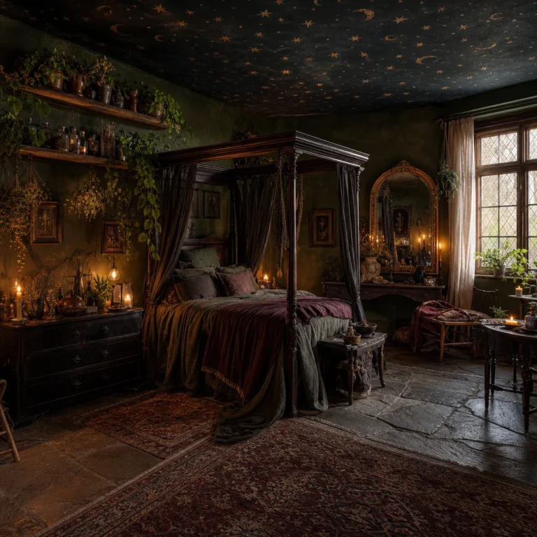
I’ve always thought a dark green cottagecore bedroom hits a kind of magic that almost no other style can touch, that feeling of sleeping inside a forest that somehow also has a reading nook and a floral quilt. What I love most is how many directions you can take it, whether that’s moody pine green panelling, a fabric canopy dripping over the bed, or a wall of vintage botanical prints. Every look in this list is one I’d genuinely steal for my own room.
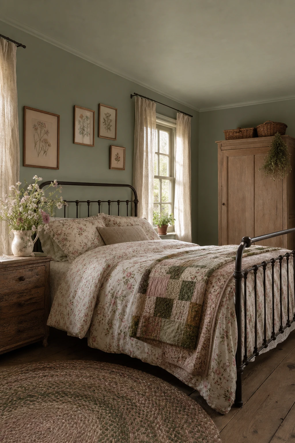
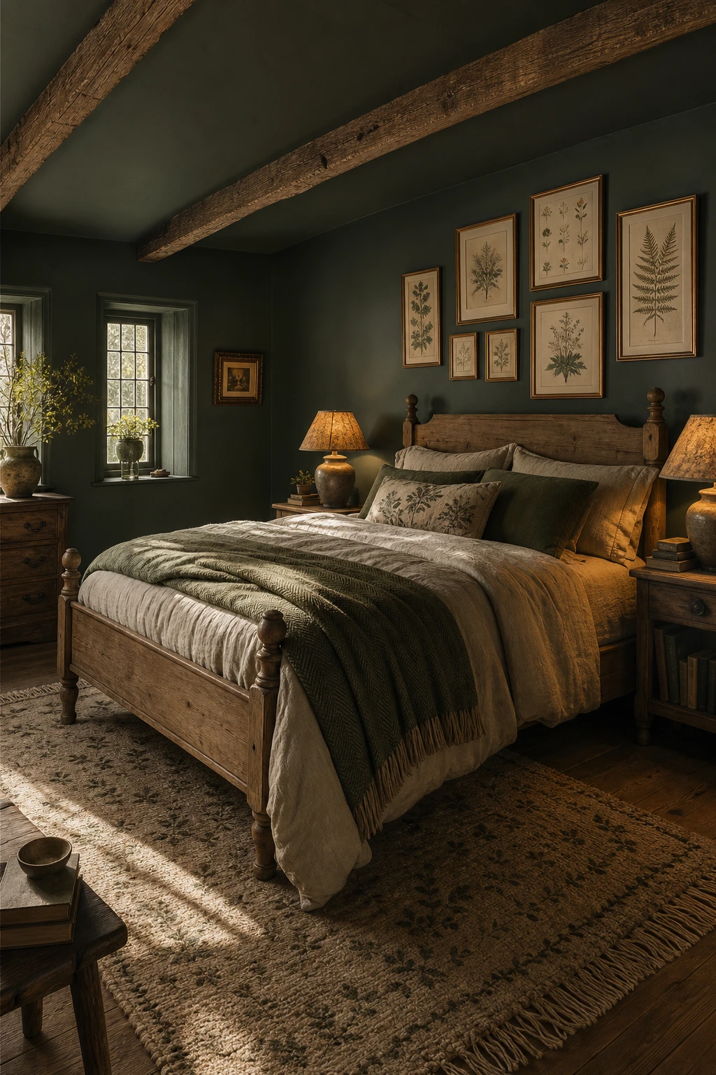
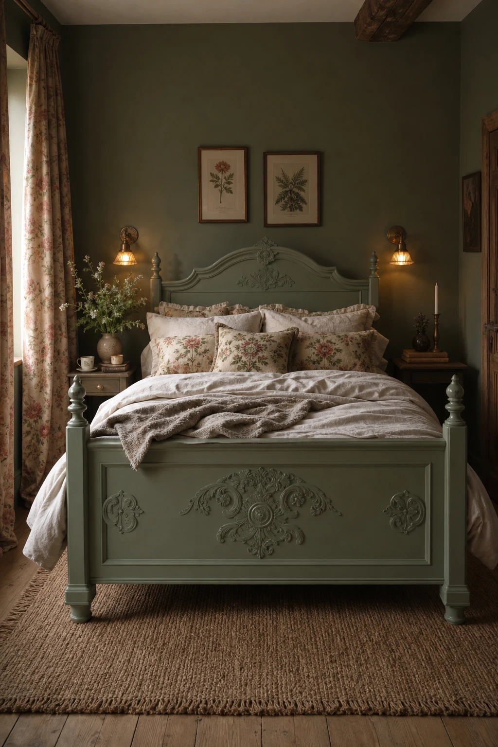
Anchoring the whole room in one deep, settled green is the move that makes every other detail sing, and it is the thing I always come back to when a cottagecore bedroom feels restless rather than romantic. When the walls hold a single confident tone, the florals on the bedding have somewhere to lean, the iron bed frame reads as sculptural rather than heavy, and the vintage wardrobe stops competing and starts belonging. You get that layered, grew here slowly quality that is so hard to fake when the foundation is doing its job quietly in the background. What wins me over every time is how one sure green turns a collection of pretty bits into a room that feels like it has always been exactly this way.
The Key Details
Get The Look
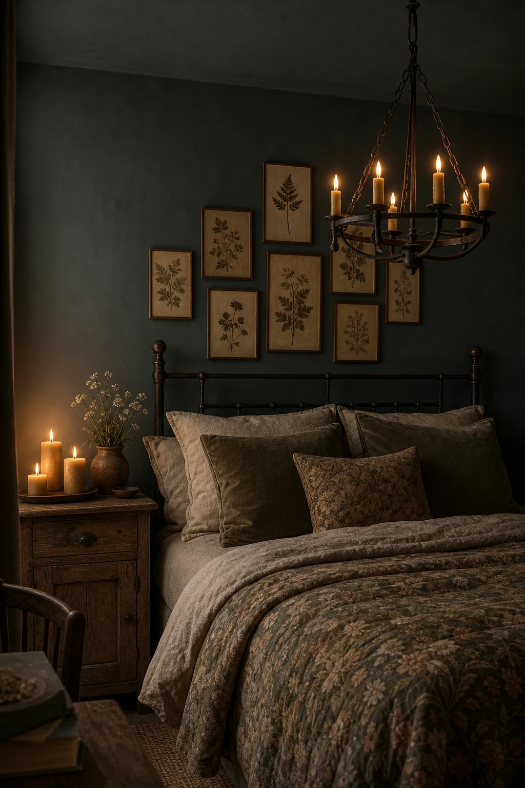
Dark cottagecore gets its magic from the way warm light plays against deep shadow, and that tension is what I reach for every time I work with a moody palette like this. You get a room that feels genuinely enveloping rather than cold, because the candlelight does something electric against forest greens and aged wood that overhead lighting simply never could. What wins me over about this approach is the layering: linen sits beside velvet, iron sits beside beeswax, and every texture catches the glow at a slightly different angle so the room breathes rather than flattens. Watch how a cluster of pillar candles on an oak nightstand pulls the whole palette together and makes the darkness feel like a choice rather than a mistake.
The Key Details
Get The Look
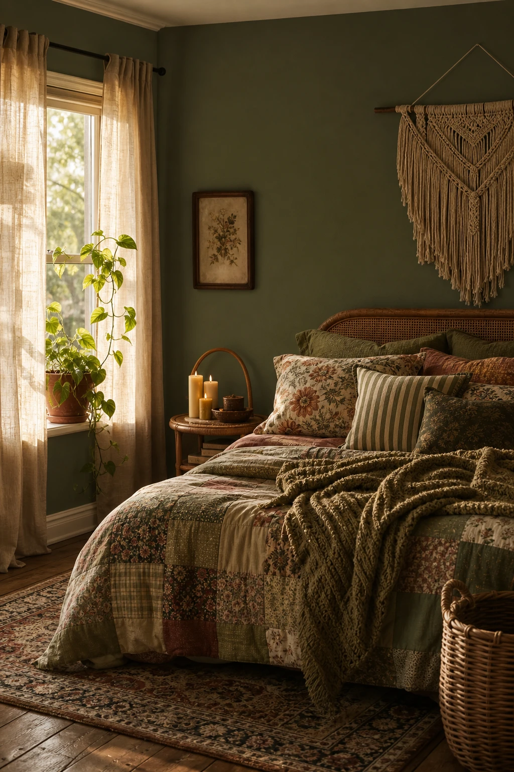
Layering textiles of different weights and patterns is what separates a room that feels genuinely lived in from one that looks like it was styled for a photo and never touched again. What I love about this boho cottagecore approach is the way a chunky woven throw sitting next to a fine embroidered pillowcase creates a kind of visual conversation, each piece with its own story, and you get that sense the room has grown over time rather than arrived all at once. The worn Persian rug underfoot and the trailing pothos on the sill add organic irregularity, and watch how those small imperfections actually anchor the deeper green walls instead of competing with them. The thing I always check in a room like this is whether every corner holds something with texture, because it is that layered weight across the whole space that makes the depth feel effortless rather than effortful.
The Key Details
Get The Look
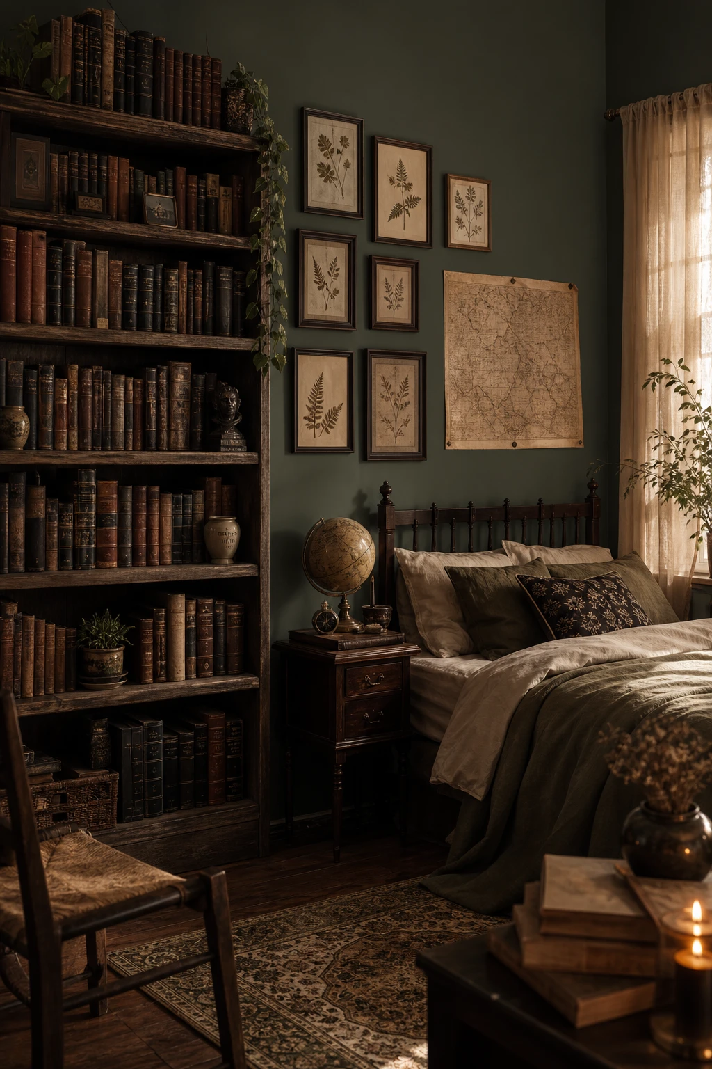
Borrowing from dark academia gives cottagecore a spine, and that is exactly what wins me over about this crossover. Books stacked on weathered oak, a tarnished brass globe, pressed botanical specimens framed above the bed: each object carries a story, so the room feels lived in rather than staged. What I love is how the botanical element does all the bridging work, sitting perfectly at home in both worlds, romantic enough for a cottage, rigorous enough for a scholar’s study. You get a space that feels as though someone genuinely curious about the natural world sleeps there, and that sense of real character is the whole lesson.
The Key Details
Get The Look
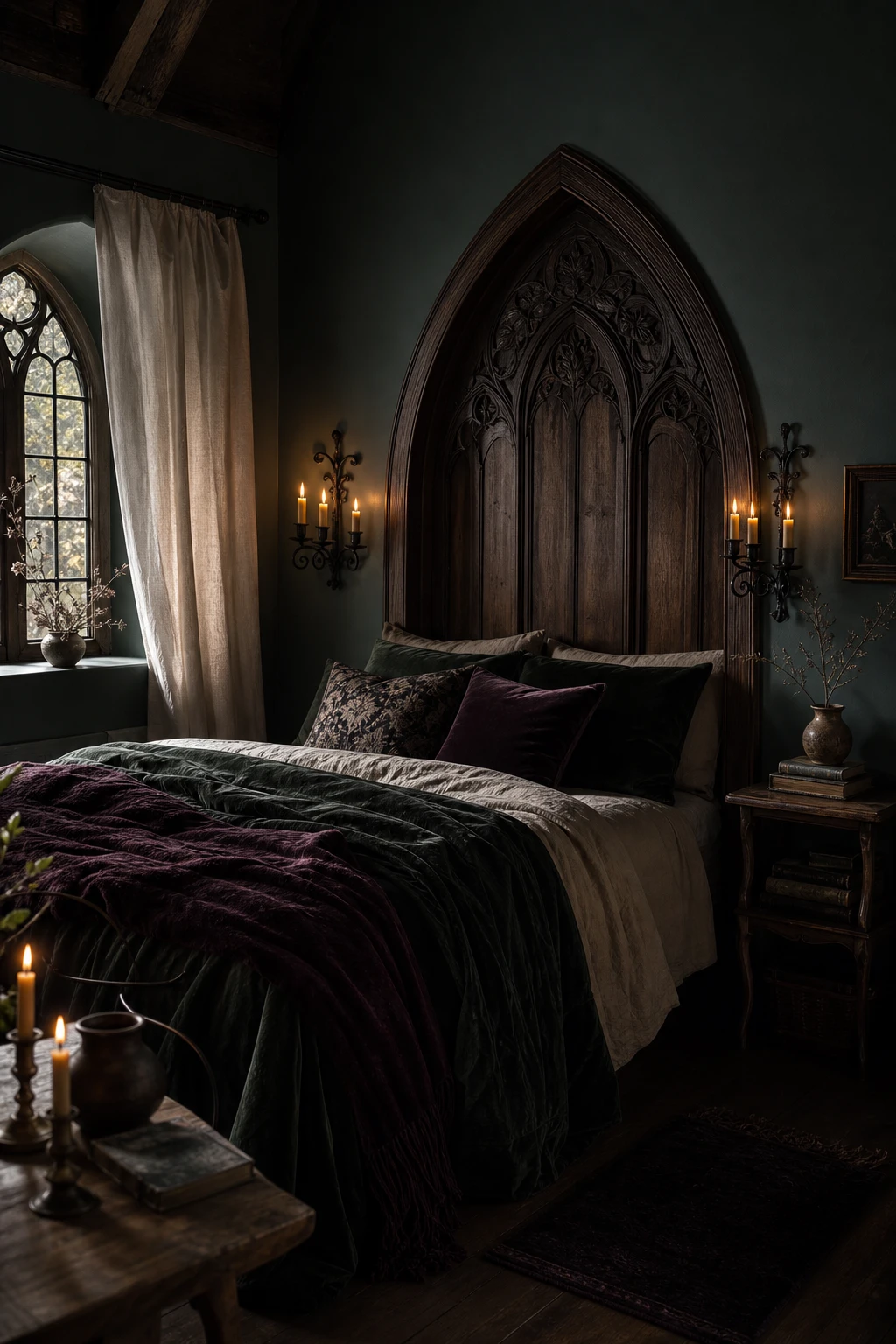
Arched shapes are doing something quietly powerful here: they pull the eye upward and give the room a sense of ceremony without any drama or fuss, and that is the thing I always check when gothic and cottage are sharing the same space. The carved oak headboard anchors the bed as a real focal point, and you will notice how the forest and plum velvet keeps everything feeling warm rather than cold or theatrical. Iron hardware earns its place by repeating that curved, handmade quality across the room, so nothing reads as a costume or a theme gone too far. What wins me over about this combination is the softness that stays underneath all of it, because the cottage bones never disappear, they just get a little moodier and more grown up.
The Key Details
Get The Look
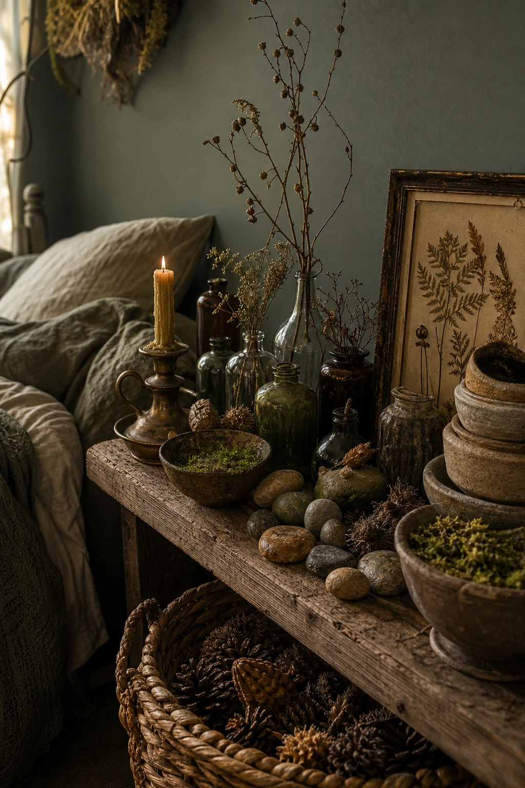
Goblincore finally gave clutter a good name, and the secret I always check for is intentional grouping: a mossy vessel next to a tarnished candlestick next to a pinecone is not a pile, it is a little scene, and you will notice how the eye reads it as a whole rather than as separate bits. Varying the heights, textures, and tones within each vignette is what does the heavy lifting, pulling together found objects, foraged pieces, and stoneware so the shelf feels composed rather than crowded. What wins me over every time is how that careful arranging makes a room look genuinely alive, the way a woodland floor looks considered even though nothing was placed there on purpose. You get a bedroom that seems to have grown there naturally, which is exactly the feeling cottagecore is chasing.
The Key Details
Get The Look
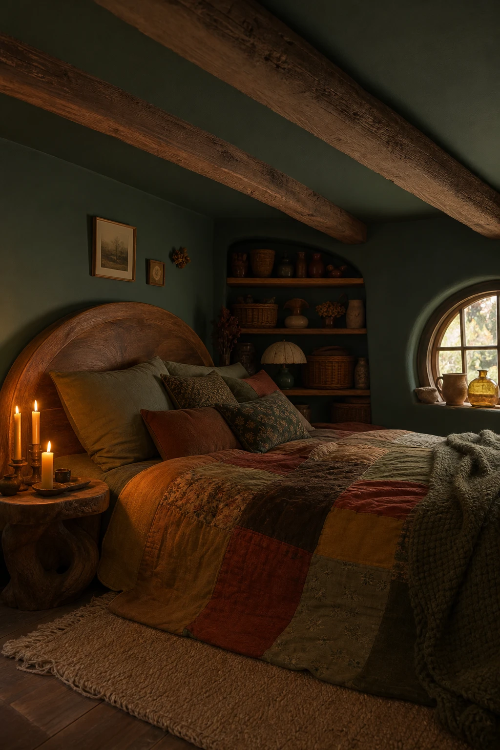
Rounded forms and low slung furniture do something almost magical to a room: they pull the eye downward and inward, so the space stops feeling like a box you inhabit and starts feeling like a hollow you nestle into. That is the whole secret of hobbitcore, and what I love most about it is how honest it is, every choice pointing toward comfort rather than impression. You will notice how stacked wicker baskets in an alcove replace tall wardrobes, keeping the visual weight close to the floor and reinforcing that snug, burrowed quality. The rough sawn beams overhead and the patchwork quilt below work together to tell the same earthy story, and the whole room ends up feeling less decorated and more grown, like it arrived naturally.
The Key Details
Deep green walls paired with aged brass and patinated wood have a quality that wins me over every single time, and the reason is simple: each element looks like it arrived in the room slowly, over years, rather than all at once on a delivery van. You get this sense of quiet history that no amount of shiny newness can replicate. The green acts as the anchor, dark enough to make the warm amber tones in old brass and worn walnut glow against it, and watch how the patina on the metal seems to deepen the moment the wall colour goes on. That layered, unhurried feeling is exactly what gives a room vintage credibility without needing a single piece that is actually antique.
The Key Details
Get The Look
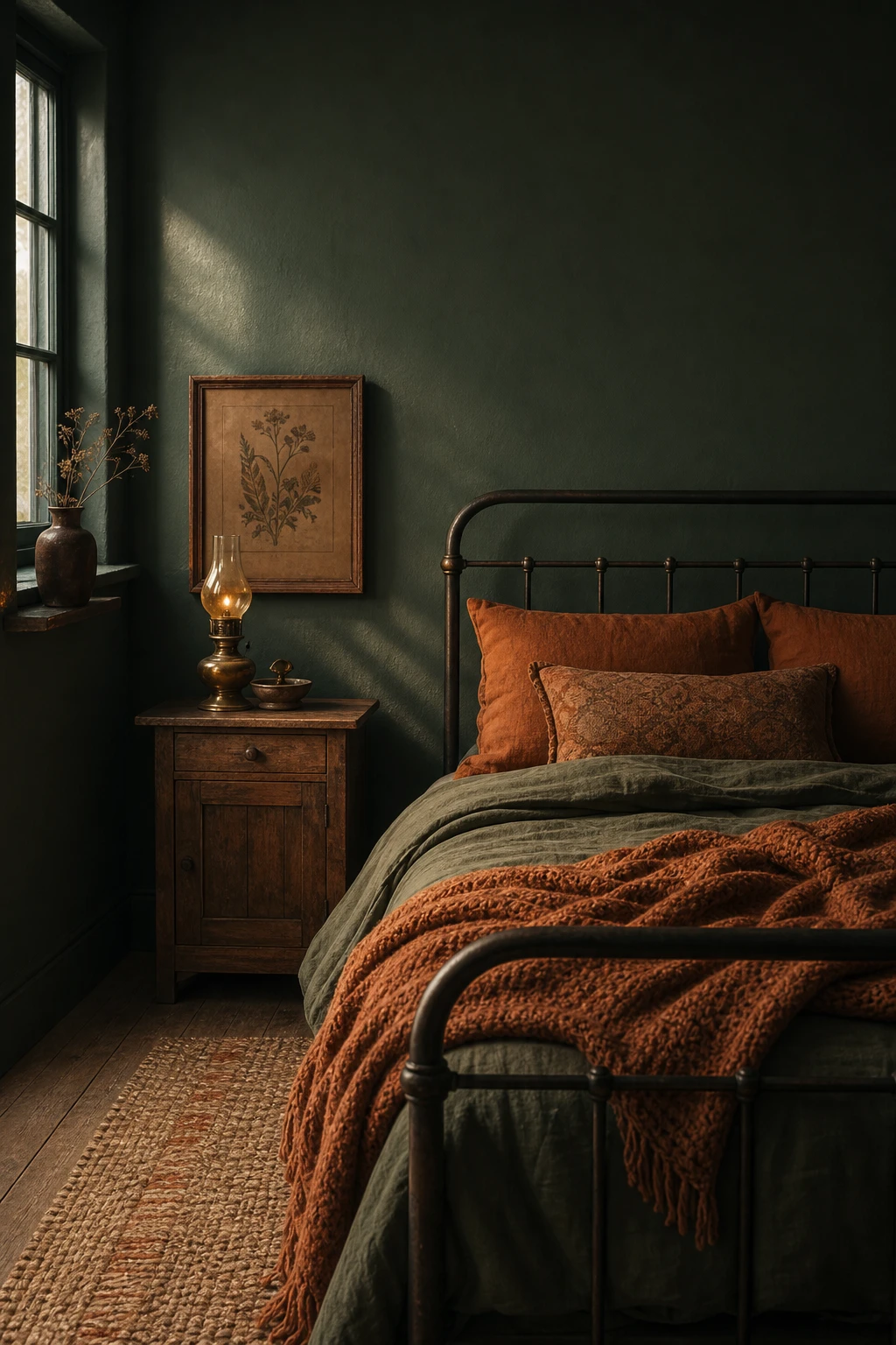
Rust and dark green sit opposite each other on the colour wheel, and that tension is exactly what makes a room feel alive rather than safe. The earthy quality in rust anchors the space to the ground, and you will notice the whole room starting to feel autumnal without a single seasonal prop in sight. What I love about this pairing is how rust pulls the warmth out of a deep forest green, so you end up with something that feels like October light filtering through old leaves rather than a cold, heavy wall. That grounded feeling is the thing I always chase when I am working with dark walls, and this combination delivers it every time.
The Key Details
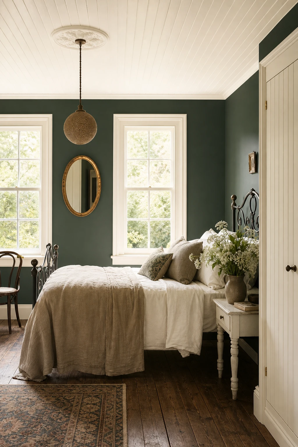
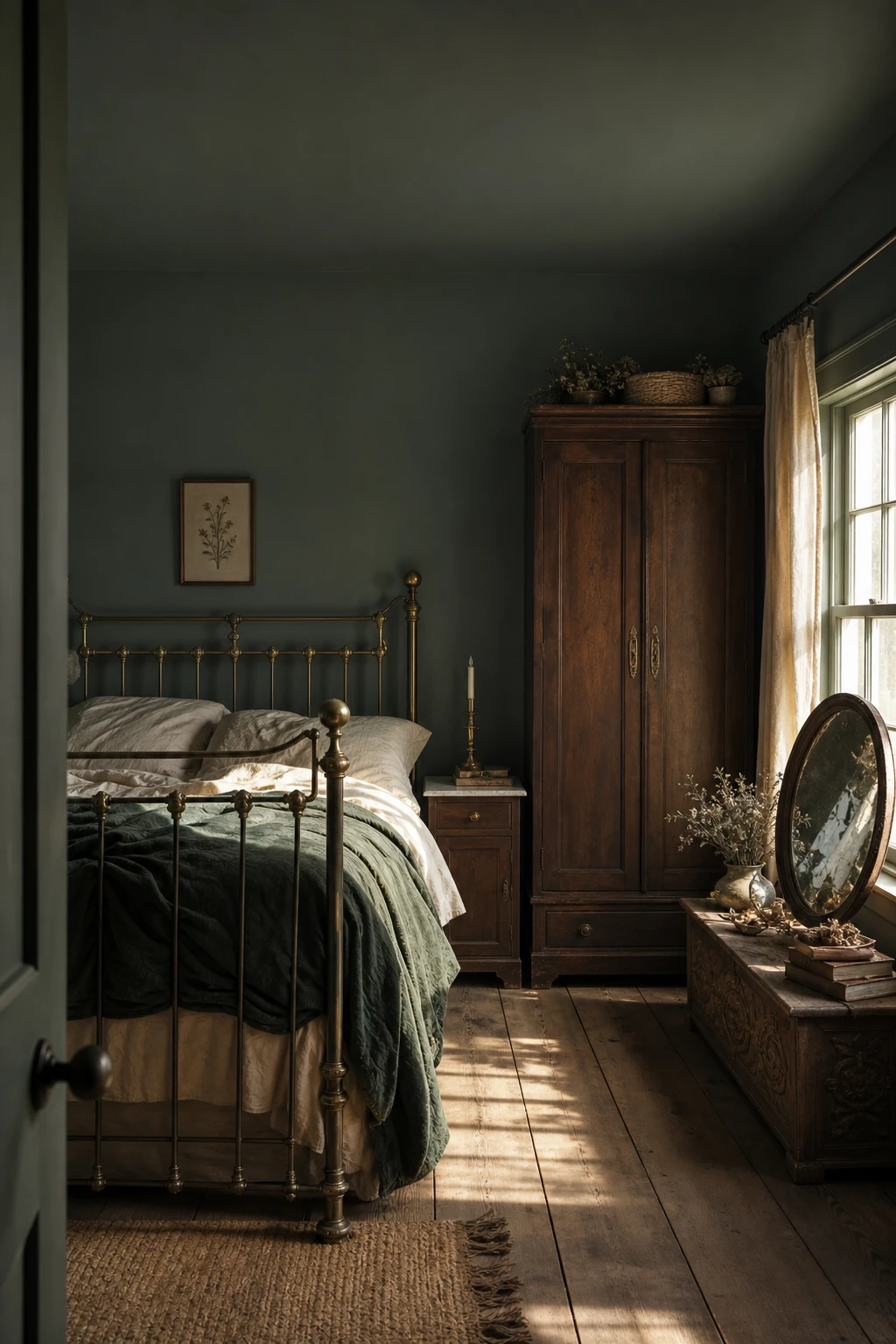
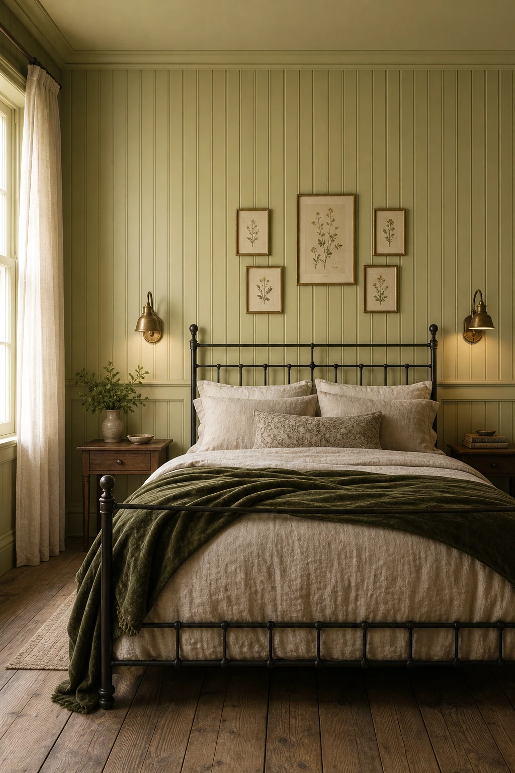
Dark green walls paired with crisp white trim is one of my favourite combinations because the contrast does something really special: it stops the room from feeling like a cave and gives it a clean, almost garden like quality instead. The white ceiling lifts your eye upward, and you get this wonderful sense of height and air even when the walls are genuinely deep and moody. What I always check before signing off on this pairing is the undertone of the white, because a warm cream white keeps the green anchored in nature where it belongs, and that is where the timeless quality comes from. Watch how the carved iron bed, the beaded wardrobe panels, and those tall sash windows all sit quietly within the scheme rather than fighting it, each one feeling like it has always been there.
The Key Details
Get The Look
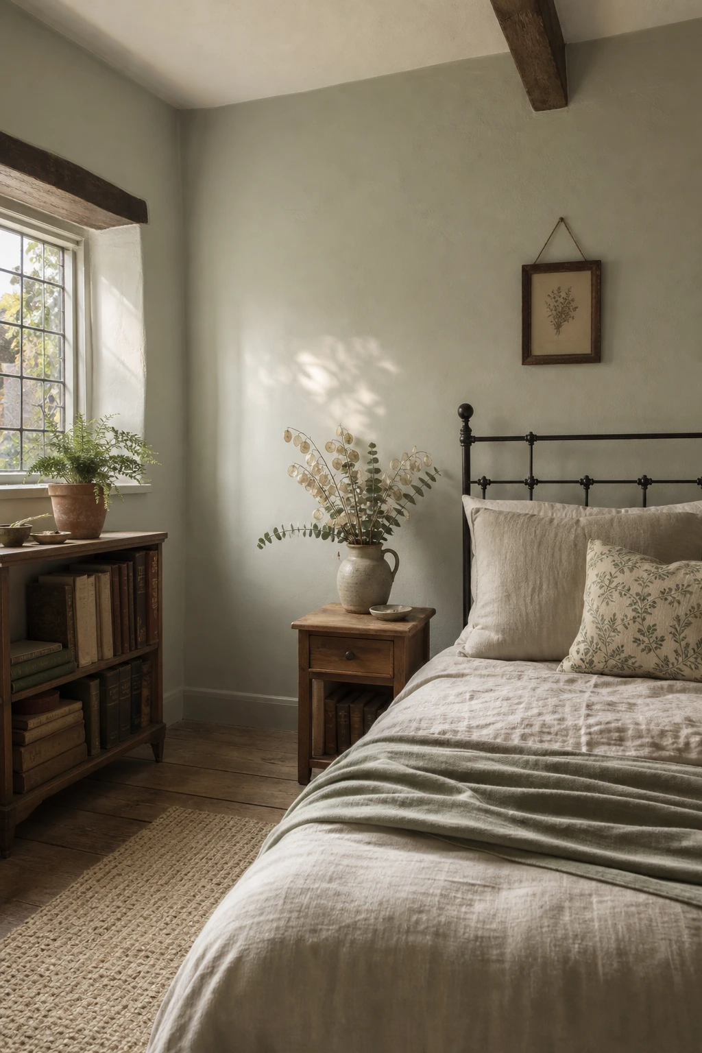
Sage sits in that lovely middle ground between muted and botanical, and for a cottage bedroom with small windows it is genuinely one of my favourite choices because it does something clever with what little light it gets. You will notice the room does not feel dark even though the walls are fully saturated, and that is because sage carries just enough warmth to bounce the light around rather than swallow it. What I love about pairing it with undyed linen and aged pine is the way those raw, natural textures stop the green from feeling polished or modern, pulling it firmly back into cottage territory. Watch how the dried honesty stems in a ceramic jug read almost luminous against it, that small botanical detail is all you need to tie the whole palette together.
The Key Details
Get The Look
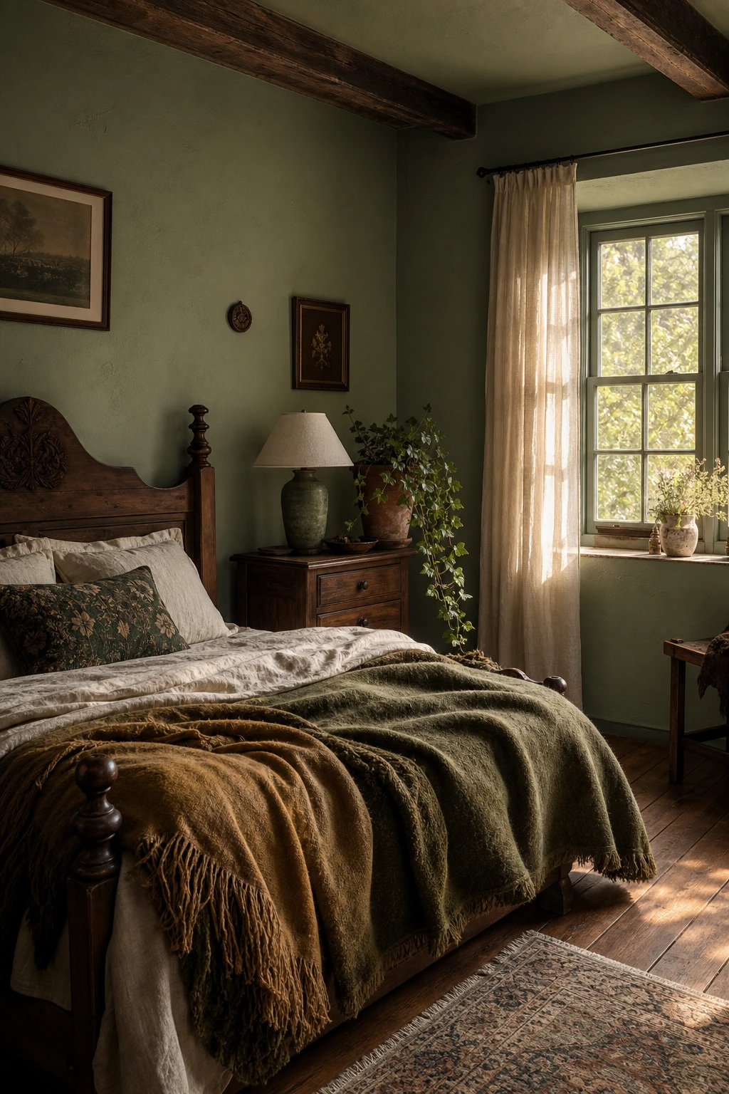
Brown and green belong together the way bark belongs to a tree, and that is exactly the feeling you get when this palette lands well in a bedroom. The worn chestnut floors pull the eye down and anchor everything, while the green walls lift the space up, and what I love is how neither colour has to fight for attention. You will notice the warmth spreading across the room even before you can name what is causing it, and that quiet glow comes from the brown doing all the heavy lifting as a neutral. It wins me over every time because it asks for almost nothing from the other pieces in the room, the carved walnut bed, the rustic nightstand, the sheer linen curtains all slot in naturally without a single one looking forced.
The Key Details
Get The Look
Pine green sits at the darkest, moodiest end of the cottagecore palette, and before I recommend it I always check whether a room has enough natural material to carry it. When it does, something shifts: the oak beams look richer, the wool rug looks warmer, and the weathered pine bedframe stops being furniture and starts looking like something that grew out of the forest floor. Every raw texture in the room seems to glow against that deep backdrop, the way a mossy stone glows in low woodland light, and that is the quality I love most about this shade. Committing fully is what wins me over every time, because half measures leave it looking heavy rather than alive.
The Key Details
Get The Look
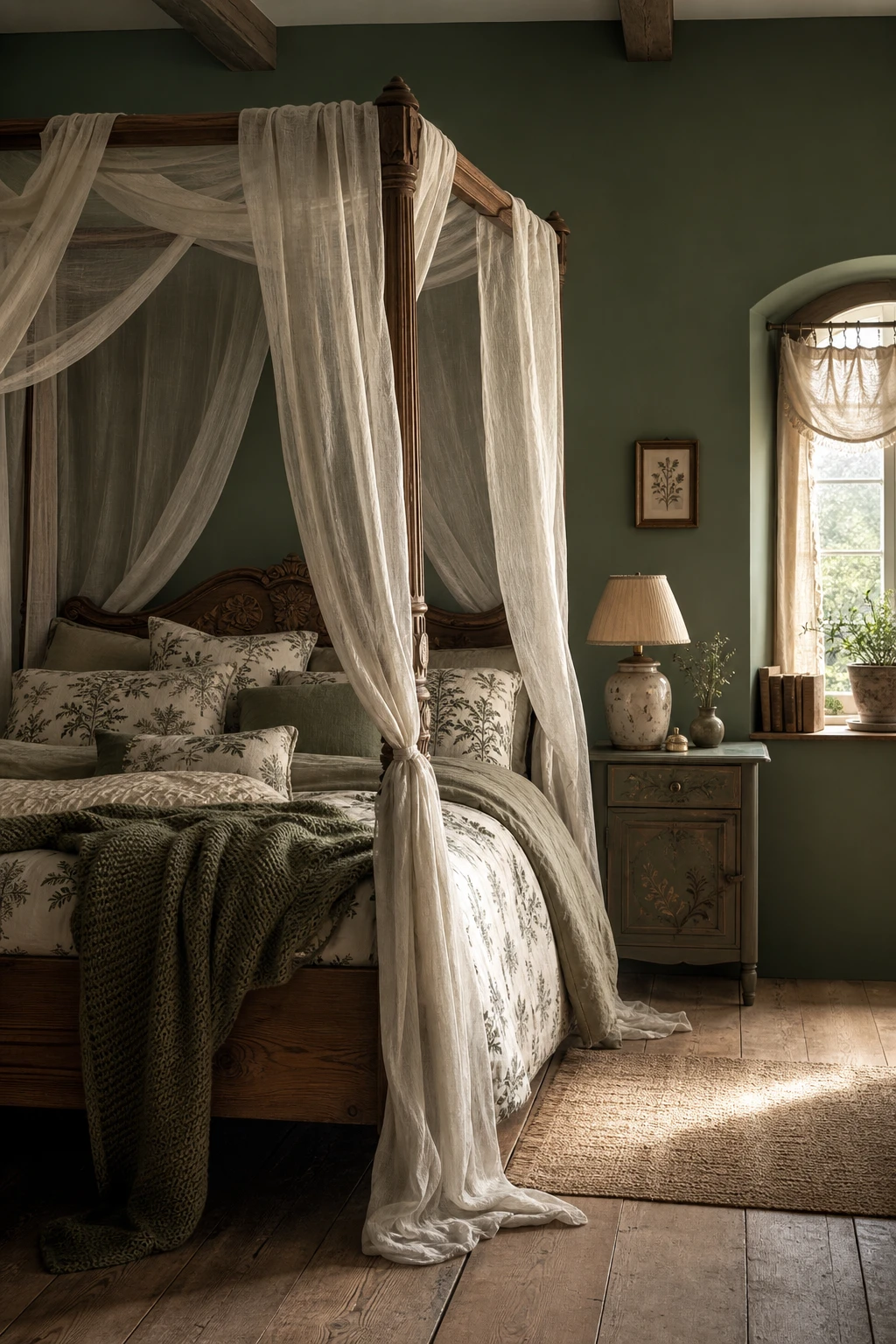
A canopy bed is one of those moves I come back to again and again in small bedrooms, because it does something almost magical: it pulls the eye straight up, and the moment that happens, the room feels taller and grander than it actually is. The carved oak four poster frame gives the whole thing a cottagecore soul, solid and rooted, while the sheer linen drapes float around it just enough to cocoon you without ever feeling closed in. What I love most is that soft pooled hem on the fabric, because you get that sense of abundance and ease, the look of a room that has been lived in gently for a long time. Set that against the wide plank aged oak floor and the arched window with its gathered muslin, and watch how the green palette ties every element into one quiet, enveloping whole.
The Key Details
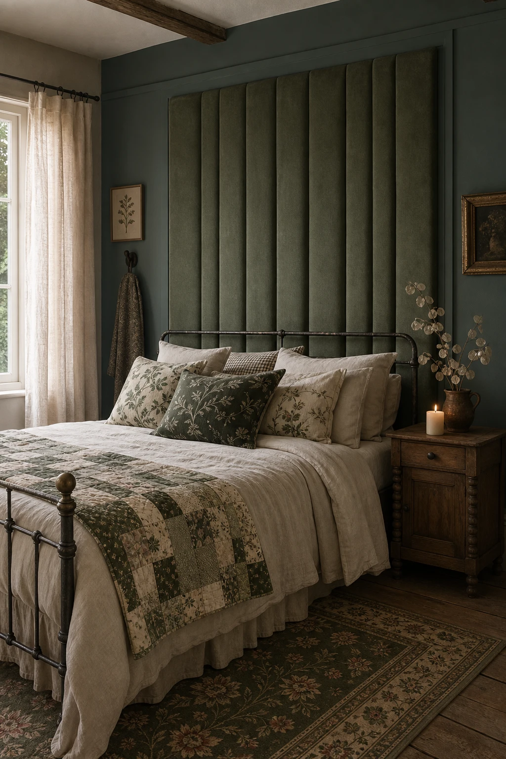
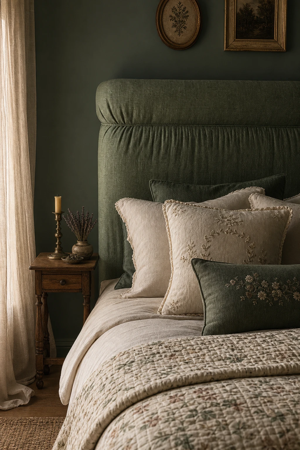
A green upholstered headboard is the piece I reach for when a bedroom needs a clear focal point without a lot of fuss on the walls. The deep colour draws the eye straight to the bed, so everything else in the room gets to breathe, and you get that effortless, pulled together feeling even when the rest of the scheme is quite simple. What wins me over every time is the way velvet or linen softens the green, giving it that mossy, organic warmth that is the whole soul of cottagecore rather than anything sharp or modern. Watch how the other layers, the quilts, the cushions, the worn timber floors, all fall naturally into place once that headboard is anchoring the wall.
The Key Details
Swap a painted wood or metal bed frame for a padded linen headboard and the whole room changes register immediately, and that shift is one of my favourite moves in a dark green bedroom. The textile surface soaks up light gently rather than bouncing it back, giving the wall behind the bed a quiet depth that feels almost like a second layer of softness. What I love most is how that first soft surface becomes a silent anchor for every other textile in the space: the embroidered cushions, the folded quilt, even the sheer muslin at the window all seem to belong to the same family once it is in place. Watch how the pleating catches the candlelight from the bedside table too, adding just enough movement to stop the dark walls from feeling heavy, and you will notice the whole room settles into something that feels genuinely restful.
The Key Details
Get The Look
Sage Green Velvet Upholstery Fabric
Natural Linen Headboard Fabric
Painting the bed frame rather than the walls is one of my favourite moves for renters or anyone who knows their taste will shift in a few years, because the green lands exactly where your eye goes first and you get all the drama without a single wall being touched. What I love here is how a deep forest green on carved wood reads as something genuinely old, the kind of piece that looks as though it came out of a country house rather than a flat pack box. You will notice how the aged brass sconces and the botanical curtains pull the colour through the room so the bed never feels like a lone experiment, and that layering is what turns one painted piece into a whole world. The woven jute underfoot and the wide timber planks do the quiet work of grounding it all, keeping the green feeling rooted and warm rather than loud.
The Key Details
Get The Look
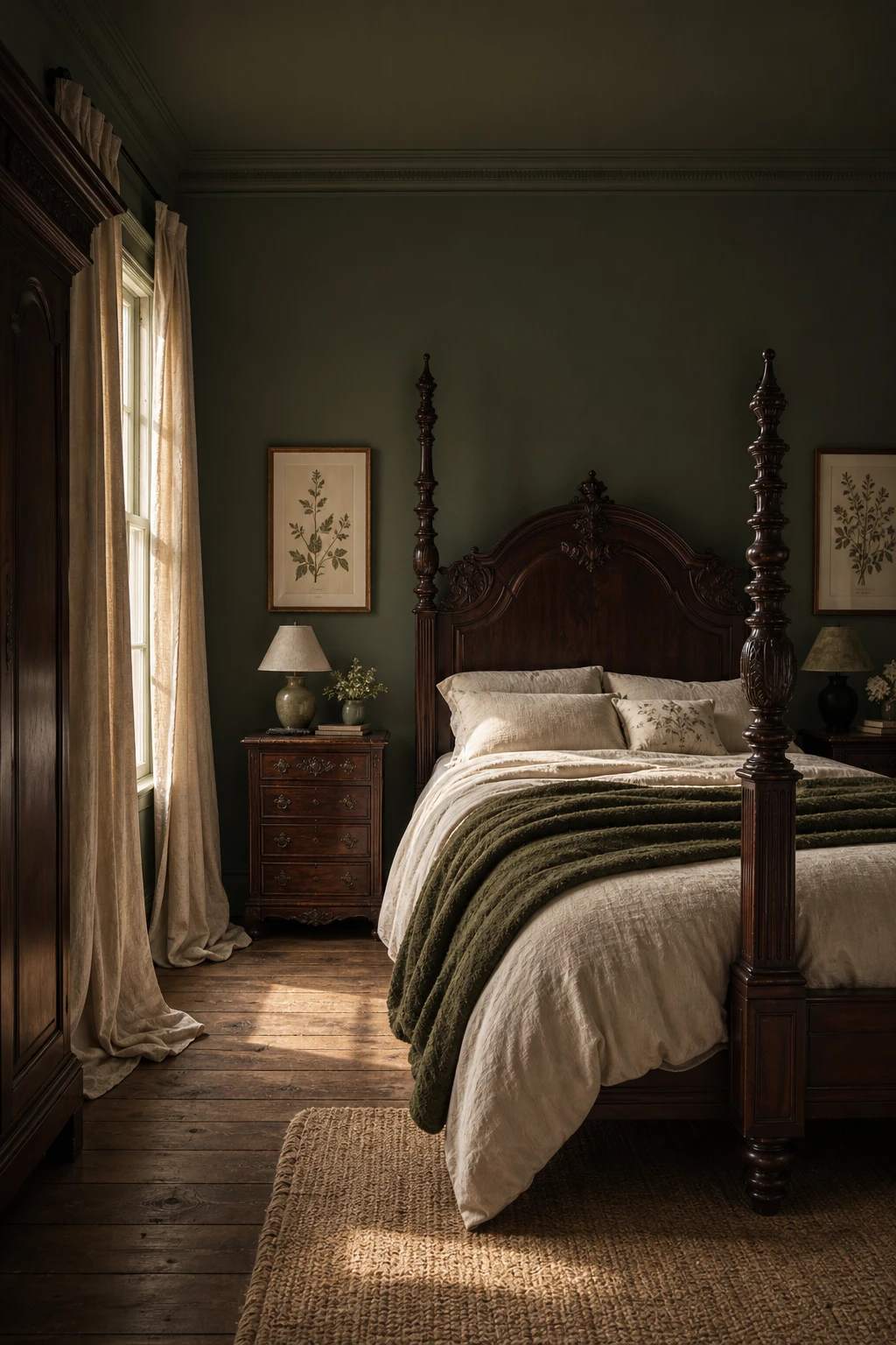
Heavy dark wood is the thing I always reach for when a cottagecore bedroom starts feeling too sweet, too fussy, or like it belongs in a gift shop rather than a real home. Bringing in a carved mahogany bed frame or a deep walnut dresser adds a kind of quiet authority that the softer elements, the linens, the botanicals, the worn oak floor, can lean against without tipping the whole room into whimsy. You get that sense of a space that has been lived in across generations, where nothing was bought as a matching set because nothing needed to be. What wins me over every time is how the darkness of the wood pulls the green walls deeper, so the whole room feels more like something found than something decorated.
The Key Details
Get The Look
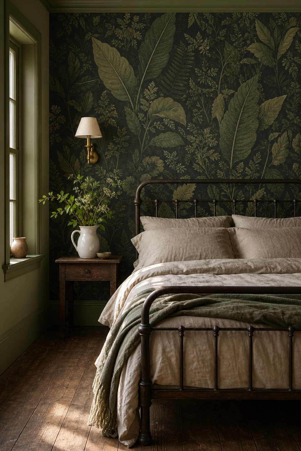
A large scale botanical print is doing two jobs at once, and that is what wins me over every single time: you get rich colour and lush pattern from a single decision, so the walls feel completely dressed without a single extra picture hook or art print in sight. The leaves pull the eye across the whole surface and you notice how the room starts to feel like somewhere the outside has crept in, which is the whole spirit of cottagecore. What I love about pairing it with an antique iron bed and brass sconces is that those quieter elements let the paper breathe rather than compete. Keep the rest of the room simple and watch how the botanical print becomes the room rather than just a backdrop to it.
The Key Details
Get The Look
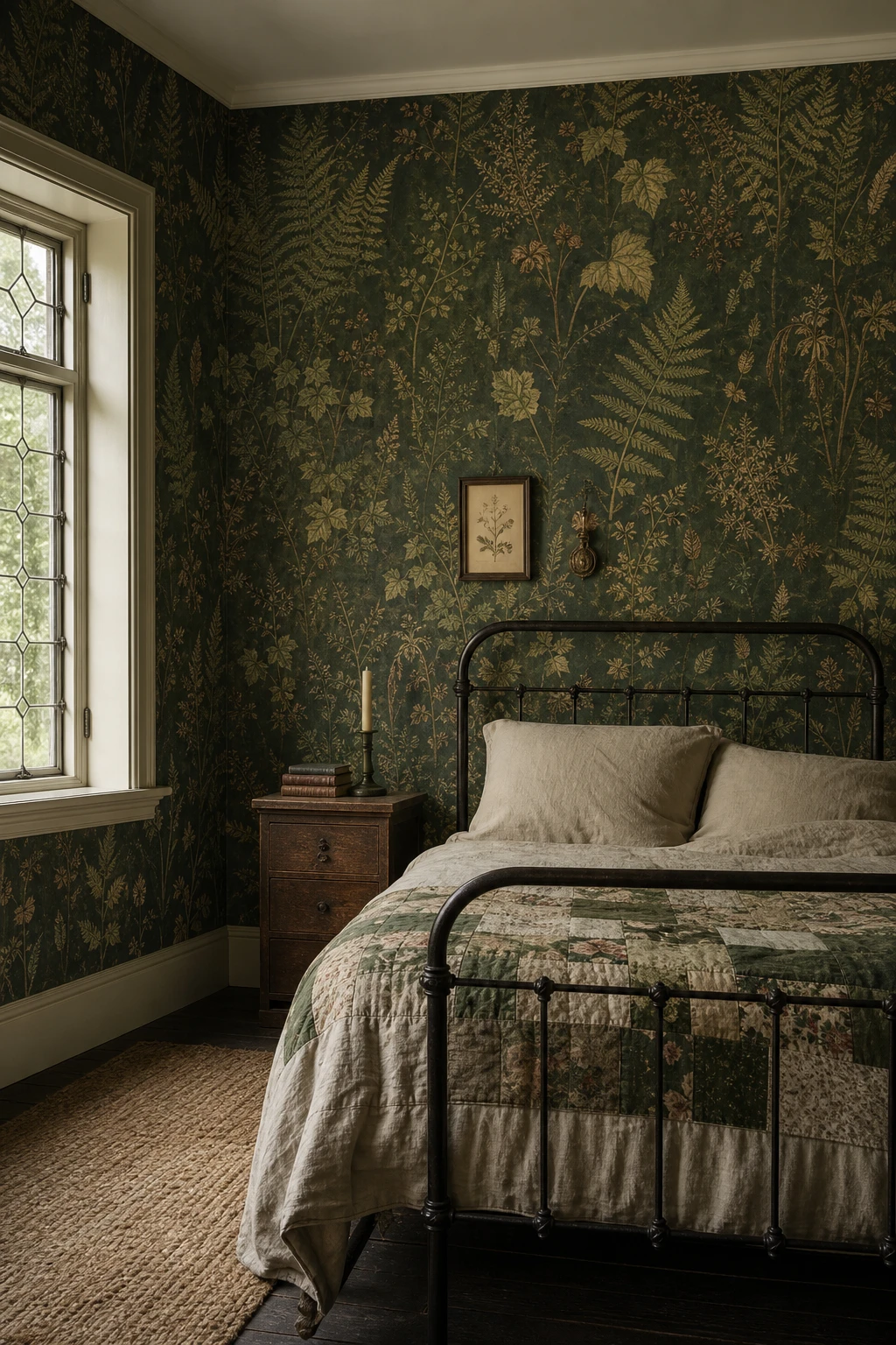
Botanical archive wallpaper carries a kind of visual weight that you simply cannot manufacture from scratch, and that weight is exactly what gives a cottagecore bedroom its soul. What I love about genuine reproduction prints is that they were drawn from real herbarium specimens, hand engraved plates, or Victorian pattern books, and you feel that care every time you look at the wall. The repeat never feels mechanical, the colours hold a dusty, slightly uneven quality that new digital prints iron out completely, and you end up with a room that seems to have been sleeping quietly for a century rather than assembled last weekend. Pair it with an antique iron bed, a patchwork quilt, and a rough sawn oak nightstand and the whole thing clicks into place, each piece lending a little more of its own age to the story the room is quietly telling.
The Key Details
Get The Look
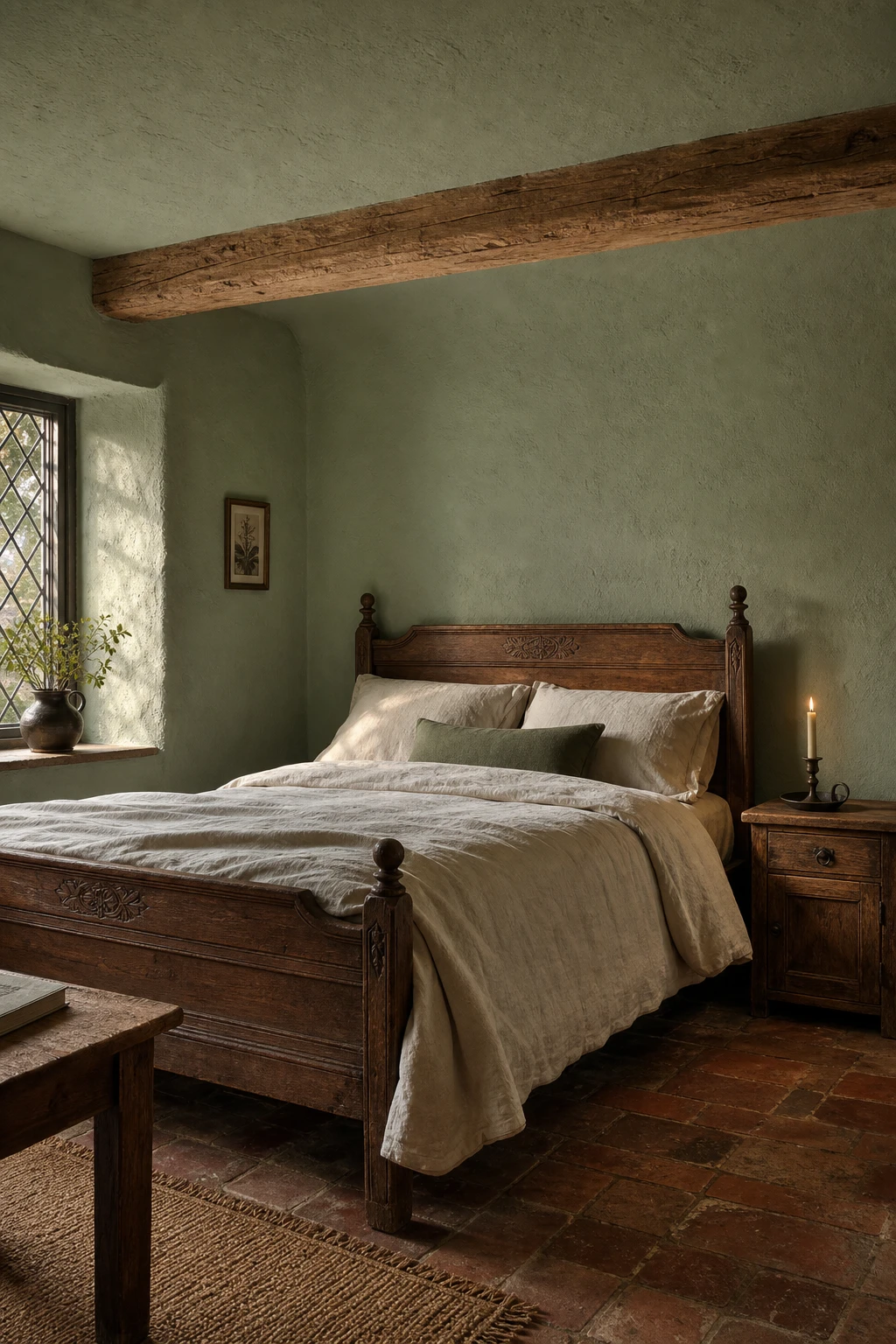
Raw plaster walls in a deep, mossy green are one of those combinations that stop me in my tracks every time, because the finish does as much work as the colour. The slight unevenness of lime plaster catches the light differently across the day, so the green shifts from a warm olive in morning sun to something almost smoky by lamplight, and you get a room that feels like it has been living and breathing for a hundred years. What I love about pairing that rough wall texture with hewn oak beams and a carved wooden bed is that every element carries a little imperfection, and together they tell a story that no flat painted wall ever could. You will notice the whole room settles into itself rather than looking assembled, and that quiet, unhurried feeling is exactly what genuine rustic style is chasing.
The Key Details
Get The Look
Panelling is the thing I reach for when a bedroom feels like it is missing a backbone. A flat wall gives dark green nowhere interesting to go, but add raised mouldings and suddenly the colour has depth and shadow and a whole new dimension to play in. What I love most is the way the light catches each panel edge and carves the room into something that looks genuinely old and considered, even when the bones of the house are completely ordinary. You get the feeling of a room that was designed, not just decorated, and that shift is everything in a cottagecore space.
The Key Details
Get The Look
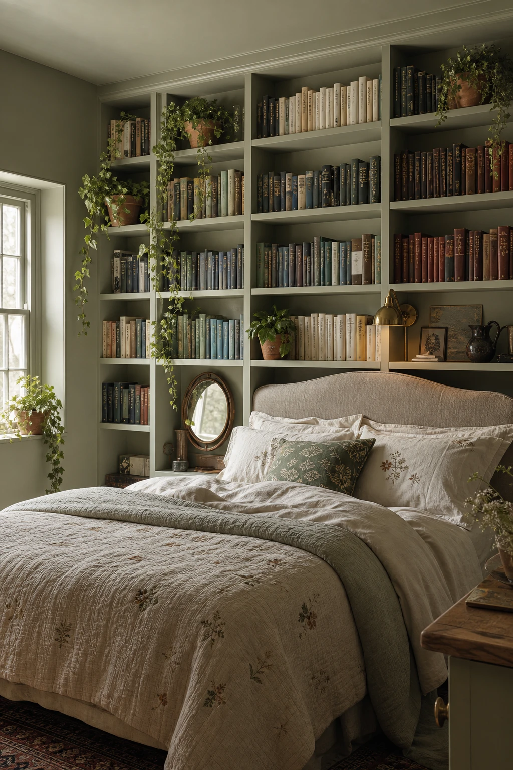
A floor to ceiling library wall does something that no amount of artwork or wallpaper can quite match, and what I love about it is how effortlessly it earns its place in a cottagecore bedroom. Books have colour, texture, age and story all built in, so you get a backdrop that feels genuinely lived in from day one rather than arranged for a photograph. The dark green paint behind the shelving pulls everything together and gives the whole wall a depth that makes the room feel like it has been collecting character for decades. Watch how your eye moves across the spines, the trailing ivy, the small objects tucked between volumes, and you will notice the shelf stops reading as storage and starts reading as the most personal thing in the room.
The Key Details
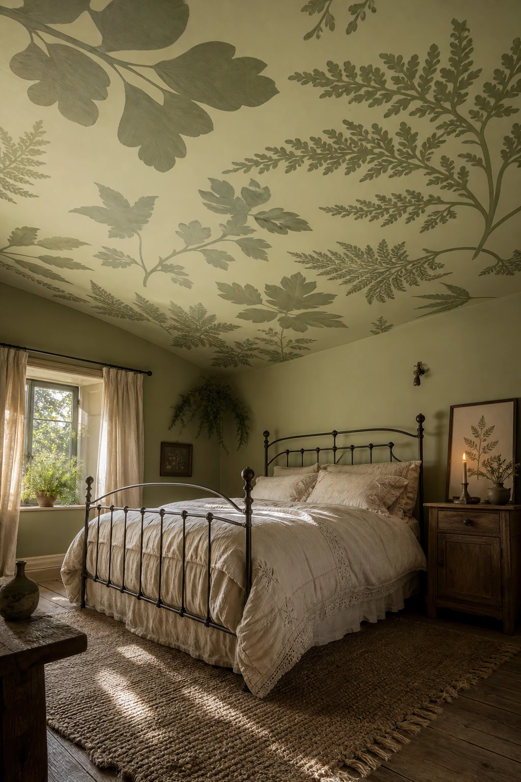
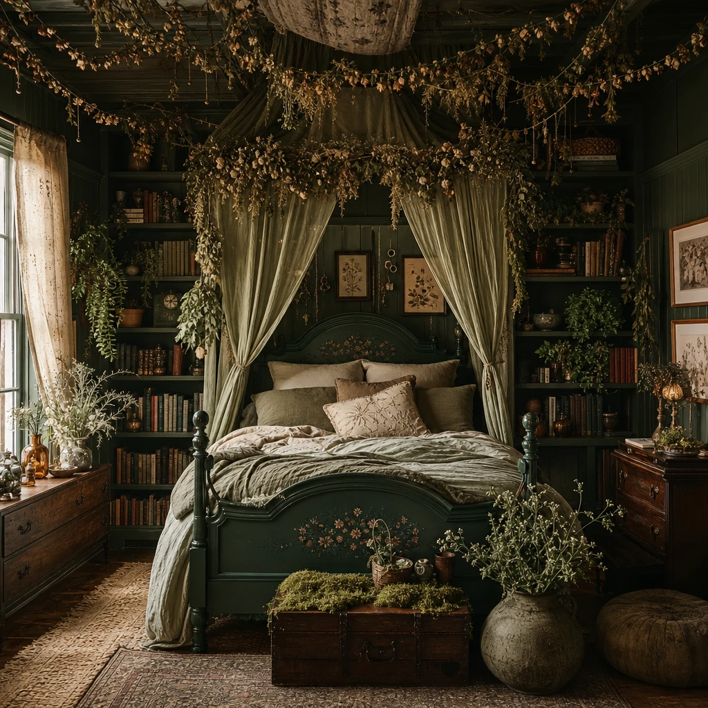
Leaving the ceiling plain is one of the easiest missed opportunities in a cottagecore room, and the moment you cover it in oversized botanical leaves the whole space transforms into something closer to a forest canopy than a bedroom. The framing effect is the thing that wins me over every time: your eye lifts, the room feels taller, and the dark green walls and the ceiling become one continuous world of foliage rather than four walls and a lid. What I love about this trick is how it shifts the mood without moving a single piece of furniture, you get a sense of being held inside the space, cocooned under the canopy, simply by treating the ceiling as the fifth wall it always was. That one decision is what separates a good room from a truly theatrical one.
The Key Details
Get The Look
Farrow & Ball Cooking Apple Green
Botanical Leaf Ceiling Wallpaper
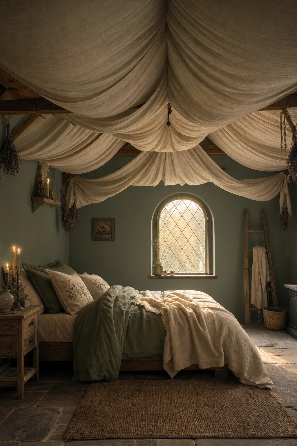
Gathered fabric overhead is one of my favourite tricks for a bedroom that feels genuinely cocooning, and the effect it creates is immediate. You get this sense of a canopy wrapping the whole room, not just the bed, which pulls every corner inward and makes even a plain square space feel intimate and considered. What I love about pairing it with dark green walls is the way the soft folds of linen catch the candlelight from below and shift between sage and shadow depending on the hour. The sound dampening is a real bonus too, you will notice the room feels quieter and stiller, which is exactly the restful quality a cottagecore bedroom is reaching for.
The Key Details
Get The Look
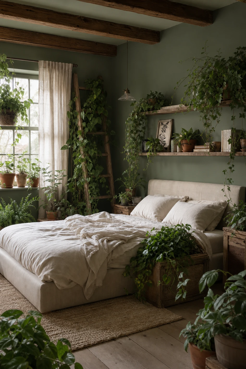
Trailing pothos and ivy spilling off timber shelves do something that even the most carefully chosen green paint simply cannot, and that is what I find so compelling about this approach. The plants move, they catch the light differently each morning, and they soften every hard edge in the room so the boundary between the bedroom and the garden outside starts to genuinely blur. What I love about anchoring a wooden ladder with climbing vines is the way it becomes functional sculpture, something living that draws the eye upward and fills vertical space you would otherwise ignore. You get a room that feels like it has grown rather than been decorated, and that quality wins me over every single time.
The Key Details
Get The Look
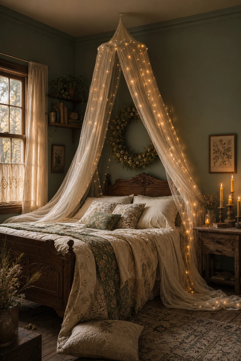
Fairy lights woven through a sheer canopy turn an ordinary ceiling corner into a little pocket of sky, and against a deep forest green wall the effect stops people in their tracks. The layering of light is what I find so hard to resist: soft fabric catches tiny warm glows while the dark backdrop absorbs everything around it and pushes the brightness forward so you notice every single twinkle. You get this feeling of being cocooned inside something alive, the way a glade feels at dusk, and the sheer fabric keeps it weightless and dreamy rather than oppressive, so the whole canopy seems to float. What wins me over is how something so simple, a handful of lights and a length of linen, manages to deliver that much magic.
The Key Details
Get The Look
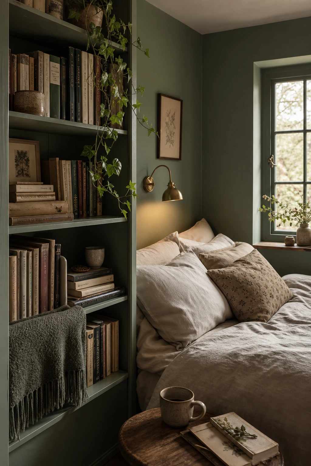
Positioning a bookshelf right beside the bed is one of my favourite moves in a cottagecore room, because it turns a plain sleeping space into somewhere that feels genuinely lived in and loved. You get that sense that the room has grown around real habits, stacked novels, a half read poetry collection, a little ceramic pot of trailing ivy tucked onto a lower shelf, and the dark green walls wrap the whole corner in something that feels almost forest like. What I love most is how the shelf quietly anchors the bed to the room, giving it a sense of place rather than just floating in the middle of a wall. Watch how your eye travels from the pillows to the books and back again, and the room suddenly feels like it has a story.
The Key Details