Newsletter Subscribe
Enter your email address below and subscribe to our newsletter

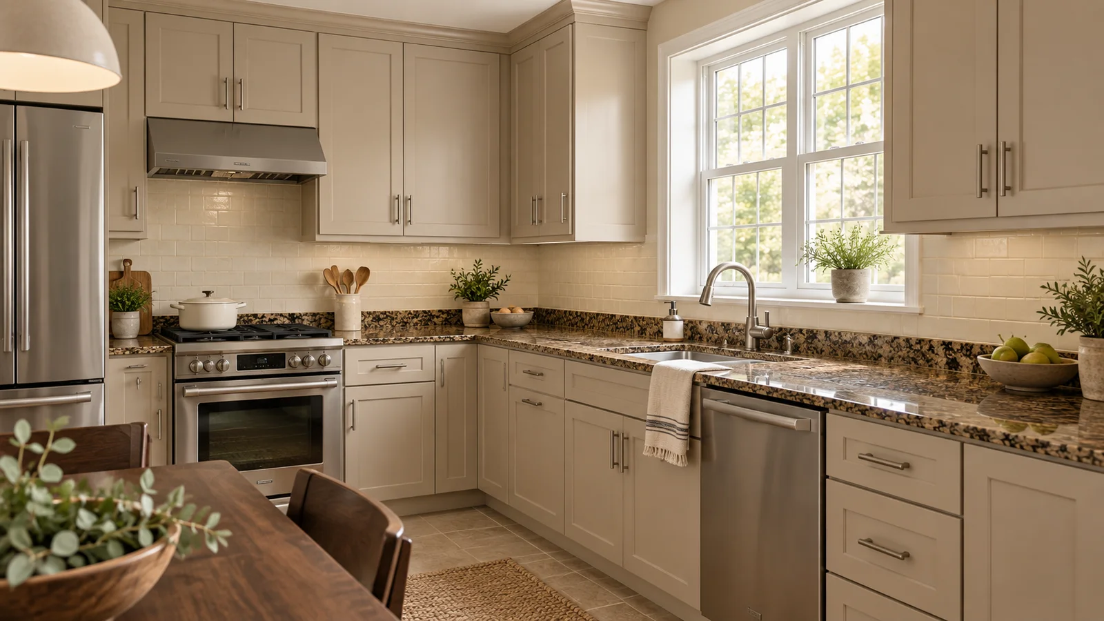
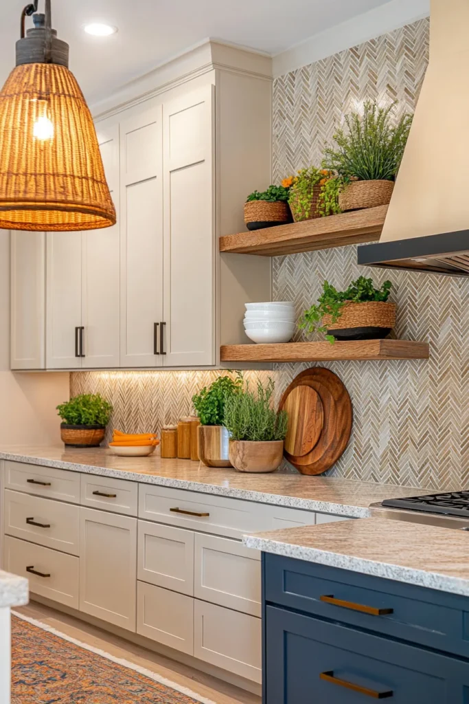
A backsplash for beige kitchen cabinets can look lovely in a showroom and unexpectedly pink, yellow or cold beside the granite already in your kitchen. The problem is often the relationship between surfaces, rather than one obviously wrong colour. Your cabinets occupy a large vertical area, the granite carries several colours at once, and the new tile has to sit comfortably between them. Keeping those cabinets and counters gives you a useful starting point: two important decisions are already made. This guide helps you choose the remaining surface through a small set of comparisons, then turn the winning sample into a clear installation brief. You will consider the granite background, cabinet undertone, grout, everyday light and any existing stone upstand. The aim is a kitchen that feels resolved using what you already have, with enough evidence to order confidently instead of chasing another perfect inspiration photograph.
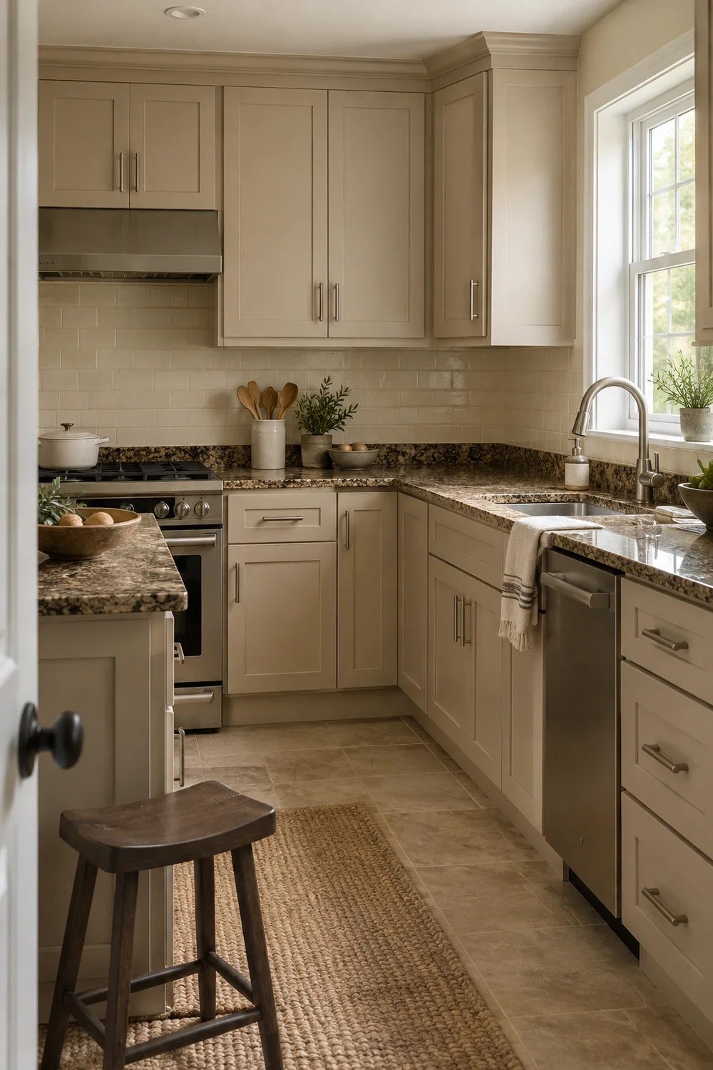
Begin by writing down what is staying. Include the cabinet doors, countertop, flooring, window trim and large appliances. Add the stone strip rising above the counter if your granite has one. That strip is an upstand, and it affects both the visible palette and where the new tile can begin. A backsplash decision becomes much easier when the retained surfaces are genuinely fixed, rather than quietly becoming a whole kitchen renovation halfway through choosing tile.
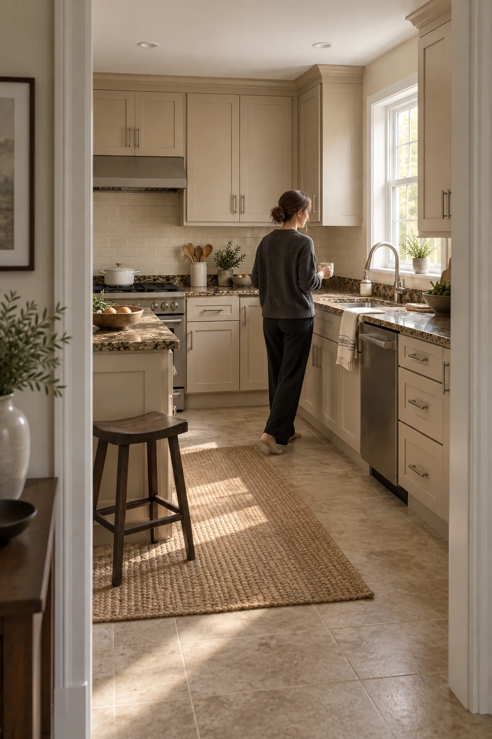
Clear one stretch of countertop before judging colour. Leave the everyday kettle or coffee machine elsewhere for the first comparison, then return it for a second look. A red appliance, a patterned tea towel or a strong reflection from a nearby curtain can distract you from the three surfaces you actually need to coordinate. Stand at the doorway as well as at the counter. A combination that feels interesting close up can become restless across the full room.
Choose a simple visual priority. If the granite has lively speckling or movement, let it supply most of the pattern. If the cabinet door has a pronounced frame, avoid asking a strongly outlined tile grid to compete with every cabinet edge. This is a design preference rather than a rule: you can enjoy several patterns, but keeping one dominant makes a retained kitchen easier to settle.
Define the scope before shopping. For example: keep the cabinets, granite and floor; replace only the wall finish; assess the upstand with an installer; retain the existing appliance positions. That statement is more useful than a vague intention to make the room lighter. If you are still considering different cabinet looks, explore the broader beige kitchen cabinet guide first, then return when the surfaces you intend to keep are clear.
Look at the granite from a normal standing distance. Identify its overall background before studying individual flecks. A counter that reads brown across the room may contain cream, black and a little pink close up. Choosing a backsplash from the tiniest pale fleck can produce a colour that technically exists in the stone but feels unrelated to the kitchen as a whole. Start with the colour the counter contributes at room scale.
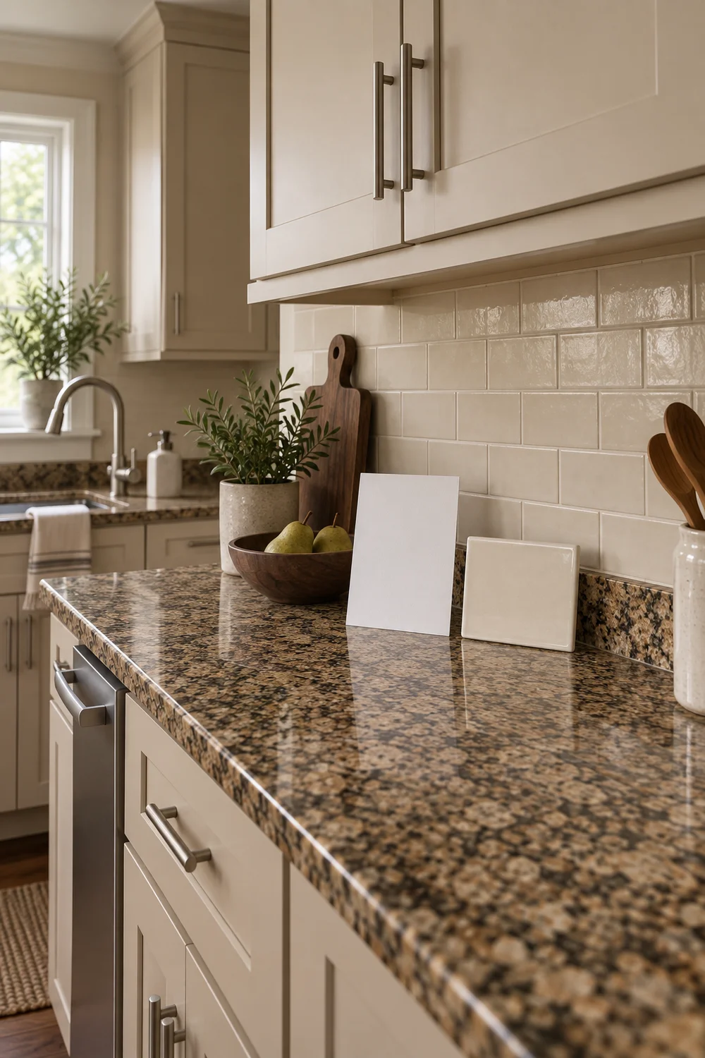
Next, hold a plain white card beside a cabinet door and then beside the stone. The card gives your eye a comparison point; it does not measure the undertone or prescribe a white tile. Notice whether the beige seems more golden, rosy or grey beside it. Repeat the observation in a shaded part of the room. You are looking for a persistent relationship, not trying to assign a perfect colour label from one photograph.
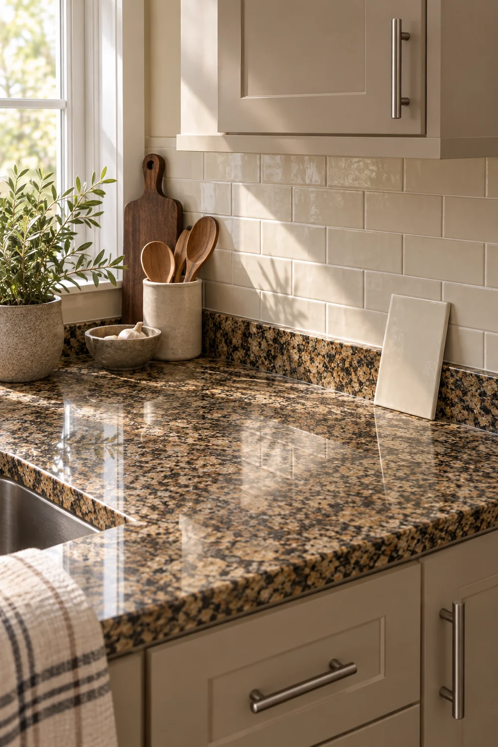
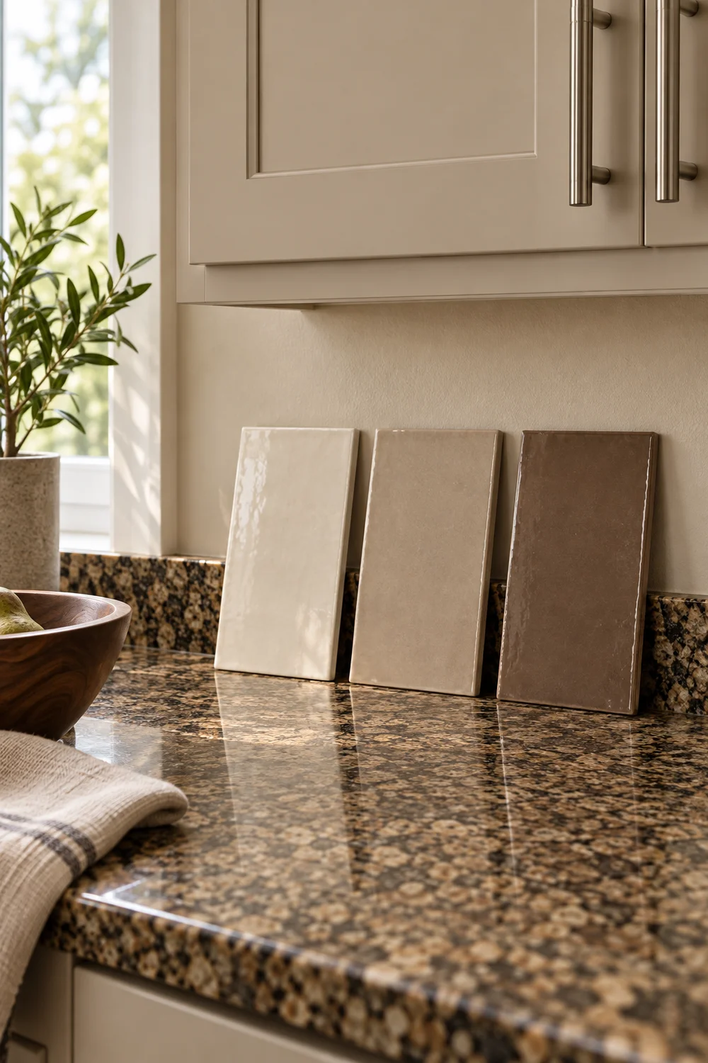
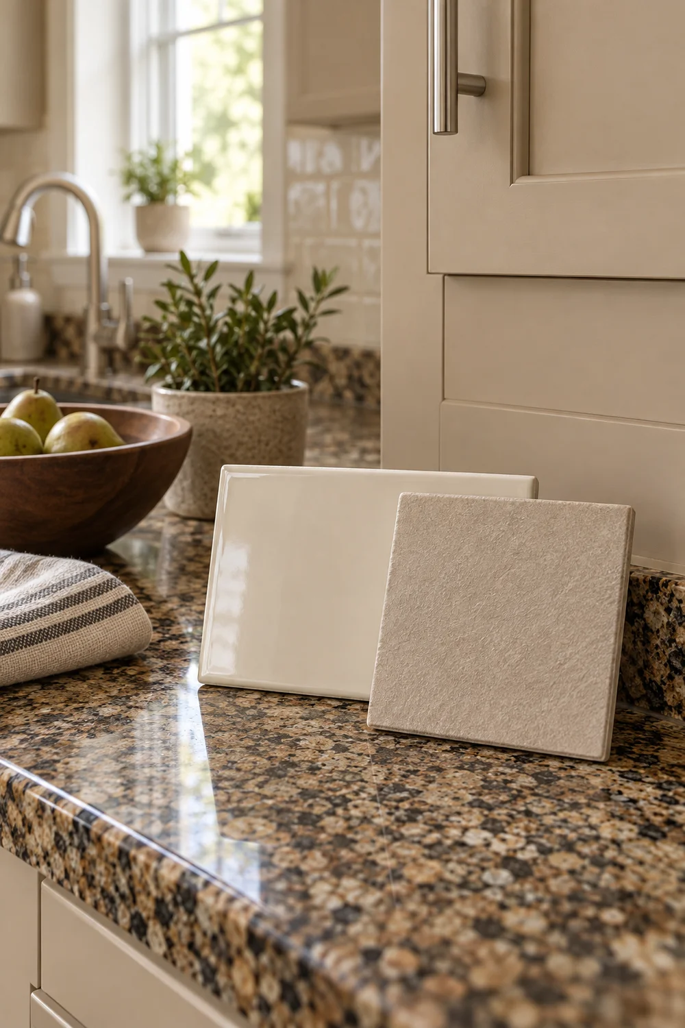
Bring the tile into that same relationship. Prop samples upright against the wall with a cabinet door visible above or beside them and a broad area of granite below. Keep the actual finish facing the room. A tile lying flat on the counter receives different light and may seem to match simply because it reflects the same ceiling. Move the upright samples along the wall, especially where a cabinet casts a shadow.
Write one concrete observation for each option. Try “the cabinet looks pink beside this grey tile” or “the cream tile connects the cabinet to the counter background.” Avoid notes such as “nice” that will tell you very little later. If every sample seems wrong, check whether your shortlist came from a pale fleck instead of the main granite colour. Returning to the large surfaces is often more productive than adding six more shades that differ only slightly.
A soft cream tile is a useful first route when the cabinets and granite both contain warm pale tones. Aim for a visible but gentle distinction from the cabinet colour, rather than an uncertain near match. A smooth ceramic rectangle or square can keep the wall quiet while the granite supplies the movement. Reject a cream that makes the cabinet look unexpectedly pink or that turns conspicuously yellow under the lighting you use at dinner.
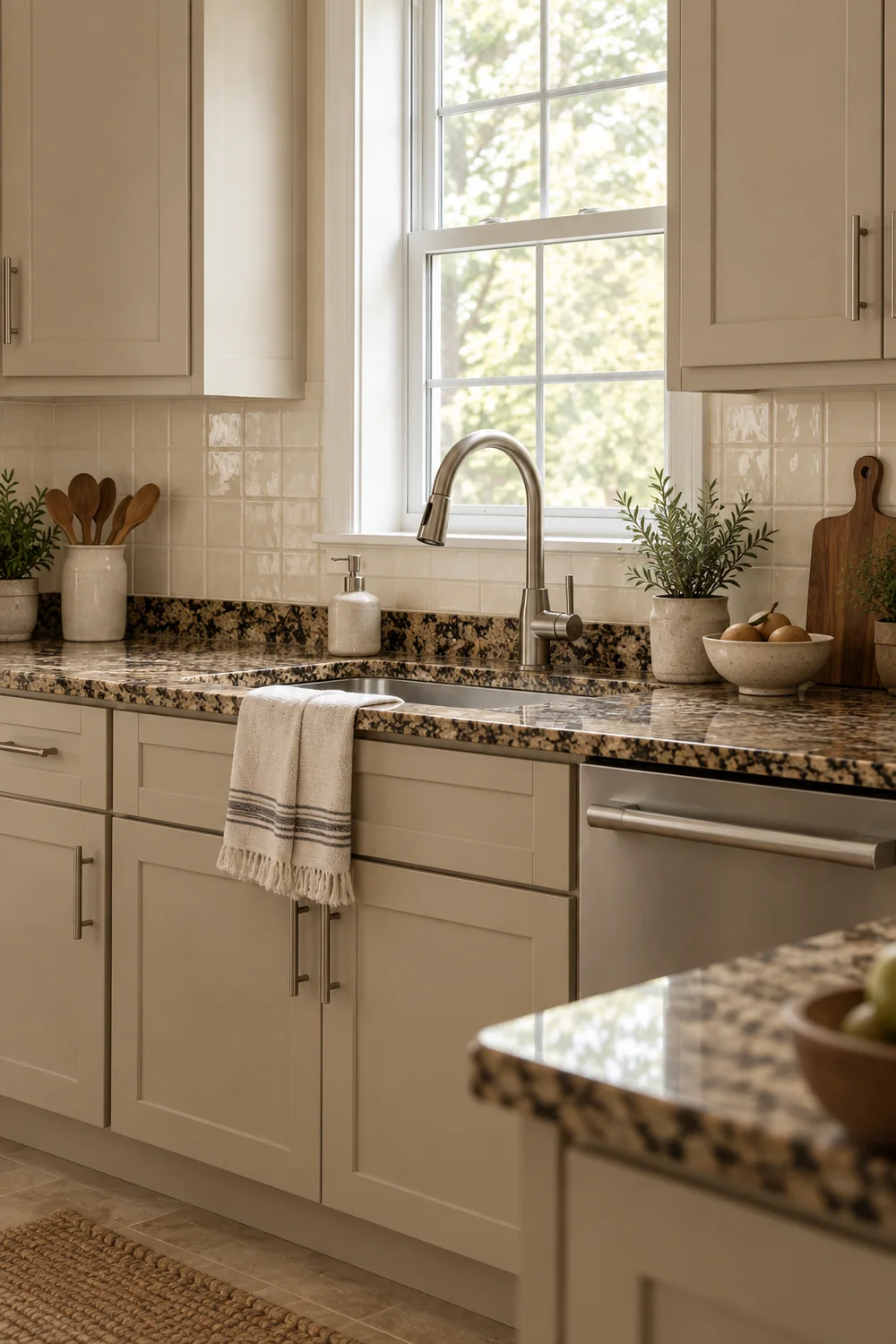
A muted mushroom tile offers a second route when the granite reads as taupe, grey brown or charcoal mixed with beige. This can connect a darker counter to lighter cabinet doors without introducing another strong pattern. The important word is muted. A cool grey chosen from a screen can feel quite different beside warm cabinets. Test the actual tile upright, and judge whether its grey content feels connected to the stone instead of detached from the rest of the room.
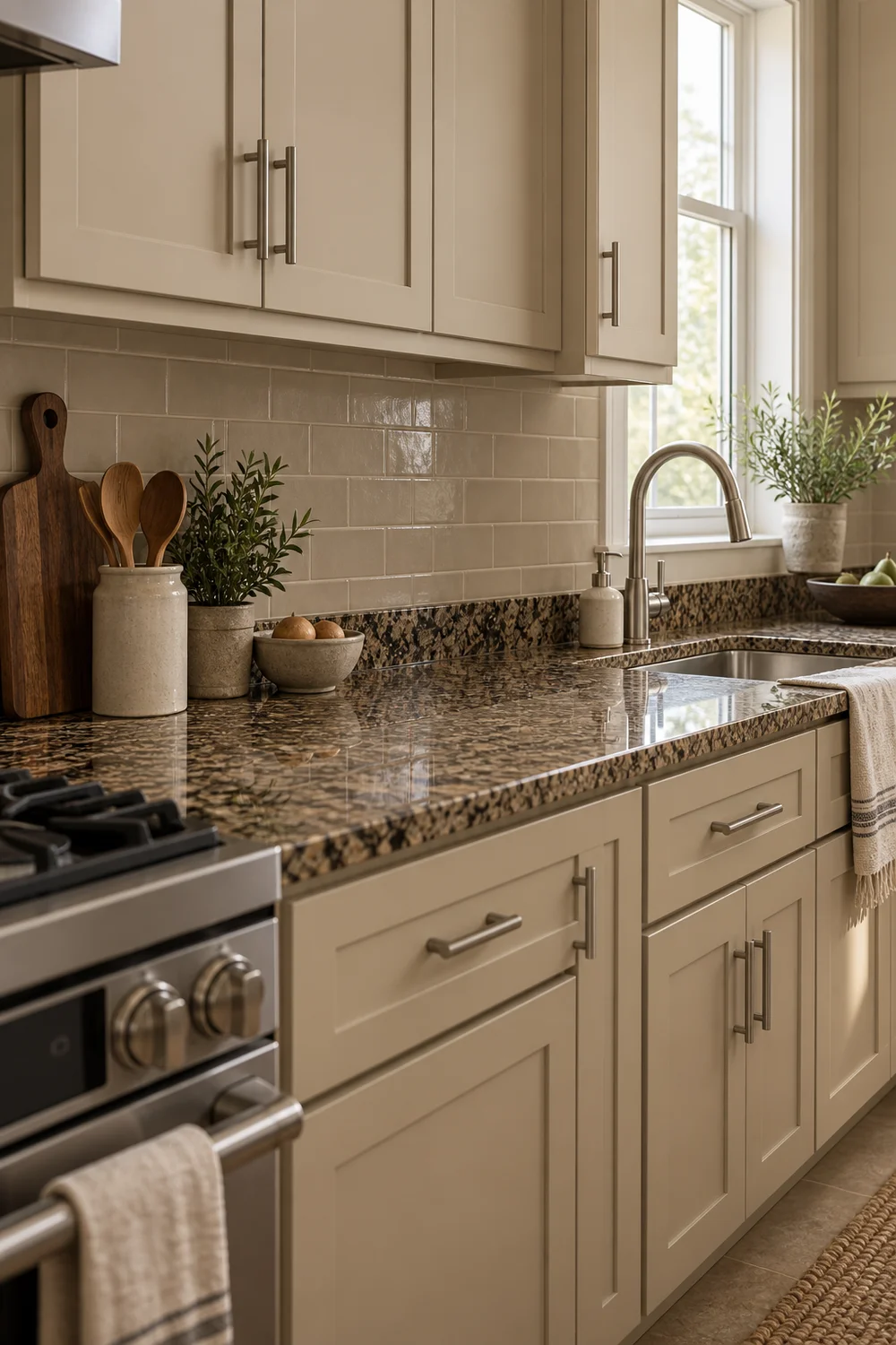
A deeper tobacco or cocoa tile is a third route for readers who prefer a more enclosed, characterful kitchen. It can echo a substantial brown area in the granite and make pale cabinet frames more legible. Use it because you like that depth, not because dark tile is guaranteed to hide marks or make a room sophisticated. Check the darkest corner with the normal evening lights switched on. If the wall becomes a heavy band that you dislike, choose a lighter route.
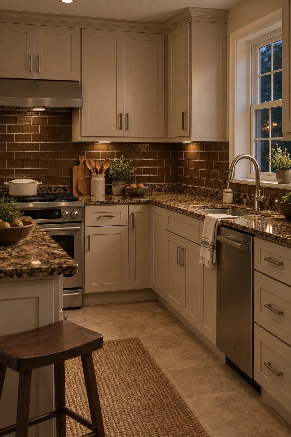
Keep these as alternatives, rather than combining all three. Start with two or three samples from the route that best relates to your retained surfaces. A kitchen with cream tile, mushroom grout, brown mosaic and a contrasting border can quickly accumulate decisions that each need their own explanation. One restrained tile field gives the cabinets and counter a clearer relationship. Shape, surface variation and joints will still provide detail, even when the colour palette is modest.
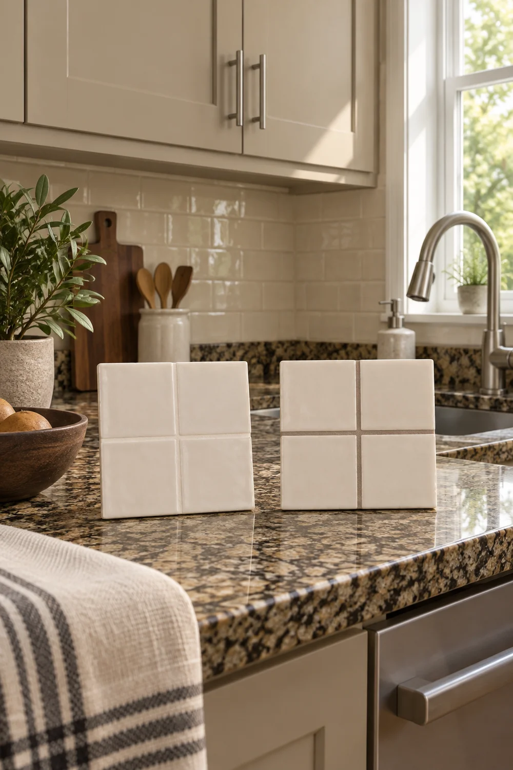
Make a small comparison panel large enough to show several tiles and the proposed joint pattern. Ask the tile supplier or installer how to prepare a representative sample, particularly if the finish varies from piece to piece. A single perfect tile cannot show the range you may receive in a box. Include a realistic grout sample beside the tile or a properly prepared grouted panel before committing to the final combination.
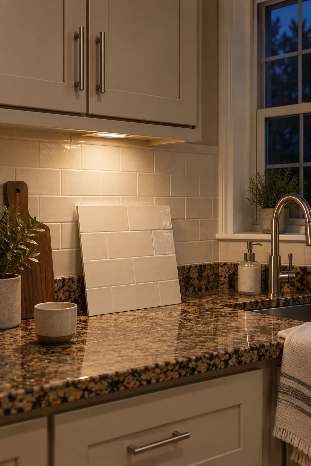
Compare the panel in morning daylight, later daylight and the artificial light you normally use after dark. Leave it in the intended backsplash position, then check it near the sink, below an upper cabinet and at the end of the run. These are different viewing conditions even in a small kitchen. Fireclay’s installation guidance recommends having permanent lighting in place where possible so the final appearance can be assessed. Resolve any planned lighting change before treating your colour decision as final.
Grout controls how strongly the tile layout reads. A grout colour close to the tile usually creates a quieter field; a clear contrast makes the joints more visible. Neither is inherently better. With busy granite, begin by testing the quieter option and decide whether you want more definition. Look across the entire panel instead of studying only one joint. Small tiles create many lines, so a modest colour difference can become a strong pattern across the wall.
Use the same short scorecard each time: cabinet relationship, granite relationship, joint visibility and overall brightness. Record whether each is comfortable, uncertain or unacceptable. Photographs can help you remember the layout, but do not let a phone’s changing colour balance overrule what you see in the room. Reject a sample with a recurring unacceptable result. Approve one only when you can explain why it works in the light you actually live with, including the least flattering corner.
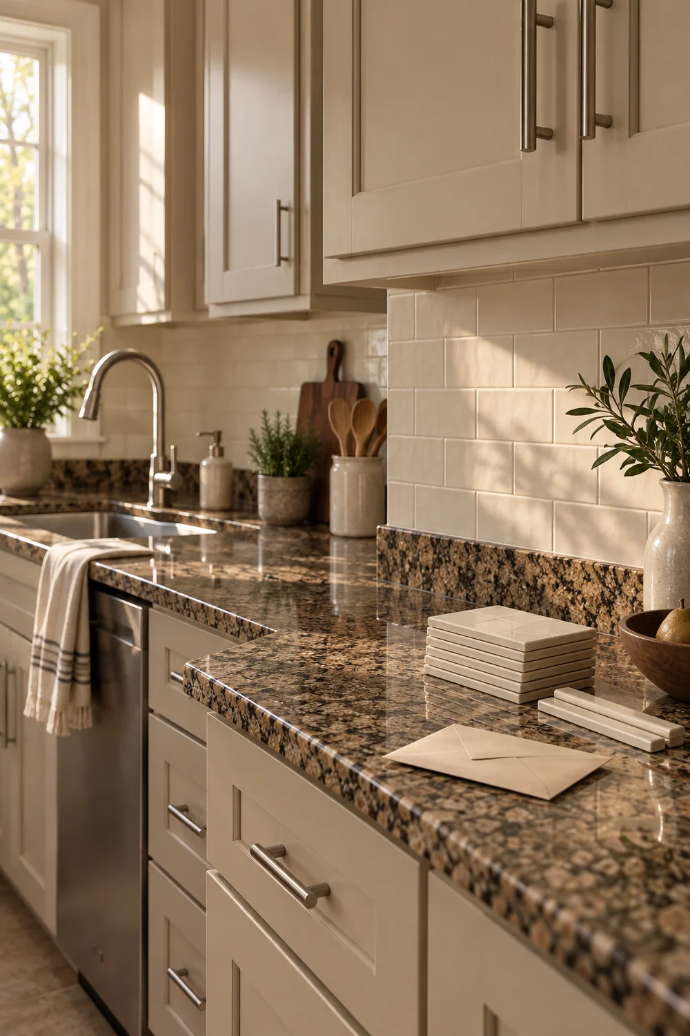
An existing granite upstand is part of the composition, not a detail to leave until installation day. Keeping it creates a stone band between the counter and tile. That can work well when the tile is quiet and the band has a consistent height. Show the full stack in your sample test: counter, upstand, tile and cabinet. Judging the tile against the horizontal counter alone misses the strip that will sit directly beneath it.
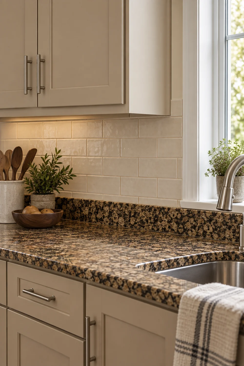
Removing the upstand may give the tile a simpler starting line, but ask an installer or stone professional to assess the consequences before choosing that route. The attachment, wall condition, countertop edge and any gaps behind the stone can affect the work. A photograph cannot establish how cleanly it will come away. Keep your design decision provisional until you know what repair and detailing would be required. Do not make removal a casual weekend step in an otherwise modest refresh.
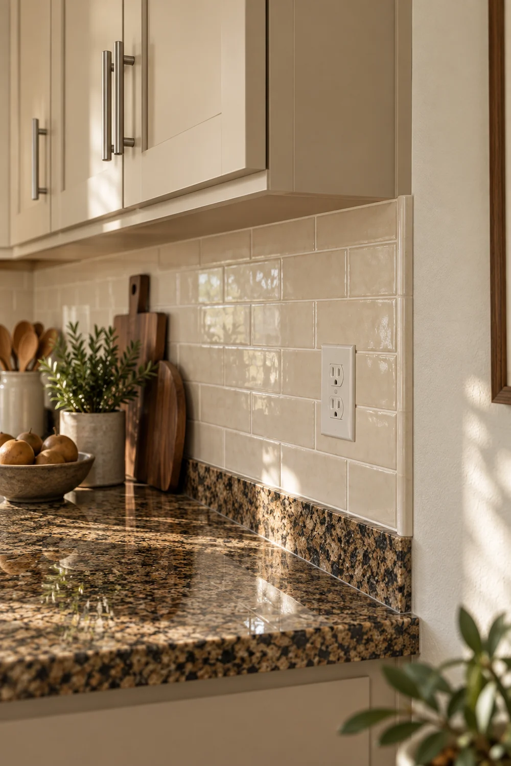
Walk the entire backsplash boundary. Decide where tile stops at a window, an exposed cabinet end, a doorway and the side of a tall appliance. An attractive tile can still feel unresolved if it ends at an arbitrary height or leaves an awkward narrow strip. Ask the installer to draw the proposed first and last rows and show any visible trim. Include the actual tile dimensions and recommended joint size, because nominal sizes alone may not predict the finished layout.
Also identify outlets, switches and appliance connections. Their position affects cuts and the appearance of the field. Have the appropriate trades confirm any electrical adjustments, appliance clearances and wall preparation. The design brief should name those questions without trying to answer them from a decorative image. Approve the edges and transitions at the same time as the colour so that the installed backsplash reads as one considered surface.
Colour is only one part of a useful backsplash. Run your hand over the sample and inspect its edges. A deeply textured tile or projecting profile may appeal in a close photograph but create details you will need to clean around. A smoother surface may be preferable near a frequently used preparation area. Let your own cooking habits and willingness to maintain the finish guide the choice instead of assuming that every pale tile is difficult or every dark tile is forgiving.
Ask the supplier to confirm suitability for the precise location. A product described as wall tile still needs its installation and care instructions checked against the intended use. Discuss areas beside the hob, sink and any appliance that releases heat or steam. Verify the tile, grout, adhesive and substrate as a compatible system with the installer. Decorative appearance is not evidence that a particular product is suitable behind your appliance.
If you choose natural stone, ask what it is and what care it requires. The Natural Stone Institute’s care guidance recommends neutral cleaner, stone soap or mild dishwashing detergent with warm water, and cautions against acidic cleaners even for generally acid resistant siliceous stone. Your existing granite and a new stone backsplash may have different finishes or treatments. Keep the specific supplier instructions for each rather than assuming one cleaning product suits every surface in the kitchen.
For ceramic or porcelain, request the actual care guidance too. Ask about glaze variation, grout staining precautions and any preparation required before grouting. A sample is useful for understanding the finish, but do not perform improvised chemical tests that the supplier has not approved. Your final choice should be attractive in ordinary use and supported by instructions you can follow. That is a firmer basis for a purchase than an unsupported promise that a material is maintenance free.
Keep the approved sample and write down its manufacturer, range, colour, finish and exact size. Record the grout product, colour and proposed joint size alongside it. Include trim details and the agreed tile orientation. Without that information, a verbal request for warm cream tile can drift into a different glaze or a stronger grout line when materials are ordered. The sample should remain available for comparison when the delivery arrives.
Ask the installer to measure the actual tiled areas and calculate the order quantity, including cuts, layout and appropriate spare material. Do not apply a universal extra percentage without considering the pattern and product. A simple rectangular layout and an intricate diagonal layout can create different cutting needs. Confirm the supplier’s batch and variation guidance, delivery timing and return policy before ordering. Reserve any required trim and special pieces at the same time as the field tile.
Put the sequence in writing: assess the existing wall and upstand; confirm any repairs or service changes; approve the layout and edges; protect retained cabinets and granite; install according to the product system; then complete the specified cleaning and curing steps. Agree who is responsible for each handoff. If the preparation reveals a different wall condition, review the scope before proceeding rather than asking the installer to improvise around an unapproved detail.
Finally, agree what you will review before the job is considered finished. Compare the installed colour range with the approved sample, check visible edges and the agreed layout, and review joints and transitions with the installer. Collect care instructions and labelled spare material. Your brief has done its job when the people carrying out the work can understand both the technical scope and the appearance you approved, without relying on a saved photograph of somebody else’s kitchen.
The right backsplash begins with the beige cabinets and granite you intend to keep. Read those large surfaces together, choose a restrained colour route, and test the tile with grout in the actual room. Give the upstand, stopping points and daily care the same attention as the colour. You do not need a perfect match between every surface, and you do not need to replace a useful counter because an isolated sample looks wrong beside it. You need a combination that makes sense across the room and holds up to ordinary changes in light. Keep the approved panel, record the exact specification and let that evidence guide the installation. A small, clearly resolved decision can give the whole kitchen a more settled appearance.