Newsletter Subscribe
Enter your email address below and subscribe to our newsletter
I’ve always believed a black and white palette does more work on a ranch exterior than almost any other combination. What I love most is how it holds its own whether you lean modern farmhouse, desert minimal, or even a little boho. In this roundup I walk through 21 distinct looks, touching on everything from limewashed brick and single slope rooflines to porch decor and porte cocheres. Every one is a look you can lift straight onto your own house.
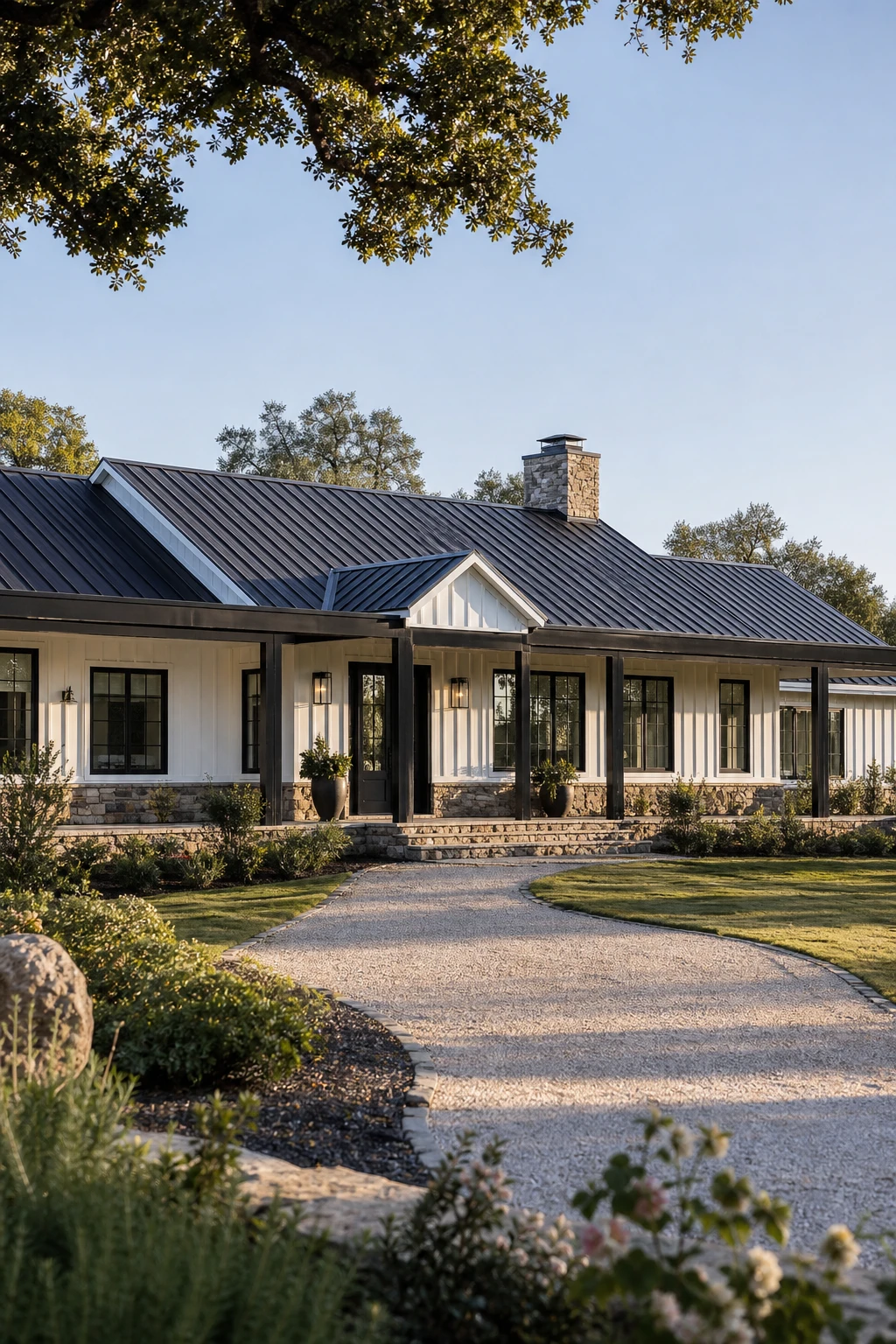
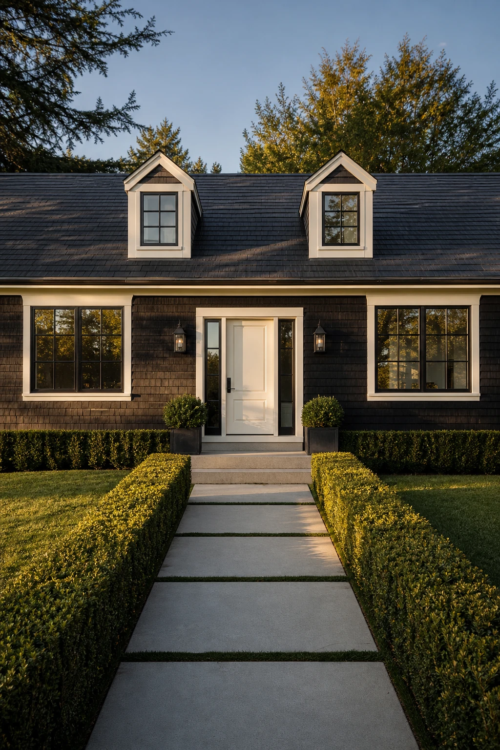
I’ve always loved how white board and batten siding gives a ranch home that clean, almost tailored quality, like a freshly pressed shirt against a wide open sky. The vertical lines pull the eye upward and add a quiet sense of height to a naturally low lying form. When you bring in matte black at the windows, posts, and roof, those elements stop the eye just long enough to read as intentional and confident. The result is a facade that feels both rooted and refined, which is exactly why this pairing keeps showing up on newly built homes and renovated ranches alike.
The Key Details
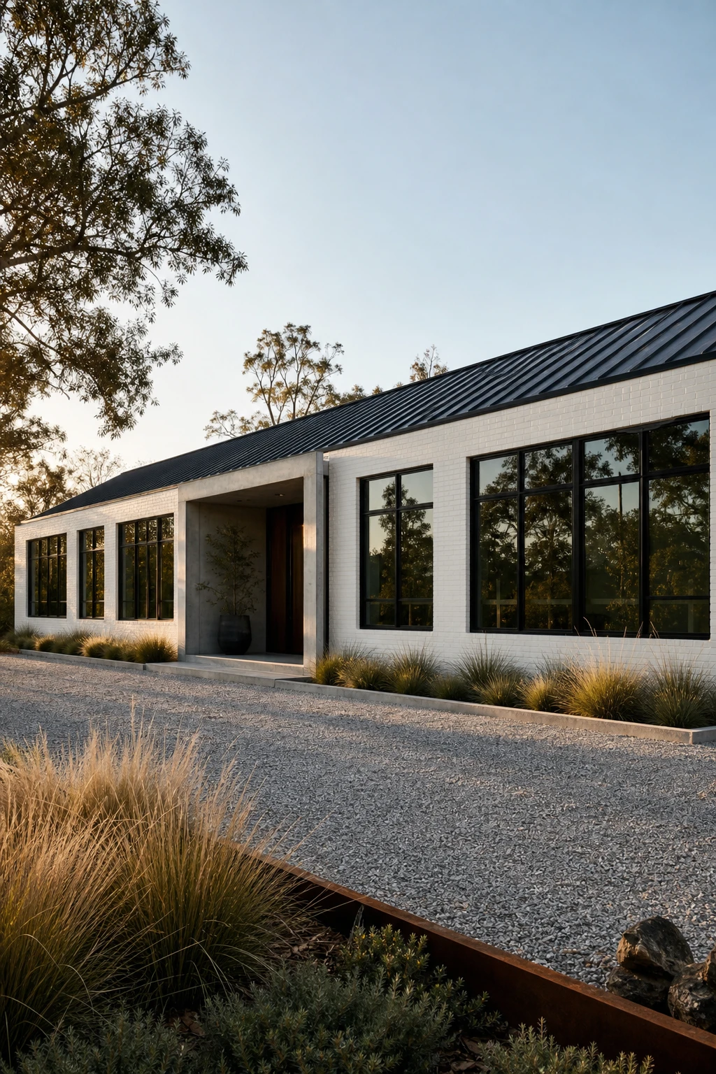
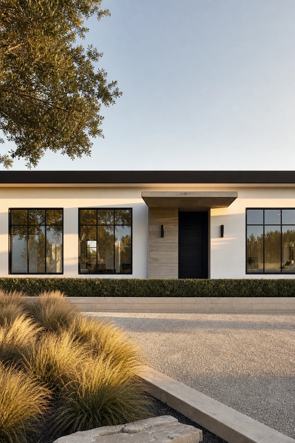
White brick has so much natural texture and depth that it almost asks for something sharp to pull it together, and black window frames do exactly that. I love how the dark frames read like bold pencil lines drawn across the facade, giving the eye a clear place to land on each opening. Because the frames carry all the graphic weight, you get a finished, considered look without any fussy trim moulding or decorative detail cluttering the wall. The whole exterior feels calm and confident at the same time.
The Key Details
Get The Look
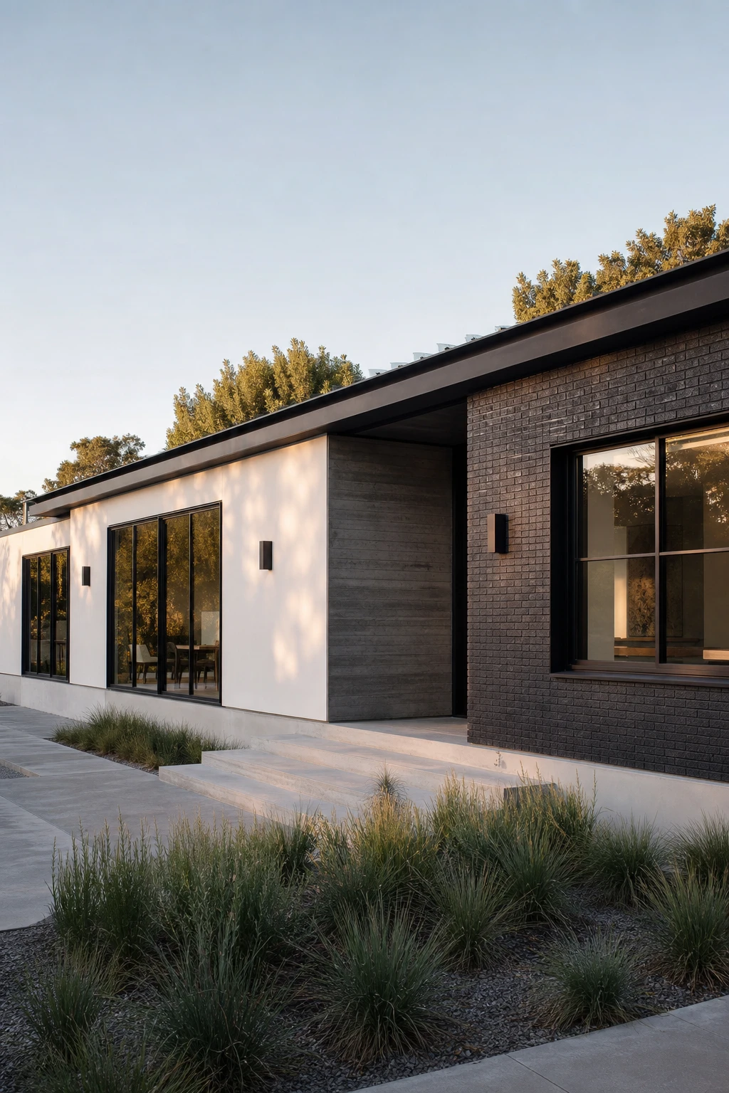
I’ve always loved what happens when two materials sit side by side on a long ranch elevation and each one gets its own clear territory to live in. The brick anchors the heavier, grounded zones while the stucco lifts the wall and gives it a cleaner, quieter surface, so the eye moves along the facade and finds something new without feeling confused. That contrast is what turns a flat horizontal run of wall into something that feels composed and considered. When the boundary between the two sits right at a structural break, a corner, a beam, or a recessed entry, the whole thing reads as a decision rather than an accident.
The Key Details
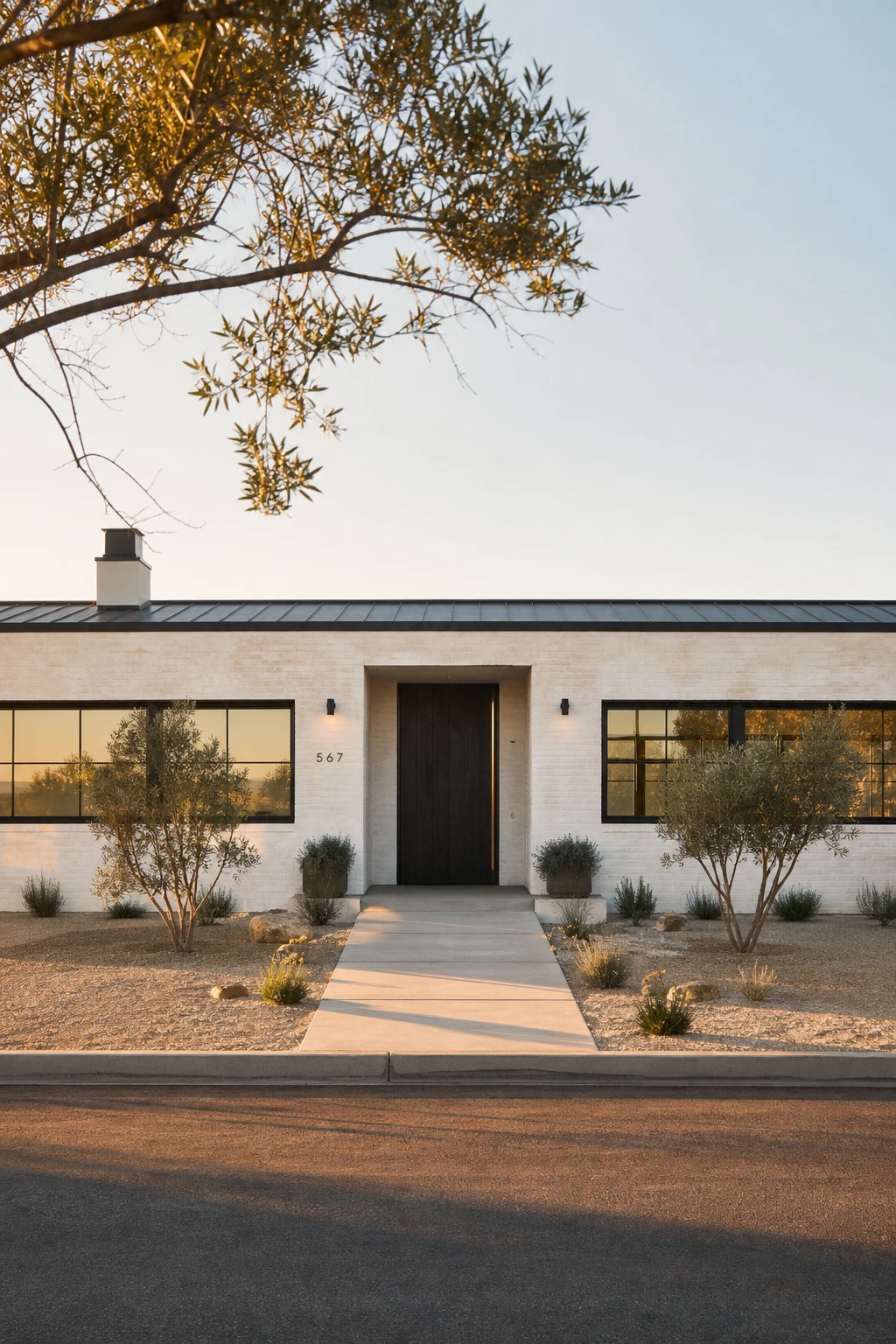
Limewash does something a tin of regular paint simply cannot. It soaks into the surface unevenly and builds up in layers, so the white you end up with has depth and shadow and a little warmth baked right into it. I’ve always loved how that tonal variation makes a long, low ranch facade feel like it has been standing quietly for a hundred years rather than painted last spring. Those horizontal lines that define a ranch become something gentle and European rather than stark, and the matte black frames and dark pivot door read even sharper against a white that breathes like this.
The Key Details
Get The Look
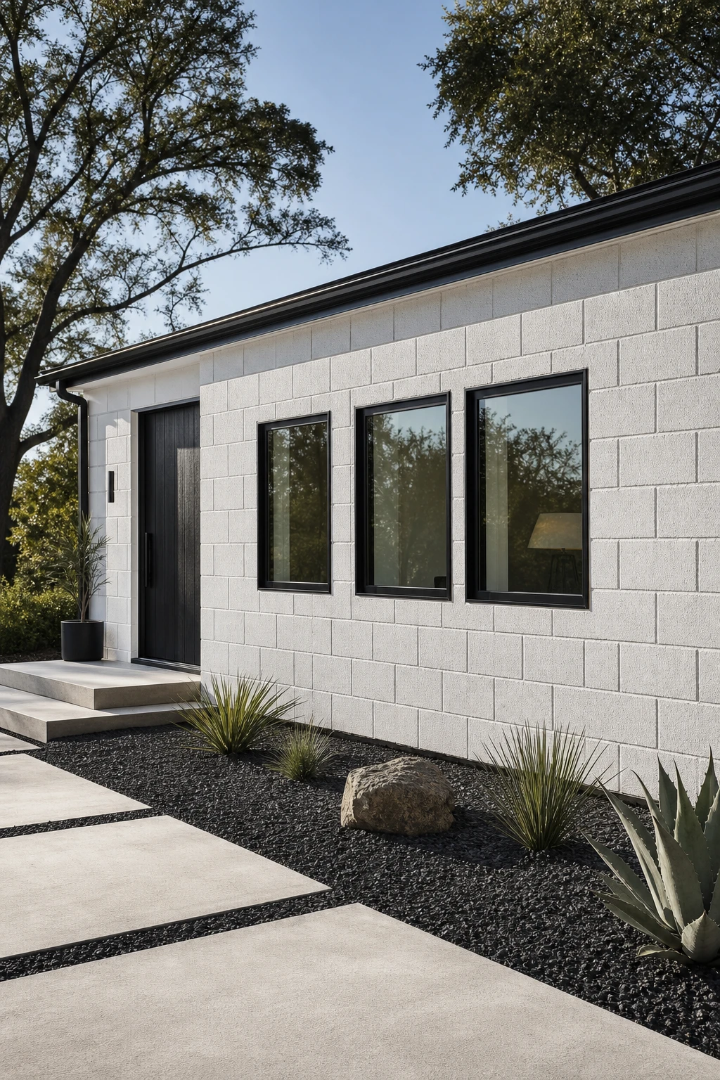
I have always loved how painted cinderblock stops being a budget compromise and starts looking like something you chose on purpose, the moment you commit to a clean, near white tone across the whole facade. The grid of mortar joints gives the wall a quiet, repeating pattern that sits somewhere between raw texture and refined geometry, which feels completely at home on a low, horizontal ranch form. Keeping the colour tight, think a warm white like Strong White rather than a bright stark white, lets the block’s natural shadow lines do the visual work without the wall feeling cold or unfinished.
The Key Details
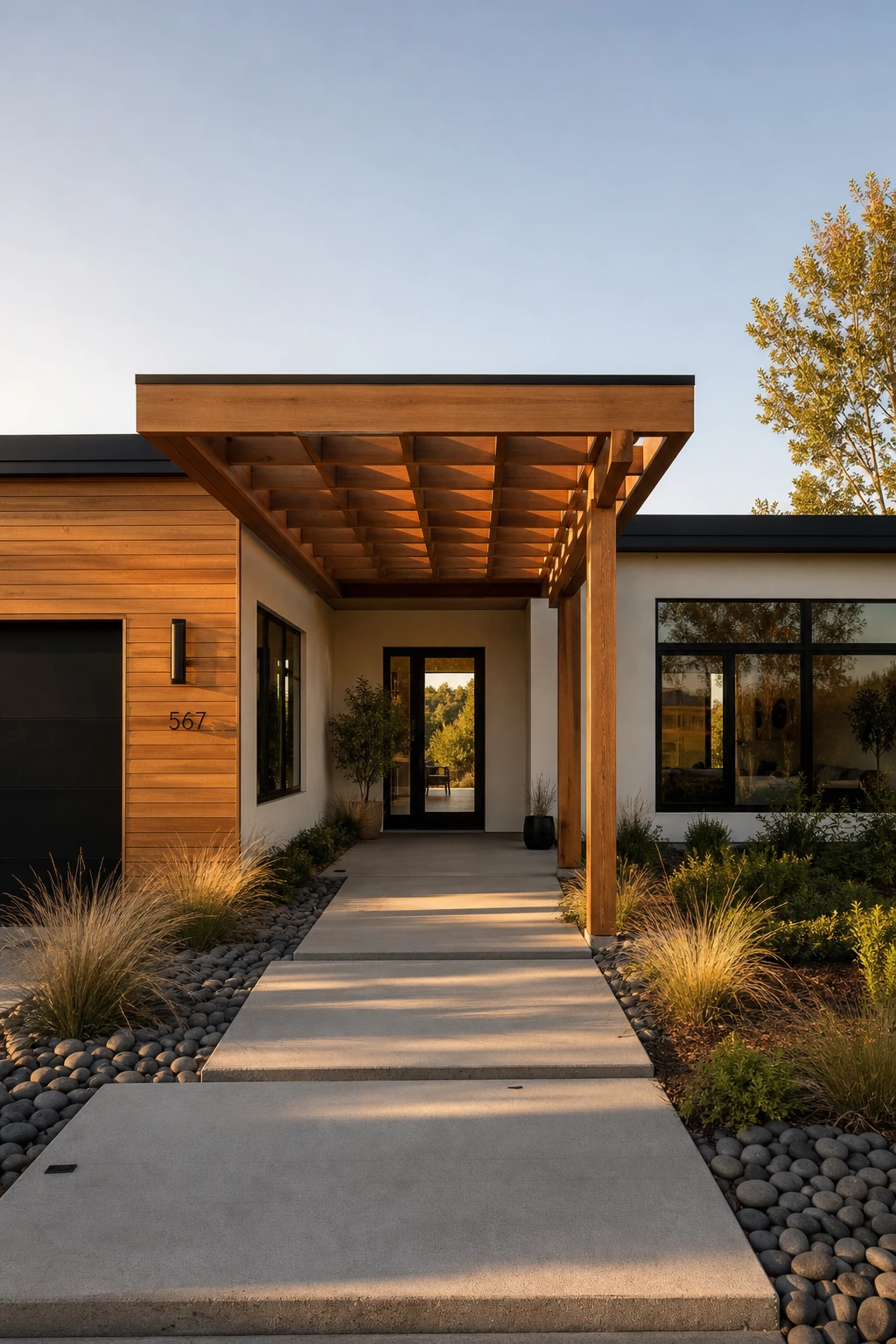
I have always loved what a single run of cedar does to a black and white facade. It pulls the eye to the entry or the garage line and gives the whole front of the house a temperature, something you can almost feel. The lesson here is simple: you do not need warmth everywhere, just in one deliberate spot. One material, used consistently at the pergola, the fascia, or the front door surround, stops that high contrast palette from reading as cold or corporate.
The Key Details
Get The Look
I’ve always loved how a flat roofline strips away every bit of fussiness and leaves only pure horizontal lines, and against a black and white facade that effect becomes almost architectural sculpture. The sharp flat edge at the top of the house works like a picture frame, containing the bold contrast below and giving the eye a clean place to stop. Where a pitched roof would pull your gaze upward and soften the geometry, the flat line holds everything low and deliberate, which is exactly what makes a modern ranch feel so confident. Pair that with smooth white stucco and oversized black steel casement windows and the whole exterior reads as one composed, graphic statement.
The Key Details
Get The Look
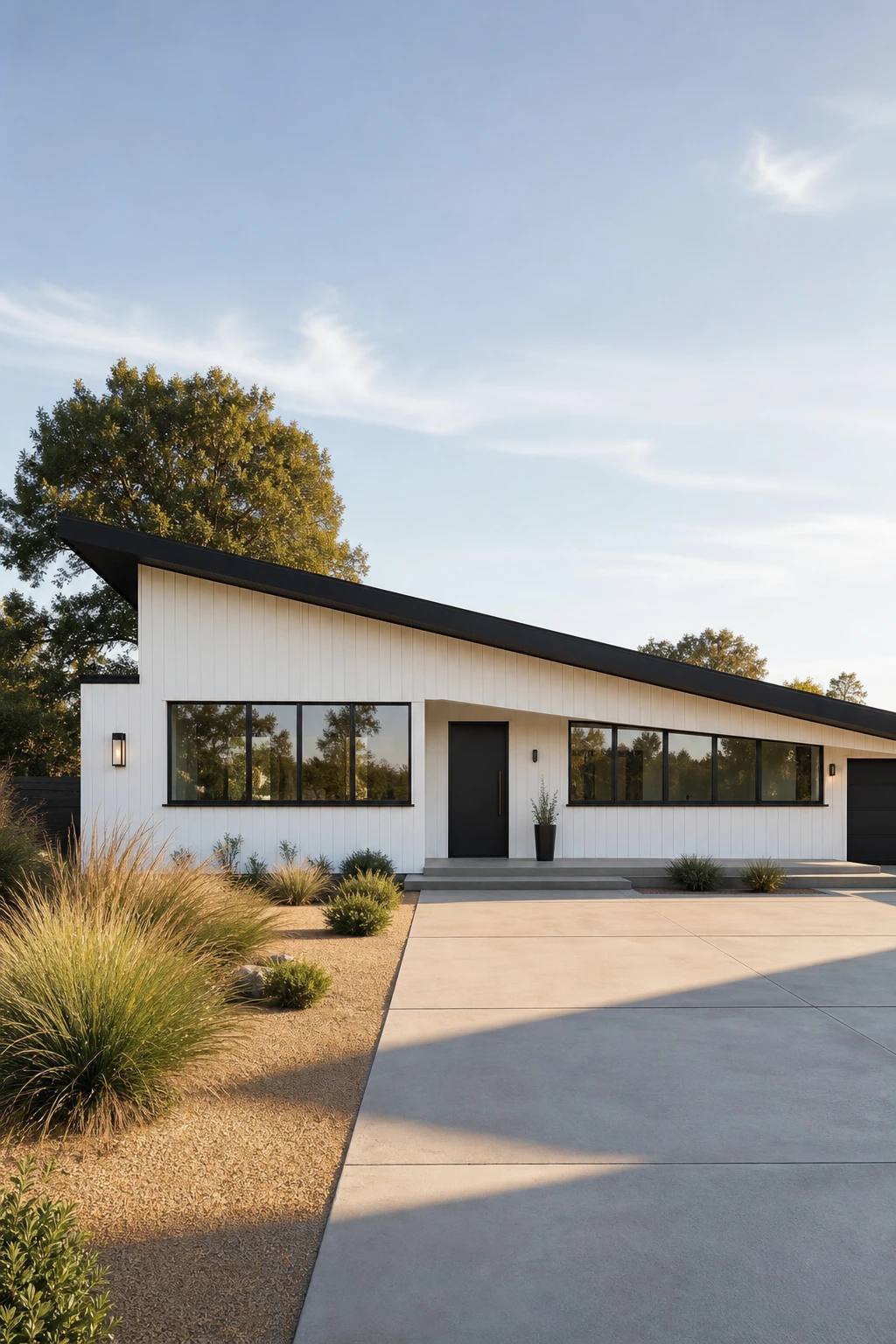
I’ve always loved how a single slope roof turns a simple ranch into something that looks like it was drawn by hand with purpose. The diagonal line pulls your eye from one end of the house to the other, so even a low, long building reads as a complete composition rather than just a box. Paired with black vertical board and batten and those slim casement windows, the shed roofline gives the whole facade a quiet drama that feels sculpted rather than accidental. Every angle from the street tells the same clean story.
The Key Details
Get The Look
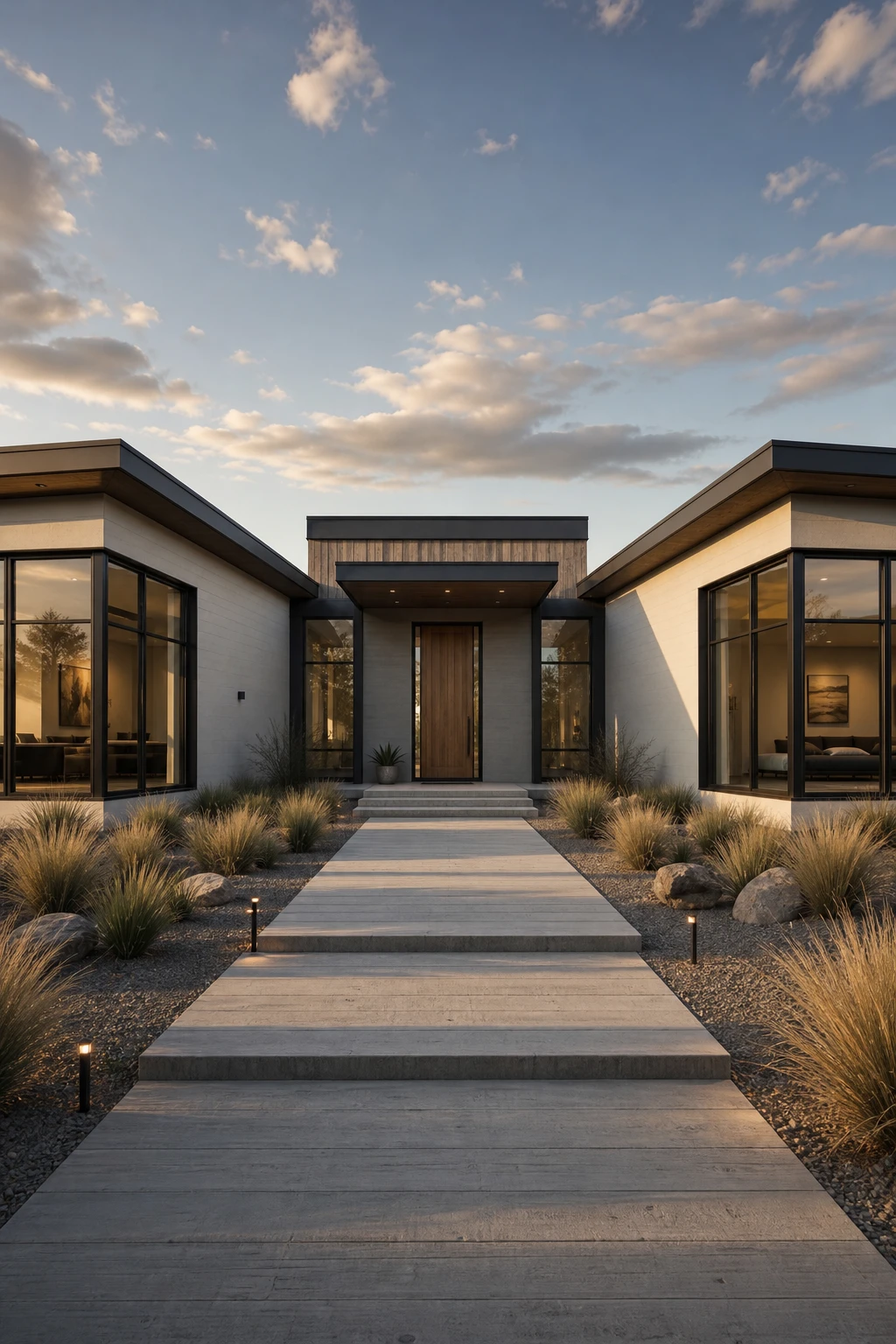
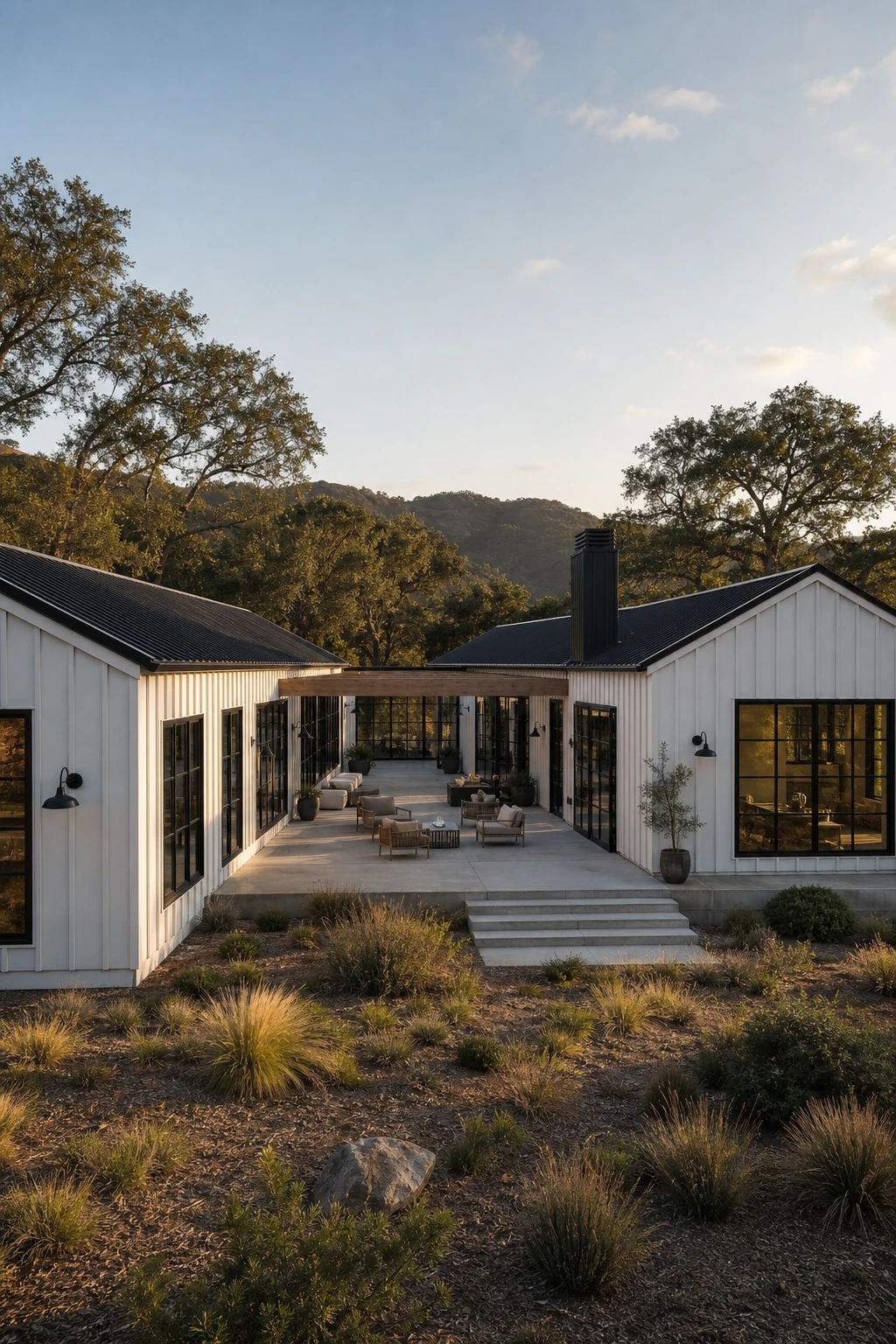
I’ve always loved what a winged layout does to a ranch that would otherwise read as a single long box. Pulling the floor plan out into angled side wings gives the facade a clear centre point and two quieter flanks, so your eye travels across the whole front rather than just sliding off one end. The black and white palette matters here because the contrast deepens every shadow line the wings create, and those shadows are exactly what telegraph the depth and dimension of the composition to someone standing at the kerb. It is that combination of bold geometry and strong tonal contrast that lifts this house above its neighbours without adding a single extra storey.
The Key Details
Get The Look
Bending the ranch into an L shape is one of my favourite moves on a generous lot because the two arms of the house do the heavy lifting for you, wrapping three sides of an outdoor space that feels genuinely sheltered without a single fence in sight. The courtyard that opens up at the junction becomes a room you simply walk out into rather than a yard you wander off to, and that closeness to the interior is what makes it feel like real living space rather than leftover land. The black steel casement windows lining both arms face inward so the courtyard gets that warm, gallery like quality where you feel held by the architecture from every angle.
The Key Details
Get The Look
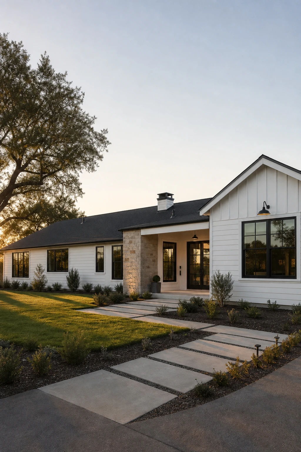
I love transitional style because it refuses to pick a side, and that is exactly what makes it so liveable. Here, horizontal shiplap and stacked natural stone bring the warmth and texture people associate with a classic ranch, while matte black divided light windows and clean proportions push the whole thing forward into something that feels very now. The result is a facade that reads as calm and considered rather than trendy or stuck in time. That balance is the whole lesson: you are not mixing eras randomly, you are choosing one traditional material and one modern gesture and letting them do the talking together.
The Key Details
Get The Look
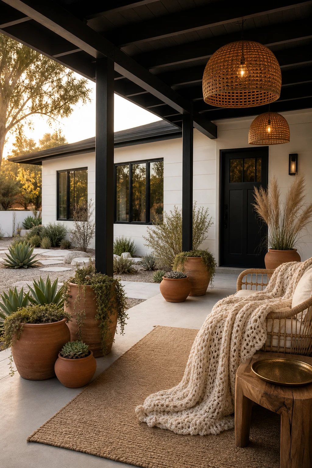
I’ve always loved how a crisp white and black shell actually gives boho layers more room to breathe, because there is nothing competing with them. The terracotta, the woven textures, and the soft pampas grass all read warmer and richer against a clean pale wall than they ever would against a busy backdrop. What makes this work is that the house does the quiet work and the accessories do the soul work, so you get both feelings at once without either one cancelling the other out.
The Key Details
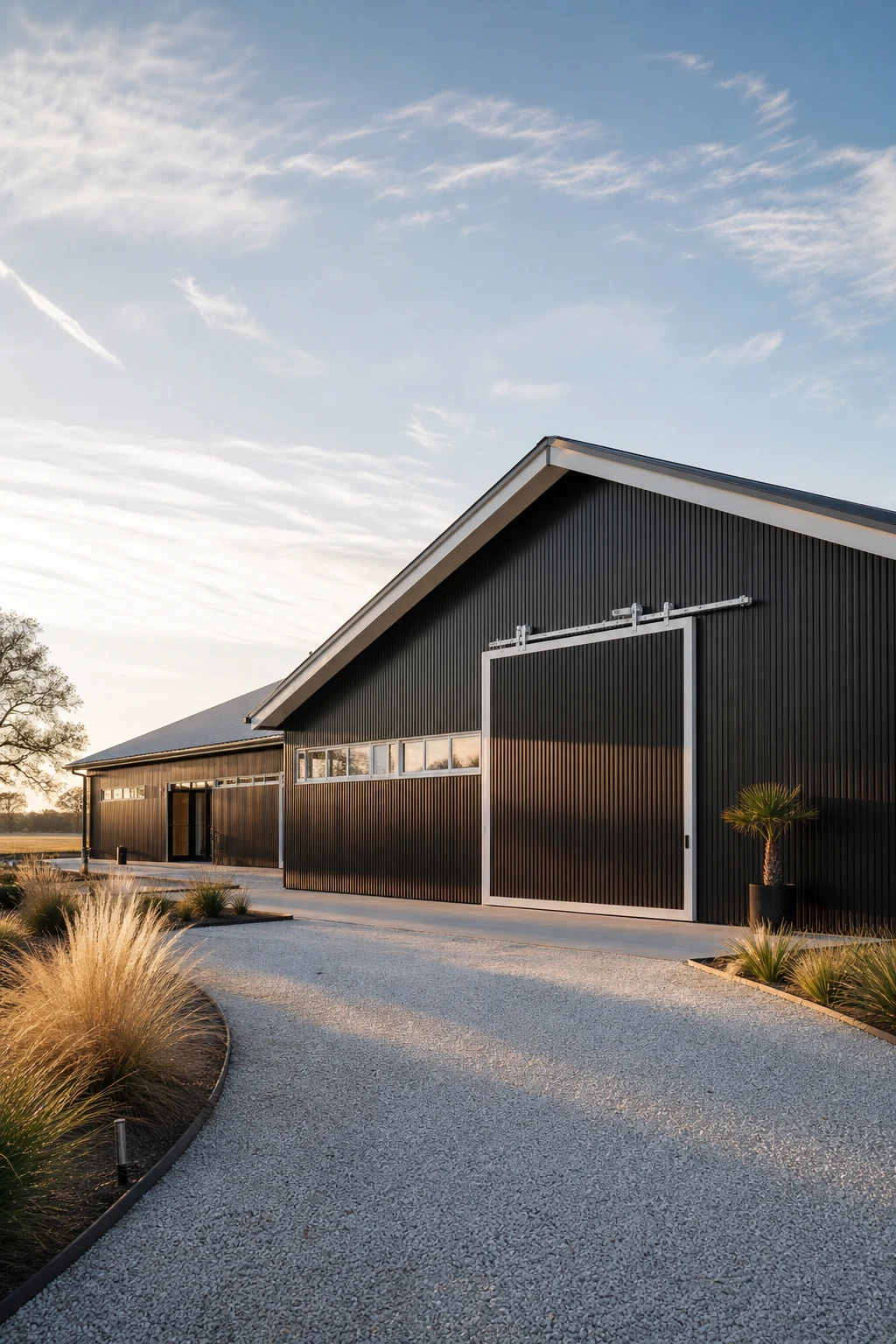
A barndominium shell hands you something most traditional builds never could: a single wide open span with no load bearing walls cutting up your view or your floor plan. Painting that corrugated steel a deep, near matte black turns a utilitarian structure into something that reads as bold and intentional rather than agricultural. White trim at the fascia, around the windows, and across the sliding door pulls the eye to every edge, giving the whole facade a crisp graphic quality that feels very current. The result is a home that looks like it was designed rather than just built.
The Key Details
Get The Look
Cape Cod buildings have always had a quiet confidence about them, and I think it comes from that strong central symmetry and the way shingles give the wall a soft, layered texture without any fuss. When you strip away the decorative trim and repaint everything in a strict white and charcoal palette, that same bones level balance reads as something fresh and modern rather than nostalgic. The single storey ranch footprint actually helps here because the roofline sits lower and the dormers become small punctuation marks rather than dominant features, so the whole facade feels calm and grounded. Pairing steel framed casement windows with weathered cedar shingles is what keeps the nod to Cape Cod honest without letting it tip into pastiche.
The Key Details
Get The Look
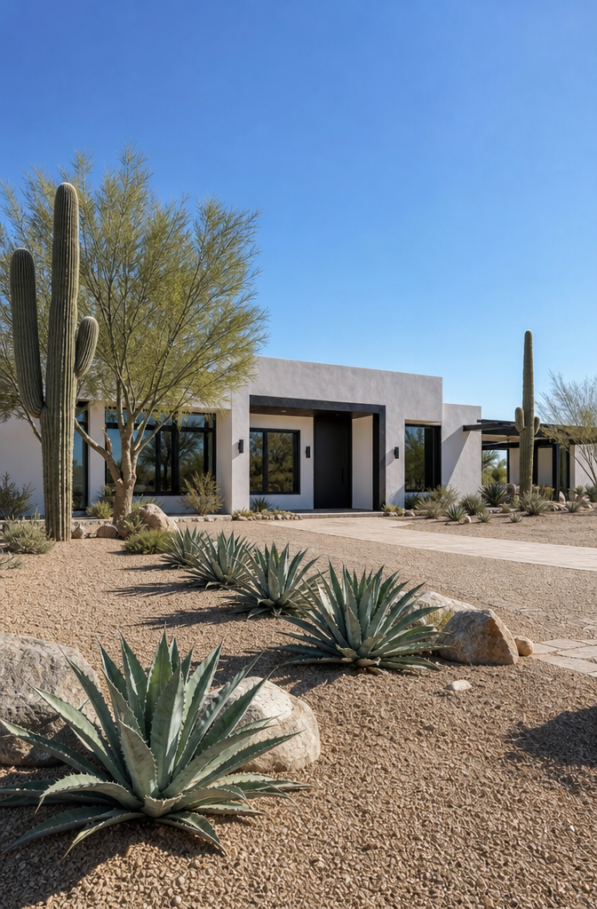
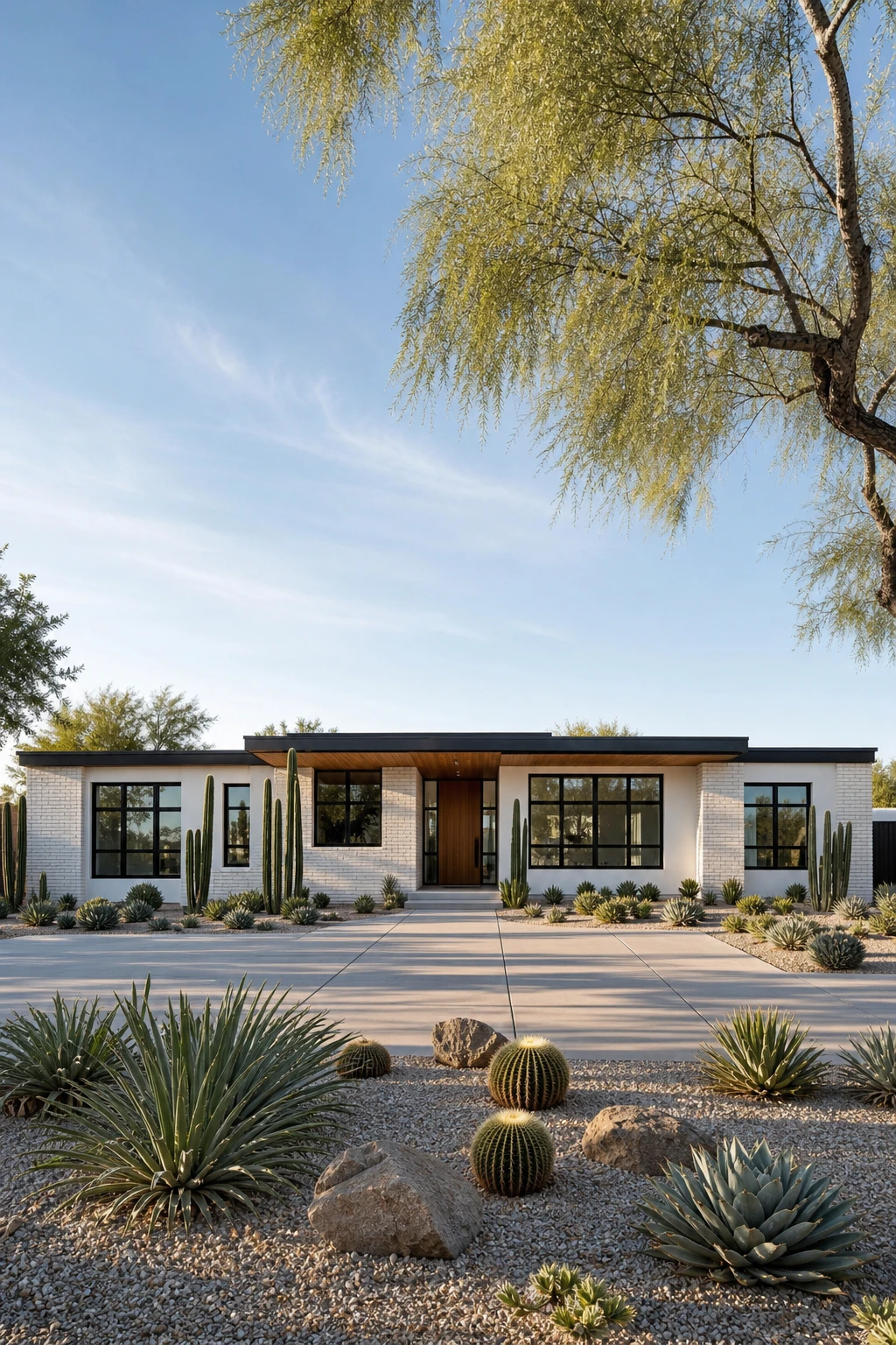
I love how desert minimalism asks so little yet gives so much back. A white stucco body bounces harsh sunlight away from the walls and reads as calm and clean against a dusty, sun bleached sky. The black steel details on the door and windows act like sharp ink lines on a blank page, giving the whole facade a quiet confidence without fighting the landscape. What really pulls it together is letting the planting carry as much visual weight as the architecture, so the agave, boulders, and decomposed granite feel like a continuation of the house rather than an afterthought.
The Key Details
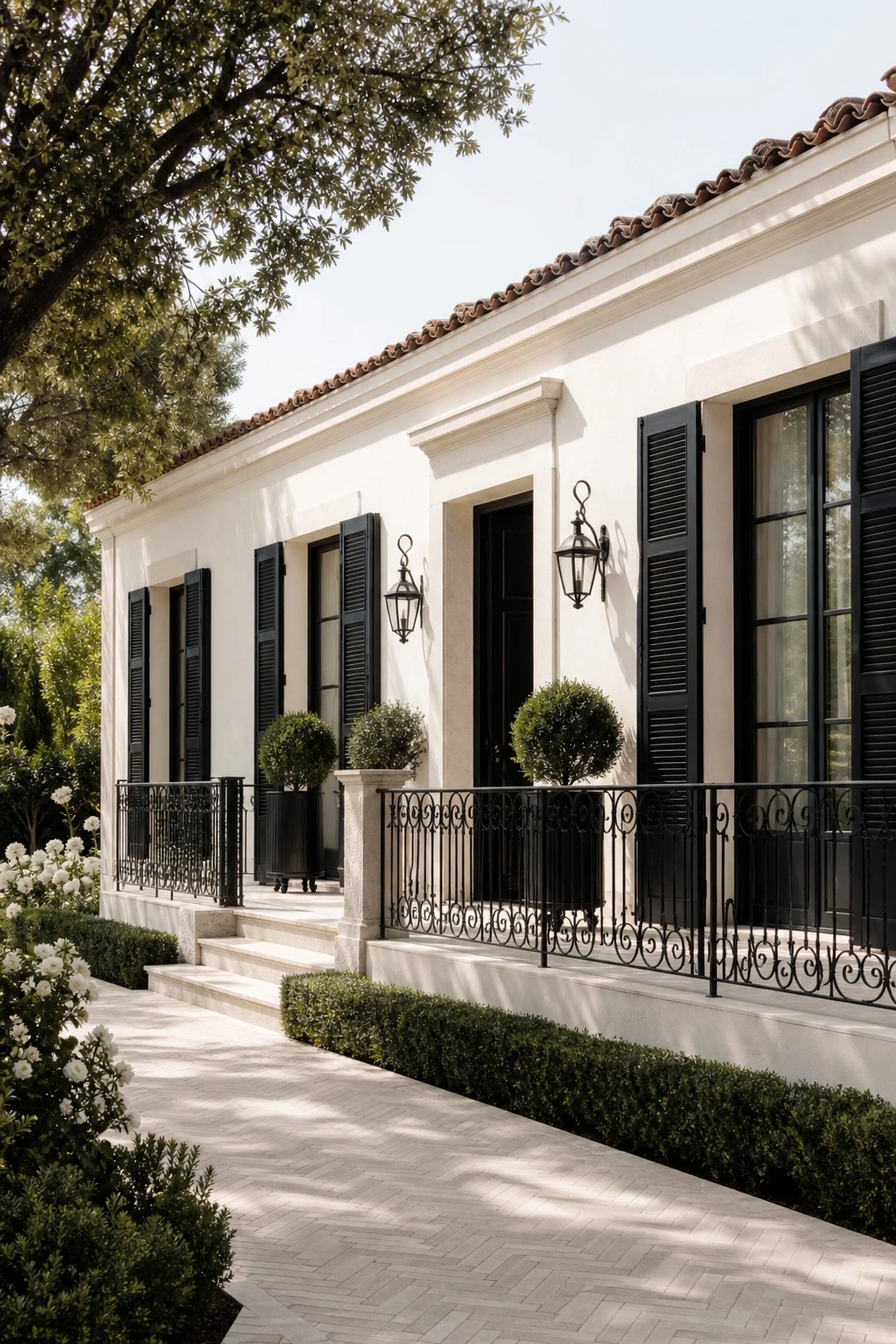
I fell for this combination the moment I saw a Paris side street where every building was just one or two storeys and still felt utterly refined. What makes it translate so well to a ranch is the way a creamy stone palette and tall black shutters give the eye vertical lines to follow, so the low roofline stops feeling like a limitation and starts feeling intentional. The iron balustrades add a delicate layer of shadow and texture that reads as crafted rather than decorated, and that quiet restraint is exactly what separates sophistication from show. The whole picture earns its elegance through proportion and material honesty rather than ornament.
The Key Details
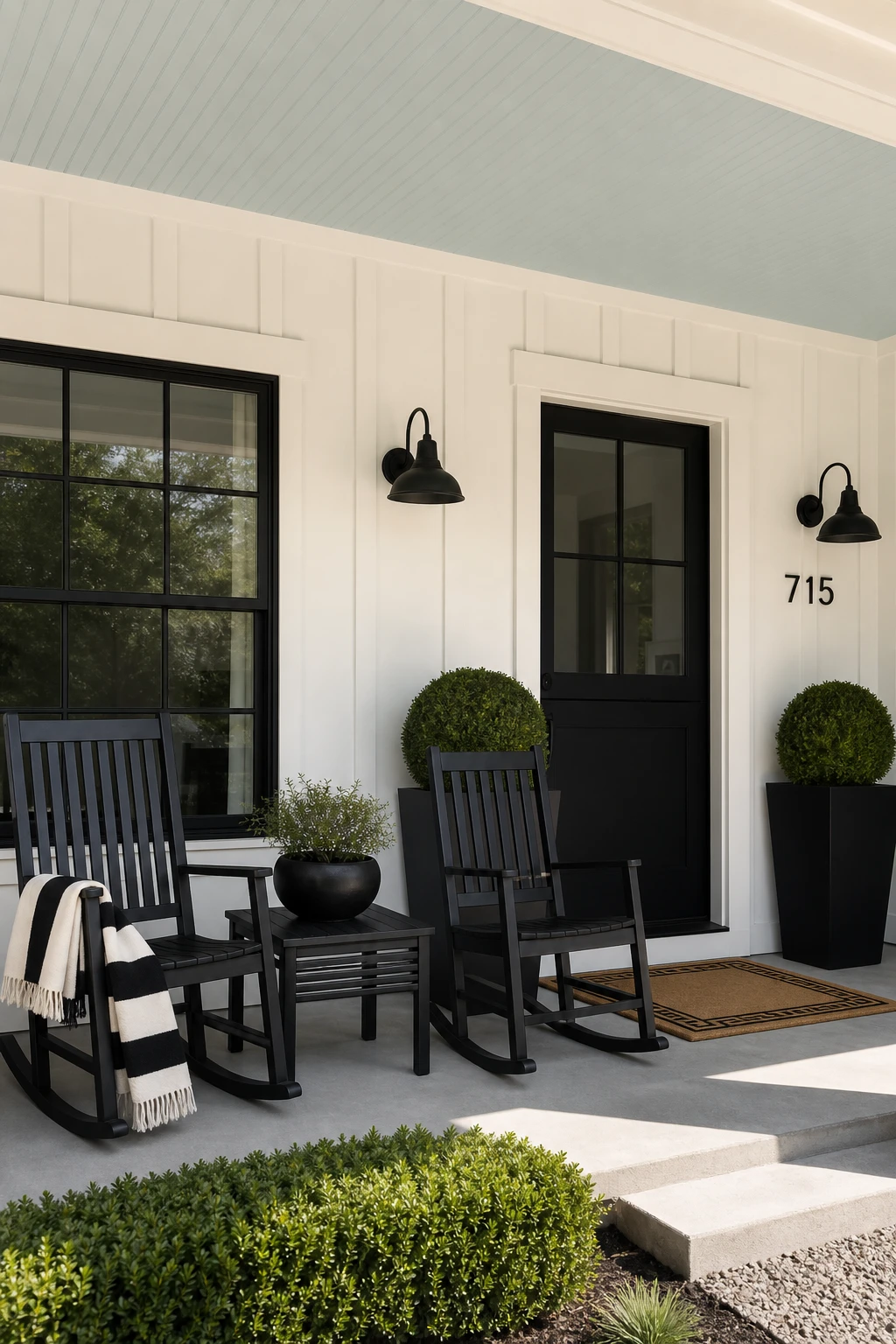
A front porch that commits to black and white tells you exactly what kind of home you are walking into, and I love how that confidence reads from the street before anyone rings the bell. The matte black rocking chairs anchor the space with weight and intention, while the striped throw and geometric doormat pull the eye through layers of pattern without ever leaving the two tone lane. Clipped boxwood topiaries in black planters bring in life and softness, and that touch of green actually makes the black feel richer rather than competing with it. The whole composition turns the porch into a full stop at the end of the exterior sentence.
The Key Details
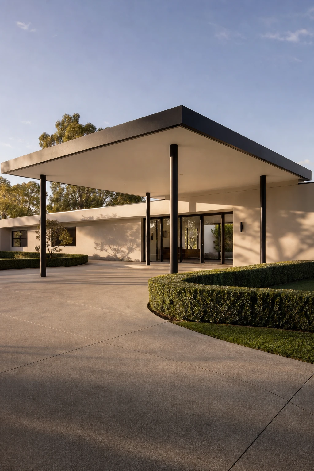
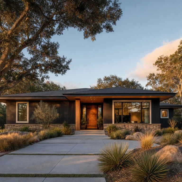
I have always thought a porte cochere is one of those features that does two jobs at once and does both brilliantly. The flat canopy reads as a strong horizontal line that stretches the ranch facade wider and lower, which is exactly the silhouette this style wants. Slender black steel columns hold it up without blocking the view, so the whole thing feels light rather than heavy. Farrow and Ball Elephant’s Breath on the soffit ties the canopy back to the house and makes the arrival feel composed and intentional from the moment you pull into the motor court.
The Key Details
Get The Look
Farrow & Ball Elephant’s Breath
Flat Roof Steel Carport Canopy Kit
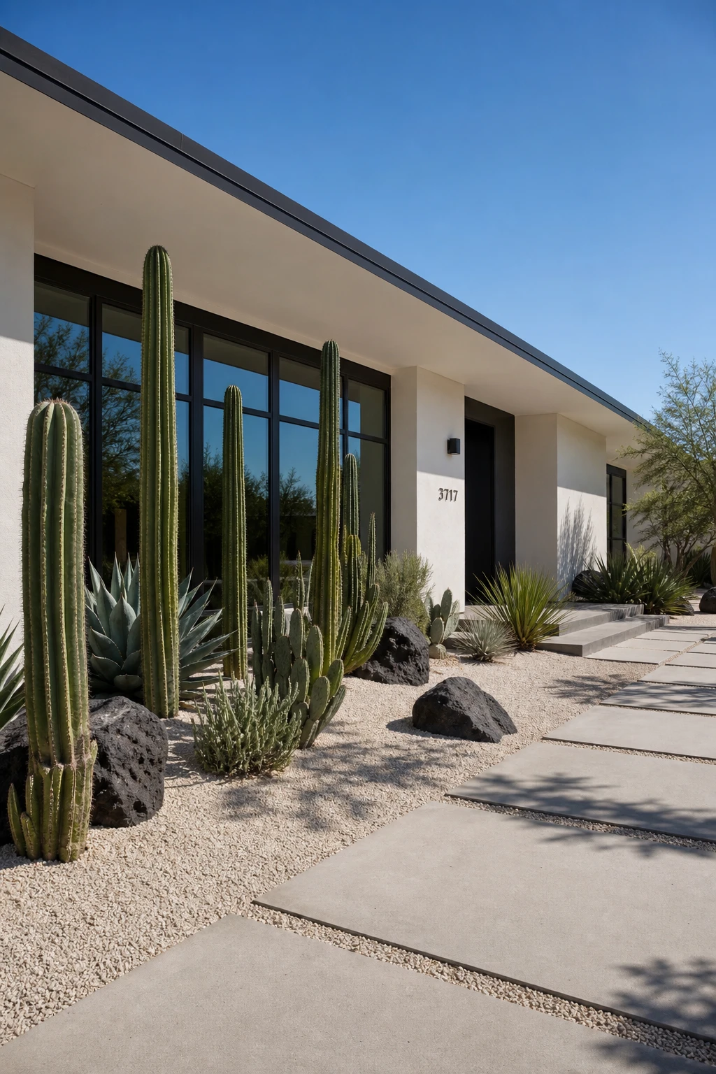
Tall columnar cacti planted against a crisp black and white facade do something a flowering shrub never could: they repeat the vertical lines of the architecture and make the whole exterior feel intentional and composed. I love how a single saguaro or blue columnar cactus carries so much visual weight without adding colour noise, keeping the palette clean and the contrast sharp. The spiky silhouettes read almost like sculpture, and that is exactly the point: the planting becomes part of the design rather than something softening the edges of it. Pair those tall forms with low spreading succulents and a decomposed granite bed and you get a front yard that looks considered from the street without a blade of grass in sight.
The Key Details
Get The Look
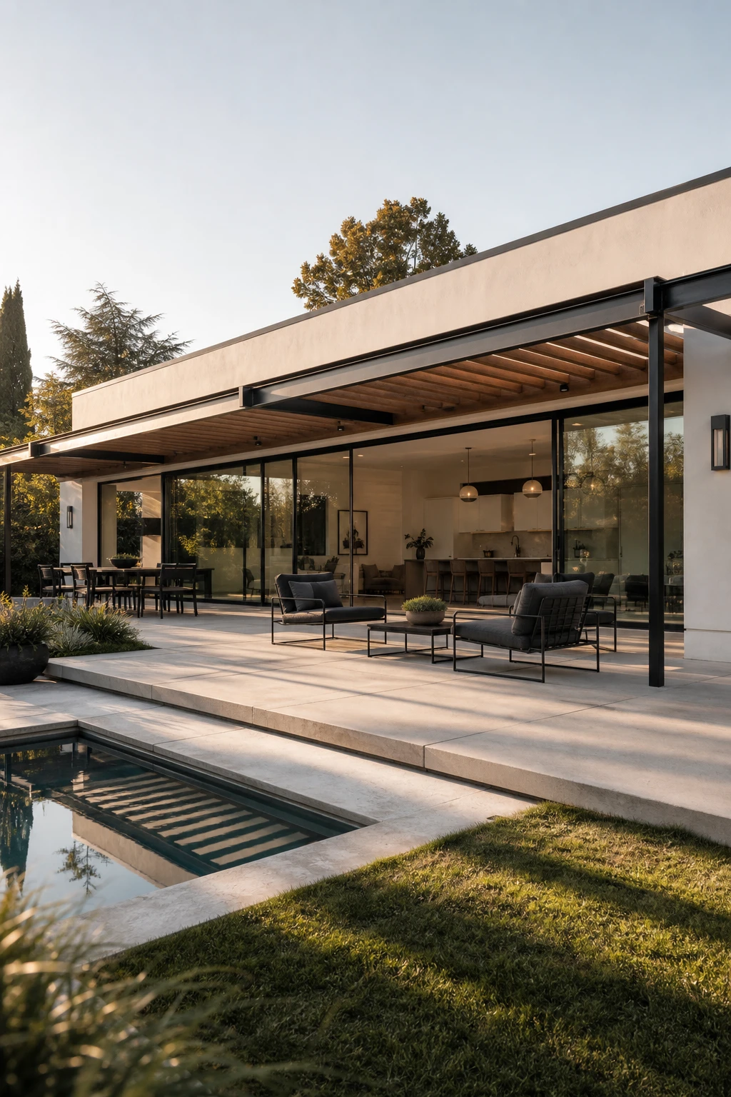
When the same black and white palette walks straight out the back door, the eye reads the patio as a room rather than an afterthought, and the whole property feels bigger for it. Black powder coated steel furniture anchors the space with the same visual weight as the window frames and front door, while large format white concrete pavers echo the body colour of the house so nothing feels imported from a different world. I love how a full width glass sliding wall removes the boundary between inside and out, so you are always looking at one resolved composition rather than two separate spaces trying to get along.
The Key Details
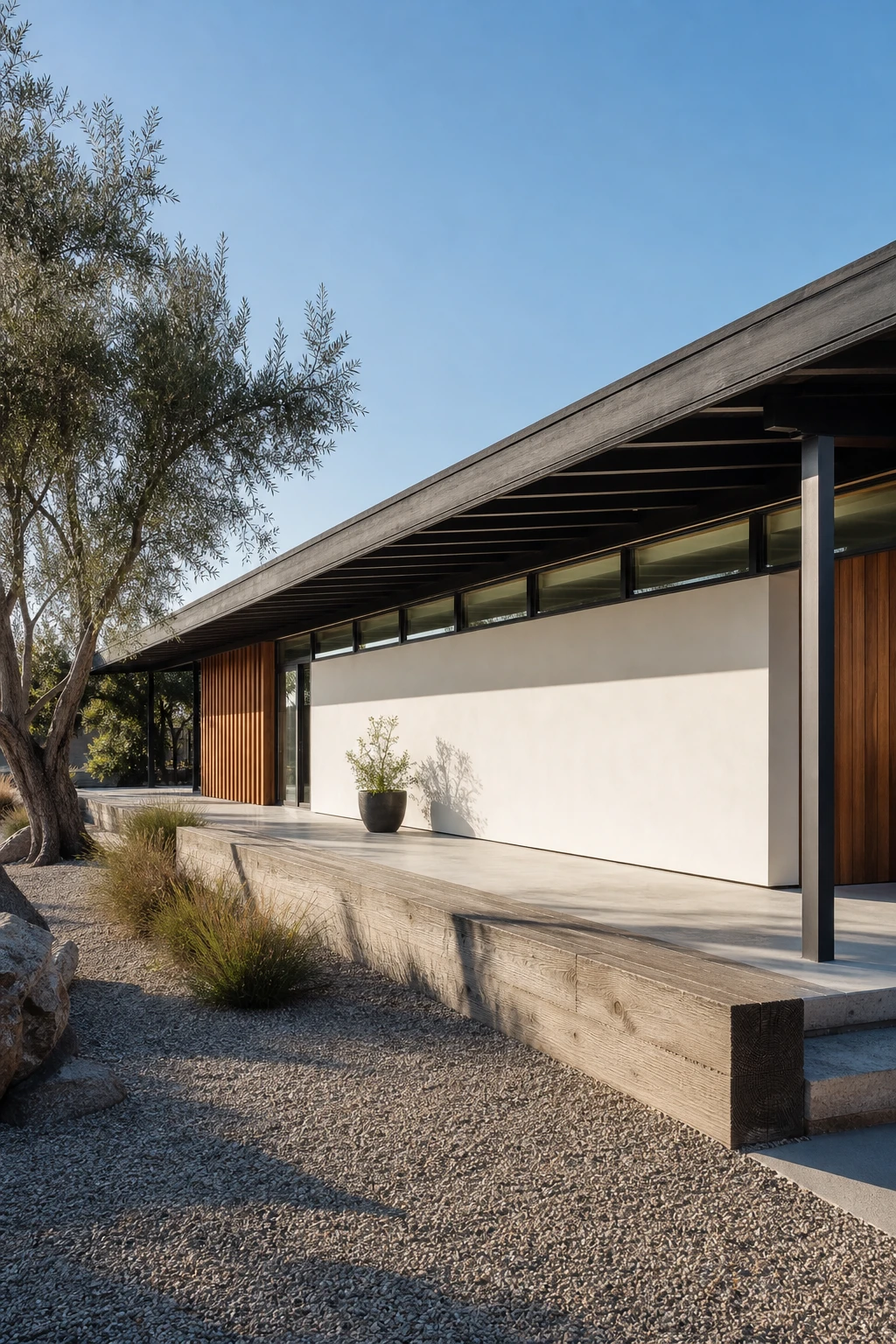
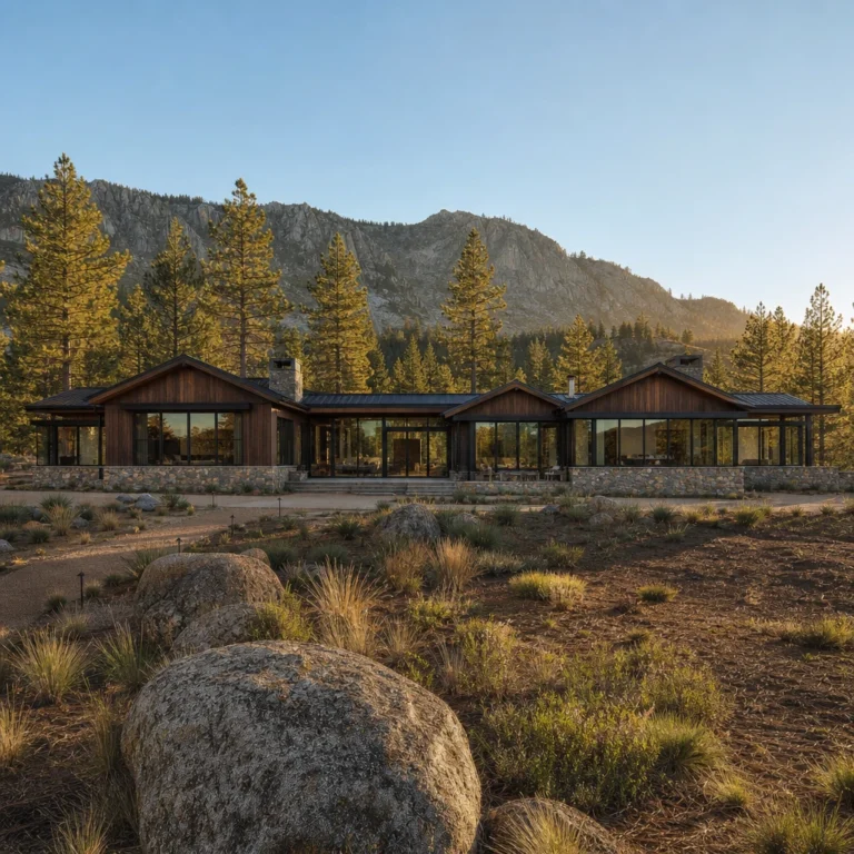
I’ve always loved how a low pitched roofline, when paired with broad overhanging eaves and a clerestory window band, pulls a ranch out of the ordinary and gives it the kind of quiet confidence you normally only see in architecture magazines. The three moves work together because each one reinforces the horizontal story the building is already trying to tell, stretching the eye left and right rather than upward. In black and white especially, that long shadow cast by a deep overhang reads as a crisp dark stripe running the full width of the facade, and the clerestory glazing above it catches the sky and adds a second lighter stripe that makes the composition feel deliberate and balanced. The result is a home that looks like somebody genuinely thought about it.
The Key Details