Newsletter Subscribe
Enter your email address below and subscribe to our newsletter

The perfect blue living room decor can transform your space from merely functional to genuinely restorative, creating a sanctuary where stress melts away at day’s end. I’ve discovered through years of designing with blue tones that they offer unparalleled versatility—from moody navy that grounds a space to ethereal powder blue that expands and brightens even the smallest rooms. The stunning examples featured here showcase how various shades of blue can be layered with complementary textures and materials to create spaces that feel both fresh and deeply comforting. Whether you’re struggling with a cramped apartment or a cavernous great room, these blue-centric designs offer practical solutions that bring both visual coherence and emotional calm to your everyday living environment.
Blue has no dimensions, it is beyond dimensions.
Yves Klein


Blue living room decor activates our innate connection to vast oceans and endless skies, instantly lowering blood pressure and creating an atmosphere of tranquility that few other colors can achieve. The psychological impact manifests in measurable ways—reducing stress hormones, slowing breathing patterns, and transforming chaotic thoughts into ordered calm within minutes of entering the space.


The spectrum of blue generates varied emotional effects—navy instills confidence and rootedness, aqua stimulates playfulness, and powder blue conveys innocence and possibility. This spectrum of psychological responses explains why designers strategically deploy blue in spaces intended for restoration, intellectual focus, or creative contemplation—making it not just aesthetically pleasing but neurologically beneficial.


Incorporating multiple blue tones within blue living room decor produces dimensional complexity that one-note color schemes fail to deliver, allowing each shade to bring its unique emotional resonance—from calming aqua to dramatic navy. Layering these tones through different textiles and surfaces builds a sophisticated rhythm throughout the space, with lighter shades expanding perceived dimensions while deeper blues anchor the composition with visual weight.

Blues expressed through diverse tactile surfaces—from matte walls to velvet upholstery, glossy ceramics, and natural linens—intensifies the nuance and interest of even the most subtle blue palette. Consider how natural and artificial light transforms these varied blue tones throughout the day, selecting shades that maintain their intended character from bright mornings to intimate evenings when illuminated by warm lamps against darkening windows.


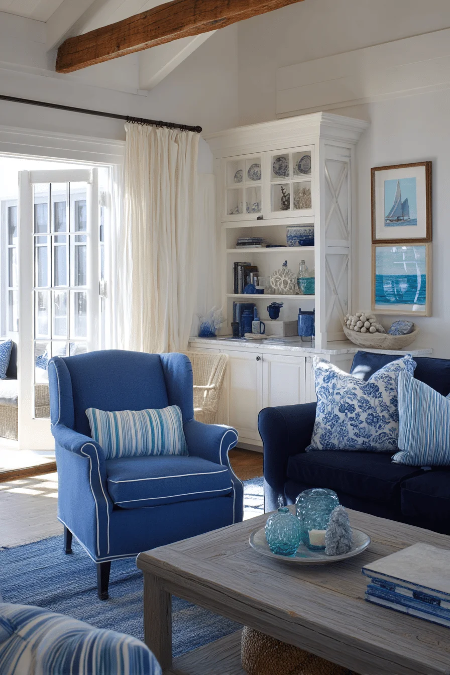
Blue statement furniture elevates a living room from conventional to exceptional, with richly saturated hues commanding attention while simultaneously providing a grounding influence to the entire space. A navy velvet wingback chair or tufted azure ottoman becomes the gravitational center of your blue living room decor, creating visual tension against lighter elements while inviting comfortable repose.


Bold blue furniture achieves its full impact when paired with neutral companions—think creamy slipcover sofas or weathered wood tables that prevent the intense color from overwhelming the senses. Consider variations in blue’s extensive spectrum for different energy levels: cobalt and sapphire inject vibrant sophistication, while slate and powder blue tones whisper serene tranquility perfect for spaces meant for contemplation.

Textural diversity within blue living room decor establishes visual intrigue that saves monochromatic schemes from appearing one-dimensional, inviting both visual interest and tactile exploration beyond mere color coordination. The interplay of smooth velvet pillows against nubby linen upholstery or the contrast of a chunky knit throw draped over sleek leather creates a sophisticated depth that catches light differently throughout the day.


Introduce textural contrast via carefully chosen organic elements—jute underfoot, rattan accents, or timber tables with character that provide organic counterpoints to the coolness inherent in blue palettes. The most successful textural compositions balance at least three different surface qualities—rough, smooth, and lustrous—creating a sensory richness that transforms even the simplest blue living room from merely attractive to genuinely immersive.


Thoughtfully chosen companion hues enhance the tranquility of blue living room decor, creating visual harmony while preventing the space from feeling monotonous or overly cool-toned. Warm ochres, burnished coppers, and muted corals introduce a captivating tension against various blue hues, drawing the eye through the room while subconsciously balancing the psychological effects of each shade.


Balancing these complementary elements demands measured control—consider introducing terracotta accessories against navy walls or pairing celestial blues with brass fixtures that glow like captured sunlight against twilight skies. The 60-30-10 color distribution principle offers a sophisticated framework: dominant blue tones for 60% of the visual field, complementary neutrals for 30%, and vibrant accent colors for the remaining 10%, ensuring your palette remains cohesive rather than chaotic.


In blue living room decor, statement furniture pieces serve as anchoring elements that establish both the color palette and the room’s personality, whether through a commanding sectional in navy velvet or a pair of cobalt armchairs with architectural silhouettes. These bold blue furnishings create visual gravity in the space, drawing the eye while infusing the environment with a sense of tranquility that smaller blue accents simply cannot achieve.


When selecting statement pieces, consider variations in blue’s extensive spectrum—from the introspective depth of indigo to the refreshing clarity of cerulean—allowing the furniture to dictate the room’s emotional temperature while remaining adaptable with neutral surroundings. Balance these commanding blue elements with complementary textures like natural wood, brushed brass, or soft wool to prevent the color from overwhelming the space, instead creating a harmonious dialogue between your bold blue centerpiece and its thoughtfully curated companions.


Layering textures within blue living room decor creates captivating dimension that prevents monochromatic schemes from falling flat, inviting both visual interest and tactile exploration beyond mere color coordination. The interplay of smooth velvet pillows against nubby linen upholstery or the contrast of a chunky knit throw draped over sleek leather creates a sophisticated depth that catches light differently throughout the day.


Incorporate texture through thoughtfully selected natural materials like jute rugs, rattan accessories, or weathered wood accent tables that provide organic counterpoints to the coolness inherent in blue palettes. The most successful textural compositions balance at least three different surface qualities—rough, smooth, and lustrous—creating a sensory richness that transforms even the simplest blue living room from merely attractive to genuinely immersive.


In blue living room decor, textural elements serve as the unsung heroes that transform flat, uninspiring spaces into multi-dimensional sanctuaries that engage all your senses, not just your sight. The interplay of chunky knit throws against smooth linen upholstery creates a tactile conversation that invites both visual interest and physical comfort through deliberate material contrast.


Layer diverse textures like natural jute rugs underneath sleek glass tables, or pair rough-hewn wooden elements with polished ceramic vessels to achieve depth that makes a monochromatic blue palette sing with unexpected complexity. The magic happens when you juxtapose at least three distinctly different textures within your line of sight—perhaps a velvet pillow, woven basket, and hammered metal accent—creating a sensory landscape that feels both curated and organically evolved.


The strategic selection of complementary colors amplifies the serenity of blue living room decor, creating visual harmony while preventing the space from feeling monotonous or overly cool-toned. Warm ochres, burnished coppers, and muted corals introduce a captivating tension against various blue hues, drawing the eye through the room while subconsciously balancing the psychological effects of each shade.


Incorporating these complementary elements requires thoughtful restraint—consider introducing terracotta accessories against navy walls or pairing celestial blues with brass fixtures that glow like captured sunlight against twilight skies. The 60-30-10 color distribution principle offers a sophisticated framework: dominant blue tones for 60% of the visual field, complementary neutrals for 30%, and vibrant accent colors for the remaining 10%, ensuring your palette remains cohesive rather than chaotic.