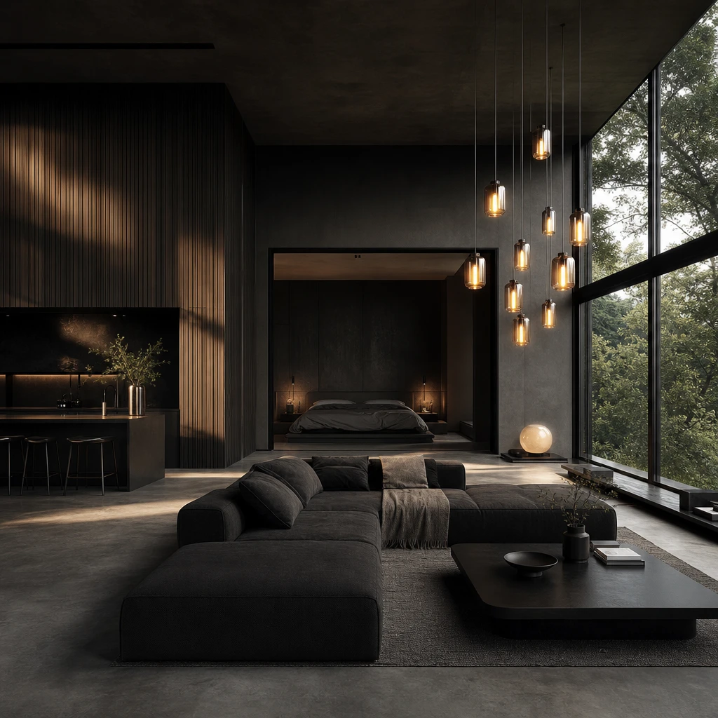
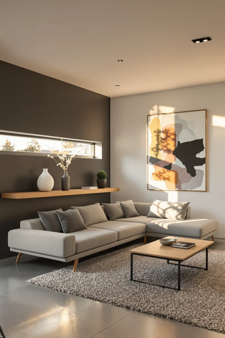
I’ve always believed that dark minimalist interior design is one of the most quietly confident looks you can choose for a home. There’s something about pairing deep, shadowy walls with raw wood, sleek black fixtures, and barely there furniture that feels genuinely restful rather than heavy. In this piece I walk you through the features that make it work, from charcoal panel walls to moody forest view bedrooms to Nordic noir entryways, and every one of them is a look you can borrow for your own space.
How Tonal Layering Makes Dark Minimalist Interior Design Feel Warm Instead of Cold
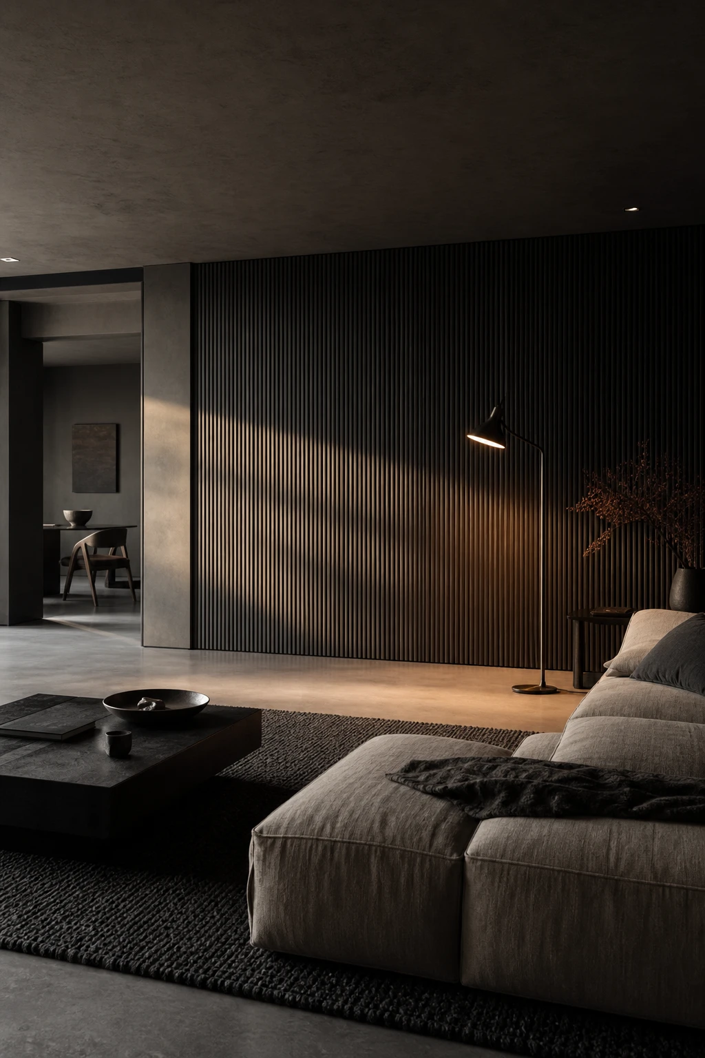
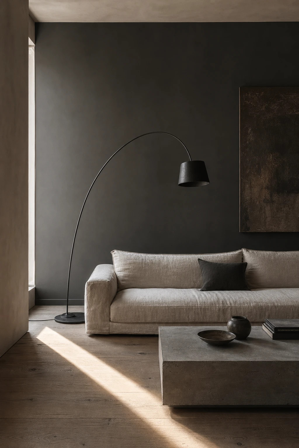
Tonal layering is the quiet trick that keeps a dark room feeling alive rather than heavy. When I place a charcoal plaster wall beside a near black linen sofa and a soft slate rug, you get depth without drama, each shade nudging the next so the eye keeps moving. What I love is how the differences are subtle enough to feel restful yet distinct enough to stop the space collapsing into one flat shadow.
The Key Details
Low profile linen sofa
Ribbed hand trowelled plaster feature wall
Sculptural arc floor lamp
Chunky wool area rug
Matte concrete flooring
Pro TipMix at least one matte surface with one low sheen finish in the same dark tone, because the contrast in light absorption creates the layered depth tonal schemes depend on.
AvoidPainting walls, ceiling, and joinery in the same flat dark shade with no tonal shift leaves a room feeling like a box, with no surface to draw the eye or add warmth.
Why a Black Wall With Warm Wood Accents Is the Living Room Combination Worth Stealing
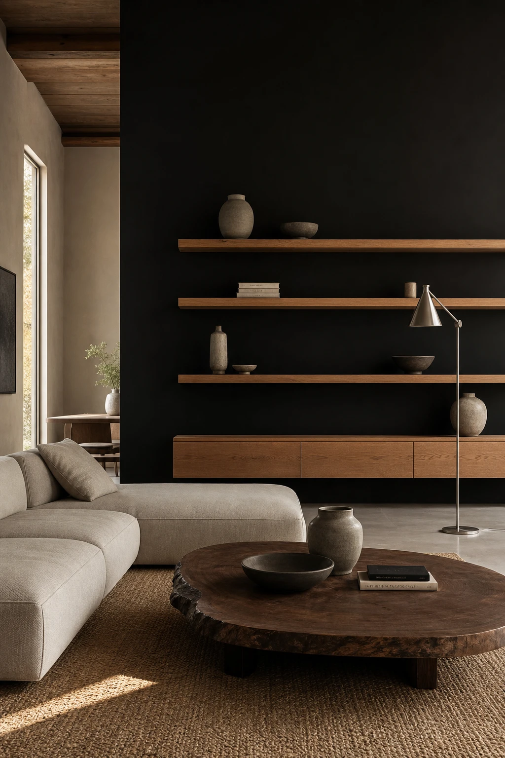
Black walls alone can feel cold, and what I love about bringing warm wood in is the way it solves that immediately. You get the drama of the dark backdrop but the timber pulls you back into the room, making it feel lived in rather than severe. A golden oak shelf or a raw edge walnut piece catches the light in a way that painted surfaces simply cannot, and that contrast is what gives the whole scheme its pulse.
The Key Details
Floating oak shelf unit
Low profile linen sofa
Raw edge walnut coffee table
Woven jute rug
Brushed steel floor lamp
Pro TipHold your wood samples against the black paint in both daylight and lamplight before you buy, because golden and honey tones stay warm beside black while anything with a red or orange base will fight it.
AvoidUsing three or four different wood species across one room fragments the look and turns the natural warmth you worked for into visual noise.
The Dark Wood Slat Wall Detail That Gives Any Room Its Quiet Focal Point
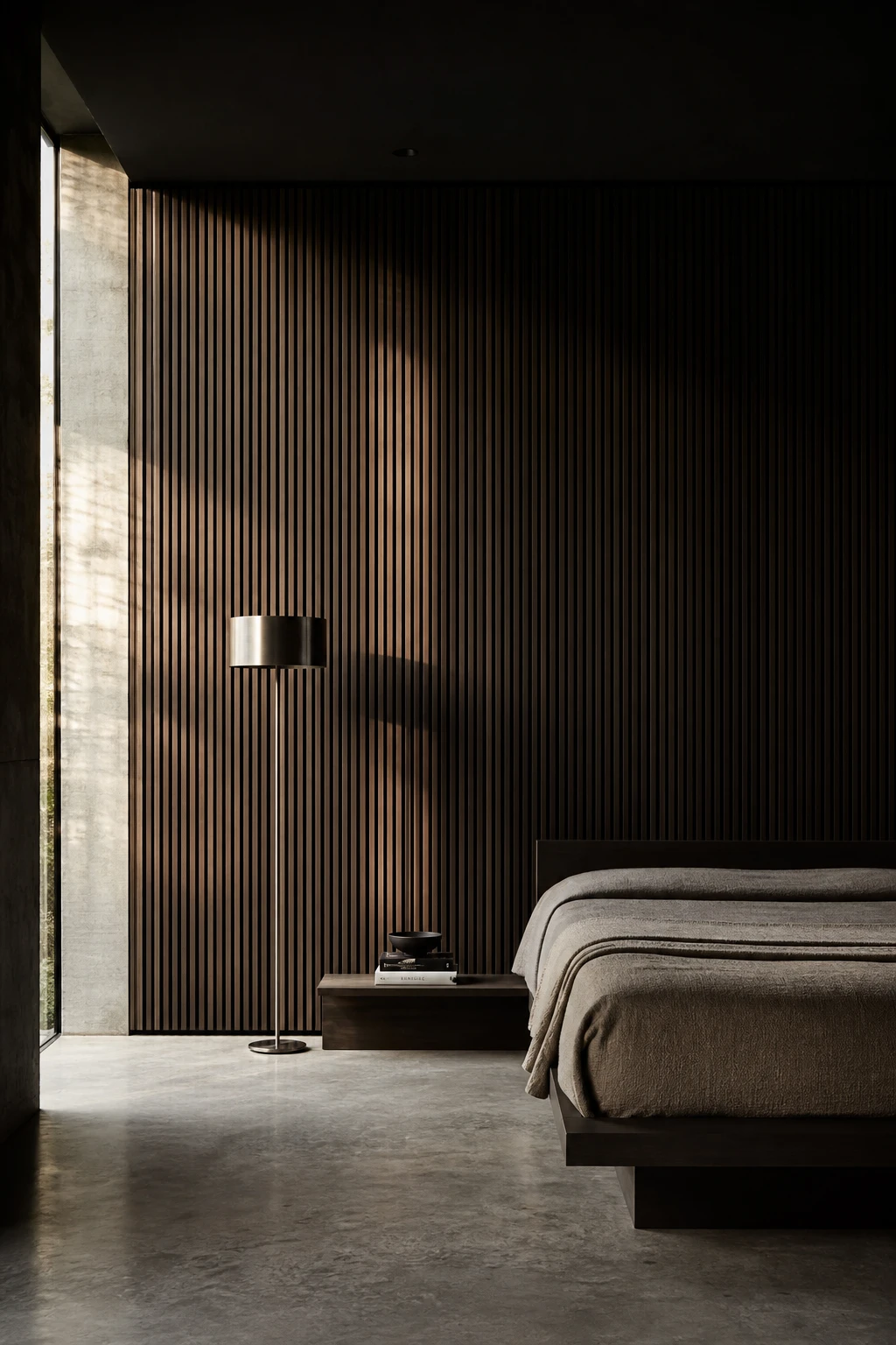
Vertical slat cladding is one of my favourite moves in a dark minimal room because it gives the eye something to travel along without adding a single object. The shadow play is the real reward: each gap lets the dark wall behind breathe through, so you get depth and texture from one simple surface. I find that rooms with this detail feel considered rather than bare, which is exactly the balance minimalism asks for.
The Key Details
Full height vertical wood slat cladding
Low platform bed with linen throw
Brushed steel cylindrical floor lamp
Raw concrete floor
Narrow side window with raking light
Pro TipLeave at least a finger width gap between each slat so the darker wall behind reads as a shadow line and the whole surface has genuine depth.
AvoidTaking slats all the way up to a low ceiling compresses the room visually and turns a feature wall into something that feels more like a crate than a calm retreat.
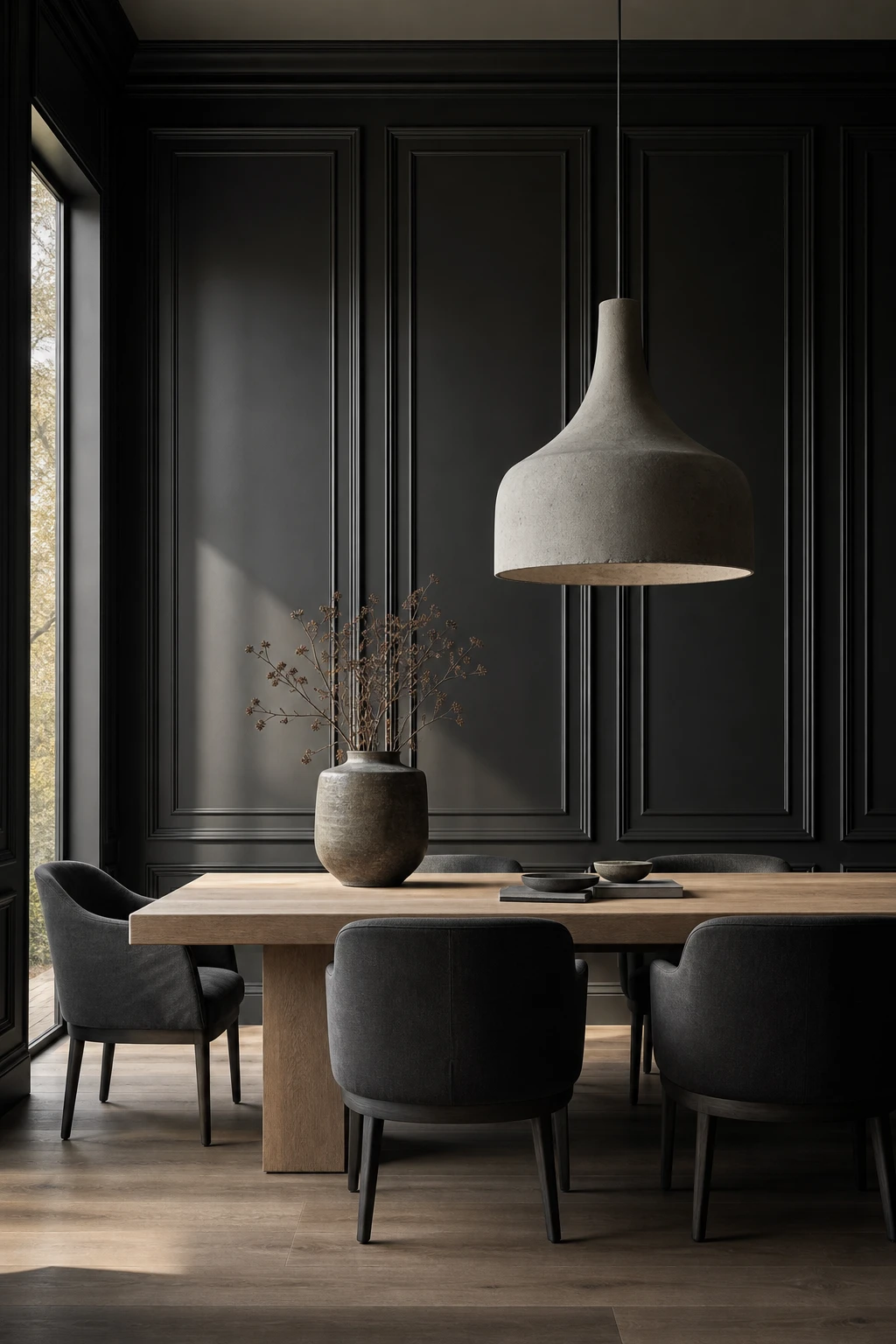
Black Panel Walls and the Simple Trick That Keeps Them Looking Calm Rather Than Busy
Panel moulding on a dark wall is one of those moves that looks almost too simple until you see it in a room, and then you wonder how you ever did without it. The shadow lines the panels cast give the surface depth and structure, so the wall feels considered rather than just painted dark. What wins me over every time is how flat and calm it stays, architecture doing the work that furniture and accessories usually shoulder.
The Key Details
Floor to ceiling recessed panel moulding
Bleached oak dining table
Oversized concrete pendant light
Low profile charcoal linen dining chairs
Full height narrow window
Pro TipPaint the moulding, the panel infill, and the surrounding wall in exactly the same shade so the shadow lines do the work and the colour reads as one seamless surface.
AvoidReaching for ornate Victorian ogee or rope profiles turns a clean dark wall into a period pastiche, and the whole minimalist intention collapses the moment the moulding competes with the paint.
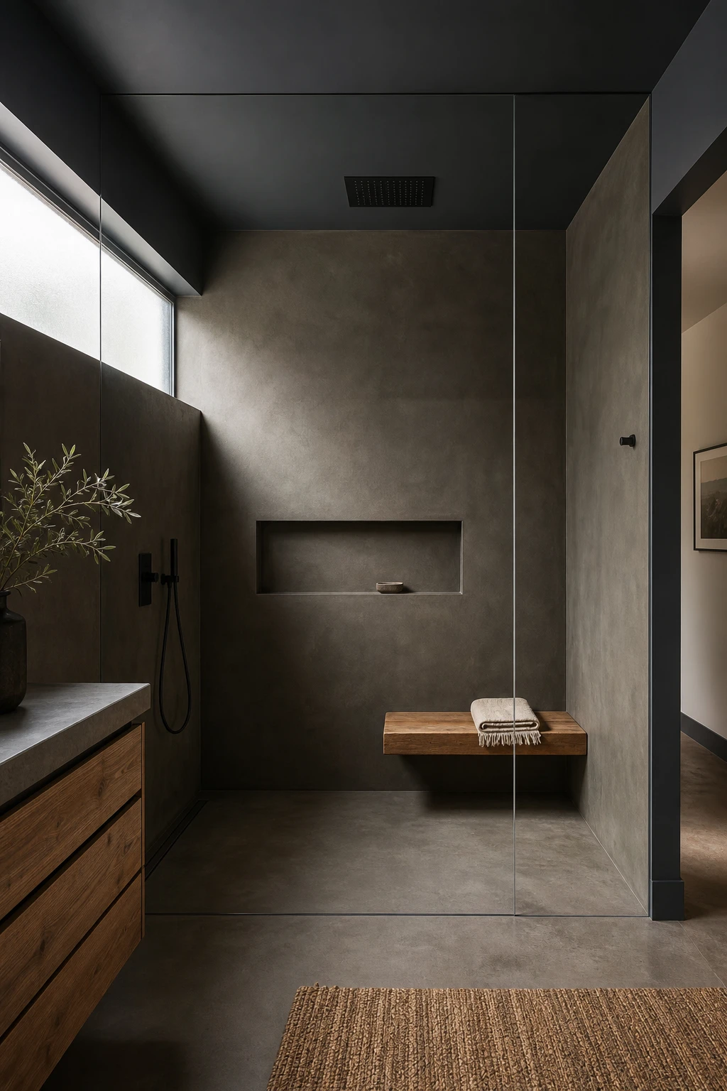
Concrete Shower Walls and What Makes Them Feel Luxurious Rather Than Industrial
Concrete in a shower lives or dies on its finish, and what I reach for every time is microcement or a high quality concrete look tile with a honed, almost silky surface. You get that raw, moody depth without anything that reads cold or unfinished. The matte texture drinks in the light from above and pairs beautifully with the dark palette, and watch how a seamless wall to floor pour removes every grout line so the space feels genuinely calm rather than busy.
The Key Details
Honed concrete shower walls and floor
Ceiling flush matte black rain shower head
Floating teak shower bench
Recessed open wall niche with stone soap dish
Frameless glass shower panel
Pro TipSeal your microcement with at least two coats of a penetrating sealer before the shower sees any water, and let each coat cure fully so the surface repels soap residue rather than absorbing it.
AvoidStopping at one coat of sealer, or skipping it entirely, turns a beautiful microcement wall into a stained, patchy surface within weeks and undoes everything the finish was supposed to achieve.
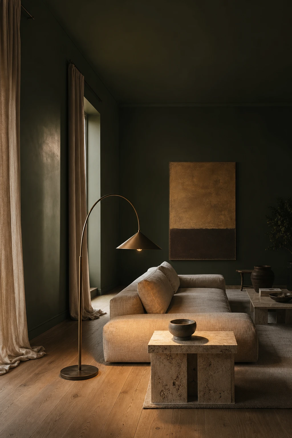
Dark Green Living Rooms and the Shade That Sits Right Between Forest and Jewel
Deep green is the shade I reach for when a room needs weight without drama. What I love is how it settles into low light almost like a shadow, so the walls stop competing and the furniture gets to breathe. You will notice the green reads warmer or cooler depending on the hour, which gives a room a kind of quiet life through the day. That ability to anchor everything around it, without fighting a single piece, is exactly why it earns its place as a neutral.
The Key Details
Low slung linen sofa
Sculptural arc floor lamp
Wide plank oak flooring
Floor to ceiling ecru linen curtains
Rough travertine side table
Pro TipPull in warm brass on door handles, curtain poles and light fittings to nudge a deep green away from cool and closer to the rich, collected feel you are after.
AvoidCrisp cold white trim against a very deep green sharpens the contrast so hard the walls start to look like a painted feature rather than a whole enveloping room.
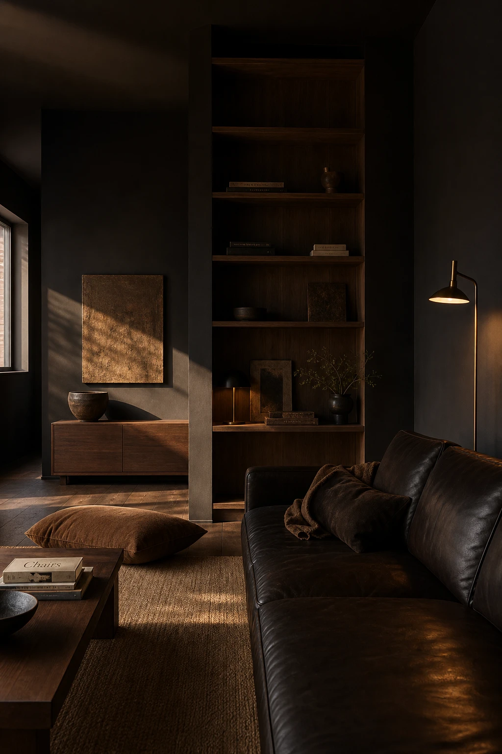
The Black and Brown Apartment Palette That Makes a Small Space Feel Intentional
Black and brown is one of those combinations that wins me over every time, because the warmth of brown stops black from tipping into cold or heavy. You get depth without the room closing in on you. What I love here is how the espresso leather and oiled walnut pull the eye around the space, so the black accents read as grounding rather than gloomy. Watch how a single rich tone does the heavy lifting and every other element falls into place around it.
The Key Details
Espresso leather sofa
Oiled walnut console and shelving
Slender bronze floor lamp
Hand thrown ceramic bowl
Tobacco brown linen floor cushion
Pro TipBring in a brown leather or suede piece, a sofa, a cushion, even a small ottoman, to act as the bridge between your black accents and any wood surfaces, so the palette feels connected rather than contrasted.
AvoidSplitting black and brown at roughly equal weights leaves the eye with nowhere to settle and the room ends up feeling muddy rather than considered.
Charcoal Grey Walls and the Undertone Choice That Changes Everything About the Room
Charcoal is one of those colours that looks almost identical on a chip but transforms completely on a wall, and the undertone is everything. A warm charcoal with a brown or red base pulls the room in around you, making it feel grounded and cosy. You will notice a cool blue based charcoal does the opposite, pushing the walls back and making the space feel crisper, harder, a little more removed. Knowing which version you want before you commit is the move that separates a room that feels intentional from one that just feels dark.
The Key Details
Low linen sofa
Blackened steel arc floor lamp
Raw concrete coffee table
Aged oak plank flooring
Tall narrow window with bare reveal
Pro TipPaint a large sample board and live with it through an evening under your actual bulbs, because artificial light shifts charcoal more dramatically than almost any other colour.
AvoidA cool blue based charcoal in a north facing room will drain every last bit of warmth from the space and leave it feeling flat and unwelcoming no matter how well you style it.
Going All Black in the Bathroom Including the Toilet and Why It Actually Works
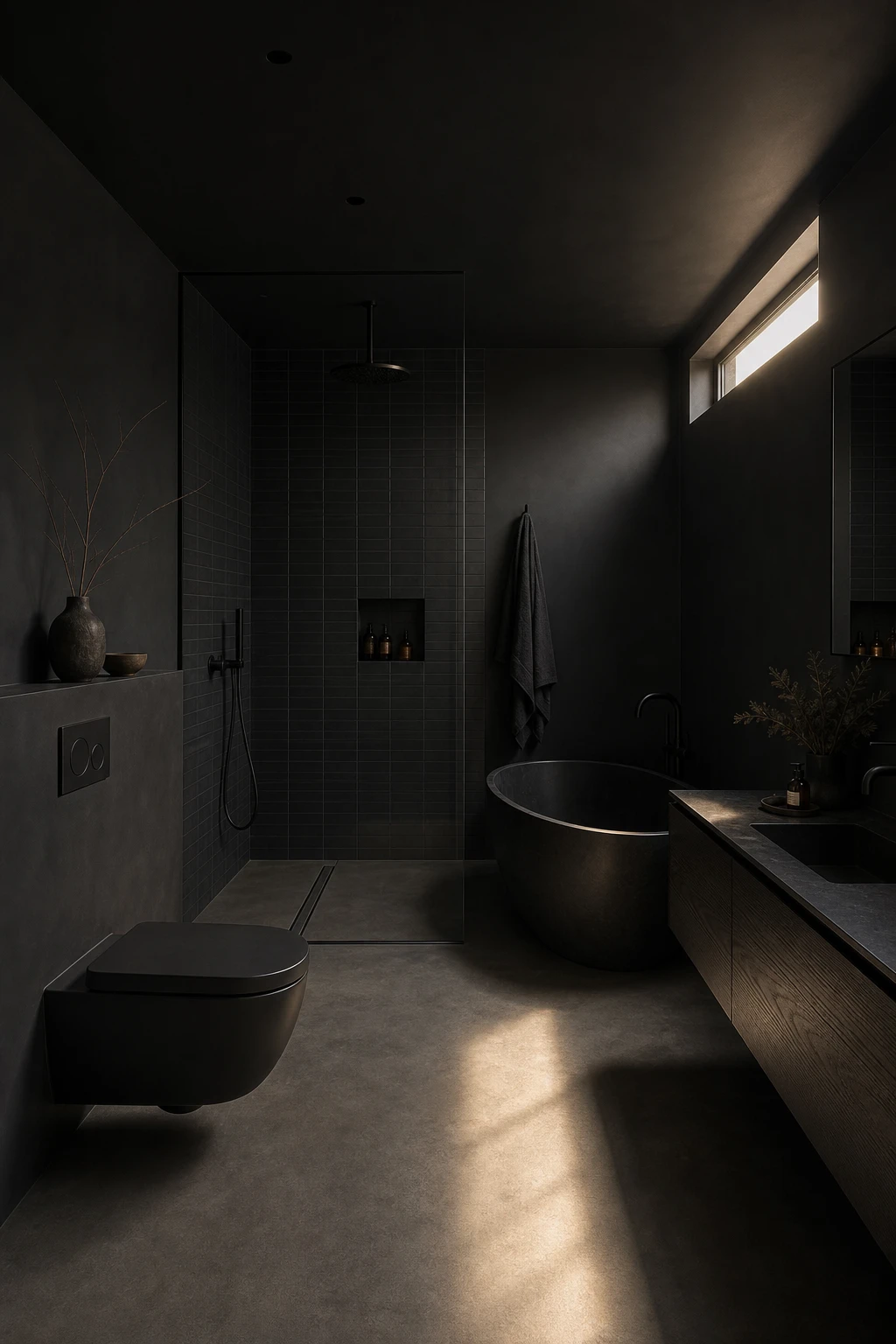
Going all black in a bathroom, toilet and all, is one of those moves that sounds bold until you see it done well and then it feels completely inevitable. What I love is how full tonal commitment removes the visual noise that comes from mixing finishes: every surface agrees, so the room reads as one calm, deliberate object rather than a collection of parts. You get a spa like stillness that a mixed palette simply cannot deliver.
The Key Details
Matte black wall hung toilet and cistern
Freestanding oval black soaking tub
Floating blackened oak vanity
Frameless walk in shower with linear drain
Honed concrete floor with directional clerestory light
Pro TipAlways specify matte black sanitaryware rather than gloss, because the matte surface scatters light and hides everyday watermarks that would make a gloss finish look grubby within hours.
AvoidSourcing your toilet, taps, and towel rails from different manufacturers is a real risk, because each brand mixes its black slightly differently and the mismatched undertones become obvious the moment natural light hits them side by side.
Onyx Bathrooms and the Lighting Move That Makes the Stone Glow From Within
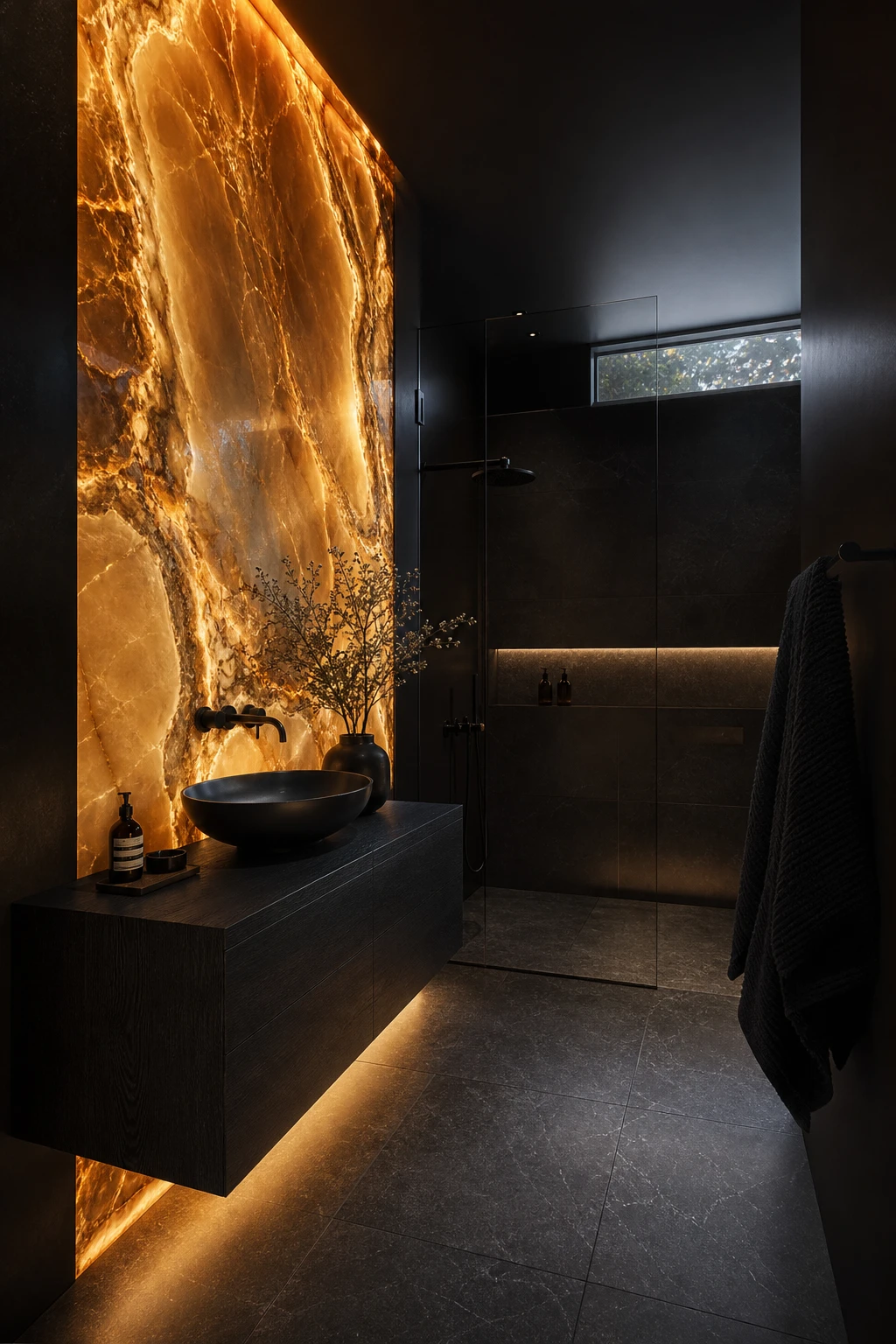
Onyx is the one stone that rewards light rather than just reflecting it, and that is what makes this bathroom feel alive rather than simply dark. What I love is how a warm LED strip tucked behind a thin slab pulls the veining forward in amber and gold tones you never see in daylight. You get depth and glow at the same time, which no ceramic tile can replicate. The rest of the room stays minimal so that one lit wall does all the talking.
The Key Details
Backlit translucent onyx feature wall
Floating blackened oak vanity
Matte black vessel basin and tap hardware
Honed dark basalt floor tiles with recessed LED channels
Frameless glass shower enclosure
Pro TipUse 2700K LED strips behind the onyx rather than cool white, because warmer light reads as candlelight through the stone and brings out the honey and rust tones in the natural veining.
AvoidCovering every surface in solid dark ceramic tiles flattens the room into a cave and wastes the opportunity that a single statement slab of translucent stone would have delivered far more powerfully.
Rustic Dark Bathrooms and the Raw Material Pairings That Feel Surprisingly Refined
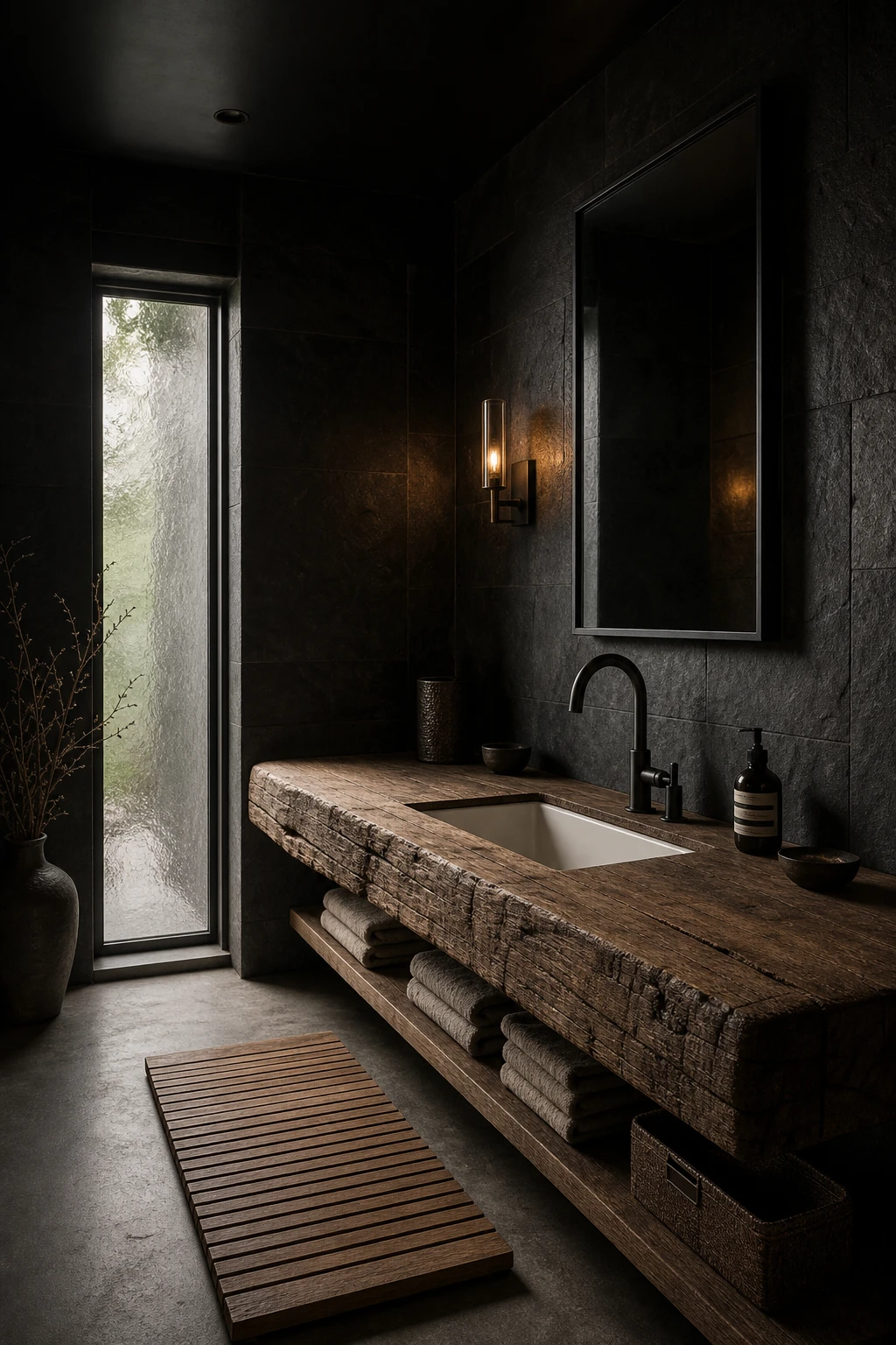
Rough timber next to honed basalt is a pairing I keep coming back to in a dark bathroom because the contrast does all the heavy lifting without a single accessory. The warmth of wood grain pulls against the cool density of stone, and that tension is what stops the room feeling flat or cold. What wins me over is how the rawness of both materials actually reads as refined once the palette is kept tight and dark, which is not something you can easily predict from a sample board.
The Key Details
Rough hewn solid timber vanity slab
Honed basalt stone wall cladding
Matte black freestanding tap set
Aged iron wall sconce
Polished concrete floor with flush grout lines
Pro TipSeal any exposed timber in a wet room with a marine grade oil, working it into the end grain first, so the wood stays stable and the finish holds without flaking.
AvoidLeaving even a small gap between a timber vanity and a stone wall traps moisture behind the joint, and that standing damp will rot the wood and lift the cladding faster than almost anything else.
Small Bathrooms Go Moody and the Size Myth You Can Comfortably Let Go Of
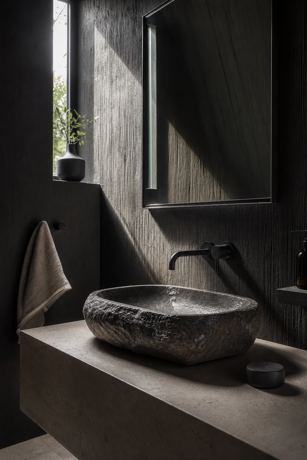
A small bathroom painted dark all over loses its edges, and that is exactly what makes it feel so good. What I love here is how the walls, ceiling, and floor read as one continuous envelope rather than four separate surfaces closing in on you. You stop measuring the room with your eyes and start feeling it instead. The intimacy that creates is closer to a spa than a cupboard, and that shift in feeling is worth far more than a few extra square feet.
The Key Details
Hand carved stone basin
Brushed black wall mounted tap
Blackened steel framed mirror
Honed limestone floor tiles
Narrow slot window with raking sidelight
Pro TipPaint the ceiling the same dark tone as the walls so the room wraps around you with no visible seams cutting the space into pieces.
AvoidA lighter ceiling in a tiny bathroom creates a hard visual lid that makes the room feel shorter and more confined than any dark colour ever could.
The Modern Black Kitchen Bar Design Detail That Doubles as Your Best Entertaining Feature
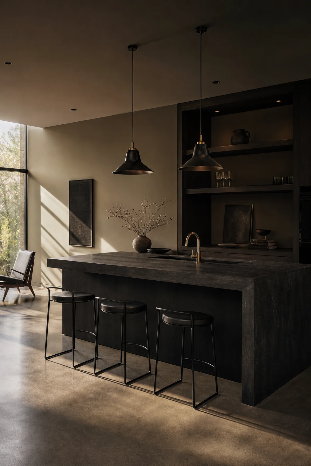
A raised bar counter in black does something clever in an open plan space: it draws a clean line between cooking and living without closing the room off. What I love is how the height alone creates that anchor, so your eye lands there first and the rest of the room organises around it. You get definition without a wall, and the matte black finish keeps it feeling deliberate rather than heavy.
The Key Details
Raised waterfall edge bar counter
Matte black low profile bar stools
Blackened steel pendant lights
Recessed open shelving with glassware
Honed concrete floor
Pro TipSpecify a waterfall edge so the counter material folds straight down to the floor on both ends, giving the whole bar a seamless, sculpted profile that looks far more considered than a standard overhang.
AvoidChoosing bar stools even a centimetre too tall for the counter height turns what should be your best entertaining feature into an uncomfortable perch that guests quietly avoid.
Dark Brown Kitchen Cabinets and the Hardware Finish That Lets Them Really Breathe
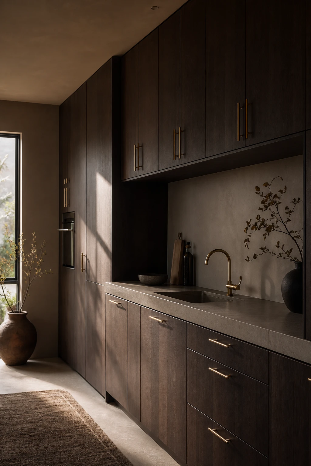
Deep espresso oak veneer has this quality I find endlessly satisfying: it reads as both grounded and luxurious at once. What wins me over here is the brass. Brushed, warm toned hardware pulls the red undertones out of the wood rather than fighting them, and you get a palette that feels cohesive rather than assembled. The limestone counter keeps things quiet, and that sliver of afternoon sidelight does the rest.
The Key Details
Flat front floor to ceiling cabinet doors in deep espresso brown oak veneer
Brushed brass slim bar handles
Honed limestone countertop with integrated undermount sink
Panel fronted integrated appliances
Narrow side window with afternoon sidelight
Pro TipChoose unlacquered brass handles so the finish slowly deepens and spots over time, giving your kitchen the kind of character a brand new fitting never has.
AvoidChrome hardware against dark brown cabinetry drains the warmth from the wood instantly, leaving a kitchen that feels cold and slightly clinical no matter how beautiful the veneer is.
Hi Tech Kitchen Features That Disappear Into a Dark Minimalist Space Beautifully
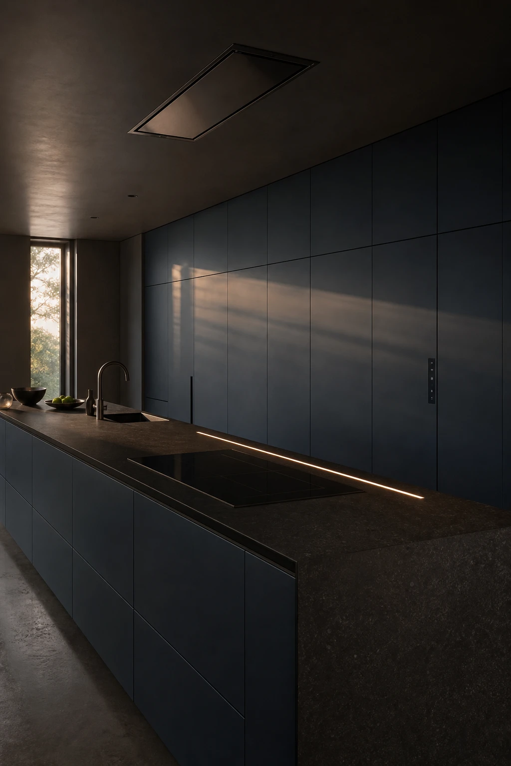
The best kitchen technology I have ever specified is the kind you cannot see at all. When appliances sit behind handleless slab fronts that match the surrounding cabinetry exactly, the room reads as one unbroken surface and the tech simply vanishes into it. You get all the function and none of the visual clutter, which is the whole point of dark minimalism. That seamless wall of matte cabinet fronts wins me over every single time.
The Key Details
Handle free slab cabinetry doors
Flush induction cooktop in continuous stone worktop
Ceiling integrated retractable ventilation hood
Linear undermount LED worktop strip
Poured concrete flooring
Pro TipSpecify every appliance as fully integrated from the start of the project, because retrofitting integrated fronts after cabinetry is built almost always leaves visible gaps at the edges.
AvoidLeaving a coffee machine, toaster, or any countertop gadget on show breaks the unbroken surface you worked so hard to achieve and immediately reads as a different, busier design altogether.
Dark Open Kitchens and How to Zoning Them So the Whole Floor Feels Considered
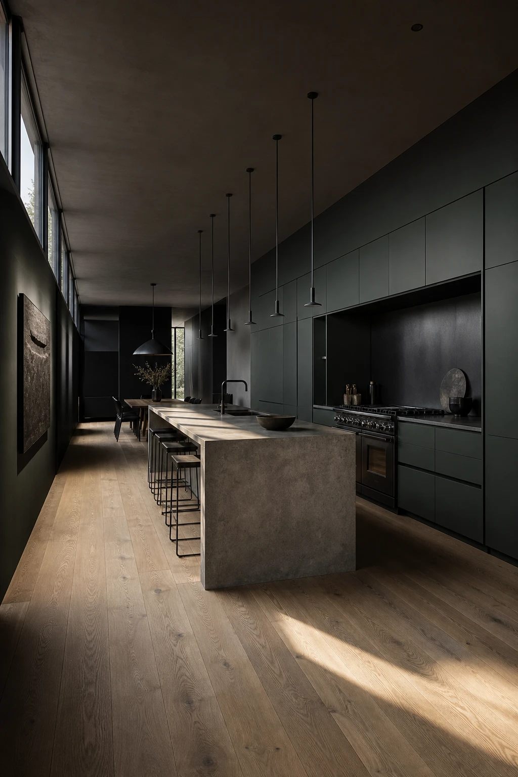
Open plan dark kitchens are the ones I find myself sketching most often, but they do carry a real risk: without zoning, the whole floor reads as one heavy block. What I reach for first is a material shift at the floor plane. Wide plank white oak under the dining area does quiet but firm work, pulling that zone away from the concrete and lacquer without needing a single wall. You get definition and flow at the same time, and the darkness of the cabinetry actually looks more intentional for having a clear boundary to sit against.
The Key Details
Full height matte lacquer cabinetry wall
Raw concrete waterfall island
Blackened steel professional range
Slender black pendant light grid
Wide plank white oak flooring
Pro TipLay a large format stone tile under the kitchen proper and let it meet the oak at a clean straight joint directly beneath the island overhang, so the boundary reads as deliberate, not accidental.
AvoidRunning identical dark cabinetry all the way around every wall with no material break flattens the whole room into a tunnel, and no amount of pendant lighting will rescue it.
Modern Dark Bedrooms and the Linen Tone That Stops the Whole Room Feeling Severe
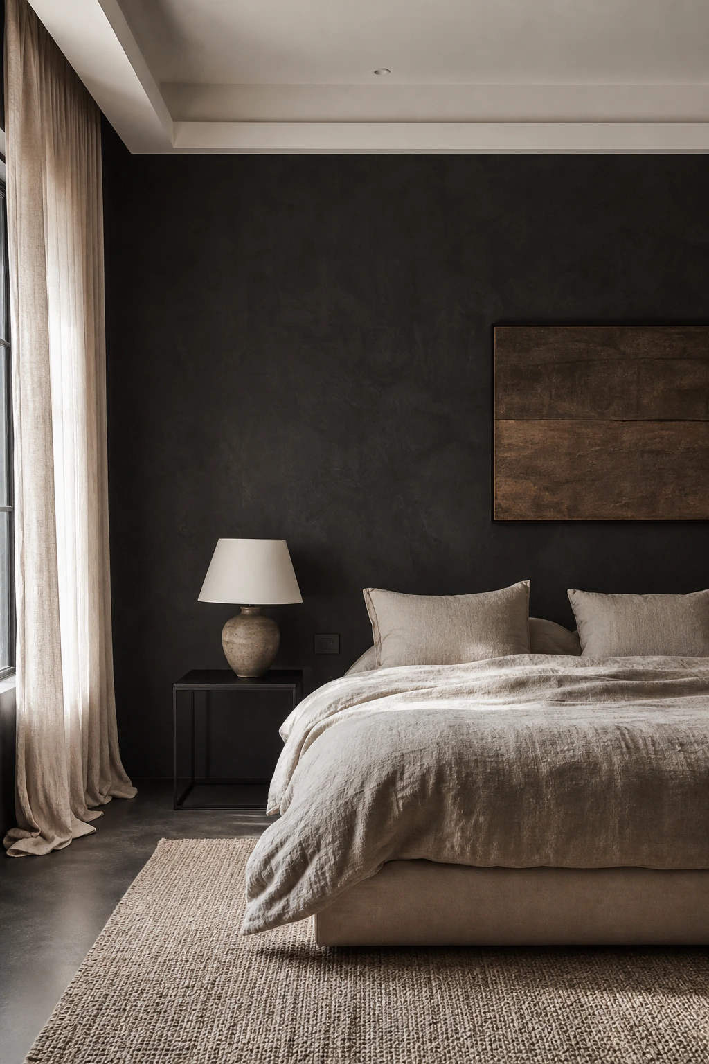
Dark bedroom walls can tip from moody and restful into cold and unwelcoming the moment the bedding fights back. What I reach for every time is oatmeal or stone linen, because those warm, undyed tones sit close enough to the wall colour to feel unified, yet carry just enough warmth to soften the whole scene. You get depth without severity, and the bed reads as a place to rest rather than a graphic statement. That shift in feeling is everything in a room built for sleep.
The Key Details
Platform bed frame in blackened oak
Oatmeal stone linen bedding set
Slim blackened steel bedside table
Undyed muslin floor length curtains
Hand loomed sand wool rug
Pro TipLayer two or three linen textures in the same neutral family, such as a waffle throw over a stone flat sheet, so the bed gains visual richness without any colour clash pulling the eye.
AvoidCrisp white bedding against a dark wall creates a stark, high contrast split that feels more graphic than restful, working directly against the calm you came here for.
The Truly Minimalist Dark Bedroom and the Single Piece of Furniture That Carries It All
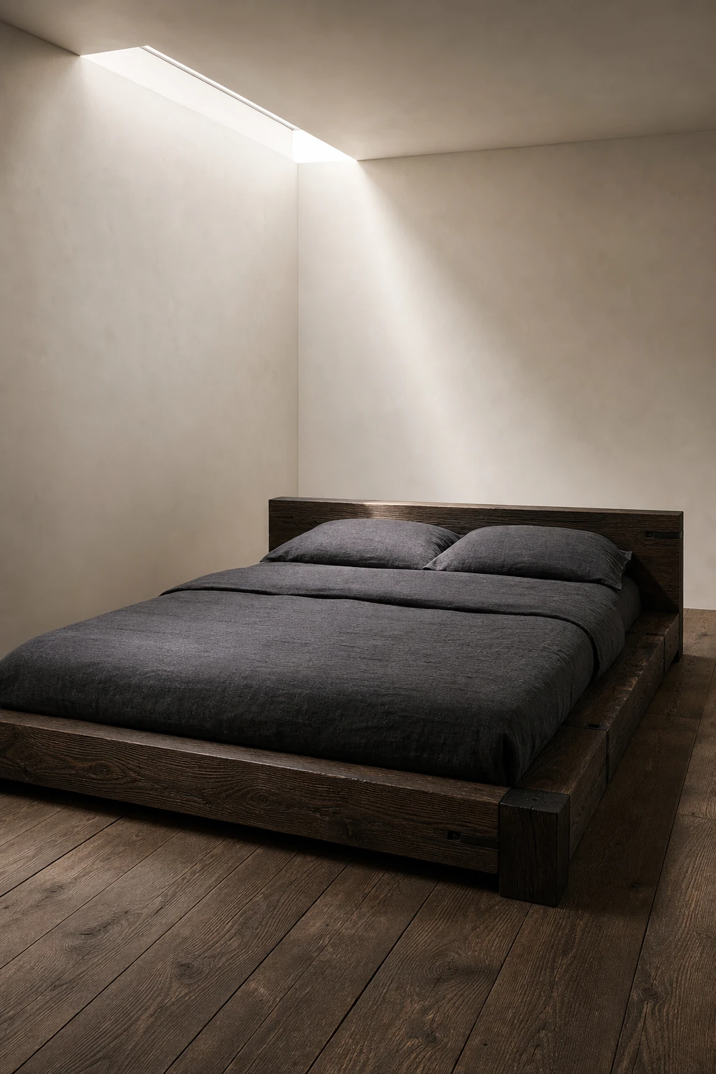
A bedroom stripped to almost nothing puts every eye straight onto the bed frame, and when that frame is beautifully made, you realise it was always enough. What I love about this approach is the quiet confidence of it: one sculptural piece against a dark wall, and the room feels complete rather than empty. You get real rest from a space like this, not just visual calm.
The Key Details
Sculptural low profile solid oak bed frame
Heavyweight charcoal linen bedding
Wide plank raw timber flooring
Matte plaster ceiling with narrow skylight
Brushed blackened steel bed hardware
Pro TipMount one slim wall sconce flush to the wall on each side of the bed so your bedside lighting sits at exactly the right height without a table, a lamp, or any floor clutter beneath it.
AvoidPlacing even small decorative objects on every available surface pulls the eye in too many directions and dissolves the single focal point the whole room depends on.
Dark Bedrooms With a Forest View and Why the Window Becomes the Only Art You Need
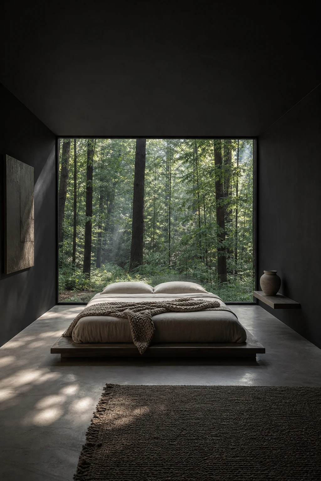
Stripping a bedroom back to near nothing is what lets the window take over, and pulling that off is one of the moves I find most satisfying in a dark scheme. A living painting that changes hour by hour, season by season, sits in the frame you built for it, and no art budget in the world can compete with that. The dark walls and bare concrete floor act like a frame within a frame, pulling every eye straight to the green outside.
The Key Details
Floor to ceiling unadorned window
Low platform bed frame
Undyed linen and chunky wool throw bedding
Honed concrete flooring
Single ceramic vessel on slim bedside ledge
Pro TipSpecify floor to ceiling glazing from sill to soffit so the tree line reads as one unbroken canvas rather than a view chopped into segments.
AvoidFitting curtains or Roman blinds breaks the hard edge between the dark interior and the landscape outside, and that contrast is the entire point of the room.
A King Size Black Bed as the Room’s Centrepiece and How to Scale Everything Else Correctly
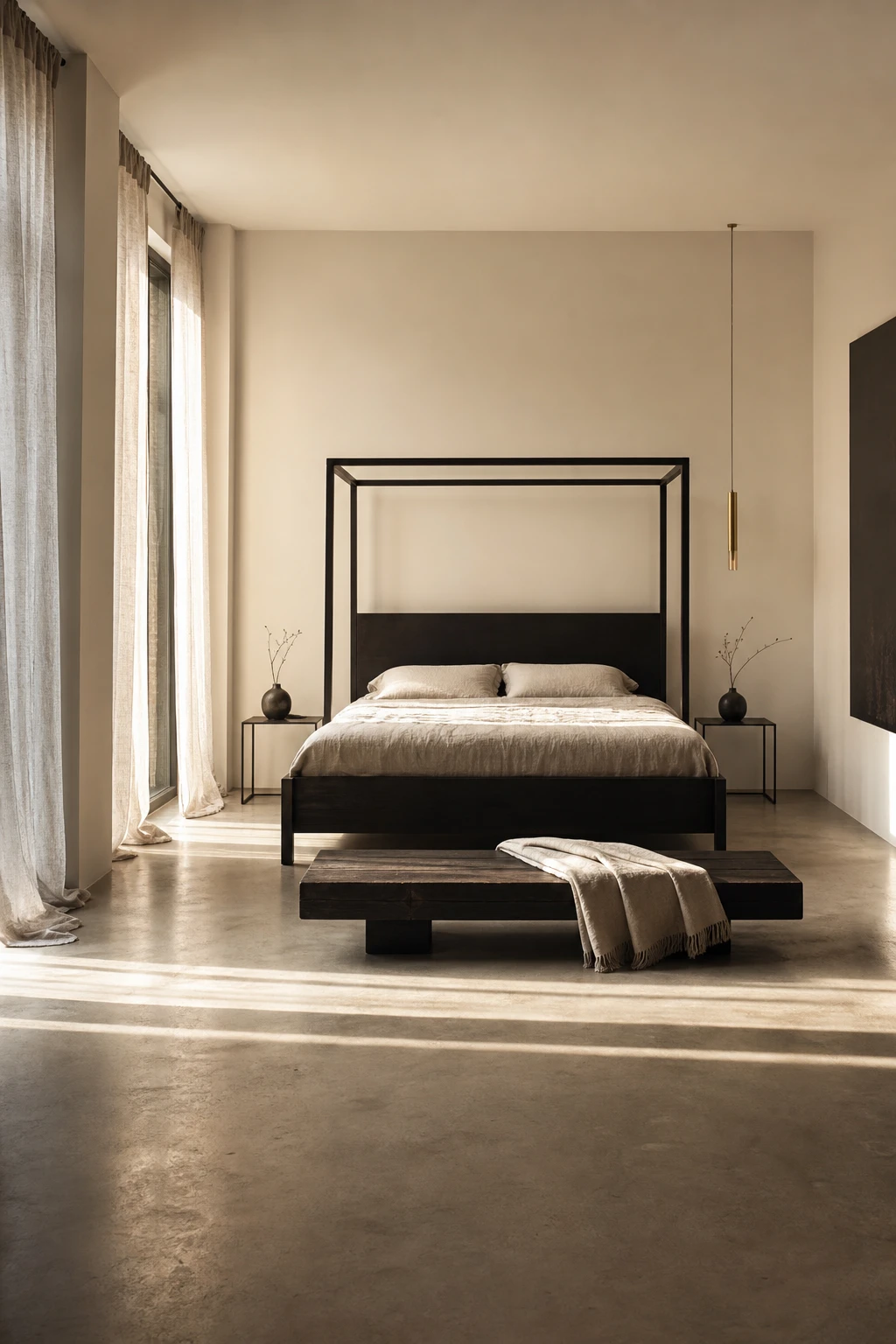
A king black bed frame commands a room the moment you walk in, and what I love is how the surrounding pieces need to earn their place by staying out of its way. Low, lean furniture lets the floor breathe beneath and beside the bed, so the frame reads as a single bold object rather than part of a heavy cluster. You get that calm, deliberate feeling dark minimalism is built on, because nothing is competing for attention.
The Key Details
Matte blackened steel and dark oak king bed frame
Razor thin low profile bedside tables
Low slung dark timber end of bed bench
Floor to ceiling sheer linen curtains
Honed concrete floor
Pro TipChoose a bed frame that sits on slim legs rather than a solid base, so a strip of floor stays visible underneath and the whole piece feels lighter in the room.
AvoidMatching oversized dark bedside tables pulled flush to either side of a king bed turns three separate pieces into one solid mass, and the room immediately feels smaller and heavier than it should.
Dark Moody Minimalist Living Rooms and the Furniture Edit That Makes Fewer Pieces Feel Like More
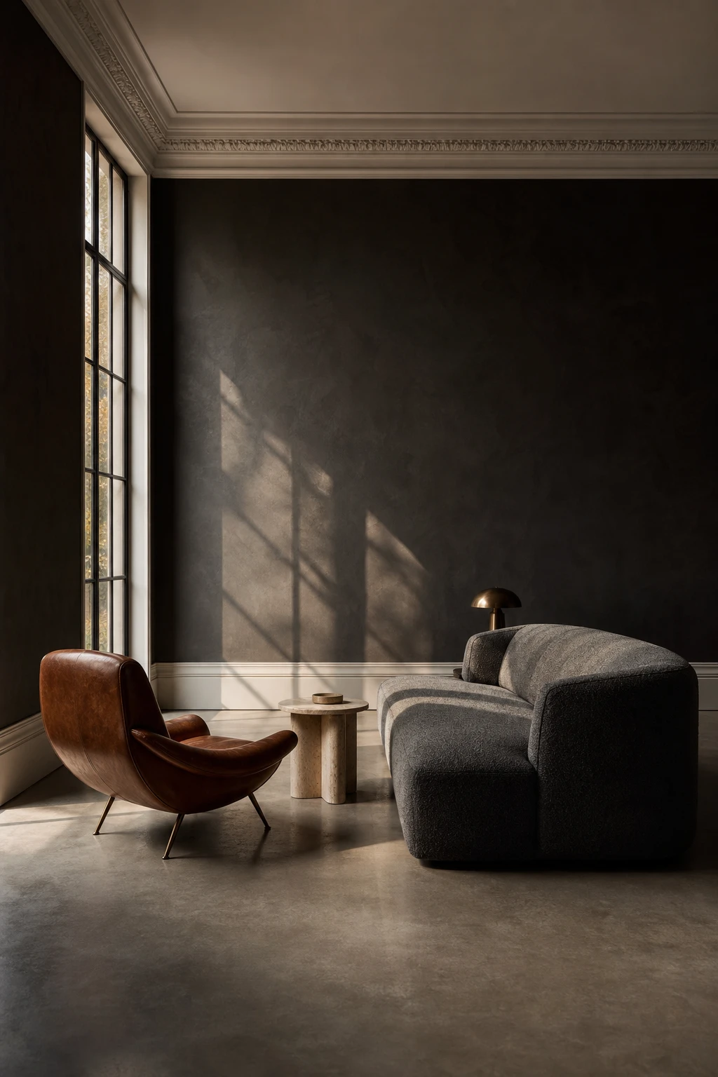
Editing a dark room down to three or four pieces is one of my favourite moves because the negative space becomes part of the design rather than a gap you feel compelled to fill. There is a quiet confidence that settles in when every piece genuinely earns its place rather than filling a corner. The low sofa, one sculptural chair, and a slim stone table pull focus without competing, and the dark walls hold it all together like a frame rather than a backdrop.
The Key Details
Low profile boucle sofa
Sculptural cognac leather lounge chair
Slim travertine side table
Honed concrete floor
Full height single window
Pro TipPut your budget into one genuinely oversized, well made sofa and let it anchor the whole room rather than spreading the same money across three or four smaller pieces that dilute the mood.
AvoidScattering small accent objects across a moody room fragments the calm you worked so hard to build, and the whole scheme starts to feel restless rather than considered.
Warm Minimalism and the Earthy Accent That Keeps a Dark Room From Feeling Cold
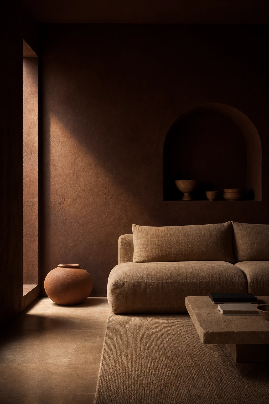
Warm terracotta, clay, and sand tones do something grey simply cannot: they pull heat into a dark room rather than pushing it further away. What I love about this palette is how the earthy accents borrow from nature, so nothing feels forced or added on. You get depth and shadow from the dark base, and then the warm layer wraps it in something that actually feels like home.
The Key Details
Low profile linen sofa in clay tone
Oversized unglazed terracotta floor vessel
Sand toned dense wool rug
Honed sandstone flooring
Arched alcove with raw plaster finish
Pro TipA single unglazed ceramic vessel on the floor or a shelf introduces enough warm tone to shift the whole room without touching the walls.
AvoidReaching for greige or cool grey as your accent in an already dark room deepens the chill and makes the space feel flat rather than grounded.
Dark Entertainment Rooms and the Acoustic Detail That Looks as Good as It Sounds
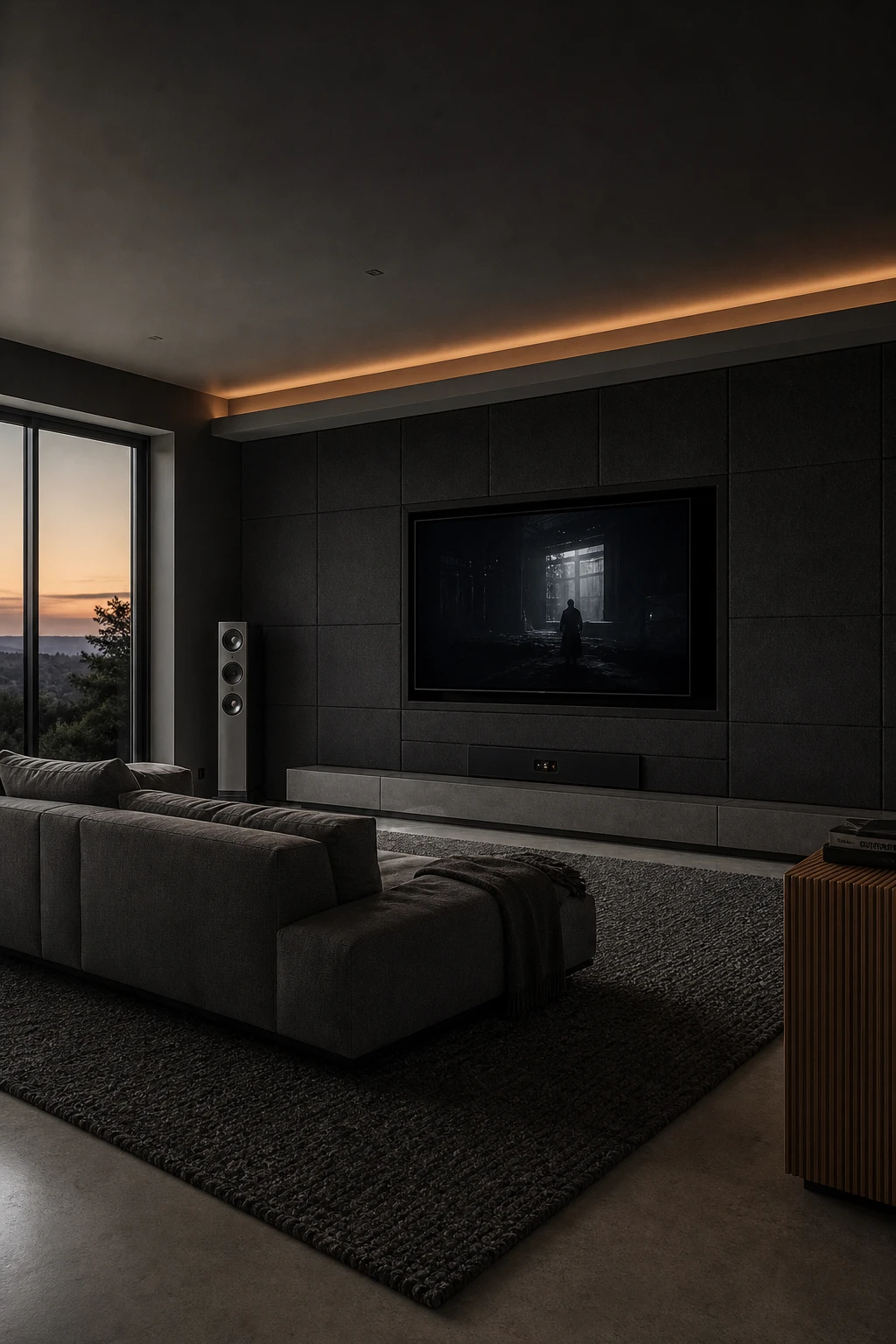
A dark entertainment room wins me over fastest when the acoustic panels stop looking like a fix and start looking like a choice. Charcoal fabric wrapped flush to the wall reads as texture rather than treatment, and you get that satisfying depth where every surface seems to belong to the same quiet family. Watch how the amber ceiling light then lifts the whole thing, giving warmth without fighting the dark.
The Key Details
Charcoal fabric acoustic wall panels in a flush grid
Low profile concrete grey sectional sofa
Recessed amber ceiling channel lighting
Slatted timber side console
Oversized woven wool area rug
Pro TipOrder fabric wrapped acoustic panels in a deep charcoal that matches your wall paint as closely as possible, so the seam between panel and plaster all but disappears.
AvoidPainting the screen wall a lighter shade than the rest of the room pulls the eye straight to it and creates a glare band that makes long viewing sessions genuinely uncomfortable.
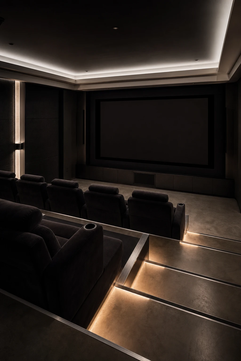
Modern Dark Home Theaters and the Tiered Seating Arrangement Worth Planning From the Start
Getting the rake right before a single wall goes up is the move that separates a real theater from a dark room with a big screen. What I love about tiered platforms is how the moment you add even one step at the back row, every seat wins a clean sightline and the whole room starts to feel intentional. You get that cinema depth without the cinema footprint, and the raised platform gives you a natural ledge to run recessed step lighting that looks sharp and stays practical.
The Key Details
Tiered recliner seating platforms
Acoustic fabric wall panels
Recessed LED step riser lighting
Matte black projection screen wall
Polished concrete flooring
Pro TipRaise your back row by at least 300mm so even someone tall in the front seat cannot block the view for anyone sitting behind them.
AvoidLeaving the walkway width between rows as an afterthought means you will end up with a gap so tight that anyone leaving mid film has to edge past knees in the dark.
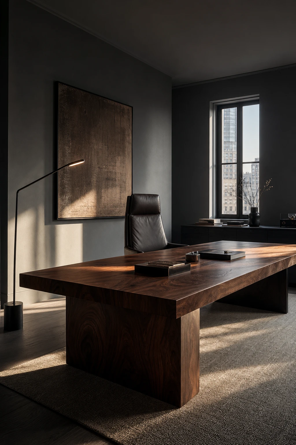
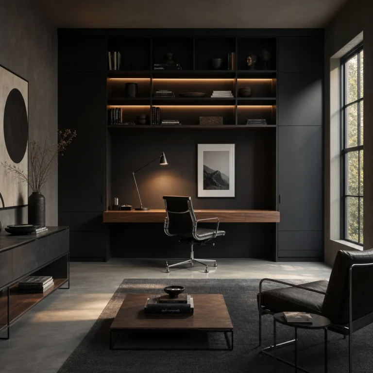
Executive Office Decor in a Dark Palette and the Desk Material That Sets the Right Tone
A bookmatched walnut slab desk stops the room cold, and that is exactly the point. The grain pattern reads as something made once, for this space, and you feel that weight the moment you walk in. What I love about pairing it with espresso leather and blackened oak is that every surface earns its place quietly, no gilding, no fuss. The room signals confidence because nothing in it is trying too hard.
The Key Details
Bookmatched walnut slab desk
Deep espresso leather executive chair
Slim architectural floor lamp
Blackened oak credenza
Tall casement window with smoked glass
Pro TipChoose a solid walnut or black lacquer desk over veneer, because the edge profile and the way the surface ages over years is what gives a dark executive office its lasting authority.
AvoidLining the shelves with framed awards and trophies shifts the room from calm confidence into something that reads more like a waiting room trophy cabinet, and the focused atmosphere you worked hard to build disappears with it.
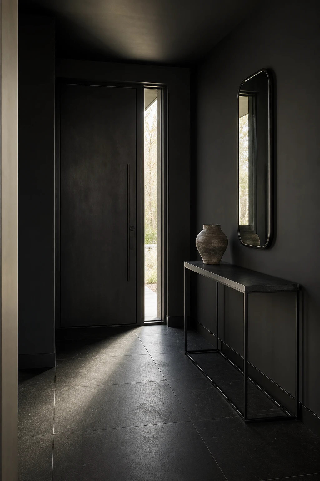
Dark Modern Entryways and the First Impression Detail That Guests Notice Before Anything Else
The floor is the first thing a guest reads when a door opens, before the walls, before the furniture, before anything else has a chance to speak. Honed black stone laid in large continuous slabs does something quiet but powerful: it pulls the eye straight down the hall and signals that this home means it. What I love about running the tile past the threshold without interruption is how the entry stops feeling like a separate zone and starts feeling like the beginning of something longer. You get a mood before you even step fully inside.
The Key Details
Honed black stone floor tiles
Slender black metal console table
Sculptural ceramic vessel
Elongated gunmetal wall mirror
Narrow sidelite window beside entry door
Pro TipLay your large format tiles in a brick offset pattern running lengthwise so the floor actively draws the eye deeper into the hallway and makes the space feel longer from the very first step.
AvoidPlacing a patterned rug right at the entry breaks the visual run of the floor before the space has time to register, turning a powerful first impression into a muddled one.
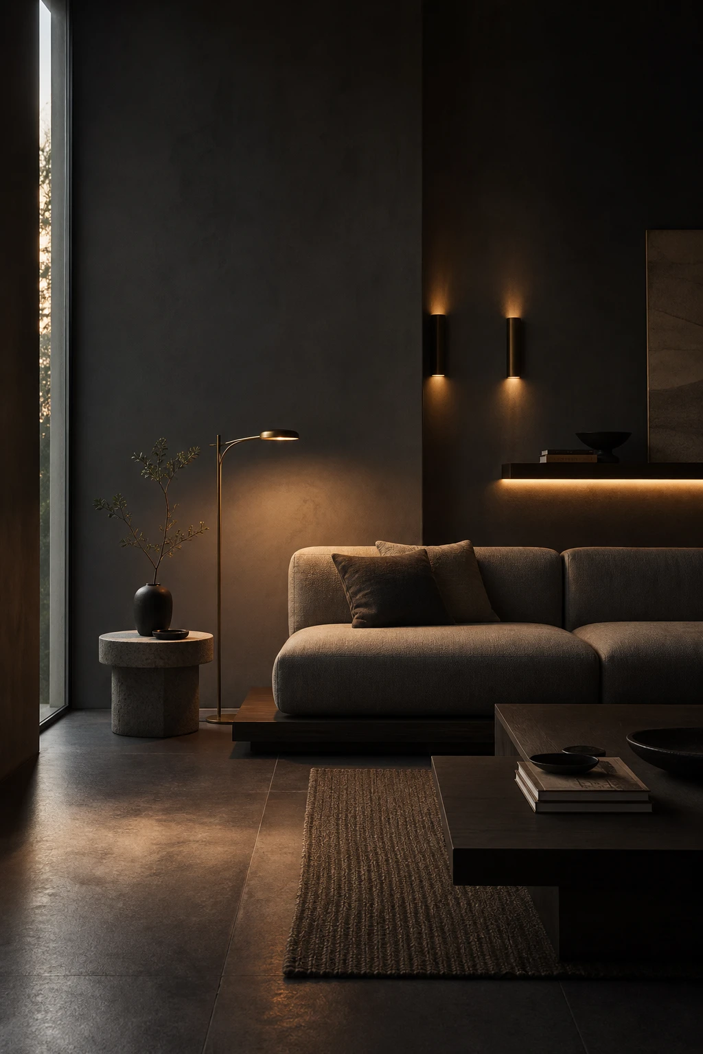
Moody Lighting Layers and Why a Single Overhead Fixture Is the One Thing to Avoid
Layered moody lighting is the detail that separates a flat dark room from one that feels genuinely alive. When you pull light down from the ceiling and push it out from walls, shelves, and floor level instead, the whole space softens into pools of warmth rather than one harsh wash. What I love most is how the shadows become part of the design, giving texture to those dark walls and drawing the eye across the room rather than straight up. You get depth, calm, and that low lit quality every good dark minimal interior depends on.
The Key Details
Brushed bronze slim floor lamp
Flush wall sconces at seated eye level
Floating shelf with recessed LED strip underlight
Low platform sofa in natural linen
Honed basalt floor tiles
Pro TipFit dimmable wall sconces at seated eye level and make them your primary evening light source, so the room settles into exactly the mood you want rather than defaulting to bright and flat.
AvoidA single ceiling pendant aimed straight down creates hard shadows across faces and furniture, and it works directly against the layered warmth a dark minimal room is built on.
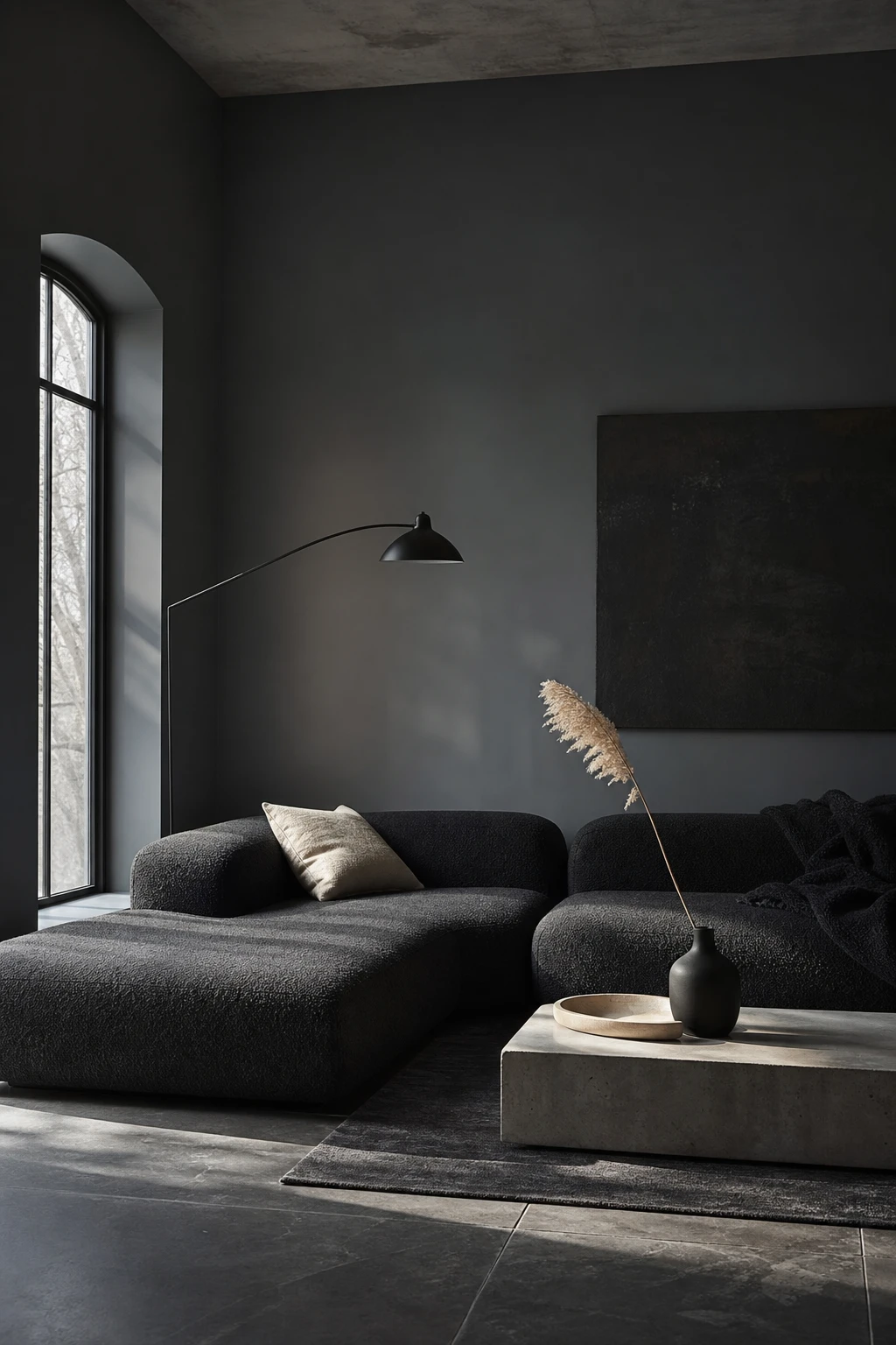
Nordic Noir Minimalism and the Unexpected Pale Contrast That Stops It Feeling Too Serious
Nordic noir gets its quiet authority from the tension between very dark surfaces and one small, pale thing that refuses to disappear. That bleached birch tray sitting on the concrete table is doing more work than it looks like it is: your eye finds it instantly, exhales, and the whole room feels considered rather than heavy. What I love about this pairing is how the pale wood reads as warmth without softening the scheme, so you get calm and character at the same time.
The Key Details
Low platform bouclé sofa in near black
Bleached birch wooden tray on concrete coffee table
Slender black steel arc floor lamp
Dried pampas stem in matte black ceramic vessel
Tall north facing window with full height reveal
Pro TipChoose one pale carved or bleached wood piece, a tray, a bowl, or a simple block, and place it at the lowest surface in the room so it anchors the eye at rest height rather than competing with the drama above.
AvoidStripping out every light element in pursuit of noir purity leaves a room that reads as punishing rather than peaceful, and most people stop spending time in it within a week.
Alan launched Edward George London in 2017. Since completing his masters in Town & Regional Planning (MPlan) he has combined the skills he learned at the University of Sheffield with his passion for design, to help create a foundation for those looking to create a beautiful home.