Newsletter Subscribe
Enter your email address below and subscribe to our newsletter
The transformative power of an earthy color palette lies in its ability to shift a room’s energy from chaotic to grounded, inviting the serenity of nature into even the most refined interiors. These organic hues from terra cotta and ochre to moss and umber create a sophisticated foundation that celebrates both architectural integrity and seasonal flexibility. When artfully layered in a space, these colors don’t merely decorate walls but rather cultivate an atmosphere where conversation deepens, stress dissolves, and the mind finds its natural rhythm against a backdrop of enduring beauty.
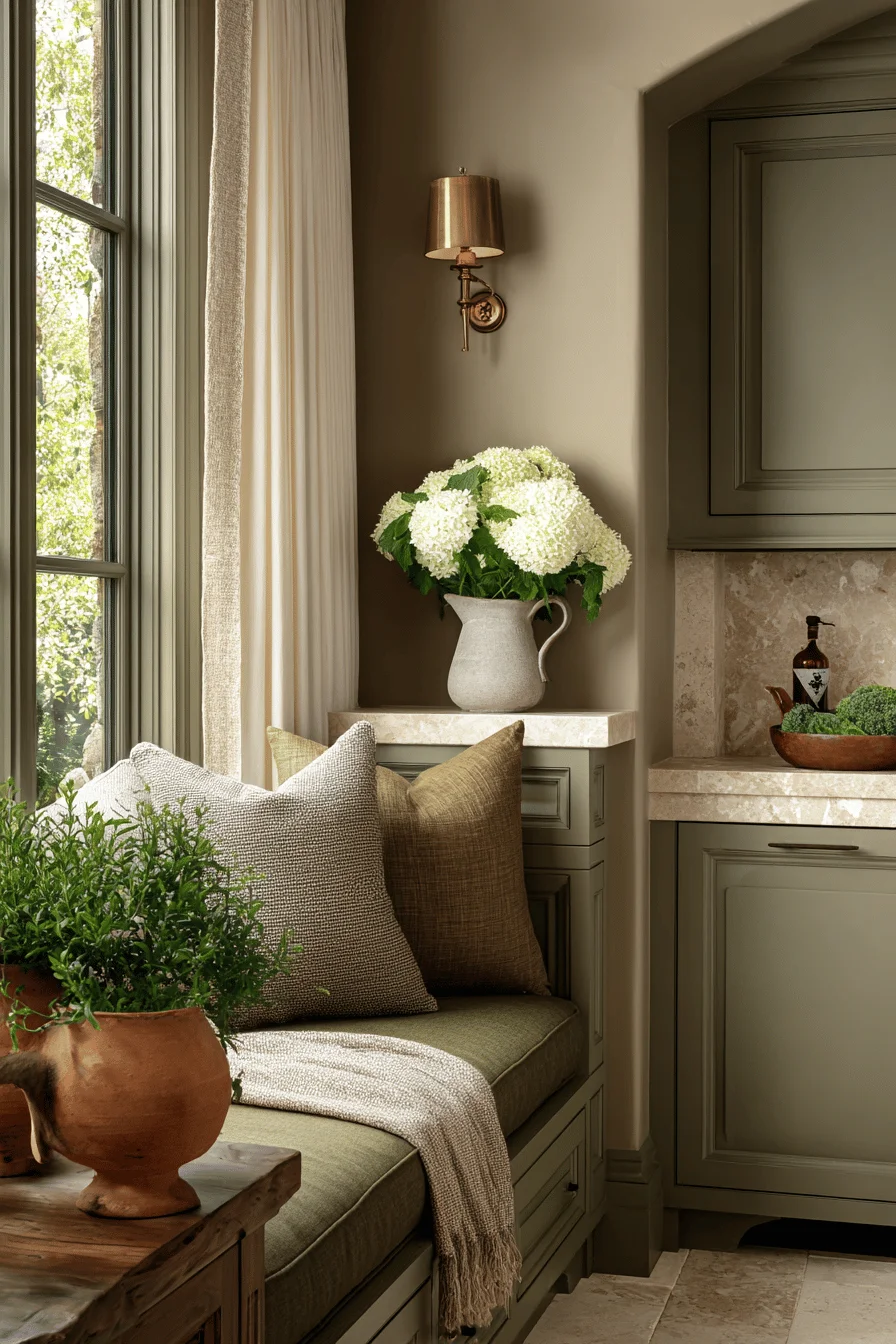
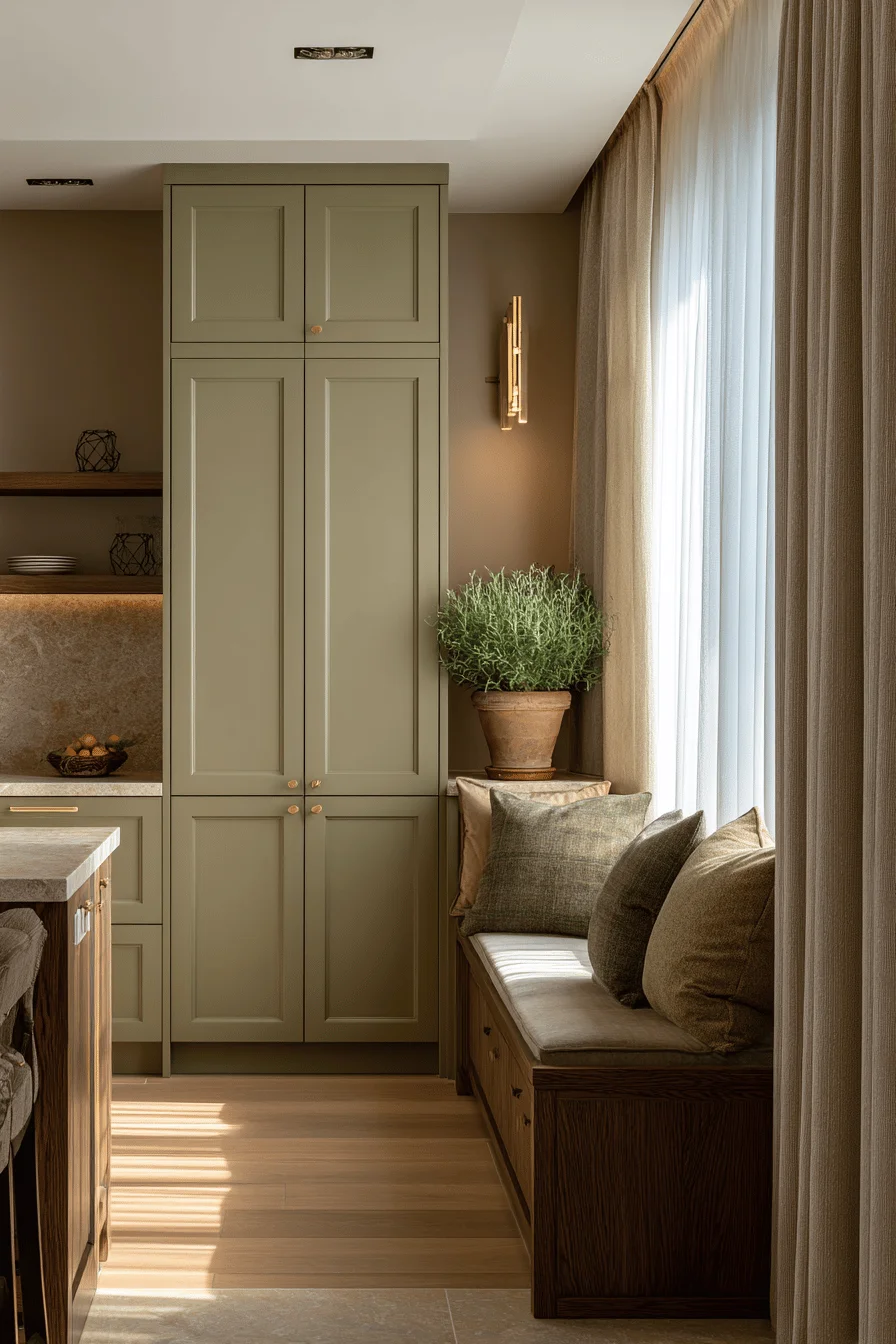
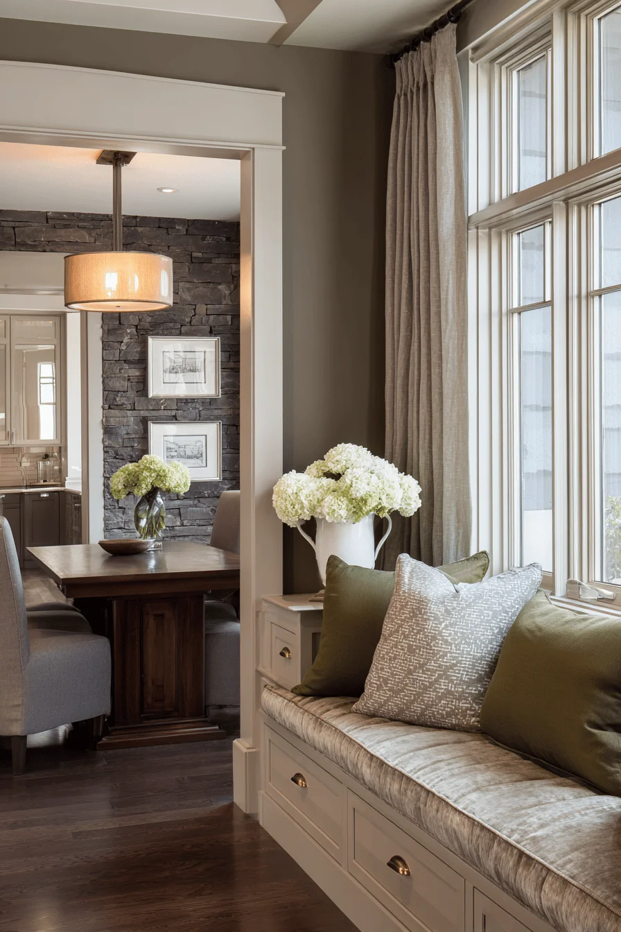
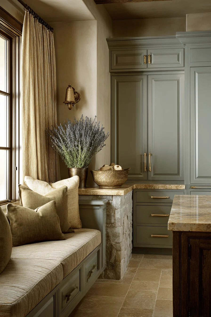
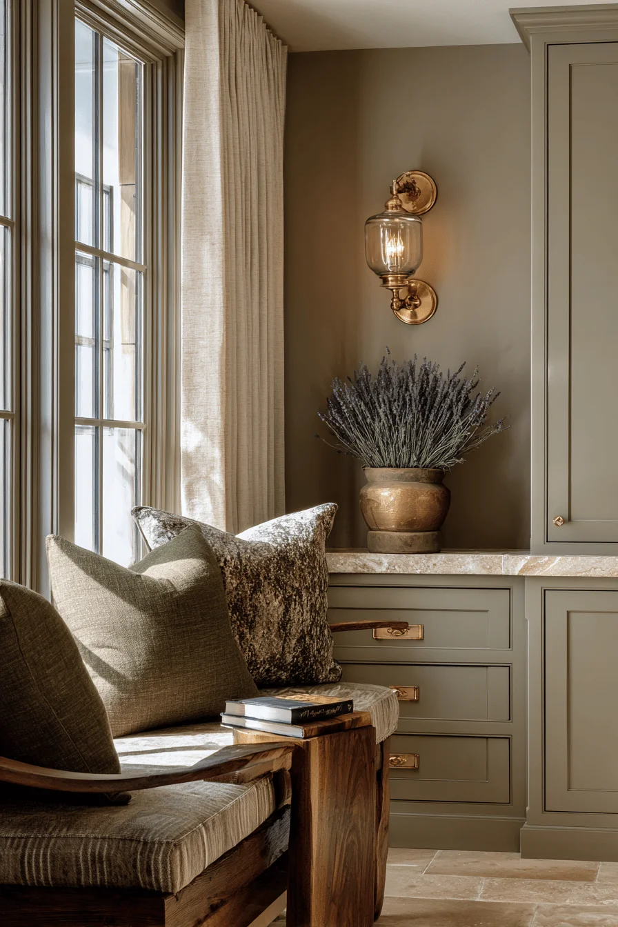
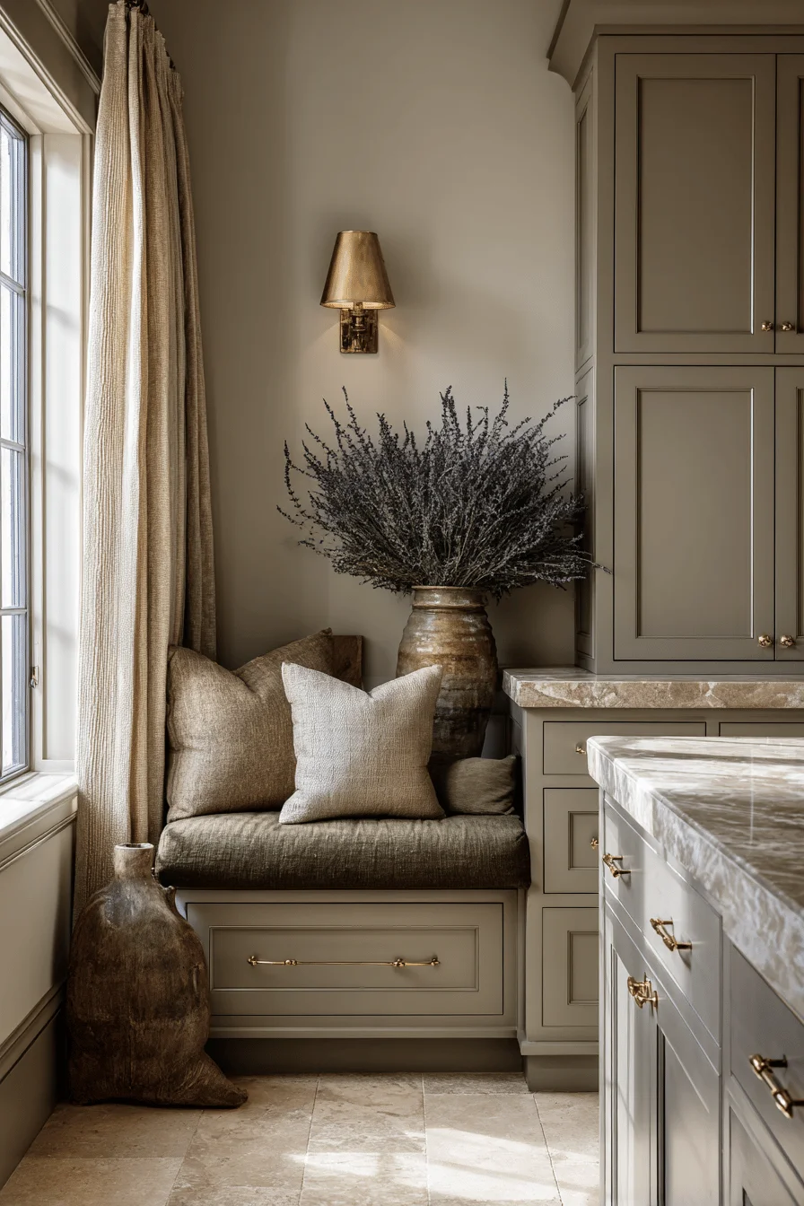
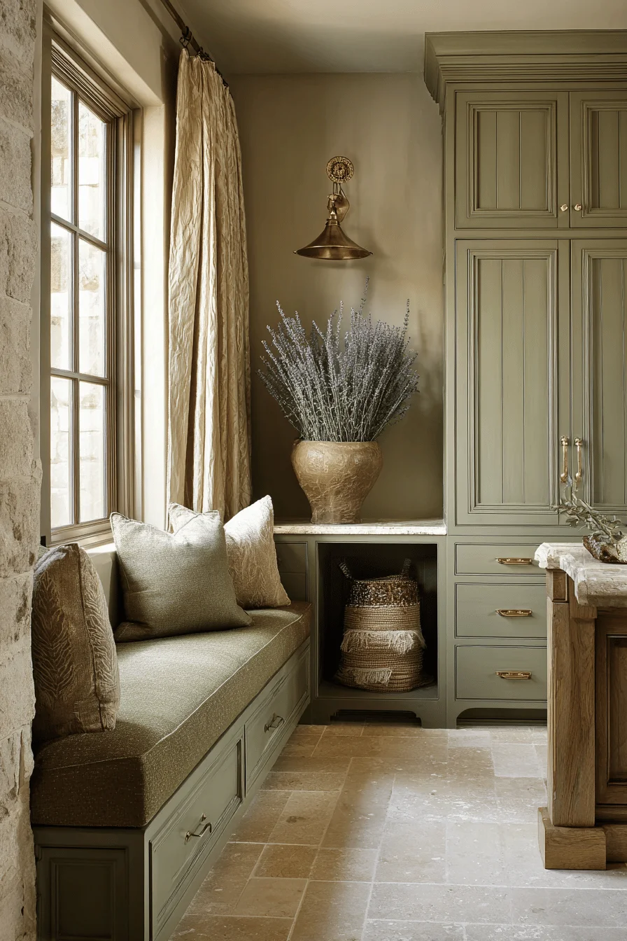
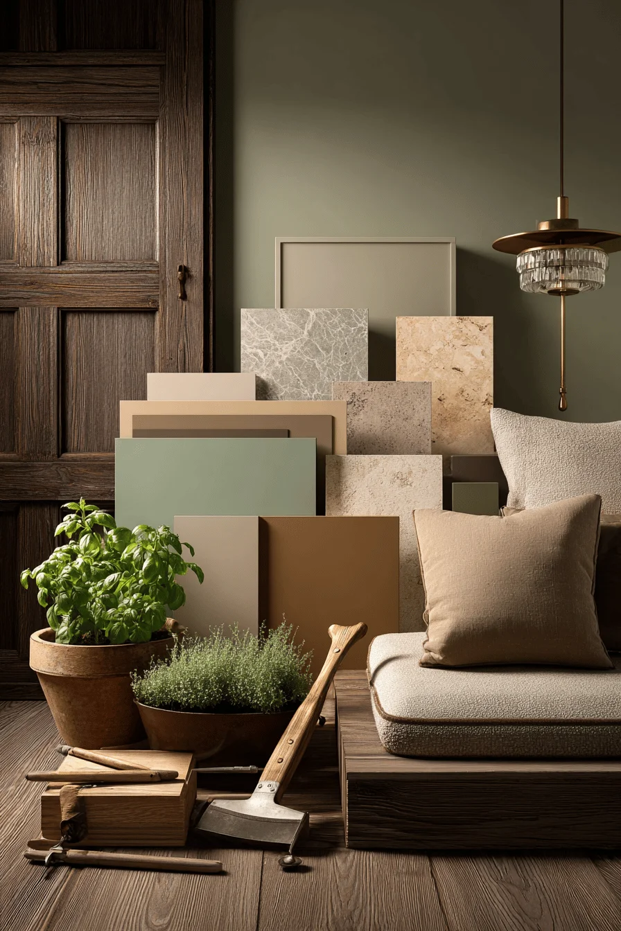
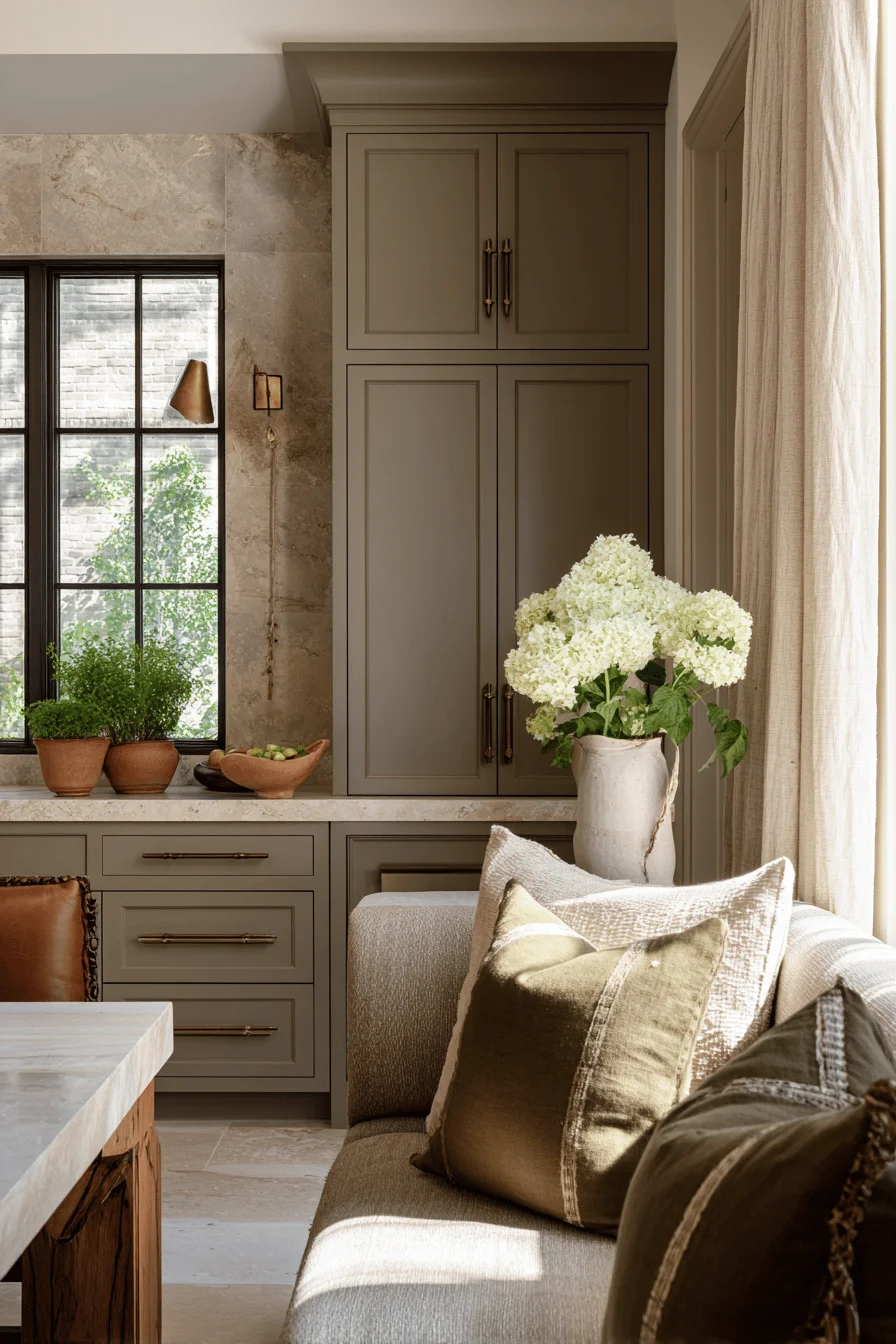
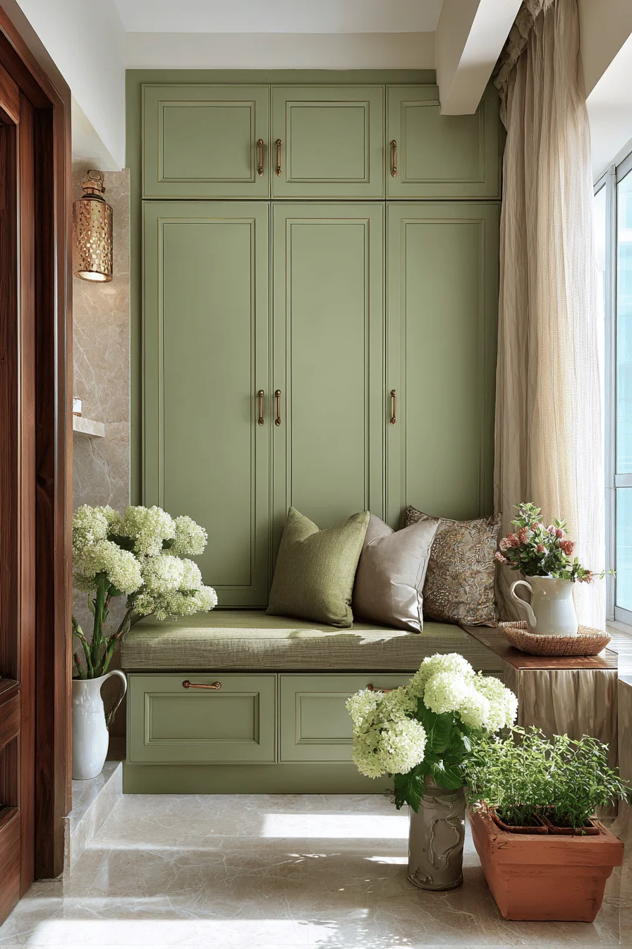
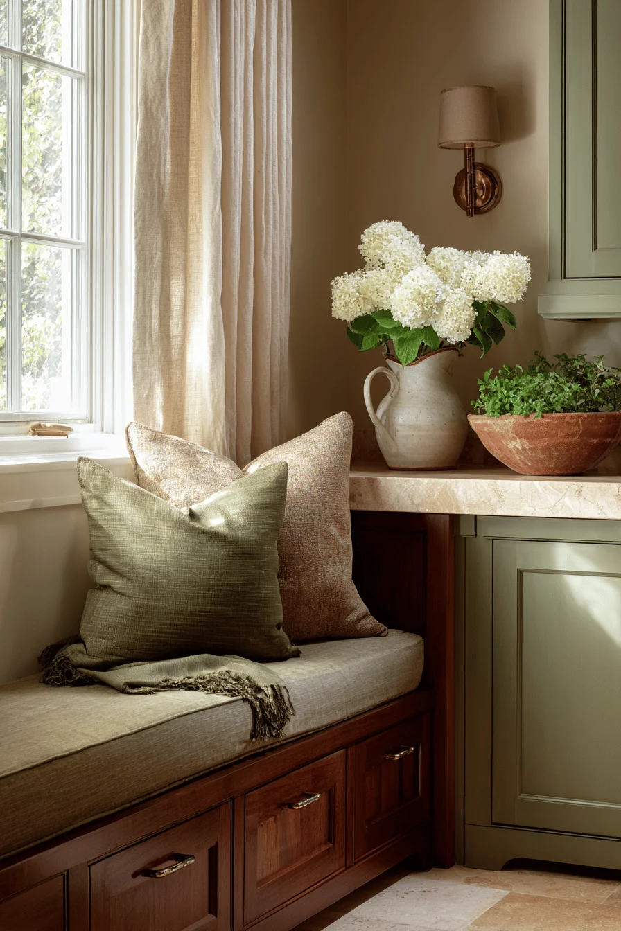
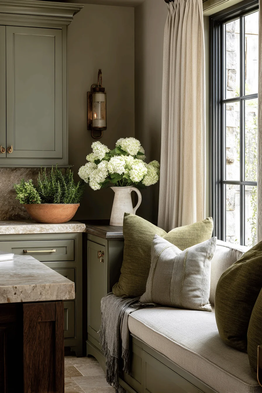
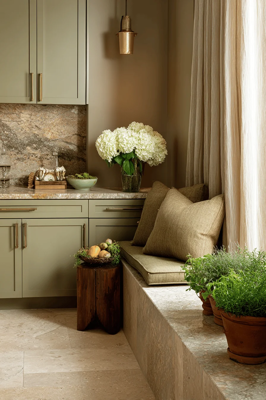
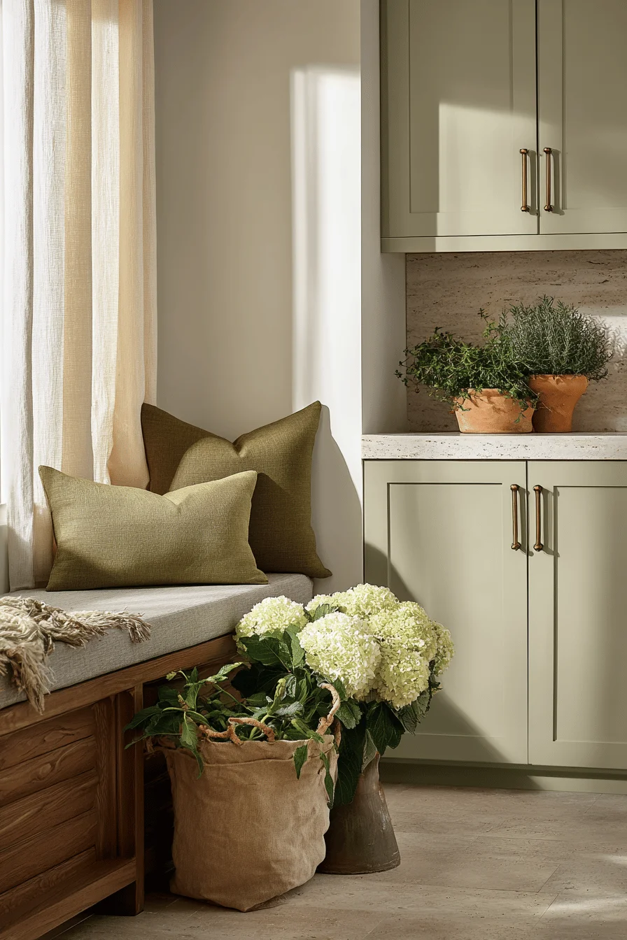
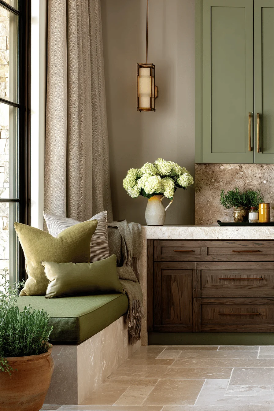
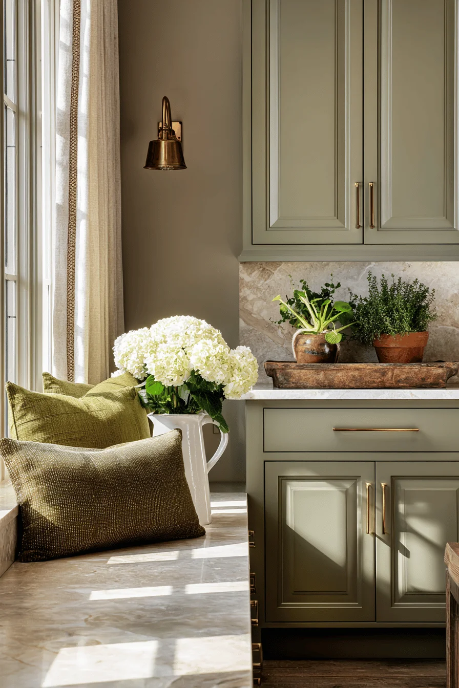
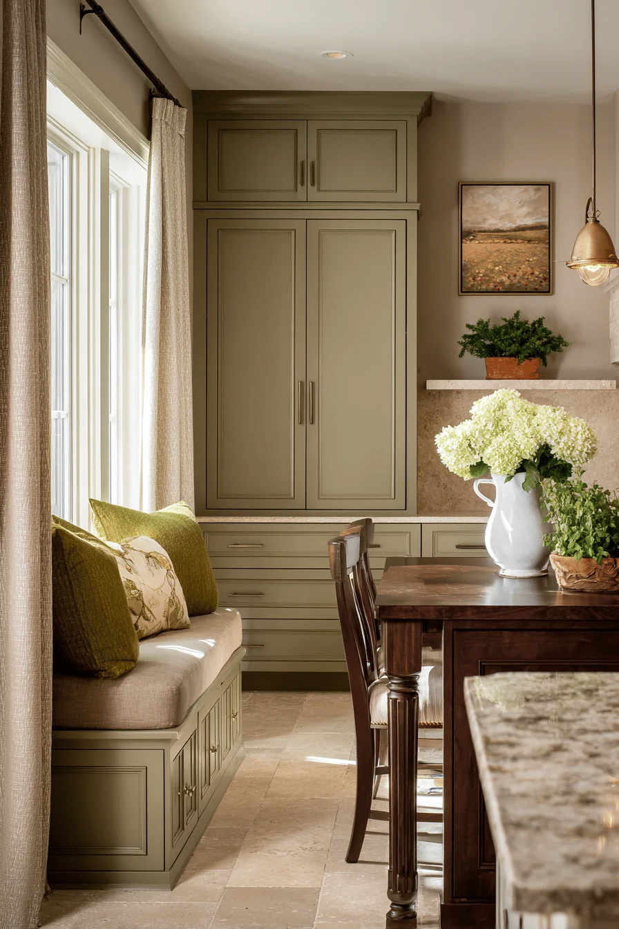
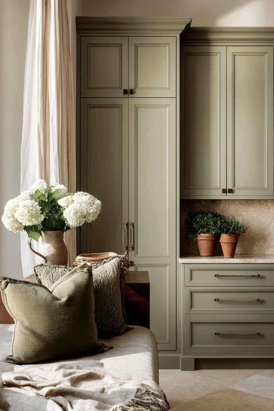
Earthy color fundamentals draw their authenticity from natural pigments found in soil, clay, and botanical matter elements that have defined distinguished interiors for centuries burnished terracottas, cashmere taupes, verdant olives, and atmospheric sages that create a grounded atmosphere throughout your established home.
The nuanced interplay of these hues establishes both aesthetic and psychological foundations, quintessential attributes for establishing interiors that balance refinement with authentic hospitality.
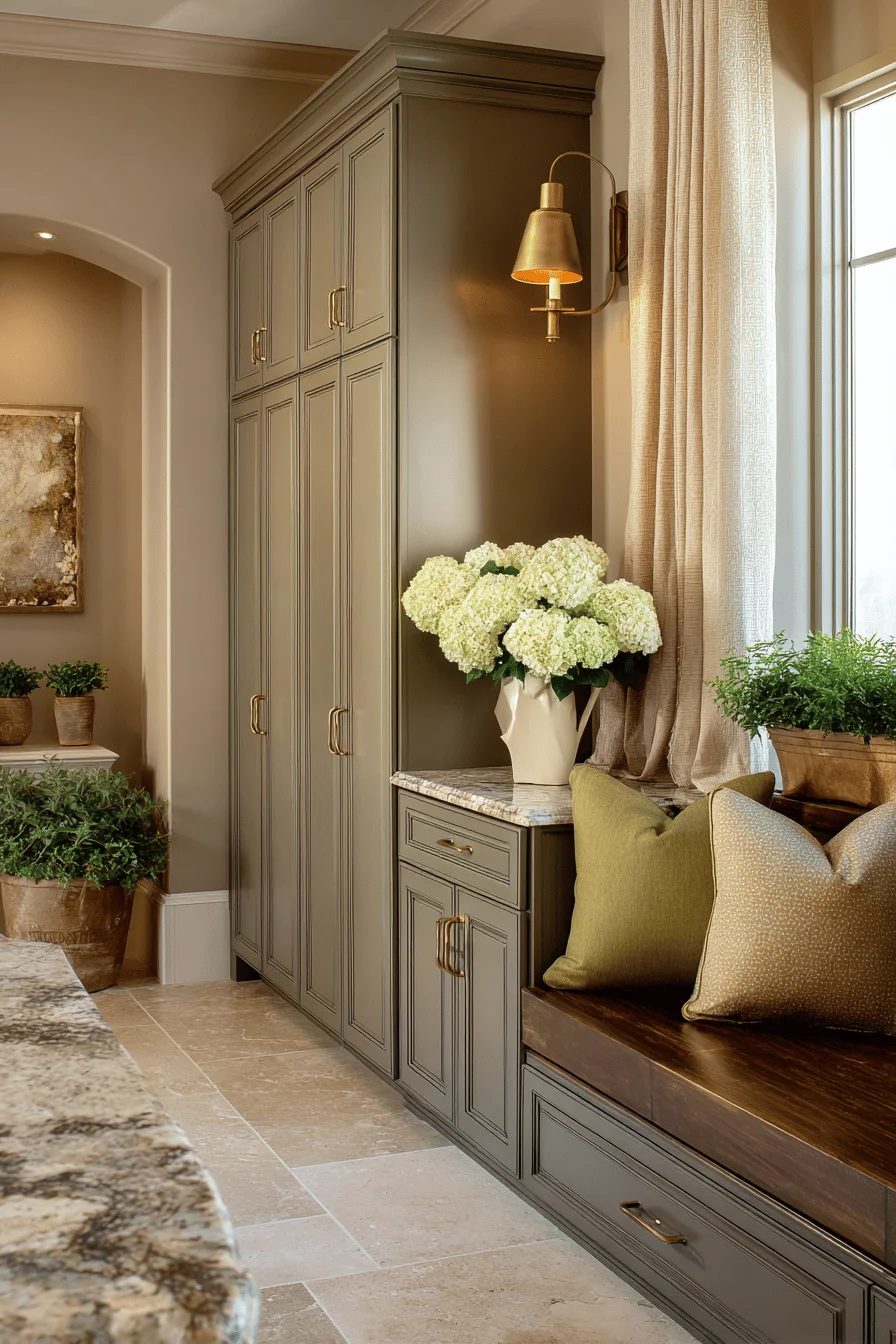
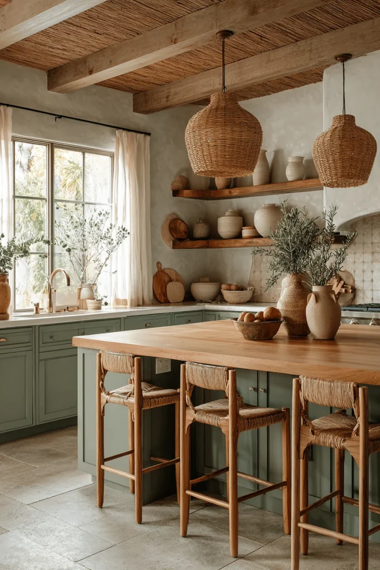
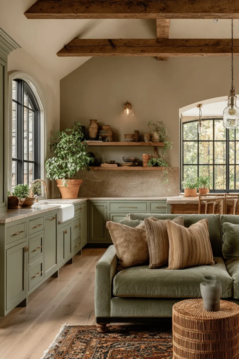
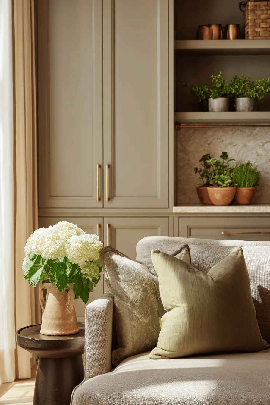
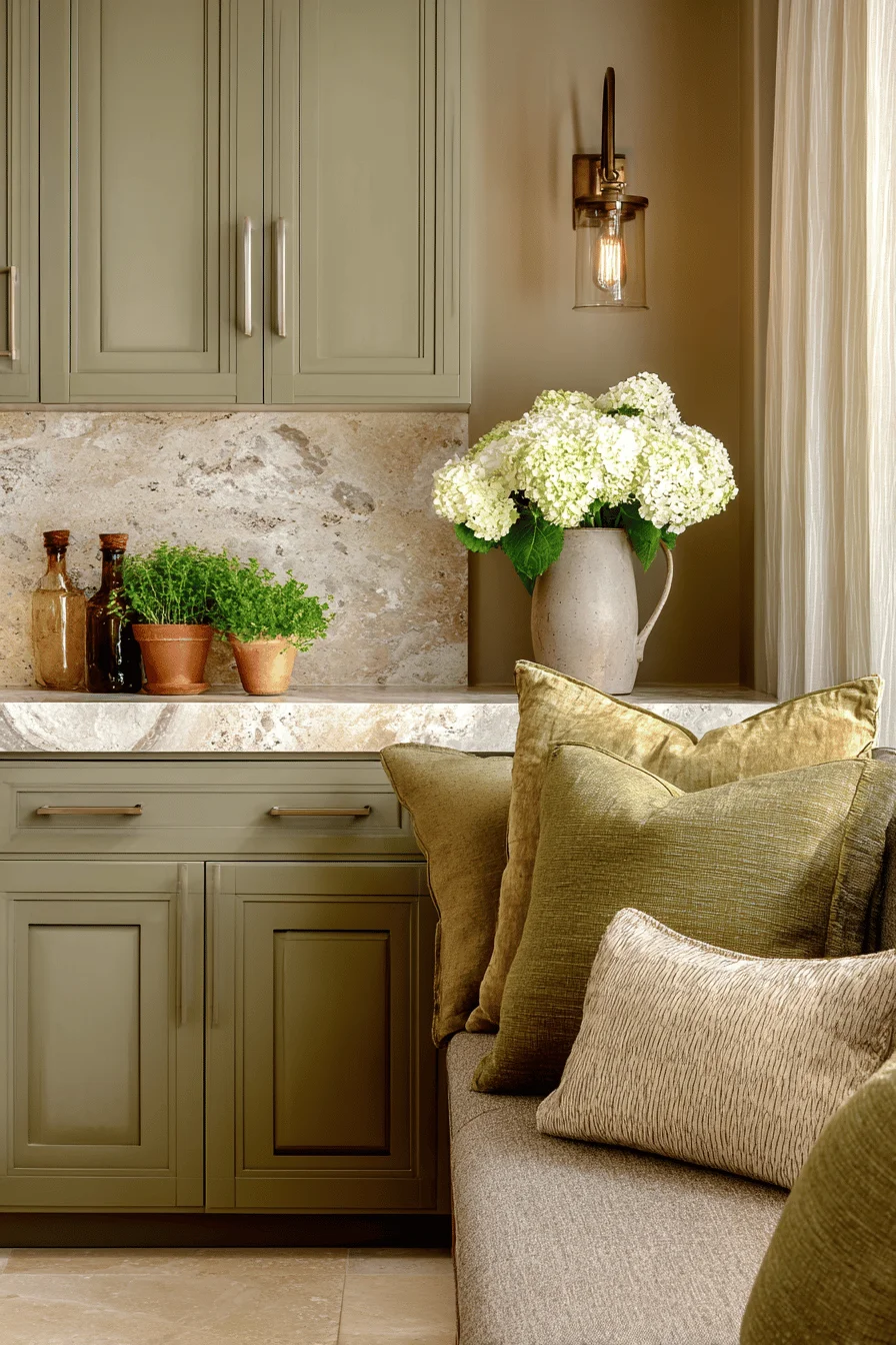
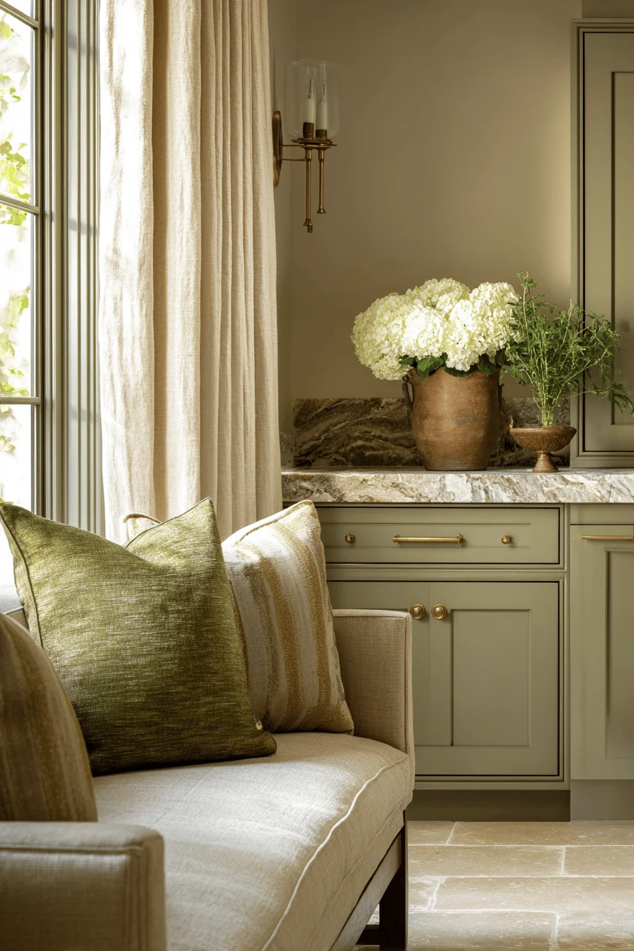
These foundational earth tones work harmoniously because they share underlying brown and gray undertones, allowing them to complement fine woodwork, natural stone, and quality textiles without competing for visual prominence.
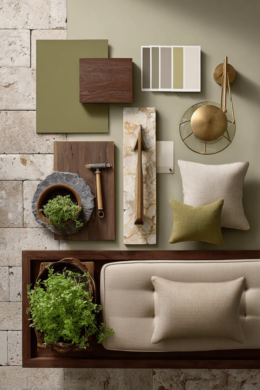
When selecting your earthy palette, prioritize colors with complex depth rather than flat imitations, as authentic earthy pigments contain subtle variations that reflect natural light differently throughout the day, enhancing both architectural features and cherished furnishings.
Before implementing refinements, carefully examine your living spaces during various lighting conditions to understand how your current colors interact with both natural and artificial light sources. Your assessment should focus on identifying which earthy color elements feel harmonious, and which create visual dissonance, particularly noting how wall colors influence the perception of furniture pieces and architectural features.
Evaluate each room’s dominant and accent colors by considering whether they communicate the intended mood and complement your quality furnishings and cherished accessories.
Documenting your existing palette through photography in different lighting conditions can reveal unexpected patterns and provide crucial reference points for developing a refined palette that honors your home’s character while elevating its overall sophistication.
When refining an earthy color scheme, the proper proportion of warm to cool tones determines whether your space feels balanced or appears overwhelmed by a single dominant hue. Successful implementation requires understanding how natural light interacts with earthy colors throughout the day—transforming terracotta, sage, and ochre as sunlight shifts from morning brightness to evening warmth.
Quality materials with authentic earthy finishes outperform synthetic alternatives in creating environments with authentic provenance and connection to the natural world rather than merely imitating it.
The integration of complementary textures natural stone with its cool solidity, aged wood offering warmth, and hand woven textiles providing tactile dimension elevates the earthy color story by adding dimensional interest and tactile comfort that sophisticated interiors require for both visual appeal and livability.
Integrating an earthy color palette requires deliberate consideration that begins with evaluating your existing architectural features and natural light patterns throughout different times of day. A comprehensive color progression plan ensures your spaces flow harmoniously from room to room while respecting the unique character and proportions of each area.
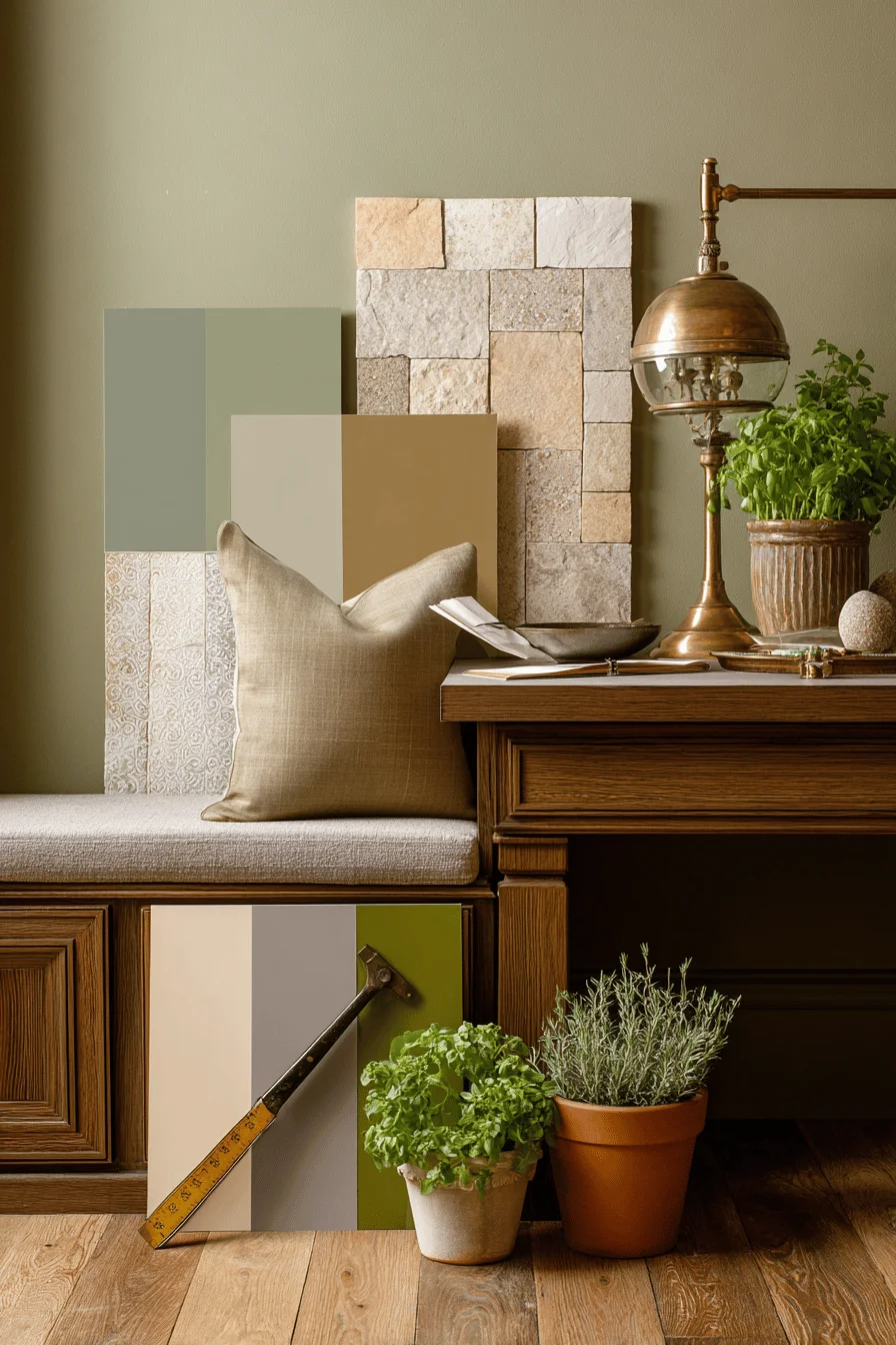
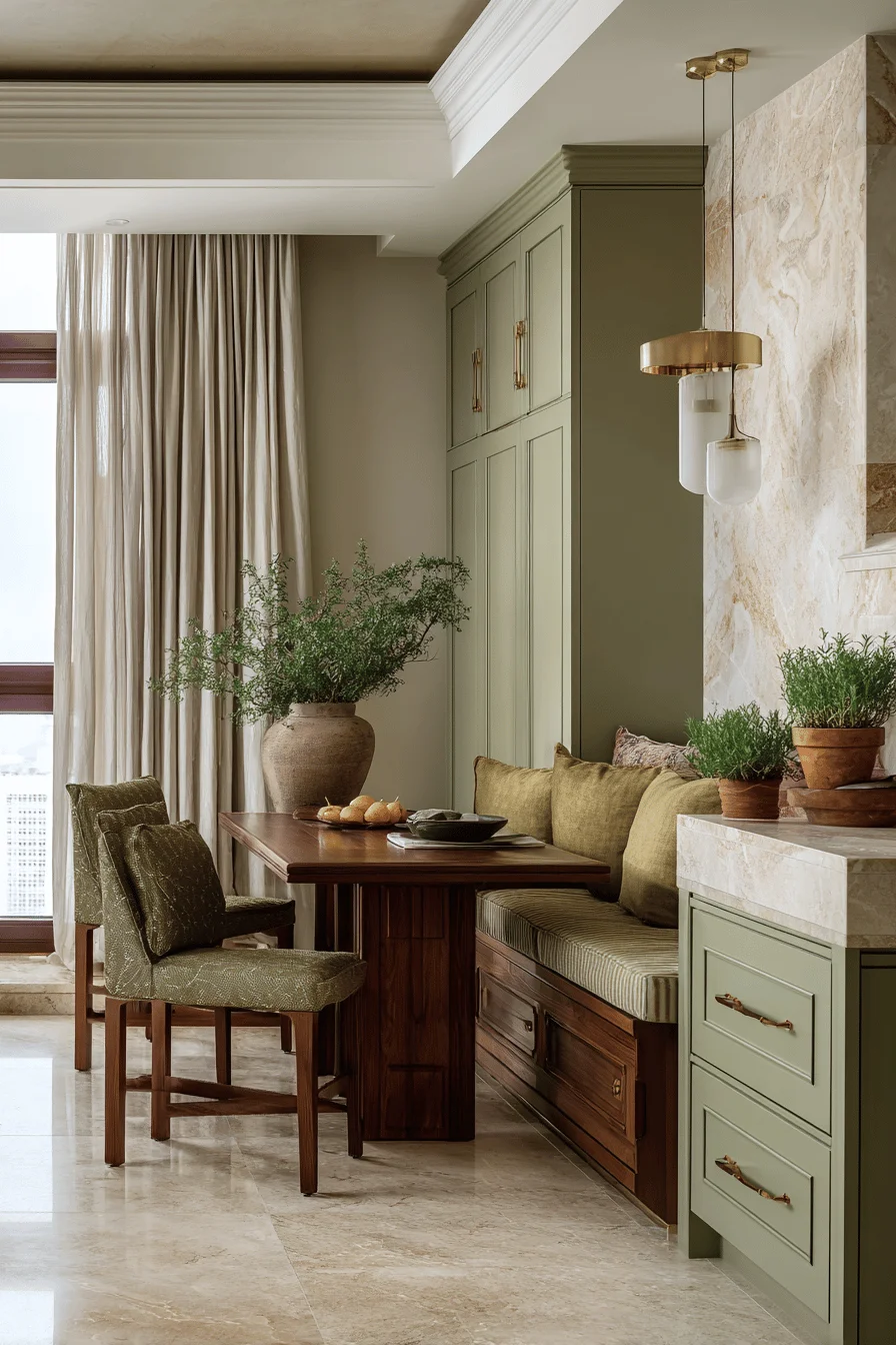
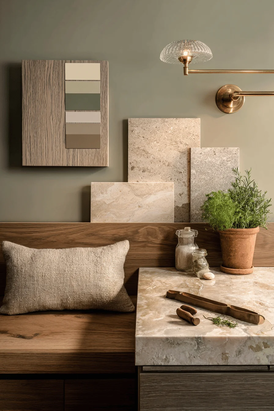
Curate a limited palette of three to five foundational earthy tones that harmonize with your existing investment pieces, then map precisely where each color will appear on walls, trim, ceilings, and floors using a scaled floor plan.
Consider how seasonal changes in natural light will affect your selected colors by evaluating substantial color studies on various wall planes before committing to your final earthy color transformation scheme.
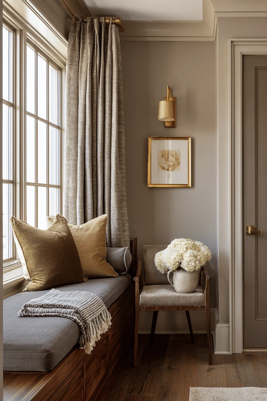
The art of color balancing within an earthy palette centers on the principle of visual weight, where darker earth tones anchor a space, while lighter hues create breathing room and visual movement. Achieving this balance demands thoughtful distribution of your dominant earthy colors across both horizontal and vertical planes, preserving the visual hierarchy within your cultivated composition you’re creating.
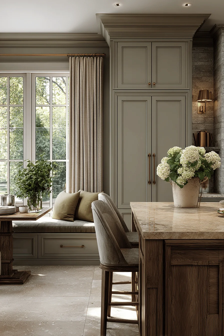
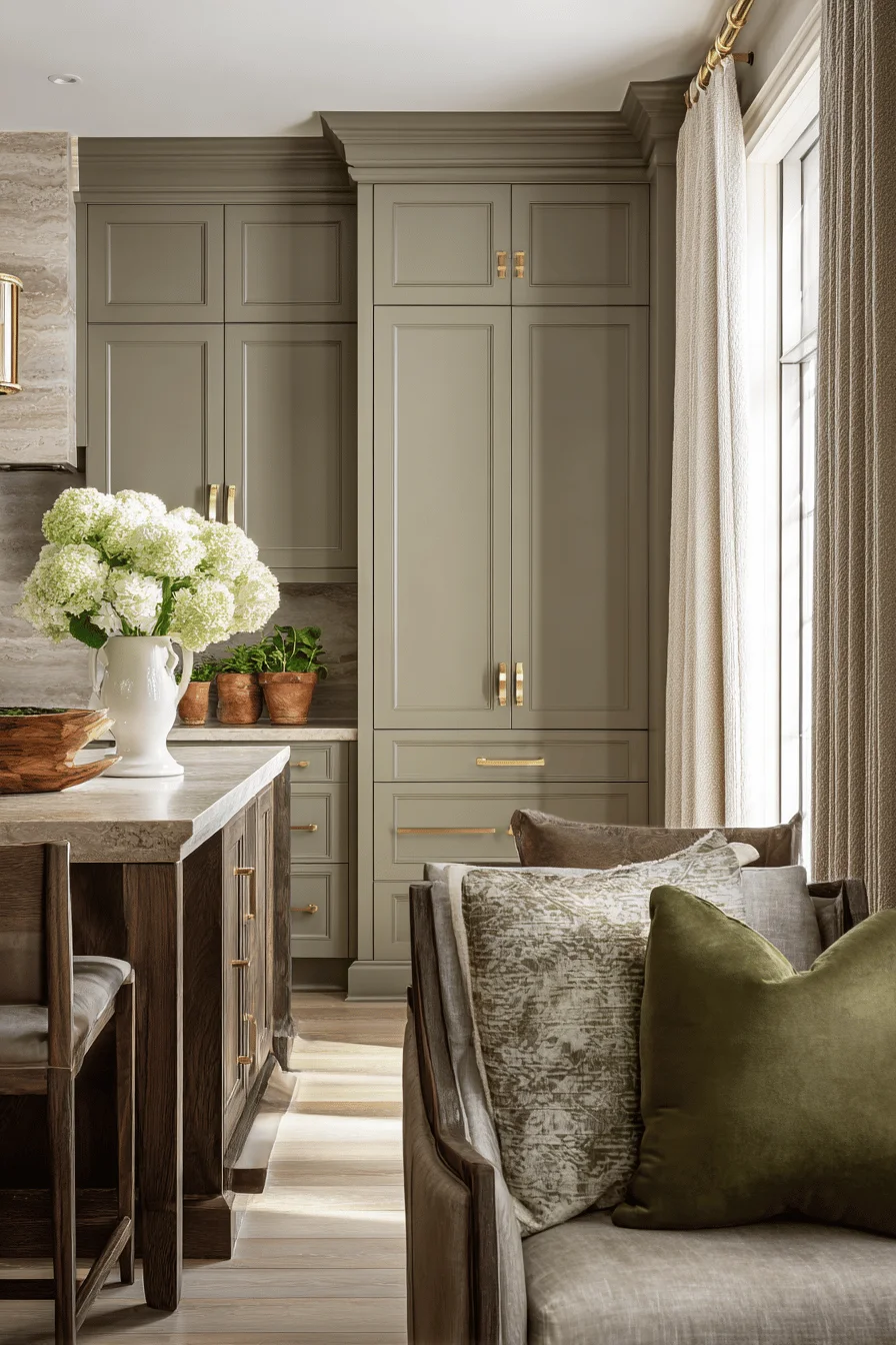
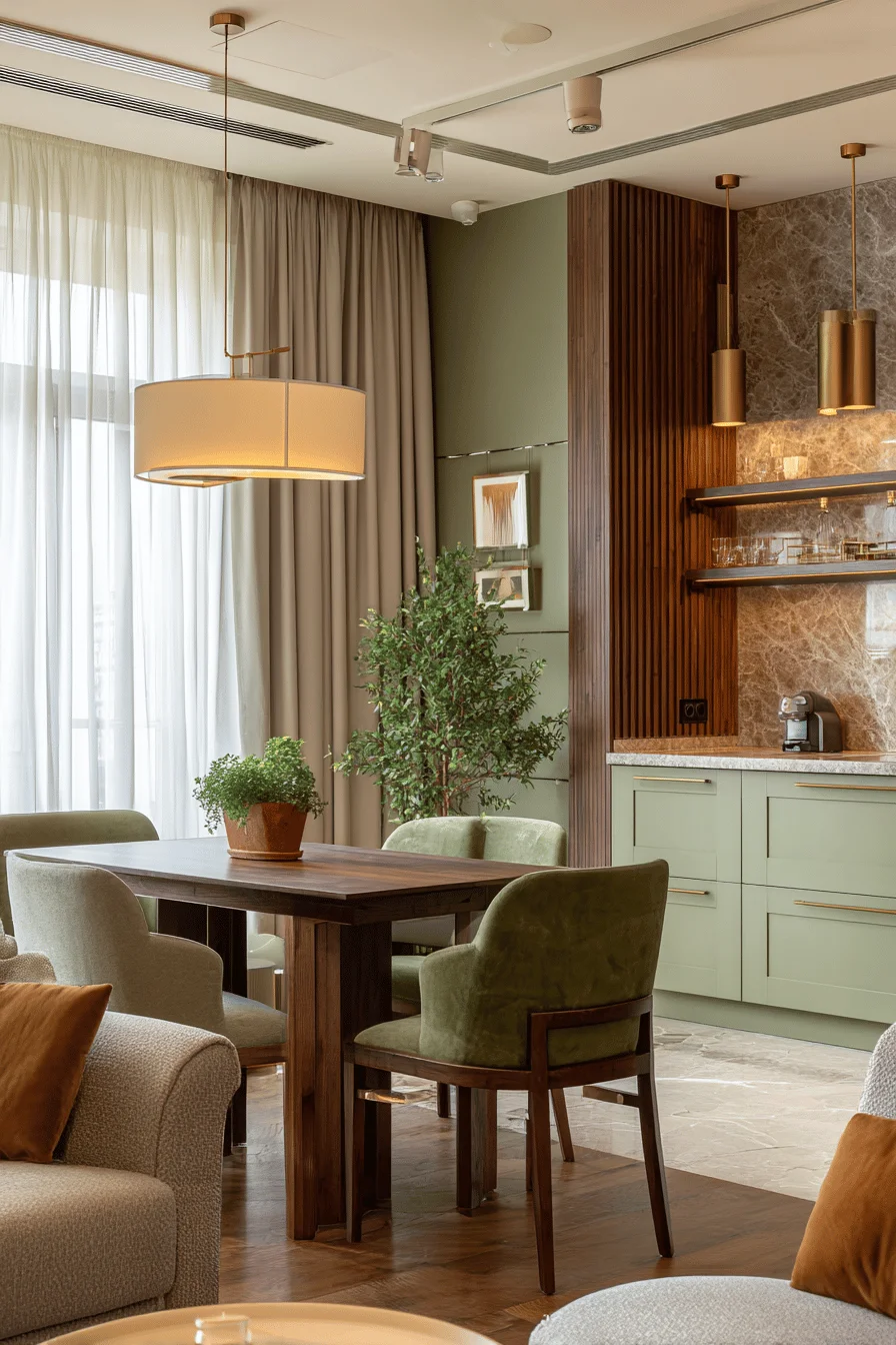
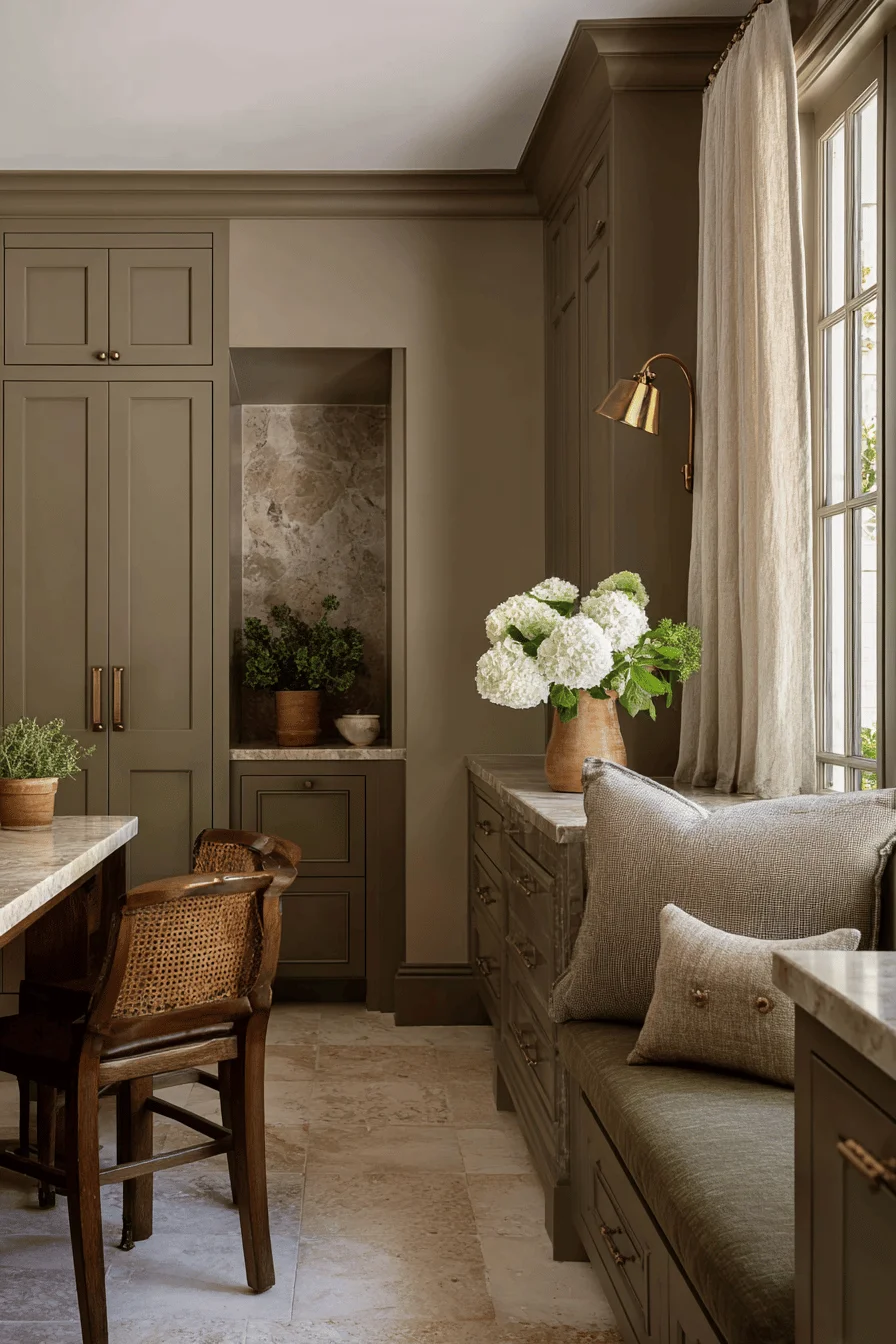
The classical 60-30-10 proportion—a principle that has guided interior design for generations provides a reliable framework for color distribution, with 60% allocated to your primary earthy tone (often walls or large furniture), 30% to secondary complementary colors (upholstery or cabinetry), and 10% reserved for accent elements that add depth through careful contrast.
Consider how natural light interacts with your earthy palette throughout the day, as northern exposure brings out cooler undertones while southern light amplifies warmth, requiring strategic color placement to maintain balance regardless of time or season.
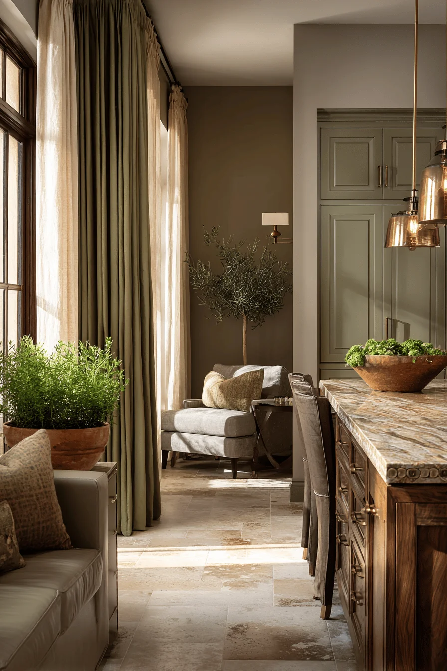
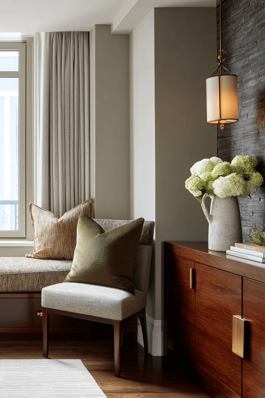
Blending earthy colors successfully requires understanding where even well-designed spaces may present coordination complexities, particularly when warm and cool tones create unintended contrast instead of harmony. The most common challenge occurs when attempting to incorporate multiple wood finishes or stone elements, as variations in undertones can create visual discord rather than the intended natural cohesion.
Address color coordination complexities by anchoring your scheme with a dominant neutral preferably one with subtle undertones that complement your architectural features, then incorporating complementary earth-derived hues within a consistent tonal register to create a rhythmic visual flow.
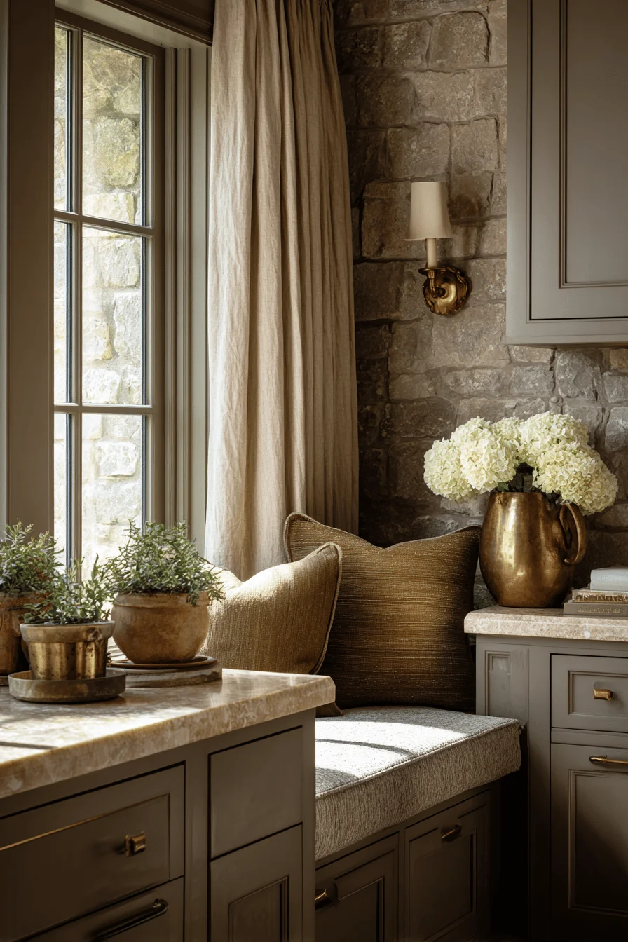
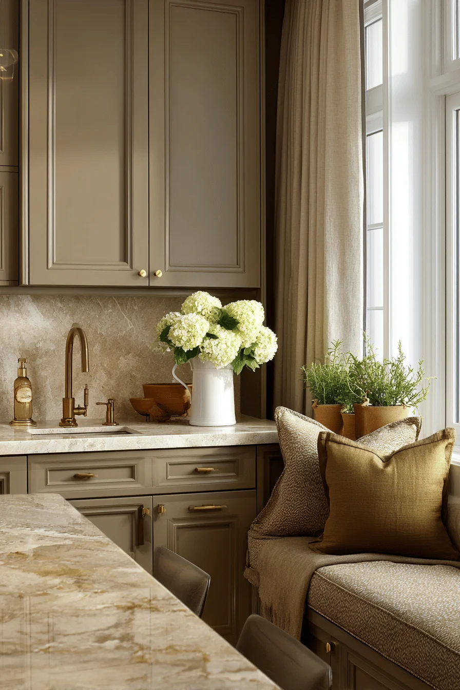
Quality textiles with subtle pattern variations can effectively bridge disconnected elements, while strategically placed metals like aged brass or bronze provide valuable transition points between challenging color combinations.
Professional designers achieve natural harmony by balancing earthy color tones through carefully calibrated proportions of warm and cool elements across walls, furnishings, and accessories. Well-conceived earthy palettes often incorporate varying intensities of related hues, creating subtle transitions between spaces while maintaining a sophisticated coherence throughout the home.
Introducing accent elements sourced from noble materials—the cool restraint of limestone, the Mediterranean warmth of terracotta, or the lived-in patina of aged brass—brings dimensional character to the depth and character of traditional interiors without compromising their refined quality. Consider how natural light interacts with your earthy color scheme throughout the day, as morning sunlight might emphasize warmer undertones while afternoon light often reveals the cooler, more contemplative aspects of your carefully selected palette.
Investing in an earthy color palette of premium materials creates a foundation that withstands both time and changing trends, offering sophistication that feels simultaneously current and classic. The careful selection of rich walnut finishes, limestone flooring, and taupe wall treatments delivers a depth of character that mass-produced alternatives simply cannot achieve.
Quality investments manifest through natural stone surfaces, hand-crafted wooden elements, and textiles with substantial weight and texture that become more beautiful with age rather than deteriorating.
The intrinsic value of these earthy selections extends beyond aesthetics into daily experience, where the subtle interplay of warm neutrals and natural materials creates an environment of enduring comfort that reflects discerning taste rather than fleeting fashion.
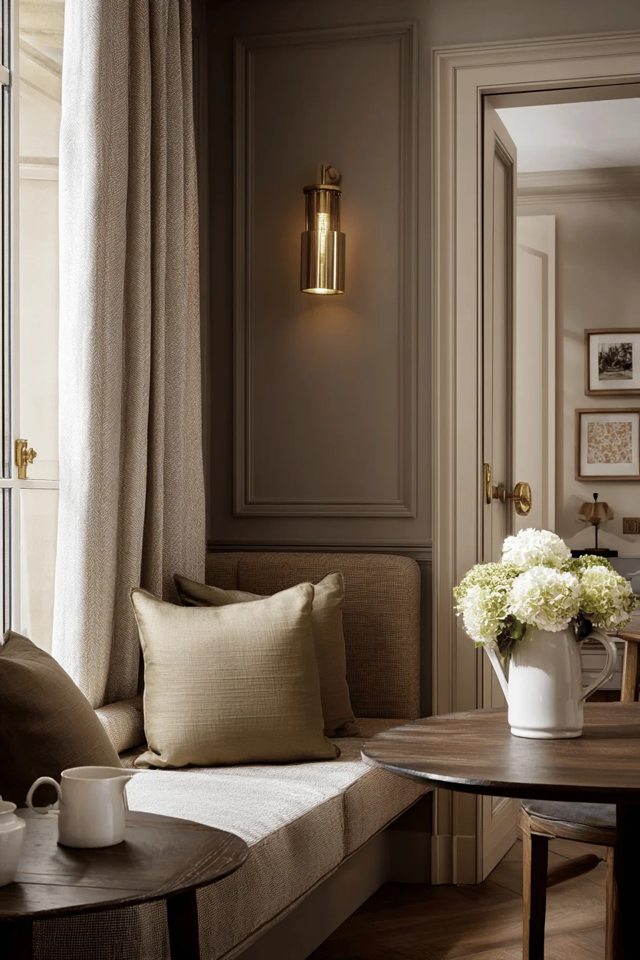
The hallmark of sophisticated color integration lies in the artful handling of transitions, where each earthy color flows naturally into the next through considered furnishings and finishes that create depth without jarring contrasts. The masterful layering of warm neutrals with subtle undertones establishes visual harmony that feels intentional rather than accidental, creating spaces that read as polished and professionally designed.
The essential principle underlying this refined integration lies in selecting a consistent color temperature throughout your palette, maintaining either cool or warm undertones across all elements from flooring to ceiling treatments.
Quality lighting plays an essential role in this sophisticated arrangement, as proper illumination from both natural and artificial sources reveals the nuanced relationships between your carefully selected hues and preserves the integrity of your earthy palette’s intended character throughout the day.