Newsletter Subscribe
Enter your email address below and subscribe to our newsletter

Imagine stepping into a world where vibrant hues and bold designs seamlessly blend with sleek lines and organic forms, creating a space that’s both timeless and utterly captivating. That’s the magic of mid-century modern color, it has the power to transform any room into a stunning tableau that exudes warmth, sophistication, and an undeniable sense of cool. Whether you’re a die-hard aficionado of the style or simply looking to infuse your home with a touch of retro charm, join me on this exciting journey as we explore the incredible world of mid-century modern color palettes and discover how to make them work in your own space!

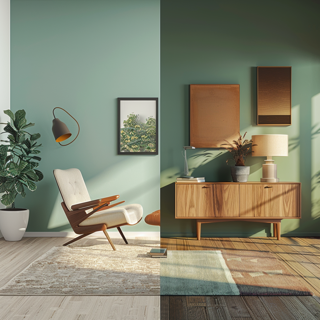
Mid-century modern design is characterized by a focus on simplicity, functionality, and organic forms. The color palette reflects these principles, featuring clean lines, uncluttered spaces, and a harmonious blend of hues that create a sense of openness and clarity. The style draws inspiration from both Scandinavian and American design traditions, bringing together a love for natural materials, neutral tones, and bold, graphic elements.
Mid-century modern design emerged in the post-World War II era, characterized by a focus on simplicity, functionality, and organic forms. The color palette reflects these principles, featuring clean lines, uncluttered spaces, and a harmonious blend of hues that create a sense of openness and clarity.
The mid-century modern style draws inspiration from both Scandinavian and American design traditions. Scandinavian influence brings a love for natural materials, neutral tones, and a connection to nature, while American design contributes bold, graphic elements and a more playful use of color.
The mid-century modern color palette is built around three main categories: bold primary colors, neutral foundations, and earthy tones. Vivid reds, deep blues, and sunny yellows are used as accents or focal points, creating striking contrasts against neutral backgrounds of white, gray, and black. Earthy tones, such as olive green, mustard yellow, and burnt orange, add warmth and depth to the spaces, evoking a connection to nature.
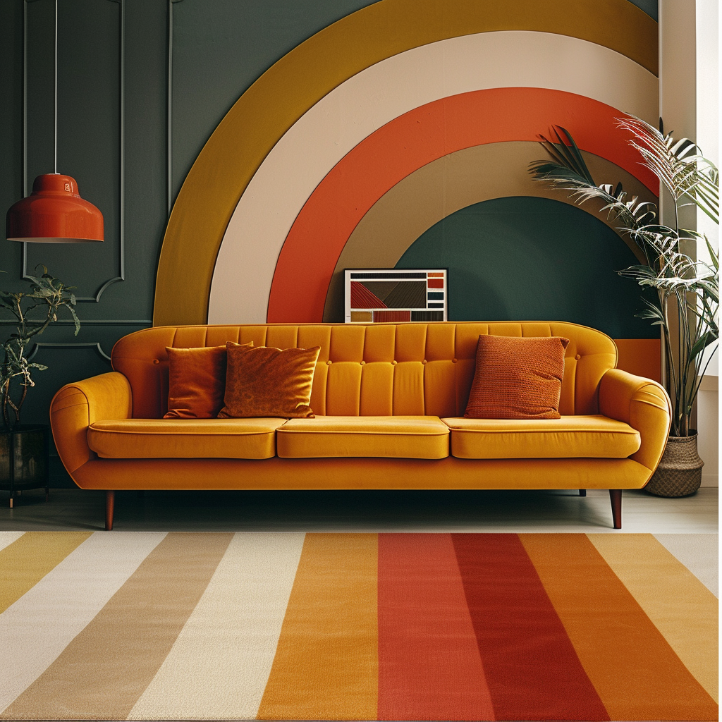
Mid-century modern design fearlessly embraces bold primary colors, such as vivid reds, deep blues, and sunny yellows. These colors are often used as accents or focal points, injecting energy and vibrancy into a space. When used sparingly, they create a striking contrast against neutral backgrounds.
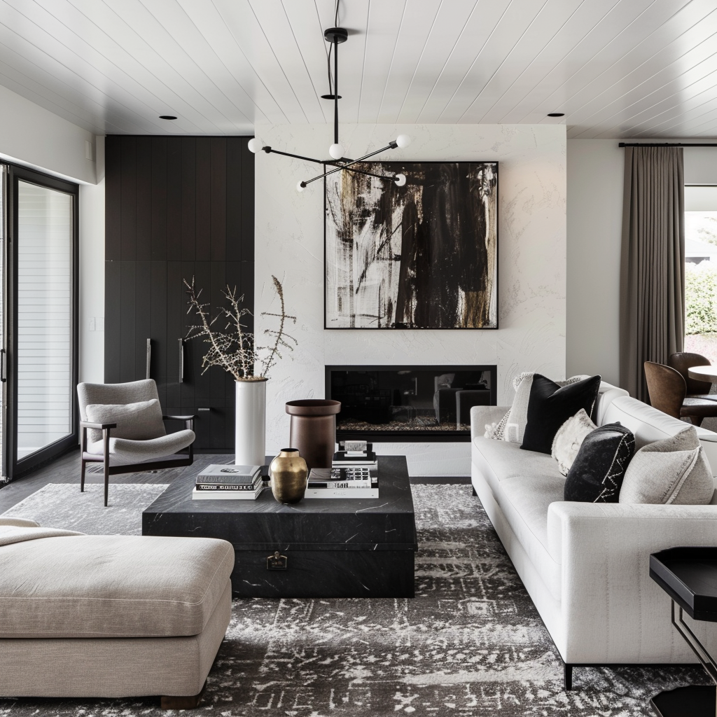
Neutral colors form the foundation of the mid-century modern palette, providing a backdrop for bolder hues to shine. Shades of white, gray, and black create a sense of sophistication and timelessness, while also highlighting the clean lines and sculptural forms that define the style.
Earthy tones, such as olive green, mustard yellow, and burnt orange, add warmth and depth to mid-century modern interiors. These colors evoke a connection to nature and bring a sense of comfort and coziness to a space. They work beautifully with natural materials like wood, leather, and textiles.

When it comes to creating a successful mid-century modern color scheme, the key is to find that sweet spot between bold and neutral hues. It’s all about balance, folks! If you go overboard with too many bright, attention-grabbing colors, your space might end up feeling a bit like a circus gone wrong. On the other hand, if you play it too safe with an all-neutral palette, you run the risk of putting your guests to sleep. The trick is to be intentional with your color choices, using bold accents strategically to draw the eye and create visual interest throughout the room. Don’t be afraid to mix things up and experiment with different combinations until you find the perfect blend that speaks to your personal style. With a little bit of creativity and a lot of love for color, you’ll be well on your way to crafting a mid-century modern space that’s both visually stunning and effortlessly cool.
The key to a successful mid-century modern color scheme is finding the right balance between bold and neutral hues. Too many bright colors can overwhelm a space, while an all-neutral palette may feel flat and uninspired. Aim for a thoughtful mix of both, using bold colors strategically to draw the eye and create visual interest.
Complementary colors, such as blue and orange or yellow and purple, create a dynamic and engaging contrast when used together. In mid-century modern design, these pairings are often softened by incorporating muted or desaturated versions of the colors, ensuring a harmonious and sophisticated look.
Monochromatic color schemes, which use variations of a single color, can be incredibly effective in mid-century modern interiors. By layering different shades, tints, and tones of the same hue, you create a cohesive and calming atmosphere that still offers depth and interest.
The colors used in mid-century modern design can have a profound impact on the mood and atmosphere of a space. Vibrant reds and oranges are known for their energizing and stimulating properties, making them perfect for spaces where you want to encourage activity and conversation. Cool blues and greens, on the other hand, evoke a sense of tranquility and serenity, ideal for bedrooms and bathrooms. Earthy tones bring warmth and comfort, creating inviting and cozy atmospheres in living rooms and family spaces.
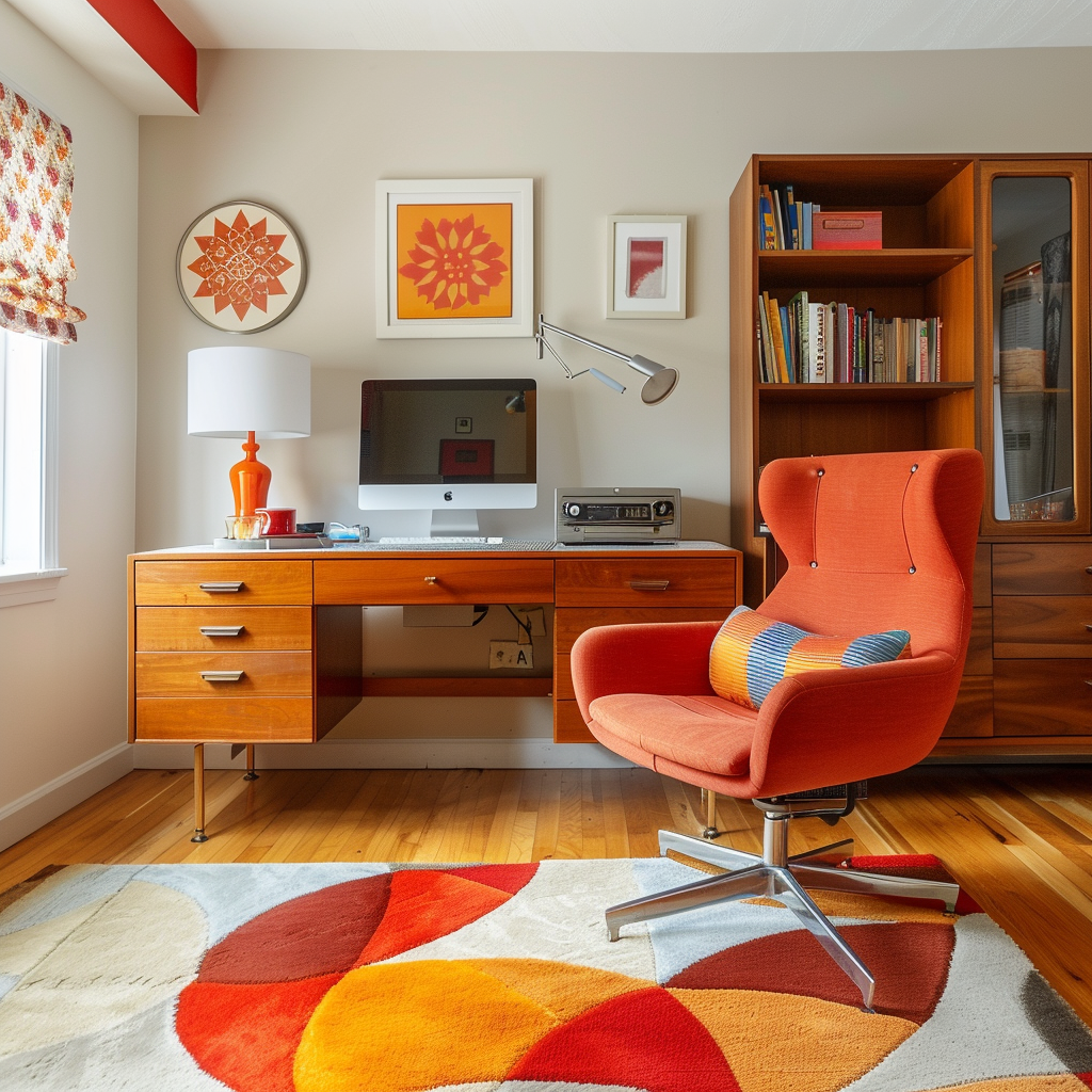
Vibrant reds and oranges are known for their energizing and stimulating properties, making them perfect for spaces where you want to encourage activity and conversation. Use these colors in living rooms, dining areas, or home offices to promote a lively and engaging atmosphere.
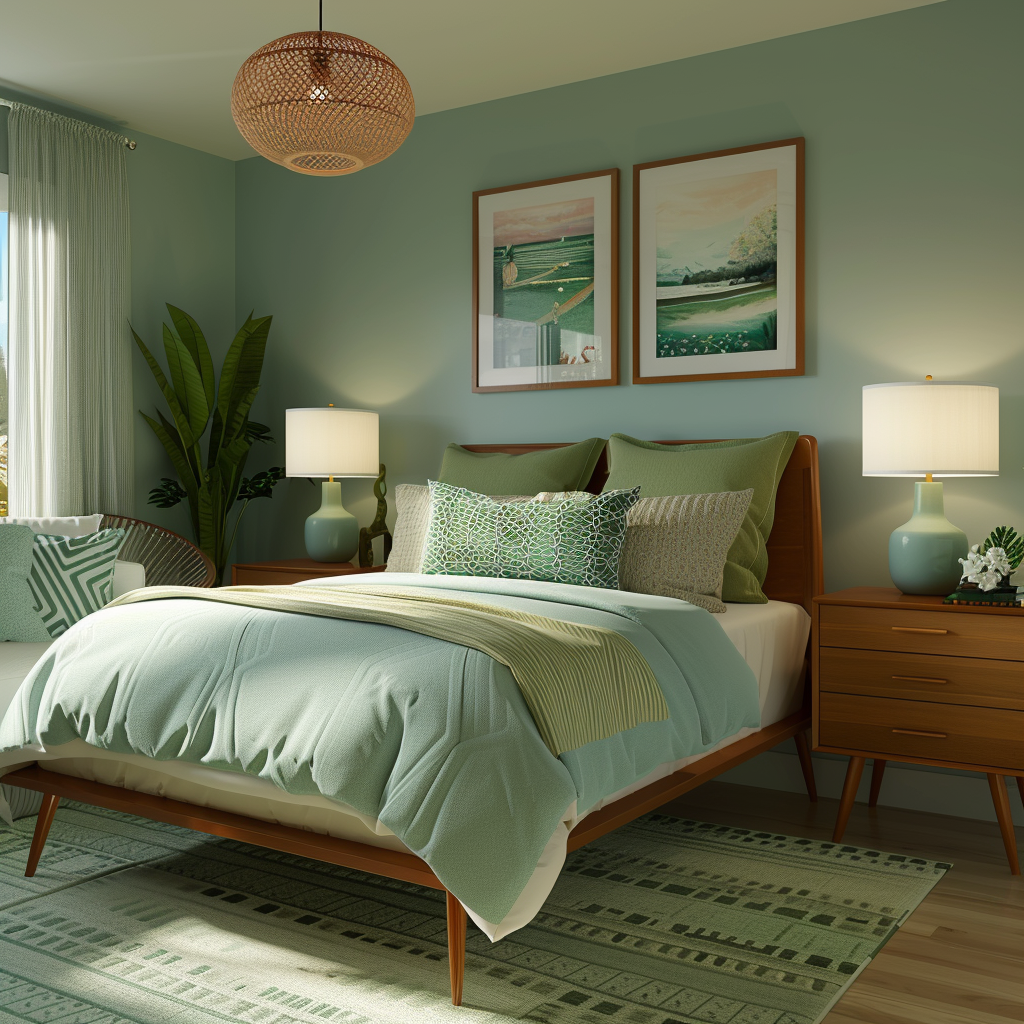
Cool blues and greens evoke a sense of tranquility, serenity, and connection to nature. These colors work beautifully in bedrooms, bathrooms, and other spaces where you want to create a calming and relaxing environment. Pair them with natural textures and materials for a truly serene retreat.
Earthy tones, such as olive green, mustard yellow, and burnt orange, bring a sense of warmth and comfort to a space. These colors are perfect for creating inviting and cozy atmospheres in living rooms, dens, and family rooms. They pair beautifully with natural wood finishes and textiles like wool and linen.

Patterns and textures play a significant role in mid-century modern design, adding visual interest and depth to the spaces. Geometric shapes and abstract designs can be incorporated through textiles, wallpaper, or artwork, reinforcing the style’s graphic and playful nature. Natural materials, such as wood, leather, and textiles, help to ground the space and create a sense of warmth and texture. Metallic accents, in the form of lighting fixtures or decorative objects, add a touch of sophistication and glamour.
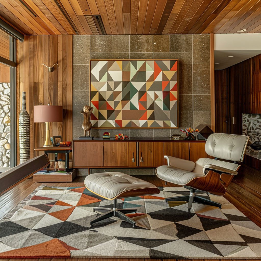
Mid-century modern design often features geometric shapes and abstract patterns, which can be incorporated through textiles, wallpaper, or artwork. These patterns add visual interest and depth to a space, while also reinforcing the style’s graphic and playful nature.
Natural materials play a significant role in mid-century modern interiors, with wood, leather, and textiles being key elements. Incorporating these materials through furniture, accents, and soft furnishings helps to ground the space and create a sense of warmth and texture.
Metallic accents, such as brass, chrome, or stainless steel, add a touch of sophistication and glamour to mid-century modern spaces. These materials work well as lighting fixtures, furniture legs, or decorative objects, and they help to balance the warmth of natural materials with a cool, refined edge.
Now, I know what you might be thinking – isn’t mid-century modern all about those bold, saturated colors that defined the era? Well, yes and no. While the core principles of mid-century modern color are still as relevant as ever, it’s important to remember that we’re not living in the 1950s anymore. Times have changed, and so have our tastes in home decor. That’s why it’s crucial to adapt the mid-century color palette to suit contemporary living. This might mean incorporating more muted or desaturated hues that feel a bit more understated and sophisticated, or mixing in some contemporary neutrals to balance out those classic mid-century shades. Don’t be afraid to get a little experimental, too – sometimes the most unexpected color combinations can yield the most stunning results. At the end of the day, the goal is to create a timeless aesthetic that gives a nod to the mid-century style we all know and love, while still reflecting your own unique personality and modern sensibilities. So go ahead, put your own spin on those tried and true color schemes – your home will thank you for it!
While the core principles of mid-century modern color remain relevant, it’s important to adapt the palette for today’s lifestyles and preferences. This may involve incorporating more muted or desaturated hues, combining mid-century colors with contemporary neutrals, or experimenting with unexpected color combinations.
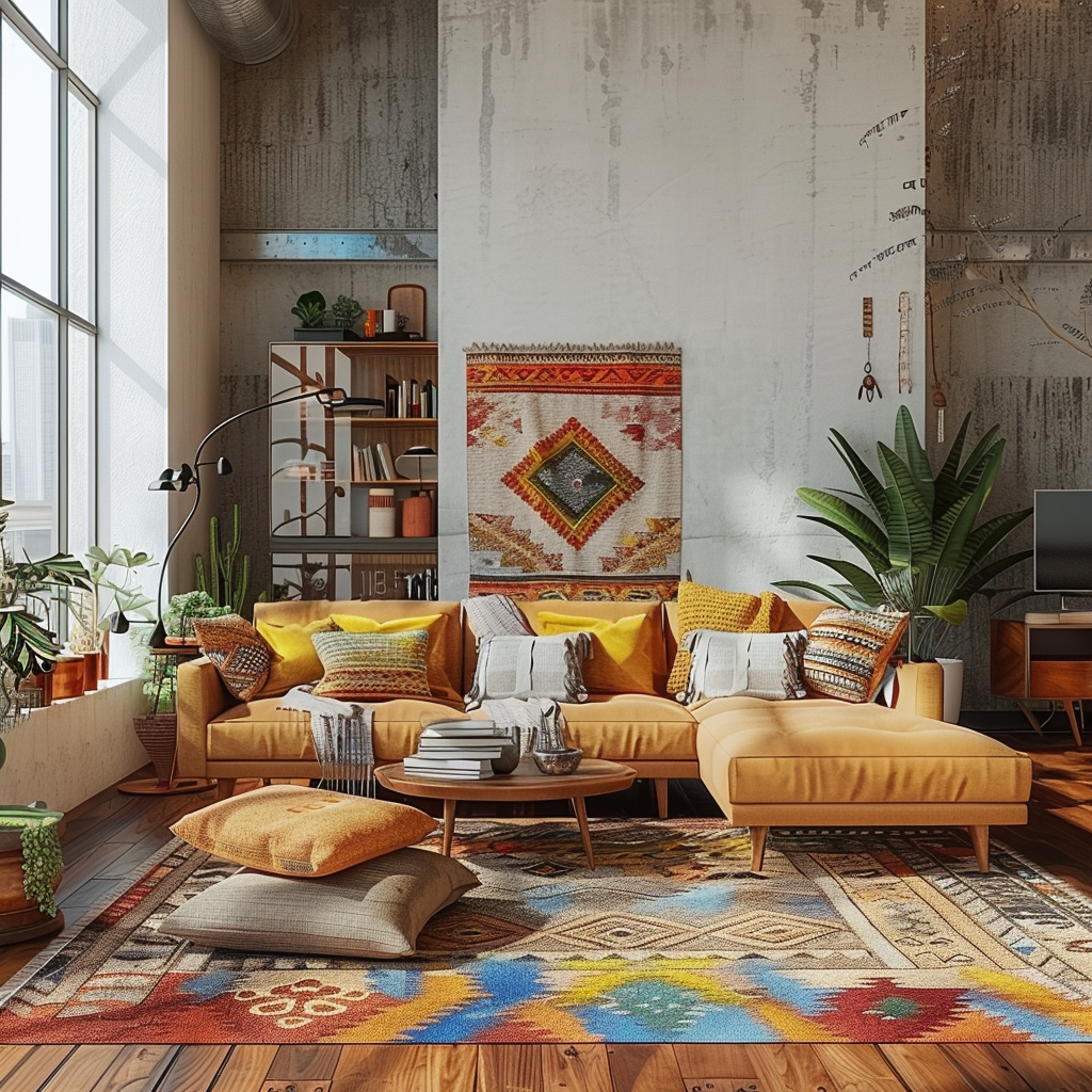
Mid-century modern colors can be successfully integrated with other design styles, such as bohemian, industrial, or contemporary. By carefully selecting colors and materials that work well together, you can create a unique and personalized space that pays homage to the mid-century aesthetic while also reflecting your individual taste.
The key to creating a timeless mid-century modern color scheme is to focus on simplicity, balance, and a thoughtful mix of hues. By avoiding overly trendy or saturated colors and instead opting for a more refined and understated palette, you can create a space that will stand the test of time and continue to inspire for years to come.
To truly appreciate the beauty and versatility of mid-century modern color palettes, it’s helpful to see them in action. Explore a curated selection of living rooms, bedrooms, kitchens, and dining rooms that exemplify the style, demonstrating how color can be used to create a variety of moods and atmospheres. From bold and graphic to soft and subdued, these spaces showcase the timeless appeal of the mid-century aesthetic.
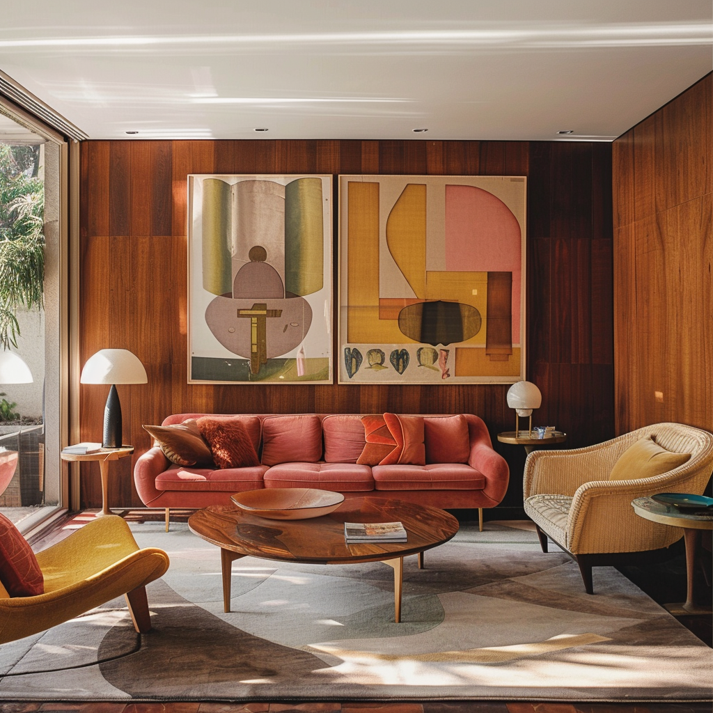
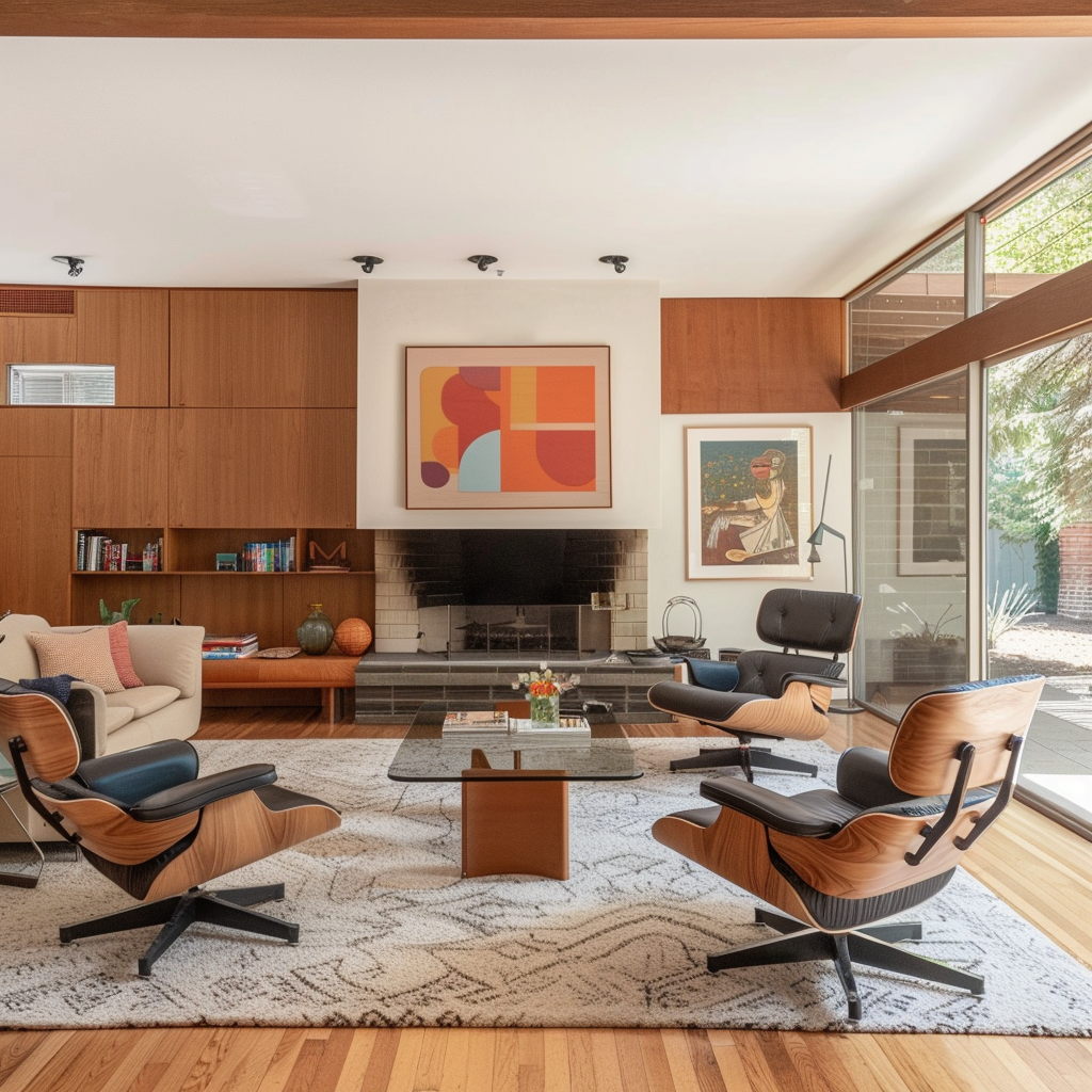
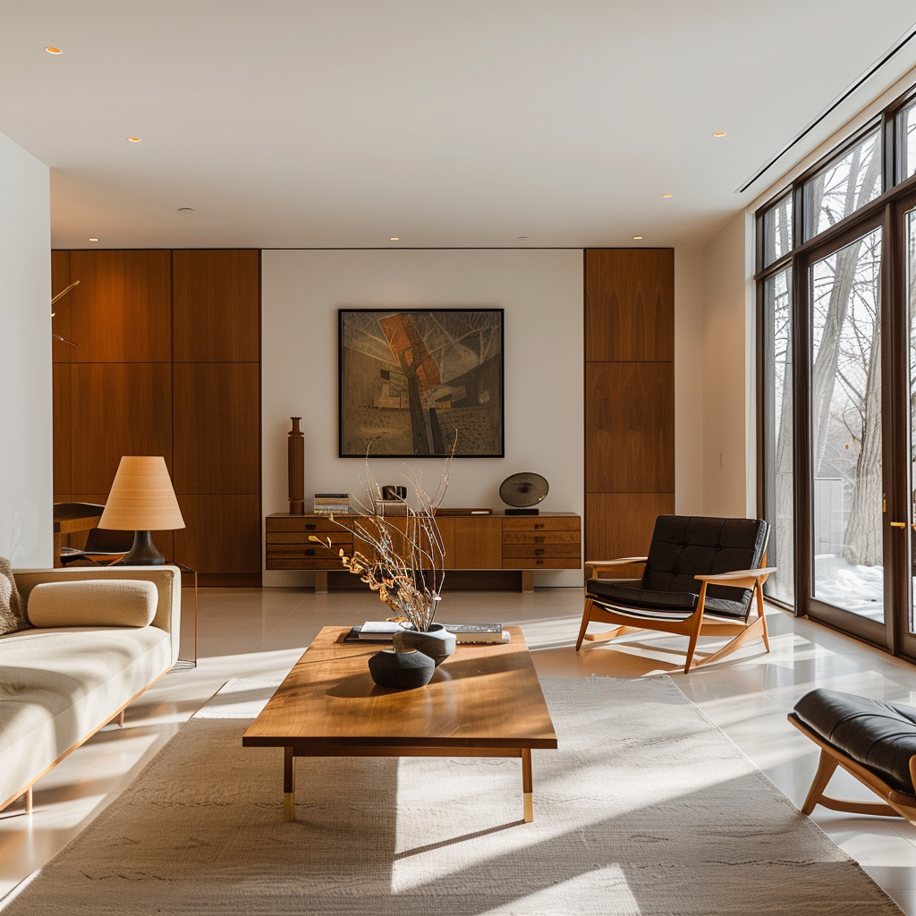
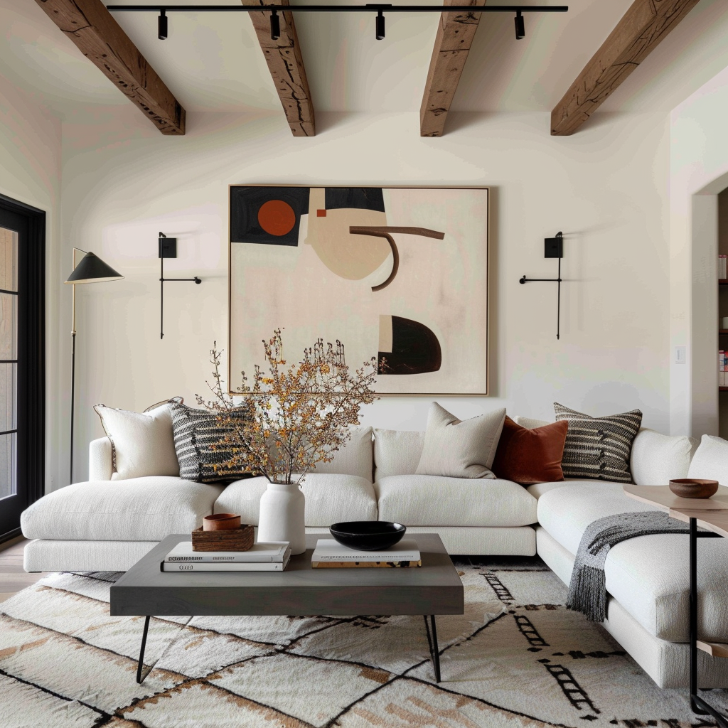
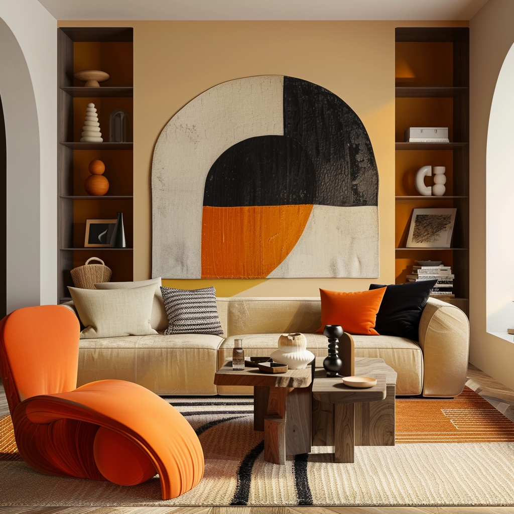
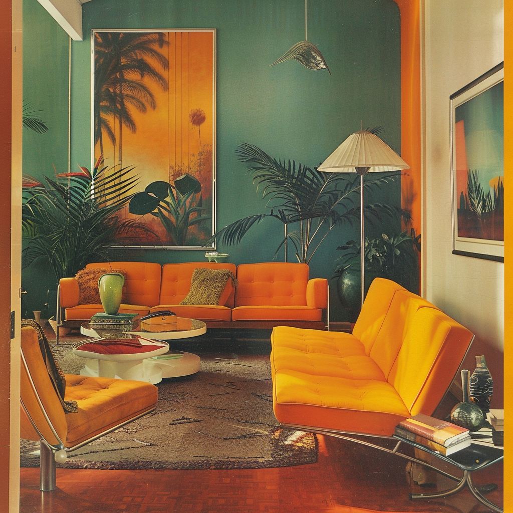
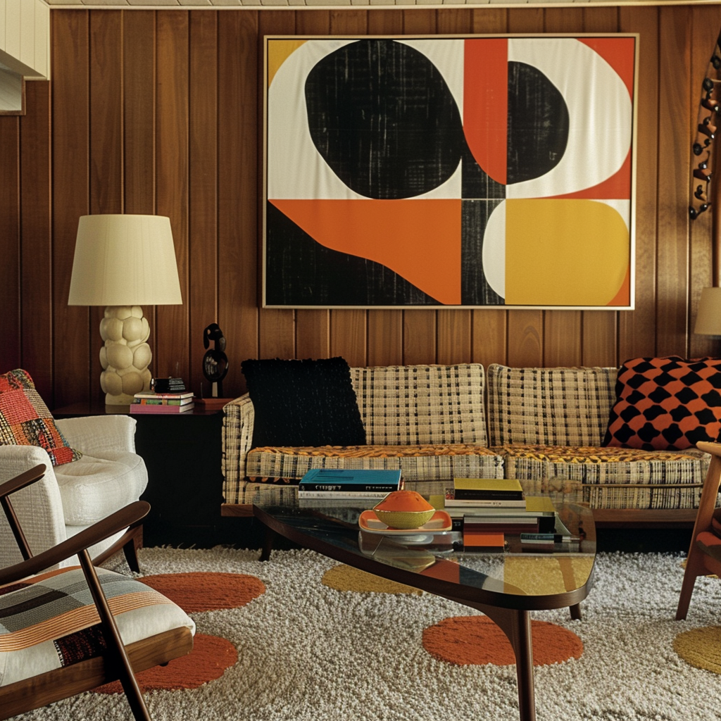
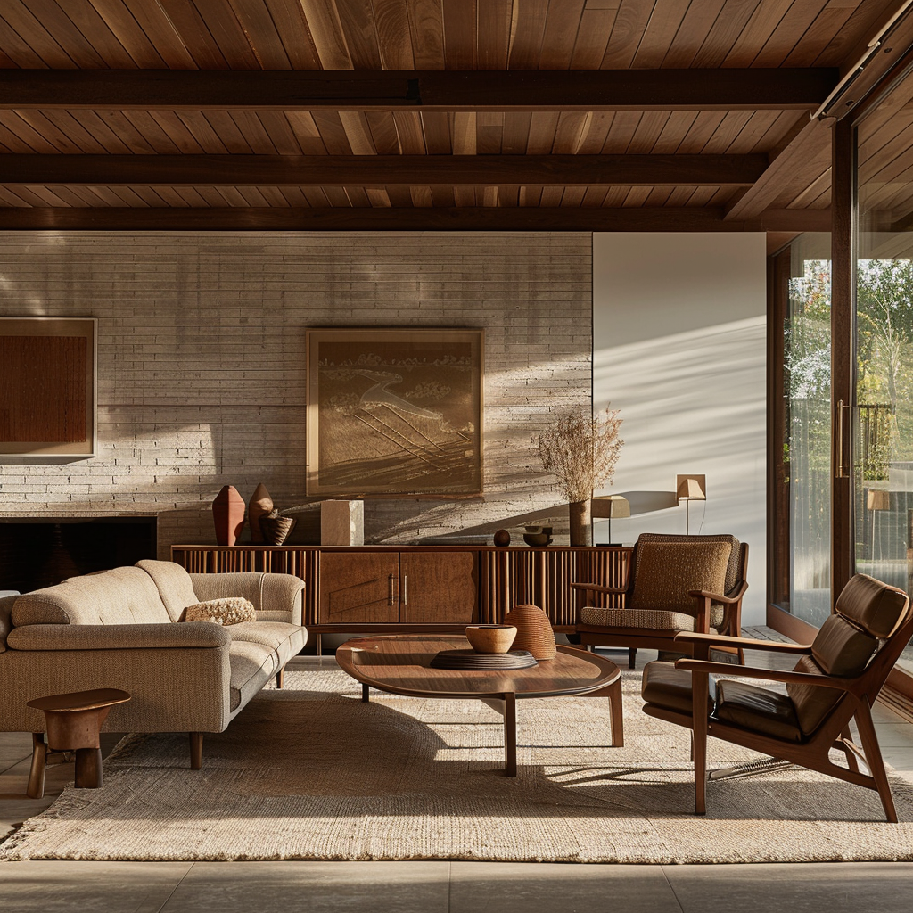
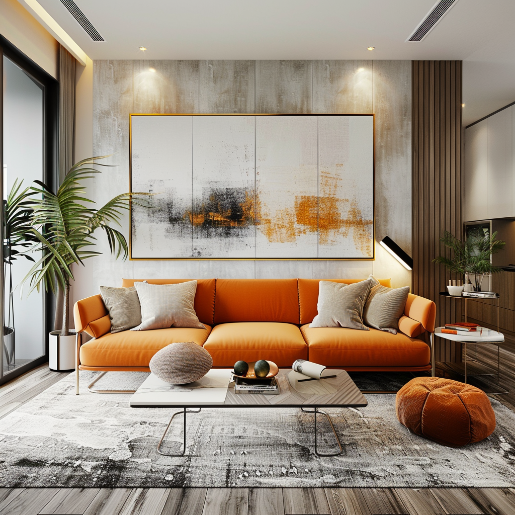
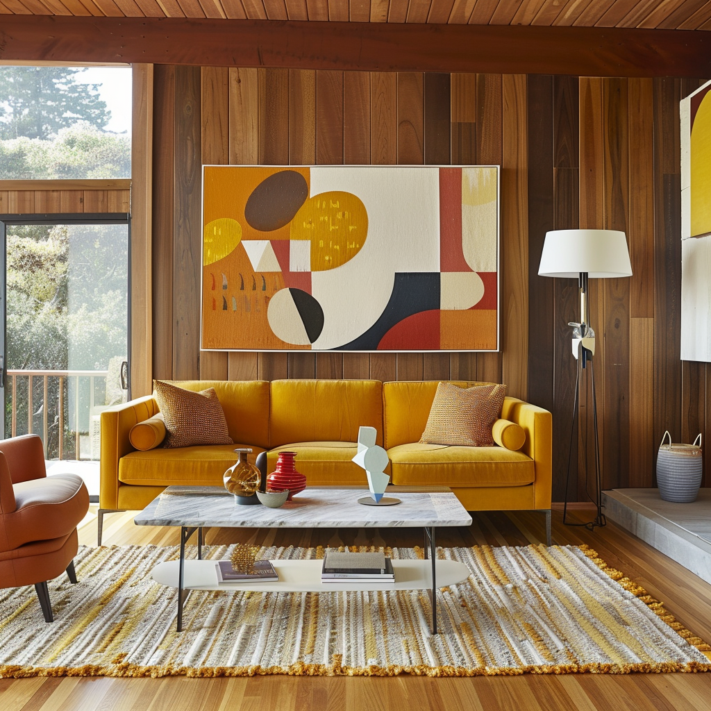
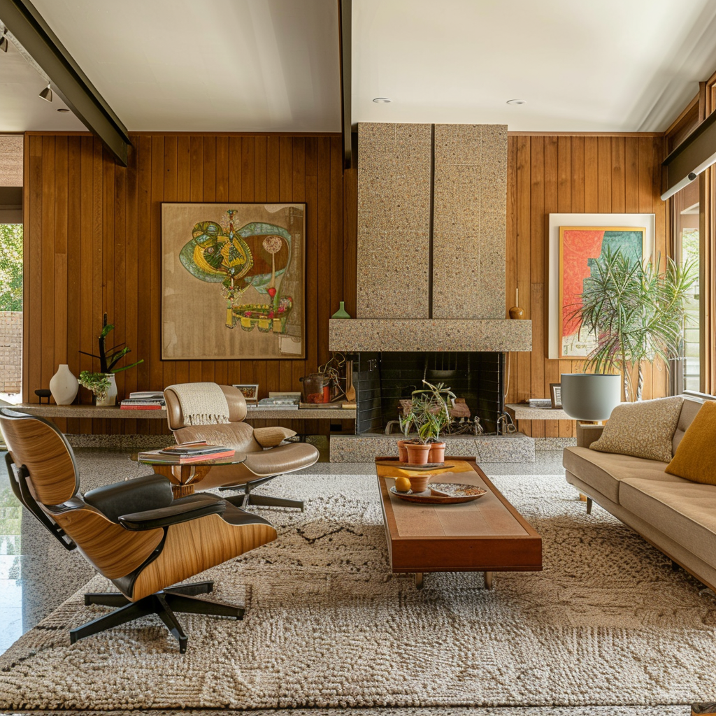
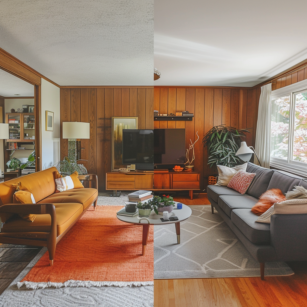
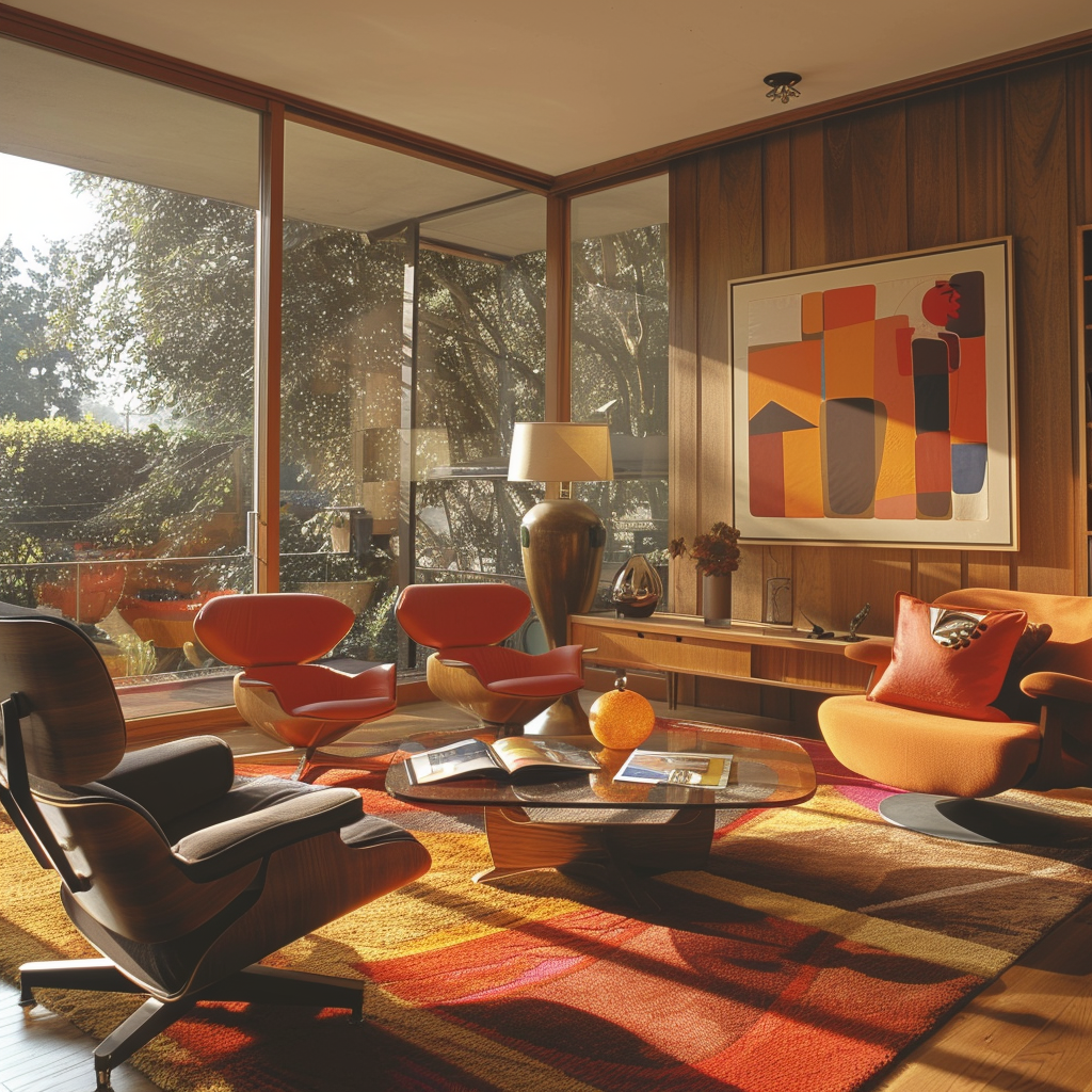
Explore a curated selection of living rooms that exemplify the beauty and versatility of mid-century modern color palettes. From bold and graphic to soft and subdued, these spaces demonstrate how color can be used to create a variety of moods and atmospheres within the mid-century modern framework.
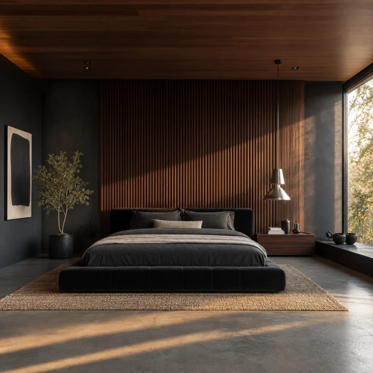
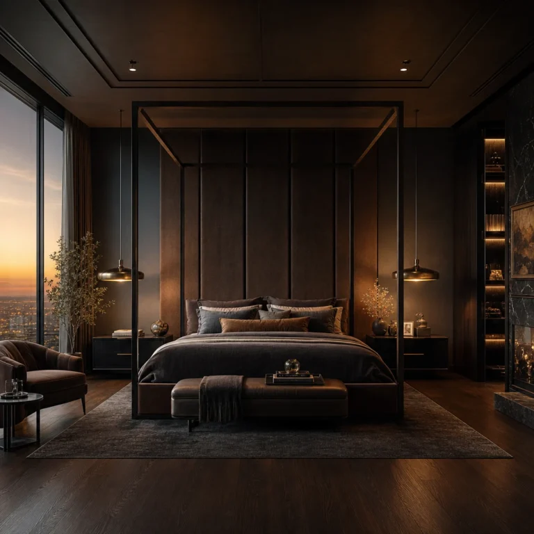
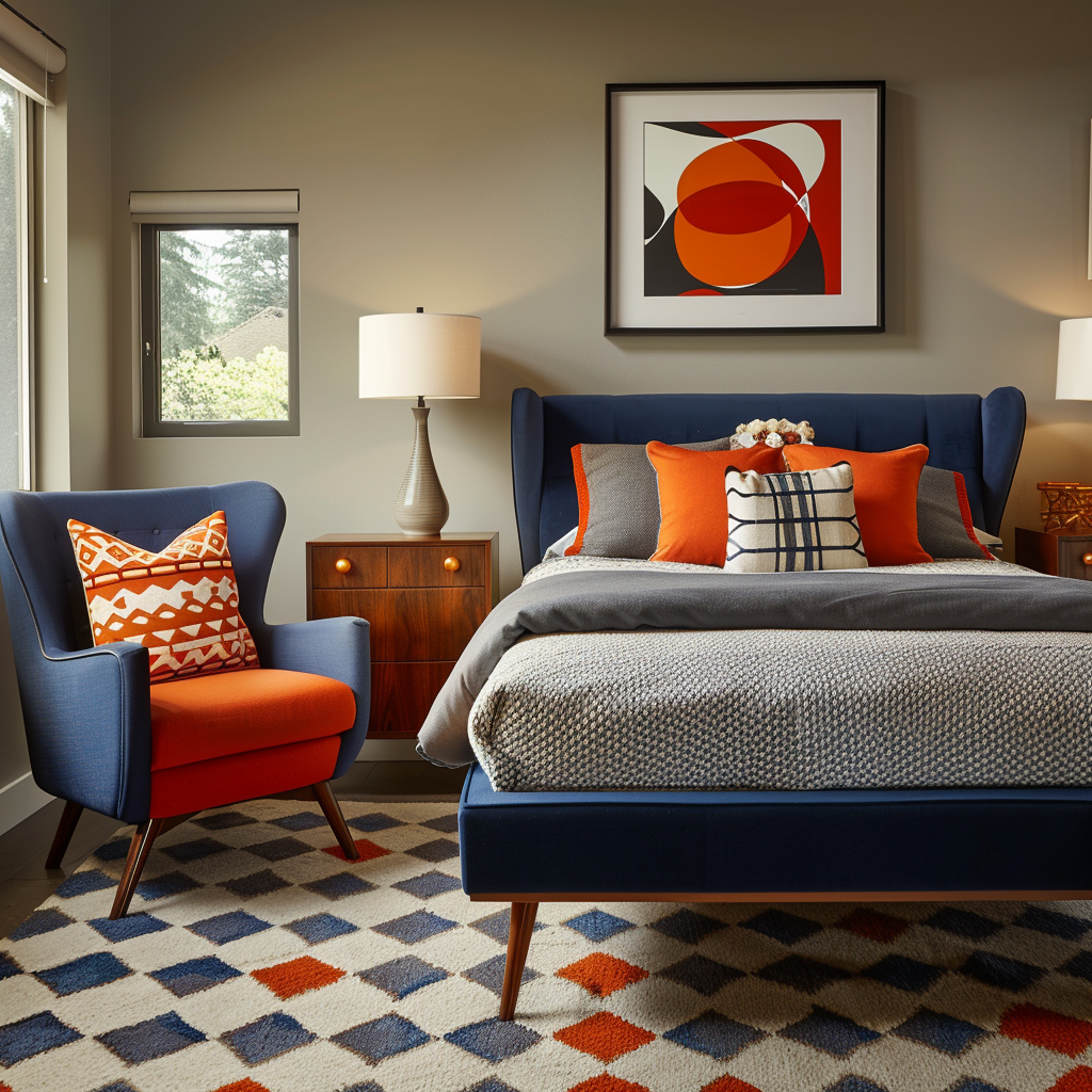
Discover how mid-century modern colors can transform bedrooms into stylish and serene retreats. Whether you opt for a monochromatic scheme or a playful mix of hues, these spaces showcase the timeless appeal of the mid-century aesthetic and its ability to create a restful and inviting atmosphere.

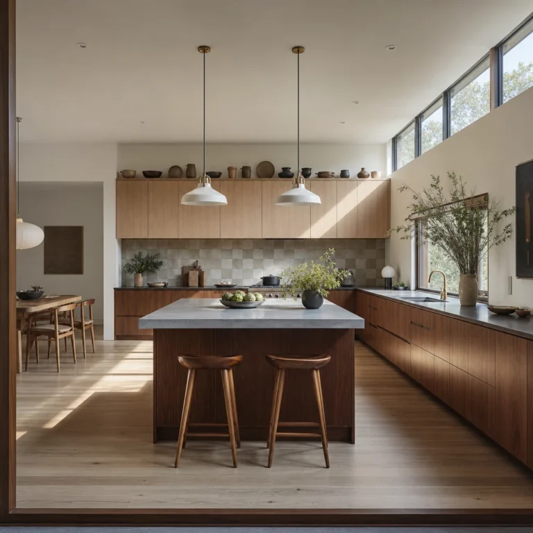
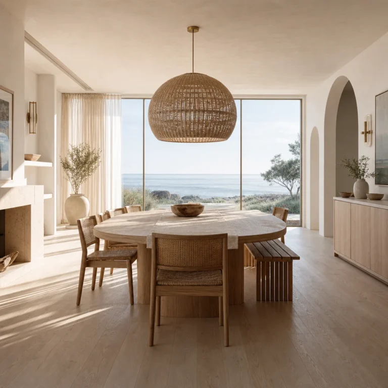
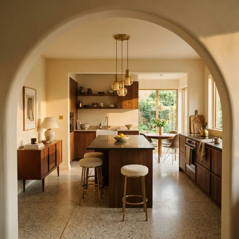
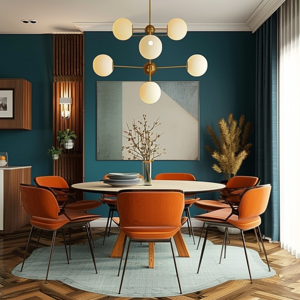
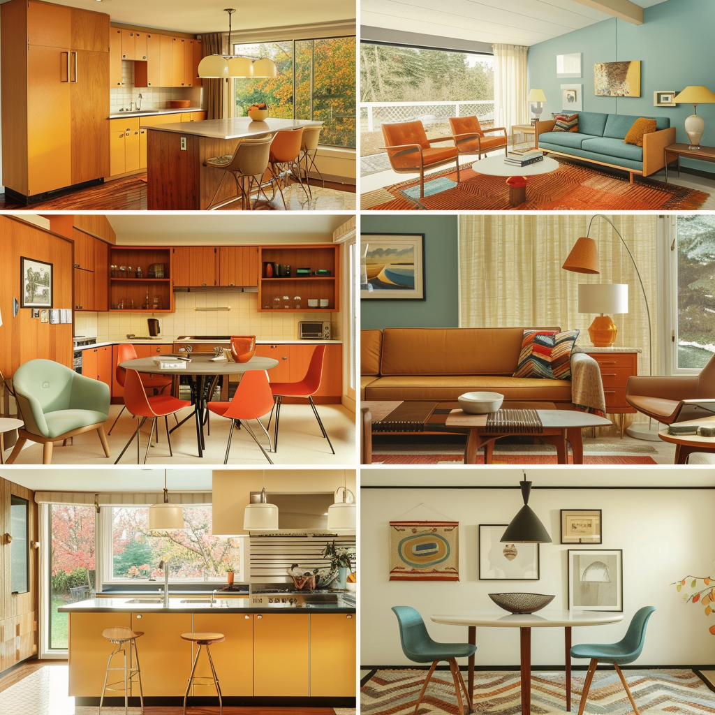
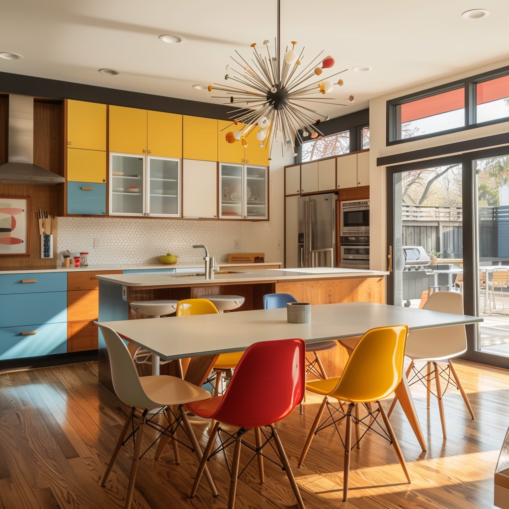
See how mid-century modern color palettes can be adapted for kitchens and dining rooms, creating spaces that are both functional and visually striking. From bold backsplashes to colorful cabinetry, these spaces demonstrate how color can be used to infuse personality and character into the heart of the home.
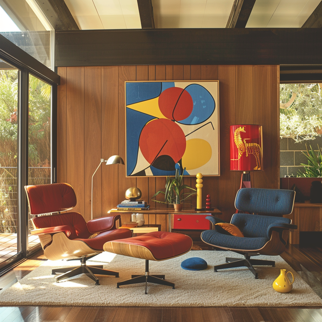
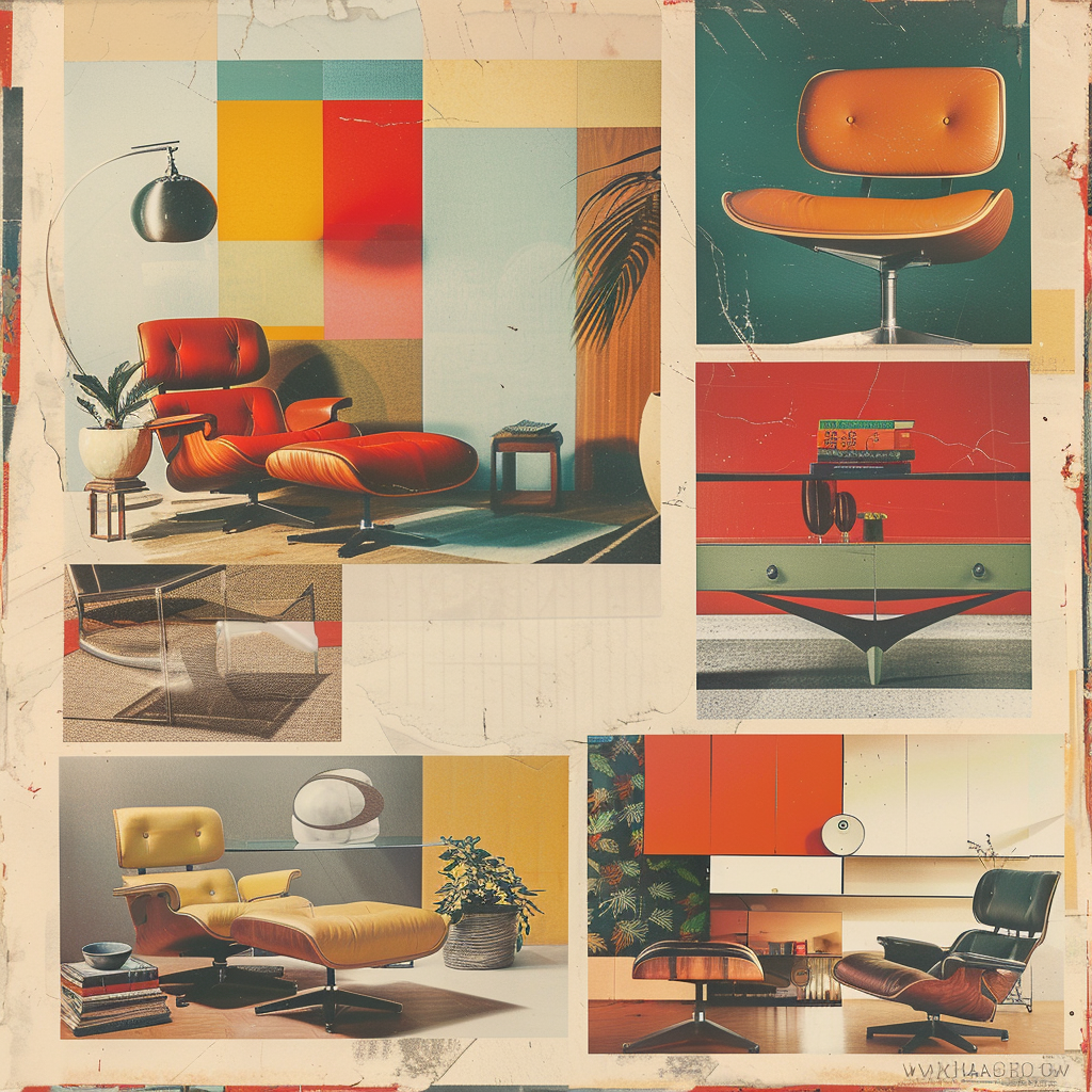
The influence of mid-century modern design and its iconic color palettes continues to be felt in contemporary interior design. By exploring the color philosophies of iconic designers like Charles and Ray Eames, Arne Jacobsen, and Eero Saarinen, we can gain a deeper understanding of the principles that shaped the aesthetic of the era. Today, designers are reinterpreting the mid-century palette for a new generation, celebrating its timeless beauty while adapting it for modern living.
Delve into the world of iconic mid-century modern designers, such as Charles and Ray Eames, Arne Jacobsen, and Eero Saarinen, and explore how their unique color philosophies shaped the aesthetic of the era. Learn about their approaches to color, material, and form, and how their ideas continue to influence contemporary design.
Trace the enduring influence of mid-century modern color on contemporary interior design, from the resurgence of interest in vintage furniture to the adaptation of mid-century principles for modern living. Discover how today’s designers are reinterpreting the palette for a new generation, while still paying homage to the timeless appeal of the original style.
We conclude by celebrating the timeless beauty and versatility of mid-century modern color palettes, and their ability to create spaces that are both stylish and livable. We encourage you to experiment with these colors in your own homes, drawing inspiration from the past while also embracing your own unique vision and personal style.