Newsletter Subscribe
Enter your email address below and subscribe to our newsletter
I’ve always had a soft spot for kitchens that feel lived in and a little groovy, which is exactly what a well done small 70s kitchen remodel delivers. What I love most is how the decade’s warm wood tones, earthy tiles, and punchy colours translate beautifully into today’s homes when you handle them with a light touch. In this piece I walk through 28 looks, from painted cabinet transformations and retro appliances to cosy breakfast nooks and copper faucets, and every single one is a look you can borrow.
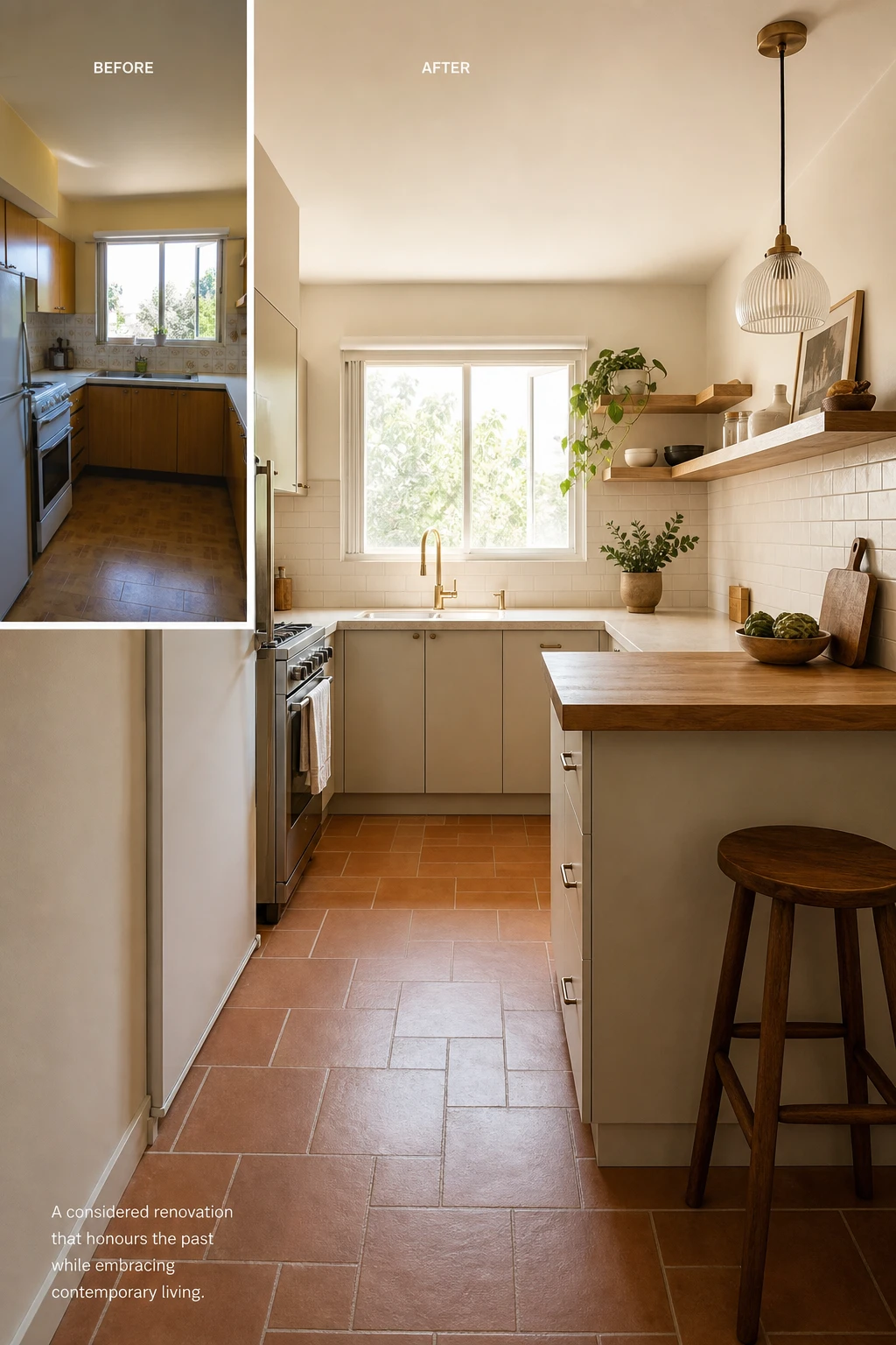
Before and after shots are the backbone of any good remodel, and what I find most useful is how a clear starting point keeps every decision that follows honest and grounded. When you photograph a tired 70s kitchen in full, all the scuffed cabinetry, the cracked grout, the harvest gold everything, you give yourself a map of exactly what the space is doing wrong and why. I love that moment of standing back with a camera because it strips the sentimentality away and lets the bones of the room speak plainly. You will notice, once you have those images, that the decisions stop feeling random and start feeling like a proper sequence, each choice building on the last toward something coherent.
The Key Details
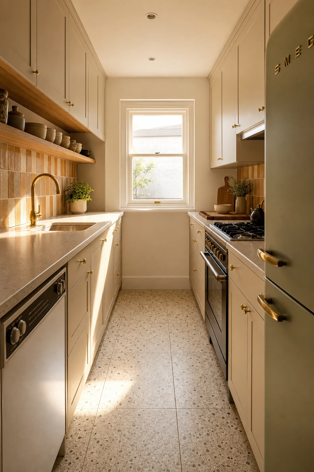
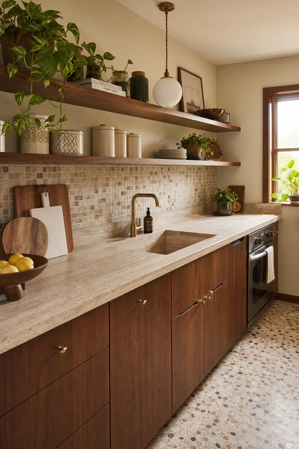
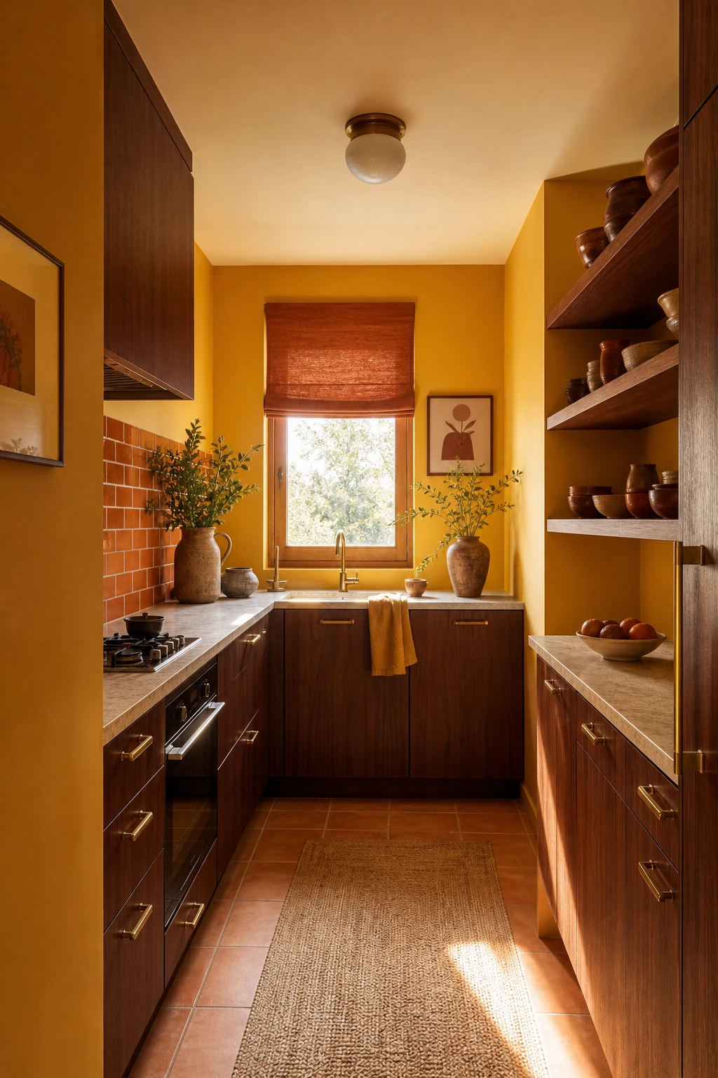
Scaling every decision to the actual room size is the move that separates a small kitchen that feels tight from one that feels complete, and it is the thing I always check before anything else goes on the plan. Shallow galley cabinetry keeps the walkway clear so you never feel like the room is closing in on you, and open timber shelving above the bench lets the wall breathe instead of stacking weight where the ceiling already feels low. A compact single basin sink fits the counter run without swallowing it, and honed terrazzo tiles on the floor carry that warm 70s character without the visual noise of a busier pattern. You end up with a kitchen where everything has a home and nothing is fighting for attention.
The Key Details
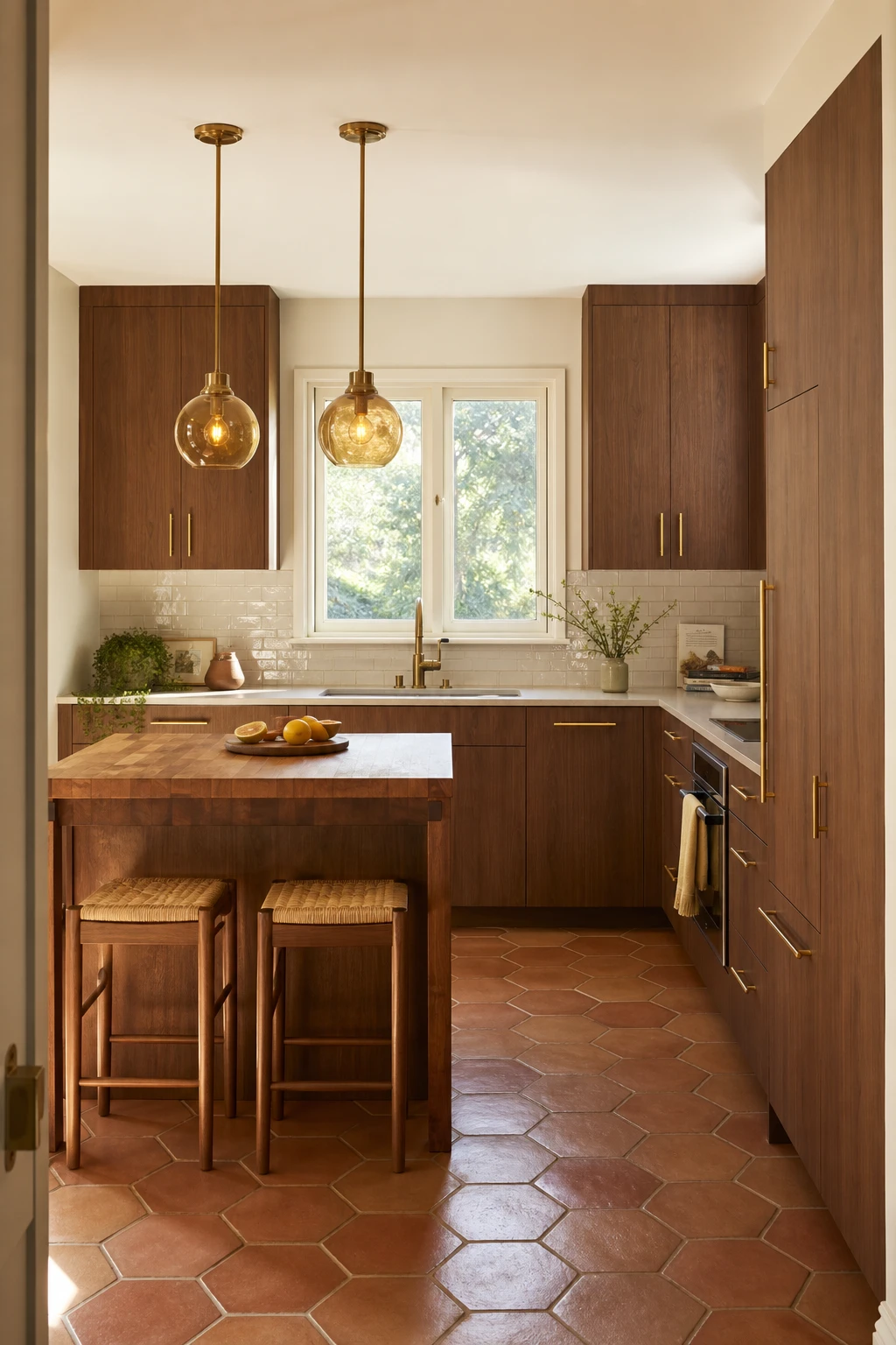
Selectively keeping the best bones of a 70s kitchen and refreshing everything around them is the move that gives a remodel real soul, and you can feel it the moment you walk in. The walnut cabinets stay because that warm grain is genuinely beautiful, but flat fronts and clean hardware bring them firmly into the present. What I love about terracotta hex tiles is that they anchor the whole room to the era without screaming retro, so the space reads as considered rather than costumed. You get that rare thing: a kitchen that feels personal and lived in, not like a showroom reset.
The Key Details
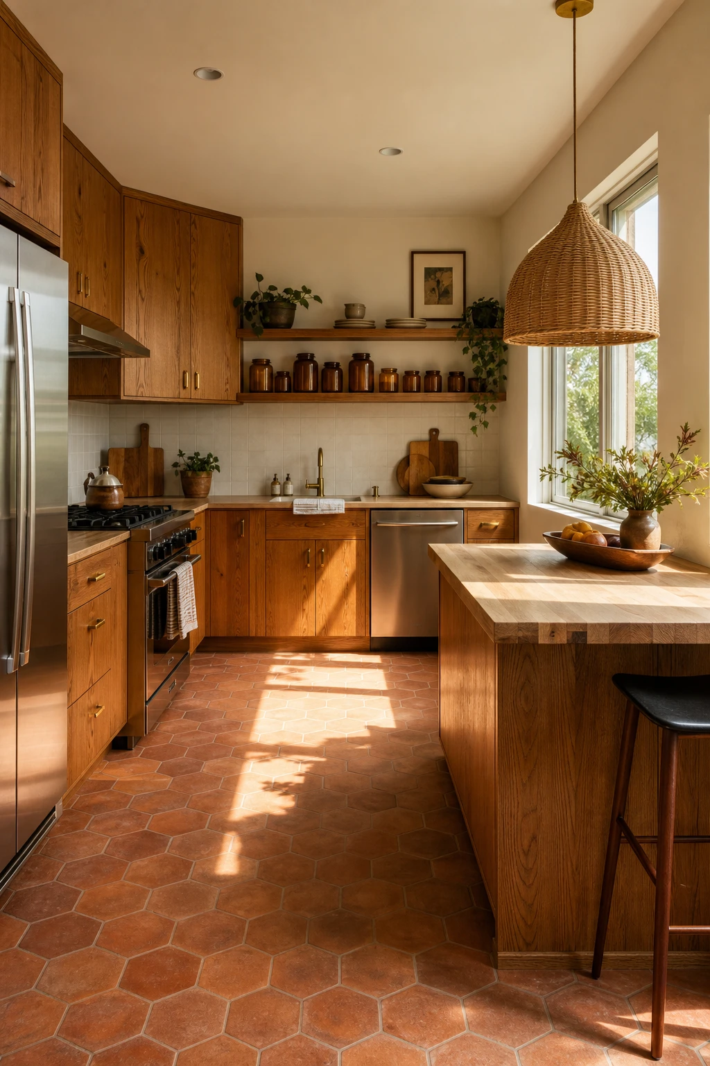
Honey oak cabinets from the 70s have a warmth that flat pack replacements simply cannot replicate, and when you clean and reseal the existing wood rather than rip it out, you keep that depth while saving a serious amount of money. The grain tells a story, and I find that clients who almost gave up on their original cabinets are always the ones most pleased once the timber comes back to life with a good oil. You will notice how the amber tones pull the whole room together, linking the terracotta floor tiles and the butcher block peninsula into one warm, cohesive palette. That kind of layered warmth costs a fraction of a full refit, which is the thing I always want people to see before they reach for a sledgehammer.
The Key Details
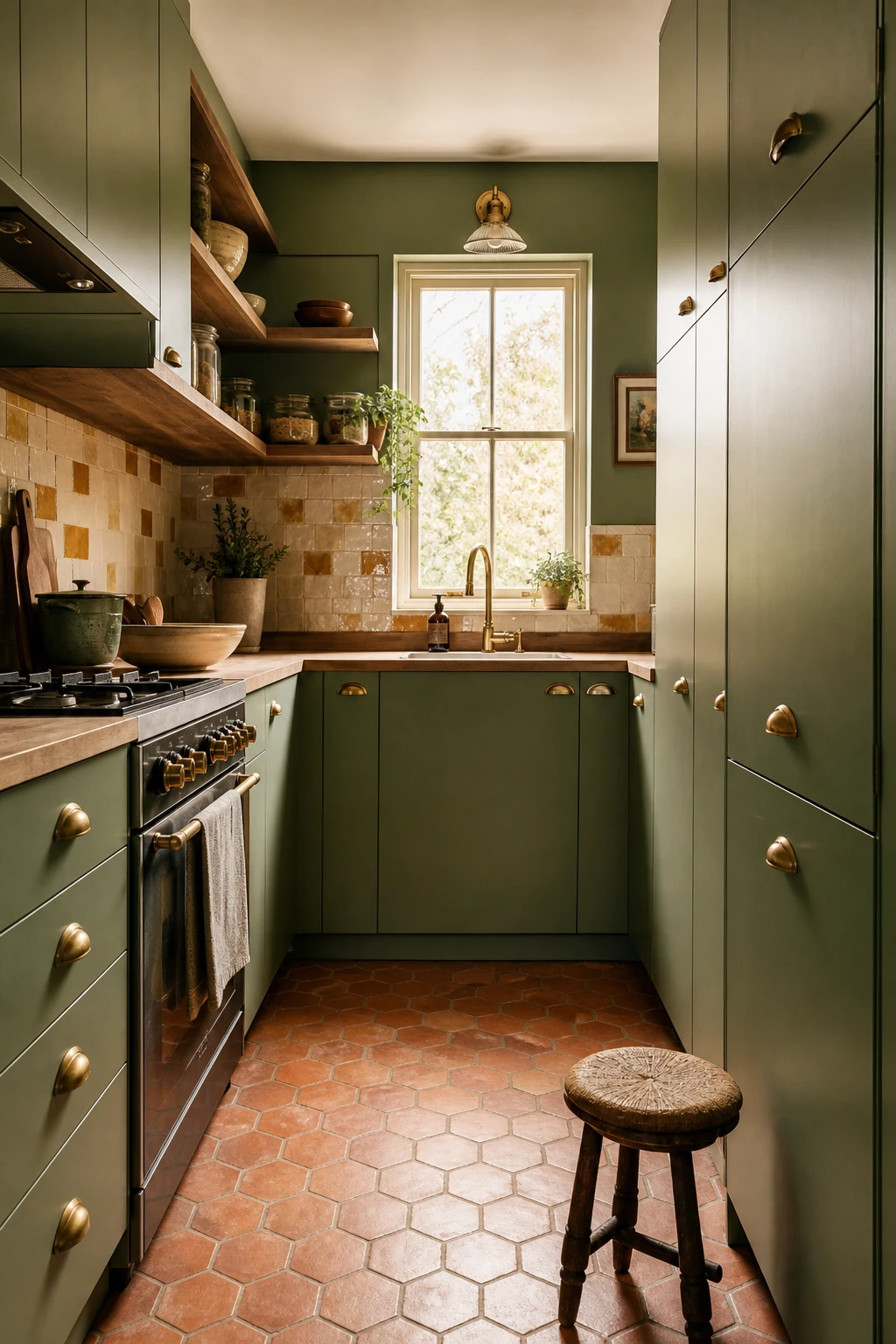
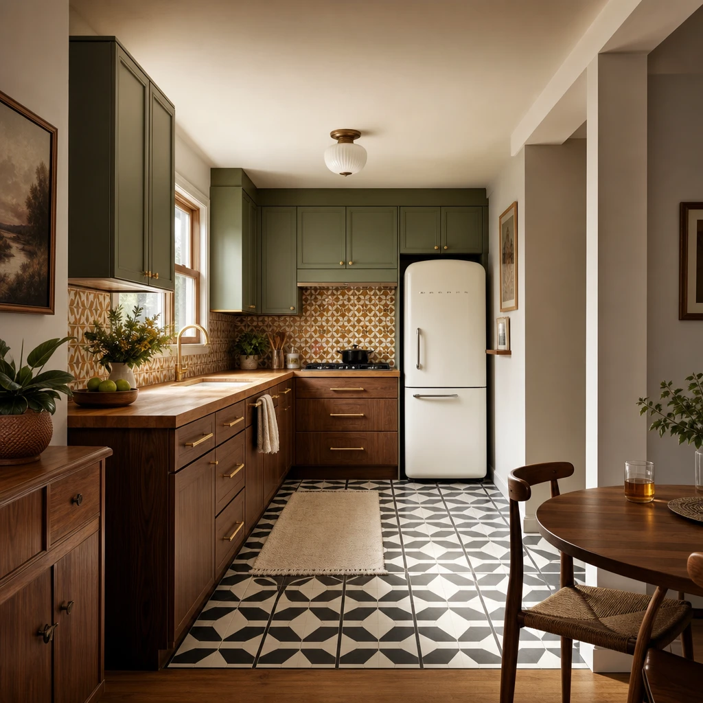
Painting every cabinet the same deep, earthy green is one of my favourite moves in a small kitchen because it stops the eye jumping around and gives the whole room a calm, settled weight. You get that instant sense of intention, like every choice was made on purpose rather than assembled from leftovers. What wins me over every time with a colour like this is the way it pulls the warmth out of natural materials nearby, so the timber shelving and terracotta floor feel like they belong together rather than like separate decisions. Watch how the room reads as much bigger once that visual noise disappears and one strong tone takes charge.
The Key Details
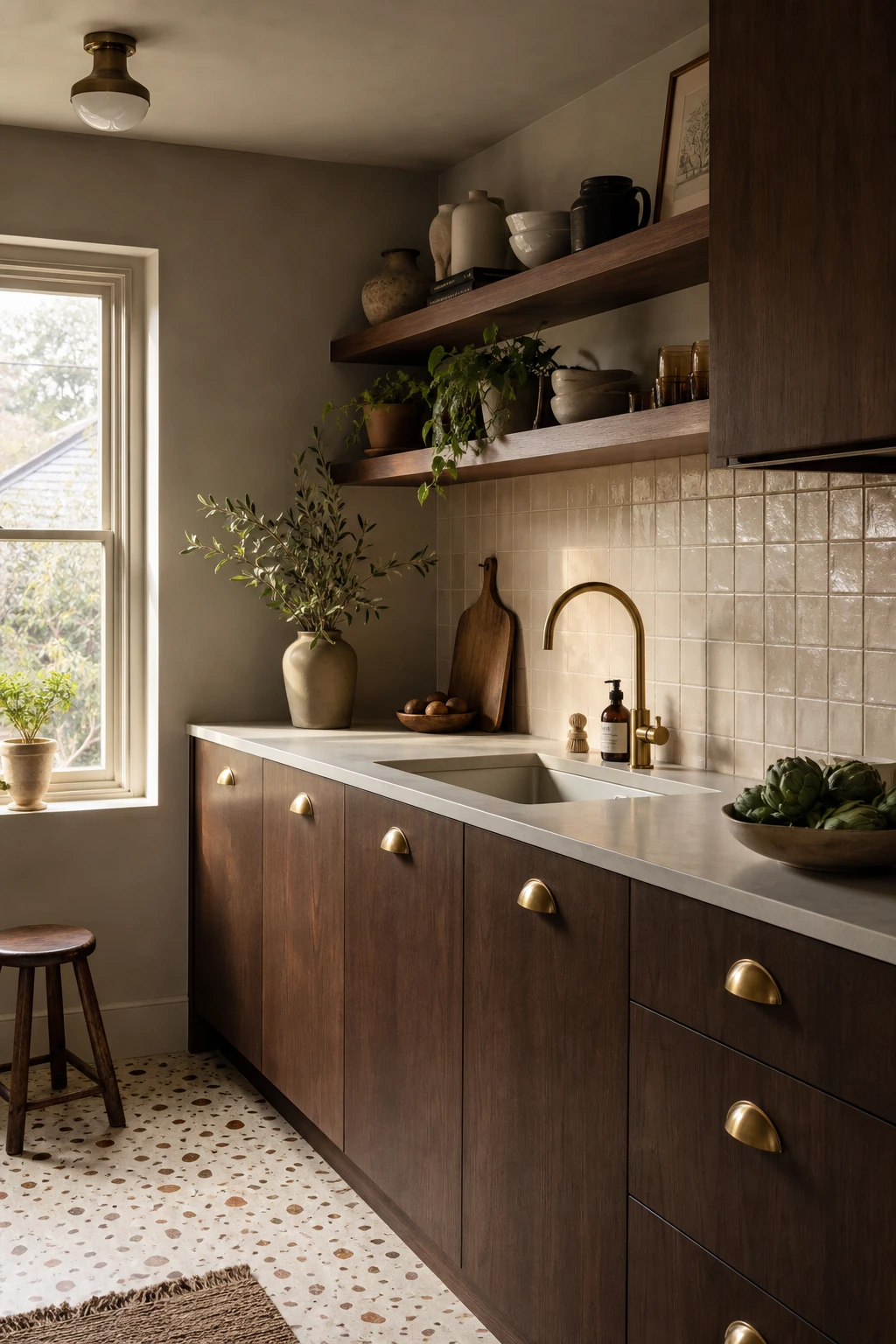
Brown cabinets are one of those choices that wins me over every single time, because deep brown tones do something quiet and powerful: they anchor the whole room so that every lighter surface beside them seems to glow. Watch how a creamy terrazzo floor or a pale handmade tile backsplash suddenly looks warmer and richer when it sits next to a flat front walnut veneer door. You get that grounded, settled feeling without the kitchen ever tipping into heavy or dark, and I think that balance is exactly what makes the 70s palette feel so right for a modern remodel. The brass cup pulls are the detail I always check first, because a warm metal note at that scale is just enough to lift the wood grain and keep the whole thing feeling intentional rather than accidental.
The Key Details
Repainting the original cabinet boxes is the move I come back to again and again in small kitchen remodels, because nothing else gives you that level of transformation for the money. You are not tearing out structure, you are not replumbing, you are simply changing what your eye lands on first, and in a 70s kitchen that means shifting the whole mood of the room with one decision. What I love here is how the warm avocado green reads almost like a deliberate vintage choice rather than a budget constraint, and the open upper shelving breaks the wall up so the colour breathes rather than closes in. Watch how the terracotta floor tiles and the butcher block section lock the palette together so every surface feels chosen, not patched together.
The Key Details
Pairing walnut lowers against lighter uppers is one of my favourite moves in a small kitchen because the eye reads two distinct layers instead of one flat wall of cabinetry, and that alone makes the room feel bigger without touching the floor plan. What I love about anchoring the darker tone at the base is that it gives the space a sense of weight right where you need it, low and grounded, while the lighter uppers keep the top half of the room breathing. You will notice how the counter acts as a natural dividing line, and that clean break is what stops the whole thing from feeling busy. Watch how the walnut grain pulls warmth from the terracotta backsplash and the butcher block top, so the contrast feels considered rather than accidental.
The Key Details
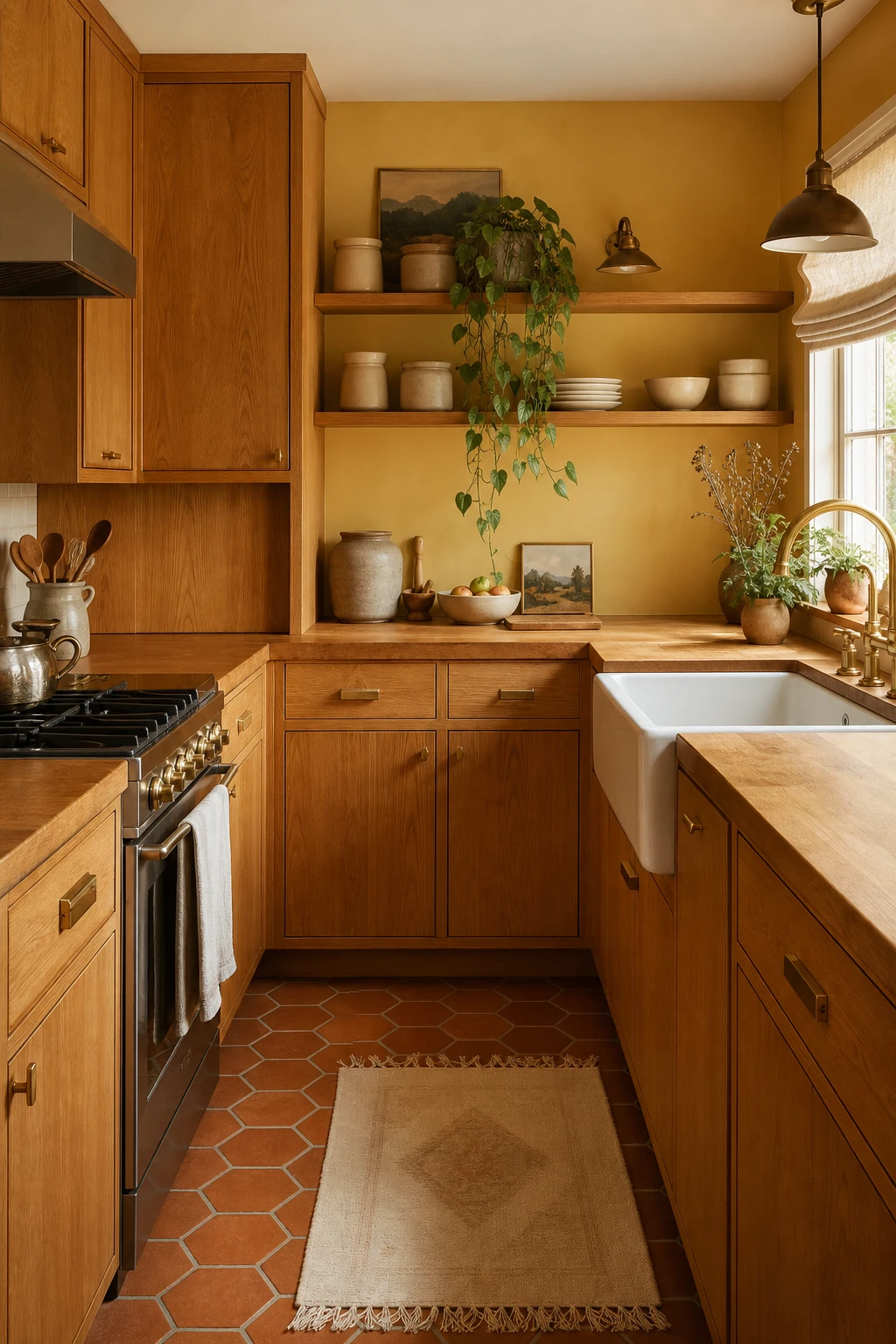
Honey oak has spent years being painted over, and what a waste that always is. The grain has this deep amber warmth that you simply cannot buy in a can, and when you stop fighting it and start working with it, the whole kitchen exhales. What I love about leaning into that golden tone is the way everything else in the room suddenly has a direction to follow: the butcher block countertop echoes the wood, the terracotta floor picks up the orange underneath, and the brushed brass hardware pulls out the gold sitting right there in the grain. You end up with a kitchen that feels considered rather than accidental, and the 70s warmth reads as a deliberate choice rather than something left over from a previous owner.
The Key Details
Get The Look
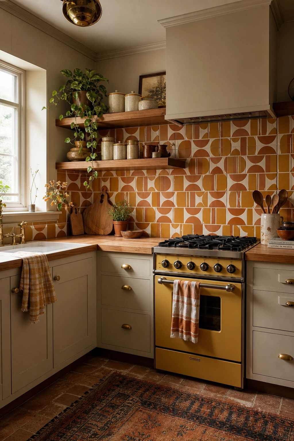
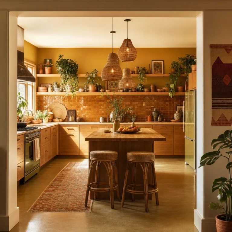
Keeping the geometric terracotta and ochre tiles to one zone, the backsplash behind the cooker, is the move that makes this whole kitchen feel bold rather than busy. What I love about focusing pattern into a single panel like this is that your eye lands on it, enjoys it, and then gets to rest on the calm timber shelving and butcher block either side. You will notice how the harvest gold range anchors the colour story underneath, so the tile pattern reads as part of a considered scheme rather than something stuck on at the last minute. The aged brass hardware picks up just enough warmth from the ochre to tie everything together without adding another competing element, and that restraint is really the secret.
The Key Details
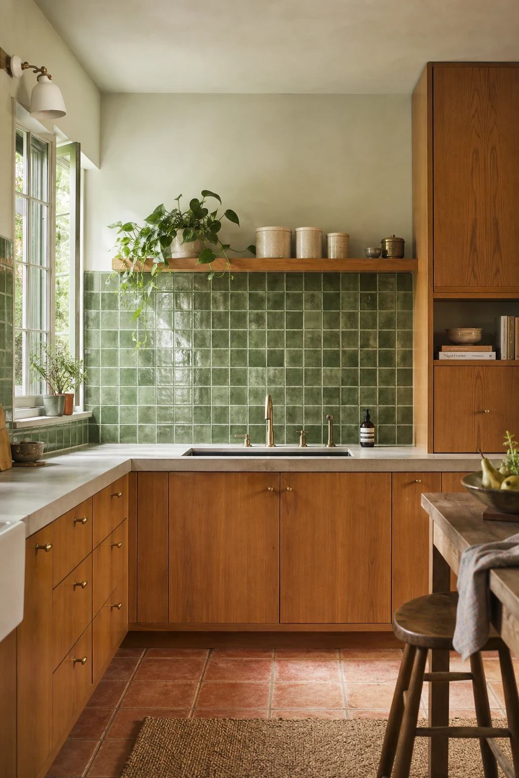
Green tile against warm wood cabinets is a combination that keeps winning me over, and the reason is simpler than most people expect. The green sits right between the yellow warmth of the timber and whatever colour you have on the walls, so you get a natural bridge without having to plan anything too carefully. What I love about a hand glazed finish in particular is the way the tone shifts slightly across each tile, giving the wall a depth that flat paint just cannot match. You will notice the whole kitchen starts to feel more considered, more layered, even though the actual work involved was choosing one tile.
The Key Details
Get The Look
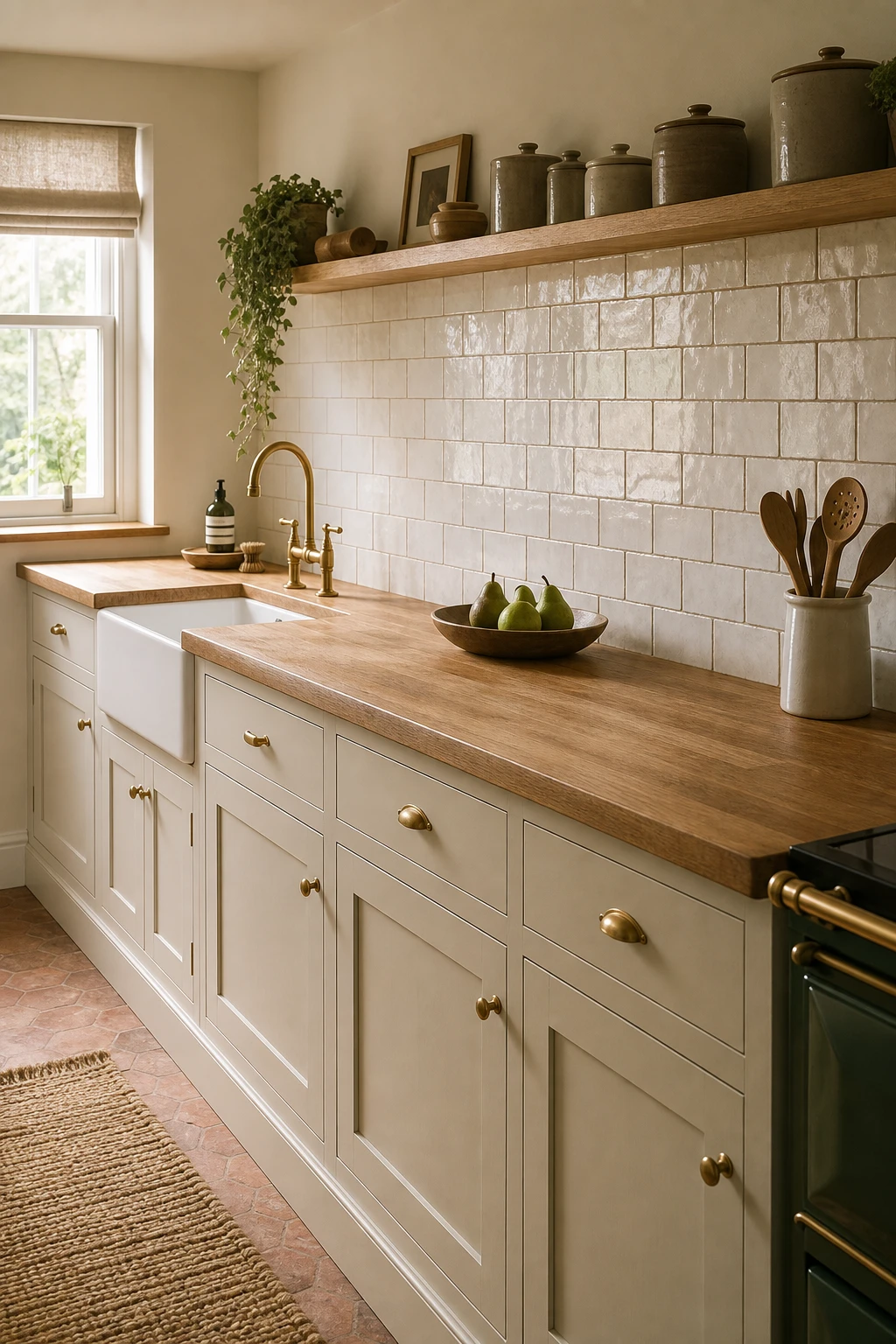
Ceramic tile is one of those materials that looks simple from a distance and then quietly does a lot of heavy lifting once you study it. What I love about running the tile horizontally across a narrow kitchen is the way your eye follows the long lines from one side of the room to the other, and you get a space that reads wider than it actually is. Lean in close and you will notice how every grout line acts like a small arrow pointing outward, gently stretching the walls apart. That simple shift in layout direction is the thing I always check first when a 70s kitchen feels a little pinched, because it costs nothing extra and changes everything about how the room feels.
The Key Details
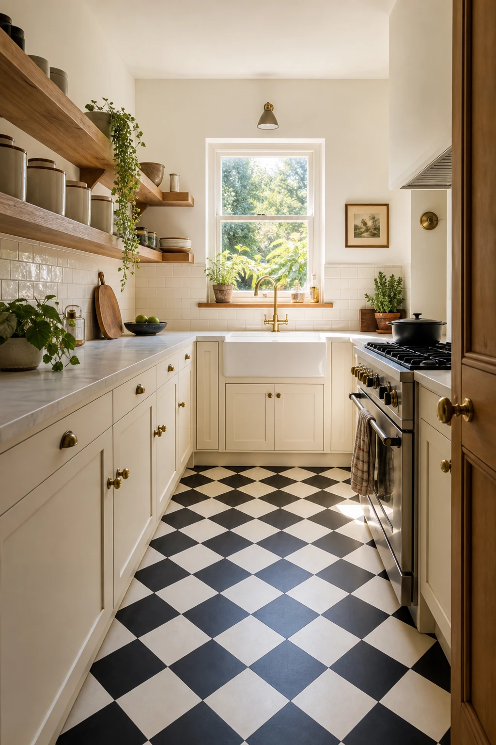
A black and white checkerboard floor is one of my favourite moves in a small kitchen because it does something almost architectural: it pulls every eye straight down to the ground, and the moment that happens, the cabinets above look taller and the whole room feels more generous. What I love about the contrast here is how clean and graphic it reads without needing any fuss above worktop height, so the cream flat front cabinets and open timber shelving get to breathe rather than compete. You will notice the floor is doing the heavy lifting on personality, and that lets every other surface stay calm and quietly 70s rather than loud. The trick that wins me over every time is how a bold floor actually makes a small room feel considered rather than cramped, because the eye has somewhere intentional to land.
The Key Details
Get The Look
Laminate has come so far that what I reach for now barely resembles the shiny, obviously fake surfaces people picture when they hear the word. Today’s stone effect sheets have a depth and texture that genuinely stops visitors in their tracks, and you get all of that without the eye watering cost of quarried stone. The thing I always check is how the pattern moves across the surface, because the best laminates now replicate the subtle variation of real mineral veining rather than repeating a flat tile like stamp. Pair a warm travertine or slate look finish with those flat front walnut tone cabinets and the whole kitchen reads as considered and deliberate, not budget conscious.
The Key Details
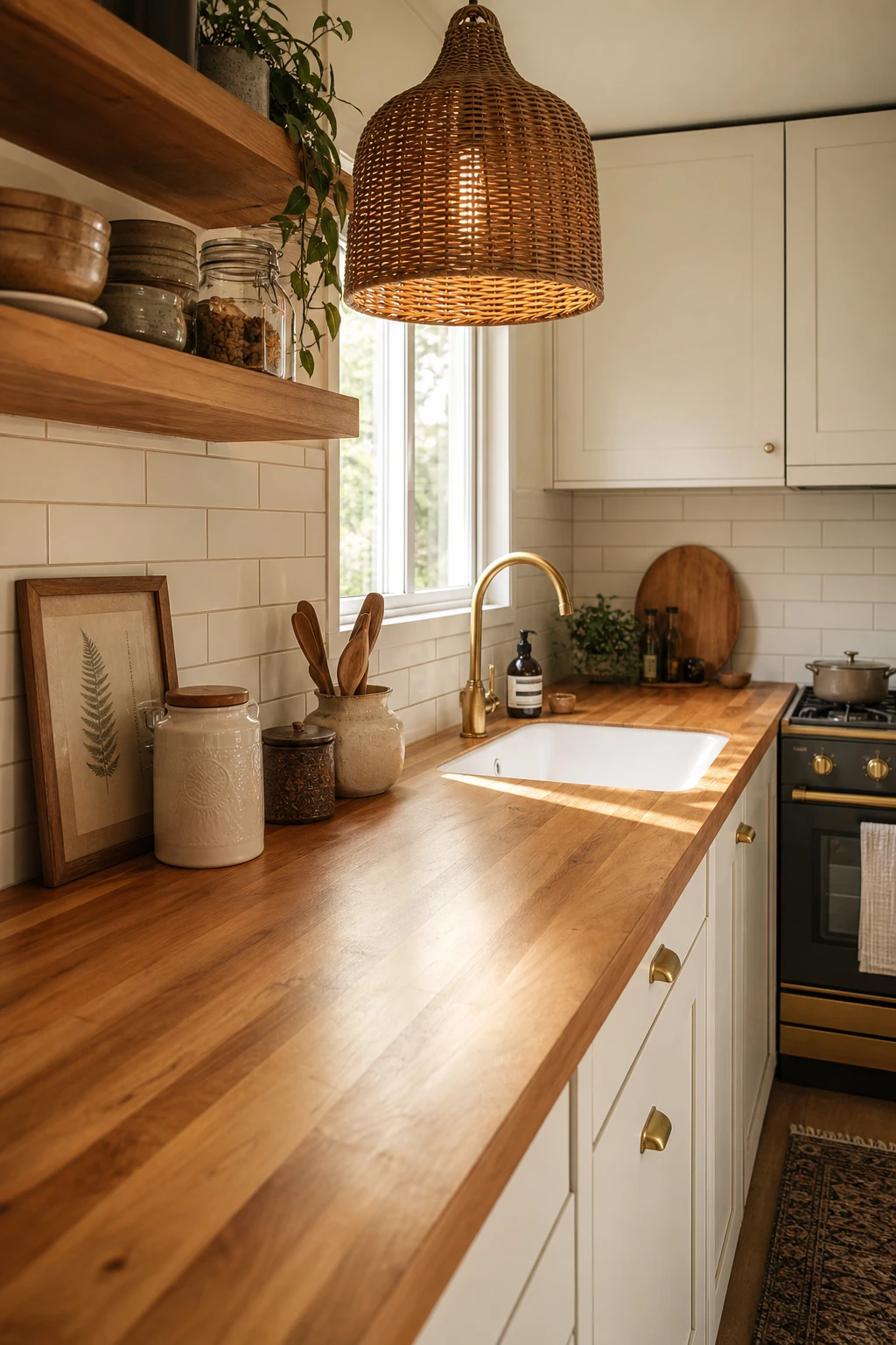
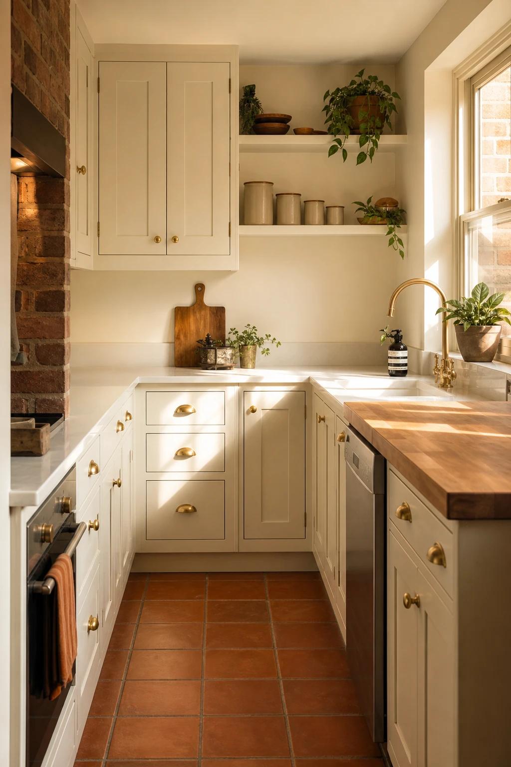
Butcher block beside white cabinets is one of those pairings that wins me over every single time, because the warm honey tones of the wood do something no painted surface can: they bring a room down from clinical and cold into something that actually feels lived in. You get this lovely contrast where the white reads crisp and clean and the timber reads generous and earthy, and together they hold a balance that feels just right. What I love most is the tactile quality, that grainy, slightly imperfect surface that you notice the moment you run a hand across it, which matters a lot in a small kitchen where every detail is right in front of you. It roots the whole space, and in a 70s remodel it nods to the era’s love of natural materials without ever looking dated.
The Key Details
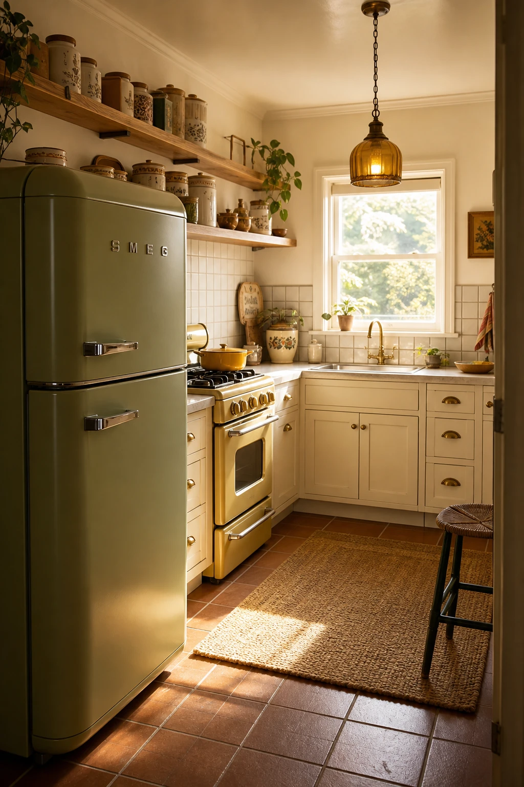
A single avocado green refrigerator or harvest gold range does more for a 70s kitchen than any amount of wallpaper or tile, and that is the thing I always check first when a small kitchen feels flat. You get one strong colour statement that pulls every eye straight to it, so the walls around it can breathe in cream or warm white without the room feeling bare. What I love about leaning on the appliances for all that era weight is that it leaves the rest of the space calm and open, which a small kitchen desperately needs. Watch how the whole room snaps into focus the moment one bold, rounded appliance lands on the counter or against a wall.
The Key Details
Get The Look
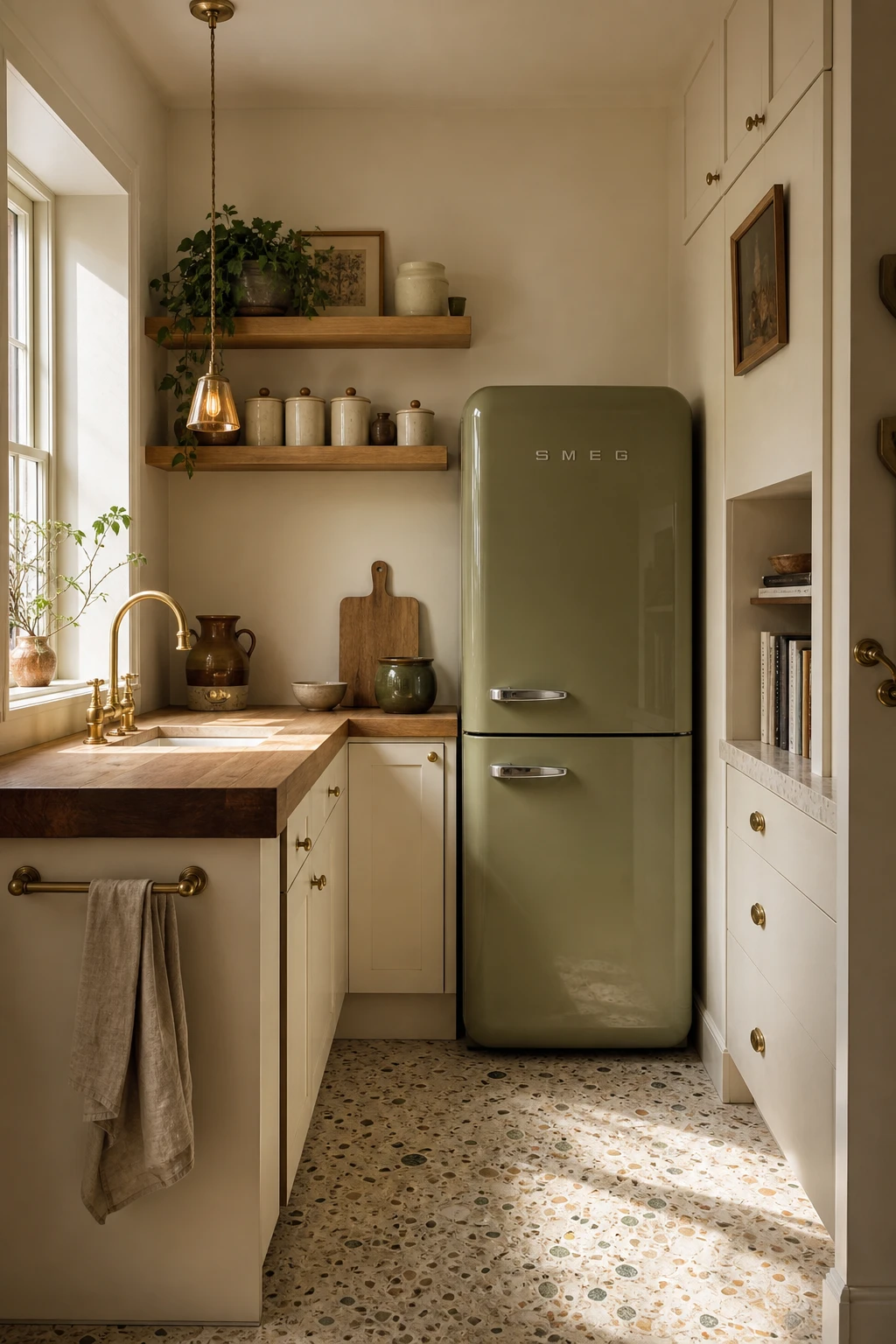
Dropping one rounded retro refrigerator into an otherwise modern kitchen is one of my favourite moves, because your eye lands on it immediately and the whole room shifts tone without a single tile being changed. What I love about this approach is how little heavy lifting it asks of everything else: the clean lines around it stay calm, the fridge does the talking, and you get a sense of era without the kitchen tipping into costume. You will notice that the avocado finish pulls warmth from the timber shelving and the butcher block, so the vintage piece feels chosen rather than plonked down. That one decision, a single hero with strong character, bridges decades more gracefully than repainting every cupboard and tracking down period hardware ever could.
The Key Details
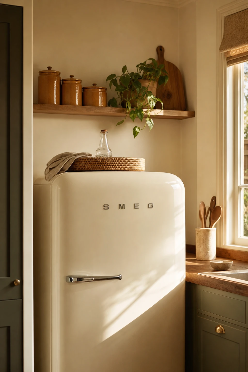
A vintage fridge is already a statement piece, and what I love about giving it room to breathe is that the whole kitchen shifts around it, almost like the fridge becomes the anchor painting in a gallery. You get that rounded pastel silhouette doing all the heavy lifting, and every accessory nearby either adds to the story or takes away from it. The rattan tray sitting quietly on top, the curated canisters on an open timber shelf, a single trailing plant catching the light, these are the touches that tell you someone made a deliberate choice rather than just collecting things over the years. Watch how the brushed chrome hardware picks up just enough detail to feel considered without competing, and suddenly the whole corner reads as charming rather than cluttered.
The Key Details
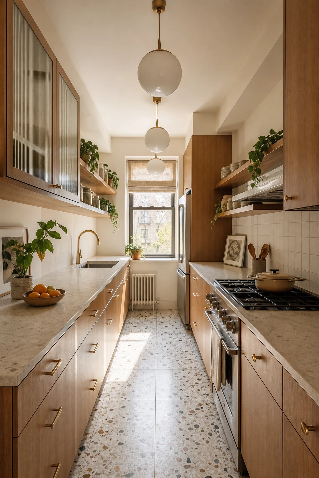
Galley kitchens get a bad reputation, but what I love about this one is how the parallel runs actually do the heavy lifting for you. When you keep both walls aligned and let the terrazzo floor run the full corridor length without interruption, your eye follows the line all the way to that ribbed glass window at the end, and the room suddenly reads as long and generous rather than narrow and squeezed. The toffee veneer cabinetry on both sides holds the warmth steady, while the open shelving on one wall lets the space breathe a little, softening what could otherwise feel like a tunnel. Globe pendants strung along the centreline are the finishing move I reach for in a layout like this, because they draw the gaze forward and remind you that the sightline itself is the feature.
The Key Details
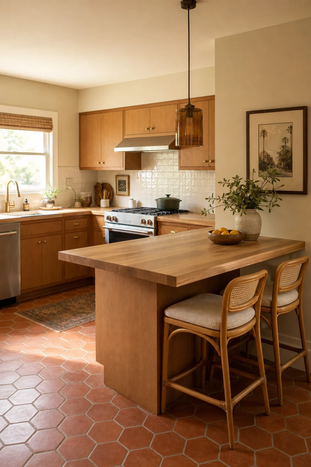
A narrow peninsula is one of my favourite moves in a small 70s kitchen remodel because it does two jobs at once without asking for much floor space. You get a defined social zone where someone can perch on a rattan counter stool and chat while the cooking happens, and the cook’s triangle stays completely free behind it. What wins me over every time is how the butcher block surface ties the peninsula back to the warm honey cabinetry, so it reads as part of the room rather than a thing bolted on as an afterthought. Watch how the smoked amber glass pendant above it pulls the eye down and makes the whole corner feel intentional, anchoring the seating spot with the kind of low amber glow that is pure 1970s.
The Key Details
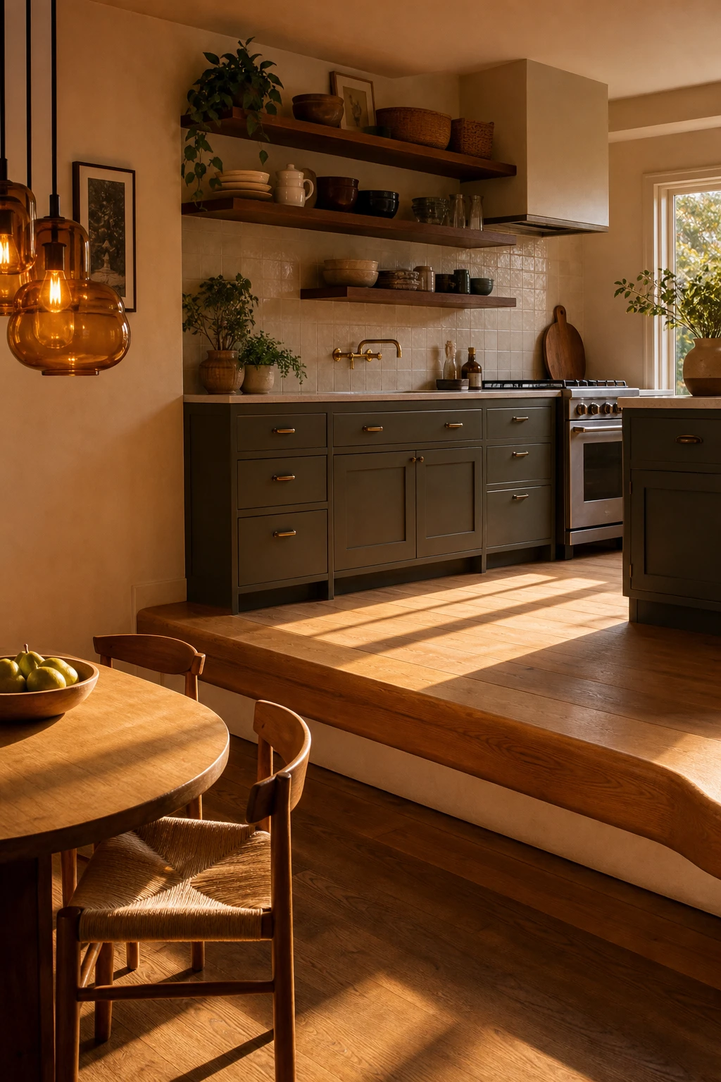
Split level kitchens have a reputation for being awkward, but the step between zones is actually one of the best free design tools you get in an open plan space. What I love about working with a level change is that it does the job of a wall without blocking light or shrinking the room visually. You get a clear signal that the cooking zone and the dining platform are different spaces, and that clarity makes the whole room feel more considered and calm. Watch how a rounded bullnose edge on the step and the same oiled oak running across both levels pulls everything together so the shift in height reads as a deliberate choice rather than an architectural leftover.
The Key Details
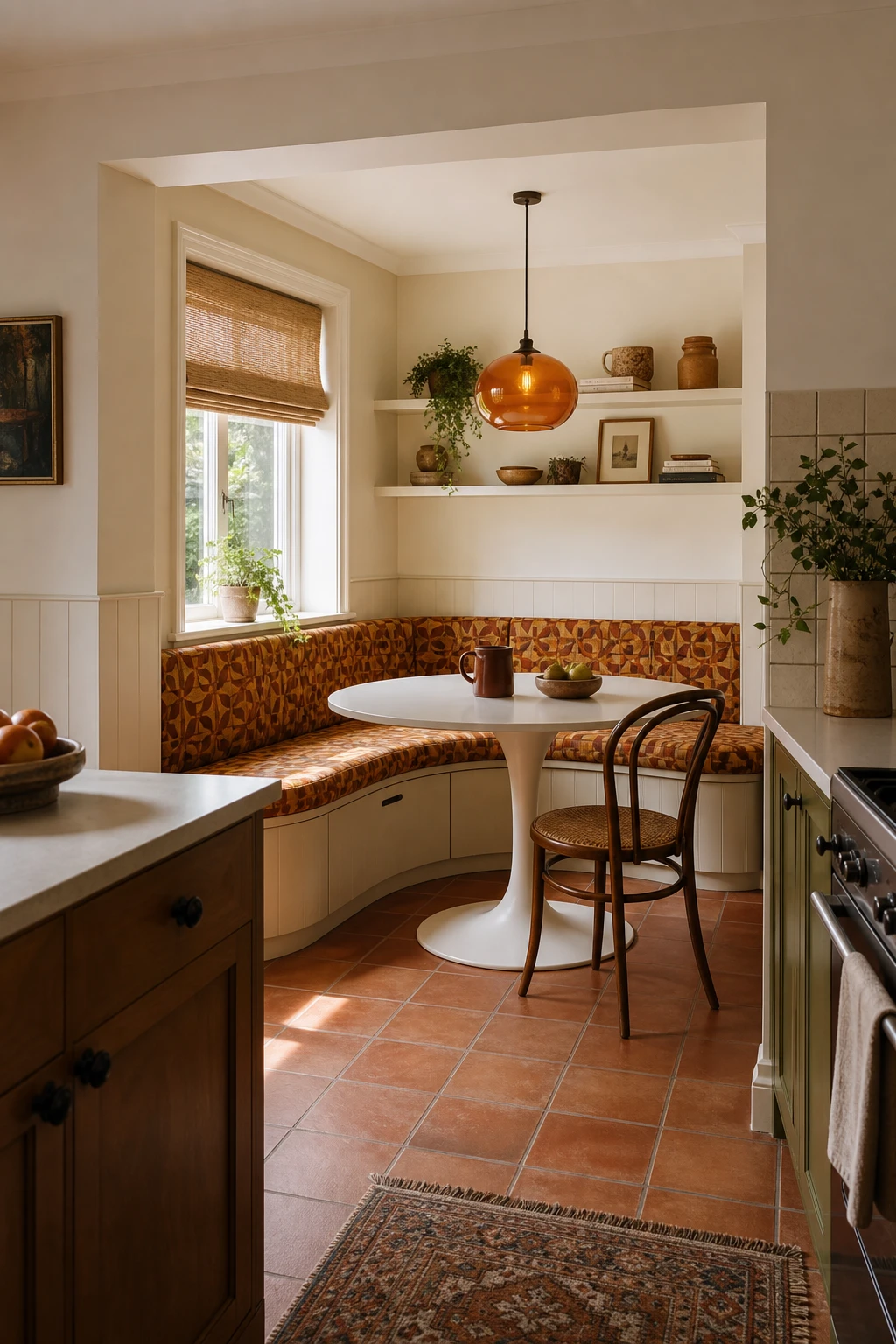
A breakfast nook carved into a corner of a small kitchen does something almost magical: it creates a whole separate feeling within the same four walls, and that sense of arrival is what I love most about this move. Built in banquette seating wraps the space with purpose, and the moment you tuck under seat storage beneath those hinged cushions, you solve two of the most frustrating small kitchen problems in one clean gesture. You get a place to sit and eat without losing a single square foot to a freestanding chair that needs pulling out, and all that dead corner space quietly becomes home to extra linens, seasonal kit, or the things you never quite know where to put. Watch how the round pedestal table, the amber pendant dropping low, and the terracotta tiles pull it together into something that feels genuinely warm rather than just clever.
The Key Details
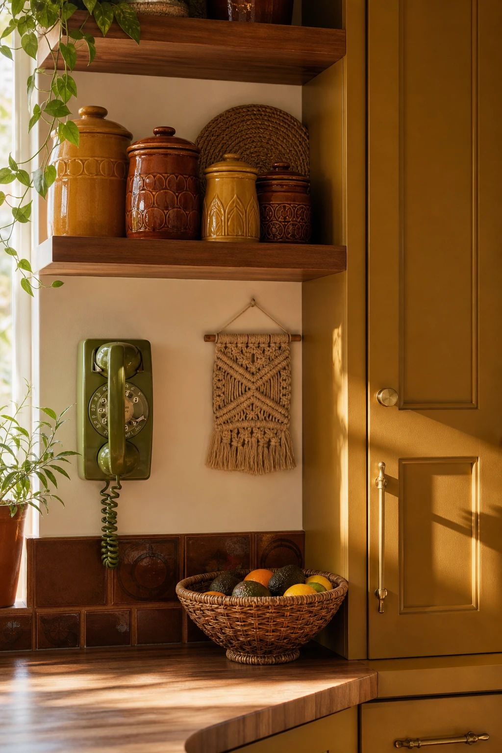
Accessories are the quietest way to pull a decade into a room, and in a small kitchen that matters enormously because you get all the personality without touching a single tile or cabinet. A hand thrown canister, a woven rattan bowl, a macrame panel on the wall: each one whispers the 70s rather than shouting it, so the room still feels like yours. What I love about working at this scale is that you can shift the whole mood of a space simply by swapping a few objects on a shelf, no commitment, no dust sheets, no contractor. You will notice how three well chosen pieces on a surface read as a considered collection, while the same room with a dozen pieces starts to feel like a market stall, so the edit is everything.
The Key Details
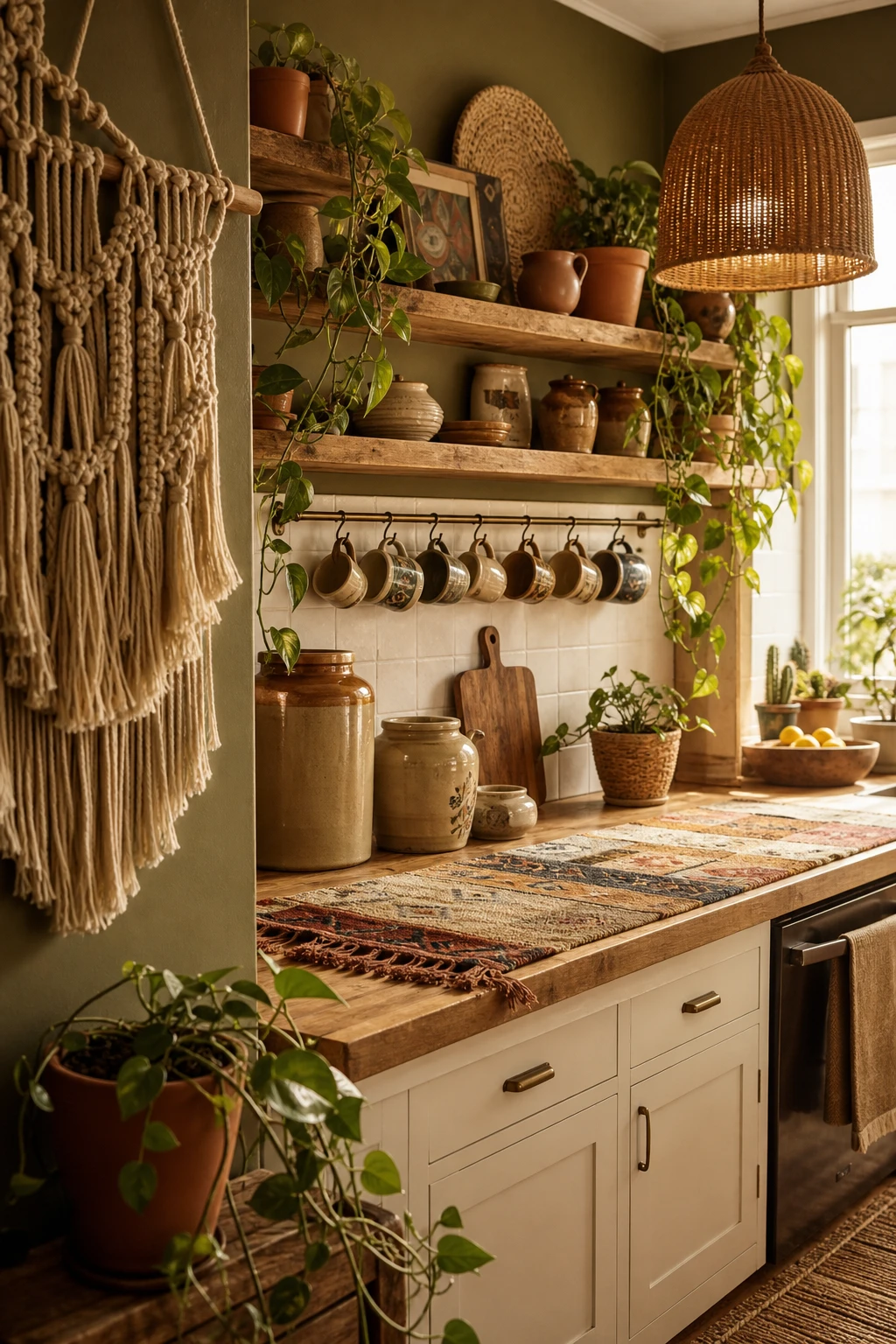
Bohemian layering is one of those approaches that looks effortless but actually has a quiet logic underneath it, and what I love most is how forgiving it is in a small kitchen. You are not buying new cabinets or retiling anything. A macrame hanging brings texture to a bare wall, a rattan pendant pulls the eye upward and makes the ceiling feel taller, and a patchwork runner along the counter breaks up any hard surfaces without costing much at all. Watch how the trailing pothos does the real work here, softening those boxy cabinet corners with something living and green so the whole room feels like it has been growing into itself rather than assembled in a weekend.
The Key Details
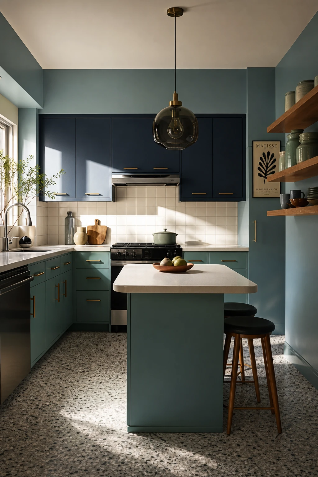
Cool toned palettes in a retro kitchen have a way of reading as completely deliberate, and that is exactly what wins me over about this combination of teal cabinetry, grey terrazzo and smoked glass. You get a sense of calm and quiet confidence the moment you walk in, the kind of room that feels curated rather than assembled. What I always check when I am working with a cool palette like this is whether there is enough warmth anchoring it, and here the open timber shelving does that job beautifully, pulling the eye away from anything that might feel cold or flat. The slim brass pulls are the finishing touch I reach for to seal the deal, a little warmth right at hand level that ties the whole thing together without fighting the palette.
The Key Details
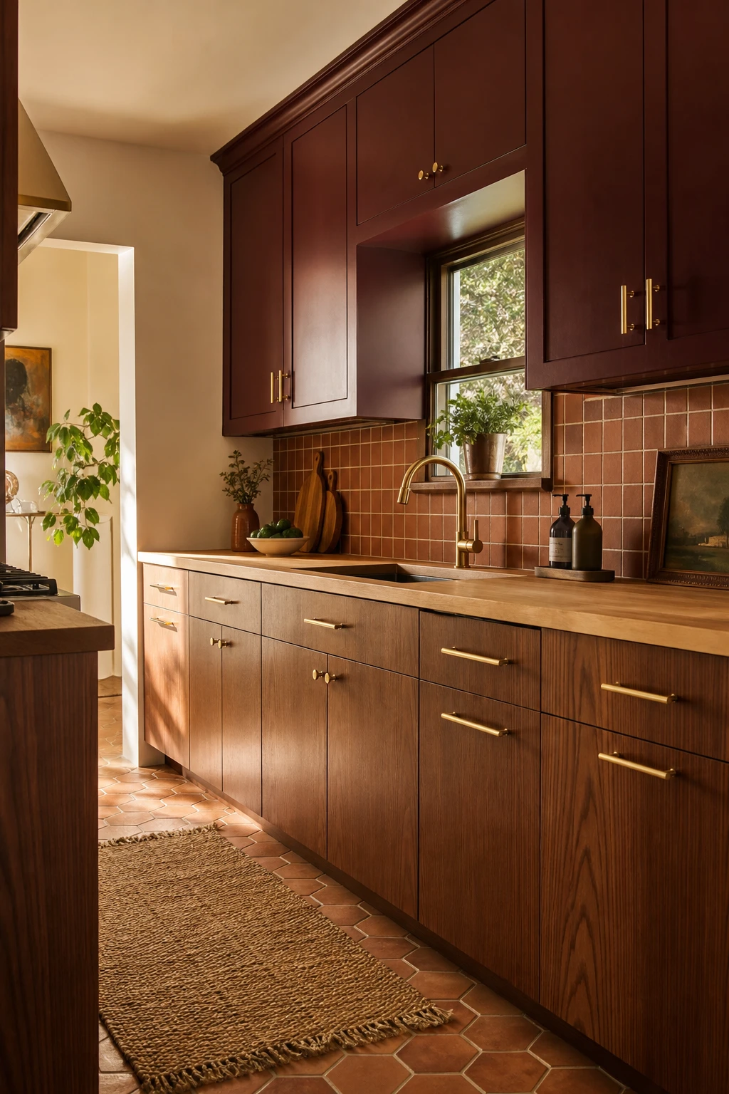
Amber, ochre, and terracotta are the colours that made the 1970s kitchen feel so alive, and what wins me over every time is how effortlessly they translate into a space that feels warm today rather than dated. You get a richness on the walls and cabinetry that a cool grey palette simply cannot give you, and the moment those earthy tones sit together, the room starts to feel like somewhere people actually want to pull up a chair. The thing I always check is whether the palette has enough variation in tone, because a flat block of the same warm hue flattens everything, but layering terracotta tiles against a softer ochre wall and a walnut cabinet front gives you depth that keeps the eye moving. Watch how the natural grain in the timber and the slight variation in a glazed ceramic tile do all the heavy lifting, giving the whole room a handmade, human quality that feels genuinely current.
The Key Details
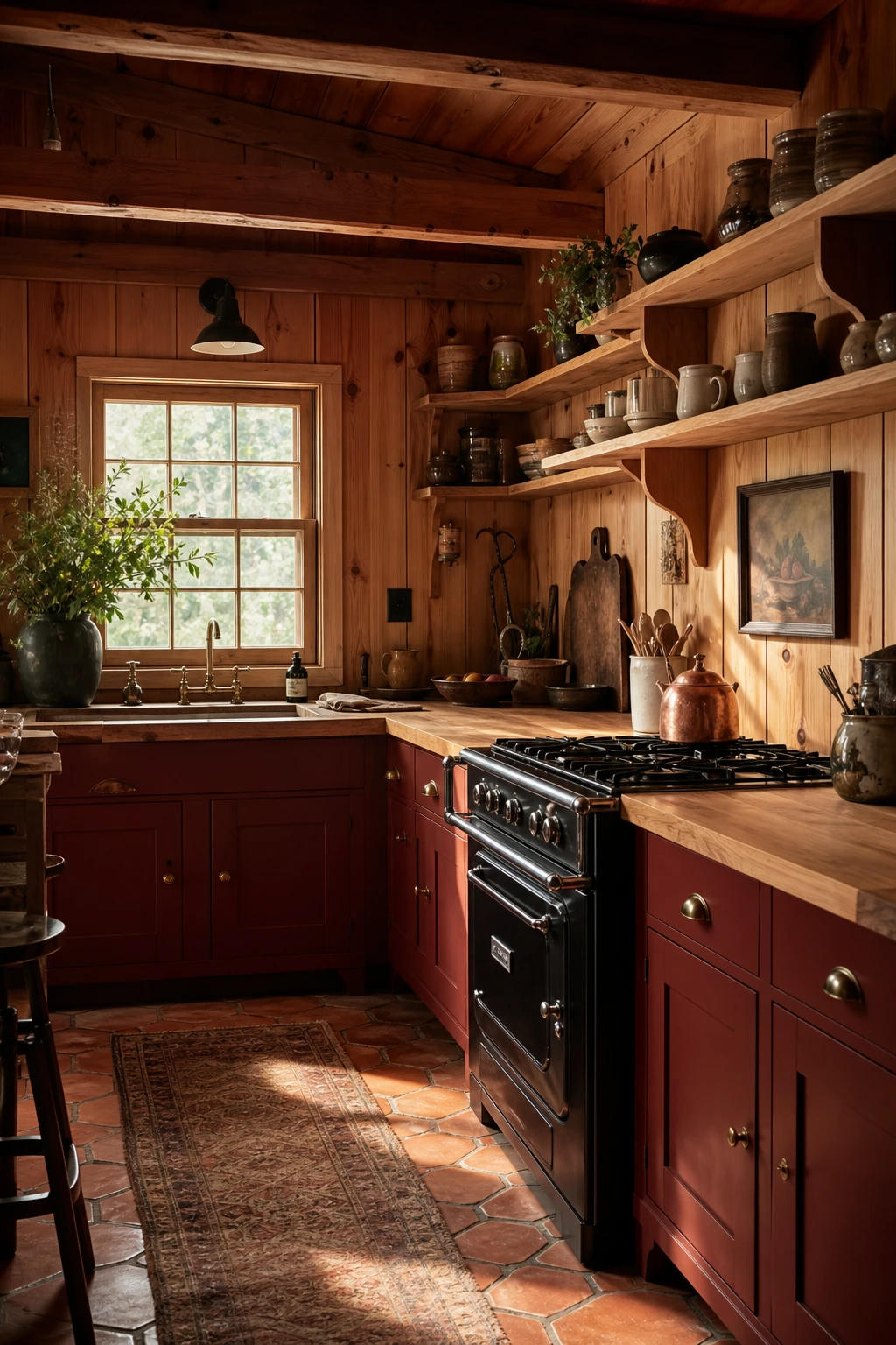
Knotty pine panelling, rough ceiling beams, and terracotta underfoot create so much visual texture that the room feels completely finished before a single decoration goes up, and that is the whole lesson of this look. What I love about cabin kitchens is how the material itself does the heavy lifting: every knot in the wood, every colour shift in the tile, every worn edge on the butcher block adds a layer that paint or wallpaper simply cannot replicate. You will notice that the earthy palette, warm amber wood, dusty terracotta, and muted earthenware, all pull from the same family of tones, so nothing fights and everything settles together quietly. The restraint wins me over every time, because when raw materials are this good, decorating more would only get in the way.
The Key Details
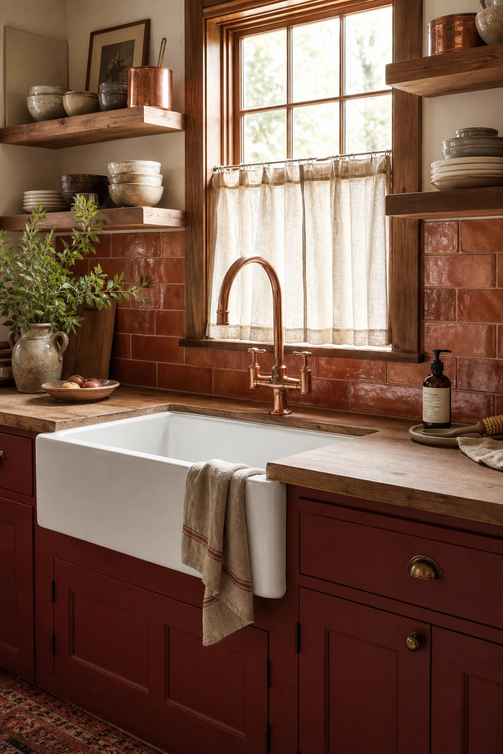
A copper faucet is the kind of single choice that does the work of ten decisions, and that is exactly what wins me over about it in a small 70s kitchen remodel. You get an instant warmth that reads as deliberate rather than accidental, because the eye picks up that burnished tone and then finds it echoed in every cabinet pull, every light fitting, every small detail across the room. The terracotta tile, the raw timber shelving, the linen curtain at the sink window, all of it suddenly belongs together once that copper anchor is in place. Watch how the whole scheme feels curated rather than collected, and that is the real lesson: one finish decision, made confidently, unifies hardware across the whole kitchen without you touching another thing.
The Key Details