Design Your Kitchen In 70s Style Design Your Kitchen in 60 Secs Try For Free Try Free

Enter your email address below and subscribe to our newsletter

Get the 70s Boho Kitchen Look Without Ripping Anything Out

I’ve always had a soft spot for the 70s boho kitchen, where warm earthy tones, rattan, and a little happy chaos come together in the most liveable way. What I love most is how this style lets you layer colour freely, whether that means pairing brown and yellow cabinetry, going all in on terracotta tiles, or smuggling in a wall of trailing plants. Every look in this list is something I’d happily steal for my own kitchen.

How to Make Brown and Yellow Feel Chic Instead of Dated

70s boho kitchen with brown and yellow as the hero, featuring India Yellow painted cabinets, terracotta tiles, rattan pendants, and warm afternoon light

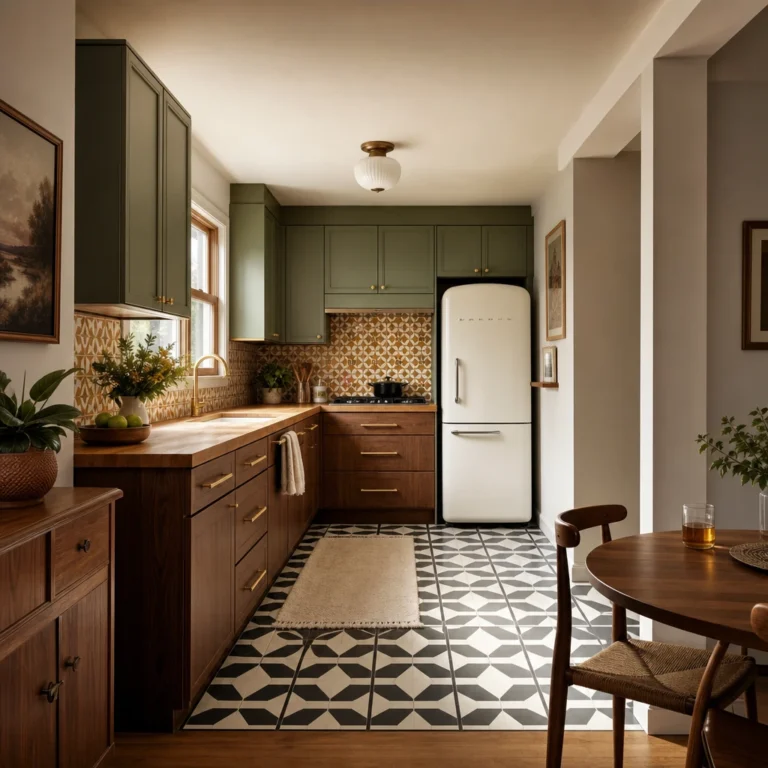
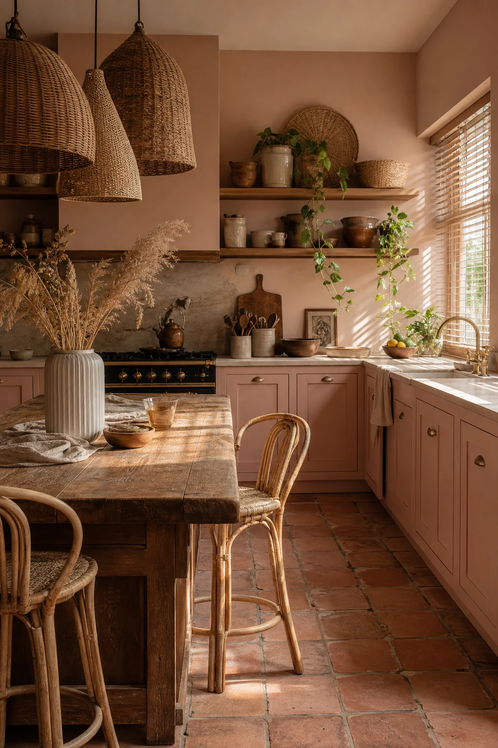
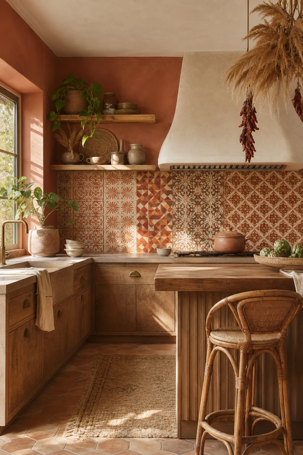
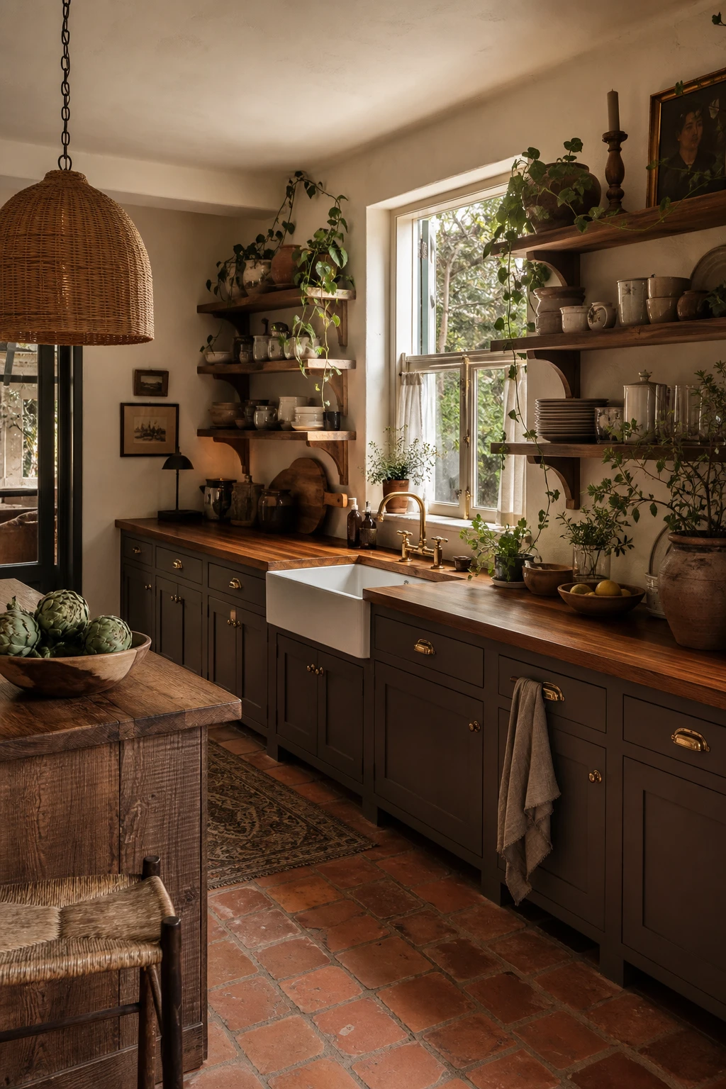
Brown and yellow is the combination that makes most people nervous, and I completely understand why, because one wrong step and the whole kitchen slides back to a school cafeteria in 1974. What saves it is treating brown as your anchor and yellow as your light source, so the eye has somewhere warm to rest and somewhere bright to travel. Walnut cabinets do the heavy lifting here, grounding the room with that deep, honeyed grain, and then the yellow comes in as a glaze of sunshine rather than a shout. You will notice how the terracotta zellige tiles sit right between the two tones, acting as a bridge that keeps everything feeling earthy and alive rather than flat or muddy.

The Key Details

  • Walnut lower cabinets
  • Terracotta zellige tile backsplash
  • Clustered rattan pendant lights
  • Open timber shelving with ceramic vessels
  • Sisal runner on hardwood floor
Pro TipChoose a yellow with a golden or amber undertone rather than a cool or greenish one, because it will echo the warm grain in the walnut and feel like the sun is hitting the room from the inside.
AvoidAvoid mixing a warm brown wood with any yellow that leans lime or chartreuse, because the cool green pull in the yellow will fight the red undertones in the timber and turn the whole palette murky.

An All Orange Kitchen That Actually Works

A 70s boho kitchen painted entirely in deep orange with terracotta tiles, rattan pendants, open shelving and warm afternoon light flooding through a large window

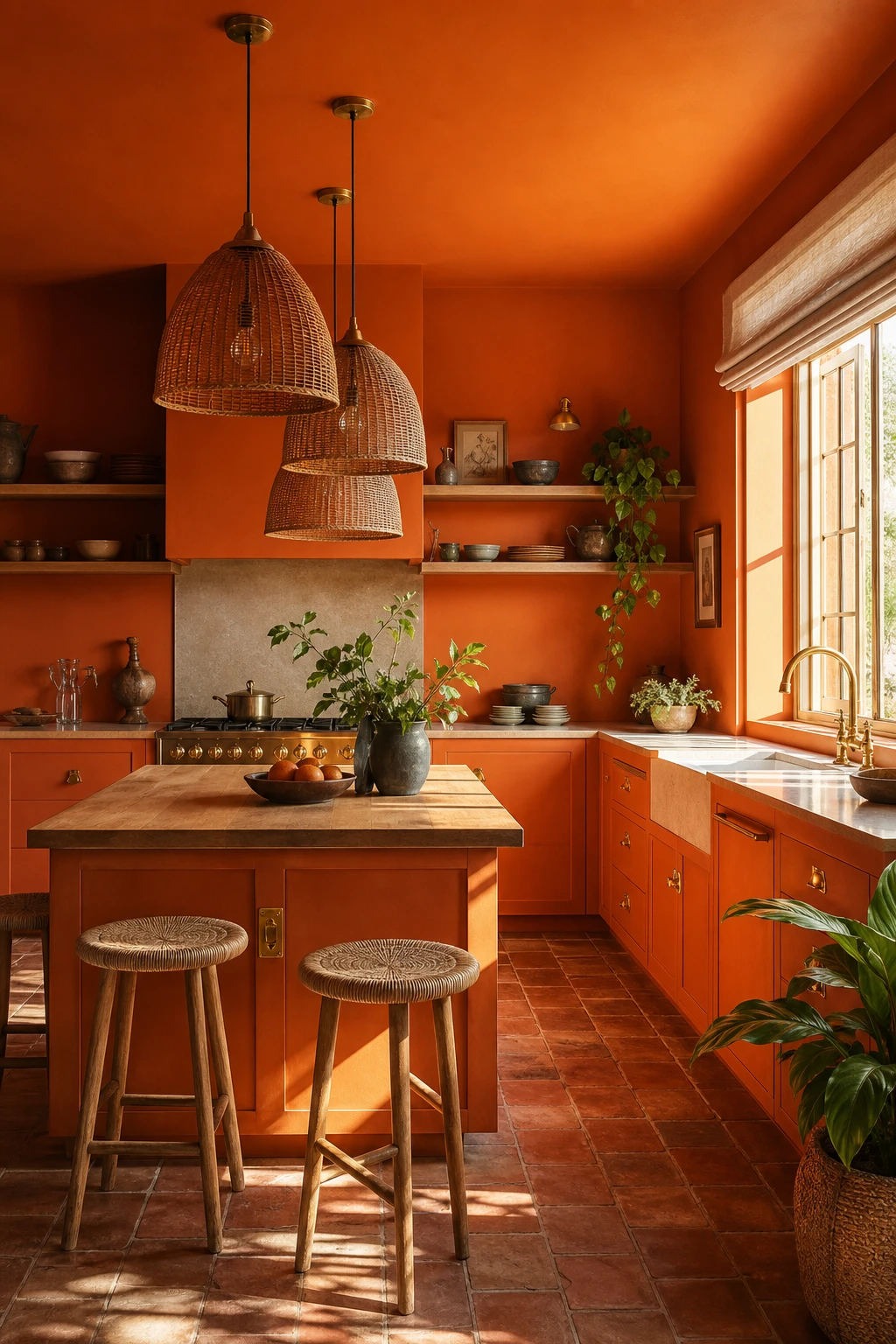
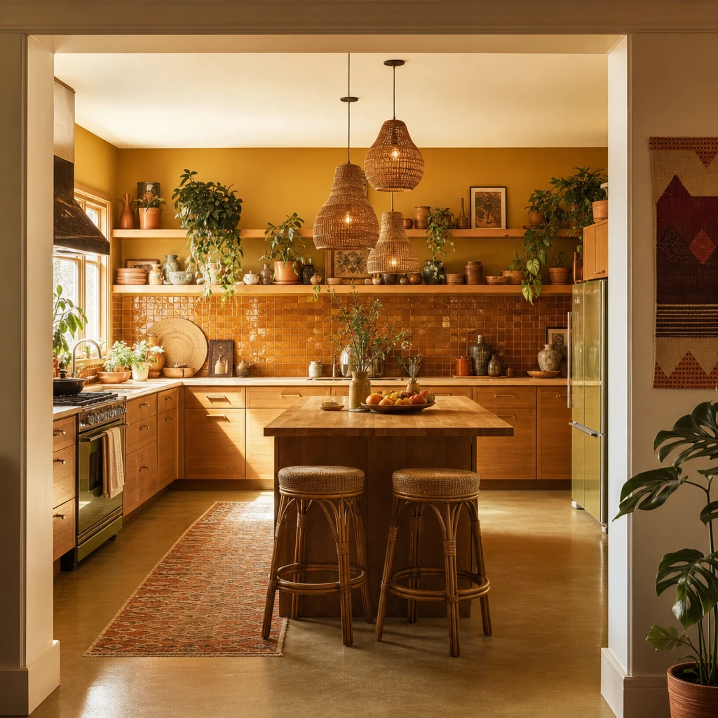
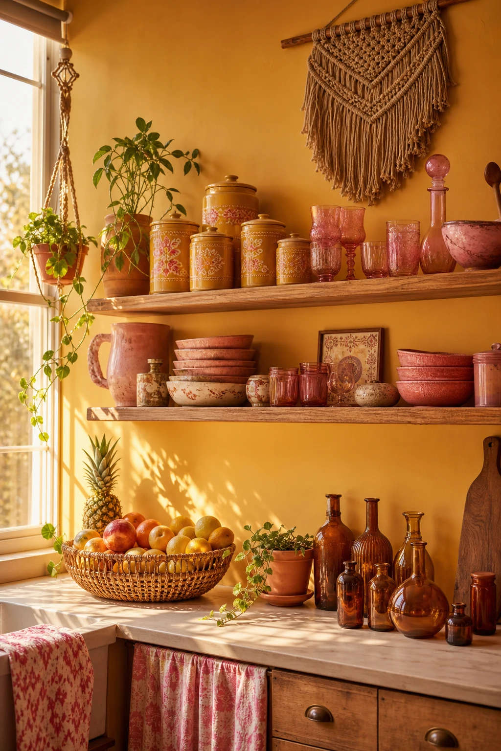
Committing every surface to a single saturated hue is one of my favourite moves in a small kitchen because it dissolves the edges of the room and pulls you inside a warm, enveloping space rather than a box with walls. What I love about orange specifically is that it carries the whole spectrum of the 70s palette on its own, earthy enough to feel grounded, bright enough to feel alive. You get that rich, almost edible quality when the tone sits closer to amber than tomato, and watch how the natural wood shelving and terracotta floor tiles do not compete with it but breathe alongside it, giving your eye a place to rest without breaking the spell. The whole room reads as one warm intention rather than a collection of separate decisions, and that single mindedness is exactly what makes it feel confident instead of chaotic.

The Key Details

  • Rattan pendant lights
  • Open timber shelving
  • Terracotta floor tiles
  • Butcher block island
  • Brass cabinet hardware
Pro TipBring in at least one run of open timber shelving at eye level so the natural grain interrupts the orange just enough to stop the walls from feeling flat.
AvoidAvoid any orange that leans red or coral because the moment it tips toward that brighter, cooler territory it starts to read more burger bar than bohemian kitchen.

Yellow Fading Into Orange Across Every Surface

70s boho kitchen with yellow to orange gradient cabinets and walls, rattan pendants, terracotta tiles, and warm afternoon light creating a sunset colour story

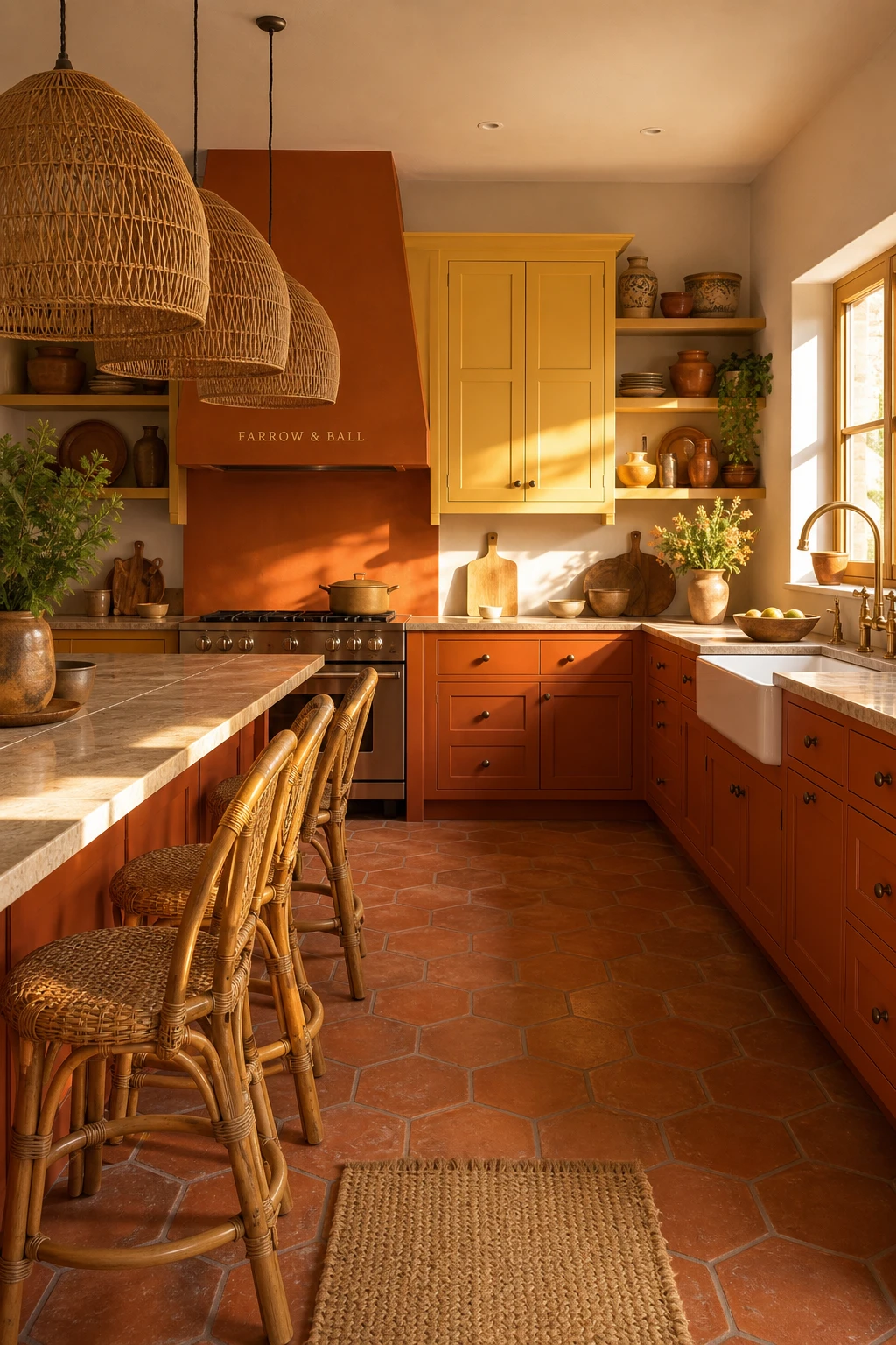
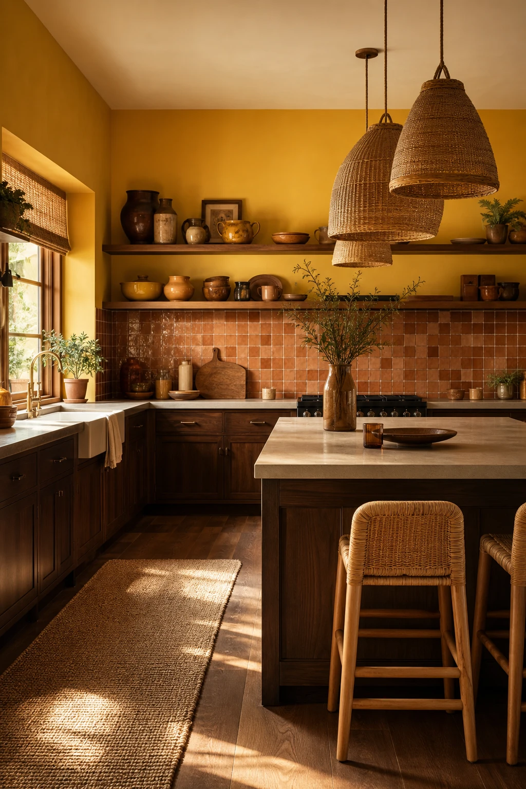
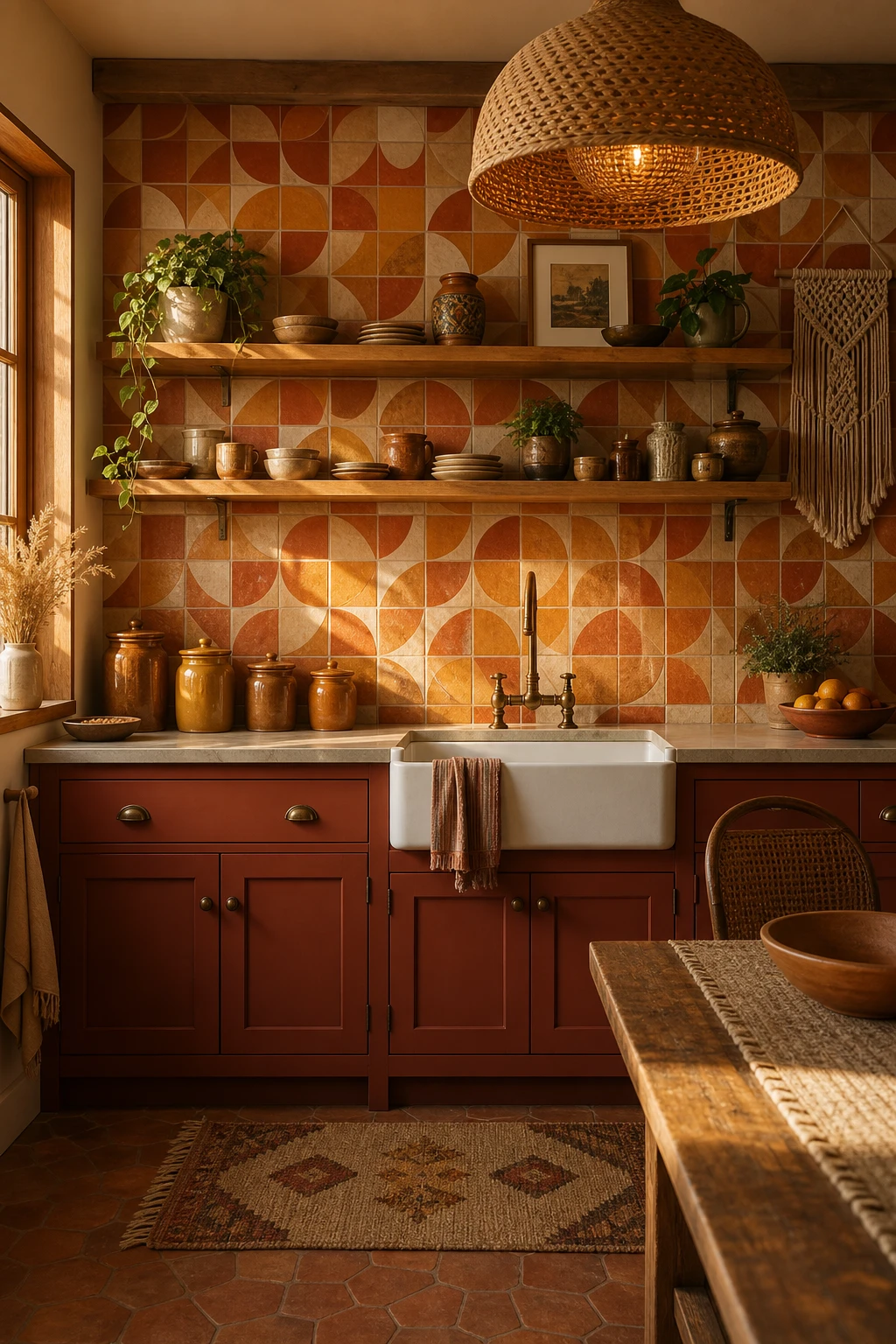
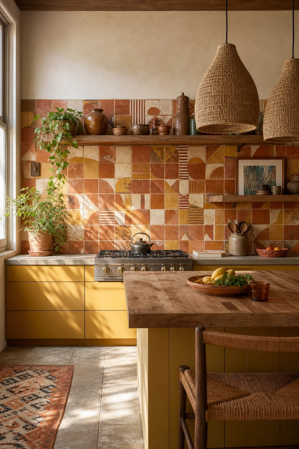
Analogous colours, the ones sitting right next to each other on the colour wheel, never fight each other. They just deepen the mood as your eye travels across the room, and running yellow into orange across cabinets and walls is one of the moves I keep coming back to because the room reads as one continuous warm story rather than a collection of individual choices. You get that slow burn glow that feels genuinely alive rather than painted on, and the terracotta tiles on the floor anchor the whole gradient, pulling the warmest end of the palette down to ground level where it belongs. Watch how rattan pendants and ochre ceramics on open shelving echo those tones without adding a single new colour to manage, and you will notice the whole scheme just breathes.

The Key Details

  • Gradient painted timber cabinets in yellow to orange
  • Rattan dome cluster pendant lights
  • Terracotta hexagonal floor tiles
  • Open shelving with ochre and rust ceramic vessels
  • Hammered brass farmhouse tap and fittings
Pro TipFix raw hammered brass hardware to every cabinet door so the warm metal sits right at the midpoint of your yellow to orange fade and ties the whole gradient together in one quiet stroke.
AvoidDo not let yellow stop sharply on one side of the room and orange start on the other, because that hard line splits the kitchen into two competing spaces and kills the seamless warmth you are building.

Dark Olive Cabinets That Ground the Whole Room

70s boho kitchen with dark olive lower cabinets, rattan pendant lights, terracotta tile floor, open shelving with ceramic vessels, and warm afternoon light

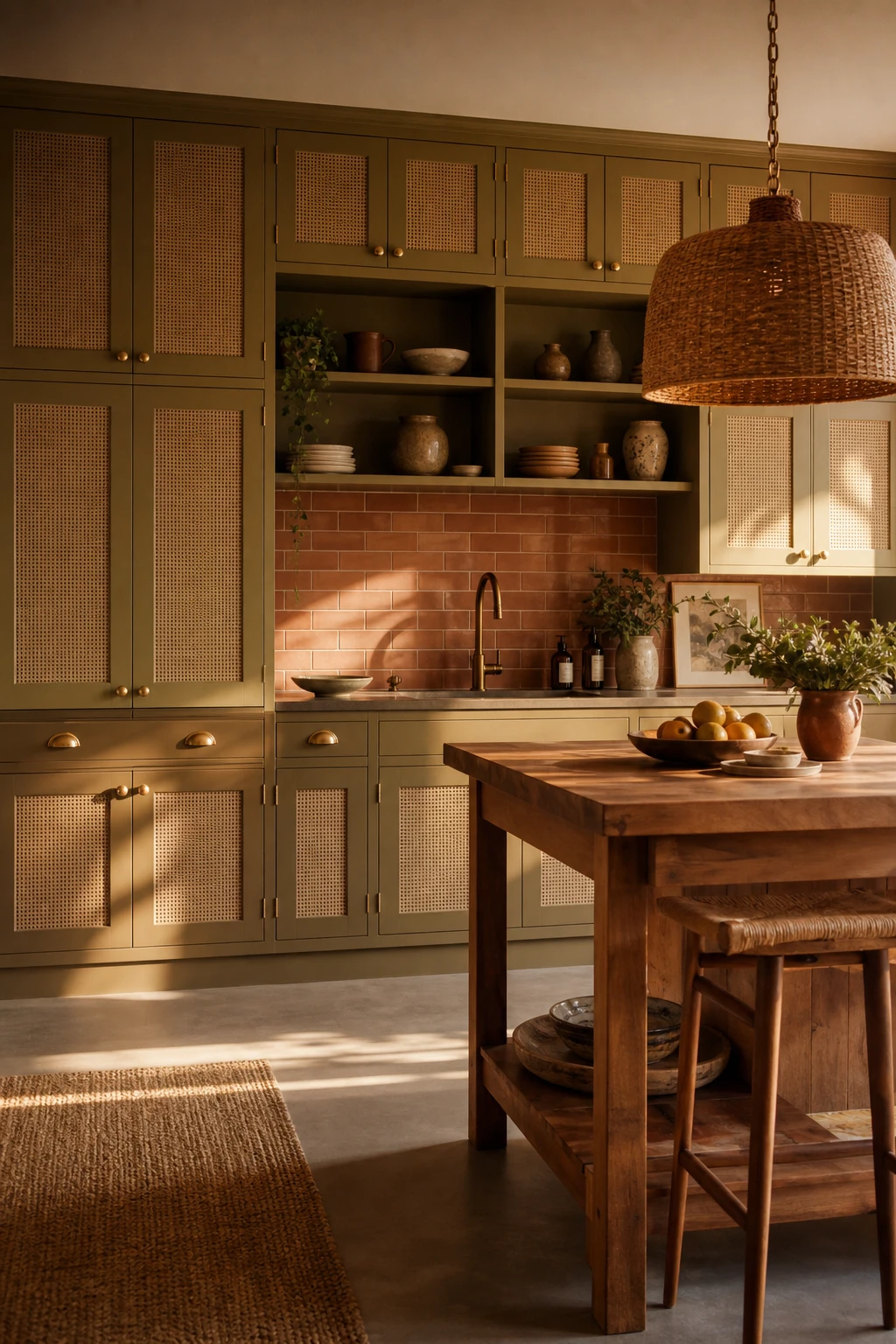
Dark olive is one of those colours that earns its place the moment you see it against warm cream walls, and what I love most is how it reads as rich and grounded rather than cold or heavy. You get that depth of a truly dramatic kitchen without any of the chill you would feel from navy or black, because olive carries yellow and brown underneath that keep the whole room breathing. The flat slab doors with brushed brass bar pulls are the move I reach for here, because the clean face lets the colour itself do the talking while the brass pulls up all that warmth hiding in the green. Watch how the terracotta floor and the honed travertine countertop on top complete the loop, earthy, sun baked tones below and above so the olive sits nestled rather than floating.

The Key Details

  • Flat slab cabinet doors with brushed brass bar pulls
  • Honed travertine countertop
  • Rattan wrapped pendant lights
  • Terracotta tile floor
  • Open timber shelving with ceramic vessels and trailing pothos
Pro TipPaint your walls a warm off white with a yellow or pink undertone, not a cool white, so the olive reads alive and mossy rather than dull and muddy.
AvoidDo not apply a high gloss lacquer finish to olive cabinets, because once that earthy matte texture is gone the colour looks flat and plastic rather than warm and natural.

Sage Green Meets Warm Oak for the Softest Boho Kitchen

70s boho kitchen with sage green lower cabinets, warm oak upper cabinets, rattan pendants, terracotta tiles, and soft morning light from a side window

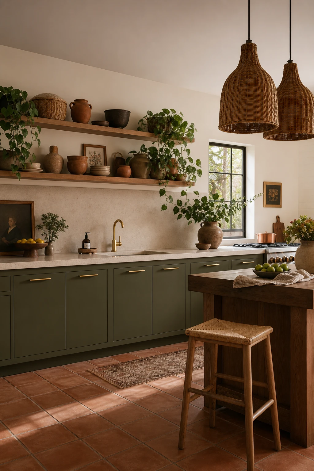
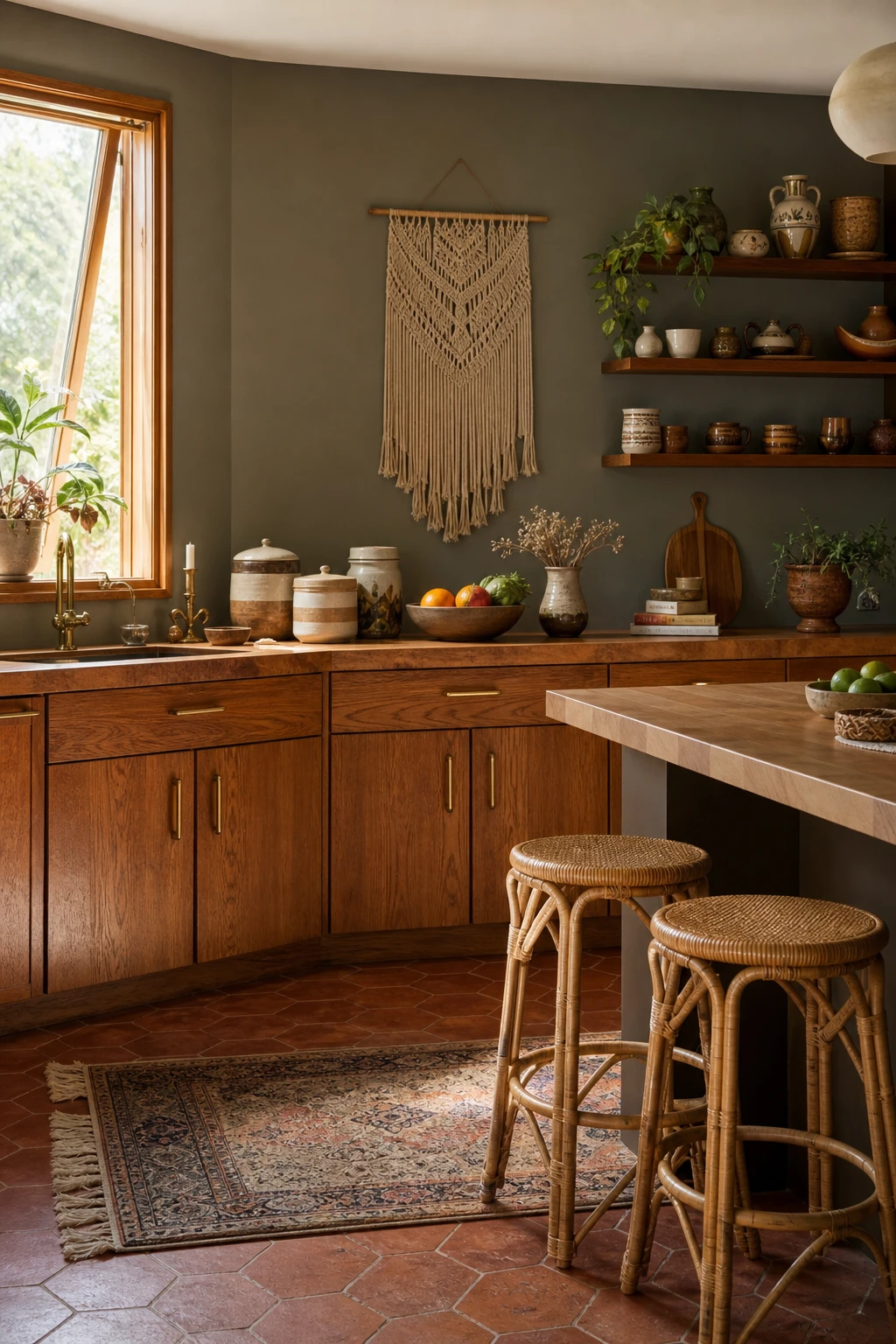
Sage green and warm oak is one of those combinations that just feels easy to be around, and the reason it works so well is that both tones are already doing the same quiet job. The green carries enough grey in it to stay calm, and the honey in the oak stops the whole room from feeling cold or flat. What I love about this pairing is the contrast it creates without any tension, you get depth and warmth at the same time, which is exactly the mood a boho kitchen should land on. Watch how the wood grain pulls the green forward and gives it life, because without that earthy warmth alongside it, a muted green can easily read as dull rather than considered.

The Key Details

  • Two tone oak and sage green cabinetry
  • Rattan cluster pendant lights
  • Terracotta hexagonal floor tiles
  • Open oak display shelving
  • Butcher block island surface
Pro TipLook for a sage with a clear grey or blue grey undertone rather than a yellow one, because that cooler base is what lets it sit peacefully next to honey oak without the two fighting each other.
AvoidDo not go so pale with your sage that it loses its presence entirely, because next to the warmth of oak it will simply vanish and the gentle contrast you are after will disappear with it.

Soft Pastels in a Boho Kitchen That Still Feel Grown Up

A 70s boho kitchen with pastel pink walls, rattan pendant lights, open shelving with ceramic vessels, terracotta floor tiles, and woven textures throughout

Pastels in a kitchen get a bad reputation because people picture them on every wall, every cabinet, every surface at once, and that is when they tip into something that feels more playful than grown up. Restraint is everything here, and the move I always suggest is a single pale sage or dusty blush cabinet front sitting against raw timber shelving and rough terracotta floor tiles, the softness of the colour playing off the grittiness of the materials around it. You get that gentle, sun faded quality that sits right at the heart of 70s boho without the room ever feeling like it belongs to a toddler. The texture is doing the heavy lifting, and once you see it working you will notice it is almost impossible to make a pastel kitchen feel too sweet when the surfaces around it have this much warmth and grain.

The Key Details

  • Rattan pendant cluster
  • Open timber shelving with stoneware
  • Butcher block island
  • Terracotta floor tiles
  • Slatted timber window blind
Pro TipTest your pastel cabinet colour against a swatch of your actual timber and a terracotta tile before you commit, because the way those three read together in your specific light is more useful than any paint chart.
AvoidAvoid painting your walls, cabinets, and ceiling in the same pastel family at the same time, because without contrast the colour has nothing to push against and the whole room goes flat.

Pink and Yellow Accessories That Make a Kitchen Sing

70s boho kitchen with pink and yellow decor accessories including ceramic vessels, woven baskets, and retro glassware on open shelving with warm afternoon light

Pink and yellow is one of those combos that sounds risky on paper and then completely wins you over the moment you see it done right. What I love about using accessories to carry bold colour is that you are essentially running a test with zero commitment, a swap of canisters or a new bowl costs almost nothing compared to repainting cabinets. You will notice the secret is saturation: a warm mustard yellow and a soft blush pink share the same dusty, slightly faded quality that reads as vintage rather than garish, and that shared warmth is what holds them together on the shelf. The accessories do all the talking while your kitchen surfaces stay calm, and that balance is exactly what gives the whole room its confidence.

The Key Details

  • Open timber shelving
  • Mustard and blush ceramic canister set
  • Macrame wall hanging
  • Vintage amber glass bottles
  • Rattan countertop fruit basket
Pro TipPlace at least three pieces in each colour across the shelves and counter so both pink and yellow feel like a considered choice rather than a happy accident.
AvoidBuying just one pink item and one yellow item leaves both colours looking like they wandered in from different rooms rather than belonging together.

A Retro Tile Backsplash That Ties the Whole 70s Look Together

70s boho kitchen with a retro patterned tile backsplash as the hero feature, terracotta cabinetry, rattan pendant lights, and warm afternoon light

A patterned retro tile is one of the bravest moves you can make in a kitchen, and when you get it right, it pulls the whole room into focus. The geometric terracotta and ochre pattern here is doing something really clever: it acts as the colour anchor for every other decision in the space, so nothing feels random. You will notice how the oak shelves, the stoneware, the brass hardware all feel like they belong together, and that is because the tile chose them first. What wins me over every time with this approach is the confidence of it, one strong pattern doing the heavy lifting so the rest of the room can breathe.

The Key Details

  • Geometric patterned terracotta and ochre ceramic tile backsplash
  • Open solid oak floating shelves
  • Woven rattan pendant light
  • Hand thrown stoneware ceramic canisters
  • Aged brass cabinet hardware
Pro TipPick the most used colour in your tile pattern and ask your paint supplier to match it as closely as possible for the cabinet colour, because that single step is what makes a retro backsplash feel designed rather than stuck on.
AvoidDo not pair a busy geometric tile pattern with cabinet colours that fight for attention, because the two will compete and the kitchen will feel restless rather than warm and considered.

Orange Tiles From Floor to Ceiling: Is It Too Much?

70s boho kitchen with floor to ceiling orange tile wall, rattan barstools, open timber shelving, hanging macrame, and warm afternoon light

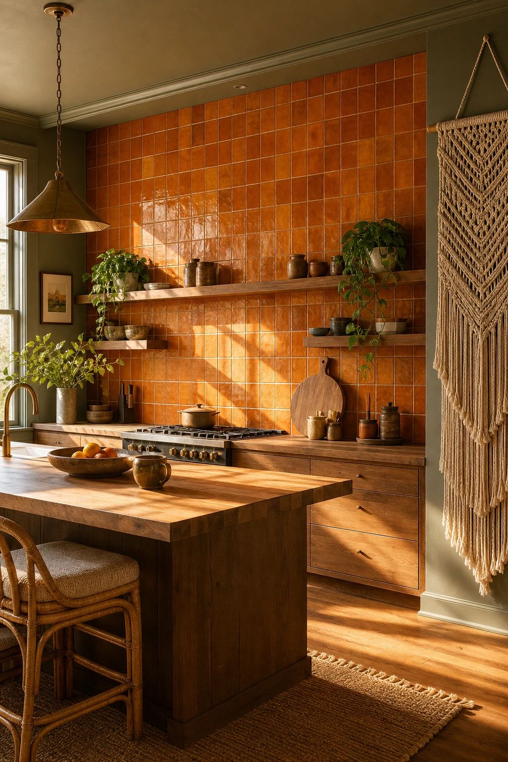
Floor to ceiling is the only way I would ever do a wall like this, and the moment you commit to it you will understand why. A thin strip of orange tile reads as an accident, something left over from a renovation that never quite finished, but carry it all the way up and the wall becomes the room’s anchor. What I love about handmade ceramics here is the variation baked into each piece, the slight wobble in glaze from one tile to the next, and you get a warmth that no factory tile can fake. Watch how the timber shelves and the butcher block island pull the eye back to natural tones so the orange never tips into overwhelming.

The Key Details

  • Floor to ceiling handmade ceramic tile wall
  • Open grain timber floating shelves
  • Rattan cushioned barstools
  • Looping macrame wall hanging
  • Butcher block island
Pro TipUse a wide grout line of around 10 to 12 millimetres in a warm cream or linen colour so each tile sits with a little breathing room and the wall reads as textured rather than flat.
AvoidAvoid tiling only a small splashback strip or a single row behind the hob because the orange will look like an afterthought rather than the confident statement it needs to be.

Mix and Match Tiles Done the Boho Way

70s boho kitchen with eclectic mix and match patterned tiles in terracotta, rust and ochre tones covering the splashback and lower wall

Mixing tiles feels risky until you understand the one rule that holds it all together, and colour is that rule. Pull a hand painted splashback tile and a bold encaustic floor tile from completely different visual worlds, and the moment they share even one strong colour the eye reads them as a family rather than a fight. The contrast in pattern adds energy to the room while the repeated colour keeps everything feeling calm and considered, and that tension between variety and unity is the heart of boho style. Tiles are one of the easiest places to let it play out, and I find they reward boldness far more often than caution.

The Key Details

  • Mixed encaustic and hand painted splashback tiles
  • Curved plaster range hood
  • Open timber shelving with ceramic vessels
  • Rattan bar stool
  • Dried pampas and chilli pepper wall hangings
Pro TipKeep your grout colour consistent across every tile in the room, floor and walls, so even the most mismatched patterns share a quiet thread that pulls the whole mix together.
AvoidPulling tiles from different eras without a single shared colour or tone will leave the kitchen looking patchy rather than layered.

Go Playful on the Backsplash and Keep Everything Else Simple

70s boho kitchen with a playful handmade tile backsplash as the hero, warm terracotta tones, simple flat front cabinets, and rattan pendants overhead

A playful backsplash is the one place in the kitchen where I say go for it, be bold, pick the pattern you have been quietly obsessing over. What I love about giving a single surface all the personality is that the rest of the room gets to breathe. You will notice the flat front timber cabinet doors and the butcher block counter look more considered and calm precisely because they are not competing with anything. The hand painted ceramics become a genuine focal point, and every other honest, simple material in the room quietly frames them.

The Key Details

  • Hand painted ceramic tile backsplash
  • Flat front timber cabinet doors
  • Woven rattan pendant lights
  • Butcher block timber counter
  • Open timber wall shelf with earthenware
Pro TipUse plain white grout throughout the backsplash so the tile pattern stays the star and the whole thing reads as one clean, joyful surface rather than a patchwork.
AvoidHanging patterned curtains or laying a busy rug nearby will split the eye in two directions and the backsplash loses the impact you worked so hard to create.

The Cabinet Style That Says 70s Boho Without a Word

70s boho kitchen with flat panel cabinets in Farrow and Ball Cardamom paint, cane inset doors, brass hardware, terracotta tiles and rattan pendant light

Flat slab and simple shaker doors are the quiet heroes of a 70s boho kitchen, and what wins me over every time is how much character they carry without shouting. The door profile itself does the era signalling, a clean flat face or a single step shaker frame gives you a canvas that reads vintage the moment you add the right hardware. You will notice that cane inset panels push the whole room straight into that warm, earthy 1970s territory, because the woven texture is so tied to the decade it needs nothing else to do the talking. Watch how a flat door with an unlacquered brass cup pull pulls the whole kitchen together, the simplicity of the door and the richness of the metal doing all the work between them.

The Key Details

  • Cane inset cabinet doors
  • Unlacquered brass cup pull hardware
  • Terracotta subway tile backsplash
  • Rattan drum pendant light
  • Butcher block timber island top
Pro TipChoose the plainest door profile you can find and let one strong hardware choice, like a long brass cup pull or an aged knob, carry all the era detail.
AvoidAvoid stacking too many decorative elements onto a shaker door, beadboard inserts, routed grooves and ornate hardware together will pull the room toward country cottage and the 70s feeling disappears completely.

Natural Wood Cabinets With a Genuine Retro Soul

70s boho kitchen with warm honey toned retro wood cabinets, rattan bar stools, terracotta tile floor, macrame wall hanging and Farrow and Ball London Clay painted walls

Honey and amber wood tones are the heartbeat of an authentic 70s kitchen, and getting the stain right is everything. A warm, medium toned oak finish pulls the whole room into that sun drenched, earthy mood without you having to do much else, and the grain catches the light differently through the day, giving the cabinets a living quality that painted surfaces simply cannot match. Brass pulls and a butcher block counter are the natural companions here, and once those three elements sit together the decade clicks into place almost instantly. The thing I always tell clients is that you do not need to decorate much else once the wood is doing this job properly.

The Key Details

  • Honey stained solid oak slab cabinet fronts
  • Brass bar pulls
  • Butcher block countertop
  • Rattan bar stools
  • Terracotta tile floor
Pro TipIf your existing wood cabinets are solid rather than veneered, sand them back to bare wood and feed them with a tung or linseed oil tinted with a warm amber stain, because the result will look far more authentic than any new flat pack cabinet you could buy.
AvoidAvoid finishing the wood with a pale, grey toned or whitewashed stain, because however much you love Scandi style, that cool bleached look will pull the kitchen straight into the 2020s and erase every trace of the 70s you were chasing.

Why Wood Countertops Are the Heart of a Boho Kitchen

70s boho kitchen with butcher block wood countertops as the hero, terracotta tiles, rattan pendants, open shelving, and Farrow and Ball Tanners Brown painted lower cabinets

Wood countertops are one of those surfaces that actually get better the longer you live with them, and that quality is what makes them so right for a boho kitchen. What I love is the way a well used oak worktop tells a quiet story, a little darkening near the sink, a gentle grain that catches the morning light differently each year. You get a warmth from it that no stone or laminate can replicate, because it genuinely responds to its environment rather than sitting there looking the same forever. The whole surface becomes part of the room in a way that feels lived in and honest, which is exactly the soul a 70s boho kitchen is after.

The Key Details

  • Butcher block oak countertops
  • Open timber shelving
  • Rattan pendant light
  • Handmade terracotta floor tiles
  • Patinated brass cabinet hardware
Pro TipFeed your wood worktop with a food safe oil once a month and you will watch it deepen into a rich, honeyed tone that grows more beautiful with every passing season.
AvoidSealing wood countertops with a hard varnish traps the surface underneath a plastic shell and kills the very patina that makes the material worth choosing in the first place.

Butcher Block Countertops Against White Cabinets: A Classic Pairing

70s boho kitchen with butcher block countertops against white cabinets painted Farrow and Ball Pointing, warm natural light, rattan and ceramic details

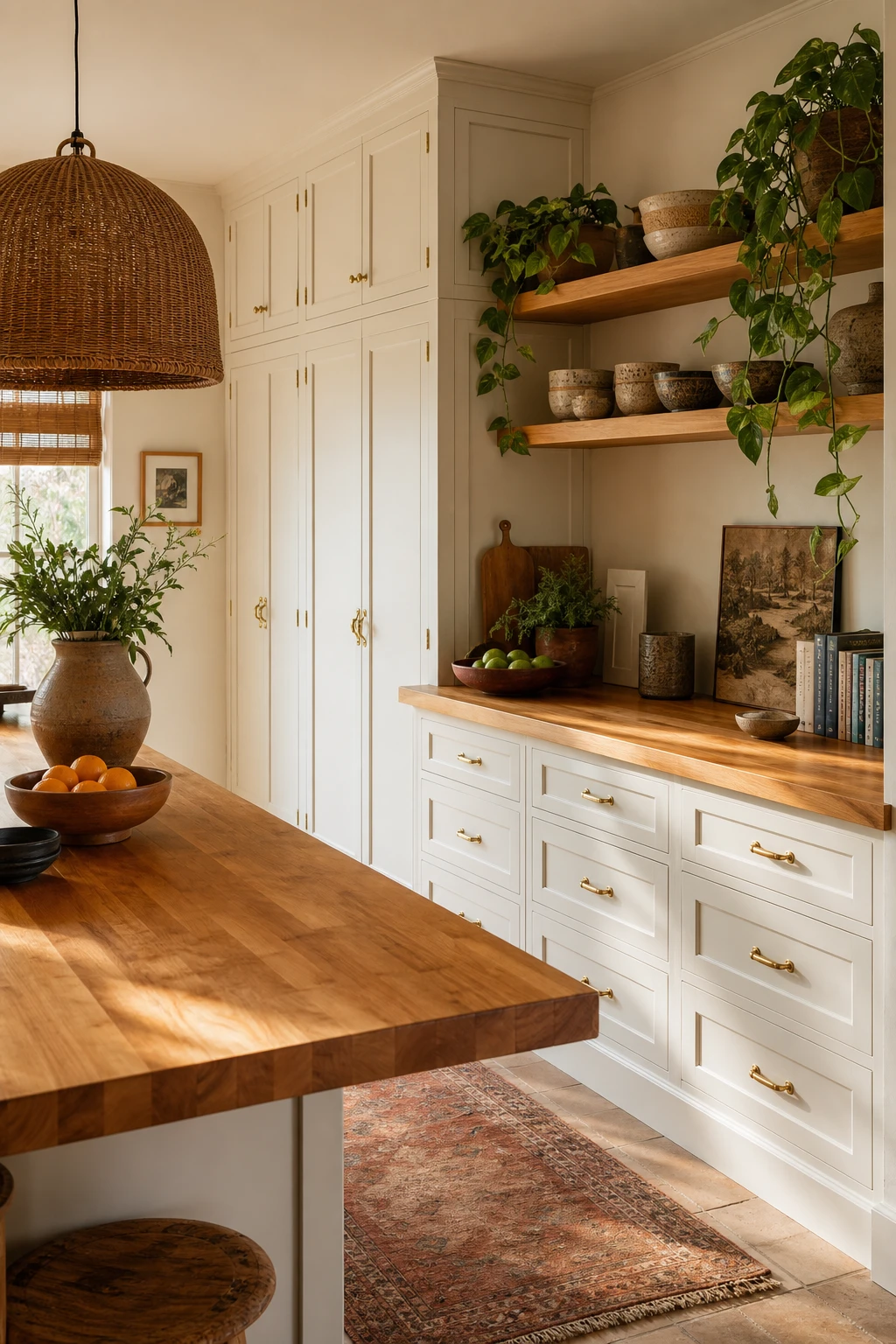
Butcher block against white cabinets is one of those pairings that never asks for much and yet always delivers. The raw grain of the wood pulls every bit of warmth it can out of the room while the white cabinets give your eye somewhere quiet to rest, and you get that easy, lived in feeling that sits right at the heart of 70s boho, where nothing is too precious and everything feels like it belongs. The contrast does the heavy lifting here, keeping the kitchen grounded rather than rustic and bright rather than cold. It is the kind of combination that always makes me smile because it looks considered without anyone having to try very hard.

The Key Details

  • Butcher block countertop
  • Rattan pendant light
  • Vintage brass cabinet hardware
  • Open shelving with ceramic bowls
  • Trailing pothos shelf plants
Pro TipLet the butcher block run a few inches past the cabinet at one end so you can pull a stool up and have a proper perch without needing a separate island.
AvoidAvoid a countertop sealant that sits on the surface as a thick film because it dulls the grain and gives the whole worktop a plastic quality that fights the warm, honest mood you are building.

Full Maximalist Energy: More Is More in a 70s Boho Kitchen

Maximalist 70s boho kitchen layered with patterned tiles, hanging copper pots, macrame, open shelving, and Farrow and Ball Broccoli Brown painted walls

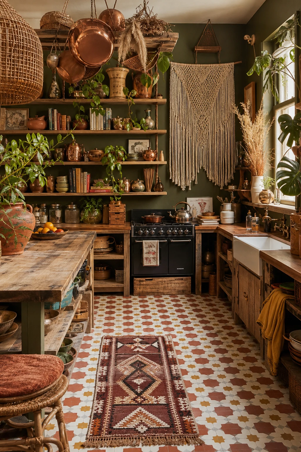
Maximalist layering works when every single thing you see has been chosen on purpose, and that is the secret the 70s boho kitchen gets so right. A room like this builds colour, pattern, and objects in waves: the Moroccan floor tiles set the palette, the copper pots and trailing pothos pick it back up, and the macrame anchors the whole wall without competing with anything below it. You will notice it never feels chaotic because each layer belongs to the same warm family of rust, mustard, and natural timber, so the eye moves around happily rather than getting snagged. The thing I always check in a maximalist room is whether there is a clear through line connecting the pieces, and here that line is the earthy 70s palette running from floor to ceiling.

The Key Details

  • Open timber shelving crowded with ceramics and vintage books
  • Hanging copper pots suspended from ceiling rail
  • Large macrame wall hanging
  • Geometric Moroccan floor tiles in rust and mustard
  • Dried pampas grass and trailing pothos vines
Pro TipBefore you add anything new to a shelf or surface, ask yourself whether you genuinely love it or whether it is just filling a gap, because one honest object beats three filler pieces every time.
AvoidMaximalism is not the same as randomness. If your layers share no colour or material connection at all, the room tips into clutter rather than character, and the warmth you are chasing will be the first thing to disappear.

The Complete 70s Boho Kitchen Look in One Room

A complete 70s boho kitchen with Fox Red walls, rattan pendants, terracotta tiles, macrame wall hanging, open timber shelves and woven stools at a butcher block island

Pulling every element together into one room is where the real magic of 70s boho happens, and the whole becomes so much greater than the sum of its parts. The rattan pendants talk to the timber shelves, the terracotta floor echoes the warm cabinet tones, and the macrame adds just enough softness to stop it all feeling too structured. You get a room that feels lived in and layered, like it arrived over years rather than a single weekend, and I love that sense of collected warmth most of all. When every piece earns its place, the kitchen stops looking decorated and starts feeling like home.

The Key Details

  • Rattan cluster pendant lights
  • Butcher block island
  • Macrame wall hanging
  • Open timber floating shelves
  • Terracotta hex floor tiles
Pro TipIf a piece makes you pause and think where does this go, trust that instinct and hold off buying it, because hesitation usually means it is not quite right for the story you are telling.
AvoidBuying every element in the same week leaves you with a room full of right pieces that never quite settle into each other, so bring things in slowly and let the space guide you.

Little Hippie Details That Give a Kitchen Its Free Spirit Feeling

70s boho kitchen close up showing hippie retro details including macrame wall hanging, beaded curtain, ceramic canisters, and vintage printed textiles in warm earth tones

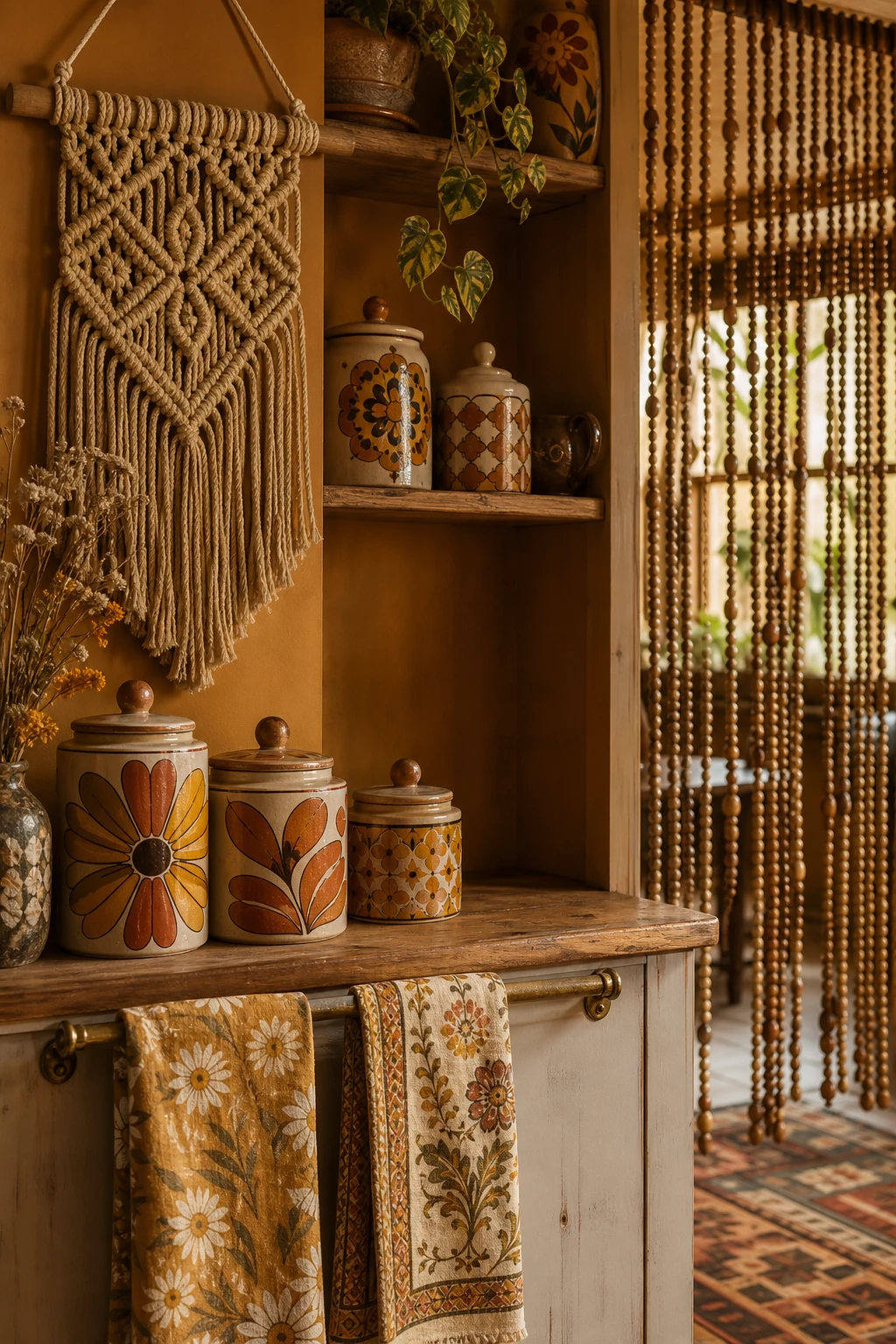
Small details carry more weight than people realise, and in a 70s boho kitchen the right ones do all the heavy lifting without you touching a single wall or cabinet. A hand knotted macrame hanging, a string of wooden beads across a doorway, a set of hand painted ceramic canisters lined up on a shelf: each piece reads as intentional but relaxed, which is exactly the spirit you are going for. What I love about this approach is that none of it requires a renovation budget or even a free weekend, you just layer things in over time until the room starts to feel like it belongs to someone with a well travelled, free thinking soul. You will notice how a couple of vintage botanical prints propped on a shelf or hung in a loose grouping can shift the whole mood of a plain kitchen wall into something that feels genuinely personal and alive.

The Key Details

  • Hand knotted macrame wall hanging
  • Beaded doorway curtain
  • Hand painted ceramic canisters
  • Vintage printed cotton dish towels on brass rail
  • Raw wood open shelving
Pro TipPick up two or three framed vintage botanical or mushroom prints from a charity shop or online marketplace and hang them at slightly different heights for an instant, low cost focal point that anchors the whole boho feeling.
AvoidResist the urge to use every hippie motif at once, because macrame plus beads plus fringe plus dreamcatchers plus printed everything in the same small kitchen tips over from characterful into costume, and the room stops feeling like a home.

Boho Colour With a Minimalist Hand: Less Stuff, More Impact

70s boho kitchen with colourful minimalism, Farrow and Ball Citrona yellow walls, spare open shelving, rattan stools and warm afternoon light

Colour hits harder when it has room to breathe, and that is the whole secret behind this approach. One bold rust glaze on a handthrown bowl, sitting alone on a raw oak shelf against plain off white cabinetry, stops you in your tracks far more quickly than it ever would in a kitchen crowded with competing things. The restraint here is never cold, which is what I find so compelling about it. The concrete counter brings texture, the rattan stools bring warmth, and the oiled wood carries that earthy character, so the room still feels layered and alive even though nothing is cluttered. You get full boho soul and full visual punch at the same time.

The Key Details

  • Handleless off white lower cabinetry
  • Raw concrete countertop
  • Single oiled oak open shelf
  • Rattan bar stools
  • Handthrown terracotta and rust glazed bowls
Pro TipPick your one hero colour first, whether that is a deep rust, a burnt amber or a warm clay, and let every other surface stay neutral so that single choice does all the talking.
AvoidDo not strip out every textured, natural, or handmade object in the name of keeping things minimal, because without them the warmth disappears and the kitchen starts to feel more like a showroom than a home.

Fill Your Kitchen With Plants and Watch the Whole Room Shift

A 70s boho kitchen filled with cascading and potted plants in terracotta and woven planters, warm afternoon light, earthy green walls

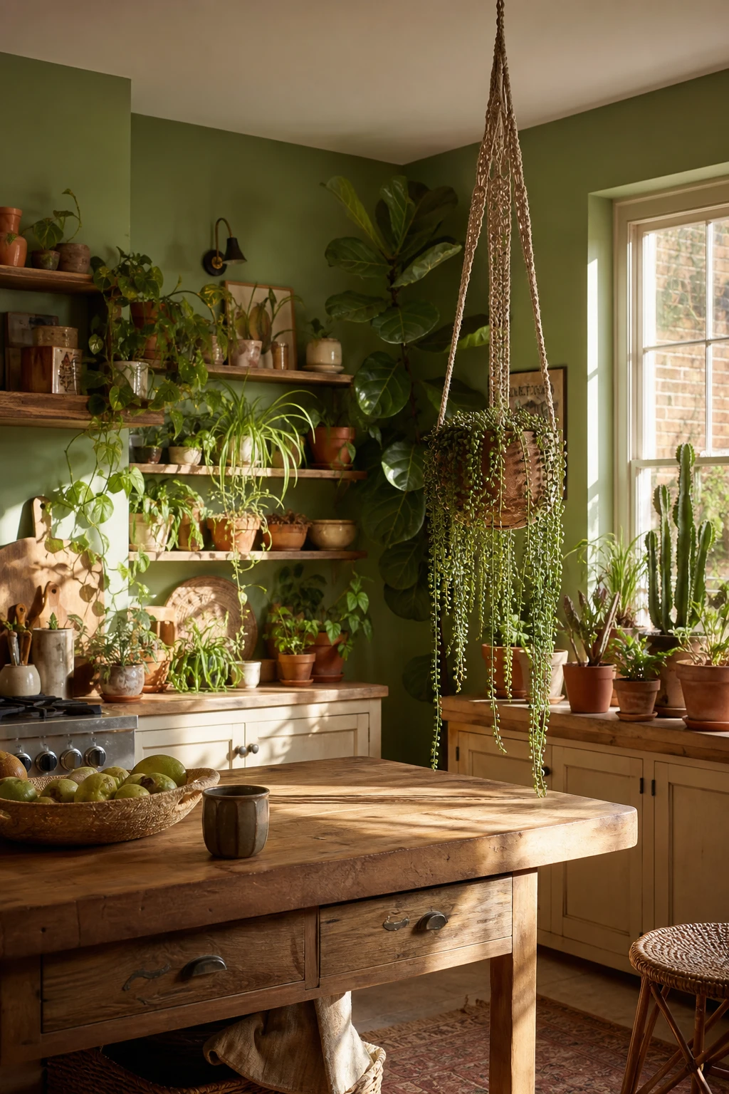
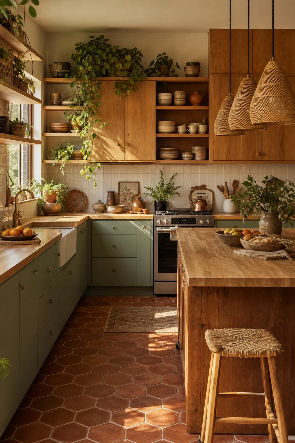
A plant filled kitchen does something no paint colour or tile can fully replicate. The green pulls the whole room together without any effort, and plants work on three levels at once: colour, texture, and actual movement as leaves shift in the light, so you get the visual richness of a full styling moment from something that costs very little. Grouping a trailing ivy on an upper shelf alongside a stocky terracotta cactus down below creates a layered scene rather than a flat row of pots, and I always encourage people to think in that vertical way rather than lining everything up at the same height. That depth is what separates a kitchen that feels genuinely alive from one that just has a few plants sitting around.

The Key Details

  • Macrame hanging planter
  • Terracotta pot cluster on windowsill
  • Open timber shelving
  • Butcher block island
  • Woven rattan baskets
Pro TipArrange your plants in a loose triangle, one tall, one mid height, one low, so your eye travels through the group rather than along a straight line.
AvoidNever position a planter directly above a chopping board or sink, because dripping water and falling soil near food prep is a hygiene problem that no amount of good styling is worth.

Retro Appliances That Do the Heavy Lifting on Style

70s boho kitchen with retro coloured appliances as hero focal points, warm Corngold yellow walls, rattan pendants, terracotta tiles and macrame accents

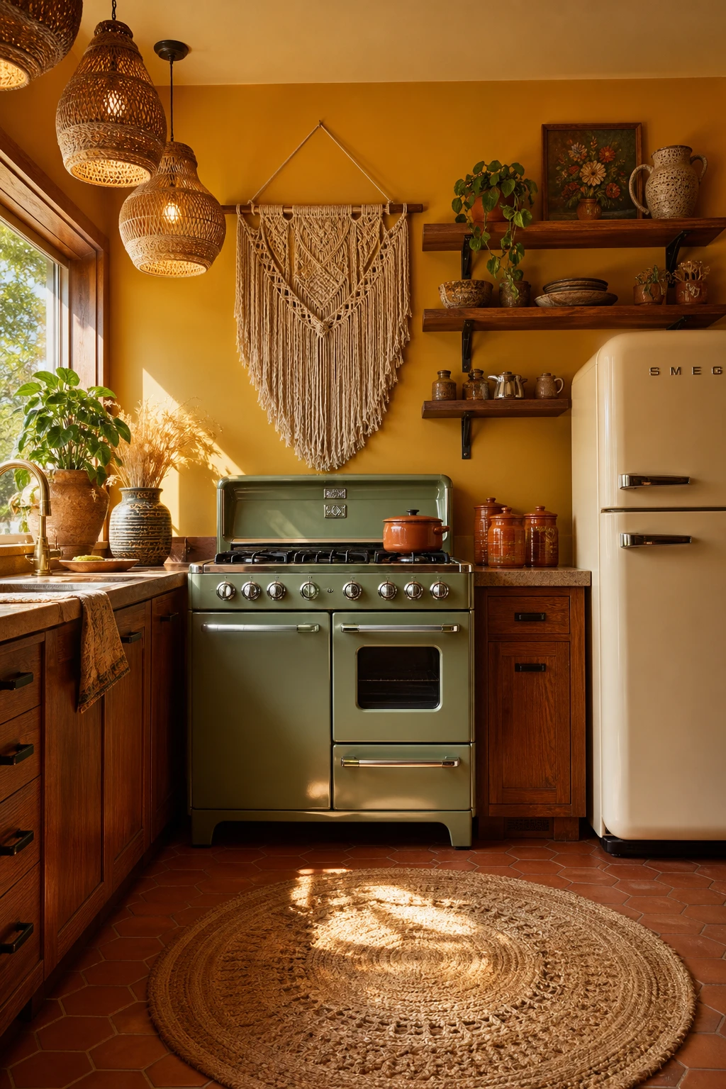
A single avocado green range sitting against warm timber shelving does something no amount of styling tricks can quite replicate: it becomes the room. What I love about leaning into coloured appliances is that the kitchen stops needing extra decor to feel finished, because the appliance is already doing that job with real confidence. You get a focal point that is also fully functional, which wins me over every time as a designer. Watch how the eye settles on that one bold piece and the rest of the room simply supports it, rather than competing for attention.

The Key Details

  • Avocado green vintage style range
  • Rounded cream retro refrigerator
  • Hanging rattan pendant lights
  • Terracotta hexagonal floor tiles
  • Open timber shelving with ceramic canisters
Pro TipPull the exact paint code from your chosen appliance and use it on the island or lower cabinets so the colour reads as a deliberate design decision rather than a lucky find.
AvoidPlacing a sage green toaster, a cream kettle and a red stand mixer on the same bench will make the kitchen feel like a display floor rather than a considered space, so commit to one hero colour across your statement appliances.

A Cosy Breakfast Nook That Makes You Want to Linger

A 70s boho kitchen breakfast nook with curved banquette seating, rattan pendant light, macrame wall hanging, and Farrow and Ball Bisque painted walls

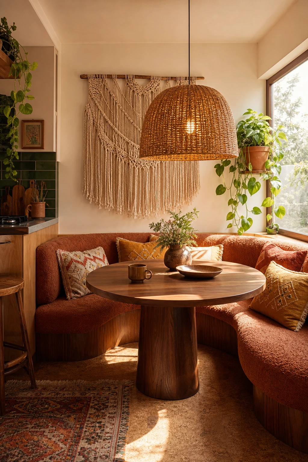
Carving a breakfast nook out of a kitchen corner is one of my favourite moves because it takes dead space and turns it into the most loved spot in the whole room. The curved bouclé banquette wraps you in softly, and that round walnut pedestal table pulls people together without any awkward corners to navigate around. You get that intimate, tucked away feeling even though you are still right in the middle of the kitchen, and watch how the oversized rattan pendant light draws the eye down and seals the zone off from the rest of the room. The macrame wall hanging and a trailing pothos in a terracotta pot do the quiet work of making it feel personal, the kind of corner that says sit down, stay a while.

The Key Details

  • Curved bouclé banquette
  • Round walnut pedestal table
  • Oversized rattan pendant light
  • Macrame wall hanging
  • Trailing pothos in terracotta pot
Pro TipFit a deep cushion of at least 10cm on the banquette and use a zip off washable cover so the nook earns its place every single morning rather than being saved for best.
AvoidDo not make the seat depth less than 50cm or the gap between the cushion and the table edge less than 35cm, because a nook that leaves no room to cross your legs with a mug in hand will go unused within a week.

Keeping a Narrow Galley Kitchen Bright Without Losing Its Boho Warmth

Bright narrow galley boho kitchen with warm white walls, rattan pendants, open shelving, terracotta tiles and trailing plants in 70s style

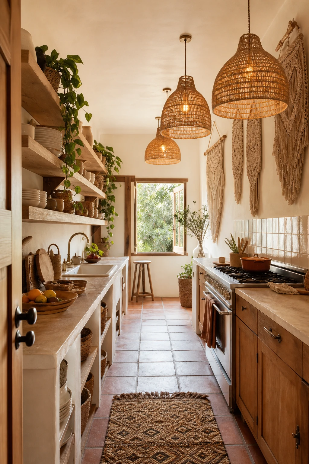
Galley kitchens get a bad reputation, and most of that comes down to people treating the narrow layout as a problem to hide rather than a structure to work with. The trick I keep coming back to is letting warm colour sit low while the upper half of the room stays light and open, so you get all the richness of terracotta tiles and rattan and trailing green without the walls closing in. The ceiling and upper walls bounce natural light back down the run of the kitchen, and you will notice how the whole space feels longer and more generous than the footprint suggests. Keep the colour confident but anchored below the worktop line and the layout stops feeling like a corridor and starts feeling like a room.

The Key Details

  • Rattan pendant lights
  • Open timber shelving
  • Terracotta floor tiles
  • Macrame wall hangings
  • Trailing pothos in ceramic pots
Pro TipPaint your ceiling and the upper wall above the cabinets in a warm white with a yellow or cream base tone, not a cool blue white, so the reflected light adds to the boho warmth rather than fighting it.
AvoidAvoid running a deep, saturated colour from floor to ceiling on both sides of the galley because even a beautiful terracotta or olive will turn the kitchen into a tunnel and no amount of pendant lighting will fully rescue it.

Built In Seating That Makes a Kitchen Feel Like a Real Gathering Place

70s boho kitchen with built in corner banquette seating upholstered in burnt orange boucle, terracotta tile floor, rattan pendant, and Farrow and Ball Drab painted walls

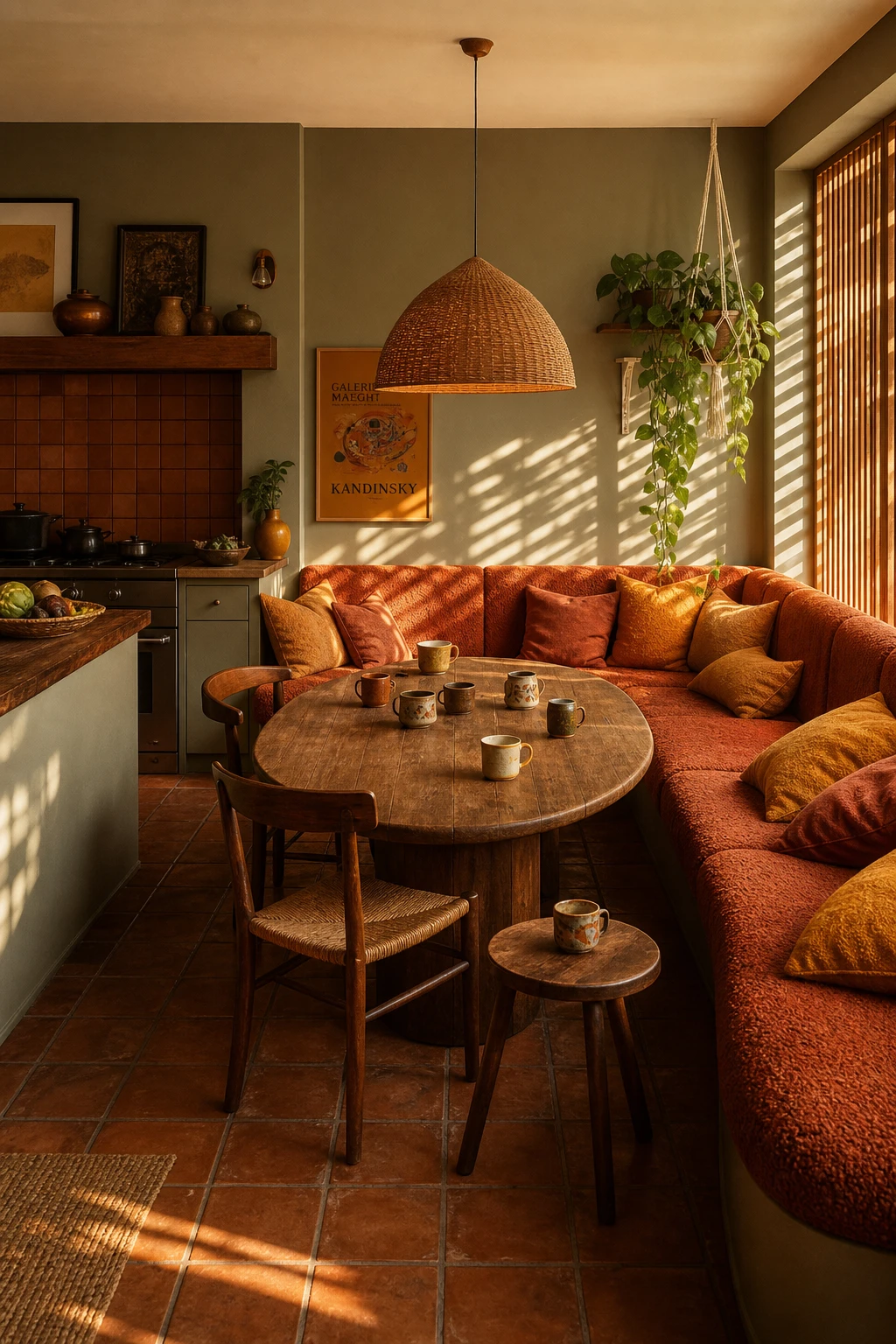
A wraparound corner banquette does something no row of chairs ever manages, and that is anchor the kitchen as a place where people actually want to sit and stay. The burnt orange boucle pulls the 70s warmth right through the room, and you get this lovely visual pocket that feels carved out and intentional rather than left over. Fixed seating signals to everyone who walks in that gathering here is the point, not just passing through to grab something, and that is a quality I value deeply in any kitchen I work on. Pair it with an oval aged teak table and a low woven rattan pendant and watch how the whole corner takes on the feel of a proper room, not a waiting area tacked onto a worktop.

The Key Details

  • Wraparound corner banquette
  • Burnt orange boucle upholstery
  • Oval aged teak dining table
  • Woven rattan pendant lamp
  • Handmade terracotta floor tiles
Pro TipBuild deep drawers into the base of every bench run so the seating pays its way with hidden storage for table linen, serving dishes, or anything else that currently clutters a cupboard.
AvoidNever position built in seating so guests face a wall or a corner with no sightline into the kitchen, because people feel tucked away and forgotten rather than part of what is happening.

Layered Lighting That Makes a Kitchen Feel Warm from Morning to Night

70s boho kitchen with layered lighting including pendant lights, under cabinet strips and ambient wall sconces bathed in warm evening glow on Dorset Cream walls

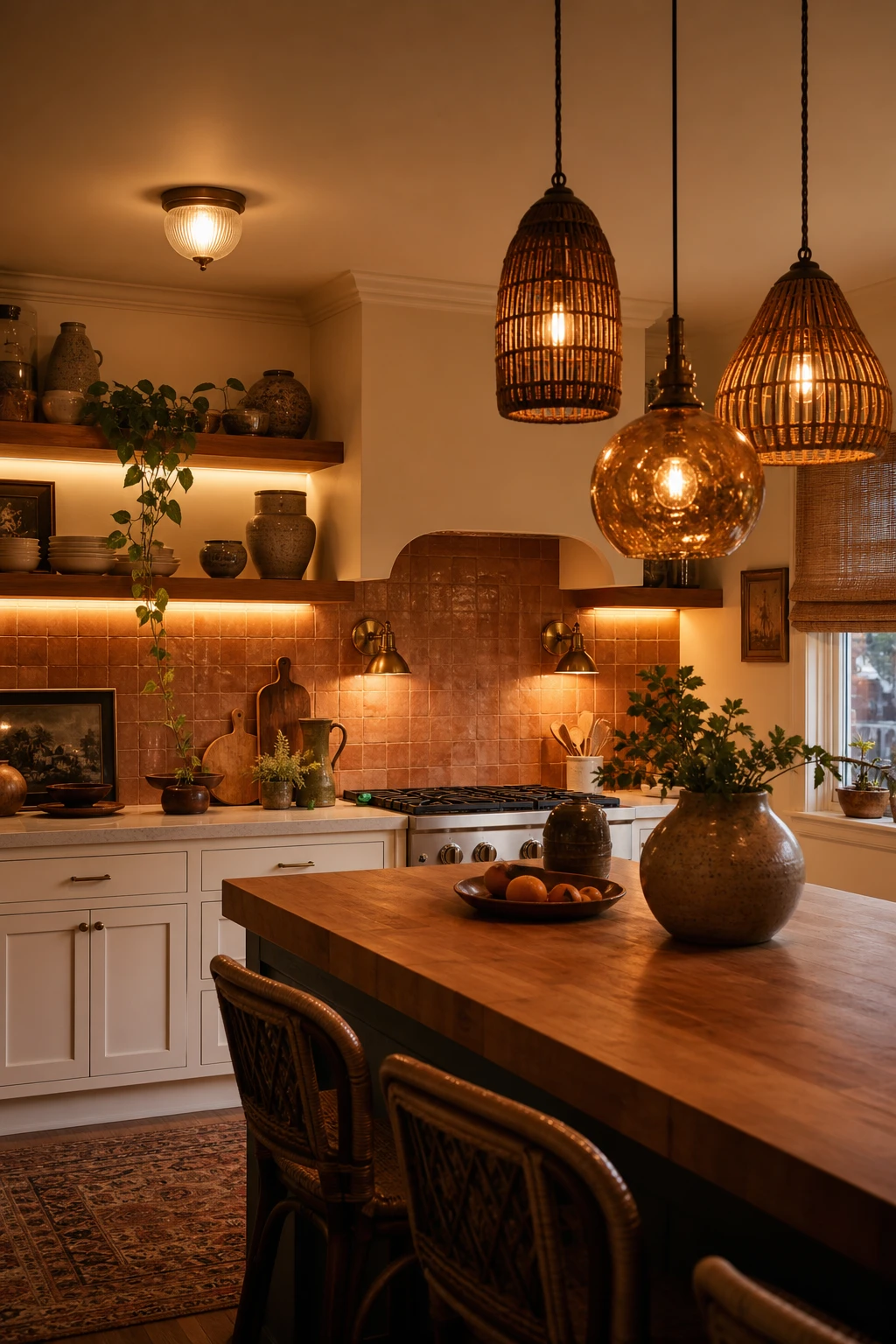
Layered lighting is one of those things I always check first when a kitchen feels cold or flat, because nine times out of ten a single overhead fitting is doing all the work and losing the battle. What I love about this setup is the way the staggered rattan and amber glass pendants sit low over the island and cast that golden, almost honeyed glow across the butcher block, so the whole surface looks warm and lived in rather than clinical. You get the under cabinet strips pulling the eye along the timber shelving at a completely different level, and the wall sconces add a soft pocket of light closer to head height that makes the room feel like it has corners and depth rather than one flat ceiling glare. Watch how the terracotta zellige tile splashback comes alive in that layered light, each little variation in the glaze catching a slightly different angle, and you will notice the whole room shifts from a bright, functional morning space to something genuinely cosy and inviting by the time dinner is on the table.

The Key Details

  • Staggered rattan and amber glass pendant cluster
  • Brushed brass wall sconces
  • Open timber shelving with under cabinet strip lighting
  • Terracotta zellige tile splashback
  • Butcher block island
Pro TipSwap every bulb in the room to warm white 2700K and you will feel an immediate difference without touching a single fitting or spending much money at all.
AvoidRelying on one ceiling light as your only source flattens every surface and kills the warmth of the whole room the moment the sun goes down.

A Sunset Colour Palette Running From the Walls to the Worktop

70s boho kitchen with sunset colour theme moving from warm terracotta walls through amber worktop to deep rust cabinetry in soft evening light

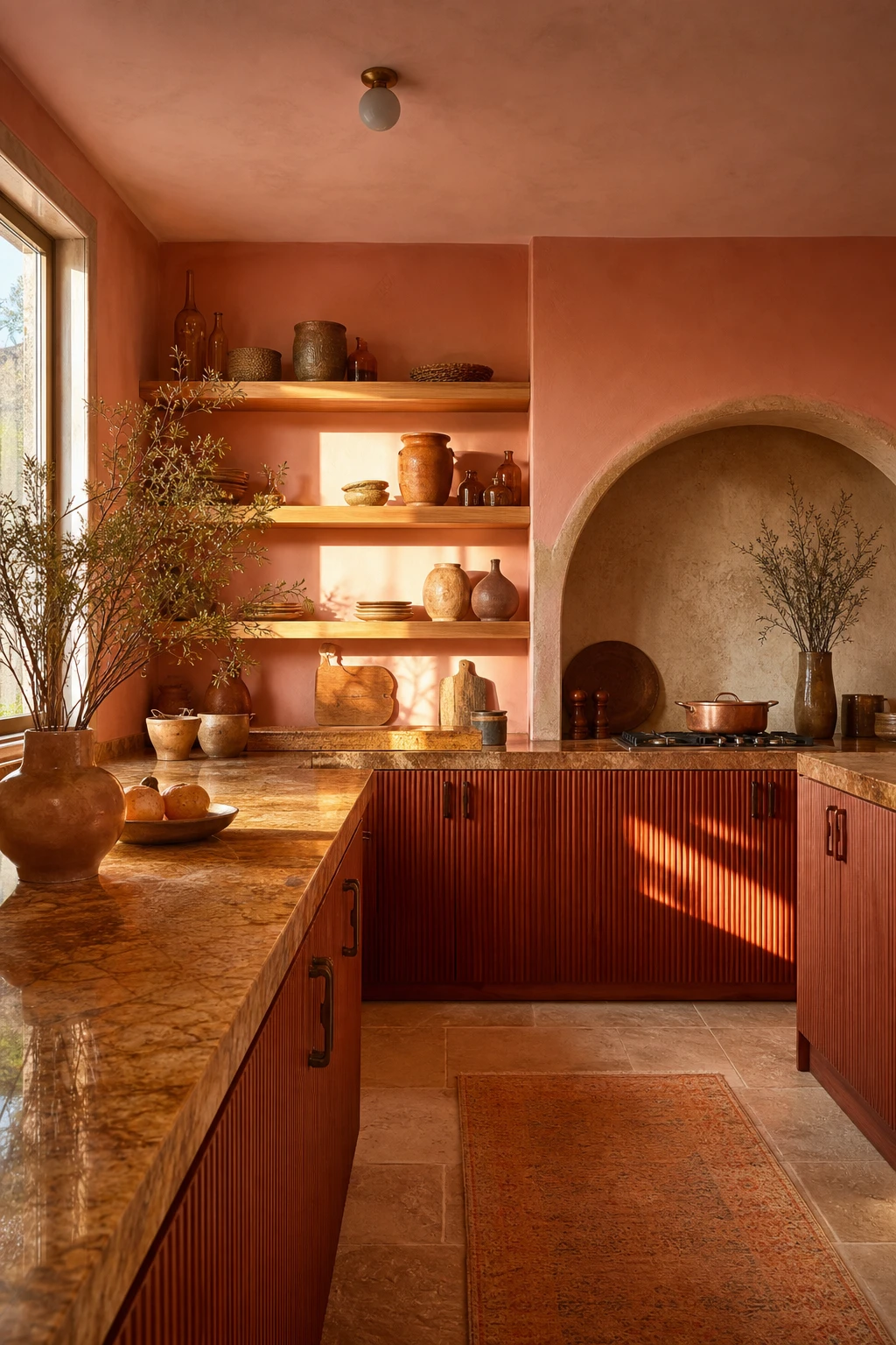
Tracking light across the day is the secret move behind a sunset palette that actually holds together, and this kitchen does it beautifully. The amber honed stone worktop sits at the warmest, most luminous point of the scheme, the way the horizon blazes just before the sun drops, and everything above and below it shifts by a step or two. The deep rust cabinets anchor the lower half without pulling the eye into darkness, while the raw plaster arch and oiled oak shelving carry the cooler, dustier tones of the sky once the blaze fades. That coherence, a room that feels like a single breath rather than a collection of orange things thrown together, is what keeps it from tipping into costume, and it is the quality I look for first when judging whether a bold palette is working.

The Key Details

  • Amber honed stone worktop
  • Grooved flat front base cabinets in deep rust
  • Open oiled oak timber shelving
  • Raw plaster cooking alcove arch
  • Terracotta pottery and amber glass shelf display
Pro TipPaint one short return wall in the deepest rust from your palette so the whole gradient has a fixed anchor point to read against.
AvoidDo not lift colours directly from a sunset photograph because what looks glorious on screen at dusk will often clash under a kitchen’s artificial light in the evening.

Terracotta From Floor to Accessories: The 70s Boho Colour That Never Fails

A 70s boho kitchen with terracotta as the hero colour across floor tiles, walls and accessories under warm afternoon light

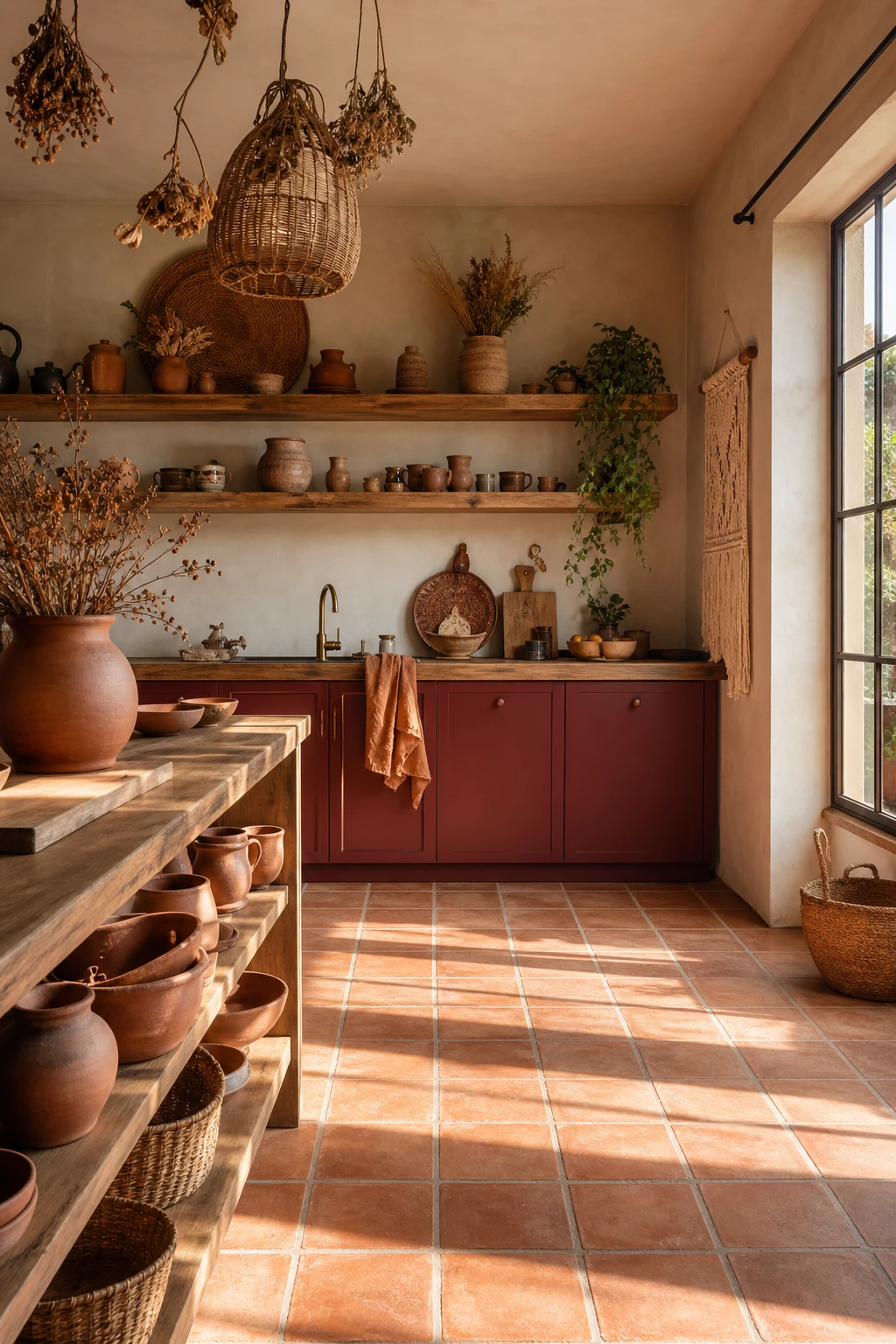
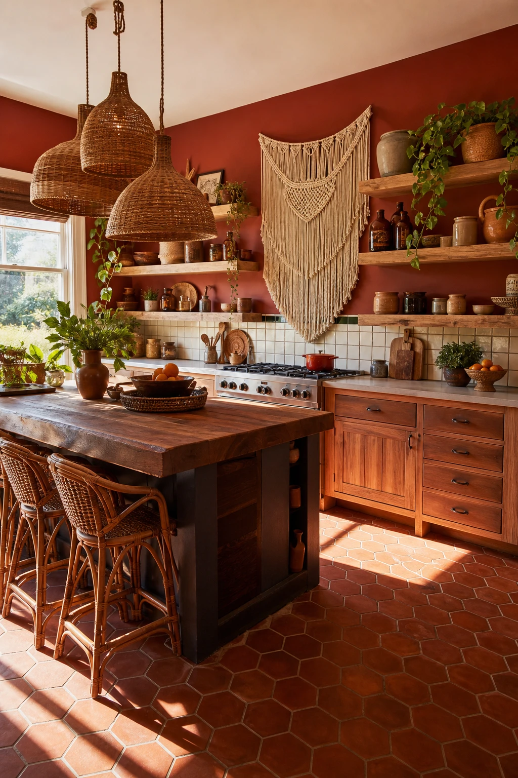
Terracotta is the heartbeat of the 70s boho kitchen, and it belongs in a cooking space in a way few other colours do. The shade carries the warmth of sun dried clay, raw earth, and open air markets all at once, so you get an instant sense of comfort the moment you walk in. When I am building a terracotta palette the first thing I check is whether the chosen shade has enough orange red depth to feel alive, because the best rooms lean into that warm, dusty richness rather than softening it away. The colour shifts through the day too, glowing amber in morning light and settling into something deeper and moodier by evening, and that daily movement gives the kitchen a life that cooler palettes simply cannot match.

The Key Details

  • Terracotta square floor tiles
  • Open timber shelving with rust glazed pottery
  • Rattan storage baskets
  • Dried botanical hanging bundle
  • Macrame wall hanging
Pro TipLayer at least three different terracotta tones across your tiles, pottery, and walls so the colour reads as rich and evolved rather than flat.
AvoidPainting every surface a single identical terracotta shade flattens all the warmth out of the palette and makes the room feel like a paint swatch rather than a lived in kitchen.
Alan George
Alan George

Alan launched Edward George London in 2017. Since completing his masters in Town & Regional Planning (MPlan) he has combined the skills he learned at the University of Sheffield with his passion for design, to help create a foundation for those looking to create a beautiful home.