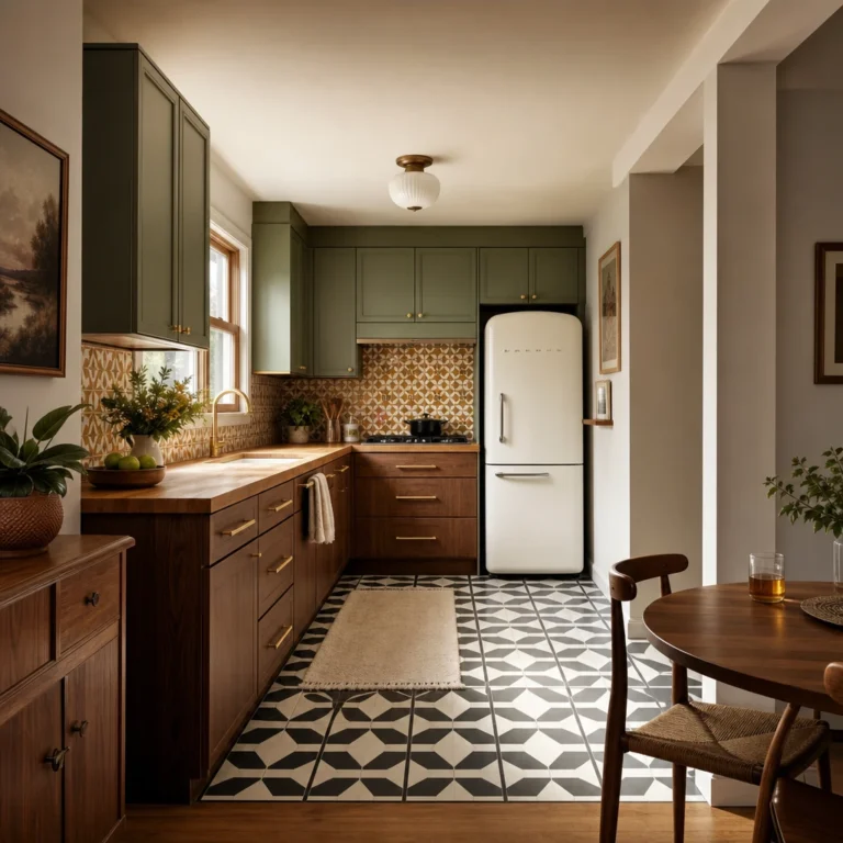
I’ve always had a soft spot for the way a 70s kitchen floor stops you in your tracks, all pattern and color and quiet confidence. What I love about this era is that the floors did the talking, whether it was a swirling linoleum sheet, a speckled terrazzo, or a checkerboard that seemed to go on forever. This piece walks through the best 70s kitchen flooring looks, from avocado vinyl to painted wood and warm retro tile, and every single one is a look you can steal.
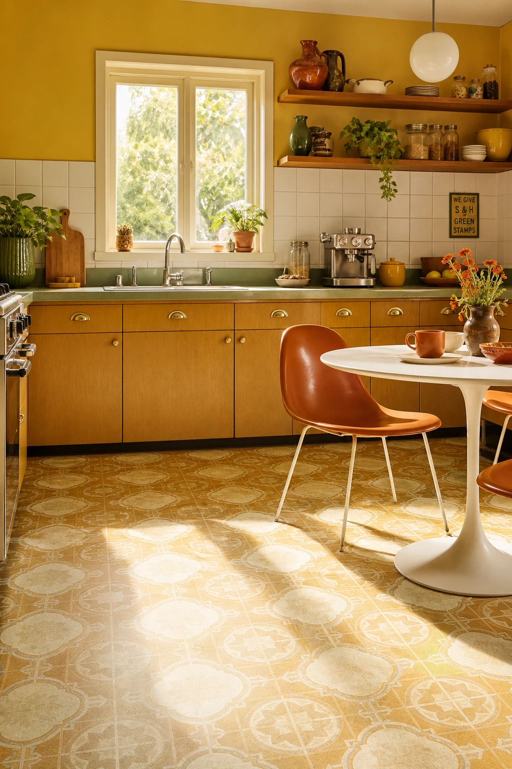
Why Vinyl Was the Star of Every 70s Kitchen Floor
Vinyl took over the 70s kitchen because it solved three problems at once: it was soft underfoot, water resistant, and printed in the bold geometric patterns that everyone wanted. What I love about a good amber and cream sheet floor is the way it anchors all those harvest golds and avocado greens without fighting them. You get warmth, pattern, and practicality in one material, and that winning combination is exactly why it outlasted every trend that tried to replace it.
The Key Details
Geometric vinyl sheet floor in amber and cream print
Harvest gold laminate cabinets with brass cup handles
Avocado green ceramic countertop with chrome edge trim
Moulded plastic tulip table and burnt orange chairs
Open shelving with chunky pottery and glass canisters
Pro TipGo for a vinyl sheet with a wear layer of at least 0.3mm so the pattern stays sharp through years of kitchen traffic.
AvoidThin, high gloss vinyl reads as cheap plastic rather than retro, and it will date the room in the wrong direction entirely.
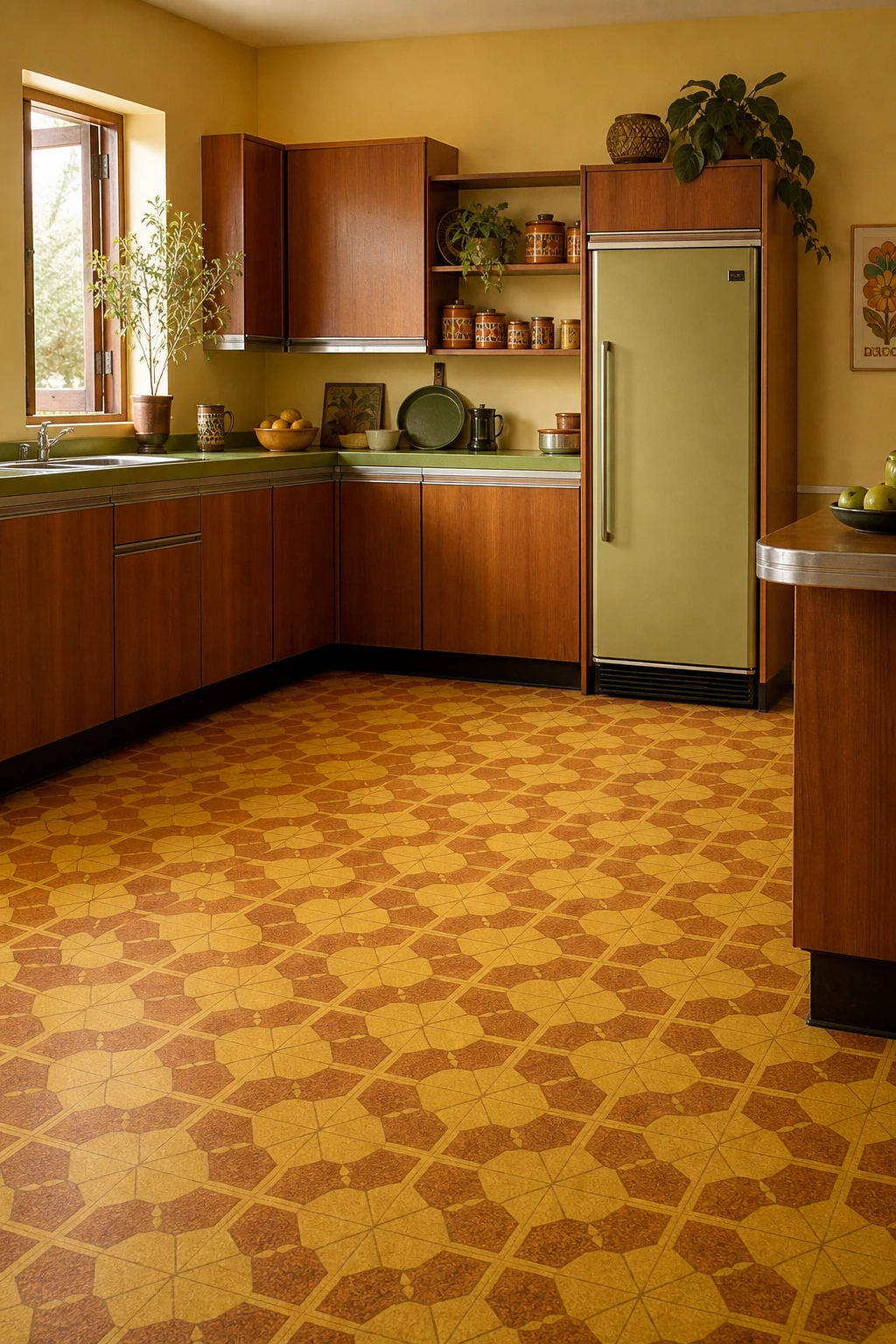
Harvest gold and burnt sienna on a geometric linoleum floor is the thing I always come back to when someone wants a kitchen that feels genuinely rooted in the 70s. Real linoleum is made from linseed oil and natural resins, so it has a warmth and depth you simply do not get from vinyl. You will notice how the matte surface absorbs the earthy tones around it, pulling the teak cabinets and terracotta canisters into one cohesive story rather than a collection of separate props.
The Key Details
Harvest gold and burnt sienna geometric linoleum floor
Flat fronted teak wood veneer cabinets
Avocado green laminate countertop with chrome edge trim
Freestanding retro refrigerator with bar handle
Open shelving with terracotta ceramic canisters
Pro TipSearch for heritage or period linoleum through specialist flooring suppliers rather than trade counters, as they hold the authentic colorways like harvest gold and sienna that mainstream ranges dropped decades ago.
AvoidSubstituting a shiny vinyl tile for true linoleum gives the floor a plastic, disposable look that undercuts every other authentic 70s detail you have worked hard to put in the room.
Bold Floor Tiles That Gave the 70s Kitchen Its Personality
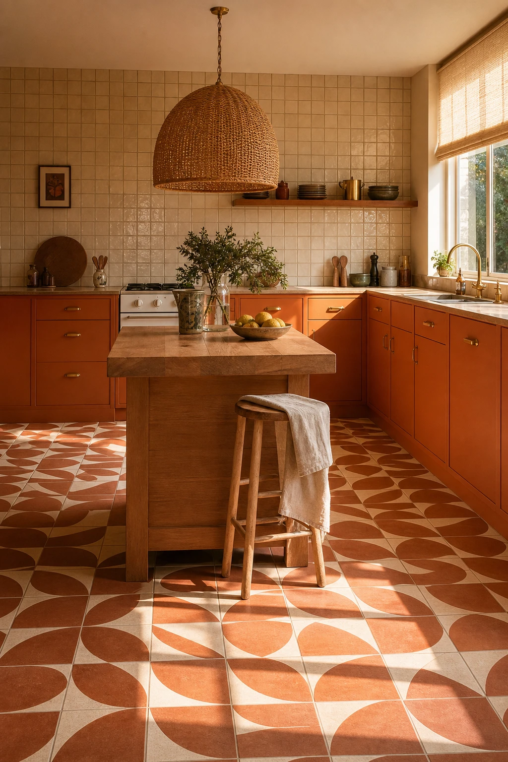
Bold patterned floor tiles were the beating heart of a 70s kitchen, and what wins me over every time is how one strong floor can set the mood for everything above it. You get an instant anchor point, so the cabinetry, worktops, and walls all feel like they belong together rather than competing. Watch how a large geometric repeat pulls the eye across the whole room, making even a modest kitchen feel considered and deliberate.
The Key Details
Large scale geometric ceramic floor tiles
Flat front timber cabinetry
Rattan dome pendant light
Butcher block worktop
Ceramic tile splashback
Pro TipLay your tiles with grout lines of at least 8 to 10mm and use a warm buff or biscuit toned grout, because that wide joint is what gives a period floor its authentic, unhurried character.
AvoidMatching a heavily patterned floor with an equally busy tiled backsplash splits the room into two competing focal points and leaves the eye with nowhere to rest.
How a Two Color Linoleum Check Transforms the Whole Kitchen
Two colours trading places in a steady grid is one of the hardest working patterns in a 70s kitchen, and a linoleum check delivers it better than anything else. The repeating squares pull your eye across the whole floor, making the room feel bigger and full of life before a single cabinet goes in. My favourite thing about this move is the rhythm it creates, that steady beat anchoring everything above it without competing with warm timber or earthenware tones.
The Key Details
Two tone checkered linoleum floor tiles
Avocado green painted timber cabinetry
Woven rattan pendant light
Butcher block island surface
Open upper shelving with earthenware ceramics
Pro TipMatch your check square size to the room: go for larger squares in a generous kitchen so the pattern reads boldly, and drop to a smaller scale in a compact space so the grid doesn’t overwhelm it.
AvoidPicking two shades that sit too close together on the colour wheel kills the whole effect, leaving the floor looking flat and muddy rather than crisp and rhythmic.
The Swirling Patterns That Made 1970s Linoleum Instantly Recognizable
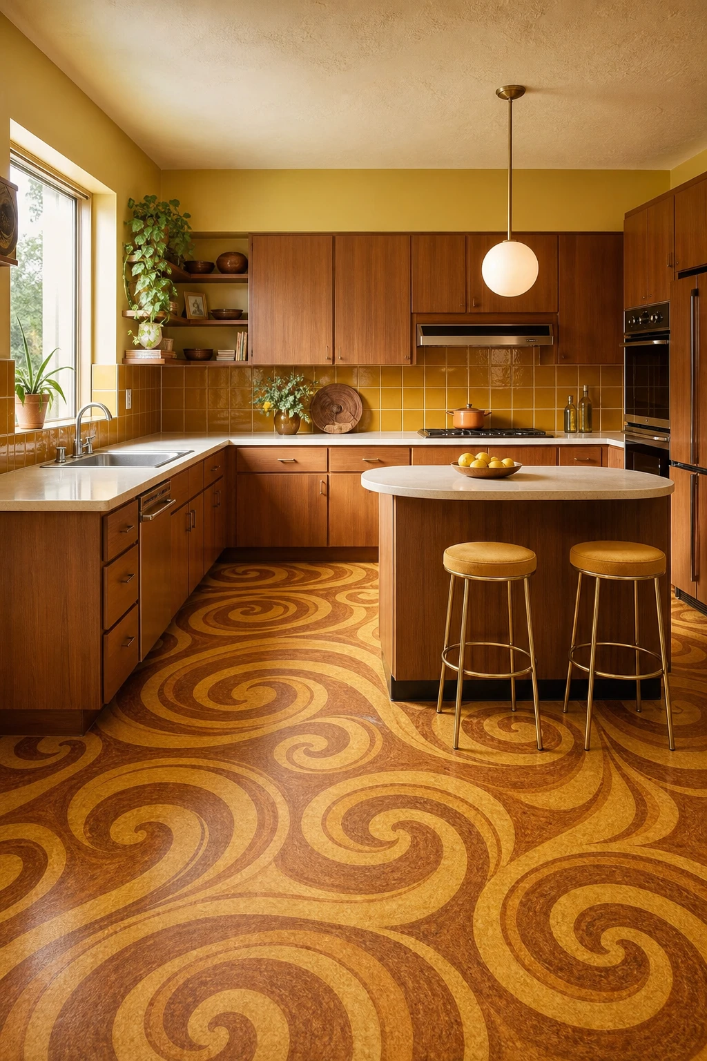
Swirling lino is the move I reach for when a kitchen needs personality without a renovation budget. The trick you will notice in every room that pulls it off is pattern scale: the swirls are bold up close yet the repeat is tight enough that the floor reads as one warm, amber wash from the doorway. That balance is what stops a busy floor from feeling chaotic and lets the flat front cabinets and rounded laminate top sit quietly around it.
The Key Details
Swirling amber and sienna linoleum floor tiles
Wood veneer flat front cabinets
Rounded edge laminate countertop
Globe pendant light over breakfast bar
Harvest gold ceramic backsplash tiles
Pro TipRun a 10 cm plain strip of matching lino around the room’s perimeter so the swirling field has a clean edge to breathe against.
AvoidPairing a swirling floor with patterned cabinet doors splits the room’s attention and leaves both surfaces looking restless rather than retro.
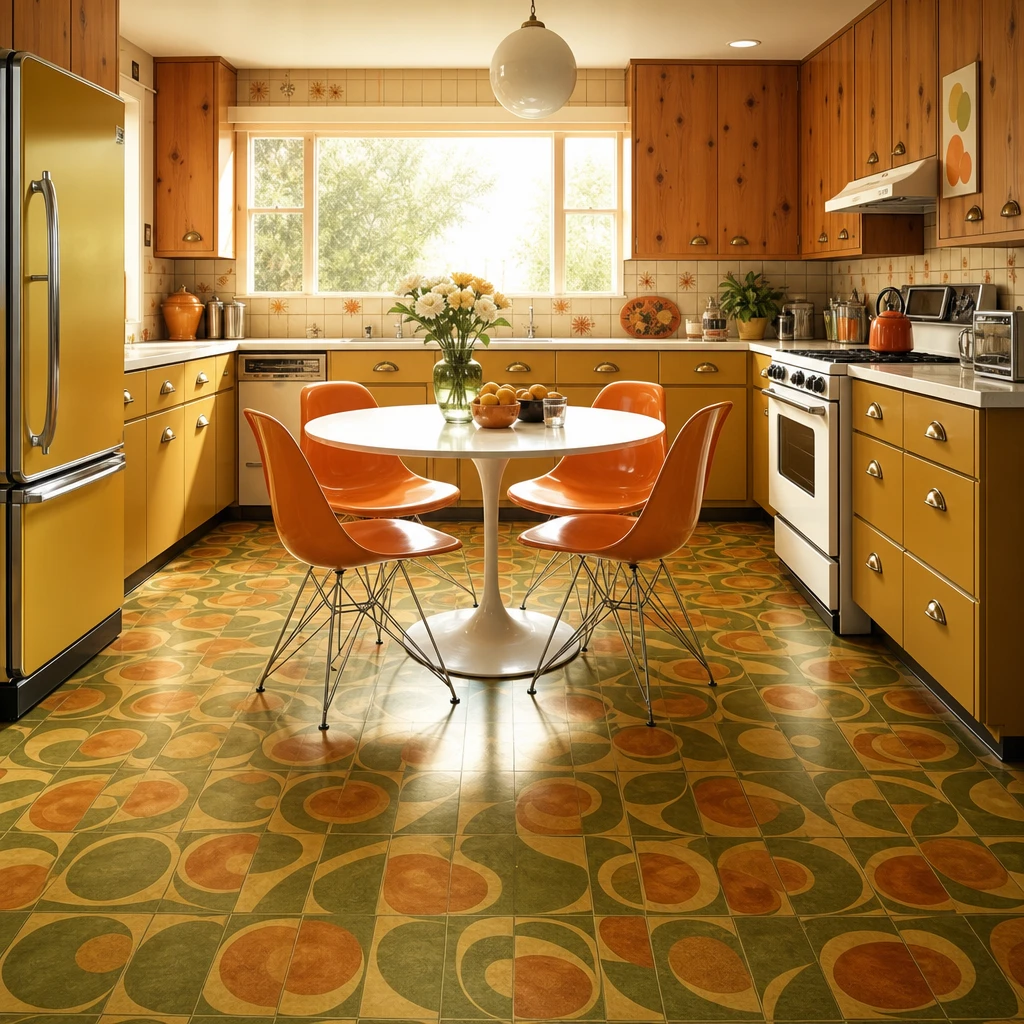
Orange and Green Tiles That Capture the 70s in One Bold Move
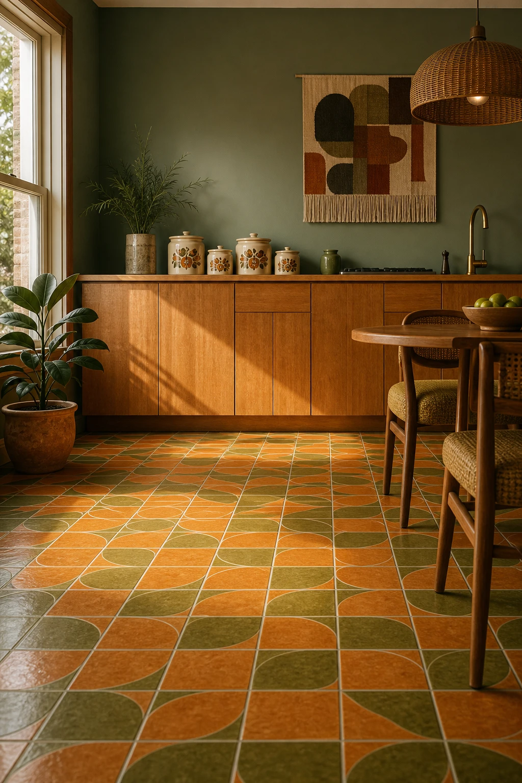
Orange and green together sounds risky, but the trick I always use is letting the floor carry both tones and keeping everything above it quieter. You get all the retro energy without the room feeling like it is shouting at you. The warm amber of the oak cabinetry softens the orange, and the rattan light pulls in just enough natural texture to stop the green reading too cool. Watch how the brass hardware ties it all back into one warm, settled palette.
The Key Details
Geometric glazed ceramic floor tiles in orange and green
Flat front honey oak cabinetry
Rattan pendant light
Vintage ceramic canister set
Brushed brass hardware
Pro TipPaint one splashback wall in a dusty sage to echo the green in the tiles without adding another full pattern to the room.
AvoidRunning both colours at full saturation across the floor and up every wall at the same time crowds the room and leaves the eye nowhere to rest.
The Avocado Green Kitchen Floor That Makes the Whole Era Click
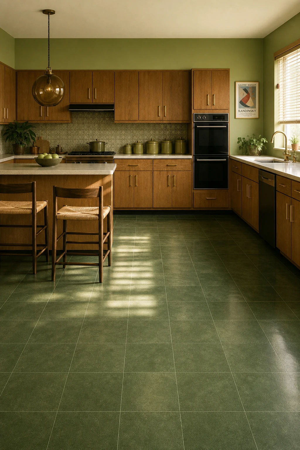
Committing to one signature colour across both floor and fittings is the move that makes a 70s kitchen feel fully intentional rather than half finished. Avocado reads as a continuous ground when you use it this way, so your eye travels the whole room without stopping to compare surfaces. The oak overhead stops the green ever feeling cold, and I love how the brass handles pull both tones together into something that feels considered rather than costume.
The Key Details
Avocado green square vinyl composite floor tiles
Flat front oak laminate cabinets with brass bar handles
Amber smoked glass globe pendant light
Avocado green glazed ceramic canister set
Breakfast bar with overhanging counter edge
Pro TipBring in a honey toned oak element at eye level, whether cabinets or open shelving, so the avocado green reads warm rather than clinical.
AvoidLayering sage, olive, and avocado in the same space creates a muddy visual argument where no single green ever wins.
A Burnt Orange Kitchen Floor That Brings All That Warmth Back
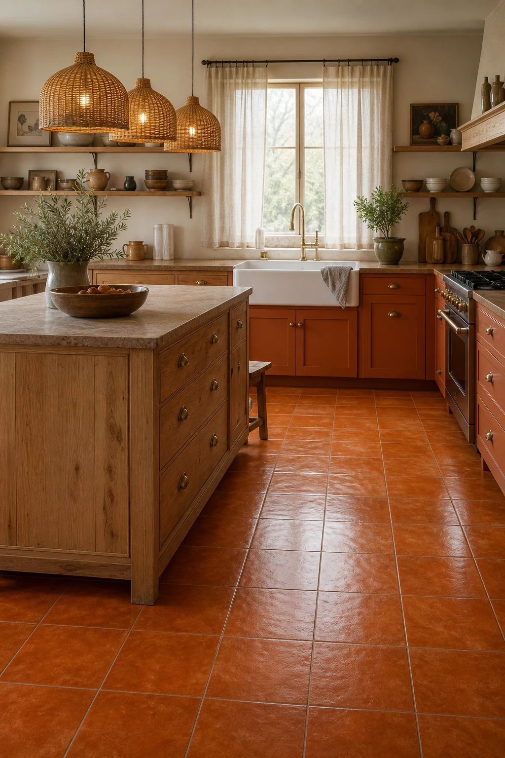
Burnt orange on the floor is one of my favourite fixes for a north facing kitchen that just never feels warm enough. You get this low, radiant glow coming up from the ground that no amount of warm white paint can fully replicate. What wins me over every time is how the colour reads differently through the day, rich and earthy in the morning, almost amber by late afternoon. Pair it with raw oak and aged brass and the whole room feels like it has been quietly soaking up sun for decades.
The Key Details
Burnt orange glossy vinyl floor tiles
Raw oak cabinetry with aged brass pulls
Woven rattan cluster pendant lights
Open timber shelving with ceramic crockery
Sheer linen window curtains
Pro TipRun a near black grout line or a dark border tile around the perimeter and the orange deepens, giving the floor real presence rather than reading as a flat wash of colour.
AvoidMatching burnt orange flooring with cool bright white walls drains the warmth straight out of the floor and leaves the room feeling confused rather than cosy.
Yellow Patterned Floor Tiles That Make a Kitchen Feel Sunny All Year
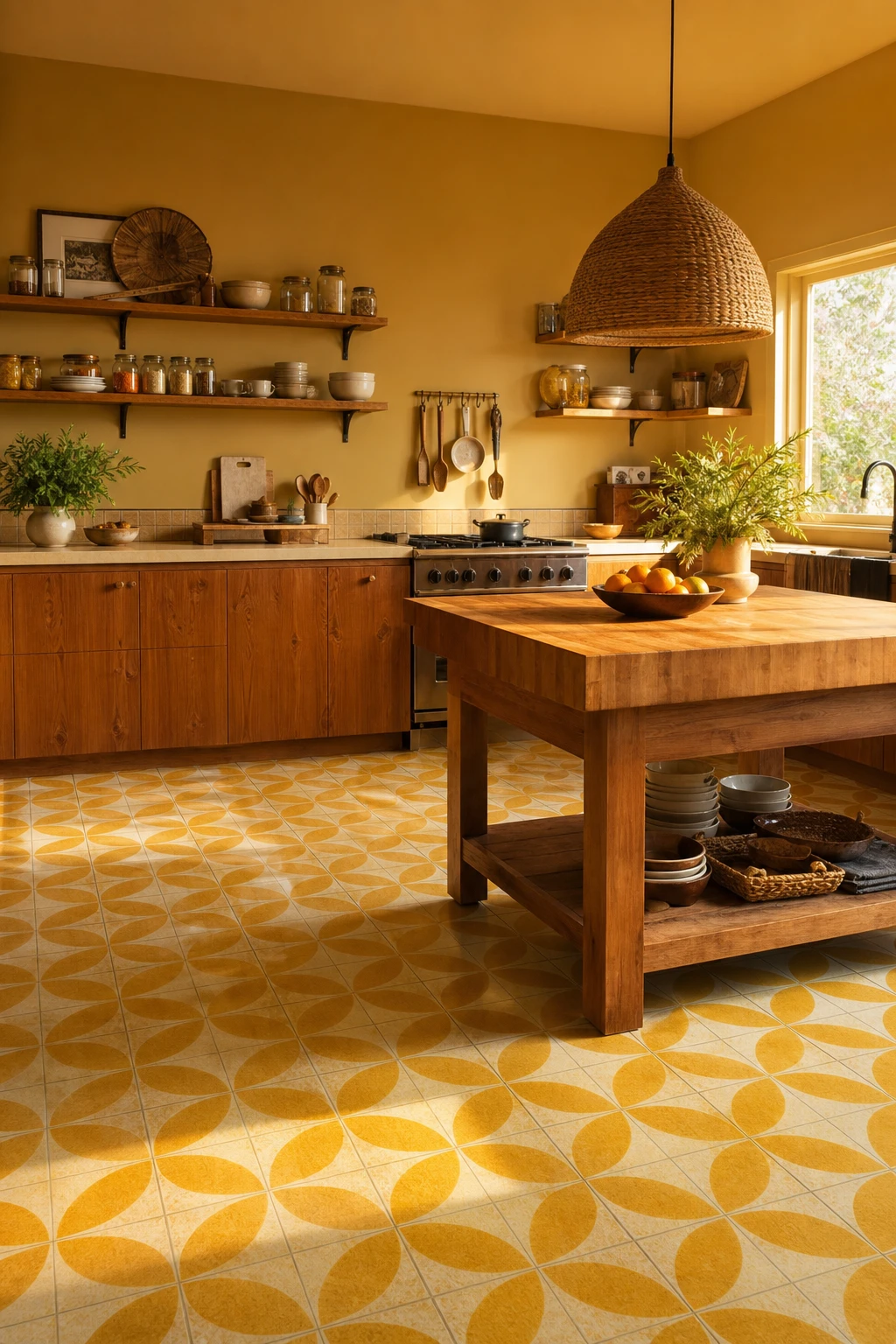
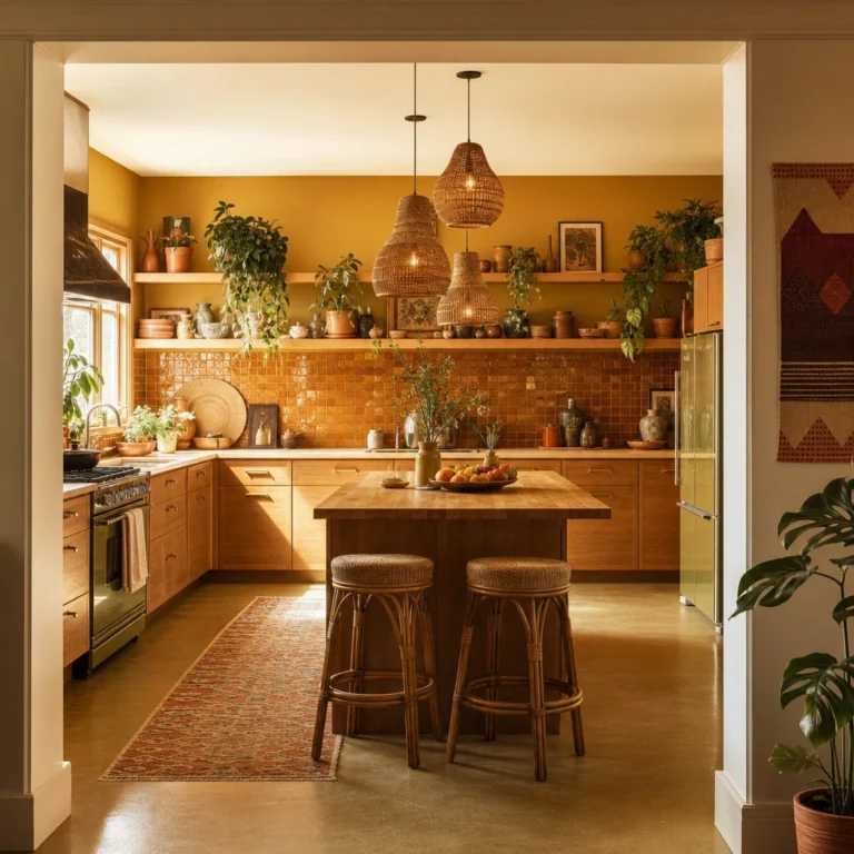
A patterned yellow floor tells the whole colour story in a single move and lets you keep everything else calm and honest. The tiles do the leading, so teak cabinetry and open timber shelving nod along rather than compete, and that quiet confidence is what I love about the approach. From the doorway the room simply reads as warm and sunny without a single yellow accent fighting for attention above the worktop.
The Key Details
Geometric encaustic ceramic floor tiles
Teak wood cabinetry
Open timber shelving with ceramic display
Wicker pendant light
Butcher block island
Pro TipChoose a matte glaze so the pattern stays crisp and readable rather than bouncing light around the room.
AvoidPiling yellow accessories on top of a yellow patterned floor dilutes the impact and makes the room feel restless rather than considered.
A Speckled Terrazzo Floor That Hides Crumbs and Looks Beautiful Doing It
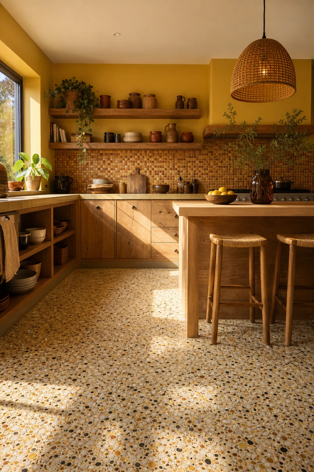
Speckled terrazzo is one of my favourite practical joys in a kitchen. The chips scatter the eye so crumbs, drips and everyday chaos simply disappear into the pattern. What I love most is choosing a mix with at least three chip colours, because that variety keeps the floor lively from standing height and ties into every other tone in the room. You get a floor that genuinely works harder the busier life gets.
The Key Details
Speckled multi chip terrazzo floor
Open timber shelving
Mosaic tile backsplash
Rattan pendant light
Butcher block island countertop
Pro TipSeal your terrazzo with a penetrating stone sealer before grouting, then reseal once a year, and the surface stays bright and stain free rather than slowly going grey and flat.
AvoidChoosing a terrazzo with very fine, uniform chips means the speckle effect disappears completely from standing height, leaving you with a floor that just looks like a single flat colour.
How Multicolor Terrazzo Flooring Carries a Whole Kitchen on Its Own
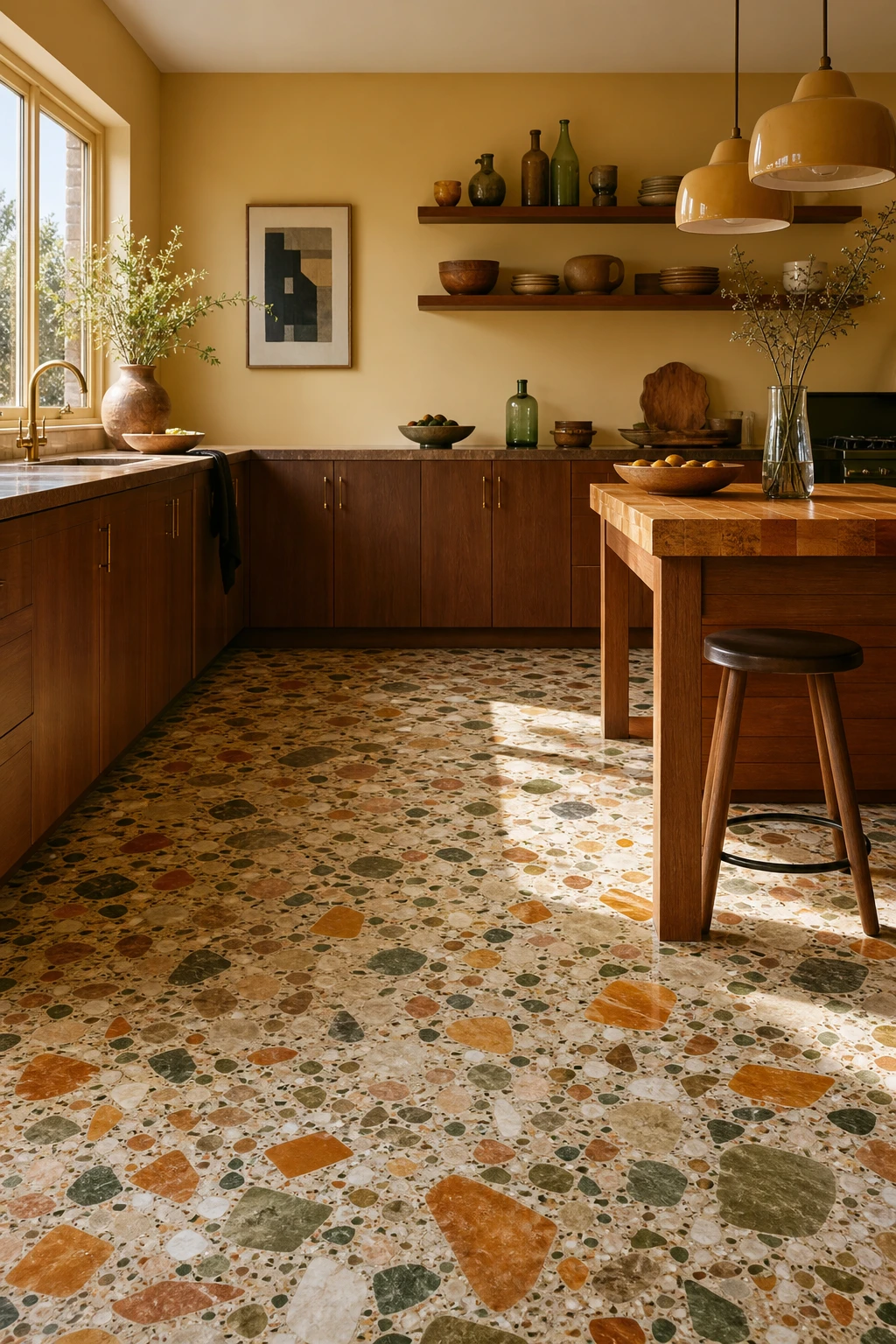
Multicolor terrazzo genuinely does the decorating for you, and my instinct is always to lean into that rather than fight it. The rust, amber, sage and cream chips scattered through the slab hand you a ready made palette, so the kitchen feels considered without a single busy wall. Flat walnut cabinetry and butcher block sit quietly beside it, which is exactly right, and you will notice how the floor holds all the attention while the rest of the room simply frames it.
The Key Details
Multicolor terrazzo floor with rust amber sage and cream aggregate chips
Flat front walnut cabinetry
Chunky ceramic pendant lights
Open timber shelving with earthenware
Butcher block island surface
Pro TipPick out one chip color from the terrazzo, rust or sage works brilliantly, and repeat it in a single small accessory like a ceramic bowl or a tea towel so the floor and the room feel connected.
AvoidLoading the shelves with multicolored earthenware, patterned textiles and bright appliances all at once pulls attention away from the terrazzo and the whole point of the floor is lost.
Retro Checkerboard Tiles Laid the Right Way for Maximum Impact
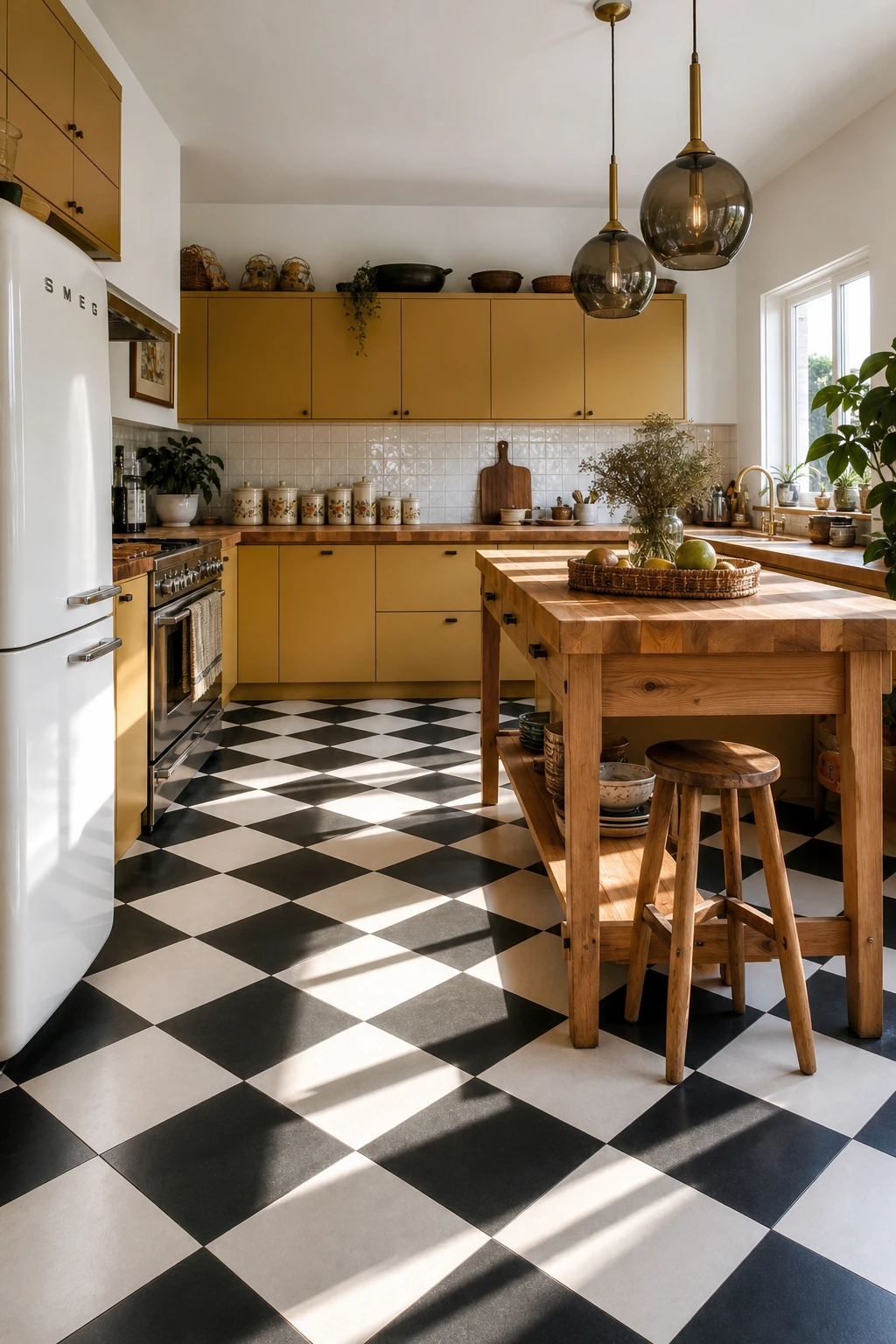
Laying checks on the diagonal is one of my favourite moves in a narrow kitchen because the eye follows the points toward the far wall, which pulls the room open visually. You get a floor that feels almost twice as generous as it really is. What I love about this pattern is how it also anchors the whole 70s palette, giving the harvest gold cabinets and timber counter something bold and graphic to sit against.
The Key Details
Diagonal black and white checkerboard ceramic tile floor
Harvest gold flat front cabinetry
Butcher block timber countertop
Smoked glass globe pendant lights
Vintage ceramic canister set
Pro TipRotate your tile layout 45 degrees before the fitter starts and centre the pattern on the doorway so the first tile a visitor sees is a perfect point, not a cut edge.
AvoidChoosing a high gloss white square means every footprint, splash, and scuff is on permanent display and the floor will look grubby within an hour of cooking.
The Harlequin Floor Pattern That Turns a Plain Kitchen Into Something Special
A harlequin diamond floor is not simply a check laid on the diagonal. The tiles are elongated into true diamond shapes, so the points pull your eye along the room rather than breaking it into equal squares, and you get a sense of real movement underfoot. What I love is how a three colour sequence, say cream, rust and olive, builds depth that a two tone check never quite reaches without feeling busy.
The Key Details
Diagonal harlequin diamond ceramic floor tiles
Open timber wall shelving
Woven rattan pendant lights
Butcher block timber countertop
Brushed brass cabinet hardware
Pro TipMap your three colour harlequin sequence on paper before you touch the floor, placing your mid tone at the centre field so the darker and lighter shades frame it from either side.
AvoidCutting diamond tiles freehand along the border without a jig or template leaves the pointed tips ragged, and that lost crispness is the one thing that makes the whole geometric pattern look amateur.
A Modern Kitchen That Borrows the Best 70s Flooring Tricks
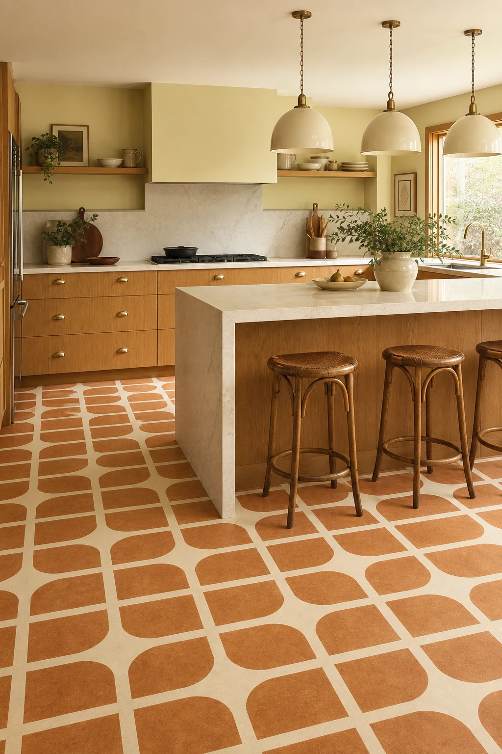
Borrowing from the 70s without living in a time capsule is the whole game here, and the floor is where you win it. A large format geometric tile in terracotta, amber and cream carries all the warmth of the era, but scaled up it reads as modern rather than nostalgic. Pair it with flat front cabinetry and a clean quartz waterfall island and you get a kitchen that feels considered, not costumed.
The Key Details
Large format geometric vinyl tiles in terracotta amber and cream
Flat front honey oak veneer cabinetry
Brushed brass cup handle hardware
Waterfall quartz island countertop
Oversized ceramic pendant light cluster
Pro TipPick one 70s palette colour from your floor and repeat it in a single hardware finish, like brushed brass, to tie the retro and the contemporary together without any extra effort.
AvoidPulling in touches from too many retro decades at once leaves the kitchen without a clear point of view, and the result feels muddled rather than curated.
Why a Warm Wood Kitchen Floor Feels More 70s Than You Might Expect
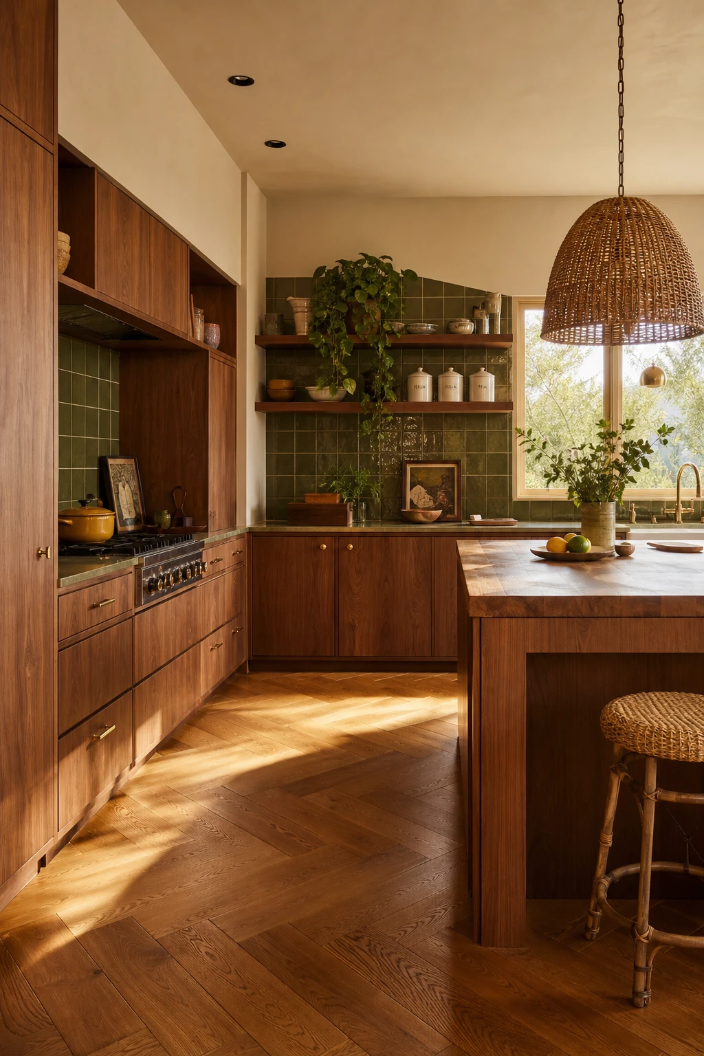
Wood flooring and the 70s are a natural pair that people underestimate. A warm honey or amber tone pulls the whole kitchen into that earthy, grounded mood the decade did so well, and what I love most is how alive the surface feels compared with any tile or vinyl alternative. The grain does the decorating quietly, tying together avocado greens, burnt oranges and raw timber details so no single element has to fight for attention.
The Key Details
Wide plank herringbone oak floor
Flat front walnut cabinetry
Avocado green ceramic tile backsplash
Woven rattan pendant light
Butcher block timber island top
Pro TipChoose a wide plank in oak or ash with a matte oil finish rather than a gloss lacquer, because the flat sheen reads as genuinely period and lets the natural colour age beautifully over time.
AvoidReaching for a grey washed or cool toned wood strips every drop of warmth from the floor and leaves the kitchen feeling like it belongs to a completely different era.
Knotty Pine Cabinets and the Floor Color That Makes Them Shine
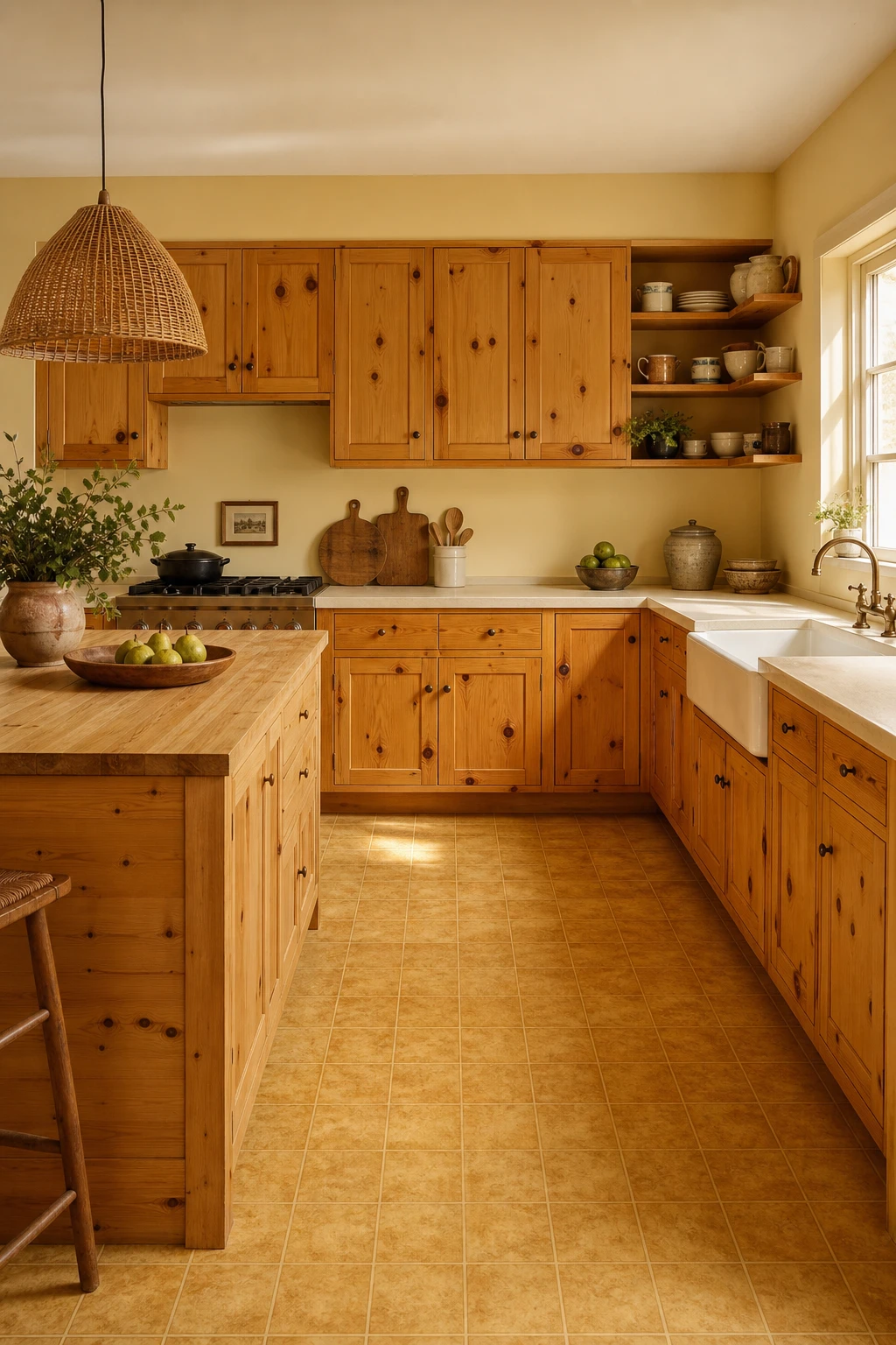
Knotty pine has so much character already, and the thing I always check is whether the floor is working with it or fighting it. A honey toned linoleum or vinyl tile picks up those warm amber knot colors and keeps the whole room in the same family, so you get a kitchen that reads as cozy rather than cluttered. Watch how the grain and the floor tone seem to breathe together instead of competing.
The Key Details
Knotty pine upper and lower cabinetry
Honey amber vinyl composite tile floor
Rattan pendant light over island
Butcher block island surface
Open timber display shelving
Pro TipChoose a vinyl composite tile with a matte finish in a mid honey shade so it mirrors the pine knot color without reflecting so much light that the natural wood grain disappears.
AvoidLaying a dark espresso or near black floor under knotty pine pulls all the warmth out of the wood and leaves the kitchen feeling dim and heavy, no matter how many pendants you hang.
Orange Cabinets and the Floor Beneath Them That Pulls It All Together
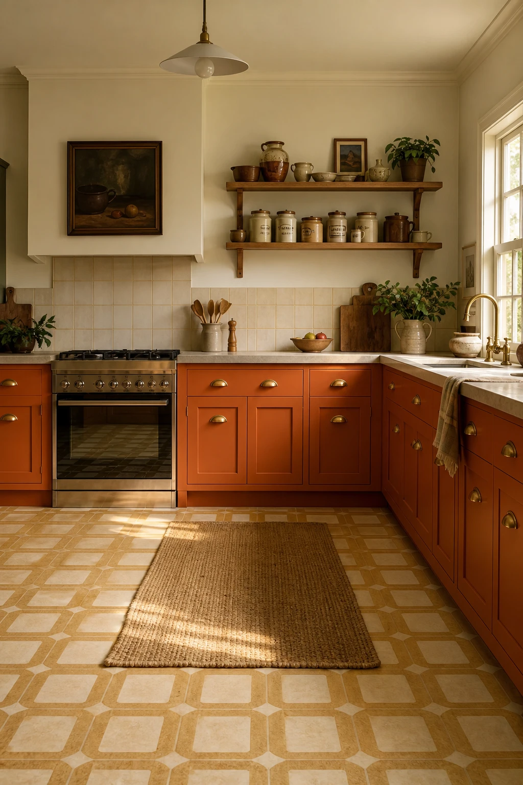
Orange cabinets are a full commitment, and the floor beneath them is where the whole scheme either lands or tips over. What I reach for here is a warm cream or biscuit tile, something that holds the heat of those doors without throwing it straight back at you. You get the boldness you came for, but the room stays breathable. That calm base is what lets the orange read as confident rather than chaotic.
The Key Details
Geometric ochre and cream vinyl tile flooring
Brass cup pull cabinet hardware
Open timber upper shelving
Ceramic canister set
Natural jute runner
Pro TipLay a cream tile with a very faint ochre vein or speckle so the floor connects to the cabinet colour without matching it.
AvoidPairing an orange floor with orange cabinets creates a single note room where the eye has nowhere to rest and the whole kitchen feels smaller and more exhausting than it should.
How a Pistachio Green Kitchen Finds Its Perfect Flooring Partner
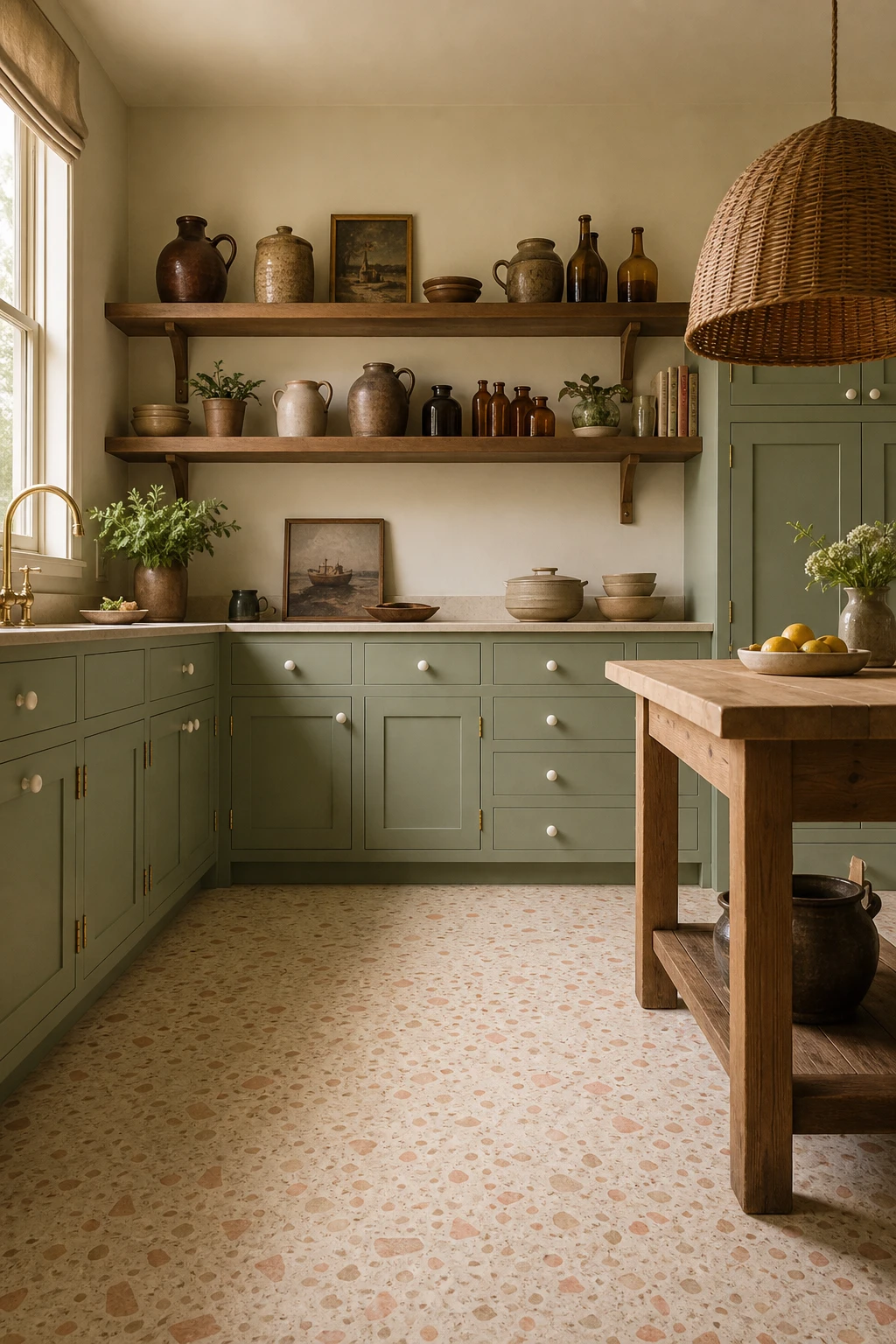
Pistachio green sits in that lovely cool leaning zone, and the floor is the thing I always check first to make sure it does not tip into cold. A warm cream terrazzo with coral and sand aggregate is the move I reach for here, because those earthy flecks pull the green toward something softer and more alive. You get a palette that feels sun warmed rather than clinical, and the two surfaces carry each other beautifully.
The Key Details
Warm cream terrazzo floor with coral and sand aggregate
Open timber shelving with earthenware and amber glass
Woven rattan dome pendant light
Butcher block prep counter
Ivory glazed ceramic drawer pulls
Pro TipPick a terrazzo or speckled tile with at least one warm tone, coral, sand, or amber, so the aggregate does the work of balancing pistachio’s cool base without you adding a single extra colour.
AvoidA bright white floor strips the warmth straight out of a pistachio palette and leaves the whole kitchen feeling washed out and flat rather than the gentle, enveloping tone you were after.
Laying Retro Linoleum Sheet Flooring So It Looks Seamless and Intentional
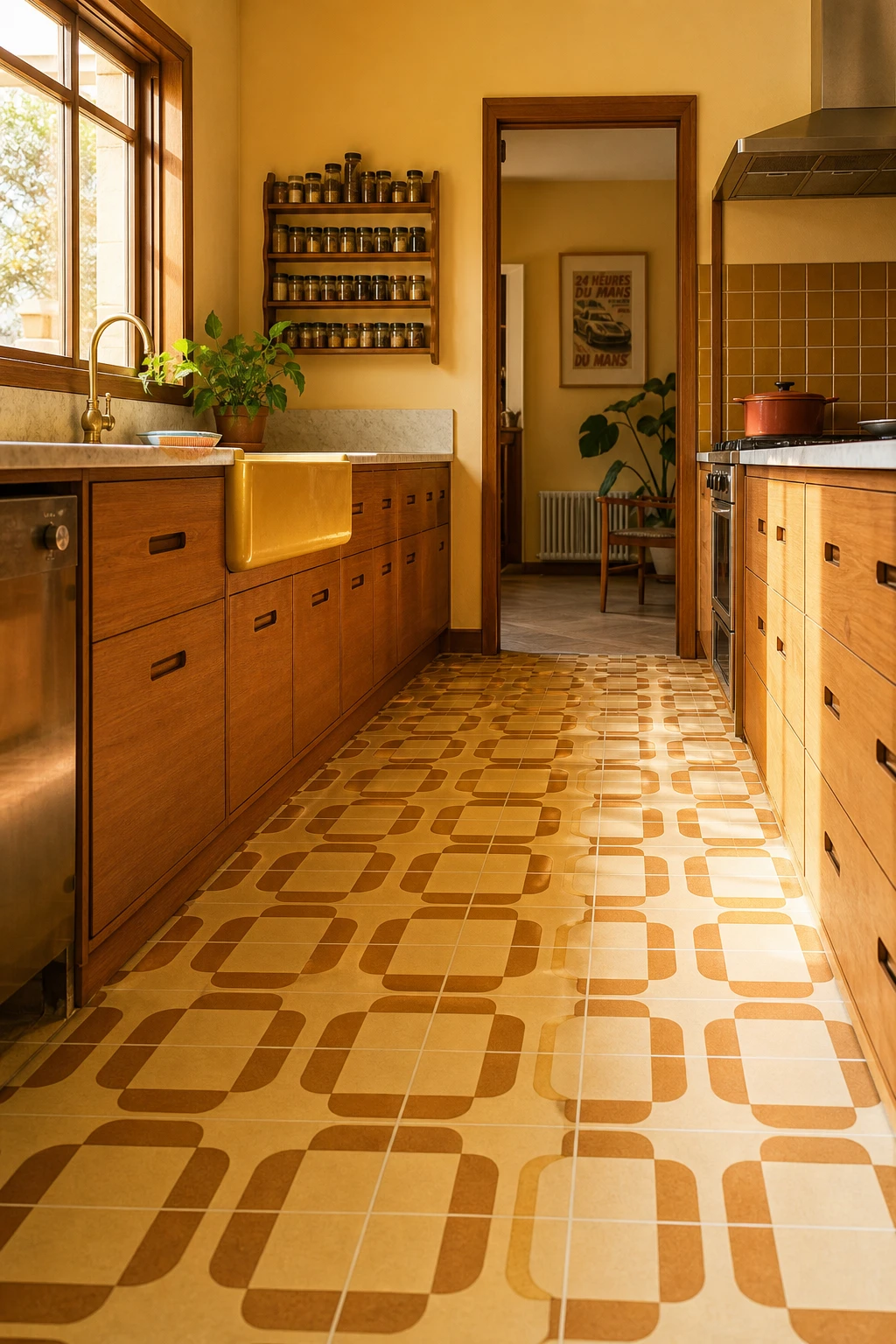
Sheet lino is one of my favourite 70s moves because when it lands right, the pattern flows wall to wall like one giant tile with no interruptions. You get that full graphic punch, the geometry reads as a whole composition rather than a patchwork. What wins me over every time is how a seamless floor anchors everything above it, the cabinetry, the sink, the hardware all sit inside a frame rather than floating.
The Key Details
Geometric pattern sheet linoleum floor
Teak veneer lower cabinetry with recessed pulls
Harvest gold ceramic farmhouse sink
Vintage wall mounted spice rack
Brushed brass hardware accents
Pro TipStand the roll upright in a warm room for at least 24 hours before you unroll it, so the lino relaxes and lies flat without curling at the edges when you cut.
AvoidCutting both edges of a sheet join without matching the pattern repeat first leaves a visible break that pulls the eye straight to the floor for all the wrong reasons.
Mid Century Modern Tile Flooring That Bridges the 60s and 70s Perfectly
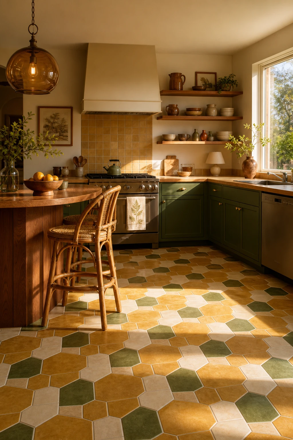
Mid century tile sits right at the crossroads of two decades, and that is exactly what makes it so useful for a 70s kitchen. The shapes, hexagons, squares, simple geometry, come from the 60s, but the moment you drop in avocado green or harvest gold they pull firmly into 70s territory. You get a floor that feels layered and earned rather than costume y. Watch how the warm earthy tones anchor every other element in the room, from teak wood to earthenware, because the colour story starts right underfoot.
The Key Details
Geometric ceramic tile floor in avocado and harvest gold
Teak breakfast bar
Rattan counter stools
Amber smoked glass pendant lamp
Open shelving with earthenware pottery
Pro TipRun a row of small squares as a border around a field of hexagons to break up the pattern and give the floor that slightly improvisational, period accurate feel.
AvoidPicking a tile with a bright white grout or a sharp geometric print will read as a modern Scandi kitchen rather than a 70s one, and the whole warm vintage mood collapses.
A Painted Checkerboard Kitchen Floor You Can Do Over a Weekend
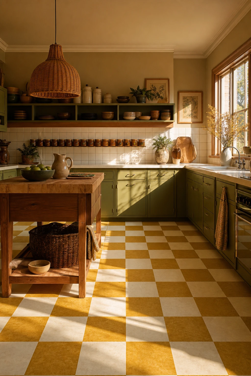
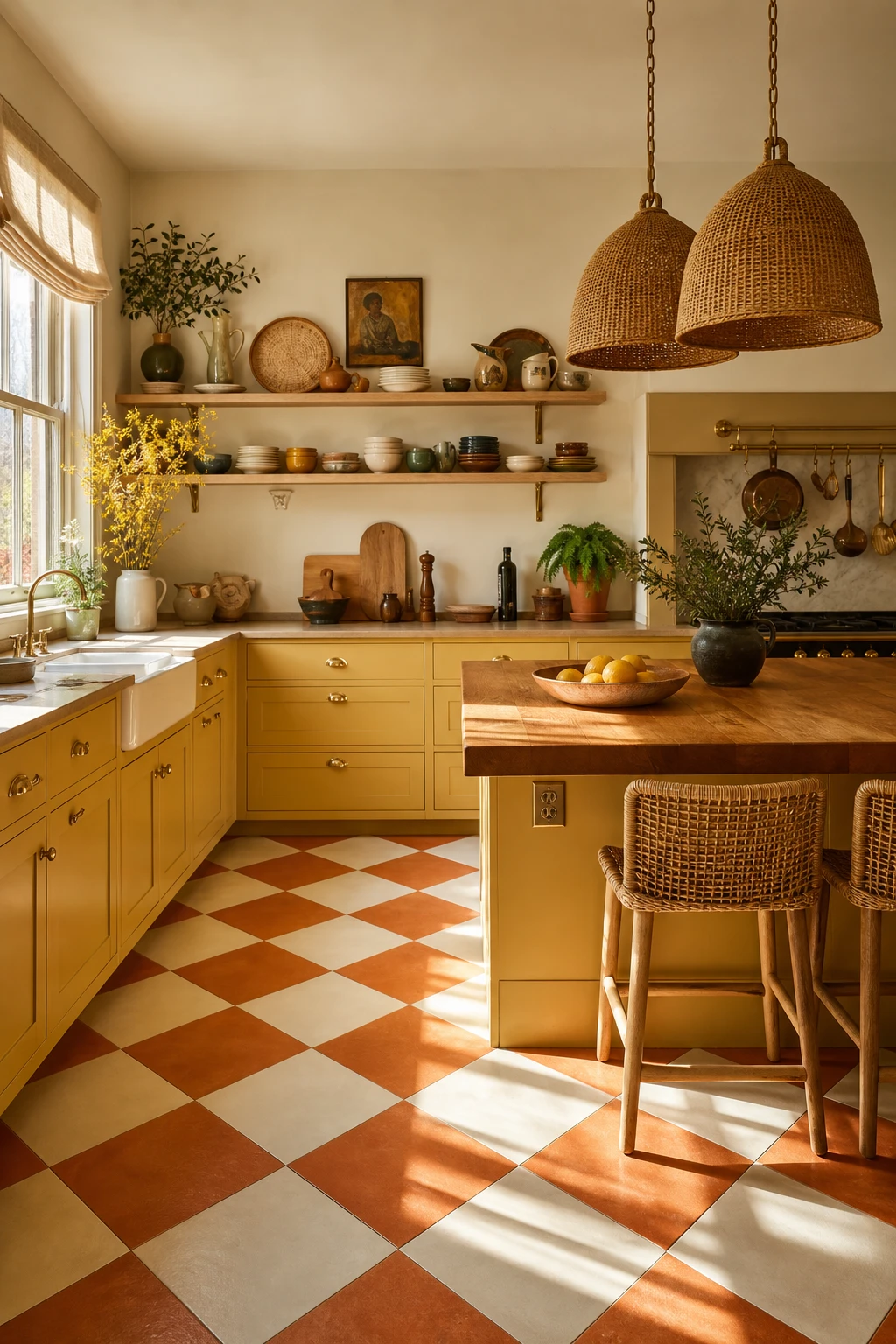
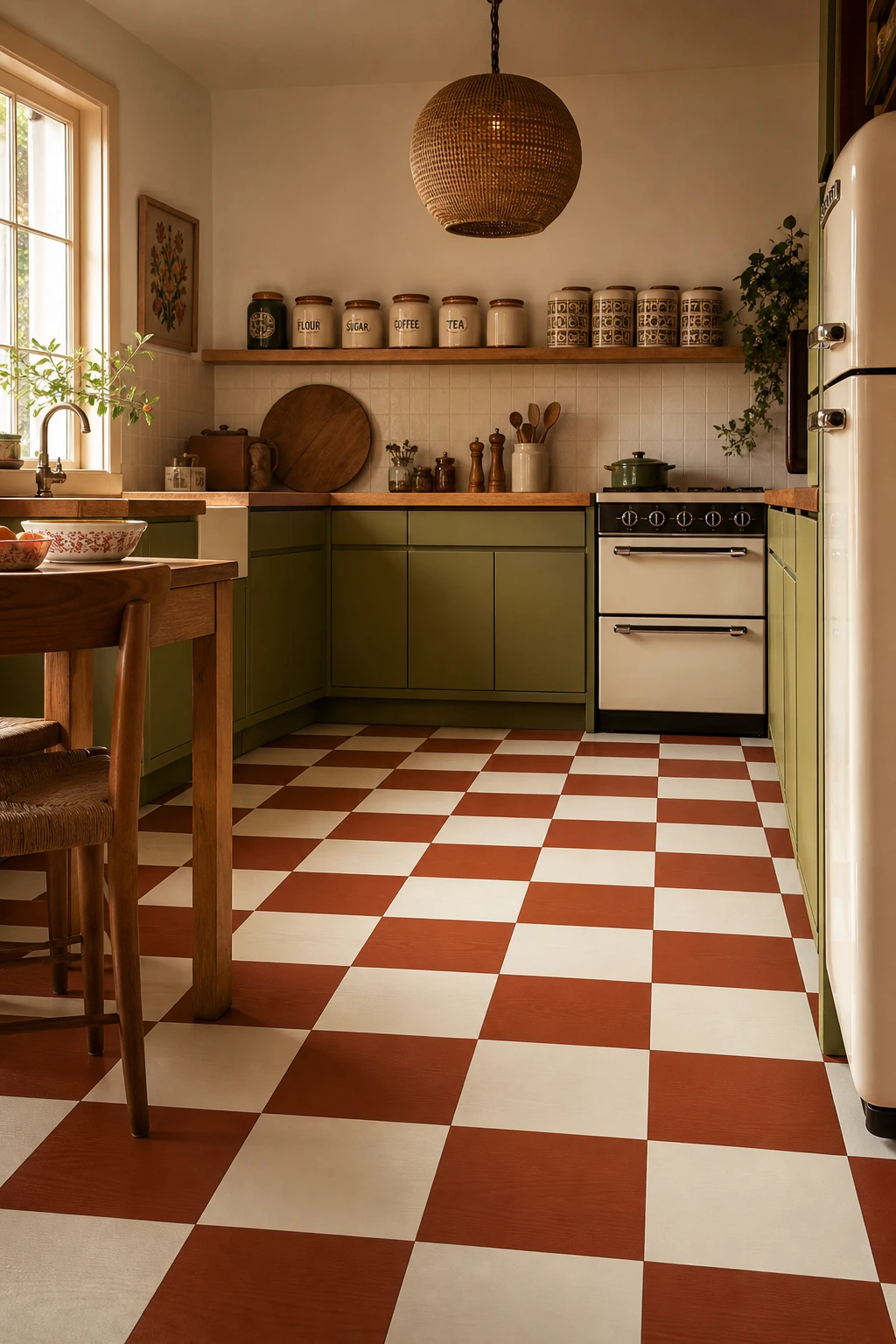
Painted checkerboard floors win me over every time because the geometry does all the heavy lifting. The terracotta and white squares pull the warm avocado cabinetry and butcher block together in one bold move, and you get that unmistakable 70s energy without a single tile. What I love most is how crisp lines at floor level make the whole room feel considered, like every choice was deliberate.
The Key Details
Flat front timber cabinetry in avocado tone
Round rattan pendant light
Chunky butcher block countertop
Vintage ceramic canister set
Terracotta and white geometric checkerboard squares
Pro TipRoll a self leveling floor primer across the whole surface before you tape your grid, because it fills small grain and pores and gives the paint something solid to grip so your squares stay sharp for years.
AvoidSkipping the topcoat sealer is the one mistake I see most often, and a painted floor without it will start scuffing and flaking within a few weeks of normal foot traffic.
Vintage Yellow Tiles That Make a Kitchen Feel Like a Sunny Family Heirloom
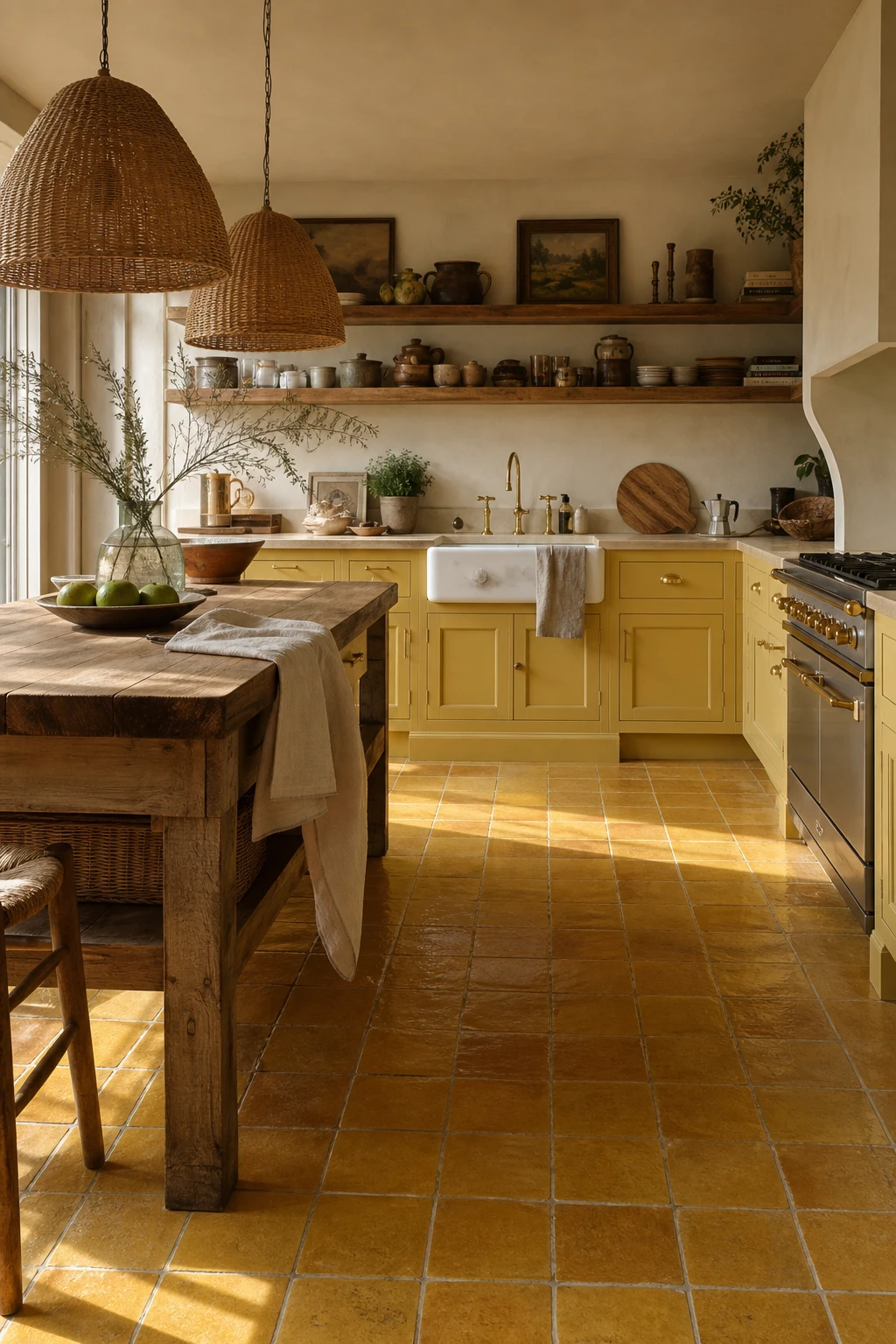
Reclaimed yellow tiles carry something no new tile can fake: the warmth of decades pressed into uneven edges and slightly varied glaze. What I love is how that imperfection reads as richness once the tiles are down, giving you a floor that feels inherited rather than installed. The sizing quirks force the eye to slow down and settle, which makes a kitchen feel genuinely lived in.
The Key Details
Reclaimed handmade ceramic floor tiles
Butcher block island
Open timber shelving with earthenware
Rattan pendant lighting
Farmhouse sink
Pro TipBefore you lay a single tile, sort your reclaimed pieces into light, mid, and deep shade piles, then mix from all three as you go so the colour drift reads as intentional patina rather than fading.
AvoidBright white grout next to aged yellow tiles creates a clinical contrast that fights the vintage warmth you are trying to build, so reach for a sand or straw grout tone that sits inside the tile palette.
Pink Kitchen Tiles That Give the 70s Floor a Softer Feminine Side
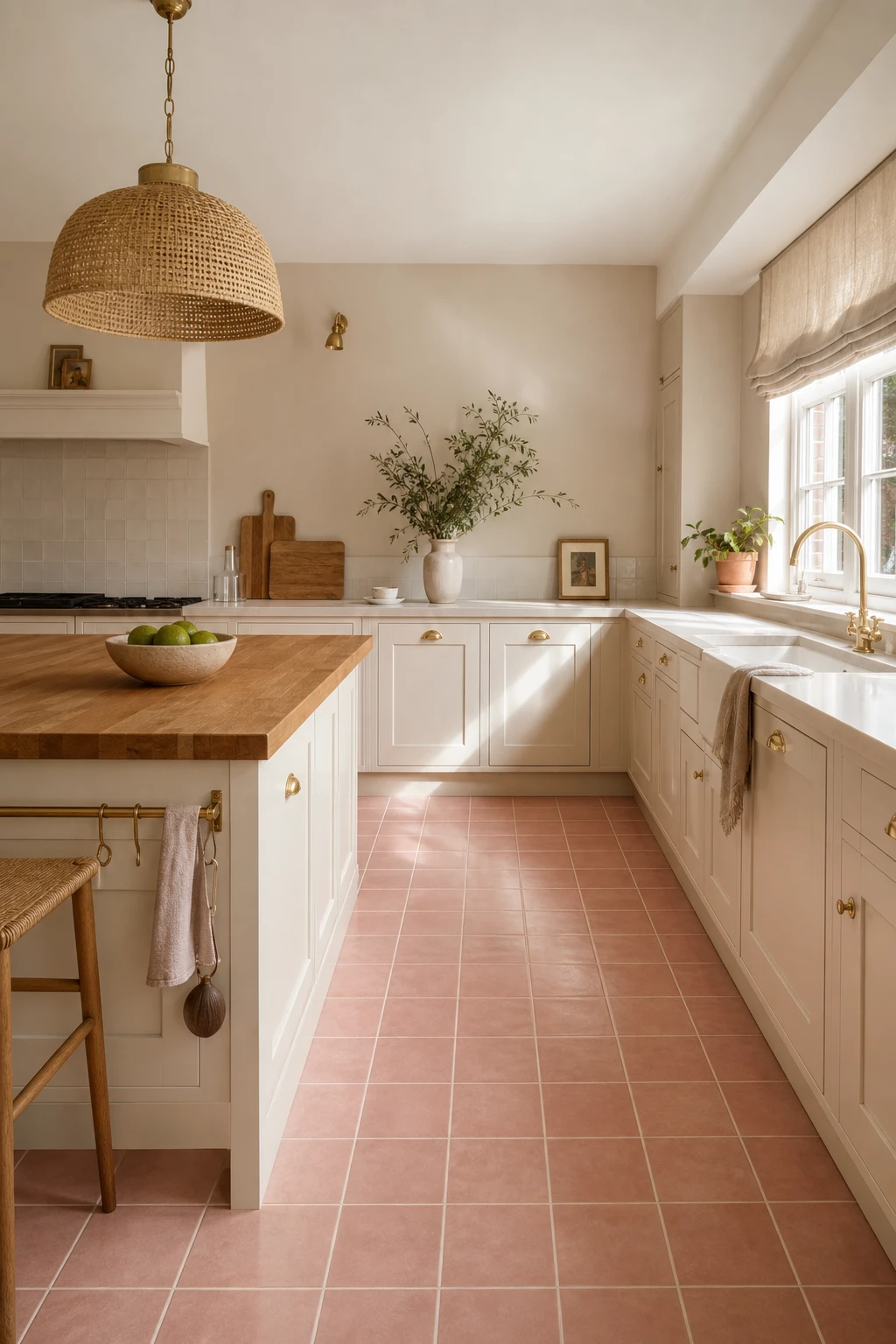
Pink on the floor is a move I love because it anchors the whole room in warmth without demanding attention the way a pink wall would. You get a colour that reads as neutral from a distance, then reveals its personality the moment light catches the glaze. What wins me over here is how dusty, terracotta leaning pink sits so naturally beside timber and brass, pulling the 70s palette together from the ground up rather than layering it on top.
The Key Details
Pink ceramic floor tiles in square grid layout
Cream lacquer lower cabinetry with brushed brass hardware
Rattan pendant light
Butcher block island worktop
Linen roman blind at south facing window
Pro TipPair your dusty pink tiles with brushed brass tap fittings and cabinet handles, because the yellow in the brass draws out the peachy warmth in the clay and the whole room locks into one cohesive retro note.
AvoidChoosing a cold, bright bubblegum pink pushes the floor straight into nursery territory, and no amount of warm wood or rattan will pull it back toward the kitchen it was meant to be.
Retro Vinyl Plank Flooring That Gives the 70s Look Without the Upkeep
Wide teak tone vinyl planks carry all the warmth of real timber without a single worry about water or heavy foot traffic, and that trade off wins me over every time in a kitchen. What I love is how the broad grain pattern reads as genuinely retro, the kind of floor you would have found in a well loved 70s home, yet you get the total practicality of a waterproof surface. Pair it with avocado lower cabinets and brass pulls and you will notice the whole room pulls together into something that feels considered rather than costume.
The Key Details
Wide teak tone vinyl plank floor
Avocado green lower cabinets with brass bar pulls
Open timber upper shelving
Butcher block island top
Hanging copper pot rail
Pro TipStagger your plank end joints by at least a third of a board length so the floor flows like real timber rather than locking into a repeating grid.
AvoidChoosing a vinyl plank with a high gloss finish will make the floor read as plastic under kitchen lighting, which kills the warm, lived in feeling you are chasing.
A Green and Yellow Kitchen Floor That Puts the 70s Color Duo Center Stage
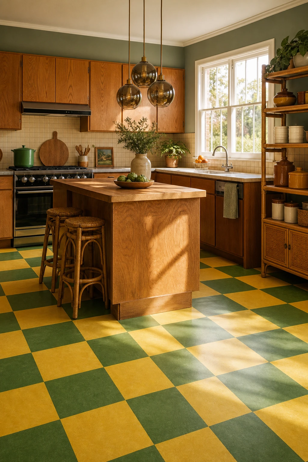
Avocado and sunflower side by side sounds bold, and it is, but what I love is how the lighter yellow does the heavy lifting here. It covers more floor, so your eye reads the space as warm and open, while the green lands as a deliberate accent rather than a fight for attention. You get all the energy of a two colour palette without the room feeling chaotic.
The Key Details
Alternating avocado and sunflower large format vinyl floor tiles
Flat fronted oak veneer cabinetry
Smoked glass globe pendant lights
Butcher block timber island
Open rattan display shelving
Pro TipLay your sunflower tiles as the base pattern and drop the avocado in at roughly a one in four ratio so the green reads as a rhythm rather than a rival.
AvoidSplitting the floor exactly half and half between both colours creates a visual tug of war that makes the room feel restless and smaller than it actually is.
1970s Ceramic Floor Tiles and the Grout Color That Makes or Breaks Them
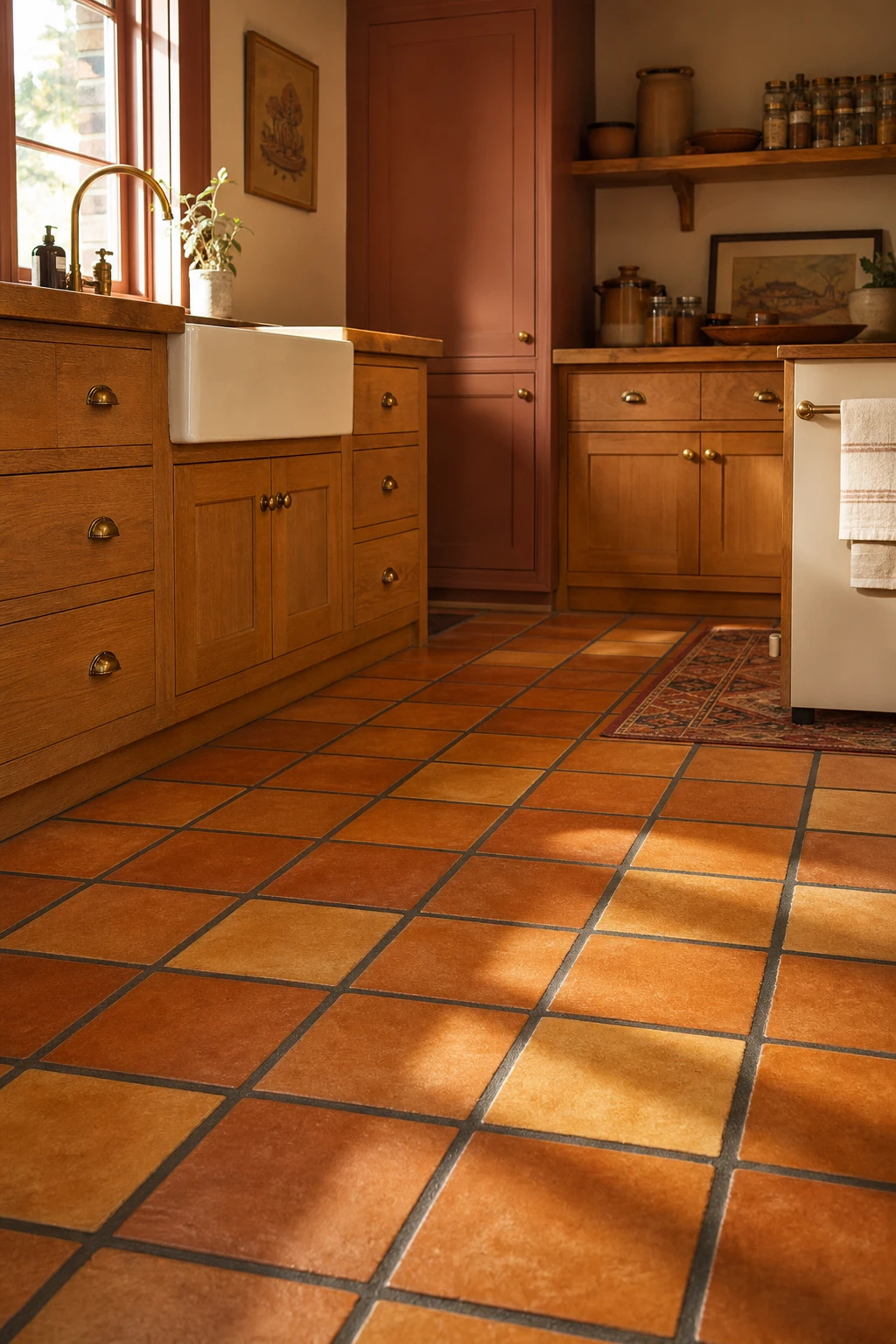
Ceramic floor tiles from the 1970s carry a weight and warmth that modern porcelain just cannot fake, and the thing I always check first is not the tile itself but the grout. Charcoal lines cut between burnt orange and harvest gold pull the palette together rather than slicing the pattern into a grid of pale interruptions. You get a floor that reads as one warm, breathing surface, and the low timber cabinets and chunky farmhouse sink sit above it like they always belonged there.
The Key Details
Matte glazed ceramic floor tiles in burnt orange and harvest gold
Wide contrasting charcoal grout lines
Low slung honey toned timber base cabinets
Chunky aged cream farmhouse ceramic sink
Open timber shelf with stoneware crocks and glass jars
Pro TipTint your grout to match the darkest tile in the set so the joins anchor the pattern rather than compete with it.
AvoidSkipping your annual sealant refresh lets the grout absorb grime and lighten over time, which kills the contrast the whole floor depends on.
The Armstrong Flooring Patterns That Defined What a 70s Kitchen Felt Like
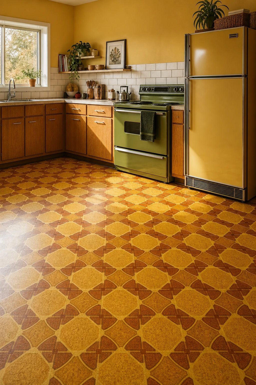
Armstrong pattern lino had a commercial grade confidence that cheap imitations never captured, and that thickness is exactly what gave it that satisfying, cushioned feel underfoot. What I love about the amber and gold repeat prints specifically is how they held a room together without demanding attention. You get a floor that reads as warm and grounded, letting the avocado range and harvest gold fridge do their thing above it.
The Key Details
Geometric sheet vinyl floor in amber and gold repeat print
Flat fronted honey oak lower cabinets
Avocado green freestanding electric range
Harvest gold refrigerator
Ceramic subway tile backsplash
Pro TipWhen searching for a modern match to a discontinued Armstrong pattern, contact independent sheet vinyl makers directly and ask for their heritage or retro sample books, as smaller runs are often available that never appear on the main website.
AvoidChoosing a reproduction that copies the surface print onto a thin backing means the floor will lift and buckle at seams within a year, and no amount of adhesive fully fixes that once it starts.
70s Kitchen Flooring in Laminate and How to Pull Off the Look Today
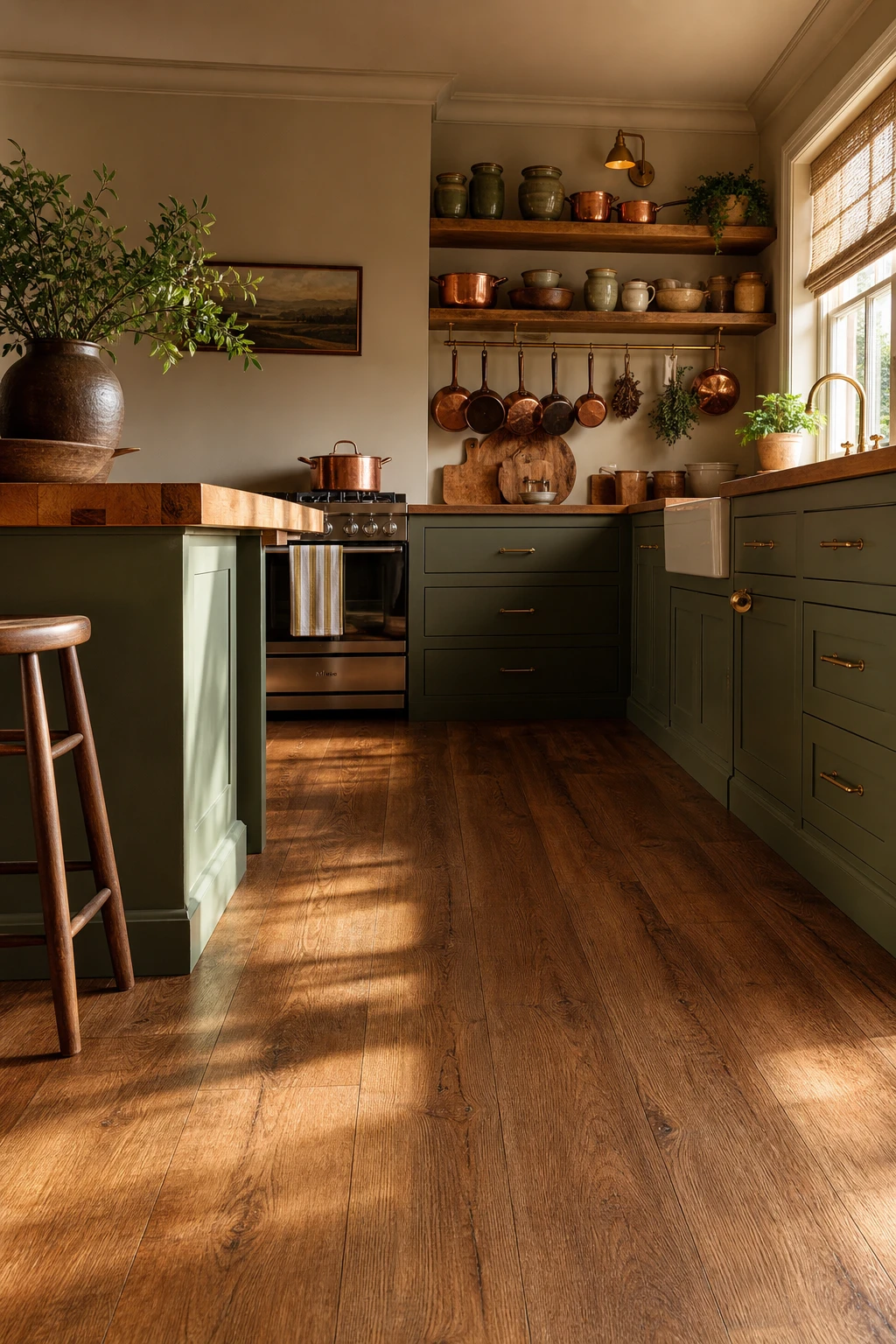
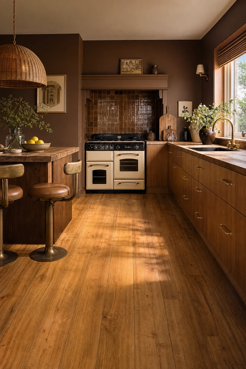
Laminate gets a bad reputation, but the right board pulls a retro kitchen together beautifully. A wide plank with a warm oak tone, laid straight and clean, echoes the honest unfussy geometry the 70s did so well, and that simplicity is what wins me over. You get the visual weight of real timber without the upkeep, and paired with flat fronted cabinetry and brass hardware the floor reads as considered rather than cheap.
The Key Details
Woodgrain laminate floor planks in straight lay
Flat fronted oak veneer cabinetry with brass D bar handles
Butcher block timber worktop
Oval rattan pendant light
Cushioned vinyl breakfast bar stools
Pro TipChoose a registered emboss laminate so the surface texture physically lines up with the printed grain beneath it, because that tiny detail is what separates a board that looks real from one that just looks like a photo of wood.
AvoidSkipping underlay turns every footstep into a hollow knock that instantly exposes the floor as fake, no matter how good the print looks.
Alan launched Edward George London in 2017. Since completing his masters in Town & Regional Planning (MPlan) he has combined the skills he learned at the University of Sheffield with his passion for design, to help create a foundation for those looking to create a beautiful home.