Newsletter Subscribe
Enter your email address below and subscribe to our newsletter

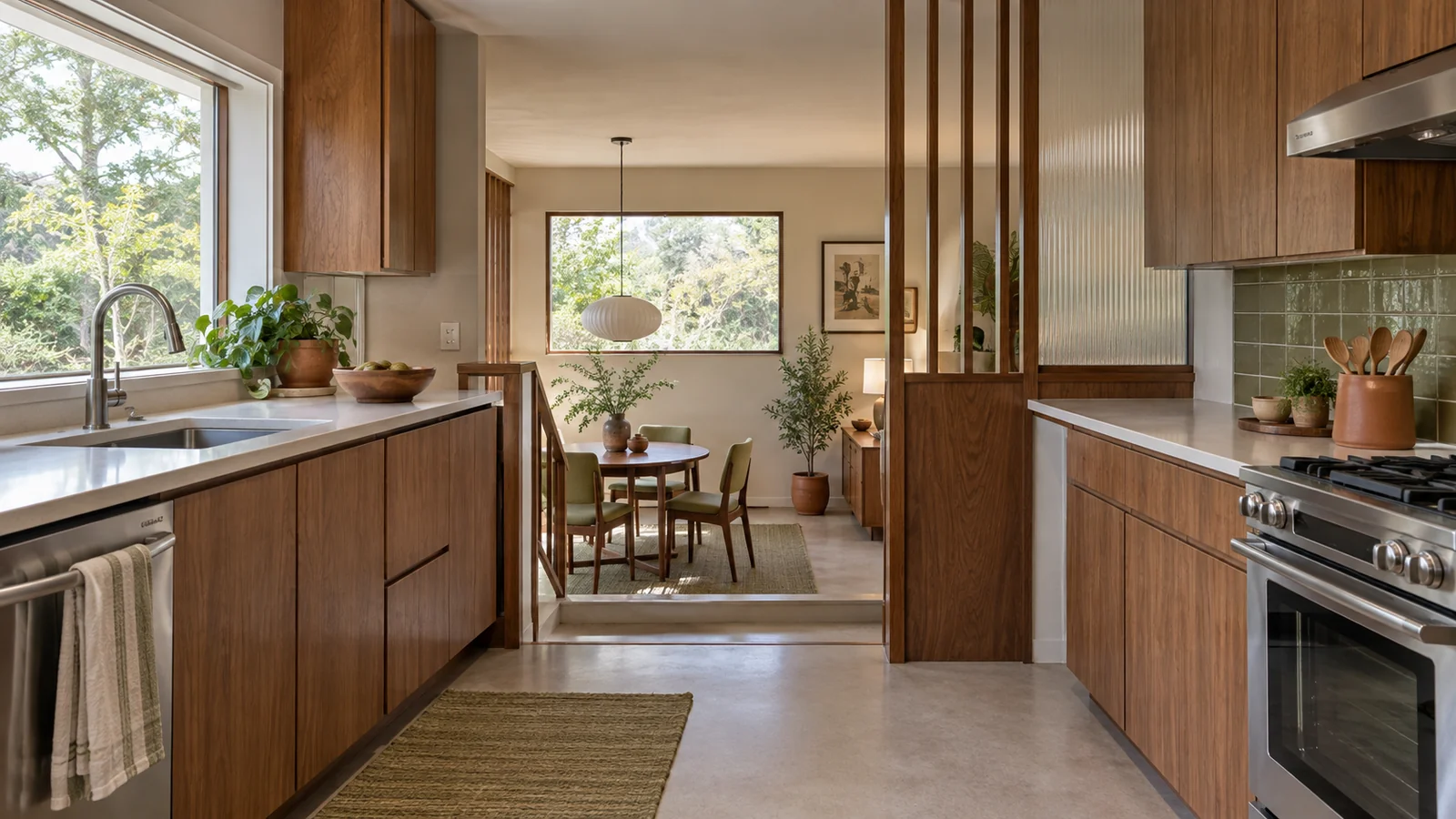
A split level kitchen remodel can look wonderfully simple in a photograph: remove the divider, add an island and let the dining room flow into the kitchen. In a 1970s home, the step between rooms changes that decision. The divider may contain structure or services, an island may interrupt the route to the other level, and a new floor finish can make the edge of the step harder to see. If you own one of these homes, begin with the relationships you already have. Measure where people walk, where the cook works and where the lower or upper room begins. Then compare three opening options before choosing cabinets. This guide gives you a way to make those choices in sequence, so you can retain the useful character of your kitchen while asking a designer or contractor much better questions.
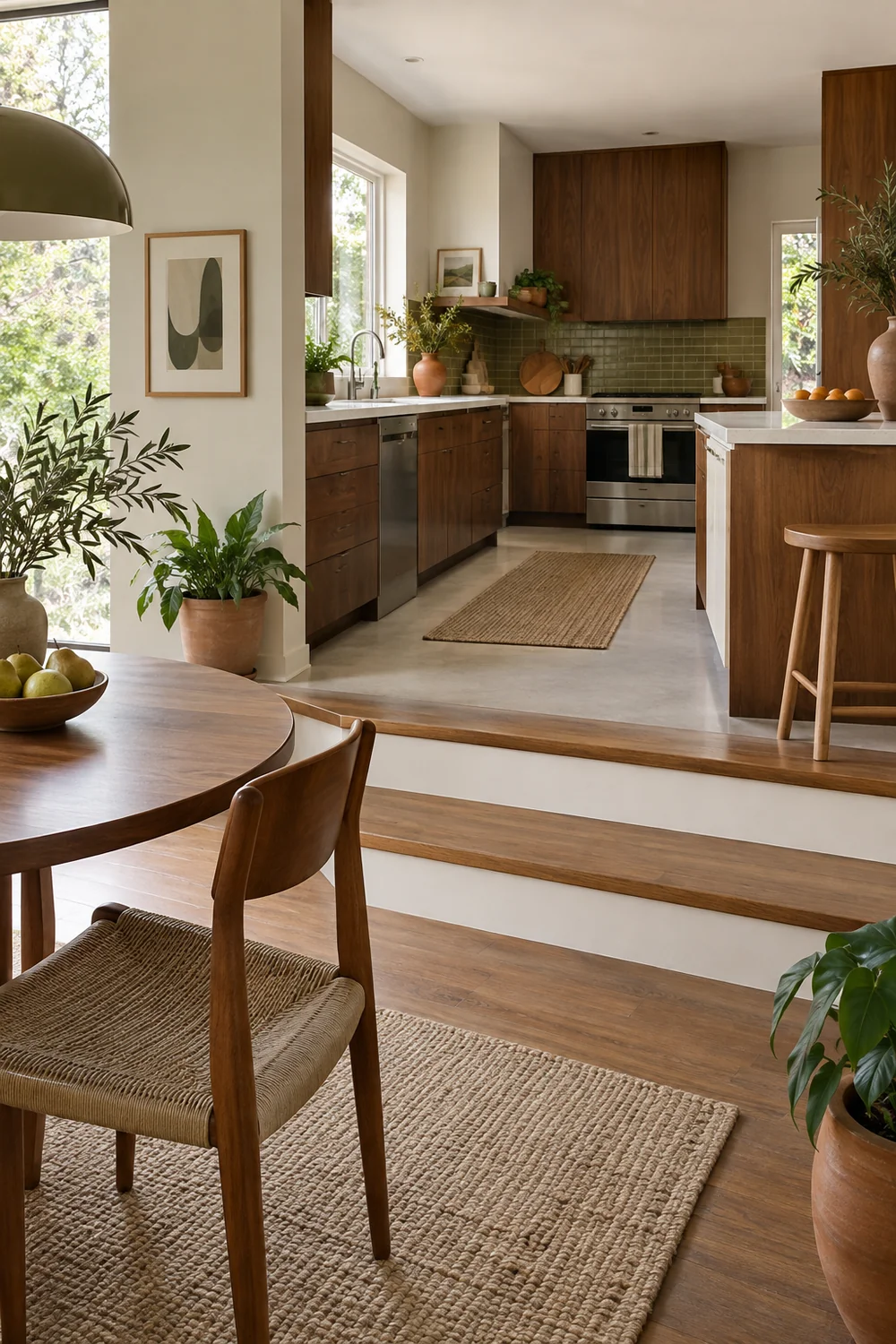
Start with a plan of the room you actually use, not a plan of the room you hope to have. Mark the kitchen walls, the edge and direction of every step, the entrances to adjoining rooms, windows, radiators, existing appliances and the places where people pass behind a cook. Add the dining table and its occupied chairs. A clear path on an empty plan can disappear once someone sits down for a meal. This first drawing should show both levels on the same sheet so neither room is treated as leftover space.
Watch the kitchen on an ordinary day before marking anything for demolition. Which route brings groceries in? Does someone cross the cooking area to reach a stair or garden door? Where do dishes wait between cooking and serving? A useful remodel protects these repeated movements. If the existing cabinets still serve a purpose, separate their condition from the inconvenience of the layout. The original materials and colour story in a 70s kitchen can be worth considering without committing to the old work triangle or an awkward doorway.
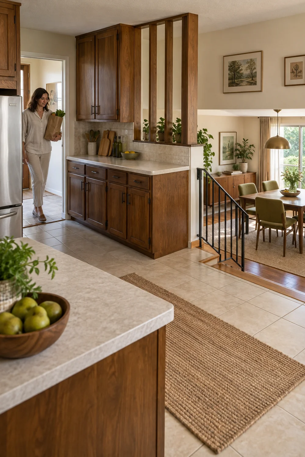
Photograph the kitchen from the adjacent dining level and then from the main work position. These two views reveal different problems. The first shows whether the cook is visually cut off. The second shows whether opening the divider would expose the sink, preparation clutter or a direct view into a hall. Note the height of any half wall and where its end meets the step. A partial opening might improve conversation more effectively than a fully open room if it leaves a useful place for storage or a peninsula.
Keep uncertainty visible on the plan. Do not label a wall removable because a photograph makes it look thin. A qualified professional needs to assess structure, wiring, plumbing and the local requirements before you price an opening. The same applies to changing the step. Your job at this stage is to describe the experience you want, the routes that must work and the questions the existing building raises. That brief is more valuable than an island sketch with no measured context.
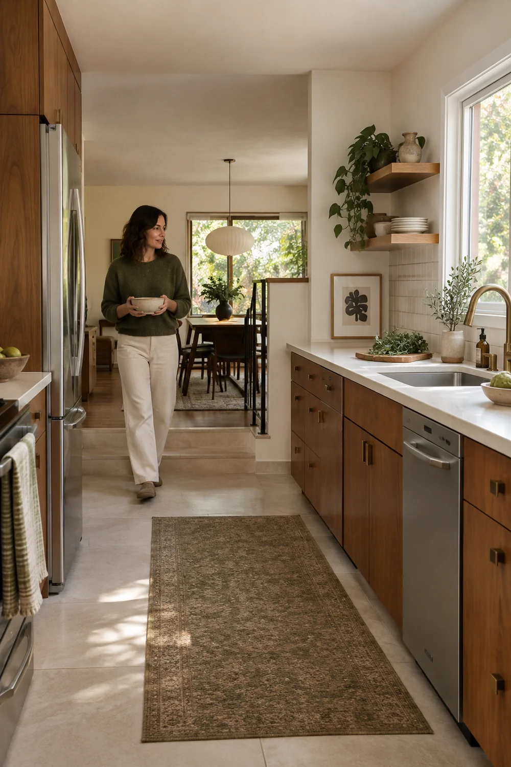
Compare three versions of the same plan. In the first, retain the divider and improve the doorway, lighting and work surfaces. In the second, create a larger opening or lower part of the divider while keeping useful structure and storage. In the third, explore a full opening only after professional assessment. Put the dining table and occupied chairs into each version. Judge every option by the route to the other level, the available wall storage and the view from the cooking position, not simply by how wide the photograph might look.
A retained wall can be helpful when the kitchen is compact. It holds tall storage, hides everyday appliances and gives the dining area a quiet edge. The existing small 70s kitchen remodel examples show how cabinet, light and finish choices can change the feel of a tight room. Use that route if the current opening already allows easy movement and the main frustration is storage or visual heaviness rather than disconnection.
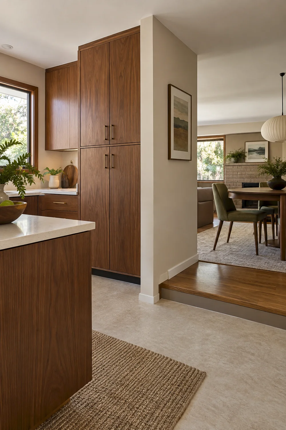
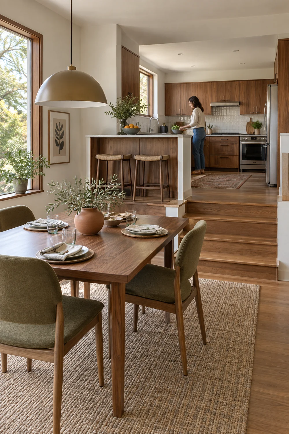
A partial opening is often the option worth drawing carefully. It can connect the cook to the dining area while leaving a landing spot for dishes or a useful cabinet run. In a split level house, its edge also helps people understand where one zone ends and the other begins. Keep the remaining pier or half wall aligned with the step and the working surfaces rather than leaving a random fragment in the middle of the view. Ask the professional team how services and support affect the size and position of the opening.
A full opening changes more than the view. It removes storage, exposes the work zone and can make the edge of the level change less obvious. It may be exactly right if a careful plan replaces that lost function, but the benefit needs to be described. Write one sentence for each option: what it improves, what it costs in storage or circulation, and what still needs technical verification. If you cannot identify a usable advantage in the open version beyond a bigger photograph, keep the less invasive versions in the comparison.
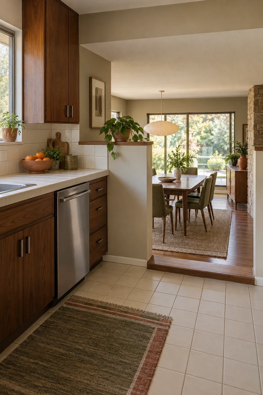
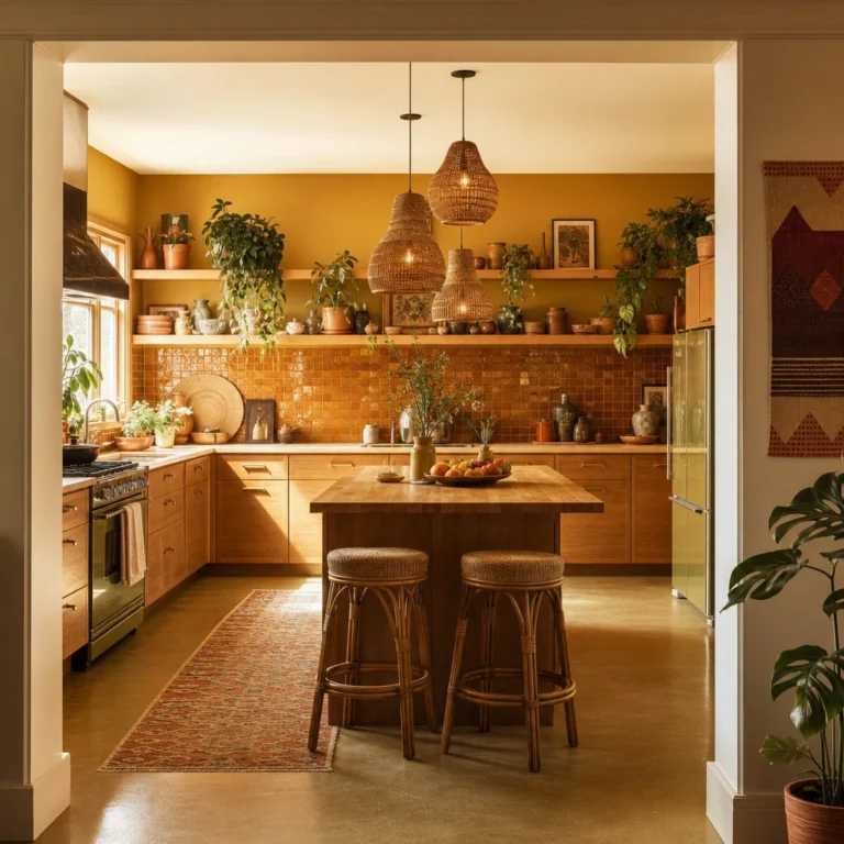
The island is usually the first shape people place into a new kitchen drawing. In a split level room it can become an obstacle between the work area and the adjoining level. Mark the open appliance doors, a person at the sink and a person walking toward the step at the same time. Do this with tape or movable cardboard outlines if the room is empty. The test is about occupied space, not only the distance between two cabinet edges. A beautiful island that makes people step into the cooking zone to reach dinner is the wrong shape for this particular house.
A peninsula can use the end of a retained wall or partial opening, creating a preparation surface that still points toward the dining space. It often allows a clearer route along one side and can define the kitchen without a second barrier. The ranch kitchen layout discussion provides a broader view of long work zones and practical space use. Bring that question back to your own plan: can someone move from the refrigerator to the work surface while another person crosses to the lower level?
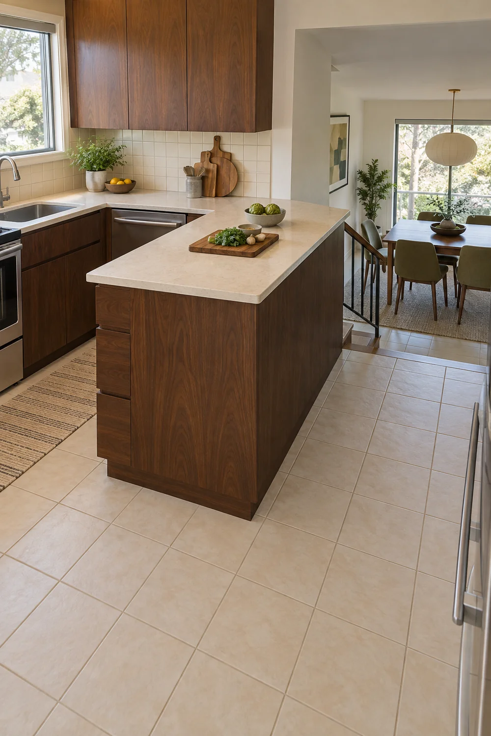
Choose seats only after deciding where serving, cleaning and circulation happen. Bar stools at the edge nearest a step can put occupied legs into the route, and a row of seats facing the dining table may duplicate a function the next room already provides. A short peninsula without stools might be the most useful choice if it gives you a place to put a tray between cooking and dining. If the island genuinely fits, let it earn its place with preparation, storage or serving work rather than treating it as a required symbol of a remodel.
Draw two versions with the same cabinets and appliances, changing only island and peninsula. Look at the work route, the route to the step, the amount of accessible storage and the view into the adjacent room. A decision becomes easier when the comparison isolates one variable. If both versions crowd the threshold, the best answer may be a clear floor and a better wall run. You can still have an open feeling without furniture in the middle of the kitchen.
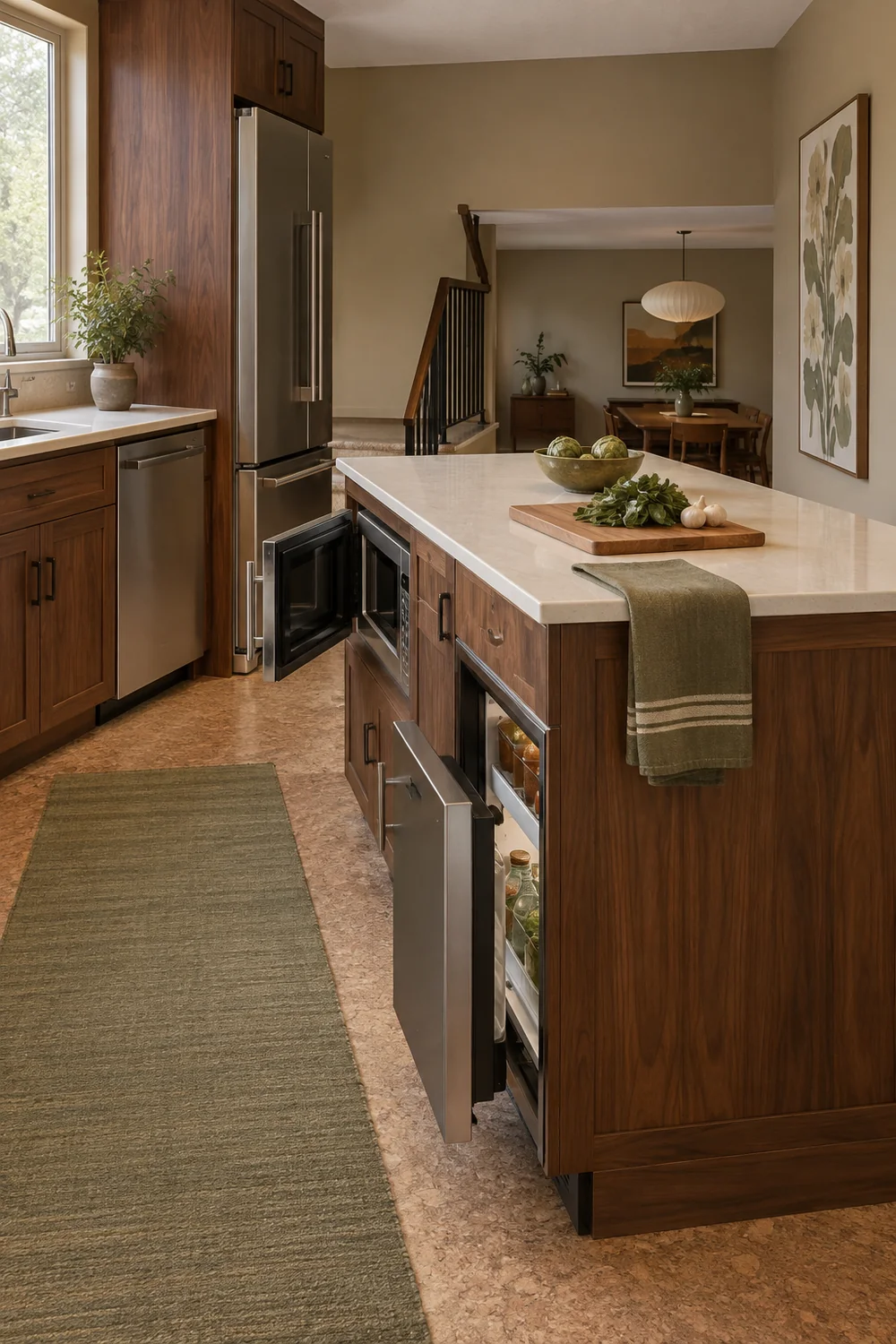
The level change is part of the plan, not a defect to disguise. People should be able to recognise the edge while they carry dishes, talk to someone or enter from another room. Show it in every perspective drawing, including the most attractive view. A rendering that crops out the step cannot prove the proposed layout works. Ask your designer or contractor to review the existing condition and any proposed alteration against the requirements that apply where you live. For the editorial plan, concentrate on the visibility of the transition and a route that does not run directly into furniture.
Keep the main walking line clear on both sides of the step. If the dining table sits close to it, draw the chairs in use, not tucked under. A table can look comfortably placed in an empty room and still squeeze the route when someone rises from a chair. The adjoining 70s dining room ideas are useful for choosing an era sympathetic table and chairs, but the geometry of your platform should decide their scale and position. Let the best route to the table guide the final furniture choice.
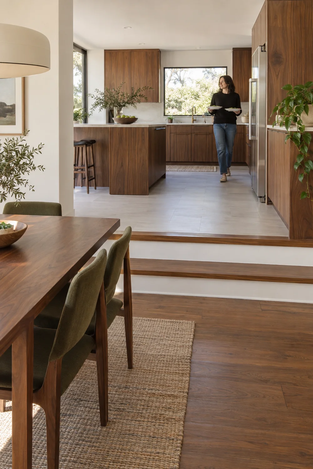
Use floor finishes to connect the spaces without hiding the threshold. One continuous material may make the house feel coherent, while a deliberate edge detail makes the change in level readable. Alternatively, related finishes can distinguish the kitchen from the dining platform while sharing colour or texture. Either approach is valid if the edge remains visible in daylight and when the kitchen lights are on. Avoid using an image of a perfectly seamless floor as the only reference for a house with a real step.
The view across levels should also explain where things belong. A pendant can centre the dining table while task lights identify the kitchen work zone. A sideboard on the lower platform may hold plates and linens if the kitchen loses a cabinet to the opening. These are not decorative afterthoughts; they replace functions changed by the remodel. Stand at the step and ask whether cooking, serving and sitting each have a clear place. If they do, the level change can give the room structure rather than confusion.
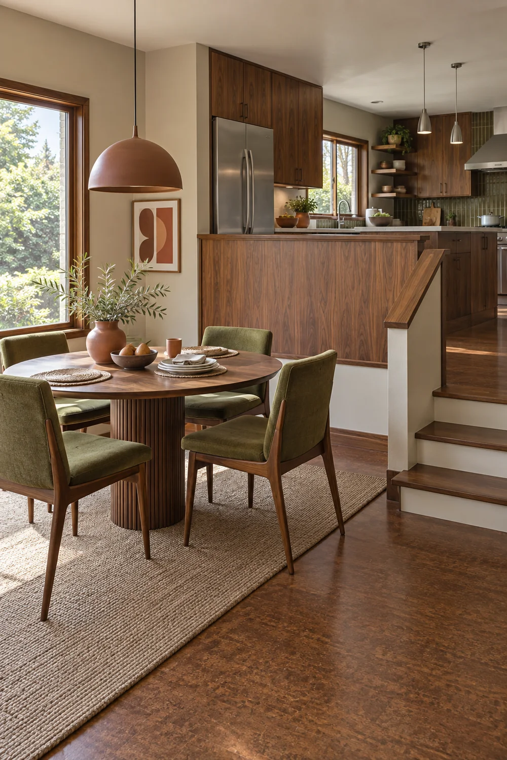
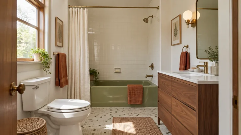
Once the layout works, decide which original elements deserve to stay. Many 1970s kitchens have wood grain, flat cabinet faces or earthy colour that can look excellent beside cleaner contemporary surfaces. Inspect condition before deciding to paint or remove everything. Sound cabinet boxes might be useful even if doors or handles change. If the cabinets are failing, you can still carry a measured part of the era into the new design through walnut, a muted olive accent or a single textured tile, without building a theatrical replica.
Choose one dominant material and let the other finishes support it. For this project, medium walnut can make the cabinets the main 1970s reference; warm off white and mushroom surfaces keep the two levels bright enough to read. A little olive or terracotta can mark a dining textile or a small wall plane. The mid century modern kitchen guide is a useful next reference for flat cabinet forms and restrained material combinations. Compare its ideas with the actual age and architecture of your own house rather than copying a set wholesale.
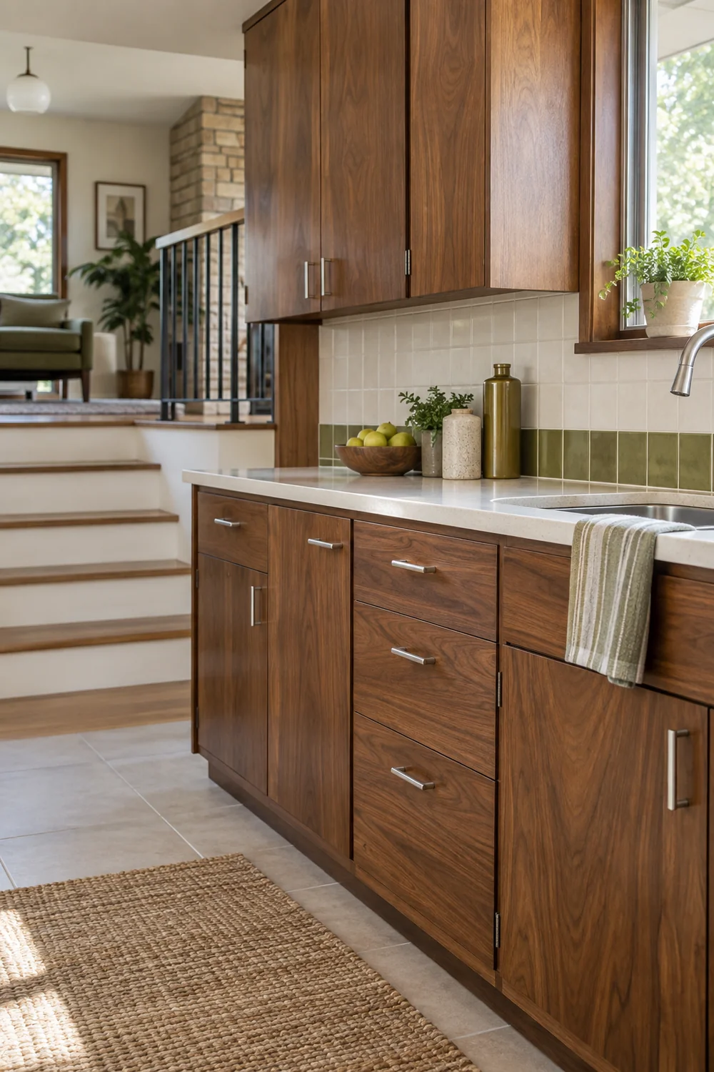
Repeat a material across the level change with restraint. A walnut cabinet face in the kitchen might relate to a dining sideboard, while the same pale wall colour holds both spaces together. Do not make every surface match. Variation helps the dining platform feel like a room of its own. The important relationship is visual continuity from the place where a person stands at the step: the cabinet tone, floor and table should look considered together.
Test samples from both levels and from the two principal viewing directions. A finish that looks balanced close to a kitchen window may become heavy when seen from the lower room. Photograph the samples in clear daylight, then check them with the planned task and dining lights on. Keep the comparison to a few realistic combinations so the decision remains tied to the architecture. Colour is the last part of the plan to settle, after the wall, work surface and threshold are credible.
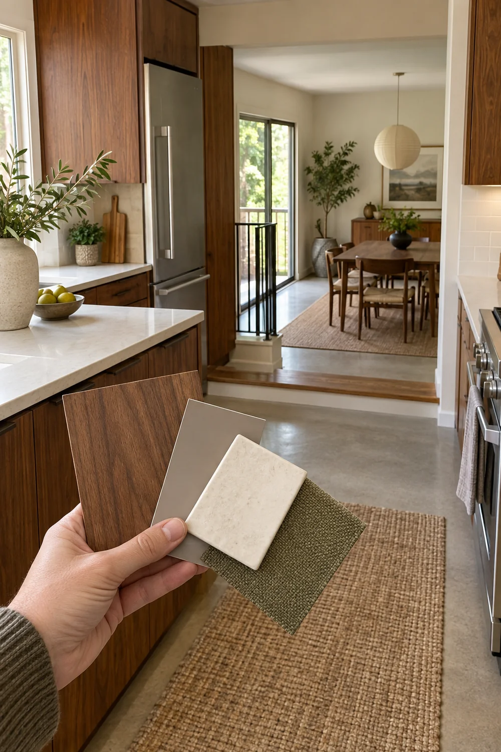
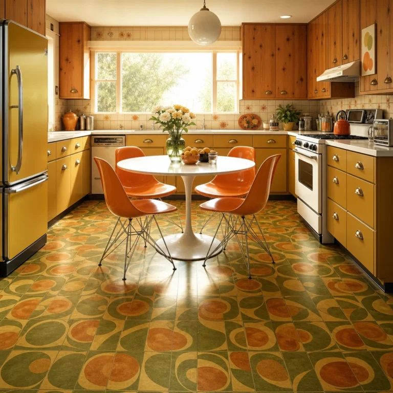
Flooring deserves an early place in the technical discussion because it meets the existing step and both room levels. The final material may affect door clearances, transitions and how the edge is detailed. Review its suitability with the professionals doing the work, then compare finishes in the light and colours of the actual house. The 70s kitchen flooring gallery provides period inspired directions. Select from it only after the level change and threshold have been resolved.
Make a lighting plan for tasks and movement rather than a row of attractive pendants. The preparation surface needs clear working light; the sink and range need light that does not leave a person working in their own shadow. The step and route into the dining room need to remain legible when daylight changes. A dining pendant can provide a separate centre of gravity, but it should not be the only source that makes the level transition visible. Put the proposed light positions on the same measured plan as the furniture.
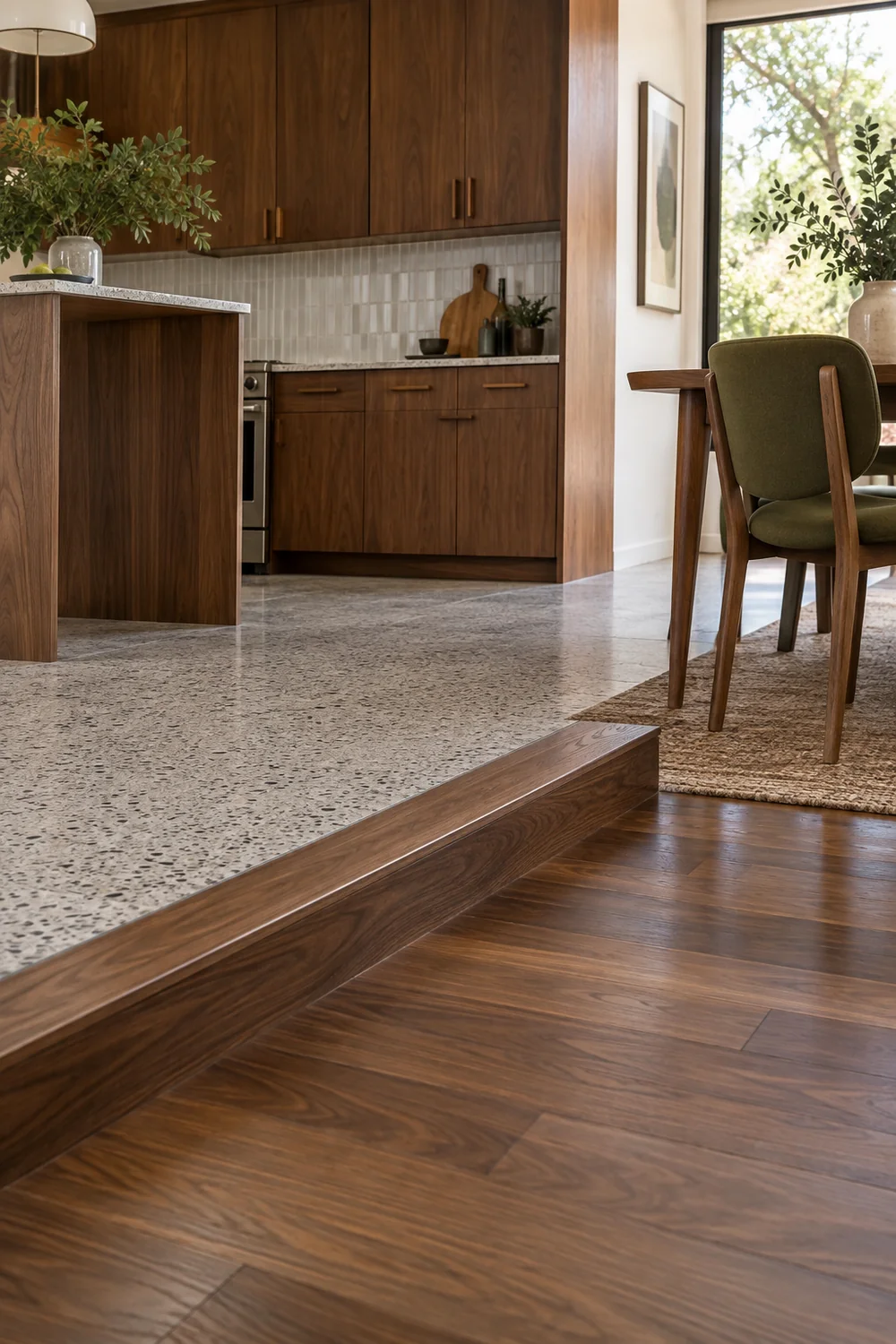
Sequence the remodel in decisions. First document the existing room and get any needed professional assessment of walls, services and steps. Next compare the opening options and choose the work zone. Then resolve the dining route, floor transition and lighting positions. Only after those relationships are credible should you finalise cabinetry, finishes and decorative details. This order protects you from buying a cabinet run that assumes a wall opening or floor level that cannot be delivered as drawn.
Prepare a concise brief for quotes. Include the measured plan, photographs from both levels, the preferred layout and one fallback, the functions you want to retain, and a list of technical unknowns. Ask bidders to identify what they have included and what still depends on investigation. You are not asking a picture to solve a building problem. You are asking a professional team to price a clearly described project while keeping the design decisions visible.
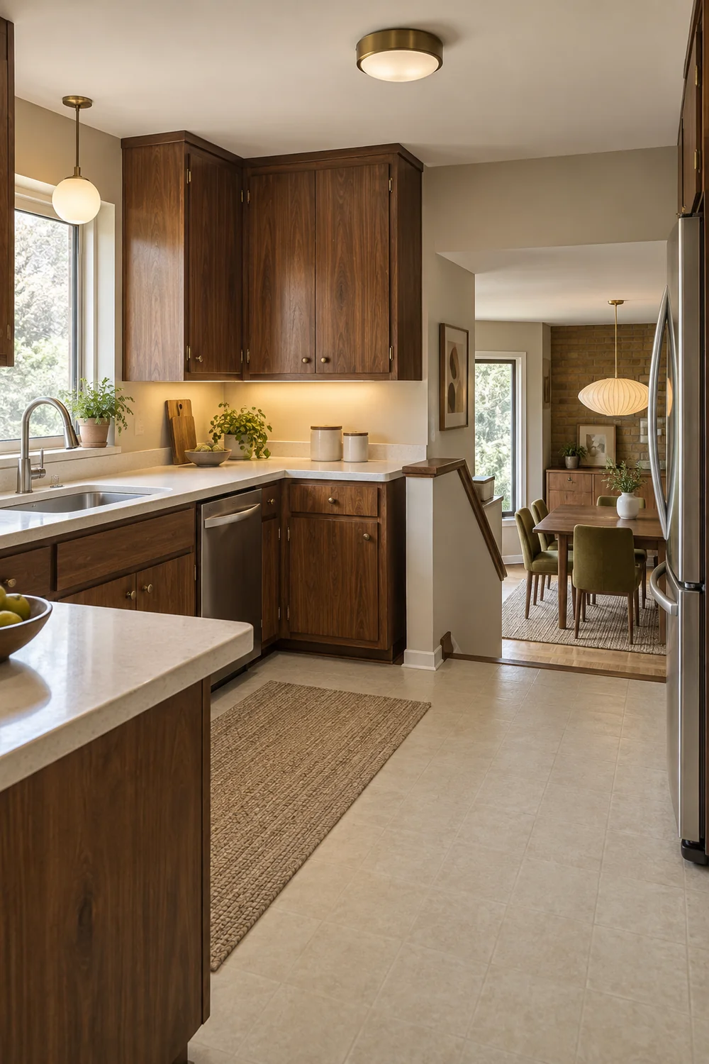
Before approving the final drawing, walk through the proposed day once more. Bring groceries in, prepare a meal, set the table, clear the plates and move through the rooms while someone else occupies the kitchen. Check the island or peninsula, the step, the occupied chairs and the light at each point. If the plan passes those ordinary moments, the remodel is likely to feel more successful than a layout chosen only for its widest camera angle.
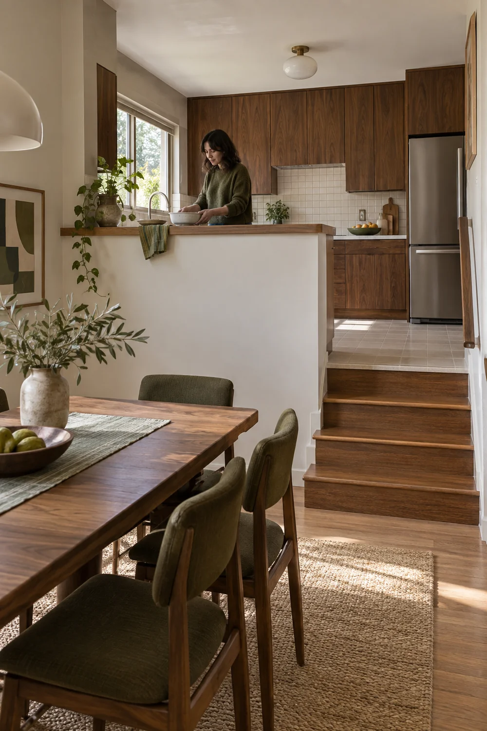
Your 1970s home does not need to pretend the two levels are one flat room. A good split level kitchen remodel makes the connection understandable and useful. Keep the original architecture visible on the plan, choose the degree of openness that improves daily life, and let the cabinets and colours follow that decision. Take the measured drawing, one preferred option and one fallback into the professional conversation. That gives you a practical way to resolve the unknowns before paying for finishes. The result can feel both unmistakably of its house and comfortably ready for the way you use it now.