I have always loved the moment you walk into a hallway that stops you in your tracks, and a black mirror black hallway does exactly that. There is something about deep, dark walls paired with reflective surfaces that makes even the narrowest corridor feel like a destination rather than just a passage. In this piece I walk through looks that range from sleek slat walls to ornate gold mirrors to moody limewash finishes, and every single one is a look you can borrow for your own home.
How a Black Mirror Turns Your Hallway Into Something You Actually Stop to Look At
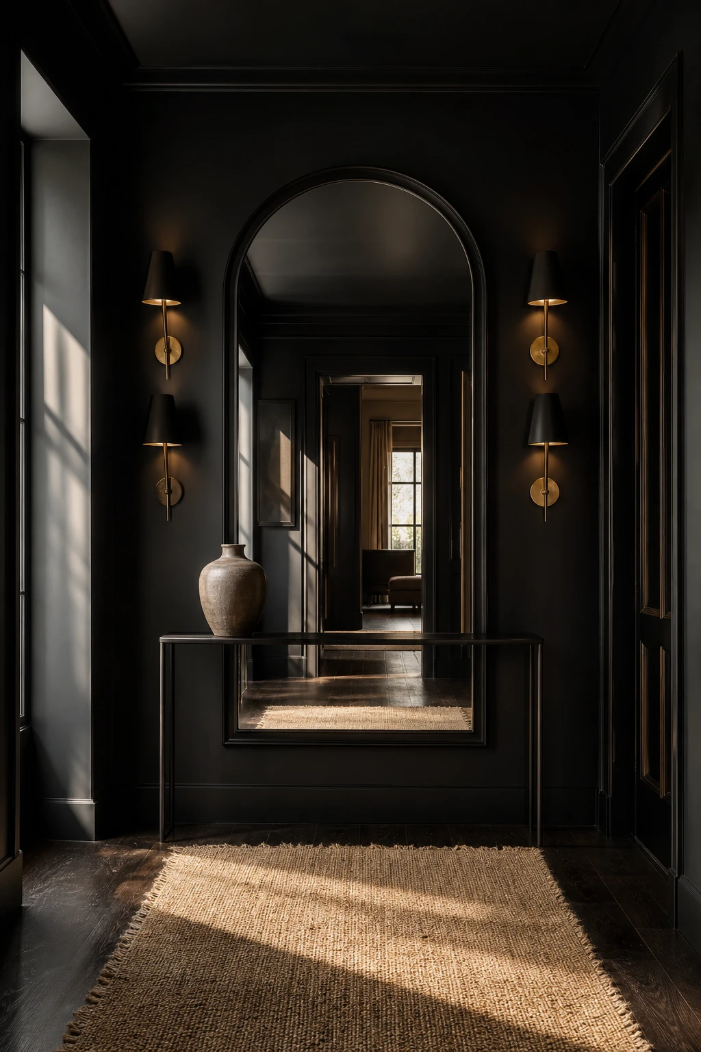
Anchoring a hallway with one oversized black framed mirror is a move I come back to again and again, because it does two things at once: it pulls the eye straight to one bold point and opens the space with reflected light. You get drama without a single extra object on the wall. The arch softens the strong frame so the whole thing feels considered rather than heavy, and that balance is what stops people in their tracks.
The Key Details
Oversized arched black framed mirror
Slim dark console table
Brass wall sconces
Aged jute runner on dark hardwood
Single sculptural vase
Pro TipHang the centre of the mirror at eye level, roughly 150 to 155 cm from the floor, so the reflection catches the room behind you rather than the ceiling.
AvoidPositioning the mirror too low drops its visual weight down to furniture level, where it reads as an afterthought rather than the statement piece the whole hallway is built around.
The First Thing Guests See and Why a Black Mirror Entryway Gets It Right
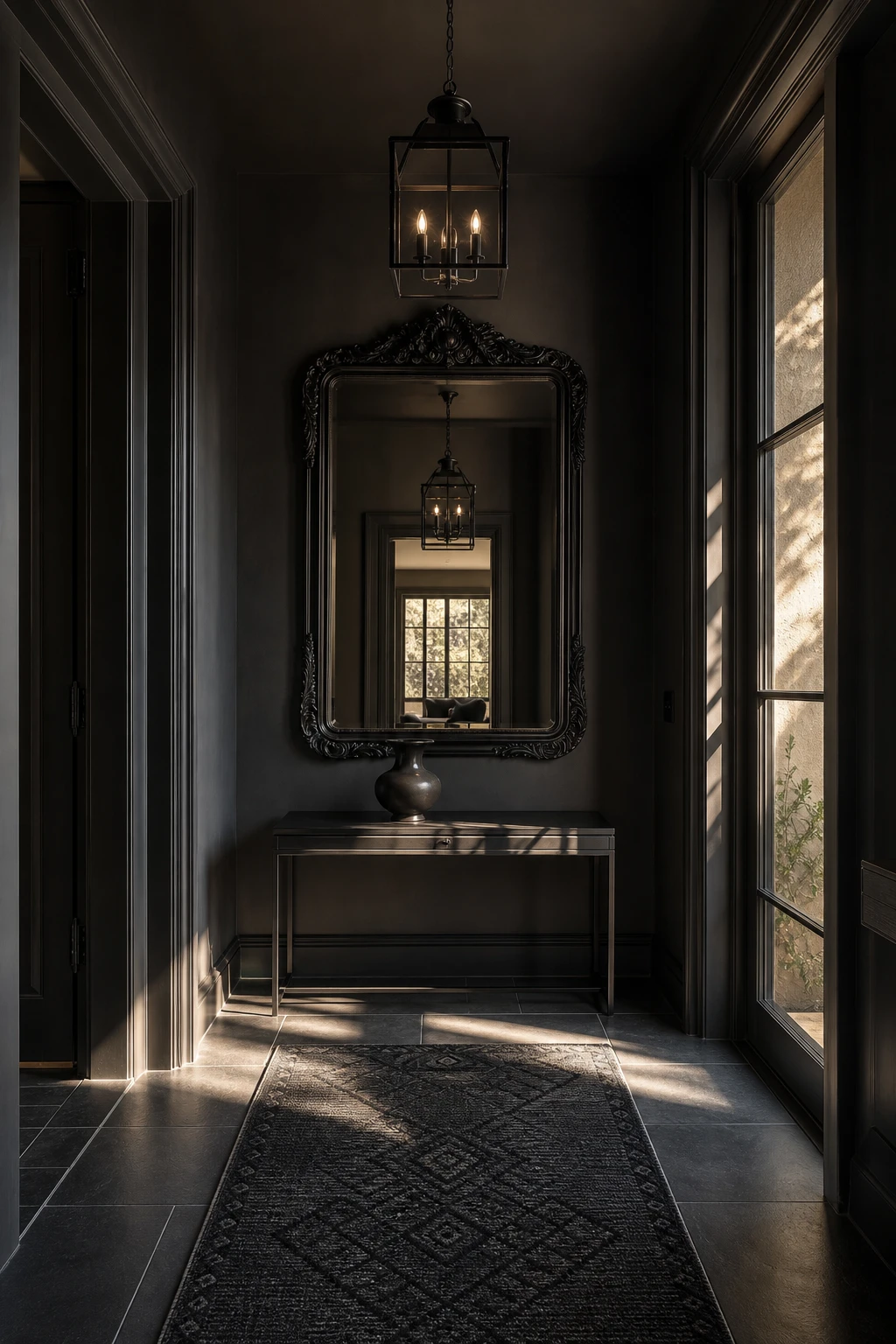
A mirror at the entry does something no other piece can: it pulls the outside world in and hands it straight back, doubled and dramatic. What I love about a black frame here is the way it signals intent, telling guests before they have even taken their coat off that this home means it. You get that rare first impression where the space feels both bigger and more considered, and the dark surround keeps the reflection crisp rather than lost in a pale wall.
The Key Details
Ornate black framed mirror
Black iron pendant lantern
Slender black console table
Charcoal geometric runner rug
Honed slate floor tiles
Pro TipPosition one pendant lantern directly above or just in front of the mirror so the light source bounces back into the hall and the entry glows twice as warm with half the fittings.
AvoidPiling a console with keys, post, and decorative objects right beneath the mirror shrinks the visual breathing room and turns what should be a strong focal point into background clutter.
Small Black Hallway Ideas That Make a Tight Space Feel Bigger and Bolder
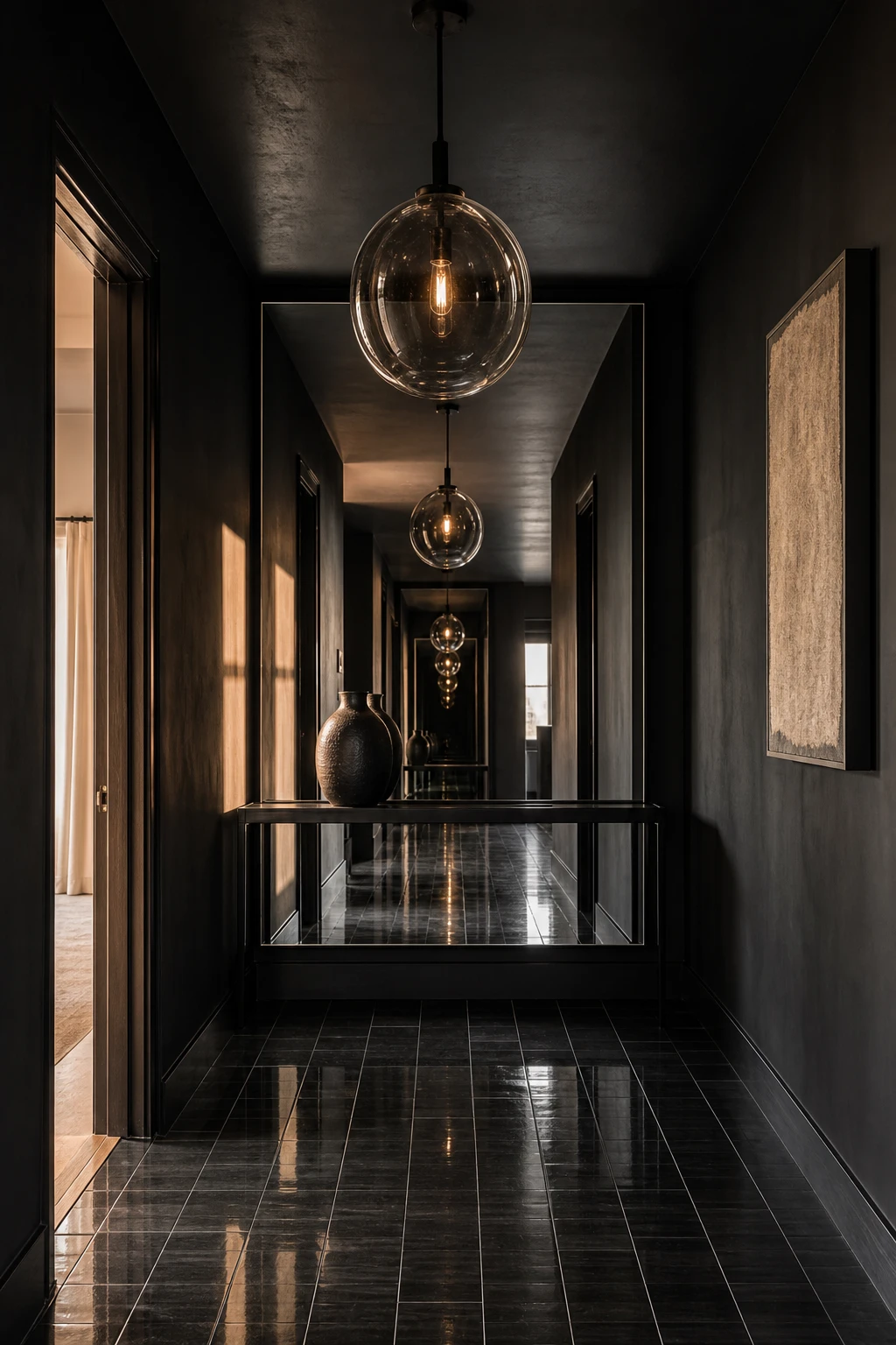
Dark walls in a small hallway stop the space from fragmenting into competing edges, and that calm unity is something I keep recommending to clients who think they need to go light to go large. The walls recede, the room reads as one whole, and the sense of depth that pale paint simply cannot fake takes over. A mirror running floor to ceiling doubles that depth, so you feel the corridor stretch rather than close in on you.
The Key Details
Floor to ceiling frameless mirror
Slim iron console table
Oversized blown glass pendant
High gloss narrow porcelain floor tiles
Sculptural single stem vase
Pro TipRun narrow vertical tile or a slim beaded strip from skirting to cornice to pull the eye straight up and make the ceiling feel miles away.
AvoidClustering too many small accessories on the floor eats into the footprint and makes even the boldest colour scheme feel cluttered and cramped.
A Narrow Hallway Actually Suits This Modern Look Better Than a Wide One
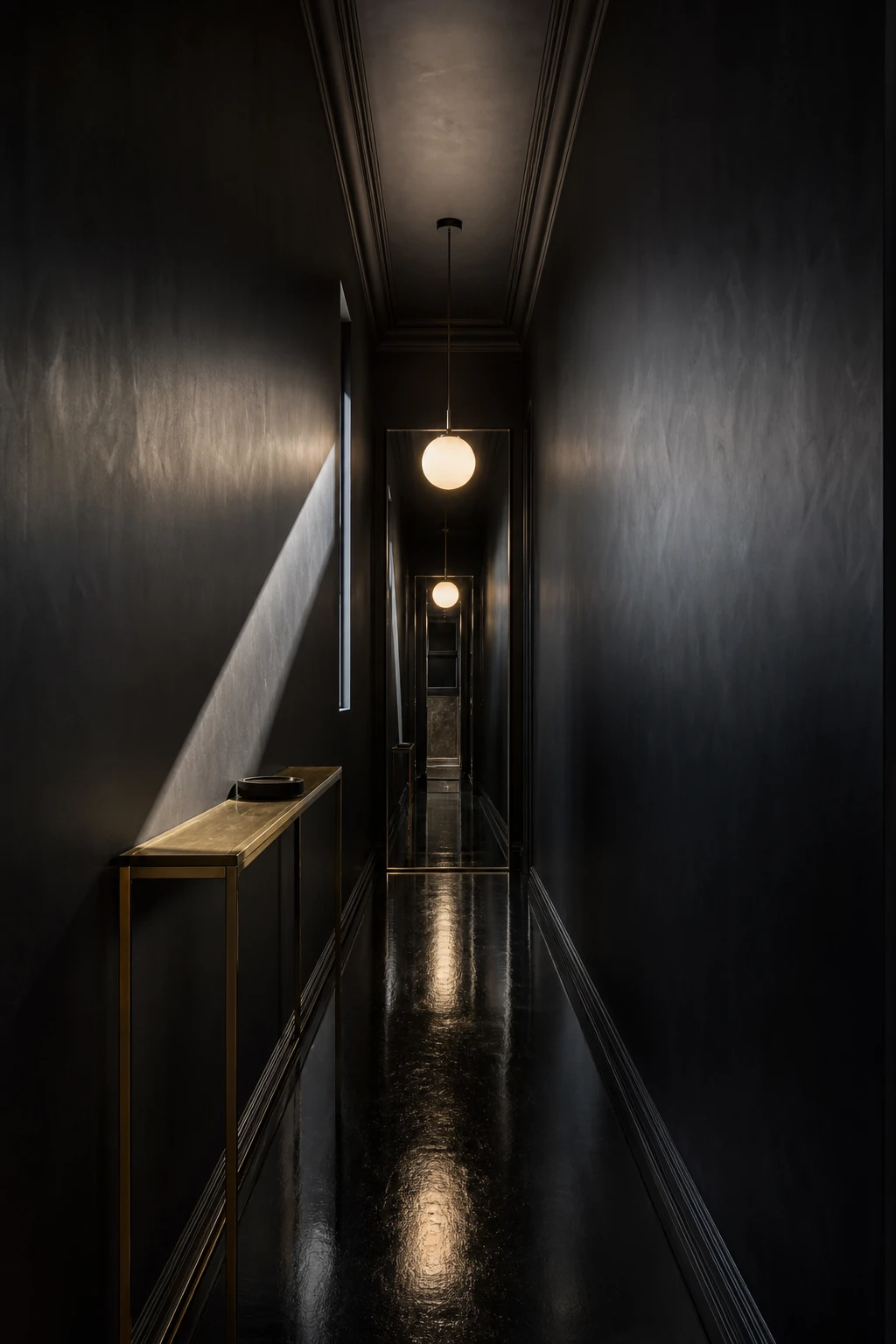
Narrow hallways get a bad reputation, but what I love about them is the way they already do half the work for you. That tight corridor pulls the eye straight ahead and creates a natural tunnel of shadow and reflection that wider spaces simply cannot fake. You feel it the moment you step in, a sense of arrival, of moving through something rather than just standing in it. The proportions and the dark finish work together, and the result is genuinely compelling.
The Key Details
Razor thin brass console table
Oversized globe pendant on fabric cord
Glossy lacquered floor runner
Frameless full height mirror
Slim slot window with diagonal light stripe
Pro TipRun one continuous matte black treatment the full length of your longest wall, no breaks, no panels, so the eye travels uninterrupted from door to end and the corridor reads as much longer than it is.
AvoidMixing three or four different wall finishes down a narrow corridor chops the space into short segments, which kills the tunnel effect and makes the hallway feel cluttered rather than considered.
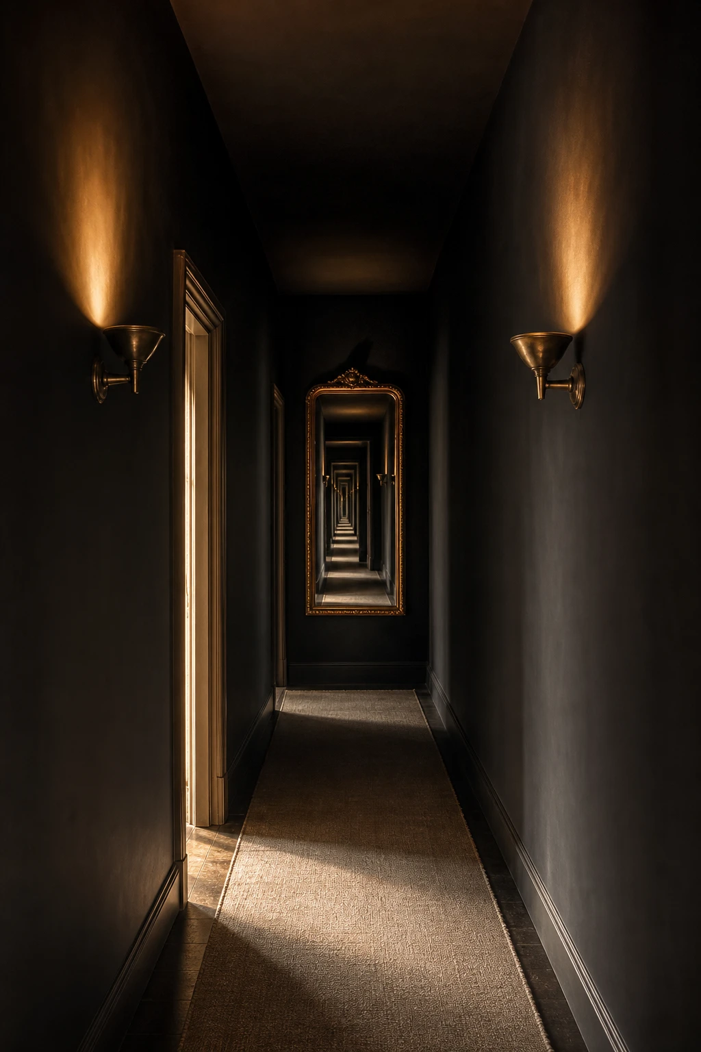
What Happens When You Line a Hallway With Mirrors From End to End
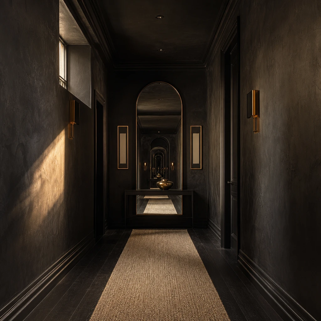
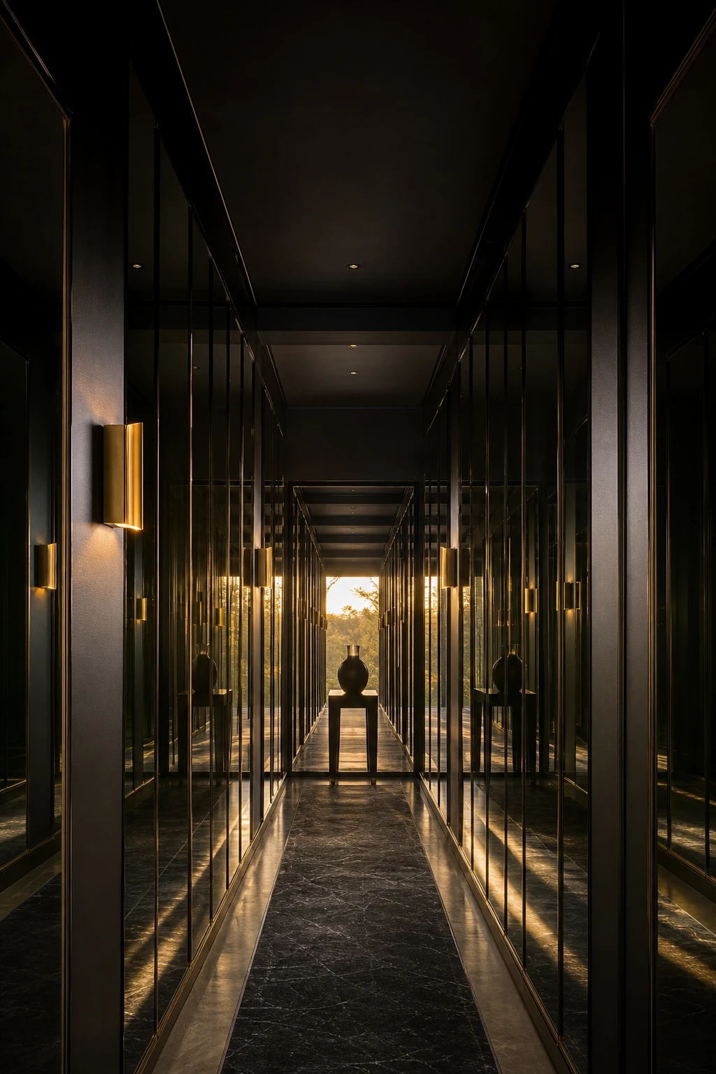
Lining a corridor with mirrors from end to end is one of my favourite moves in a dark hallway, because the repetition does something almost architectural. The black walls deepen every reflection so you get richness rather than the harsh brightness you would expect in a pale room. That is the detail that wins me over: the space stops feeling like a passage and starts feeling like a destination, and it happens the moment someone steps through the door.
The Key Details
Floor to ceiling frameless mirrors
Burnished brass wall sconce
Obsidian stone runner
Slender console table
Sculptural ceramic vase
Pro TipHang mirrors at two or three different heights along the run so the eye travels up and down the wall as well as forward, giving the whole corridor a collected, gallery feel.
AvoidMatching every frame identically turns the arrangement into a grid, and a grid reads as a showroom wall rather than a considered space.
Why a Full Length Mirror Is the One Thing a Dark Hallway Should Never Skip
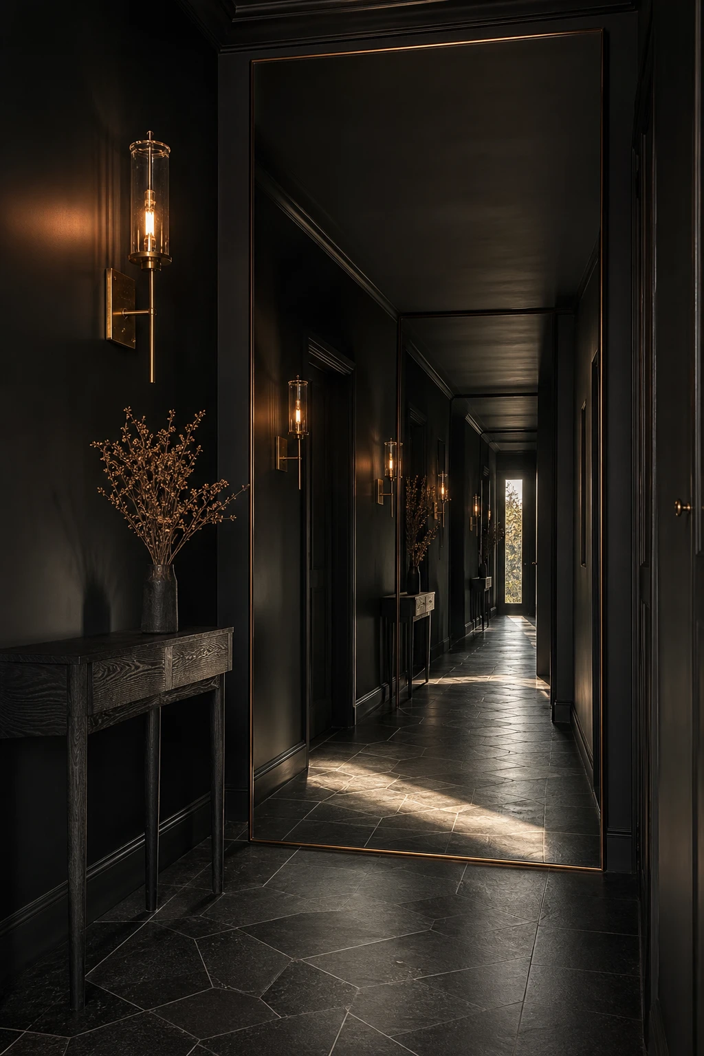
A floor to ceiling mirror is the one move I keep coming back to in a dark corridor. You get the practical check before you leave the house, but the real win is spatial: the reflection doubles the depth of the hallway so it reads as a proper room rather than a pinched passageway. What I love most is how a bevelled edge catches the sconce light and throws warm slivers of gold across those dark walls, adding life without adding clutter.
The Key Details
Floor to ceiling bevelled mirror
Aged brass wall sconce
Blackened oak console table
Geometric slate tile floor
Dried botanical arrangement
Pro TipLean the mirror against the wall rather than fixing it in place so you can angle it slightly forward, which pulls in the ceiling and makes the corridor feel even taller.
AvoidPlacing the mirror directly opposite the front door bounces a flat, cold wash of daylight straight back at anyone arriving, which kills the moody, considered atmosphere you have worked hard to build.
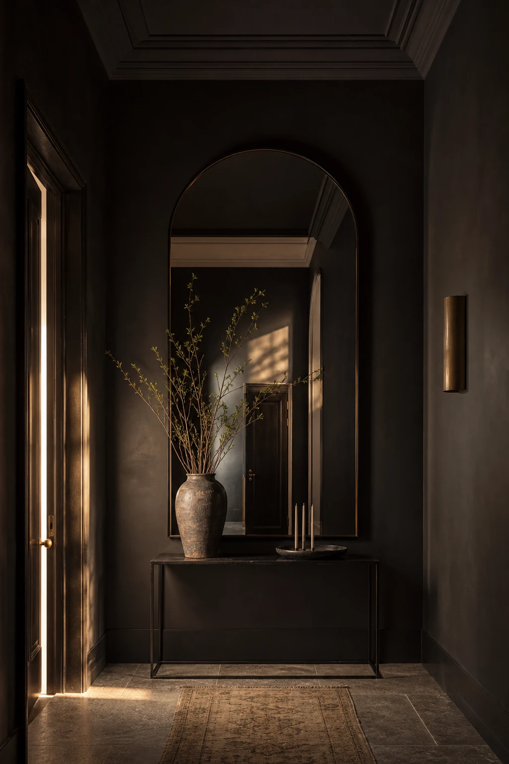
An Arch Mirror Does Something to a Hallway That a Rectangle Simply Cannot
That curved top on an arch mirror pulls the eye upward and breaks the hard geometry of black walls in a way no rectangle ever could. You get a shape that feels almost architectural, like a doorway to somewhere, without laying a single brick. What I love most is how the soft curve holds its own against deep colour rather than disappearing into it, and the whole arrangement ends up feeling composed rather than just decorated.
The Key Details
Floor to ceiling arched mirror
Blackened steel console table
Tall ceramic vase
Taper candles in a low dish
Honed stone floor tiles
Pro TipIf your hallway already has an arched doorway, match the mirror’s curve as closely as you can and the two will echo each other in a way that feels completely intentional.
AvoidChoosing a mirror that runs too close to the ceiling or the edges of the wall leaves no breathing room, and the whole composition feels wedged in rather than placed.
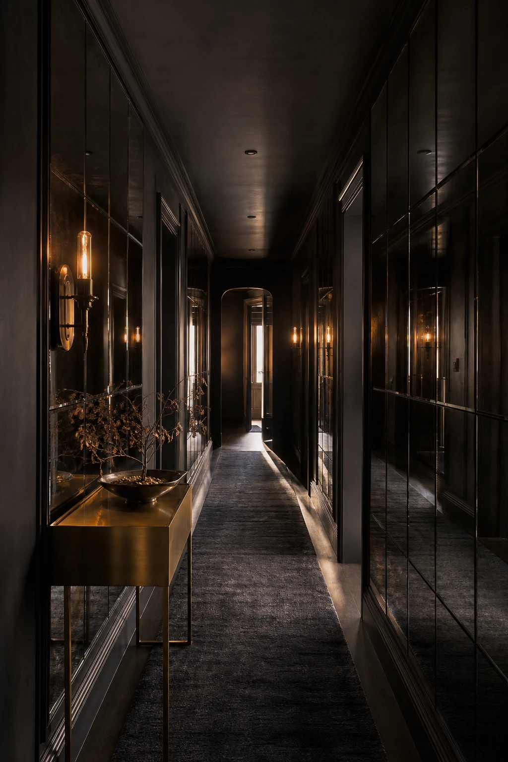
Black Panel Mirror Walls Feel Luxurious and They Are Easier to Pull Off Than You Think
Mirrored panels arranged in a grid pull off something clever: your eye reads them as a single built in feature rather than individual pieces stuck to a wall. What I love is how the smoked glass keeps the reflection moody rather than harsh, so you get depth and drama without the space feeling like a dressing room. The grid lines do the heavy lifting, giving the whole wall a bespoke, architectural quality that looks genuinely expensive.
The Key Details
Smoked glass mirror panels in floor to ceiling grid
Brushed brass slim console table
Single sculptural brass wall sconce
Deep charcoal textured wool runner
Dried botanical arrangement in shallow decorative bowl
Pro TipFrame each panel with thin black timber or metal trim before you fix it to the wall, and the joins look like a deliberate design decision rather than a gap you hoped nobody would notice.
AvoidStandard bathroom mirror tiles have a thin, plasticky edge that reads as a budget fix the moment the light catches them, and no amount of styling around them will rescue the wall.
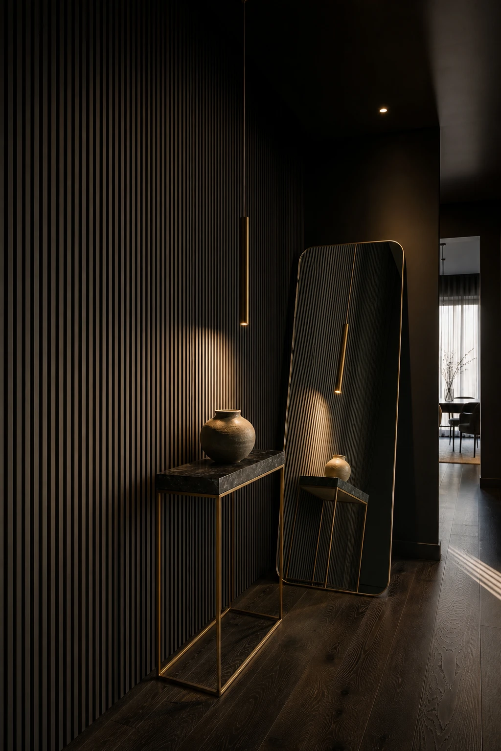
Pair a Slat Wall With a Mirror and the Whole Hallway Comes Alive
Rough against smooth is one of those contrasts that stops people in their tracks, and a slat wall next to a mirror is exactly that. The ridged timber breaks up the flatness of a dark hallway while the mirror bounces light back through all those grooves, so the texture reads deeper and richer than it ever would alone. You get two surfaces doing completely different things, and each one makes the other look better for it.
The Key Details
Vertical timber slat wall panel
Oversized leaning floor mirror
Slim console table with ceramic vessel
Narrow pendant light
Dark engineered oak flooring
Pro TipPaint the slat wall the same black as your surrounding walls and the grooves disappear into shadow, giving you pure texture rather than a panel that looks like it was added as an afterthought.
AvoidSlats in a warm honey or natural wood tone will pull against a cool dark palette and the whole wall will read as an accent you changed your mind about halfway through.
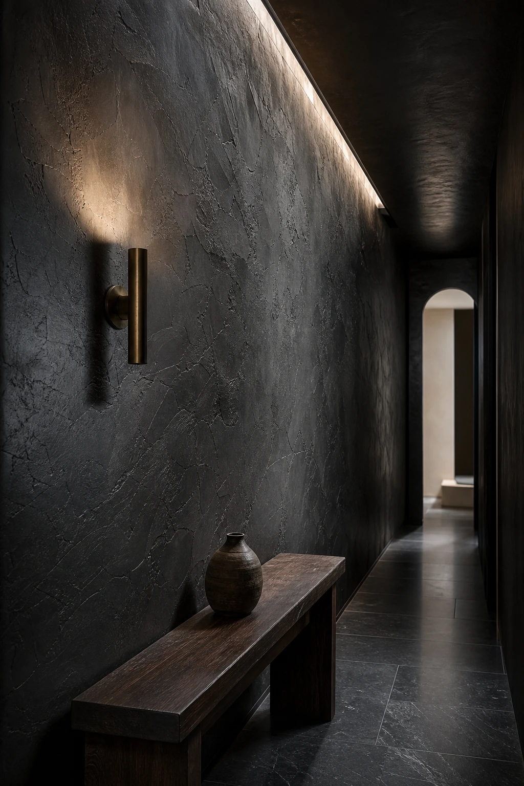
Black Venetian Plaster Gives a Hallway Wall a Depth That Flat Paint Simply Cannot Reach
Venetian plaster in black is one of those finishes that genuinely stops people in the hallway, and I think it’s because the wall never looks quite the same twice. Morning light pulls out a slate undertone, and by evening the surface deepens into something almost liquid. You get that sense of movement without anything physically changing, which is what I love about texture over flat pigment. The burnished layers catch and release light in a way paint simply cannot replicate.
The Key Details
Burnished Venetian plaster walls
Aged brass wall sconce
Darkened oak console table
Honed charcoal slate floor
Tall arched doorway
Pro TipSeal the finished plaster with a satin topcoat rather than matte to bring out that signature marble like sheen and protect the surface from scuffs in a busy hallway.
AvoidSkipping a proper skim coat before you apply the plaster means every existing bump gets amplified, and the finished wall will look uneven rather than luxurious.
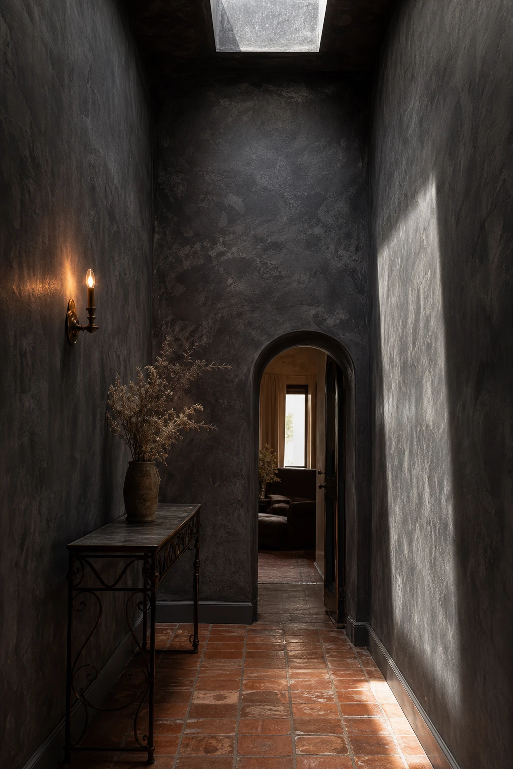
Dark Grey Limewash Walls Feel Ancient and Cool and Completely at Home in a Modern Hallway
Limewash is one of those finishes that makes a wall feel like it has a past, and that quality is what I reach for when a dark hallway risks feeling flat or heavy. The colour shifts as the light moves through the day, cloud soft in the morning and almost moody by evening. You get warmth without adding warmth, if that makes sense, because the texture does the emotional work that a plain painted wall simply cannot.
The Key Details
Limewash plaster walls
Wrought iron console table
Terracotta tile floor runner
Arched doorway
Aged brass wall sconce
Pro TipApply limewash in loose circular strokes, then take a dry brush and buff back lightly before it fully sets, because that is what creates the cloudy gradation of tone that makes the finish look ancient rather than applied.
AvoidRolling limewash on like standard emulsion flattens out all the handmade variation and leaves you with an expensive paint job that looks like a cheap one.
Painting Walls and Ceiling Black in a Hallway Is Bolder Than It Sounds and Better Than You Expect
Painting the ceiling black is the move most people stop just short of, and I think that hesitation is the only thing standing between a good hallway and a great one. The moment that top edge disappears, you get a real cocoon, walls and ceiling folding into one continuous surface with no white lid cutting the room in half. What I love is how the sconces and the gilt mirror seem to float inside the dark, pulling all the warmth forward so the space feels curated rather than heavy.
The Key Details
Burnished brass wall sconces
Pale stone runner over dark stained oak floorboards
Antique gilt framed mirror
Seamless wall to ceiling paint junction
Matte plaster finish on all surfaces
Pro TipRoll the ceiling in the same black but one sheen level higher than the walls so the two planes read as distinct without any contrast in colour breaking the cocoon.
AvoidKeeping the ceiling white while the walls go black creates a harsh, blunt edge at the top that sits on the space like a dropped ceiling and undoes all the drama you were aiming for.
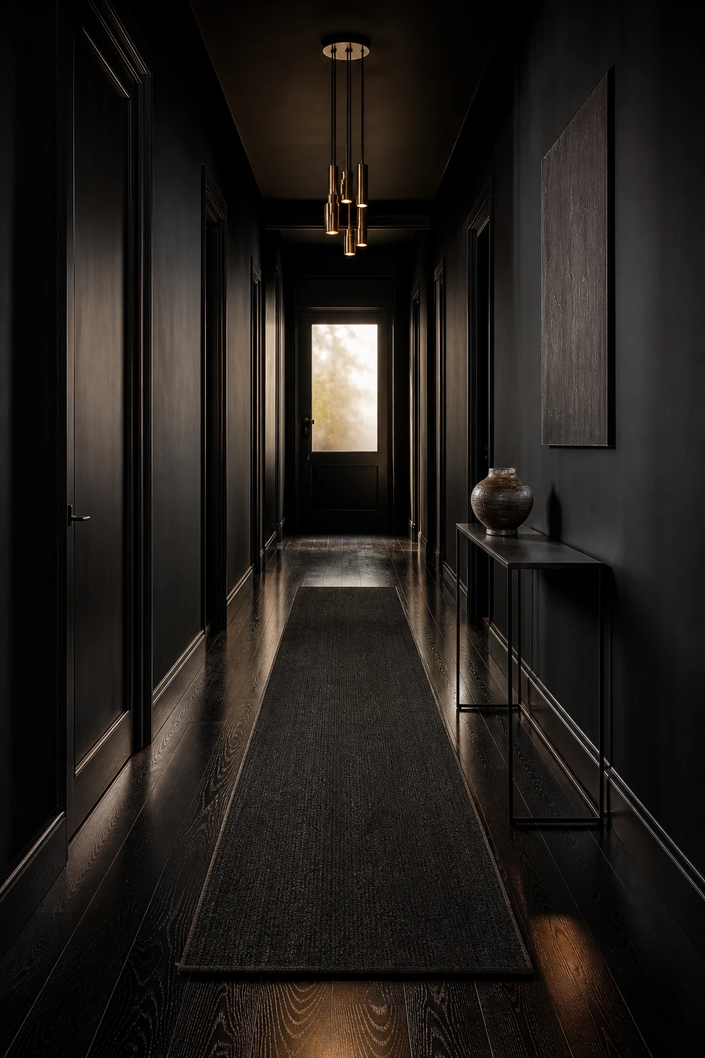
Black Stained Wood Floors Ground a Hallway in a Way Nothing Else Quite Does
Dark stained floors do something to a hallway that no paint colour or wallpaper can quite match, and it is one of my favourite upgrades to recommend when someone has tired oak underfoot and a limited budget. The depth pulls your eye straight down the length of the space, making it feel longer and more deliberate. What I love most is the contrast: a floor this dark makes every lighter element above it, a pale wall, a brass fitting, a frosted window, look almost luminous by comparison.
The Key Details
Ebony stained oak plank flooring
Aged brass cluster pendant
Blackened steel console table
Charcoal wool runner rug
Frosted transom window
Pro TipFinish your stained floor with a matte sealer rather than gloss, because it gives the wood a rich, natural ebony look instead of the plastic sheen you get from lacquered furniture.
AvoidSkipping the sanding stage before applying a dark stain is a mistake that shows immediately, because any existing residue or uneven grain grabs the colour inconsistently and leaves a patchy result that reads as accidental rather than considered.
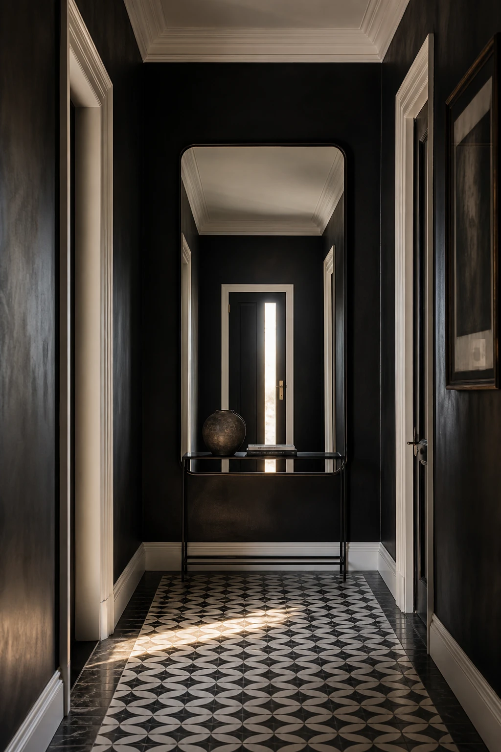
Black and White in a Hallway Is a Classic for a Reason and There Is a Wrong Way to Do It
Monochrome contrast is one of those combinations that looks effortless when the ratio is right, and the ratio is almost always more black than you think. What I love about pushing the walls deep and letting white come in through the trim, the ceiling and a light fitting is that the contrast feels considered rather than graphic. You get drama without the space tipping into something cold, and the eye travels across the room rather than splitting in half at a hard line.
The Key Details
Slim black frame statement mirror
Geometric black and white encaustic floor tiles
Matte black iron console table
White painted ceiling coving and skirting boards
Deep black limewashed plaster walls
Pro TipLet white earn its place through coving, skirting and a pendant shade rather than a full painted wall, and the whole hallway will read as intentional rather than half finished.
AvoidSplitting black and white exactly down the middle, say black below a dado and white above, gives the hallway the look of a grid rather than a room, and no amount of styling will rescue it.
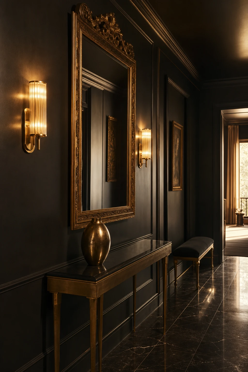
Gold Accents Against a Black Wall Are the Combination That Makes a Hallway Feel Genuinely Luxurious
Gold against black is one of those pairings that stops people in the doorway, and what I love most is why it works: warm metal in a dark space behaves like candlelight, throwing a soft glow that flat colour simply cannot fake. You get depth and richness at the same time, each finish making the other look more considered. The thing I always check is that every gold piece reads from the door, so the warmth lands the moment someone steps inside.
The Key Details
Ornate gilt framed mirror
Paired brass wall sconces
Gold legged console table
Honed marble floor tiles
Velvet upholstered bench
Pro TipChoose brushed or satin gold over polished finish, because the softer surface drinks in the light rather than bouncing it, and that is what gives a black hallway its sense of quiet luxury.
AvoidSlipping even one silver or chrome piece into the mix pulls the eye away from that warm and dark relationship and the whole scheme starts to feel unresolved rather than intentional.
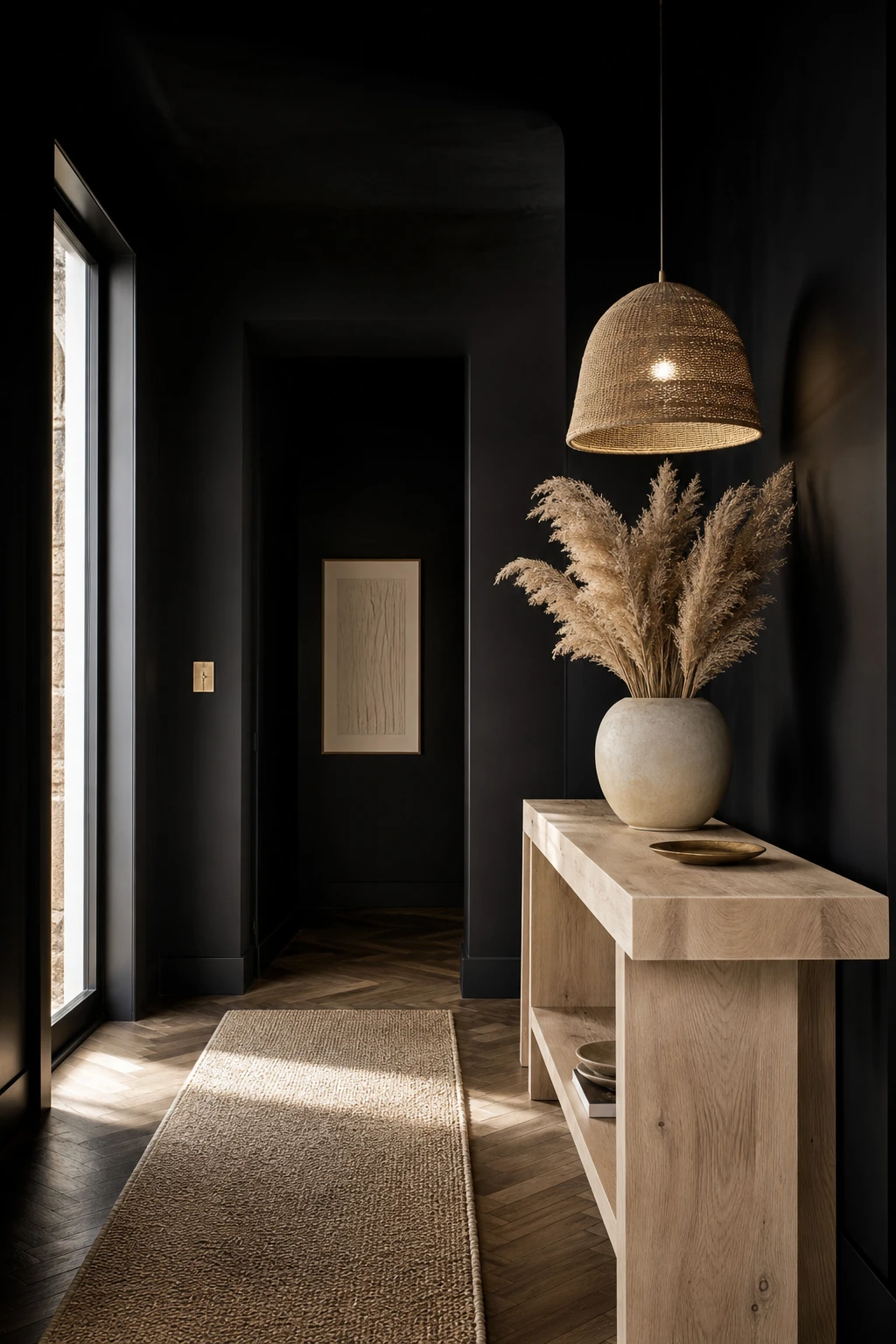
Light Wood Against Black Walls Is the Pairing That Stops a Dark Hallway Feeling Heavy
Pale wood against black walls is one of those pairings I keep coming back to, because it does something no other material quite manages: it stops the darkness from closing in. You get the drama of an all black hallway but the wood pulls in warmth and a sense of living, breathing nature that softens everything around it. What wins me over every time is how the contrast feels balanced rather than forced, the light grain catching the eye just enough to make the space feel curated and human.
The Key Details
Bleached oak console table
Rattan woven pendant light
Natural fiber hallway runner
Aged herringbone timber floor
Dried pampas grass in raw ceramic vase
Pro TipChoose a console or floor with visible, open grain rather than a flat sealed veneer, so the natural warmth reads clearly against the dark walls and does not disappear into them.
AvoidLayering in too many wood pieces at once turns a considered pairing into a cluttered look, and the warmth you were after gets lost entirely.
A Black Console Table Does More Work in a Hallway Than Any Other Single Piece of Furniture
A console table is the piece I always specify first in a hallway, because it gives the eye somewhere to land and the room somewhere to begin. What I love here is how the ebonised oak reads as furniture rather than just storage, which instantly lifts the corridor into a proper room. You get a composed surface, a reflected depth from the mirror above, and a sense of arrival that a bare wall can never give you.
The Key Details
Ebonised oak console table
Tall leaning rectangular mirror
Oversized matte stoneware vase
Slim brass wall sconces
Honed limestone floor tiles
Pro TipChoose a console with slender, tapered legs so the floor tiles remain visible beneath it, keeping the hallway feeling open rather than blocked.
AvoidPlacing too many objects on the surface turns a considered vignette into a dumping ground, and the whole sense of calm that made the console worth having simply disappears.
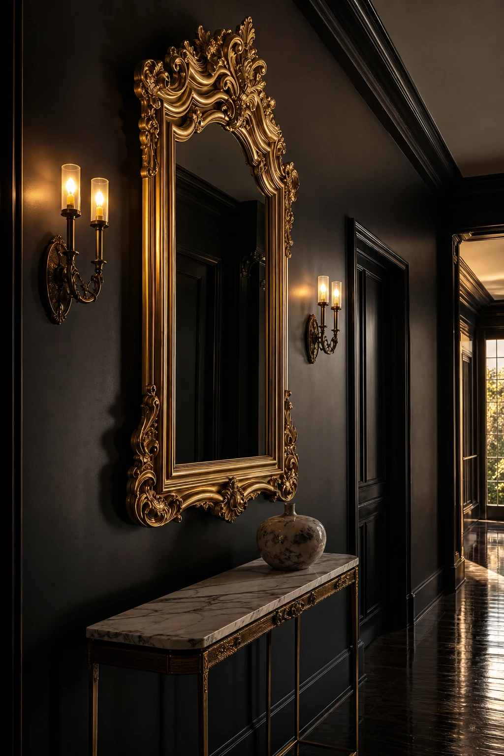
An Ornate Gold Mirror on a Black Wall Is One of Those Pairings That Just Works Every Single Time
Ornate gold against black is a combination that earns my trust every time, because the dark wall does all the heavy lifting. Every carved leaf, every scrolled edge you would barely notice on cream suddenly reads with real clarity, and you get a frame that looks twice as detailed as it actually is. That clarity is what I love most: the gold stays warm rather than flashy, held in place by all that depth around it.
The Key Details
Carved gilt wood mirror frame
Marble topped console table
Paired brass wall sconces
Sculptural ceramic vessel
Polished plaster wall finish
Pro TipHang the mirror at eye level rather than centred on the wall height, and it immediately feels chosen rather than installed.
AvoidPlacing equally ornate lighting beside a heavily carved gold mirror splits the room’s focus and leaves both pieces looking cluttered rather than considered.
A Well Styled Coat Rack Keeps a Dark Entryway Practical Without Ruining the Mood
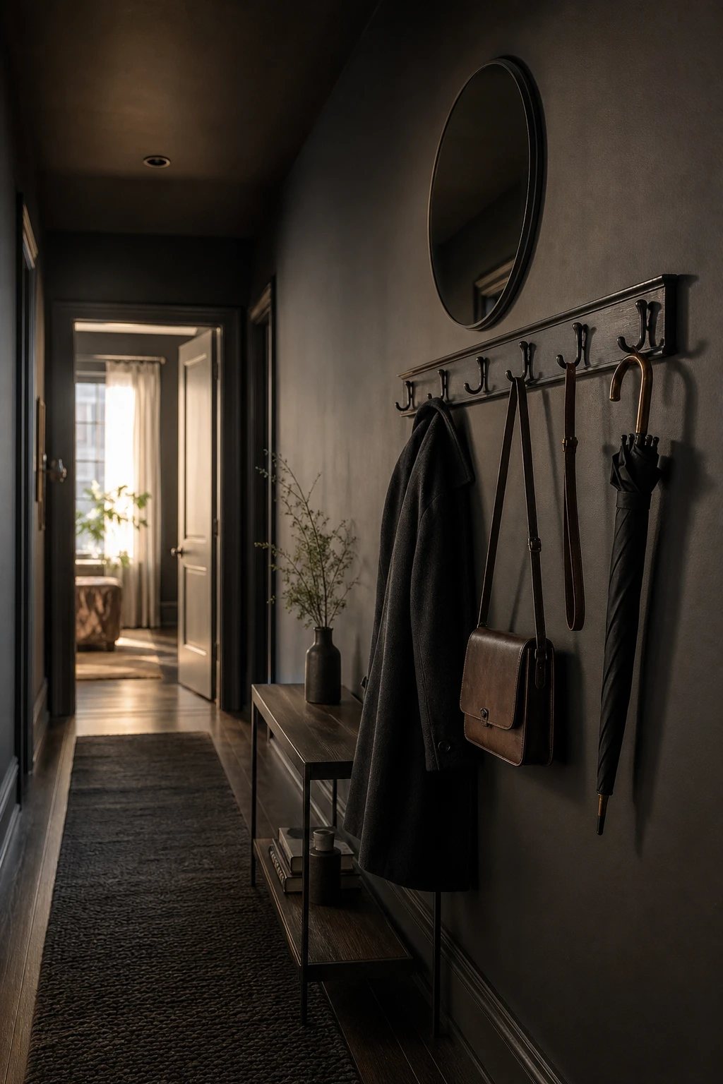
Coat hooks earn their place in a moody hallway the moment you stop treating them as a chore and start treating them as part of the wall composition. What I love here is how the cast iron rail reads as a deliberate horizontal line rather than a bolted on afterthought. You get function and drama at once, and the dark metal pulls the whole palette together so nothing feels out of place.
The Key Details
Cast iron hook rail
Bevelled round mirror
Charcoal wool runner rug
Dark stained hardwood floor
Shallow console table with ceramic dish
Pro TipMount your hook rail onto a slim panel of painted MDF or dark stained timber so it sits proud of the wall as a framed feature rather than a bare fixing.
AvoidA freestanding coat stand placed in a narrow corridor cuts the sight line and makes even a generous hallway feel pinched and cluttered.
Recessed Ceiling Lights Are the Secret That Makes a Black Hallway Glow Rather Than Disappear
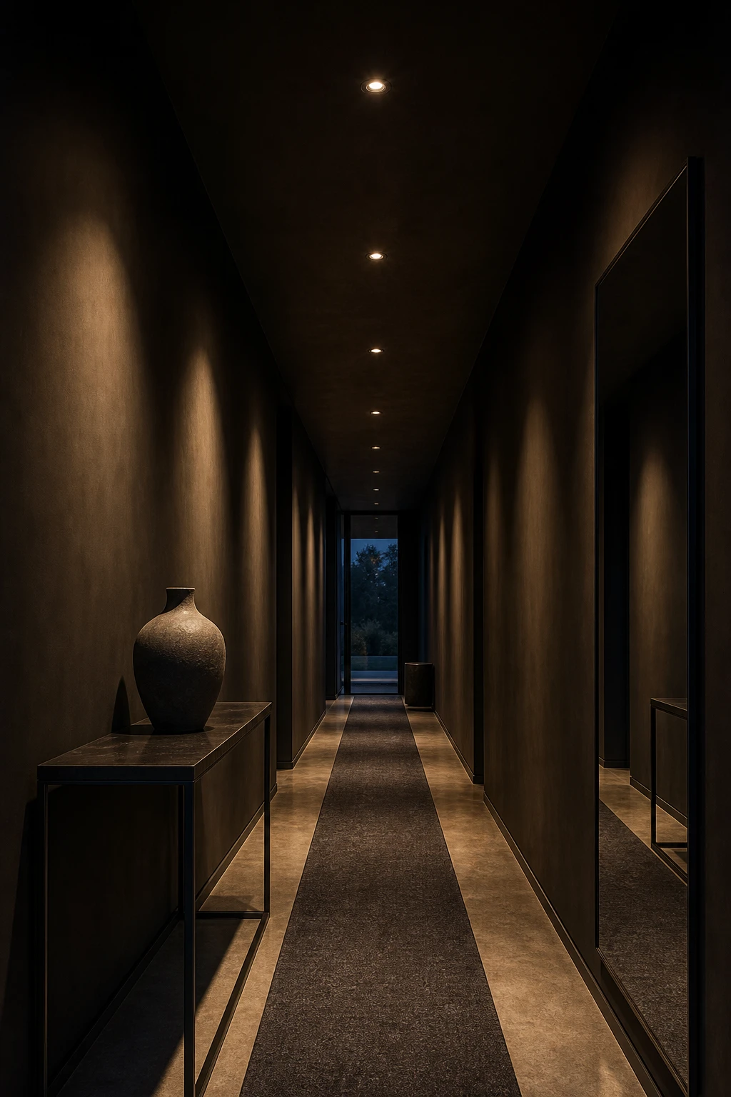
Recessed downlights disappear into a black ceiling and let the light itself do all the talking, which is what I love most about this approach. Each fitting throws a soft pool of warmth onto the floor below, and you get a corridor that feels like a sequence of lit moments rather than one flat tunnel. Watch how the eye moves naturally from pool to pool, pulling you forward through the space with a rhythm that feels almost cinematic.
The Key Details
Flush recessed ceiling downlights
Polished concrete floor
Blackened steel console table
Frameless full length mirror
Charcoal wool runner
Pro TipChoose bulbs at 2700K or below so the light reads as genuinely warm rather than the cold, bluish tone that kills the mood in a dark hallway.
AvoidSpacing your downlights too far apart leaves heavy dark patches between each pool, and those gaps make the hallway feel unfinished and slightly unsettling rather than dramatic.
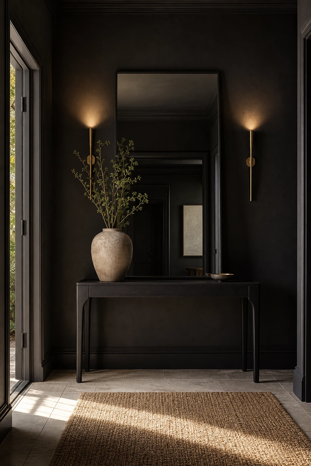
Lighting a Mirror Directly Changes the Entire Feeling of a Dark Entryway
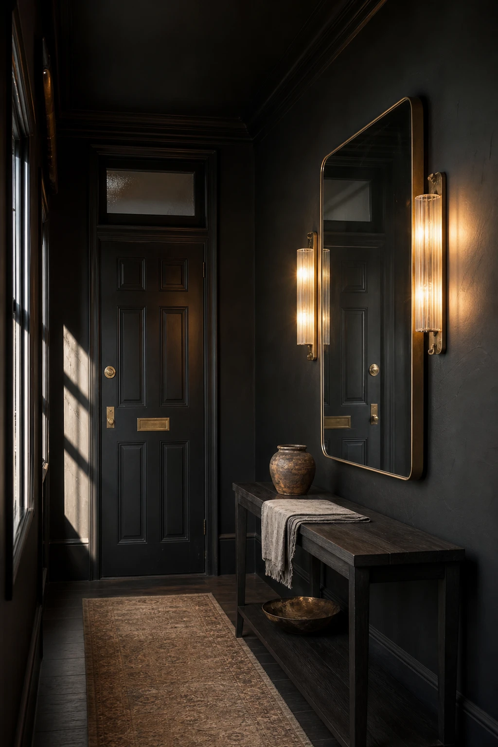
A mirror with its own light source stops being a mirror and becomes something closer to a painting. What I love about flanking sconces is the way they throw a warm, even glow across the glass without any ceiling shadow cutting across a face. You get that soft, lit from the sides quality that feels cinematic rather than functional, and suddenly the hallway announces itself as a proper room.
The Key Details
Brass wall sconces flanking mirror
Large rectangular wall mirror
Slim dark console table
Sculptural ceramic vessel
Panelled door with brass hardware
Pro TipPosition wall sconces at eye level on either side of the mirror so the light grazes the glass evenly and flatters anyone checking their reflection on the way out.
AvoidA backlit bathroom mirror brings a cold, clinical ring of light that fights against a moody black palette and makes the whole entryway feel like a hotel washroom.
An Orb Light Hanging in a Black Hallway Looks Like Something From a Very Good Hotel
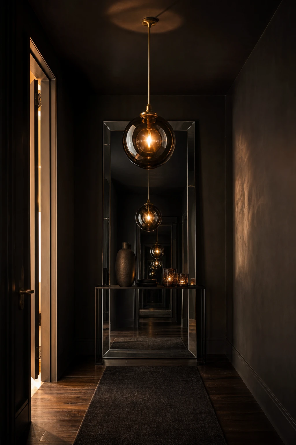
A globe pendant in a black hallway earns its place three times over. The orb itself is a sculpture you read from the moment you open the front door. Then the dark walls throw the warm glow back, and a mirrored surface doubles the whole scene so one light behaves like several. That multiplication of warmth is what I find so satisfying here: a narrow corridor quietly becomes something that feels genuinely generous.
The Key Details
Smoked glass globe pendant
Polished brass ceiling fitting
Full length bevelled mirror
Blackened steel console table
Charcoal wool runner
Pro TipChoose an orb with a visible Edison filament or a smoked amber glass shade, because a cool white bulb inside a beautiful fitting still reads as a bare utility light.
AvoidPitching the pendant too low in a corridor saves no one any trouble and turns a beautiful fitting into something guests duck around all evening.
The Trick Luxury Hotels Use in Their Corridors That Works Just as Well at Home
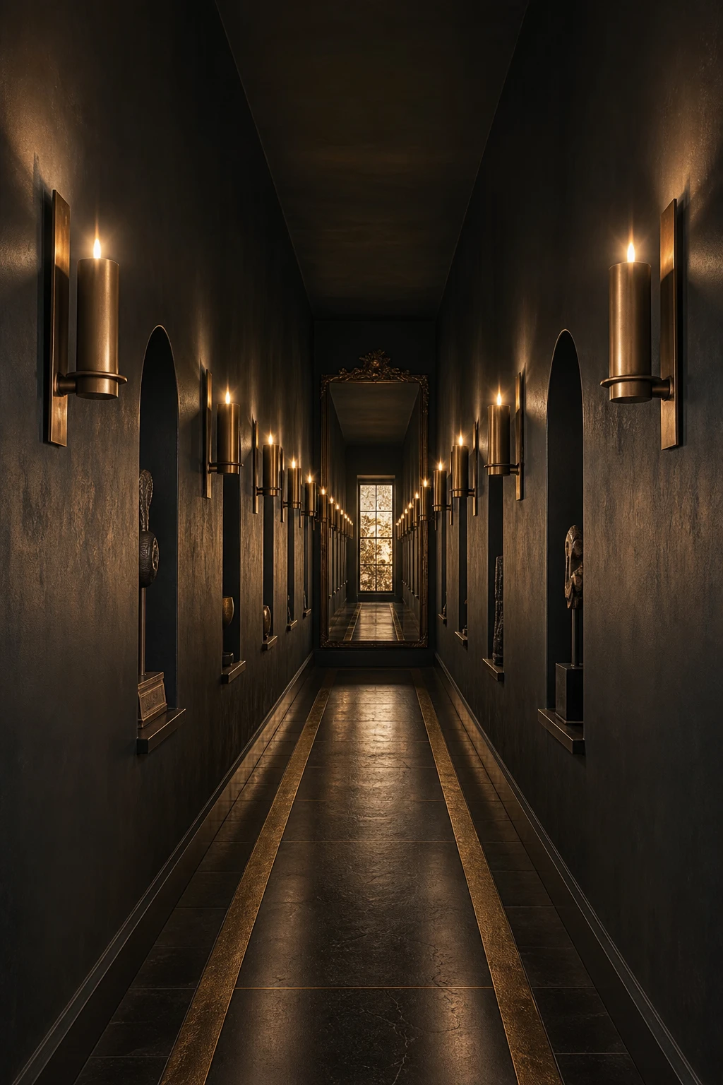
Hotels crack the dark corridor problem through repetition, and it is one of my favourite tricks to bring into a home hallway. When the same sconce appears at even intervals down the wall, your eye locks onto the rhythm and reads the space as deliberate rather than dim. You get that satisfying pull toward the end of the corridor, which actually makes the whole run feel longer and grander. Pair that with a consistent surface treatment, same wall tone, same floor, same ceiling, and every element reinforces the next.
The Key Details
Symmetrical bronze wall sconces
Polished dark stone floor with brass inlay runner
Slim arched wall niches with sculptural objects
Antique mirror at corridor terminus
Painted ceiling matched to walls in one envelope
Pro TipSpace your sconces at equal intervals and hang them all at exactly the same height so the perspective lines up and draws the eye beautifully down the corridor.
AvoidSwapping in a different fitting halfway down the hall breaks the rhythm instantly and makes the whole corridor read as an afterthought rather than a considered space.
What Moody Interior Design Actually Means and How to Get It Without Going Too Far
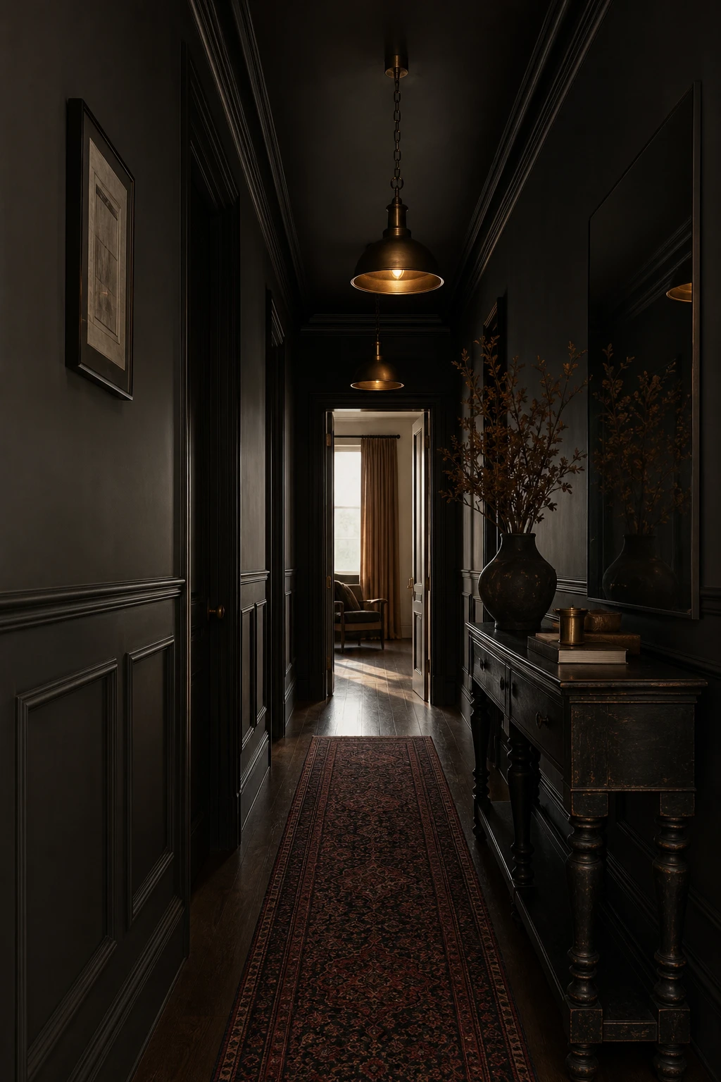
Moody design is really about layers, and that distinction wins me over every time I put a dark hallway together. You are not painting everything black and calling it done. What you are doing is stacking charcoal panelling against a deeper wall tone, placing a hand knotted runner that introduces texture and a slightly warmer hue, then letting aged brass catch the light just enough to lift the whole space. Watch how those shifts in tone keep the eye moving rather than landing on one flat, heavy surface.
The Key Details
Painted wood wall panelling
Hand knotted wool runner rug
Aged brass cluster pendants
Ebonised oak console table
Frameless smoked mirror
Pro TipBring in a wool runner with at least one warm undertone, taupe, rust or ochre, and the whole palette will soften without losing any of its moody edge.
AvoidMatching every surface in the same flat dark finish strips the space of all depth, leaving you with a hallway that feels more like a cave than a considered room.
A Witchy Hallway Is the Dark Maximalist Version of This Look and It Is Easier Than It Appears
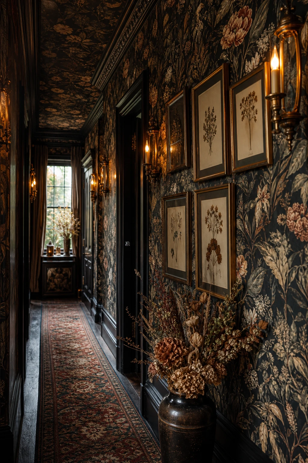
Witchy maximalism wins me over every time because the layers do the heavy lifting together rather than competing. Botanical prints, candlelight sconces, and dark dried florals read as collected and intentional when they share a colour story of deep greens, oxblood, and aged brass. You get richness without chaos because every element belongs to the same moody palette. The trick I always check is that at least one surface stays clear so the eye can rest before it moves on.
The Key Details
Dark botanical wallpaper floor to ceiling
Aged brass candle style wall sconces
Salon wall of gilded framed botanical prints
Oxblood and forest green Persian runner
Dried flower arrangement in glazed ceramic urn
Pro TipUse dried botanicals and dark dried flowers in vases rather than living plants, because low light corridors are tough on anything that needs to grow.
AvoidFilling every single surface leaves the eye nowhere to land, and a hallway that should feel dramatic starts to feel genuinely stressful to walk through.
Raw and Industrial in a Dark Hallway Looks Intentional When You Know the One Rule
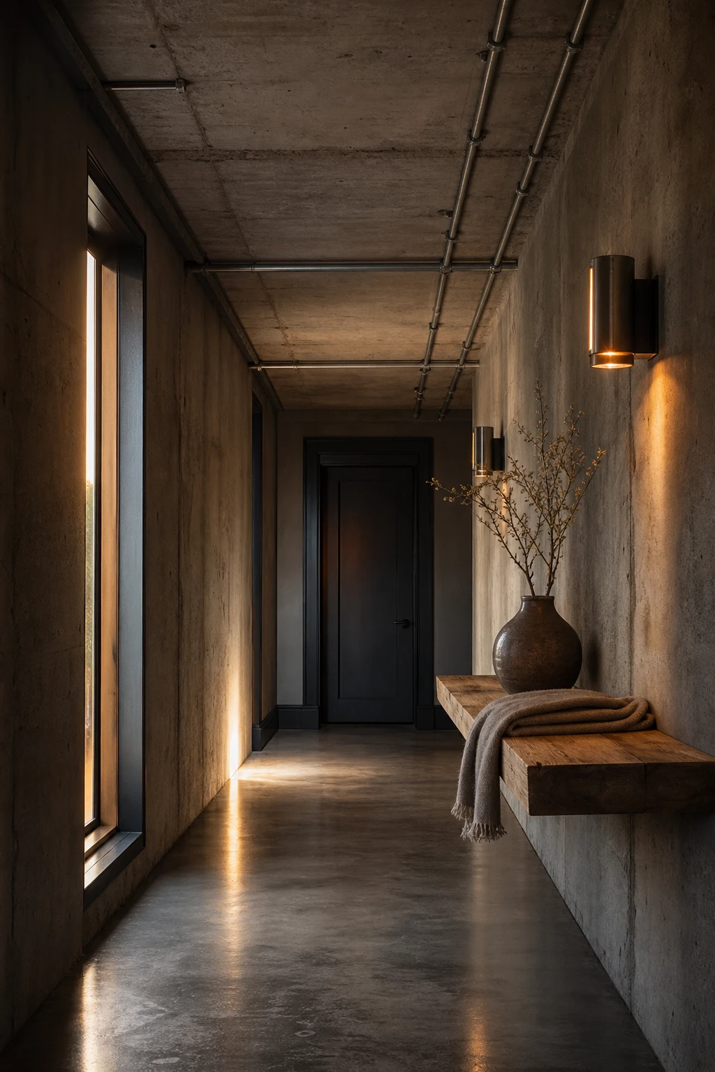
Raw concrete and exposed metal in a dark hallway can feel cold and abandoned, but the moment you add one warm material, reclaimed oak in this case, the whole space shifts from unfinished to intentional. That single warm note is what I always check for before signing off on an industrial scheme. You get all the edge and texture of the raw surfaces, and the wood quietly tells the eye that someone made a considered choice here.
The Key Details
Exposed steel conduit ceiling run
Brushed iron wall sconces
Reclaimed oak floating shelf
Poured and sealed concrete floor
Raw concrete feature wall
Pro TipSpecify black powder coated metal for every fitting, hook, and bracket so all the industrial pieces share one visual language rather than looking like a collection of mismatched hardware.
AvoidLeaving concrete walls or floors genuinely unsealed means they shed dust and deteriorate visibly over time, which turns a bold design choice into something that simply looks neglected.
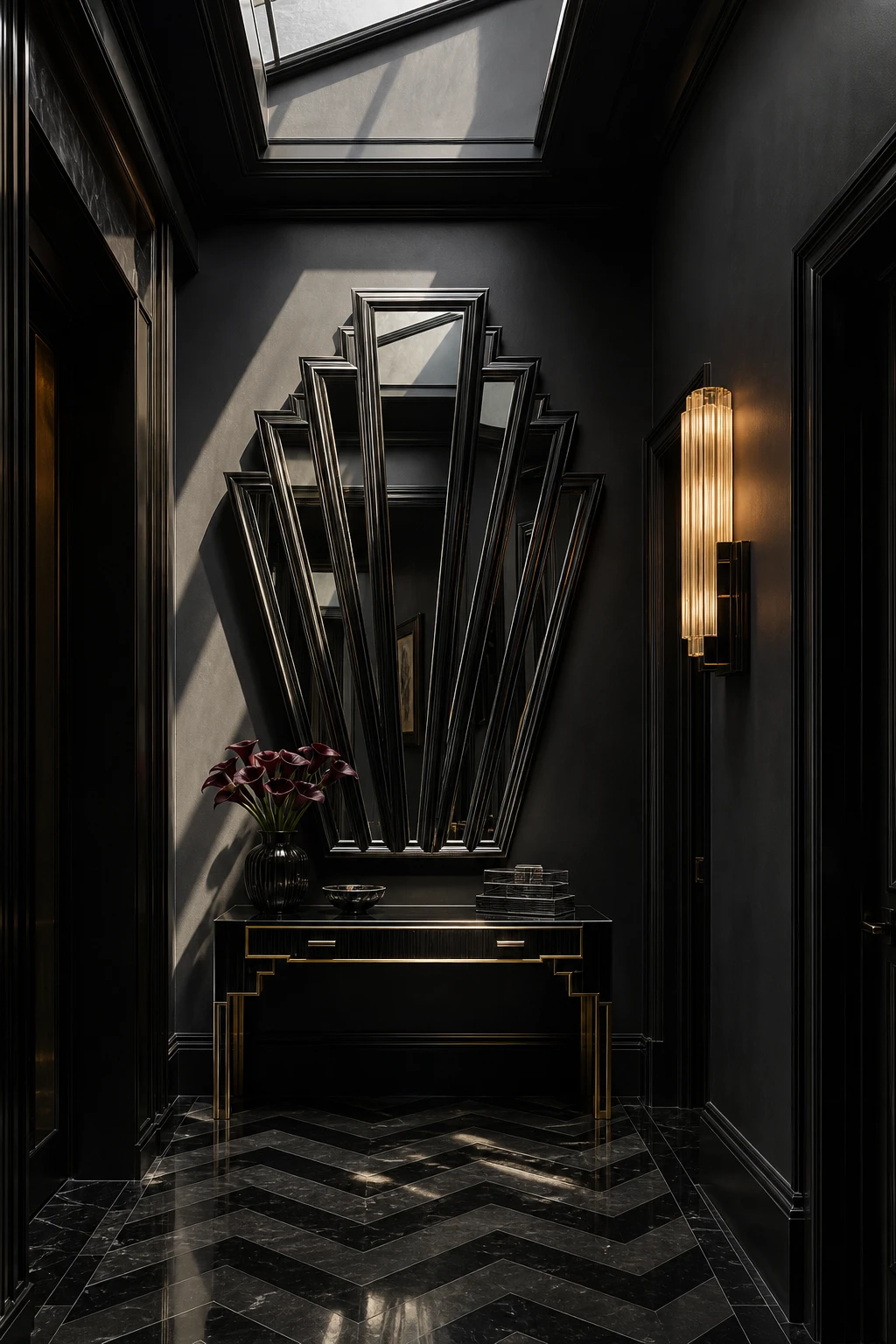
Contemporary Art Deco in a Black Hallway Brings a Glamour That Feels Fresh Rather Than Dated
Art Deco geometry wins me over every time in a dark hallway because the shapes do the decorating for you. Fans, chevrons, and stepped forms catch light at different angles, so you get depth and movement without adding a single extra colour. What I love is how the repetition of one motif ties the whole space together, making it feel considered rather than busy. You walk in and sense opulence immediately, not a museum, just a very confident room.
The Key Details
Fan motif stepped wall mirror
Chevron black and charcoal floor tiles
Lacquered console table with brass legs
Fluted plaster wall sconce
Skylight with geometric cornice detail
Pro TipPick one Art Deco motif, a fan, a chevron, or a stepped arch, and echo it in two or three spots so the room feels composed rather than collected.
AvoidLeaning too heavily on period reproduction pieces, the ornate clocks, the tasselled lampshades, tips the hallway from glamorous into costume, and the whole effect loses its freshness.
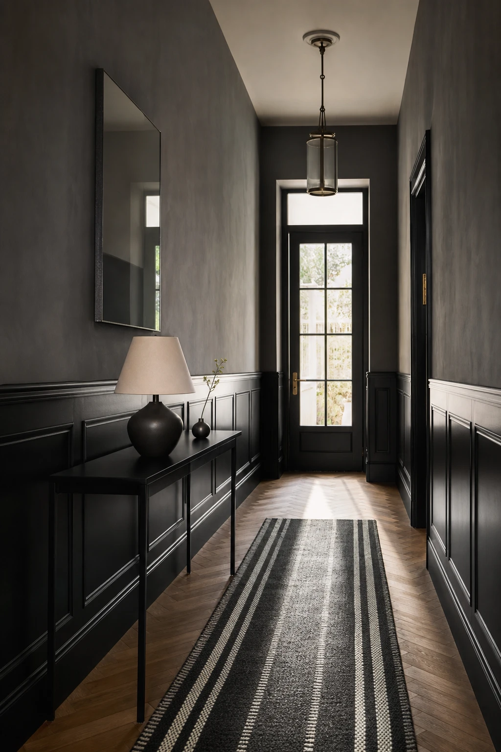
Two Tone Walls Give a Black Hallway a Tailored Look That Single Colour Rooms Cannot Match
Dividing a hallway wall into two tones is one of my favourite moves for making a corridor feel considered rather than just painted. The darker lower half grounds the space and hides scuffs, while the slightly lighter upper half lifts your eye and makes the ceiling sit higher than it actually is. You get all the drama of a black hallway without it ever feeling like a tunnel.
The Key Details
Slim black console table
Sculptural ceramic table lamp
Narrow striped wool runner
Frameless rectangular wall mirror
Herringbone oak floor
Pro TipRun the division exactly along an existing dado or picture rail so the boundary between tones is a clean architectural line rather than a painted edge that wobbles under close inspection.
AvoidPicking two tones too close in value means the eye cannot find the division, and the whole effect reads as an accidental inconsistency in the paint rather than a deliberate design decision.
Alan launched Edward George London in 2017. Since completing his masters in Town & Regional Planning (MPlan) he has combined the skills he learned at the University of Sheffield with his passion for design, to help create a foundation for those looking to create a beautiful home.