I’ve always thought a blue English country bedroom has a particular kind of magic to it, the way it feels cool and calm in summer but cosy and wrapped up in winter all at once. What I love is how many different blues can carry that feeling, from the palest powder tone on a panelled wall to a deep navy wardrobe standing proud in the corner. In this piece I’ll walk you through the patterns, the pairings, the furniture choices, and the little details that make each look so easy to borrow for your own room.
How to Build a Blue English Country Bedroom from the Ground Up
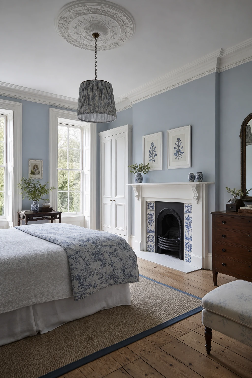
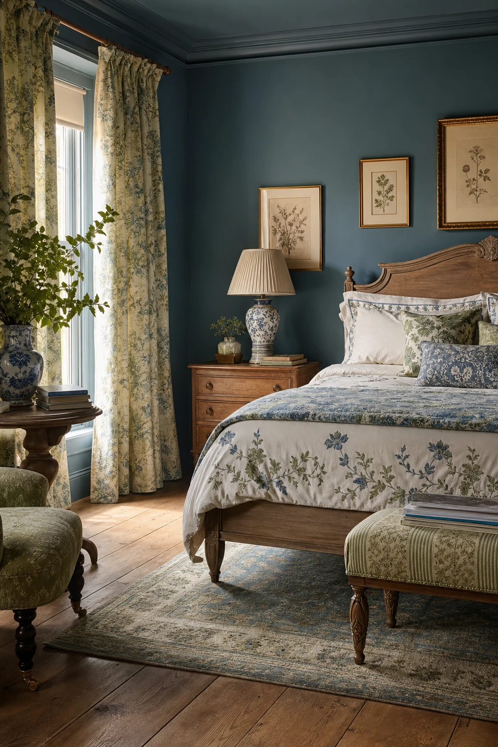
Layering is everything here, and what I love most is how each textile you add pushes the room further from showroom and closer to somewhere people actually live. A linen headboard gives you a soft, anchored starting point, and then you build out from it with mixed pillows, a heavy curtain, a worn oak floor underneath. Watch how the blue walls stop feeling cold the moment all those warm textures are in the room with them.
The Key Details
Upholstered linen headboard
Layered mixed textile pillows
Wide plank oak floorboards
Pleated linen curtains on iron rods
Sash windows with glazing bars
Pro TipChoose a blue with a grey or green undertone rather than a pure cool blue, and it will read much warmer once the linen and oak are around it.
AvoidArranging pillows in a too perfect row and folding every throw with precision strips the room of the relaxed, lived in quality that makes a country bedroom feel inviting rather than staged.
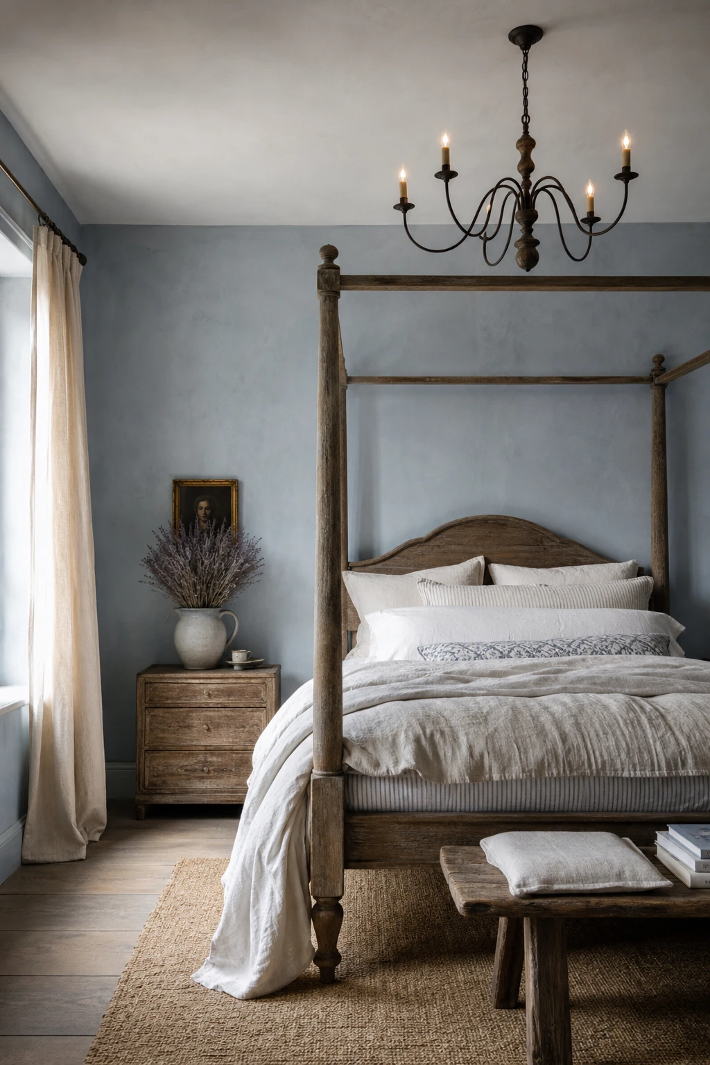
The French Country Touches That Make a Blue Bedroom Feel Utterly Romantic
Aged timber and soft linen are what take a blue bedroom from cool and crisp to genuinely romantic. The warm honey tones in old oak push back against the blue just enough, so you get depth and softness at the same time. Sheer linen curtains keep the light hazy, and that slight rumple they carry is exactly the charm you want here. My favourite part of this pairing is how effortless it looks, nothing feels placed, everything feels found.
The Key Details
Aged oak four poster bed frame
Sheer linen curtains
Wrought iron chandelier
Ceramic jug with dried lavender
Ticking stripe mattress cover
Pro TipChoose a timber with visible grain and knots rather than a smooth finish, because the texture is what creates that warm contrast against cooler blue walls.
AvoidBuying a complete matching bedroom suite in the same wood tone pulls all the warmth into one uniform block and loses the gathered, layered feeling that makes this look so quietly romantic.
Blue Cottagecore Bedroom Ideas for a Room That Feels Quietly Wild
Cottagecore styling wins me over every time because it lets the outside world creep in without you having to do anything dramatic. Botanical prints, wicker, dried stems in a terracotta jug: you get that feeling of a room that has simply grown that way over time. Watch how the soft textures and faded florals take the edge off a deep blue wall, making it feel meadow cool rather than cold.
The Key Details
Botanical print gallery wall in mismatched wooden frames
Low iron bed frame with patchwork floral quilt
Wicker rattan nightstand
Woven rush rug over stone flagstone floor
Dried lavender and wildflower arrangement in terracotta jug
Pro TipTuck a small bunch of dried lavender into the wicker nightstand or rest it against the wall behind your lamp, as the pale silver purple picks up the blue and adds a scent that makes the outdoor feeling completely convincing.
AvoidLayering too many competing botanical prints at the same scale flattens the room into visual noise and loses the quiet, overgrown mood you are aiming for.
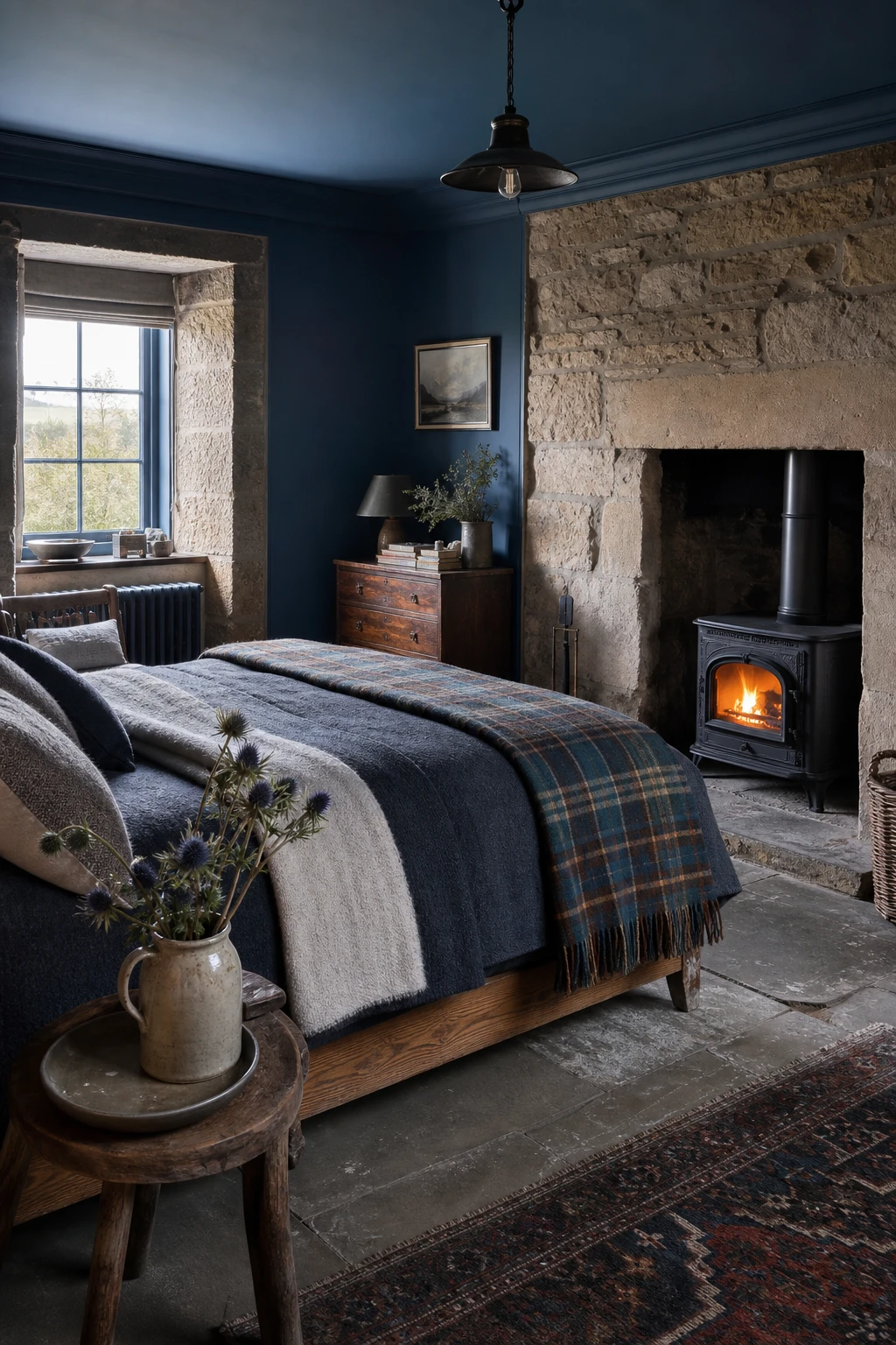
Scottish Bedroom Ideas That Bring a Heathery Blue Mood Indoors
Stone textures and rough wool are what give a blue room that properly northern feeling, and the Scottish Highlands is where that combination lives best. What I love here is how the heathery blue walls absorb light in the same quiet way moorland does, so you feel the mood shift the moment you walk in. Layered throws and a raw stone chimney breast give your eye something to rest on, and together they stop blue feeling cold and make it feel sheltered instead.
The Key Details
Low oak bed frame
Layered wool throws and tartan blanket
Cast iron wood burning stove
Rough hewn stone chimney breast
Flagstone flooring
Pro TipAnchor the blue with one or two genuine slate or stone accessories, even something as small as a slate lamp base, and the whole palette suddenly reads as rooted rather than floating.
AvoidLoading the room with tartan on every surface pulls it toward themed territory and the elegance of a true Highland palette quietly disappears.
Blue and White Victorian Bedroom Details That Never Go Out of Style
Crisp white trim against a deep blue wall is one of those combinations that never needs defending. What I love is how the contrast does the work quietly: your eye follows the skirting, the architrave, the cornice, and the room feels considered without a single fussy accessory. You get that polished Victorian finish because the white is pulling the blue into focus, not fighting it.
The Key Details
White plaster ceiling rose with fabric shaded pendant
Cast iron fireplace with Delftware tile surround
Tall white painted skirting boards and architraves
Blue and white toile quilt on linen dressed bed
White framed botanical prints above mantel
Pro TipChoose a pure or slightly warm white for your trim rather than a cool brilliant white, which can look harsh against most heritage blues.
AvoidLeaving out the cornice and skirting entirely flattens a Victorian room and strips away the very lines that give the blue walls something to sit against.
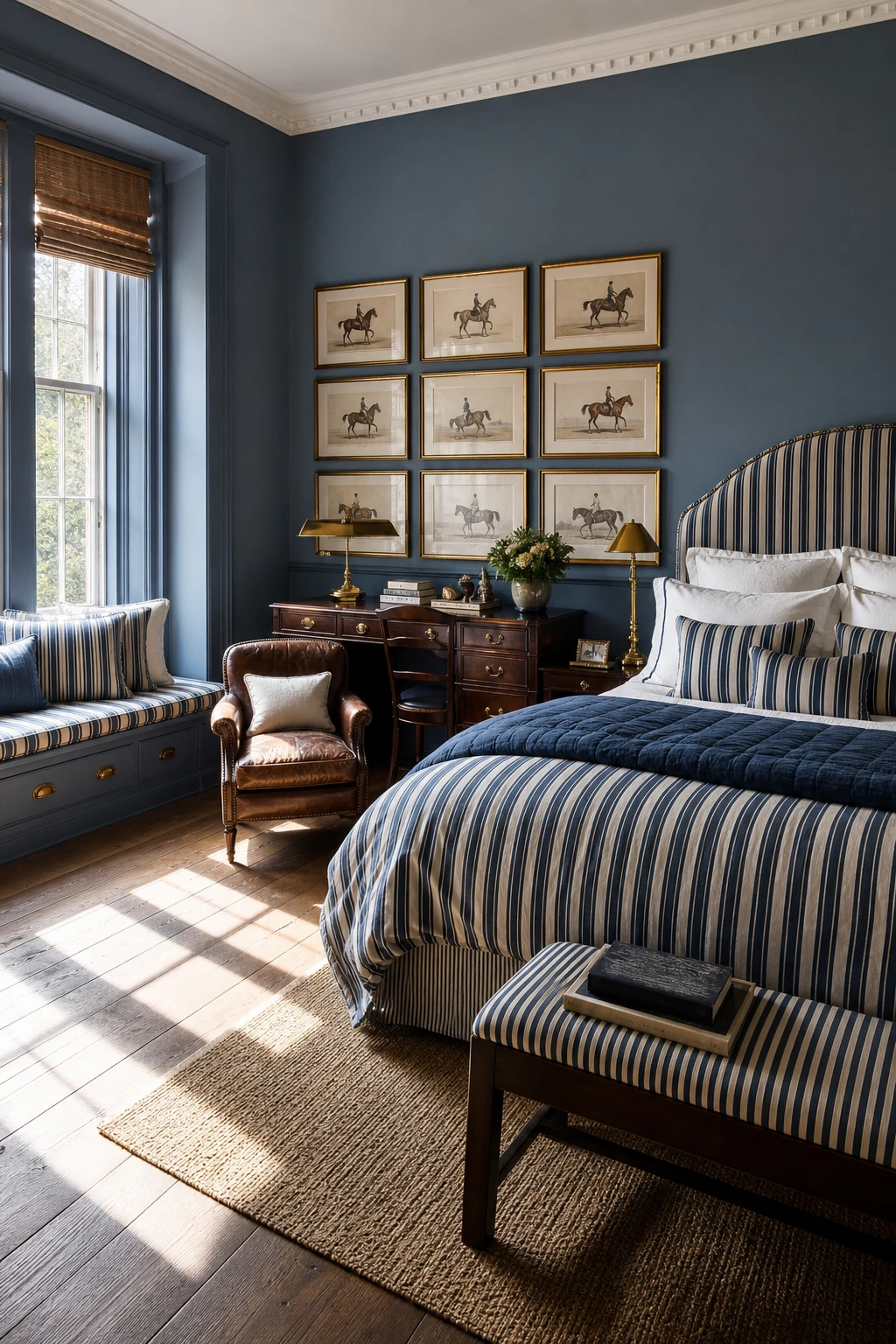
The Tailored English Country Look That Ralph Lauren Rooms Always Get Right
Ticking stripe and solid navy is one of those pairings that just holds its nerve, and what I love is how the structure it creates never tips into stiffness. The stripe does the talking and the solid wall gives it somewhere to land, so you get a room that feels confident rather than busy. Watch how every element, the leather chair, the gilt frames, the brass lamp, slots in without fighting for attention.
The Key Details
Heritage ticking stripe bedlinen
Brass studded window seat
Mahogany writing desk with banker lamp
Equestrian prints in gilt frames
Worn leather club chair
Pro TipPaint one wall in a deep solid blue before you hang a single stripe, because that anchor colour is what stops the pattern reading as a guest room rather than a proper bedroom.
AvoidTreating every piece as a museum exhibit rather than something to live with turns heritage style into a costume, and the room loses all its warmth.
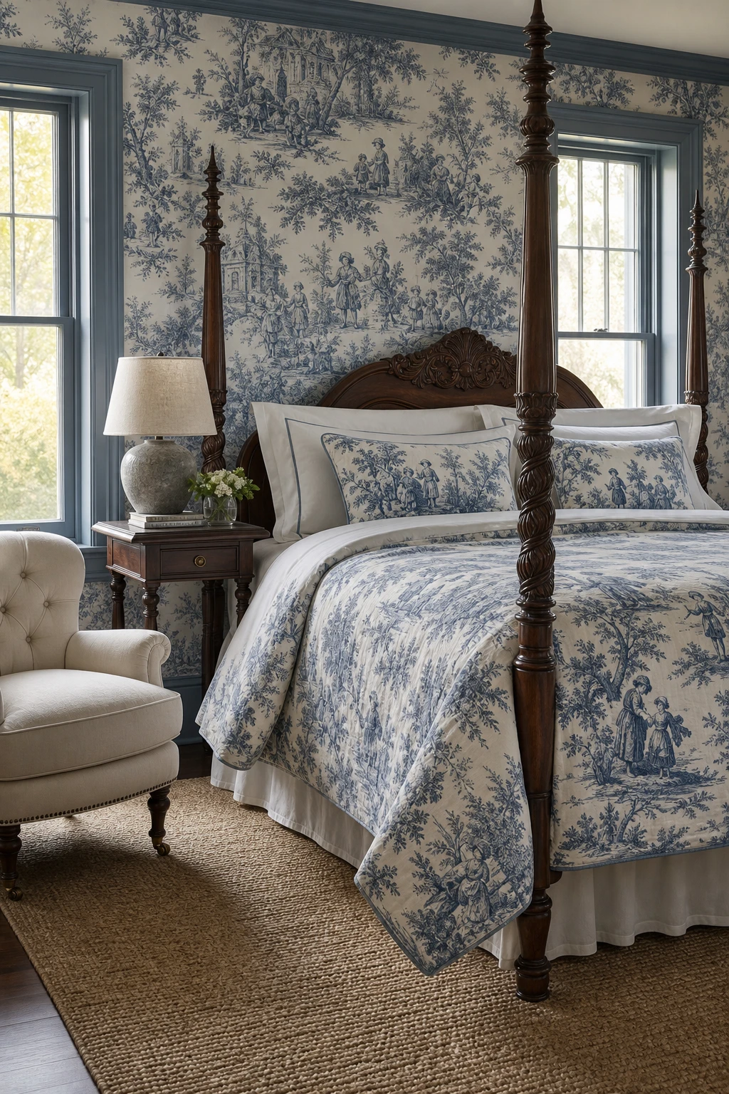
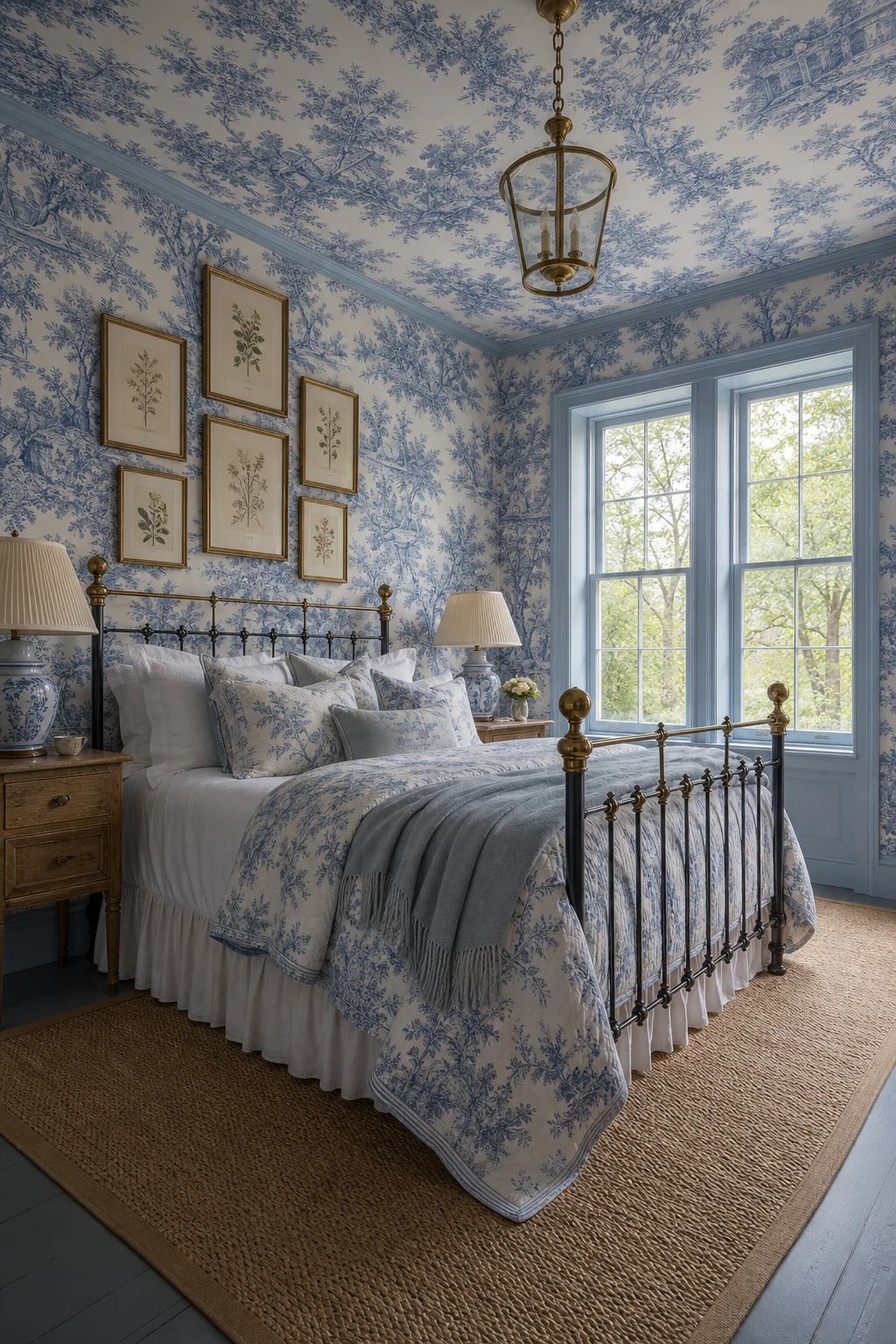
Why a Blue Toile Bedroom Feels More Timeless Than Trendy
Toile wins me over every time precisely because it tells a story, and when you commit to it generously on both walls and bedding, the room stops feeling decorated and starts feeling inhabited. That continuous pastoral scene wraps the space so the eye moves through it rather than bouncing between competing ideas. You get richness without clutter, and that is the whole secret of why it reads timeless rather than busy. I think of it as the difference between a room you admire and a room you sink into.
The Key Details
Blue toile wallpaper and bedcover in a continuous pastoral print
Carved wooden four poster bed frame
Tall sash windows with painted architraves and skirting
Tufted ivory linen armchair
Turned leg bedside table with ceramic lamp
Pro TipKeep the toile to one dominant surface, either the walls or the bedding, and let the other carry a plain coordinate so the pattern stays the clear star of the room.
AvoidIntroducing a second printed pattern alongside toile, even a small geometric, splits the room’s focus and the storytelling quality that makes toile so special simply disappears.
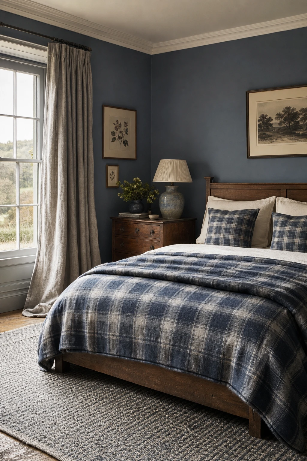
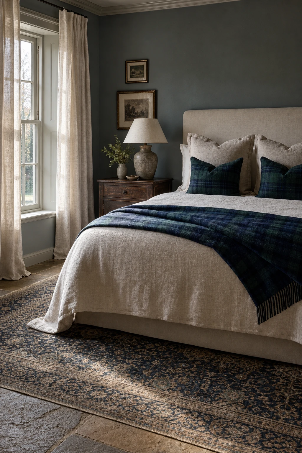
Blue Plaid Bedroom Ideas That Feel Cosy Without Looking Like a Log Cabin
Plaid in a bedroom lives or dies by scale, and getting that right is the thing I always check first. A fine navy and slate check on the bedding stays quiet enough to read as texture rather than pattern, so you get the cosiness without the visual noise. Bring in a chunkier plaid on a wool throw folded at the foot and you suddenly have depth and contrast working together. The room feels layered and considered, not like a decision that ran away with itself.
The Key Details
Navy and slate plaid wool throw
Low timber bed frame
Sash window with pooling linen curtains
Antique bedside table with ceramic lamp
Woven heather wool rug
Pro TipChoose your bedding plaid first at the smallest scale you like, then pick a throw where the repeat is at least three times larger so the two patterns relate without competing.
AvoidPlaid on the curtains, the bedding and the rug at the same time leaves nowhere for the eye to settle, and the room stops feeling restful.
How to Use Blue Tartan in a Bedroom Without It Feeling Costume y
Tartan earns its place here because it stays in its lane, a throw draped at the foot of a linen bed frame rather than splashed across every surface. You get the richness of the pattern without the room tipping into a Highland lodge costume. What I love is how the dark oak and the indigo rug quietly absorb the tartan’s energy and make it feel like it belongs. One bold accent, well placed, reads as confidence.
The Key Details
Wool tartan throw draped at bed foot
Linen upholstered bed frame
Dark stained oak bedside table
Unlined linen sash window curtains
Antique Persian rug in indigo and cream
Pro TipDrape the tartan throw over a worn leather bench or a dark timber chest at the bed foot and the wool pattern will feel anchored rather than decorative.
AvoidBuying the matching tartan cushion set, throw, and valance together smothers the effect and turns a beautiful textile into a theme park version of a Scottish estate.
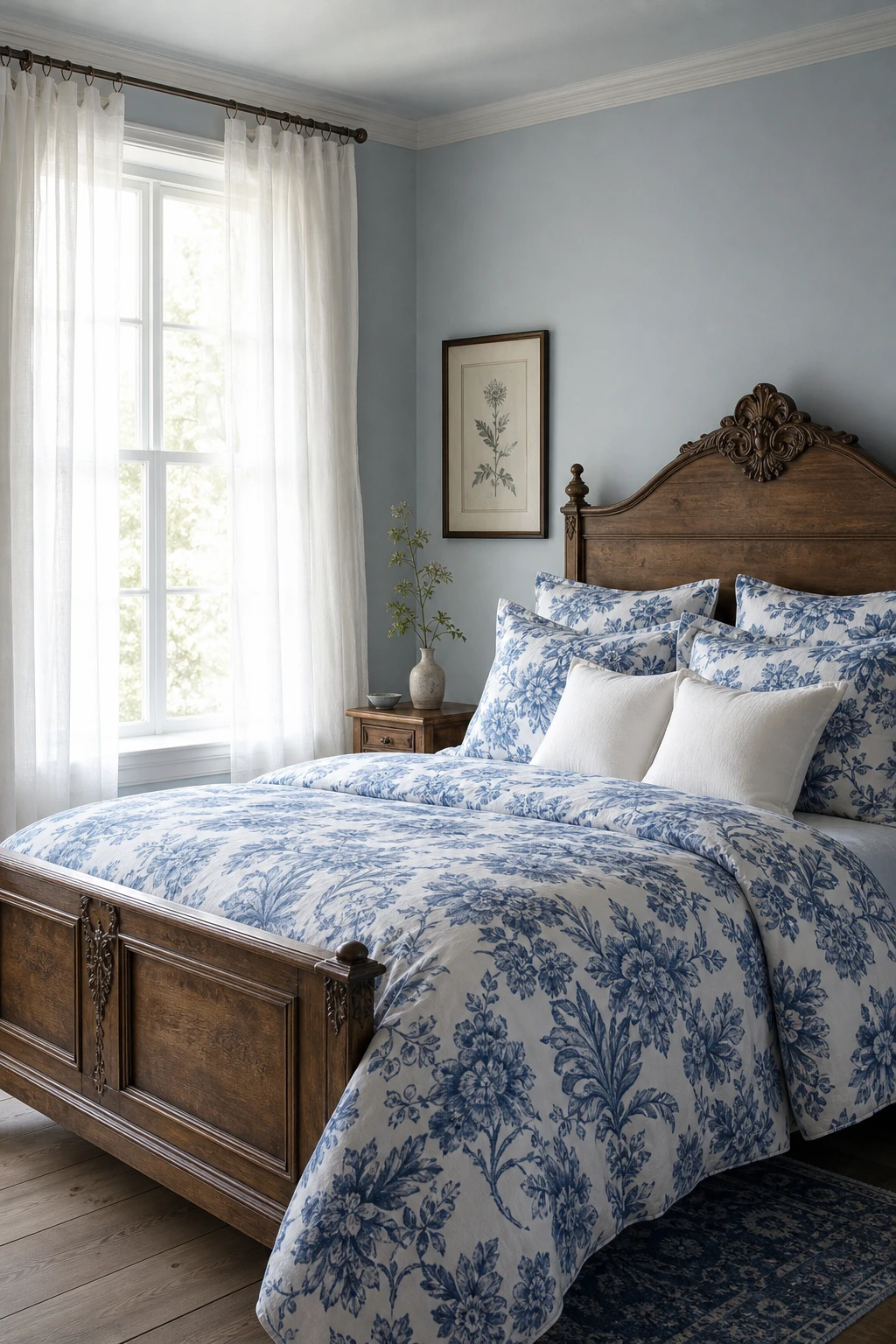
Floral Blue Bedrooms That Feel Fresh Rather Than Old Fashioned
Floral prints earn their place when they have room to breathe, and plain painted walls give them exactly that. What I love about this pairing is the visual rest you get between the pattern and the wall, so the eye travels to the print rather than fighting it. You will notice the room feels fresh and considered rather than busy, which is the whole difference between a floral that sings and one that overwhelms.
The Key Details
Botanical floral print bedding
Carved antique oak bed frame
Sheer white linen curtains
Tall sash windows
Ceramic bud vase on slim bedside table
Pro TipWhen choosing your fabric, look for a print where blue sits in the stems, petals, and background wash rather than appearing only as a small accent, because that depth of colour is what ties the textile to the walls so naturally.
AvoidLayering two different florals in a small bedroom pulls the walls inward and leaves the room feeling restless rather than restful, even when the prints are both beautiful on their own.
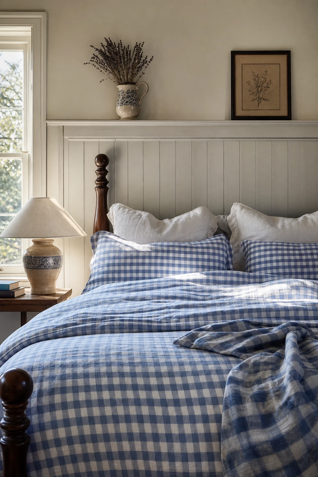
Blue Gingham Bedding Ideas That Give a Bedroom Its Sweetest Texture
Gingham is one of those patterns I return to again and again because it does so much quiet work. The repeat is small and orderly, so you get visual texture without any of the noise a floral or stripe can bring. What I love most is how the check reads almost as a solid from across the room, yet draws you in with all that lovely rhythm up close. You will notice the whole bed feels grounded and country sweet without trying too hard.
The Key Details
Blue and white gingham cotton duvet cover
Linen Euro pillows
Tongue and groove wall panelling
Turned dark oak bedpost
Ceramic bedside table lamp
Pro TipLayer a larger scale gingham duvet with a finer check pillowcase in the same blue and you get that relaxed, gathered over time feeling that makes a bedroom look genuinely lived in rather than styled for a catalogue.
AvoidMatching every gingham piece to the exact same scale and tone turns the bed into a uniform block of pattern, which reads more nursery than English country retreat.
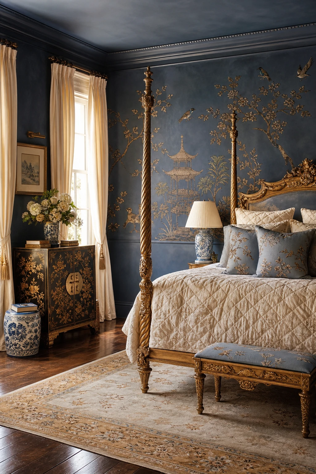
Chinoiserie in a Blue Bedroom and Why It Feels So Unexpectedly Right
Chinoiserie in a blue bedroom feels so settled, so quietly confident, and what wins me over every time is the way hand painted motifs add a layer of curated history that plain colour simply cannot. You get the sense that this room has been gathered over time rather than ordered in a single afternoon. Gilded frames catch the light and lift the blue walls without competing, and the whole thing reads as considered rather than decorated.
The Key Details
Hand painted chinoiserie wall panels
Gilded carved four poster bed
Antique lacquered chinoiserie cabinet
Ceramic garden stool side table
Tall sash windows with ivory silk drapes
Pro TipHang one large chinoiserie panel above the bed and let it do all the talking, giving every other surface space to breathe around it.
AvoidPairing chinoiserie with raw linen, rough jute, or exposed wood instantly strips away the lacquered refinement that makes these motifs so compelling in the first place.
Blue Silk Wallpaper and the Gentle Shimmer That Changes a Room at Night
Silk wallpaper is one of those choices that rewards you most when the sun goes down. By day you get a quiet depth of colour, but once you light the room with wall sconces the surface catches every flicker and the walls seem to breathe outward. That gentle movement tricks the eye into reading the room as larger, and the blue tones stay rich rather than flat. The antique brass and foxed mirror nearby pick up the same warm light, so everything feels connected.
The Key Details
Four poster bed with layered linen bedding
Antique brass wall sconces
Carved mahogany dresser with foxed mirror
Faded Persian rug
Wide plank oak floor
Pro TipUse warm white bulbs in your sconces, around 2700K, so the light grazes the silk at a low angle and draws out the sheen rather than washing it flat.
AvoidPlacing a large matte painted wardrobe or a flat lacquer chest right against silk wallpaper kills the shimmer by giving the eye nowhere else to travel, and the whole effect falls apart.
How Running Toile Over the Ceiling Turns the Whole Bedroom Into a Story
Wrapping toile up and over the ceiling is one of my favourite moves in a country bedroom because the scene never stops, it just keeps unfolding above you. You lose the hard line where the wall ends and suddenly the whole room becomes the story, not just a backdrop to it. The enclosed, dreamy quality it creates is like sleeping inside a painting, and once you have tried it you will find it very hard to go back to plain white overhead.
The Key Details
Scenic toile wallpaper wrapped over ceiling
Antique iron and brass bed frame
Pleated ceramic table lamps
Tall casement windows
Clustered vintage botanical prints
Pro TipPaint your skirting, door frames, and window casements in the exact background colour of the toile so the pattern floats free and the woodwork disappears into the walls.
AvoidStopping the wallpaper at the picture rail leaves a cold, unfinished stripe of ceiling that breaks the spell the pattern was building.
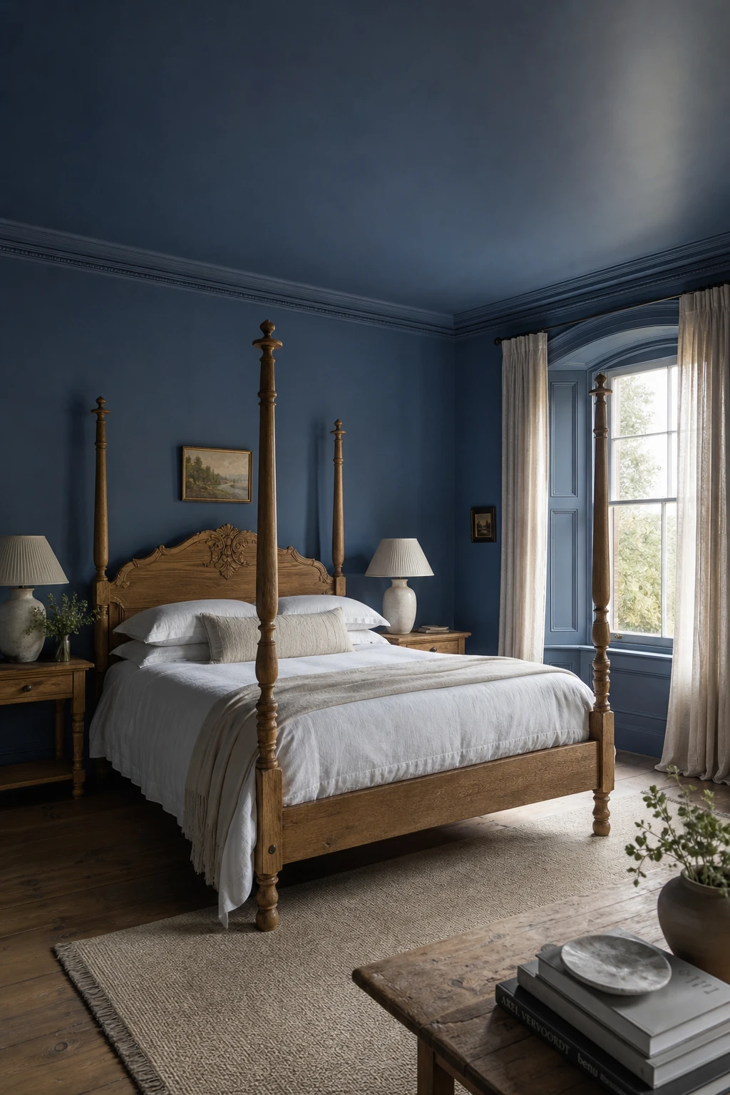
Colour Drenching a Blue Bedroom and Why Total Immersion Feels So Restful
Colour drenching is one of my favourite tricks for a bedroom that truly lets you exhale. When the walls, ceiling, and woodwork all share the same blue, your eye has nowhere to snag and nothing to jump between, and that quiet continuity is what makes the room feel so deeply calm. You will notice how the carved four poster and the aged oak floor seem to belong there, settled into the colour rather than sitting on top of it. That sense of total immersion is the whole point.
The Key Details
Carved wooden four poster bed
Turned leg nightstands
Ceramic table lamps with ivory shades
Sash window with sheer linen panels
Aged oak floorboards
Pro TipReach for a mid tone blue rather than a deep navy so the drenched finish looks equally good in the bright light of morning and the low lamplight of evening.
AvoidChoosing a very dark shade in a smaller room will make the drenching feel heavy and enclosed rather than restful, which is the opposite of what you are after.
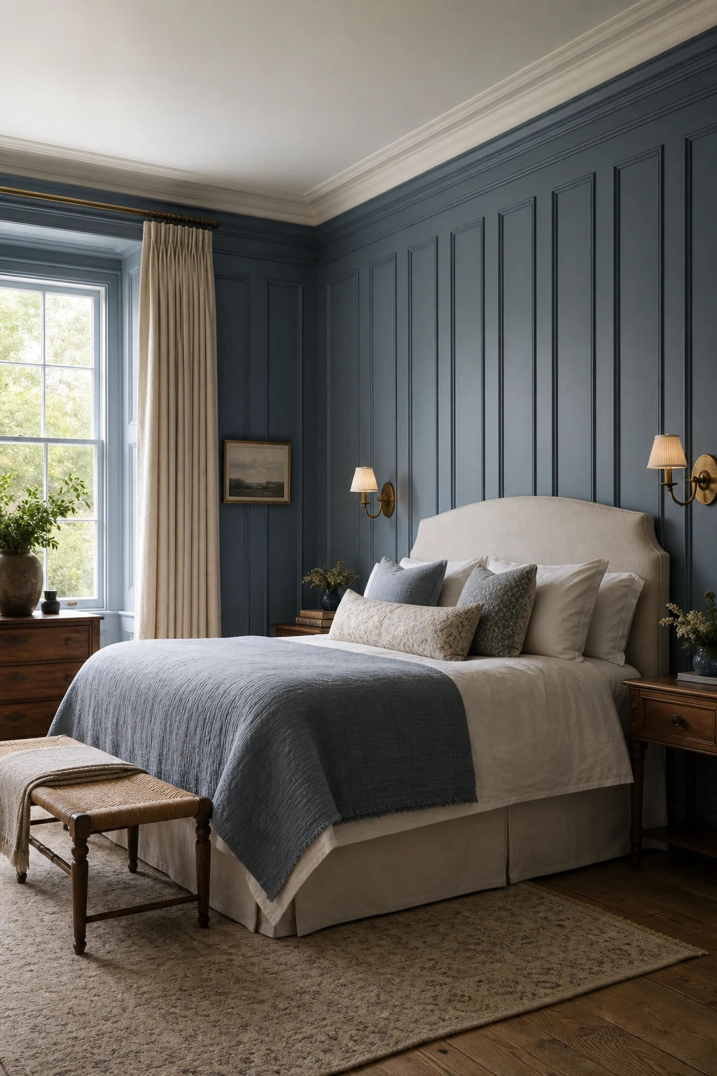
Wall Panelling in a Blue Bedroom and the Subtle Trick That Makes It Look Expensive
Panelling gives a plain wall something to say, and in a blue bedroom that matters more than people expect. What I love about painting the panels the exact same blue as the surrounding wall is that you lose the hard contrast and gain something quieter: depth. You will notice the light catch the raised edges differently depending on the time of day, and that movement is what makes the room feel considered rather than simply painted.
The Key Details
Raised tongue and groove wall panels
Linen upholstered headboard
Aged brass wall sconces
Floor to ceiling linen curtains
Wide plank oak flooring
Pro TipUse an eggshell finish on the panels and a flat emulsion on the wall behind them so the same colour reads in two very slightly different ways and the relief really shows.
AvoidChoosing an ornate, heavily detailed panel profile pulls the eye in too many directions and fights the calm quality that makes a soft blue bedroom feel restful.
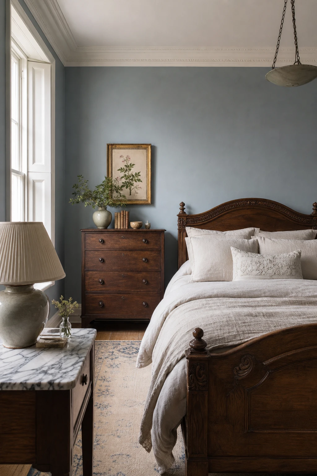
The Farrow and Ball Light Blue Bedroom Tones That Interior Designers Keep Coming Back To
Farrow and Ball Light Blue is one of those colours I keep returning to because it never quite settles. In morning light you get something close to a soft grey, and by afternoon the blue wakes up and the whole room shifts with it. That quiet complexity is what gives the space its depth, and you will notice it feels calm without feeling flat. The carved oak bed and cream linen anchor it beautifully, keeping the blue honest rather than cold.
The Key Details
Carved oak bed frame
Layered linen bedding in cream and dusty white
Marble topped nightstand with pleated linen table lamp
Antique wooden chest of drawers with gilt framed botanical print
Original timber sash windows with glazing bars
Pro TipBefore committing, brush a large patch of Light Blue in both the north facing and south facing corners of the room and live with it across a full day, because the same pot will read quite differently in each spot.
AvoidChoosing a blue that looks luminous on screen or in a magazine swatch can leave you with a room that reads as a dull, washed out grey once it is up on four walls under your actual light conditions.
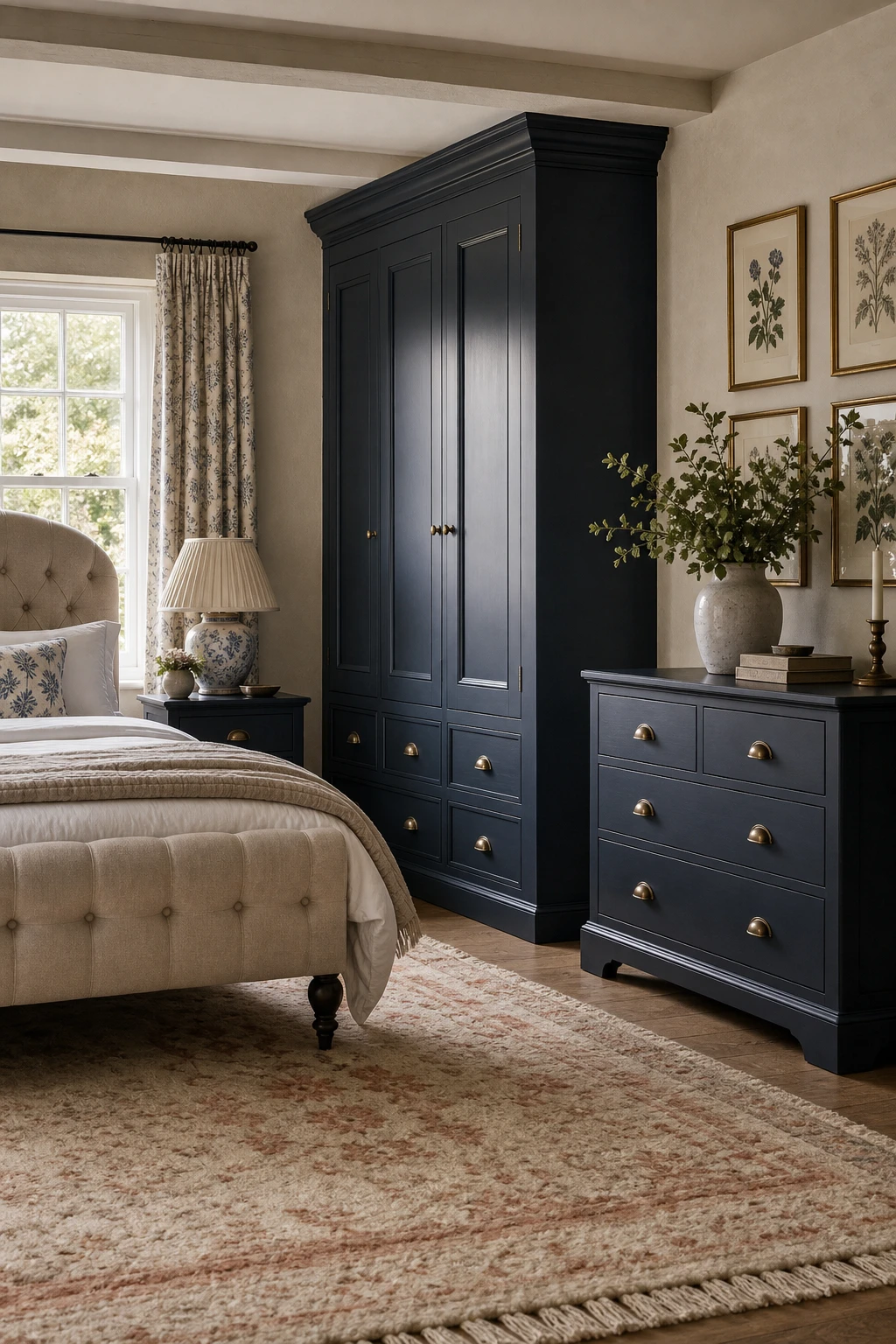
Dark Blue Bedroom Furniture and the Confident Look It Gives a Neutral Room
Painting furniture rather than walls in a deep navy or midnight blue is one of my favourite moves for a neutral bedroom. You get all the drama without committing the whole room to a dark palette, so repainting or swapping textiles later stays easy. What I love is the way a blue wardrobe or chest of drawers anchors the space like a piece of furniture always lived there, confident and settled rather than trying too hard. Watch how the surrounding creams and linens seem warmer and quieter simply by sitting next to something that bold.
The Key Details
Panelled painted wooden wardrobe
Brass cup drawer handles
Linen tufted headboard
Hand knotted wool rug
Pleated ceramic table lamp
Pro TipPair dark blue furniture with bedding in warm white or oat linen so the room breathes and the colour reads as a considered choice rather than a heavy one.
AvoidPushing all the dark blue pieces to one side of the room throws the whole layout off balance and makes the space feel lopsided rather than curated.
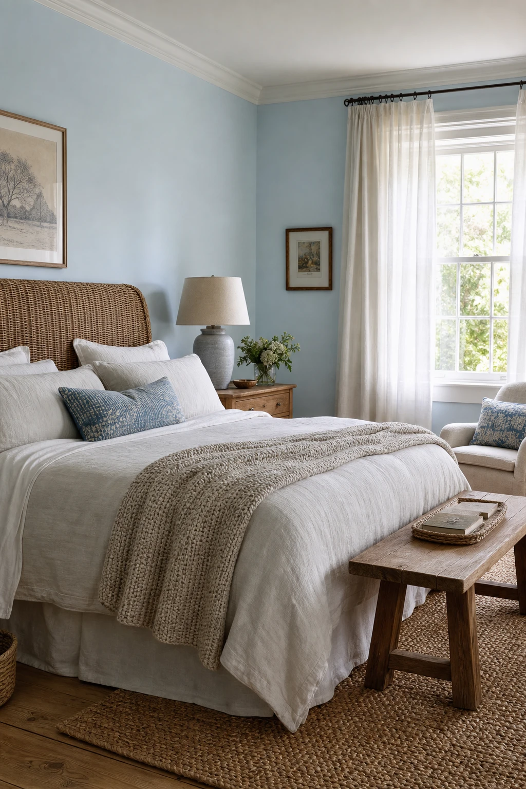
Baby Blue Bedroom Ideas That Feel Grown Up and Genuinely Soothing
Baby blue has a reputation for being sweet rather than sophisticated, but pair it with rattan and warm oak and watch how quickly that changes. The natural grain and honey tones pull the coolness out of the blue and you get something genuinely restful rather than frosty. What I love about this combination is how little it asks of you: the warmth does all the heavy lifting, and the blue simply settles around it.
The Key Details
Rattan headboard
Chunky knit cotton throw
Wide plank oak flooring
Sheer voile sash window curtains
Ceramic table lamp with linen shade
Pro TipSwap any chrome or nickel hardware for brushed brass, even just a few drawer pulls, and it ties the warm tones together beautifully.
AvoidPairing baby blue with a bright stark white on woodwork and ceilings drains the warmth from the room and leaves it feeling cold rather than calm.
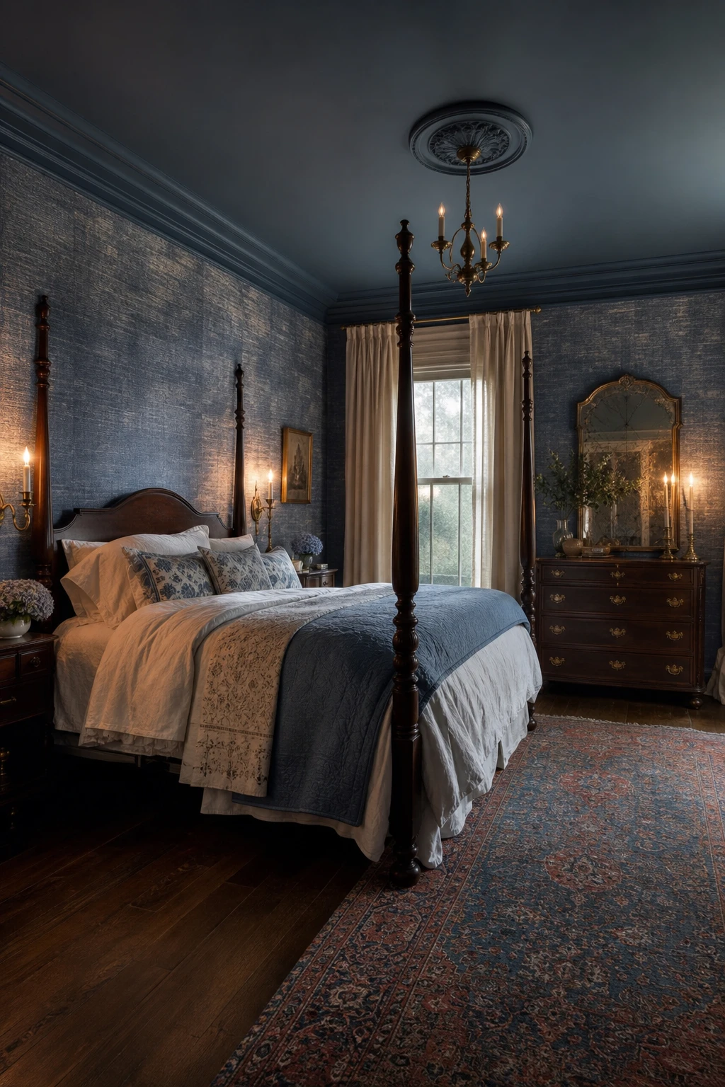
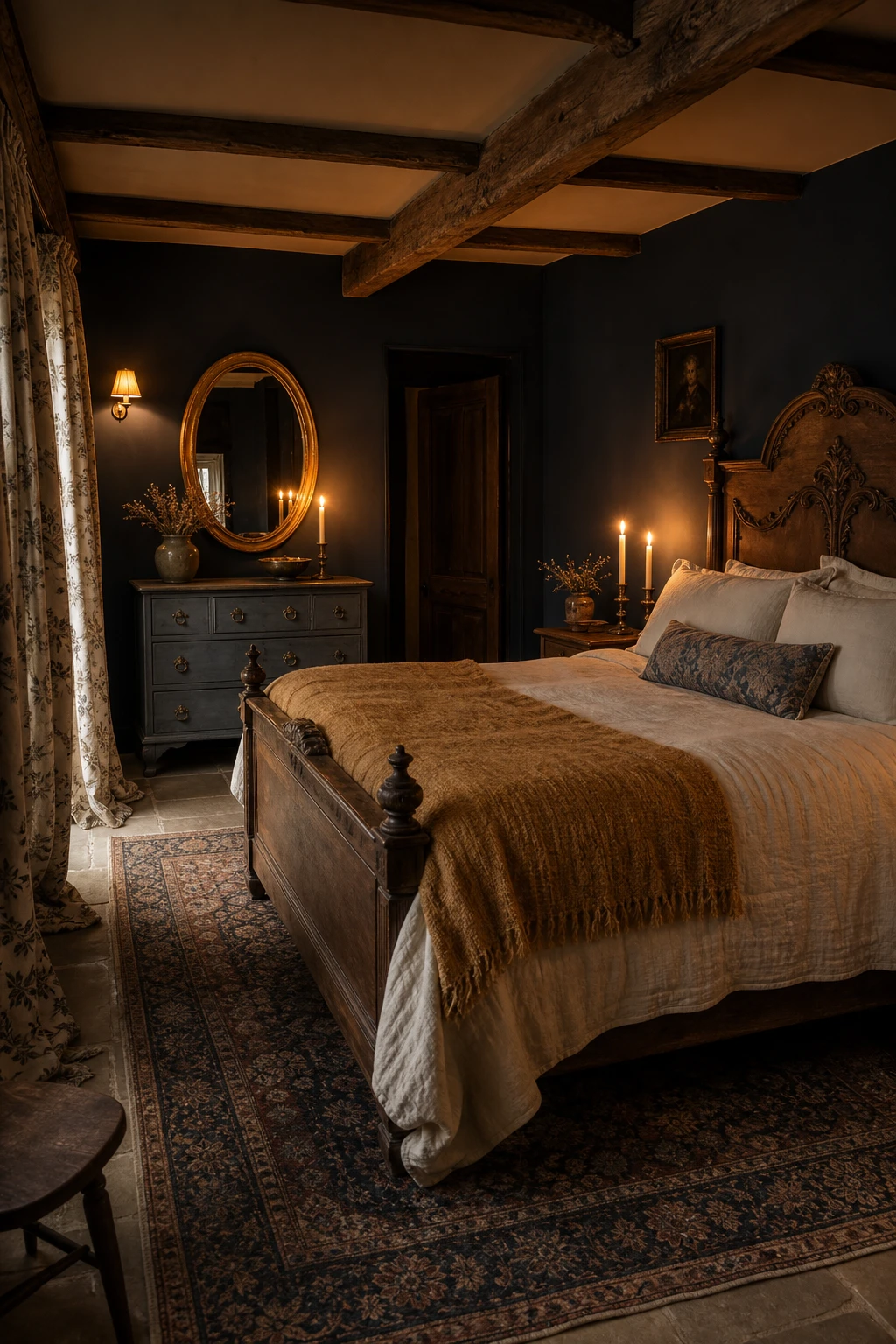
Navy Blue Country Bedroom Ideas That Feel Dramatic Without Feeling Heavy
Navy done right is one of the most enveloping colours you can put in a bedroom, and what makes it sing here is the warmth layered against it. Aged gold and candlelight pull the blue toward richness rather than chill, so you get drama without the room closing in on you. Watch how the gilded mirror and carved oak bed hold their own against that depth, anchoring the space so it feels curated rather than heavy.
The Key Details
Carved antique oak bed frame
Aged gold candlestick holders
Gilded oval wall mirror
Faded Persian wool rug over stone flags
Botanical print linen curtains
Pro TipPaint just one wall navy first and live with it through an evening before committing, because the colour shifts dramatically once the sun drops and you see it only by lamplight.
AvoidCool white or daylight bulbs in a navy room strip out every scrap of warmth and leave the space feeling like a corridor rather than a retreat.
Blue and Green Bedroom Combinations That Feel Like a Garden Brought Indoors
Blue and green sit so close on the colour wheel that they naturally share undertones, and that shared DNA is what keeps them feeling calm together rather than competitive. What I love about bringing green in through plants and soft furnishings is that the room starts to feel genuinely alive, like the garden has crept inside. You get depth without drama, and the botanical prints and embroidered linen tie the two colours into one easy story.
The Key Details
Botanical print curtains in sage and duck egg
Carved wooden bed frame
Embroidered linen bedding in cornflower and fern
Ceramic table lamp with pleated linen shade
Pressed botanical prints in gilded frames
Pro TipLet green do its work through trailing plants, cushions and curtain prints rather than a second painted wall, so the colour feels fresh and changeable rather than fixed.
AvoidPairing a yellow green with a cool blue creates an uneasy tension that no amount of styling will fix, because their undertones pull in opposite directions.
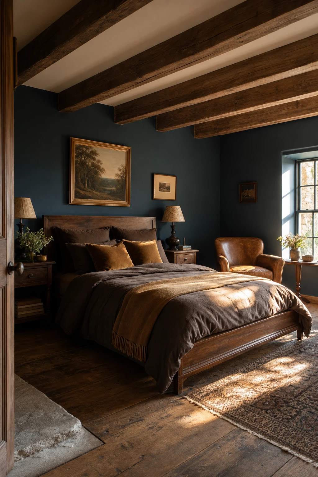
Blue and Brown Bedroom Pairings and the Warm Depth They Bring to a Country Room
Blue and brown is a pairing I reach for again and again in a country bedroom, because the warmth brown brings is a different thing entirely from what white or grey can offer. You get actual depth, the kind that makes blue feel anchored rather than cold. Walnut, oak, and tan leather pull that warmth from the earth rather than from artificial contrast, so the room feels genuinely settled. There is something honest about it, two colours that have belonged together long before anyone called it interior design.
The Key Details
Walnut framed bed
Exposed timber ceiling beams
Tan leather armchair
Oak plank floorboards
Sash windows with amber afternoon light
Pro TipBring your brown in through a leather armchair, timber bed frame, and a jute rug rather than a painted wall, so the warmth feels natural and layered rather than deliberate.
AvoidReaching for a red toned or terracotta brown alongside a cool blue sets up a quiet tension in the room that never quite resolves, leaving the whole space feeling slightly unsettled.
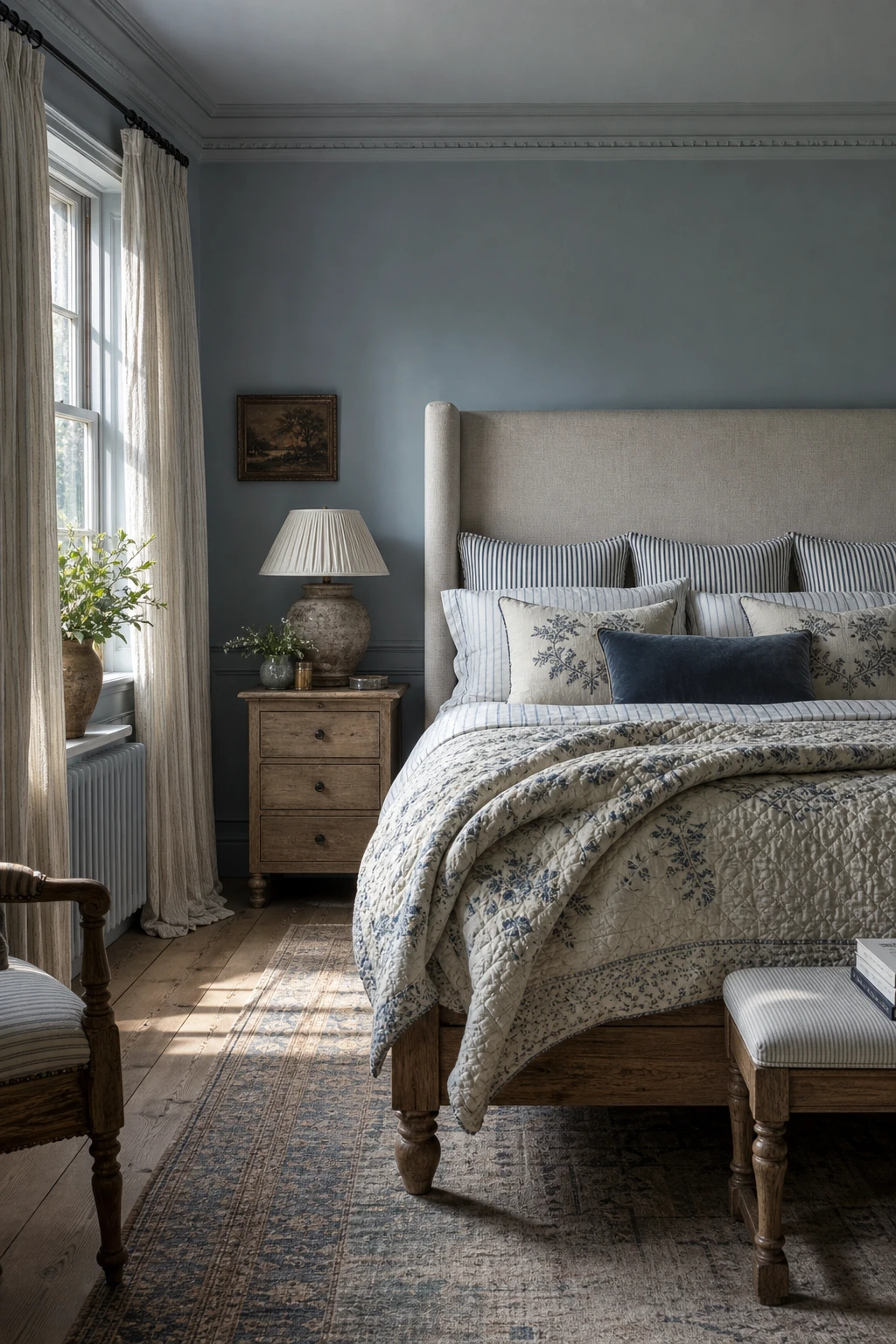
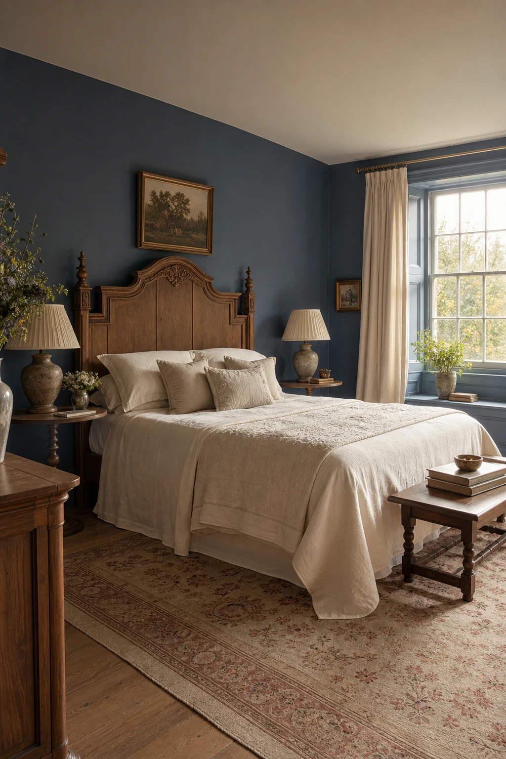
Blue and Cream Bedroom Combinations That Always Feel Quietly Right
Cream does something to blue that pure white simply cannot, and it is one of those quiet truths I keep coming back to. Where white sharpens the contrast and pulls the room cool, cream wraps around the blue and warms it, giving the whole space that honeyed, settled feeling you notice the moment you walk in. You get a palette that breathes without fighting itself, and the carved oak headboard and ivory quilted throw sit inside it as if they were always meant to be there.
The Key Details
Carved oak timber headboard
Cream linen bedding with ivory quilted throw
Faded antique wool rug
Sash windows with slim painted glazing bars
Pleated cream ceramic table lamps
Pro TipPaint your skirting, dado rail and window frames in the same warm cream as your bedding tones so the woodwork reads as part of the palette rather than a leftover decision.
AvoidReaching for a cool or grey tinted off white on the woodwork pulls the whole palette cold and undoes exactly the warmth the cream was there to give.
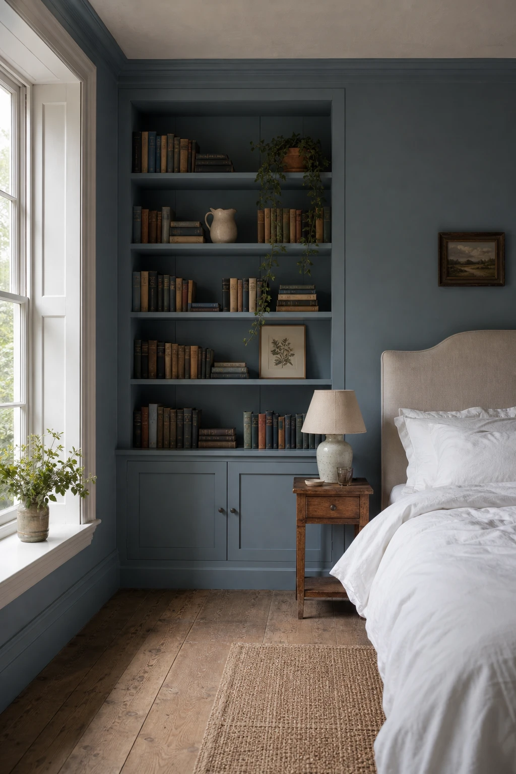
A Bedroom Bookcase Painted Blue and Why It Makes the Whole Room Feel Smarter
Built in shelving painted the same blue as the walls is one of my favourite moves in a bedroom because the shelves stop reading as furniture and start reading as architecture. You get this quiet, enveloping quality that a freestanding bookcase simply cannot give you. The books and objects sit inside it like jewels rather than clutter, and the room starts to feel genuinely curated without a single extra accessory. What wins me over is how the colour wraps everything into one considered whole.
The Key Details
Floor to ceiling built in bookcase
Linen upholstered headboard
Antique wooden bedside table
Ceramic table lamp with linen shade
Sash window with white painted trim
Pro TipGroup your books loosely by colour across the shelves so the spines read as part of the blue palette rather than fighting against it.
AvoidLeaving built in shelves unpainted in a colour drenched room breaks the visual flow and makes the joinery look like an afterthought rather than part of the design.
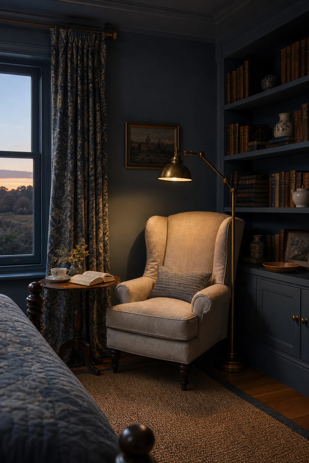
Creating a Blue Reading Nook in the Bedroom and Making It the Best Seat in the House
A reading nook tucked into a bedroom corner does something quietly powerful: it gives the room a second life beyond sleep. What I love here is the wingback chair anchoring the space with its own sense of occasion, flanked by painted timber shelves that make the corner feel built rather than arranged. You get a spot with genuine purpose, and that intention is what makes a bedroom feel richer rather than just larger.
The Key Details
Wingback armchair in aged linen
Built in painted timber bookshelves
Brass arc floor lamp
Small round side table
Sash window with deep reveal
Pro TipFix a wall mounted or clip on reading light directly beside the chair rather than relying on a floor lamp you have to reposition, and the nook will instantly feel like it was always meant to be there.
AvoidSqueezing a chair into a dim corner without dedicated task lighting turns the nook into a decorative feature you never actually use, which defeats the whole point.
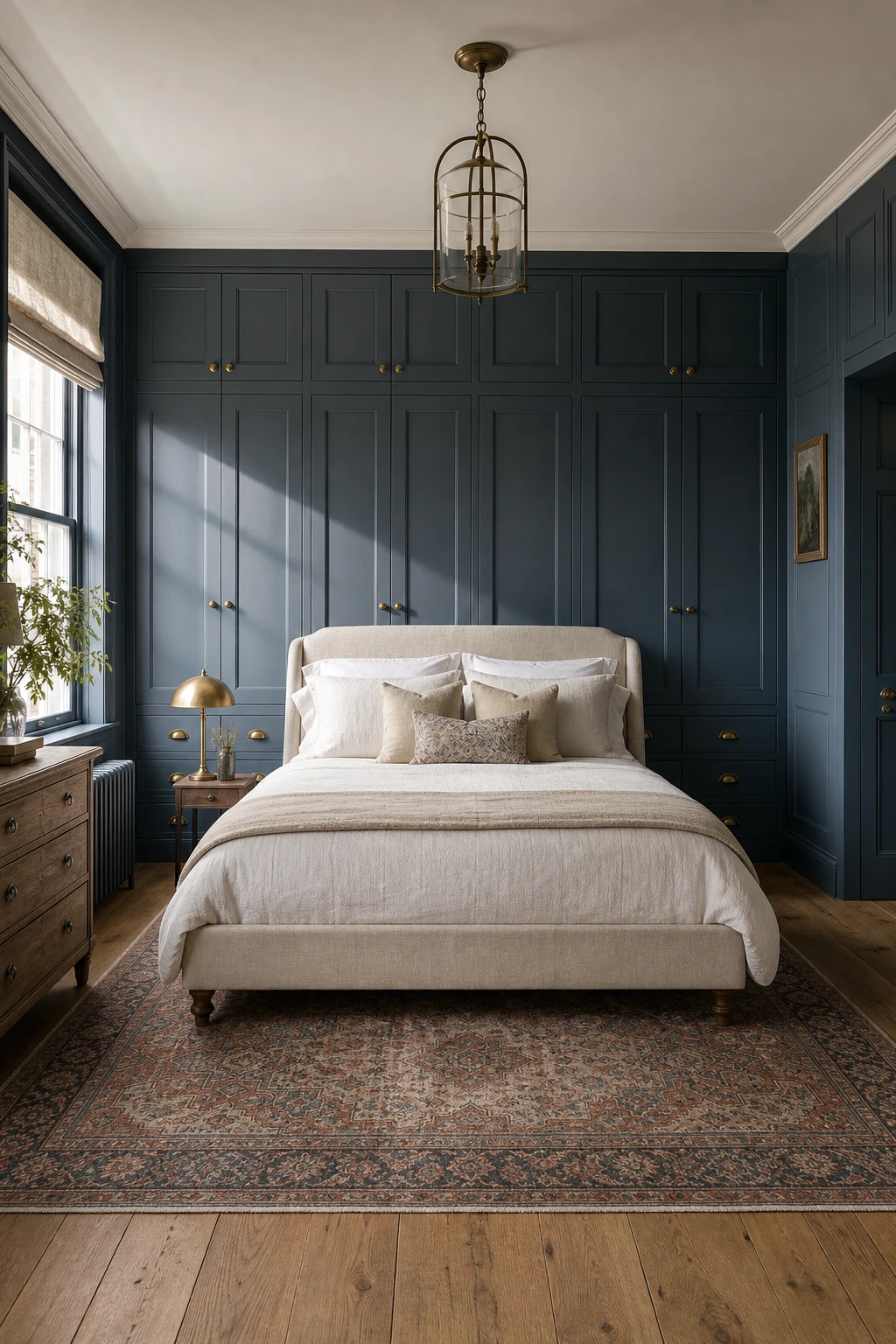
Blue Fitted Wardrobes and the Storage Solution That Also Becomes the Feature Wall
Fitted wardrobes painted the same blue as the walls stop the eye reading them as furniture and turn that whole run of doors into one sweeping feature wall. What I love about this move is that you lose nothing, you actually gain the room back, because the storage disappears into the architecture. The shaker panelling adds quiet texture, and the aged brass cup handles give your eye somewhere to land so it never feels flat.
The Key Details
Floor to ceiling shaker panel wardrobe doors
Aged brass cup handles
Linen upholstered bed frame
Wide plank oak flooring
Vintage Persian wool rug
Pro TipRun the wardrobes all the way from floor to ceiling so the colour pulls the eye upward and the room reads taller than it really is.
AvoidFitting small, delicate handles on large wardrobe doors leaves them looking unfinished and a little lost against all that painted panelling.
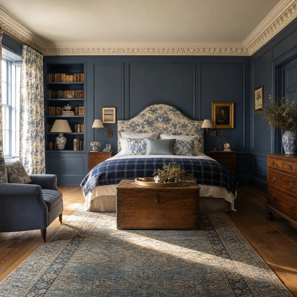
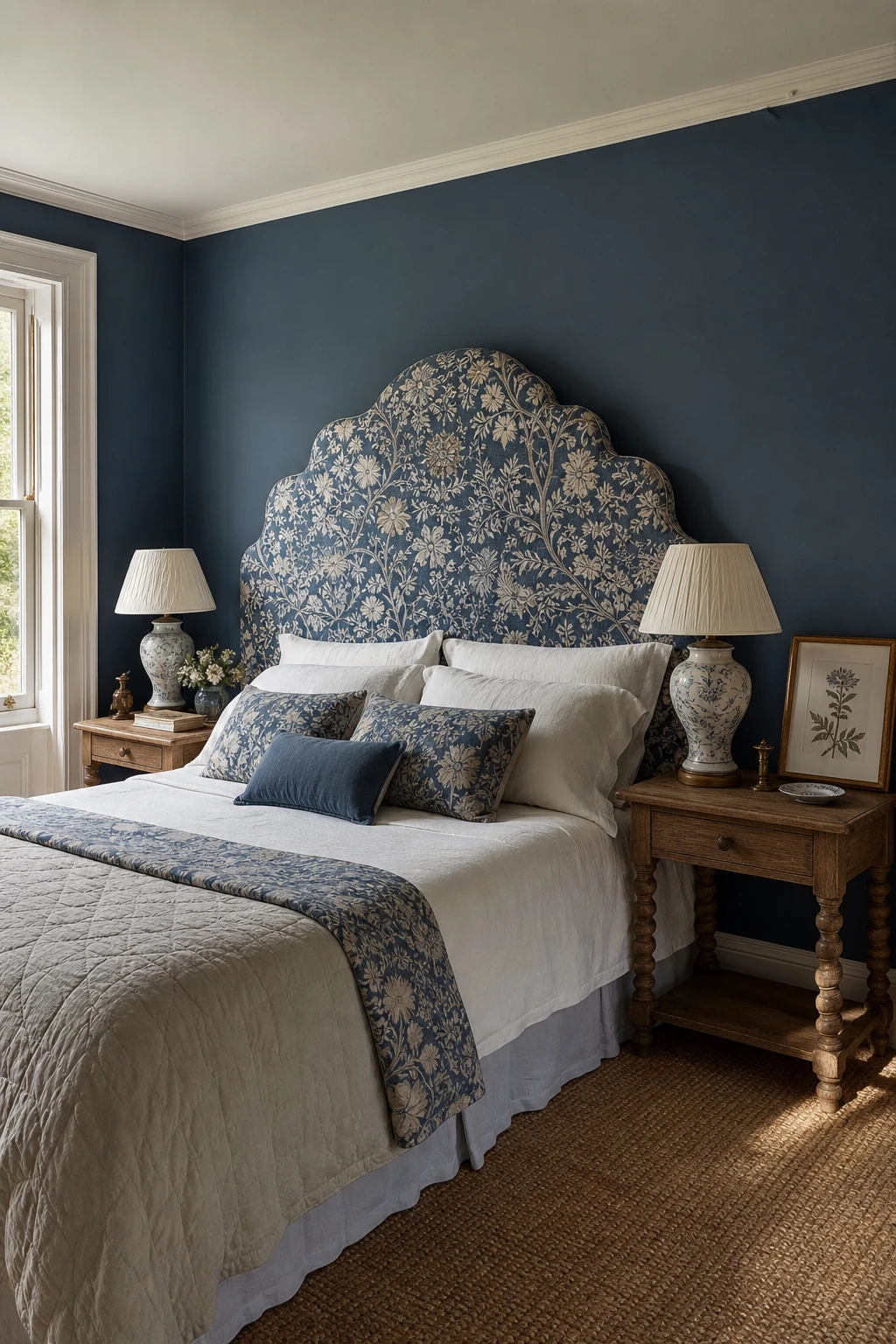
A Patterned Headboard in a Blue Bedroom and Why One Bold Piece Is All You Need
A patterned headboard in a heritage botanical print does the work of a painting and a furniture piece at once, and that double duty is what I love most about it. You get a room that feels complete without needing much else on the walls. The blue tones in the fabric anchor the whole scheme, so every other piece simply responds to it rather than competing for attention.
The Key Details
Botanical print upholstered headboard
Layered linen and quilted cotton bedding
Turned oak nightstands
Ceramic table lamps with linen shades
Leaning framed botanical print
Pro TipPick one colour from the headboard fabric, a dusty blue or a soft sage leaf tone, and repeat it in your top quilt or pillowcase so the bedding feels chosen rather than accidental.
AvoidHanging a busy gallery wall directly behind a patterned headboard splits the eye between two focal points and the room ends up feeling restless rather than considered.
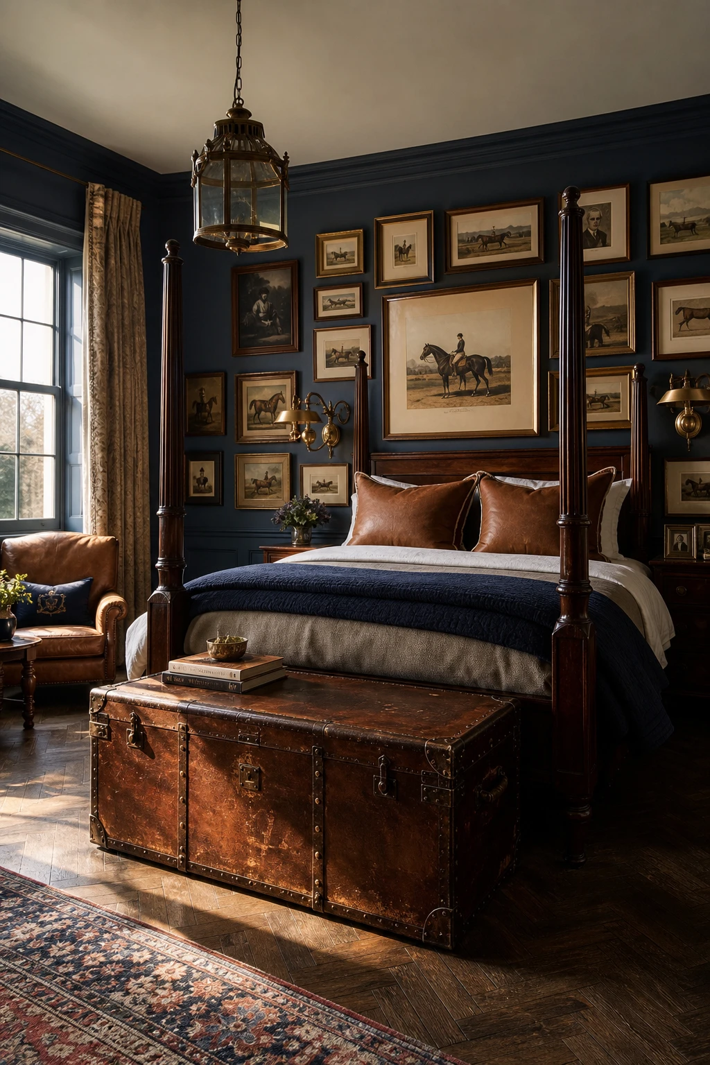
Equestrian Bedroom Ideas That Bring a Country Estate Feeling Home
Leather, dark timber, and horse themed prints work together because each one carries the same quiet confidence, and you get a room that feels earned rather than decorated. The cognac trunk, the mahogany four poster, the antique prints on the wall: they tell a story without spelling it out. What I love most is how the equestrian references stay subtle, so the room reads as a proper country bedroom first and a themed space never.
The Key Details
Dark mahogany four poster bed
Framed antique equestrian gallery wall
Cognac leather trunk at bed foot
Brass aged patina wall sconce
Dark stained oak herringbone floor
Pro TipHang your equestrian prints in matching dark wood frames and treat them as fine art, grouped at eye level, so they anchor the room the way a gallery wall would in any well dressed home.
AvoidPiling on horseshoe hooks, stirrup bookends, and bridle trim on the cushions all at once turns a sophisticated country bedroom into a display cabinet, and the story the room was trying to tell gets completely lost.
Alan launched Edward George London in 2017. Since completing his masters in Town & Regional Planning (MPlan) he has combined the skills he learned at the University of Sheffield with his passion for design, to help create a foundation for those looking to create a beautiful home.