I’ve always found that an Old English color palette does something no other approach quite manages: it makes a room feel as though it has always been there, unhurried and deeply settled. What I love most is how much range sits inside that one idea, from the smoky, inky greens of a Tudor hall to the warm parchment walls of a Georgian drawing room and the soft, mossy tones of an English cottage garden. Every look here is one you can borrow, whether your home is a period terrace or a brand new build.
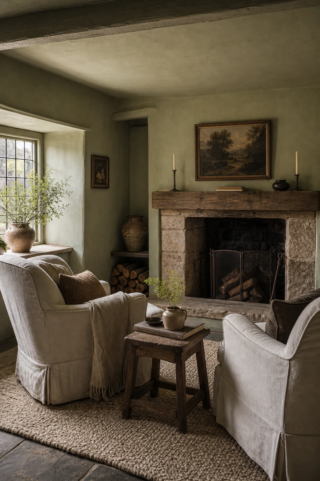
How a Moody Cottagecore Color Palette Feels So Lived In
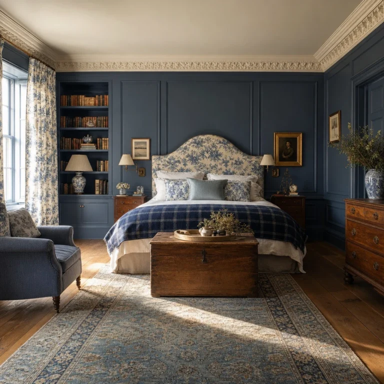
Layering deep nature tones, think ink bottle green, bark brown and soft ochre, is one of my favourite ways to make a room feel like it has been loved for decades. What I find so convincing about the moody cottagecore palette is that no single colour shouts; they lean into each other the way old things do. You get that instant cosiness because every surface is pulling from the same forest floor, and the room just settles around you.
The Key Details
Cast iron fireplace
Leaded cottage windows
Aged oak beam ceiling
Hand knotted wool rug in ochre and forest green
Mismatched stoneware ceramics on mantle
Pro TipAnchor the whole scheme by painting just one chimney breast wall in your darkest tone and let the other walls breathe two shades lighter.
AvoidPushing every wall to the same deep shade without warm wood nearby will make the room feel heavy and cold rather than cosy.
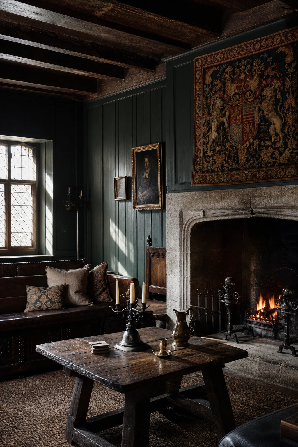
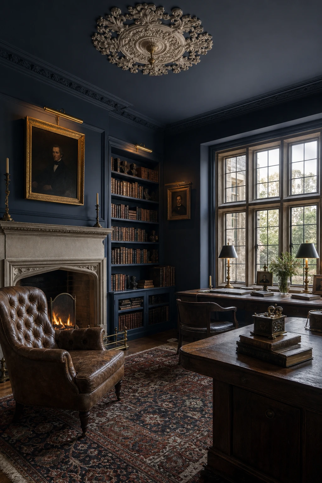
The Tudor Color Palette and Its Surprisingly Liveable Shadows
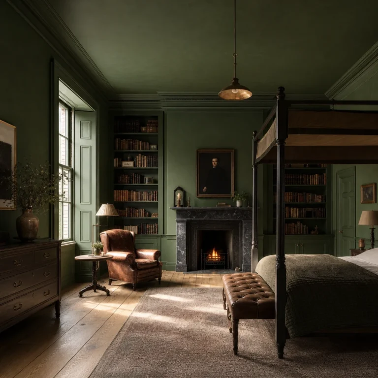
Tudor darks are the thing I keep coming back to when a room needs real weight. Near black walls pull carved oak beams and stone fireplaces forward, so every aged surface reads as deliberate rather than dusty. You get that sense of candlelit depth without the room feeling like a cave, because the relief in the timber and the glint of iron fittings hold the light beautifully.
The Key Details
Full height tongue and groove panelling
Carved oak ceiling beams
Inglenook stone fireplace
Leaded casement windows
Iron candlestick lighting
Pro TipPush the wall colour right up to the carved oak rather than painting a pale border around it, so the timber grain pops against the dark ground instead of floating on a pale field.
AvoidCovering every window with heavy lined curtains in a room this dark will kill the natural light that keeps deep tones alive and dramatic rather than simply gloomy.
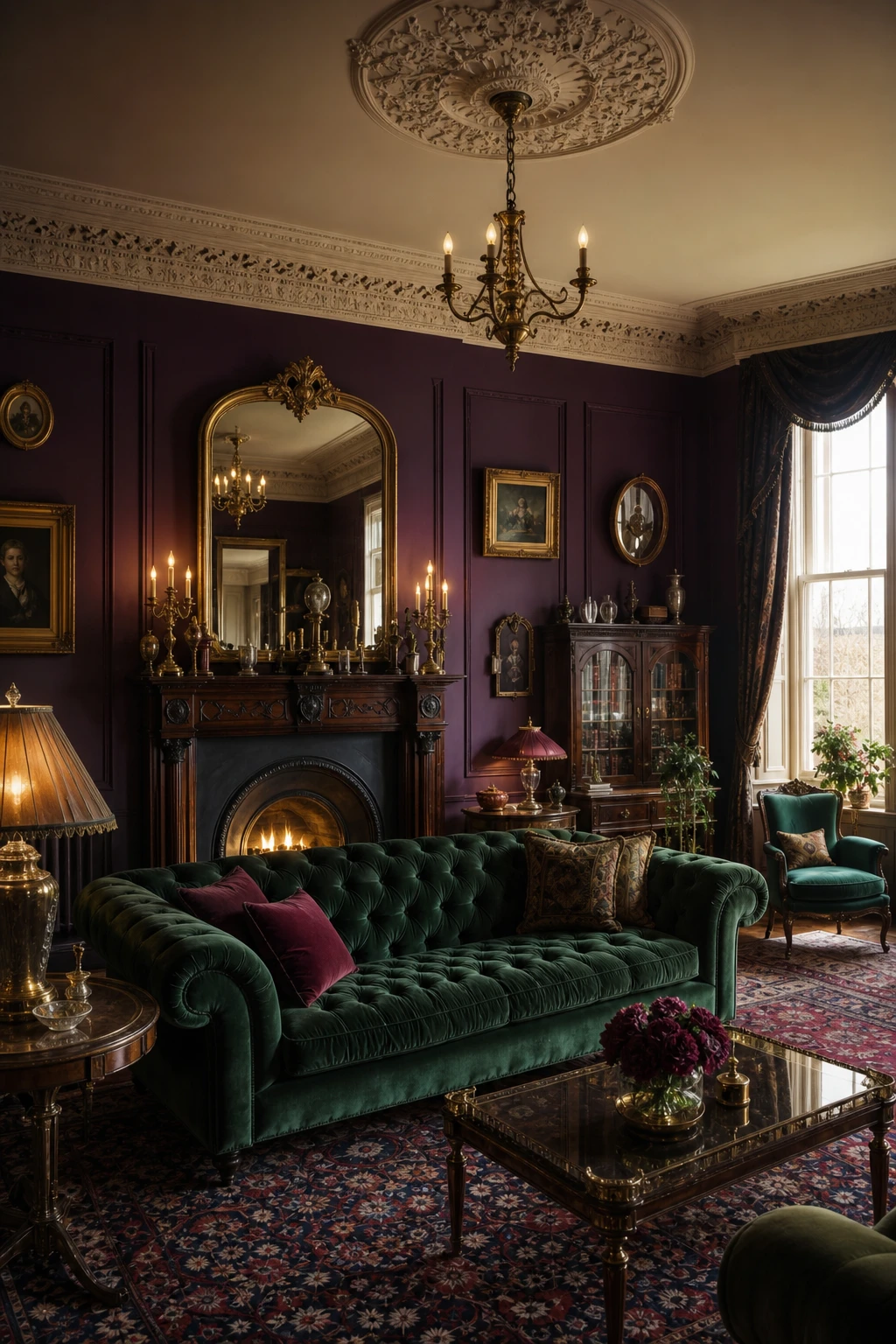
Victorian Color Palette Ideas That Feel Opulent Without the Fuss
Jewel tones earn their keep in a Victorian room because the gilding does the heavy lifting alongside them. A deep sapphire or ruby wall stops feeling heavy the moment a gilded mirror throws light back across it, and that push and pull between richness and warmth is the thing I am always chasing. The eye keeps moving rather than feeling overwhelmed, which is exactly what a room this ambitious needs.
The Key Details
Tufted velvet Chesterfield sofa
Carved mahogany fireplace surround
Gilded overmantel mirror
Ornate plasterwork cornice and ceiling medallion
Layered Persian wool rug
Pro TipPaint just the dado panel in your boldest jewel tone first, then live with it for a week before committing the full wall, because the colour will read very differently once the gilt accents are in place.
AvoidReaching for three or four saturated colours in the same room at once flattens the drama you are working so hard to build, because no single tone gets the space to breathe and sing.
Georgian Color Palette Choices That Make a Room Feel Serene
Georgian rooms earn their serenity through proportion first, and colour second. What I love is how pale stone tones sit so naturally against the crisp geometry of dentil cornicing and tall sash windows, giving you a room that feels calm without feeling empty. The limestone floor pulls the warmth downward, the sage linen chairs hold the middle ground, and a carved marble fireplace gives the eye a single point of quiet drama. Every element earns its place.
The Key Details
Plaster cornice with dentil moulding
Tall sash windows with ivory silk curtains
Carved marble fireplace surround
Pale limestone flooring
Wing back armchairs in dusty sage linen
Pro TipPaint your panelling in a stone white with a yellow undertone, not a grey one, so the room glows rather than recedes when the lamps come on in the evening.
AvoidChoosing a stone colour with a cool or blue base looks flat and slightly sad the moment natural light drops, which in a Georgian room with deep reveals happens earlier than you expect.
Medieval Color Palette Tones That Root a Room to the Earth
Ochre and rust are the colours I reach for when a room feels unmoored, too light, too cool, too disconnected from anything real. Watch how they pull the carved oak and worn flagstone into a single warm conversation, the way a fire ties a whole hall together. You get that quality of age and rootedness without a single antique in the room.
The Key Details
Carved oak settle with leather cushions
Hand forged iron chandelier
Smoke darkened exposed timber beam ceiling
Worn flagstone floor
Deep set arched window with leaded glass panes
Pro TipBorrow your ochre and rust tones directly from an antique tapestry fragment or a wool kilim, even a small one, because the colours in woven textiles have already been softened by time and they will sit far more honestly on your walls than a fresh paint chip chosen in isolation.
AvoidPainting all four walls in a flat ochre and calling it done leaves the colour looking muddy and lifeless, because earthy tones only come alive when rough textures like undyed wool, aged timber, and hammered iron are giving the light somewhere to catch and shift.
1800s Color Palette Shades That Bring Old World Softness Indoors
Muted mid tones from the 1800s carry a softness you simply cannot fake with modern paint ranges, and that is what wins me over every time I work with them. The pigments read warm and a little dusty, the way aged plaster does, so every surface feels like it has earned its place. You get a room that breathes quietly rather than one that shouts, and the carved walnut, linen and stone all settle into that palette as if they were always meant to be there.
The Key Details
Carved walnut settee with wool damask upholstery
Wide plank oak flooring
Tall sash windows with gathered linen panels
Stone hearth with cast iron grate
Framed botanical print above mantel
Pro TipTake your aged plaster tone straight onto the ceiling at full strength so the whole room wraps you in one continuous warmth rather than the ceiling cutting the mood cold.
AvoidReaching for a crisp modern white for the trim strips the period softness right out of the room and leaves your carefully chosen muted walls looking muddy rather than mellow.
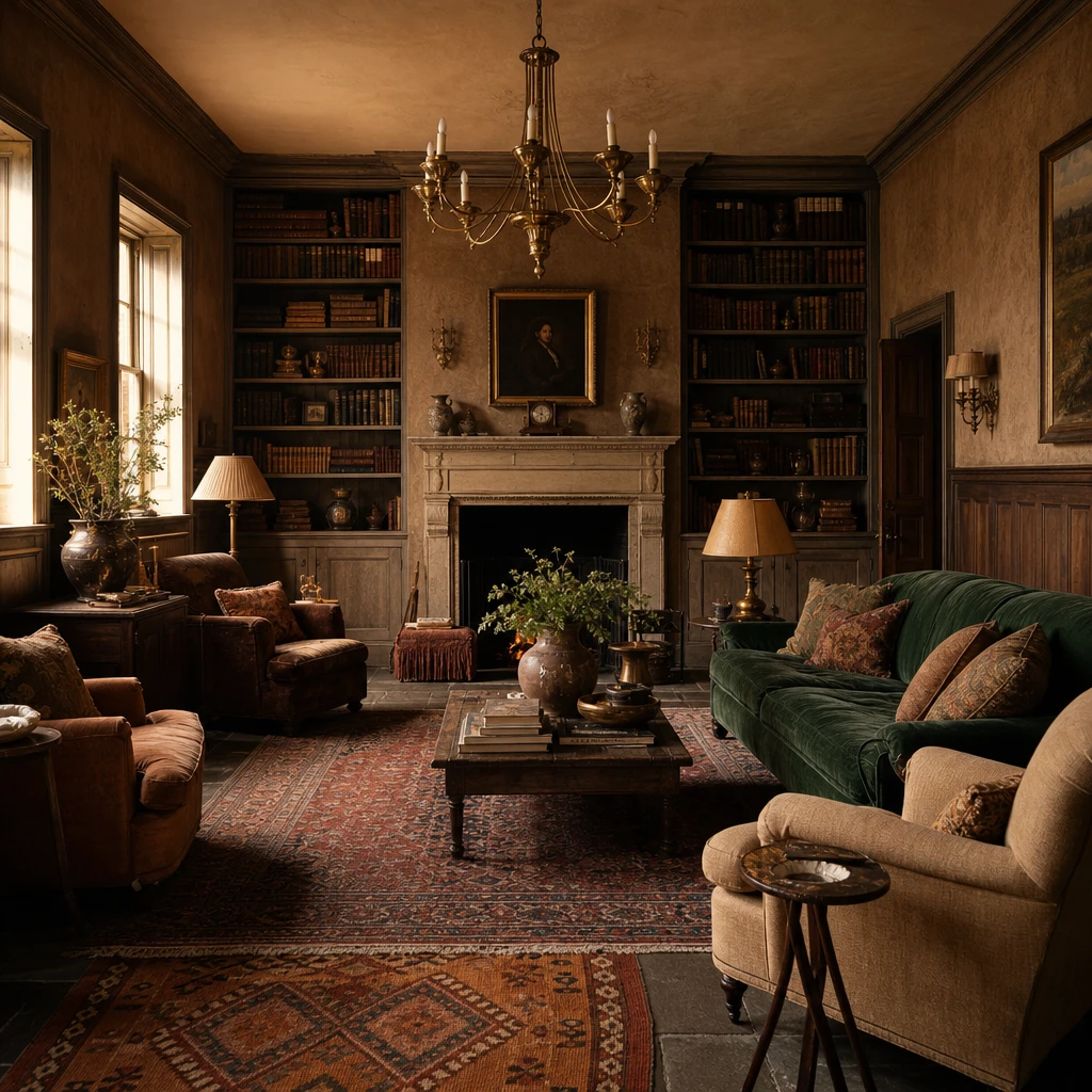
Dark Academia Color Palette Rooms That Feel Like a Beautiful Old Novel
Deep umber and ink tones do something a lighter palette simply cannot: they pull the whole room inward, so you feel held by the space rather than exposed in it. What I love about the Dark Academia mood is that every element, the chesterfield, the floor to ceiling shelves, the aged oak underfoot, reads as though it has been there for a century and earned its place. You get that sense of accumulated meaning, which is the whole point.
The Key Details
Buttoned chesterfield leather armchair
Floor to ceiling timber bookshelves with leather bound volumes
Brass articulated reading lamp
Aged oak herringbone floor
Tall sash window with original glazing bars
Pro TipStack books spine out in warm tan and burgundy tones alongside your darker volumes so the shelves echo the umber and ink of the walls and tie the whole room together.
AvoidSkipping warm light sources in favour of cool white bulbs will tip the palette from contemplative into cold and unwelcoming, losing everything the dark tones were meant to give you.
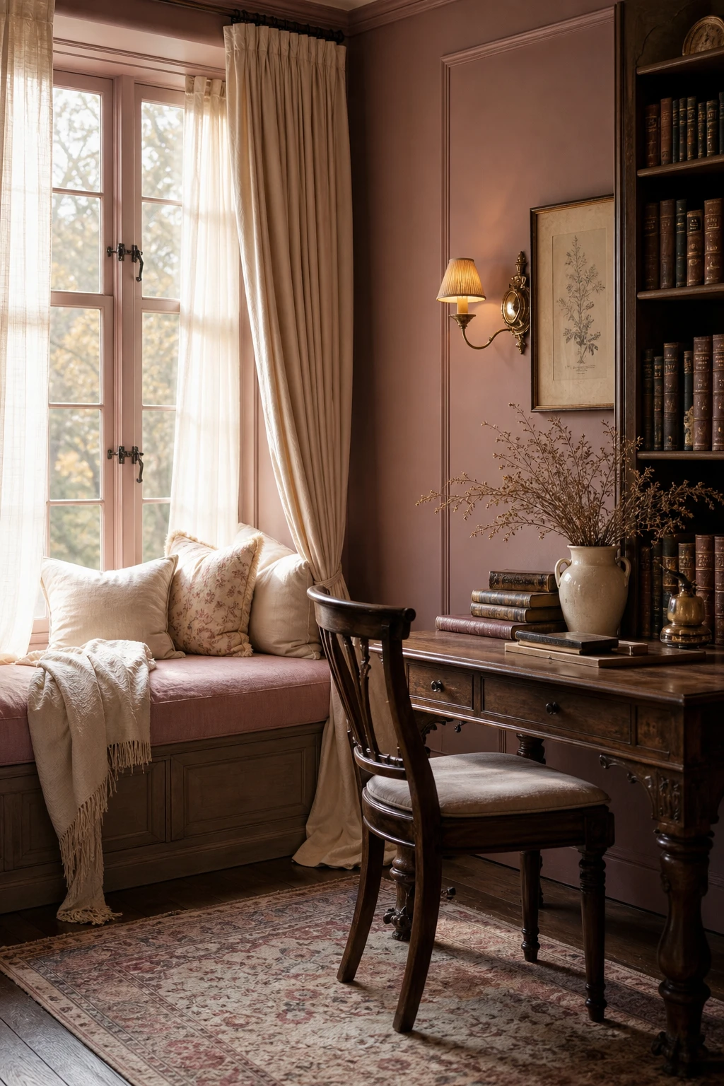
Soft Academia Color Palette Ideas for a Gentler Scholarly Look
Dusty rose and warm cream take the traditional scholarly interior and breathe something gentler into it. The rose reads as faded rather than sweet, so you still get the weight of an old library without any of the severity, and that balance is what I find so hard to achieve with bolder shades. Cream acts like aged paper brought into the walls and fabric, tying every surface together so quietly you almost miss it.
The Key Details
Window seat with dusty rose linen cushion
Aged brass wall sconces
Cream drapes pooling on worn oak floor
Leather bound books stacked on writing desk
Dried botanicals in cream ceramic vase
Pro TipLayer an aged paper linen cushion beside a faded floral accent to give the room that well loved, gently worn quality that makes soft academia feel lived in rather than staged.
AvoidPiling too many distressed or antique pieces into one room pushes the look past charming and into chaotic, which swamps the calm, reflective mood the palette is meant to create.
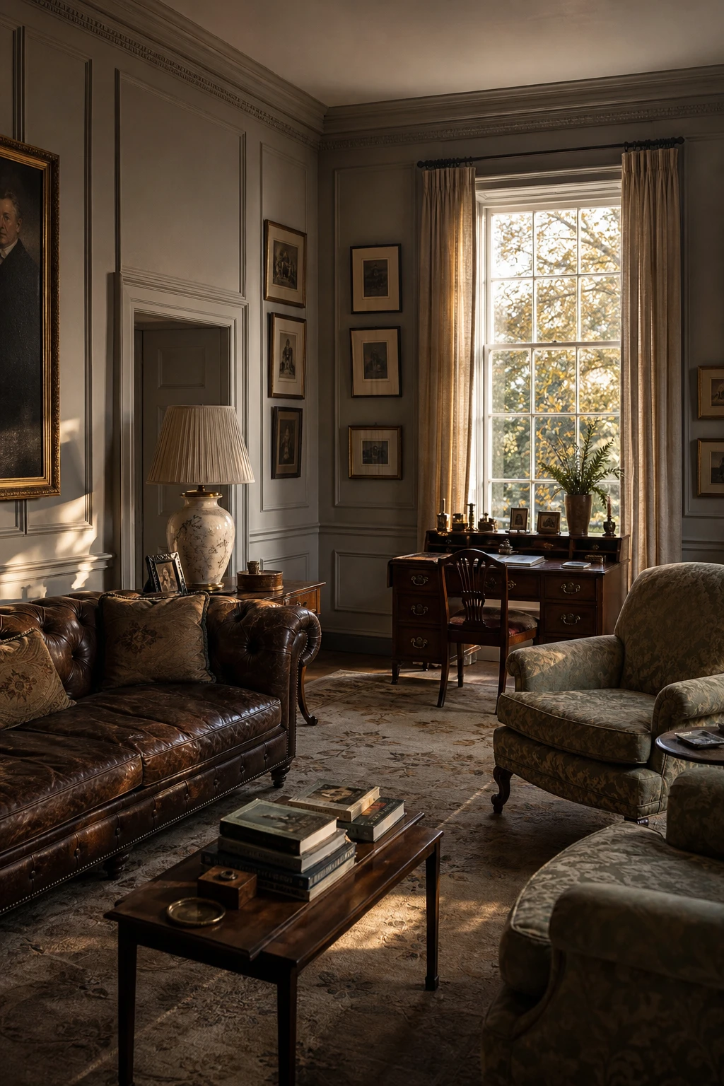
Old Money Color Palette Rooms That Whisper Rather Than Shout
Rooms that whisper are the hardest to pull off, and the ones I find most satisfying. The aged tobacco leather, dusty sage silk, and worn Aubusson all sit in the same low, quiet register, so nothing competes and nothing shouts. You get a sense of wealth that has never needed to prove itself, which is exactly what understated neutrals do when you choose them with patience.
The Key Details
Buttoned Chesterfield sofa in aged tobacco leather
Silk damask armchairs in dusty sage
Georgian mahogany writing desk
Tall sash windows with unlined linen curtains
Worn Aubusson rug
Pro TipIf the budget allows one splurge, put it into the silk damask armchair fabric, because that single exceptional material will lift every humbler piece around it.
AvoidLoading a restrained palette with too many patterns or finishes muddles the quiet confidence you are trying to build and makes the room read as cluttered rather than considered.
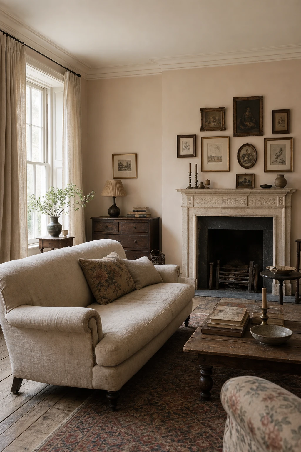
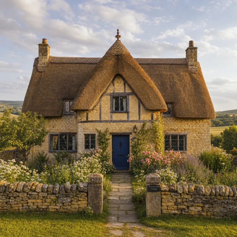
English Cottage Color Palette Ideas That Feel Like Coming Home
Wrapping a small room in one warm white from skirting to ceiling, then pulling a faded sage into the soft furnishings, is a trick that wins me over every time. You lose the hard edges where walls meet trim, and the room suddenly breathes. What I love about this pairing is how the sage reads almost like a neutral, so the leaded windows and worn flagstone do the talking rather than the colour.
The Key Details
Leaded casement windows with deep splay reveals
Low stone fireplace with timber mantel
Worn flagstone flooring
Linen slipcovered armchairs
Hand knotted wool rug
Pro TipPaint your skirting, architrave, and ceiling the same warm white as the walls so a low cottage ceiling appears to lift without any structural work.
AvoidMixing three or four colours in a small cottage room breaks the calm spell entirely and makes the space feel cluttered before a single piece of furniture goes in.
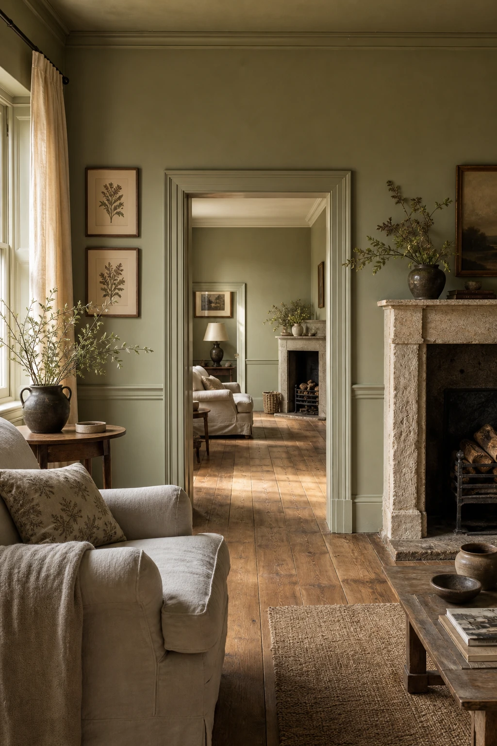
English Country Paint Color Palette That Works in Any Room
Think of connecting rooms as one long conversation rather than separate chapters and the whole house becomes easier to plan. A soft stone or warm white running through the corridor holds every adjoining room together, so the deeper sage in the sitting room and the dusty blue in the bedroom feel related rather than random. That sense of a scheme breathing easily from one end of the house to the other is what I am always working toward when I lay out a country palette.
The Key Details
Carved stone fireplace surround
Aged oak floorboards
Linen slipcover armchairs
Painted dado rail
Framed botanical print grouping
Pro TipPaint your hallway and landing in the lightest neutral from your palette so it acts as a calm thread that every room can borrow from.
AvoidChoosing each room’s colour in isolation, under different light conditions, almost always produces a scheme that jars at every doorway rather than flowing.
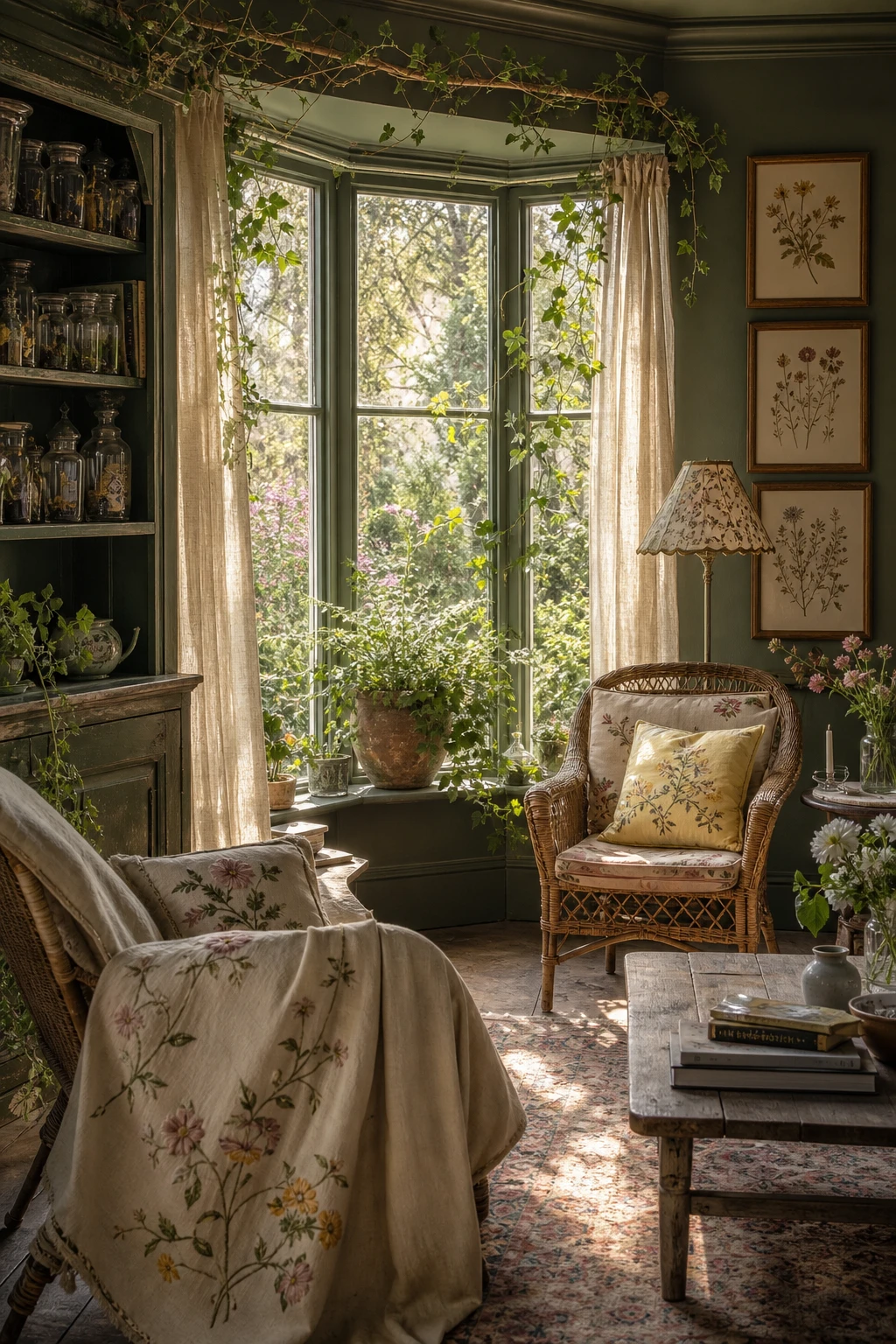
English Garden Color Palette Brought Inside for a Fresh Room Feel
Bringing garden tones inside is one of my favourite moves when a room feels too controlled and needs breathing room. Soft sage, dusty rose, and faded lavender carry the same quiet energy as a late summer border, and you will notice how the whole space relaxes the moment those colours land on fabric and walls. What I love most is that floral tones pulled from nature never fight each other, they already know how to sit together.
The Key Details
Rattan armchairs with floral linen cushions
Sheer muslin window panels
Botanical specimen jars on painted shelf
Trailing ivy arrangement in terracotta pot
Hand embroidered botanical throw
Pro TipPaint just one wall in a muted garden green and position your main seating to face it, and it frames the room like a window looking out into the garden itself.
AvoidReaching for a fresh, saturated green instead of a dusty or grayed one strips out all the natural softness and leaves the room feeling more like a kitchen than a garden.
Historical Paint Colours That Look Incredible in a Modern Home
Historical pigments carry a depth that modern paints rarely match, and that richness is what wins me over every time. The reason comes down to how they were made: natural minerals and earth oxides absorb light rather than bouncing it back, so the colour shifts and breathes as the day moves. You get a wall that almost feels alive, which is why these shades sit so comfortably next to raw stone and aged brass.
The Key Details
Carved stone fireplace surround
Built in timber bookshelves
Chesterfield linen sofa
Tall sash windows
Patinated brass table lamp
Pro TipPair a deep historical wall colour like an ochre or an aged verdigris with a clean lined contemporary sofa, and the contrast does the decorating for you.
AvoidMatching every element too precisely to the period turns a beautiful room into a showpiece nobody wants to sit in.
Dark Rich Colors on Every Wall and Why They Work So Well
Dark rich walls only truly sing when you commit to all four of them. What I love about going all in is the way the room stops feeling like a box and starts feeling like a place, somewhere you actually want to sit and stay. You get that deep, enveloping quality that one or two dark walls simply cannot deliver, and the furniture and books and fireplace all read as treasured objects set against velvet rather than floating against paint.
The Key Details
Floor to ceiling built in bookshelves
Tufted aged leather armchair
Antique brass picture lights
Carved stone fireplace surround
Ornate plaster ceiling medallion
Pro TipCarry the dark colour up onto the ceiling too, and the room wraps around you like a proper cocoon rather than a well painted box.
AvoidStopping the paint at the picture rail leaves a pale strip of ceiling that breaks the mood and makes the whole scheme feel unfinished, no matter how good the colour below is.
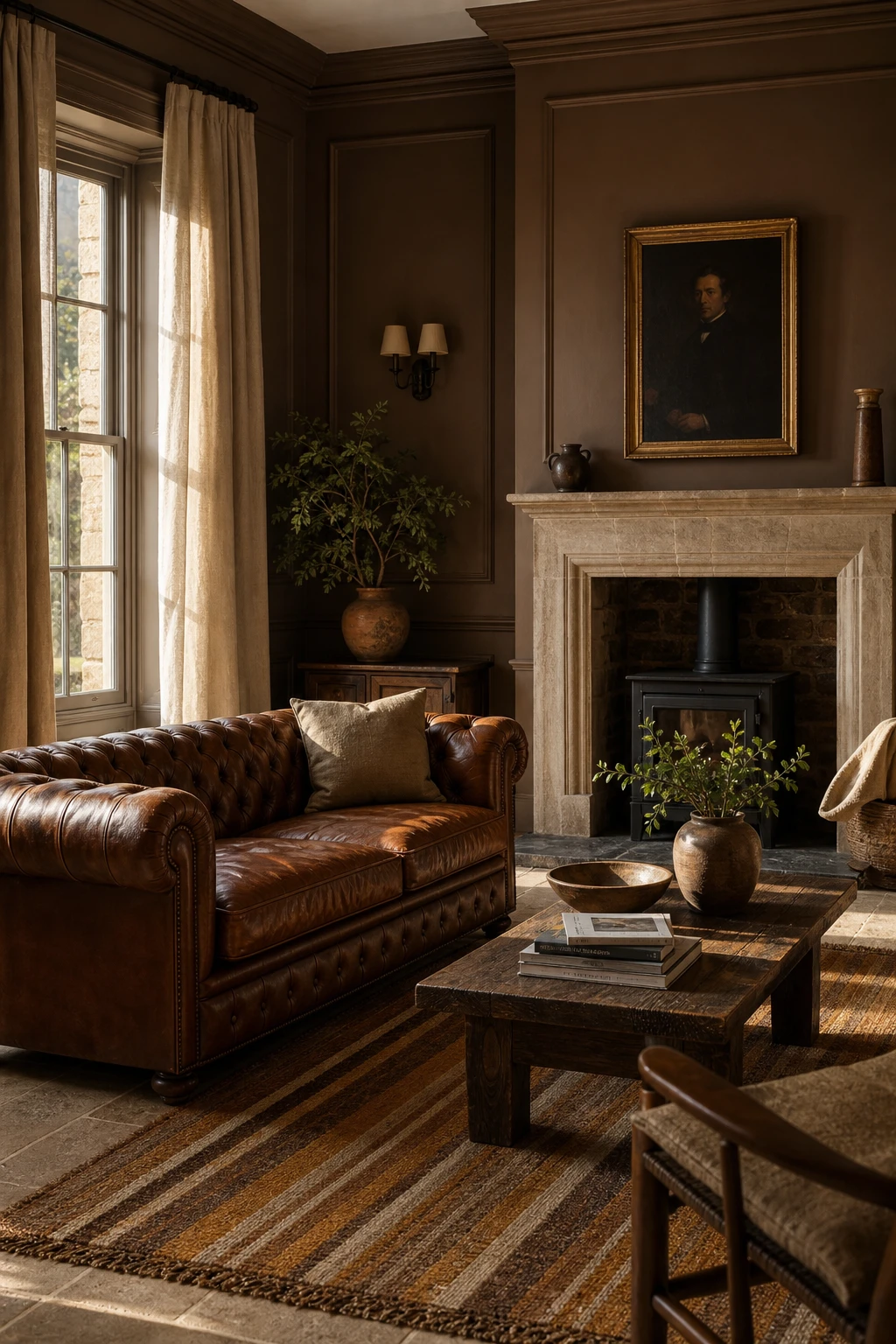
Brown and Bronze Together and the Warmth They Bring to a Room
Brown rooms live or die by how much light they can hold, and bronze is what I reach for to solve that. The metallic sheen catches the flame of a candle or the glow of a lamp and bounces it back into corners that flat earthy tones would otherwise swallow. You get depth without darkness, warmth without weight, and the whole room settles into something that feels genuinely old and genuinely alive.
The Key Details
Burnished bronze floor lamp
Chesterfield leather sofa in chestnut
Amber and sienna wool kilim rug
Wide oak plank flooring
Built in bookshelves with bronze bookends
Pro TipUse a satin finish on your bronze accessories and a matte finish on the surrounding brown surfaces so the metal reads as a true highlight rather than blending into the background.
AvoidKeeping everything in flat matte brown without a single metallic note leaves the scheme looking heavy and closed in, robbing the room of the warmth it should be delivering.
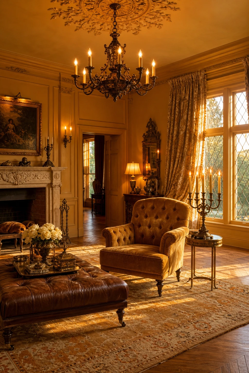
Antique Gold Color Palette Ideas That Glow in Evening Light
Honey and aged gold tones do something bright metallics simply cannot: they hold warmth rather than throwing it back at you. What I love about this palette is the way candlelight and table lamps pool across the damask and the tufted velvet, turning the whole room amber by evening. You get depth without heaviness, and the herringbone oak underneath ties every piece of furniture to the same warm family of colour.
The Key Details
Silk damask curtains
Carved stone mantelpiece
Tufted velvet armchair
Wrought iron chandelier with brass candelabra cluster
Herringbone oak parquet floor
Pro TipHang gilded frames and set candlesticks at sitting eye level so lamp light catches them directly rather than skimming past overhead.
AvoidBright polished gold sits in the wrong century, reading as contemporary glam and pulling focus away from the aged, layered feeling the rest of the room is working hard to build.
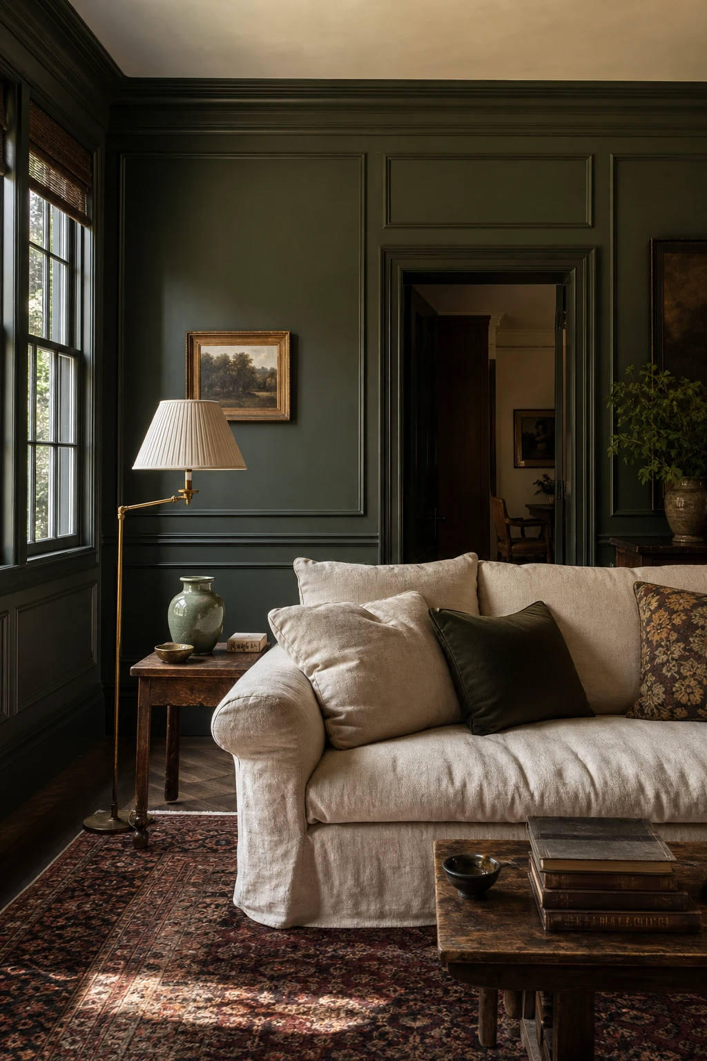
Dark Green Color Palette Combinations That Feel Rich and Restful
Dark green paired with aged brass and natural linen is a combination that wins me over every single time. The green anchors the room with real depth, the brass pulls out its warm, earthy undertones, and the linen stops it all feeling too heavy. You get a room that reads as both rich and genuinely restful, which is a hard balance to strike.
The Key Details
Panelled dark green walls
Aged brass floor lamp
Natural linen sofa
Persian wool rug
Tall sash windows
Pro TipBefore you commit to a tin, paint a large sheet of card and hold it against your floor in both morning and evening light, because dark greens shift dramatically depending on what is beneath them.
AvoidReaching for a blue toned dark green in a warm room pulls the whole space cold and flat, and no amount of brass or linen will fully rescue it.
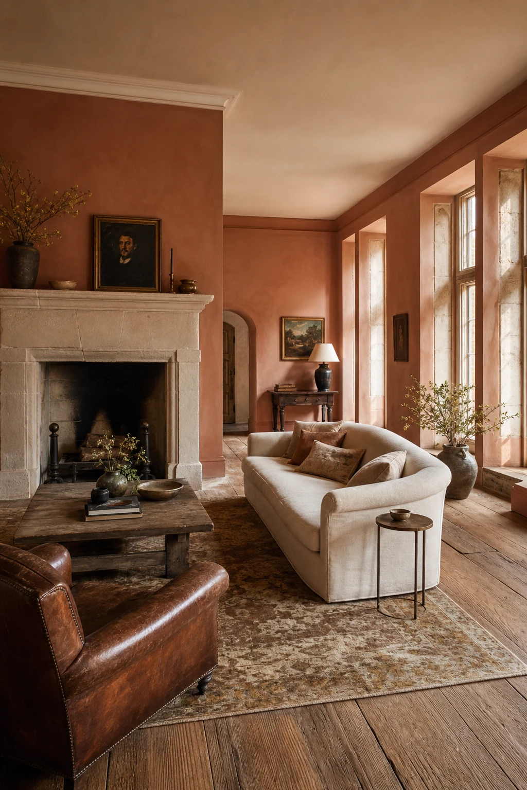
Terracotta Color Palette Rooms That Feel Sun Warmed All Year
Terracotta earns its warmth when you ground it in things pulled straight from the earth, and that is exactly what I reach for here. Natural stone and cream linen absorb the colour rather than fight it, so the whole room settles into something quiet and sun baked. You will notice how the aged oak floor and ochre rug keep every tone within the same warm family, which is the thing I always check before signing off a palette like this.
The Key Details
Natural stone fireplace surround
Cream linen sofa
Aged oak floorboards
Hand knotted wool rug in ochre and ivory
Stone mullion casement windows
Pro TipPaint just one wall in terracotta and let the stone fireplace carry the warmth across the rest of the room, so the colour reads rich without closing the space in.
AvoidPairing terracotta with cool grey drains every drop of warmth from it, leaving the room feeling flat and slightly grimy rather than sun baked.
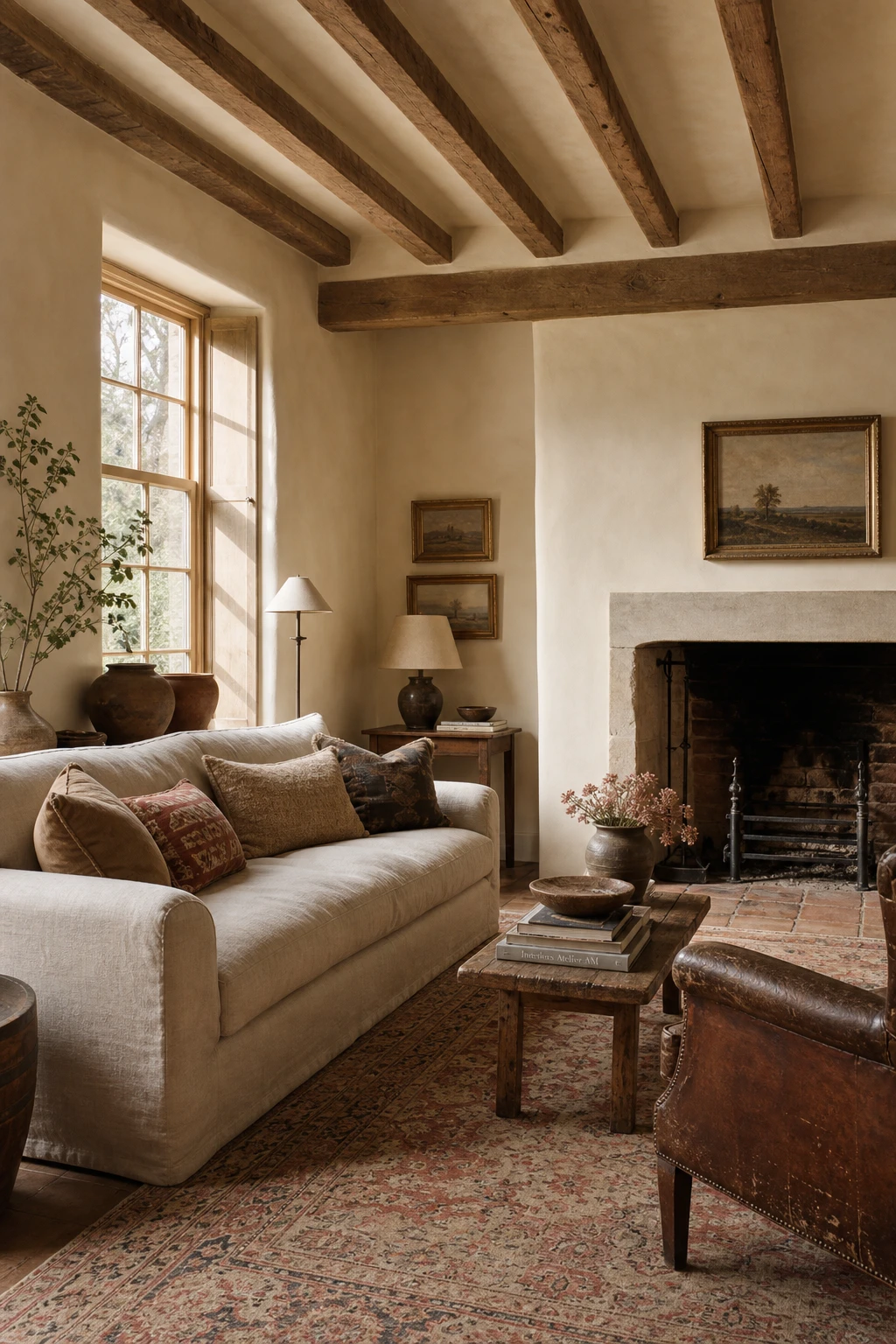
Parchment Color Palette Shades That Make a Room Feel Timeless
Parchment tones on large surfaces do something plain white simply cannot: they hold warmth in the room even on grey days, and that is what gives an English interior its settled, lived in quality. What I love about a yellow leaning parchment is the way it pulls aged oak beams, worn leather, and faded Persian rugs into a single quiet conversation. You get depth without colour, which is a rare thing to achieve on a wall.
The Key Details
Exposed oak ceiling beams
Tall sash windows with timber glazing bars
Oatmeal linen sofa
Worn leather wingback chair
Faded Persian rug
Pro TipWhen sampling parchment shades, hold the paint card next to your woodwork in afternoon light and choose the one that makes the timber look golden rather than green.
AvoidPicking a shade that is too pale means the wall reads as off white on screen but flat brilliant white in the room, and the whole period character you were after simply disappears.
Muted Vintage Color Palette Choices for a Faded and Lovely Room
Fading colours intentionally is one of my favourite quiet tricks, because the room stops feeling decorated and starts feeling lived in. What I love here is how aged linen, worn oak, and oyster linen curtains all carry slightly different temperatures of the same pale warmth, so you get layers rather than a flat wash. Watch how the threadbare Persian rug anchors it all, its own colours already softened by decades of foot traffic, and the whole room reads as gathered slowly rather than bought in a weekend.
The Key Details
Roll arm sofa in aged linen upholstery
Worn oak plank flooring with threadbare Persian rug
Carved limestone fireplace surround
Antique frames clustered above the mantel
Tall sash windows with unlined oyster linen curtains
Pro TipPull two or three shades of the same tone, one slightly greener, one slightly warmer, and let them sit side by side so the eye reads depth instead of monotone.
AvoidChoosing colours that have all their pigment stripped out in equal measure leaves a room looking bleached and tired rather than beautifully faded.
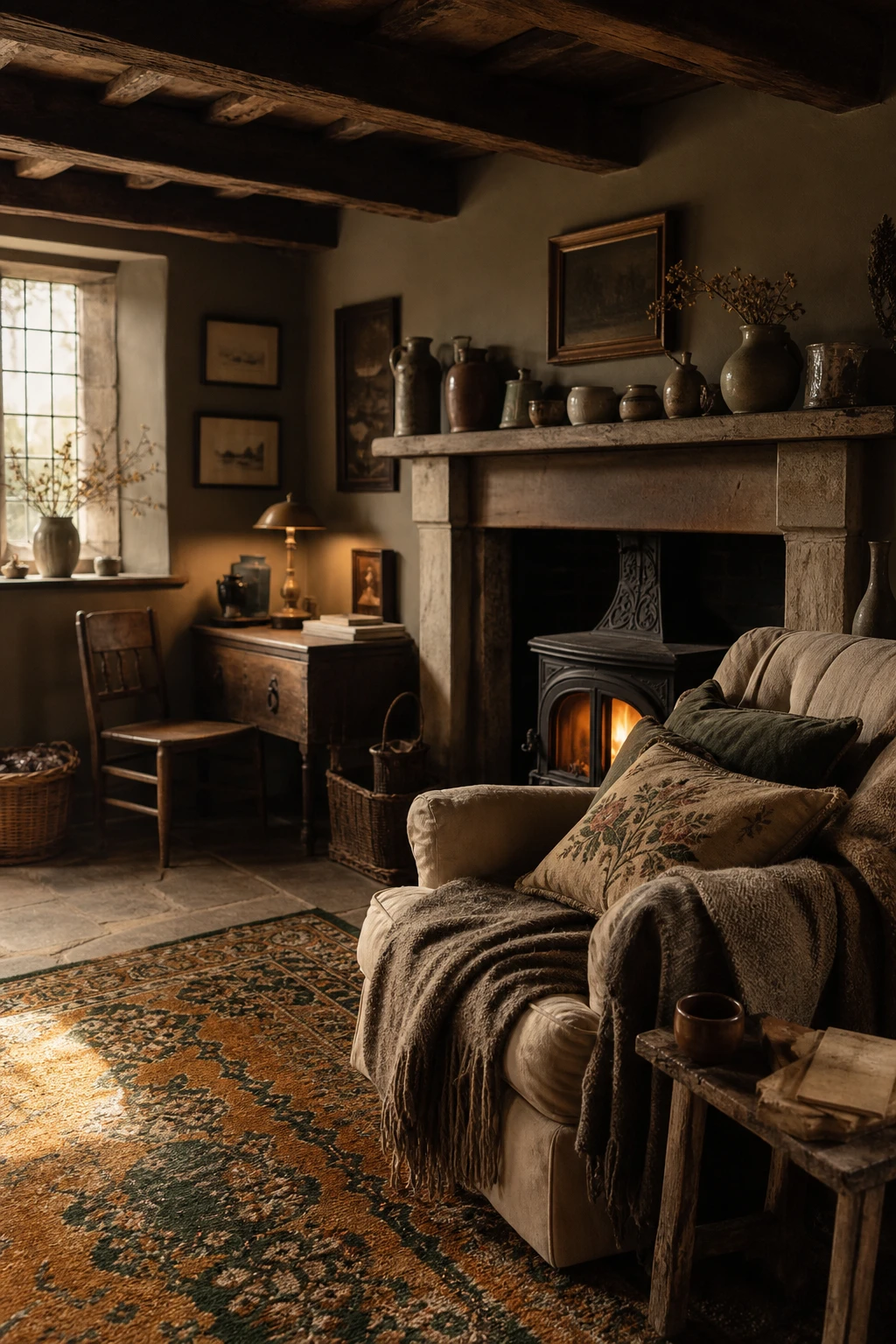
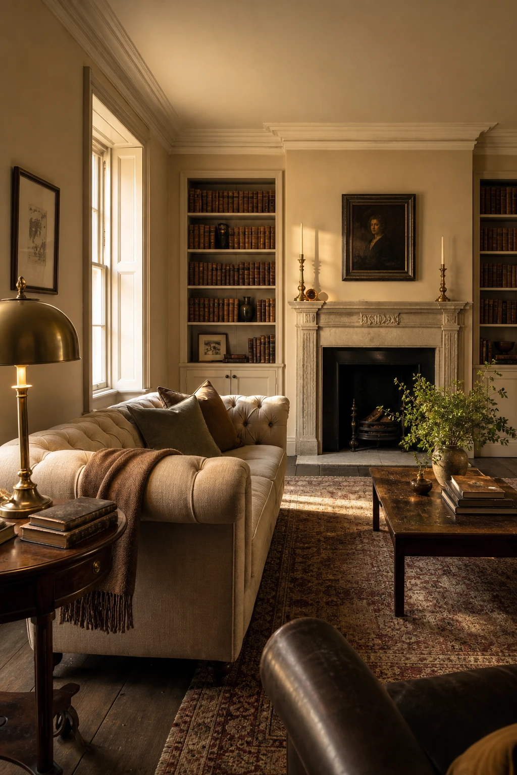
Earthy Colour Schemes That Feel Grounded and Genuinely Warm
Earthy schemes built from soil, stone, and bark tones feel settled in a way that brighter palettes simply cannot match, and that groundedness is exactly what I reach for in an English interior. You get this quiet hierarchy where cognac leather, aged oak, and raw flax all belong to the same family, so nothing shouts. What wins me over every time is how natural light shifts across these tones through the day, keeping the room alive without any effort.
The Key Details
Tufted cognac leather chesterfield sofa
Stone fireplace surround with mortar joints
Hand knotted ochre and umber wool rug
Raw flax linen curtains on tall sash windows
Aged oak panelling and flagstone flooring
Pro TipBring in a clay pot or a rattan basket to give the palette a textural anchor point that paint and fabric alone cannot quite deliver.
AvoidPacking an earthy palette with five or six tones of near identical depth flattens everything into a muddy sameness that reads as dim rather than warm.
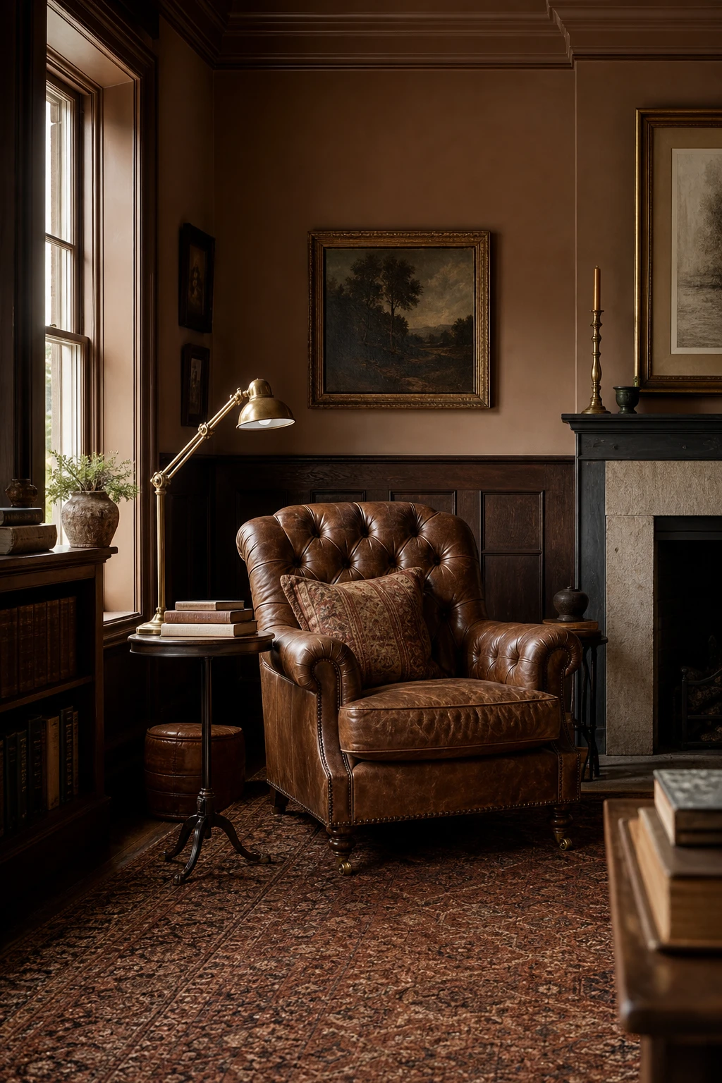
Rich Brown Palette Ideas That Are Anything But Boring
Brown earns its place here not through contrast but through depth, and that is the thing I always check first. Layer a tufted leather armchair over oak panelling and a sienna herringbone rug and you get a room that feels like it has been lived in for generations. What I love is how each surface reads slightly differently, warm amber here, cool grain there, so your eye keeps moving without ever feeling restless.
The Key Details
Tufted leather armchair
Oak tongue and groove panelling
Brass articulated reading lamp
Sienna wool herringbone rug
Tall sash window
Pro TipReach for a brown with a red or amber undertone rather than a grey one, because warm leaning browns pull the whole room together in evening light.
AvoidChoosing soft furnishings in a single flat brown with no tonal variation makes the room feel airless and muddy, no matter how good the individual pieces are.
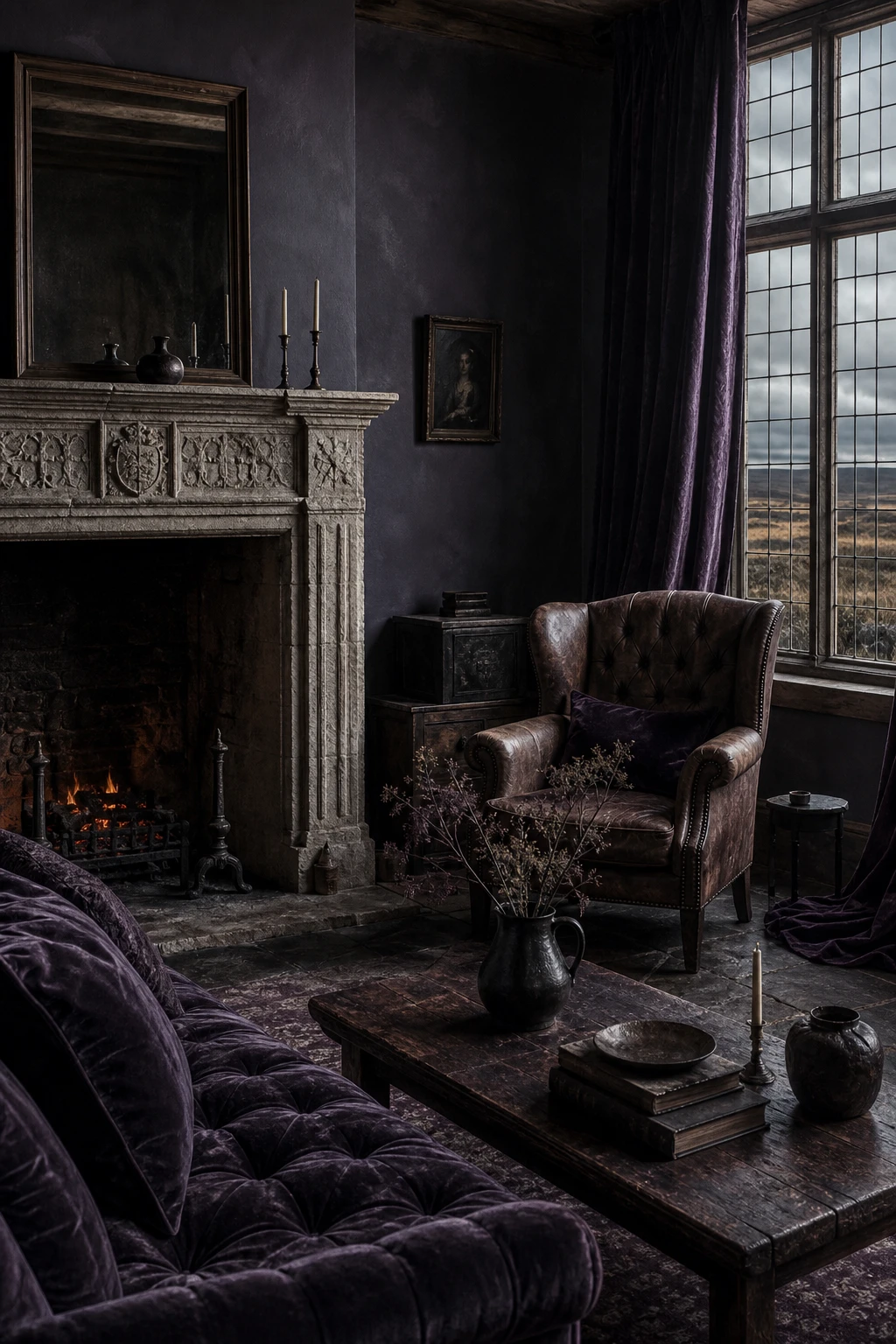
Wuthering Heights Color Palette for a Room Full of Romantic Drama
Storm grey and deep heather pulled straight from the moors give a room a brooding, windswept energy that I find completely irresistible. What wins me over is the tension between the two tones: the cold grey holds the drama and the heather pulls in just enough warmth to stop the room feeling bleak. You get that Brontë esque romance without it tipping into gloom.
The Key Details
Carved stone fireplace surround
Deep heather velvet curtains
Weathered leather wingback chair
Flagstone flooring
Mullioned casement windows
Pro TipFix a raw stone or rough lime plaster panel to one wall and watch how it makes the whole palette read as wild and elemental rather than simply dark.
AvoidRelying on overhead light alone with colours this deep leaves the room feeling heavy and cave like, so layer in candles or warm low level lamps to lift the mood.
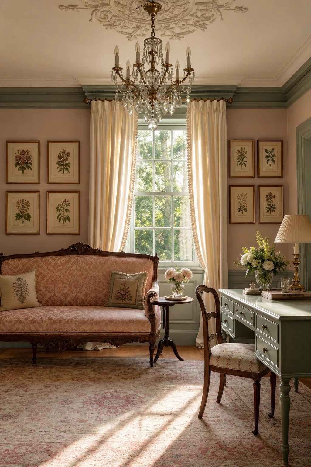
Pride and Prejudice Color Palette and the Softness It Brings a Room
Blush, cream, and sage sit together the way a watercolour trio does, each one quiet enough to let the others breathe. What I love is how sage on the panelling anchors the scheme with just enough green coolness, so the blush above reads romantic rather than sweet. You get that particular Regency softness, the feeling of a room that is delicate without being fussy, and the cream threads through both to keep everything composed.
The Key Details
Blush damask upholstered Regency settee
Crystal droplet chandelier on plaster ceiling medallion
Ivory silk sash window drapes
Symmetrical botanical watercolor wall gallery
Rose and ivory aged Turkish rug
Pro TipPaint the panelling in a dusty sage and carry a warm blush onto the wall above the rail, because the contrast in tone is what lifts the ceiling and stops the room feeling flat.
AvoidTipping the balance too far into pink by using a bright or warm blush turns the whole scheme sugary and the Regency elegance you were after disappears completely.
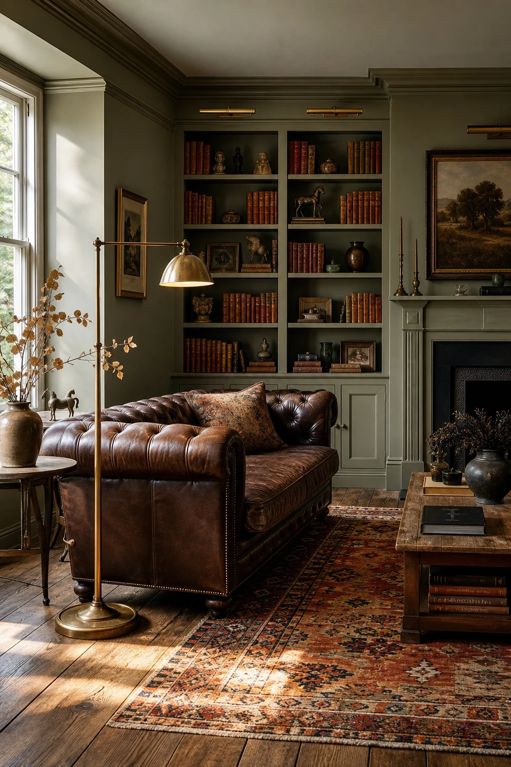
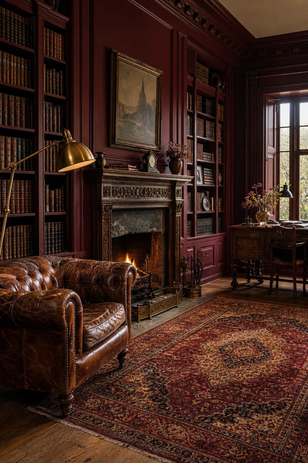
Library Colour Palette Rooms That Feel Like the Best Kind of Escape
Deep jewel tones do something a pale room simply cannot: they pull you in and hold you there. The colour wraps around you the moment you close the door, and you will notice the books themselves become part of the decoration rather than clutter. Warm oak shelving against a saturated wall, a teal or a forest green, creates that layered depth, and the contrast between living timber and rich pigment is the thing I keep coming back to every time I design a proper library.
The Key Details
Chesterfield leather armchair
Floor to ceiling oak bookshelves
Carved stone fireplace surround
Brass swing arm reading lamp
Persian wool rug
Pro TipPaint the back panel of each shelf shelf in a tone two shades darker than the wall so every row of spines sits forward and catches the eye.
AvoidChoosing a soft neutral for a library strips away the whole point of the room, leaving it feeling like a corridor rather than a sanctuary.
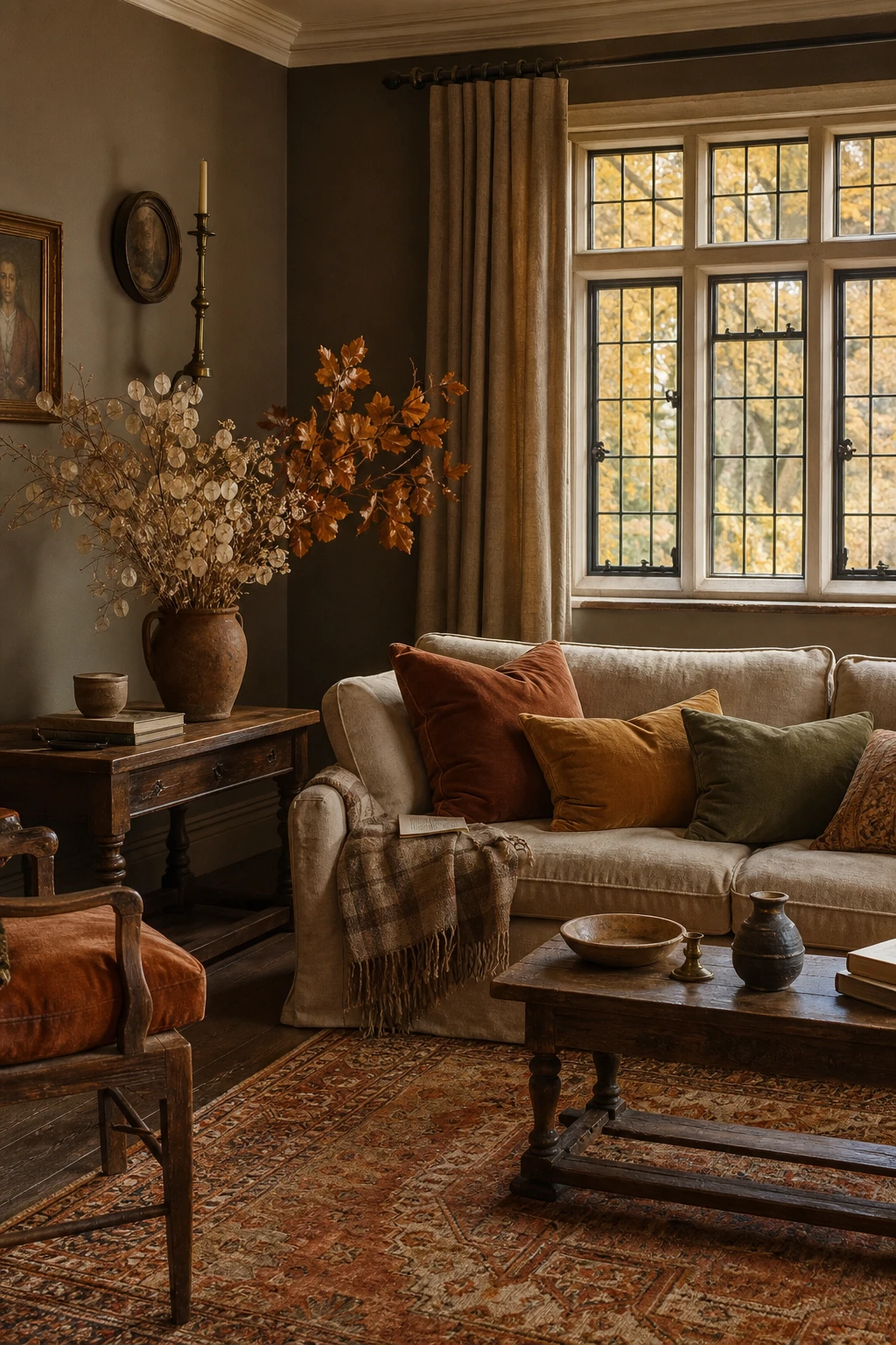
Muted Autumn Palette Ideas That Keep a Room Feeling Warm All Season
Muted autumn tones are one of my favourite seasonal moves because you shift the whole mood of a room simply by swapping out cushions and throws. Watch how tawny ochre and soft rust borrow warmth from whatever daylight is left, while a worn kilim and dried honesty arrangement anchor things without screaming October. You get that cosy, settled feeling without touching a single wall.
The Key Details
Velvet and linen cushion layering in tawny ochre and sage
Aged oak side table
Worn Turkish kilim in amber and terracotta
Dried honesty and beech leaf arrangement
Leaded casement windows
Pro TipBring in amber and rust velvet cushions in early September so the room feels ready before the light changes, not like you scrambled to catch up.
AvoidReaching for the deepest, most saturated burnt orange you can find looks exciting in the shop but turns heavy and oppressive once the short grey days of December arrive.
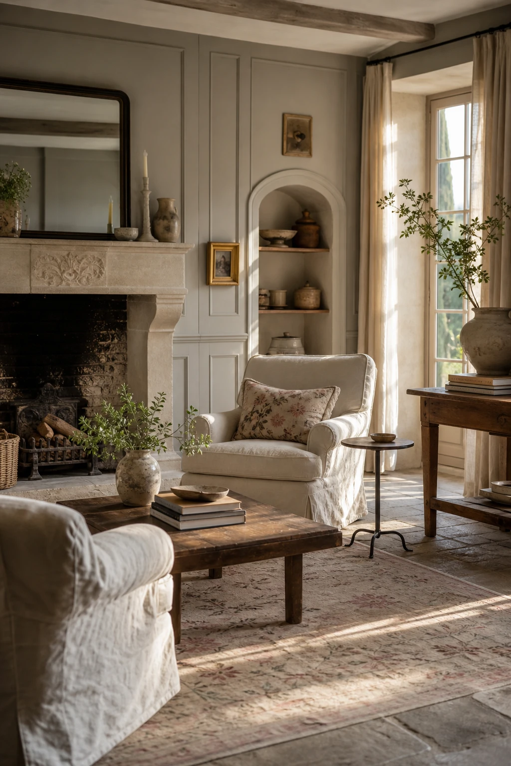
French Country Color Palette and What It Shares With the English Look
French Country and English country share a love of faded, lived in colour, but the mood shifts the moment you cross the Channel. What I notice in a French scheme is that lavender, soft sage, and chalky blue do the heavy lifting, keeping things airy and a little sun bleached. English country leans warmer, reaching for ochre, brick, and tobacco. Spot that difference and you can borrow one note from Provence without the room losing its footing.
The Key Details
Carved limestone fireplace surround
Loose linen slipcover armchairs
Painted tongue and groove wall panelling
Stone flagged floor with faded botanical rug
Tall casement windows with unlined linen drapes
Pro TipAdd a single greyed lavender cushion or throw to an otherwise English scheme and you get a whisper of Provence without pulling the room off course.
AvoidSplitting the room evenly between both styles leaves it feeling undecided, and guests will sense the room is trying to be two things at once.
Alan launched Edward George London in 2017. Since completing his masters in Town & Regional Planning (MPlan) he has combined the skills he learned at the University of Sheffield with his passion for design, to help create a foundation for those looking to create a beautiful home.