I have always thought a pink English country bedroom is one of the most quietly beautiful things a room can be. There is something about soft roses on the curtains, a warm blush on the panelling, and a brass bed piled with quilts that just feels like home. In this piece I share the details I love most, from toile de Jouy drapes to grasscloth walls to the paintiest pinks Farrow and Ball make, and every single one is a look you can borrow for your own room.
How a Pink English Country Bedroom Gets That Head to Toe Rosy Glow
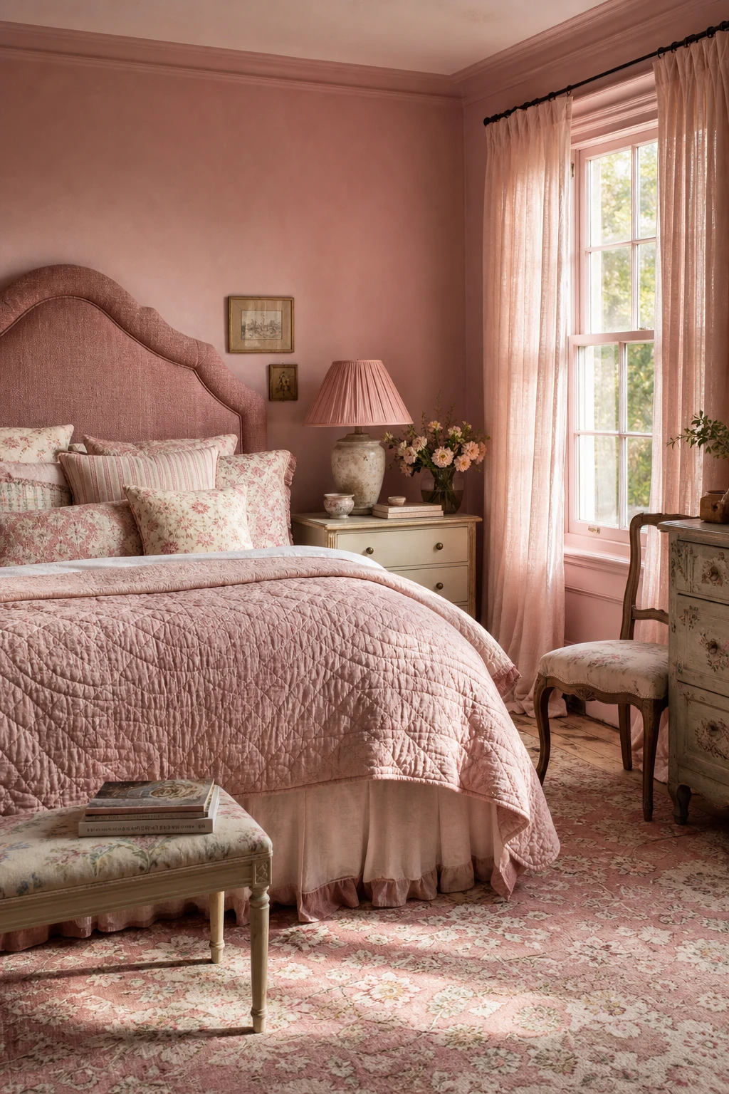
Wrapping a room in pink from the walls down to the rug is one of my favourite moves when I want a space to feel genuinely enveloping rather than just decorated. You get warmth on every surface, but the magic is in the variation: a dusty rose wall reads differently beside a blush eiderdown and a faded antique rug, so each layer earns its place. What I love most is how the tones shift as the light changes through the day, keeping the room alive rather than flat.
The Key Details
Upholstered linen headboard
Floral and ticking cushion stack
Quilted blush eiderdown
Tall sash windows with sheer linen curtains
Faded antique wool rug
Pro TipChoose one anchor pink first, then pull your other tones one shade cooler and one shade warmer so the layers have a quiet tension that holds the eye.
AvoidMatching every surface to the same saturated pink strips the room of shadow and depth, leaving you with a single loud note instead of a layered, breathing palette.
What the French Country Version Teaches Us About Getting Pink Just Right
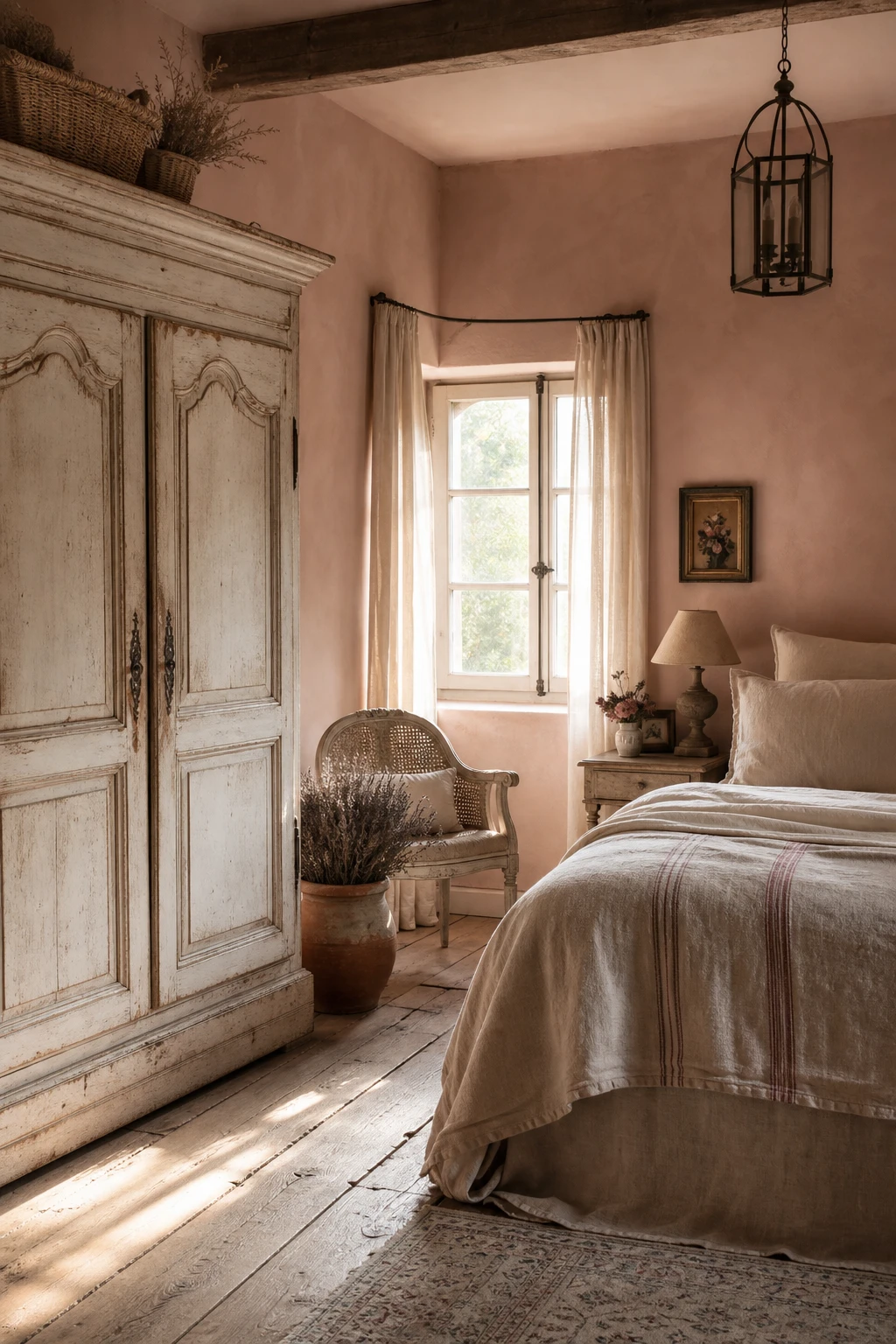
French country rooms have a looseness that pure English schemes can sometimes lack, and that looseness is exactly what pink needs to breathe. Aged linen pulls the colour down from pretty into something warmer and more worn, and you will notice how the whole room relaxes the moment painted furniture arrives. I love the way a chalky, slightly chipped finish on a bedside or armoire makes the pink feel earned rather than applied.
The Key Details
Distressed painted armoire
Aged linen bedding with grain sack stripe coverlet
Cane backed bergere chair
Wide plank oak flooring
Sheer unlined linen curtains
Pro TipBring in one piece of distressed painted furniture, even something small like a bedside table, and it does the work of ageing the whole room without you touching another thing.
AvoidMixing too many pattern scales between the French and English pieces pulls the eye in too many directions and the room loses the calm, settled quality that makes this combination worth attempting.
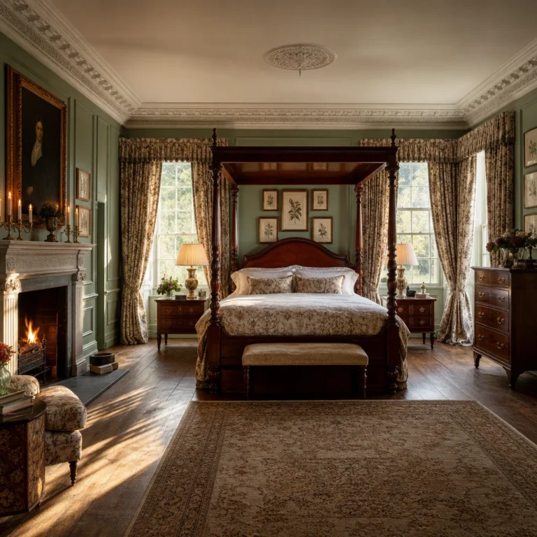
The Georgian Bedroom Trick That Makes Pink Feel Grown Up and Grand
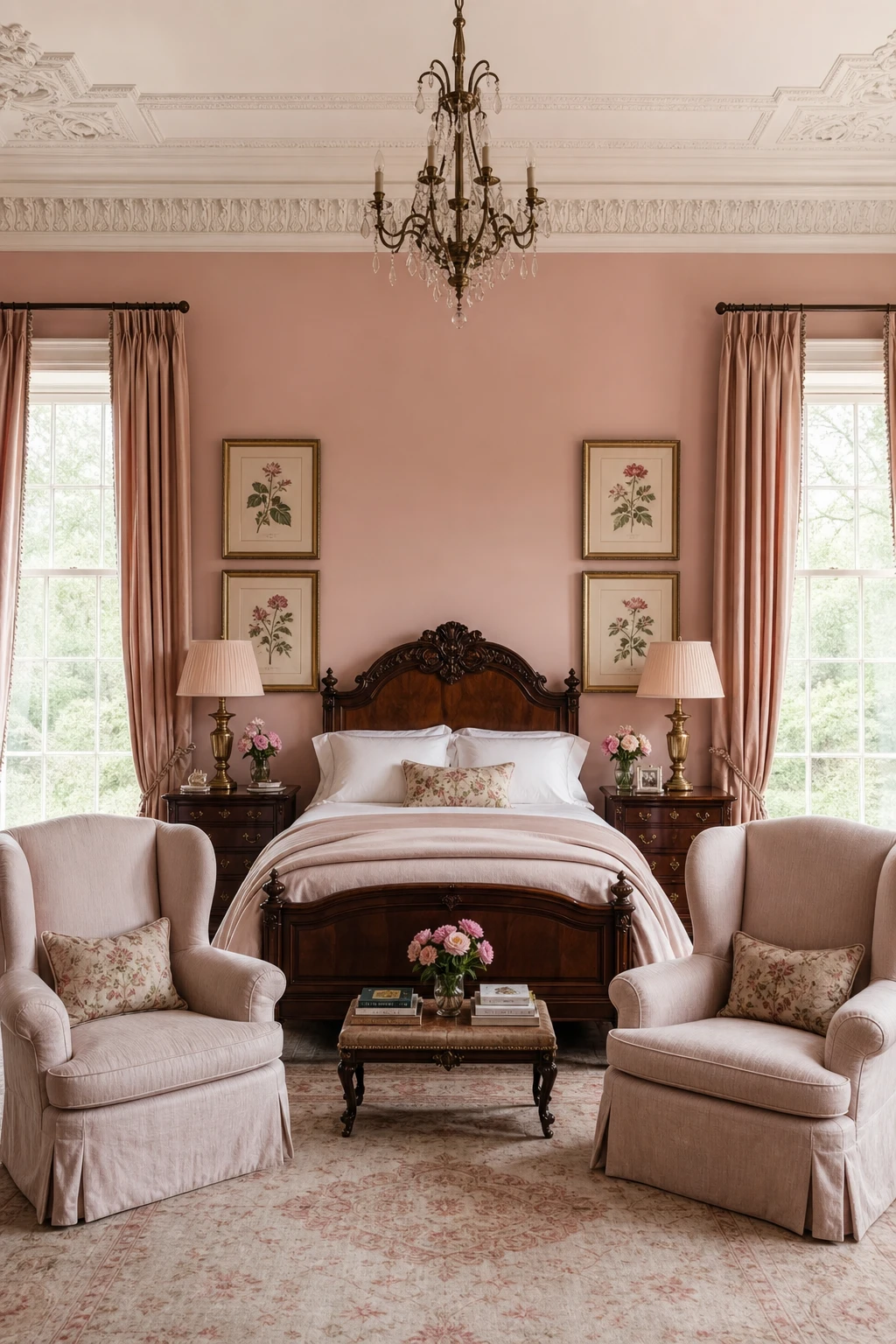
Georgian symmetry is the quiet secret that lifts pink out of the nursery and into something genuinely grand. When you place matching lamps, paired prints, and a centred carved bed, the eye reads order first and colour second, so the pink settles into the architecture rather than fighting it. Tall ceilings and deep cornice moulding give the room enough height that the softness of the colour feels deliberate, almost stately. That balance is what I am always chasing: a room so calm and considered that the pink simply belongs.
The Key Details
Grand carved wooden bed with upholstered headboard
Matching antique brass column table lamps
Deep plaster cornice ceiling moulding
Floor pooling silk curtains at tall sash windows
Paired framed botanical prints above each nightstand
Pro TipFix matching brass wall sconces at identical heights on either side of the bed before you hang anything else, because that one decision anchors the whole Georgian axis.
AvoidFilling every surface with decorative objects breaks the architectural calm that makes the symmetry work, and the room quickly loses the grown up quality you were building toward.
Victorian Rooms Did Pink Better Than Anyone and Here Is Why
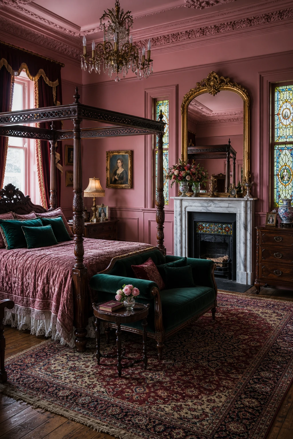
Victorian rooms earned their reputation with colour because they were never afraid of contrast, and that is the lesson I keep coming back to. Blush on its own reads fragile, but the moment you press ruby silk or a deep teal against it, you get something with real weight and presence. What wins me over every time is how the jewel tones do the heavy lifting so the pink can stay soft and pretty without ever feeling washed out or empty.
The Key Details
Carved mahogany four poster bed
Marble fireplace with gilded overmantel mirror
Ruby silk floor length curtains
Persian rug in burgundy and gold
Ornate plasterwork cornice and dado rail
Pro TipTuck one deep burgundy or teal velvet cushion onto the bed or an armchair and you will immediately feel the whole palette lock into place.
AvoidStripping back the cornicing, dado rails, and carved detail to simplify the room pulls out the very bones that make Victorian pink feel opulent rather than just pink.
Shabby Chic Pink Done the English Way Looks Nothing Like You Expect
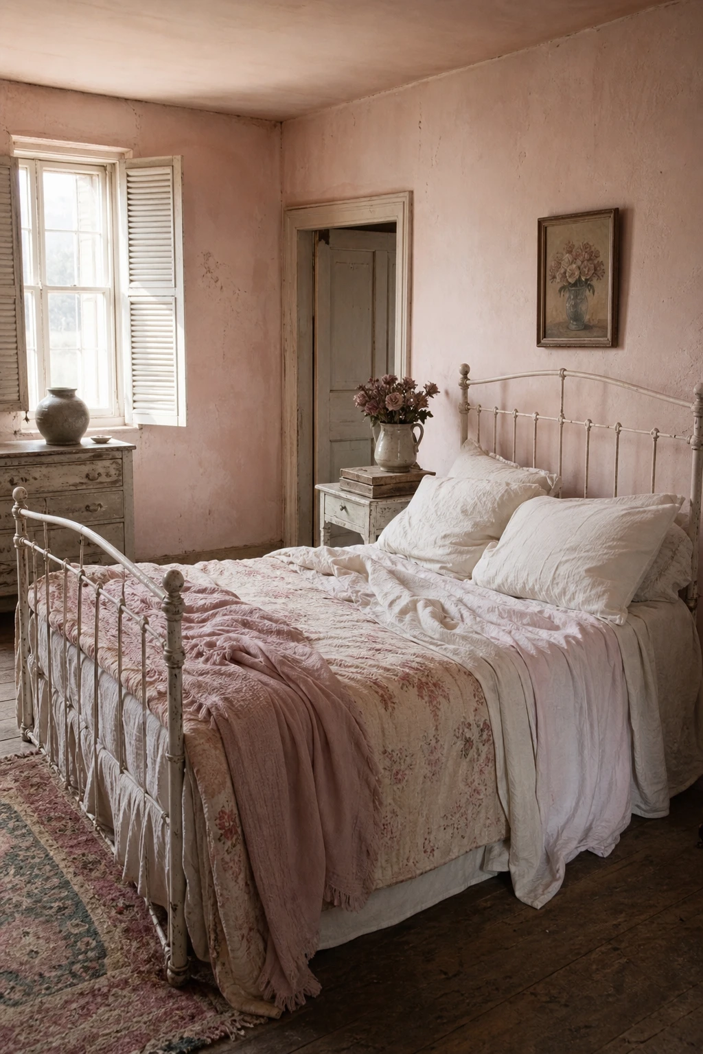
Faded, chalky pinks are the whole secret here. What I love is how they carry that gentle, sun bleached quality that bright candy tones simply cannot fake, and you get an instant sense that the room has been lived in and loved for decades. Layering an aged floral eiderdown over plain antique linen is what keeps everything feeling soft rather than busy, and watch how the distressed wood and threadbare rug pull the warmth down to floor level so the whole room settles around you.
The Key Details
Iron or painted wooden bed frame
Layered antique linen and faded floral eiderdown
Distressed painted bedside table
Shuttered sash windows
Threadbare Turkish rug on wide oak floorboards
Pro TipPair one faded floral with at least two plain linen pieces so each pattern has room to breathe and the bed feels romantic rather than restless.
AvoidFilling every surface with ornaments crowds the romance out of the room and leaves it feeling cluttered rather than quietly beautiful.
Chintz Is the Fabric That Makes an English Country Bedroom Feel Complete
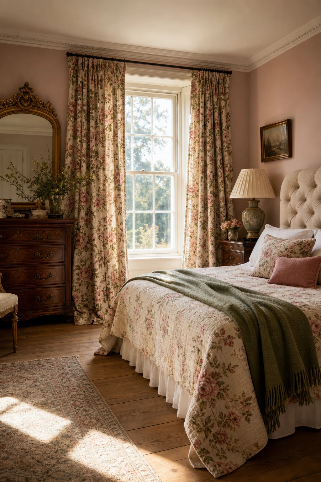
Chintz has a way of pulling a whole room into focus, and what I love most is how one generous curtain print does the hard work for you. Pick out a single colour from the fabric and carry it onto the walls and you get a room that feels considered rather than cobbled together. Every other piece, the linen headboard, the oak floor, the ceramic lamp, quietly supports the print without competing. You will notice how restful that calm backdrop makes the florals feel.
The Key Details
Floor length chintz floral curtains
Button back linen headboard
Carved antique mahogany dresser with gilt mirror
Pleated silk lampshade on ceramic base
Wide plank oak floorboards
Pro TipOnce your chintz is chosen, let it set the palette and keep every other textile in a plain weave or solid so the print has room to breathe.
AvoidPicking a chintz with six colours and then chasing each one across cushions, throws and paint will pull the eye in too many directions and leave the room feeling restless rather than rich.
Pink Gingham Bedding Is the Simplest Way to Make a Bedroom Feel Instantly Country
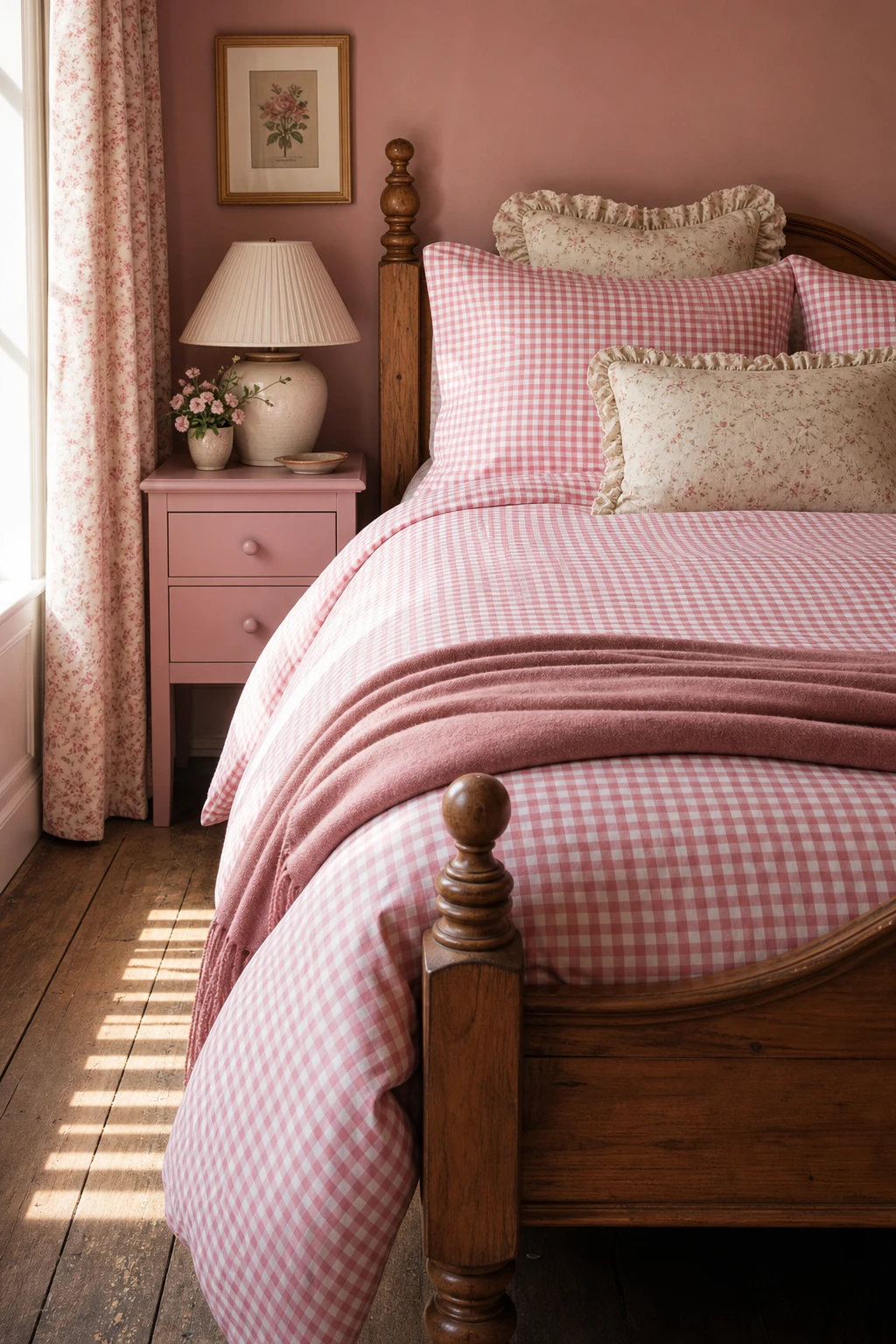
Gingham is one of those patterns I keep coming back to because it does something no floral can quite manage: it gives the eye a clean, repeating grid to rest on. You get that crisp graphic energy at the bed, and watch how it actually makes the softer florals on the cushions feel more relaxed by contrast, not busier. The check earns its place by doing the balancing work quietly.
The Key Details
Small check pink and white gingham duvet and pillowcases
Turned solid oak bed frame with low footboard
Gathered floral linen cushion stack
Ceramic lamp with pleated cotton shade
Aged oak floorboards
Pro TipUse a larger gingham check on the duvet cover and step down to a finer check on the pillowcases so the bed has rhythm and depth rather than one flat repeat.
AvoidPairing gingham with another bold check at a similar scale creates visual noise that neither pattern can escape from, and the bed ends up feeling restless rather than restful.
Toile and Gingham Together Is the Classic Pairing English Rooms Always Get Right
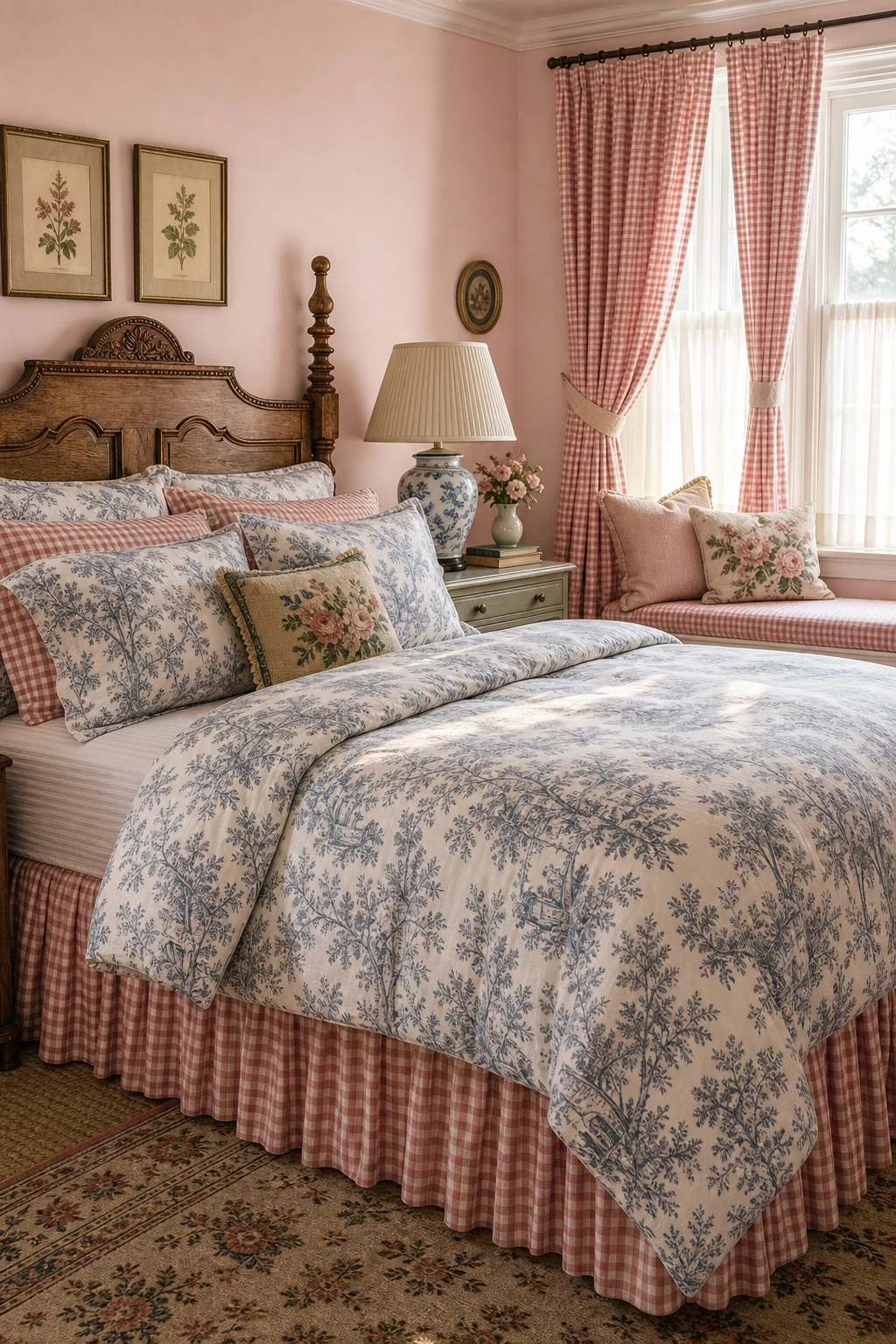
Toile and gingham is one of those pairings I return to again and again, because the logic is so clean: one pattern tells a story and one just holds the grid, so they never compete. You get visual richness without noise. What wins me over every time is how the eye moves easily between the busy scenes on the toile and the quiet repeat of the gingham, settling rather than darting. Keep them in the same pink family and the contrast becomes purely about texture, which is exactly where you want it.
The Key Details
Toile duvet and gingham bed skirt pairing
Carved oak headboard
Pleated linen lampshade on painted bedside chest
Gingham curtains with linen tie banding
Upholstered window seat beneath sash windows
Pro TipCut a small swatch of your toile and hold it against gingham options in the shop, because the pink has to read as one family or the calm falls apart.
AvoidChoosing a warm rose toile against a cool candy gingham pulls the eye in two directions at once, and the room reads busy rather than the charming layered look you are after.
Pink Toile de Jouy Curtains Are the One Thing That Truly Transforms a Bedroom Window
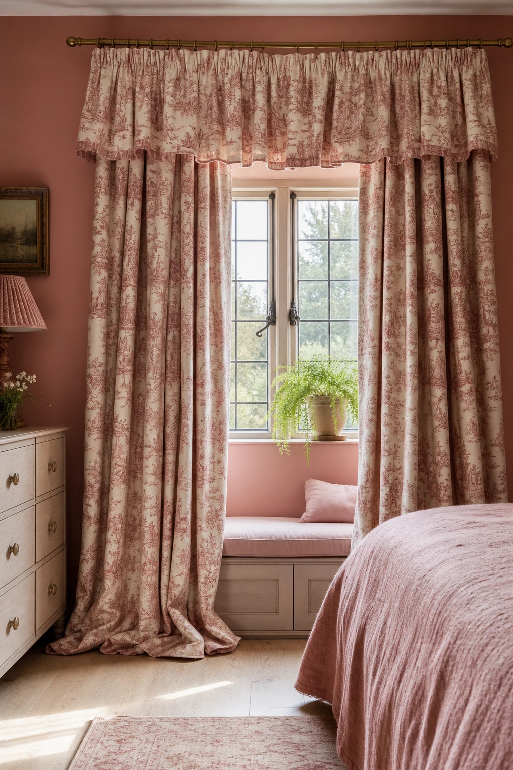
Full length toile curtains do something paint simply cannot: they bring a whole story to the window. Every panel is filled with pastoral scenes, figures, trees, and details you keep noticing days later, and that density of pattern gives the room a settled, collected feeling I find nowhere else. What I love most is the way the repeat unfolds properly when the curtains pool or just kiss the floor, so the narrative reads as the maker intended.
The Key Details
Full length Toile de Jouy curtain panels
Gathered toile pelmet
Aged brass curtain pole and rings
Upholstered window seat in blush linen
Leaded casement window
Pro TipFix your curtain pole as close to the ceiling line as you can get it, because that single decision makes an ordinary window read as something far grander.
AvoidHanging toile curtains at sill length chops straight through the scenic repeat, leaving figures and trees with no tops or no bottoms, and the whole storytelling quality the fabric was designed to carry simply disappears.
A Full Floral Bedroom Is Less Scary Than You Think When You Follow This One Rule
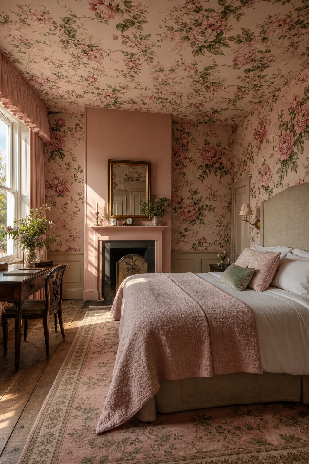
All over florals get a bad reputation, and I think that is mostly down to one fixable mistake. When you pick out the background colour of the print and use it on a single painted wall or a plain upholstered headboard, the whole room settles. The solid element gives your eye somewhere to rest, so the climbing roses and peonies feel lush rather than loud. You get abundance without the chaos.
The Key Details
All over climbing rose and peony wallpaper
Solid linen upholstered headboard
Antique brass wall sconces
Pleated plain fabric valance
Tall sash windows with distressed oak floorboards
Pro TipMatch the painted wall or headboard fabric exactly to the background colour of your wallpaper so the solid and the pattern read as one seamless choice rather than an afterthought.
AvoidLayering a second floral in a different scale or colourway over the first turns the room into a competition between two patterns, and neither one wins.
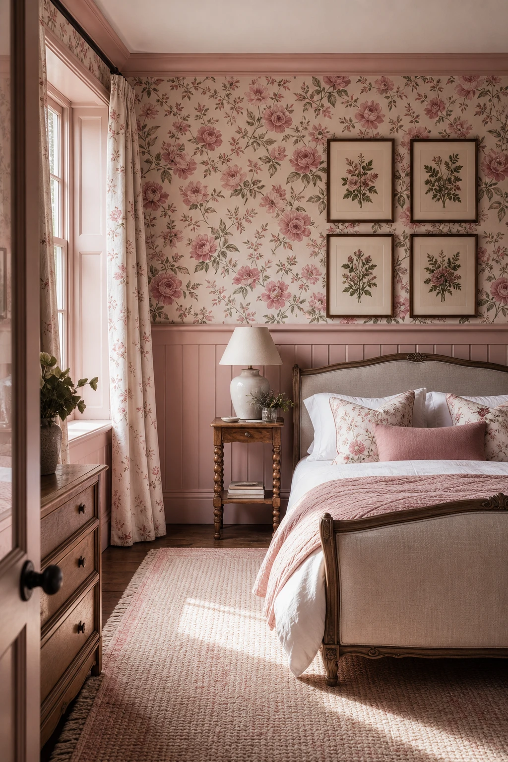
Pink Panelled Walls Give a Bedroom Architecture That Plain Painted Walls Never Can
Panelling gives a room bones, and painting it pink is where things get really interesting. The raised frames catch the light while the recessed fields sit a shade deeper, so you get this quiet play of tone across the wall that flat emulsion simply cannot do. What I love most is how the colour stops feeling like a decision and starts feeling like architecture. You notice the room before you notice the pink, which is exactly the right order.
The Key Details
Raised timber wall panelling floor to picture rail
Brass wall mounted reading lights
Linen upholstered bed frame
Antique wool rug on oak floorboards
Tall linen curtains at sash window
Pro TipPaint the raised frame in an eggshell finish and the recessed field in dead flat, same pink, and the sheen difference alone gives you a tonal shift without mixing a second colour.
AvoidRunning the panelling colour only to picture rail height and switching to a contrasting shade above it cuts the wall in two and makes ceilings feel lower than they are.
Combining Panelling and Wallpaper in One Room Is the Move That Makes Both Look Better
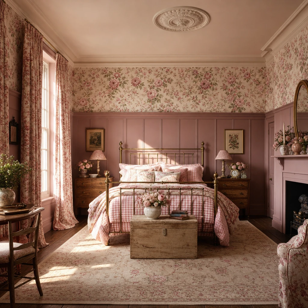
Panelling below the dado and wallpaper above is one of my favourite moves because each half gets to shine without competing. The paint on the wainscoting grounds the room, and you will notice how a soft floral pattern above feels lighter and more considered than it would running floor to ceiling. What wins me over every time is that dividing line: it gives your eye a place to rest between the two layers, so a room full of pattern and texture never tips into busy.
The Key Details
Tongue and groove wainscoting panels
Floral hand painted style wallpaper
Carved wooden bed frame with linen headboard
Dado rail dividing wall surfaces
Botanical prints hung in a loose grid
Pro TipPick a wallpaper that contains the exact paint colour you used on the panelling and the two halves will look like they were always meant to be together.
AvoidRunning wallpaper all the way to the skirting board leaves the panelling looking like a last minute addition, and the whole wall loses the structured, layered quality that makes this combination so special.
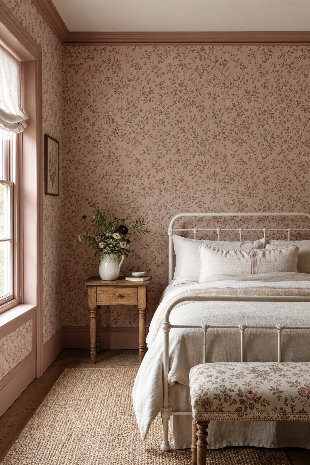
The Right Wallpaper Is What Turns a Plain Room Into a True English Cottage Bedroom
Cottage rooms live or die by their wallpaper, and what I reach for every time is a small scale repeat on a warm cream or blush ground. The tight pattern fills the wall without competing with itself, and you get that wrapped, snug feeling that a bold large print simply cannot give a low ceiling room. Watch how the blush and sage tones pull the bedding and bench into one quiet conversation rather than a jumble of separate pieces.
The Key Details
Small scale blush and sage floral wallpaper
White cast iron bedstead
Layered cream linen bedding
Ceramic jug with garden stems on side table
Upholstered floral bench at bed foot
Pro TipPaper all four walls right around and behind the bed for a fully wrapped cocoon rather than a single feature wall that makes the room feel unfinished.
AvoidPicking a paper with a very long vertical repeat in a small room means huge wasted cuts at every drop, the pattern rarely lines up neatly at the joins, and the budget quietly doubles.
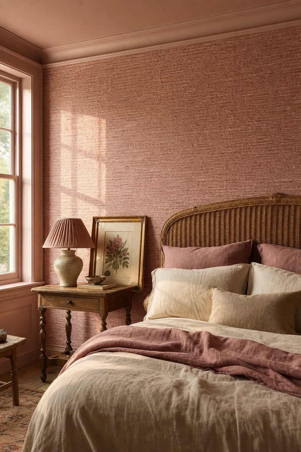
Pink Grasscloth Wallpaper Brings a Texture That No Painted Wall Ever Could
Pink grasscloth is one of those combinations that wins me over every single time, because the woven texture does something a flat painted wall simply cannot. You get this quiet, layered depth, where light catches the natural fibres differently across the day and the whole room feels warmer for it. What I love most is that the grasscloth carries its own softness without needing pattern, so the pink reads as grounded and rich rather than sweet.
The Key Details
Woven sisal grasscloth wallpaper
Rattan headboard
Pleated silk lampshade on ceramic base
Gilded framed botanical print
Turned leg bedside table
Pro TipRun the grasscloth only across the chimney breast or the wall behind the bed and you get all the warmth of a full room treatment while cutting cost and effort in half.
AvoidHanging grasscloth in a bathroom or any room with poor ventilation causes the natural fibres to absorb moisture, warp at the seams, and lift away from the wall within months.
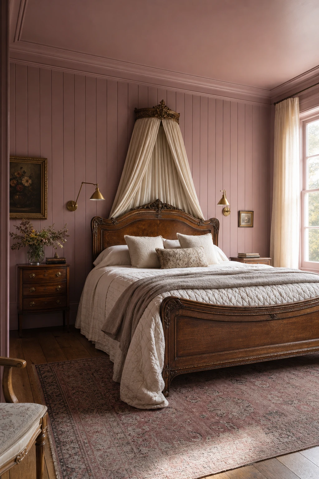
Sulking Room Pink on Bedroom Panelling Is the Moody Shade That Changes Everything
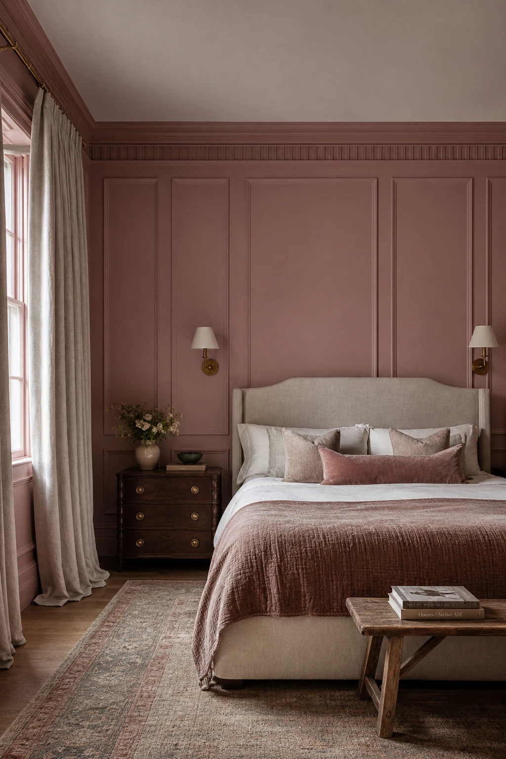
Sulking Room Pink sits in that rare territory where pink stops being pretty and starts being powerful. On full height panelling the depth of the pigment does the heavy lifting: you get a room that feels settled and considered, never sugary. The dusty, almost smoky quality reads more like a tailored suit than a nursery wall, and that restraint is what wins me over every time. You will notice how the colour seems to grow richer as the day draws in rather than fading the way softer pinks tend to do.
The Key Details
Floor to ceiling tongue and groove panelling
Carved antique wooden bed frame
Brass swing arm wall lights
Wide plank oak flooring
Faded Persian rug
Pro TipPair Sulking Room Pink panelling with warm brass hardware and your room will genuinely glow once the lamps come on in the evening.
AvoidReaching for cool bright white on the trim pulls the warmth straight out of Sulking Room Pink and leaves both colours looking flat and a little sad.
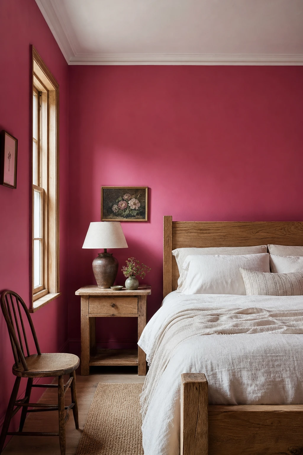
Rangwali Is the Farrow and Ball Pink That Is Far Bolder Than You Expect and Utterly Lovely
Rangwali stops people in their tracks, and I completely understand why it feels daunting. The spiced, almost terracotta warmth in this pink pulls oak and aged pine right into its orbit, so the wood tones feel deliberate and generous rather than accidental. What I love is how the white linen and plaster cornice give the eye somewhere cool to rest, so the room reads bold but still breathes. That balance between daring colour and quiet relief is something I find genuinely hard to achieve with a softer shade.
The Key Details
Natural oak bed frame
Layered white linen bedding with cream throw
Aged pine bedside table
Turned ceramic table lamp with linen shade
White plaster cornice and sash window with timber glazing bars
Pro TipPaint Rangwali on the chimney breast only and leave the remaining walls in Farrow and Ball Wimborne White so the colour sings without closing the room in.
AvoidReaching for cool grey cushions or a slate lamp base is a common instinct with a strong pink, but it pulls the warmth clean out of Rangwali and leaves the room feeling flat and slightly cold.
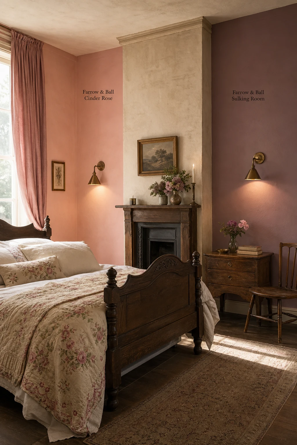
Cinder Rose and Sulking Room Pink Are Both Beautiful But One Will Suit Your Room Better
Cinder Rose and Sulking Room sit close enough on a paint chart to feel interchangeable, yet the undertone difference is real and your room will expose it fast. Cinder Rose pulls warm and peachy, so it glows in morning light and feels generous by lamplight. Sulking Room leans dustier and slightly greyed, which gives you something more withdrawn and grown up. What I love is how that single tonal shift changes the whole mood of a space, so getting it right before you commit is genuinely worth the extra week of looking.
The Key Details
Carved antique oak bed frame
Floral embroidered linen coverlet
Aged brass wall sconces
Tall sash windows with gathered rose cotton curtains
Chimney breast as central architectural divider
Pro TipPaint both colours as large swatches on the same chimney breast wall and check them at dawn, full midday light, and again under your bedside lamps before you make any decision.
AvoidHolding a tiny chip card against a white sheet of paper flattens the undertone completely, and you will almost certainly pick the wrong one for your actual walls and light.
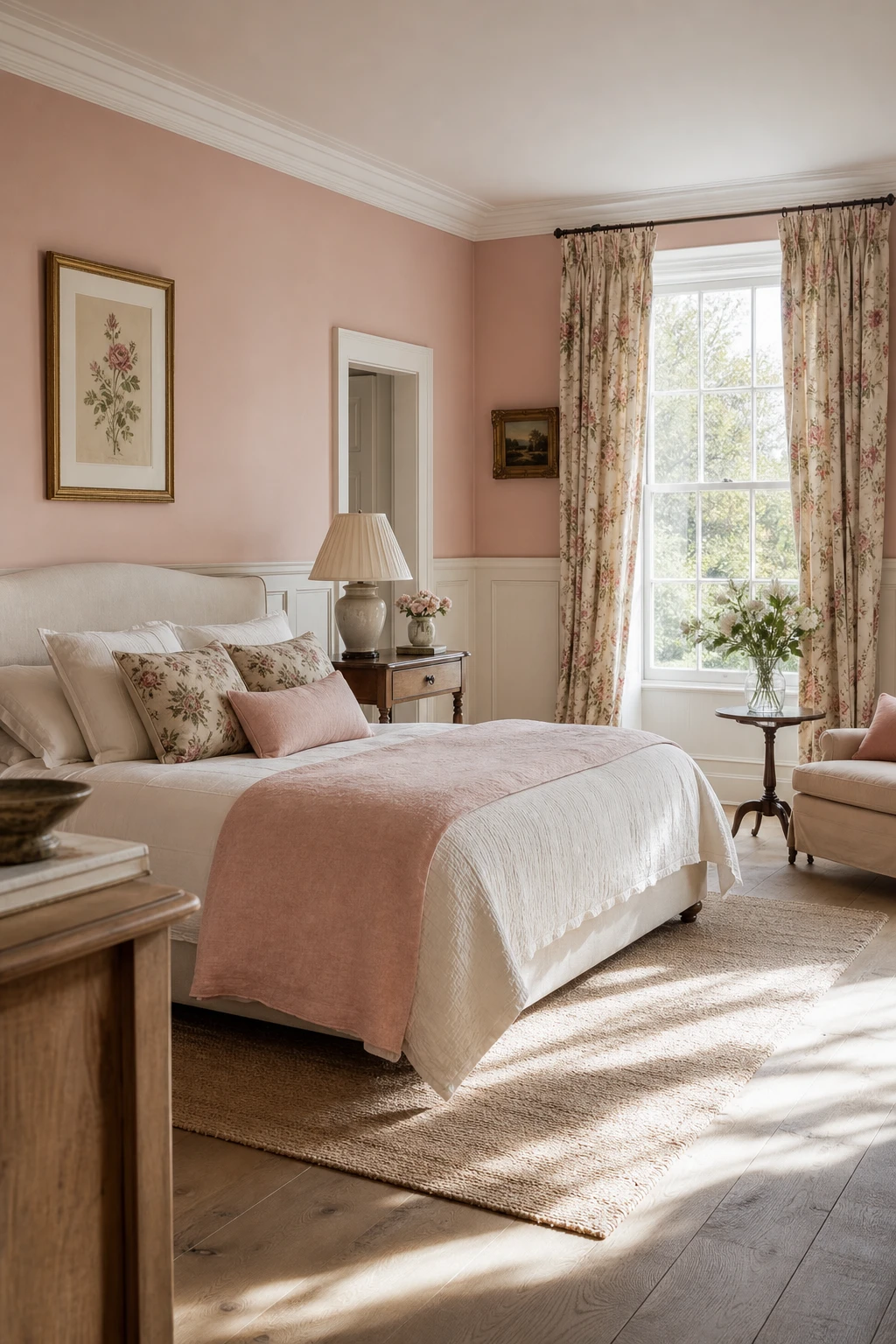
Pink Ground Is the Farrow and Ball Colour That Makes a Bedroom Feel Like a Warm Hug
Pink Ground is one of those colours that surprises people the first time they see it on a large wall. It reads almost neutral until the light shifts, and then you get this soft, warm blush that makes the whole room feel settled and generous. The chalky quality keeps it from ever feeling candy sweet, and you will notice how it bounces natural light around without any of the harshness a brighter shade brings. That gentle reflection is what makes the space feel bigger and airier than the floor plan suggests.
The Key Details
Linen upholstered bed frame
White painted timber wall panelling
Floor length floral curtains
Pleated linen table lamp shade
Wide oak floorboards
Pro TipChoose an off white such as Farrow and Ball’s All White or Strong White for the woodwork so the two tones sit warmly side by side rather than fighting each other.
AvoidUsing the same tin of Pink Ground across walls and woodwork gives you a flat, one note finish, because flat emulsion and eggshell carry the colour very differently and the contrast between them is part of what makes the room feel alive.
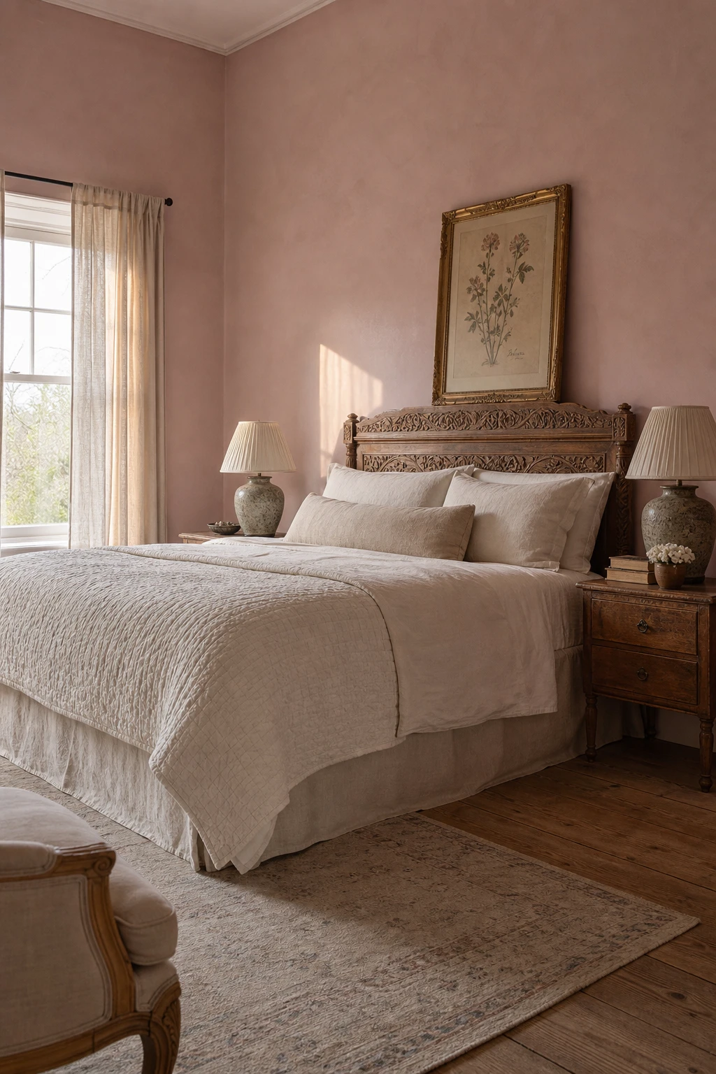
A Dusky Pink Bedroom Has a Quietness to It That Brighter Shades Simply Cannot Touch
Dusky, grey toned pinks are the shades I reach for when a client wants a room to feel genuinely restful rather than just pretty. They shift through the day in a way that brighter pinks simply do not: soft and lilac cool in morning light, then warming right up to a blush amber by lamplight. That quiet movement is exactly what makes them so easy to live with across every season, and the greyness in the tone is what keeps the room from ever tipping into sweetness.
The Key Details
Carved oak headboard
Layered linen and quilted ivory coverlet
Pleated ceramic table lamps
Gilded botanical print
Unlined linen sash window drape
Pro TipLayer dusky pink walls with aged linen, a faded floral or two, and warm honey toned wood, and the whole scheme settles into something that could have been there for a hundred years.
AvoidPairing dusky pink with a lot of sharp, bright white strips the warmth clean out of it and leaves the colour looking flat and a little sad rather than the soft, enveloping tone you were after.
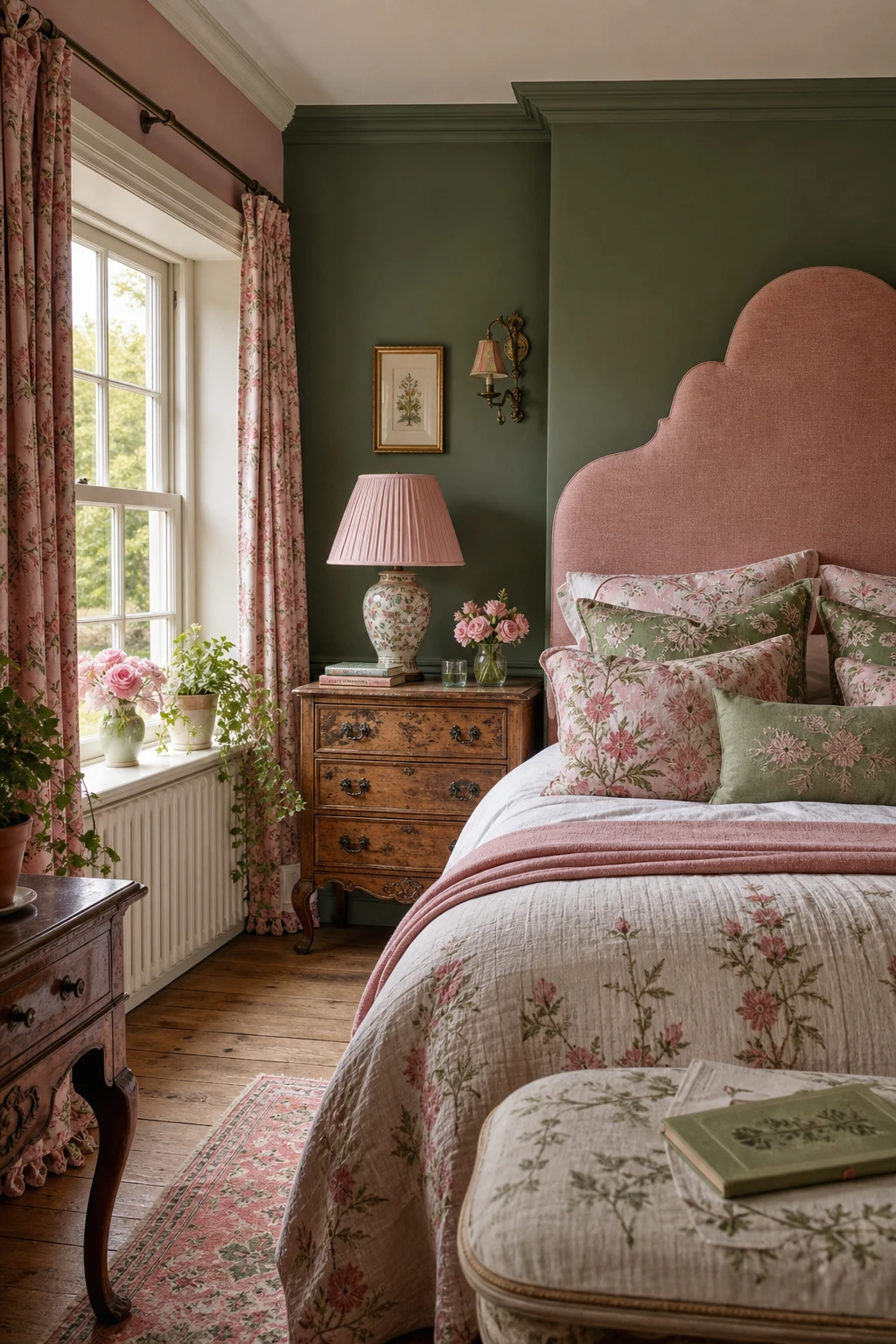
Pink and Green in a Master Bedroom Is the Combination That Feels Like a Garden Brought Indoors
Pink and green are natural partners, and the reason wins me over every time is pure colour theory: they sit opposite each other on the wheel, so they create contrast without any real tension. What I love is how a blush linen headboard paired with leaf green cushions reads less like a decorating decision and more like something that simply grew that way. You get that garden room feeling without a single plant pot being strictly necessary, though the trailing ivy on the windowsill never hurts.
The Key Details
Blush linen upholstered headboard
Botanical printed cushions in coral and leaf green
Carved wooden bedside table
Pleated ceramic table lamp
Potted trailing ivy and garden roses on windowsill
Pro TipBring green in through a velvet accent chair, botanical cushions, or a potted plant rather than painting a full wall, so you can adjust the balance without redecorating.
AvoidReaching for a neon or lime green as the contrast colour will feel sharp and jarring next to soft pink, stripping out exactly the garden fresh calm you are trying to build.
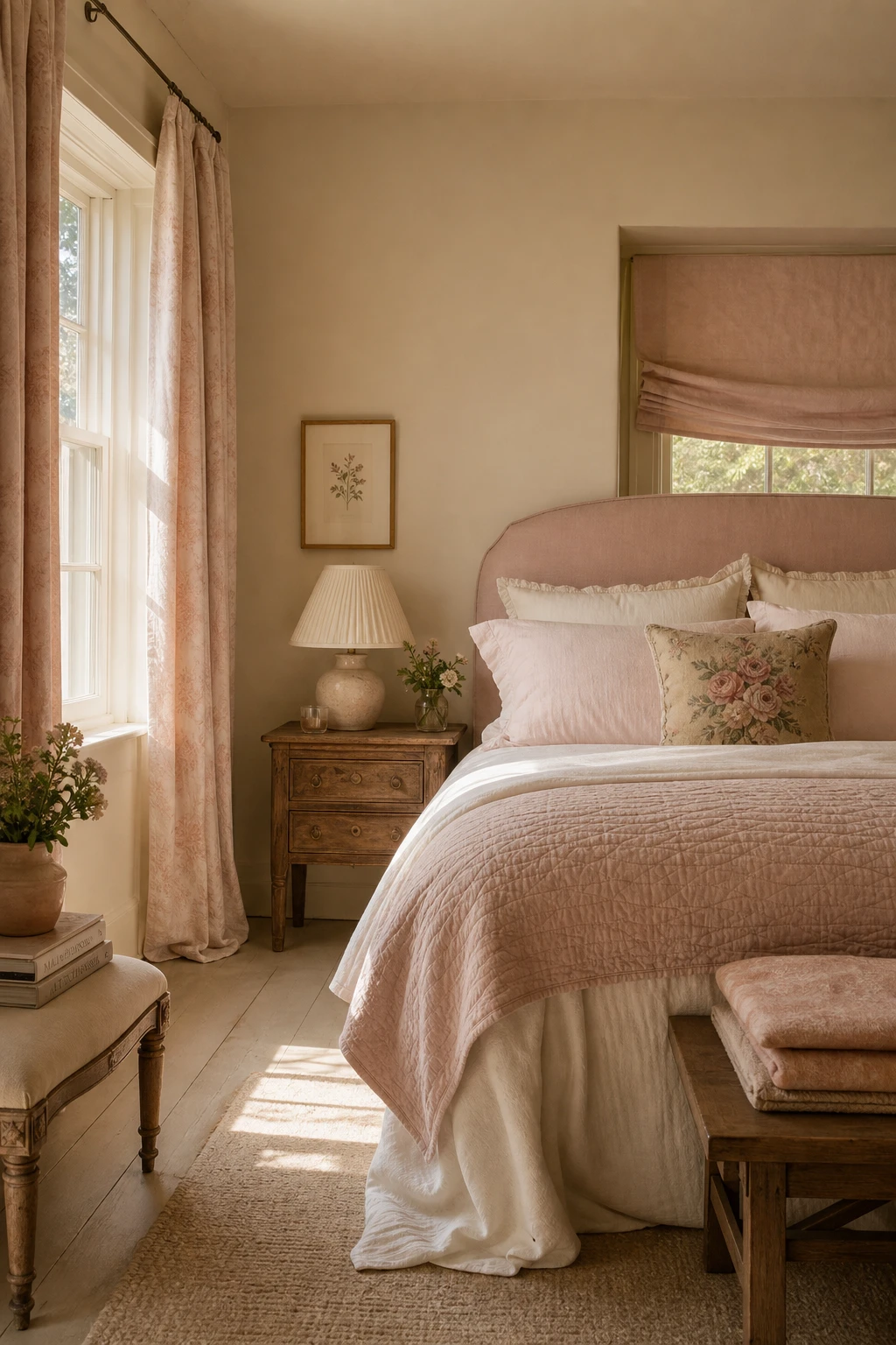
Pink and Cream Together Make a Bedroom That Feels Like Sunday Morning All Week Long
Cream and pink share the same warm yellow base, and that quiet kinship is what I love most about pairing them. You get softness without sweetness, warmth without fuss. Watch how the cream pulls the pink down from pretty into something genuinely restful, the kind of room that feels slow and unhurried every single morning of the week.
The Key Details
Upholstered blush linen headboard
Carved oak bedside table
Pleated ivory ceramic table lamp
Loose linen Roman blind
Faded floral needlepoint cushion
Pro TipKeep cream on the ceiling, woodwork, and floor so the room breathes, then let pink own the walls and soft furnishings as the clear star.
AvoidPairing a warm cream with a cool, bluish pink creates an undertone clash that reads as grubby rather than elegant, especially in the low morning light where these rooms are meant to shine.
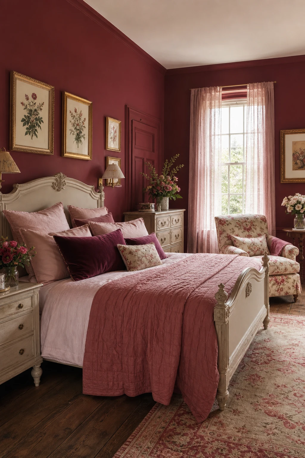
Adding Raspberry to a Pink Bedroom Gives It the Depth That Stops It Looking Flat
Layering from pale blush up to deep raspberry is one of my favourite moves in an English country bedroom, because you get genuine richness without ever reaching for a second colour. Watch how the darker tone pulls the eye and gives the room a sense of weight, while the softer pinks keep everything feeling fresh and pretty. That push and pull within a single family is what separates a scheme that feels considered from one that just feels pink.
The Key Details
Carved wooden bed frame
Raspberry velvet cushions
Chintz armchair in rose and cream
Tall sash windows with blush silk curtains
Gilded framed botanical prints
Pro TipBring raspberry in through piping on cushions or a velvet bolster so it punctuates the bed without tipping the whole room into darkness.
AvoidSplitting the room roughly half pink and half raspberry leaves the scheme feeling heavy and unresolved, with neither tone able to do its job properly.
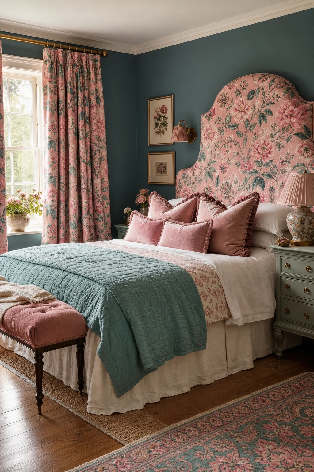
Pink and Teal Florals Make the Most Unexpectedly Pretty Bedroom Combination
Pink and teal sound like a bold gamble, yet the moment you put them together the logic is obvious. Teal brings just enough cool to steady the warmth of blush, so you get a room that feels romantic and calm at the same time, never sugary. The pairing works on pure colour science: the two tones are close enough on the wheel to feel related but different enough to create a lively contrast. What I love is how that gentle tension keeps the room feeling alive rather than settled into one mood.
The Key Details
Large scale botanical print curtains
Upholstered fabric headboard
Teal quilted throw
Painted wooden nightstand
Polished oak floorboards
Pro TipFind a floral fabric or wallpaper that already carries both pink and teal in the same print, and the whole palette clicks into place without any guesswork.
AvoidLetting teal creep into too many surfaces tips the balance and drains the room of the warm, romantic softness that made the combination worth trying in the first place.
A Roman Blind Is the Window Treatment That Keeps an English Bedroom Looking Polished
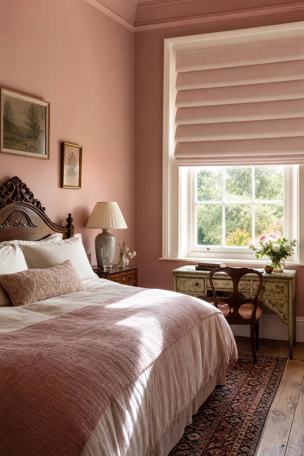
A Roman blind pulled to its stack is one of those quietly satisfying things I never tire of, those neat horizontal folds sitting flush against the window like a piece of tailored clothing. What I love is the precision it brings, a clean rectangular frame that draws the eye to the glass without the billow of a full curtain. You get softness and structure at once, which is exactly the balance an English bedroom needs.
The Key Details
Linen Roman blind with horizontal pleat folds
Carved mahogany bedhead
Ceramic table lamp with pleated silk shade
Vintage painted writing desk
Persian runner on aged oak floorboards
Pro TipLine your Roman blind with interlining, a bump or domette weight, so each fold drops with an even, weighted crease and the fabric holds its shape through every season.
AvoidChoosing a fabric that is too lightweight means the blind will pucker and buckle at the folds rather than stack cleanly, and the whole tailored effect collapses.
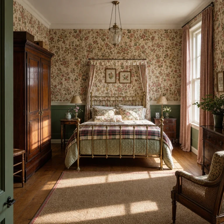
A Brass Bed Is the Single Piece That Makes an English Country Bedroom Feel Genuinely Special
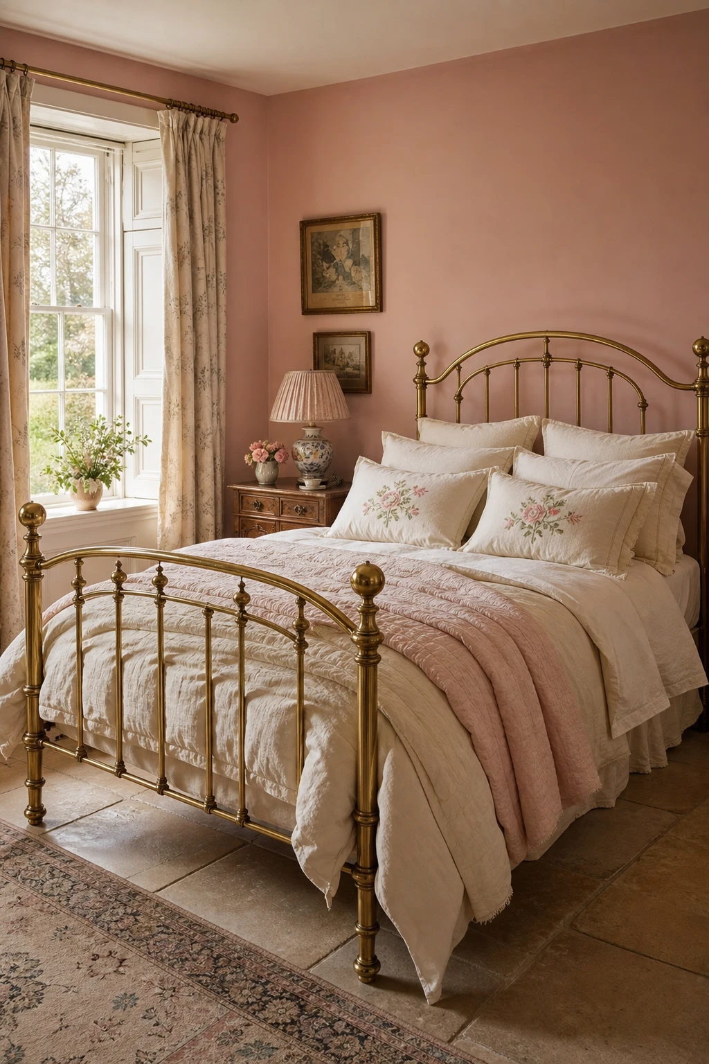
Brass catches morning light in a way no painted or upholstered frame ever quite manages, and that warm golden glow is what I reach for when a bedroom needs a focal point that earns its place. The arched silhouette reads as quietly grand without tipping into formality, so you get that sense of occasion the English country style does so well. What wins me over every time is how the metal holds its own against soft florals and gathered linen, letting all that pattern settle around it rather than compete.
The Key Details
Arched brass bed frame with antique gold finish
Layered linen and embroidered cotton bedding
Gathered fabric lampshade on ceramic table lamp
Tall sash window with natural morning light
Stone flagstone flooring
Pro TipLayer a plain linen duvet under an embroidered cotton throw, then add one floral pillowcase so the brass always has something soft to shine against.
AvoidMixing brass with chrome or brushed nickel in the same room creates a visual tension that makes the whole space feel unresolved and slightly unloved.
A Canopy Bed Gives a Bedroom That Dreamy, Enveloping Feeling Nothing Else Can Replicate
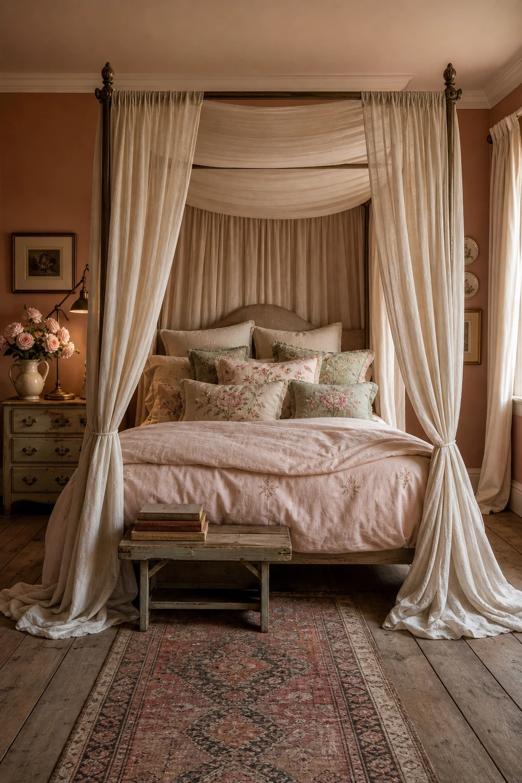
A canopy bed does something no headboard ever quite manages: it draws a soft boundary around where you sleep, turning that corner of the room into its own little world. What I love about sheer or lightweight fabric here is the way it filters light rather than blocks it, so you get that gauzy, romantic glow without the room feeling closed off. You will notice how the translucent drapes hold colour gently, letting a blush pink wall read through them and deepen the whole mood.
The Key Details
Four poster canopy frame with sheer ivory linen drapes
Floral embroidered cushions in blush and sage
Antique brass arc reading lamp
Painted bedside chest with ceramic jug and garden roses
Faded Persian runner on aged oak floorboards
Pro TipPull the same sheer fabric through your pillowcases so the canopy reads as a considered choice rather than a statement piece bolted on after everything else.
AvoidHeavy blackout fabric on a canopy frame in a low ceilinged room pulls the ceiling down visually and leaves the space feeling more like a cave than a sanctuary.
A Pink Gingham Headboard Is the Cheery Focal Point Every Country Bedroom Deserves
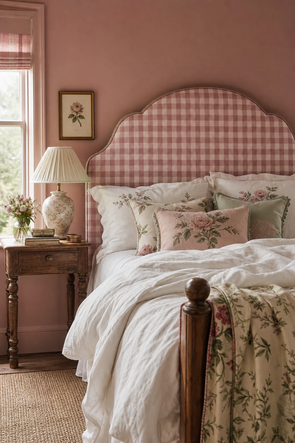
Gingham on a headboard is one of my favourite moves in a country bedroom because the repeat grid gives the bed a clear focal point without any fuss. You get all the visual weight you need from a statement piece, but the simple check keeps things light and cheerful rather than imposing. The pattern reads as graphic from across the room, which is exactly the clarity a focal point needs, and then it softens right up close thanks to the fabric texture. That shift between distances is something a plain upholstered headboard can never quite give you.
The Key Details
Gingham upholstered headboard in rose and cream check
Embroidered floral cushions in blush and sage
Turned leg bedside table in aged oak
Pleated silk lampshade on ceramic table lamp
Sash window with natural morning light
Pro TipAsk for the headboard to be cut two or three inches taller than the standard height so it stays visible and commanding even once you stack all your pillows in front of it.
AvoidDressing the bed in the same gingham as the headboard flattens the whole thing into one solid block of pattern, and the focal point you worked hard to create simply disappears.
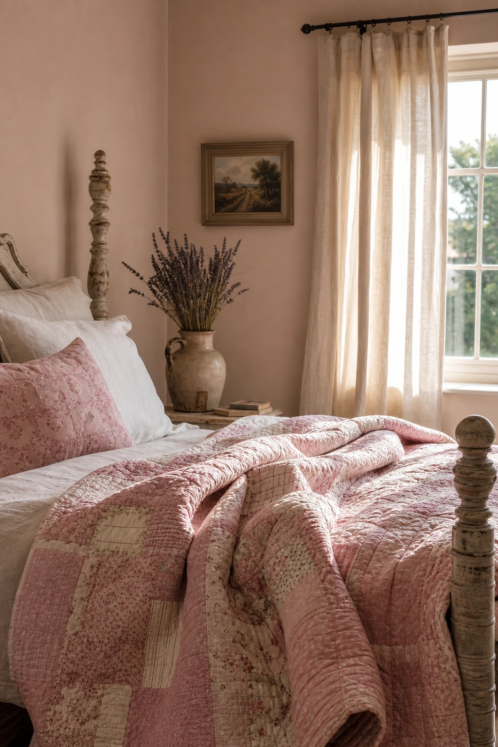
A Pink Quilt Is the Simplest Thing You Can Add to Make a Bedroom Feel Instantly Cosy
A quilt does something a plain duvet simply cannot: it carries the weight of hands that made it. The stitching, the slight unevenness, the way light catches each raised seam, all of that gives the bed a warmth that feels lived in rather than dressed. What I love about laying one across the foot of the bed is how it breaks the surface into layers, so the eye has somewhere interesting to land. You get that crafted, human quality the rest of the room is quietly asking for.
The Key Details
Handstitched patchwork pink quilt
Turned wooden bedpost with worn painted finish
Earthenware bedside jug with dried lavender
Linen window curtain
Brushed plaster walls
Pro TipFold the quilt across the lower third of the bed so the duvet and any layered blankets beneath it stay visible, giving the bed its full sense of depth.
AvoidChoosing a quilt in the exact same pink as the walls makes the bed melt into the room and you lose all the definition that makes the layers worth having.
Alan launched Edward George London in 2017. Since completing his masters in Town & Regional Planning (MPlan) he has combined the skills he learned at the University of Sheffield with his passion for design, to help create a foundation for those looking to create a beautiful home.