Newsletter Subscribe
Enter your email address below and subscribe to our newsletter

Imagine transforming your home with colors that tell a story. Picture navy blue bringing a sense of sophistication and depth, slate gray offering that sleek, modern touch, and dark teal adding a layer of intrigue and tranquility. Now, mix in some accents like gold for a touch of opulence, red for a dash of energy, or orange for a burst of warmth and happiness. Sounds magical, doesn’t it? Lets waste no time and tuck into the enchating world of dark interior color design.

These are the most widely used colors in the palette, defining the overall tone and atmosphere of the design. In a dark color palette, primary colors are often deep, rich tones that provide a strong background or foundation.

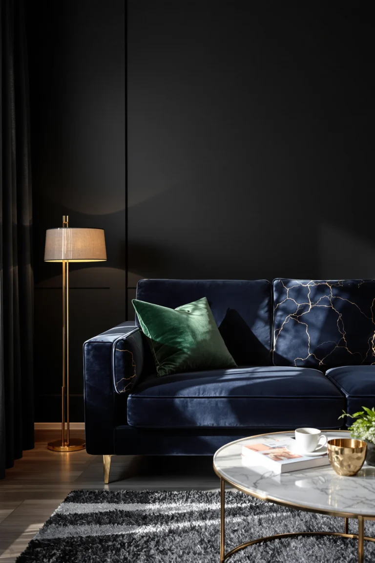
Serves as a versatile backdrop that conveys trust and stability. Ideal for creating a feeling of luxurious depth and timeless elegance in any space.

A sophisticated and neutral choice, perfect for minimalist designs. It offers depth without overwhelming the senses.

Provides a warm, earthy base that can make designs feel grounded and organic. Great for nature themed or luxury contexts.

Secondary colors support the primary colors and are used to create variety and depth in the design. They are used in smaller areas and elements like side tables, large furniture, or medium sized decor. In a dark color palette, these might be slightly lighter or more subdued tones compared to the primary colors.

Brings a sleek and modern touch to interior design, serving as a versatile foundation that complements both bold accents and subtle textures.

Adds an element of nature and sustainability. Suitable for eco-friendly brands or projects that want to emphasize an organic feel.

In interior design, dark teal acts as a statement color, perfect for adding depth and intrigue to a room. It works beautifully on accent walls, upholstered furniture, or as vibrant decor pieces, infusing spaces with a blend of sophistication and a touch of nature’s tranquility.

Accent colors are used sparingly to draw attention to key elements like buttons, links, or important icons. They are often brighter or more saturated than primary and secondary colors, providing a pop of color that stands out against the dark background.

In interior design, gold is synonymous with opulence and warmth, adding a touch of glamour to any setting. It shines on hardware finishes, mirror frames, and lighting fixtures, effortlessly elevating the room’s aesthetic with its luxurious sheen.

In interior design, red serves as a bold accent color, bringing energy and passion to any space. It stands out on statement pieces like sofas, curtains, or as vibrant wall art, creating focal points that draw the eye and invigorate the room’s atmosphere.

Offers a serene and calming presence, ideal for creating a soothing ambiance. This versatile hue pairs beautifully with decorative pillows, area rugs, or wall paint, providing a harmonious backdrop or accent that enhances the overall aesthetic of a room.

Injects a vibrant burst of energy and warmth, making spaces feel more inviting and lively. Perfect for accent chairs, throw blankets, or decorative cushions, this cheerful hue can transform any room into a cozy and stimulating environment.

Utilize dark primary colors in the living room for a dramatic backdrop or main pieces like sofas and bookcases. This establishes a deep, inviting tone.

Introduce secondary colors through throw pillows, curtains, and area rugs for depth and interest. Use bright accent colors sparingly for items like decorative vases or artwork to draw attention and add personality.

Dark primary colors in the bedroom work well for wall paint and the primary bedding color, offering a cozy, intimate vibe.

Choose secondary colors for nightstands, dressers, and curtains. Accent colors can be incorporated through bedside lamps, wall art, and throw blankets to inject energy and warmth.

Apply primary dark colors in the bathroom to wall tiles or paint for a luxurious feel.

Use secondary colors for towels and mats, while accent colors can brighten up the space through soap dispensers, toothbrush holders, or small decorative items.

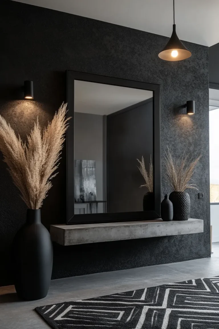
Dark primary colors in the hallway on walls can make the space feel grander and more welcoming. Add a runner in a secondary color for contrast.

Wall sconces or picture frames in accent colors can create focal points and add visual interest.

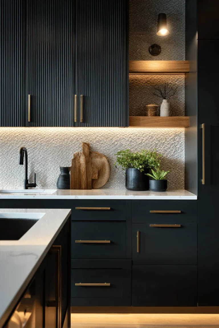
Use primary dark colors in the kitchen for cabinets for a sleek look. A backsplash in a secondary color can add depth.

Accent colors can pop on items like kettles, toasters, and decorative bowls, energizing the space.

A dining table and chairs in primary dark colors anchor the room.

Secondary colors can be introduced through table linens and dinnerware. Use accent colors for centerpieces, candle holders, or wall art to spark visual interest and conversation.

Dark colors make a bold statement but need to be balanced with neutral tones like beige, grey, or off-white to prevent rooms from feeling too heavy or closed in. This balance maintains the room’s elegance and ensures the dark palette does not overwhelm.

Incorporating various textures can prevent a dark palette from becoming monotonous. Use materials like velvet, silk, wool, and linen to introduce depth and interest, allowing the colors to play off each other under different lighting conditions.

To maintain a cohesive look throughout your home, stick to a consistent dark color theme while varying the shades and textures room by room. This consistency helps in creating a seamless transition between spaces.

Use seasonal trends to inform your choice of accent colors. For instance, warmer tones in autumn or bright, vibrant colors in spring can refresh your space without losing the dark essence. These can be easily swapped out according to the season.

Seasonal trends can be incorporated through accessories and decor items such as cushions, throws, and artwork. This allows for flexibility in updating the look without major overhauls.

Incorporate seasonal natural elements, like flowers or branches, which can add a fresh touch and complement the dark backdrop in a subtle, organic way.

Avoid using dark colors excessively as they can make a space feel smaller and more confined. Ensure there is adequate lighting, both natural and artificial, to offset the darker tones.

Pay attention to the undertones in dark colors. For example, a black with a blue undertone will interact differently with light and surrounding colors than a black with a brown undertone. These subtleties can significantly impact the ambiance of a room.

The function and size of a room should influence color choices. Dark colors can make large, open spaces feel cozier, but they might need to be used more sparingly in small rooms to avoid a claustrophobic effect.