Newsletter Subscribe
Enter your email address below and subscribe to our newsletter
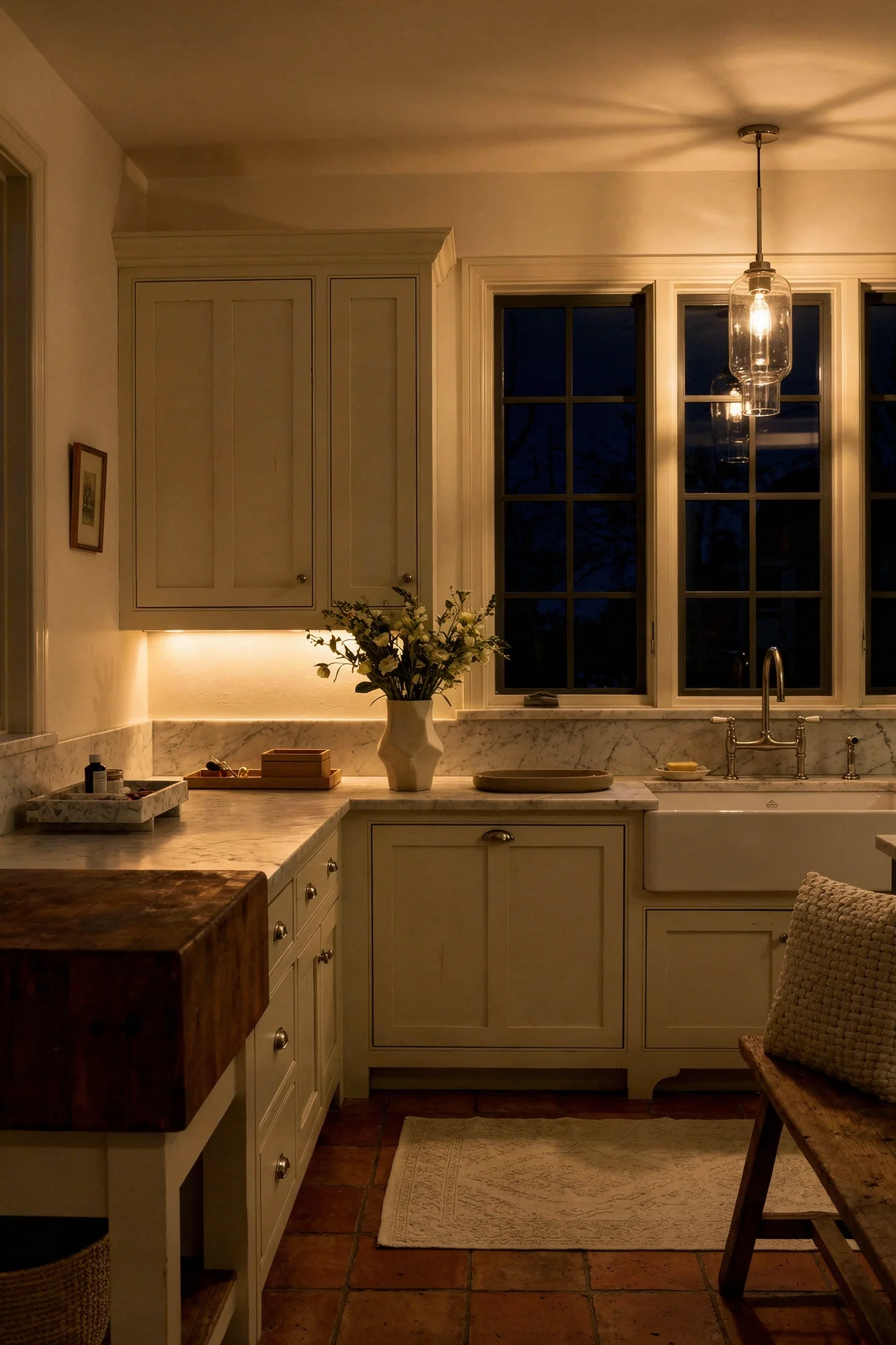
Grey kitchens came and went. The all white minimalist phase peaked and faded. Even the industrial concrete look has started aging out faster than anyone predicted. But the French Country kitchen just sat there, quietly looking better than all of them. I have been watching this play out across hundreds of renovations, and the kitchens that still feel current after ten or fifteen years almost always share the same bones: honed countertops instead of polished, furniture style cabinetry instead of flat panel, and warm metals that look collected rather than coordinated. Here is what they get right.
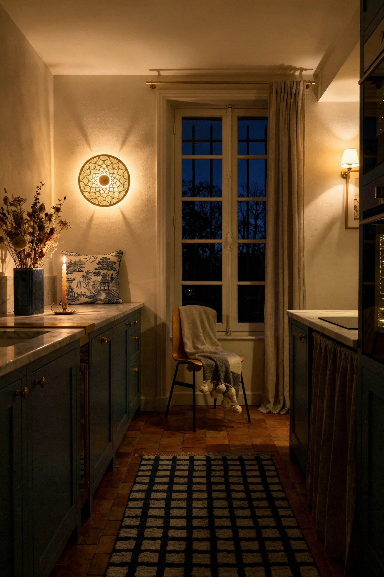
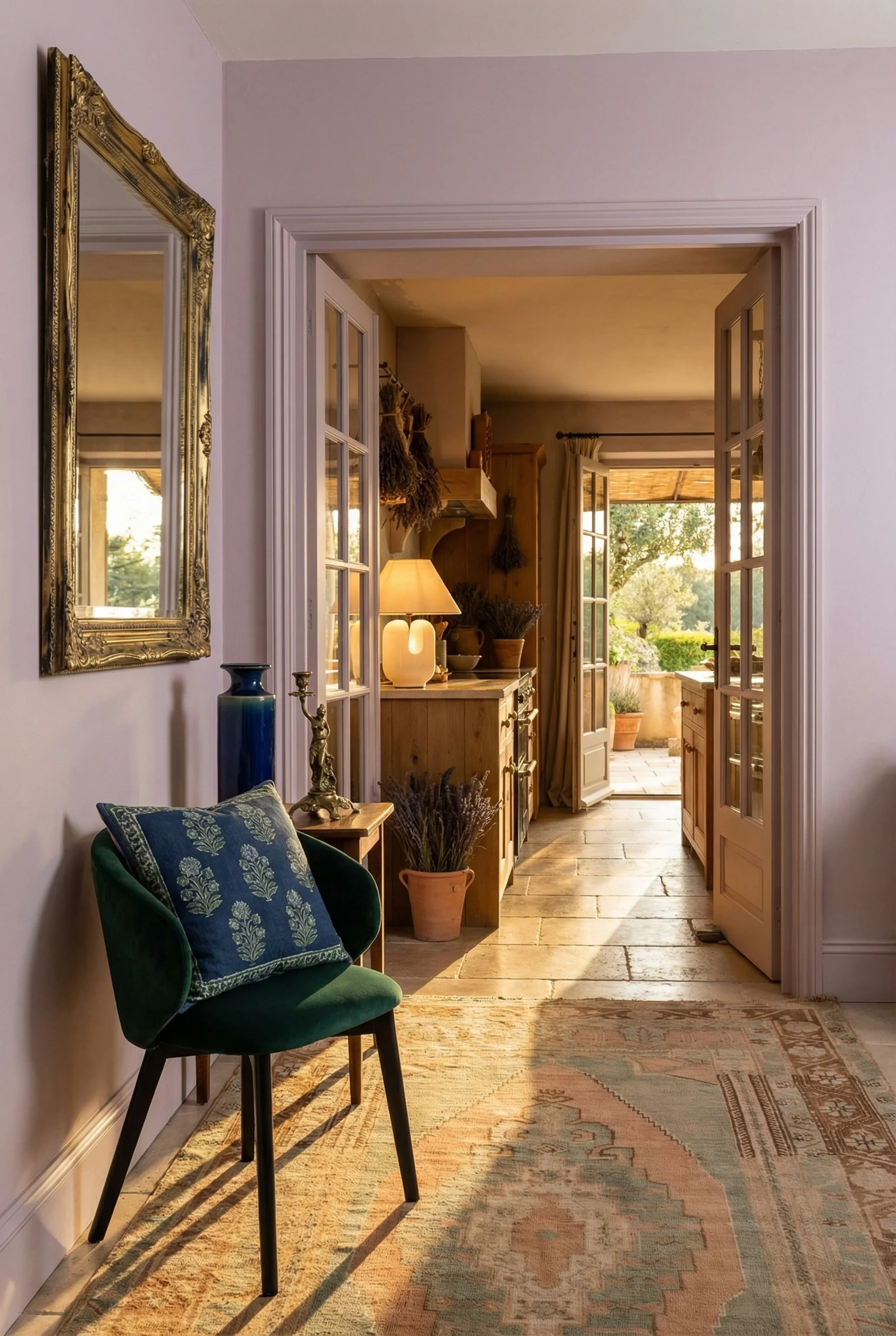
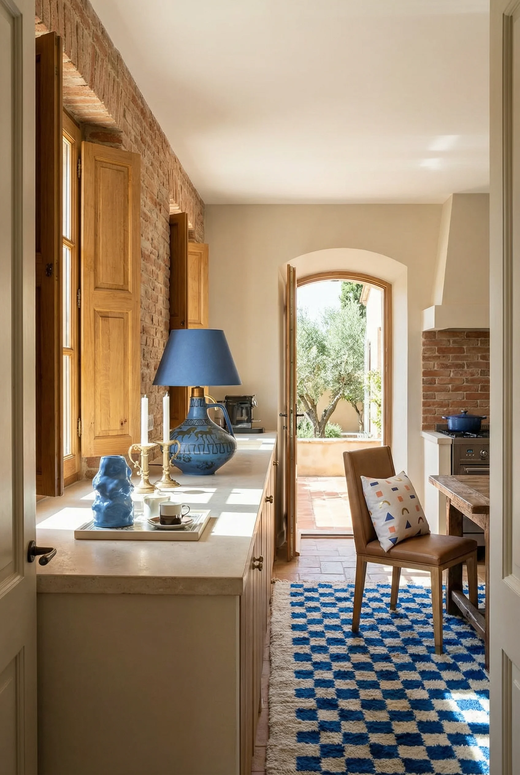
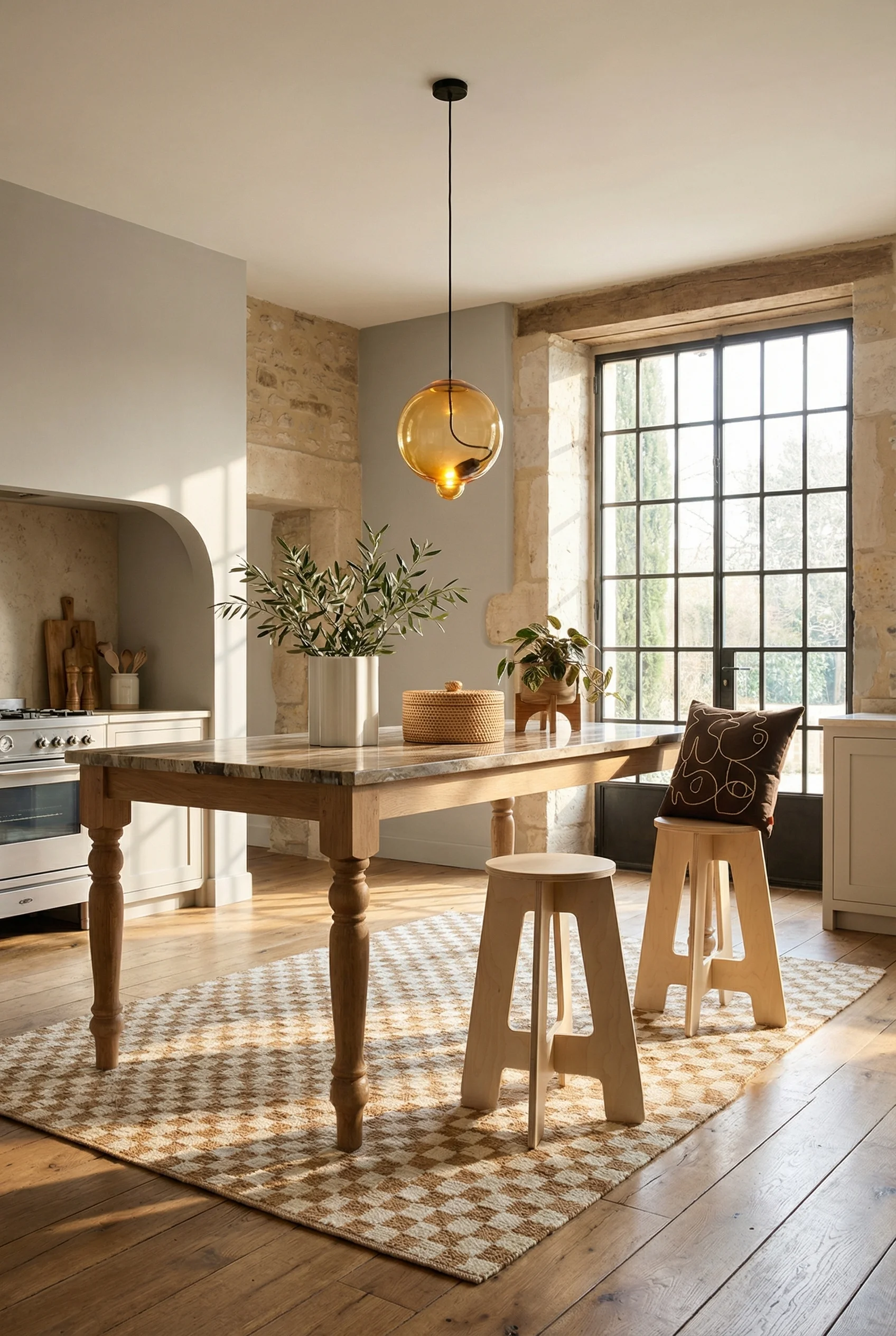
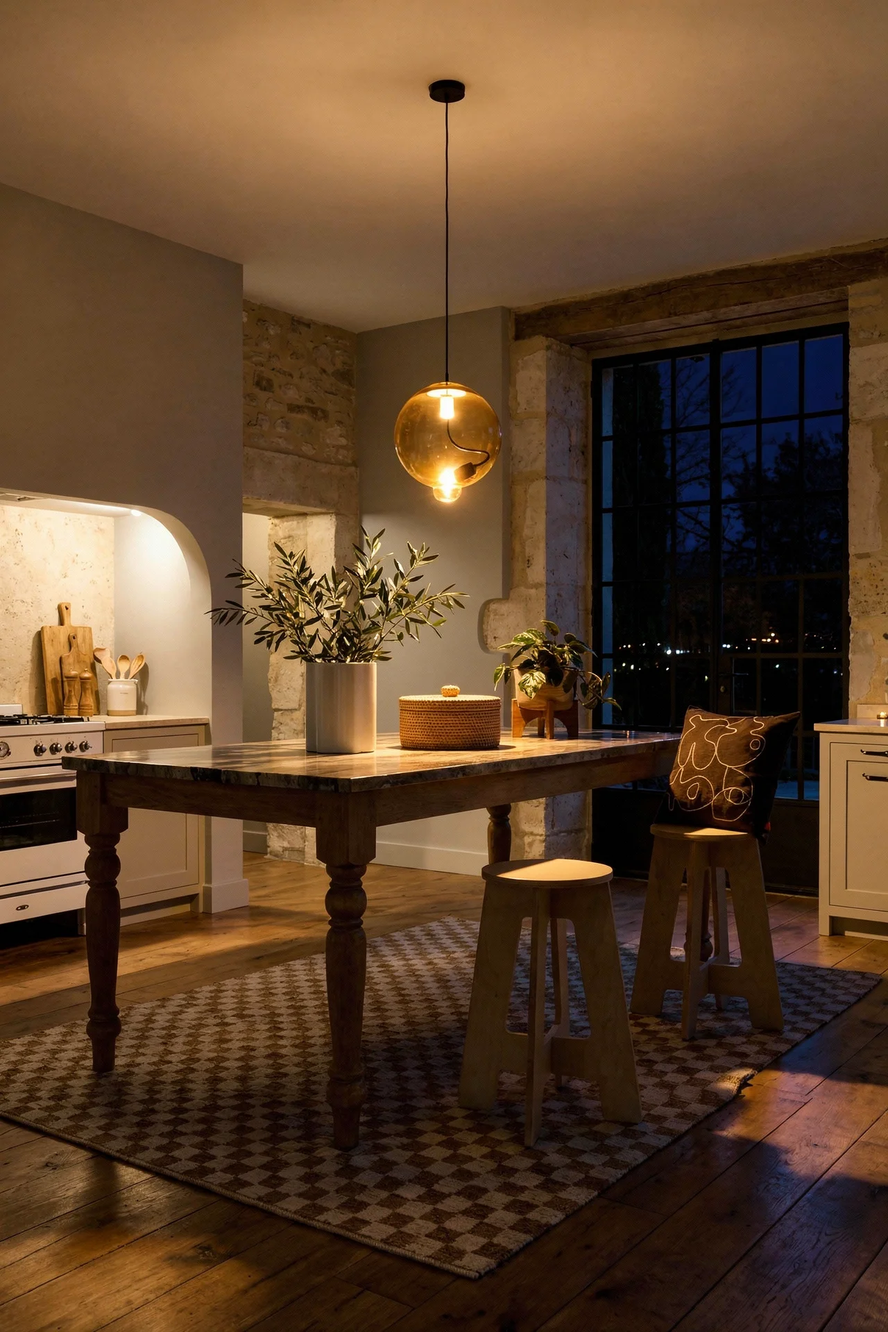
There is a reason blue cabinetry keeps showing up in the most saved French Country kitchen images on Pinterest. It works on a level that most accent colors simply cannot match. A soft, airy “French blue” reads as both traditional and completely fresh, which is the kind of contradiction that gives a kitchen staying power. But it is the deeper end of the spectrum that I find more interesting for renovators.
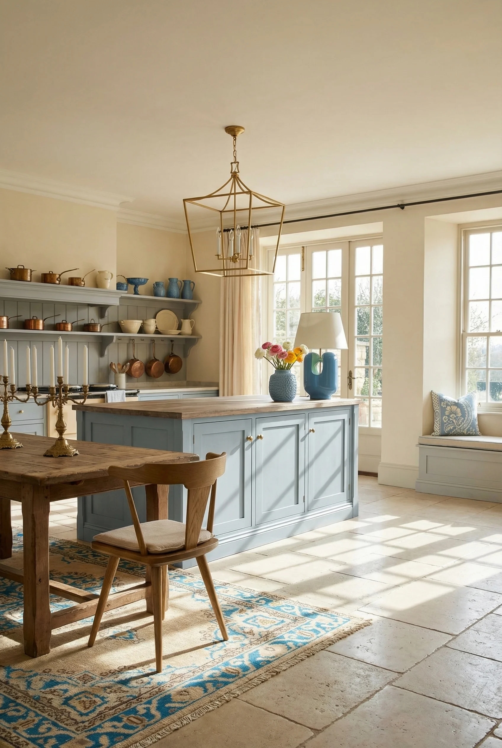
Hale Navy and Hague Blue have become two of the most requested tones for French Country kitchen islands, and the approach is almost always the same. The perimeter cabinetry stays neutral, typically a warm cream or ivory, and the island gets painted in that rich, saturated blue as the room’s focal point. This two tone strategy does something clever. It gives you the drama of a bold colour choice without the commitment of painting every surface.
What makes blue particularly smart for this style is the Mediterranean connection. French Country draws heavily from Provencal landscapes, and that palette is full of faded lavenders, warm whites, and chalky blues. A blue island does not fight the rest of the room. It anchors it.
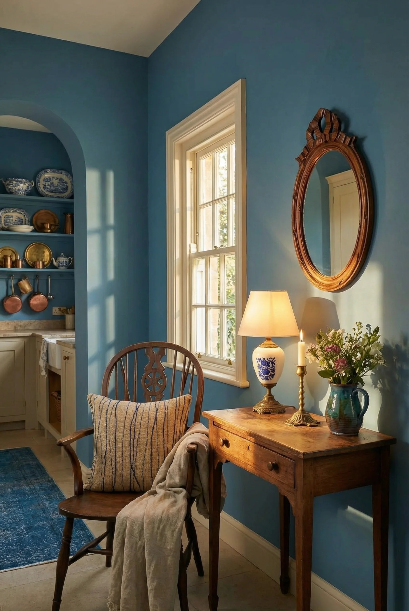
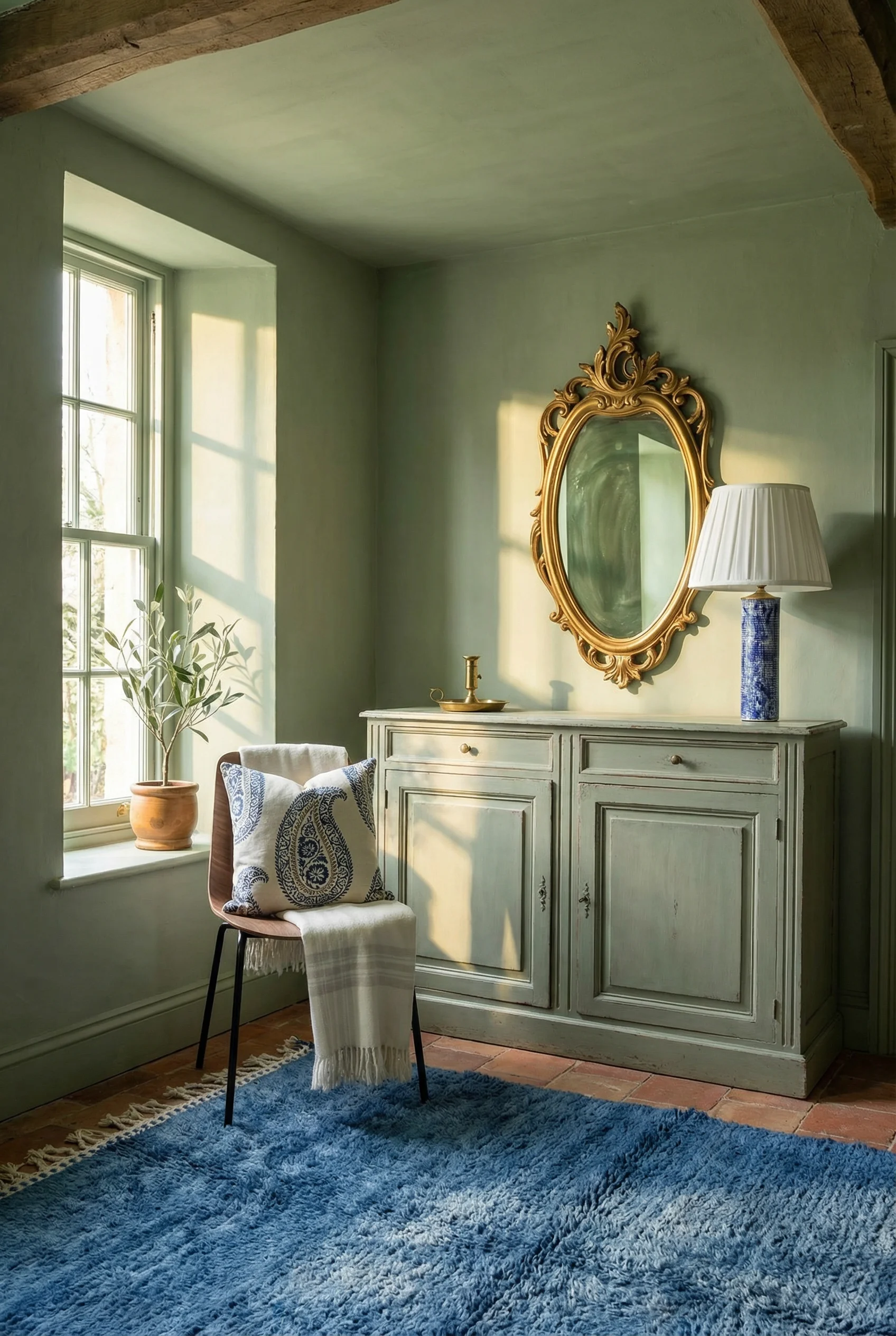
If you are weighing up blue for your renovation, I would lean towards a muted, chalky finish over a high gloss. The whole point of French Country cabinetry is that it looks like furniture, not factory fitted units. Chalk paint or a limewash finish gives you that softness. Pair it with antique brass hardware and you have something that feels like it has been there for decades.
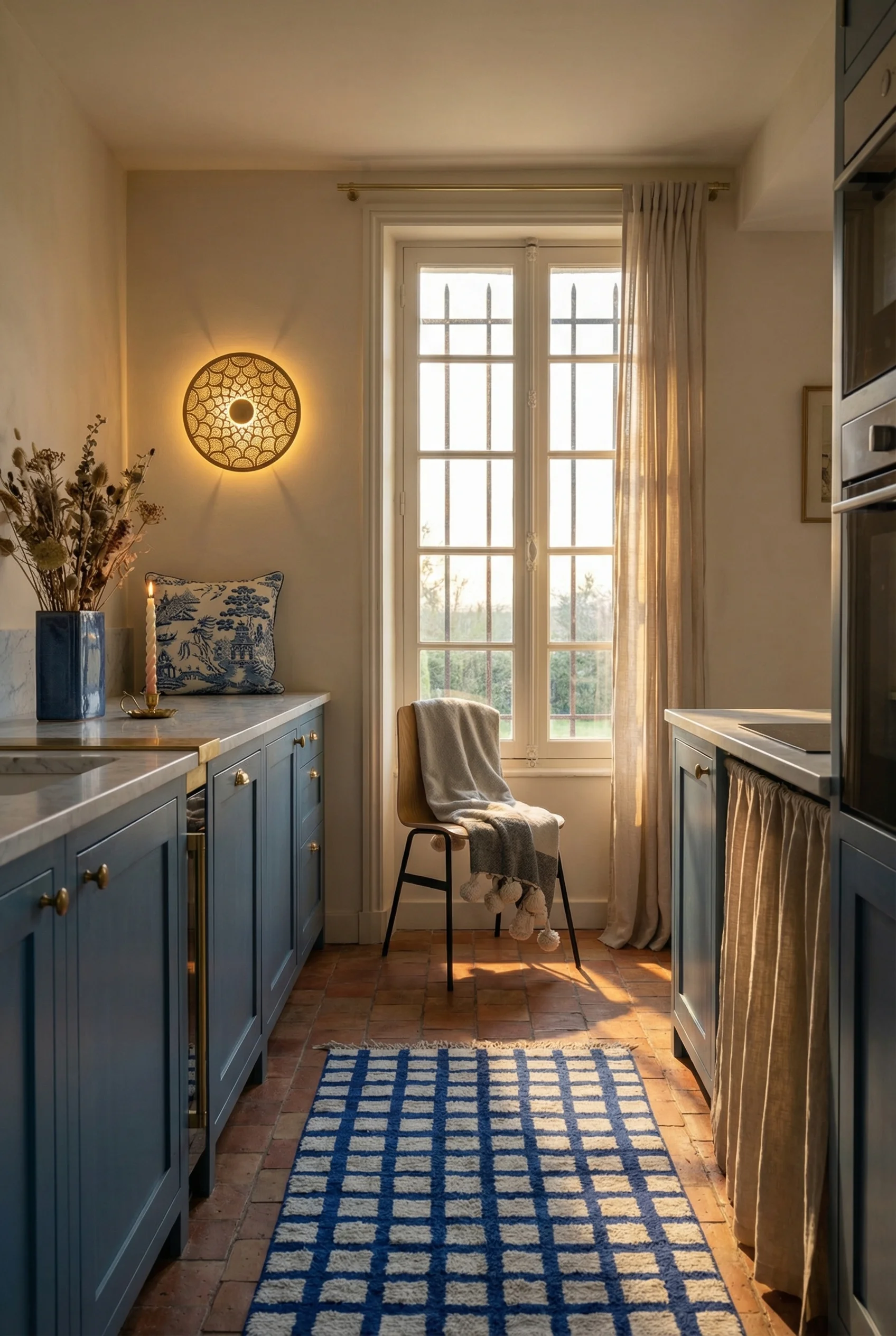
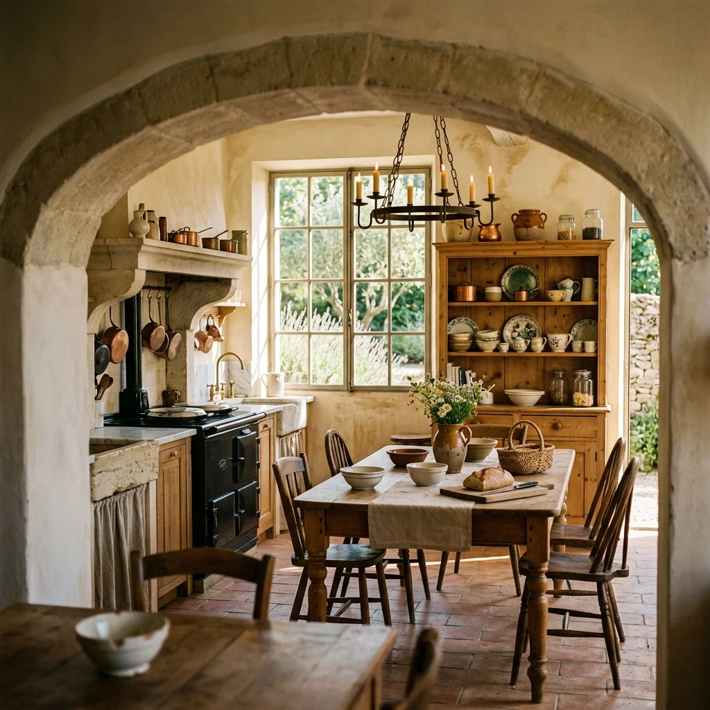
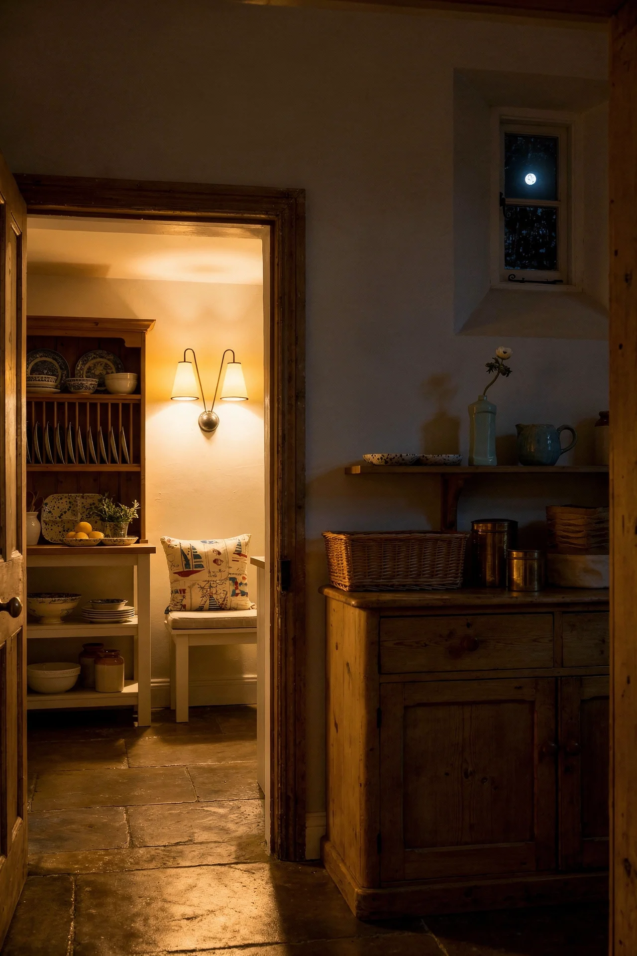
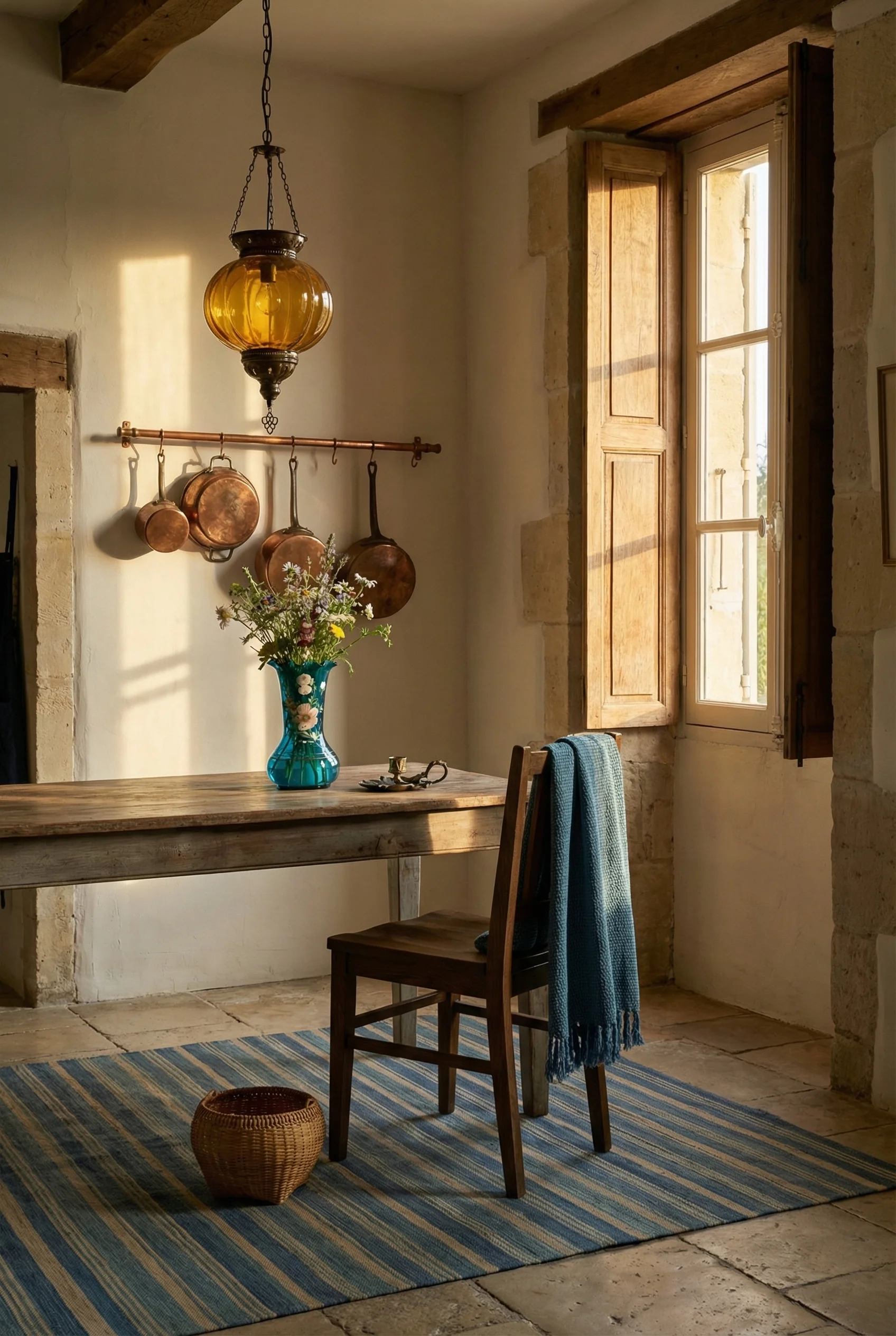
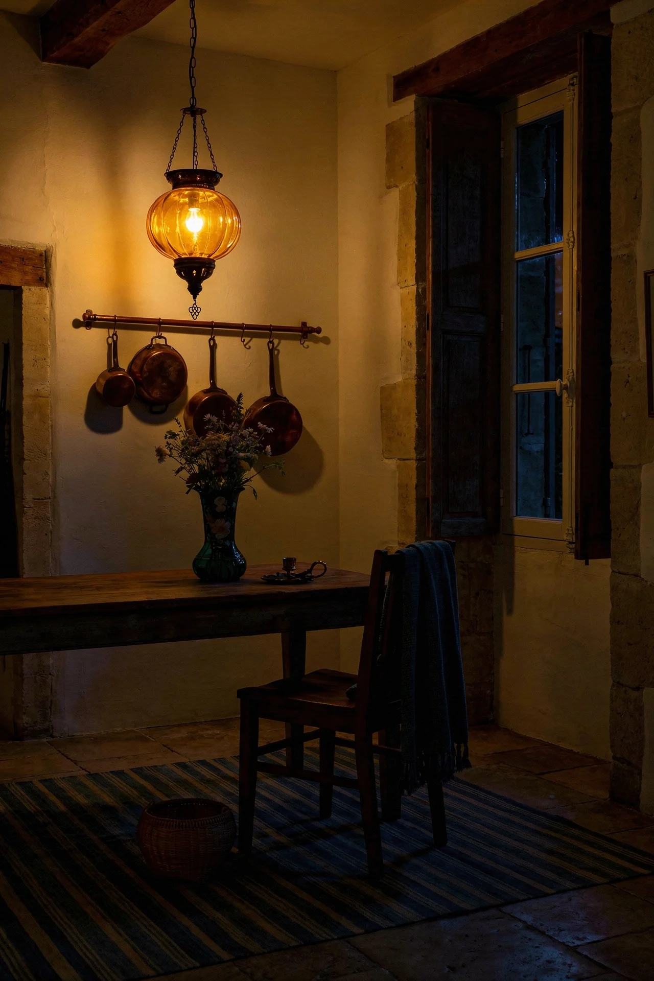
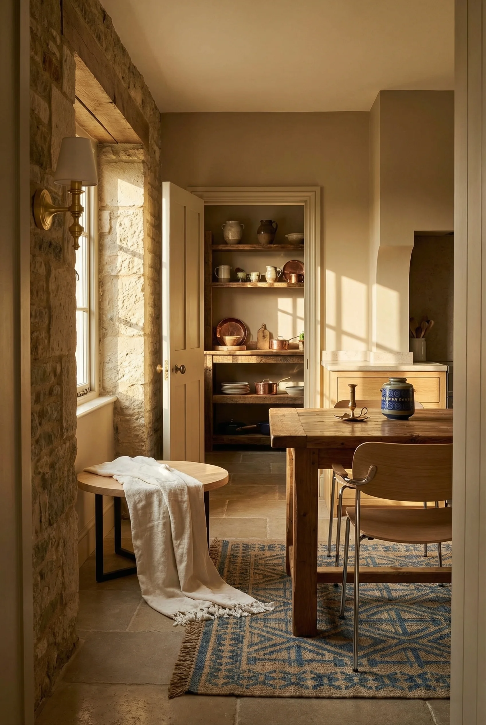
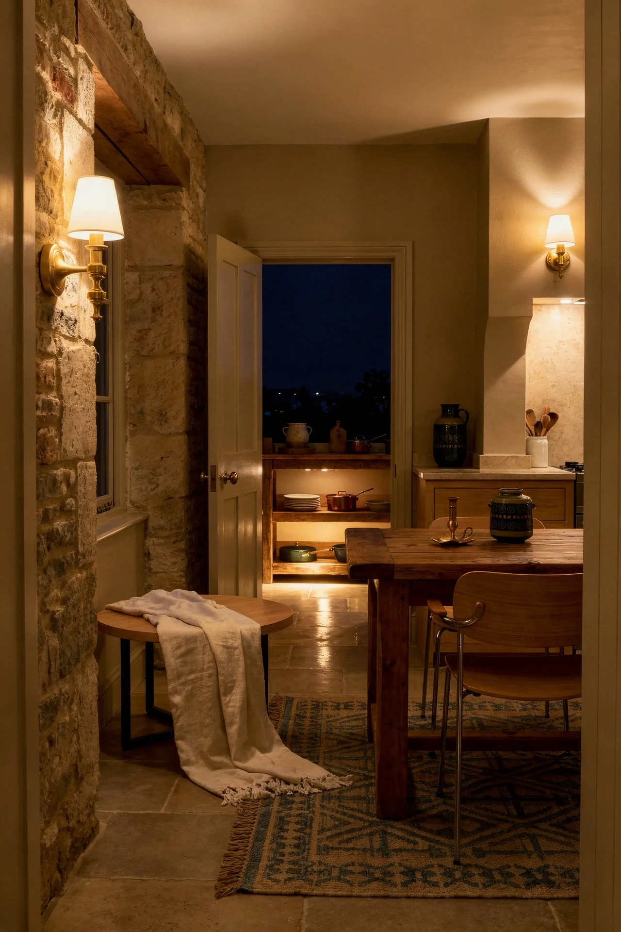
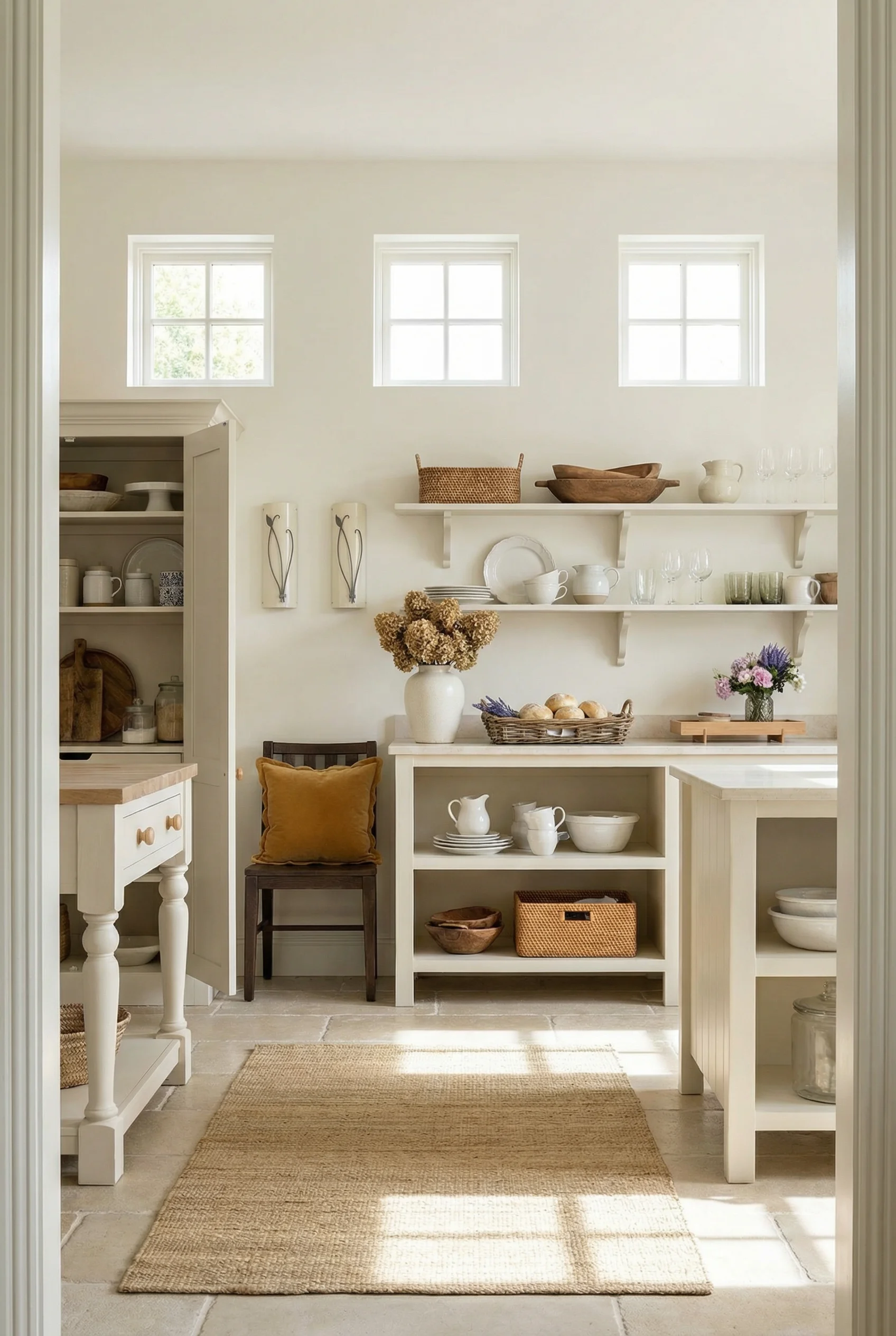
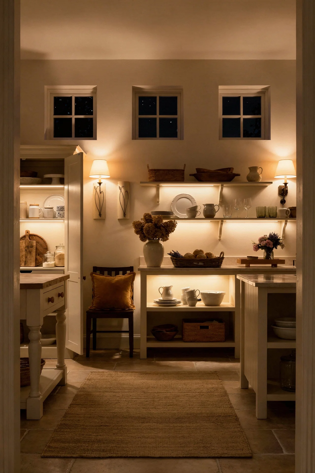
Open shelving in most modern kitchens looks like a styling exercise that falls apart within a week. In a French Country kitchen, it looks like it belongs there because it is not decorative. It is functional display.
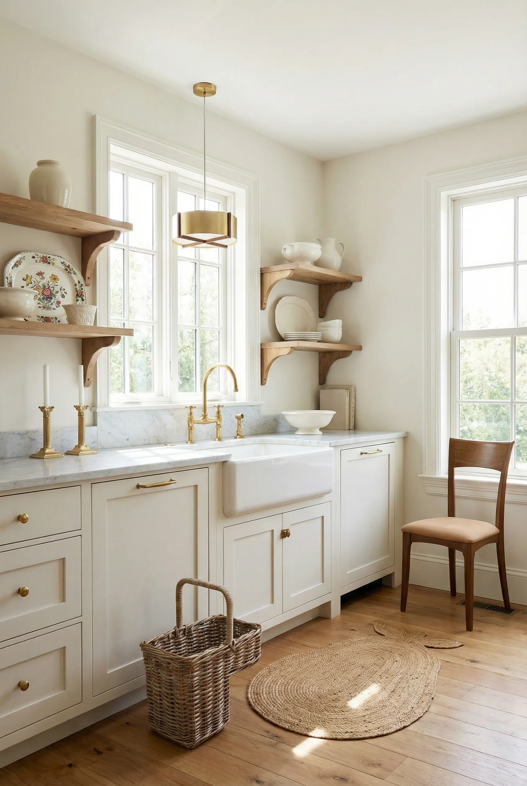
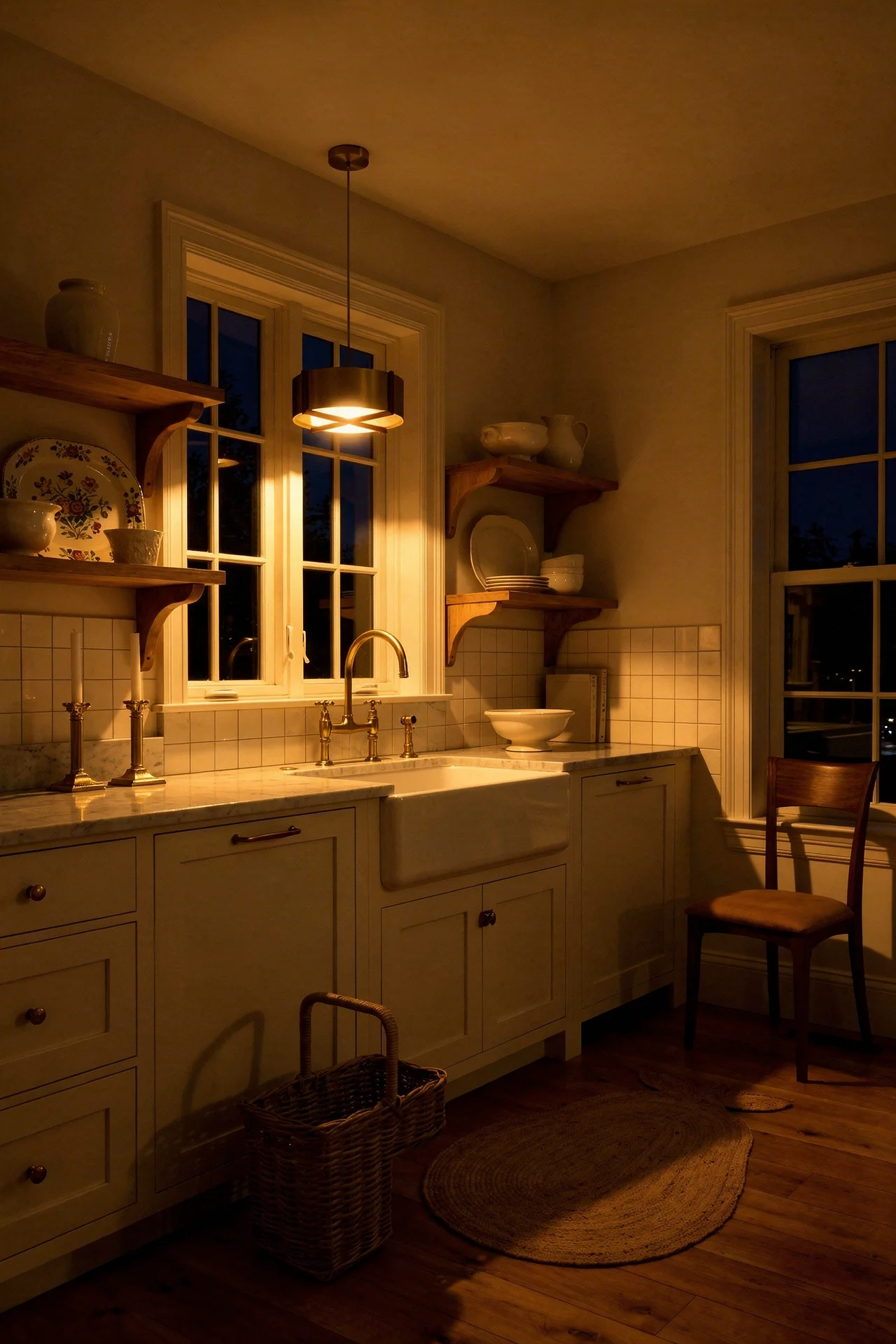
The difference comes down to what goes on the shelves. White ironstone, transferware, and everyday ceramics that you genuinely use create a rhythm that styled decor objects never will. The best French Country kitchens I have seen treat open shelves like a plate rack rather than a gallery wall. Stacks of three or five, leaning serving platters behind them, a few pieces of copper catching light.
The secret is keeping a restricted palette. If everything on your shelves shares a tonal family, creamy whites, muted blues, weathered terracotta, the visual noise drops. You get the warmth of a collected kitchen without the clutter of a messy one.
One approach I particularly like is mixing open shelves with closed cabinetry. Lower cabinets handle the practical storage (the blender, the cling film, the things nobody wants to look at), while upper shelves display the pieces you love. It is a system that works every day, not just the day you photograph it.
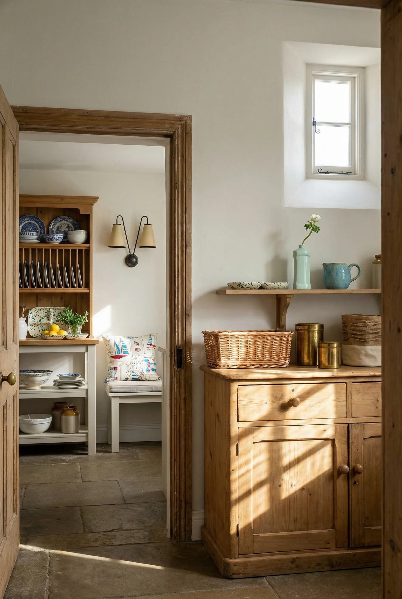
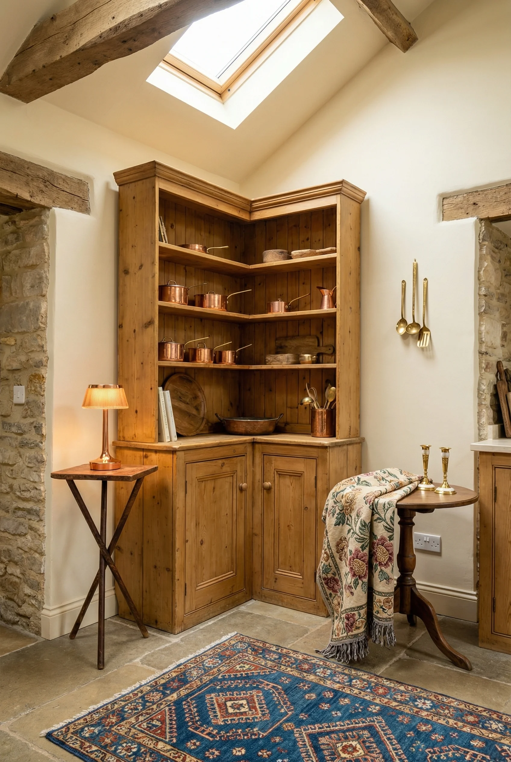
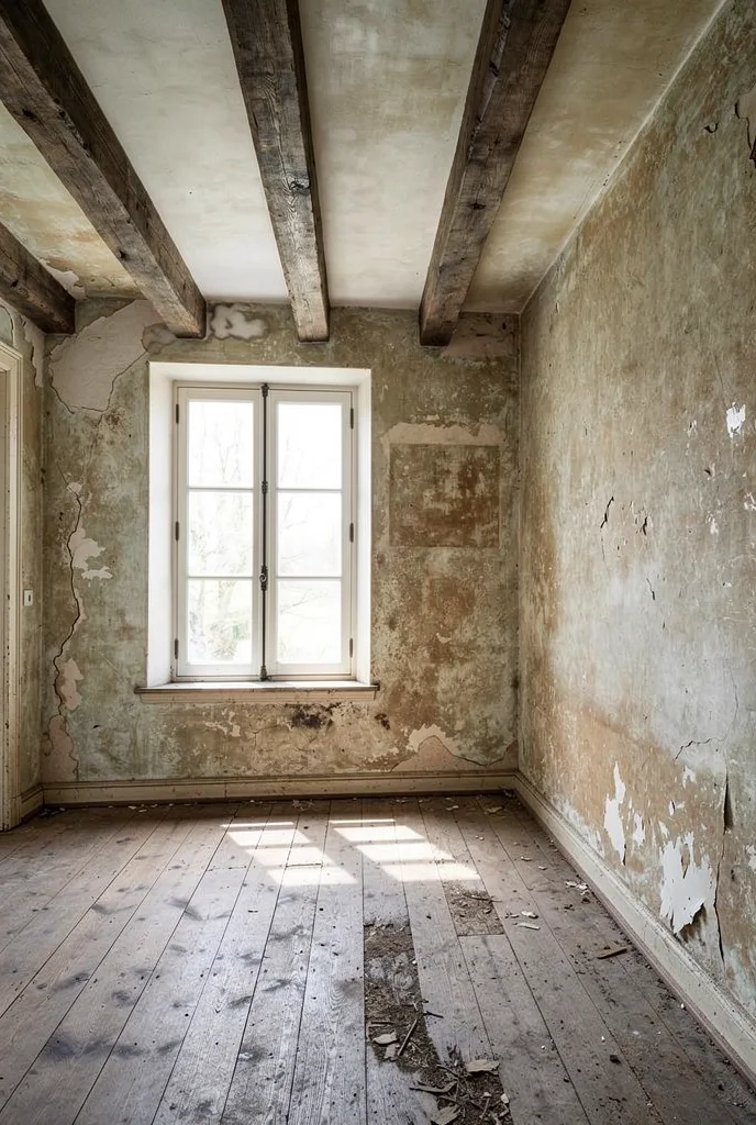
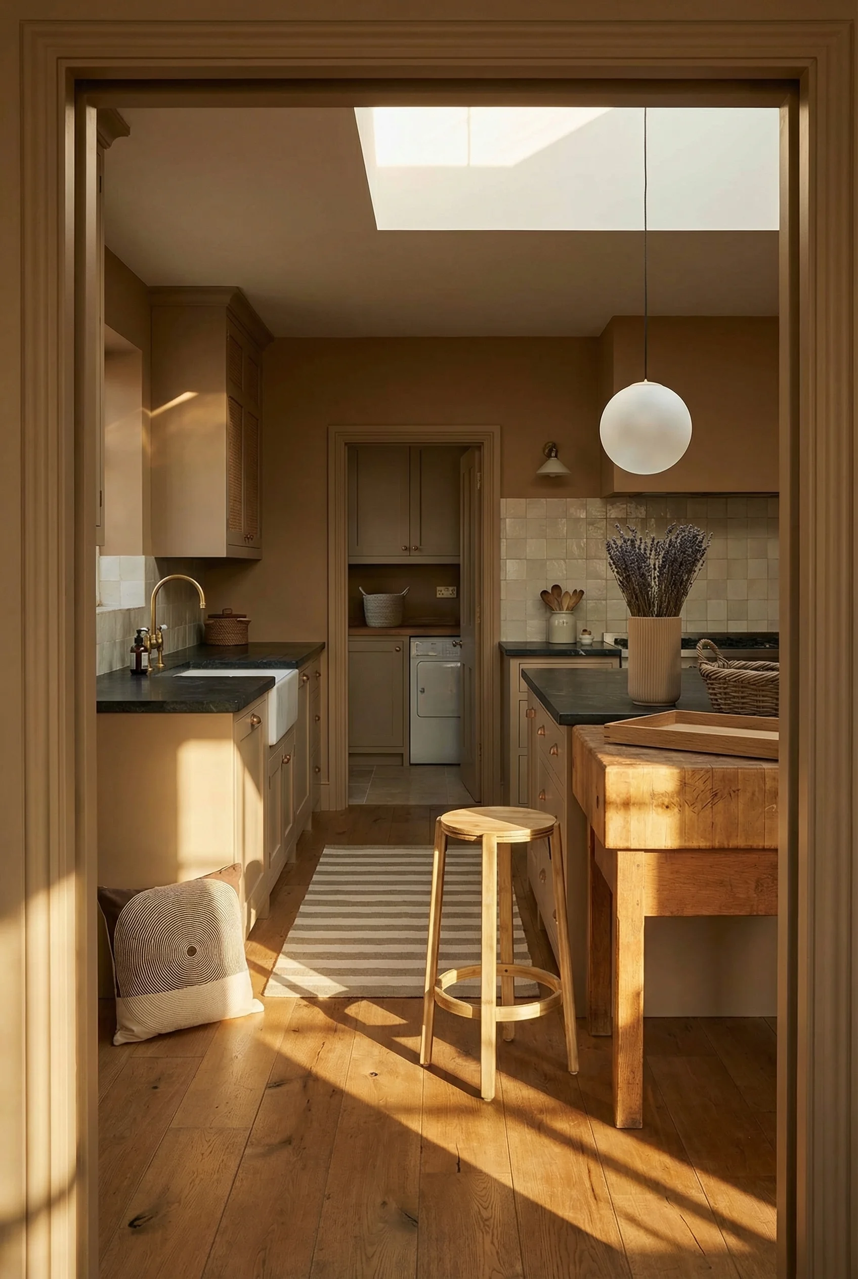
Strip away the textiles, the copper, the ceramics, and a French Country kitchen still reads as French Country if the wood is right. That is how foundational warm timber is to this style. Wide plank oak flooring, aged pine cabinetry, butcher block on at least one work surface. These are not decorative choices. They are structural ones.
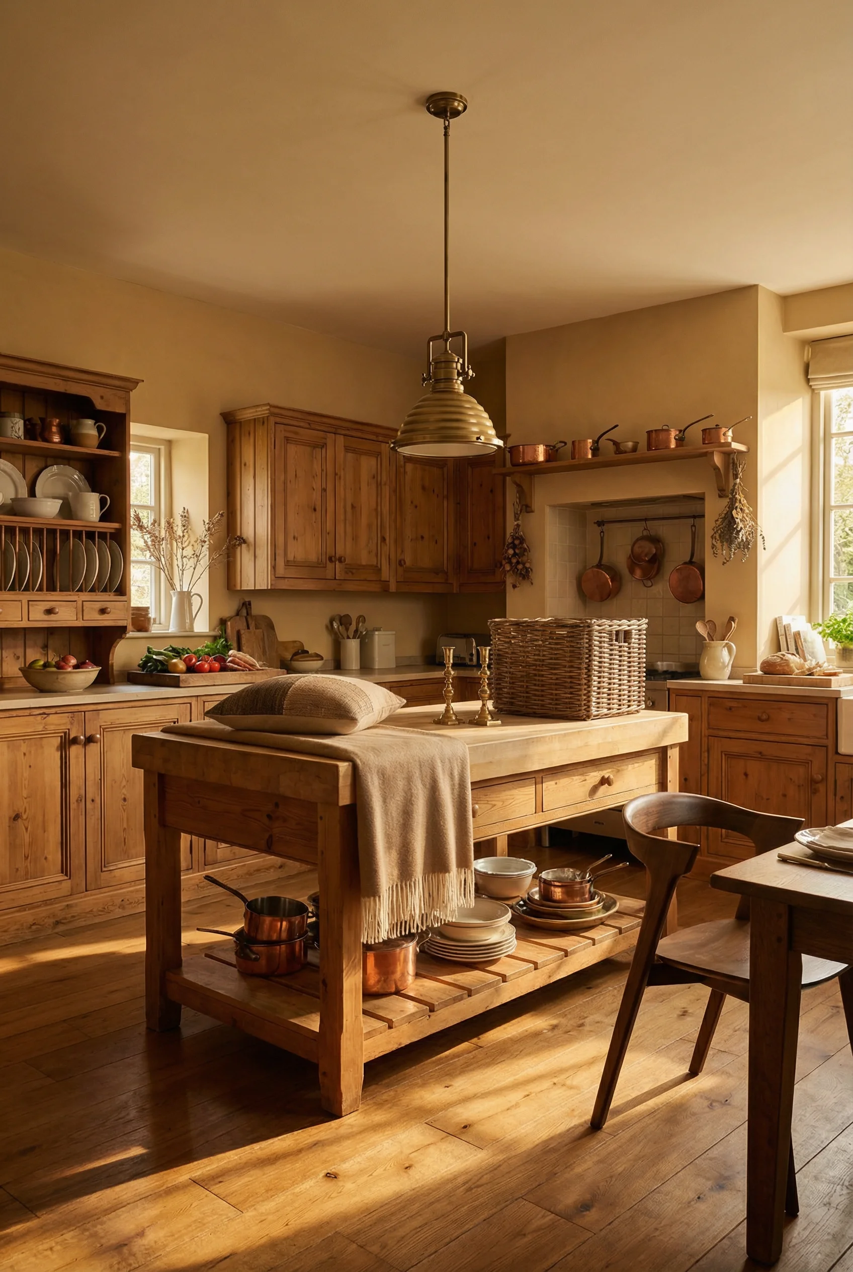
The key here is mixing textures rather than matching wood tones. A smooth marble countertop against rough hewn reclaimed timber creates visual depth that makes a kitchen feel layered and old in the best possible way. I have noticed that the most successful renovations avoid anything that looks too new. They choose wire brushed finishes, hand scraped surfaces, and woods with visible knots and grain variation.
Oak and pine dominate, but the finish matters more than the species. A heavy polyurethane seal kills the warmth instantly. Wax finishes, matte oils, or even leaving wood unsealed in low traffic areas lets the material breathe and age the way it should.
If you are working with existing cabinetry that feels too slick, distressing changes the game. A mocha tinted antiquing glaze over chalk paint mimics decades of natural wear. Sand the edges where hands would naturally grip, the corners of drawers, the lip of a shelf. Precision distressing always looks fake. Random wear always looks real.
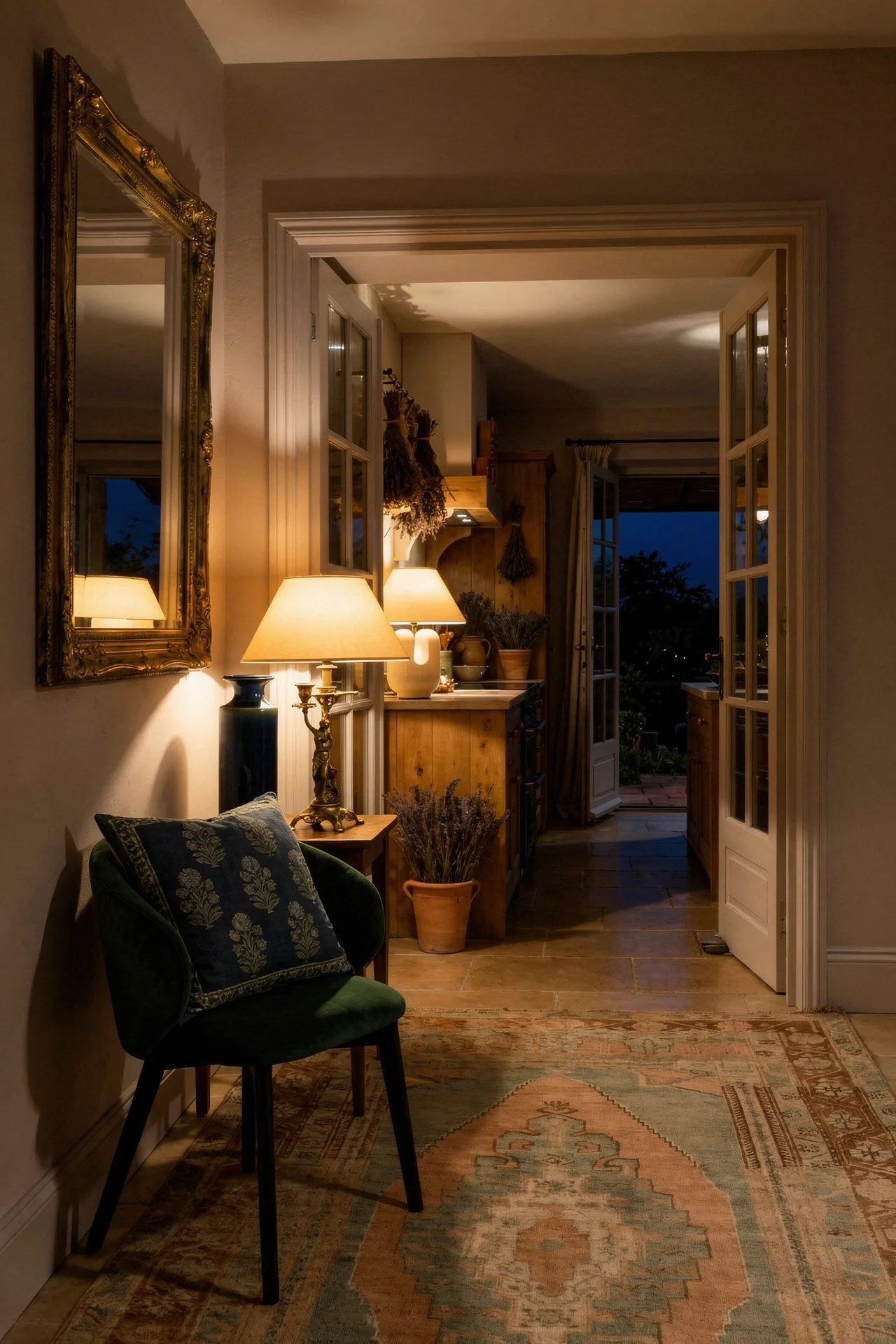
The Provencal palette is not just about picking soft colours. It is about choosing the right level of saturation. Every accent in a French Country kitchen should look like it has been sitting in warm sunshine for thirty years. That means chalky, unsaturated, and slightly faded.
Creamy yellows work where bright yellows would be jarring. Pale olive or sage greens replace any sharp emerald. Muted lavender replaces violet. And warm terra cotta replaces orange. The common thread is that no single colour shouts. They all whisper, and together they create something richer than any bold statement wall could.
For cabinetry specifically, warm whites outperform cool whites every time in this style. Ecru, ivory, and antique white have pink or yellow undertones that make them feel like they belong in a stone farmhouse. A blue white or grey white reads as modern, which fights the rest of the room.
I think the mistake most renovators make is treating paint as a permanent decision. In French Country kitchens, paint is meant to evolve. Chalk painted surfaces can be touched up, layered, even sanded back to reveal a previous colour underneath. That lived in quality is not a flaw. It is the entire point.
Most backsplash trends age faster than any other surface in the kitchen. The geometric tiles from 2018 already look dated. The penny rounds from 2020 are heading the same direction. But tumbled marble, hand painted ceramic, and natural terracotta? Those have looked right in French kitchens for actual centuries.
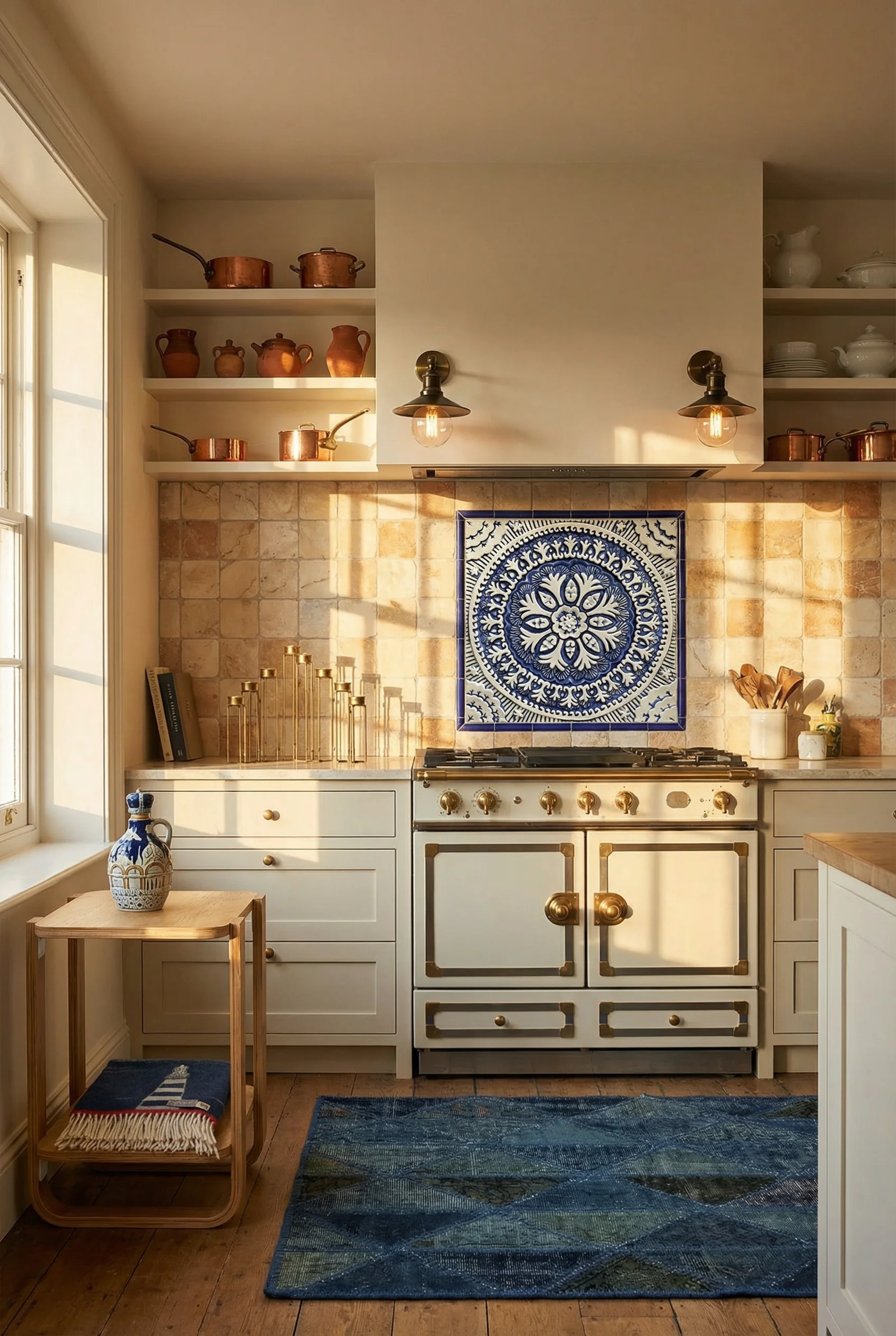
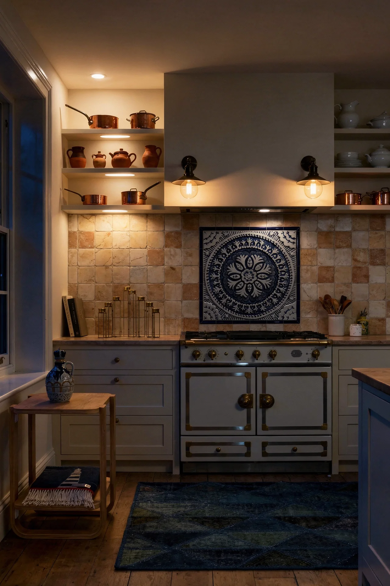
Tumbled marble and travertine give you softened edges and a matte surface that hides water spots and cooking splashes far better than polished alternatives. The slight irregularity of each tile reads as handcrafted rather than mass produced. For a more decorative option, blue and white hand painted tiles bring in that Provencal pattern language without overwhelming the room.
Natural terracotta is the sleeper choice I keep coming back to. Unsealed or lightly sealed, it develops a patina over years that no manufactured tile can replicate. Painted brick pavers offer a similar effect at a lower price point, and they bring that hearth like warmth that anchors French Country cooking spaces.
If you are renovating on a budget, here is something worth knowing. A simple tumbled marble subway in a running bond pattern costs about the same as most ceramic options, but it reads as exponentially more expensive. The investment is in the installation, not the material.
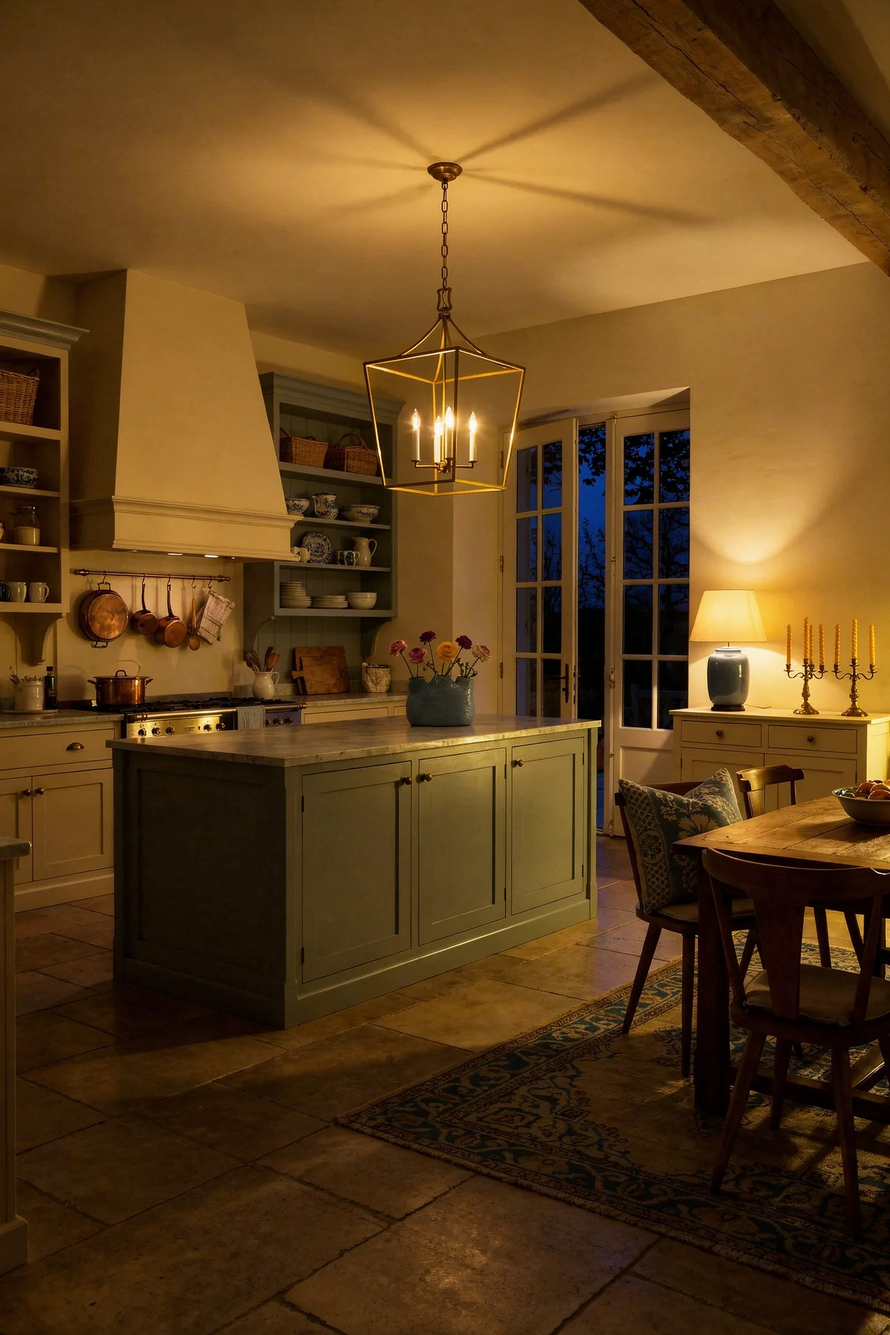
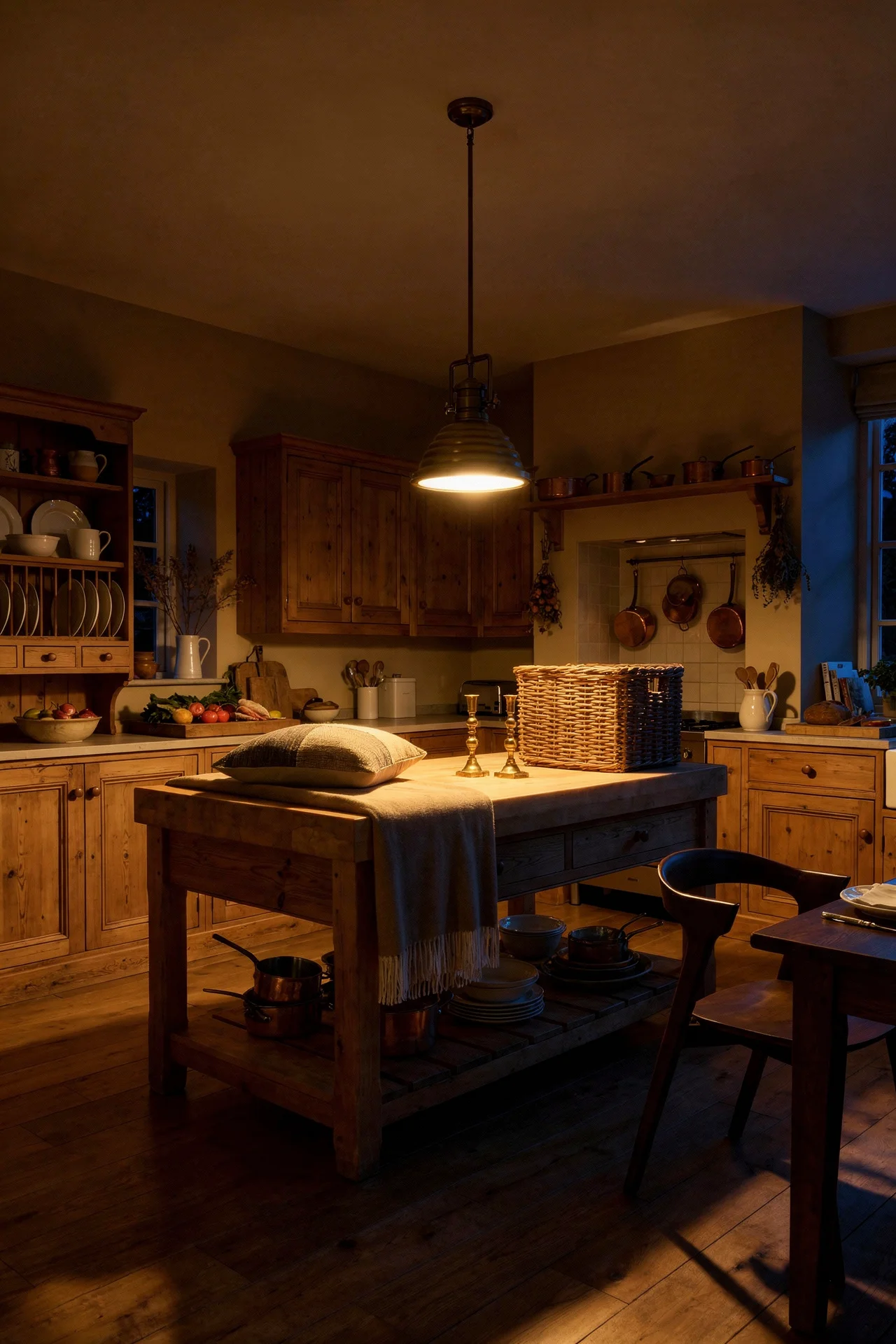
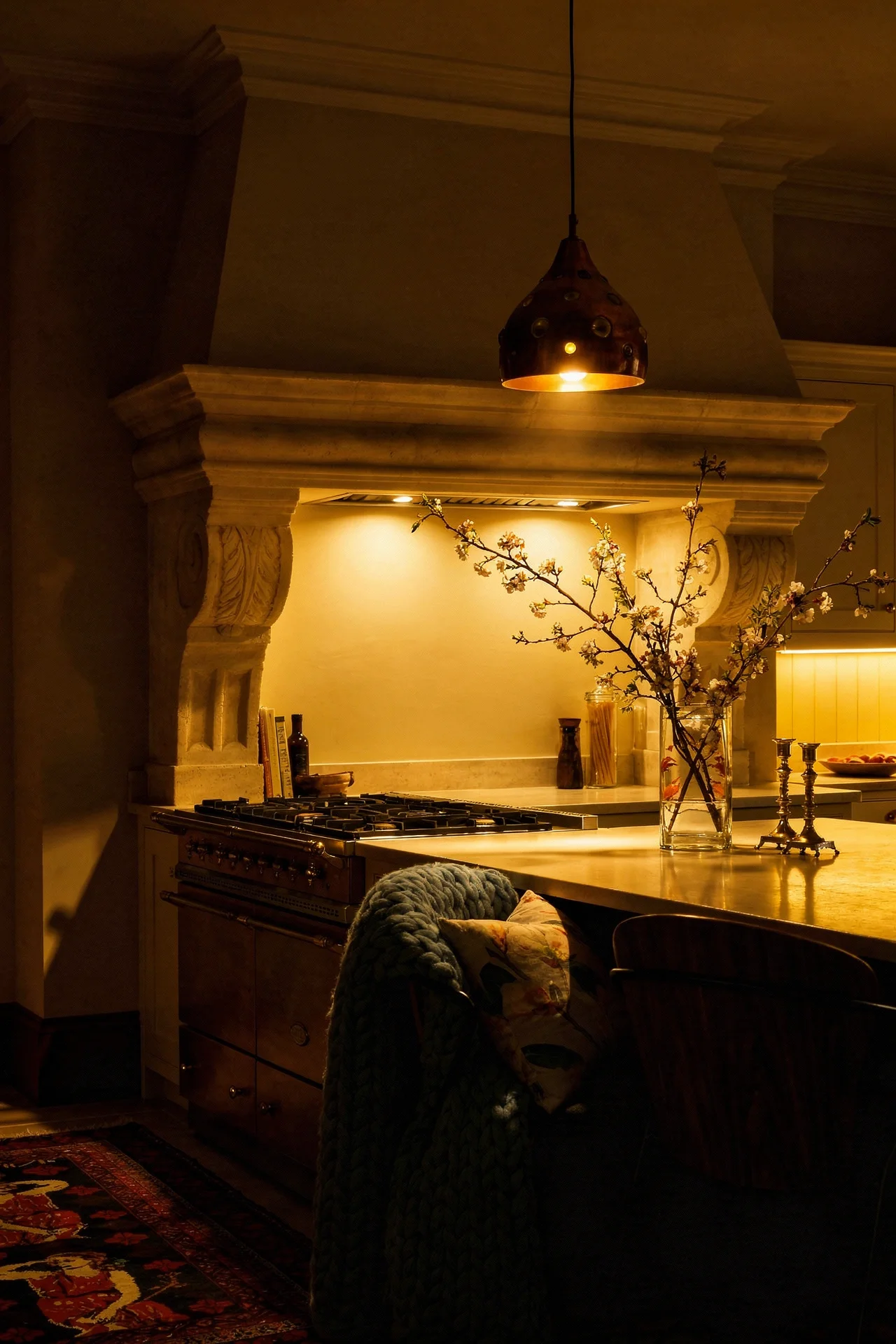
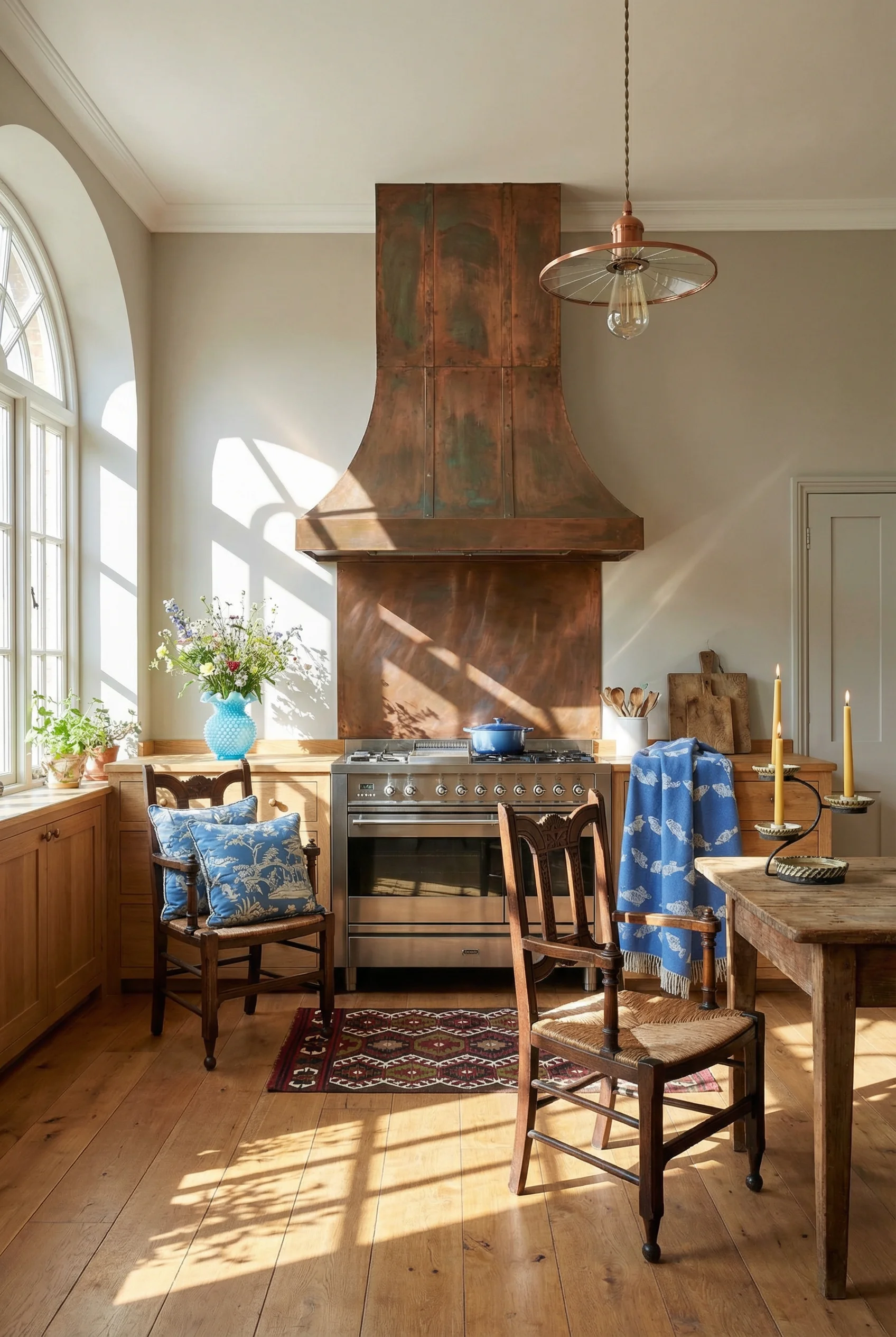
In most kitchen styles, the range hood is functional hardware you try to hide. In a French Country kitchen, it becomes the room’s centrepiece. A carved wood, copper clad, or hand plastered hood framed by stone or brick creates a hearth like presence that every other element in the room orbits around.
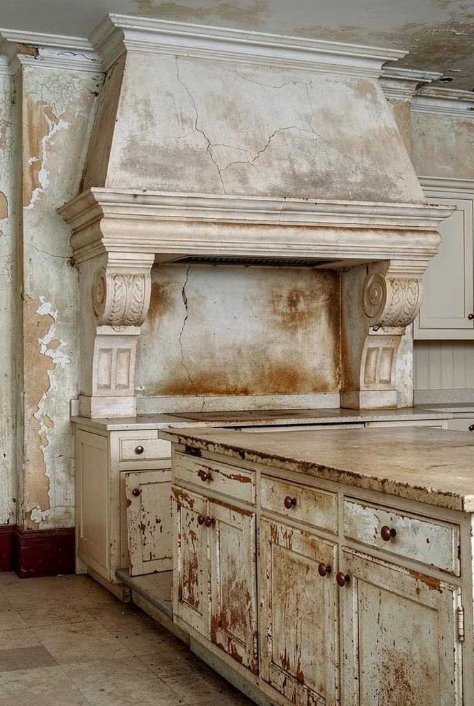
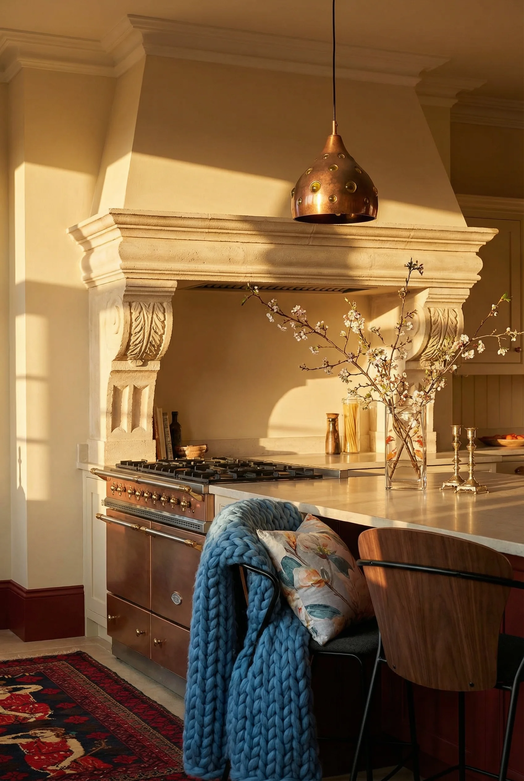
The most striking versions I have seen use a contrast material. If your cabinetry is painted, the hood is raw plaster or aged wood. If your cabinets are natural timber, the hood gets a copper or zinc cladding. This tension between materials is what gives the kitchen its sense of age and character.
Functionally, a decorative hood still needs to vent properly. What changes is the surround. Wood corbels or carved brackets support the sides. A stone or brick arch frames the top. Some renovators build the entire cooking zone as a recessed alcove, almost like an inglenook, with the hood concealed above it.
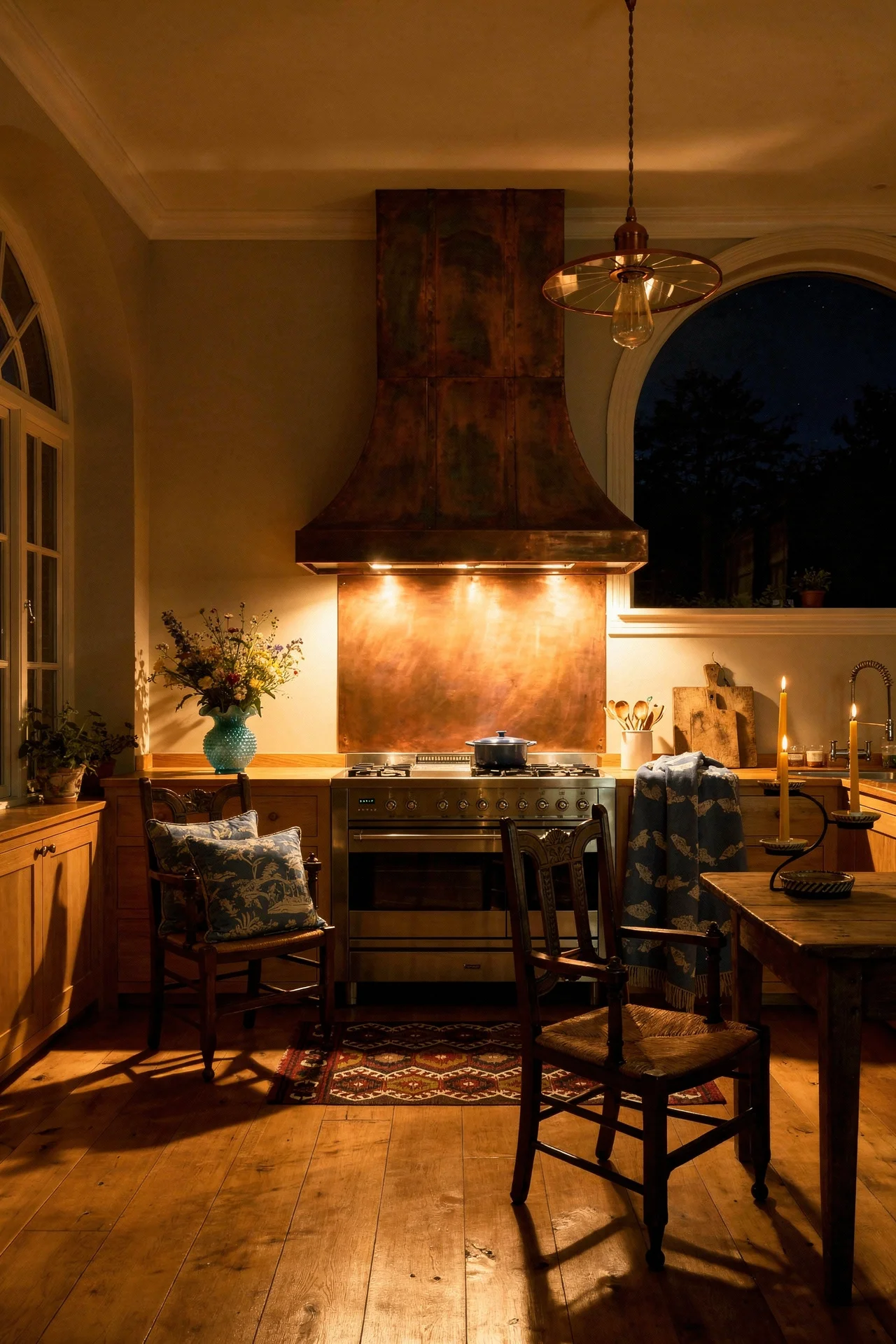
A wall mounted pot filler next to the range adds both function and visual weight to this zone. It is one of those details that signals the kitchen was designed with actual cooking in mind, not just as a showpiece.
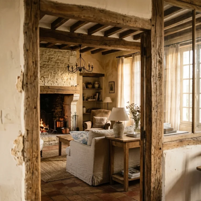
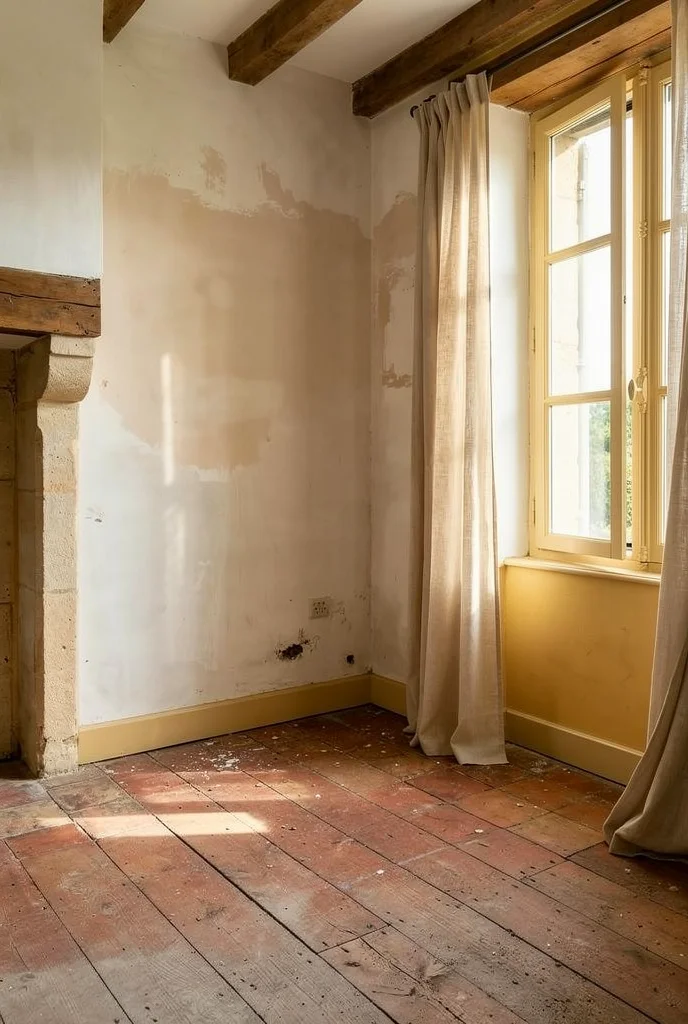
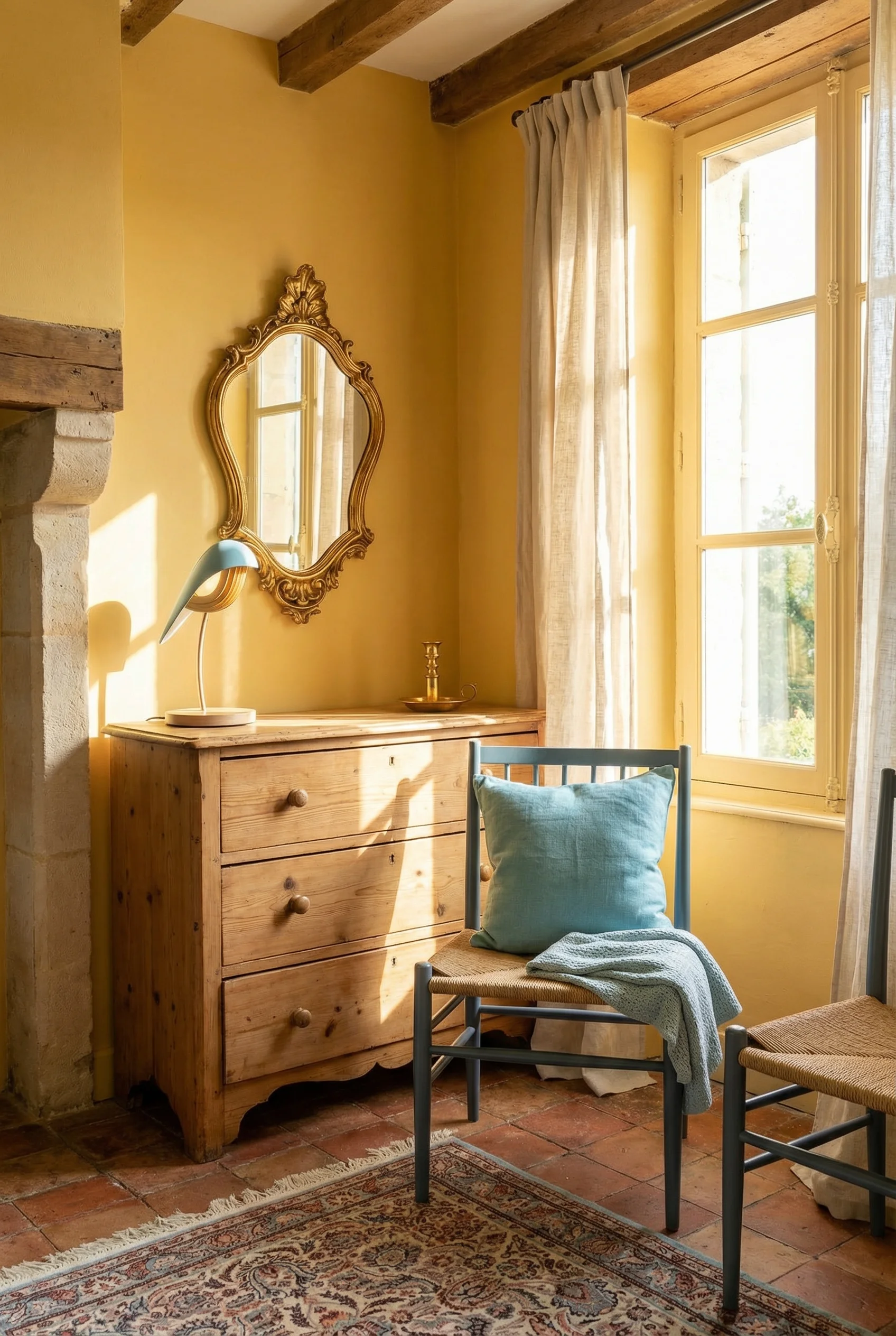
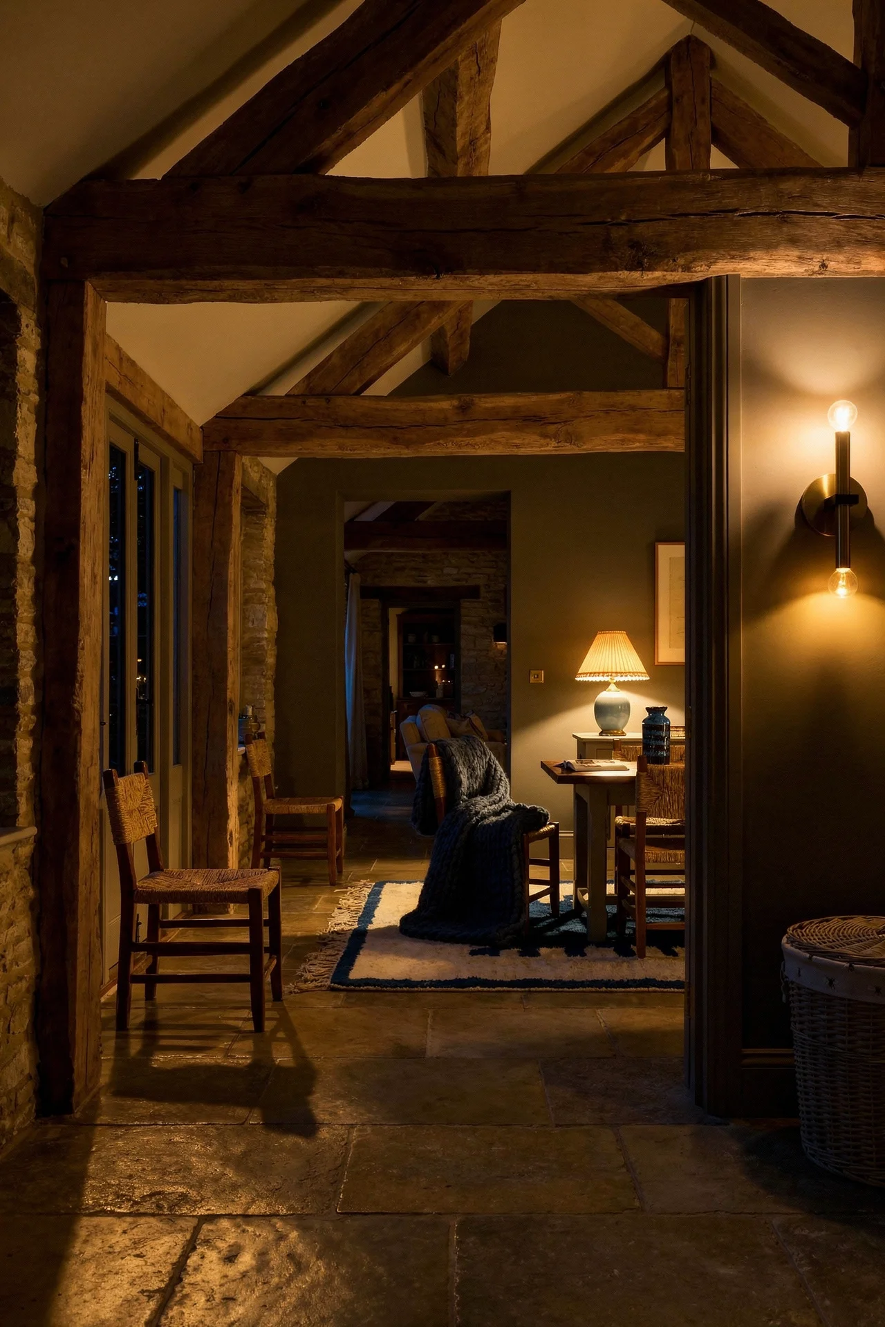
There is a ceiling treatment that instantly codes any kitchen as French Country, and it costs less than most people assume. Exposed wooden beams, whether structural or decorative, add architectural weight that painted drywall simply cannot provide.
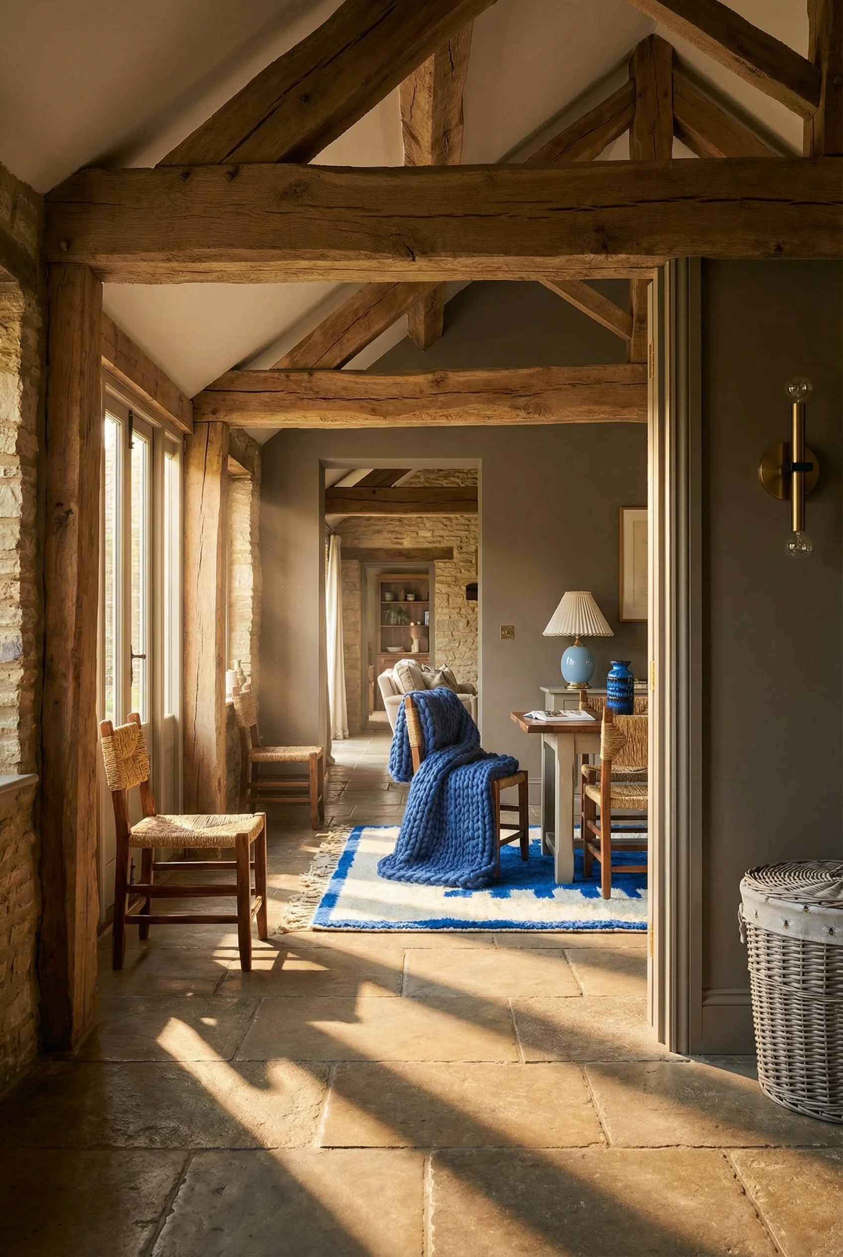
Genuine reclaimed beams carry the marks of their previous life. Nail holes, saw marks, checking, and colour variation tell a story that new timber cannot fake. If you can source them, they are worth every penny. But if reclaimed beams are not available or not in the budget, hollow beam wraps made from thin reclaimed wood achieve a similar effect at a fraction of the weight and cost.
The spacing matters. I have seen kitchens where beams are packed too tightly and the ceiling feels heavy and oppressive. For most kitchen heights (8 to 9 feet), three to five beams spaced evenly across the width of the room hit the right balance. They add character without lowering the perceived ceiling height.
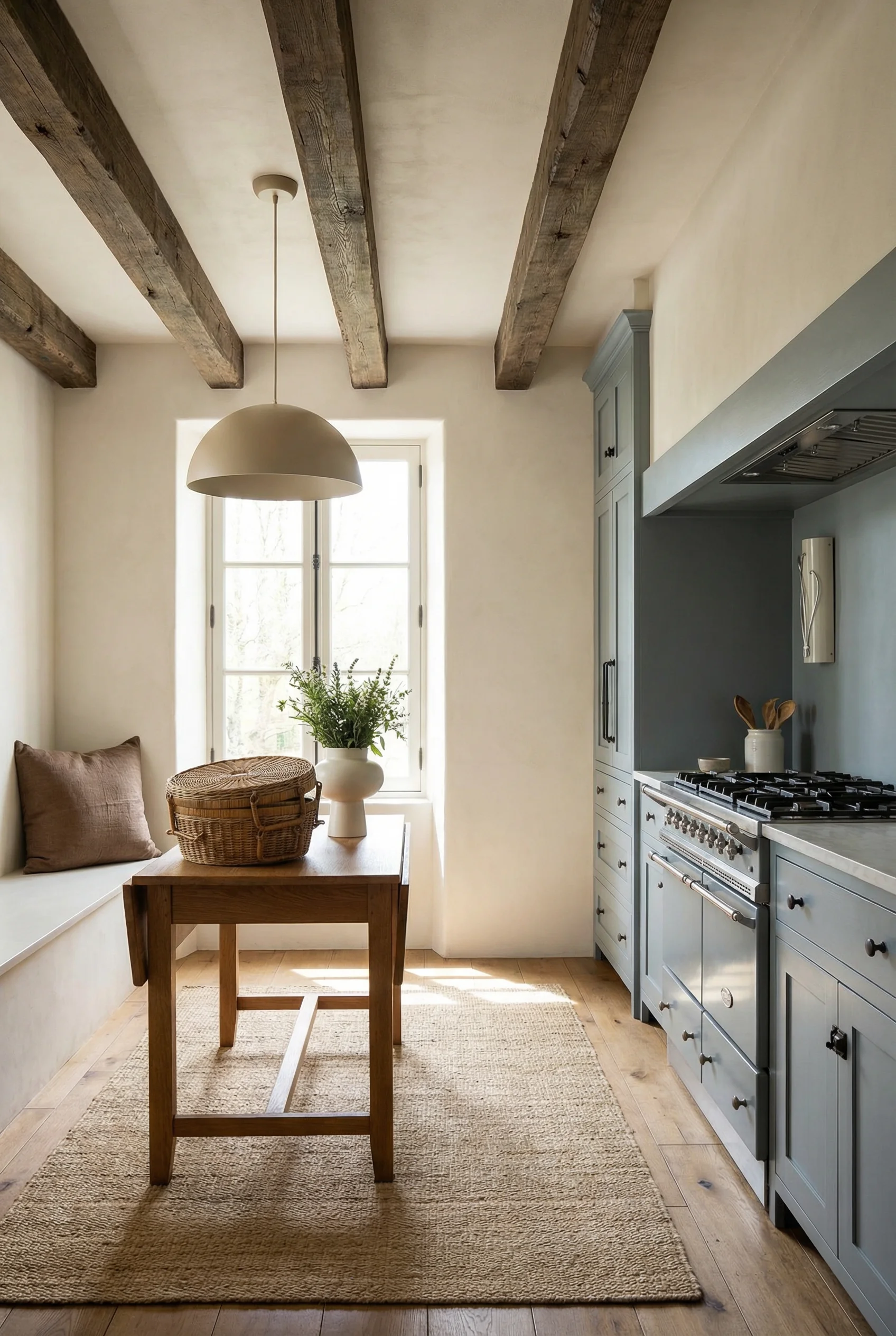
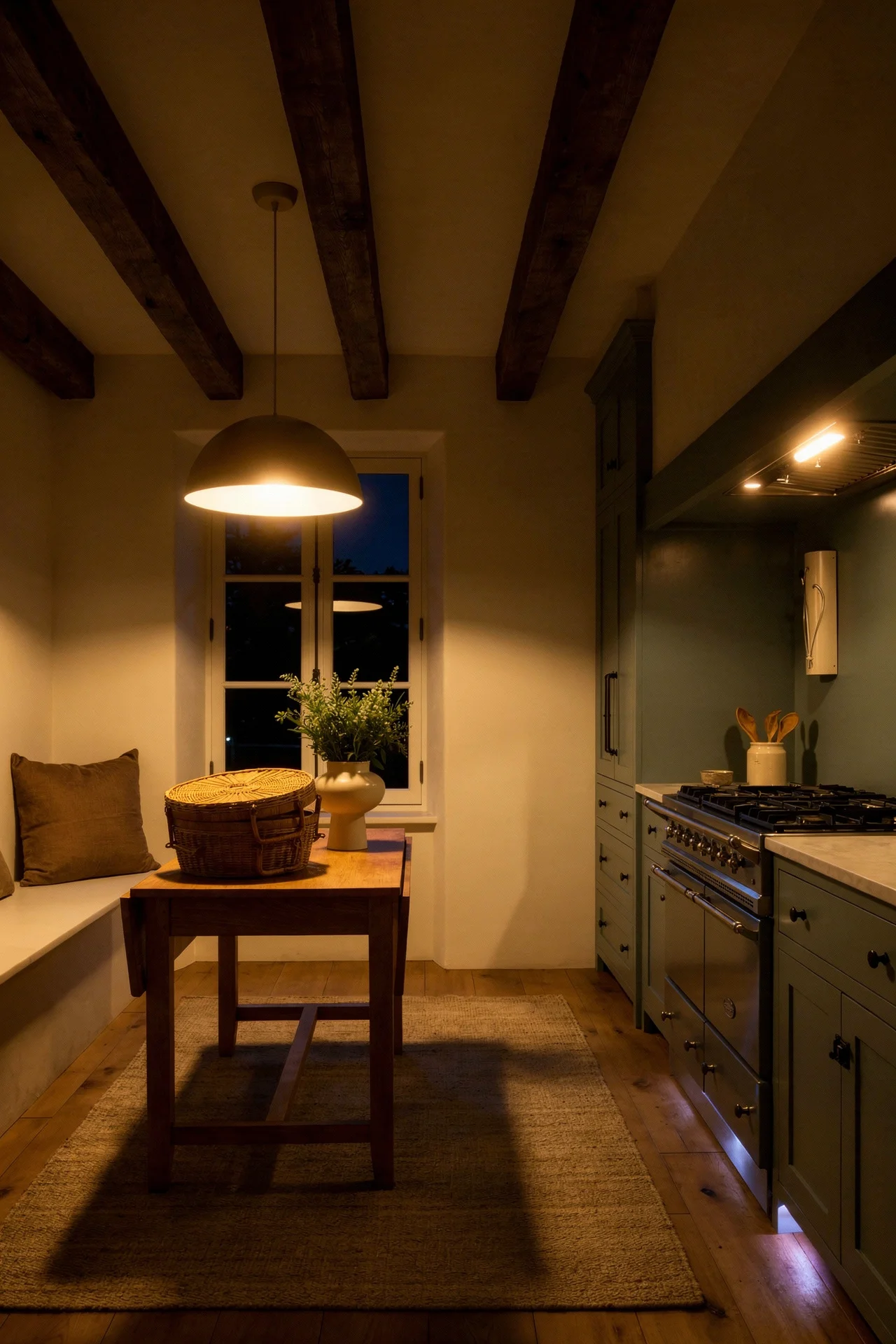
Colour should complement your cabinetry, not match it. If your cabinets are painted cream, the beams should be a weathered medium brown. If your cabinets are natural wood, the beams should be darker and more distressed. That contrast is what makes both surfaces look intentional.
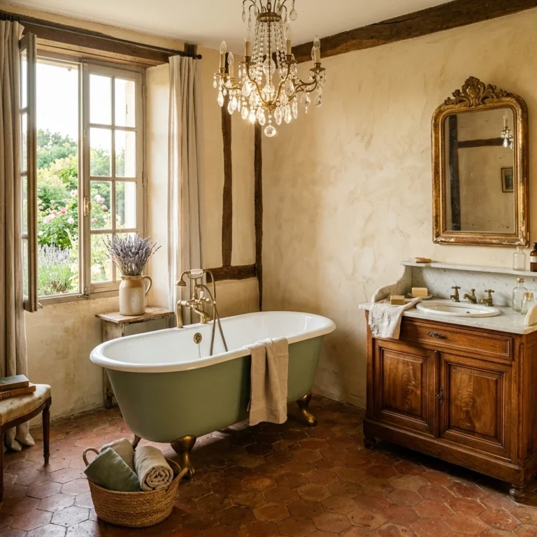
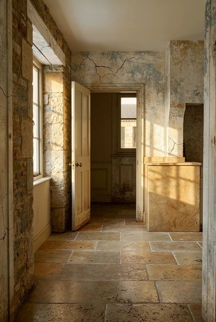
Polished granite was the safe choice for two decades. It is also one of the fastest surfaces to date a kitchen. In French Country design, honed natural stone tells a completely different story. Honed marble, limestone, and soapstone all develop a patina that makes the kitchen look more beautiful at year ten than year one.

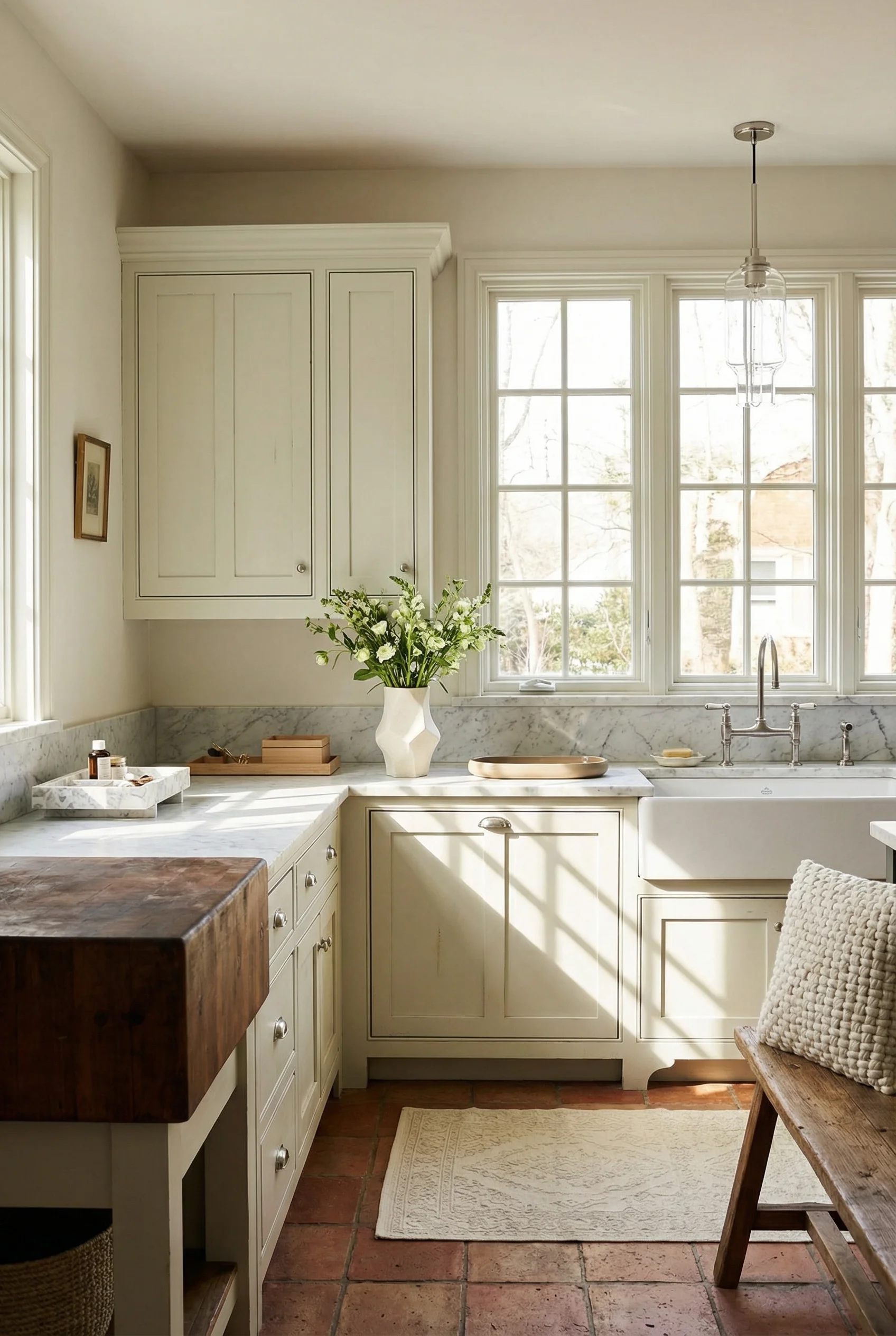
Honed marble provides classic luminosity with a matte surface that hides fingerprints and water spots better than its polished cousin. Honed limestone brings rustic warmth with an earthier, more textured finish. Soapstone is the practical choice, naturally antimicrobial and darkening gracefully with use. Each one rewards you for living in your kitchen rather than punishing you for it.
Butcher block deserves its own mention. A thick walnut or oak slab on an island or prep station brings organic warmth that stone alone cannot deliver. The best French Country kitchens mix surfaces, stone on the perimeter counters and wood on the island, which creates that collected, built over time quality.
If you are worried about maintenance, honed limestone and soapstone are the most forgiving. They stain and scratch, yes, but those marks blend into the surface over time. Marble requires more care, but mineral oil and periodic resealing keep it manageable. The goal is not a pristine surface. It is one that tells the story of a kitchen that gets used.
The biggest giveaway of a kitchen that was designed rather than evolved is an island that matches the perimeter cabinetry exactly. In a French Country kitchen, the island should look like a separate piece of furniture that found its way into the room. Contrasting paint colour. Turned legs or carved corbels. Open shelving on at least one side.
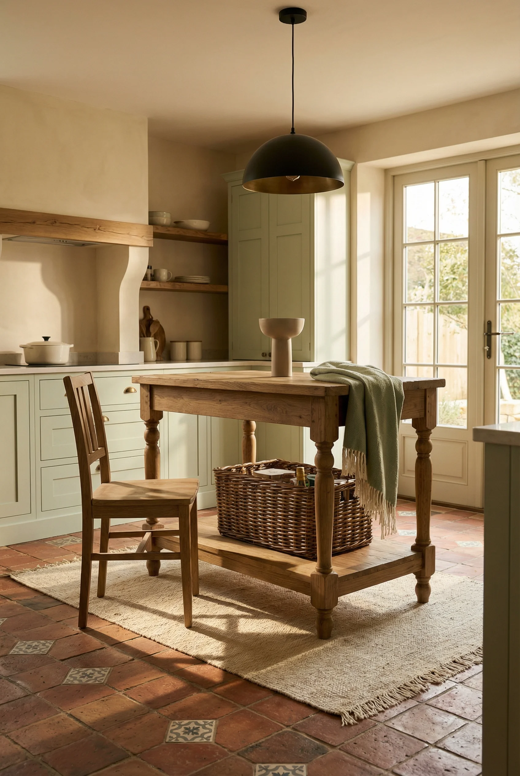
I find that the most successful islands borrow details from dining tables and antique workbenches rather than standard kitchen cabinetry. Furniture style feet instead of a toe kick. A slightly thicker countertop overhang for casual seating. Wicker baskets slotted into open shelves instead of drawers. These details signal that the island was chosen, not specified from a catalogue.
The contrasting colour approach ties back to the blue cabinetry conversation. Painting your island a shade darker or in a complementary tone creates a visual anchor point. Cream perimeter with a sage island. White surround with a warm grey centre. The combination makes both colours look more intentional than either would alone.
Size matters here, too. French Country islands tend to be generously proportioned but not necessarily fitted wall to wall. Leaving breathing room on all four sides preserves that freestanding furniture quality. If your footprint allows it, pull the island slightly away from the work triangle and let it function as a gathering point rather than a workflow station.
You have probably noticed that French Country kitchens feel warmer and more inviting than most traditional styles, and the colour palette is the reason. Here are the five colours that define the style.

Soft Blue – The signature French Country accent. This is not a bright or primary blue but a dusty, chalky tone with grey undertones. Use it on island cabinetry, ceramic accessories, or a tile backsplash. It reads as both calming and distinctly Mediterranean.
Paint Pick: Farrow & Ball Parma Gray No.27
Cream – The workhorse of the palette. Warm cream with yellow or pink undertones works on walls, perimeter cabinetry, and ceiling paint. It is the colour that makes everything else in the room feel cohesive without flattening the space.
Paint Pick: Farrow & Ball Farrows Cream No.67
Antique Gold – Used sparingly on hardware, light fixtures, and picture frames. This is not a bright, polished gold but a warm, slightly tarnished brass tone. It catches light and adds a sense of history without looking ostentatious.
Paint Pick: Farrow & Ball Yellow Ground No.218
Lavender – The unexpected one. A pale, greyed lavender on textiles, ceramic pieces, or even a feature wall brings Provencal warmth without veering into purple territory. It pairs beautifully with cream and soft blue.
Paint Pick: Farrow & Ball Sugared Almond No.9913
Soft Grey – The grounding colour. A warm grey with taupe undertones works on floors, stone surfaces, and linen textiles. It stops the palette from feeling too sweet and gives the kitchen a sophisticated backbone.
Paint Pick: Farrow and Ball Pigeon No.25
Once you nail this palette, the material and furniture choices practically make themselves.
If this list feels long, start with just two things: the countertop and the paint colour. Those two decisions cascade into everything else. A honed limestone counter and a warm cream cabinet will pull you towards brass hardware, tumbled marble backsplash, and reclaimed wood beams almost by instinct. French Country kitchens were never designed from a mood board. They were built one honest decision at a time.
This post contains affiliate links, which means we may earn a small commission if you make a purchase through our links, at no extra cost to you.