Newsletter Subscribe
Enter your email address below and subscribe to our newsletter
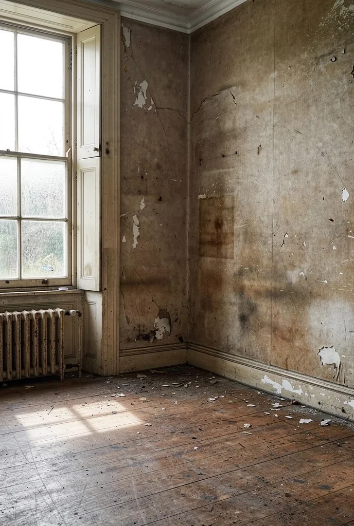
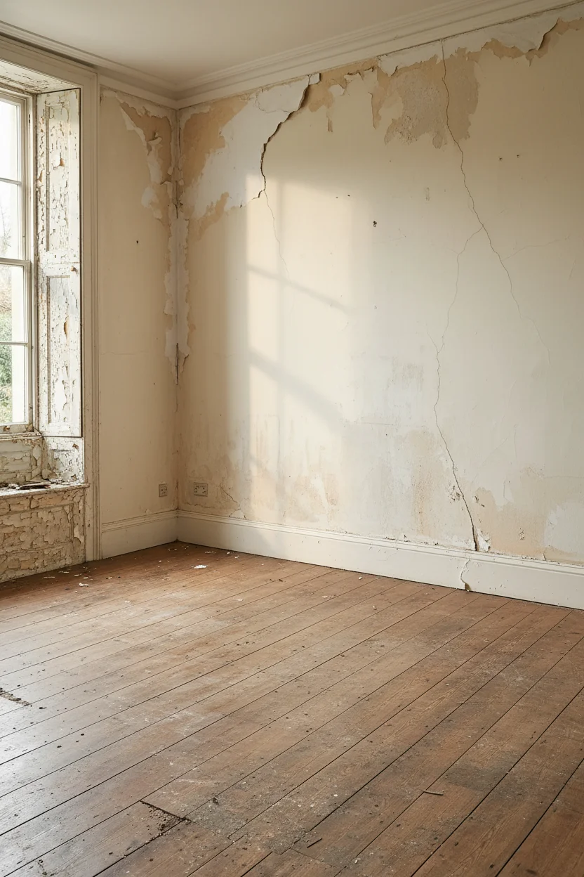
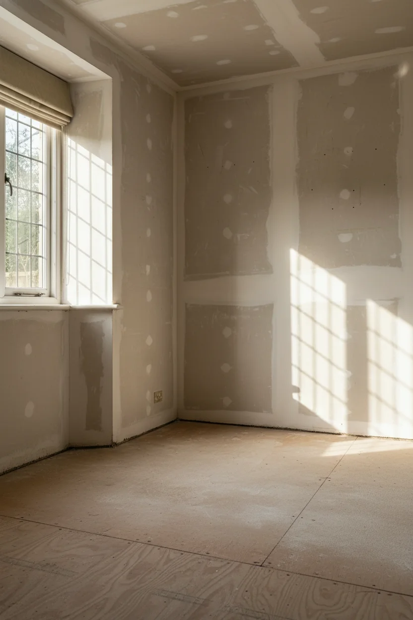
There is a moment when an English country living room stops looking like a magazine shoot and starts feeling like somewhere you’d want to sit down with a cup of tea and never leave. I’ve been staring at about a hundred of them lately, the cosy ones and the stiff ones side by side, and the gap between them is not what I expected. Ben Pentreath calls his version ‘happiness, history, character, and imperfection.’ John Fowler built an entire career on what he named ‘humble elegance.’ The cosy rooms all understood this. The stiff ones were chasing something else entirely, and I think I can finally tell you what it is.
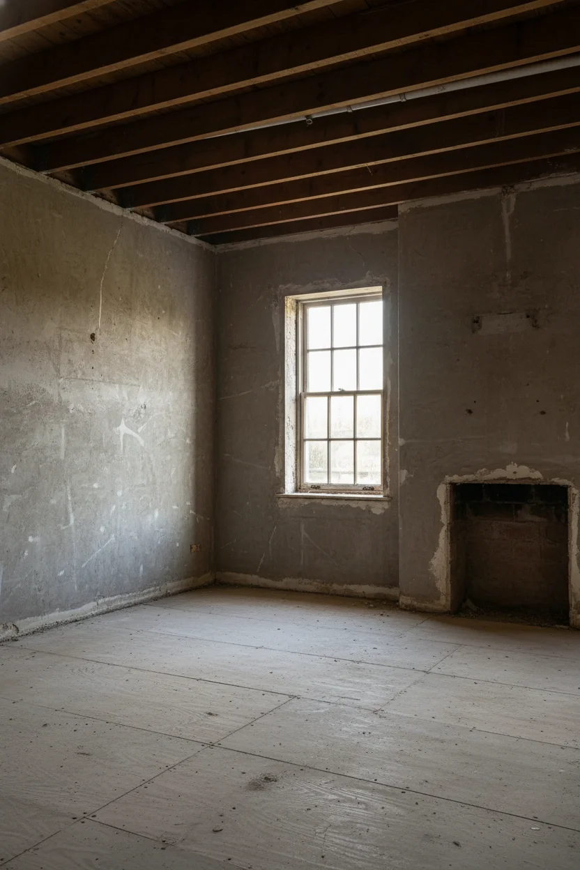
The rooms that worked felt collected, not decorated. The ones that fell flat felt like somebody had opened a catalogue and pointed. That is the whole difference, and it traces back to a specific lineage of designers who spent decades figuring out how to make grand country houses feel like somewhere a family lives.
John Fowler and Syrie Maugham started it in the mid twentieth century, blending aristocratic heritage with the practicality of cottage life. Fowler’s phrase ‘humble elegance’ is the one I keep coming back to because it names the tension so precisely. You want the room to feel important and unbothered at the same time. Ben Pentreath carries that torch now, and when he talks about ‘happiness, history, character, and imperfection’ he is describing exactly the thing I kept noticing in the cosy rooms I studied.
Rita Konig puts it another way. She says her spaces should never feel ‘fuddy,’ which is a properly English word for stiff and self conscious. Her trick is to make sure nothing looks too resolved. Carlos Garcia, who calls his own aesthetic ‘unashamedly traditional,’ does the same thing with antique textiles and rich colours that already look like they have a story.
What all four of these designers share is a refusal to treat a room like a finished product. Emma Sims Hilditch talks about considered natural materials and seamless flow, which sounds simple until you realise most rooms try too hard and break that flow immediately. The cosy ones I looked at had clearly been edited over time. The stiff ones had been delivered in a van on a Tuesday.
Once I’d noticed this, I couldn’t unsee it. Every room I loved had at least one thing in it that felt like it shouldn’t work, and that was the thing making the whole space sing. But there was also one architectural element doing more heavy lifting than anything else, and I want to talk about it next because almost everybody underestimates it.
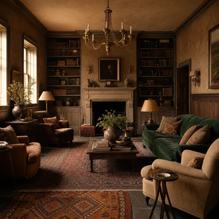
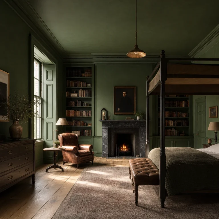
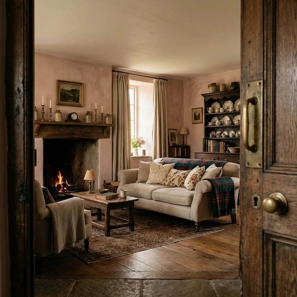
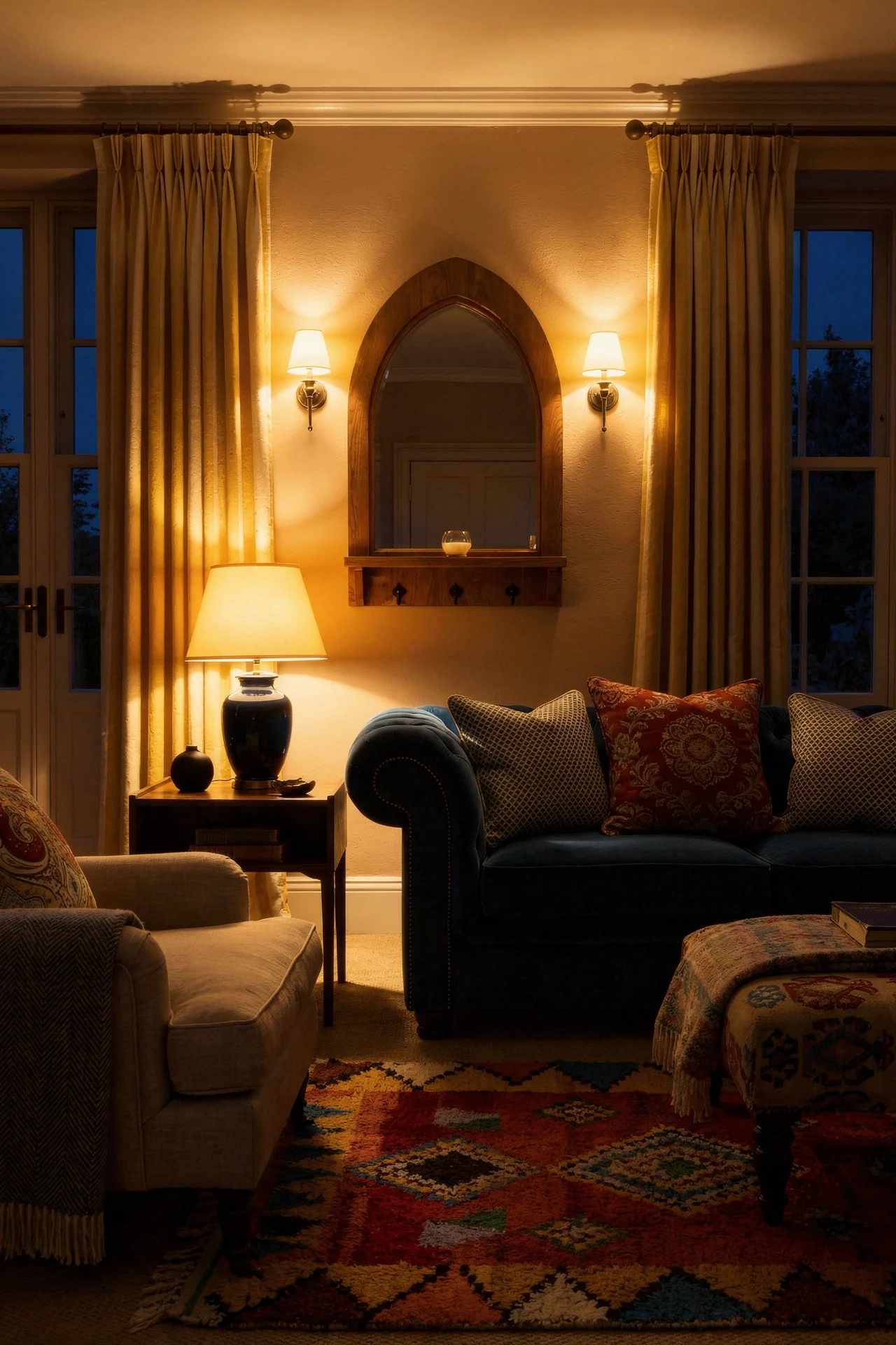
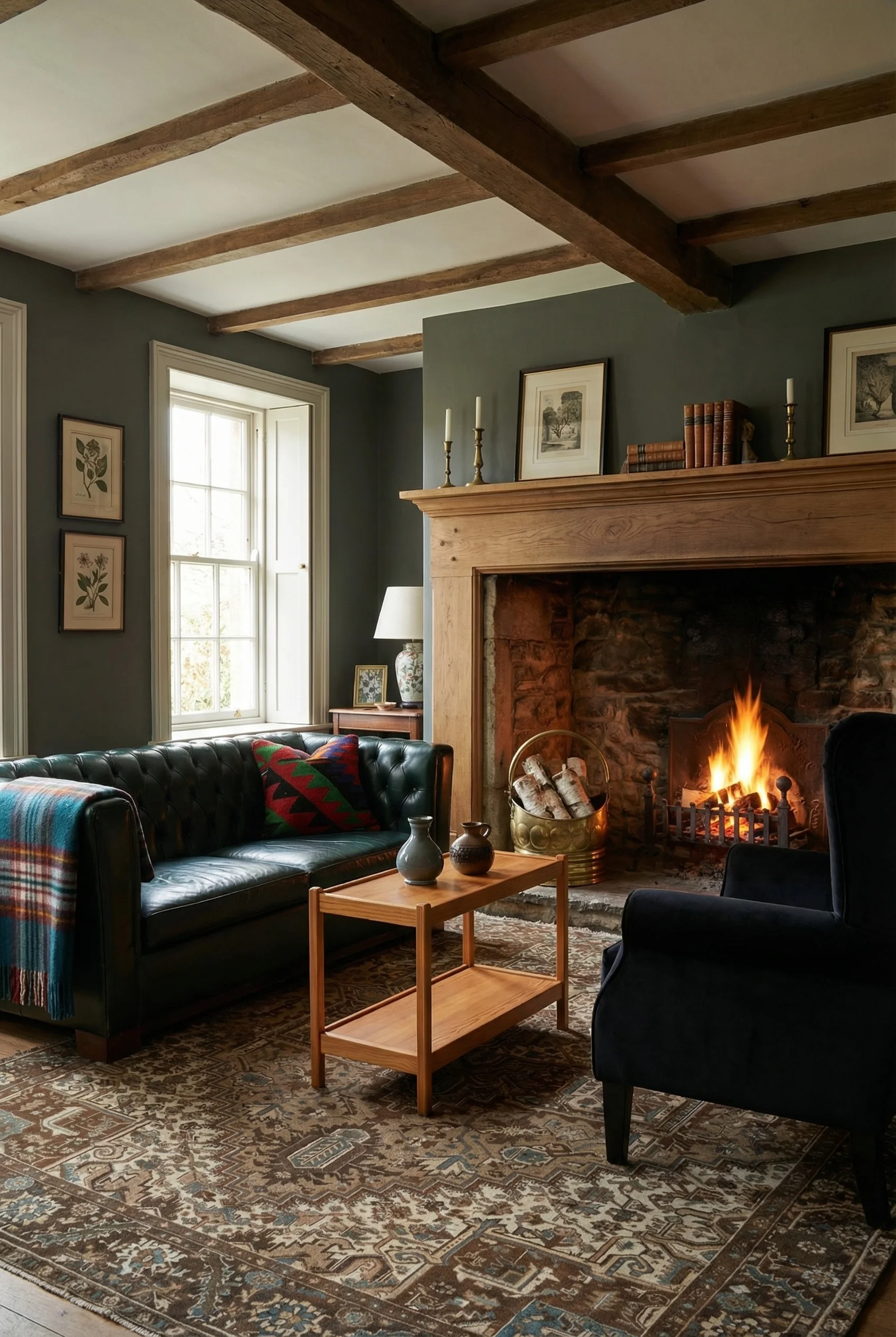
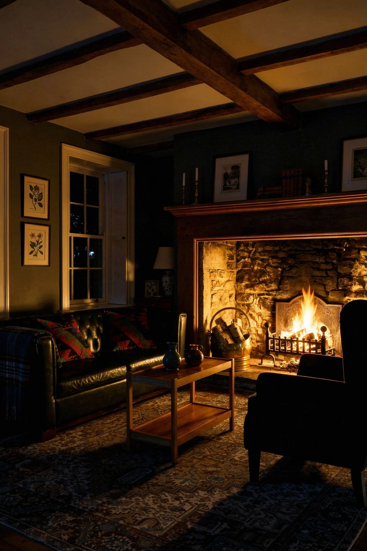
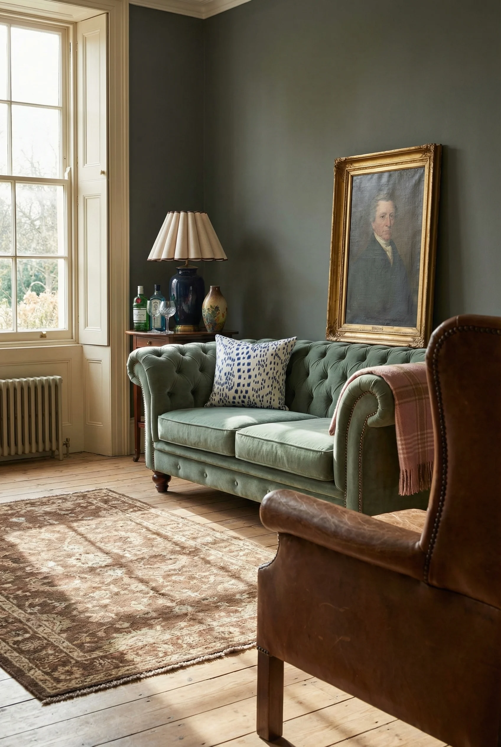
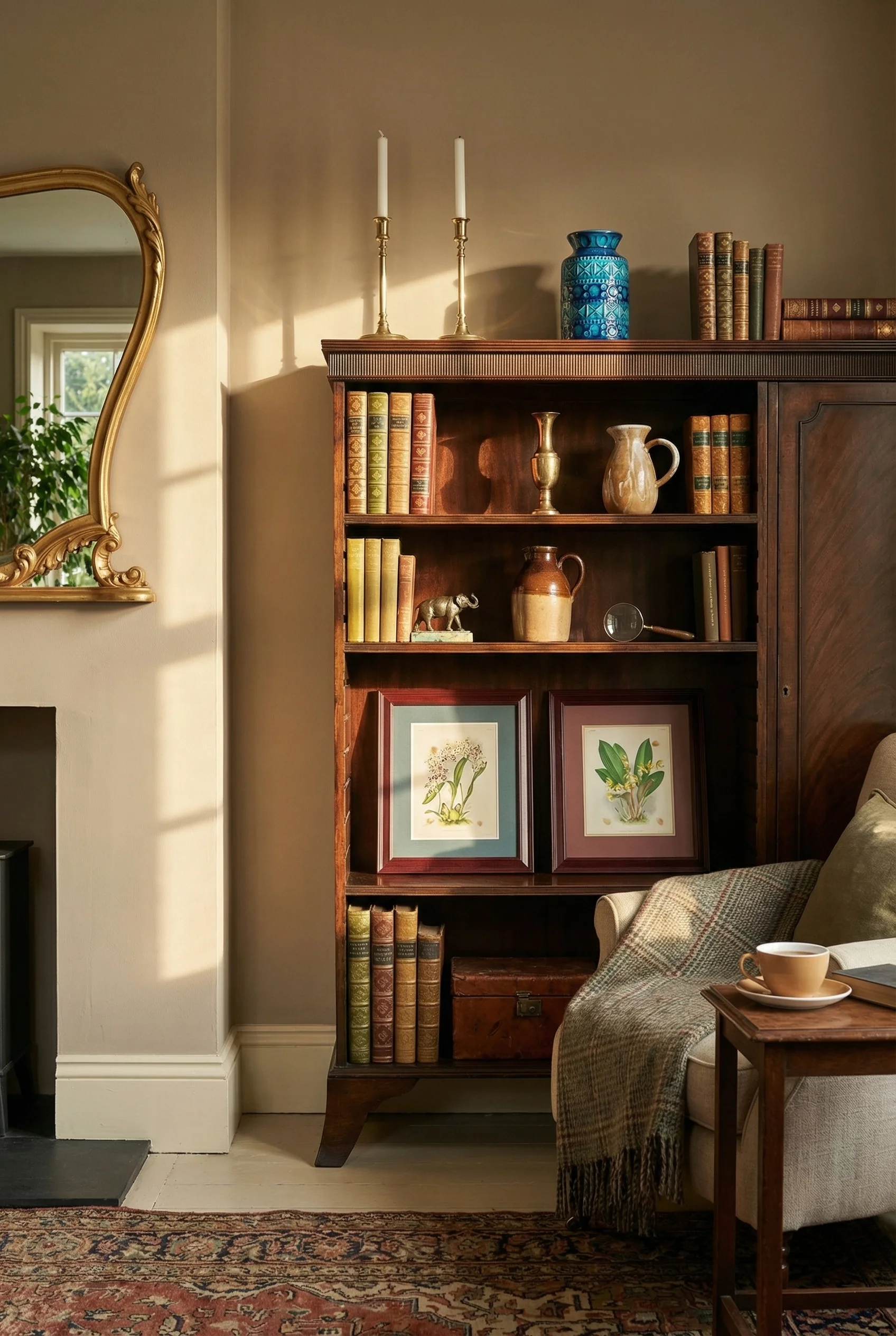
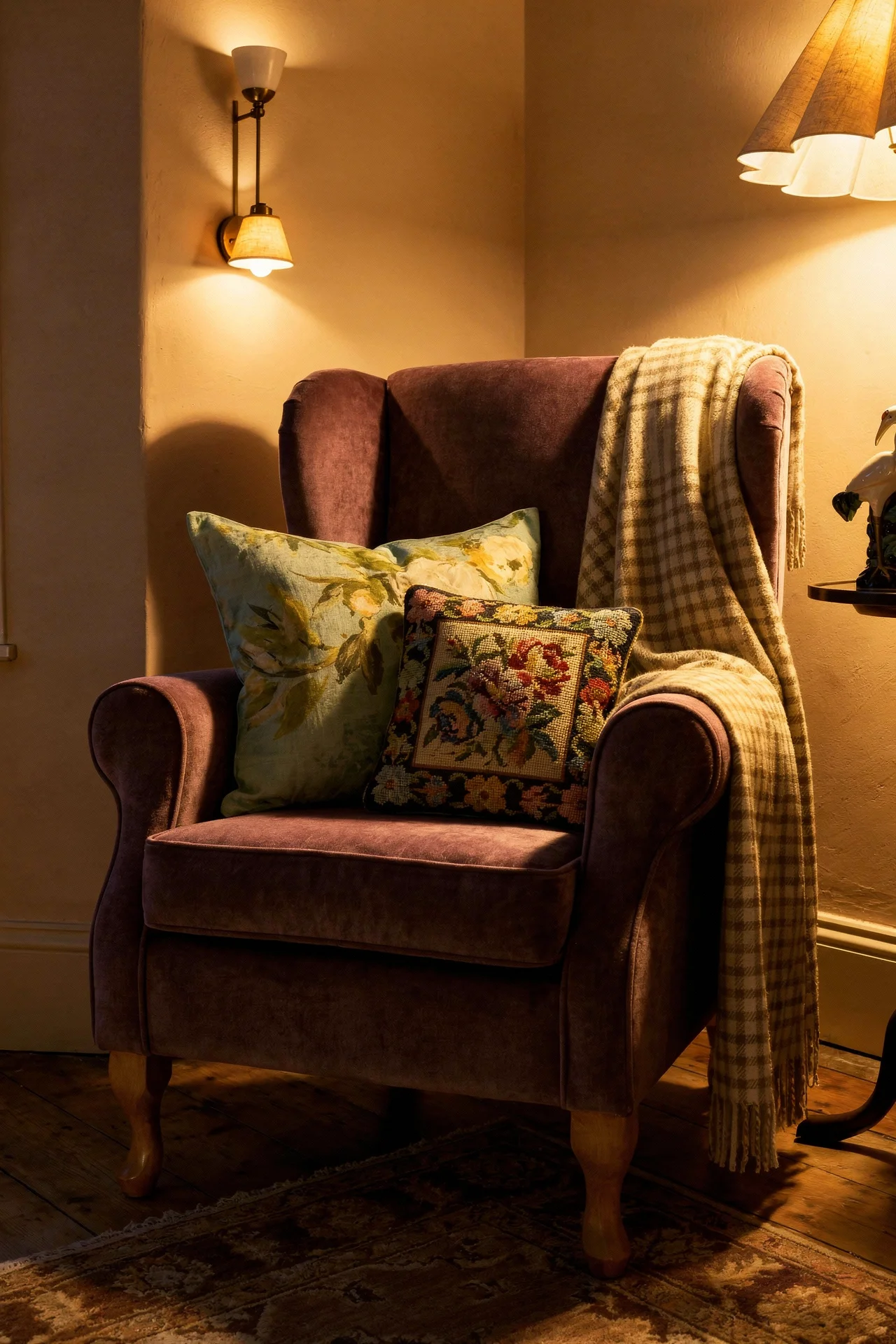
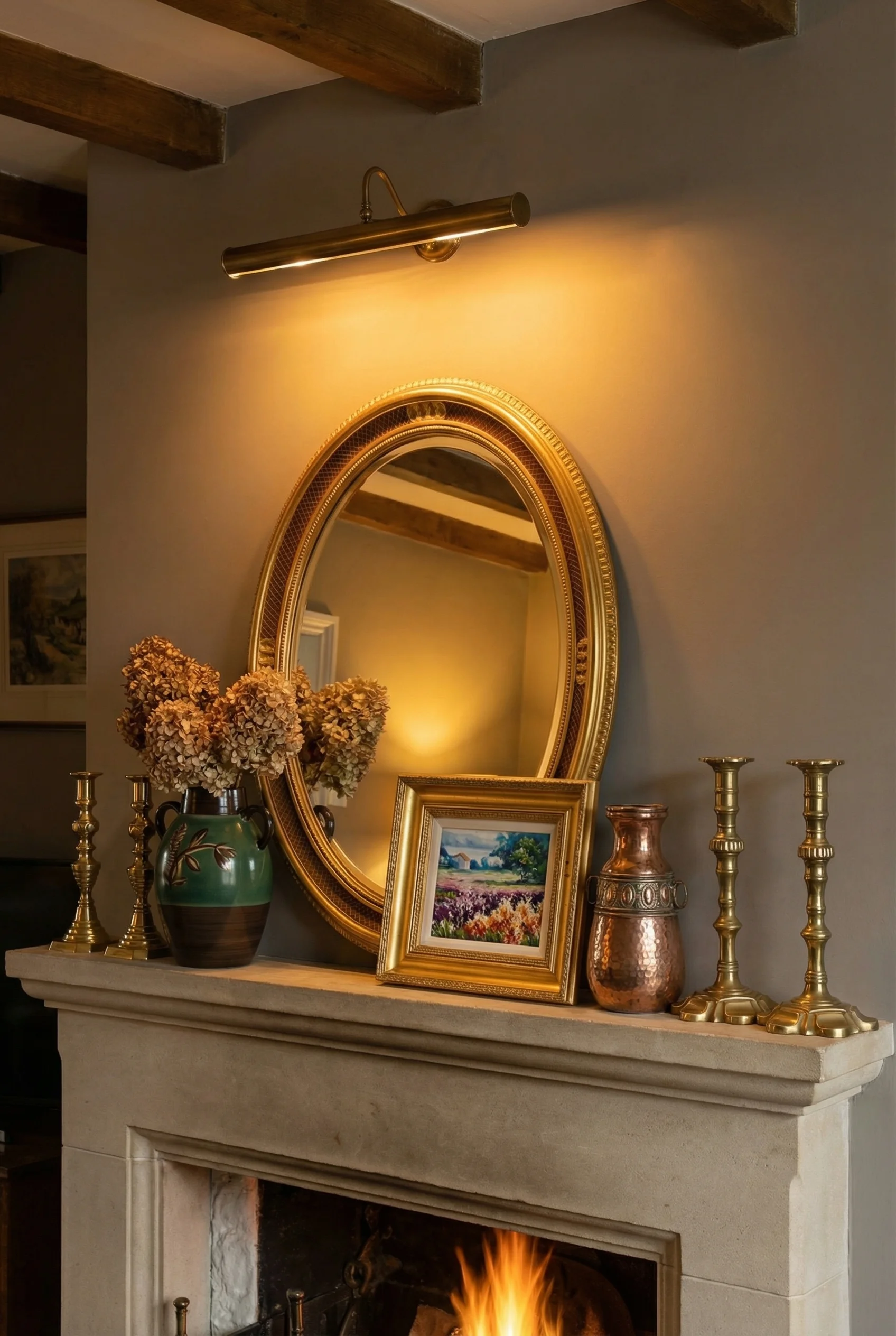
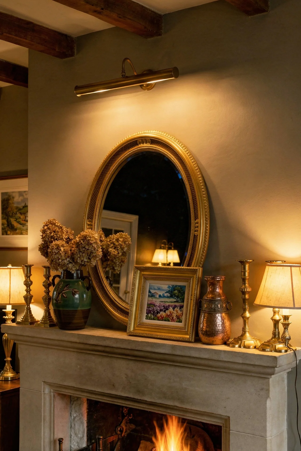
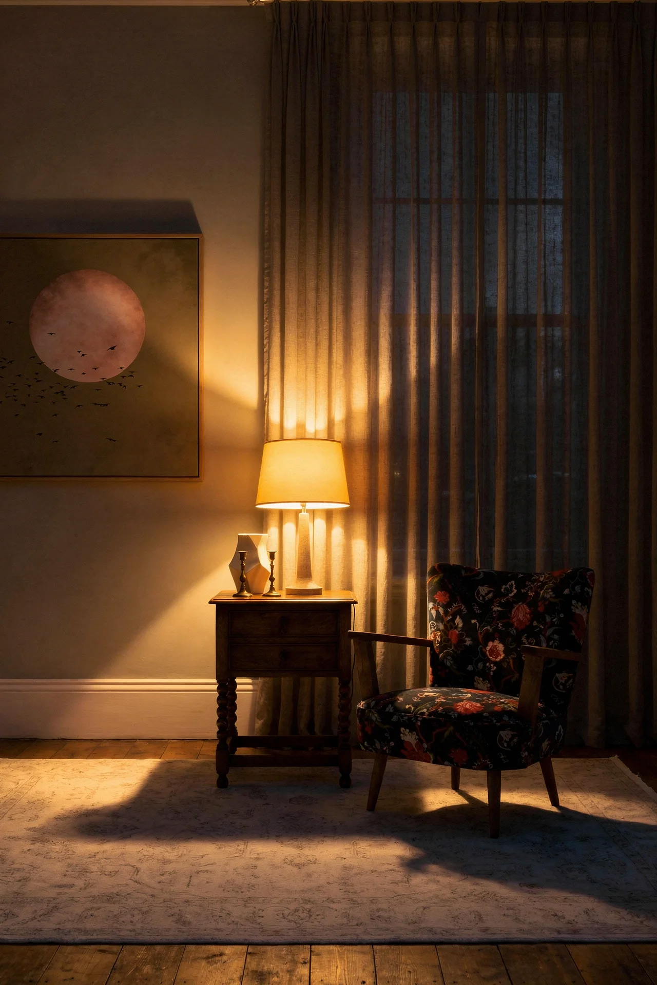
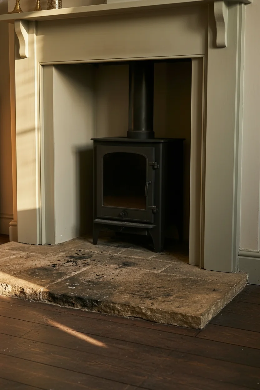
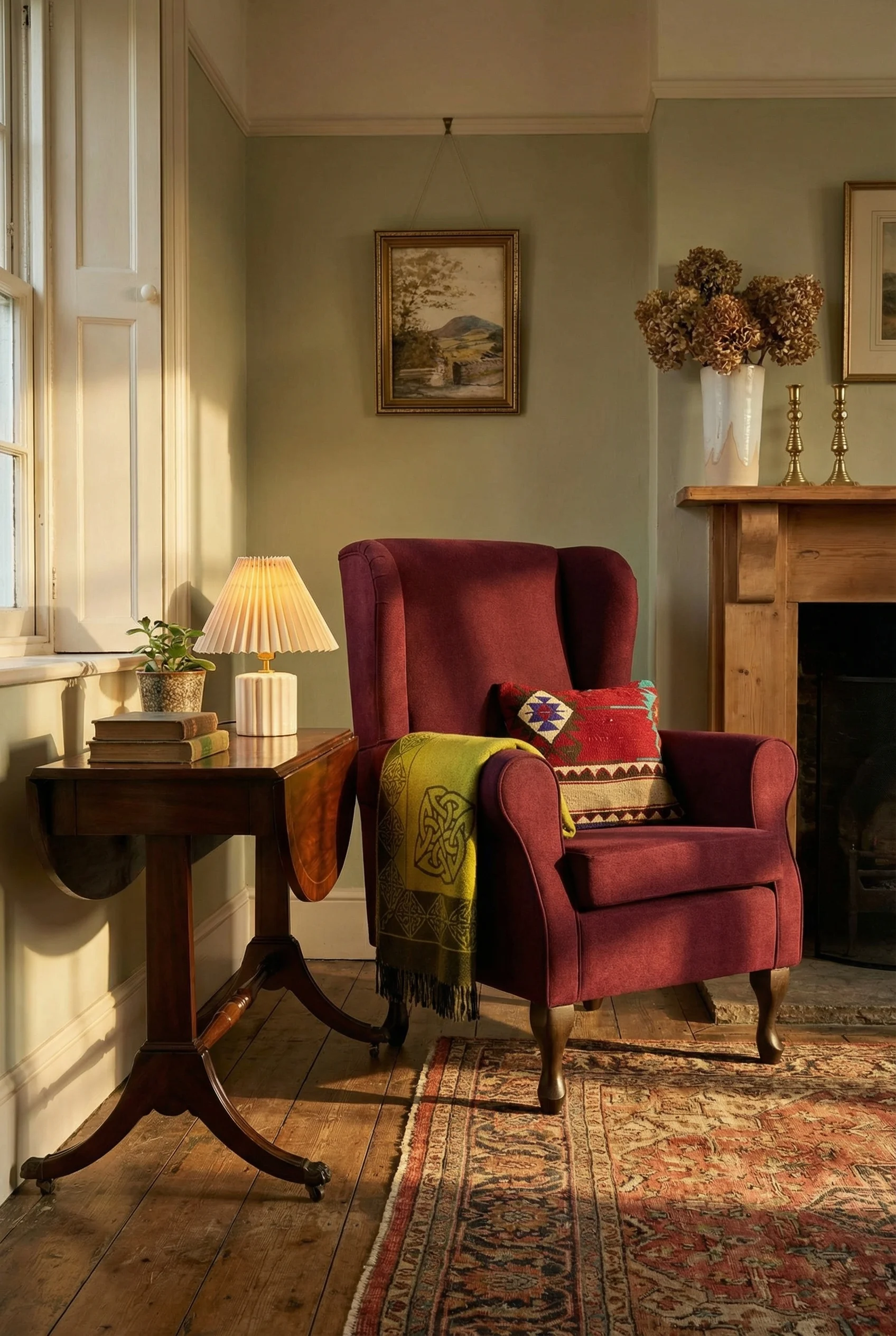
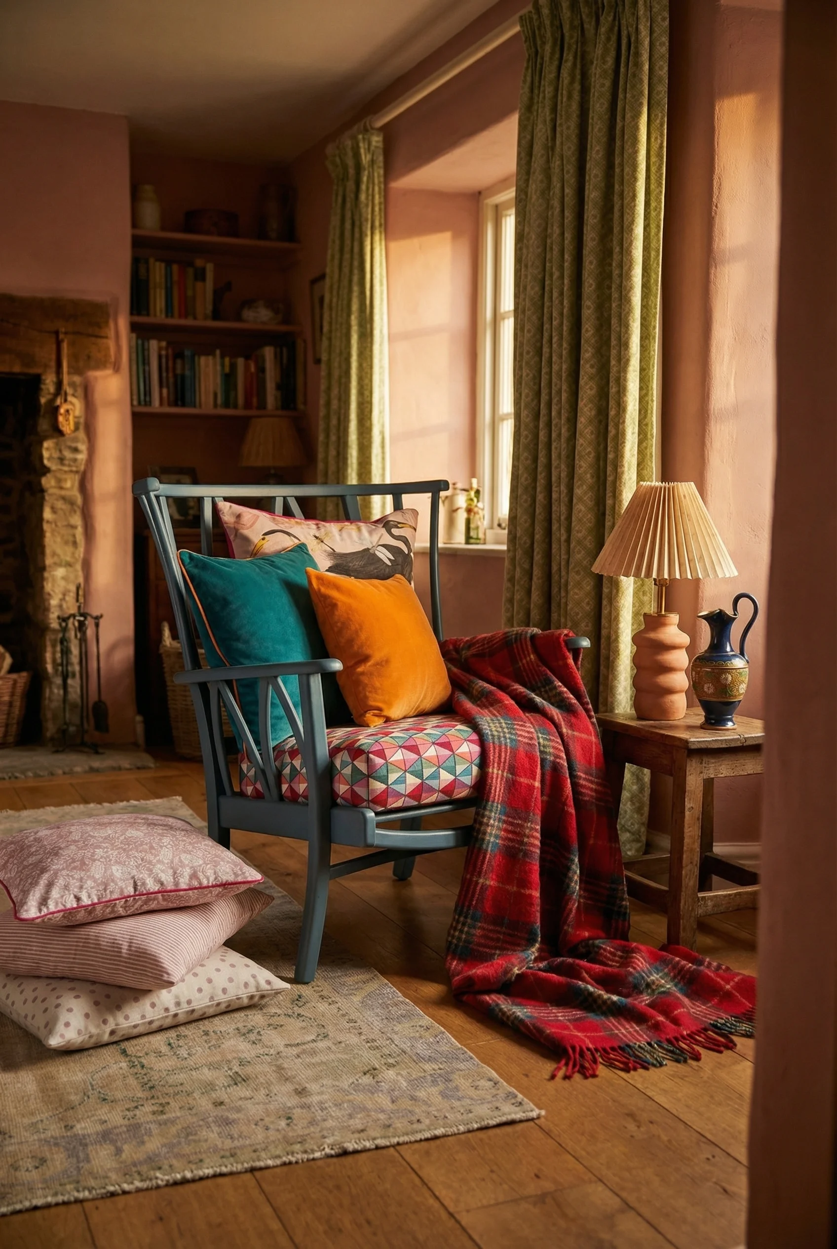
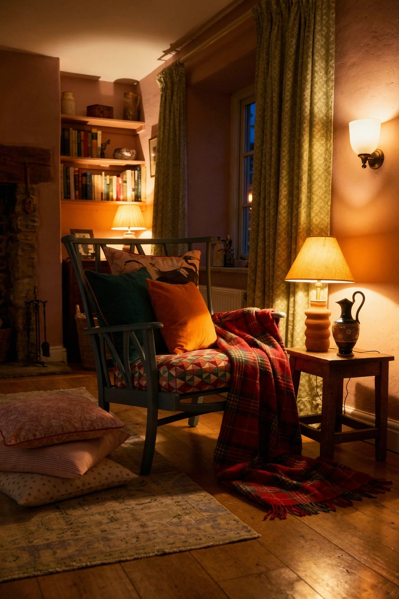
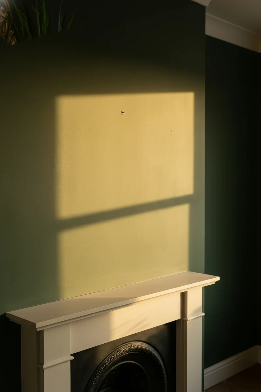
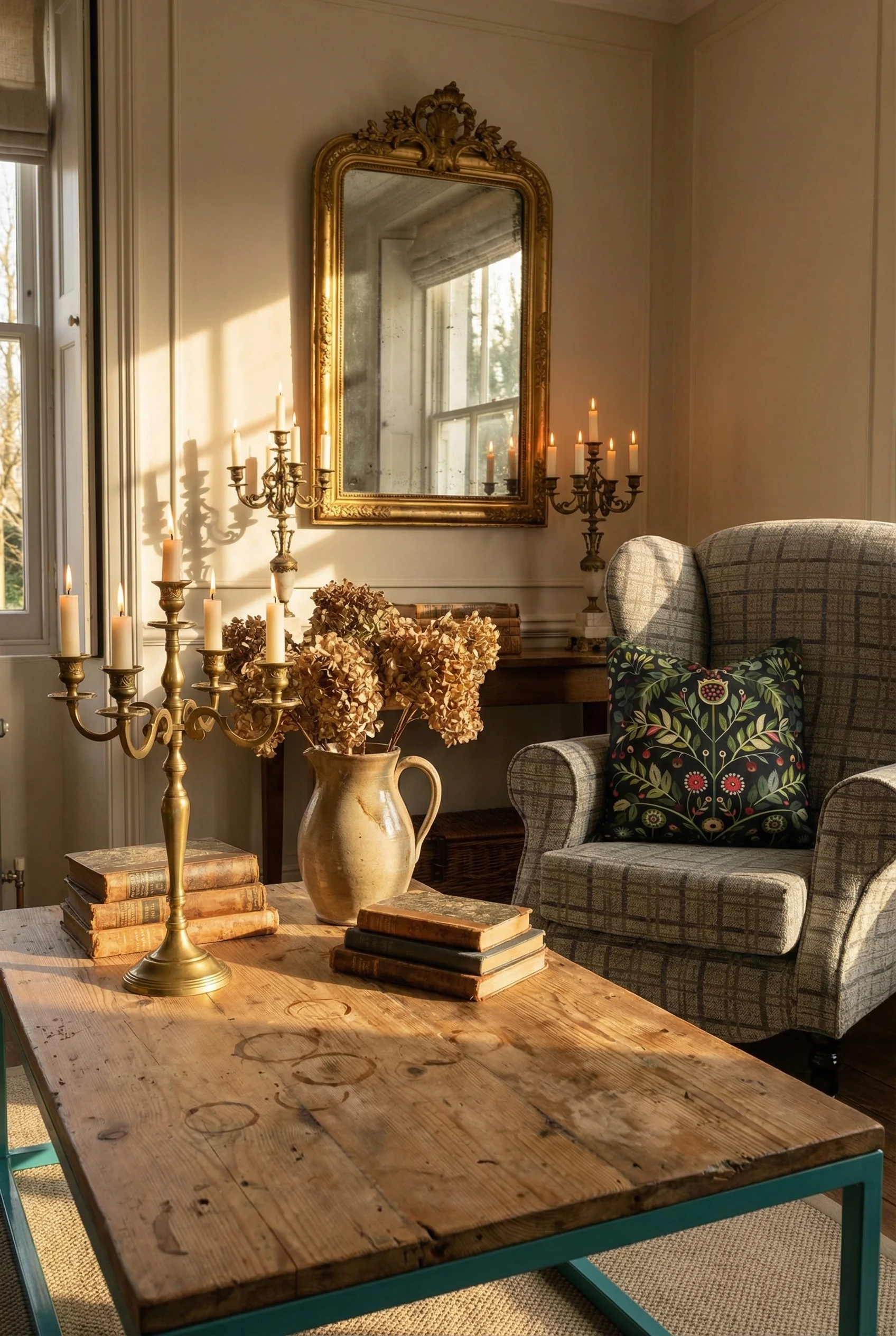
If I had to choose one element that made or broke every cosy room I studied, it was the fireplace. Not the style of it. The gravity of it. In the rooms that worked, everything else deferred to it.
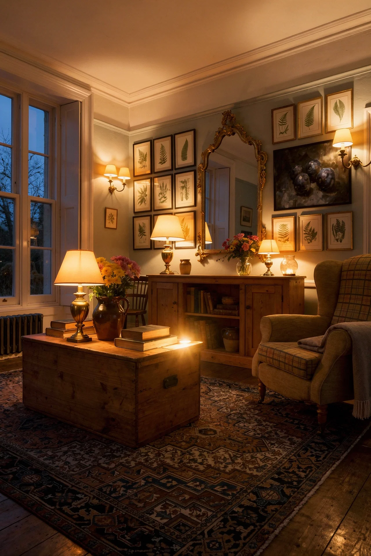
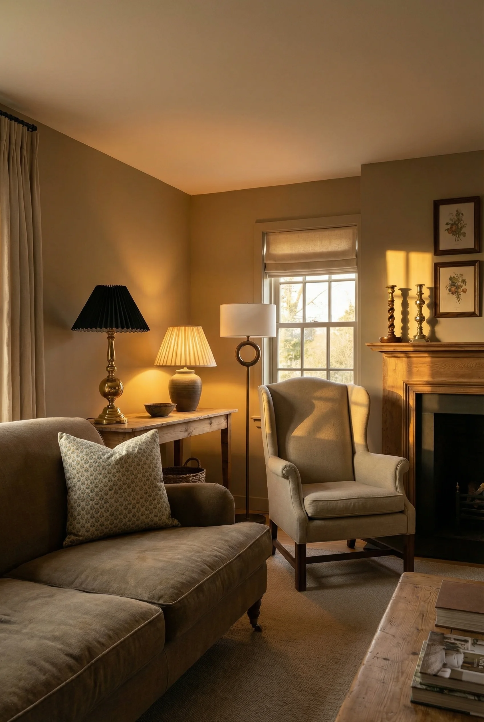
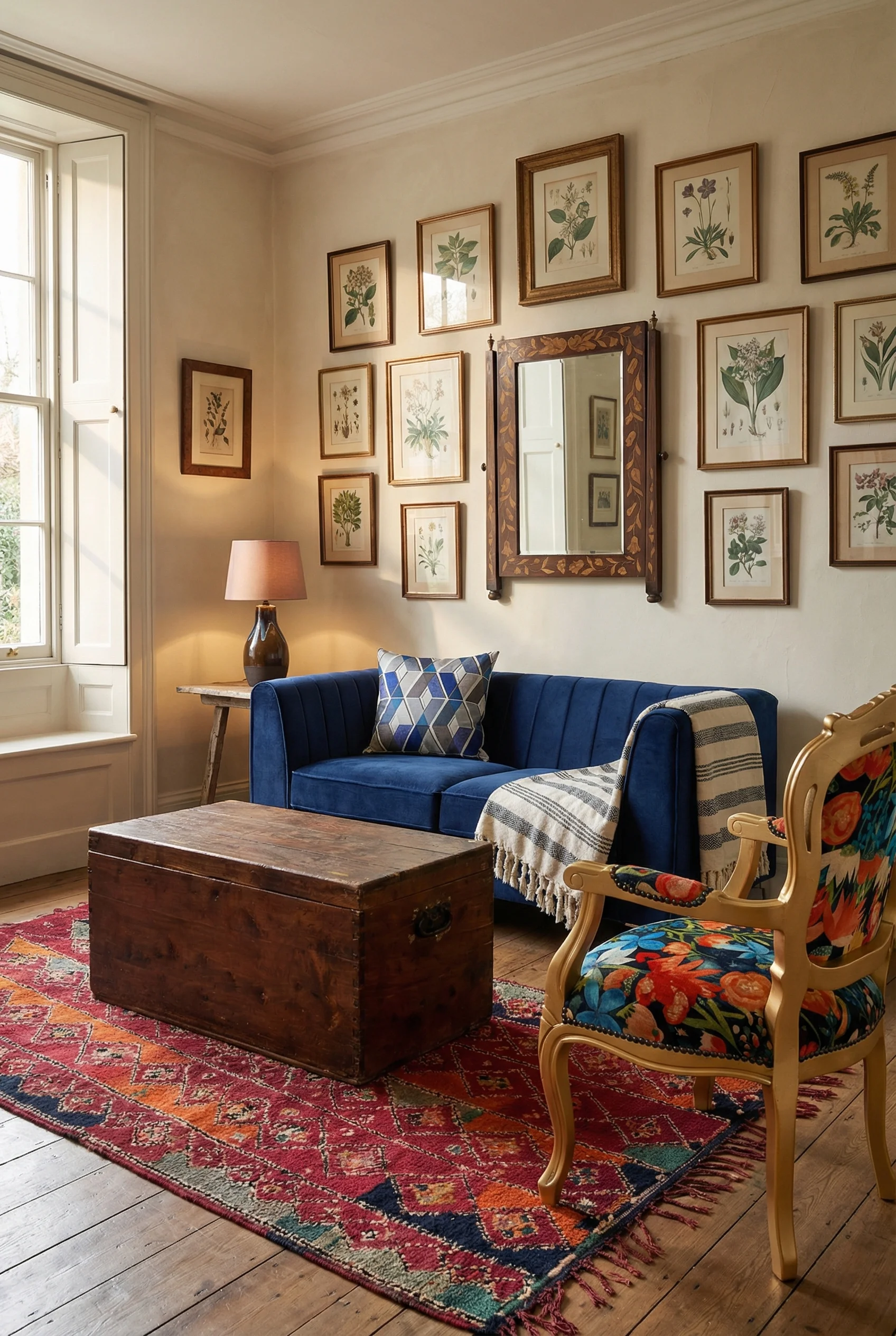

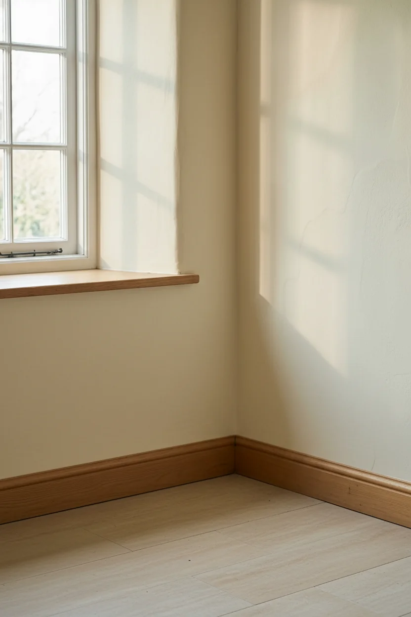
The materials matter more than I realised. Hand quarried limestone, warm sandstone, or traditional red brick, almost always topped with a substantial oak beam mantel that looks like it has been there since before anyone was born. The oak is usually darker and heavier than modern taste would suggest, and that weight is the point. It anchors the whole room.
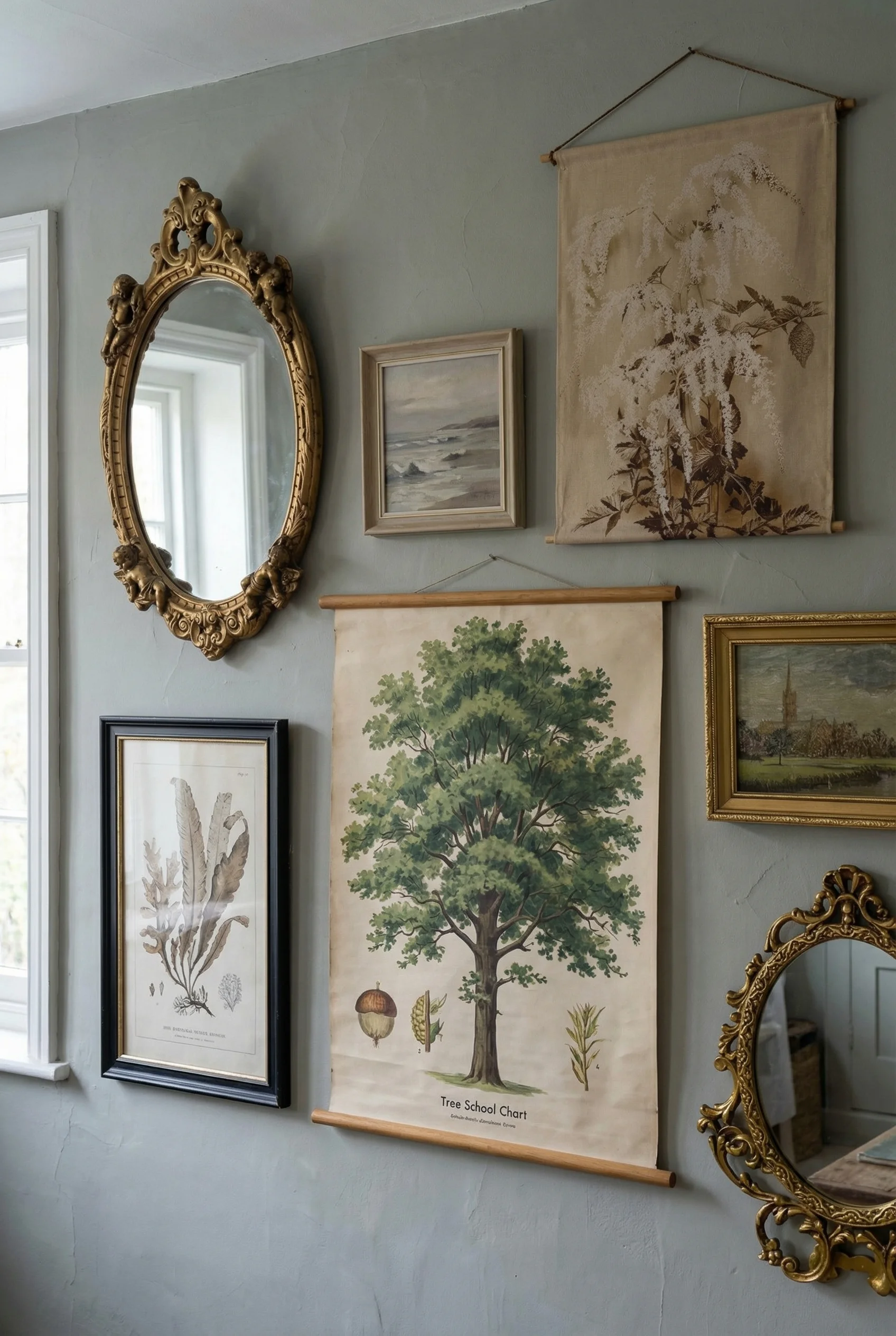
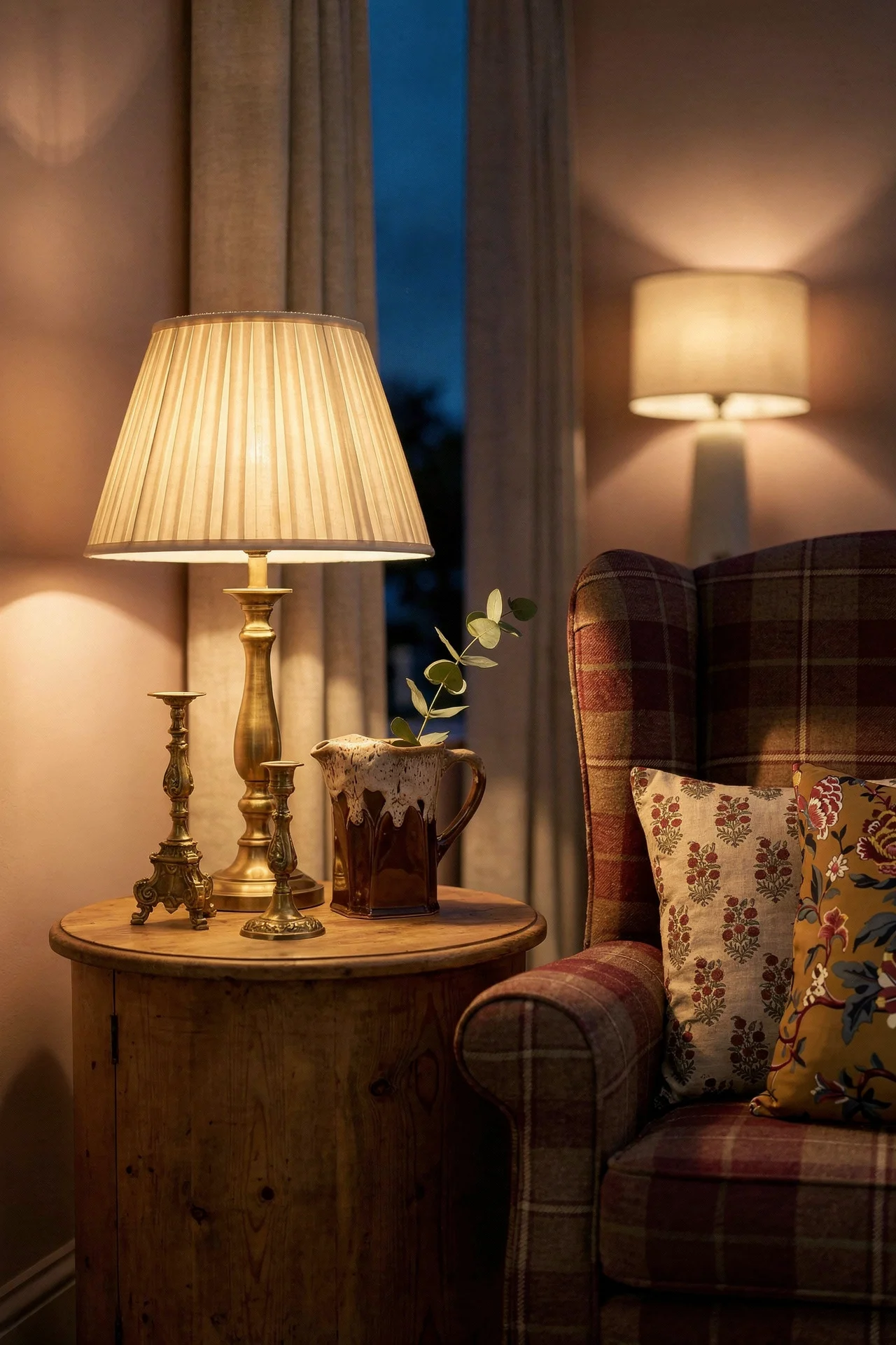
Then there is the 8 to 10 foot talking circle. This is the rule I think most people miss. The seating needs to gather within that radius of the fire, close enough that you could hand somebody a drink without standing up. I kept finding rooms that had beautiful furniture pushed against faraway walls, and the hearth looked lonely because of it. Pull everything in. The room shrinks and becomes cocooning in exactly the right way.
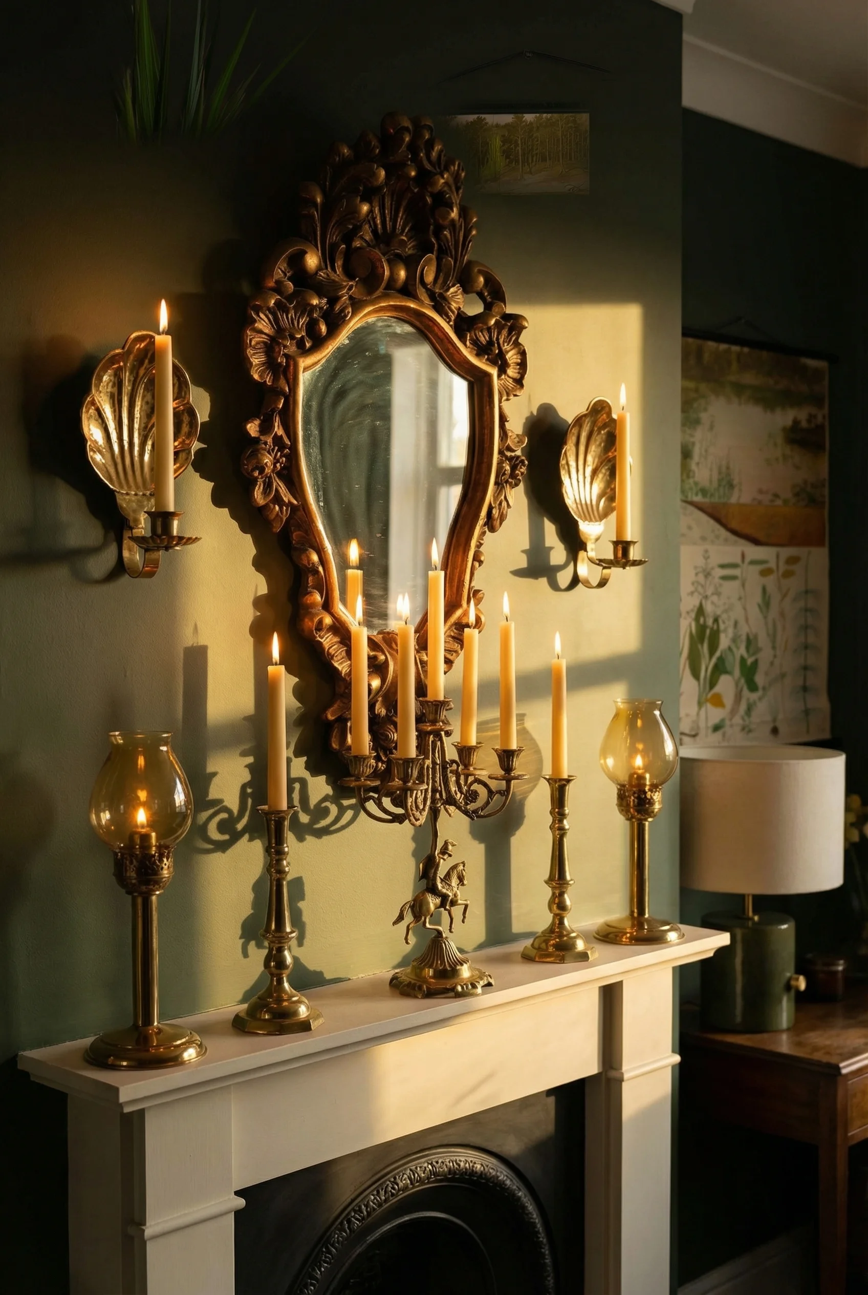
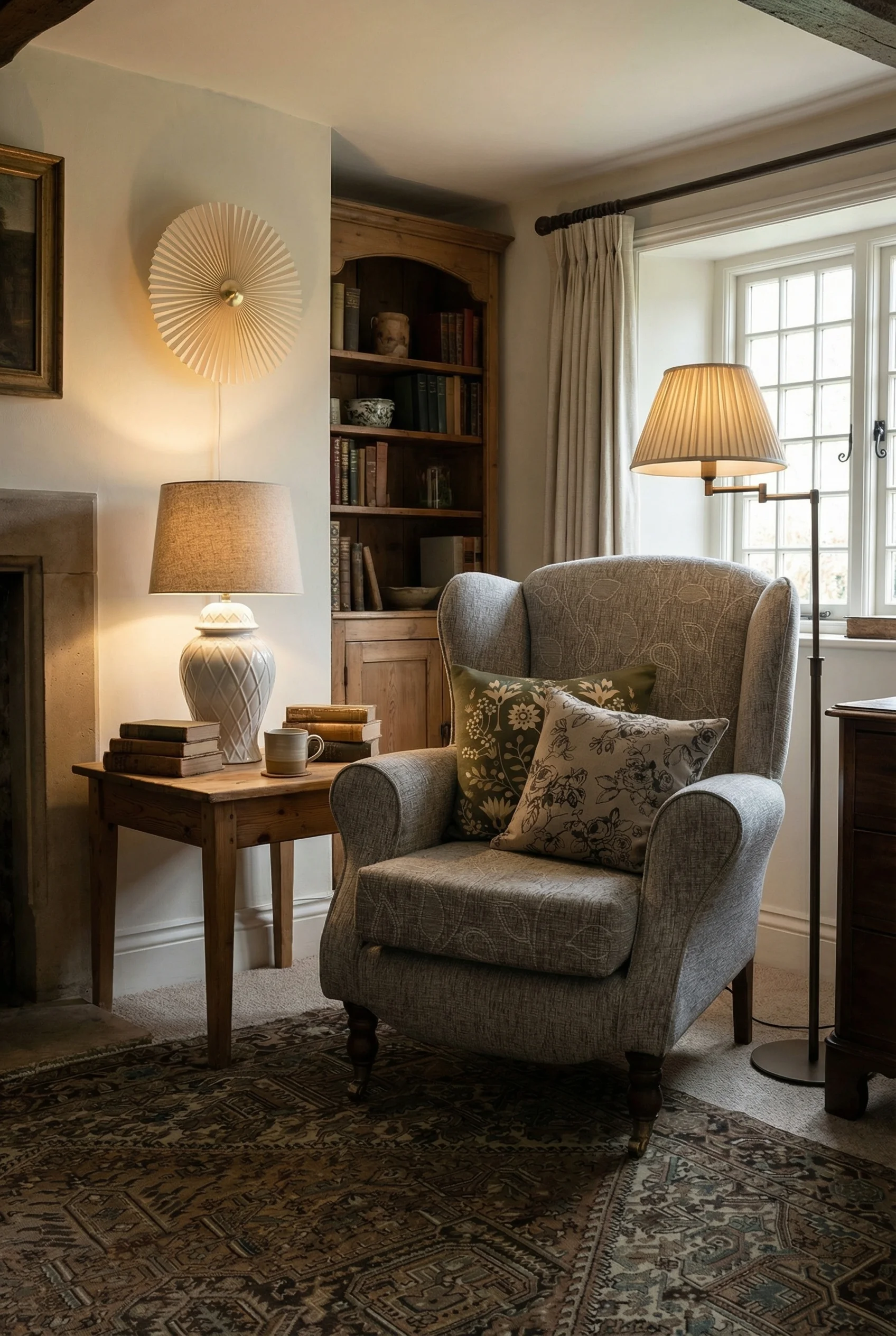
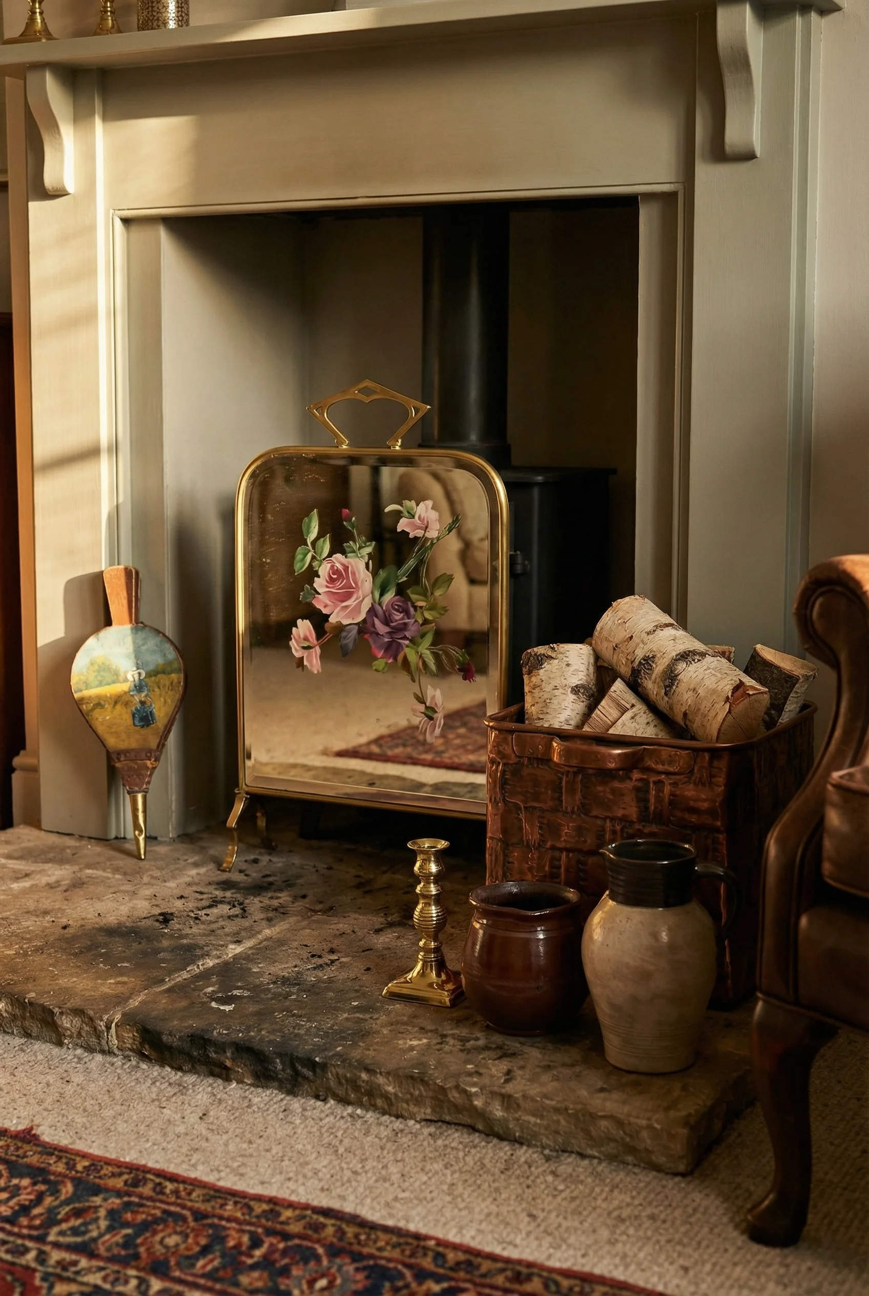
The mantel styling has its own quiet rule, the Rule of Three. Odd numbers, arranged slightly off centre, with artwork leaned against the wall rather than hung. One tall thing, one mid, one small. A brass candlestick, a piece of lichen coloured pottery, a stack of old books. The leaning art is the detail most people skip, and it is the detail that tells your eye this mantel was styled by somebody who lives here, not photographed for a catalogue.
Get the fireplace right and you have bought yourself enormous grace on everything else. The room forgives mismatched rugs, imperfect furniture pairings, a bookshelf that sags slightly. A well anchored hearth will carry almost any mistake you make elsewhere, which is why I say it does roughly seventy percent of the work.
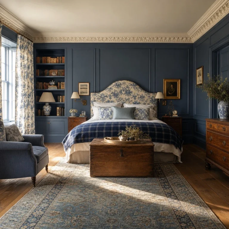
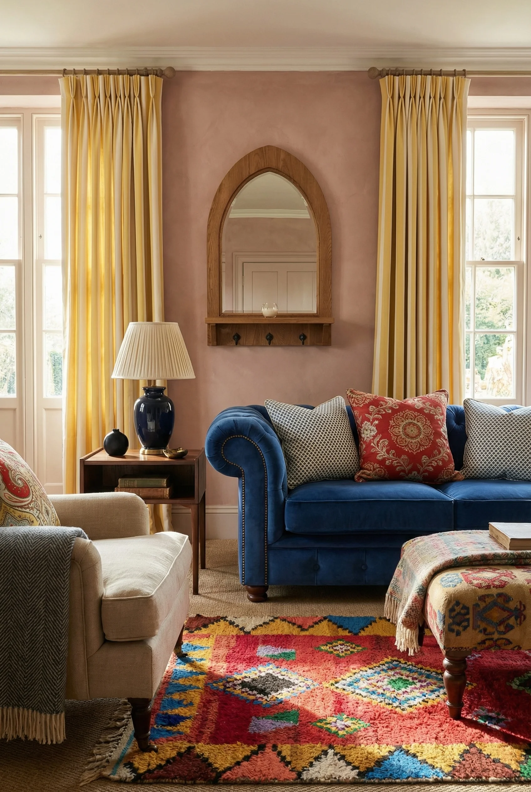
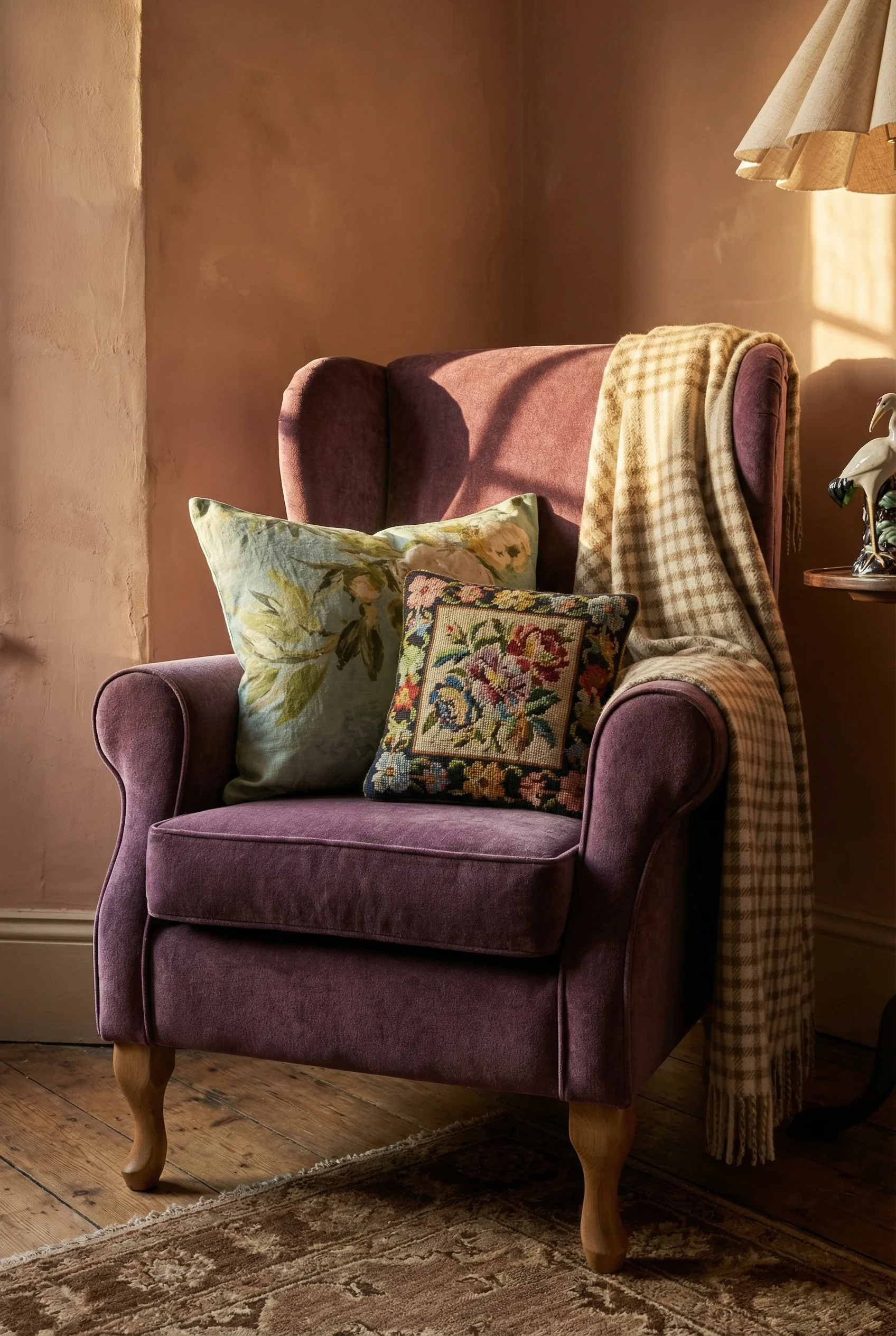
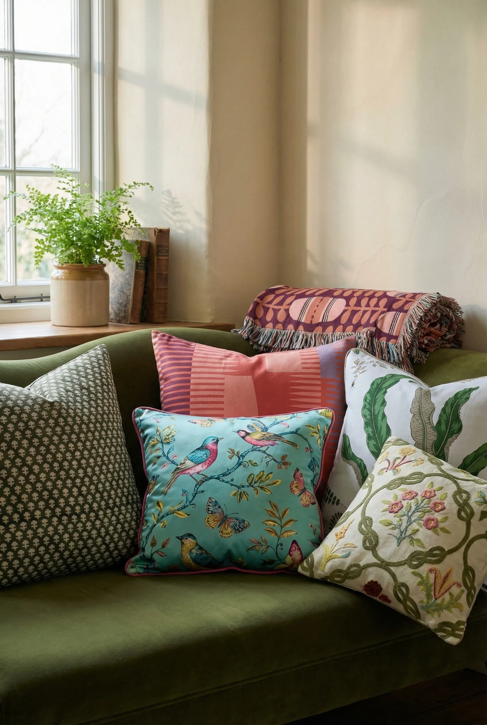
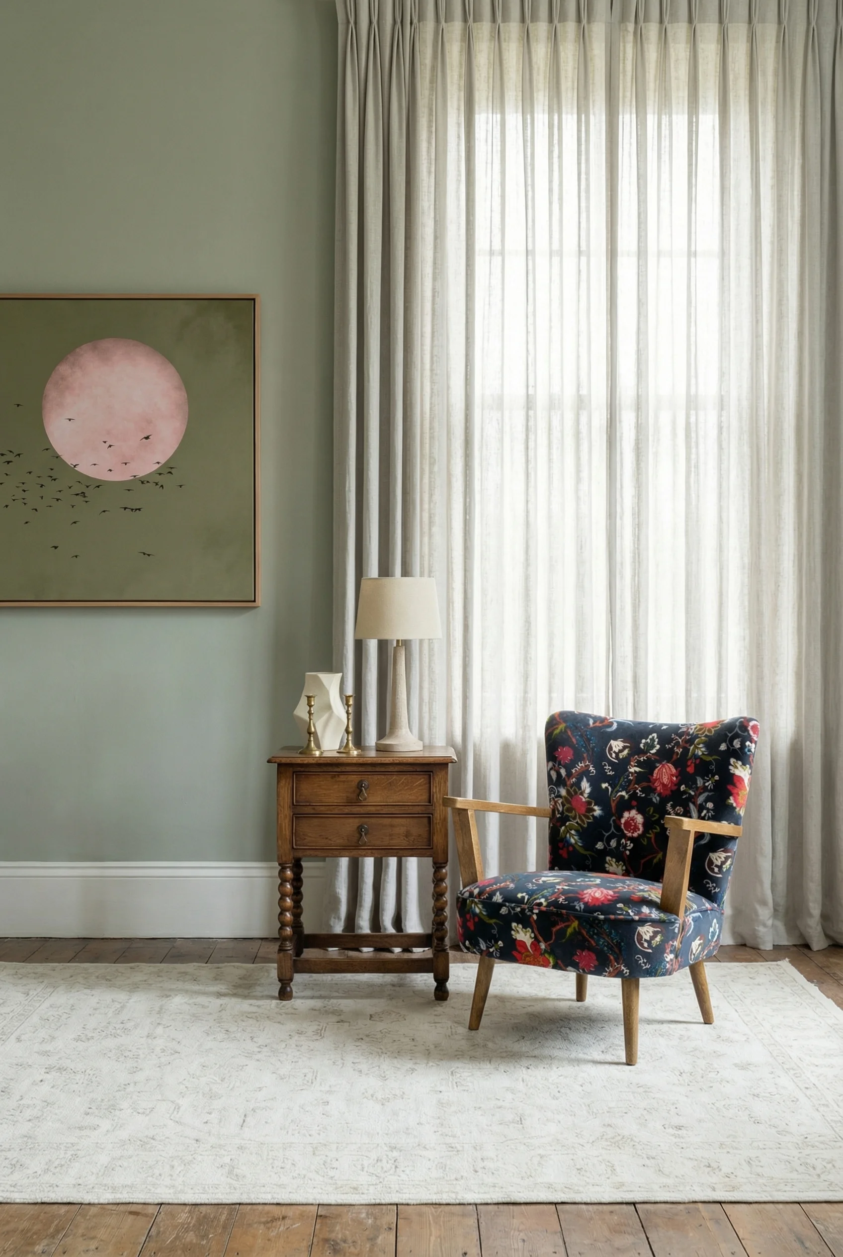
The rooms that got pattern mixing right all shared a secret, and Rita Konig has been saying it out loud for years. You pick one bold, large scale ‘hero fabric’ and let it run the room. Everything else supports it.
A hero fabric is almost always a big chintz or a toile or a bold floral, loud enough to make a statement on a sofa, curtains, or a statement armchair. Once you have chosen it, the rest of the pattern mixing becomes a recipe rather than a guess. You add a structural stripe or a plaid at a medium scale. Then you add a tiny pattern, a check or a ticking or a small geometric, for the smaller cushions and accents. Three scales. Large, medium, tiny.
The thing that ties it all together is a unifying colour thread, one hue that shows up in each of the three patterns even if nothing else matches. That thread is what stops the room from feeling chaotic. Konig is brilliant at this, and if you want a deeper walk through of the formal British version of the look I’d look at how to get the classic English countryside look because it covers the more structured pattern discipline that underpins it.
The other rule nobody mentions is negative space. You need solid areas for the eye to rest. A plain wall, a solid rug, a key piece of upholstery in one calm colour. Without that, even a perfect pattern mix turns into visual static. In every cosy room I studied, I could find at least one generous plain surface that was doing the job of letting the patterns breathe.
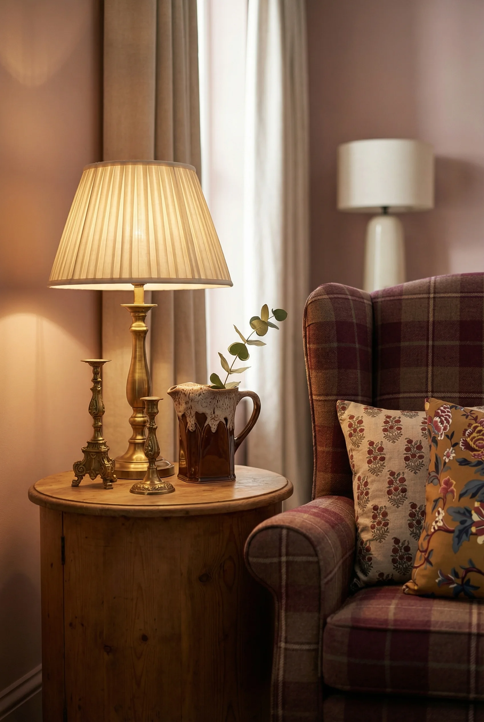
This is also where tactile layering starts mattering. Velvet cushions, linen slipcovers, a wool tartan throw flung across the arm of a chair, cotton chintz curtains. The cosy ones always had at least four different textures pulling their weight, and that texture made the pattern mixing feel lived in rather than styled.
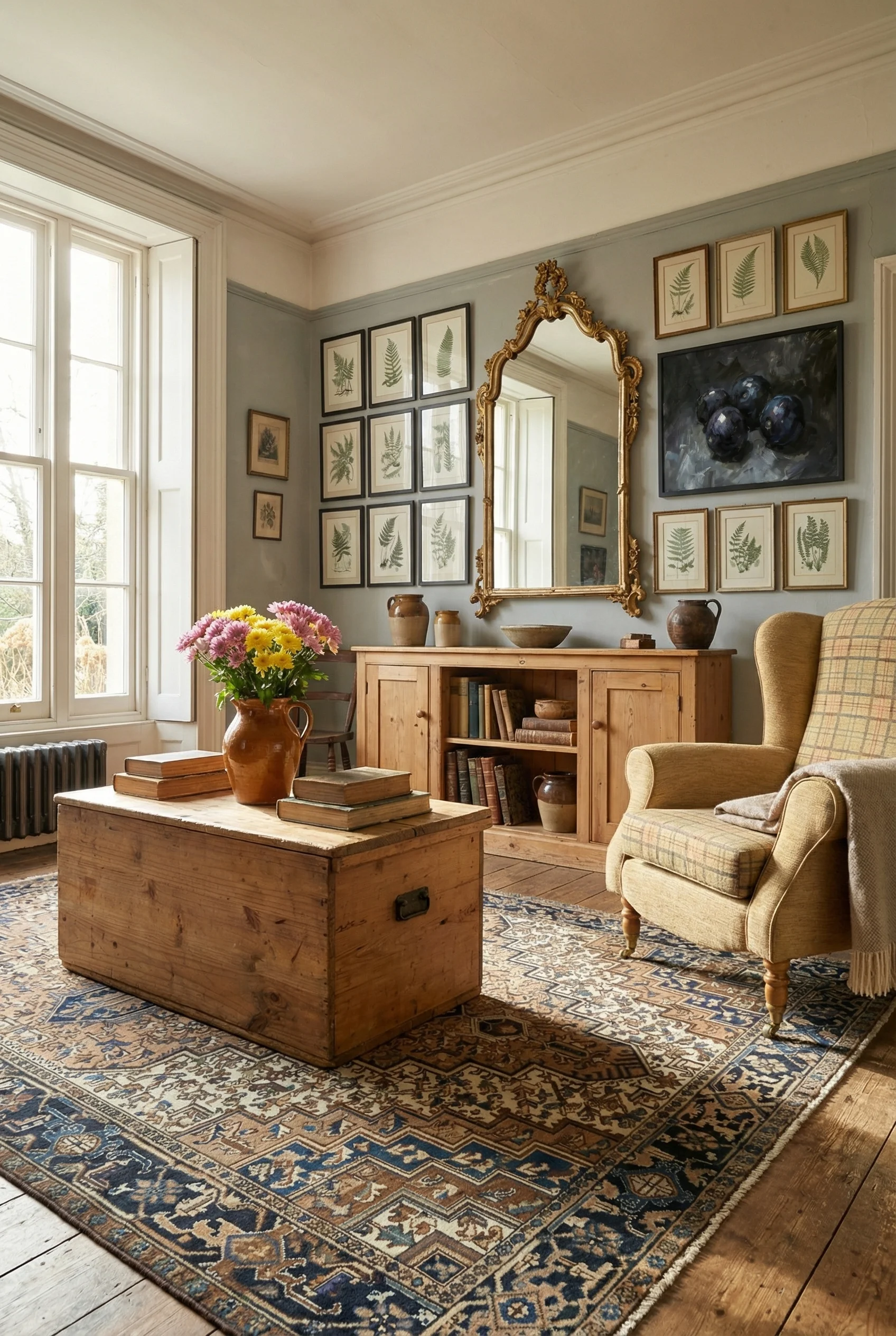
Matching furniture sets are the fastest way to kill an English country living room. Every stiff room I studied had a suite. Every cosy room looked like it had been accumulated slowly by people who cared about comfort more than coordination.
The English roll arm sofa is the gold standard. Low recessed arms, deep seats, something you can nap on. It is not glamorous but it is the backbone of almost every cosy room I loved. A Chesterfield works too, especially a slightly battered leather one, and wingback chairs earn their keep by the fireplace. Skirted furniture with bullion fringe feels generous and soft without trying to be pretty.
The wood tones should not agree with each other. Scrubbed pine next to rich mahogany next to walnut is exactly what you want. A Welsh dresser on one wall, a gate leg table tucked in behind the sofa, an antique console that might be slightly too tall for the room. The mix is the point. In my experience, the moment everything starts matching is the moment the room loses its story.
Mismatched seating is the hallmark I kept returning to. A floral sofa next to a striped armchair with a tufted ottoman acting as the coffee table. Three different decades of furniture, three different fabrics, one room. It sounds like it should not work. It is the thing that makes the cosy ones feel cosy.
I’d avoid the temptation to buy everything from the same place on the same day. If you can only afford one good piece right now, buy that piece and wait. The accumulation over time is what builds the patina, and the patina is what people feel when they walk in.
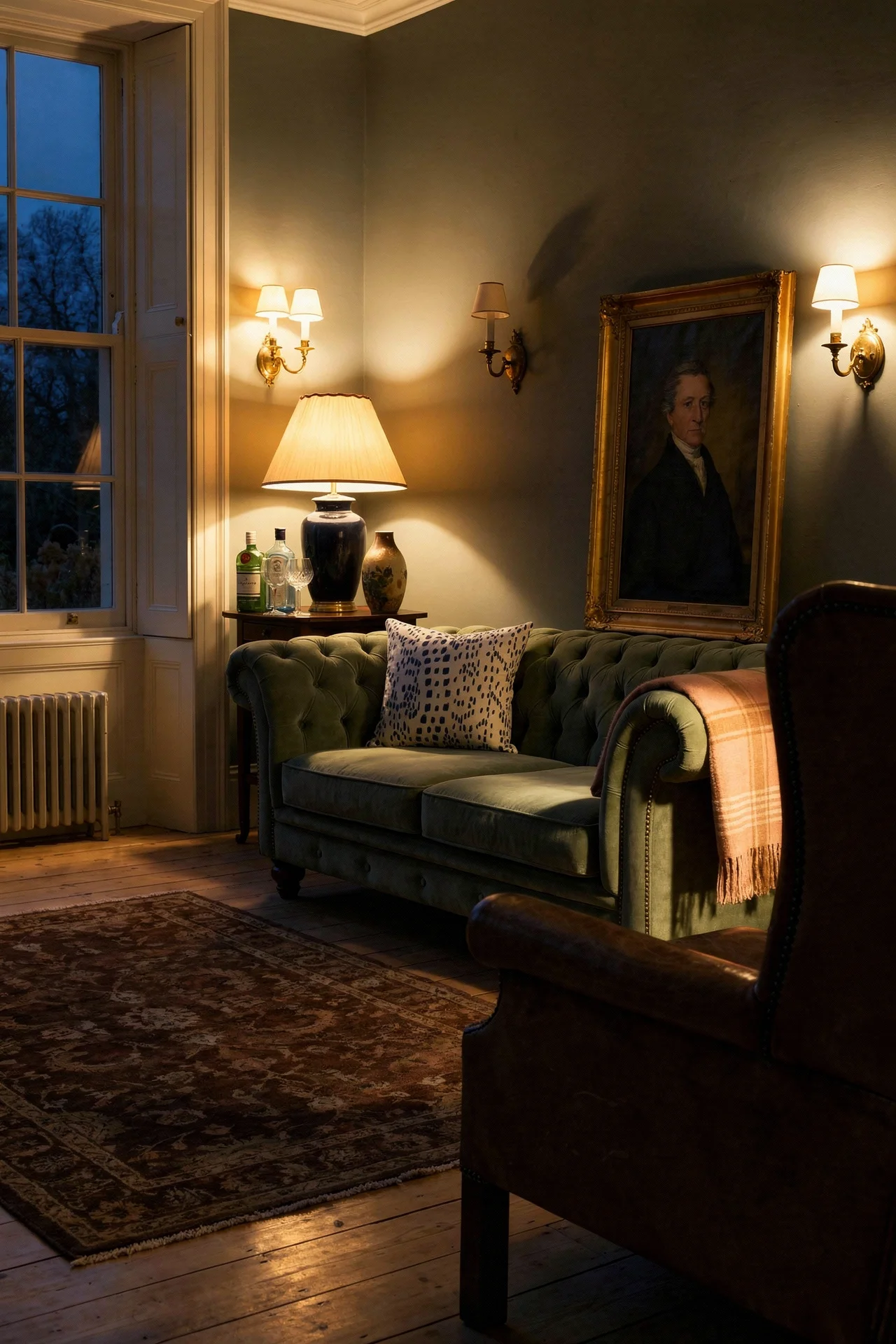
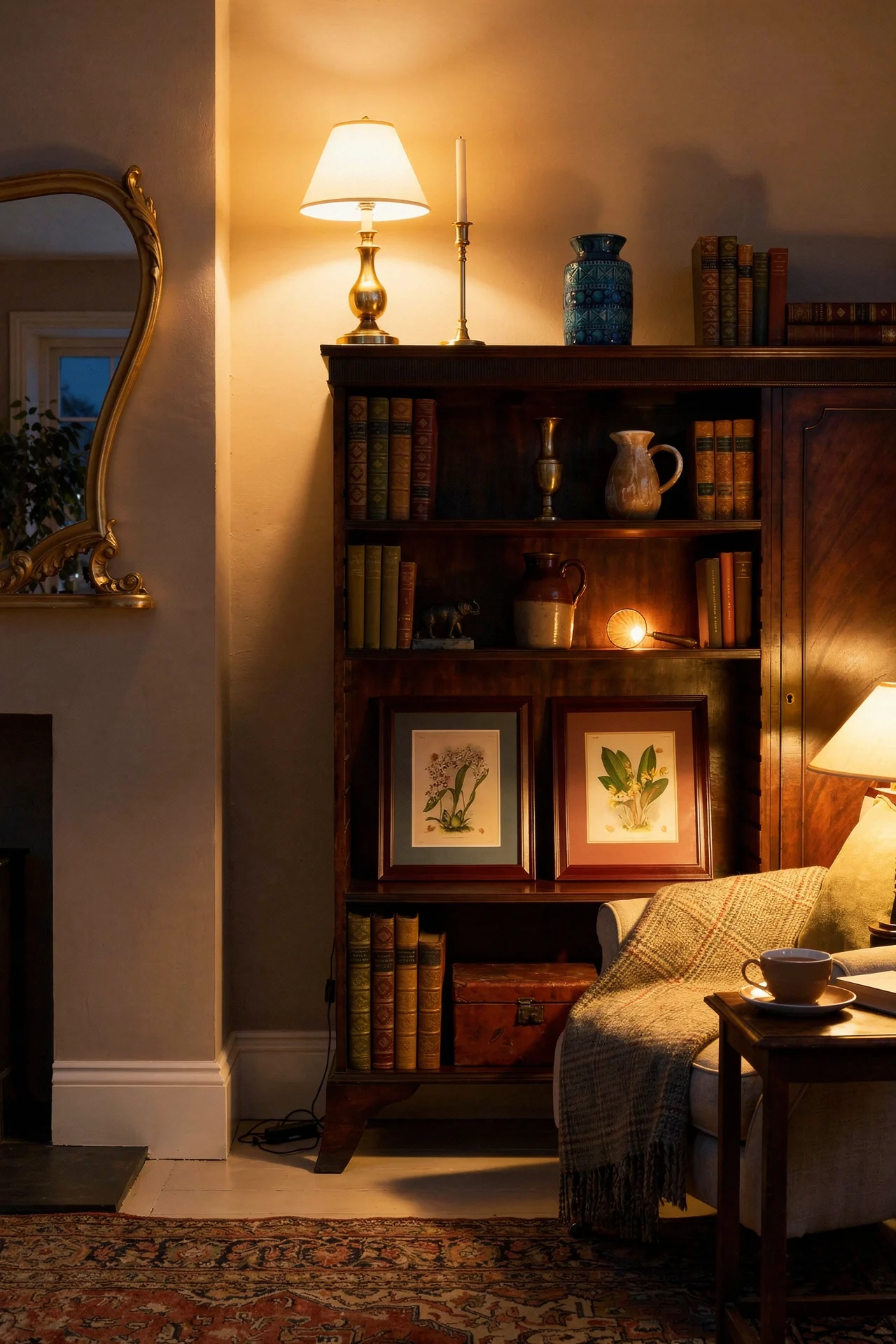
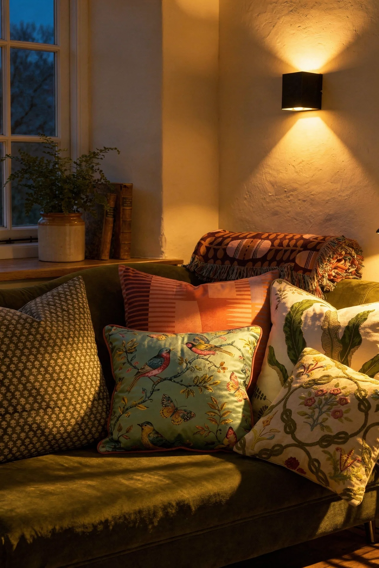
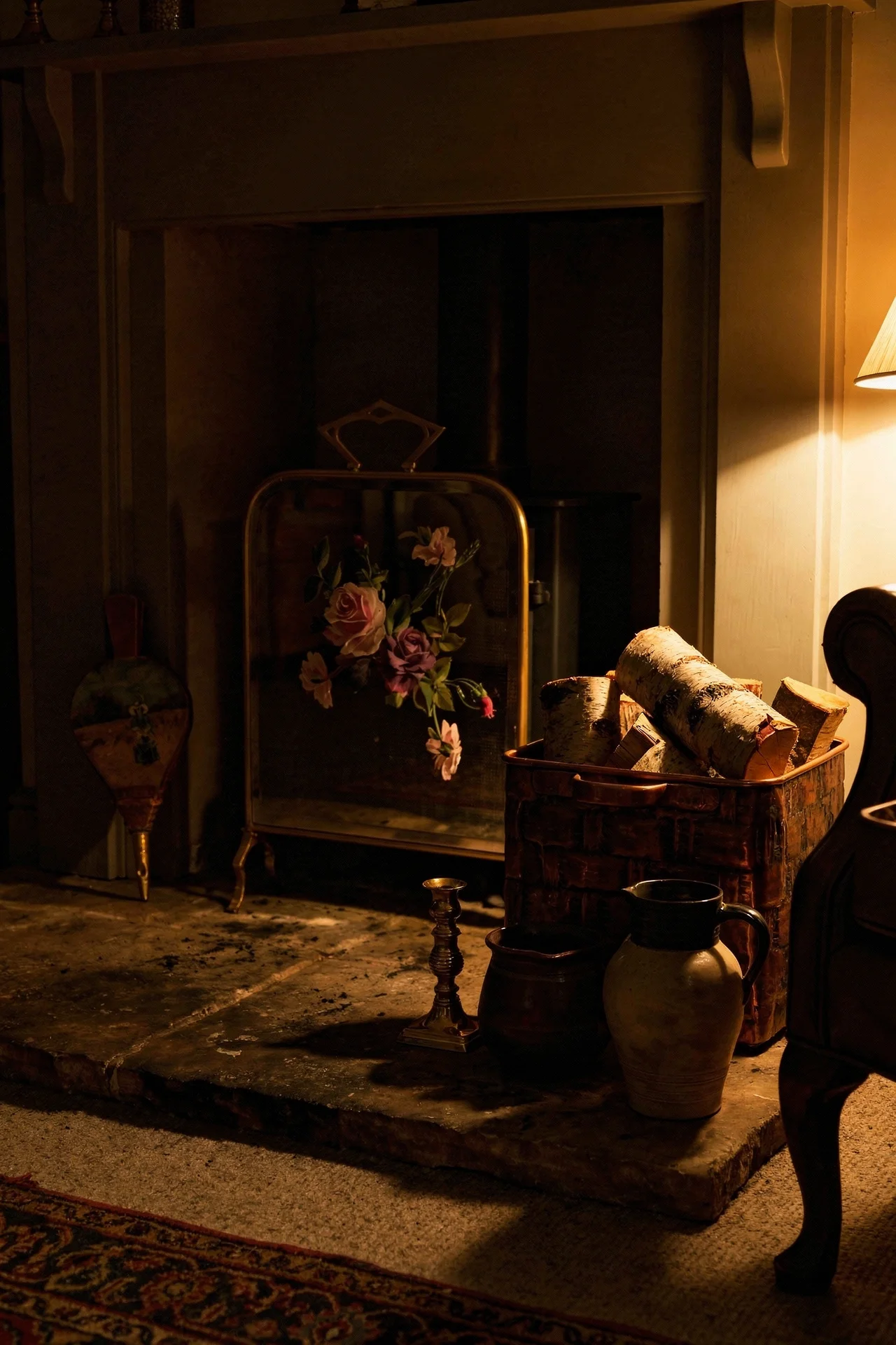
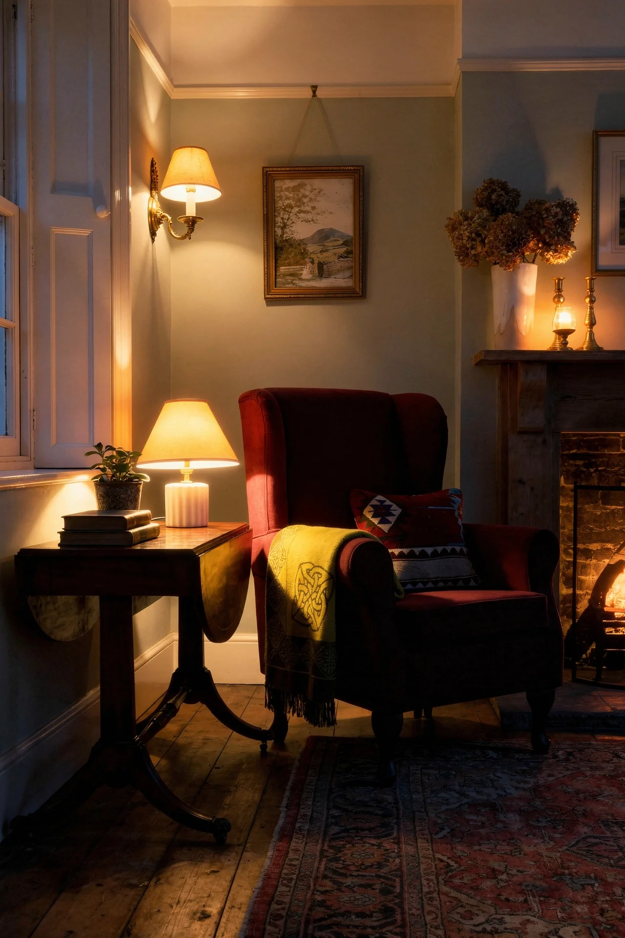
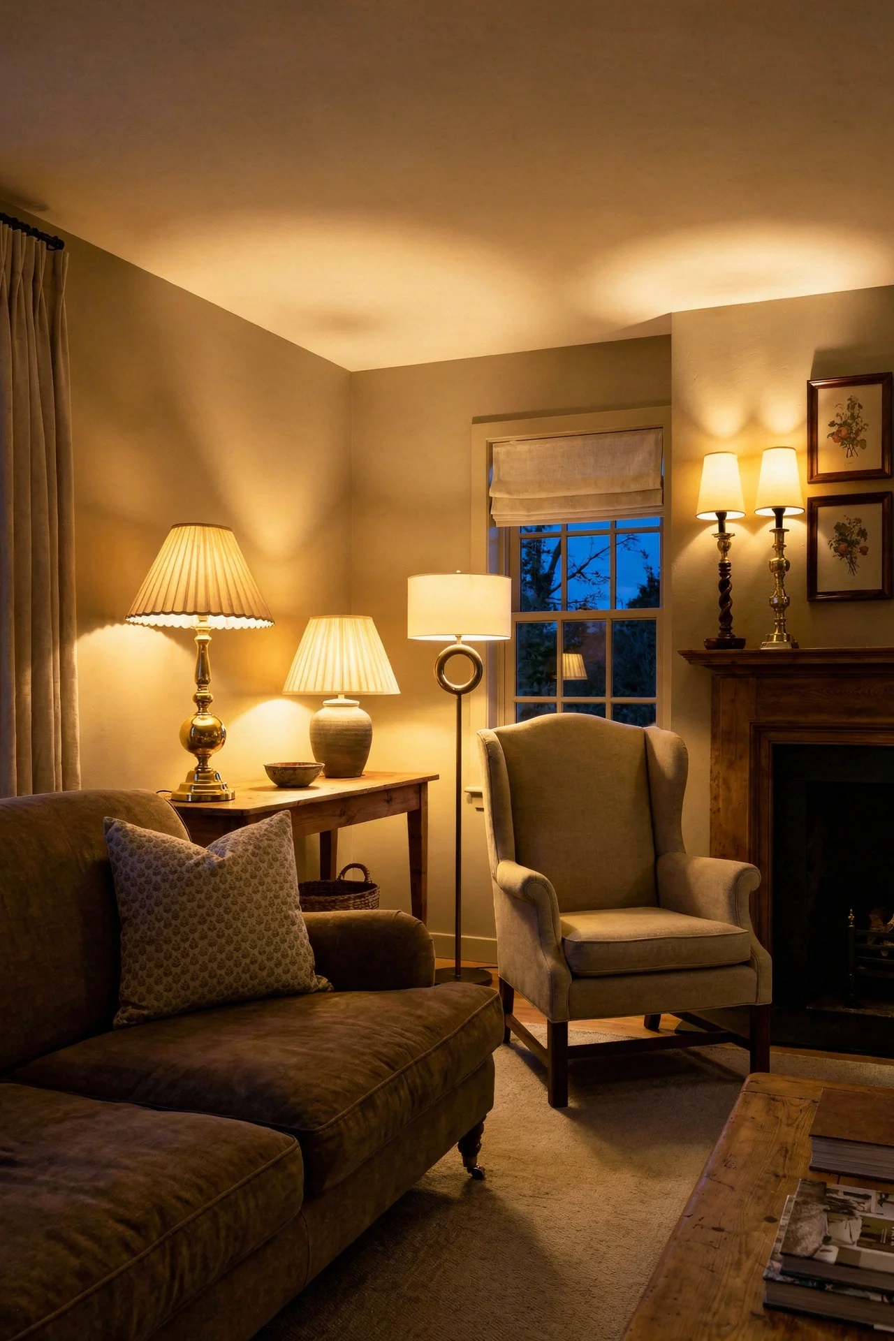
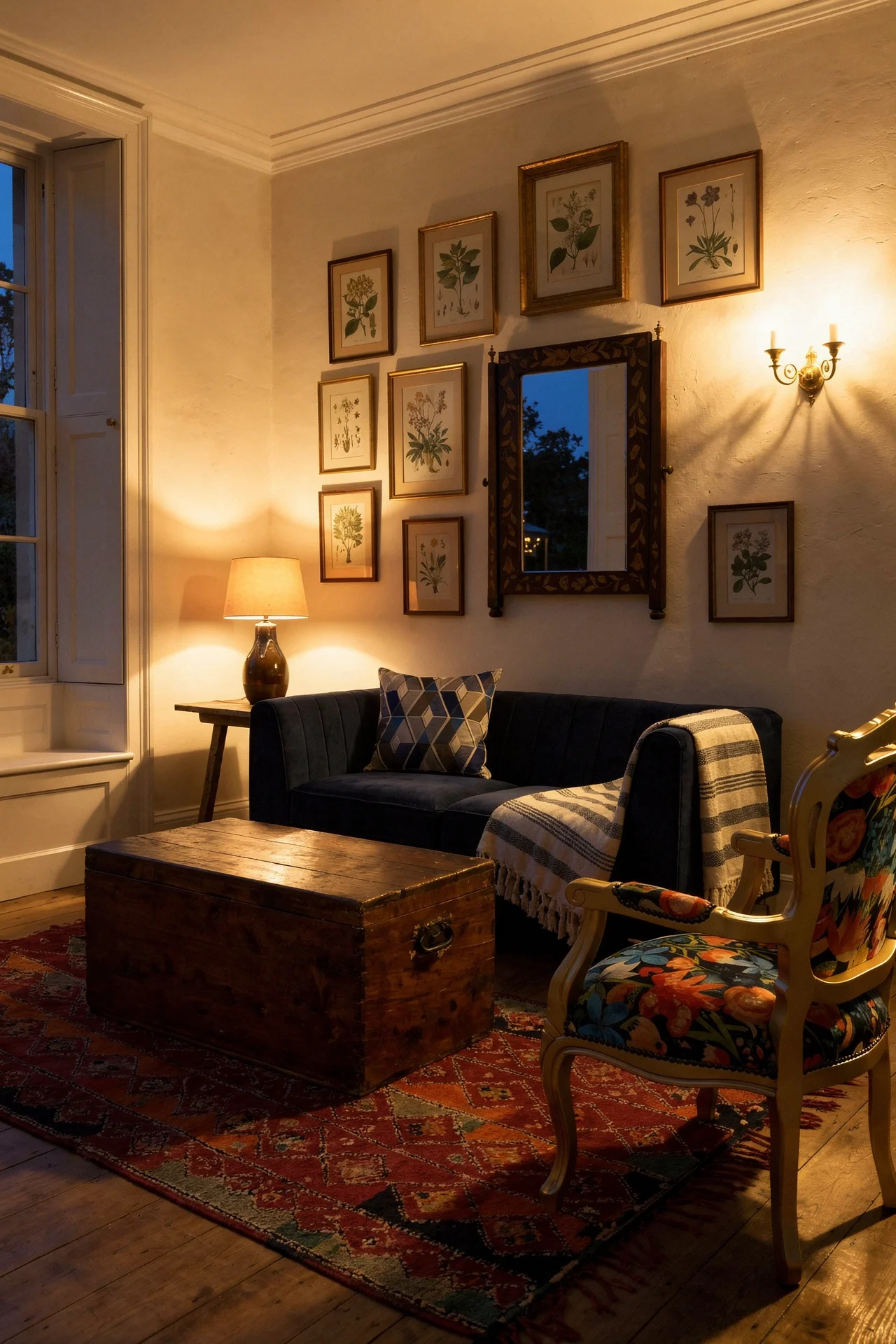
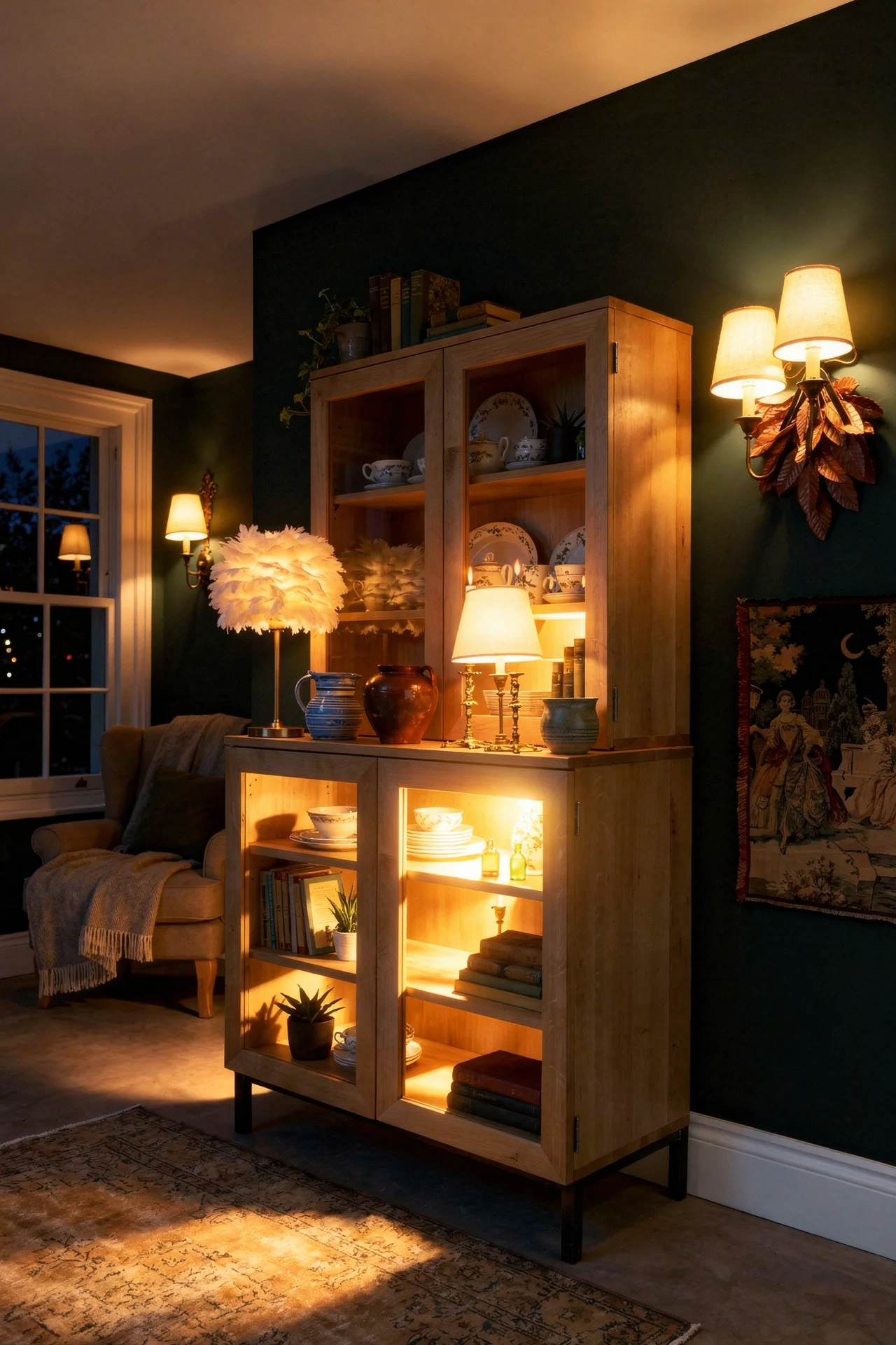
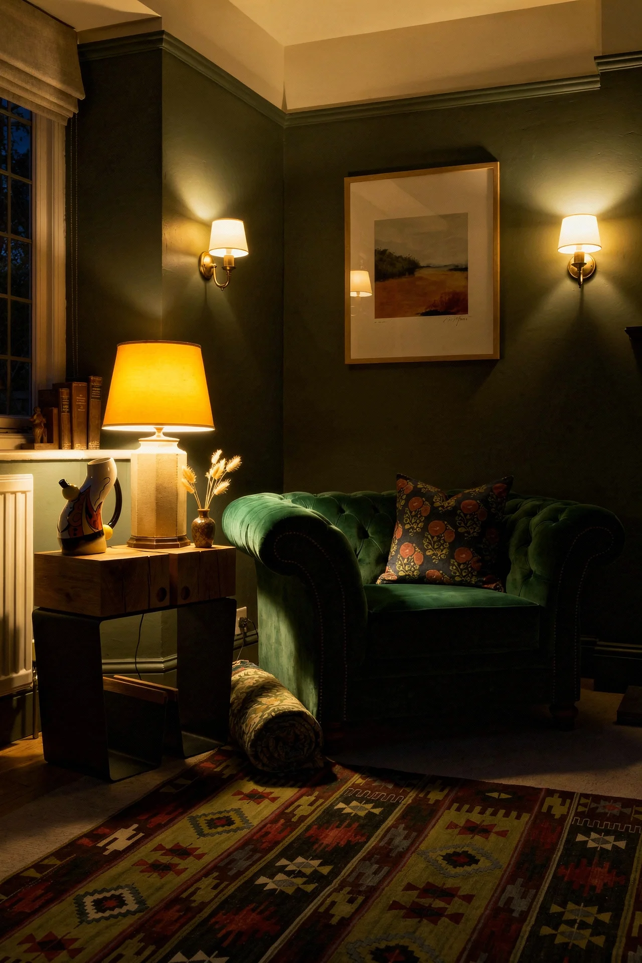
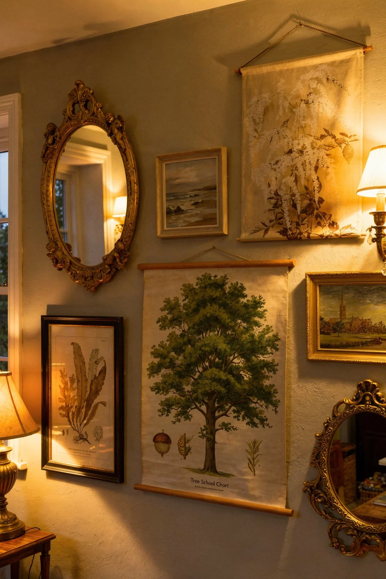
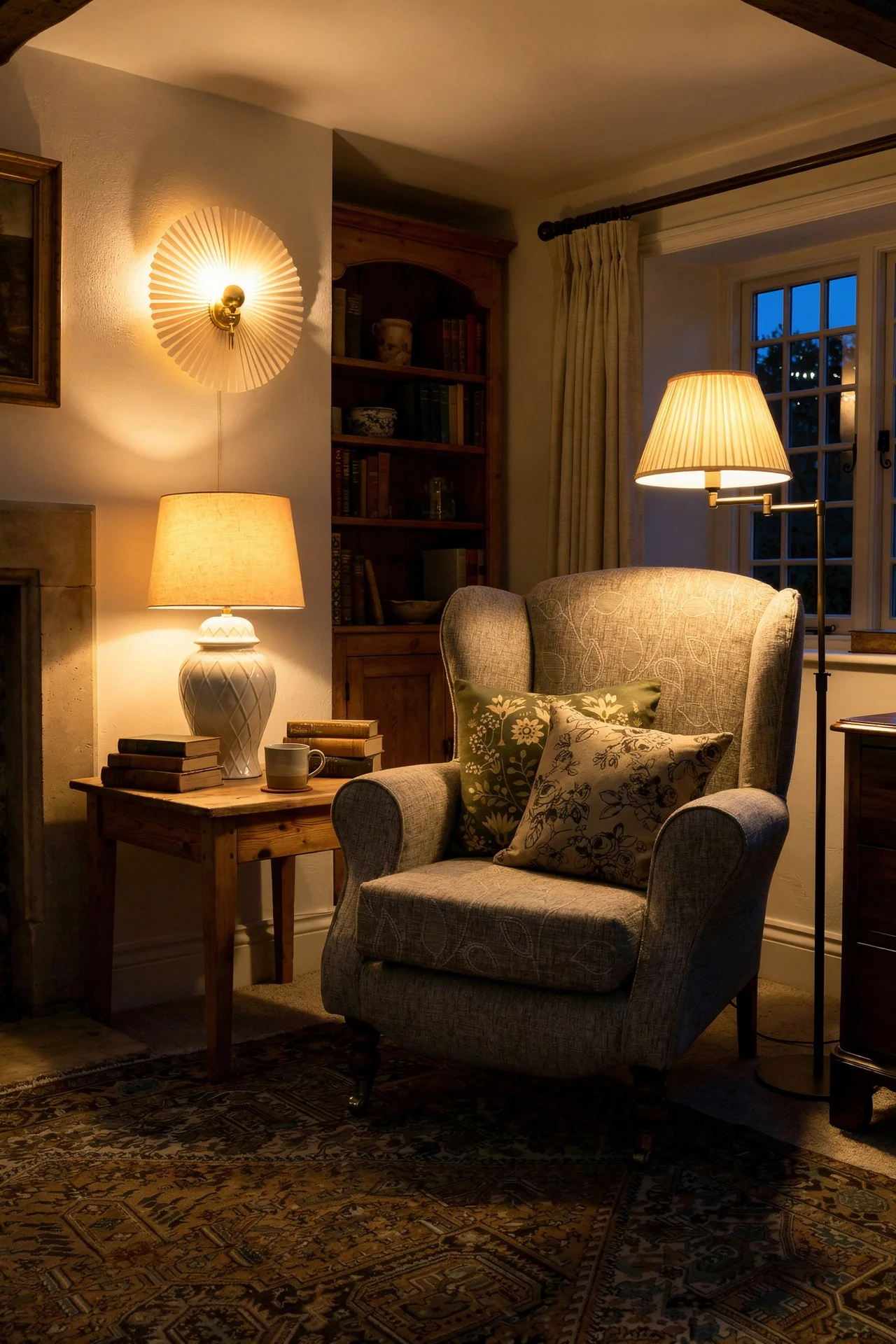
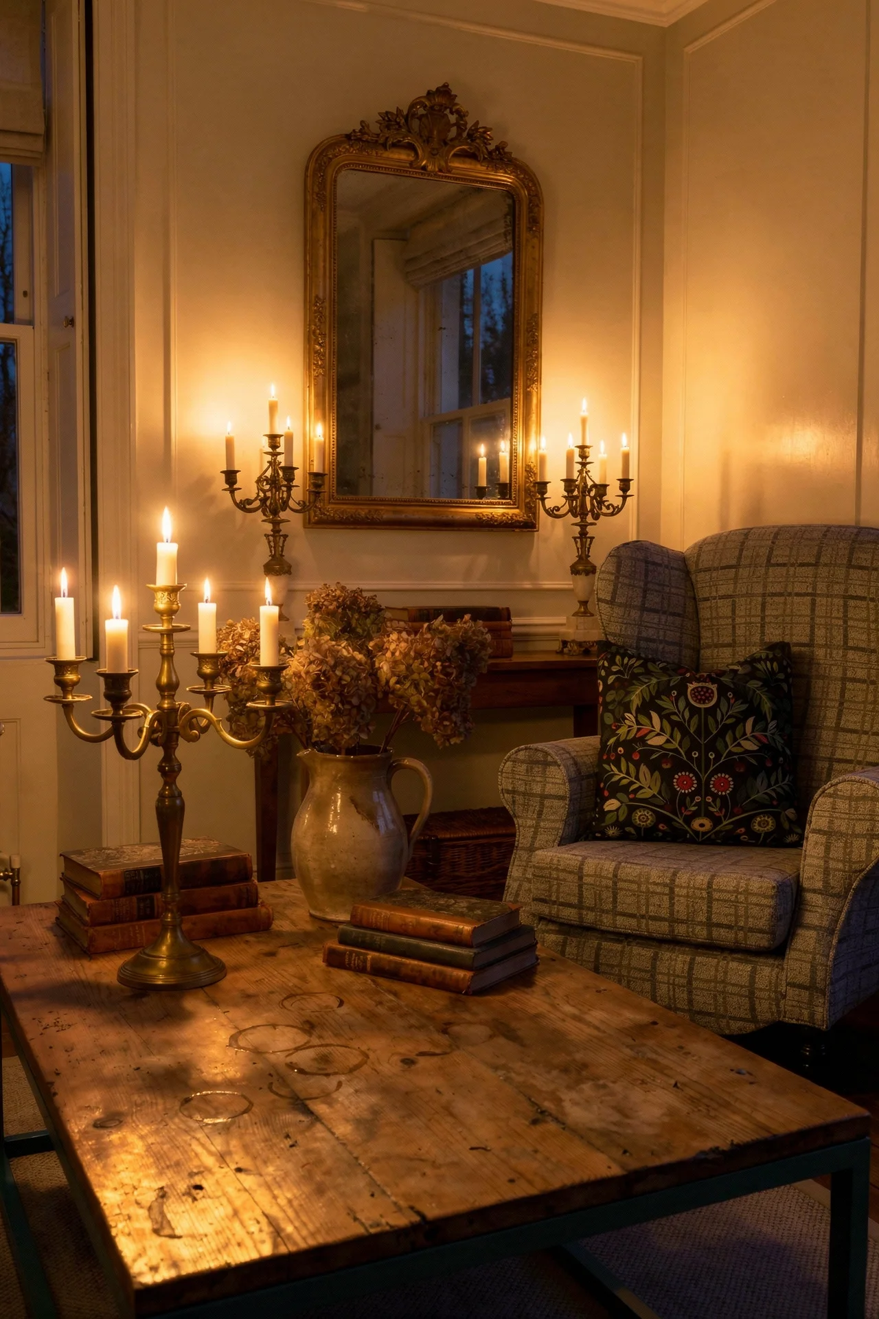
Overhead lighting killed more of the rooms I studied than any other single mistake. A bright ceiling light flattens an English country living room faster than anything else. The cosy ones never relied on it.
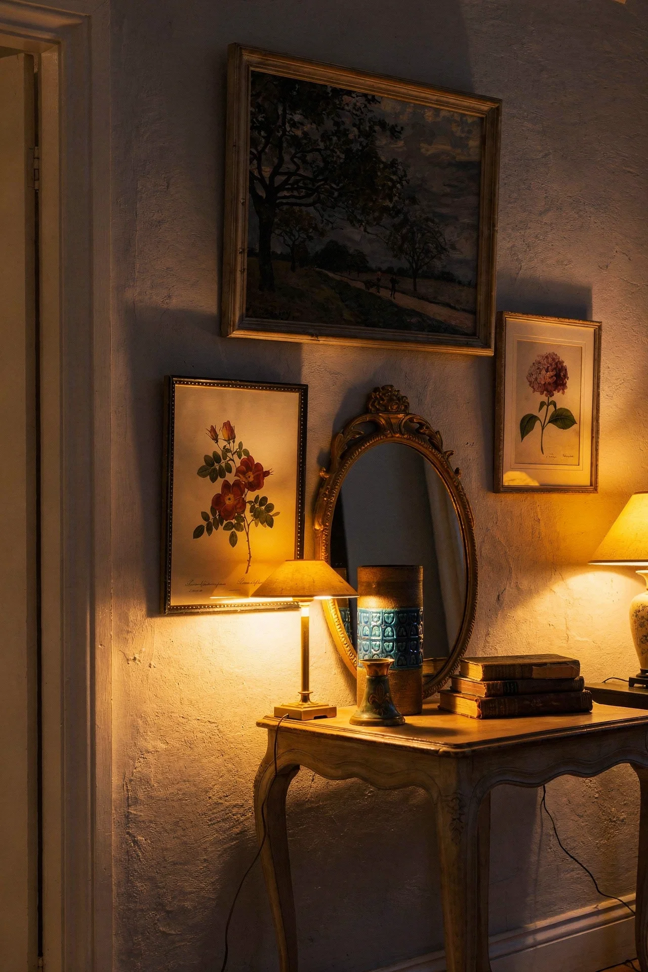
What they did instead was build the room out of low pools of light. Table lamps on brass or ceramic bases, almost always with pleated or patterned fabric shades that warm the light as it spreads. Wall sconces flanking the fireplace. A picture light above a favourite oil painting. A floor lamp next to a reading chair, angled downward. The ceiling stays dark and the room gets deeper because of it.
I’d lean toward pleated shades every time. They are a small detail but they change the quality of the light completely, softening it into something that feels almost candlelit. Brass bases age beautifully. Ceramic bases in a warm glaze, pale blue or cream or a soft sage, look like they belong. The trick is to have more lamps than you think you need, because each one is doing a small job rather than lighting the whole room.
Candles finish the work. Actual candles in hurricane vases, or in tarnished brass candlesticks on the mantel. The cosy rooms almost always had at least one candle burning somewhere even in daylight photos, and the flicker tells your brain this is a room that is used.
The fix for any room that feels cold is almost always to turn off the ceiling light and add three more lamps. It sounds too simple. It is the change that transforms the feeling of the space more than almost anything else I tested in my notes.
The last thing I kept noticing is how the cosy rooms handled imperfection. They embraced it. The stiff ones pretended it did not exist, and that pretending was exactly what made them feel hollow.
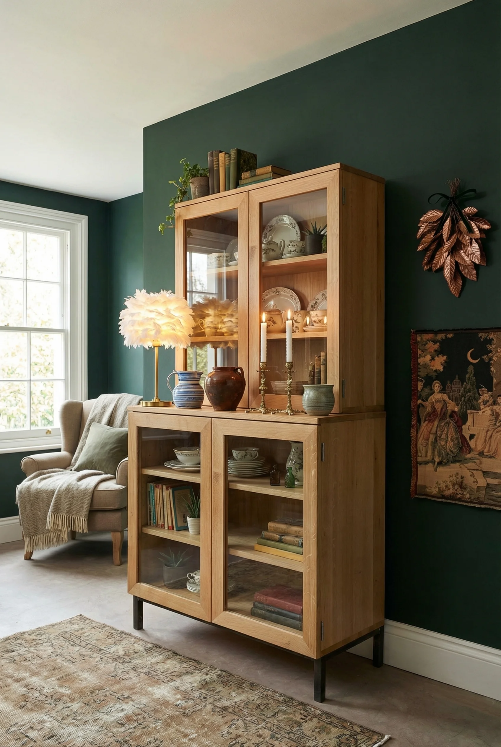
Books are the first clue. In every cosy room I studied, books were everywhere. On shelves, stacked on ottomans, piled on side tables, leaning against the mantel. Designers in this tradition consider books both insulation and decoration, and they are right on both counts. A room with real books in it feels inhabited in a way that a tasteful book arranged by colour does not. Let the spines be scruffy. Let the titles be personal.
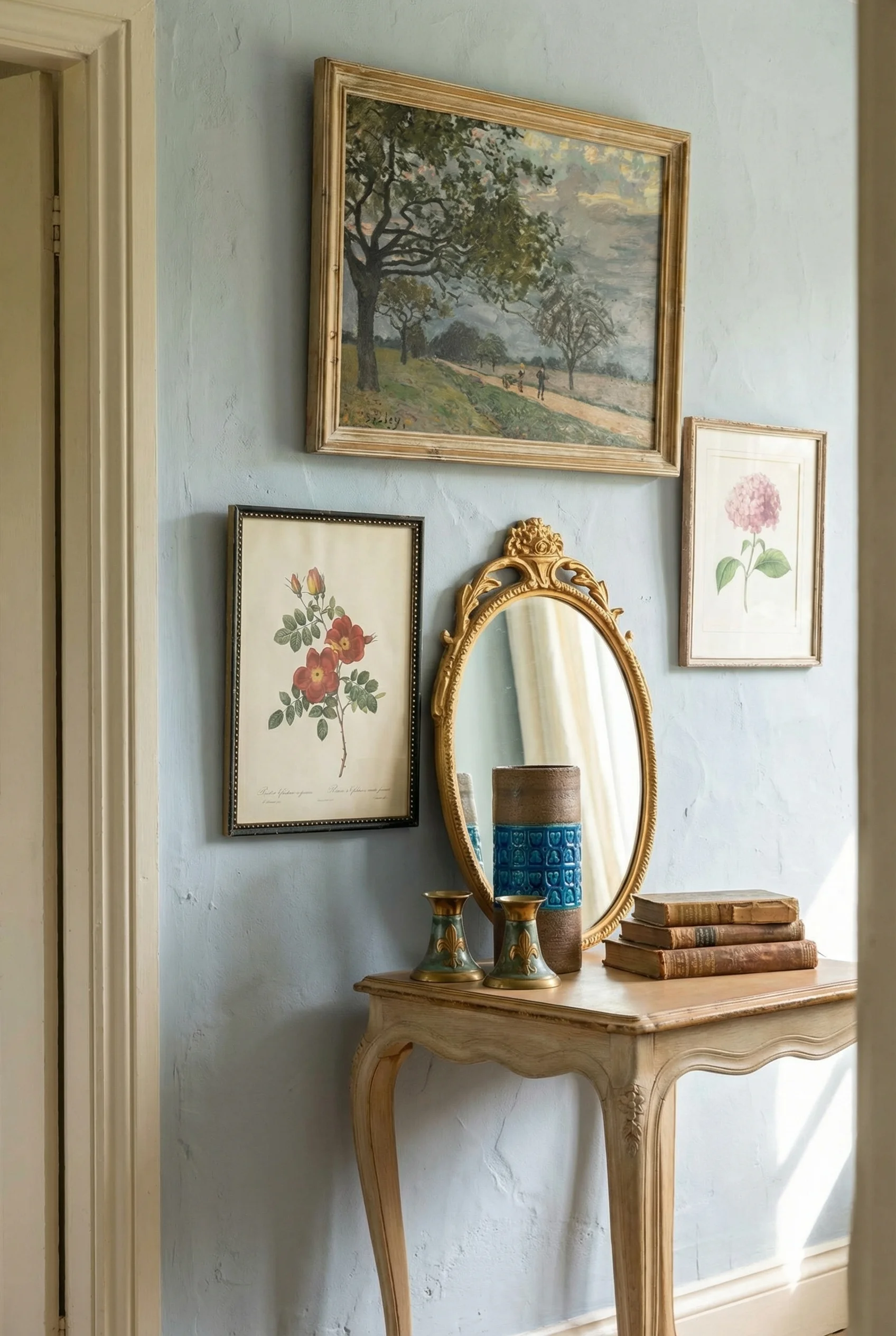
Gallery walls are the second clue. Not the matching frame kind. Mismatched vintage frames, botanical prints, small pastoral landscapes, a watercolour somebody made on holiday, a hand drawn map. The frames should not agree with each other. Some of the art should lean rather than hang. This is the Rule of Three again, quietly running the whole show.
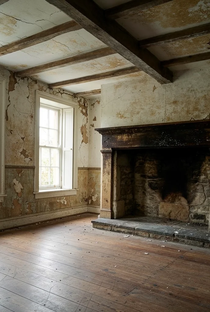
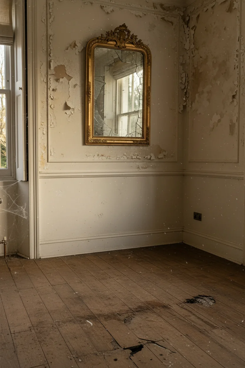
Distressed wood matters more than I initially thought. A coffee table with ring marks. A pine cupboard with a chip in the corner. A leather armchair that has softened into the shape of whoever sits in it most often. The cosy rooms never tried to hide these things, which is why the patina narrative held together.
And the television. This was the quiet tell. In every cosy room, the TV was either hidden inside a reworked armoire or it was a Frame TV pretending to be art. Never centred over the fireplace, never dominating the room. The fireplace keeps its job as the metaphorical heart, and the TV slides politely into the background where it belongs.
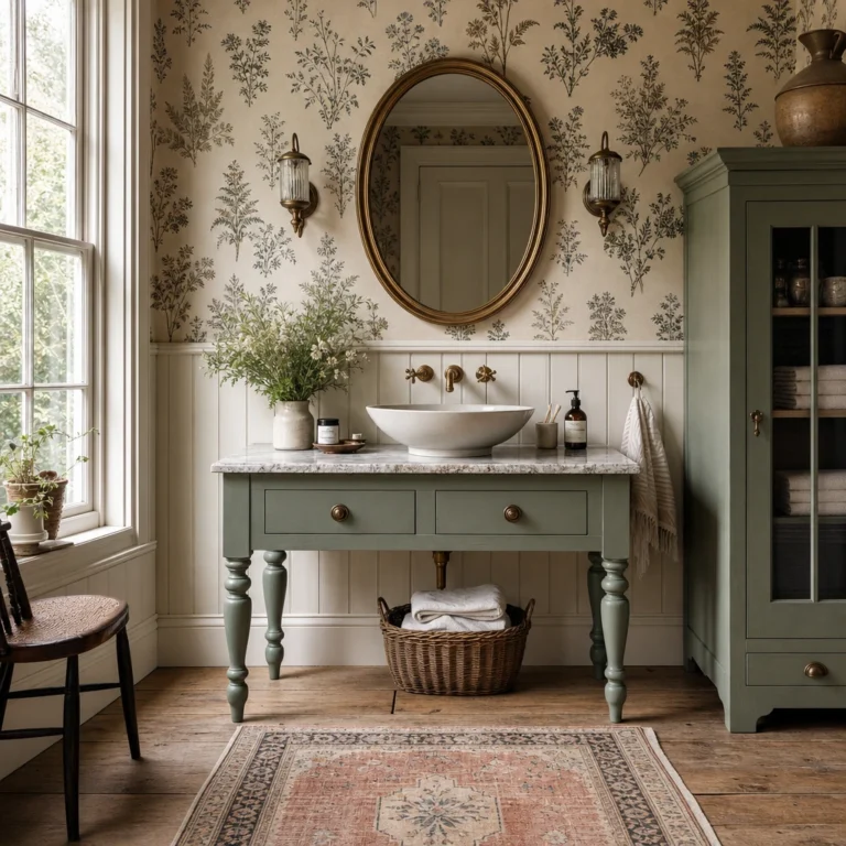
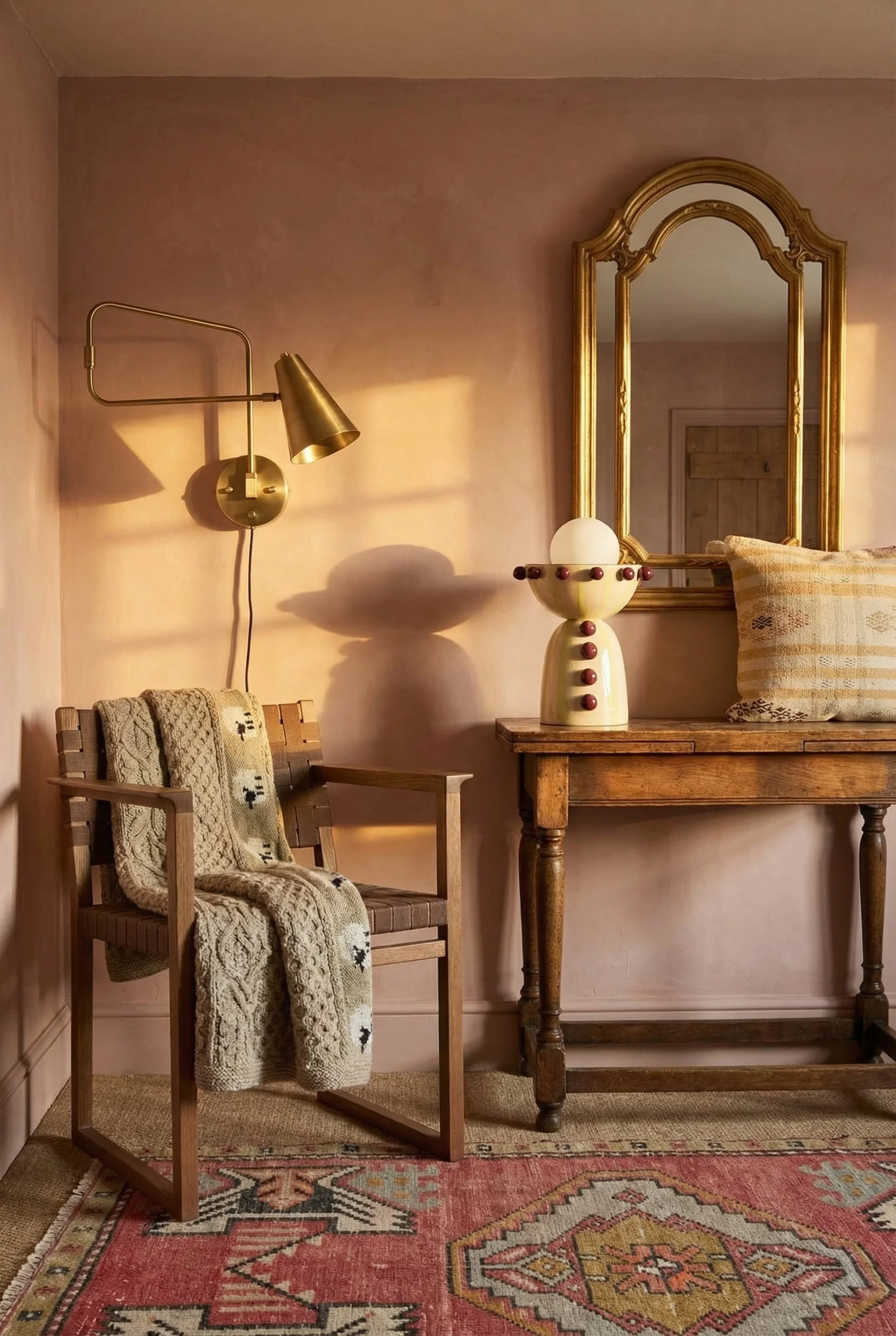
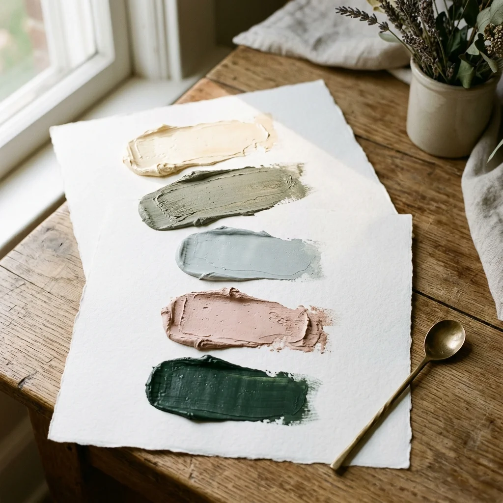
The cosy rooms almost never used bright colours. They used what designers call ‘tired and dirty’ versions, hues that look like they have already lived through a few northern winters and come out gentler for it. Here are the five that showed up again and again.
Creamy White. Not brilliant white. A warm soft cream with a faint clay undertone that reads as morning light. It is the background that makes everything else look its best.
Paint Pick: Farrow & Ball School House White No.291
Sage Green. A dusty grey green, the colour of lichen on an old garden wall. It is restful and flattering and it sits beautifully next to raw wood. Farrow & Ball Slipper Satin edges into this territory with a soft clay sage feel.
Paint Pick: Farrow & Ball Lichen No.19
Faded Robin’s Egg Blue. Pale, slightly grey, never sharp. The sort of blue that looks like it was once brighter and has gently softened. It works beautifully on panelling and inside cupboards.
Paint Pick: Farrow & Ball Skylight No.205
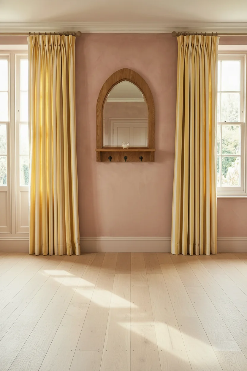
Dusty Pink. Not nursery pink. Almost a plaster pink with a little brown in it, warm and grown up. I’d use it on one wall or inside an alcove and let the rest of the room breathe around it.
Paint Pick: Farrow & Ball Pink Ground No.202
Deep Botanical Green. The moody cocooning one. Farrow & Ball Breakfast Room Green or Studio Green is the archetype, and Benjamin Moore Fairmont Green HC-127 works the same magic. Perfect for a snug or a library corner where you want evening hush.
Paint Pick: Farrow & Ball Card Room Green No.79
I’d use flat matte on the walls and eggshell or satin on the woodwork, which is how every cosy room I studied handled the finish question. The sheen contrast is subtle but it is part of what makes the room feel proper.
If you want to start somewhere concrete, start with the fireplace and the lighting. Pull the seating into an 8 to 10 foot talking circle around the hearth, turn off the ceiling light, and add three lamps with pleated shades. That single evening of rearranging will tell you more about the feeling of an English country living room than any amount of shopping, and it costs almost nothing to try.
This post contains affiliate links, which means we may earn a small commission if you make a purchase through our links, at no extra cost to you.