Newsletter Subscribe
Enter your email address below and subscribe to our newsletter
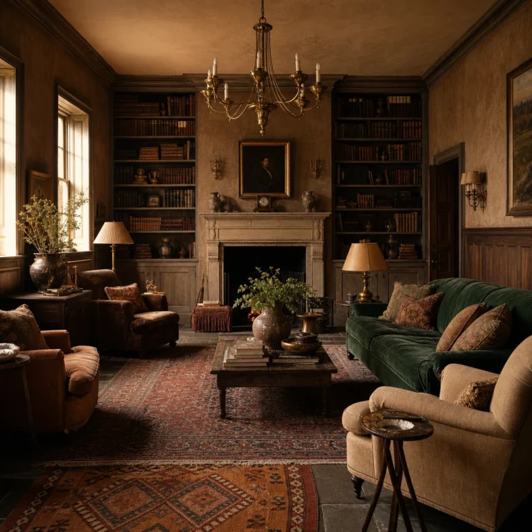
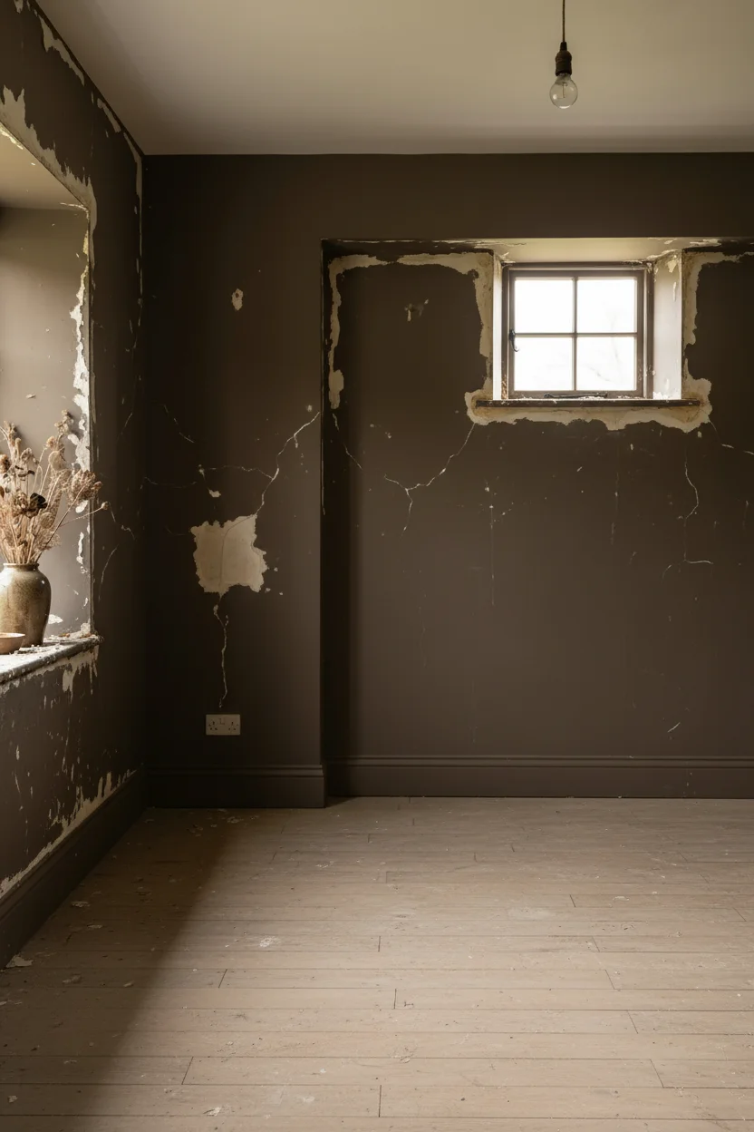
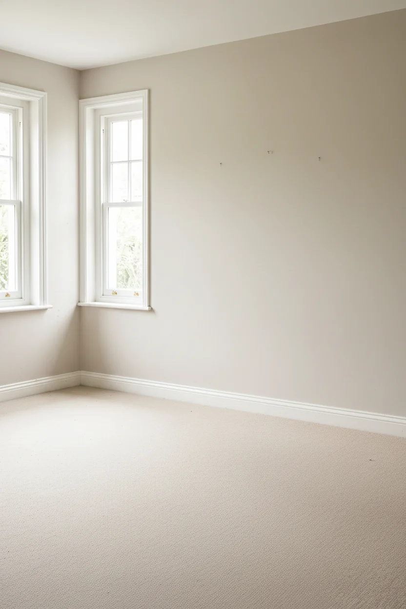
Most English country bedrooms get the palette right and the proportions wrong. The bed is too big, the side tables too short, the rug too small, and the overhead light flattens the whole thing by 9pm. I’ve spent the last few months studying what separates the Cotswolds bedrooms that feel like a proper retreat from the ones that look like a showroom impression of one, and almost every difference came down to six specific moves. The designers I kept circling back to (Rita Konig, Ben Pentreath, the Studio McGee teams doing warm English work) weren’t chasing authenticity through props. They were layering era, texture, and scale in ways any intentional homemaker can plan for, even in a new build with eight foot ceilings. If you’re also working on the downstairs, I studied 100 English Country living rooms and found seven things the cosy ones all got right. This piece is what I learned about bedrooms specifically.
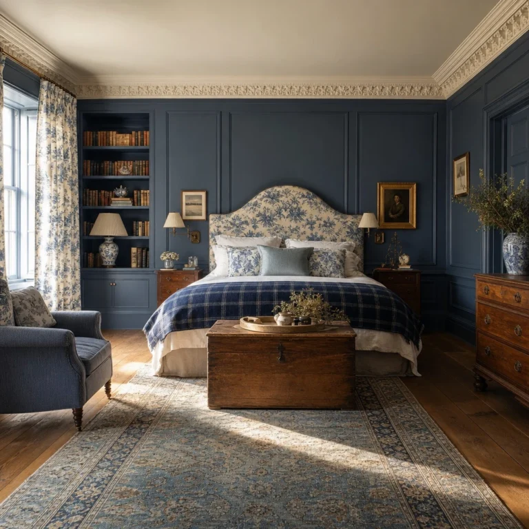
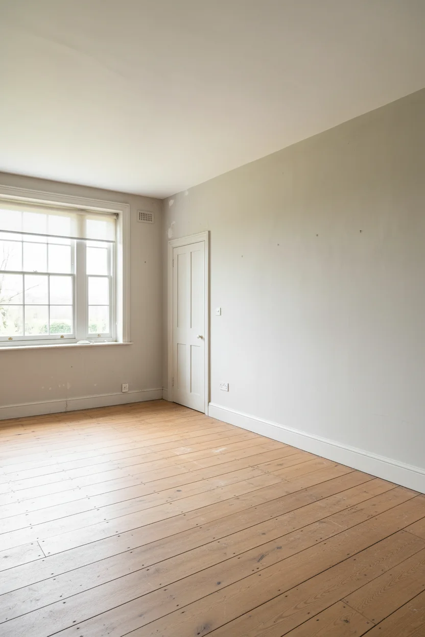
The cosiest English country bedroom I’ve seen all year wasn’t a large bedroom. It was a standard double with an IKEA PAX wardrobe on each side of the bed, pulled in, trimmed out with a softwood lintel, and curtained across with a heavy linen panel. That is the entire architectural story of an alcove bed: flanking storage, a horizontal trim to cap the opening, and fabric that closes the volume off from the rest of the room. Acoustically, thermally, emotionally, you’re sleeping in a smaller, softer box than the one the builder gave you.
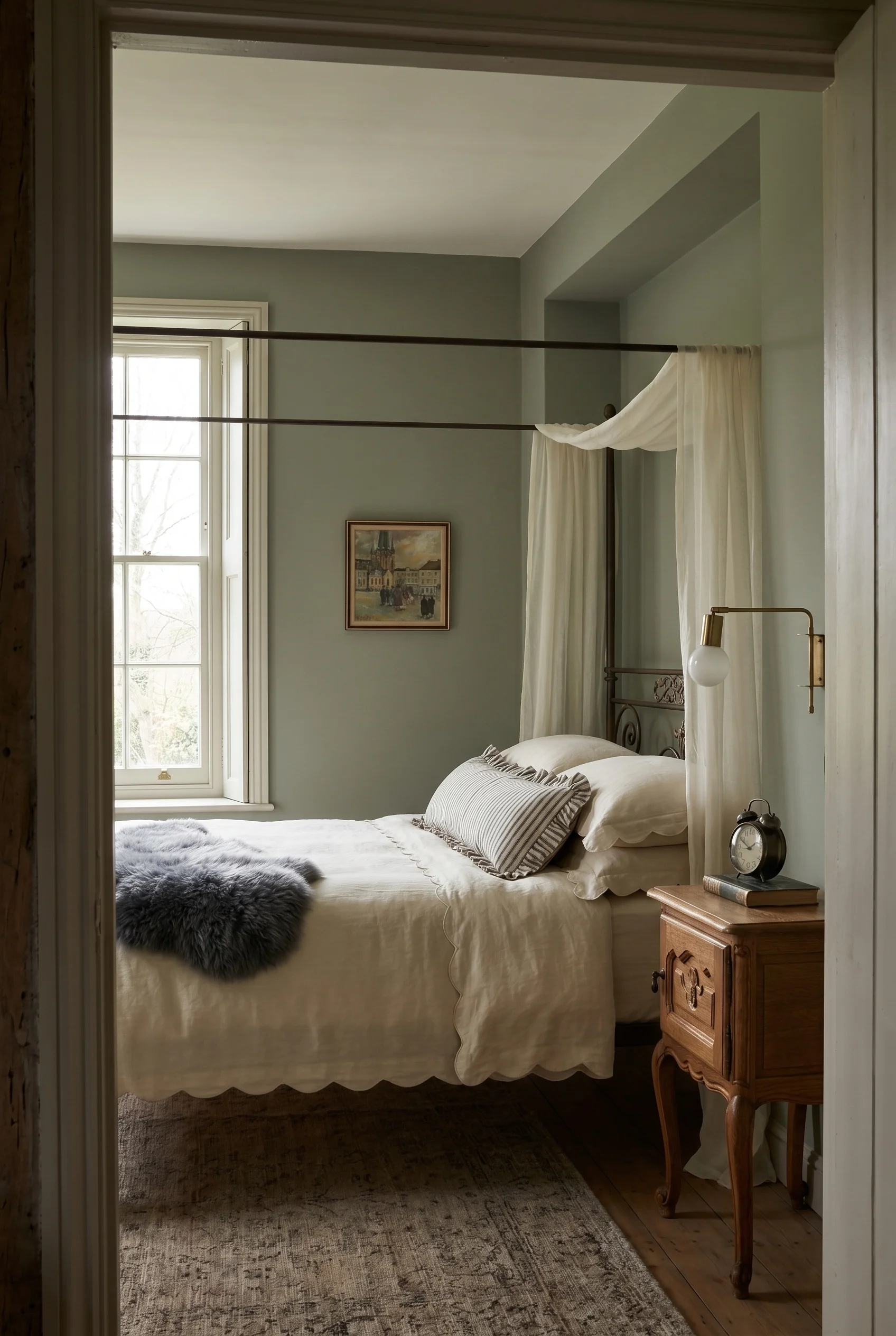
Rita Konig has written about this as “curtaining the bed” and it’s one of the oldest moves in English cottage design. In a cottage, the bed sat in an alcove because the alcove was what the stone walls left behind. In a modern home, you’re building that alcove back in using off the shelf cabinetry to fake what a Cotswolds cottage would have inherited.
The PAX route is the cheap one. A carpenter can do it in three days with MDF, beadboard, and a heritage paint drenched across the lot so the wardrobe and wall read as one surface.
The rule I’d give anyone trying this: the fabric matters more than the joinery. A poly blend from an online big box shop will look like a hospital curtain. Go for unlined linen, loose weave, hung on a simple iron rod inside the alcove. You want a slight drape, a bit of gather, and a colour one shade deeper than the wall so the opening reads as intentional.
If you can’t build out a full alcove, fake the feeling with a half tester or a fabric panel hung behind the headboard that extends down to the mattress.
You’re giving the brain something softer than flat wall to register. Next up is the ceiling, because even a perfect alcove bed gets undone by a bare, flat ten foot canopy overhead.
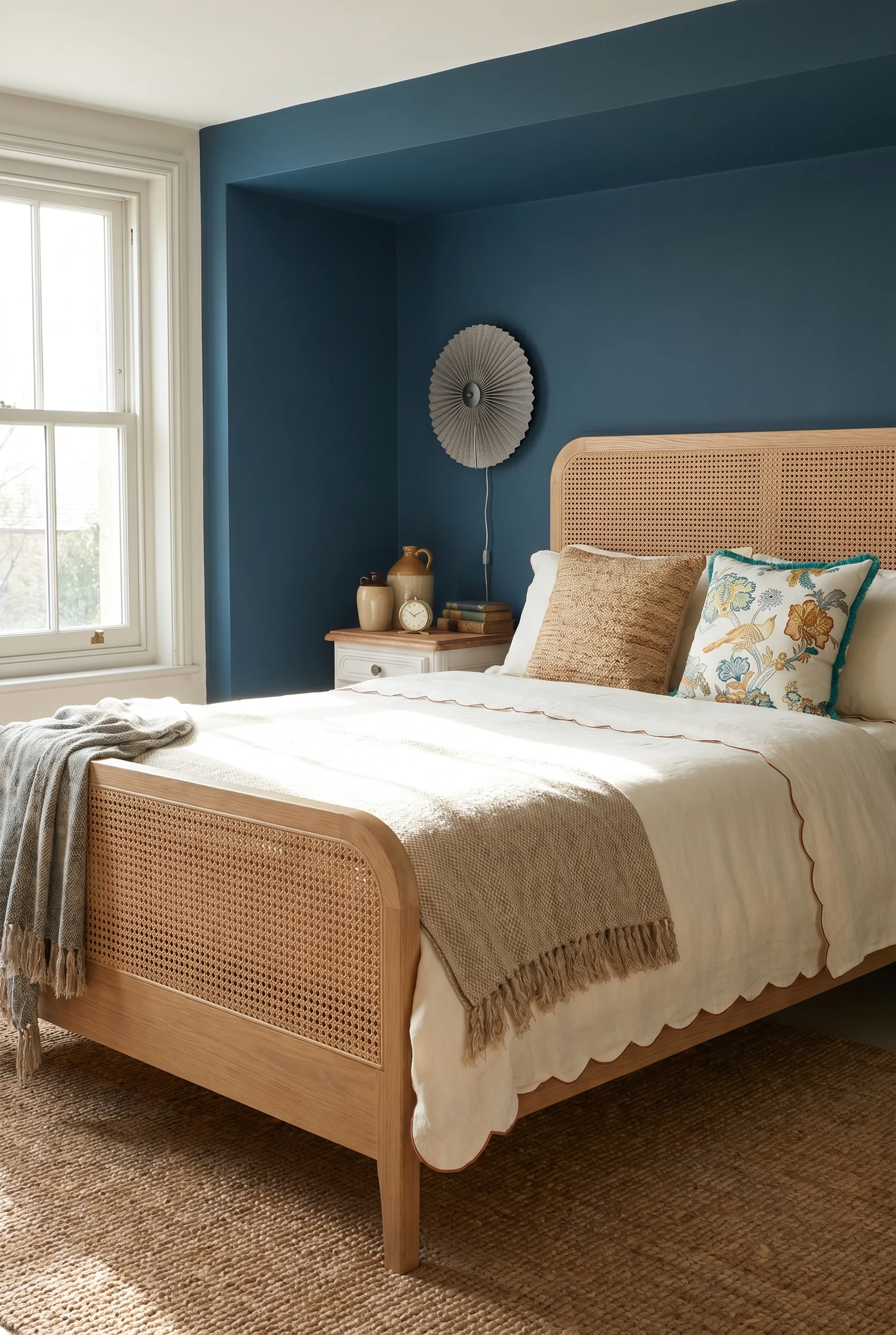
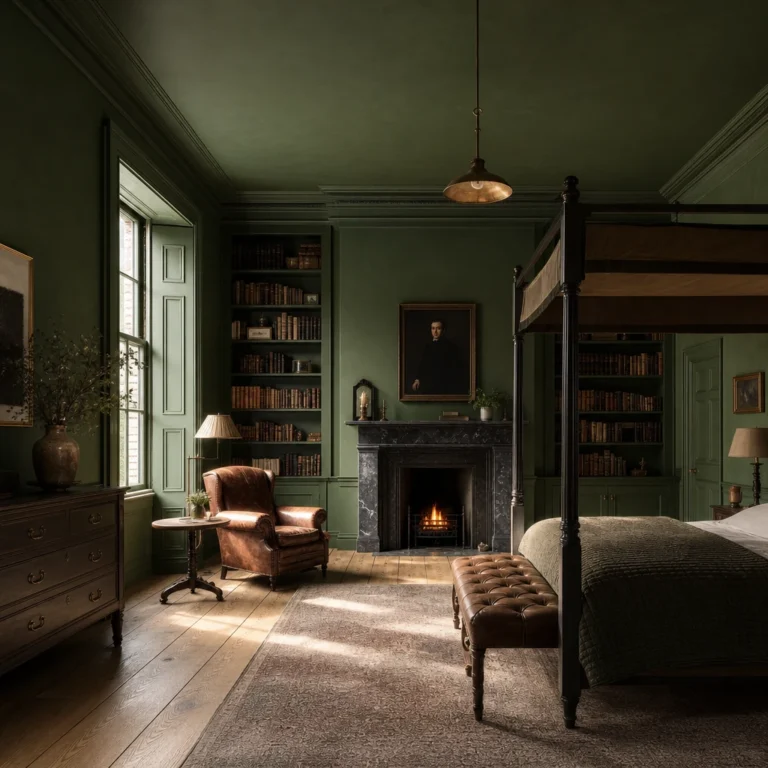
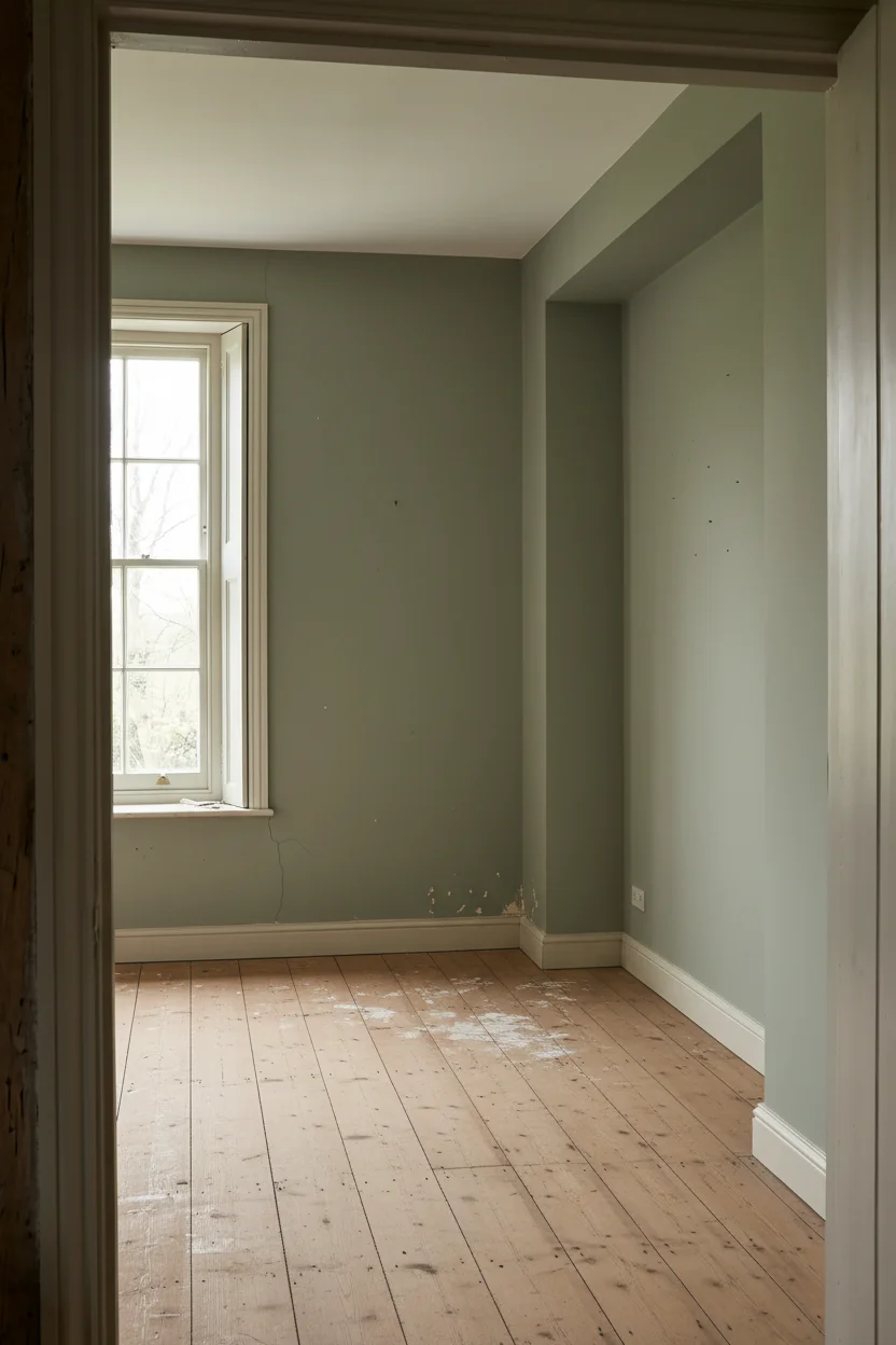
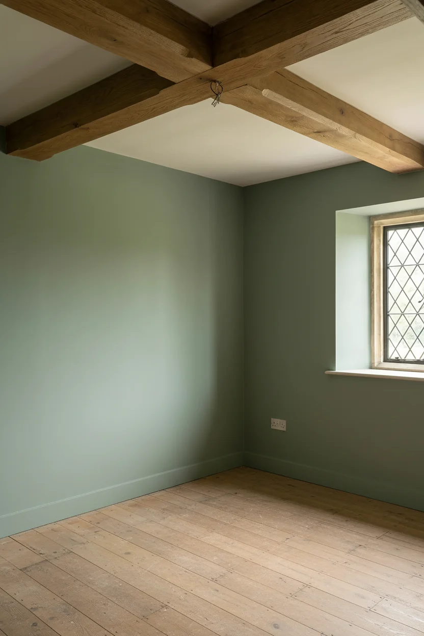
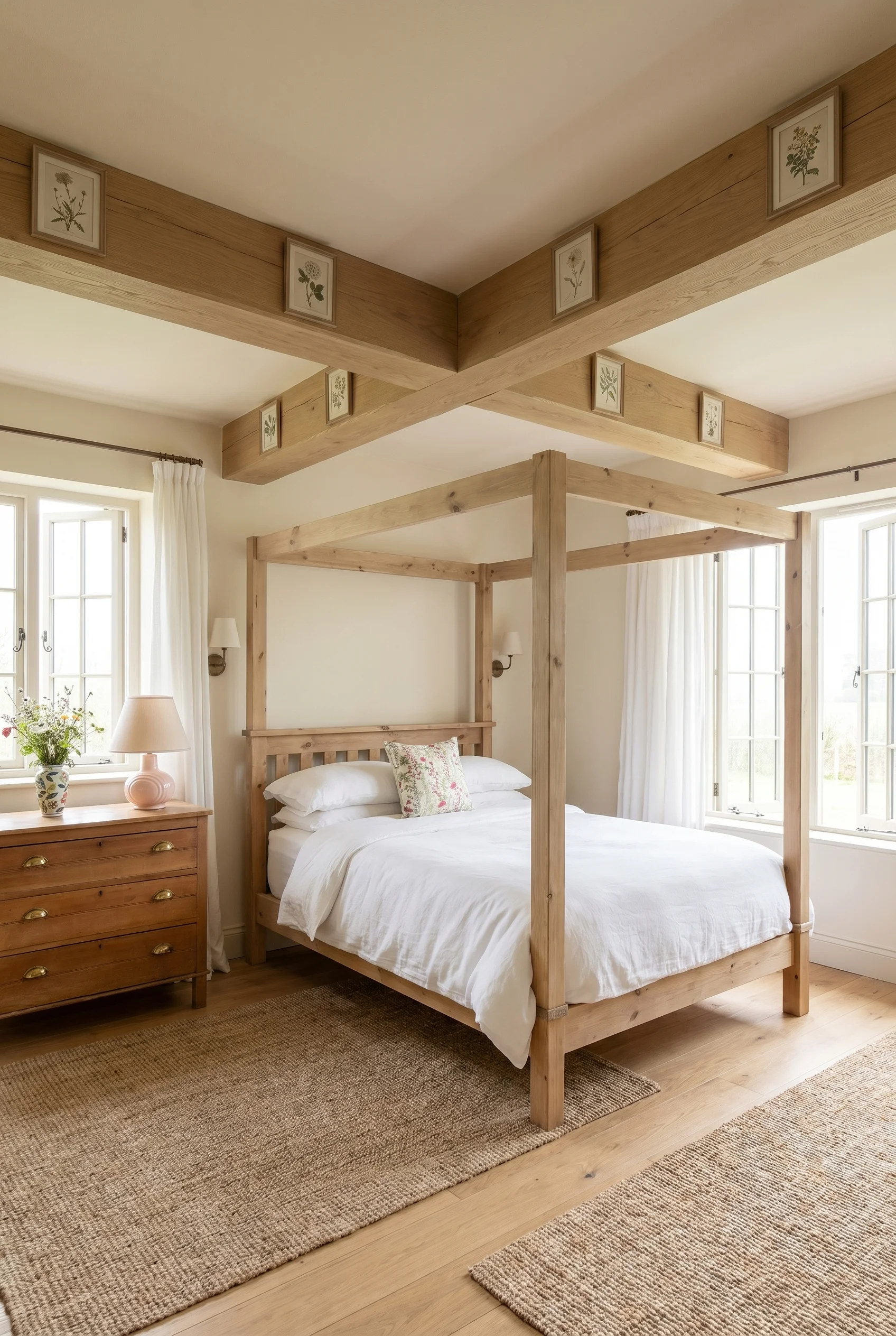
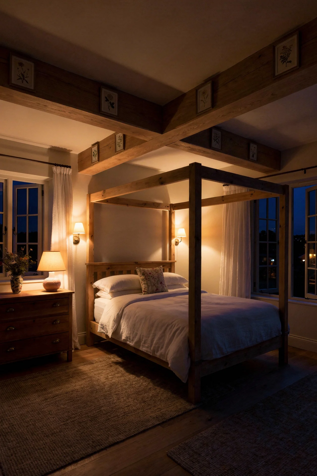
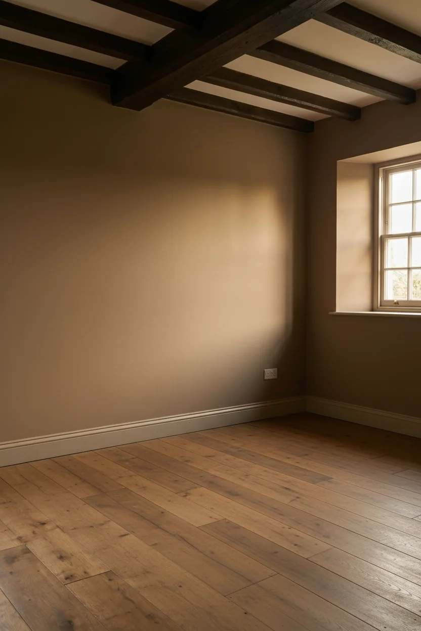
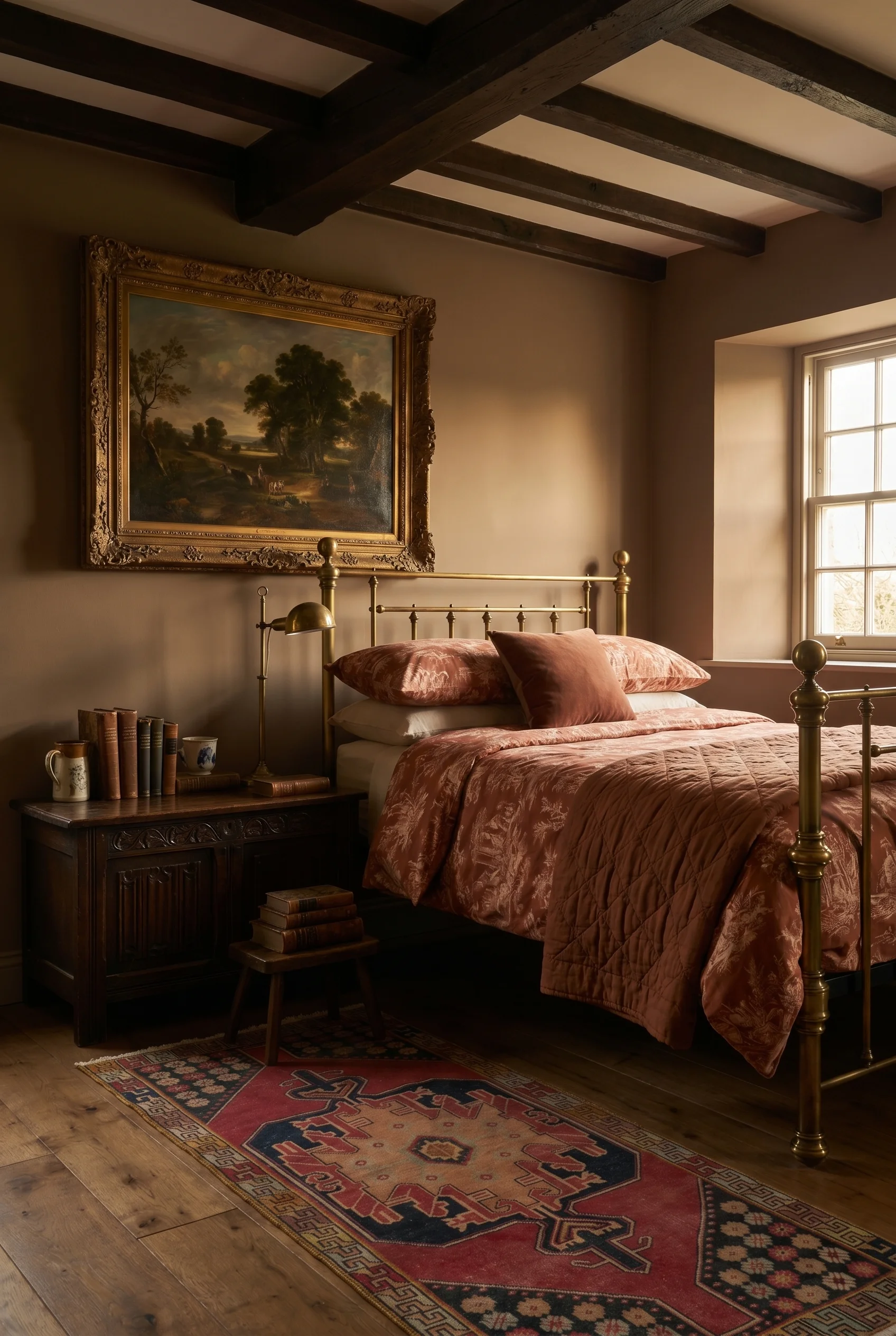
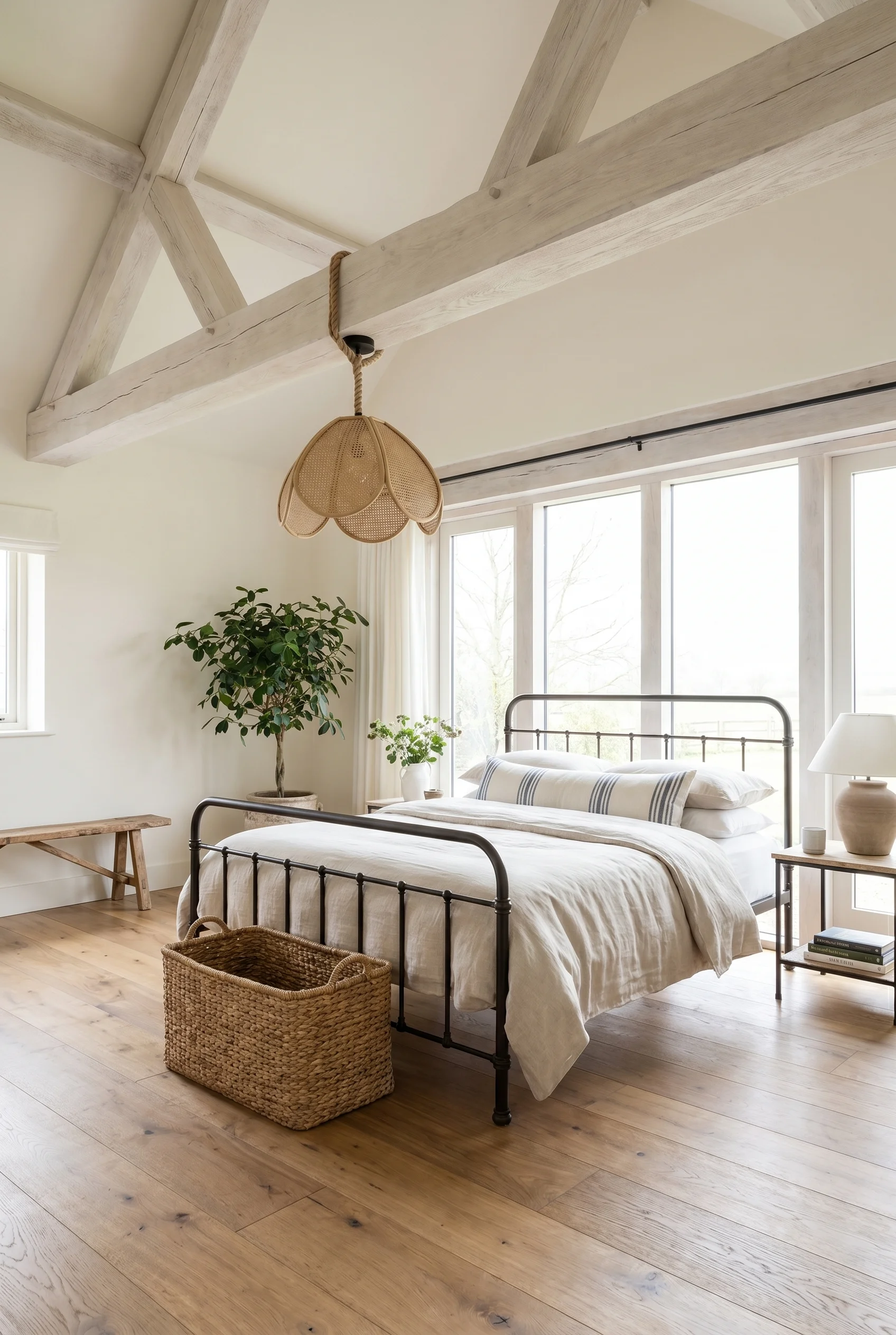
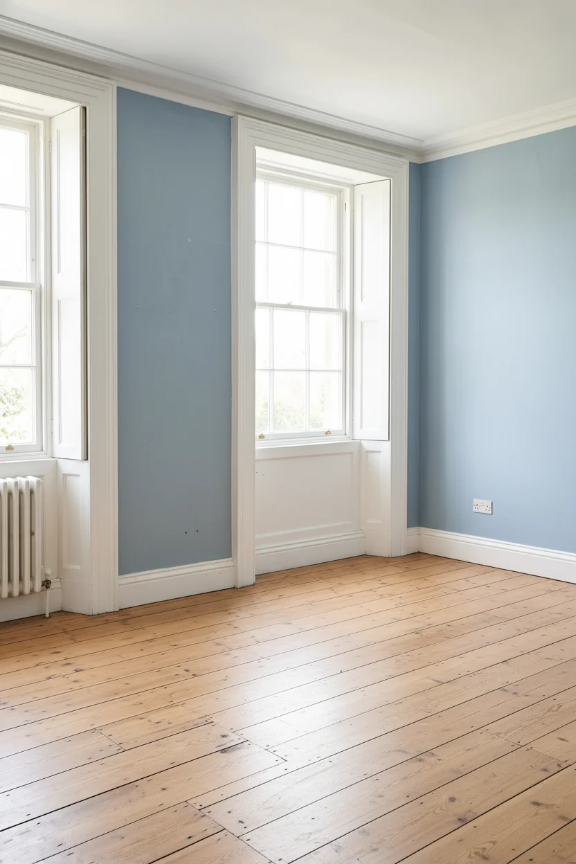
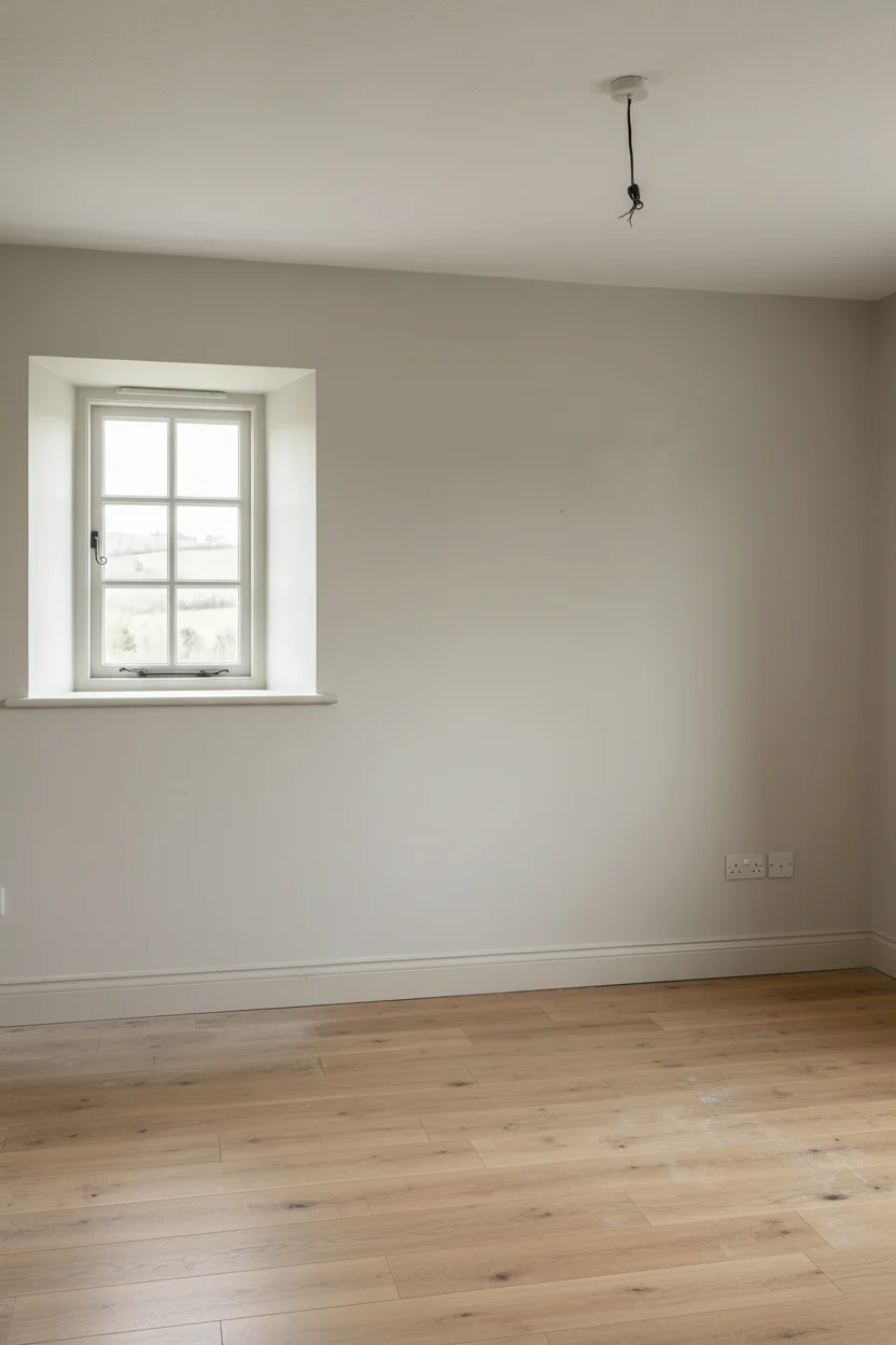
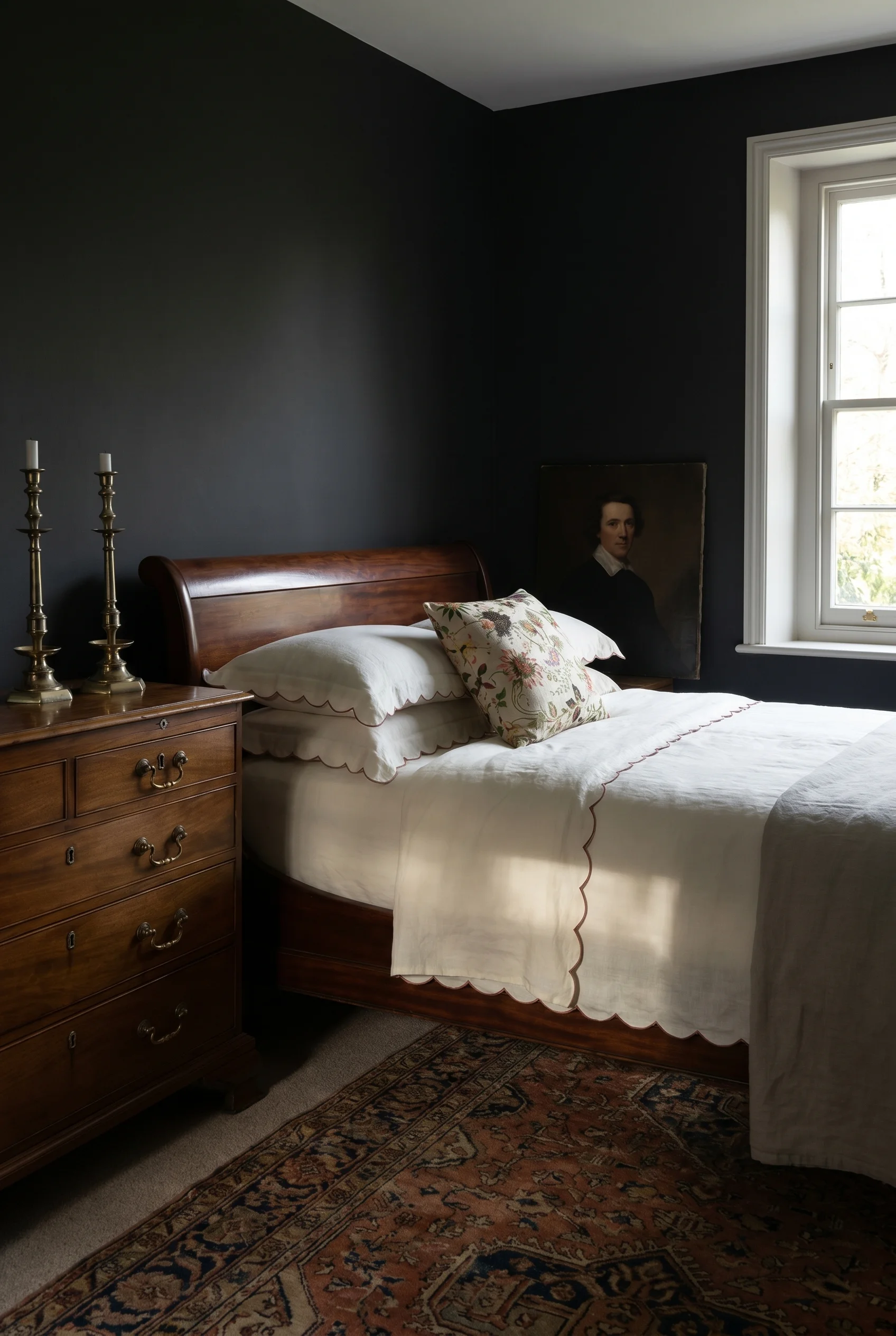
A Cotswolds bedroom has beams. A new build bedroom has nothing. The visual weight of exposed timber overhead is doing more work in a cosy bedroom than most people realise, because it tells the eye where the ceiling ends. Without that horizon line, the ceiling feels vague and the room feels taller and more sterile than it needs to be.
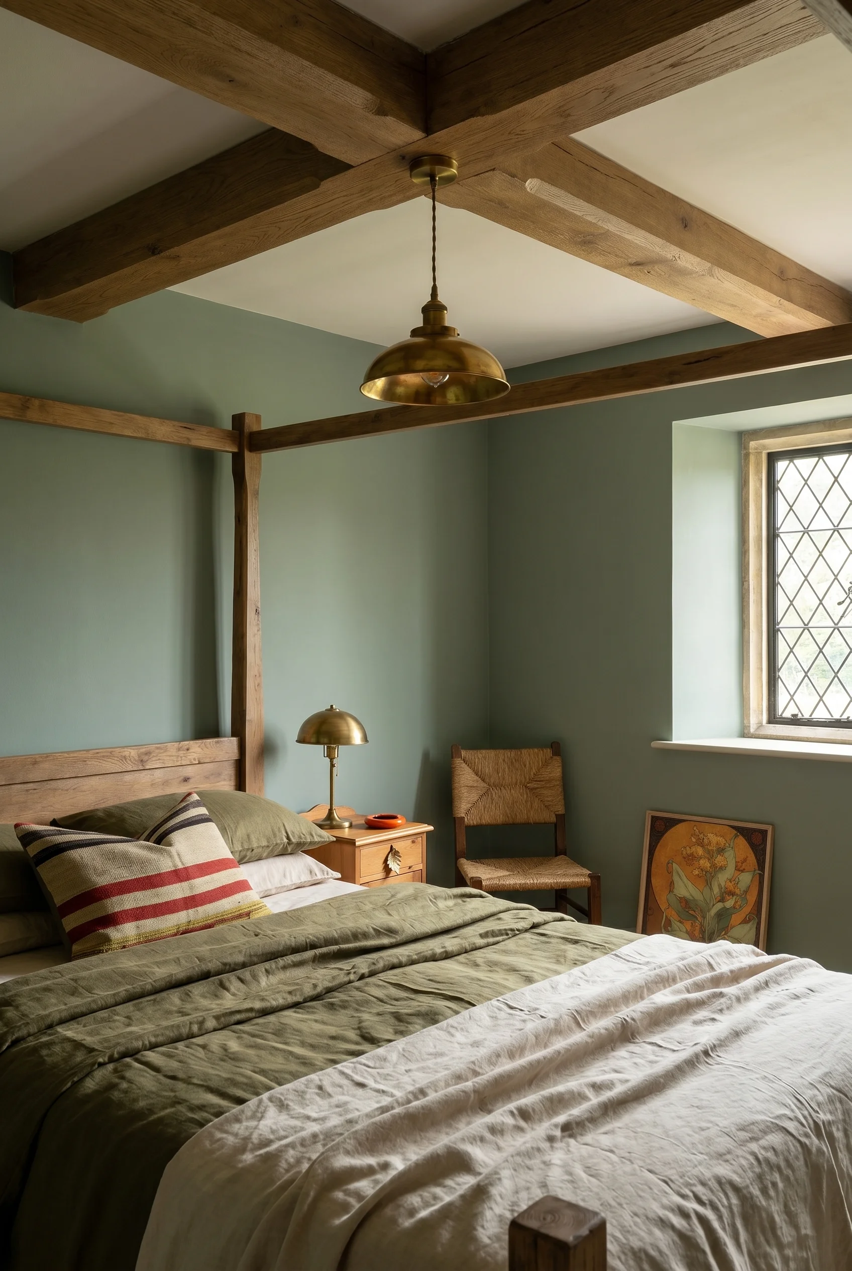
The fix is shockingly accessible now that hollow wood beams and high density foam beam systems exist, and neither requires structural engineering. Two routes I’ve watched people take: reclaimed timber beams (heavy, expensive, the real deal, needs a proper joist anchor) or the polyurethane faux beam from companies like Volterra or Barron.
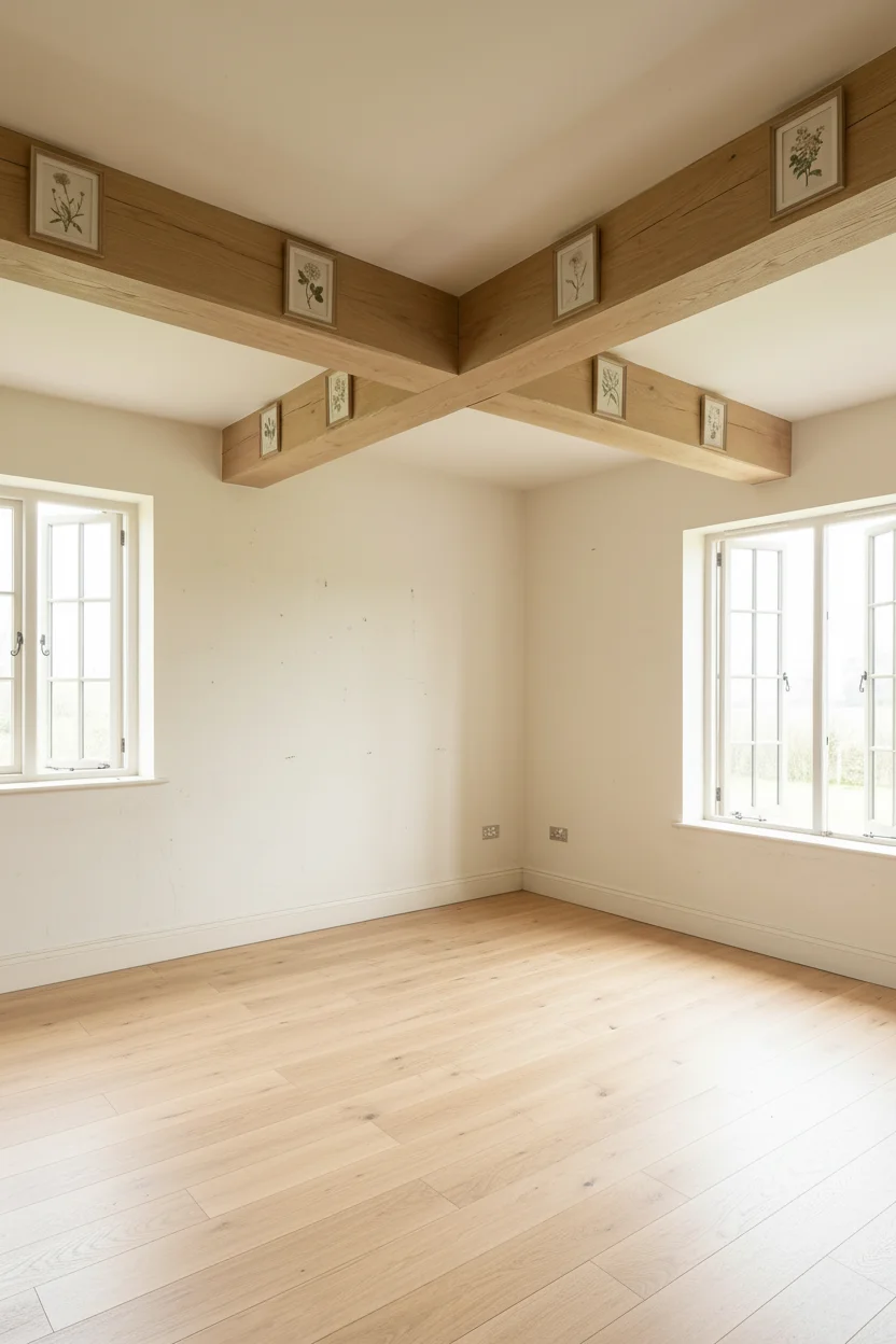
The foam versions weigh almost nothing, ship flat, mount with construction adhesive, and once stained in mid tone oak or walnut they read as genuine at any distance beyond arm’s reach. The trick is the finish: matte stain, hand rubbed, with visible grain or a deliberate adze mark. A glossy synthetic beam will always look fake.
Placement is where DIY beam installs go wrong. You don’t want evenly spaced beams at 24 inch centres. A proper English country ceiling has two or three beams running the short dimension of the room, with the end beams tucked right against the walls so the ceiling plane reads as nested inside a timber grid. In a fourteen foot room, space three beams at roughly four foot intervals with the outer two set about six inches off the wall.
The payoff of beams isn’t just cosiness. They also lower the perceived ceiling, which matters more in a bedroom than anywhere else, because you spend most of your time there lying down and looking straight up. A room with beams at eight and a half feet feels more intimate than a beamless room at nine. Once the ceiling is handled, the next layer is what you put on the bed.
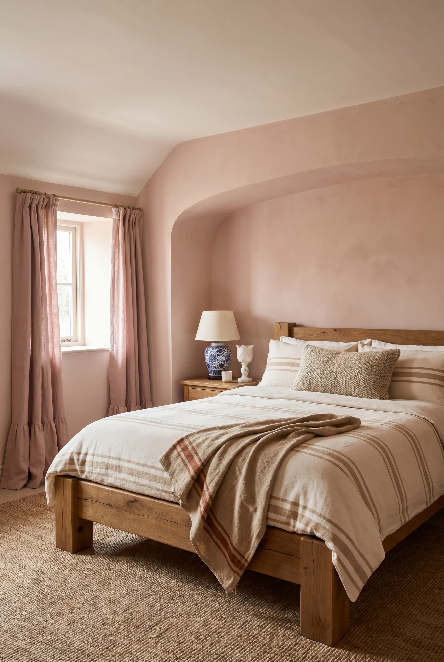
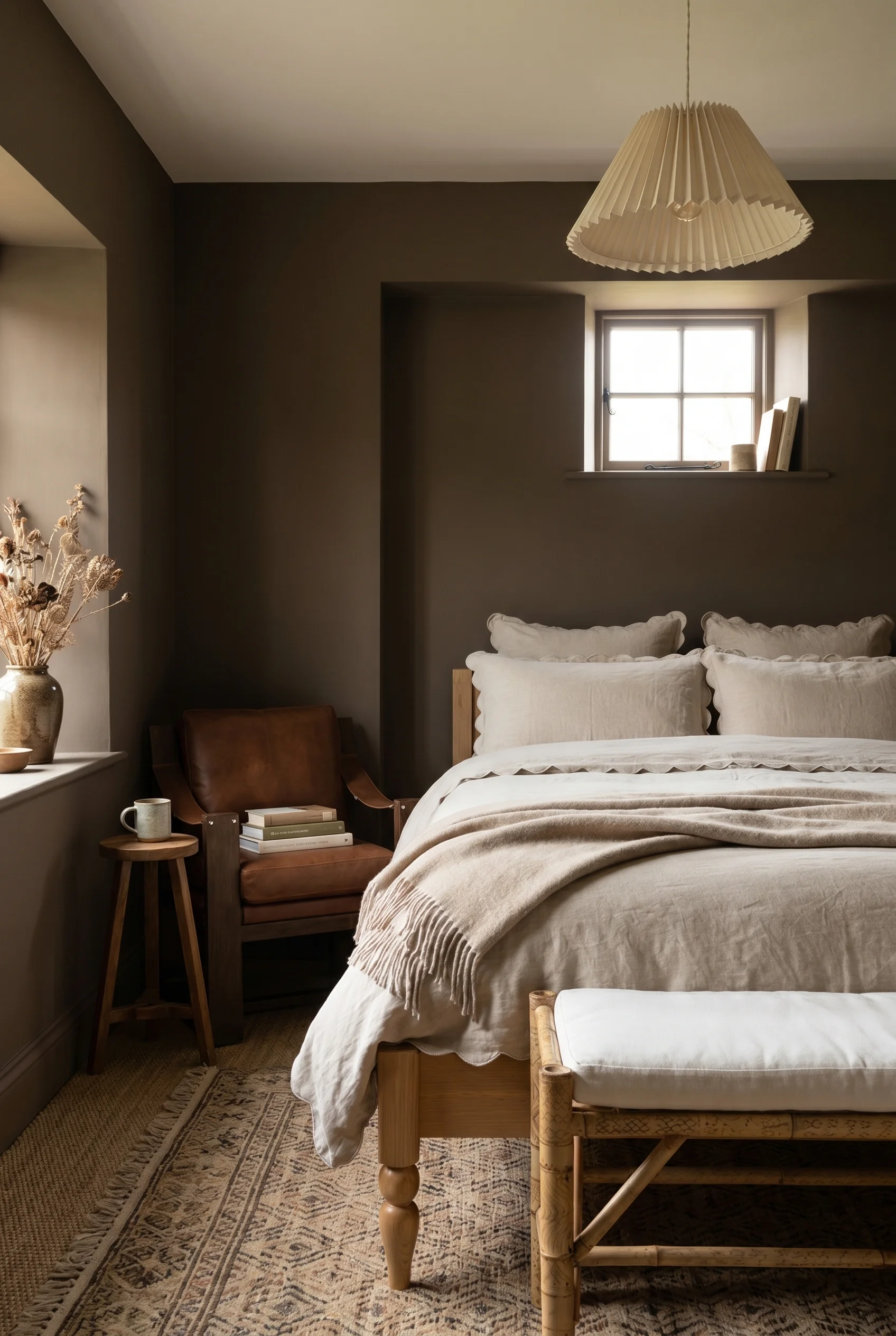
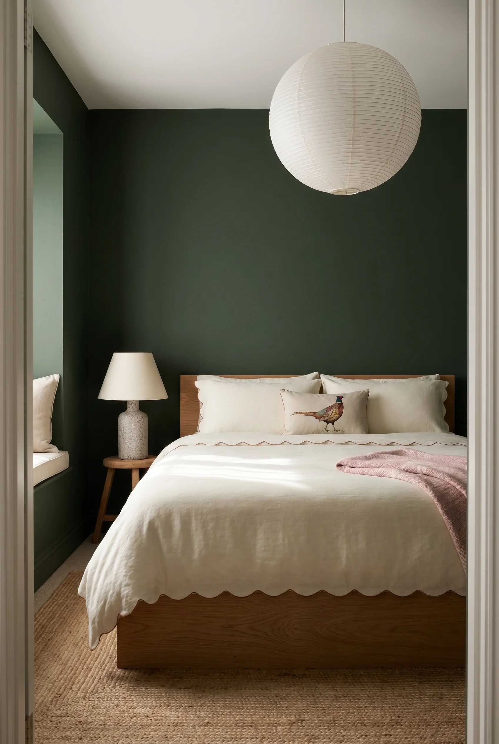
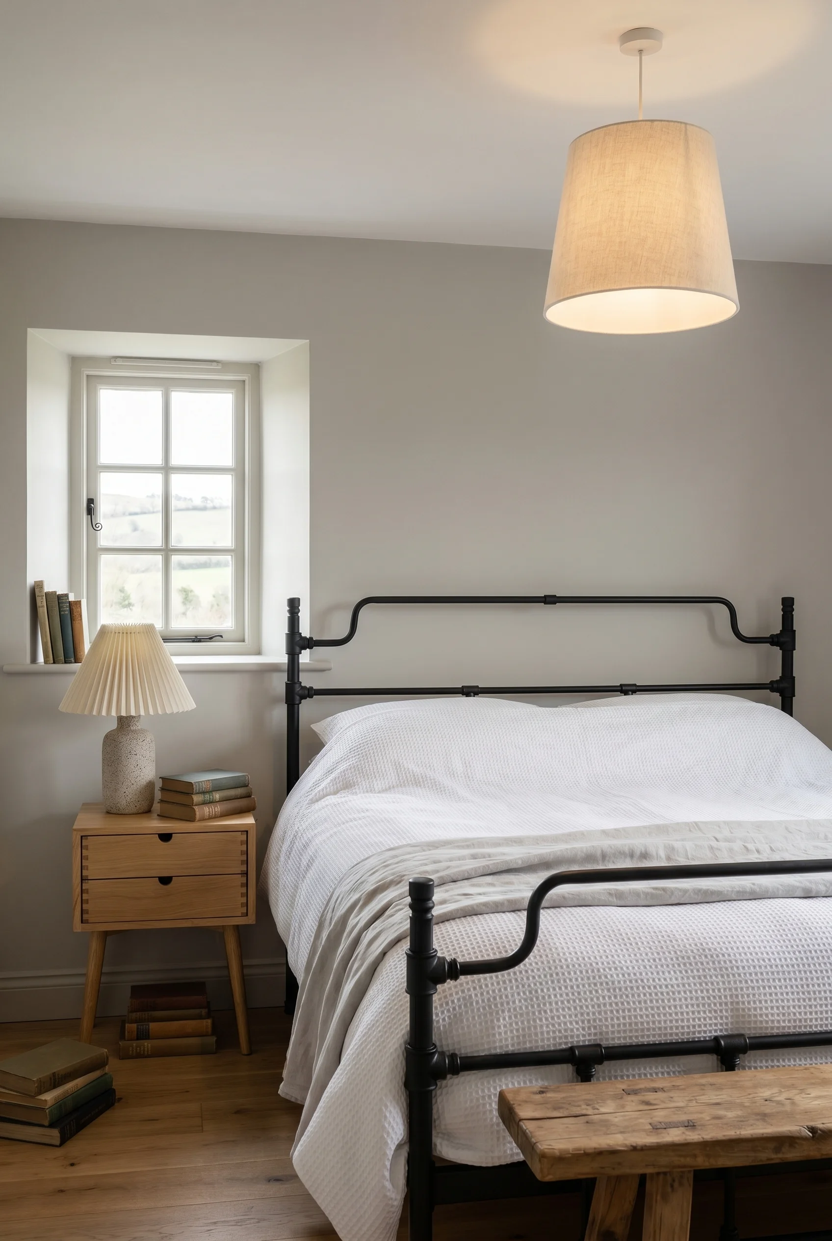
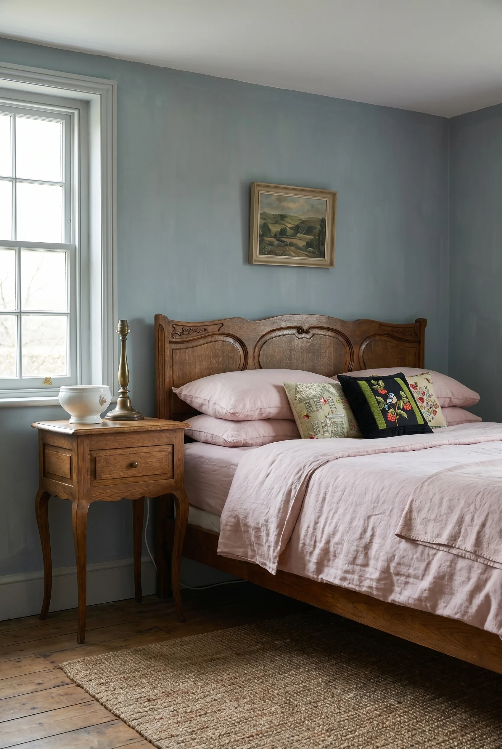
The pattern mixing rule that actually works is the one Ben Pentreath has been quietly teaching for years: one floral, one geometric, one solid texture. A large scale chintz on the duvet, a smaller gingham on the shams, and a solid linen bolster or throw that gives the eye somewhere to rest. Vary the scale so florals are larger than geometrics, keep the palette tight (three colours maximum across all three patterns), and you can’t make it look wrong.
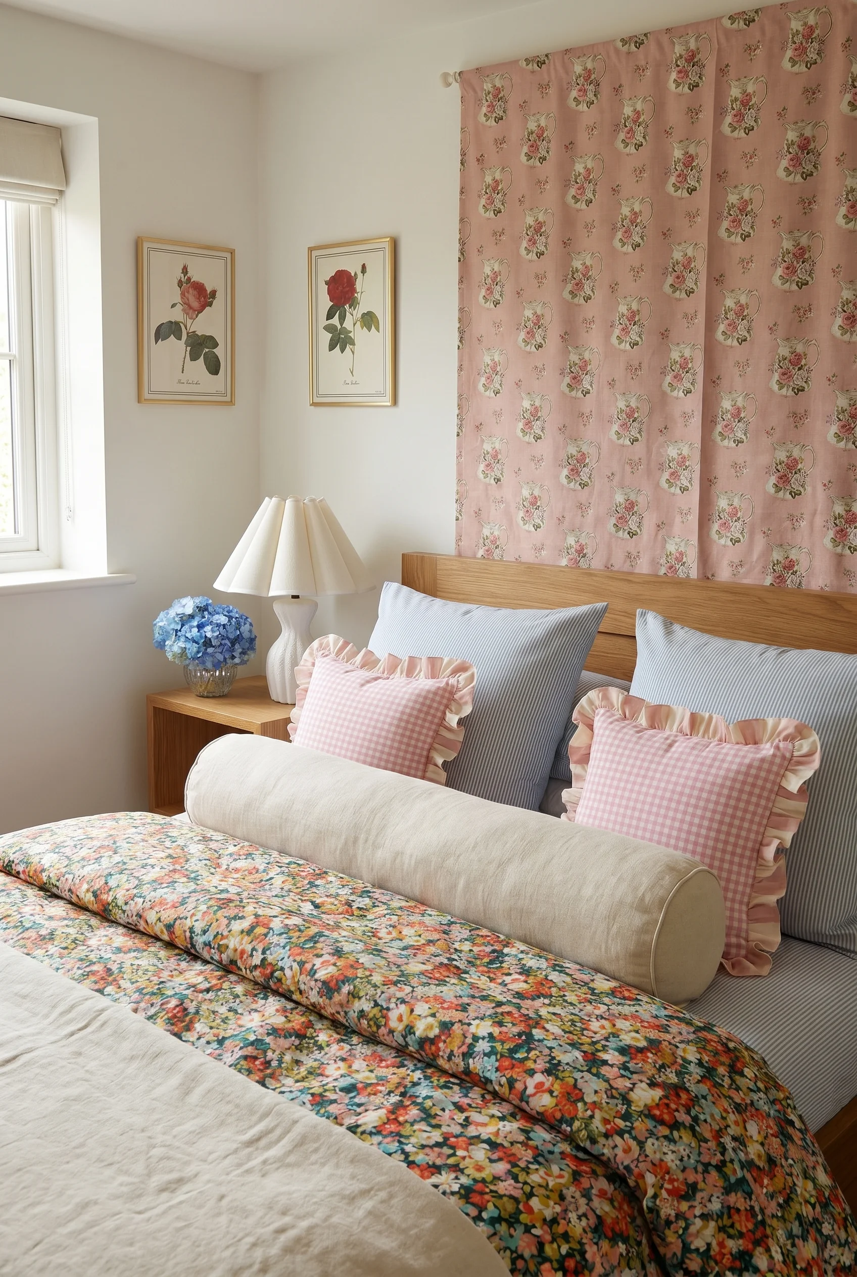
Where people go sideways is scale. A medium floral paired with a medium stripe is the most common bedding mistake I see, because both patterns compete for the same visual weight and the eye has nowhere to settle.
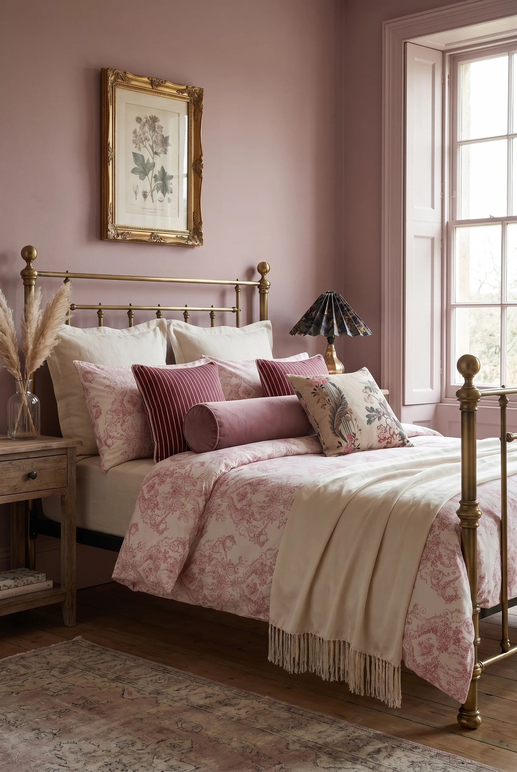
The principle is hierarchy: one dominant pattern (largest in scale, usually the duvet), one supporting (smaller, usually pillows or shams), one solid (textural, usually the throw). If your bed feels busy, it’s almost always because two of your three elements are the same scale.
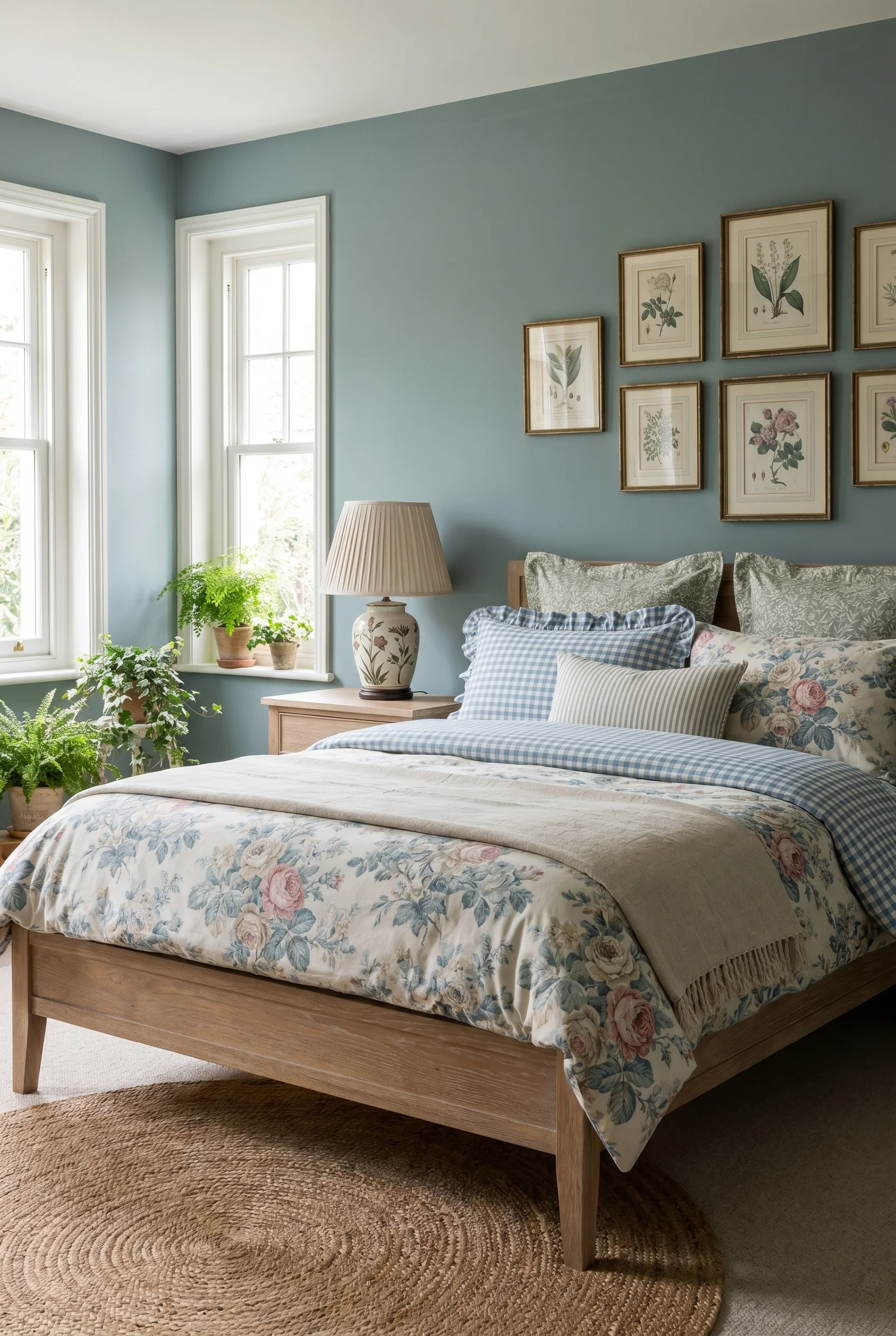
The materials do a lot of the work. Washed linen reads as both pattern and solid depending on light, because the slub of the weave gives it built in texture. A cotton chintz with a slightly faded floral looks more heritage than a crisp new one, which is why vintage sheets from eBay or Etsy are worth the dig. Layered over a quilted linen coverlet and a plain chambray sham, you’ve got pattern mixing that looks collected rather than styled.
One addition worth making: block print. Indian block printed cotton fits cleanly into the small geometric slot and works harder than gingham because the irregular hand printed texture reads as artisan, not preppy. Rebecca Atwood, Les Indiennes, and Soane Britain all do versions. Layered with a classic English floral like Colefax and Fowler Bowood or a Farrow and Ball Rangwali, you get the mix that looks as though someone’s grandmother built it over forty years of Sunday markets. Before you pick any of this, though, the scale of the room itself needs to be right.
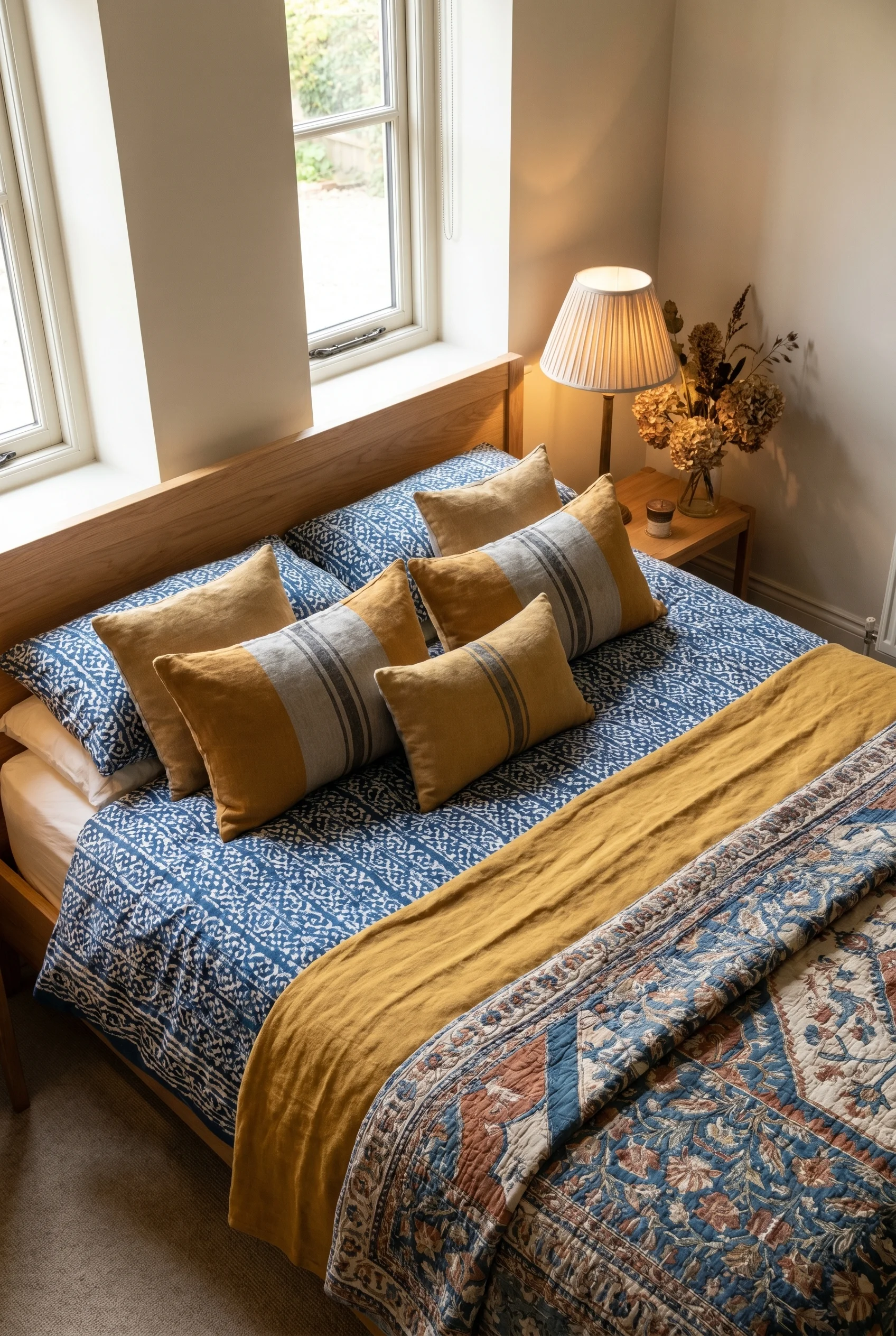
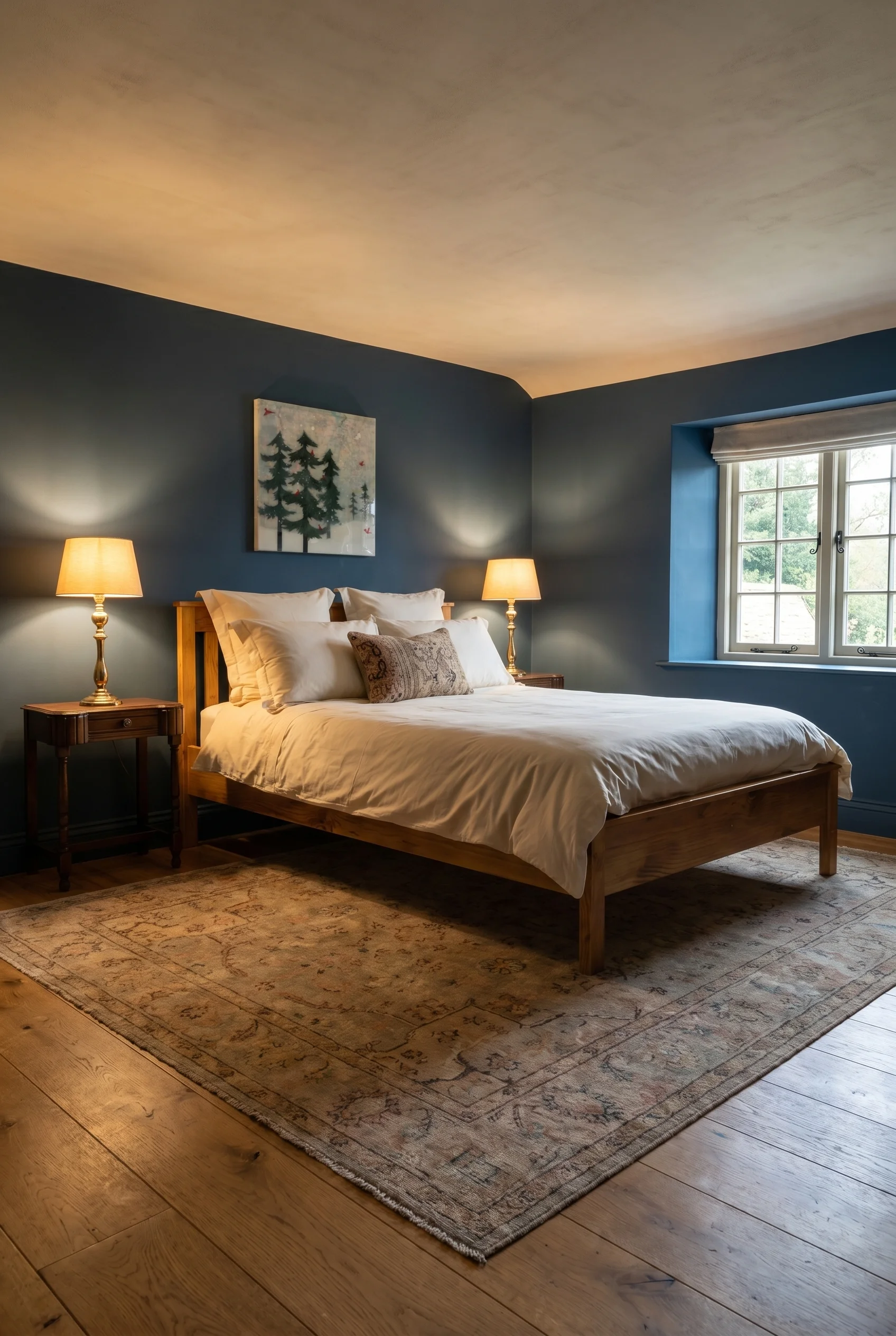
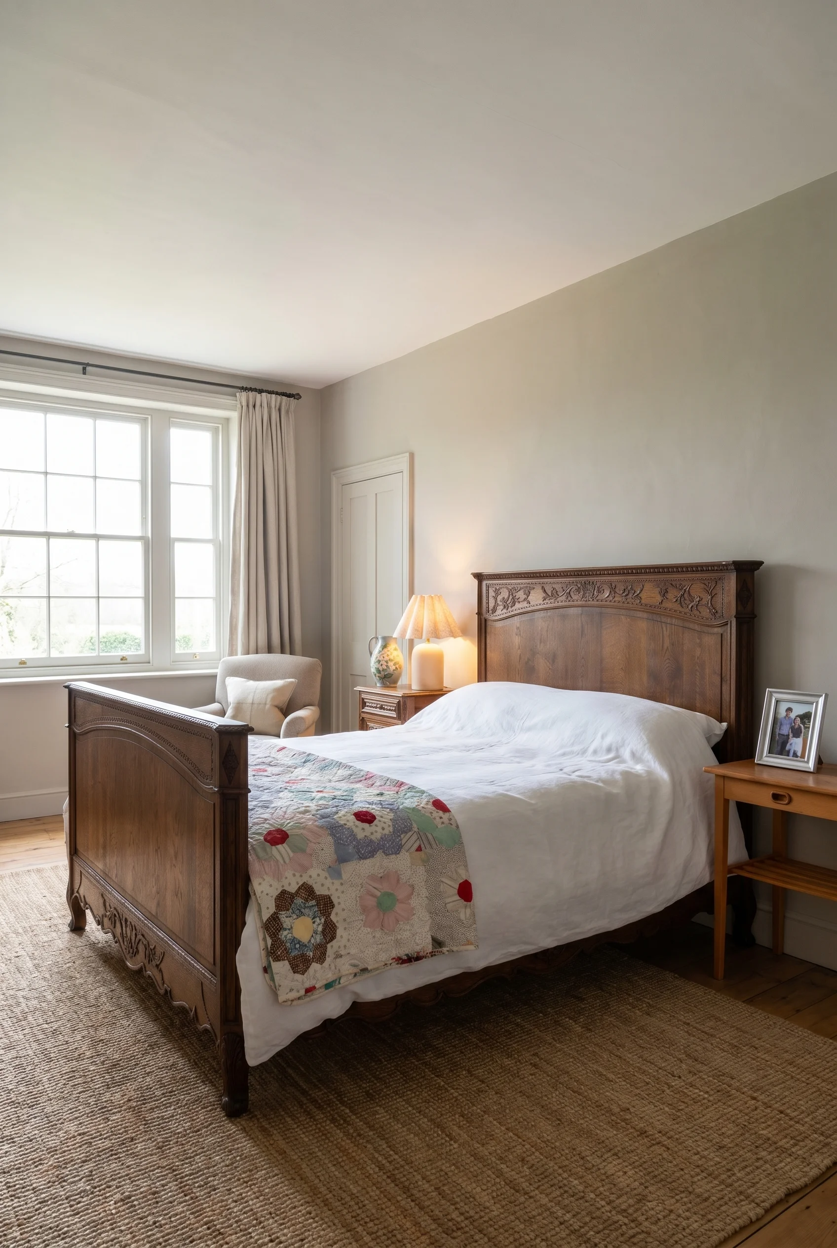
Scale mistakes in bedrooms are worse than anywhere else because beds are oversized objects relative to the rooms they sit in. Two non negotiable numbers live in every design book I trust: 40 to 60 centimetres of clearance on both sides of the bed, and side tables no more than two inches taller or shorter than the top of the mattress. Break either and the room reads as cramped regardless of how beautiful the individual pieces are.
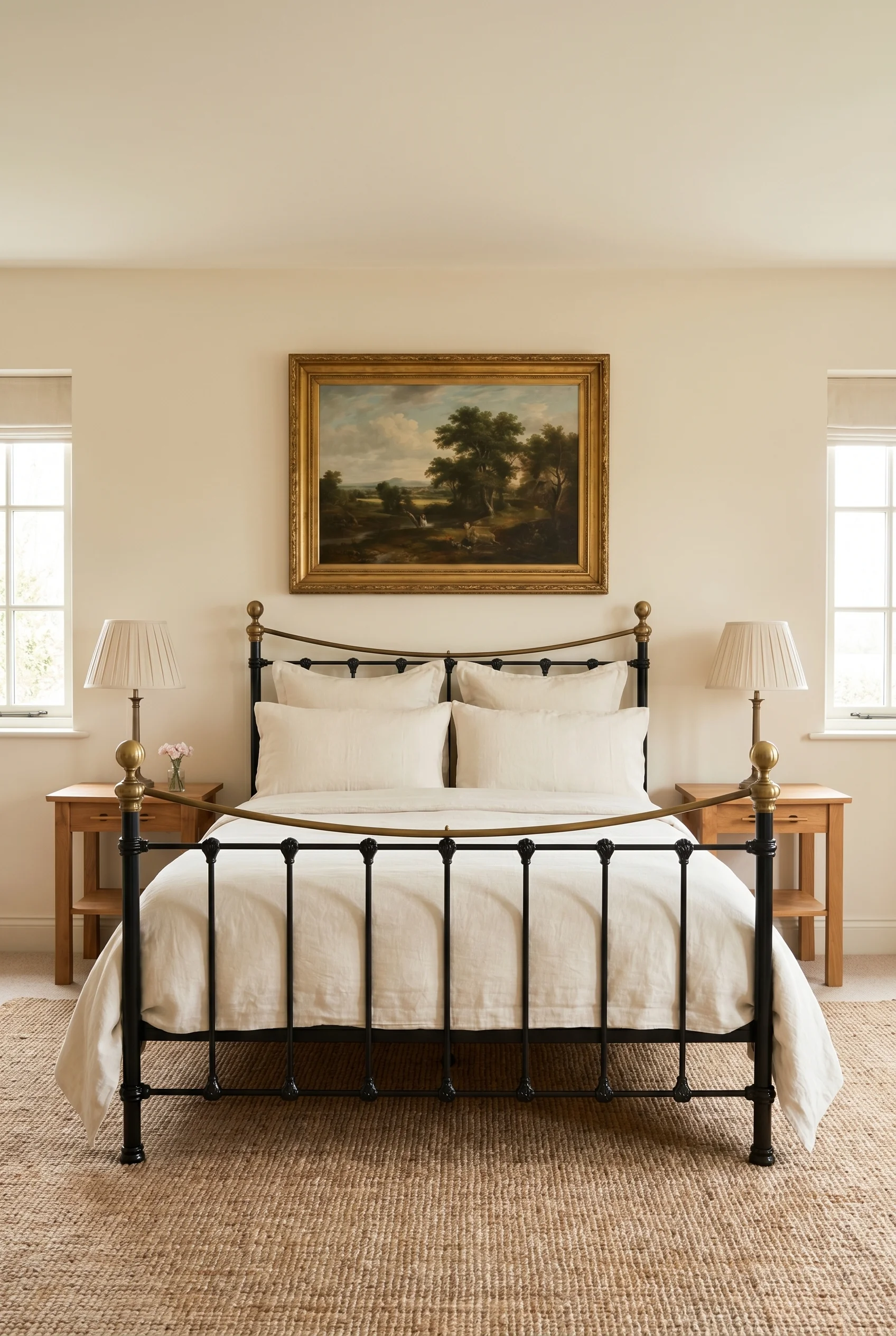
On bed size, the instinct is always to go bigger. A king in a room that should have a queen is the most common upgrade mistake. Once you’ve done it, side tables get pinched against the walls, drapes get pushed off to awkward angles, and circulation around the foot shrinks to a shuffle.
If you’ve got less than 11 square metres of floor and you’re not building an alcove, a queen is the correct answer, full stop. Save the king for the room that can actually carry it.
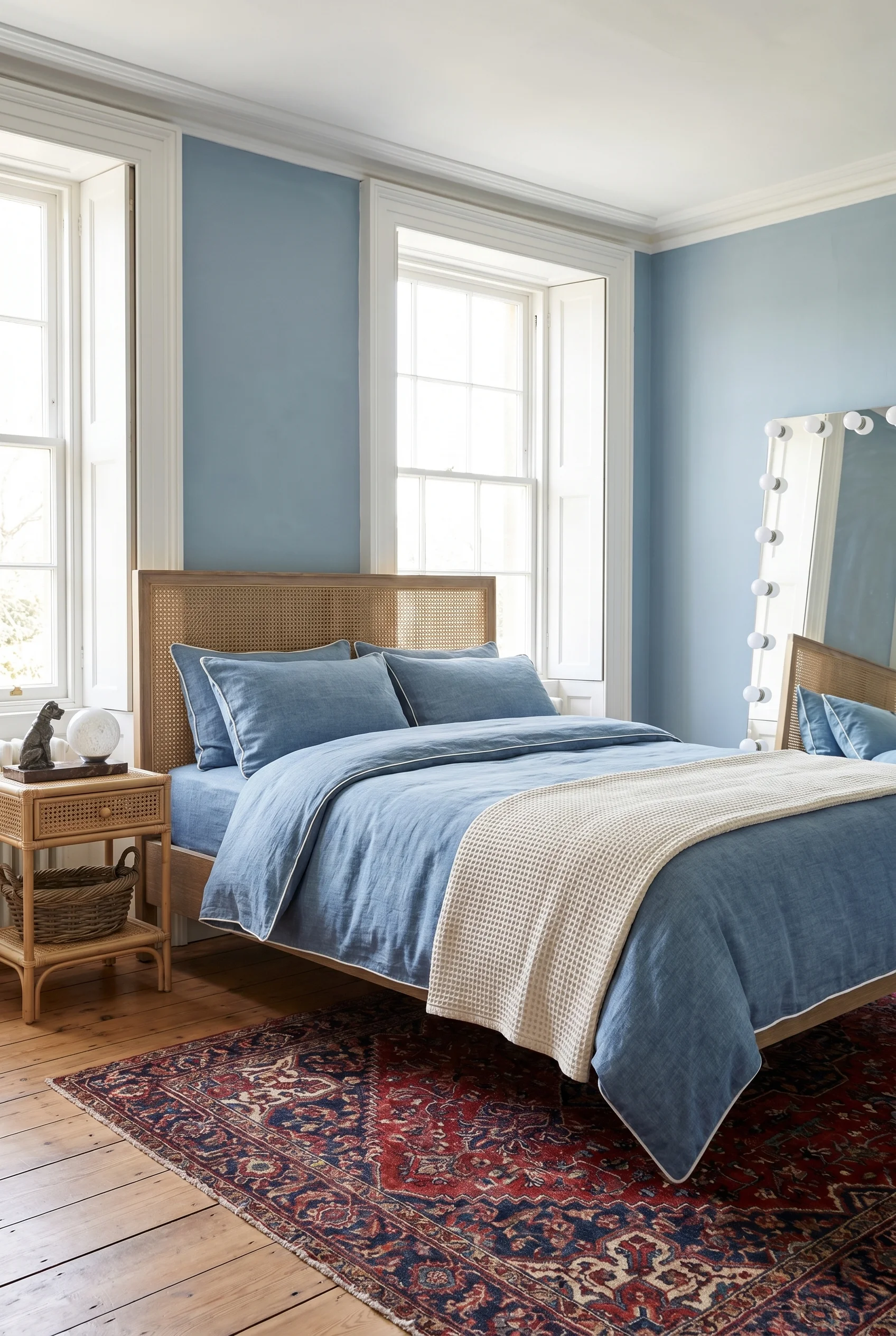
Side tables are the next failure point. Tops should align within two inches of the mattress height. Too tall and the table dominates the bed. Too short and you’re fumbling for your water glass in the dark. A turned leg Georgian bedside at the right height is doing twice the aesthetic work of a flat pack nightstand. If you’re combining new and old, measure first.
Rug sizing: a nine by twelve foot rug is the default for any bedroom ten feet wide or larger, positioned so the front two thirds of the bed sit on it. Smaller bedroom? Runners on each side of the bed is the Pentreath move I’d copy. They soften the floor, reduce cold feet on hardwood in the morning, and let you layer patterned runners over a plain sisal. Next comes the thing that most ruins an otherwise gorgeous bedroom: the lighting.
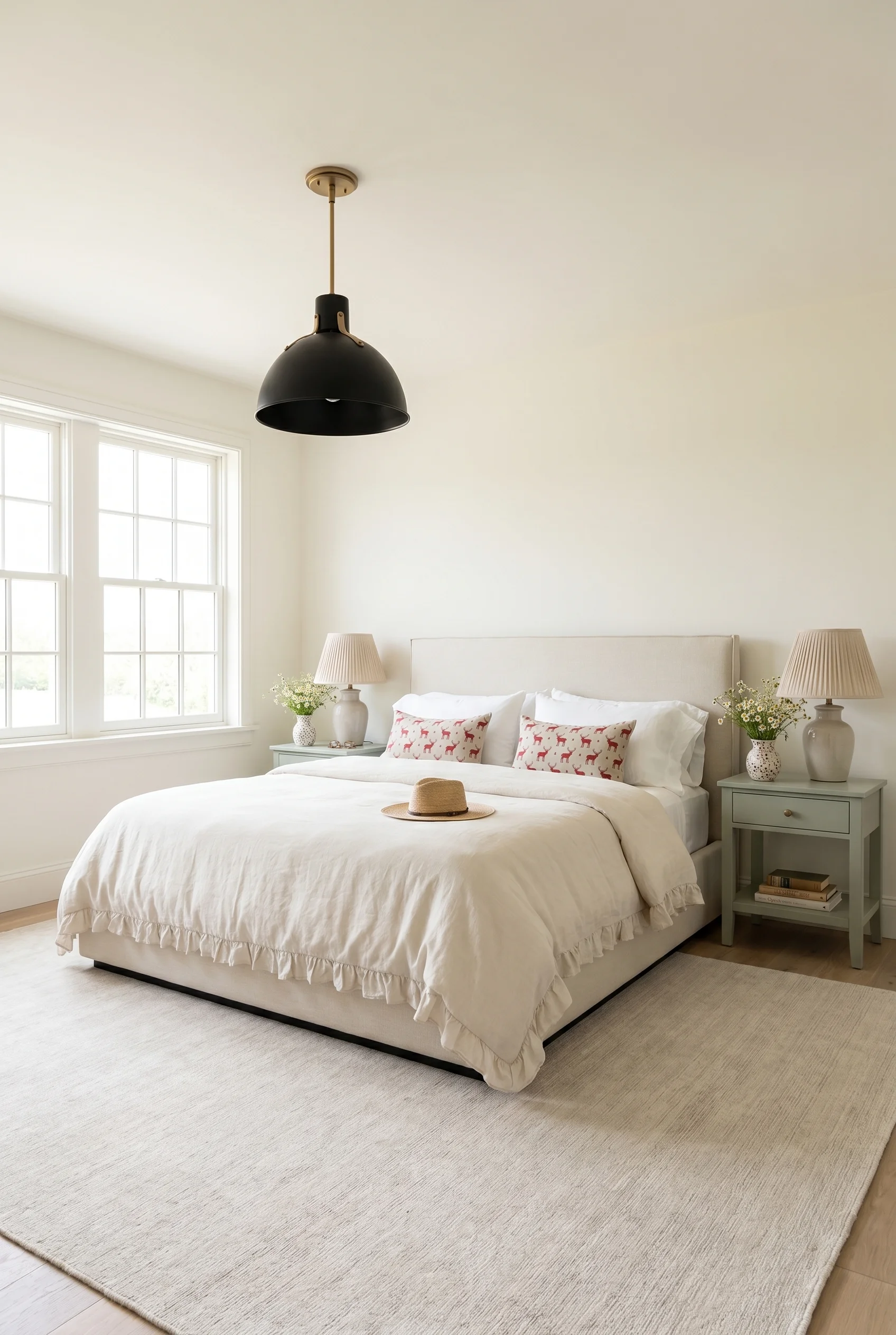
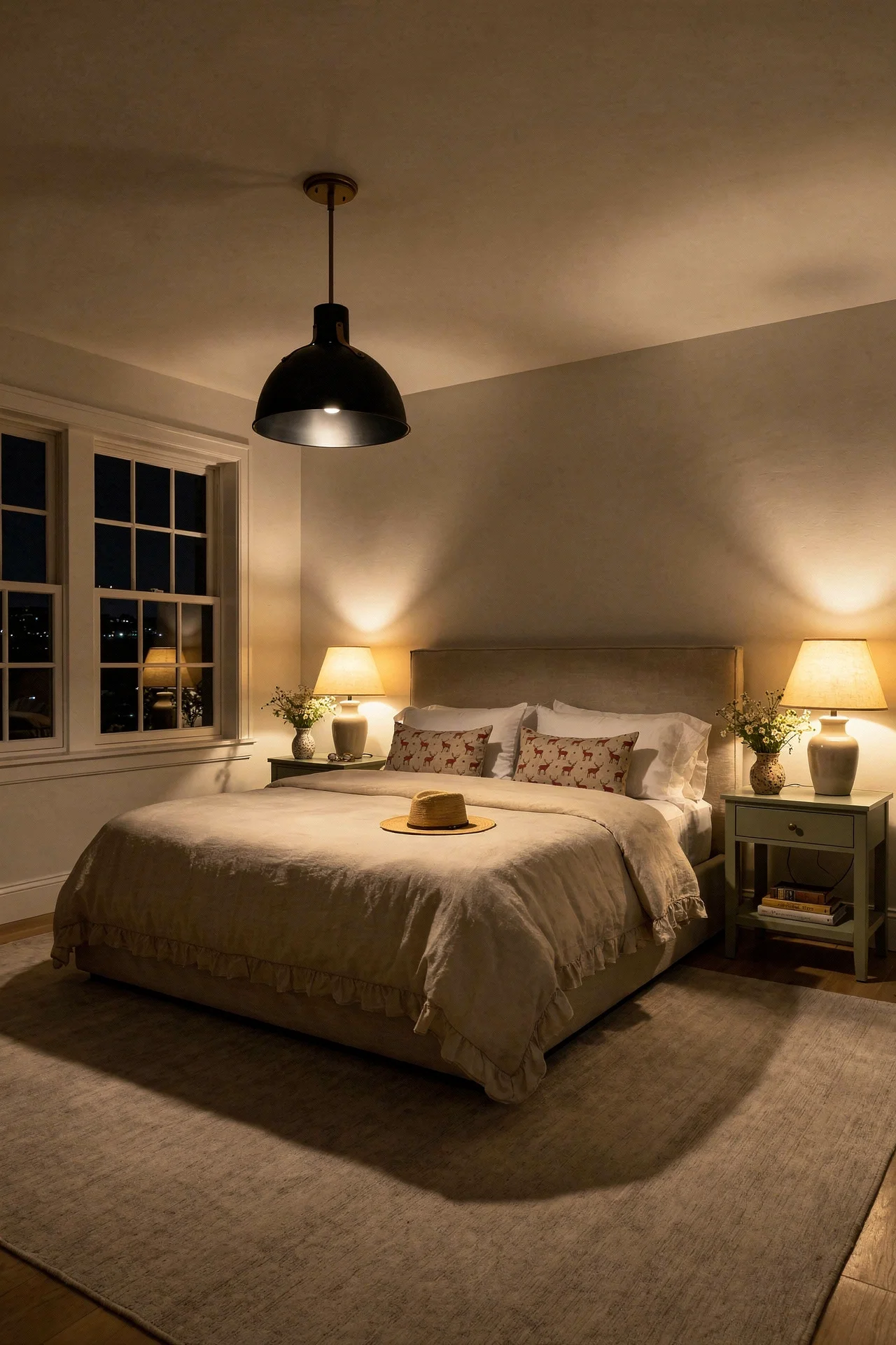
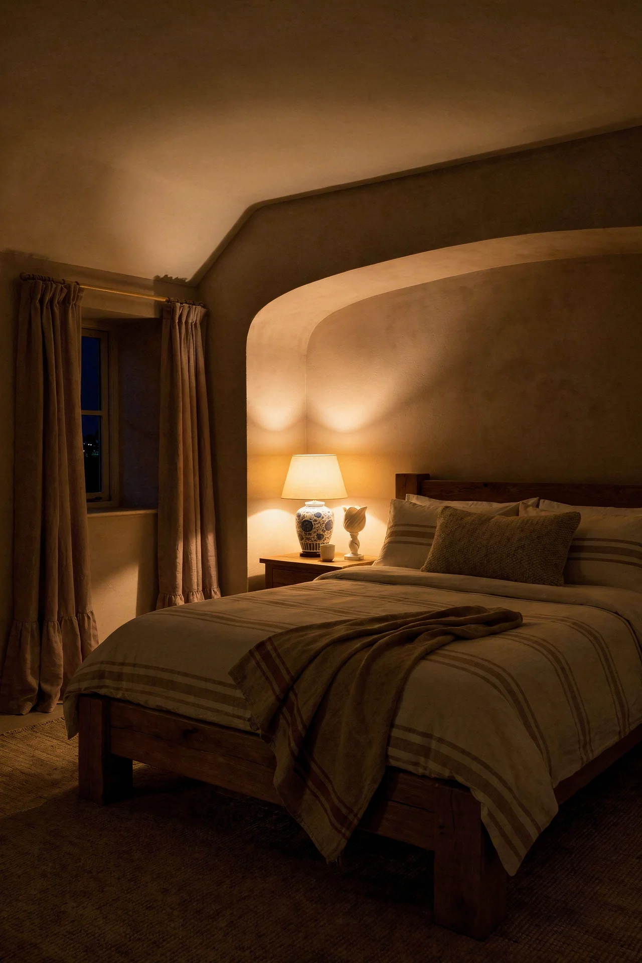
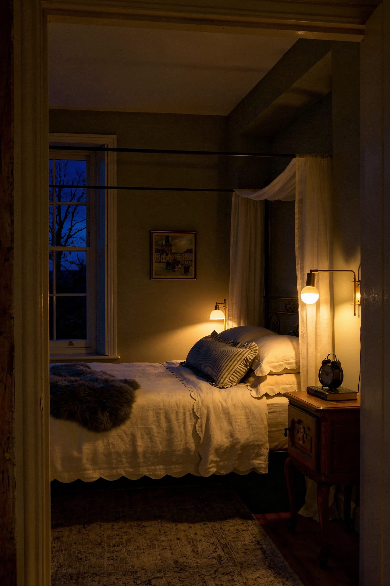
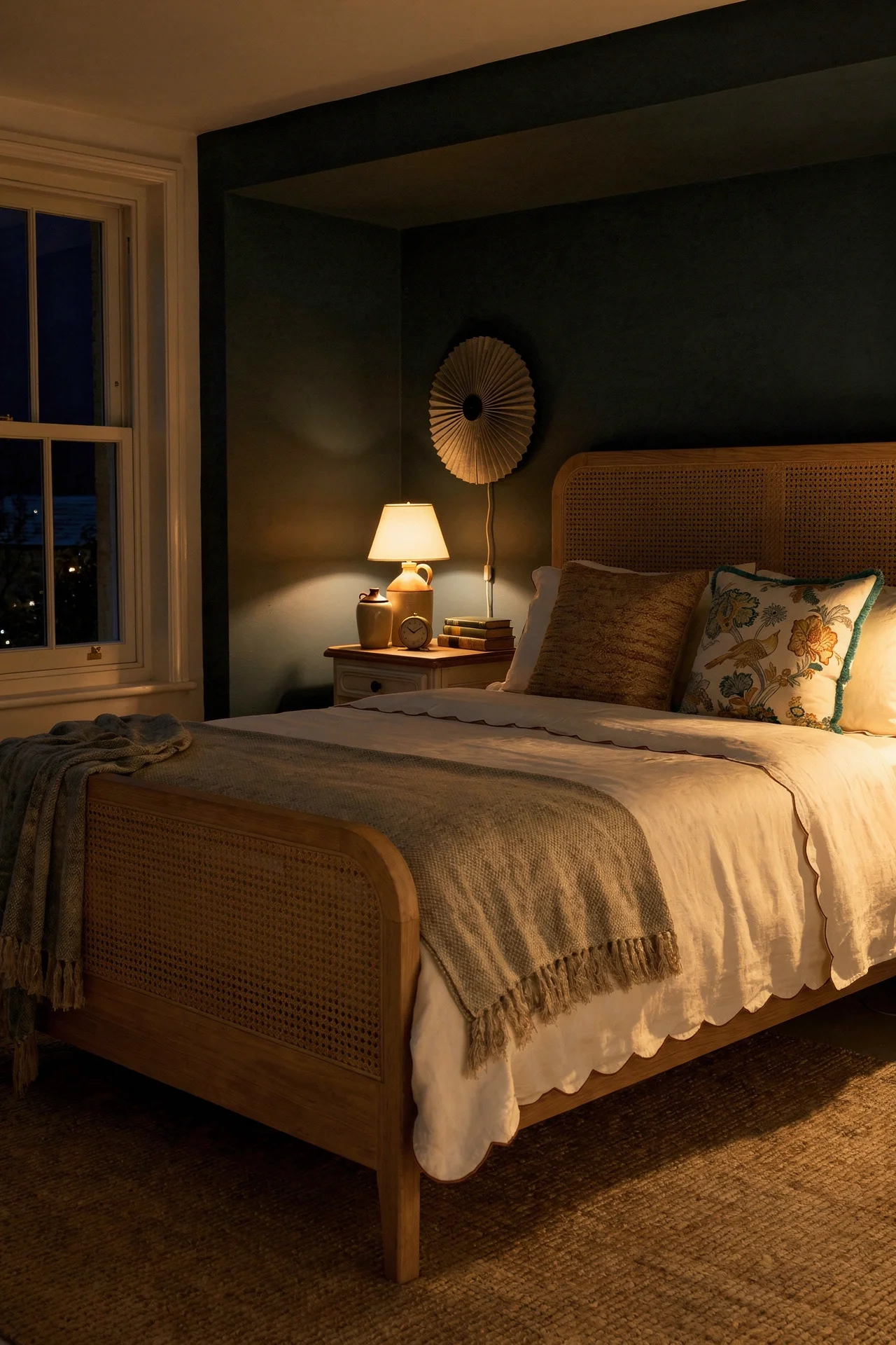
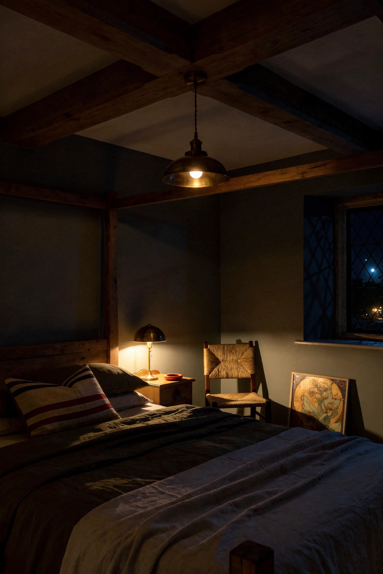
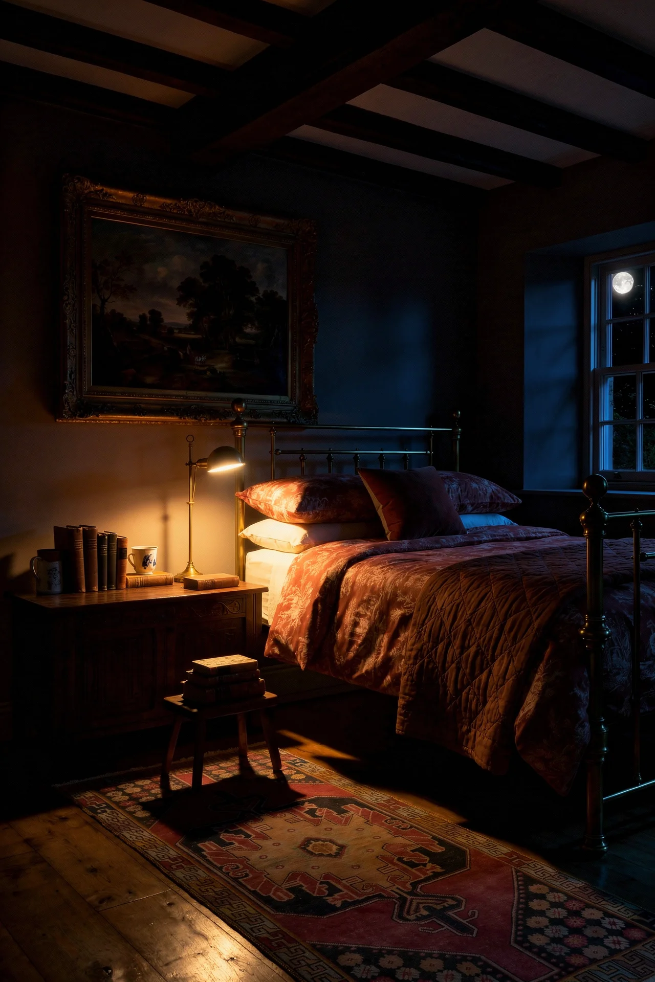
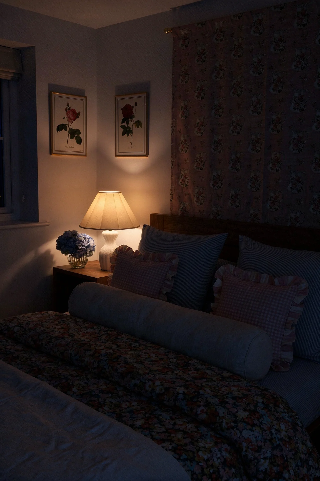
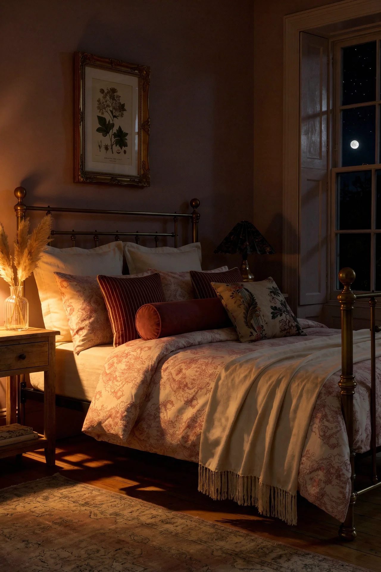
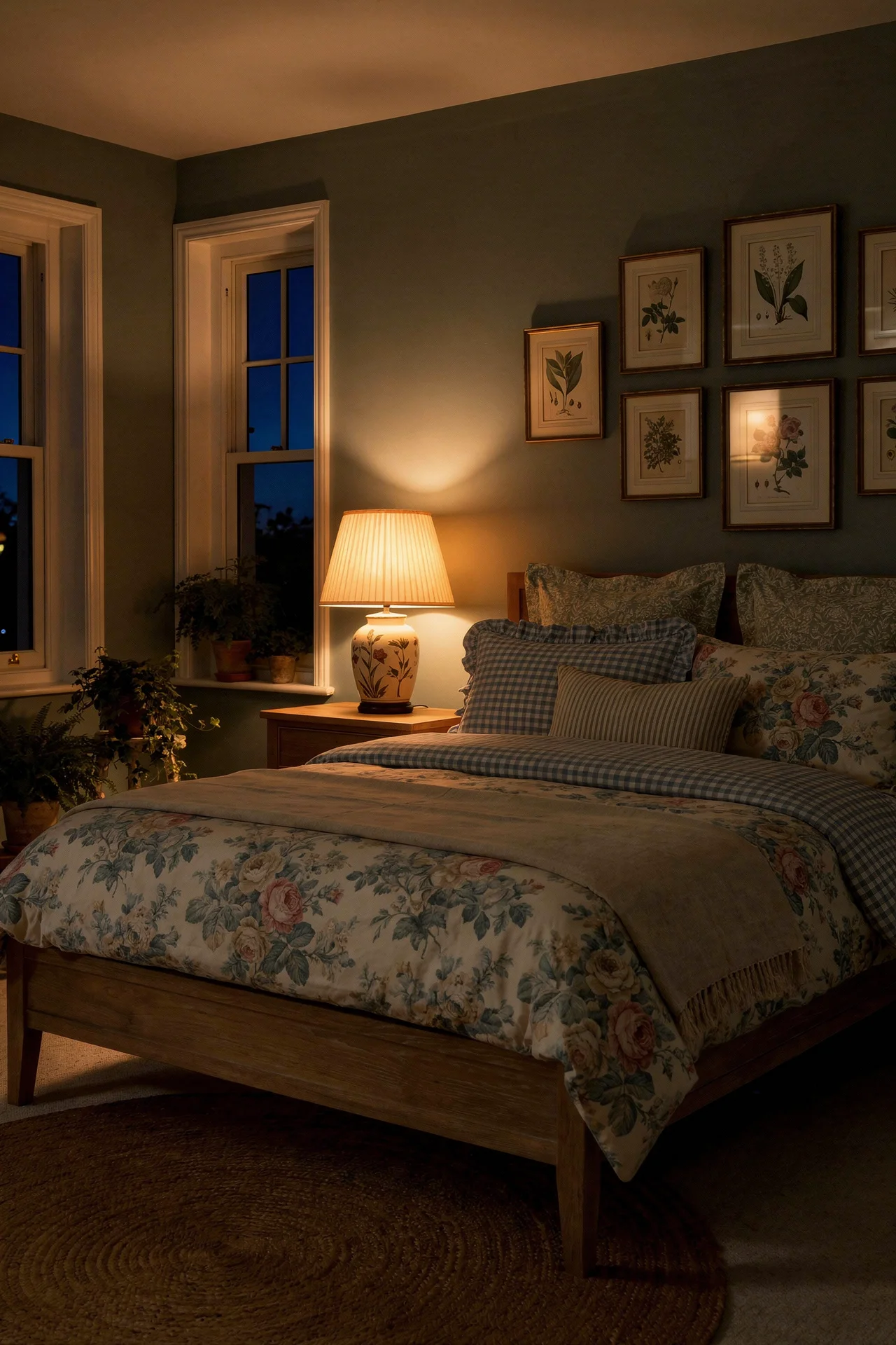
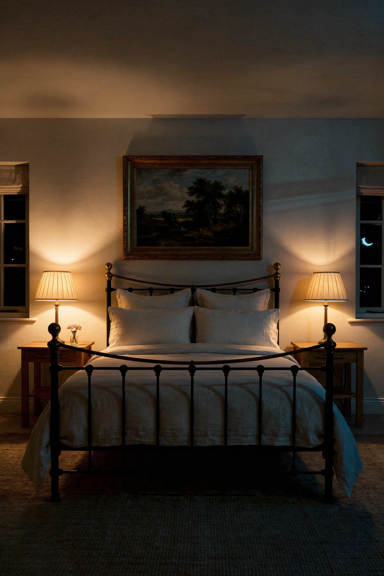
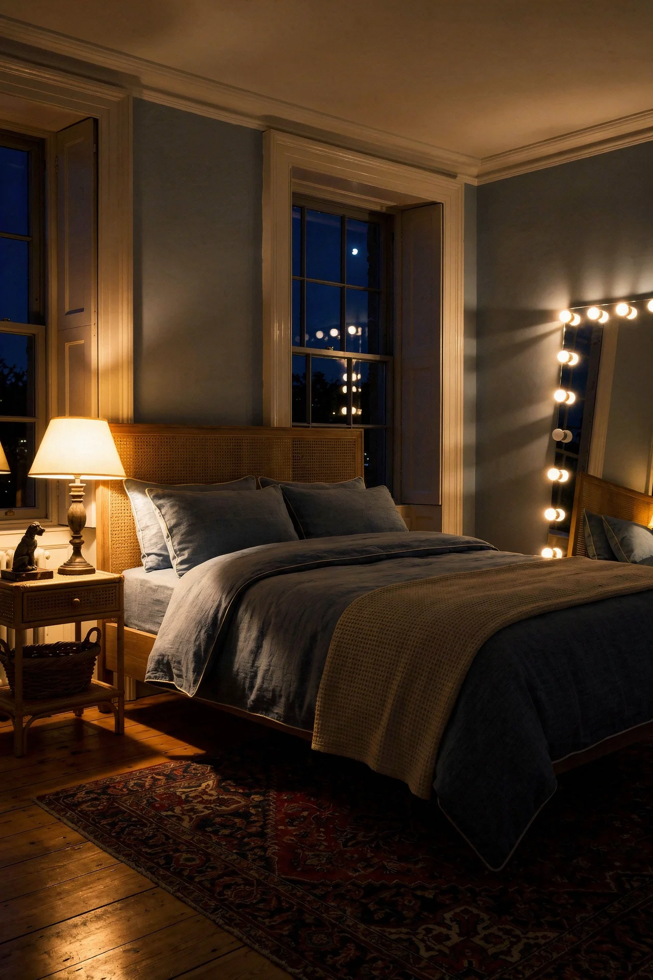
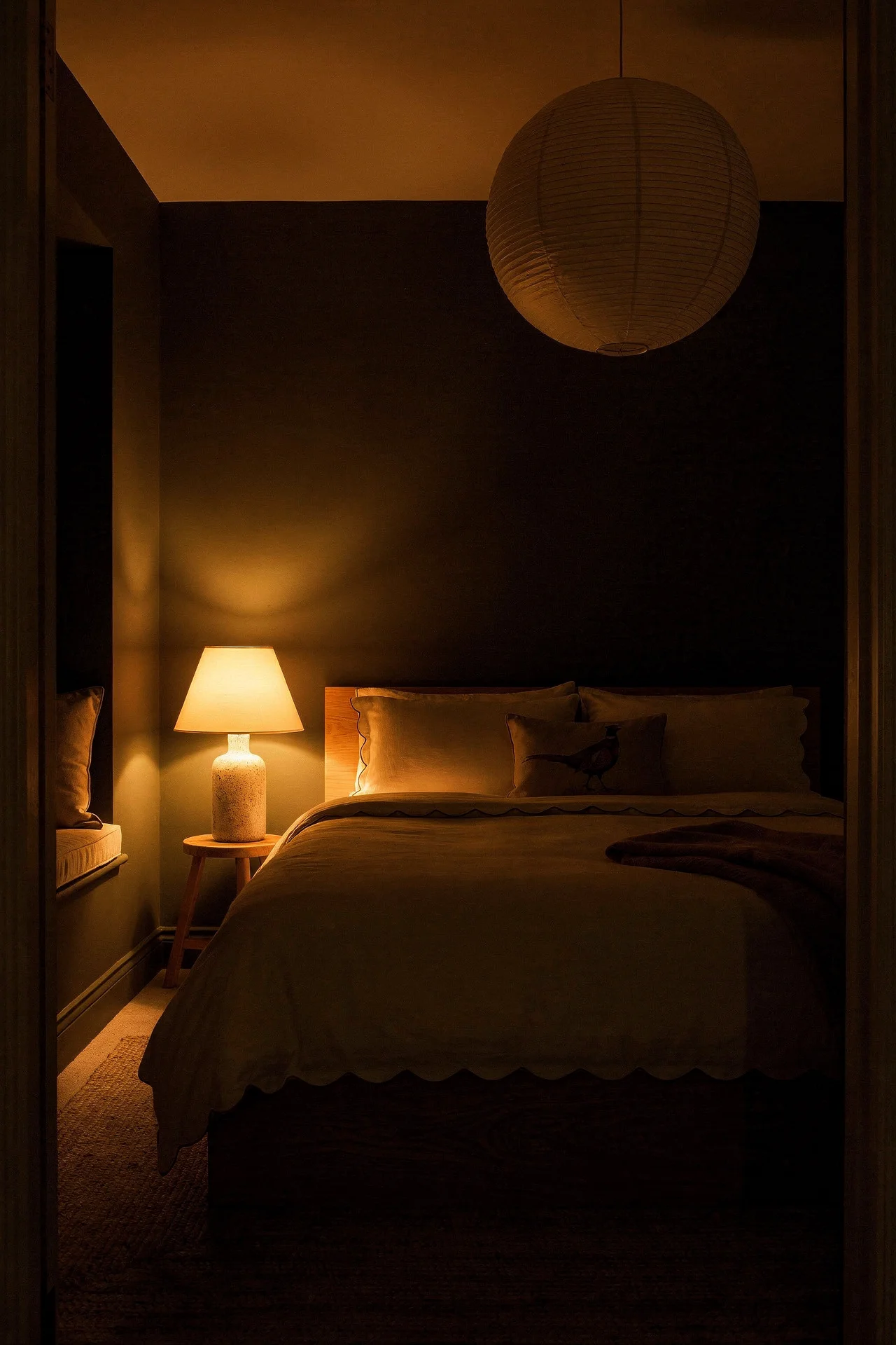
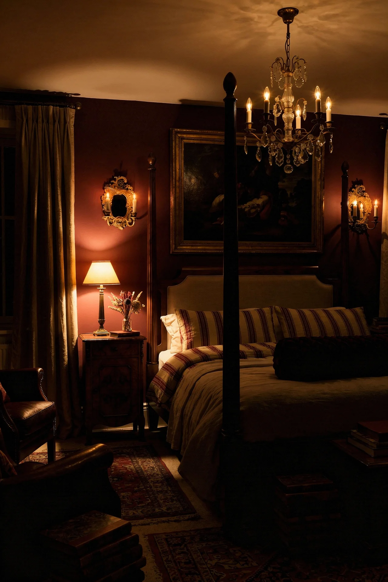
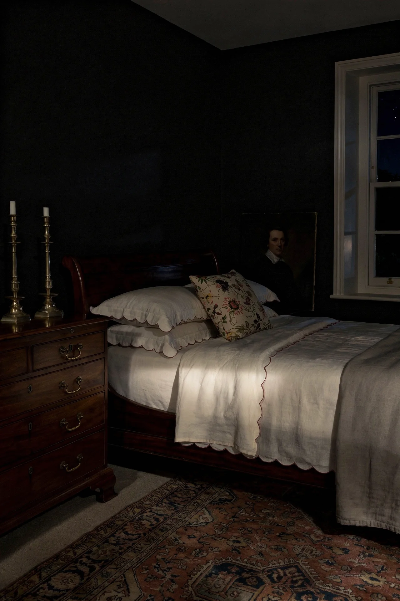
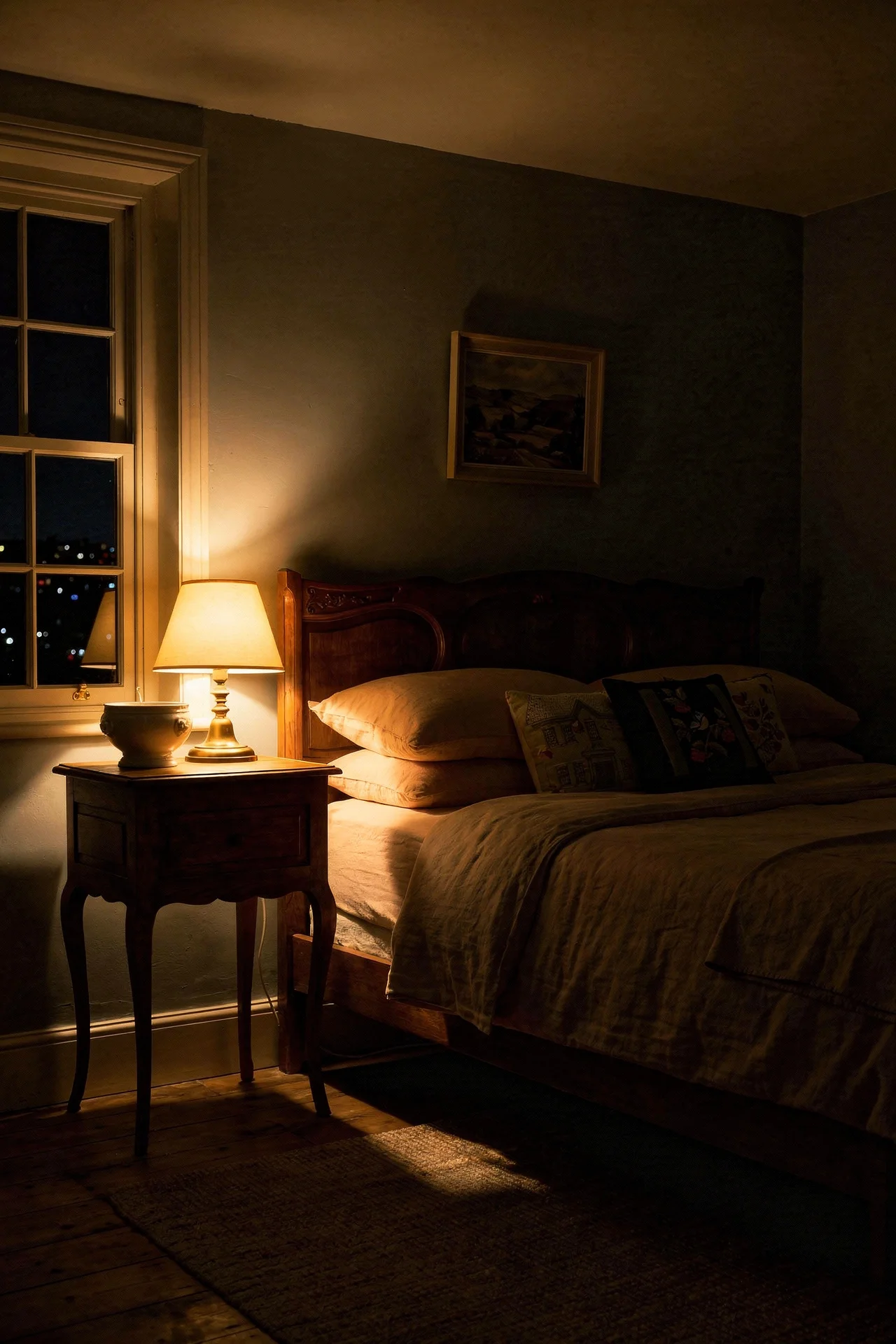
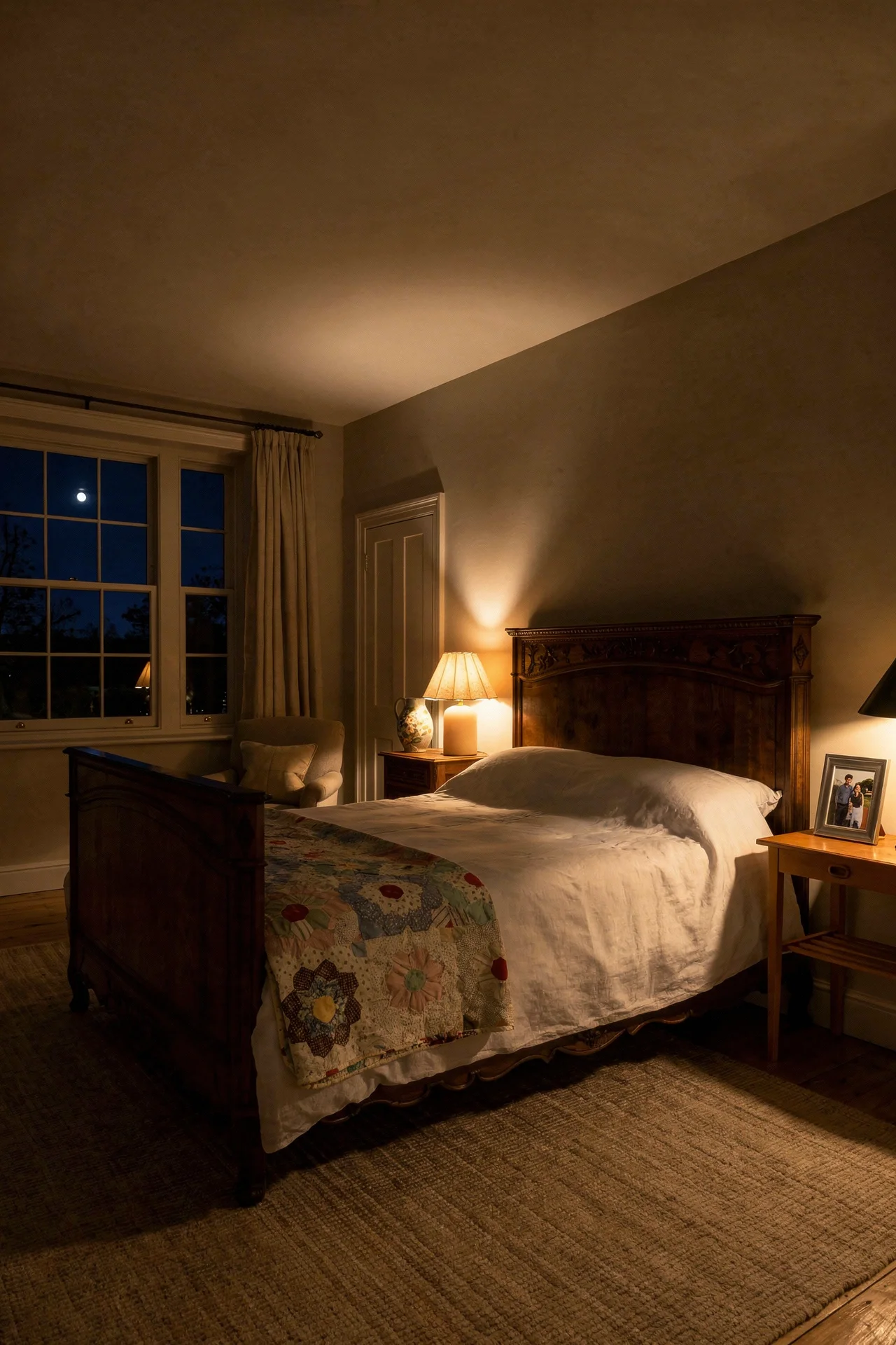
A pendant light hanging over a bed looks like a good idea in a magazine photograph and falls apart the moment anyone actually tries to sleep under it. The visual weight overhead, the way it intrudes on sightlines when you’re lying down, the bluish cast if the bulb is wrong, all of it conspires against the calm a bedroom is supposed to deliver.
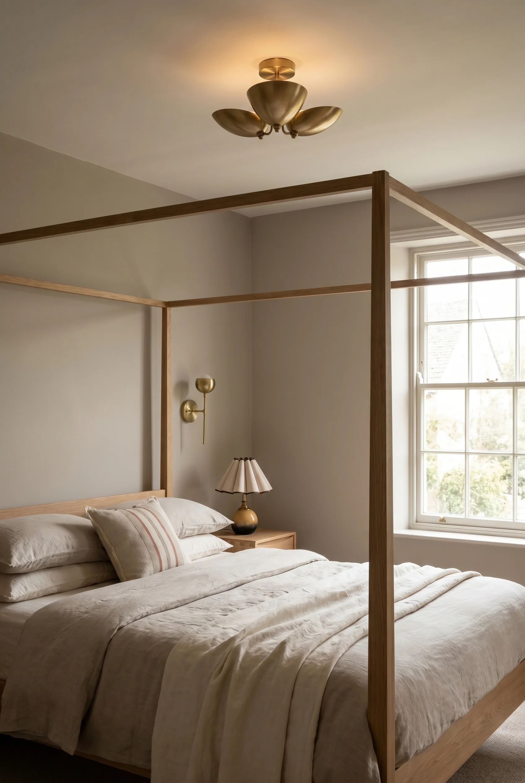
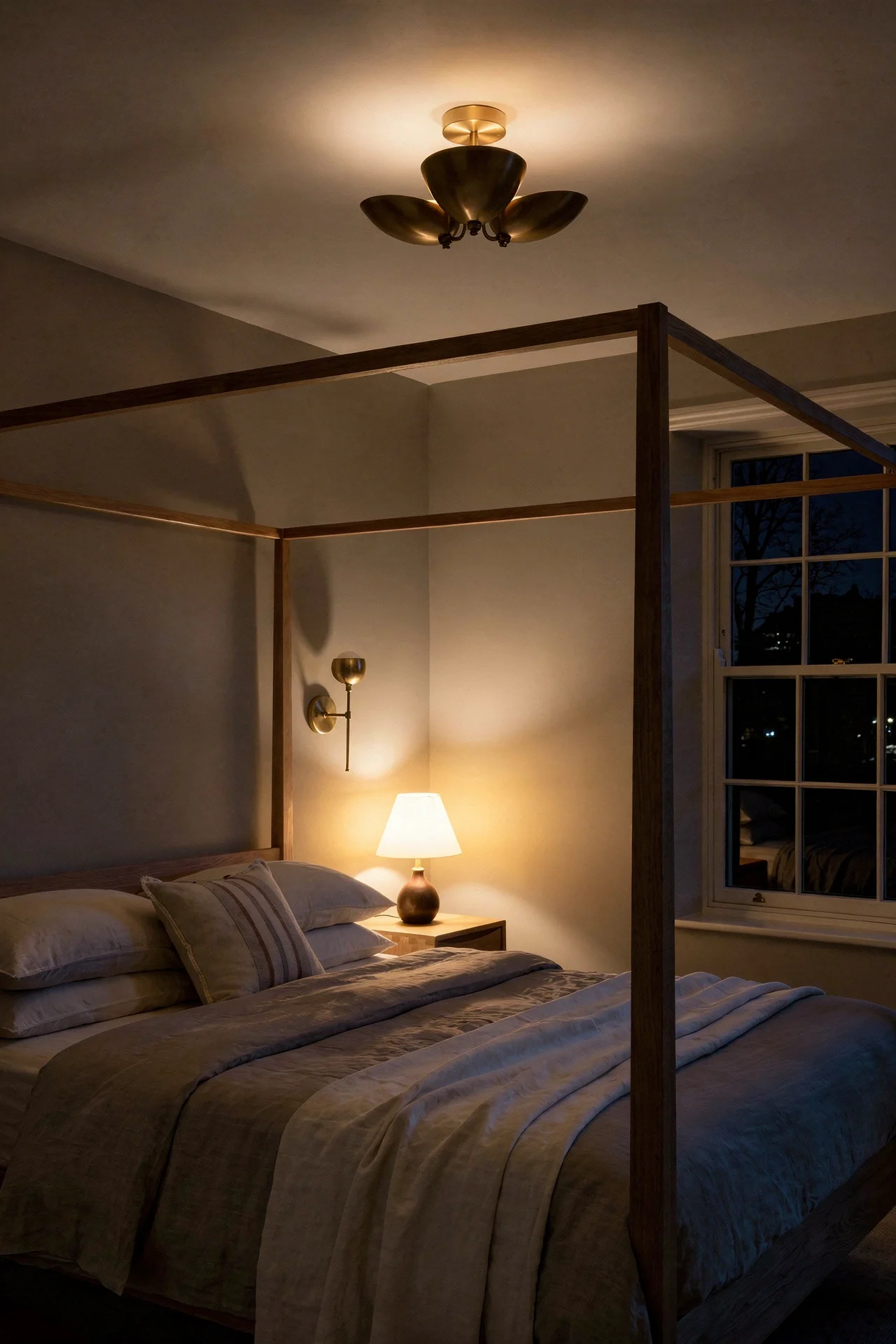
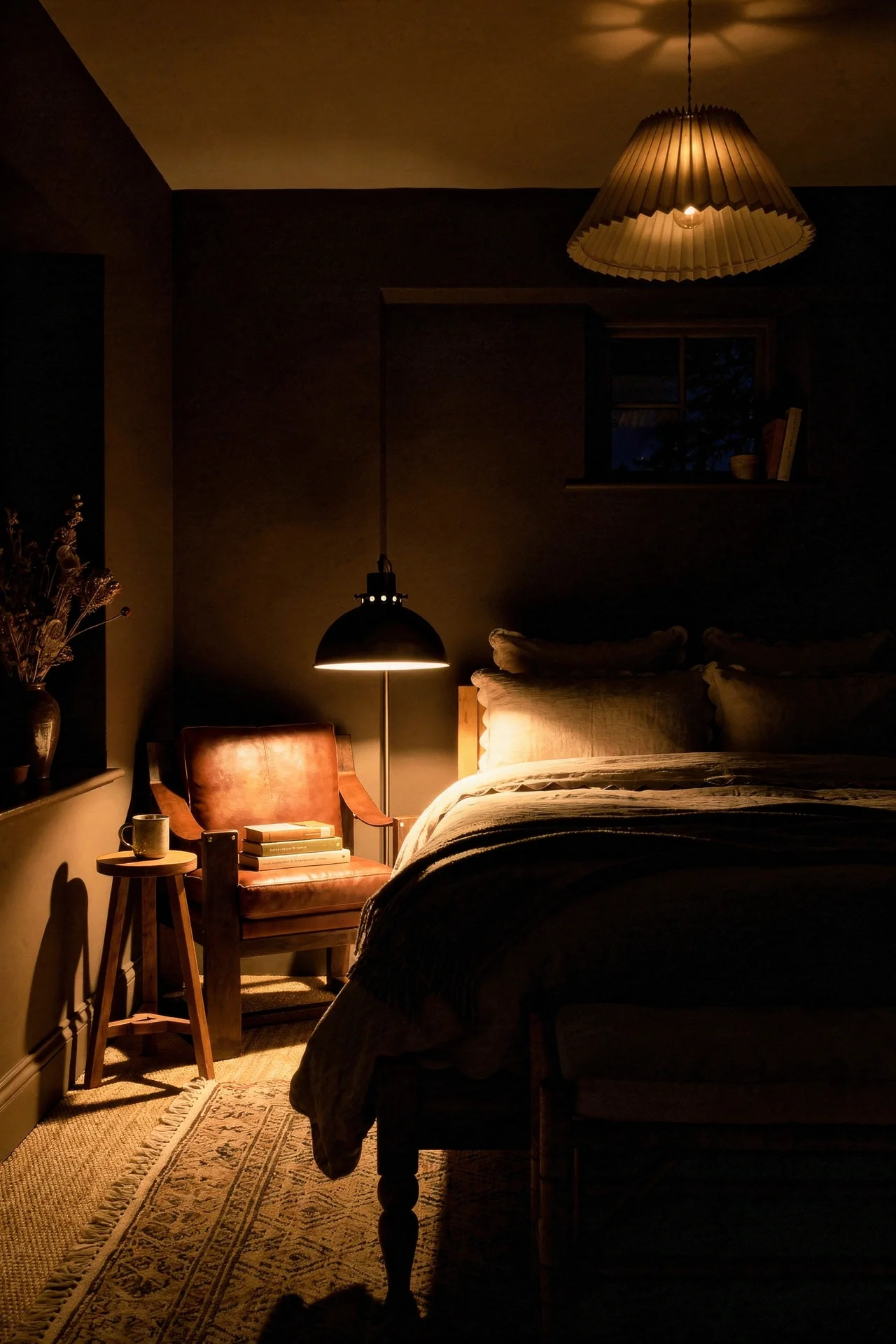
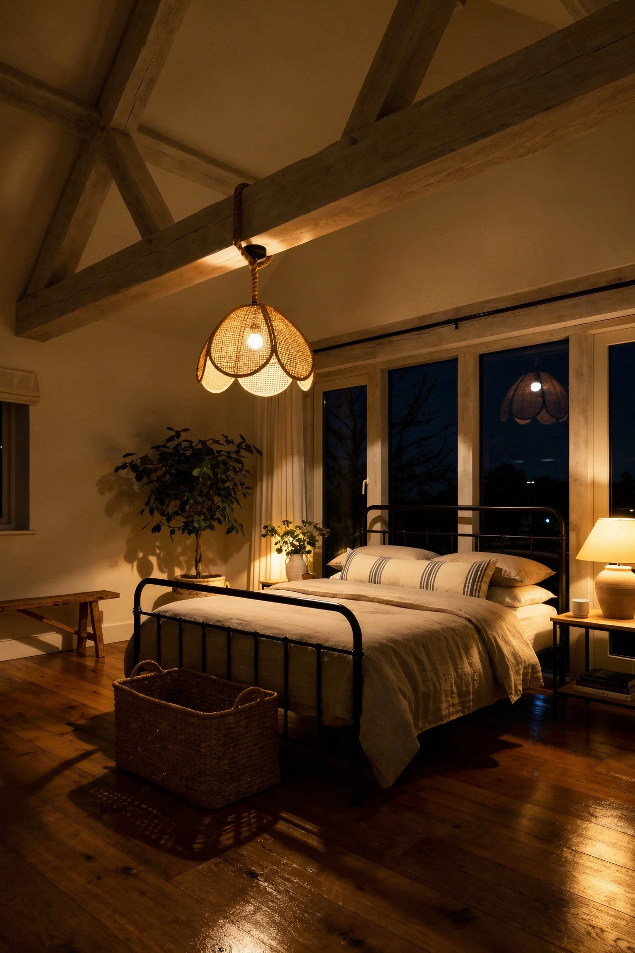
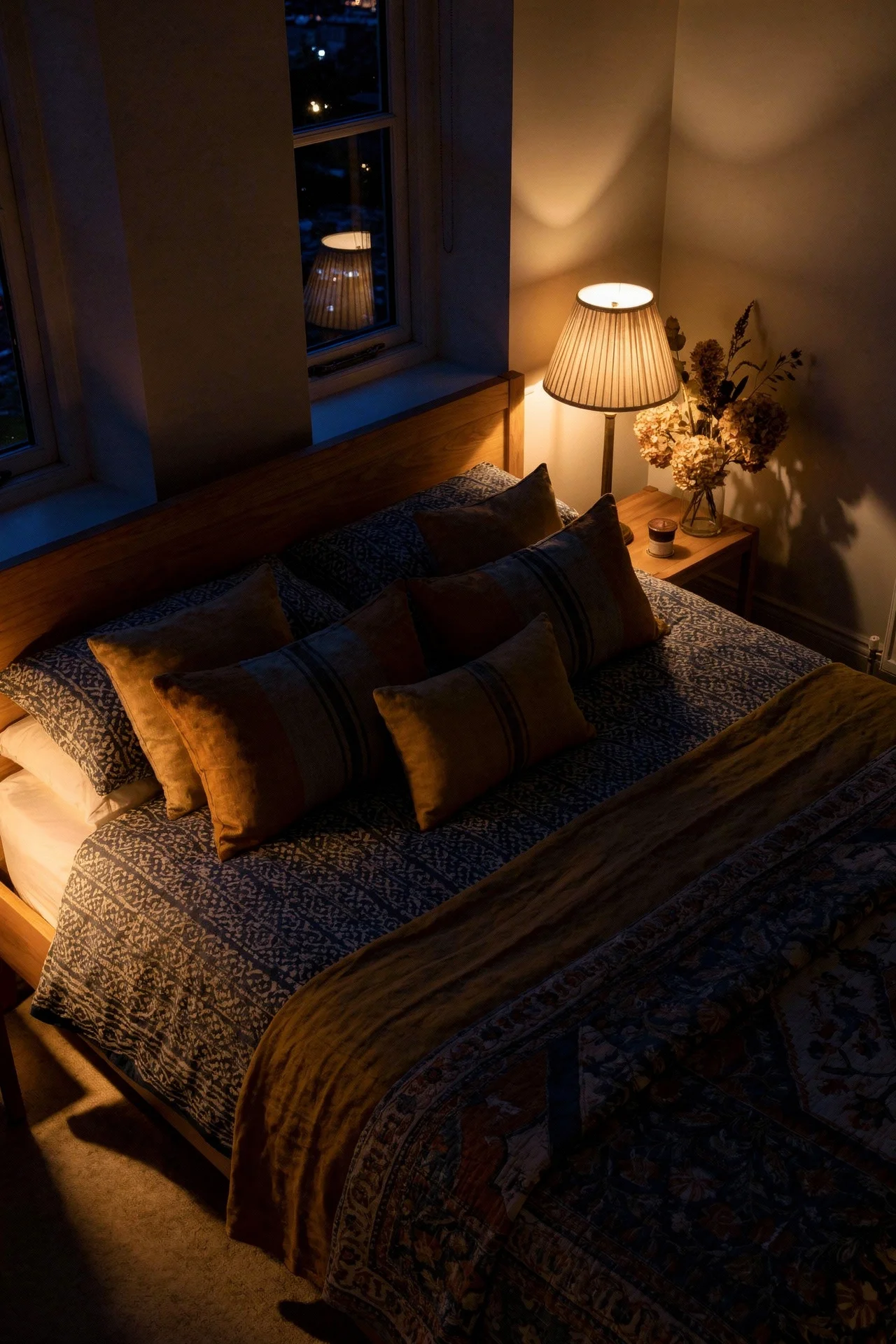
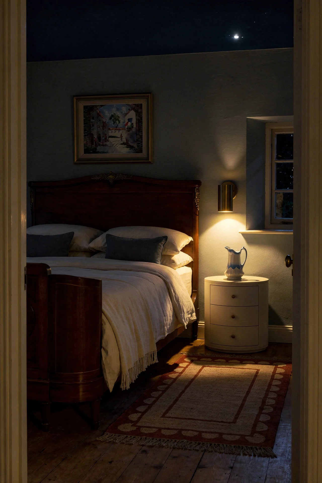
The fix that the Cotswolds interiors I keep admiring all share is a rattan, ceramic, or milk glass flush mount, paired with warm 2700K bulbs and at least two layered lamp sources on nightstands and one on a dresser. Flush mounts are having a genuine moment because the design community finally admitted that low hanging pendants in a room with anything under ten foot ceilings are just bad for the head.
A textured flush mount (Pooky, Rejuvenation, and the Anthropologie Living collection are doing lovely ones) sits close to the plaster and gives a diffuse, indirect wash of light without ever being the thing you notice. If you want pattern or weight overhead, use a beam. Let the light be quiet.
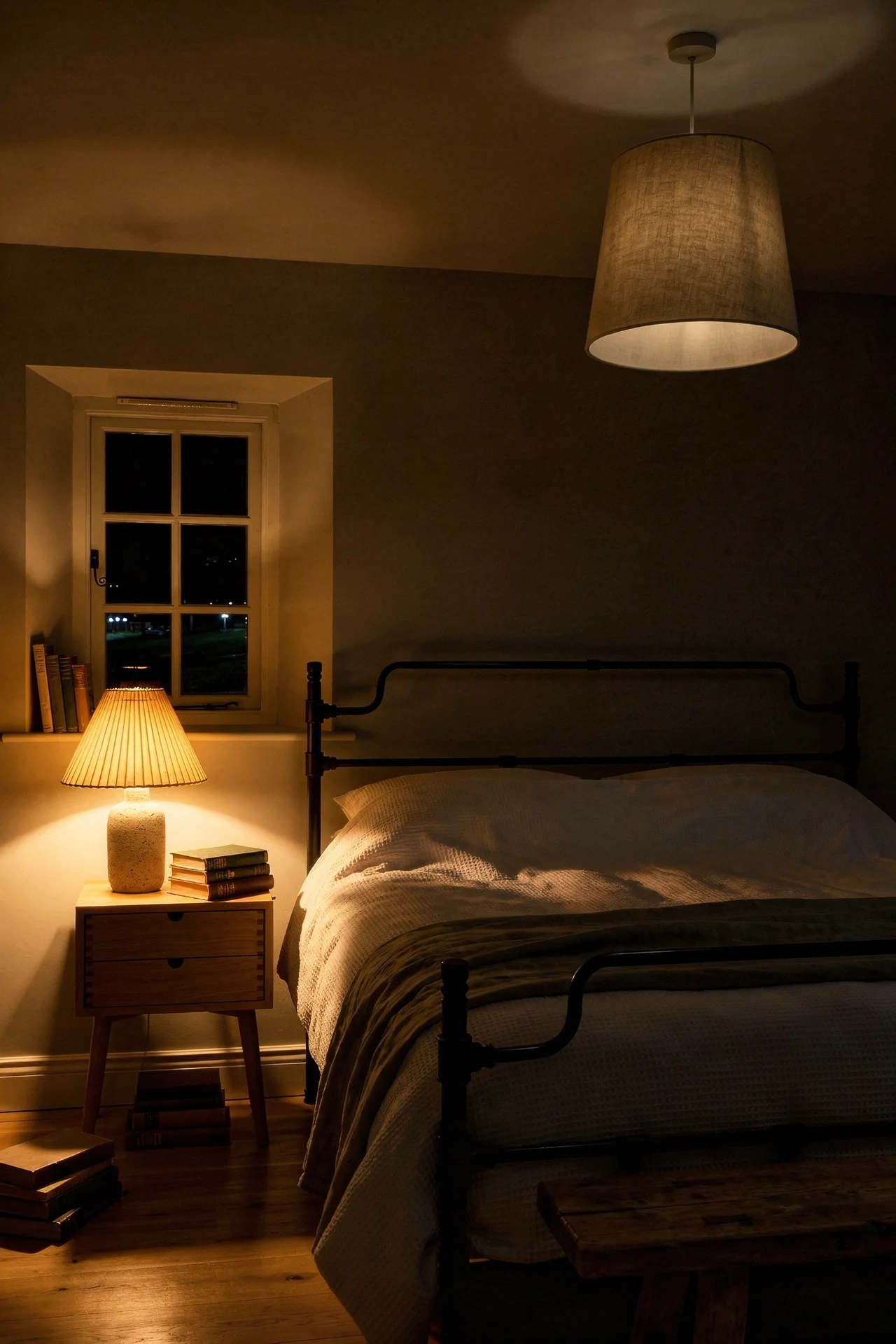
Colour temperature is separate and equally important. Anything above 3000K reads cold in a bedroom. 2700K is the magic number: warm, soft, golden, forgiving on skin tone in the morning and on everything else at night. Some people go to 2400K for a candlelit feel, which is gorgeous but can make reading hard. Dimmers on every circuit is non negotiable: one on the flush mount, one on each bedside lamp, and a third on a dresser lamp or sconce near the door.
A lampshade detail that matters more than it should: pleated silk, linen drum, or gathered chintz. The unshaded bulb is the enemy. Even a cheap IKEA lamp with a proper pleated linen shade looks three times more expensive than it is. Once the lighting is soft, the last layer is what makes it feel old.
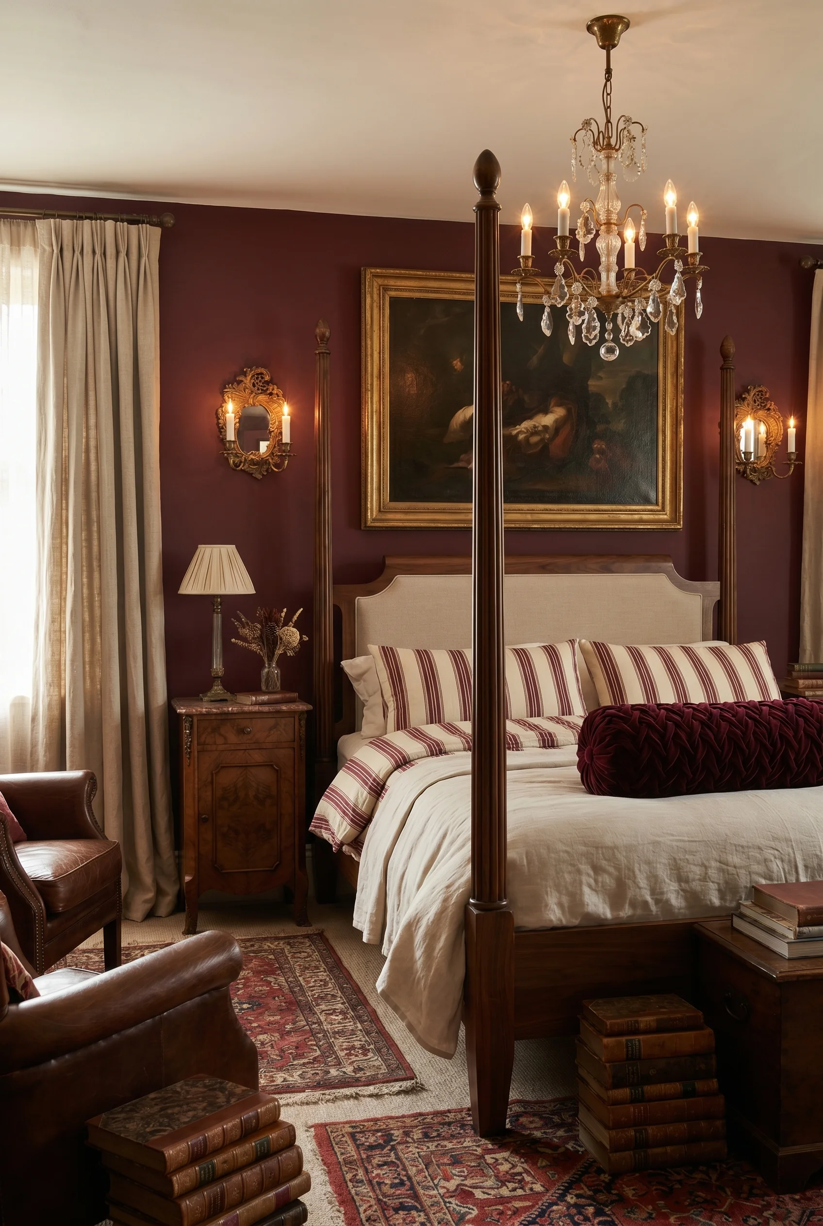
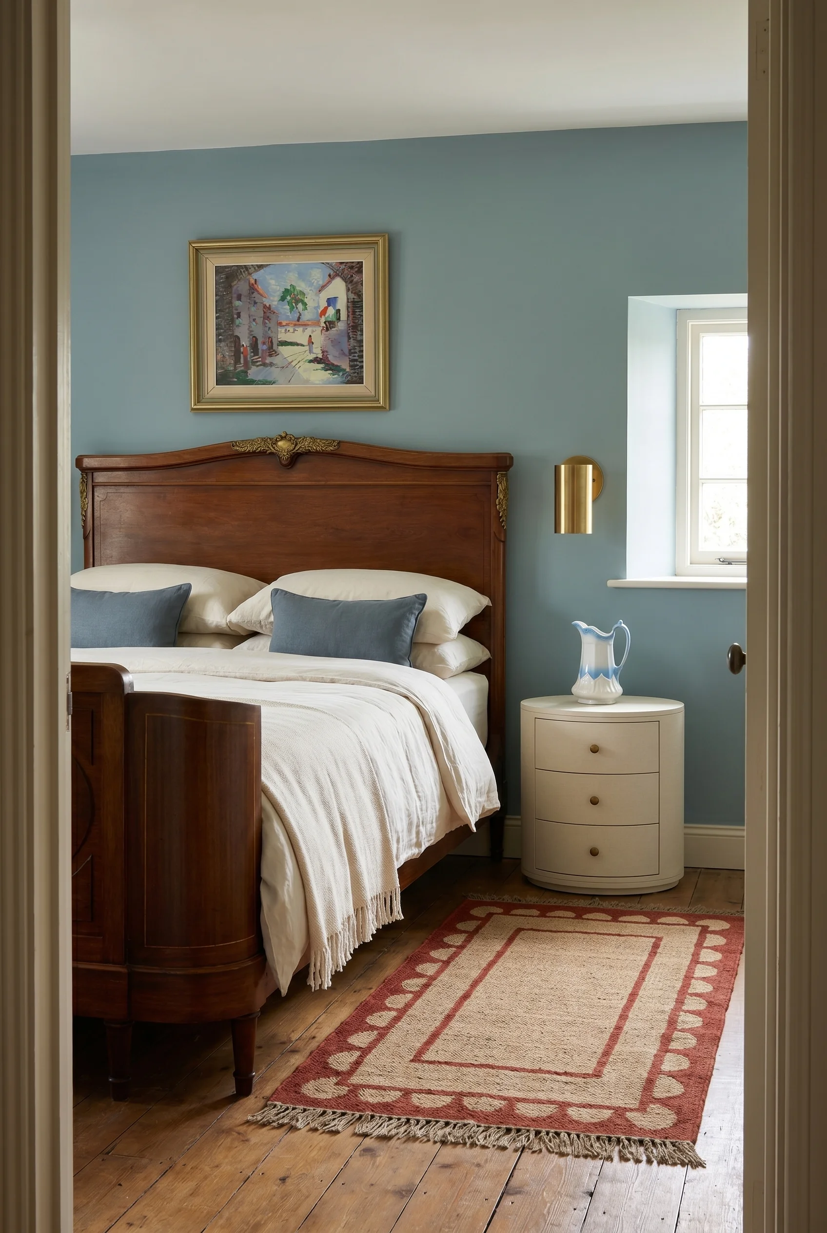
The most useful rule I’ve learned this year is the 80/20 rule the Studio McGee team uses for their warmer English country work: 80 percent modern functional, 20 percent vintage accent. A new bed, mattress, bedding, and rug is fine. But the side tables, one lamp, the dresser, a mirror, and the art should all carry age. That’s what stops a bedroom looking like a catalogue shoot.
Where to find the vintage 20 percent: eBay (far better than people think, especially for lamps and dressers), estate sales (best for pieces with a turned leg or a real patina), auction house lots (Bonhams, Sworders, and Wilson55 run weekly online sales at a fraction of retail), and French brocantes.
Skip Facebook Marketplace for anything above a hundred pounds, because descriptions are rarely accurate and condition varies wildly.
What to look for: wood that has been waxed rather than lacquered, because wax develops a patina and lacquer goes milky. Turned legs rather than straight. Brass hardware rather than chrome. Textiles washed more than twenty times, because the softness is impossible to fake. Hard perfect corners and crisp paint mean it’s repro or refinished, and either way not doing the 20 percent job.
If the piece you love is the wrong colour, the DIY route is chalk paint plus a wax resist. Rub a candle along the edges and corners of a base coat, apply a top coat in your chosen colour, and once dry give it a light sand along the waxed areas. Annie Sloan Chalk Paint, Rustoleum Chalked, and Frenchic all work. Finish with a clear wax, buffed, to stop the paint chalking off. That’s the six moves. One thing left: the palette that ties them all together.
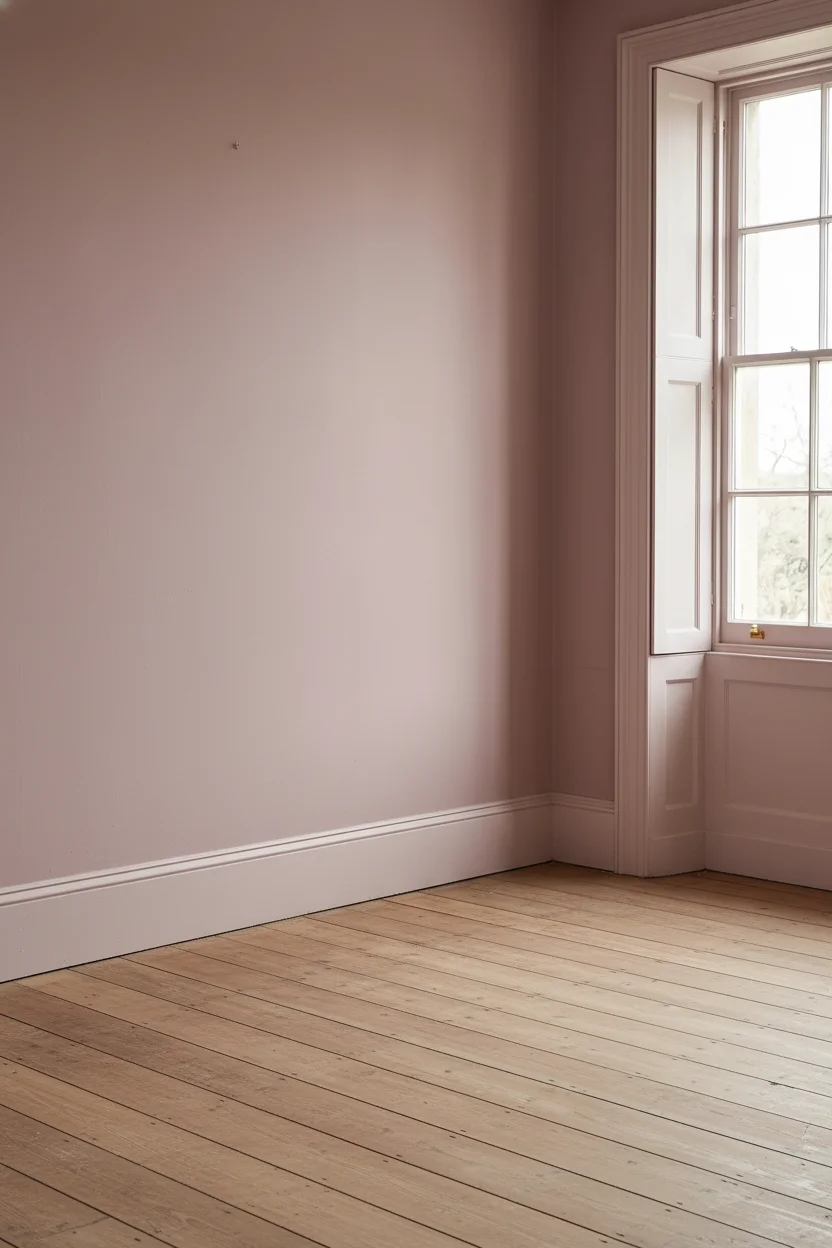
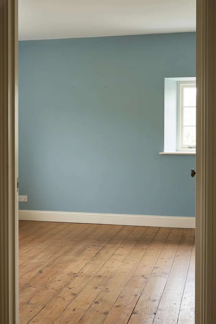
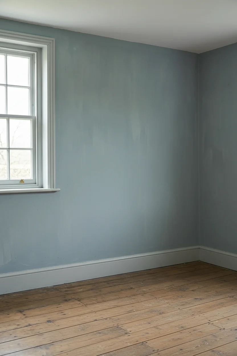
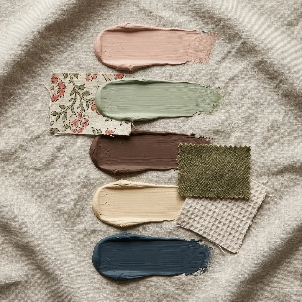
The palette for this style is earthy, slightly muddy, and deeply forgiving. These five colours are what I’d pull from any of the Cotswolds bedrooms I keep going back to, and they sit together in almost any combination.
Warm Plaster Pink. A dusty, chalky pink that reads as a soft off white in daylight and flushes warm in lamplight. The wall colour that flatters every other colour in the room, especially pistol grey linen and aged oak.
Paint Pick: Farrow & Ball Setting Plaster No. 231
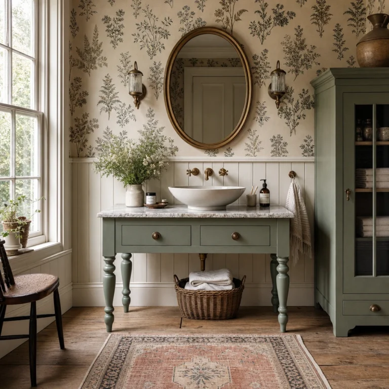
Sage Apothecary Green. A muted, dusty green with enough grey in it that it never shouts. Brilliant on the inside of a wardrobe, on a painted bedside, or drenched across a small bedroom for a cocoon effect.
Paint Pick: Farrow & Ball Lichen No. 19
Wet Clay Brown. The unexpected neutral of the English country bedroom. Warmer than taupe, deeper than mushroom, and the perfect foil for cream bedding, brass hardware, and anything with a pattern running through it.
Paint Pick: Farrow & Ball London Clay No. 244
Faded Chintz Cream. An off white with a yellow undertone rather than a grey one, because grey undertones go cold in a bedroom and yellow ones stay golden. Use this for ceilings, trim, and the base coat on any distressed furniture project.
Paint Pick: Farrow & Ball Matchstick No. 2013
Inky Heritage Blue. The accent colour. Deep, slightly green, with enough pigment to read as a proper statement without going navy. Perfect drenched on a single bedside or the inside of a painted armoire, and a strong choice for headboard upholstery.
Paint Pick: Farrow & Ball Inchyra Blue No. 289
Once these five are in the room, you almost can’t get the rest of it wrong. Furniture, bedding, rug, and art will all find a home inside this palette, and you’ll stop second guessing every purchase.
If you do one thing from this list, make it the flush mount and the 2700K bulbs. It’s the cheapest, fastest, most transformative move in the whole article, and it’ll make every other decision easier because you’ll finally be seeing the room in the light it’s meant to live in. Everything else (the beams, the alcove, the bedding, the patina) you can do one weekend at a time.
This post contains affiliate links, which means we may earn a small commission if you make a purchase through our links, at no extra cost to you.