Newsletter Subscribe
Enter your email address below and subscribe to our newsletter
Imagine for a moment, weaving the tranquil and vibrant essence of Japanese colors into every corner of your home. Yes, I’m talking about those mesmerizing hues that breathe life into any space, turning it into a serene sanctuary. The Japanese color palette, deeply rooted in history and culture, reflects a broad spectrum of shades and tones inspired by nature, seasons, and traditional arts. To break it down into neat sections, we can draw on the traditional Japanese color system, which includes colors that have been used in art, clothing (like kimonos), and literature for centuries.

In the traditional Japanese palette, primary colors are not strictly defined as in Western color theory (red, blue, yellow). However, certain colors hold significant importance due to their frequent use and cultural significance.

A deep blue that is almost synonymous with traditional Japanese textiles. It is used extensively in dyeing fabrics.

Represents good fortune and happiness. It’s a vibrant color used in many cultural festivities and traditional garments.

Symbolizes purity and cleanliness in Japanese culture. It is a fundamental color in various ceremonies and architecture.

Secondary colors are those that have been historically used and recognized in various aspects of Japanese life, often derived from natural elements:

Reflects nature, youth, and vitality. It’s seen in the depiction of landscapes and seasons.

Often associated with the sun and brightness, it carries positive meanings and is used in festivals and art.

Traditionally associated with the aristocracy and nobility, this color has a deep cultural significance tied to the Heian period.

Orange, with its warm and vibrant tones, can inject energy and enthusiasm into any space, making it a perfect secondary color in the Japanese-inspired palette. This cheerful hue, reminiscent of autumn leaves and sunsets, bridges the gap between the passion of red and the joy of yellow, creating a sense of comfort and liveliness in your interiors.

Accent colors in the Japanese palette are used to add depth, contrast, or highlight to artworks, textiles, and crafts.

Represents wealth, strength, and warmth. Used in temples, shrines, and art, it’s a prestigious color often used for accents.

Symbolizes grace, sophistication, and elegance. It’s used similarly to gold but offers a cooler tone.

While it can be considered a primary color in some contexts, in traditional Japanese aesthetics, black often serves as an accent, outlining or emphasizing details in art and textiles.

Pink, a versatile and emotive color, can add a layer of warmth, tranquility, or vibrancy to any interior, depending on its hue and saturation. As an accent color in your palette, pink can serve various roles—from softening a modern design scheme to adding a pop of color in a more neutral setting.

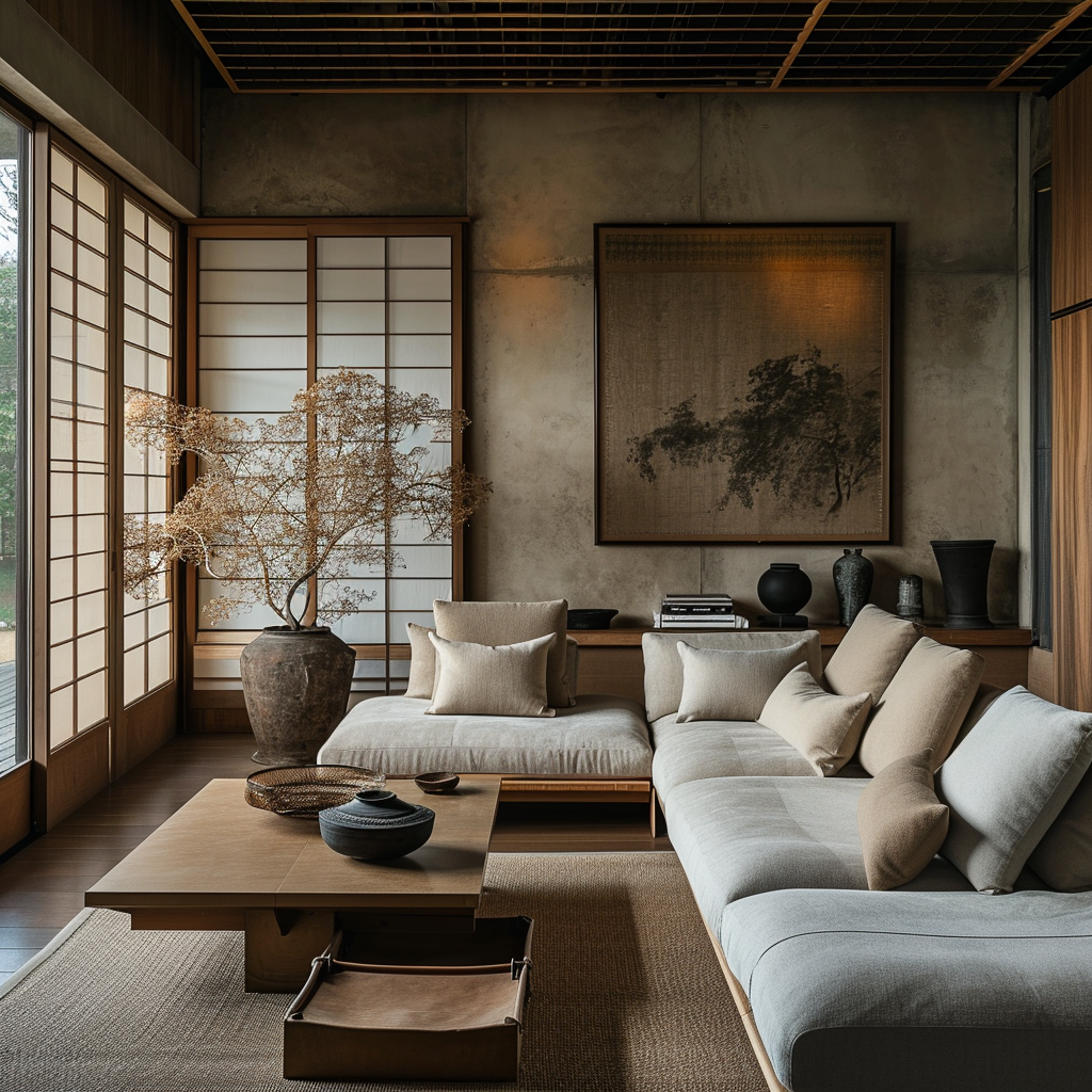
Adding greenery and artwork with green tones can enliven the room and connect it to nature.

Gold frames, lamps, or vases can introduce a touch of elegance and warmth.

Add orange cushions or throws to your living room setup for a pop of color. These accents can invigorate the space without overwhelming it, especially when paired with more neutral primary colors like white or indigo.

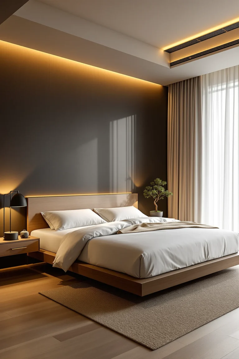
White beddings and curtains can create a peaceful and clean atmosphere, conducive to relaxation.

A purple accent wall or area rugs can add a sense of luxury and comfort.

Silver accents in lighting can add sophistication and reflect light, enhancing the room’s ambiance.

Utilize orange bed linens or area rugs to introduce warmth and coziness. The color promotes comfort and relaxation, essential for a restful sleep environment.

White tiles and fluffy towels can make the bathroom feel clean and spa-like.

Orange elements can add a splash of color and contrast beautifully with the white.

Black faucets, shower heads, and picture frames can ground the space and add a modern touch.

A vibrant red runner can energize the hallway space and make it welcoming.

Choose wall art that features orange hues, whether in abstract pieces, traditional Japanese prints, or nature-inspired scenes. Art is a subtle way to integrate color and add visual interest to your rooms.

Gold light fixtures can add warmth and a touch of luxury to the transitional space.

Wood cabinets and countertops can create a cooking space full of character.

Green tiles can add a pop of color and a natural element to the kitchen.

Black appliances can complement the natural wood for a cohesive look.

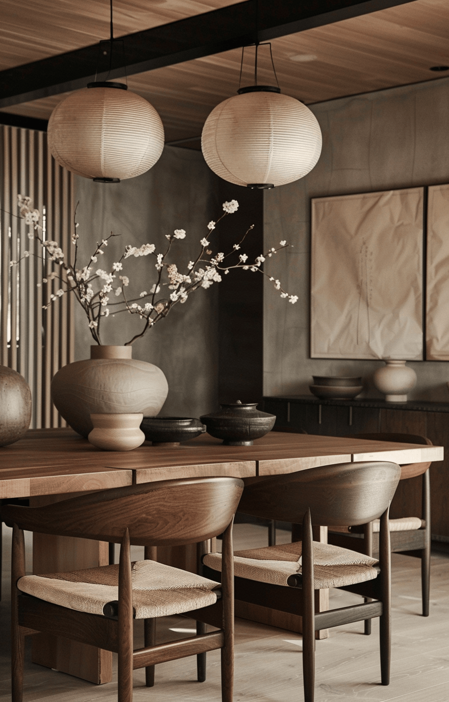
Incorporate black elements through tableware, such as bowls and cups, or decorative items like vases. This color stimulates appetite and conversation, making it ideal for dining areas.

Indigo chair covers or upholstery can provide a rich backdrop for meals.

Yellow flowers or candles can add warmth and a festive feel to the dining table.

Black frames or a sleek buffet table can anchor the space and add contrast.


The Japanese color palette is deeply rooted in nature. Begin by selecting colors that reflect the natural world around you, ensuring a serene and grounded environment. This approach guarantees timelessness, aligning with both traditional Japanese aesthetics and modern design principles.

For every bold or vibrant color you choose, balance it with a neutral. This not only anchors your space but also allows the more vivid colors to stand out without overwhelming the senses. White, beige, and soft grays are excellent choices for this purpose.
Embrace seasonal changes by incorporating accessories and textiles that can easily be swapped out. This strategy allows you to keep the base colors of your rooms constant while refreshing the look with seasonal colors and trends. For example, use indigo-dyed cushions in summer for a cooler feel and add gold-toned throws in winter for warmth.

Pair colors with mindfulness to their contrasts and complements. Colors directly opposite each other on the color wheel, like red and green, can create vibrant spaces when used judiciously. Consider the room’s function and desired ambiance when deciding on the level of contrast.

While vibrant colors like red and indigo are beautiful, using them excessively can lead to a visually overwhelming space. Limit the use of bold colors to one or two elements per room and balance them with more subdued tones.

Natural and artificial lighting significantly affects how colors appear. A color that looks perfect in a brightly lit store may not have the same appeal in your dimly lit hallway. Test paint colors and fabric swatches in the actual lighting conditions of your home before making final decisions.

The texture adds depth and interest to spaces, influencing how colors interact. Glossy surfaces reflect more light and can make colors appear lighter, while matte surfaces absorb light, making colors look deeper. Incorporate a variety of textures to enhance the interplay of light and color.

While it’s tempting to follow the latest design trends, it’s crucial to prioritize personal preference and comfort. Your home is your sanctuary; choose colors that resonate with you personally, ensuring a space that feels welcoming and authentic.

By following these tips and best practices, you can create a home that beautifully melds the timeless elegance of the Japanese color palette with your unique style and the dynamism of seasonal trends.