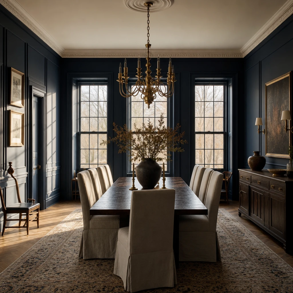
I’ve always thought navy is one of the most generous colours you can bring into a dining room. It holds candlelight beautifully, makes every texture feel richer, and somehow makes a meal feel like an occasion. In this piece I’ll walk you through dark dramatic walls, soft two tone combinations, warm wood pairings, and everything in between. Every look here is one you can genuinely make your own.
Why Dark Blue Walls Make a Dining Room Feel Instantly Special
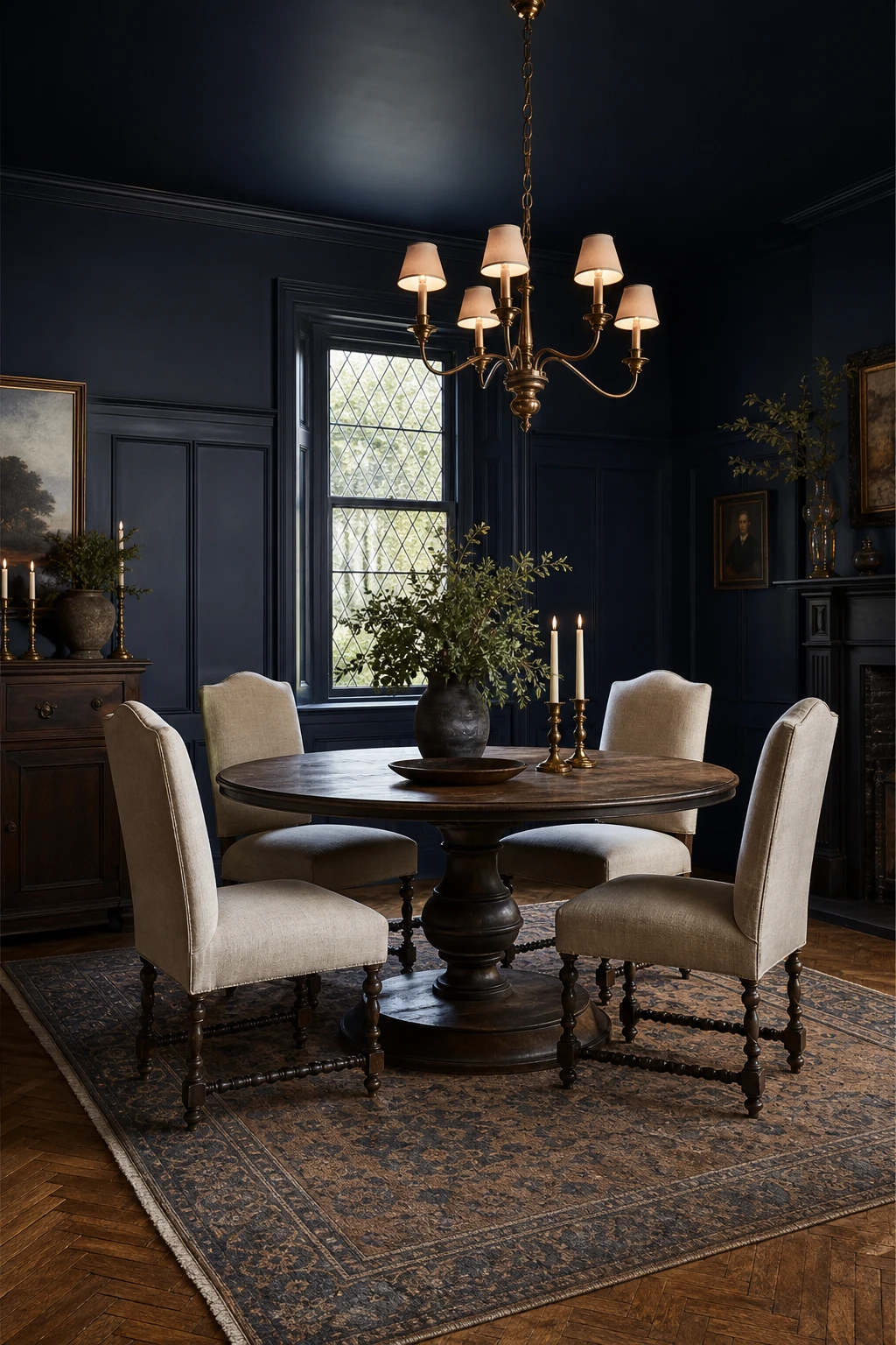
Dark blue on all four walls is one of my favourite moves in a dining room because the colour wraps around you and makes the space feel like its own world. You get that sense of arrival the moment you walk in, something a single painted wall or a pale shade simply cannot deliver. What I love most is how the depth pulls the ceiling and corners inward, so even a generous room starts to feel intimate and lit for dinner every single evening.
The Key Details
Round pedestal dining table
Linen upholstered dining chairs
Brass branching chandelier
Leaded glass casement window
Hand knotted wool rug over oak parquet
Pro TipChoose an eggshell finish rather than full matt so the walls hold just enough sheen to bounce candlelight and give the colour its full richness.
AvoidA dead flat matt finish on deep navy absorbs so much light that the colour reads muddy and the beautiful depth you paid for disappears entirely.
The Navy and White Dining Room Combination That Never Gets Old
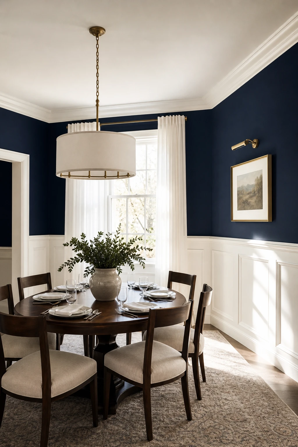
Navy and white is one of those pairings that wins me over every single time, because the contrast does the heavy lifting for you. The white trim gives your eye somewhere to land and rest, so the navy walls never feel oppressive. What I love is how that crisp boundary between dark and light keeps the whole room feeling intentional and sharp rather than just dark.
The Key Details
White timber wainscoting panelling
Round linen drum pendant
Dark walnut dining table
Sheer white sash window curtains
Aged brass candlestick holders
Pro TipAim for roughly two thirds navy to one third white across walls, trim, and soft furnishings so the contrast reads clearly without the room feeling striped.
AvoidReaching for a warm or creamy white softens the edge between the two tones and turns a crisp, graphic contrast into something muddy and flat.
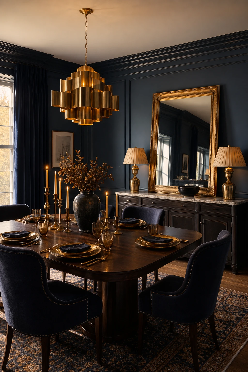
How Gold Accents Turn a Navy Dining Room Into Something Truly Elegant
Brushed brass against deep navy is a pairing that just makes sense, and the reason is simple: warmth against cool, glow against depth. A brass chandelier pulls the eye up and gives the colour something to play off, so you get richness without the room ever tipping into heavy. That restraint wins me over every time, the gold reads as a highlight rather than a statement, the navy stays the star, and the whole thing feels considered rather than loud.
The Key Details
Brushed brass chandelier
Gilt framed leaning mirror
Dark walnut dining table
Marble topped sideboard
Full length ink blue velvet curtains
Pro TipCarry the same brass tone across your chandelier, door handles, and picture frames so the eye has a thread to follow around the room.
AvoidMixing brass and silver metal finishes splits the room’s warmth in two and leaves the whole scheme feeling unresolved rather than layered.
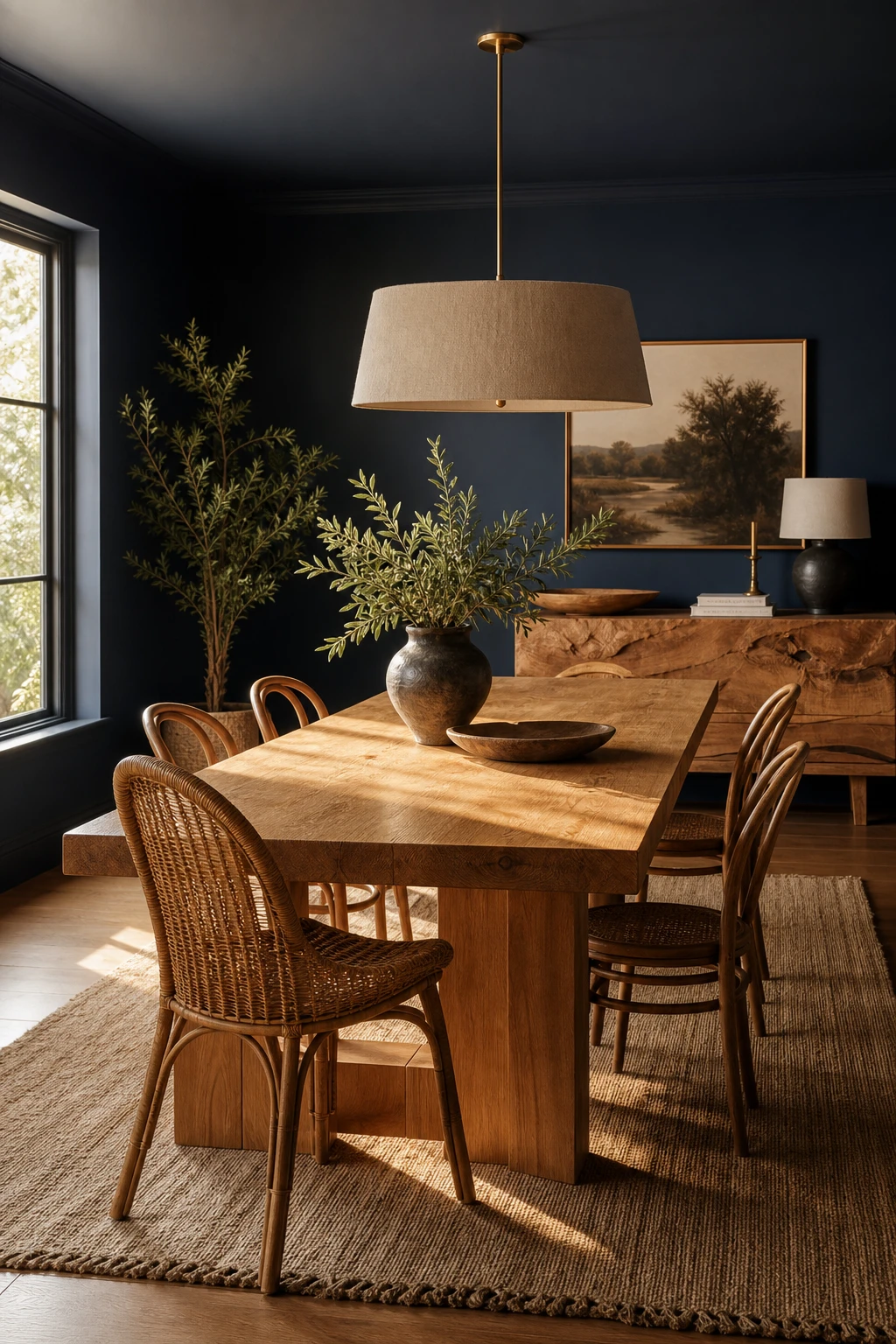
Blue Walls Meet Warm Wood and the Result Is Quietly Stunning
Cool navy and warm wood settle into each other in a way that feels almost inevitable. The wood stops the room from feeling cold without softening the drama one bit, and what I love is how organic that balance reads, earthy and solid, nothing like a scheme that has been laboured over. You get the grounding quality of natural grain alongside the boldness of a deep wall colour, and together they land somewhere that feels genuinely balanced rather than styled.
The Key Details
Solid oak dining table
Rattan and bentwood dining chairs
Linen pendant light
Live edge wooden sideboard
Woven jute runner
Pro TipKeep your dining table, sideboard, and floor in the same wood family so the warmth reads as intentional rather than accidental.
AvoidChoosing a wood with strong orange or red undertones will pull against the cool blue and leave the room feeling unsettled rather than grounded.
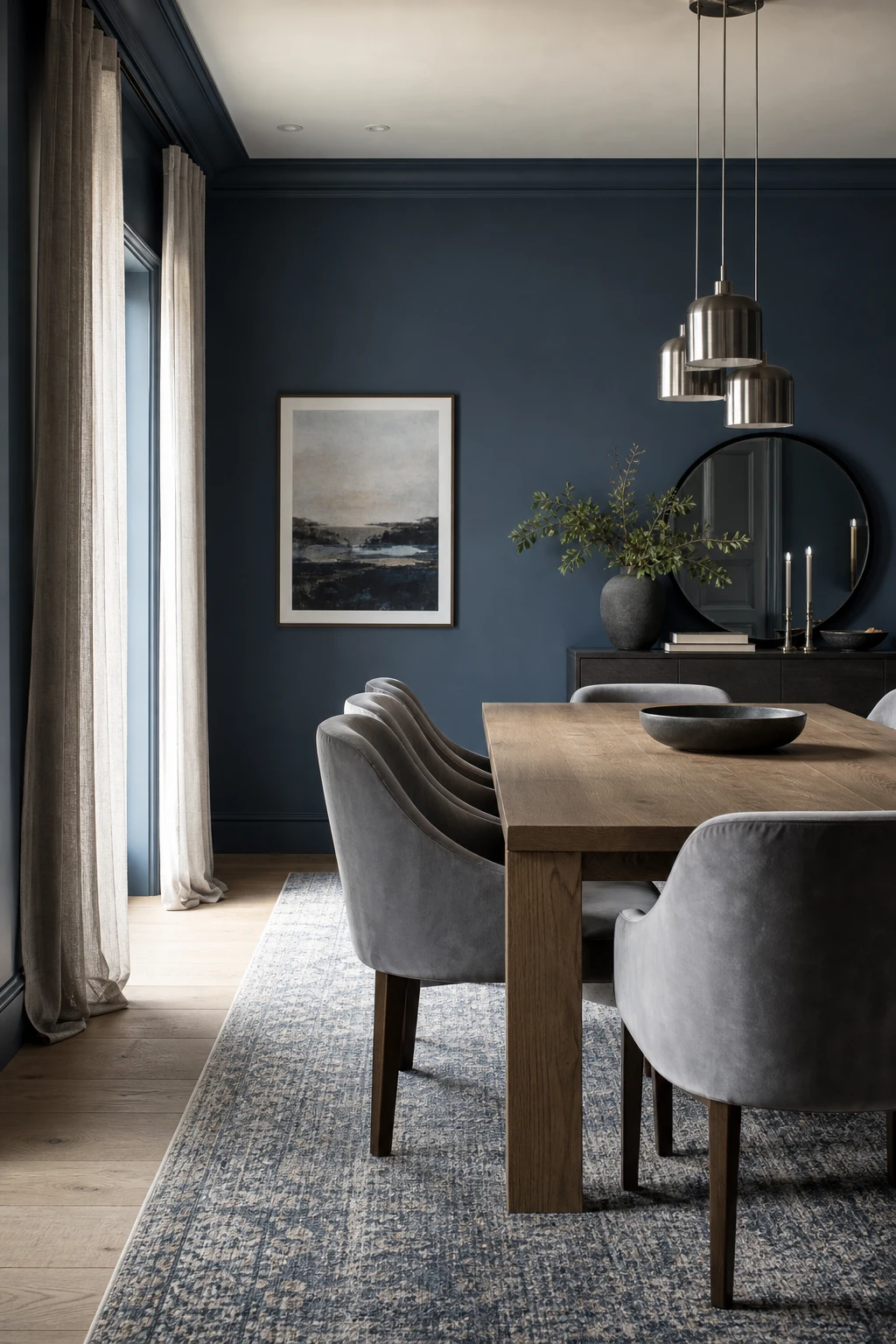
Grey and Blue in the Dining Room Is a Softer Take Worth Considering
Grey and blue together offer something the bolder combinations cannot: a room that feels calm and polished rather than charged. When the tones are chosen carefully, a blue leaning grey breathes into the navy so the eye reads the whole palette as one considered whole. My favourite thing about this pairing is the quiet sophistication it delivers, you get real depth and a sense of order without the weight that a stronger contrast would bring.
The Key Details
Grey velvet upholstered dining chairs
Rectangular solid oak dining table
Brushed steel pendant cluster light
Pale grey linen floor length curtains
Wide plank pale oak flooring
Pro TipHold grey paint samples against your blue wall in both daylight and evening light, because a grey with clear blue undertones will lock the palette together while a neutral grey can shift and separate the two colours.
AvoidChoosing a grey that pulls warm or green in your actual light conditions will sit in visual tension with your blue, making the room feel unsettled rather than quietly sophisticated.
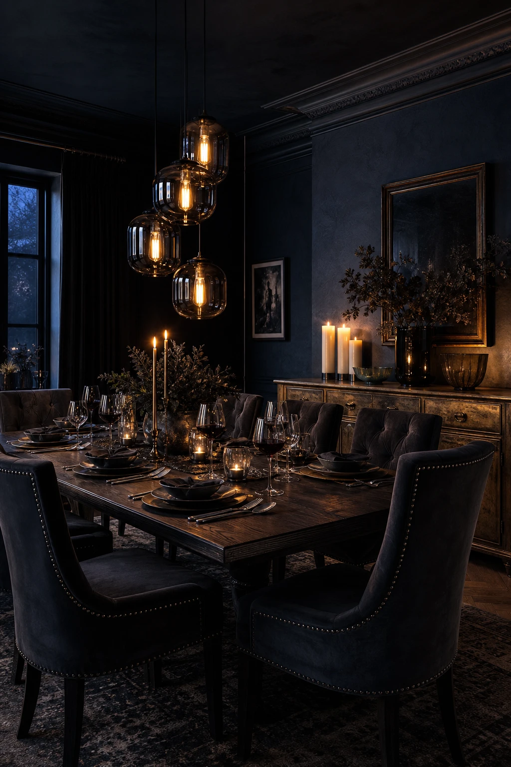
A Moody Blue Dining Room Sets a Mood You Will Want to Linger In
Deep navy walls and low, warm light do something almost alchemical together. The colour absorbs the room’s edges and the candlelight pools where you want it, drawing every eye to the table and the people around it. What I love most is how that combination shifts the dining room from a functional space into somewhere guests actually want to stay. You will notice the mood the moment you dim the lights, and that feeling is the whole point.
The Key Details
Smoked glass cluster pendants
High backed velvet dining chairs
Dark stained oak dining table
Antique brass sideboard
Textured plaster walls
Pro TipLayer at least three light sources at different heights, wall sconces, a pendant, and candles on the table, then put every one of them on a dimmer so you can dial the atmosphere up or down through the meal.
AvoidFitting a single bright overhead light in a moody navy room kills the atmosphere entirely, washing out the depth of the colour and leaving the space feeling more like a car park than a dining room.
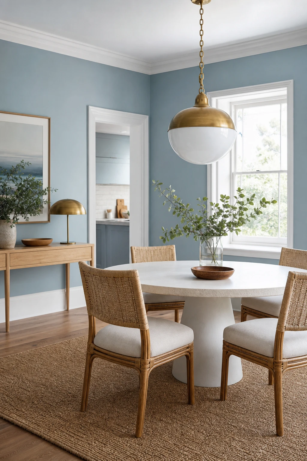
Light Blue Brings an Airy, Relaxed Energy to the Dining Room
Pale blue is one of those colours that quietly does a lot of heavy lifting. What I love about it on dining room walls is the way it bounces light around the room, making the space feel larger and more open than it really is. You get that easy, relaxed mood without any of the drama, which is why I reach for it first in north facing or smaller rooms where a deeper shade might close things in.
The Key Details
Round white pedestal dining table
Rattan and linen woven dining chairs
Aged brass globe pendant light
Pale oak slim console table
White painted skirting boards and architraves
Pro TipLayer in linen curtains and a woven table runner to add warmth against pale blue walls and stop the room feeling cool or clinical.
AvoidChoosing a blue so pale it reads as off white under electric light will strip the colour of any character and leave the room feeling flat and unfinished.
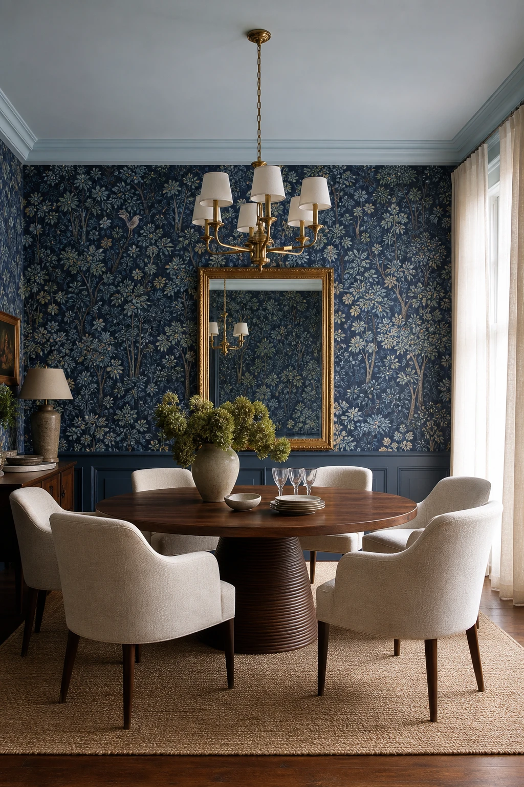
The Right Blue Wallpaper Can Do More Work Than Paint Ever Could
Wallpaper pulls you into a room in a way that paint simply cannot, and botanical blue is one of the most compelling examples of that. The pattern gives your eye somewhere to travel, so the walls feel alive rather than just coloured. What I love about pairing it with warm walnut and oatmeal linen is that the busyness of the print gets anchored straight away, and you get depth without the room ever feeling overworked.
The Key Details
Botanical patterned blue wallpaper
Layered brass chandelier with linen shades
Round dark walnut pedestal dining table
Oatmeal linen upholstered dining chairs
Gilt framed mirror on wallpapered wall
Pro TipIn a smaller dining room, choose a wallpaper with a tighter repeat so the pattern reads as texture from a distance rather than competing with the table setting up close.
AvoidMixing a large scale botanical wallpaper with heavily patterned curtains or a printed rug pulls the room in too many directions and flattens the impact the wallpaper was doing all the heavy lifting to create.
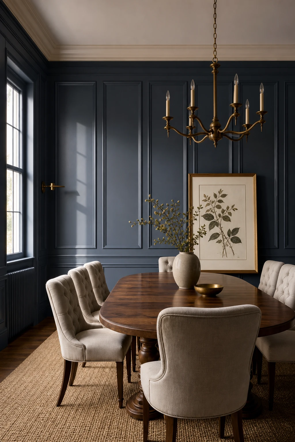
Blue Wall Panelling Adds Structure and Depth in Equal Measure
Floor to ceiling shaker panelling in navy is one of my favourite moves in a dining room because it gives the walls a physical presence you simply cannot fake with paint alone. You get that sense of craft and permanence, as if the room has always been there. What I love is how the raised geometry catches the light differently across the day, adding depth without a single extra accessory.
The Key Details
Floor to ceiling shaker wall panelling
Oval walnut dining table
Button back linen dining chairs
Aged brass candle chandelier
Framed botanical wall print
Pro TipPaint the panelling, the recesses and the wall above all in the same navy so the colour reads as one unbroken surface and the joinery feels truly built in.
AvoidCutting panels too short so a wide band of bare wall sits above them pulls the eye down and makes even a generous ceiling feel compressed.
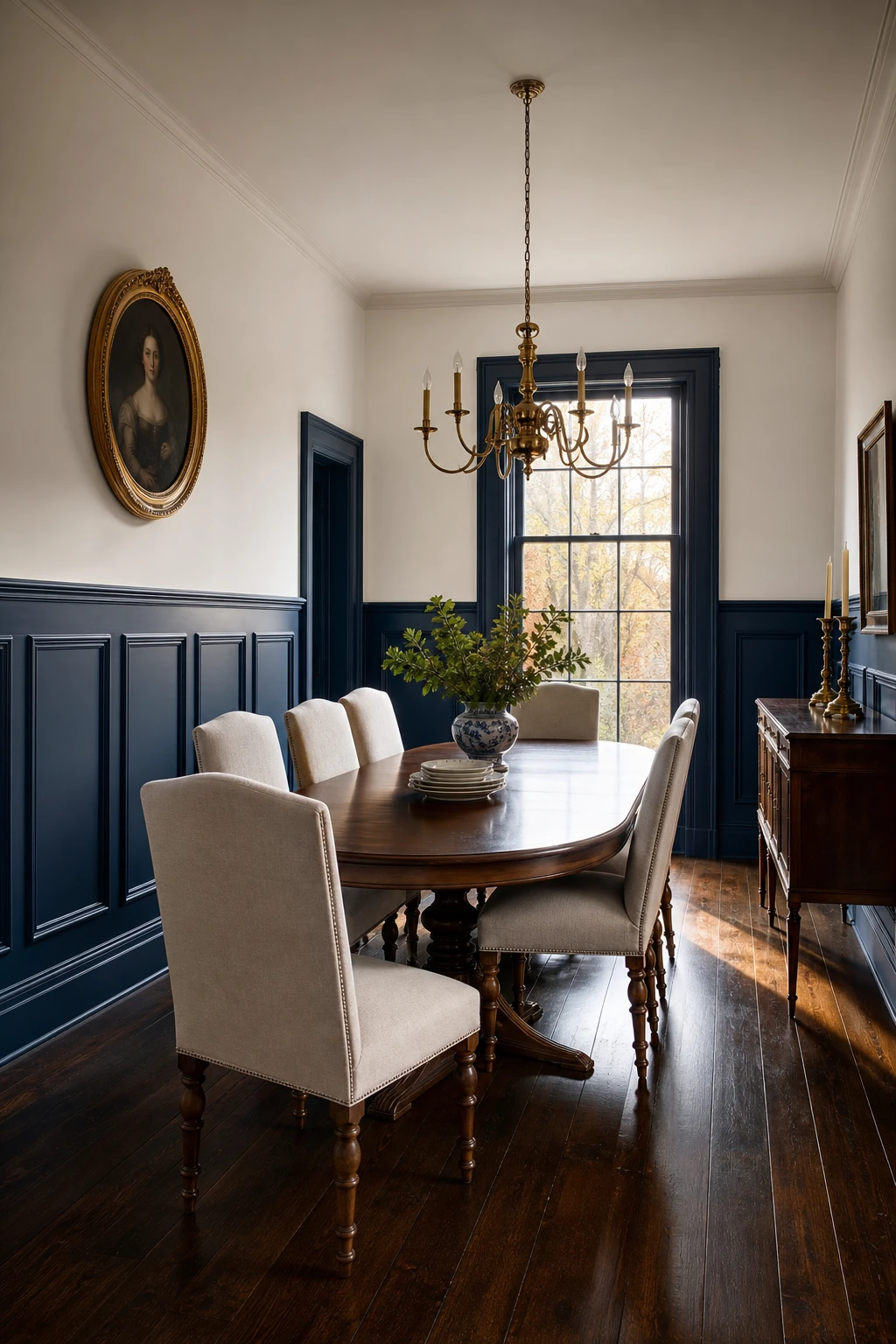
Dark Blue Wainscoting Gives a Dining Room Real Classical Elegance
Wainscoting is one of my favourite tools for making drama feel controlled rather than overwhelming. The chair rail acts as a natural horizon, letting navy sit richly on the lower half while the upper wall stays pale and open, so you get depth without the room closing in. That split is what gives a classical dining room its sense of proportion, and you will notice how the eye settles comfortably rather than feeling swamped by colour.
The Key Details
Painted timber wainscoting panels with chair rail molding
Brass candelabra chandelier
Linen upholstered dining chairs with turned legs
Gilt framed oval portrait
Dark stained hardwood floor
Pro TipSet your chair rail at roughly one third of the ceiling height, so in a standard 2.4 metre room that lands around 80 to 90 centimetres, which keeps the lower panel visually grounded without feeling squat.
AvoidPainting the wainscoting and the upper wall the same shade flattens the whole wall into one block and throws away the contrast that makes the technique worth doing in the first place.
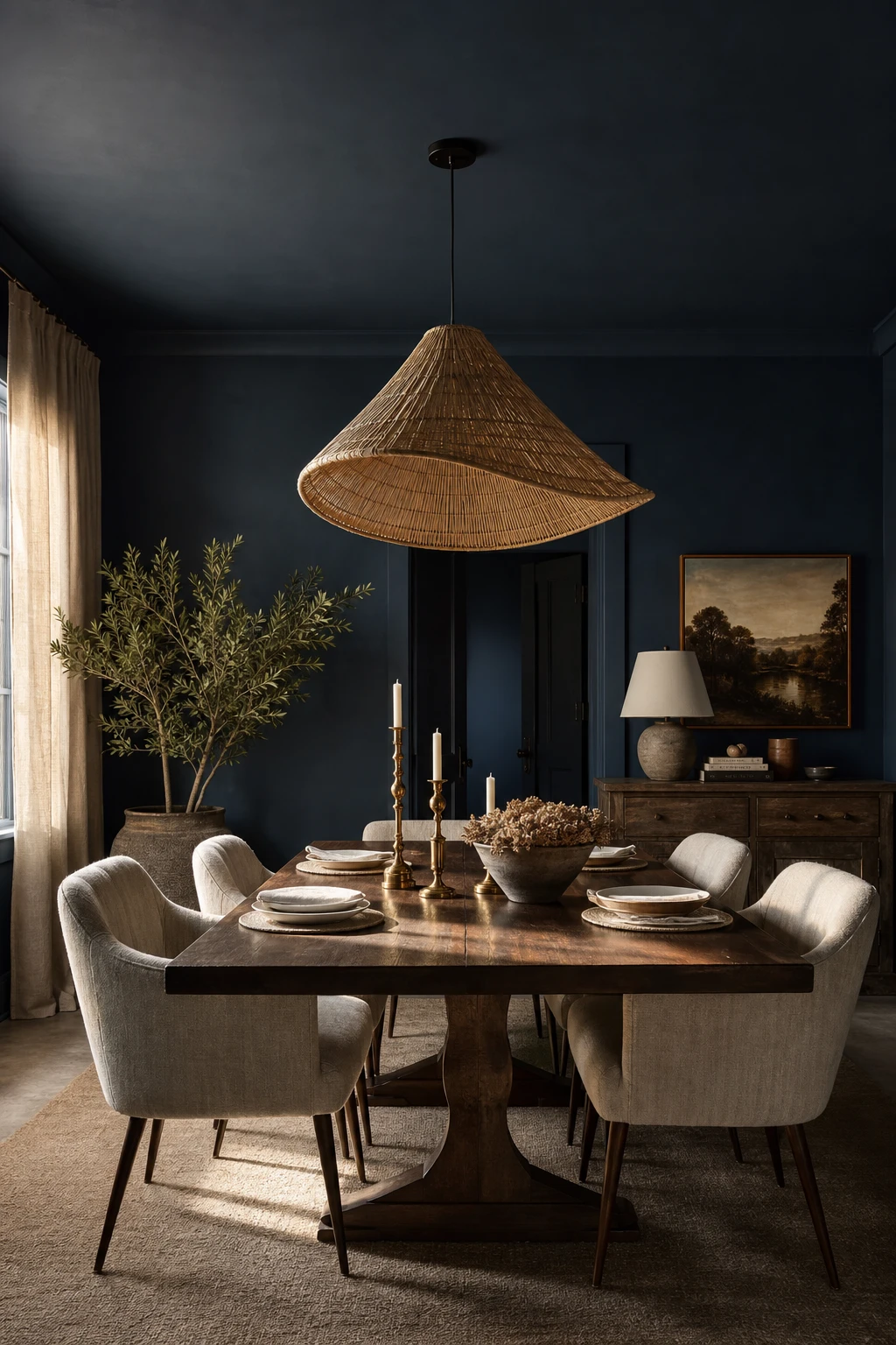
Painting the Ceiling Blue Is the Move That Changes Everything
Painting the ceiling blue is the move I come back to again and again in dining rooms, because it does something a fourth wall simply cannot. You get a room that feels genuinely wrapped around you, like the colour has been thought about from every angle. What I love is how it pulls the walls and the furniture into one considered whole, so nothing feels like an afterthought. Watch how your eye stops bouncing and just settles.
The Key Details
Woven rattan pendant light
Dark walnut dining table
Linen upholstered armchairs
Antique brass candlesticks
Hand plastered walls
Pro TipGo one shade lighter on the ceiling than your walls and you keep that cocooning feeling without the room tipping into heavy.
AvoidA high sheen ceiling finish will throw harsh reflections across the table and completely undo the soft, enveloping mood you are working so hard to create.
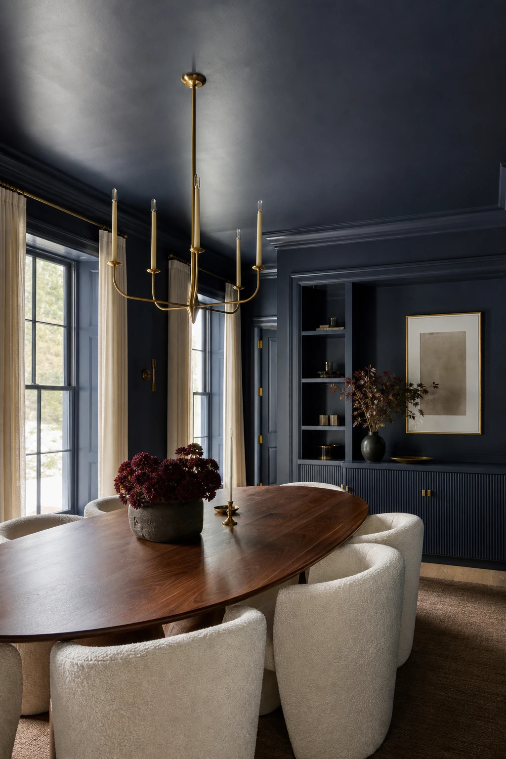
What Happens When You Drench Every Surface in Blue
Drenching every surface in one colour is one of my favourite moves in a dining room because the eye has nowhere to stop and nowhere to start. You lose the usual patchwork of wall, ceiling, skirting, and door frame, and what you get instead is this sense of being held inside the colour. The walnut table and brass chandelier read as objects floating in blue, which I find quietly dramatic without being loud.
The Key Details
Oval walnut dining table
Curved bouclé upholstered dining chairs
Aged brass candle chandelier
Fluted built in sideboard joinery
Tall sash windows with painted casings
Pro TipUse a flat finish on the walls and ceiling, then step up to eggshell on the trim and joinery so the surfaces read as one colour but catch the light differently.
AvoidPainting the skirting or door casings in a contrasting white or off white breaks the drench into fragments and loses the whole enveloping effect you were building.
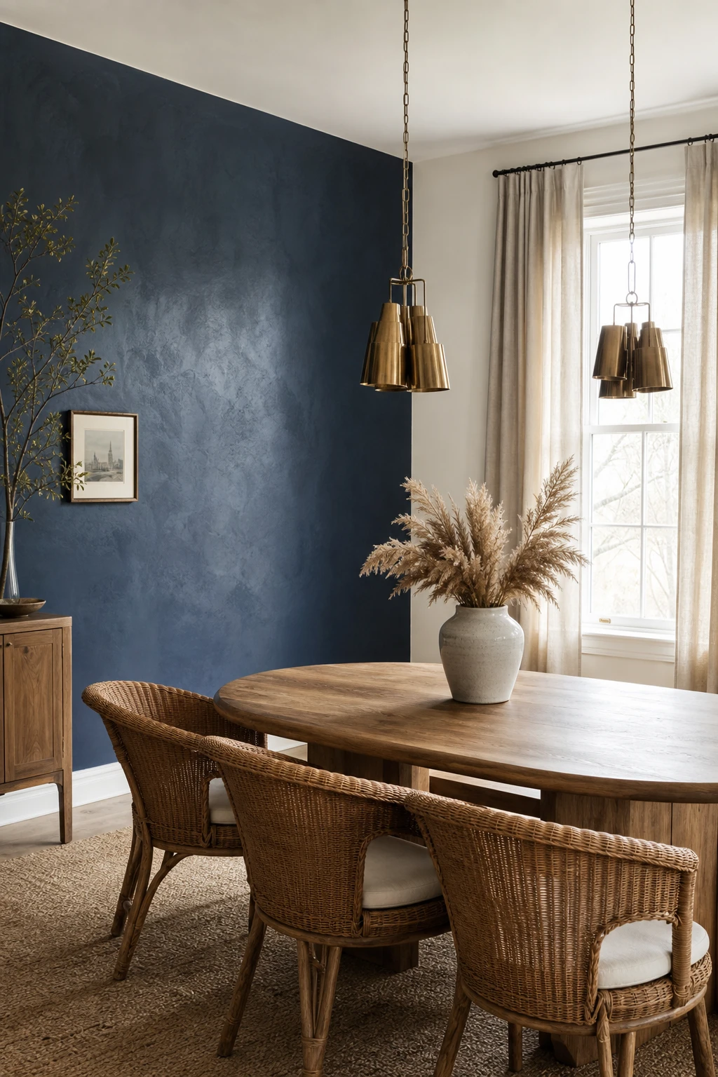
One Blue Accent Wall Is the Low Commitment Way to Try This Look
One wall does a lot of heavy lifting when you choose it well. What I love about the accent wall approach is that your eye gets a clear focal point, and the rest of the room stays light and breathing. You will notice the navy reads as intentional rather than overwhelming, which is exactly the confidence boost a colour cautious room needs. It is my favourite way to dip a toe in without redecorating the whole space.
The Key Details
Oval solid timber dining table
Woven rattan dining chairs with ivory cushions
Aged brass cluster pendant lights
Floor length oatmeal linen curtains
Textured plaster accent wall
Pro TipPut the navy behind your sideboard or buffet so the furniture anchors the colour and the whole wall feels purposeful rather than random.
AvoidChoosing a navy that sits too close to the grey or greige on your other walls means the accent wall loses all its contrast and barely registers as a feature at all.
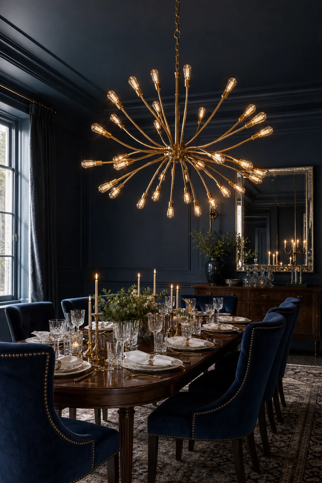
An Elegant Chandelier Is the Piece That Pulls a Blue Dining Room Together
A great chandelier does something no other piece can: it draws the eye up, frames the table below, and gives the whole room a centre of gravity. What I love about pairing an oversized brass sculptural fitting with navy walls is that the warm metal sings against the cool depth of the colour, and suddenly everything reads as deliberate. You get that jewel like quality where guests look up and the room feels curated rather than assembled.
The Key Details
Oversized sculptural brass chandelier
Dark walnut dining table
Navy velvet upholstered chairs with brass nail head trim
Mirrored sideboard
Crystal glassware table setting
Pro TipHang the bottom of your chandelier roughly 75 to 85 centimetres above the table surface so it feels intimate without blocking eye contact across the table.
AvoidA chandelier that is narrower than two thirds of the table width looks like an afterthought and drains the room of the drama navy deserves.
A Black Chandelier Against Blue Walls Is a Pairing That Stops You in Your Tracks
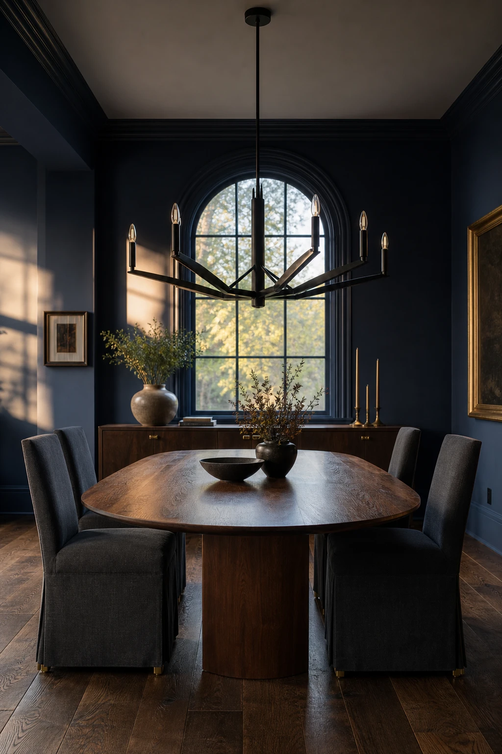
A black chandelier against a deeply navy wall is one of those pairings that hits you the moment you walk in. What I love is the graphic quality it creates: the dark metal reads as a bold drawing against the colour, giving the room a confident, deliberate personality rather than a soft, floaty one. You get definition and drama without adding another colour to the mix.
The Key Details
Matte black iron chandelier
Oval walnut dining table
High back charcoal linen dining chairs
Wide plank dark oak floor
Arched rear window
Pro TipRepeat the black in at least one other place, chair legs, picture frames, or door hardware, so the chandelier feels like part of a considered scheme rather than a single statement hanging in isolation.
AvoidA black fixture left as the only dark element in the room can look like a happy accident rather than a decision, and the whole effect loses its authority.
A Modern Pendant Light Keeps a Blue Dining Room Feeling Fresh and Current
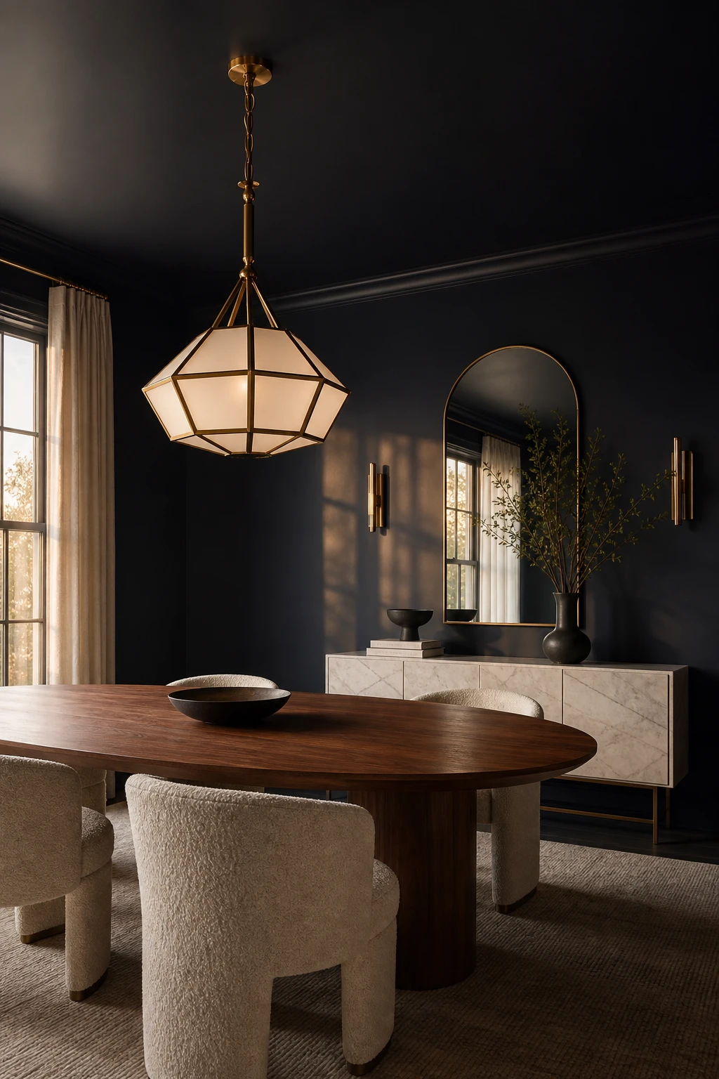
A geometric brass pendant wins me over every time in a navy dining room because it holds the eye up and keeps the whole scheme breathing. You get that contrast between the warmth of the metal and the depth of the blue, which stops the walls from feeling oppressive. What I love most is how a modern silhouette signals confidence, telling the room this is a deliberate choice rather than a safe one.
The Key Details
Geometric brass and frosted glass pendant
Oval oiled walnut dining table
Curved oatmeal boucle upholstered dining chairs
Honed marble sideboard
Large arched wall mirror
Pro TipCluster three pendants in a row over a long table rather than centering one, because the rhythm they create feels considered and gives the room a moment of real drama.
AvoidHanging pendants too low blocks sightlines across the table and makes conversation feel cramped, so the base of each shade should clear seated eye level with room to spare.
Blue Finds a Wonderfully Relaxed Home in the Farmhouse Dining Room
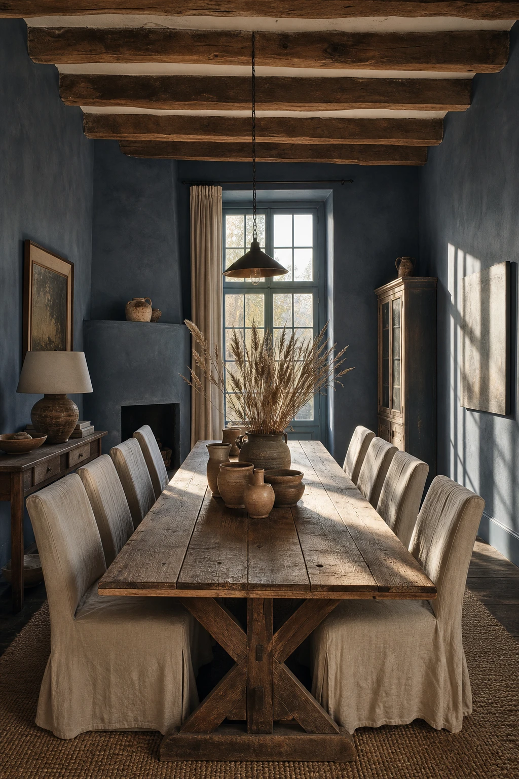
Bending navy into a farmhouse setting is one of my favourite moves, because the rustic materials do all the heavy lifting. Reclaimed wood brings its own history, and you get a colour that feels grounded rather than grand. Linen chairs and hand thrown stoneware keep things honest, and watch how the exposed beams pull the whole room down from the ceiling and make it feel lived in rather than posed.
The Key Details
Reclaimed wood dining table
Exposed aged timber ceiling beams
Oatmeal linen slipcover dining chairs
Hand thrown stoneware vessels
Tall casement window
Pro TipMix one painted wood piece, such as a bench or side chair, with raw unpainted timber at the table to give the room that authentically layered, unplanned farmhouse feel.
AvoidSanding and lacquering every timber surface to a smooth finish strips the grain, the knots, and all the character that makes navy feel relaxed rather than stiff.
The Modern Traditional Blue Dining Room Gets the Balance Exactly Right
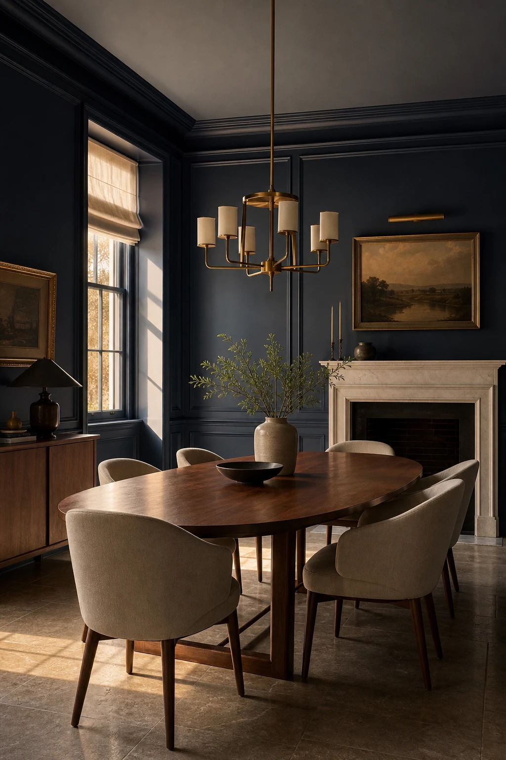
Pairing full height timber panelling and a picture rail with an oval walnut table and curved linen chairs is one of my favourite balancing acts. The architecture gives you that reassuring sense of solidity, and then the cleaner furniture lines stop it tipping into a period room that feels like a museum. You get warmth and quiet elegance all at once, and the honed stone floor ties it together without adding any fuss.
The Key Details
Full height timber wall panelling with picture rail
Oval oiled walnut dining table
Curved back linen upholstered dining chairs
Aged brass multi arm chandelier
Honed stone floor tiles
Pro TipChoose one piece with a genuinely simple silhouette, such as an oval table with no carved detailing, and let it do the modernising work while everything else carries the traditional character.
AvoidPulling in furniture from too many different eras means the room never settles on a point of view, and what could feel intentionally layered just ends up looking unresolved.
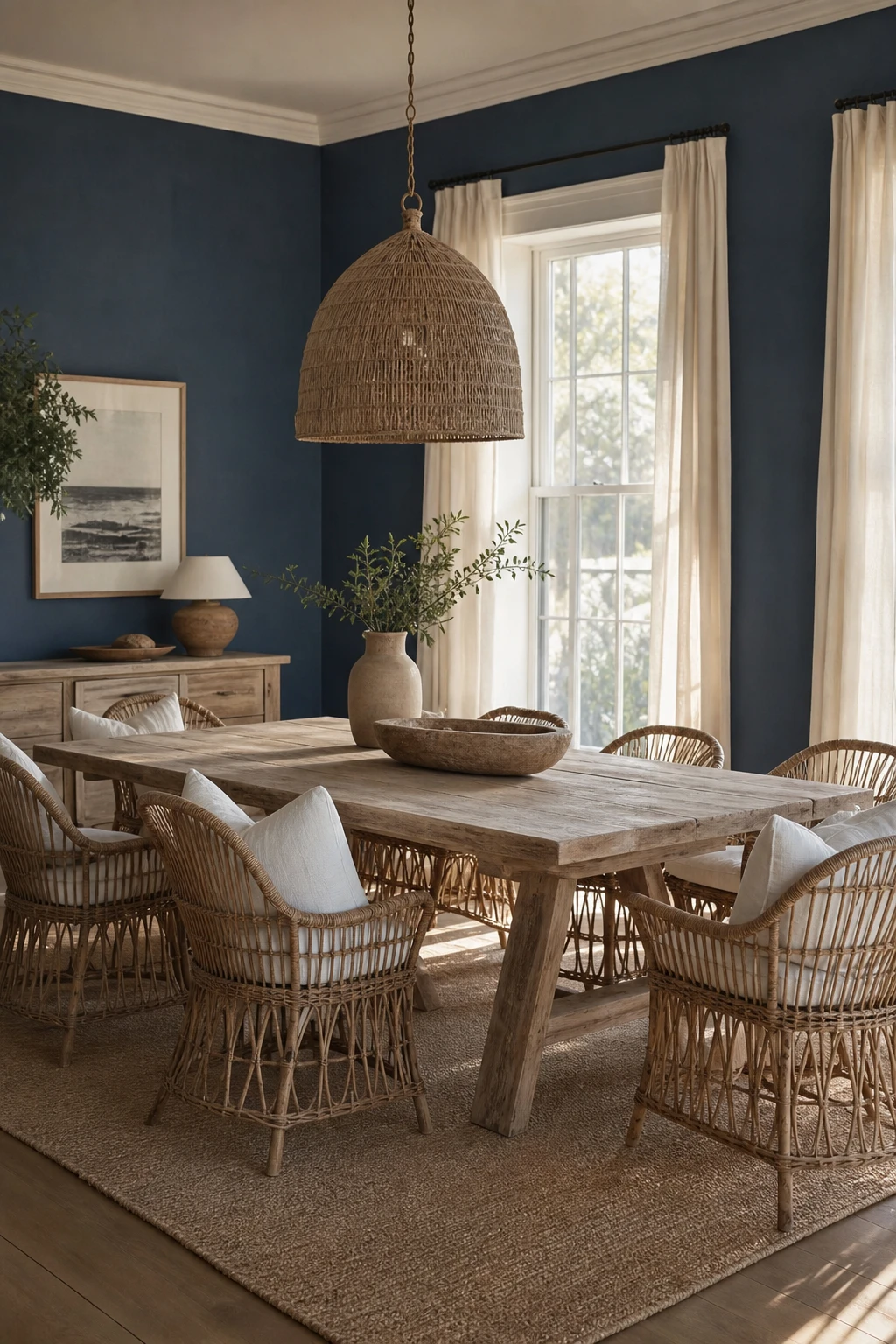
Navy Blue Coastal Dining Rooms Capture That Easy, Breezy Holiday Feeling
Coastal navy lands so well because the colour reads like deep water on a calm afternoon, and the natural textures around it do all the storytelling. Rattan chairs, a bleached table, a jute rug: each one whispers seaside without announcing it. What I love about this approach is that you get the holiday feeling through material honesty rather than decoration, so the room stays relaxed and genuinely liveable all year round.
The Key Details
Curved rattan dining chairs with linen cushions
Bleached driftwood dining table
Woven seagrass pendant lamp
Flat woven jute rug
Sheer ivory linen window drapes
Pro TipBring in one piece of real rattan, a chair, a pendant, even a small tray, and it will do more to set the coastal mood than any amount of blue paint alone.
AvoidReaching for anchor prints or knotted rope details tips the whole room from styled into themed, and once that line is crossed the space starts to feel like a seaside gift shop rather than a home.
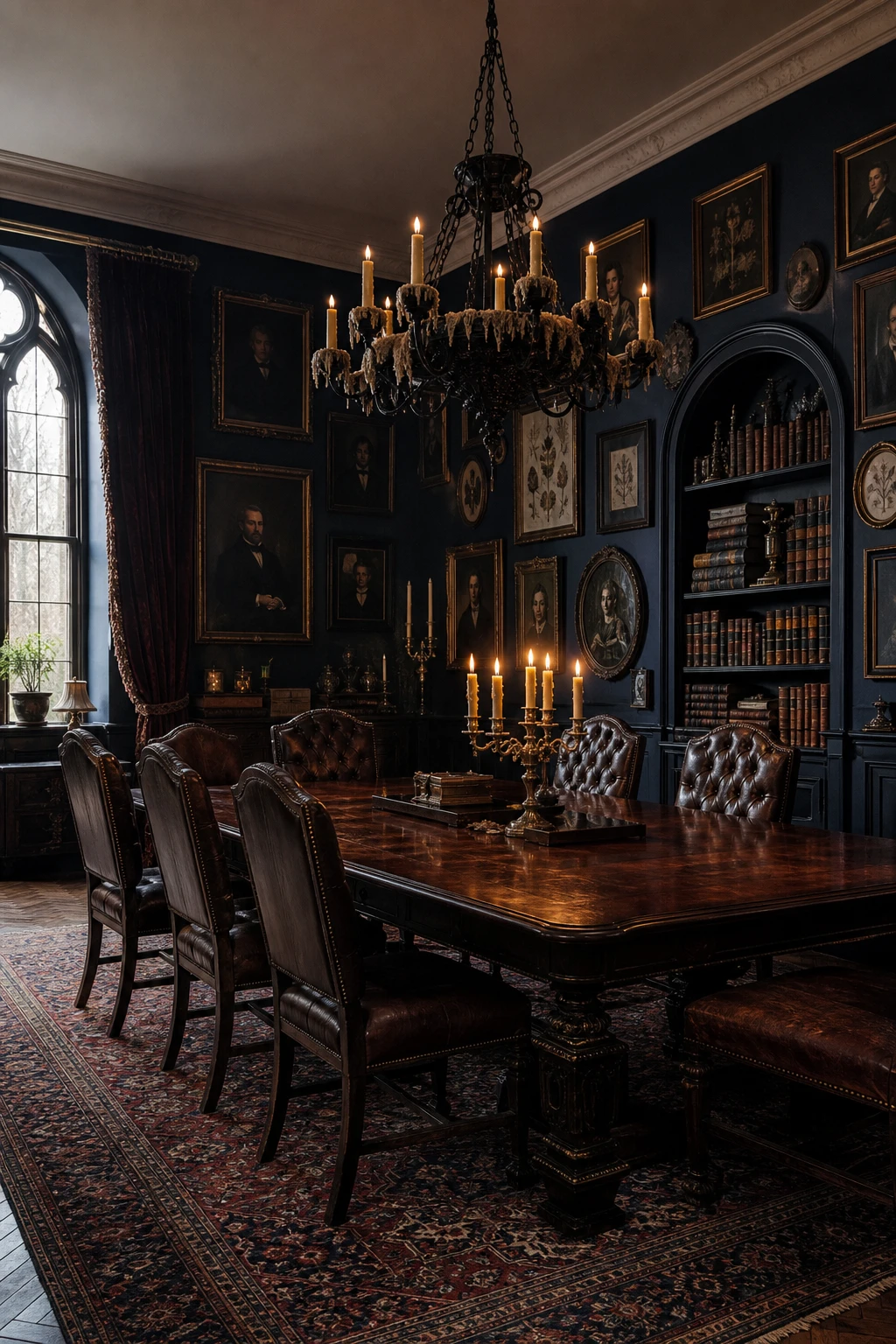
A Dark Academia Dining Room Channels the Most Romantic Kind of Atmosphere
Dark academia is the style I reach for when a client wants a room that feels like it has a past. Deep navy walls pull the space inward, and when you layer in mahogany, tufted leather, and gilt frames, you get that sense of accumulated time that no showroom piece can fake on its own. What wins me over every time is the books: a built in alcove of vintage leather bound spines adds weight and warmth together. You will notice the whole room starts to feel less like a dining room and more like a place where good conversations happen.
The Key Details
Tufted leather dining chairs
Wrought iron chandelier with candle lights
Gilt framed portrait and botanical print gallery wall
Built in shelving alcove with vintage leather bound books
Layered aged Persian rug underfoot
Pro TipScour estate sales and charity shops for a single large gilt framed portrait first, because one strong anchor piece pulls the rest of the room together faster than a dozen smaller finds.
AvoidFilling every shelf and surface to capacity tips the room from curated into chaotic, and the storied atmosphere you are after gets completely lost in the noise.
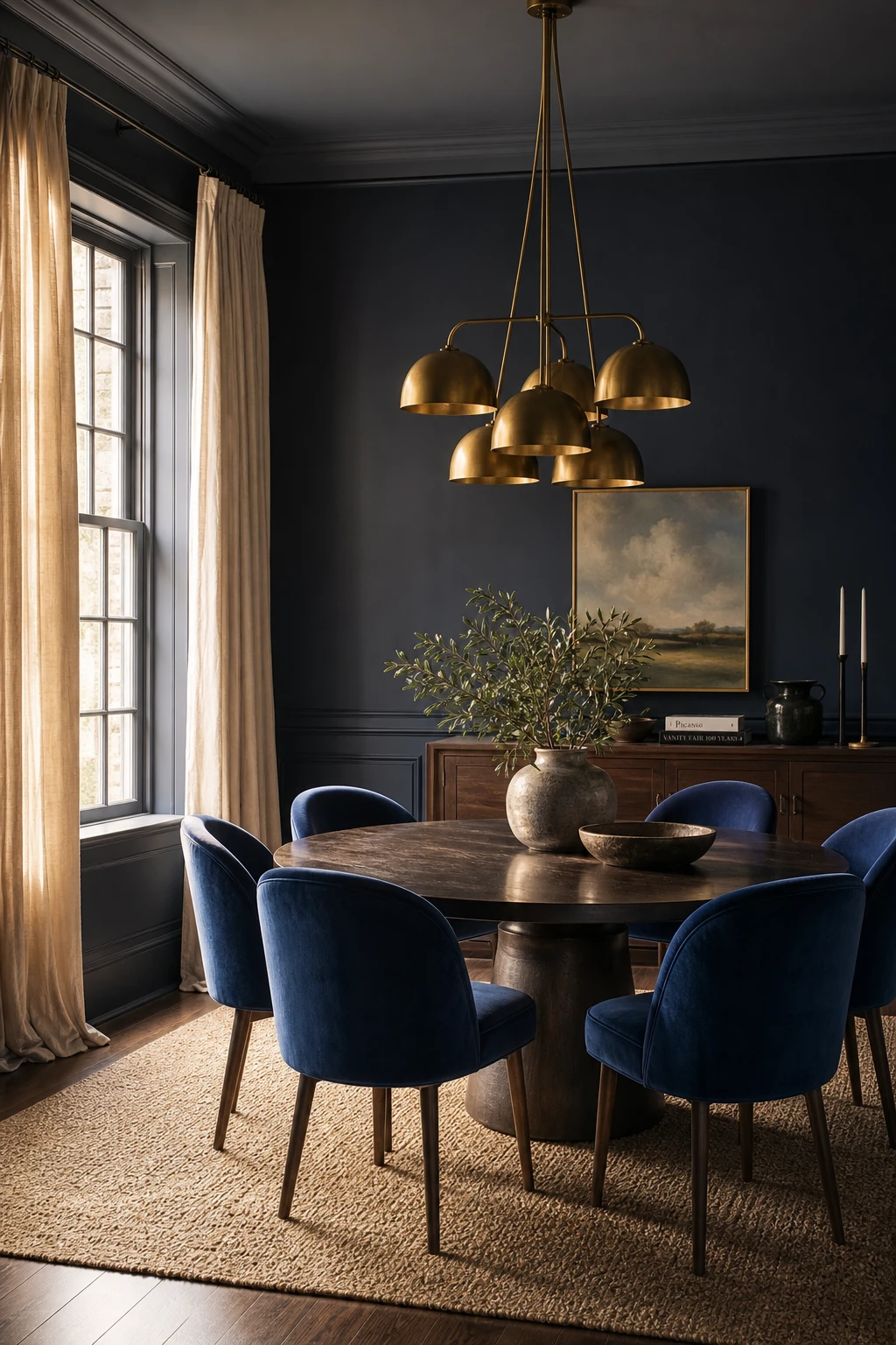
Blue Dining Chairs Are the Easiest Way to Bring This Colour In
Chairs are the piece I reach for first when a client wants colour but feels nervous about committing to it everywhere. Deep sapphire velvet seats against a dark oak table give you that rich, layered feeling you get from a fully painted room, but the furniture is doing all the work. You keep the walls neutral and the colour stays entirely moveable.
The Key Details
Deep sapphire velvet upholstered dining chairs
Round dark stained oak pedestal dining table
Brushed brass cluster pendant light
Oiled walnut slim sideboard
Floor length unbleached linen curtains
Pro TipMix one or two carver chairs with your standard side chairs at the same table for a relaxed, collected look that feels like the room grew over time rather than arrived in a single delivery.
AvoidChoosing a delicate fabric like silk or a loosely woven linen for dining chairs means staining and wear will show within months, and the chairs will look tired long before you are ready to replace them.
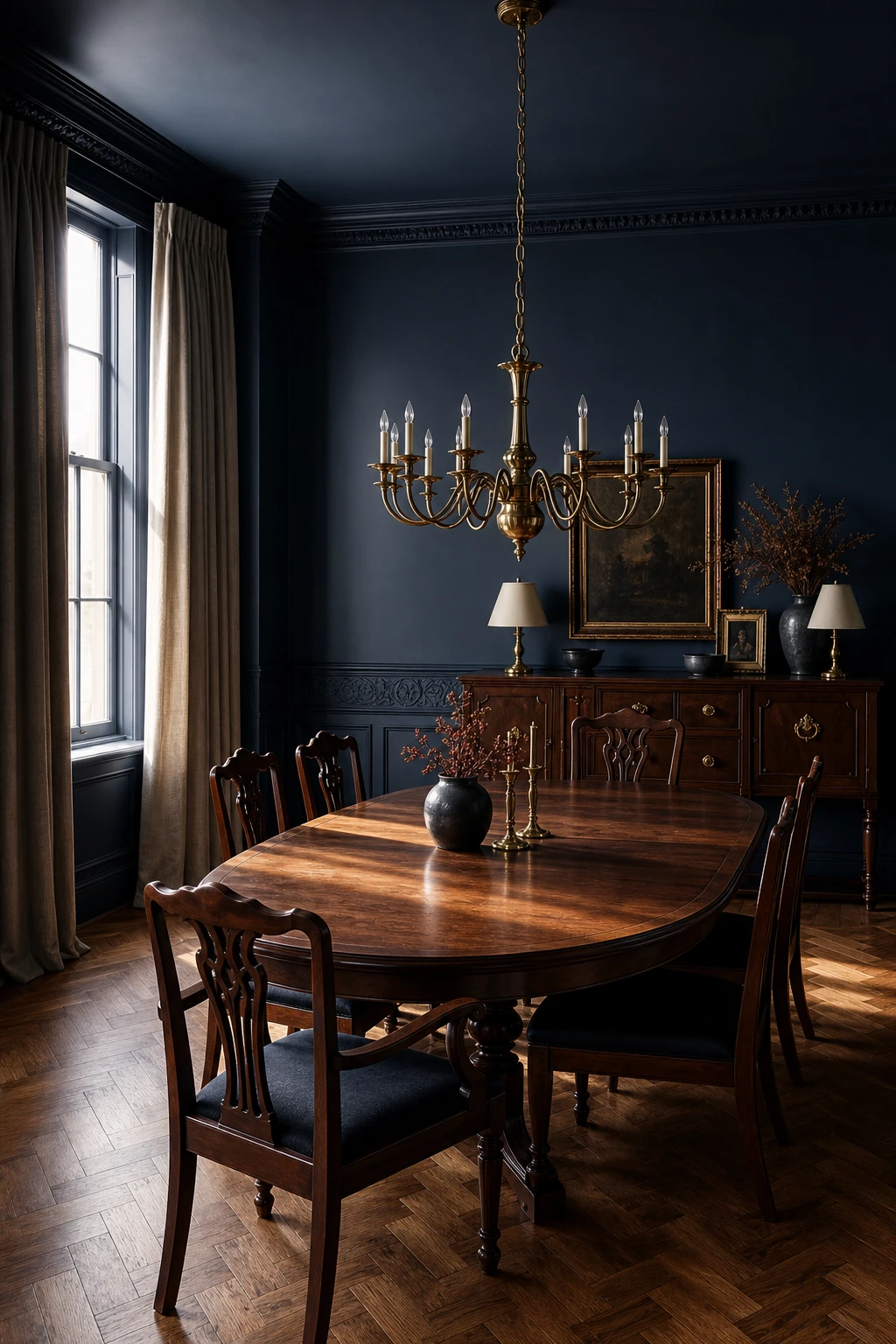
A Dark Wood Dining Set Gives Navy Walls Their Ideal Companion
Dark walnut or mahogany against navy walls is one of my favourite pairings because neither colour fights for attention. What I love is the way each surface seems to pull depth from the other, so the room feels genuinely layered rather than just painted. You get a warmth that pure navy alone can never quite deliver, and that is the whole point of this combination.
The Key Details
Oval walnut dining table
High backed mahogany dining chairs
Aged brass multi arm chandelier
Carved plaster wainscoting panels
Herringbone parquet flooring
Pro TipLay a cream or warm linen table runner across the centre of the table so the surface reads clearly against the dark walls behind it.
AvoidPairing very dark walls with an equally dark floor swallows the furniture completely, leaving the room feeling heavy rather than rich.
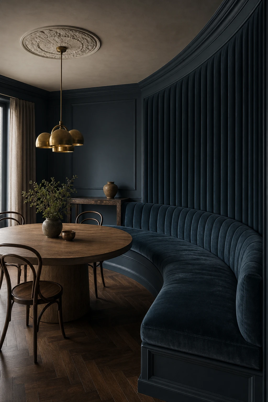
An Upholstered Banquette Makes the Blue Dining Room Feel Like a Restaurant Worth Going Back to
A banquette earns its place the moment it goes in, because suddenly the room has a wall of colour and texture that no freestanding chair can match. What I love here is the velvet channel tufting: it turns the seating itself into a design feature, not just somewhere to sit. You get an almost restaurant level intimacy, and the navy reads deeper and richer when it wraps a whole corner like this.
The Key Details
Channel tufted velvet banquette
Round oak pedestal dining table
Brass cluster pendant light
Herringbone dark stained oak floor
Plaster ceiling rose
Pro TipBuild lift up storage into the banquette base and you recover enough room to hide table linen, candles, and extra glassware without touching a single cupboard elsewhere.
AvoidPositioning the banquette too close to the table edge means guests have to squeeze in sideways, and no amount of beautiful upholstery will save a meal eaten with your ribs pressed against the wood.
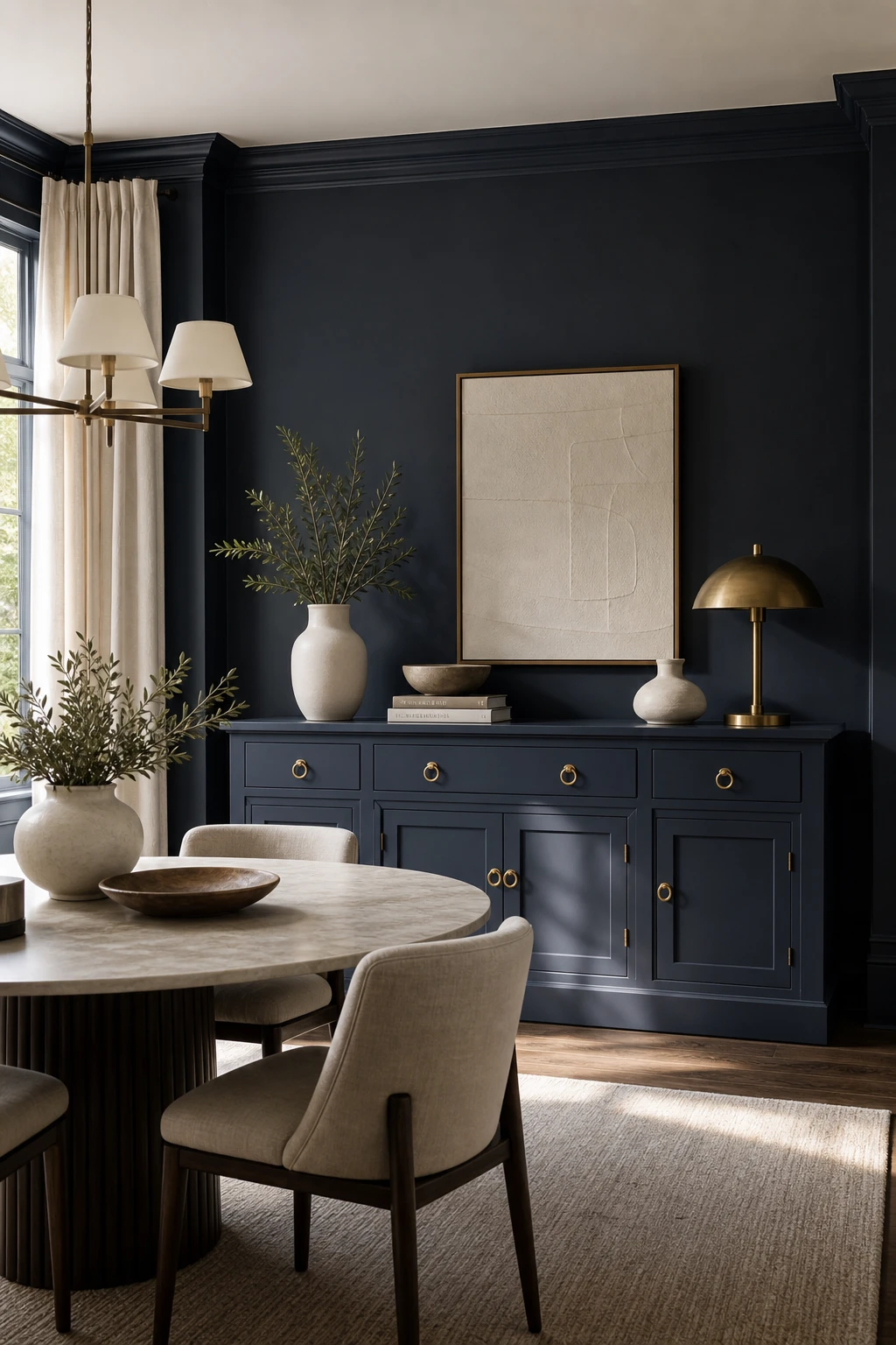
A Navy Sideboard Is the Piece of Furniture This Room Was Made For
A navy sideboard is one of those pieces that earns its place twice over, and I find myself specifying one in almost every dining room I design. Painted in a matching or slightly deeper navy than the walls, it reads as part of the room rather than furniture dropped into it. You get a strong, grounded anchor on that long wall, and because the colour does the heavy lifting, the styling on top stays calm and considered.
The Key Details
Painted hardwood sideboard with brass ring pulls
Matte white ceramic and sculptural vase styling
Brass table lamp on sideboard surface
Linen upholstered dining chairs
Floor length linen drapes at tall windows
Pro TipStyle the sideboard top in two clear heights, a tall lamp or vase at one end and a low grouped arrangement at the other, so your eye travels across it rather than seeing a flat line of objects.
AvoidCrowding the sideboard top with too many pieces flattens the whole surface into visual noise, and that beautiful painted colour you chose disappears completely.
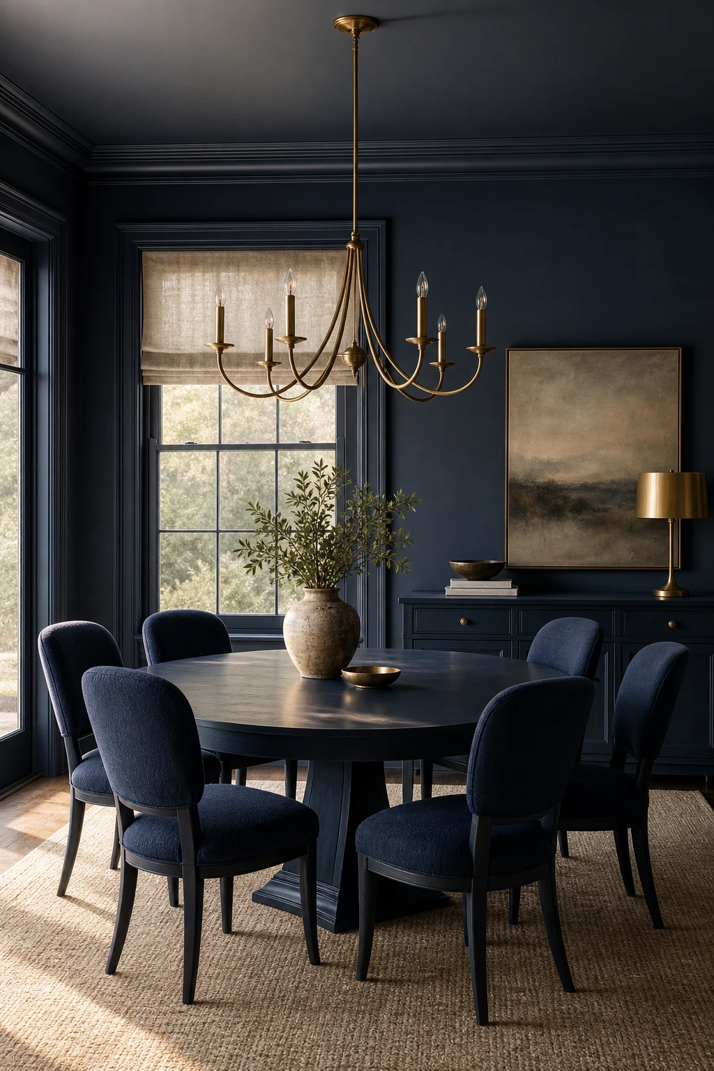
A Matched Navy Blue Dining Room Set Delivers a Look That Feels Effortlessly Considered
A matched set does half the work for you before a single candle is lit. What I love is the instant calm it brings: the table, chairs and sideboard all speak the same navy, so your eye settles rather than jumps. You will notice the room suddenly feels considered without requiring ten separate decisions. The bouclé chairs and linen blind then add enough texture to keep it feeling lived in rather than straight out of a catalogue.
The Key Details
Oval solid wood dining table in deep navy finish
Matched upholstered dining chairs in navy bouclé
Brushed brass candle arm chandelier
Linen weave Roman blind at tall sash window
Navy sideboard on the far wall
Pro TipLayer at least two different textile weights across the chairs and window to give the set warmth and stop it reading as a single flat block of colour.
AvoidBuying a full matched set sized for a showroom floor means the pieces can overwhelm a modest dining room and make the whole space feel cramped rather than cohesive.
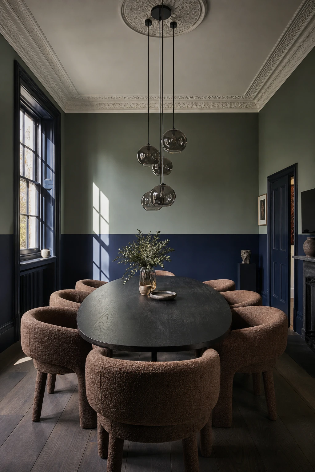
Two Toned Walls Give a Navy Dining Room a Graphic Edge That Feels Very Now
Splitting a wall into two distinct colour zones is one of my favourite moves for a dining room that wants personality without wallpaper. What I love here is how the navy anchors the lower half and the lighter tone lifts the eye upward, so you get a room that feels both grounded and open. Watch how the horizontal line gives the space a quiet graphic quality, almost architectural, that plain single colour walls simply never achieve.
The Key Details
Horizontal colour block wall division
Oval dark stained oak dining table
Curved boucle dining chairs
Clustered smoked glass globe pendant
Tall sash windows
Pro TipRun your colour block line at chair rail height, roughly 90 to 100 centimetres from the floor, because this proportion is already baked into the room’s architecture and the split will look considered rather than accidental.
AvoidSplitting the wall at a random midpoint, say exactly halfway up, flattens the room and makes both zones fight each other rather than one supporting the other.
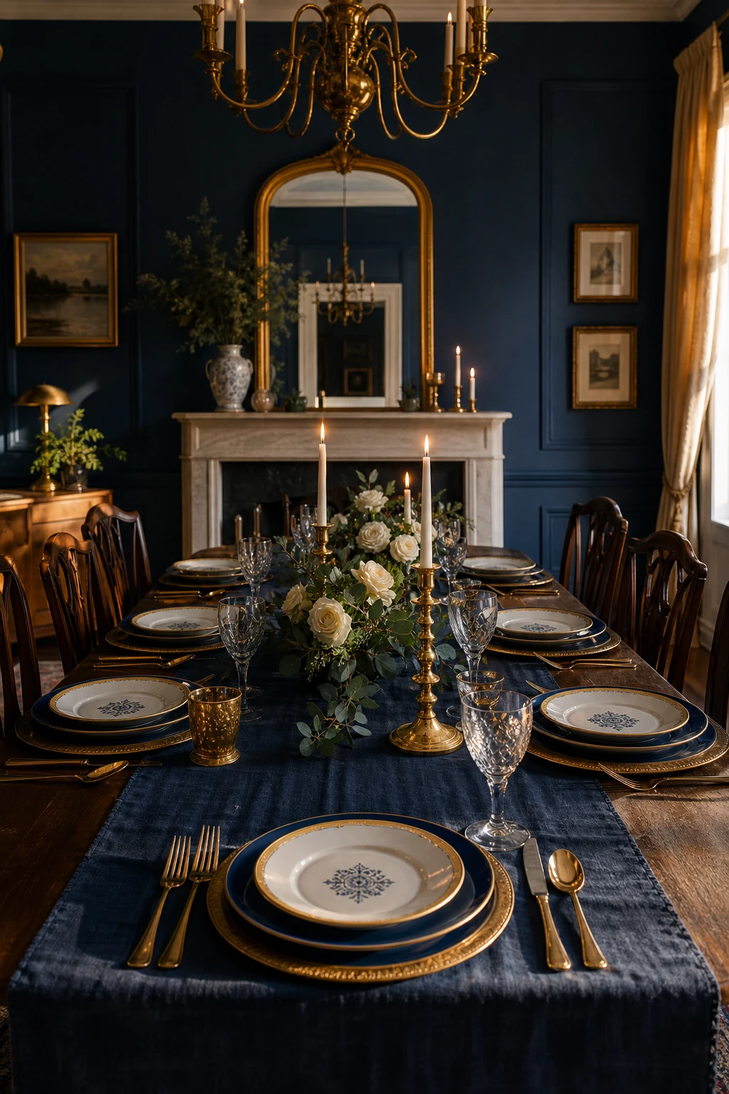
A Blue and Gold Table Setting Is All You Need to Make Dinner Feel Like an Event
A navy dining room already has strong bones, and the table is where you get to reward that confidence. Gold on the tabletop, rimming the glassware and catching the candlelight, pulls the warmth right up from the walls and makes the whole room feel deliberately composed. What I love here is how the deep indigo runner echoes the walls while the cream centrepiece keeps things from feeling heavy. Every guest sits down and the table feels like it was dressed for them.
The Key Details
Gold rimmed porcelain dinner plates
Tall gilded candlesticks
Polished brass cutlery
Deep indigo linen table runner
Cream and eucalyptus low centerpiece
Pro TipA set of gold rimmed glassware is the single fastest upgrade you can make to a navy dining room, because the metal picks up any light in the room and does the work of a full table restyle for a fraction of the cost.
AvoidLayering too many competing patterns across the tablecloth, plates, and napkins pulls the eye in every direction and fights the bold wall colour rather than completing it.
Alan launched Edward George London in 2017. Since completing his masters in Town & Regional Planning (MPlan) he has combined the skills he learned at the University of Sheffield with his passion for design, to help create a foundation for those looking to create a beautiful home.