Newsletter Subscribe
Enter your email address below and subscribe to our newsletter

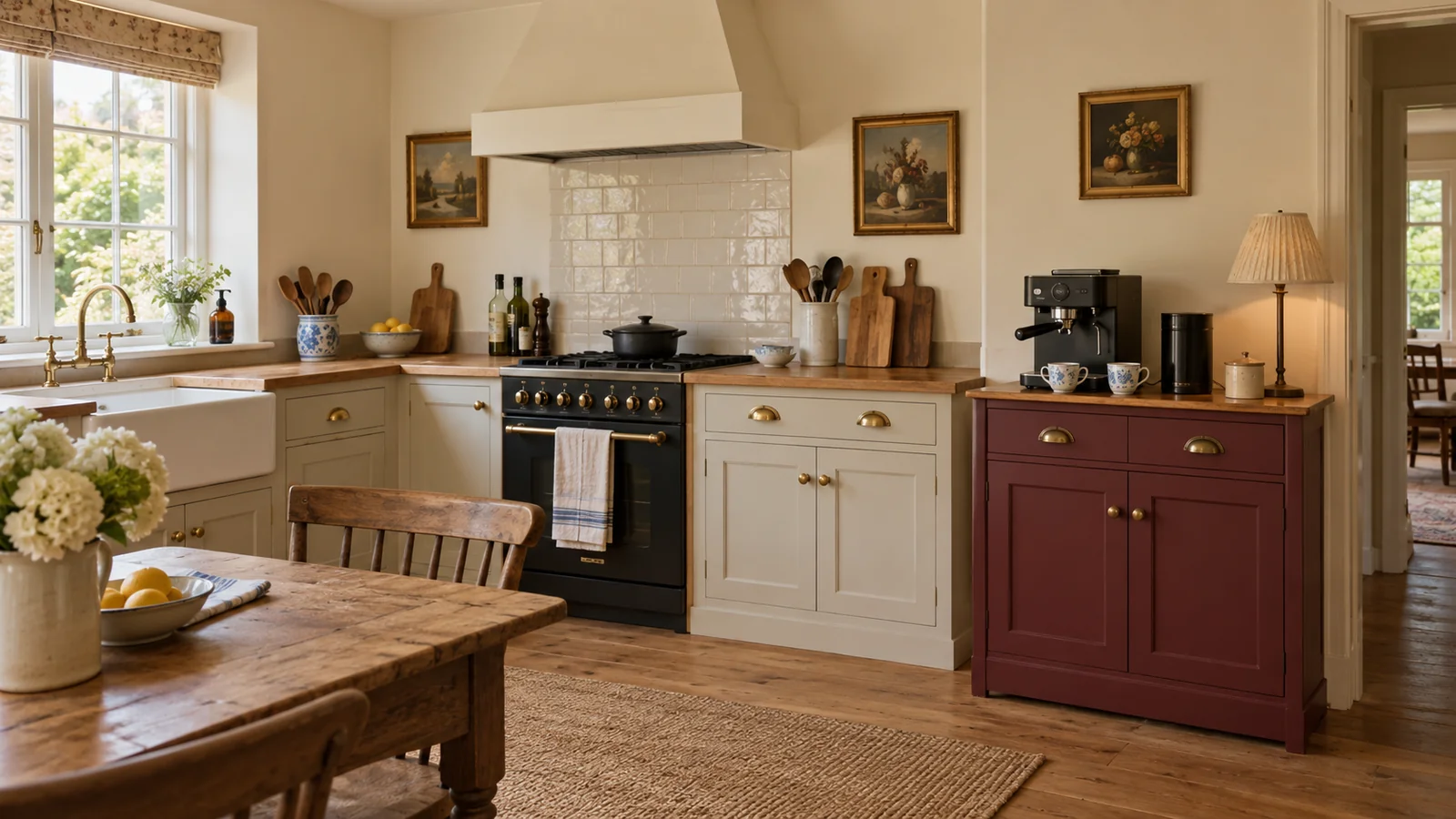
Vintage coffee corner ideas become useful when they begin with the coffee you actually make. If you love the ritual but have a small kitchen, you probably do not need another appliance, an entire wall of shelving or a miniature café set. I would look first at the cup you reach for, the machine or brewer that earns its place and the furniture already around them. A warm cream background, a little aged oak, a muted burgundy cabinet and a few blue and white cups can give that ordinary corner a collected feeling without taking over the room. This is the direction I would choose for a home coffee lover who wants character alongside everyday usefulness. The aim here is to help you recognise the right vintage elements and decide what belongs in the picture. Your brewing method can stay exactly as it is while the corner starts to feel more like part of your home.
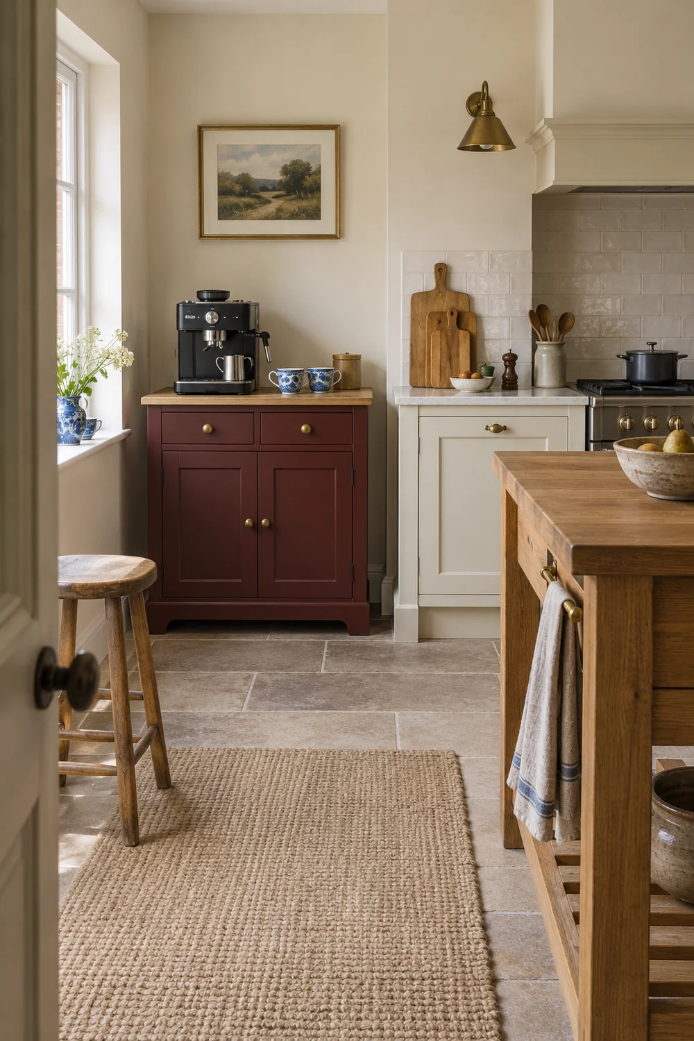
The most convincing coffee corners borrow their character from the room around them. I would avoid beginning with a coffee sign, a special wallpaper or a shopping basket of themed objects. Instead, notice the existing cupboard doors, the floor and the colour of the worktop. Those are the large surfaces that your coffee corner has to live with. A collected look feels settled when its smaller objects have some relationship to those fixed elements, even if none of them matches exactly.
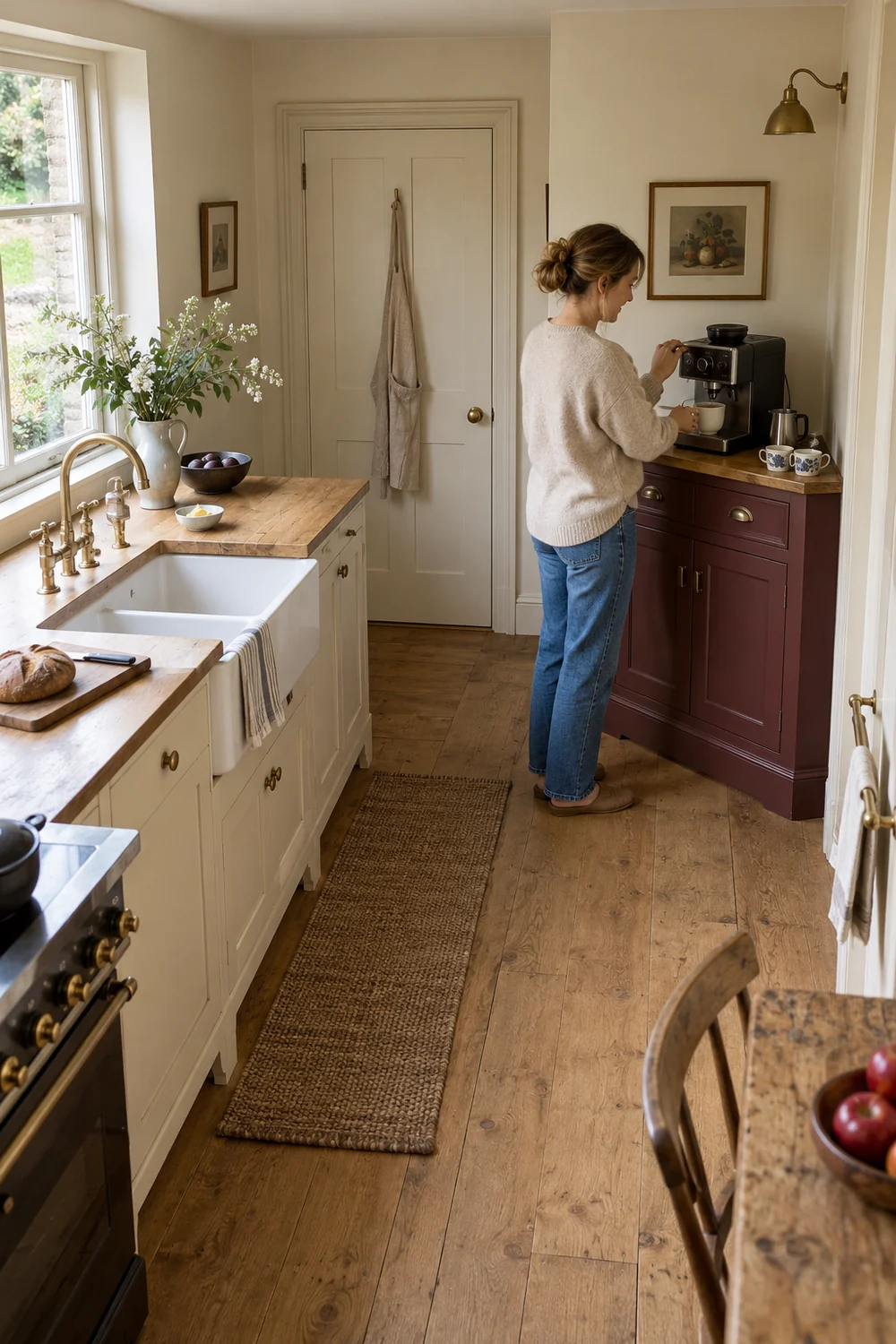
In a small kitchen, the corner is always visible alongside other jobs. Breakfast dishes, the chopping board and the washing up will not disappear because you have arranged beautiful cups. I would keep the coffee area visually compact, with one recognisable furniture shape or one clear group of objects. This lets you see it as a deliberate part of the kitchen rather than a second room squeezed onto the counter. The empty surface around it is part of the composition.
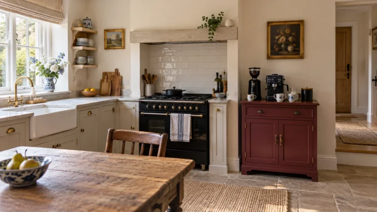
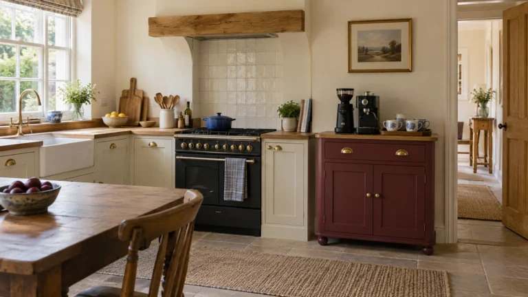
For this project, I would use warm cream as the quiet background and let burgundy provide the single stronger colour. Honey toned oak brings an aged texture, while blue and white ceramics give the eye a few smaller details to enjoy. A stainless steel or black machine can stay visible. It does not have to pretend to be old. The contrast between a useful contemporary appliance and a cabinet with character is often what makes the whole arrangement convincing.
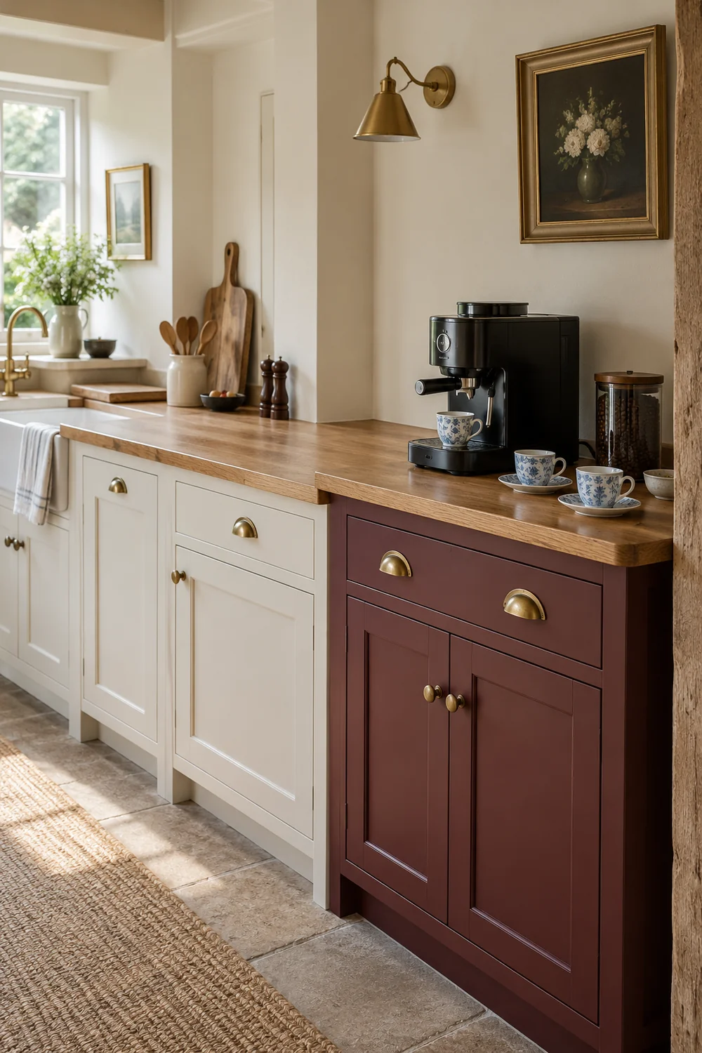
If you want that approach to carry beyond the coffee corner, the broader english country kitchen reference explains the idea of treating the room as collected furniture. For this smaller project, I would borrow the principle rather than reproduce an entire country kitchen. The coffee area should feel as though it belongs to the life already happening there, not as though a stylist has installed a separate café.
One characterful piece is usually enough to establish the vintage direction. It might be an existing painted cupboard, a small oak cabinet or the visible end of a dresser that is already in the kitchen. I would choose a simple shape with a clear job before looking at decorative detail. A cupboard that holds the everyday cups and tools has a reason to be there. A narrow table with nowhere for those things to go may look attractive but leave the same clutter on the counter.
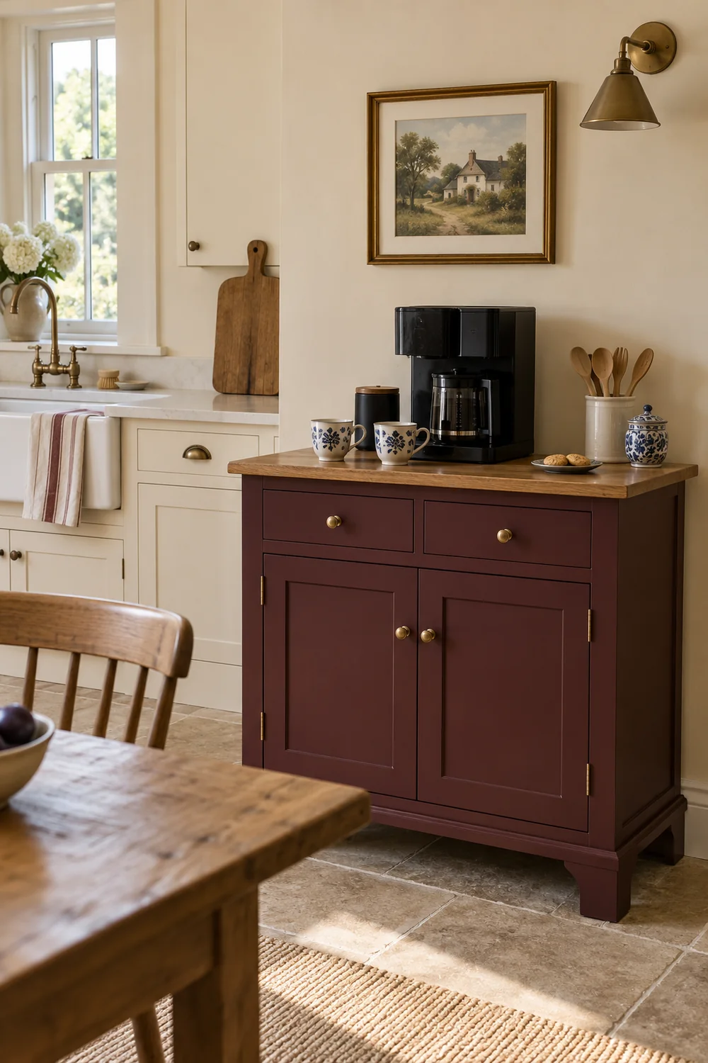
The piece does not have to be an antique. A new cabinet with modest proportions and a softened painted finish can sit happily alongside older ceramics. Equally, an older cabinet can work with a plainly modern tray. What I would avoid is adding several imitation period details at once. Carved brackets, ornate handles, a distressed sign and a heavily patterned curtain can turn a quiet corner into a set. Let the furniture carry the strongest note and keep the supporting objects simpler.
Burgundy works here as a concentrated colour rather than a room wide instruction. I would use it on the coffee cabinet or on one existing cupboard face, if changing that finish is appropriate for your home. If the cabinets cannot be changed, a burgundy cloth or a small ceramic detail can introduce the same family more gently. You do not need to repaint the whole kitchen to make the corner feel intentional.
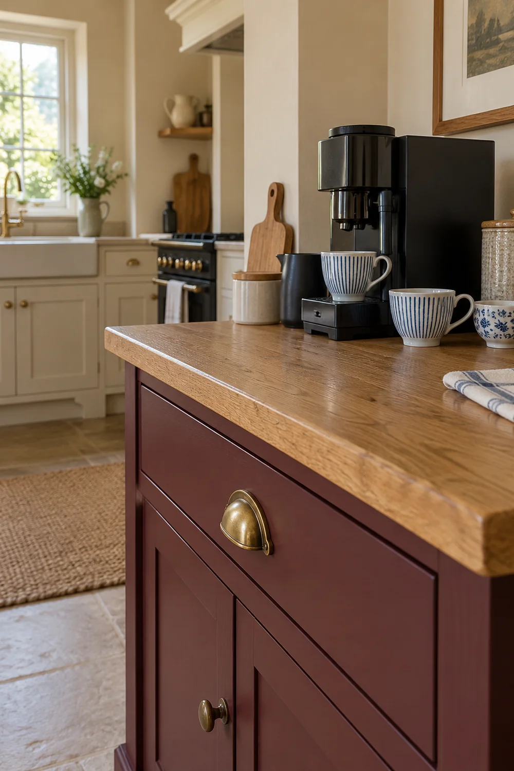
Construction still matters behind the visual choice. A bowed surface, a loose leg or a door that cannot open comfortably is not an appealing kind of character for something you use each morning. The kitchen cabinets reference gives you a wider view of materials, hardware and storage. At this inspiration stage, the useful decision is simpler: choose one piece that looks like it belongs and can eventually support a real coffee routine, rather than several pieces that only decorate the idea.
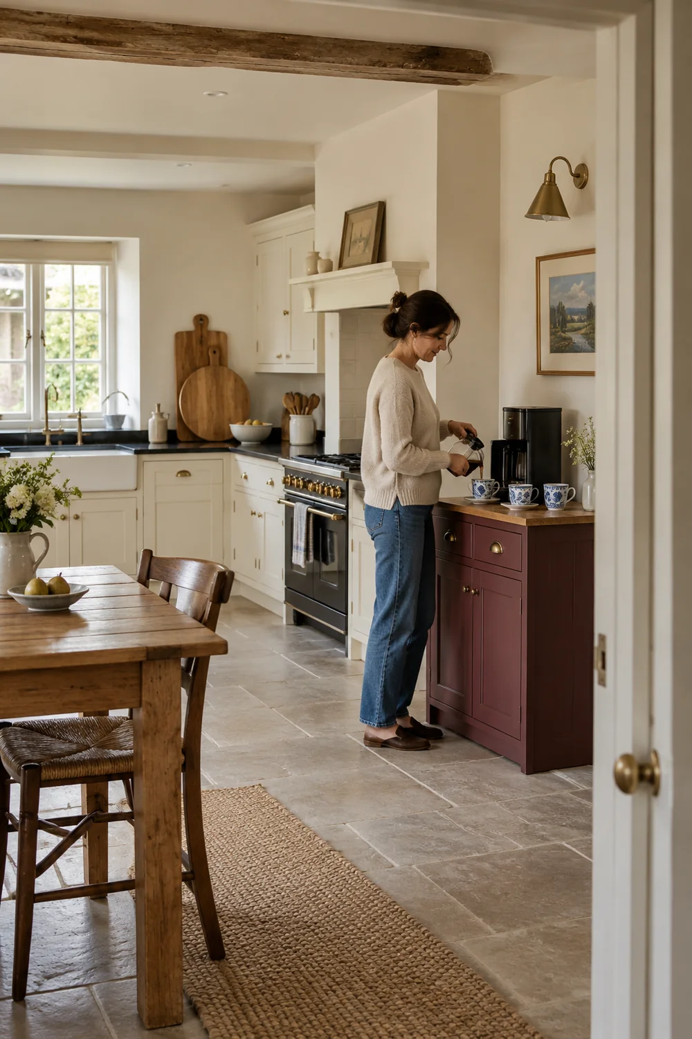
The cups are where this corner can feel personal without becoming crowded. I would begin with the two or three that you genuinely use, not a complete matching set bought for the photograph. Notice why those cups keep being chosen. Perhaps one feels comfortable in your hand, another holds your longer morning drink and a small pair comes out when someone joins you. Those differences can make a display look collected while still being entirely practical.
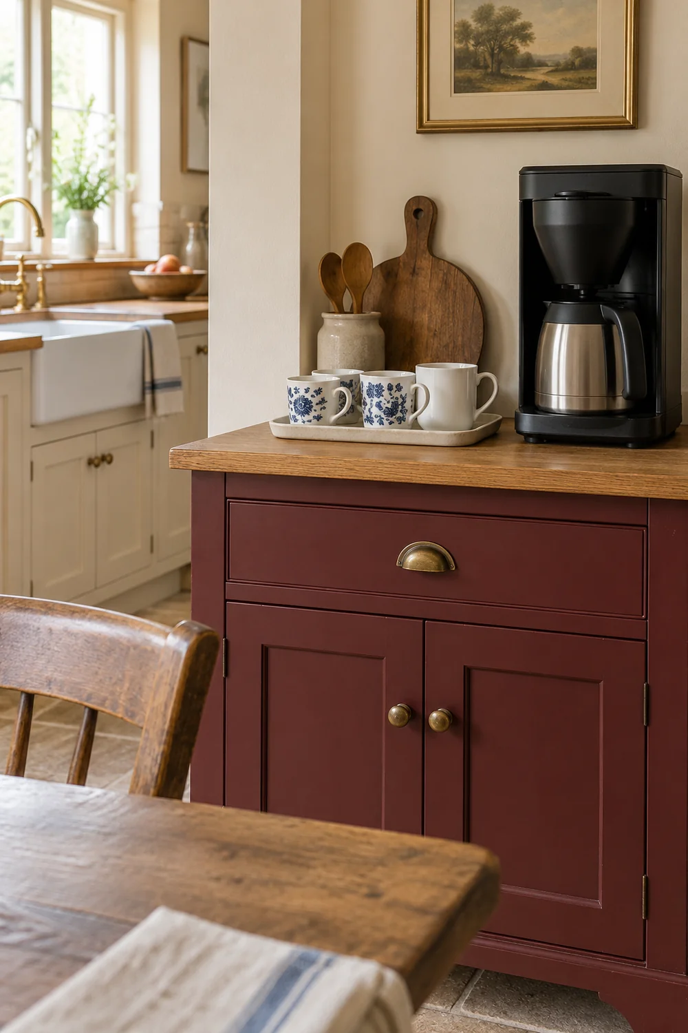
Blue and white china provides a useful thread through mismatched shapes. A little floral pattern can sit beside a plain white mug when the scale of the group stays modest. I would avoid placing every patterned piece shoulder to shoulder. Give one cup some space, let another sit beside the brewer and put the remainder away. The display should tell you where the morning drink begins, not ask you to dust a whole collection before you make it.
Keep daily drinkware and decorative finds separate in your mind. You cannot establish that an old cup is suitable for drinks simply because its glaze looks intact or its pattern is lovely. For everyday coffee, I would use pieces sold or otherwise confirmed for food contact and follow their care guidance. An uncertain vintage cup can still be a decorative object, but it should not quietly become the cup you use each morning. Age is a visual quality, not a suitability check.
A display needs a boundary. I would choose one shallow shelf, a section of an existing dresser or a compact group above the cabinet, rather than filling every available level. The boundary helps you decide what stays visible. A small framed print, a cup with a generous handle and one little vessel can carry plenty of character when they are allowed to stand apart. Adding another object should improve the group, not simply use up a gap.
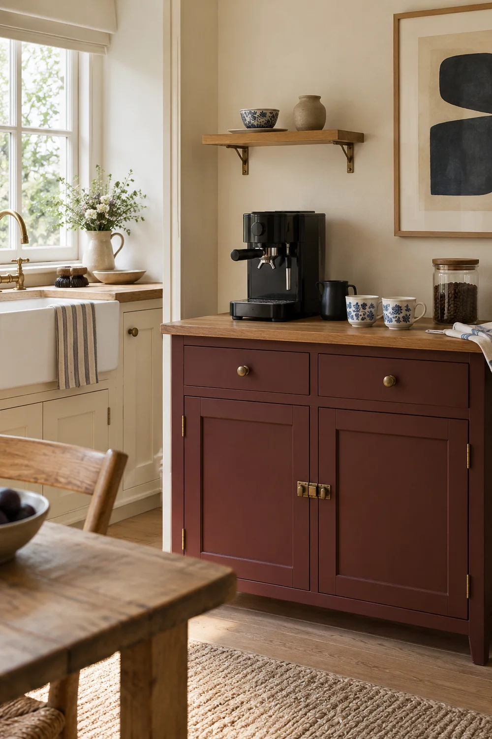
Think about the view you have while making coffee. A cup on the shelf that is visible from across the room may be less useful than a cup you can reach without turning away from the brewer. A picture might look better beside the display than behind equipment that hides half of it. I would let the ordinary working view guide the arrangement. The display is there to make a daily moment enjoyable, not only to impress someone looking in through the doorway.
For a small kitchen, I like a little asymmetry. The heavier machine can sit toward one side, with a lighter cup group nearby and a little space between them. A single print can be offset from the cabinet rather than centred over every object. This is a design preference, not a rule that you have to follow. Its purpose is to keep the corner from looking like a shop window where each object has an identical partner.
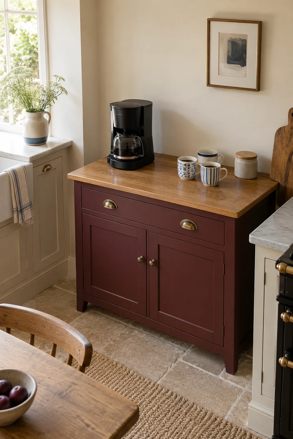
The collected furniture approach in an english country kitchen is helpful here too. A dresser earns its character through useful crockery and separate pieces, not through a complete themed collection. I would apply that on a smaller scale and keep the display shallow enough that the coffee corner still has breathing room. When you can name the job of every visible item, it becomes much easier to recognise the extra one.
Your machine or brewer will probably be the strongest object in the corner, so I would let it influence the colours instead of disguising it. A black appliance can provide a dark outline beside cream walls and a burgundy cabinet. Stainless steel can sit comfortably with warm oak when the surrounding group is calm. A white appliance may need a darker cup or tray nearby so that the corner does not dissolve into one pale patch.
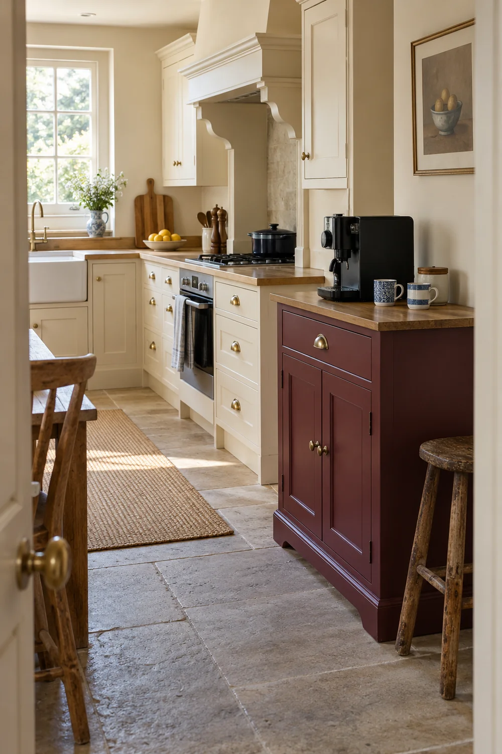
The burgundy is most effective when it stays concentrated. I would let the cabinet carry it and leave the work surface lighter. Blue and white ceramics then become a small pattern rather than a competing colour scheme. A natural linen cloth can soften the edge without introducing another bold hue. You do not need every colour in every image or in every object. The room will feel more coherent when one colour leads and the others support it.
Materials are part of that palette. Smooth contemporary equipment can look better beside the visible grain of oak than beside a second glossy object. A plain glazed tray can give patterned cups somewhere quiet to stand. I would choose a little variation in texture rather than trying to match every timber or metal exactly. There is a difference between a collected group and a group in which every surface is arguing for attention.
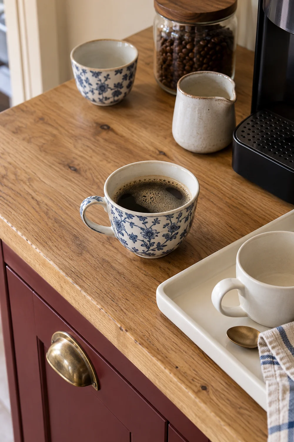
If you want to see how natural textures can carry warmth without relying on lots of accessories, the earthy kitchen reference is a useful optional branch. Here, I would keep those textures close to the actual coffee job. The cabinet, the surface, the cups and one cloth already supply several layers. The palette should help the brewer belong in the kitchen, not create a reason to replace it with a more photogenic model.
A vintage coffee corner should look useful before it looks full. I would want to see somewhere to place the cup, a clear piece of surface for the actual preparation and an obvious place for the few tools used each morning. The exact size of those areas belongs to the planning stage. At this point, look for the visual signal: does the arrangement suggest that someone can make a drink, or does it look as though everything will have to move first?
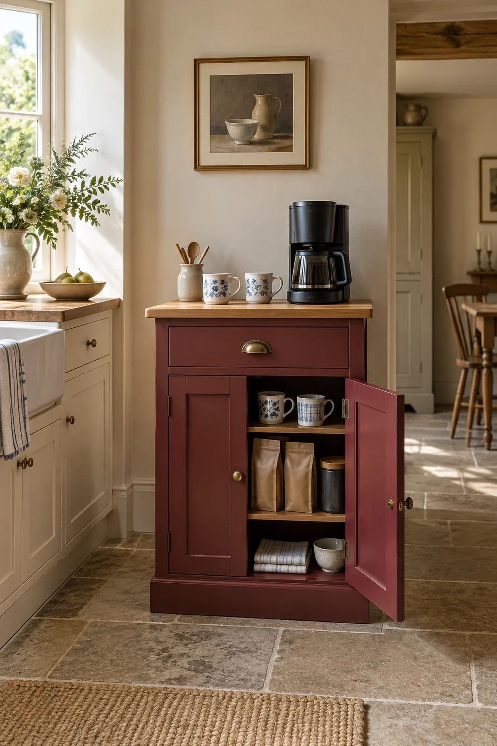
A tray can help group small things, but it should not become a platform for the whole routine. A container, two cups and a spoon may sit together while the brewer remains on its own appropriate surface. A basket can hold spare cloths inside the cabinet rather than competing with the cup display. Closed storage is particularly valuable when your coffee supplies have brightly coloured packaging that fights the quiet palette you are trying to create.
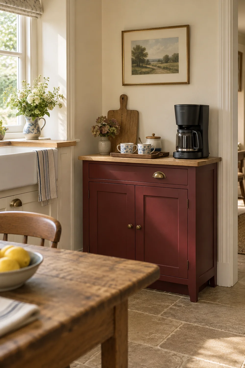
The wider cottage kitchen reference shows how modern appliances and useful display can sit inside a characterful room. For your corner, I would hold onto that balance. A cabinet with a door, a limited cup display and a contemporary brewer are enough to make a strong visual choice. You can keep the things that support the coffee ritual close while allowing the rest of the kitchen to remain an ordinary working space.
Before you buy anything, I would describe your preferred corner in one sentence. For example: a warm cream kitchen with one burgundy cupboard, honey toned oak and a small group of blue and white cups around the brewer I already use. That sentence gives the project a boundary. A large neon sign, a wall of syrup bottles or a second cabinet may be appealing in another home, but they do not automatically belong to this particular picture.
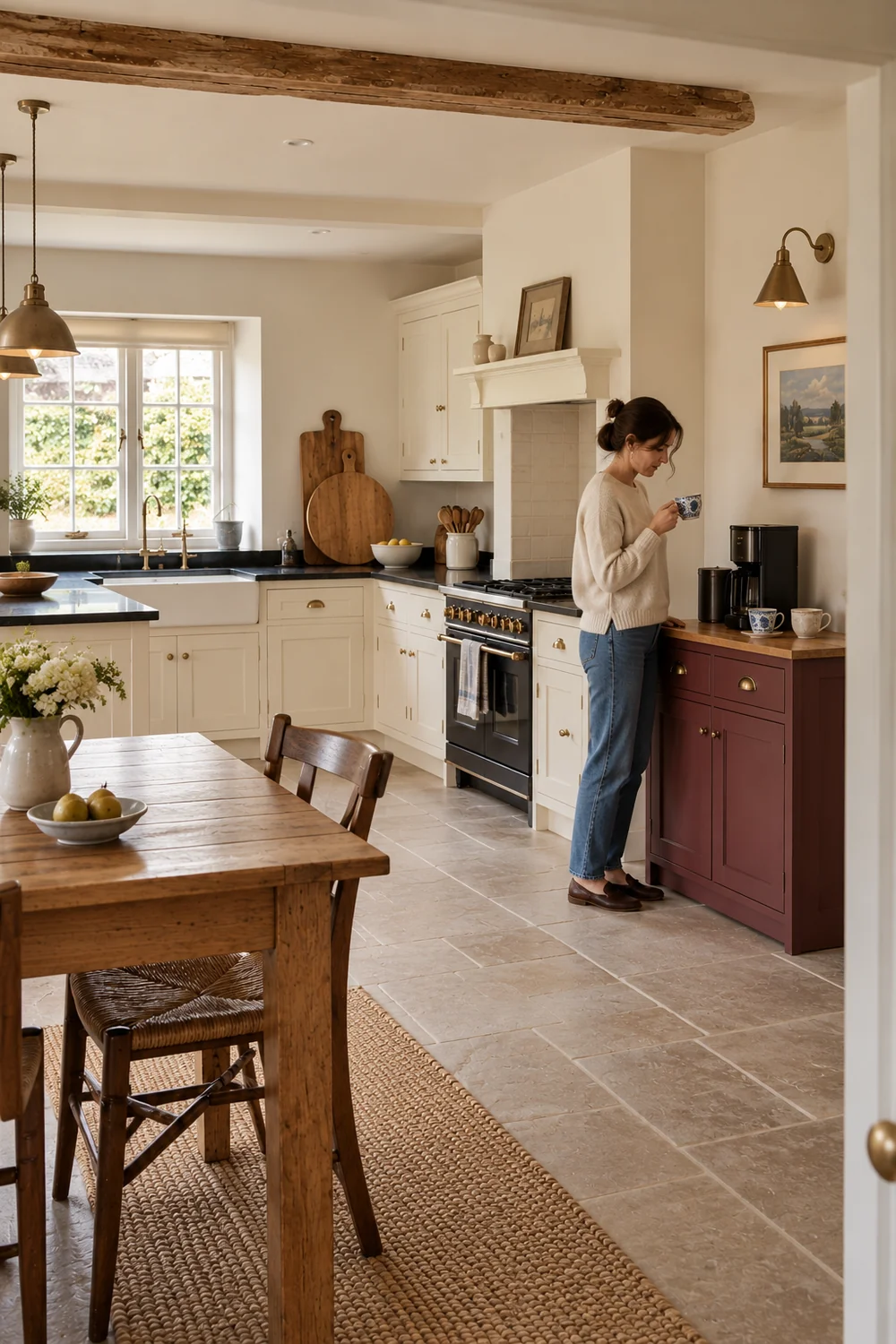
Then make a short keep and add list. Keep the appliance that suits your drinks, any useful cupboard that is already in the right area and the cups you enjoy using. Add only the visual elements that are genuinely absent. Perhaps that is a plain tray, a softer painted colour or one small framed print. If the corner already has enough character, the most important change may be removing a few unrelated objects rather than introducing something new.
The next question is where that direction will work in the actual kitchen. A countertop corner and a freestanding cabinet make different demands on preparation space, opening access and the route to the sink. The kitchen coffee station plan answers that distinct decision. You can arrive there with a clear picture of the result you want, while leaving the measurements and arrangement to a proper working plan.
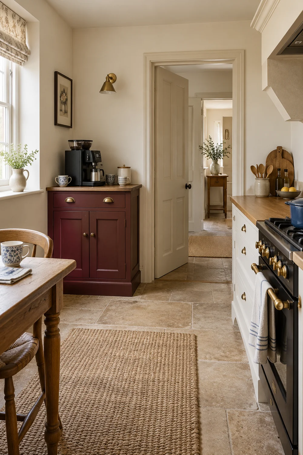
I would keep the finished direction quiet enough to grow through use. The vintage feeling should come from one characterful furniture piece, useful cups and a palette that respects the room. You do not have to complete a collection or imitate a café before the corner earns its place. Once the visible objects reflect your own coffee habit, you have a convincing starting point. The practical plan can then protect that character while making sure your small kitchen still works for everything else.