Newsletter Subscribe
Enter your email address below and subscribe to our newsletter
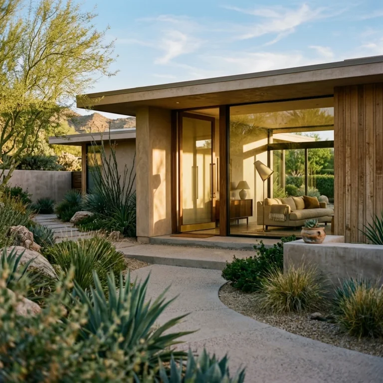
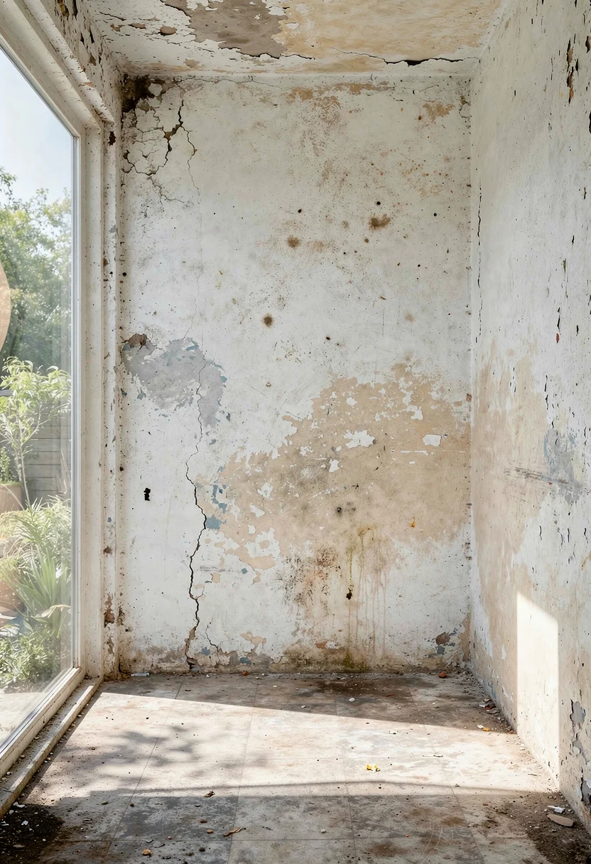
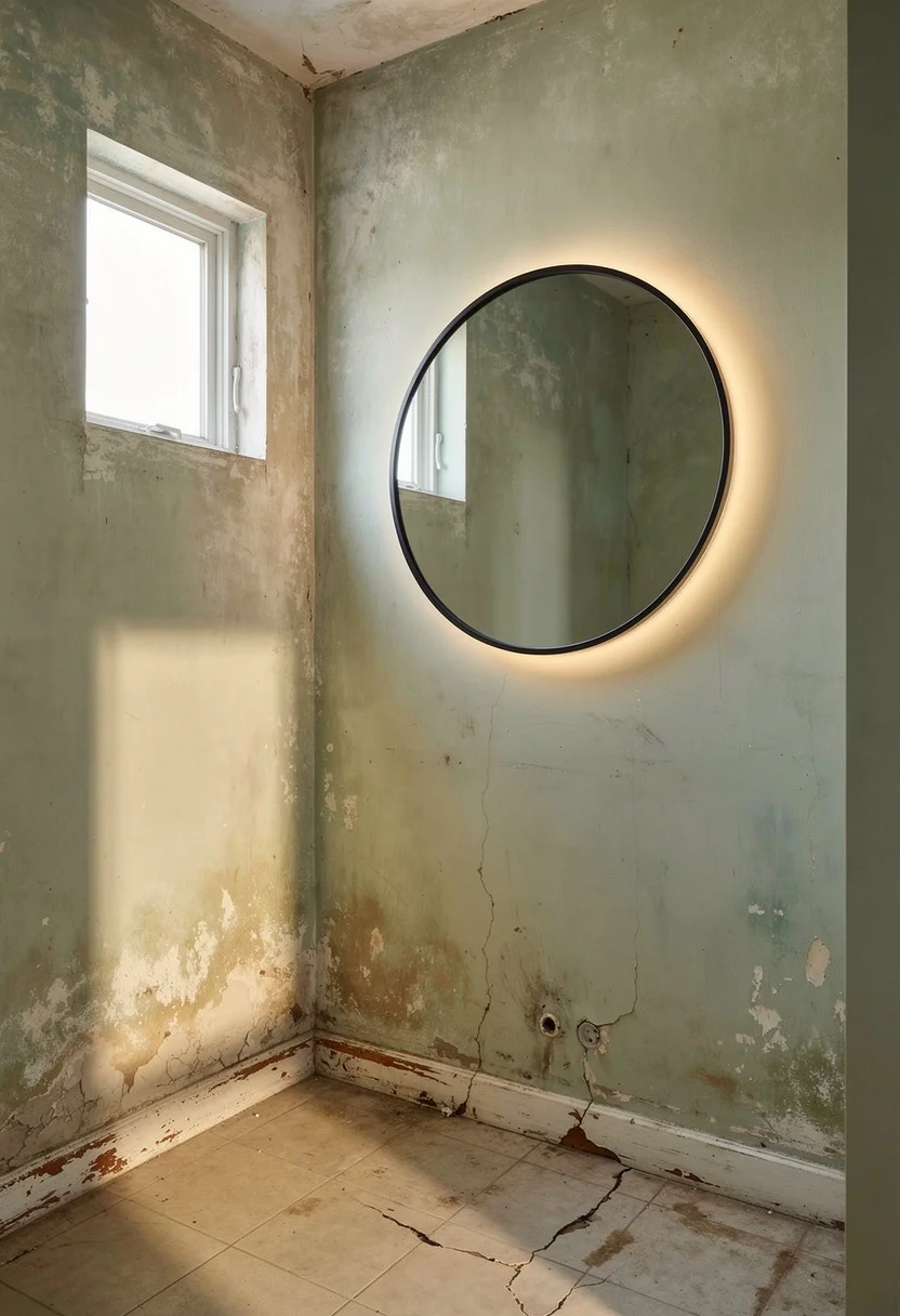
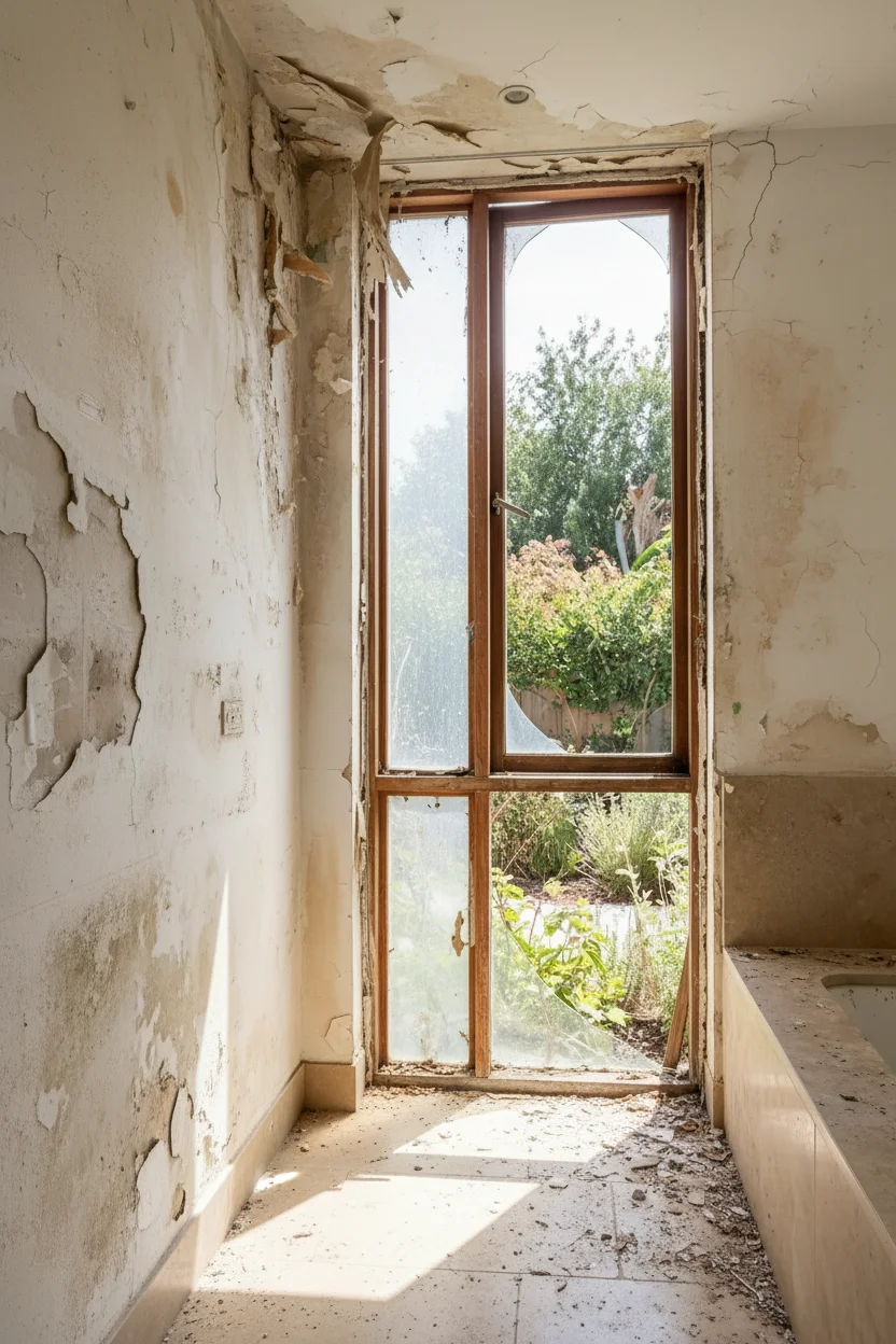
A frameless glass shower panel makes a bathroom look 30% bigger. That single statistic from recent designer surveys explains why every modern small bathroom renovation worth its tile grout starts with what you remove, not what you add. The industry has shifted. Where bathroom design once meant cramming fixtures into tight footprints and hoping for the best, today’s approach is almost surgical. Designers are borrowing wet room principles from Japanese bathhouses and space planning tricks from yacht interiors to transform bathrooms under 50 square feet into rooms that genuinely feel expansive.
If you’re looking for broader modern bathroom inspiration beyond small spaces, our full modern bathroom gallery covers every size and layout.
Here are the techniques that make that transformation possible.
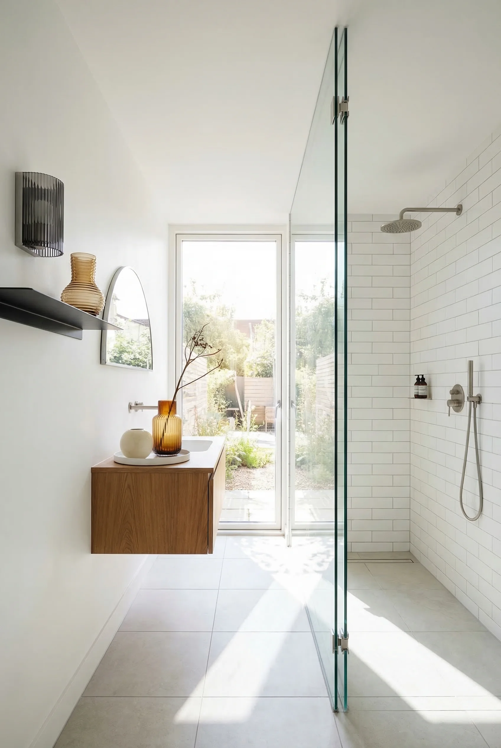
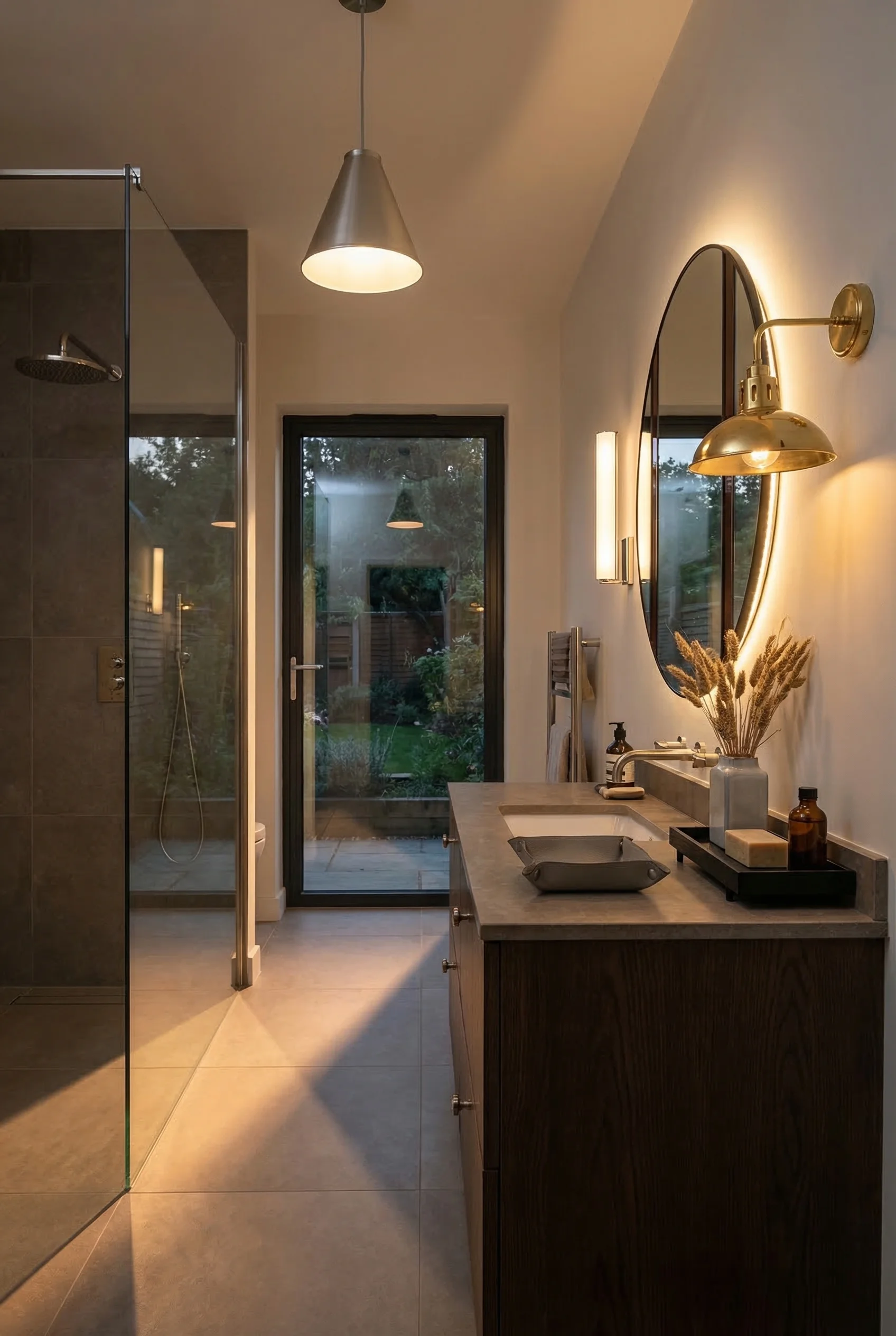
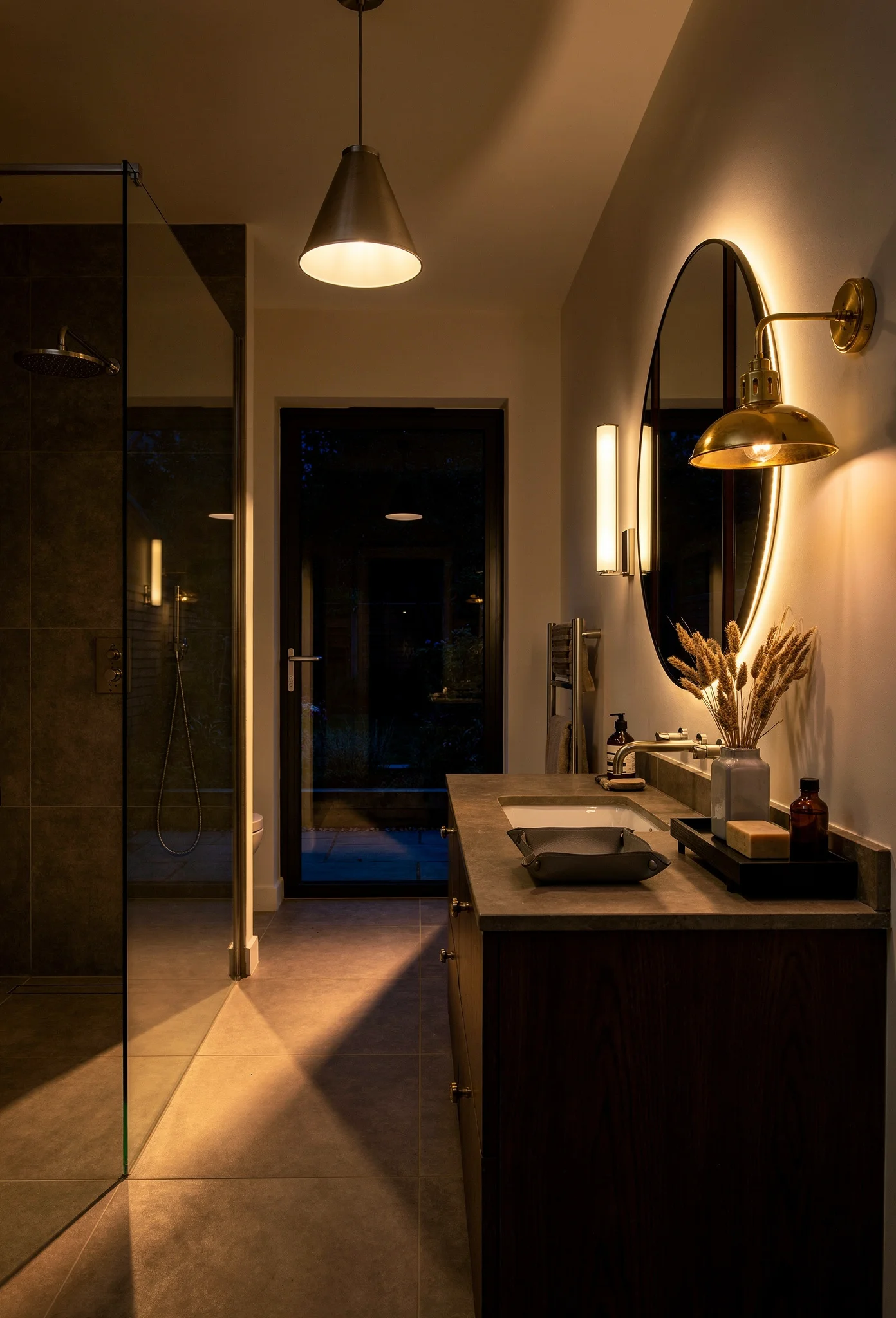
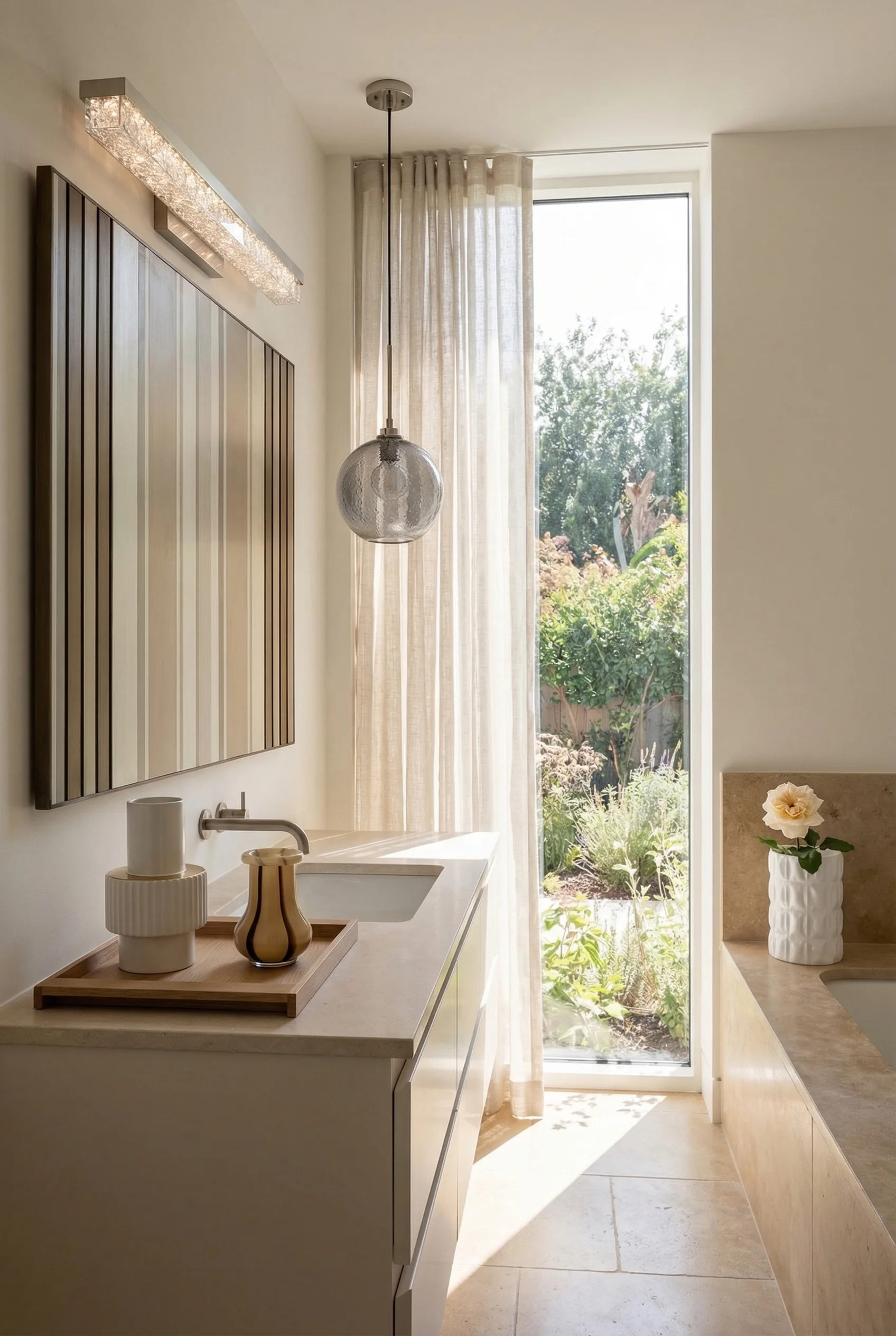
Removing the bathtub is the single most effective thing you can do to enlarge a small modern bathroom. Not visually enlarge. Actually reclaim usable floor area. A standard tub occupies roughly 13 square feet. Replace it with a curbless walk in shower behind a single frameless glass panel, and you get that space back while creating an unbroken sightline from wall to wall.
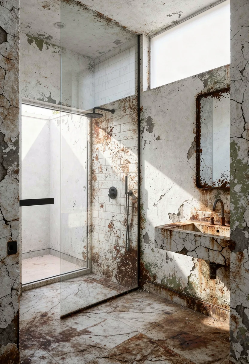
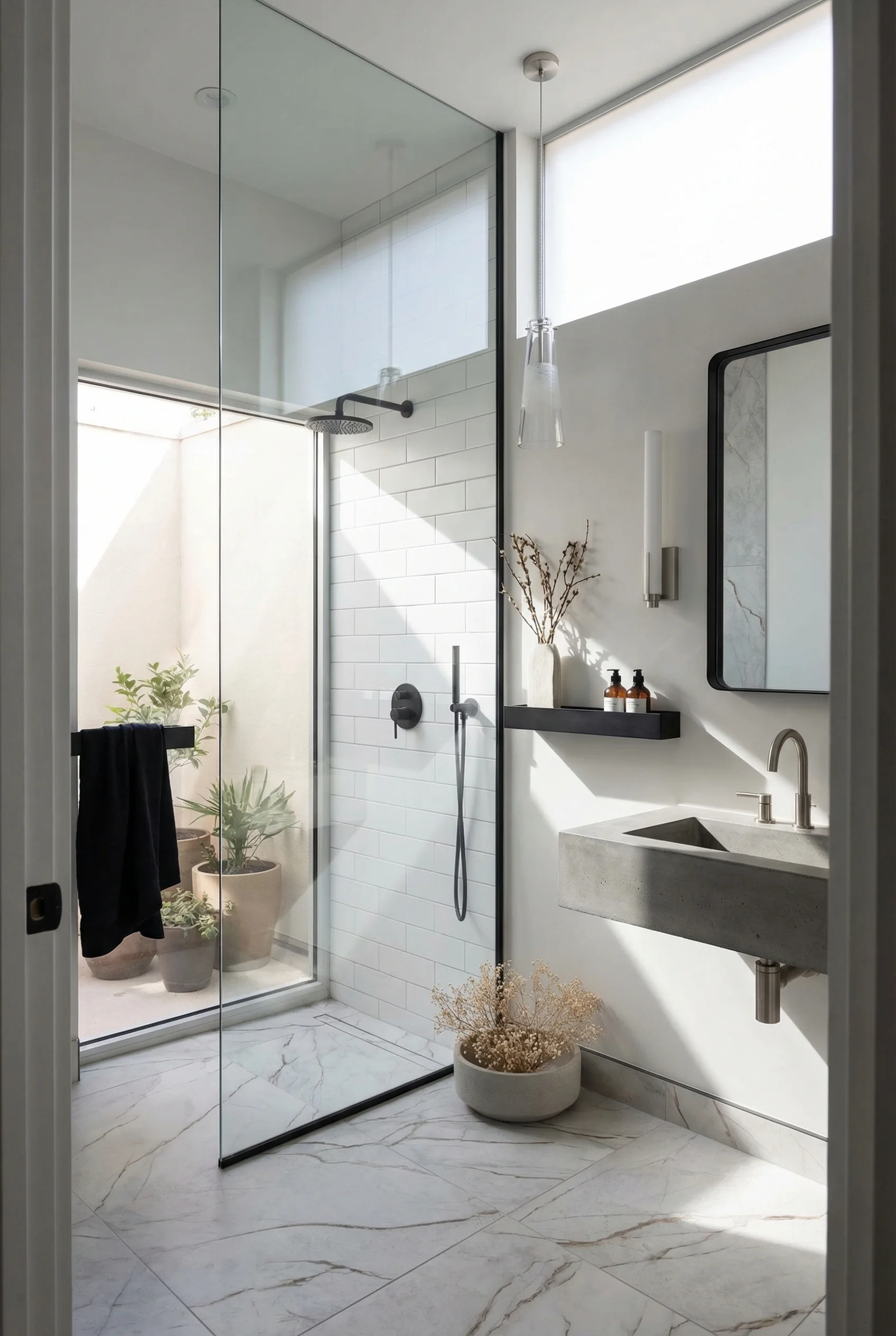
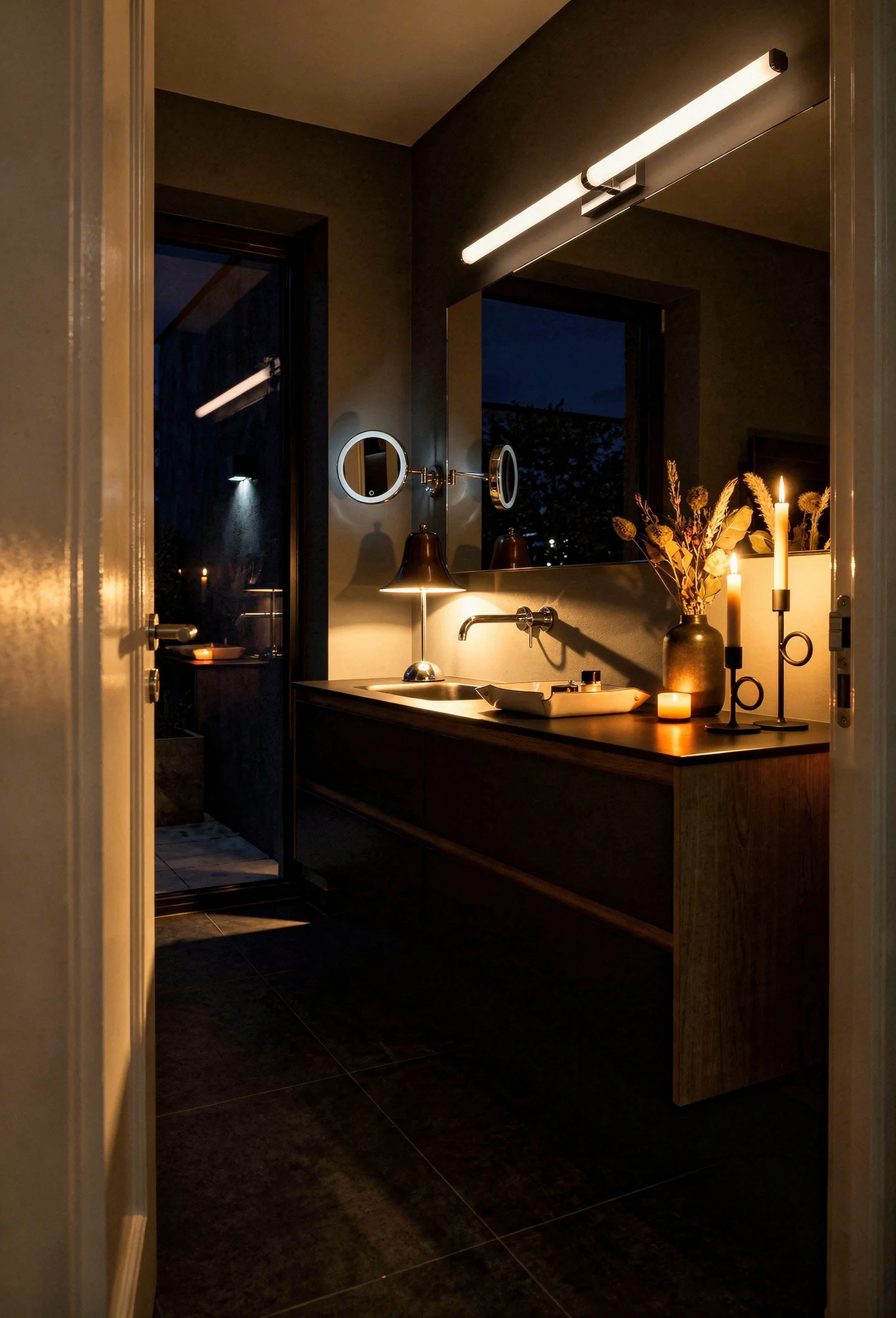
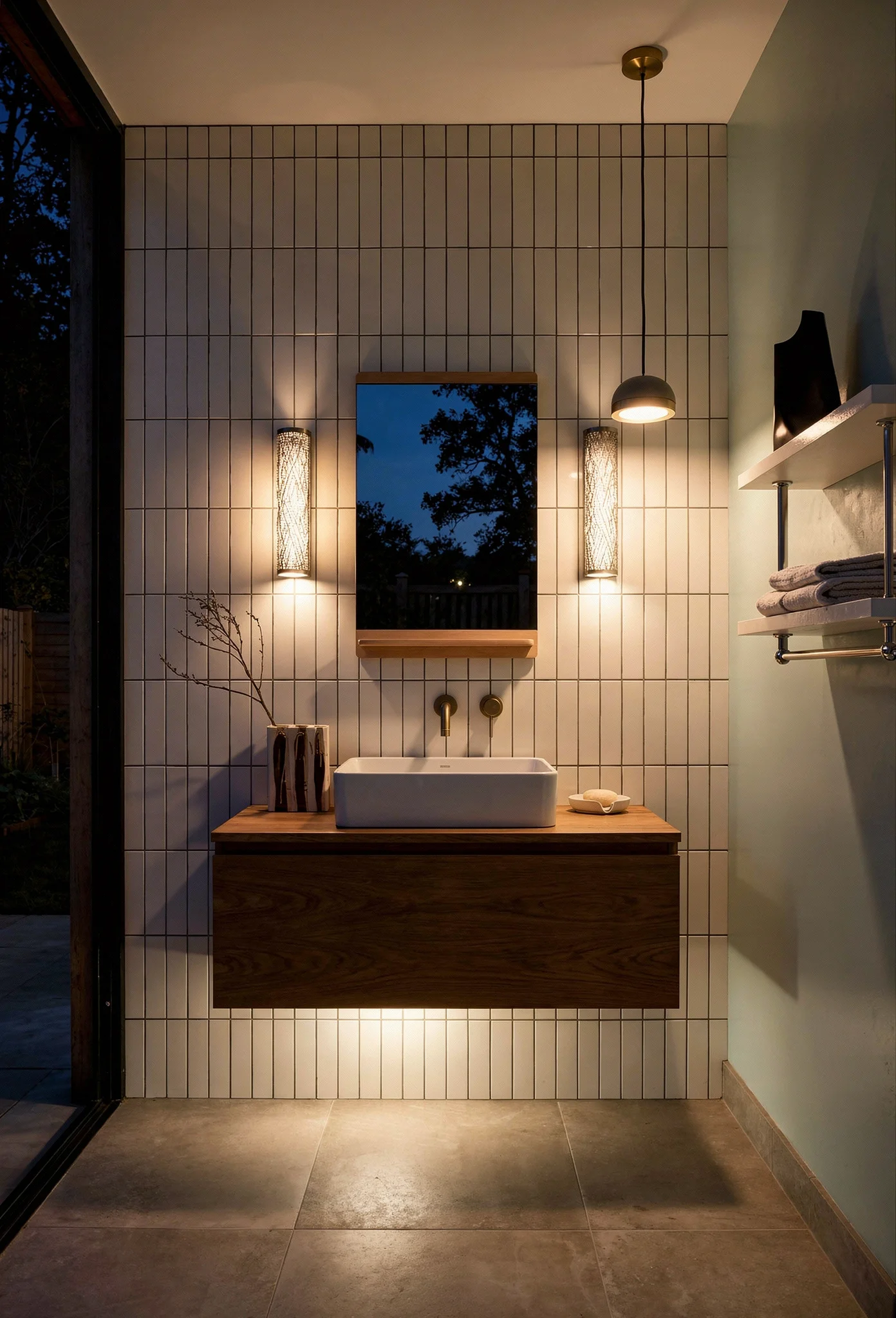
Start with the floor. A zero entry shower with a linear drain eliminates the curb entirely. Your eye reads the floor as one continuous plane, which is exactly why designers insist on running the same tile from the bathroom floor straight into the shower base. No threshold, no visual break, no mental shrinkage.
Then choose your glass. A single fixed glass panel is the modern move. Skip the framed enclosure, skip the sliding door on a track. One piece of frameless glass, floor to ceiling if your ceiling height allows it, creates separation without creating a box. The room keeps its depth.
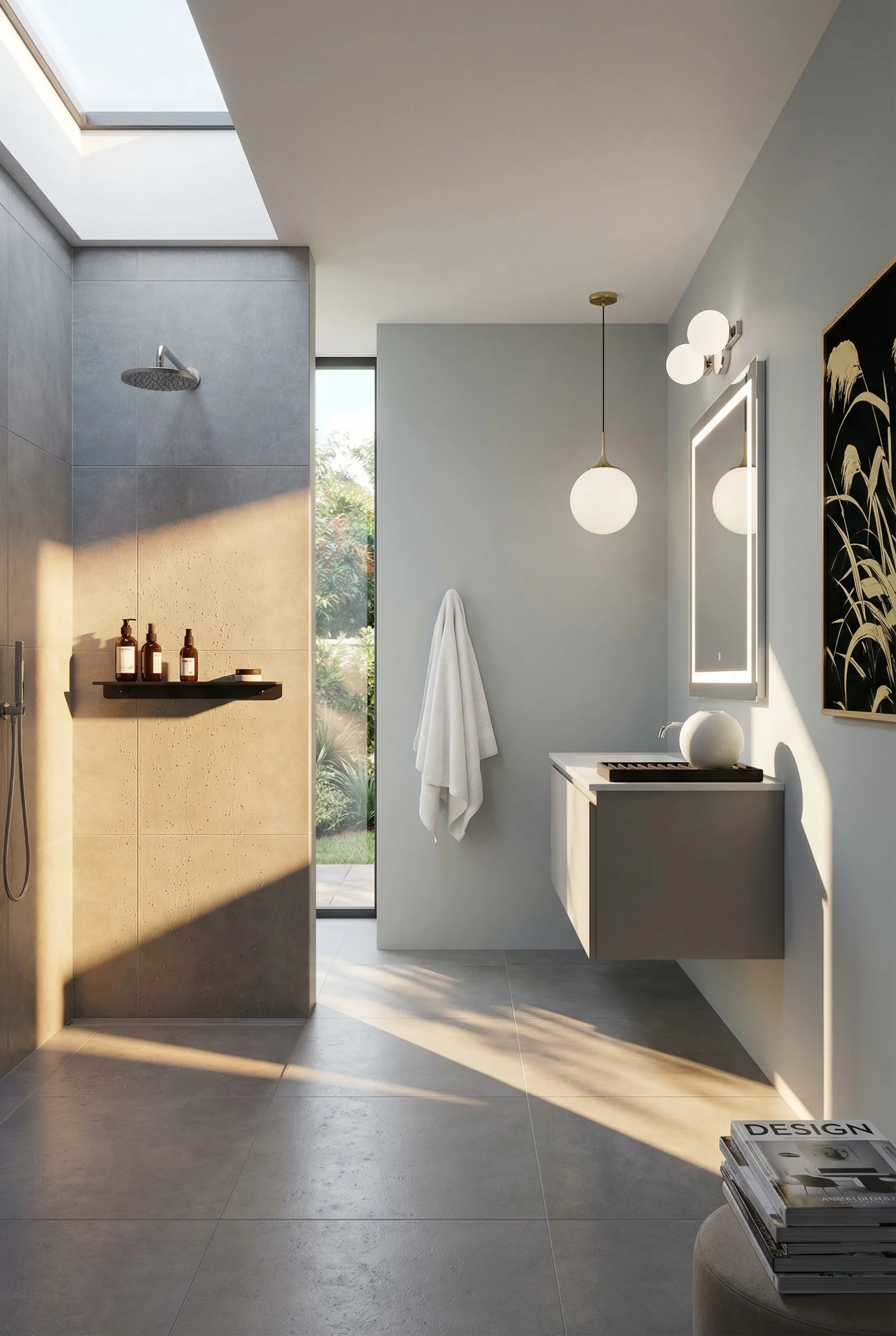

Consider fluted glass if privacy matters. This is one of the strongest bathroom trends right now. Fluted or reeded glass diffuses light beautifully, provides genuine privacy for shared bathrooms, and adds vertical texture that draws the eye upward. It handles the “I don’t want to shower in a fishbowl” concern without sacrificing a single inch of visual space.
For the most committed small space renovation, look at the full wet room approach. Waterproof the entire floor, slope it toward a central or linear drain, and eliminate the enclosure altogether. The shower becomes the room. The room becomes the shower. In a bathroom under 40 square feet, that conceptual shift is transformative.
The reward here is straightforward. A curbless shower with frameless glass doesn’t just look bigger. It IS bigger in every way that matters to your daily experience of the room.
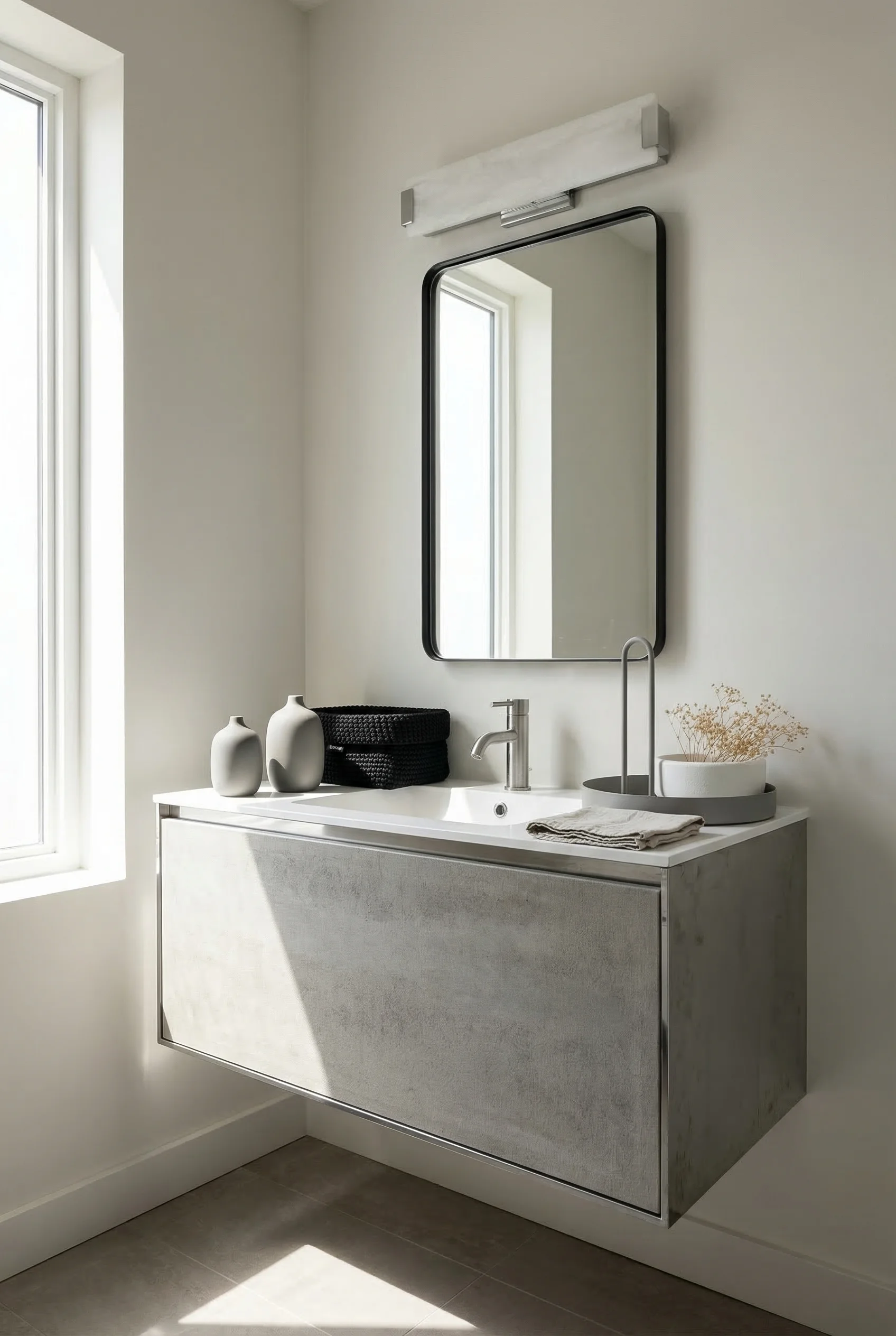
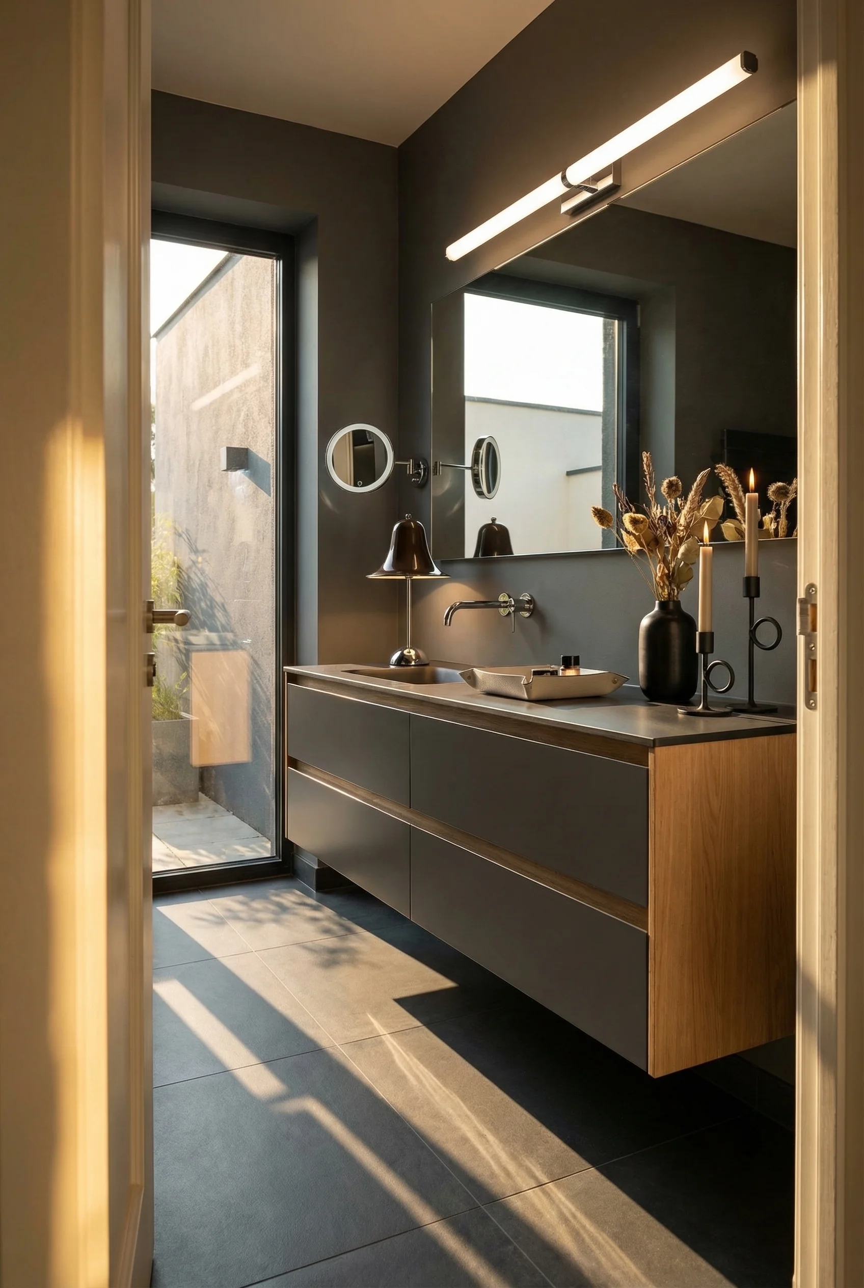
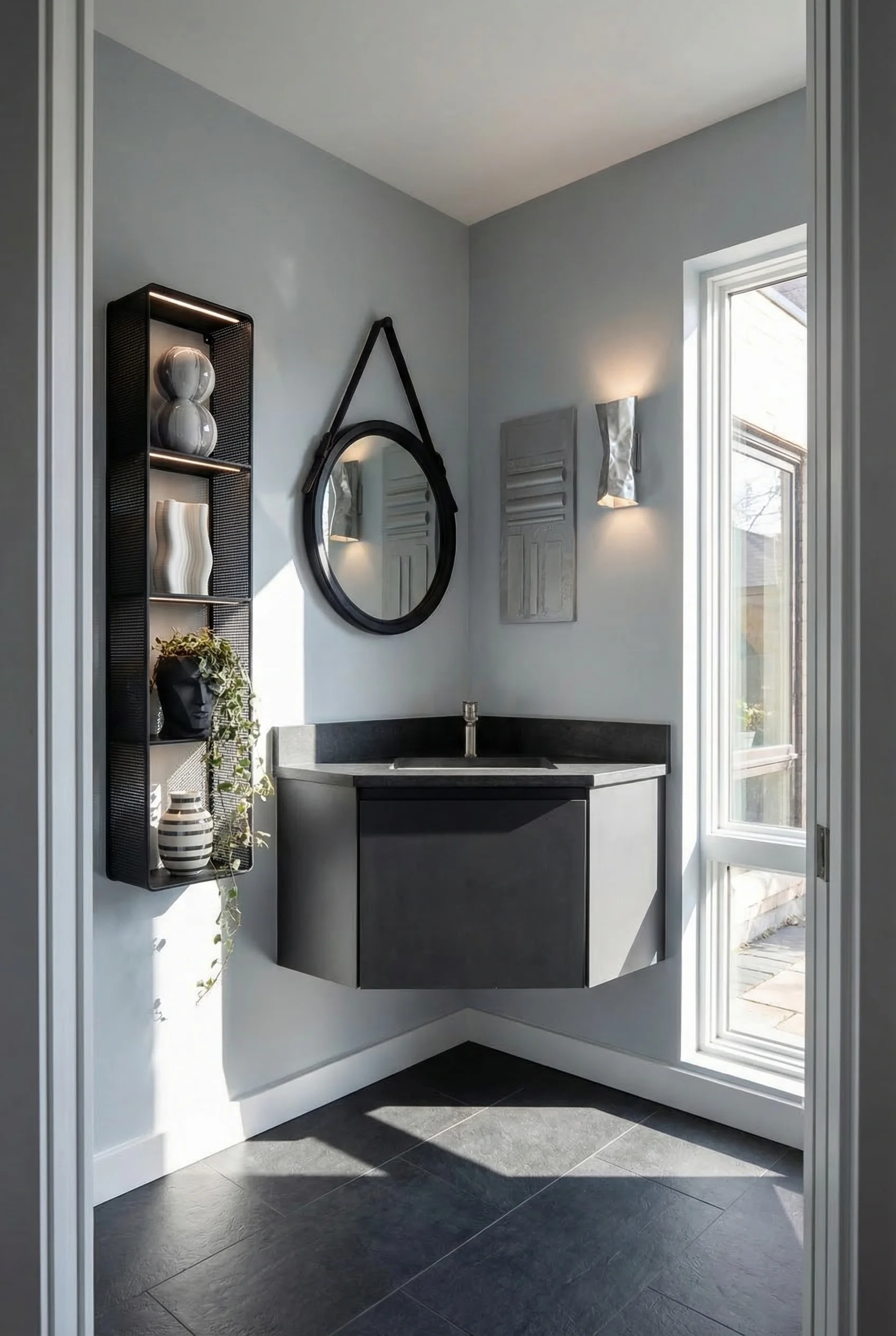
Ask any designer what they choose first in a small modern bathroom, and the answer is almost always the vanity. Not because it’s the most glamorous fixture. Because it’s the one that determines whether you see floor.
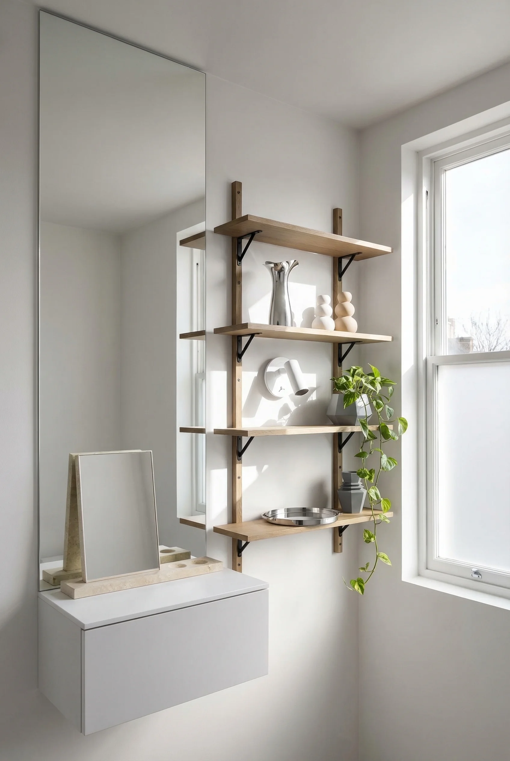
Visible floor area is the single biggest factor in how spacious a bathroom feels. A floating vanity, wall mounted with clear space underneath, gives you back those precious inches of tile. Your eye travels under the vanity and reads the floor as larger than it is. Here are the moves that compound that effect.
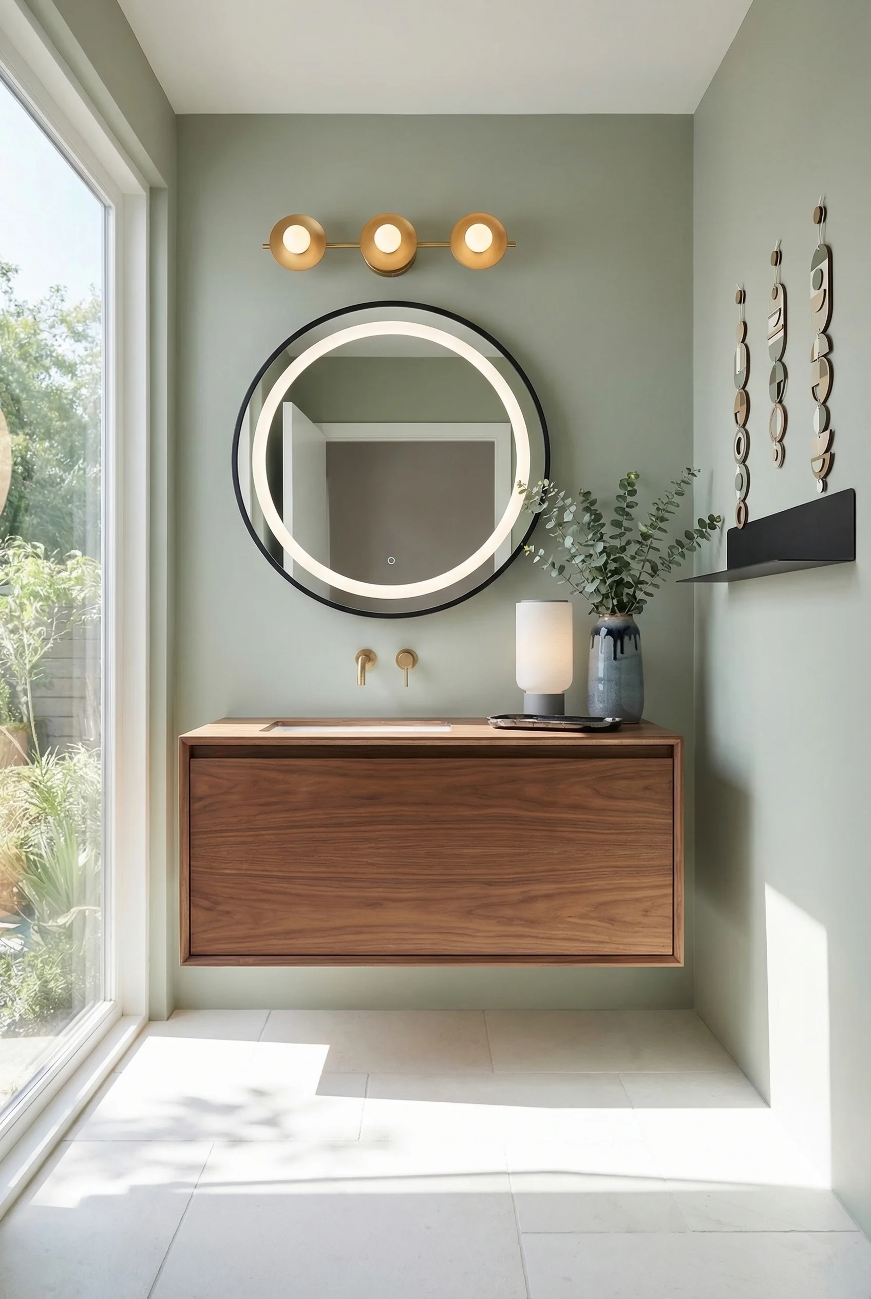
Floating vanities with fluted fronts. The ribbed or fluted cabinet face is everywhere in modern bathroom design right now, and for good reason. Vertical grooves add texture and visual height without any additional bulk. A 24 inch floating vanity with fluted doors looks intentional, not compromised.
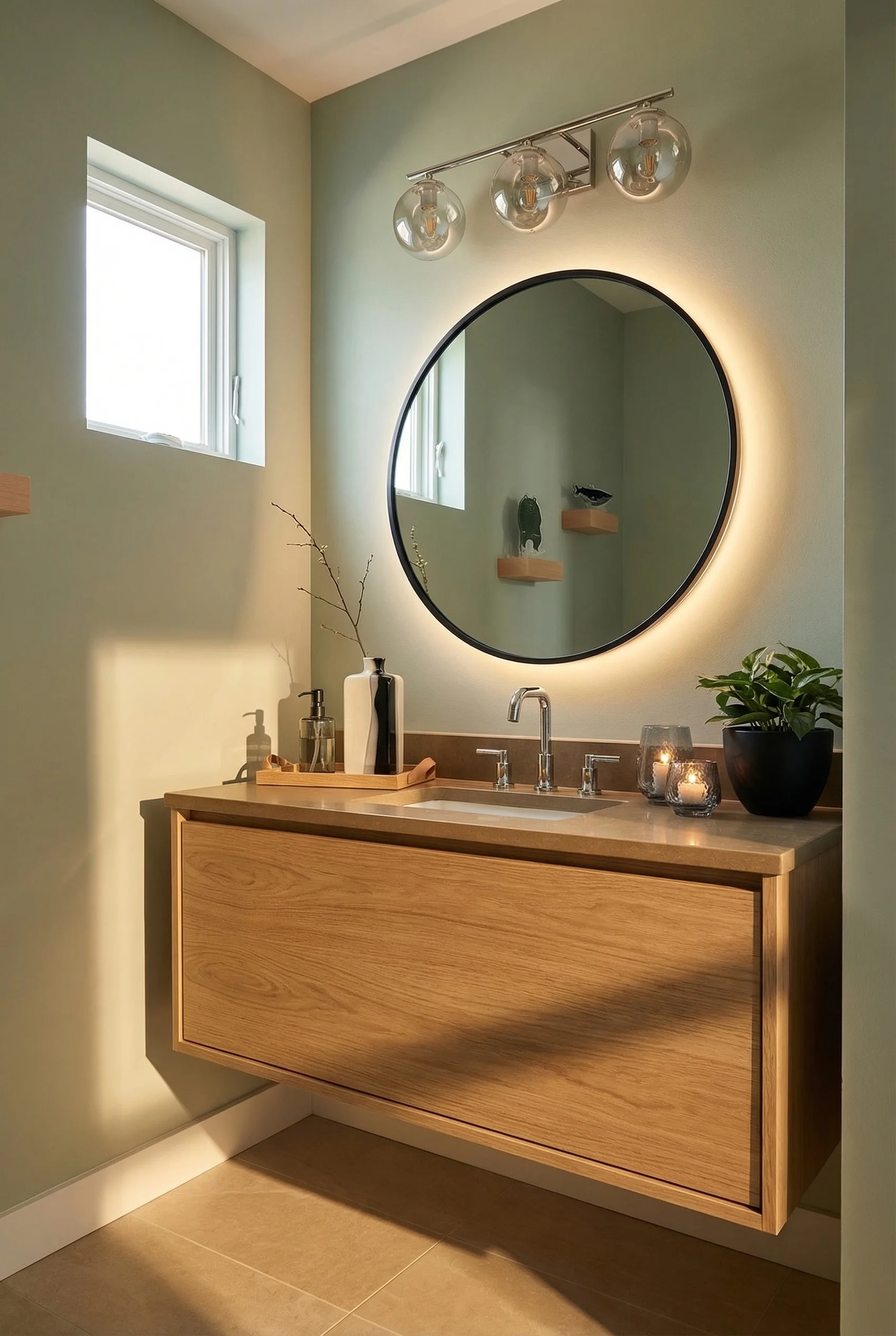
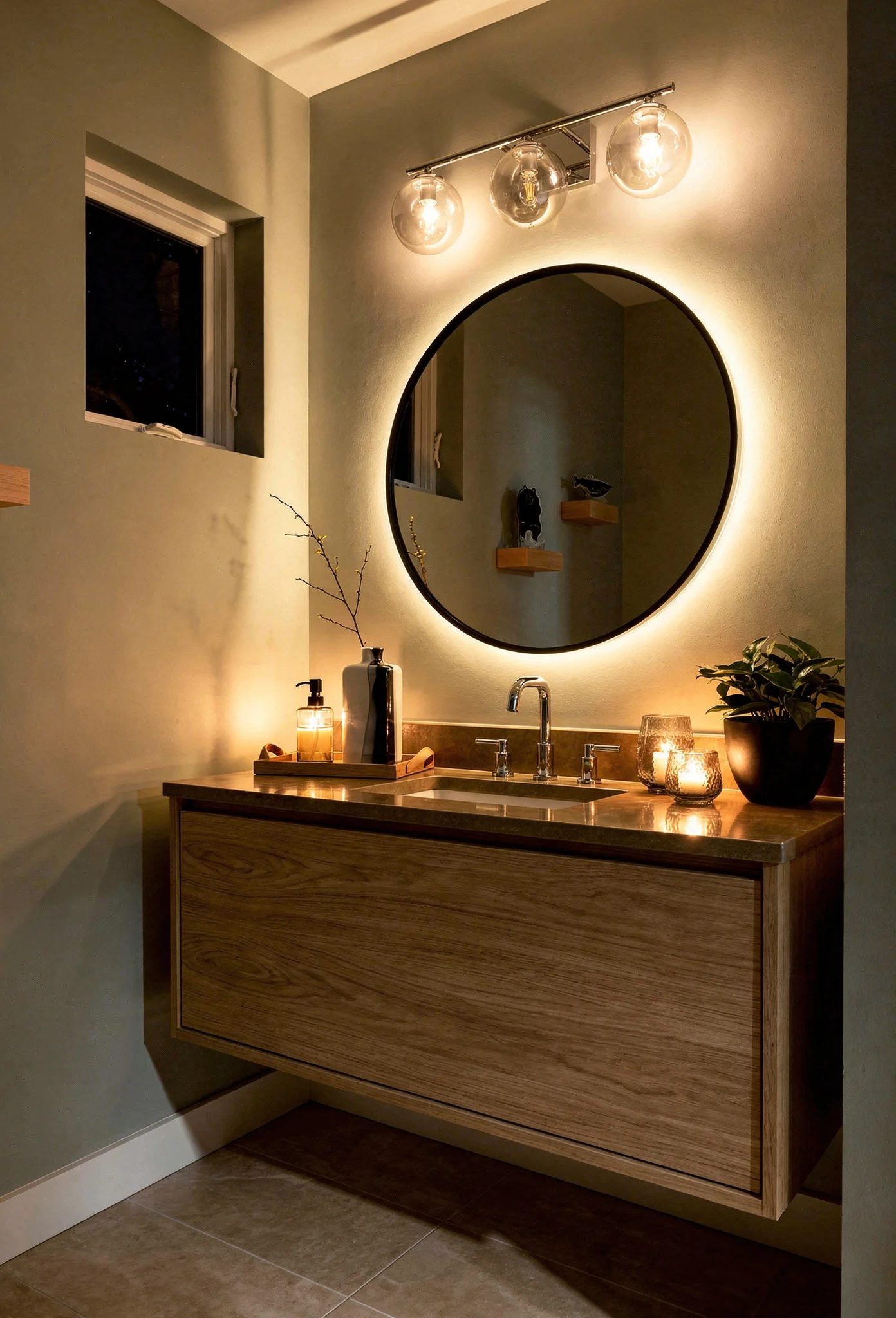
Wall hung toilets. A Geberit in wall carrier system pushes the cistern into the wall cavity and mounts the toilet bowl directly on the wall. You reclaim roughly 12 inches of depth compared to a standard floor mounted toilet. In a room where every inch counts, that’s significant. If a wall hung toilet isn’t feasible, look for compact models under 28 inches in depth with a round bowl.
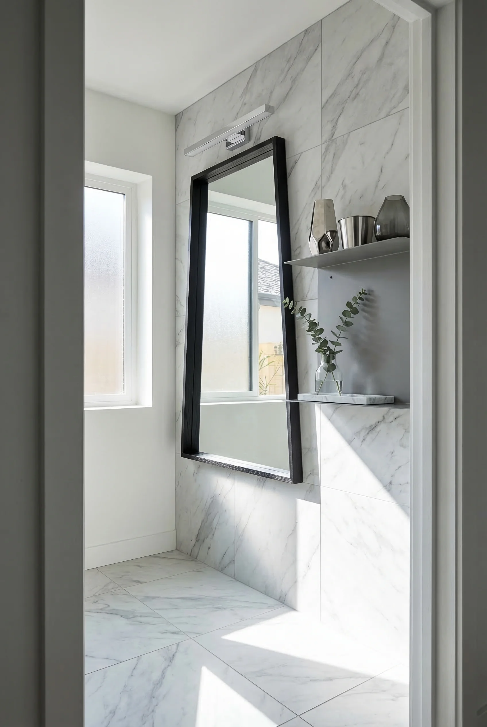
Corner basins. When a floating vanity still feels too wide for your layout, a compact corner basin frees up the opposite wall entirely. Combined with a recessed medicine cabinet above, you get storage and a sink in a footprint that barely registers.
The principle behind all three is the same. The more floor and wall you can see, the larger the room feels. Every fixture that floats, recesses, or tucks into a corner serves that goal.
The right tile doesn’t just cover your walls. It actively deceives the eye about how much space exists behind them. This is one of the most powerful and least expensive tools in a small modern bathroom renovation.

Here’s how each tile decision either shrinks or stretches your room.
Large format tiles reduce grout lines. A 12×24 or 24×24 tile means fewer grout lines, and fewer grout lines mean fewer visual interruptions. Each grout line is a tiny signal that says “edge, boundary, limit.” Remove those signals, and the surface reads as a single unbroken plane. This effect multiplies when you match your grout color to your tile.
Vertical stack bond makes ceilings taller. Instead of the traditional brick lay pattern, stack your rectangular tiles in a straight vertical column. The unbroken vertical lines pull the eye upward. In a bathroom with 8 foot ceilings, vertical stack bond can make the room feel closer to 9.
Horizontal running bond widens narrow rooms. The same principle works sideways. In a galley style bathroom that feels more like a corridor, horizontal tiles with staggered joints draw the eye across the longer dimension.
Herringbone creates depth and energy. Diagonal patterns trick the brain into seeing more dimension. A herringbone floor in a small bathroom adds visual complexity that distracts from the room’s actual measurements.
Zellige bounces light in dark rooms. These handmade Moroccan tiles have slightly irregular, glossy surfaces that catch and scatter light in unpredictable ways. In a small bathroom with limited natural light, zellige on a feature wall or shower surround can brighten the space noticeably. The slight color variation in each tile adds warmth without pattern.
The most common mistake with small bathroom tile is using too many different patterns. One tile, run continuously from floor to shower to walls, will always make a room feel larger than three different tiles competing for attention.
Before you fall in love with a vanity or a shower screen, you need to know whether your bathroom can actually fit them. Building codes dictate minimum clearances that eat into your available space, and understanding those numbers early saves you from expensive surprises.
Step one: mark your clearances. The IRC requires a minimum of 15 inches from the toilet centerline to any wall or fixture, with 18 inches recommended. You also need at least 21 inches of clear space in front of the toilet, though 30 inches is far more comfortable. Tape these dimensions on your floor with painter’s tape before you start shopping. Most “this vanity would look amazing” disappointments happen because the clearance math doesn’t work.
Step two: rethink the door. A standard inswing bathroom door consumes roughly 9 square feet of usable floor space when it opens. In a small bathroom, that’s real estate you cannot afford to waste. A pocket door eliminates the swing entirely and reclaims that area. If pocket door construction isn’t possible in your wall, a bi fold door or outswing door are strong alternatives.
Step three: match your layout to your room shape. Galley bathrooms, the long narrow ones, work best with a one wall layout. Line the toilet, vanity, and shower along the same wall, keeping the opposite wall clear. Square bathrooms suit a corner or neo angle shower that claims the corner without dominating the room.
Step four: steal storage from the walls. Recessed medicine cabinets and recessed shower niches provide real storage without protruding into the room. A medicine cabinet needs roughly 4 inches of wall depth, which most standard framed walls provide. A shower niche built between studs gives you shelf space for bottles without any floor footprint at all. These are zero footprint solutions, meaning they add function without stealing a single inch.
Following these steps in order prevents the mistake most homeowners make: choosing fixtures they love, then discovering they can’t legally install them in the space they have.
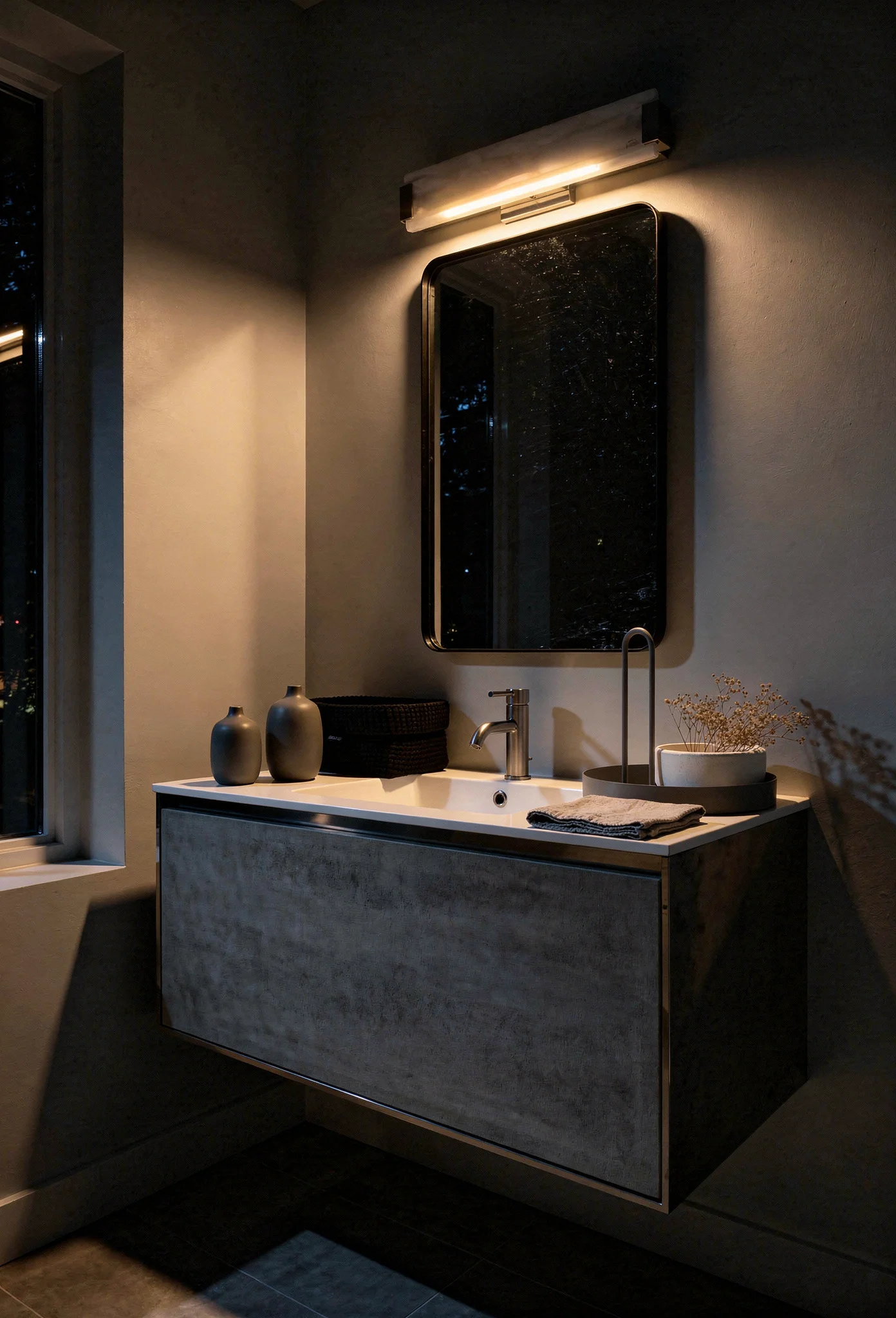
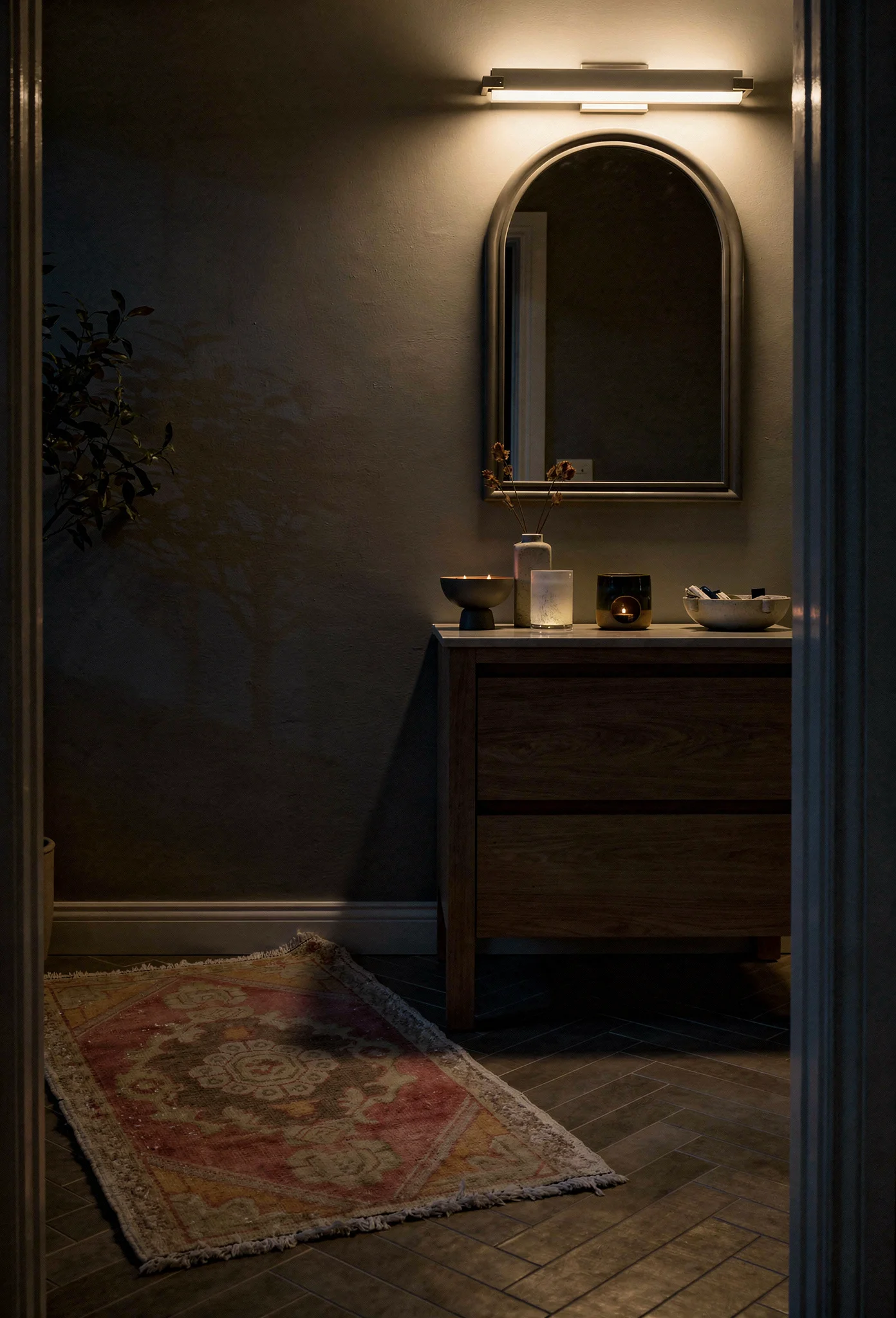
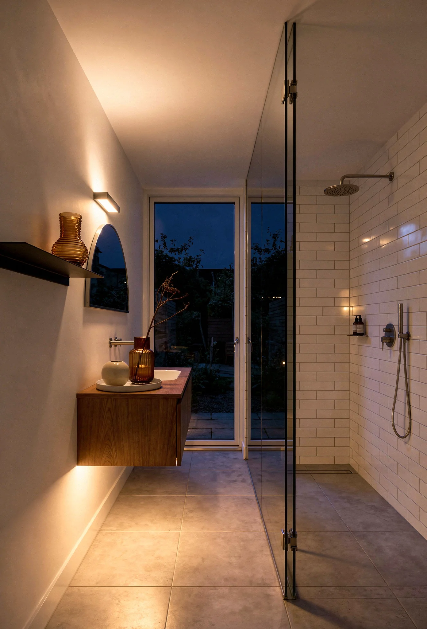
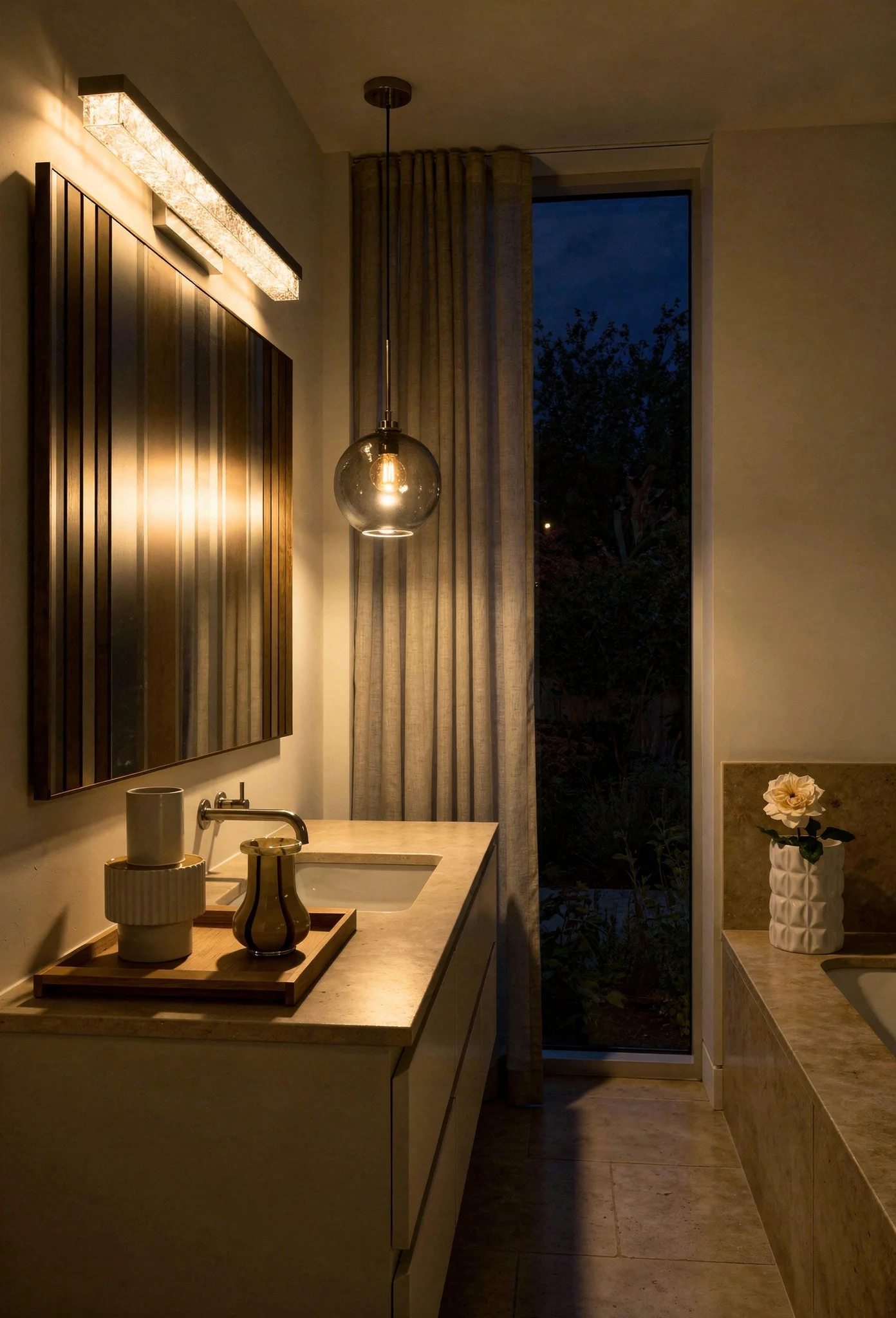
The fastest way to make a small bathroom feel even smaller is to install one overhead light and call it done. That single fixture creates flat, shadowless light that flattens every surface and makes the room feel like a utility closet.

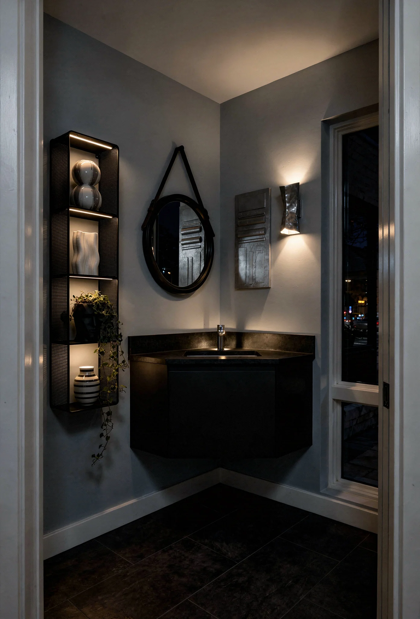
Designers use three layers of light to create depth, dimension, and warmth. Here’s what each layer does and why skipping any one of them costs you the effect.
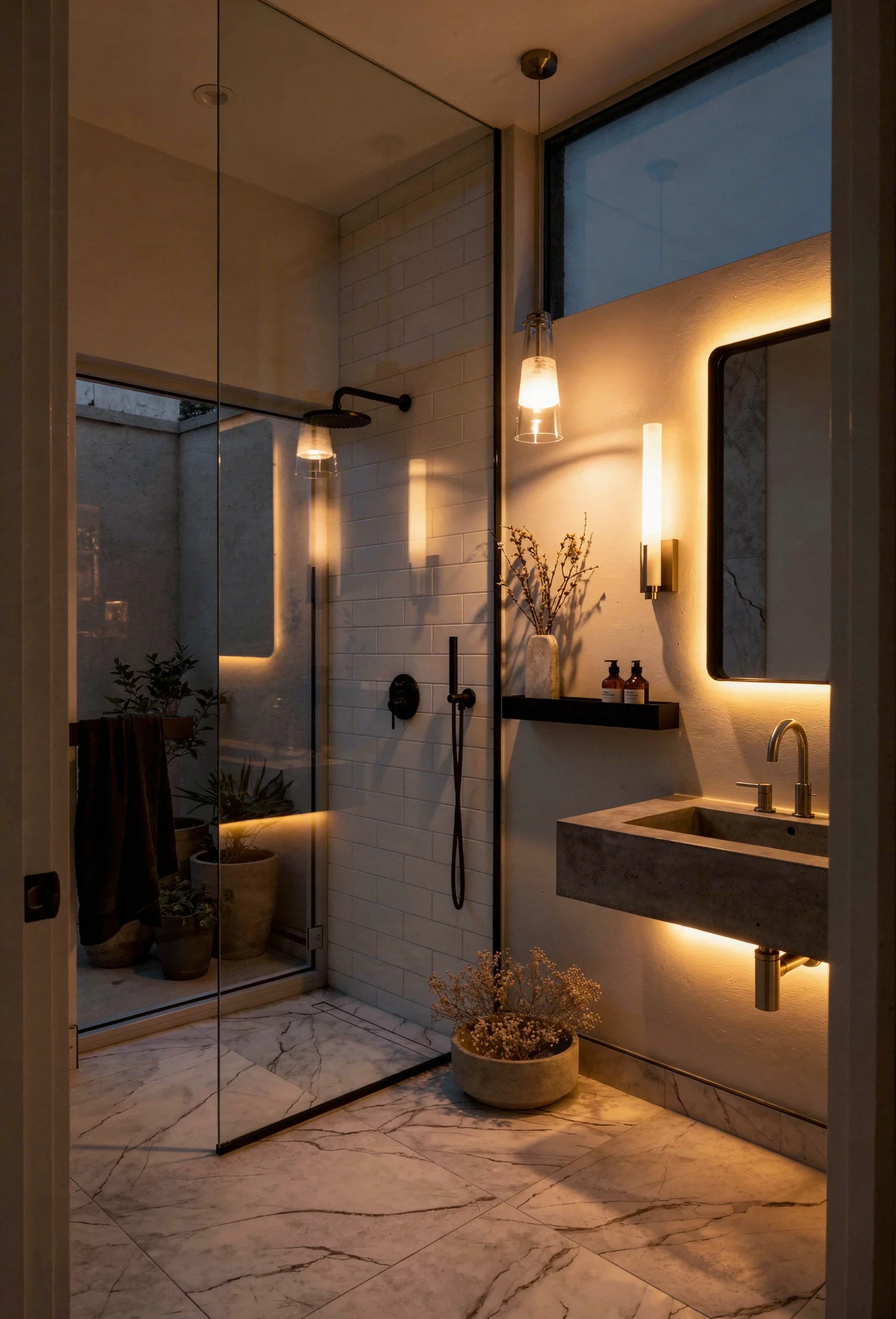
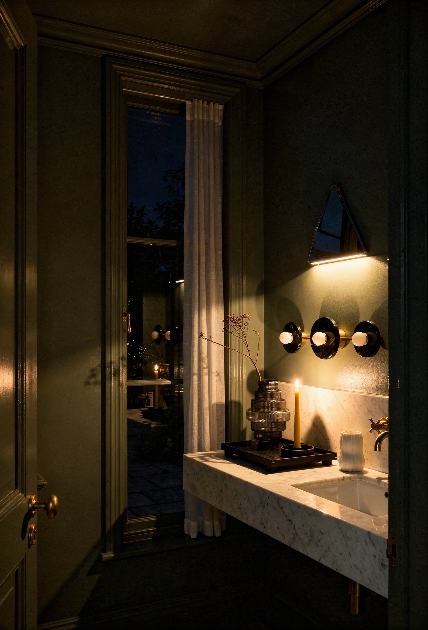
Ambient light sits at the ceiling. Recessed LED downlights, positioned away from directly over the mirror, provide your base layer of general illumination. You’re targeting roughly 70 lumens per square foot. In a 40 square foot bathroom, that’s about 2,800 lumens total. Choose fixtures rated CRI 90 or above for accurate color rendering, and stick to the 3000K to 4000K range. Below 3000K feels too warm and yellowy for tasks like applying makeup. Above 4000K starts creeping toward clinical.
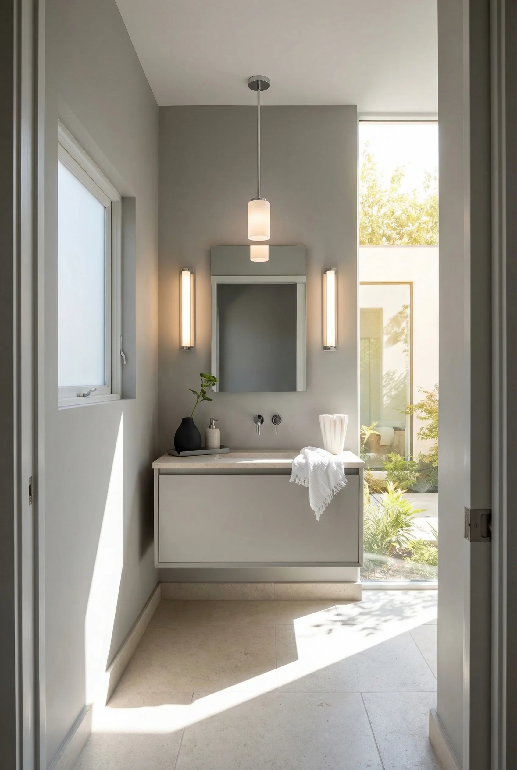
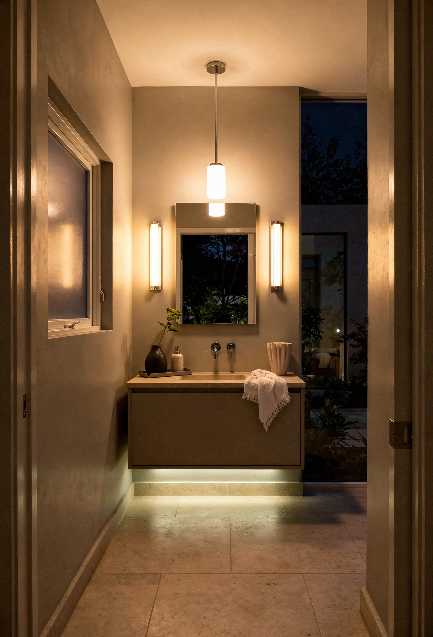
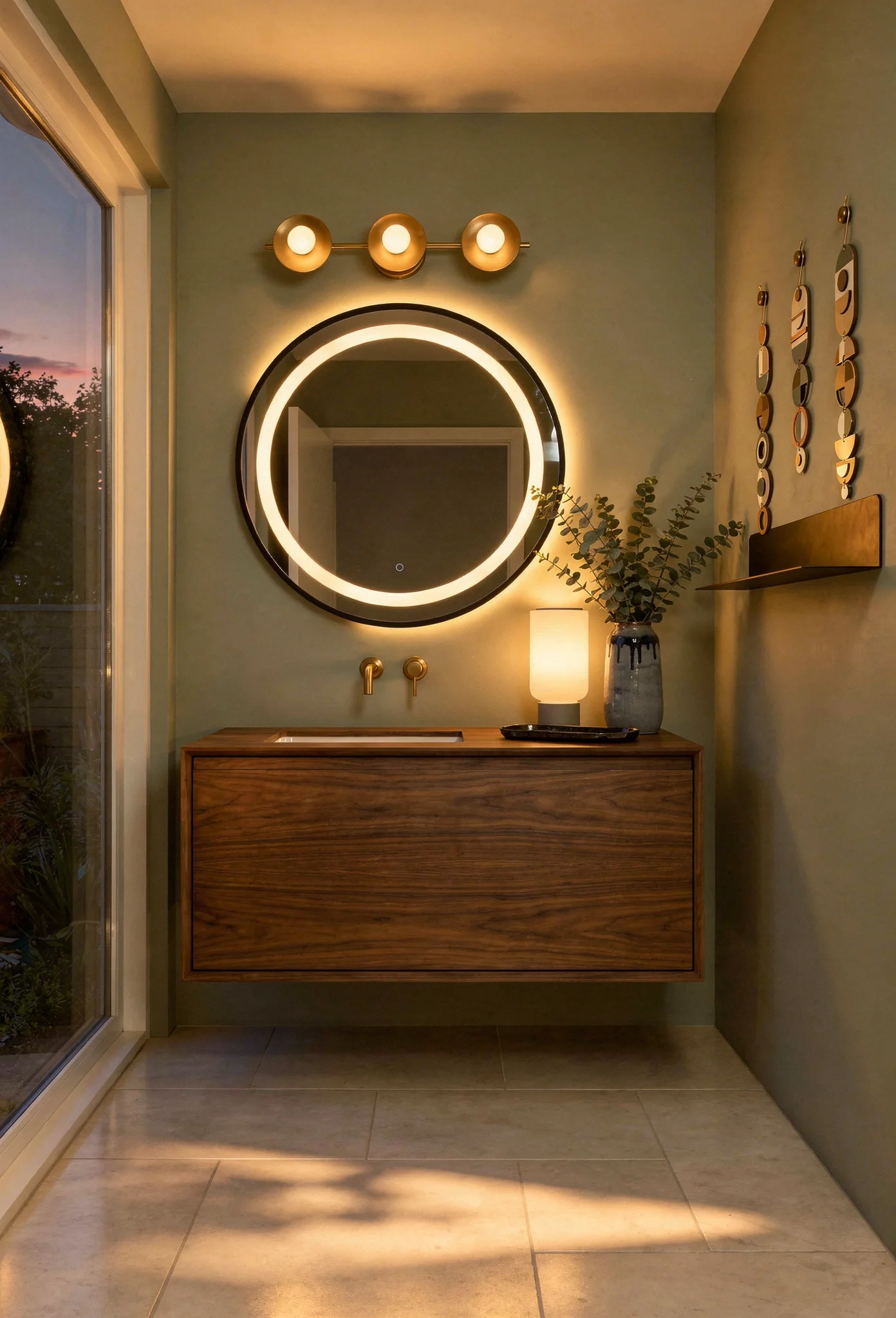
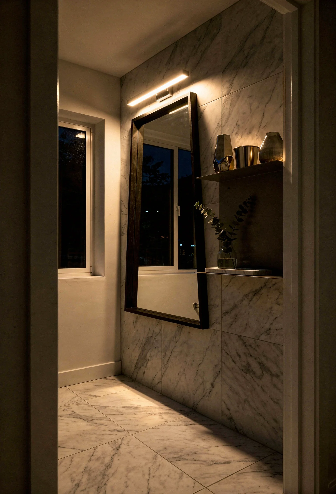
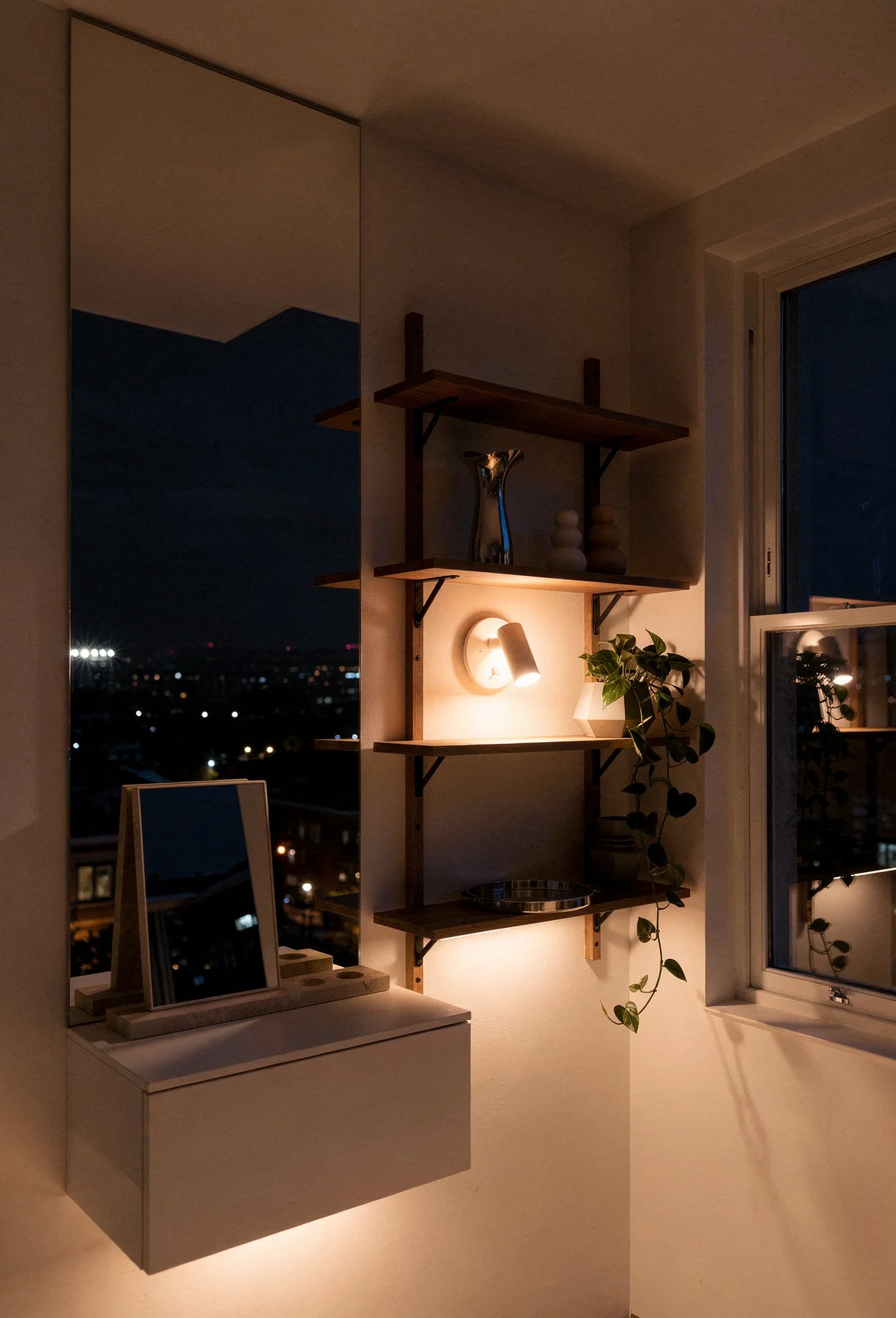
Task light flanks the mirror. Wall sconces installed on both sides of the mirror, mounted at 60 to 66 inches from the floor, eliminate the unflattering shadows that a single overhead light creates across your face. Two sconces provide even, cross lit illumination that’s dramatically more flattering. If wall sconces don’t suit your design, a backlit mirror achieves a similar effect while also adding a soft ambient glow that makes the mirror appear to float.
Accent light lives at the edges. Toe kick LEDs under a floating vanity, LED strip lighting inside a recessed shower niche, or a slim strip behind a freestanding mirror. These subtle light sources add depth by illuminating the periphery of the room. Your eye reads the illuminated edges and processes the space as larger than it is. This is the layer most homeowners skip, and it’s the one that makes the biggest perceptual difference.
One critical safety note. Any fixture installed within the shower zone must be wet rated, typically IPX4 or IPX5. All bathroom circuits need GFCI protection. These aren’t optional upgrades. They’re code requirements.
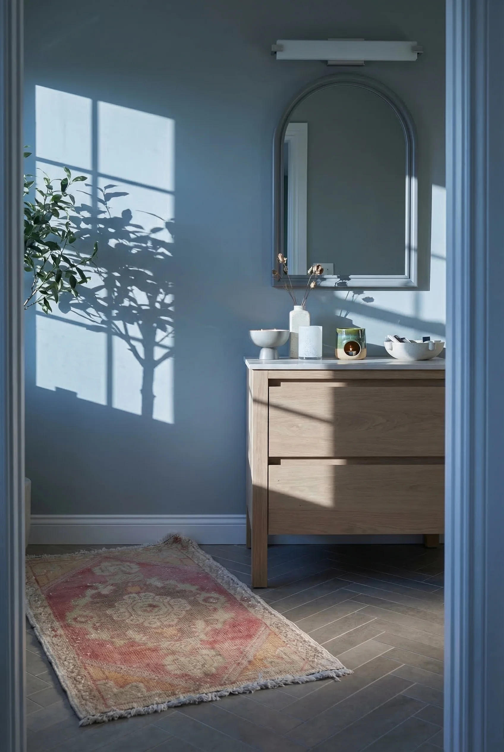
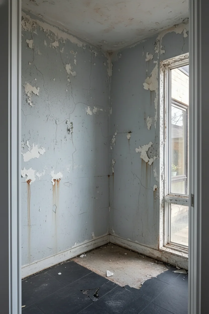
A designer we admire recently renovated a bathroom that measured exactly 5 feet by 7 feet. Thirty five square feet. The kind of room where you bump your elbow drying your hair.
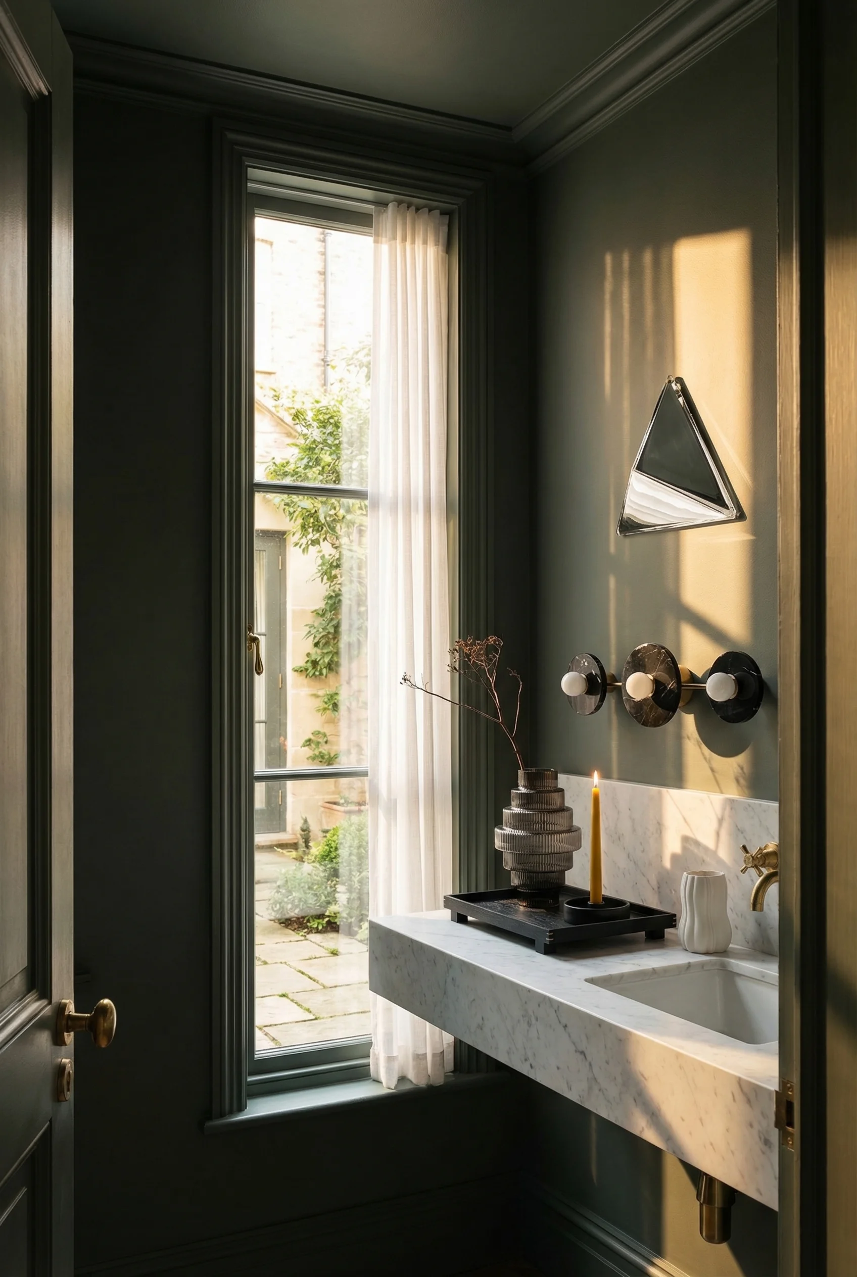
She painted the walls, the trim, the ceiling, and even the back of the door the same warm earthy green. Every surface became one continuous color. The room didn’t look green. It looked like a room with no edges.
That technique is called color drenching, and it’s replaced the old “paint it white to make it look bigger” advice that dominated small bathroom design for decades. The logic is counterintuitive but well proven. When every surface is the same color, your eye has no contrast points to register where walls meet ceiling, where trim meets wall, where the room actually ends. The boundaries dissolve.
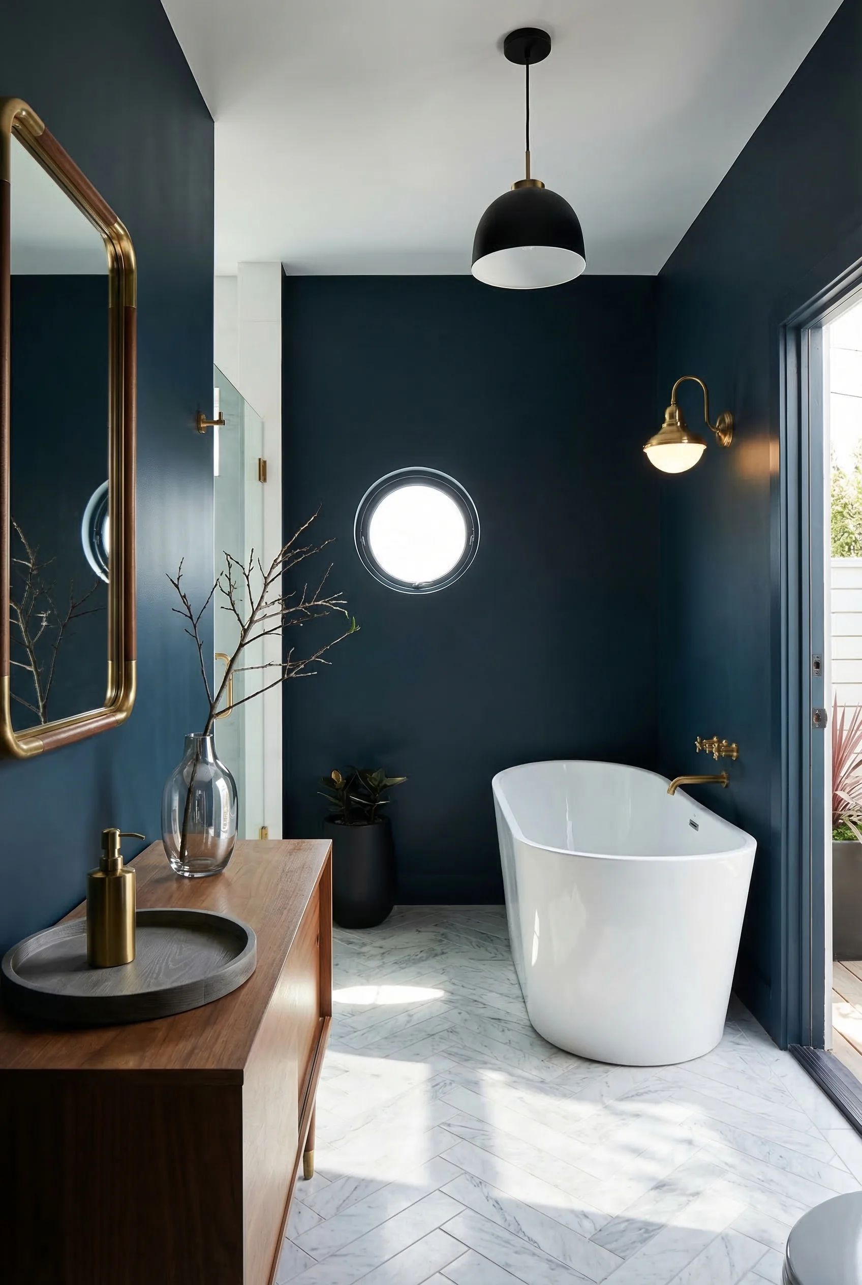
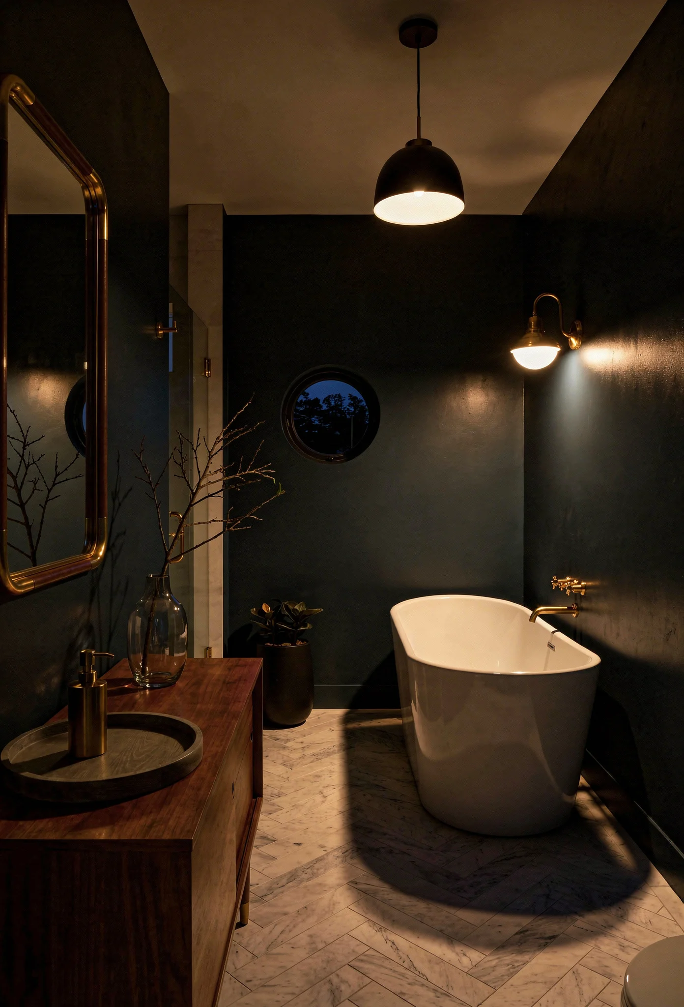
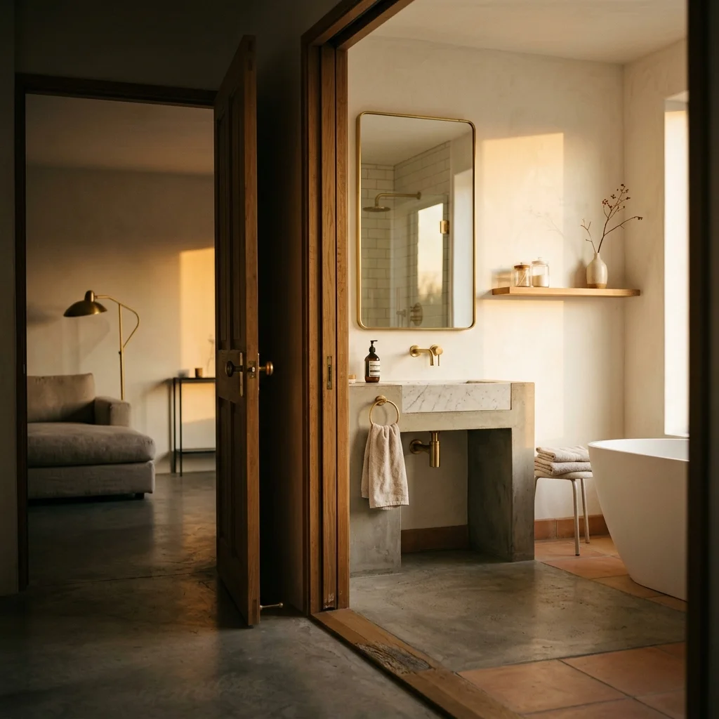
The color shift in modern bathrooms has moved decisively away from the sterile white and cool grey combinations that defined the 2010s. Warm earthy tones, deep greens, ocean blues, and terracotta are the palettes designers are choosing now. These colors feel like spa environments rather than operating rooms.
Hardware finishes complete the story. Brushed brass, champagne bronze, and matte black are the current standard. Polished chrome is declining noticeably. The warmer metals complement the warmer wall colors and add another layer of intentional warmth to a room that needs all the warmth it can get.
If you’re nervous about committing to a strong color in a small space, start with the shower walls. It’s a contained area where you can test whether a deep green or warm taupe feels right before rolling it across every surface. But if you’re ready to commit, commit fully. Color drenching works precisely because it’s total. Half measures just look like you ran out of paint.
You’ve probably noticed that the most striking modern small bathrooms aren’t just well laid out. They’re anchored by a palette that makes the entire room feel cohesive. Here are five colors that work beautifully in compact modern spaces.
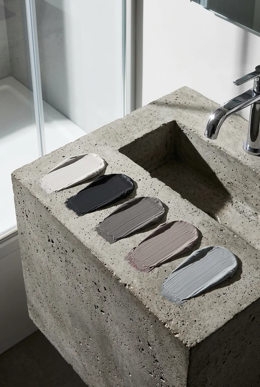
Warm Greige. The bridge between grey and beige, this is your safest wall color for a modern small bathroom. It reads warm in natural light and neutral in artificial light, which matters enormously in a room that often has both. The undertone prevents the cold, clinical feeling that pure grey creates.
Paint Pick: Farrow & Ball Elephant’s Breath
Soft Olive. A muted, earthy green that brings nature into the room without overwhelming it. Olive works particularly well in bathrooms with natural wood vanities and brass hardware. It’s sophisticated enough for color drenching but subtle enough to live with daily.
Paint Pick: Farrow & Ball Off-Black
Warm White. Not bright white. Not cream. A white with the faintest warm undertone that prevents the room from feeling stark. This is the color for ceilings when you’re color drenching the walls, or for the entire room when you want clean simplicity with warmth.
Paint Pick: Farrow & Ball Wevet
Smoky Blue. A greyed, dusty blue that evokes water without feeling nautical. In a small bathroom, smoky blue on all surfaces creates a calming, spa like environment. It pairs naturally with brushed brass fixtures and white marble or porcelain.
Paint Pick: Farrow & Ball Dimpse
Mushroom. A complex neutral with pink and brown undertones that feels inherently warm. Mushroom is trending as the replacement for the cool taupe tones that dominated the last decade. It flatters skin tones in bathroom mirror light, which is a practical benefit worth considering.
Paint Pick: Farrow & Ball Mole’s Breath
Once you nail your palette, every other decision in the room becomes simpler. Your tile, hardware, and textiles have a reference point. The room designs itself.
The difference between a modern small bathroom that feels cramped and one that feels deliberately compact comes down to these six principles: open the shower, float the fixtures, simplify the tile, plan the layout to code, layer the lighting, and commit to a unified color. None of these techniques require knocking down walls or expanding your footprint. They work within the space you already have. Start with whichever one solves your biggest frustration, and let the rest follow.
This post contains affiliate links, which means we may earn a small commission if you make a purchase through our links, at no extra cost to you.