Newsletter Subscribe
Enter your email address below and subscribe to our newsletter
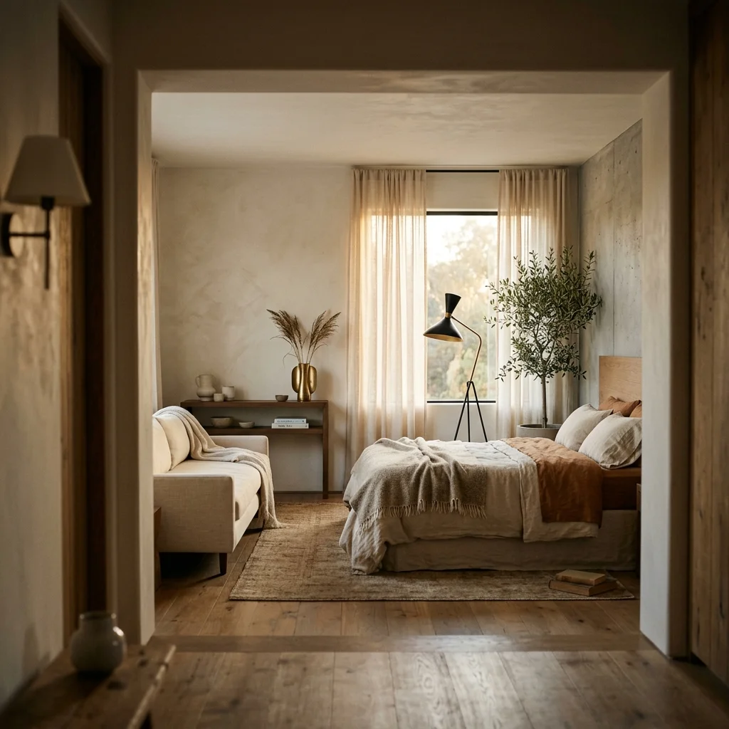
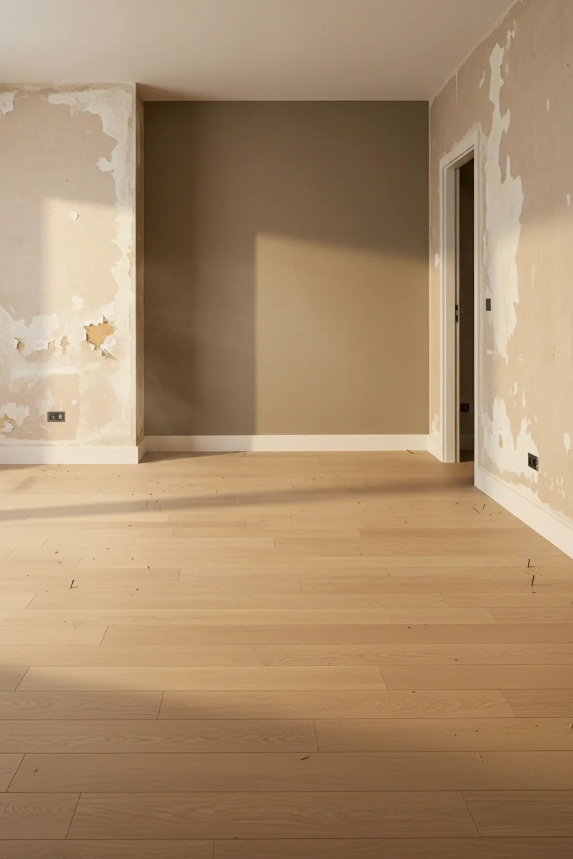
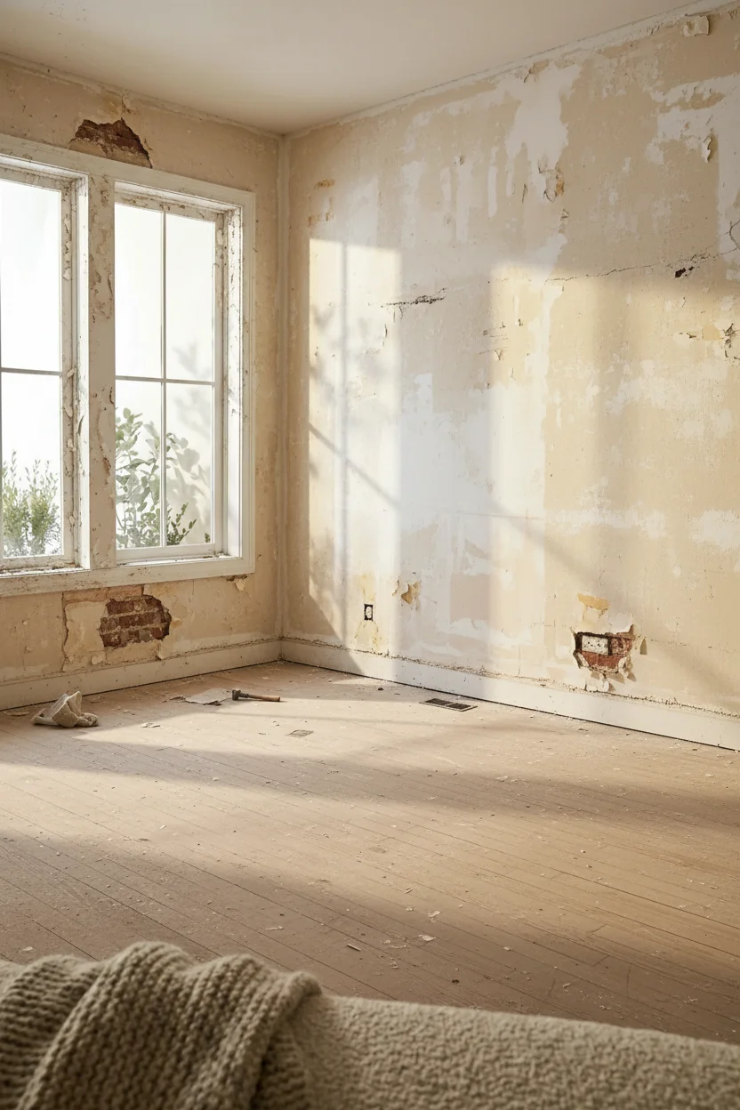
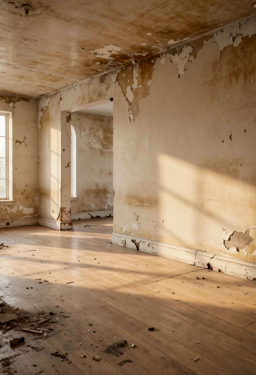
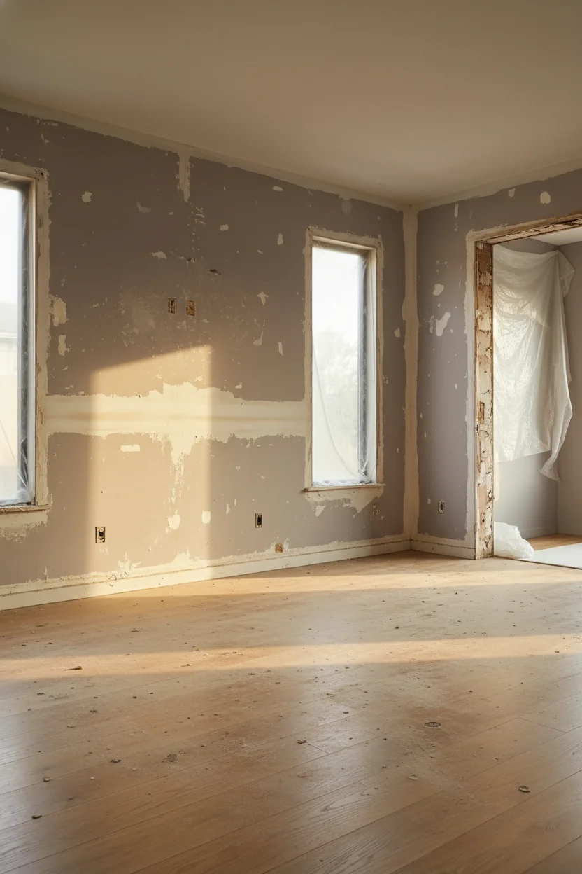
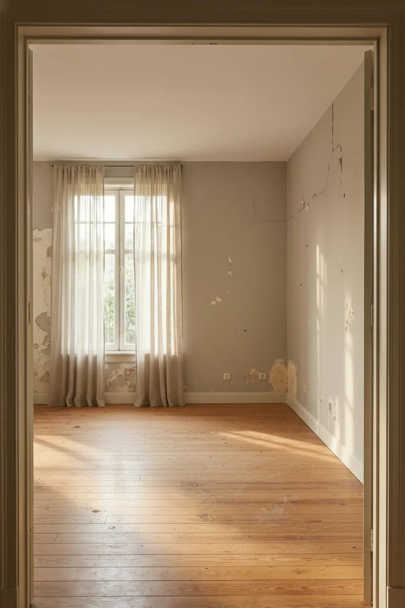
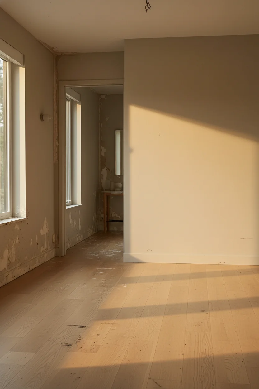
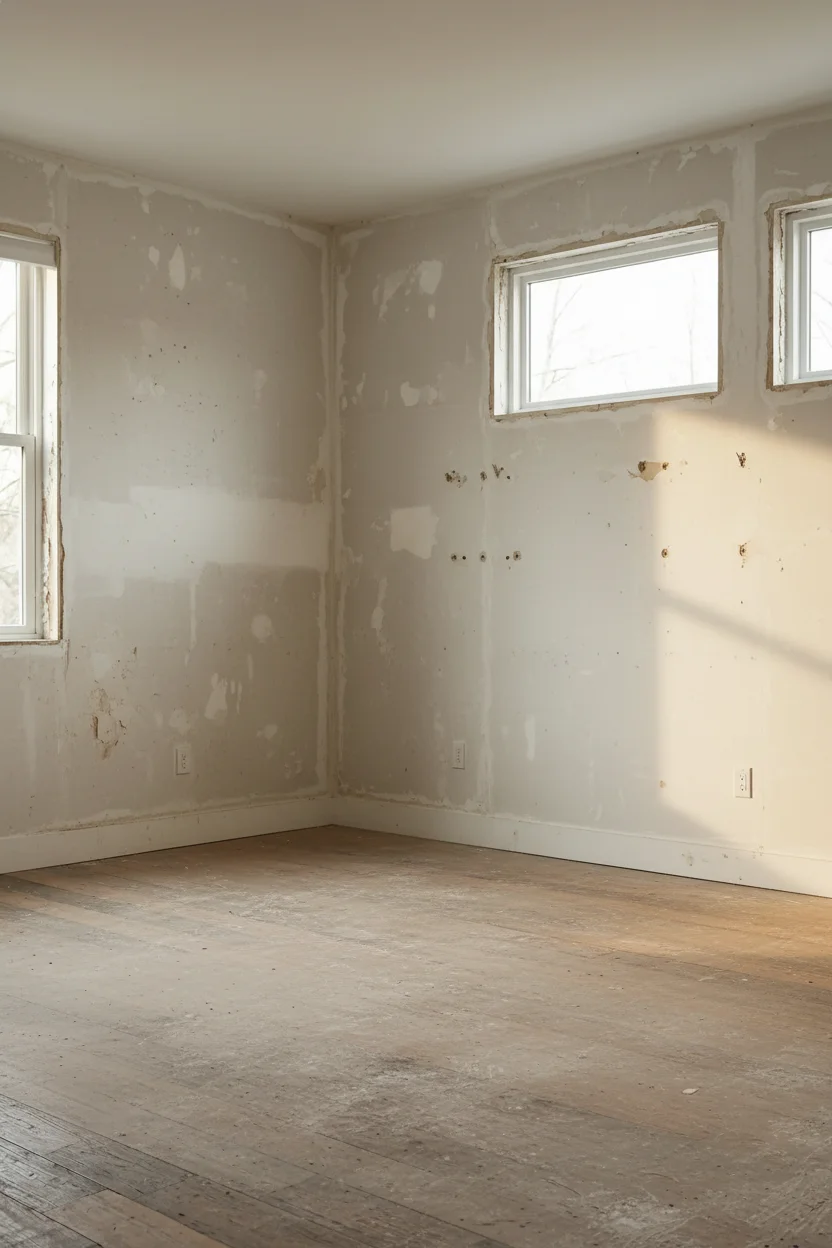
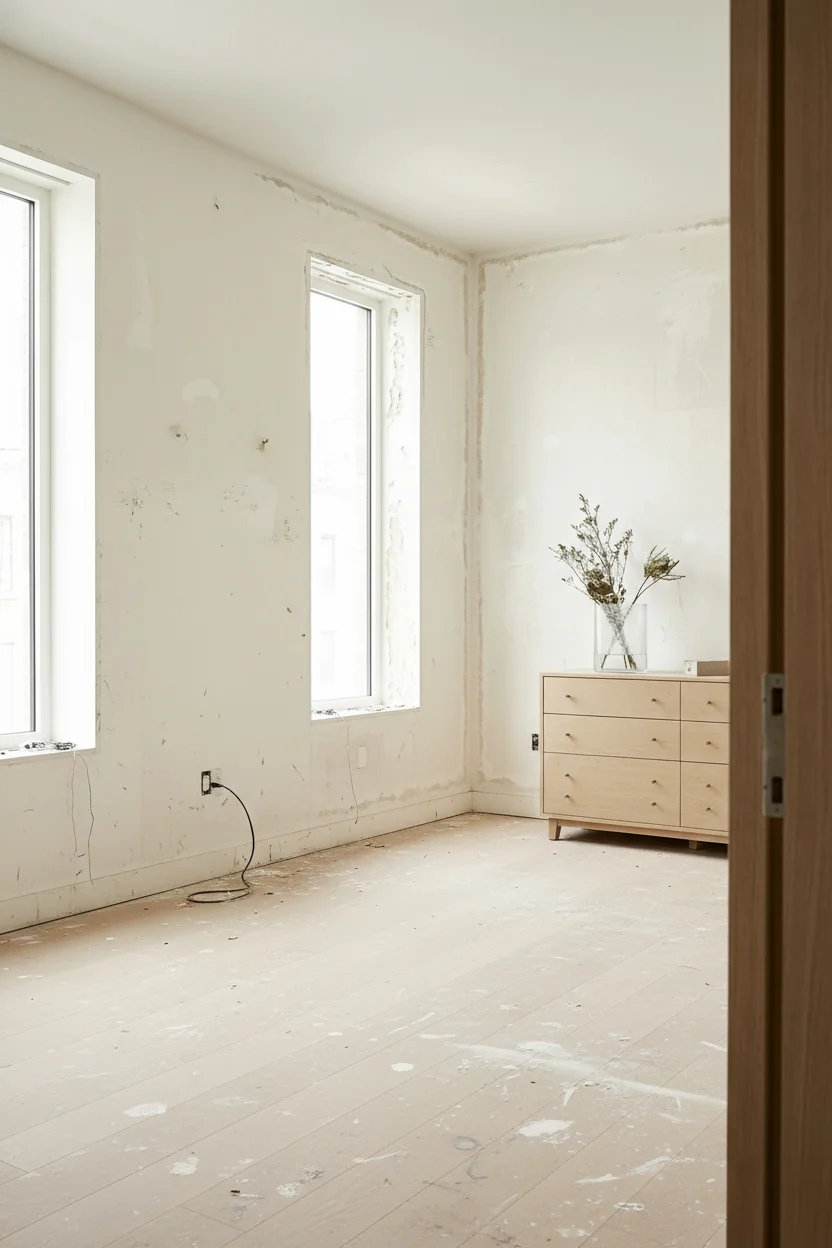
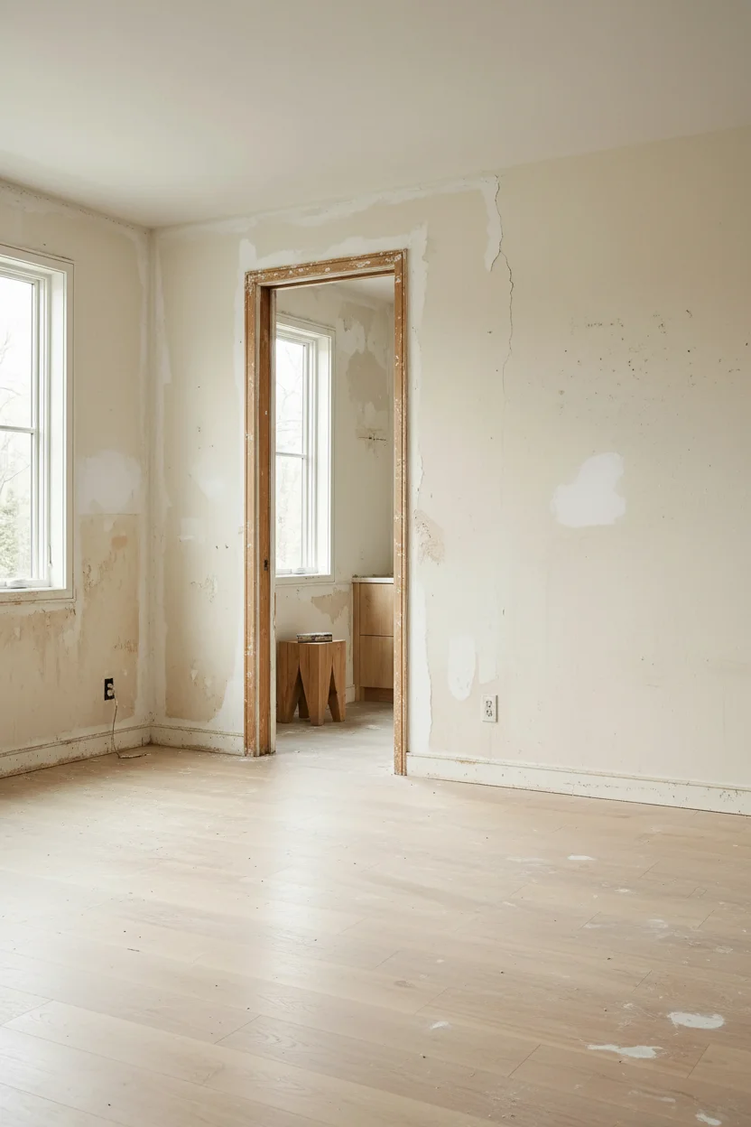
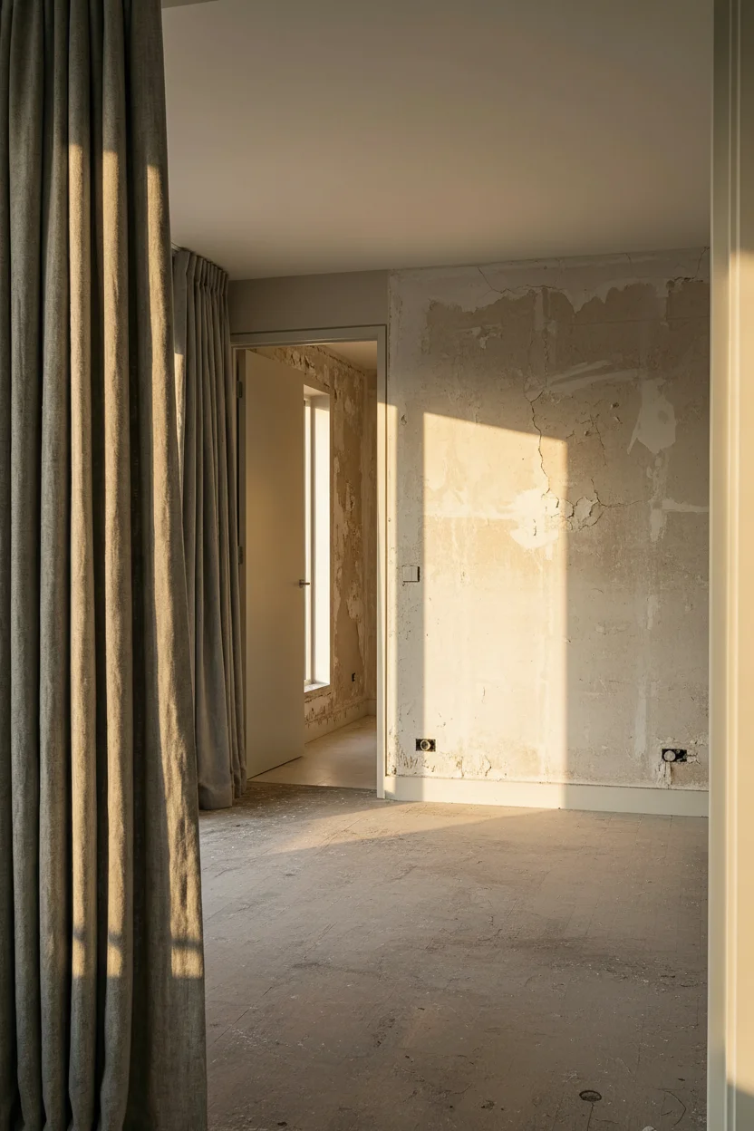
Your bedroom looks beautiful in photos. Clean lines. Crisp whites. That minimal modern aesthetic everyone pins on Pinterest. But here’s what nobody talks about: it feels like sleeping in a museum. Cold. Empty. Like something is missing.
You’re not alone. Thousands of homeowners have discovered the same uncomfortable truth about modern neutral bedrooms. The good news? The solution isn’t starting over. It’s understanding one simple shift that designers have been making for the past two years.
Most people think neutral means safe. Pick some grays. Add white bedding. Call it done. But that approach creates a bedroom that photographs well while feeling utterly lifeless to actually live in.
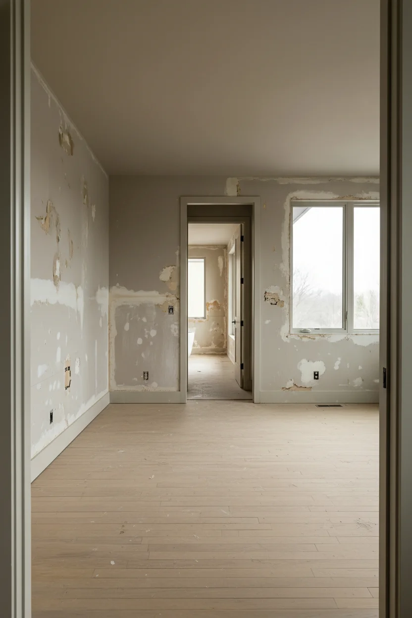
The issue isn’t the color choice itself. It’s the lack of temperature in those colors. Pure grays and stark whites reflect light harshly. They create visual tension instead of calm. Your brain reads the space as clinical rather than restful.
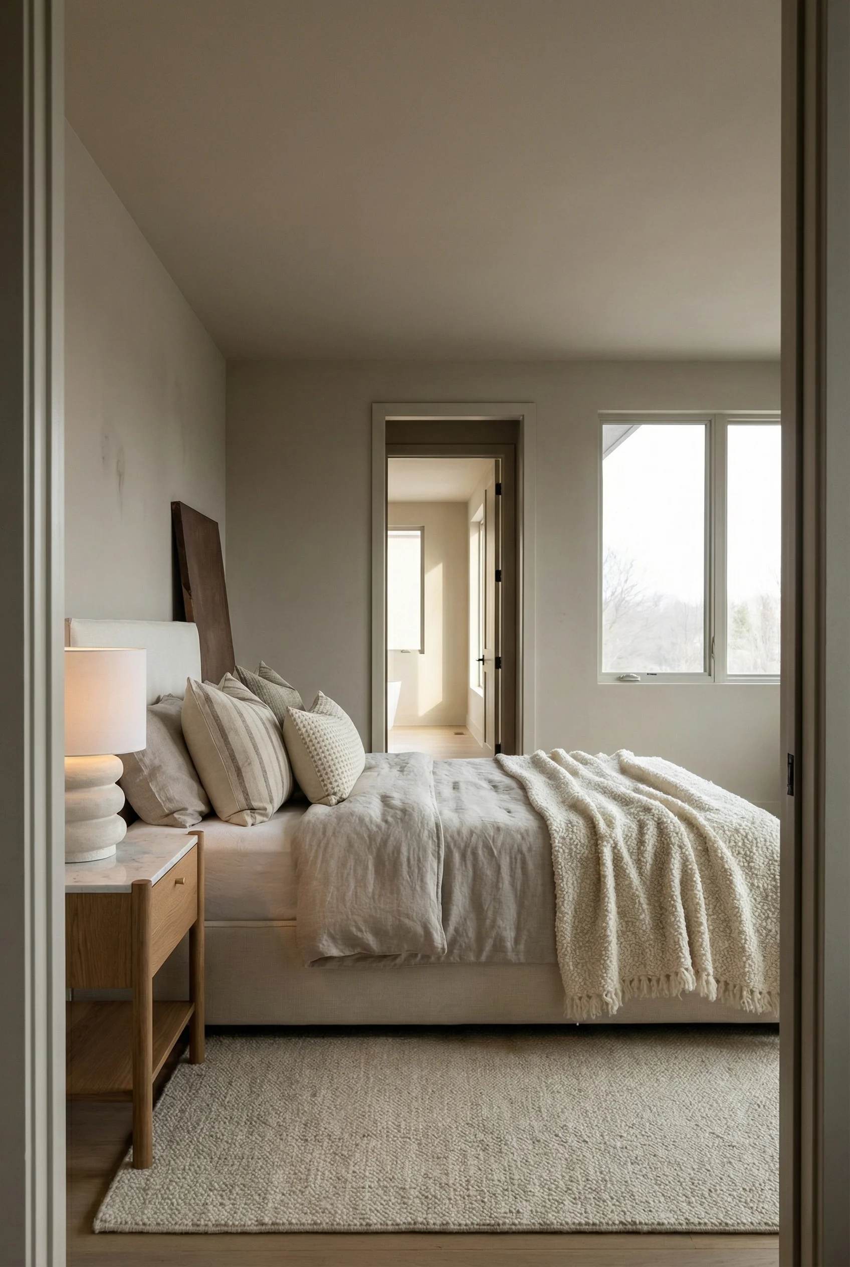
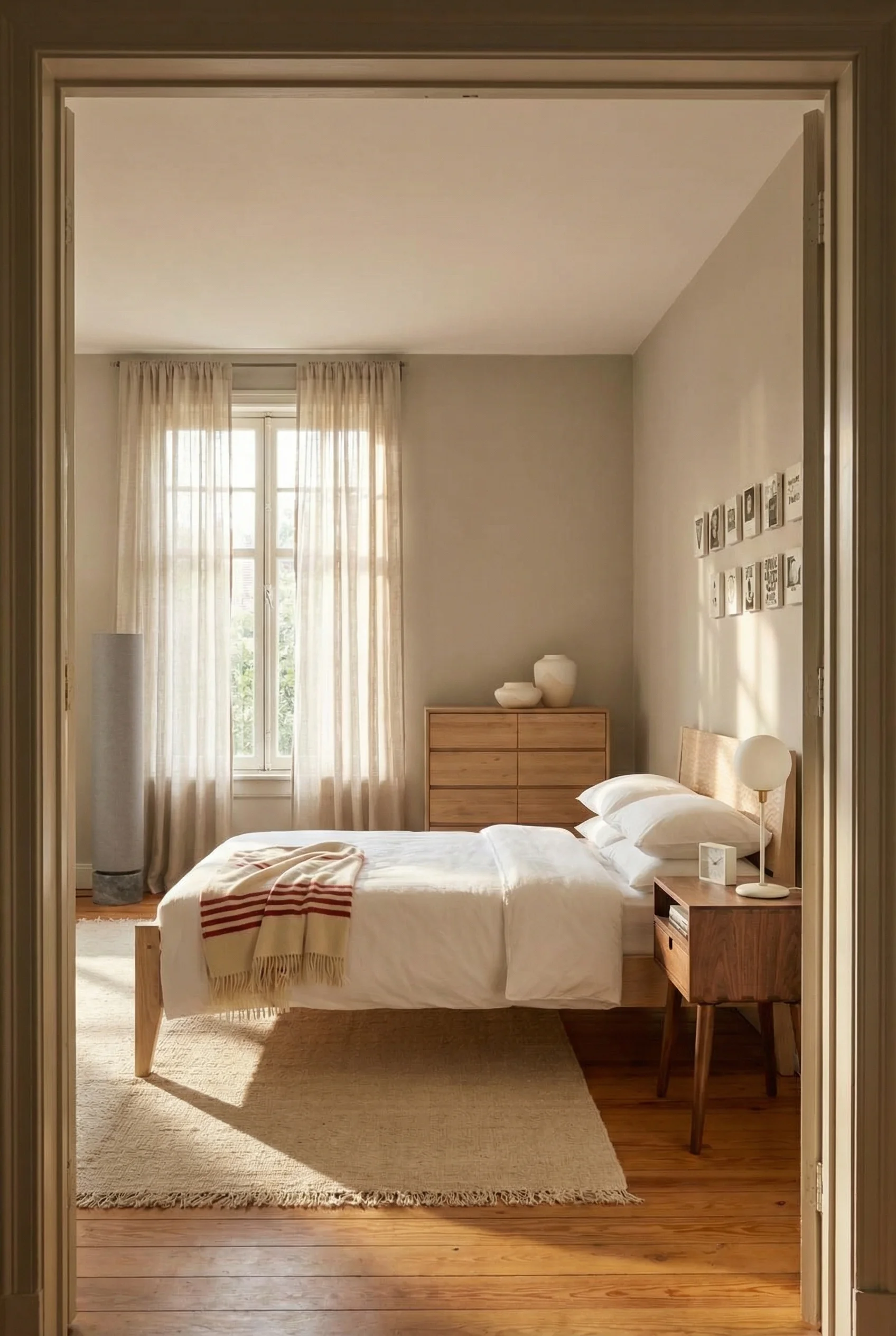
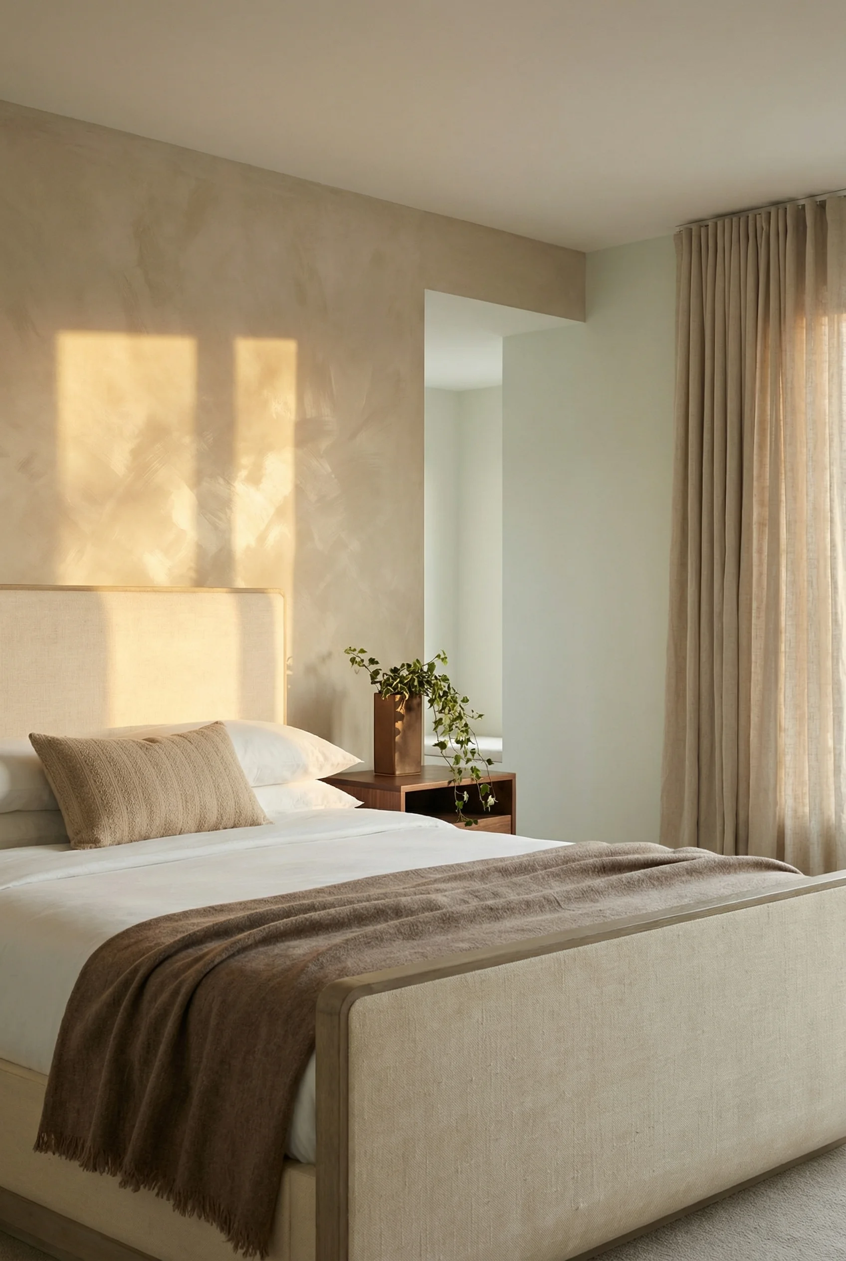
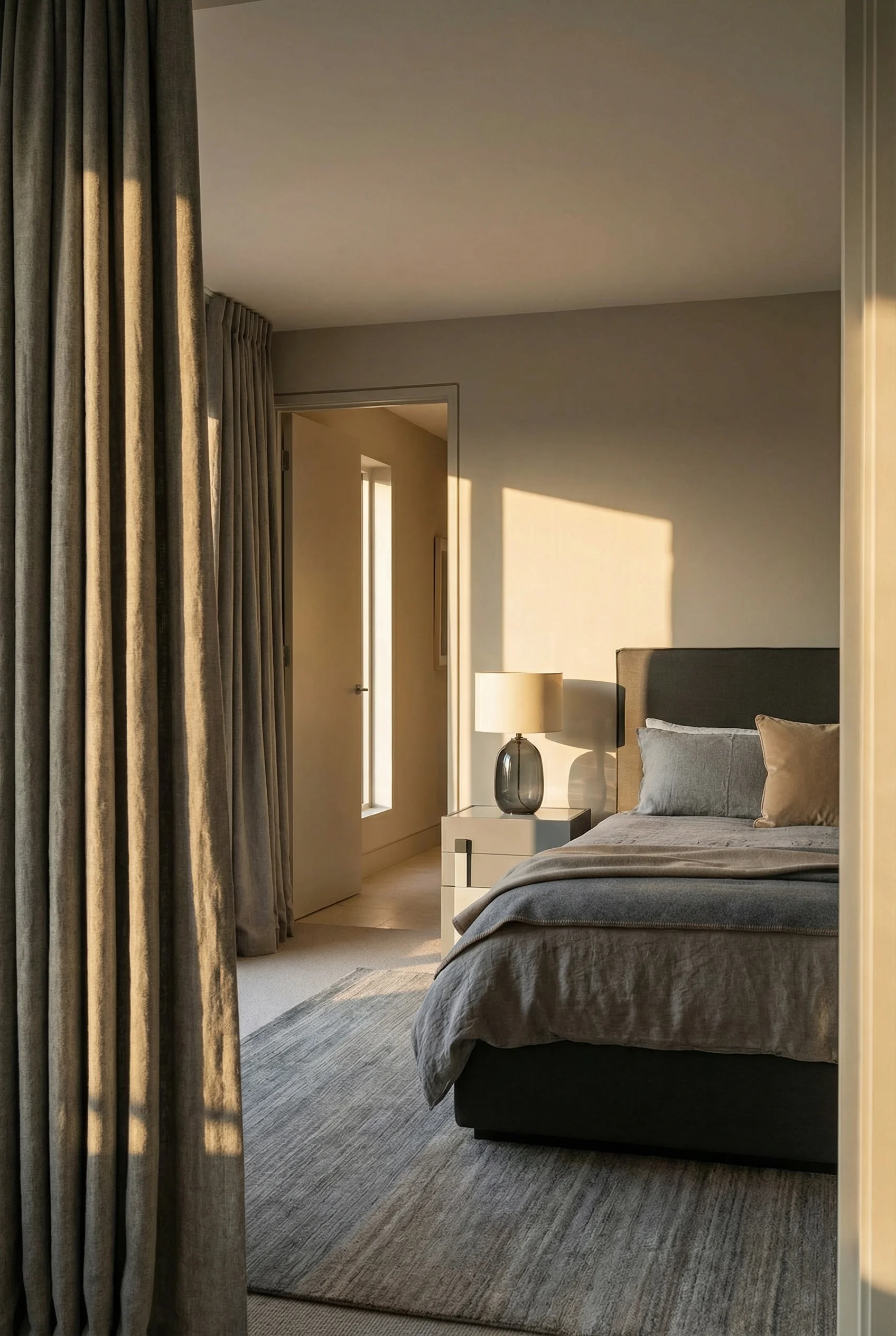
Walk into a spa and notice how different it feels. The walls might technically be neutral, but they carry warmth. Depth. A quality that makes you want to exhale. That’s not accident. It’s intentional use of complex neutrals rather than flat ones.
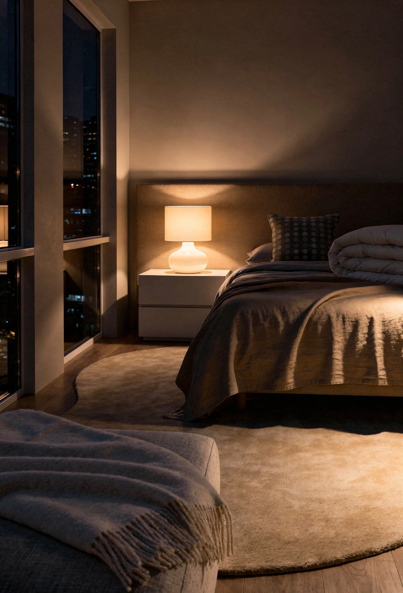
The modern bedroom trend of 2026 has caught onto this. Designers call it “warm minimalism” or “organic modernism.” Same clean aesthetic. Completely different feeling.
You already know flat white doesn’t work. That bright white paint that seemed perfect at the store. Benjamin Moore’s Decorator’s White or Sherwin Williams’ Extra White. They looked clean on the swatch but creates a flatness in your bedroom that feels sterile.
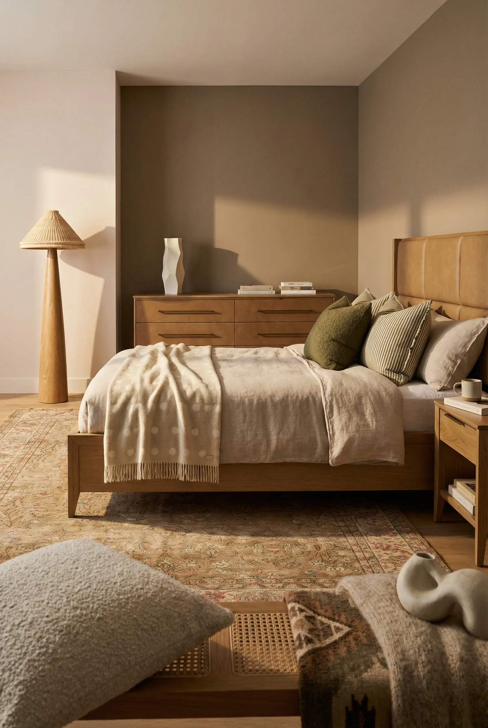
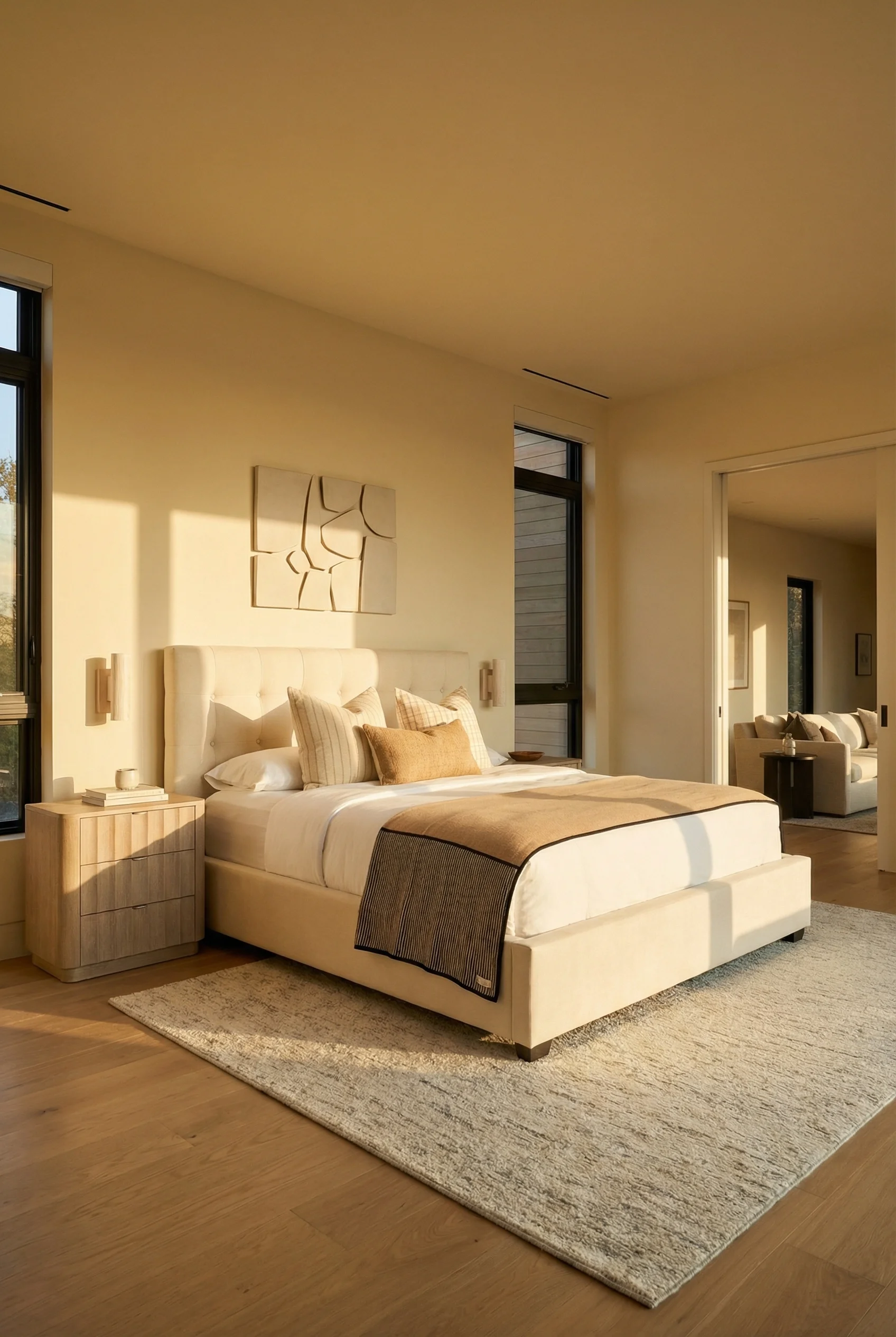
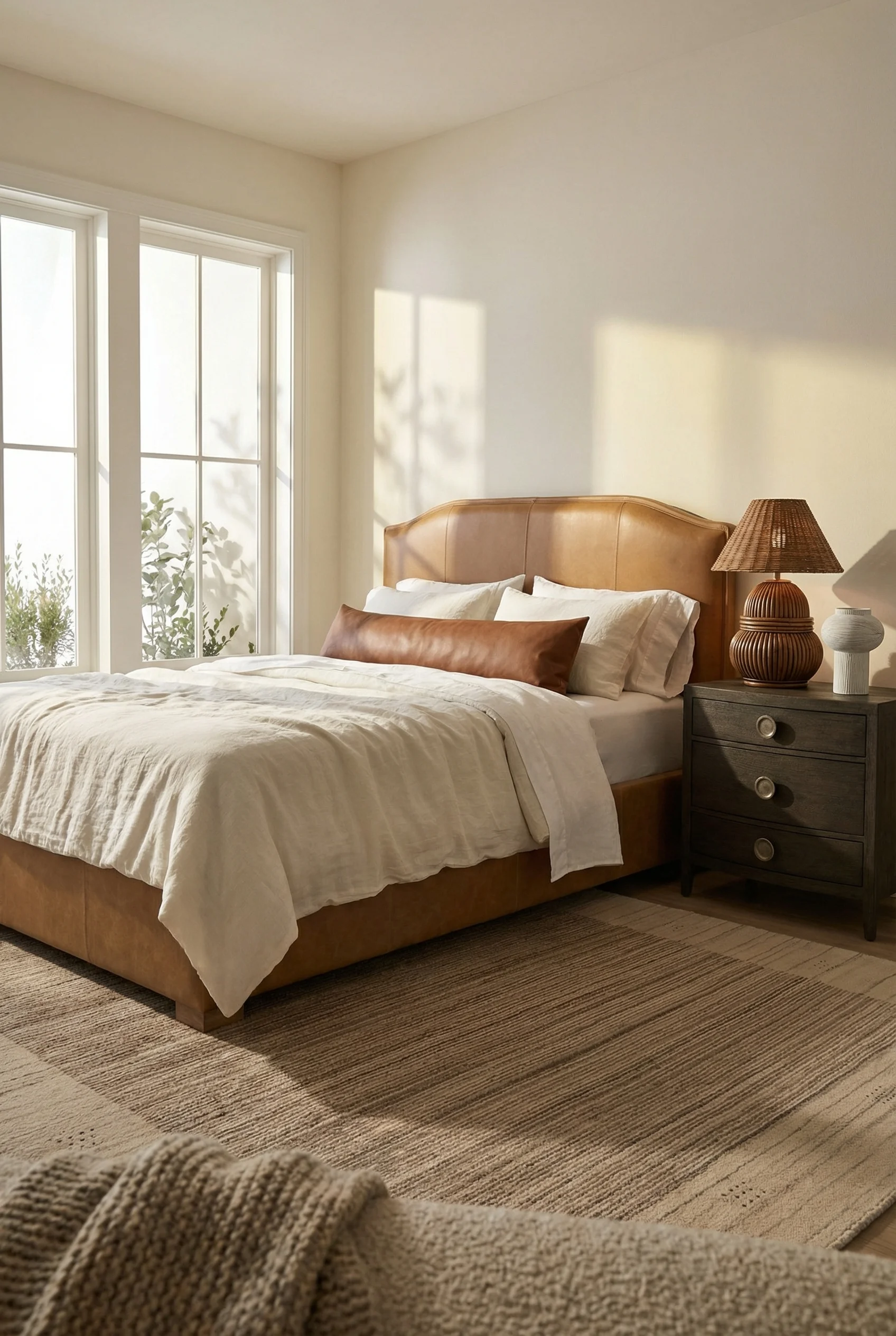
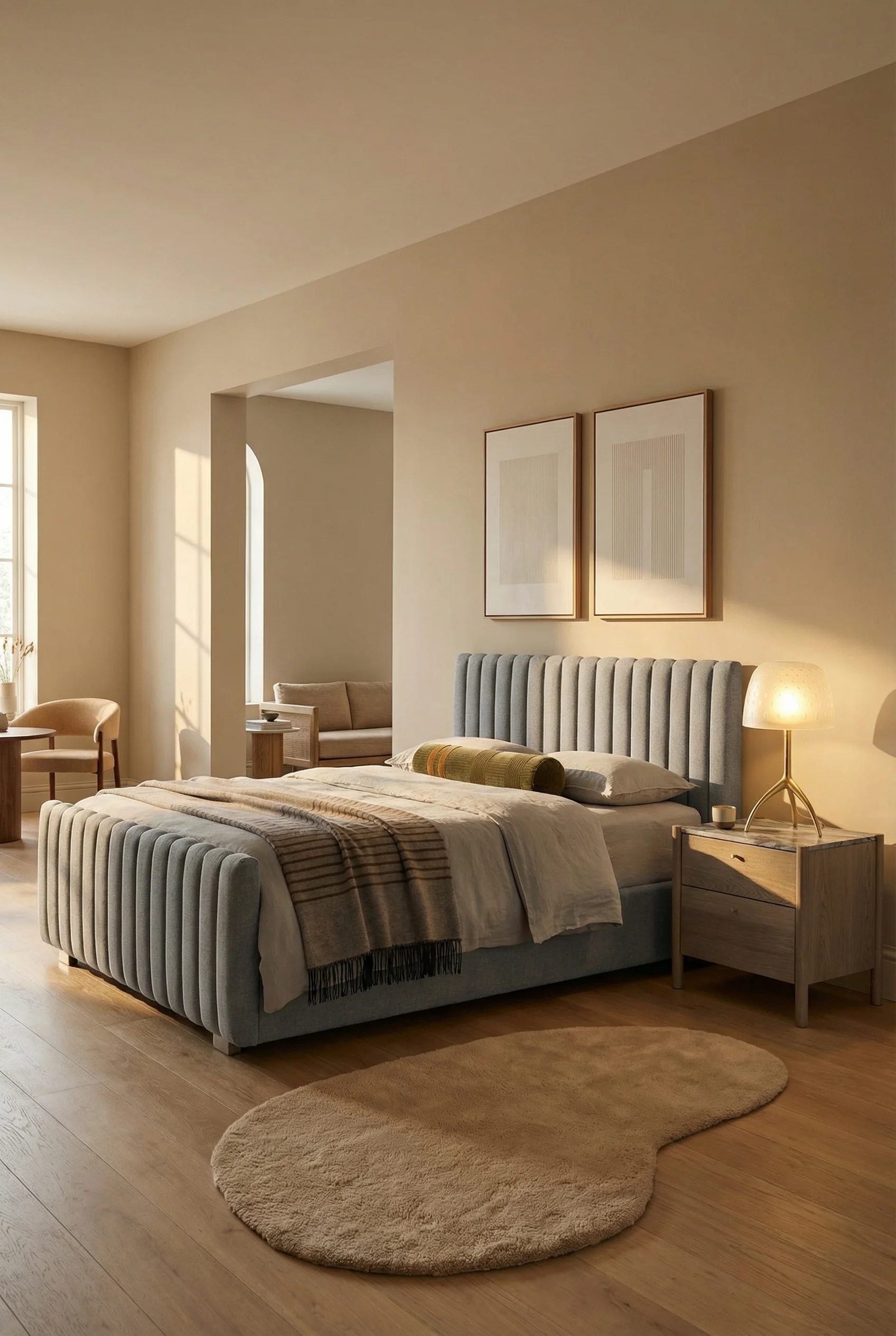
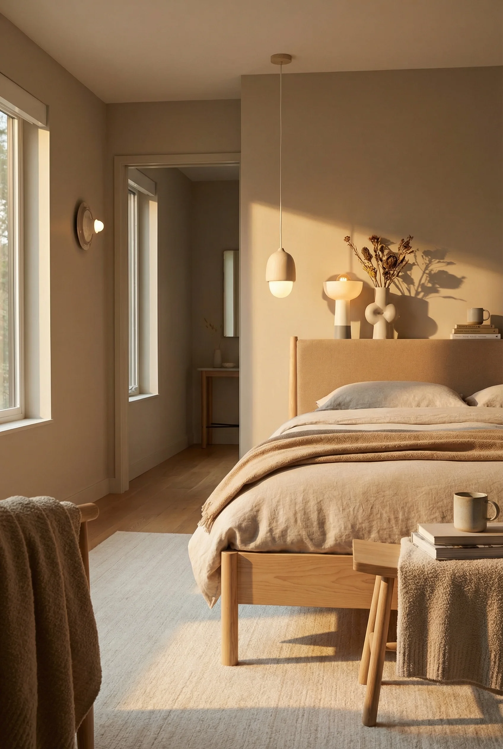
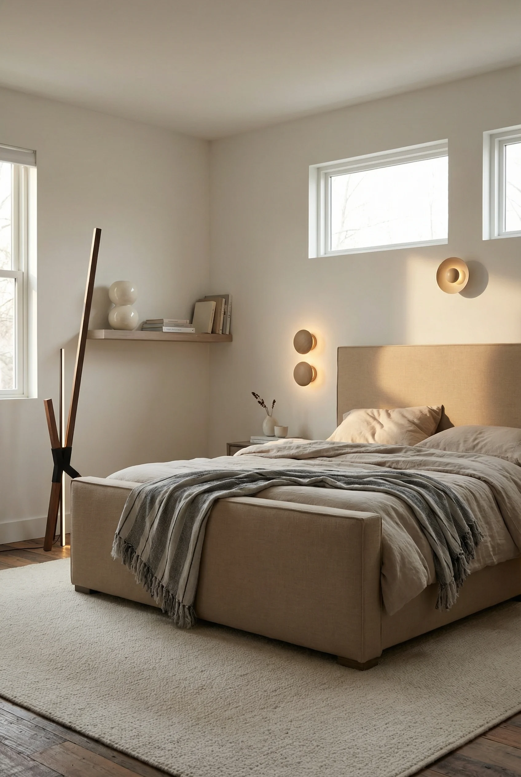
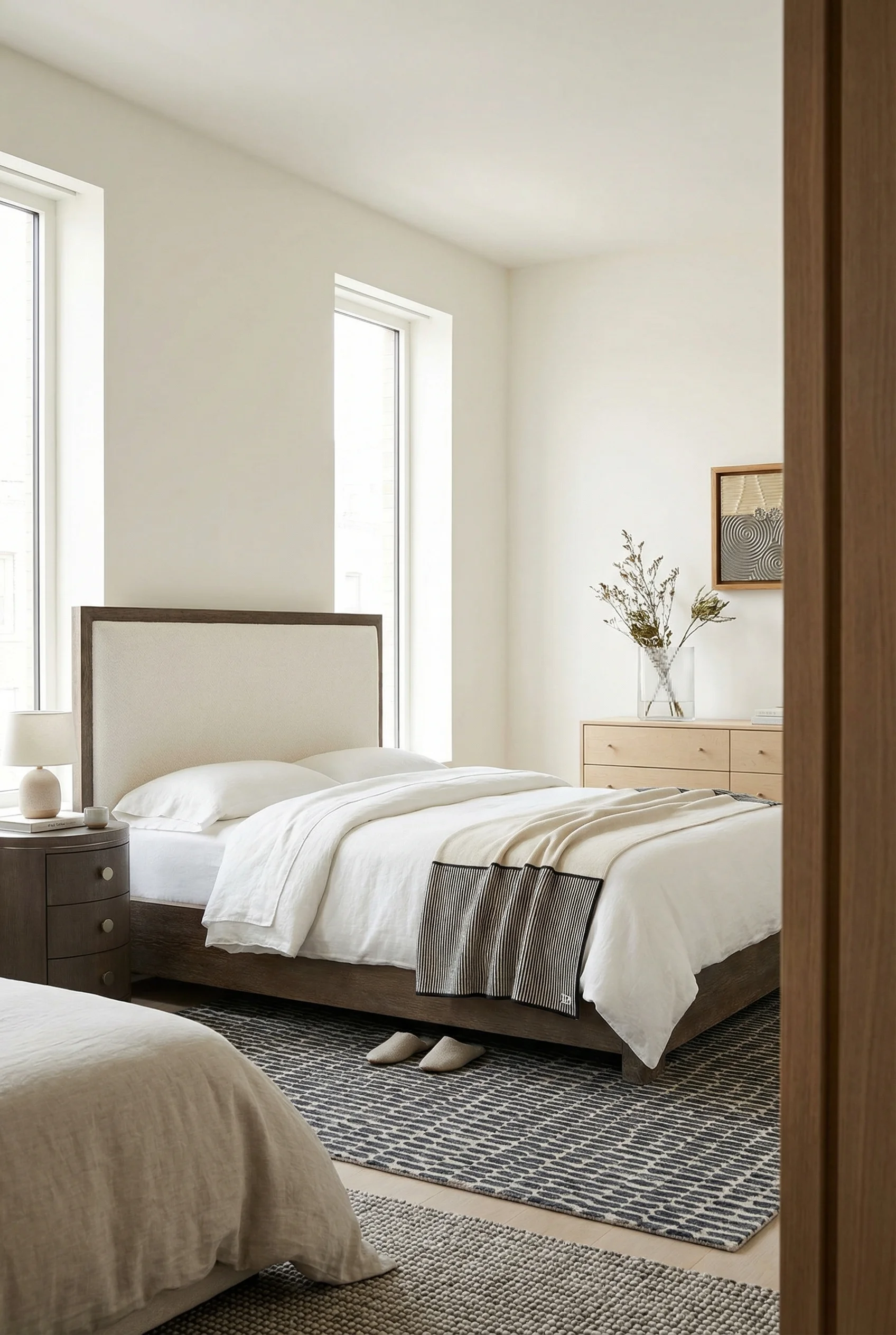
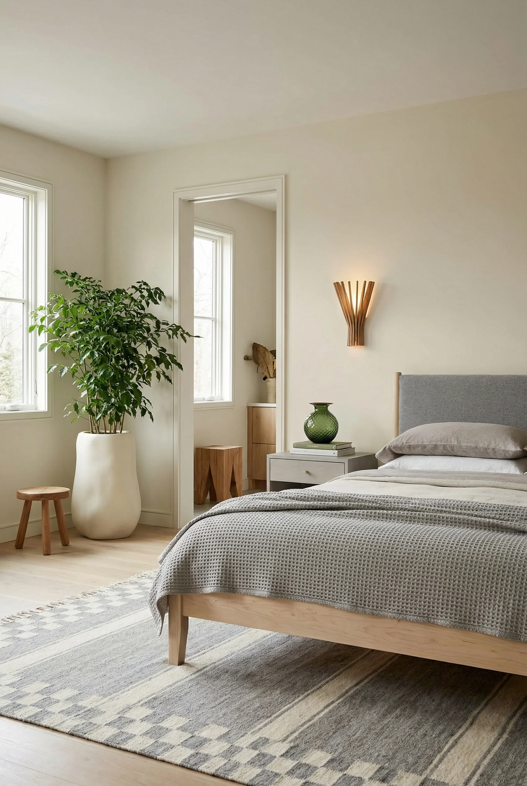
The fix is complex neutrals. Colors that look simple but contain multiple subtle undertones working together. Mushroom. Taupe. Camel. Even soft sage green, which pairs so naturally with wood and stone that it functions as a neutral.
If you’ve been comparing Farrow & Ball to Little Greene, you’re already on the right track. Farrow & Ball’s “Setting Plaster” carries enough pink warmth to make skin tones look healthy and textiles feel luxurious. Little Greene’s “Portland Stone” does something similar with golden undertones. It goes on smoother if that’s been a concern.
The 2026 color trend points toward sandy shades. “Universal Khaki” and similar warm beiges that connect modern spaces to natural landscapes. The difference between a room that photographs well and one that actually feels restful.
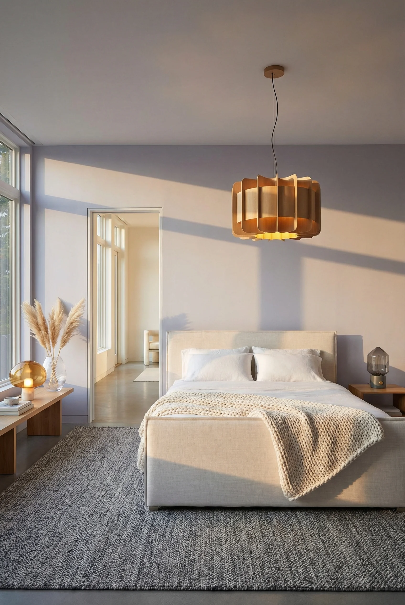
Here’s something interior designers know that most homeowners miss: warmth comes more from texture than from color. You can have the perfect warm white walls and still feel cold if every surface is smooth and flat.
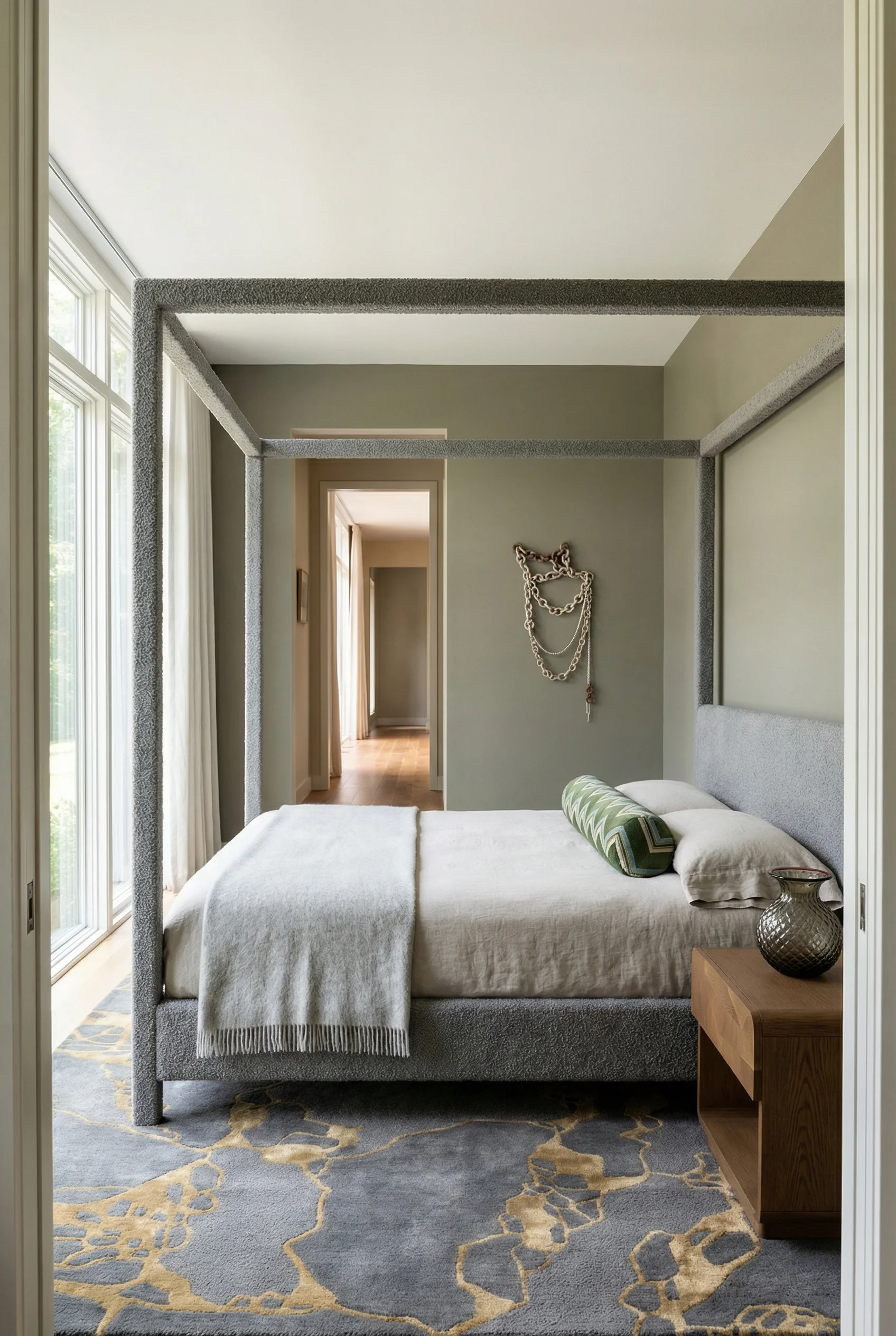
Think about the rooms that feel most inviting. They have layers. A chunky knit throw over linen sheets. A high pile wool rug underfoot. Velvet pillows against a cotton headboard. Each texture catches light differently and creates visual depth.
The formula works in three layers:
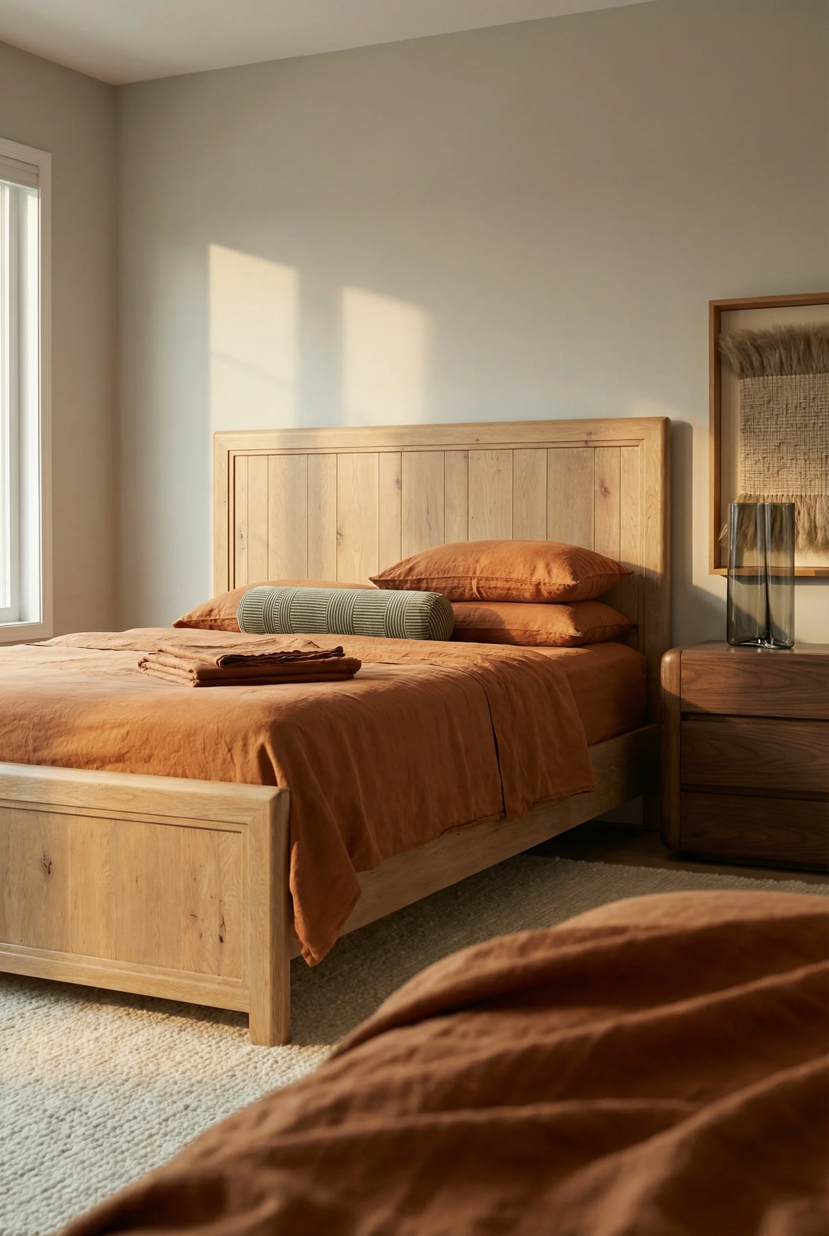
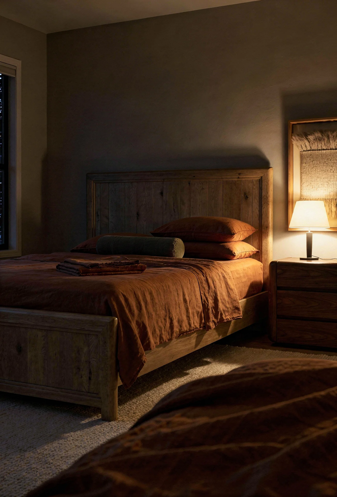
Foundation layer: This is your bedding base. Linen or cotton in relaxed weaves rather than crisp percale. The slight wrinkle and softness reads as lived in rather than staged.
Accent layer: Add materials with more visual weight. Boucle fabric on a chair. A velvet bench at the foot of the bed. Chunky wool throws folded at the corner. These pieces draw the eye and create interest.
Grounding layer: Your flooring and rugs anchor everything. High pile wool rugs or natural jute and sisal bring organic texture that synthetic materials simply cannot replicate.
When you layer at least three distinct textures on your bed alone, the entire room shifts from flat to dimensional.
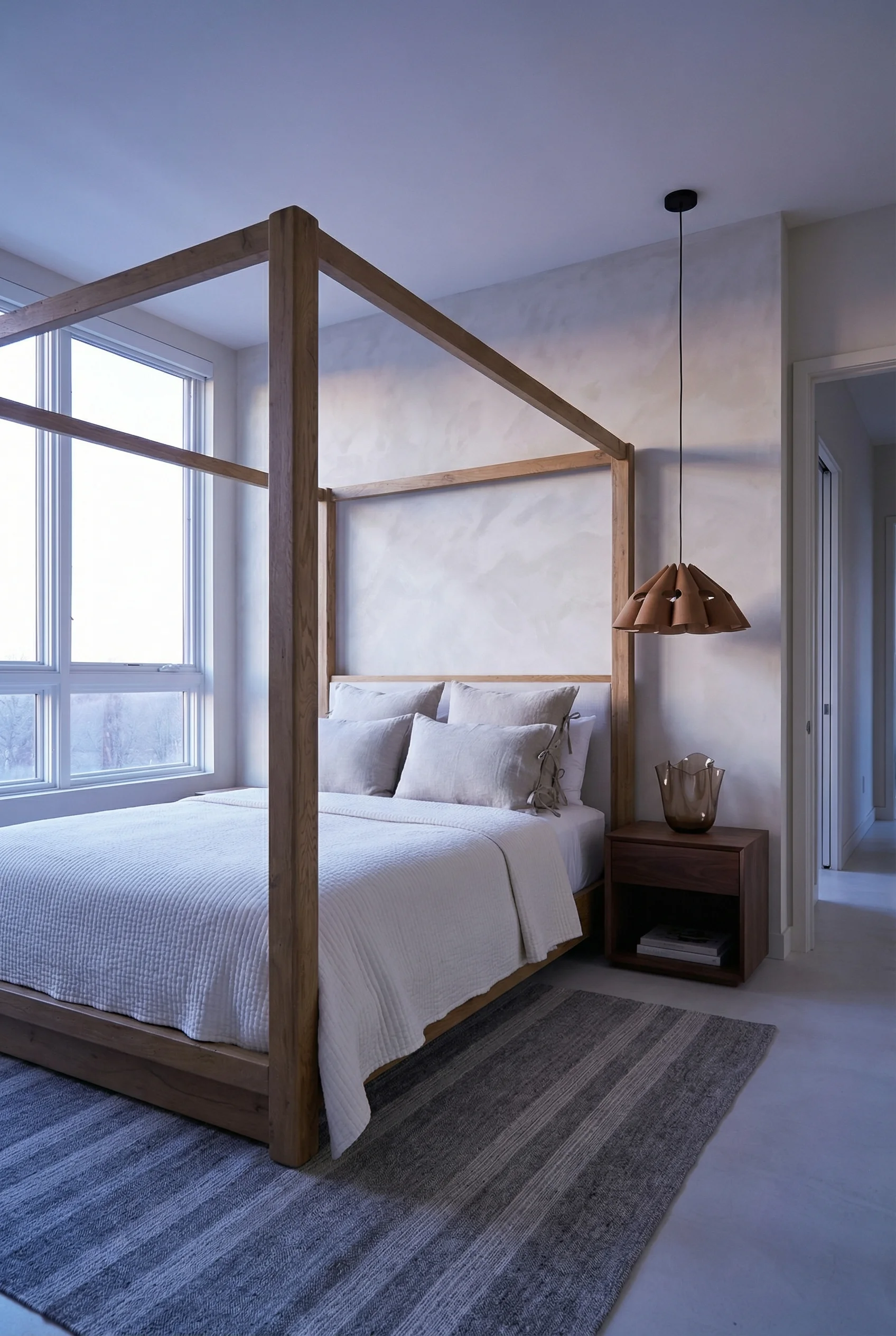
For years, matching wood tones was considered a design rule. Your nightstands should match your dresser should match your bed frame. But that approach often makes modern bedrooms feel like furniture showrooms rather than personal spaces.
The current approach is far more interesting. Mix wood tones intentionally and the room gains character and depth. The key is doing it with purpose rather than randomly.
Start by selecting one dominant tone. Usually this comes from your flooring or your bed frame since those are the largest wood surfaces. Let’s say you have light oak floors.
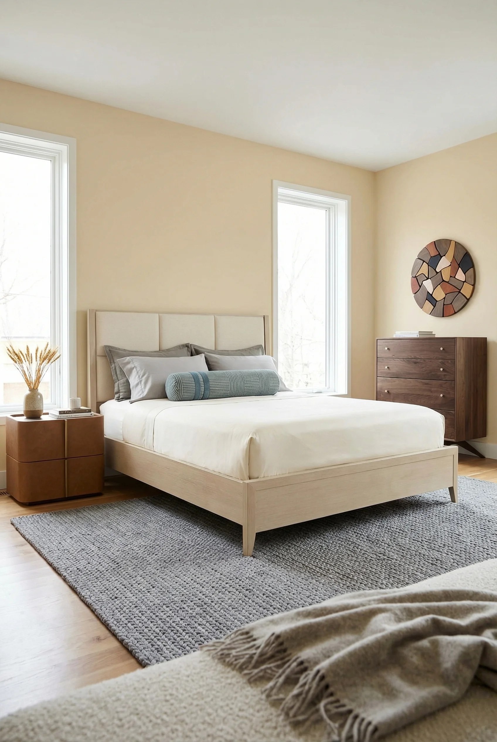
Now add contrast. A dark walnut dresser against those light floors creates visual interest. The contrast feels intentional because it’s significant enough to read as a choice rather than a mismatch.
Bridge the gap with your smaller pieces. A medium toned nightstand can connect your light floors to your dark dresser. Alternatively, use a rug or painted furniture to create separation that makes the mix feel cohesive.
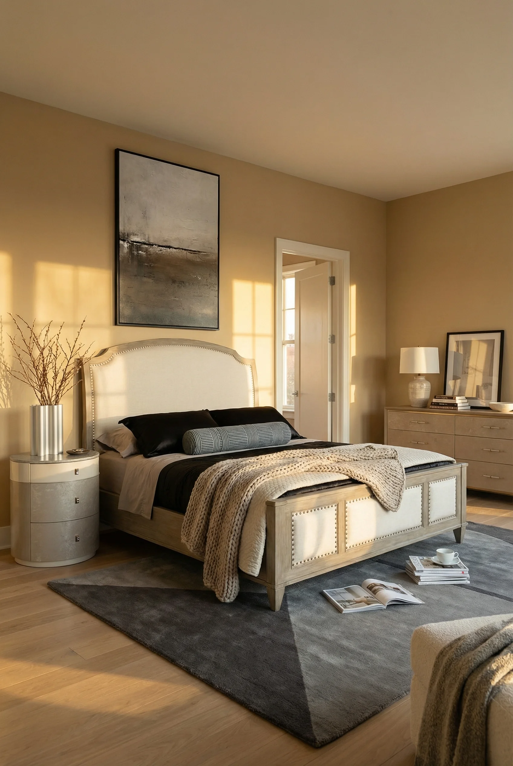
The most important rule: keep the undertones related even when the values differ. Warm woods with warm woods. Cool grays with cool grays. When the underlying color temperature matches, even dramatically different tones work together.
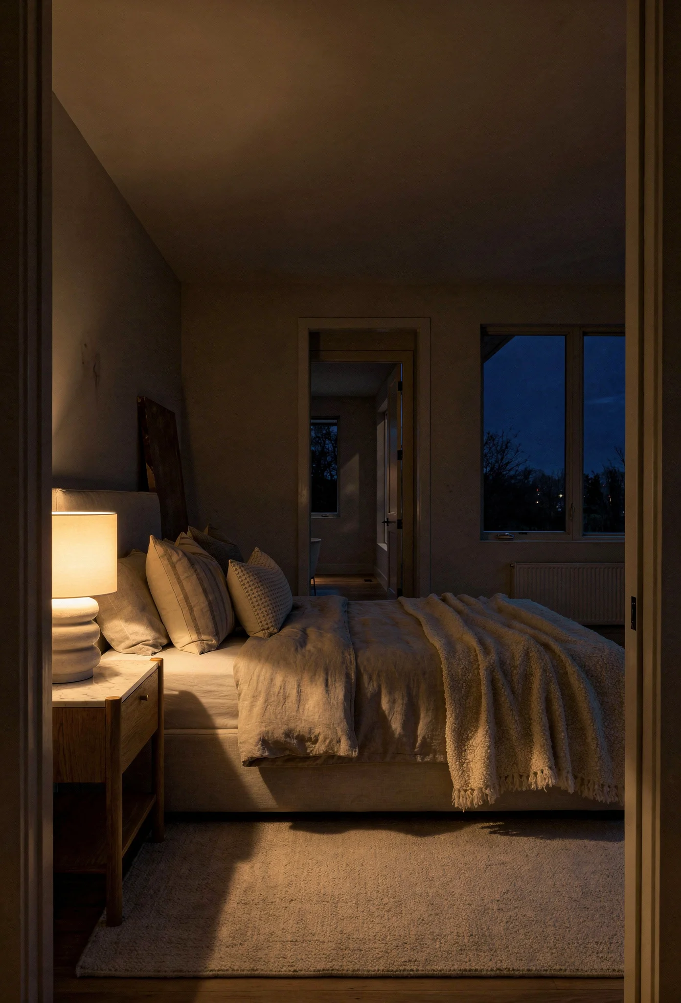
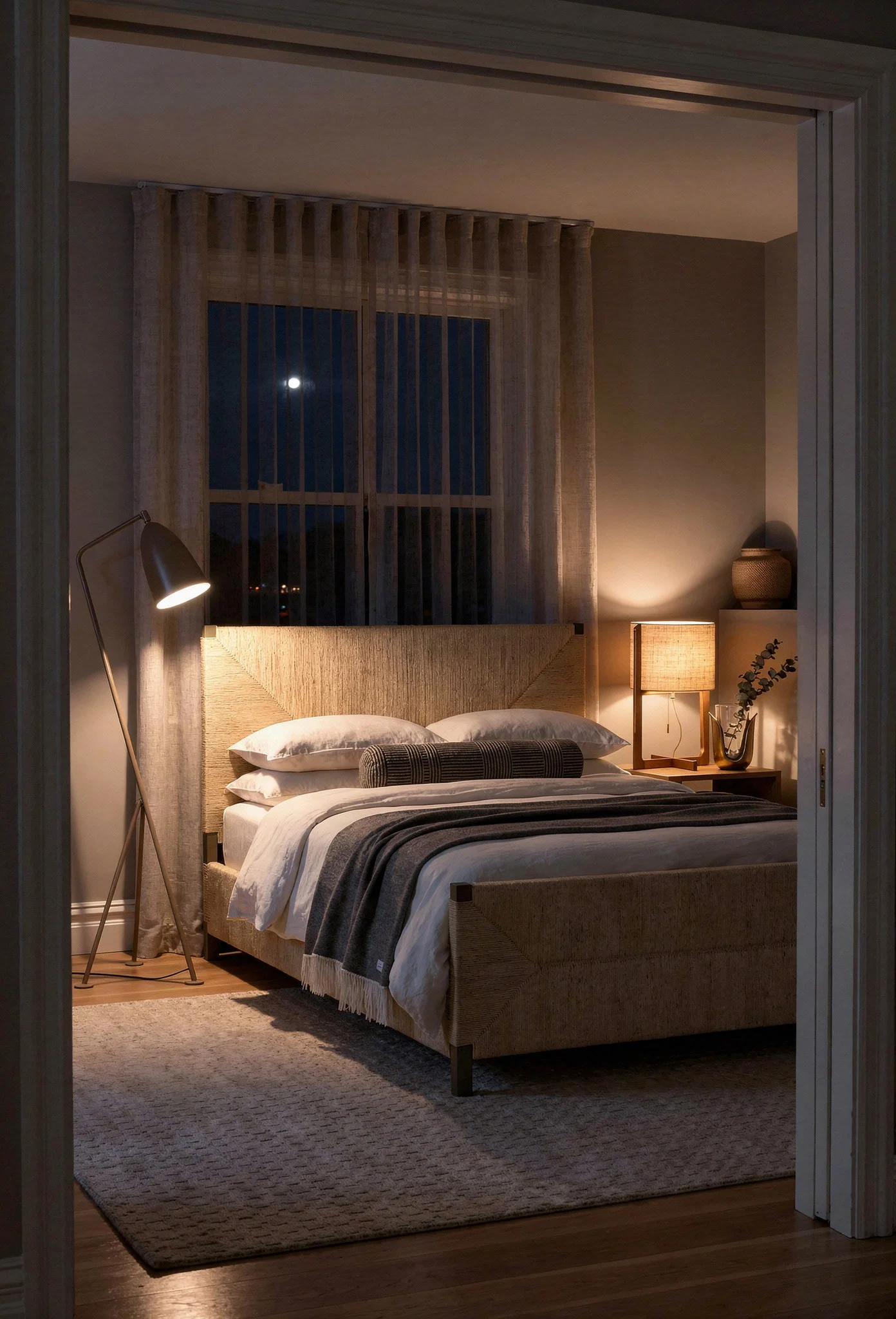
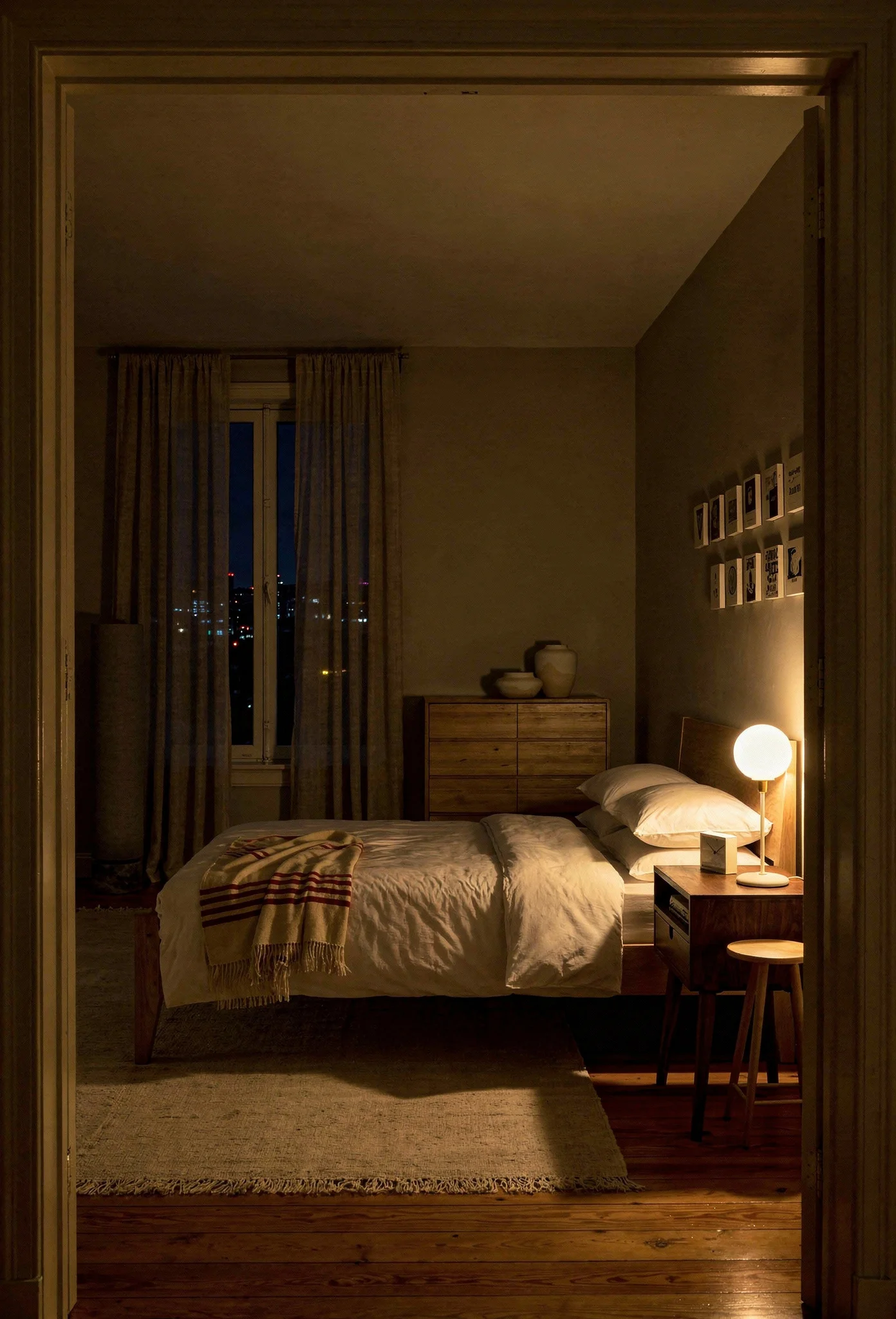
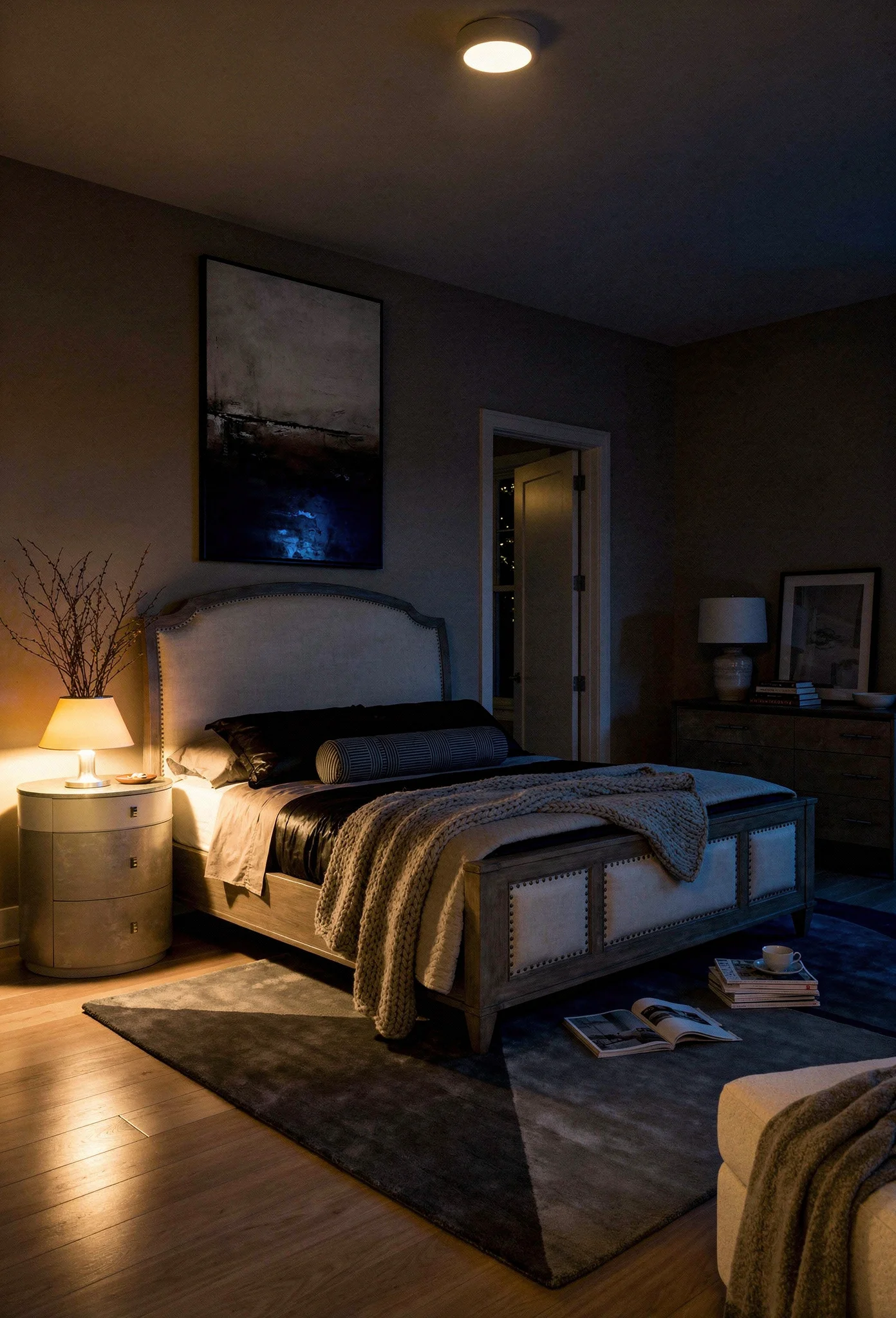
You’ve probably already discovered how wrong bulb choice can sabotage a space. Most people accidentally buy 3000K or even 4000K bulbs that cast a cooler, more clinical light. In a neutral room, that mistake is amplified.
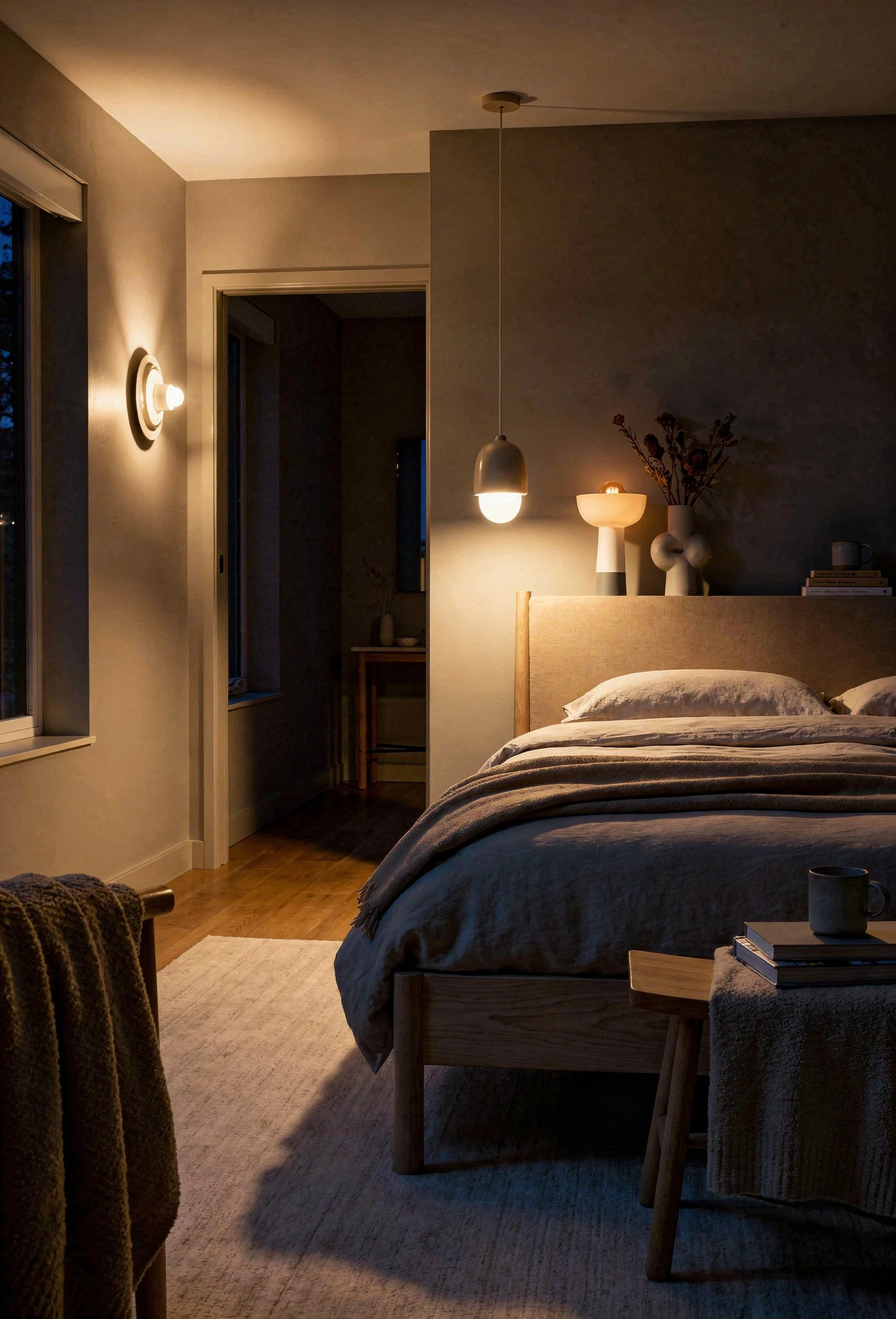
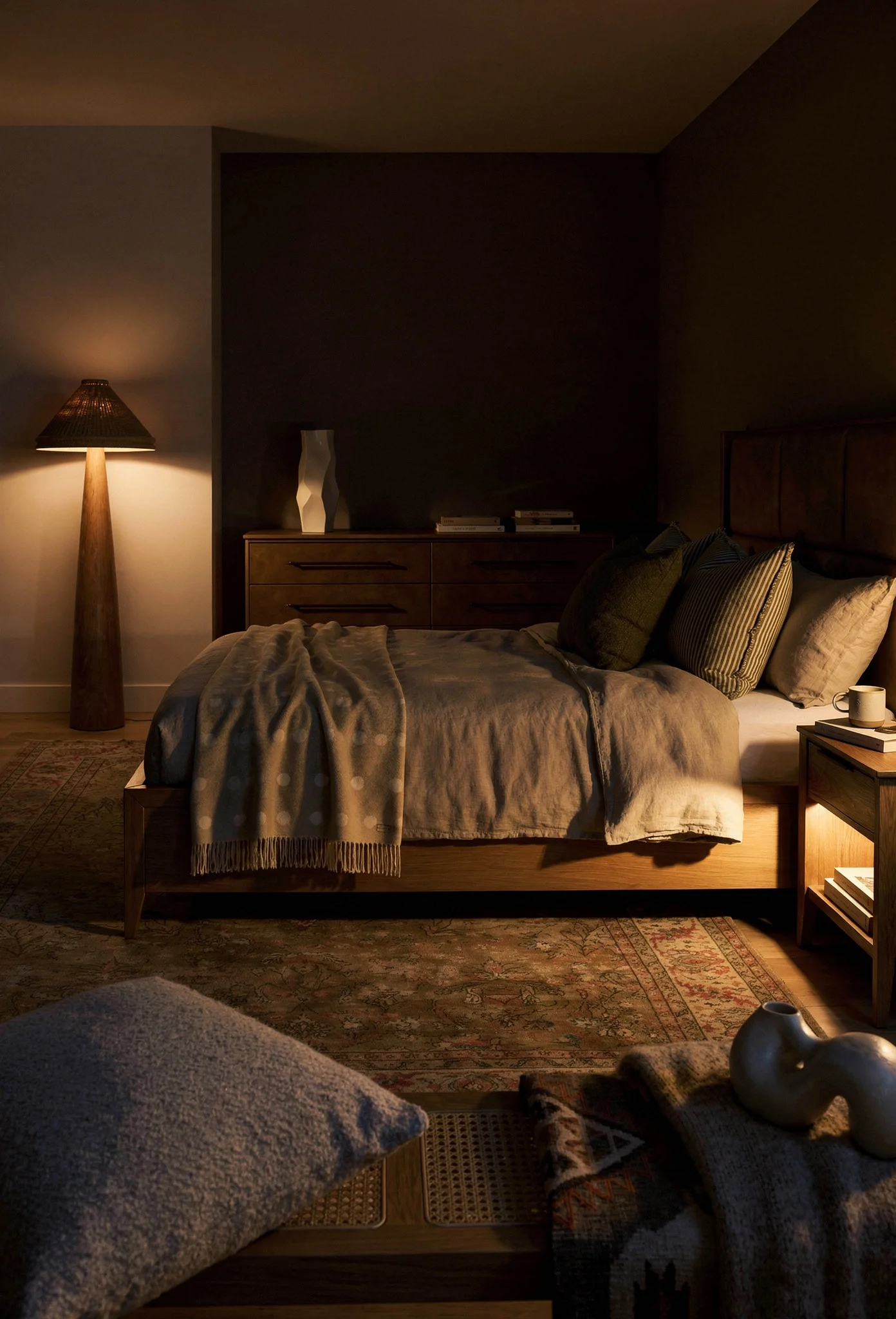
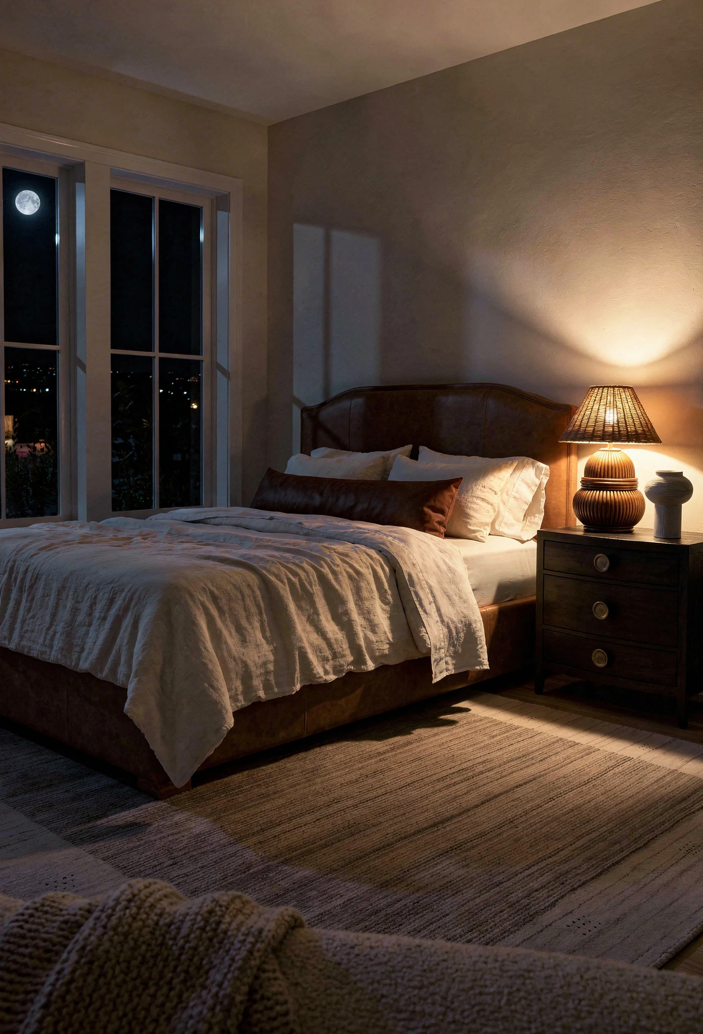
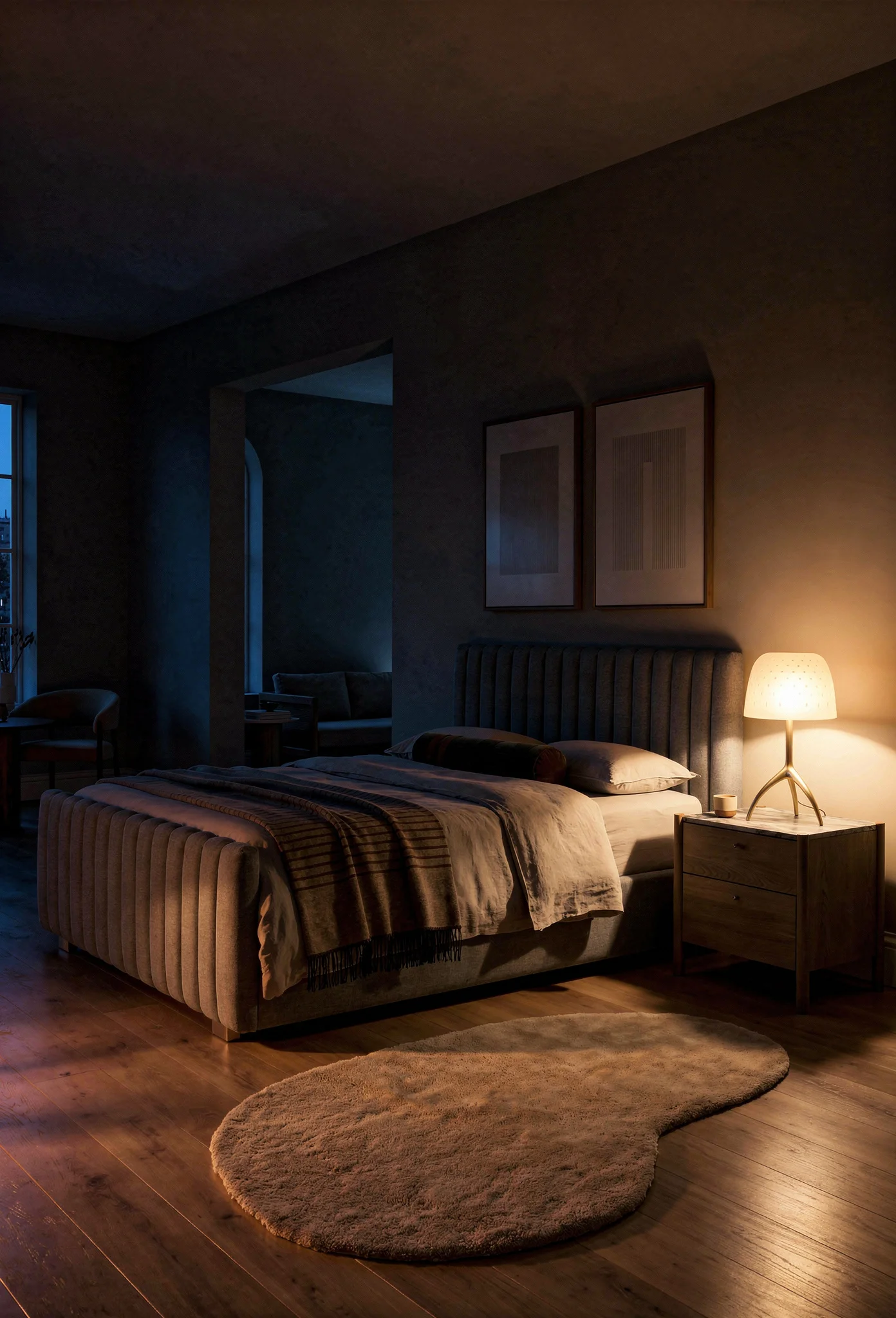
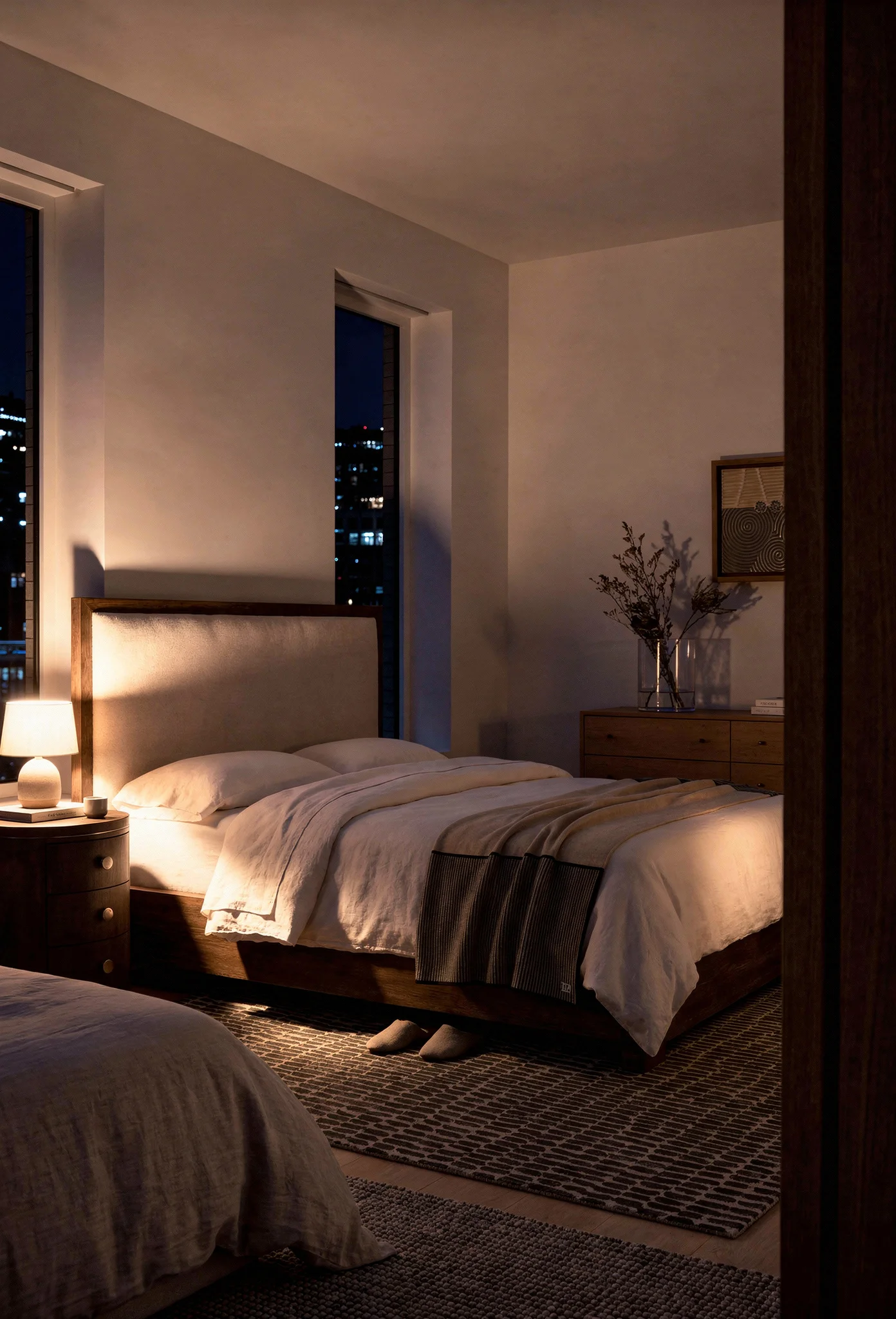
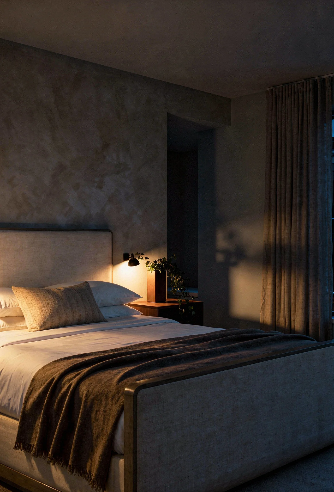
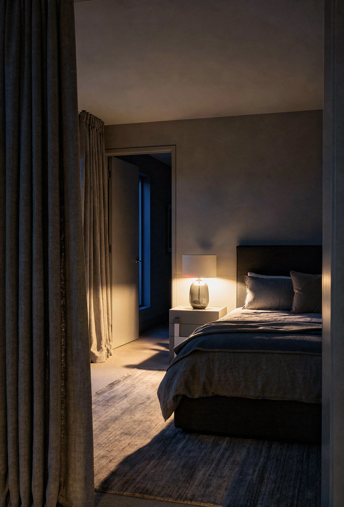
The number you want is 2700K. You likely know this already. But here’s what makes the real difference: color temperature only matters if you can control intensity.
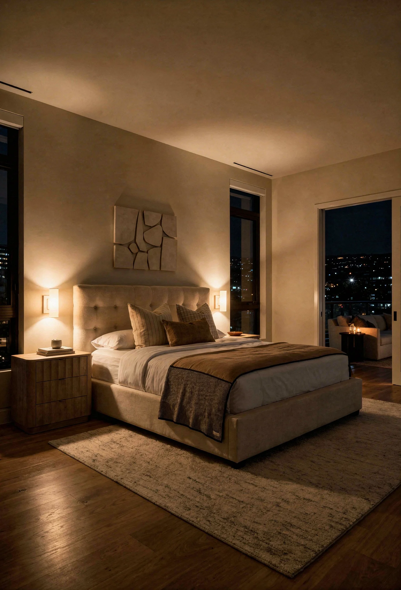
In a neutral room, cool light emphasizes gray undertones. Warm light brings out creamy, golden notes. Same room, completely different feeling. Dimmers are non-negotiable.
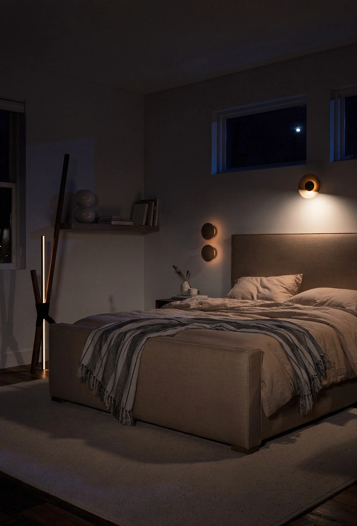
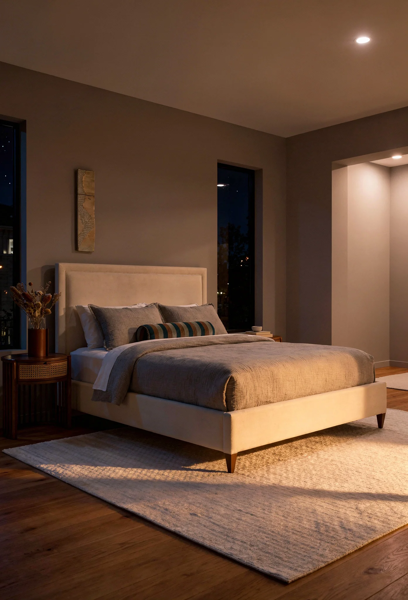
Beyond color temperature, layered lighting creates the cozy atmosphere you’re after. One overhead fixture never provides enough warmth, no matter how perfectly chosen.
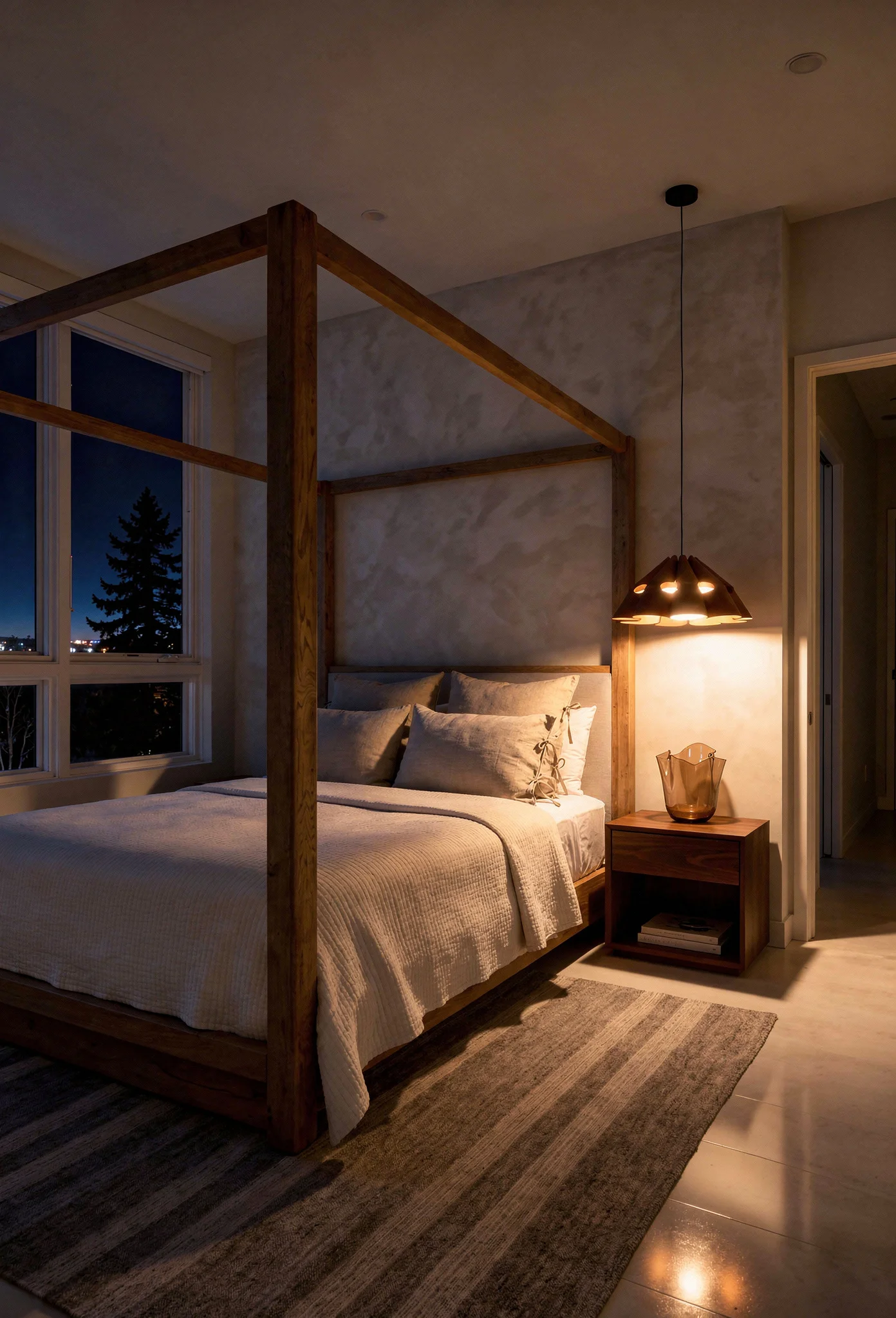
Ambient lighting sets the overall mood. Plaster pendants or paper lanterns diffuse light softly rather than creating harsh pools.
Task lighting handles practical needs. Sconces or adjustable bedside lamps let you read without flooding the room in brightness.
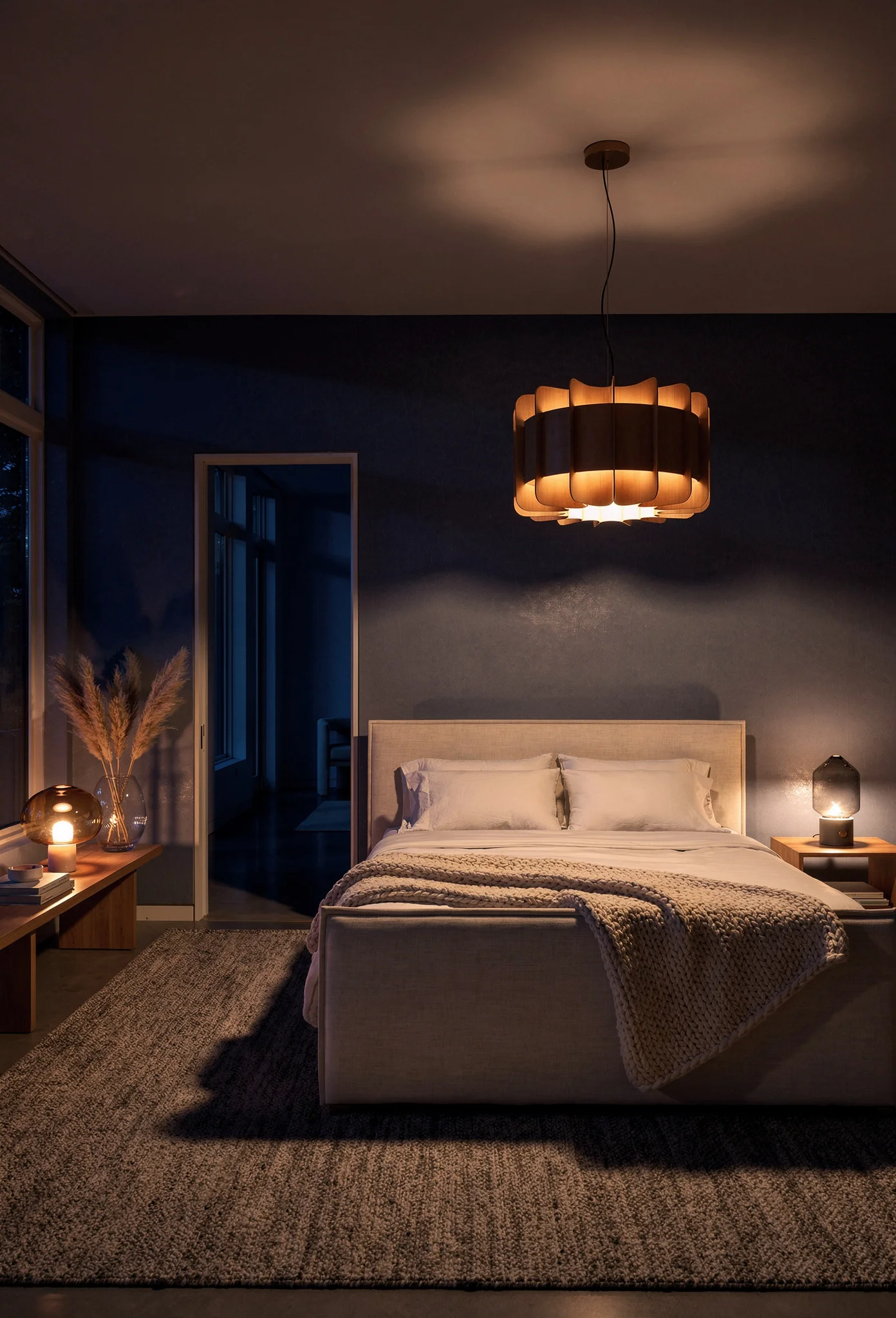
Accent lighting adds magic. Hidden LED strips behind headboards or under floating shelves create a gentle glow that makes the room feel intentionally designed.
If you’re weighing up hardwired sconces versus plug-in options, hardwired gives you cleaner lines. Plug-in with cord covers is the practical choice if you’re renting or don’t want to deal with an electrician.
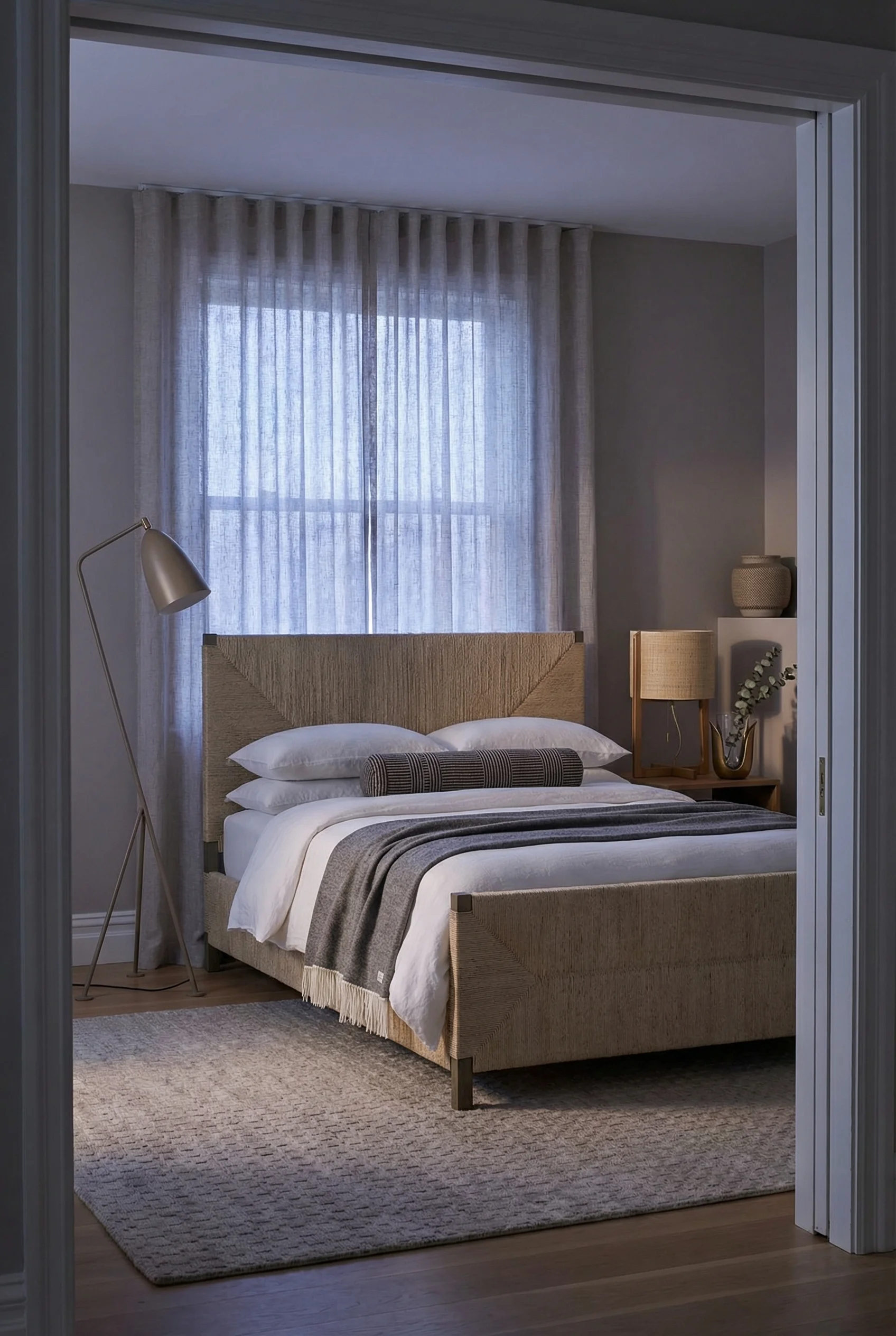
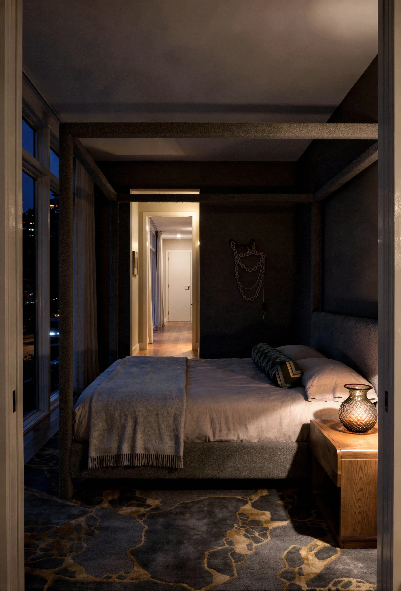
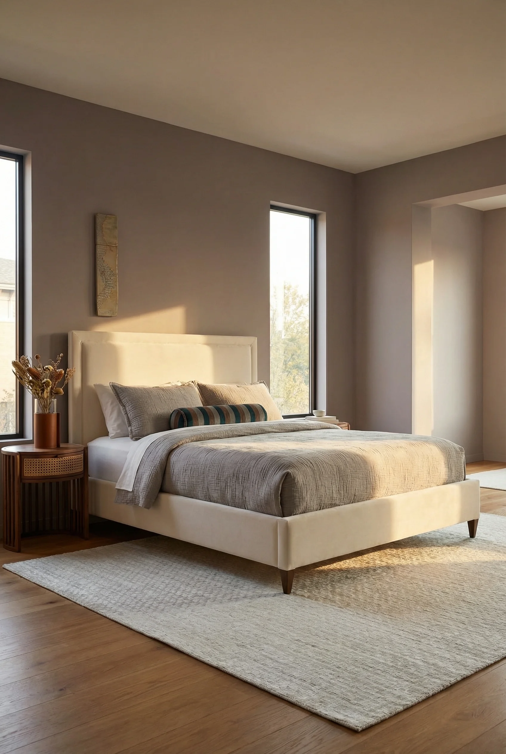
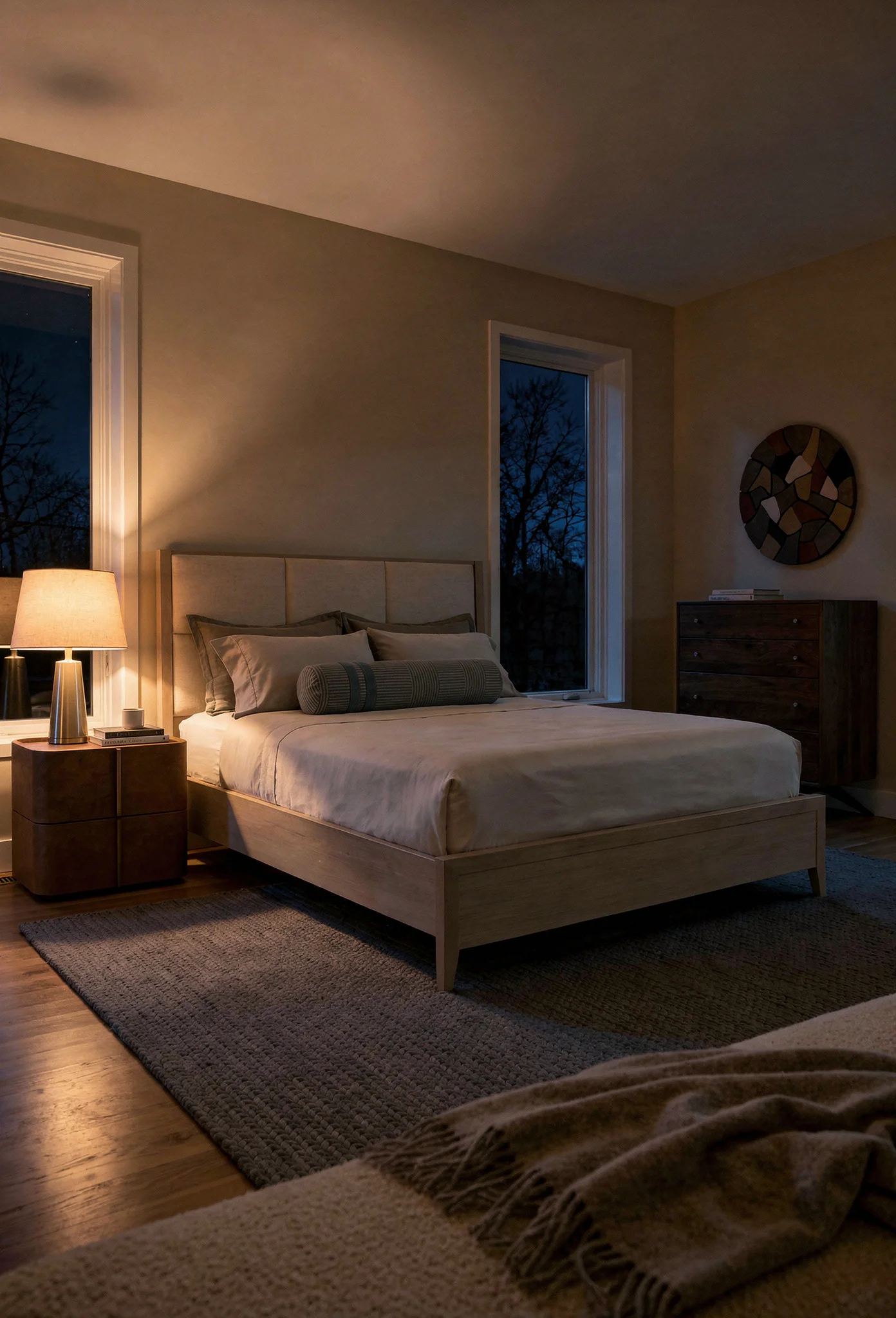
Your headboard offers the single biggest opportunity to add warmth to a neutral modern bedroom. It anchors the most important wall in the room and frames what you see first when entering.
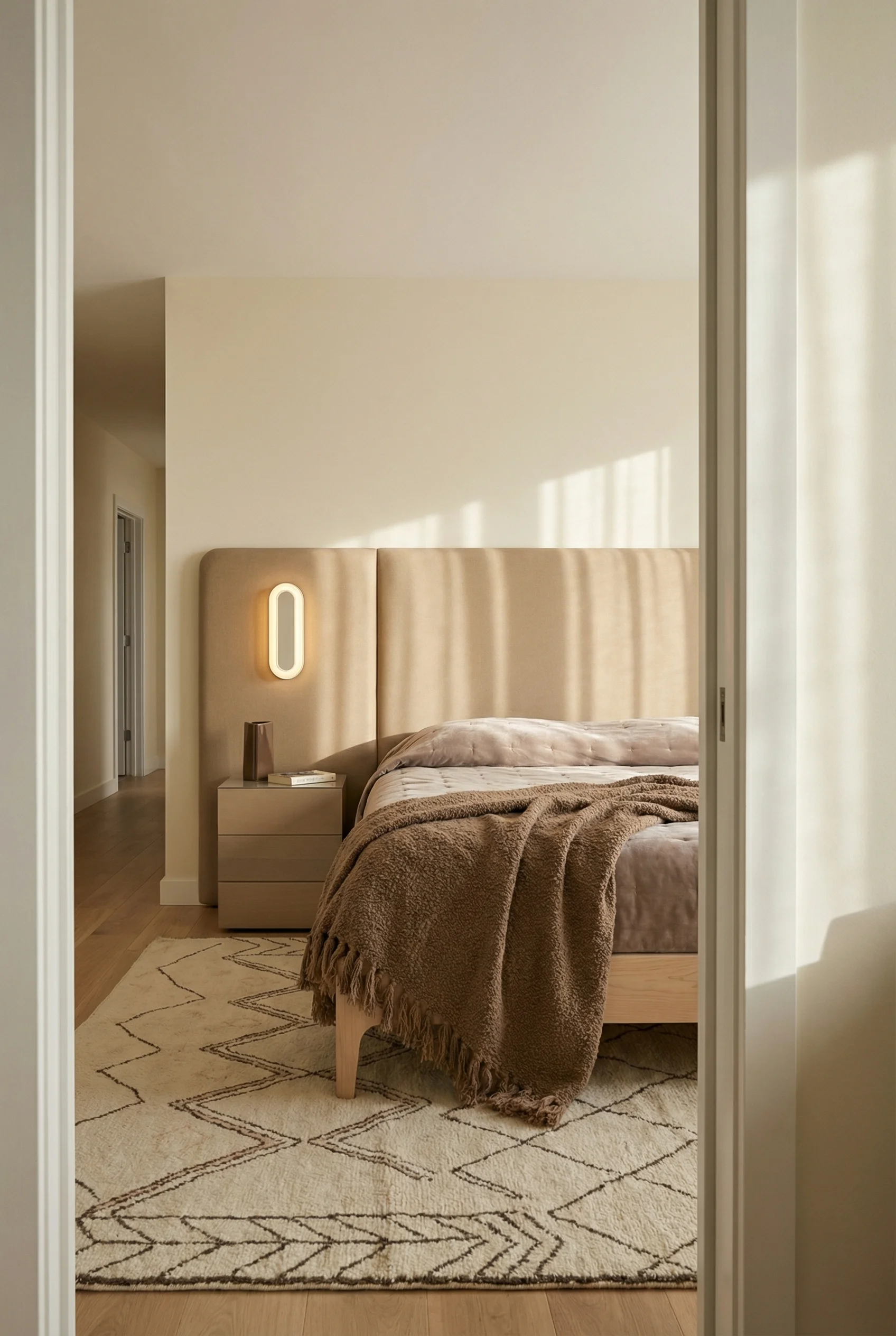
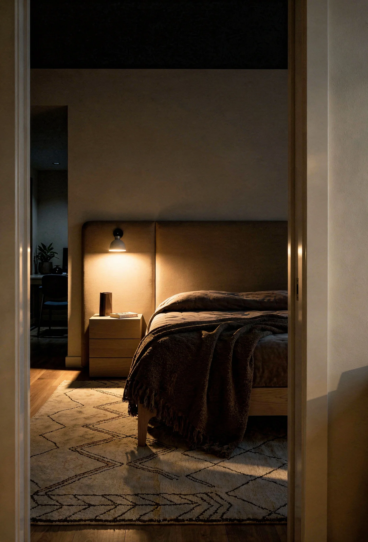
The trend has shifted away from simple frames toward statement upholstered headboards. Arched shapes have become particularly popular because they soften the angular quality of most modern furniture. The curve introduces an organic element that breaks up the rigid lines.
Fabric choice matters enormously. Velvet headboards in warm tones like camel or mushroom absorb light and add immediate richness. Corduroy offers similar texture with a more casual feeling. Even linen or cotton in heavyweight weaves work beautifully.
The “monastic bed” trend takes a different approach. Ultra simple frames paired with exceptional quality bedding, layered thoughtfully. The warmth comes from the textiles rather than the structure. This works particularly well in smaller rooms where a large headboard might overwhelm.
For those wanting architectural warmth, consider extending material behind your bed. Wood slat panels, limewash treatment, or fabric wrapped panels can transform an entire accent wall. This creates a cocoon like feeling that makes the bed feel nestled rather than floating in space.
Flat matte paint looks fine. Limewash looks alive. You’ve probably noticed this in photos. That cloudy, dimensional finish that changes throughout the day as light shifts.
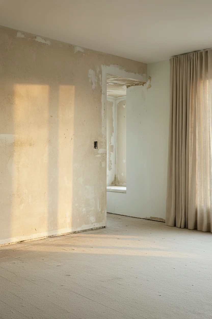
The texture comes from natural limestone and mineral pigments that interact with the wall surface rather than just coating it. Beyond aesthetics, limewash is naturally breathable. It regulates humidity and allows walls to release moisture rather than trapping it.
The application requires some skill. The slightly irregular finish, with areas of deeper and lighter saturation, reads as artisanal rather than imperfect. It adds age and character that new construction often lacks.
If you’re weighing up Portola versus Bauwerk versus Domingue, they each have slightly different textures. Portola is the most forgiving for DIY. Bauwerk has the deepest color saturation. Domingue has that Old World look but needs experienced application.
Popular colors for bedrooms: warm plaster tones and soft stone grays. The texture works particularly well on headboard walls where you want visual interest without pattern or artwork.
If full limewash feels like more commitment than you want, several paint brands now offer limewash-effect paints that capture much of the dimensional quality with easier application.
Biophilic design sounds complicated but the concept is simple: bring nature indoors. Research consistently shows that natural elements in bedrooms improve sleep quality and reduce stress markers.
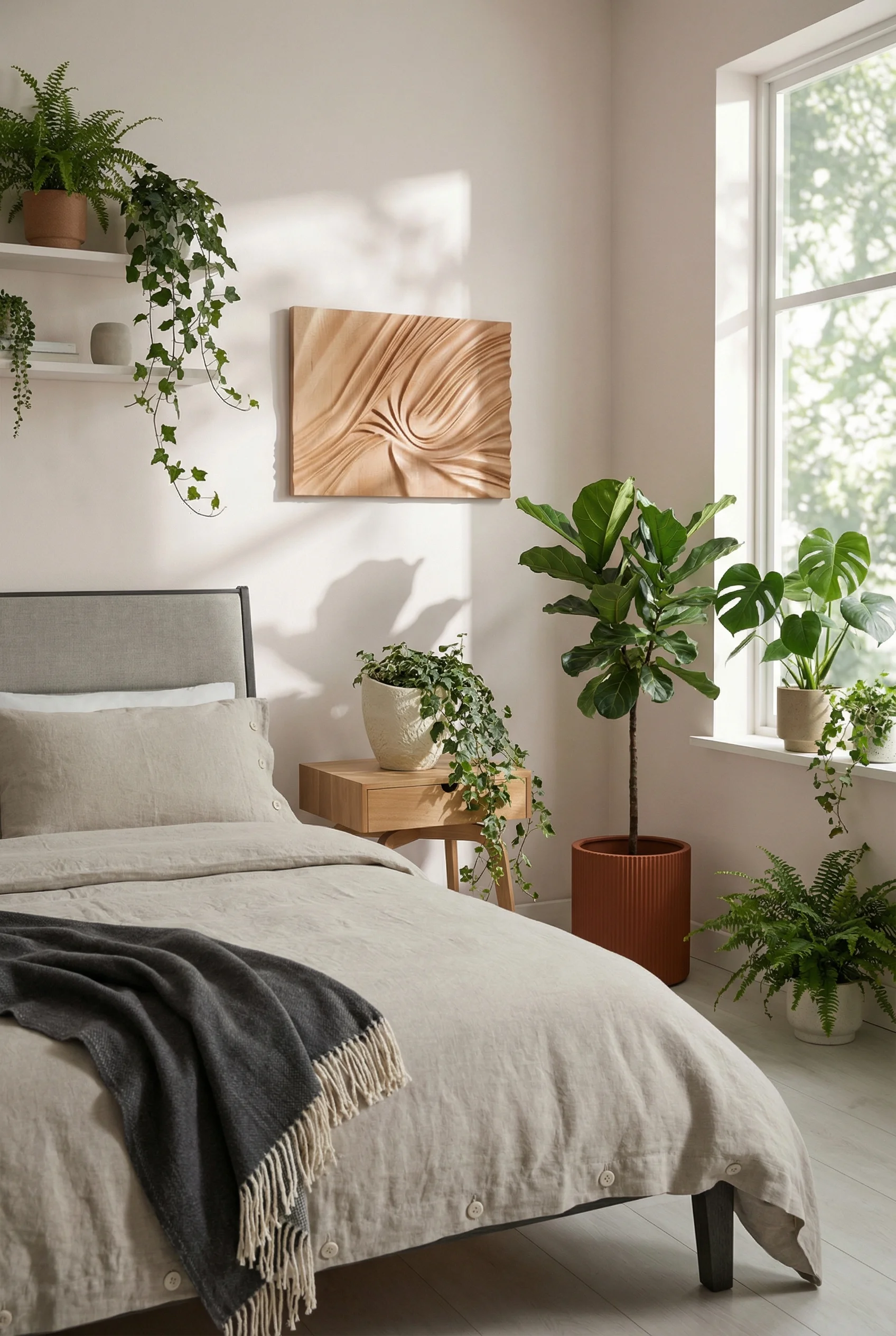
Start with materials. Clay pots rather than plastic. Stone or ceramic accessories rather than synthetics. Wood in its natural grain rather than painted or laminated. Each organic material carries subtle variations that artificial versions cannot replicate.
Plants obviously fit this category but work strategically. Low light tolerant varieties like snake plants and pothos survive bedroom conditions. They also quietly filter air while you sleep. Start with one substantial plant rather than scattering many small ones.
Natural light matters more than anything else for circadian rhythm. Maximize your exposure to daylight, especially morning light which signals your body to wake naturally. Sheer curtains maintain privacy while allowing light to filter through.
The biophilic bedroom also means removing what disrupts natural rhythms. Hidden charging stations rather than glowing devices on nightstands. TVs behind cabinet doors or panels rather than dominating the wall. The goal is a space that feels disconnected from the digital noise of daily life.
You rarely think about how your bedroom sounds until you notice it. Hard surfaces bounce noise around, creating an echoey quality that subconsciously registers as cold and unwelcoming.
Soft surfaces absorb sound and create the acoustic warmth we associate with cozy spaces. This is why a room with a thick rug, heavy curtains, and an upholstered headboard feels immediately more intimate than one with bare floors and bare windows.
Heavy drapery does double duty. It controls light for better sleep while absorbing sound and adding visual softness. Floor length curtains in natural linen or cotton velvet transform window walls.
Upholstered headboards reduce sound reflection from the largest wall surface in most bedrooms. Combined with thick rugs, they can reduce ambient noise by a noticeable degree.
Wood slat panels have become popular for exactly this reason. Beyond their visual warmth, they function as acoustic treatment. Quality slat installations reduce echo and create a noticeably quieter room.
Layer these elements and your bedroom begins to feel like a sanctuary. The outside world stays outside. Inside, only the sounds of rest.
Color is where most warm neutral bedrooms fall apart. The wrong white looks clinical. The wrong gray reads cold. Here’s the five color palette that keeps everything cohesive. All from Farrow & Ball, whose mineral-rich pigments create the depth that flat commercial paints simply cannot match.

Warm White – Your ceiling and trim color. Skip bright white entirely. Pointing carries the faintest whisper of yellow that bounces light around the room without feeling sterile. In north-facing rooms it reads creamy and calm. In south-facing rooms it stays clean without going cold.
Paint Pick: Farrow & Ball Pointing No. 2003
Warm Neutral – The lightest wall option. Dimity has a subtle pink undertone that makes skin tones look healthy and textiles feel more luxurious. It works beautifully in bedrooms where you want softness without veering into beige territory. Pairs with every wood tone without competing.
Paint Pick: Farrow & Ball Dimity No. 2008
Earthy Brown – The grounding color. Broccoli Brown sits in that rich territory between chocolate and clay, deeper and earthier than a typical taupe. Use it on an accent wall or for rooms with abundant natural light that can handle a more enveloping tone. It reads remarkably sophisticated against pale linen and warm oak.
Paint Pick: Farrow & Ball Broccoli Brown No. 198
Charcoal – The dramatic choice. Hopper Head is a deep graphite with warm brown undertones. Think the color of aged lead, not cool concrete. This is not a subtle gray. It anchors a bedroom with real weight, especially effective on a headboard wall where it makes lighter bedding and natural wood furniture pop.
Paint Pick: Farrow & Ball Hopper Head No. 305
Sage Green – The unexpected fifth color. Cromarty is a soft, grey-green that connects your bedroom to the natural world outside. It reads as a neutral in practice, calming rather than colourful. It pairs beautifully with warm woods, natural linen, and brass hardware. The green undertone brings life without competing with your textiles.
Paint Pick: Farrow & Ball Cromarty No. 285
Once you nail your palette, every furniture and textile decision becomes easier. The colors do the heavy lifting.
Your bedroom should be the warmest, most restful room in your home. Start with bulbs. Swap everything to 2700K and add dimmers. Layer texture aggressively. Audit your space for anything that feels artificial or cold. These small shifts create the sanctuary you’ve been pinning but never quite achieving.