Newsletter Subscribe
Enter your email address below and subscribe to our newsletter
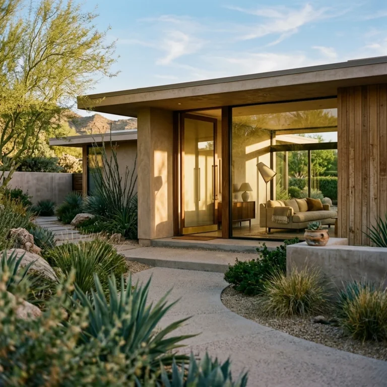
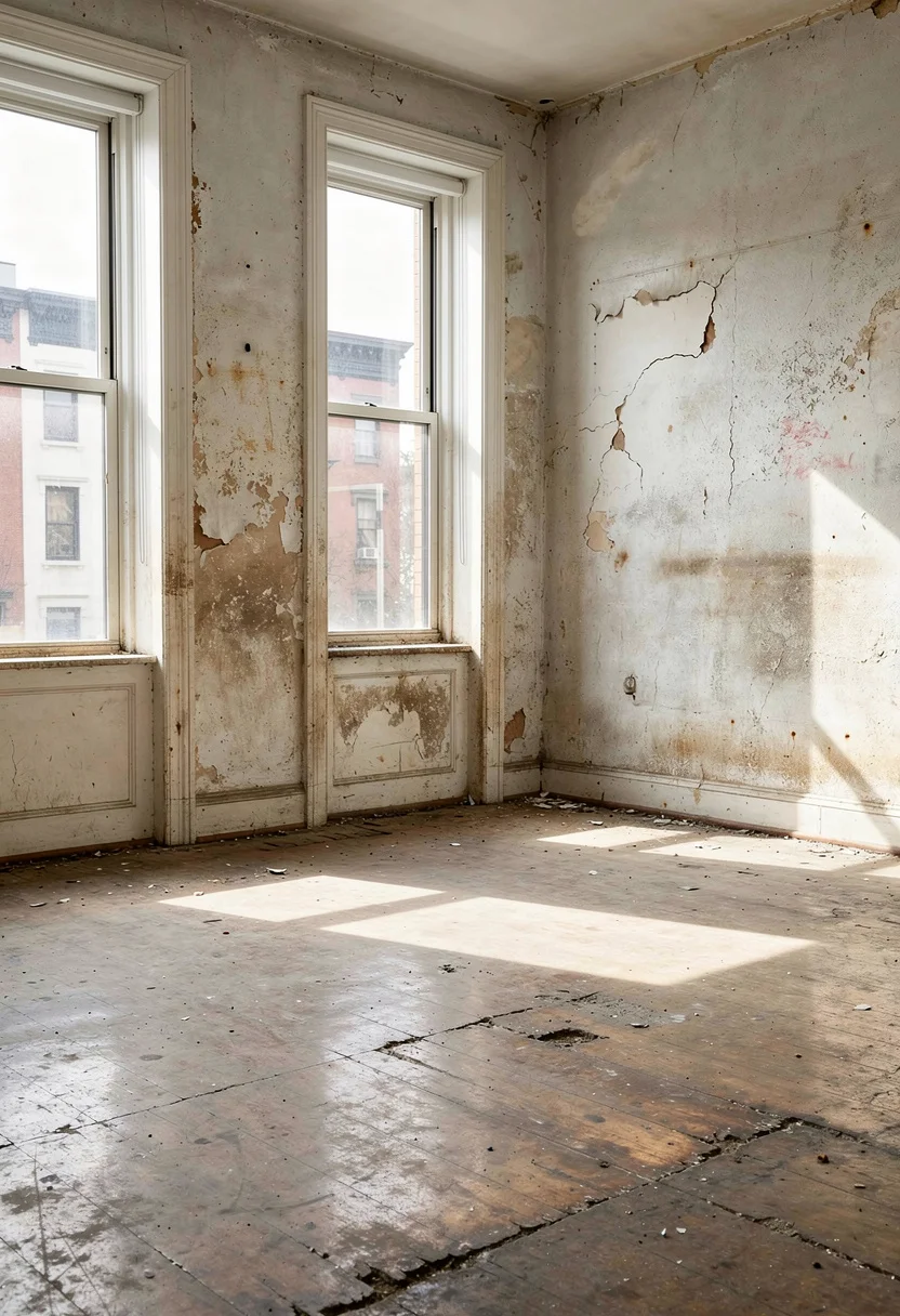
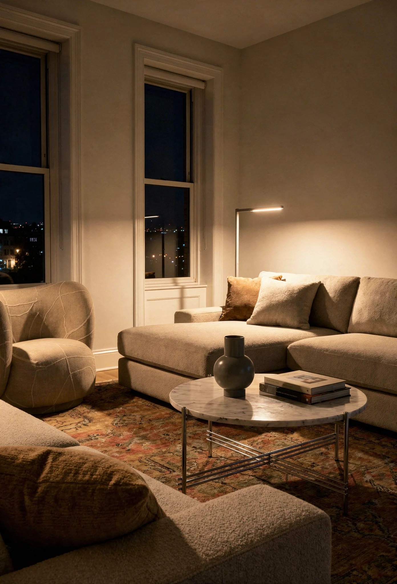
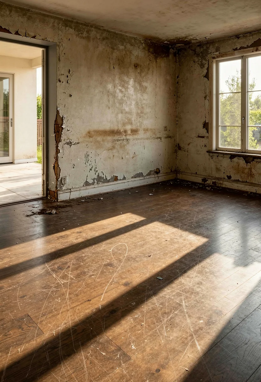
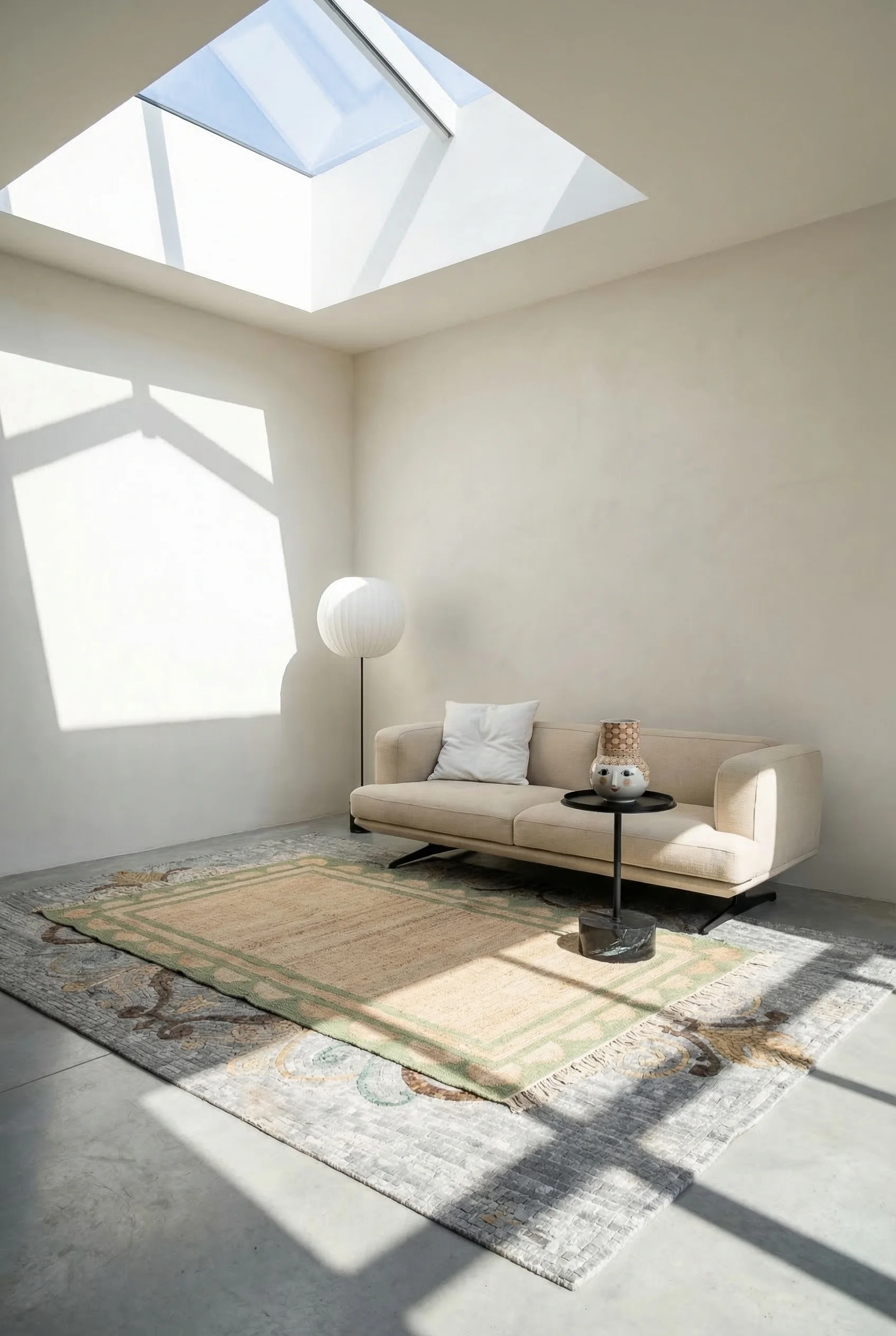
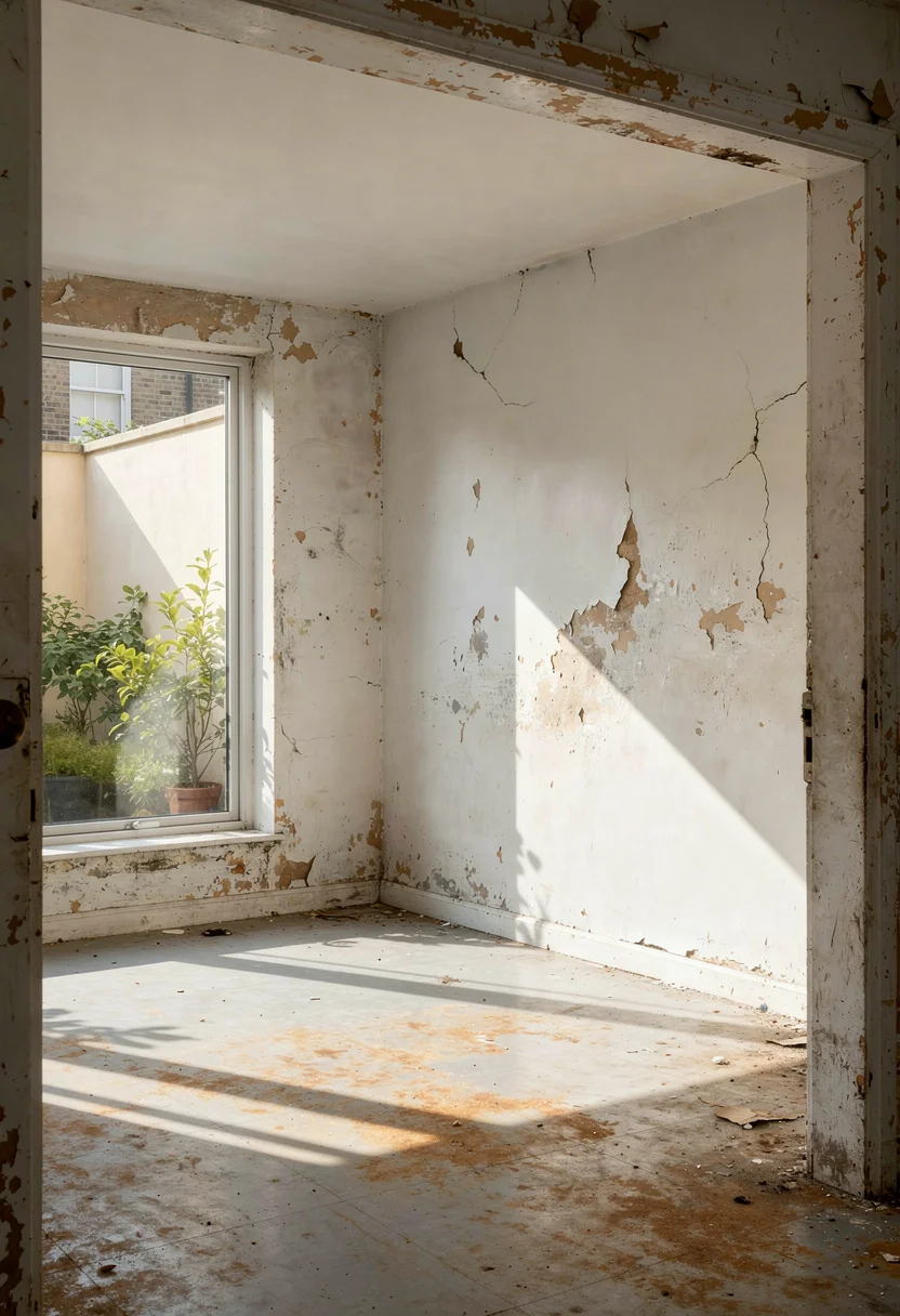
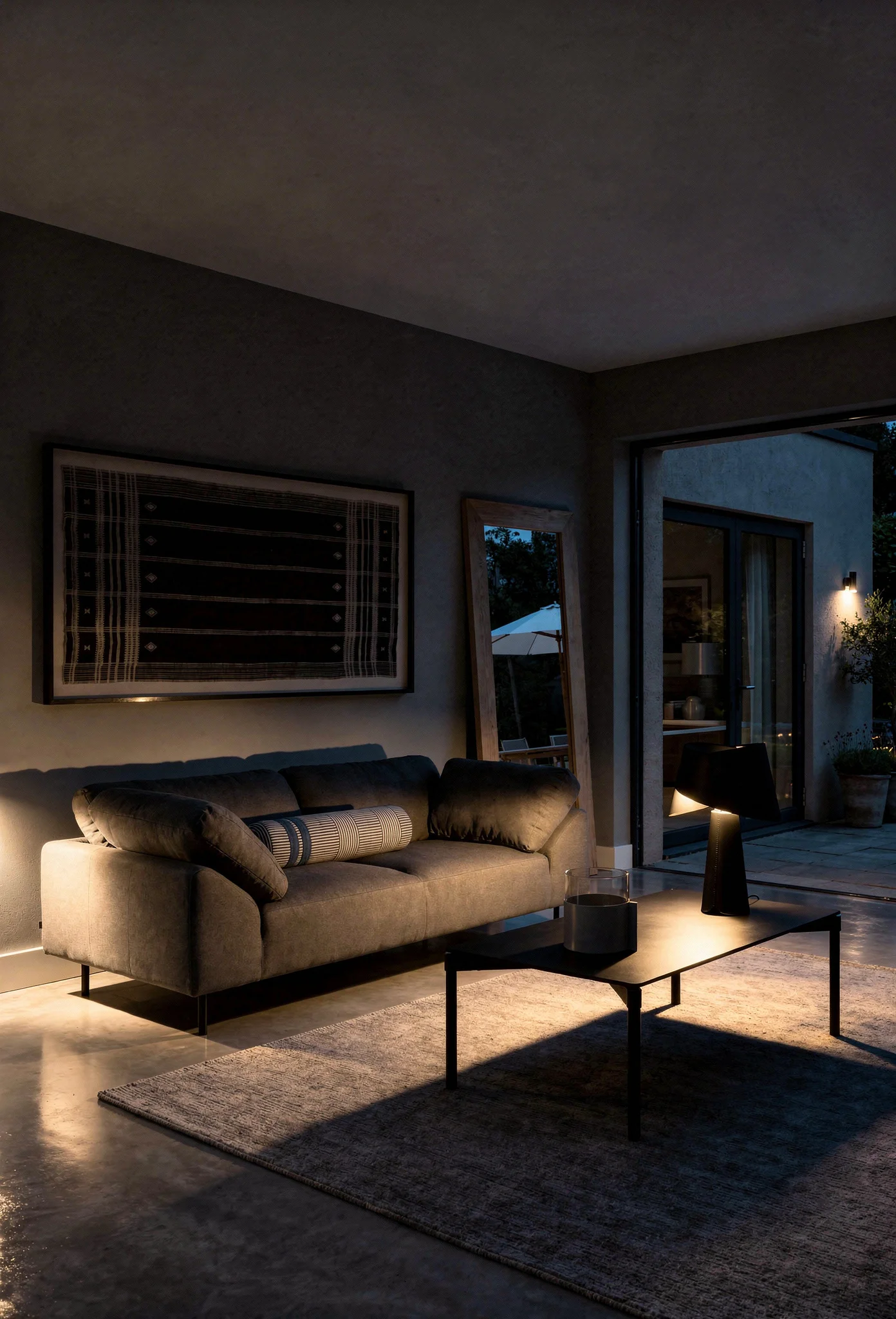
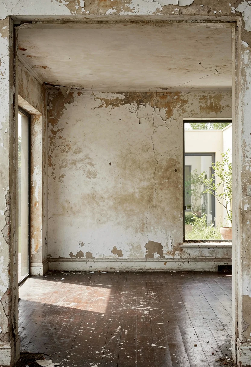
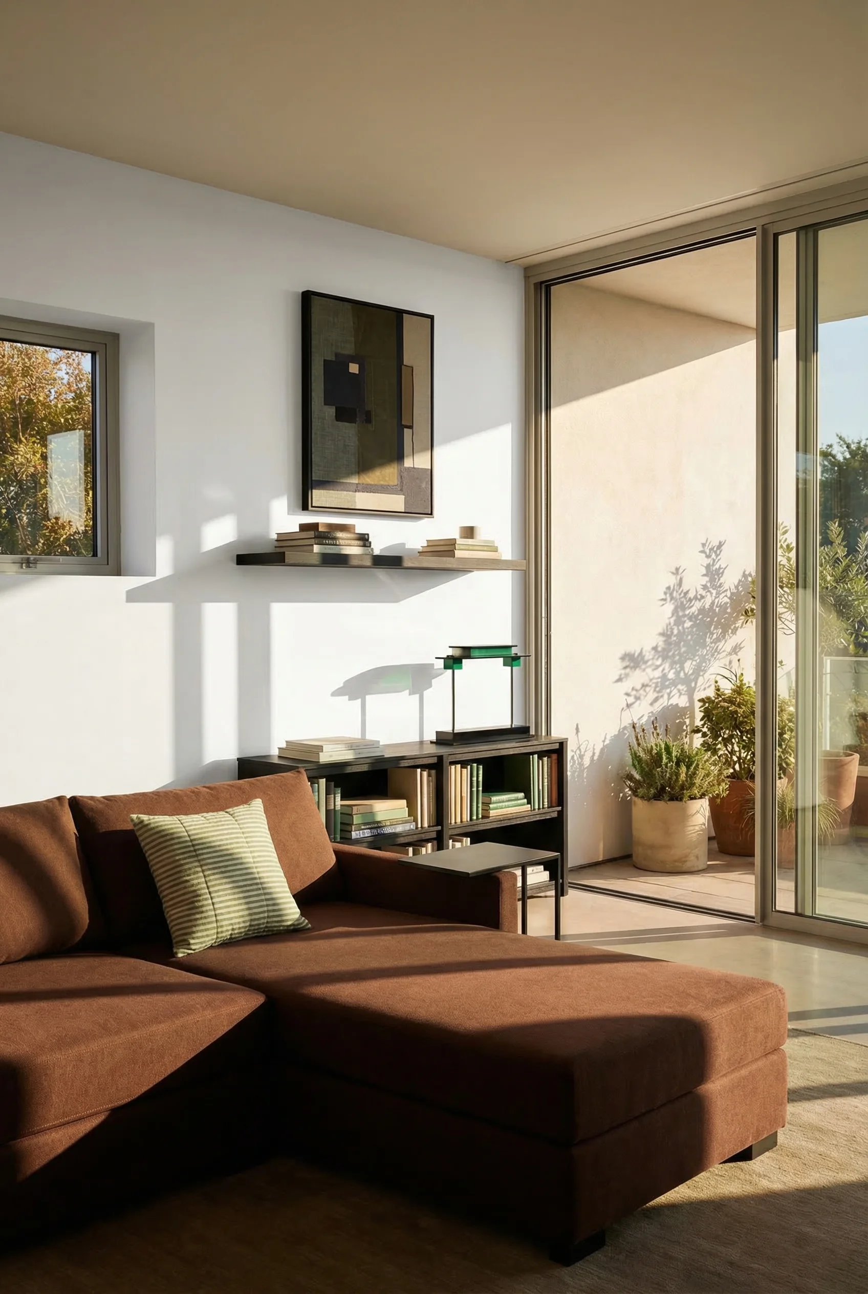
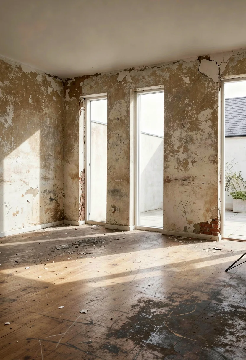
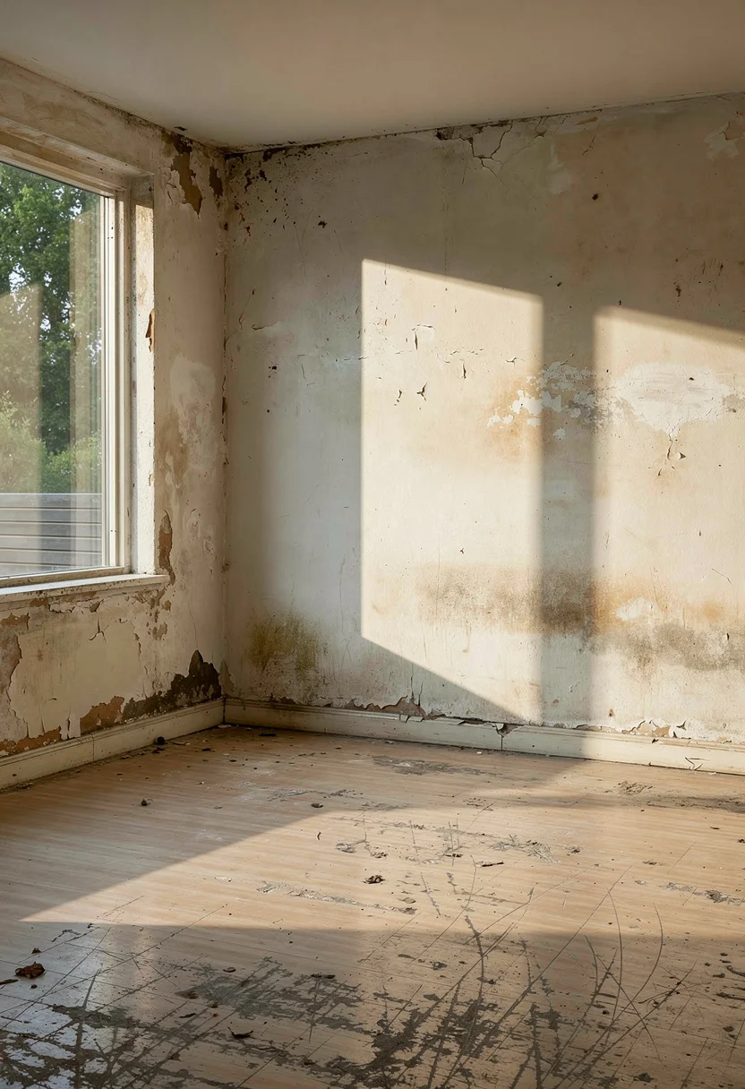
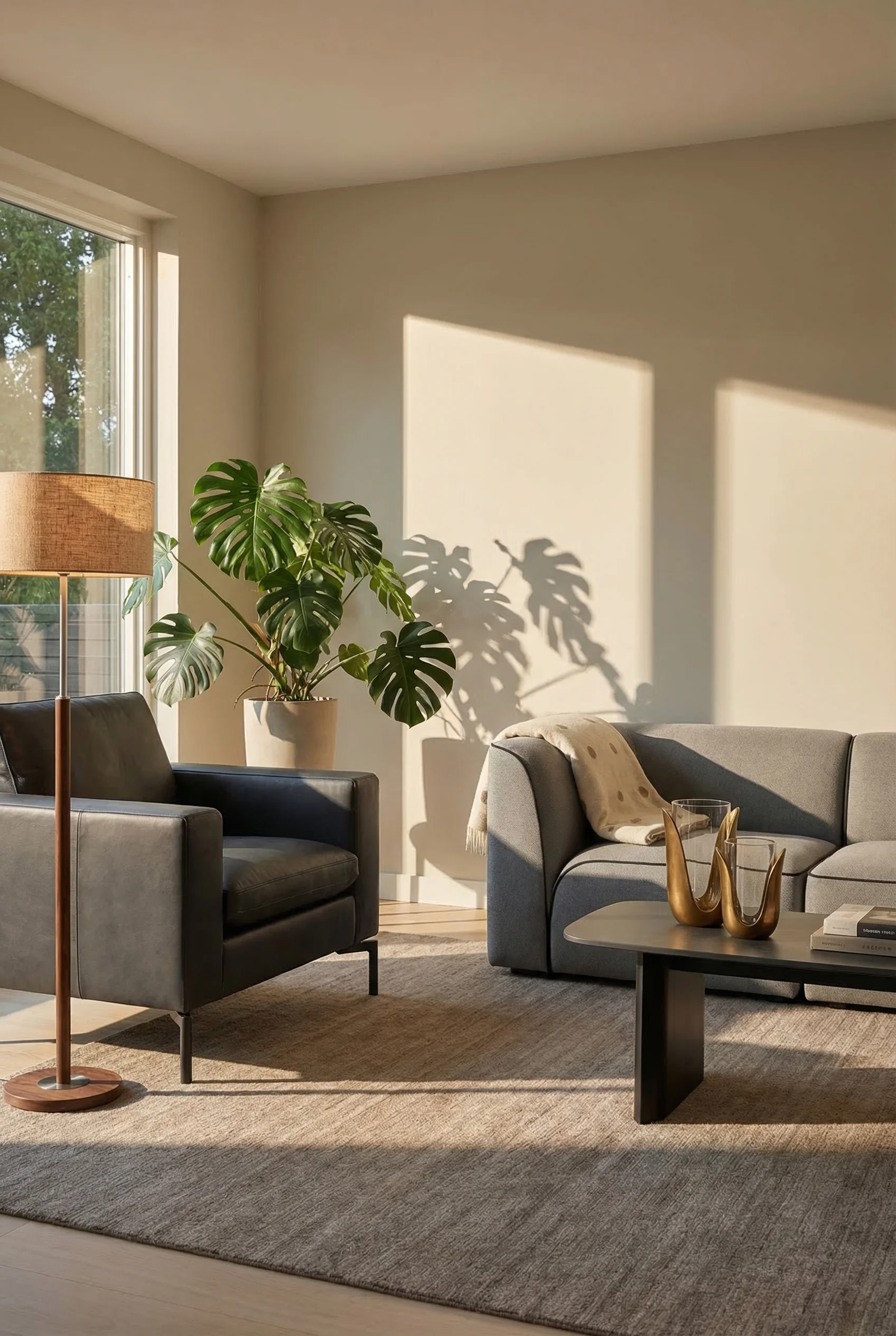
Most modern living rooms look good in photos and feel wrong in person. The sofa sits against the wall. A single pendant hangs from the ceiling doing nothing useful. Everything matches, and nothing connects.
The shift happening in 2025 and 2026 interior design is not about new furniture. It is about treating the living room as an emotional ecosystem. Designers are measuring success not by how a room photographs, but by its impact on the human nervous system. Warm minimalism has replaced cold precision, and materials that age gracefully have overtaken those that simply look new. Here is the system behind rooms that feel as good as they look.
Looking for more modern living room inspiration? See our full gallery.
Every room that feels “off” has a layout problem, not a furniture problem. The measurements are specific, and most people get them wrong.
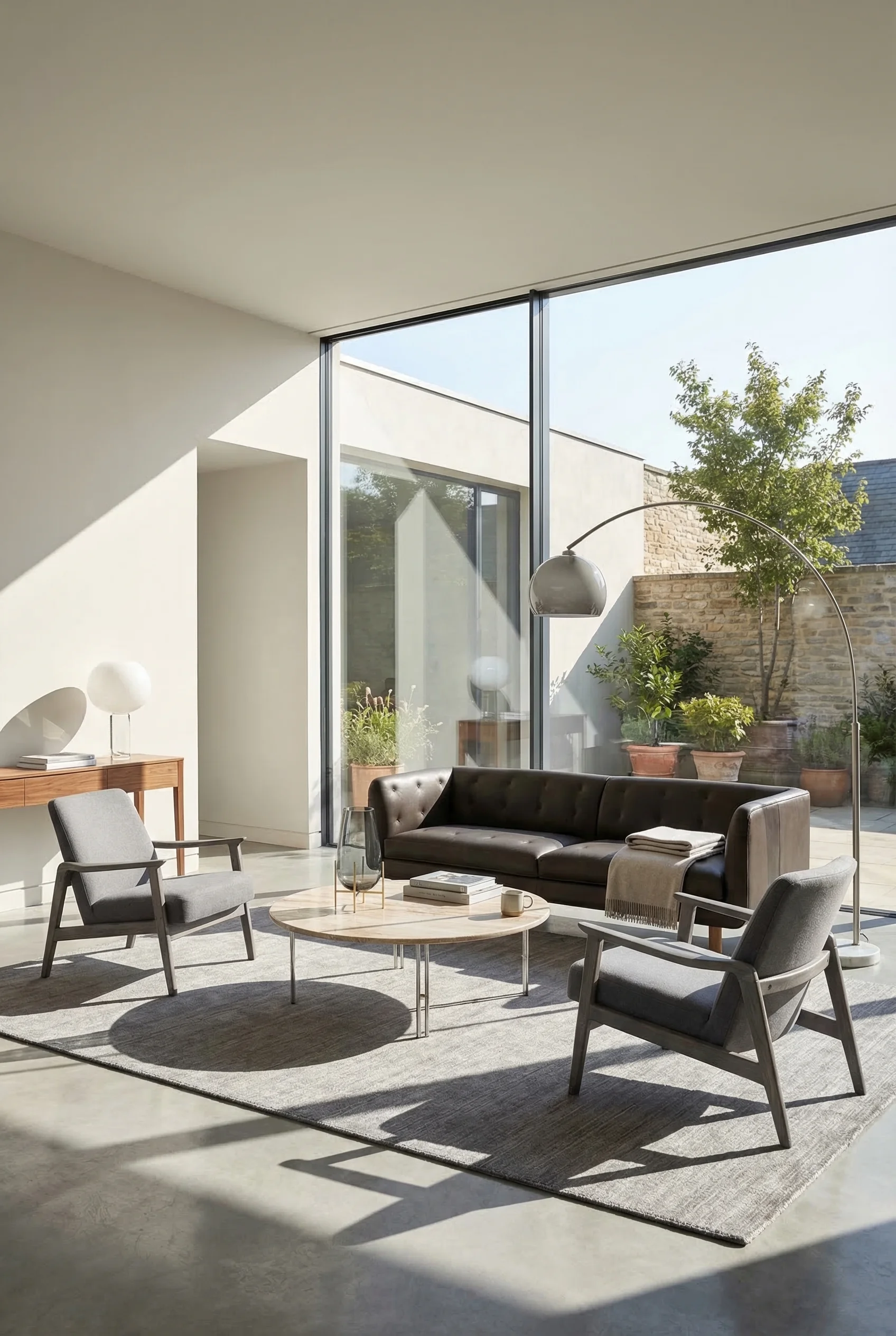
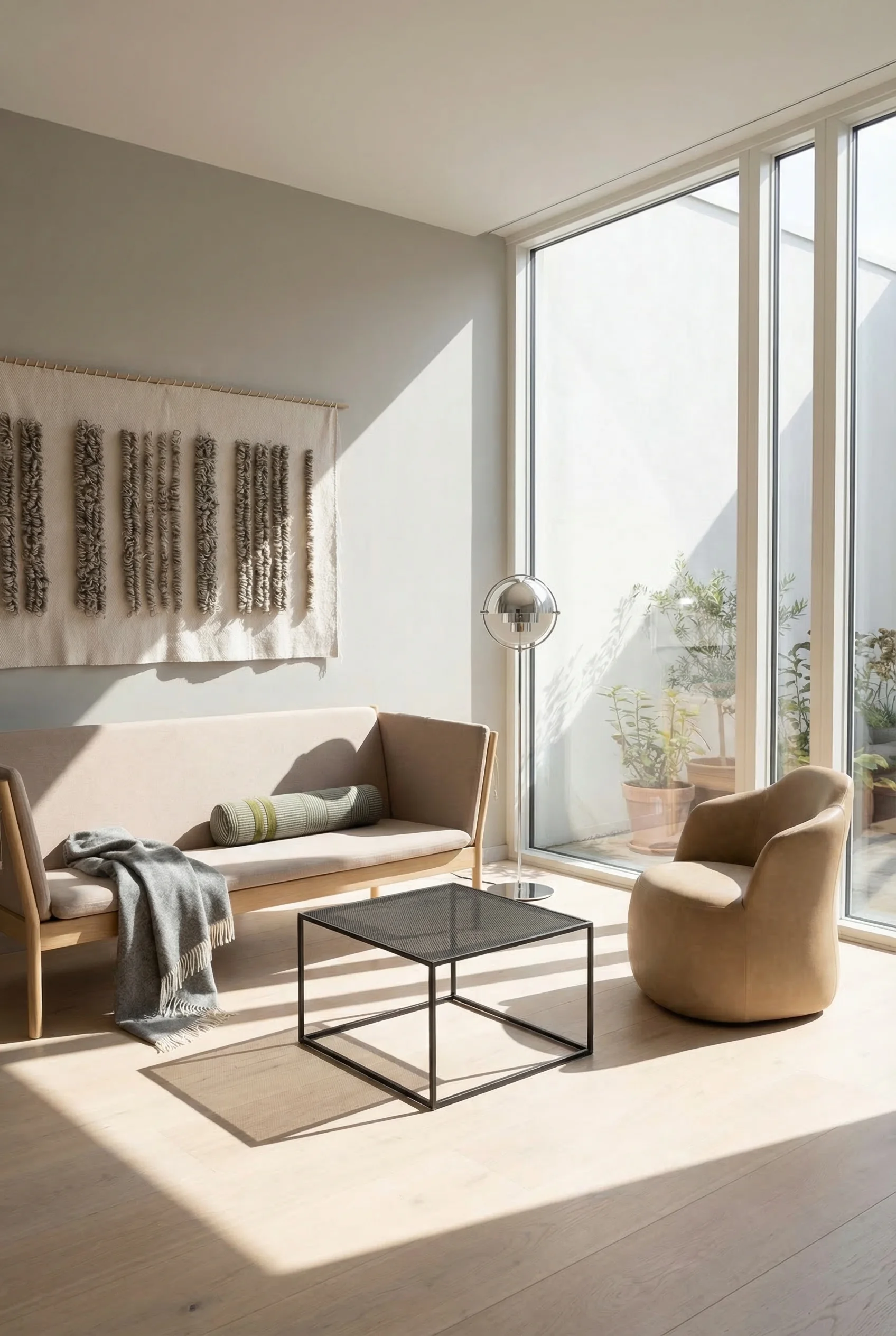
The conversation circle is the foundation. All primary seating should fall within an 8 to 9 foot radius, with individual pieces spaced 3 to 6 feet apart. This is close enough for conversation without shouting across the room and far enough to avoid that cramped waiting room feeling.
Primary walkways need 36 to 40 inches of clearance. Secondary paths can narrow to 24 to 30 inches. When you plan these paths first, the furniture placement becomes obvious rather than forced.
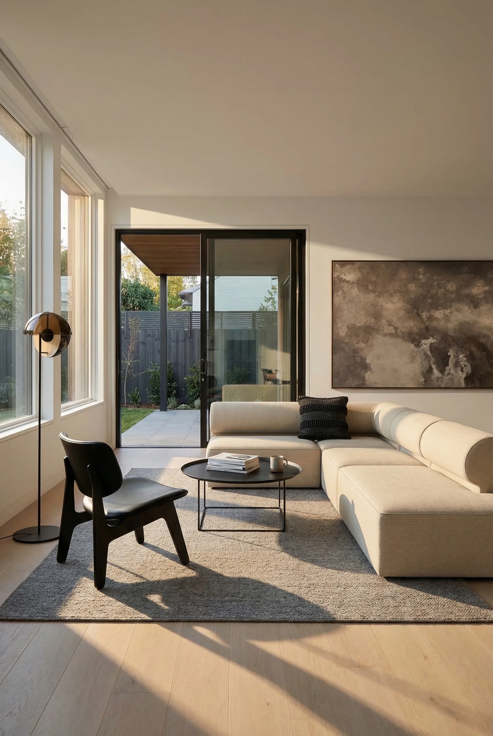
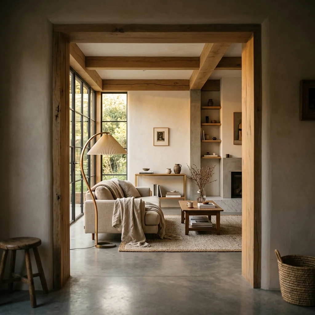
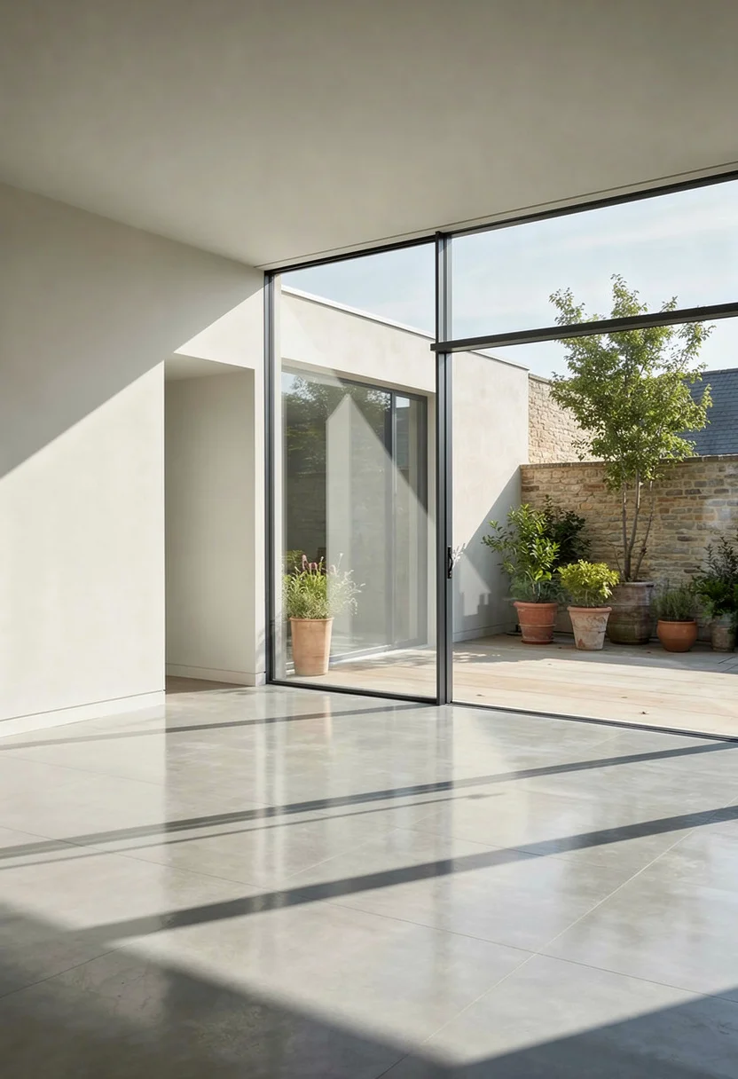
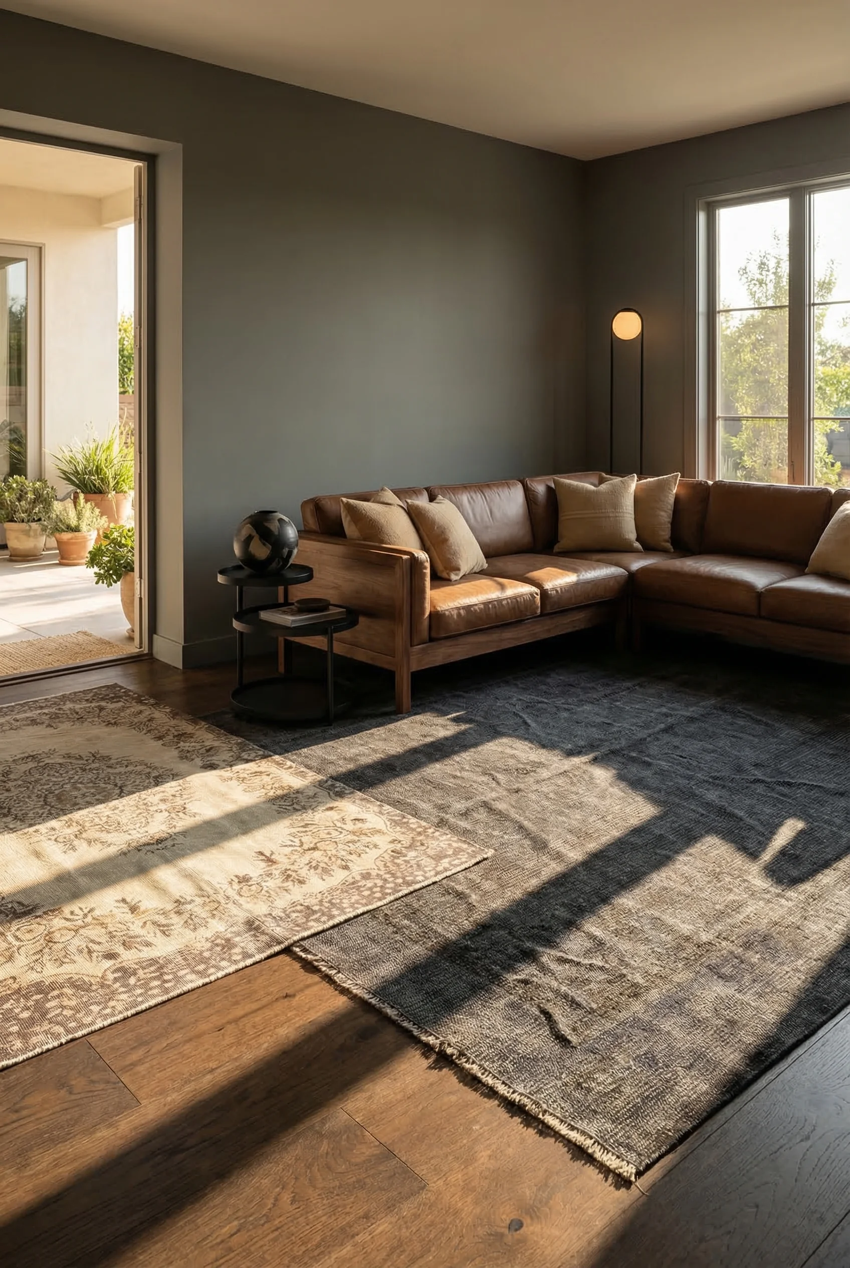
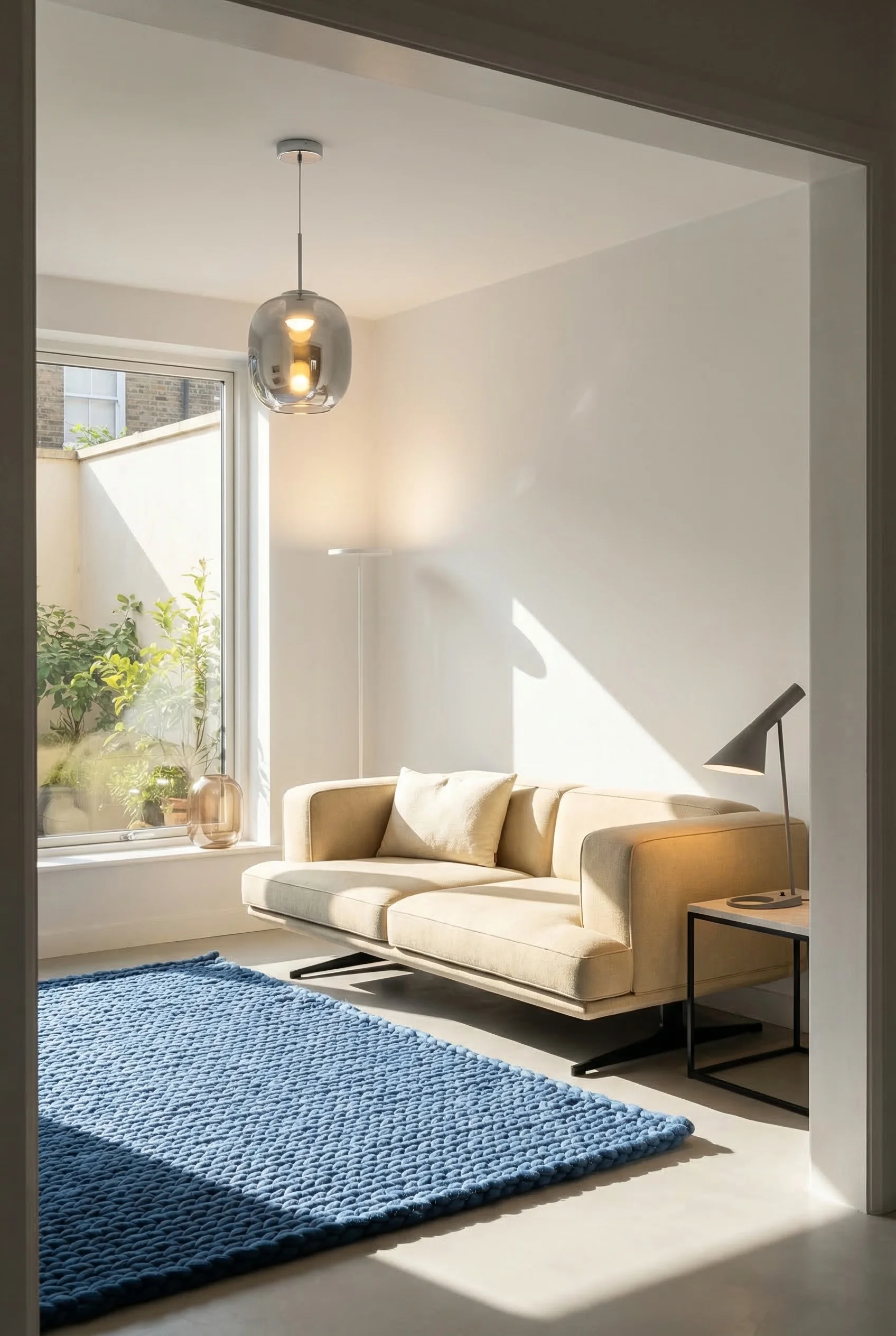
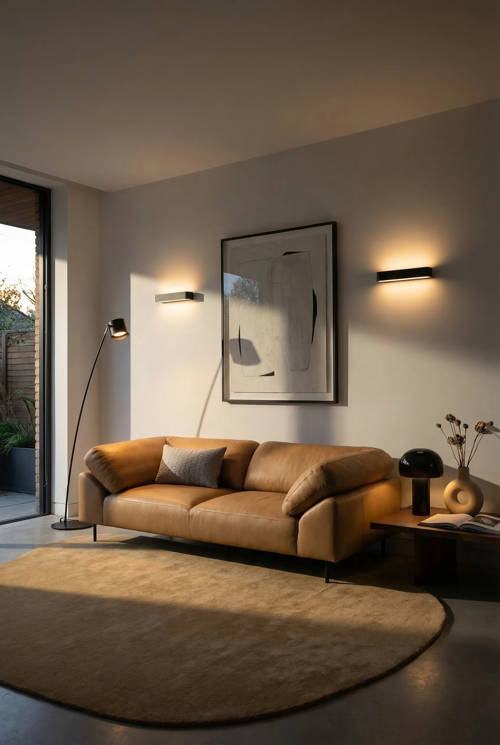
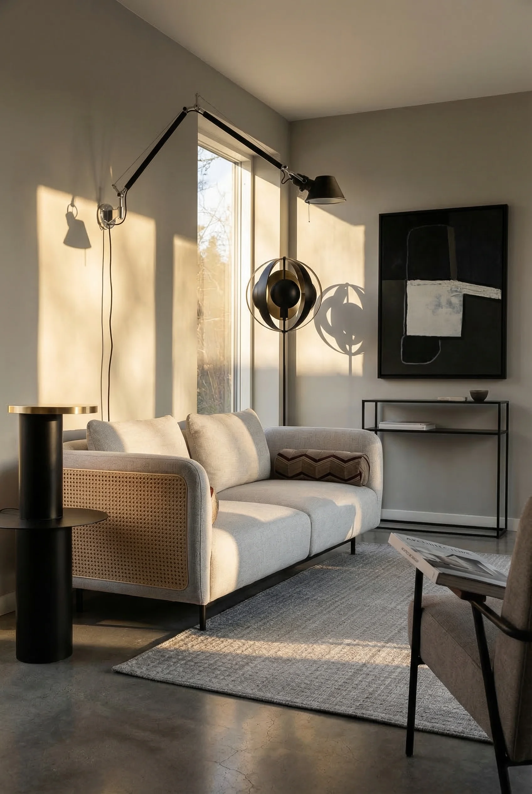
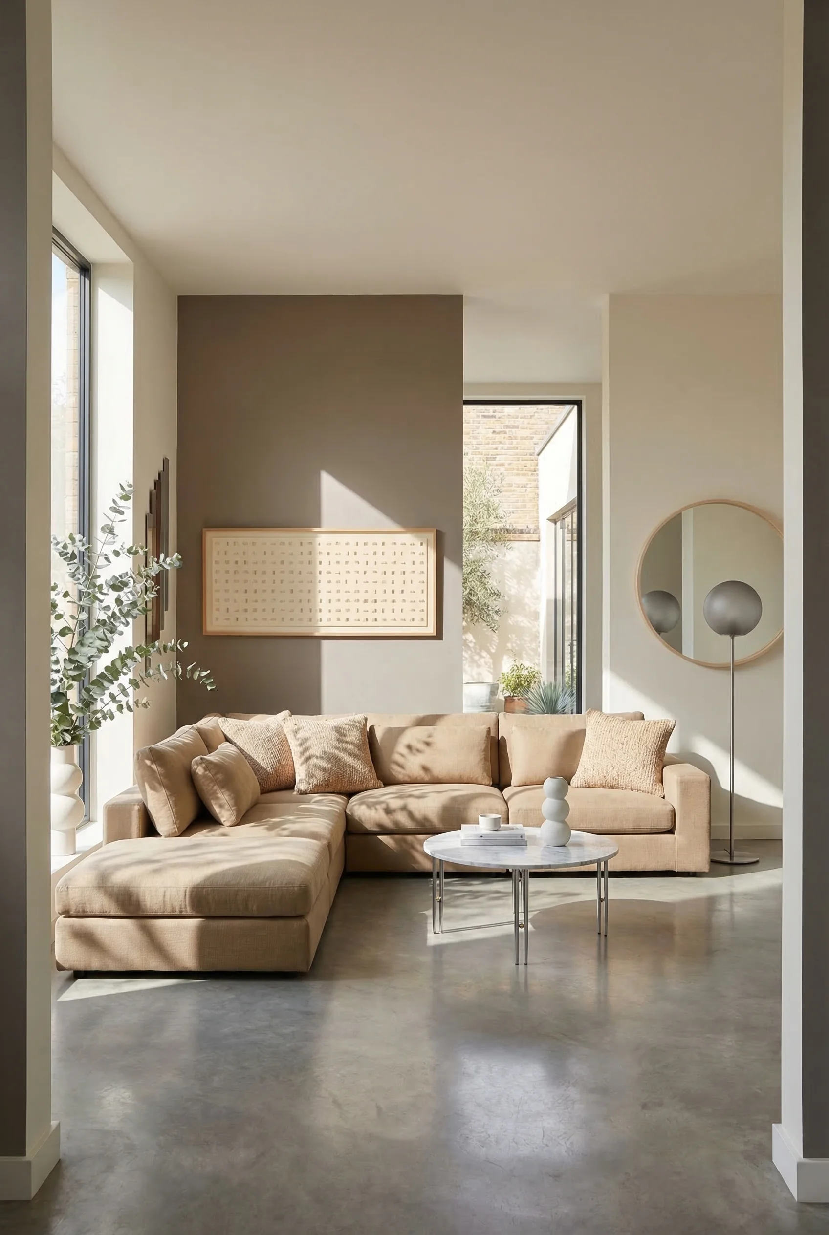
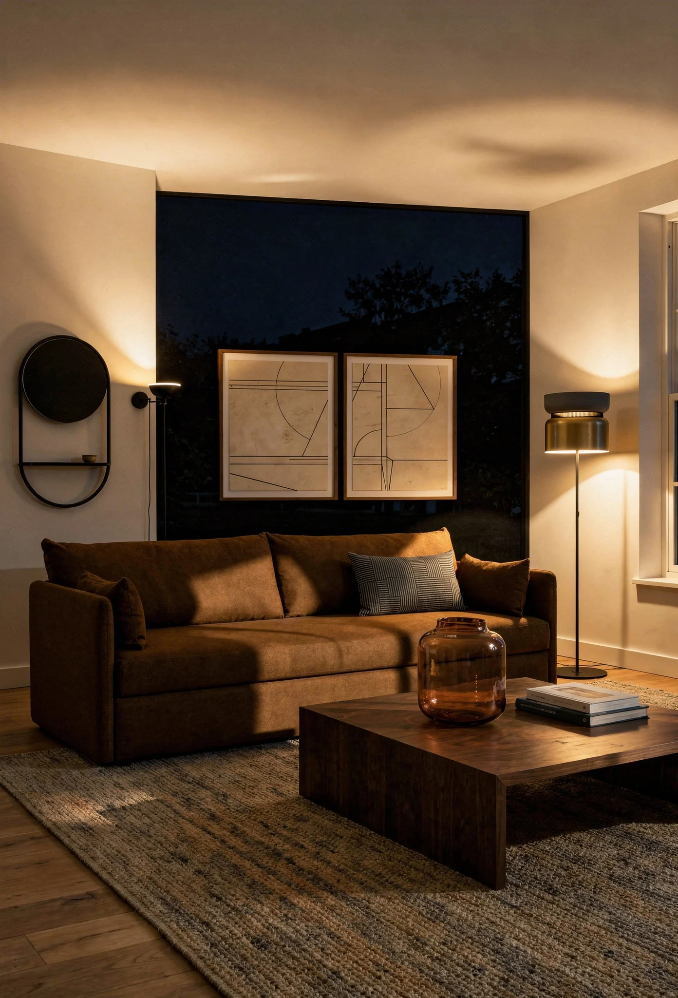
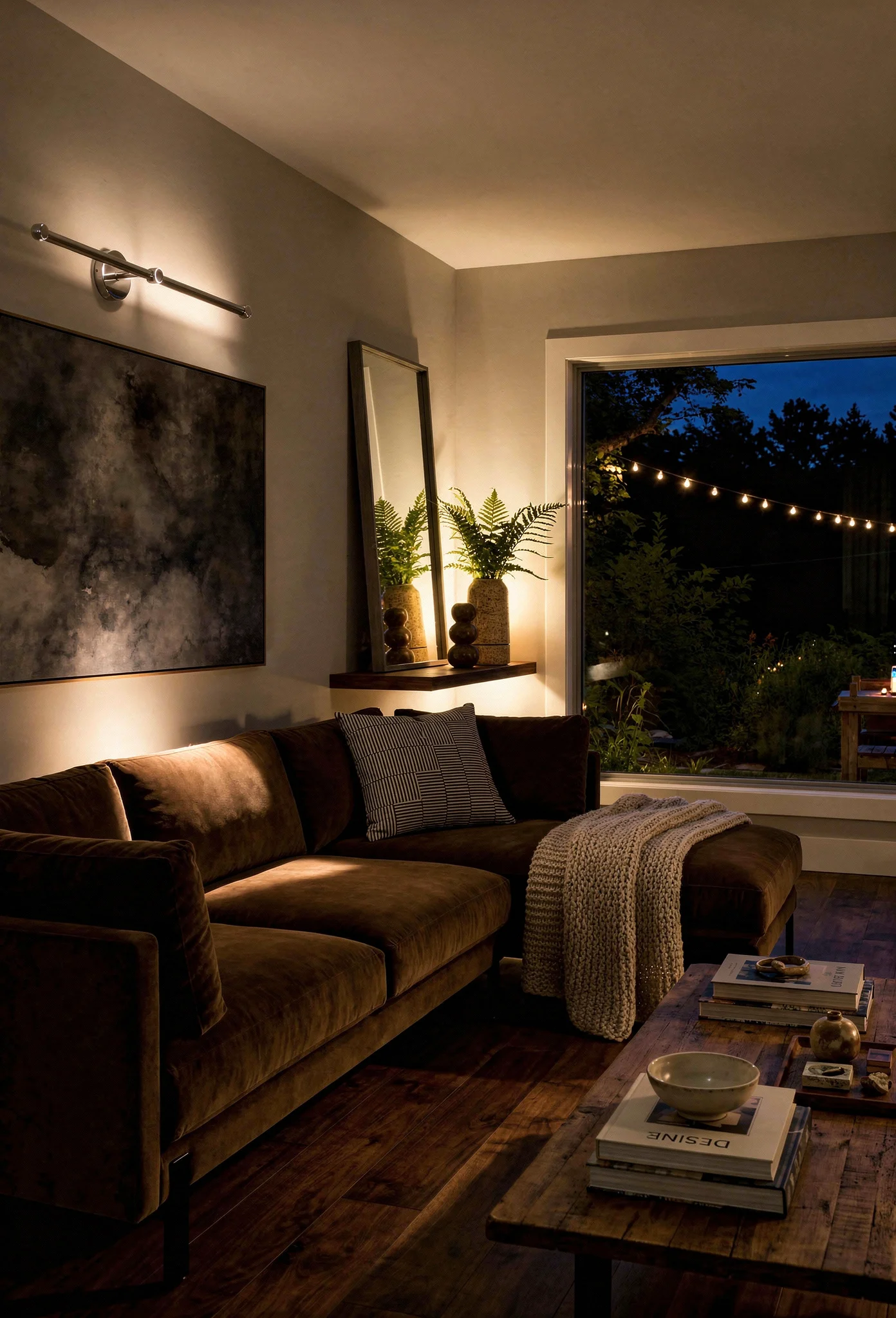
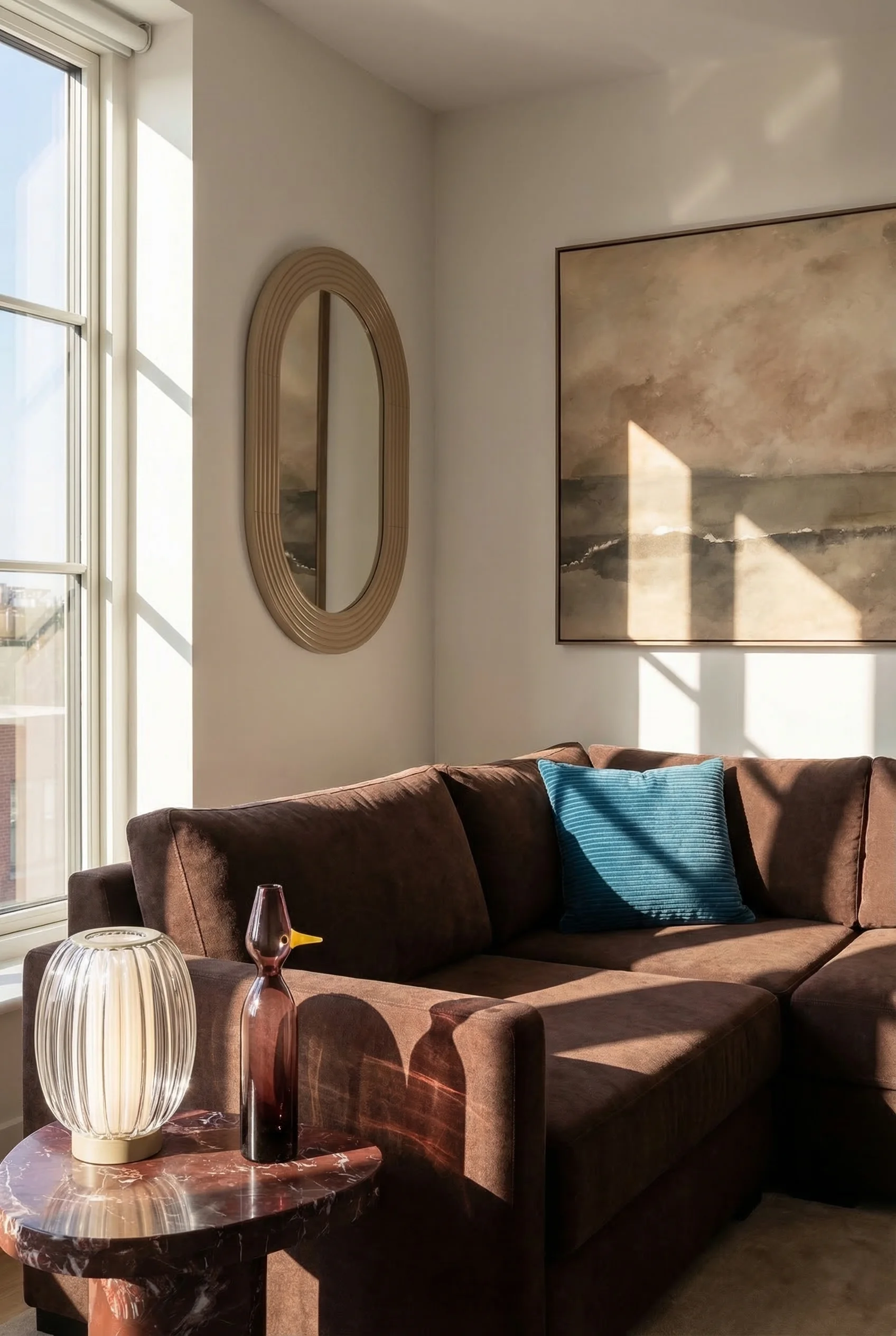
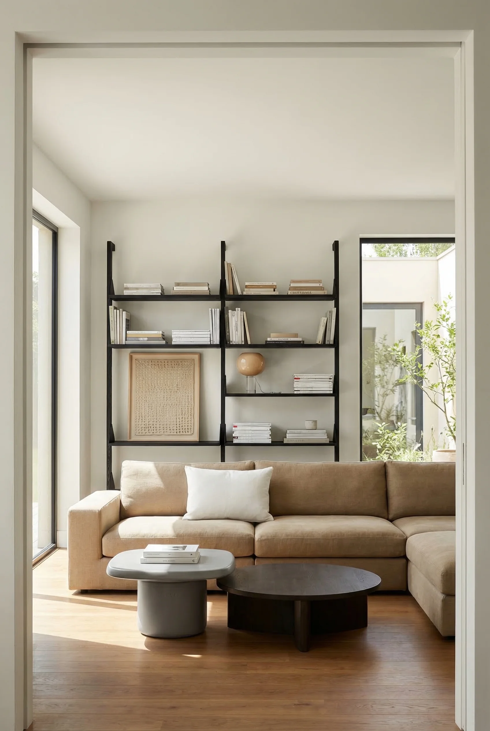
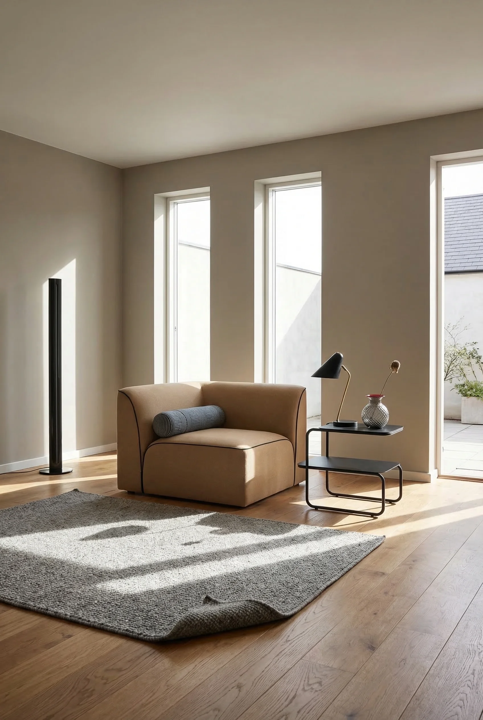
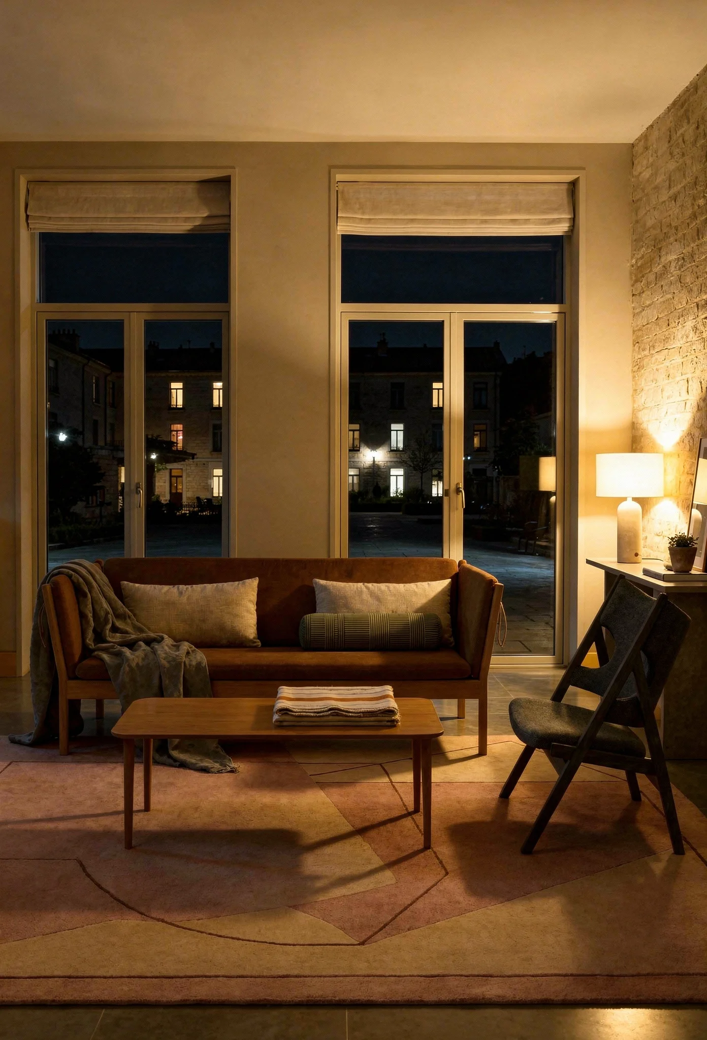
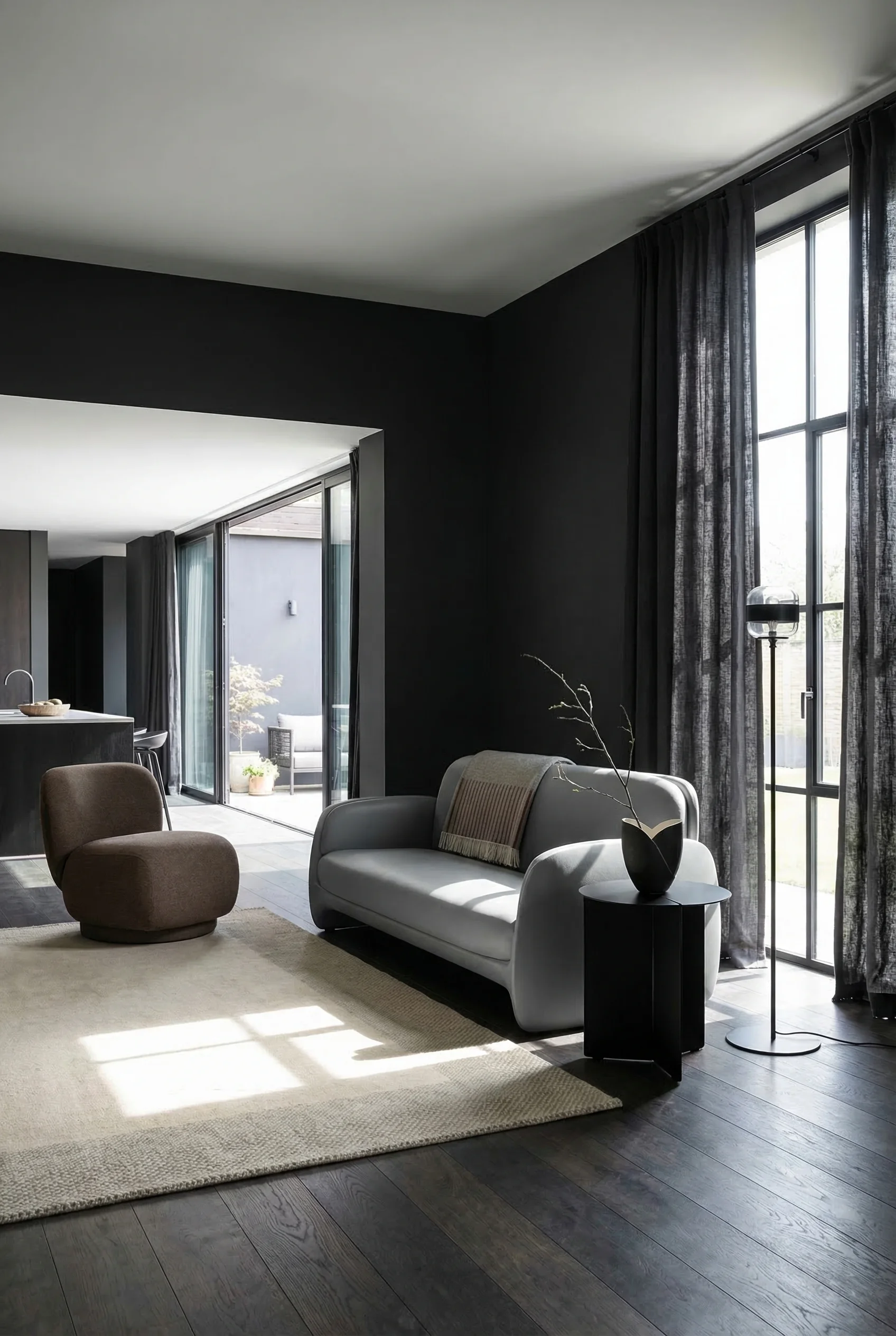
The single most transformative move is pulling your sofa away from the wall. Even 4 to 8 inches creates the illusion of a larger, more intentional space. Wall huggers create dead zones behind the furniture and make the room feel like a perimeter track.
Your coffee table should sit 14 to 18 inches from the sofa. Close enough to reach a drink without leaning. Far enough that you don’t crack your shins getting up. I think these matter more than most people realise. They’re the measurements that separate rooms people sit in from rooms people avoid.
Proportions are what your eye reads before your brain catches up. When they’re off, you feel it before you can name it.
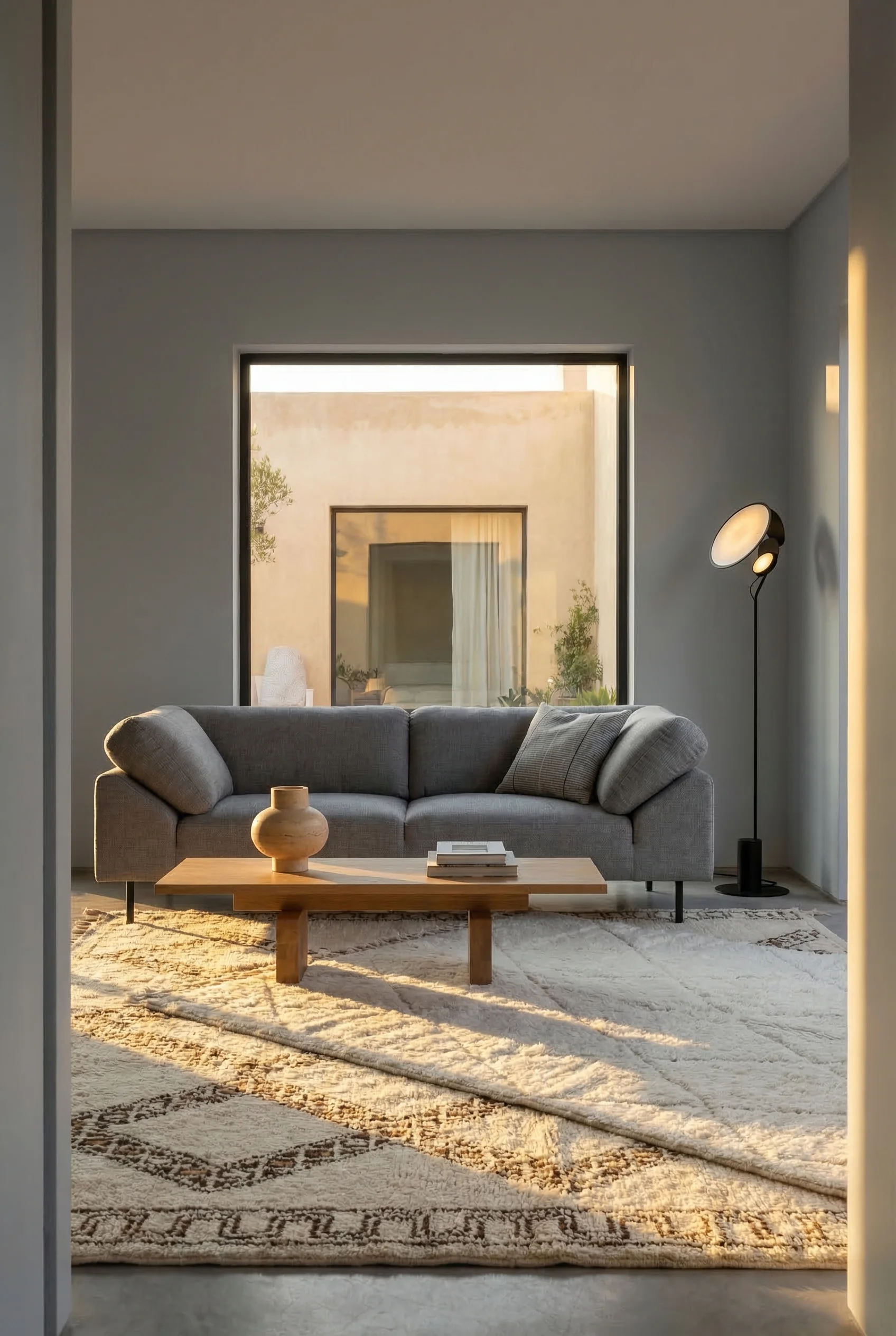
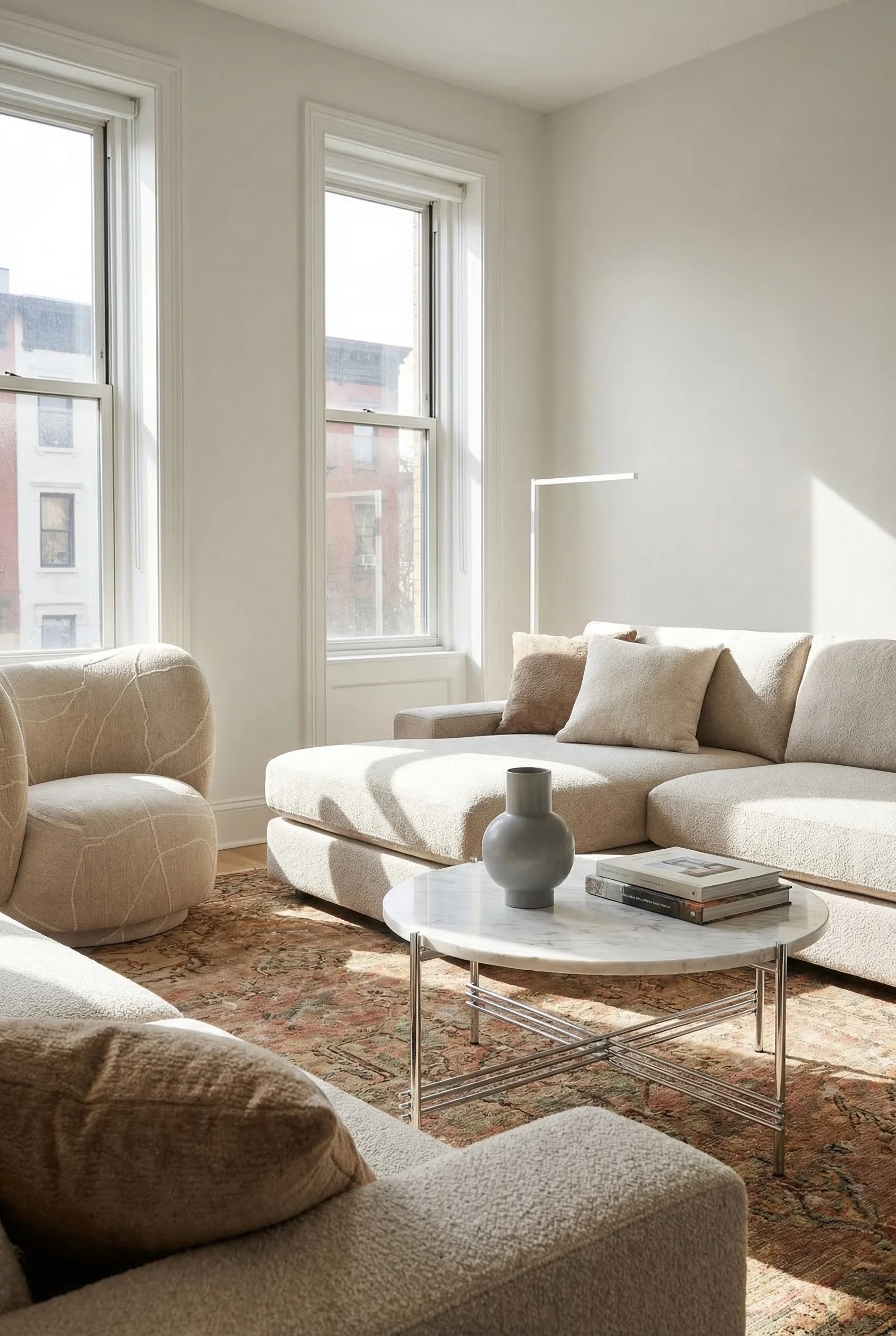
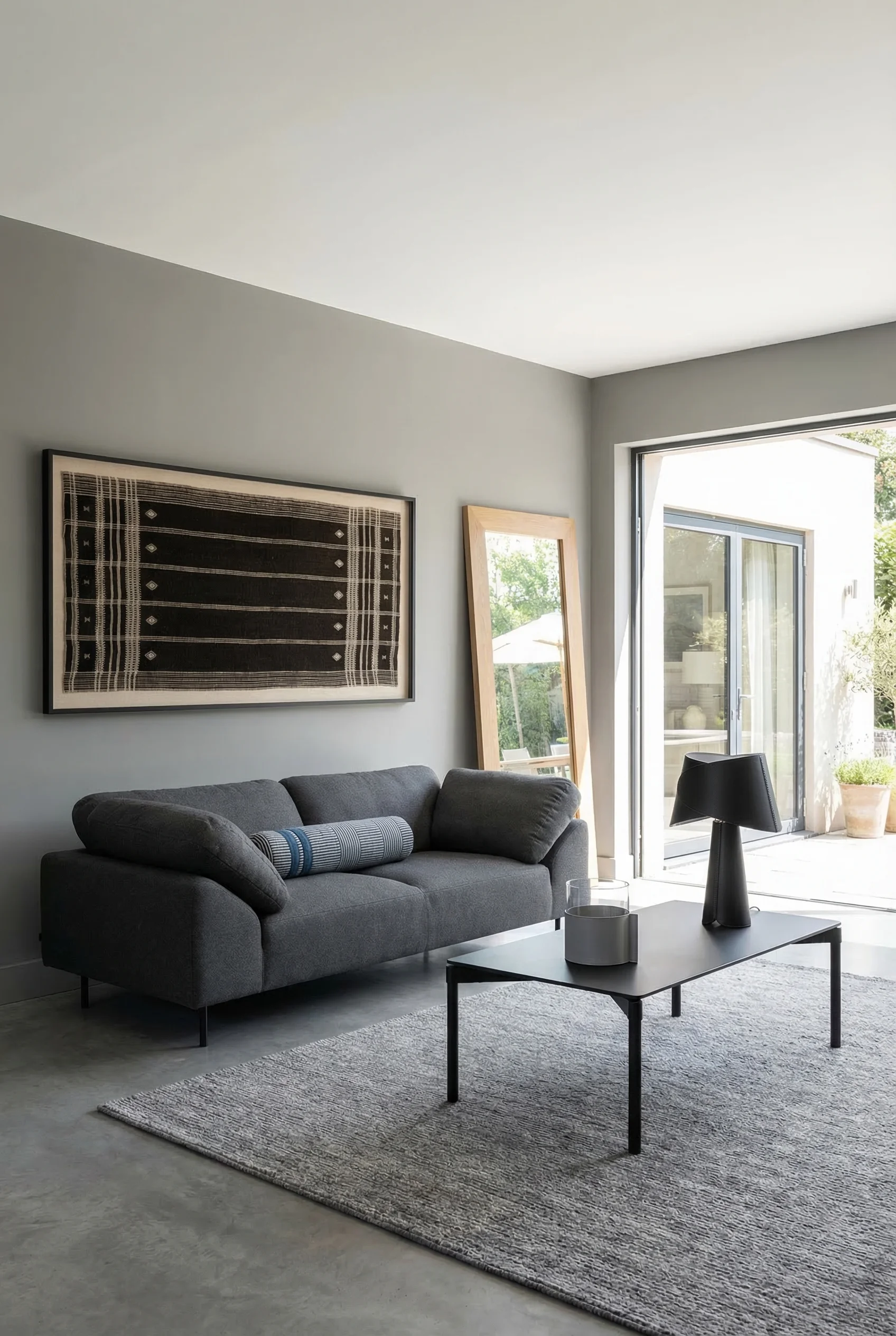
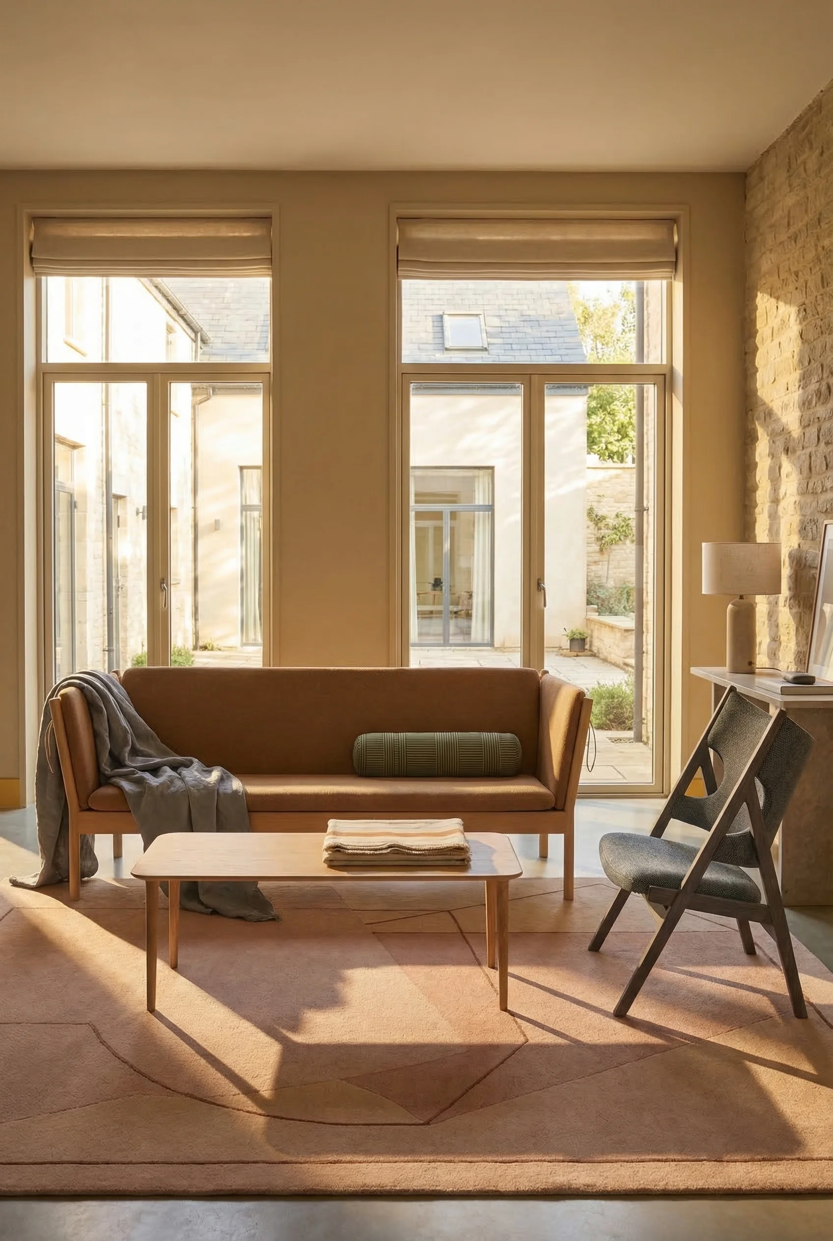
The 2/3 rule governs coffee tables. Your table should measure roughly two thirds the length of your sofa. Anything smaller looks like it floated in from another room. Anything larger dominates the conversation circle.
Your rug is the frame for the entire seating arrangement. It must extend under the front legs of every piece of seating in the group. A rug that floats in the middle, touching nothing, makes the furniture look disconnected and the room feel smaller.
Scale is the secret weapon of rooms that photograph well. Pair low slung modern sofas with tall floor lamps. Set a substantial console against a wall with a slim piece of art above it. These contrasts in height and mass keep the eye moving through the space rather than settling.
For pattern mixing, follow the three scale rule. One large pattern (perhaps a rug or statement curtain), one medium (throw pillows or an accent chair), and one small (a textured throw or decorative objects). Three scales of pattern create visual richness without chaos.
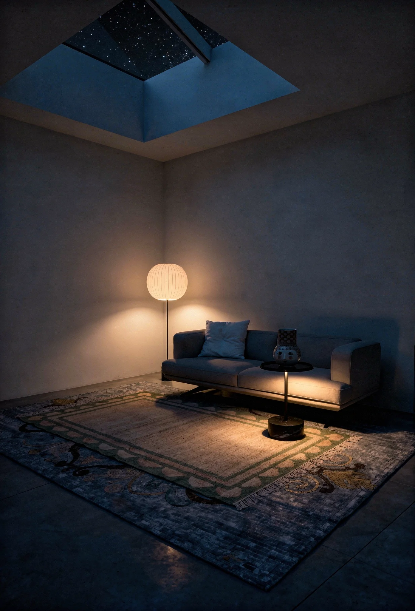
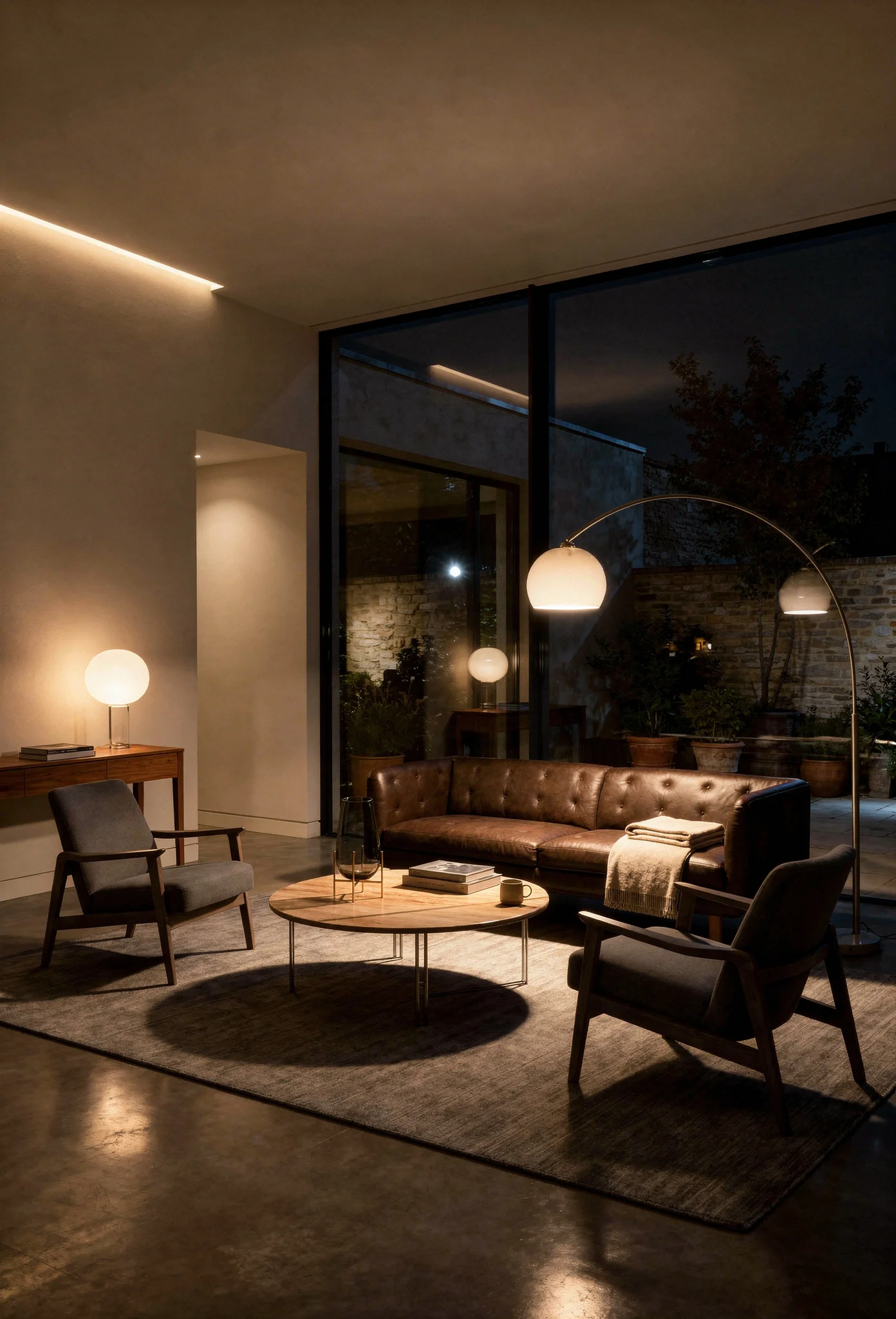
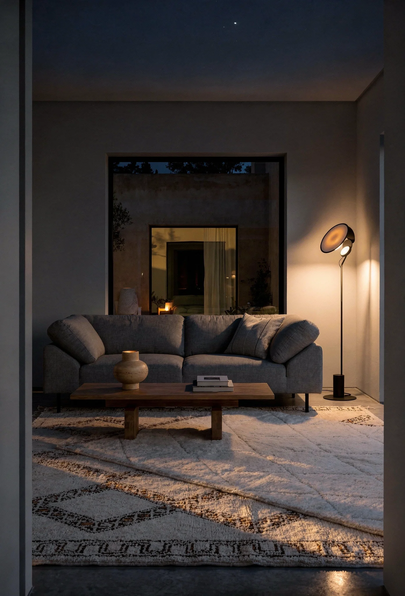
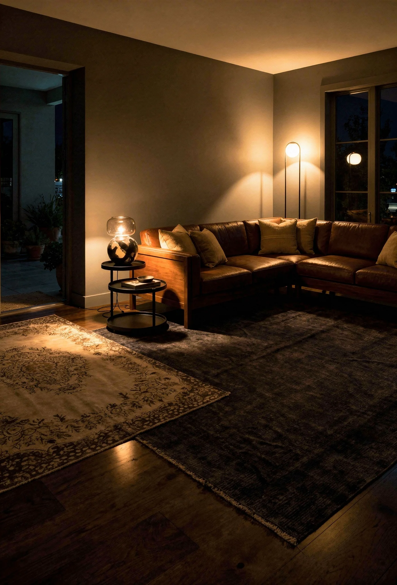
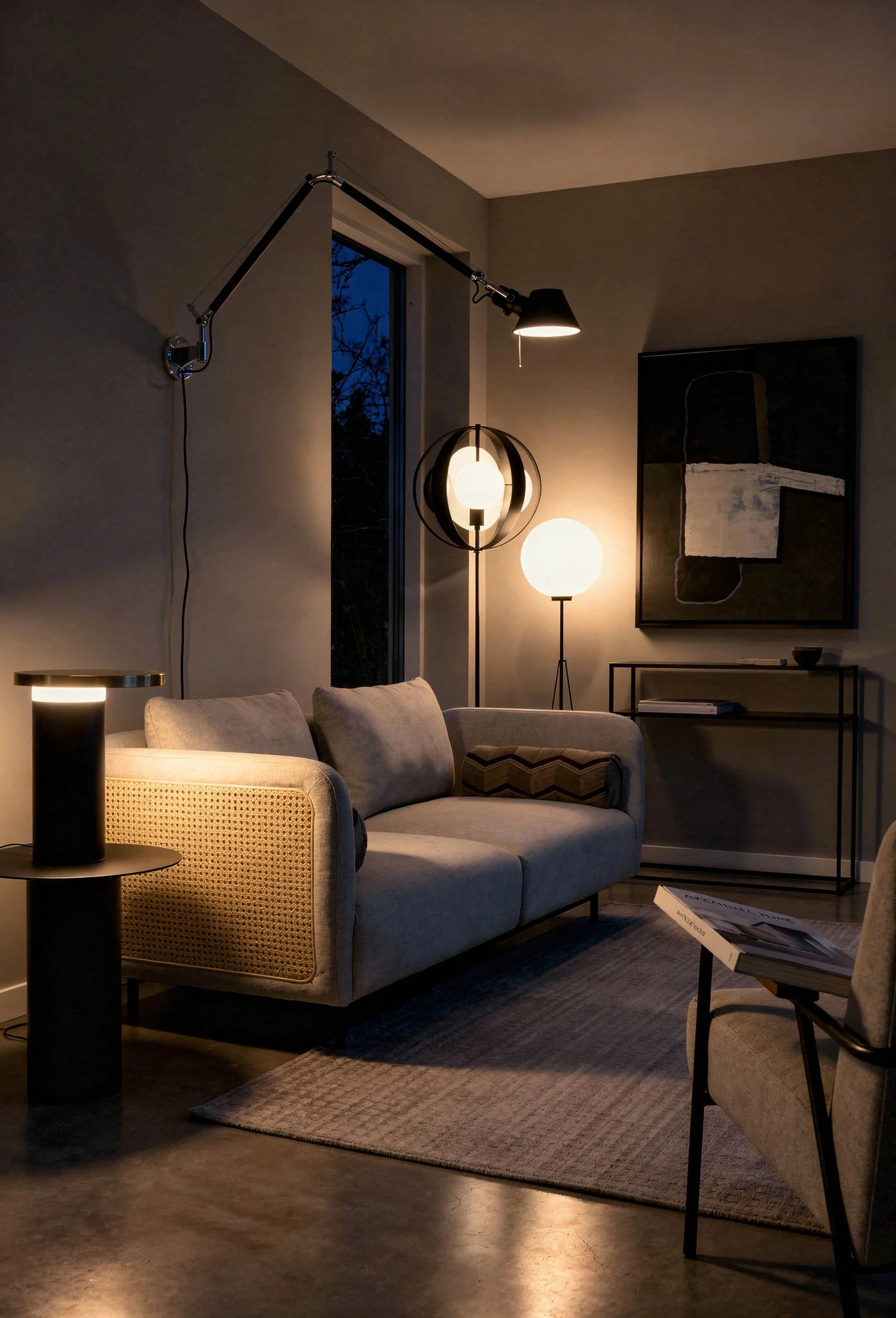
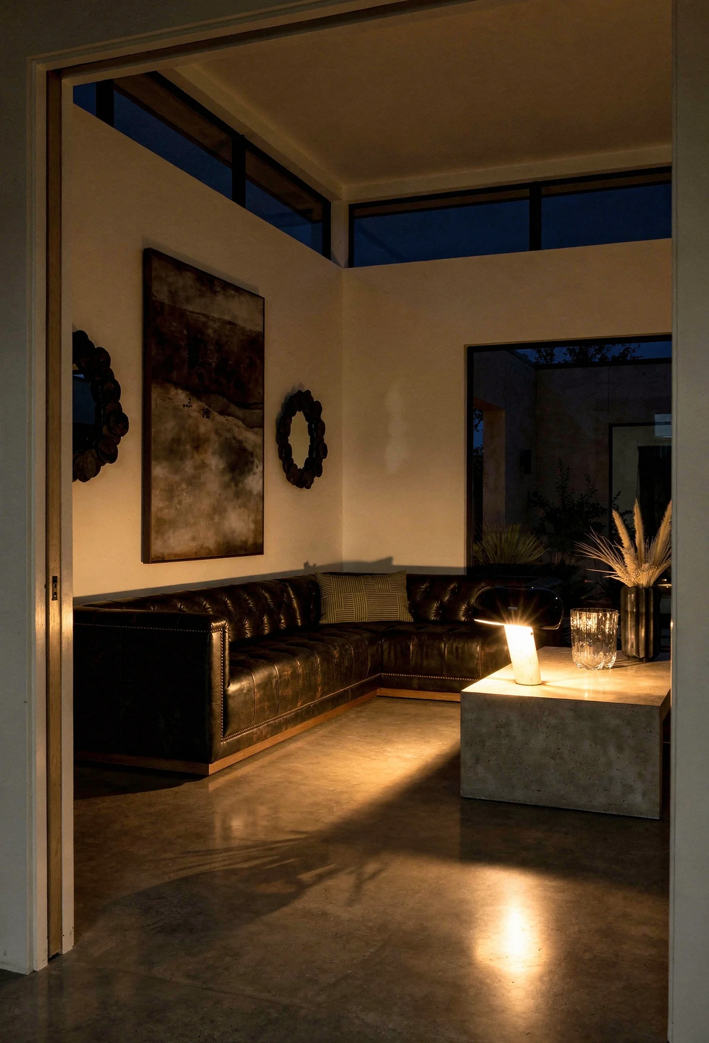
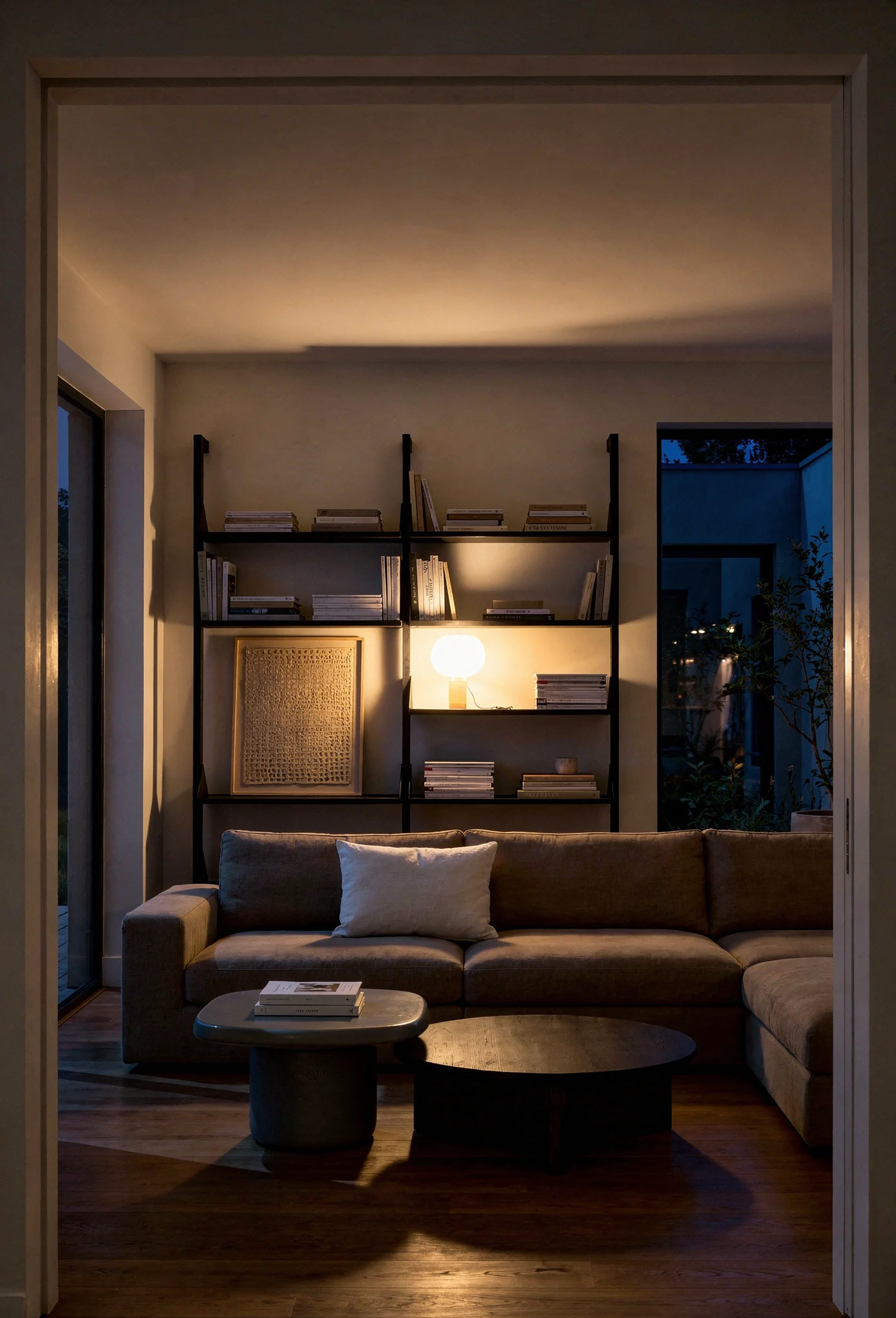
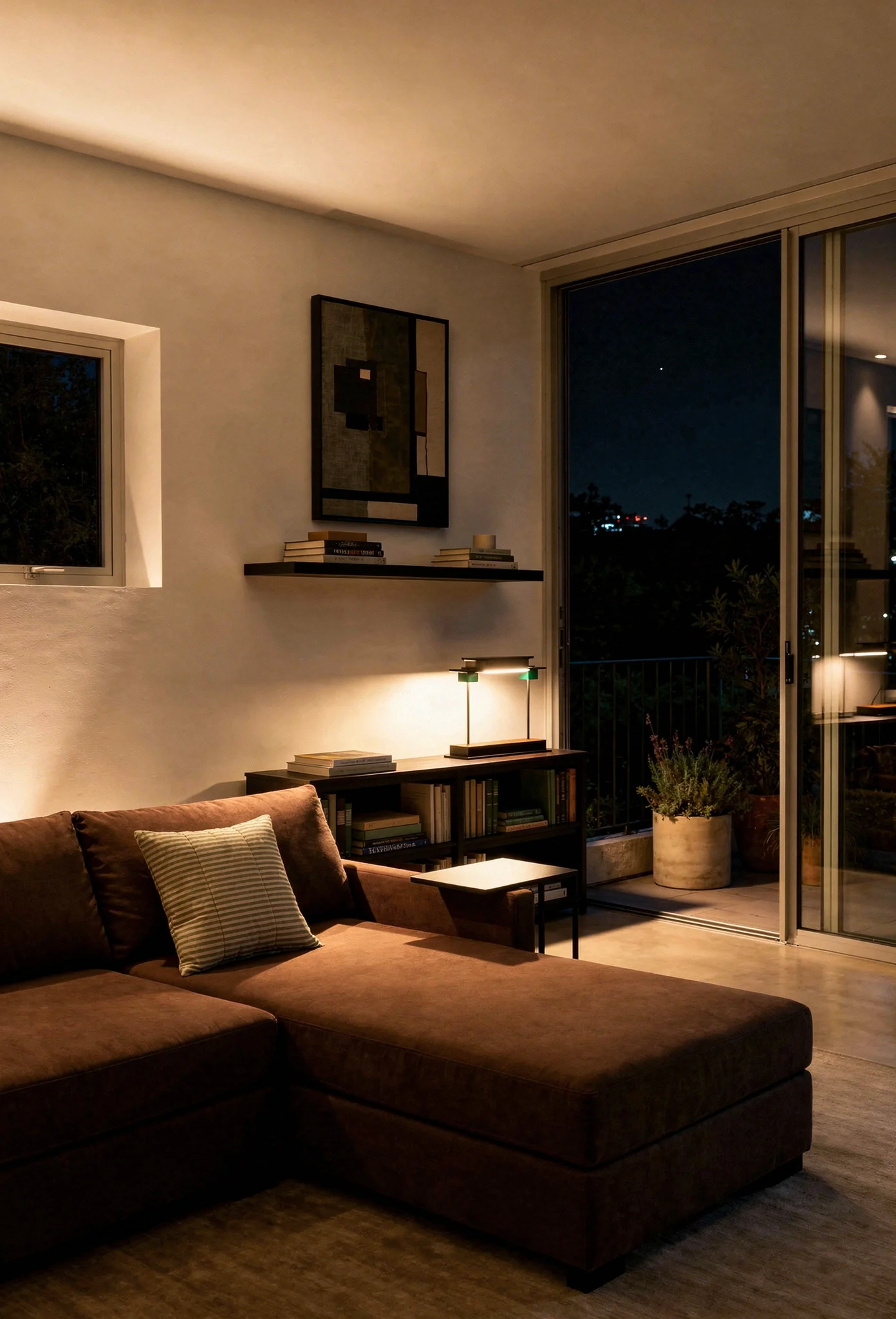
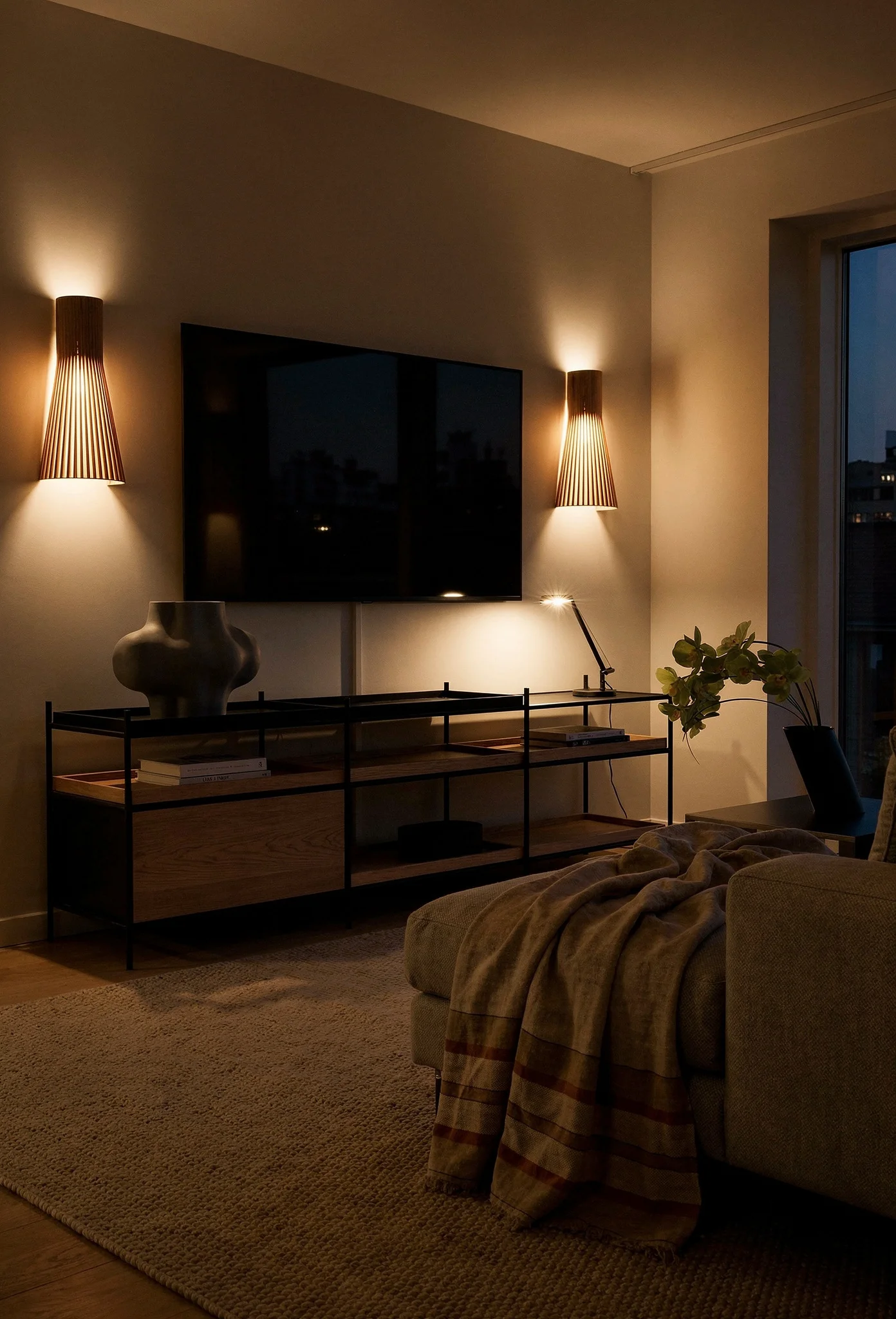
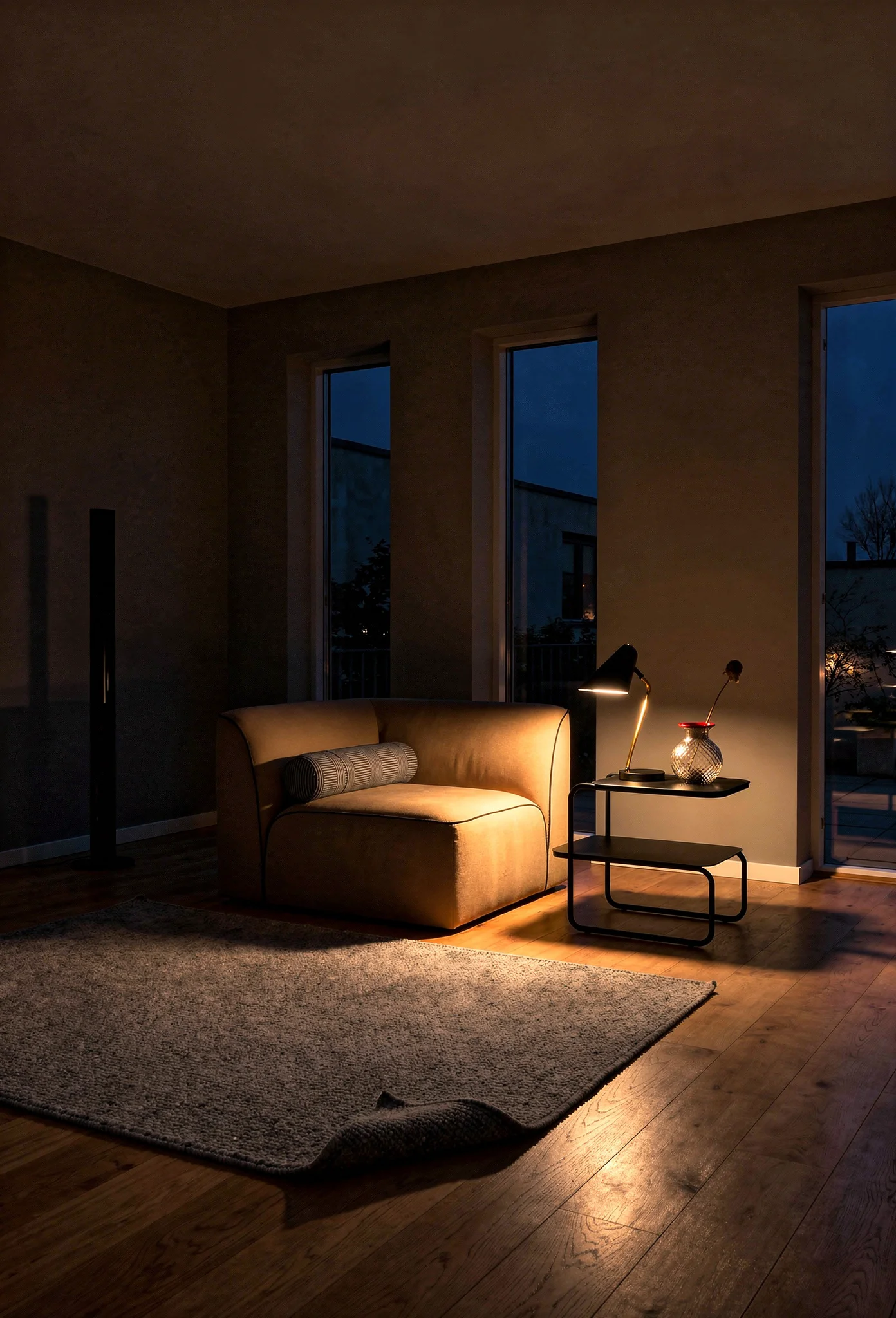
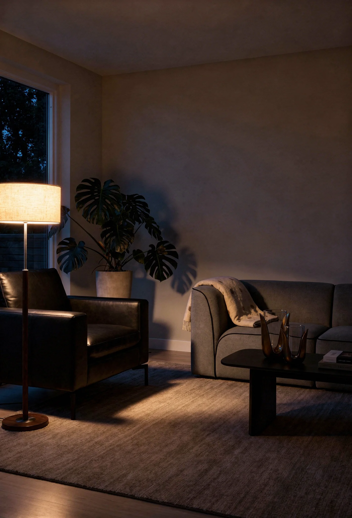
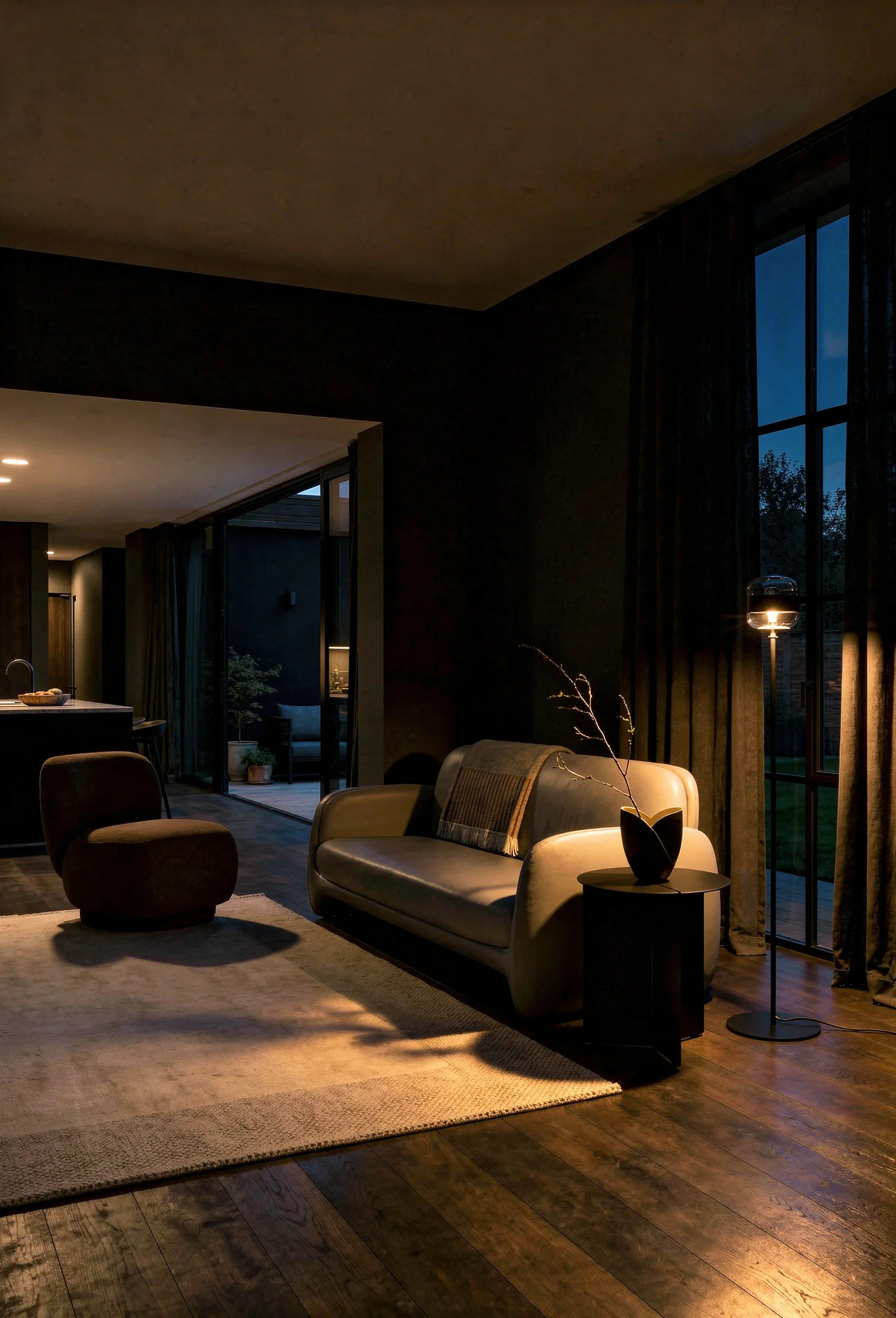
A single overhead light is not a lighting strategy. It is the absence of one. This is the most common design error I see in modern living rooms, and it is the cheapest to fix.
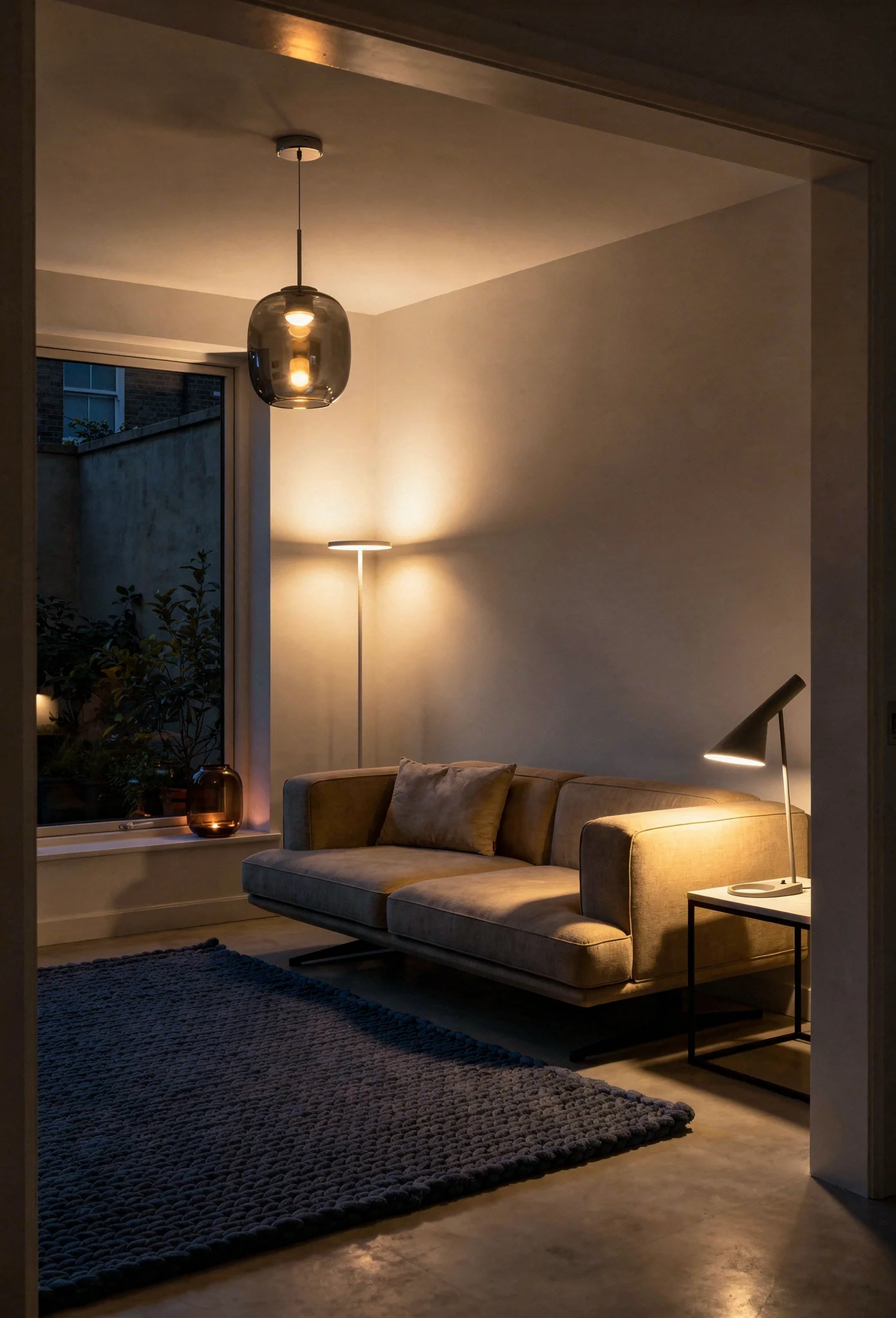
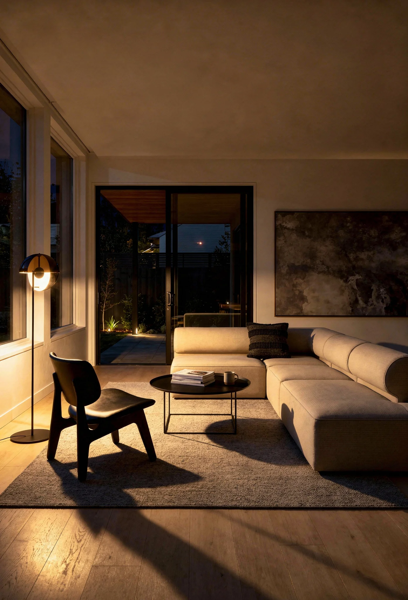
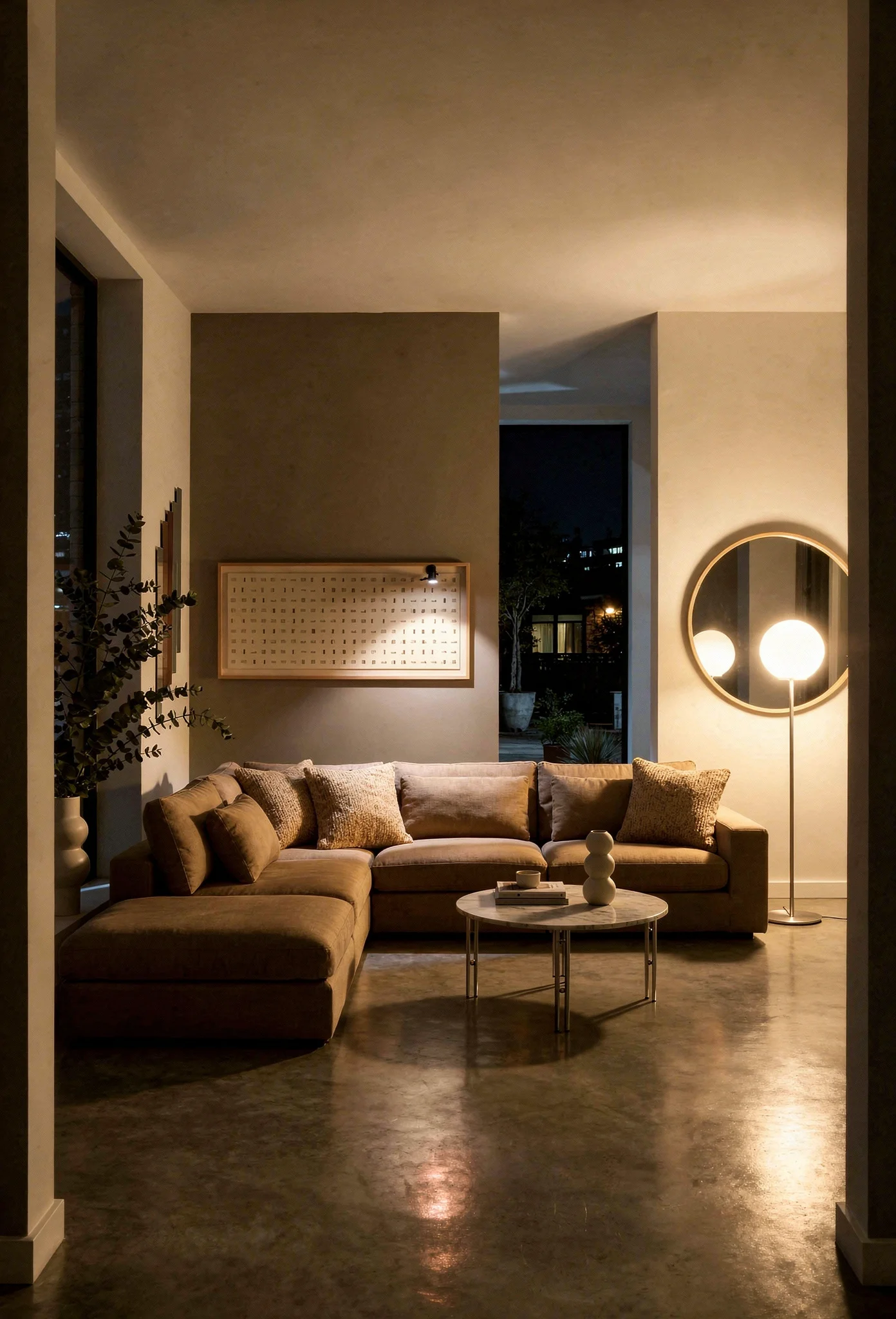
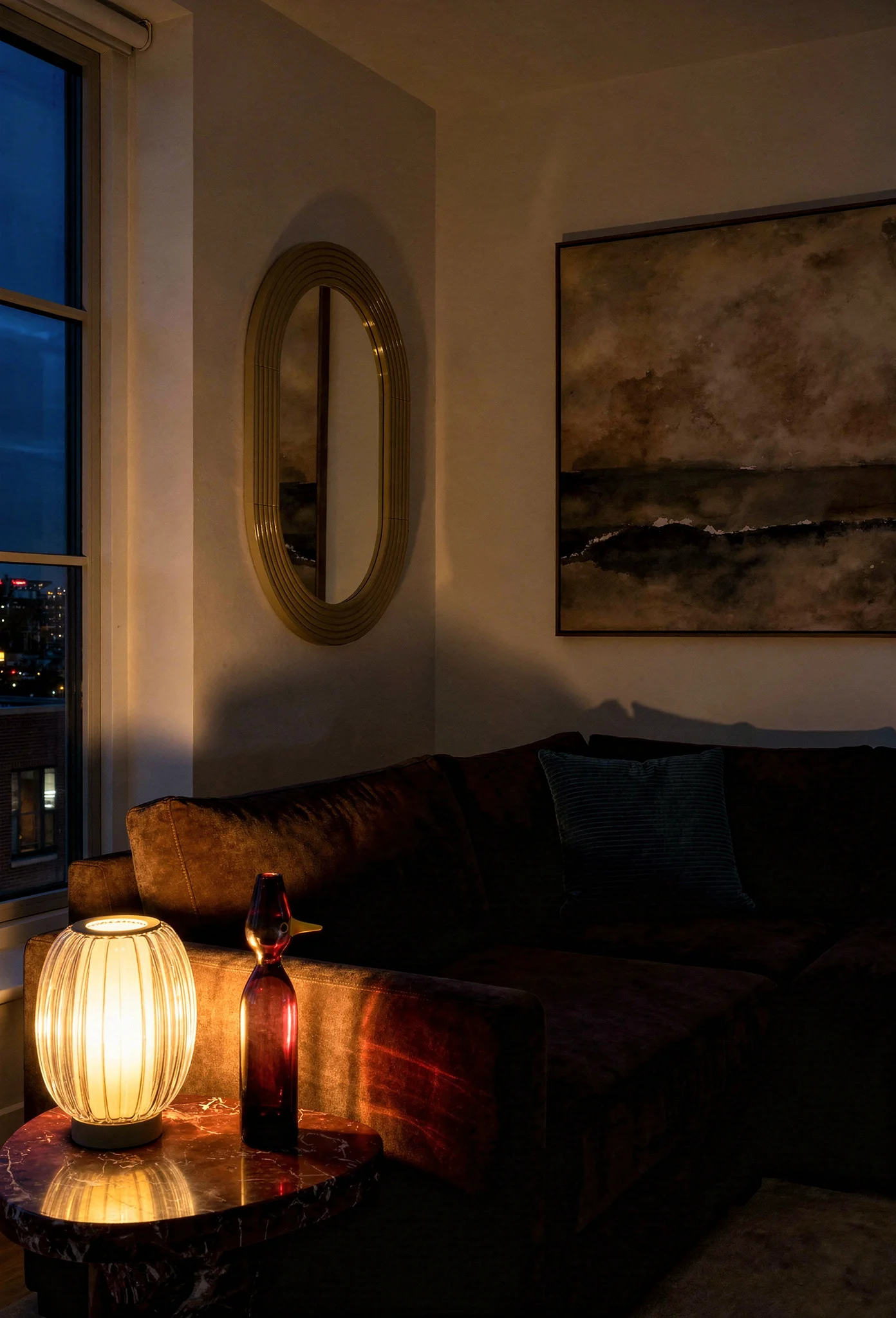
In my experience, the three layer system is non-negotiable. Ambient light provides overall illumination, typically from recessed fixtures or a central pendant. Task lighting targets specific activities like reading, working, or cooking. Accent lighting creates drama and depth through wall sconces, picture lights, and shelf lighting. I think you really do need all three.
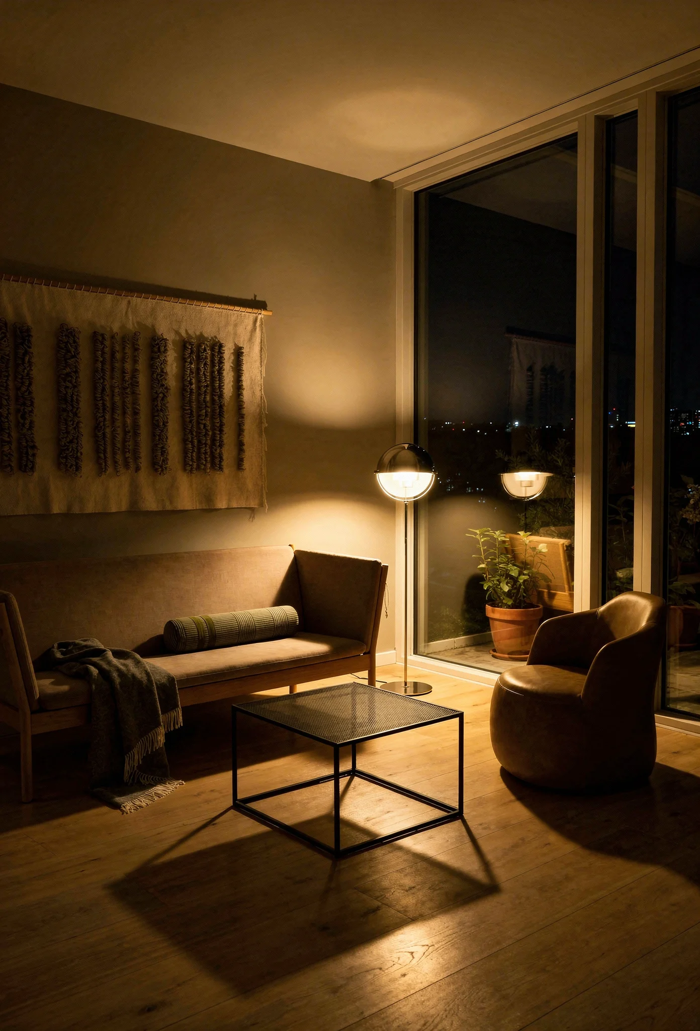
Circadian responsive systems are replacing fixed warm bulbs. A 2700K warm setting for evenings helps your body wind down. Cooler temperatures during the day support focus. The technology exists to automate this, and it costs less than most coffee tables.
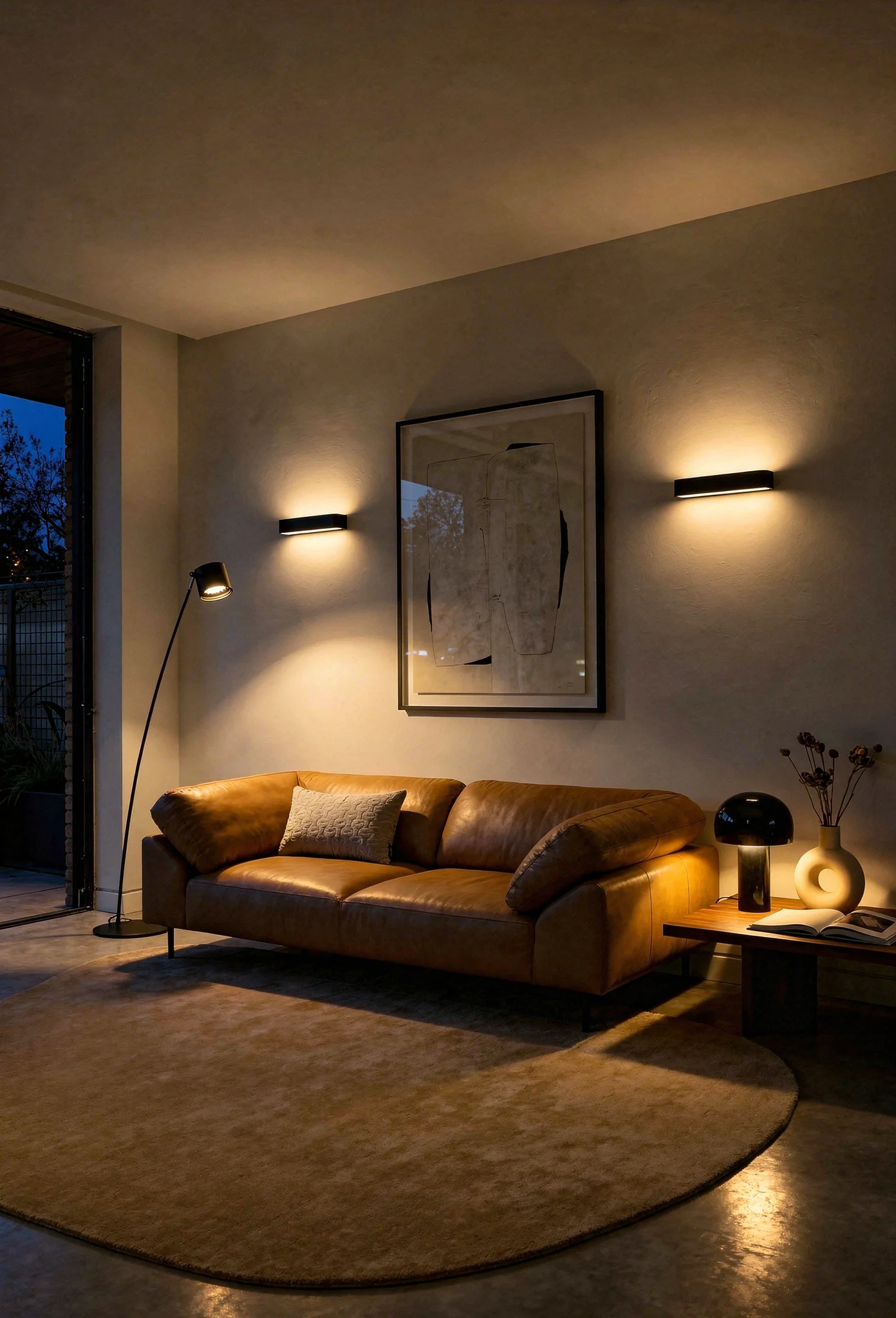
Amber and mocha smoked glass pendants are replacing cool chrome in 2025 and 2026. The shift is subtle but significant. Where polished chrome creates hard, reflective light, smoked glass diffuses warmth through the room. Modern chandeliers for living rooms are following this trajectory too, with organic shapes and warm metalwork outpacing the geometric chrome fixtures of the past decade.
Every seating area needs its own light source within arm’s reach. A floor lamp beside a reading chair. A table lamp on the console behind the sofa. Light should follow the furniture plan, not fight against it.
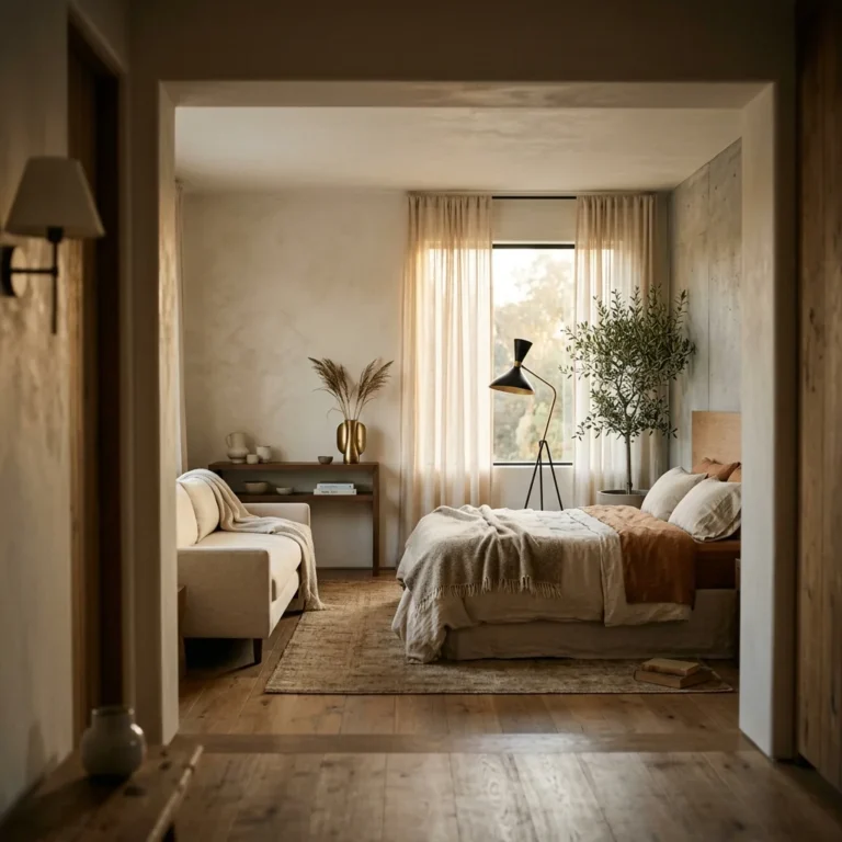
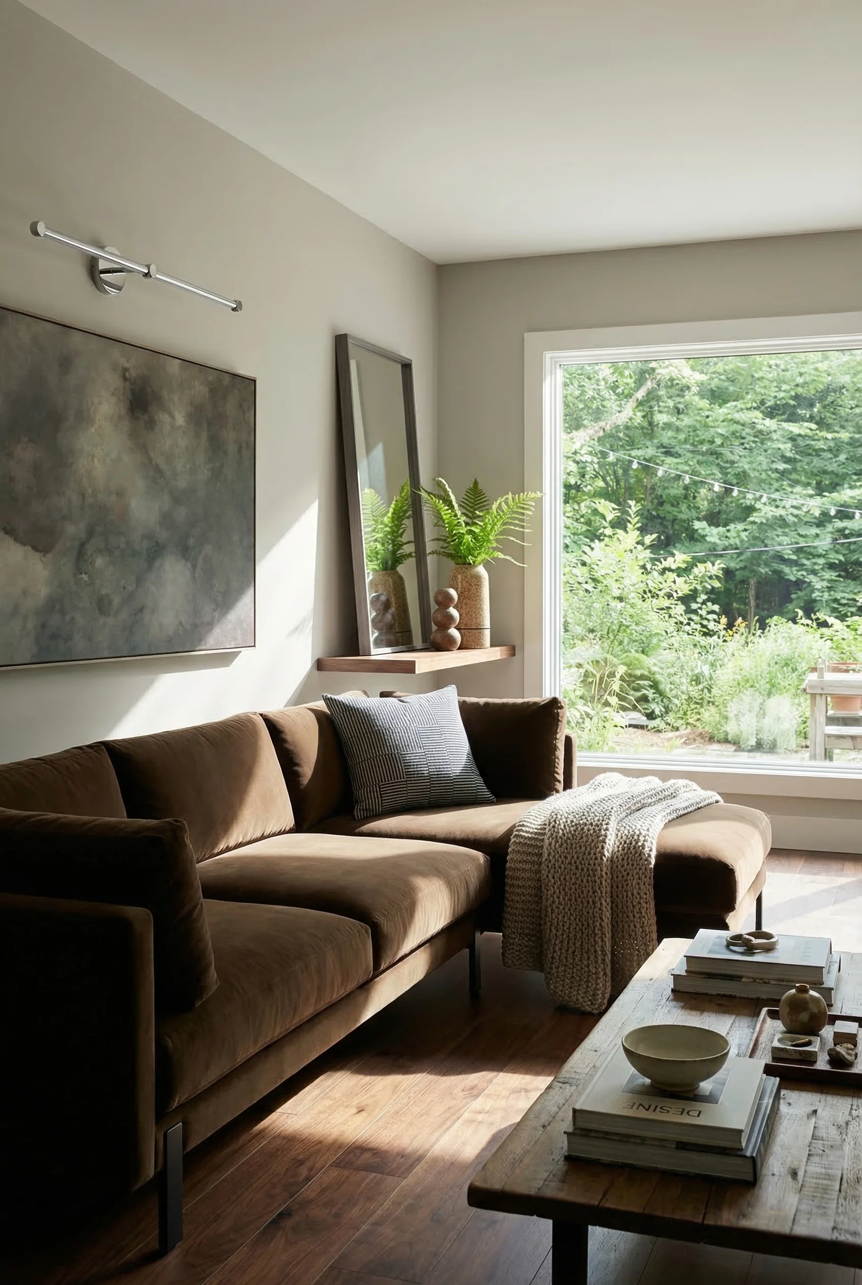
Brown is replacing gray as the essential modern neutral. From Mocha Mousse to Chocolate Umber, warm earth tones have overtaken the cool grays that defined the previous era. The shift signals something deeper: comfort over minimalism, richness over restraint.
Color drenching is the technique worth understanding. It means applying a single hue across walls, ceiling, trim, and sometimes furniture. Instead of breaking a room into accent walls and contrasting trim, you wrap the space in one color. The effect is enveloping and surprisingly modern.
The 60/30/10 rule still holds for more complex palettes. 60 percent of the room in your dominant color (walls, large furniture, floors). 30 percent in a secondary color (supporting pieces, textiles). 10 percent in an accent that creates pops of energy.
Heritage Green and Rich Olive are emerging as grounding accents, replacing the blush pink and dusty blue of previous years. These deeper, earthier tones work because they connect to the natural world. Modern paint colors for living rooms are moving toward pigments that feel borrowed from landscapes rather than laboratory swatches.
If browns feel too warm for your space, try a greige. Half gray, half beige. It holds the warmth of brown without the heaviness, and it pairs with virtually any accent.

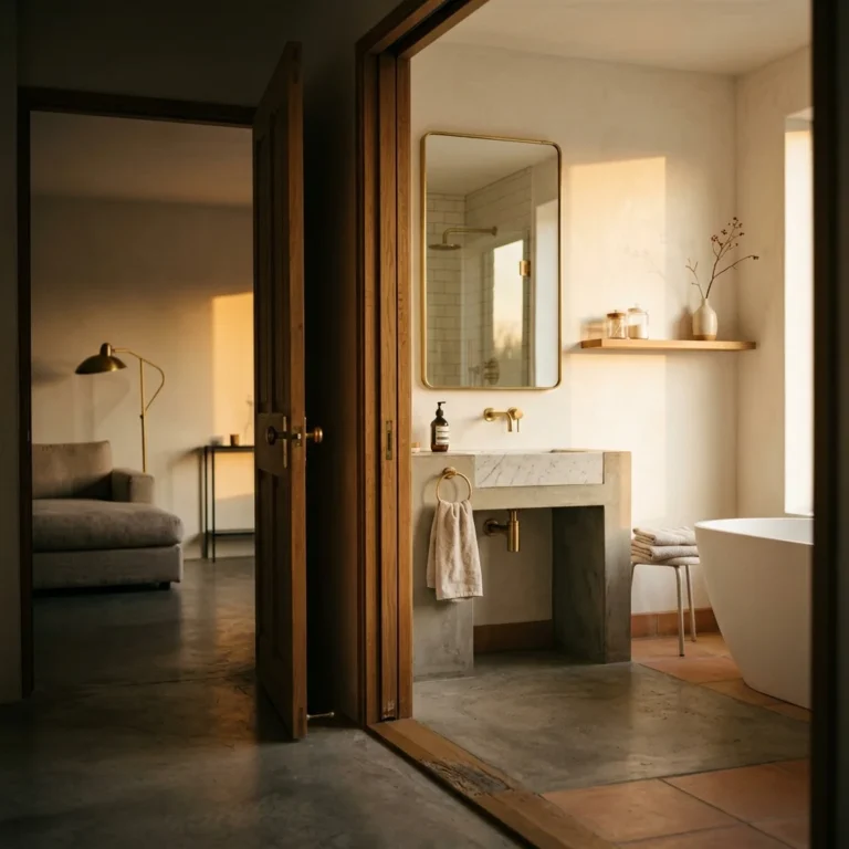
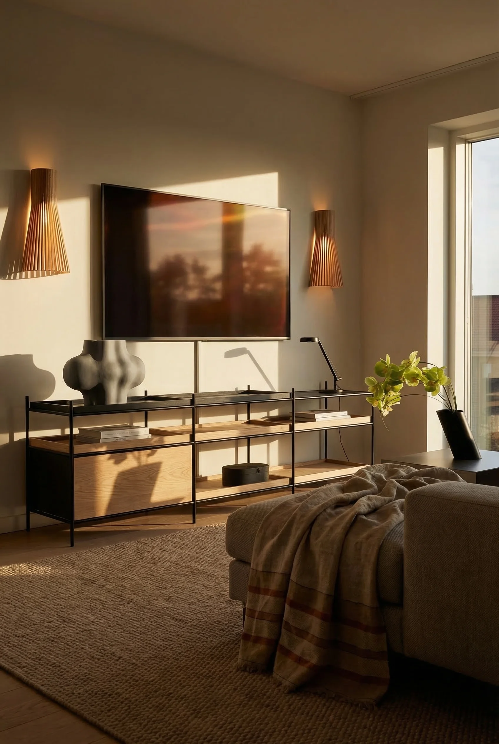
A room with only one texture feels like a showroom. A room with five feels lived in. The difference between modern spaces that feel cold and ones that invite you in is almost always about material variety.
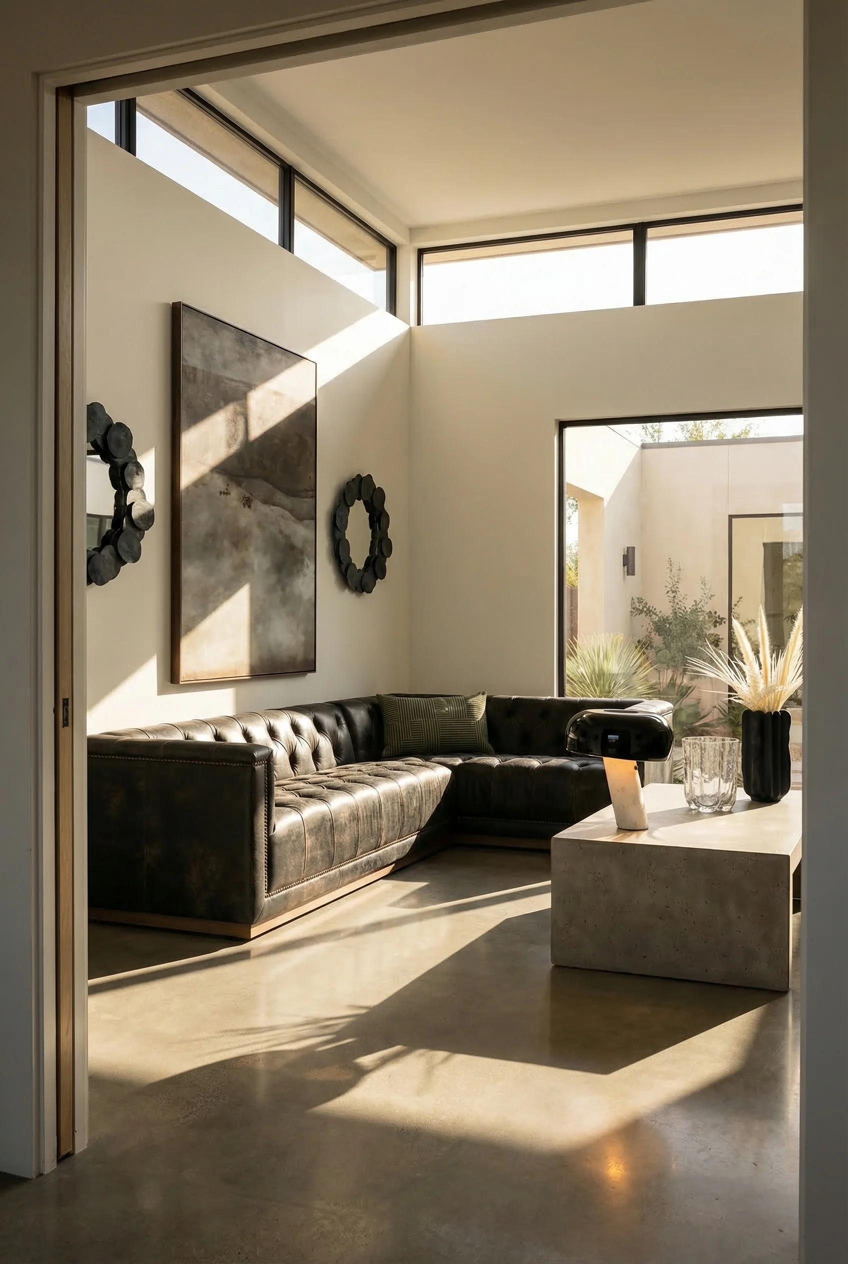
Aim for 4 to 5 textures within each zone. A linen sofa, a wool throw, a jute rug, a ceramic side table, and a glass vase. Each material catches light differently, creating subtle visual movement throughout the day.
Bio materials are entering the modern living room in 2025 and 2026. Mycelium composites for acoustic panels. Cactus leather for upholstery. Terrazzo made from recycled glass. These are not compromise materials. They perform as well as or better than their traditional counterparts, and they age with character.
Material honesty is the thread connecting these choices. You should feel the wood grain under your fingertips. See the artisanal tool marks in handmade ceramics. Sense the variation in a handwoven textile. Modern design is moving away from synthetic perfection and toward materials that reveal their making.
For pattern mixing, follow the same three scale principle as proportion. One bold pattern (a rug or large cushion), one medium (curtains or a throws), one small (a textured pottery piece or decorative object). The patterns do not need to match. They need to share at least one common colour.
The most designed rooms of 2026 have one thing in common: you cannot find the technology. It is there. It works flawlessly. But it has been made invisible.
Mirror TVs and Samsung’s The Frame have changed the game for living room focal walls. When off, they display art or blend into a gallery wall. The era of a black rectangle dominating the room is ending for anyone paying attention.
Invisible speakers plastered directly into walls deliver sound without cabinets, stands, or visible hardware. Combined with in wall cable routing and wireless HDMI, the entire entertainment system can disappear into the architecture.
Wireless charging built into side tables removes the last visible cable from the living room. Several furniture makers now offer this as a standard feature rather than an upgrade. Cable management systems for media consoles have improved dramatically. Magnetic cable clips, hollow furniture legs, and integrated conduit channels mean every wire has a designated hidden path.
The way I see it, technology should serve the room, not define it. If your first impression of a living room is screens and wires, I’d say the design has failed no matter how beautiful the furniture.
I get it. The instinct is always to add more. Another throw pillow. Another side table. One more piece of wall art. But restraint is what makes modern design modern.
The 60/40 balance applies to spatial composition. 60 percent of your room should be occupied, furnished, decorated. 40 percent should breathe. That breathing room is not wasted space. It is what gives your eye a place to rest and your furniture permission to stand out.
Atmospheric minimalism is the current term for this approach. It is not about owning less. It is about being intentional with what remains. Every object in the room should either serve a function or tell a story. If it does neither, it is visual noise.
The Rule of Three governs displays and vignettes. Group objects in odd numbers (three candles, three vases, three books stacked). Odd numbers create asymmetry, and asymmetry feels natural. Even groupings feel static and arranged.
Resist the urge to fill every surface. A console with three carefully chosen objects has more impact than one crowded with twelve. The space between things is what makes the things special.
These are the five errors I see most often. The frustrating part is that each one is simple to fix once you spot it.
TV height is the most common offender. Your screen should sit with its centre at 42 to 48 inches from the floor. That aligns with a seated eye line. Most mounted TVs hang a full foot higher than this, creating a neck craning cinema experience in a space meant for relaxation.
Wall hugging furniture creates dead zones and makes rooms feel smaller. Floating your largest pieces even a few inches off the wall adds depth and purpose to the layout.
A rug that does not reach the front legs of your seating disconnects the furniture grouping. It makes individual pieces feel like islands rather than a cohesive arrangement. Size up. It is almost always the right call.
Matching furniture sets look generic because they are. A sofa, loveseat, and armchair from the same collection remove every opportunity for personality. Mix materials, eras, and silhouettes. Coherence comes from color and proportion, not from a product line.
Blocking windows with bulky furniture steals natural light, and natural light is free ambiance you cannot buy back with lamps. Keep window walls clear. Position tall furniture on solid walls. Let the daylight work for you.
Modern design relies on a tight palette of neutrals that do the heavy lifting, so your furniture and art can shine without competing against the walls.
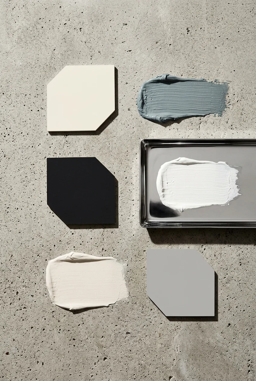
Bright White – The canvas. A clean, blue free white for walls and ceilings that maximises natural light and provides the sharpest contrast for darker furnishings and bold art. Paint Pick: Slipper Satin by Farrow & Ball
Black – The anchor. Use sparingly on frames, hardware, and statement furniture legs. Black grounds a room and prevents an all neutral palette from feeling weightless. Paint Pick: Liquorice by Farrow & Ball
Charcoal – The depth builder. Softer than black, charcoal works for large upholstered pieces, accent walls, and floor finishes. It adds weight without heaviness. Paint Pick: Blue Gray by Farrow & Ball
Taupe – The warm bridge. This gray brown hybrid connects the cooler whites to the warmer elements in your room. Ideal for secondary textiles, rugs, and built in cabinetry. Paint Pick: School House White by Farrow & Ball
Silver – The reflective accent. In metallic hardware, mirror frames, and light fixtures, silver adds modernity without coldness when paired against the warm taupe and charcoal tones. Paint Pick: Shadow Gray by Farrow & Ball
When your palette is this controlled, every material choice and accent colour you add reads as intentional. The neutrals are not boring. They are the framework that makes everything else possible.
In my experience, designing a modern living room works best as a system, not a shopping trip. Start with the layout measurements. Build the proportion relationships. Layer three types of light. Choose a colour method. Mix five textures, hide the technology, and leave 40 percent of the room to breathe. Fix the five common mistakes. Then stop adding things. The room is done when it feels right, not when it looks full.
This post contains affiliate links, which means we may earn a small commission if you make a purchase through our links, at no extra cost to you.