Newsletter Subscribe
Enter your email address below and subscribe to our newsletter
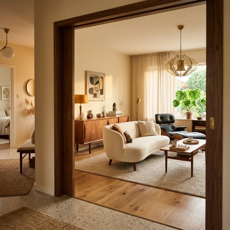
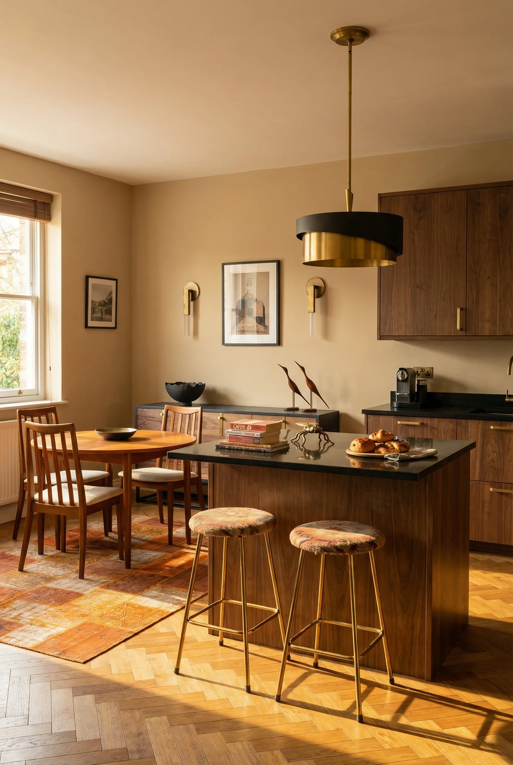
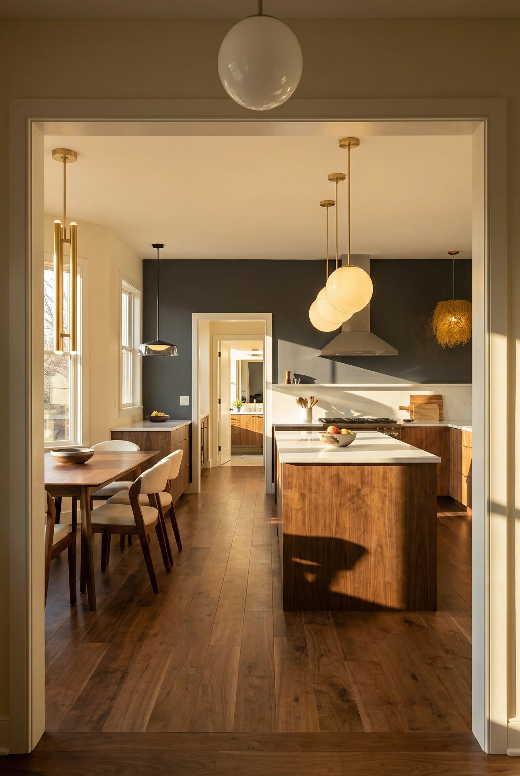
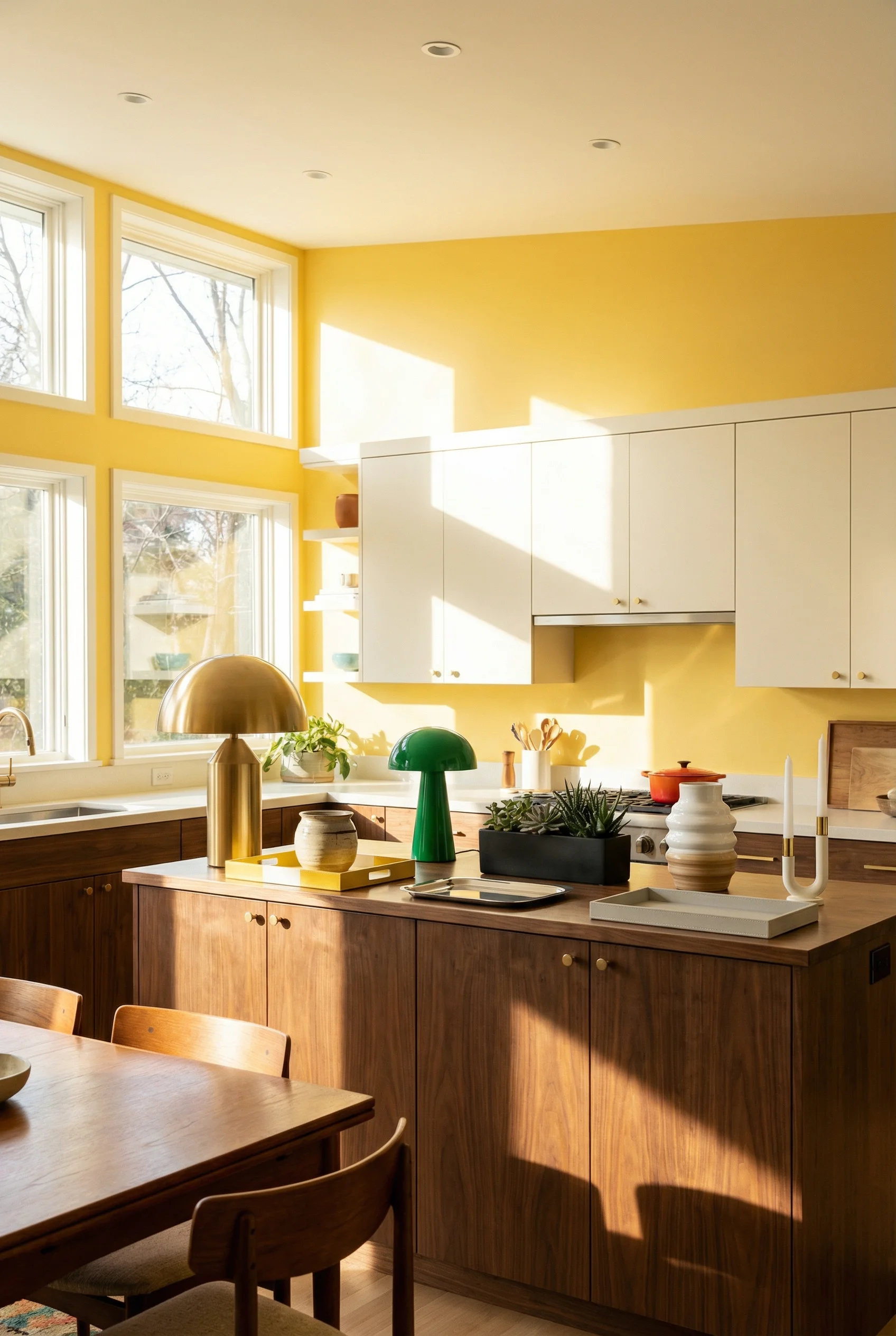
White kitchens had a good run. A decade of bright, clean, safe. And now they all look exactly the same. The problem is not that white cabinets are ugly. They are fine. The problem is that they say nothing. They have no opinion. Meanwhile, walnut slab fronts with integrated pulls are showing up in every serious kitchen renovation I’ve been tracking this year, and the warmth they bring makes the all white kitchen feel like a waiting room. I’ve noticed the homeowners getting the most striking results are not recreating a 1960s time capsule. They are pulling specific mid century modern kitchen elements, the wood grain, the geometric tile, the sculptural lighting, and dropping them into spaces that feel completely current.
If you are planning a kitchen renovation and that Pinterest board full of white shaker cabinets is starting to bore you, this is where things get interesting.
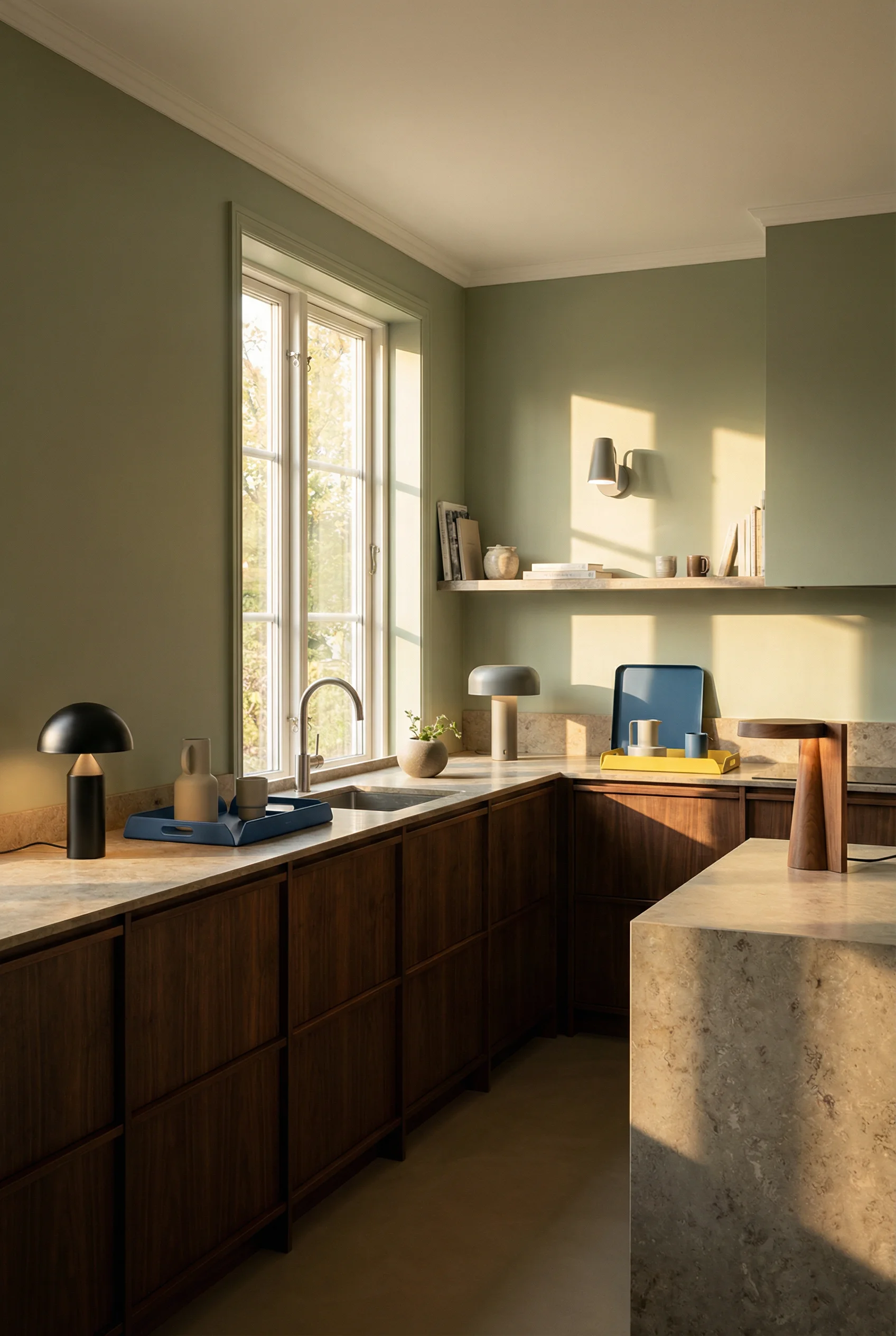
Five years ago, dark wood cabinets felt dated. Builders were painting over walnut, cherry, anything with grain. That has reversed hard, and walnut specifically is leading the charge in mid century modern kitchen design.
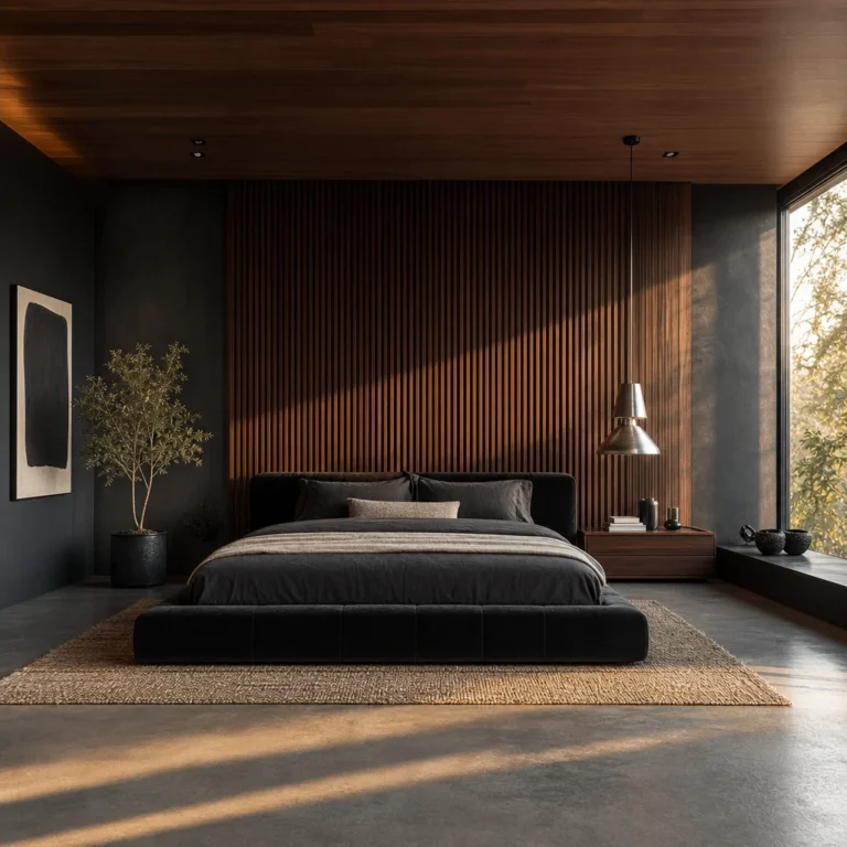
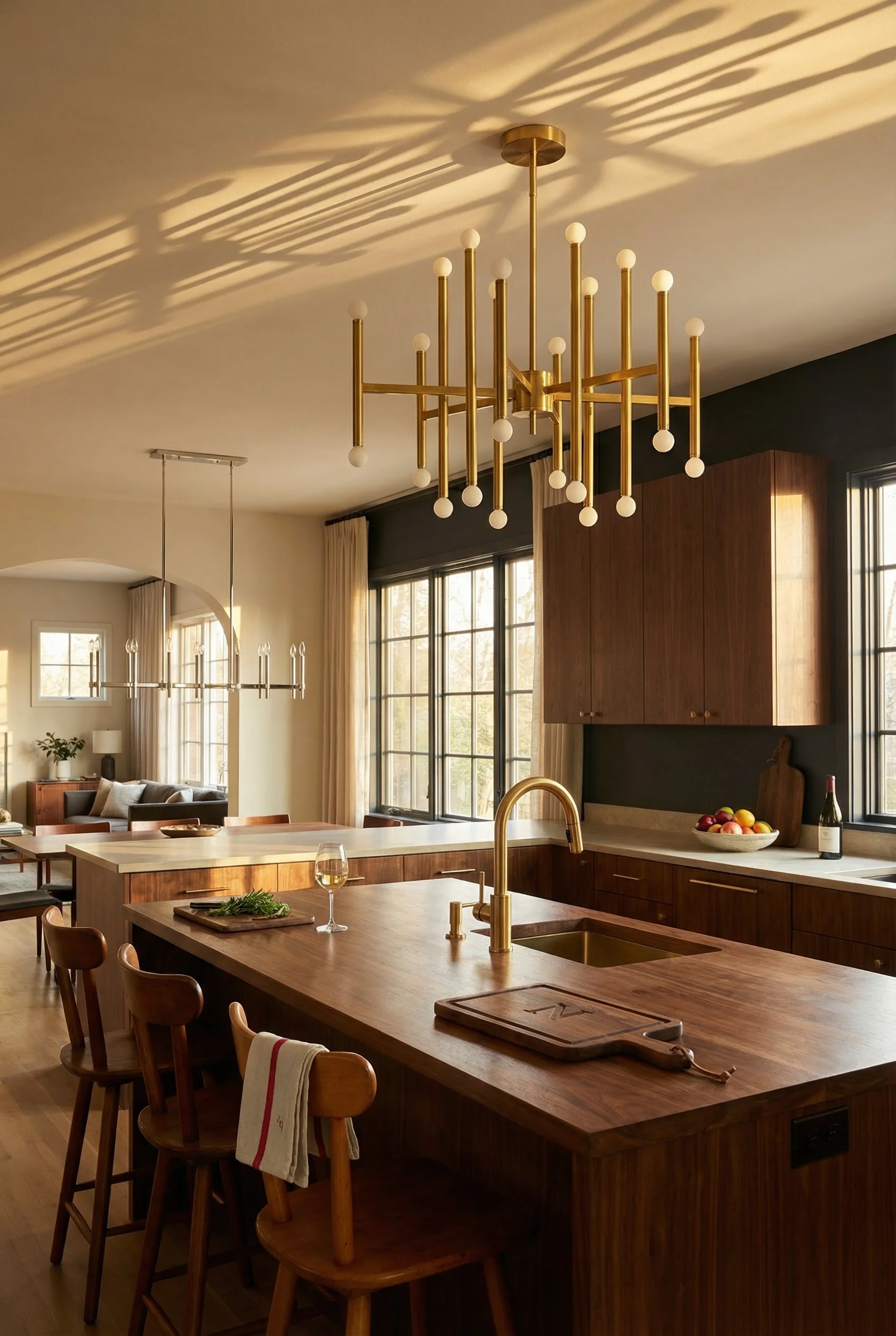
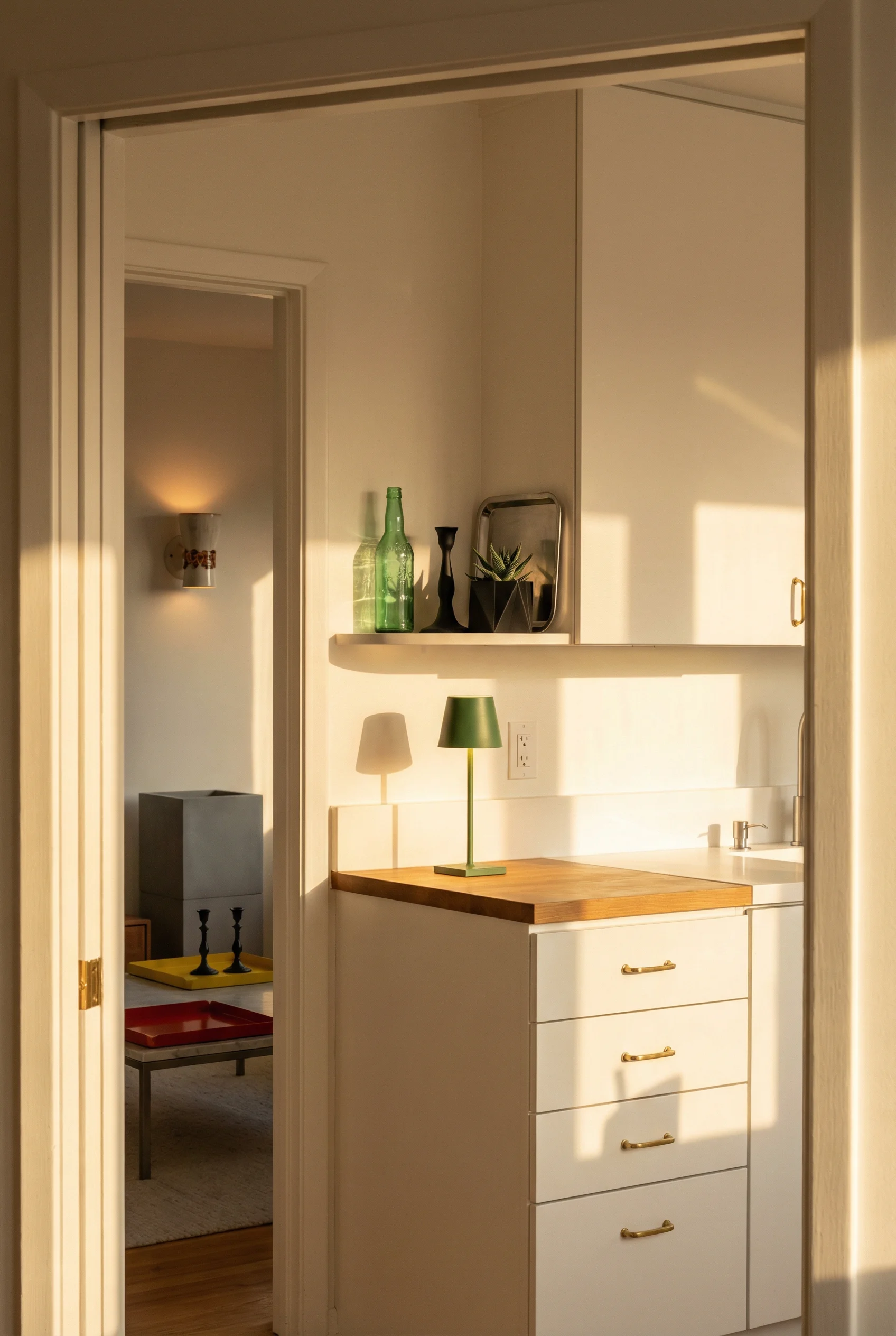
The reason walnut works where other dark woods stumble is its grain pattern. It is irregular enough to feel organic but consistent enough to read as intentional. Pair it with slab front doors, no raised panels, no ornate moulding, and you get a surface that looks expensive without trying. The best MCM kitchens I’ve seen use flat front walnut on lower cabinets with either open shelving or lighter uppers to keep the room from feeling heavy.
Here is something most people miss. The finish matters more than the species. A heavy polyurethane kills the warmth that makes walnut special. Clear oil or matte lacquer lets the wood breathe and shows the grain honestly. Over time it develops a patina that painted cabinets simply cannot replicate.
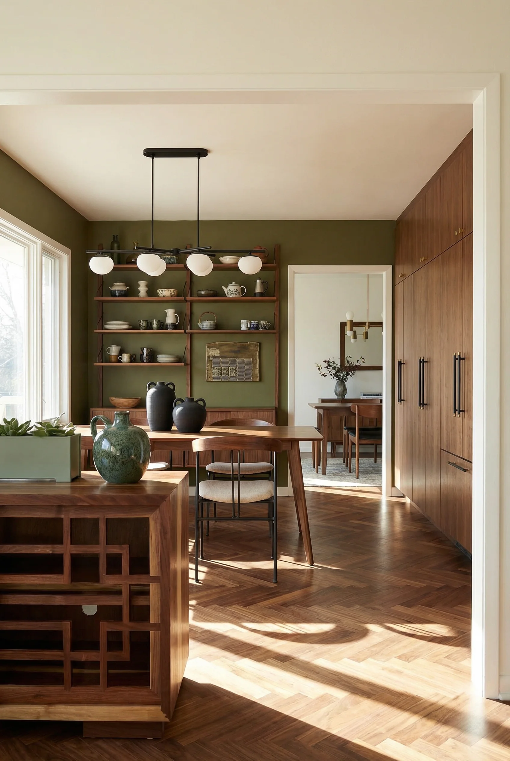
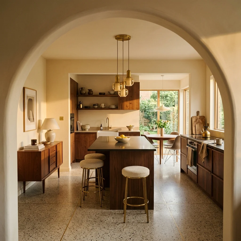
If full walnut cabinetry feels like a big commitment, there is a middle ground that I think works brilliantly. Companies now make custom MCM fronts designed to fit standard IKEA Sektion cabinet boxes. You get the grain matched walnut slab doors with integrated pulls at roughly 30 to 40 percent less than full custom. The result looks indistinguishable from a bespoke kitchen.
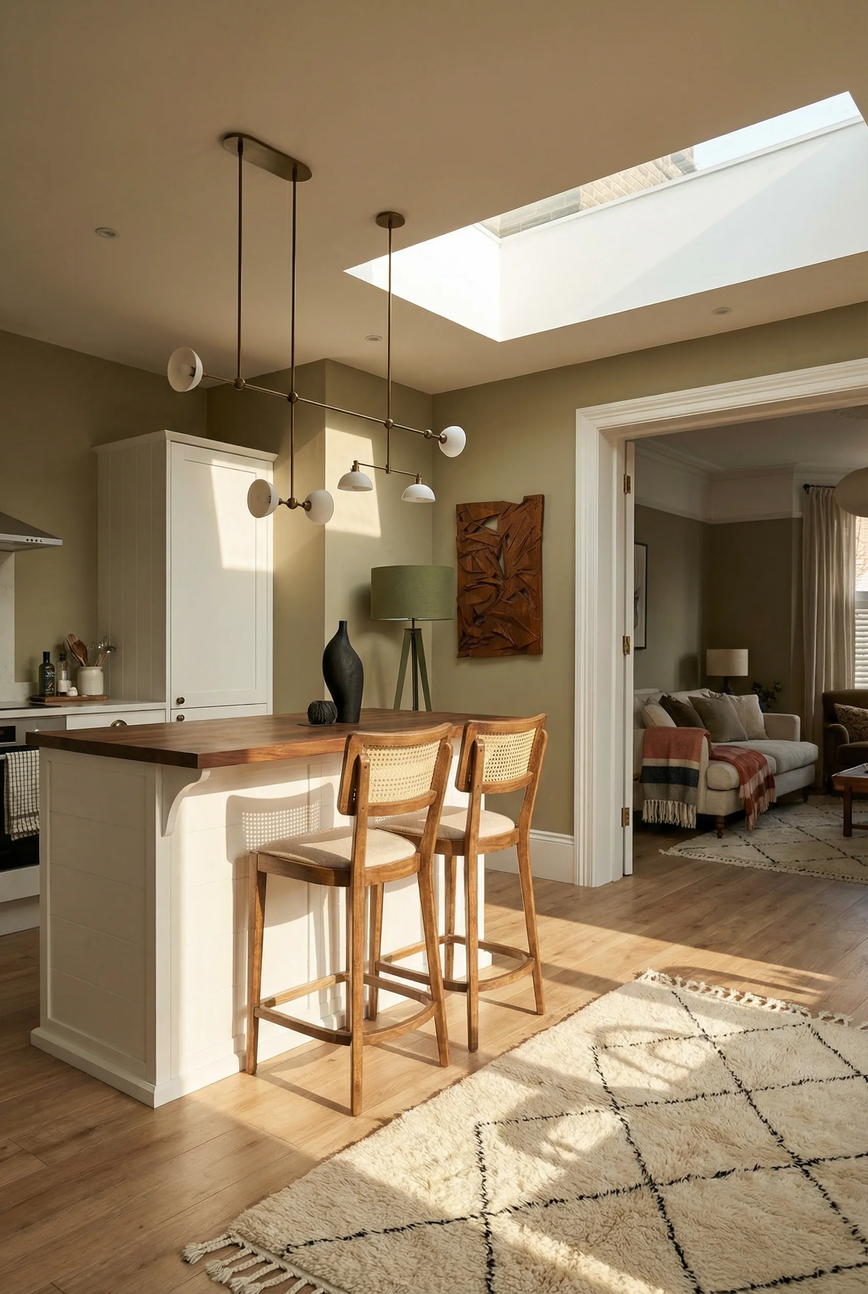
The hybrid approach is gaining traction too. Painted perimeter cabinets in a warm off white or sage, with a walnut island as the centrepiece. That single element shifts the entire room from generic to intentional.

Walnut is not the only player either. Rift sawn white oak gives you that straight, tight grain without the orange cast of traditional oak. Teak brings a golden warmth with natural water resistance, which is practical in a kitchen. Cherry darkens beautifully over years. But walnut remains the one that reads most clearly as mid century, and the one that photographs best against the matte blacks and brushed brass that anchor the style.
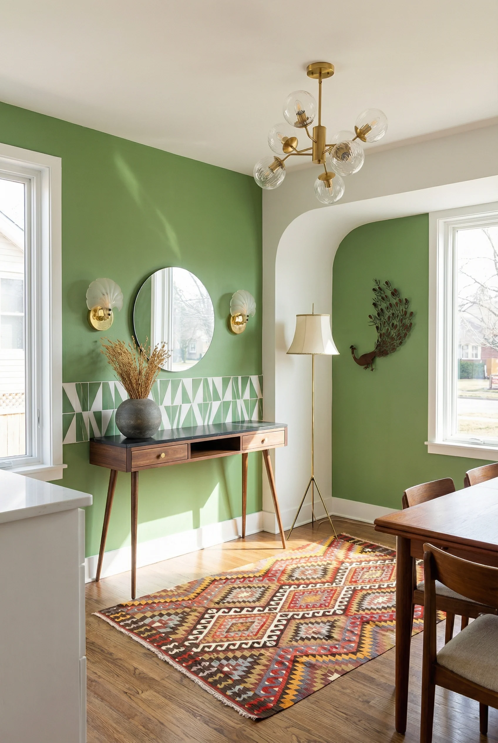
A mid century modern kitchen without a strong island is like a living room without a sofa. It works technically, but something is missing. The island is not just counter space. It is the visual anchor that organises the entire room.
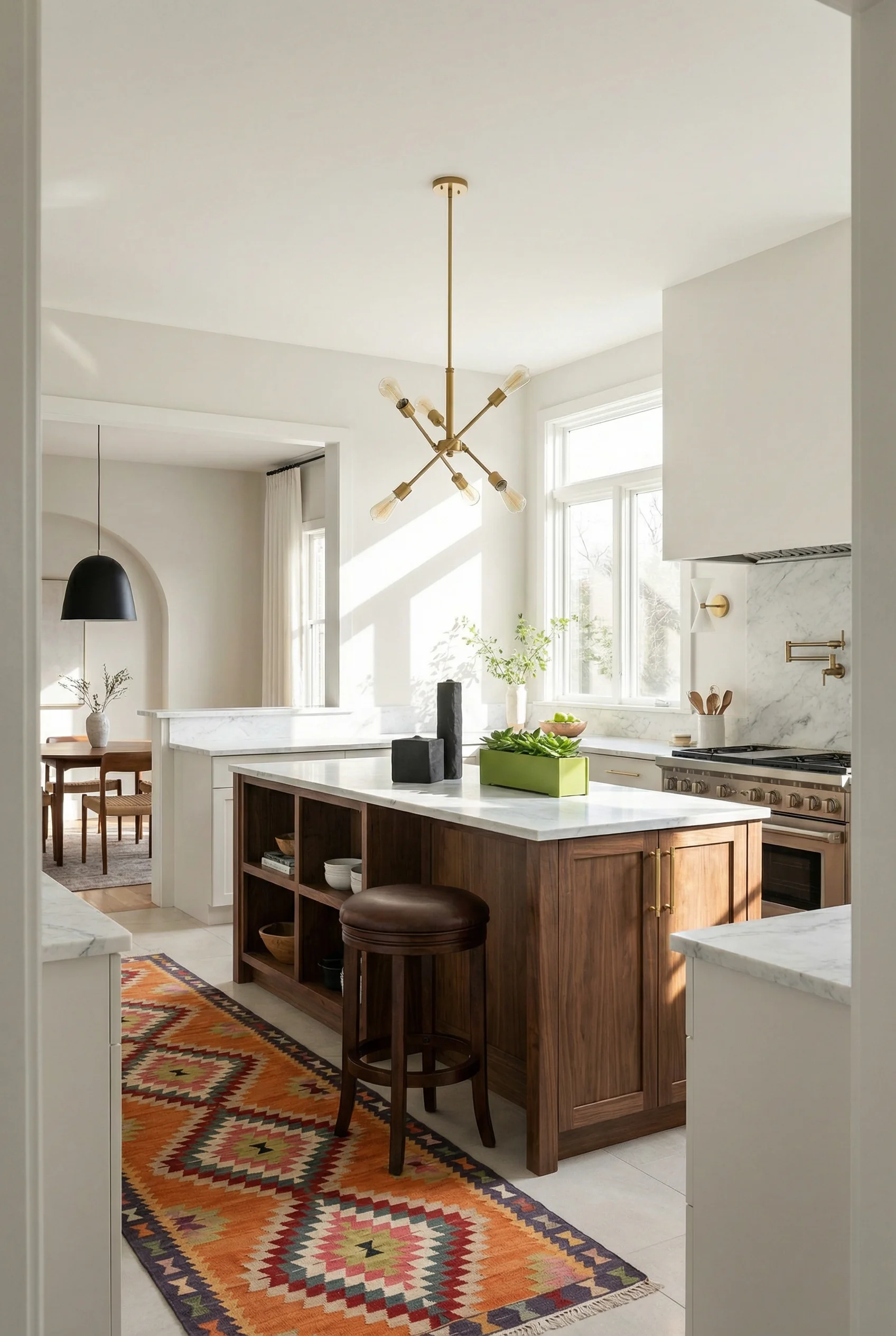
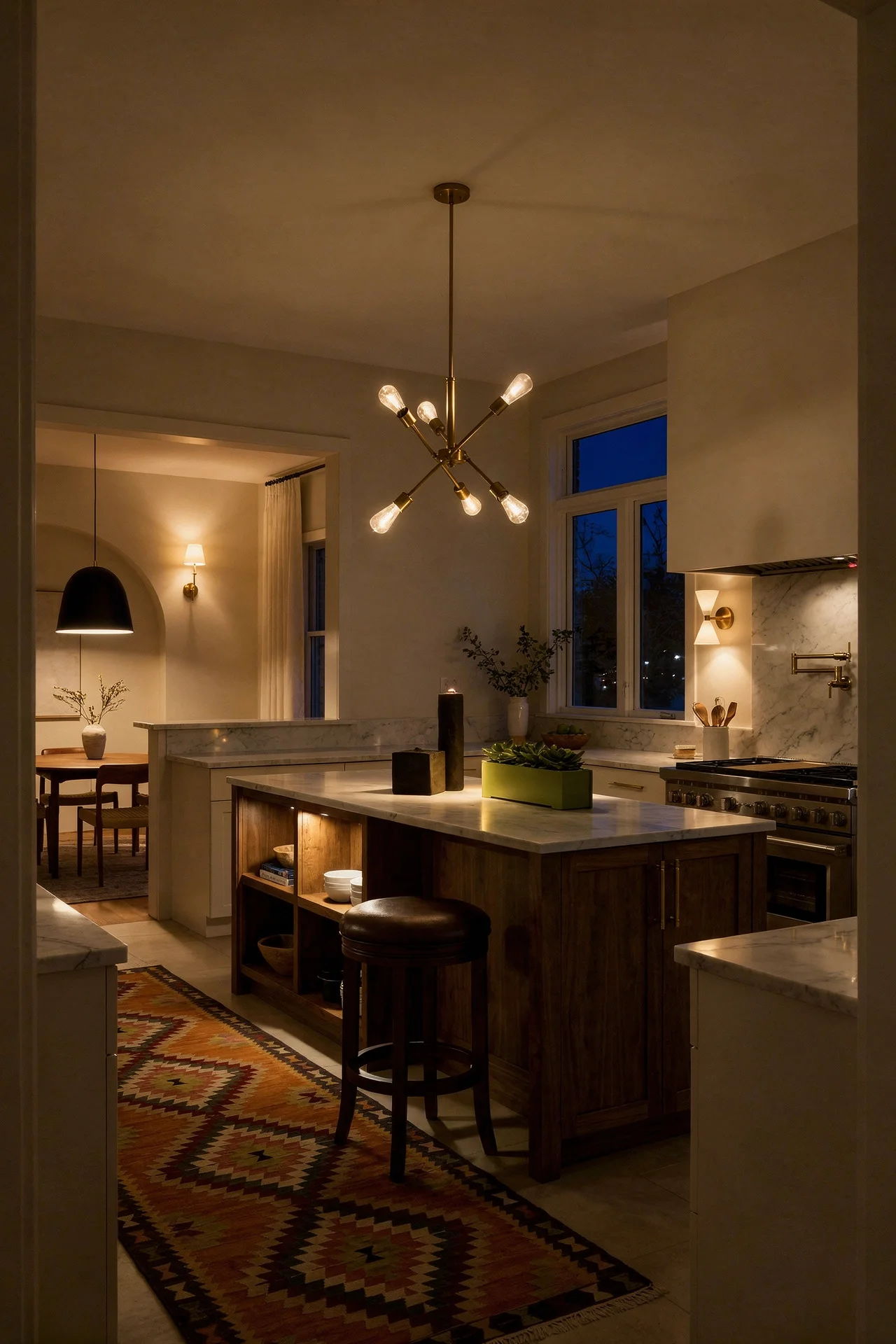
The best MCM islands I’ve come across share a few traits. They use a waterfall edge, where the countertop material wraps down the sides in one continuous plane. This creates that clean, unbroken line that defines the era. The material choice matters. A butcher block waterfall in walnut feels warm and grounded. White quartz with grey veining feels contemporary but pairs well with wood cabinetry. Concrete or terrazzo push things slightly industrial, which can work in loft style kitchens.
Seating matters too, and this is where people often get it wrong. A mid century island needs at least a 12 inch overhang to accommodate stools comfortably. Those stools should be low profile with tapered legs, not the bulky farmhouse types that crowd the sightline. Wire frame or moulded shell seats keep the visual weight low.
Storage inside the island is where function meets the MCM philosophy of “form follows function.” I’d lean towards deep drawers with wood dividers on the working side, and open display shelving on the social side for cookbooks or ceramics. The horizontal emphasis of the open shelves echoes the horizontal cabinet banks that define mid century layouts.
If your kitchen footprint is tight, a mobile butcher block cart on casters gives you the island benefit without the permanent commitment. You can roll it out when cooking and push it aside when you need the floor space. It is a proper mid century solution because the movement designed for efficiency, not ornament.
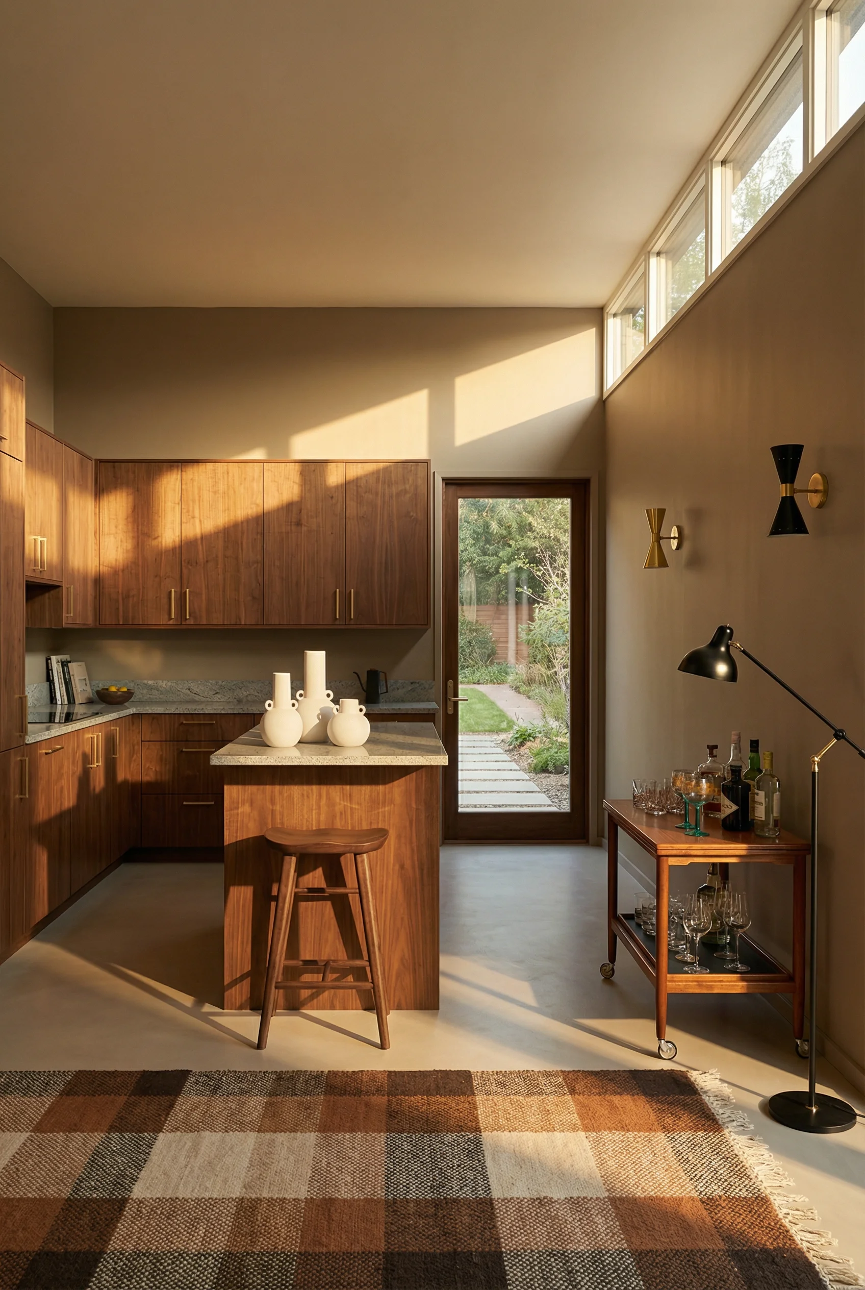
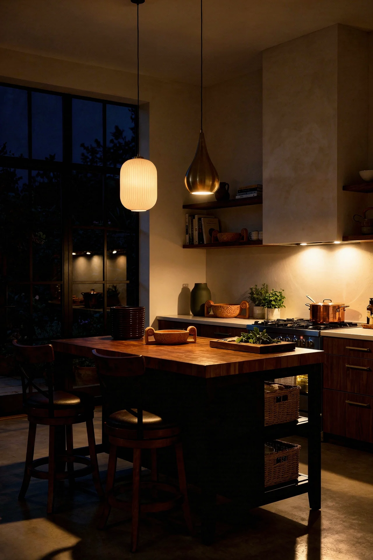
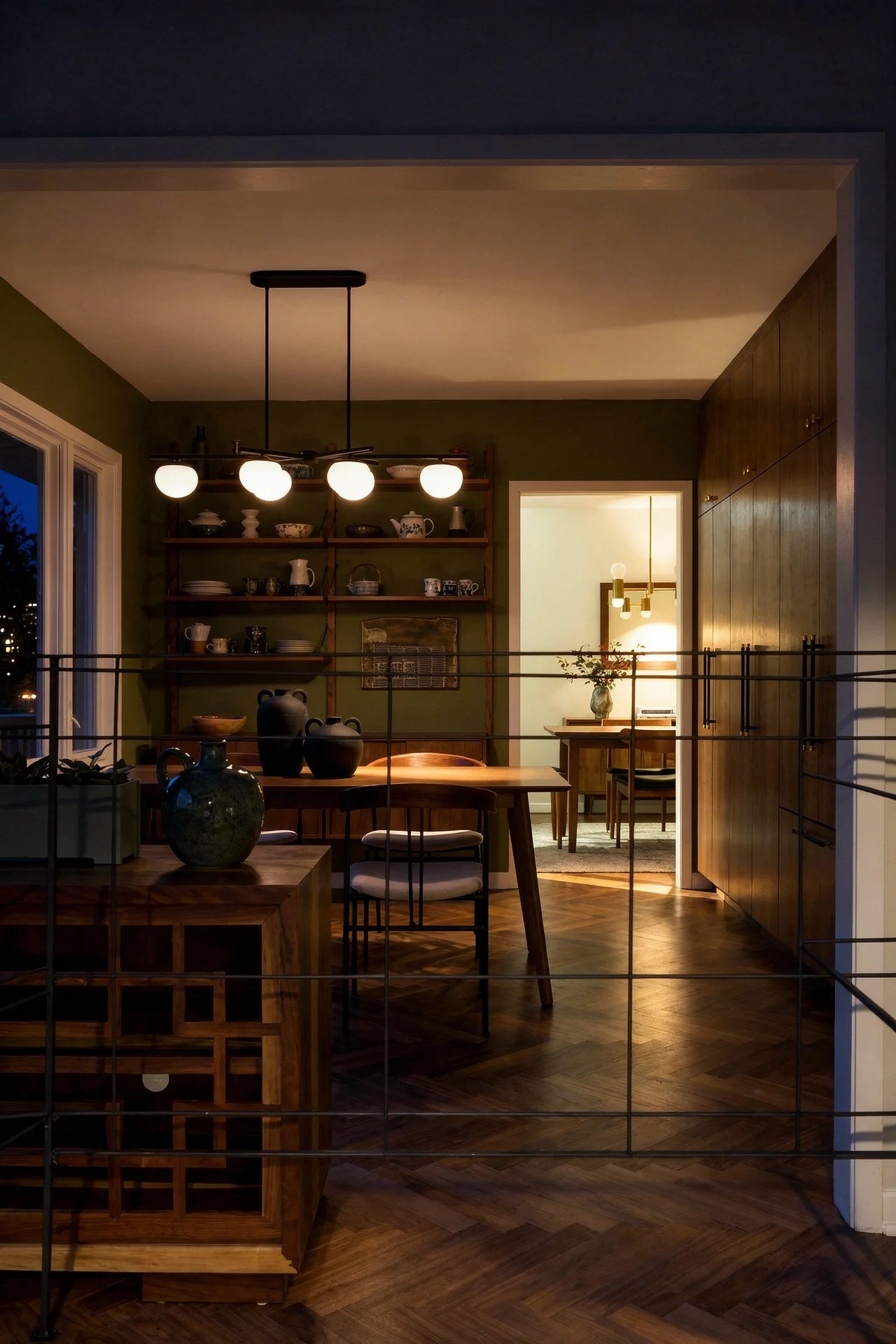
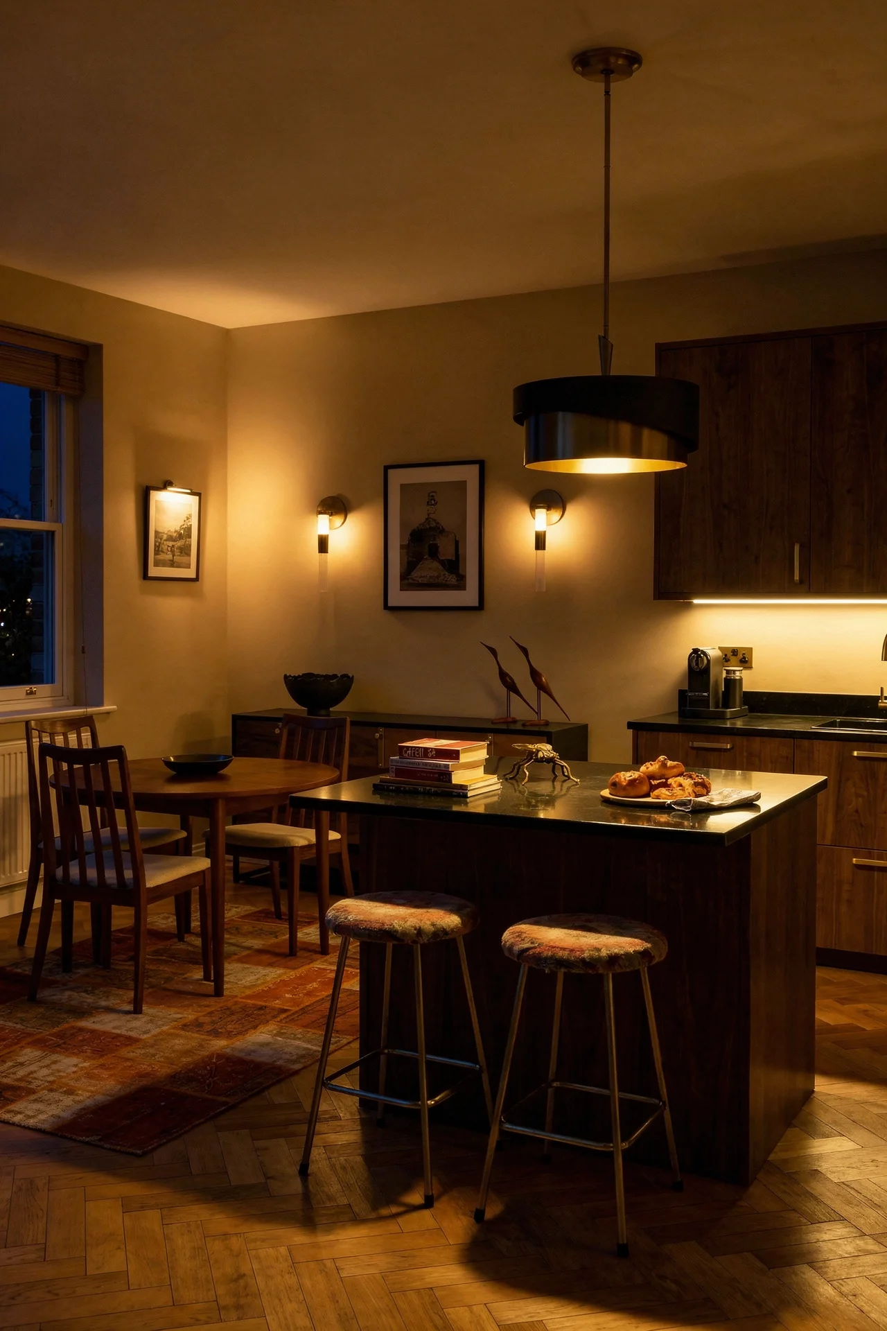
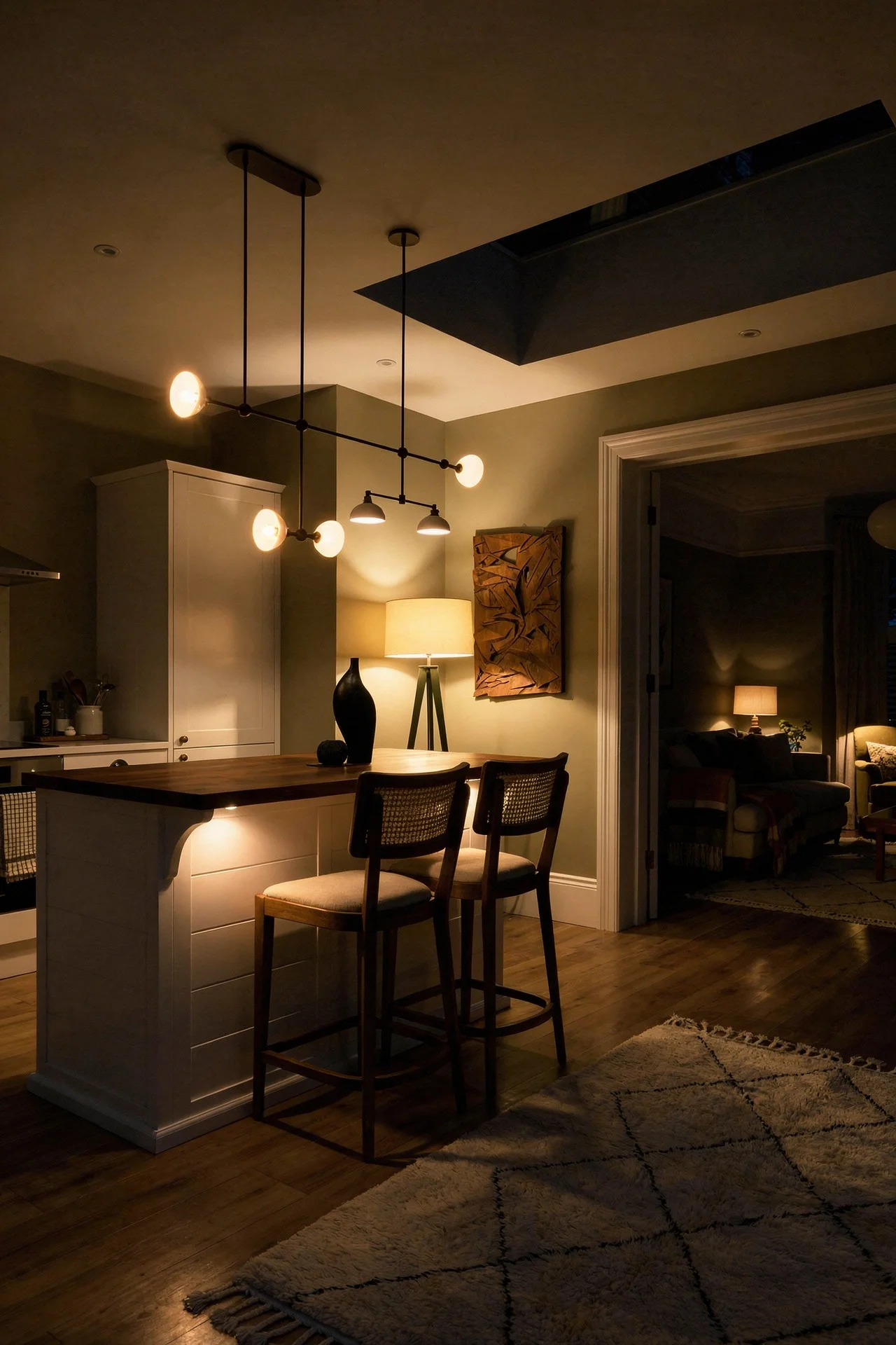
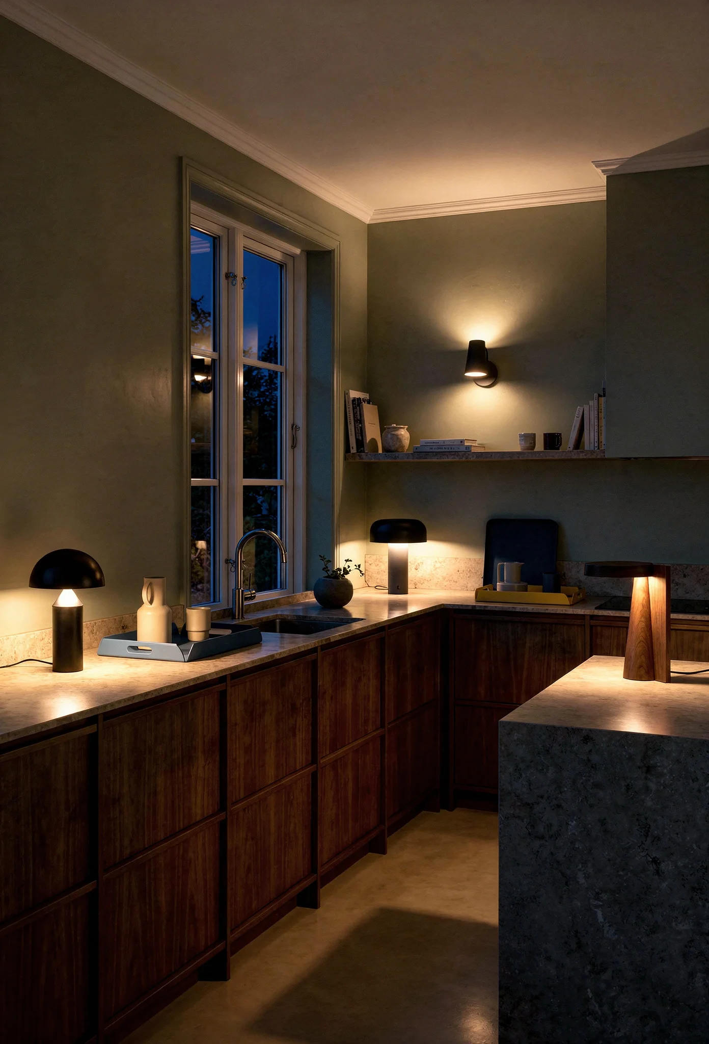
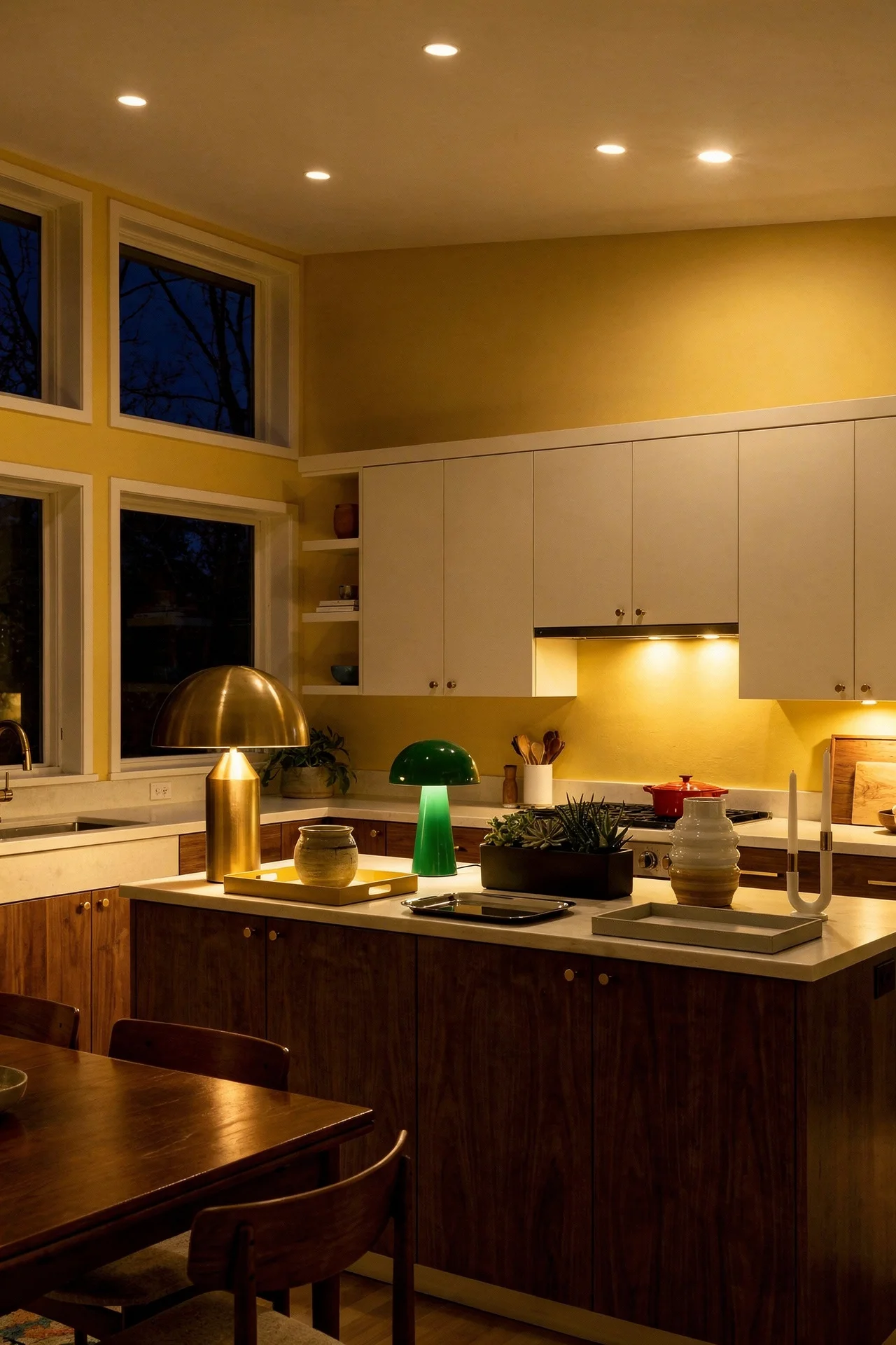
One detail that separates a good MCM island from a great one is pendant lighting directly above it. Two or three fixtures with brass arms and opal glass shades at 30 to 36 inches above the counter surface create a pool of focused light that makes the island feel like the centre of gravity. We will get deeper into lighting next.
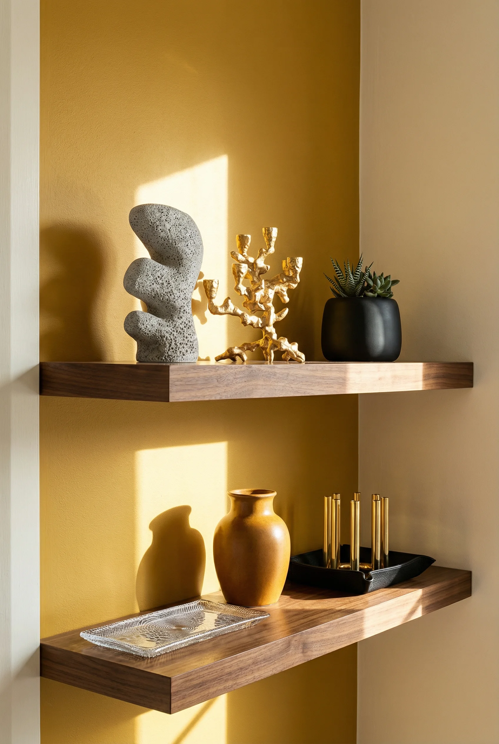
If the cabinetry is the body of a mid century modern kitchen, the backsplash is the personality. This is the one surface where MCM design lets loose with bold geometry and colour.
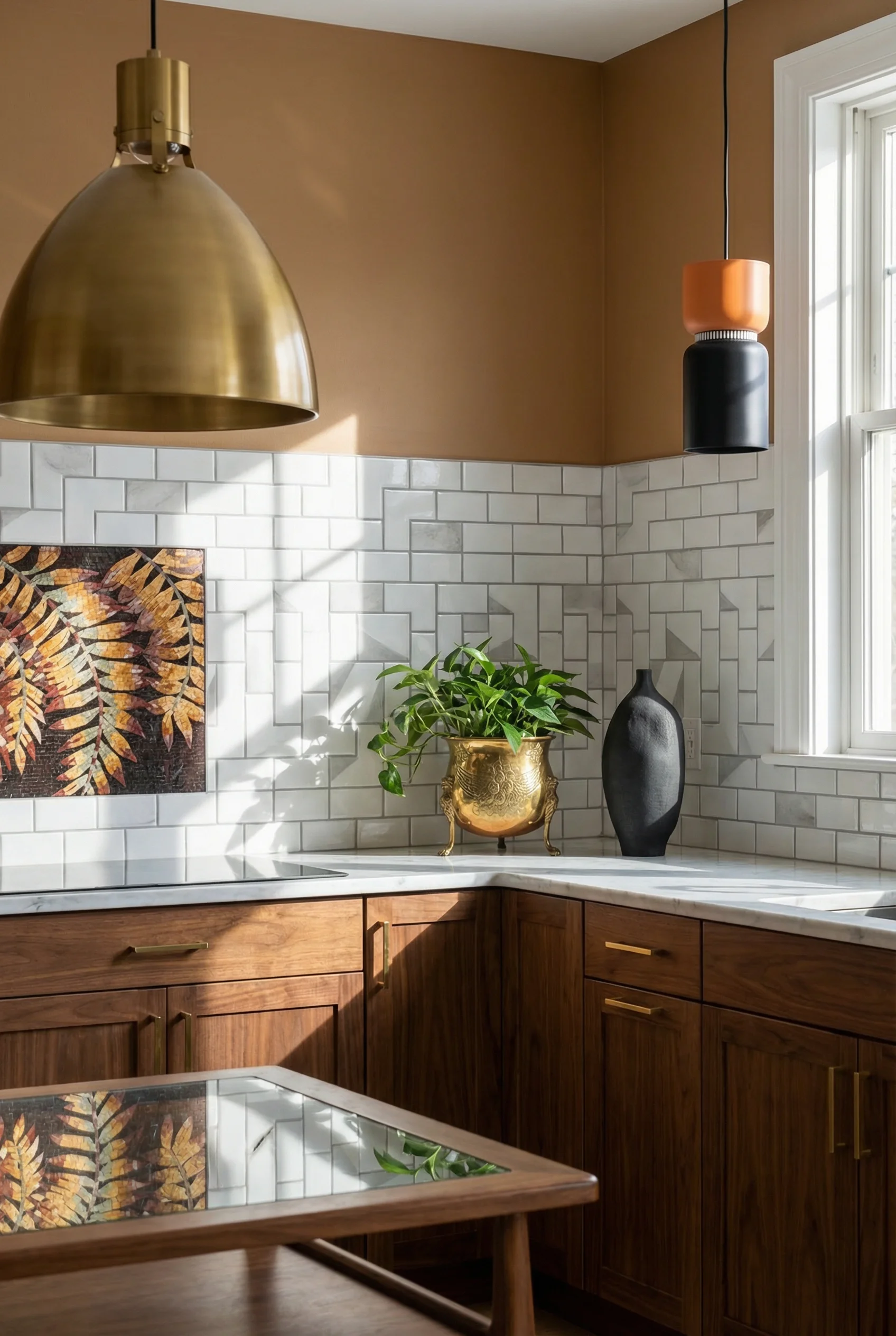
Chevron, hexagon, diamond, star and cross. These are the shapes that defined backsplashes in original mid century homes. The trick with using them now is scale. Oversized geometric tiles in a single colour feel modern. Small format mosaics in multiple colours lean retro. I’d aim for something in between. A medium hex in a matte olive or teal reads as mid century without tipping into costume.
Terrazzo is having its own moment and it belongs here. The mottled pattern with natural stone chips is a genuine MCM material, not a trend import. It works as both countertop and backsplash, which creates the kind of visual continuity the style prizes. A terrazzo backsplash behind a walnut cabinet run is one of the strongest combinations in this space right now.
Colour is where you can push further than you might think. Teal, mustard, burnt orange, avocado green. These are not novelty choices in a mid century kitchen. They are historically accurate. The key is to limit bold colour to the backsplash and a few accessories, not everywhere. Your cabinets provide the warmth, your counters provide the calm, and the tile provides the energy.
The organic modern twist is worth mentioning. Wood look geometric tiles or marble mixtures like Thassos white with Athens grey create a backsplash that has geometric interest without shouting colour. If your cabinets are already a strong walnut and you do not want the room competing with itself, this neutral but textured approach is the smarter call.
Avoid the common mistake of pairing busy tile with busy everything else. One bold surface per kitchen. If your backsplash is a teal chevron, your cabinets should be flat, your hardware should be minimal, and your countertops should be quiet. That restraint is what separates a mid century kitchen from a retro theme park.
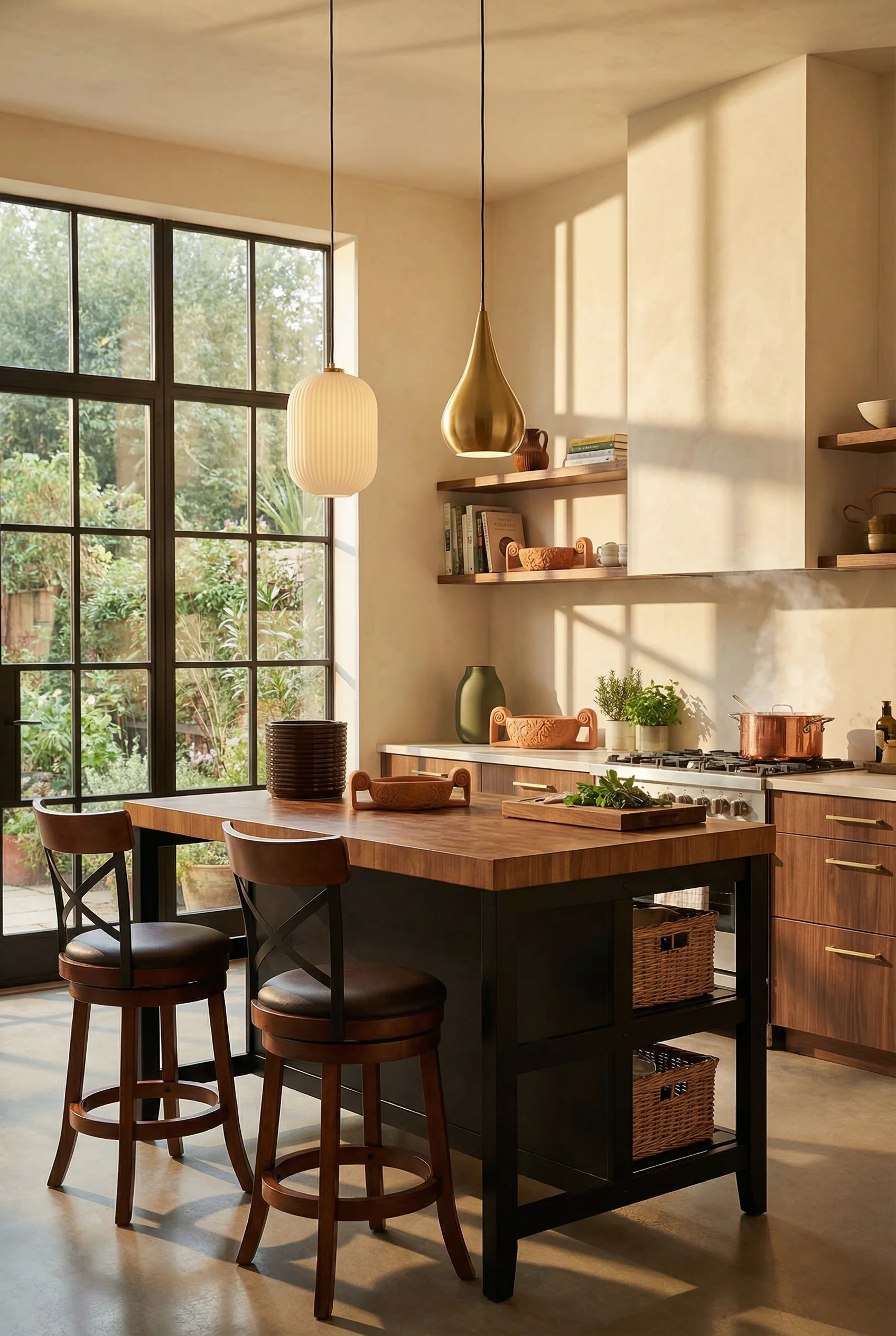
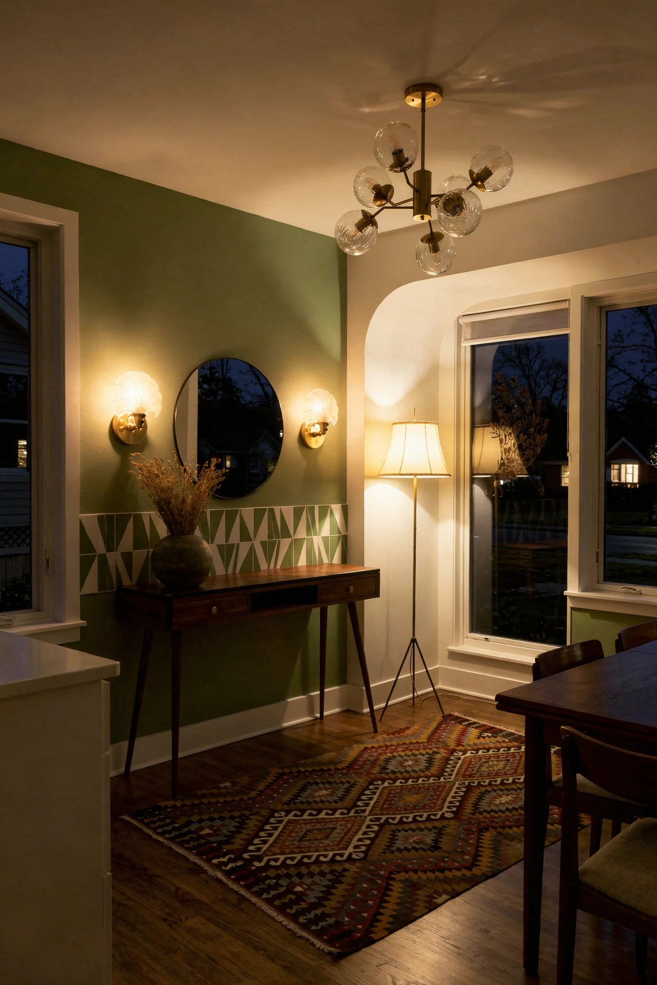
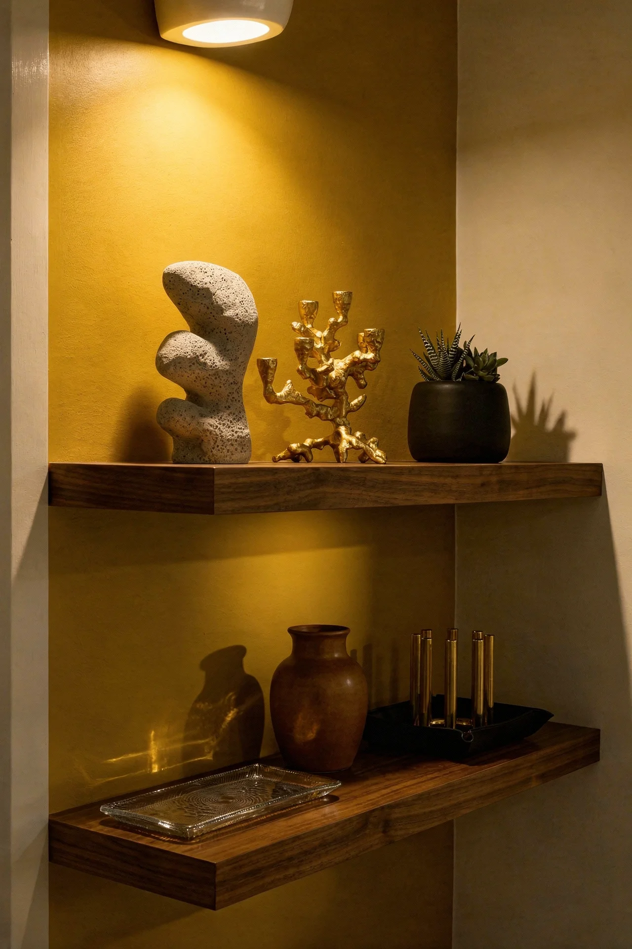
Mid century lighting fixtures are designed to be noticed. They are not recessed cans hiding in the ceiling. They are sculptural objects that happen to illuminate your kitchen.
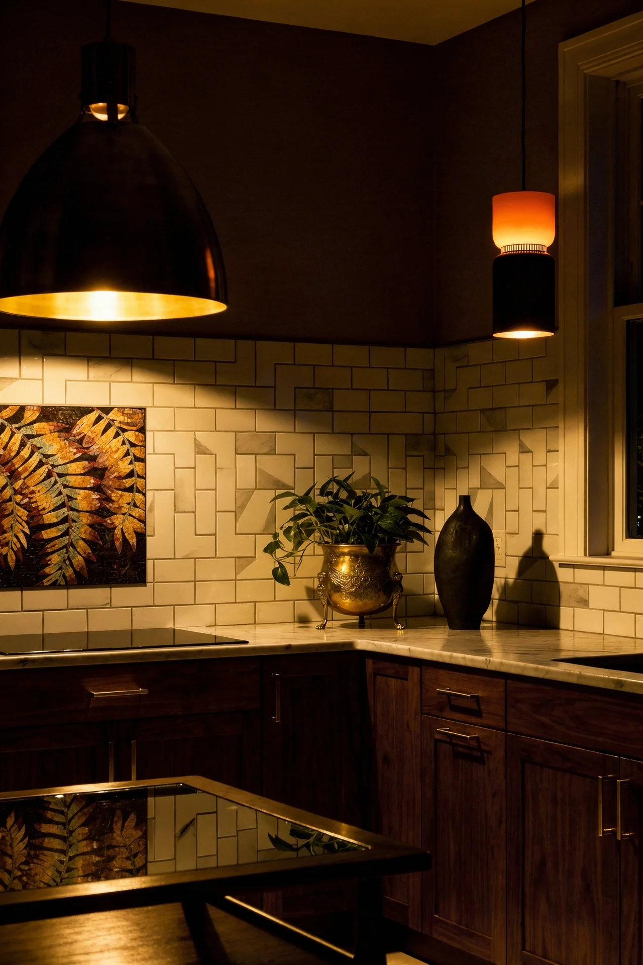
The Sputnik chandelier is the one everyone pictures, and for good reason. That burst of brass arms with exposed bulbs acts as a ceiling level sculpture. But in a kitchen, where function matters as much as form, I think the Bubble pendant or the PH 5 style layered shade is the better choice. They provide even, glare free light over a worksurface, which is what you actually need when chopping onions at 7pm.
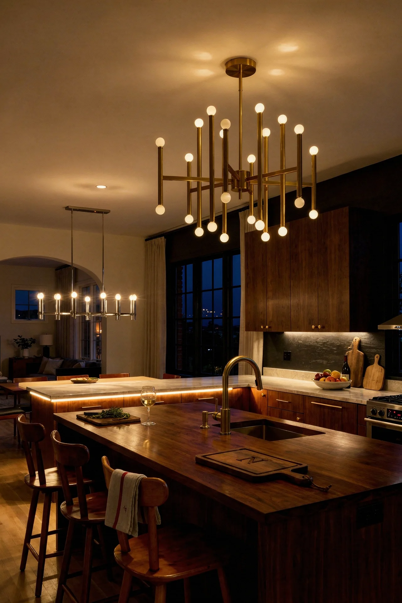
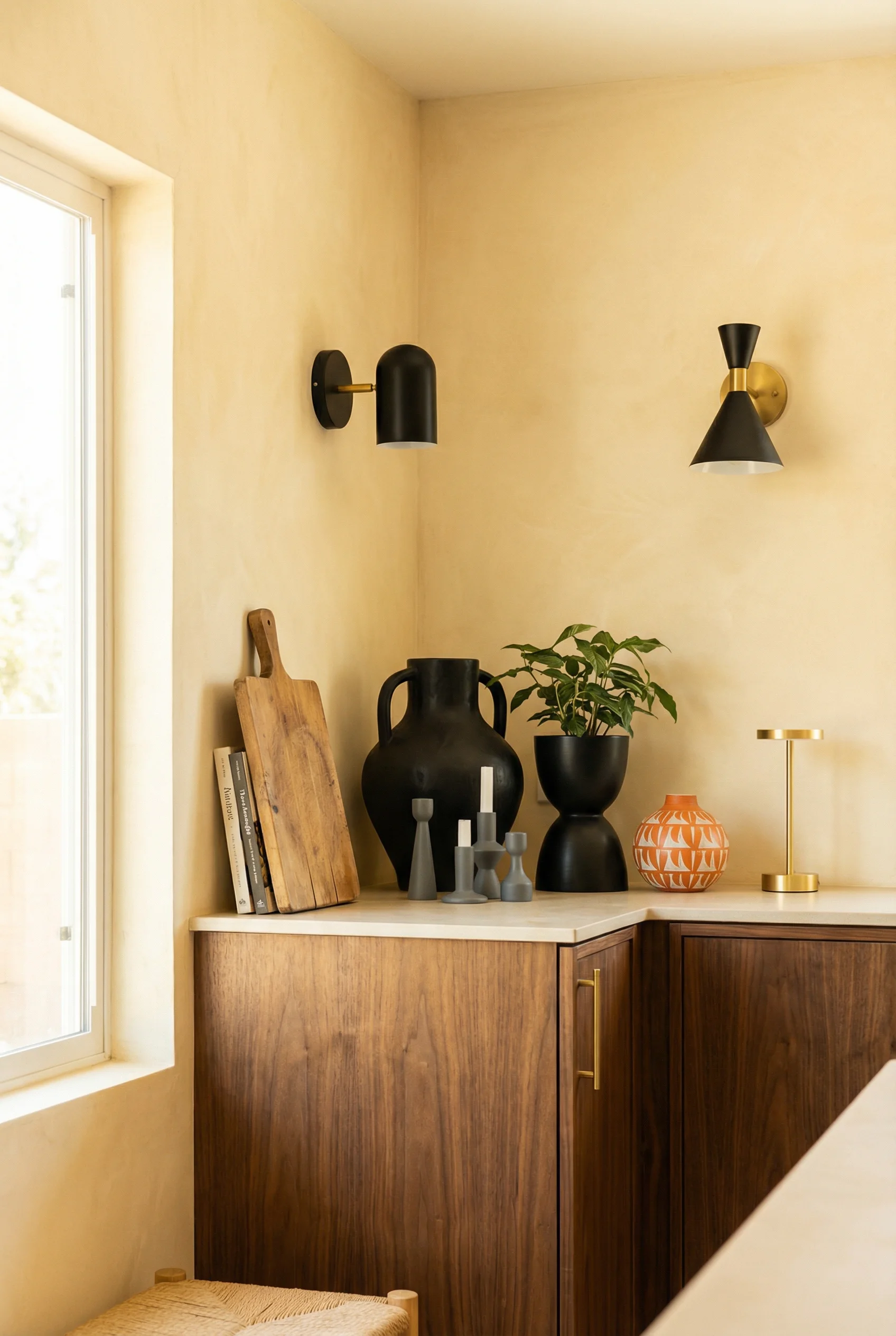
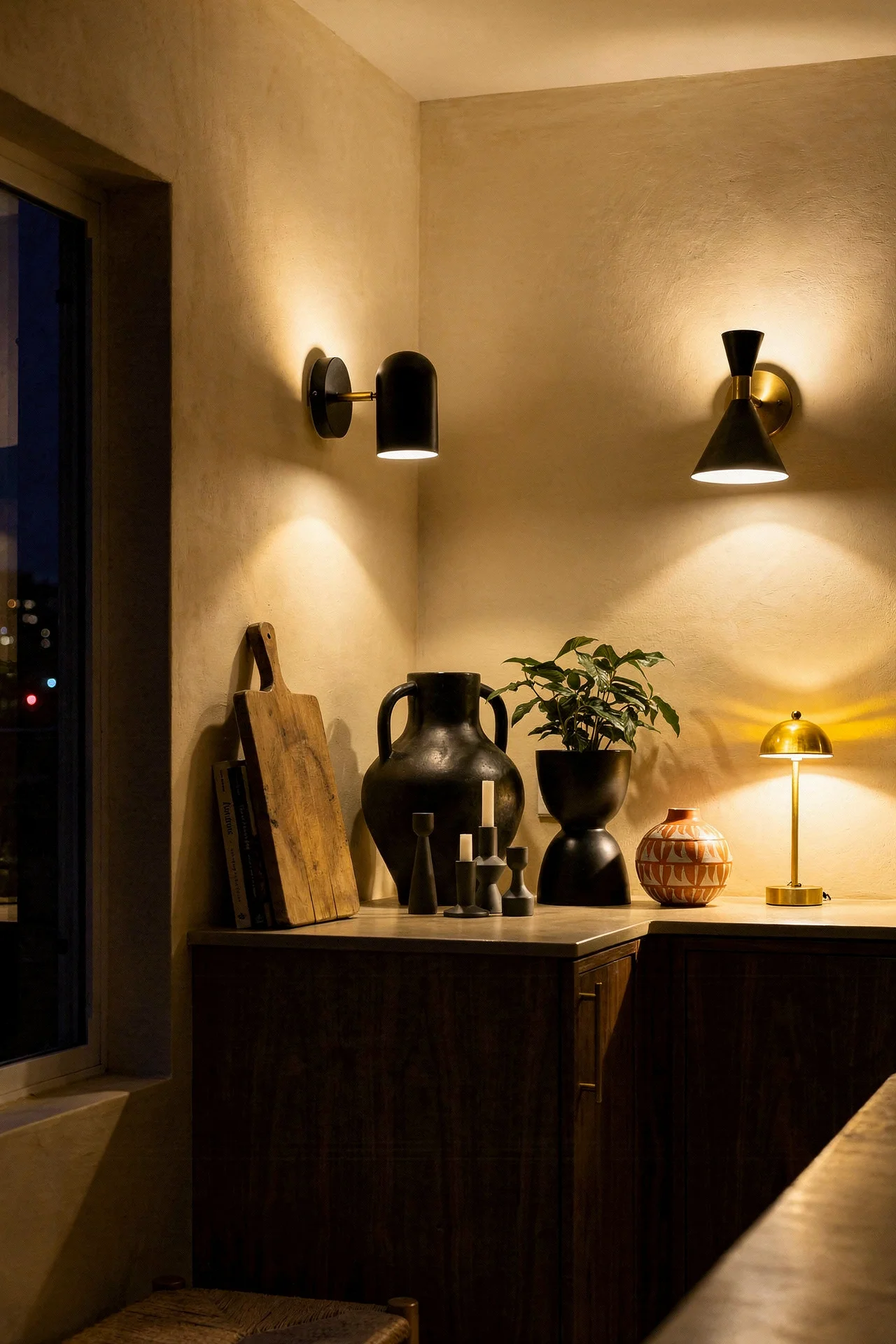
Brass and matte black are the dominant finishes. Polished chrome was original to the era, but modern interpretations have moved toward warmer metals. A pair of brass globe pendants over the island, hung at counter height, gives you both task lighting and a focal point. Three pendants work if the island is longer than 8 feet. Space them evenly and keep the same fixture throughout. Mixing pendant styles over one island is a common mistake.
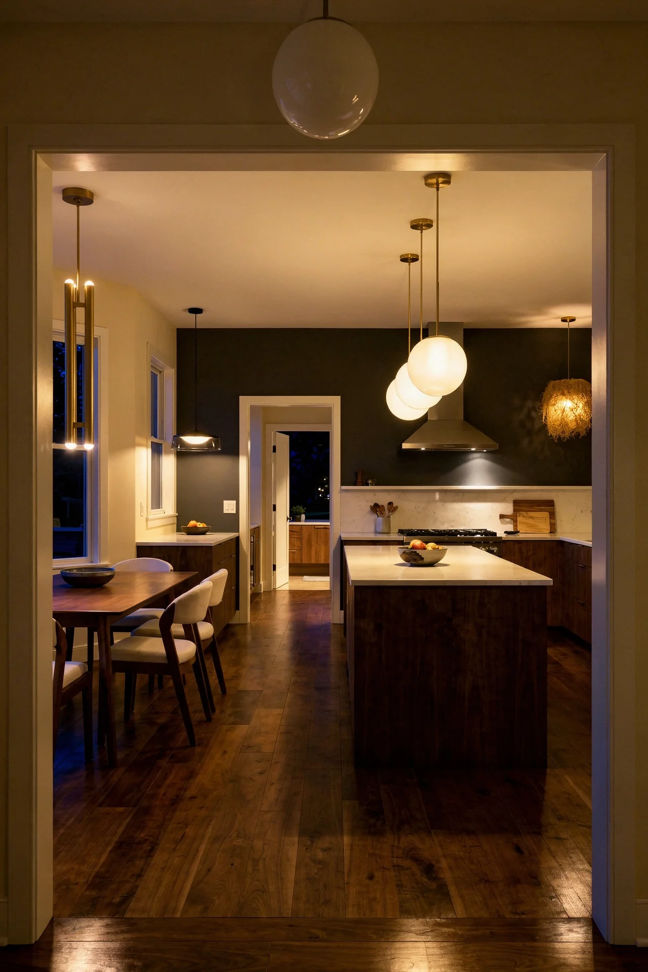
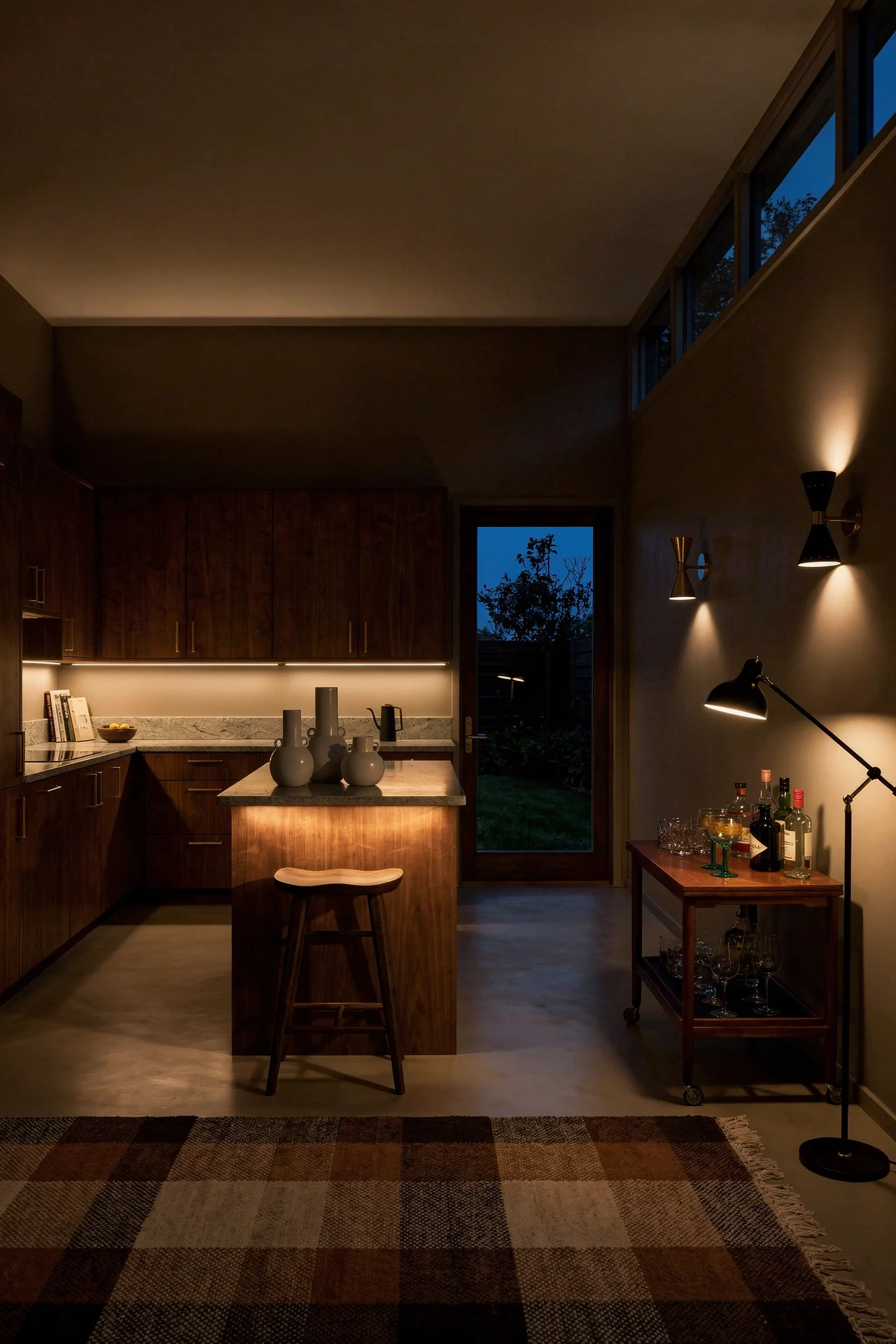
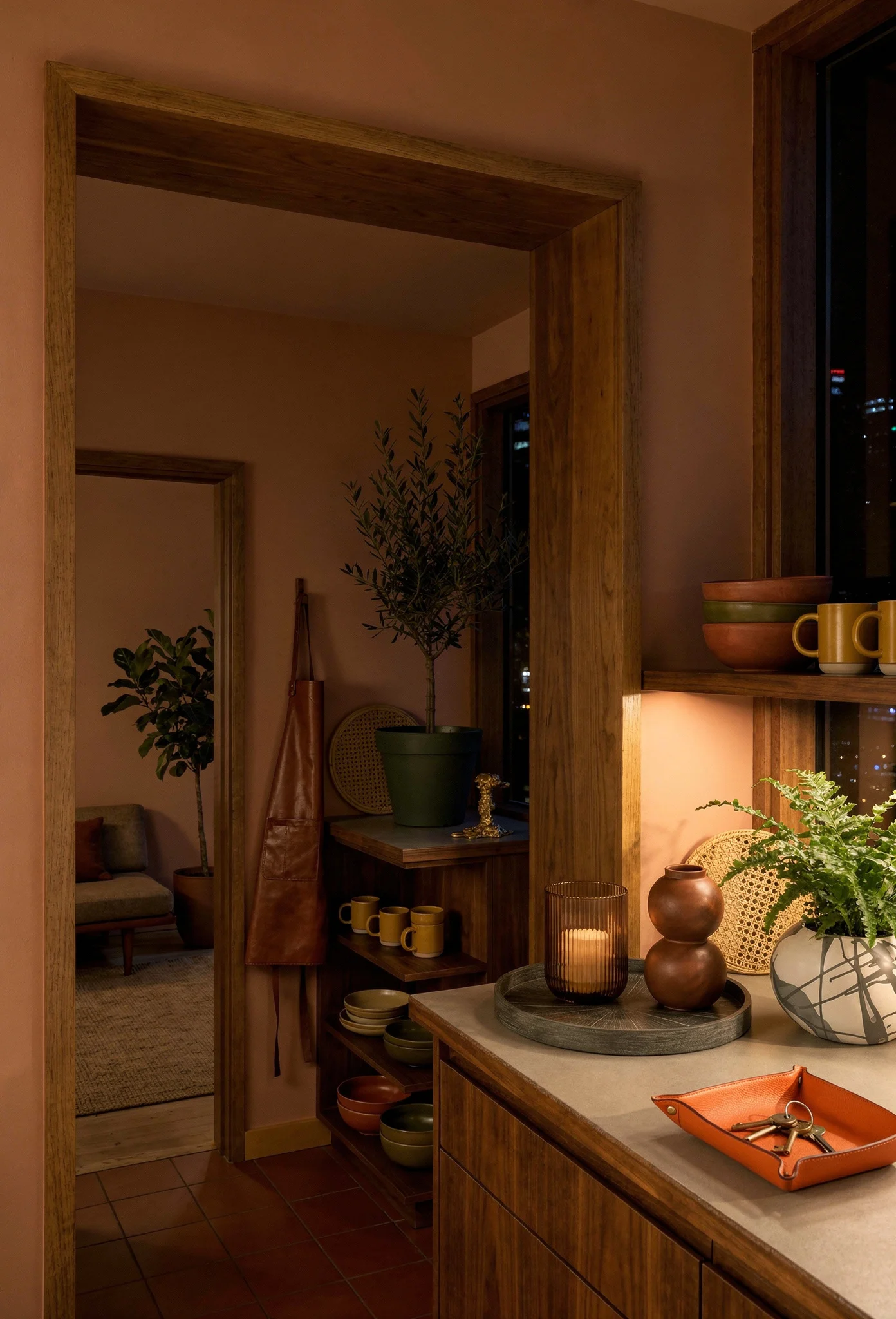
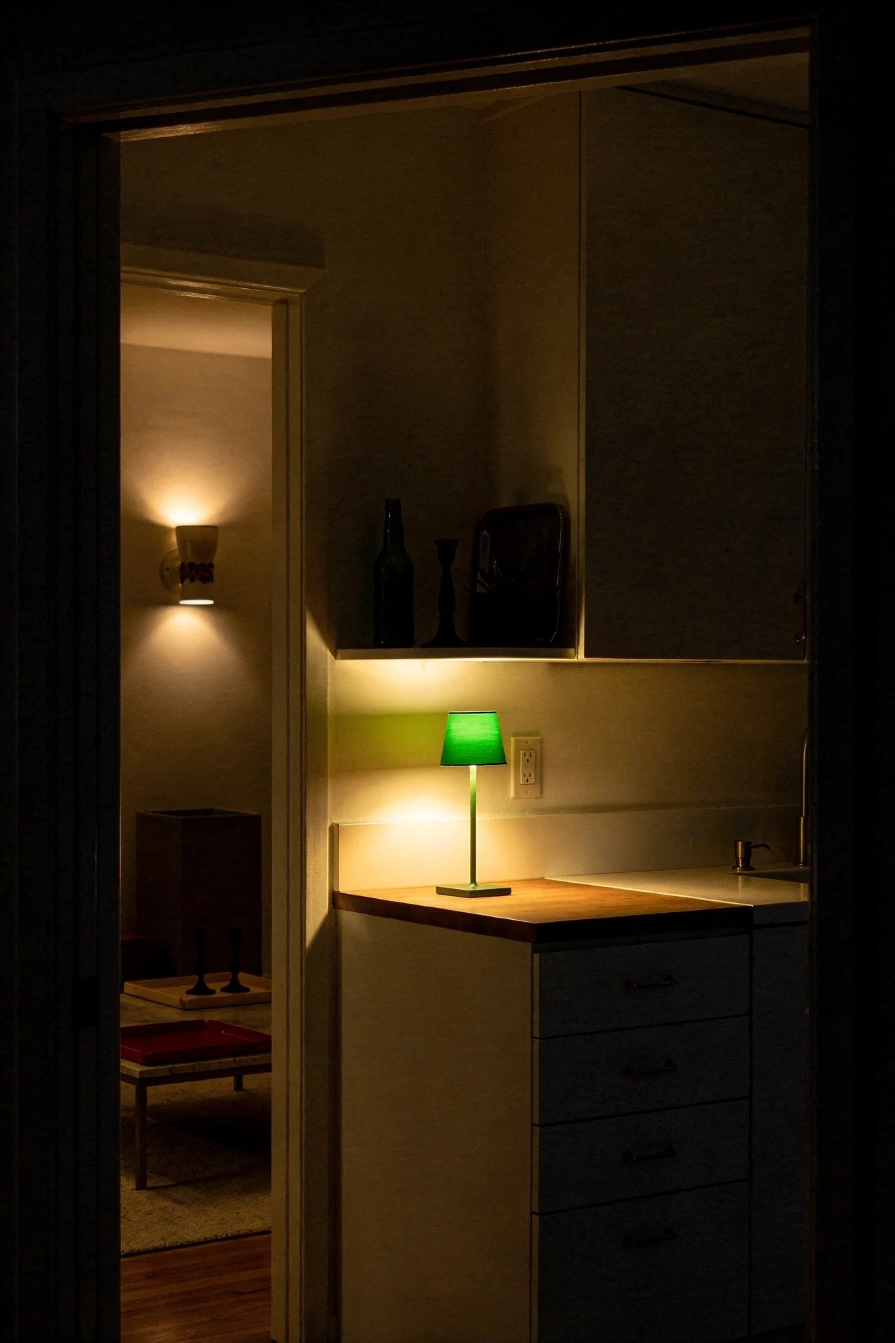
Under cabinet lighting is the unsung hero. Strip LEDs concealed beneath wall cabinets wash the countertop with even light and eliminate the shadows that overhead pendants create when you are working directly below them. Set them to 2700K warm white. Anything cooler strips the warmth out of walnut and makes even the cosiest kitchen feel clinical.
The combination is what makes it work. Pendants for ambience and focal interest, under cabinet strips for task light. A dimmer on both circuits lets you shift the mood from bright functional cooking light to low warm evening light without touching a lamp. That flexibility is everything in an open plan kitchen that doubles as a social space.

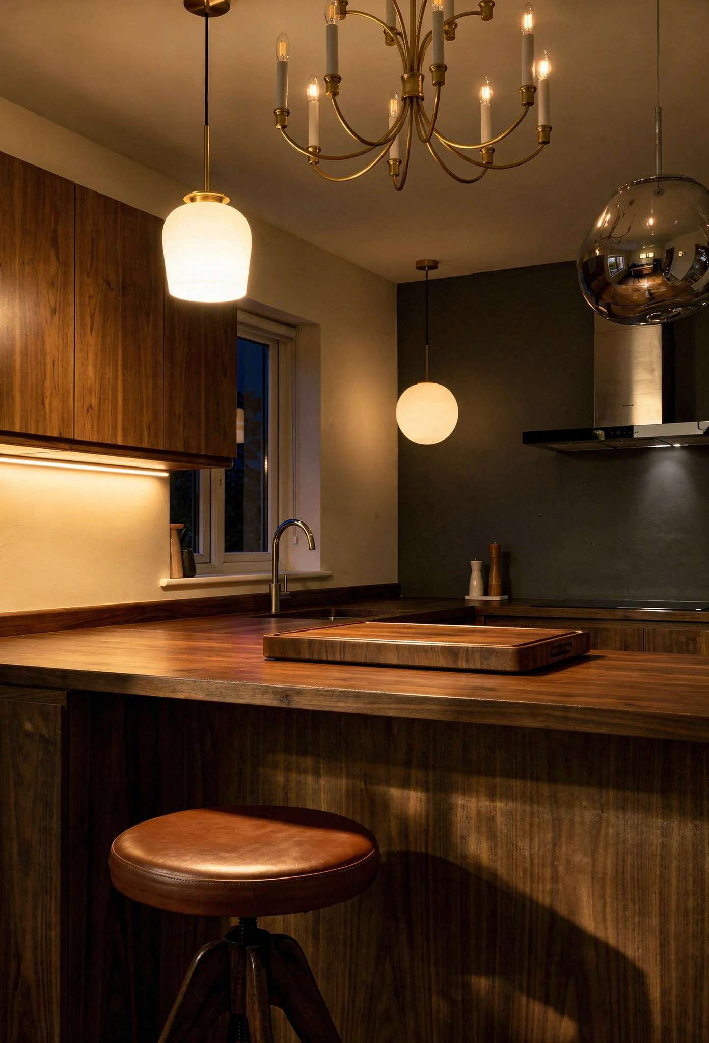
One more note on fixtures. MCM design favours exposed bulbs or translucent shades that let you see the light source. If you choose a pendant with an opaque shade, make sure it directs light downward rather than trapping it inside. The goal is warm pools of light falling on surfaces, not a dim glow from a decorative object.
There is a reason the mid century era never embraced the cool greys that dominated kitchen design for the last decade. The entire movement was built around warmth. Natural materials, organic shapes, earth tones. Cool grey fights every one of those principles.
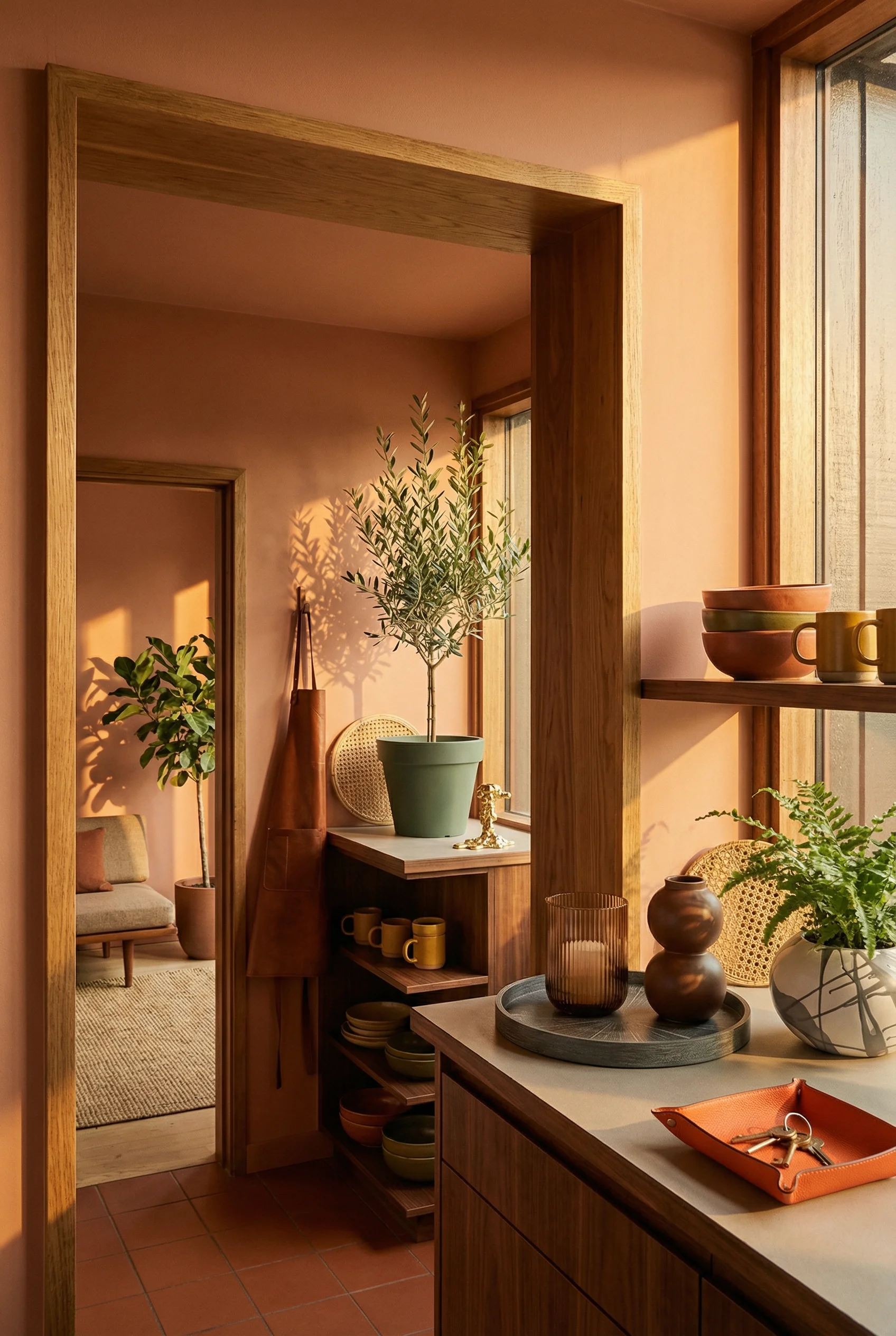
The earthy MCM palette starts with the wood itself as the dominant warm tone, then layers in supporting colours that feel like they come from the same landscape. Think terracotta, olive, mustard, warm cream, charcoal. Not bright primaries. Not pastels. Colours that look like they were pulled from desert rock, dried clay, and autumn foliage.
Walls should stay warm but neutral. A plaster finish in a sandy off white or a warm mushroom grey gives you a backdrop that makes walnut cabinets glow. Pure white walls next to warm wood create a temperature clash that makes both look wrong. The wall colour should feel like it belongs in the same family as the wood.
Flooring ties the palette together. A matte tile in a warm cement tone, or wide plank oak in a natural finish, grounds the room without competing with the cabinets. Avoid high gloss anything. The MCM kitchen is about matte, tactile surfaces that absorb light rather than bounce it.
Accessories are where you inject the character colours. A teal kettle, a set of mustard ceramics on open shelving, a terracotta planter with trailing greenery. These are small commitments that can change with your mood. The bones of the kitchen stay warm and neutral. The personality comes from the objects you place in it.
This palette has a practical advantage too. Warm earth tones hide the reality of a working kitchen better than white ever could. Splashes, fingerprints, the general chaos of cooking. They disappear into a warm surface. White cabinets show everything. That is not a design opinion. It is just physics.
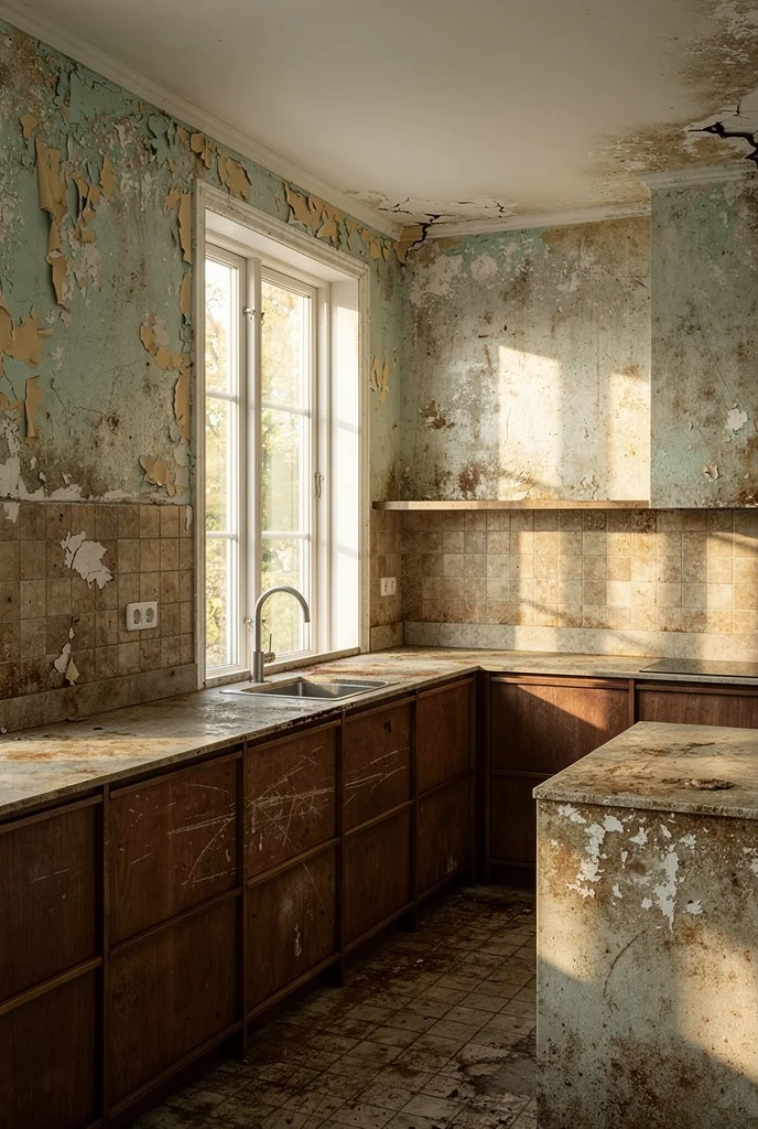
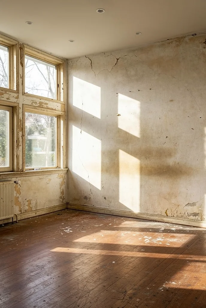
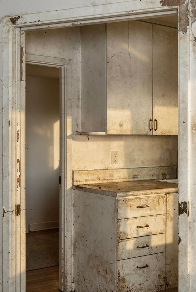
The shift away from all white kitchens is not just an aesthetic trend. It is a correction. White kitchens became the default because they photograph well and appeal to the widest range of buyers. Builders loved them. Realtors loved them. But people who actually cook in their kitchens every day started noticing the gap between how a white kitchen looks in a listing photo and how it feels at 6am on a Tuesday.
Warmth in a kitchen comes from three places. The materials, the light, and the colour temperature. A mid century approach addresses all three simultaneously. Walnut and oak provide material warmth you can feel with your hand. Brass fixtures and warm LED strips provide light that flatters food, skin, and every surface it touches. And the earthy colour palette wraps the whole room in tones that make people linger instead of pass through.
The psychological effect is real. Research on colour temperature in interior spaces consistently shows that warm toned environments make people feel more comfortable, more social, and more inclined to stay. A kitchen is the one room in the house where you want all three of those responses.
I am not saying white has no place. A warm off white on upper cabinets or a white ceiling to keep headroom feeling open, these work. The issue is white as the entire story. When every surface is the same bright neutral, the room has no depth, no focal point, no personality. Walnut lowers against white uppers instantly creates hierarchy. Your eye knows where to land.
The MCM kitchen solves the white problem without swinging to the opposite extreme. It is not a dark, moody cave. It is a room built around natural warmth, balanced with enough light surfaces to feel open and enough dark ones to feel grounded. That balance is what makes people stop scrolling and start planning.
If you are sitting in a white kitchen right now wondering whether it is worth the upheaval, start small. Swap the hardware for brushed brass pulls. Add a pendant with an opal glass shade. Put a walnut cutting board on the counter and notice how the grain changes the room’s temperature. If those small shifts make you feel something different, you have your answer.
You have probably noticed that every strong mid century kitchen leans into the same family of tones. Here is the palette that makes it all connect.

Warm Walnut Brown – The backbone of the entire palette. This is your dominant cabinet tone, and it sets the warm temperature for everything else. Look for a brown with red and chocolate undertones rather than anything grey or ashy. It should feel like polished wood on a warm day.
Paint Pick: Farrow & Ball Wainscot
Matte Olive Green – The secondary colour that bridges earth and foliage. Use it on a backsplash, an accent wall, or a single bank of cabinets. Olive reads as both natural and sophisticated, which is the MCM sweet spot.
Paint Pick: Farrow & Ball Bancha
Warm Cream – Not white. Cream. The wall colour that makes walnut glow instead of clash. A warm cream with yellow undertones wraps the room in soft light and keeps everything feeling cohesive.
Paint Pick: Farrow & Ball Dimity
Burnt Mustard – The accent that brings energy without screaming. Use it sparingly on ceramics, a kettle, a stool cushion. Mustard is historically accurate to the era and pairs with walnut like they were designed together.
Paint Pick: Farrow & Ball India Yellow
Charcoal – The grounding tone that prevents the palette from feeling too sweet. Use it on hardware, light fixtures, a range hood, or the inside of open shelving. Charcoal gives the room edges and definition.
Paint Pick: Farrow & Ball Off-Black
Once you nail these five, the furniture and decor practically choose themselves. Every piece either echoes one of these tones or provides a deliberate contrast. That is how a mid century kitchen moves from a collection of nice things to a room that feels complete.
Every mid century modern kitchen renovation I have seen succeed started with the same decision. The cabinets. Not the tile, not the pendant, not the paint colour. The cabinets set the tone for everything that follows. Pick your wood or your painted finish first, then let every other choice respond to it. You do not need to gut the whole room at once. A walnut island in an otherwise unchanged kitchen shifts the feel of the space more than you would expect. Start there. See how it changes the way you use the room. The rest will follow.
This post contains affiliate links, which means we may earn a small commission if you make a purchase through our links, at no extra cost to you.