Newsletter Subscribe
Enter your email address below and subscribe to our newsletter
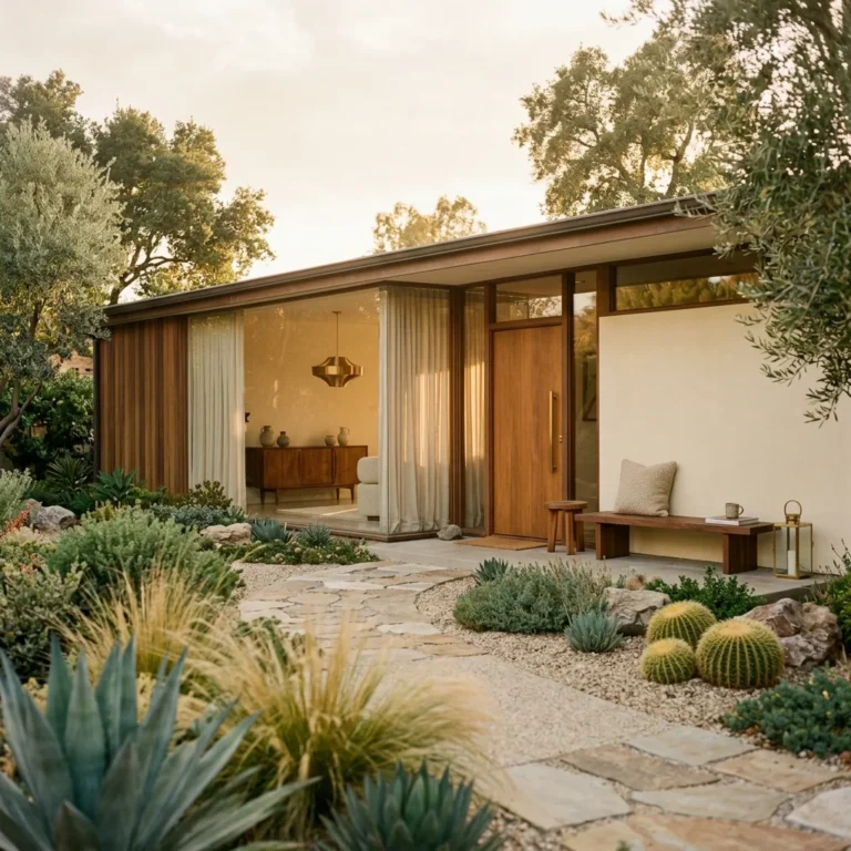
You nailed the walnut credenza. The tapered leg nightstands are perfect. You even found a Sputnik chandelier that doesn’t look like a cheap replica. And yet your mid century modern bedroom still feels like a furniture showroom, not a place you actually want to sleep.
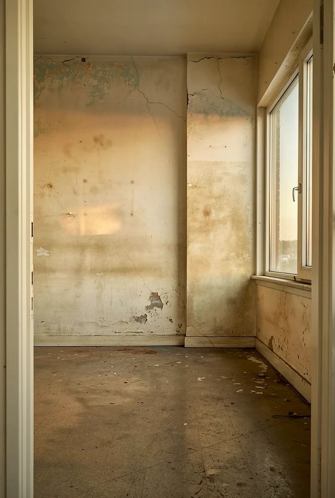
You’re not alone. MCM bedrooms have a specific warmth problem that most design advice ignores entirely. The style was built around open plan living, minimal ornament, and hard surfaces. Gorgeous in a sunlit California living room. Cold in a bedroom at 10pm in February. I’ve been watching this disconnect for a while now, and the fix is less about buying warmer things and more about understanding where warmth actually comes from in a room built on clean lines. Looking for more mid century modern bedroom inspiration? See our full gallery of MCM bedroom ideas.
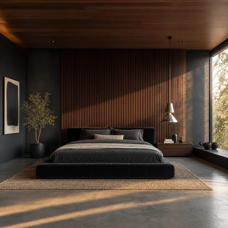
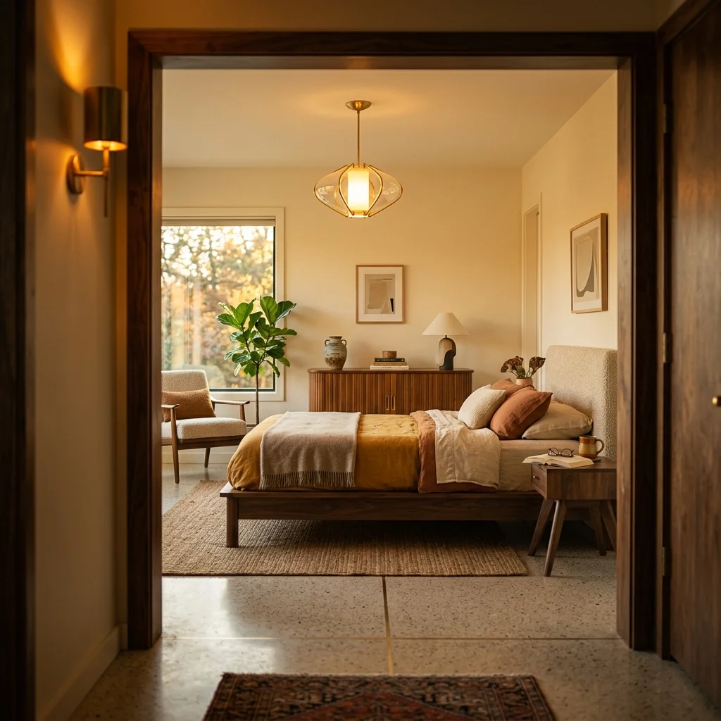
Here’s where most people go wrong with accent walls in MCM bedrooms. They install shiplap or reclaimed barn wood and wonder why the room suddenly feels like a mountain cabin instead of a Palm Springs retreat. The difference between a wood accent wall that works and one that doesn’t comes down to three decisions you make before you buy a single plank.

First, the wood species matters more than the finish. Walnut and teak read mid century because MCM designers like Charles and Ray Eames actually used them. Oak can work if it’s rift sawn with a tight, linear grain. Pine, cedar, or anything with heavy knots pulls you straight into rustic territory. Second, the plank direction should be horizontal. Vertical boards read Scandinavian or farmhouse. Horizontal slats at consistent widths echo the post and beam construction that defined MCM architecture.
Third, and this is the part people miss, the wall should be warm toned but not too dark. A medium walnut with visible grain gives you richness without swallowing light. I’d lean towards something in the range of Minwax’s Provincial or Early American. Too dark and you lose the airiness that makes MCM work. Too light and you lose the warmth you’re chasing.

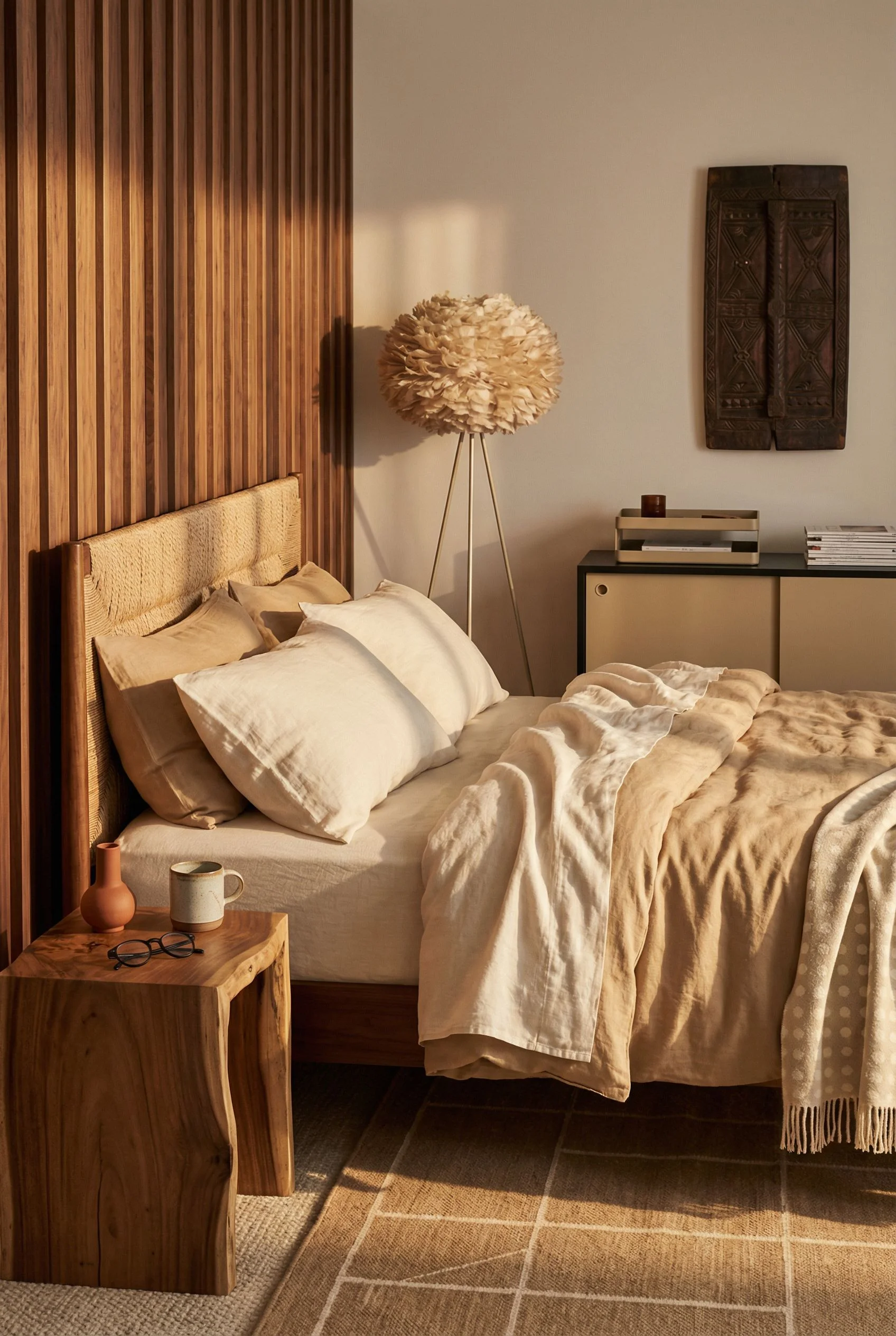
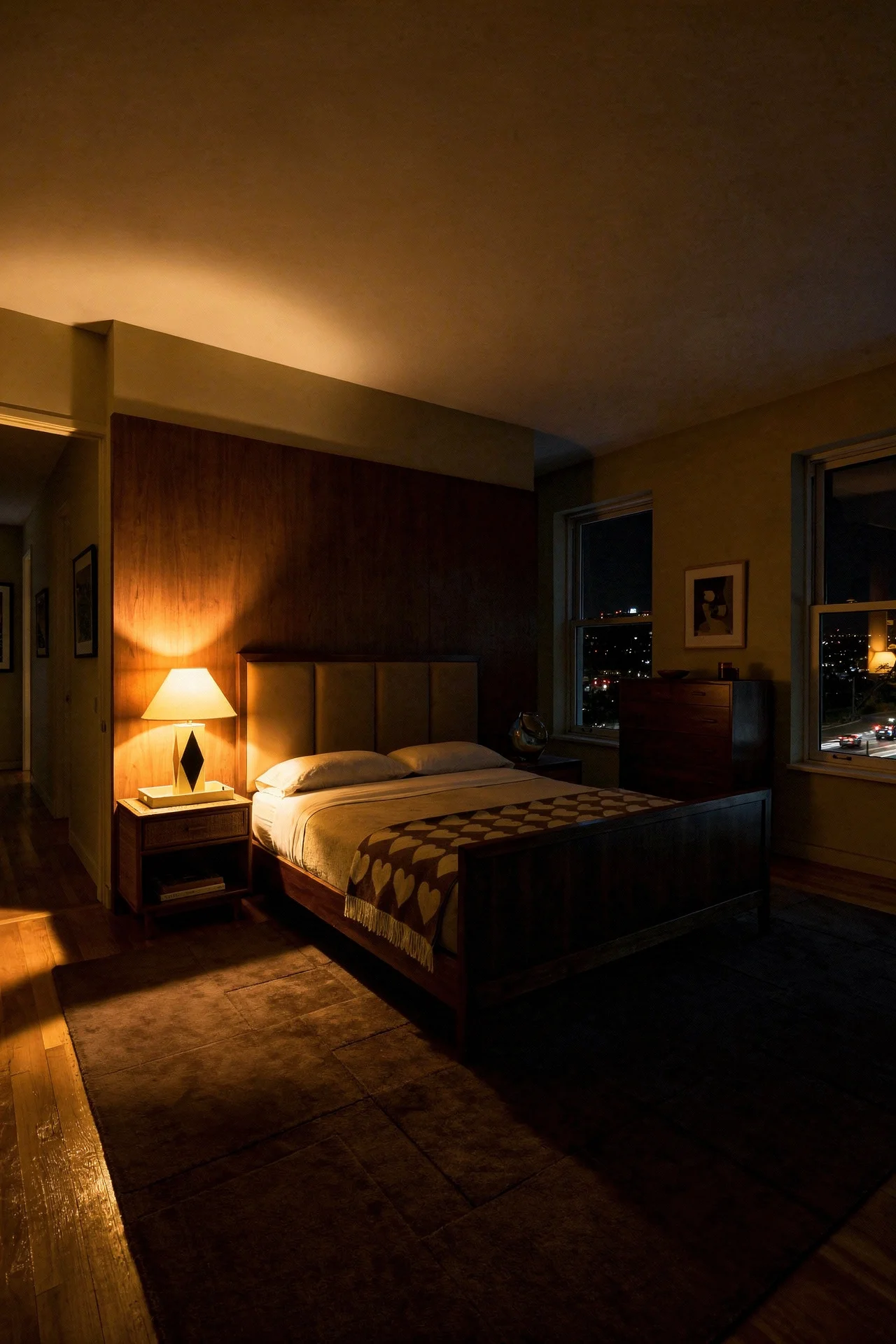
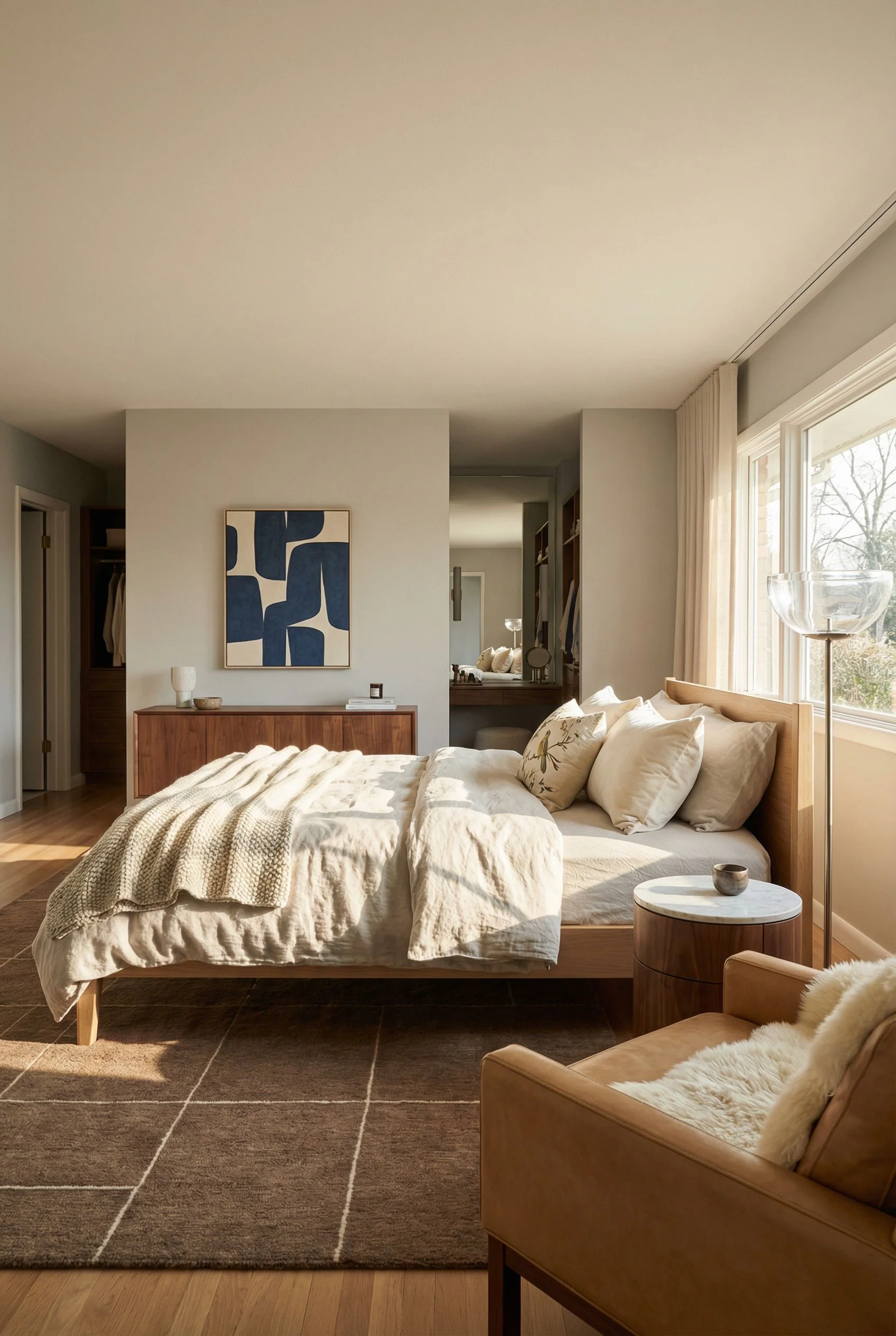
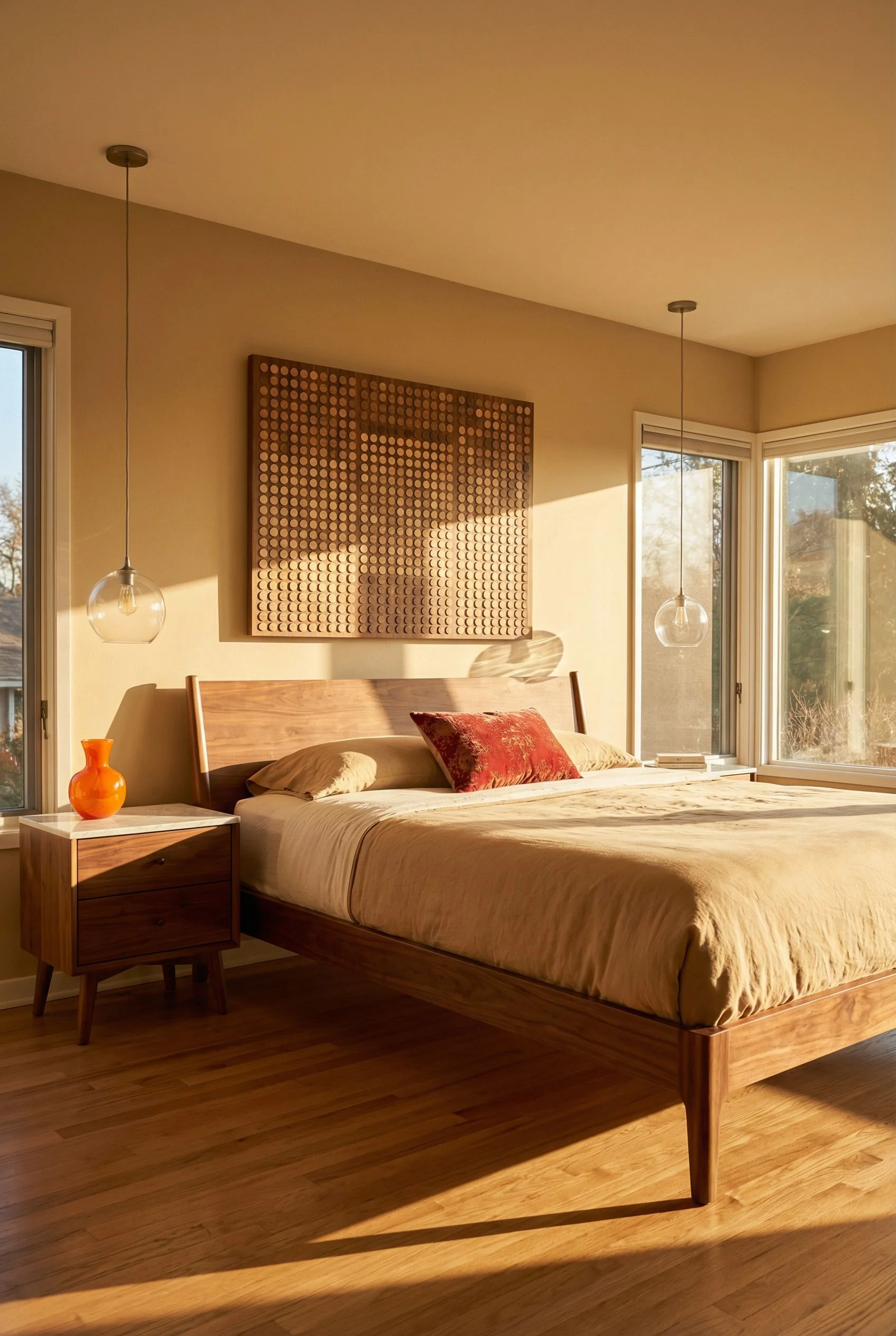
The accent wall goes behind the bed. Always. It anchors the room’s focal point and gives your headboard something to sit against that isn’t cold painted drywall. If your ceilings are under 9 feet, run the slats to the ceiling line without a gap. It draws the eye up and makes the room feel taller. Over 9 feet, stop at 8 and cap with a simple reveal. This keeps the proportions honest to the era.
MCM bedrooms fail at warmth because people confuse warmth with stuff. They pile on throw pillows and blankets and suddenly the clean geometry that made them fall in love with the style disappears under a heap of textiles. Warmth isn’t volume. It’s layering done with restraint.

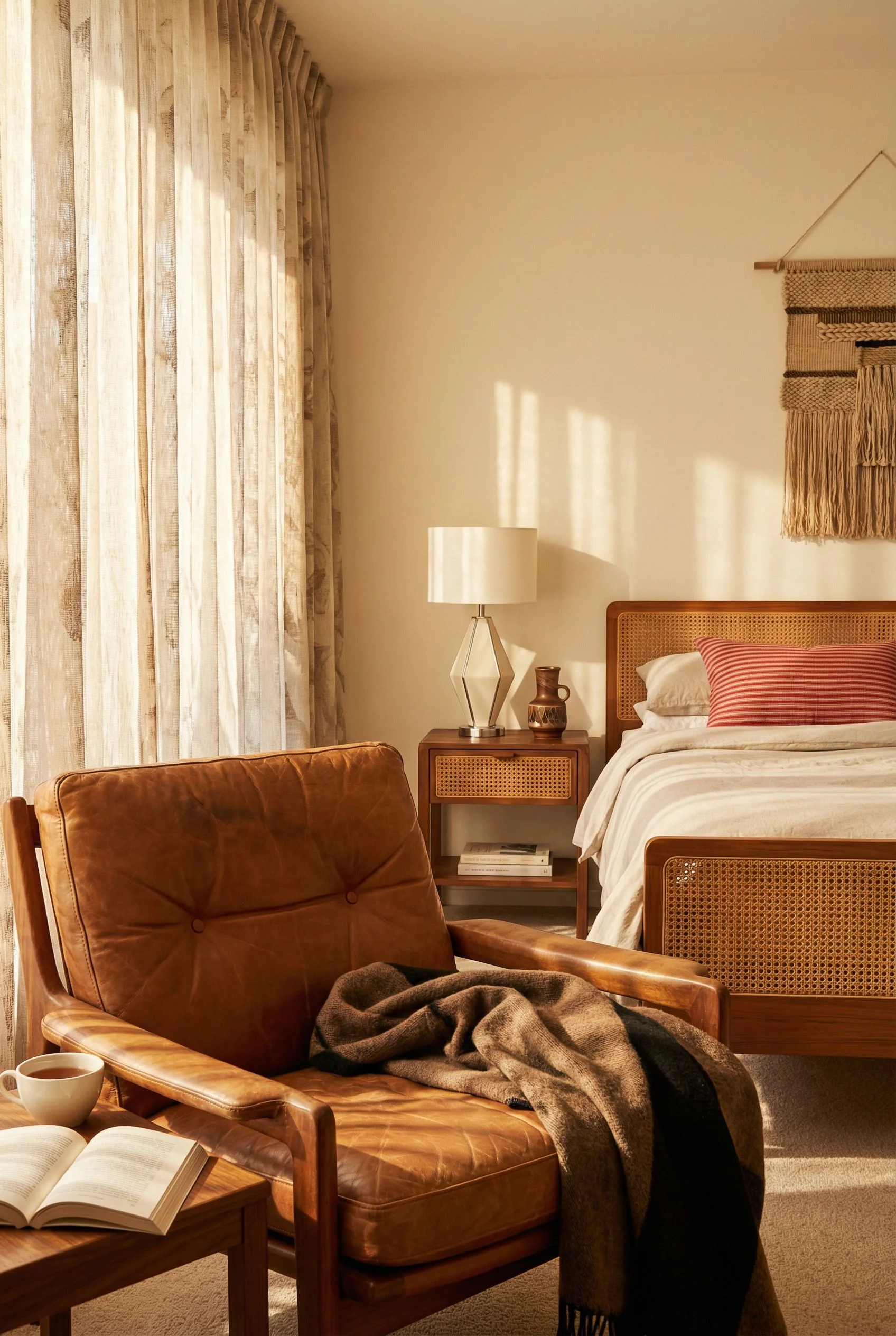
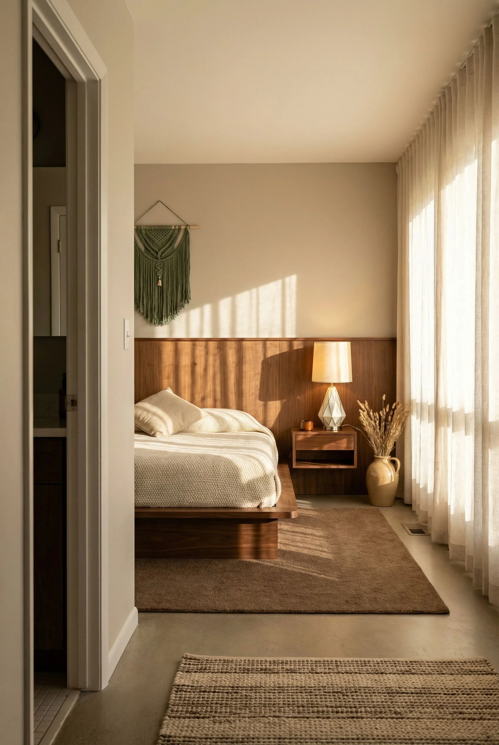
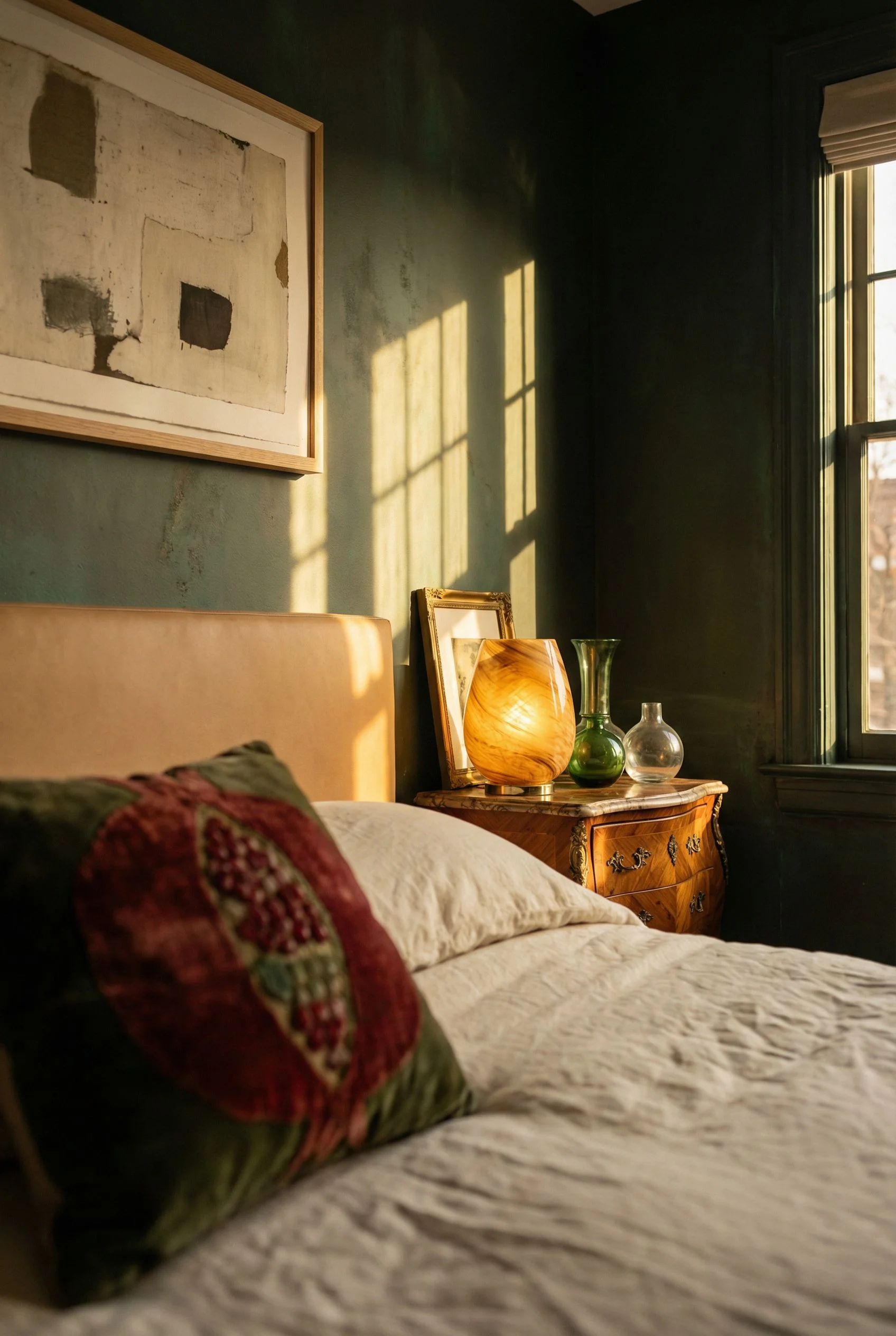
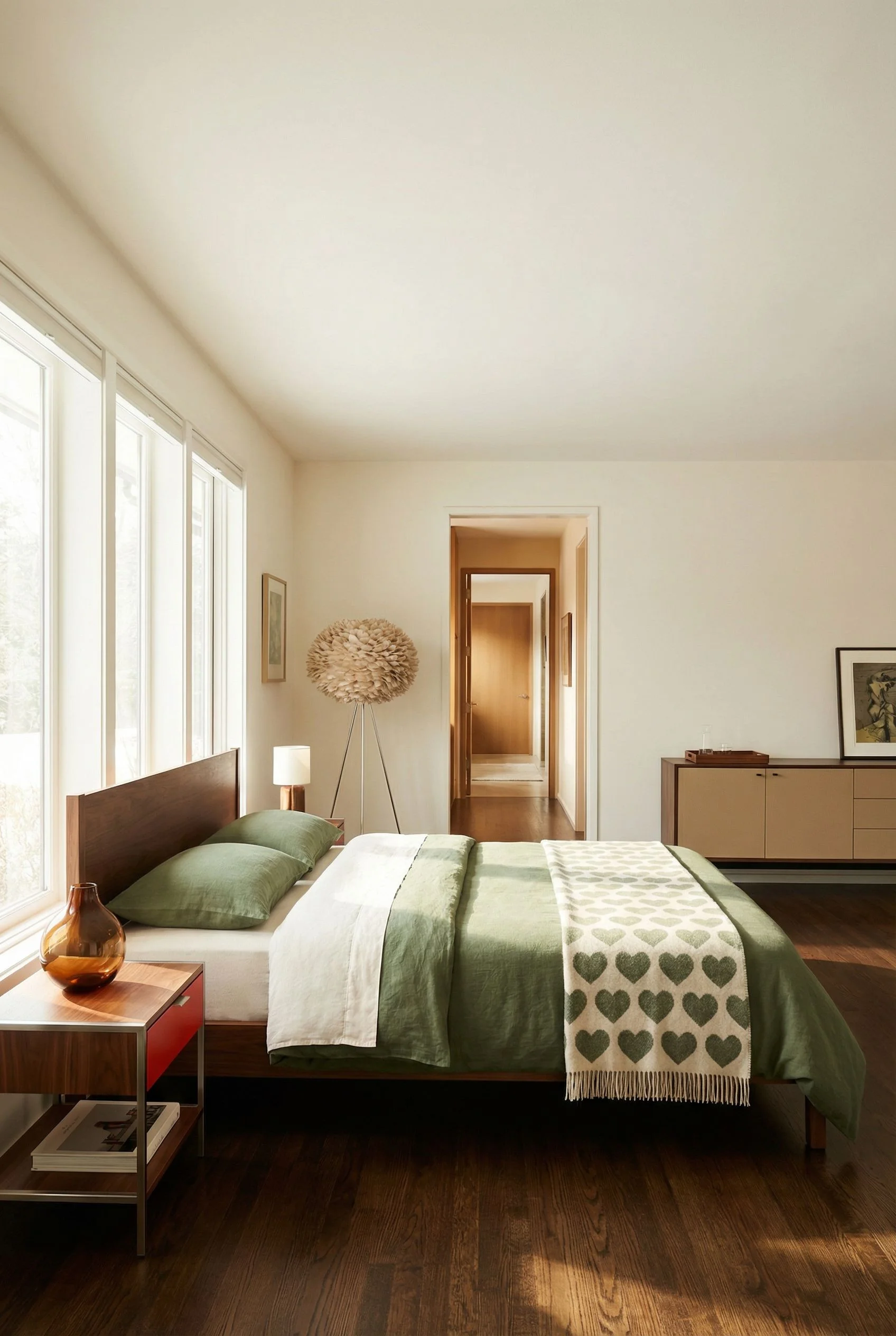
There are four texture layers that build a warm bedroom aesthetic without cluttering the silhouette. The first is underfoot. A rug with a low, dense pile in a warm neutral anchors the space. The research is clear on placement here: front legs of the bed on the rug, 18 to 24 inches extending beyond the sides. No floating rug syndrome.
The second layer is the bed itself, which I’ll cover in the bedding section. The third is a single textile on a chair or bench. One throw, draped deliberately. Not three throws competing for attention. The fourth is a natural material accent. A ceramic vase, a turned wood bowl, a woven basket for books beside the bed. One per surface, maximum.
The trick is that each layer uses a different texture but stays within the same tonal family. Linen against wool against ceramic against wood. Your eye reads variety without your brain registering clutter. In my experience, staying within two shades of the same warm tone across all four layers is what separates a room that feels curated from one that feels stuffed.
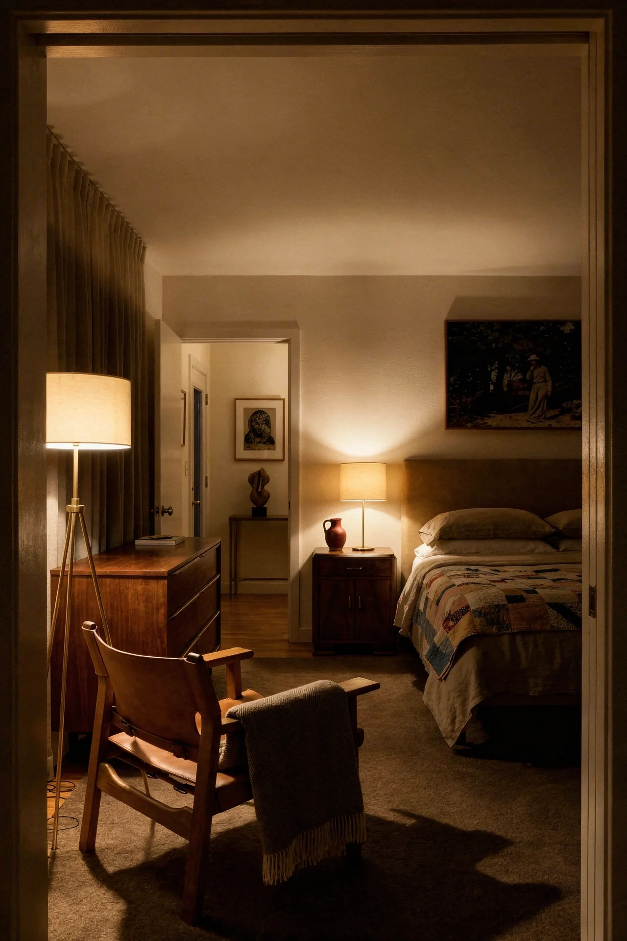
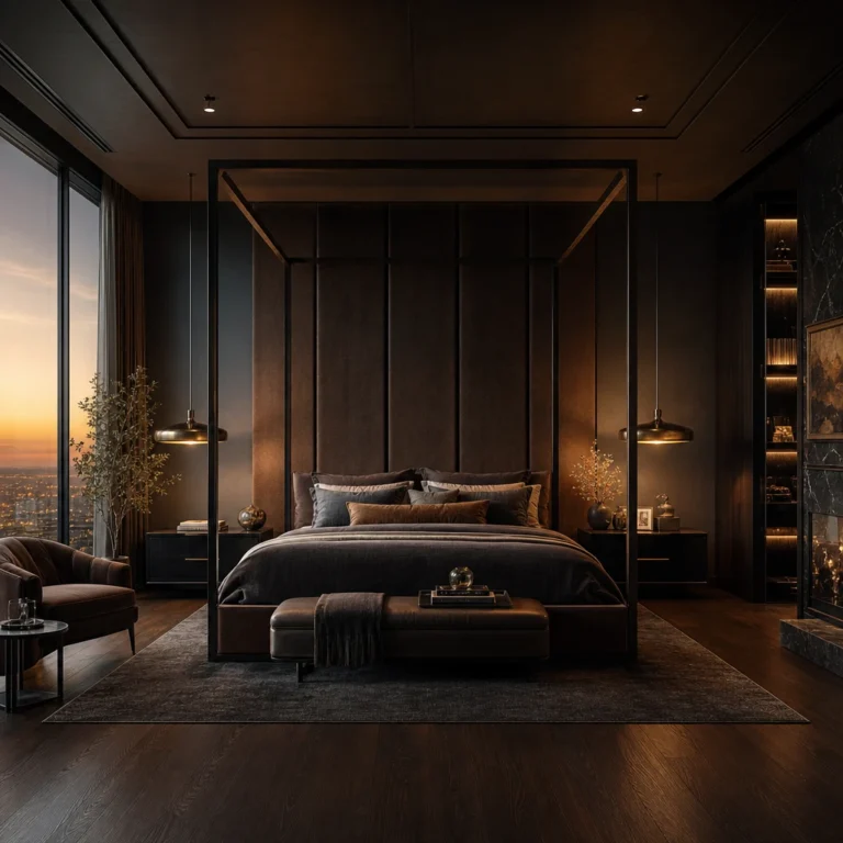
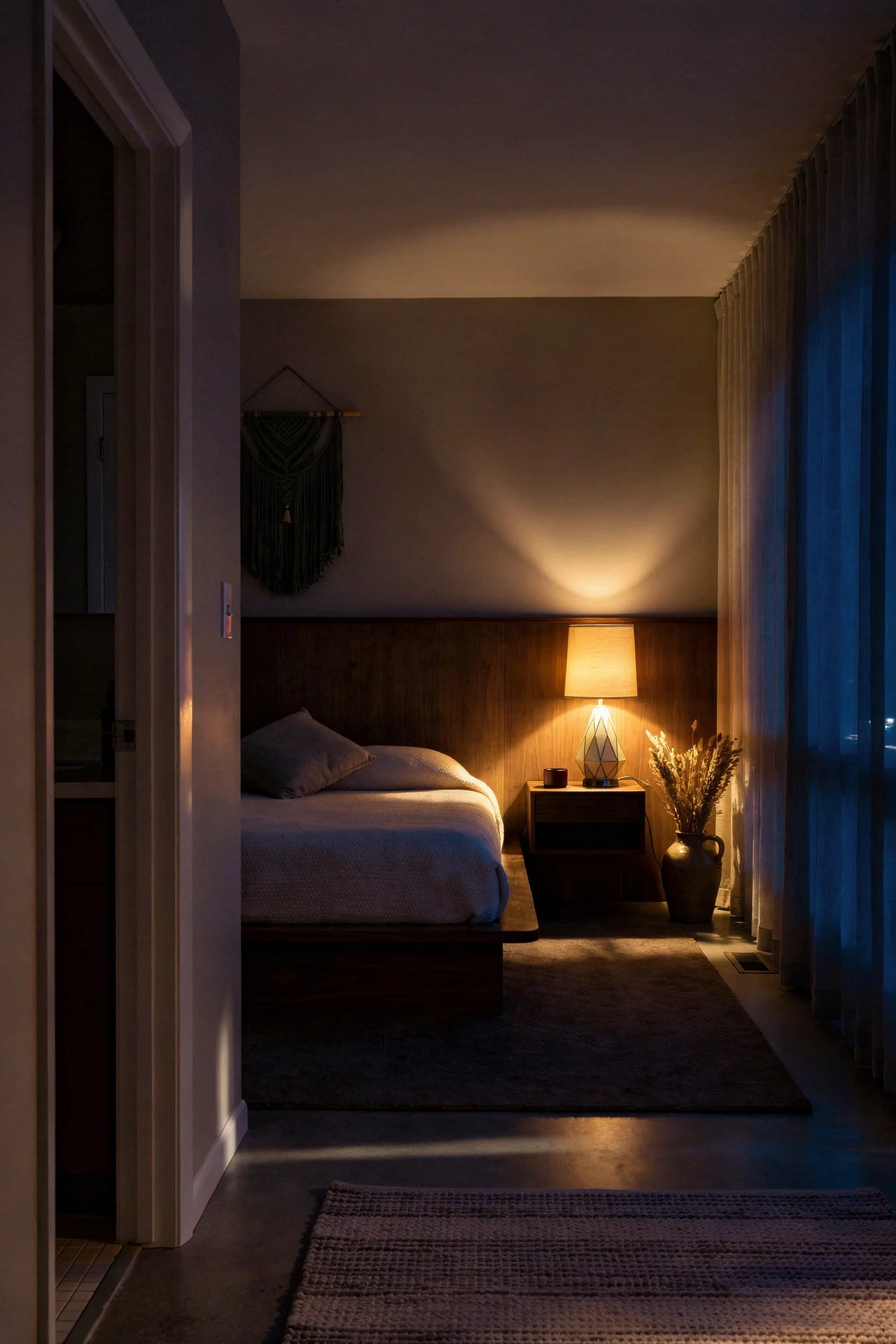
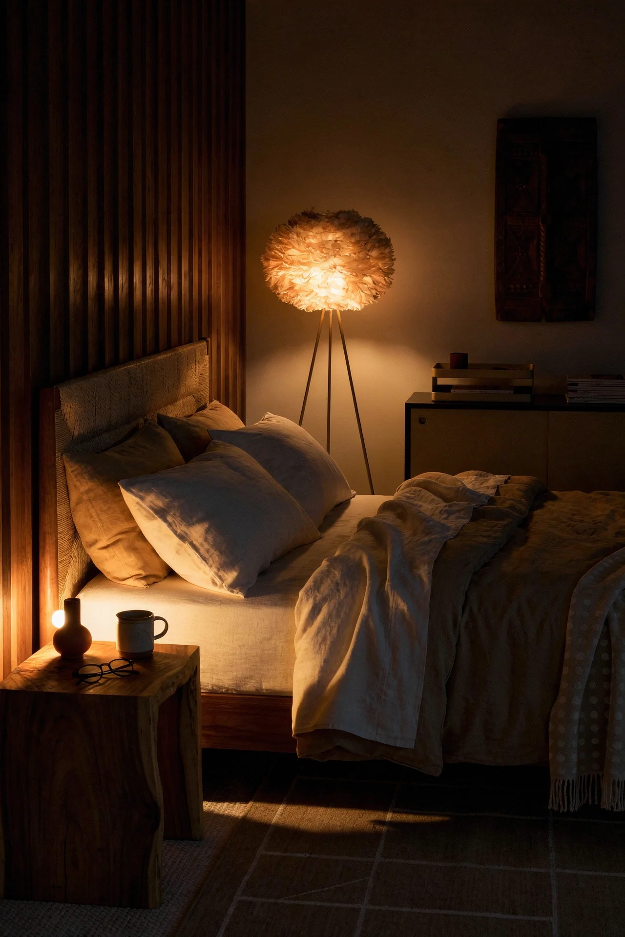
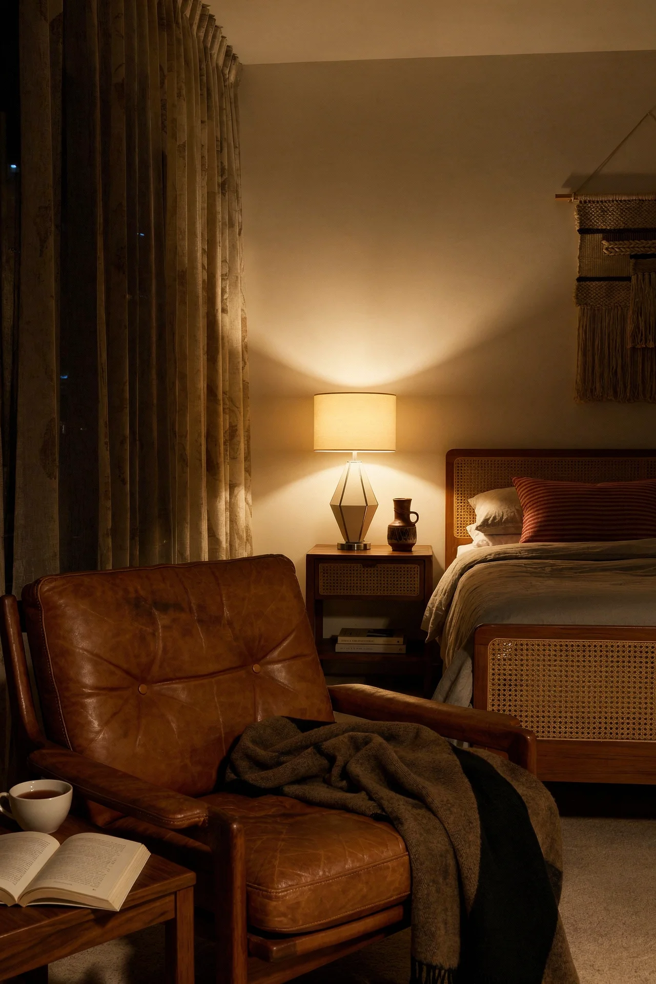
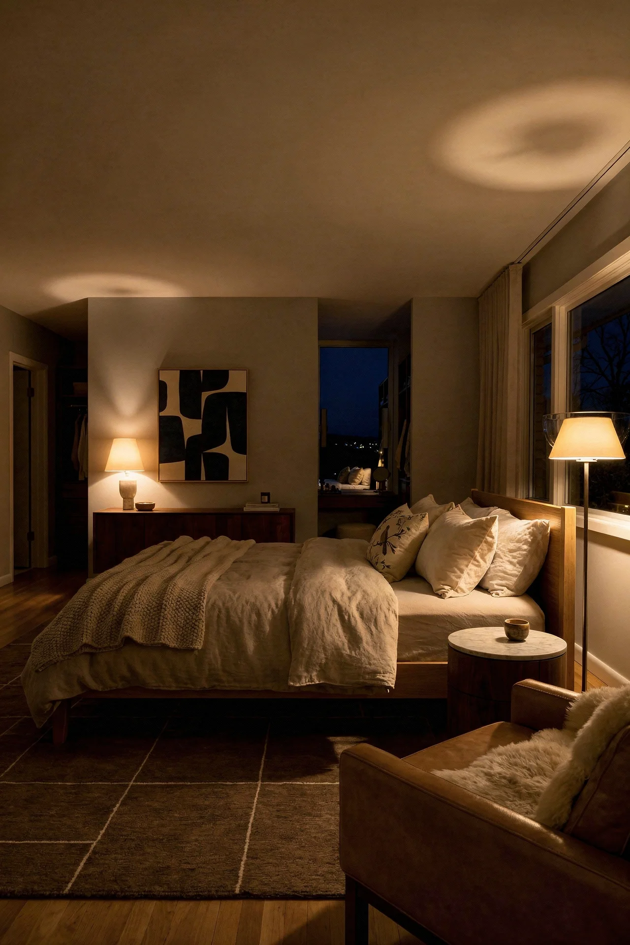
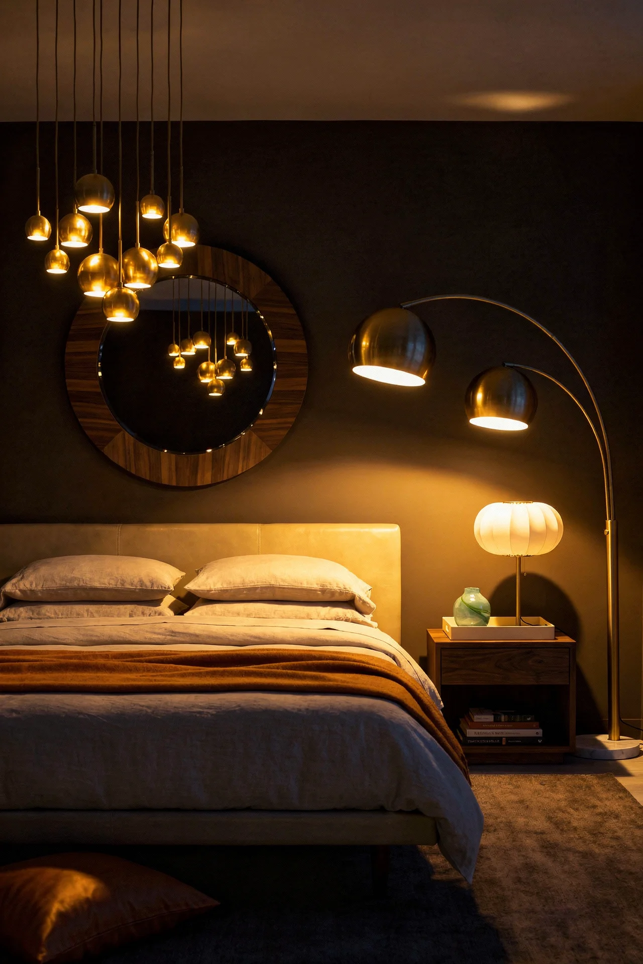
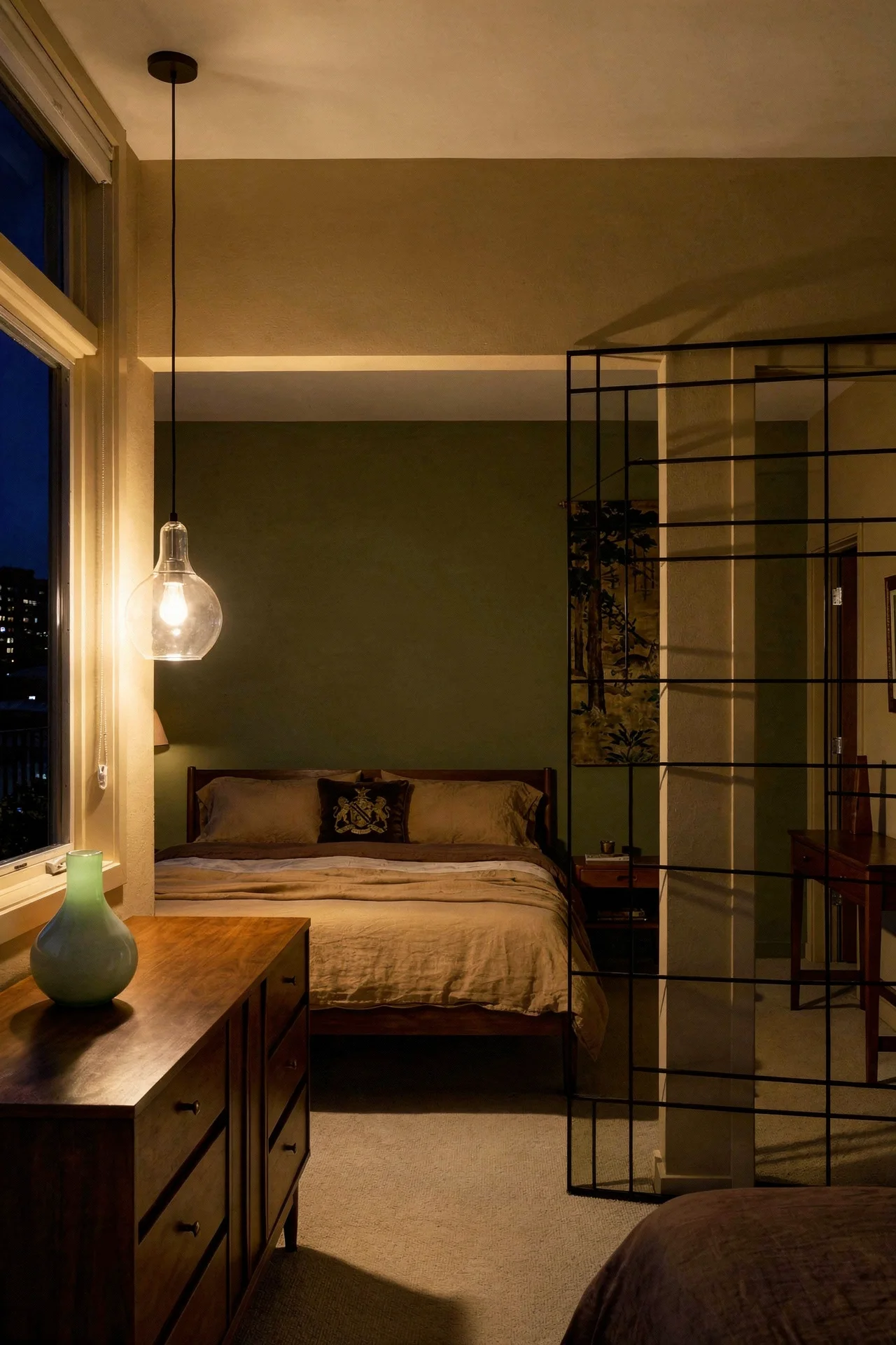
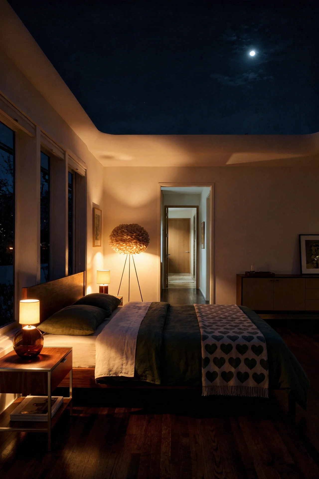
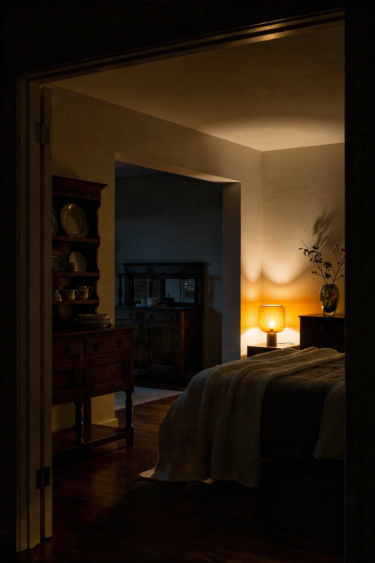
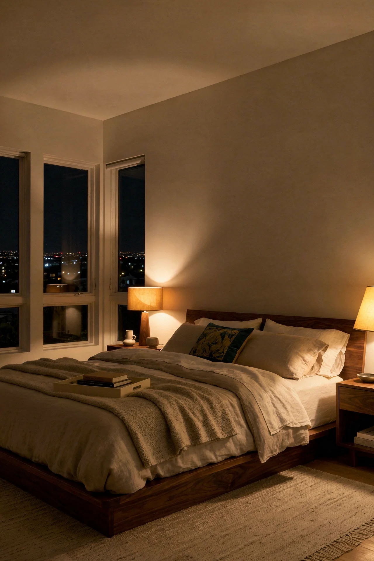
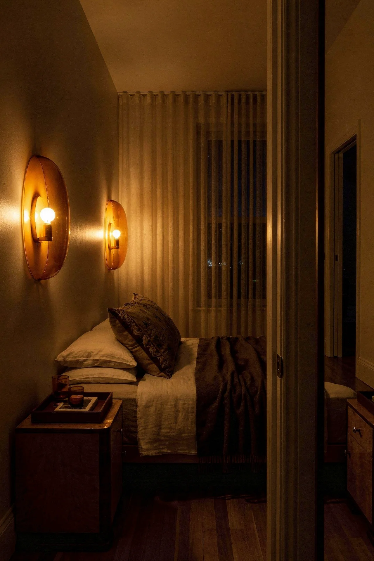
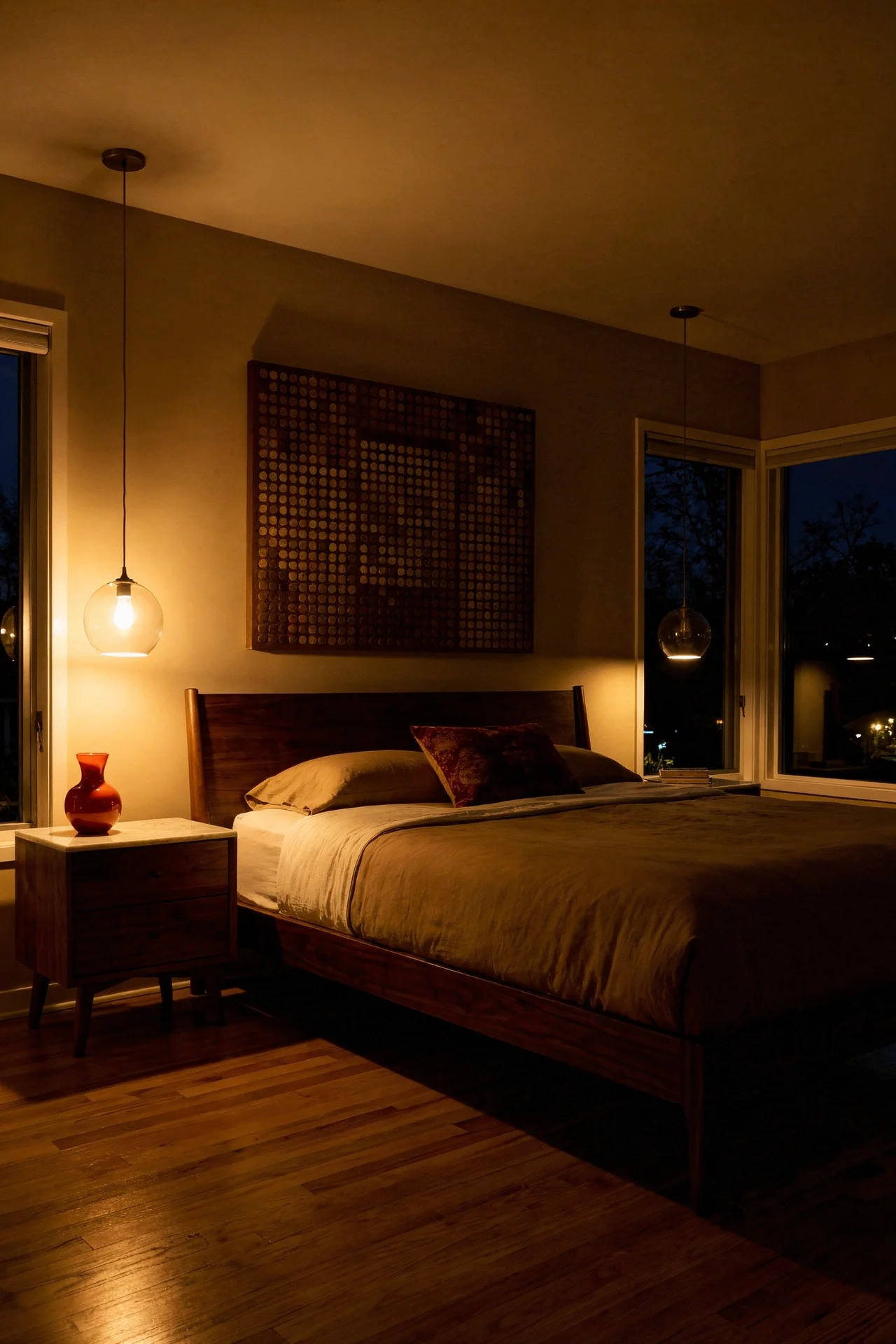
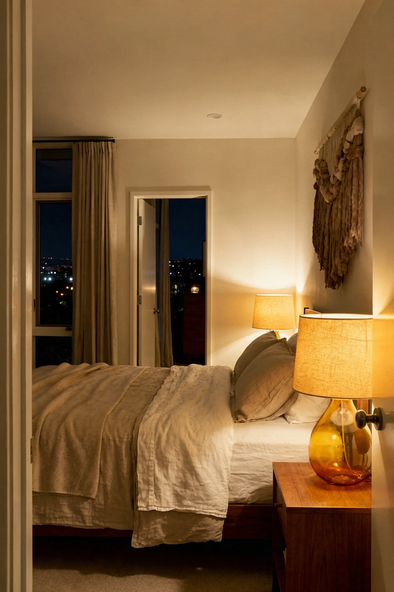
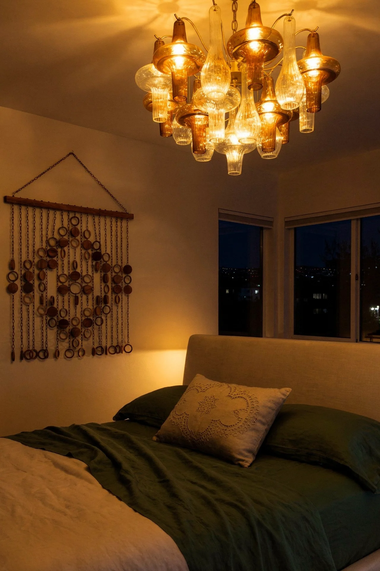
If your mid century modern bedroom still feels cold after you’ve addressed materials and colour, the problem is almost certainly your lighting. A single overhead fixture, even a beautiful one, creates flat, shadowless light that makes every surface look the same temperature. MCM designers understood this. Their interiors always had at least three light sources working together.
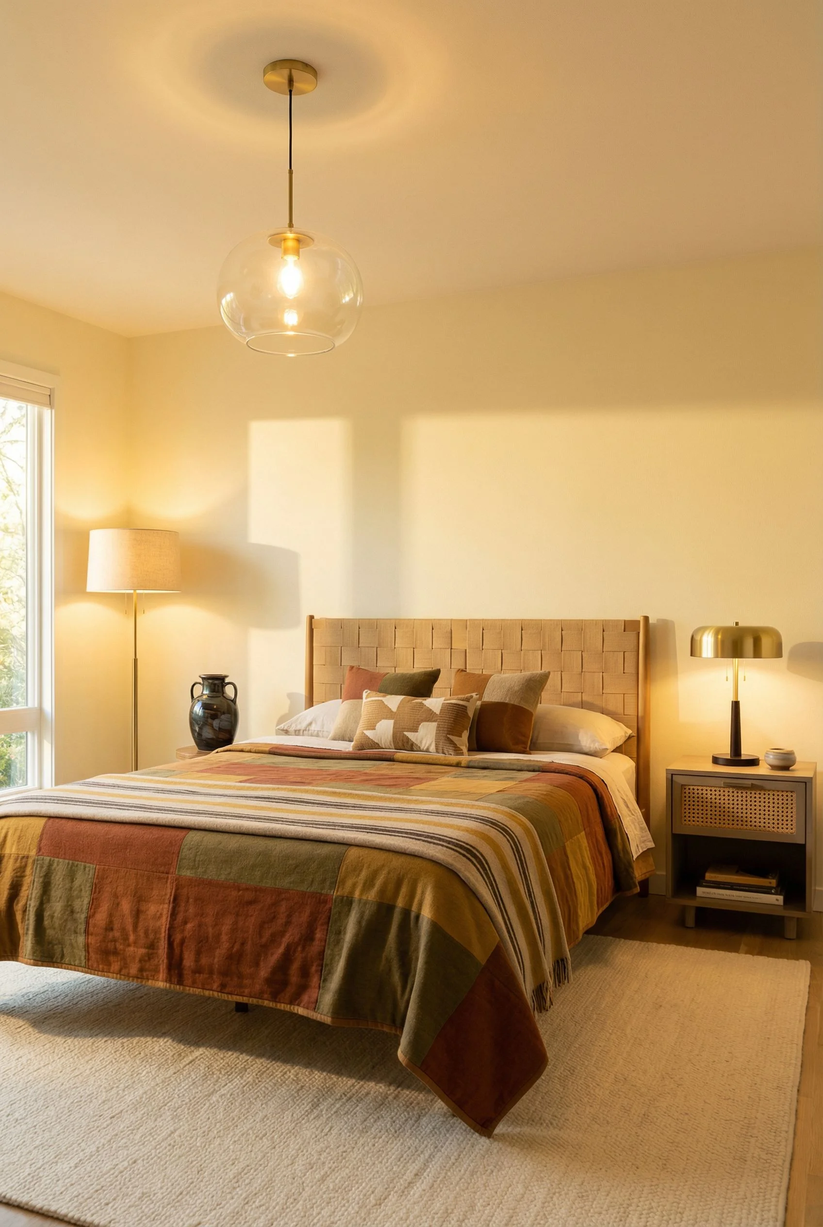
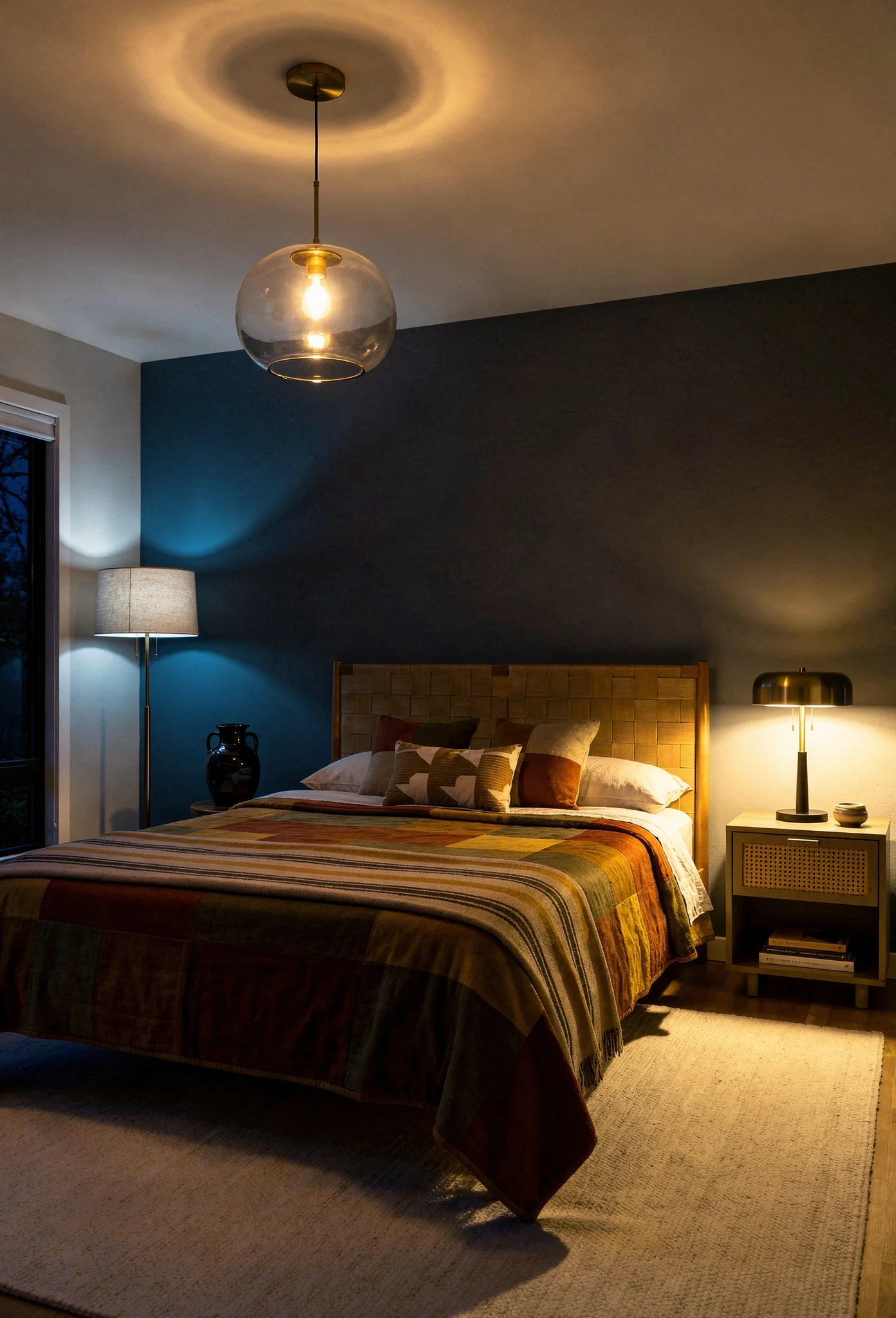
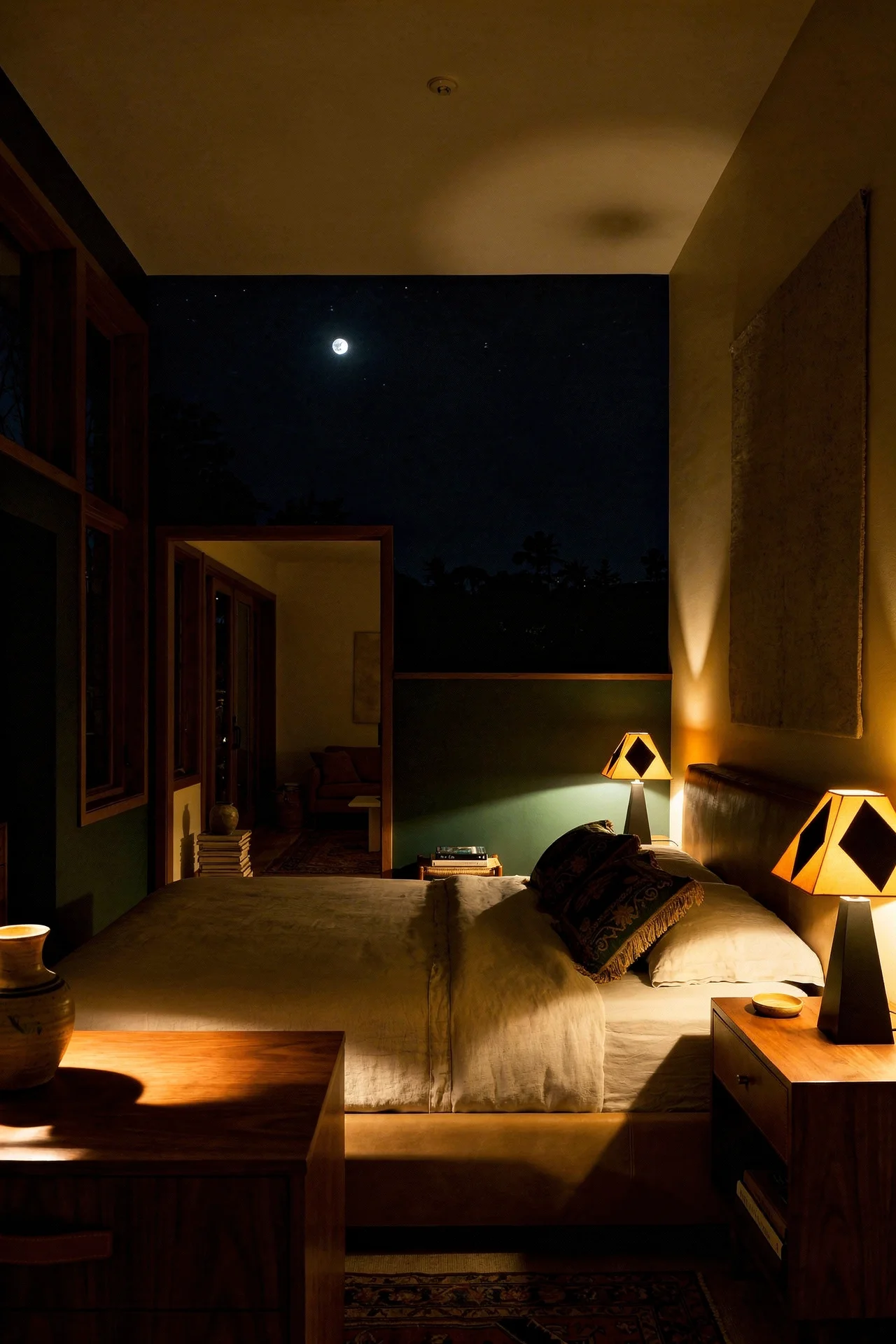
The first point is your ambient source. This is your pendant or flush mount, and in MCM bedrooms it should be a globe or drum shape. Sputnik chandeliers look incredible but they throw light in every direction, which can feel harsh at night. I’d lean towards a single globe pendant in brass or brushed gold. The warm metal reflects light at a colour temperature that reads cosy even before you dim it.
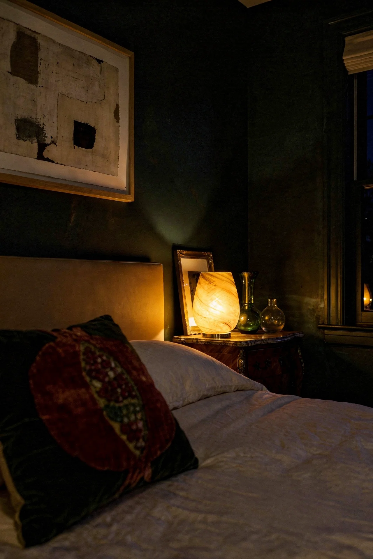
The second point is task lighting. Bedside sconces or table lamps at 2700K, positioned so the light pools downward onto the nightstand surface. This is where most people stop. Two lamps and an overhead. But the third point is what transforms the room.
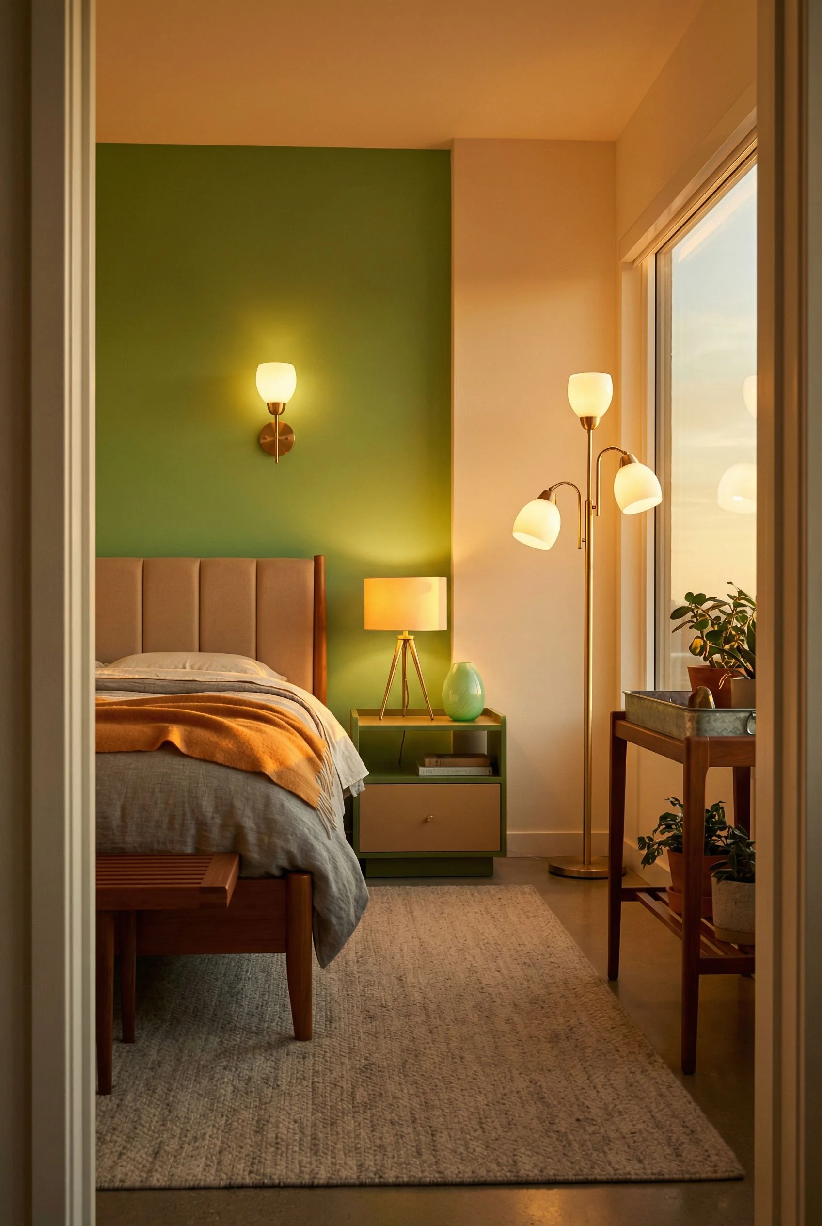
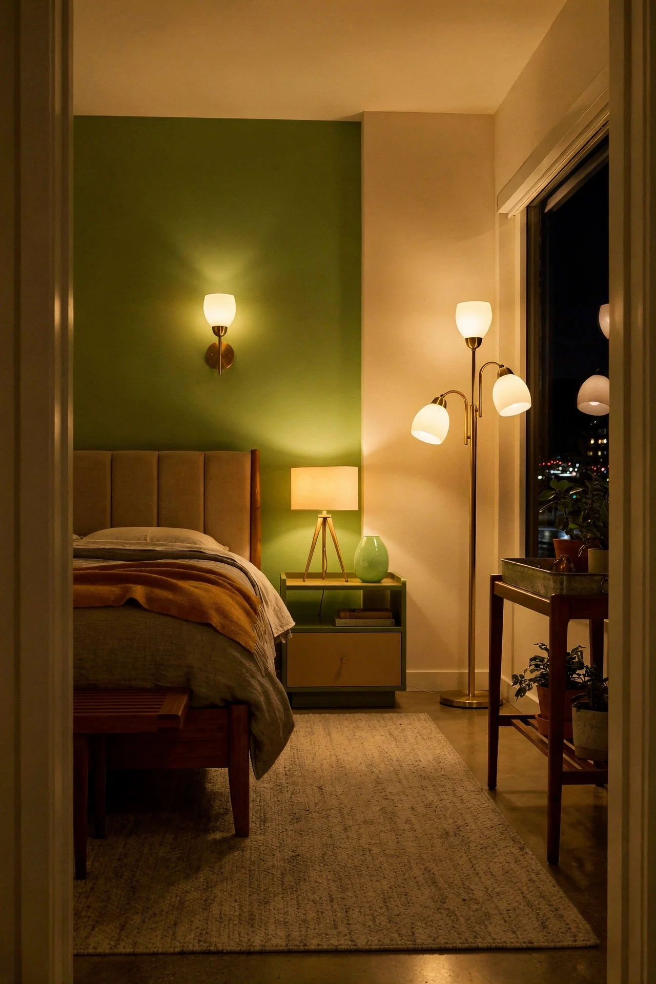
The third point is accent lighting, and it’s the one everyone skips. A floor lamp in the corner opposite the bed, angled to wash light up a wall or across a reading chair. This creates depth. Shadows appear. The room develops dimension. Your walnut accent wall catches light at an angle that reveals its grain. Your ceramic vase throws a soft shadow. Suddenly the bedroom has atmosphere instead of illumination.
Keep all three sources at 2700K. Not 3000K. Not 4000K. The difference between 2700K and 3000K is subtle on paper but immediately noticeable in a bedroom at night. Warmer is always better here.

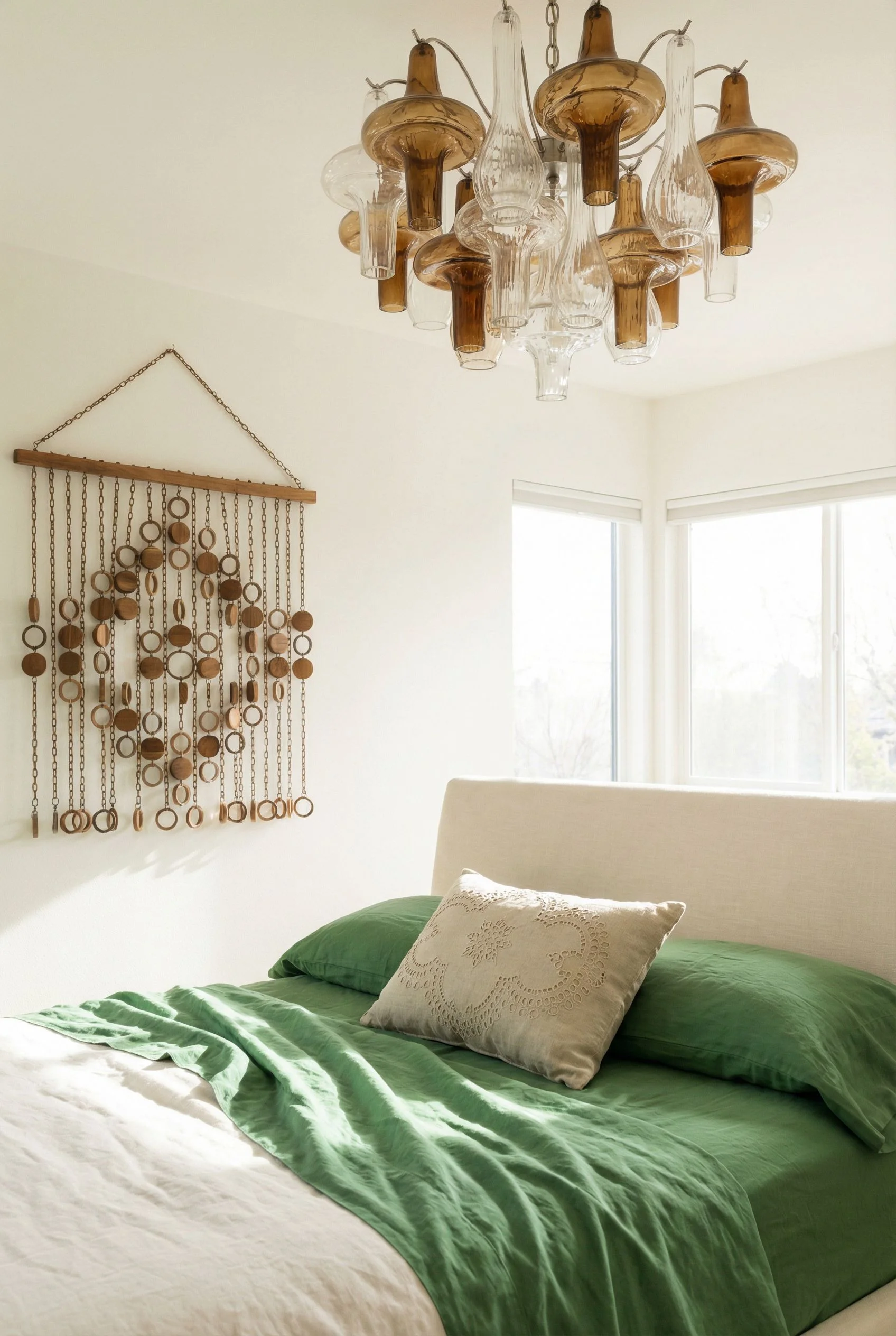
There’s a specific dark green that keeps showing up in the best mid century modern bedrooms, and it’s not the sage or olive that most people default to. It’s deeper. Somewhere between forest and emerald, with enough blue in the undertone to feel sophisticated rather than earthy.
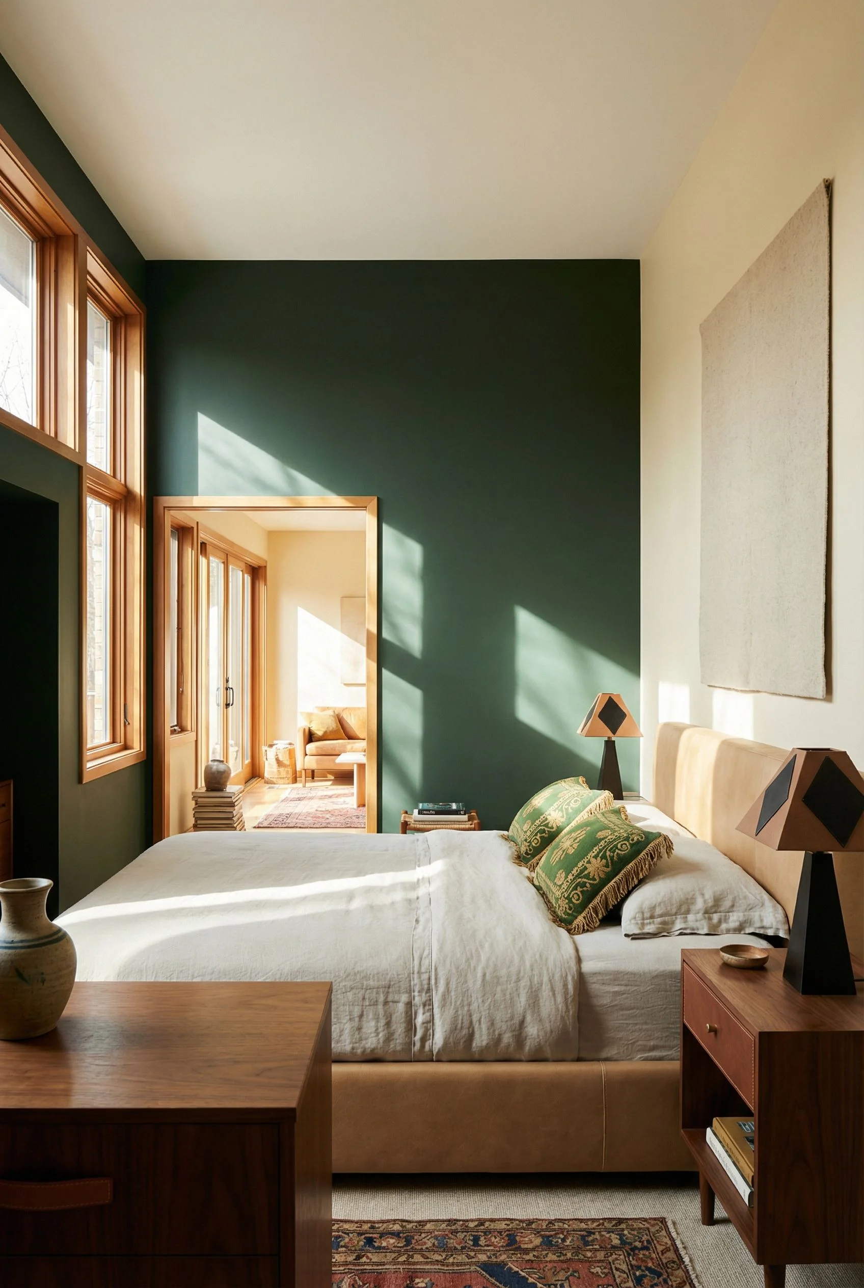
I noticed this pattern when looking at MCM interiors that actually felt warm despite using a colour most people consider cool. The reason it works is counterintuitive. A dark green bedroom wall absorbs overhead light instead of bouncing it back, which kills that flat, clinical quality that makes MCM rooms feel sterile. The remaining light in the room comes from your table lamps and accent sources, which are warm. So the wall reads as rich and enveloping rather than cold.
The key is choosing a green with warm undertones. A forest green with a yellow base feels alive. A green with a grey base feels institutional. If you hold a paint chip up and it reminds you of a school hallway, it’s the wrong green.

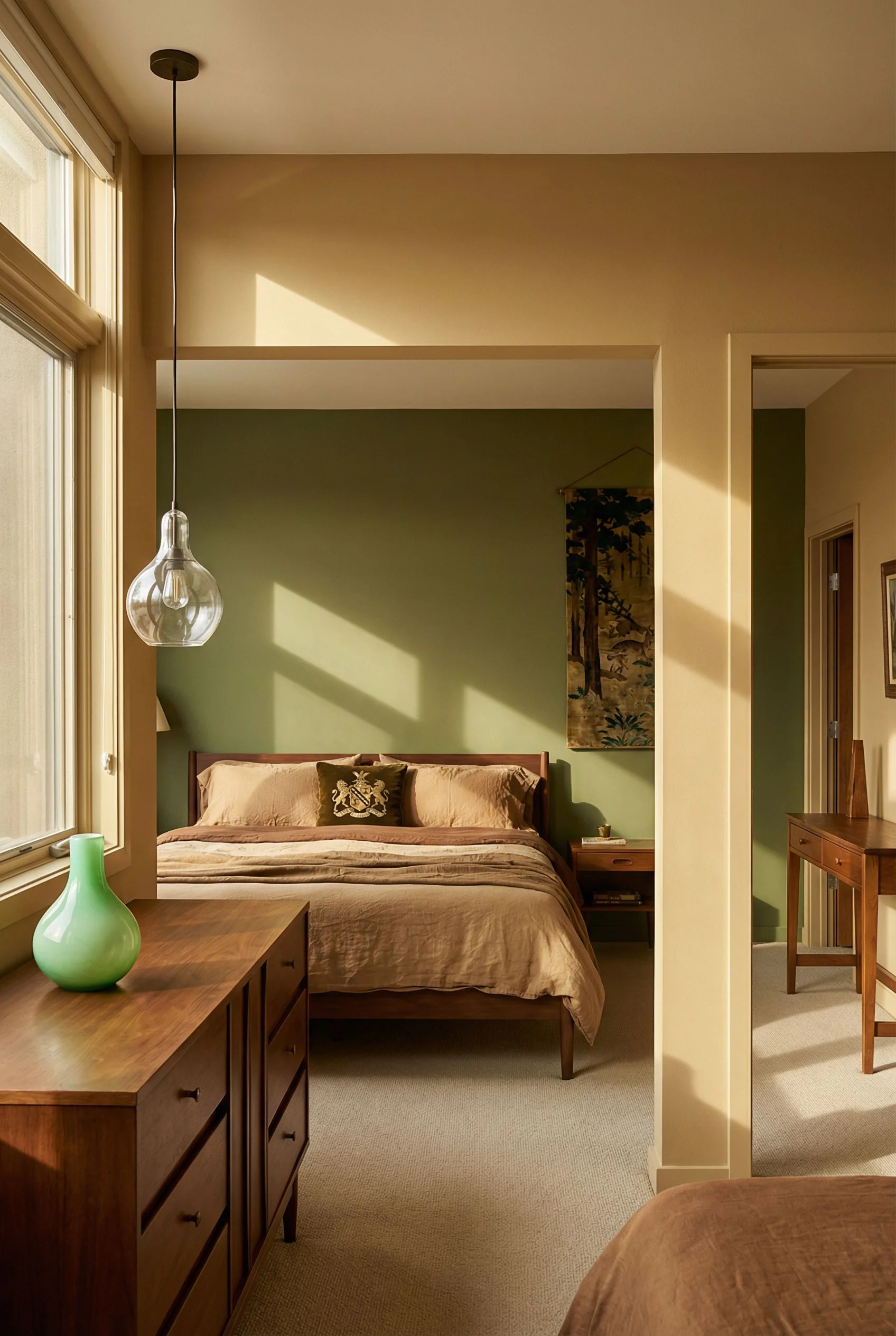
Paint one wall, not four. This is a dark green bedroom accent, not a cave. The bed wall in deep green with the remaining three walls in a warm white creates contrast that makes the green feel intentional. Your walnut furniture pops against it beautifully. Brass hardware and gold toned lighting fixtures sing against this backdrop in a way they simply can’t against a white wall.

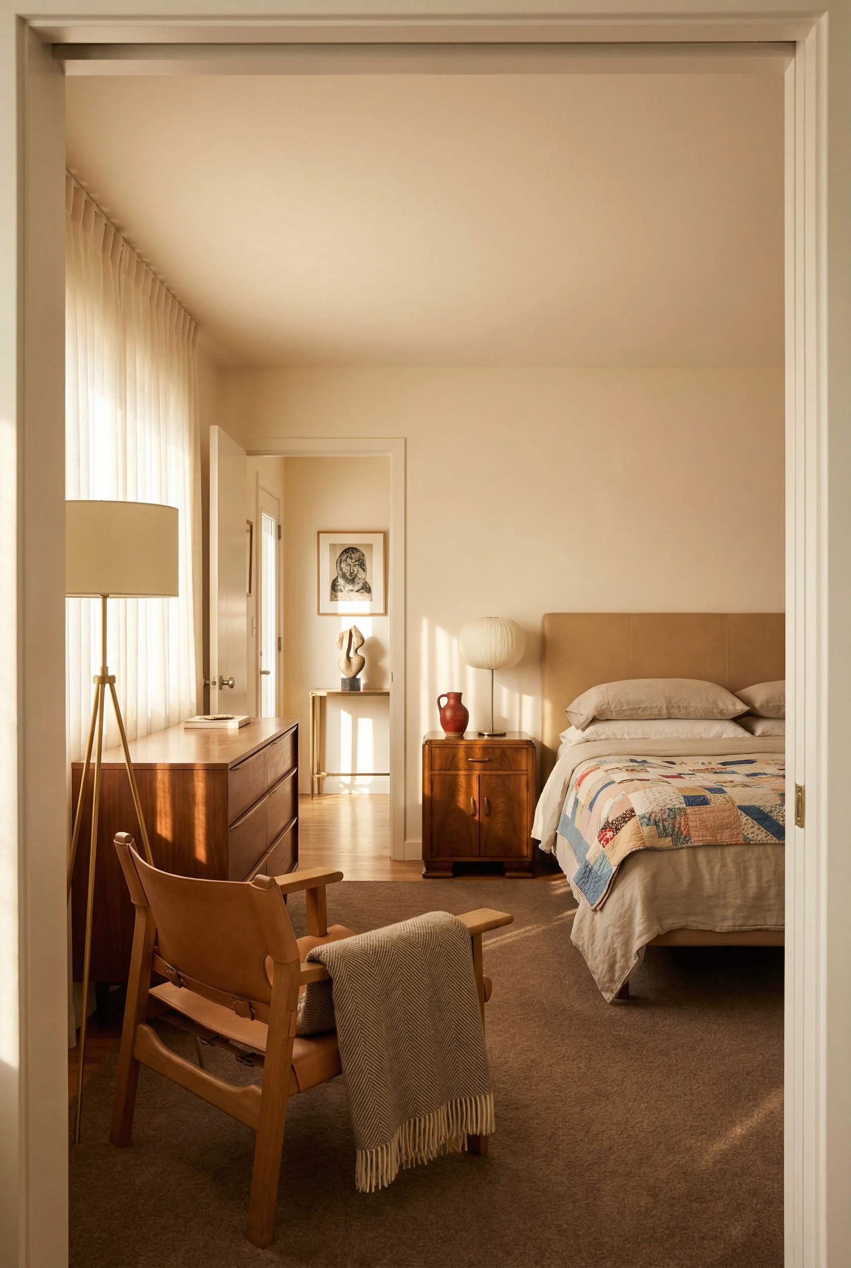
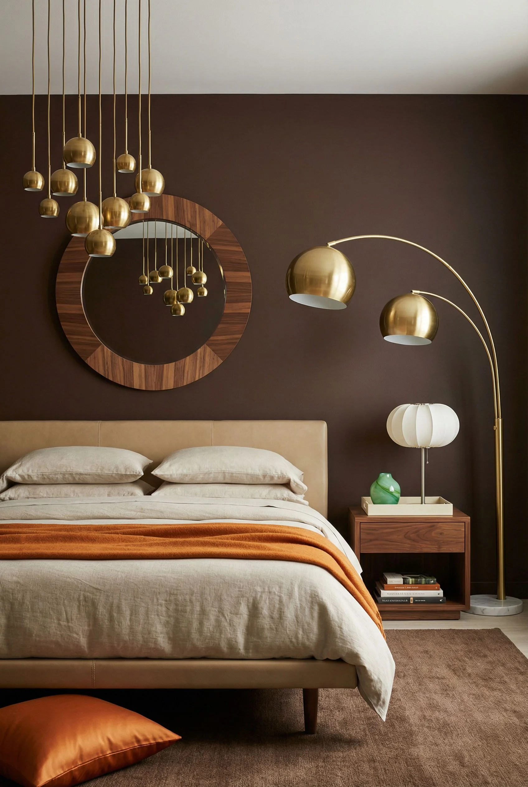
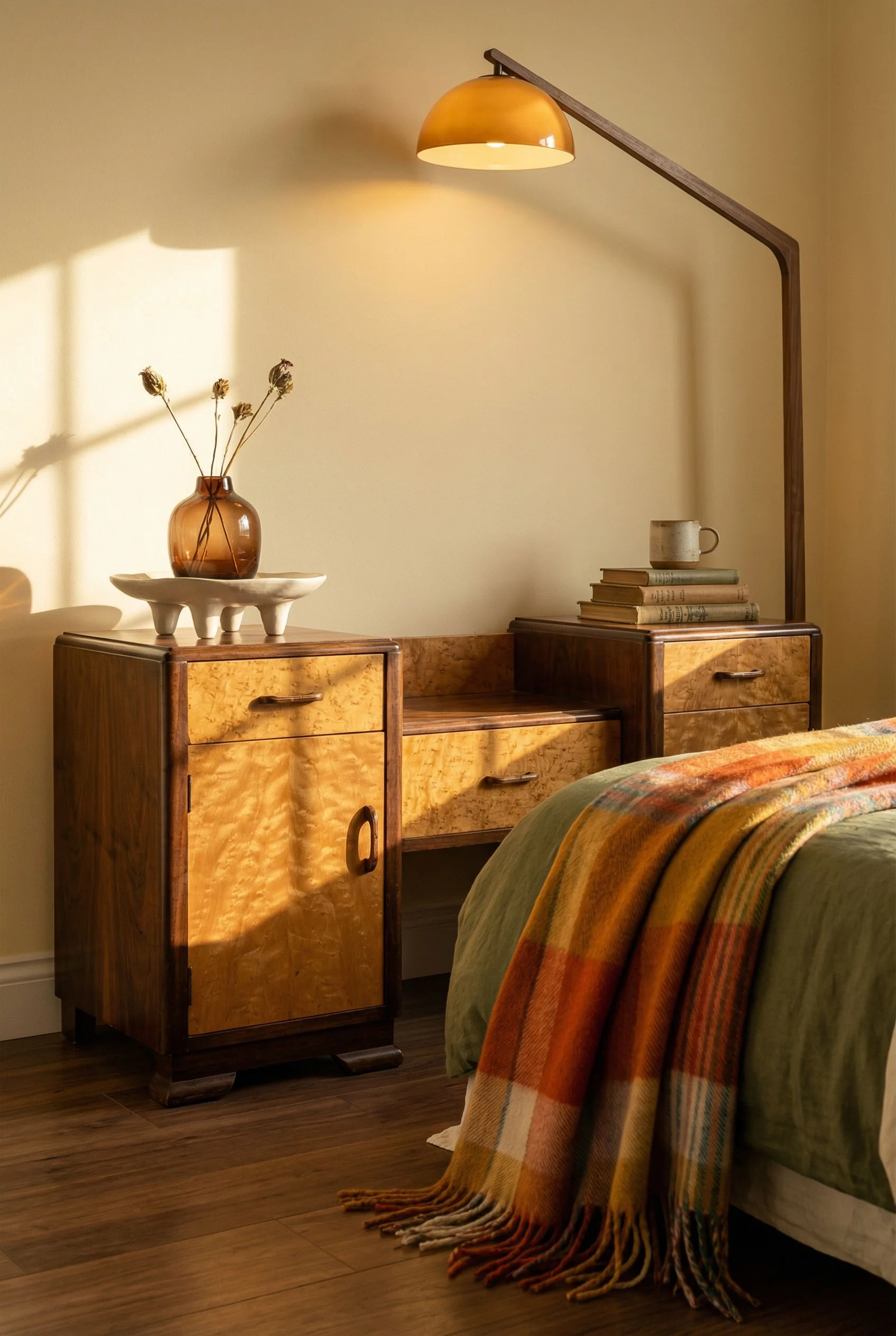
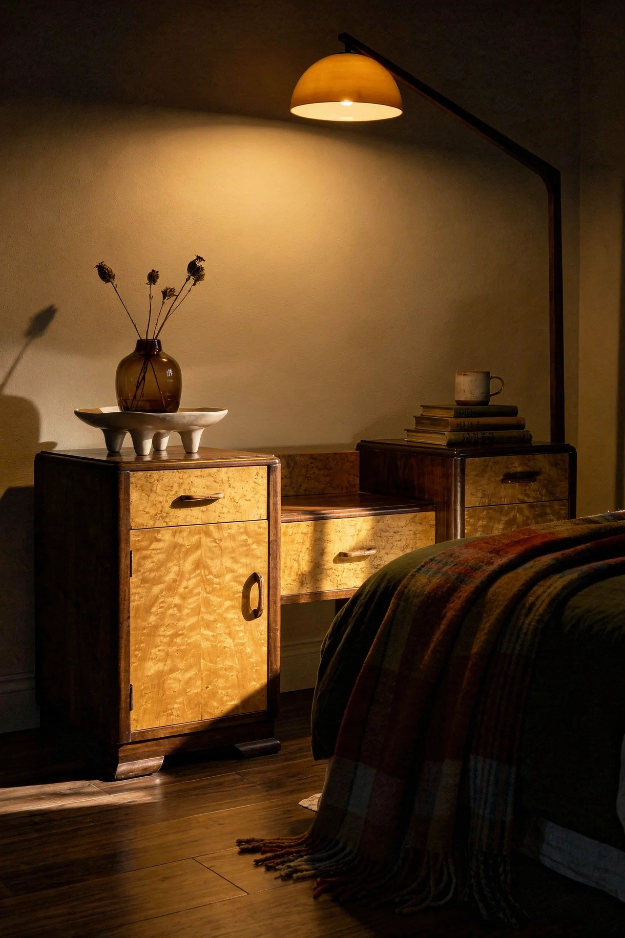
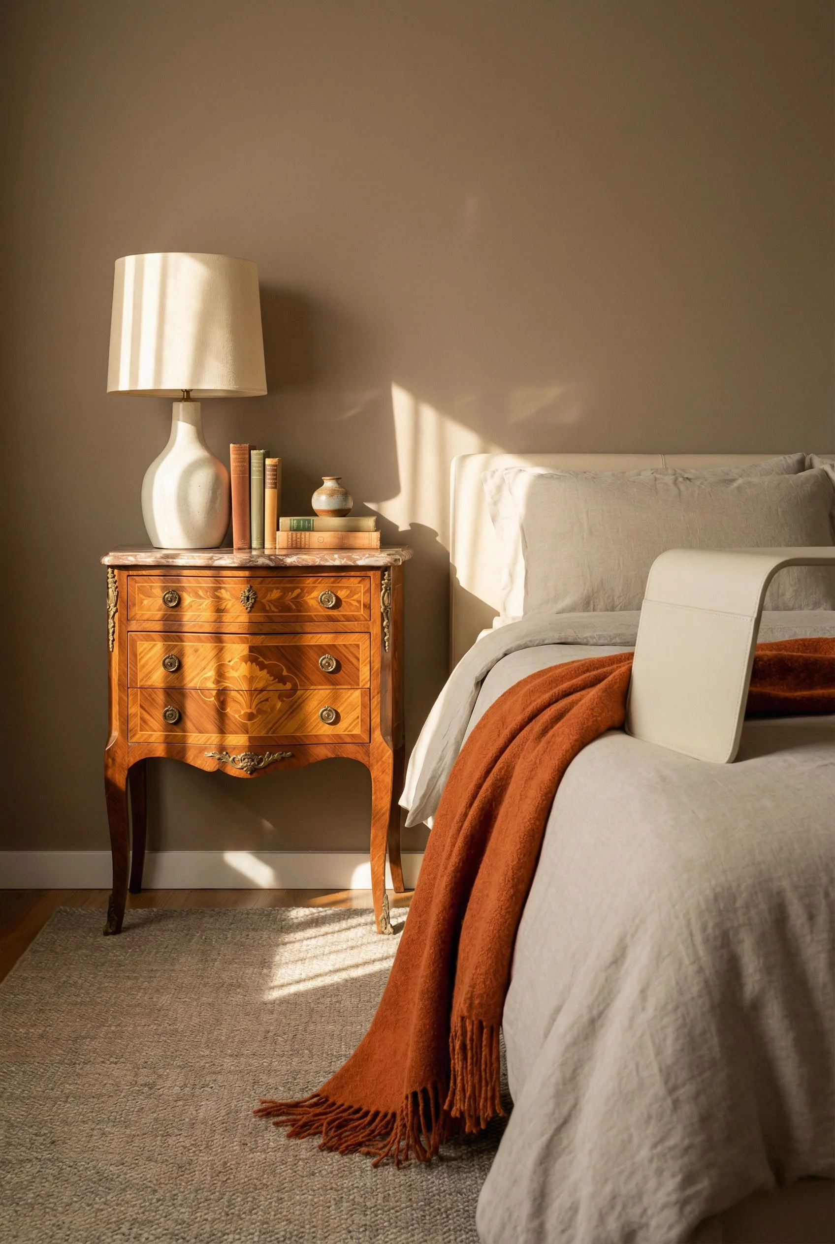
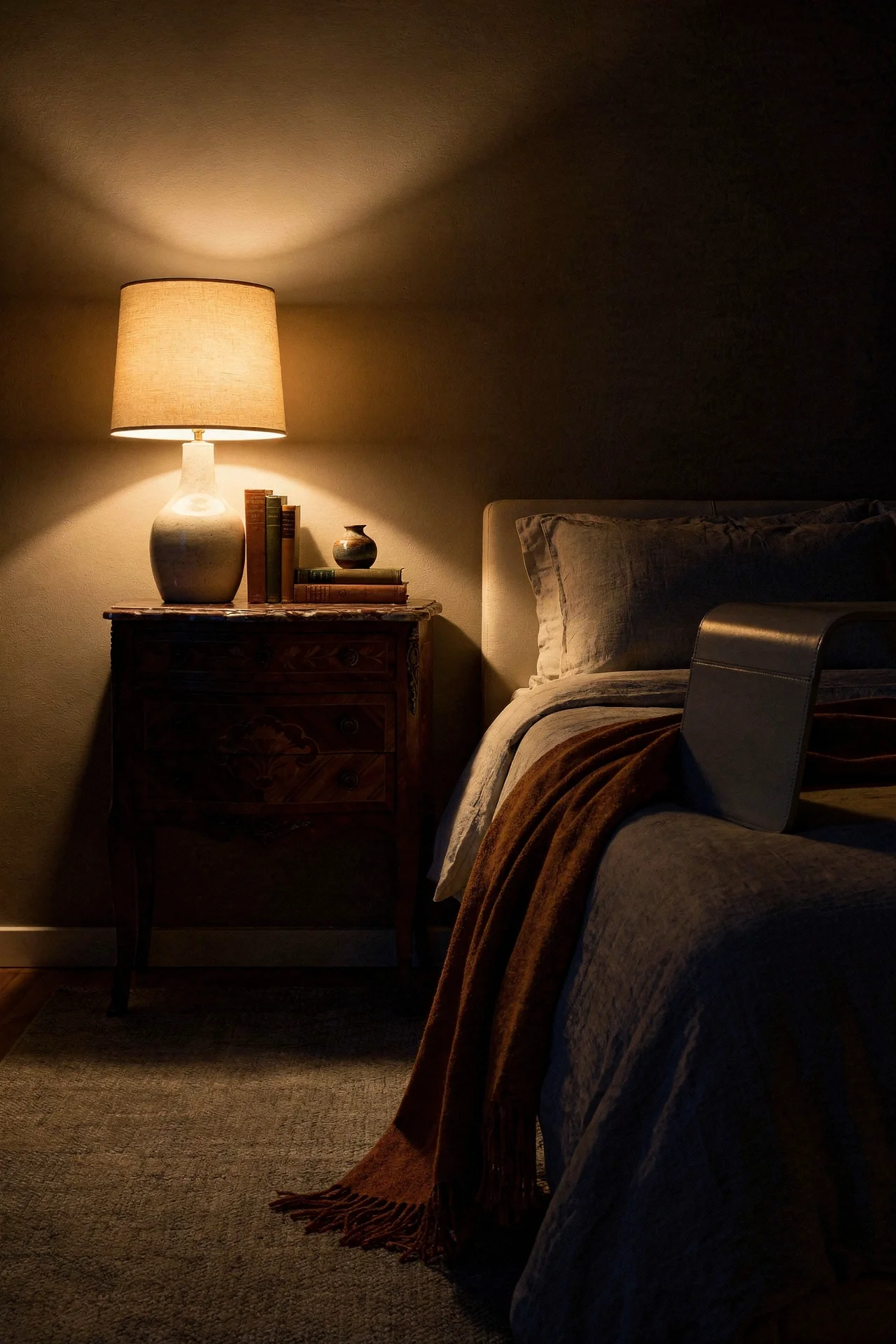
Dark wood carries baggage. Say “dark wood bedroom” to most people and they picture chunky cherry armoires and matching bedroom sets from 1994. That association is so strong it scares people away from the richest, warmest material palette MCM design has to offer.
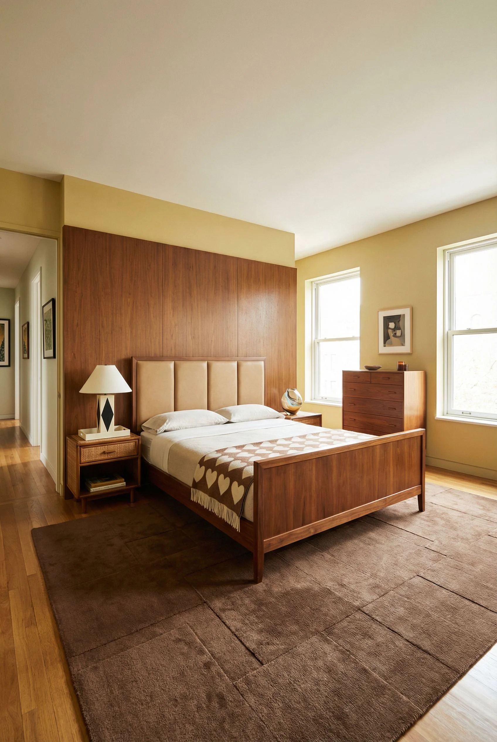
The difference between dark wood that reads warm and dark wood that reads dated comes down to four rules. First, never match your wood tones exactly. A walnut bed frame with walnut nightstands and a walnut dresser looks like a furniture set. Mix walnut with teak, or dark oak with rosewood. Close but not identical. This reads collected over time, not purchased in a single transaction.
Second, pair dark wood with light surroundings. White or cream walls, light bedding, a pale rug. The contrast is what makes the wood feel rich. Dark wood in a dark room just feels heavy.

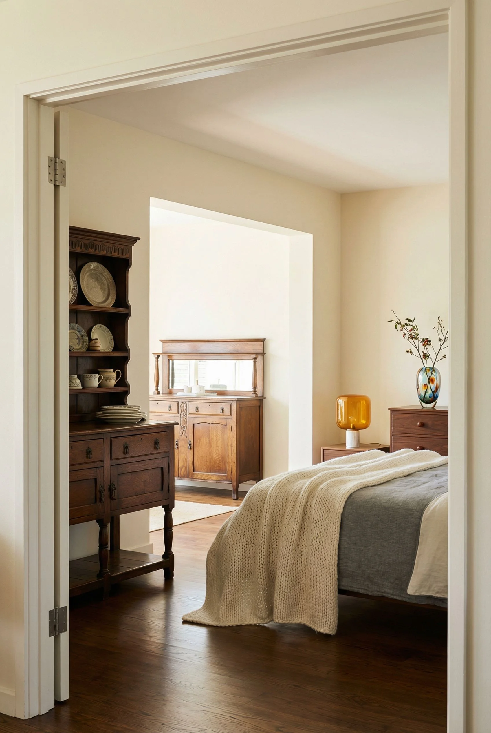
Third, choose pieces with visible joinery or sculptural elements. MCM dark wood furniture has finger joints, beveled edges, and organic curves. These details catch light and create visual interest that flat, featureless surfaces don’t. Fourth, keep the footprint slim. MCM furniture sits on legs. It shows floor. The moment you bring in a massive dark wood piece that sits flat on the ground, you lose the airiness that prevents dark wood from feeling oppressive.
In my view, one hero piece in dark wood is enough. The bed frame or a statement dresser. Not both. Let the rest of your pieces be lighter, and the dark wood becomes a grounding anchor instead of a weight.

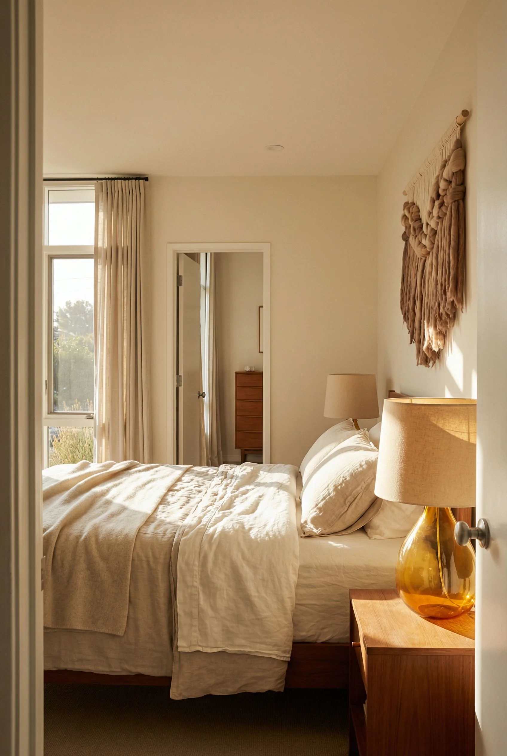
Your bedding is the largest textile surface in the room. It’s the thing your eye hits first when you walk through the door. And in a mid century modern bedroom, it needs to do something very specific: disappear just enough that your furniture and architecture remain the stars.
Neutral bedding in MCM doesn’t mean boring. It means strategic. The best approach I’ve found is a base layer in warm white or cream linen. Not bright white, which reads clinical, and not grey, which reads cold. Linen specifically, because the natural texture and slight rumple give the bed life without pattern. Over that, a single accent layer. A wool or cotton throw at the foot of the bed in a tone that picks up one of your wood finishes.
The pillow situation matters here. Two sleeping pillows, two Euro shams, one accent cushion. That’s it. Each one in a slightly different texture within the same neutral family. Linen, bouclé, raw cotton. The variation reads deliberate without looking decorated.
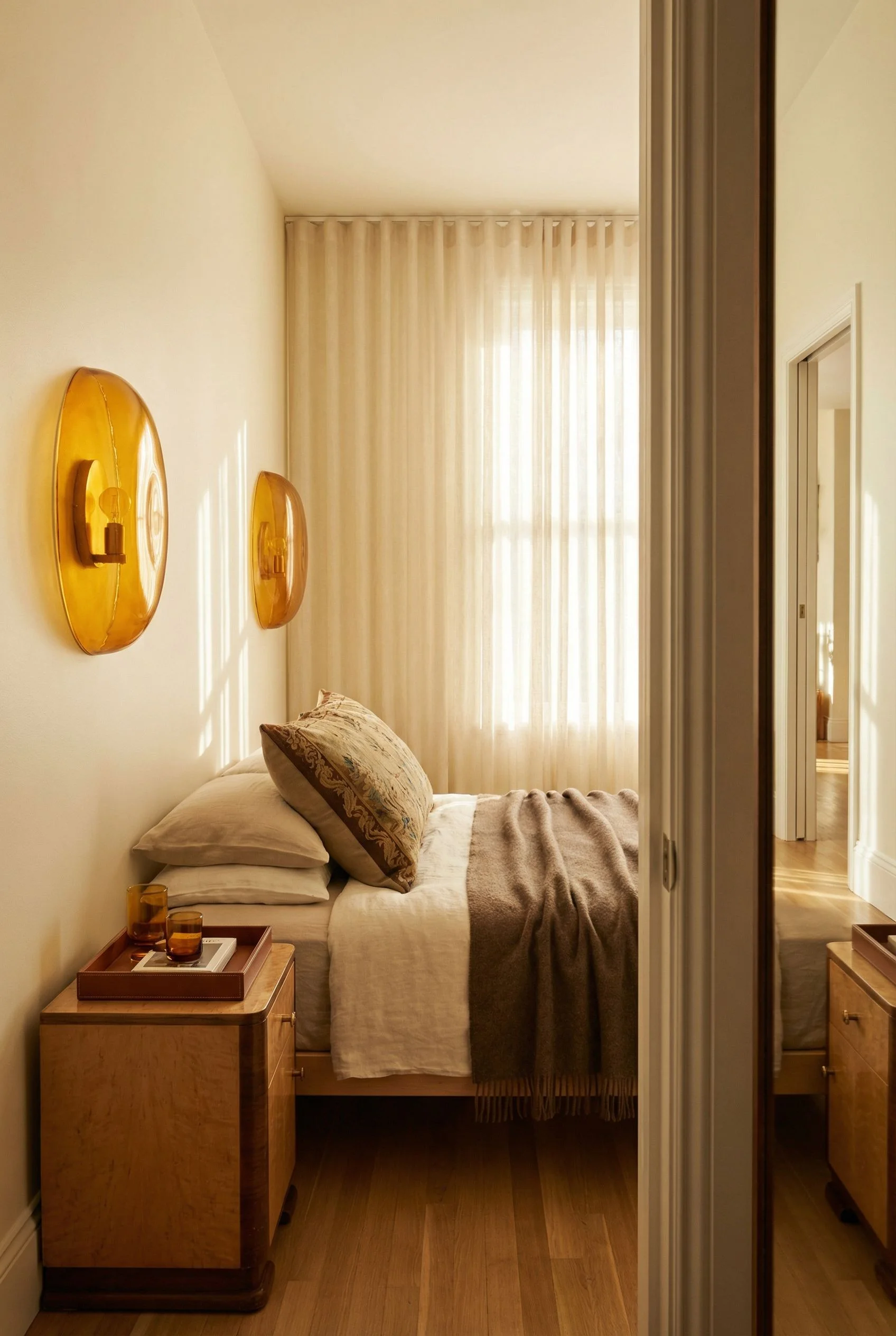
Avoid anything with bold geometric patterns. I know it feels like geometric prints would be perfect for MCM. They’re not. Printed bedding competes with the geometric furniture silhouettes you’ve already got. Hairpin legs, splayed supports, angular nightstands. These are your geometry. The bed should be the quiet foundation that makes those shapes pop. If you want pattern, keep it to a single woven texture like a waffle or herringbone rather than a printed motif.

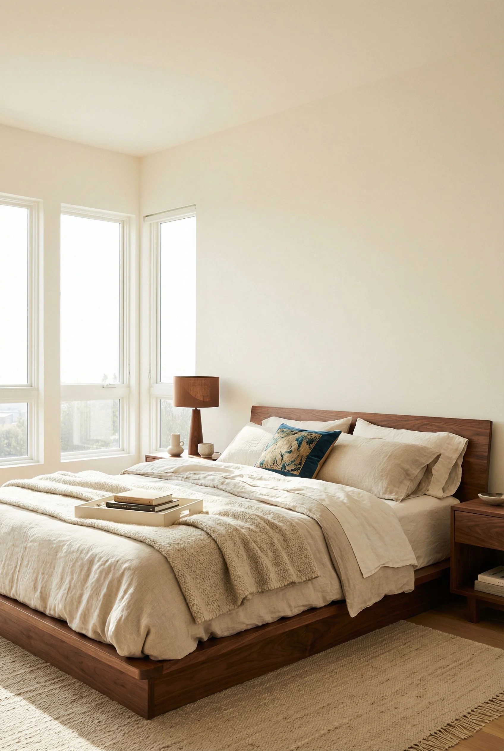
The bed is the single most important purchase in this entire process. Get it wrong and nothing else matters. A mid century modern bed has a specific visual language. Low profile, platform construction, and a headboard that reads as architectural rather than decorative.
Start with height. MCM beds sit low. The mattress surface should be roughly 18 to 22 inches from the floor. This changes the proportions of the entire room. Lower beds make ceilings feel taller and walls feel wider. They also create a sense of groundedness that upholstered taller beds can’t match.
Next, consider the frame material. Walnut is the classic choice and I think it’s still the strongest option for warmth. A walnut platform bed with a slatted or panel headboard gives you the organic grain that reads warm, the tapered legs that read MCM, and the visual weight that anchors the room. Teak is the alternative if you want something lighter in tone.
The headboard is where most people overthink things. In MCM design, the headboard is an extension of the frame, not a separate statement piece. Avoid tufted upholstered headboards. They pull the room towards contemporary or glam. A simple wood panel, either flat or with horizontal slats that echo your accent wall, keeps everything consistent. If you want softness at the headboard, a thin cushion in leather or linen that attaches to the wood frame gives you comfort without compromising the line.
Size the bed to leave at least 24 inches on each side for nightstands. MCM nightstands tend to be compact, often just 18 to 22 inches wide, and they look best when they don’t crowd the bed frame. This breathing room is part of the warmth equation. Open space reads calm. Cramped space reads cold.
You’ve probably noticed that the warmth in MCM bedrooms isn’t coming from one bold colour choice. It’s a specific combination of tones working together. Here’s the palette that ties everything in this article together.

Warm White – Your base. This covers three walls and the ceiling. Not brilliant white, which has blue undertones that flatten a room. Look for whites with a yellow or pink base. They reflect lamplight warmly and make wood tones glow.
Paint Pick: Farrow & Ball Bisque
Walnut Brown – Your anchor tone, carried through furniture and the accent wall. This should be a medium brown with red undertones, not a chocolate or espresso. It reads warm and organic against white walls.
Paint Pick: Farrow & Ball Broccoli Brown
Forest Green – Your accent wall colour, deep and complex. The green I keep coming back to has enough warmth in the base to avoid feeling clinical. Use it on one wall only.
Paint Pick: Farrow & Ball Palm
Brass Gold – Your metallic accent, appearing in lighting fixtures, drawer pulls, and one or two decorative objects. Brushed or aged brass reads warmer than polished gold, which can tip into glam.
Paint Pick: Farrow & Ball Hay
Cream Linen – Your textile base, covering bedding and the rug. Sits between white and beige with a natural, undyed quality. This is the colour that softens every hard surface and clean line in the room.
Paint Pick: Farrow & Ball White Tie
Once you lock in these five tones, every purchase decision gets simpler. If a potential piece doesn’t speak one of these colours, it doesn’t belong in the room.
You don’t need to overhaul your entire mid century modern bedroom in a weekend. Start with the accent wall. It’s the single change that shifts the room’s temperature the most, and it gives you a foundation that everything else builds on. Layer in lighting second. Then let bedding and accessories find their way in over time. The rooms that feel warmest are never assembled all at once. They’re built gradually, one considered choice at a time.
This post contains affiliate links, which means we may earn a small commission if you make a purchase through our links, at no extra cost to you.