Newsletter Subscribe
Enter your email address below and subscribe to our newsletter
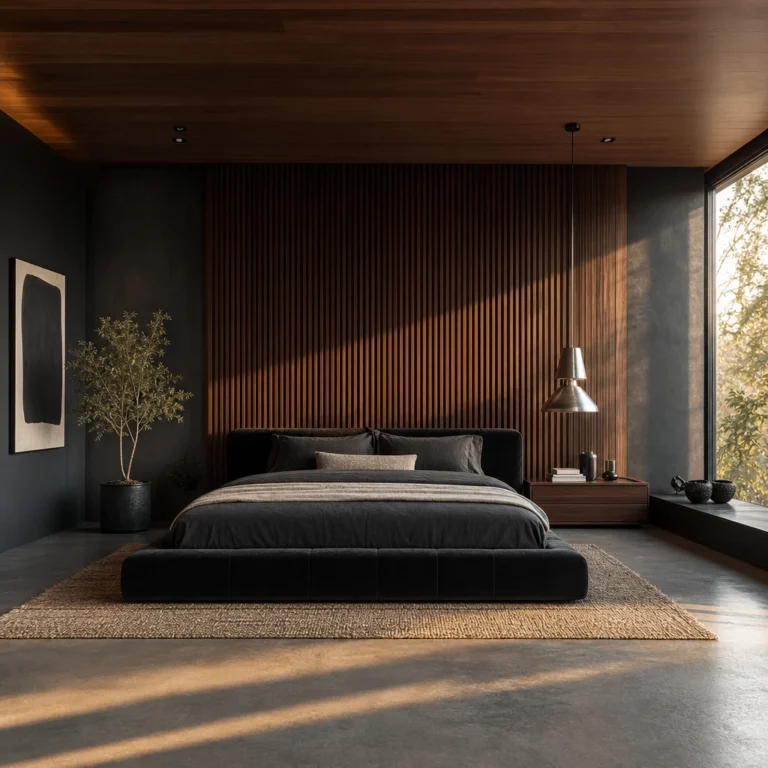
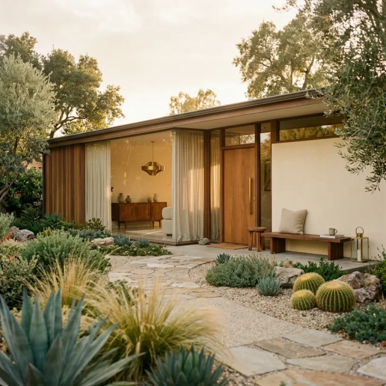
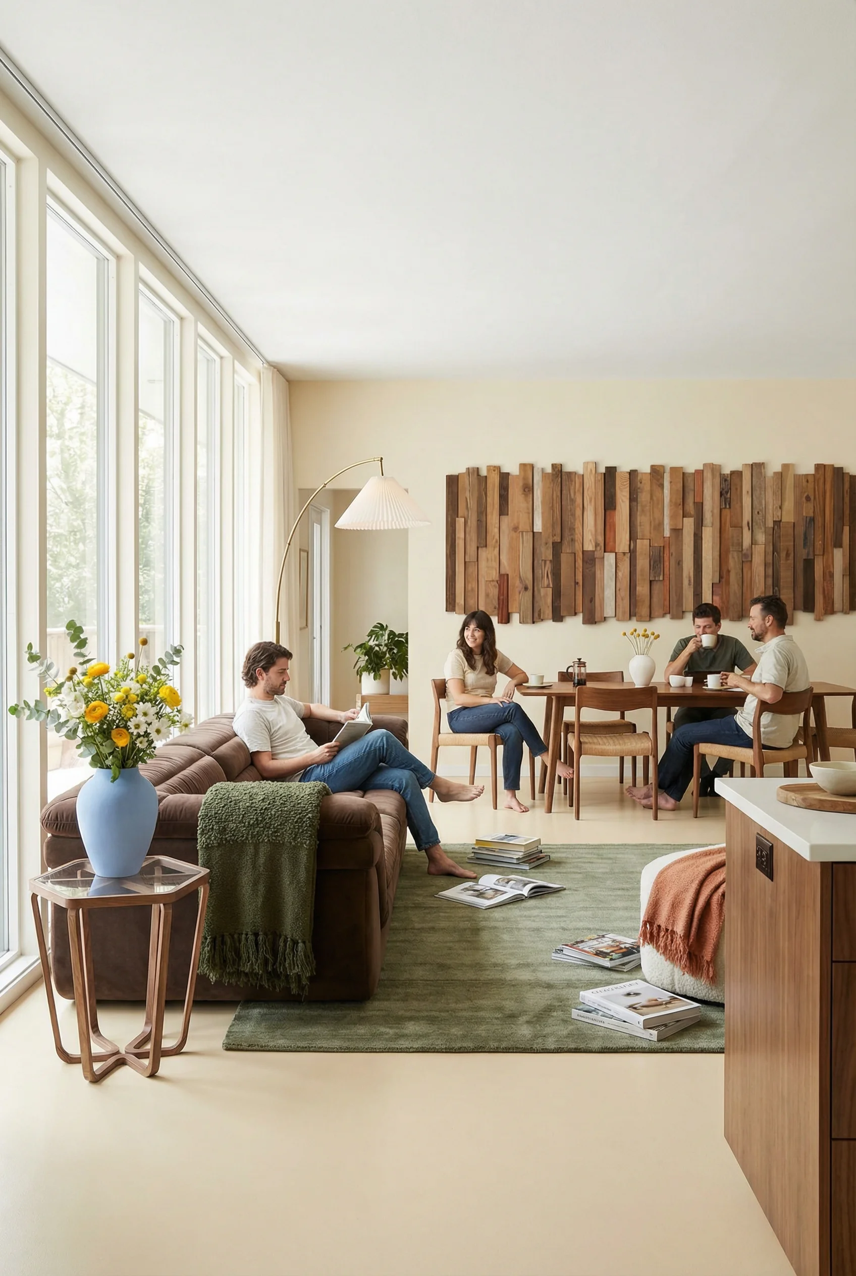
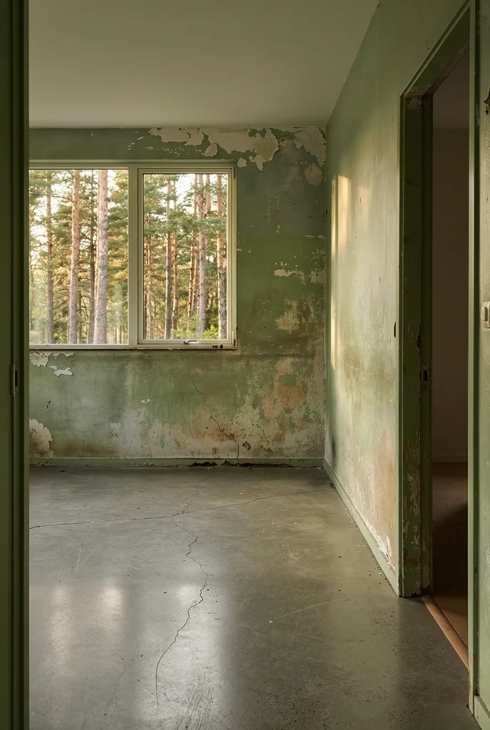
Most mid century modern living rooms you see online live inside Richard Neutra houses with post and beam ceilings, floor to ceiling glass, and original terrazzo floors. Gorgeous. Also completely useless if you rent a flat with standard 8 foot ceilings and beige carpet. The good news is that MCM was never really about the architecture. It was about the furniture. The silhouettes. The way a room breathes when every piece lifts off the floor on tapered legs. I’ve spent years watching people pull off this look in the most generic apartments imaginable, and the ones who get it right all share the same instinct. They stop trying to recreate the house and start thinking about the bones of each piece instead.
Here is the thing nobody tells you about mid century modern. The architecture gets all the credit, but the furniture does all the work. Charles and Ray Eames proved this in the 1950s when they designed chairs from molded plywood that could make a warehouse feel intentional. The silhouettes are the style.
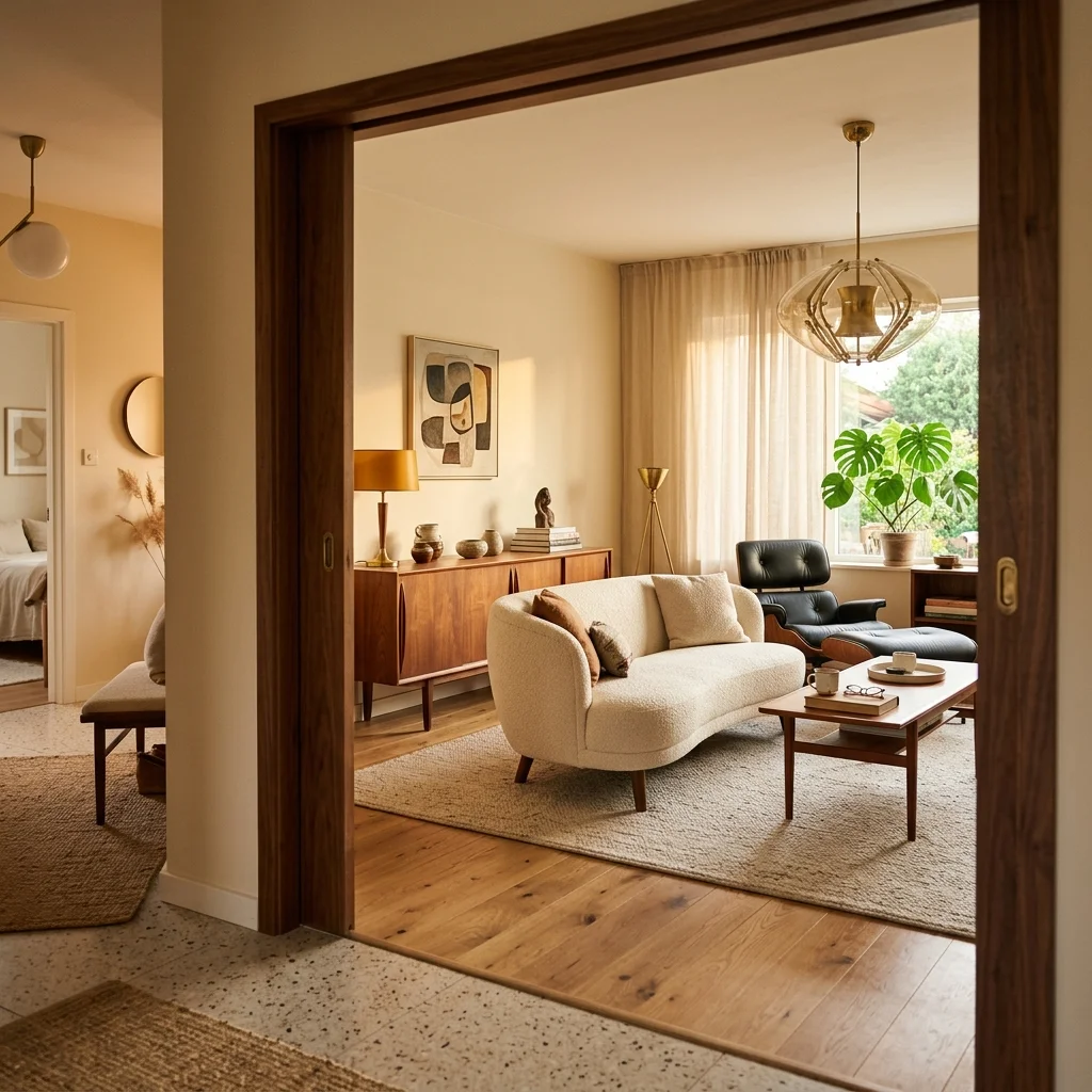
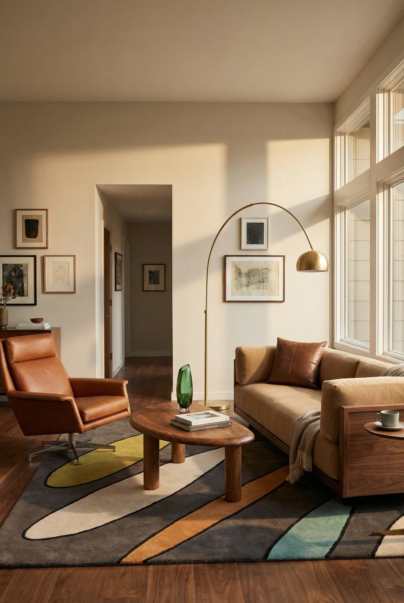
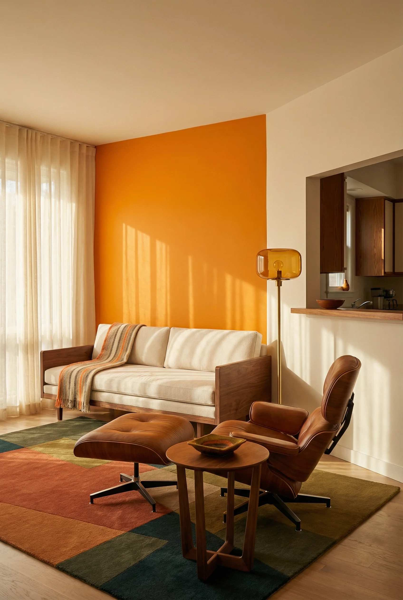
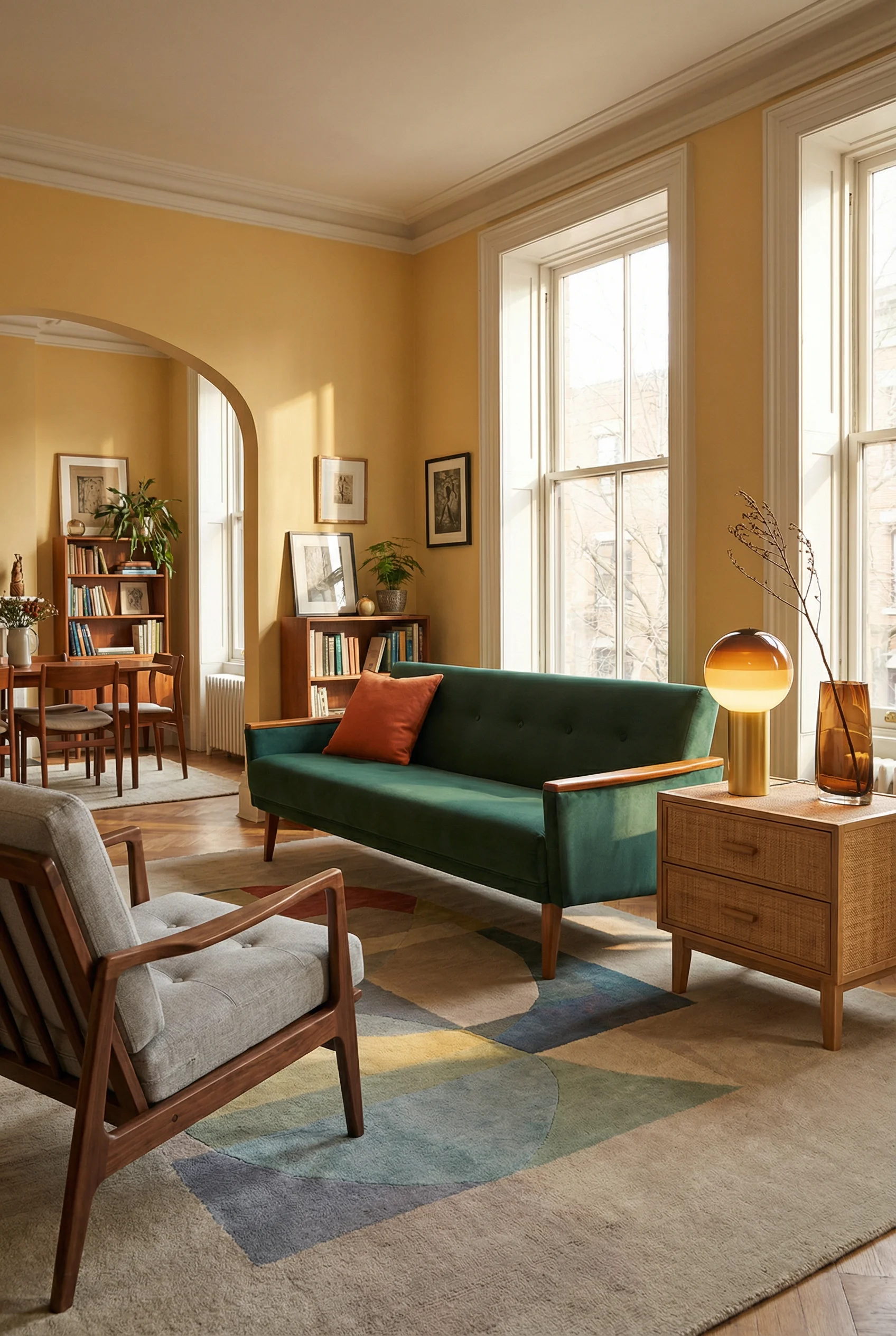
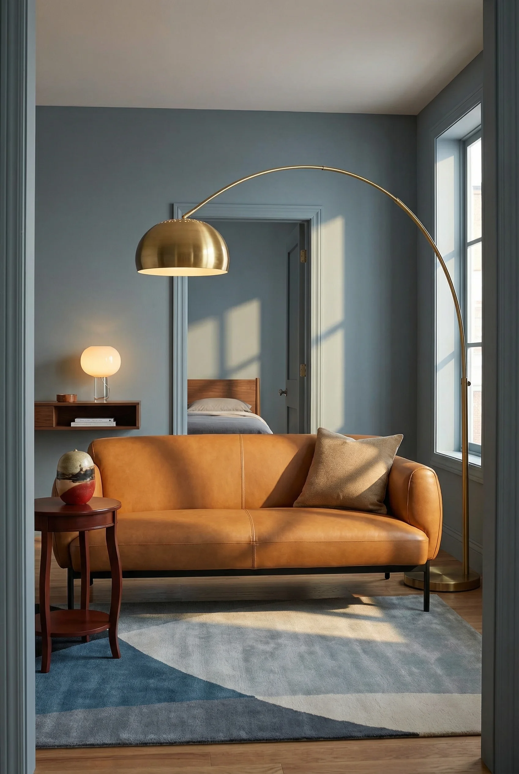
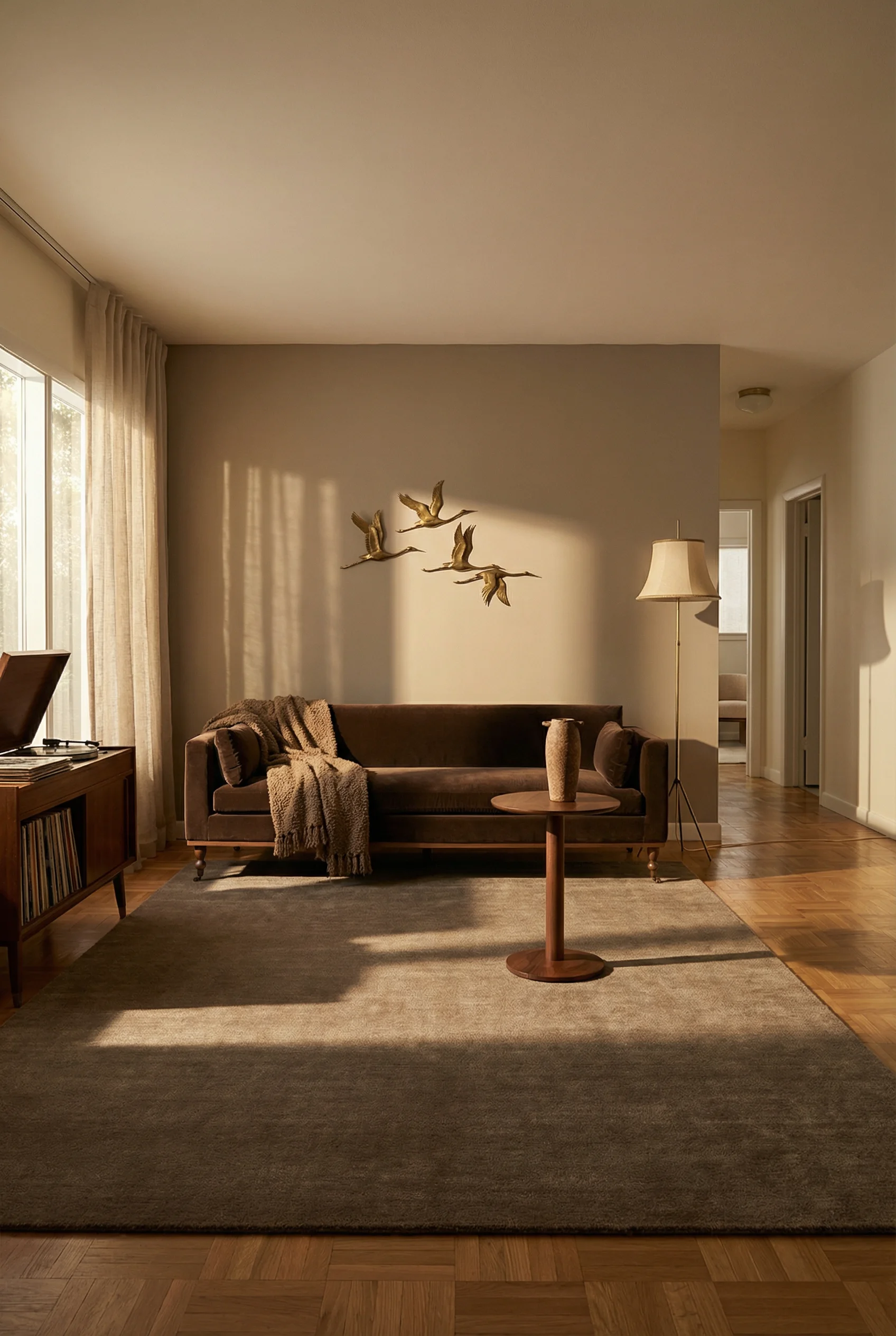
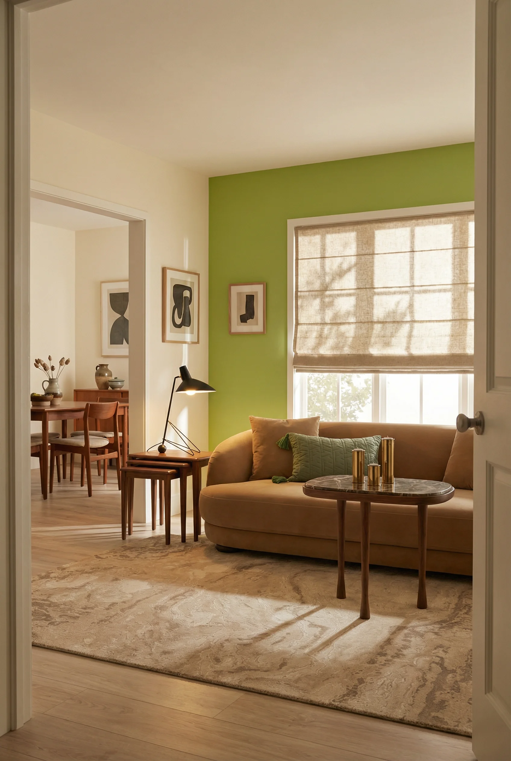
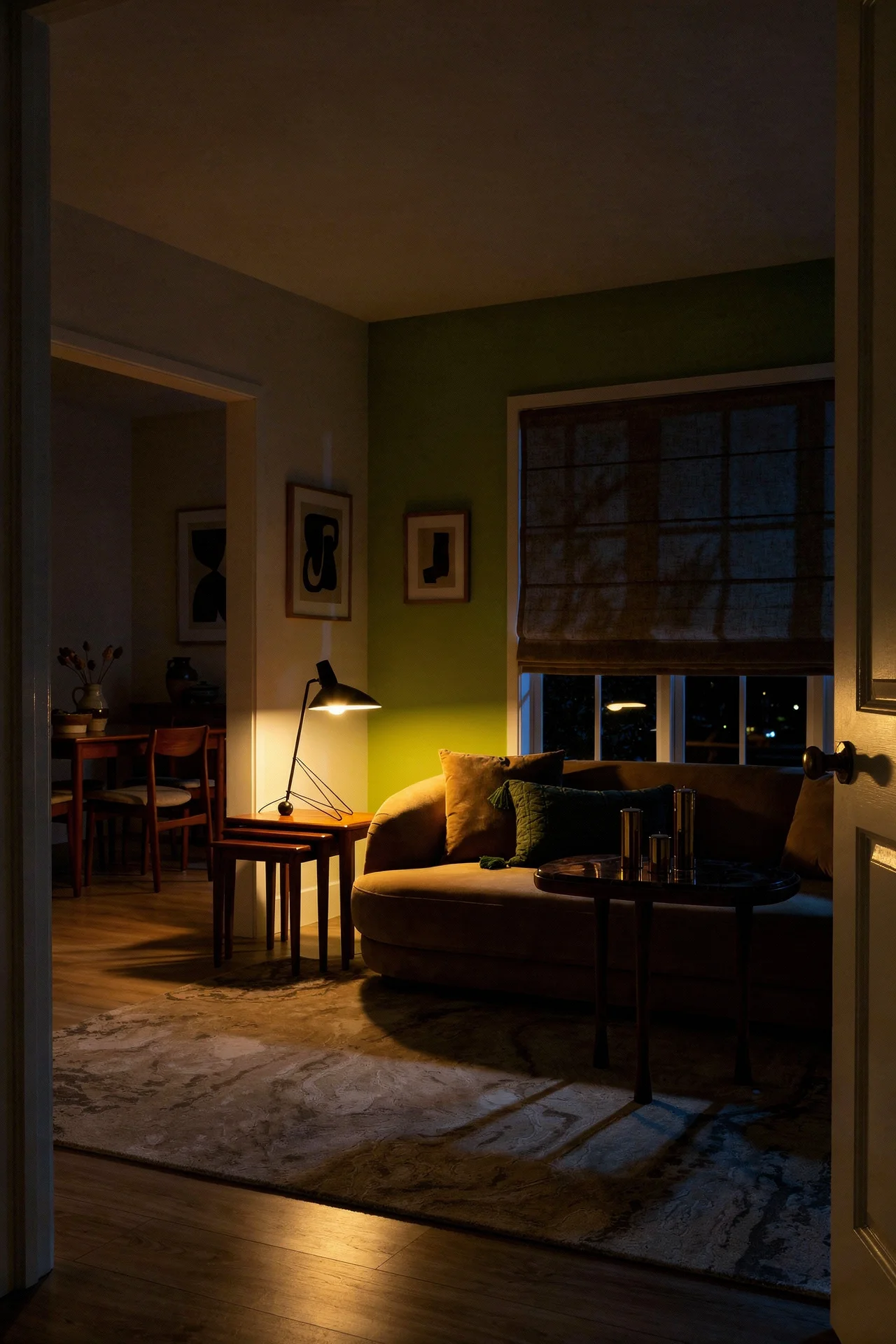
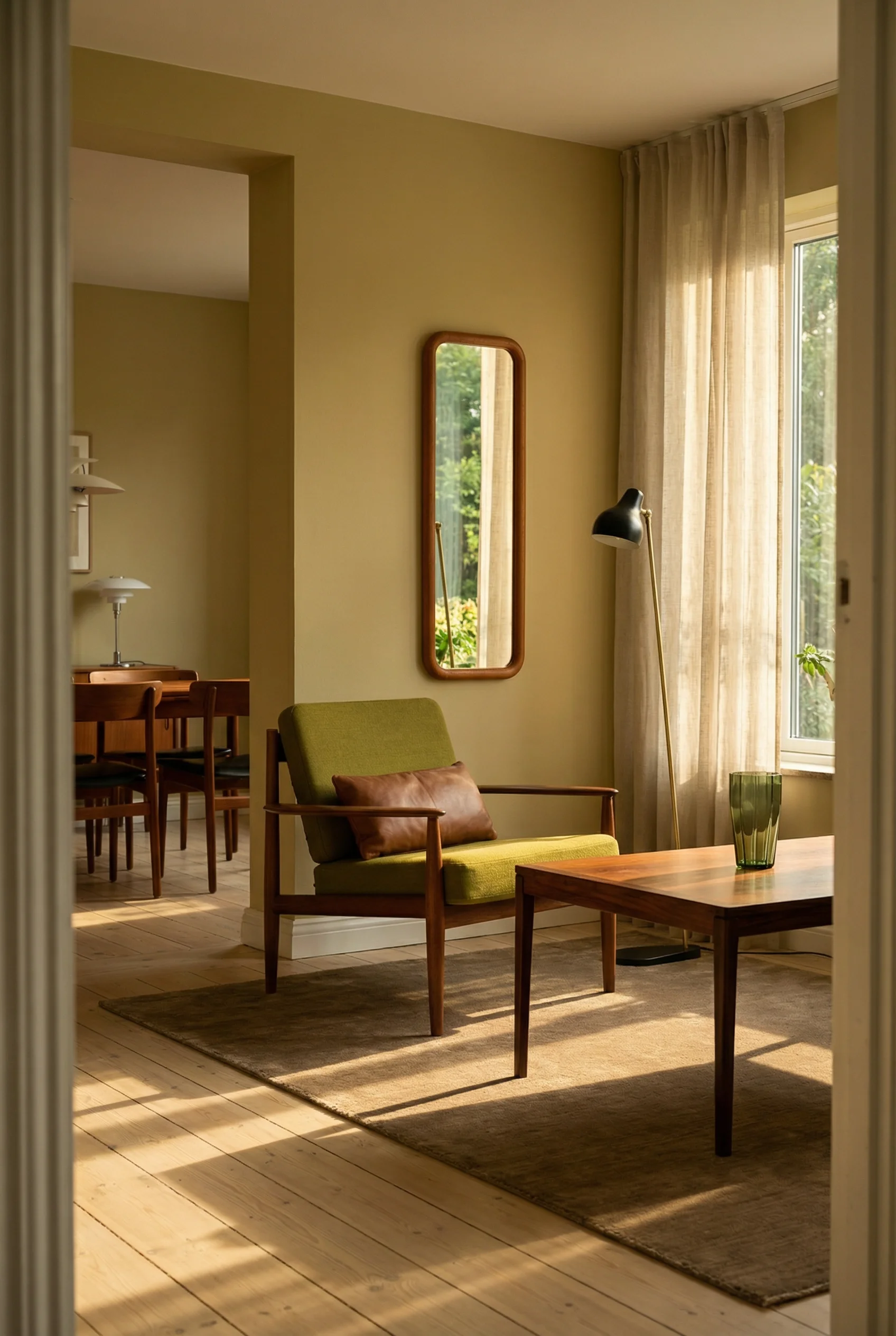
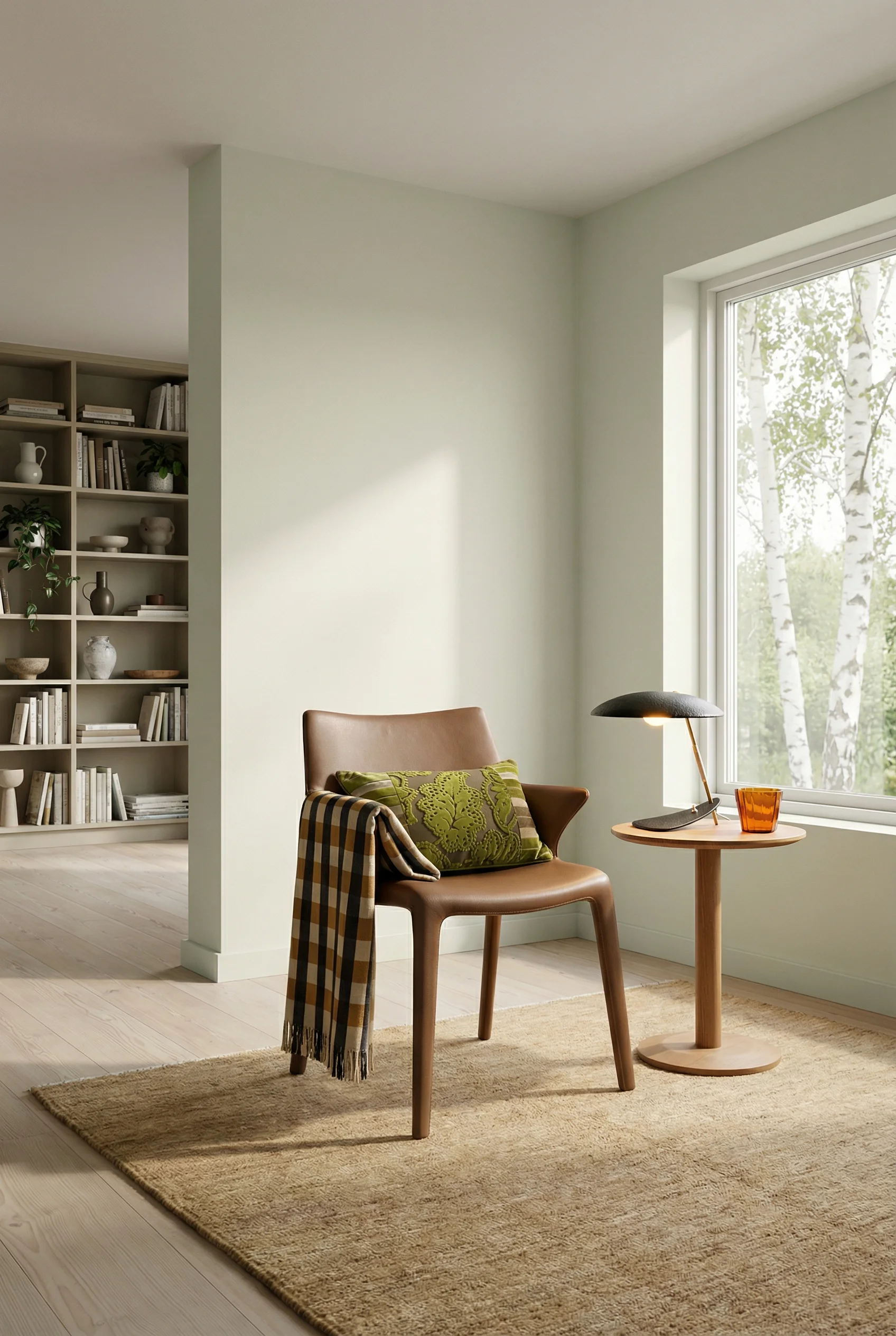
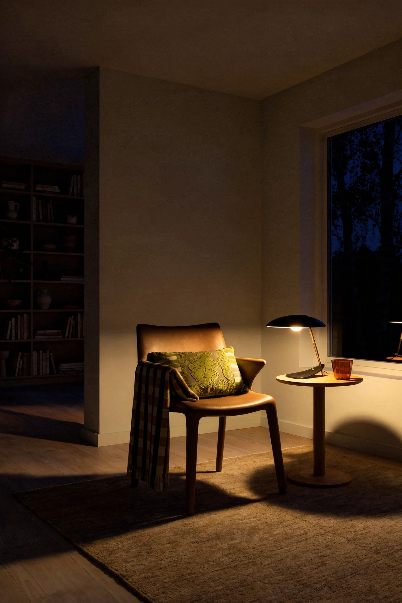
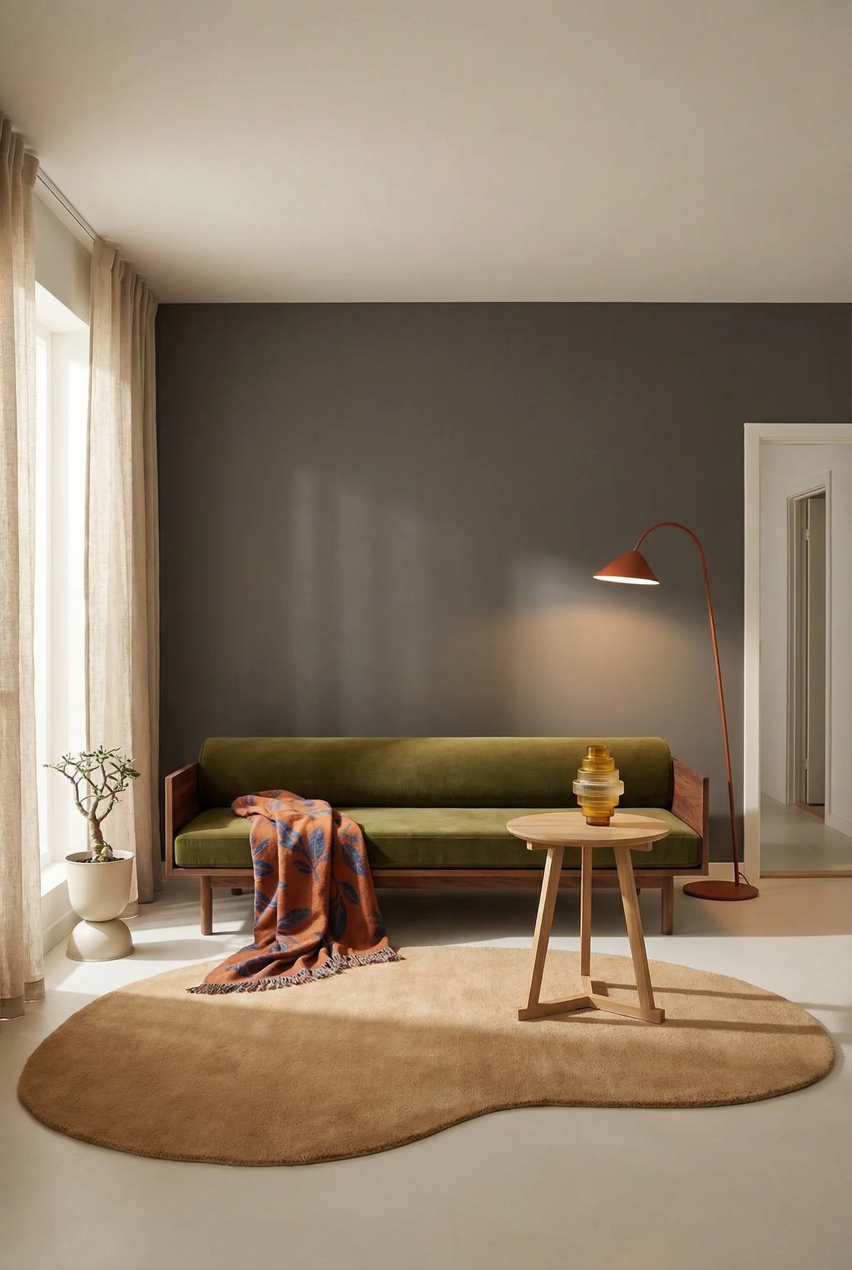
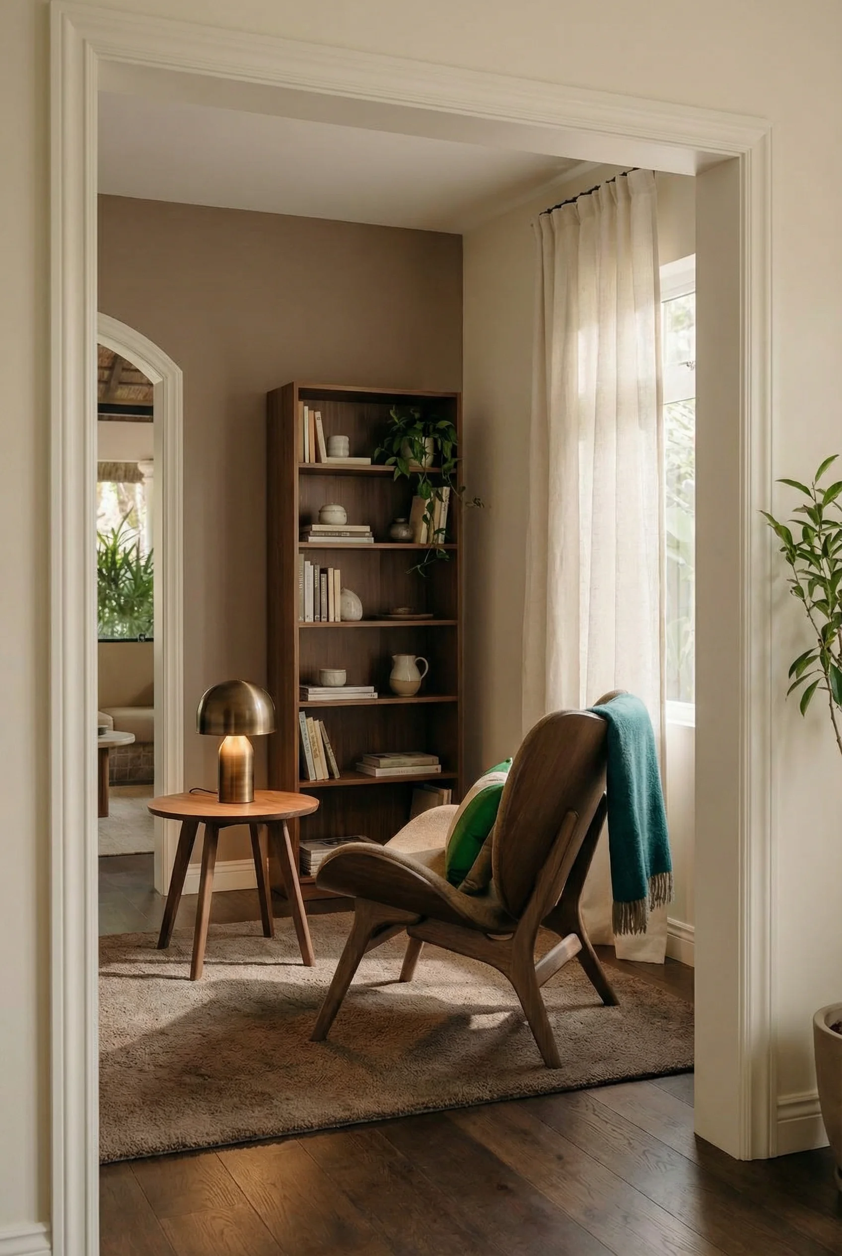
What makes MCM furniture instantly recognisable comes down to three traits. Tapered legs that angle outward, lifting everything off the floor. Low, horizontal profiles that stretch wide rather than tall. And organic curves where you’d expect sharp corners. A sofa with splayed wooden legs and a low back reads as mid century from across the room. A boxy couch on a solid base does not, no matter what colour it comes in.
The visual transparency is what makes these shapes so powerful in smaller spaces. When you can see the floor beneath your coffee table and sofa, your brain registers the room as larger than it is. I’d argue this is the single most effective trick for apartment dwellers. Forget accent walls and bold paint. Start with furniture that lets the floor plane flow uninterrupted.
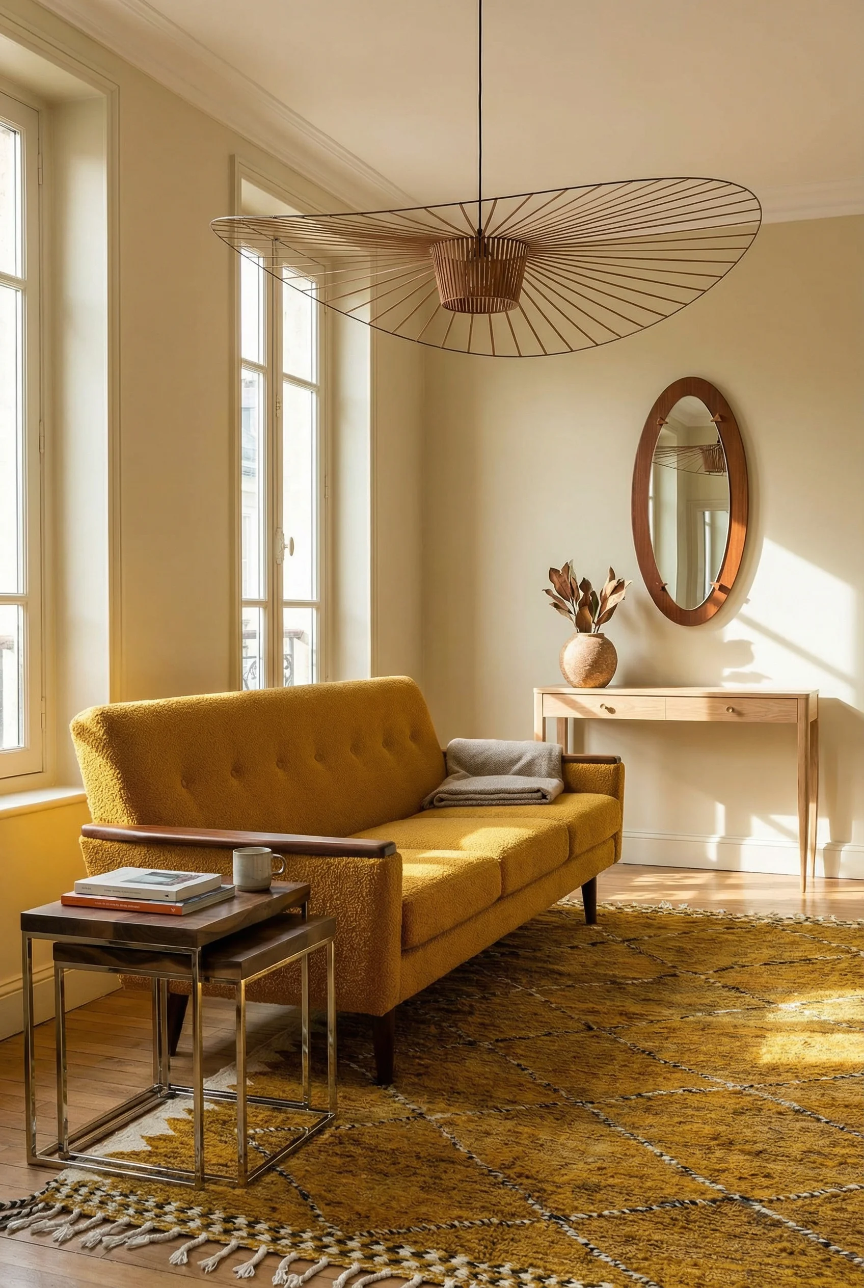
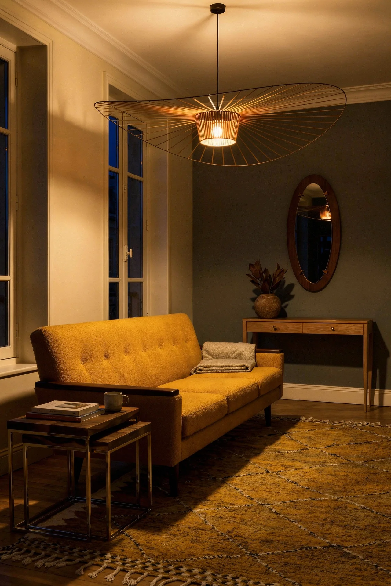
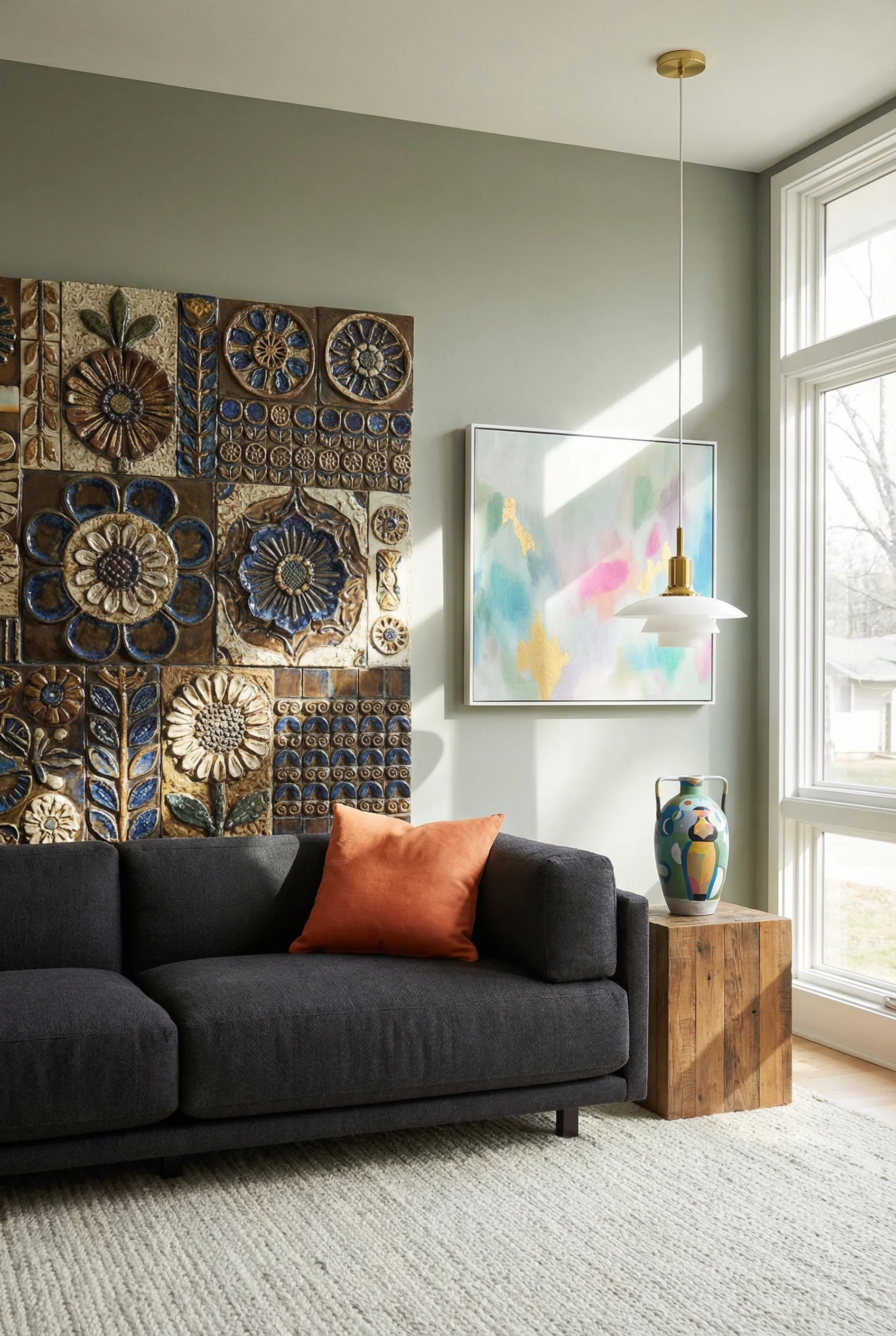
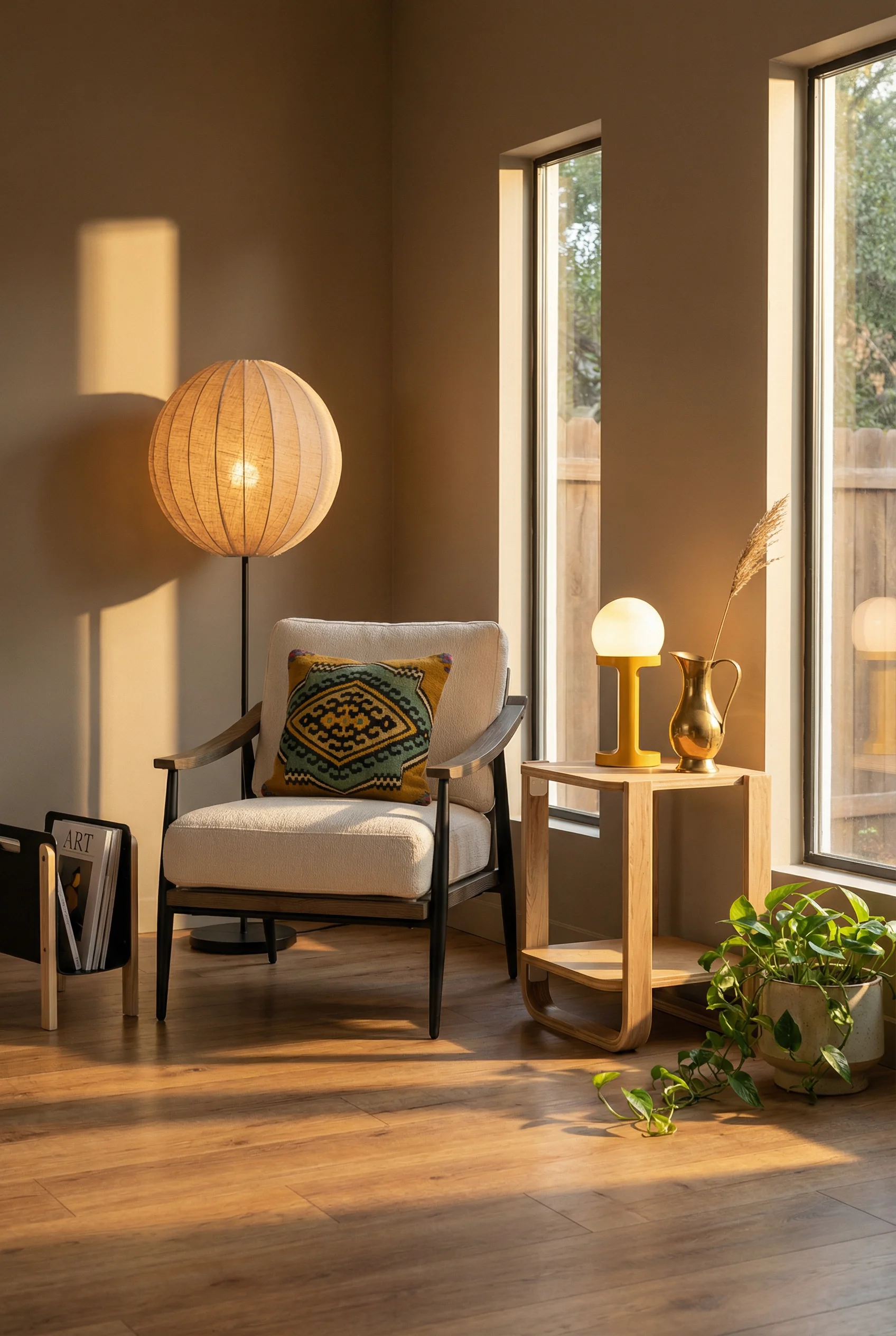
A walnut credenza with hairpin legs, a lounge chair with an exposed wood frame, a glass top side table on slim brass rods. Each one does double duty. It stores what you need while keeping the space visually open. If you can only change one thing in your living room, change the legs on your largest piece of furniture. Tapered leg kits exist for under thirty pounds. It is a ten minute swap that shifts the entire character of the room.
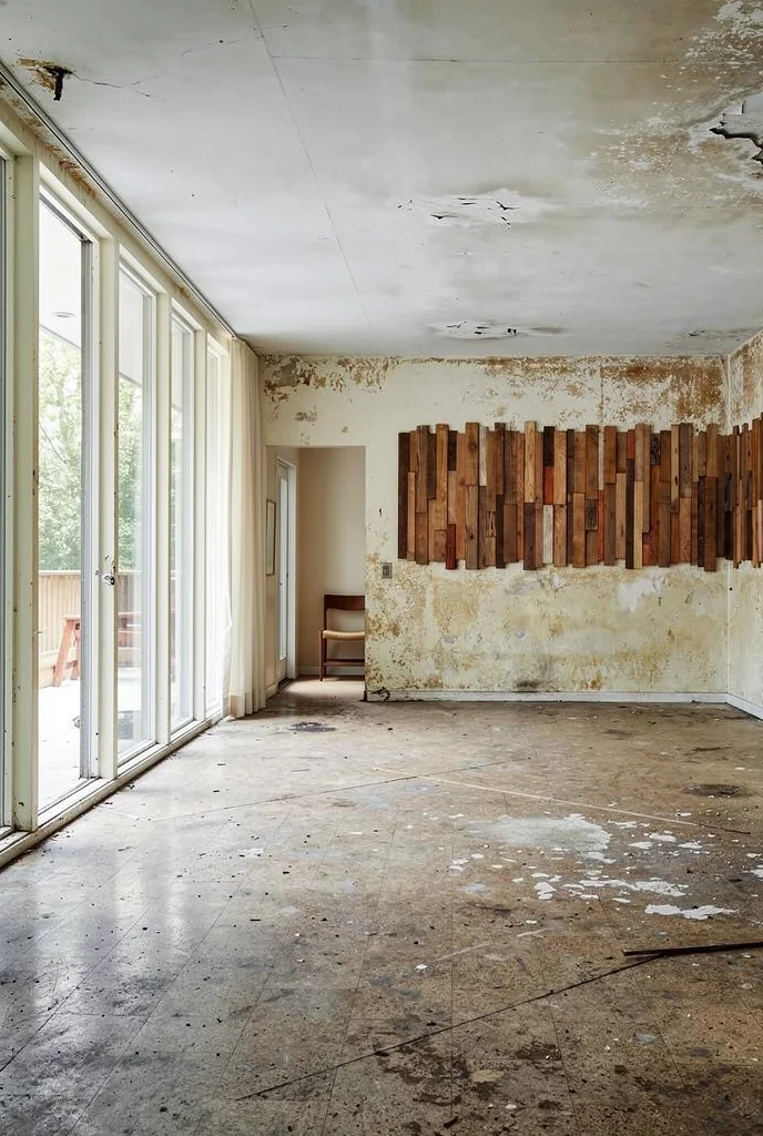
There is a persistent myth that all your wood has to match. Same species, same finish, same tone across every piece. MCM designers never worked this way. Walk through any Eichler home from the 1960s and you will find teak sideboards next to walnut coffee tables next to oak shelving. The variety was the point.
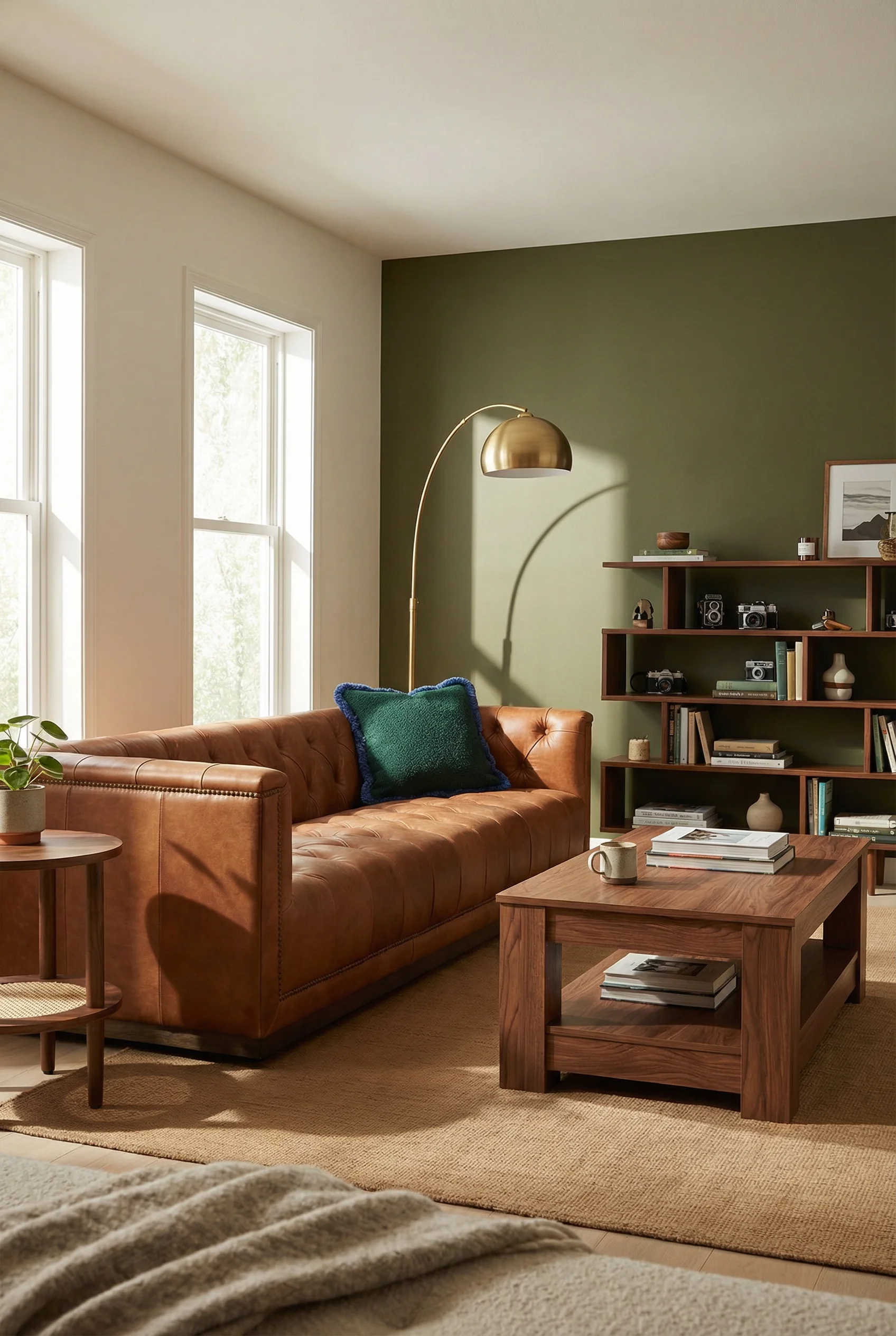
The key is understanding undertones rather than surface colour. Teak runs warm with a golden, almost orange base. Walnut sits cooler with a chocolate brown that leans slightly purple. Oak falls somewhere in the middle, a honey tone that bridges the gap. When you mix woods with different surface colours but similar warmth underneath, the room feels curated rather than chaotic.
I’d lean towards anchoring with one dominant wood and letting the others play supporting roles. If your media console is walnut, make walnut your 60 percent. Then bring in a teak side table at 30 percent and an oak plant stand at 10 percent. The 60/30/10 rule works for wood tones just as well as it works for colour.
One thing I’ve noticed is that people get nervous mixing vintage and new wood. Do not be. A 1960s teak credenza from a charity shop sitting next to a brand new walnut bookshelf looks better than two matching pieces from the same catalogue. The patina difference adds depth. The slight mismatch tells a story. That lived in quality is precisely what makes MCM rooms feel authentic rather than staged.
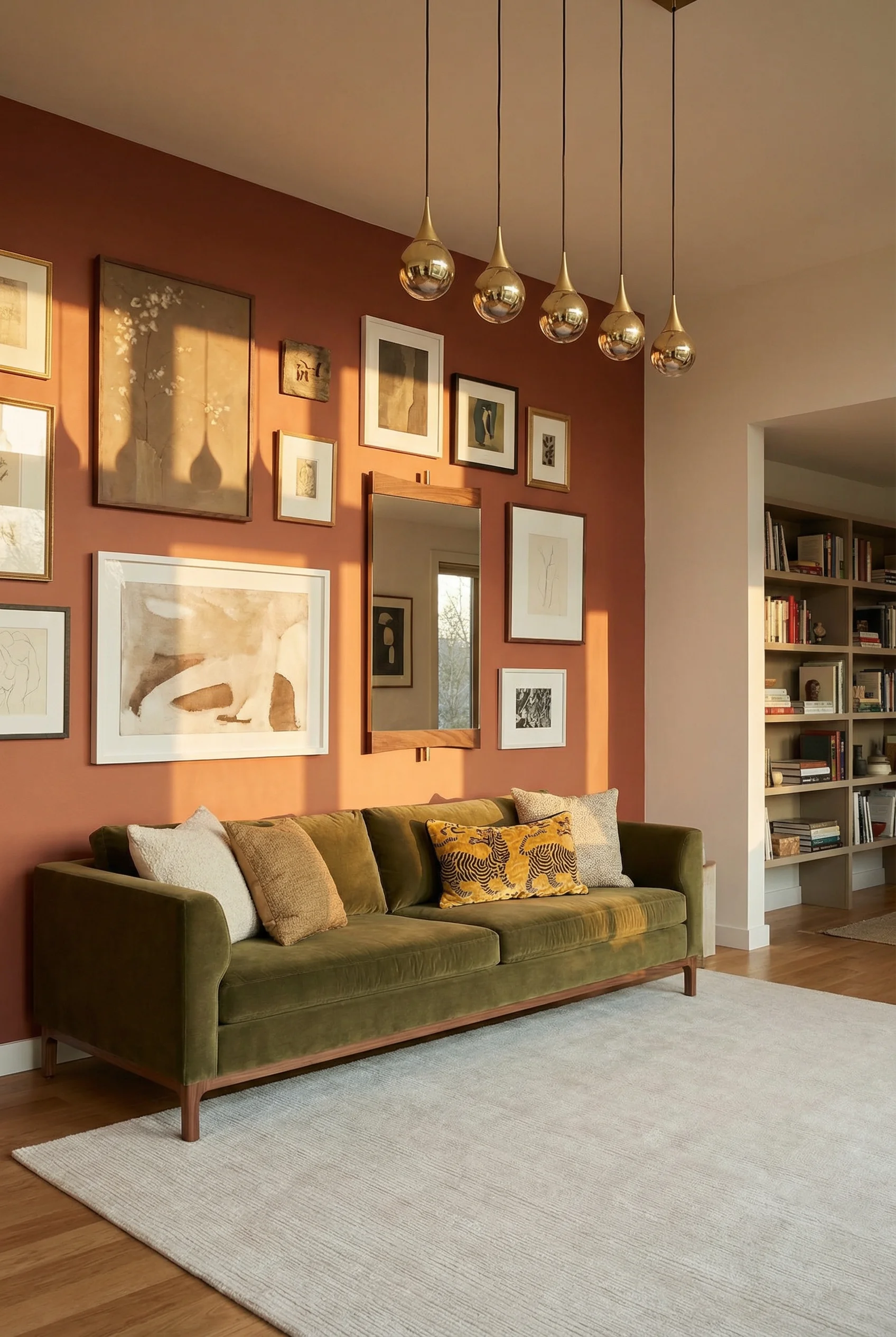
Gallery walls in a mid century modern space work differently than the maximalist salon hang you see elsewhere. MCM gallery walls are structured. Grid based. And they lean heavily on graphic prints, abstract forms, and the work of artists like Alexander Girard whose geometric motifs defined the era.
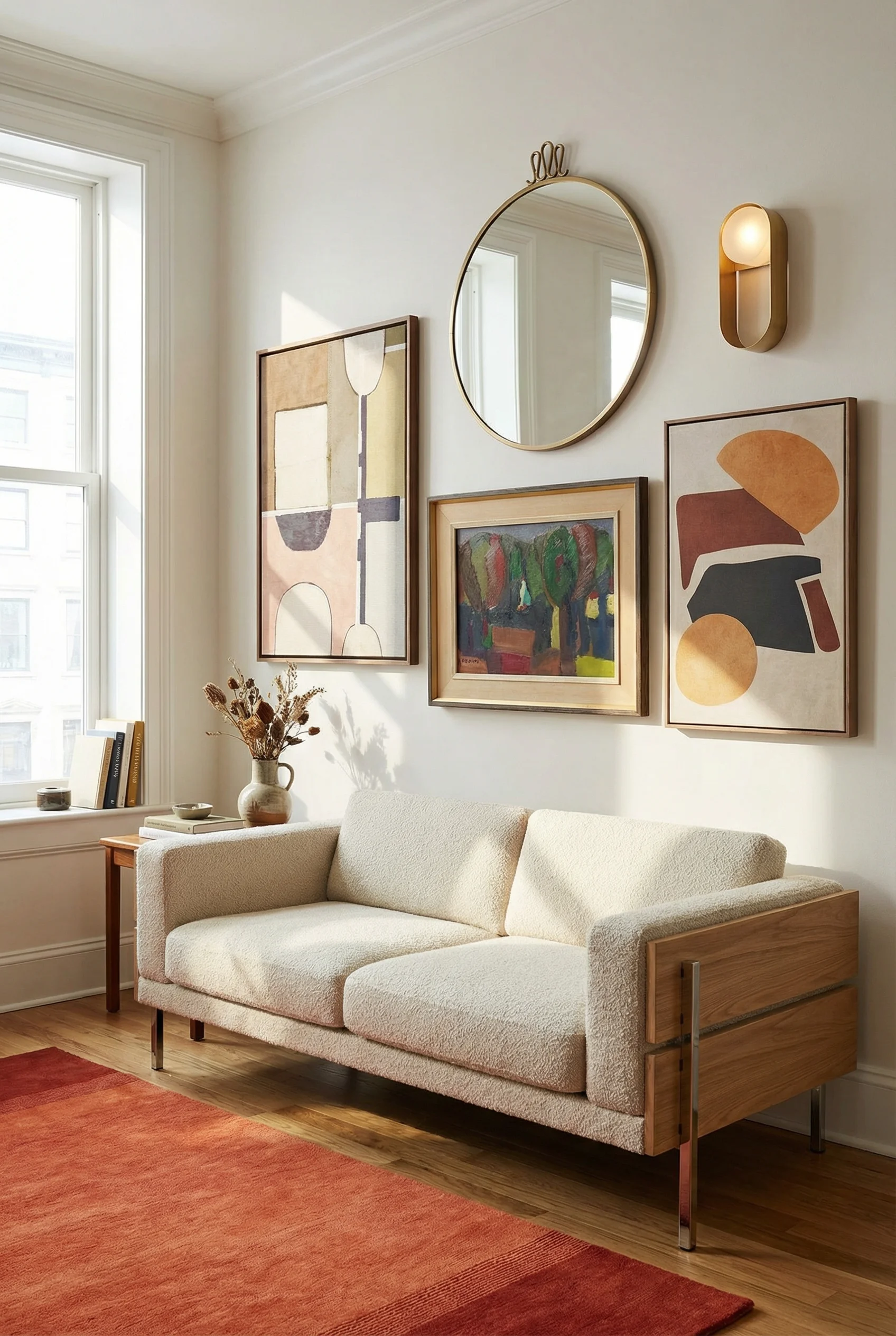
Start with a grid. Two rows of three, or three rows of three if you have the wall space. Keep the frames consistent in material and finish. Slim black frames or natural wood frames work best. This creates visual order while letting the art inside each frame do the talking. The grid format also happens to be the easiest to execute because you only need to measure spacing once and repeat.
What goes inside the frames matters more than the frames themselves. Mix original vintage prints with contemporary abstract pieces that share the MCM colour palette. A Girard textile sample, a mid century travel poster, a geometric abstract in mustard and teal. I think the mistake most people make is filling every frame with the same type of art. Vary the medium. A photograph next to a screen print next to a textile swatch creates the kind of visual rhythm that keeps your eye moving.
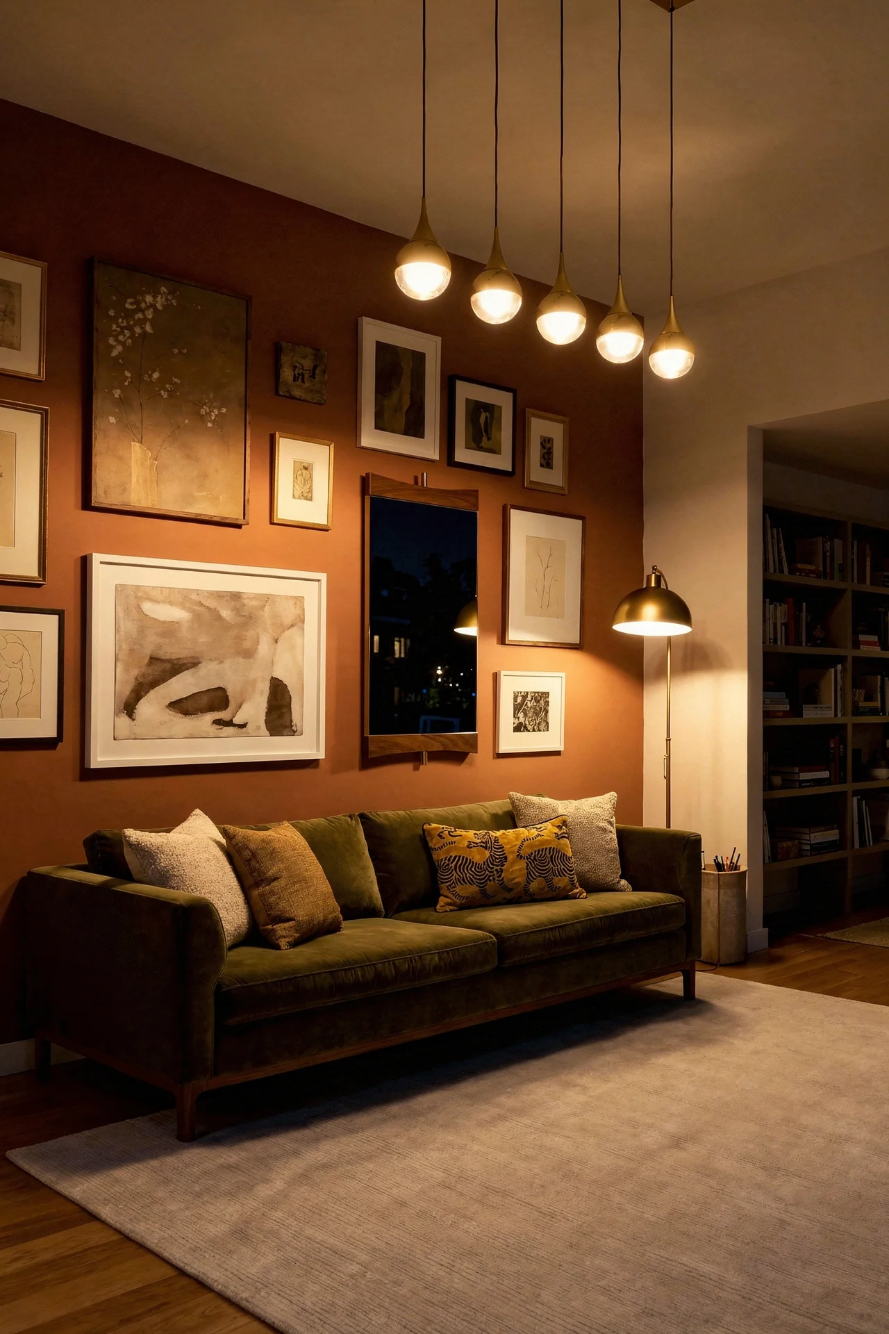
The placement is where apartments have an advantage. In a home with tall ceilings, a gallery wall can feel lost. In an apartment with standard ceiling height, a gallery wall fills the vertical space beautifully and draws the eye upward. Hang the centre line of your grid at eye level, roughly 145cm from the floor. This creates the illusion of height without you doing anything else to the room.
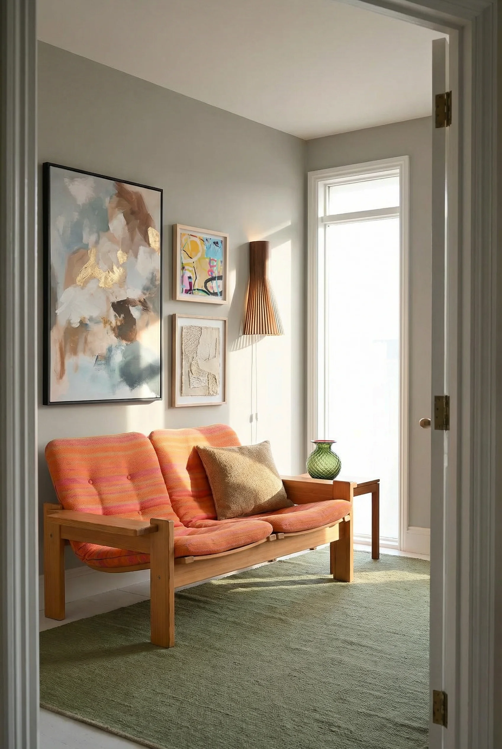
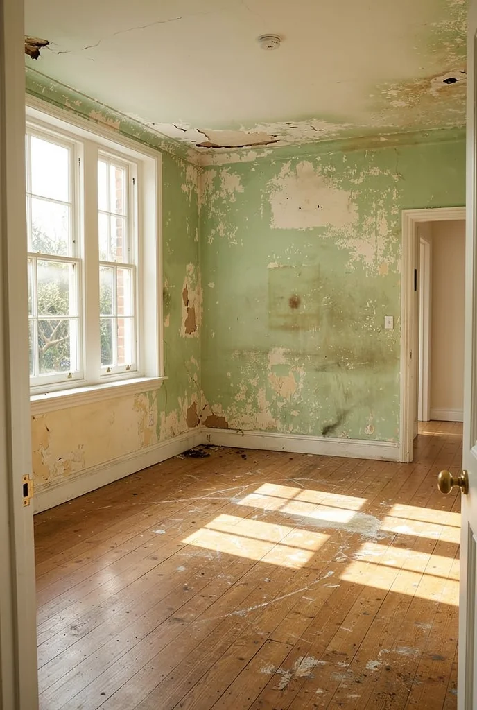
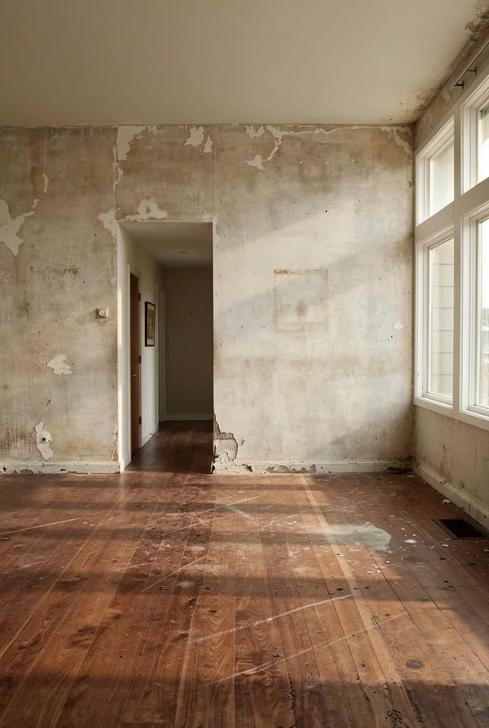
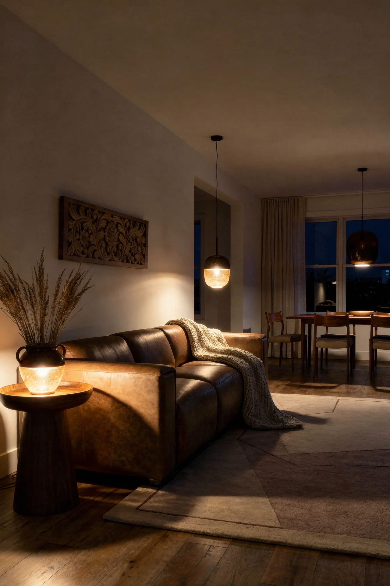
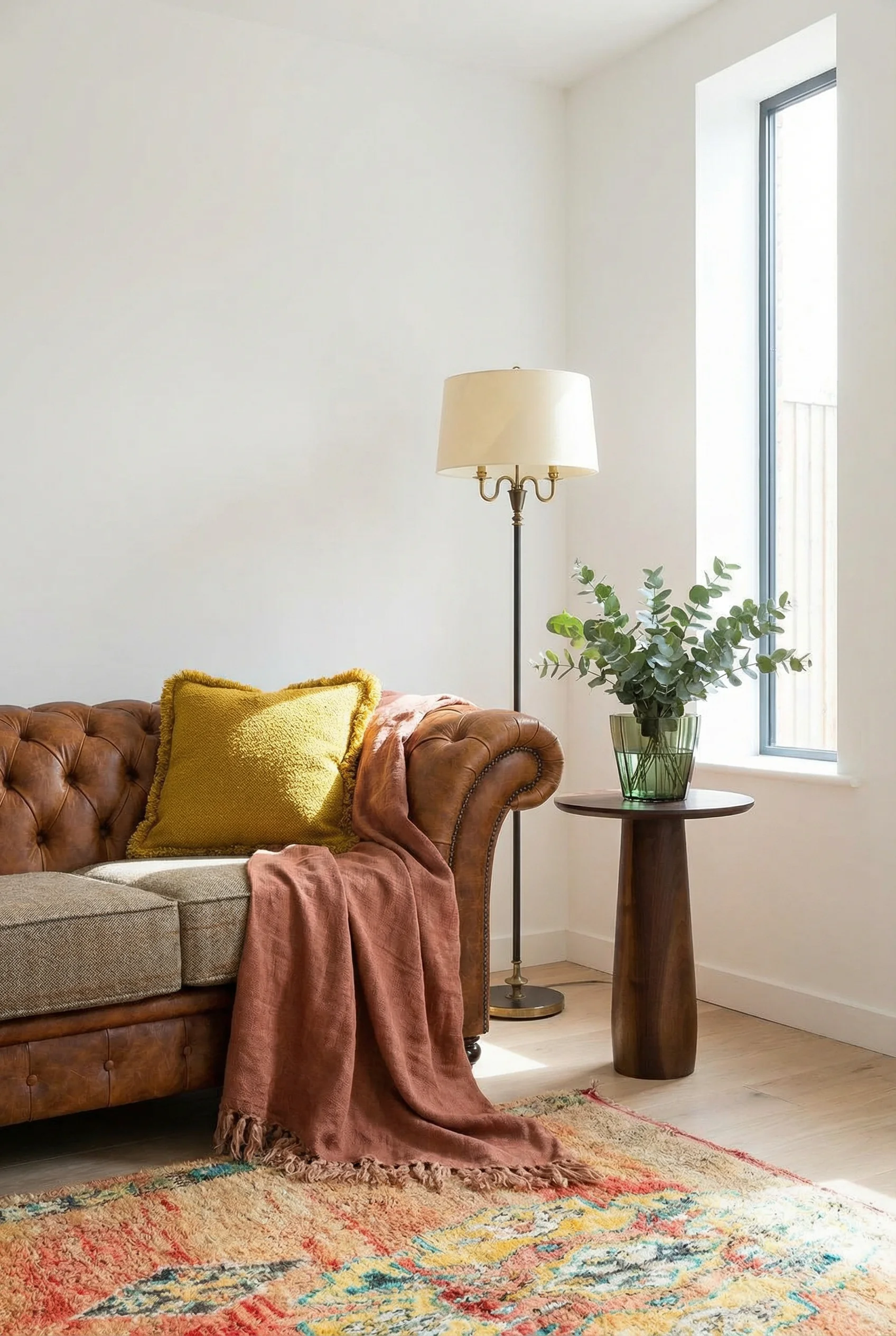
I have seen hundreds of mid century modern living rooms that look technically correct but feel flat. Every piece is new. Every finish is pristine. Every angle is precise. And somehow the whole thing looks like a furniture showroom instead of a place where someone actually lives. The fix is almost always the same. One vintage piece.
A vintage side table is the ideal entry point because it carries low risk and high reward. Side tables are small enough to experiment with, affordable enough at vintage markets (expect to pay between 40 and 150 pounds for a genuine 1960s piece), and visible enough to shift the character of an entire seating area.
What you are looking for is patina. A slightly worn teak top with visible grain. Brass hardware that has developed that warm amber oxidation. Tapered legs with minor scuffs that tell you this piece lived through five decades of actual use. These marks are not damage. They are proof of quality. Cheap furniture from the 1960s did not survive to 2026. What you find in vintage shops lasted because it was built properly in the first place.
Place the vintage piece next to something new. The contrast is immediate and powerful. A brand new sofa with a vintage side table instantly reads as collected, not purchased. In my view, this is the fastest way to make a mid century living room feel like it belongs to a real person rather than a Pinterest board.
Mid century modern architecture pioneered the open floor plan. Eichler, Neutra, and Breuer all designed homes where the kitchen flowed into the dining area which flowed into the living space with minimal walls between them. If your apartment already has an open layout, you are closer to authentic MCM spatial design than you might realise.
The challenge with open plan spaces is defining zones without building walls. MCM offers three strategies that work perfectly in apartments. First, use rugs as boundaries. A large geometric rug under your seating area creates a visual anchor that separates the living zone from the dining zone. The rug should be big enough that all furniture legs sit on it. A rug that floats in the middle of the seating arrangement actually makes the space feel smaller.
Second, float your furniture. Pull the sofa away from the wall and position it to face the room. This feels counterintuitive in a small space, but it creates a walkway behind the sofa that functions as a traffic path. The room suddenly has circulation. It feels larger because movement through it is easier.
Third, use vertical storage to separate zones. A Poul Cadovius style wall mounted shelving unit between the living and dining areas works as a room divider without blocking sightlines. You get storage, you get separation, and you keep the open flow that makes the layout work. I think this is one of the most underrated MCM strategies for modern apartments. A modular shelf system does three jobs at once and costs less than a partition wall.
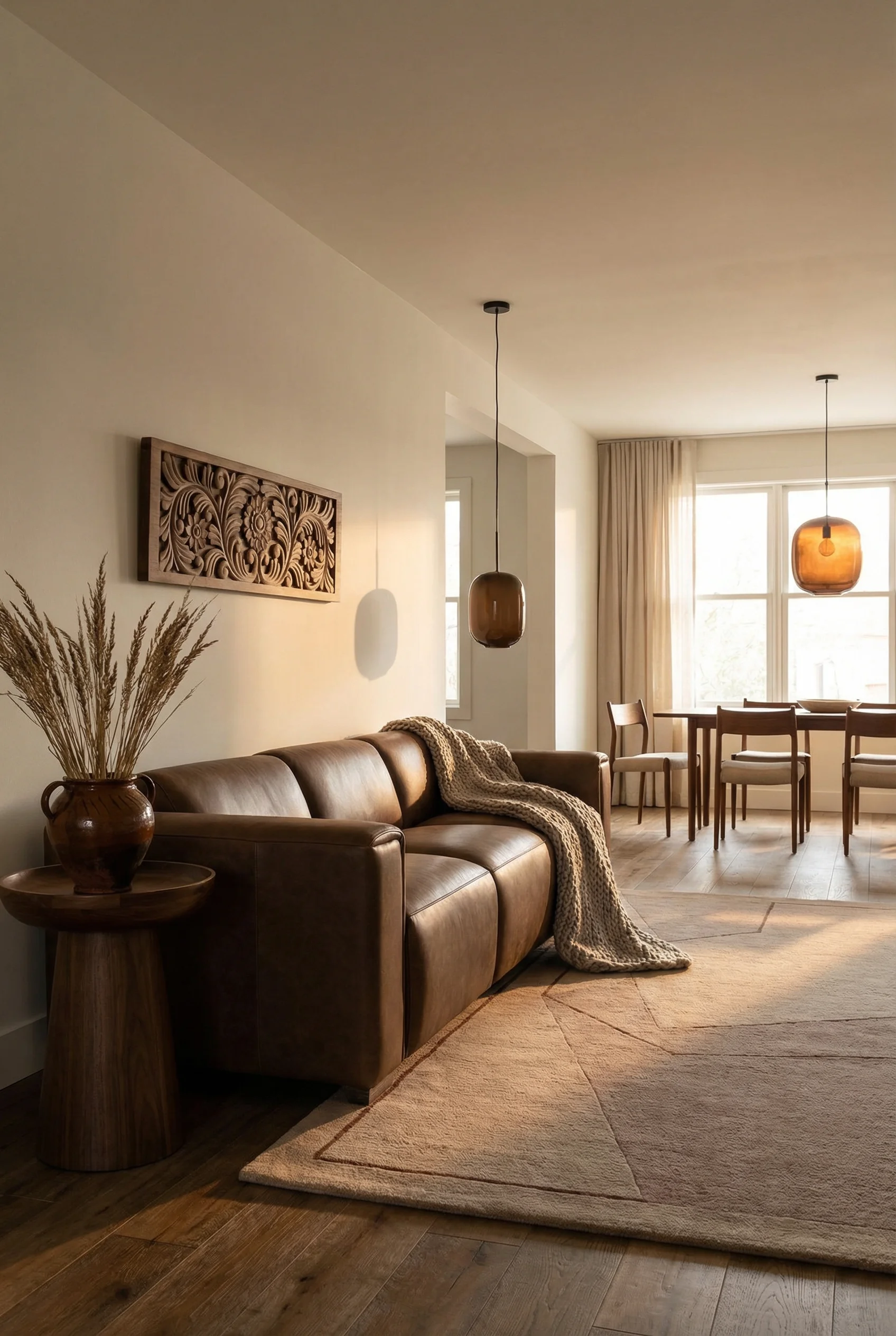
The crossover between Scandinavian and mid century modern design is not a trend. It is a shared family tree. Danish designers like Hans Wegner, Arne Jacobsen, and Finn Juhl were mid century modern. Their work sits at the exact intersection of both movements. Warm wood, functional form, clean lines, organic curves. Scandi MCM is not a hybrid. It is the original.
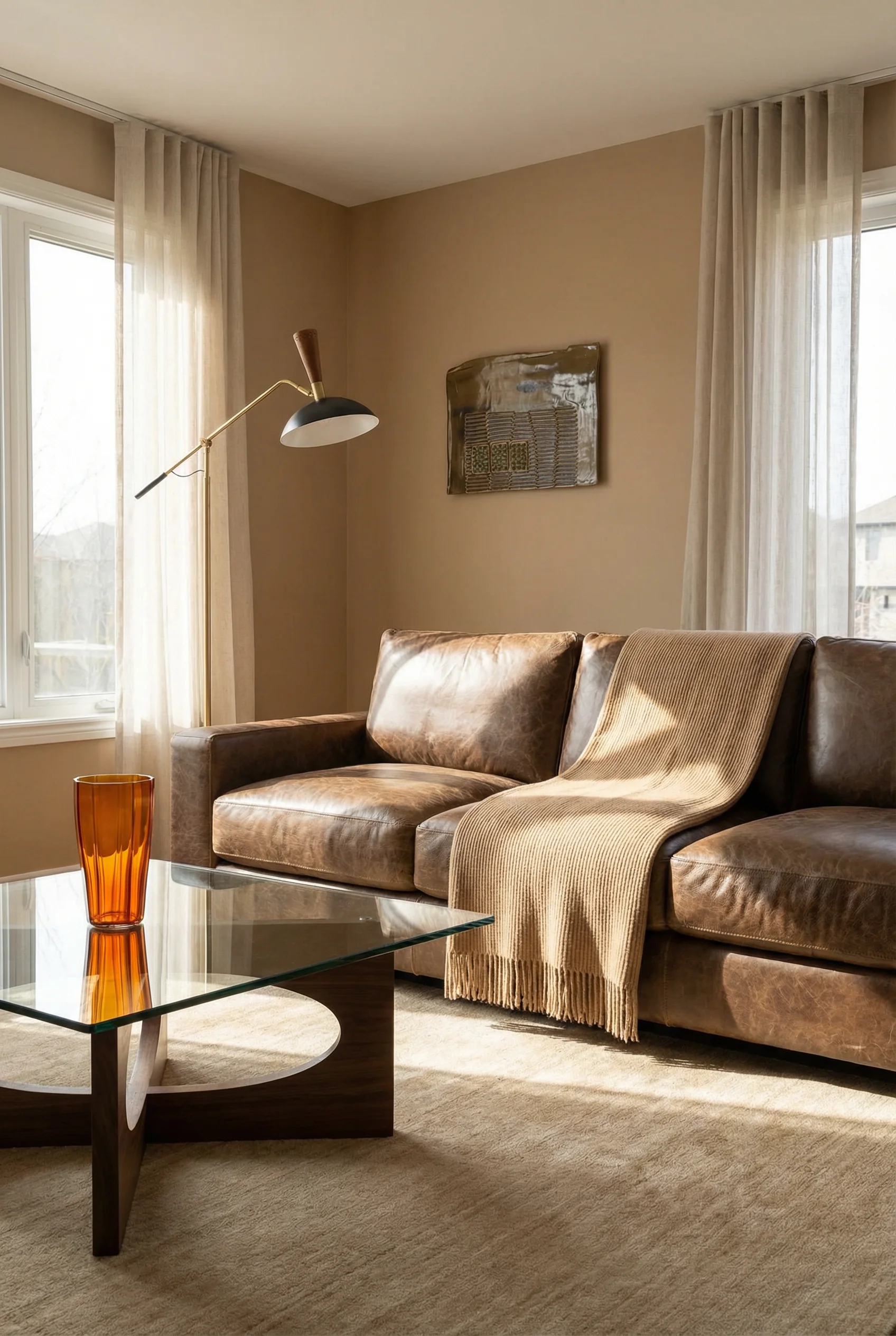
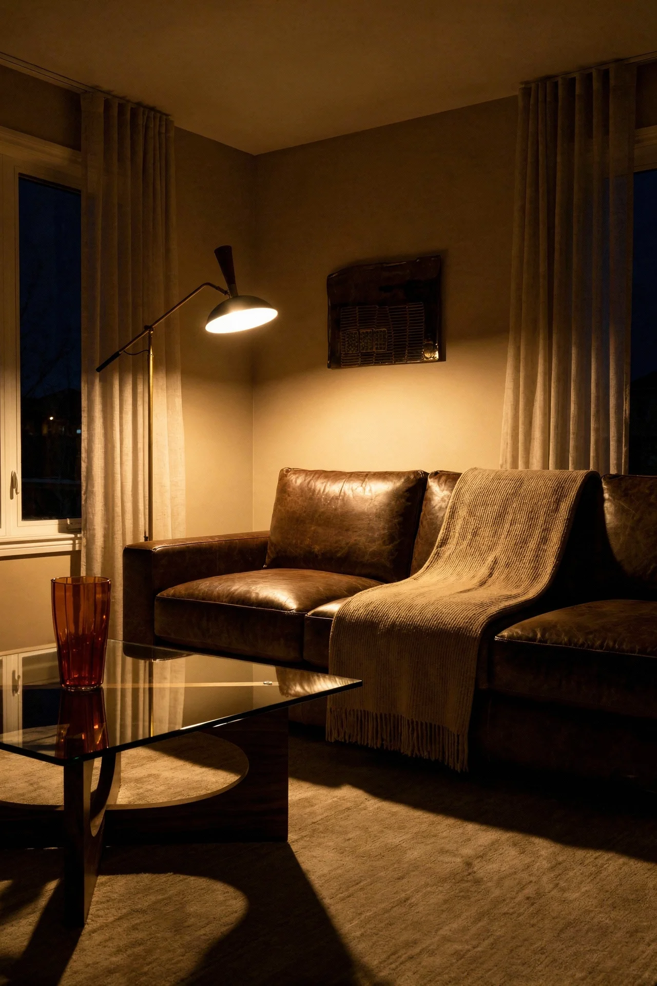
What Scandinavian influence adds to an MCM living room is lightness. American mid century design tends towards darker woods, bolder colours, and more dramatic statement pieces. Scandinavian mid century works with pale ash and beech, softer greys, and a quieter palette that lets the furniture shapes take centre stage.
In my experience, the best Scandi MCM rooms use colour temperature as the unifying element rather than matching wood species. Everything in the room runs warm. Warm whites on the walls instead of cool ones. Warm toned wood on the furniture. Warm textiles in cream and camel rather than grey and charcoal. When the temperature is consistent, the mix of Scandinavian and American pieces feels effortless.
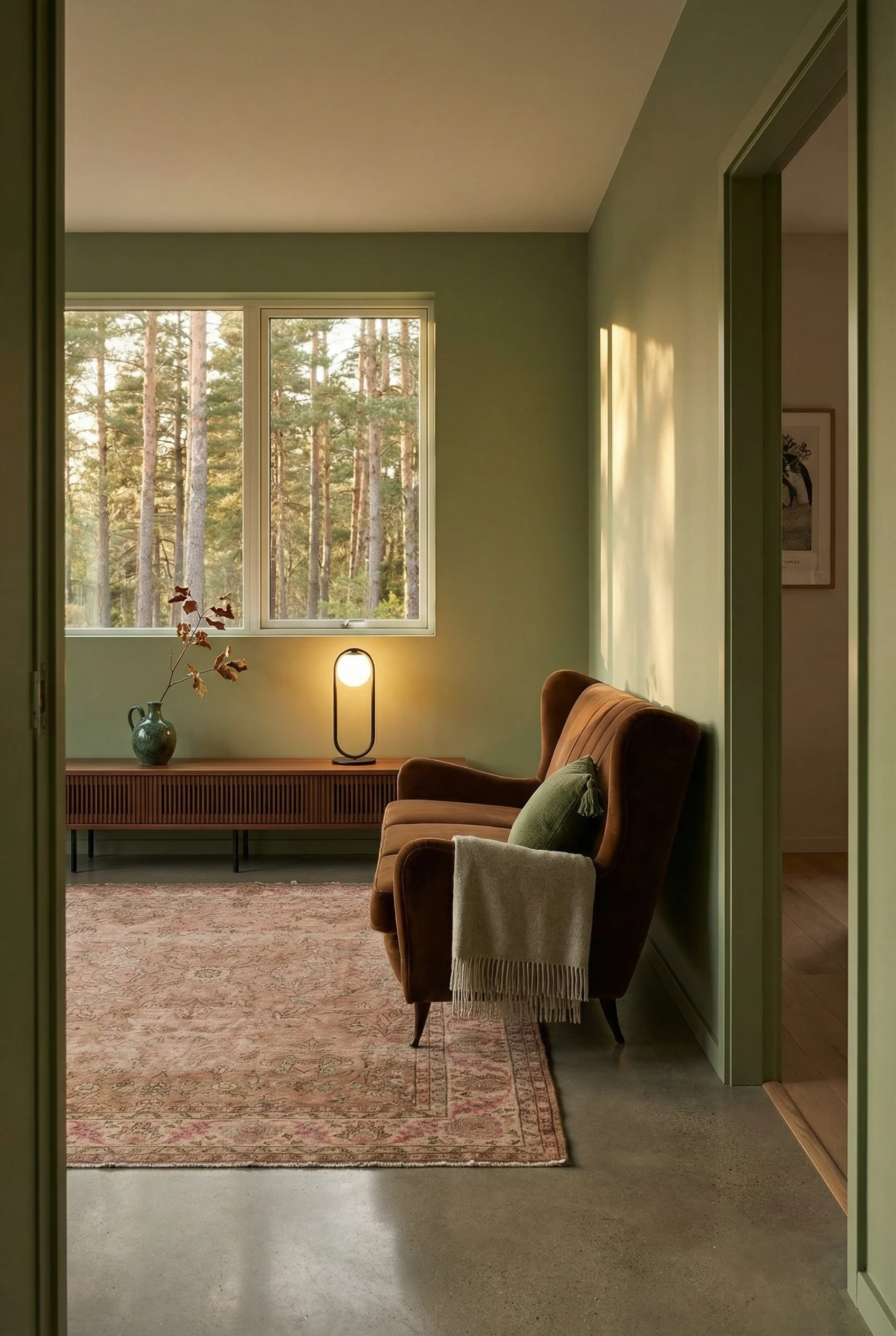
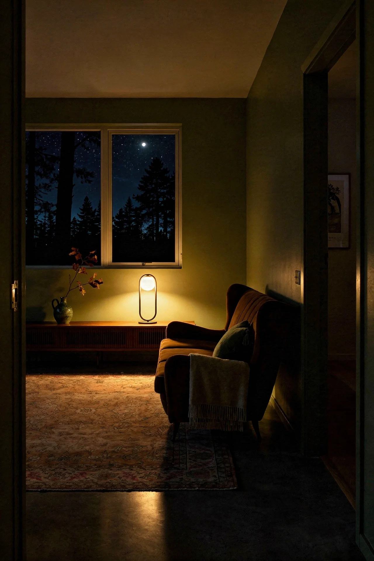
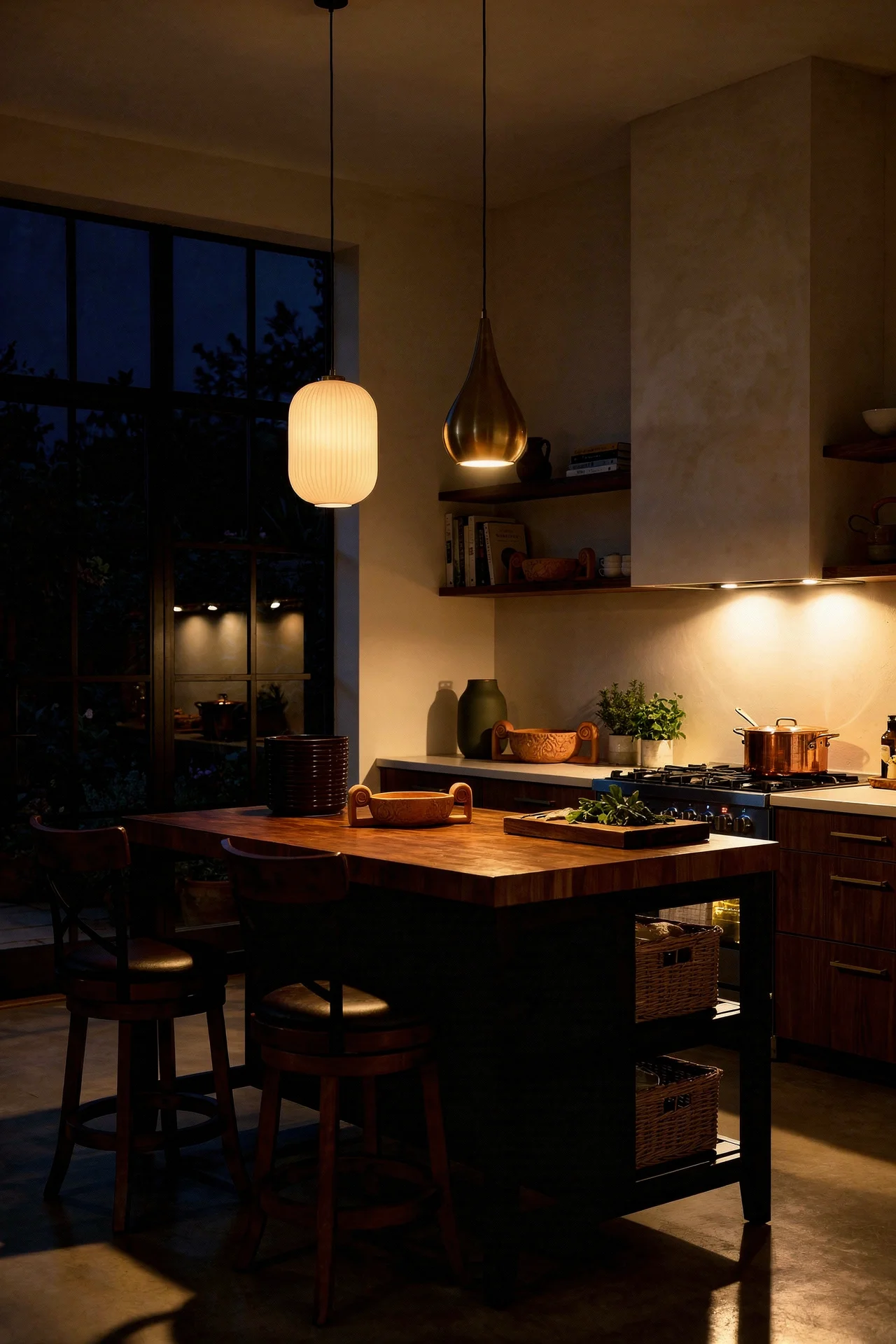
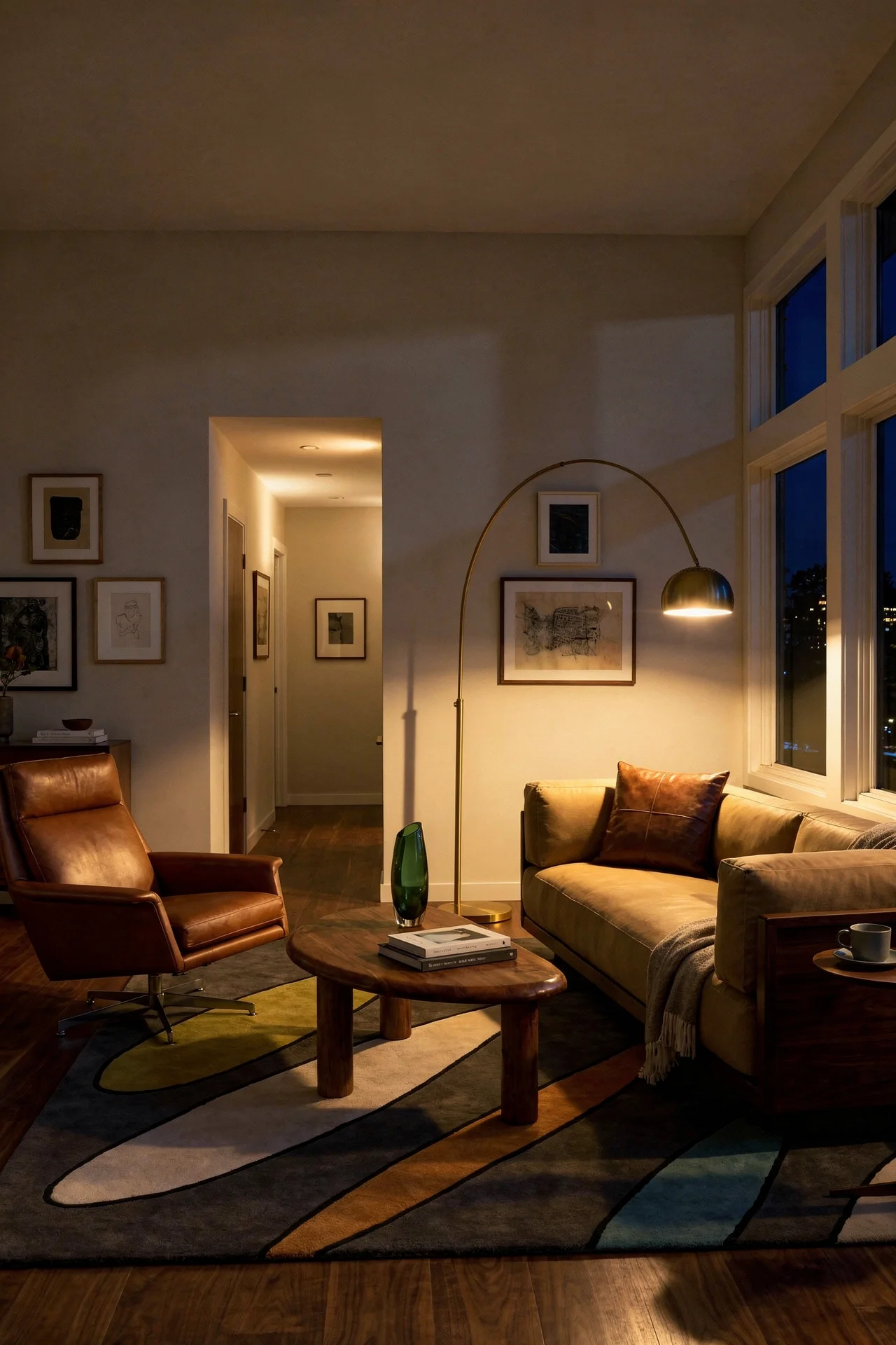
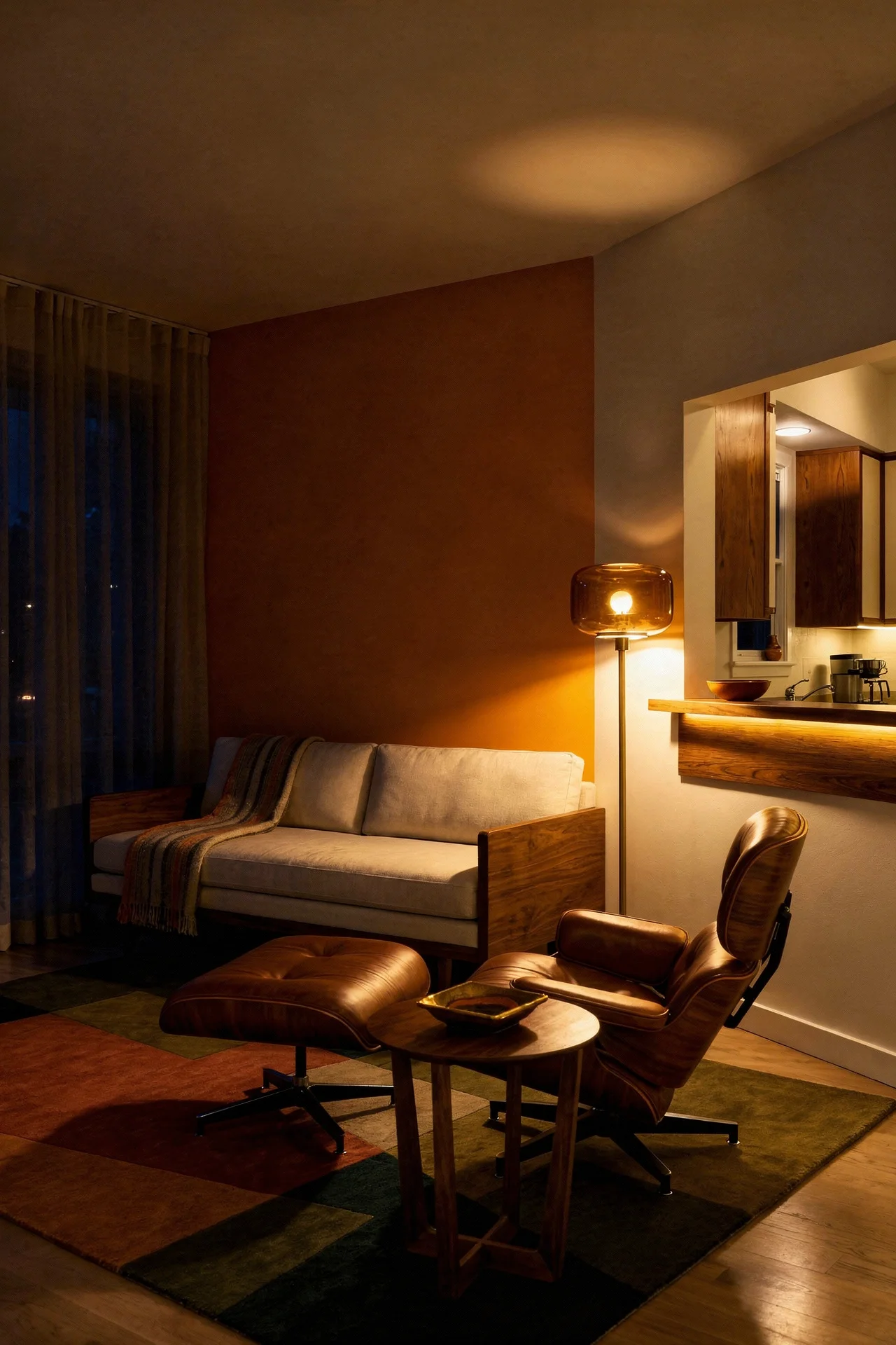
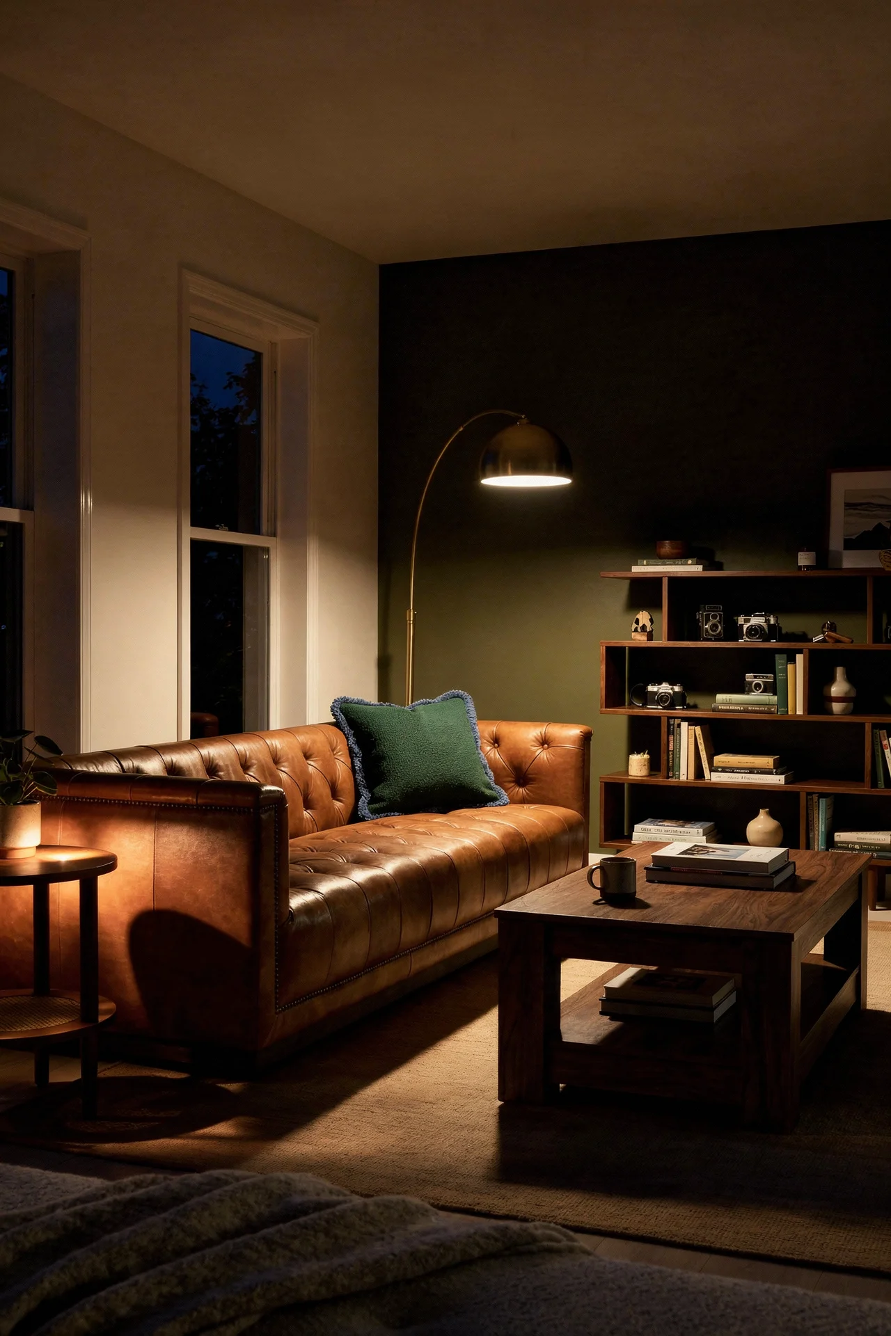
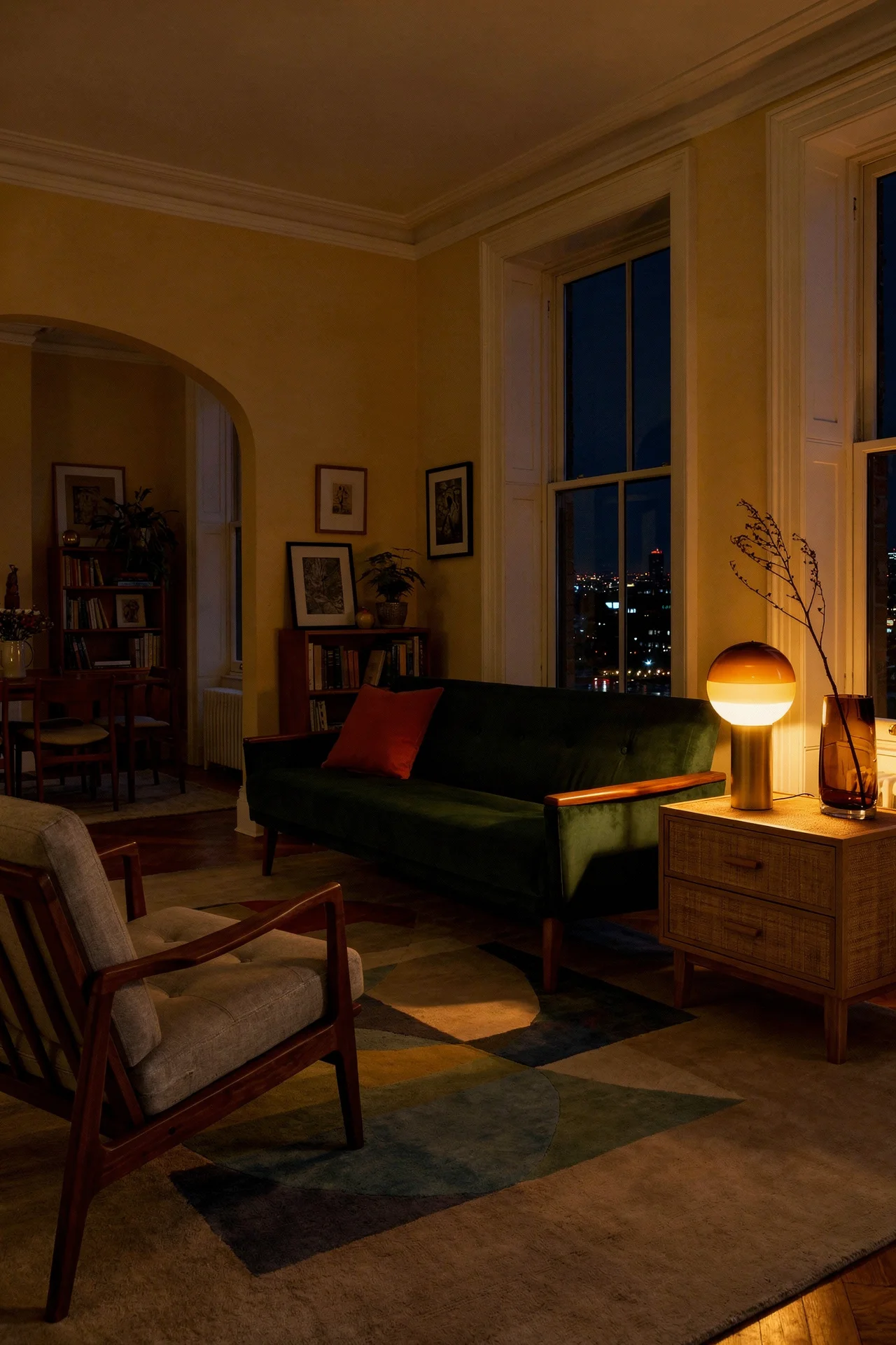
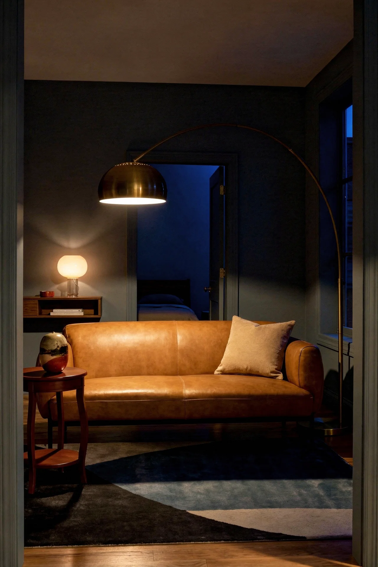
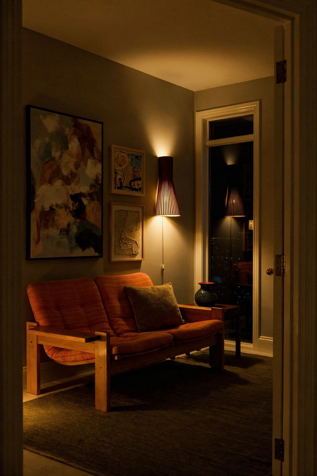
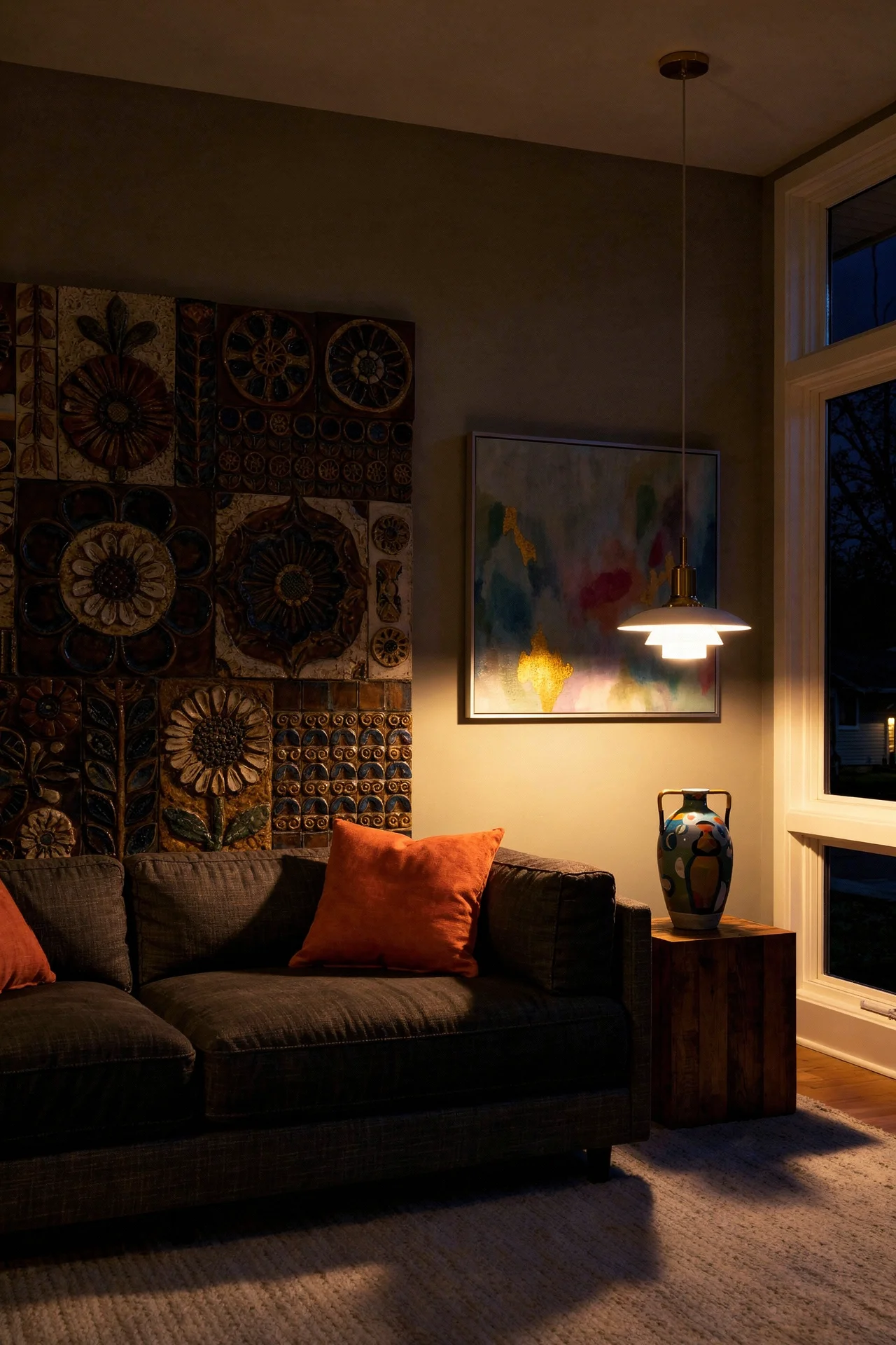
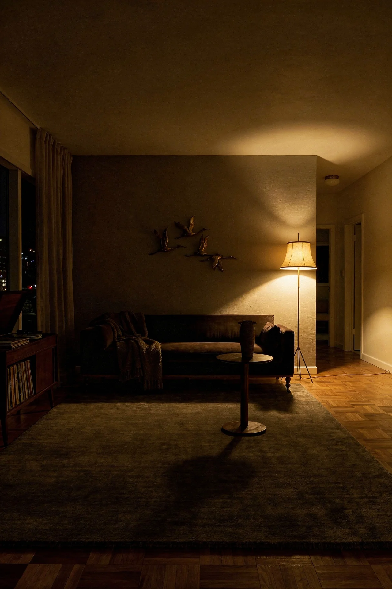
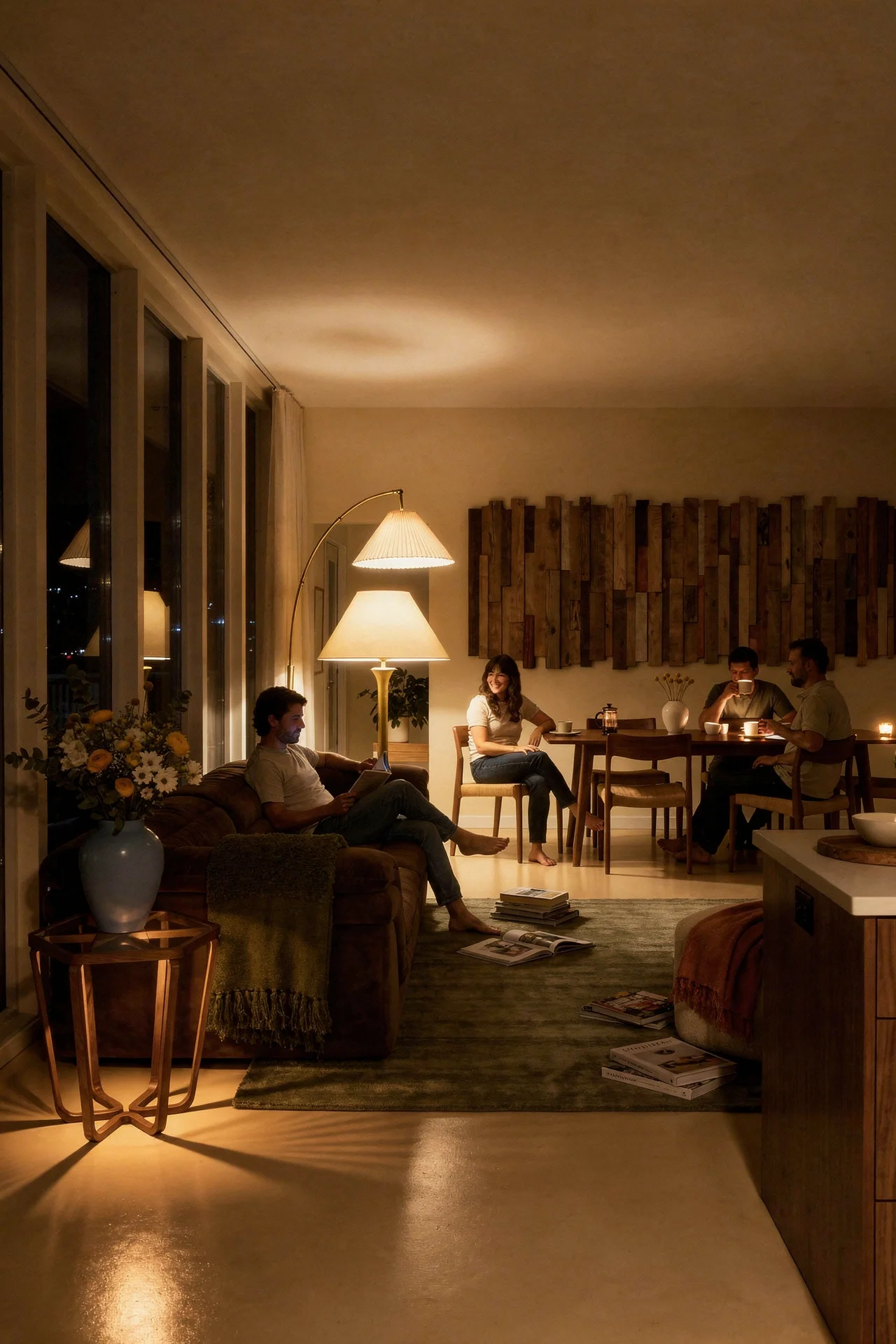
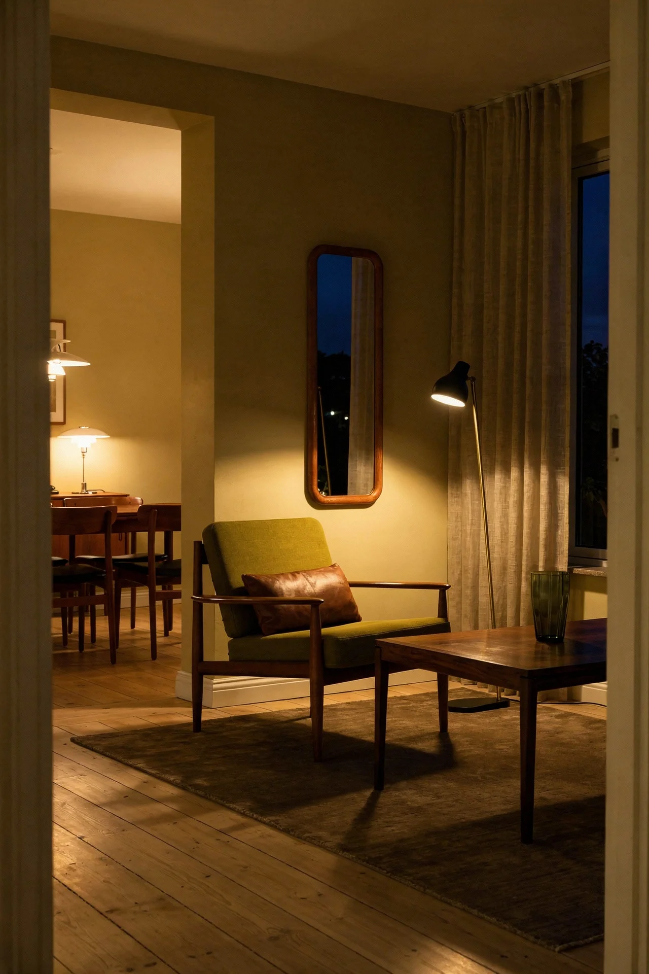
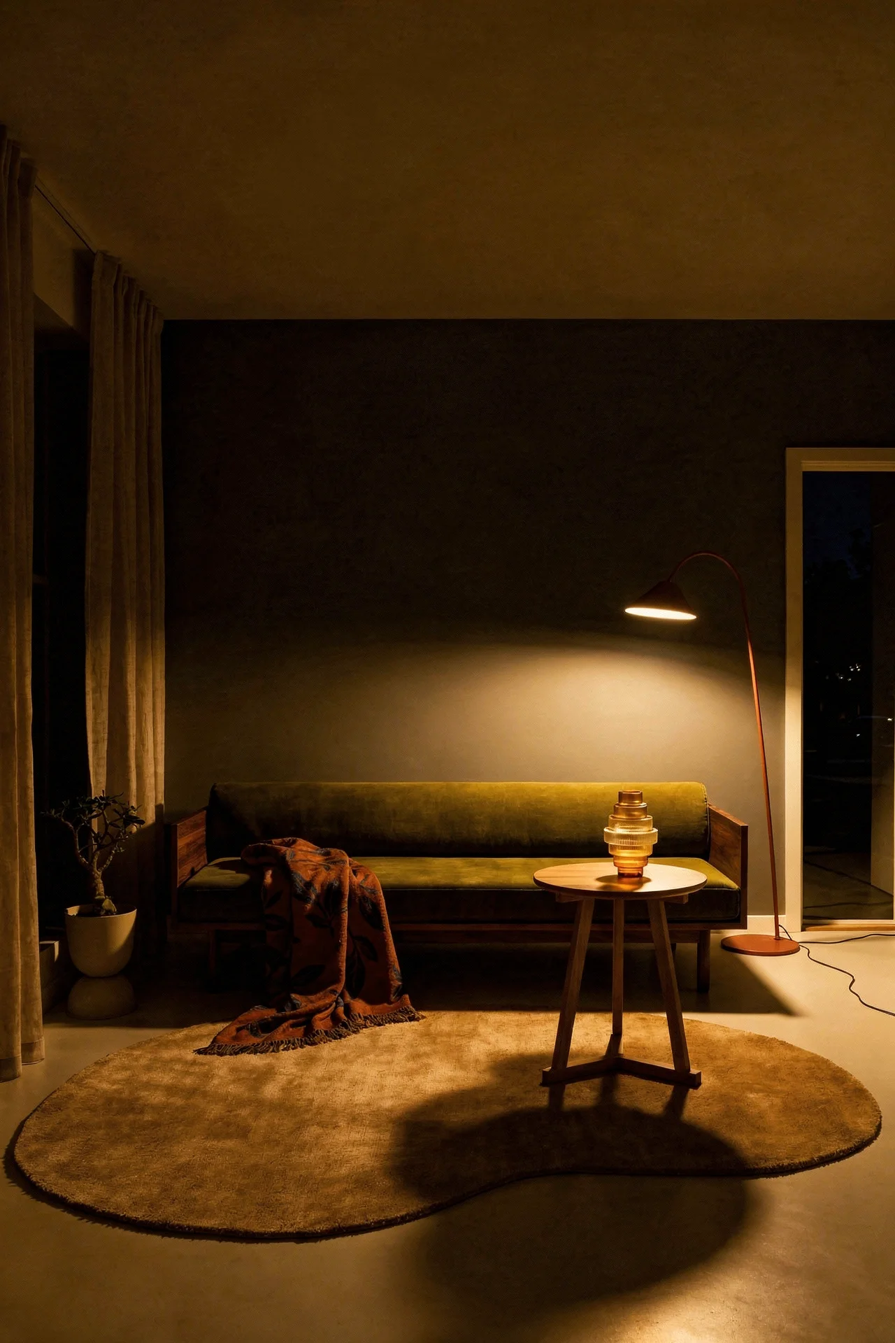
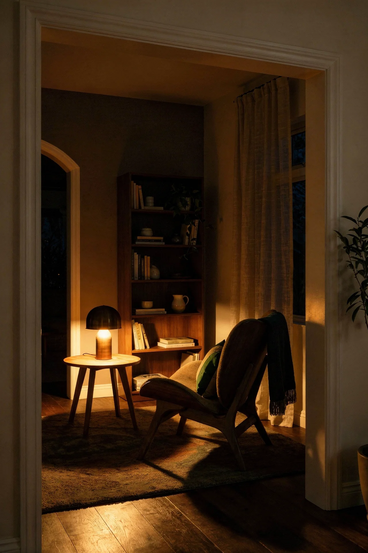
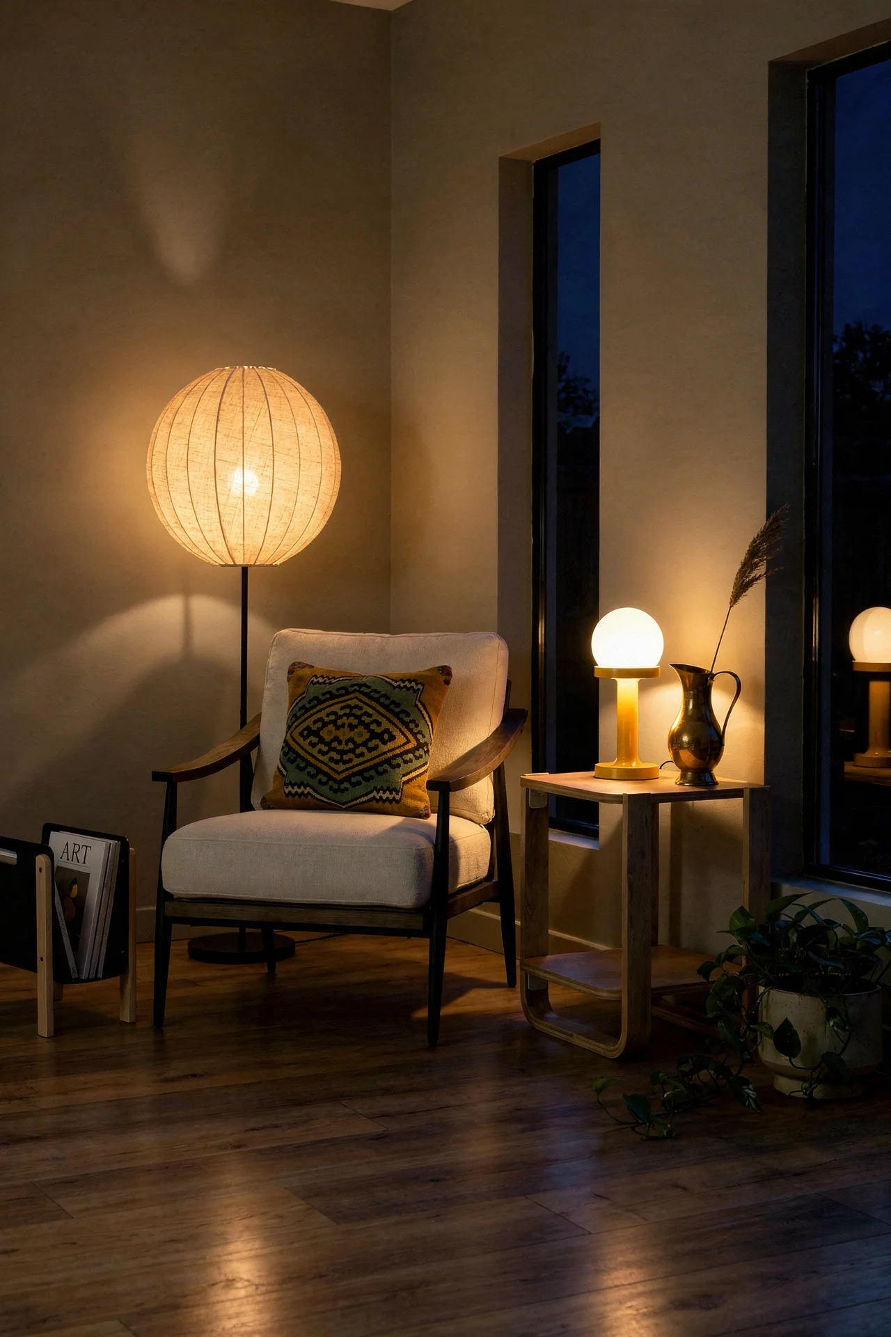
The one thing I would borrow from Scandinavian interiors above all else is the lighting philosophy. Scandinavian homes layer multiple light sources at low heights. Table lamps, floor lamps, pendant lights hung low over seating areas. MCM has its own iconic lighting, the Sputnik chandelier, the Nelson Bubble Lamp, the arc floor lamp. Combining both traditions gives you a living room where the light feels warm and dimensional rather than flat overhead fluorescent.
Japandi has its own identity, but its roots borrow heavily from mid century modern thinking. The Japanese concept of wabi sabi, finding beauty in imperfection, aligns perfectly with the MCM philosophy of honest materials. Both traditions value simplicity without sterility. Both use natural wood as a primary material. The crossover is more natural than most design blogs acknowledge.
Where Japandi diverges from pure MCM is in restraint. A mid century living room might have eight pieces of furniture in a conversation arrangement. A Japandi MCM room would have five. The negative space is intentional. Every piece that stays in the room earns its place by doing more than one job. A low platform coffee table that doubles as a display surface. A bench that works for seating and as a side table.
The colour palette shifts too. Where MCM embraces bold accents in teal, mustard, and burnt orange, Japandi MCM keeps the accents muted. Sage green instead of emerald. Warm clay instead of terracotta. The saturation drops but the warmth stays. The effect is a room that feels calm without feeling cold.
I think the most successful Japandi MCM rooms treat texture as the accent instead of colour. A boucle throw over a walnut framed sofa. A jute rug under an ash coffee table. Linen curtains that pool slightly on the floor. When you remove bold colour, you need something else to create depth. Texture does that job beautifully and keeps the space feeling lived in rather than minimal for the sake of it.
You have probably noticed that mid century modern colour works on a completely different logic than most contemporary design. It is not about neutrals and pops of colour. It is about a three tier system where every hue has a role to play.
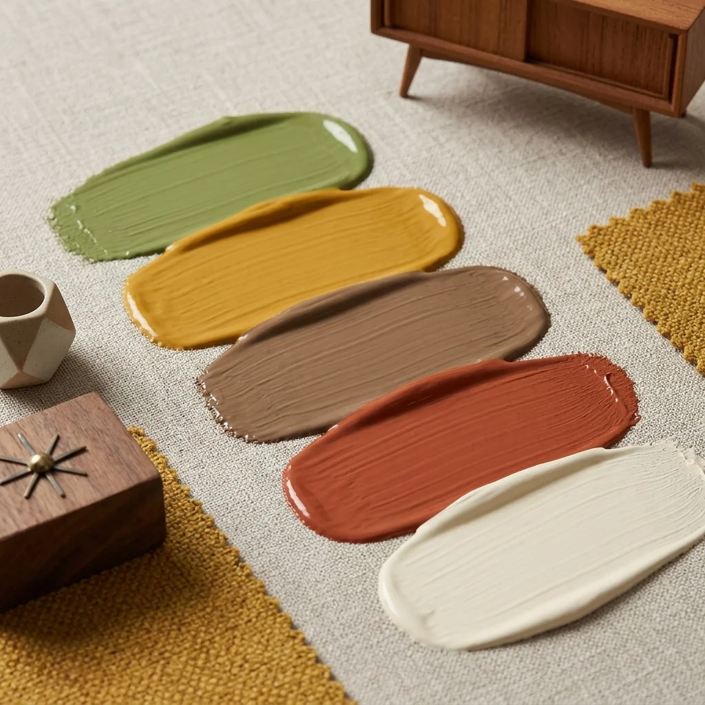
Creamy White. The foundation. Not bright white, not grey white. A warm cream with yellow undertones that makes wood furniture glow. This goes on your walls and ceiling. It creates the gallery backdrop that lets your furniture silhouettes read clearly.
Paint Pick: Farrow & Ball White Tie
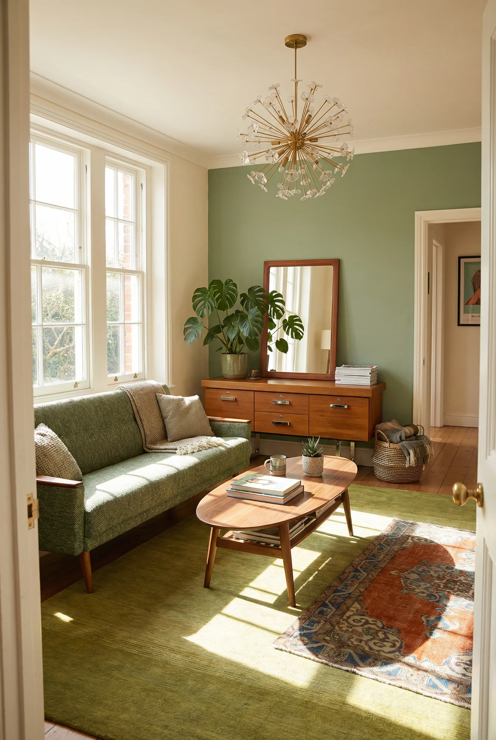
Olive Green. The mid tone bridge between your neutral walls and your bold accents. Use it on a large upholstered piece like a sofa or armchair. Olive green was everywhere in original MCM homes and it still works because it connects the natural world outside to the organic materials inside.
Paint Pick: Farrow & Ball Breakfast Room Green
Mustard Yellow. The signature MCM accent. Bold enough to draw the eye, warm enough to feel inviting. Use it on cushions, a throw, or a single accent chair. A little goes a long way with mustard. One well placed piece creates the focal point. Five pieces creates a headache.
Paint Pick: Farrow & Ball India Yellow
Teal. The cooler counterpoint that prevents an all warm room from feeling heavy. Teal shows up in MCM ceramics, artwork, and textiles. It reads as sophisticated without feeling trendy because the colour has sixty years of design precedent behind it.
Paint Pick: Farrow & Ball Singed Red
Warm Walnut Brown. Not a paint colour, but the wood tone that grounds everything. Your furniture, your shelving, your picture frames. Walnut brown is the colour thread that runs through every other choice in the room and ties the palette together.
Paint Pick: Farrow & Ball London Stone
Every mid century modern living room that works, whether it sits in a 1962 Eichler or a 2026 rental flat, follows the same principle. The furniture lifts off the floor. The wood tells a story. One vintage piece proves the whole room is real. You do not need the architecture. You need the silhouettes, the right wood tones, and the confidence to float your sofa six inches off the wall. Pick one section from this article and do it this weekend. The room will tell you what to do next.
This post contains affiliate links, which means we may earn a small commission if you make a purchase through our links, at no extra cost to you.