I’ve always thought green is the most forgiving colour you can bring into a home. It sits somewhere between the garden and the indoors, and English green in particular has this wonderful depth that makes a room feel both rooted and alive. In this piece I walk through everything from ink dark drenched studies and panelled boot rooms to muted sage sitting rooms and painted kitchen cabinets, so you can see exactly which shade does what. Every look here is one you can borrow.
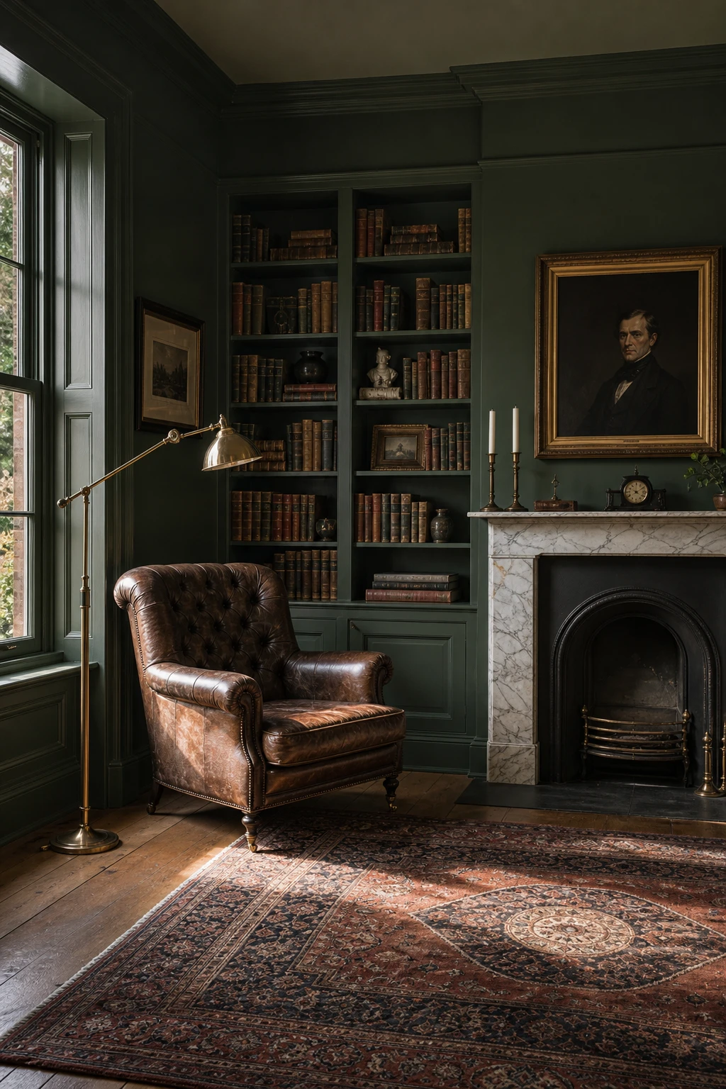
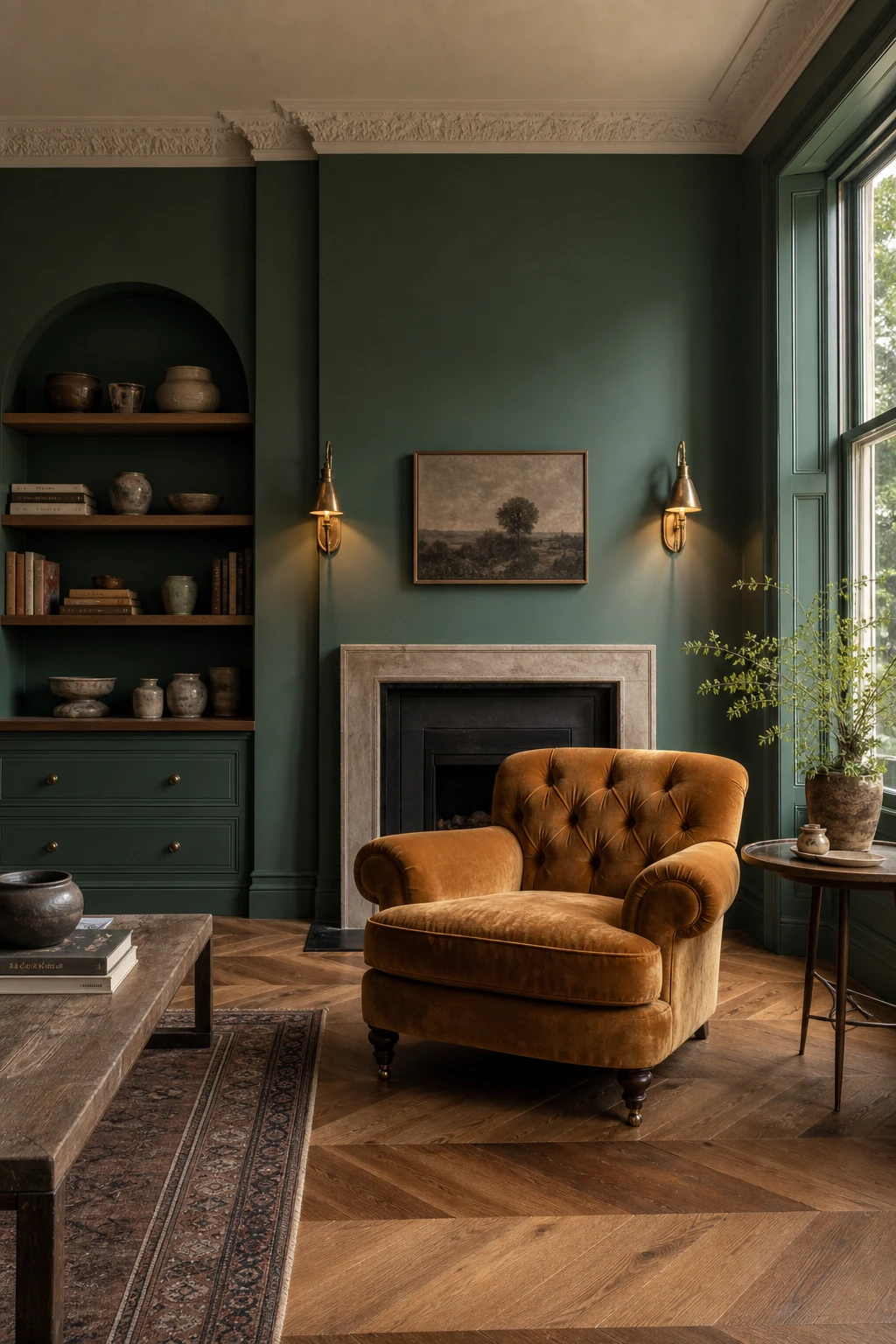
Why a Fully Drenched Dark Green Room Feels So Richly Cocooning
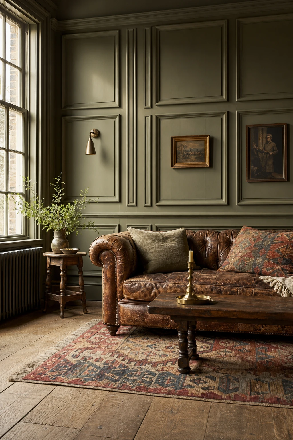
Painting every surface the same deep green, walls, ceiling, skirting and all, is one of my favourite moves in a traditional English room. You lose the hard edges where wall meets ceiling and the space folds in around you, warm rather than tight. What wins me over every time is how the colour reads differently on each plane as light shifts through the day, so you get genuine depth from a single shade.
The Key Details
Tufted leather club chair
Cast iron fireplace surround
Antique brass picture lights
Floor to ceiling built in bookshelves
Tall sash windows
Pro TipPaint the trim and skirting boards the exact same colour and finish as the walls so the room reads as one continuous envelope rather than a collection of separate surfaces.
AvoidKeeping the ceiling white while the walls go dark creates a hard lid that cuts the room off and destroys the cocooning effect you are trying to build.
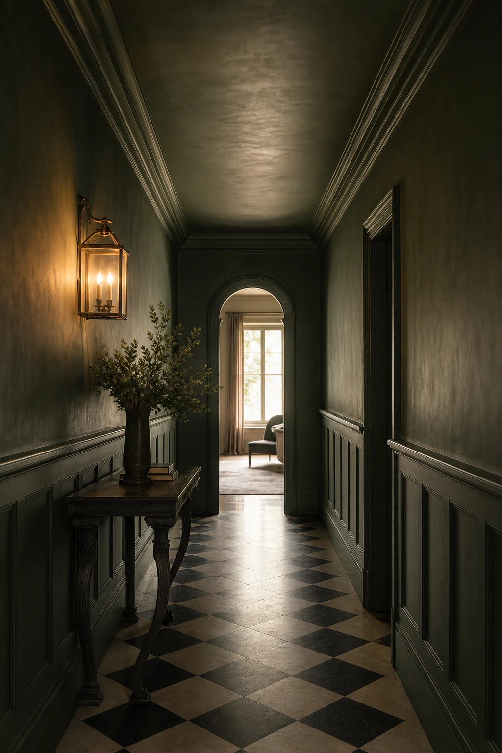
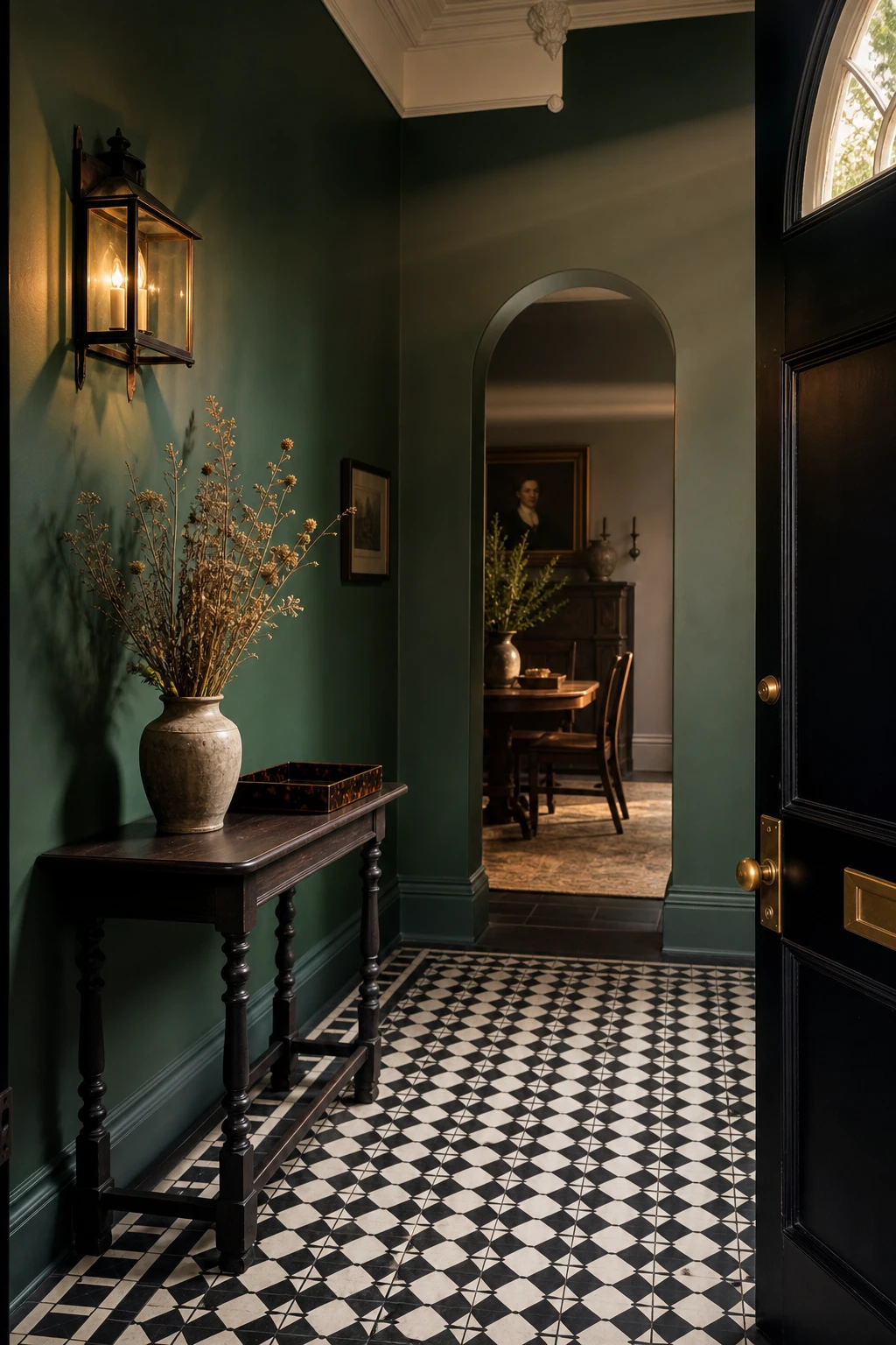
A Green Drenched Hallway That Makes Every Guest Stop at the Door
Small spaces are exactly where English green earns its keep, and a hallway drenched floor to ceiling proves that immediately. The moment the front door swings open you get this jewel box quality that a pale corridor could never deliver. What I find so satisfying is how the colour pulls the panelling, the brass lantern, and that chequered floor into one composed scene rather than a collection of separate things, so a narrow space reads as considered rather than cramped.
The Key Details
Tongue and groove panelled walls
Polished brass wall lantern
Black and white chequered stone floor
Slim carved console table
Arched internal doorway
Pro TipUse a satin finish on hallway walls rather than matt, as it wipes clean after scuffs and still holds the depth of colour beautifully.
AvoidPainting only the walls and leaving the architrave and skirting in white breaks the drenched effect and makes the whole scheme feel half finished.
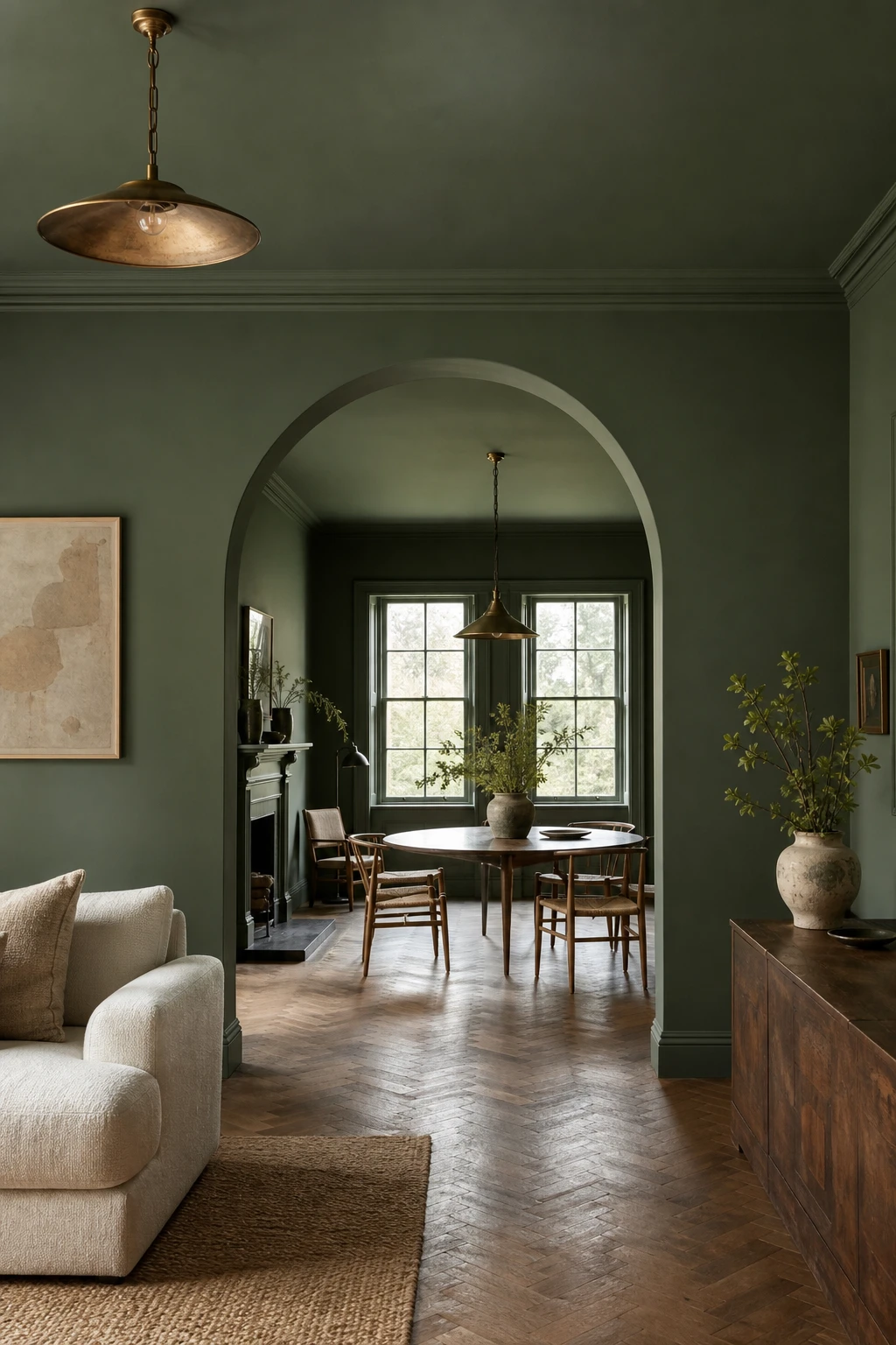
Carrying One Green Across Two Rooms So the Whole Floor Plan Feels Like One
When two rooms open into each other, running the same green through both is the move that makes the whole floor plan feel deliberate. The eye travels the full length without snagging on a colour break, and you get a calm, continuous read that makes both rooms feel bigger for it. What I find so compelling about this approach is how a single considered decision does more work than a dozen accessories ever could.
The Key Details
Plaster arch threshold
Linen upholstered seating
Continuous oak parquet floor
Aged brass pendant lights
Tall sash windows
Pro TipStep the further room one tone lighter within the same green family so depth and distance read naturally without breaking the flow.
AvoidPulling in a second or third green across the run fragments the palette and the cohesion you worked so hard to build simply disappears.
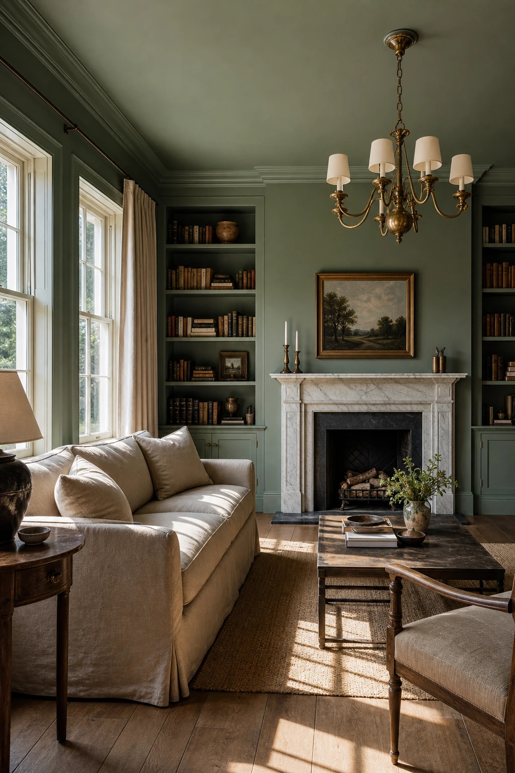
Paint the Ceiling Green Too and Watch the Whole Room Settle
Taking green up onto the ceiling transforms a tall or boxy room almost immediately. There is this sense of shelter that arrives the moment it is done, as though the room has drawn a breath and settled around you. My favourite thing about this move is how the colour wraps the space rather than simply coating the walls, so the eye stops climbing and everything from floor to ceiling reads as one considered whole rather than a room that just happens to have painted walls.
The Key Details
Aged brass chandelier with cream candle shades
Deep cushioned linen sofa in oat
Marble surround fireplace
Built in bookshelves flanking chimney breast
Wide aged oak floorboards
Pro TipTint your ceiling paint one shade lighter than the walls and the junction reads as intentional rather than flat, giving the room quiet depth without the ceiling feeling heavy.
AvoidPainting the ceiling in a dead flat finish traps moisture marks and scuffs that a soft sheen would simply wipe clean, so the ceiling looks tired far sooner than it should.
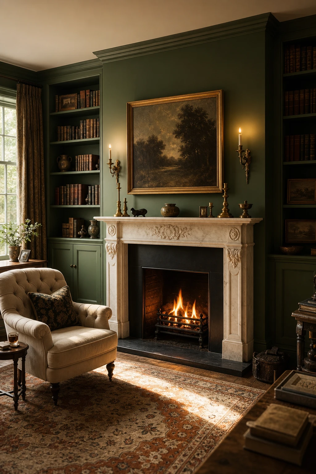
Deep Green Walls Around a Fireplace That Turn the Hearth Into a Real Focal Point
A deep green wrapped around a fireplace does something almost theatrical: it pulls the eye straight to the flames and holds it there. What I love about this pairing is the way firelight bounces off a warm, slightly olive toned green, giving the wall a glow that plain white could never match. You get depth behind the mantel that makes carved stone or marble read as a proper sculpture rather than just a shelf.
The Key Details
Carved marble fireplace mantel
Built in alcove shelving with books
Brass candlestick wall sconces
Persian rug in amber and ivory
Tufted linen armchair
Pro TipReach for a green with a yellow or amber undertone, something close to moss or dried fern, because cool blue greens can look cold and flat once the fire dies down.
AvoidPainting the mantel and surround the same colour as the wall causes the whole chimneybreast to merge into one flat plane, and the architectural detail you paid for simply vanishes.
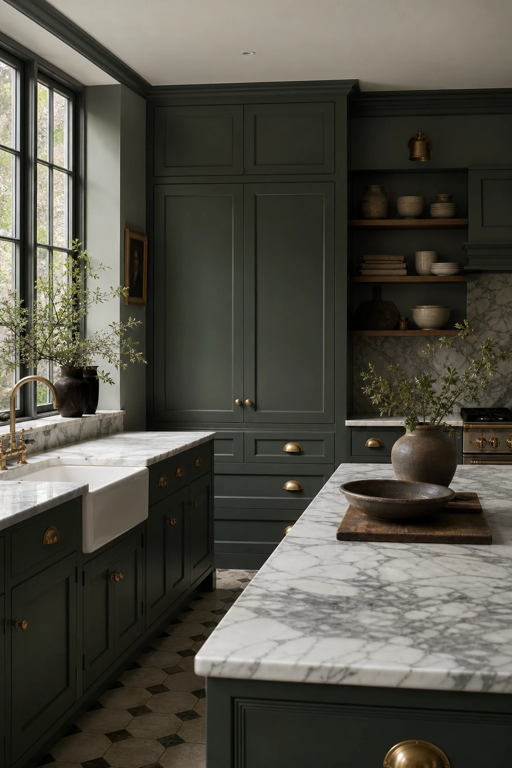
Dark Green Kitchen Cabinets with Marble Worktops That Feel Quietly Luxurious
Dark green cabinets and marble worktops is a pairing that wins me over every single time. What makes it land is the temperature play: cool marble veining against that warm, earthy green creates a tension that reads as quietly expensive rather than showy. You will notice the eye keeps moving between the two surfaces, never settling, and that visual rhythm is exactly what gives the kitchen its depth. Pull a warm toned marble, and the green feels grounded and rich rather than cold.
The Key Details
Shaker cabinet doors
Thick veined marble worktops
Unlacquered brass cup handles
Ceramic butler sink
Encaustic stone floor tiles
Pro TipHold a marble sample flat against your cabinet door in natural light and look for veining that shares even one tone with the green undertone, because that tiny echo is what ties the whole kitchen together.
AvoidPicking a marble that reads heavily grey in your kitchen light flattens the green completely, leaving the whole scheme looking muddy rather than rich.
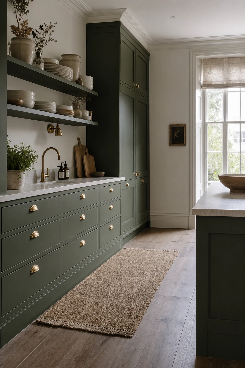
Bancha on Kitchen Cabinets and How This One Shade Does All the Work
Bancha is the shade I reach for when a client cannot decide between olive and forest green, because it quietly contains both. You get that earthy, almost mossy warmth at one angle and a deeper, more serious green at another, so it flatters both the honey tones of a limestone worktop and the cool shimmer of unlacquered brass without breaking a sweat. What wins me over every time is how grounded the kitchen feels without going dark or heavy.
The Key Details
Shaker cabinet doors
Unlacquered brass cup handles
Honed limestone countertop
Tall sash windows
Open display shelving with stacked ceramics
Pro TipKeep upper cabinets painted white or left as open shelving so the eye gets breathing room above the Bancha base and the room reads as tall rather than closed in.
AvoidPairing Bancha with cold grey walls pulls the olive warmth right out of it, leaving the cabinets looking muddy and flat rather than rich.
An Olive Green Panelled Wall That Gives Any Room Instant Character
Panelling and paint are one of those combinations where the whole is genuinely greater than the parts, and olive green shows that off better than almost any other colour. What I love here is how the raised mouldings catch the light at different angles, giving you depth and shadow across the wall that flat paint simply cannot deliver. You get instant character, the kind that looks like it took years to accumulate.
The Key Details
Floor to ceiling raised panel mouldings
Worn leather chesterfield sofa
Antique walnut side table
Brass candlestick
Wide plank oak floor with kilim rug
Pro TipPaint the panel face, the moulding, and the inset all in the same olive green shade so the wall reads as one unified surface rather than a patchwork of tones.
AvoidLeaving the panel inset in a lighter or contrasting shade breaks the depth completely and the wall ends up looking patchy rather than purposeful.
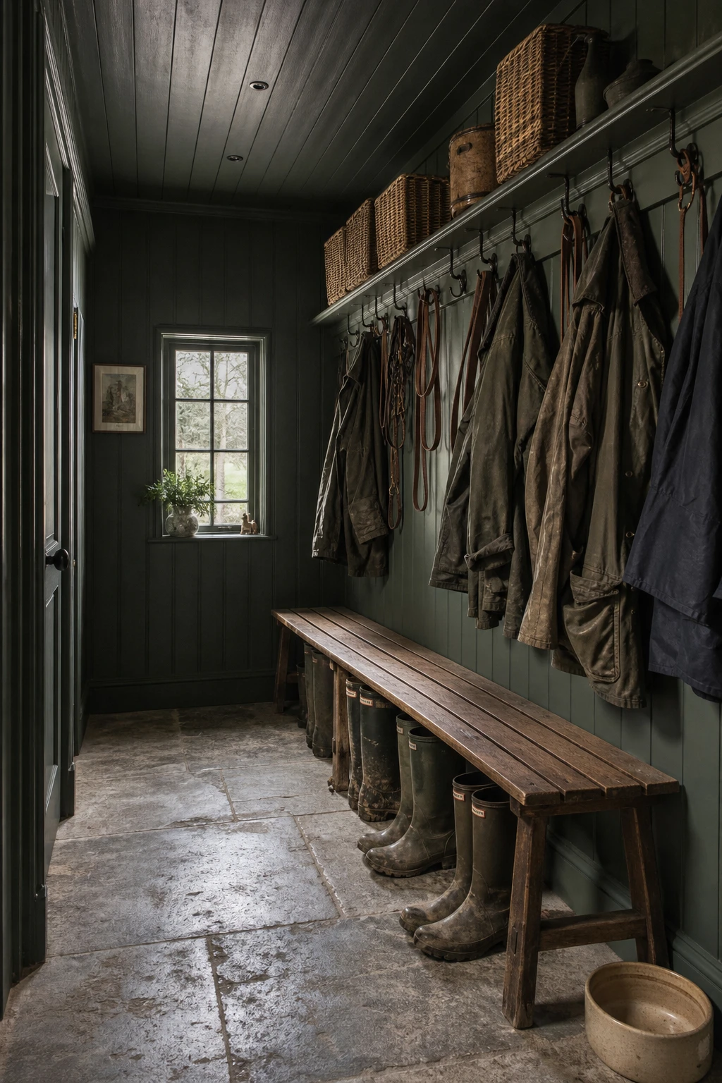
A Dark Green Boot Room That Makes Muddy Arrivals Feel Like Part of the Story
A boot room painted in a deep English green stops being a place to dump wet coats and becomes somewhere you actually want to pause. What I love here is how the colour does two things at once: it hides the everyday scuffs and marks that come with muddy arrivals, and it gives the space a weight that says this room was considered. You get that sense of arrival, a proper threshold between outside and in.
The Key Details
Tongue and groove peg rail
Slatted oak bench
Reclaimed limestone floor tiles
Brushed iron coat hooks
Small casement window
Pro TipPaint the walls in an eggshell finish rather than matt so mud splashes and damp handprints wipe away cleanly without lifting the colour.
AvoidKeeping the ceiling white lifts all that weight off the room and makes the boot room feel like a utility cupboard someone painted rather than a proper threshold between outside and in.
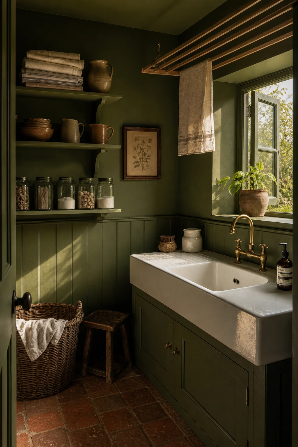
How a Dark Green Utility Room Stops Feeling Like a Chore to Walk Into
Practical rooms get forgotten so easily, and that is exactly why painting a utility room a deep, serious green is such a satisfying move. You walk in to deal with laundry or muddy boots and the room feels considered rather than bolted on. What I love here is how the darkness actually works with the utility function: it hides splashes, grounds all those white ceramic surfaces, and makes the brass fittings glow.
The Key Details
White ceramic butler sink
Slatted wall mounted wooden drying rack
Aged terracotta floor tiles
Tongue and groove wall panelling
Brushed brass tap fittings
Pro TipFit a warm toned wall light or two above the sink rather than relying on a ceiling fitting, and the brass picks up the light in a way that makes the whole room feel far more expensive than it is.
AvoidA single overhead fluorescent strip kills the depth of any dark paint colour and leaves the room looking dingy rather than dramatic, so it is the first thing to replace.
An Arts and Crafts Hallway in Green That Looks Like It Has Always Been There
An Arts and Crafts hallway rewards patience, and choosing a green that sits in the same tonal family as the period tiles and dark oak is what I find makes everything click. The encaustic floor, the carved balustrade, the stained glass fanlight: each one already carries its own colour story, and a dusty, slightly muted green on the walls lets all of those elements breathe together rather than compete. You get a hallway that feels as though it was decorated the moment the house was built and simply never needed changing.
The Key Details
Encaustic geometric floor tiles
Dark stained oak newel post and carved balustrade
Stained glass fanlight
Hammered brass picture rail
Panelled timber dado
Pro TipFix a picture rail in a deep umber or ebony stain a few inches below the cornice, because that dark horizontal line pulls the eye around the walls and makes the green feel deliberate and finished.
AvoidA green with too much yellow or too much brightness will sit at odds with the warm russet tones in the encaustic tiles and the reddish undertones of aged oak, making the whole hallway feel unsettled.
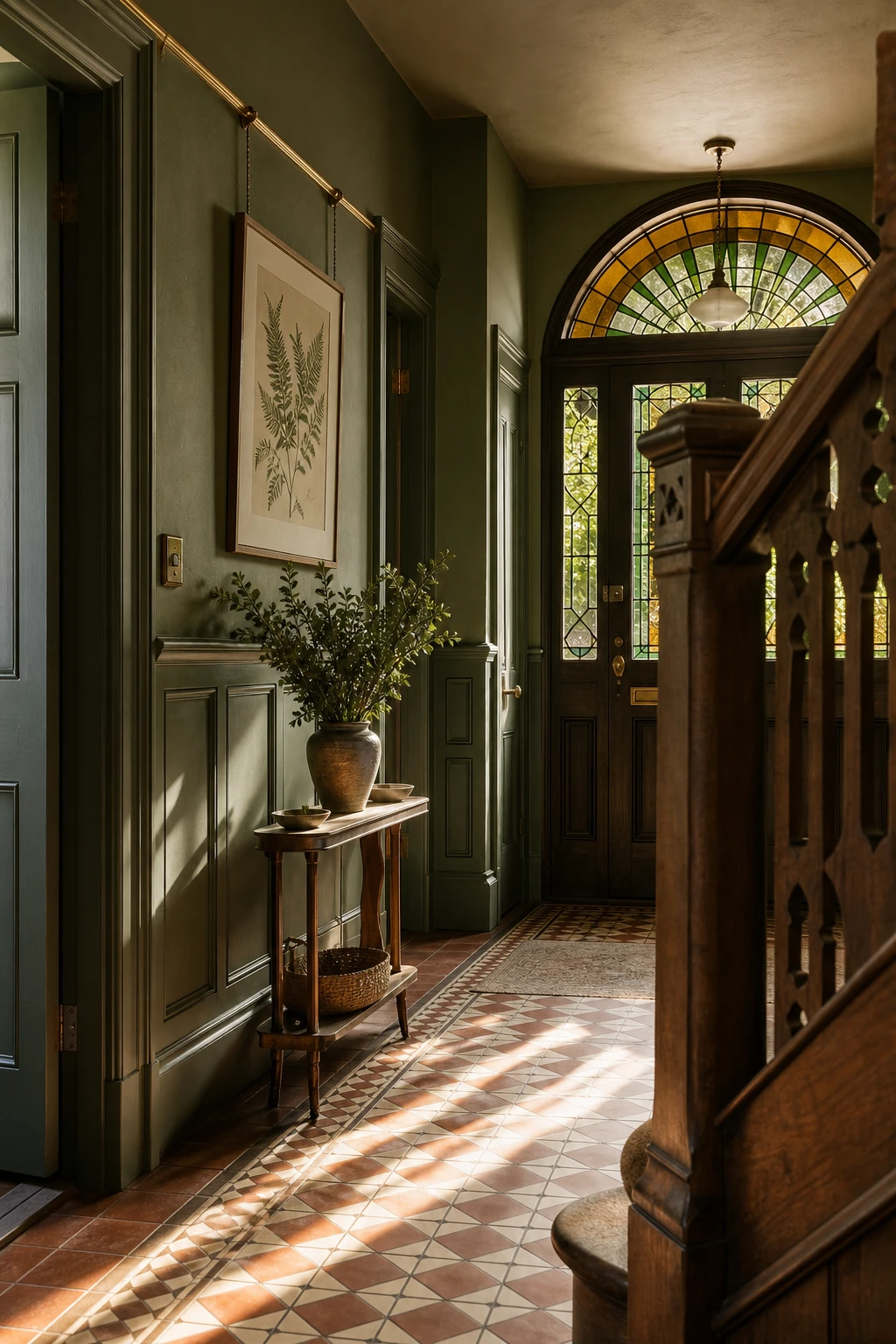
The Farrow and Ball Entrance Hall Shade That Sets the Whole Tone of a Home
Hallways set the tone before a single word is spoken, and the green you choose here quietly promises what lies beyond. A deep English green in an entrance makes the space feel considered rather than incidental, which is something I think about every time a client asks whether colour is worth the commitment in a room they just pass through. Paired with encaustic tiles and a forged iron lantern, you get that layered, lived in quality that takes a hallway from corridor to destination.
The Key Details
Black and white encaustic floor tiles
Dark hardwood console table with turned legs
Forged iron wall lantern
Arched internal doorway
Dried botanicals in ceramic vase
Pro TipSample your chosen shade on the wall directly opposite the front door, because that is the surface light hits first and the one every visitor actually sees, not the wall beside the coat hooks.
AvoidKeeping the architrave and skirting in white while the walls go dark breaks the envelope and makes the whole scheme read as a halfway decision rather than a resolved one.
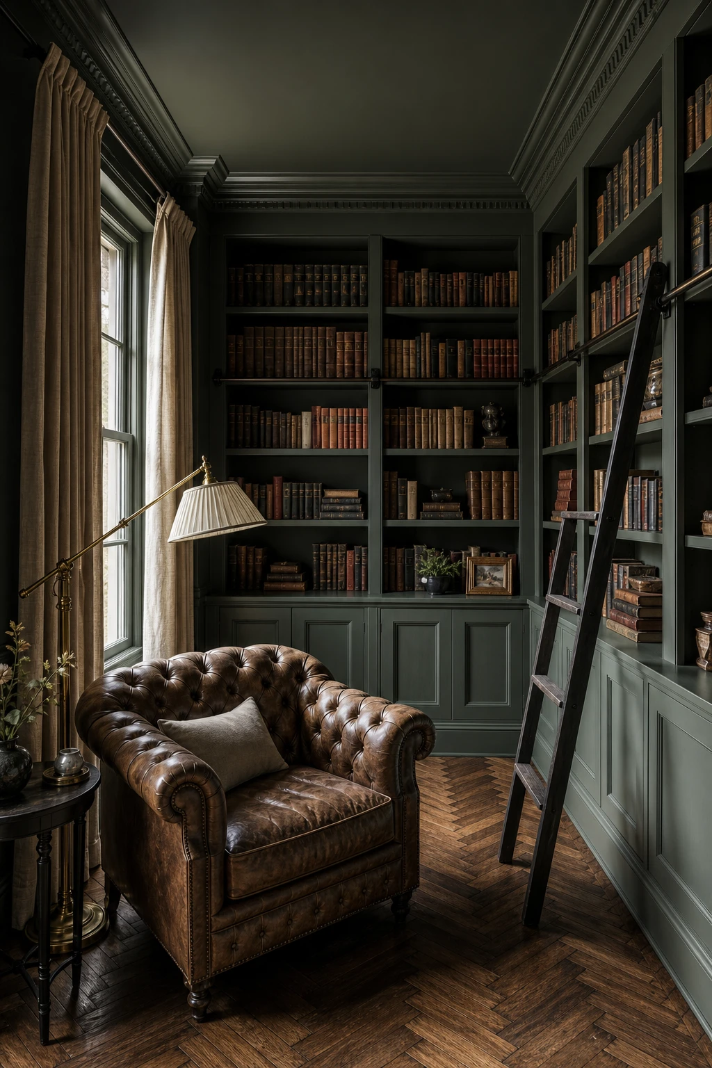
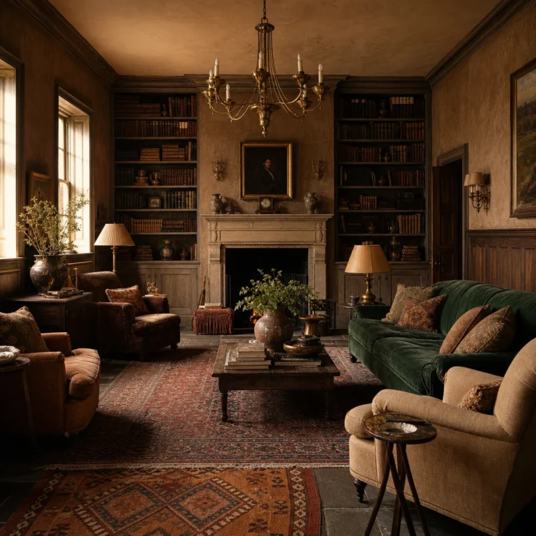
A Green Drenched Library That Feels Like the Best Room in the House
Books and deep green were made for each other, and a library drenched in one shade is where you really feel why. The colour quietly recedes so the shelves become the whole story, which is exactly what a good library should do. Something I genuinely love about this room type is how it holds together even when every wall is packed with spines and objects of different sizes and colours. You get that enveloping, settled feeling that makes it the room everyone ends up gravitating toward by the end of the evening.
The Key Details
Built in painted bookshelves floor to ceiling
Tufted leather armchair
Brass floor standing reading lamp
Herringbone parquet floor
Draped linen sash window
Pro TipRun the paint behind and inside every shelving unit before the books go in, so the drench reads as one continuous surface rather than a colour that stops and starts.
AvoidToo many bright accessories on the shelves pull the eye in every direction and break the calm, enveloping feeling that makes a drenched library so special.
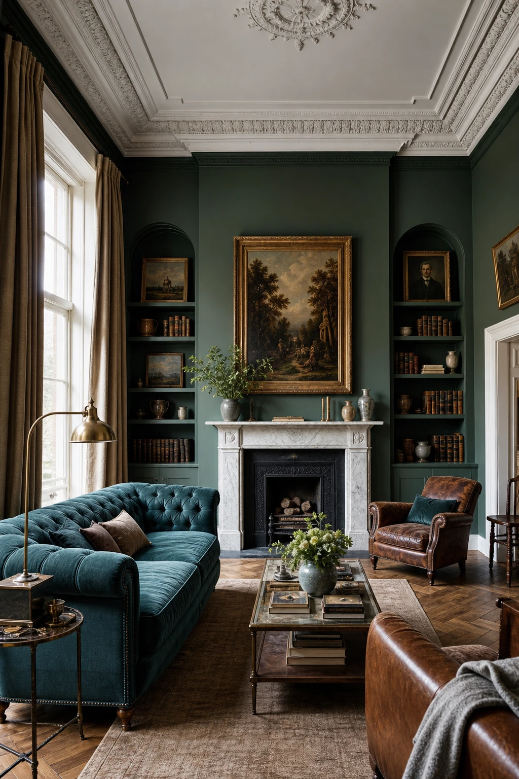
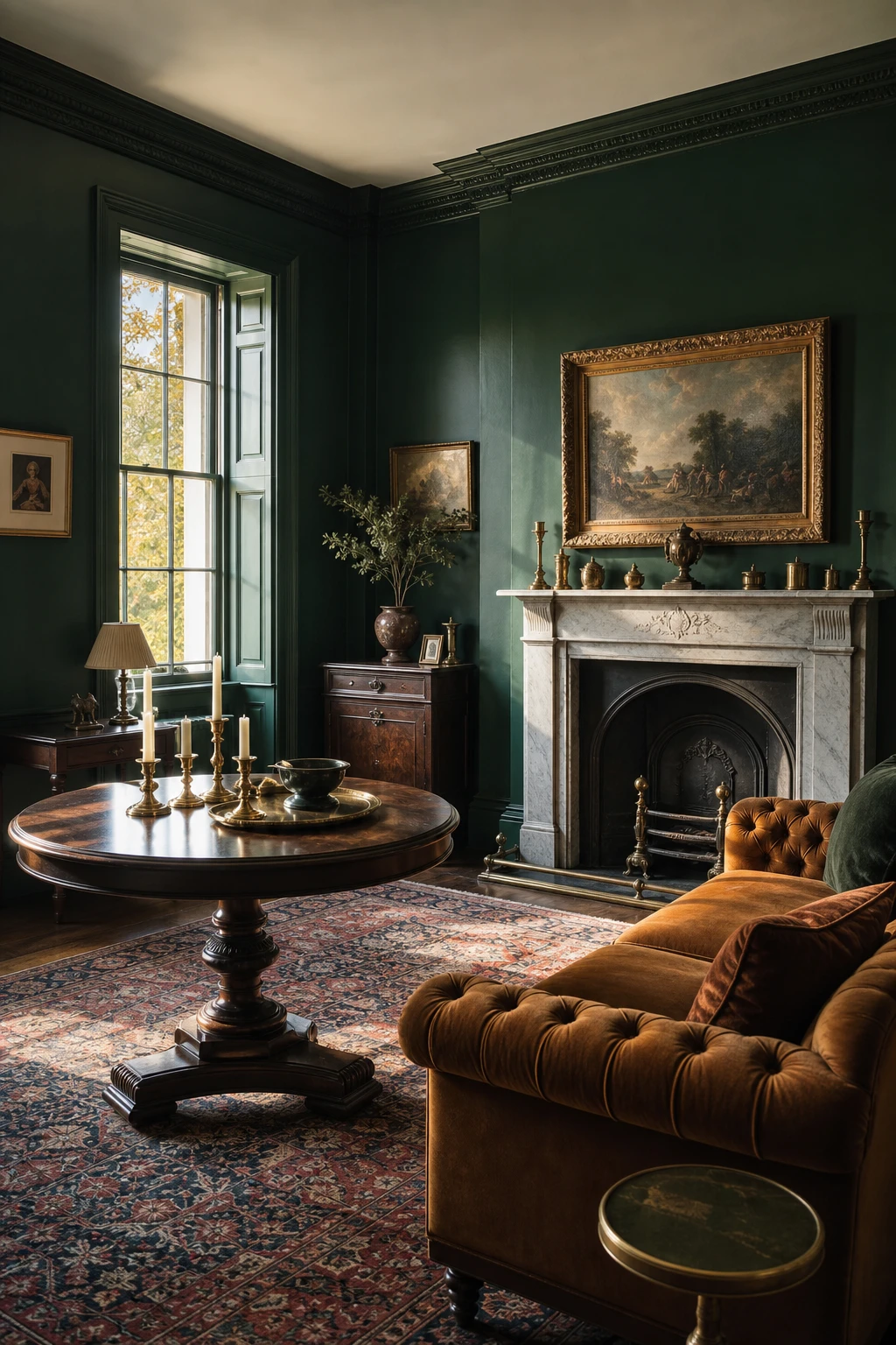
Dark Green in a Victorian Living Room That Plays to the House’s Own Strengths
Victorian rooms were built for strong colour, and dark green on the walls is one of my favourite ways to prove it. The height reads taller against a deep tone, and you will notice how the cornice stops looking like an afterthought and starts looking like the crown it was always meant to be. What wins me over every time is how the original marble fireplace and the velvet sofa both gain presence rather than compete for it.
The Key Details
Ornate plasterwork cornice and ceiling rose
Original marble fireplace
Button back velvet sofa
Tall sash windows with linen curtains
Brass reading lamp
Pro TipPaint the cornice and ceiling rose one shade lighter than the walls so the plasterwork carving casts a clear shadow and every detail reads from across the room.
AvoidPainting original floorboards the same dark tone removes the contrast that anchors the room, and the whole space ends up feeling like a dim box rather than a grand one.
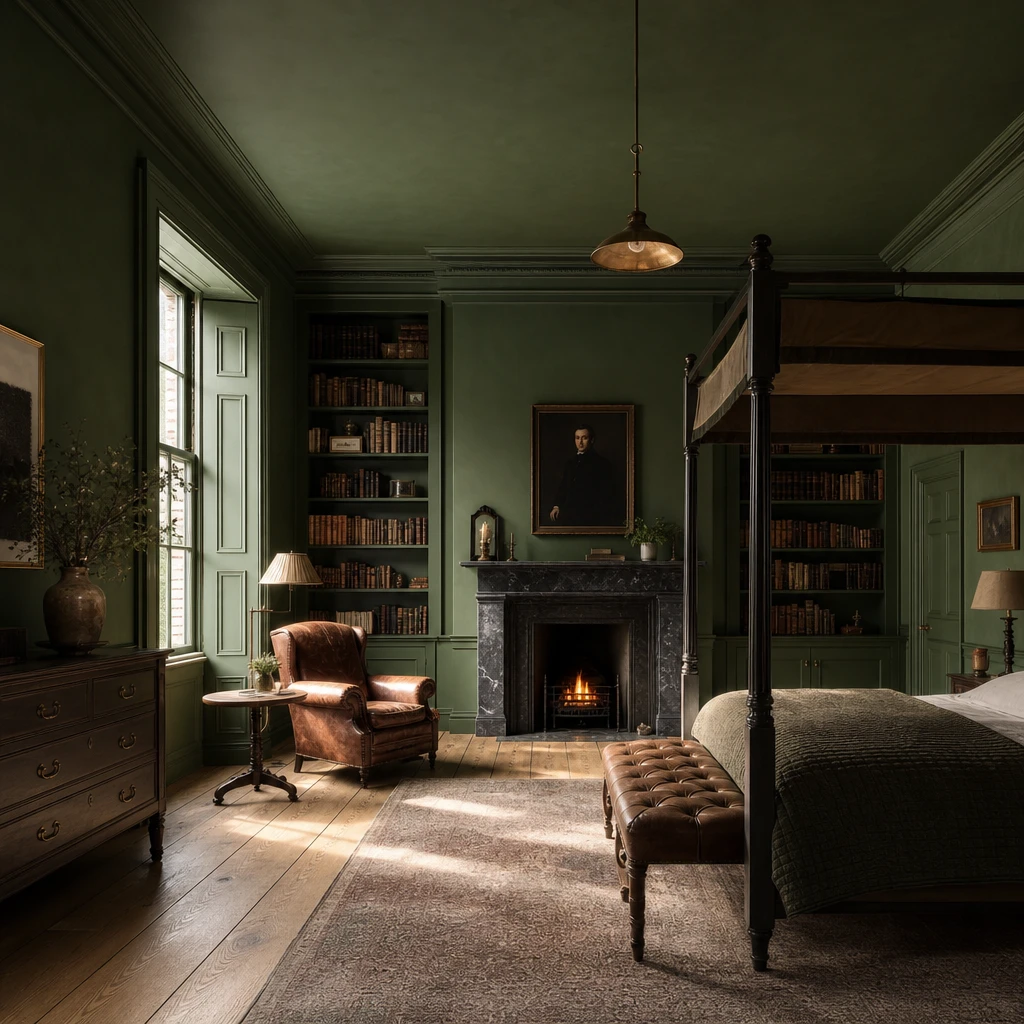
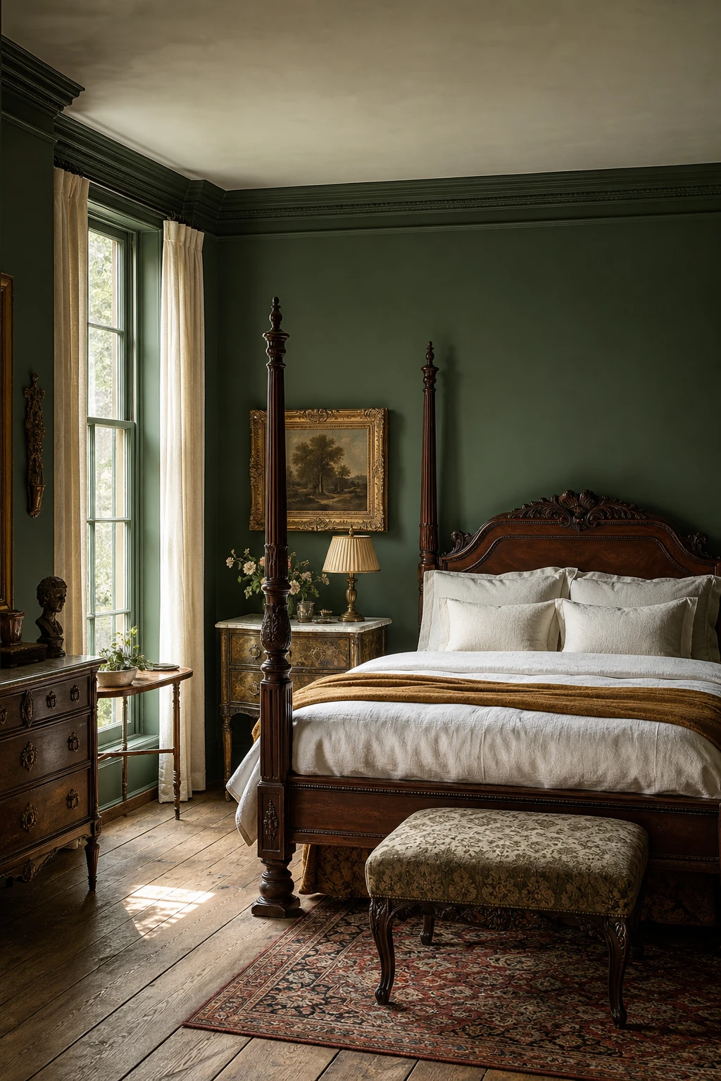
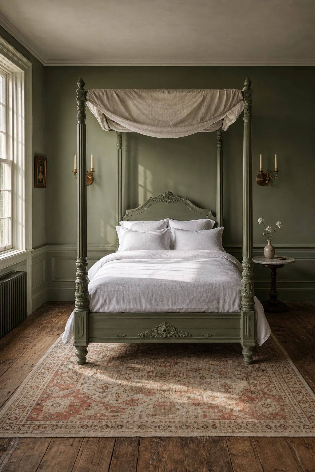
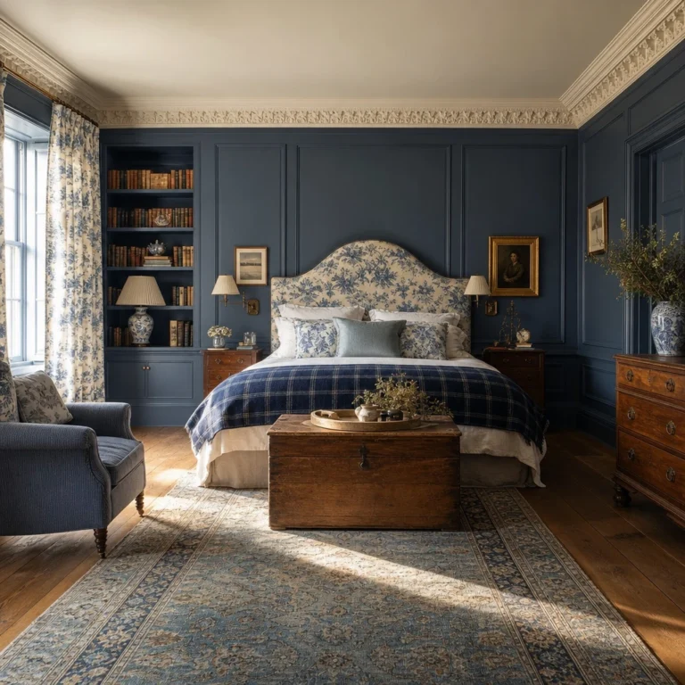
Dark Green Walls in an Antique Bedroom That Make Old Pieces Look Their Best
Antique furniture can look a little lost against a pale wall, as though each piece is sitting in a waiting room rather than a room. Deep green changes that entirely. What I love is how the colour wraps the carved mahogany and gilded frames in something warm and serious, so you feel the age and the story in every piece. You get a room that looks genuinely collected rather than decorated.
The Key Details
Carved mahogany four poster bed
Gilt framed oil painting
Marble topped nightstand
Tall sash windows with linen curtains
Worn oak floorboards
Pro TipReach for aged brass and patinated bronze over polished gold hardware, as the duller, warmer tones sit into deep green far more naturally than anything bright and shiny.
AvoidPulling in a very dark ceiling, heavy navy textiles, and black furniture all at once leaves the green nowhere to anchor the room, and everything reads as one flat, muddy mass.
A Vintage Green Four poster Bed That Makes the Whole Room Feel Dreamy
Painting the bed frame rather than the walls is one of my favourite quiet confidence moves. You get all the drama of deep green without committing every surface to it, so the colour reads as a jewel sitting in the room rather than a statement you have to live with forever. Watch how the carved timber catches the paint differently in shadow and light, giving you that aged, almost found it in a French chateau feeling without spending chateau money.
The Key Details
Carved timber four poster bed frame
Brass candlestick wall sconces
Antique wool rug in ivory and terracotta
Marble topped bedside table
Wide plank aged oak flooring
Pro TipChoose a flat or chalky paint finish on the timber so the green looks like it has always belonged to the piece rather than freshly applied.
AvoidHanging a canopy fabric with a competing pattern or warm toned stripe pulls the eye away from the painted frame and leaves the whole bed looking unsettled.
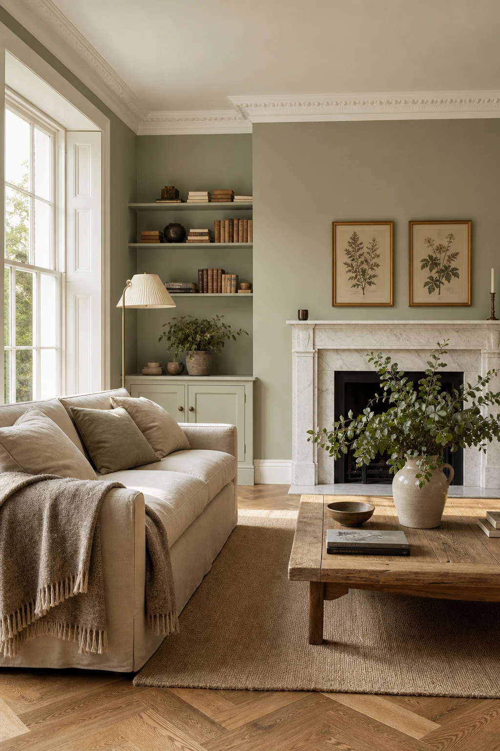
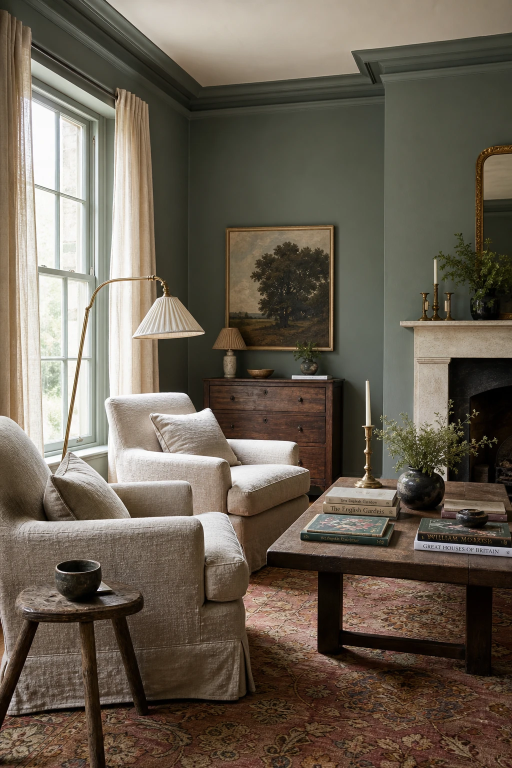
A Sage Green Front Room That Feels Calm From the Moment You Sit Down
Sage is the colour I reach for when a client wants calm without the coldness of grey. In a sunny front room, it reads almost like a warm neutral, sitting quietly behind everything else while still giving the walls real depth. You get that sense of ease the moment you sit down, and the botanical prints and marble hearth lift it just enough to feel considered rather than cautious.
The Key Details
Deep linen sofa in oatmeal
Herringbone oak floor
Tall sash windows
Marble fireplace hearth
Botanical prints in gilt frames
Pro TipPair sage walls with natural linen upholstery in oatmeal or warm flax to keep the whole room anchored in the same soft, earthy family.
AvoidPulling in too many cool blue grey accessories tips sage from calm into clinical, draining the warmth that makes the colour so appealing in the first place.
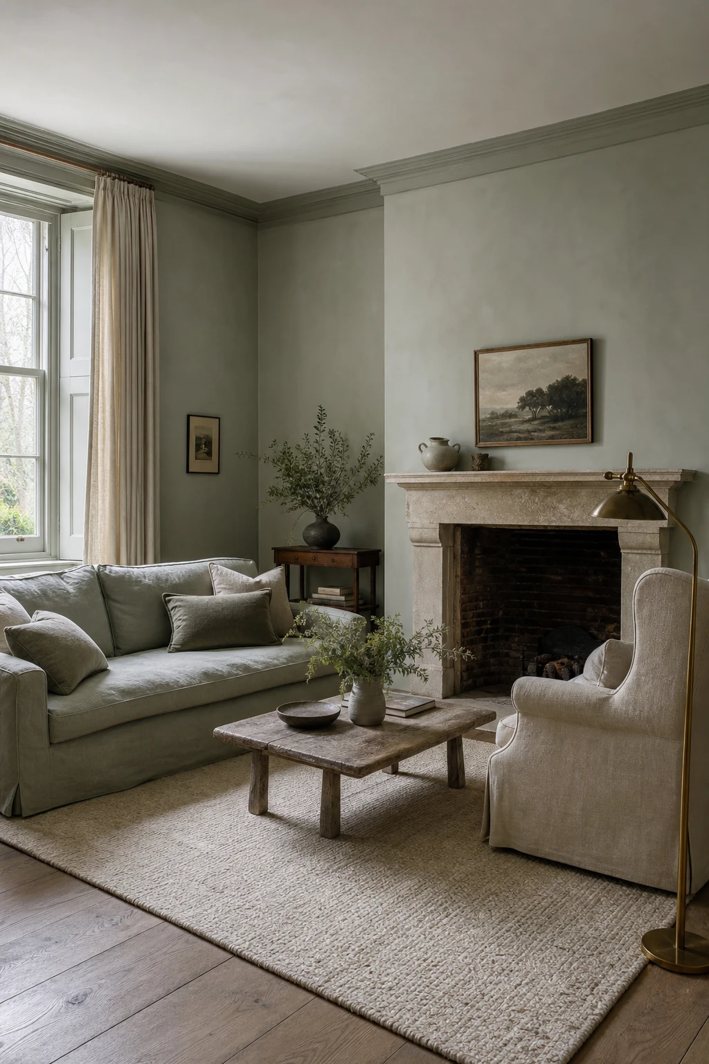
Muted Sage Green Paint and the Quiet Way It Changes a Room’s Mood
Muted sage sits in that narrow band where green almost becomes grey, and that tension is exactly what gives it weight. What I love is how the colour shifts as the day moves, reading warmer at noon and cooler by dusk, so the room never feels static. You get sophistication rather than sweetness, which is the whole point of greying a sage down rather than leaving it clean and bright.
The Key Details
Muted sage linen sofa
Stone fireplace surround
Aged brass floor lamp
Wide plank oak flooring
Undyed cream wool rug
Pro TipSwatch your muted sage and check it specifically under your evening lamp light, because that is when the grey undertone becomes most visible and you will know whether it reads moody or simply dull.
AvoidPairing a greyed sage with a sharp bright white trim pulls the two apart rather than letting them settle together, and the green ends up looking dingy rather than deliberately subdued.
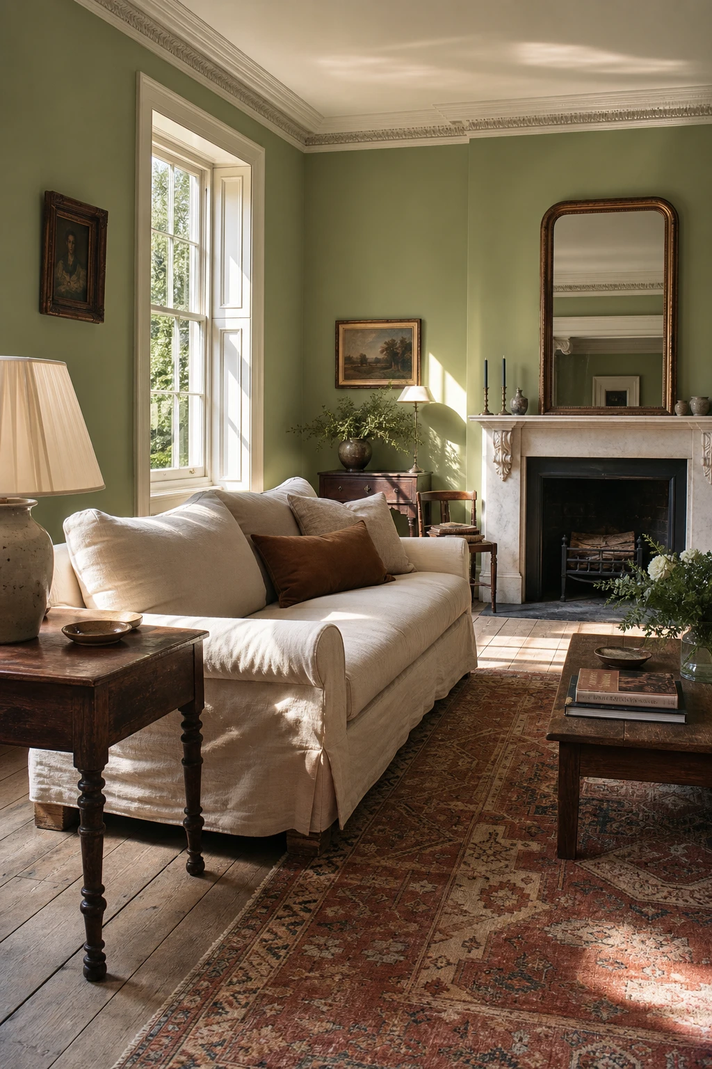
Farrow and Ball Pea Green and the Rooms Where It Really Comes to Life
Pea Green is one of those colours that rewards a south facing room like nothing else. What I love is the way strong daylight pulls out its warm, golden undertones, so you get a room that feels alive and almost edible rather than sharp. Pair it with antique oak, worn Turkish wool, and a marble fireplace and you have a room that looks as though it has been quietly perfect for a hundred years.
The Key Details
Tall sash windows
Linen sofa with feather cushions
Antique oak side table
Faded Turkish wool rug
Marble fireplace surround
Pro TipBring in warm toned wooden furniture rather than painted pieces, because the honey notes in oak and walnut draw out the yellow in Pea Green and stop it reading as cold.
AvoidPainting a north facing room in Pea Green is a trap I see regularly, because the absence of direct sun strips out every warm tone and leaves the colour looking sour and muddy by midday.
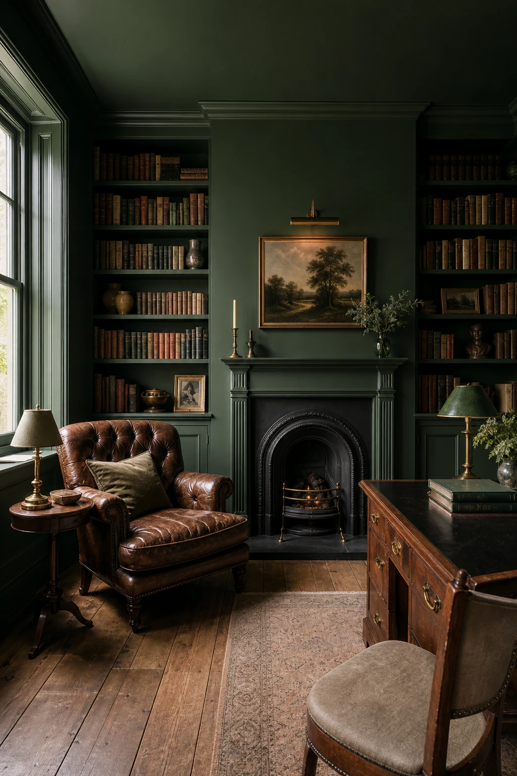
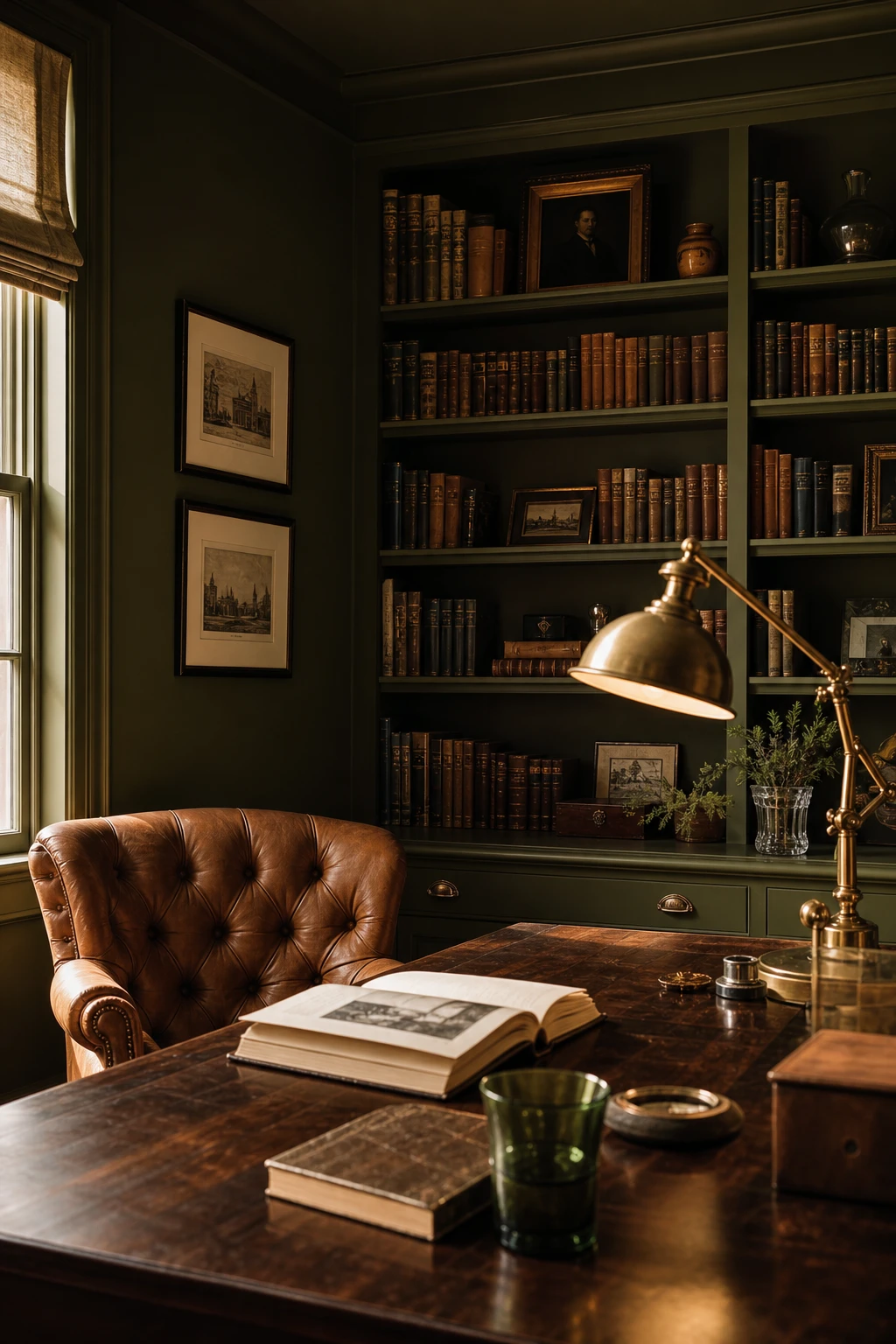
Card Room Green by Farrow and Ball and Why It Suits a Study Like Nothing Else
Card Room Green is the colour I reach for when a study needs to feel genuinely serious. That grey sitting inside the green is what does the work, pulling the saturation back just enough so you never tip into jungle territory. What I love is how the walls seem to absorb noise and distraction, and you will notice your eye settle almost immediately rather than bouncing around the room. It is one of those rare colours that makes concentration feel effortless rather than forced.
The Key Details
Deep buttoned leather reading armchair
Floor to ceiling built in bookshelves
Pivoting brass library floor lamp
Marble fireplace surround
Worn Persian rug on wide board oak floor
Pro TipRoll Card Room Green onto the joinery and built in shelves only, leaving the ceiling off white, and you get all the drama without the room ever feeling closed in.
AvoidBringing in a third or fourth accent colour breaks the composed, singular mood that makes Card Room Green so effective as a study backdrop.
Arsenic by Farrow and Ball and the Surprisingly Versatile Rooms It Suits
Arsenic sits in that rare in between place where sage meets teal, and what I love is how that ambiguity actually works for a room rather than against it. You get a colour that feels grounded enough for a traditional space yet fresh enough for something more relaxed. Pair it with the oatmeal linen, the dusty rose of that Persian rug, and a low oak table and watch how the warmth pulls the whole thing together into something settled and easy.
The Key Details
Loose linen oatmeal armchairs
Slender brass arc floor lamp
Tall sash windows with unlined ivory linen drapes
Low oak coffee table
Aged Persian rug in dusty rose and amber
Pro TipBring in at least one terracotta accent, a cushion, a pot, a throw, and Arsenic immediately reads as warm rather than cool.
AvoidPlacing Arsenic next to a blue grey on an adjacent wall drags the colour toward teal and strips out all the sage softness that makes it so appealing.
Deep Emerald Green Paint That Brings Real Drama Without Feeling Overdone
Deep emerald genuinely rewards commitment, and that is the first thing I tell clients who hesitate at the door of the paint shop. The more surfaces you give it, the richer and more jewel like the whole room becomes. Cognac leather and carved marble are the pairings that win me over most: both read warm and tactile against that depth of green, and the combination tips into something just a little grand without the room ever feeling try hard.
The Key Details
Buttoned velvet sofa in cognac
Carved marble fireplace surround
Gilt framed oil painting
Tall sash windows
Dark stained oak floorboards
Pro TipBring in gold picture frames, cabinet handles, and a gilt mirror to bounce warm light around the room and deepen that emerald tone even further.
AvoidReaching for silver or chrome fittings in an emerald room strips out all the warmth and leaves the green feeling cold and hard rather than rich.
Dark Warm Green Paint and How to Tell If You Have Found the Right Tone
Warm dark green, the kind with yellow or brown sitting quietly inside it, pulls a room together in a way cold greens simply cannot. What I love about this tone is how it borrows from the wood already in the space: the walnut desk, the timber shelves, the leather chair all echo the same earthy warmth back at you. You get a room that feels complete rather than assembled. The undertone is doing all the heavy lifting, and once you see it working you will never ignore it again.
The Key Details
Tufted cognac leather library armchair
Open timber bookshelves with cloth bound volumes
Antique brass adjustable desk lamp
Dark walnut writing desk
Sash window with antique glass panes
Pro TipHold your sample pot swatch directly against your largest wood tone, whether that is a floorboard, a door frame or a piece of furniture, and if the green pulls yellow or brown from the grain rather than fighting it, you have found your match.
AvoidChoosing a warm green from a screen almost always ends in disappointment, because monitors and phones push colours cooler and bluer than they appear on a real painted wall in real light.
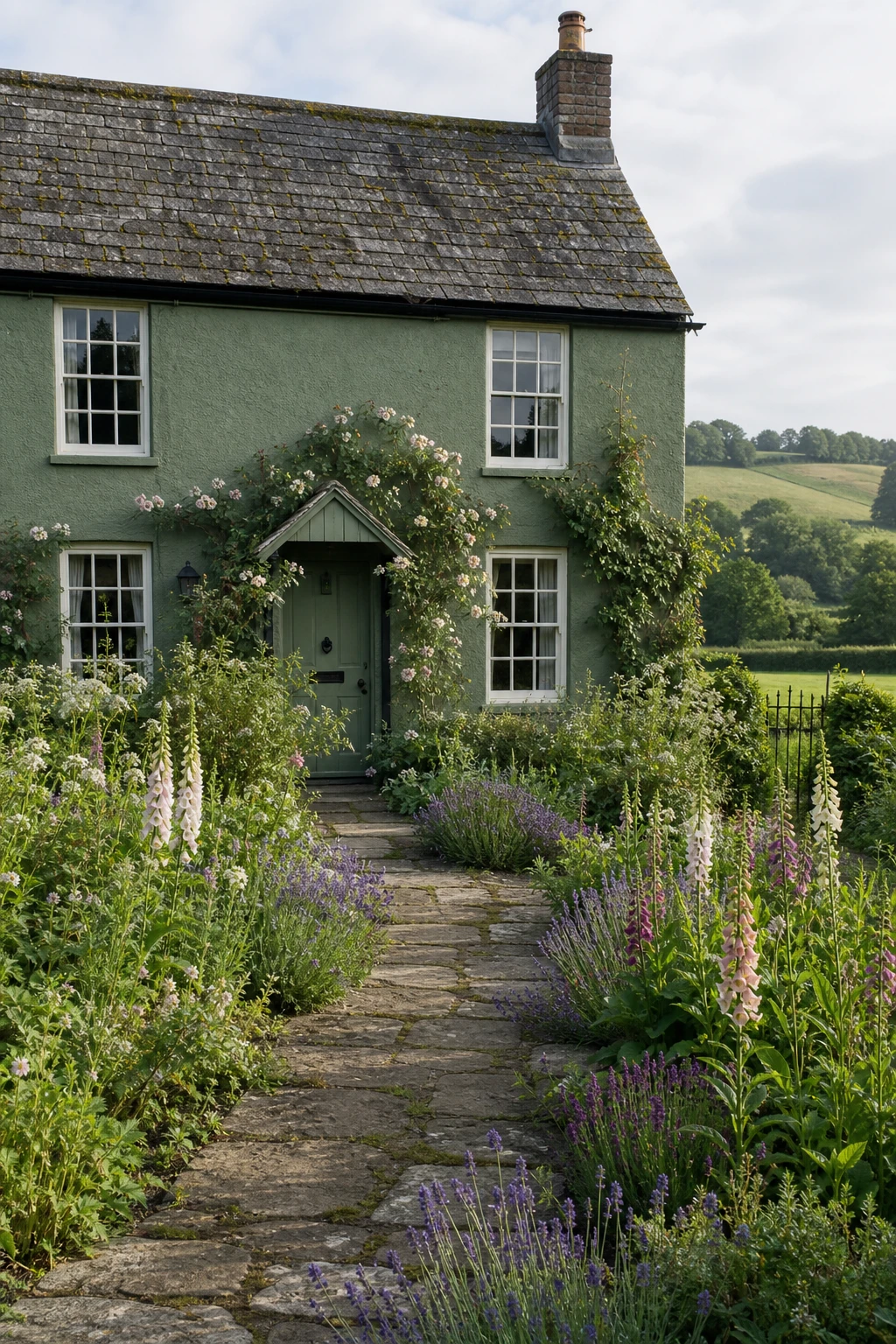
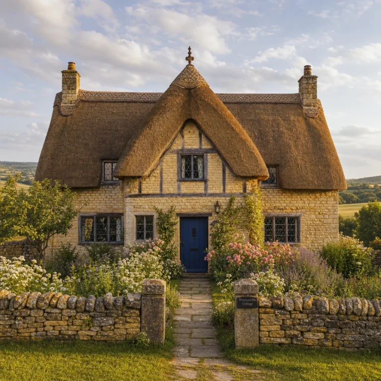
An English Green Painted Cottage Exterior That Looks Like It Grew There Naturally
A cottage painted in the right green simply disappears into its setting, and that is exactly what you want. The tone I reach for reads almost like shadow on a mossy bank, close enough to the hedgerow and the slate roof that the building feels rooted rather than painted. You will notice how the climbing roses and foxgloves then do all the talking, with the walls quietly holding everything together behind them.
The Key Details
Timber sash windows with white glazing bars
Climbing roses framing the front door
Worn stone flagstone path
Mossy slate roof
Cottage garden planting of foxgloves and lavender
Pro TipPaint a large test patch on each elevation and watch it through at least one full season, because exterior greens shift dramatically between a bright summer noon and a grey October morning.
AvoidA green that sits even slightly too yellow or too saturated pulls the eye straight to the walls and away from the garden, the roses, and the worn stone path, stripping the cottage of the very charm you are trying to protect.
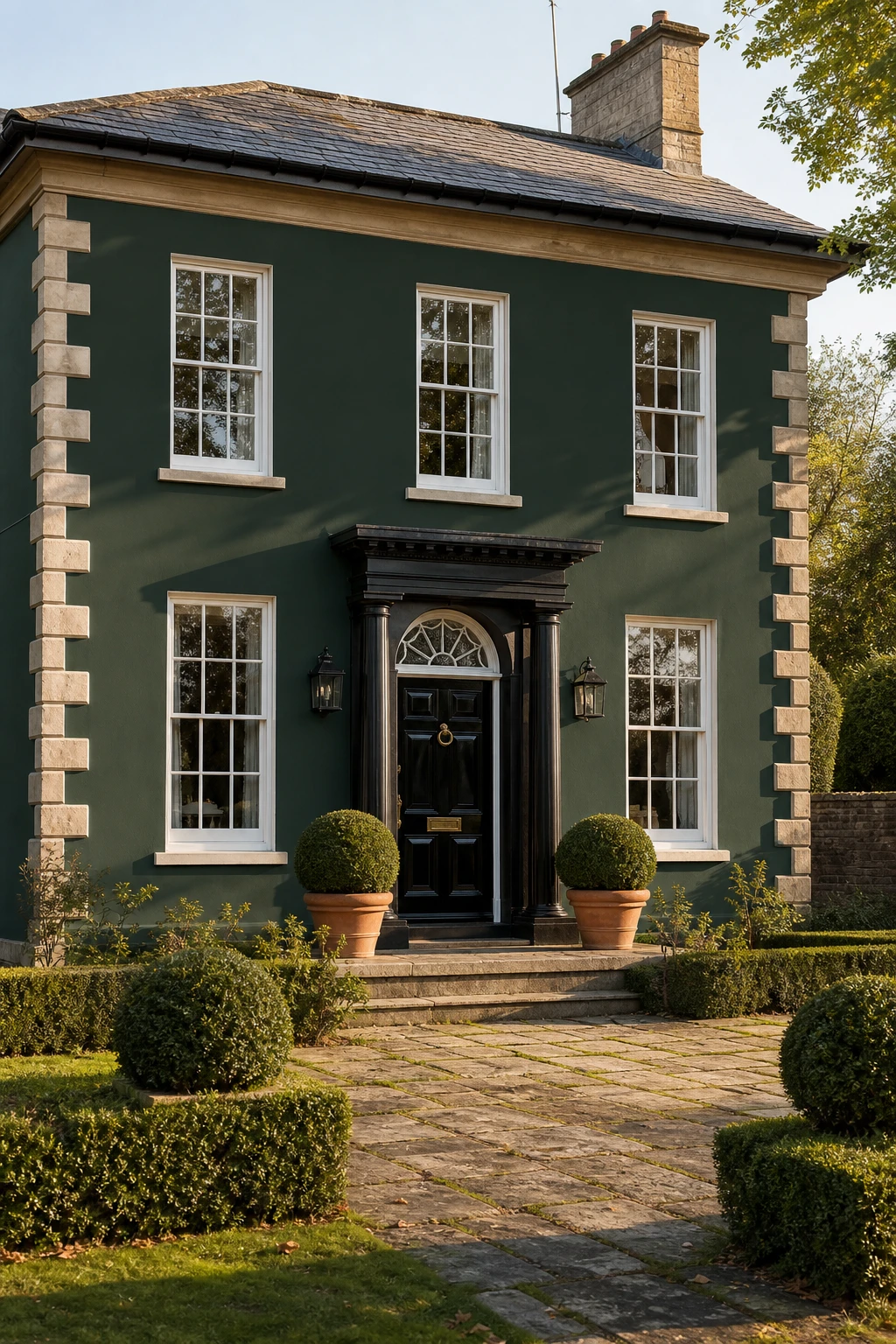
A Windsor Green Exterior and the Classic English Look It Brings to Any House
Windsor Green on an exterior is one of those choices that looks like it has always been there, and that permanence is exactly what I aim for. The depth of tone reads almost like foliage in shadow, sitting naturally against stone, brick, and aged ironwork without demanding attention. What strikes me every time I specify it is how the whole facade settles into the street rather than standing apart from it. You get that classic English kerb appeal and not a single trend driving it.
The Key Details
Glossy black ironwork front door
White painted timber sash windows with glazing bars
Limestone corner quoins
Clipped boxwood spheres in terracotta pots
Cast iron guttering and downpipes
Pro TipPaint your window frames and front door the same Windsor Green as the walls so the whole exterior reads as one considered piece rather than a collection of separate elements.
AvoidPairing this depth of green with brown wood accents pulls the facade into muddy, indistinct territory and loses all the crispness the colour is capable of delivering.
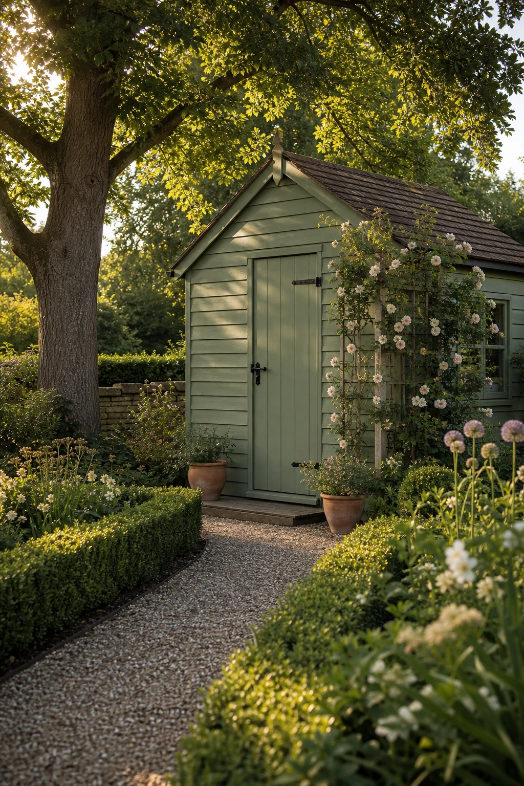
The Green Shed Paint Colour That Makes a Garden Building Part of the Whole Picture
A shed painted in a deep garden green stops being an afterthought and starts belonging. What I love about this move is the way a considered colour lifts the whole plot: the building anchors the end of the garden the way a piece of furniture anchors a room. You will notice it reads as intentional rather than utilitarian, and that shift changes how the entire outdoor space feels.
The Key Details
Weatherboard shiplap cladding
Forged iron door latch and hinges
Clipped box hedge border
Climbing roses on timber trellis
Terracotta entrance pots
Pro TipChoose a specialist exterior wood paint with a microporous finish, as it lets the timber breathe through wet English winters and holds the colour without peeling for years longer than standard gloss.
AvoidPicking a shade that mirrors the lawn too closely leaves the shed looking like it has simply disappeared, which is not the same thing as it looking good.
Teal Green Paint and the Rooms That Use It in the Most Unexpected Ways
Teal sits right at the meeting point of green and blue, and that tension is exactly what makes it so interesting to work with. You get the cool, airy quality of blue without the room tipping into the cold side, and the grounding depth of green without it feeling heavy. What I love most is how an amber armchair and warm oak parquet pull the teal toward the green family, keeping the whole room settled and cohesive. That balance is the thing I always check: teal needs warmth nearby or it starts to drift.
The Key Details
Deep buttoned velvet armchair in amber
Unlacquered brass wall sconces
Arched alcove with open timber shelving
Wide herringbone oak parquet floor
Hand cut stone hearth surround
Pro TipHang your teal swatch next to a warm cream sample rather than a crisp white, because cream pulls the colour toward green and keeps the room feeling grounded rather than clinical.
AvoidBringing navy into a teal scheme shifts the whole room into nautical territory, which is rarely what you are after in a thoughtful English interior.
Alan launched Edward George London in 2017. Since completing his masters in Town & Regional Planning (MPlan) he has combined the skills he learned at the University of Sheffield with his passion for design, to help create a foundation for those looking to create a beautiful home.