I’ve always believed hot pink is the most underestimated colour in a home, because when it’s used with intention it doesn’t shout, it sings. What I love about the looks I’m sharing here is how many ways there are to bring it in, whether that’s a velvety sofa, a whole wall of saturated pigment, or a pattern forward tile that stops you in your tracks. Every single one is a look you can genuinely steal for your own space.
Why Hot Pink Walls Make a Living Room Feel Instantly Alive
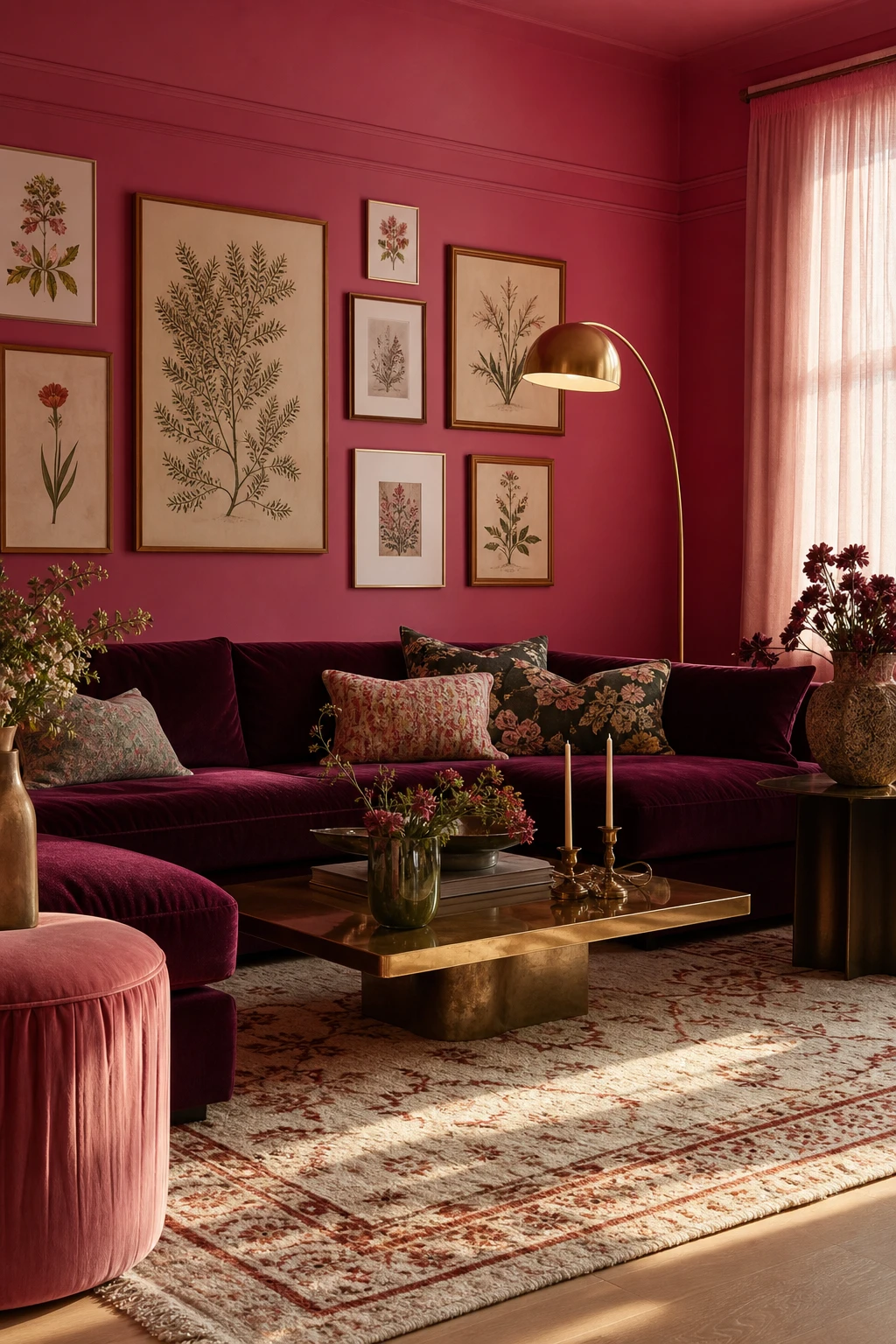
Painting all four walls the same hot pink is one of my favourite moves in a living room because the colour wraps around you and creates real warmth rather than a single accent you barely notice. What I love is how the room stops feeling like a box and starts feeling like somewhere. You get that confidence from committing fully, and the result reads as intentional rather than accidental. Watch how the pink bounces light around the space and makes everything sitting inside it, your furniture, your art, your people, look richer.
The Key Details
Jewel toned velvet sofa
Brass arc floor lamp
Botanical gallery wall
Hand knotted wool rug
Linen sheer curtains
Pro TipAnchor hot pink walls with a sofa in cream, oatmeal, or warm stone so the seating gives your eye a place to rest without fighting the colour.
AvoidMatching your cushions, rug, and curtains all to the same pink as the walls flattens the whole room into a single tone and strips out the contrast that makes the colour sing.
Hot Pink Kitchen Cabinets and the One Finish That Makes Them Shine
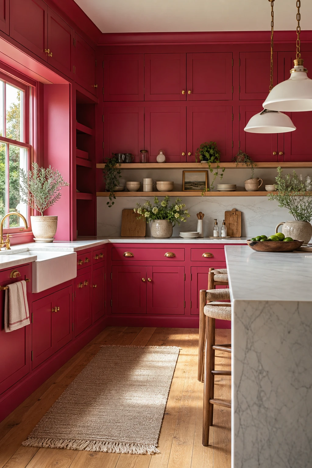
Hot pink cabinetry is the fastest way to change how a kitchen feels without touching a single wall or tile. Floor to ceiling shaker doors in this colour have a confidence I find irresistible: you walk in and the room already has a point of view before the kettle is even on. The antique brass hardware warms the tone so it never reads as garish, and that waterfall marble countertop gives your eye somewhere calm to land and breathe.
The Key Details
Shaker style floor to ceiling cabinetry
Antique brass cup handles and knobs
Waterfall edge marble countertop
Floating open timber shelving
South facing casement window
Pro TipChoose a satin finish for cabinet paint: it reflects just enough light to make the colour sing without showing every fingerprint the way a gloss does.
AvoidPairing bold pink cabinets with a busy, veined countertop in a competing colour crowds the room and kills the impact you worked so hard to create.
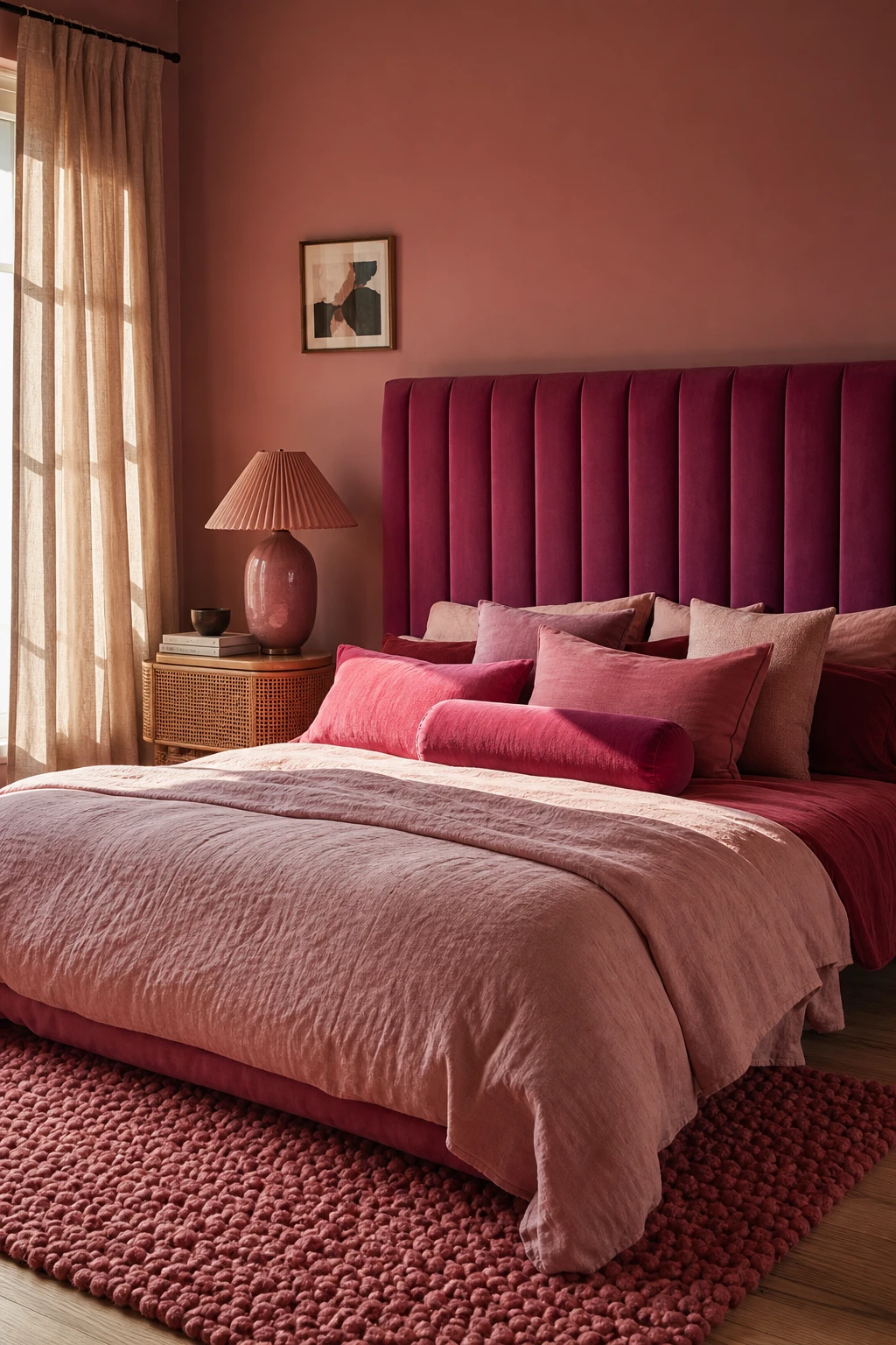
How to Build a Hot Pink Bedroom That Feels Cosy Rather Than Chaotic
Layering tones within one colour family is what separates a bedroom that feels alive from one that feels like a paint sample gone wrong. The fuchsia velvet headboard anchors the room with depth, and as your eye moves down through the cushion stack and across the looped wool rug, the pink softens and shifts. You get movement without chaos. What wins me over every time is how the cane bedside and pleated ceramic lamp quietly break up all that colour with natural texture, so nothing feels flat.
The Key Details
Tall fuchsia velvet upholstered headboard
Graduated pink cushion stack in mixed fabrics
Chunky looped wool rose bedroom rug
Cane bedside table
Pleated blush ceramic table lamp
Pro TipChoose one surface to carry a slight sheen, velvet headboard or glazed lampbase, and keep everything else matte so the contrast does the work rather than competing.
AvoidKeeping every surface the same flat finish drains the energy from a bold colour scheme and leaves the room looking more like a mood board than a real, layered space.
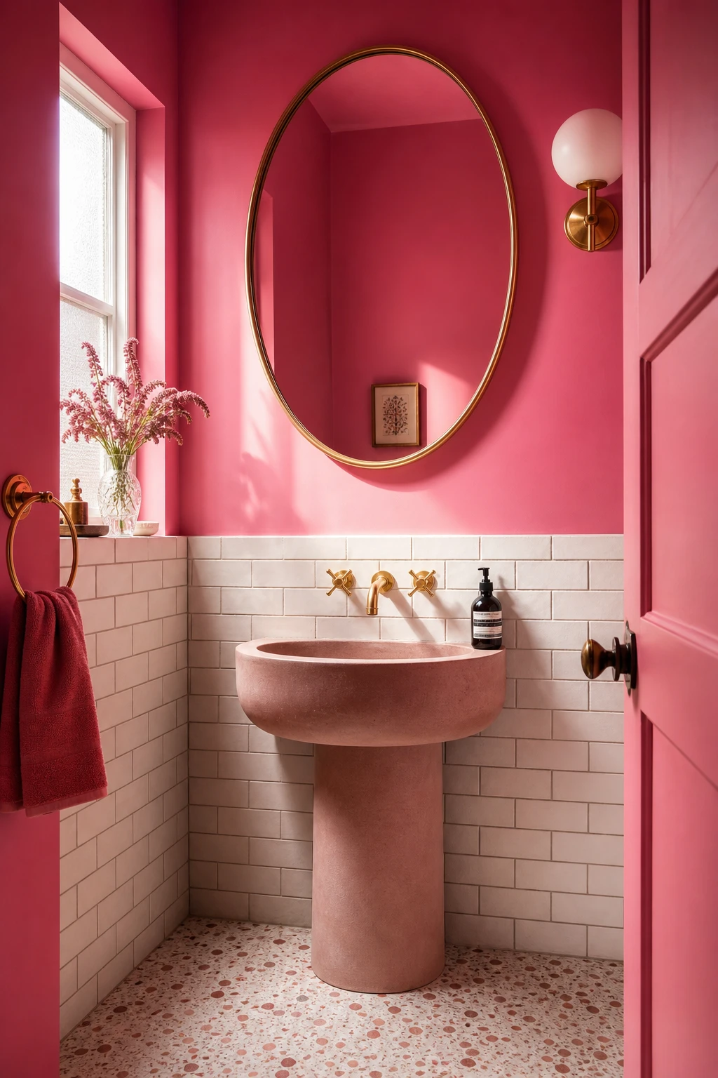
Bright Pink Bathrooms That Turn the Smallest Room Into a Joyful Escape
Small bathrooms are where saturated pink really earns its keep, and that cocooning quality is something I find genuinely hard to achieve in larger rooms. You commit to the colour on every wall and the space wraps around you rather than overwhelming you. The brass mirror and gold tapware warm everything up, and the white subway dado gives your eye a clean horizontal line to rest on without breaking the spell.
The Key Details
Oval brass framed mirror
Pedestal sink with gold tap ware
White handmade subway tile dado
Terrazzo floor in blush and white
Frosted glass side window
Pro TipUse a moisture resistant eggshell or satin finish in your chosen pink so the colour stays rich and wipe clean for years without peeling at the edges.
AvoidCool white or daylight bulbs sit at the opposite end of the colour spectrum from warm pink, and that clash will make the walls look faintly grey and the whole room feel uncomfortable.
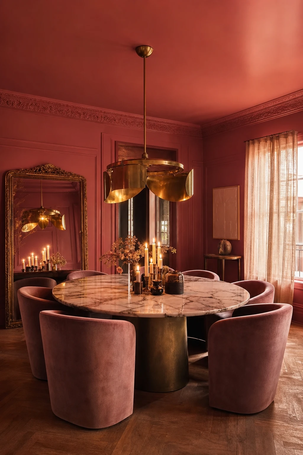
A Hot Pink Dining Room Sets the Mood Before the First Course Arrives
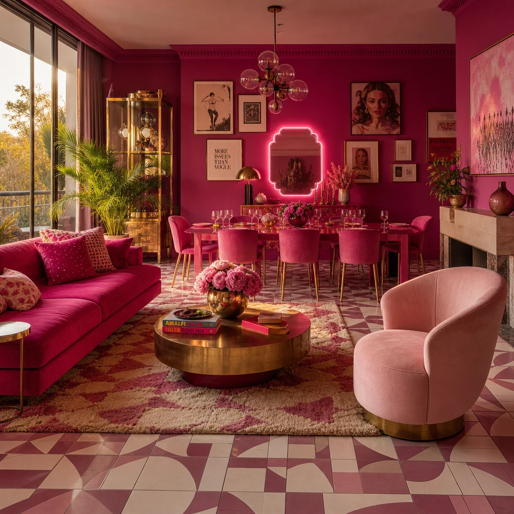
Dining rooms are one of the few spaces that truly come alive after dark, and that is exactly why saturated pink earns its place here. By evening, those deep walls stop reading as bold and start reading as warm, wrapping everyone at the table in a flattering, candlelit glow you simply cannot fake with paint alone. Brass catches it beautifully, the marble glows, and suddenly the whole room feels like somewhere worth lingering.
The Key Details
Sculptural brass chandelier
Round marble topped dining table
Curved velvet upholstered dining chairs
Gilt framed leaning mirror
Sheer linen curtains
Pro TipSwap any cool toned bulbs for warm amber ones in your pendant or chandelier and the hot pink walls will shift from vivid to deeply flattering the moment the sun goes down.
AvoidDimmer switches left at full brightness flatten the whole effect, stripping out the warmth and making the pink feel harsh rather than enveloping.
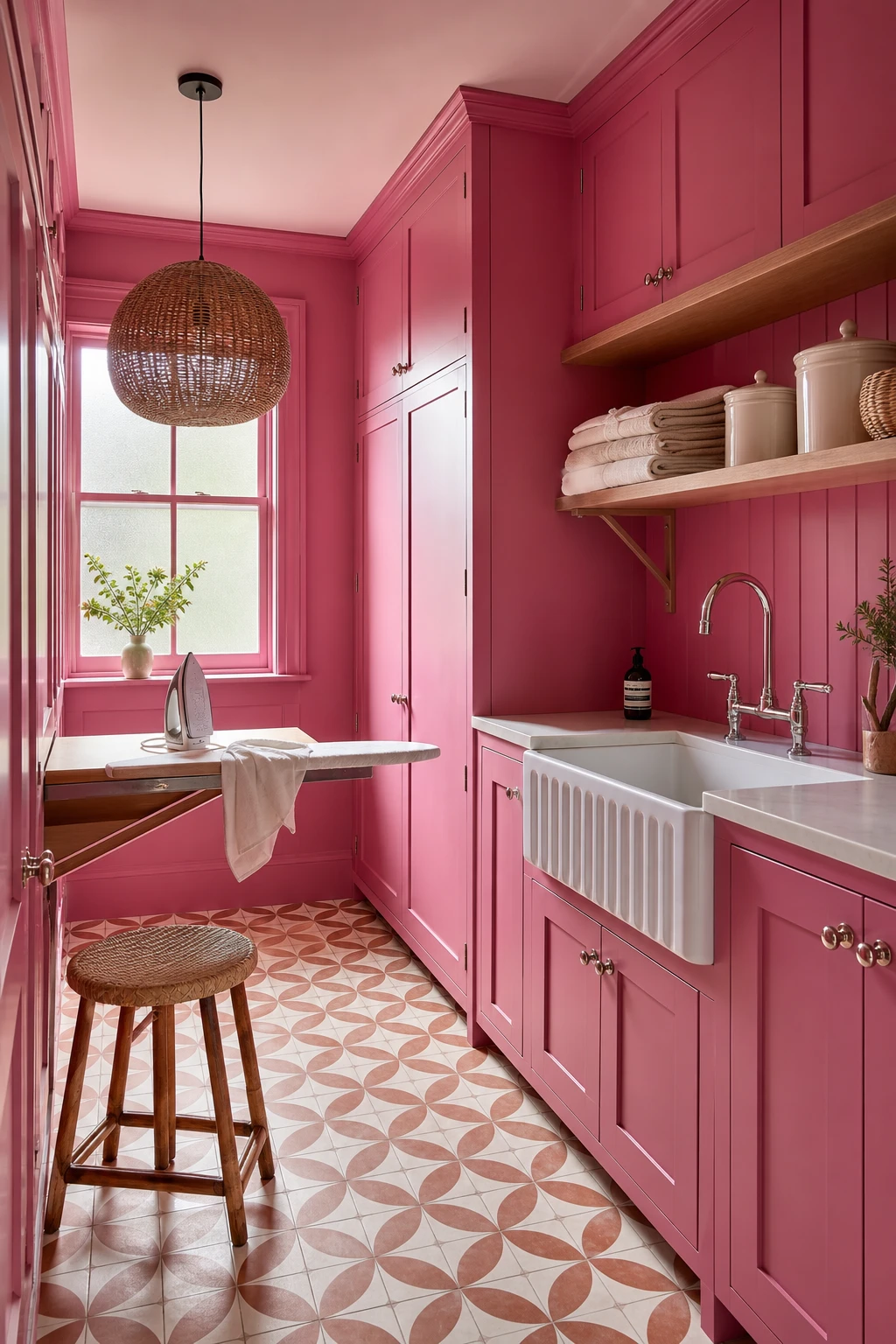
Hot Pink Turns the Laundry Room Into the Most Cheerful Corner of the House
Utility rooms are so often the forgotten space, and that is exactly why hot pink hits so hard in here. Wrapping the cabinetry in a bold, saturated pink turns a room you usually rush through into one you actually want to linger in, and you will notice how the cheerful colour makes the whole chore feel lighter. The white butler sink and polished nickel tap keep things crisp so the pink never tips into chaos, and the encaustic tiles and rattan pendant remind you this room deserves just as much care as any other.
The Key Details
Floor to ceiling shaker cabinetry
Deep white butler sink with polished nickel tap
Geometric encaustic floor tiles
Rattan pendant light
Open timber shelving with ceramic storage jars
Pro TipIf you rent, peel and stick contact paper in hot pink applied to cabinet fronts gives you the full colour impact with zero commitment and peels away cleanly on moving day.
AvoidTreating the utility room as unworthy of real design thought leads to a joyless space that drags down your mood every single time you set foot in it.
A Pink Home Library Is the Cosiest Room You Never Knew You Wanted
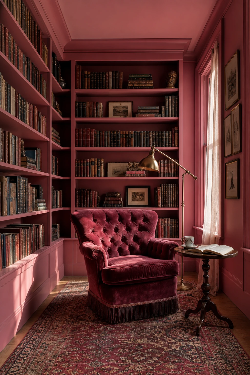
A reading room painted in a deep, saturated pink does something a neutral never quite manages: it tells you exactly how this room wants to feel before you even sit down. What I love is the way the colour wraps every wall and the built in shelves in one continuous tone, so the room reads as a whole rather than a collection of furniture. Book spines then become the decoration, popping against the pink like a gallery of colour. You get warmth, intention, and that rare sense that every single thing belongs.
The Key Details
Floor to ceiling built in bookshelves
Tufted velvet armchair
Pivoting brass library floor lamp
Layered Persian wool rug
Narrow sash window with sheer linen drape
Pro TipPaint your built in shelves one shade lighter than the walls so book spines sit against a slightly softer ground and every colour in your collection gets a chance to sing.
AvoidPacking shelves so tightly that no wall colour shows through turns the whole effect into visual noise and loses the intentional mood you worked so hard to build.
One Hot Pink Accent Wall and the Smart Way to Pick Which Wall Gets the Colour
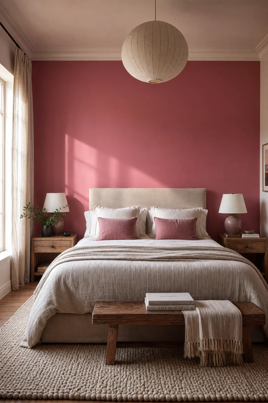
Painting the wall behind the bed transforms the headboard into a proper focal point, and hot pink does that job with real conviction. One bold decision anchors the whole room without asking every surface to compete for attention, and that restraint is something I keep coming back to. You get depth and drama, but the remaining walls stay calm enough to let the colour breathe and the furniture read clearly.
The Key Details
Upholstered linen headboard
Solid timber nightstands
Ceramic bedside lamps
Hand knotted wool rug
Painted plaster accent wall
Pro TipBefore you open a tin, stand in the doorway and note which wall your eyes land on first, because that is almost always the right one to paint.
AvoidChoosing the wall opposite a window pulls the eye toward colour instead of light, and the room ends up feeling smaller and darker than it should.
Hot Pink Wallpaper Adds Pattern and Pigment in One Brilliant Move
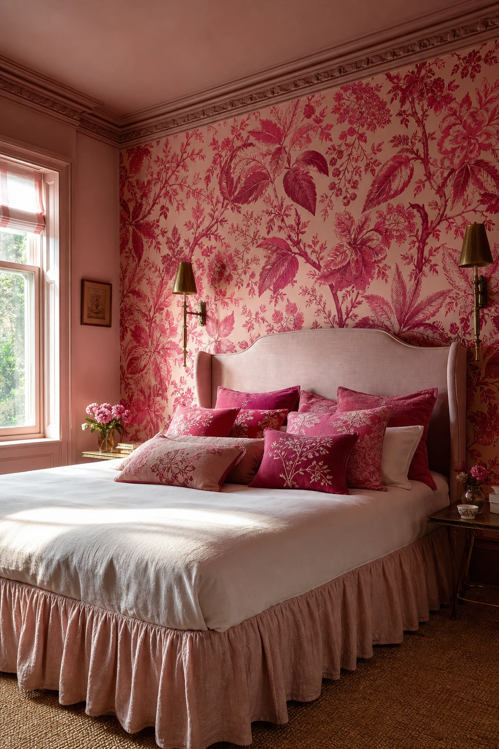
Wallpaper is the one move I return to when a room needs both colour and personality at once, because you get a fully dressed wall without layering paint, art, and texture separately. A hot pink botanical print carries your eye around the room while the pigment does the emotional heavy lifting, and you will notice the space feels considered and complete almost immediately. That confidence comes from one decision, not five, and I find that economy genuinely satisfying to work with.
The Key Details
Floor to ceiling botanical print wallpaper
Antique brass wall sconces
Low upholstered bed with gathered linen bed skirt
Graduated embroidered cushion stack
Painted plaster cornice detail
Pro TipIn a room with low ceilings, choose a small to medium repeat pattern because a large bold repeat needs height to breathe or it feels cut off and restless.
AvoidPapering all four walls of a small room with an oversized pattern closes the space in fast and leaves nowhere for the eye to rest.
Vibrant Red and Pink Tiles Together and Why the Clash Is Actually the Point
Red and pink side by side is one of those combinations that makes people nervous, yet the moment you see it tiled across a wall it just sings. What I love is how both tones share the same warm undertone, so they push and pull against each other without ever fighting. You get movement and energy, but the eye still reads it as one cohesive story rather than a collision.
The Key Details
Handmade ceramic wall and floor tiles in crimson and candy pink
Curved plaster shelf with terracotta vessel
Arched unlacquered brass mirror
Matte cast iron wall hook
Natural linen hand towel
Pro TipChoose a grout in a dusty rose or warm terracotta shade and it will tie every tile together so the surface reads as one rich, layered colour field.
AvoidA bright white grout cuts between each tile like a grid and completely kills the blended, painterly warmth you are trying to build.
Pink Art Deco Tiles Bring Geometric Elegance Into Any Room
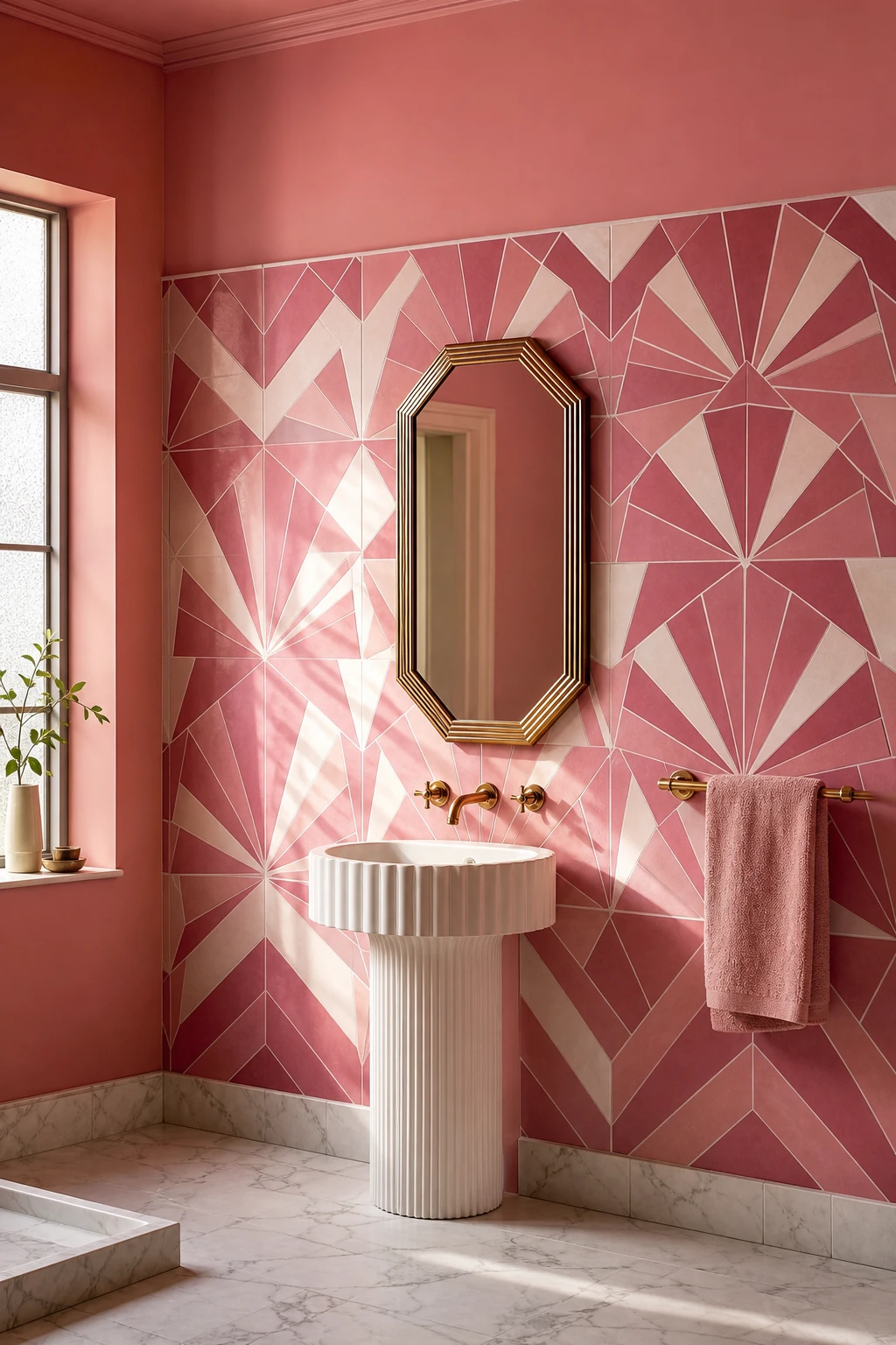
Geometric tile does the decorating for you, and that is what wins me over every time I use it. A fan or chevron in hot pink and ivory pulls the eye around the room before a single shelf goes up. You get structure, pattern, and colour all from one surface, which means the room feels finished and considered without crowding the space.
The Key Details
Geometric encaustic ceramic wall tiles
Fluted pedestal sink
Octagonal bevelled brass mirror
Stepped brass towel bar
Frosted casement window
Pro TipMatch your grout to the lightest tone in the tile so the geometry reads cleanly and the overall effect feels true to the period.
AvoidLoading the room with bold accessories on top of strong geometric tile splits the eye and flattens the impact the pattern was doing on its own.
Retro Pink Tile Bathrooms Look So Good Right Now and Here Is Why
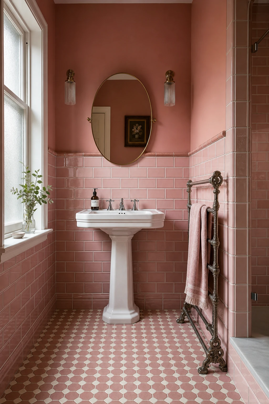
Retro pink tile wins me over every time because it does something modern tile simply cannot: it anchors the room to a specific era and makes that commitment feel confident. Blush beveled subway on the walls, dusty rose hex underfoot, a pedestal sink with cross handle faucets. You get a bathroom that reads as genuinely period rather than trend chasing, and that specificity is exactly what gives it such lasting charm.
The Key Details
Beveled subway wall tiles in blush rose
Octagonal hex floor tiles in dusty rose and ivory
Porcelain pedestal sink with cross handle chrome faucets
Cast iron towel rail
Oval mirror with thin brass surround
Pro TipSource all your tiles from a single reproduction supplier so the glaze depth and slight surface variation stay consistent across walls and floor.
AvoidPairing retro tile with a wall hung floating vanity or a rain shower head pulls the room in two directions at once, and neither era wins.
A Hot Pink Velvet Sofa Is the Statement Piece That Earns Its Place Every Time
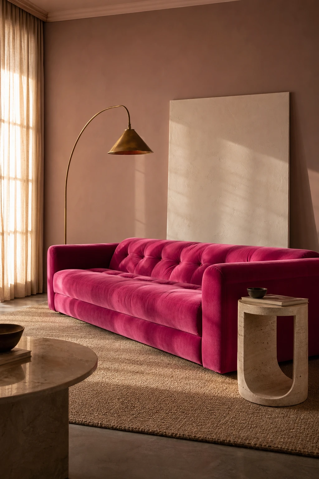
A hot pink velvet sofa is one of those pieces I reach for when a client wants the room to feel dressed without overworking every corner. The saturated fuchsia pulls focus so completely that you get to keep everything around it quiet, raw linen, pale stone, a soft ivory canvas, and the whole thing breathes. Watch how the velvet pile catches the light and shifts from deep rose to almost magenta depending on the hour. That movement means the sofa decorates the room differently morning to evening, and you barely have to lift a finger anywhere else.
The Key Details
Deep fuchsia tufted velvet sofa
Arc brass floor lamp
Curved travertine side table
Raw linen area rug
Oversized ivory canvas leaning against wall
Pro TipPosition a hot pink velvet sofa away from south facing windows or add a UV filtering sheer to protect the pile from fading unevenly across the cushions.
AvoidBringing in too many competing accent colours around a statement sofa fragments the visual story and the sofa loses the commanding presence that made it worth buying in the first place.
How a Fuchsia Sofa Pulls an Entire Living Room Together Around One Colour
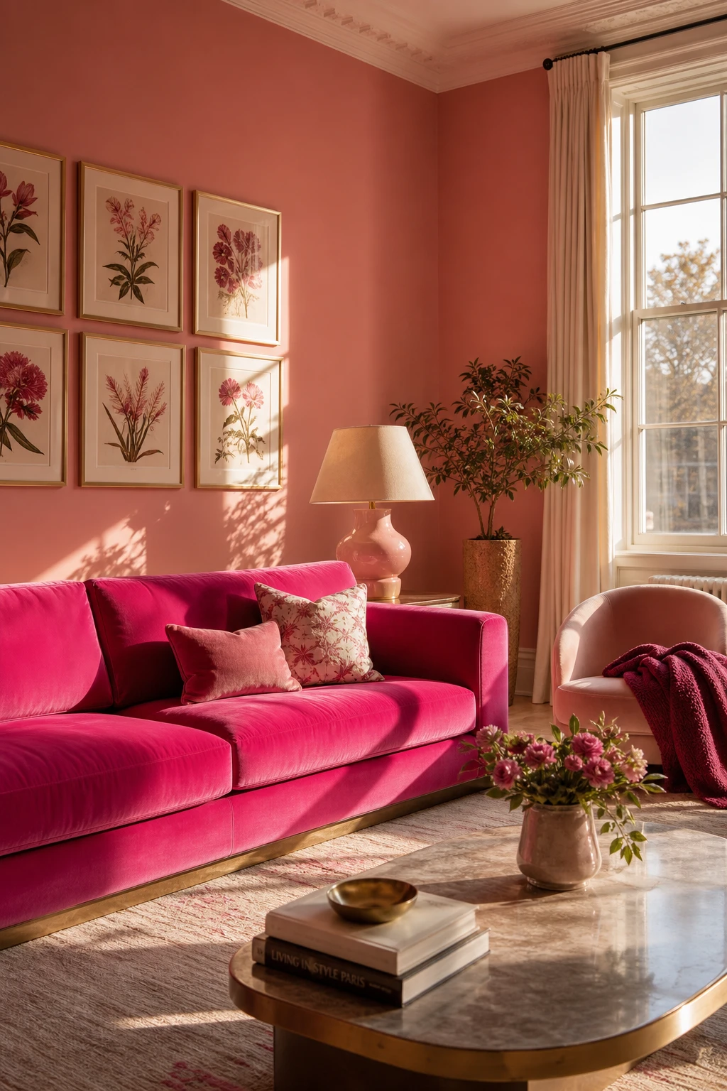
A fuchsia sofa earns its place as the room’s anchor, and what I love is how it hands you a ready made colour story. You pull that deep pink into a magenta chair, soften it with blush ceramics, and echo it in botanical prints, so the eye moves around the room rather than stopping dead at one bold piece. The windows do the rest, washing everything in natural light so the tones read as related rather than clashing.
The Key Details
Fuchsia velvet statement sofa
Curved accent chair in magenta wool
Blush ceramic table lamp
Gallery wall of botanical prints
Tall sash windows
Pro TipHold fuchsia fabric swatches against your wall and floor at different times of day before committing to a sofa, because the same velvet can look electric at noon and almost purple by late afternoon.
AvoidLeaving every surface around a statement sofa completely neutral creates a room that looks staged rather than designed, as if the sofa arrived and nobody knew what to do next.
The Hot Pink High Heel Chair Is Proof That Furniture Can Be Pure Fun
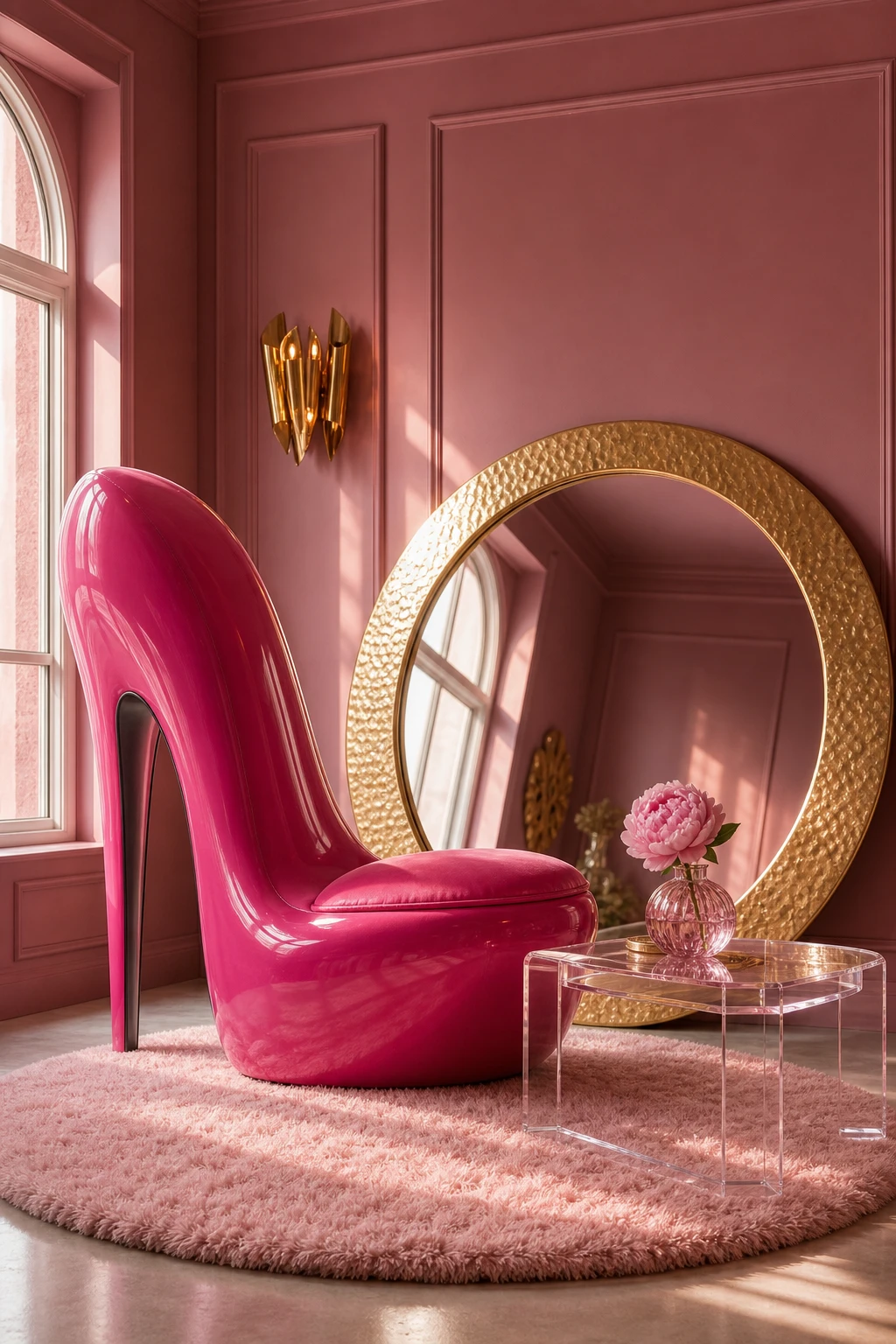
A high heel chair in glossy fuchsia resin is the kind of piece that stops people mid sentence, and that is exactly the point. What I love about a sculptural chair like this is that it carries a full personality on its own, so you can keep everything around it calm and simply let it breathe. The room gets instant wit and warmth, and a clear signal that someone with real confidence made the decisions in here.
The Key Details
Sculptural high heel accent chair in glossy fuchsia resin
Oversized circular gilded mirror
Low polished acrylic side table
High pile circular blush rug
Single peony stem in a glass bud vase
Pro TipFloat the chair in a corner where two sightlines cross, so guests catch it from the hallway and again from the sofa, giving the sculpture twice the impact.
AvoidGrouping several statement pieces together dilutes every single one of them, leaving a room that feels restless rather than bold.
Curved Furniture Softens a Hot Pink Room in the Most Unexpected Way
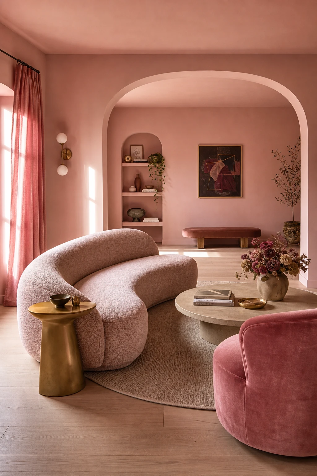
Rounded silhouettes do something almost magical in a hot pink room: they absorb the energy of the colour rather than bouncing it back at you. What I love is how a curved bouclé sofa or a kidney shaped side table makes the whole scheme feel generous and welcoming instead of sharp. You get all the boldness of hot pink with none of the aggression, and that balance is exactly what keeps a room feeling liveable rather than loud.
The Key Details
Curved bouclé sofa
Round velvet armchair
Kidney shaped brass side table
Circular low coffee table
Arched doorway
Pro TipPair your curved seating with one strong linear detail, like a slim skirting board or a straight edged shelf, so the room reads as considered rather than uniformly soft.
AvoidFilling the space with only angular furniture amplifies the intensity of hot pink until the room starts to feel tense and unwelcoming.
A Hot Pink Makeup Vanity Turns Getting Ready Into a Whole Mood
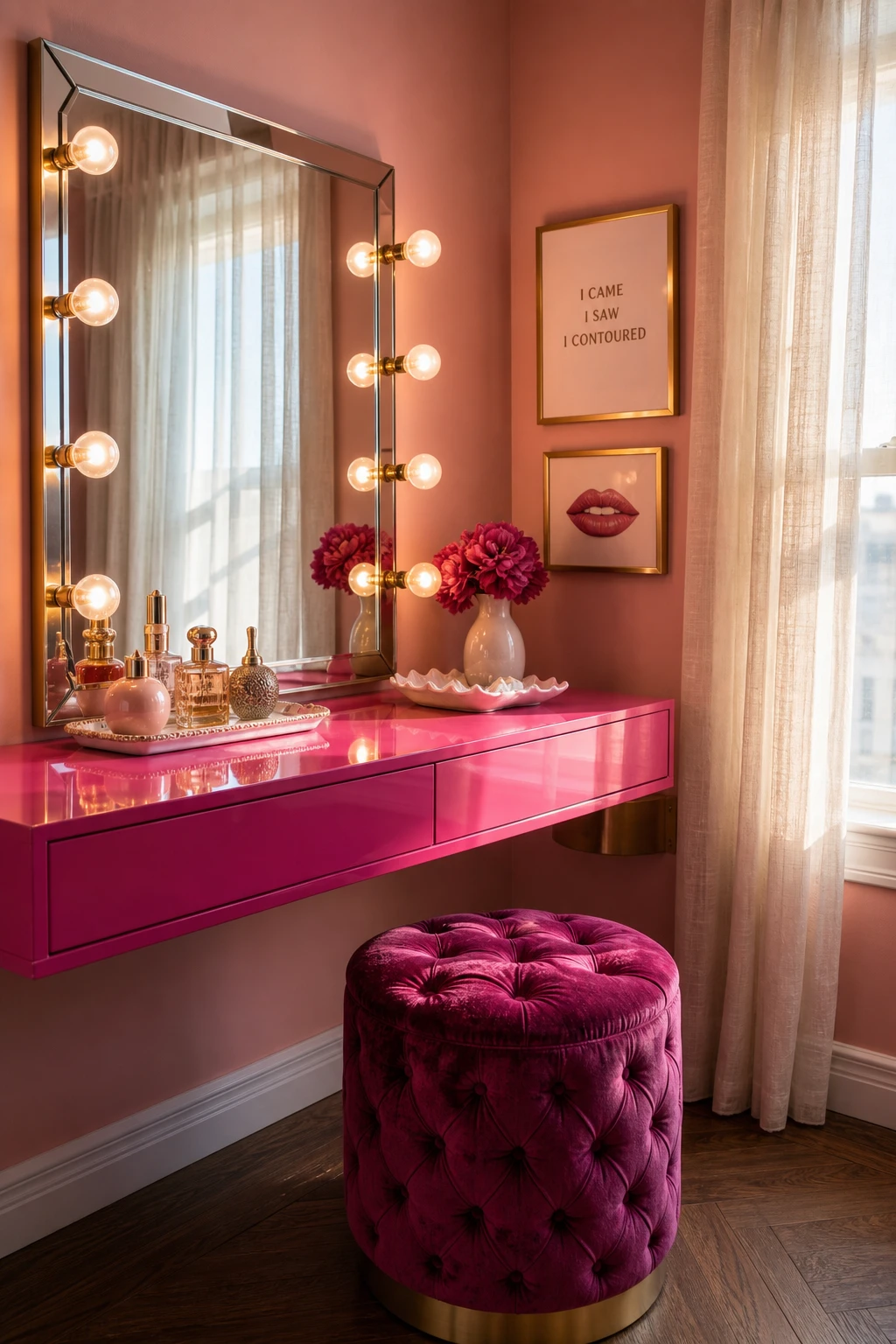
A dedicated corner dressed in hot pink tells your brain that getting ready is worth the ceremony, and you feel it the moment you sit down. What I love here is how the glossy lacquered ledge bounces light around while the tufted velvet stool anchors the whole thing in softness. You get a space that is functional and genuinely uplifting, which is exactly what a morning ritual deserves.
Once the pink vignette has given you a direction, this bedroom dressing table guide checks the table, stool, mirror and light against a daily routine.
The Key Details
Hollywood bulb vanity mirror
Tufted velvet magenta accent stool
High gloss lacquered hot pink floating ledge
Sculptural perfume bottles and ceramic trinket tray
Sheer linen side curtain
Pro TipFit warm white LED strip lights around the mirror frame rather than relying on ceiling lights, so your makeup reads in the same tones you will actually wear it in the real world.
AvoidOverhead downlights aimed straight at a vanity cast shadows under the eyes and chin that make colour matching almost impossible and leave you guessing until you step outside.
A Dressing Table With a Stool in Pink Is a Small Setup With a Big Impact
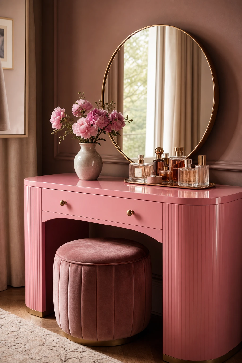
A pink dressing table and stool done right feel like a moment in the room, not just a place to sit and sort your hair. The upholstered stool echoes the table’s tone so the two read as one considered piece rather than two separate finds, and that unity is what wins me over. You get that sense of a finished vignette, something that looks placed rather than landed, and that small shift from assembled to designed is the whole point here.
The Key Details
Lacquered curved dressing table
Velvet upholstered stool
Round brass framed mirror
Glass perfume bottle cluster
Ceramic bud vase with florals
Pro TipMeasure the table height before buying the stool so the seat lands roughly 25 to 30 centimetres below the surface, letting it tuck cleanly underneath when not in use.
AvoidPicking a stool after the table is in place and grabbing whatever fabric is closest tends to introduce a tone or texture that pulls the eye away from the vignette rather than completing it.
Styling a Pink Bookshelf With Books and Objects the Way Designers Actually Do It
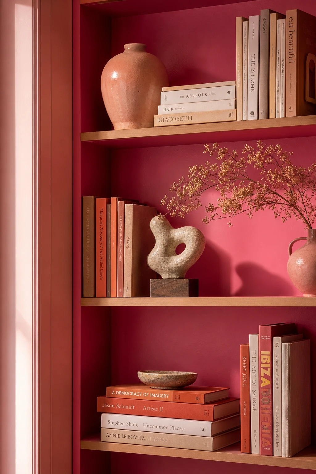
Styled shelves live or die by rhythm, and what I love about this approach is how mixing upright books, stacked spines, and objects at different heights gives the eye a little journey to follow. A rounded vase here, a sculptural piece there, a dried sprig adding softness, you get layers without clutter. The pink palette threading through the spines and ceramics ties it all together so nothing feels random.
The Key Details
Built in floor to ceiling bookshelf
Stacked and upright book arrangement
Rounded glazed stoneware vase
Dried botanical sprig accent
Small sculptural decorative object
Pro TipGroup your books by cover colour in loose clusters rather than one long rainbow run, and you will get a shelf that looks curated rather than sorted.
AvoidFilling every shelf from edge to edge leaves no room to breathe, and the whole thing reads as storage rather than something you styled with intention.
Barbiecore Interior Design Looks That Go Far Beyond the Obvious Pink
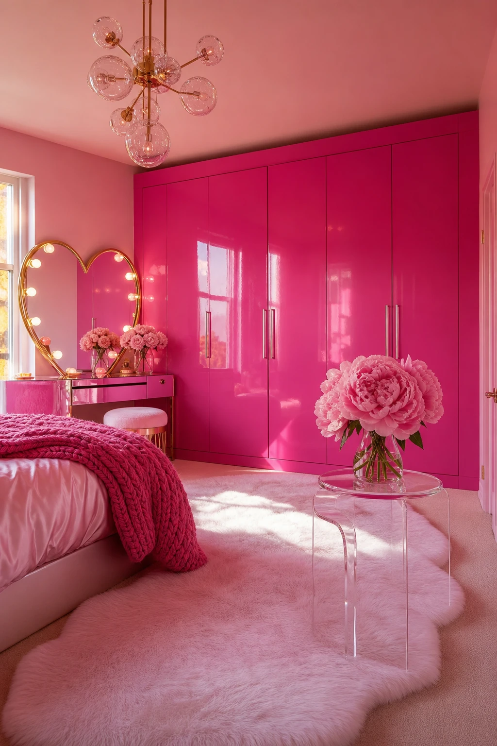
Barbiecore refuses to apologise for itself, and that fearlessness is precisely what wins me over. You commit to the whole world: the lacquered wardrobe, the heart mirror, the cloud rug, and suddenly the room has a point of view so clear it becomes genuinely joyful. When everything belongs, nothing looks out of place, and I love how that total commitment reads as confidence rather than excess.
The Key Details
Floor to ceiling glossy lacquered wardrobe
Heart shaped gold trimmed vanity mirror
Faux fur cloud area rug
Sculptural clear acrylic side table
Oversized peony floral arrangement
Pro TipAnchor the whole look with three hero pieces, say the wardrobe, the vanity mirror and the rug, then let everything else stay simple so the room feels curated rather than crammed.
AvoidDropping in a winking novelty item or a self conscious kitsch piece pulls the room apart at the seams, because it signals you do not quite believe in the look and the whole fearless energy collapses.
Magenta Interior Design and the Subtle Difference That Sets It Apart From Pink
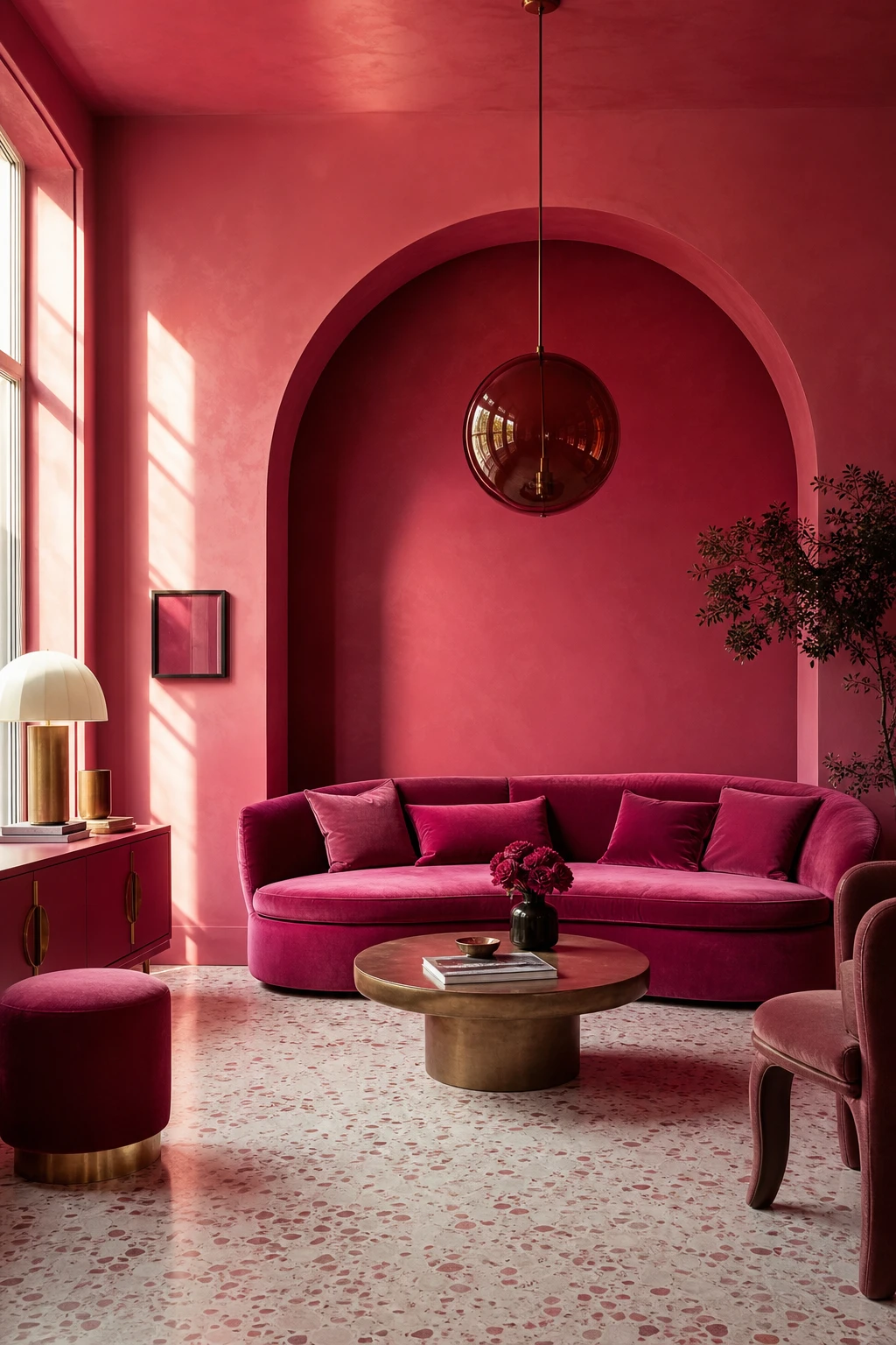
Magenta sits in a fascinating spot between red and violet, and that warm cool tension is what gives these rooms their charge. What I love is how the blue undertone stops the space from feeling sugary, while the red keeps it from tipping cold. You get a shade that reads confident rather than sweet, and in a room with decent natural light, watch how it shifts from jewel bright in the morning to something almost plum by evening.
The Key Details
Curved velvet sofa
Arched plaster alcove
Smoked amber globe pendant
Terrazzo floor in cream and blush
Brushed brass hardware
Pro TipHold your magenta swatch next to the actual bulb type you use at night, because what looks vibrant in daylight can read almost purple under warm LED light.
AvoidTreating all pinks as interchangeable is a costly mistake, because a magenta with blue undertones can look bruised and flat the moment cloud cover rolls in.
Retro Futurism Brings Hot Pink Into a World That Feels Both Nostalgic and Next Level
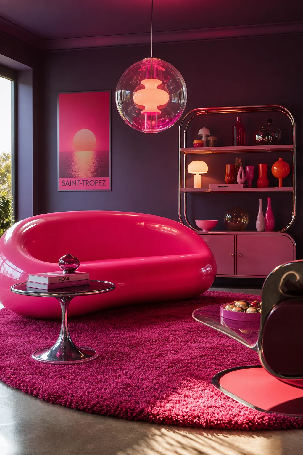
Retro futurism gives hot pink a genuine reason to exist beyond pure decoration, and that is what draws me back to it. The pod shapes and atomic era curves carry the nostalgia, while chrome finishes and acrylic pendants push everything forward, leaving you with a room that feels invented rather than borrowed. That tension between past and future is exactly what keeps it original, and you feel it the moment you walk in.
The Key Details
Curved pod vinyl sofa
Chrome tulip base side table
Suspended acrylic orb pendant
Circular deep fuchsia shag rug
Atomic era ceramic display shelving
Pro TipCluster your mirrored and chrome pieces so they bounce the pink around the room, turning one accent colour into something that feels woven into every corner.
AvoidPulling in mid century, space age, and eighties Memphis references all at once dilutes the concept until the room reads as confused rather than curated.
A Memphis Style Kitchen Uses Geometry and Hot Pink to Break Every Quiet Rule
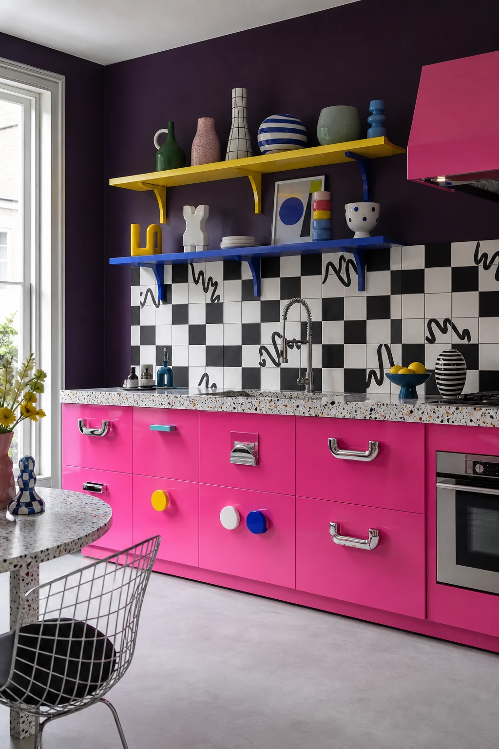
Memphis design was never meant to be polite, and that is exactly what wins me over about it in a kitchen. Hot pink lacquered lowers sit against a checkerboard and squiggle tile backsplash and you feel the energy shift the moment you walk in. The asymmetric shelving and chunky postmodern pulls are not accidents, they are decisions, and understanding that intention is what stops it feeling like a mess and starts feeling like freedom.
The Key Details
Hot pink lacquered lower cabinets
Geometric checkerboard and squiggle tile backsplash
Asymmetric open shelving with primary colour brackets
Chunky postmodern chrome and candy drawer pulls
Terrazzo countertop
Pro TipPeel and stick laminate in a Memphis squiggle or grid print applied to flat cabinet fronts gives you the full graphic effect for a fraction of the cost of custom lacquer.
AvoidLetting every element compete equally means the eye has nowhere to rest, so threading hot pink as a consistent colour through the brackets, pulls, and at least one surface is what keeps the chaos readable.
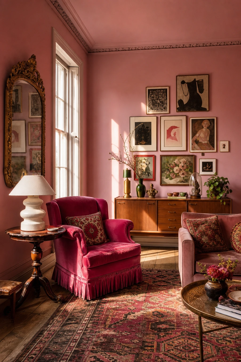
Eclectic Interior Design With Hot Pink at Its Heart Looks Collected Not Cluttered
Eclectic rooms live or die by one invisible rule, and hot pink is one of the best colours I know for playing that role. When fuchsia turns up in the velvet armchair, echoes through a print on the gallery wall, and pulses again in a vase on the credenza, you stop seeing a jumble of eras and start seeing a room. The kilim, the gilded mirror, the mid century credenza suddenly belong to each other because they all answer to the same colour.
The Key Details
Velvet fuchsia armchair
Ornate gilded mirror
Layered kilim rug over bare timber floorboards
Gallery wall of mixed vintage and abstract prints
Mid century credenza with curated object display
Pro TipPlace your hot pink in at least three spots spread across the room, low on the rug, mid height on a chair, and high on the wall, so the eye travels a full circuit and the space feels intentional.
AvoidPicking pieces purely for individual charm without a colour connection leaves even beautiful objects feeling like strangers sharing a room rather than a considered collection.
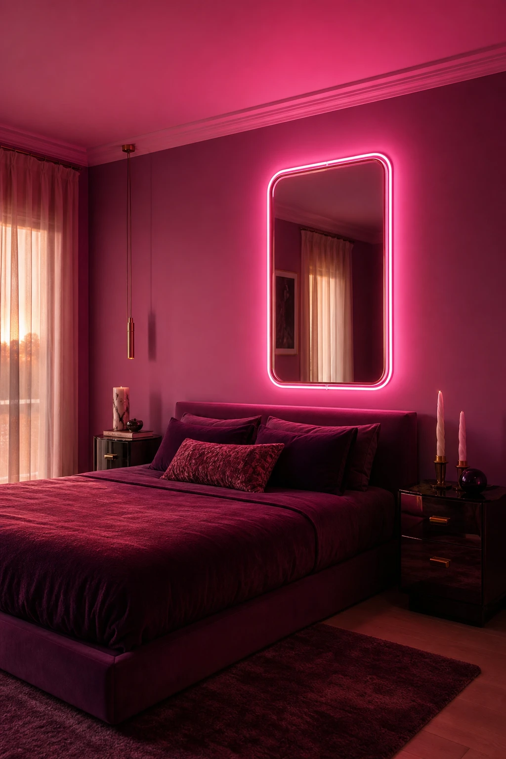
A Pink Neon Mirror on the Wall Is the One Piece That Changes the Whole Room After Dark
A neon pink mirror earns its place twice over: by day it reads as sculpture, all curved tube and polished glass, and after dark it becomes the room’s main event. What I love is that one piece does the job of both art and ambient light, so you get a genuine mood shift without touching a single other thing. You will notice the glow bounces off the glass and spills softly outward, warming every surface it reaches.
The Key Details
Neon tube mirror frame
Low platform bed
Deep plum velvet bedding
Smoked glass bedside tables
Sheer ivory curtains
Pro TipHang the mirror at eye level so the reflection catches the whole room and the neon glow travels as far as possible.
AvoidPositioning the mirror close to a bright overhead light flattens the neon completely, and you lose the whole after dark effect the piece was chosen for.
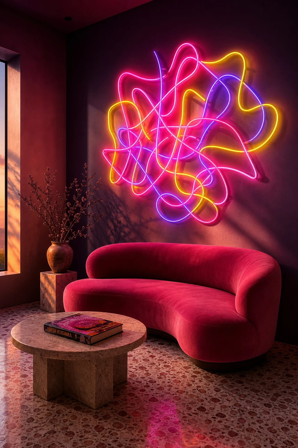
Abstract Neon Light Sculptures Give a Hot Pink Room Its After Hours Energy
Freeform bent neon stops being a gadget and becomes a proper sculpture the moment you treat it that way, and that shift is what I love about this corner. The glowing tube echoes the curved arm of the velvet loveseat below it, so your eye finds a quiet rhythm between the two shapes. You get that warm pink bloom on the cream terrazzo without overhead light flattening the mood, and the recessed window keeps the wall clean so the neon reads as the only statement it needs to be.
The Key Details
Freeform bent neon tube sculpture
Curved deep pink velvet loveseat
Low travertine side table
Cream and rose terrazzo flooring
Recessed slit window
Pro TipBefore you commission a custom shape, hold a piece of bent wire against the wall and check that its curve genuinely mirrors something already in the room, a sofa arm, a table edge, or an arch, because that echo is what makes it feel considered rather than random.
AvoidPlugging neon into a visible extension cord that trails down the wall collapses the gallery illusion instantly and makes what should feel like art look like a prop.
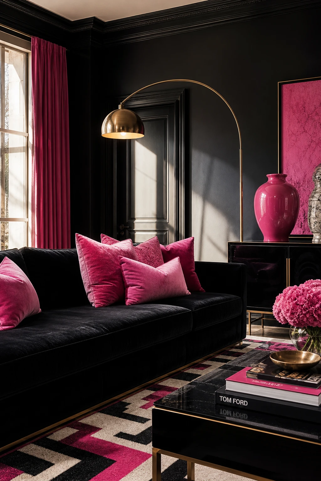
Black and Hot Pink Living Room Decor and the Ratio That Stops It Feeling Too Much
Black and hot pink is one of the most dramatic pairings you can put in a living room, and the ratio is everything. What I love about anchoring pink as the dominant shade at around 70 percent is that the room stays warm and alive, while black pulls the whole thing into focus. You will notice how a lacquered sofa or a geometric rug in both colours holds its edge without ever tipping into heavy. The contrast earns its drama because one colour clearly leads.
The Key Details
Black lacquered velvet sofa
Hot pink velvet scatter cushions
Brass arc floor lamp
Geometric black and pink wool rug
Low black lacquered sideboard with oversized pink ceramic vase
Pro TipRun your black through the architecture first, window frames, skirting, and shelf edging, and it reads as a grounding line rather than a competing block of colour.
AvoidSplitting the two colours evenly across the room leaves neither shade in charge, and the result feels restless rather than bold.
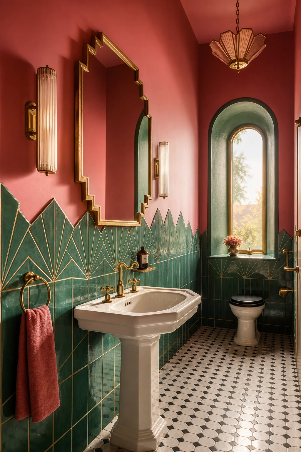
A Pink and Green Art Deco Bathroom Is the Combination You Did Not Know You Needed
Pink and green sit opposite each other on the warm cool spectrum, and that tension is exactly what gives this bathroom its pull. The pink tile base does the heavy lifting, wrapping the room in warmth, while green arrives as a sharp, cool contrast that stops it feeling sugary. What wins me over every time is the Art Deco geometry: stepped mirrors, fan tiles, and that black and white mosaic floor give the colour pairing real structure to live inside. You get drama without chaos.
The Key Details
Emerald green geometric fan subway tiles
Stepped octagonal aged brass mirror
Pedestal basin with cross handle brass faucets
Black and white hexagonal mosaic floor
Arched window with deep plastered reveal
Pro TipKeep green as the accent only, adding it through towels, a trailing plant, or a single shelf accessory so the pink reads as the clear hero and the green gives it an edge.
AvoidSplitting the room fifty fifty between pink and green leaves neither colour in charge, and the bathroom ends up feeling pulled in two directions rather than composed.
Alan launched Edward George London in 2017. Since completing his masters in Town & Regional Planning (MPlan) he has combined the skills he learned at the University of Sheffield with his passion for design, to help create a foundation for those looking to create a beautiful home.