Newsletter Subscribe
Enter your email address below and subscribe to our newsletter

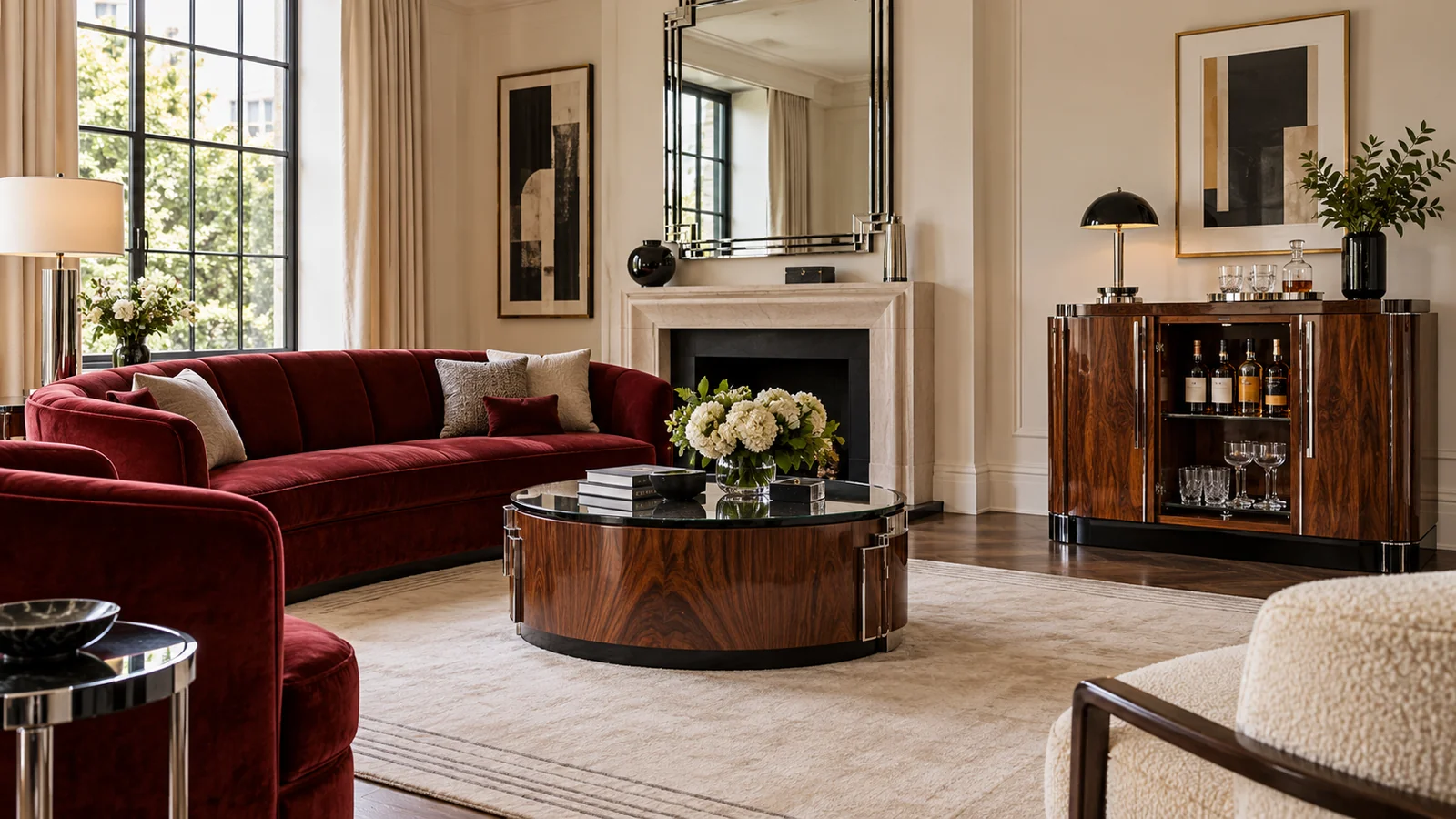
When friends are coming over, I would plan an Art Deco home bar around the evening you want to share. A handsome cabinet earns its space when you can pour a drink, offer water and return to the conversation without searching another room for a glass. The room still needs to feel like your living room, with comfortable seats and somewhere to put a drink once everyone settles. I would start with those ordinary actions before choosing a trolley, a mirrored back or a dramatic light. Here I work through the location, the choice between serving guests and letting them help themselves, and the route that connects the cabinet with the kitchen. My palette is oyster, black lacquer, deep red velvet, walnut and chrome, used with a clear working surface. The result is a room and serving plan you can rehearse before buying anything or arranging the cabinet contents.
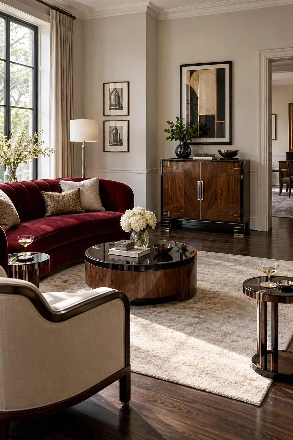
I would first decide which part of the room already carries the style. It might be a curved red sofa, a walnut cabinet with a stepped outline or a chrome lamp beside a favourite chair. Keeping that strongest element gives the drinks corner something to belong to. You do not need to add geometric wallpaper, a sunburst mirror and another metallic finish just because a cabinet is joining the room. I would let one familiar feature remain the centre of attention.
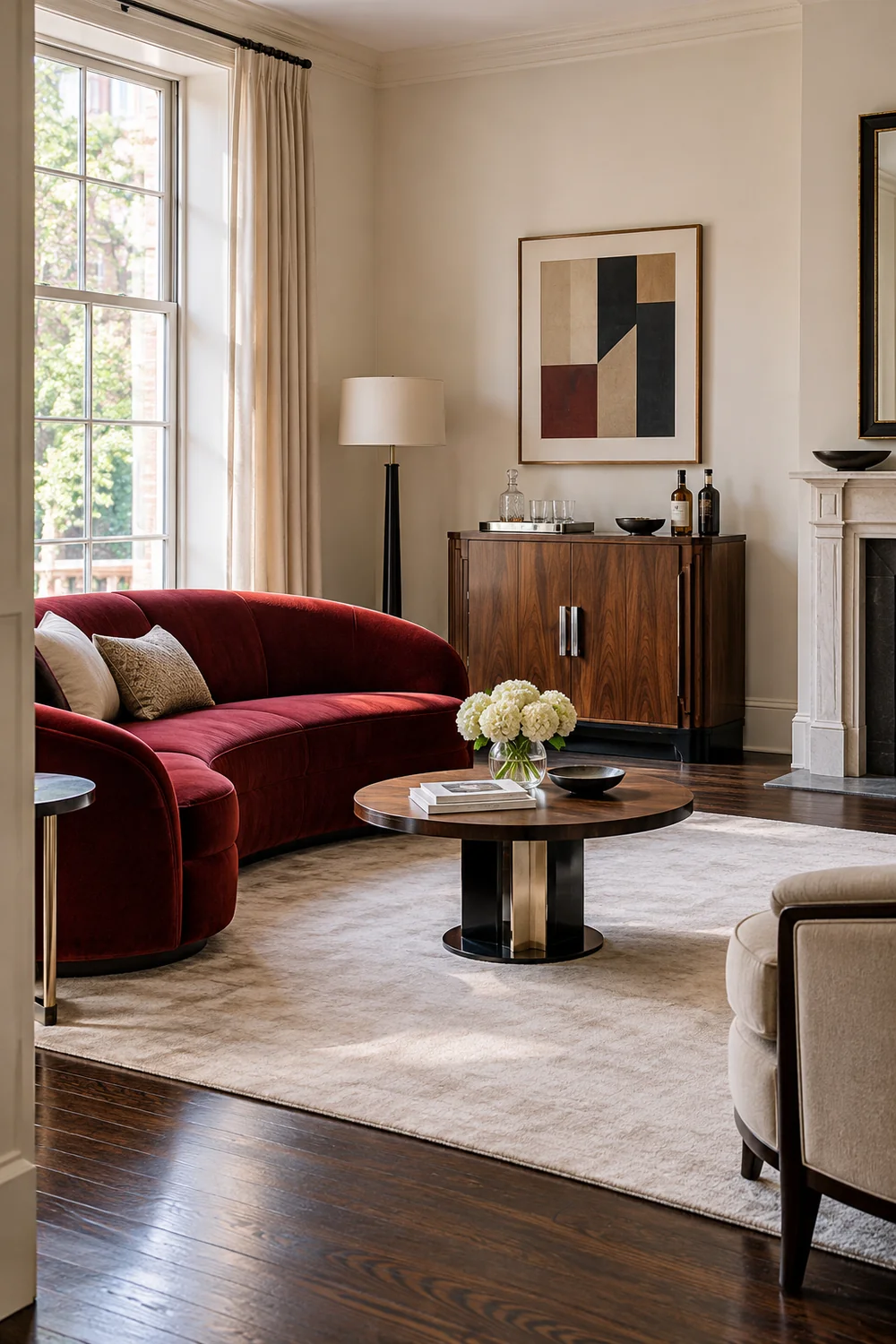
For this room, I would use pale oyster walls to keep the seating legible, then repeat black in small lacquered details. Walnut brings a warmer surface beside clear glass and chrome. Deep red belongs mainly to the upholstery, where its colour has enough area to read clearly. These are choices for a contemporary interpretation, rather than a claim that every historic room used the same recipe. If you are still deciding which elements appeal, the illustrated Art Deco living room gives you that visual starting point.
Next I would remove the things that only occupy a prospective serving surface. A vase can move to the mantel; a large framed picture might hang above the cabinet instead of leaning against its back. This is an edit of the corner, not a reason to empty the room of personality. I want the cabinet to look recognisable when it is closed and useful when friends arrive. A single decorative object can remain if it does not compete with a glass or your hand.
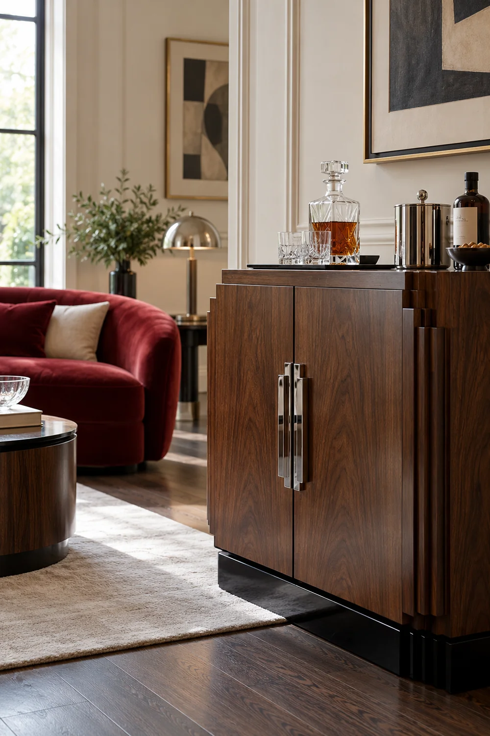
Before moving furniture, I would take a photograph from the doorway and another from the main seat. The doorway view shows whether the drinks corner interrupts the room's existing balance. The seated view shows whether bottles or a bright reflection become the only thing you notice. If the cabinet feels too prominent, I would try a quieter location before buying a smaller collection of equally conspicuous accessories. The room character is the starting condition that the serving plan has to respect.
The next decision is who will use the serving point. If you enjoy making each drink, I would plan one working position for you and a nearby place to pass the finished glass. Friends can stay beside the seating rather than gather around your hands. You need to reach the tools without turning your back on everyone for long. A compact cabinet may work well because you can open it for the visit and close it afterwards.
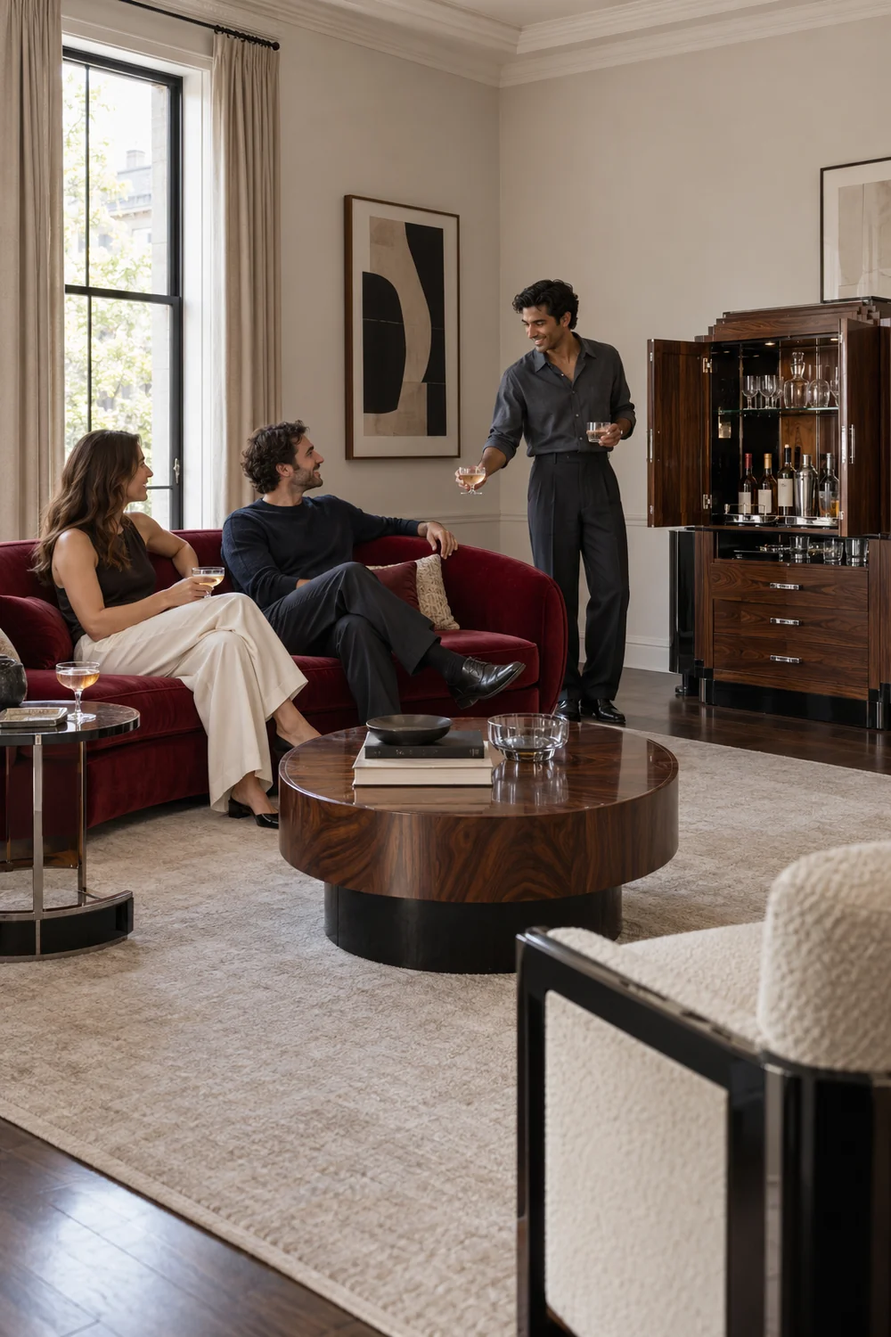
If you would rather sit with your guests, I would arrange a simpler help yourself selection. Water, glasses and the drinks you have agreed to offer should be understandable without an explanation every time someone stands up. I would avoid a large display of bottles that implies a full cocktail menu when you only intended a few choices. The arrangement is successful when a friend can take the glass they need and step away without asking you to move a lamp or another drink.
There is also a useful middle route. You can prepare the first drinks, then leave an obvious water and refill position while the tools return to their own space. This keeps the social pleasure of welcoming people without making you the permanent attendant. The broad Art Deco home inspiration helps you compare cabinet and trolley silhouettes, but I would choose between those forms only after deciding how you want the evening to work.
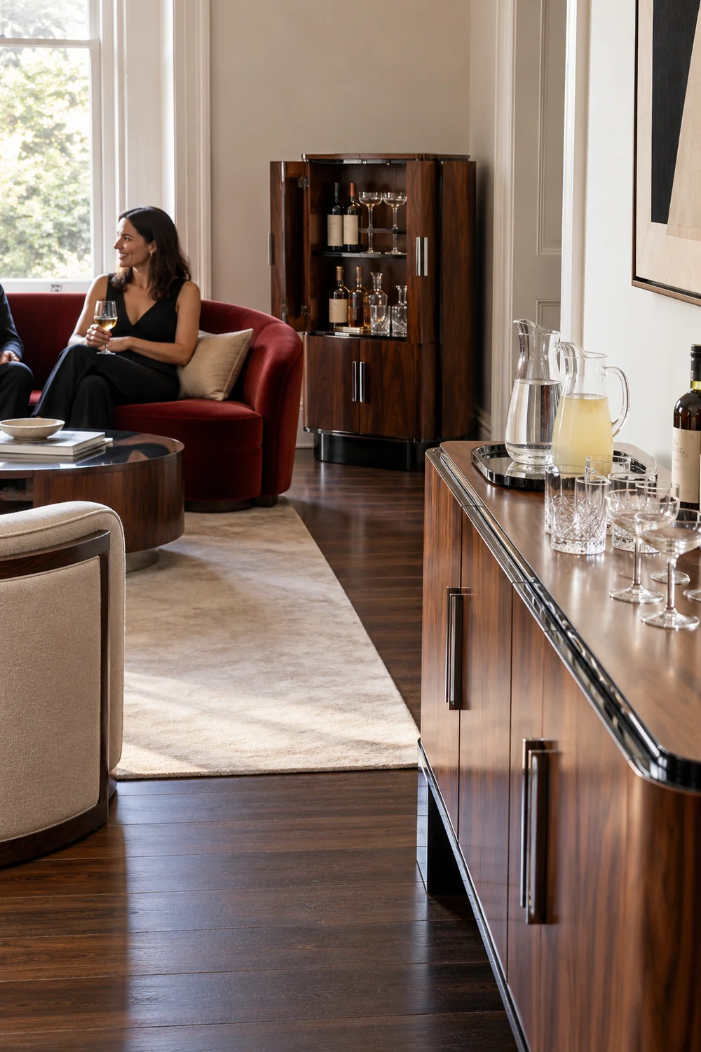
I would write the chosen arrangement in one sentence: I pour beside the cabinet and pass drinks towards the chairs, or friends help themselves from the sideboard while I sit nearby. That sentence prevents the room from accidentally trying to support two competing setups. It also reveals what stays in the kitchen. You can prepare there and serve here without expecting a living room cabinet to become a second kitchen, complete with equipment that the room has no useful place to accommodate.
I would test the furniture you already have before choosing a new piece. An existing sideboard may offer a clear top, enclosed storage and a position close to the conversation. Its limitation might be that it also houses paperwork or table linen. I would decide where those belongings will go before calling the surface available. Moving clutter into an unrelated drawer only hides the conflict until the next ordinary weekday.
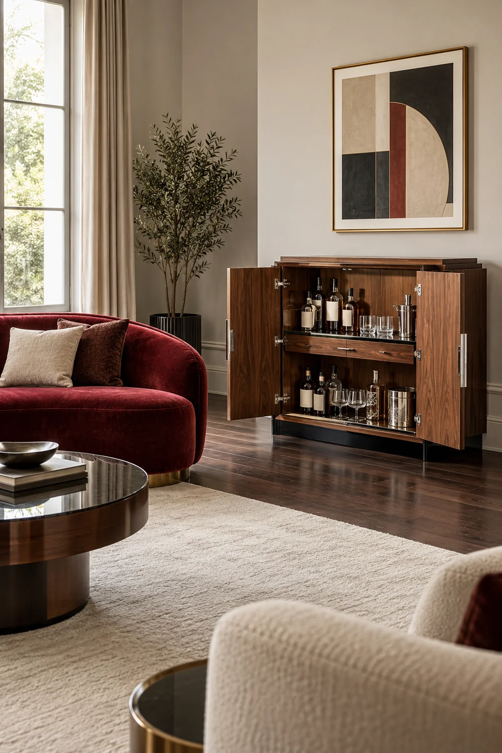
A cabinet gives the serving set a defined home and can make the return to everyday living straightforward. However, its doors, drawers and any pull out shelf have to work while someone is standing there. I would draw or mark the full opened shape on the room sketch. A slim closed outline is not enough information. The furniture instructions govern its assembly, intended loads and any fixing requirements; appearance cannot establish those things.
A trolley is useful when its parked position and serving position are both clear. I would not assume that it needs to roll during a gathering. It can remain in one sensible location while the tray moves, which may suit the room better than steering glasses around people. If you plan to move it, check its instructions and the actual floor transition before loading it. The wider living room furniture guide is useful when this choice also changes your seating or storage arrangement.
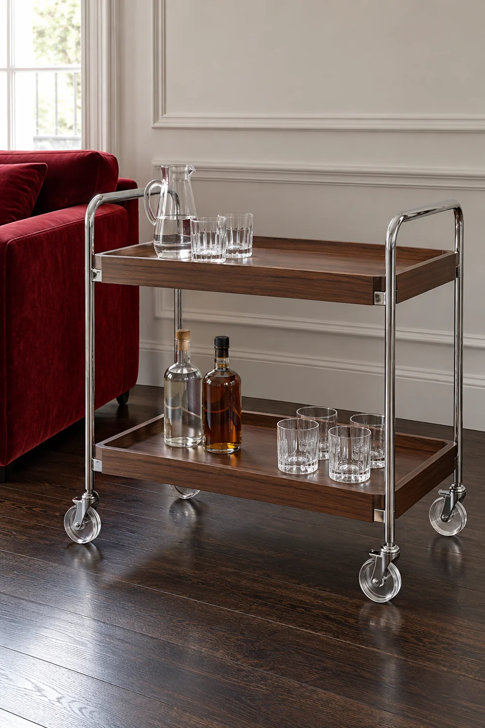
For a fair comparison, I would give all three options the same job. Each must house the agreed serving set, provide an accessible working or pickup point, and leave the main seats usable. Do not compare an empty trolley with a fully stocked cabinet. I would keep the option that fulfils the brief with the least disruption. A beautiful cabinet that requires removing your most comfortable chair may be a worse choice than a sideboard that simply needs a deliberate section cleared.
I would now place the serving point in the room sketch and add people. Show someone standing at the cabinet, another person waiting for water and someone sitting in the nearest chair. The important question is whether those positions can coexist. A route that looks open between empty objects can disappear when a cabinet door opens or a guest stands up. I would check those ordinary moments before treating a narrow leftover corner as the answer.
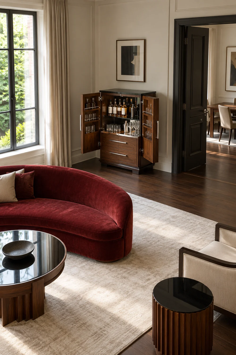
Try the sequence with the actual furniture where possible. Open the cabinet, take a glass and turn towards the seating. Then ask someone to walk from the room entrance towards a chair while you remain at the serving point. You are looking for awkward negotiations, rather than proving a universal distance. Your room, furniture and the access needs of your guests determine the usable arrangement. If two actions conflict, move the serving point or simplify the sequence and try again.
The kitchen route needs the same attention. I would rather have one clear journey for a prepared tray than repeated crossings behind a seated guest. If living and dining share the space, a serving position at their boundary can sometimes connect the two uses. The living room dining room combo ideas explore that flexibility when your evening moves from the table to the sofa. It remains an optional comparison, rather than a reason to reorganise an otherwise comfortable room.
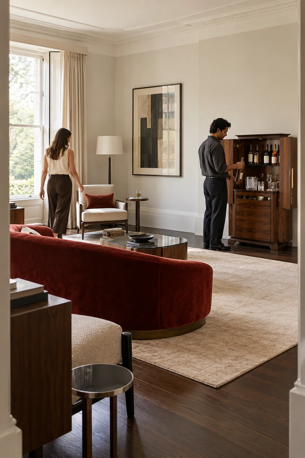
I would also check where coats, bags and occasional stools go during the visit. These can quietly consume the very space that made the plan work. Give them a home before guests arrive, especially if the drinks corner sits near the entrance. A successful rehearsal ends with everyone able to reach their place without moving the trolley, closing a drawer for somebody else or asking a seated friend to stand. That is more persuasive than an attractive empty room photograph.
I would put water into the first version of the plan, alongside the glasses that make it easy to take. It should not require a separate request or a journey past the host's mixing position. The same applies to an alcohol free choice if that is part of your gathering. I would arrange it as a welcome option, with a clear place among the offered drinks, rather than an afterthought that you retrieve from the kitchen once someone asks.
For hosted pouring, the water position might sit at the guest end of the sideboard while your tools occupy the other end. For a help yourself arrangement, I would make water the simplest thing to identify and pick up. You can use the same family of glasses if it suits the drinks, or a distinct shape when that makes the choice clearer. The aim is practical recognition, without relying on tiny labels or expecting every visitor to know your storage system.
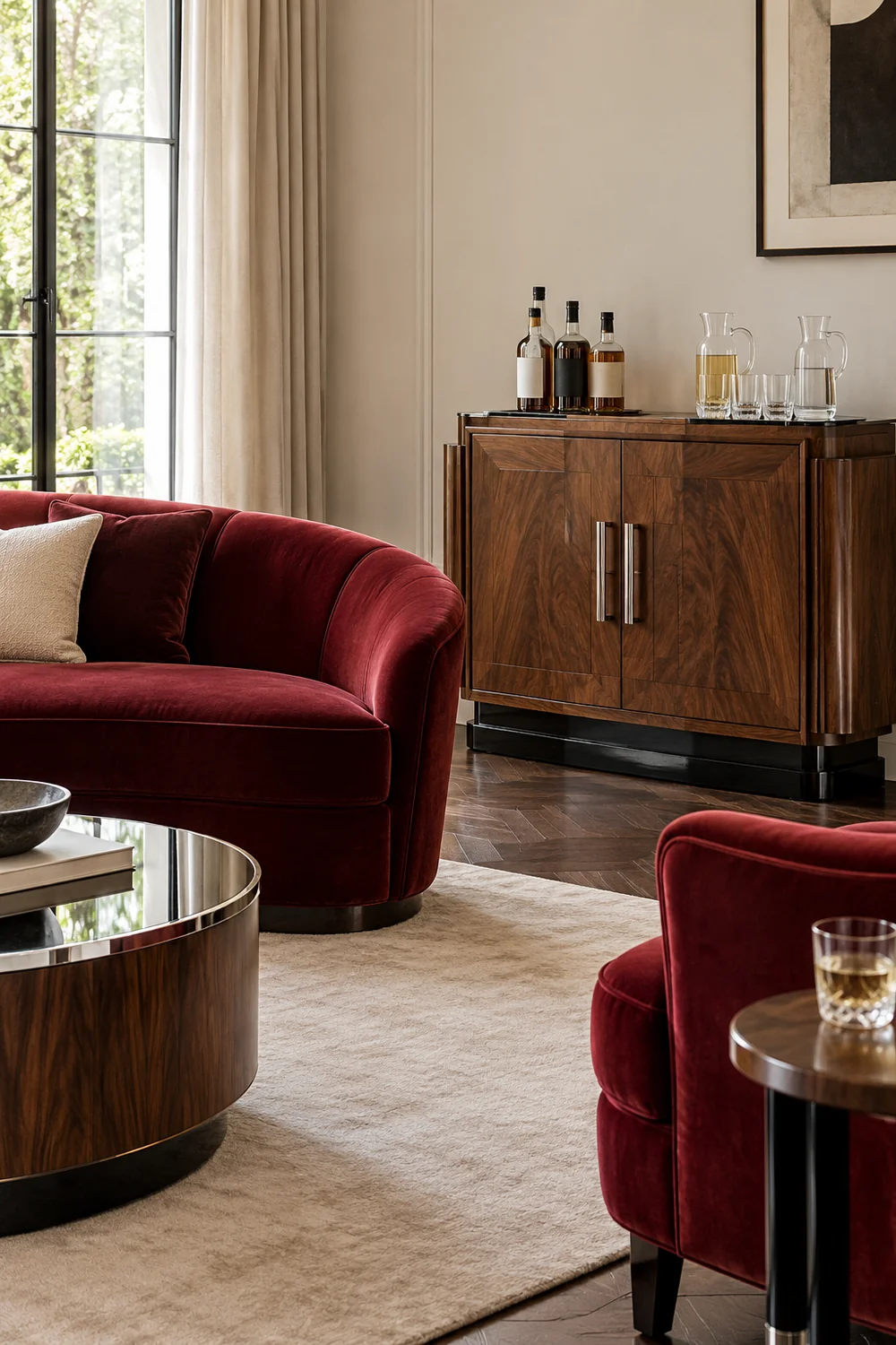
This decision also changes what the room needs to hold. A large collection of spare glasses may belong in the kitchen while the living room carries only the set for this visit. I would check the actual gathering rather than fill every shelf because it is empty. If you expect different drinks at different points, decide which objects arrive later. A cabinet can be deliberately modest and still support a generous welcome when its contents have been chosen around the evening.
Finally I would give each occupied seat a sensible place for a glass. A shared low table may work for some seats, while an outer chair needs its own small surface. Test the reach while sitting normally, not leaning forward to prove that it is possible. The cabinet is only one part of the hospitality arrangement. If a guest has to hold a glass throughout the conversation because every table is decorative, I would fix that before adding another bottle display.
I would separate three actions in the plan: keeping clean glasses ready, making or pouring a drink, and collecting used glasses. They can happen on nearby surfaces without sharing exactly the same patch. The distinction is especially helpful if you are serving while friends help themselves to water. A clean pickup position should not become the place where someone leaves an empty glass because no other landing point is obvious.
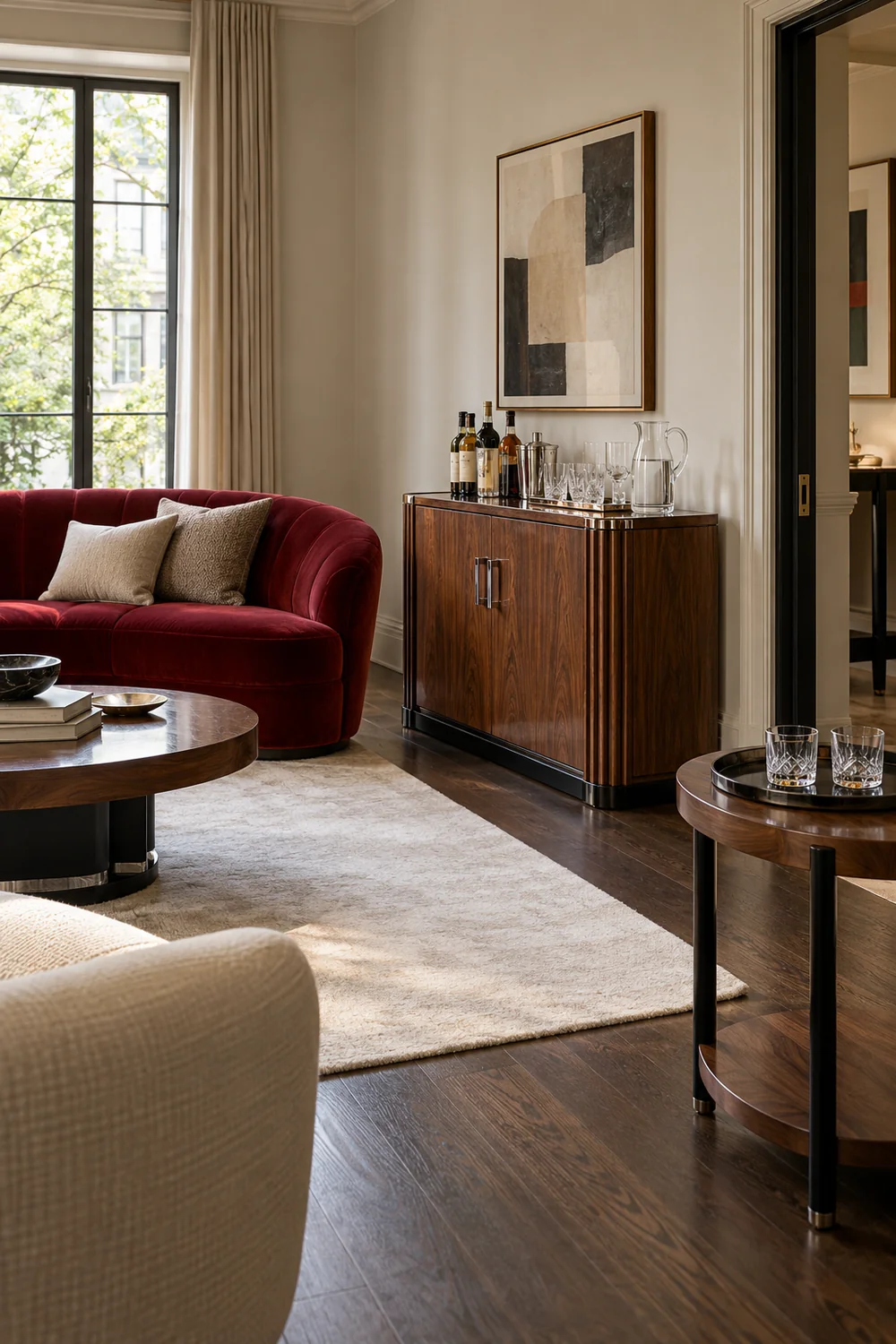
For a cabinet against a wall, I would put the host's working area closest to its useful storage and pass finished drinks towards the open room. A small removable tray can define the used glass return elsewhere, provided it belongs on a suitable stable surface and does not block a route. It need not remain in the living room after the visit. I would carry returned items back to the kitchen between natural pauses instead of turning the cabinet into a washing station.
Think about the return journey before choosing the tray. You should be able to lift it without moving clean glasses or reaching over open drinks. If the kitchen is distant, reduce what you offer or make the clearing sequence simpler. Once these room relationships work, my Art Deco bar cabinet setup turns them into actual glass groups, tool positions and a rehearsal before friends arrive. That is the next decision after choosing where service happens.
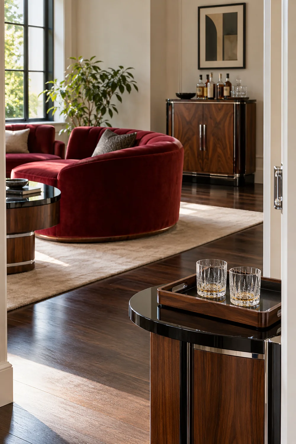
I would keep this plan legible in ordinary use. A cloth and a suitable surface protector can be ready without covering the furniture in equipment all week. The used glass tray can live elsewhere until the visit. This lets the cabinet return to being part of the room after the gathering, rather than leaving a permanent arrangement designed for an evening that happens only occasionally. The object has to support both versions of your home.
I would place decorative finishes after the serving route is settled. On the cabinet, walnut grain can be the main pattern while chrome handles and clear glass repeat the room's lighter accents. The black lacquer can remain a narrow outline rather than covering every surface. Deep red velvet in the seating gives the corner a relationship with the rest of the room without asking the glassware to supply another competing colour story.
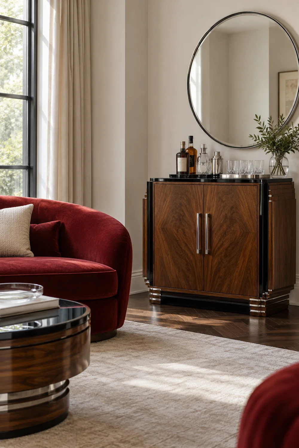
A mirror deserves a test from more than one position. From the doorway it may make the corner seem brighter, yet from a chair it might reflect a lamp directly towards your eyes. I would stand where the host will pour and sit where guests will talk before committing to its position. If a reflective back makes the working area confusing, choose a quieter backdrop or reduce the objects in front. Sparkle is useful only when the everyday objects remain easy to distinguish.
The same restraint applies to the palette. I would compare the cabinet finish with the room's existing upholstery before adding a contrasting wall colour. The Art Deco color palette gives you broader relationships to explore when that decision remains open. In this room, the oyster wall already gives the walnut and chrome enough separation. I would keep it unless the actual room suggests a stronger reason to change it.
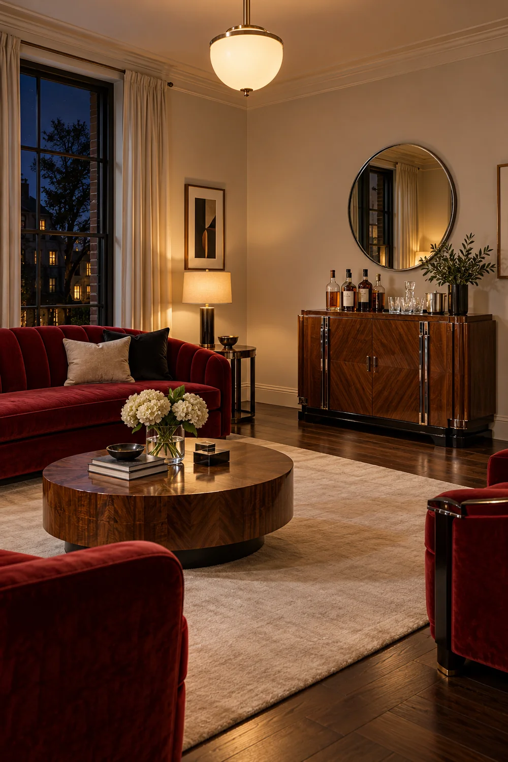
For evening use, I would check that you can see the glass and the worktop without relying on a bright decorative reflection. A lamp beside the cabinet may be more useful than one occupying the mixing area. Position its cable so it does not cross an opening or walking route, following the fitting's instructions. Daylight photographs are helpful for comparing materials, but I would still rehearse the lighting in the conditions when friends will actually use the room.
My finished plan would name the furniture, its location and the serving arrangement in plain language. It would show the occupied seats, the host or guest pickup position, water, and the route back to the kitchen. I would keep a second sketch showing open doors and drawers. These are working notes for your room, not a decorative floor plan. You should be able to explain the evening to another person using those two sketches and the furniture already in place.
I would then rehearse the first few minutes of the visit. Welcome someone, offer their choice, prepare or collect the glass, and settle into the conversation. Later, try a water refill and the return of a used glass while another person is moving towards a chair. Watch what you instinctively move aside. A lamp that has to shift every time is telling you something about the plan, as is a cabinet door that stays open across the route.
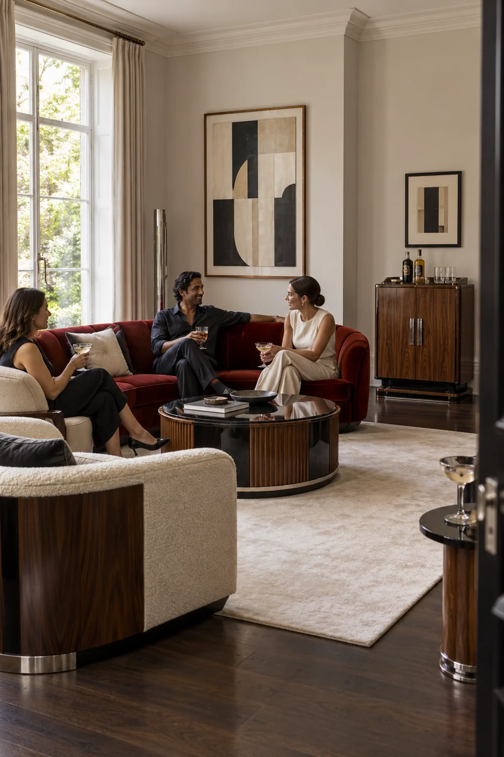
If the rehearsal is awkward, I would change the simplest thing first. A different pickup end, fewer displayed objects or a relocated return tray may solve the conflict without replacing furniture. If you still need to leave the conversation repeatedly, reconsider the serving arrangement you chose earlier. You can offer a smaller selection or let friends help themselves to part of it. There is no advantage in maintaining an elaborate setup that works against the evening you wanted.
I would call the room plan ready when each action has a place and the ordinary living room still works. You know where service happens, how guests reach it, where their glasses rest and how used items return to the kitchen. The cabinet contents can now be chosen to serve those decisions. I would keep the oyster, red, walnut and chrome relationships clear, then let the people and the conversation bring the room to life. That is the Art Deco home bar I would want to host around.