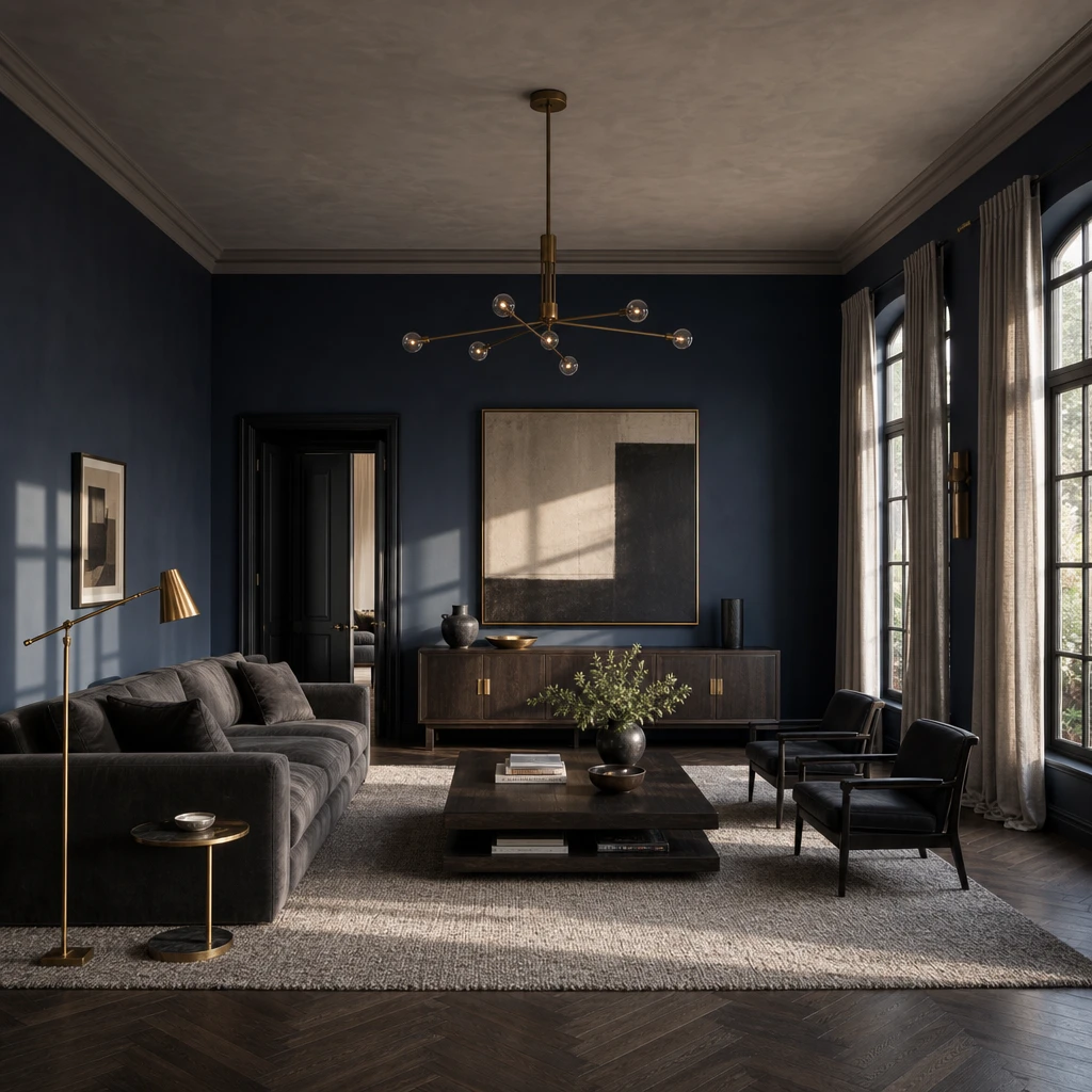
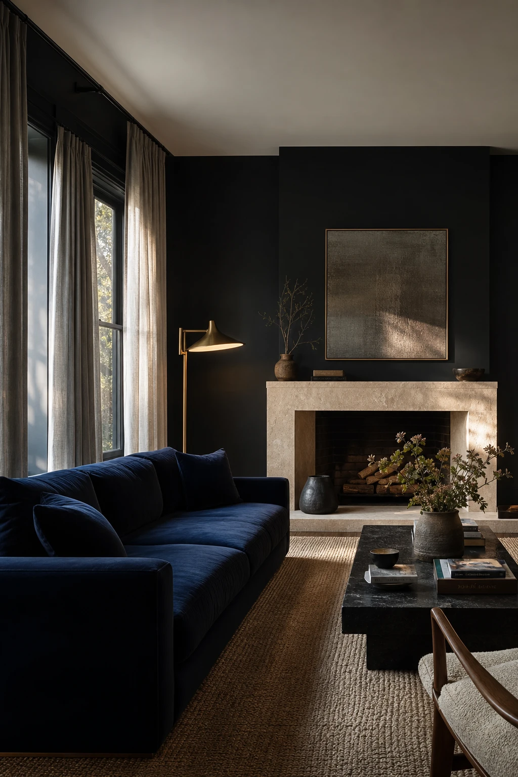
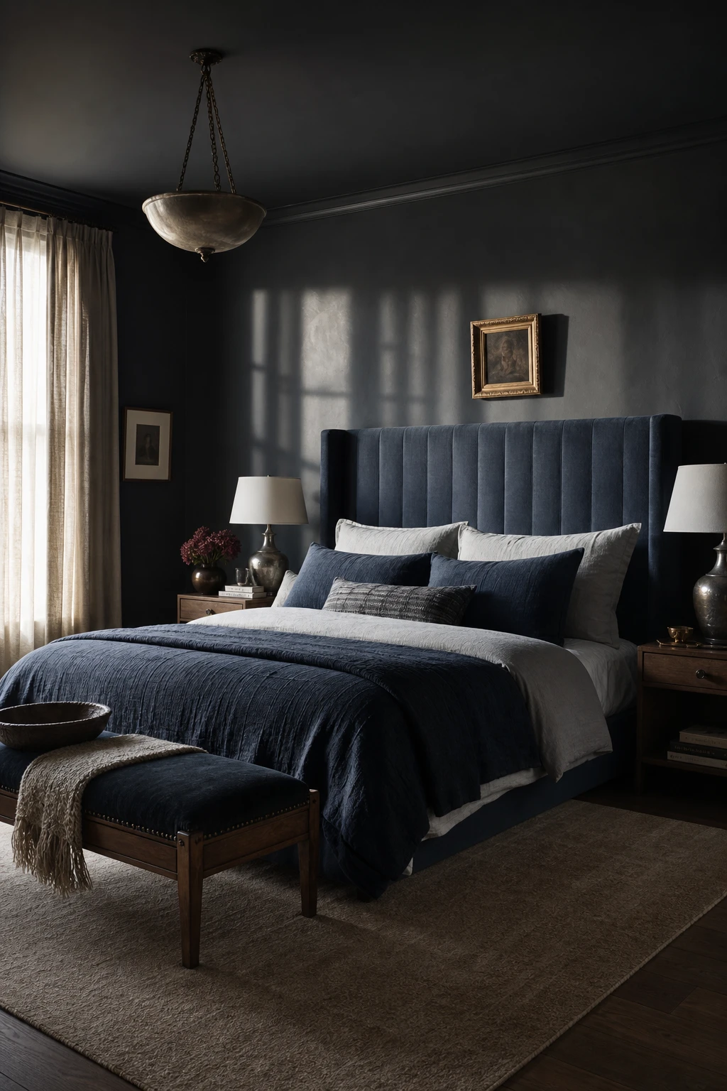
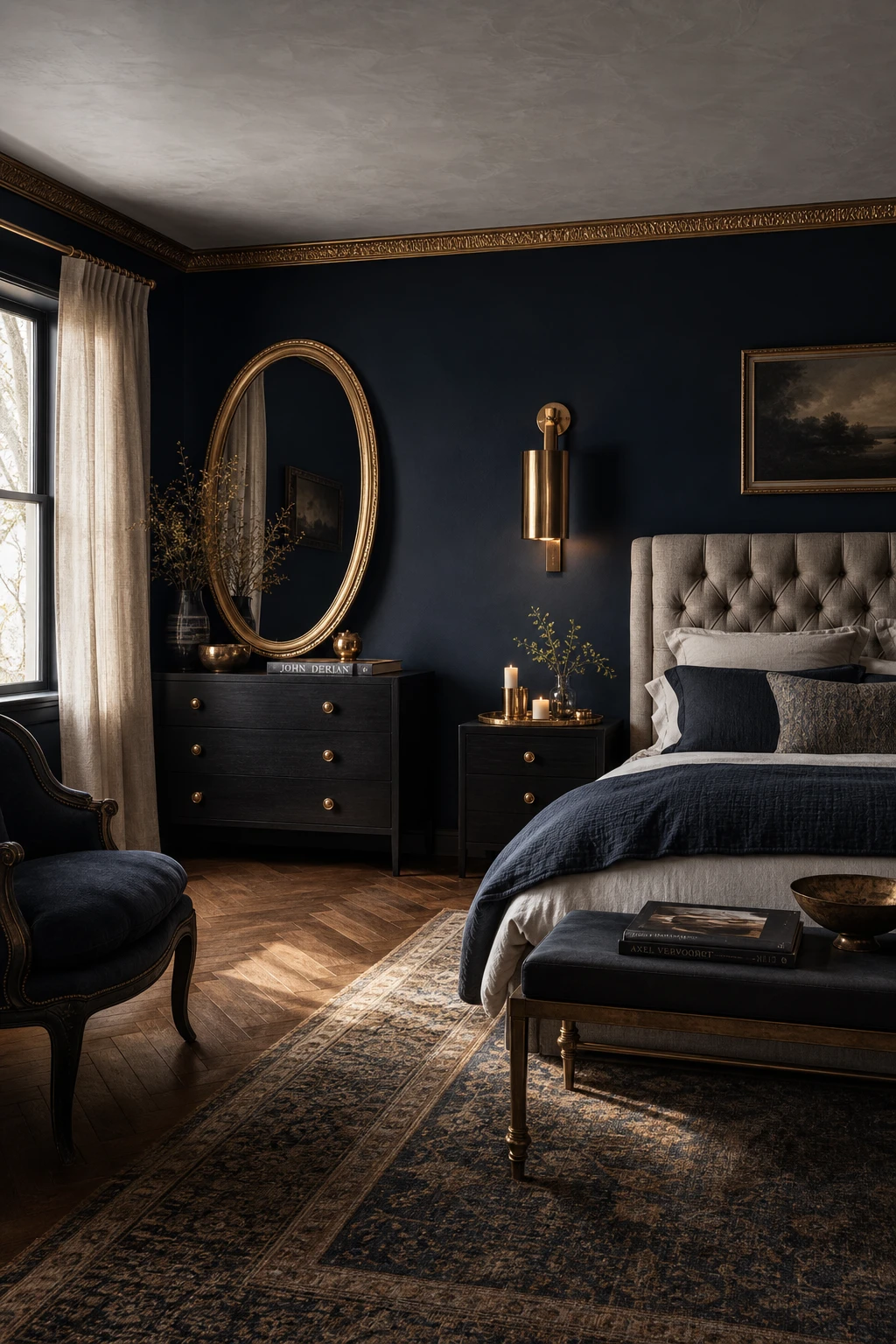
I’ve always thought dark blue and gray is one of those combinations that feels almost effortlessly grown up, the kind of palette that wraps a room in quiet confidence without trying too hard. What I love most is how far it stretches: a velvety living room, a moody bedroom, a bathroom that feels like a spa, even a hallway that stops you in your tracks. Every look in this piece is one you can genuinely steal, whatever your room size or budget.
How a Dark Blue and Gray Living Room Earns Its Calm
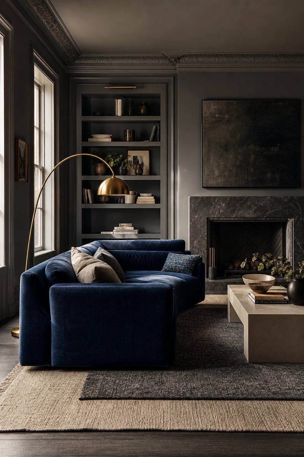
A deep navy sofa against pale gray linen curtains is one of my favourite moves because the contrast keeps both tones alive rather than letting them blur into one flat mood. You get the depth of the navy and the quiet of the gray, and that tension is exactly what settles a room. What wins me over here is the limestone fireplace and the brass lamp pulling in warm undertones, so the cool palette never tips into feeling chilly.
The Key Details
Deep navy velvet sofa
Raw limestone fireplace surround
Pale gray linen floor curtains
Sculptural brass floor lamp
Chunky natural wool area rug
Pro TipLayer a chunky natural wool rug underfoot to add physical warmth that your eye reads even before you sit down.
AvoidMatching your sofa and walls too closely in the same blue gray tone flattens all the contrast and leaves the room looking like it has no focal point.
The Dark Blue and Gray Bedroom That Feels Like a Real Escape
Deep blue walls and layered gray bedding sounds like a recipe for a room that swallows itself, but the gap between the two tones is what saves it. I always check that gap first: close enough to feel unified, far enough apart that you can read each element on its own. The walls recede, the bedding sits gently forward, and you get real depth without any single surface shouting for attention. Full matching would flatten all of that in an instant.
The Key Details
Slate Blue Velvet Upholstered Headboard
Layered Linen Bedding in Tonal Grays and Navy
Brushed Pewter Table Lamps
Floor to Ceiling Linen Curtains
Warm Greige Wool Area Rug
Pro TipReach for a gray with a clear blue undertone, something like a cool mid slate, so it reads as a natural companion to deep navy rather than a separate colour fighting for attention.
AvoidKeeping every element at the same dark value flattens the room into a single heavy mass, stripping out the depth that makes the whole scheme worth looking at.
Navy Bedroom Walls That Glow With Just a Touch of Gold
Navy walls have this quality I find almost theatrical, a depth that pulls you in rather than pushing you away. What makes it celebratory rather than heavy is gold used as punctuation: a sconce here, a mirror rim there, and you get tiny flares of warmth that catch the eye without competing with the wall colour. Watch how the brass and the dark blue talk to each other, the contrast is just wide enough to feel luxurious.
The Key Details
Brass wall sconces
Oval gold leaf mirror
Tufted linen headboard
Gold picture rail molding
Herringbone oak floor
Pro TipPlace gold accents at eye level or just above it, on sconces and mirror frames, so they catch the light exactly where you look most naturally in a bedroom.
AvoidLoading a navy room with gold on every surface strips away the moodiness that made the palette worth choosing in the first place.
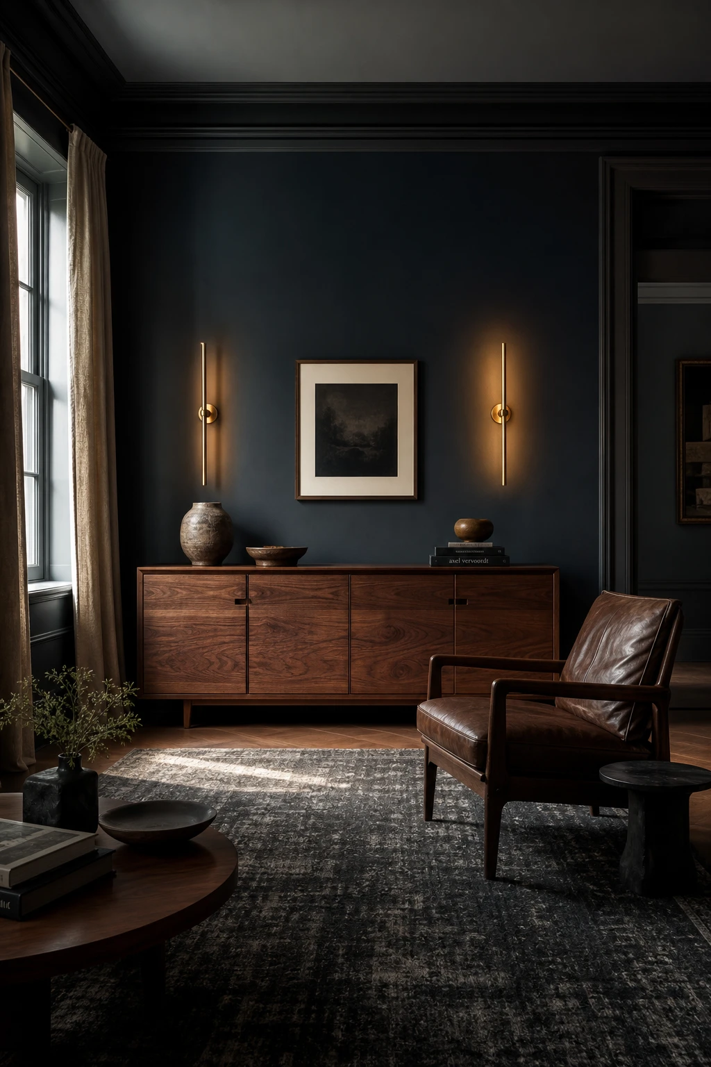
Why Navy Walls and Dark Wood Furniture Belong Together
Navy walls and dark wood furniture feel like they were made for each other, and the reason wins me over every time: both carry depth, but they read as different textures so you never lose the line between them. What I love is how the wood grain gives the eye somewhere to land inside all that richness. You get a room that feels wrapped and grounded rather than heavy, and the contrast stays clear without any pale filler propping it up.
The Key Details
Walnut credenza
Leather armchair
Brass wall sconces
Charcoal wool rug
Raw linen curtains
Pro TipLayer raw linen curtains between the navy and the wood tones and they act as a natural bridge, softening the contrast without breaking the mood.
AvoidPicking a wood with strong red or orange undertones next to blue walls pushes the two surfaces into conflict, and the whole room starts to feel muddy rather than rich.
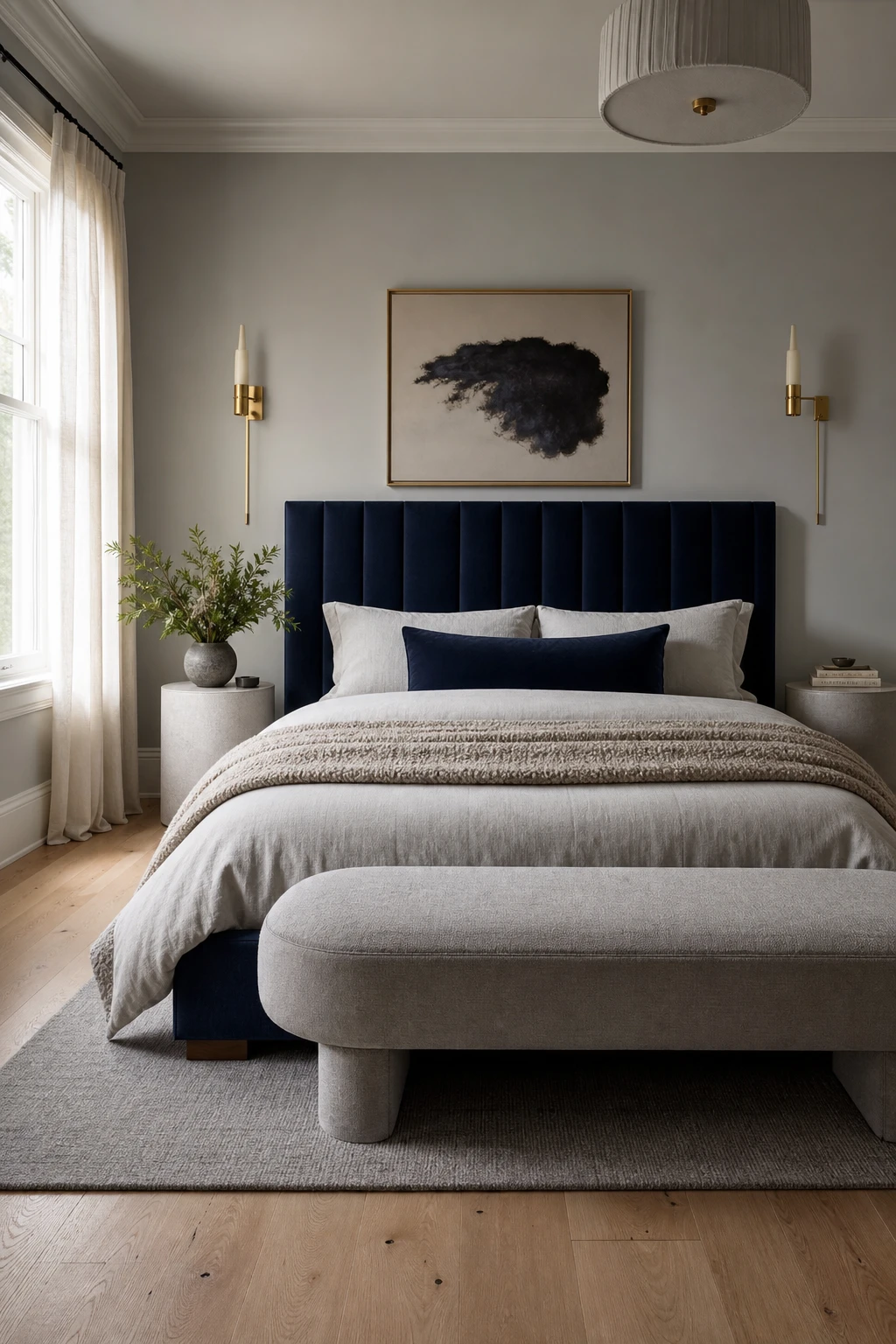
Deep Navy and Pale Gray Together in a Bedroom That Refuses to Feel Heavy
The trick to making a dark headboard feel airy rather than oppressive is keeping every surface around it as pale as you dare, and that is the rule I apply here without exception. The sheer curtains and bare oak floor bounce light back into the room before the navy even gets a chance to close things in. What I love about this pairing is how the contrast does the heavy lifting quietly, so you get all the drama of deep colour without any sense of the room shrinking around you.
The Key Details
Navy velvet upholstered headboard
Sheer ivory linen curtains
Brushed brass wall sconces
Natural white oak plank flooring
Low profile pale gray upholstered bench
Pro TipChoose a light gray with the faintest warm or greige undertone so it holds softness beside the navy rather than fighting it.
AvoidReaching for a cool blue gray on the walls alongside navy bedding creates a room that feels more clinical than calm, draining all the warmth the pairing should deliver.
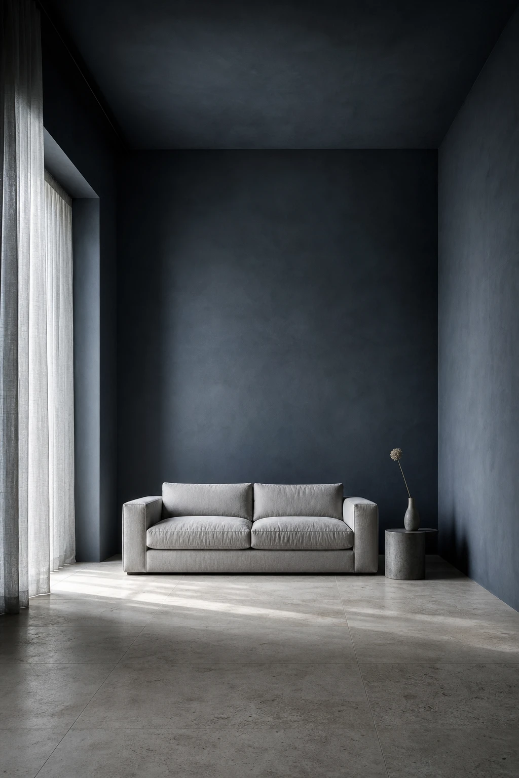
Dark Blue Minimalism and the Beauty of Keeping Almost Nothing Out
Dark blue walls earn their keep when the room around them stays quiet, and that trade off is what I love most about this approach. The colour itself becomes the decoration, so you get atmosphere without clutter. Watch how a low profile linen sofa and a single ceramic vessel feel complete against that depth, nothing is competing for attention and nothing needs to.
The Key Details
Low profile gray linen sofa
Honed limestone floor
Raw concrete side table
Floor to ceiling sheer linen drapes
Single stem ceramic vessel
Pro TipPull every piece of furniture away from the walls by at least a foot so the dark paint reads as a deliberate backdrop rather than a room that simply ran out of space.
AvoidStripping the room to bare walls and one lone chair tips the mood from calm into cold, so keep one warm texture, a linen drape or a stone surface, as an anchor.
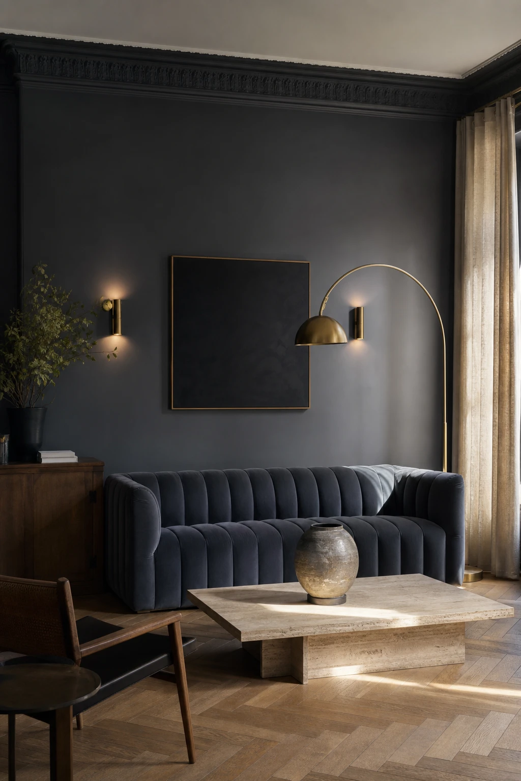
Charcoal Blue Walls and Why This In Between Shade Does So Much Work
Charcoal blue sits in that rare sweet spot where the colour never fully commits, and I find that ambiguity is exactly what makes a room feel layered rather than flat. By morning light you read it as a cool, almost stormy blue. Come evening, the same wall settles into deep gray. You get two moods from one paint choice, which is a quiet kind of magic that no accent cushion can replicate.
The Key Details
Channel back slate velvet sofa
Aged brass arc floor lamp
Herringbone oak floor
Floor to ceiling oat linen curtains
Low travertine coffee table
Pro TipHold your swatch samples against the wall at 9pm with your actual lamps switched on, because charcoal blue shifts dramatically under warm bulbs and what looked perfect in daylight can turn muddy by evening.
AvoidOrdering charcoal blue based on a small on screen chip is a reliable way to end up with plain dark gray on your walls, because the blue undertone is the first thing a low resolution image loses.
Slate Blue Meets Black and the Result Is Quietly Dramatic
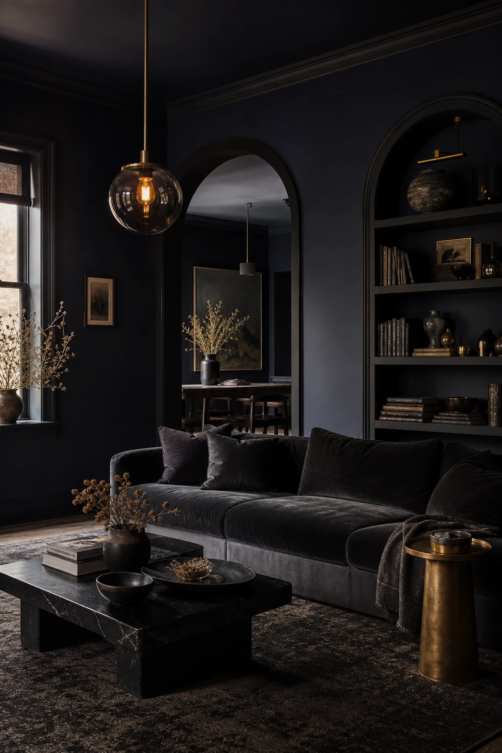
Slate blue has a softness that I think needs a sharp edge to really sing, and true black delivers that without overwhelming the room. What I love is how a small hit of black, a frame, a fitting, a shelf edge, pulls the whole palette into focus and gives it that quietly dramatic quality you feel before you can name it. The slate stays gentle and the black stays crisp, and you get a pairing that feels both calm and confident.
The Key Details
Matte black arched doorway trim
Built in black shelving with ceramic vessels
Charcoal velvet low slung sofa
Smoked glass pendant light
Layered charcoal and slate wool rug
Pro TipBring black in through frames, door handles, and light fixtures first, so you can feel how much contrast the room needs before committing to anything larger.
AvoidTipping the balance so that black covers more wall or floor space than the slate blue reads as a dark room rather than a dramatic one, and the whole point of the pairing is lost.
Dark Gray and Navy in a Living Room That Feels Like It Was Designed Twice
Two deep neutrals sitting in the same room could easily dissolve into one another, but giving each colour its own territory is the move that stops that from happening. Navy claims the upholstery, gray claims the walls, and the boundary between them stays clear. What I love is how the fireplace surround and that brushed brass lamp sit right in the middle of the two, giving your eye a warm place to rest before it travels on. The room feels considered rather than accidental, and that distinction matters.
The Key Details
Deep navy velvet sofa
Honed limestone fireplace surround
Brushed brass arc floor lamp
Layered slate and ivory wool rugs
Recessed built in bookcase
Pro TipKeep navy entirely on soft furnishings and gray entirely on hard surfaces, because the contrast between the textures is what stops the two tones from collapsing into one dark mass.
AvoidChoosing a sofa fabric that reads as blue gray in the shop will leave the whole room looking like one flat, muddy shadow once the curtains are drawn and the natural light drops.
One Navy Feature Wall Behind a Gray Sofa and Everything Clicks
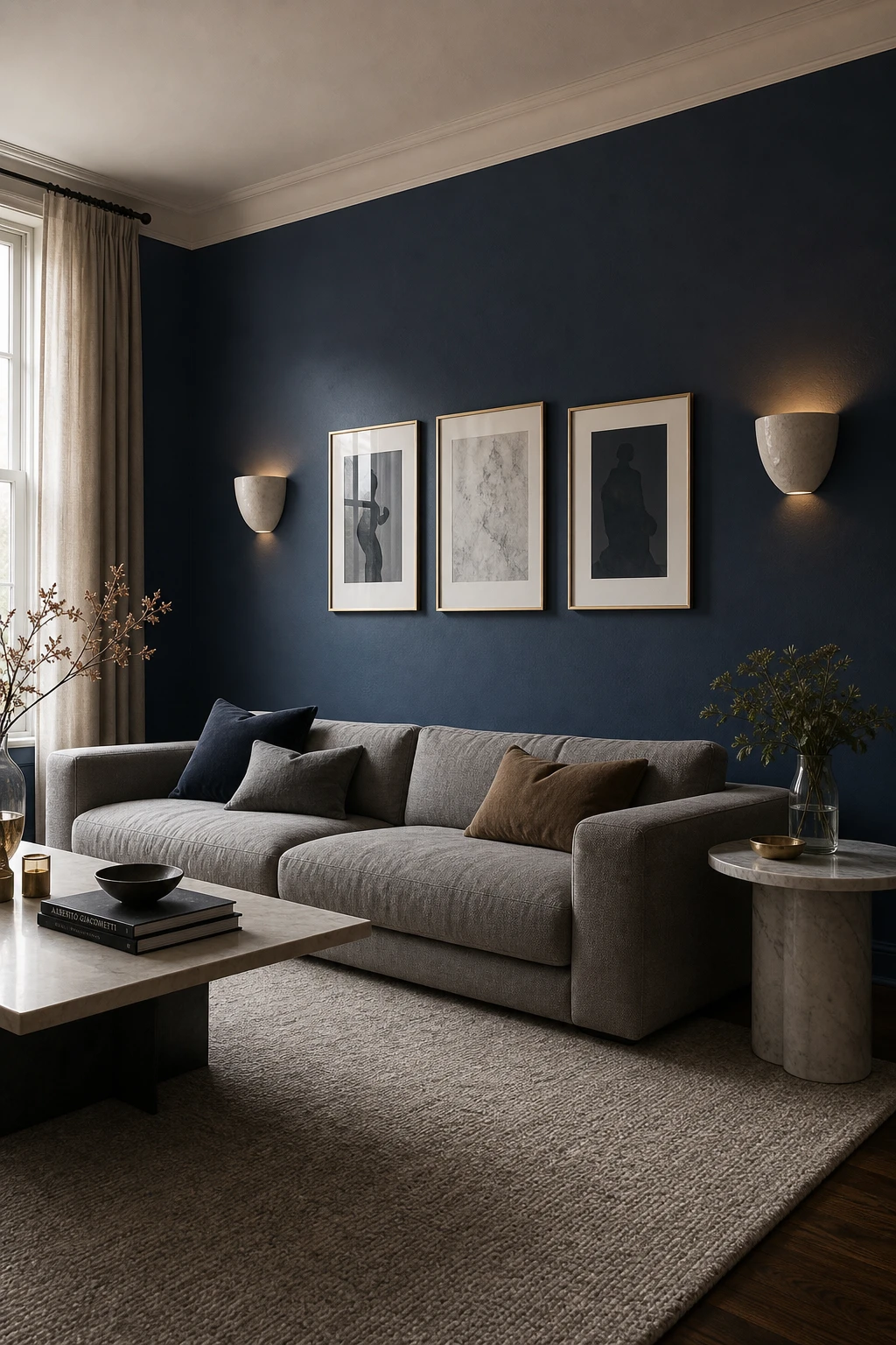
A navy wall behind a gray sofa does something quietly brilliant: it makes the sofa read as a calm, considered anchor rather than a piece of furniture just sitting there. The depth of navy pulls the wall back visually, so you get this sense of the room opening up around the sofa. What I love most is how the contrast does all the work, the sofa stays soft and neutral while the wall carries the drama.
The Key Details
Low profile gray linen sofa
Brass framed gallery wall prints
Ceramic wall sconces
Pale gray wool rug
Round honed marble side table
Pro TipPaint the wall your sofa faces rather than the one behind it, so every time you sit down you are looking straight into the richest colour in the room.
AvoidChoosing a navy that shares the same cool undertone as your sofa fabric blurs the boundary between the two and loses the contrast that makes the whole idea work.
A Blue Monochrome Living Room That Proves One Colour Is Never Boring
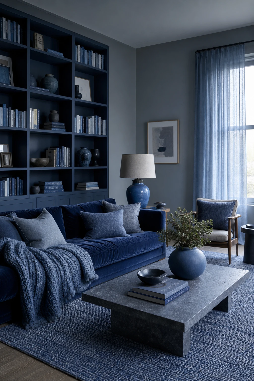
A single colour pulled across every surface sounds like a recipe for boredom, but watch what happens when you vary the finish instead of the hue. Velvet drinks light, linen scatters it, and a chunky knit holds shadow in its loops, so the navy reads differently on each piece. That contrast of matte, gloss, and woven is the thing I always check before signing off on a monochrome scheme, because it is texture doing the work that pattern usually does. You get a room that feels considered and deeply calm at the same time.
The Key Details
Deep navy velvet sofa
Slate blue linen and chunky knit cushions
Matte cerulean ceramic table lamp
Woven blue jute area rug
Floor to ceiling built in bookshelves
Pro TipAdd one gloss surface, a lacquered lamp base or a glazed ceramic, so the matte walls have something to bounce light off.
AvoidChoosing a woven cushion in the same flat finish as your walls loses every bit of the contrast that makes a monochrome room feel rich rather than dull.
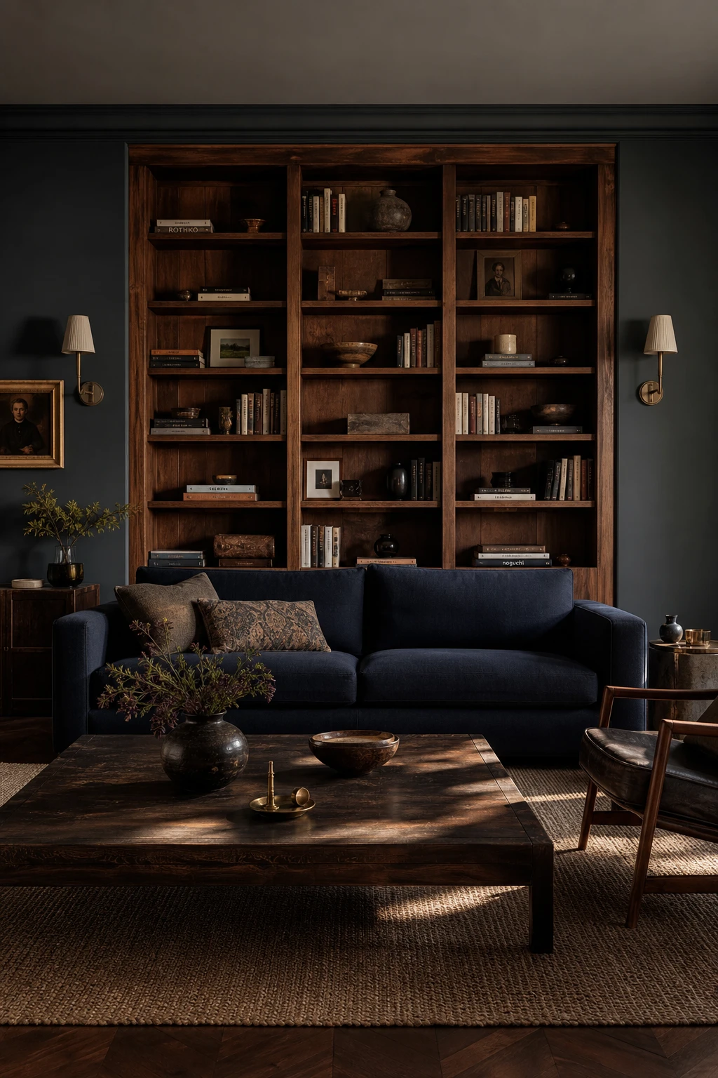
Dark Wood Accents in a Blue Living Room and Why the Warmth Is the Point
Blue rooms can hover just above the floor if nothing pulls them down, and dark wood is my answer to that every time. Walnut or a deep oak grounds all that airy colour so the space stops feeling like a showroom and starts feeling like somewhere a person actually lives. What I love is the grain texture adding a quiet contrast that paint and fabric simply cannot give you, warmth without any compromise to the depth of the navy sitting above it.
The Key Details
Floor to ceiling walnut shelving unit
Deep navy linen sofa
Chunky dark wood coffee table
Woven jute area rug
Aged brass hardware accents
Pro TipStart with a single dark wood side table or a floating shelf before committing to larger pieces, so you can read how the warmth sits against your specific blue before buying anything big.
AvoidBringing in too much wood at once tips the balance so the blue palette becomes a background note rather than the star of the room.
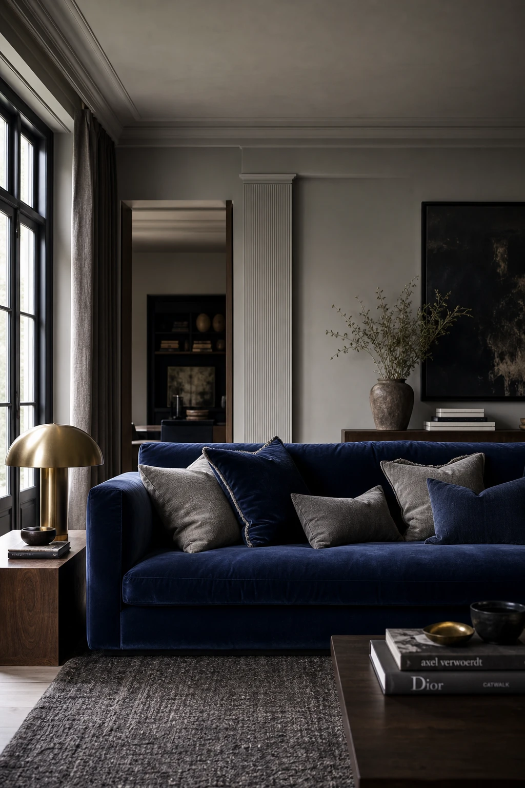
A Velvet Blue Couch Is the Fastest Way to Make a Gray Room Feel Luxurious
A velvet blue sofa does something walls simply cannot: it carries all the colour drama while the gray around it stays calm and easy to live with. What I love is how the pile catches light differently through the day, so the sofa feels almost alive. You get a room that reads as rich and considered, and the understated walls only make that centrepiece sing louder.
The Key Details
Deep Velvet Blue Sofa
Brushed Brass Sculptural Table Lamp
Layered Navy and Gray Cushions
Charcoal Nubby Wool Area Rug
Fluted Plaster Wall Detail
Pro TipPile matte cotton cushions onto a velvet sofa to let the contrast in texture do the talking, because the softness of cotton makes the velvet sheen look even more deliberate.
AvoidPlacing a velvet sofa beside glossy lacquered furniture or high sheen metals pulls the eye in too many directions at once and dilutes the luxurious quality that makes velvet worth choosing.
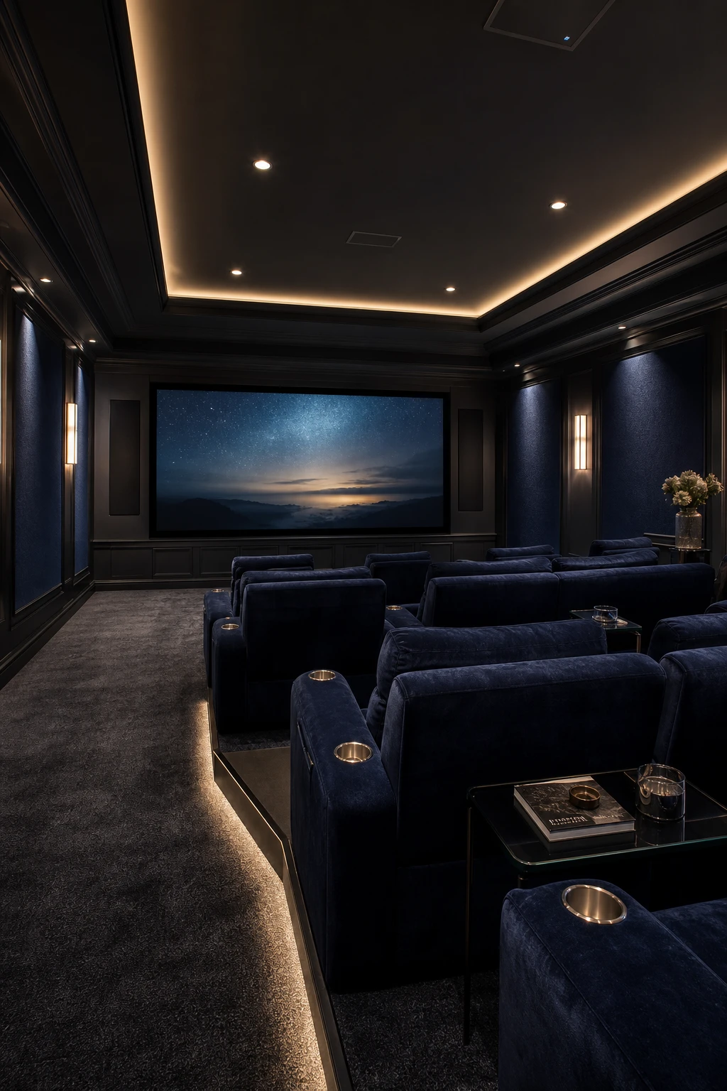
Dark Blue Home Theater Decor That Makes Every Screening Night Special
Darkness in a room usually signals a problem to fix, but a home theater is where you flip that rule and lean into it completely. What I love here is how the storm blue acoustic panels and charcoal carpet absorb every stray reflection, so the screen becomes the only thing your eye wants to settle on. The coffered ceiling with LED cove strips gives you just enough warmth to feel considered rather than cavernous, and you get that cinema atmosphere without ever leaving home.
The Key Details
Tiered velvet recliner seating rows
Flush mounted projection screen
Coffered ceiling with LED cove strip lighting
Acoustic fabric wall panels in storm blue
Deep charcoal pile carpet with center aisle runner
Pro TipRun a low level LED strip along the base of each tiered row so guests can move safely between seats without anyone reaching for the main lights mid film.
AvoidFitting a ceiling downlight directly above or in front of the screen creates a hot spot reflection that washes out the picture and pulls focus every time someone glances up.
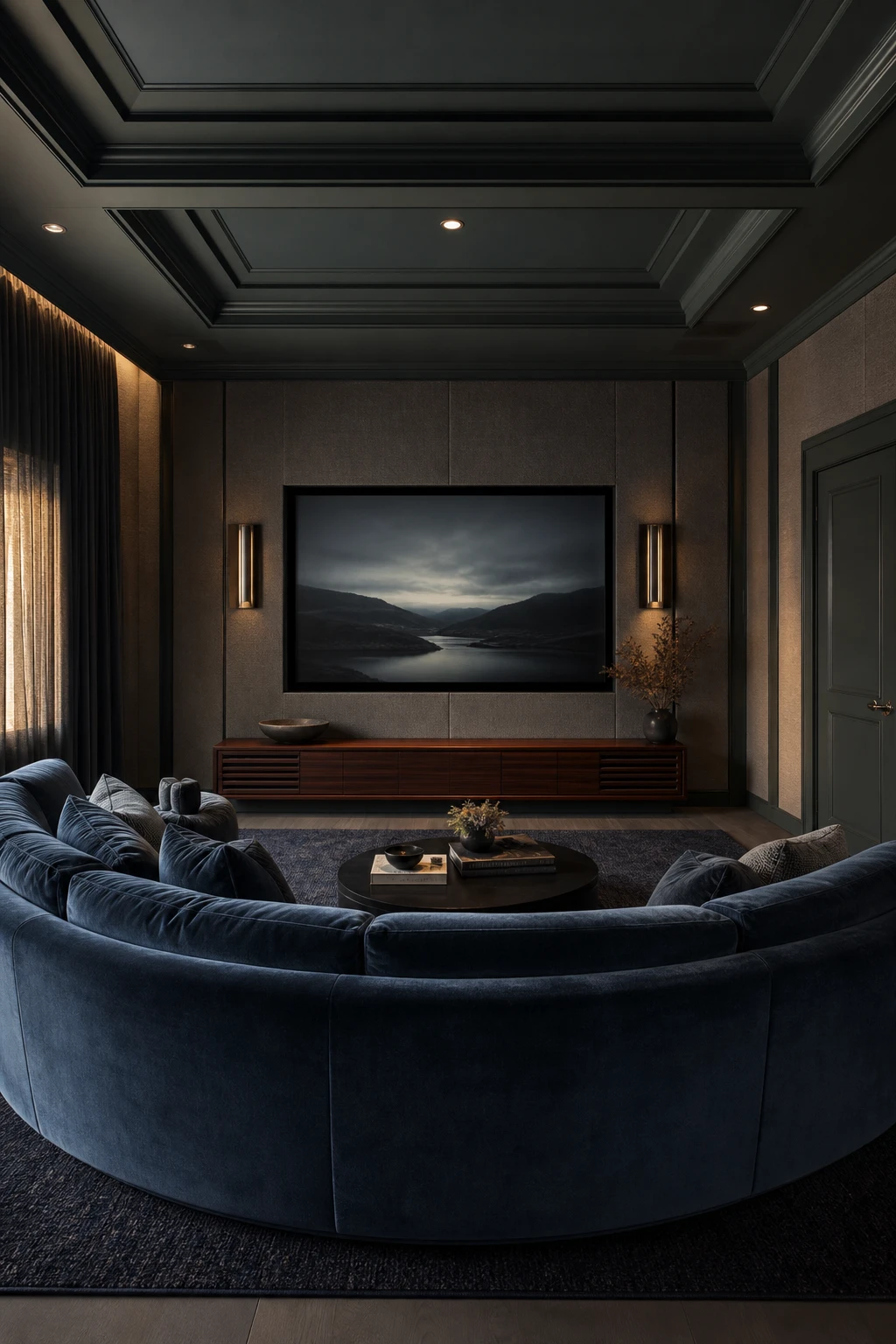
The Moody Media Room Look and the One Thing That Pulls It Together
Fabric is doing double duty here, and that is the move I keep coming back to in a media room. The velvet sofa, the linen wall panels, the layered wool rug, every soft surface is quietly eating sound and light at the same time, so you get a picture that looks richer and a room that feels genuinely hushed. What I love is how the slate blue and charcoal palette holds the eye without fighting the screen. You will notice the whole room leans in rather than bouncing energy back at you.
The Key Details
Curved slate blue velvet sectional sofa
Floor to ceiling linen fabric wall panels
Low slung oiled walnut media console
Layered charcoal and navy wool rug
Recessed ceiling coffer with painted trim
Pro TipHang your curtains from ceiling to floor even if the window is small, because the extra fabric drop absorbs a surprising amount of both echo and glare.
AvoidGlossy surfaces like lacquered consoles or glass shelving reflect sound and light in equal measure, which undoes every bit of softness the fabric is working to create.
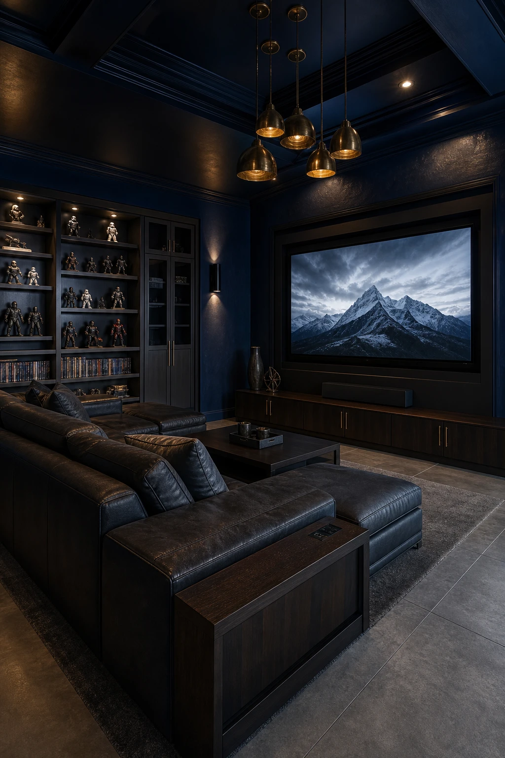
A Dark Blue Game Room That Makes the Fun Feel Even More Immersive
Game rooms get a bad reputation for looking chaotic, and the dark blue here is exactly what fixes that. What I love is how the deep colour acts as a visual anchor, pulling every screen, shelf and seat into one cohesive scene rather than a jumble of gear. You get a room that feels genuinely immersive because the walls recede and the activity takes centre stage, and the gray accents keep it from tipping into novelty territory.
The Key Details
Coffered ceiling with recessed sconces
Built in gray shelving unit
Low profile charcoal leather sectional
Aged brass pendant cluster
Concrete look floor tiles
Pro TipRun LED strips behind your screens and under the sectional so each activity zone has its own glow, making the room feel organised even when a full group is playing.
AvoidMounting equipment, cables and accessories across every wall leaves the deep blue with no room to breathe, and the colour that was supposed to create atmosphere just vanishes entirely.
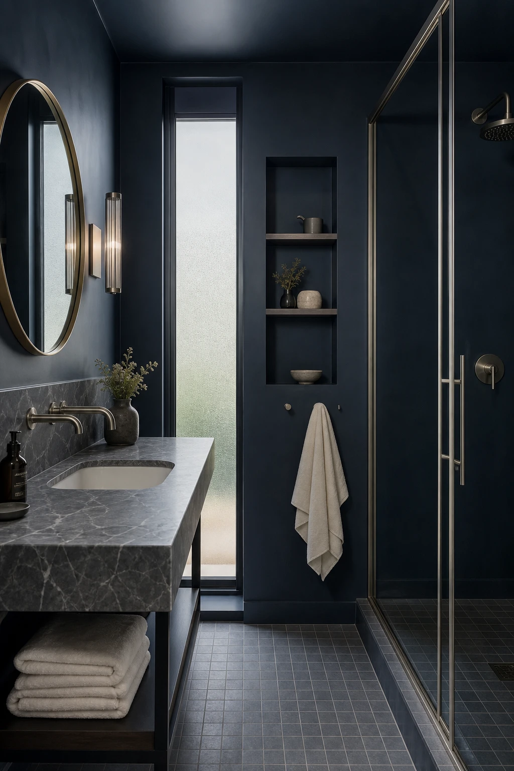
Modern Dark Blue Bathroom Design and Why Small Rooms Can Handle It
Small bathrooms make people nervous about dark colour, and I understand why, but this is precisely where deep blue earns its place. Rather than shrinking the room, the colour wraps every surface in one confident tone so your eye stops hunting for where the walls begin and end. What I love is that shift in feeling: from cramped to cocooned. The limitation becomes the whole point, and the room feels chosen rather than compromised.
The Key Details
Wall mounted brushed nickel faucets
Gray veined marble vanity top
Round brass framed mirror
Matte ceramic grid floor tiles
Recessed niche shelf with ceramic vessels
Pro TipPair your dark blue walls with large format floor tiles in a soft warm white so the ground plane reads as open and unbroken.
AvoidChoosing small mosaic tiles for the floor fills the room with grout lines that chop the space into fragments and fight the calm the dark walls are working to create.
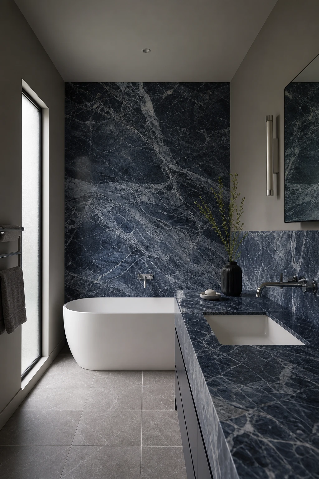
Blue Marble in the Bathroom and the Quiet Drama It Brings
Blue marble with gray veining is one of those surfaces that does all the talking, so everything around it gets to stay calm and quiet. What I love is the way the stone’s natural movement draws the eye without any effort from the fixtures at all. You get a bathroom that feels genuinely luxurious because the drama comes from something real rather than from layers of pattern competing for attention. Keep the fittings simple and the floor plain and the marble rewards you every single time.
The Key Details
Veined Blue Marble Wall Slab
Freestanding Soaking Tub
Wall Mounted Chrome Spout
Large Format Limestone Floor Tile
Matte White Undermount Basin
Pro TipChoose a marble slab where the gray veining runs through the blue ground, because that built in link is what makes the stone feel at home in a gray and blue scheme rather than dropped in from somewhere else.
AvoidPairing marble with a busy geometric or patterned tile on the floor creates a visual clash that fragments the stone’s natural movement and makes the whole room feel restless.
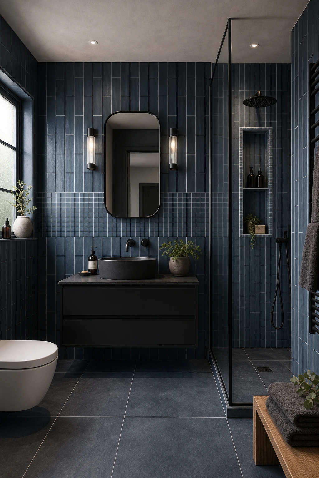
Blue Tiles From Floor to Ceiling and How to Make the Layout Interesting
Floor to ceiling tile in a single blue is one of my favourite moves in a small bathroom, because the colour reads as one calm wash rather than a chopped up room. What keeps it from feeling flat is the format play: smaller tiles underfoot draw the eye down and anchor the space, while larger tiles climbing the walls push the ceiling up. You will notice how the change in scale creates a quiet rhythm without ever breaking the colour story.
The Key Details
Mixed format floor to ceiling tiles
Recessed shower niche with pencil border detail
Wall hung vanity unit
Matte black brushed metal fixtures
Frosted casement window
Pro TipRun your smallest tile on the floor in a diagonal lay, then switch to a large format brick bond on the walls, and the shift in direction alone gives the room a sense of movement you can feel the moment you walk in.
AvoidTiling every surface in the same format and the same direction leaves the eye with nothing to travel across, turning what could be a rich, layered room into something that simply feels unfinished despite the effort.
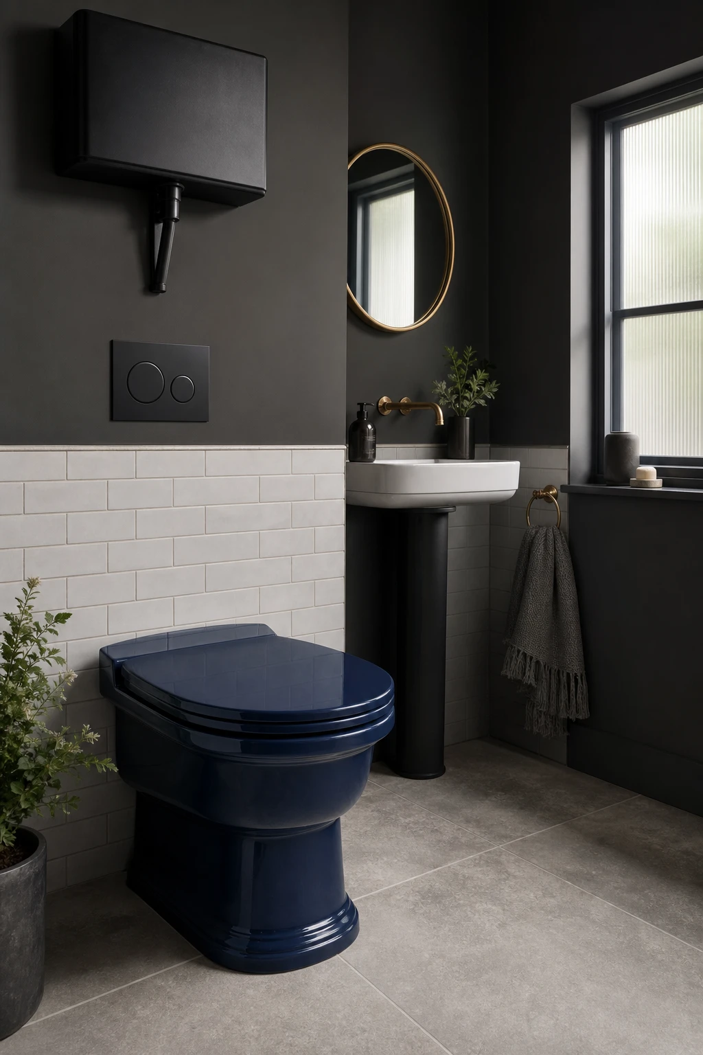
A Navy Blue Toilet Sounds Bold But Here Is Why It Works
A navy toilet stops people in their tracks, and that is exactly the point. What I love about using a coloured fixture this way is that the room is tiny, so one bold piece does all the work a gallery wall or a rug would do elsewhere. You get a focal point that feels deliberate and confident rather than cluttered, and the surrounding whites and greys give it the breathing room it needs to land properly.
The Key Details
Navy glazed ceramic toilet
Wall mounted matte black cistern and flush plate
White subway tile dado
Brass framed round mirror
Honed limestone floor tiles
Pro TipKeep the walls a soft warm white or pale grey so the navy reads as a considered design choice and not a plumbing accident.
AvoidPairing a statement fixture with equally bold patterned tiles pulls the eye in two directions at once and neither feature wins.
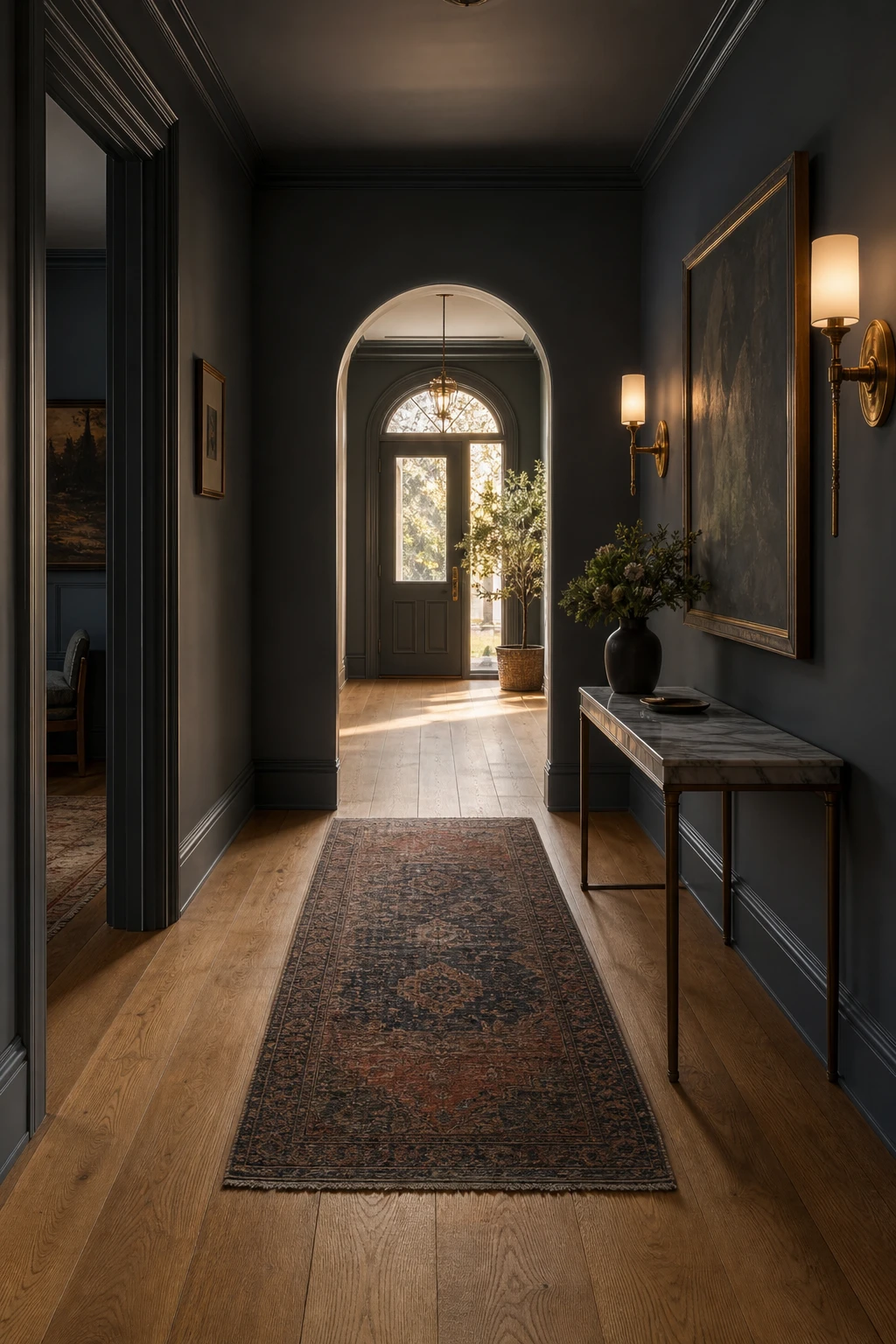
A Dark Blue Hallway Over Warm Wood Floors Sets the Whole House Up
A dark blue hallway is the first sentence your house speaks, and when it lands over warm oak boards you get something genuinely inviting rather than heavy. What I love is how the amber in the wood pulls the warmth out of the blue, so even at dusk the space glows. You will notice every room beyond feels considered because the entrance has already set the tone.
The Key Details
Wide plank warm oak flooring
Marble topped console table
Brushed brass wall sconces
Arched internal doorway
Layered charcoal and rust runner rug
Pro TipReach for a blue with a slight green or red undertone rather than a cool grey blue, and watch how it stops fighting the wood and starts working with it.
AvoidPainting a narrow hallway dark without hanging a mirror means the light simply disappears and the space feels smaller every single day.
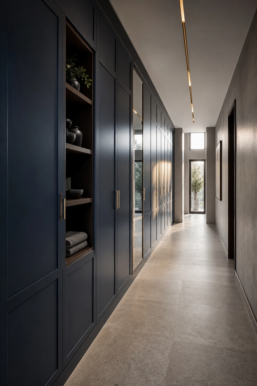
Modern Hallways Where Blue Accents Do All the Talking
Hallways rarely get treated as proper rooms, and that is the mistake I always push back on. Here the blue stays contained to joinery and accessories so the gray walls can do their calm, neutral job while the colour lands with real punch. What I love is how much that restraint wins you: a layered, considered look without touching a single main wall. Every piece from the ceramic vessels to the mirror panel earns its place by pulling the eye rather than fighting for it.
The Key Details
Floor to ceiling built in joinery
Brushed brass pendant strip lighting
Large format honed limestone floor tiles
Frameless mirror panel inset
Open display shelf with ceramic vessels
Pro TipPaint just the door and skirting boards in the same blue tone so the colour feels intentional and coordinated rather than added as an afterthought.
AvoidSpreading blue across too many unconnected pieces, a hook here, a vase there, a rug somewhere else, leaves the hallway feeling busy and unresolved rather than designed.
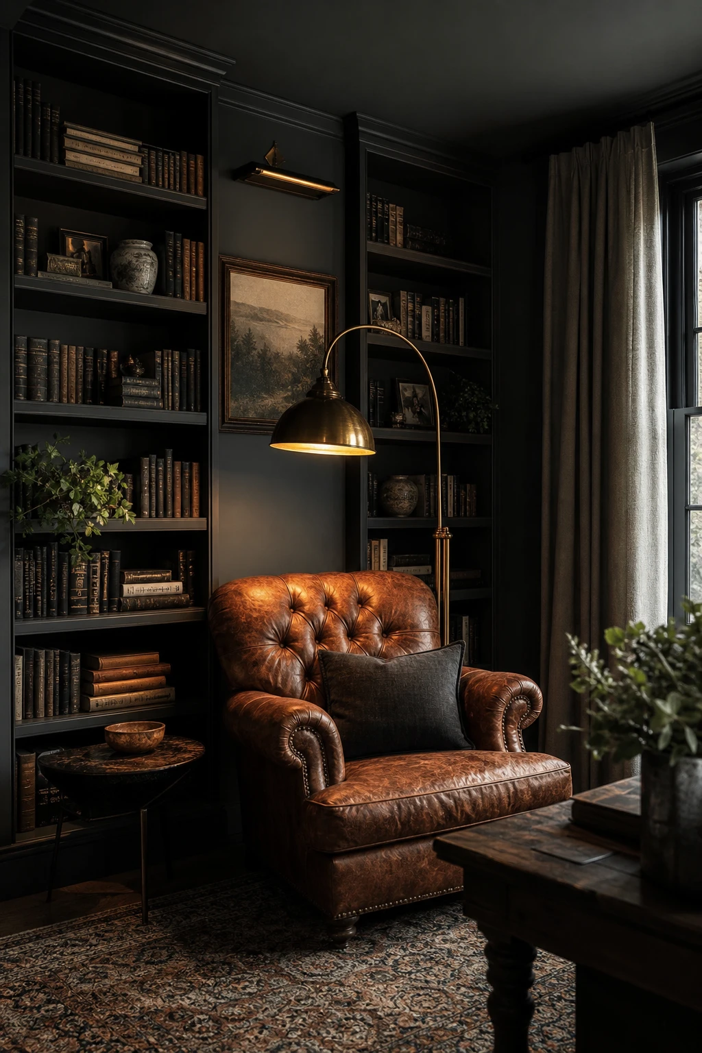
Designing a Moody Library Corner That Feels Like It Has Always Been There
A moody library corner earns its atmosphere through layered warm light pooling against dark surfaces, and what wins me over every time is how the room feels like it settled in decades ago. The cognac leather and oak shelving pull the deep navy and gray walls forward rather than fighting them. You get that rare quality where every element looks chosen slowly, not styled in an afternoon.
The Key Details
Floor to ceiling built in oak bookshelves
Tufted cognac leather armchair
Brass arc reading floor lamp
Hand knotted Persian wool rug
Narrow linen curtained window
Pro TipPosition your reading lamp so the bulb sits roughly at eye level when you are seated, because that low warm pool of light is what makes the corner feel wrapped around you rather than just lit.
AvoidLeaving the overhead light on as your main source drains every drop of cosiness from the space and flattens the layered depth the dark walls and warm wood are working hard to create.
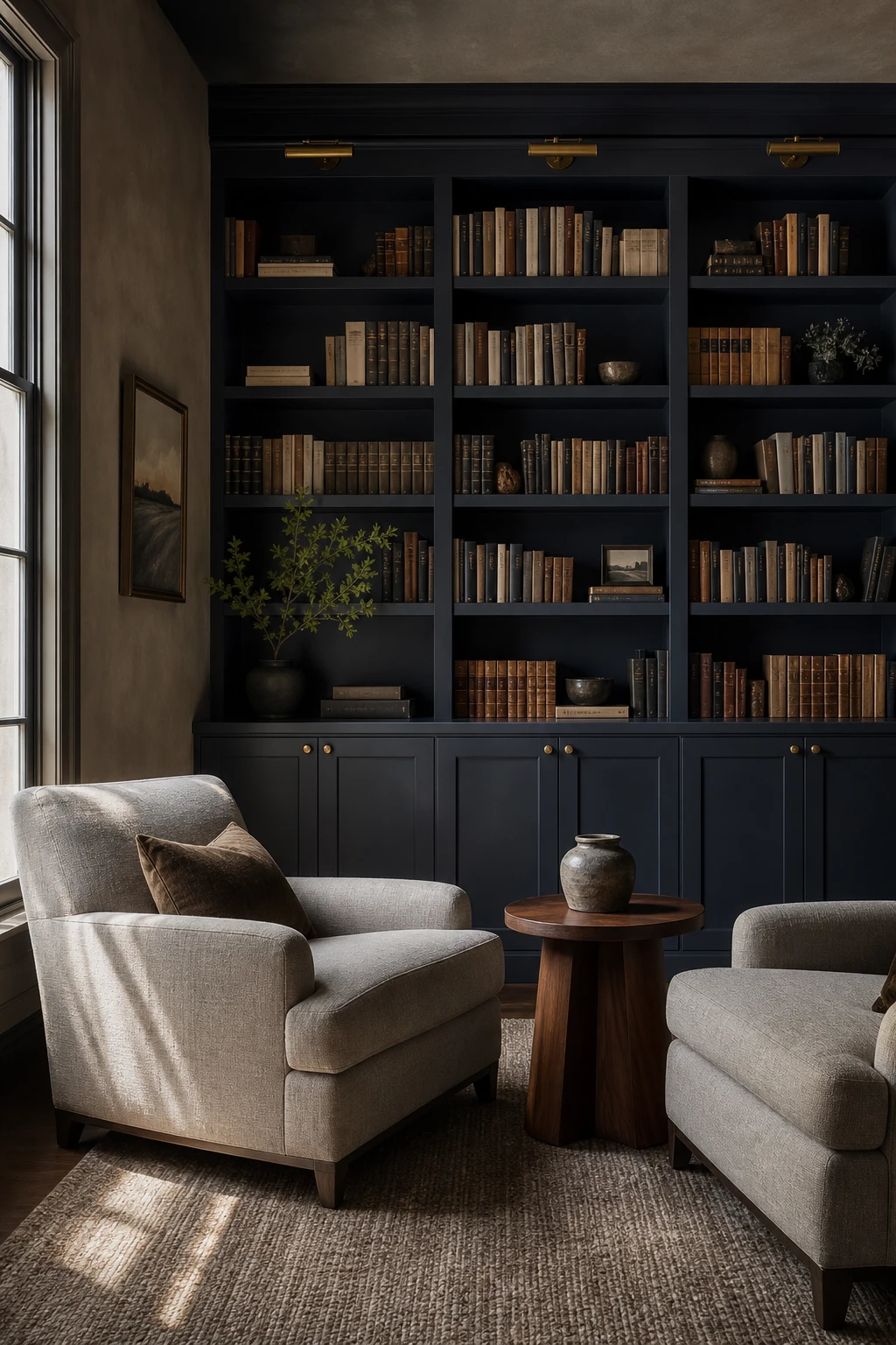
A Dark Blue Bookshelf Makes Books Look Like They Were Curated by an Artist
Painting a bookshelf dark blue turns the whole unit into a frame, and everything sitting on it suddenly looks chosen rather than accumulated. What I love here is how the colour does the heavy lifting: you get instant depth behind pale spines and ceramic pieces without adding a single extra layer to the room. Watch how the gray in the armchairs keeps the palette from tipping too moody, letting the blue stay rich rather than heavy.
The Key Details
Full height built in bookshelf with painted back panel
Gray linen armchairs
Round oiled walnut side table
Ceramic vessel accent
Brushed brass shelf hardware
Pro TipGroup books by spine colour in loose bands so the dark painted back shows through in small windows of breathing space between each cluster.
AvoidPacking every shelf solid with books means the dark paint disappears entirely, and you lose the very depth you painted the unit to create.
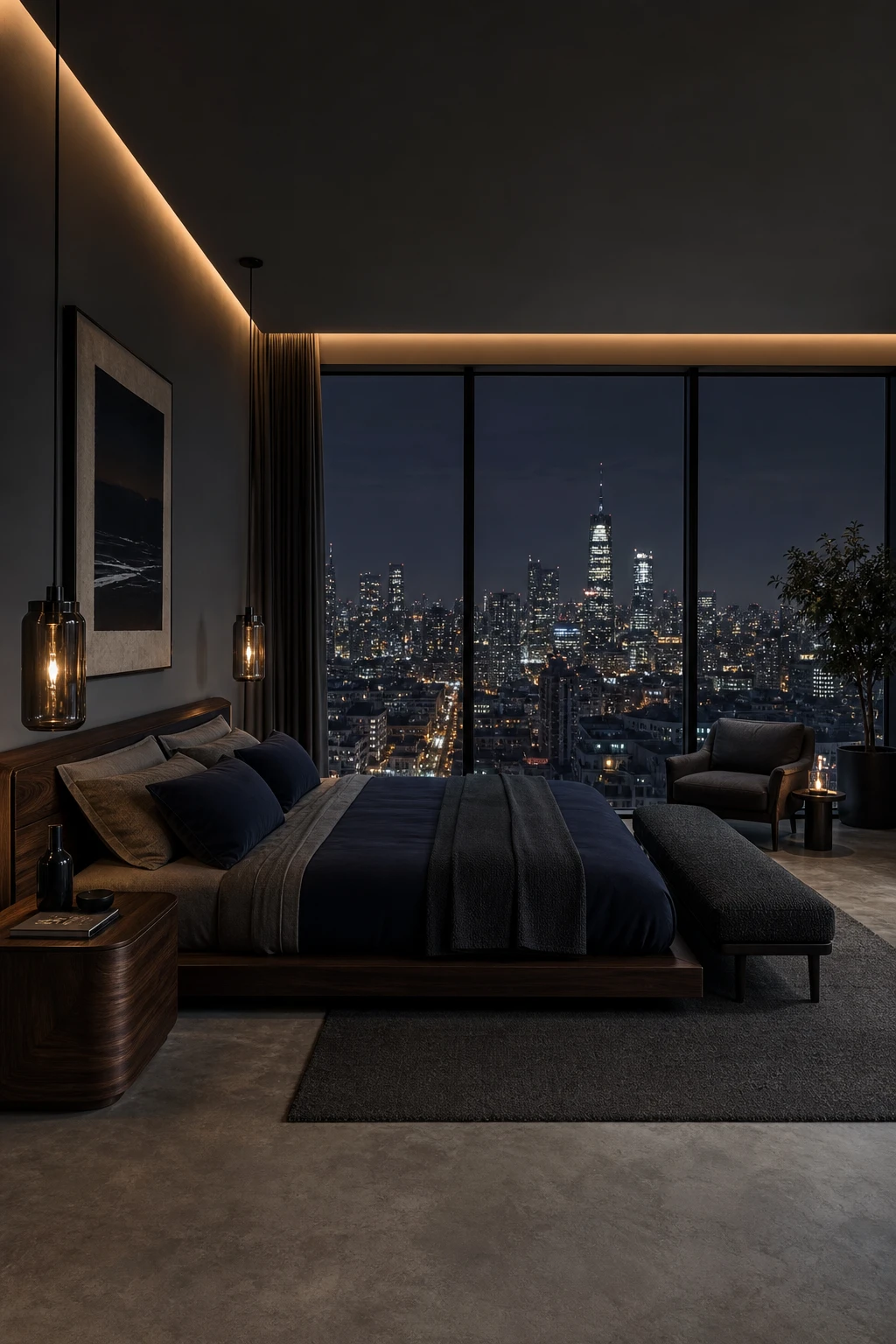
When the City View at Night Becomes the Best Feature in Your Dark Bedroom
Treating the city skyline as living art after dark is one of my favourite bedroom moves, and the key is contrast. You keep the interior deliberately dim so the lit cityscape outside reads as the brightest point in the room, and the window becomes a glowing panel rather than a flat pane of glass. What I love here is the low platform bed and charcoal tones pulling everything back, so nothing inside competes with that view.
The Key Details
Floor to ceiling city view windows
Low platform bed with navy and slate linen
Smoked glass cylinder pendant lights
Dark walnut bedside table
Charcoal boucle upholstered bench
Pro TipLayer warm, very low wattage lighting behind the bed and away from the glass, so the room stays just bright enough to feel cosy while the city outside stays the clear focal point.
AvoidBright overhead lighting bounces straight back off dark glass at night, turning your beautiful city view into a mirror that reflects the room instead.
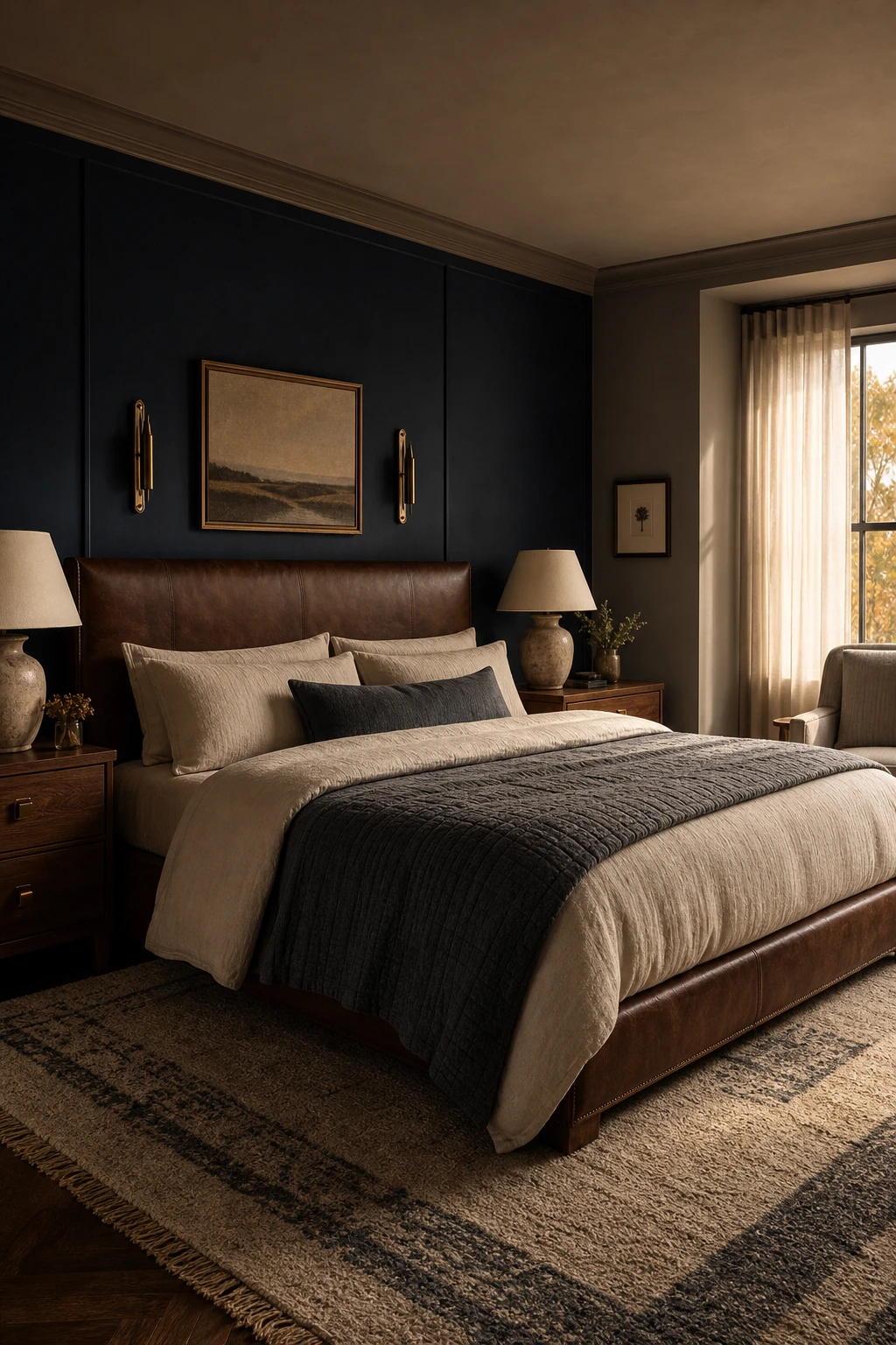
Navy and Brown in a Bedroom and the Surprisingly Warm Place They Meet
Navy and brown is a pairing I keep coming back to because the warmth does all the heavy lifting. The navy anchors the room with depth and quiet confidence, and the brown stops it tipping into cold territory. What I love is how naturally the two settle together: you get richness without drama, and the whole room reads as grounded rather than stark. Watch how the wood and leather tones seem to pull heat straight into the space.
The Key Details
Brown leather upholstered headboard
Walnut timber nightstands
Layered linen and quilted gray bedding
Biscuit and charcoal wool area rug
Ceramic table lamps with cream shades
Pro TipReach for cognac leather or caramel linen as your linking material, because that warm amber middle ground is what makes the navy and brown feel like they belong to the same story.
AvoidPicking a cool toned or ashy brown alongside a warm navy creates a quiet visual tension that makes the room feel unresolved rather than layered.
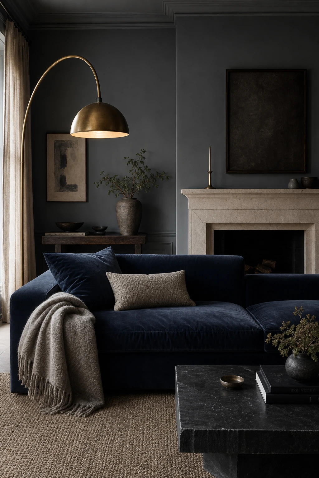
Dark Gray and Navy Together in a Living Room That Feels Genuinely Sophisticated
Deep gray walls and a navy sofa walk a fine line, and that tension is what draws me to the combination. Two near identical tones that somehow read as distinct, the secret sitting entirely in surface texture. Matte plaster and velvet pile catch light differently, so the eye separates them without needing a strong contrast to do the work. What wins me over every time is the limestone fireplace acting as a quiet neutral between the two, stopping the room from folding in on itself.
The Key Details
Deep navy velvet sofa
Limestone fireplace surround
Unlacquered brass arc floor lamp
Honed dark slate coffee table
Layered wool and mohair throw
Pro TipDrape an aged brass arc lamp over the boundary between the gray wall and the navy sofa and you give the eye an instant landmark that separates the two tones without any extra colour.
AvoidChoosing your paint shade and sofa fabric from separate sample cards at home will almost always leave you with two tones that merge into a flat, murky read once everything is installed together in natural light.
Blue and Gray in a Warehouse Style Space Where Scale Is the Real Secret
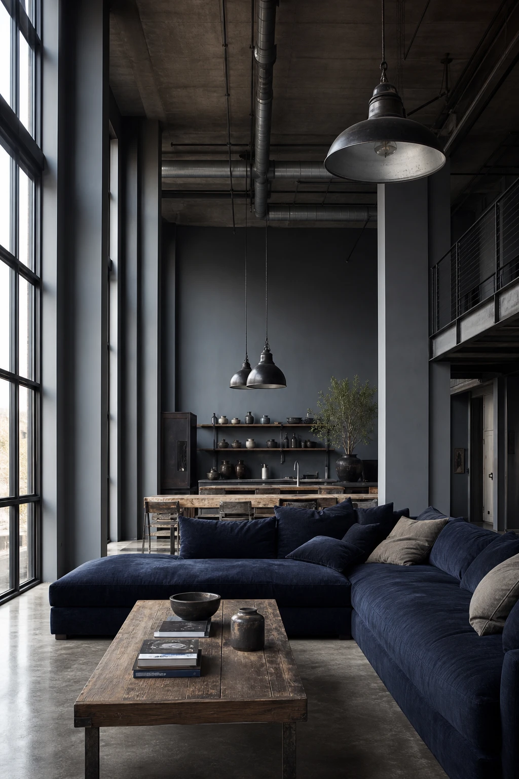
Warehouse proportions demand colours and furniture with the same confidence the space already has, and deep navy paired with cool gray delivers exactly that. What I love here is how the boldness of the palette fills the room visually before a single piece of furniture arrives. You will notice the blackened steel and polished concrete stop the blue from feeling heavy, keeping everything raw and alive rather than dark and closed in.
The Key Details
Oversized Navy Sectional Sofa
Exposed Concrete Ceiling with Ducting
Blackened Steel Factory Pendant Lights
Floor to Ceiling Steel Framed Windows
Polished Concrete Floor
Pro TipHang your factory pendants low enough to sit just above eye level when standing, because that drop pulls the ceiling height down into the room and makes the whole space feel lived in rather than cavernous.
AvoidPlacing standard domestic sofas and side tables in a double height warehouse room leaves so much empty air above them that the furniture looks lost and the space feels colder than it actually is.
Alan launched Edward George London in 2017. Since completing his masters in Town & Regional Planning (MPlan) he has combined the skills he learned at the University of Sheffield with his passion for design, to help create a foundation for those looking to create a beautiful home.