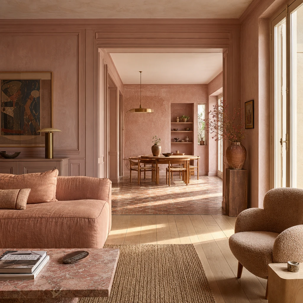
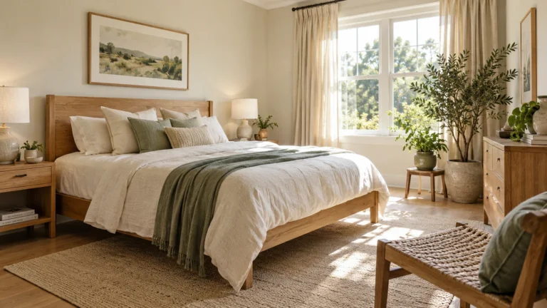
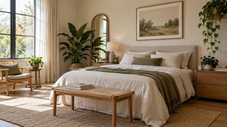
I have always loved the way dusty pink sits somewhere between warm and cool, never too sweet, never too sharp. What I find most exciting is how many directions it can go: velvety and moody in a living room, soft and raw on a bedroom wall, bold and glossy in a kitchen. Every look in this piece is something you can genuinely steal for your own home.
A Dusty Pink Living Room That Feels Genuinely Grown Up
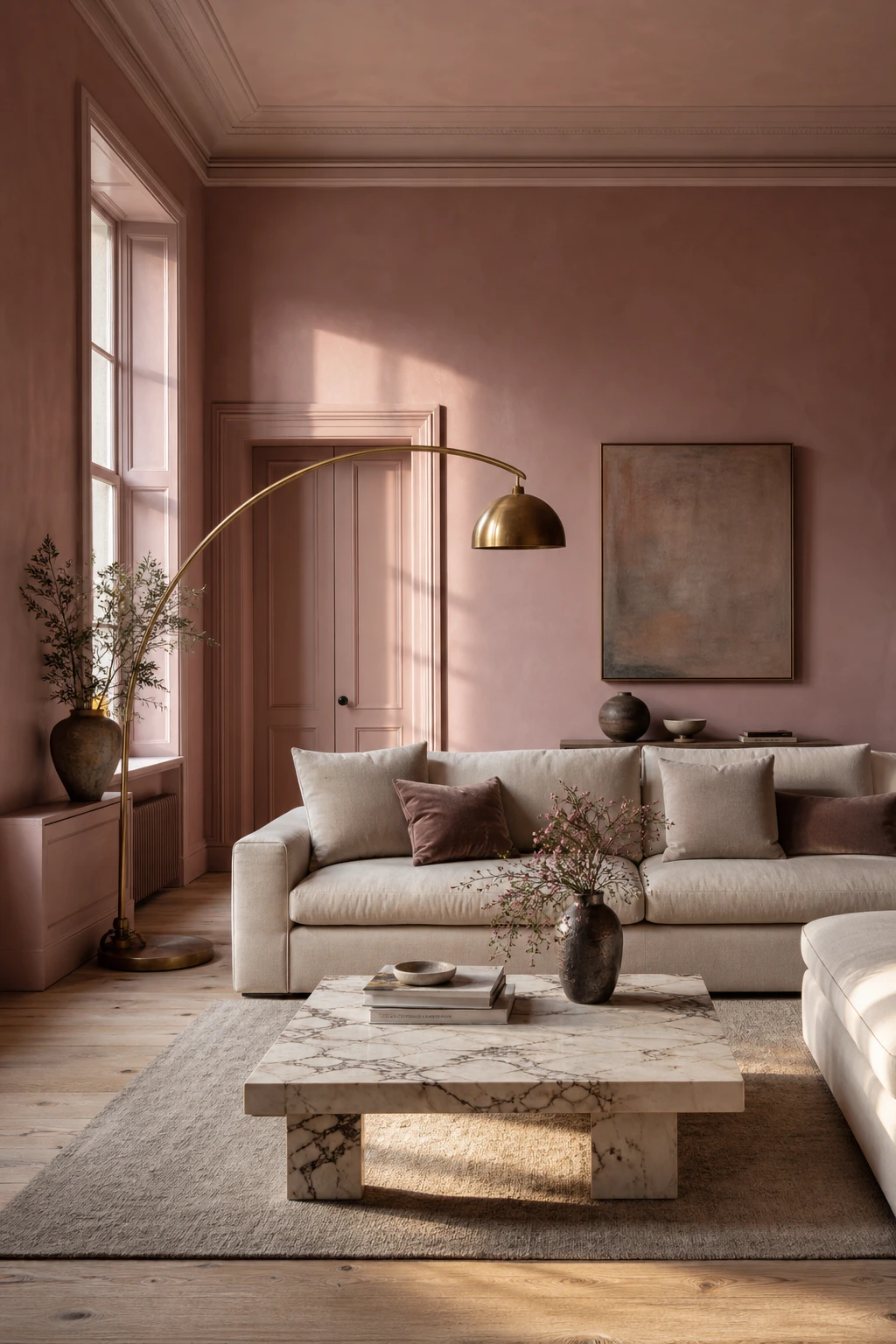
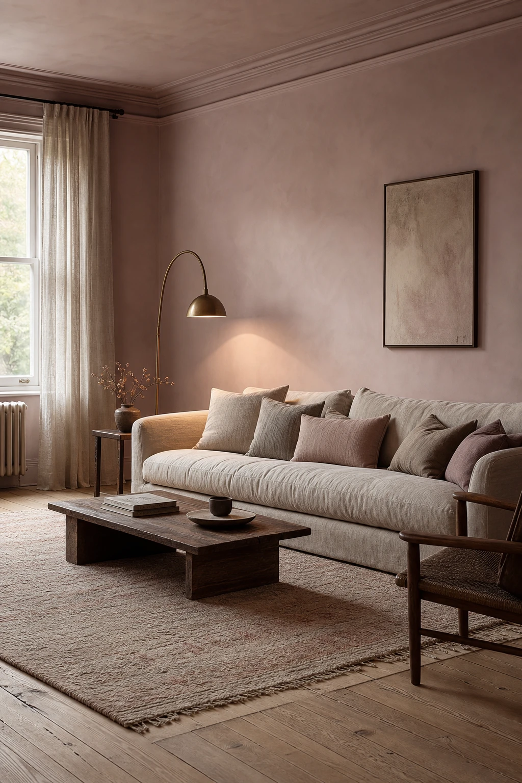
Dusty pink walls have this quiet confidence I find hard to resist. The grey undertone pulls the sweetness right out of the colour, so you get something that reads more like a warm blush stone than anything sugary. Pair it with polished oak and a deep linen sofa and watch how the room starts to feel layered and settled, the way a space does when everything belongs together.
The Key Details
Deep linen sofa
Veined marble coffee table
Brass arc floor lamp
Tall casement windows
Polished oak floorboards
Pro TipGround dusty pink walls with a warm greige or soft camel on your soft furnishings so the pink reads as a natural part of the room rather than a statement it has to justify.
AvoidReaching for a brighter, cooler pink because it seems easier to find strips the whole scheme of that grown up quality and pushes the room straight back into pretty territory.
Why Sulking Room Pink Is the Living Room Shade Everyone Keeps Coming Back To
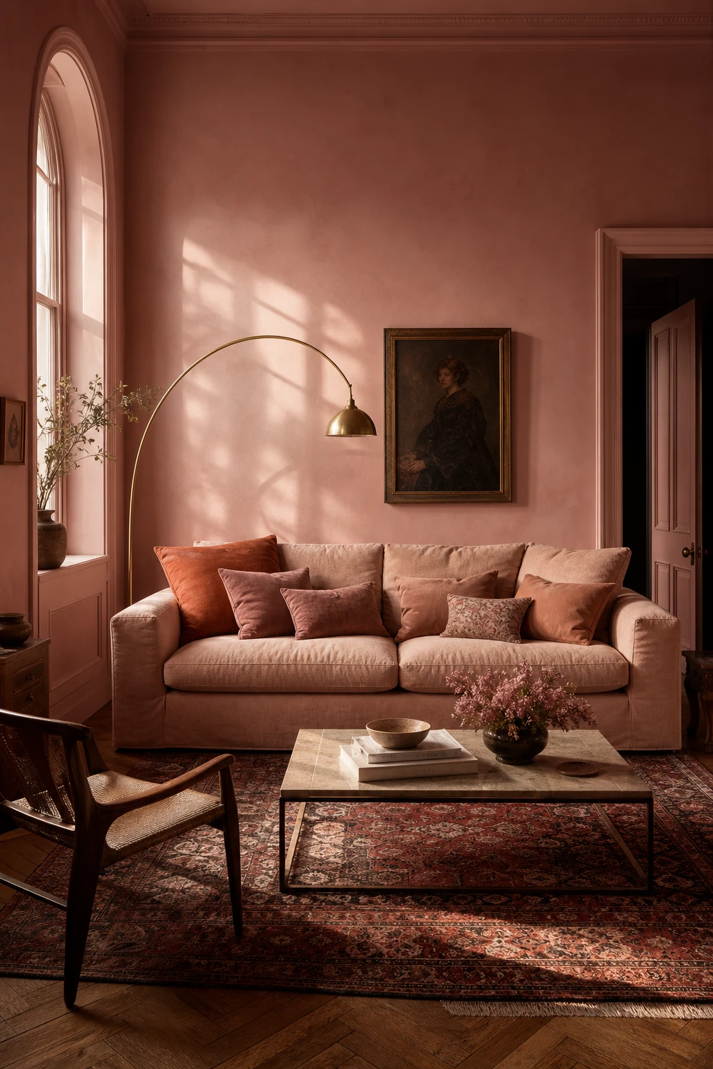
Sulking Room Pink is one of those names that tells you exactly what you are getting: a pink with real weight behind it. What I love is how the pigment sits on the wall with a richness that a custom mixed pink almost never pulls off, because the heritage formula carries undertones of grey and plum that give the room its depth. You get warmth without sweetness, and that balance is what keeps drawing people back to it.
The Key Details
Deep linen sofa in blush oatmeal
Brass arc floor lamp
Arched original window
Vintage Persian rug in muted garnet and cream
Herringbone oak parquet floor
Pro TipSpecify Sulking Room Pink in full gloss on woodwork as well as walls and the room gains a lacquered, jewel box quality that flat emulsion alone cannot touch.
AvoidA north facing room will pull the grey undertones in Sulking Room Pink right to the surface, so testing a large sample panel through a full day of light is the step that saves you from a result that reads more bruised than warm.
How to Make a Pink Living Room Feel Moody and Magnetic
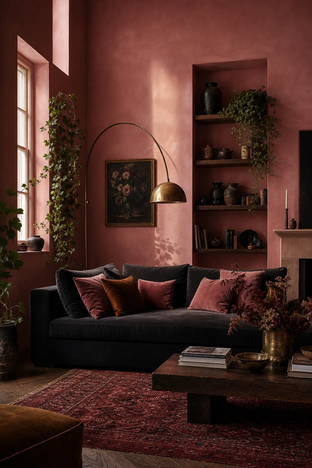
Dusty pink paired with dark accents is one of my favourite moves because the contrast does something genuinely surprising: the pink reads richer, not softer. What I love is how charcoal, deep burgundy and tarnished brass pull the warmth right up through the room, so you get that magnetic, candlelit quality without a single candle lit. Watch how the dark ceramics and layered cushions hold the eye long enough to feel considered rather than accidental.
The Key Details
Dark charcoal velvet sofa
Tarnished brass arc floor lamp
Layered dusty rose and burnt amber cushions
Deep burgundy Persian rug
Recessed alcove shelving with dark ceramics
Pro TipAnchor the room with a deep brown or bronzed lamp as your single brightest metal, and let every other finish in the space echo that warmth rather than fight it.
AvoidReaching for cool grey or icy blue accents to balance the pink will quietly strip out all the warmth and leave the room feeling flat and unresolved.
The Muted Pink Living Room Look That Always Feels Quietly Restful
Pulling pink toward grey is one of my favourite quiet moves: you get a colour that reads almost neutral from across the room yet carries a warmth that a true grey or white simply cannot. What I love most is how it settles the eye without flattening the space. The oatmeal linen, pale oak, and that hand knotted wool rug all land softly against it, and you will notice the whole room just breathes.
The Key Details
Oatmeal linen sofa
Aged brass arc floor lamp
Unlined linen sheers
Wide pale oak floorboards
Hand knotted wool rug in cream and dusty rose
Pro TipLayer at least two different natural textures, such as linen and wool, so the muted pink has enough contrast to glow rather than disappear into the background.
AvoidMixing several busy patterns across the cushions, rug, and curtains fragments the stillness that makes this palette so restorative in the first place.
A Dusty Pink Bedroom That Wraps You in Softness Every Single Night
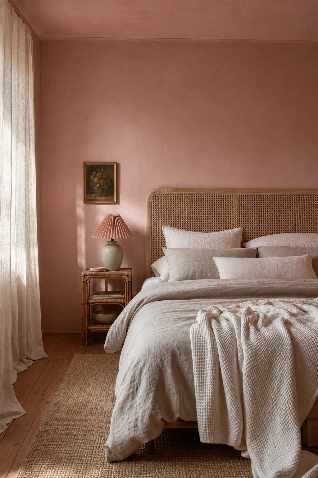
Four walls of dusty pink in a bedroom do something unexpected: they pull the room inward in the best way, wrapping you rather than closing you in. What I love is how the colour loses any sweetness once it meets natural linen and cane, settling into something that feels genuinely restful. You will notice the room reads as one quiet whole, no hard edge pulling your eye away from the calm.
The Key Details
Cane headboard
Layered linen bedding
Sheer linen curtains
Rattan bedside table
Jute rug over timber floorboards
Pro TipChoose linen bedding in a tone a shade or two lighter than your walls and the whole room softens into itself beautifully.
AvoidBright white trim against dusty pink cuts the dreamy, cocooned feeling you worked so hard to build and makes the whole room feel unfinished.
Raw Plaster Walls in a Bedroom and Why the Texture Does All the Work
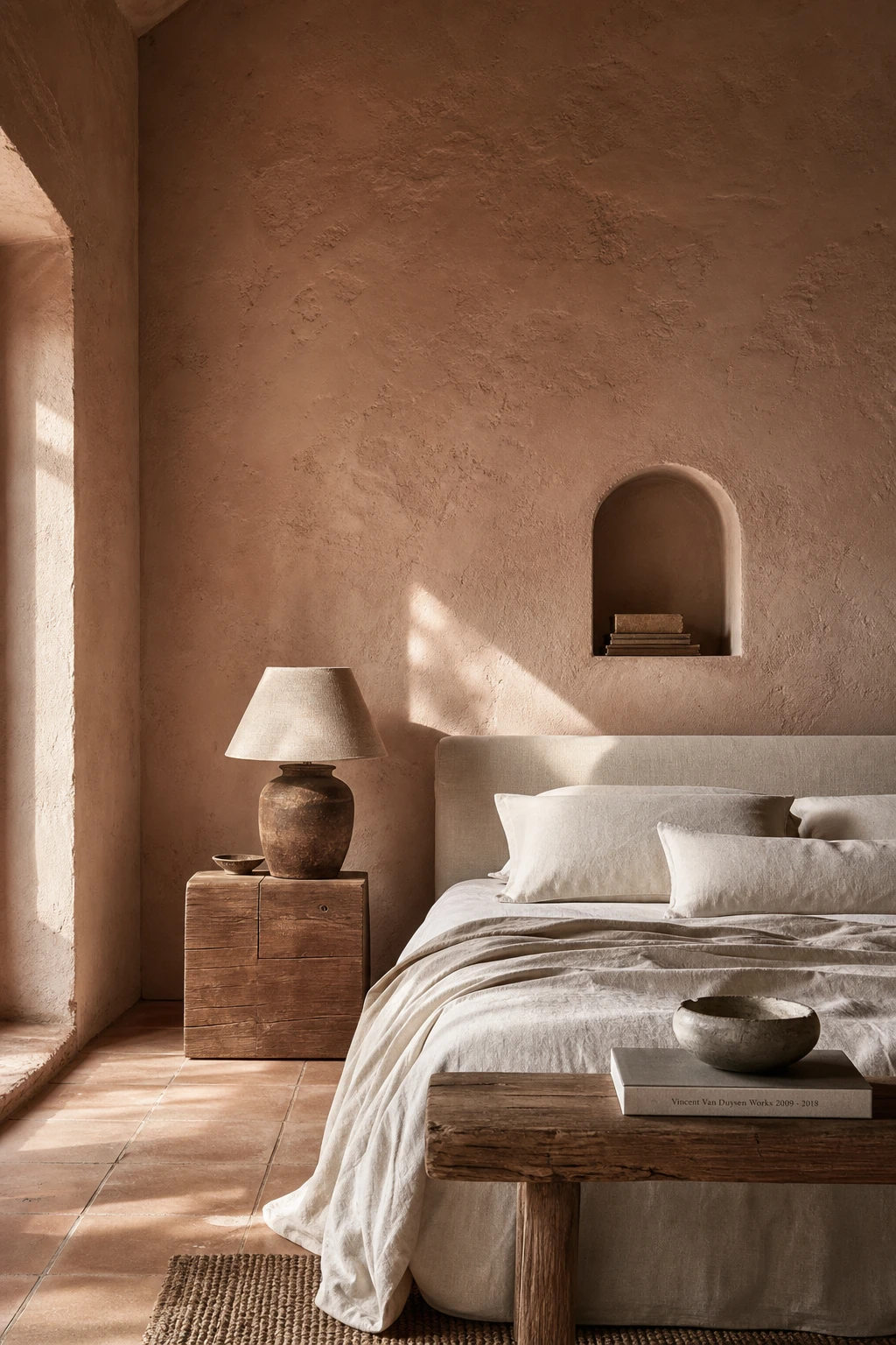
Raw plaster in a dusty pink bedroom gives you something flat paint simply cannot: a surface that shifts tone as daylight moves across it, warmer at dawn, cooler by noon. The slight grain and variation pull your eye in gently, and you will notice the room feels more alive for it. That sense of quiet movement is what makes the space feel handmade and considered rather than just decorated.
The Key Details
Raw lime plaster walls
Low linen upholstered bed
Hand thrown ceramic table lamp
Unglazed terracotta floor tiles
Arched plaster alcove
Pro TipSeal raw or plaster effect walls with one thin coat of diluted matte emulsion mixed at roughly ten parts water to one part paint, which locks down the dust without killing the depth.
AvoidLeaving plaster walls completely unsealed means fine dust will transfer onto pillows, bedding and furniture legs within days, and the surface will scuff and mark far faster than it should.
Pink Limewash Walls and the Effortless Depth They Bring to Any Room
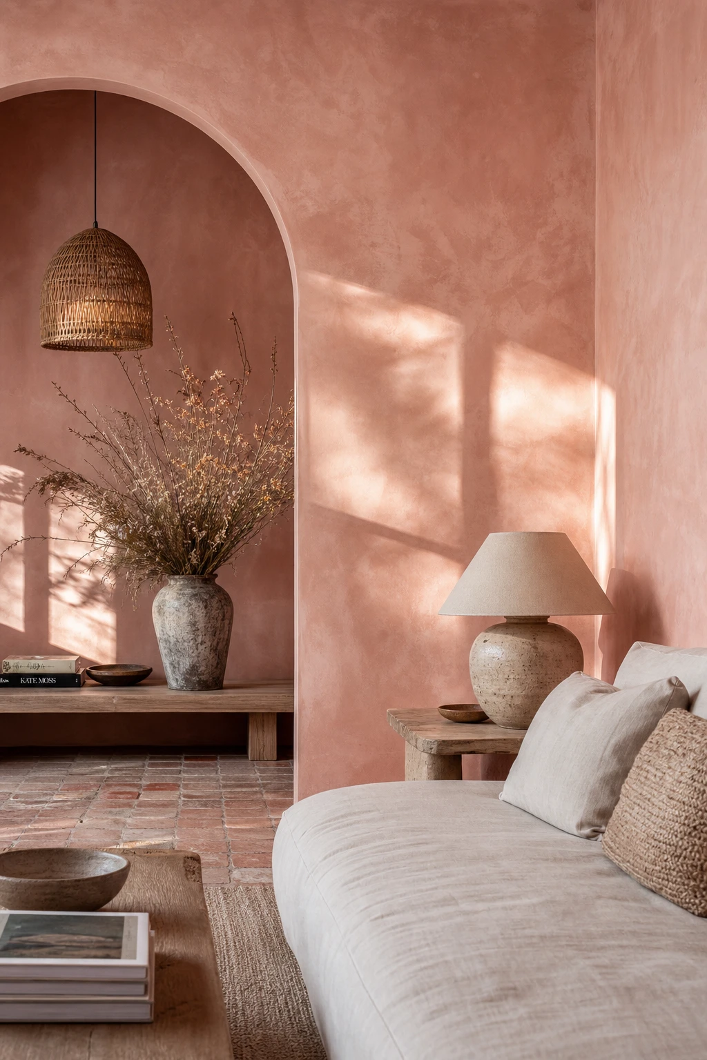
Limewash is one of those finishes that genuinely surprises people the first time they live with it. What I love is how the wall seems to change across the day, catching morning light softly and deepening by evening into something almost ancient. You get that sense of depth because the pigment sits in uneven layers, not as a flat film, and that variation is exactly what solid paint cannot replicate. Watch how a dusty pink limewash reads warm, then chalky, then almost mauve, all without a single coat change.
The Key Details
Limewash plaster walls
Low linen sofa
Terracotta floor tiles
Rattan pendant light
Arched alcove
Pro TipWork your brush in loose cross strokes and let some of the base layer show through rather than chasing full coverage.
AvoidPicking a limewash that reads as a strong, saturated pink will flatten the finish and strip away the aged, mineral quality that makes the technique worth doing at all.
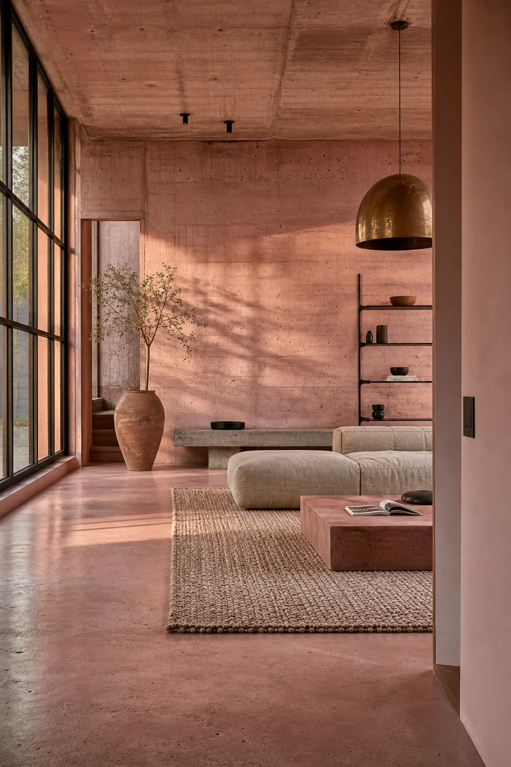
Pink Concrete Interiors That Prove Industrial and Soft Can Share a Room
Blush pigmented concrete is one of my favourite moves for clients who want warmth without fuss. The pink tint pulls the rawness of the surface toward something human and liveable, so you get that industrial edge without the room feeling cold or hard to be in. Watch how the aged brass pendant and the wool rug carry that warmth further, softening the steel frames just enough to keep things comfortable.
The Key Details
Blush pigmented concrete walls
Tall steel framed windows
Oversized aged brass pendant
Chunky hand knotted wool rug
Polished pink concrete floor
Pro TipApply a blush tinted microcement over existing walls or floors to get the full concrete effect without breaking out a single structural wall.
AvoidSkipping soft furnishings in a concrete room leaves nowhere for the eye to rest and the space quickly tips from cool to uncomfortable.
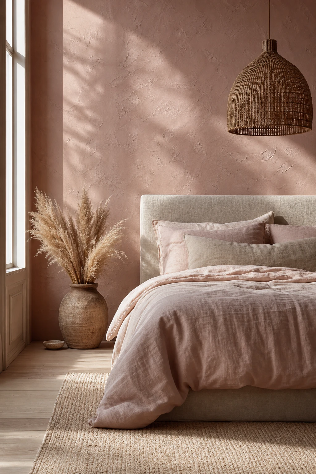
The Soft Pink Wall Texture That Makes a Room Feel Touched by Hand
A plain pink wall is pretty, but a textured one stops you in your tracks. What I love here is the tinted basecoat sitting beneath the topcoat, so the colour shifts as light moves across it and you get that warm, almost breathing quality. You will notice it reads differently at noon than it does by lamplight, and that constant gentle change is what makes the room feel alive and touched by hand.
The Key Details
Hand applied venetian plaster wall
Low linen upholstered bed frame
Woven rattan pendant light
Raw clay bedside vessel with dried pampas grass
Wide pale oak floorboards
Pro TipStir a tablespoon of fine builder’s sand into your topcoat before you apply it and you will get a soft, gritty grain that catches the light without needing any specialist plaster skills.
AvoidGoing back over a drying pass to smooth it out flattens all the natural variation and leaves you with a patchy, uneven surface instead of the artisan finish you were after.
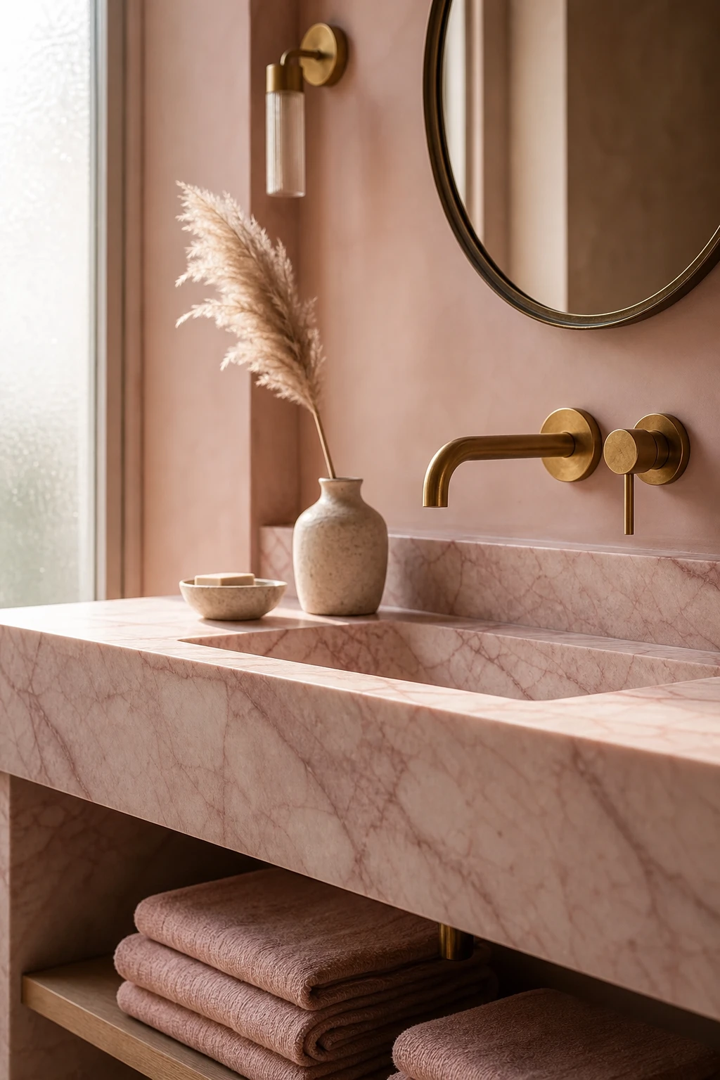
Pink Marble in the Bathroom and the One Place It Looks Most Luxurious
Pink marble on a single vanity top is one of my favourite moves in a bathroom because it gives you that full luxury hit without tiling every surface and overwhelming the room. You get the soft rose veining at eye level, right where you notice it most, and everything else stays calm around it. What wins me over every time is how one honest slab of stone does more for a space than a dozen smaller gestures ever could.
The Key Details
Honed pink marble vanity top
Brushed brass wall mounted basin mixer
Round antique brass mirror
Open timber vanity shelf
Stacked blush linen towels
Pro TipSeal your pink marble every six months with a penetrating stone sealer to lock in those blush veins and stop water and product residue from dulling the surface over time.
AvoidWarm yellow bulbs above a pink marble vanity muddy the rose tones and push the whole surface towards an unflattering orange that no amount of styling will fix.
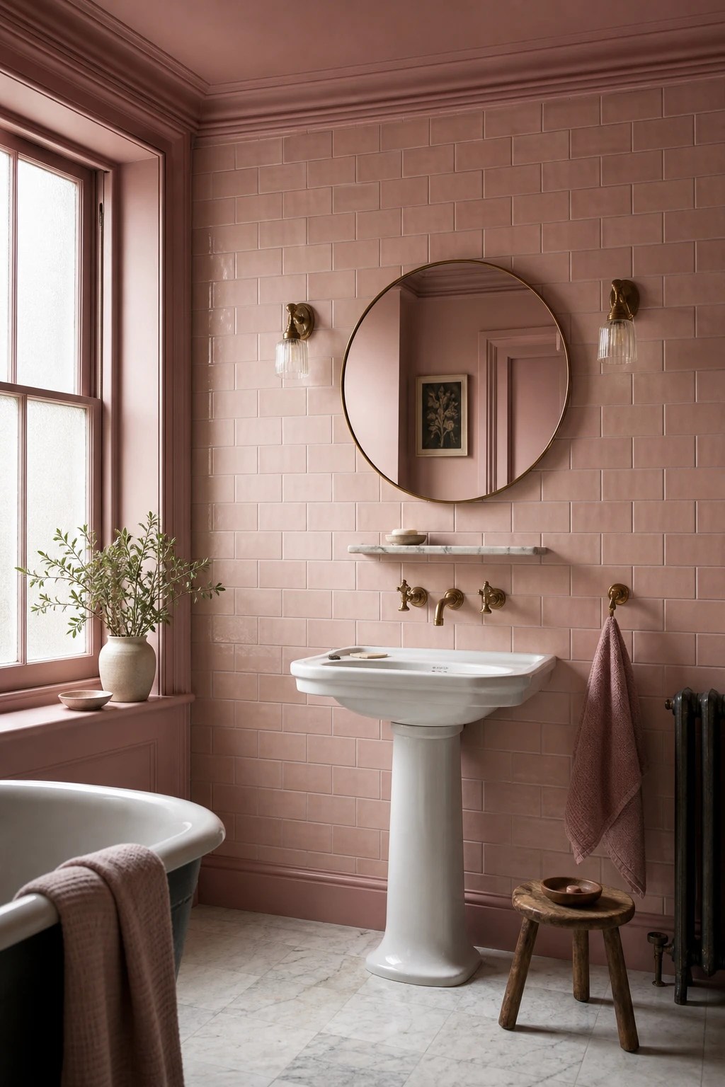
Pink Bathroom Tiles That Feel Vintage in the Very Best Way
Glazed pink tiles laid in a simple brick pattern are one of those combinations I keep coming back to, because the glaze catches light in a way flat paint simply cannot. You get a gentle shimmer across the wall that shifts through the day, and the brick offset gives the eye just enough movement without any fuss. What wins me over every time is how the pattern reads as something that has always been there, settled and sure of itself rather than chasing a trend.
The Key Details
Glazed brick pattern ceramic wall tiles
Pedestal basin
Aged brass wall mounted faucet set
Round brass rimmed mirror
Marble shelf with soap dish
Pro TipGrout in a warm taupe or soft charcoal to trace every tile edge and let the pattern do its job properly.
AvoidGrouting in white flattens the whole layout, swallowing the brick pattern and leaving the wall looking like a single pale sheet.
Pink and Orange in a Bathroom Is Bolder Than You Think and Warmer Than You Expect
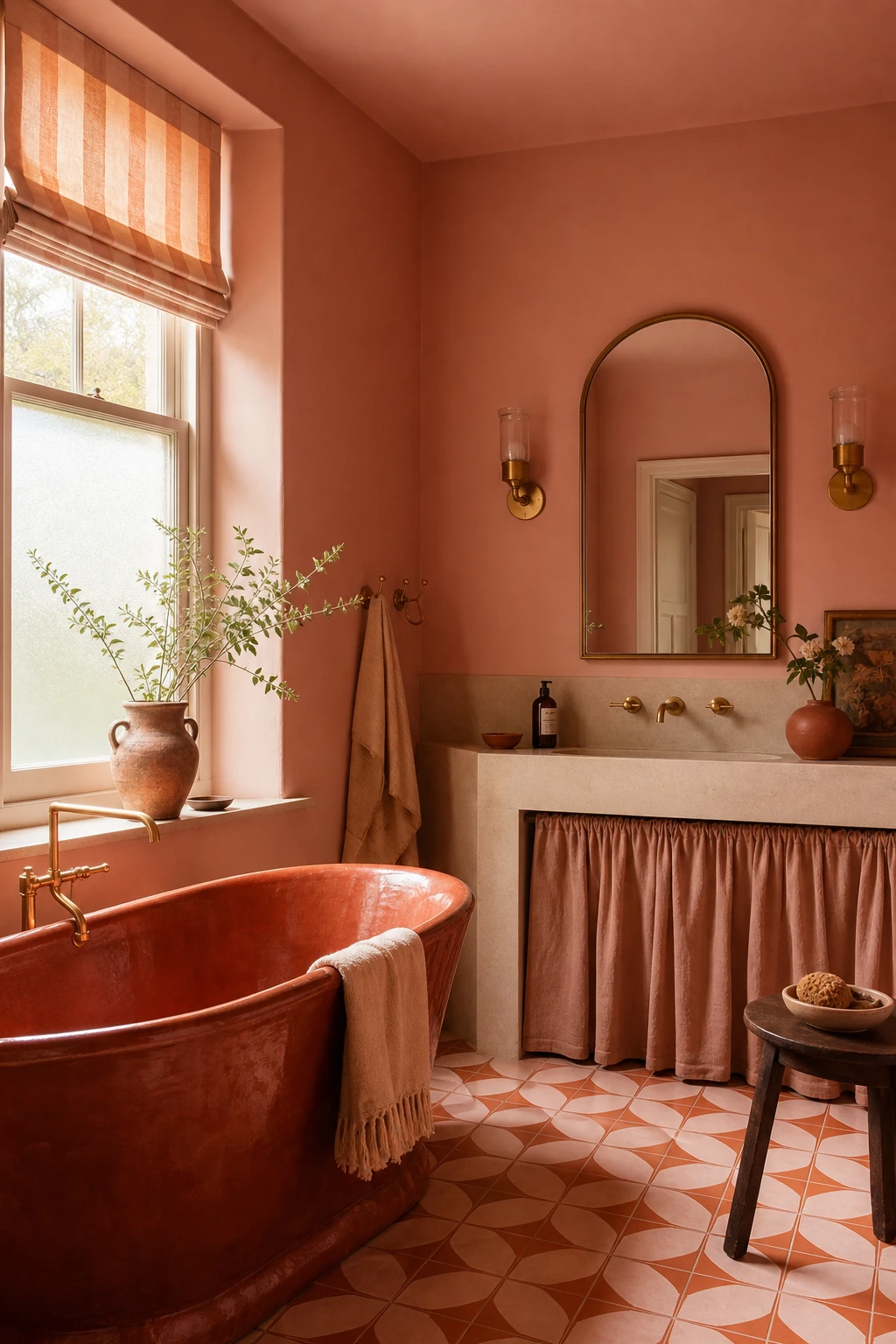
Pink and orange sound like a risk, but the thing I always check is whether both tones share the same warmth, and here they do. Dusty blush and terracotta sit right next to each other on the colour wheel, so you get depth and richness rather than a fight. Watch how the glazed tub anchors the room while the encaustic floor tiles keep your eye moving without ever feeling loud.
The Key Details
Terracotta glazed freestanding bathtub
Orange and blush encaustic geometric floor tiles
Apricot stripe linen roman blind
Aged brass wall sconces
Arched mirror
Pro TipPull your orange in through terracotta accessories rather than anything bright, and the whole pairing reads as considered and earthy rather than accidental.
AvoidPairing a cool, blue leaning pink with a warm orange creates an undertone clash that reads as a mistake rather than a deliberate choice, so always check both tones against each other in natural light before committing.
What a Truly Luxurious Pink Bathroom Actually Has That Others Do Not
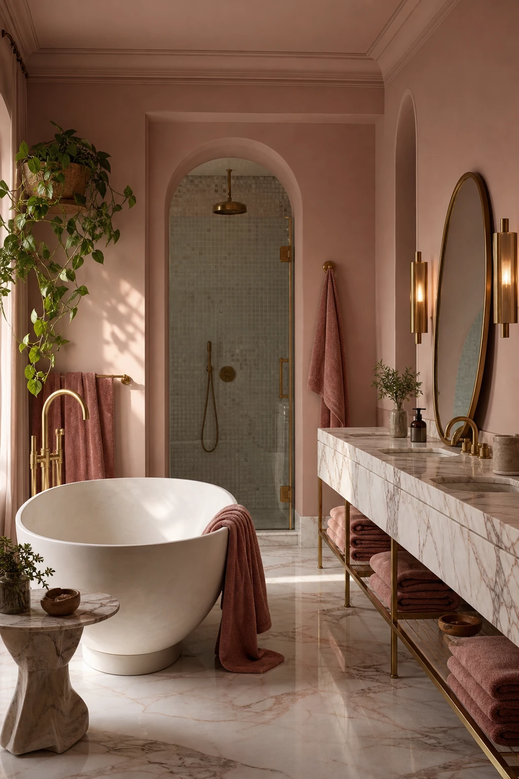
A pink bathroom earns the word luxury through what sits beside the pink, not the pink itself. Marble slabs book matched at the vanity, unlacquered brass taps, and a freestanding tub with real sculptural weight all carry their own richness, and you will notice how each material amplifies the warmth of the dusty rose rather than competing with it. That layering is the move I always come back to: soft colour, hard stone, warm metal, and then deep pile towels to bring the softness full circle.
The Key Details
Freestanding sculptural soaking tub
Polished brass wall sconces
Book matched marble vanity and floor slabs
Oval burnished brass mirror
Deep pile dusty rose stacked towels
Pro TipSpecify unlacquered brass for every fixture so the metal slowly deepens to a richer honey tone that grows more beautiful alongside the pink walls over the years.
AvoidCrowding the vanity top with bottles, trays, and decorative objects breaks the clean horizontal lines that tell a viewer this room is expensive before they even register the materials.
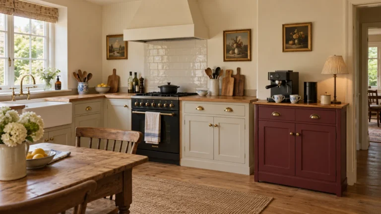
A Dusty Pink Kitchen That Makes Cooking Feel Like the Nicest Part of Your Day
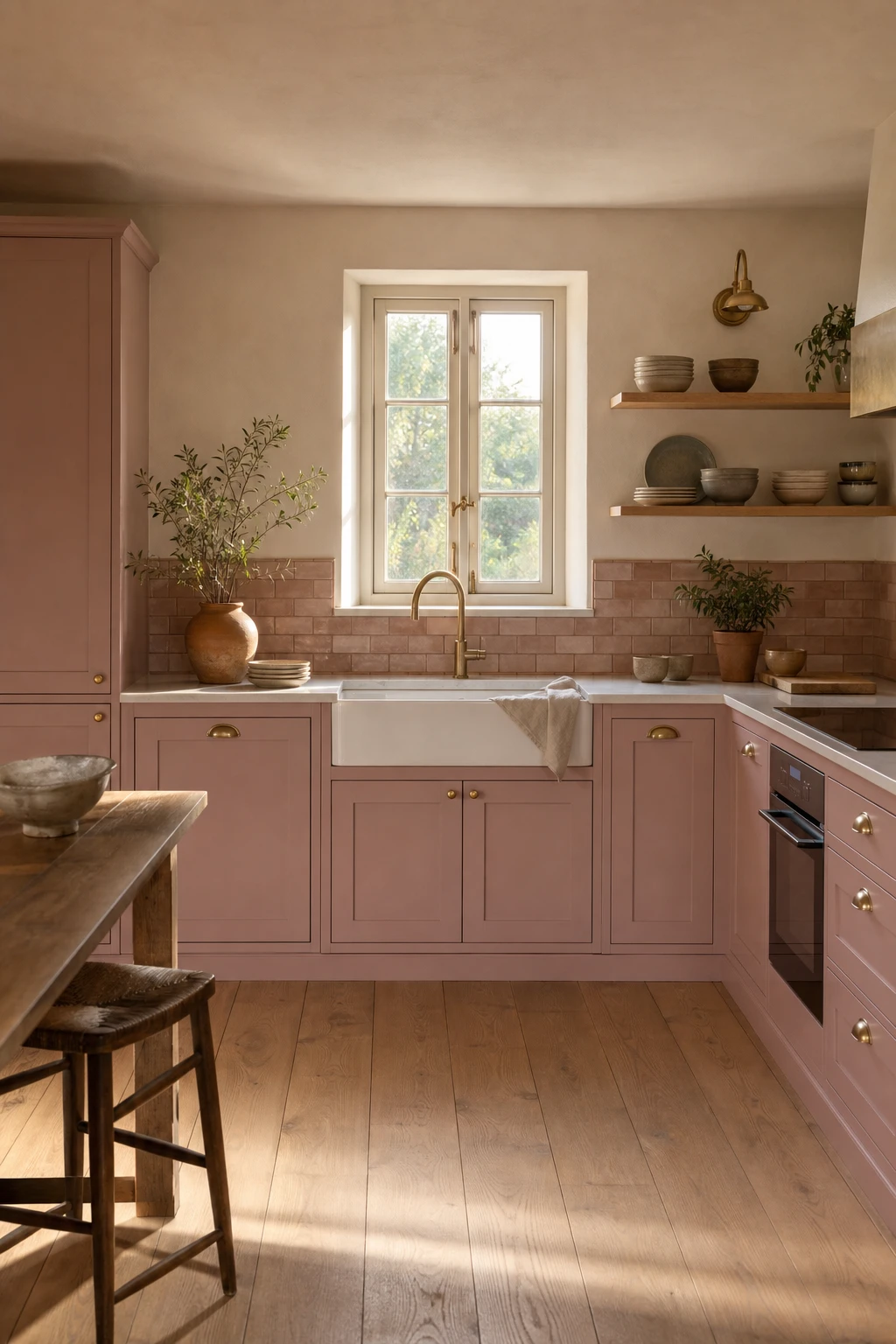
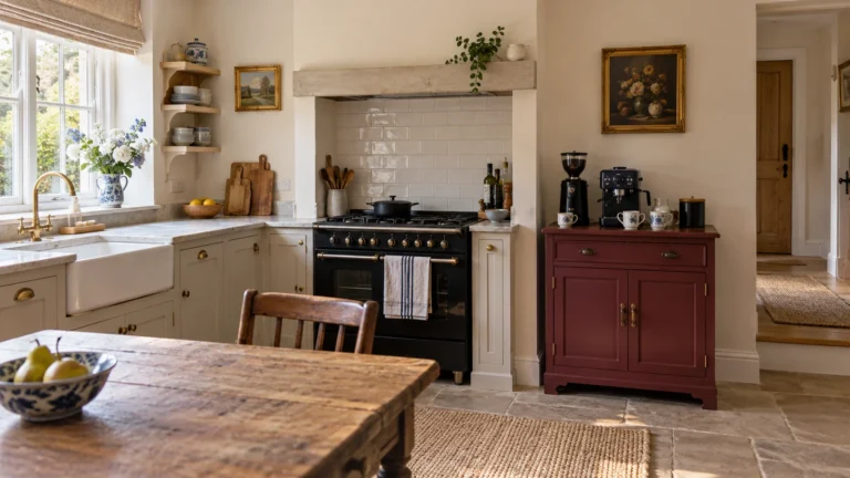
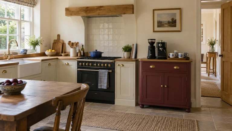
Painting the cabinets is one of my favourite kitchen moves because you get a full personality shift without touching the layout or the budget. Dusty pink sits in that rare sweet spot where it reads warm and considered rather than sweet or bold, so you will notice the room feels welcoming the moment you walk in. What wins me over every time is how beautifully it pulls the natural materials together, the aged brass, the timber, the clay tile, each one looking richer against that soft muted base.
The Key Details
Aged brass cup handles and knobs
Open timber shelving with ceramic bowls
Honed white marble countertops
Handmade clay brick format tile splashback
Pale oak timber floorboards
Pro TipFinish the cabinets in eggshell rather than matt so the surface wipes clean after cooking but still holds that soft, chalky look dusty pink does best.
AvoidFitting chrome hardware on dusty pink cabinets pulls the warmth straight out of the room and leaves the whole scheme feeling cold and a little lost.
Pink and Wood in a Kitchen and Why This Pairing Feels So Naturally Right
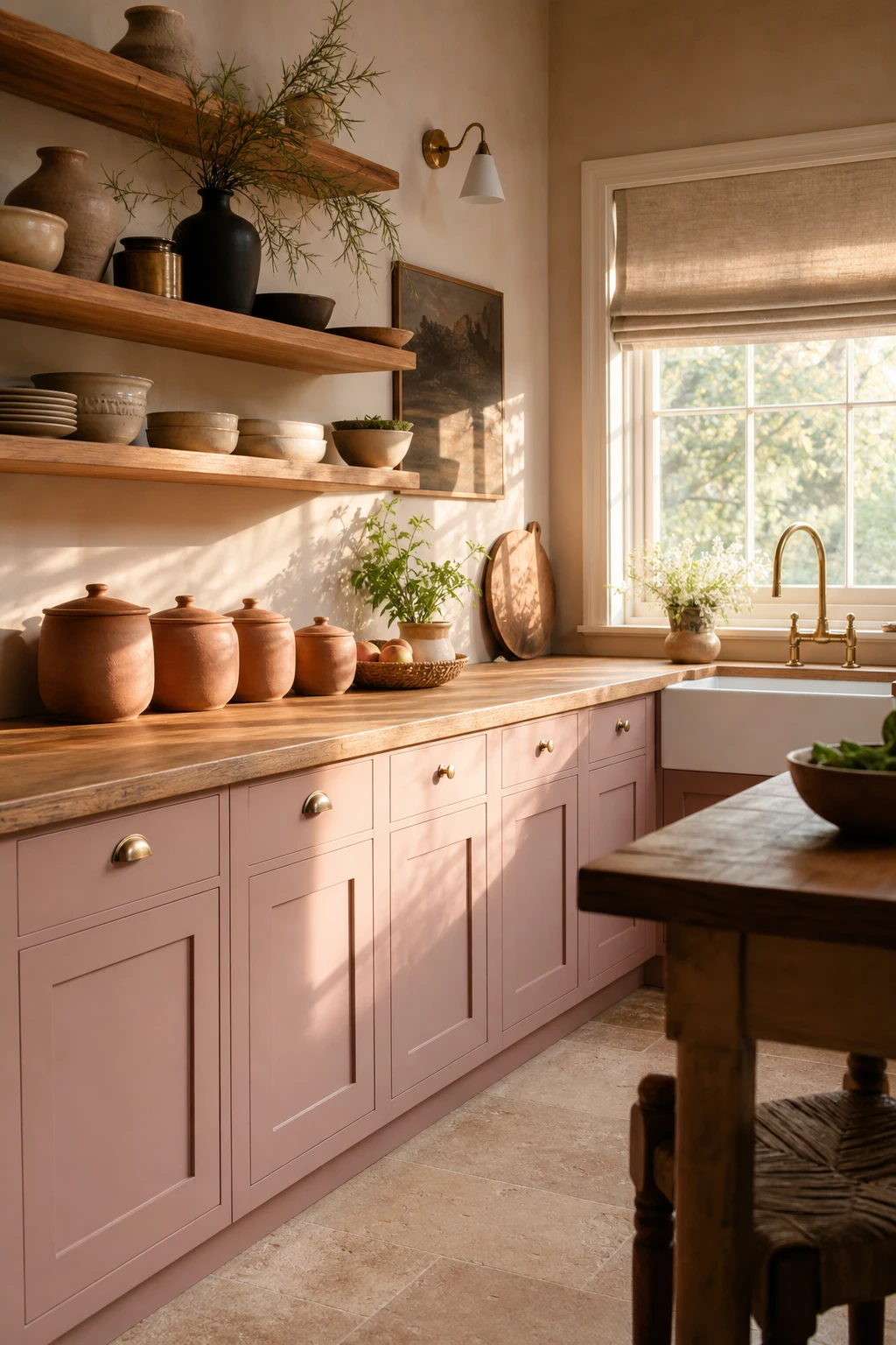
Warm timber next to pink cabinetry is one of those pairings I keep returning to because the wood does something paint alone cannot: it roots the whole room in something natural and honest. You get that softness from the pink but the oak or birch beside it stops things feeling precious. Watch how the grain and the blush bounce warmth off each other rather than competing.
The Key Details
Open timber shelving
Butcher block countertop
Terracotta ceramic canisters
Brass tap and fittings
Linen roman blind
Pro TipRun open oak shelves directly above your pink lower cabinets to give the eye a natural break and let the timber read as part of the structure rather than an afterthought.
AvoidChoosing a very dark wood stain pulls the pink toward purple, and the whole kitchen ends up feeling heavier and cooler than you intended.
Glossy Pink Kitchen Cabinets and the Light Trick That Makes Them Shine
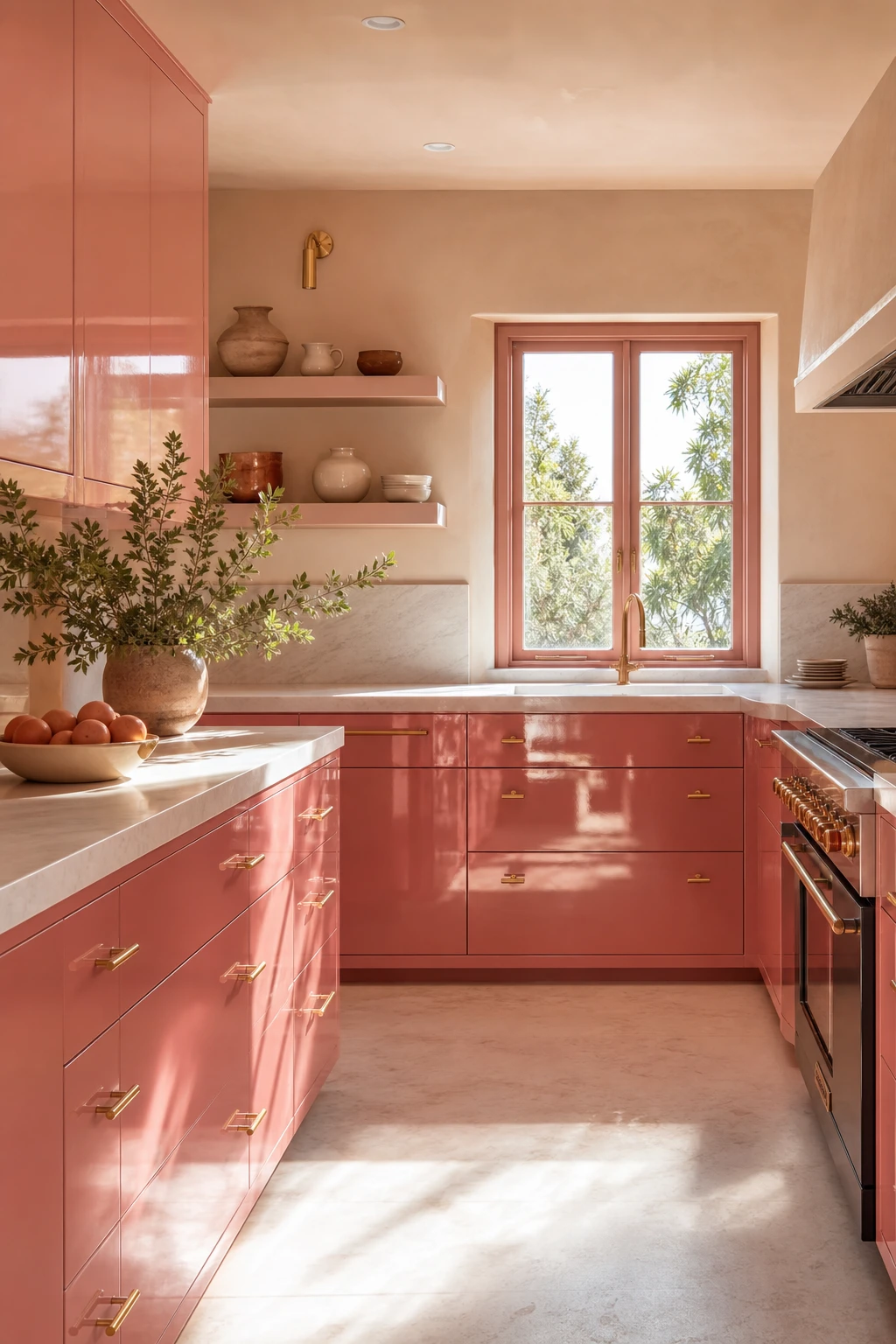
Glossy pink cabinet fronts are one of my favourite moves in a smaller kitchen because every door acts like a soft mirror, bouncing light back into the room and making the space feel twice as generous as it really is. You will notice it most in the morning, when the casement window floods in and the lacquered surfaces catch it from every angle. Pair that with honed white marble and unlacquered brass pulls and the whole room glows rather than dazzles.
The Key Details
Lacquered high gloss cabinet fronts
Unlacquered brass drawer pulls
Honed white marble countertop
Open upper display shelving
Casement window with morning light
Pro TipHang pendant lights low enough that you can actually see their reflection sitting in the glossy door faces, because that doubled glow is where the real magic happens.
AvoidRunning full gloss across a very large kitchen can tip the room from chic into clinical, so save this finish for compact galley layouts or a single run of cabinetry rather than spreading it wall to wall.
A Mauve Dining Room That Makes Every Dinner Feel Like a Special Occasion
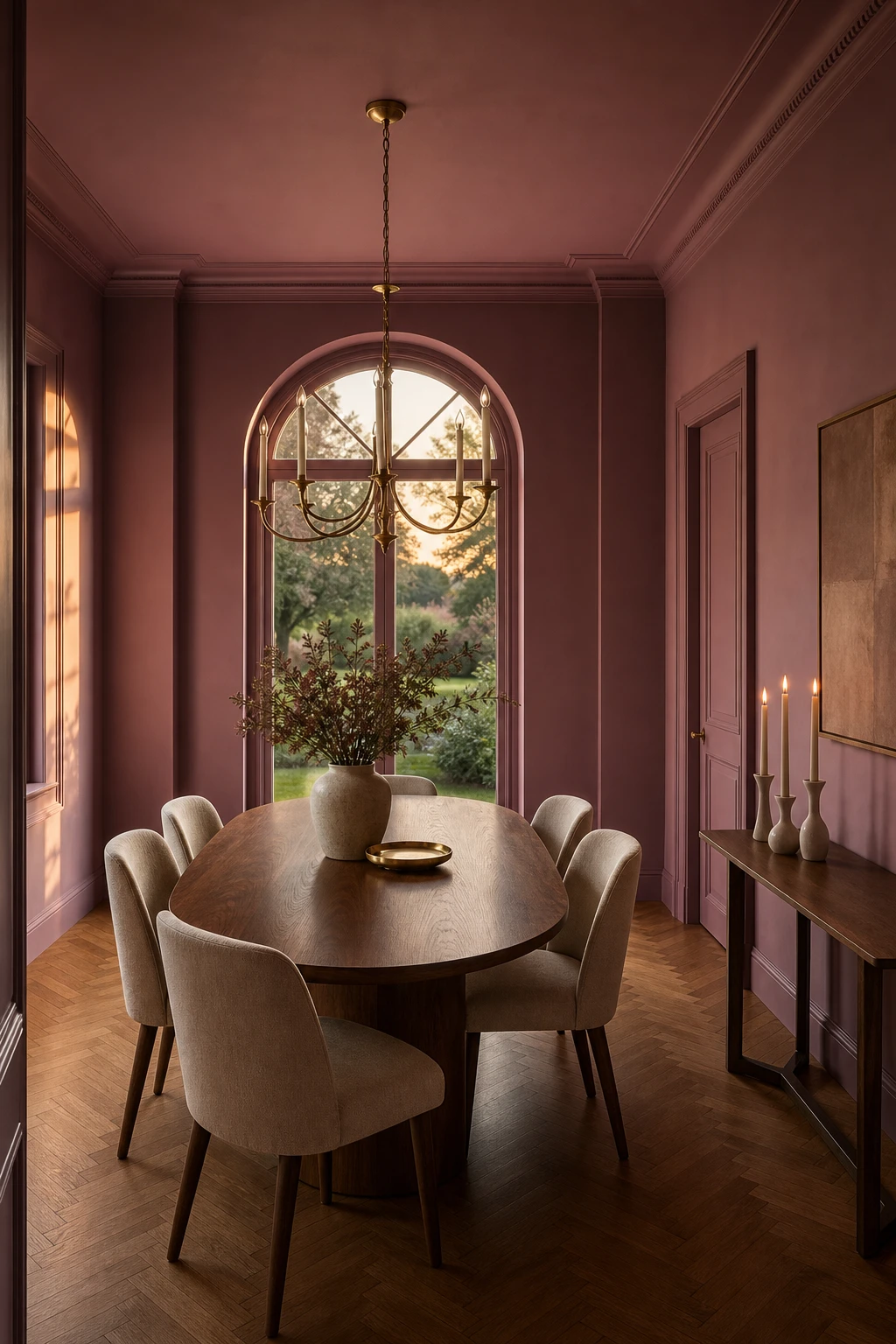
Mauve is the colour I reach for when a dining room needs drama but the owners hate anything that feels stuffy. That in between quality, part pink, part purple, gives the walls a depth that shifts as the light changes through the day. By evening, with candles going and the aged brass overhead catching the glow, you get something that feels genuinely theatrical. The walnut table and parquet floor anchor it so the room never tips into fussy.
The Key Details
Oval walnut dining table
Linen upholstered dining chairs
Aged brass candle chandelier
Tall arched window
Herringbone parquet oak floor
Pro TipLight two or three taper candles on the table before guests arrive so the mauve walls have already softened to that warm rose tone by the time everyone sits down.
AvoidBright overhead lighting left on full through dinner flattens mauve into a flat grey pink and loses the whole moody quality you painted the room for.
Pink and Brown Together in a Dining Room Is the Pairing You Did Not See Coming
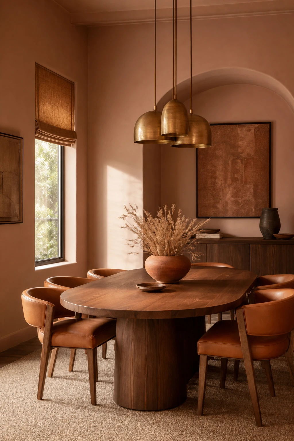
Pink and brown share a warmth that grey simply cannot match, and that shared undertone is what makes this pairing feel so settled rather than styled. What I love about bringing cognac leather into a dusty pink dining room is the way it reads as earthy and grounded without pulling the eye away from the pink. You get a room that feels layered and complete, the kind of space that looks like it came together naturally rather than by committee.
The Key Details
Sculptural walnut dining table
Cognac leather upholstered dining chairs
Caramel linen roman blind
Aged brass cluster pendant light
Terracotta ceramic centrepiece bowl
Pro TipIntroduce brown through a leather dining chair first, because the texture does as much work as the colour and the combination reads as considered from the moment you walk in.
AvoidReaching for a cool taupe when you meant warm brown breaks the shared undertone entirely and leaves the pink looking uncertain rather than anchored.
A Dusty Pink Door That Changes the Whole Feeling of Coming Home
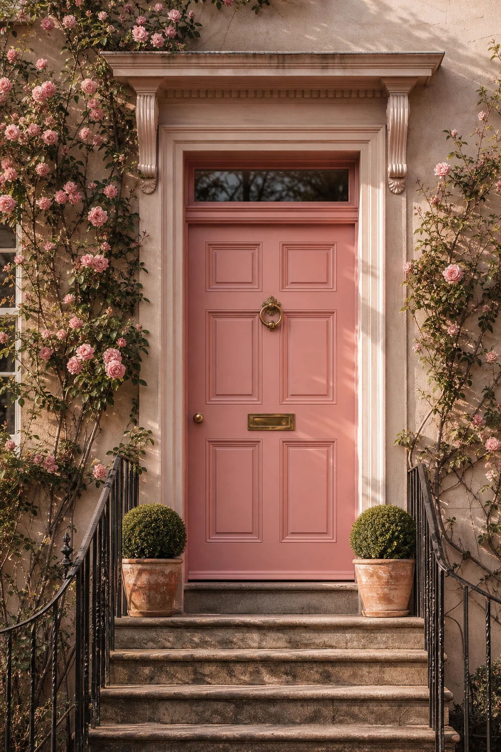
A front door does something no other surface in the house can: it sets the emotional tone before anyone steps inside. Dusty pink lands that welcome in a way white or grey simply cannot, because it reads as chosen rather than defaulted to. What I love about this shade on a panelled timber door is the way it holds warmth even on a flat grey afternoon, and paired with brass hardware and clipped box topiaries, you get a sense of care and intention from the pavement.
The Key Details
Panelled timber front door
Brass door knocker and letterplate
Overdoor pediment
Climbing roses on rendered facade
Clipped box topiaries in terracotta pots
Pro TipAlways use an exterior gloss formulation rated for direct weather exposure, because it locks in that dusty tone rather than letting UV slowly bleach it toward a washed out blush.
AvoidGoing too pale makes the door read as undercoated from the street, and the whole effect collapses into something that looks accidental rather than considered.
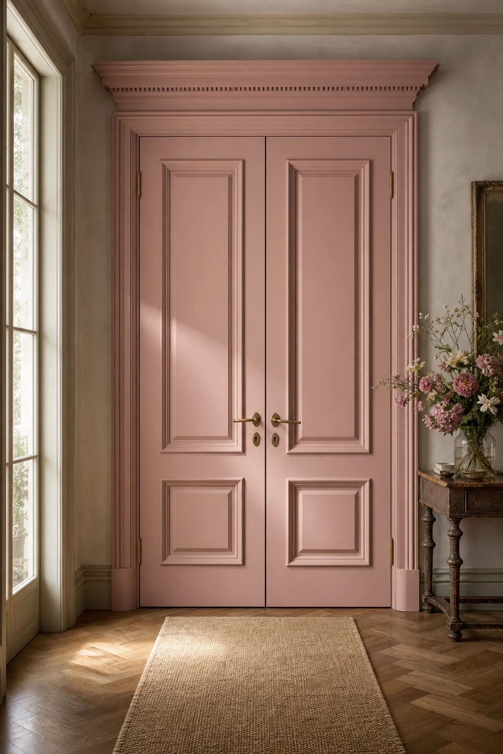
Vintage Pink Double Doors That Turn an Entrance Into a Proper Moment
Double doors painted in a dusty vintage pink do something a single door simply cannot: they make arrival feel like an occasion. What wins me over every time is the symmetry, two panels opening together carry a natural ceremony that stops you in your tracks. You notice how the soft, chalky pink sits against aged brass hardware and worn oak floors, each element quietly agreeing with the others. The whole entrance reads as a place that has always been beautiful.
The Key Details
Panelled double door moulding
Aged brass lever handles and escutcheons
Herringbone oak timber floor
Layered ornate architrave and cornice
Antique console table with cut flowers
Pro TipRun a piece of fine sandpaper very lightly along the raised moulding edges only, so the wood just whispers through the paint rather than shouting.
AvoidTaking the distressing across flat panels as well as edges makes the doors look tired and unloved rather than gracefully aged.
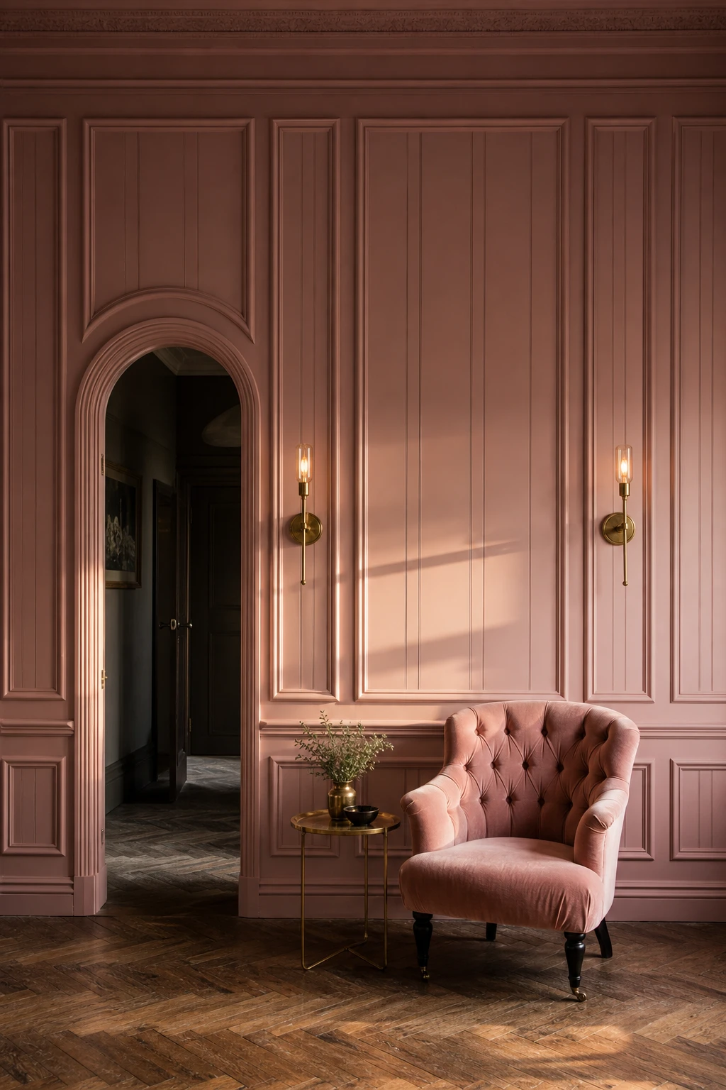
Sulking Room Pink Panelling and Why It Looks Best From Floor to Ceiling
Floor to ceiling panelling in Farrow and Ball Sulking Room Pink does something a flat paint job simply cannot: the mouldings catch the light and throw tiny shadows, so the whole wall becomes sculptural. What I love is that painting both the panels and the surrounding wall the exact same shade lets those shadow lines glow rather than shout. You get depth without the room feeling chopped up, and the colour wraps around you like a room within a room.
The Key Details
Floor to ceiling tongue and groove timber panelling
Deep shadow relief mouldings
Unlacquered brass wall sconces
Tufted velvet armchair in blush
Herringbone parquet oak floor
Pro TipPaint the panel face, the moulding edge, and the flat wall behind all in the same finish so the relief reads through shadow alone rather than colour contrast.
AvoidStopping the panelling at dado height splits the wall into two competing horizontal bands and can make even a tall room feel squat.
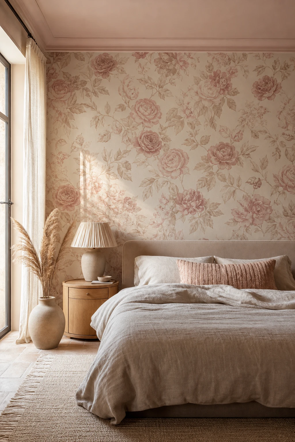
Beige and Rose Patterned Wallpaper That Feels Layered Without Feeling Busy
Beige and rose sitting in the same warm family is the quiet trick behind why this wallpaper feels rich rather than restless. What I love is that your eye reads the pattern without having to work hard, because the background and the motif never fight each other for attention. You get that layered, collected feeling while the room stays calm enough to sleep in.
The Key Details
Beige and blush botanical rose pattern wallpaper
Low upholstered bed with pale sand linen duvet
Rounded oiled oak nightstand
Gathered linen shade ceramic table lamp
Dried pampas stems in matte stoneware floor vase
Pro TipHang the patterned wallpaper on the wall directly behind the bed only, so it reads as a considered focal point rather than a room that has been wrapped in print.
AvoidPairing a rose botanical wallpaper with a geometric or floral rug in a different scale pulls the eye in two directions at once and strips the room of the calm you worked to build.
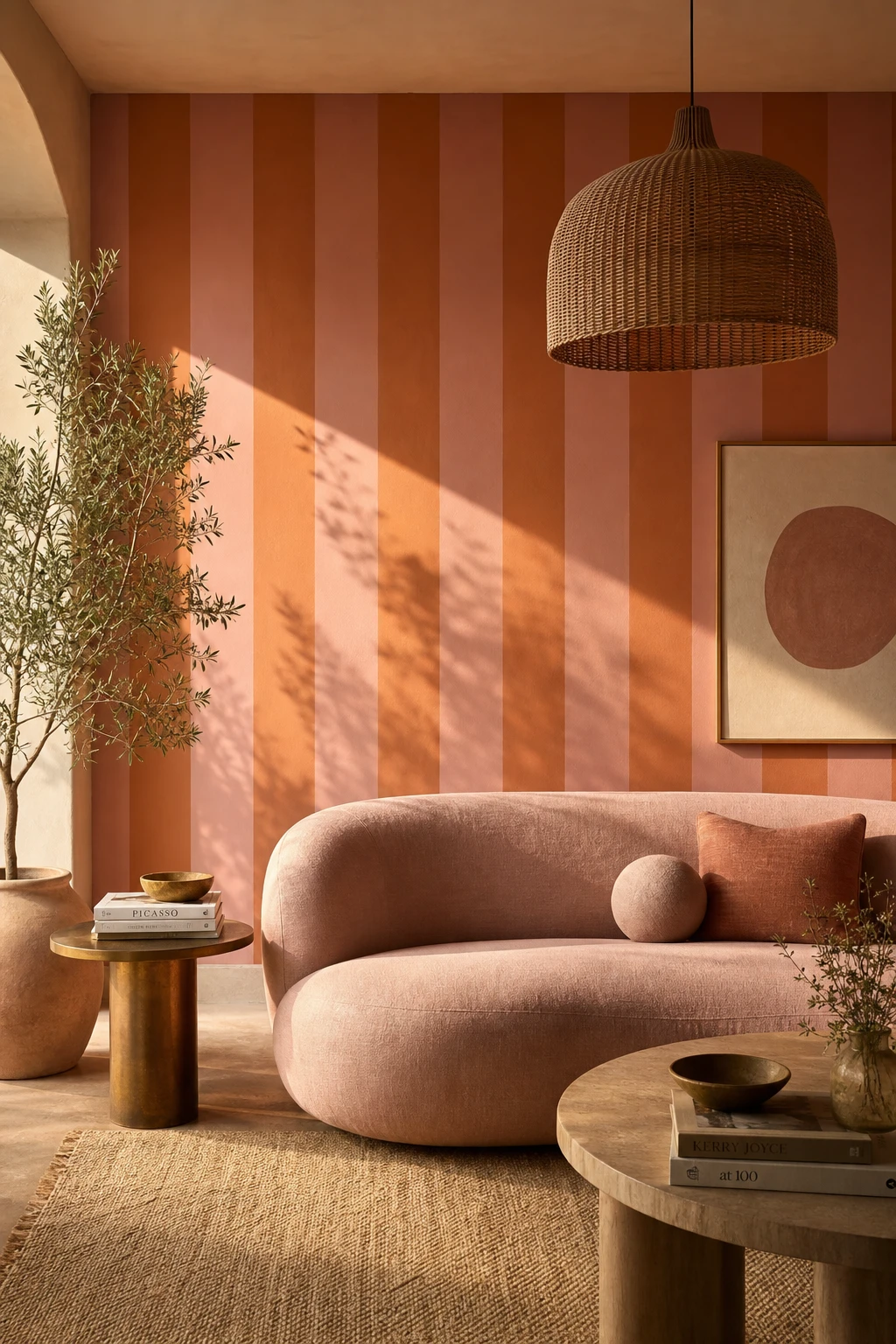
Orange and Pink Stripes That Make a Room Feel Bold Without Feeling Loud
Pink and orange sit so close on the colour wheel that stripes in equal widths feel intentional rather than chaotic, and that consistency is what wins me over every time. You get a rhythm the eye can follow, so the room reads as bold and considered rather than busy. I always check that the widths match exactly because that single decision is what separates a pattern that pulls a room together from one that just fights itself.
The Key Details
Equal width vertical stripe wall
Curved blush linen sofa
Rattan pendant light
Raw brass side table
Woven jute rug
Pro TipBring the stripe in through a Roman blind or a rug first, so you can live with the pairing before committing it to four walls.
AvoidMixing wide and narrow stripes in the same scheme breaks the visual rhythm and makes the whole thing look like an accident rather than a choice.
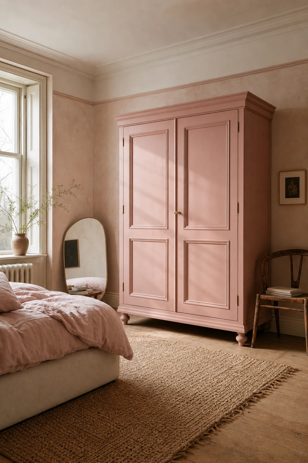
A Pink Wooden Wardrobe That Becomes the Star of the Bedroom Without Trying
Painting a freestanding wardrobe in a dusty pink and leaving the walls alone is one of my favourite bedroom moves. You get an instant focal point without the commitment of a full repaint, and the contrast between the soft pink and a neutral wall colour makes the piece feel almost architectural. What wins me over every time is how a single painted wardrobe anchors the whole room and gives it a collected, considered feel.
The Key Details
Panelled freestanding wooden wardrobe
Linen upholstered low bed frame
Oval leaning bedside mirror
Woven jute rug
Sash window with bare plaster surround
Pro TipLightly sand the wood grain with fine grit paper before you open the paint tin, and you will notice the colour sits flat and even rather than catching on every ridge.
AvoidSkipping a primer coat leaves the topcoat with nowhere to grip, so the colour comes out patchy and you end up doing three times the work to fix it.
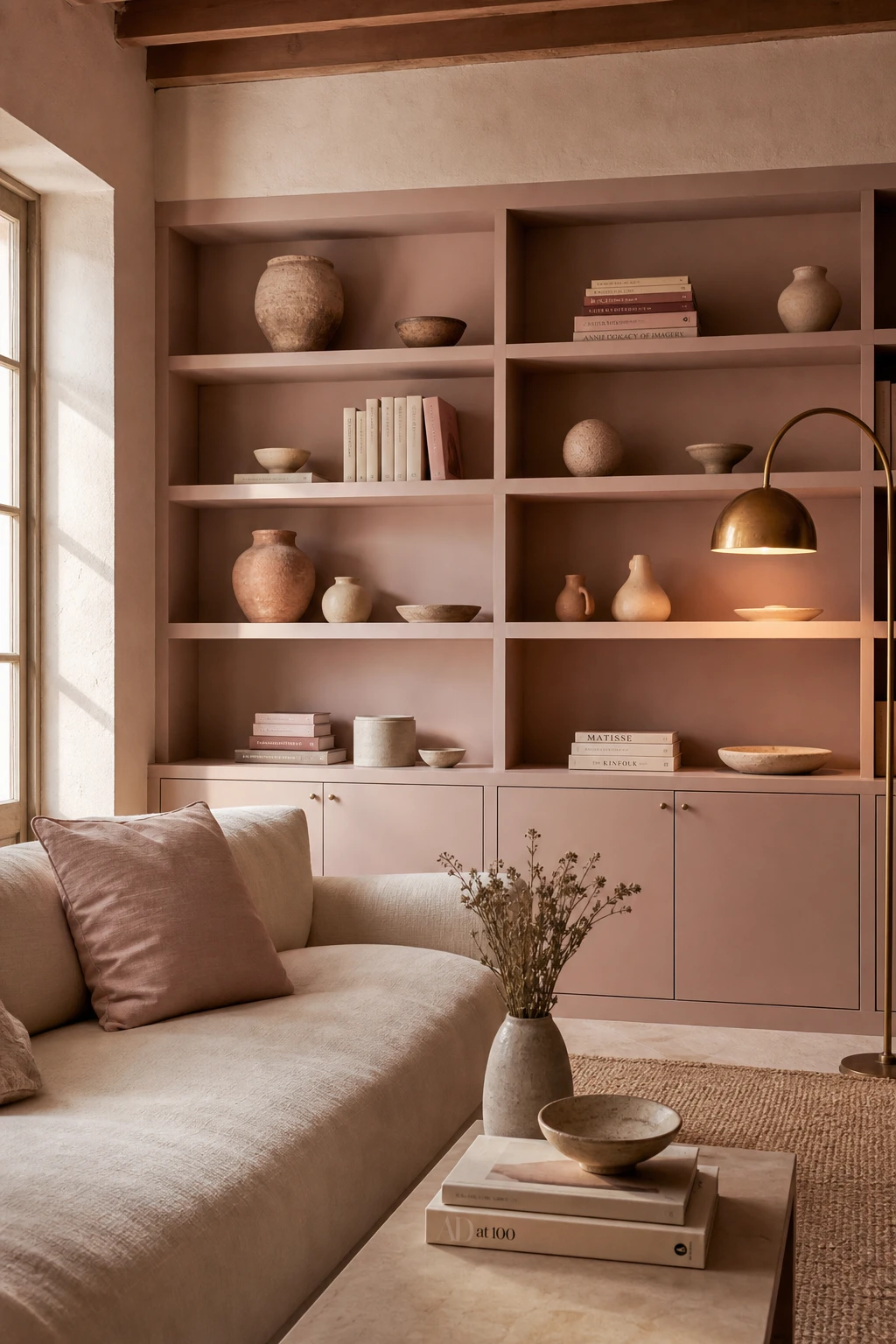
Mauve Built In Shelving That Makes Storage the Most Beautiful Thing in the Room
Mauve built ins stop a room in its tracks, and that is exactly what I want storage to do. Painting the shelves and their back panels in a deep, dusty mauve turns what could be plain alcoves into something you actually notice and admire. You get a sense of depth and intention that white shelves simply cannot give, and every object sitting in front of that colour looks curated rather than just stored.
The Key Details
Floor to ceiling built in shelving with painted back panels
Low linen sofa in pale blush
Terracotta and cream ceramic vessels
Cloth bound books in dusty rose and ivory
Arched brass floor lamp
Pro TipTake the back panel one shade deeper than the shelf frame itself, so objects sit against a richer backdrop and the whole unit looks like it has real dimension.
AvoidLeaving the back panels bare or white makes the unit read as unfinished, and no amount of careful styling will rescue it.
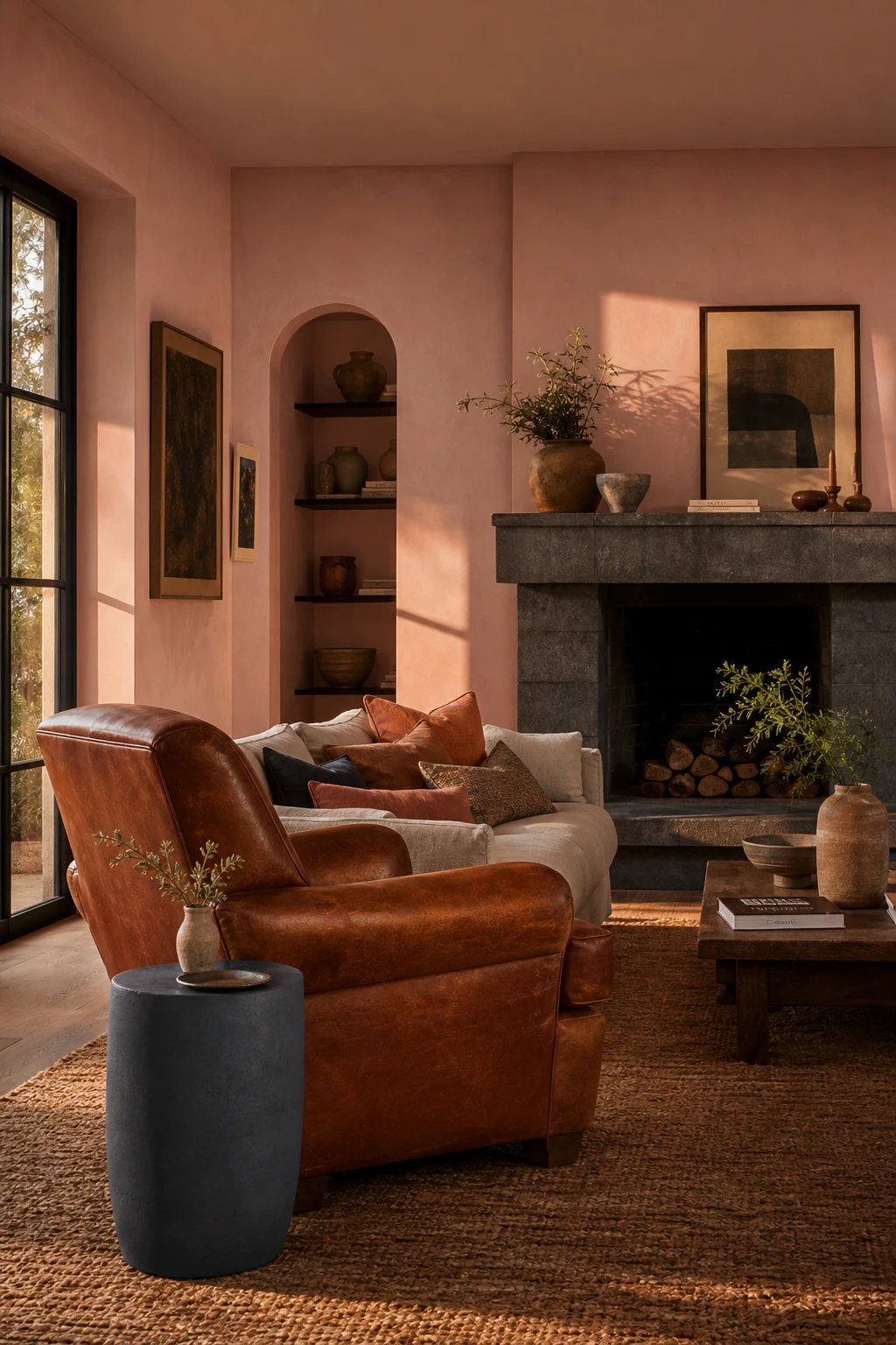
Cinnamon and Slate in a Living Room and What This Earthy Duo Does for Pink
Cinnamon and slate are the two anchors that stop a pink room from floating away into softness. What I love about this pairing is how the warmth of cinnamon and the cool weight of slate pull in opposite directions, and the pink sits right in the tension between them. You get a room that feels resolved rather than pretty by accident, and that contrast is exactly what gives a dusty pink wall something solid to lean against.
The Key Details
Cinnamon leather armchair
Slate ceramic side table
Honed slate fireplace surround
Woven jute area rug
Terracotta and charcoal cushion cluster
Pro TipBring cinnamon in through ceramics and small leather pieces first so you can shift the warmth up or down without committing to a large sofa or armchair you cannot easily change.
AvoidLayering in a third or fourth accent colour alongside cinnamon and slate breaks the story the room is trying to tell, and the eye stops knowing where to settle.
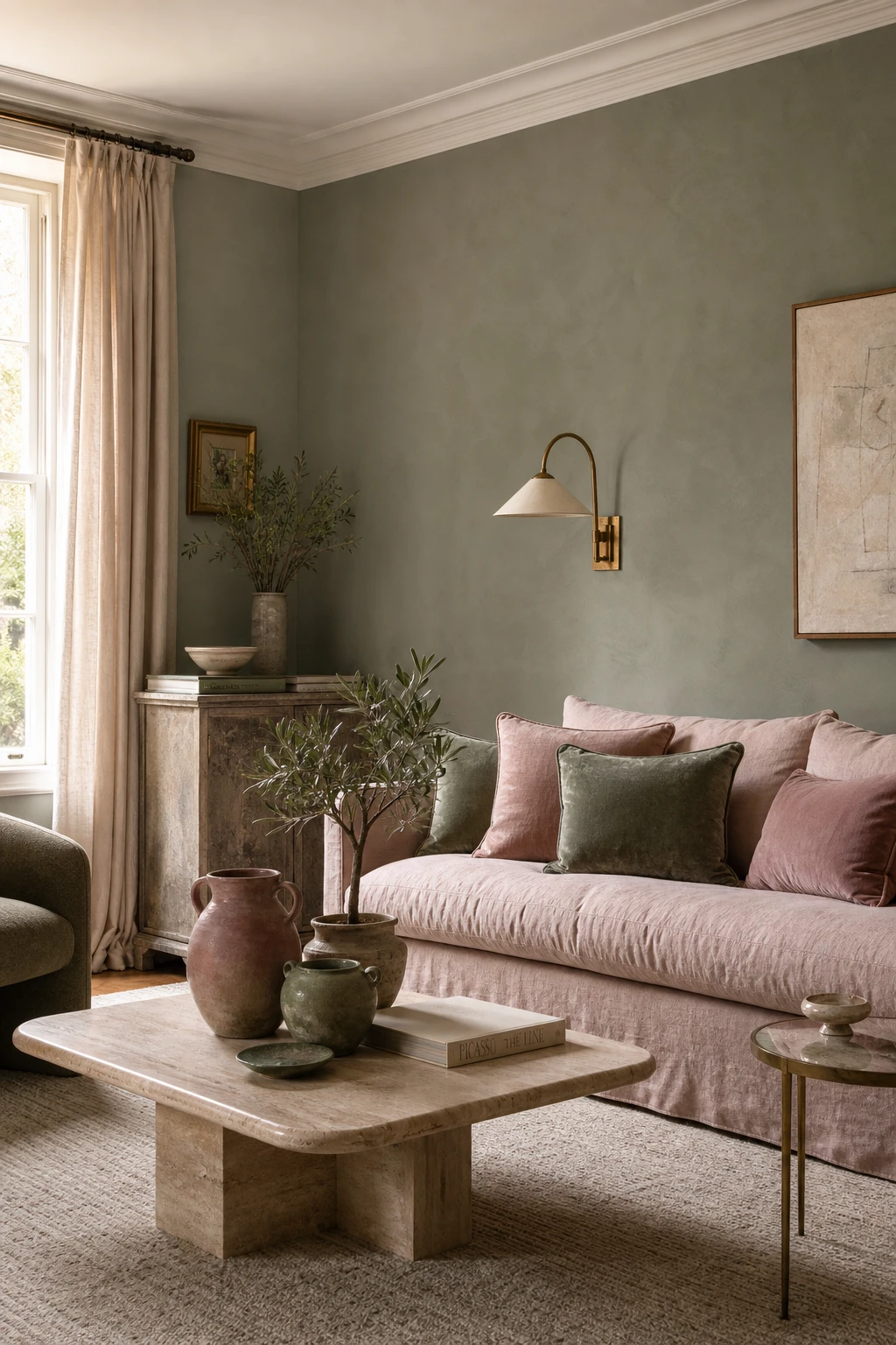
Pink and Green Together and the Surprisingly Simple Rule That Makes It Work
Pink and green feel natural together because they sit opposite each other on the colour wheel, yet the moment you pull both into a muted, dusty register they stop competing and start breathing. What I love about this pairing is how the sage reads almost like a neutral, so you get the freshness of green without anything shouting. Both colours carry the same quiet weight, and that shared softness is the thing I always check before signing off on a palette like this.
The Key Details
Blush linen sofa
Travertine coffee table
Hand thrown ceramic vessels
Sage and dusty pink velvet cushions
Sheer linen curtains
Pro TipBring in sage through a cluster of houseplants before you commit to any painted surface, because living green shifts subtly with the light and lets you test the pairing at almost zero cost.
AvoidReaching for a bright grass green instead of a muted sage pulls the eye so hard that the dusty pink beside it looks washed out and the whole room feels unsettled.
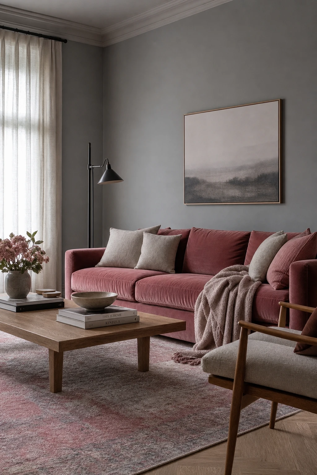
Dusty Rose and Gray Is the Combination That Always Feels Effortlessly Put Together
Dusty rose and gray is a pairing I reach for when a room needs to feel polished without feeling cold. The gray pulls back the sweetness of the pink so you get something that reads as considered rather than pretty for the sake of it. What wins me over every time is how the two sit in balance: neither one shouts, and that quiet tension is exactly what makes the room feel effortless.
The Key Details
Dusty rose velvet sofa
Blackened steel floor lamp
Low oak coffee table
Faded wool rug in rose and pewter
Sheer linen curtains
Pro TipReach for a gray with a warm or greige undertone rather than a blue one, so the two colours share enough warmth to feel like they belong together.
AvoidTipping the balance too far toward gray leaves the pink so buried that the room loses the softness and character you chose it for in the first place.
Alan launched Edward George London in 2017. Since completing his masters in Town & Regional Planning (MPlan) he has combined the skills he learned at the University of Sheffield with his passion for design, to help create a foundation for those looking to create a beautiful home.