I’ve always thought a white home office has a kind of magic that no other colour quite matches. There’s something about the calm it creates that makes sitting down to work feel like a treat rather than a chore. In this piece I’m sharing looks that range from high gloss desks and built in shelves to arched French doors and warm brass accents, so you can see the whole world of what’s possible. Every idea here is one you can genuinely steal for your own space.
Why a Modern Approach Makes a White Office Feel Effortlessly Sharp
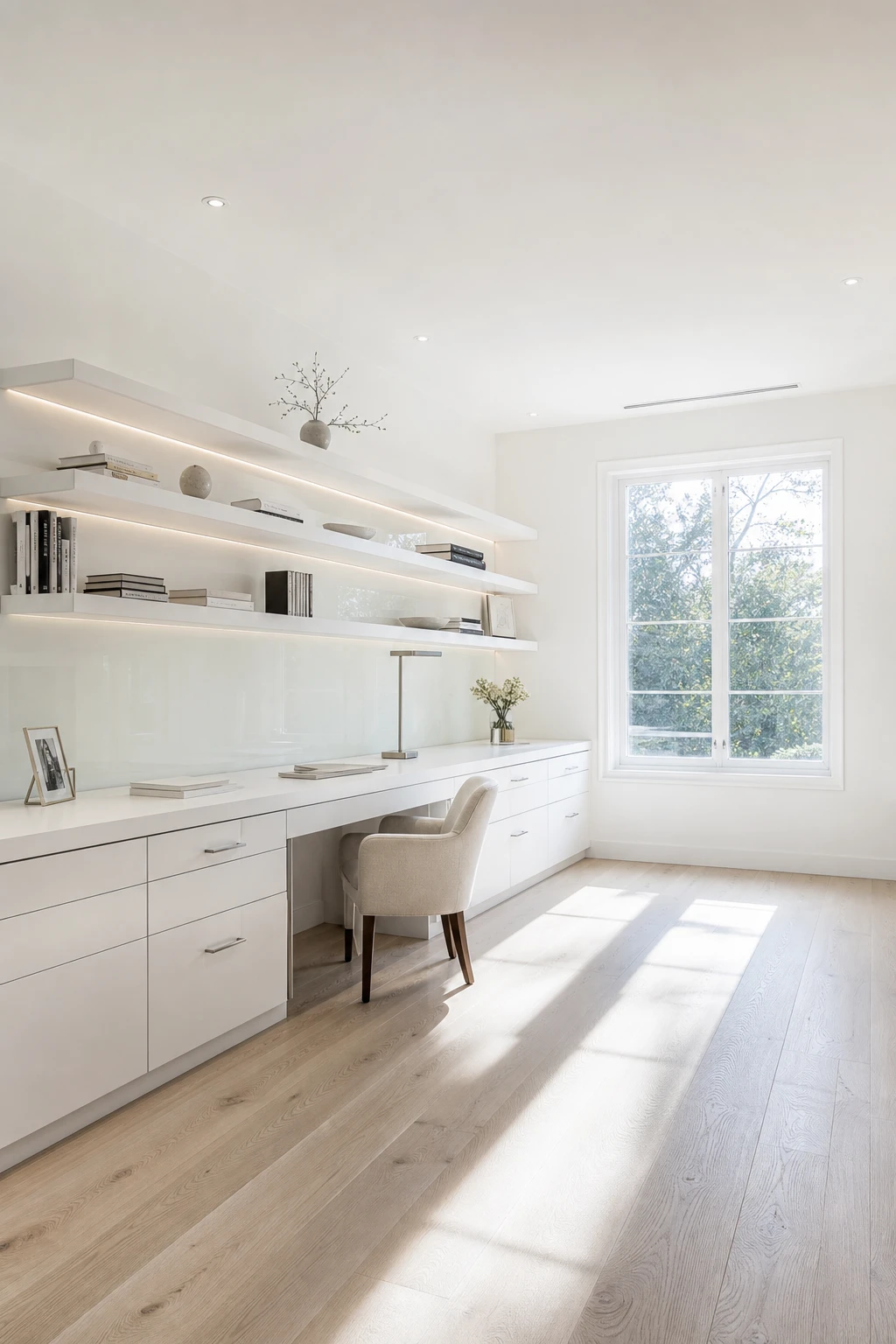
Editing a room down to its cleanest lines is one of my favourite moves in a white space, because white then does all the work for you. You get this calm, almost gallery like quality where every surface reads as intentional. What wins me over every time is how removing the clutter lets the architecture breathe, and you will notice the room feels bigger and sharper without a single extra object in it.
The Key Details
Wall to wall built in desk
Floating open shelving
Low profile linen task chair
Large casement window
Polished white oak flooring
Pro TipSpecify handleless cabinetry so the cabinet fronts read as one unbroken plane and nothing interrupts the clean sweep of white across the wall.
AvoidLayering in too many small accessories fragments that calm and the whole room loses the crisp, edited quality you worked so hard to build.
The Classic Details That Give a White Office Its Sense of Quiet Luxury
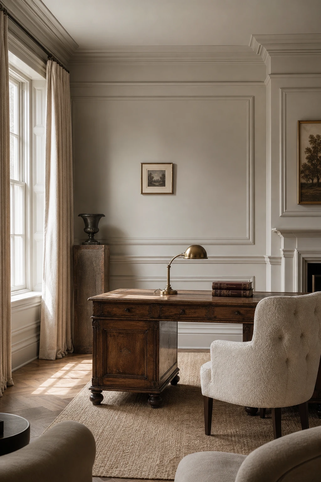
Mouldings from skirting to picture rail are the architectural move that transforms a plain white room into something that feels genuinely considered. The eye travels upward and the ceiling feels miles away, giving you real weight and height without a single extra piece of furniture. What I love is pairing that structure with warm materials: aged oak, brushed brass, linen, boucle. Each texture catches light differently, so the room reads as rich and layered rather than flat.
The Key Details
Stacked picture rail and deep skirting mouldings
Antique oak writing desk
Brass desk lamp
Floor length linen drapes
Tufted ivory boucle upholstered chair
Pro TipRun your panelling all the way up to picture rail height rather than dado height, and you will immediately feel the ceiling lift.
AvoidConcentrating ornate detail on one wall and leaving the others bare creates an unfinished tension that no amount of furniture can fix.
How French Provincial Style Brings Warmth Into a White Home Office
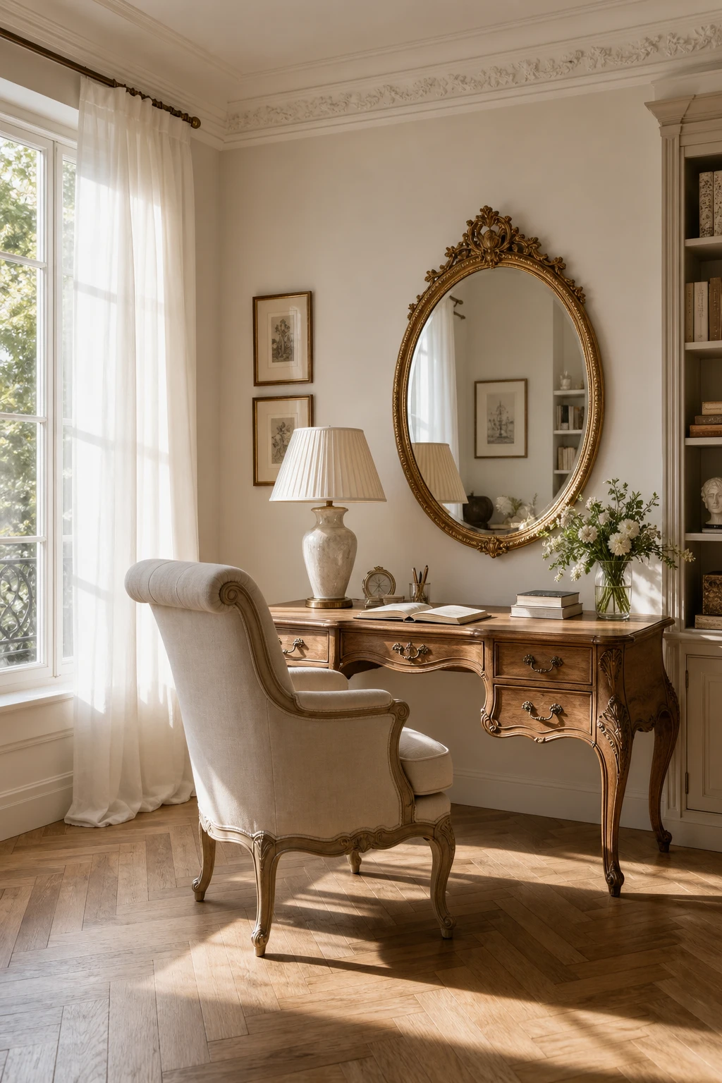
French Provincial charm does something in a white room that straight lines simply cannot: the carved curves soften every wall they share a space with. A cabriole leg desk or a rolled back linen chair breaks the flatness that plain white can sometimes produce, and you get real warmth without reaching for a single dark colour. I always check how the soft ivory and timber tones sit together because when that relationship is right, the room feels polished but never precious.
The Key Details
Carved timber writing desk with cabriole legs
Linen upholstered armchair with rolled back
Ornate gilt oval mirror
Herringbone oak parquet floor
Pleated ivory ceramic table lamp
Pro TipPair a carved timber desk with a simple linen upholstered chair so the ornate woodwork stays as the star and the seating keeps the room feeling easy to sit in.
AvoidLayering too many carved and gilded pieces in one room pushes the style from charming into fussy, and the sense of calm that makes French Provincial so appealing disappears completely.
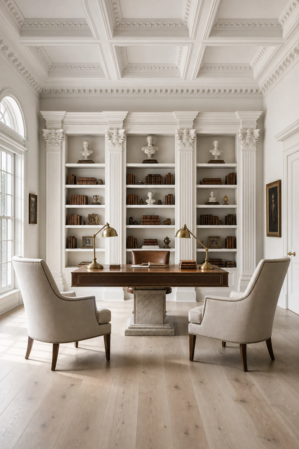
Neoclassical Symmetry and Why It Makes a White Office Feel So Composed
Neoclassical symmetry is the thing I always check when a white room feels restless but nobody can say why. Matching pairs and a strong centred focal point give the eye a clear path to follow, and you get that quiet, considered calm without adding a single extra colour. What wins me over about this arrangement is how the architecture does all the heavy lifting, so the white palette reads as deliberate rather than bare.
The Key Details
Carved pilaster built in bookcase
Matching antique brass desk lamps
Coffered ceiling with dentil moulding
Paired upholstered occasional chairs
Wide plank white oak floor
Pro TipFlank a central window with identical shelving units at the same height and depth, and the window becomes an instant focal point that anchors the whole room.
AvoidPushing every element into a strict mirror image leaves no room for the small human touches that make symmetry feel serene rather than like a showroom no one lives in.
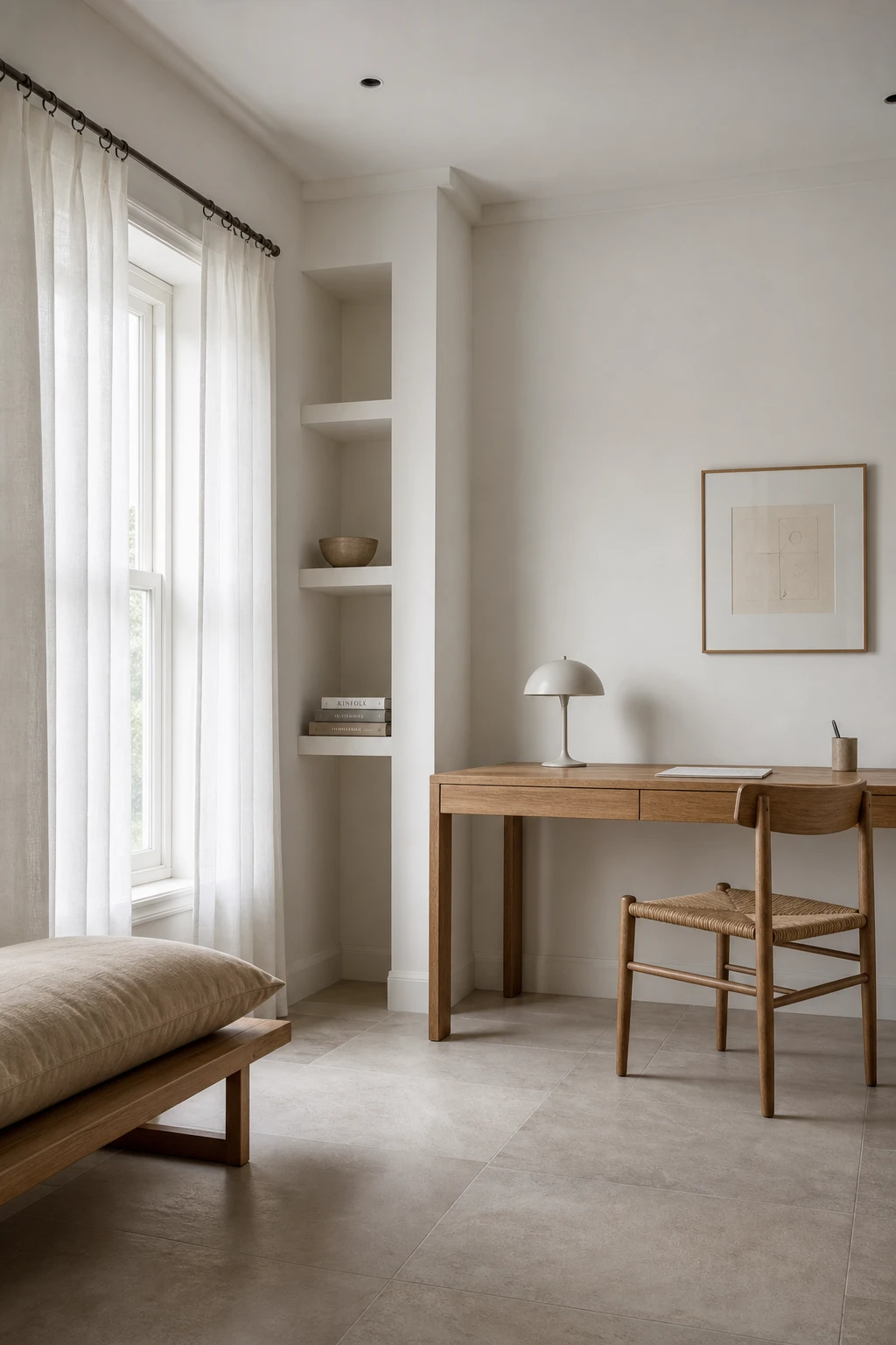
The Minimalist White Office Look and the One Thing That Stops It Feeling Cold
Pared back minimalism is where a single quiet texture does more work than a room full of objects, and here that texture is the natural woven rug. You will notice how it softens the whole floor plane without asking for any attention at all. That one warm layer is enough to pull the desk, the shelf and the window into one settled composition, and I find that stripping it out tips the room from calm into cold almost instantly.
The Key Details
Slender floating oak desk
Oversized natural linen bench cushion
Low profile matte white bookshelf
Honed stone floor tiles
Unlined cotton voile window panels
Pro TipChoose a rug that runs at least 30cm beyond each side of the desk so the chair legs always land on it, giving the whole desk zone a grounded, deliberate feel.
AvoidRemoving every soft layer in pursuit of pure white simplicity leaves the desk floating on hard floor with nothing to hold it in place, and the room reads as unfinished rather than refined.
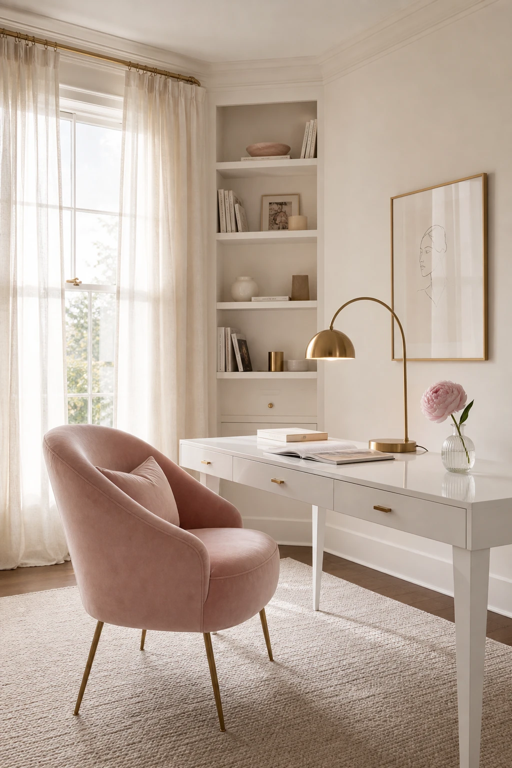
A Feminine White Office That Feels Polished Rather Than Overly Pretty
Restraint is what separates a feminine office that feels polished from one that tips into fussy. Pick just two soft touches, a blush velvet chair and a single peony stem, and everything else stays white and crisp, so you notice the beauty without the clutter. What I love most is how the brass legs and arched lamp do quiet work, adding warmth without colour. You get a room that reads as considered and calm.
The Key Details
Blush velvet occasional chair with brass legs
Fluted glass bud vase with single stem peony
Sheer ivory linen curtains
Arched brass task lamp
Pale wool loop rug
Pro TipChoose exactly two feminine accents, one fabric and one bloom, then hold the line and let white carry everything else.
AvoidLayering blush cushions, dusty rose shelves, and pink stationery together dilutes the white anchor and makes the room feel sweet rather than sharp.
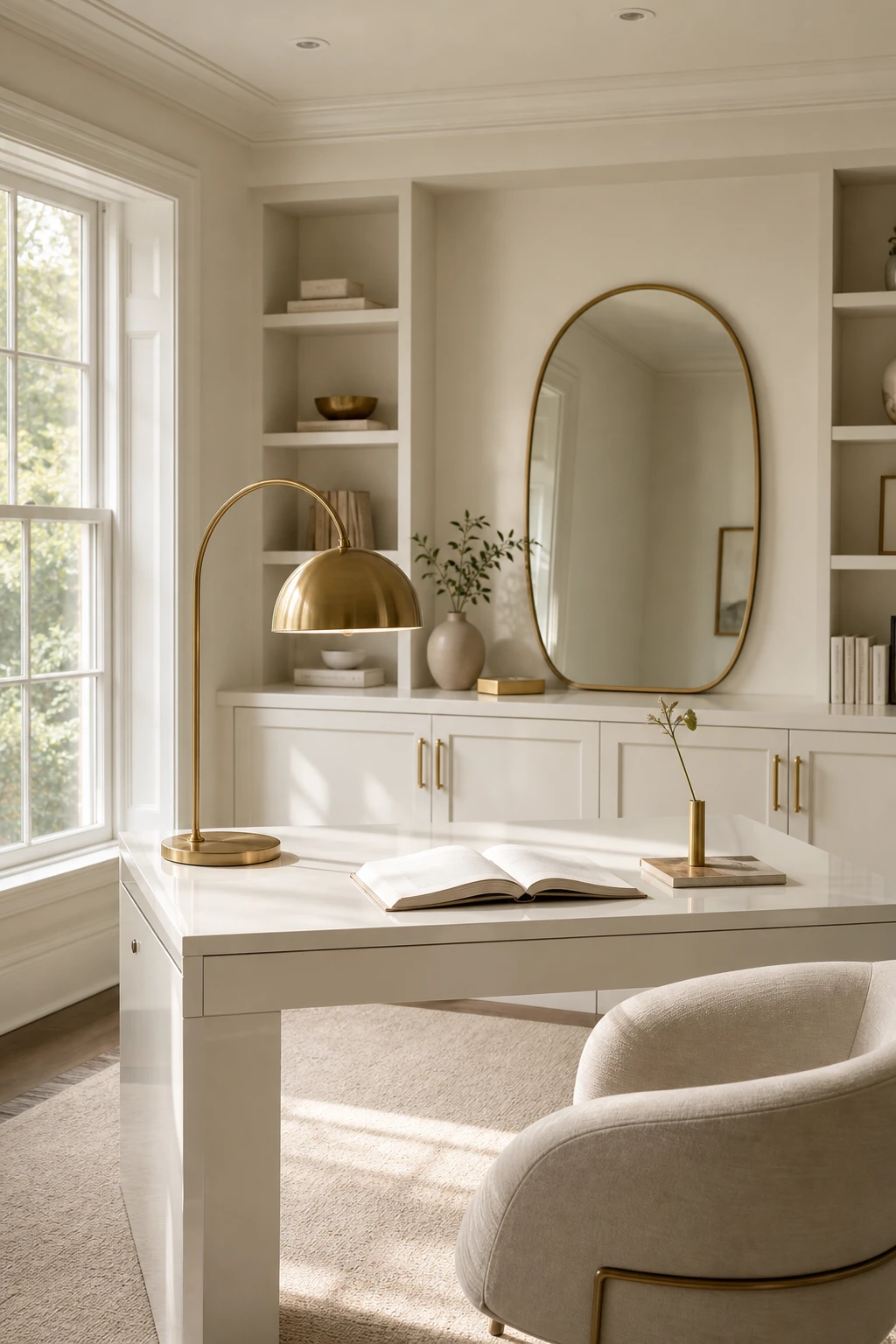
Gold and White Home Office Ideas That Glow Without Going Over the Top
Gold catches the light in a way that chrome simply never does, and what I love here is how restraint does all the heavy lifting. Limit yourself to three or four pieces and you get a room that glows rather than glitters. You will notice the brass lamp, the pulls, and the mirror all sit at roughly the same height, so your eye reads them as one warm constellation rather than scattered afterthoughts.
The Key Details
Burnished brass arc desk lamp
Gilded oval mirror
Brushed gold cabinet pulls
White lacquered writing desk
Curved linen desk chair
Pro TipCluster your gold pieces along a single horizontal band at eye level so the shimmer lands as one composed moment rather than dots of distraction around the room.
AvoidSlipping one chrome piece into a warm gold scheme cools the whole palette down and leaves both finishes looking dull and uncertain.
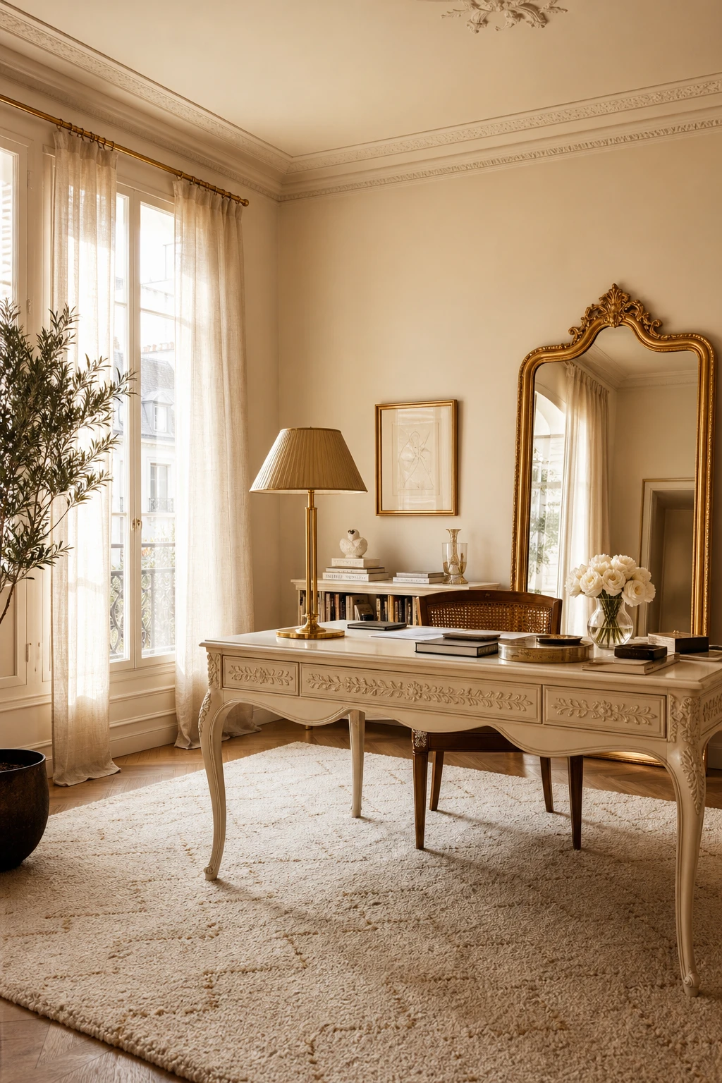
Cream and Gold Together and Why This Pairing Feels Richer Than Bright White
Cream and gold is a pairing that wins me over every single time, and the reason is simple: cool bright white reflects light in a way that can feel almost clinical next to warm metal tones, while cream pulls everything into the same golden family. You get a desk, a lamp, a mirror frame, all suddenly singing from the same hymn sheet. The warmth wraps the room rather than bouncing off it.
The Key Details
Fluted gold desk lamp
Carved cream lacquer writing desk
Gilt framed leaning mirror
Hand knotted ivory wool rug
Tall linen draped windows
Pro TipHold a paint swatch directly against your gold hardware in both daylight and lamplight before you buy a single tin, because the shift between those two light conditions is where cream shades either shine or disappoint.
AvoidChoosing a cream with a strong yellow undertone next to aged brass makes both look dingy, as the competing warm tones cancel each other out rather than lifting the room.
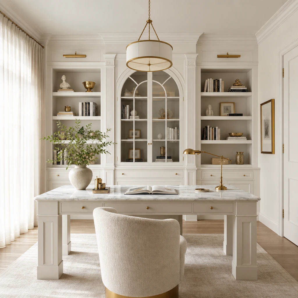
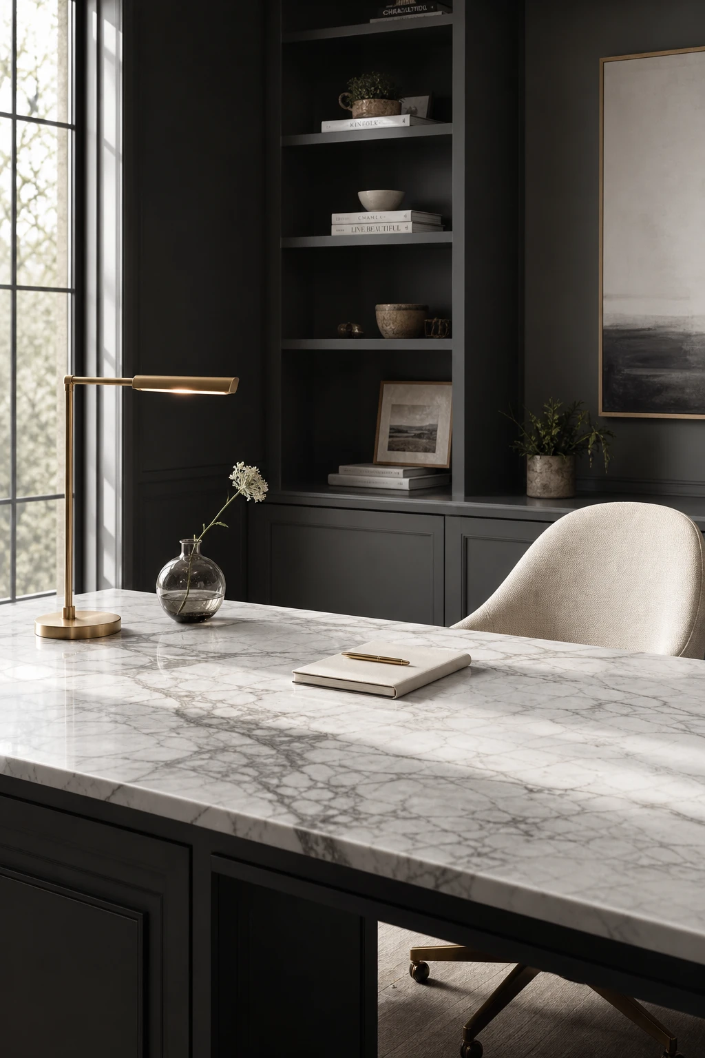
Marble in a White Office and How to Use It So It Looks Considered Not Cold
One marble surface in a white office stops the room short in the best way. What I love about keeping it singular is that the veining reads as art, something your eye travels across rather than a texture that tiles itself into wallpaper. You get all the luxury marble promises without the chill a stone covered room can carry, and the white around it gives the slab room to breathe and stay the hero it deserves to be.
The Key Details
Veined marble desk surface
Built in open shelving
Linen upholstered swivel chair
Brushed brass task lamp
Tall single pane window
Pro TipChoose a marble with warm grey or taupe veining rather than stark graphite black, so the surface feels grounded and inviting rather than clinical against white surroundings.
AvoidPairing white marble with bright white walls strips away all contrast and the veining loses its drama, leaving the room feeling flat rather than refined.
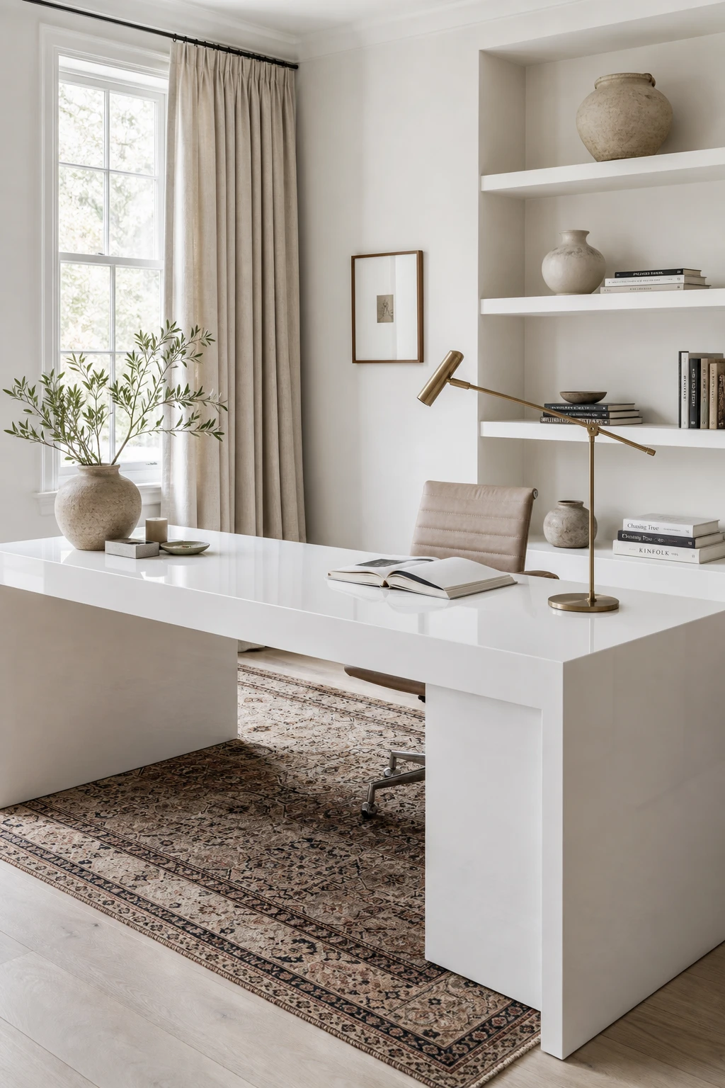
A High Gloss White Desk and the Styling Trick That Keeps It Looking Elegant
High gloss lacquer on a white desk does something almost theatrical with light, bouncing it around the room in a way that feels alive rather than flat. What I love most is how the finish earns its drama without effort. But gloss needs a partner to calm it down, and that is where the matte linen curtains and a woven rug do all the quiet work. You get brilliance and softness in the same frame, and the room feels refined rather than harsh.
The Key Details
High gloss lacquered white desk
Matte linen floor length curtains
Slender brass arc task lamp
Open white shelving with ceramic vessels
Lime washed oak flooring with woven rug
Pro TipHang a matte linen lampshade on a slender arc lamp directly above the desk so the warmth of the shade pulls your eye upward and gives the gloss surface a gentle, flattering glow rather than a cold glare.
AvoidPairing a high gloss desk with a lacquered chair, shiny metallics on every surface, and glossy wall paint strips the room of all depth and leaves everything competing for the same reflection.
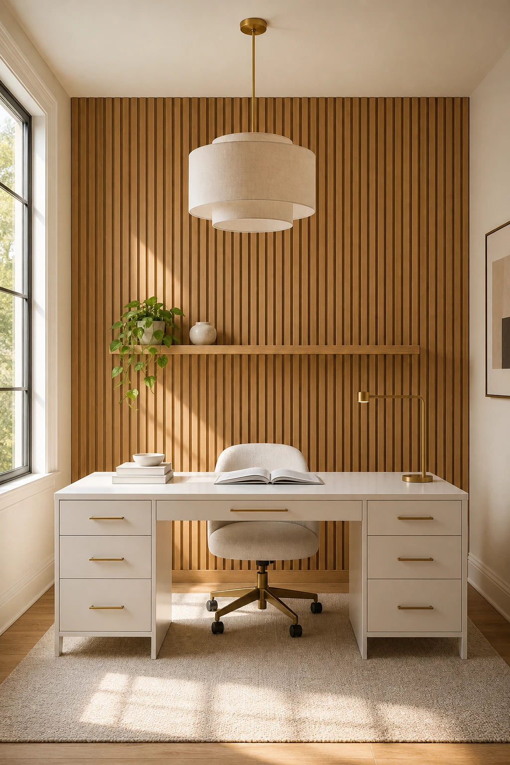
A Wood Slat Wall Behind the Desk and Why It Makes a White Office Feel So Complete
A wood slat wall behind the desk solves the one thing a white palette alone cannot fix: that finished but flat feeling you sometimes get when everything is clean and correct but the room still lacks presence. The vertical rhythm of the slats draws the eye upward and gives the wall a quiet life without competing with anything else in the space. I love how the grain reads as warmth rather than weight, so you get genuine depth and texture while the room stays unmistakably light.
The Key Details
Vertical oak slat wall panel
White lacquered desk
Bouclé task chair
Linen shade pendant lamp
Floating oak shelf with ceramic accent
Pro TipPaint the slats in a warm white that sits just one tone deeper than your walls, and the panel will feel like it belongs rather than like something pinned on.
AvoidChoosing slats in a deep walnut or espresso stain pulls the feature so far from the surrounding white that it becomes a separate room within a room, which breaks the calm the whole scheme is built on.
White Desk With Gold Legs and the Small Swap That Makes It Look Far More Expensive
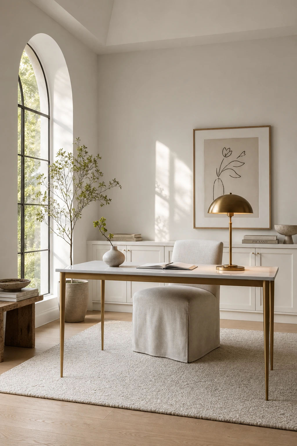
A gold legged desk is one of my favourite upgrades in a white office because the slender legs let you see the floor beneath, and that open negative space stops the room feeling cluttered. What I love most is how the warm metal pulls just enough colour into an all white palette without breaking the calm. You get a piece that looks considered and costly, simply by swapping the legs.
The Key Details
Slender tapered brass desk legs
Linen upholstered desk chair
Brushed gold table lamp
Ivory woven wool rug
Tall arched window
Pro TipChoose tapered rather than straight sided gold legs, as the narrowing silhouette keeps the desk looking light and refined from every angle.
AvoidPairing chunky gold legs with a very thick desk top creates a heavy, blocky shape that works against the elegant lift you are trying to achieve.
A Double Desk Setup That Looks Intentional Rather Than Just Practical
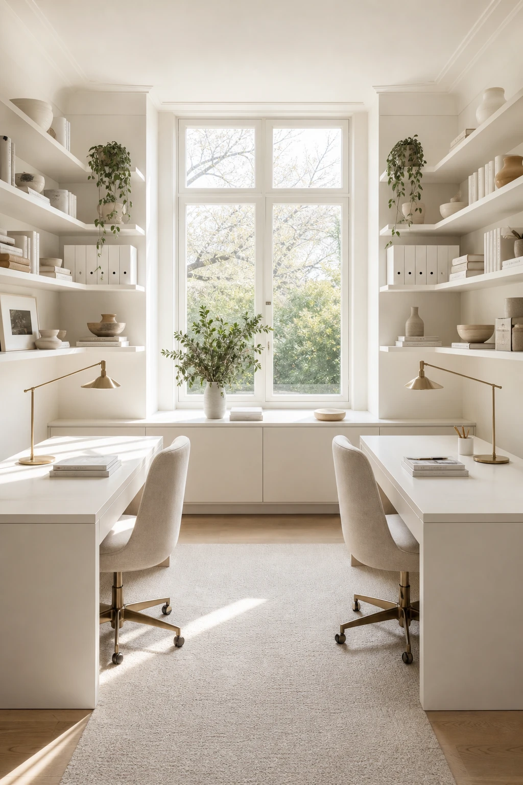
Two desks side by side can so easily look like a compromise, and what wins me over here is that they read as a single considered piece rather than two separate purchases pushed together. The shared shelf running above both surfaces is the thing I always reach for in a double setup: you get a visual bridge that locks the whole arrangement into one composed unit. Watch how the white lacquer finish carries across both desks and the floating credenza below the window, so every element belongs to the same conversation.
The Key Details
Paired white lacquer desks
Slender brass task lamps
Spanning open wall shelving
Pale oak timber flooring
Floating white credenza below window
Pro TipRun one continuous shelf across the full width above both desks, fixed at the same height, so the eye reads the whole wall as a single designed moment.
AvoidPushing two desks together without a unifying element above or between them leaves the arrangement looking like a makeshift solution, and no amount of styling on the surface will fix it.
A French Style Desk With a Hutch and How to Style the Shelves Above Beautifully
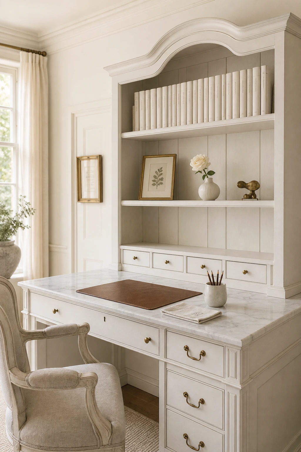
The hutch shelves are the real star here, and what I love is how they pull the eye upward, making the desk feel like a considered piece of furniture rather than just a work surface. Style them with intention and you get that relaxed editorial quality where nothing looks placed but everything looks right. I always group objects in threes or fives, mixing a tall vase against a shorter stack of books, and watch how the desk below suddenly feels anchored and complete.
The Key Details
French style hutch desk with painted oak millwork
Open display shelves above the desk
Aged brass cabinet hardware
Marble desktop surface
Tall single window with natural morning light
Pro TipLean a small framed print or unframed sketch against the back of one hutch shelf rather than hanging anything, so the display stays easy to change with the seasons.
AvoidFilling every shelf from edge to edge removes the breathing room that gives a hutch its elegance, and the whole thing reads as storage rather than a styled moment.
Built In Shelves and the Painting Trick That Makes Them Look Like They Have Always Been There
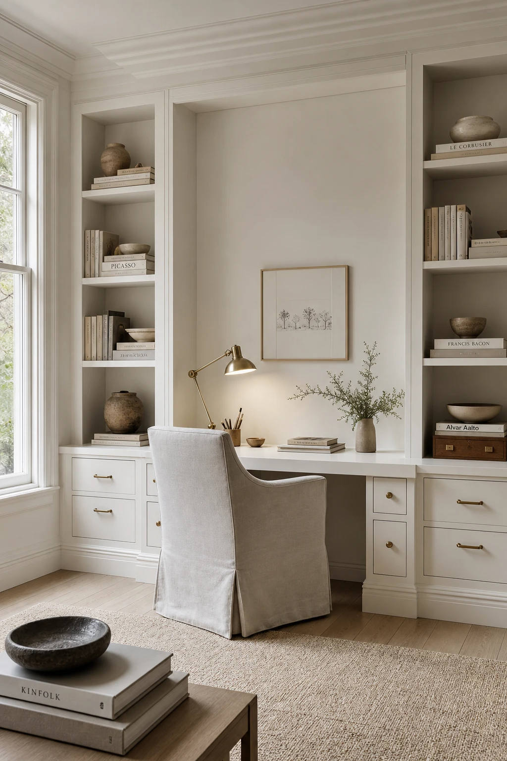
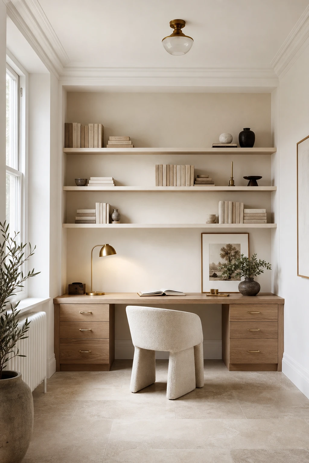
Painting built ins the exact same tone as your walls is one of my favourite tricks for making joinery feel like it grew with the house. You get that seamless, architectural quality where the eye reads the whole wall as one calm surface rather than spotting the shelves as furniture that was carried in. What I love most is how the room suddenly feels quieter and more considered, even before a single book goes on display.
The Key Details
Floor to ceiling painted oak joinery
Integrated desk alcove
Brass adjustable desk lamp
Linen upholstered task chair
Tall sash window
Pro TipPaint the back panel of each shelf one shade deeper than the face so objects sit against a gentle shadow and the whole unit gains depth without losing that built in calm.
AvoidLeaving built ins as bare or stained wood in an otherwise all white room pulls focus straight to the joinery and makes it read as an afterthought rather than part of the architecture.
How to Style Bookshelves in a White Office So They Look Elegant Every Day
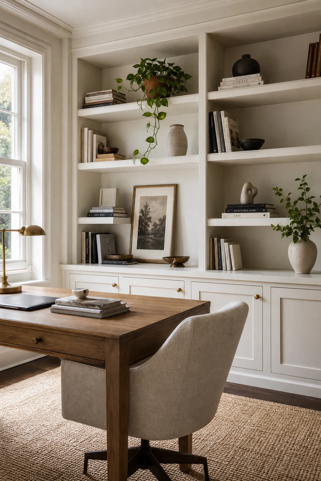
Bookshelves become a feature the moment you stop treating them as pure storage, and that shift is simpler than most people expect. What I love here is the rhythm: a vase, a small leaning print, a trailing plant, all breaking the run of spines so your eye gets somewhere to rest between the books. You will notice how the terracotta pot against white shelving adds just enough warmth without pulling focus from the desk below.
The Key Details
Floor to ceiling built in timber shelving
Ceramic vase and sculptural accent objects
Trailing pothos plant in terracotta pot
Leaning framed art print on shelf back panel
Solid oak writing desk with aged brass hardware
Pro TipTurn a handful of books spine in so only the pale page edges show, and the whole shelf suddenly feels calmer and more considered.
AvoidFilling every centimetre of shelf space leaves objects with nowhere to breathe, and the whole thing reads as clutter rather than a curated display.
Corner Shelving Ideas That Turn a Dead Spot Into the Prettiest Part of the Office
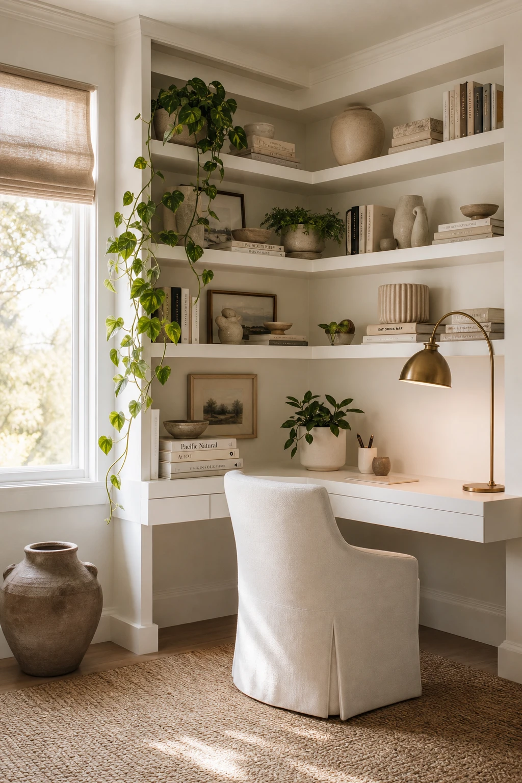
Corners are the one spot most people walk straight past, and that is exactly why I love treating them as a focal point rather than a gap to fill. Running shelves floor to ceiling here gives you a sweep of storage that draws the eye up and makes the whole room feel taller. You get the practical win of extra space and the visual win of a wall that looks deliberate rather than forgotten, which in a white office is always worth the effort.
The Key Details
Floor to ceiling built in corner shelves
Brass arc task lamp
Floating corner desk
Matte ceramic vessels and stacked books
Woven jute area rug
Pro TipRun each shelf all the way into the corner join so the two sides meet cleanly, closing off any gap that would otherwise collect dust and break the line.
AvoidStopping at a single shelf height leaves all that vertical space above it empty, which makes the corner look more neglected than it did before you started.
Closed Storage in a White Office and Why Hiding Things Is Actually a Design Choice
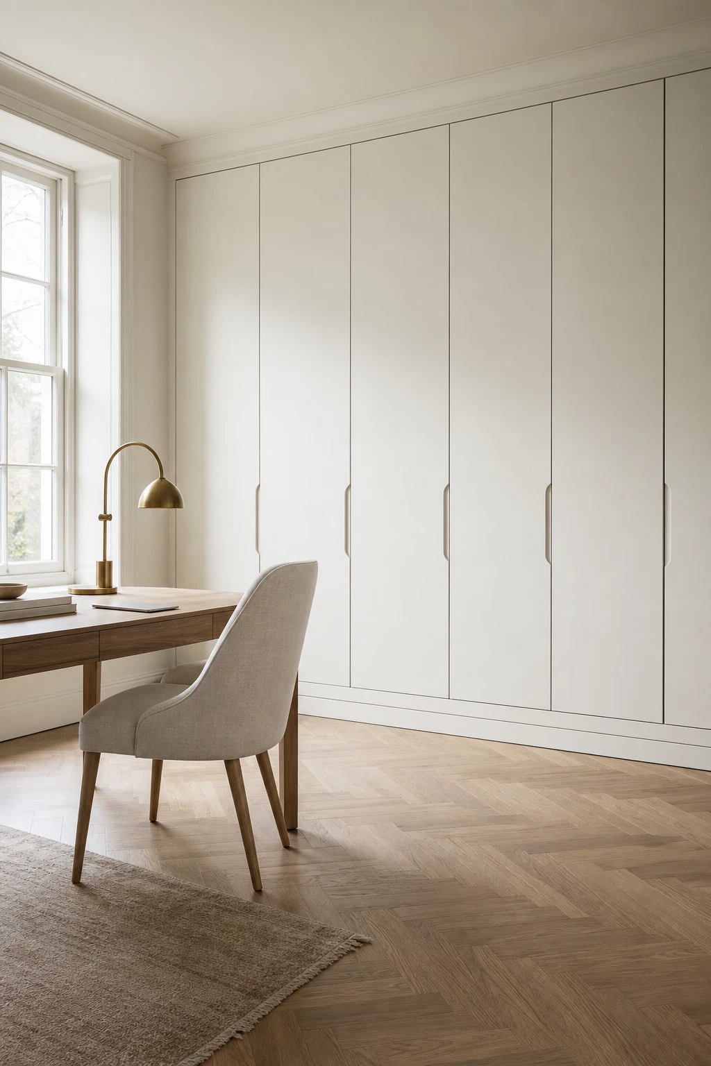
Closed storage is one of those moves I keep coming back to in white offices, because white amplifies everything, the good and the messy. What I love here is that floor to ceiling cabinetry turns an entire wall into a single calm plane, and you get that held, settled feeling the moment you walk in. The clutter is still there, just invisible, so the room can do its job of keeping you focused.
The Key Details
Flush floor to ceiling cabinetry with recessed finger pulls
Slim white oak writing desk
Warm brass arc task lamp
Linen upholstered oatmeal desk chair
Herringbone white oak parquet floor
Pro TipSpecify push to open or recessed finger pull doors so the cabinet face stays completely flat and the whole wall reads as one unbroken surface.
AvoidLeaving all your shelving open means every stack of papers and stray cable is on show, and you will spend more mental energy looking at the mess than actually working.
A Curved Chair and the Surprisingly Simple Reason It Makes a White Office Feel Softer
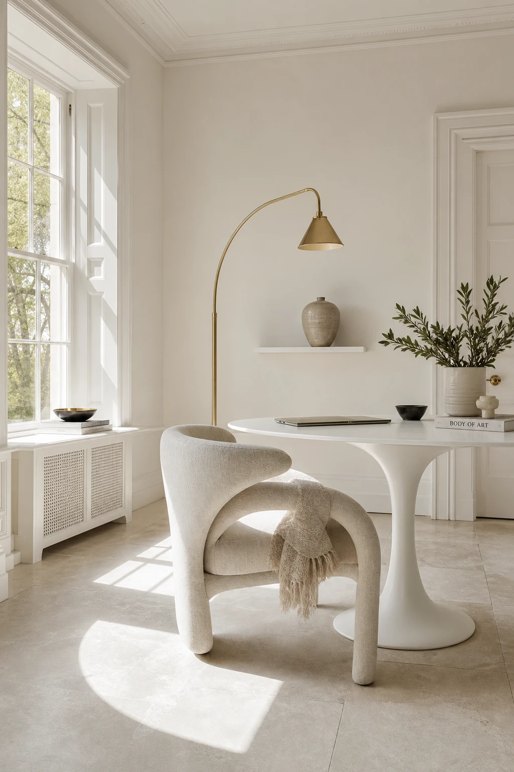
One curved chair back in a room full of straight lines stops the eye in the best possible way. You will notice the whole space seems to exhale the moment that soft silhouette appears, because the contrast is doing real work. That balance between clean geometry and one gentle curve is the move I reach for when a white office risks reading as too rigid, and it costs you nothing except choosing the right chair.
The Key Details
Sculptural curved back desk chair
Slender tulip style white desk
Slim brass arc floor lamp
Honed stone flooring
Tall sash window
Pro TipPull the chair slightly away from the desk and angle it a few degrees outward so the full arc of the back is visible, because that curve is the whole point.
AvoidPushing the chair flush to the desk tucks its sculptural back out of sight and wastes the one detail that was doing all the softening work.
A Leather Chair That Makes a White Office Feel Both Serious and Beautiful
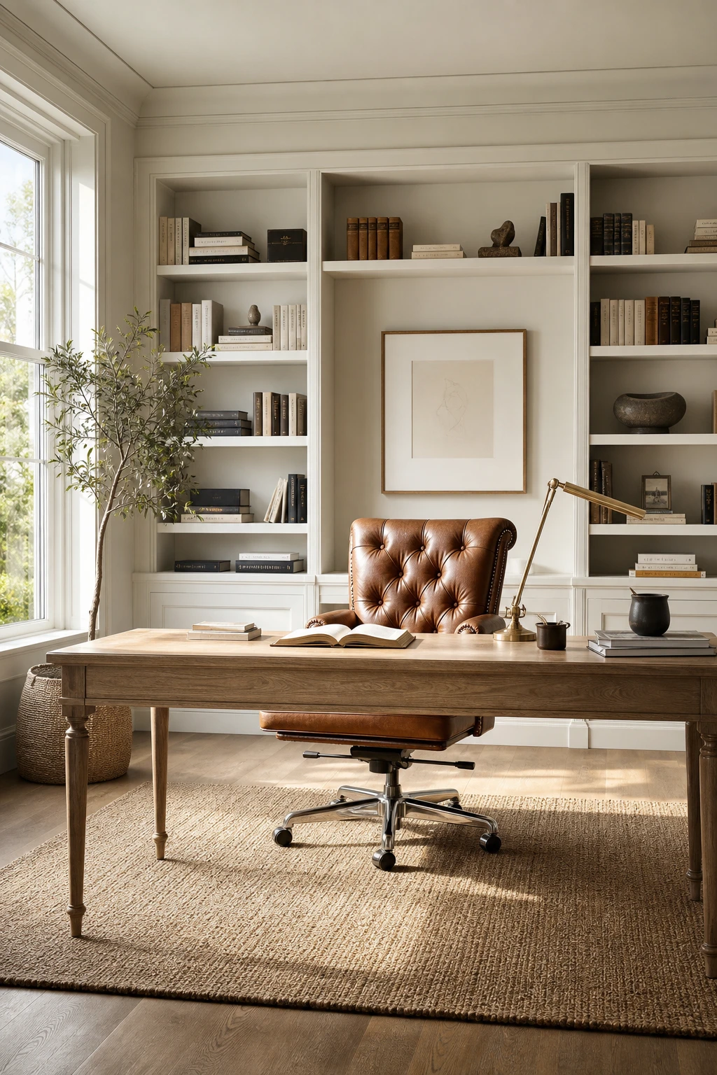
A cognac leather chair pulls something out of a white office that fabric simply cannot. What I love is the quiet authority it brings, a little structure, a little warmth, without ever competing with the room. You get a material that catches the light differently at every hour, and that contrast against painted white shelving is the thing I always check for when the scheme is working well.
The Key Details
Tufted cognac leather office chair
Pale oak writing desk
Built in white painted shelving
Tall casement window
Woven jute rug
Pro TipChoose ivory or caramel leather so the chair reads as part of the white palette rather than a piece that wandered in from another room.
AvoidReaching for dark brown leather might feel like a safe classic choice, but it sits too heavily in an all white space and draws the eye away from the room as a whole.
A Velvet Stool Under the Desk and How One Small Piece of Fabric Changes Everything
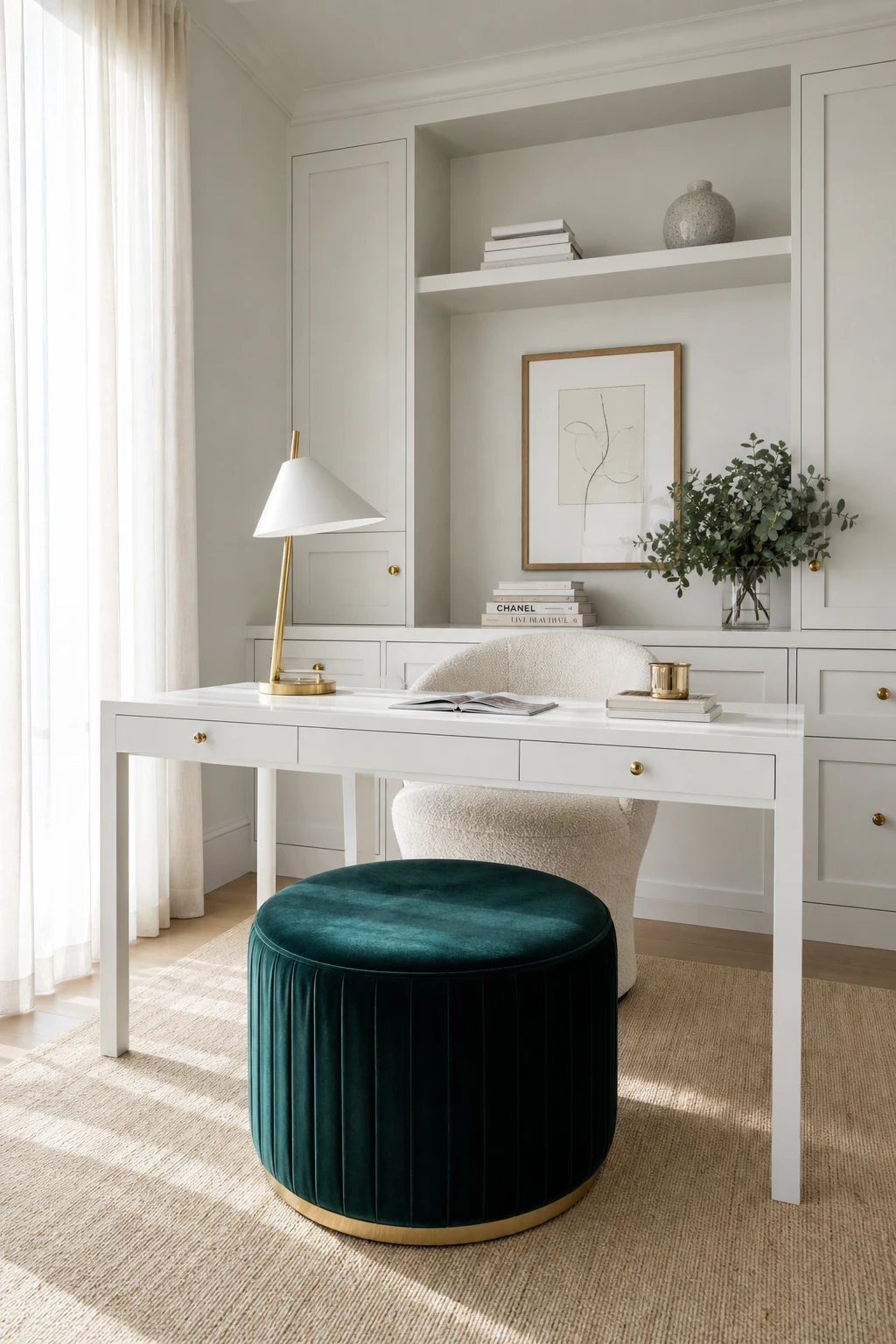
Velvet does something to a white room that no other fabric quite manages, and a tufted stool is the fastest proof of that. Slide one under the desk and you get instant warmth, a jewel of rich colour and texture sitting quietly in the frame of all that white. What I love is the scale game: one small piece punches so far above its weight that the whole room reads as considered and finished rather than plain.
The Key Details
Velvet footstool in jewel tone fabric
Slender white lacquered desk
Ivory boucle upholstered desk chair
Slim brass table lamp with white shade
Open shelving unit styled with white books and ceramic vessel
Pro TipChoose a tufted top so every little button catches the light and the velvet pile stays visible from the doorway, which is exactly where the luxury impression forms.
AvoidA stool that is too small for the desk looks like a child’s toy that wandered in, and the whole luxurious effect you were building collapses immediately.
Natural Light and the Simple Window Treatment That Lets It Do Its Best Work
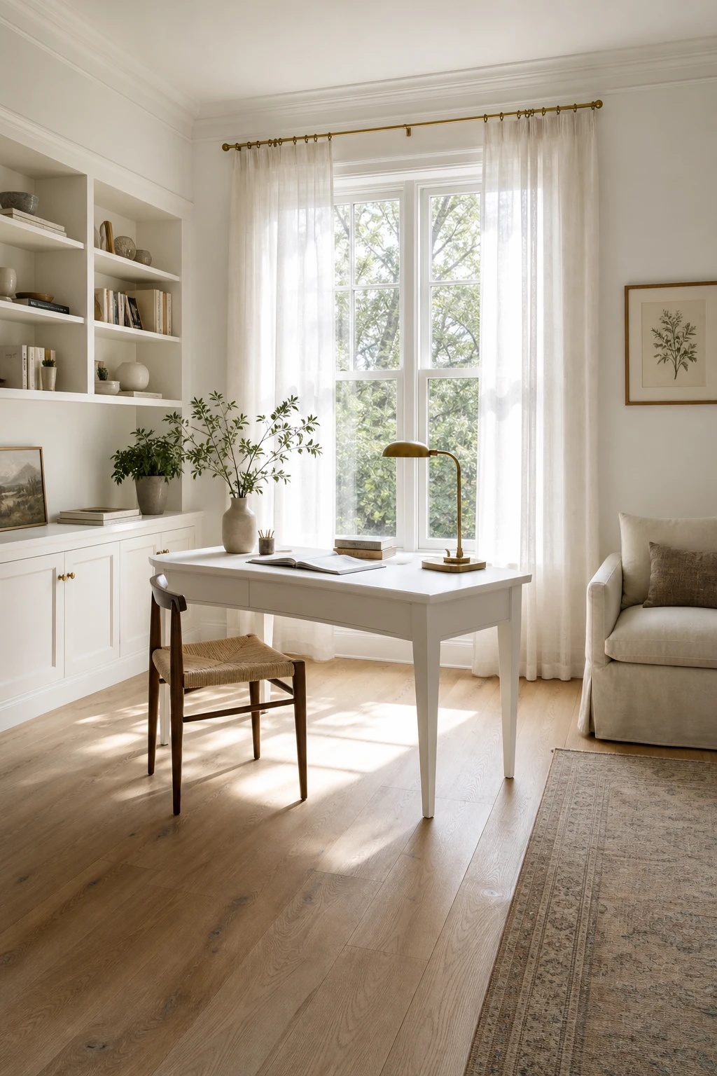
Morning light through a sheer linen panel is, to my eye, the single greatest thing you can do for a white office. The fabric softens the glare without stealing the glow, so you get that warm, even wash across the walls and floor that no lamp can fake. Watch how the wide plank oak picks up the light and bounces it back up into the room. That gentle loop of reflected daylight is what makes the whole space feel effortless rather than just bright.
The Key Details
Sheer linen curtain panels
Tall double hung window
Slim white writing desk
Wide plank oak flooring
Built in low bookshelf
Pro TipHang your curtain rod at least 20 cm above the window frame and extend it 25 to 30 cm wider on each side, so the panels stack clear of the glass when open and every bit of daylight floods in.
AvoidChoosing a heavy lined curtain because it looks luxurious will cost you the morning glow your white walls depend on, and the room will feel flat and closed in for most of the working day.
Arched French Doors in a Home Office and the Detail That Makes the Arch Sing
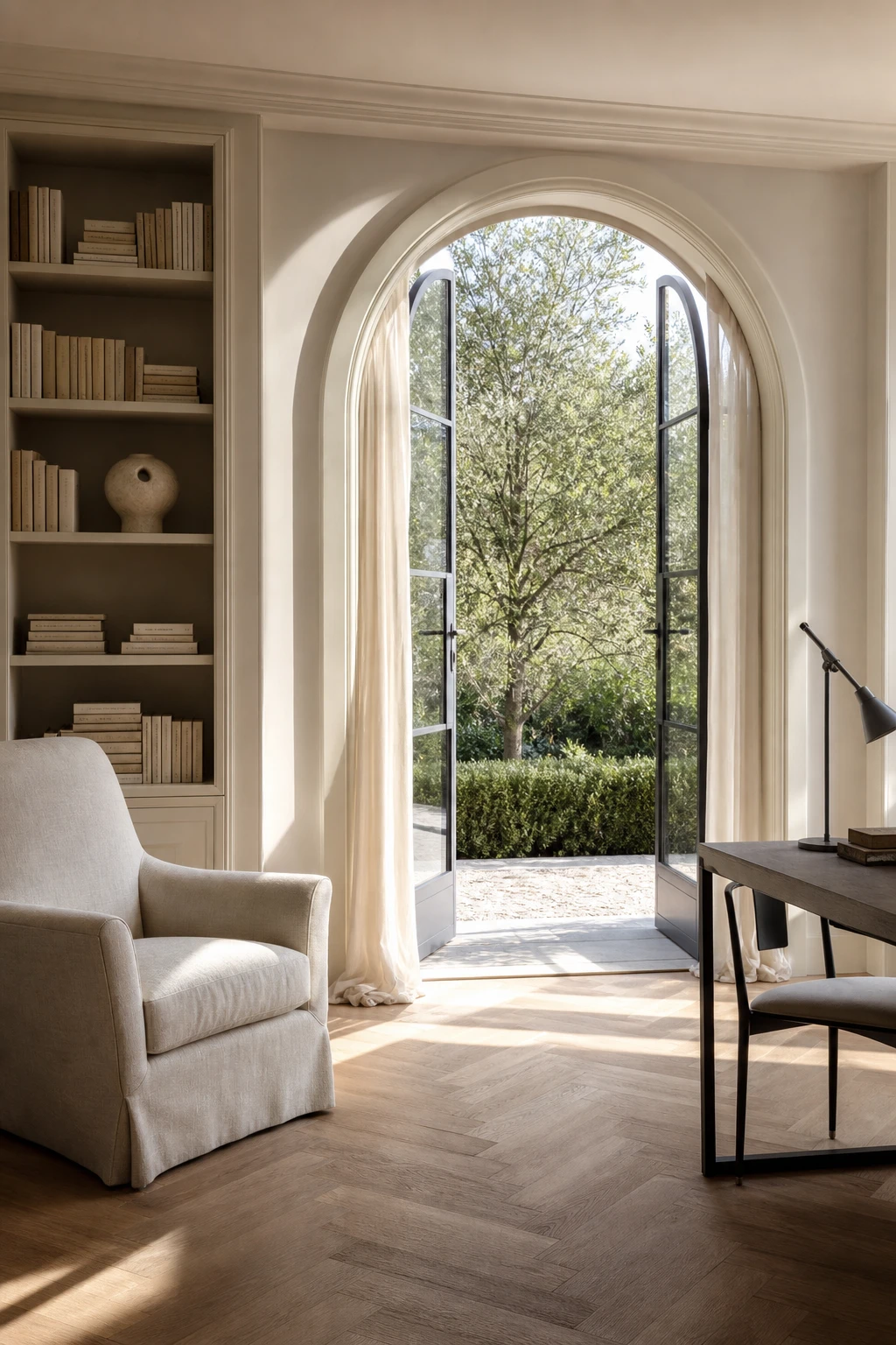
Arched French doors are one of those architectural gifts a room does not always get, and when they appear I treat them like the focal point they already want to be. What wins me over here is the moulded surround painted one considered shade deeper than the walls, so the curve reads with real clarity. You get a frame within a frame, and the eye travels straight to it the moment you enter the room.
The Key Details
Arched French doors with moulded surround
Built in flanking bookcase
Linen upholstered reading chair
Sheer ivory floor length drapes
Herringbone oak floor
Pro TipPaint the door surround one shade deeper than your wall colour so the arch holds its shape even in low light.
AvoidPainting the arch surround and walls in the exact same tone flattens the curve completely, and all that beautiful geometry quietly disappears.
Shelf Lighting and Why It Is the Most Overlooked Detail in a Beautiful White Office
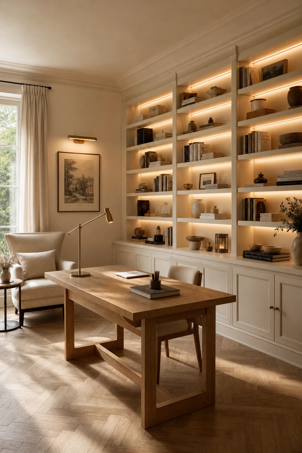
Shelf lighting is the quiet move that separates a beautiful white office from a truly atmospheric one. What I love is the way a warm glow from within the shelves pulls your eye deep into the room, creating layers that no ceiling fixture can reach. You get shadow and warmth playing off the white together, and suddenly the space feels alive rather than just bright.
The Key Details
LED strip shelf lighting
Floor to ceiling built in shelving
Linen upholstered reading chair
Herringbone light oak timber floor
Brushed brass picture light
Pro TipRun a warm LED strip along the full underside of each shelf rather than dotting in puck lights, and you get one clean unbroken line of glow that reads as intentional rather than added on.
AvoidChoosing a cool white LED for your shelves will undo all the warmth you built into the rest of the room, leaving the space feeling clinical and flat the moment the sun goes down.
A Small Home Office That Feels Bigger Than It Really Is and How to Set It Up
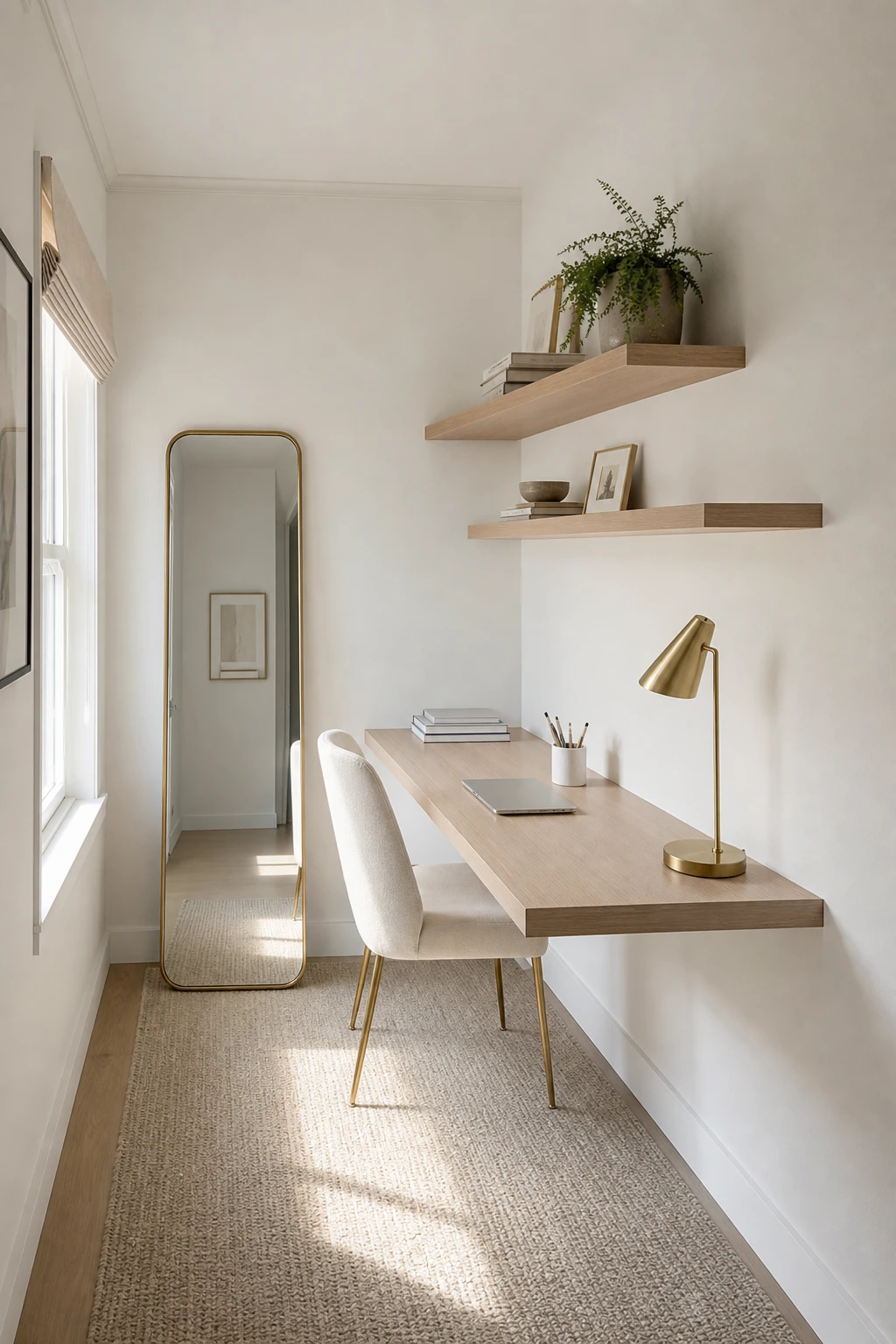
Scale and placement do the heavy lifting in a small white office, and the moment you remove the desk legs from the floor you get something remarkable. What I love is how a wall mounted desk frees up that thin strip of floor beneath it, and your eye reads the room as larger even though nothing has changed in square footage. You will notice the white finish carries that openness further, bouncing light across every wall so the space never closes in.
The Key Details
Wall mounted slim desk
Staggered floating shelves
Ivory linen upholstered chair
Narrow vertical leaning mirror
Potted plant accent on shelf
Pro TipMount the desk at standing desk height and pair it with a counter stool so you get the option to sit or stand without the room ever feeling cramped.
AvoidBuying a desk sized for a larger room fills the only clear walkway and instantly makes the whole space feel like a corridor rather than a proper working room.
A Study Corner in the Living Room That Looks Like It Belongs There
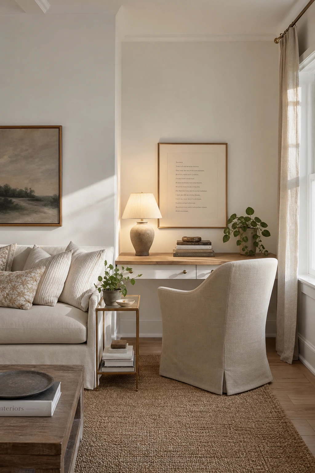
A desk corner that actually belongs in a living room is one of my favourite puzzles to solve. The trick is matching the desk finish and leg style to the sofa and side tables already in the room, so your eye reads it as furniture, not office equipment. You get a calm, unified space where the work zone feels considered rather than squeezed in. Watch how the white writing desk and linen chair carry the same quiet tone as the surrounding pieces, and the whole corner simply settles into the room.
The Key Details
Slim white writing desk
Linen upholstered armchair
Ceramic table lamp
Aged oak desktop surface
Woven jute rug
Pro TipPlace a low open bookcase at the side of the desk, facing the lounge, so it acts as a soft boundary without closing the room off.
AvoidRolling an office task chair into a living room study corner almost always breaks the spell, because the plastic base and mesh back sit so far outside the room’s language that the corner instantly feels like an afterthought.
A Feature Wall in a White Office and the Colour Choice That Keeps It Feeling Elegant
One wall in a deeper tone is the quiet anchor I reach for when a white office starts to feel a little too bare. You get depth and definition without the room closing in, because the remaining walls stay light and the darker tone reads as a frame rather than a statement. Watch how it draws your eye straight to the desk, turning the whole workspace into a composed scene rather than a room where nothing lands.
The Key Details
Full width built in desk
Open wall shelving with ceramics and books
Sculptural brass task lamp
Ivory boucle upholstered desk chair
Tall sash window with deep reveal
Pro TipPosition the feature wall directly behind your desk so every video call and every working hour places you inside a deliberately framed backdrop.
AvoidPicking a colour so saturated it grabs attention the moment you walk in means the wall becomes the room, and the rest of your considered layering simply disappears.
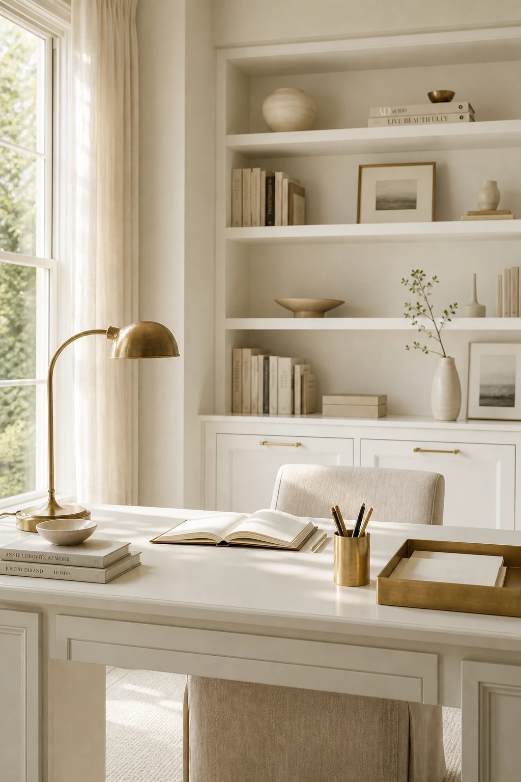
Brass Office Decor and the Rule That Stops It Looking Like a Hardware Store
Brass earns its place in a white office when every piece sings from the same sheet, and that means choosing one finish and committing to it completely. What I love about brushed brass specifically is the way it holds warmth without flash, so you get richness against white without the room tipping into glitzy. Watch how a lamp, a pen cup, and a frame clustered together read as a considered collection rather than clutter.
The Key Details
Brushed brass arched desk lamp
Matching brass desk accessories set
Built in white lacquered shelving unit
Linen upholstered desk chair
Slim brass cabinet pulls on cabinetry
Pro TipShop your brass lamp, pen cup, and frame in a single session from the same range so the finish matches perfectly from day one.
AvoidSpreading lone brass pieces across different corners of the room leaves each one looking like a random leftover rather than a deliberate design choice.
Alan launched Edward George London in 2017. Since completing his masters in Town & Regional Planning (MPlan) he has combined the skills he learned at the University of Sheffield with his passion for design, to help create a foundation for those looking to create a beautiful home.