Newsletter Subscribe
Enter your email address below and subscribe to our newsletter
The Victorians did not use subway tile. That came later. They used Lincrusta, a heavy embossed paper made to be wiped clean. Their real status piece was not the freestanding clawfoot tub. It was the panelled bath, the cast-iron tub encased in mahogany joinery to hide the plumbing. I’ve been planning a few of these rooms lately, and the same lesson keeps showing up. The line between dated and luxurious is never about budget. It is about what you leave out. The Victorians piled it all in. We don’t have to. If you’re after pure inspiration, our full Victorian bathroom gallery is the place to start. This piece is the opinionated companion.
Most modern Victorian bathrooms fail the same way. They add a clawfoot tub, a brass tap, a floral blind, and a bit of panelling, then call it period. The result feels staged. A real Victorian room had three or four loud things, not twelve. The job is to pick the loud things and let the rest go quiet. And that same logic carries over to your victorian bedroom.
I’d start with one big move and one quiet field. The big move might be the bath, or the wall colour, or a piece of original tile. The quiet field is everything else. If you choose the bath as the hero, the walls go calm. If the walls do the talking in deep paint, the bath drops back to plain white. For more on this palette, see warm cozy home office ideas.
The trick is to keep saying no. No spare gold mirror. No second pendant. No second print on the wall. Each piece has to earn its place. If you can’t say what it does, take it out. The room will thank you for it. If your taste runs more toward spanish style bathroom, the proportions shift.
Walk through the next nine sections in that frame. Pick the one big move per section. Let the rest stay calm. By the end, you’ll have a bathroom that reads Victorian without feeling like a museum gift shop. We covered the full method in our victorian bathrooms deep dive.
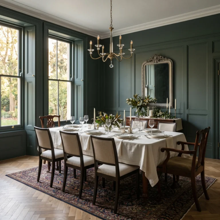
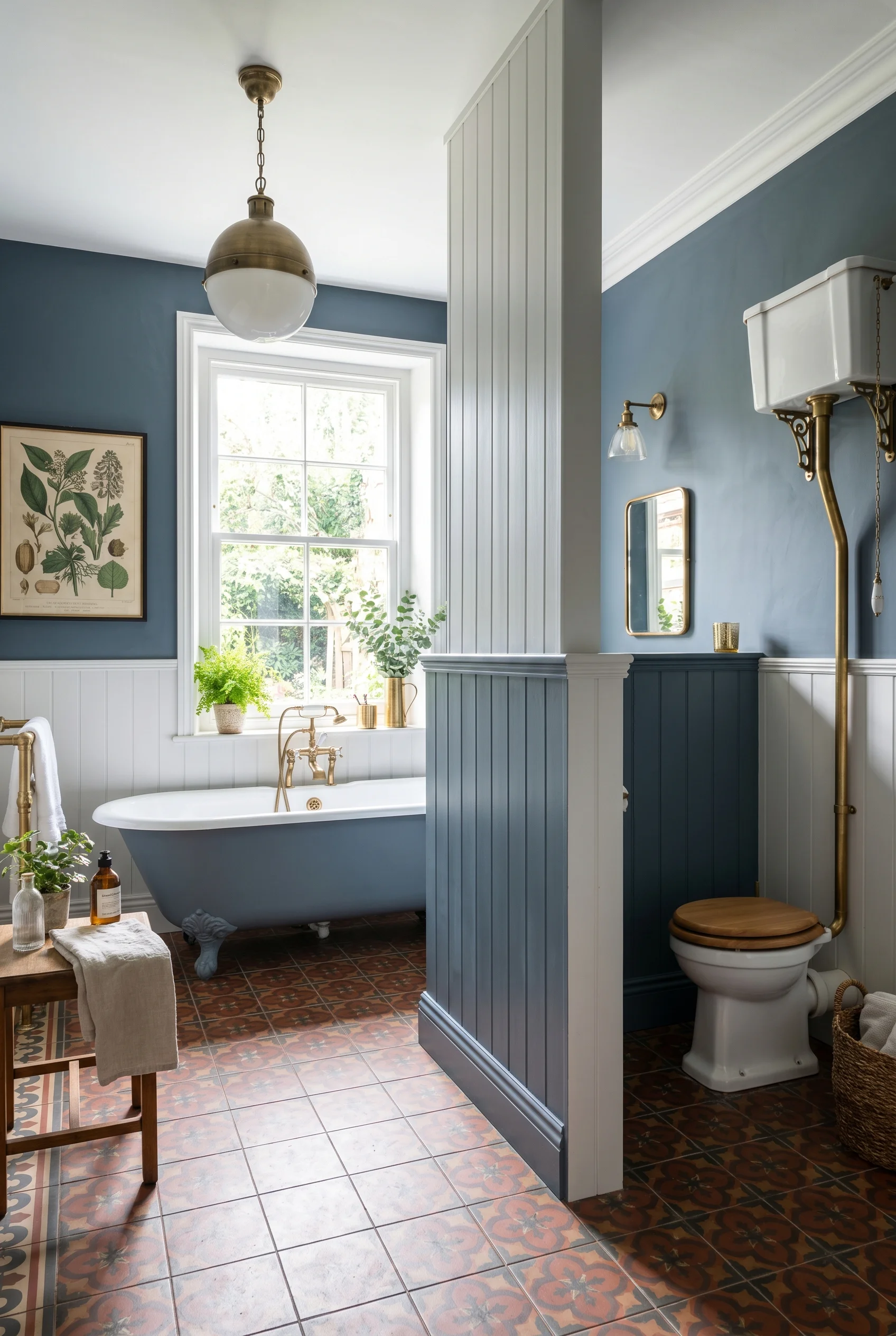
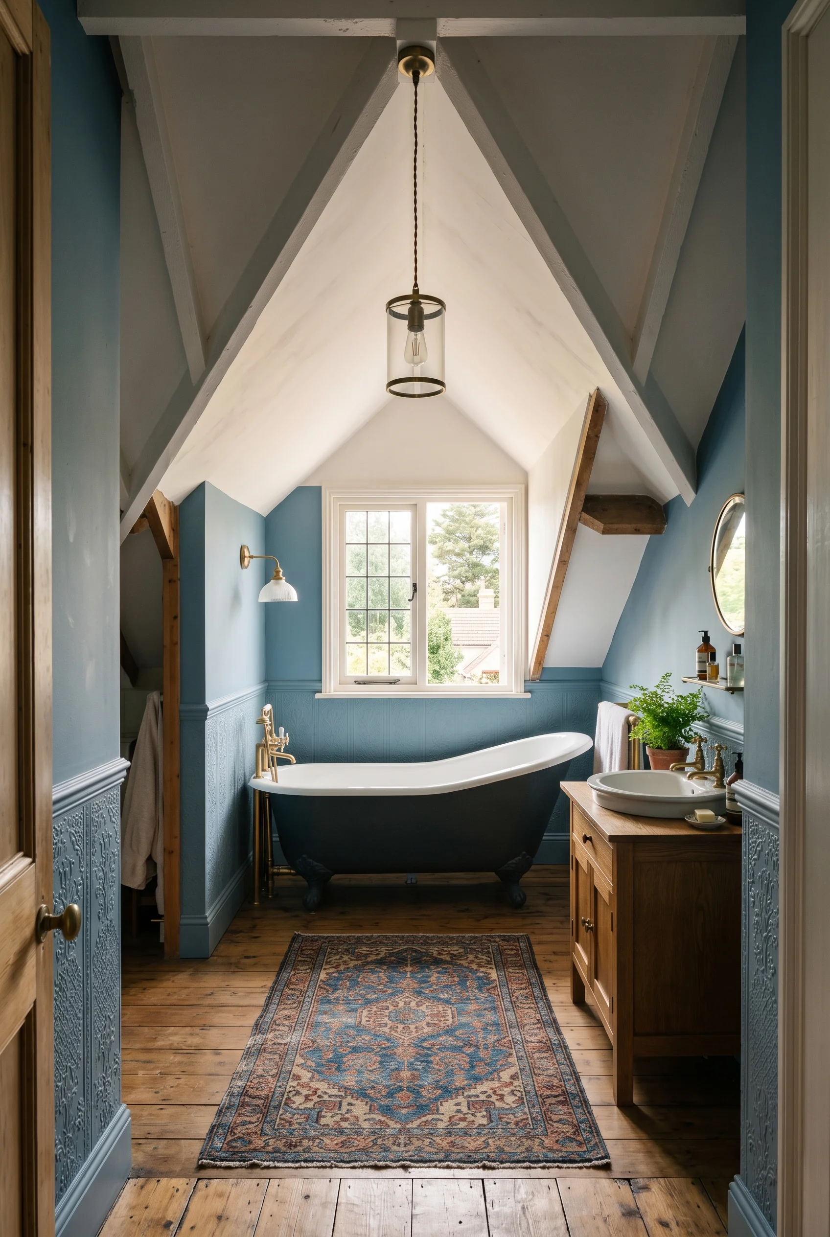
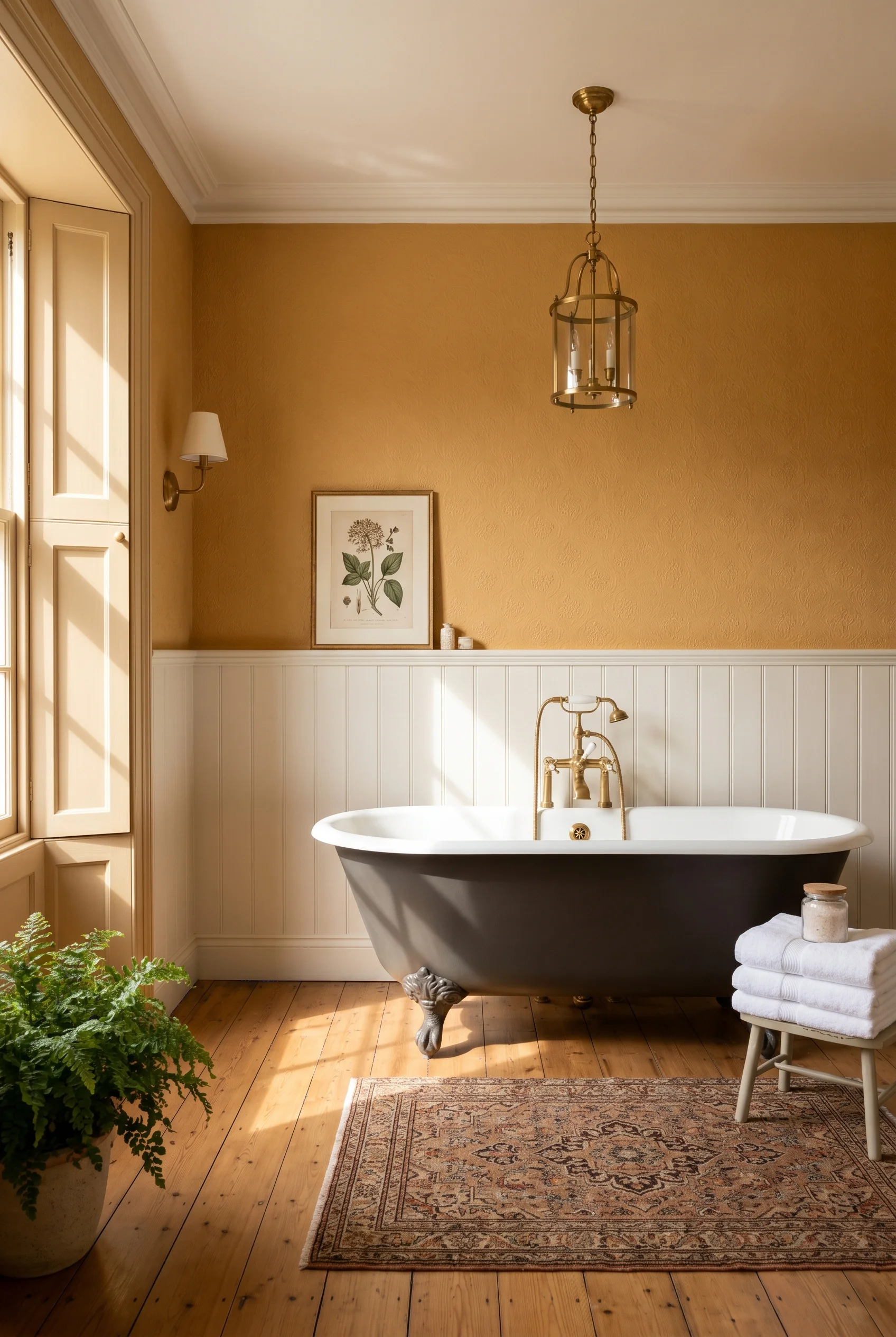
Skip the muted sage. It’s the safe choice everyone makes, and it makes the room feel polite instead of bold. The Victorians did two things with colour. They painted big rooms in saturated, almost moody tones. And they used pure white as a hygiene signal in service rooms. Both still work today. And that same logic carries over to your victorian dining room.
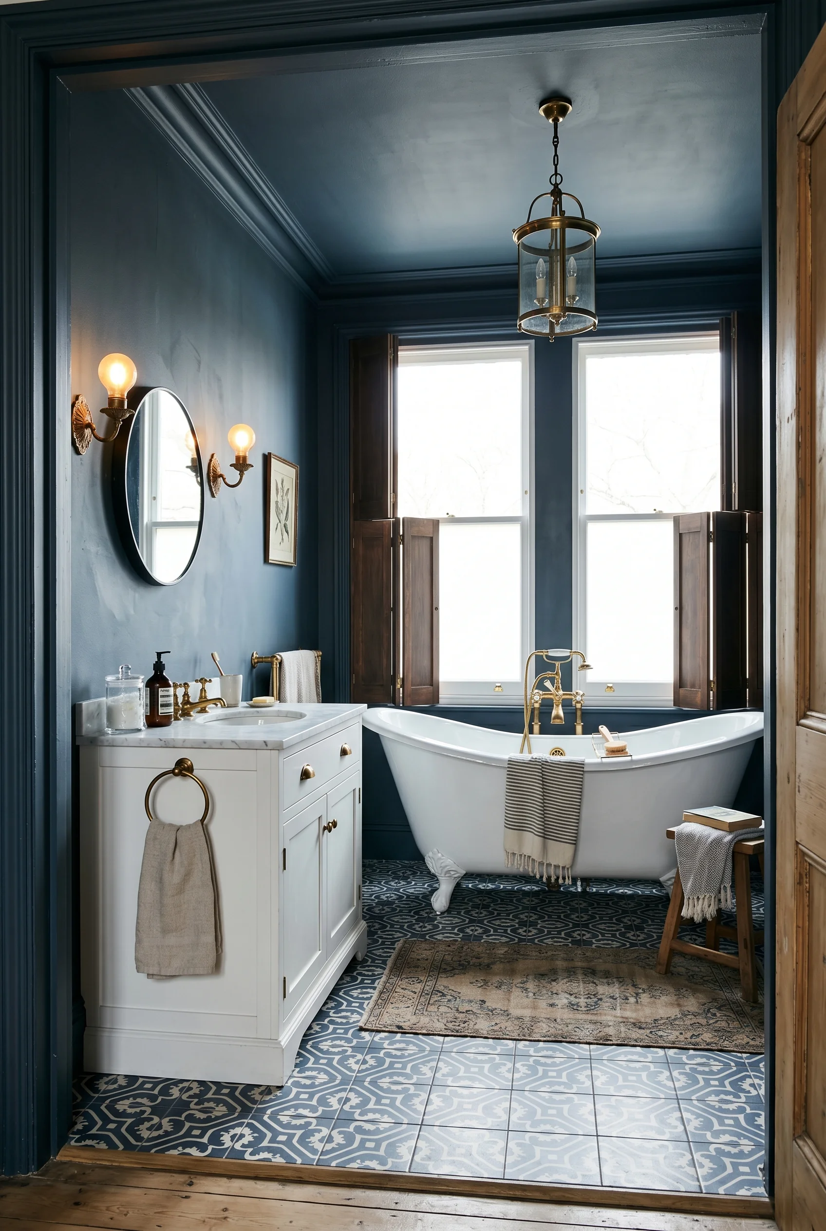
I’d colour drench the walls and ceiling in one shade. That means painting the wall, the trim, and the ceiling in the same colour. It softens the edges and makes the room feel held. If the bathroom is small, this works even better. The eye stops looking for the corners. If your taste runs more toward modern bathroom ideas, the proportions shift.
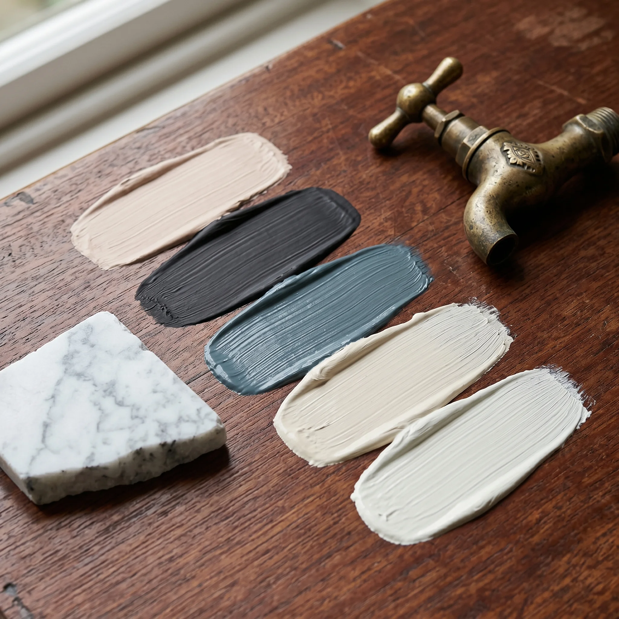
Here are five Farrow & Ball codes I’d actually reach for. Pick one as the main field. Use one or two more as accents. The same principle holds true for modern victorian interior design.
Setting Plaster No. 231 is the main wall colour. It reads soft pink in daylight and warm clay at night. I’d use it on the walls and the ceiling for a full drench. Paint Pick: Farrow & Ball Setting Plaster No.231
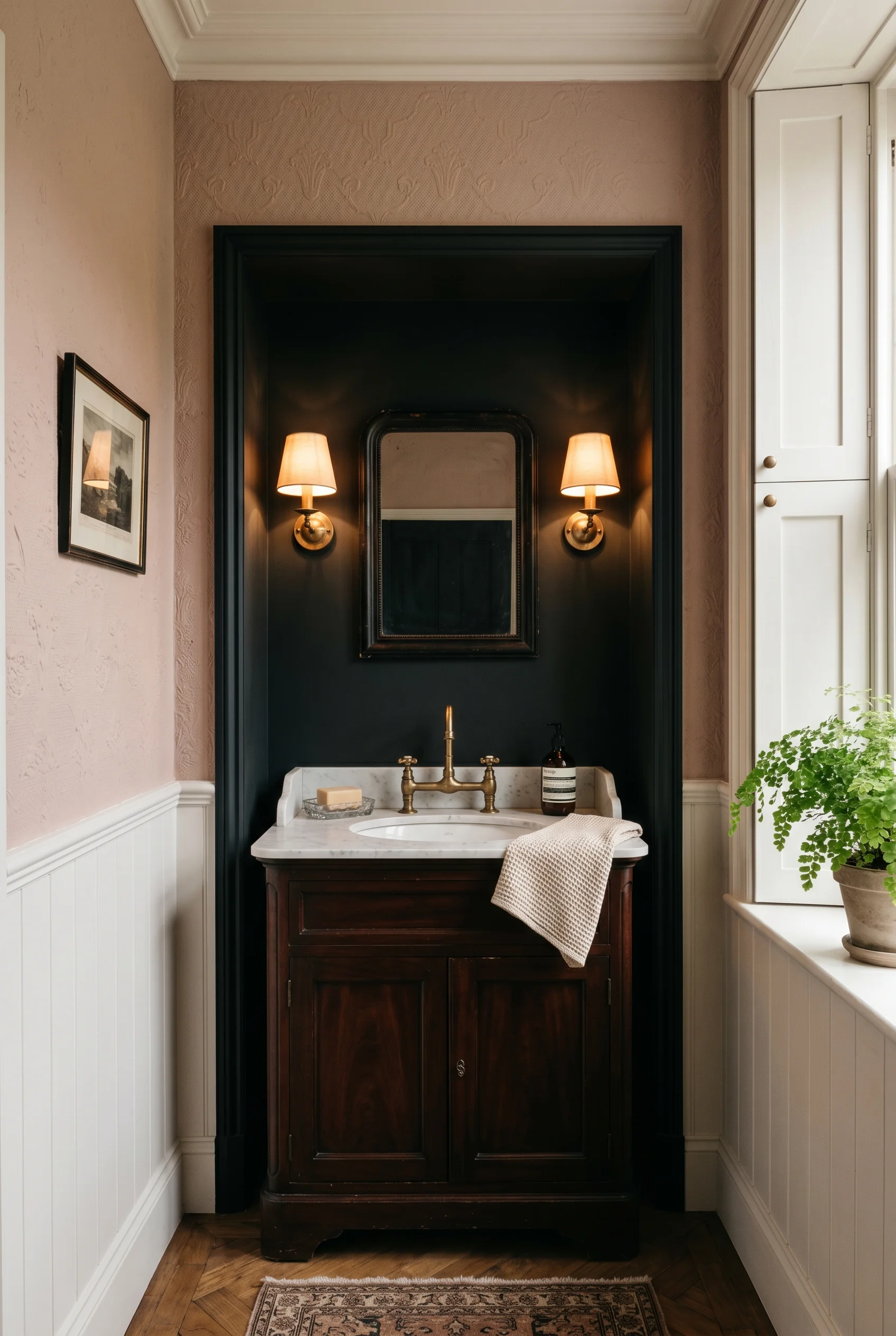
Pitch Black No. 256 is the anchor. Use it on the bath panel or a single wall behind the vanity. It frames brass beautifully. Paint Pick: Farrow & Ball Pitch Black No.256
Inchyra Blue No. 289 is the main wall option for a darker scheme. It looks teal in bright light and almost charcoal at dusk. Paint Pick: Farrow & Ball Inchyra Blue No.289
Slipper Satin No. 2004 is the trim and ceiling shade for a soft scheme. A creamy off-white that never reads cold. Paint Pick: Farrow & Ball Slipper Satin No.2004
School House White No. 291 is the accent. Use it on the inside of an alcove or a built in shelf. It glows next to deeper colours. Paint Pick: Farrow & Ball School House White No.291
Pick three of those five, not all five. That’s the edit working again.
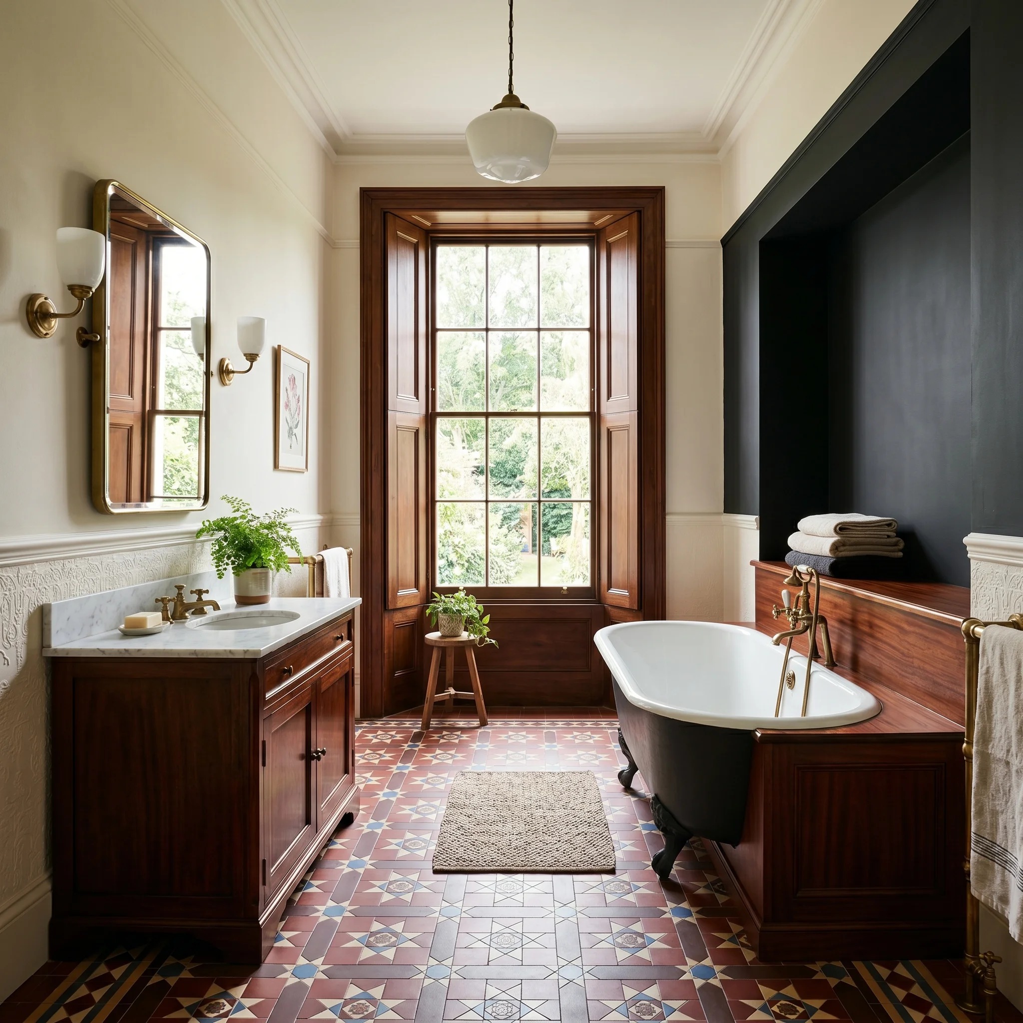
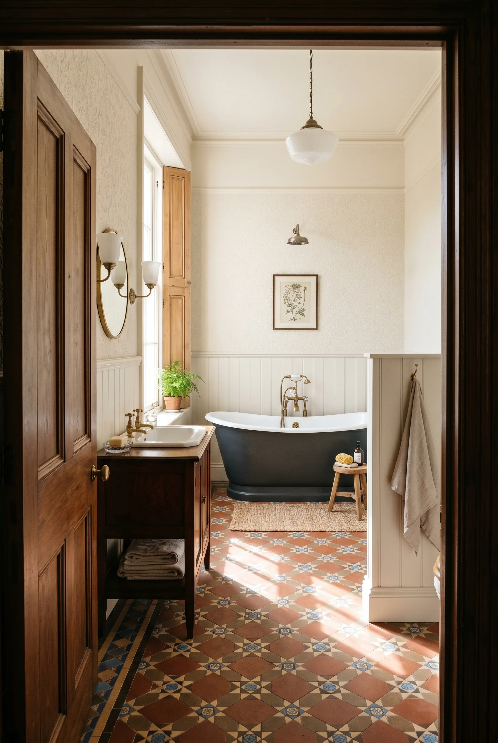
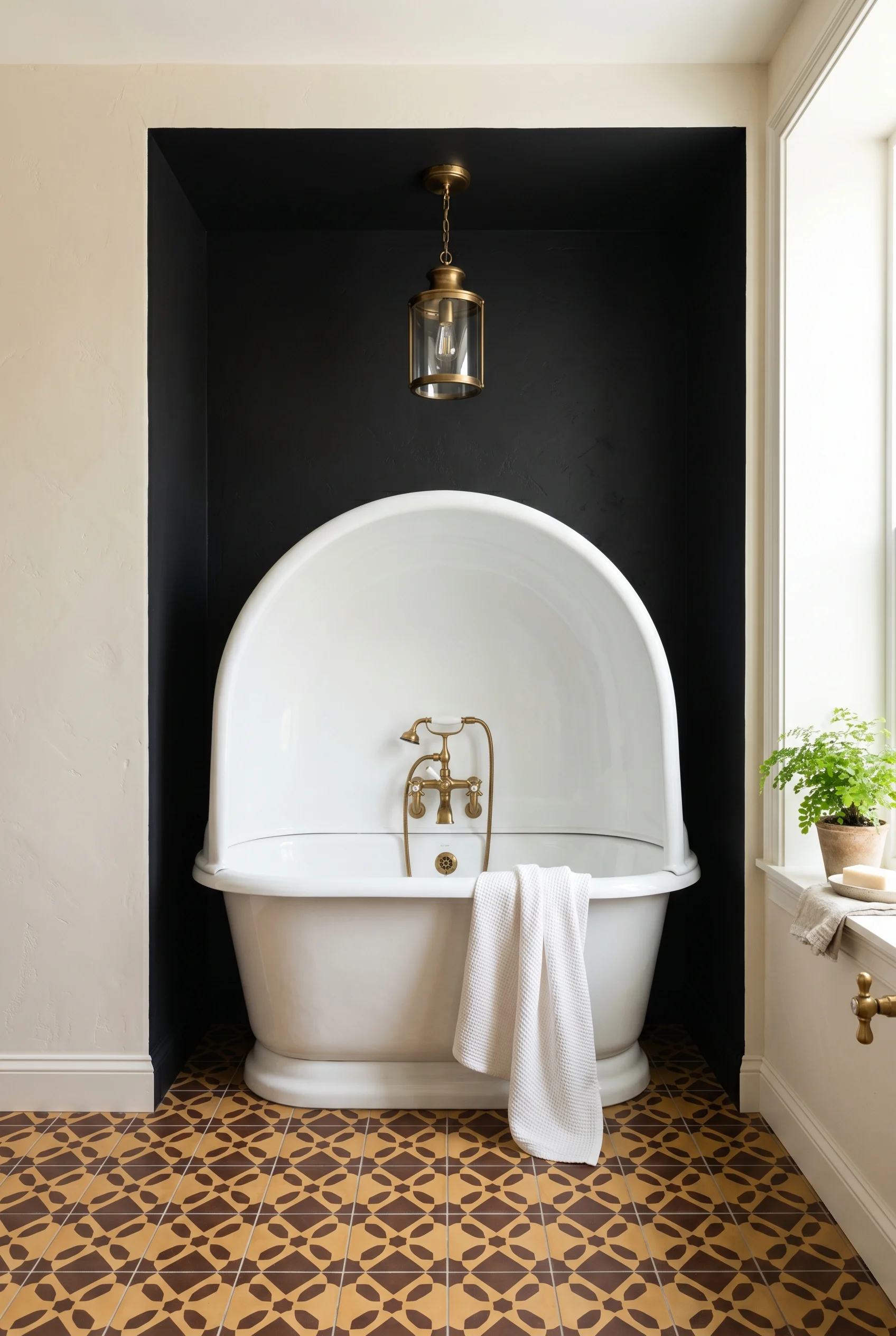
Everyone reaches for the clawfoot. It’s become the default. The panelled bath is the better choice. It’s how the Victorians actually did it. A panelled bath sits inside a frame of mahogany or painted timber that hides the plumbing and the bath’s underside. The bath itself can be cast iron, and the panel can match the rest of the room’s joinery. It looks built in, not parked. You will find a version of this in our victorian exterior breakdown.
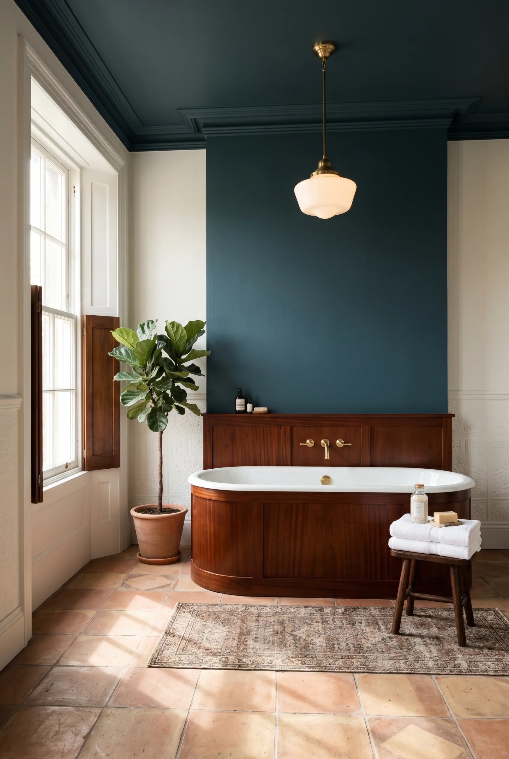
Drummonds, Catchpole & Rye, and Plain English all make panelled baths or sell the panels separately. You can also have a joiner build the panel around an existing freestanding bath. The panel turns the bath from sanitary ware into furniture, which is exactly what Victorians wanted. The same principle holds true for master modern luxury bedroom design.
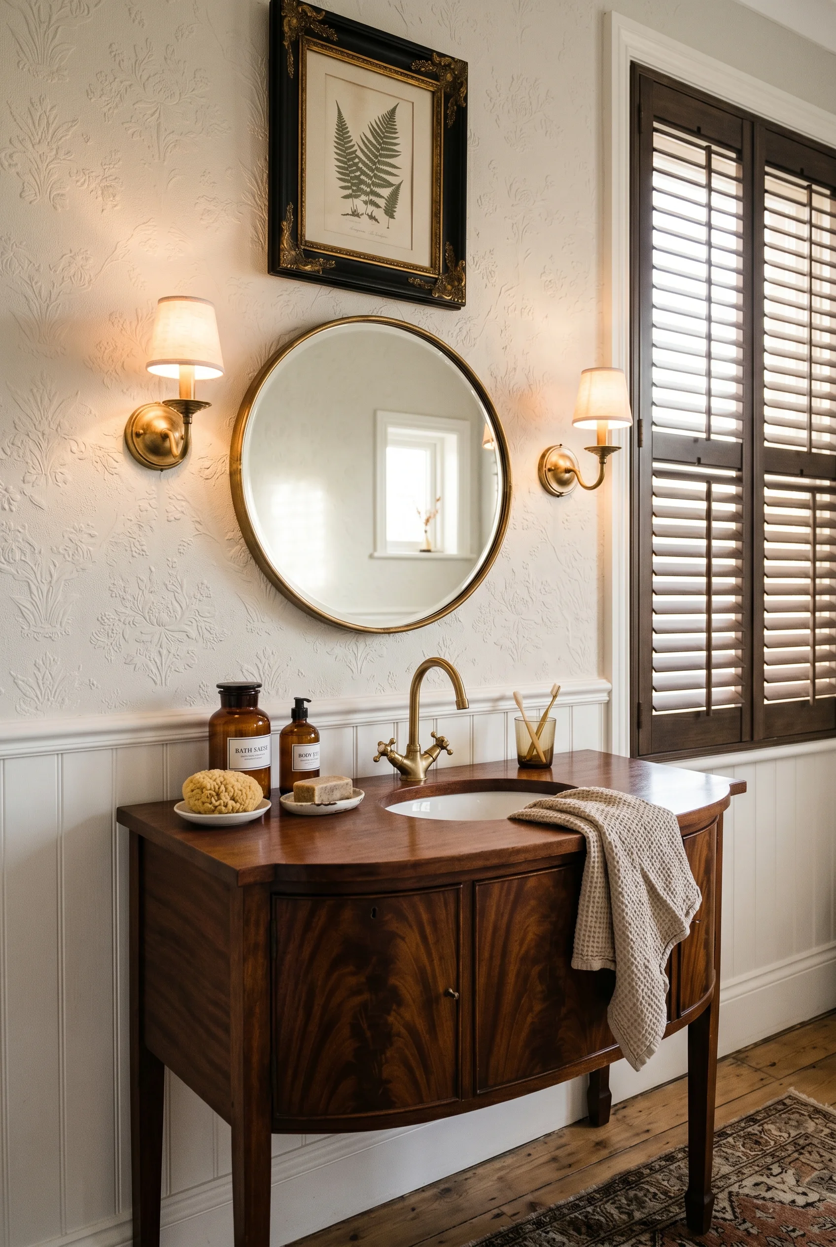
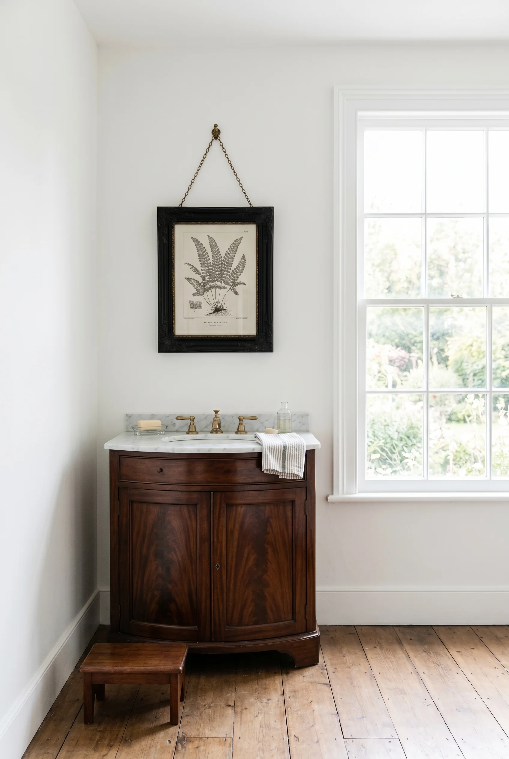
For the vanity, I’d skip the new build joinery and use a repurposed antique. An old washstand, a small chest of drawers, a bow-front commode. Cut a hole in the top, drop in an undermount basin, and seal the wood. Howe London and Plain English both sell ready-built versions if you don’t want to hunt antiques. The point is the brown wood. It softens the white sanitary ware and gives the room age. For more on this palette, see english cottage kitchen.
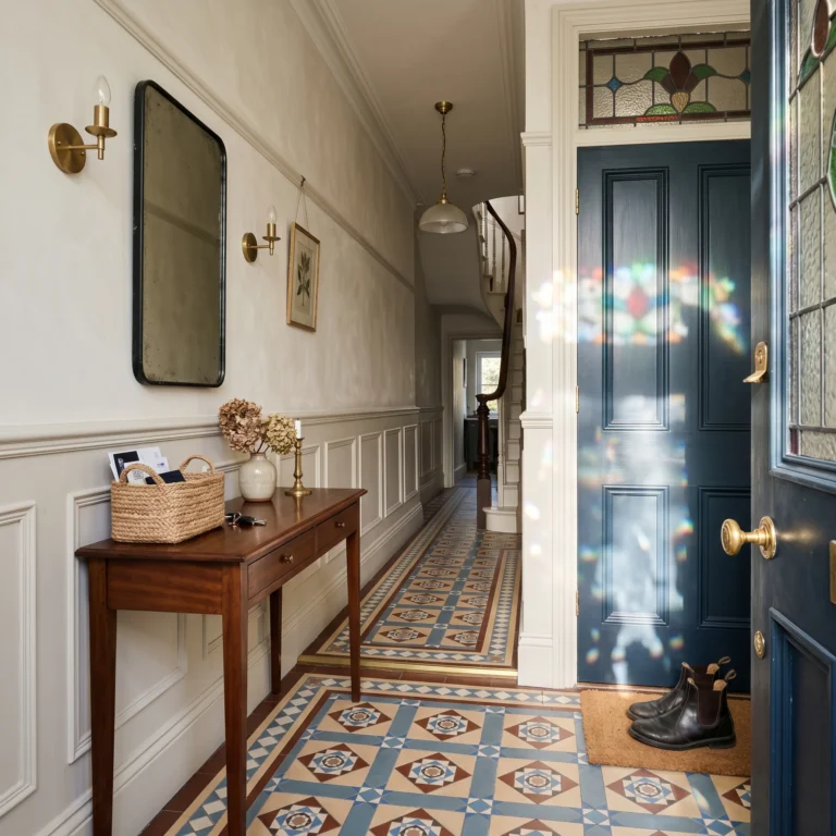
Subway tile is a 20th-century thing. The proper Victorian wall move was a dado split. A dado is the lower wall section, usually below the picture rail or chair rail. They tiled the dado for splash protection, then ran heavy embossed paper above. That paper was usually Lincrusta or Anaglypta, both made to be wiped clean. You will find a version of this in our victorian hallway breakdown.
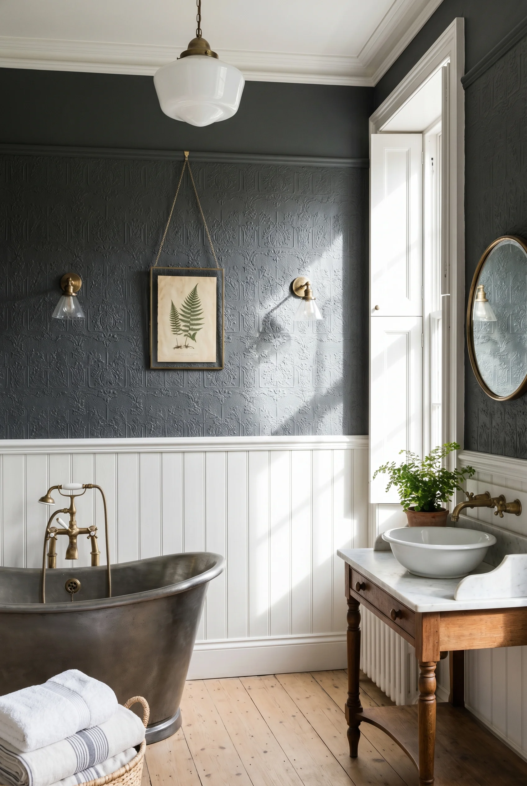
I’d put a high-relief Lincrusta paper above the dado rail and paint it out in F&B Setting Plaster. Below the dado, run plain white tongue-and-groove panelling, also painted. The texture above and the smooth panelling below give you the period detail without the museum feel. We dedicated a full guide to modern hallway wall panelling for this reason.
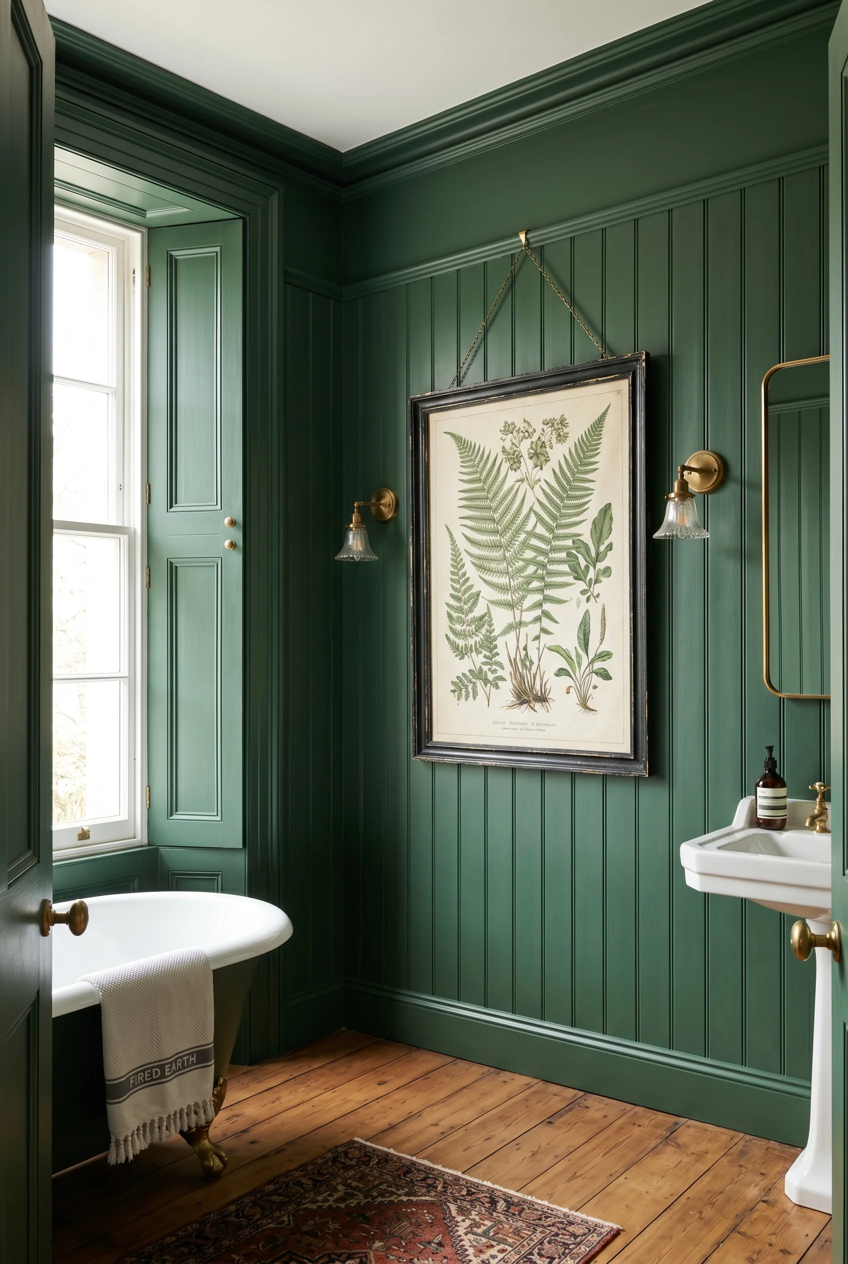
If you don’t want paper, use simple painted panelling top to bottom and lean on the colour. A picture rail set high gives you the dado line for free, and you can hang one botanical print from it on a brass chain. That’s a real Victorian move, not a styling trick. Which is exactly what makes victorian style kitchen work so well.
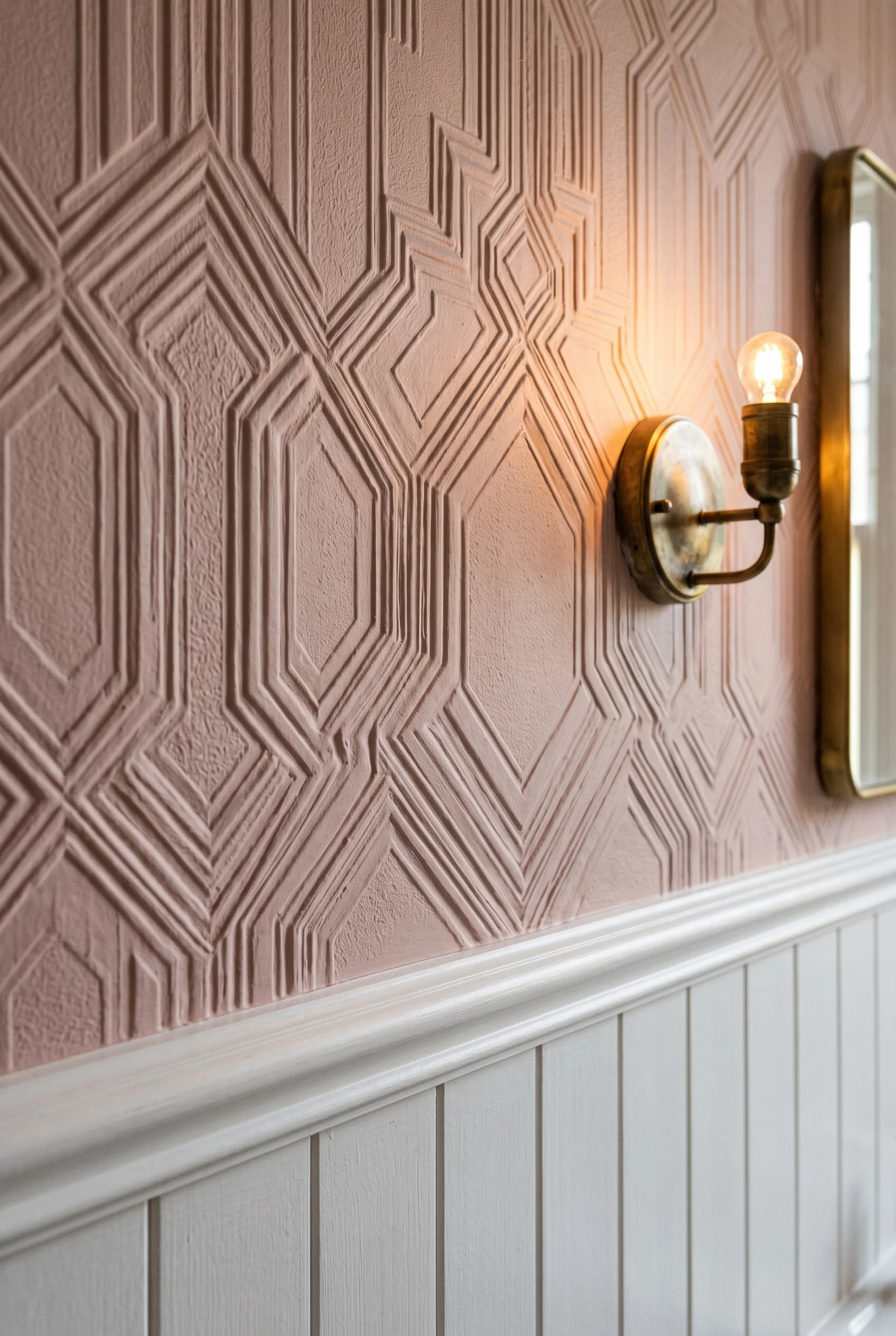
The mistake to avoid is mixing too many wall finishes. Tile, panel, paper, and a feature wall in one room is too much. Pick two finishes. Run them across the whole space. Which is exactly what makes victorian paint colors work so well.
The Victorians invented the S-bend trap. That’s the bend in the pipe under the toilet that holds water and blocks sewer smell. The S-bend let them put the loo inside the house at all. But they still kept it walled off in its own small room, away from the bath. That was sensible then, and it still is. We dove deeper into this for victorian kitchen.
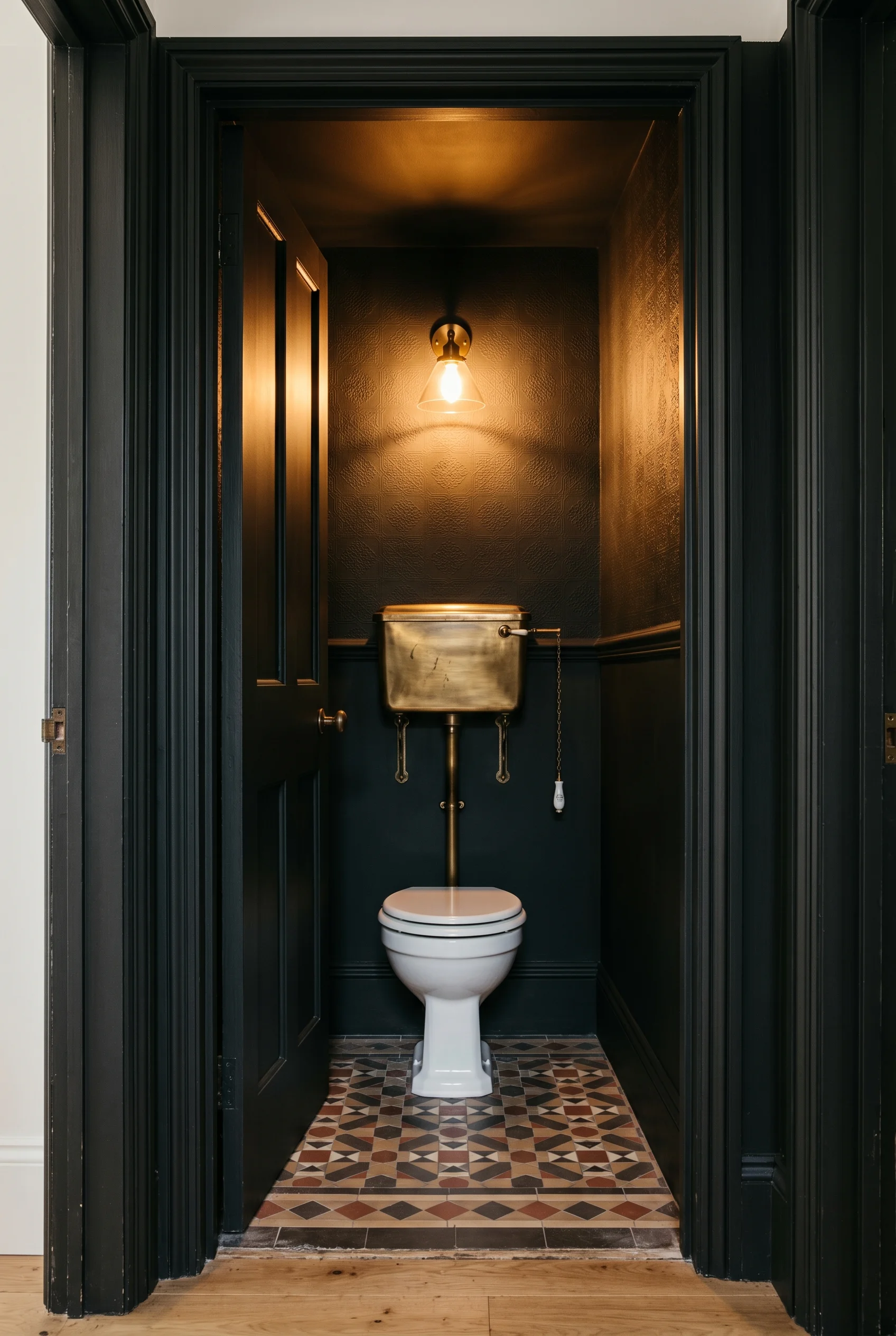
If you have the space, build a separate water closet. It can be tiny, just enough for the toilet and a small basin. It frees up the main bathroom for bath, shower, and a proper vanity. It also means two people can use the room at once without one waiting outside. Contrast this with mediterranean bathroom where the approach is almost opposite.
Where you can’t add a wall, use a screen. A half height panel of tongue-and-groove between the loo and the bath gives you the same feeling. Soane and Plain English both do freestanding screens that look right in a period room. Even a heavy curtain on a brass rail can do the job. We dedicated a full guide to english country house for this reason.
The other Victorian layout trick is using a former dressing room or large landing as the bathroom. If your house has an awkward room nobody uses, it might be the right place. Plumbing routes are easier to hide on an upper floor than people think. A close cousin of this idea appears in our victorian hallway ideas guide.
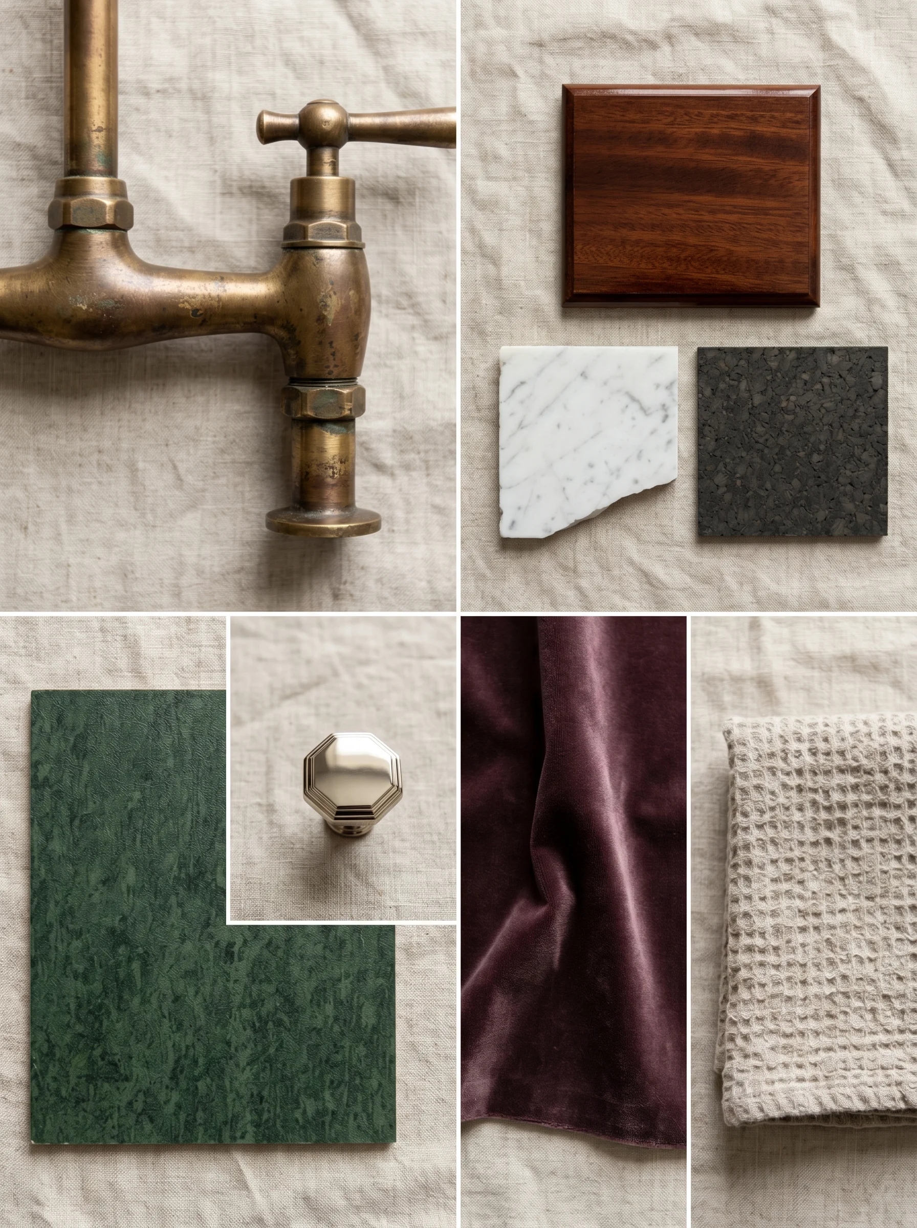
The era loved new materials. Cork, linoleum, polished nickel, mahogany, and small bits of marble used as detail. They did not slab marble across every surface. That came later. Period correct means restraint and mixed materials, not a marble vault. We dove deeper into this for victorian living room.
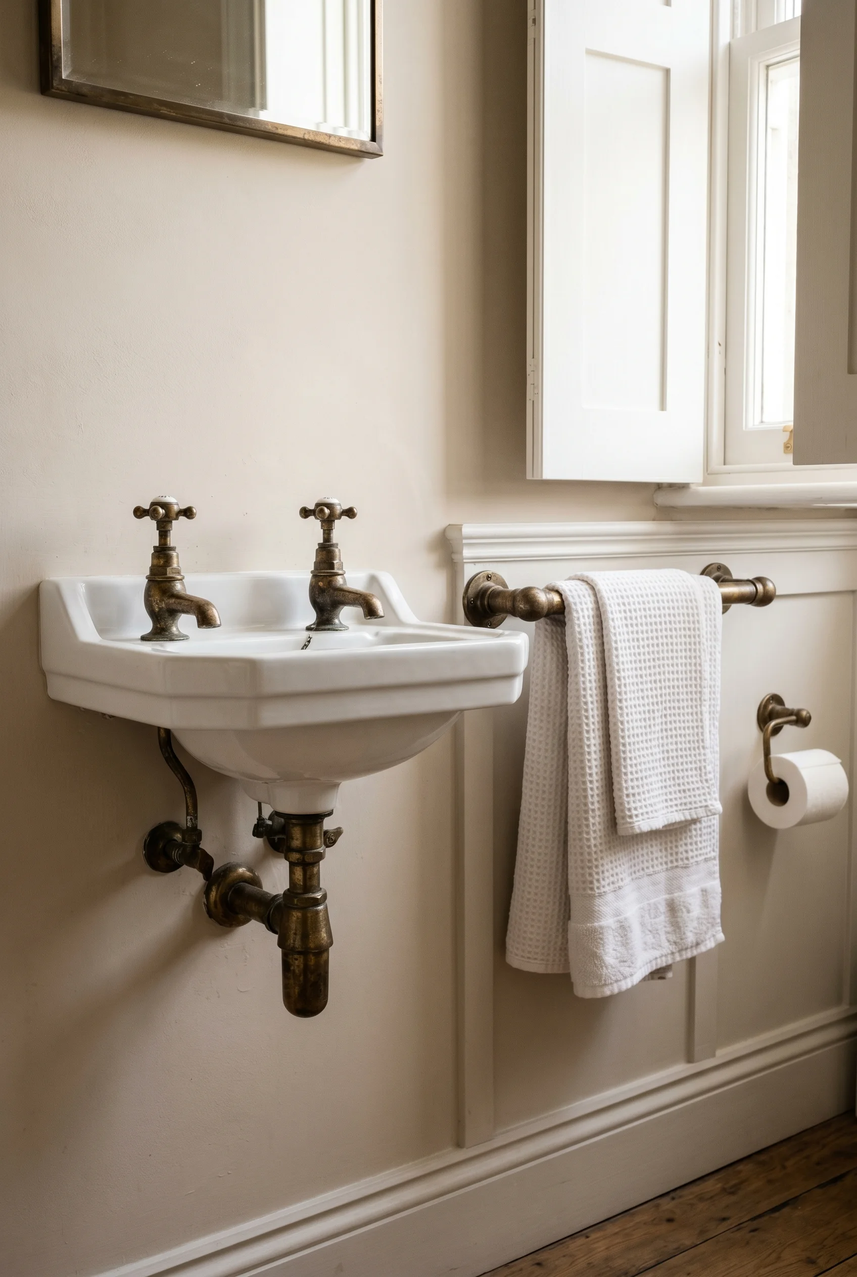
I’d use brass for taps and towel rails, not gold. Brass has a warmer, slightly duller finish that ages well. Real polished brass goes a soft bronze over time, and that patina is part of the look. Gold reads new and showy. Brass reads earned. A close cousin of this idea appears in our dining room ideas guide.
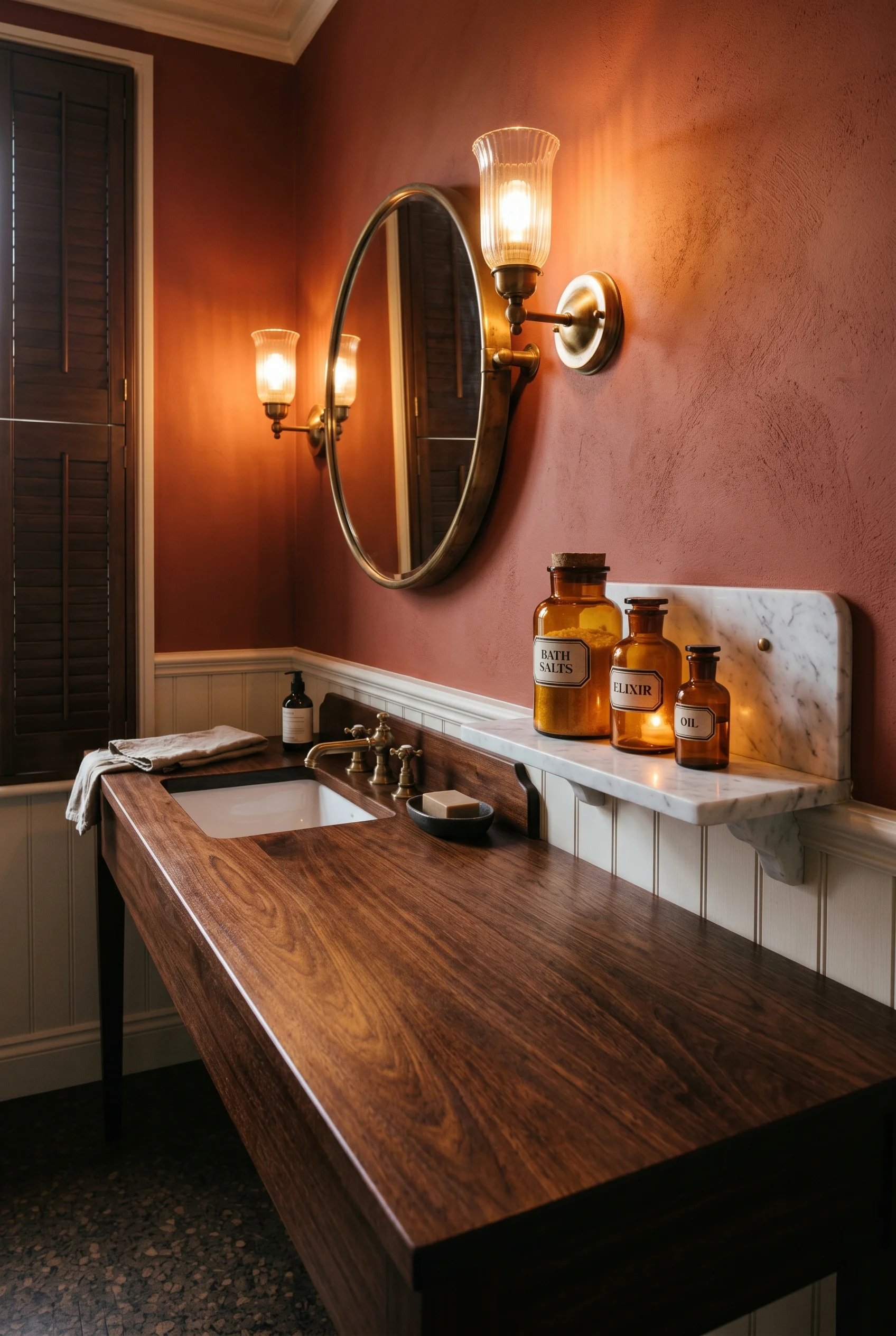
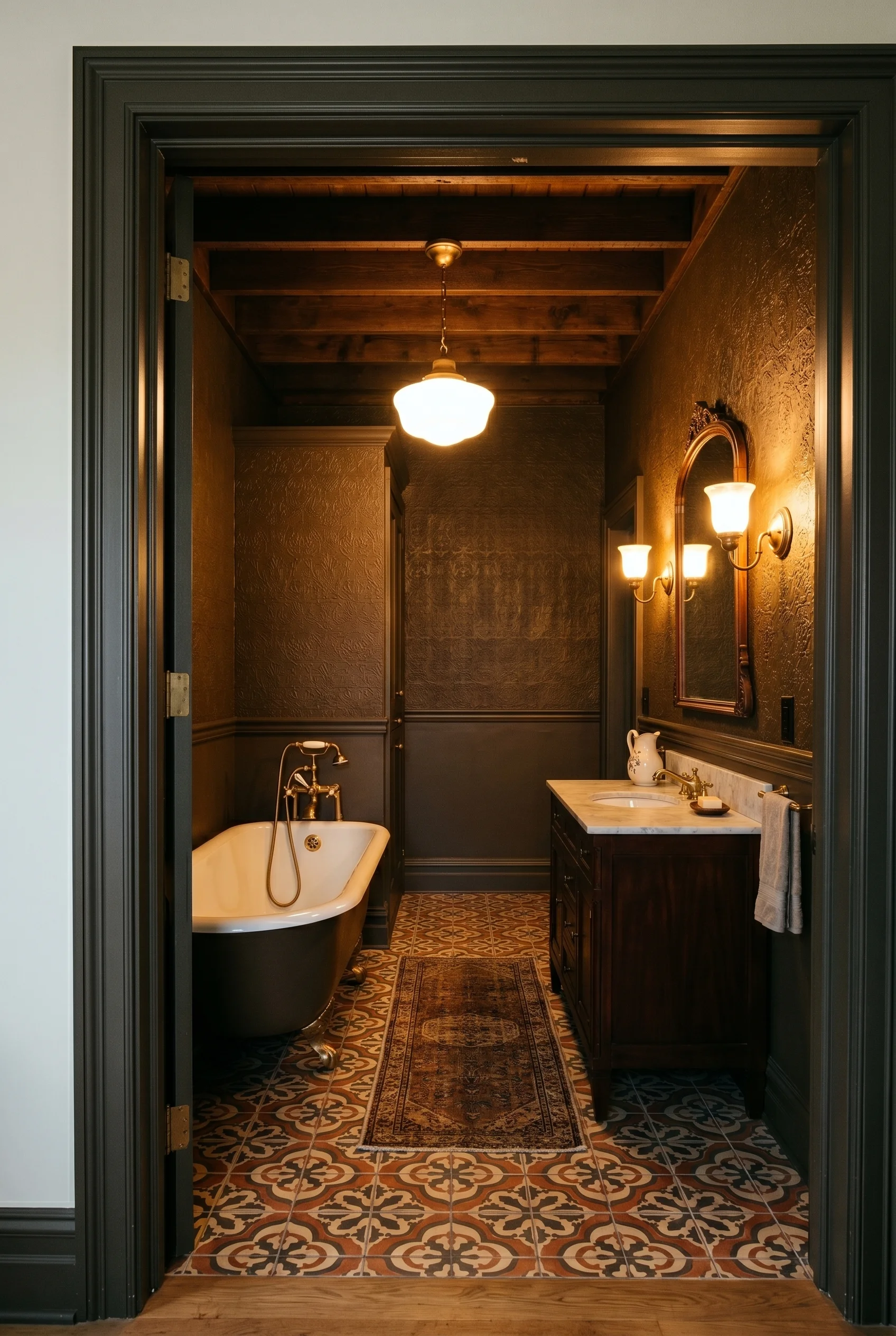
For surfaces, I’d use a mahogany vanity top, a small marble shelf above the basin, and dark cork floor tiles for warmth underfoot. Cork was a hygienic choice in the 1880s, quieter and warmer than tile. It still is. Seal it well and it lasts decades. That mix of three materials, not one, is what gives a Victorian room its depth. We tested this theory across rooms, starting with living room design.
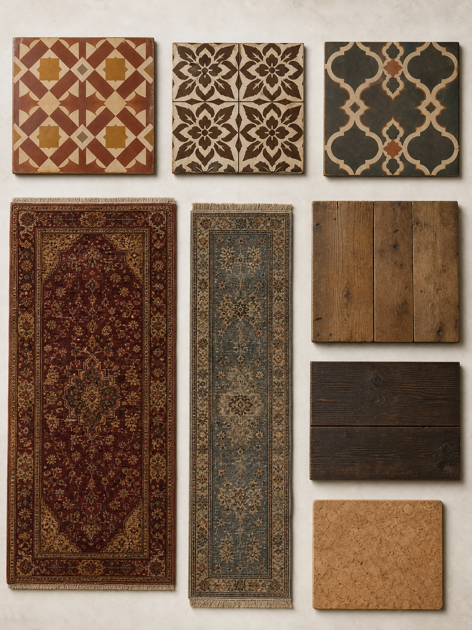
Black and white checker is the lazy default. Encaustic tile is the real thing. Encaustic tiles have the pattern set into the clay, not painted on the surface, so the pattern survives wear. Maw and Minton are the historic English makers, and you can still get reproductions of their original patterns. This shade shows up again in small english cottage living room.
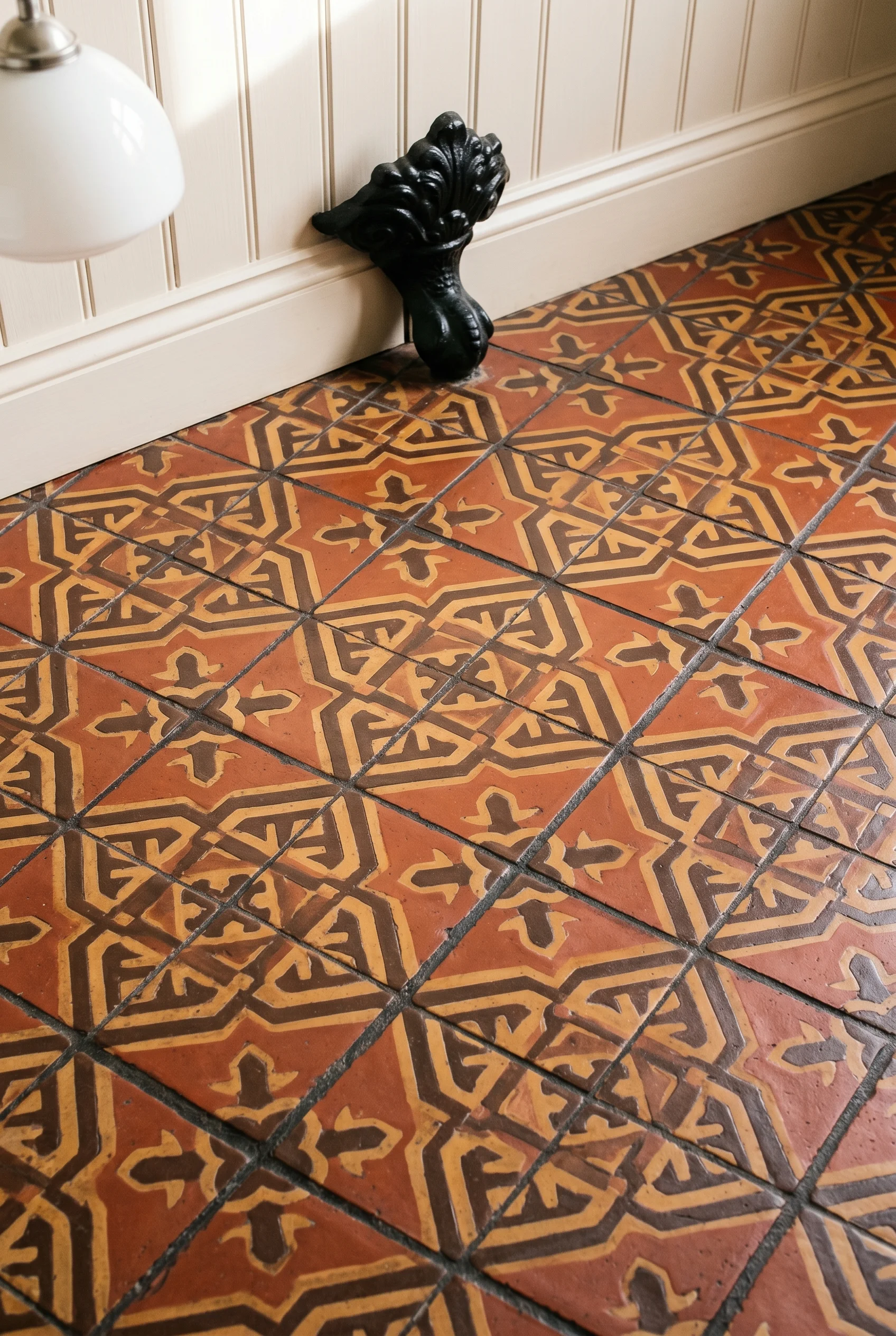
I’d pick a small geometric repeat in deep terracotta, ochre, and chocolate brown. Lay it through the whole bathroom floor and let it stop at the threshold. Don’t run it up the wall. Don’t add a border tile. The pattern is enough on its own. Contrast this with mediterranean spanish style bathroom where the approach is almost opposite.
If you have original wood boards under the existing floor, that’s the other good answer. Sand them, fill the gaps, and seal them with a hard wax oil. Lay a single Persian or needlepoint rug over the top. The bathroom started life as a dressing room in most Victorian houses, and a sealed wood floor with a worn rug honours that history. It also costs less than a tile floor and feels warmer in winter. For a warmer take on the same room, see modern bathroom.
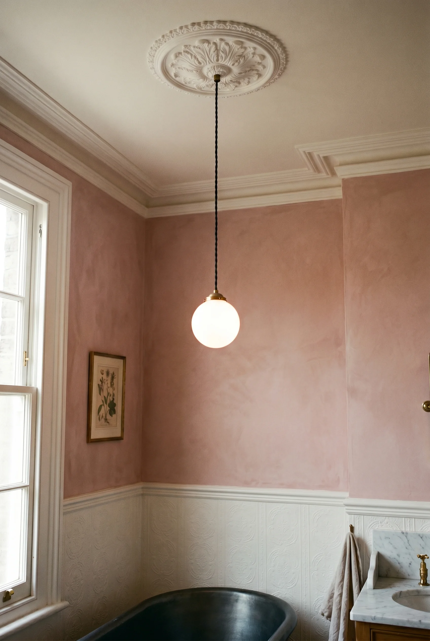
Edison bulbs everywhere is a tired look, and it isn’t even period. Victorian gaslight was soft, warm, and slightly green. The fix is sconces at eye level on either side of the mirror, on a dimmer. A sconce is just a wall mounted lamp. Two of them face to face means no shadows on your face, which is the whole point at the basin. We tested this theory across rooms, starting with how to create a timeless victorian garden.
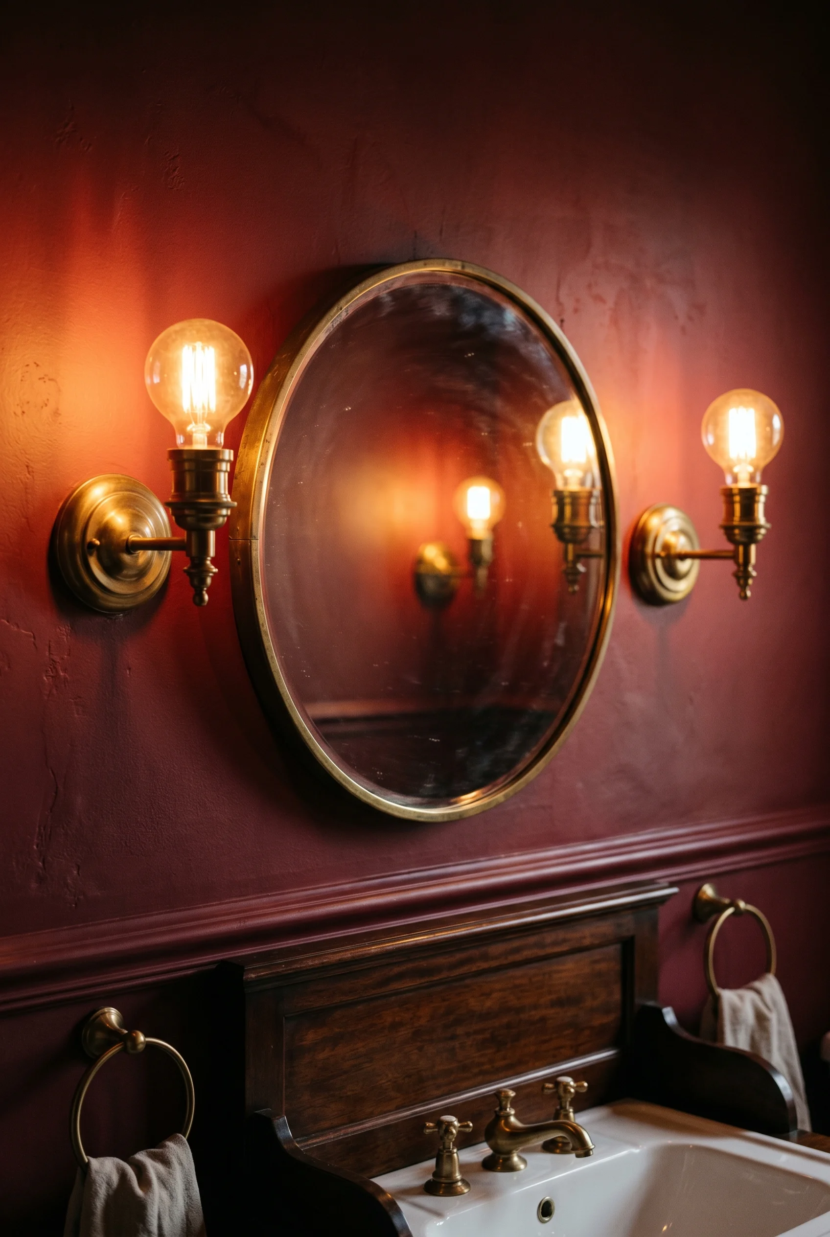
Add one ceiling pendant for general light, also on a dimmer. Keep it simple. A milk glass shade or a small brass lantern is right. A heavy crystal chandelier is wrong unless the room is huge and the ceiling is over three metres. Most aren’t. It is the same instinct behind great stunning contemporary british victorian exteriors.
Soane Britain and Howe London make beautiful brass sconces and pendants in the right scale. Jim Lawrence is the value option and the quality is honest. I’d buy three pieces from one maker so the finish matches across all the light fittings. It is the same instinct behind great victorian mudroom.
The bulb choice matters as much as the fitting. Use 2700K warm white bulbs everywhere. Not 4000K, not Edison, not coloured. 2700K is the closest match to gaslight you’ll get from an LED, and the dimmer takes care of the rest. The full version of this trick is in our victorian style office piece.
The standard advice is a frosted roller blind. It’s the safe answer. It also kills the period feel. The Victorians used wooden interior shutters on every street facing window for privacy, light control, and draft blocking. Bathrooms were no different. For a warmer take on the same room, see french country bathroom.
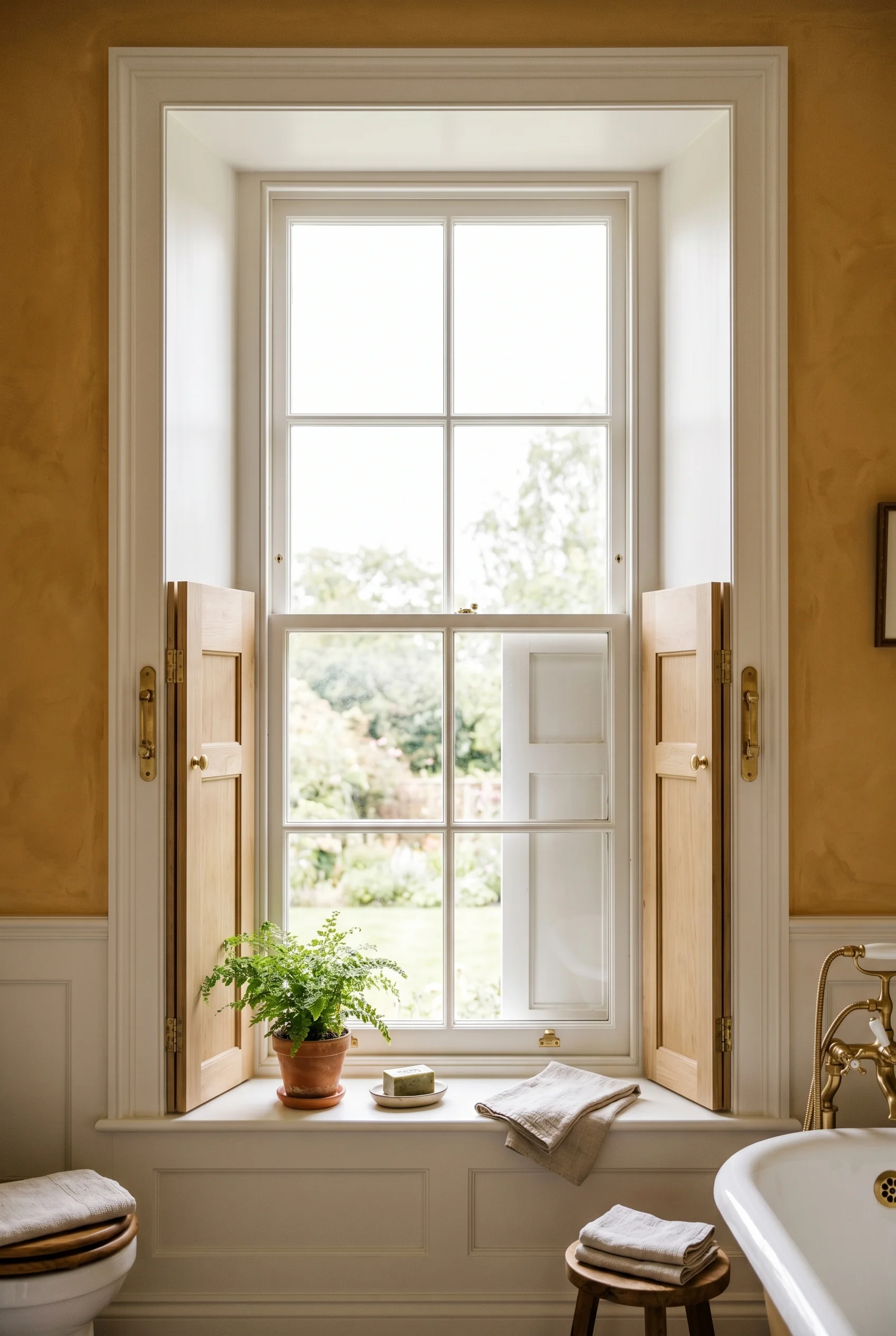
I’d fit solid wood shutters in a half height or tier on tier style. Half height gives you privacy at the basin while leaving the top of the sash open for light. Tier on tier means two sets stacked, so you can open top and bottom independently. Both look right in a period room and both work better than a blind. This shade shows up again in very small living and dining room ideas.
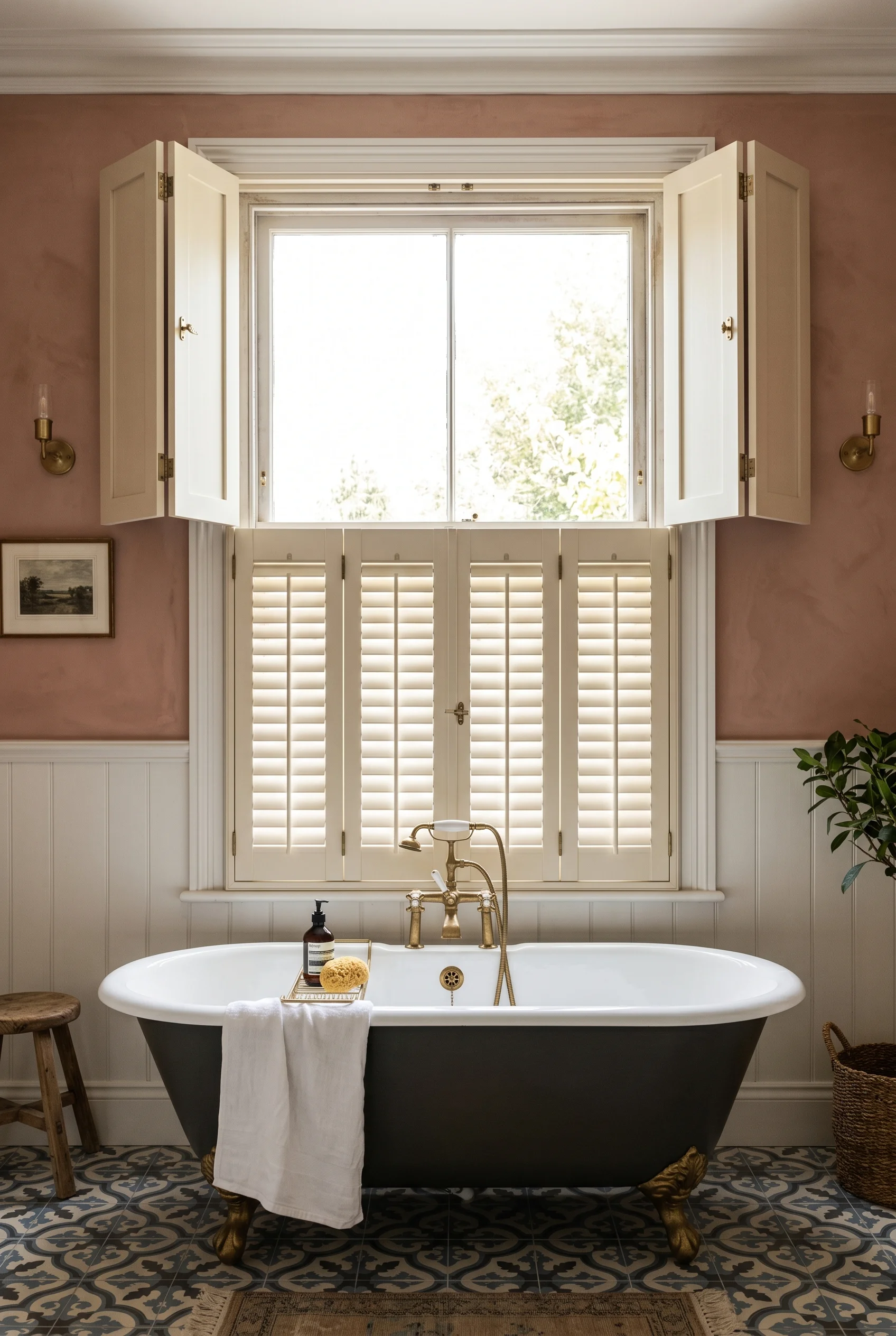
Paint the shutters in the same shade as the trim, not a contrast colour. They should disappear into the wall when closed. If the window is large and the room is cold, add a heavy drape over the top in a plain velvet or wool. One layer, not two. A lace under panel was a Victorian standard but it reads fussy now. The material logic here mirrors what we covered in living room ideas.
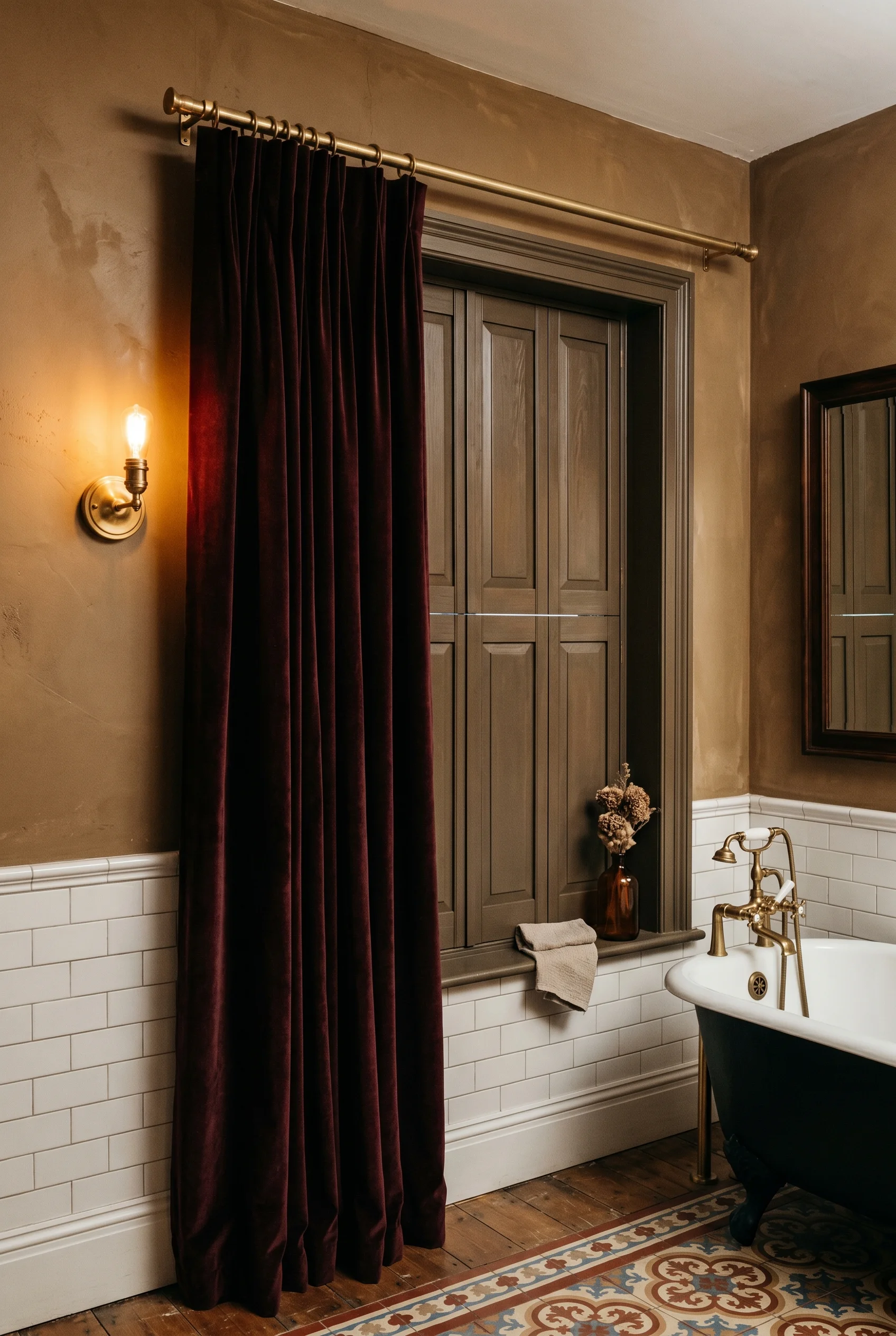
For the sash itself, restore it if you can. A sash window with the original glass and brass furniture is worth keeping. New double glazed sashes are good but never quite as elegant. A specialist sash restorer will draught proof the original for less than a full replacement. The material logic here mirrors what we covered in cozy reading nook.
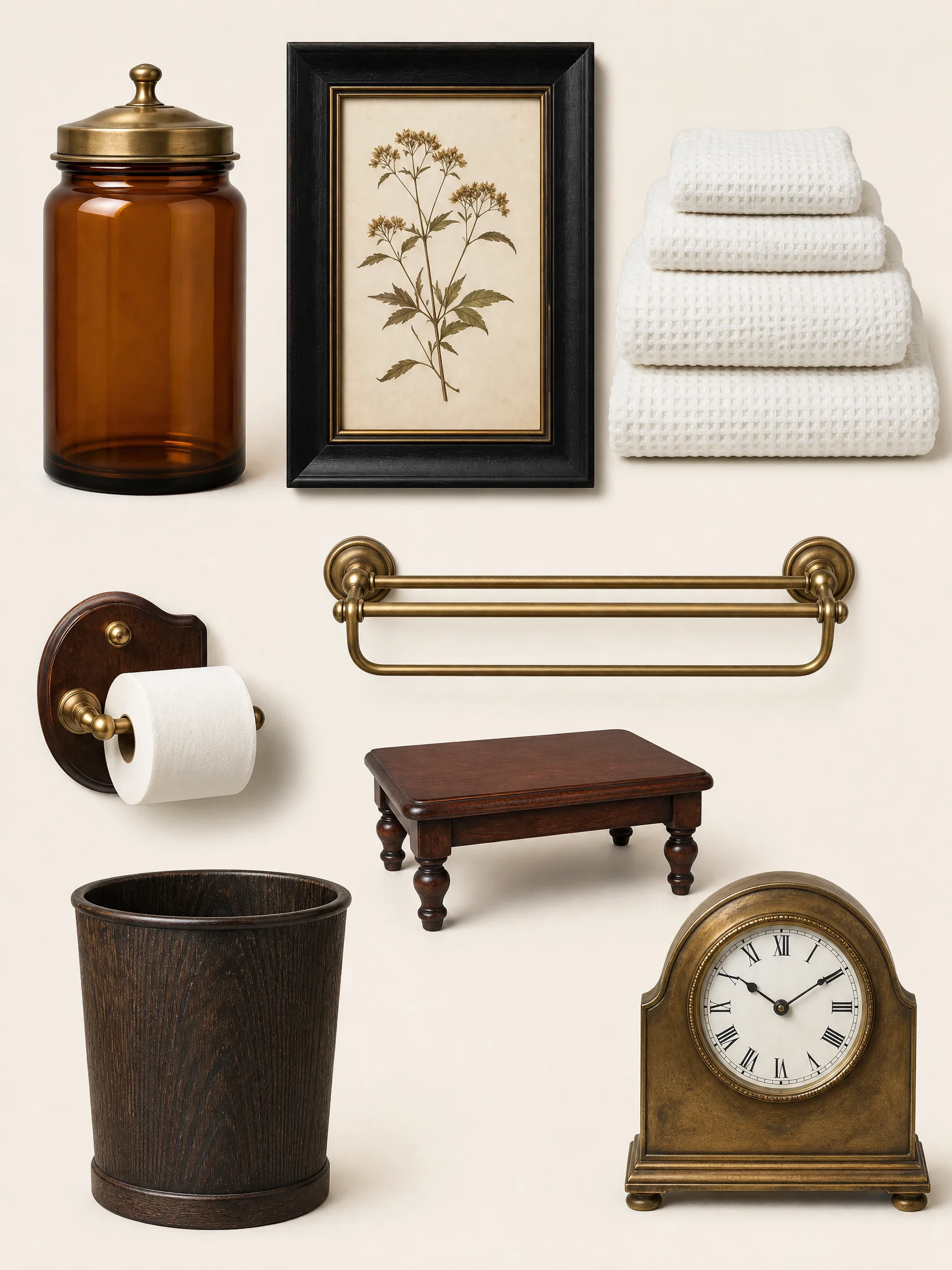
This is where most modern Victorian bathrooms go off. A floral towel set, a soap pump, a wicker basket, a sign that says BATHROOM, three candles, a faux plant, a clock. Take all of it out. Put back three things. Maybe four. The mid century modern interpretation handles this completely differently.
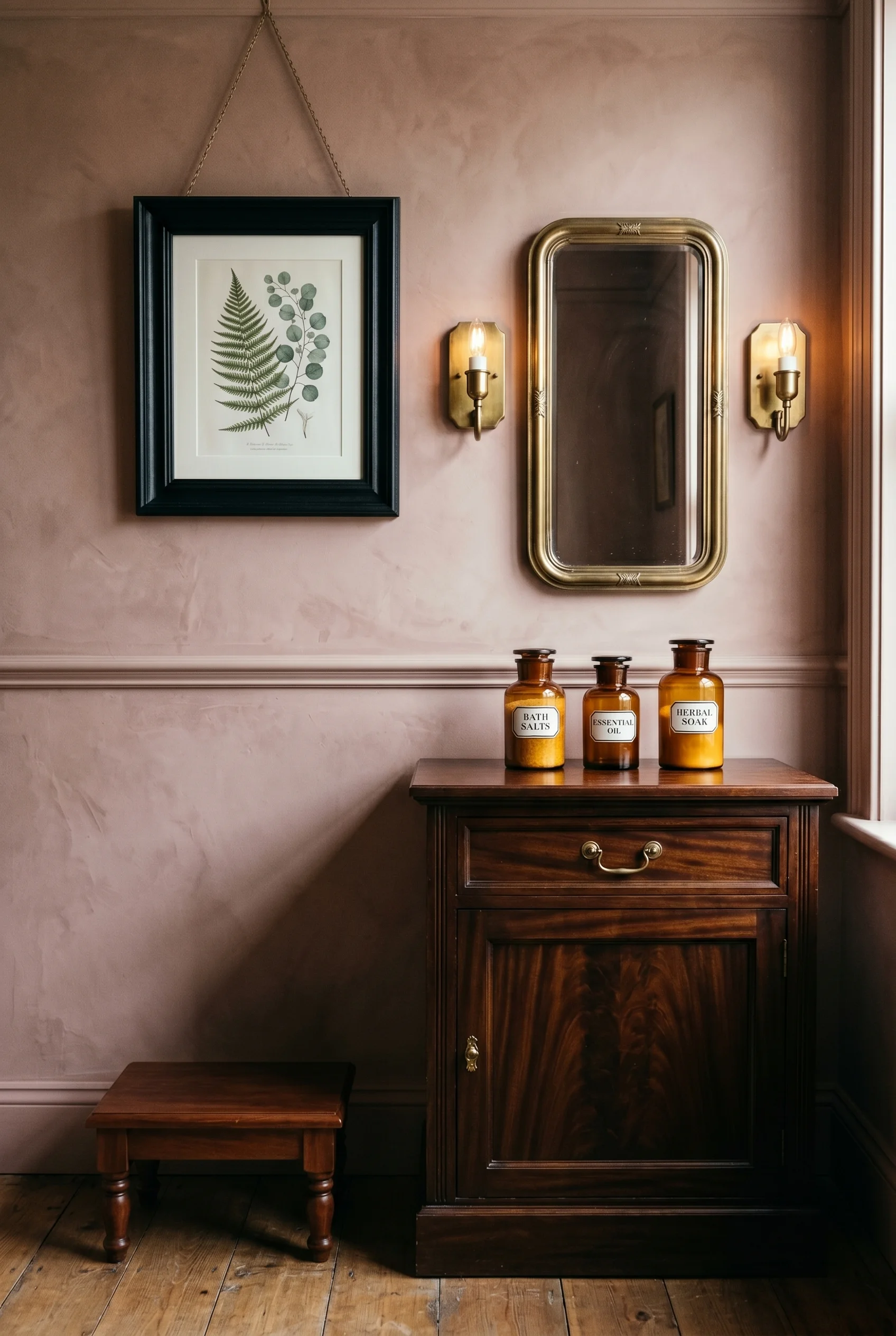
I’d start with apothecary jars in amber or clear glass for cotton wool and bath salts. Then one botanical print in a heavy black frame above the loo. Then a small brown furniture stool, an old wooden one, for towels or a book. That’s the kit. You will see this exact finish in our mid century modern kitchen roundup.
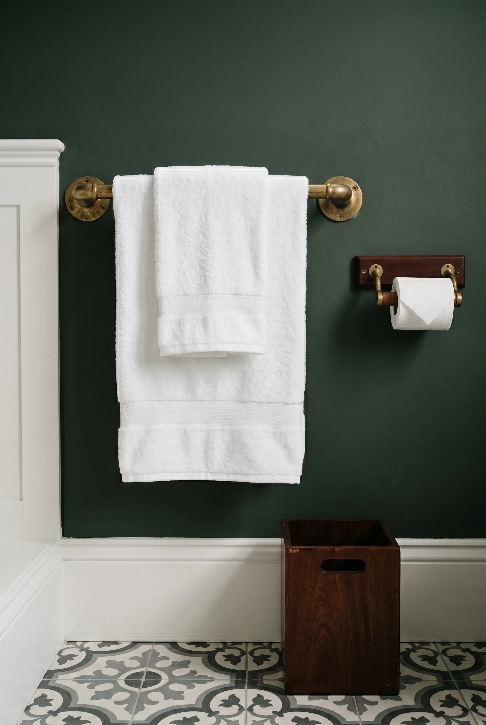
The towels stay plain white and stack on a brass rail. No prints, no monogram, no piping. The bin is dark wood or brass, not chrome. The toilet roll holder is brass on a wood mount, not a freestanding chrome rack. Each small choice keeps the room calm. Each one is the edit working in your favour. You will see this exact finish in our dark bedroom roundup.
If I had to choose one move, it would be the paint. Setting Plaster No. 231 across the walls and ceiling, with Pitch Black No. 256 on the bath panel. Brass taps. A mahogany stool. Everything else can wait. The room will already feel right, and you’ll have left out everything that doesn’t earn its place. This works in tandem with the ideas in modern bedroom.
This post contains affiliate links, which means we may earn a small commission if you make a purchase through our links, at no extra cost to you. For a related take, see farmhouse sage green kitchen cabinets.