Newsletter Subscribe
Enter your email address below and subscribe to our newsletter
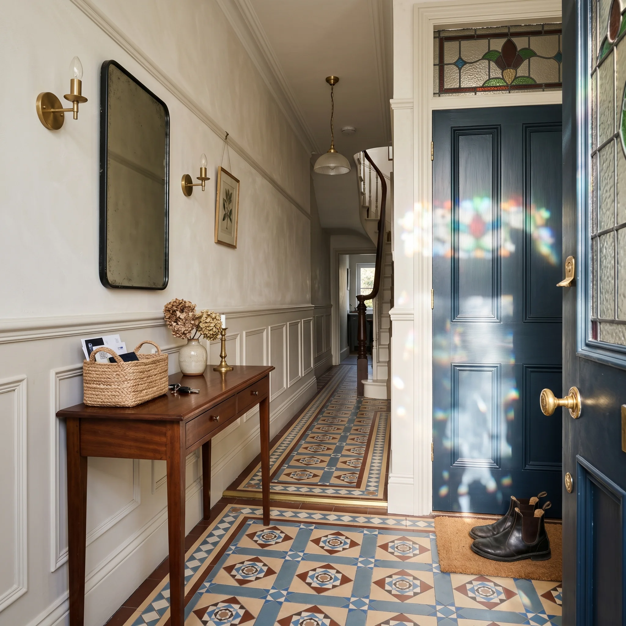
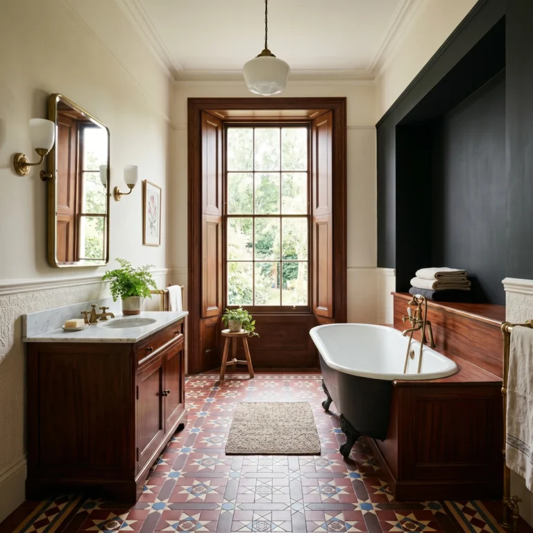
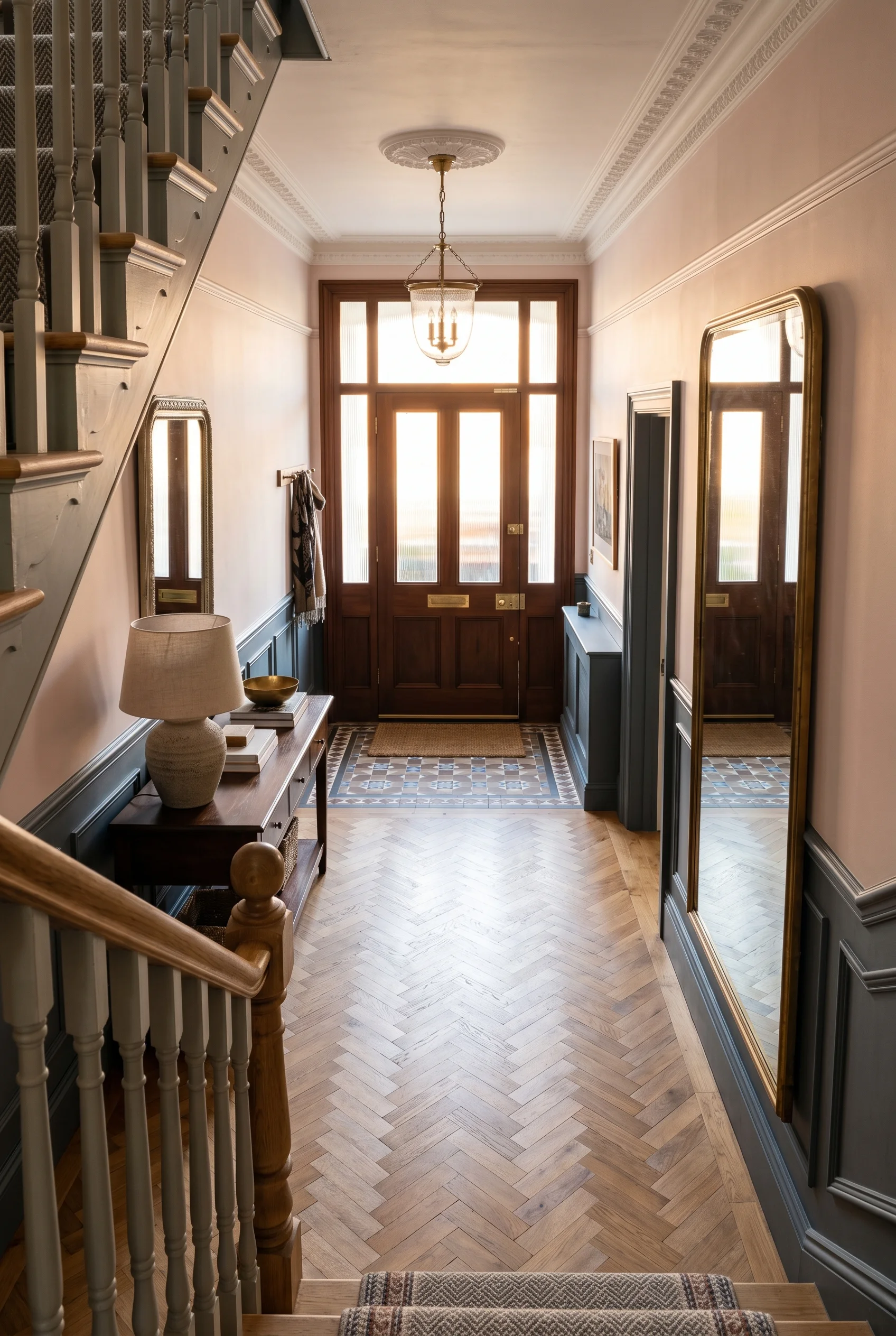
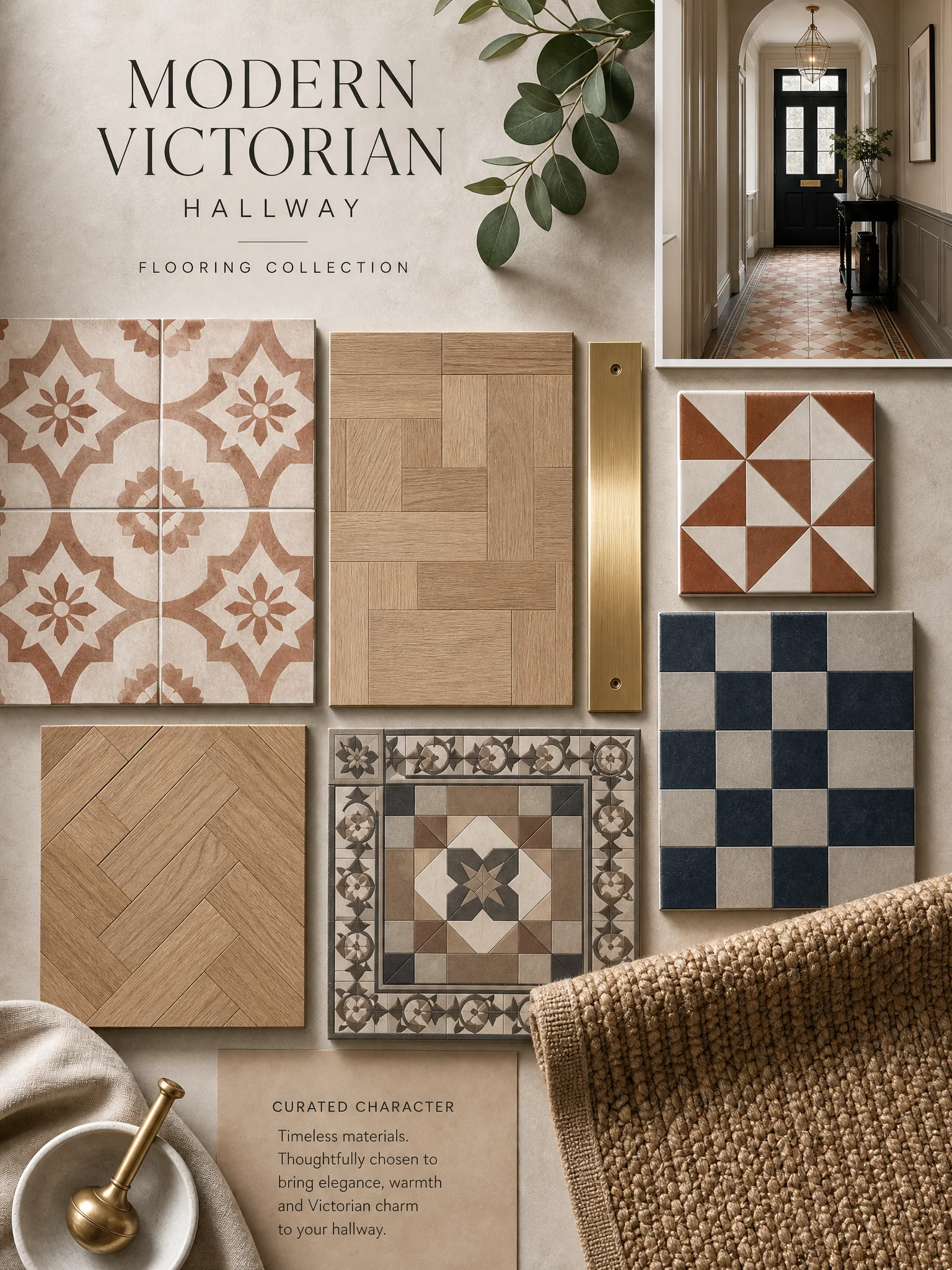
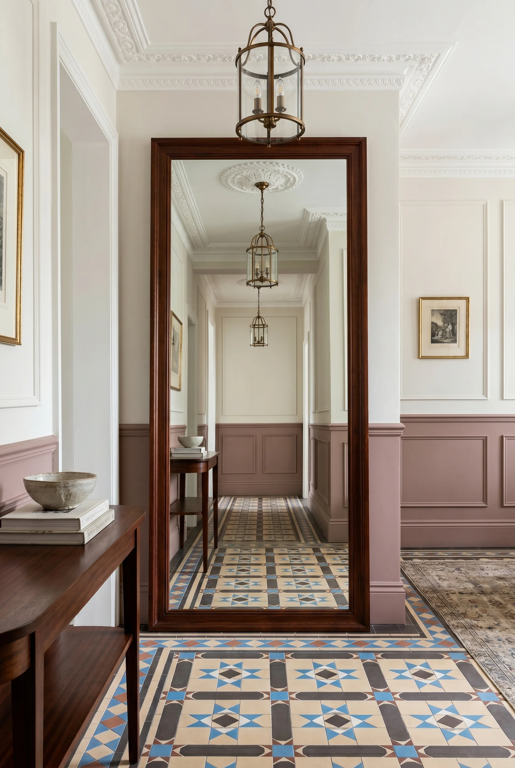
The Victorian hallway turns on three decisions, in this order: the joinery, the floor, the wall above. Get those right and the rest of the corridor more or less specifies itself. Get any one wrong and the hall reads as a corridor, not a room. I’ve found this is the bit most renovations miss. They start with paint colour or a hat hook. I’d start with the dado rail’s height, the tile under the doormat, and the finish of the plaster between rail and cornice. Joinery first. Floor second. Wall above last. That’s the whole brief. And that same logic carries over to your victorian bathroom design.
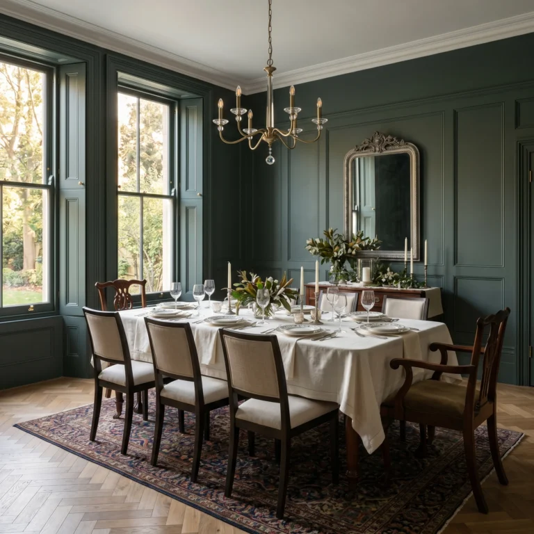
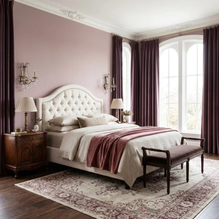
The hallway is the only room in a Victorian house that’s all transit. No sofa. No bed. No table that holds the day still. So the room is built from its surfaces. The joinery below, the floor underfoot, the wall above the rail. Each one does a job the other two can’t. And that same logic carries over to your victorian bedroom design.
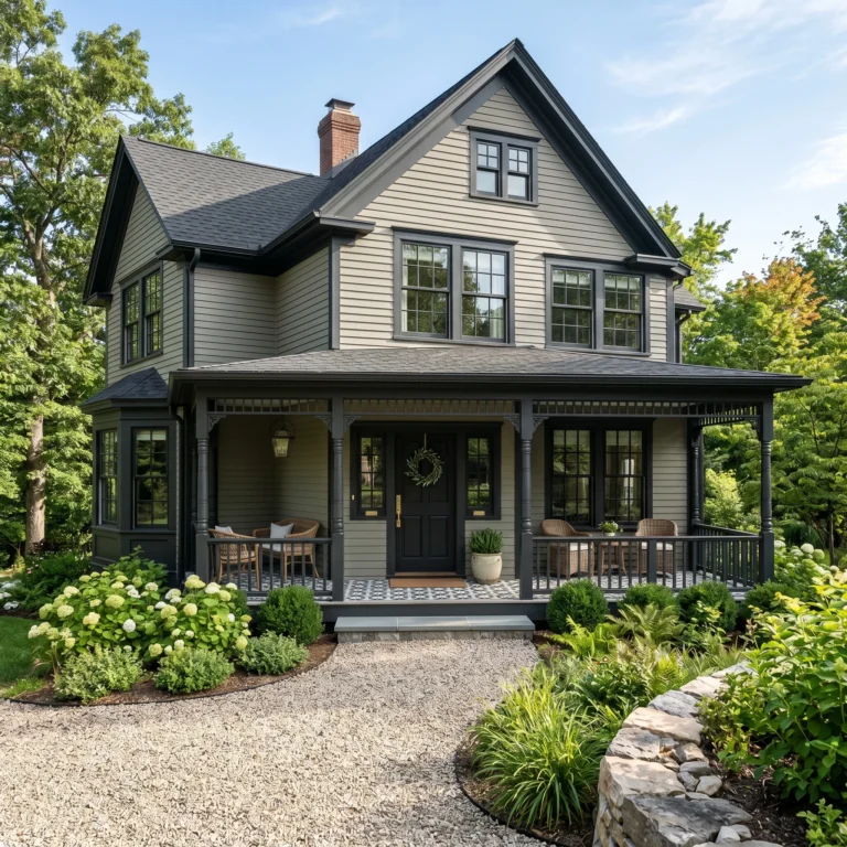
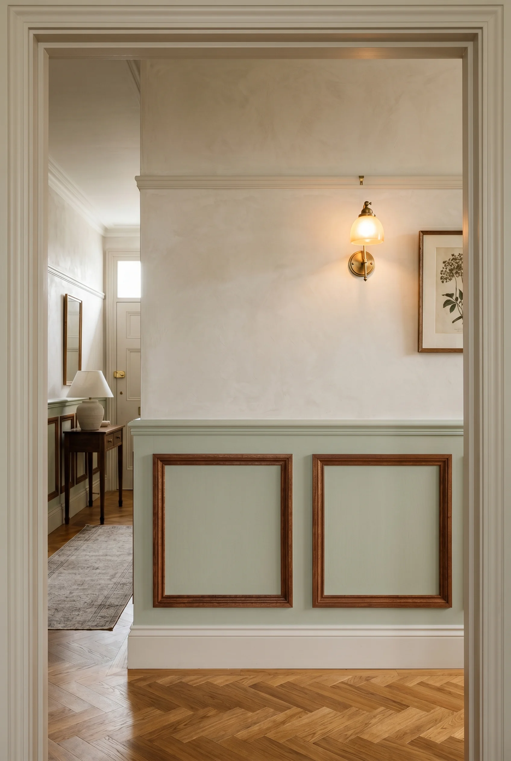
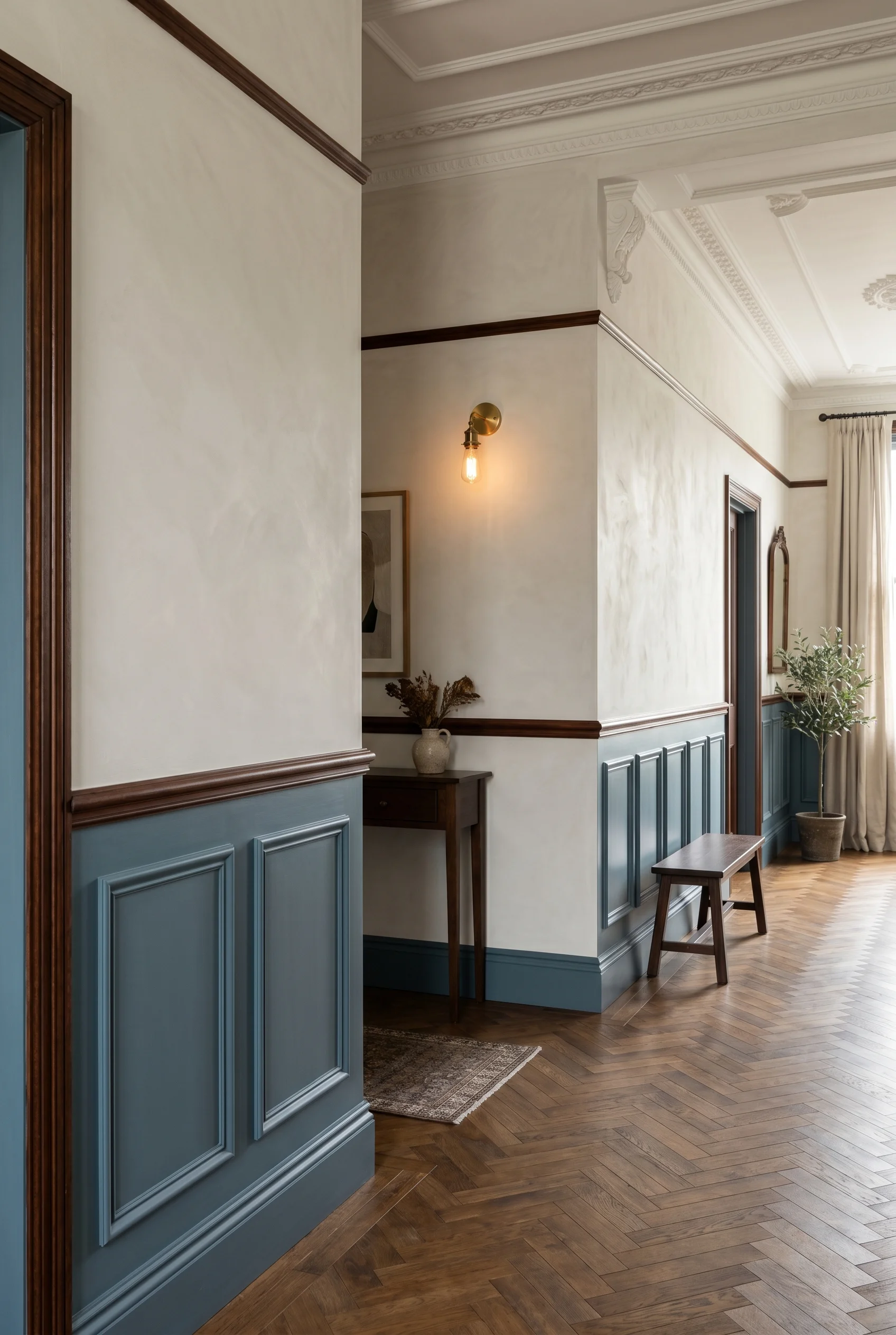
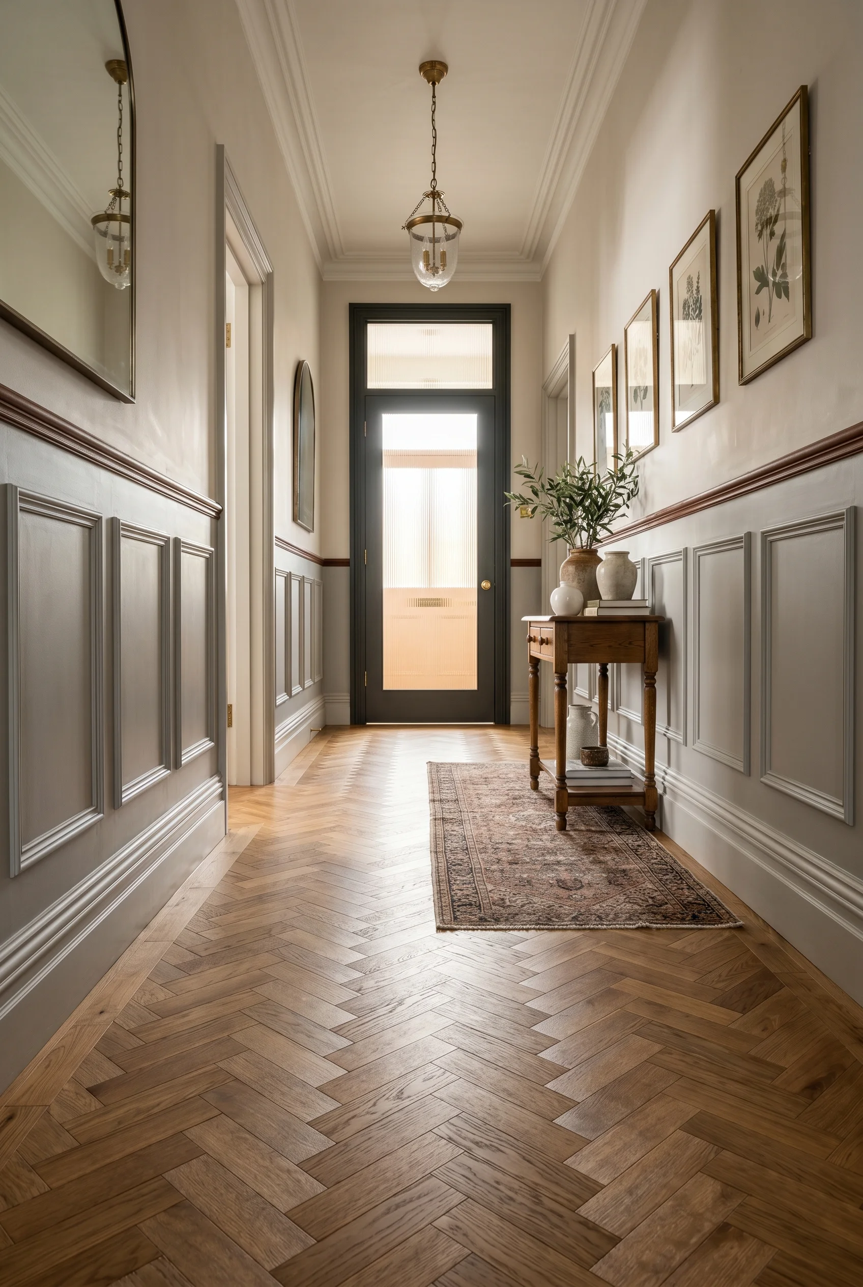
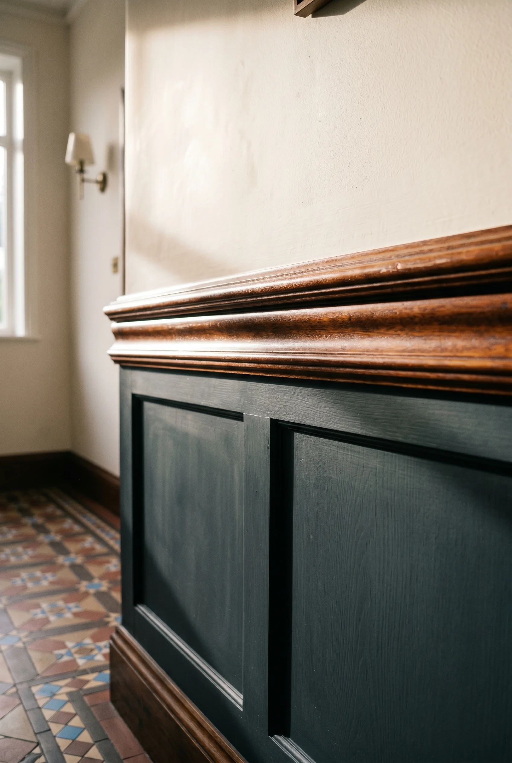
The joinery sets the rhythm. A panelled wainscot (a panelled lower wall, traditionally about a metre high) gives the corridor its bones. The dado rail caps it. The picture rail, a few feet above, holds the eye at the right height. Without that joinery, the wall is a flat blank that makes the hall feel like a passage in a budget hotel. With it, you have a room that’s been built, not painted. The same principle holds true for the complete guide to a modern victorian home.
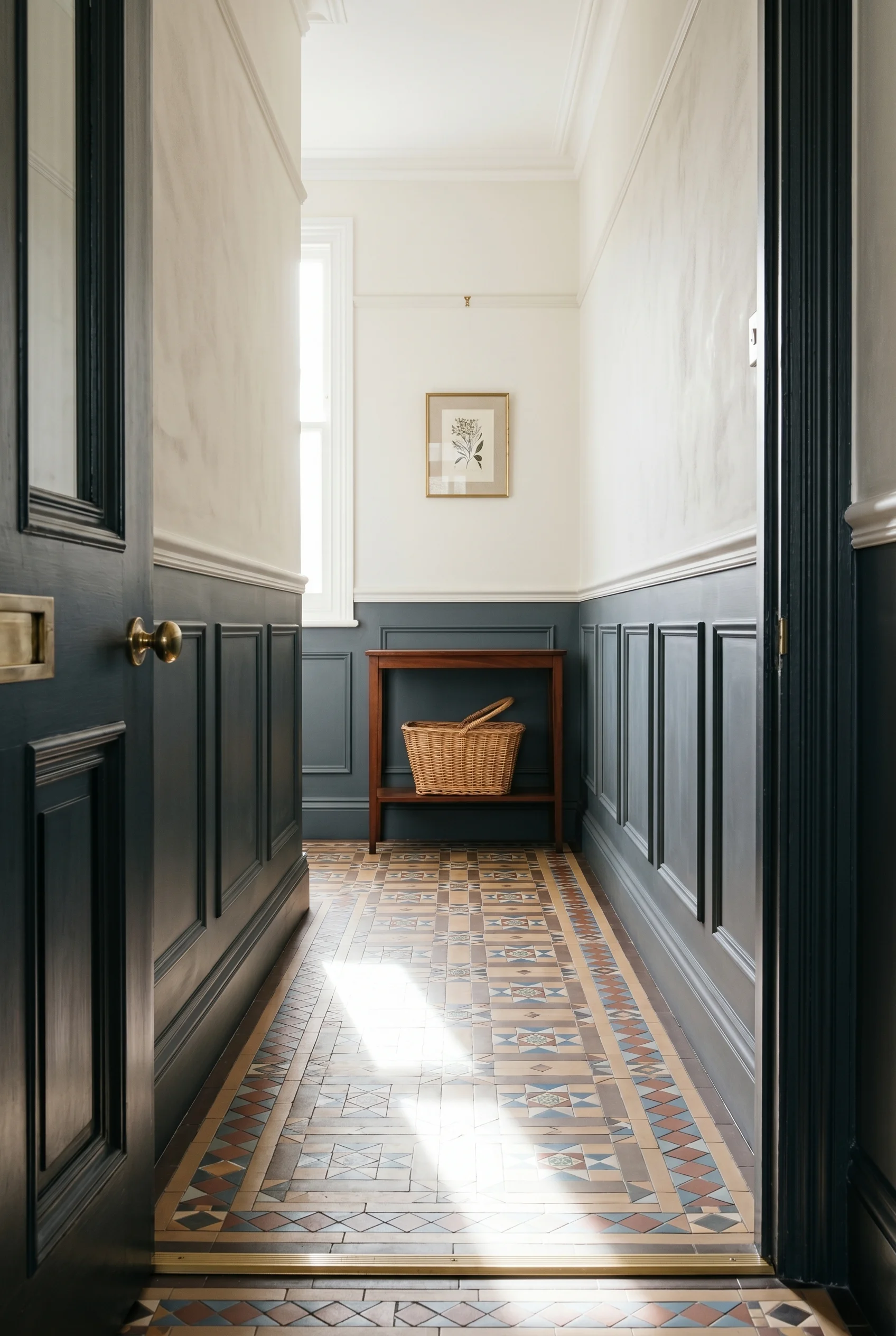
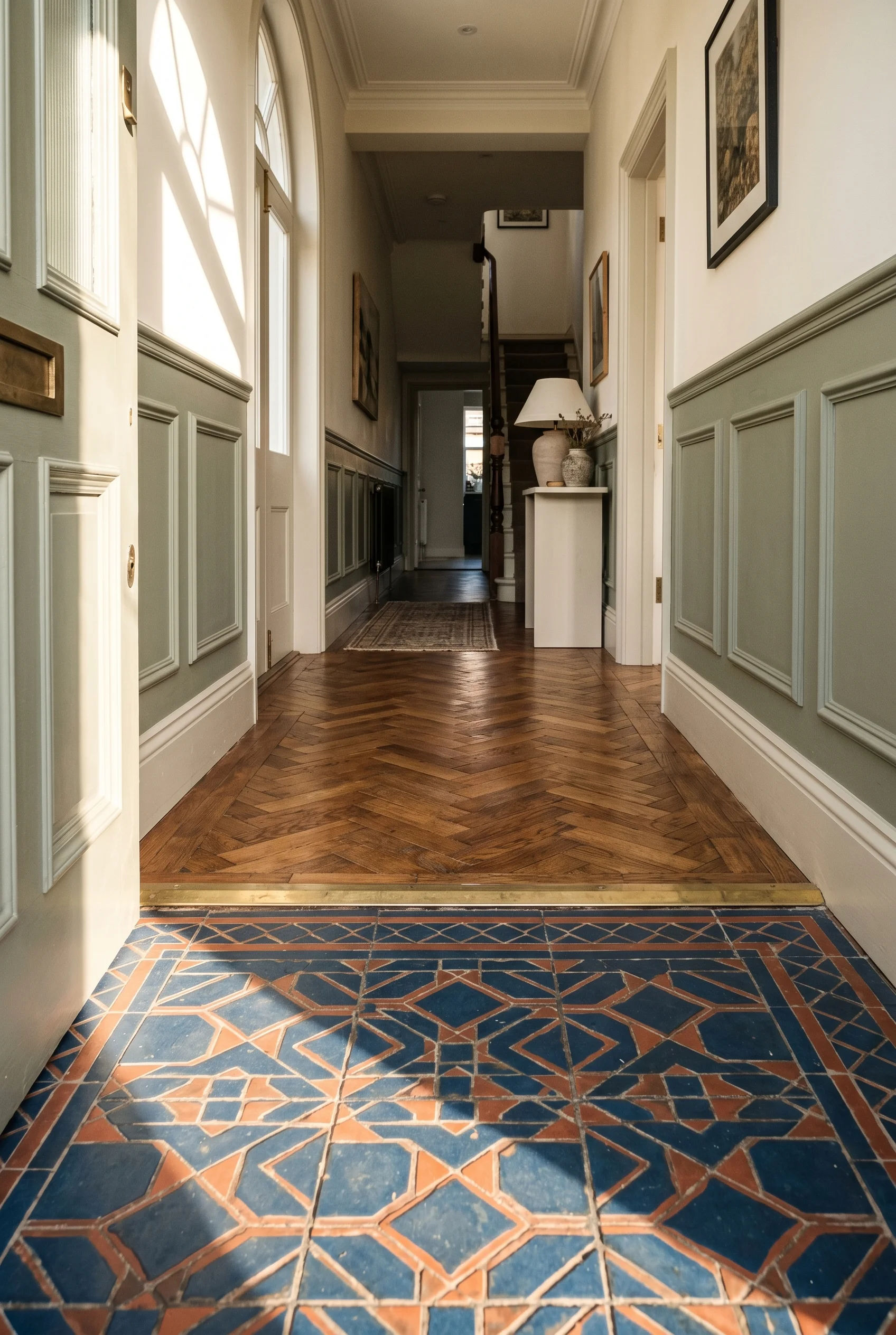
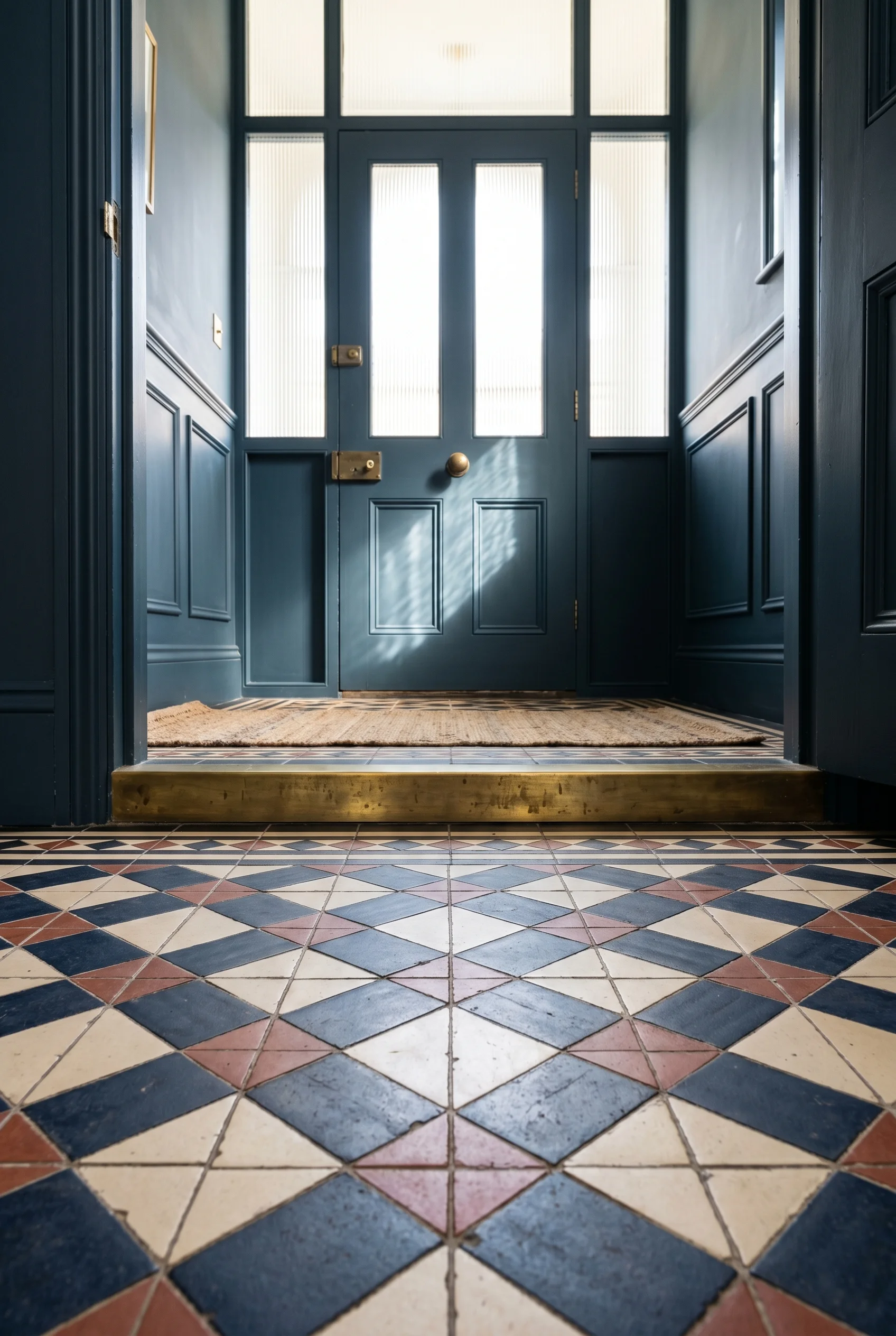
The floor does the work of welcome. Encaustic clay tile (clay tile with the pattern set into the body, not printed on top) at the front, a parquet timber laid in herringbone for the run inland. Two materials. One threshold strip. The threshold is where the language of the front of the house ends and the language of the rest begins. The same principle holds true for modern luxury bedroom design.
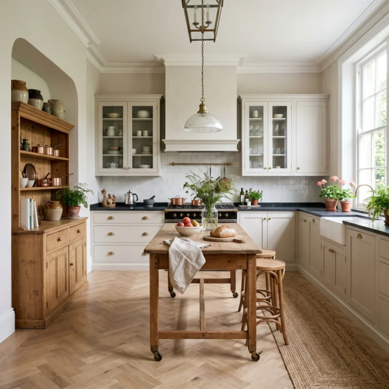
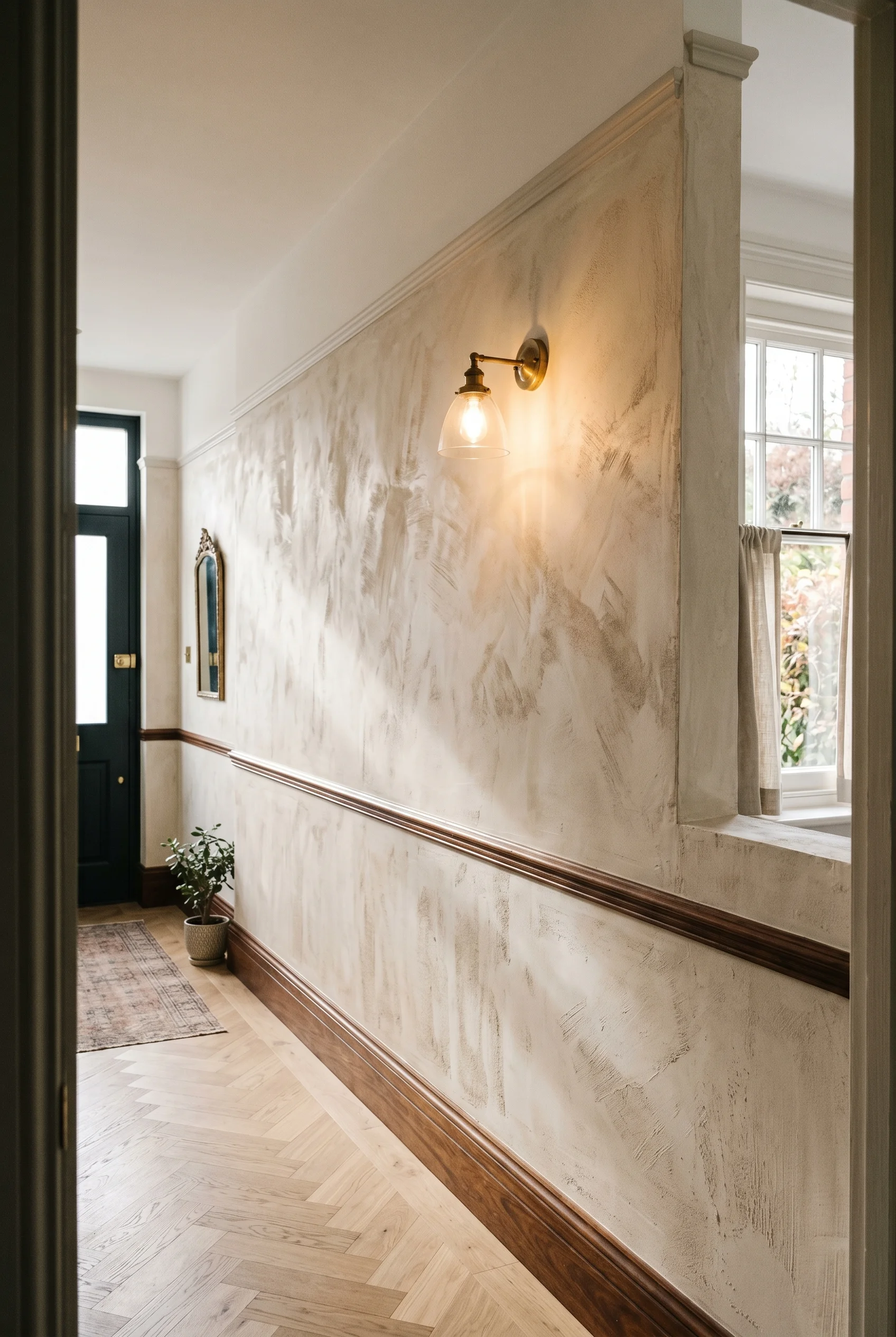
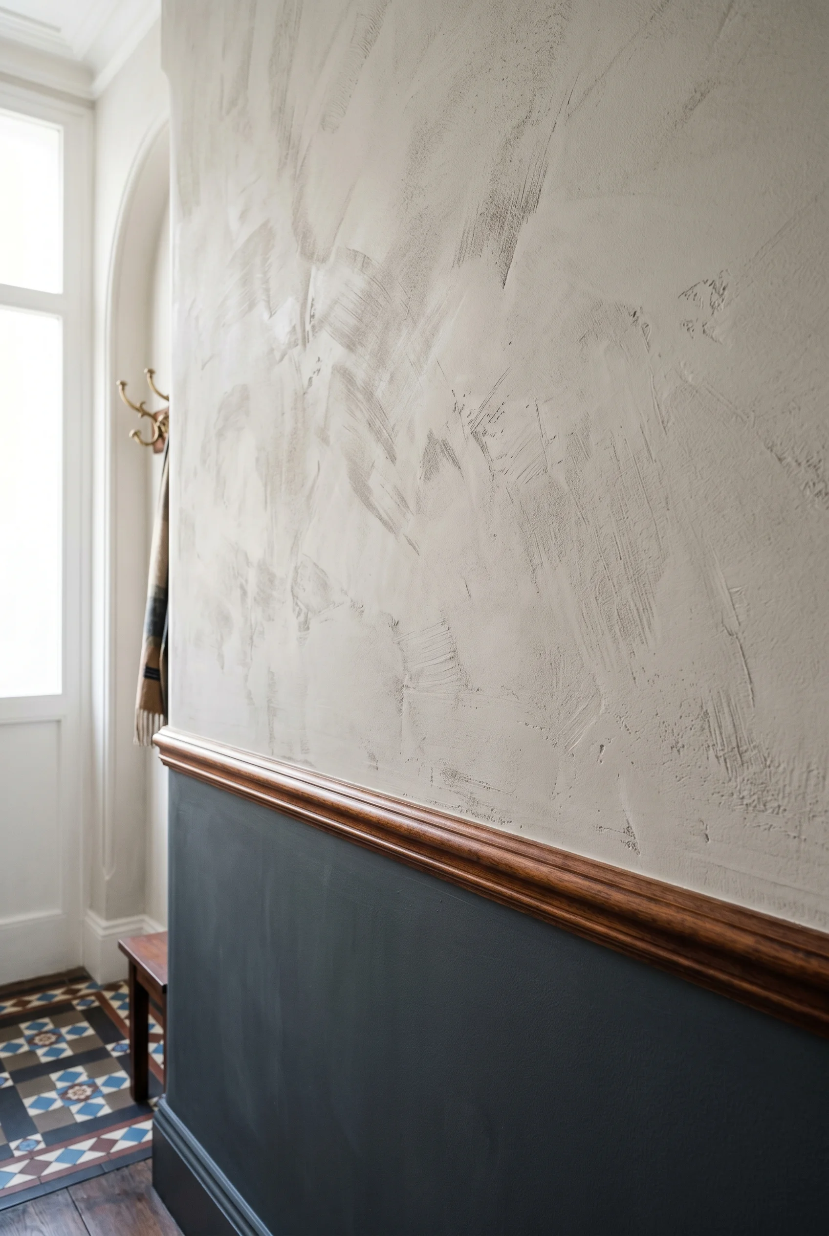
The wall above the rail is the breath. A drag finish (a matt paint pulled with a long brush so the strokes show as soft vertical lines) on the panelled section below. A smooth limewash above. The two finishes catch the light differently. That difference is what stops the corridor from feeling flat. Joinery, floor, wall above. The rest is pacing. Which is exactly what makes victorian kitchens work so well.
Most paint guides for Victorian halls give you a colour. I’d give you two finishes instead. The dado below wants a tougher paint. It gets scuffed by bags, prams, the dog. Pick a satin or a drag finish and the marks wipe off. The wall above the rail wants a soft matt or a limewash. Light hits it gently. The two finishes share one wall and the eye reads them as one room with depth. You will find a version of this in our victorian exterior design breakdown.
The 60-30-10 rule still applies, just split by surface. 60 per cent goes to the wall above the rail. 30 per cent to the joinery below. 10 per cent to the front door, the inside face. That last 10 per cent is where I’d spend the colour. A deep blue or a soft sage on the inside of the door changes how you arrive home. You shut it, you turn, you see the colour before you see the corridor. Which is exactly what makes victorian era color palette work so well.
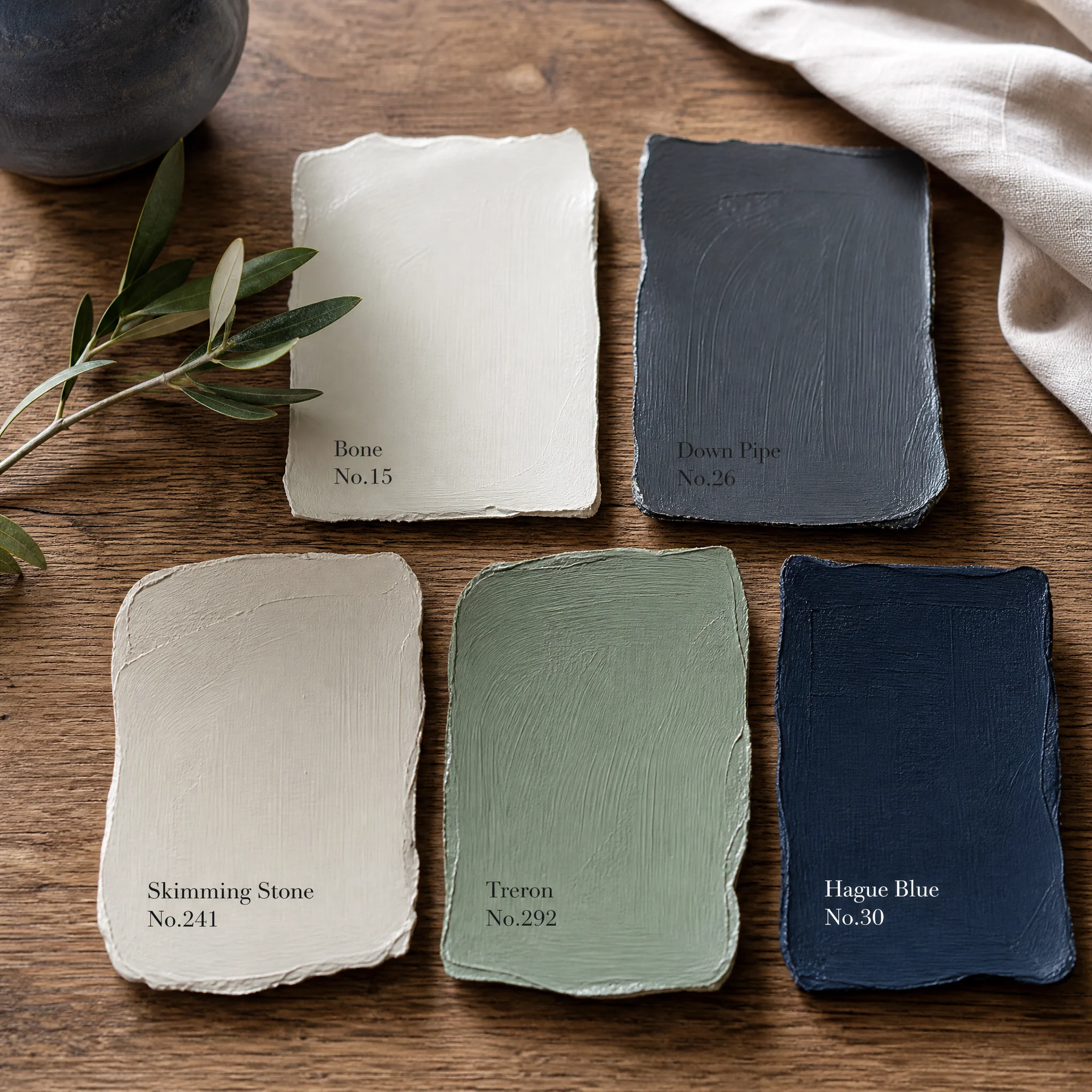
A common mistake is matching the dado paint to the trim paint. They sit too close in tone and the joinery vanishes. Push them apart. Trim in a warm off-white. Dado in a stronger note. The wall above can stay calm because the joinery is doing the work. Here are the five paints I would actually reach for. For more on this palette, see 39 stunning victorian hallway design ideas.
Bone No. 15 is the wall above the rail. A warm soft white that holds light without going chalky. Paint Pick: Farrow & Ball Bone No.15
Down Pipe No. 26 is the dado below. A deep grey that takes scuffs without showing them. Paint Pick: Farrow & Ball Down Pipe No.26
Skimming Stone No. 241 is the trim and skirting. Warm enough to sit beside Down Pipe without going cold. Paint Pick: Farrow & Ball Skimming Stone No.241
Treron No. 292 is an option for the dado if you want sage instead of grey. Drag finished, it reads like aged wood. Paint Pick: Farrow & Ball Treron No.292
Hague Blue No. 30 is the inside of the front door. The colour you see when you turn around at home. Paint Pick: Farrow & Ball Hague Blue No.30
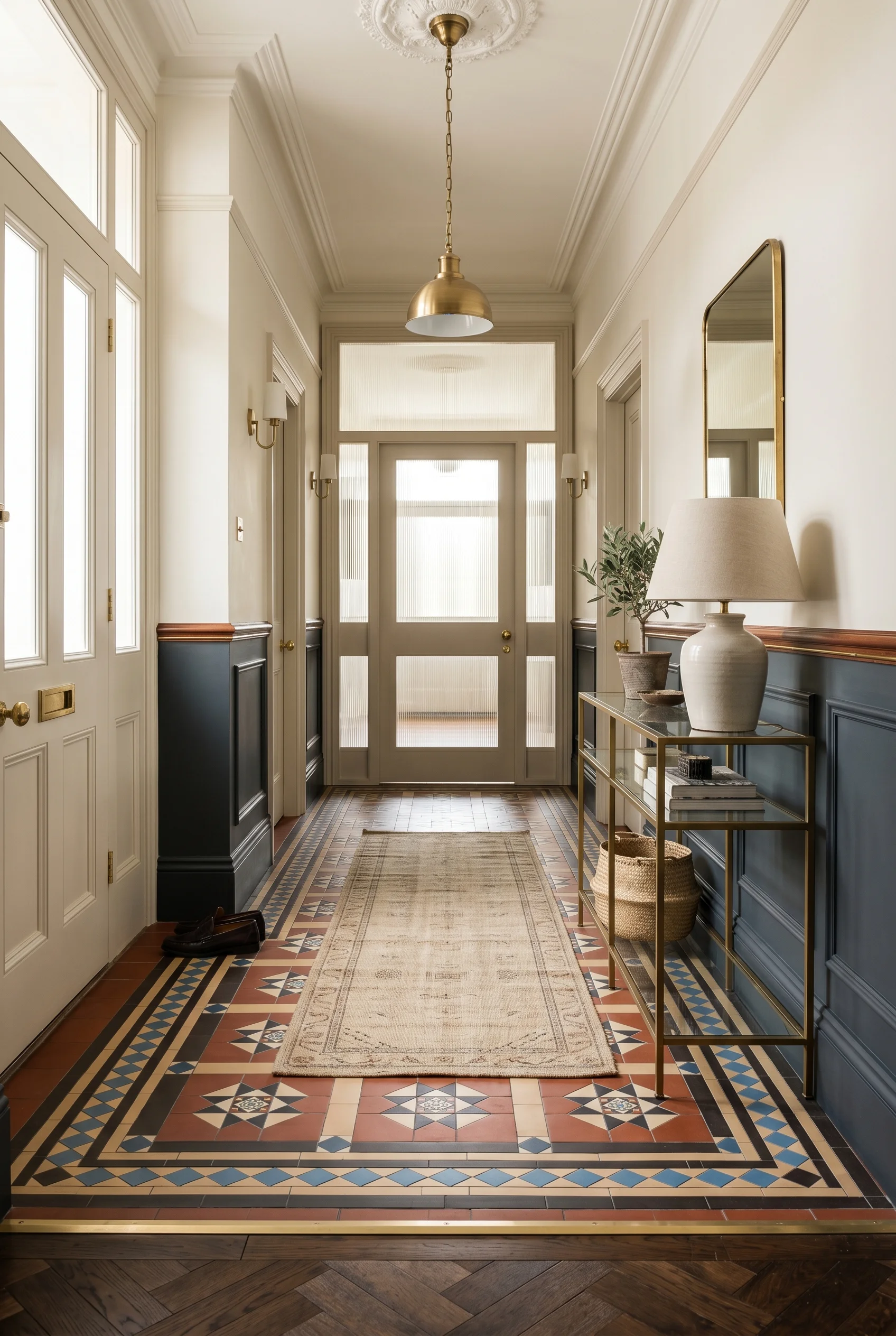
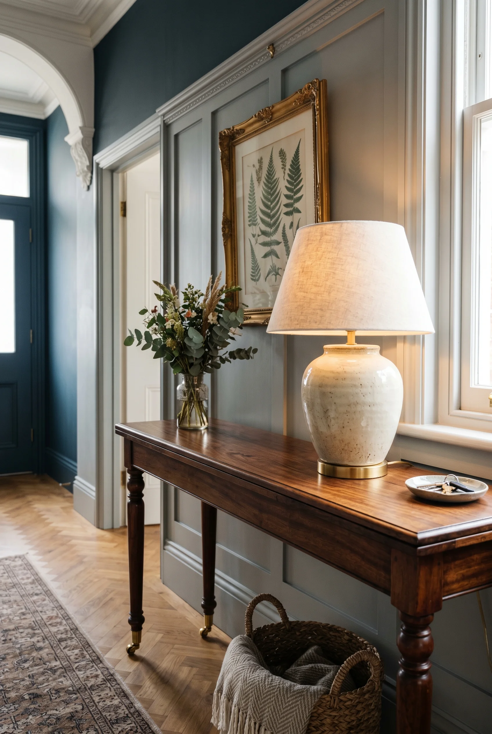
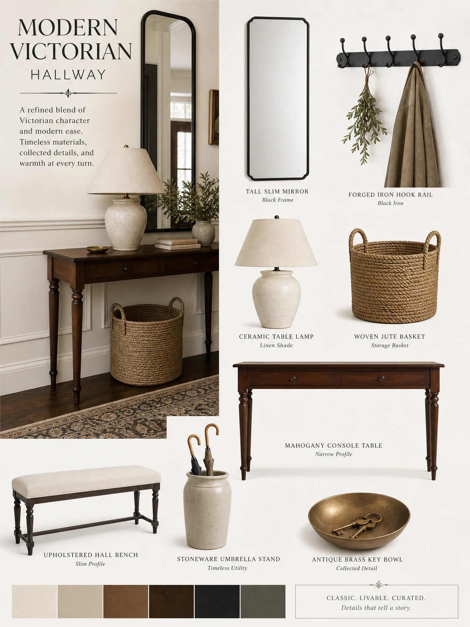
A hall has one working surface. The console table. Everything that lives in a hall lives on or under it. Keys, post, the bowl of loose coins, the umbrella, the dog lead. So the console isn’t a decorative piece. It’s the surface that carries the day. We dove deeper into this for victorian living room design.
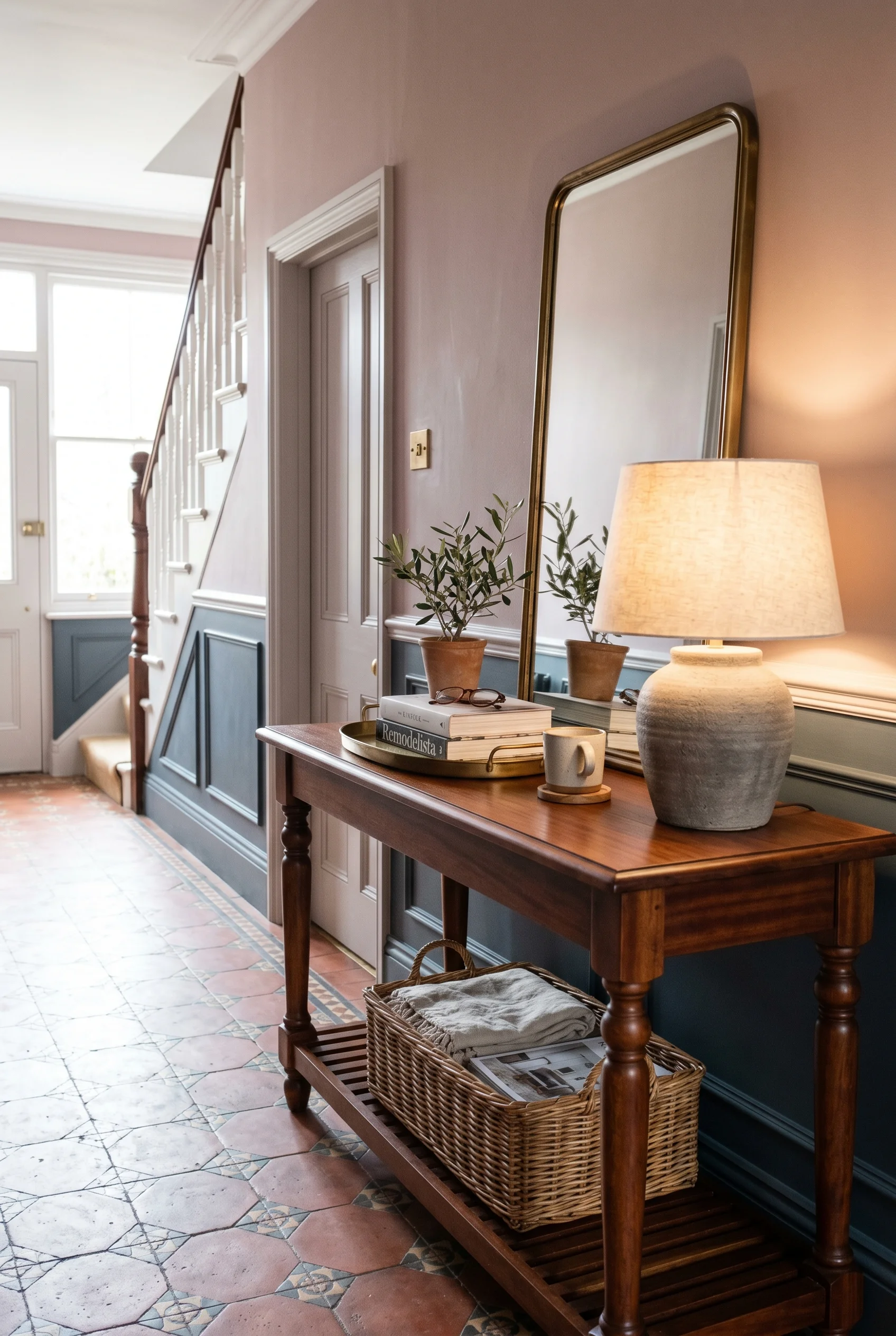
I’d pick narrow over wide. A console of about 25cm depth fits flush against the wainscot and leaves the corridor clear. Solid timber top, slim metal legs, no drawer if you can avoid it. Drawers fill with rubbish. An open shelf below holds a basket for shoes. That’s the brief. One surface, one shelf, one basket. A close cousin of this idea appears in our split living room dining room ideas guide.
Above the console, a tall narrow mirror. Not a statement frame. A simple one. The mirror’s job is light. Hang it so the top sits just below the picture rail. The proportions read as one column from rail to floor. A bench can sit opposite if there’s room, slim, no arms, upholstered in a flat woven wool. Somewhere to put a child’s shoe on while you tie it. A close cousin of this idea appears in our living room design ideas guide.
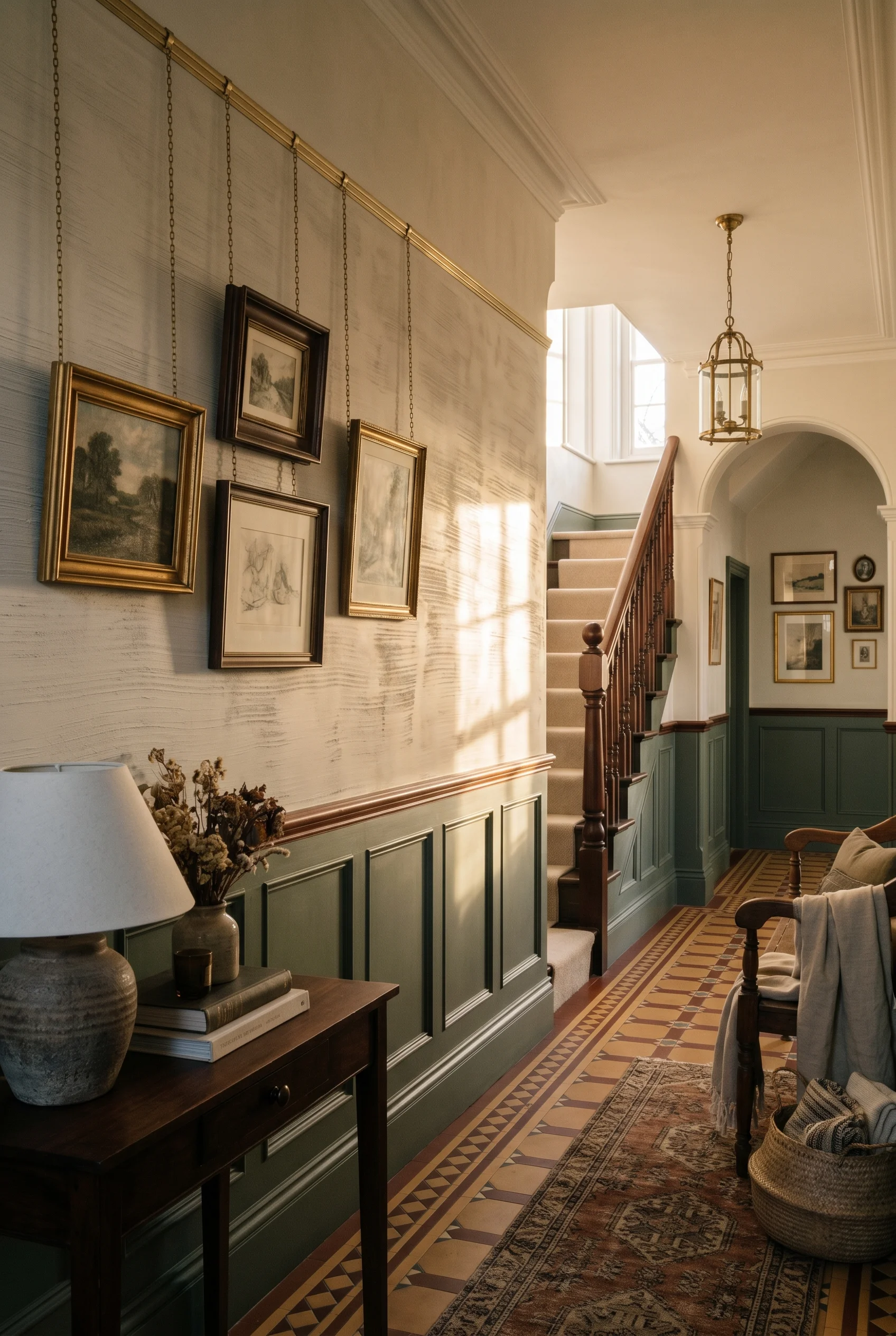
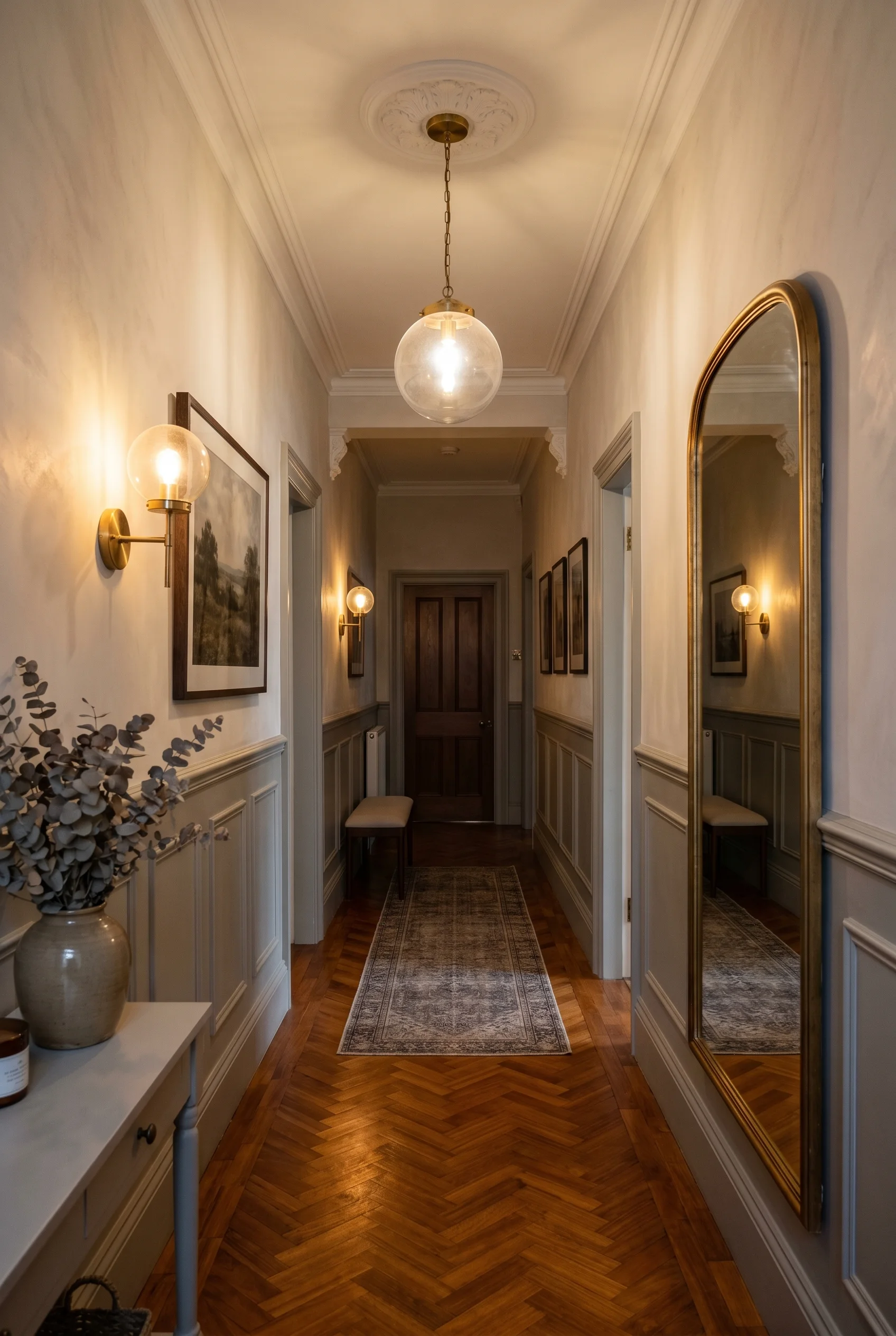
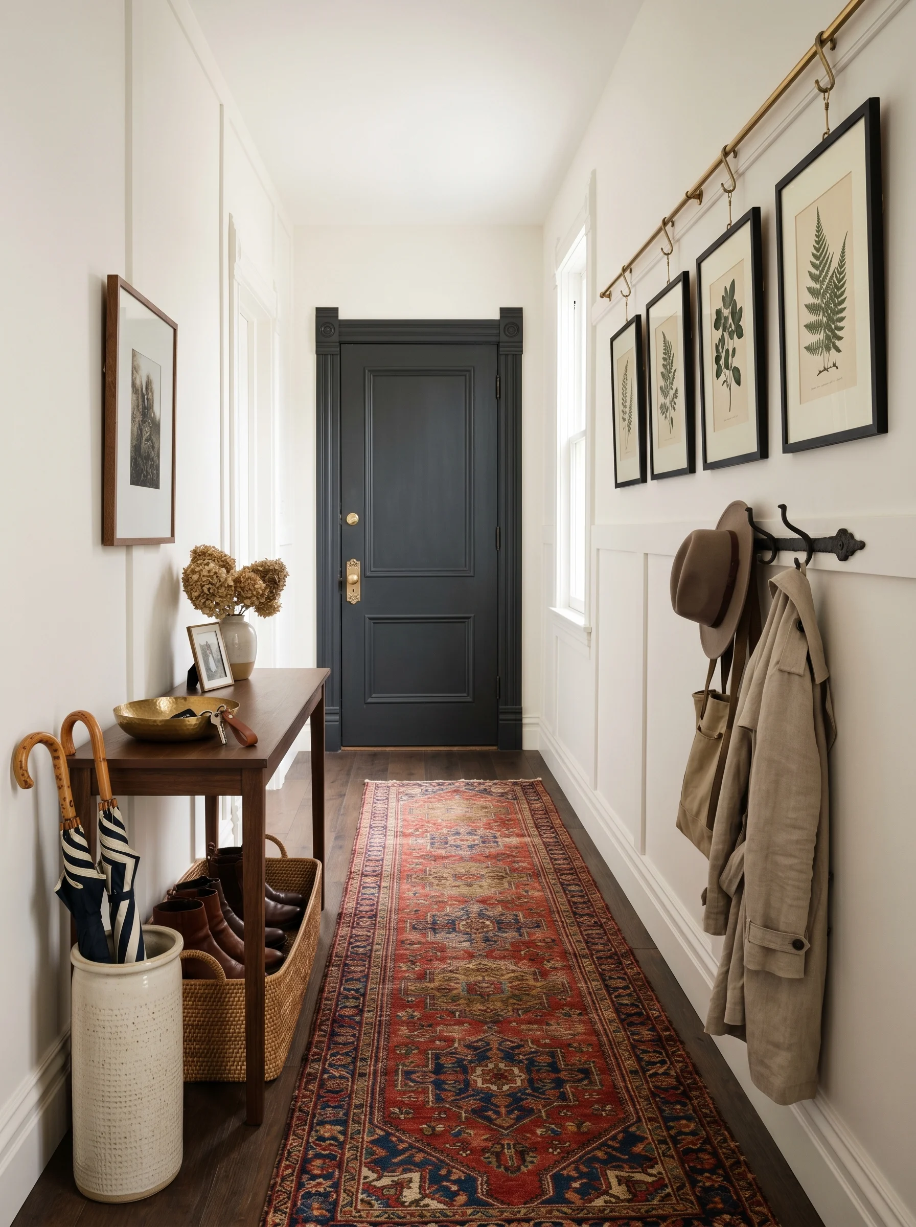
The wall is where the Victorian hall is made or lost. Not the colour. The joinery. A panelled dado below, a dado rail at about 90cm, a picture rail a few feet above the door head. Those pieces of milled timber set every other proportion in the corridor. We tested this theory across rooms, starting with modern victorian bathroom.
I’d ask the joiner for a beadboard panel below the rail. Vertical tongue and groove boards, narrow, primed both sides, fixed to a batten frame. The boards run from skirting to dado. A simple ovolo moulding caps them. The whole thing reads as period work even in a flat from the eighties. We tested this theory across rooms, starting with authentic victorian bathroom.
Above the dado, you have options. Smooth plaster painted in a soft colour. A William Morris paper, hung as a single field. A Lincrusta panel (a heavy embossed wallcovering invented in 1877, still made the same way) painted to match the wall. I’d pick paint or paper. Lincrusta is gorgeous but reads as period kit, not period bones. It is the same instinct behind great victorian home office.
The picture rail does work the eye doesn’t notice. It caps the wall colour. Above it, run the ceiling colour down to the cornice. That stripe of ceiling colour above the picture rail makes the hall feel taller. It costs the price of a length of milled pine and an extra hour of paint. The joiner adds the timber, the painter does the rest. For more on this palette, see modern farmhouse dining room.
Victorian terraces have one problem the architect couldn’t solve. The hall is dark. There’s a front door at one end, a kitchen door at the back, and between them, a tunnel. Two solutions, one for each end. We dove deeper into this for modern victorian kitchen design.
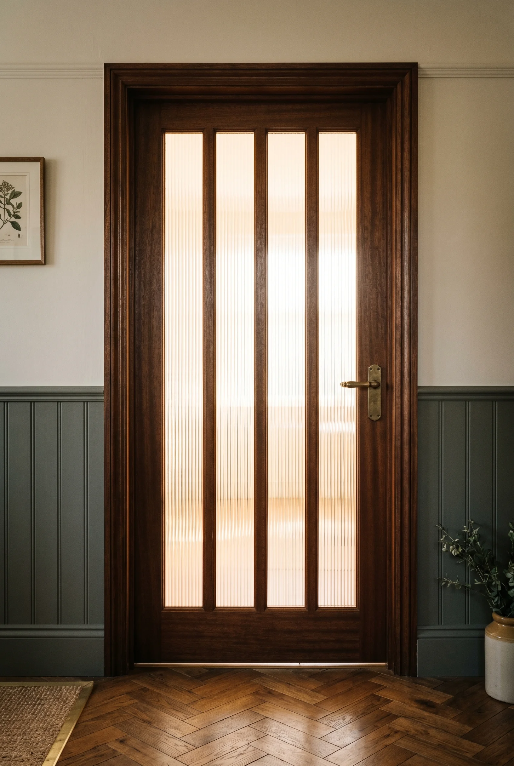
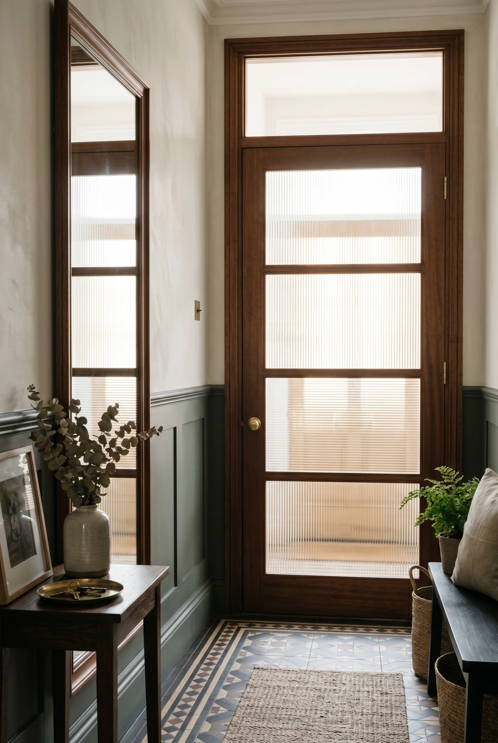
Borrowed light is the first move. The internal doors that lead off the hall, swap the solid panels for reeded glass (vertical fluted glass, frosted enough for privacy, clear enough for light to spill through). A glazier can swap a panel in a single afternoon. The hall picks up daylight from the front room, the dining room, the kitchen. The corridor stops feeling like a tunnel. You will find a version of this in our victorian dining room design breakdown.
The mirror is the second move. Place it opposite a window or a glazed door. The light bounces back across the corridor. A tall mirror with a slim frame doubles the perceived width. Don’t centre it on the wall. Centre it on the light source. The eye reads the symmetry between window and mirror, not between mirror and wall. We covered the full method in our mid century modern living room deep dive.
The threshold to the rest of the house matters too. Where the hall meets the kitchen or the open plan room, the floor changes. Tile to timber, or timber to a different timber. That threshold strip is the moment of arrival. I’d keep it crisp. A simple brass threshold bar, mitred at the corners, lets the two materials meet without a fuss. We dedicated a full guide to rustic modern farmhouse kitchen for this reason.
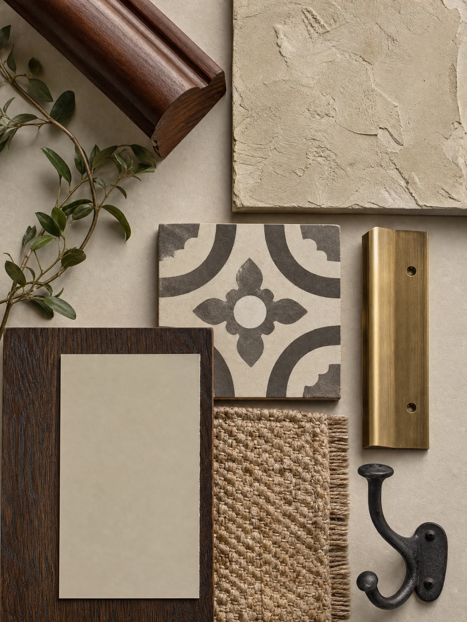
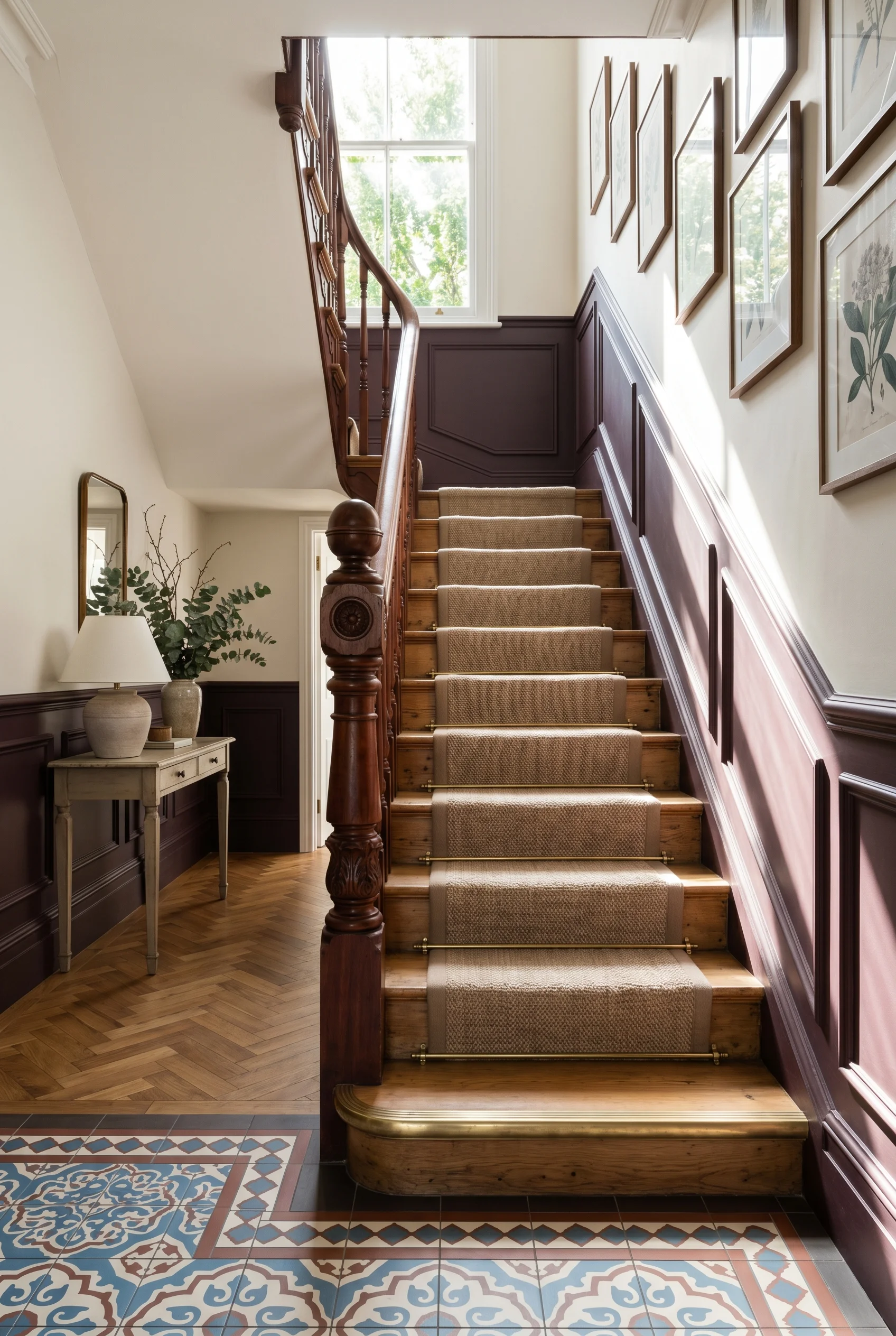
Three materials carry the Victorian hall. Mahogany. Encaustic clay. Lime-rich plaster. Each one does something the other two can’t, and the contrast between them is the whole texture story. We covered the full method in our reading nook deep dive.
The mahogany shows up in the handrail and the door rails. I’d specify a hand oil finish (raw oil, rubbed in, no varnish) so the timber stays warm. Varnish makes mahogany look like furniture polish. Oil makes it look like wood. Over years it darkens slowly, picks up the grease of a hand on the rail, and that patina is the point. We dedicated a full guide to modern dark bedroom ideas for this reason.
The encaustic tile is the floor’s job. Clay with the pattern set into the body, fired at high heat, glazed only on the wear surface. It cracks beautifully. It chips at the edges. A new floor in encaustic tile reads as 130 years old by the time it’s grouted. The lime-rich plaster is the wall’s job above the dado. Limewash sits on it in a soft chalky matt and the light moves across it. Modern emulsion on flat plaster reads as a screen. Limewash on lime plaster reads as a wall. This shade shows up again in modern bedroom ideas.
The Victorian hall floor has two zones. The first metre, where boots come in wet. The rest, where the corridor reads as part of the house. I’d treat them as two different floors with one threshold between them. For a related take, see mid century modern bedroom.
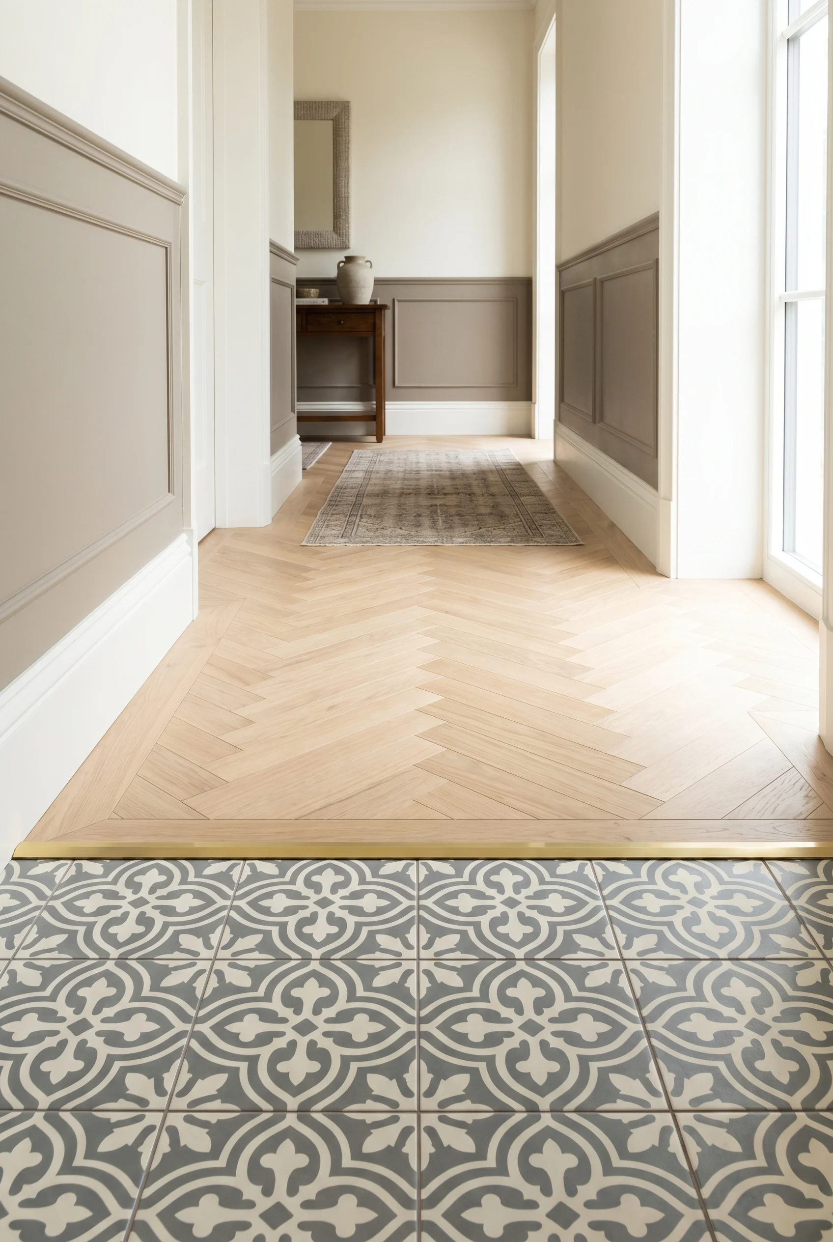
The first metre wants encaustic clay tile. Bert and May, Maw and Co, Original Style all make patterns that suit the period. A small geometric repeat in two tones reads better than a bold block. I’d pick a dusty terracotta and a pale stone, set on the diagonal, with a single dark border tile two courses in from the wall. That border is the move. It frames the entry zone like a rug. This shade shows up again in dark bedroom ideas.
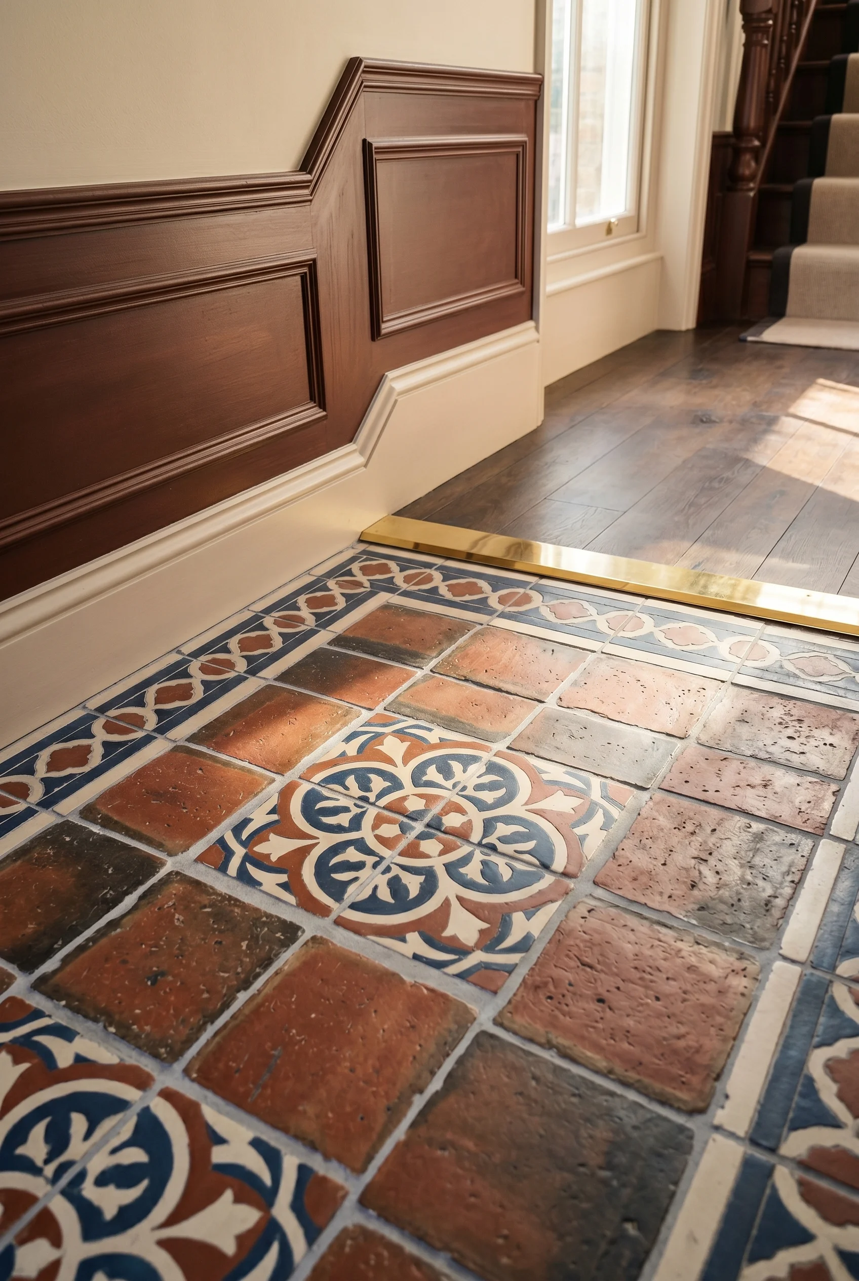
Past the threshold, parquet. Naked oak in a herringbone pattern, finished with a hardwax oil. The blocks run the length of the corridor. If the eye reads the herringbone as moving you forward, the corridor feels longer. I’d run it the long way every time. The threshold strip between tile and timber is the detail nobody photographs. A solid brass bar, 30mm wide, mitred at the corners. The tile sits 4mm proud of the timber, or vice versa. The bar lets the two finishes meet without a fight. The material logic here mirrors what we covered in modern earthy bathroom ideas.
Most hallways are over lit and warm. Spots in the ceiling, a bright bulb on the landing, an LED strip somewhere it shouldn’t be. I’d strip it back. One pendant in the ceiling rose. One sconce on the wall at picture rail height. Warm 2700K only. If your taste runs more toward mid century modern, the proportions shift.
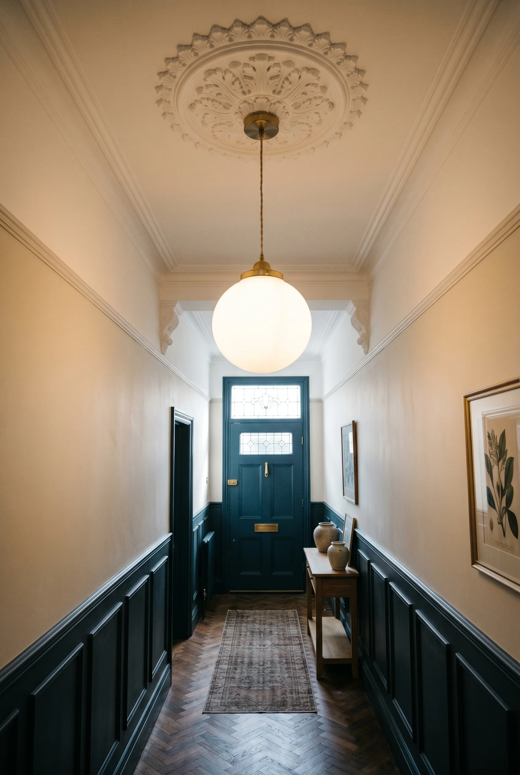
The pendant hangs from the original ceiling rose if the house has one. A simple brass cone or a plain glass globe. A chandelier here usually feels too much. The pendant’s job is to mark the centre of the corridor and put soft light in the middle of the floor. Edison-style filament bulb, 4W, dimmable. That’s the whole spec. The material logic here mirrors what we covered in mediterranean style bathroom.
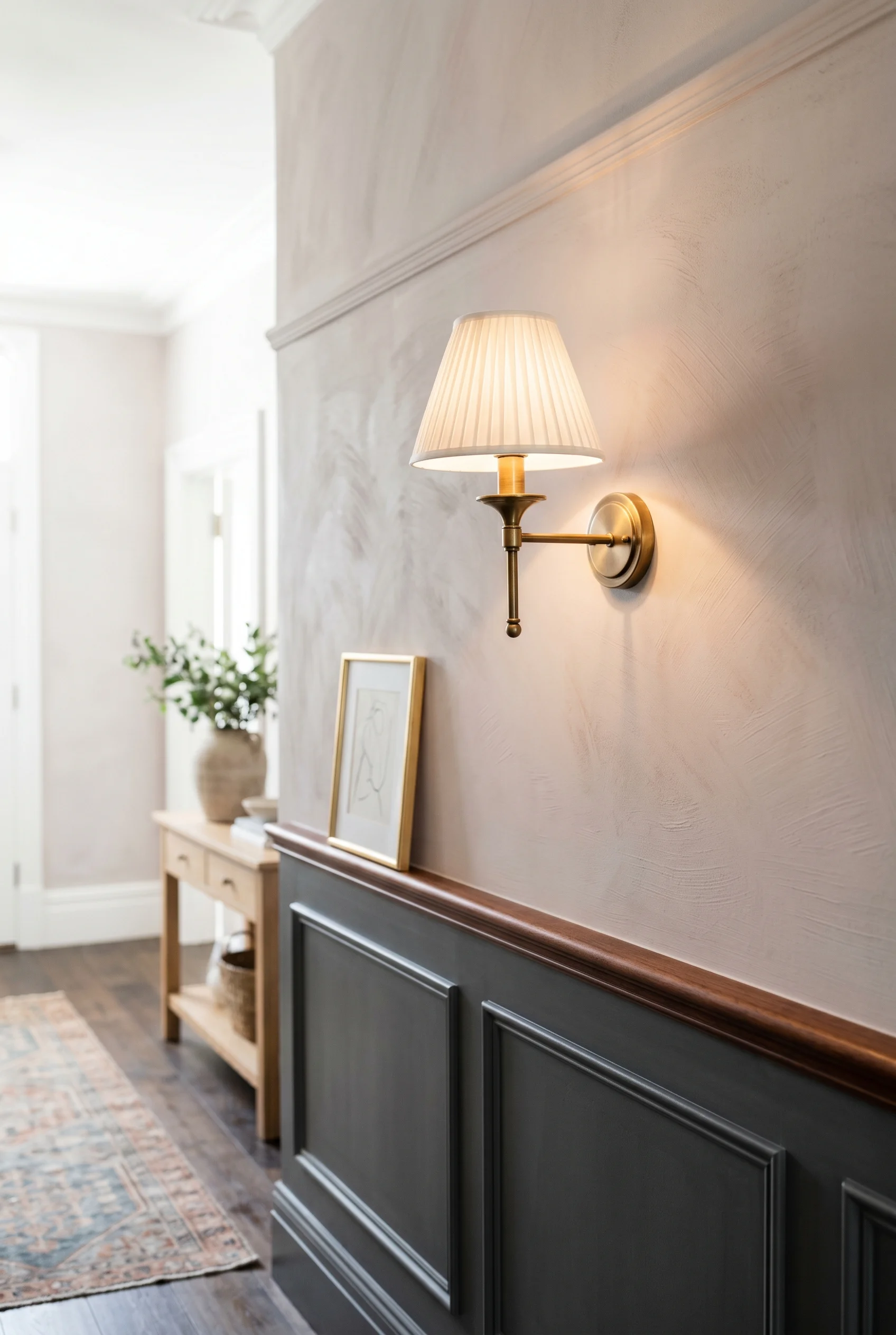
The sconce (a wall mounted lamp) sits at picture rail height, near the front door. Brass arm, fabric or paper shade. Warm light spilling sideways across the wall. It catches the dado finish and reveals the joinery. Without that sideways light the wall reads as flat paint. With it, the panels and the rail show. You will see this exact finish in our dining table in living room roundup.
Skip the LED strip behind the cornice. Skip the floor uplighter. Skip the recessed downlights. A Victorian hall was never bright, and pretending it was bright kills the period feel. Two warm sources at 2700K do everything you need. The dimmer is the third spec. Without it, the hall reads as harsh after dark. For a related take, see dark bathroom.
The front door is a window. People forget this. The fanlight above it, the side panels next to it, sometimes a small panel in the door itself, all of those are stained glass on a Victorian house, and the light they throw is the design move. We explored a connected idea in dark green bedroom aesthetic.
If the original stained glass is still there, restore it. A specialist (Goddard and Gibbs, Lead and Light, or any local conservator) can relead the panels and clean the glass. The cost is meaningful but the result is irreplaceable. The light that comes through original glass at four in the afternoon in October is the reason these houses still command a premium 130 years on. We explored a connected idea in elegant french country bathroom.
If the glass is gone, you have two options. A reproduction stained glass made to match what was there, or a reeded clear glass that throws a soft prism of light across the floor. I’d pick reeded glass every time before a poor reproduction. A bad copy of stained glass is worse than no stained glass. This pairs well with the thinking in mid century modern kitchen.
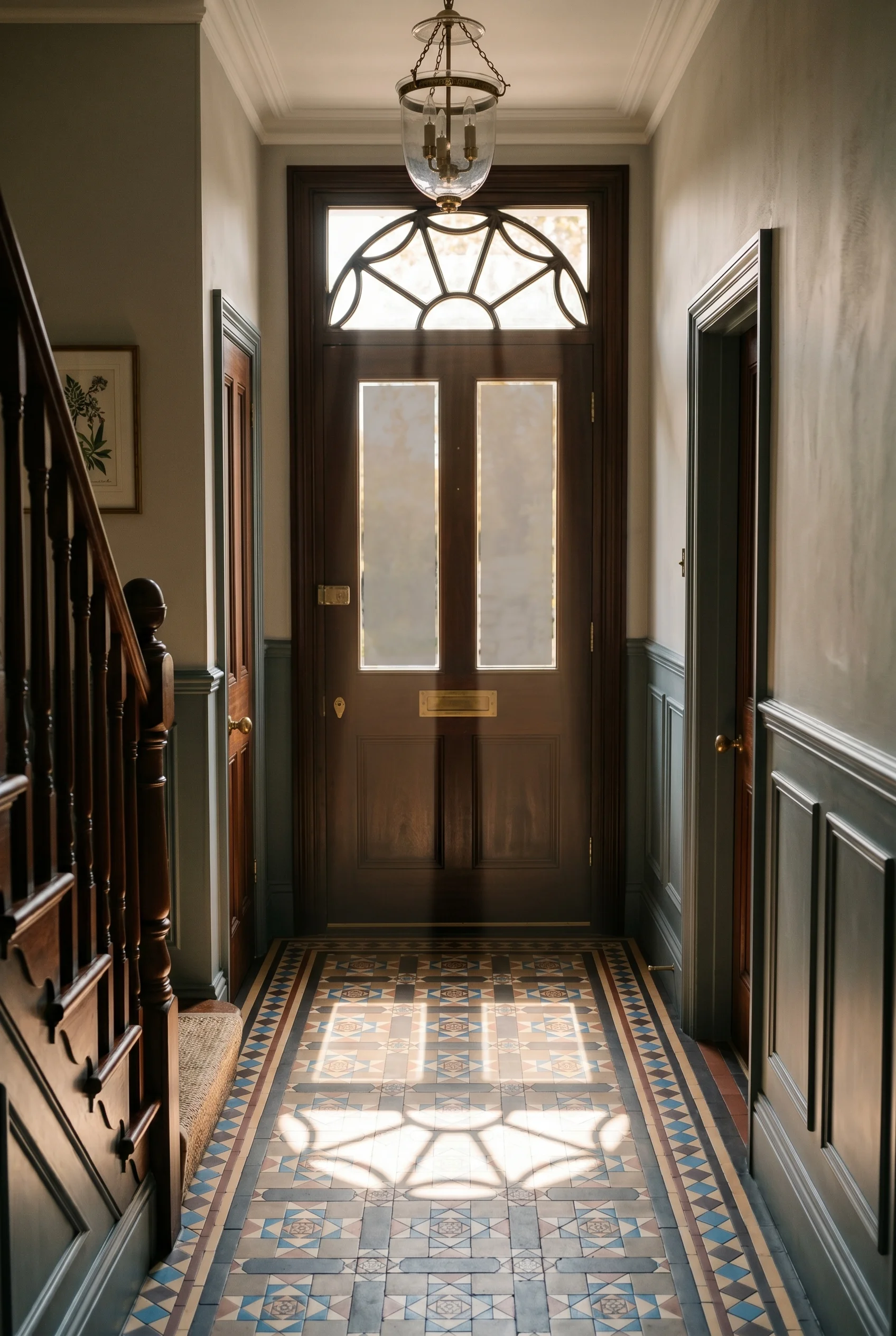
The internal doors off the hall are the second light source. Swap the solid panel for reeded glass. The hall borrows daylight from the rooms it serves. A glazier can do four doors in a day. The cost is modest. The change to how the corridor feels is total. Reeded glass beats plain frosted because reeded throws pattern, and pattern is what the Victorian hall was built to show. This pairs well with the thinking in spanish style bathroom.
The hall is the room where what you leave out matters more than what you add. Most hallways are overdecorated. A line of family photos, a framed print, a coat hook rail with twelve hooks, an umbrella stand, a key dish, a console of clutter. I’d cut most of it. If your taste runs more toward modern hallway decor ideas, the proportions shift.
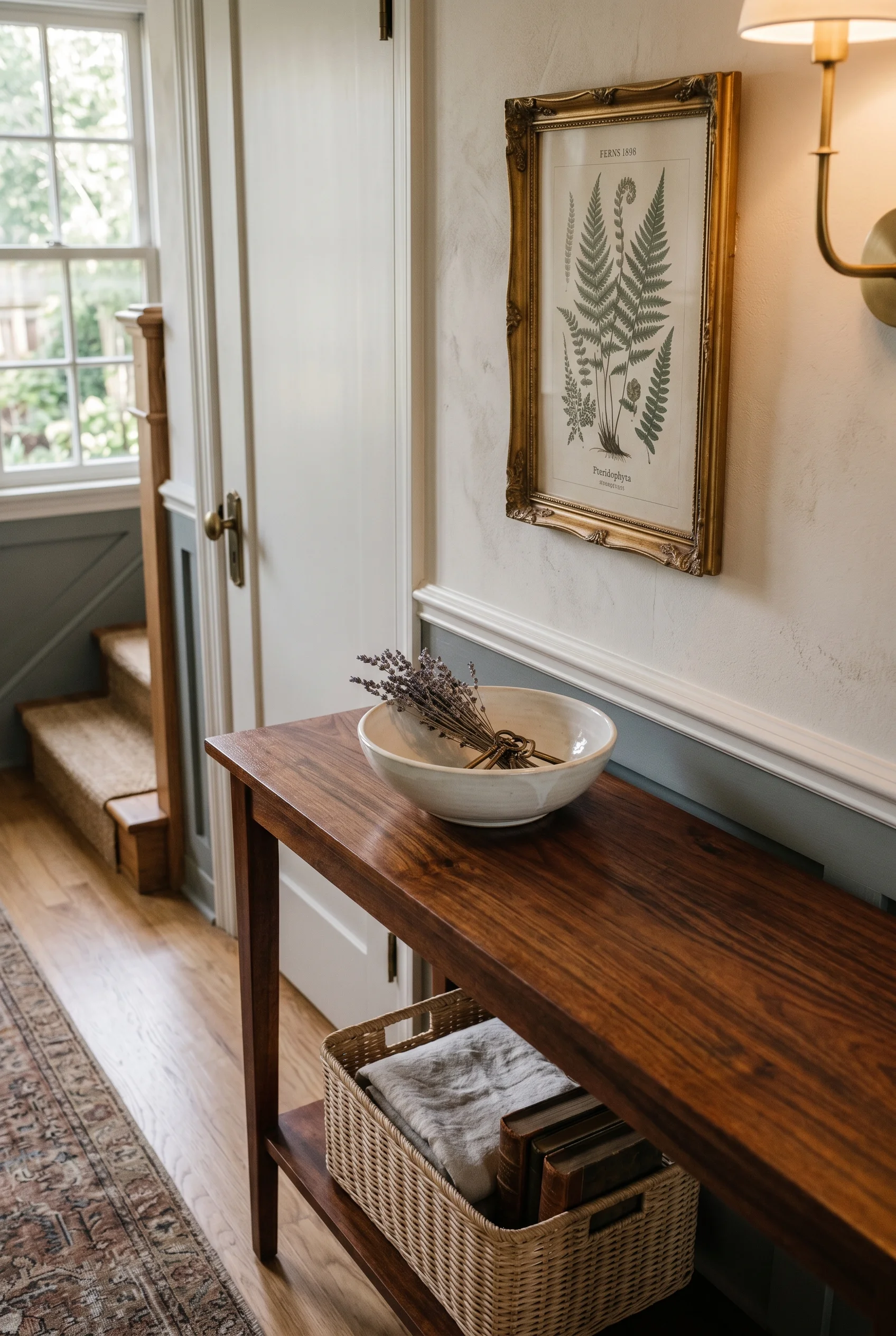
The coat hook rail is the only essential. A length of milled oak, fixed at picture rail height, with five forged iron hooks set at even intervals. Forged iron in the hall, brass at the door knob and the threshold strip. The contrast between the two metals is the point. One framed botanical print above the console, large, simple frame. A stoneware umbrella stand on the floor by the door. That’s it. You will see this exact finish in our modern french dining room roundup.
A runner rug is optional and I’d think hard before adding one. The encaustic tile and the parquet are doing the floor work. A runner covers the materials you spent money to specify. If you want soft underfoot, put it in the room the hall leads to. The hall itself reads better with the floor showing. This works in tandem with the ideas in japandi style kitchen.
The Victorian hallway is built from three surfaces. The joinery below the dado. The floor underfoot. The wall and ceiling above. Specify those with care, in that order, and the hall does the rest. The pendant, the console, the runner, the hooks. They sit on top of the surface decisions, and they only land if those decisions were made first. Joinery first. Floor second. Wall above last. Contrast this with hallway panelling where the approach is almost opposite.
This post contains affiliate links, which means we may earn a small commission if you make a purchase through our links, at no extra cost to you. There is a useful companion piece in our modern farmhouse bathroom guide.