Newsletter Subscribe
Enter your email address below and subscribe to our newsletter
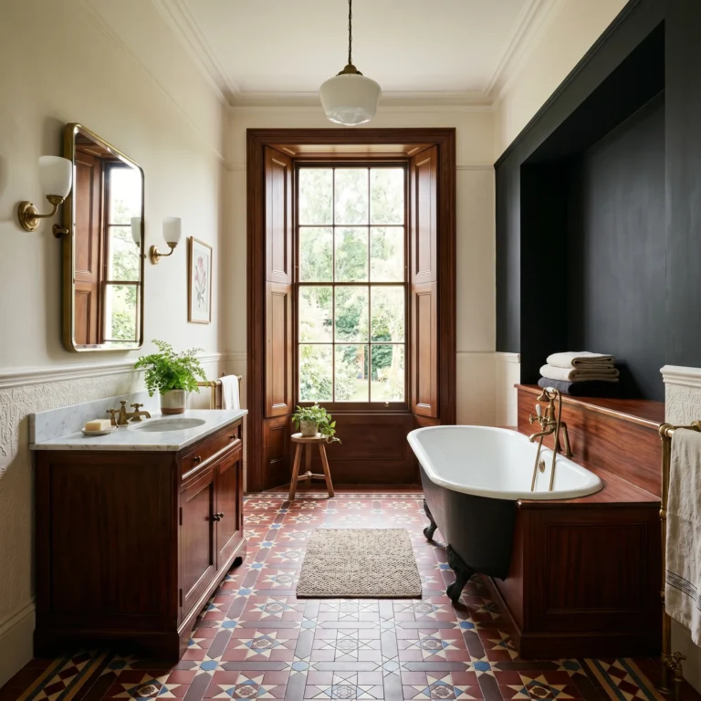
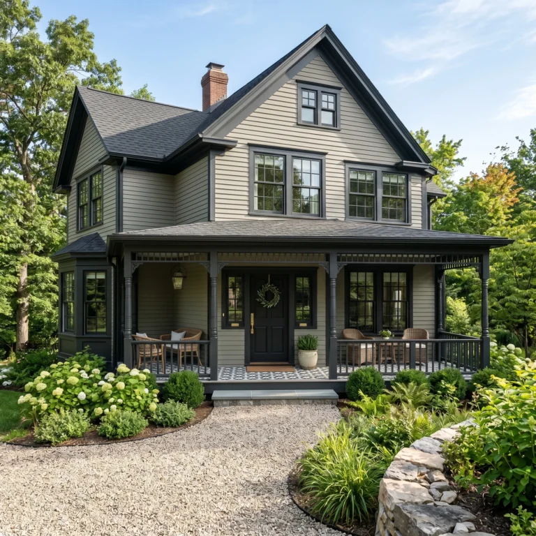
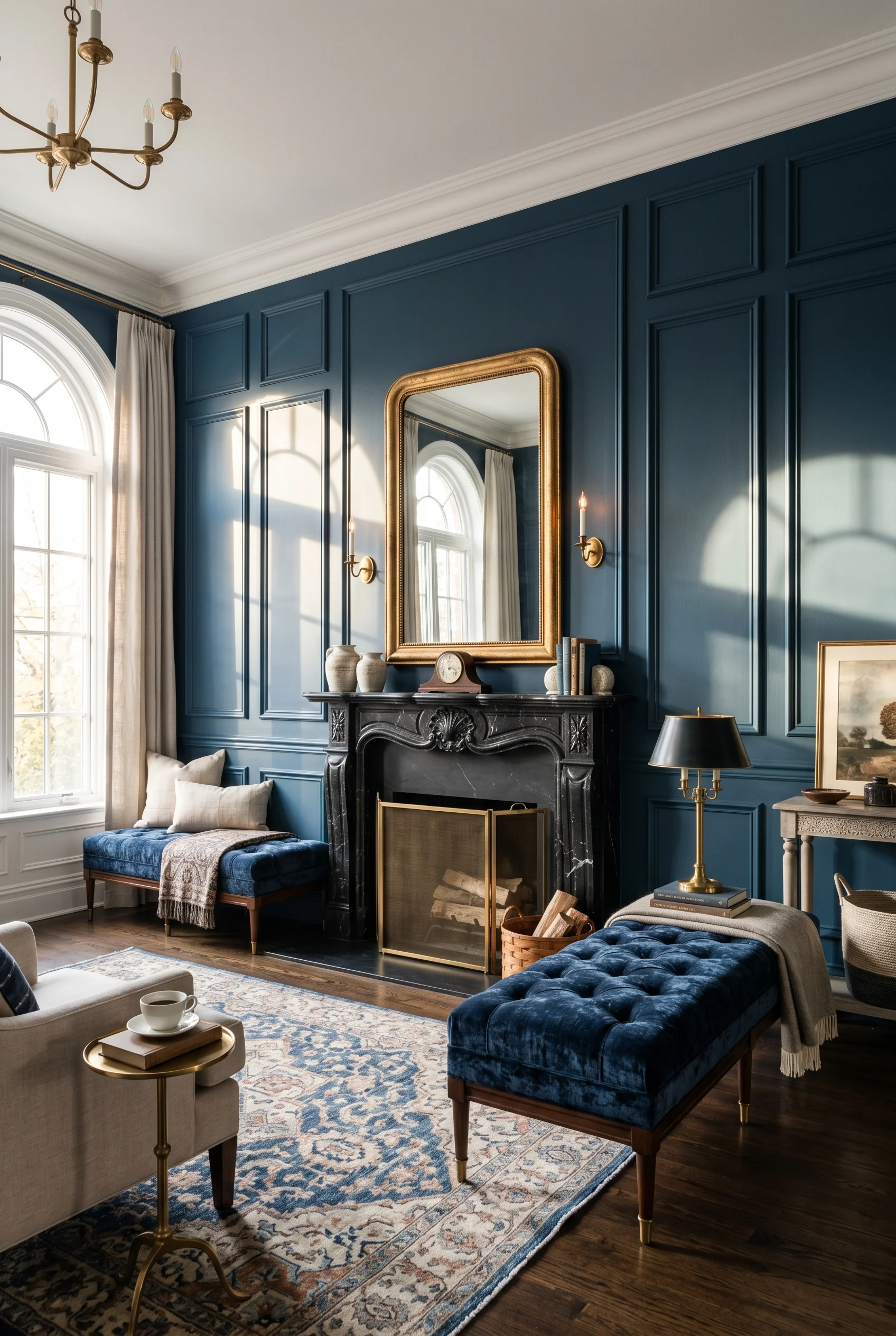
Most Victorian living rooms feel like a museum. Heavy drapes. Dark wood. Tiny floral wallpaper that crowds the eye. I’ve been watching how the smart move now is the 80/20 rule. You keep 80% of the room clean and modern. Then you add 20% real Victorian. One tufted velvet Chesterfield. One ornate gilded mirror. One carved chaise. The rest stays calm. Walls breathe. Light moves. The room feels grand, but you can also flop on the sofa with a glass of wine. That tension between old and new is what makes a Victorian living room work in a modern home. And that same logic carries over to your victorian bathroom inspiration.
The biggest mistake I see in Victorian rooms is too much stuff. The Victorians had a phrase for it. Horror vacui. Fear of empty space. They packed every wall, every shelf, every corner. In a modern home that just looks like clutter. The 80/20 rule fixes it fast. And that same logic carries over to your victorian bedroom inspiration.
I’d start by picking three to five hero pieces. A Chesterfield in deep velvet. A carved wood chaise. A pair of ornate brass sconces. Maybe one big gilded mirror. Then I’d build the rest of the room around clean, simple shapes. Low coffee tables. Streamlined side tables. Plain linen cushions. The contrast does the heavy lifting for you. The same principle holds true for modern farmhouse bedroom ideas.
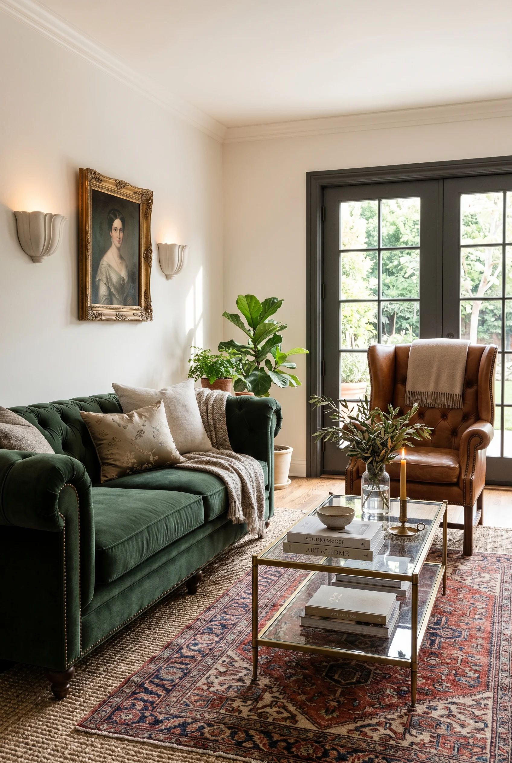
Negative space is your friend here. Leave gaps on the wall. Leave a shelf half empty. Let the carved leg of a chaise have room to be seen. A Victorian piece in a minimalist setting looks ten times more special than the same piece crammed in next to ten other carved things. That is the whole game. The same principle holds true for authentic victorian kitchen.
The reward is a room that feels grand without feeling stiff. You get the romance of the 19th century. You get the calm of a modern home. And you can actually live in it, which is the part most period rooms forget. For a related take, see modern farmhouse bedroom.
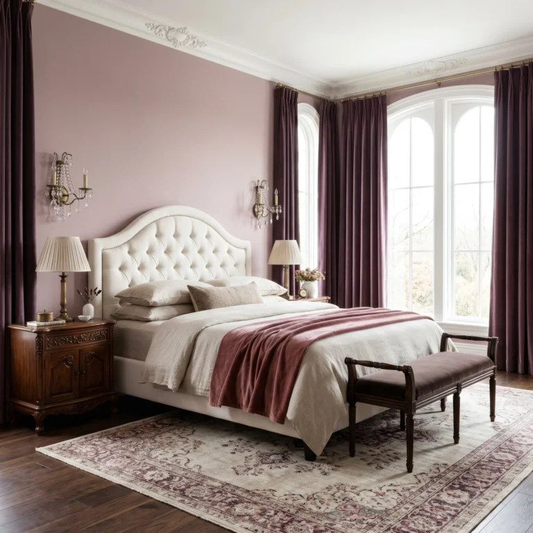
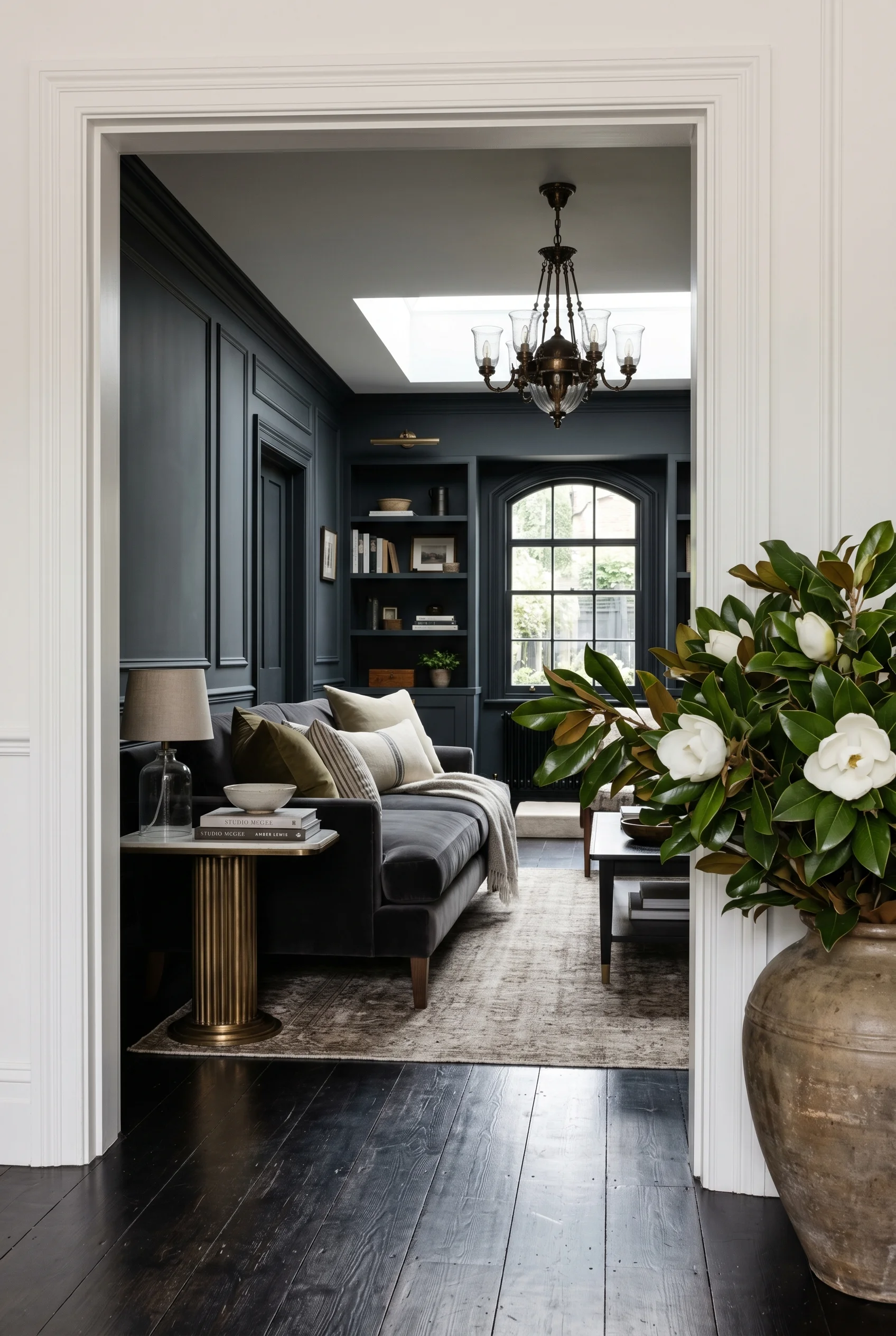
Classic Victorian color is heavy. Burgundy walls. Forest green carpet. Mustard drapes. All in one room. It worked in 1880 because rooms were small and lit by gas lamps. In a modern home with big windows it just looks dim and busy. You will find a version of this in our victorian dining room inspiration breakdown.
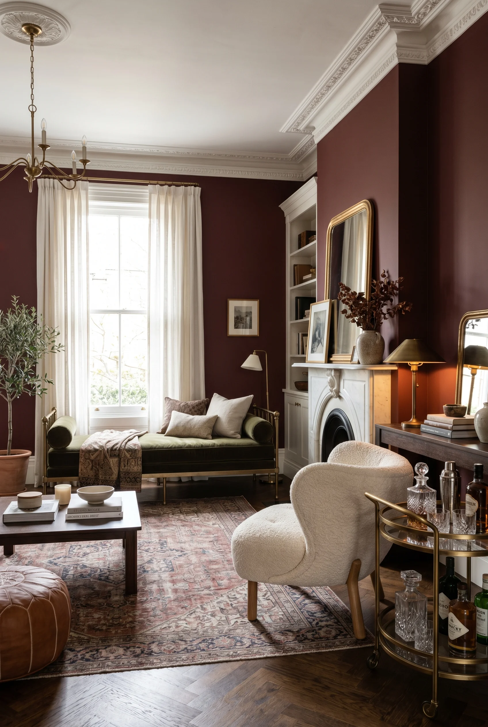
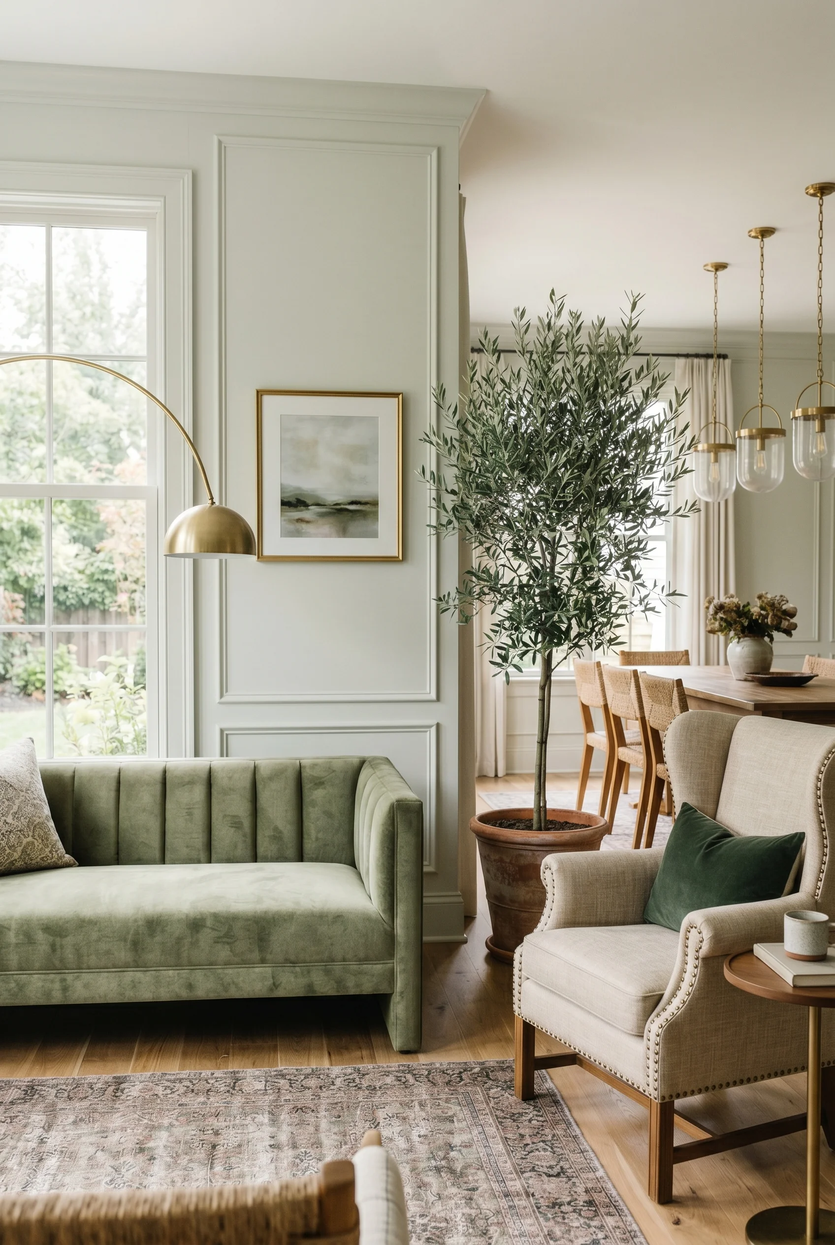
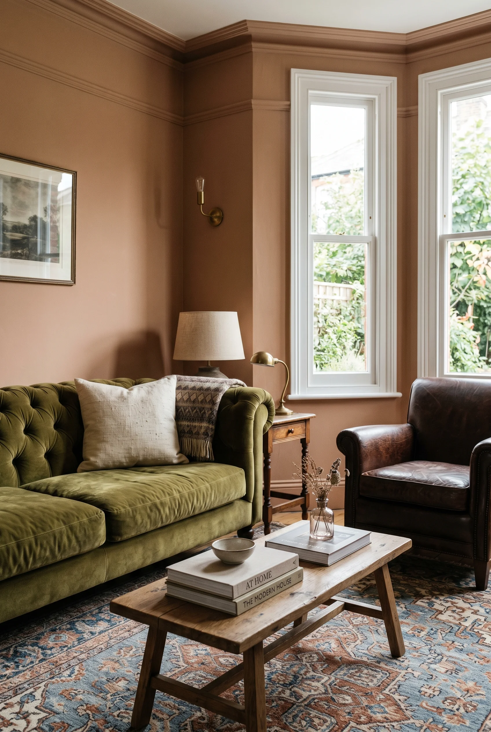
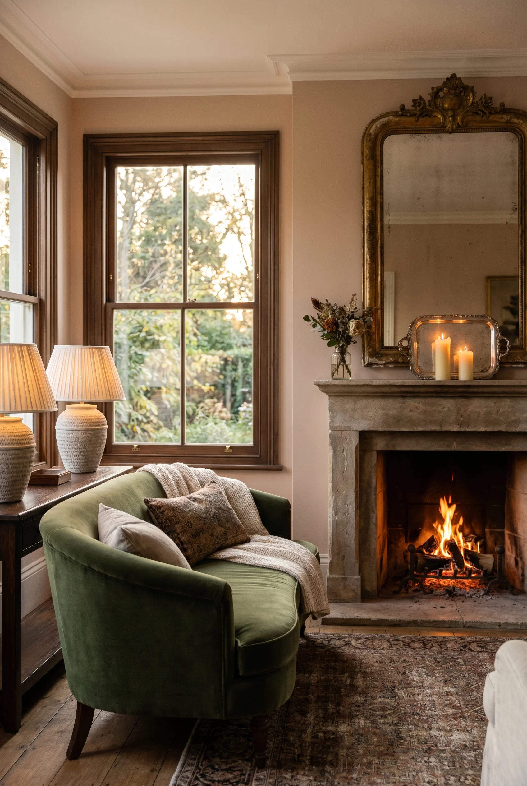
I’d start with a calm base. Warm grey walls. Stone tones. A soft white ceiling. This gives the eye a place to rest. Then layer in the jewel tones the period is famous for. Emerald green on a single armchair. Ruby red on a pair of cushions. Sapphire blue on one statement lamp. The base stays quiet. The hits land hard. For more on this palette, see green bedroom.
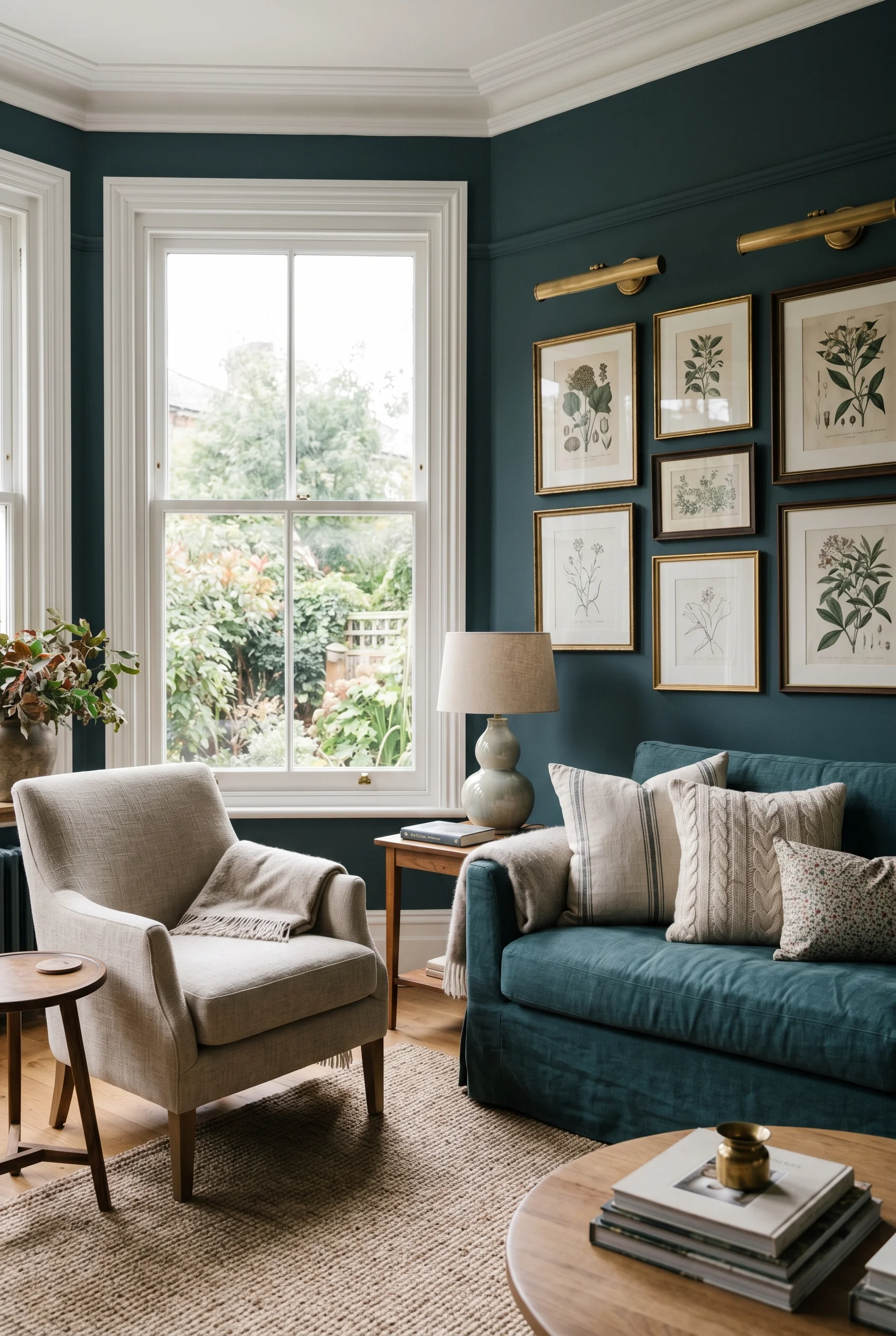
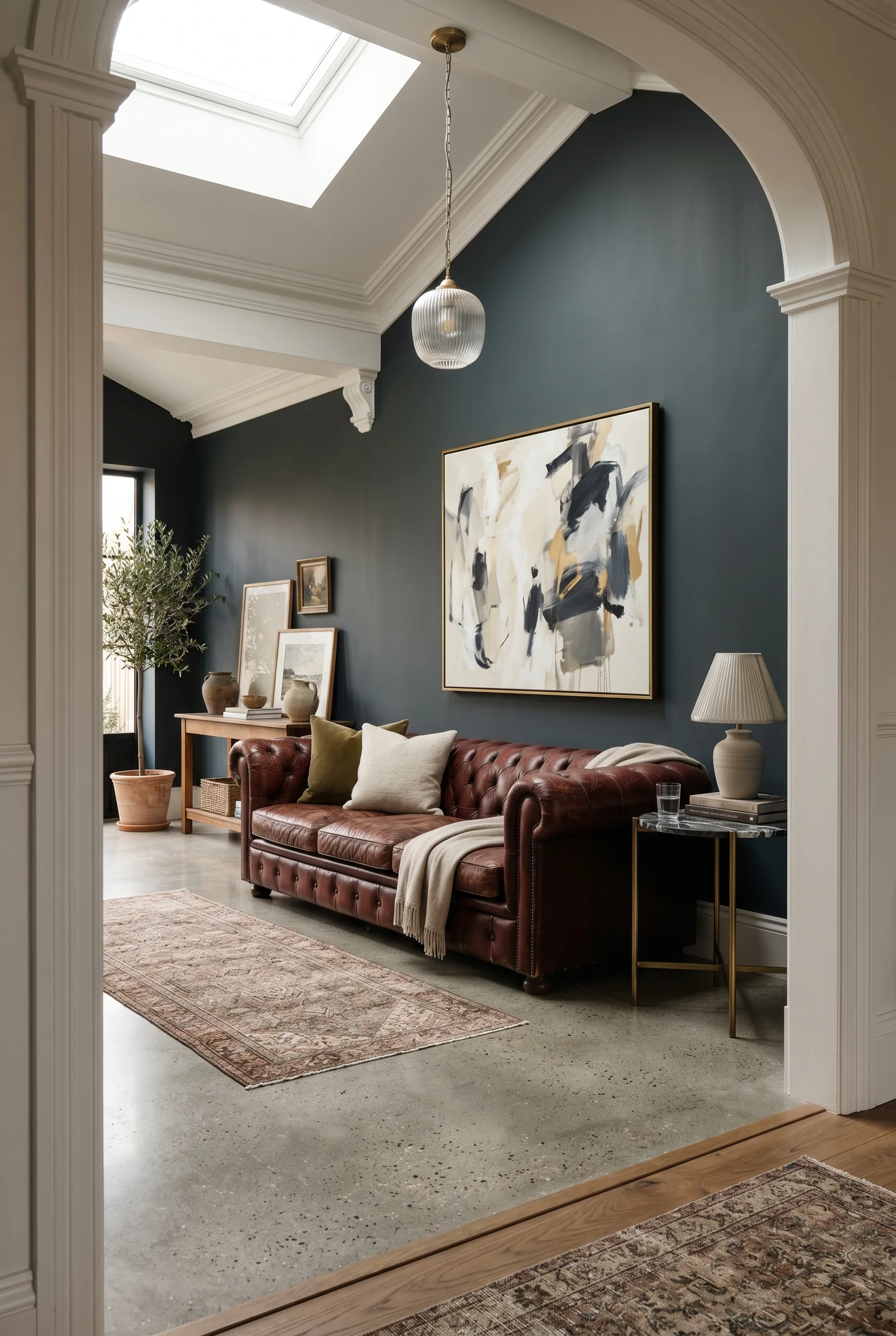
One trick I love is color drenching. You paint the walls, the trim, and even the ceiling in the same deep shade. Think a moody green or a deep blue. It sounds bold. It actually feels like a hug. The room becomes one wrapped pocket of color, which suits a snug Victorian living room or a small reading corner perfectly. Which is exactly what makes victorian color work so well.
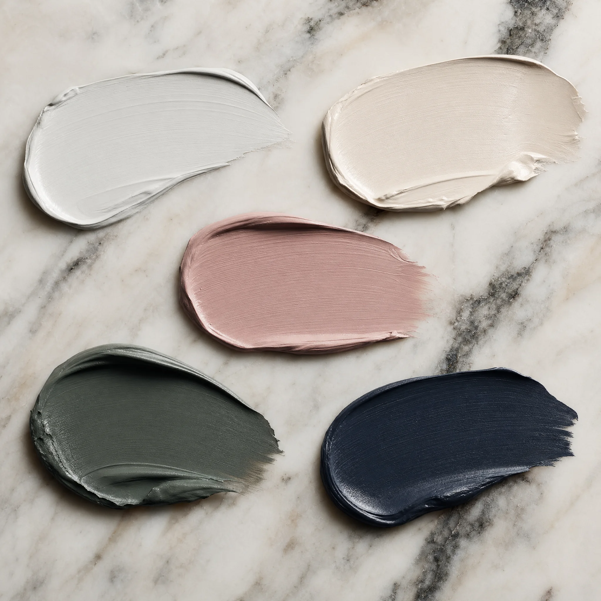
Here are the five paint colors I’d build a Victorian living room around.
Warm Stone Grey is the backbone. Soft, warm, no blue undertones. Use it on the main walls.
Soft White balances the trim and the ceiling. Slight cream undertone, never pure white.
Emerald Green is the jewel tone hero. One armchair. One pair of drapes. One painted alcove.
Deep Burgundy brings the warmth. Cushions, a single chair, the inside of a bookshelf.
Inky Blue is the color drench option. Walls, trim, ceiling, all in one moody shade.
Get these five right and the furniture practically chooses itself.
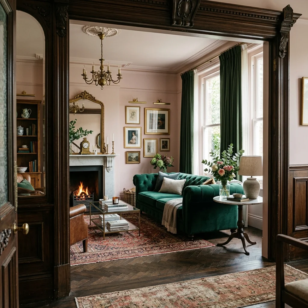
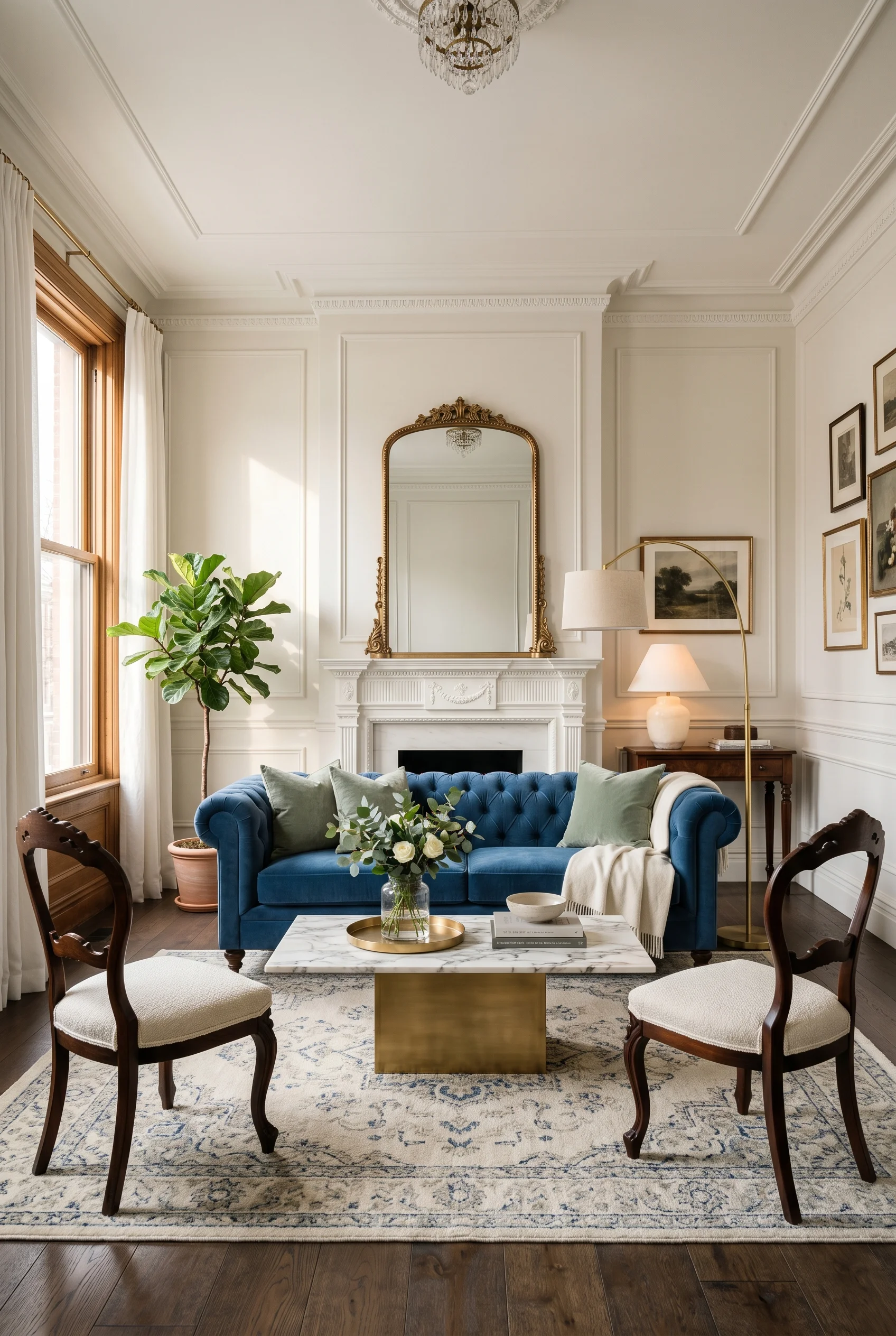
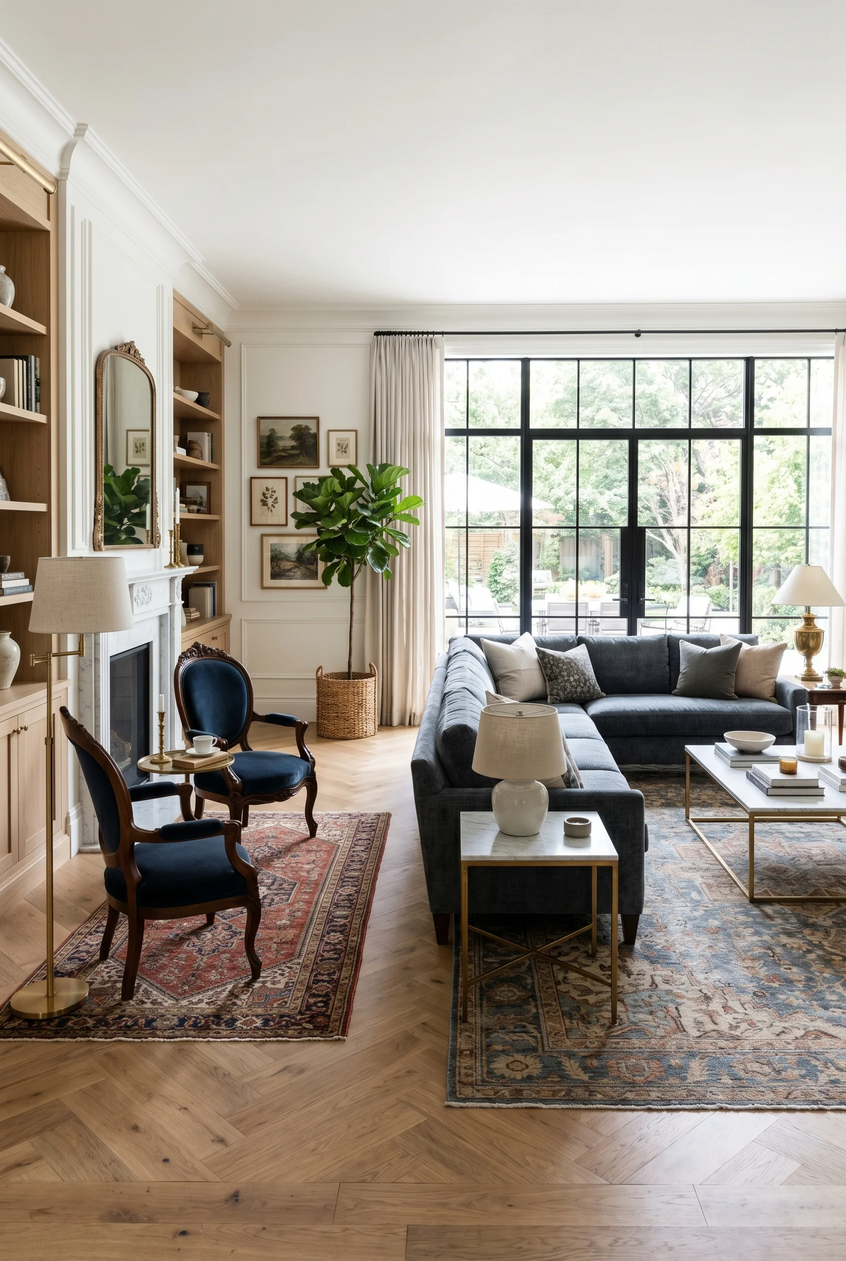
The heart of this look is one rule. Pair heavy with light. A big tufted Chesterfield with a slim glass coffee table. A carved chaise with a clean cylinder side table in marble. Ornate armchairs with a simple linen sofa. Heavy plus light. Old plus new. Every time. You will find a version of this in our victorian exterior inspiration breakdown.
I’d put the Chesterfield as the anchor. Velvet, deep color, button tufted, low arms. Then in front of it a coffee table that almost disappears. Polished metal. Glass. White marble. Something that lets you see through to the rug. The eye reads the Chesterfield as the star, and the table as supporting cast. For more on this palette, see mid century modern.
For the second seat I’d go full antique. A carved wood armchair. A rolled arm chaise in silk. Something with curves and history. Then balance it with a side table that is the opposite. A simple oak cube. A black metal pedestal. The room ends up reading half antique shop, half modern showroom. That mix is the whole point. We dedicated a full guide to modern dining room for this reason.
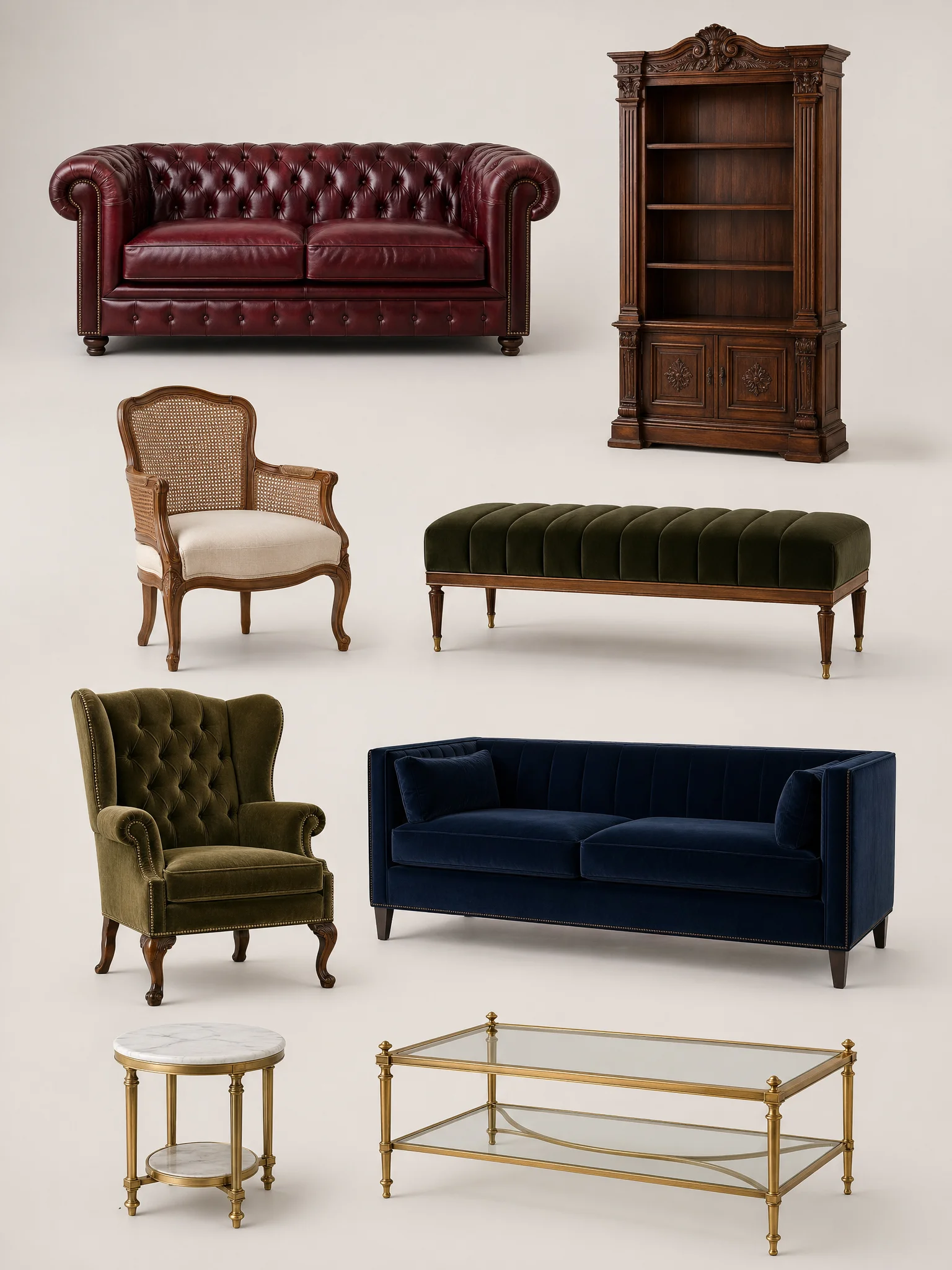
If you only buy one piece, I’d make it the Chesterfield. It does more visual work than any other item in the room. Every other choice flows from there. Which is exactly what makes moody dining room ideas work so well.
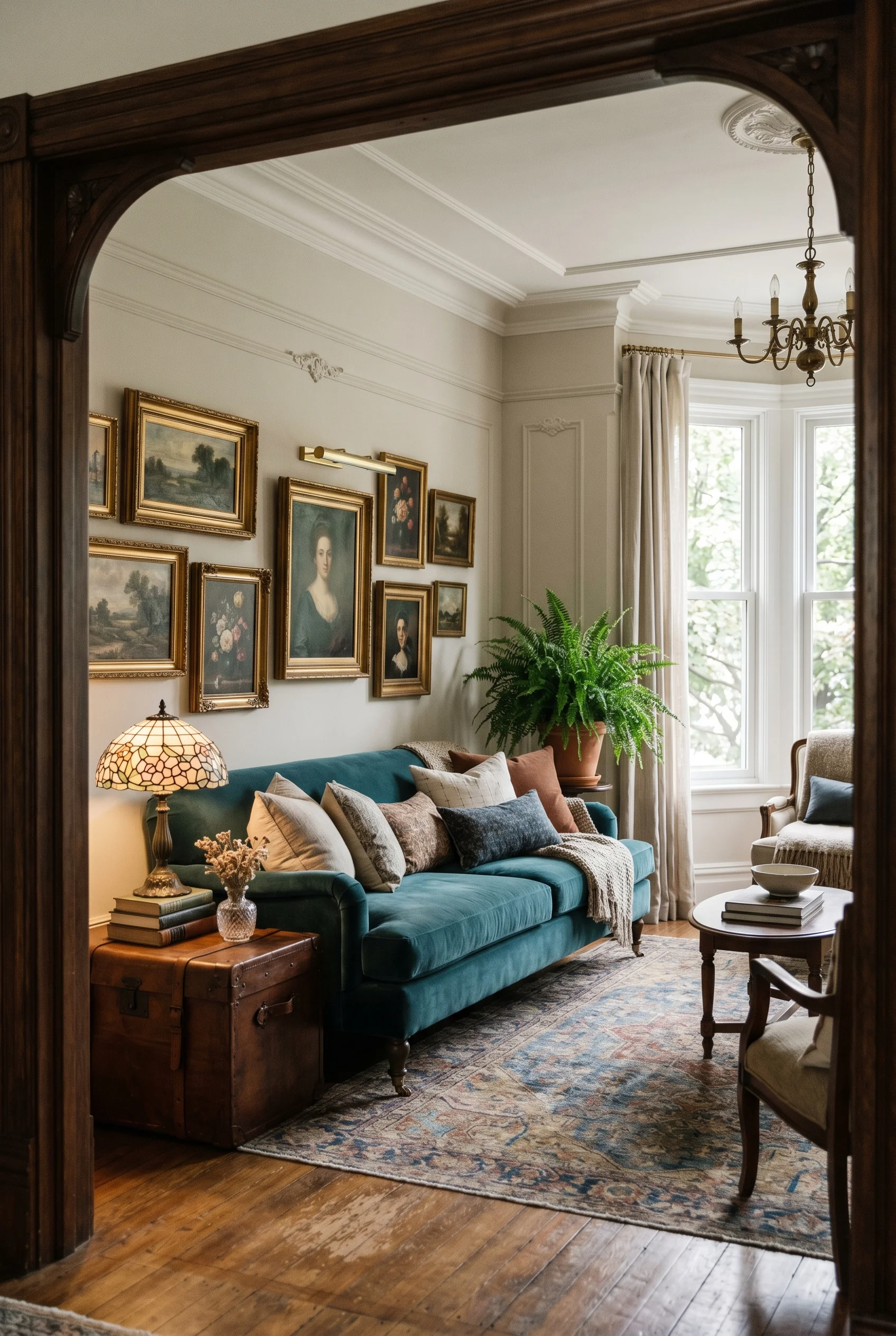
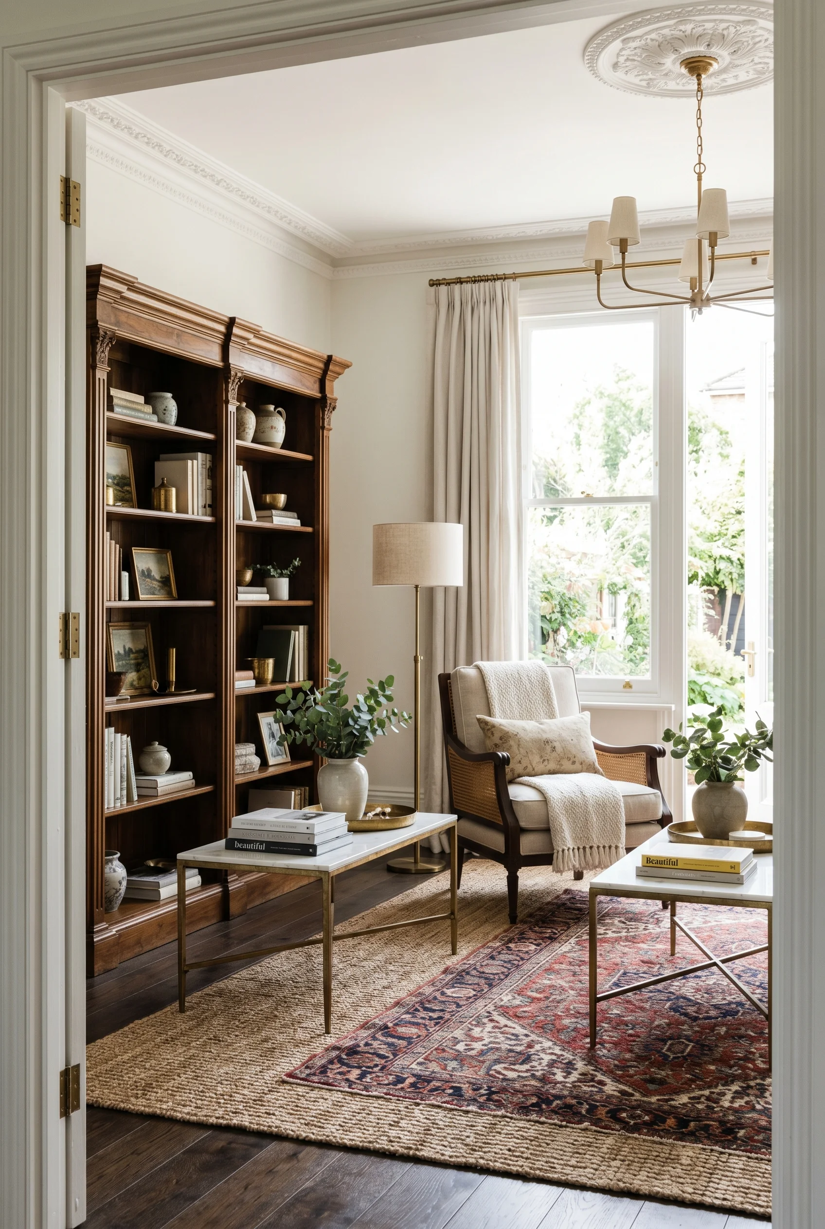
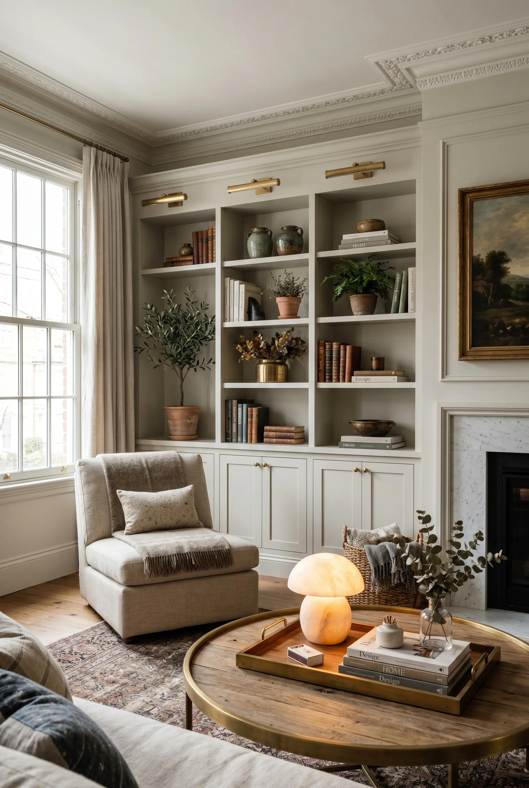
Walls are where this style earns its grandeur. Plain drywall in a Victorian living room feels like a missed chance. You want some kind of architectural detail. Picture frame molding. Raised panels. Board and batten. Beadboard. Pick one. Run it across the room. We dove deeper into this for victorian hallway inspiration.
My favourite is picture frame molding painted the same color as the wall. You get the shadow play of the molding without the busy painted lines you see in some old houses. Read at a glance, the wall looks calm. Stand close, and you see the craft. That dual reading is very Victorian. We dedicated a full guide to living room wall panel design for this reason.
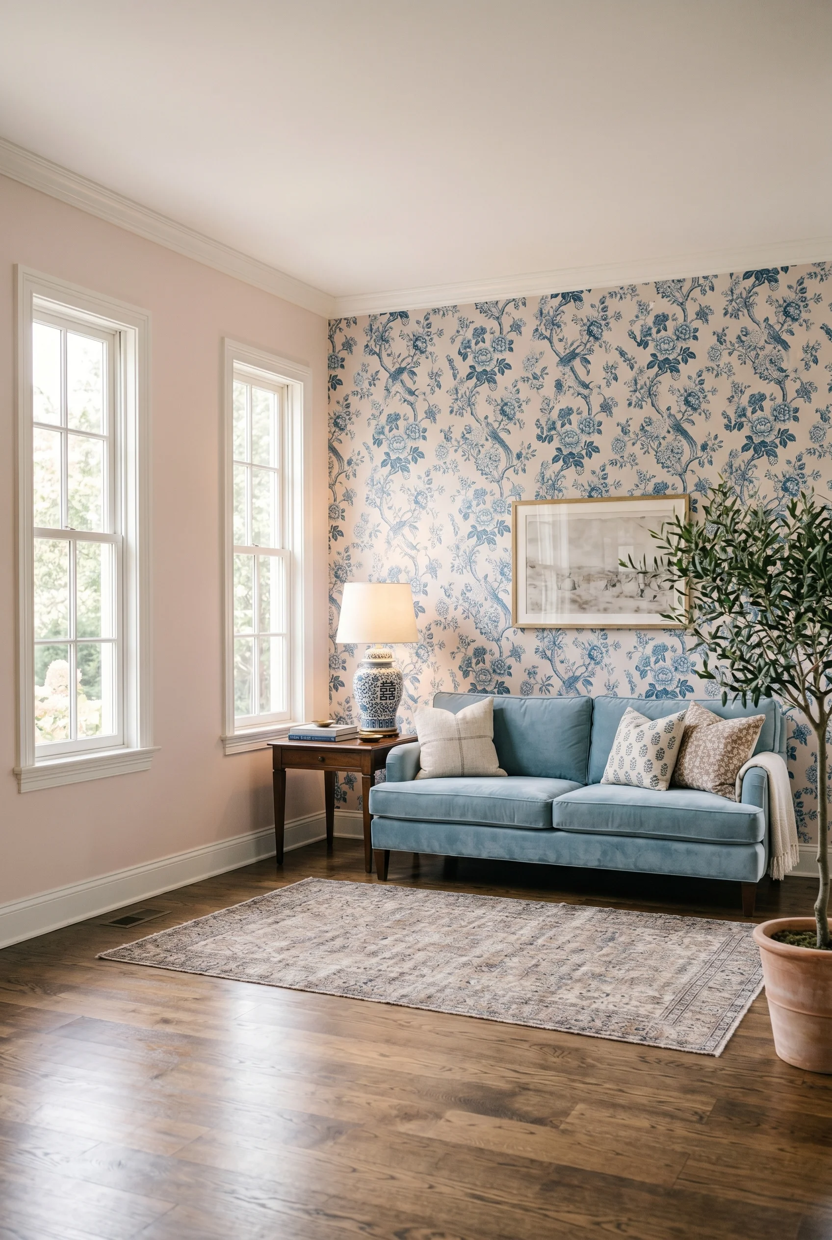
Wallpaper is the other route. But forget tiny dense floral. The modern move is big. Huge oversized florals. Abstract botanical prints. Painterly leaves the size of a dinner plate. The scale is the whole trick. Big patterns feel modern. Small patterns feel granny. Same flowers, totally different room. This shade shows up again in midcentury modern bathroom.
If you want a quick win, paper one wall behind the sofa in a large scale botanical. Leave the other three walls in your calm base color. The single papered wall reads as art, not as a 1980s sitting room. You get all the impact for a fraction of the cost. This shade shows up again in earthy boho color palette.
Victorian houses had small rooms with doors between them. Modern houses have big open plans. The fix in a modern Victorian living room is what I call broken plan. Not full open. Not full closed. You use markers to define zones inside one big room. We dove deeper into this for victorian kitchen inspiration.
Think half walls. Wide cased archways. A big rug under the sofa group. A pair of bookshelves that act like a wall without being one. Each marker says, this is the sitting zone, that is the reading zone, over there is the dining zone. Light still flows. The room still feels generous. But each zone has its own feel. A close cousin of this idea appears in our victorian bathroom guide.
The TV question is a real one. Big screens are the enemy of a layered Victorian look. I’d hide it. Build a custom alcove with paneled doors that close over the screen. Or use a Frame TV above the fireplace mantle, set to an oil painting screensaver. Either way the focal point becomes the fireplace and the art, not the black rectangle. A close cousin of this idea appears in our victorian bathroom ideas guide.
The rule I’d hold to is this. Every zone gets a rug, a light source, and a clear seat. If a corner has all three it works as its own little room within the room. That is the secret to a layout that feels rich, not random. We tested this theory across rooms, starting with the only way to design a sophisticated victorian.
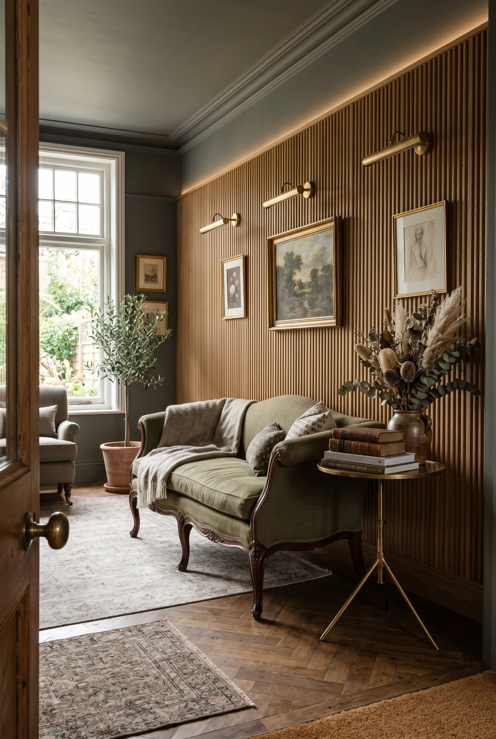
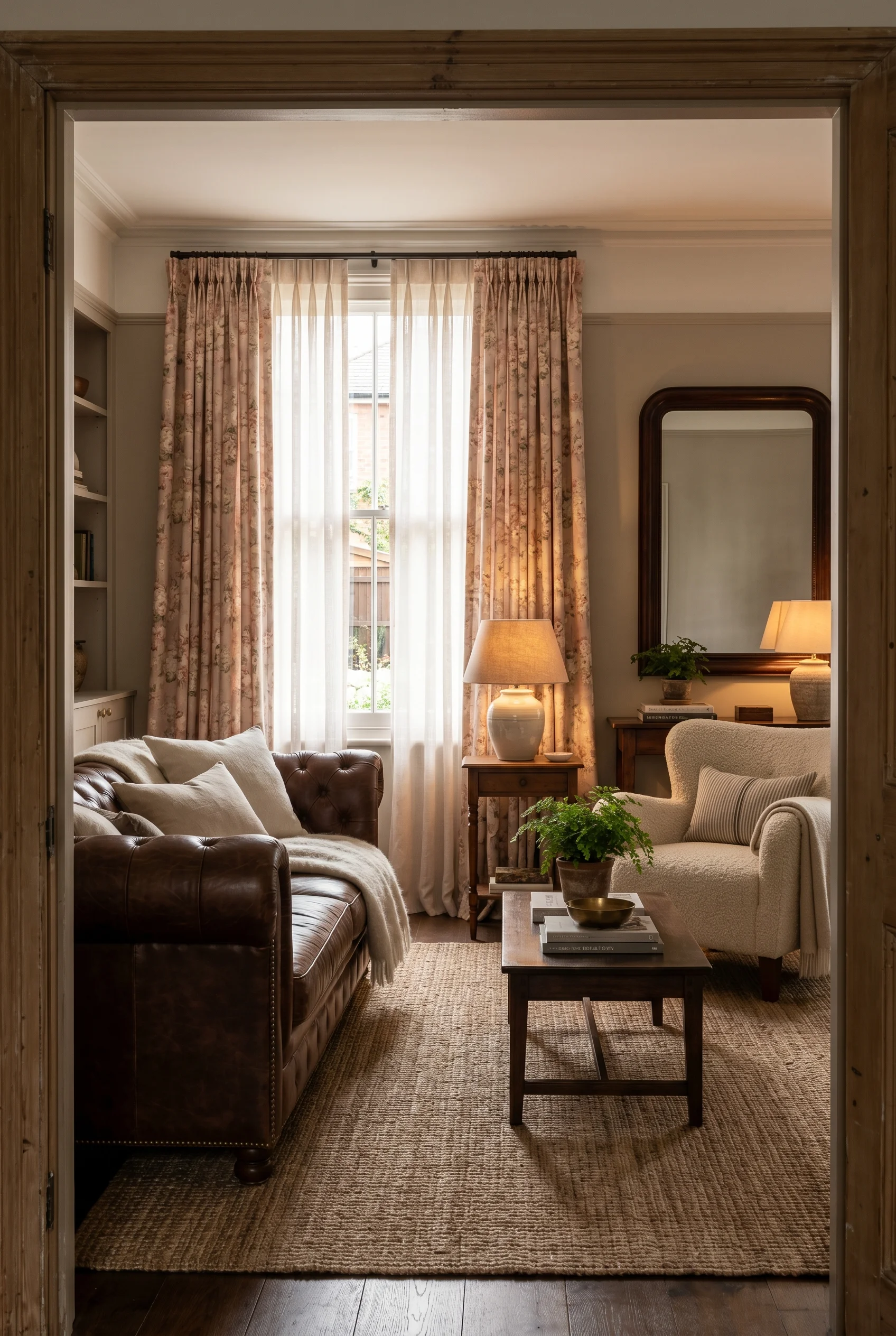
Material is where the Victorian living room gets its hand. You want stuff you want to touch. Velvet. Brocade. Silk. Heavy linen. The trick is layering. Never just one fabric. Always at least three.
I’d use velvet on one big piece. The Chesterfield, a chaise, or one armchair. Then add brocade or jacquard on cushions. Then plain linen or cotton on curtains and throws. The eye reads heavy, medium, light. That layering is what makes the room feel rich rather than fussy. If your taste runs more toward curtains for living room, the proportions shift.
If you have kids or pets, look at performance velvets and stain resistant chenille. They feel like the real thing. They survive a glass of red wine and a muddy paw. Brands like Crypton and Sunbrella now make velvets that look completely period correct. There is no reason to skip the look just because life happens. The material logic here mirrors what we covered in split living room dining room ideas.
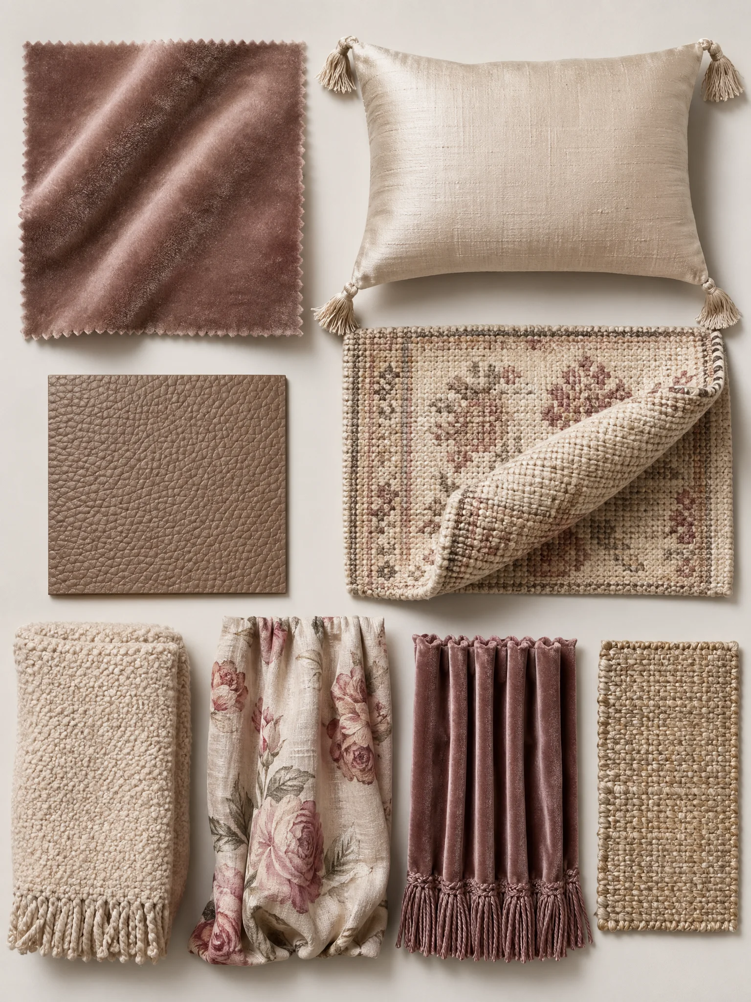
One more thing. Mix sheen on purpose. A matte velvet next to a glossy silk cushion next to a crinkled linen throw. The light catches each one differently. The sofa group ends up looking like a still life painting. That is the level of finish you are aiming for. The material logic here mirrors what we covered in mid century modern living room.
Floor is the part most people skip. Big mistake. The floor in a Victorian living room is half the mood. I’d go dark. Walnut, smoked oak, or a deep stain on existing boards. Matte or satin finish, never glossy. Gloss reads as builder grade. Matte reads as old money. If your taste runs more toward living room ideas, the proportions shift.
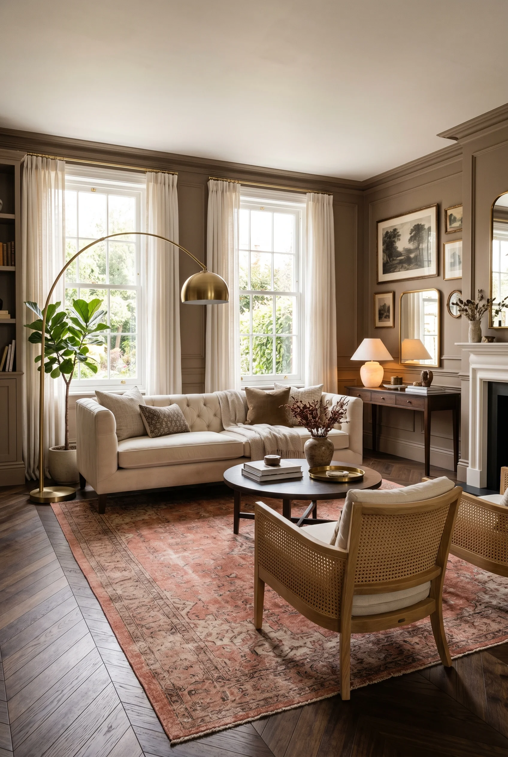
If you can lay a new floor, herringbone is the move. It is a period pattern that still feels modern because the planks are clean and tight. A dark herringbone floor under a velvet sofa is one of the most beautiful pairings in interior design. It just looks expensive even when it isn’t.
Near a fireplace or in the entryway, geometric encaustic tiles bring proper Victorian character. Black and white checkerboards. Eight pointed stars. Little floral medallions. They feel like the kind of detail you find in a grand London townhouse. A small patch is enough. You don’t need a whole room of them. You will see this exact finish in our living room fall decor ideas roundup.
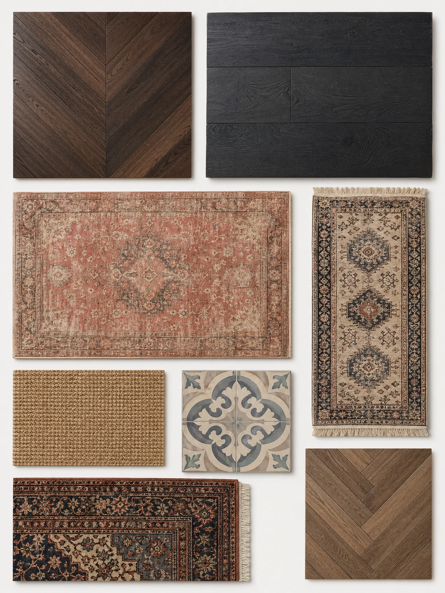
Over the top of all that, I’d layer rugs. A big neutral jute or sisal as the base. Then a smaller patterned Persian or vintage rug on top, off center, under the coffee table. Two rugs feels intentional, like a stylist did it. One rug feels safe. Always go two. We covered the full method in our modern boho bathroom ideas deep dive.
Victorian lighting is the easiest place to add drama. I think of light fittings as the jewelry of the room. One statement piece. A few quiet ones. Never a single boring overhead. For a related take, see farmhouse english country kitchen.
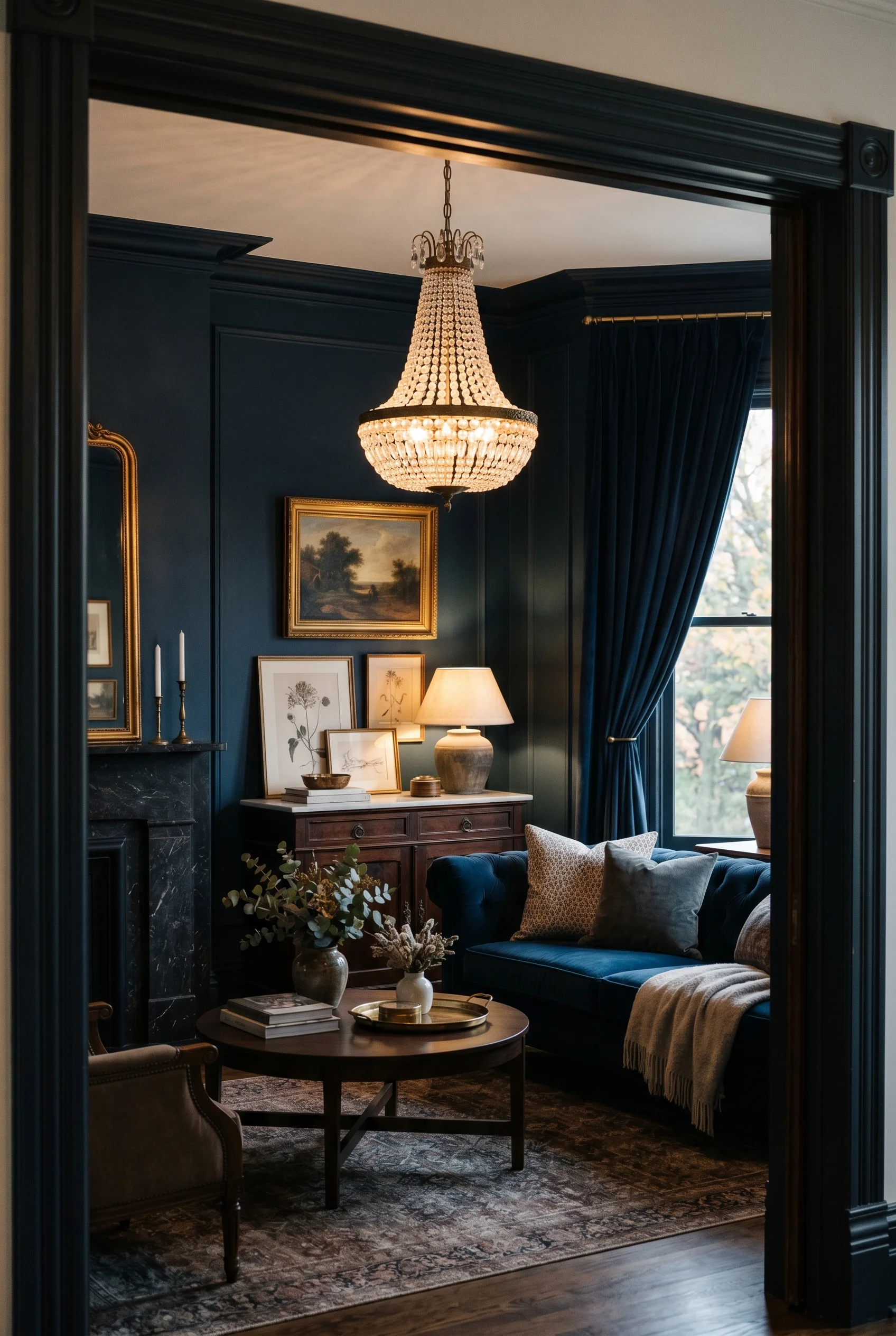
The star is a chandelier. Crystal, brass, or a moody black metal cage. Big enough to be seen from across the room but not so big it bullies the space. Hung low over the coffee table, not high to the ceiling. Low chandeliers feel intimate. High ones feel like a hotel lobby. You will see this exact finish in our spanish bathroom ideas roundup.
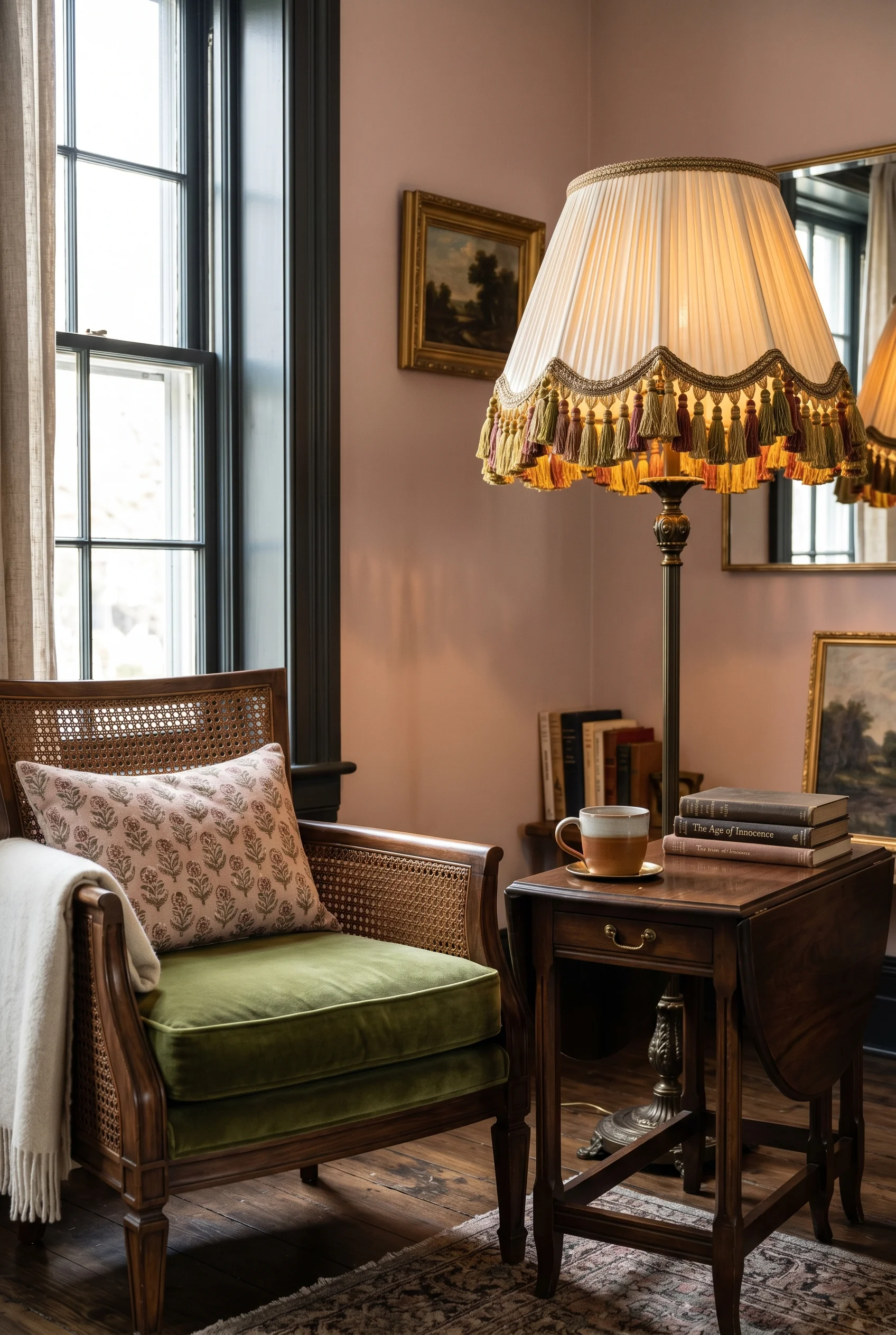
Around the chandelier I’d add quieter pieces. A pair of brass wall sconces flanking the fireplace. A simple table lamp on a side table with a soft linen shade. A floor lamp tucked behind an armchair for reading. Each fitting throws light at a different height. That layering is the warmth. This works in tandem with the ideas in modern farmhouse living room ideas.
Mix your metals on purpose. Antique brass on the chandelier. Polished nickel on a sconce. Matte black on a floor lamp. It looks collected, not catalog. Bulbs should always be warm. 2700K or lower. Cool white kills the whole mood in one click. This works in tandem with the ideas in small living room with dining table.
Windows are where Victorian rooms get their grandeur. The rule is layering. Never just one thing on the window. Always two, sometimes three. We covered the full method in our french country bathroom ideas deep dive.
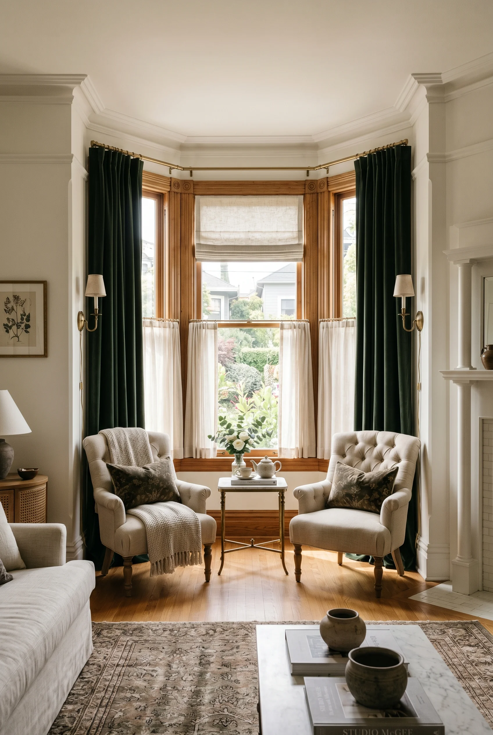
The base layer is functional. Roman shades or cellular shades for privacy and light control. Plain linen, plain cotton, neutral color. They tuck up cleanly during the day so you barely see them. At night they pull down and the room becomes a snug. For more on this palette, see modern rustic color palette.
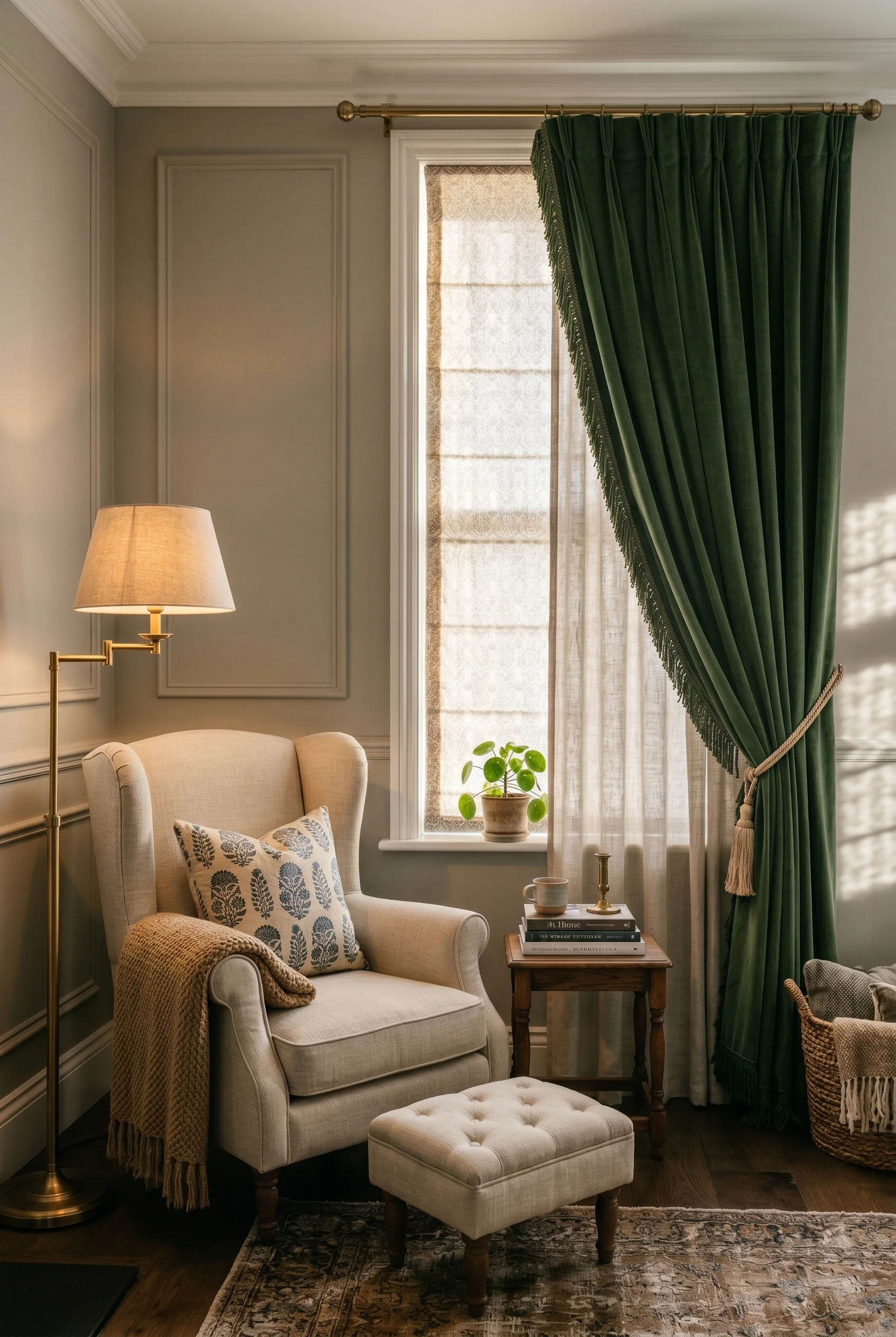
Over the top of that, heavy drapes. Floor to ceiling. Velvet, linen, or heavy cotton. They don’t need to close. They just need to frame the window like a stage. A pair of velvet drapes in deep emerald or wine flanking a tall window is one of the most Victorian things you can do, and it works in a modern home because the rest of the room stays calm. For more on this palette, see basement remodel ideas.
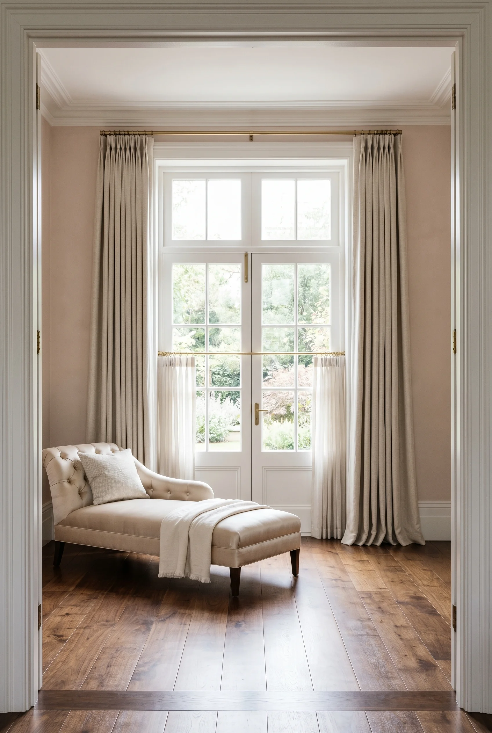
Here is the trick most people miss. Hang the curtain rod high. Right up at the ceiling, not just above the window frame. And let the drapes go all the way to the floor, just kissing the boards. That high low stretch makes the ceiling look taller and the windows look grander. It is free architecture. For the technical breakdown, our 1950’s mid century modern house interior guide walks through every step.
Accessories are where personality lives. The Victorians collected. Books, art, busts, dried flowers, taxidermy, the lot. We don’t need to go full cabinet of curiosities, but the spirit of collecting is what makes a Victorian living room feel storied. Contrast this with small warm and cozy living room ideas where the approach is almost opposite.
I’d start with one big gilded mirror. Over the fireplace, or leaning against a wall. Ornate frame, foxed antique glass if you can find it. Mirrors bounce light around the room and make a small space feel double the size. They are the single best return on investment in a Victorian room. For the technical breakdown, our fireplace decor ideas guide walks through every step.
Then build a gallery wall. Mix antique oil portraits with botanical etchings and one or two contemporary abstract pieces. The mix is the magic. All antique looks like an estate sale. All modern looks like a hotel. Mixed feels like a real person collected over years. Contrast this with modern farmhouse living room where the approach is almost opposite.
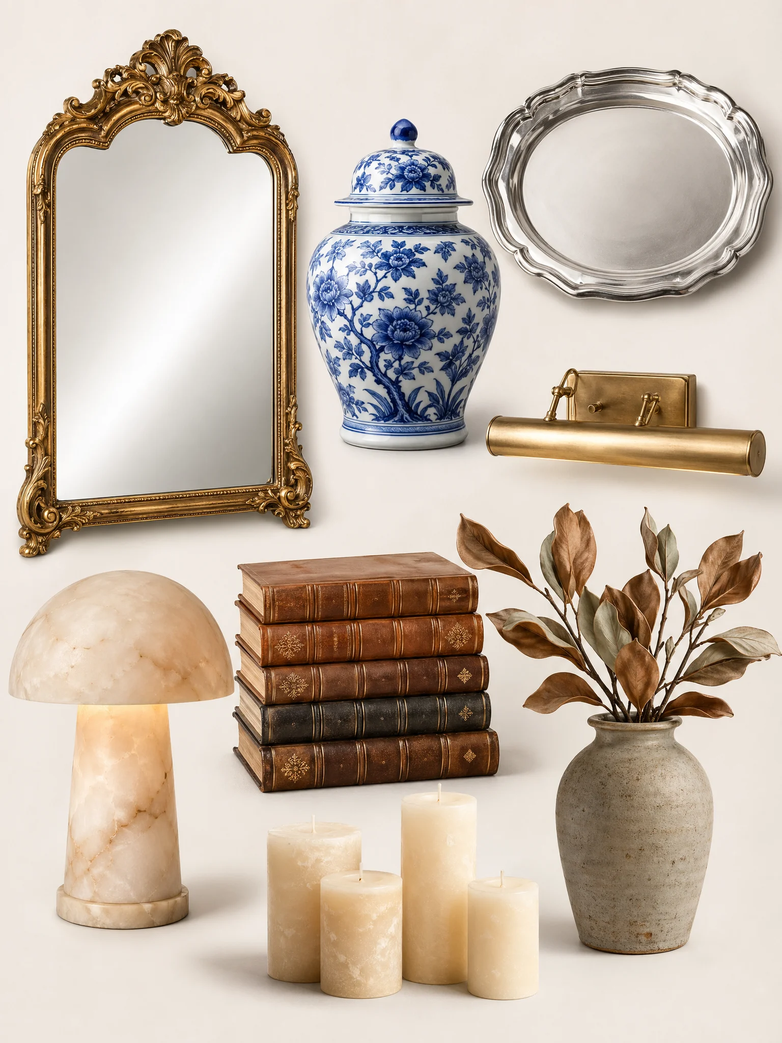
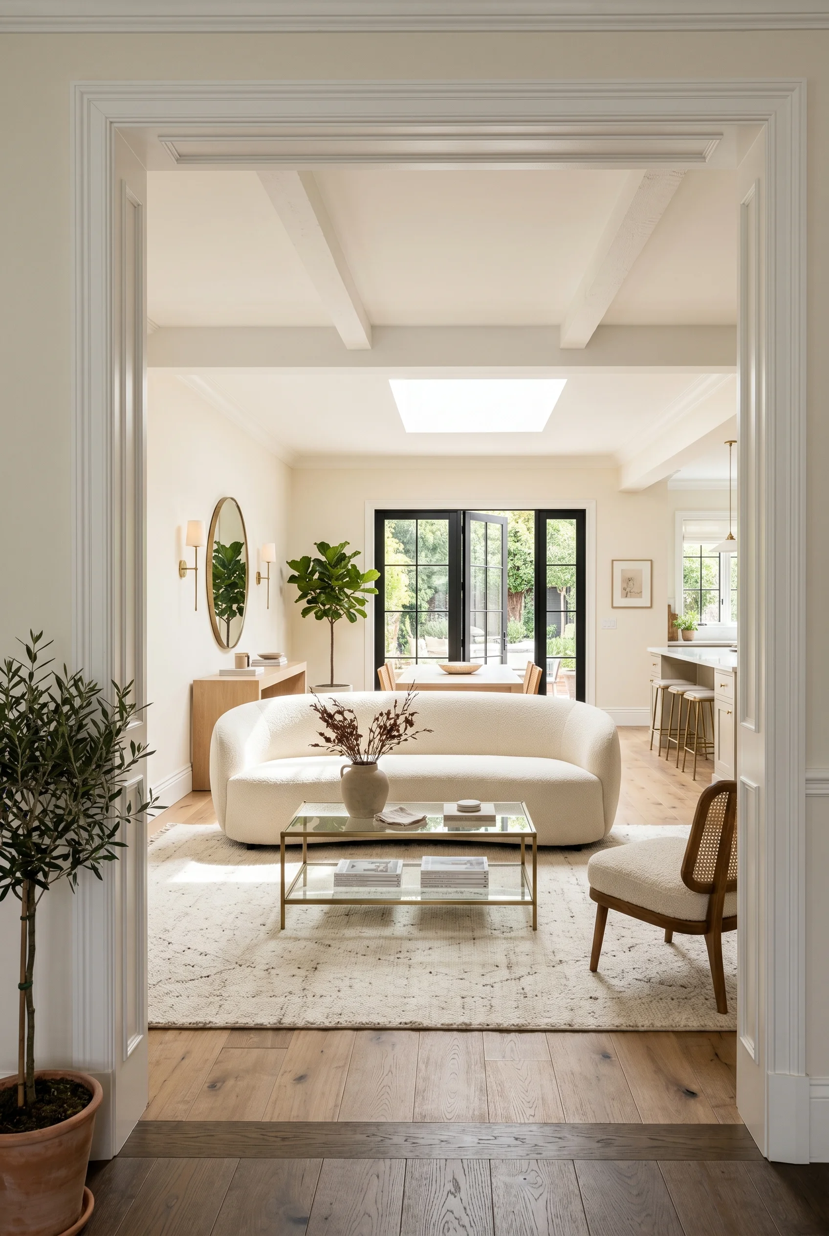
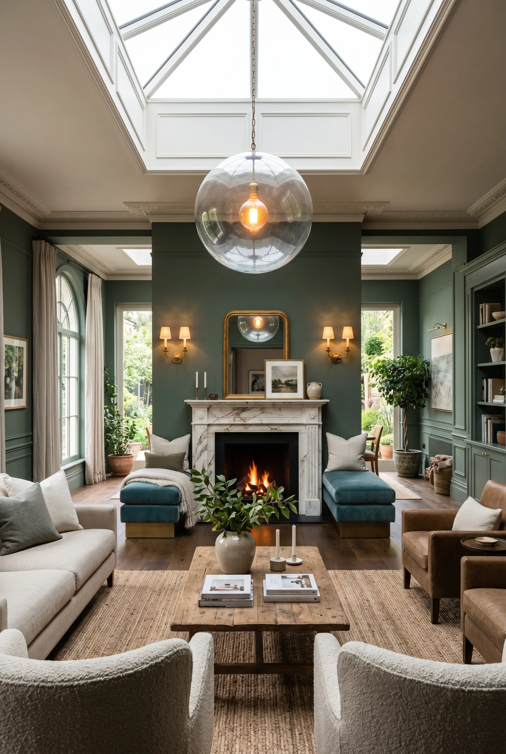
Green things matter too. Big sculptural plants. A Bird of Paradise in a heavy ceramic pot. A trailing Monstera. A Parlor Palm in a corner. They soften all the carved wood and heavy fabric. And if you have the wall, install floor to ceiling bookshelves. Real books, in real disorder, beat any styling object you can buy. For more on this palette, see sage green bathroom ideas.
If you do nothing else, do this. Buy one velvet Chesterfield in a deep jewel color. Paint your walls warm stone grey. Hang one ornate gilded mirror over the fireplace. Add a dark wood coffee table with a glass top. That four piece combo gives you the bones of a modern Victorian living room. Everything else is layering.
This post contains affiliate links, which means we may earn a small commission if you make a purchase through our links, at no extra cost to you.