Newsletter Subscribe
Enter your email address below and subscribe to our newsletter
Studio McGee’s published Victorian kitchens nearly always start with one move. A freestanding antique dresser holds open in the corner. The fitted run gets cut short to make room for it. The imitators copy the green paint and the brass knobs. They miss the dresser. That single piece is what makes a McGee kitchen feel collected, not specified. I’ve spent months tracking what she puts in these rooms, what she leaves out, and what I’d swap for a UK build. This article is a spec tracker, room move by room move. Copy. Skip. Or swap for the British alternative I’d reach for instead. You will find a version of this in our modern victorian exterior design breakdown.
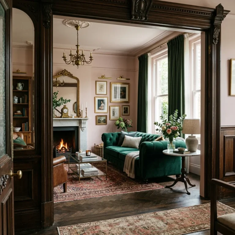
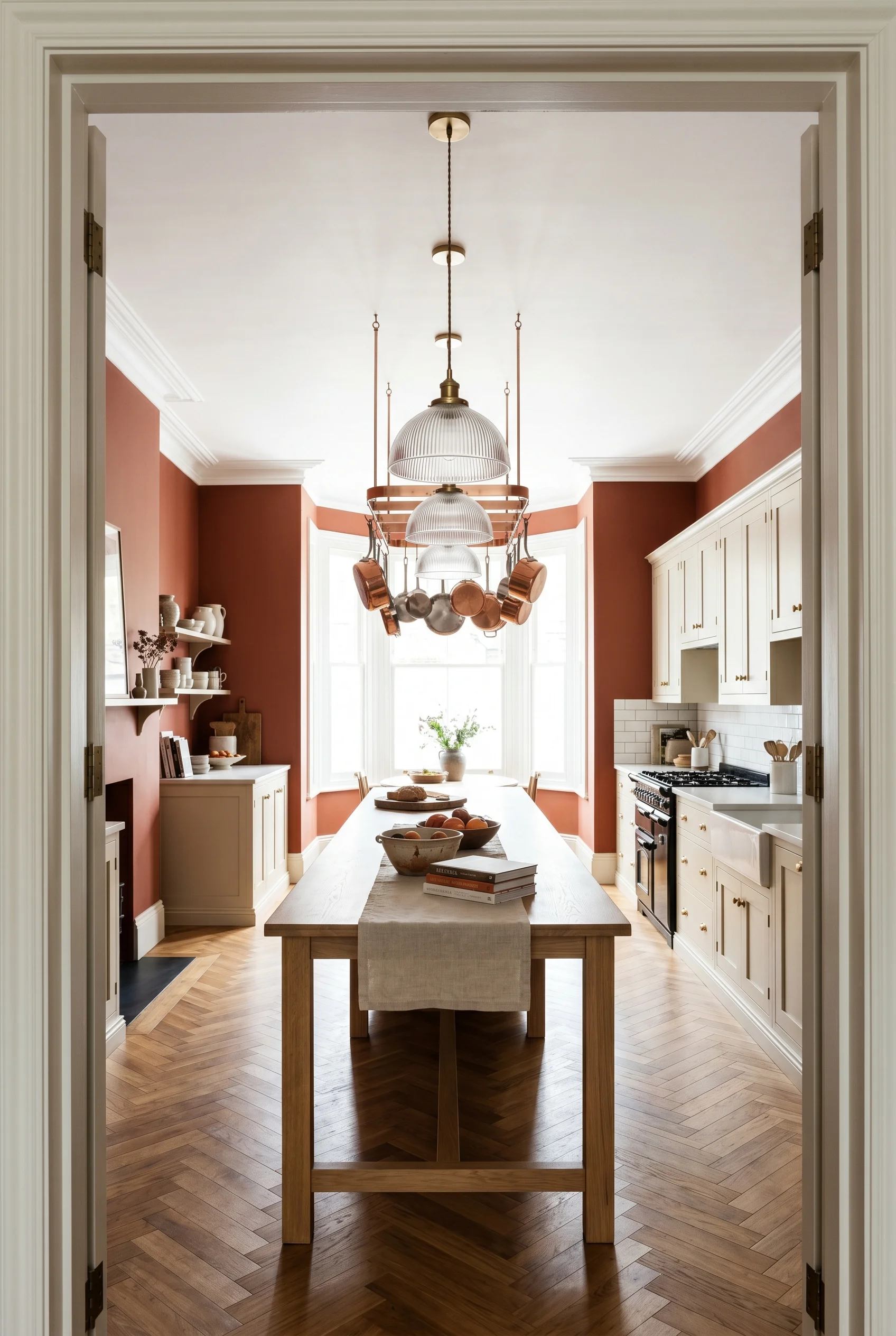
McGee’s signature Victorian kitchen move is a quiet one. She lets one antique do the period work. The rest of the room reads modern. It’s why her kitchens photograph as warm but never as costume. You see this on her Pleasant Grove projects and across the Forever Project portfolio. One old piece sets the period tone. Everything around it is clean cabinetry, plaster walls, and warm metal. The McGee imitators try to add three antiques and the room slips into costume. One does the work of three. We dove deeper into this for modern victorian hallway design.
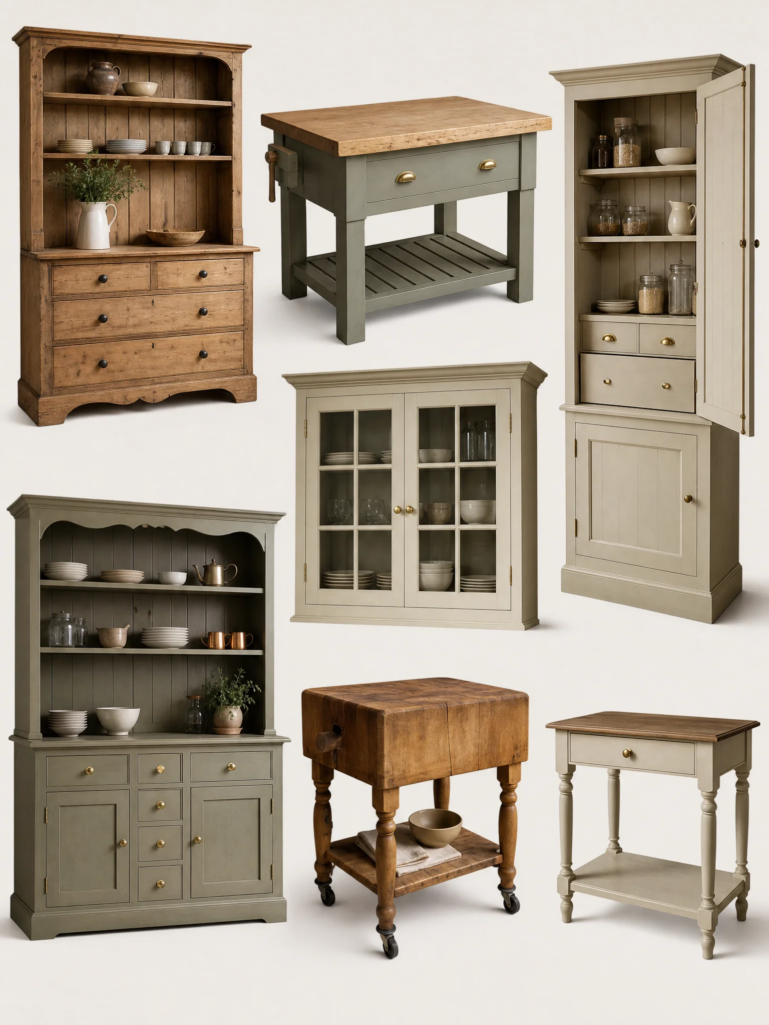
I’d copy the antique as the period piece move in any UK Victorian kitchen. What I’d swap is the source. McGee buys from US dealers who sell painted American farm pieces. In the UK we have something better. A Victorian housekeeper’s cupboard from a country dealer in Petworth or a stripped pine plate rack from Lassco in London. Same role, more local provenance. The piece carries the period note so the cabinet maker can build the rest in clean, modern lines. For more on this palette, see victorian kitchen cabinets.
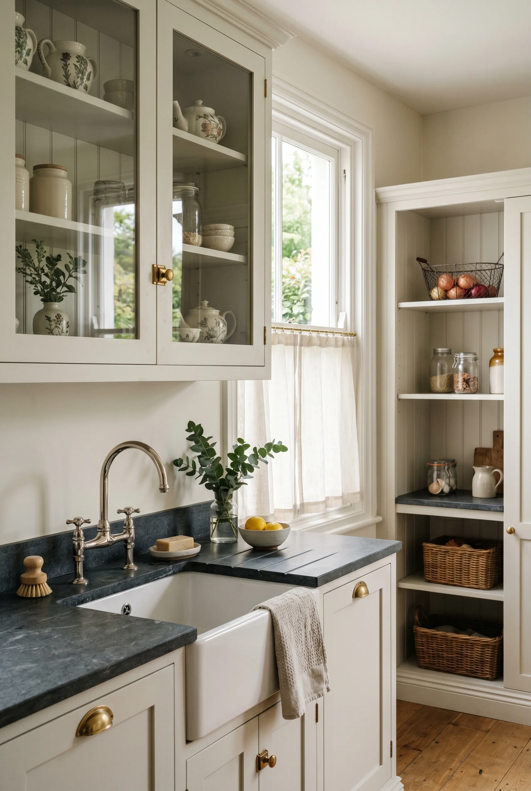
What I’d skip is the open shelving McGee often runs above the range. Beautiful in photos. Greasy in real kitchens. Heath Ceramics looks great on day one. Six months in, it’s a wipe down chore. The deVOL move I’d reach for instead is a pair of glass-fronted upper cabinets. You get the display, you keep the dust off the bowls. If your taste runs more toward farmhouse sage green kitchen cabinets, the proportions shift.
The reward of the spec-tracker thinking is this. You stop trying to copy a McGee photo wholesale. You pick the two or three moves that suit your room. Then you swap her American sources for the UK pieces that make it yours. The next H2 starts with paint, because that’s where she starts every project too. The same principle holds true for victorian interior design.
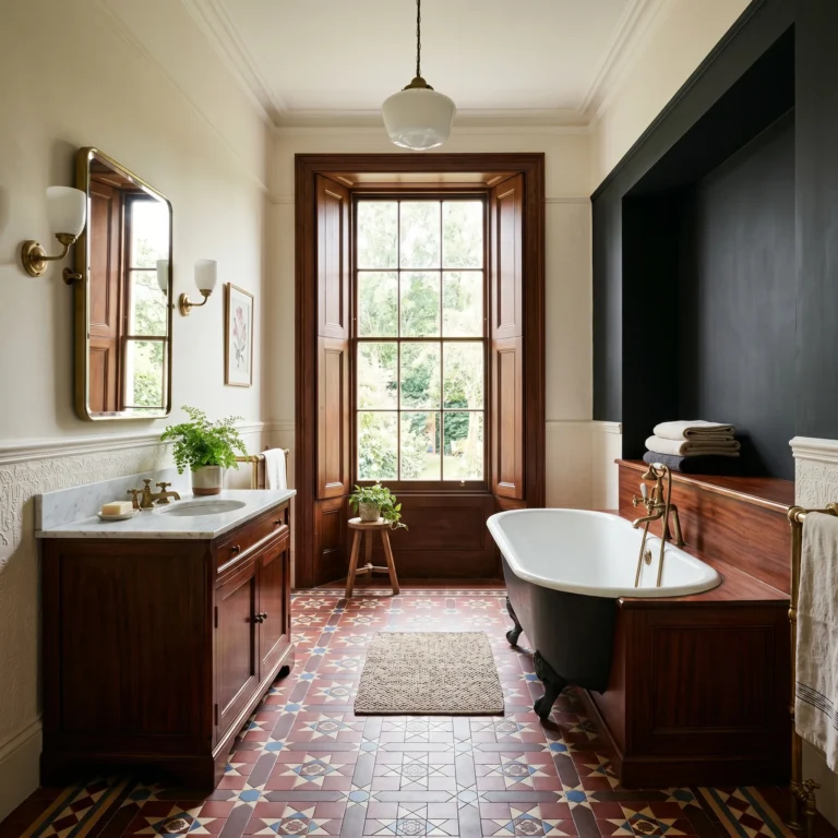
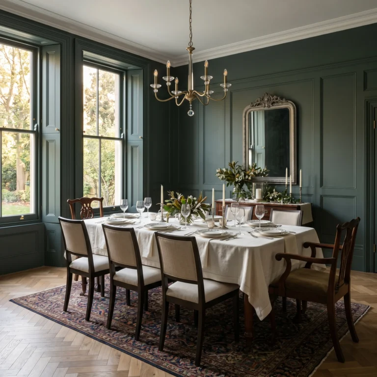
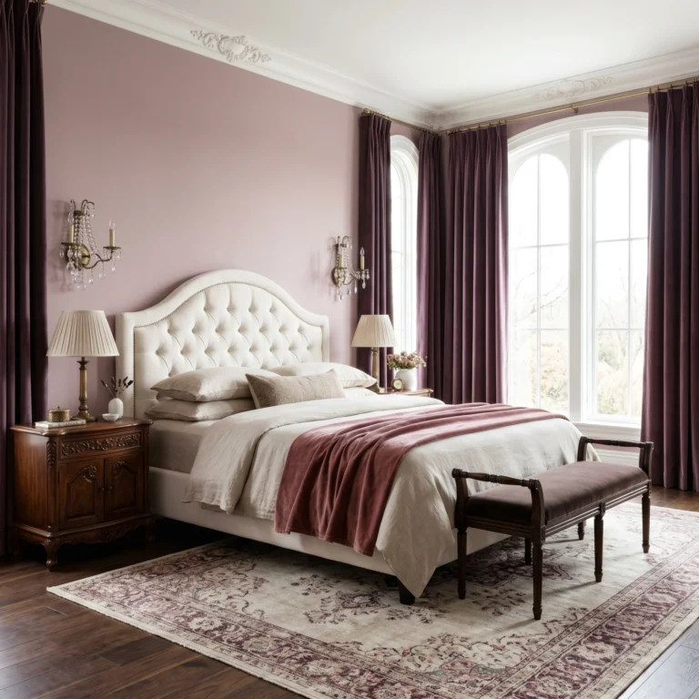
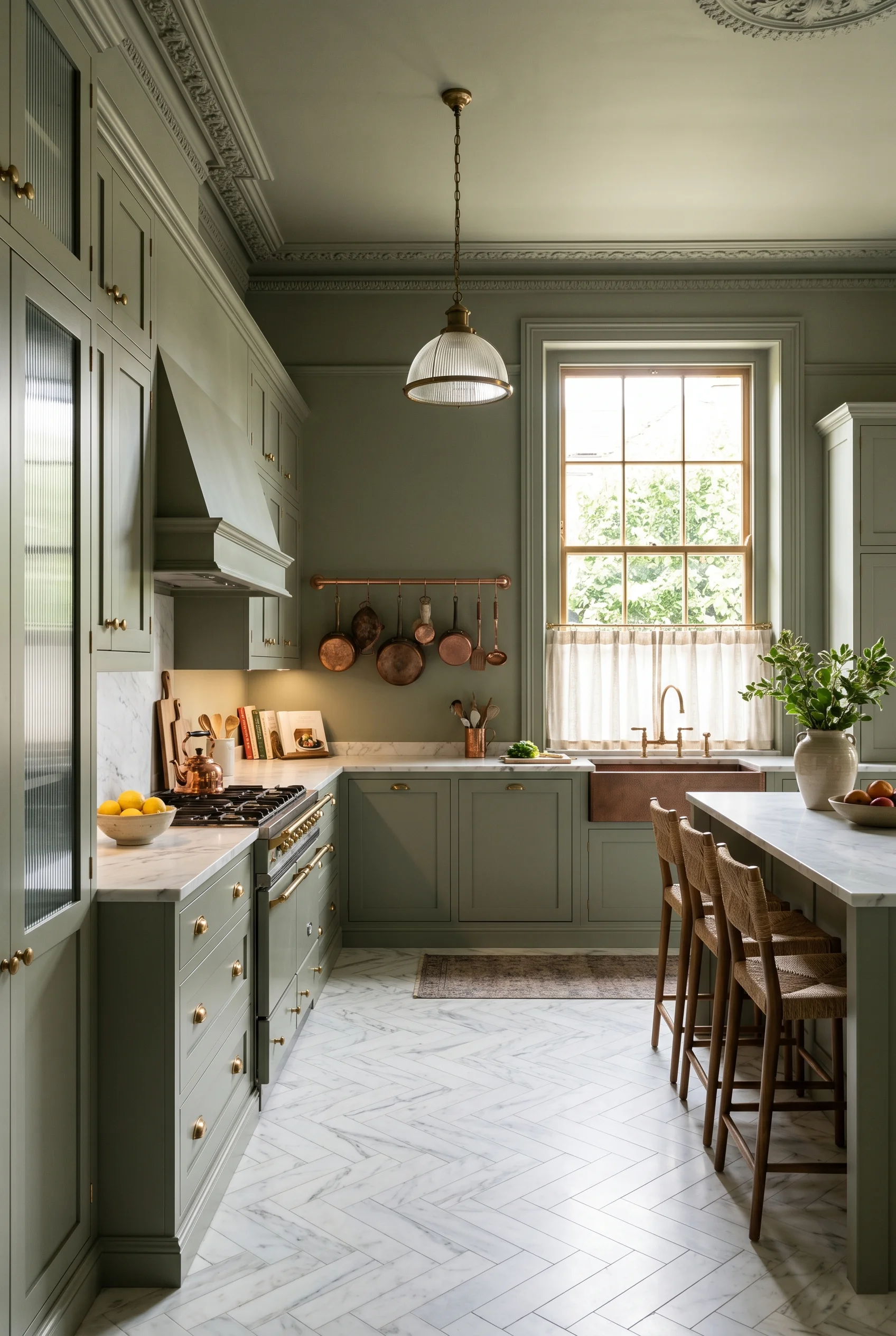
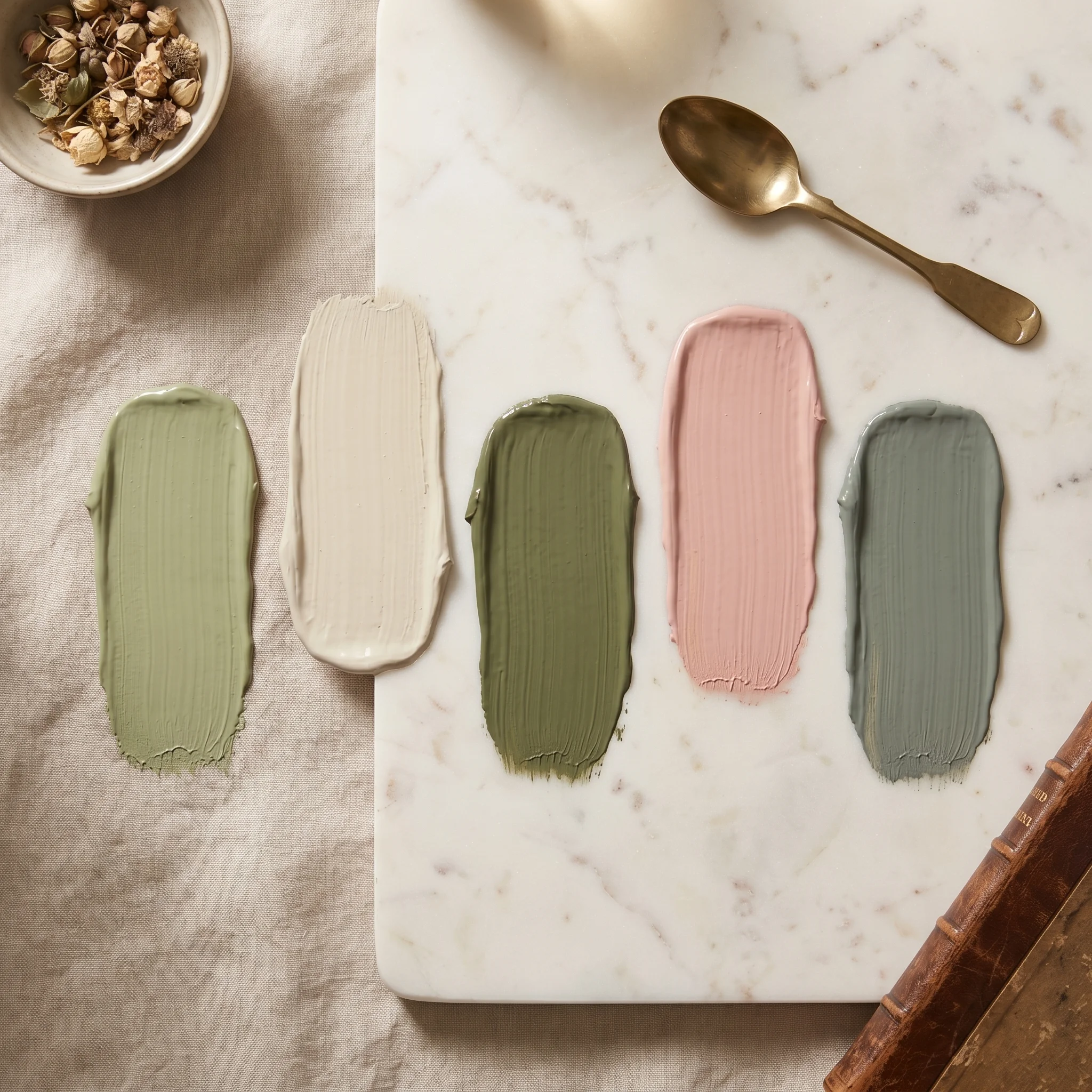
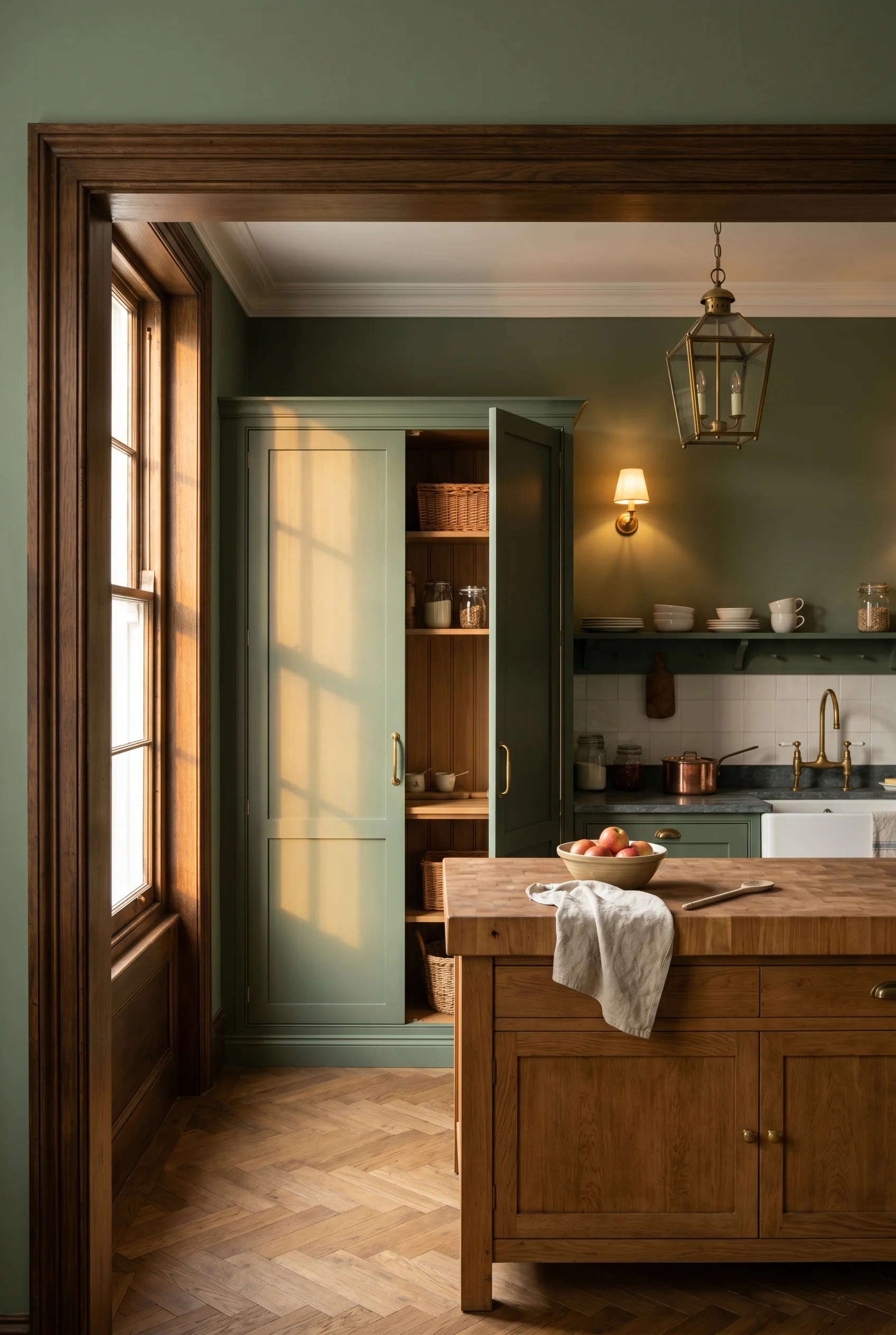
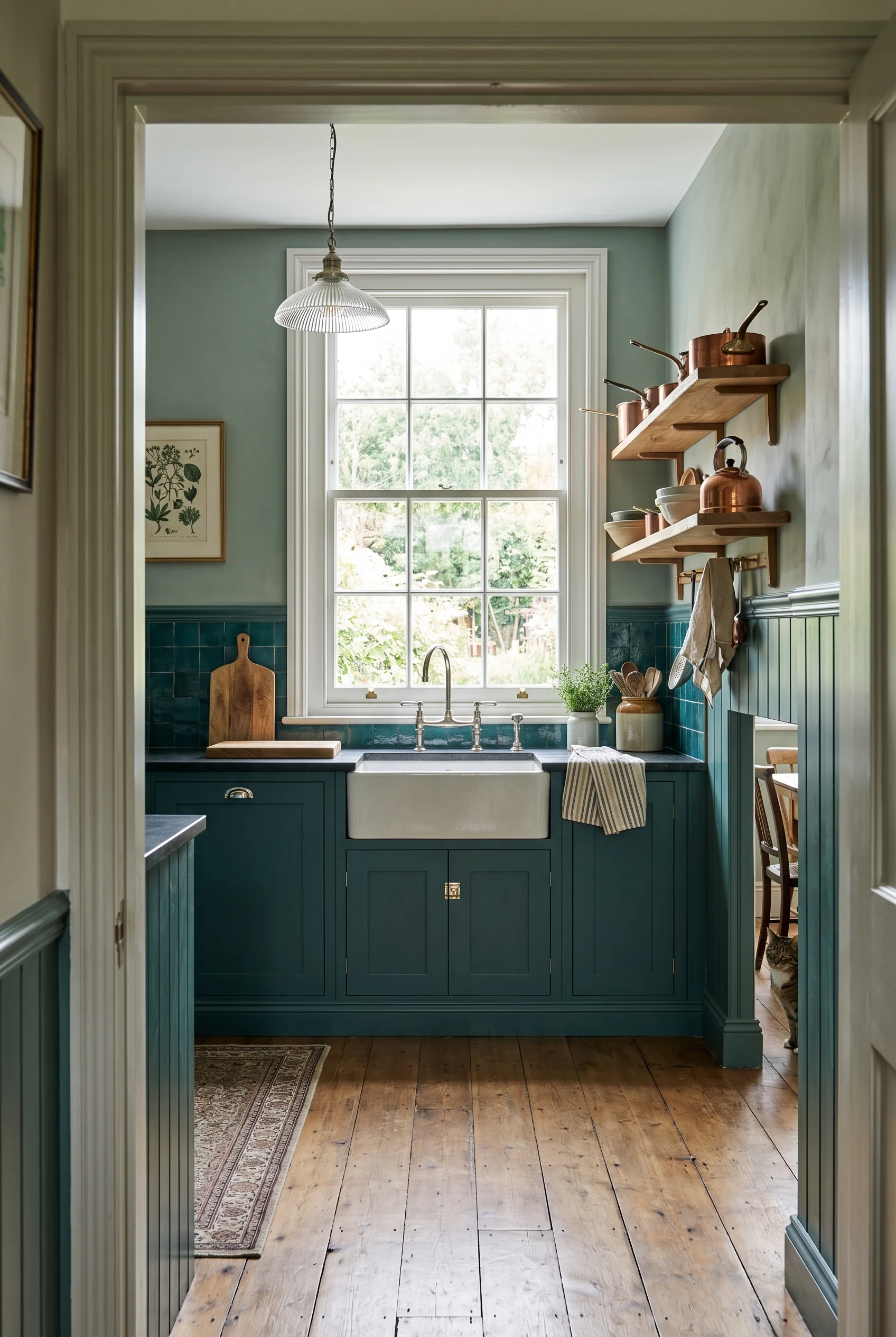
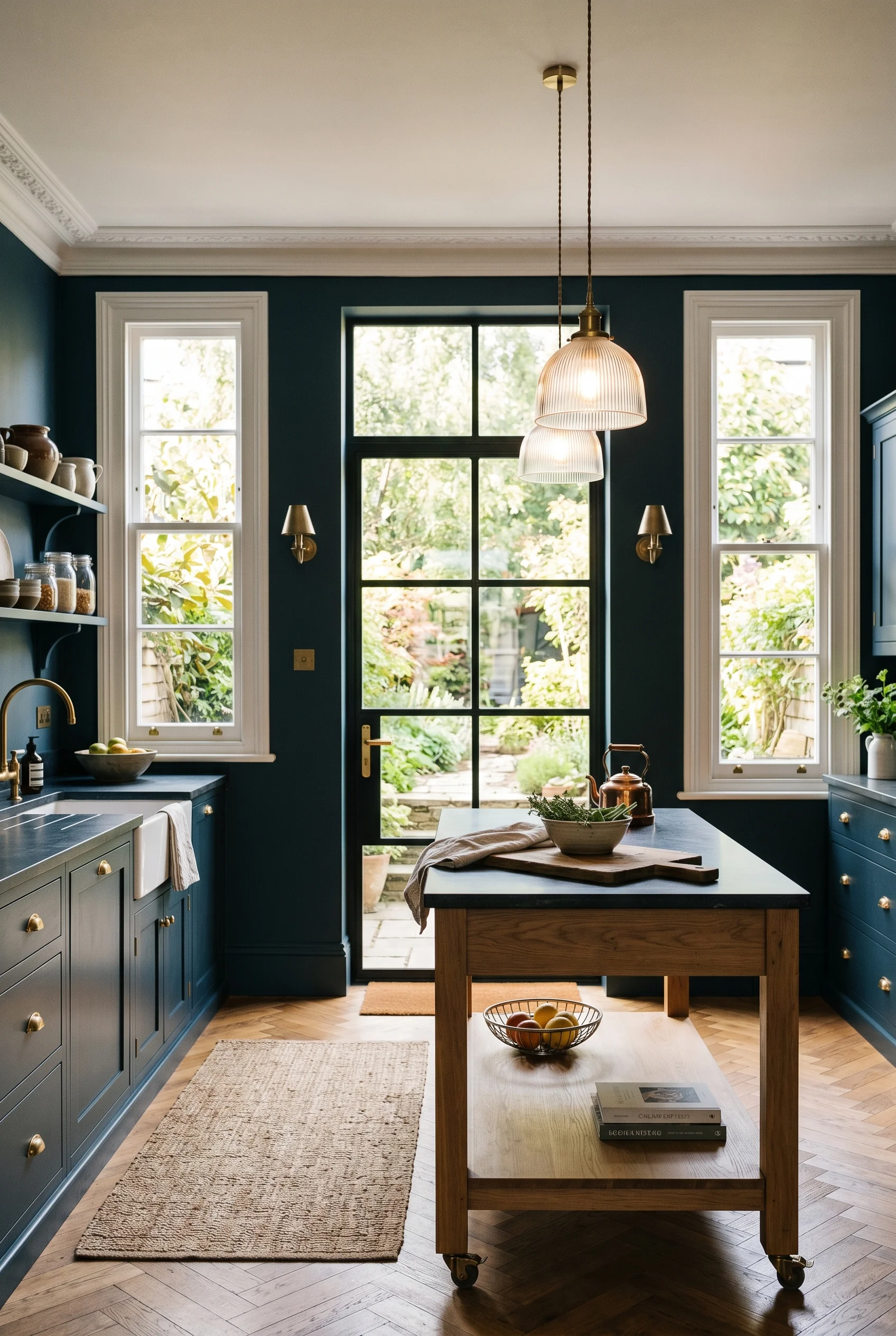
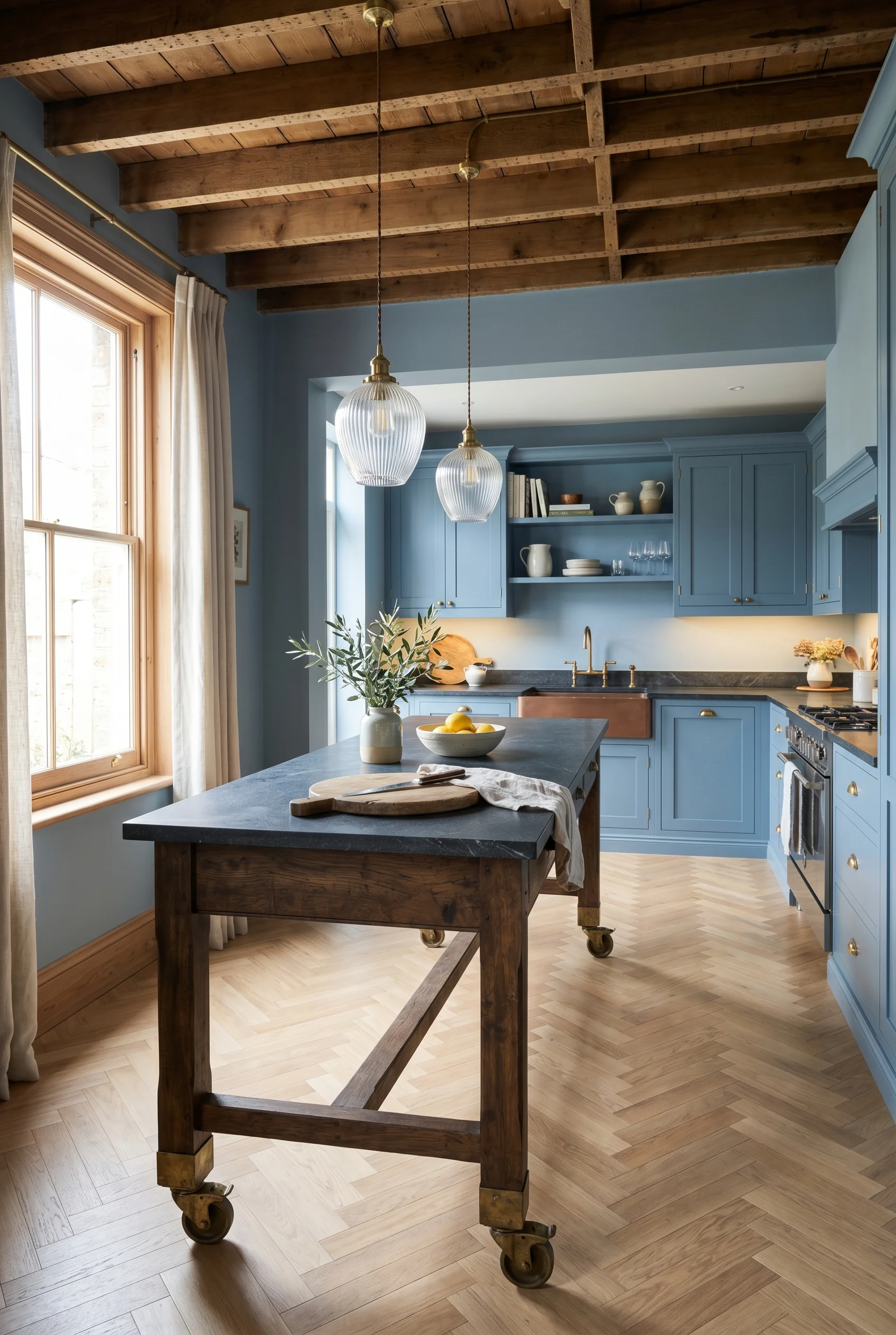
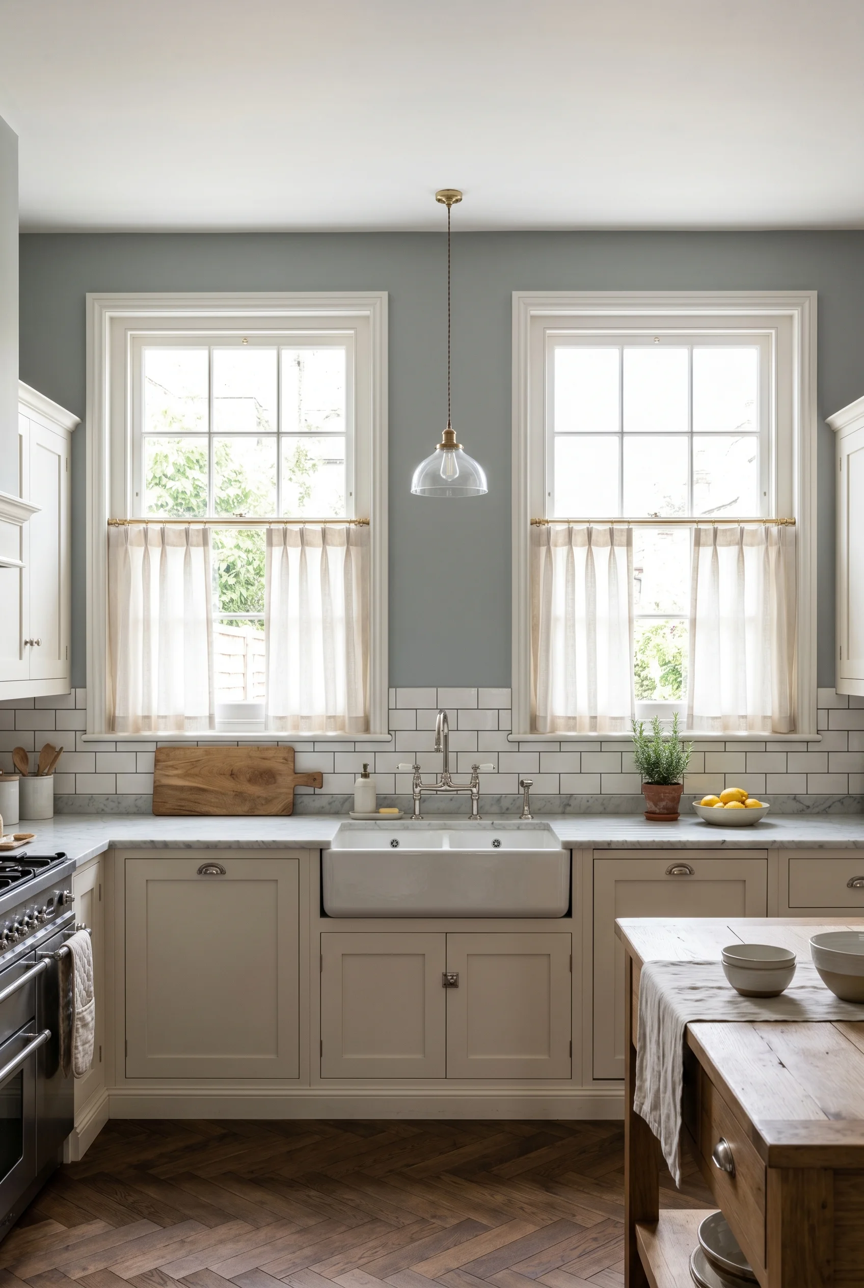
McGee’s kitchens read warm because she doesn’t paint them white. She pulls a soft heritage green or a warm putty across the cabinet run. The walls and trim go even softer. It’s a tonal layer, not a contrast scheme. You see it on her Pleasant Grove kitchen and on the family home she published in her Park City book. The green is never sharp. The white is never cold. The whole room sits in one warm bath of colour. We dove deeper into this for modern victorian living room design.
I’d build a UK Victorian kitchen on five Farrow and Ball codes. They map onto the McGee feel without copying it. I’d start with a calm green for the cabinets. Then a soft white for the walls and ceiling. A deeper green or a moody blue holds the larder door. A warm pink and cream brings the shelf nooks alive. A grey blue does the back hall or scullery door so it reads as its own zone. The same principle holds true for mid century modern bedroom ideas.
What I’d actually do here is paint the cabinets, the trim, and the inside of the dresser the same green. That’s the colour drench move and it’s the single biggest shift you can make. The room stops looking like a kitchen with green cabinets. It starts looking like a green kitchen. Big difference. Soft sheen on the cabinets, dead flat on the walls. If your taste runs more toward farmhouse french country kitchen, the proportions shift.
The Exact Colors:
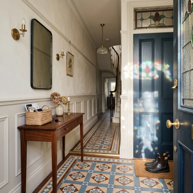
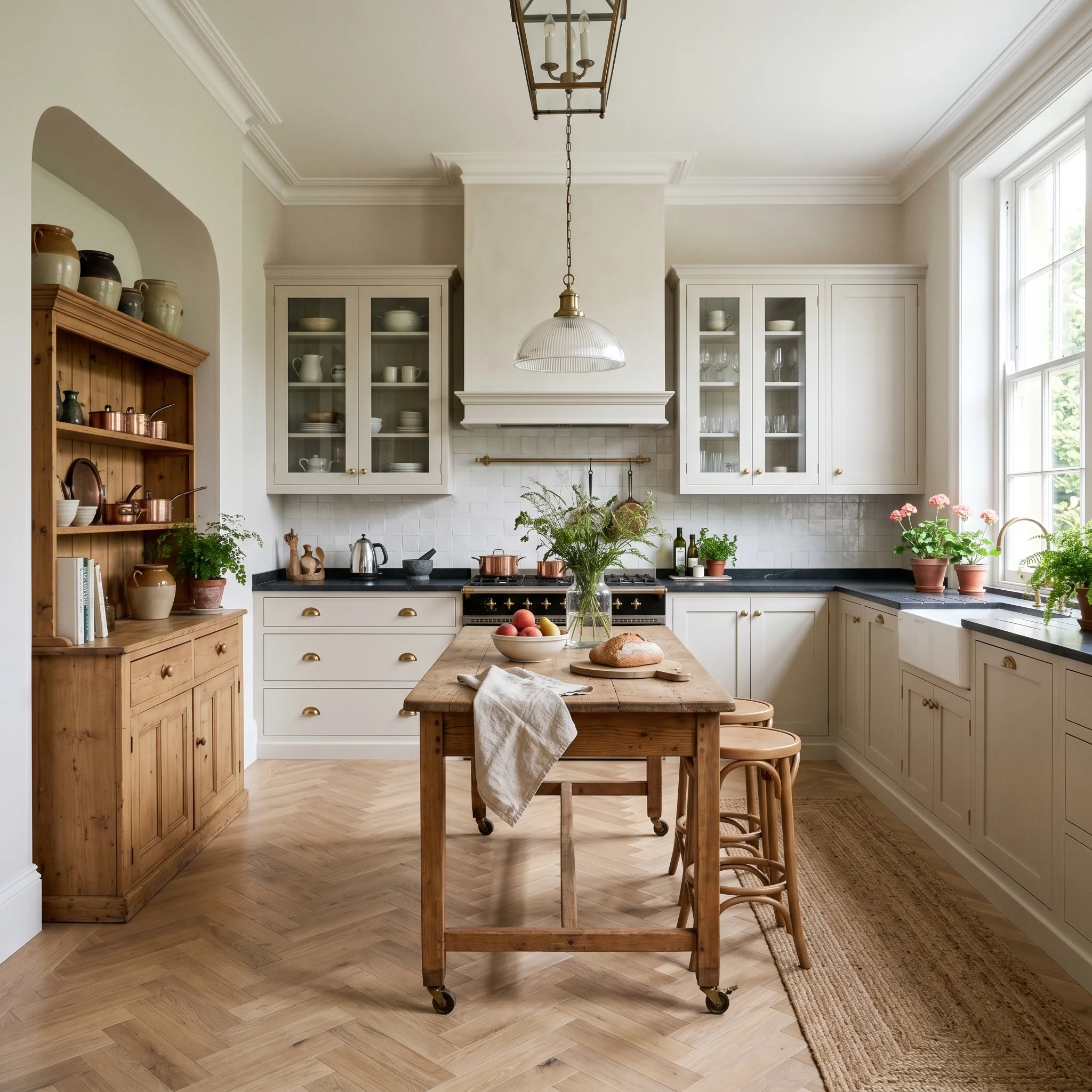
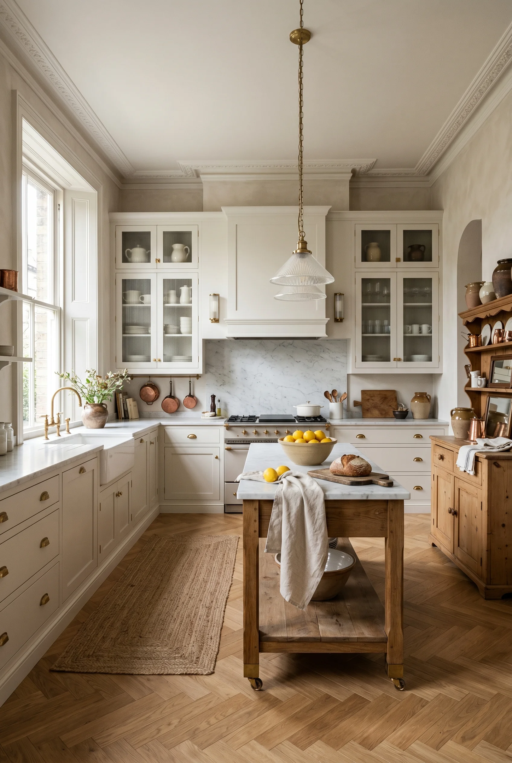
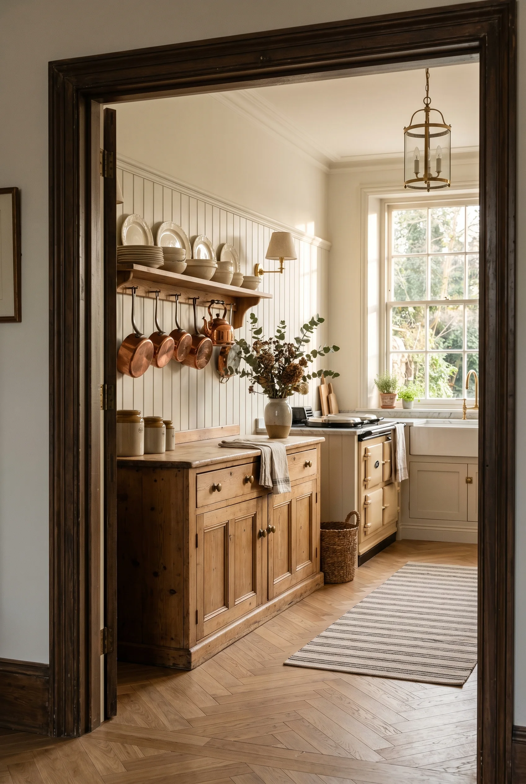
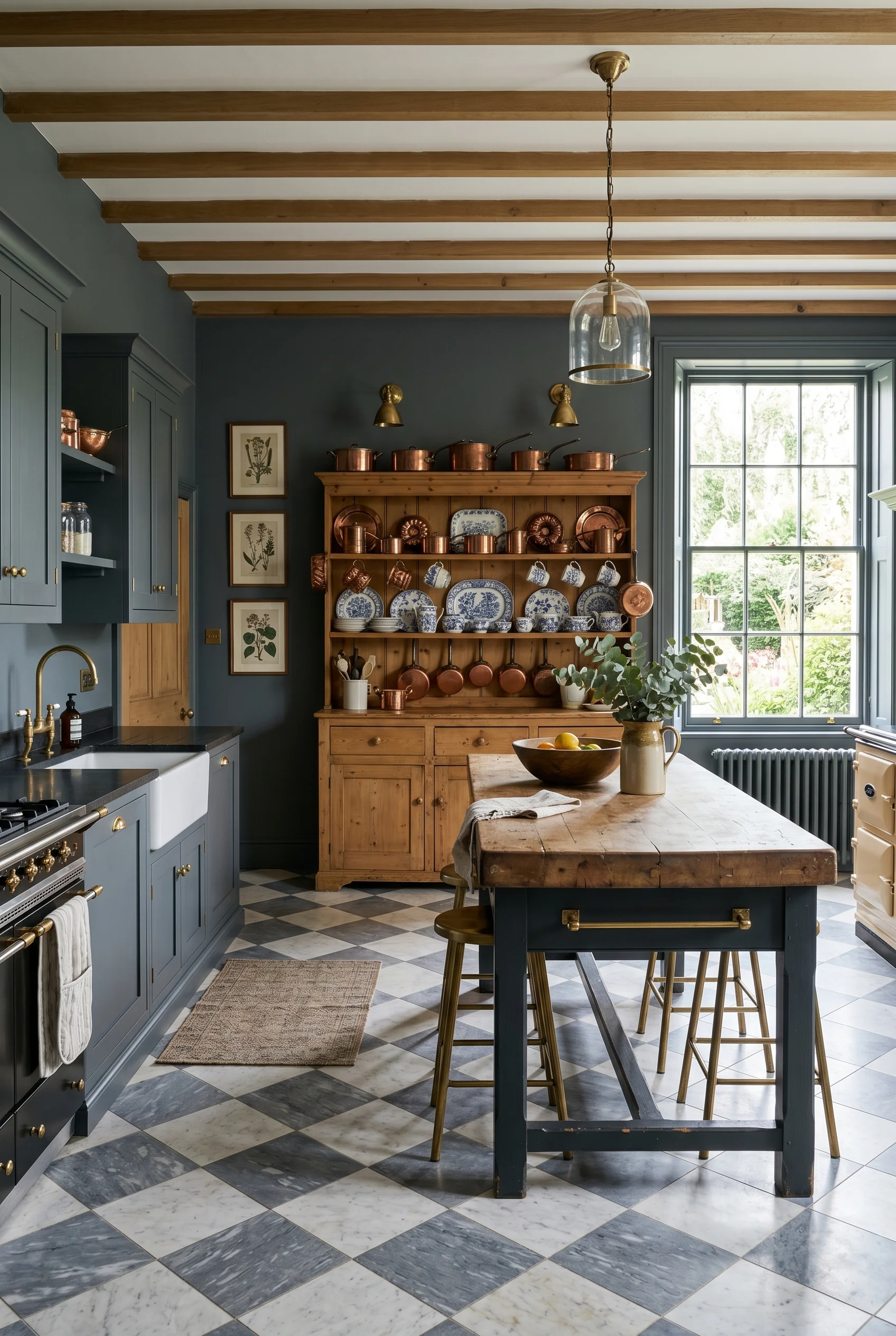
The McGee tell on furniture is what’s missing. There’s no wall-to-wall built in run. She breaks the cabinetry with a freestanding piece. It might be a tall larder. It might be a Welsh dresser. It might be a butcher’s block on castors. The room reads like a kitchen that grew, not one that was specified in a single CAD pass. The Victorian house was built for unfitted furniture in the first place. The fitted look came later. Which is exactly what makes victorian kitchen colors work so well.
For the central work table I’d reach for deVOL’s Haberdasher’s table. It’s the British answer to the McGee island. A long timber top on turned legs. No bar stools tucked under. Storage below in open shelves. It does what a fitted island does and it leaves the room feeling lighter. McGee uses an American maker called Lostine for similar pieces. Lovely. Lead times painful in the UK. The deVOL piece arrives in six weeks. Which is exactly what makes small living and dining room ideas work so well.
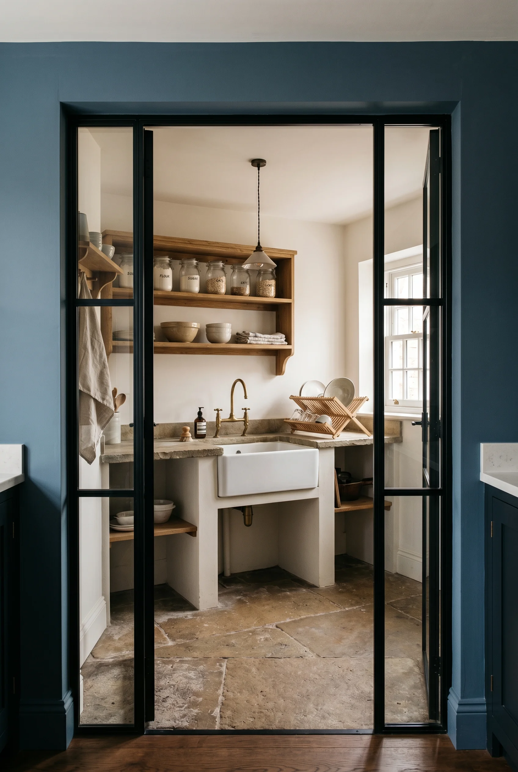
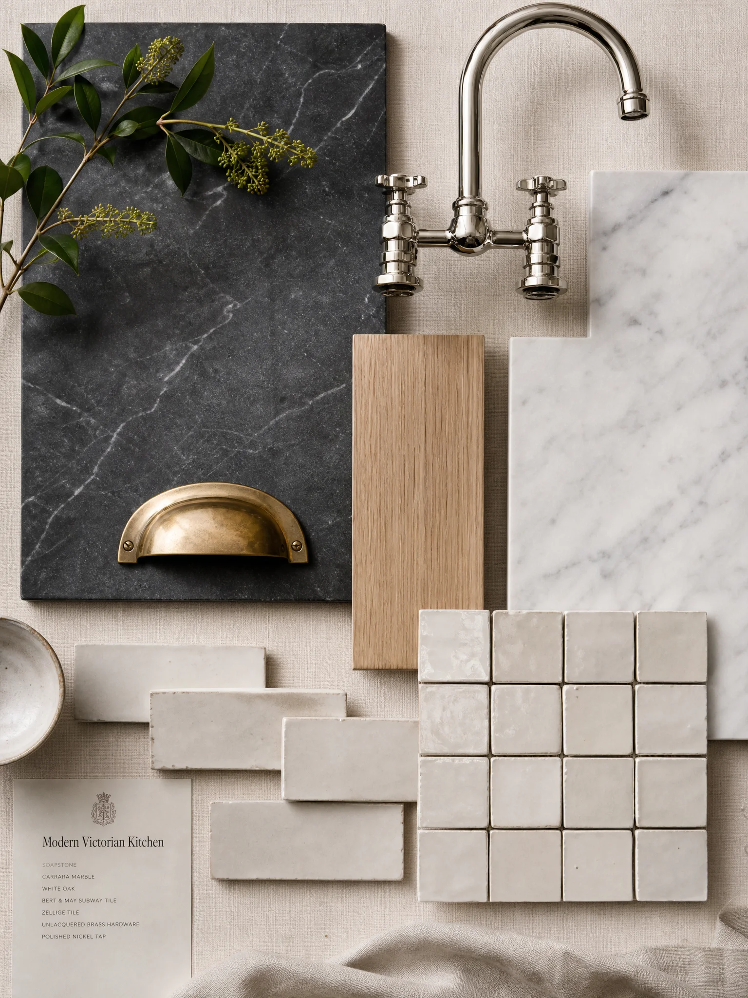
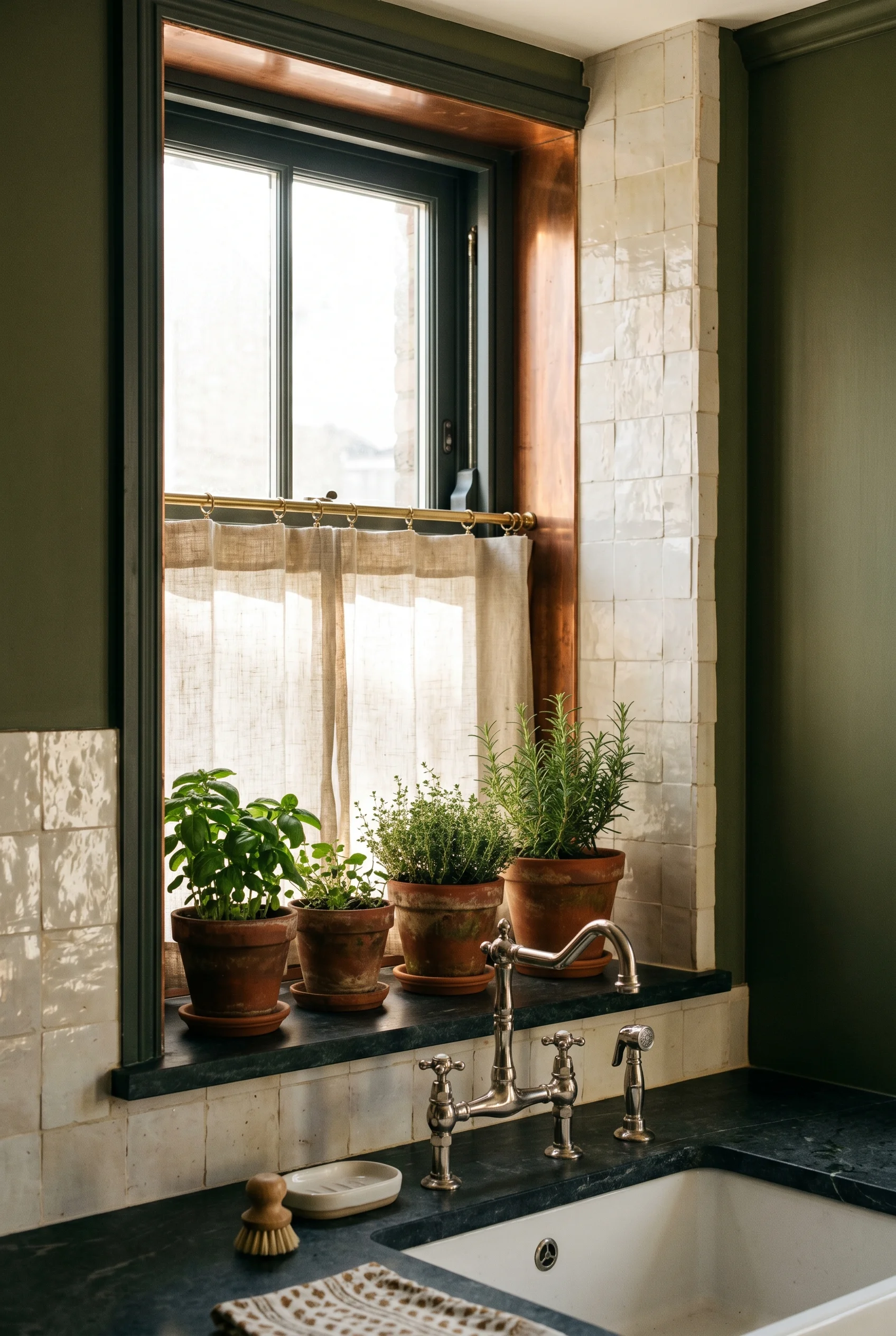
What I’d copy from McGee is the larder cupboard. A tall, paint grade joinery piece with a beadboard back. That’s vertical tongue-and-groove panelling, the thin grooved boards you see on old porch ceilings. Plain English do a brilliant version. Howe in Pimlico do something more ornate. Both work. The larder is where you hide the bin, the recycling, the small appliances. The kitchen reads quiet because the noise lives behind one door. Contrast this with english country kitchen where the approach is almost opposite.
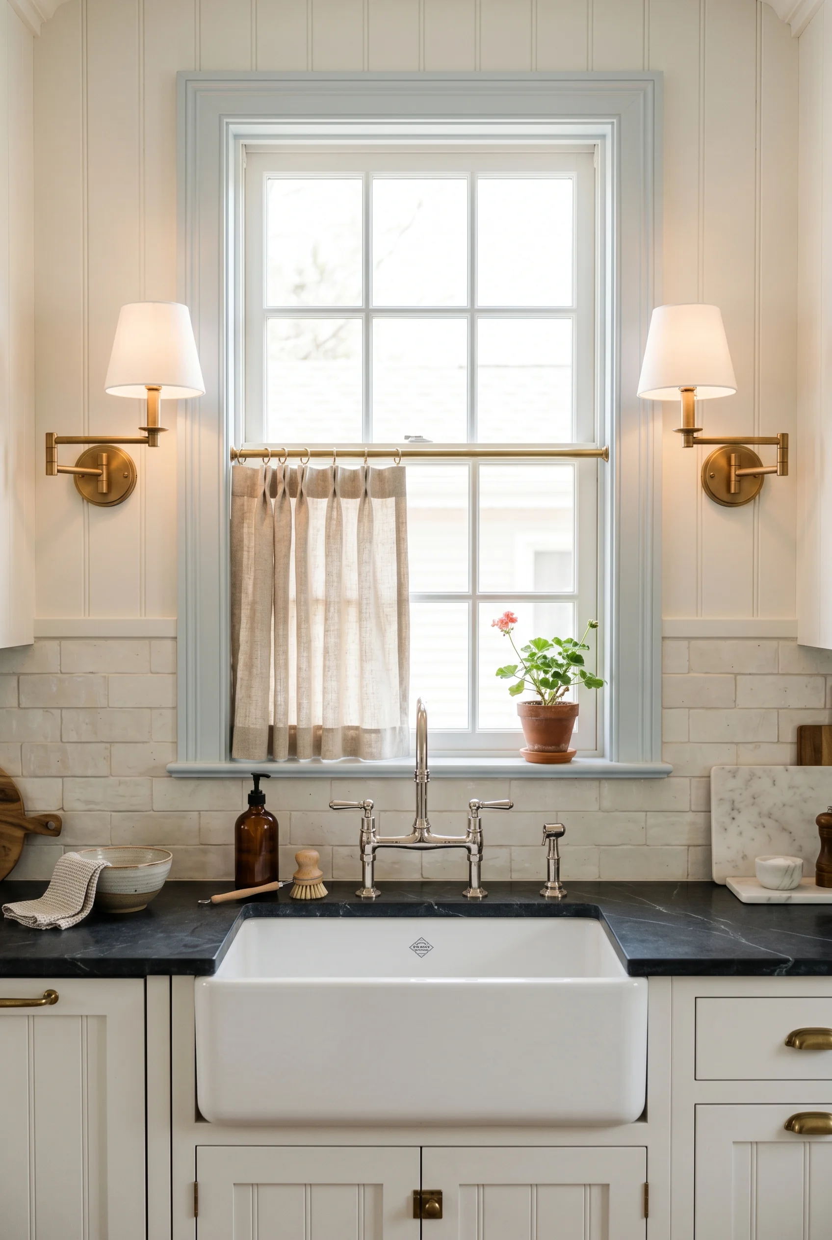
McGee almost never uses regular subway tile. People assume she does because the shape is similar. Look closer. It’s handmade, slightly uneven, glazed by hand. Heath Ceramics ship hers from California. Each tile has small variations. The grout joint is wider than a standard subway. The wall reads as craft, not catalogue. That texture is the whole reason her tile photographs the way it does. A close cousin of this idea appears in our modern living room design guide.
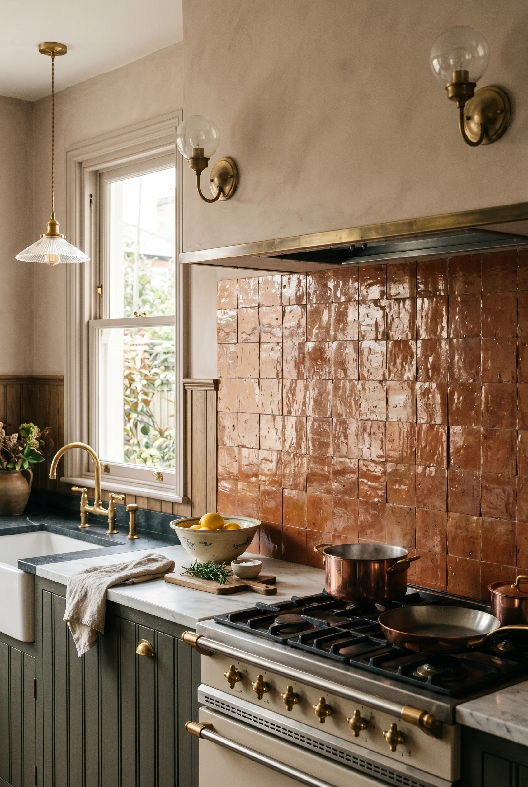
In a UK kitchen I’d swap Heath for a closer source. Two options. Bert and May make handmade glazed tiles in London with the same uneven edge. Otto Tiles do zellige, the Moroccan handmade tile, in a soft white that reads similar. Either gives you the McGee texture without the four month freight. Lay them with a 3mm joint. Use a warm grey grout, not white. Contrast this with moroccan kitchen where the approach is almost opposite.
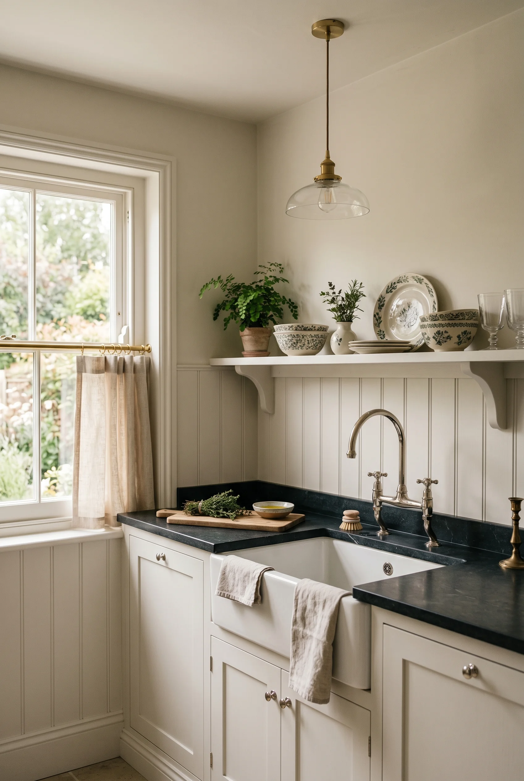
Below the tile and around the room, I’d run beadboard panelling to dado height. That’s about waist high. Painted in the cabinet green so it reads as one piece. Above the dado, dead flat plaster in the warm white. The McGee version pushes the panel higher than most British kitchens. I’d keep it lower in a UK room because our ceilings are usually shorter. A high panel in a 2.4 metre ceiling makes the wall feel cramped. For a warmer take on the same room, see japandi kitchen design.
The reward here is a wall that does three things in three textures. Tile holds the splash zone. Beadboard takes the middle band. Plaster takes the top. The eye reads it as period without anything ornate doing the work. Then layout decides where everything sits. A close cousin of this idea appears in our downstairs toilet ideas guide.
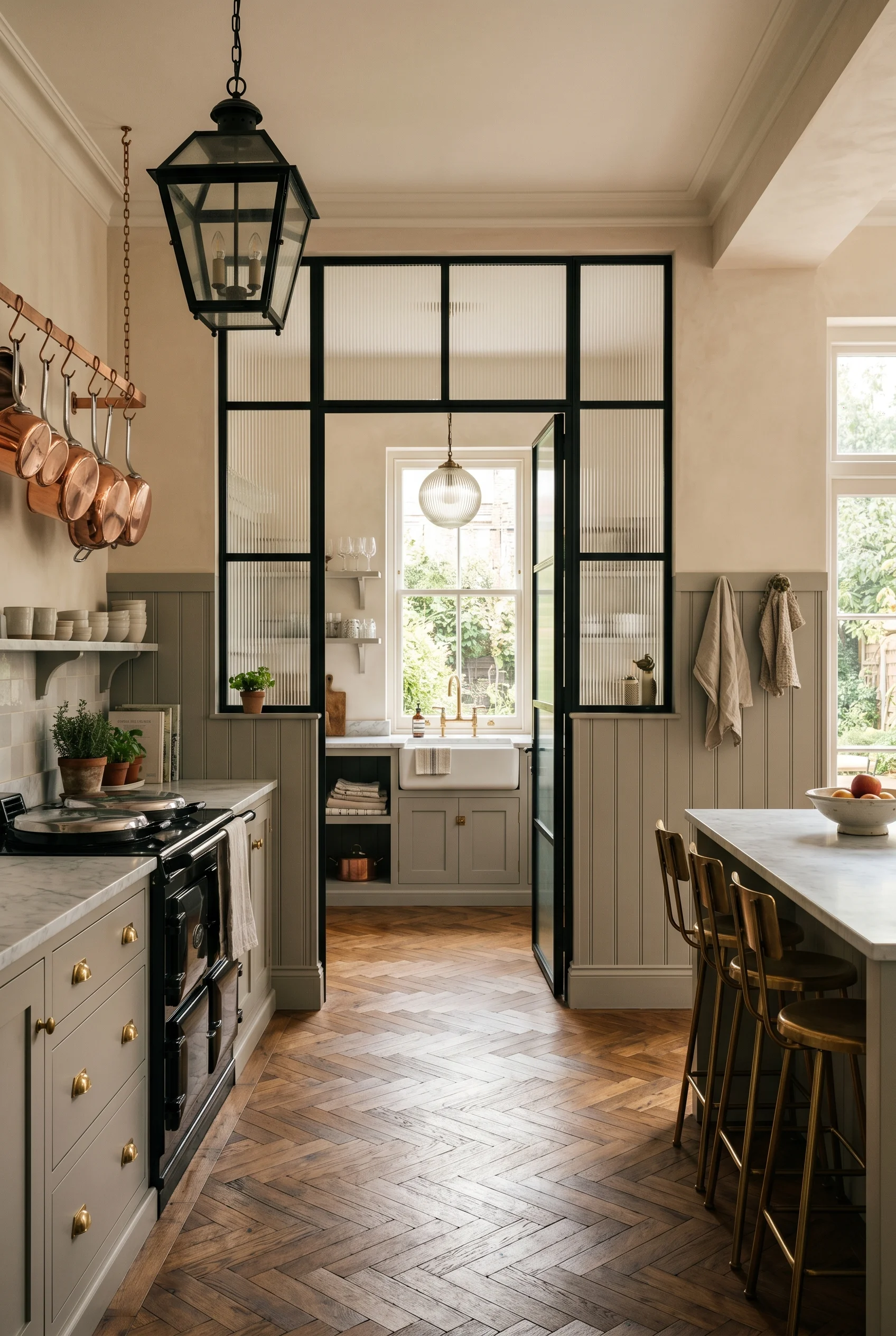
The biggest McGee layout move on a Victorian house is the scullery. Front-of-house kitchen stays formal and finished. Behind a glazed door, the working zone holds the second sink, the dishwasher, the coffee machine, and the recycling. Photographs of her published kitchens show this clearly. The main room has one sink, one cooker, one fridge. Everything else lives behind glass. It’s how the front room stays magazine clean. We tested this theory across rooms, starting with modern victorian bathroom.
In a UK Victorian terrace this is easier than it sounds. Most houses already have a back addition. The original scullery was there. You’re putting it back. Internal glazing, often called Crittall-style, runs the door and a window above. Light flows through. Noise stops at the threshold. The dishwasher can run at 8pm without filling the kitchen with a low hum. For a warmer take on the same room, see home interior design.
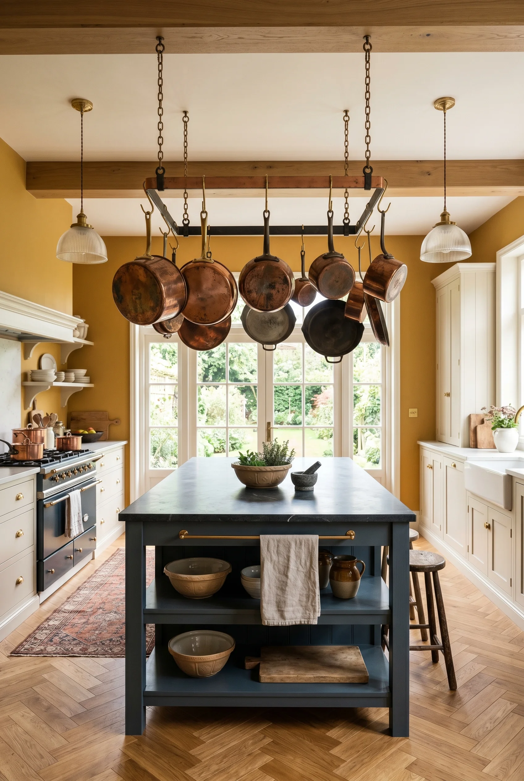
The other call is island versus central work table. McGee picks the table on Victorian projects, the island on new builds. I’d follow her on this. A central work table on castors lets the room flex. You can pull it under the window for a baking session. You can push it against the dresser for a buffet. A fixed island locks the floor plan. Beautiful, but it dates the room to the year you fitted it. We tested this theory across rooms, starting with victorian style home office.
What I’d skip is the second island people have started doing. Two parallel runs with a corridor between them. Looks great in a Houston new build. Wrong move in a Battersea terrace. Use the floor for a table, use the walls for storage, and let the room breathe. For a related take, see modern farmhouse living room ideas.
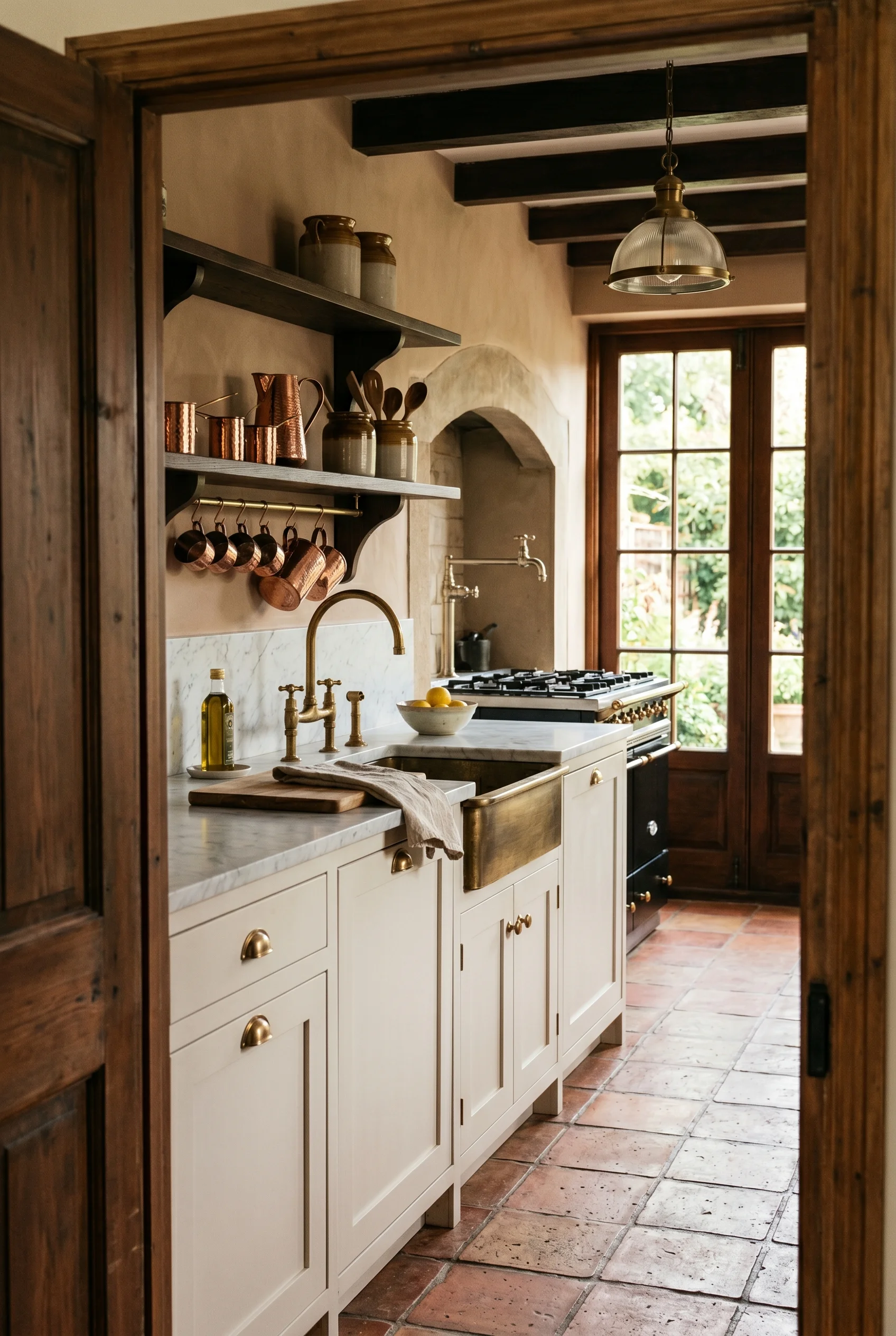
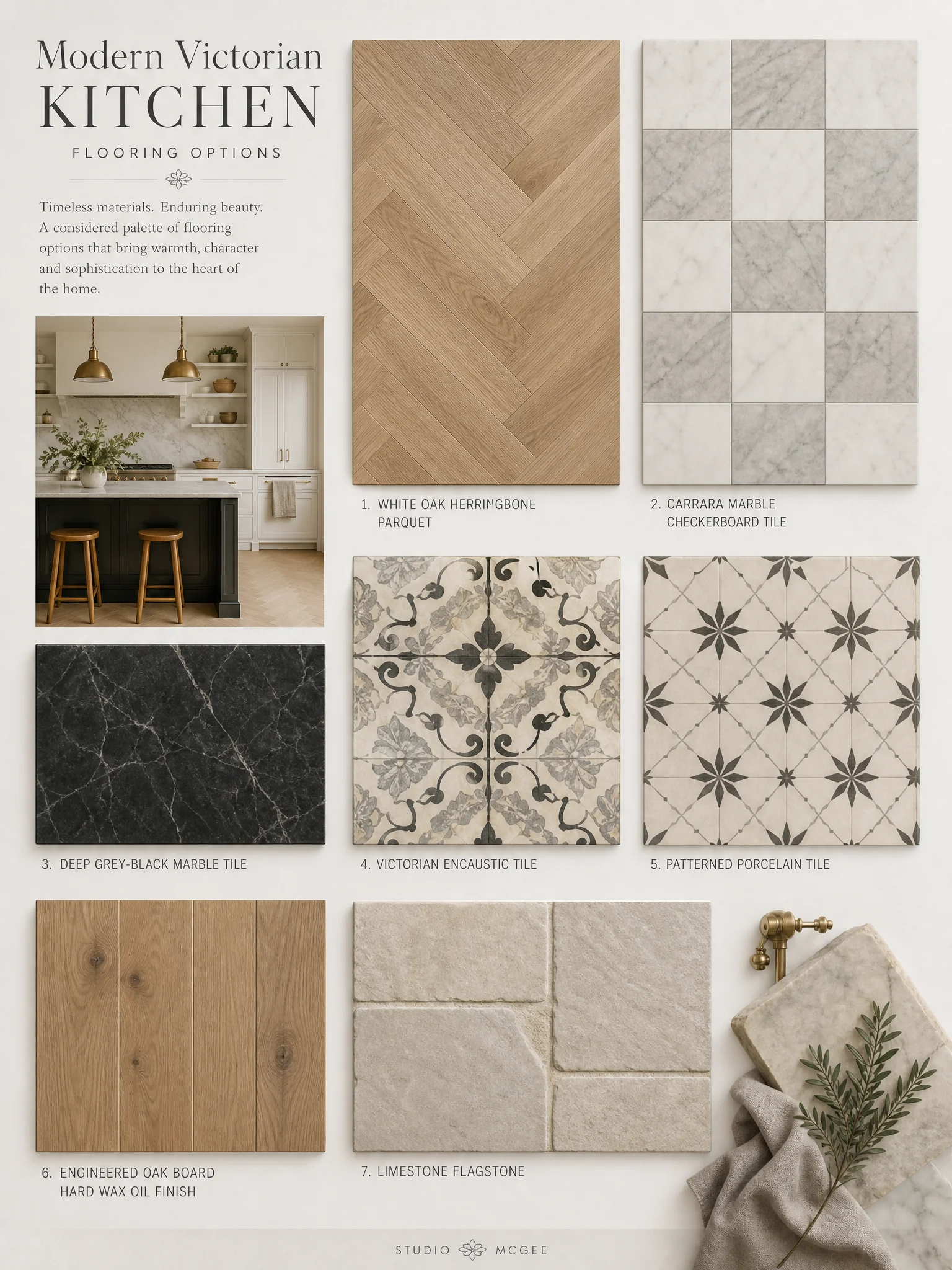
McGee’s counter call on a Victorian kitchen is almost always soapstone, not marble. Soapstone is a soft, dark grey natural stone. It scratches. It develops a patina. It looks fifty years old after one. Marble looks fifty years old after fifty. On a Victorian house you want the patina to start now. Soapstone gives you that head start. McGee specifies M Teixeira on her US projects. The dark beige kitchen cabinets interpretation handles this completely differently.
In the UK I’d reach for Cullifords or Stone Age for the soapstone slab. Both stock genuine Brazilian material with the right depth of colour. Honed finish, not polished. A polished soapstone reads like cheap quartz. Honed reads like the real thing. Edge profile should be a simple eased square. No ogee, no waterfall. The stone does the work. For more on this palette, see living room fall decor ideas.
Hardware is where McGee is most specific. Unlacquered brass, every time. Lacquered brass holds its colour. Unlacquered brass dulls and warms over the first year. By year five it has aged into the room. The McGee source is Rejuvenation in the US. The UK swap I’d reach for is Olivers and Co or House of Brass in Birmingham. Both make solid brass cup handles and knobs that age the same way. Mix two finishes if you want depth. Brass on the cabinets, polished nickel on the tap. Never chrome. Chrome reads cold and modern in a way that fights the room. We dedicated a full guide to modern bedrooms for this reason.
McGee picks one of three floors on every Victorian kitchen. Herringbone wood. Black and white checkerboard marble. A period pattern porcelain that mimics encaustic tile. Which one she picks depends on the room. Herringbone for a kitchen that opens to a snug or living space. Checkerboard for a true galley. Patterned porcelain for the back hall and boot room. The farmhouse kitchen interpretation handles this completely differently.
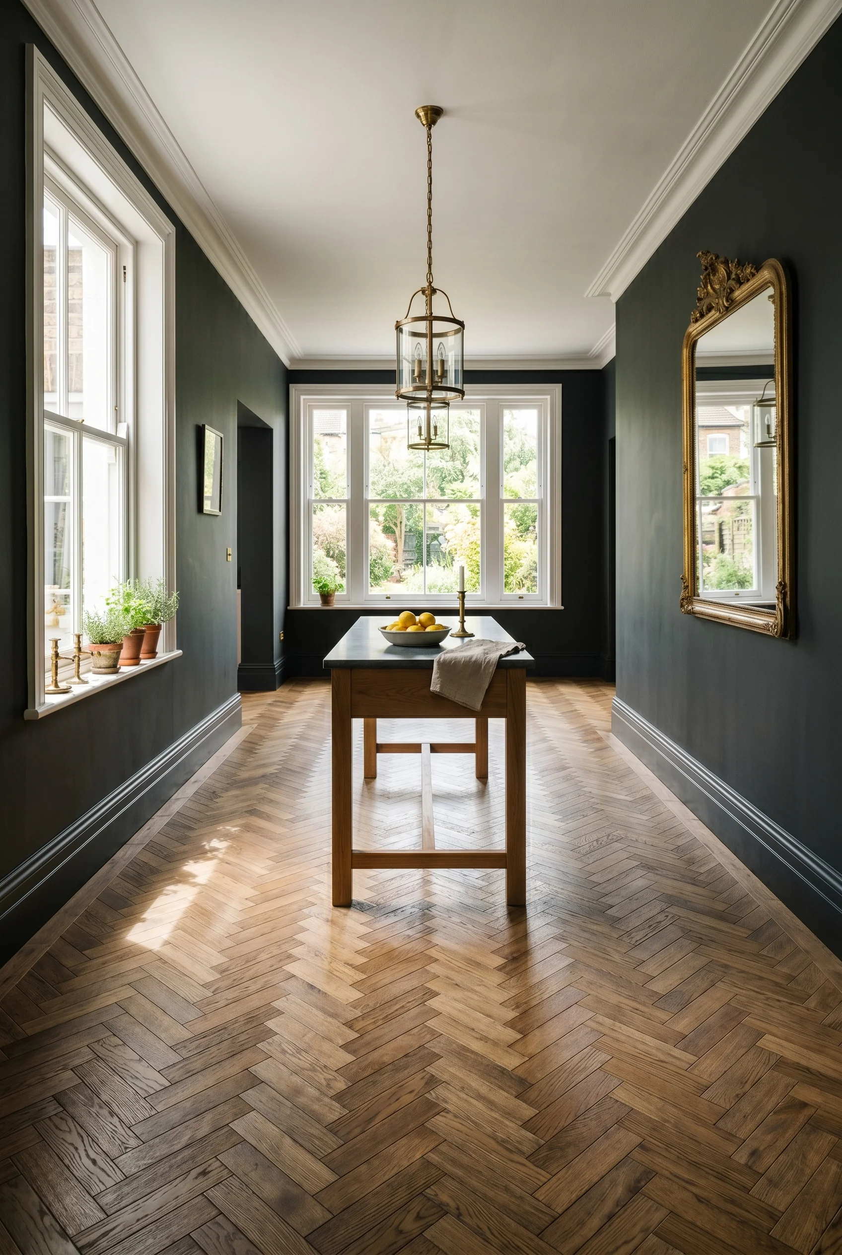
Herringbone is the safe call and the one I’d default to. White oak in a small board, around 90mm wide, laid in a tight herringbone. Finished with a hard wax oil, not lacquer. The oil lets the floor age. Lacquer locks it under plastic. McGee uses a warmer American white oak. In the UK, Element 7 or Ted Todd both do the right cut. Engineered, not solid, so it copes with underfloor heating. We dedicated a full guide to rustic living room ideas for this reason.
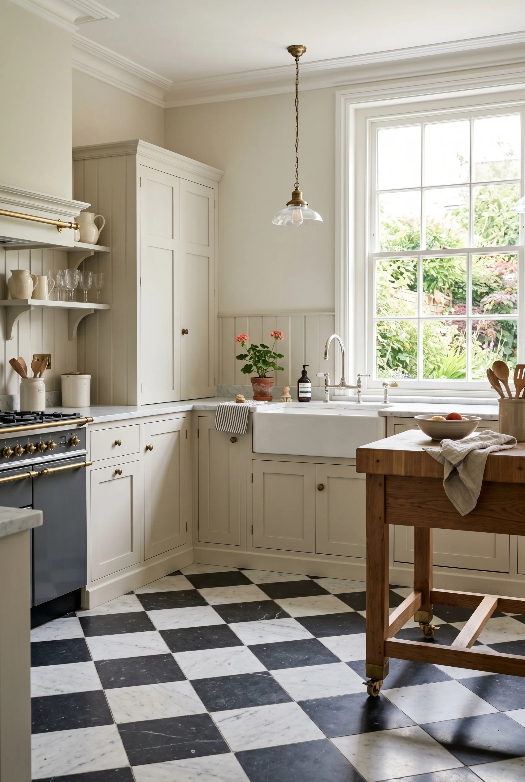
The checkerboard call is bolder and not for every room. Honed marble, not polished. 30cm tiles, set straight, not on the diamond. Black is best as a deep grey black, not a pure jet. Carrara white as the second tile. Lay it with the grout as thin as the stone will allow. The room reads grand and graphic at the same time. It’s a one shot move. If you want soft, pick herringbone. If you want a statement, pick the checkerboard and let the rest of the room go quiet. This shade shows up again in 36 christmas reading nook ideas for a cozy.
McGee’s lighting recipe in a Victorian kitchen is almost always the same. Two ribbed-glass pendants over the work table. A pair of brass sconces flanking the range hood. Wall sconces in gilded brass on either side of the window. No central chandelier. The ceiling stays quiet. The light pools at the surfaces where you actually use it. You will see an alternate version of this in earthy boho kitchen ideas.
Her source is Visual Comfort in the US for the pendants and Schoolhouse for the sconces. Both ship to the UK now but the wait is long. The British swaps I’d reach for are Original BTC for the pendants. They make a glass shade in opal and ribbed clear that reads almost identical. For the sconces, Vaughan or Jamb. Both London made, both warm brass, both the right scale. This shade shows up again in mid century modern architecture.
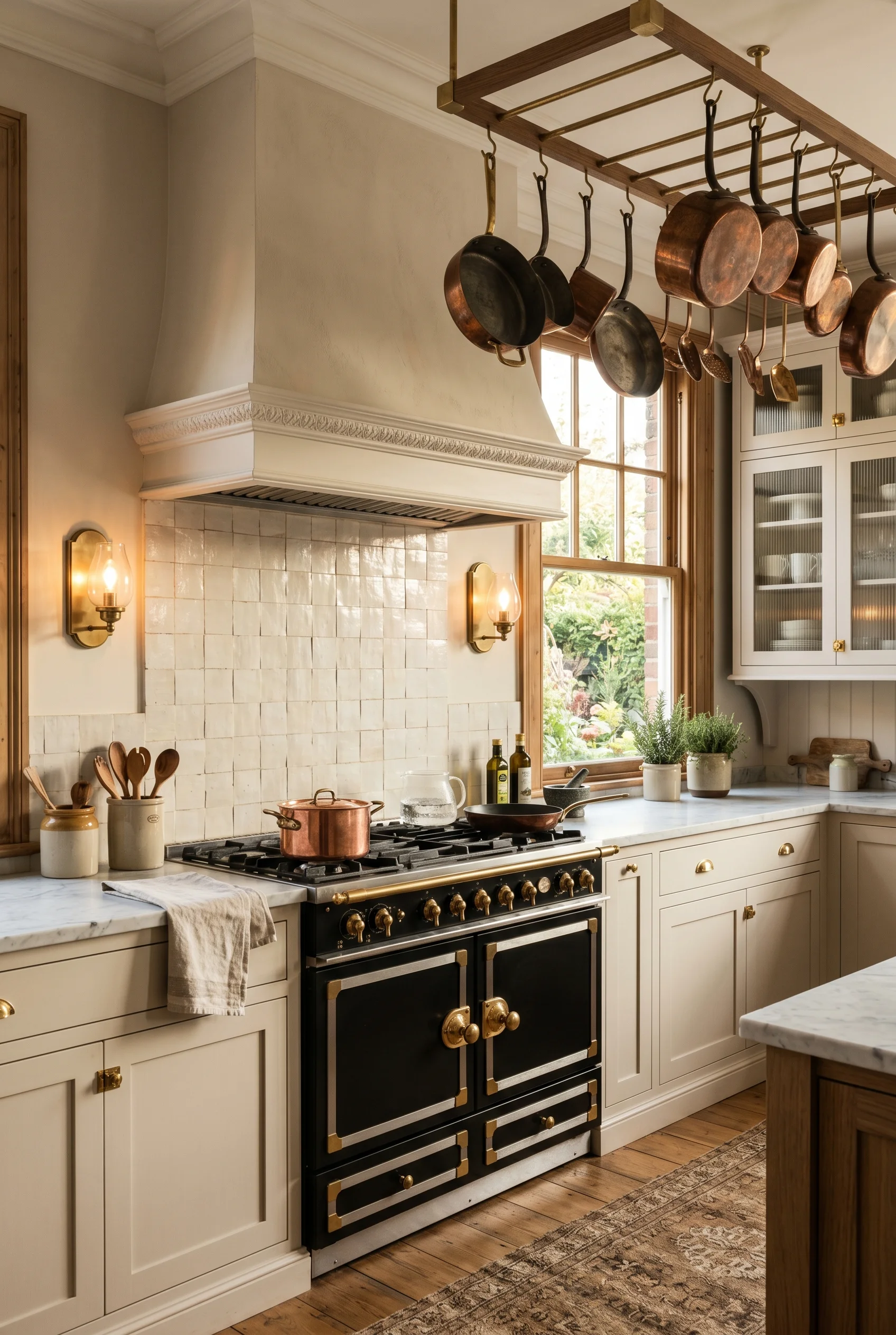
What I’d actually do here is run all three layers on separate switches. Pendants on a dimmer for the table. Range sconces on their own switch for cooking light. Window sconces on a third switch for evening. At dawn the window sconces alone are enough. At dinner all three are on at 30 percent. The room shifts mood through the day without you ever flipping a hard overhead. We covered the full method in our modern victorian bathroom ideas deep dive.
What I’d skip is the over the table chandelier the imitators always reach for. A crystal piece over the work table feels like a dining room move. McGee almost never does it on a kitchen. The pendants stay quiet. The sconces do the warmth. The room reads calm.
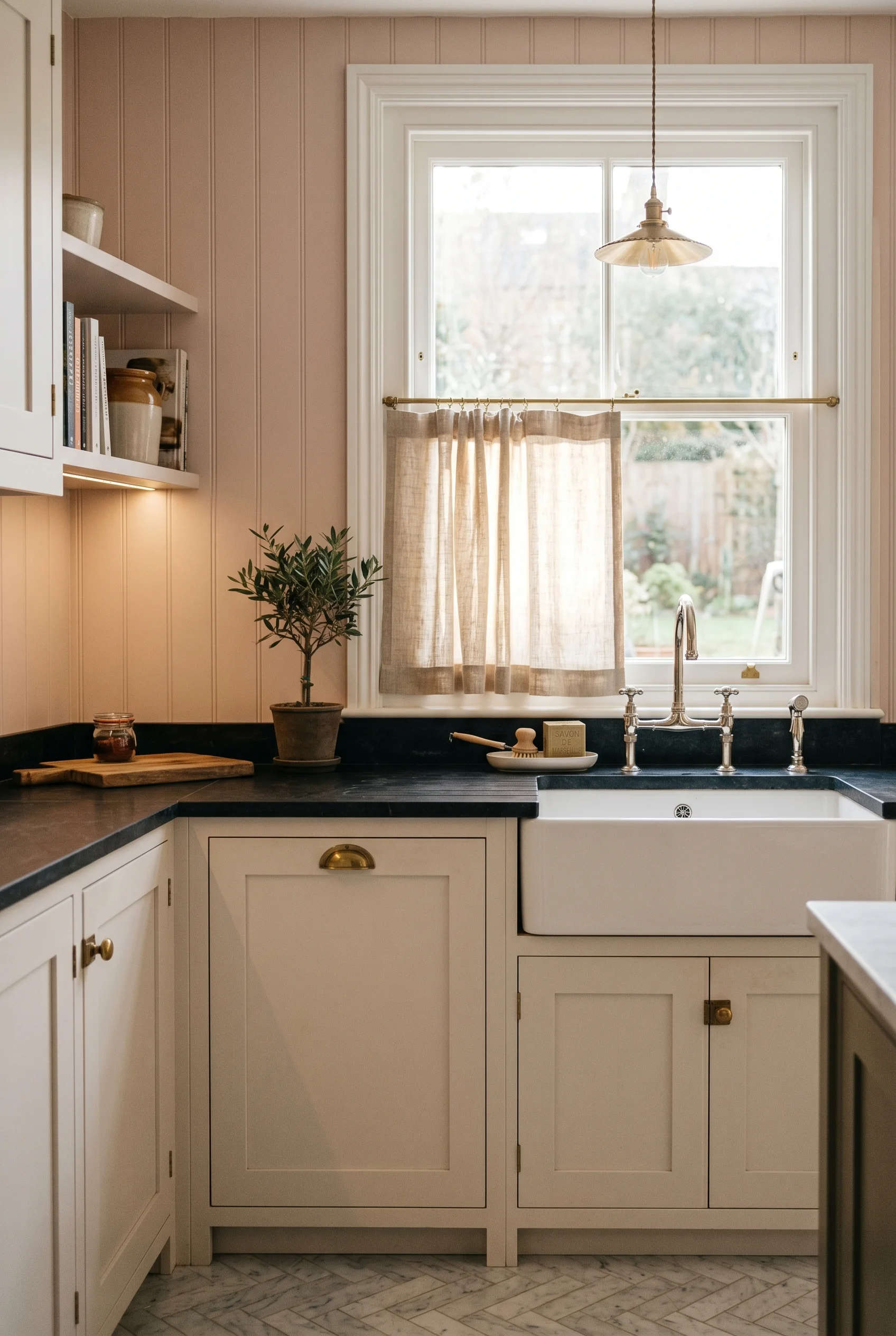
McGee’s window call on a kitchen is lighter than people expect. Linen cafe curtains, hung on a simple brass rod across the lower half of the window. Top half stays clear for light. No pleats. No silk. No cornices. The cafe curtain gives privacy at the sink and softens the room without dressing it up. It’s almost the opposite of a formal Victorian dining room treatment. You will find a version of this in our modern victorian dining room design breakdown.
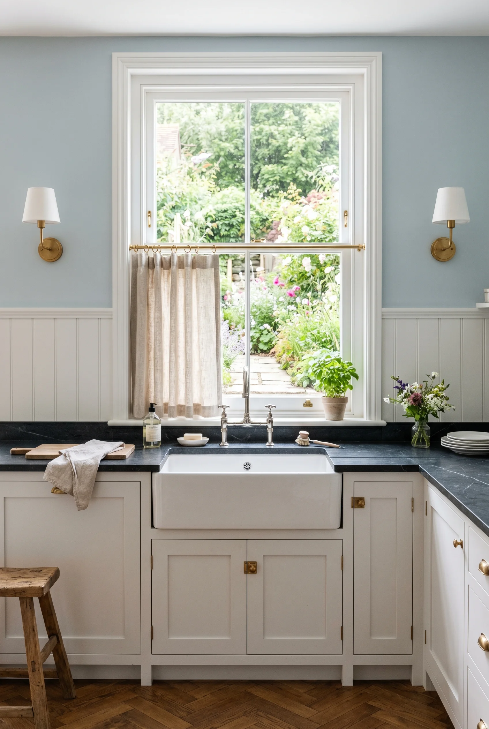
The fabric matters. McGee uses a heavy linen, often unbleached, with a small stripe or a quiet check. In the UK I’d reach for Volga Linen or Cabbages and Roses. Both make natural linens at the right weight. Hem to the bottom of the window frame, not below. Hung with simple metal rings on a brass rod. No tiebacks. No fringe. The material logic here mirrors what we covered in 48 mediterranean bathroom designs that will transport you.
For blackout in a north facing kitchen I’d add a discreet roller blind in the same linen tone. It stacks behind the cafe curtain when up. Disappears completely. Pulls down only when the room needs to go dark for early winter mornings. McGee does this on a few projects but rarely shows it in photos. The trick is matching the blind colour to the curtain so the eye reads them as one piece. You will see an alternate version of this in dark kitchen.
What I’d skip is the cornice. Victorian kitchens look heavy with a fabric pelmet across the top of the window. McGee leaves the top of the window clear. Period houses already have a deep architrave around the window. Adding a cornice on top is fabric piled on plaster. The window stops breathing. Leave the top clear and let the architrave do the period work. Lovers of home design ideas tend to flip this rule on its head.
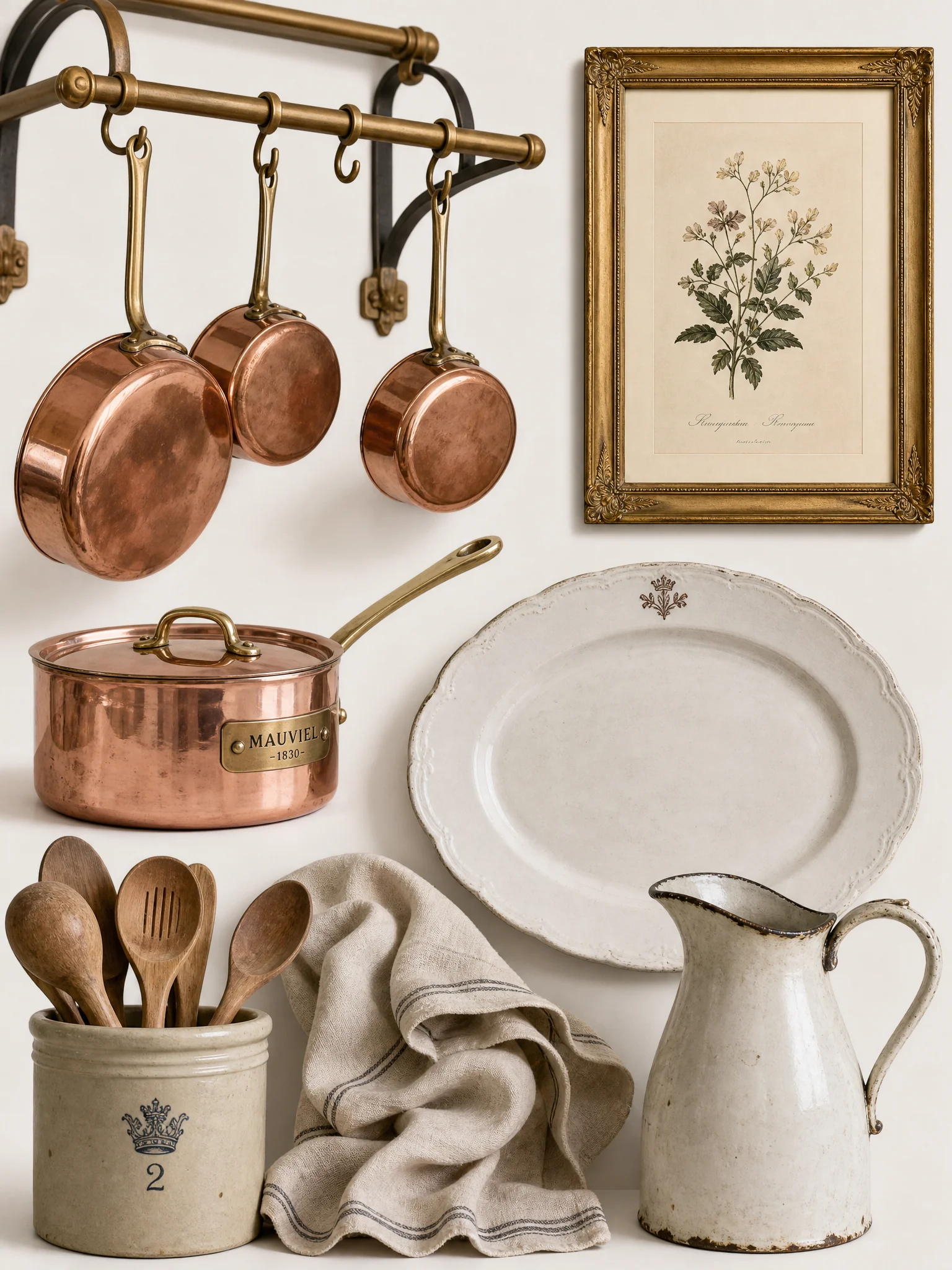
The McGee accessory move in a kitchen is a tight list. A copper pot rack overhead. A small grouping of botanical prints in gilded frames on the one stretch of empty wall. Stoneware crocks by the cooker holding wooden spoons and a bunch of tarragon. The bowl of fruit on the island that appears in every photoshoot. That’s the lot. She doesn’t crowd the surfaces. And that same logic carries over to your modern victorian bathroom design.
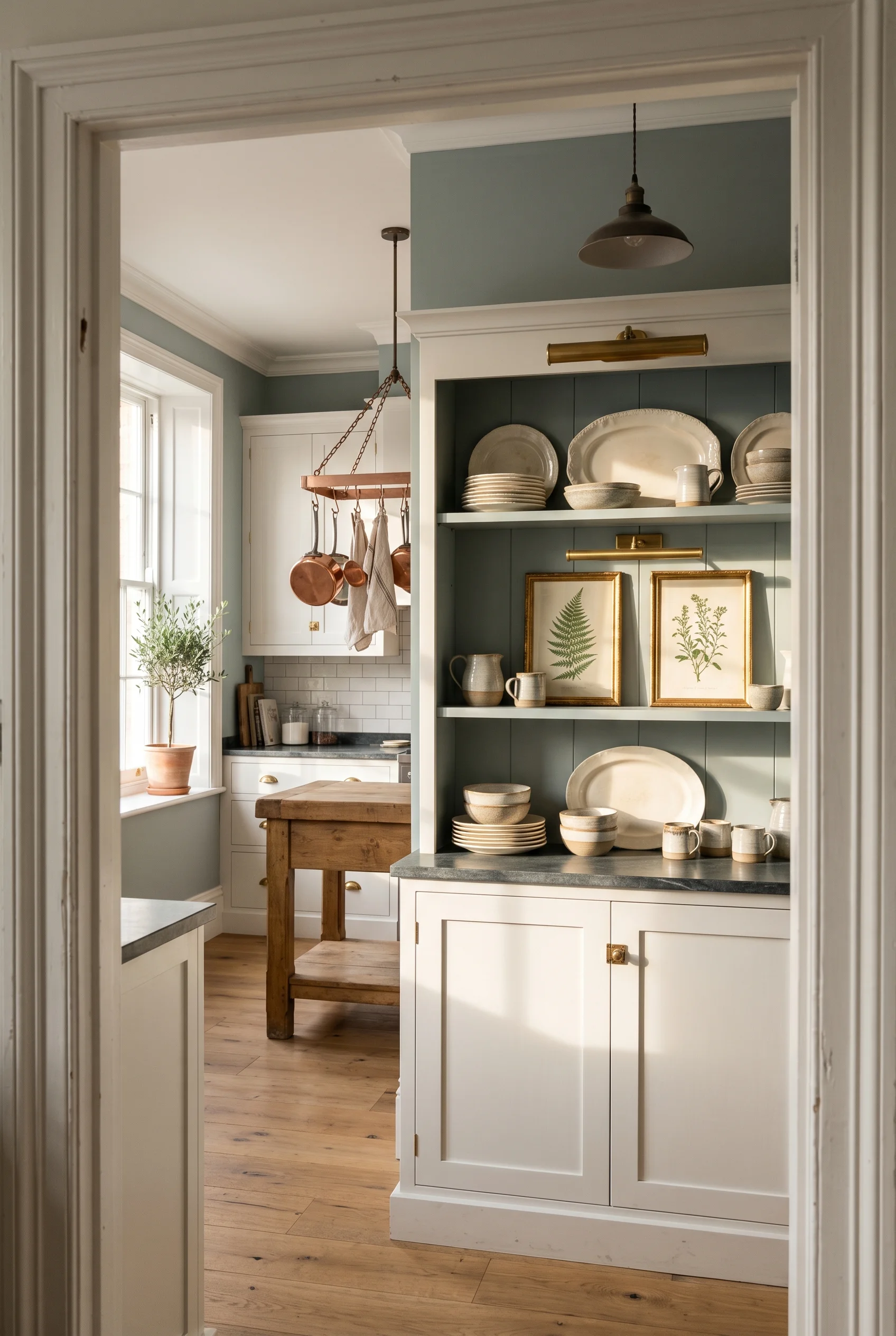
The copper pot rack is the one most worth copying. Hung over the central work table, not over the cooker. Holds five or six pieces of real copper, not decorative. Mauviel, Falk, or De Buyer. Copper is the only metal that warms a kitchen the way wood does. It reflects candlelight in the evening and sunlight in the morning. The rack is a brass or wrought iron frame on chains from the ceiling. And that same logic carries over to your modern victorian bedroom design.
The botanical prints are McGee’s softest move. She uses a single pair of botanicals, framed in narrow gilt, hung close together over a piece of furniture. Not a gallery wall. Two prints. Antique or new, doesn’t matter. The frames matter more than the art. A narrow gilt with a linen mount reads expensive. Try Soane’s framing service or any good Bloomsbury framer. The art is just an excuse to hang two warm gilt rectangles on a green wall. The material logic here mirrors what we covered in 22 sage green bedrooms for that relaxing vibe.
If you only do three things from the McGee tracker, do these. Drench the cabinets, walls, and trim in one warm green. Add a freestanding antique dresser as the period note. Specify unlacquered brass hardware that ages with the room. Those three moves carry most of the McGee feel. The rest is detail. Track her specs, then swap her American sources for UK ones that suit your house. You will see this exact finish in our sage green living room ideas roundup.
This post contains affiliate links, which means we may earn a small commission if you make a purchase through our links, at no extra cost to you. For a related take, see french country living room ideas.