Newsletter Subscribe
Enter your email address below and subscribe to our newsletter

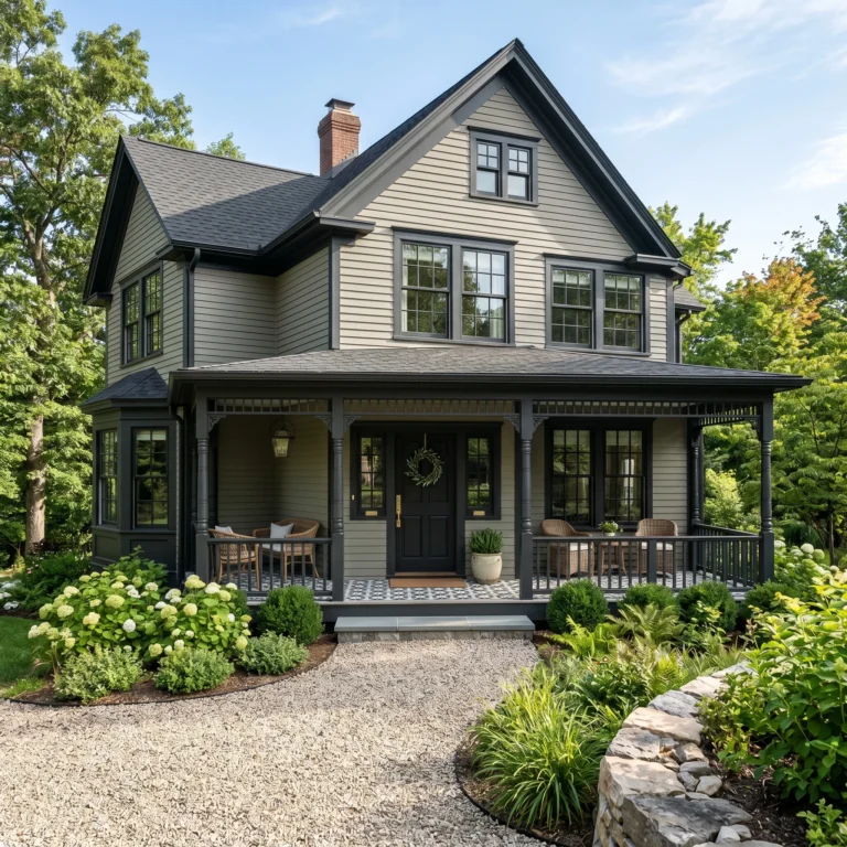
In the spirit of shared passions and cozy conversations, i’ve got something special I think you’ll adore. Have you ever been captivated by the elegance and depth of the color in Victorian interior design? Imagine rooms that speak in hushed tones of luxury and history, wrapped in colors that soothe the soul and spark creativity. We’ve delved into this magical world and brought its secrets to light just for you. The Victorian color palette, characteristic of the Victorian era (1837-1901), was known for its richness and variety, reflecting the period’s tastes and technological advances in pigment production.

In Victorian interior design, primary colors are deep, rich, and imbued with a sense of drama and sophistication. These colors serve as the backdrop for the intricate and ornate details that Victorian design is known for, laying the groundwork for a palette that’s both regal and inviting.

Rich, deep reds were a staple for creating a warm, opulent atmosphere in Victorian interiors. These included shades like burgundy and maroon.

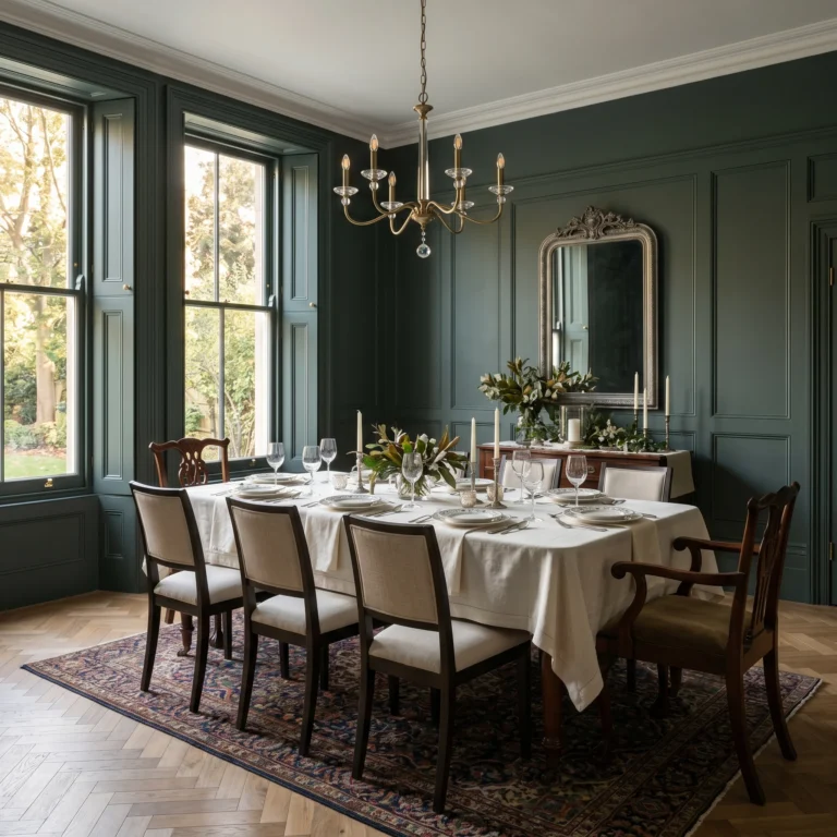
Dark green shades were popular for walls, fabrics, and furnishings, inspired by the Gothic Revival and symbolizing the era’s fascination with nature.


A strong, deep blue was often used as a grounding color, suitable for both wall colors and textiles.


Secondary colors in Victorian interior design complement the primary palette with a slightly softer, yet still vibrant, range of hues. Gold and mustard yellows, teal, and peacock blues, along with terracotta and rich browns, enrich the interior’s color scheme, adding layers and complexity.

These warm hues served as complementary colors to the deep reds and greens, used in wallpapers, upholstery, and decorative accents.

Reflective of the Aesthetic Movement’s influence, these blues added a sophisticated yet vibrant touch to the Victorian palette.


Inspired by natural elements and the Arts and Crafts Movement, these colors were used for both exterior and interior applications, providing a warm, natural feel.

Accent colors in Victorian interior design play a crucial role in highlighting and punctuating the space with pops of vibrant color or subtle elegance. Accent colors add the finishing touches that complete the look, bringing balance and cohesion to the overall design.
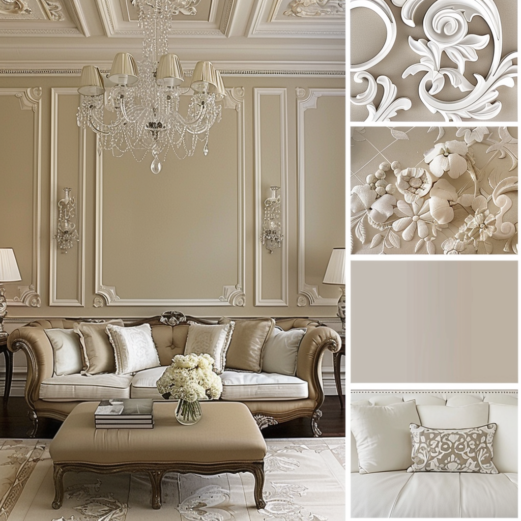
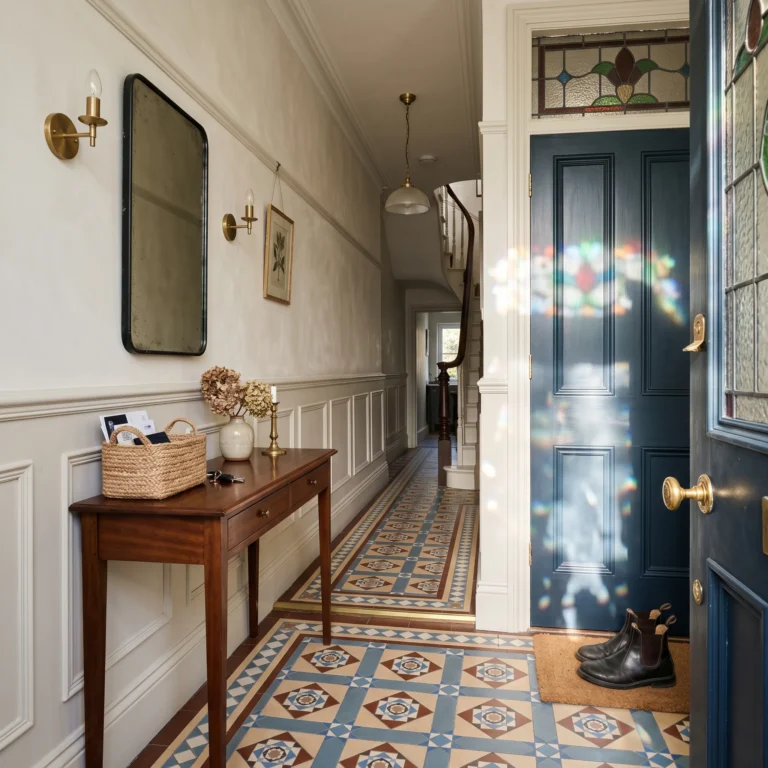
Lighter shades like cream and ivory were used to balance the darker primary and secondary colors, often in ceilings, moldings, and trims.

With the invention of new chemical dyes, these pastel hues became fashionable for accents and wallpapers.


Metallic finishes in gold and silver were common for decorative elements, picture frames, and mirrors, adding a touch of luxury and elegance.


Upholster in deep reds for a warm, inviting atmosphere.

Paint walls in dark green as a nod to the Gothic Revival influence.

Use gold and mustard yellows in throw pillows, curtains, and decorative items for a pop of color.

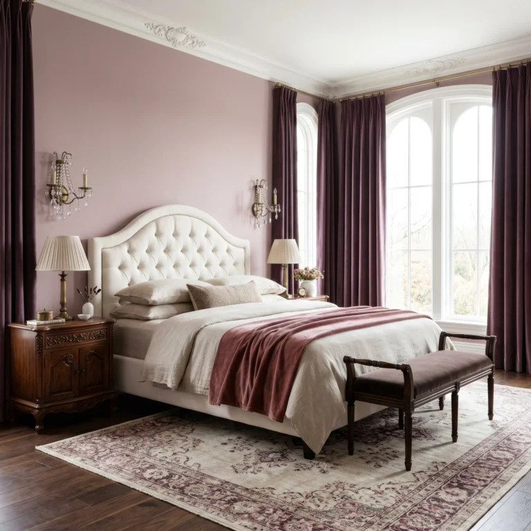
Choose navy blue bedding for a calming effect.
Opt for terracotta or earthy browns on walls for warmth.

Incorporate lavender and mauve in art, throw pillows, or a feature wall for a touch of elegance.

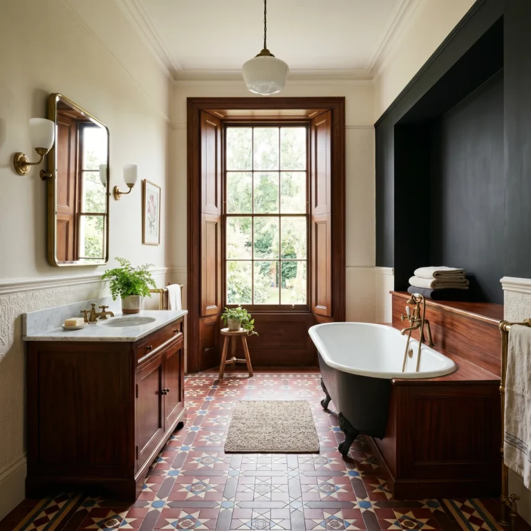
Use teal or peacock blue wall paper for a vibrant bathroom.

Keep walls light with cream or ivory to balance the strong tile colors.

Choose metallic finishes for taps and handles for a luxurious touch.

Select grey or white paints for a classic timeless finish.

Paint trims and moldings in dark green to frame the space.

Install fixtures with metallic gold or brass finishes to highlight the Victorian influence.

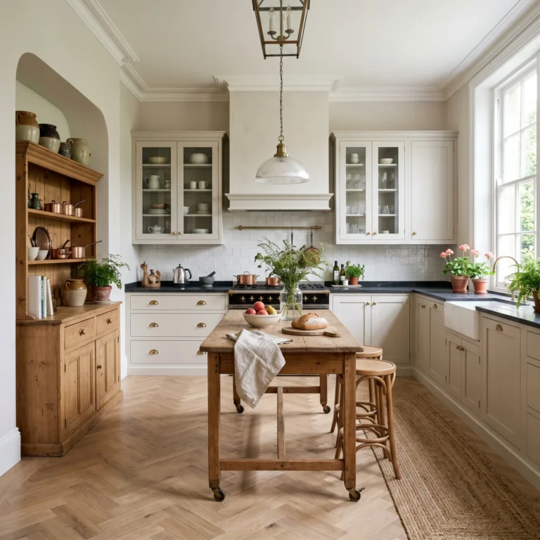
Paint kitchen cabinets in brown for a warm, earthy vibe.

Use cream or ivory tiles for the backsplash to keep the space light and airy.

Add accents in teal or peacock blue for a “pop of color” in accessories or small appliances.

Upholster chairs lush velvet for a luxurious feel.

Paint walls in a light brown for a regal atmosphere.

Choose chandeliers or wall sconces with gold or brass elements to complement the room’s opulence.

Victorian palettes are known for their deep, rich colors. Balance these with lighter shades like cream, ivory, or light pastels to prevent rooms from feeling too dark or oppressive.

Utilize the Victorian affinity for distinct, colorful spaces by assigning different color schemes to different rooms or areas.

Victorian interiors often featured a variety of textures, from velvet and silk to wood and metal. Use this to your advantage by pairing rich colors with textured fabrics and finishes, adding depth and interest to your space.

Start with a dominant color as your base, then layer secondary and accent colors through furnishings, textiles, and accessories.

Use accent colors to highlight Victorian architectural details such as moldings, cornices, and fireplaces.

Don’t be afraid to mix Victorian colors with contemporary designs. This can create a dynamic and interesting interior that respects history while embracing modernity.

Incorporate lighter, softer shades of the primary Victorian colors or introduce floral patterns that echo the era’s fascination with nature and the outdoors.

Emphasize the deeper, richer colors of the Victorian palette, such as burgundy, navy, and dark green, and pair them with luxurious textures like velvet and wool for warmth and depth.

To avoid making your space feel too dark or small, balance dark Victorian colors with lighter shades and ensure there is plenty of natural light or well-placed artificial lighting.

Victorian colors work best in spaces that complement their historical richness. In modern homes, focus on integrating these colors in ways that respect the contemporary architecture—through accents, textiles, and art.

Victorian interiors often featured bold and elaborate color schemes. Ensure your chosen colors harmonize well by sticking to a coherent palette throughout your home or room.

While it’s important to respect the Victorian essence, your home should also reflect your personal taste.

Choose durable, easy-to-clean finishes and fabrics for high-traffic areas or consider using darker colors in lower-maintenance areas.