Newsletter Subscribe
Enter your email address below and subscribe to our newsletter

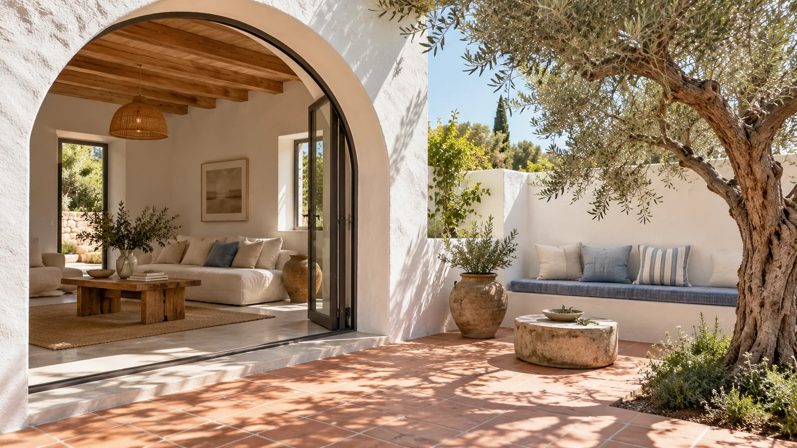
The Airbnb photography ideas I would choose for an existing holiday home begin with a simple question: what will a guest recognise when they arrive? You may already have a folder of attractive photographs, yet feel that it says very little about the stay. Perhaps the sitting room looks inviting while the private terrace is missing, or the bedroom details are beautiful while its useful space remains unclear. I would begin by deciding what the photographs should communicate together. The aim is a clear impression of the accommodation you actually offer, expressed through its setting, proportions, materials and everyday comforts. That gives you a direction before you spend time rearranging rooms or commissioning more photographs. Here, I would compare possible approaches and choose the one your property can support, using practical guest questions to keep the result specific. A small casita, a rural cottage and a city apartment can each have a convincing character without borrowing the same visual formula.
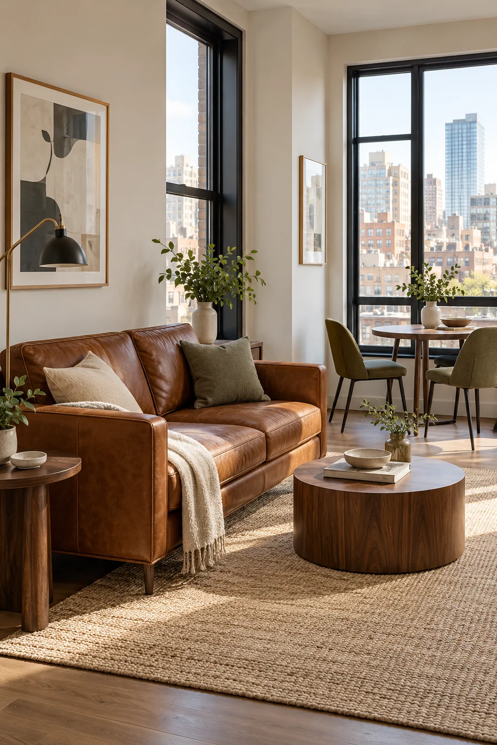
I would write one sentence about the stay before choosing its opening photograph. For a cottage with a sheltered garden, that might be a quiet place to return after walking. For a compact town apartment, it might be a comfortable base with a useful place to eat and unpack. The sentence should describe something the accommodation delivers through its ordinary arrangement. If it depends on a temporary prop, a distant attraction or a room guests cannot enter, I would change the sentence.
Next, I would compare two possible openings. A broad sitting room view could introduce the cottage as a place to spend time together. A view through the open garden door could introduce its relationship with the outdoors. Both might be accurate, but they make different promises. I would choose the one that best represents the actual stay and use the other to develop that impression later.
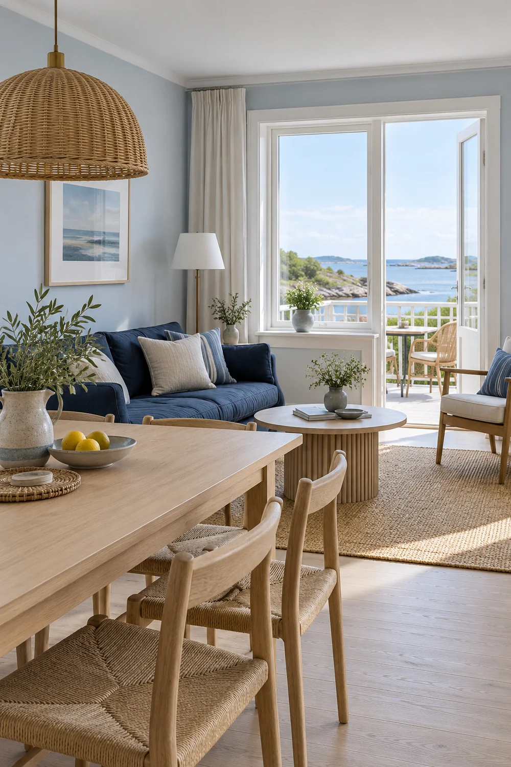
A close photograph of a book and cup can suggest a pleasant moment, but it leaves much of the accommodation unexplained. I would use it after a more informative view, where the reader can connect the detail with a real place to sit. If the terrace is the opening subject, the next photographs should help someone understand where it sits and what they can use there.
The direction becomes useful when it can guide your Airbnb photography plan. That separate task turns the chosen impression into a list of spaces and views. At this stage, I would settle what the photographs should say before deciding every photograph you need.
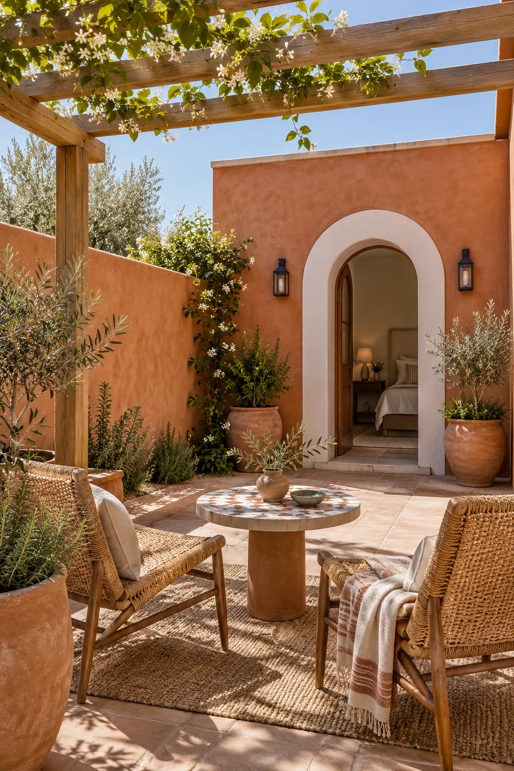
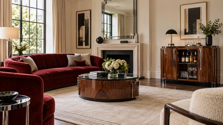
I find a room more convincing when its photograph suggests an ordinary action. A chair beside a window offers somewhere to read. A dining table shown with its surrounding chairs explains where a small group could eat. A bench near the bedroom door can make the place to put a bag immediately apparent. These are useful parts of the stay, and they give an image meaning beyond its decoration.
I would look for relationships between objects rather than isolated objects alone. A lamp matters differently when its position beside the bed is visible. A small table becomes more useful when a guest can see the seat it serves. Where circulation is tight, I would favour an honest viewpoint that keeps the route understandable instead of trying to make the room appear unusually expansive.
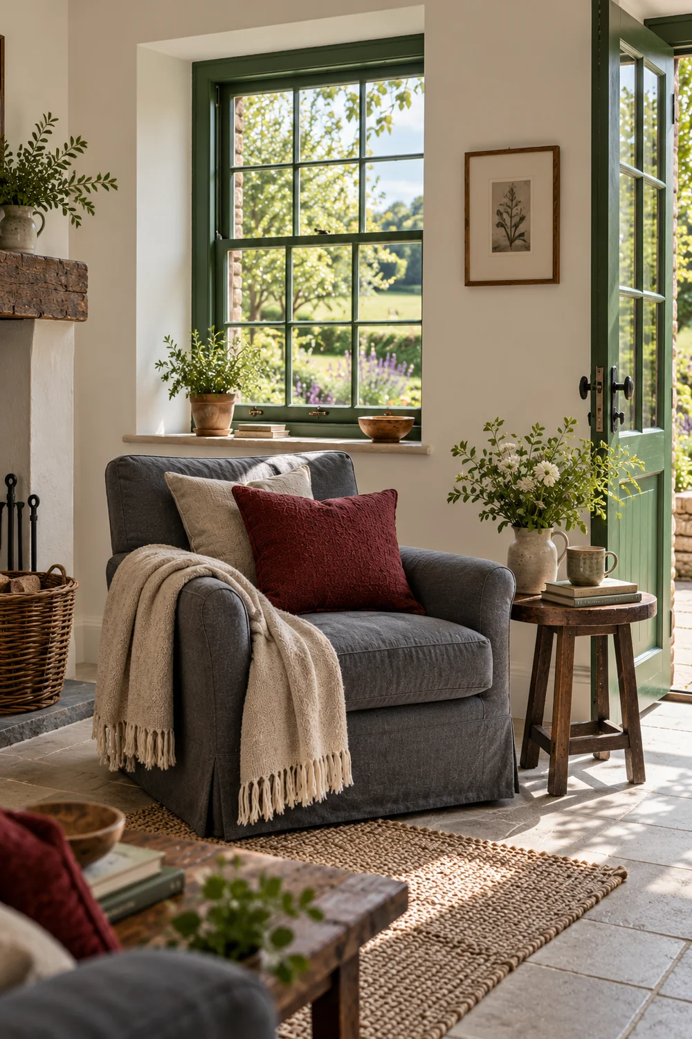
The same thinking applies to a bathroom. The guest needs somewhere for toiletries, a place to hang a towel and a clear route between the fixtures. My Southwestern bathroom planning example explores those practical decisions for a guest casita. In a photograph of your own accommodation, I would let comparable useful features remain visible when they are present.
This does not require every picture to explain everything. One view might establish the room and another might clarify a useful corner. I would avoid a set in which every photograph is a decorative fragment, because the guest then has to imagine the room that joins them. Character is easier to understand when it belongs to a legible space.
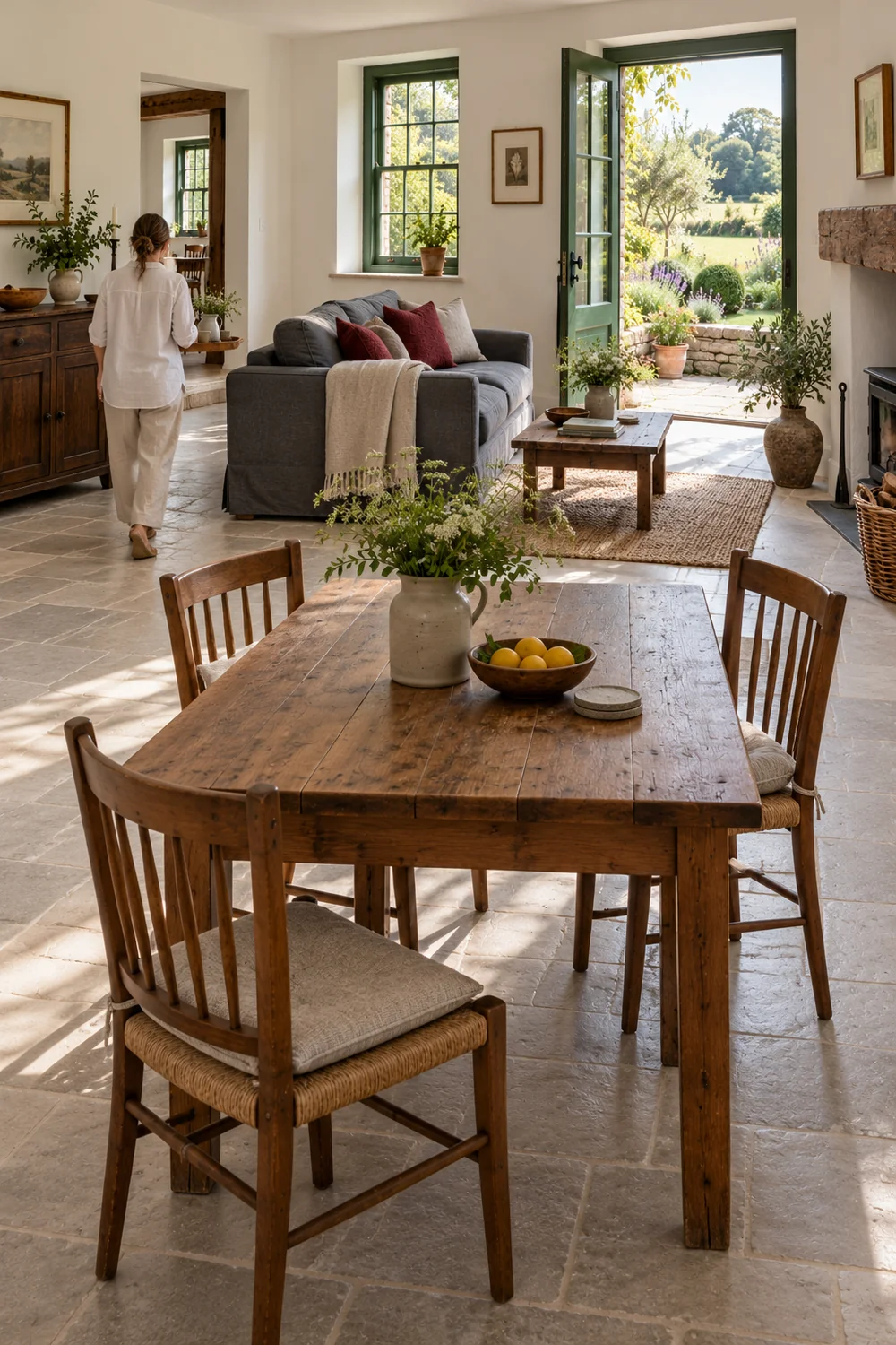
I would build the impression of comfort from the things a host routinely provides. That could be a bedside surface, a reading light, curtains, somewhere for luggage or a useful empty shelf. Photographing these features connects the atmosphere of the room with its actual use. A layered bed can look appealing, but the photograph becomes more informative when it also shows how a guest reaches it and where their belongings can go.
For a bedroom direction, I would compare a view centred tightly on the bedding with a slightly wider composition that includes the bedside arrangement. The first gives texture and colour priority. The second can communicate comfort more completely. I would keep the tighter photograph as a supporting detail if it contributes something distinct, rather than asking it to carry the whole bedroom story.
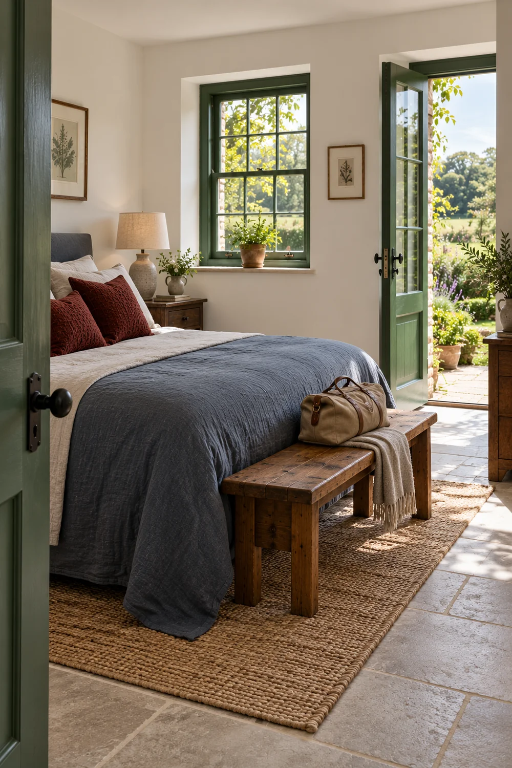
The practical ideas in my Italian guest bedroom example include light, luggage space and useful storage. You do not need an Italian interior to apply the underlying question: which comforts will someone actually use in this room? I would photograph the answer your accommodation already supplies.
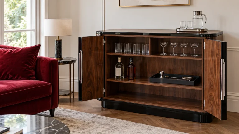
I would also be careful with welcome arrangements. A breakfast spread, flowers or an elaborate drinks setting can imply that those things form part of the stay. If they are not routinely included, I would leave them out of the principal imagery or make the arrangement and its availability clear in the accompanying description. An ordinary, well prepared room gives you a presentation you can repeat between bookings without quietly changing the promise.
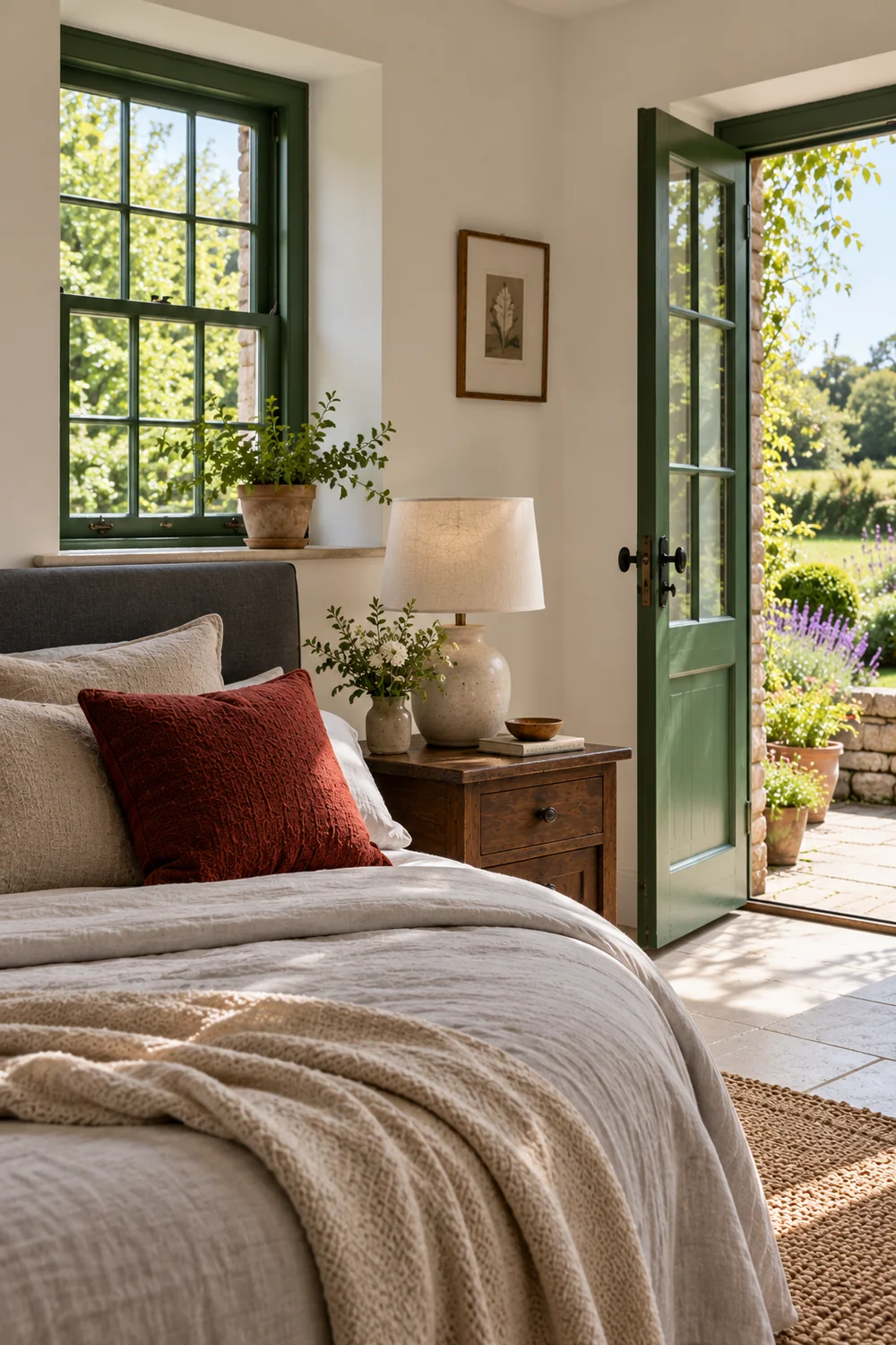
I would look first at the features that remain when the temporary styling is removed. Painted timber, brick, tile, stone, joinery and the shape of a window can make an accommodation recognisable. A photograph that gives one of these features room to breathe can express more about the property than several unrelated accessories arranged for the session.
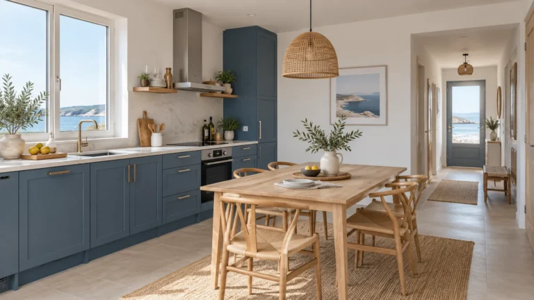
For a cottage with a substantial timber table, I might choose a dining view where the grain, chairs and daylight work together. For a casita with patterned tile, I might include enough of the adjoining wall and fixture to show where the pattern belongs. The aim is to connect the material with the actual room. A very tight crop could describe the tile beautifully while leaving its scale and location uncertain.
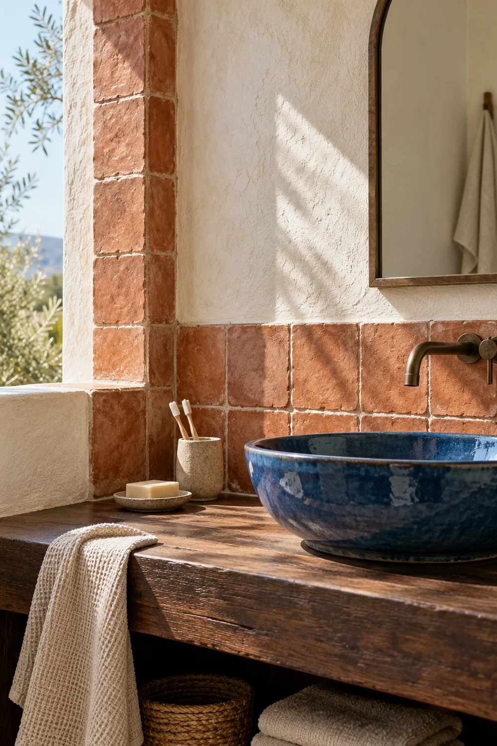
The choices in my Southwestern bathroom decor example balance material character with a practical guest reset. That is a useful distinction for photography too. I would favour an arrangement that shows the room clearly after ordinary preparation, with the surfaces and objects a guest will really find.
Colour should come from the accommodation. If the walls are blue, I would preserve that blue rather than warming the entire image until it looks brown. If a room combines pale paint with dark furniture, I would want both to remain readable. My preference would be a composed, naturally lit presentation that lets the existing materials supply the identity. Borrowing the colour treatment of an unrelated property can make a coherent interior harder to recognise when someone arrives.
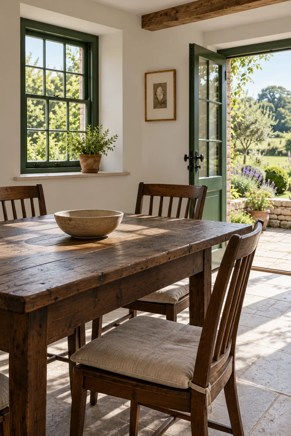
The surroundings may be central to the stay, but I would distinguish the accommodation from the wider destination. A private courtyard, a shared garden and a nearby public beach offer different experiences. Attractive photographs alone may not communicate that difference. I would choose views and captions that make the relationship clear without relying on the guest to infer ownership or access.
For a private terrace, I would look for a view that connects its seating with the accommodation. For a shared outdoor area, I would make the shared use clear in the relevant listing description and caption. A nearby walk could appear as context, but I would identify it as a place beyond the property rather than place it among the accommodation photographs without explanation.
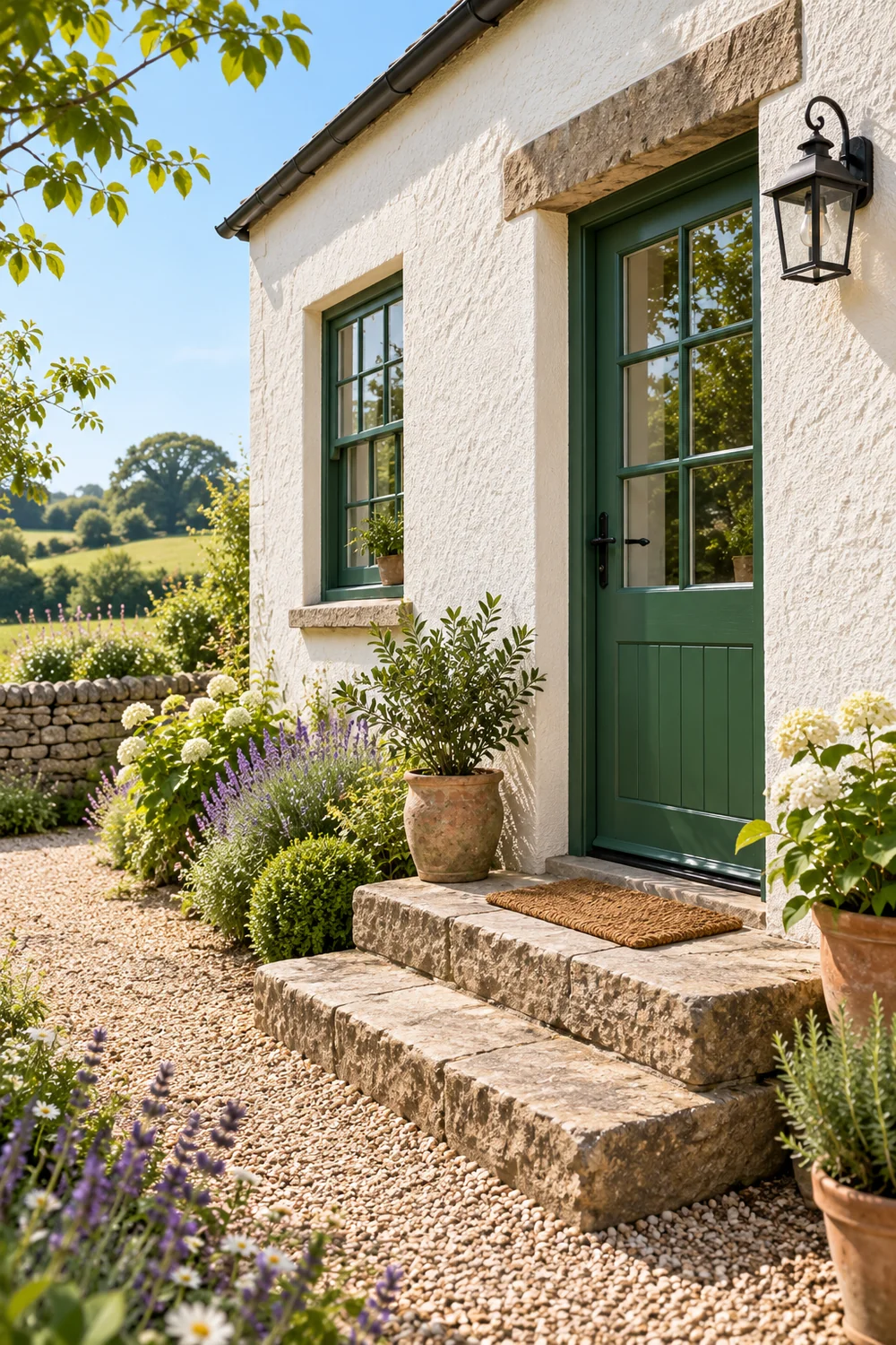
I would also consider the route a guest encounters on arrival. A garden door reached by steps is a different proposition from a level entrance directly beside parking. An atmospheric entrance photograph can be useful, yet it should not conceal the parts of the approach that affect how someone uses the stay. The image and the written access information need to agree.
I would carry these distinctions into the Airbnb photography coverage plan so that private spaces, shared amenities and destination context have separate entries. Here, the creative decision is how much of the setting should lead the story. I would give it prominence when it is a substantial, accurately represented part of the experience, and allow the interiors to lead when they are the stronger reason to choose the accommodation.
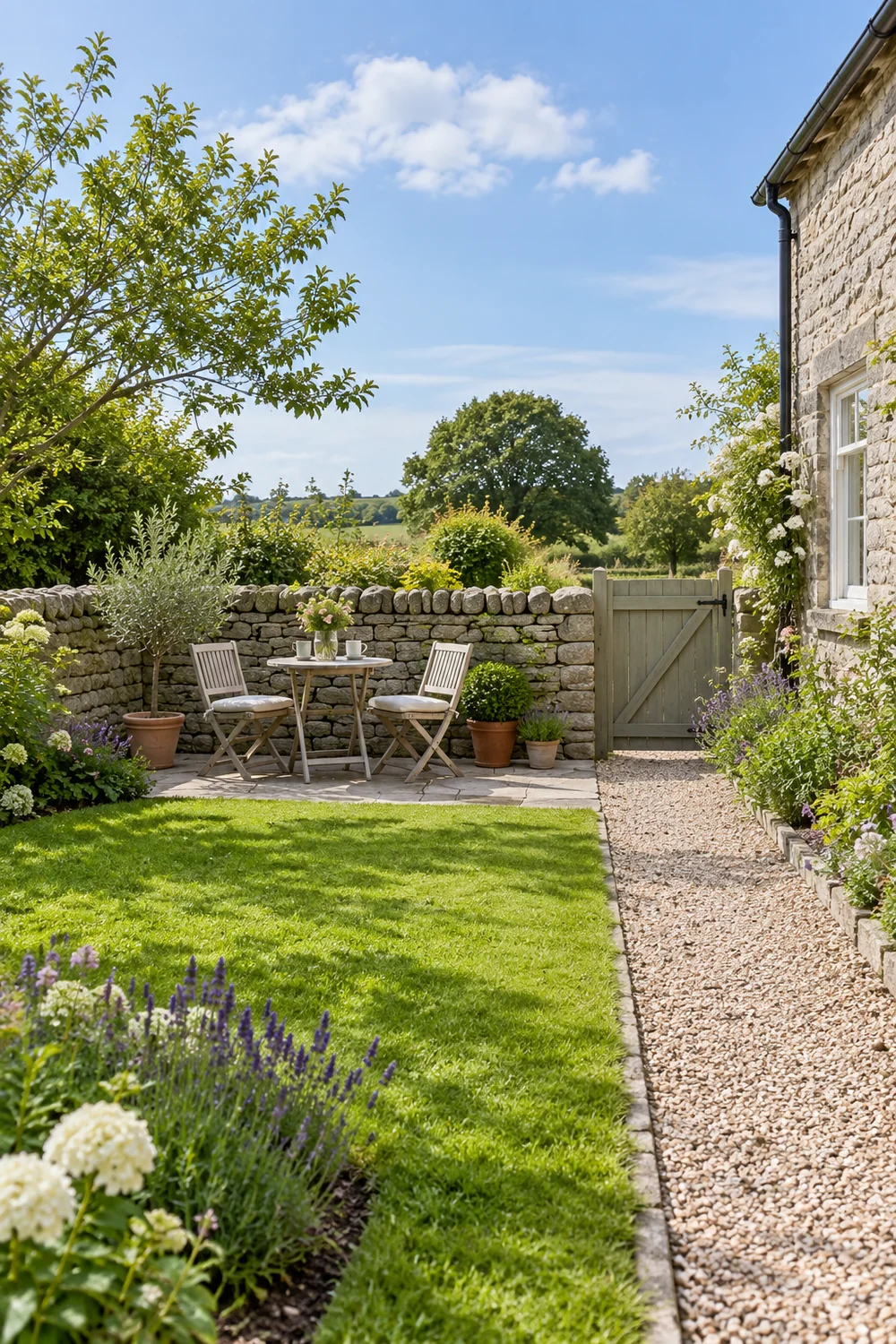
I would compare a small number of directions using the same accommodation. One might lead with its architecture, showing the principal room and the features that define it. Another might lead with the rhythm of a stay, moving from arrival to a place to sit and then to the bedroom. A third might lead with the relationship between indoors and outdoors. Each is a way of giving the existing material an order, rather than inventing a different property.
Consider a compact cottage with a generous sitting room, a modest bedroom and a useful garden. An architecture led direction could begin with the sitting room and use the garden as supporting context. An outdoor direction could begin at the terrace and then explain the indoor spaces. I would compare which opening feels representative across the year and which can be supported by the rest of the available imagery.
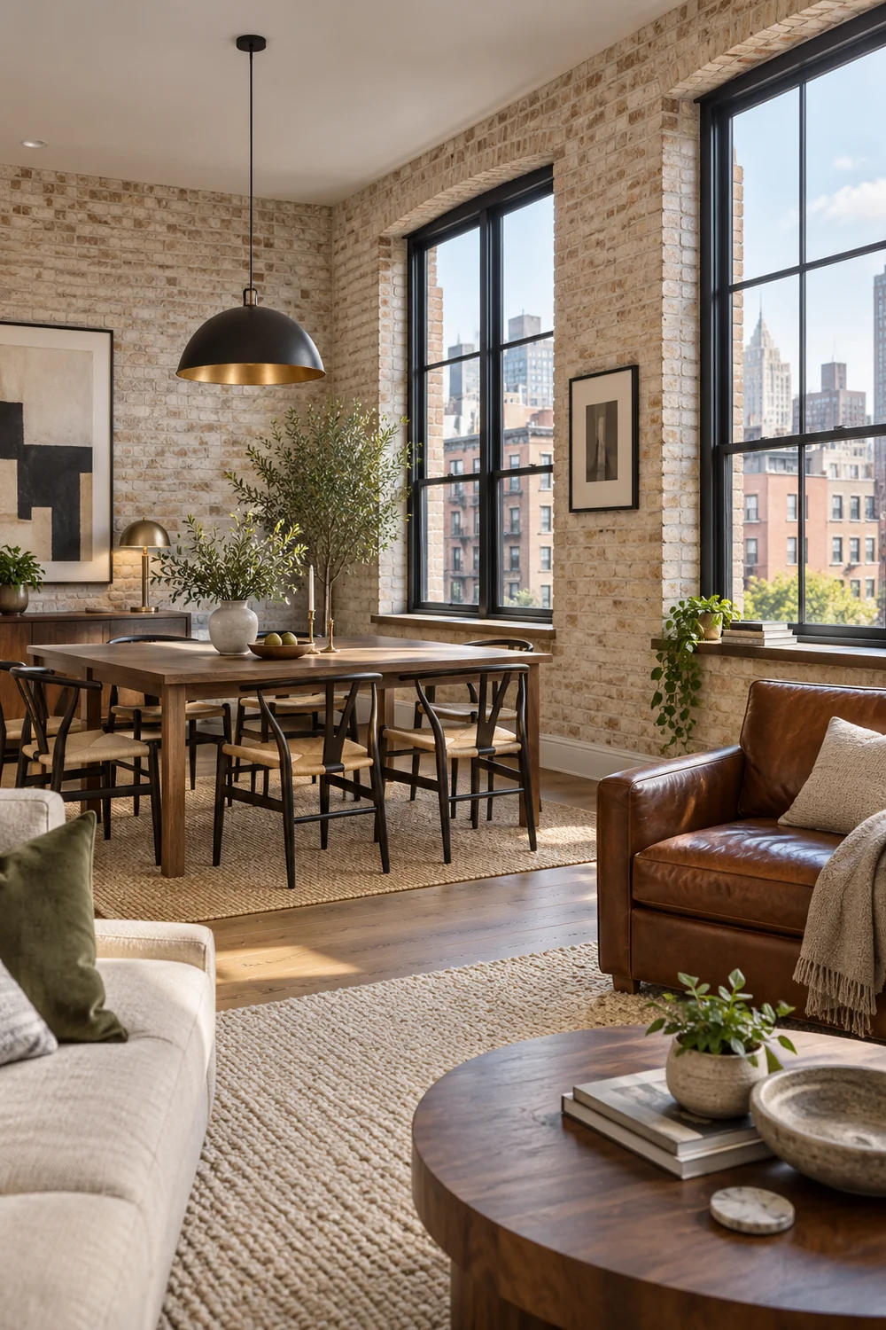
A direction becomes weak when its strongest picture depends on an unusual condition that the remaining photographs cannot sustain. A single dramatic sunset does not explain the rooms. Equally, a beautiful bedside detail should not leave the sleeping space absent. I would ask whether someone seeing only the opening sequence would recognise the same accommodation described in the listing.
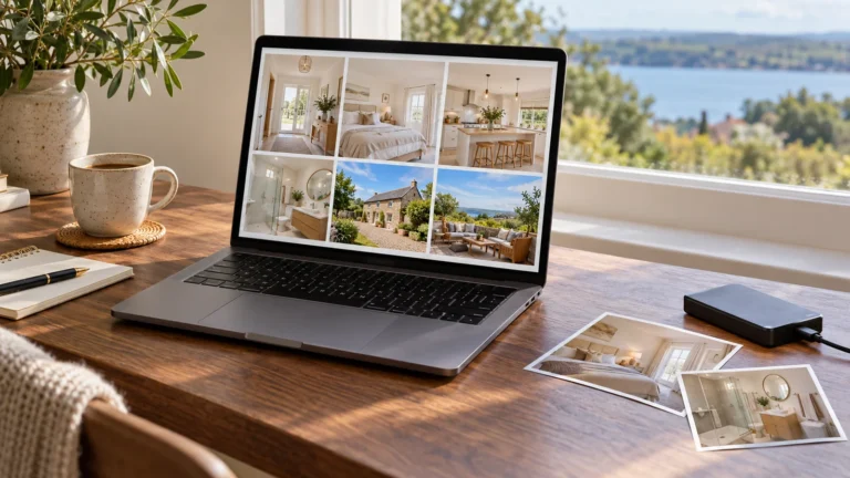
If you already have several candidate files, the next decision is which actually fulfil the chosen direction. My Airbnb photography tips provide a separate review method for that selection. I would use it after deciding the direction, so that the most polished file does not automatically determine the story.
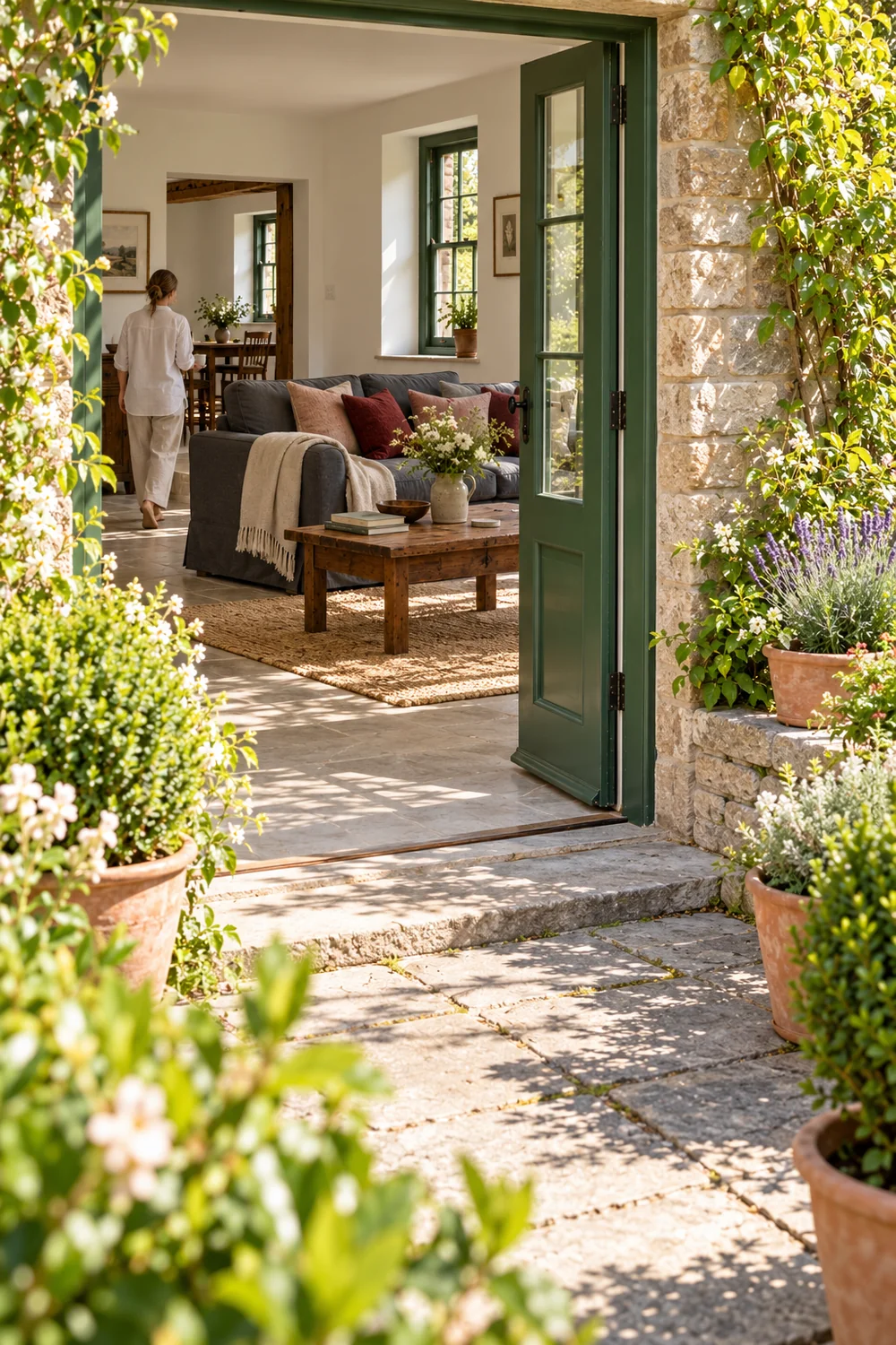
I would finish with a short direction note that you could hand to a photographer or use when reviewing your own photographs. It should name the character of the stay, the guest comforts that support it and the features that deserve visual emphasis. I would also record anything the imagery must not imply, such as exclusive use of a shared garden or a welcome meal that is not included.
For the cottage example, the note might read: show a comfortable place to return after walking, led by the sitting room and its relationship with the garden. Keep the bedroom useful and believable. Show the actual route outside, and preserve the colours of the timber, paint and textiles. This is specific enough to guide decisions without prescribing a decorative theme or pretending that every property needs the same opening.
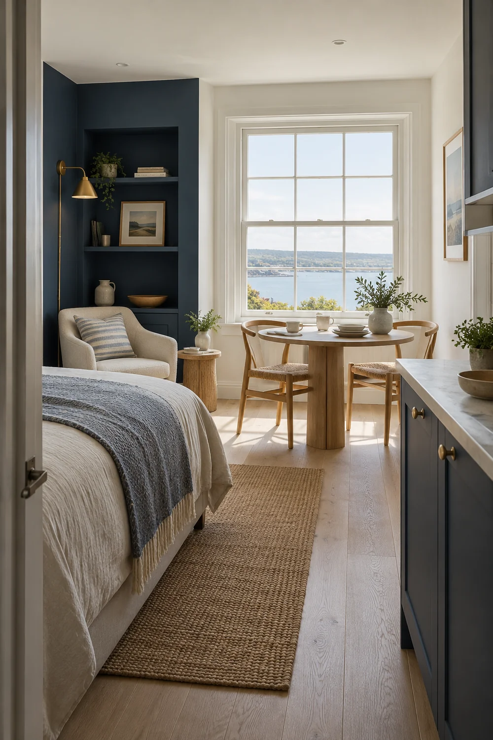
I would then test the note against the ordinary prepared accommodation. Could you maintain the arrangement between stays? Do the photographs give useful features enough space? Does the intended mood remain convincing without added props? If one answer is uncertain, I would revise the direction before commissioning a larger set.
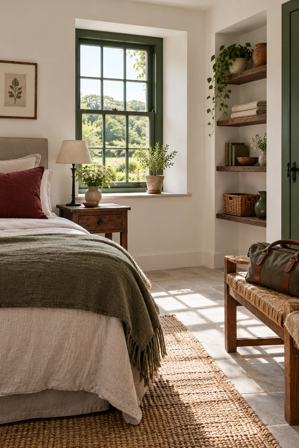
The result I would keep is a clear idea of what a guest should understand, supported by the home itself. You can then build the coverage plan, assess existing files and decide whether additional photography is necessary. The photographs do not need to make the accommodation seem like somewhere else. They need to make its real character, practical comforts and setting easy to recognise. That is the direction I would trust to remain useful after the photography session is over and the next guest is at the door. I would keep the direction note with the photographs, so anyone making a later update can preserve the same clear promise. For a separate film that develops this direction, our Holiday Home Video Tours page explains how Edward George Studio works from existing photographs, with creative direction, movement, editing and sound.