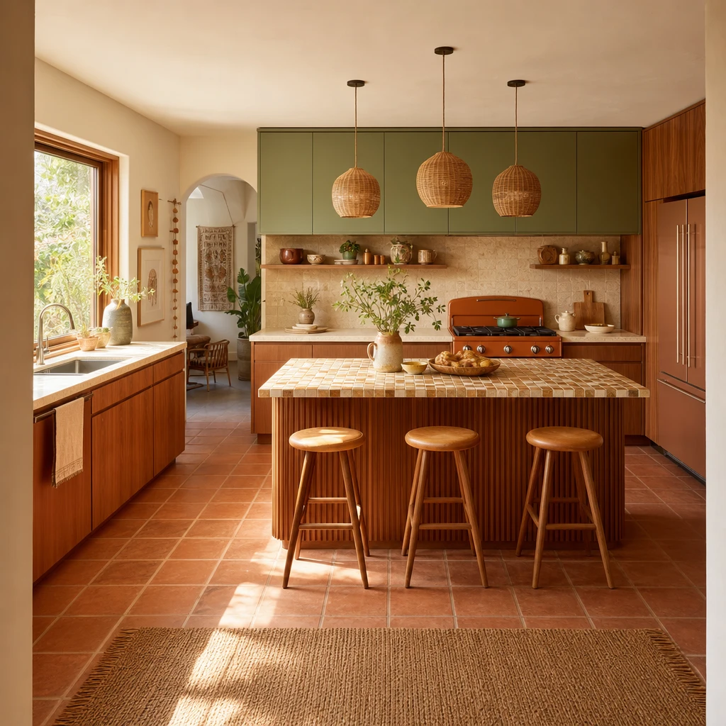
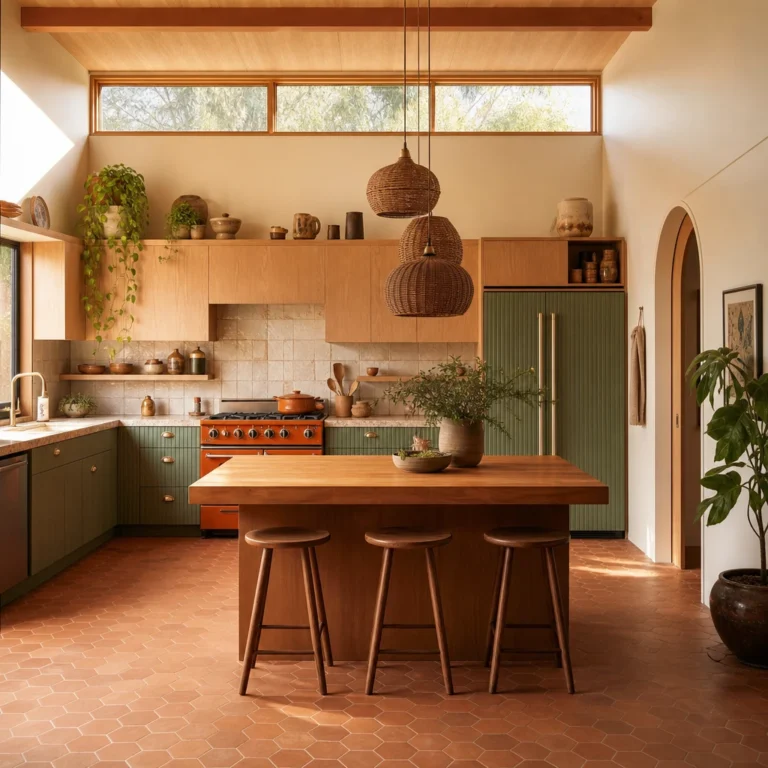
I’ve always thought the Boho Midcentury Modern Kitchen is one of the most joyful things you can do in a home: warm wood grains, a hint of retro colour, and a little pattern play that feels collected rather than designed. What I love most is how naturally the two worlds fit together, whether it’s a fluted cabinet door, a hand glazed tile backsplash, or a vintage coloured fridge that becomes the room’s whole personality. Every look in this piece is one you can genuinely steal.
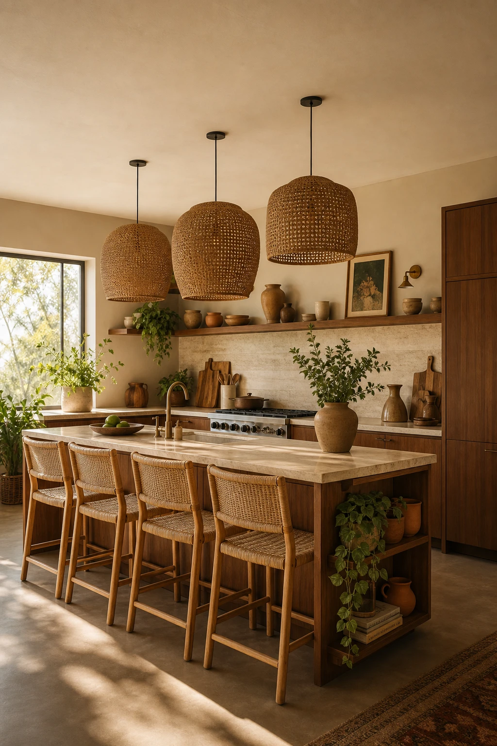
How a Boho Midcentury Modern Kitchen Layers Warmth Without Looking Cluttered
Layered warmth is one of my favourite things to chase in a kitchen, and the trick is always cohesion underneath the eclecticism. Here, rattan threads through pendants, stools, and open shelving so your eye has something familiar to land on as it moves around the room. Teak, travertine, and terracotta all sit in the same amber family, so every addition feels chosen rather than collected. You get a space that reads rich and relaxed at the same time.
The Key Details
Staggered rattan pendant cluster
Teak flat front island
Woven rattan bar stools
Open lower shelving with terracotta ceramics
Honed travertine countertops
Pro TipPick one material, rattan here, and repeat it in at least three places so the whole room feels intentional rather than accidental.
AvoidUsing three or more different wood tones pulls the eye in too many directions and makes even a beautiful collection of pieces feel chaotic.
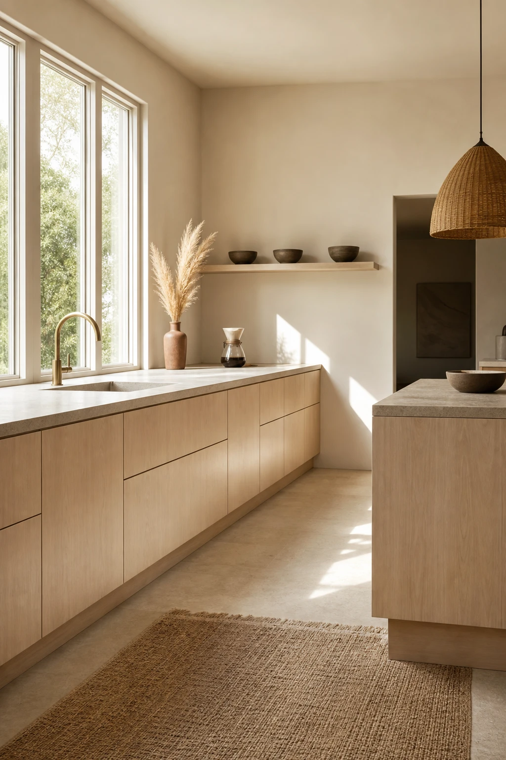
The Scandi Midcentury Kitchen That Proves Less Really Is More Beautiful
Restraint is doing all the heavy lifting here, and that is what wins me over every time. When you strip a kitchen back to flat ash fronts, a honed stone slab, and one woven pendant, each material gets room to speak, and you actually notice the grain, the texture, the weight of things. Watch how the bare casement windows pull daylight across that countertop and suddenly the whole room feels considered rather than empty.
The Key Details
Flat front pale ash cabinetry
Honed slab stone countertop
Woven rattan pendant light
Bare oversized casement windows
Hand thrown stoneware open shelf display
Pro TipPair your flat front cabinets with slim, rounded birch handles to keep the line clean while adding just enough warmth to stop the room feeling stark.
AvoidChoosing a stone countertop that reads pure grey or blue white will tip the whole palette into clinical territory, so lean toward tones with a sand or warm beige undertone to hold the room together.
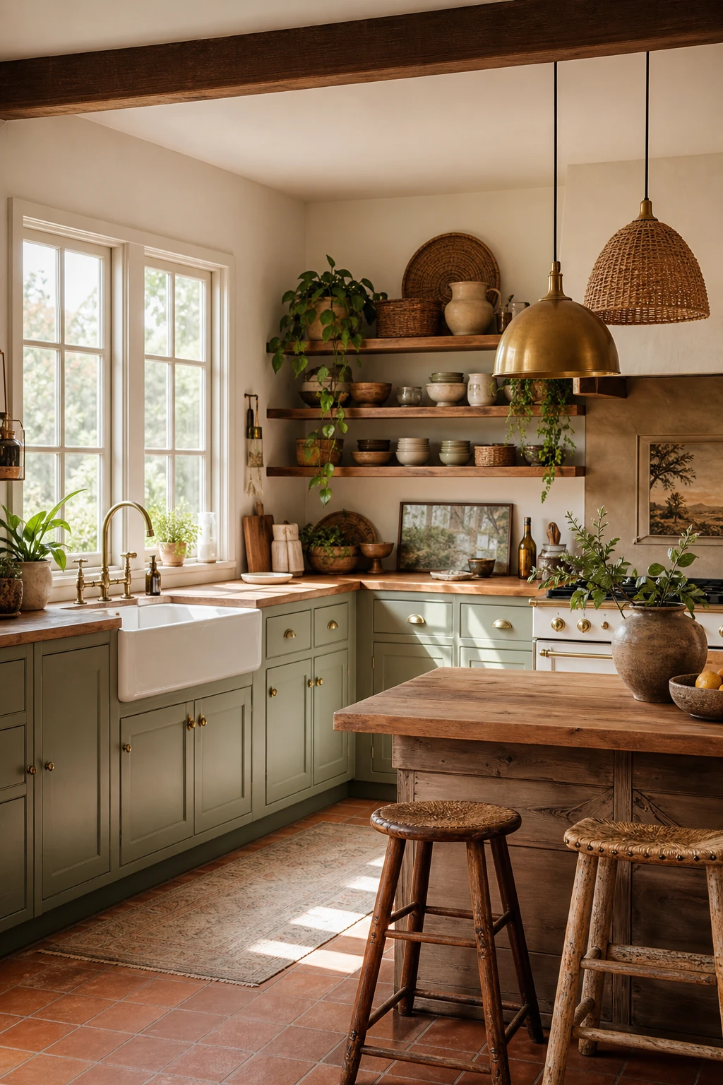
When Midcentury Meets Farmhouse the Result Is This Charming and Grounded
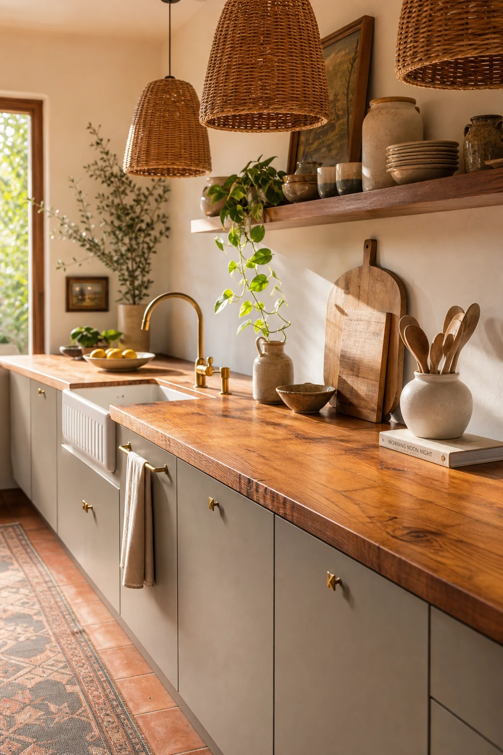
The weathered oak and terracotta in this kitchen do something I find genuinely satisfying: they pull the crisp retro geometry back to earth so the whole room feels lived in rather than styled. Midcentury bones are beautiful on their own, but they can tip cold if nothing rougher and warmer pushes back against them. That soft collision between honest raw materials and those clean architectural lines is what makes this pairing feel so right to me.
The Key Details
Spun brass and woven jute pendant cluster
Weathered oak butcher block countertop
Apron front farmhouse sink
Open timber shelving with rattan baskets
Terracotta tile flooring
Pro TipPair shaker style cabinet doors with slim tapered legs on a kitchen island to hold both worlds at once without either one feeling like a costume.
AvoidLeaning too hard into the farmhouse side with chunky beam details and distressed finishes across every surface will bury the retro line completely, and the midcentury character you came for simply disappears.
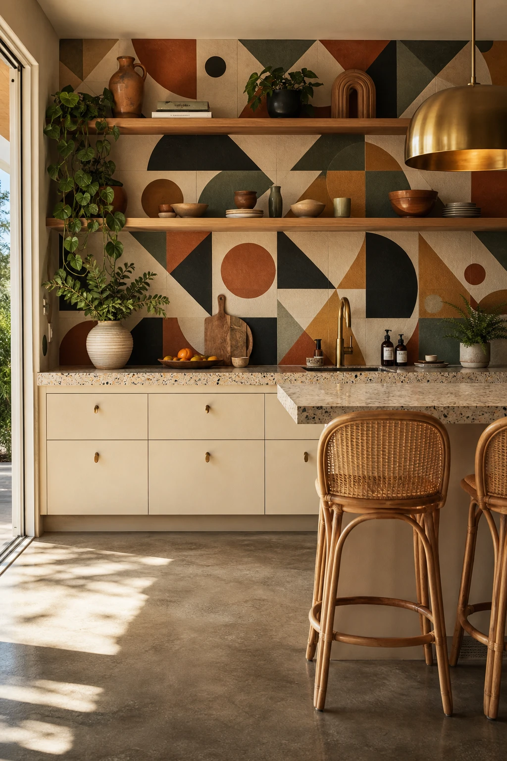
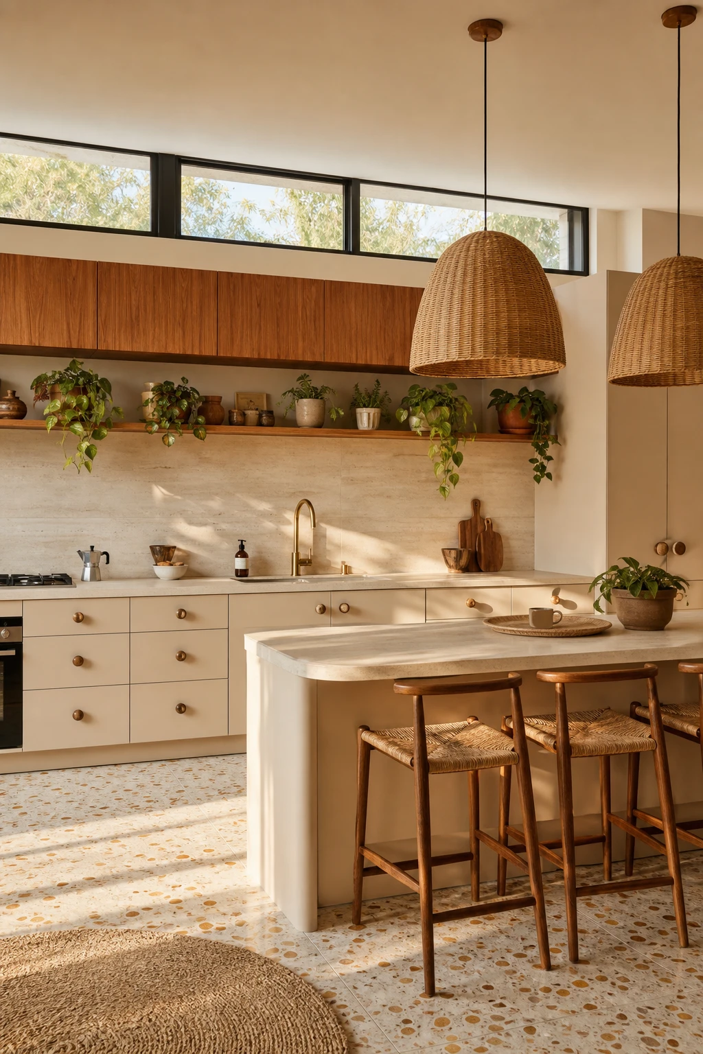
A Memphis Style Kitchen That Brings Pattern and Playfulness Back to Cooking
Graphic pattern needs one strong home, and the splashback is the best place I know to give it one. When bold Memphis geometry lands on a single plane like that, you get maximum visual impact without the room tipping into chaos. The restraint elsewhere is doing real work here: every other surface steps back quietly, and what I love is how that discipline makes the pattern feel like a considered choice rather than an accident. The kitchen ends up feeling energetic and settled at the same time, which is harder to pull off than it looks.
The Key Details
Memphis style geometric splashback tiles
Rattan barstools
Arched brass pendant light
Terrazzo countertops
Open timber shelving with ceramic vessels
Pro TipKeep your cabinet colour a soft warm neutral like putty or linen so the geometric pattern reads as the clear star rather than competing with colour on colour.
AvoidSpreading the same bold pattern across tiles, countertops, and a printed blind at once turns a lively kitchen into an exhausting one with no place for the eye to rest.
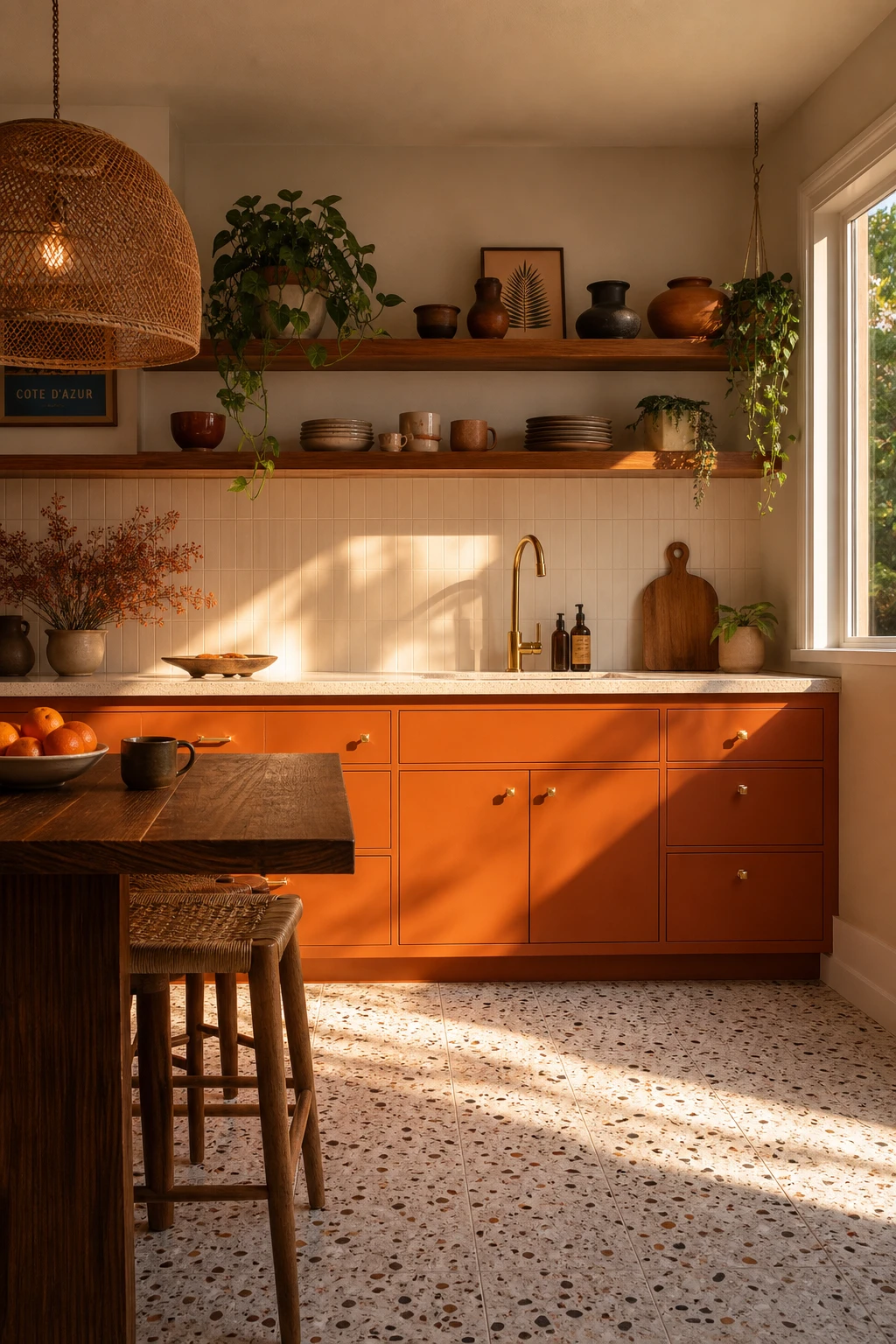
A Retro Orange Kitchen That Feels Warm and Vibrant From the First Glance
Retro orange is a colour that wins me over every time I use it in a kitchen, because it carries warmth the moment you walk in. What I love here is that the orange stays on the cabinetry only, so it reads as a deliberate choice rather than an accident. You get that vibrant hit of colour balanced by teak, brass, and terrazzo, and those quieter materials hold the whole room steady.
The Key Details
Flat front orange cabinetry
Rattan dome pendant light
Open teak shelving
Terrazzo tile floor
Burnished brass cabinet hardware
Pro TipPair orange flat front cabinets with dark walnut open shelving directly above them, so the wood pulls the colour back from the edge of garish and into something genuinely rich.
AvoidPutting orange on every surface, including walls, splashback, and cabinetry, flattens the impact and makes the room feel claustrophobic rather than warm.
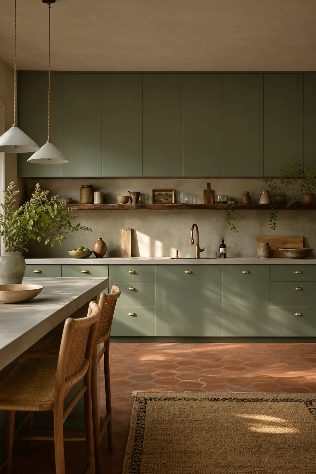
Sage Green Cabinets That Give a Midcentury Kitchen Its Softest Best Look
Sage green is one of those colours that seems to shift personality with the light, and that quiet unpredictability is exactly what I love about it in a midcentury kitchen. Flat front cabinetry keeps the tone clean and unhurried, so you notice the colour rather than the shape. Pair it with warm walnut and slim brass hardware and you get a softness that feels lived in without ever looking tired. The muted quality means it will still feel right in ten years, which is the thing I always check before I commit a whole kitchen to a single shade.
The Key Details
Flat front sage green cabinetry
Slim brass cup pull hardware
Terracotta hexagonal floor tiles
Raw edge walnut open shelf
Rattan seat bar stools
Pro TipCut a large sample card and pin it to your actual cabinet doors for a full week, checking it morning, midday, and evening before you order a single tin.
AvoidChoosing a sage with too much grey in the base will leave your cabinets looking cold and flat on cloudy days, draining all the warmth the colour was supposed to bring.
A Peach Kitchen Is the Unexpected Colour Move That Makes a Room Glow
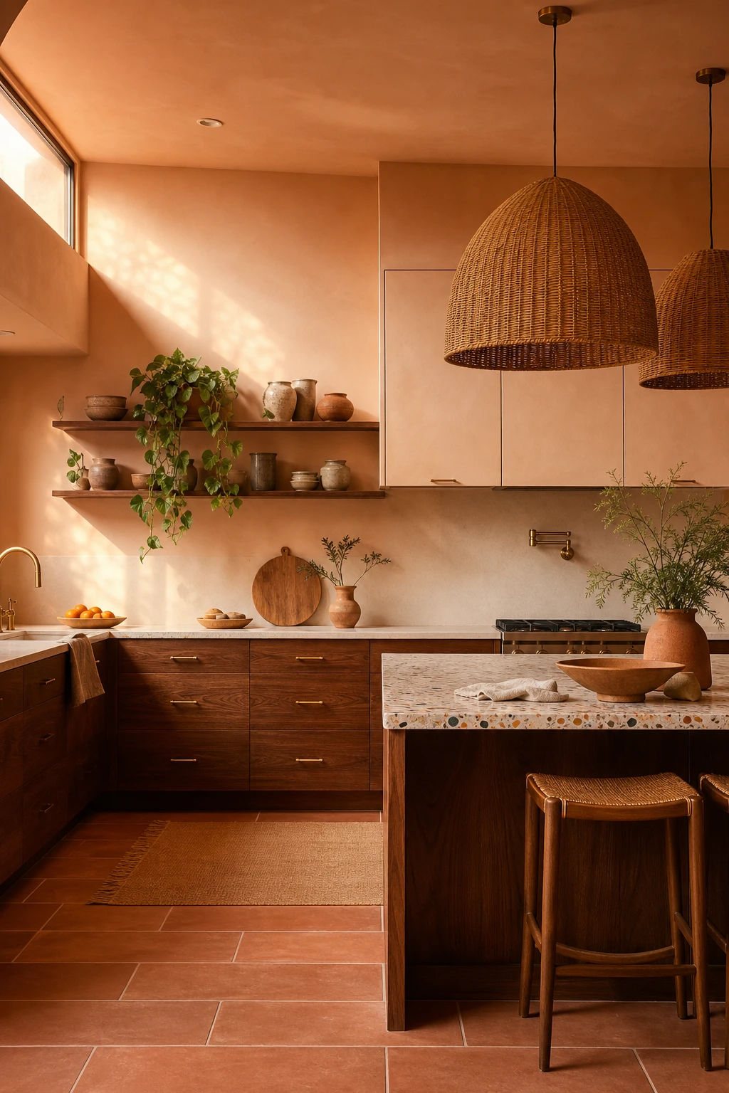
Peach sits in that sweet spot where warmth reads as glow rather than colour, and that distinction is exactly why I keep reaching for it on kitchen walls. You get all the softness of blush without the sweetness that pink can bring, so the room feels toasty and alive from first light through to evening. The walnut cabinets and terracotta floor are pulling the same amber note out of the walls here, and I love how that shared undertone makes the whole space feel considered rather than simply colourful.
The Key Details
Low slung walnut base cabinets with tapered brass pulls
Oversized woven rattan pendant cluster
Terrazzo topped kitchen island
Open shelving with hand thrown ceramic vessels
Large format terracotta floor tiles in running bond
Pro TipHang cream linen shades at the windows to keep the tonal palette tight and let the peach walls do the glowing without competition.
AvoidLetting peach drift toward coral shifts the whole mood from warm and quiet to loud and restless, which undoes everything the palette was working toward.
A White Midcentury Kitchen That Stays Crisp Without Feeling Sterile
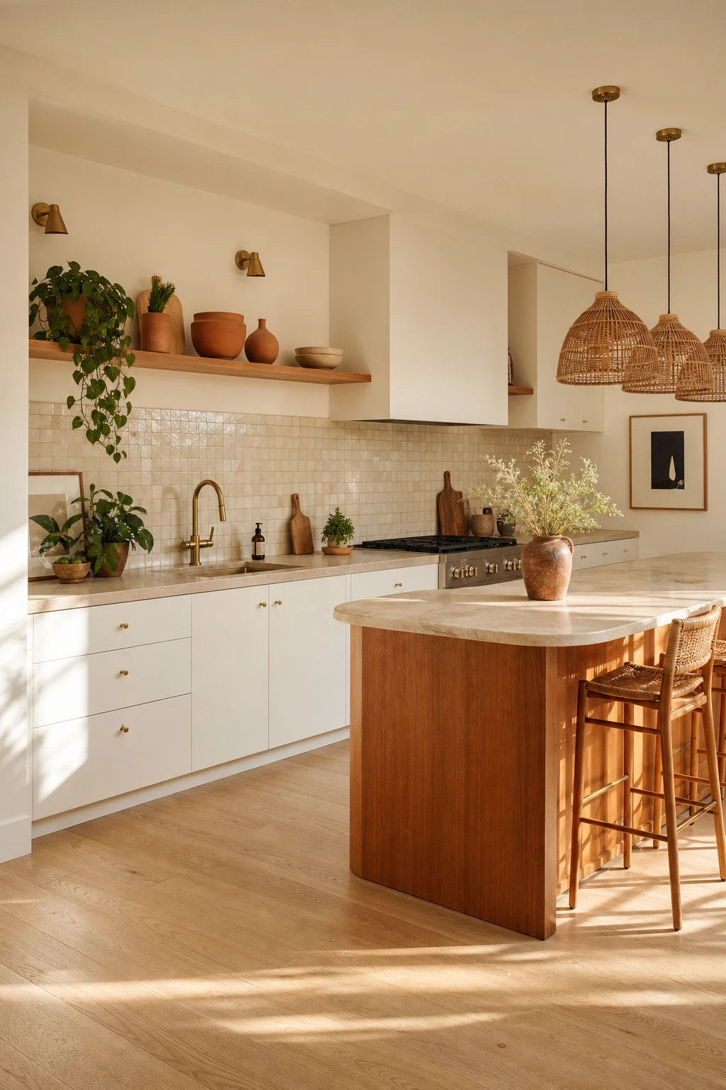
White kitchens live or die by the exact shade you pick, and what wins me over every time is a white with a whisper of warmth built into it. You get that clean, airy feeling the style is famous for, but the room never tips into cold or clinical. Watch how the rattan, travertine and terracotta all lean into those same honeyed undertones and suddenly the whole kitchen reads as one considered thought rather than a collection of pieces.
The Key Details
Rattan pendant lights
Honed travertine countertop
Flat panel white lower cabinets
Open shelving with terracotta ceramics
Zellige tile backsplash
Pro TipSwap any chrome or nickel fixtures for unlacquered brass and the white instantly reads warmer without you touching the paint at all.
AvoidPulling in a cool blue white drains every warm material in the room of its character and leaves the whole kitchen feeling flat and slightly unwelcoming.
Green Cabinets and a Wood Island Together Are Better Than Either Alone
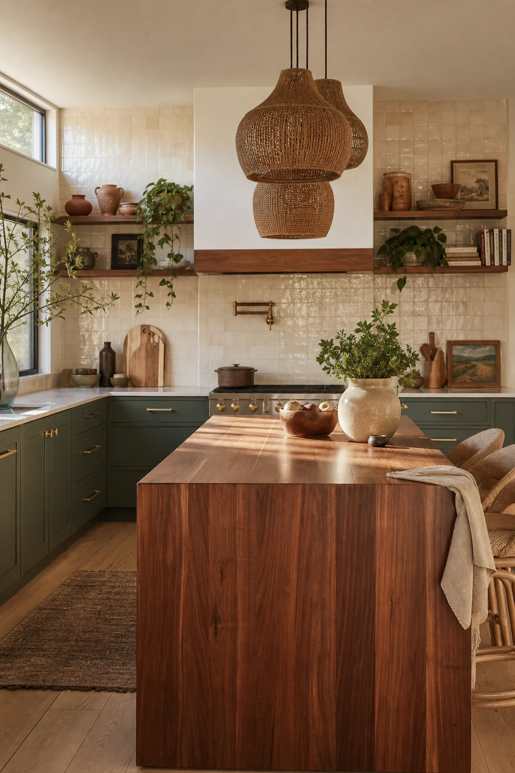
Green cabinets and a wood island is a pairing I keep coming back to, because the contrast does something neither surface can do alone. The painted green reads as grounded and intentional, while the raw grain of the wood pulls warmth into the room. What I love is how your eye moves between the two, finding rest in one and life in the other. That push and pull between painted and natural is what gives the kitchen its character.
The Key Details
Walnut butcher block island
Open upper shelving with terracotta vessels
Rattan pendant light cluster
Zellige cream tile backsplash
Brushed brass cabinet hardware
Pro TipPull a warm undertone from the wood grain and match it to the green you choose, so the two surfaces feel selected together rather than placed next to each other by accident.
AvoidReaching for a cool, blue leaning green when your island wood runs yellow or amber will set the two surfaces fighting each other, and the whole kitchen feels unsettled rather than curated.
Fluted Wood Cabinets Are the One Detail That Gives a Kitchen Real Depth
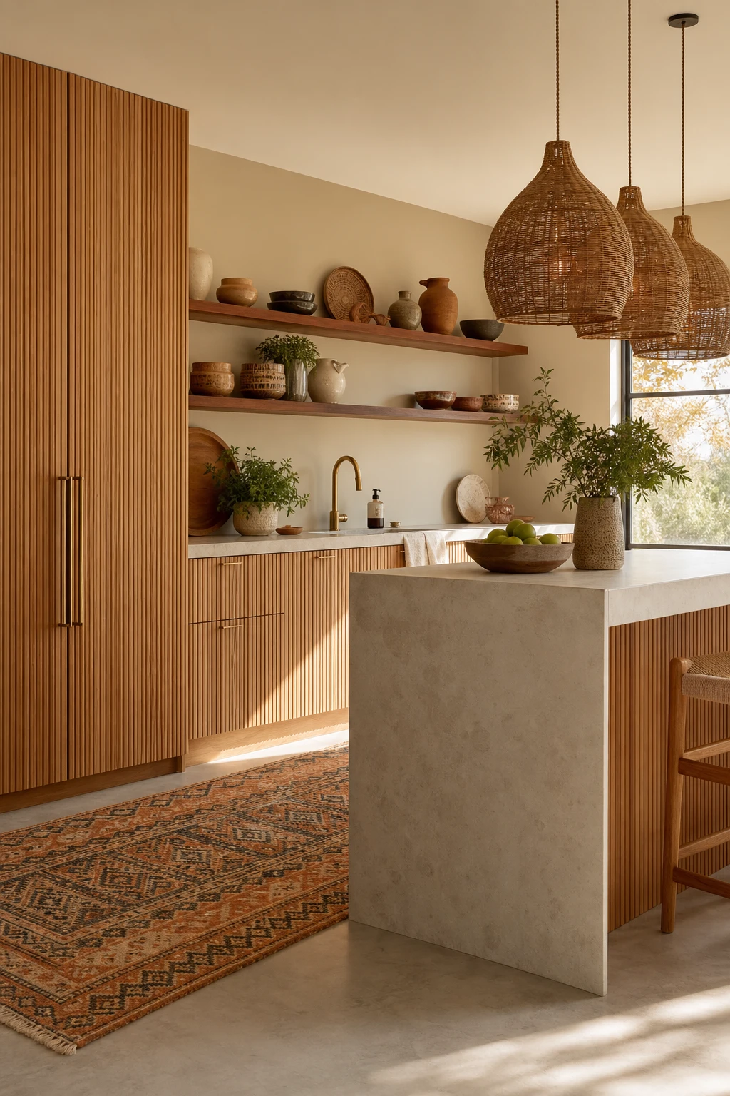
Fluted wood cabinets are one of my favourite moves when a kitchen needs more personality but the palette is already doing a lot of work. Those vertical grooves catch light differently at every hour of the day, so you get constant visual interest without adding a single new colour. What wins me over every time is how the ribbed surface reads as rich and considered, the kind of detail you notice slowly rather than all at once.
The Key Details
Fluted oak flat front cabinetry
Rattan cluster pendant lights
Open walnut wall shelving
Waterfall edge island
Moroccan pattern floor runner
Pro TipRun fluting vertically on tall cabinet doors and your eye travels straight up, which is one of the easiest ways to make a low ceiling feel like it has more room to breathe.
AvoidCovering every cabinet in fluting dilutes the whole effect, turning what should be a considered accent into visual noise that exhausts the eye before it can settle.
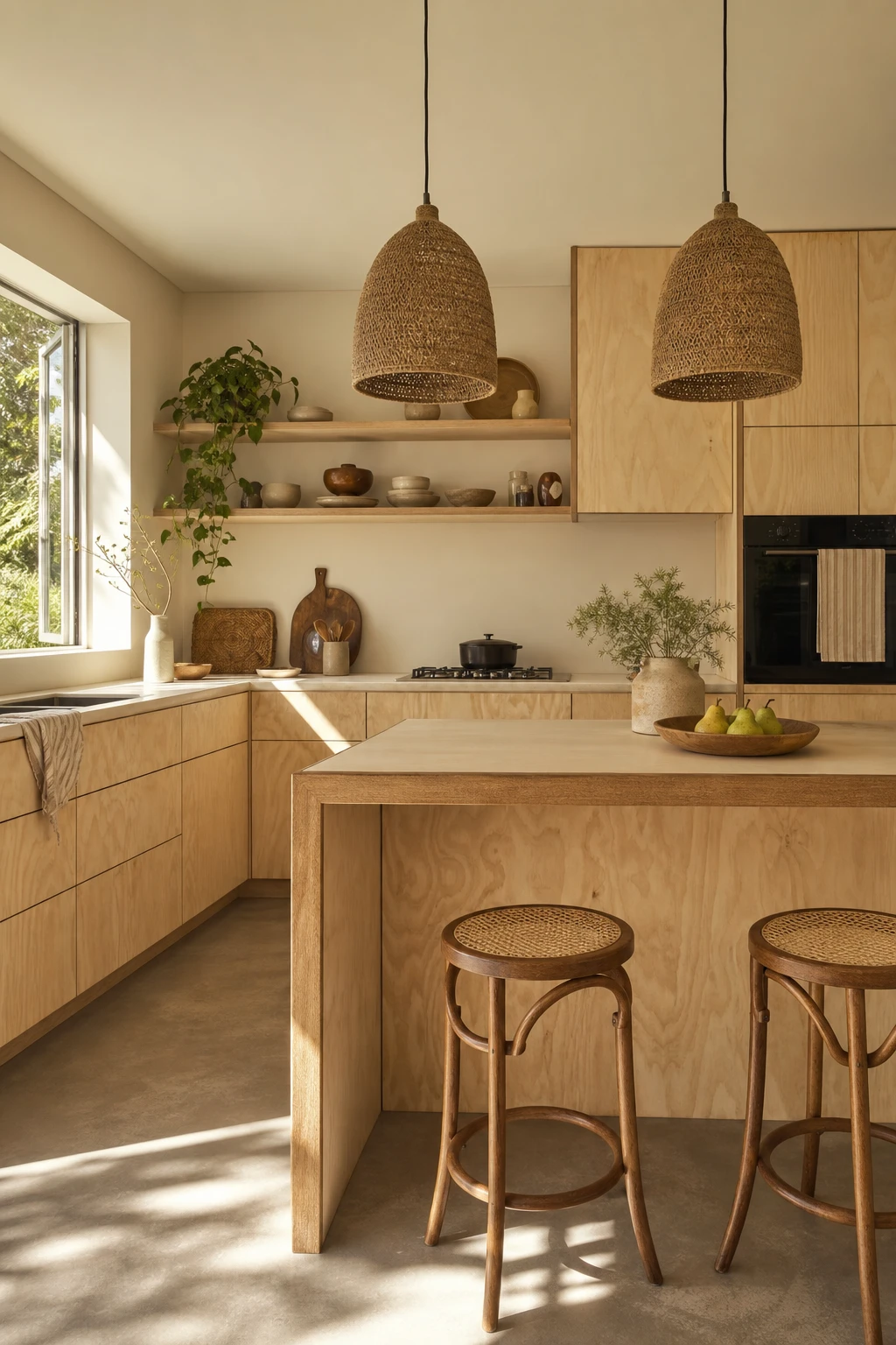
A Plywood Kitchen Is the Most Honest and Quietly Beautiful Choice You Can Make
Raw plywood is one of those materials that genuinely surprises people once it is in. The grain does the decorating for you, and you get a warmth that painted cabinetry simply cannot fake. What I love is how each sheet carries its own quiet character, so the kitchen feels collected rather than manufactured. Pair it with jute, cane, and ceramic and the whole room breathes in a way that feels completely natural to this boho midcentury world.
The Key Details
Flat front raw plywood cabinetry
Woven jute pendant lights
Bentwood and cane seat stools
Open plywood shelving with ceramic vessels
Matte concrete floor in warm greige
Pro TipRub a matte hardwax oil into the plywood faces before fitting to deepen the grain and give you a surface that wipes clean without any shine.
AvoidLeaving cut edges unsealed is the one thing that will undo all of it, because moisture creeps into exposed plywood end grain and causes delamination that no finish can rescue later.
Painted Cabinets and Wood Doors Together Create the Most Satisfying Two Tone Kitchen
Breaking a run of cabinets at the point where painted meets wood is one of my favourite moves in a kitchen because the eye gets a natural resting place instead of one flat wall of colour. What I love here is that the wood uppers keep the space feeling open and airy, while the painted lowers anchor the room with a grounding note. You get contrast that reads as intentional, not patchy.
The Key Details
Natural wood upper cabinet doors
Rattan pendant lights
Terrazzo floor tiles
Honed travertine countertops
Hand thrown ceramic cabinet hardware
Pro TipPlace the natural wood doors on the upper cabinets so the lighter material sits closer to the ceiling and pulls daylight down through the room.
AvoidSplitting the two finishes at an arbitrary point, say mid run with no architectural reason, leaves the layout looking unresolved and the whole scheme feels accidental rather than designed.
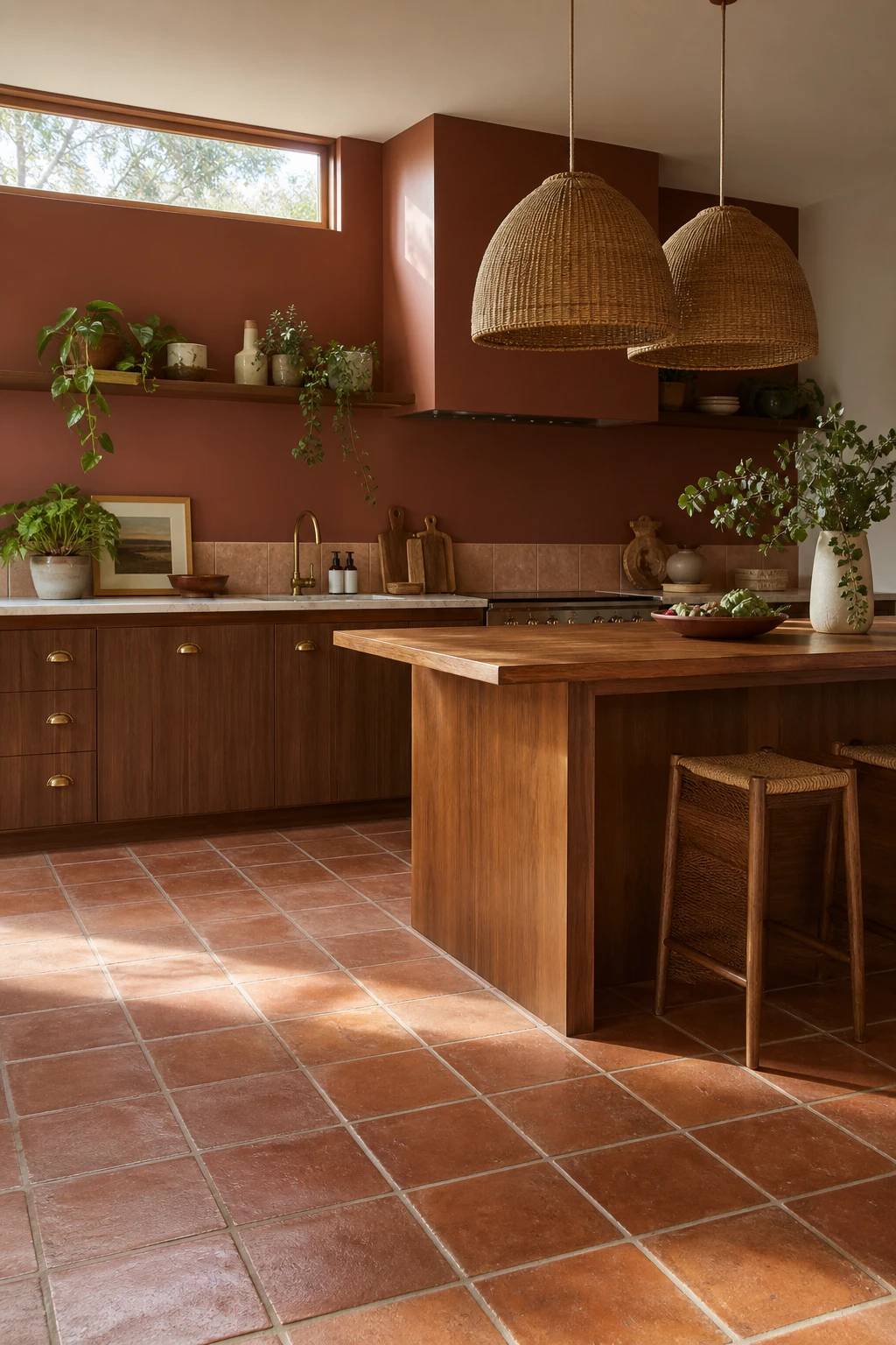
Terracotta Tiles Are the Floor Choice That Makes a Modern Kitchen Feel Lived In
Terracotta underfoot is the thing I reach for when a kitchen feels too sharp and finished. The warm burnt orange tone pulls heat down to ground level, so even cool stone worktops and flat front cabinetry feel settled rather than sterile. You get that sense the room has always been here, which is exactly what earthy warmth does to a contemporary space.
The Key Details
Handmade terracotta square floor tiles with pale grout
Flat front walnut veneer lower cabinetry with brass cup pulls
Woven rattan dome pendant lights
Solid teak kitchen island
Open shelving with glazed ceramic canisters and trailing pothos
Pro TipSeal your terracotta tiles with a penetrating sealer at least 24 hours before you grout, so the porous clay cannot absorb colour and stain permanently.
AvoidBright white grout against warm terracotta looks striking for about a week, then every scuff and splash turns it grey and the contrast you wanted works against you.
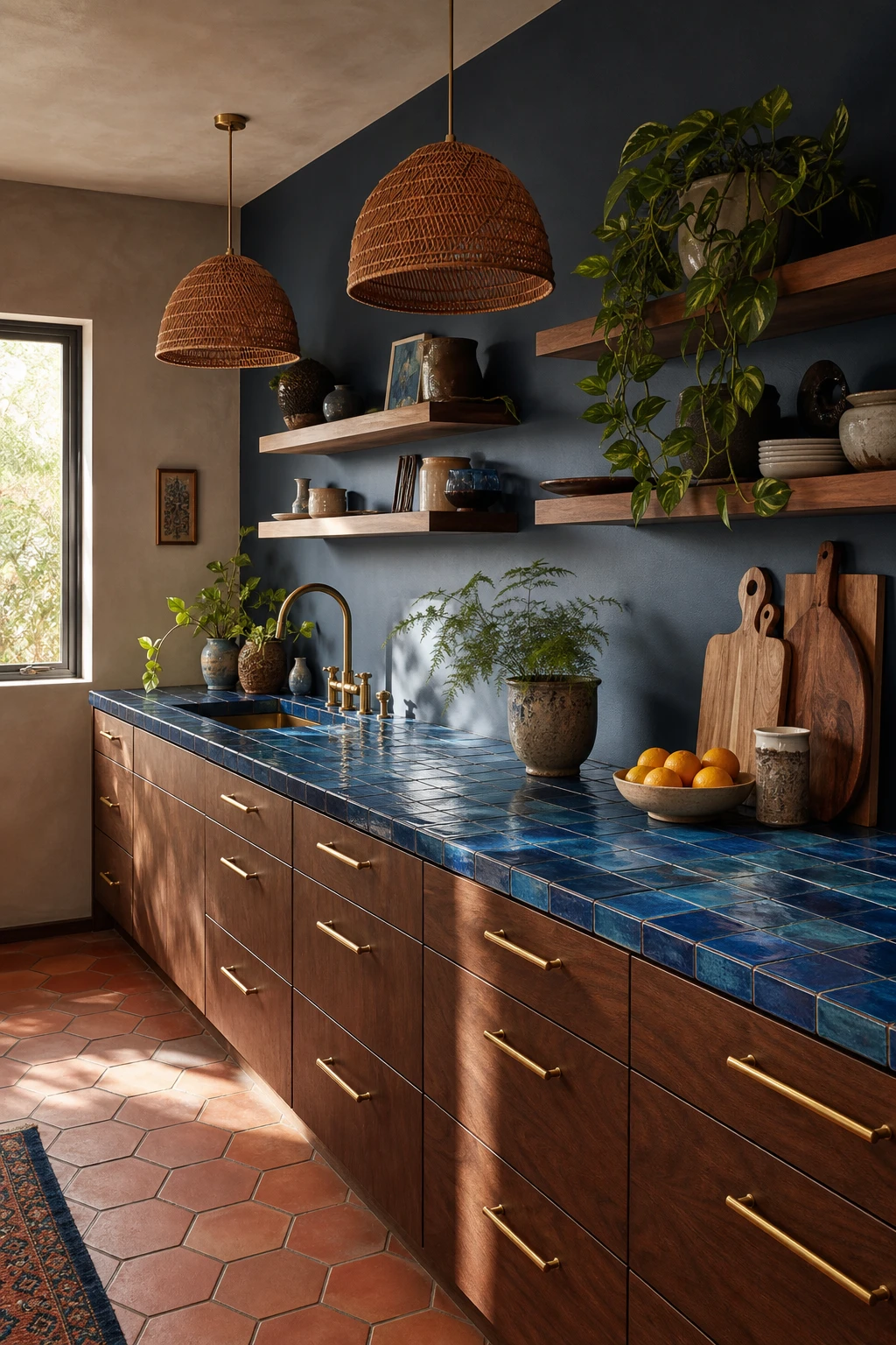
A Blue Tile Countertop Is the Colour Surprise That Makes the Whole Kitchen Sing
Putting colour on the countertop rather than the walls is one of my favourite moves in a midcentury kitchen, because you feel it every time you walk into the room without it ever feeling loud. The cobalt and teal glaze shifts as the light changes, so you get this living, moving surface that flat paint simply cannot give you. Watch how the cool blue reads beautifully against warm walnut cabinets below and the terracotta floor beneath your feet, pulling the whole palette together in a way that feels considered rather than accidental.
The Key Details
Handmade cobalt and teal ceramic tile countertop
Flat front walnut lower cabinets with brushed brass pulls
Woven rattan pendant lights
Open upper timber shelving with ceramic vessels
Large format terracotta hexagonal floor tiles
Pro TipChoose a handmade tile with a slightly uneven surface and varied glaze so the countertop has natural movement and depth rather than looking like a flat sheet of colour.
AvoidWide grout joints look beautiful on a backsplash but on a work surface they trap grease and staining within weeks, turning your showstopper feature into a maintenance headache.
A Bohemian Backsplash Turns the Hardest Working Wall Into the Prettiest One
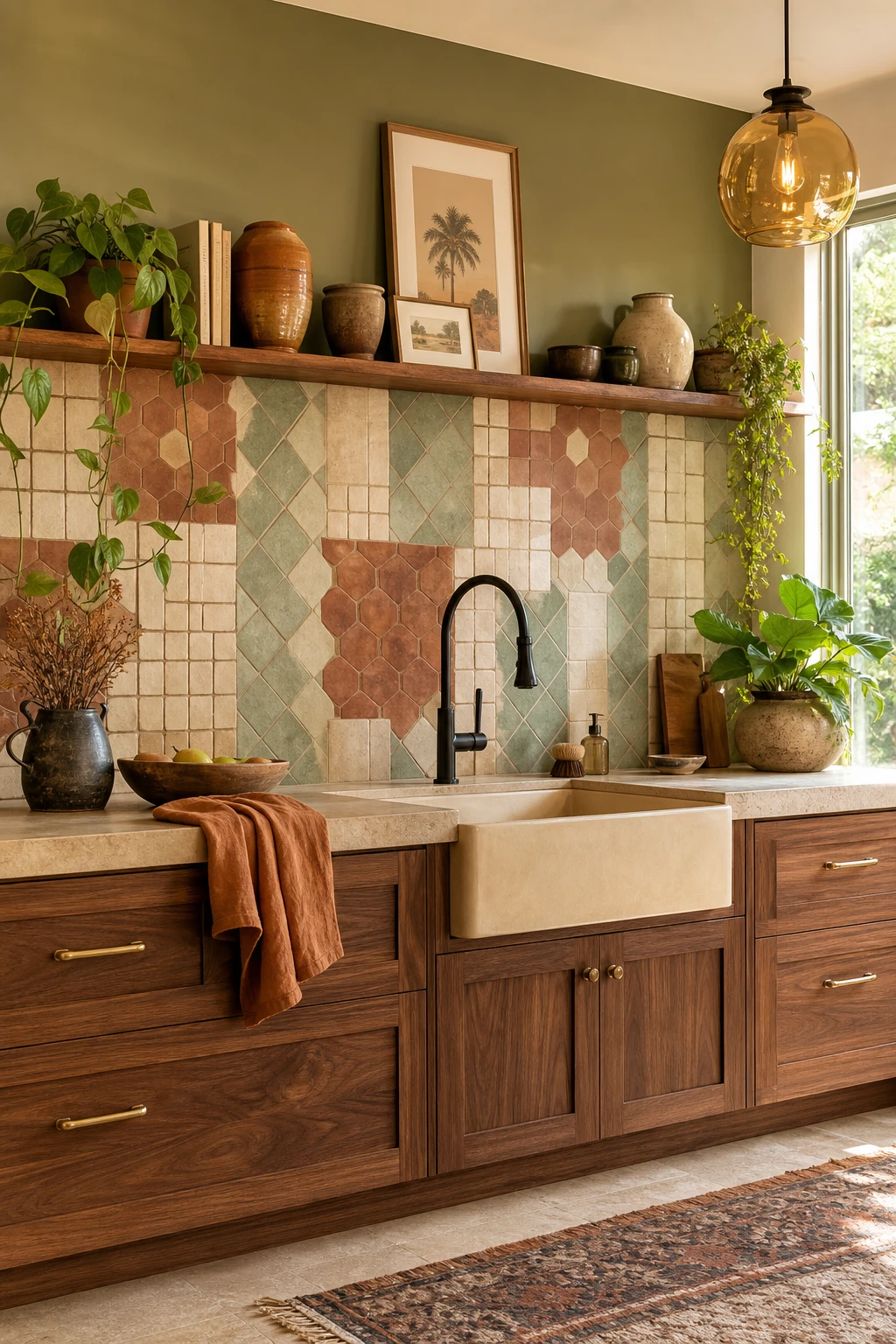
Mixing tile patterns is one of my favourite moves in a boho kitchen, because when you do it right, the wall reads as collected and personal rather than busy. The secret is staying inside a shared palette: terracotta, cream, and sage pull from the same warm earth family, so your eye relaxes even as the shapes and textures shift. You get all that handmade character without the chaos.
The Key Details
Mixed handmade tile backsplash in terracotta, cream, and sage
Oiled walnut open lower cabinets
Honed travertine countertop
Matte black vintage bridge faucet over ceramic farmhouse sink
Amber glass pendant light
Pro TipRun the same warm putty grout across every tile, whatever the pattern or glaze, and the whole backsplash settles into one calm, cohesive surface.
AvoidPicking tiles one at a time from different sample cards almost always leads to a wall that fights itself, because small differences in undertone that look fine in isolation become obvious clashes at full scale.
A Midcentury Tile Backsplash Does More Design Work Than Almost Anything Else
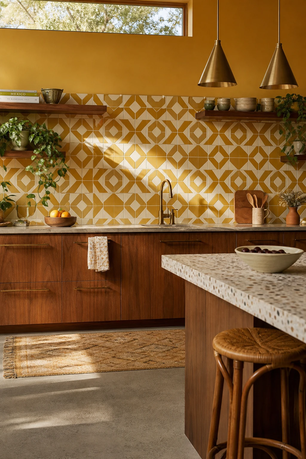
Geometric tile is the one surface in a midcentury kitchen that does the heavy lifting of the whole era in a single glance. The mustard and cream palette here wins me over because it roots the scheme in the 1950s without a word of explanation. You get a clean visual anchor behind the walnut and brass, and watch how the geometry holds the eye steady rather than competing with every other element in the room.
The Key Details
Mustard and cream geometric ceramic tile backsplash
Oiled walnut open lower cabinets and floating shelves
Brass cone pendant lights
Honed terrazzo island countertop
Rattan bar stool
Pro TipRun bowtie or hex tiles in a straight stack rather than brick bond, because the flat grid reads as sharply period correct and lets the tile shape itself do all the talking.
AvoidPairing a busy geometric mosaic with a fully loaded open shelf run splits the eye between two loud focal points and neither one wins.
Terrazzo Kitchen Tiles Bring a Retro Speckle That Never Stops Looking Good
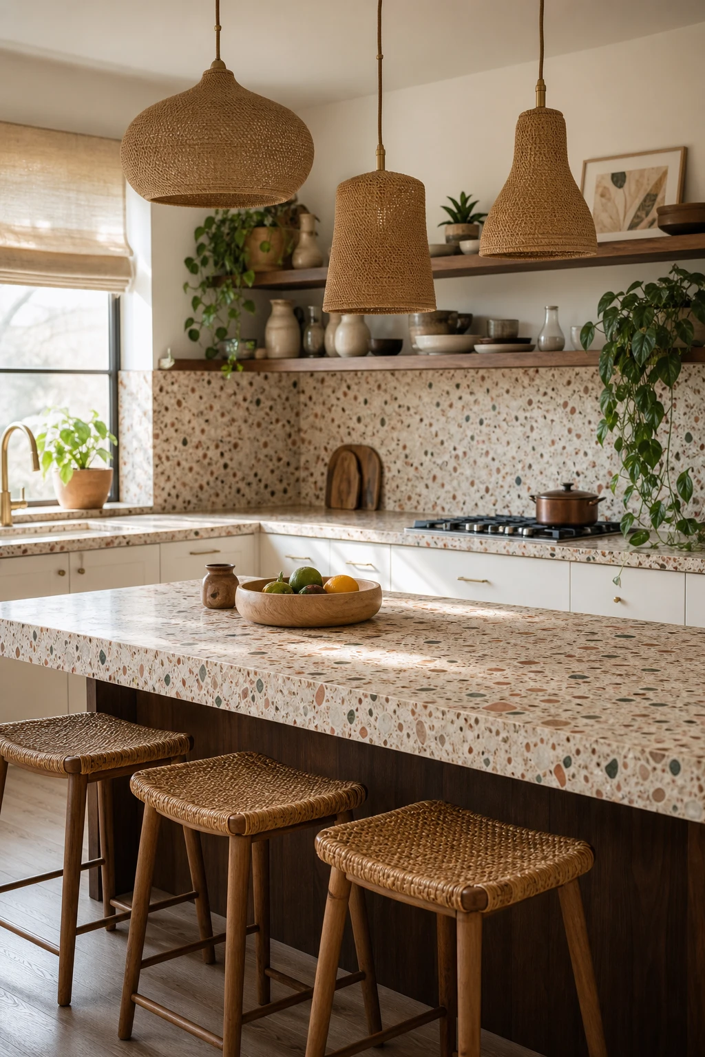
Terrazzo is the surface I reach for when a kitchen needs to work hard without looking tired by Thursday. The scattered chips break up marks, crumbs, and splashes so well that daily use almost disappears into the pattern, and you get that pleasing visual busyness without a single element shouting. A cream based mix is my favourite because it holds the wood tones and brass details together in a way that feels effortless, and the whole room reads as considered rather than collected.
The Key Details
Terrazzo countertop and backsplash tiles
Rattan bar stools
Woven natural fibre pendant lights
Open walnut timber shelving
Aged brass cabinet hardware
Pro TipWhen you are choosing your terrazzo slab or tile, hold a sample next to your cabinet door in natural light and look for a base tone that shares the same warmth as the timber grain.
AvoidPairing terrazzo with a heavily veined stone or a bold geometric tile means both patterns fight for attention and neither one reads as intentional.
Dark Grey Floor Tiles Give a Boho Midcentury Kitchen Its Most Grounded Contrast
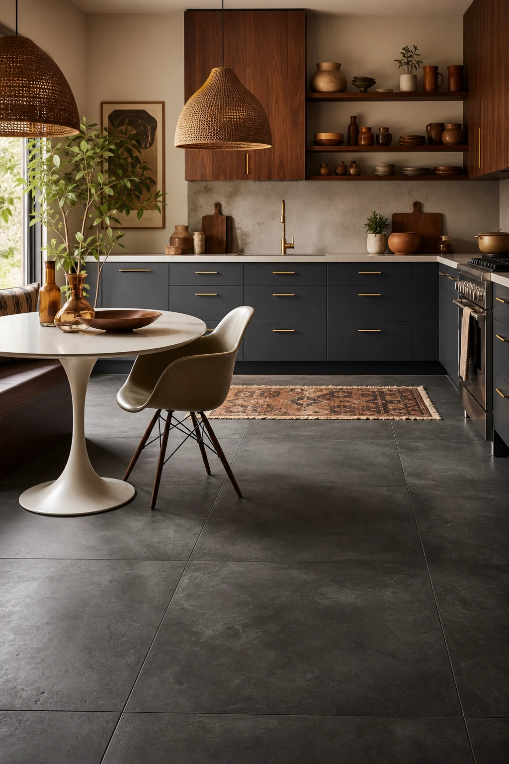
A dark grey floor is the quiet anchor that makes every warm tone above it sing. What I love here is how the deep matte concrete pulls the walnut cabinetry and amber ceramics into focus, giving the eye a place to settle before it travels upward. You get that grounded, earthy contrast that stops a boho midcentury scheme from feeling too light and floaty.
The Key Details
Large format matte concrete floor tiles
Walnut veneer upper cabinetry with tapered brass pulls
Woven rattan dome pendant lights
Open upper shelving with terracotta and amber ceramic vessels
Tulip style dining table with moulded chair
Pro TipChoose a large format tile, 60x120cm or bigger, so the floor reads as one calm plane rather than a busy grid that chops the room into small squares.
AvoidPairing dark floors with dark lower cabinets causes everything below counter height to merge into one heavy band, and the floor loses all its contrast.
Parquet Flooring in a Kitchen Adds a Pattern Underfoot That Feels Genuinely Luxurious
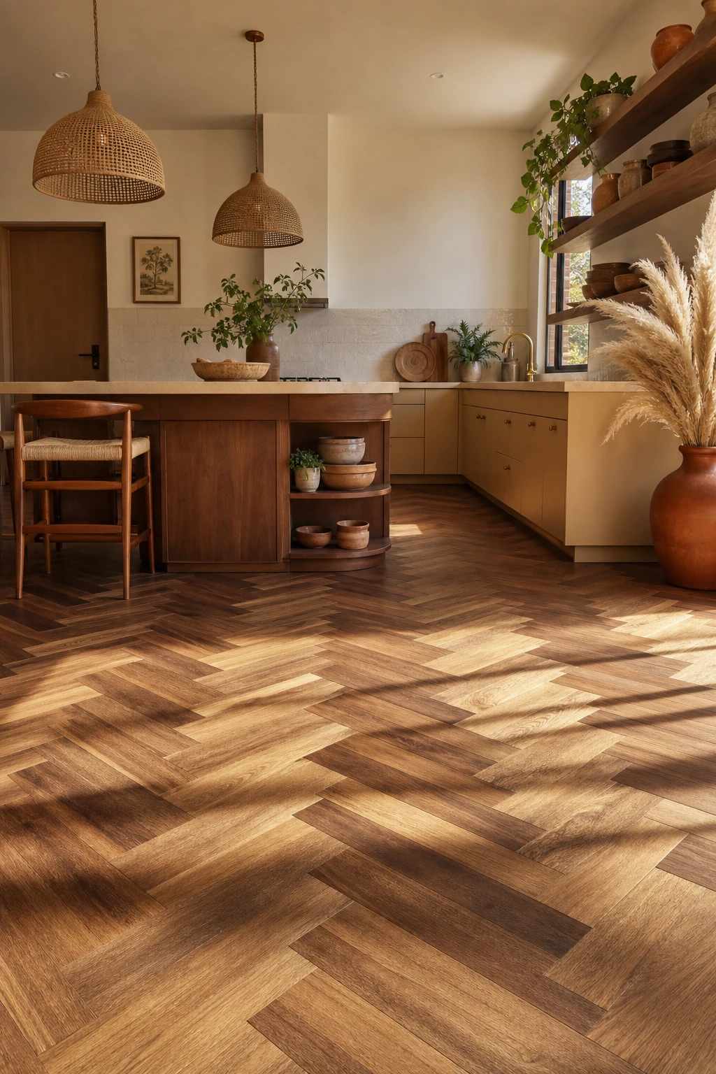
Parquet turns the floor into the feature, and that is something I always push clients toward when a kitchen feels a little flat. The woven geometry of herringbone or basketweave pulls the eye down and across the room, making the whole space feel considered from ground up. You get a warmth that tiles simply cannot match, and the mix of walnut and oak tones adds exactly the kind of natural variation this boho midcentury style needs.
The Key Details
Herringbone parquet floor in walnut and oak
Woven rattan pendant lights
Open timber wall shelving
Low profile midcentury kitchen island
Honed travertine countertop with aged brass hardware
Pro TipChoose engineered parquet over solid wood in a kitchen, because the layered core handles humidity and temperature swings without cupping or gapping at the joints.
AvoidA high gloss lacquer finish on parquet shows every footprint and scuff within hours, and the floor ends up looking grubby rather than luxurious no matter how often you clean it.
A Vintage Orange Gas Stove Is the One Appliance That Becomes a Work of Art
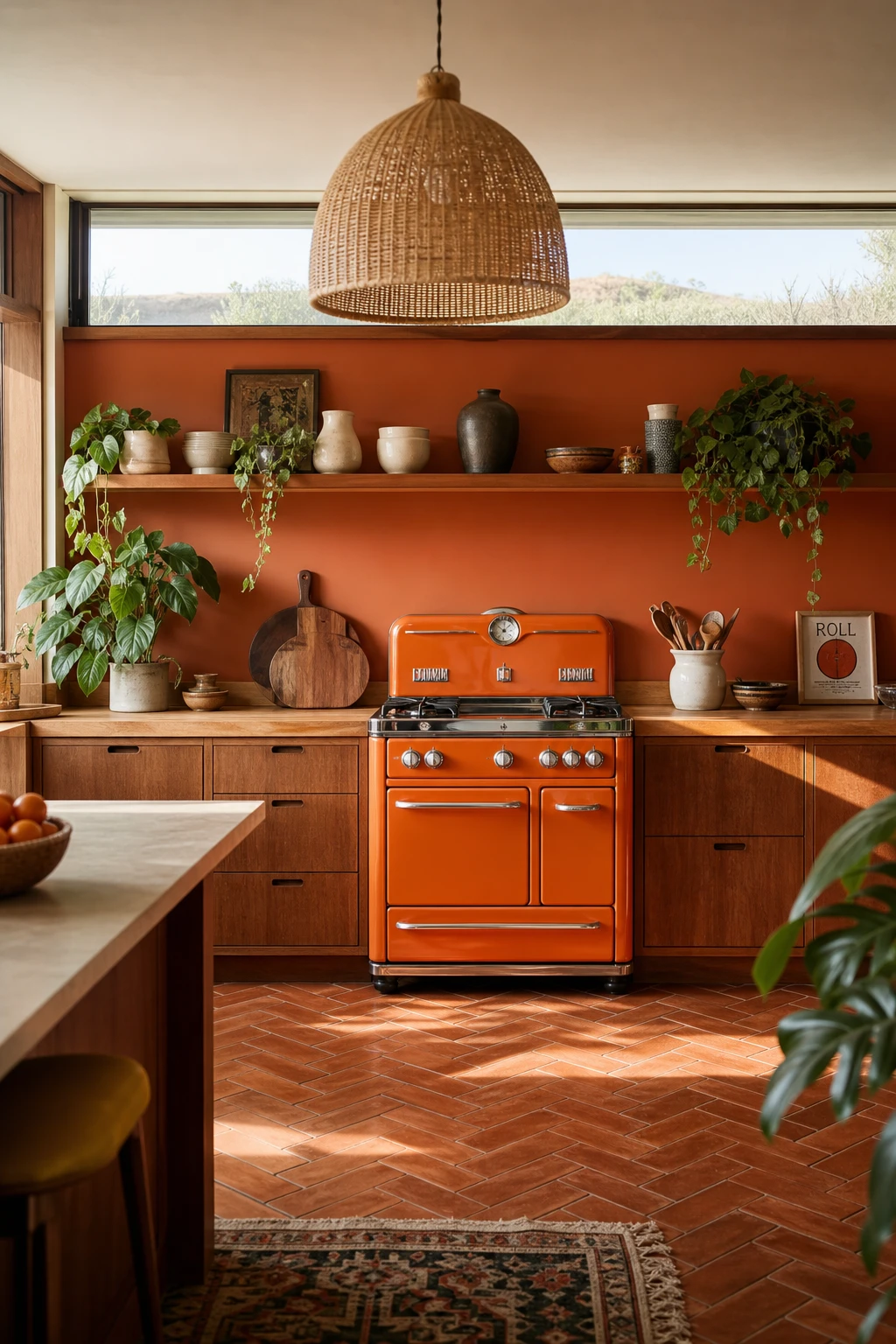
A vintage orange stove earns its place the moment it lands in the room, and I think that is rare for any single object. One saturated colour pulls the whole palette together without any extra effort on your part. The walnut cabinetry and terracotta floor already carry warm undertones, so you notice they simply click into place around the stove rather than fighting it. Keep everything else quiet and let the stove do all the talking, because that restraint is what makes the whole room feel intentional.
The Key Details
Vintage orange enamel gas stove
Flat front oiled walnut cabinetry
Woven rattan pendant light
Herringbone terracotta tile floor
Open timber display shelf with trailing pothos
Pro TipPaint the wall behind the stove in a creamy off white or pale stone shade so the orange reads as a clean, confident pop rather than blending into a busy backdrop.
AvoidPlacing other bold accent colours near a statement stove dilutes its impact and leaves the kitchen feeling visually restless rather than intentional.
A 70s Style Fridge Is the Easiest Way to Give Your Kitchen Real Retro Personality
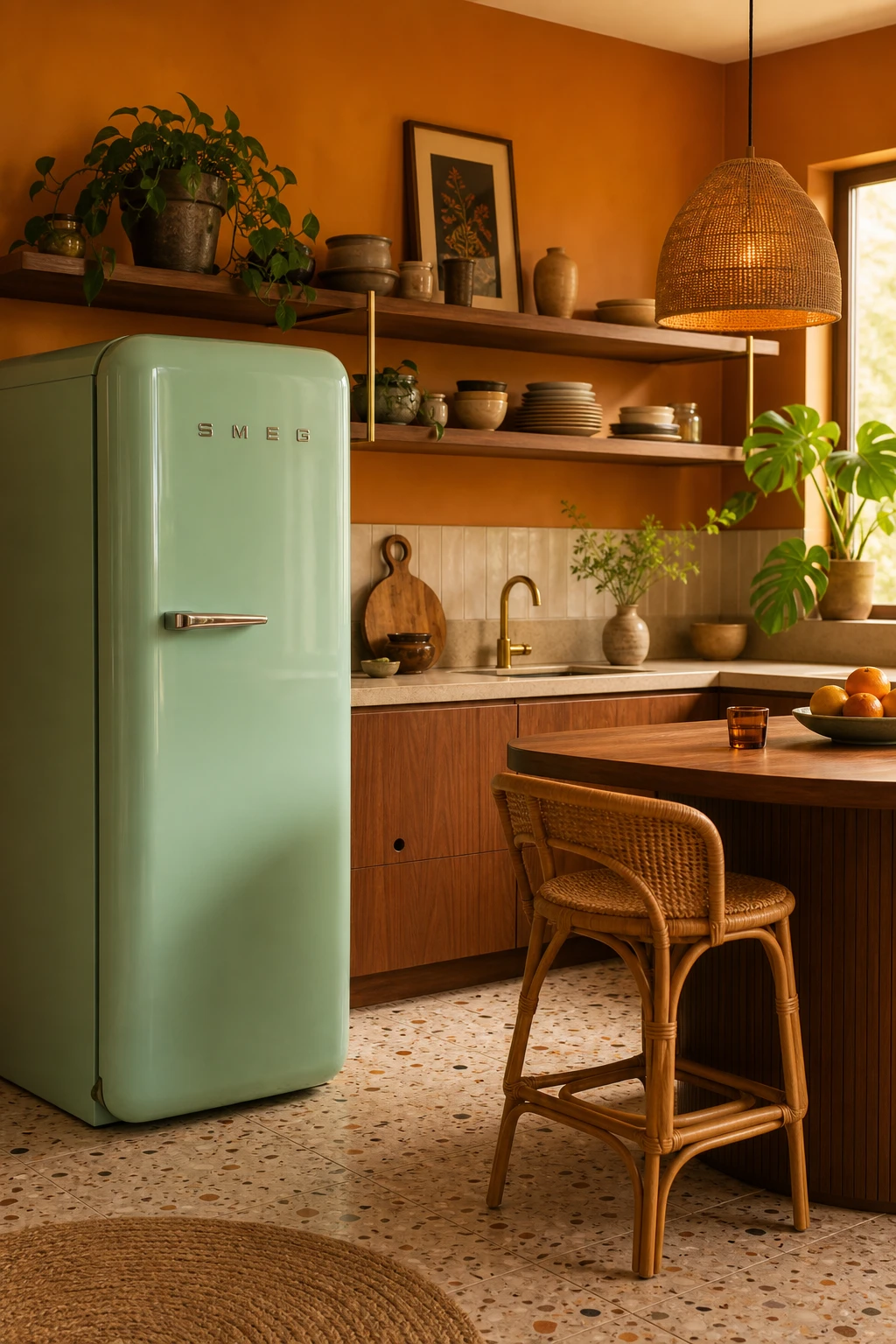
A retro fridge in a warm pastel or bold cream stops the kitchen dead in its tracks, and that is exactly the point. Treating an appliance as a furniture level decision changes how the whole room reads, and what I love about this approach is that one strong anchor makes every other choice around it, the teak counter, the rattan stools, the woven pendant, feel deliberate rather than random. You get a room that looks curated because it actually is.
The Key Details
Rounded pastel retro fridge
Woven grass pendant lamp
Teak wood breakfast counter
Rattan bar stools
Terrazzo floor tiles
Pro TipPull the fridge out of any corner run and give it a wall of its own so it reads as a statement piece rather than a tucked away utility box.
AvoidPairing a retro fridge in one strong colour with a second bold appliance nearby splits the room’s focus and leaves both pieces fighting for attention rather than earning it.
A Yellow Retro Fridge Turns One Corner of the Kitchen Into Pure Sunshine
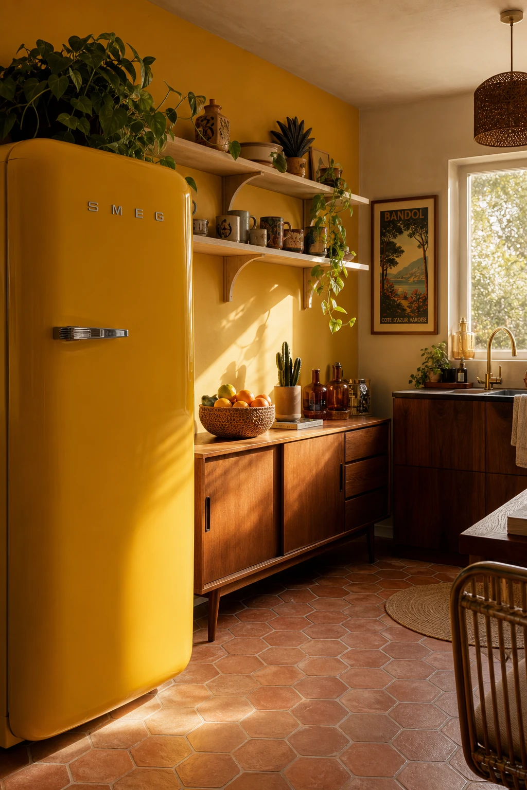
A yellow fridge dropped into a neutral kitchen is one of those moves that looks effortless but is actually quite considered. What I love is the way a single saturated colour does the heavy lifting, so the rest of the room can stay calm and let it shine. You get instant warmth and personality without wallpapering the whole space in colour. The rounded retro silhouette softens the geometry of the cabinets, and that amber glass cluster on the shelf nearby ties everything together so the yellow reads as a choice, not a mistake.
The Key Details
Rounded retro refrigerator
Low teak sideboard
Open pale ash shelving
Terracotta hexagonal floor tiles
Amber glass bottle cluster
Pro TipEcho the fridge colour in two or three small objects nearby, a mustard jug, a yellow spined cookbook, or a folded cloth, so the eye reads it as a deliberate palette rather than a lone rogue appliance.
AvoidOrdering a bold fridge colour online without first holding paint swatches against your actual tiles and cabinet fronts, because what reads as warm sunshine on a screen can turn sallow or garish under your specific kitchen lighting.
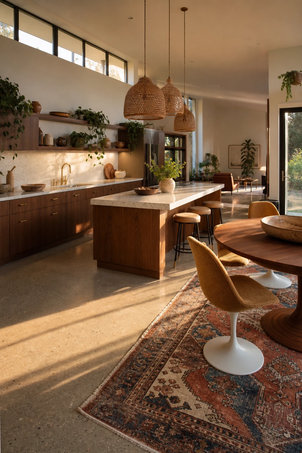
An Open Plan Kitchen Dining Space Works Best When the Zones Feel Distinct
Open plan spaces can feel unfinished when everything bleeds into everything else, and what I always check first is whether each zone has its own anchor. A Moroccan rug pulled under the dining table does that job quietly, giving the eye a clear place to land without a single wall going up. Layer in clerestory windows throwing warm amber light across that side of the room and you get a natural glow that separates the dining end from the kitchen without any effort at all. Soft boundaries like these feel organic, never forced.
The Key Details
Vintage Moroccan rug zone anchor
Woven rattan pendant lights
Round walnut dining table with tulip chairs
Open shelving with trailing pothos
Clerestory windows with amber afternoon light
Pro TipHang a cluster of woven rattan pendants low over the dining table so the pool of light draws the zone together even when the rest of the room is fully lit.
AvoidRunning the same floor surface flat through both zones with no rug or material break makes the whole space read as one undivided room, and the dining area loses all its sense of destination.
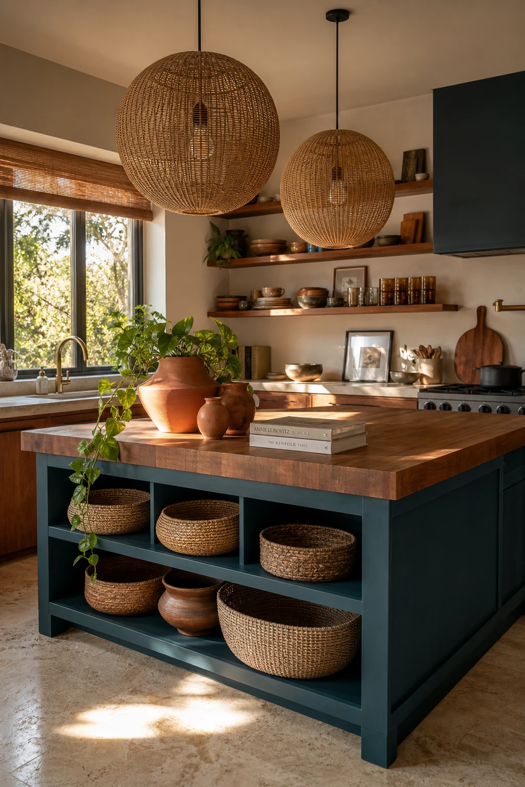
A Boho Kitchen Island Is the Place Where All the Best Layers Come Together
The island is where midcentury structure and boho warmth actually meet, and what wins me over every time is how a single piece can do so much for a room. A butcher block top brings natural grain and a tactile warmth you just cannot fake, while pendant lights and a small vessel cluster signal that this is a considered space. You get all that extra function, but it reads as art first and worktop second.
The Key Details
Rattan globe pendant lights
Butcher block island top
Terracotta vessel cluster
Open teak wall shelving
Woven basket under island storage
Pro TipPainting the island one shade deeper than your perimeter cabinets instantly gives the kitchen a grounded, layered look that feels far more intentional than a single colour throughout.
AvoidLoading the island top with too many decorative pieces slowly swallows the workspace, and a kitchen that looks styled in photos becomes frustrating to actually cook in.
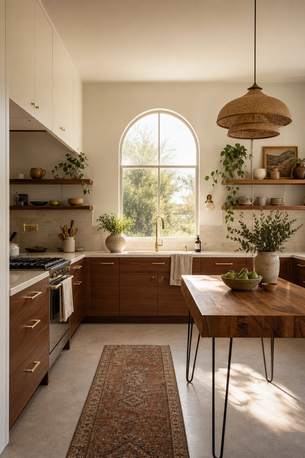
A Small Midcentury Modern Kitchen Can Feel Just as Generous as a Big One
Small kitchens reward every decision you make, and a tight MCM layout wins me over precisely because restraint becomes a design tool. Flat fronts, warm walnut tones, and a single clean line of cabinetry trick the eye into reading the room as calm rather than cramped. What I love is how the hairpin leg island floats visually, so you keep floor in view and the space breathes. The arched window does quiet heavy lifting too, pulling light in and giving the whole room a generous feel.
The Key Details
Flat front walnut lower cabinets
Open teak floating shelves
Hairpin leg butcher block island
Woven rattan pendant lights
Arched casement window
Pro TipSpecify integrated pull channels routed into the top edge of cabinet doors so your walls stay completely unbroken and the room reads as one continuous surface.
AvoidLining a small kitchen wall with open shelves trades every inch of practical storage for display space, and the clutter that builds on those shelves will make the room feel half the size within a month.
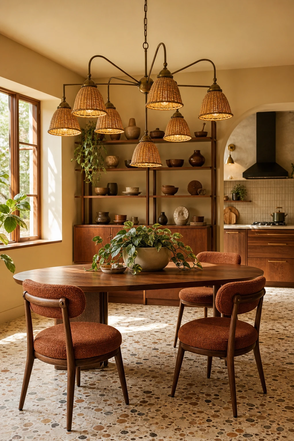
A Chandelier Pendant Above the Kitchen Table Is the Detail That Changes Everything
A sculptural rattan chandelier above the dining table does what I think all great lighting should do: it makes you stop and look up before you even sit down. You get that jewellery effect, a piece that earns its place visually rather than just throwing light around. Watch how it pulls the warm tones from the walnut table and the bouclé chairs into one cohesive story, so the whole corner feels considered rather than assembled.
Pro TipDrop the pendant lower than feels comfortable, somewhere around 70 to 75 cm above the tabletop, and the drama you get in return will surprise you.
AvoidChoosing a chandelier wider than two thirds of your table turns a beautiful focal point into a visual wall that kills conversation across the table.
A Tiled Island Countertop Brings the Kind of Handmade Character Stone Never Could
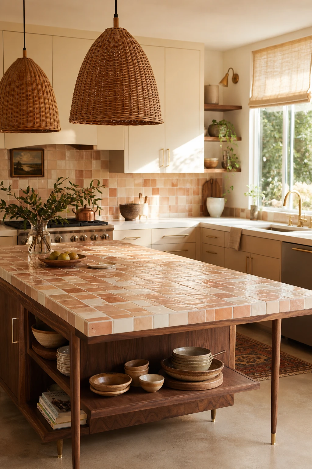
Zellige tile on an island top is one of my favourite moves in a boho midcentury kitchen because every piece catches light differently, giving you that alive, almost breathing quality stone simply cannot fake. You will notice the slight variation in each tile face makes the surface feel genuinely crafted rather than installed. What wins me over every time is how the warm, watery glaze pulls the whole room together, echoing the rattan and brass without trying too hard.
The Key Details
Handmade zellige tile island surface
Woven rattan pendant lights
Tapered oiled walnut cabinet legs
Open lower island shelving
Brushed brass cabinet hardware
Pro TipUse a pigmented epoxy grout on your island top rather than standard cement grout, because it cures almost completely non porous and will not absorb olive oil, wine, or turmeric.
AvoidLaying tile flush to the very edge of the island without a small raised lip means any liquid pooling on the surface will run straight onto the floor, which causes slip hazards and damages the toe kick over time.
Wood Countertops Age Into the Most Beautiful Version of Themselves Over Time
Wood countertops are one of those rare choices that genuinely get better the longer you live with them. What I love is the way each scratch and oil ring softens into the grain rather than standing out as damage, so the surface you have in ten years is richer and warmer than the one you started with. You get a material that records the life of your kitchen without looking worn, and that quality is exactly what makes it feel so at home alongside the natural textures of a boho midcentury space.
The Key Details
Butcher block countertop with oiled patina
Flat front lower cabinets
Woven rattan pendant lights
Ceramic farmhouse sink
Terracotta tile flooring
Pro TipOil your wood countertop every week for the first month, four treatments total, and the surface builds a deep protective layer that shrugs off daily moisture for years.
AvoidLeaving the edge directly beside a sink unsealed lets water wick into the end grain, which causes swelling and splitting that no amount of oiling will reverse.
Alan launched Edward George London in 2017. Since completing his masters in Town & Regional Planning (MPlan) he has combined the skills he learned at the University of Sheffield with his passion for design, to help create a foundation for those looking to create a beautiful home.