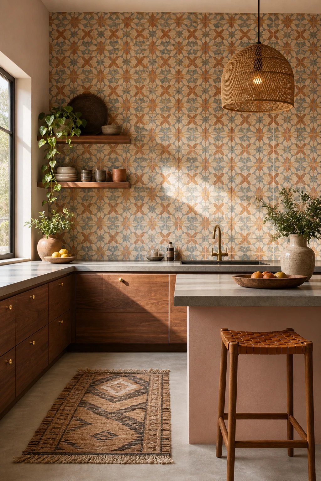
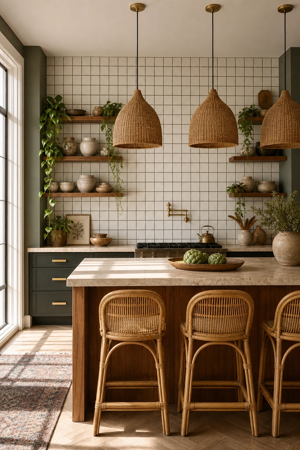
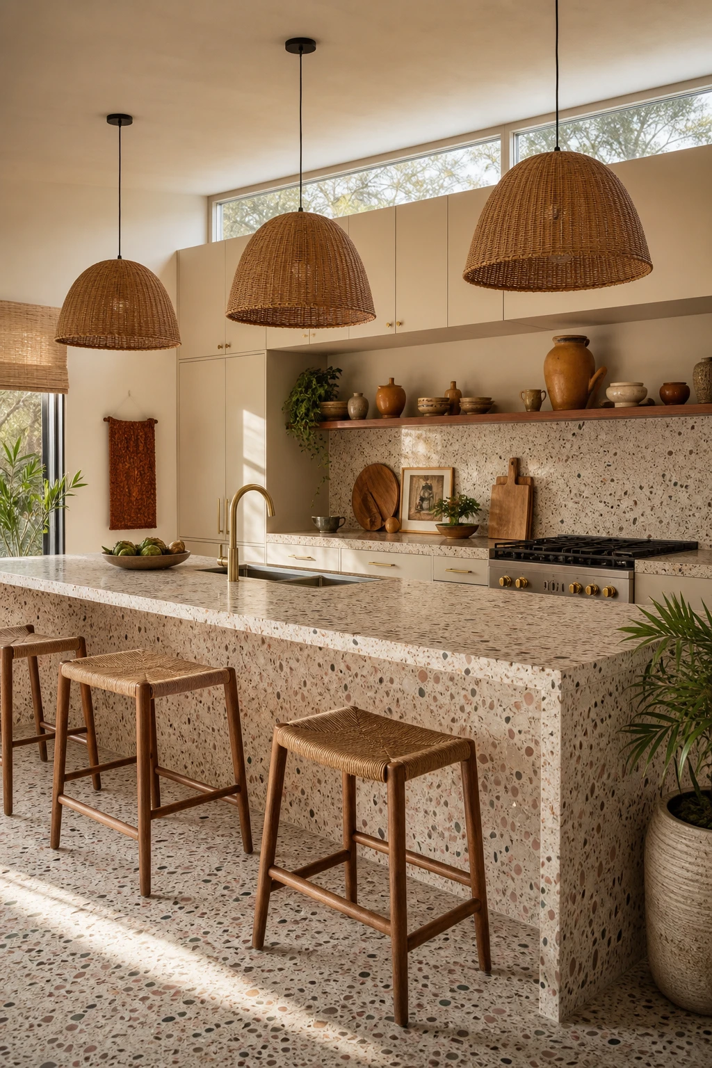
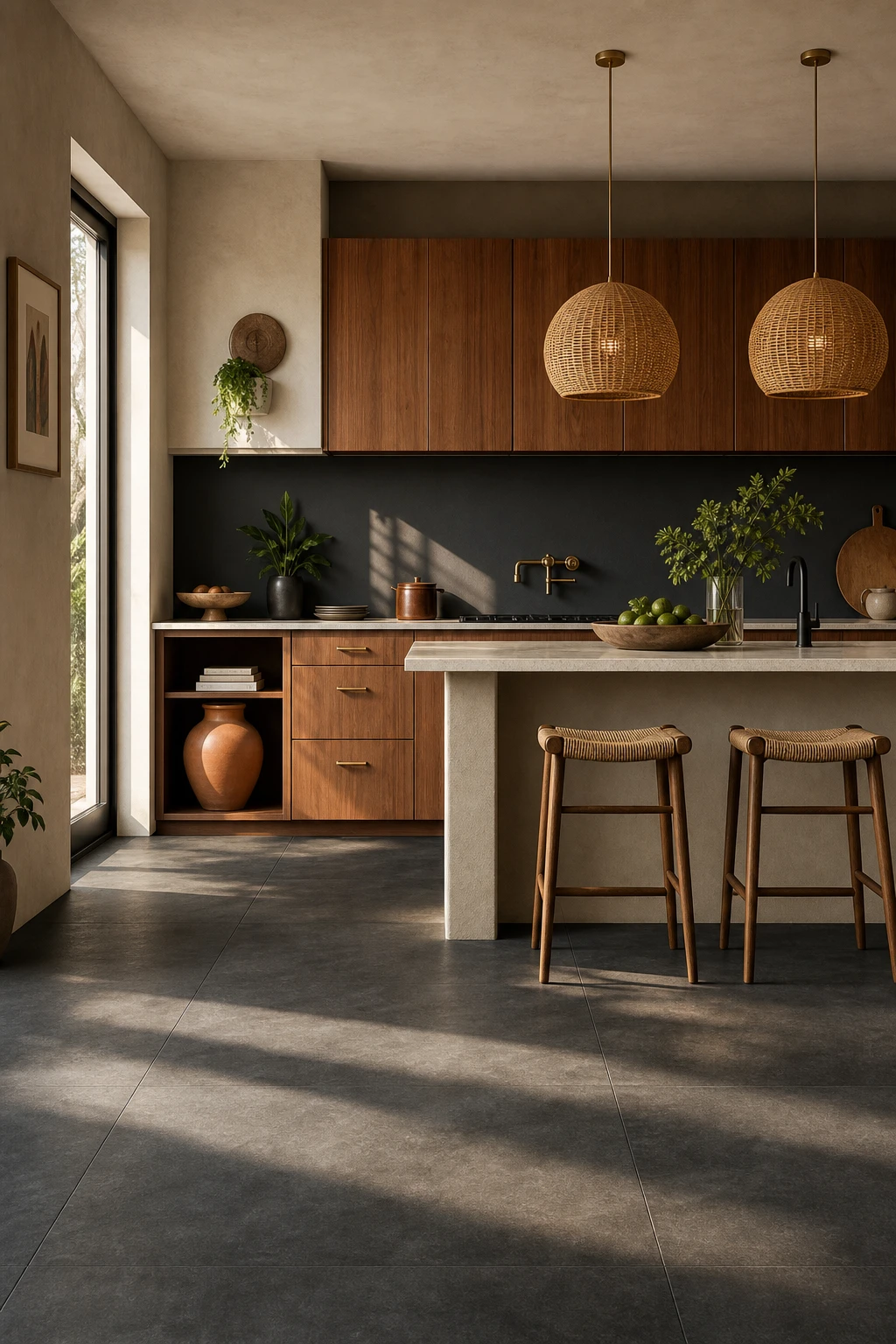
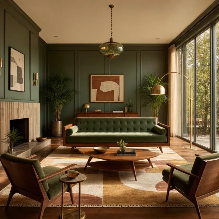
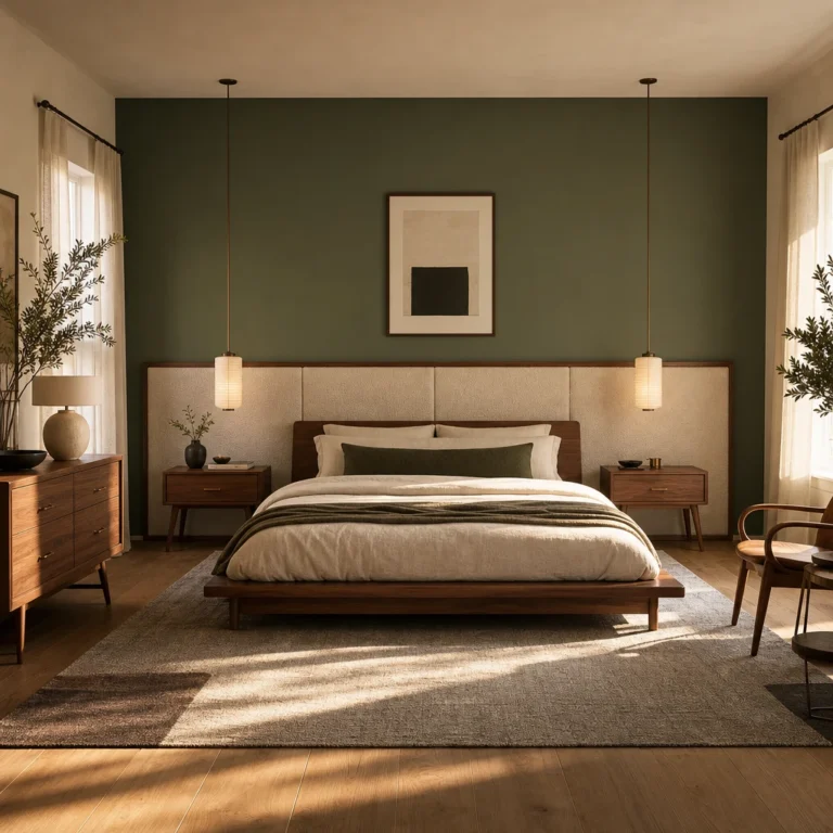
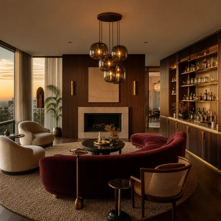
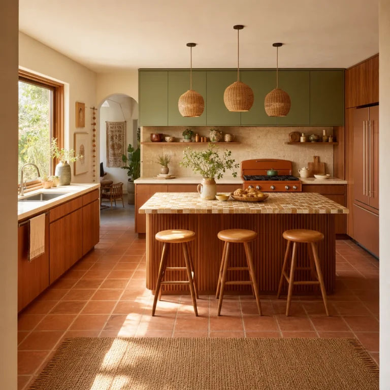
I’ve always thought the Boho Midcentury Modern Kitchen is one of the most joyful combinations in design, warm and a little wild but still beautifully grounded. What I love is how the retro shapes, earthy tiles, and free spirited layering all speak the same language once you find the right thread to run through them. In this piece I walk through the features that make it sing, from fluted cabinets and plywood surfaces to vintage appliances and bohemian backsplashes, and every single one is a look you can borrow.
How the Boho Midcentury Modern Kitchen Gets Its Warm, Collected Feeling
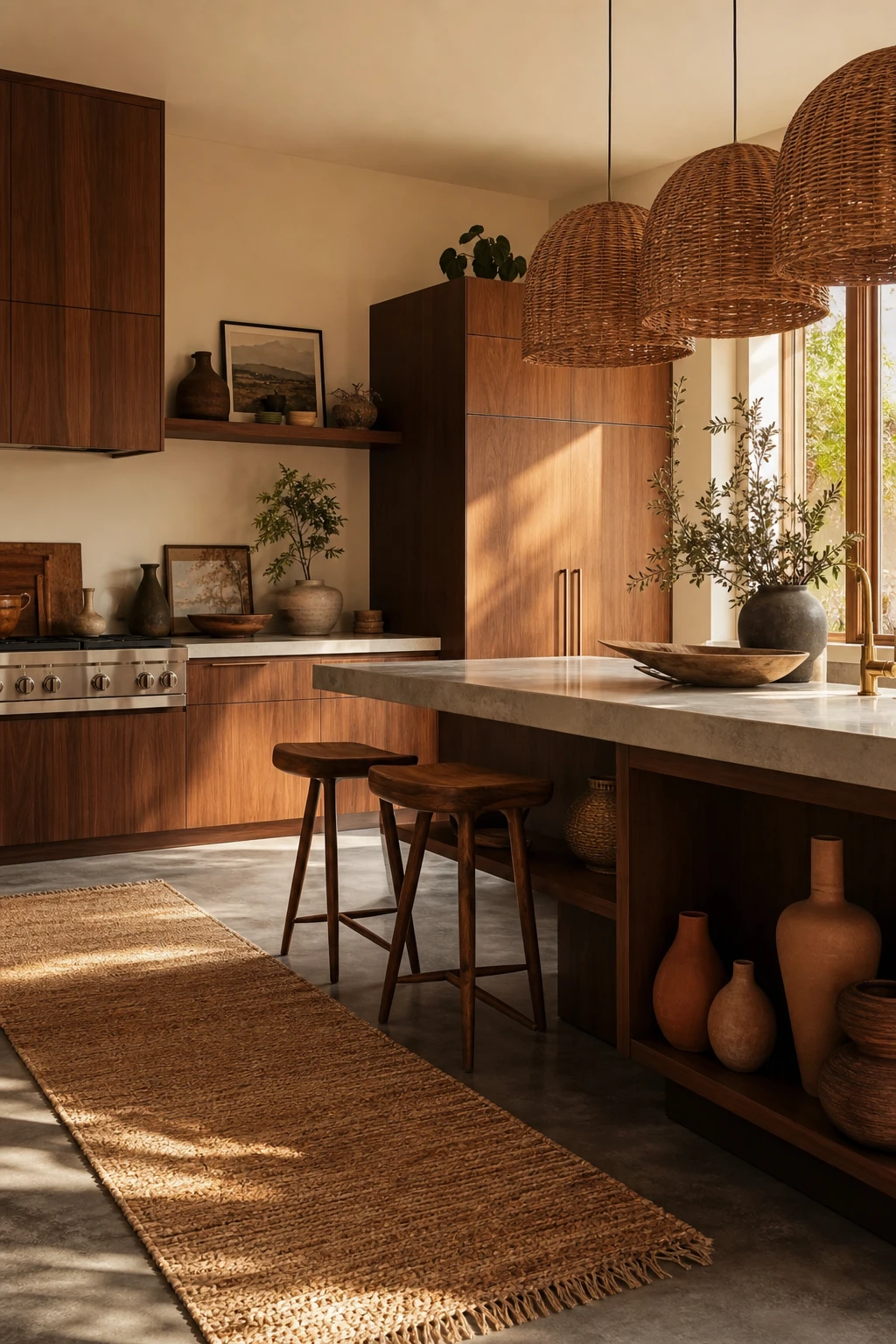
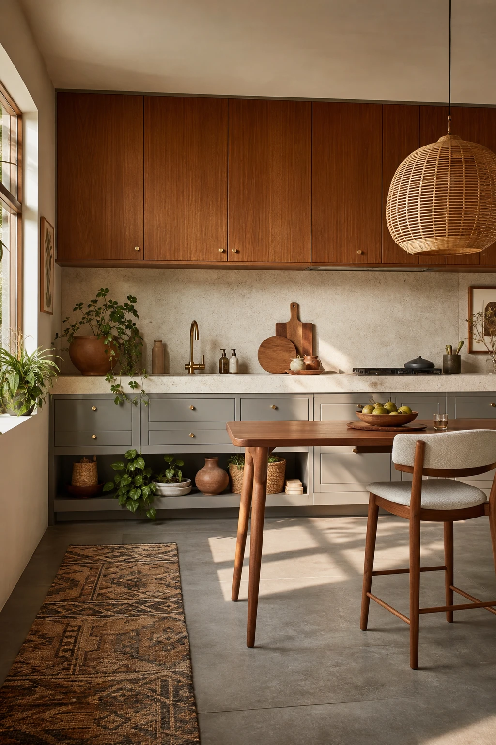
Blending Boho and Midcentury works so well because both styles are quietly obsessed with natural warmth. What I love is that walnut cabinetry, rattan lighting, and terracotta ceramics all carry the same honey toned heat, so the room reads as one collected whole rather than a style argument. You get structure from the clean flat fronts and softness from the woven and handmade pieces, and that push and pull is exactly what gives the kitchen its personality.
The Key Details
Flat front walnut cabinetry
Rattan pendant lights
Terracotta ceramic vase cluster
Woven jute floor runner
Concrete flooring
Pro TipRun walnut as your repeating material, touching the cabinetry, a shelf, and even a small utensil holder, so the eye has a thread to follow across both styles.
AvoidKeeping the Midcentury pieces on one side of the room and the Boho pieces on the other splits the space into two half finished rooms, and neither style gets a chance to shine.
The Clean Lines of a Scandinavian Midcentury Kitchen and Where Boho Warmth Slips In
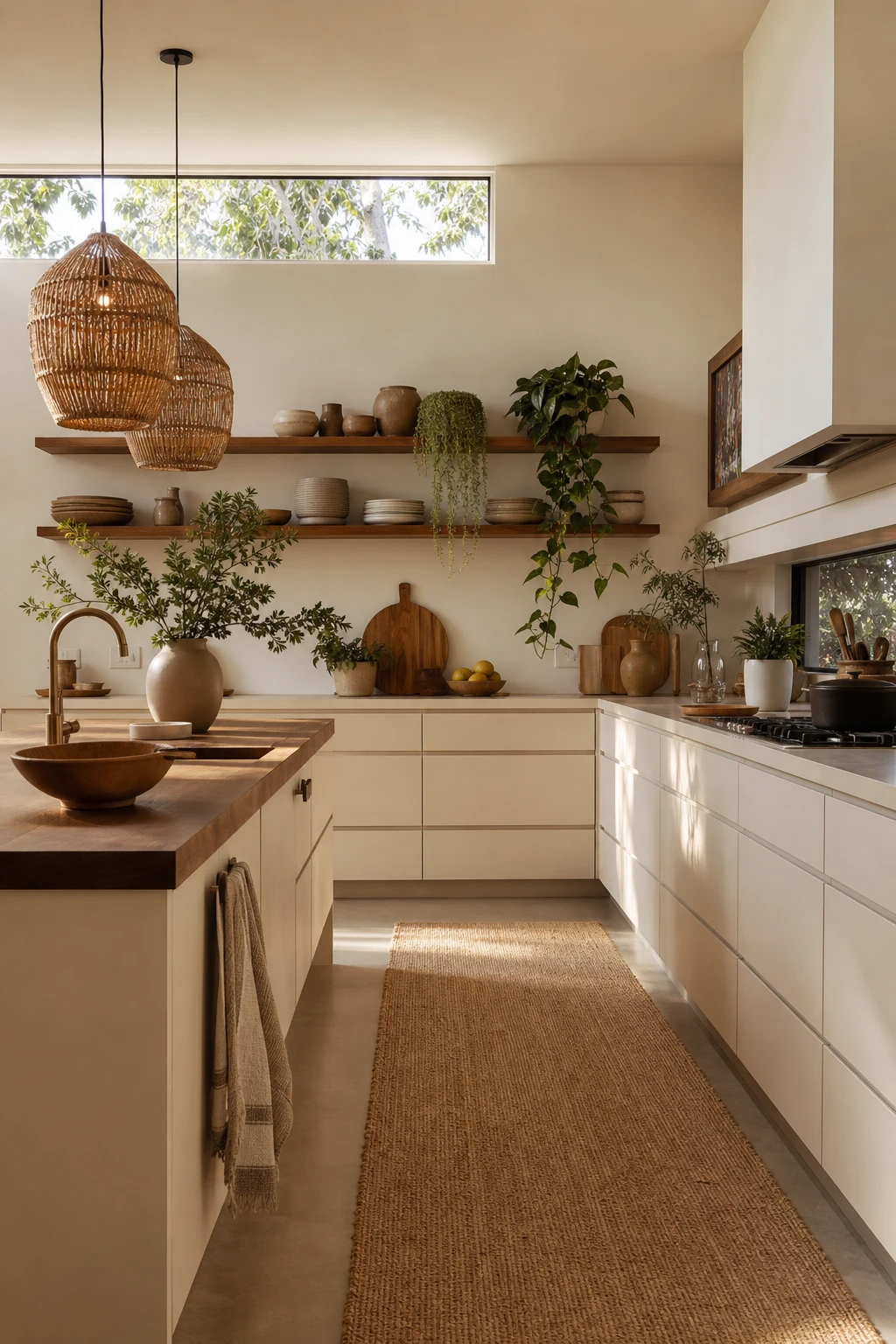
Scandinavian midcentury kitchens earn their beauty through restraint, and that clean geometry is exactly what gives organic textures somewhere to land. What I love about this pairing is the way a handthrown pot or a woven runner reads almost like punctuation against flat front cabinetry. You get the calm of minimal shapes without the chill that can creep in when a room forgets to breathe.
The Key Details
Rattan pendant lights
Flat front teak edged island
Open timber shelving
Handthrown ceramic vessels
Woven jute runner
Pro TipReach for a warm toned timber like teak or oiled oak rather than a cool ash, because it bridges the Nordic structure and the boho softness without you having to work nearly as hard anywhere else.
AvoidStripping the room back to only hard surfaces and bare geometry leaves it feeling more like a showroom than a home, and no amount of styling will fix that later.
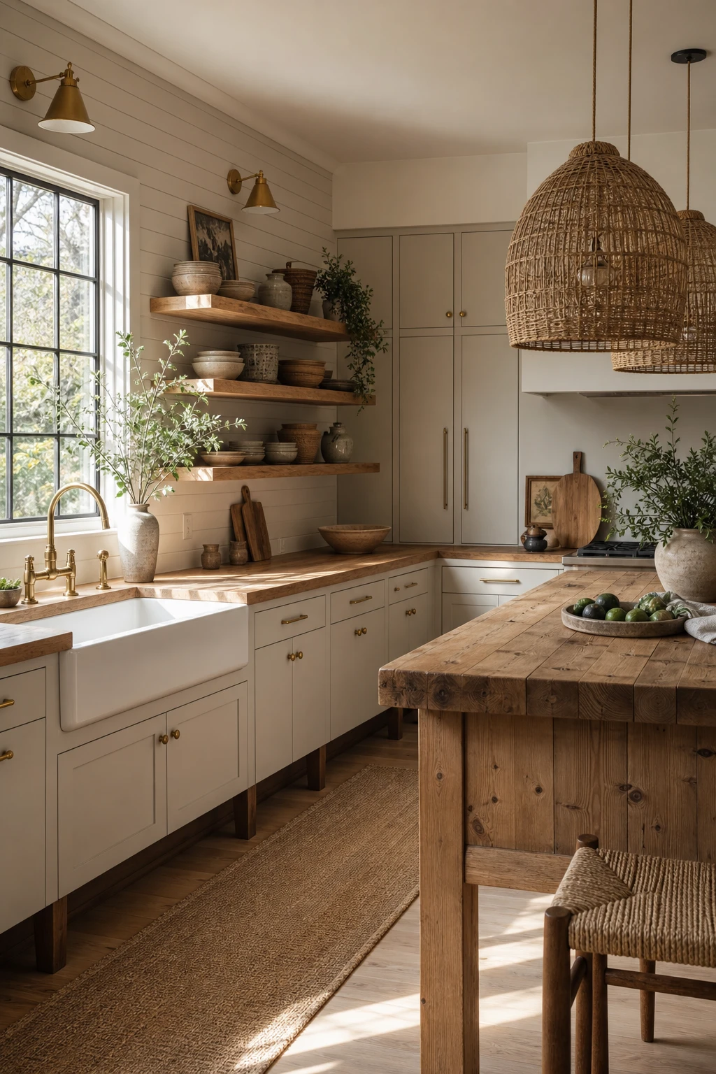
When Midcentury Meets Farmhouse the Result Is Cozier Than You Might Expect
Farmhouse and midcentury sit closer together than most people expect, and that surprise is exactly what wins me over about this fusion. The apron sink and butcher block bring warmth and a little roughness, while the clean cabinet lines keep everything honest and modern. Watch how the open oak shelving does the heavy lifting: it carries ceramic vessels that could belong to either era, so you never feel a hard stop between the two worlds. You get a kitchen that feels lived in and considered at the same time.
The Key Details
Apron front sink
Woven rattan pendant cluster
Open oak shelving with ceramic vessels
Butcher block island top
Shiplap timber accent wall
Pro TipTreat your open shelving as the style handshake: keep the left side spare and geometric for the midcentury read, and let the right side hold softer, handmade ceramics that nod to the farmhouse mood.
AvoidPiling on too many farmhouse signals at once, shiplap plus apron sink plus exposed beams plus galvanised hardware, gradually buries the midcentury structure and you end up with a look that reads as purely rustic rather than the considered mix you started with.
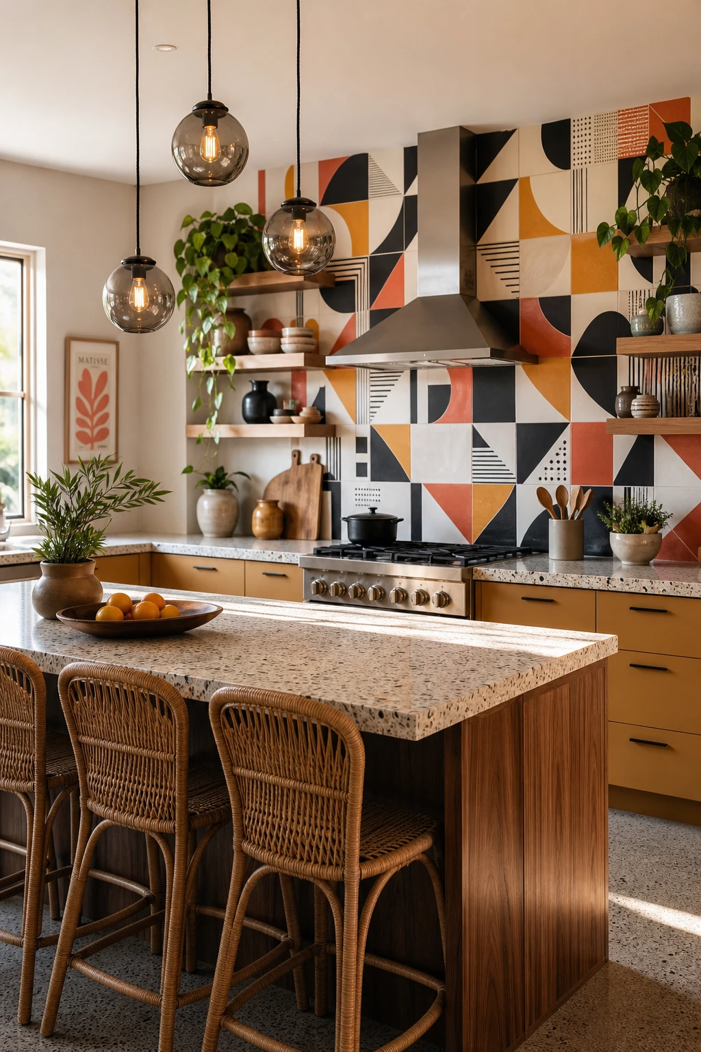
Memphis Style Details That Give a Boho Midcentury Kitchen Its Playful Edge
Memphis pattern has a reputation for being loud, but restraint is what makes it brilliant, and that restraint wins me over every time. One geometric tile backsplash behind the hob becomes the focal point the whole kitchen orbits, so everything else can stay calm and grounded. You get all the personality without the noise, and the eye always knows where to land.
The Key Details
Geometric Memphis tile backsplash
Smoked glass globe pendant cluster
Rattan counter stools
Honed terrazzo countertop
Open oak shelving with ceramic vessels
Pro TipPick your one Memphis surface first, then choose every other finish in the room to be its quietest possible neighbour.
AvoidPairing a geometric backsplash with patterned bar stools and a printed rug splits the room into three competing arguments, and none of them wins.
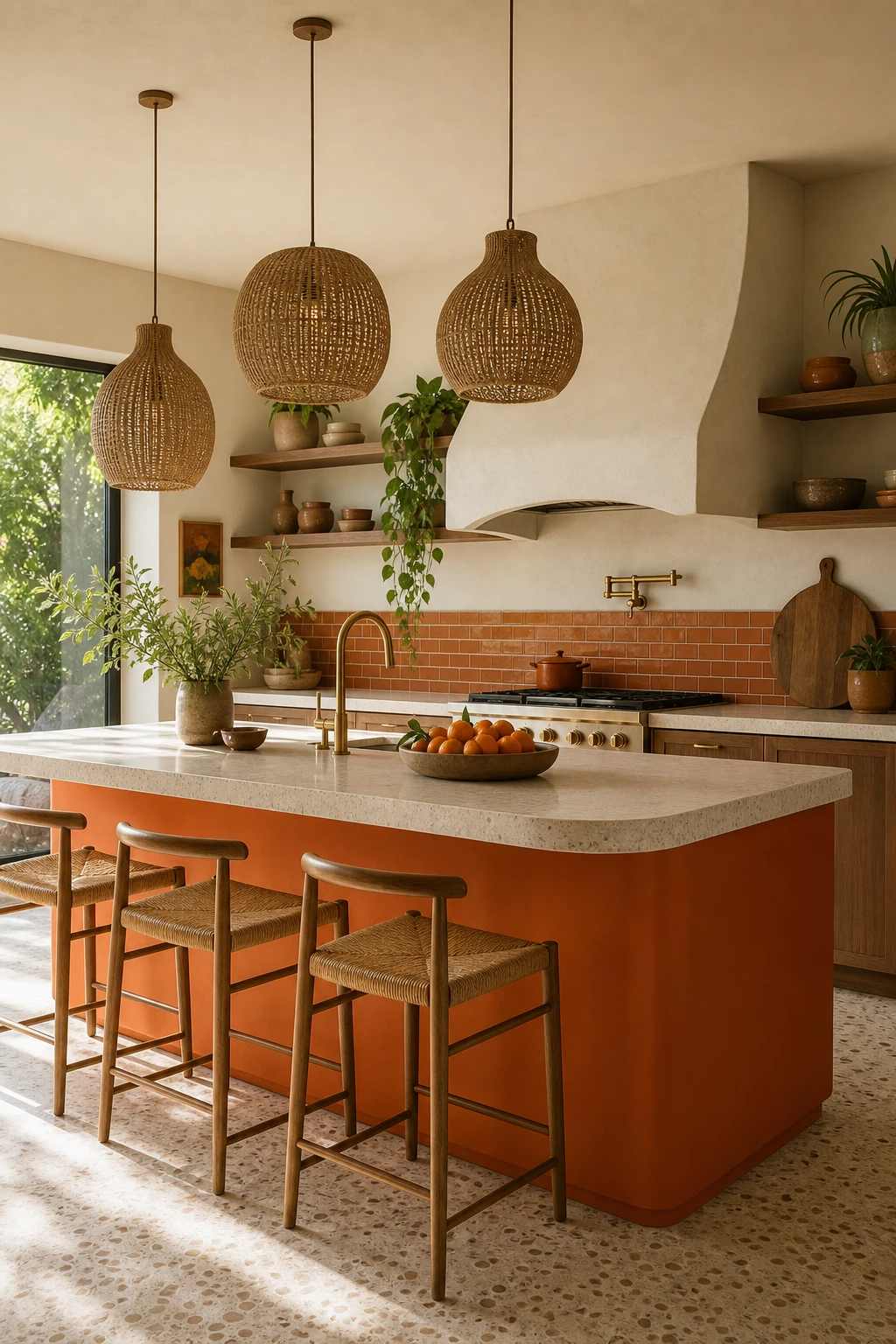
A Retro Orange Kitchen That Feels Sunny Rather Than Overwhelming
Retro orange is one of those colours that can light a kitchen up beautifully or tip straight into garish, and the difference is usually about dose. What I love here is how the colour lands on the island base only, so your eye gets a warm, sunny hit without the walls closing in. The walnut shelving and terrazzo floor pull the warmth into natural territory, softening the orange into something that feels genuinely inviting rather than loud.
The Key Details
Painted island base
Open walnut shelving
Woven rattan pendants
Terrazzo floor tiles
Glazed subway tile backsplash
Pro TipPaint the island in a matte finish rather than satin, because flat paint drinks the light and makes vivid orange feel grounded and earthy instead of plastic.
AvoidPairing orange cabinetry against a pure white surround sharpens the contrast to a point where the colour reads as harsh and the kitchen loses all its warmth.
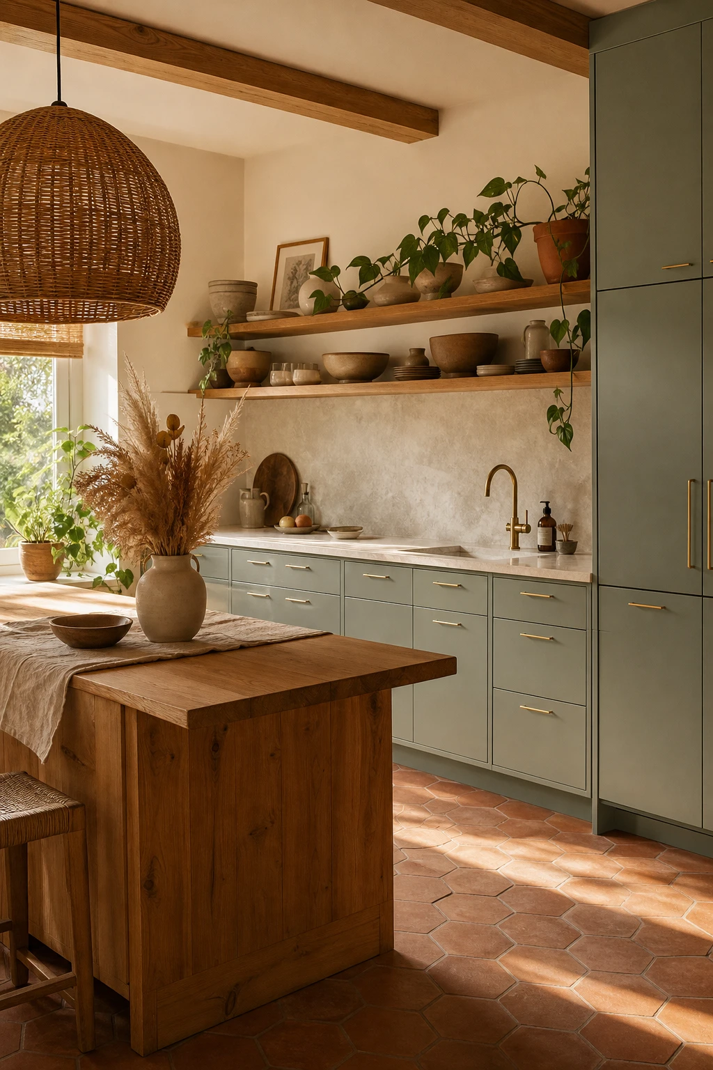
Sage Green Cabinets Are the Quietest Colour Choice With the Biggest Payoff
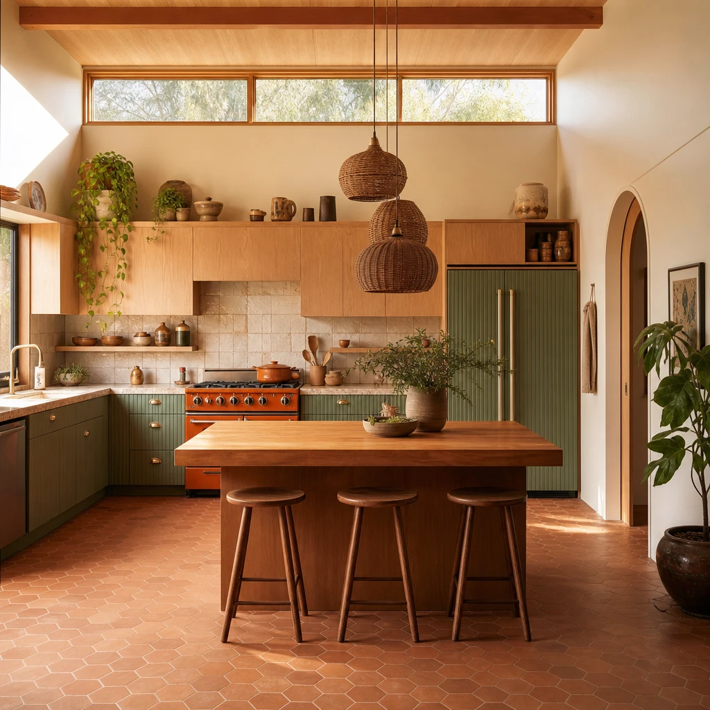
Sage green sits in that rare sweet spot where it feels collected and calm without going cold, and that balance is exactly what I reach for in a midcentury kitchen. The colour reads fresh next to natural timber and warm next to terracotta, so it holds the whole room together without fighting anything. What wins me over every time is how it echoes the earthy botanical palette that boho layers bring, while staying crisp enough to honour clean midcentury lines. You get a colour that feels both rooted and quietly alive.
The Key Details
Flat front cabinet doors with tapered brass pulls
Woven rattan pendant light
Butcher block island surface
Terracotta hexagonal floor tiles
Open timber shelving with handthrown stoneware
Pro TipPair your sage cabinets with unlacquered brass pulls rather than satin brass, because the slightly darker, warmer tone of unlacquered metal is what locks in that authentic midcentury signature.
AvoidChoosing a sage that pulls strongly yellow or noticeably grey will shift the whole reading of the room, making it feel either murky or clinical rather than that fresh, vintage grounded tone you are after.
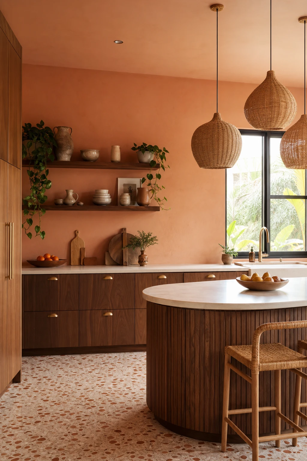
Peach Walls Bring a Boho Midcentury Kitchen to Life in the Most Unexpected Way
Peach is one of those shades I keep returning to when a client wants warmth but loses their nerve at terracotta. It sits in that sweet spot between blush and burnt orange, so you get heat without weight. Watch how it bounces against the walnut cabinetry and brass pulls, pulling the whole boho midcentury palette together without any one element shouting. The terrazzo floor and ceramic vessels find their warmth here too, held together by a wall colour that feels almost accidental in the best way.
The Key Details
Flat front walnut base cabinetry with brushed brass cup pulls
Staggered woven rattan pendant cluster
Curved kitchen island
Open shelving with hand thrown ceramic vessels
Terrazzo flooring in cream and rust
Pro TipPaint a large sheet of paper or card with your shortlisted peach and move it around the kitchen at different times of day, morning sun and evening bulb light, before you commit.
AvoidA peach with too much pink in its base will shift mauve under warm LED lighting, and the whole earthy midcentury feeling you are after will fall apart by dinner time.
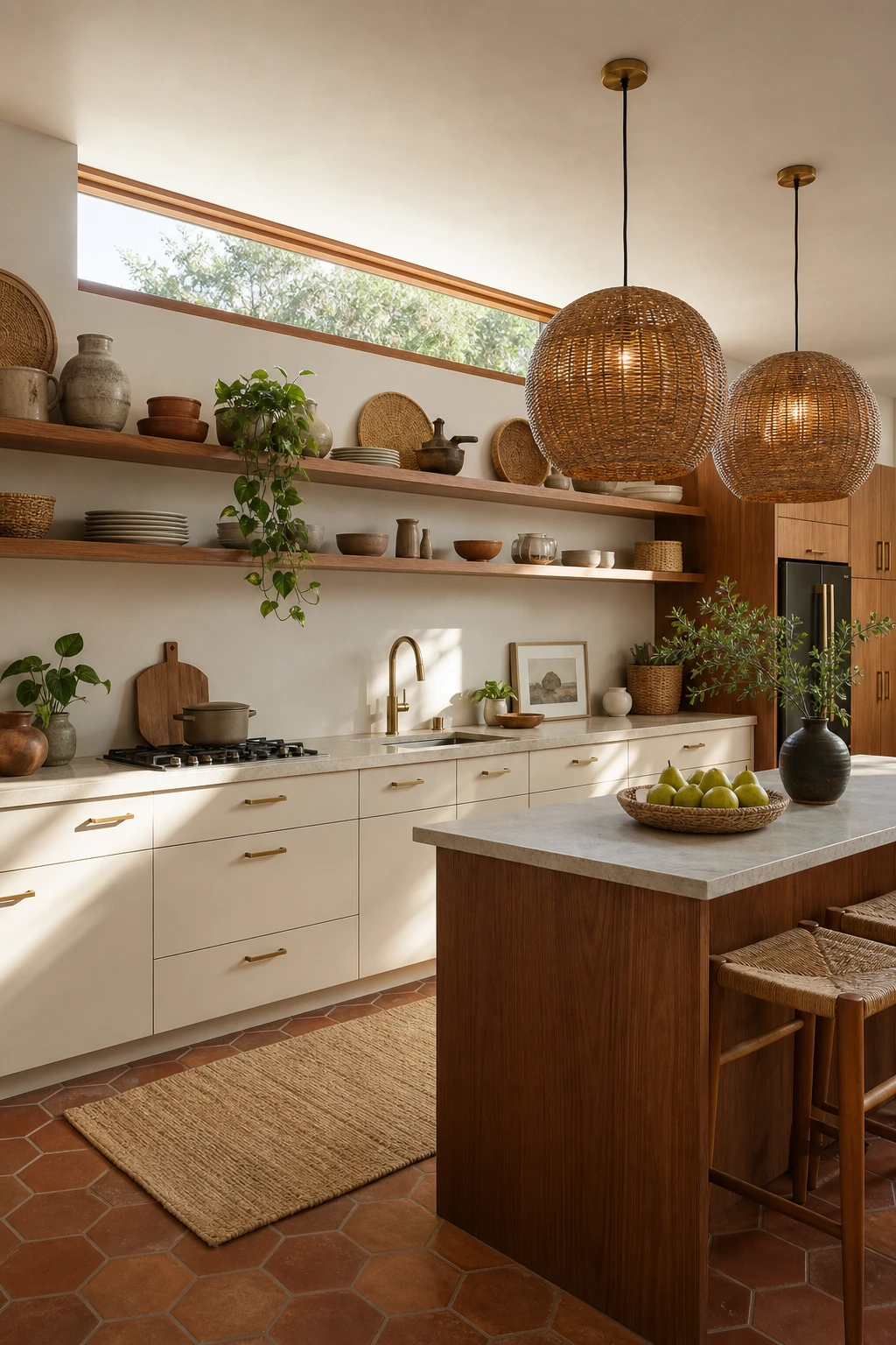
Why a White Midcentury Kitchen Is the Most Versatile Canvas for Boho Layering
White cabinets are the move I keep coming back to when a kitchen needs to carry a lot of personality without tipping into chaos. The base stays calm and the rattan pendants, terracotta tiles and aged brass get to do all the talking. What I love most is that warm white reads as soft rather than clinical, so the whole room feels settled rather than scrubbed. You get a kitchen that can absorb bold layers and still look effortless.
The Key Details
Rattan globe pendant lights
Open upper shelving with ceramics
Terracotta hexagonal floor tiles
Teak edged island
Aged brass cabinet hardware
Pro TipReach for an off white with a yellow or pink undertone, something like Farrow and Ball’s ‘All White’ or ‘Pointing’, because it stops the room reading cold under artificial kitchen lighting.
AvoidKeeping every surface, ceiling, splashback and worktop the same white drains the midcentury structure of all its shadow and contrast, leaving the room looking flat rather than curated.
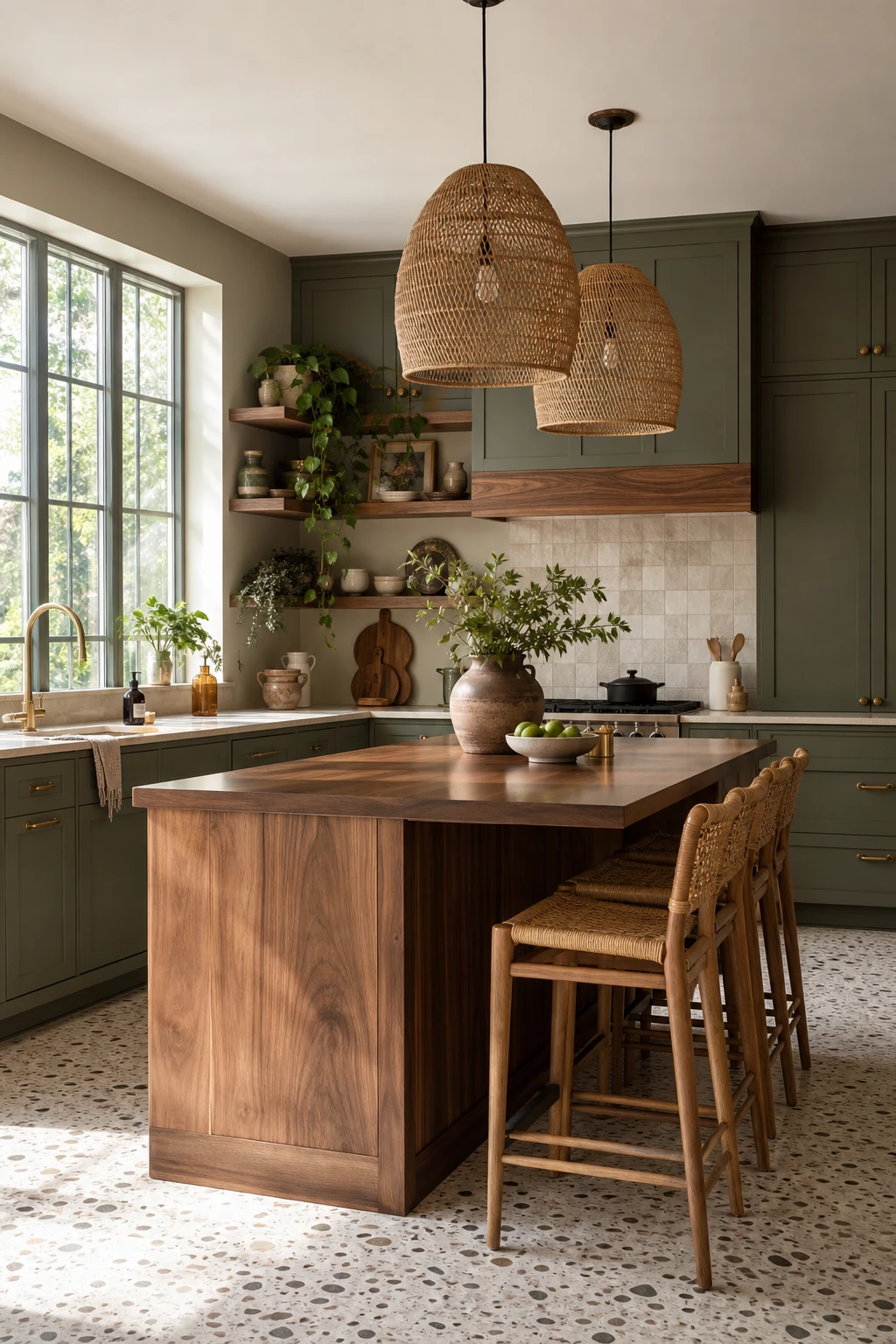
Green Cabinets Paired With a Wood Island Create the Richest Colour and Texture Story
Green cabinets and a wood island is a pairing that earns my loyalty every time, because each material makes the other look better. The green reads richer and more botanical against warm timber, and the wood feels grounded rather than rustic next to those painted faces. Colour and texture work together rather than competing here, and that layered quality is exactly what gives a kitchen genuine visual depth. Put a timber sample next to your painted door and you will see it immediately.
The Key Details
Walnut wood island
Rattan pendant lights
Open shelving with ceramic vessels
Terrazzo floor
Brushed brass cabinet hardware
Pro TipHold a timber sample against your cabinet door in natural light and check that the warm or cool undertone in the wood echoes the undertone in your green, because that quiet match is what makes the whole kitchen feel intentional.
AvoidPairing a cool toned sage green with an orange heavy timber pulls the two finishes in opposite directions, leaving both looking muddy rather than rich.
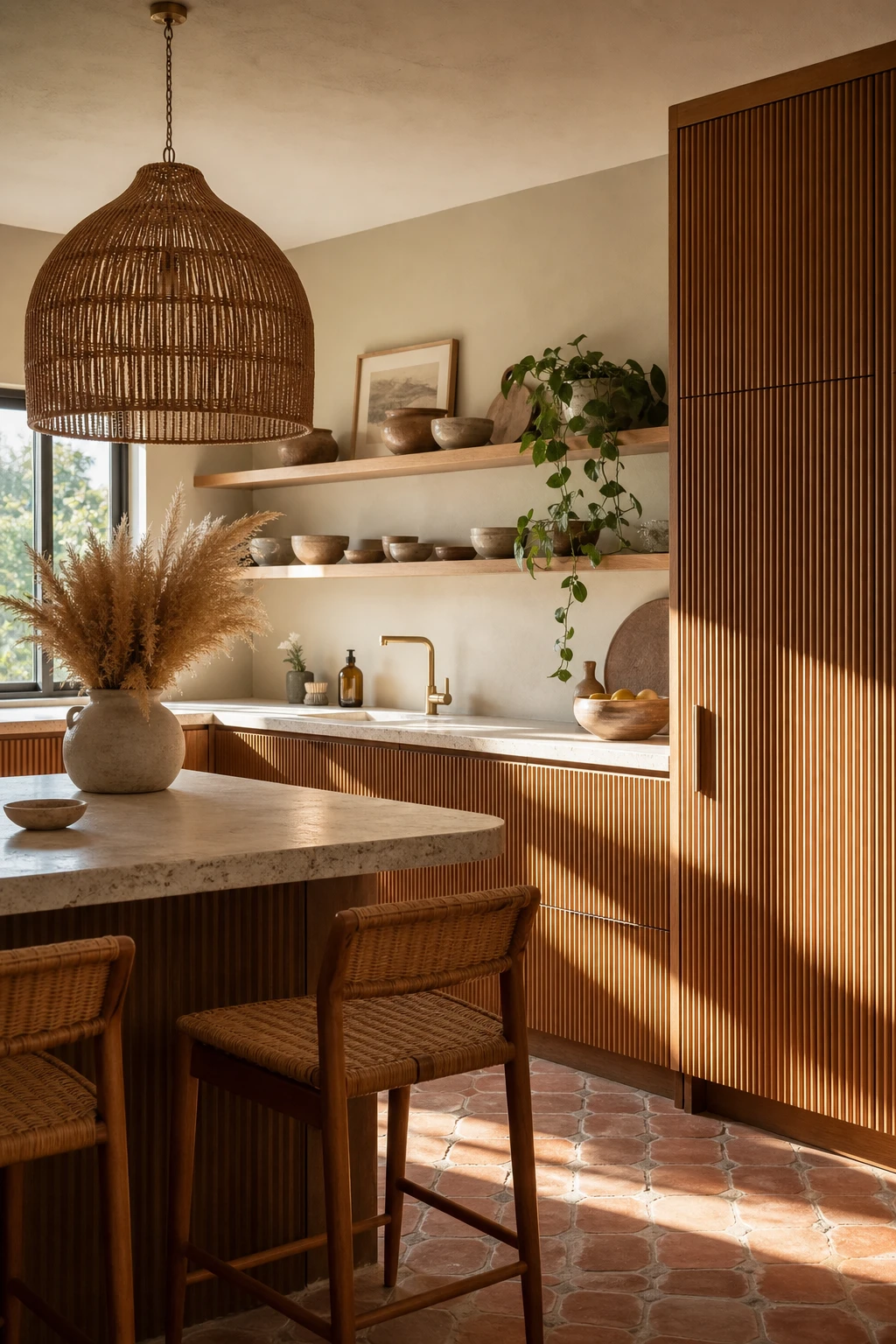
Fluted Wood Cabinets Are the One Detail Every Great Boho Midcentury Kitchen Shares
Fluted cabinet fronts are the detail that separates a kitchen that feels crafted from one that just feels finished. Those shallow vertical grooves catch the light as you move past, creating a quiet rhythm that wins me over every single time. You get all the warmth of natural wood grain plus an extra layer of handmade texture, and together they do exactly what boho midcentury needs: they make flat surfaces feel like they were made by a person, not pressed out of a mould.
The Key Details
Fluted quarter sawn oak cabinet fronts
Honed travertine island countertop
Curved rattan pendant light
Terracotta encaustic floor tiles
Open upper shelving with hand thrown stoneware
Pro TipKeep the fluting on your lower cabinets only and let your upper shelving stay open and plain, so the grooved fronts become a deliberate feature rather than wallpaper.
AvoidRunning fluted panels across the island as well as the perimeter cabinets spreads the detail too thin and the whole kitchen ends up feeling busy rather than considered.
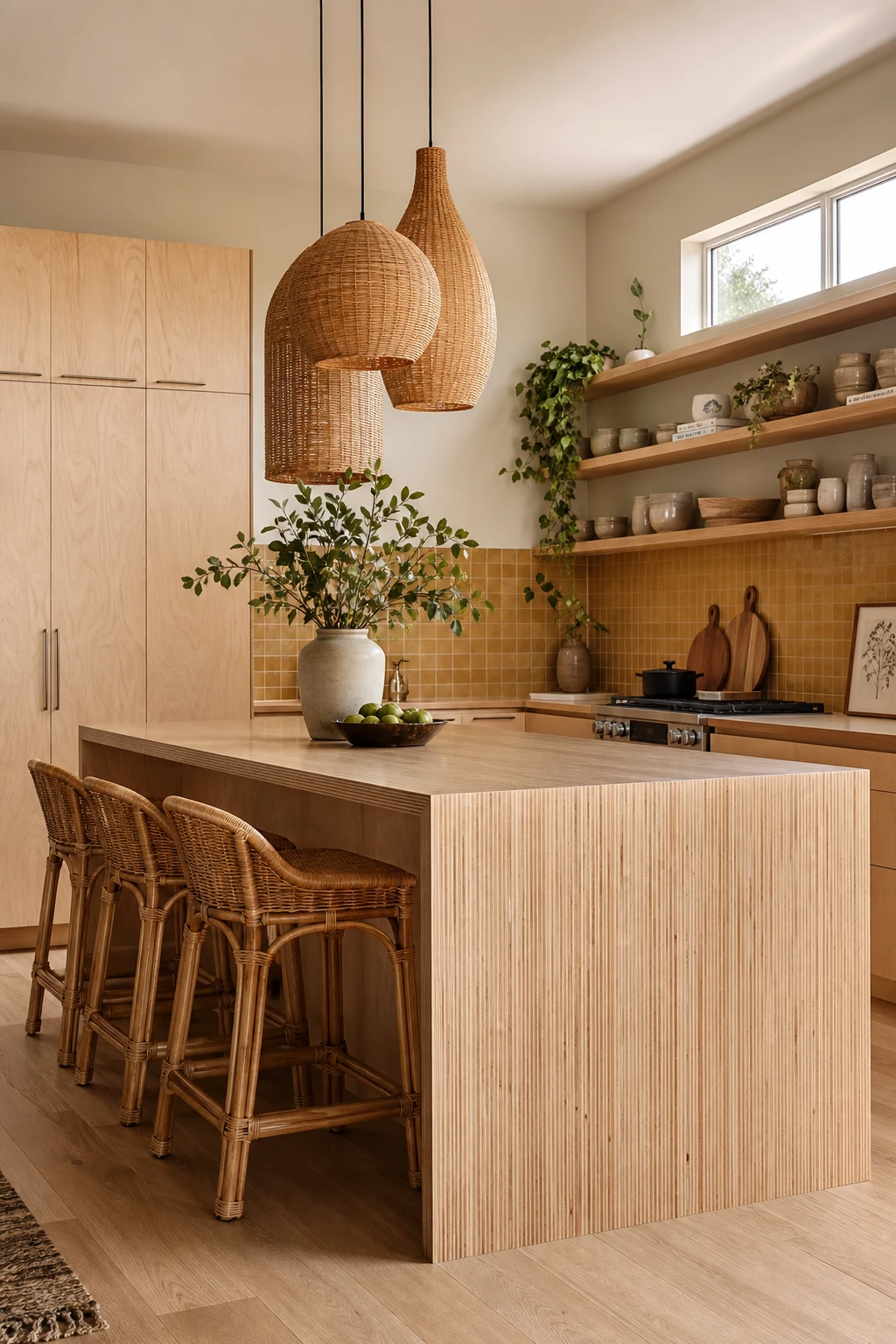
Plywood in the Kitchen Is Humble on Paper but Beautiful in the Room
Plywood is one of those materials I keep returning to, not despite its modesty but because of it. Treated well, the layered grain catches the light in a way that feels almost painterly, and you get a warmth that no laminate can fake. It reads as intentional rather than budget conscious, and that comes entirely from how carefully you finish and detail it. Run your hands across a well oiled sheet and you will understand immediately why it belongs in a boho midcentury kitchen.
The Key Details
Baltic birch plywood cabinet fronts and waterfall island edge
Open plywood floating shelves with ceramic vessel styling
Woven rattan pendant cluster
Zellige tile backsplash in muted ochre
Oiled oak hardwood flooring
Pro TipRub a matte wood oil into the surface in thin coats, letting each one cure fully, and the grain deepens to a honey tone that looks considered and rich without any plastic sheen.
AvoidLeaving plywood edges raw and unsealed means moisture creeps in over time, the layers start to lift, and the whole surface begins to look neglected within a year.
Painted Cabinets With Wood Doors Give You Two Beautiful Kitchens in One
Painted lowers with wood upper doors is one of my favourite moves in a kitchen because you get two distinct surfaces doing completely different jobs. The colour at base level grounds the room while the warm wood grain floats at eye level, keeping things open rather than heavy. Watch how your eye travels up naturally and lands on the grain, then rests on the painted colour below. That rhythm is what makes a kitchen feel considered without adding a single extra piece of furniture.
The Key Details
Teak veneer upper cabinet doors
Honed travertine countertop slab
Rattan sculptural pendant light
Tapered leg midcentury breakfast bar
Aged brass cabinet hardware
Pro TipPaint your base cabinets in a deep, flat tone and leave the upper doors in a single wood species so the eye has one warm anchor to settle on.
AvoidUsing two or three different wood tones across the doors, the frame, and the floor pulls the room apart and leaves every surface fighting for attention rather than working together.
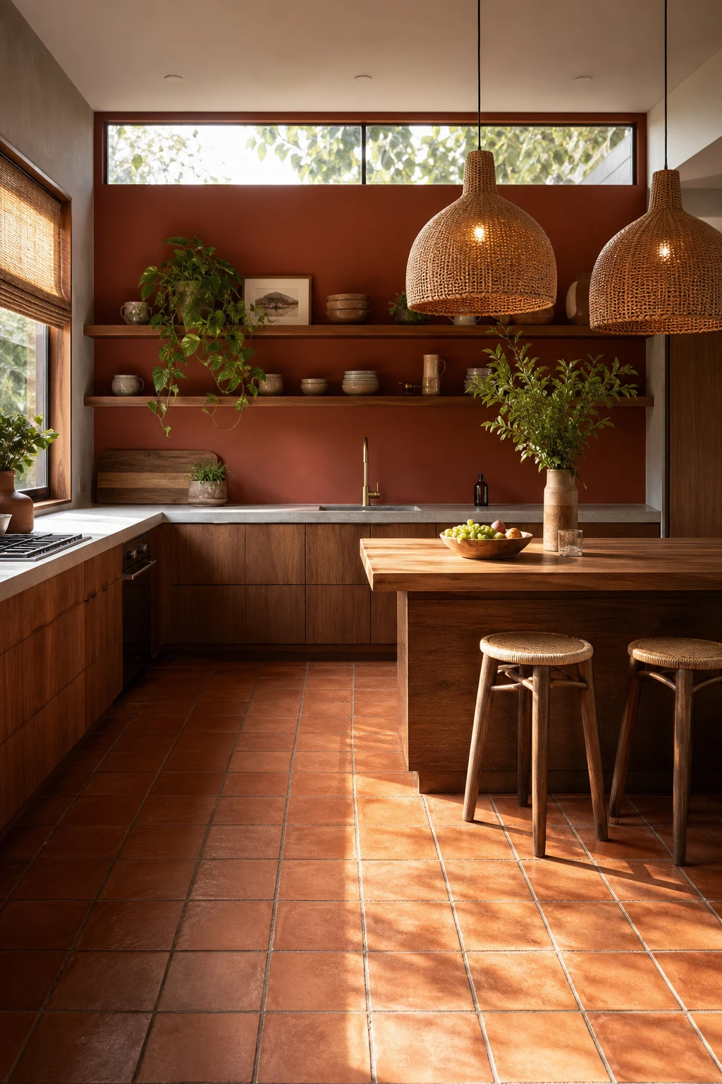
Terracotta Tiles Are the Fastest Way to Ground a Midcentury Kitchen in Earthy Warmth
Terracotta does something almost no other floor material can: it reads earthy and handmade while still sitting completely at ease beneath clean midcentury lines. What I love is the warmth it lends without any effort, that burnt orange tone pulling the rattan, the walnut, and the linen all into the same quiet conversation. You get a floor that feels like it has always been there, grounding the whole room so nothing floats or feels unresolved.
The Key Details
Handmade terracotta floor tiles
Rattan woven pendant lights
Open walnut veneer shelving
Butcher block island
Raw linen Roman shade
Pro TipLay your terracotta in a simple running brick pattern and you keep the floor honest to midcentury geometry without fighting the handmade quality of the tile.
AvoidApplying too many coats of sealant gives the tiles a plasticky sheen that kills the matte, slightly rough surface that makes terracotta so beautiful in the first place.
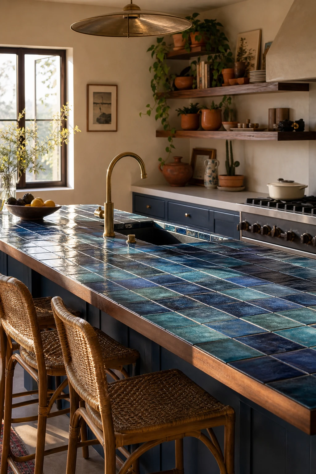
A Blue Tile Countertop Is Bolder Than Marble and More Interesting Than Quartz
A blue tile worksurface does something marble and quartz simply cannot: it gives the kitchen pattern and personality without needing a backsplash to carry the room. What I love is how the hand glazed finish catches the afternoon light from that west facing window, so every tile reads slightly differently and the surface feels alive rather than flat. You get all the warmth of natural colour without the maintenance anxiety that comes with porous stone.
The Key Details
Hand glazed ceramic tile countertop
Oiled walnut open shelving
Rattan counter stools
Brass goose neck faucet
West facing casement window
Pro TipChoose a grout colour one shade lighter than the tile itself so the grid stays legible without competing with the glaze.
AvoidA high gloss blue tile looks beautiful in the showroom but will betray every water mark, scratch, and fingerprint by the end of the first week.
The Bohemian Backsplash Trick That Makes a Plain Kitchen Feel Like a World Away
A patterned backsplash is the piece of art your kitchen never knew it needed. Keep the walls clear, the cabinets calm, and suddenly that band of encaustic geometry between counter and cupboard does all the talking. The moment I started treating it that way, everything clicked, because your eye lands there and rests rather than darting around a room full of competing ideas.
The Key Details
Encaustic geometric tile backsplash
Flat front walnut veneer cabinetry
Open timber shelving with ceramic vessels
Rattan pendant lamp
Honed concrete countertop
Pro TipBorder the patterned tiles with a single row of plain tiles in a pulled tone so the design reads as a framed panel rather than wallpaper.
AvoidRunning the pattern all the way to the ceiling turns a beautiful feature into visual noise, and the room loses the calm that made the idea worth doing in the first place.
A Geometric Tile Backsplash Holds Its Own Against Any Amount of Boho Clutter
A tight geometric tile grid is one of my favourite anchors in a boho heavy kitchen because it gives the eye somewhere to rest. Clean, repeating lines hold firm no matter how many woven pendants and stacked ceramics pile up around them. The order is already built into the pattern, and what wins me over is the way a two colour scheme quietly mirrors the cabinet and countertop tones so the backsplash feels chosen rather than dropped in. You can layer as freely as you like around it.
The Key Details
Geometric square tile backsplash with charcoal grout grid
Rattan counter stools
Open walnut floating shelves with layered ceramics
Woven pendant lights over island
Honed travertine countertop
Pro TipPull one tile colour from your cabinet tone and the other from your countertop so the backsplash bridges both surfaces without adding a third competing hue.
AvoidChoosing a tile with three or more colours means every new accessory you bring in has to compete with the backsplash rather than settle beside it, and the whole room starts to feel restless.
Terrazzo Kitchen Tiles Carry the Retro Confetti Pattern That the Best Rooms Keep Coming Back To
Terrazzo is the neutral that nobody ever talks about as a neutral, and that oversight wins me over every time. The confetti chips pull in so many tones at once that the surface quietly agrees with almost any cabinet colour you set against it. What I love is how the speckle distributes visual weight evenly, so you get a grounded, finished floor or worktop without committing to one dominant hue that might date.
The Key Details
Honed terrazzo countertop with multi tone confetti chips
Matching terrazzo floor tiles
Woven rattan dome pendant lights
Flat front upper cabinetry
Open oiled teak shelving with ceramic vessels
Pro TipChoose a large format terrazzo tile for a small kitchen floor, as fewer grout lines let the pattern read as one calm surface rather than a patchwork.
AvoidLaying terrazzo on the floor, the worktop, and the splashback at the same time turns the speckle into visual noise that competes with everything else in the room.
Dark Grey Floor Tiles Give a Boho Midcentury Kitchen a Surprisingly Grounded Base
A dark grey floor under a warm, layered kitchen is one of my favourite moves because it gives every colour above it something solid to rest on. You get honey walnut, rattan, terracotta and brass all living together, and instead of competing they settle. What wins me over here is how the floor pulls the eye down and holds it, so the room feels grounded rather than restless.
The Key Details
Large format honed slate effect porcelain floor tiles
Flat front honey walnut veneer cabinets
Woven rattan globe pendant lights
Brushed brass cabinet hardware
Open lower shelving with terracotta ceramic vessels
Pro TipChoose a matte or honed finish over polished so the floor absorbs light quietly and lets the warmer tones above it do the talking.
AvoidCarrying a very dark floor straight into dark lower cabinets collapses the whole base of the room into one heavy shadow and loses the contrast that makes the floor worth having.
Parquet Flooring in the Kitchen Brings a Pattern That Works Harder Than Any Rug
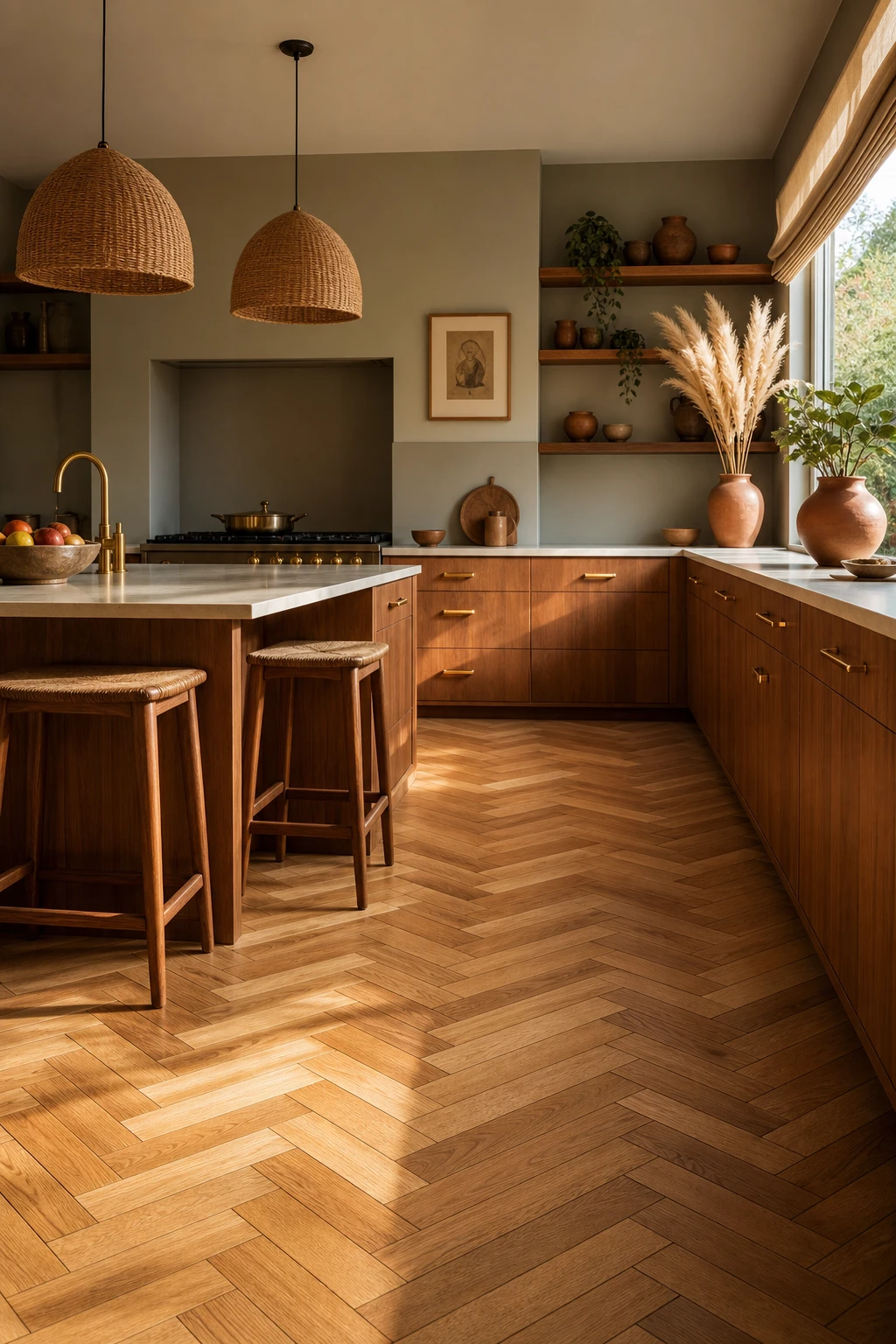
Parquet is the one floor pattern that earns its keep before a single chair goes in, and herringbone in particular pulls the eye across the room in a way that feels both lively and grounded. What I love about a medium oak tone is that you get all that geometric interest without the space closing in around you. You will notice how the interlocking blocks make the kitchen feel purposeful underfoot, almost like a design decision layered beneath every other one.
The Key Details
Herringbone oak parquet floor tiles
Flat front walnut veneer cabinetry
Woven rattan dome pendants
Open shelving with terracotta pots and dried pampas grass
Honed limestone countertop with brushed brass hardware
Pro TipChoose a herringbone lay in a warm medium oak so the chevron pattern reads clearly without pulling the room into shadow.
AvoidA high gloss parquet finish in a kitchen will show every scuff, splash, and footprint within days, turning a beautiful floor into a constant chore.
A Vintage Orange Gas Stove Is the Statement Piece That Does All the Heavy Lifting
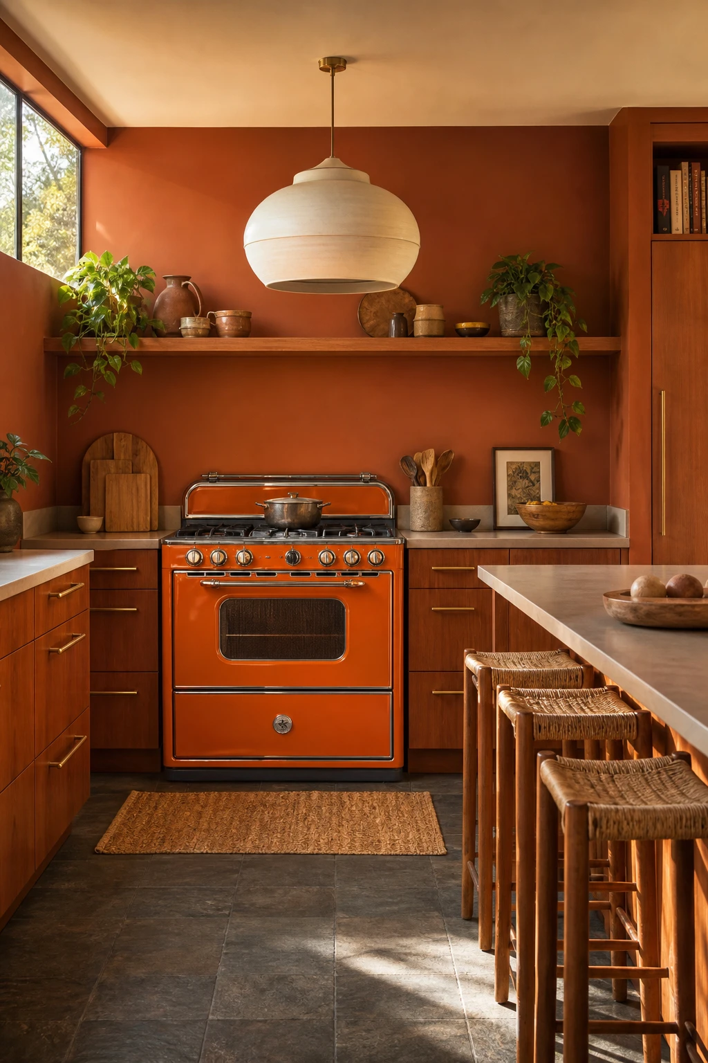
Dropping one orange vintage gas range into a kitchen is one of my favourite moves because it does all the colour work instantly. You get a single focal point so saturated and confident that every other surface around it can breathe in quiet cream and warm teak. What wins me over every time is how the stove stops being an appliance and starts reading as sculpture, the way a piece of art would on a gallery wall. Watch how the room feels complete with far less effort than layering colour across twelve decisions.
The Key Details
Teak flat front cabinetry with brass bar pulls
Woven rattan counter stools
Matte cream oversized ceramic pendant
Open shelf with terracotta vessels and trailing pothos
Honed slate floor tile
Pro TipKeep your cabinet fronts and walls within two shades of each other, both leaning pale and warm, so the stove pops forward without any competition.
AvoidBuying an original vintage unit that has never been converted or inspected often means hidden gas fittings that fail modern safety codes, and that is a serious hazard tucked behind a beautiful façade.
A 70s Style Fridge Slides Into a Boho Midcentury Kitchen Like It Was Always Meant to Be There
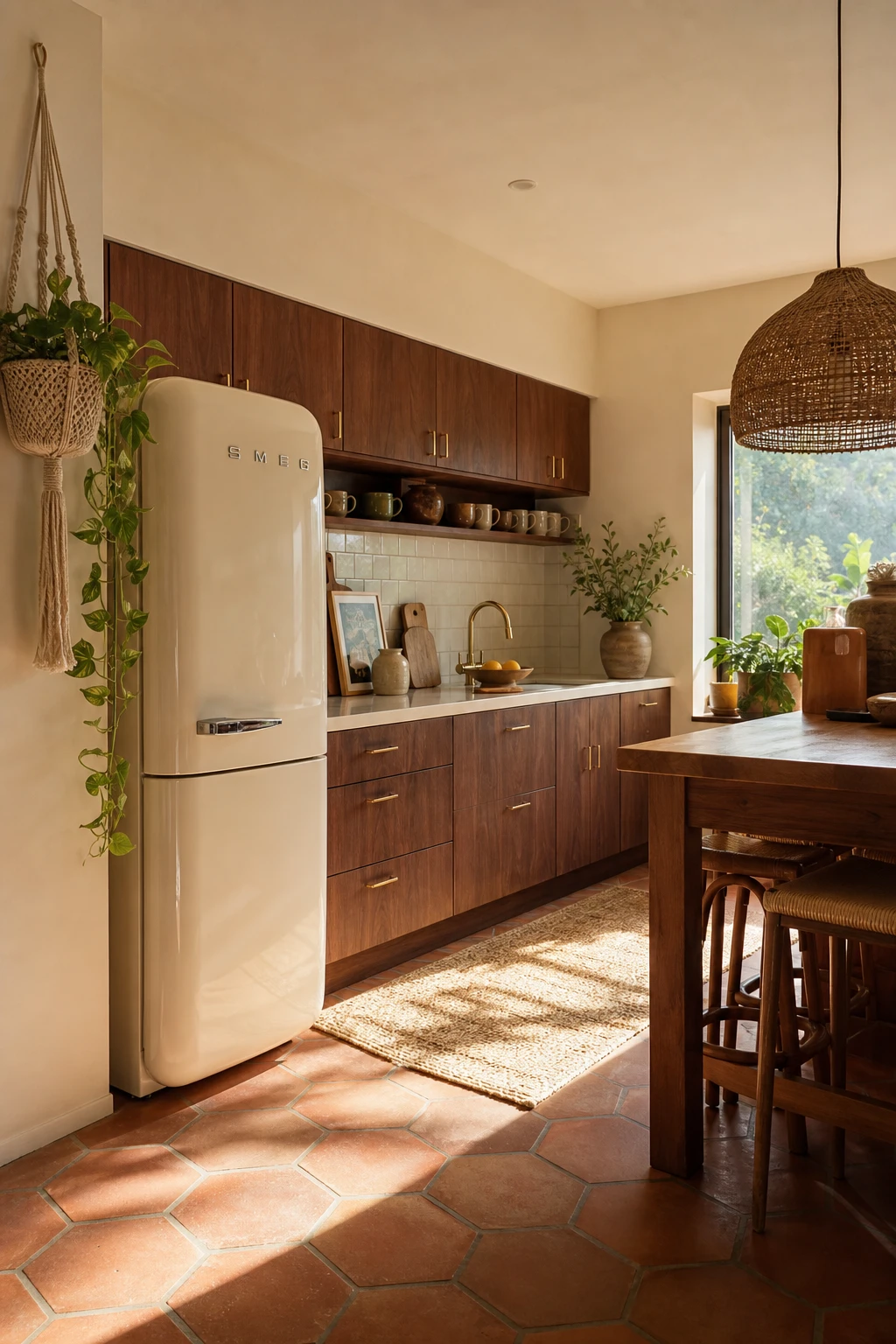
A retro fridge does something clever that no cabinet swap or new countertop can: it plants a timestamp in the room without you lifting a hammer. What I love about the rounded cream enamel silhouette is how it echoes the soft curves already living in midcentury furniture, so you get instant era coherence from a single purchase. Watch how it pulls the boho textures around it, the rattan, the terracotta, the trailing greenery, into one warm and deliberate composition rather than a happy accident.
The Key Details
Rounded retro fridge in cream enamel
Rattan pendant light over peninsula
Terracotta hexagonal floor tiles
Macrame plant holder with trailing pothos
Open shelf with earthy glazed ceramic mugs
Pro TipPosition the fridge where it sits at the end of a sightline, visible from the dining area or doorway, so it reads as a design statement the moment anyone enters the room.
AvoidPlacing a cream retro fridge directly beside warm toned cabinetry without any breathing space flattens both into one pale blur, and the fridge loses the gentle contrast it needs to read as a deliberate design choice rather than a leftover.
A Yellow Retro Fridge Is the Happiest Colour Investment Your Kitchen Can Make
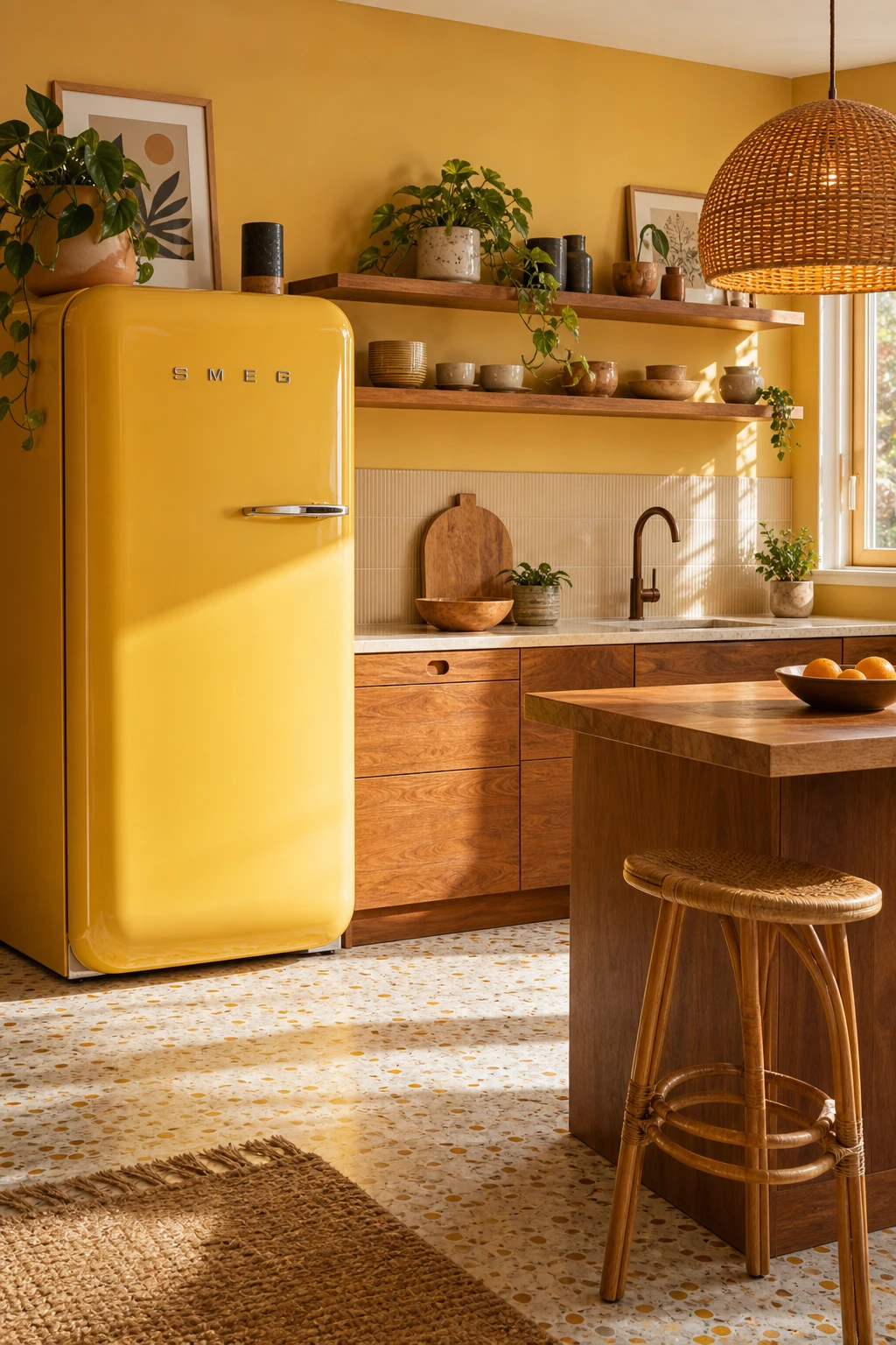
A single yellow fridge does something no paint colour can: it gives the room a pulse without committing every surface to one mood. The contrast is what I love, that glossy buttercup sitting against warm teak and cream terrazzo so your eye lands there first, then travels happily across everything else. You get energy and calm sharing the same room, which is exactly the balance boho midcentury kitchens do best, and it costs you nothing more than one good appliance choice.
The Key Details
Glossy retro rounded fridge in buttercup yellow
Open walnut shelving with ceramic vessels and trailing pothos
Rattan dome pendant lamp
Teak butcher block countertop
Cream and amber terrazzo tile floor
Pro TipPull one mustard or amber ceramic onto the open shelving and add a yellow handled utensil by the hob, so the fridge colour feels chosen rather than accidental.
AvoidPainting the walls yellow to match the fridge turns the appliance into wallpaper and loses the focal punch you paid for entirely.
Open Plan Kitchen Dining Layouts Let the Boho Midcentury Story Unfold Across One Big Space
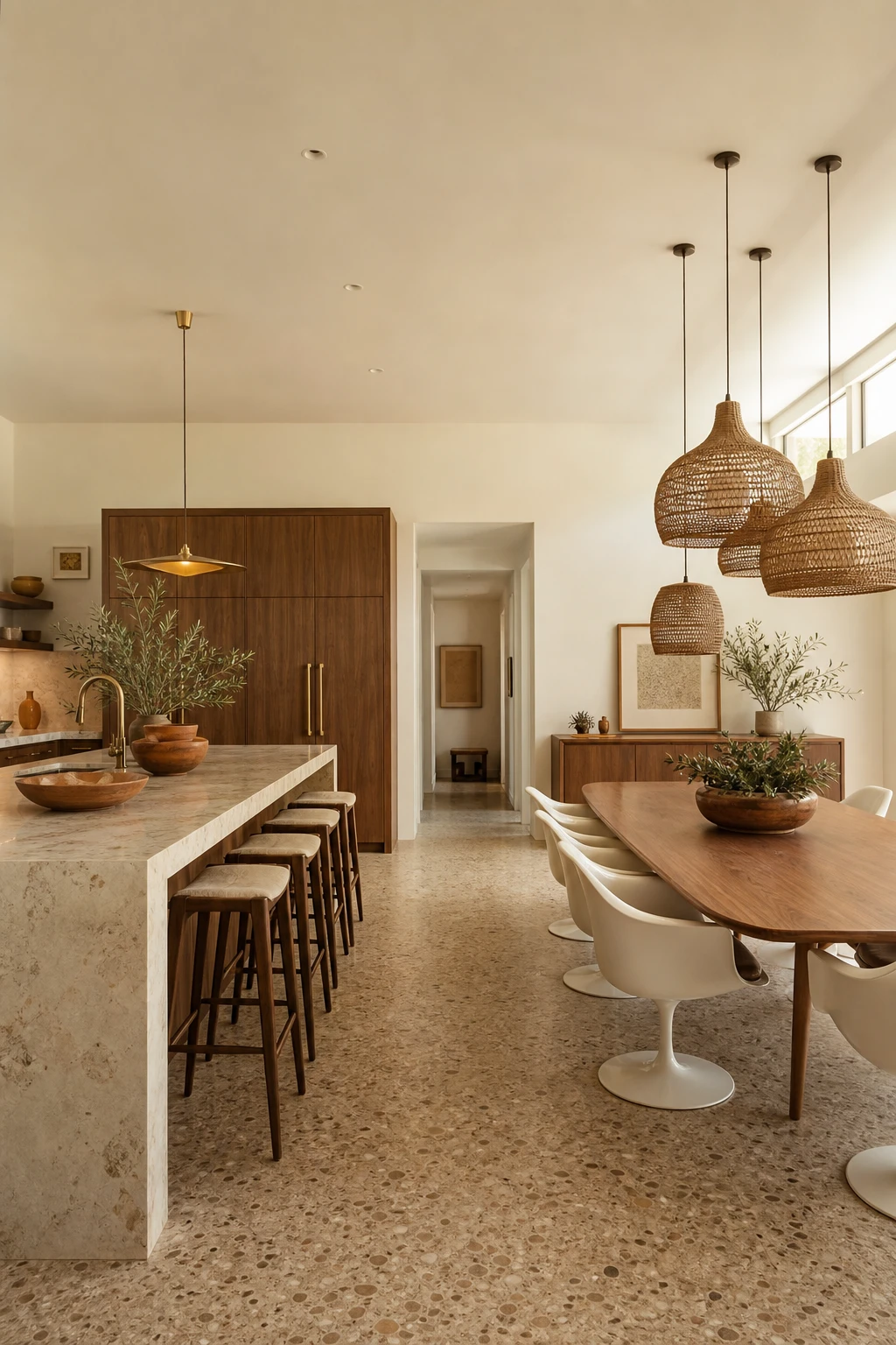
Stretching kitchen and dining across one open plan is one of my favourite moves in a Boho Midcentury scheme, because a single shared material thread, walnut grain, terrazzo underfoot, warm rattan overhead, pulls both zones into one calm story. You get breathing room rather than two rooms awkwardly staring at each other. Watch how the clerestory windows wash light across the whole floor plate and the credenza anchors the dining end without closing it off.
The Key Details
Waterfall edge walnut island
Woven rattan pendant cluster
Honed terrazzo flooring
Low walnut credenza
Clerestory windows
Pro TipLet the dining side carry your boho layering, think woven textiles, a pendant cluster, a low credenza loaded with objects, so the kitchen reads cleaner and the two zones feel balanced rather than competing.
AvoidTreating the kitchen and dining ends as two unrelated rooms, with different flooring, different wood tones, and no shared element, fragments the whole space and makes even a generous open plan feel oddly small.
The Island Is Where Boho Detail and Midcentury Structure Meet Most Beautifully
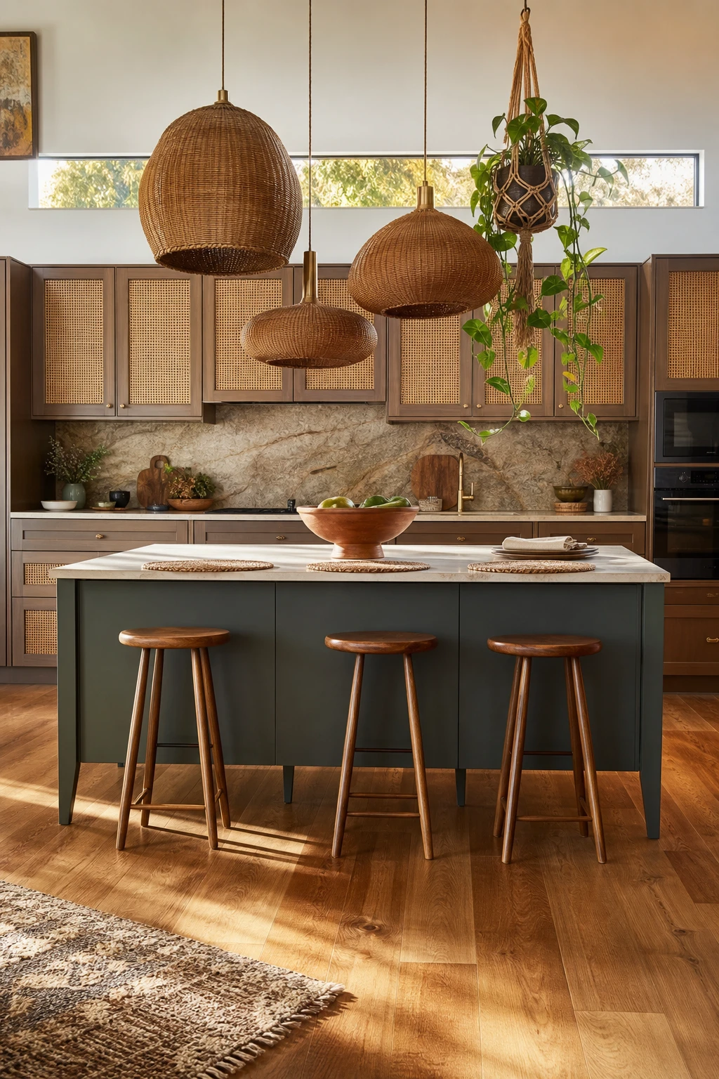
Giving the island its own finish, separate from the perimeter cabinets, is one of my favourite moves in a boho midcentury kitchen. You get a clear visual anchor, a single piece that reads as furniture rather than fitted joinery. Tapered legs reinforce that furniture quality, while a terracotta bowl or woven pendant overhead layers in the warmth and texture boho needs. Watch how the two styles stop competing the moment the island becomes the deliberate meeting point between them.
The Key Details
Tapered leg island with flush panel sides
Rattan and brass cluster pendant lights
Cane webbing cabinet inserts
Terracotta footed bowl centrepiece
Wide plank warm oak flooring
Pro TipFinish your island two or three tones darker than the perimeter cabinets so it reads as a standalone piece of furniture the eye travels to first.
AvoidFilling the island top with bowls, plants, books and cutting boards all at once turns the room’s centrepiece into a cluttered shelf that no one can actually cook on.
Small Kitchens Suit the Midcentury Boho Look More Than You Might Think
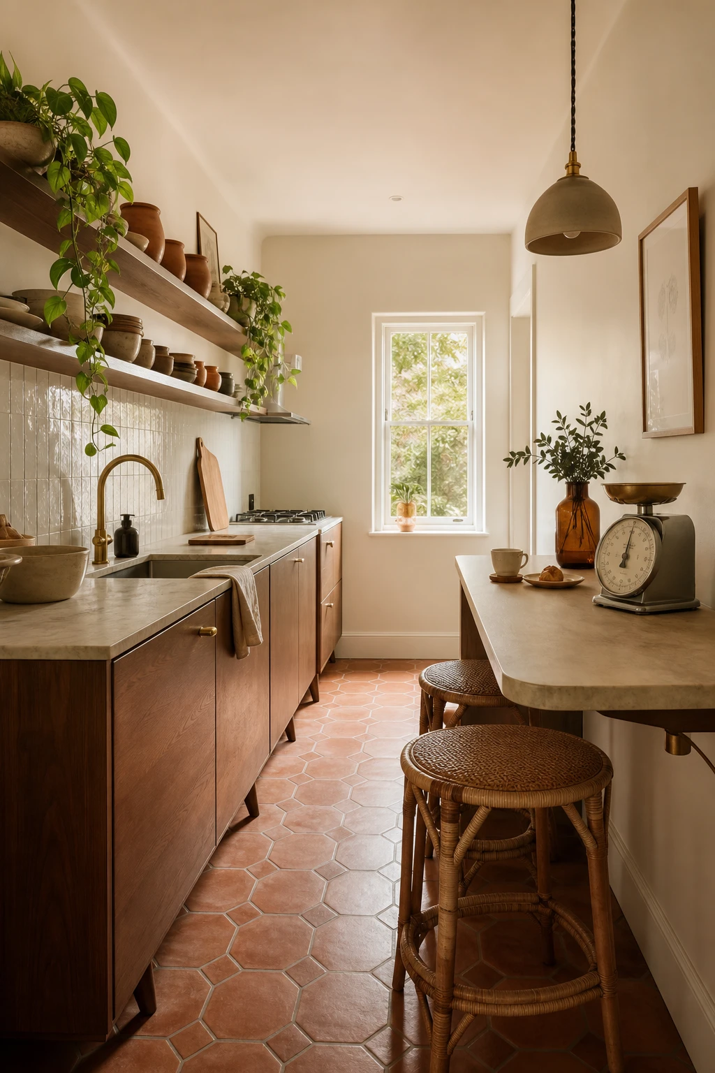
Small kitchens actually suit this style beautifully, and I find myself telling clients that all the time. Tapered cabinet legs and a single ceramic pendant keep the midcentury bones intact without crowding the room, and you still get the warmth of open timber shelving and a terracotta floor. Scaling the details down is very different from stripping them out, and that difference is what keeps a small kitchen feeling fully designed rather than just tidy.
The Key Details
Tapered leg floating lower cabinets
Single scaled ceramic pendant light
Open timber shelving with earthenware
Rattan bar stools
Handmade terracotta tile floor
Pro TipChoose one run of handmade feature tiles and one warm accent colour, perhaps a dusty sage or burnt sienna, and let everything else sit quietly around them.
AvoidPainting every surface white in a small kitchen removes the warmth and personality that make this style work, leaving you with a space that feels clinical rather than considered.
Chandelier Pendant Lights Add a Boho Drama That No Under Cabinet Strip Can Match
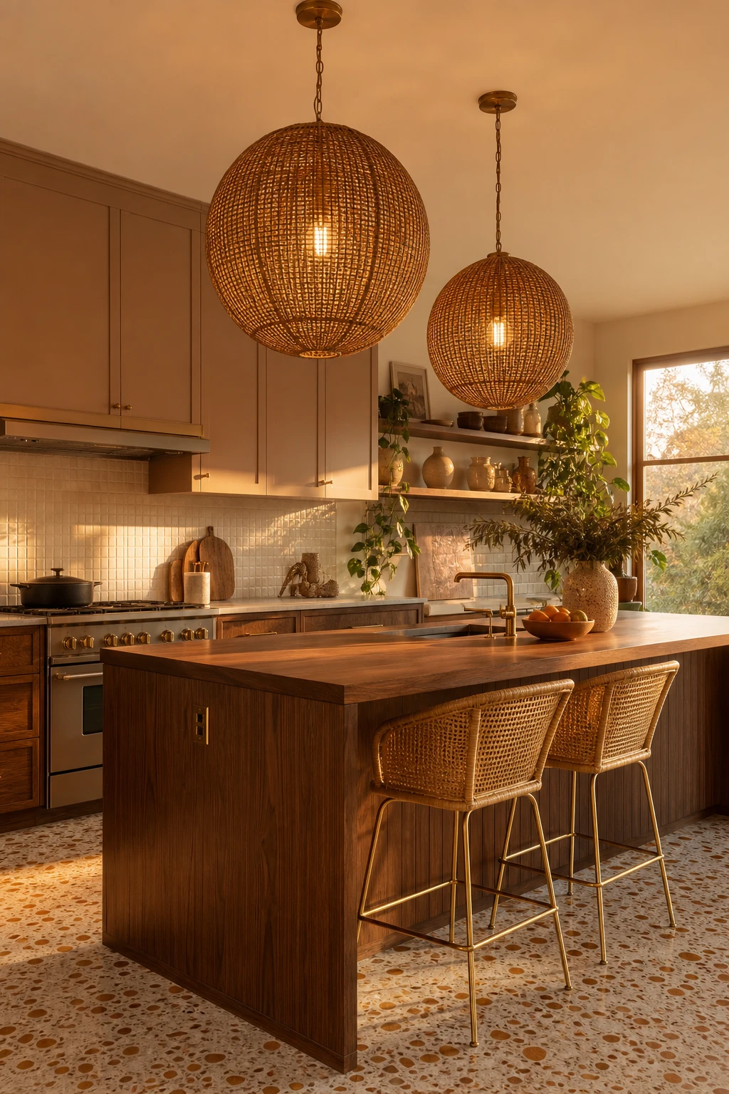
Woven rattan globe pendants are the punctuation mark a boho midcentury kitchen needs, and you will feel it the moment you walk in. What I love is how their warm texture sits against timber and brass without competing, pulling every surface into the same earthy conversation. The open weave casts the most beautiful dappled light across a terrazzo floor or a timber island, so the fitting is working twice: as sculpture by day and as mood by night.
The Key Details
Woven rattan globe chandelier pendants
Walnut timber kitchen island
Cane and brass midcentury bar stools
Open timber shelving with ceramic vessels
Cream and ochre chip terrazzo floor
Pro TipHang your chandelier pendants lower than feels comfortable, roughly 65 to 70 cm above the island surface, and you will immediately feel the room get cosier and more human in scale.
AvoidUsing three different pendant shapes across one ceiling turns the room into a lighting catalogue, and the eye never settles anywhere long enough to enjoy any of them.
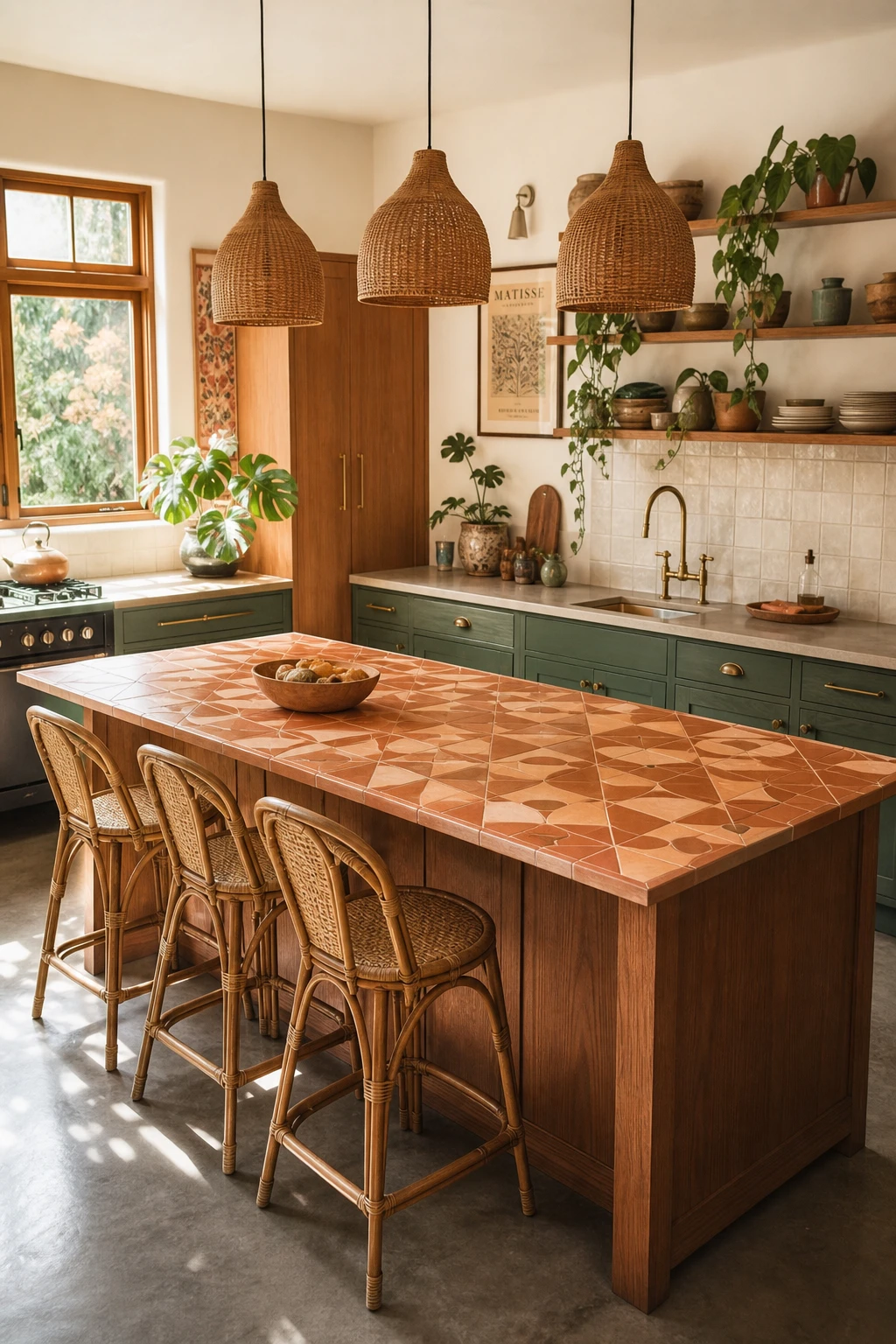
A Tiled Island Countertop Brings the Kind of Handmade Beauty That Stone Cannot Copy
Tiling a horizontal surface like an island top is one of my favourite moves when a client wants colour and pattern but feels nervous about committing to a splashback or full wall. You get all the visual payoff with far less permanence, and swapping it out later is a realistic option rather than a renovation. What wins me over every time is the way handmade ceramic tiles catch the light differently across the surface, alive and slightly uneven in the best way. Stone simply cannot do that.
The Key Details
Handmade geometric ceramic tile island surface
Curved rattan counter stools
Woven wicker pendant lights
Open timber shelving with ceramic vessels
Honed concrete floor
Pro TipChoose a tile where the glaze shifts subtly from piece to piece, so the finished surface reads as truly handmade rather than a digitally printed repeat.
AvoidSpacing tiles with very narrow grout lines on a worksurface traps crumbs and cooking residue in places a cloth cannot reach, and the lines will stain within weeks.
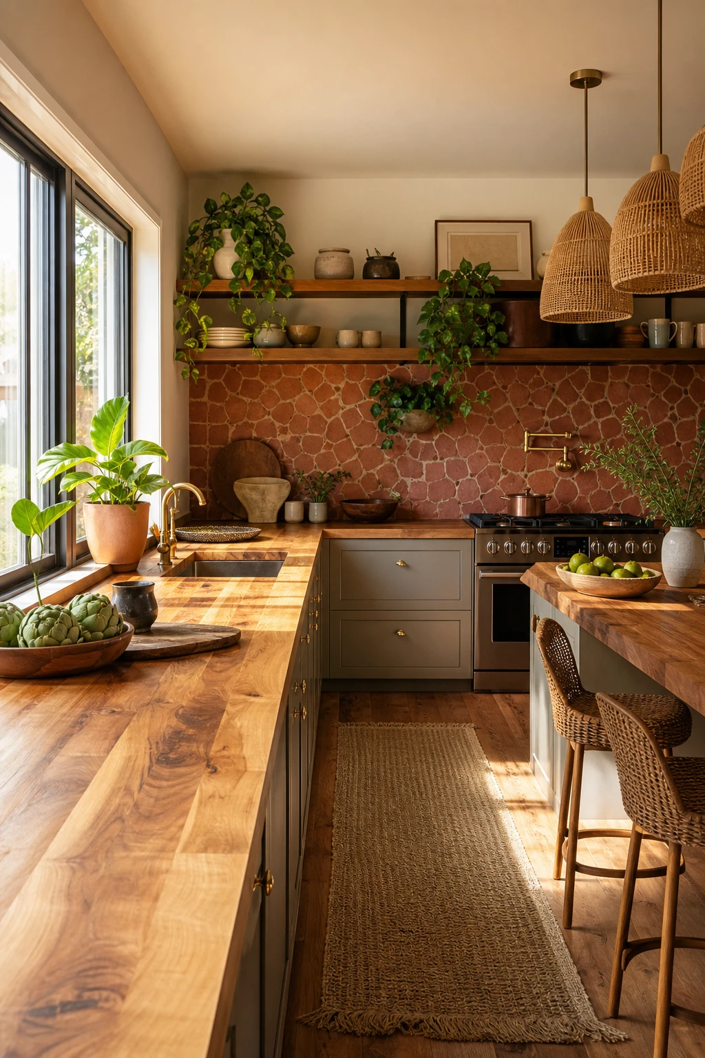
Wood Countertops Age Into the Warmest Version of Themselves and That Is the Whole Point
Wood countertops are one of those surfaces that actually get better the longer you live with them, and that slow improvement is what draws me to them. Watch the grain deepen over months, small marks collecting into something that reads as texture rather than damage. I love how that gradual build of character softens the whole kitchen, pulling the boho warmth and the midcentury structure into the same honest material story. Stone can be beautiful, but it never really changes. Wood does.
The Key Details
Butcher block countertop with visible grain patina
Open walnut wall shelving with ceramic vessels
Rattan and brass cluster pendant lights
Handmade terracotta tile backsplash
Worn sisal runner on hardwood floor
Pro TipOil your wood countertop once each season with a food safe mineral oil, working it into the grain in long strokes so the surface stays supple and the wood near the sink does not start to lift or crack.
AvoidLeaving the edge closest to the sink unsealed lets water sit against the end grain, and that is where the splitting starts, usually within the first year.
Alan launched Edward George London in 2017. Since completing his masters in Town & Regional Planning (MPlan) he has combined the skills he learned at the University of Sheffield with his passion for design, to help create a foundation for those looking to create a beautiful home.