I’ve always thought the hallway is the room that sets the whole tone of a home, and a small mid century hallway can do that beautifully when you know which details to lean into. What I love about this style is how it turns a tight corridor into something warm and purposeful, using things like a bold floor tile, a walnut console table, or a single coloured door. Every look here is one you can genuinely borrow, whether your hall is a narrow strip or a tiny square.
How to Make a Really Narrow Hallway Feel Like It Belongs There
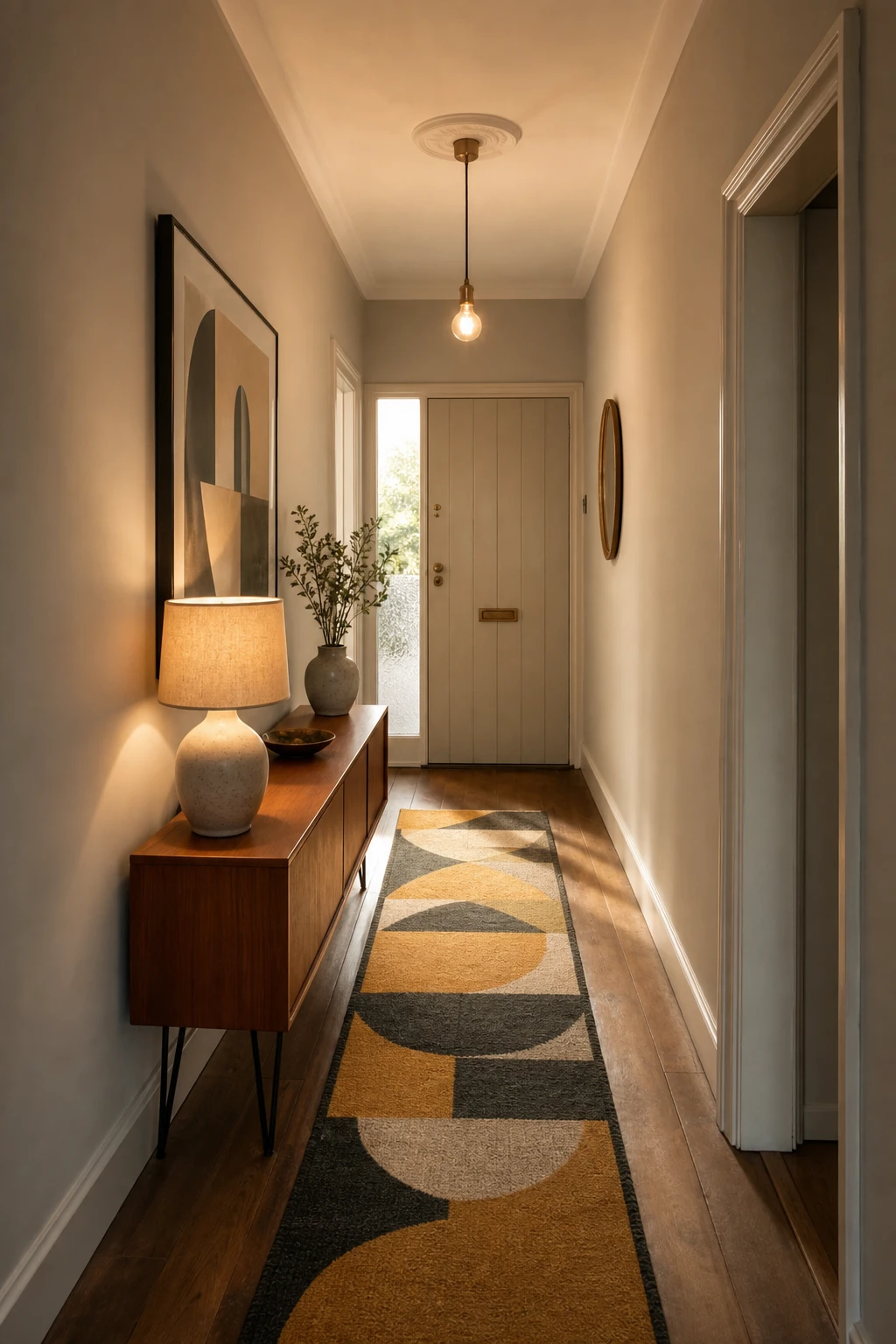
Narrow hallways win me over when the design leans into the corridor shape rather than fighting it. Low tapered legs on the console keep the sightline open, and the long runner pulls your eye straight to the end wall, making the whole space read longer and more deliberate. You get that confident midcentury feeling not by hiding the proportions but by owning them.
The Key Details
Low teak console table with tapered hairpin legs
Geometric ochre and charcoal wool runner
Exposed bulb pendant at corridor end
Ceramic table lamp with linen shade
Frosted glass panel beside entry door
Pro TipRun a vertically striped wallpaper or stack of slim framed prints on the longest wall to draw the eye upward and add height without touching the floor space.
AvoidPushing a chunky sideboard into a narrow hallway cuts the usable width down to almost nothing and makes every trip to the front door feel like an obstacle course.
A Checker Floor Is the Quickest Way to Give Your Entry Real Character
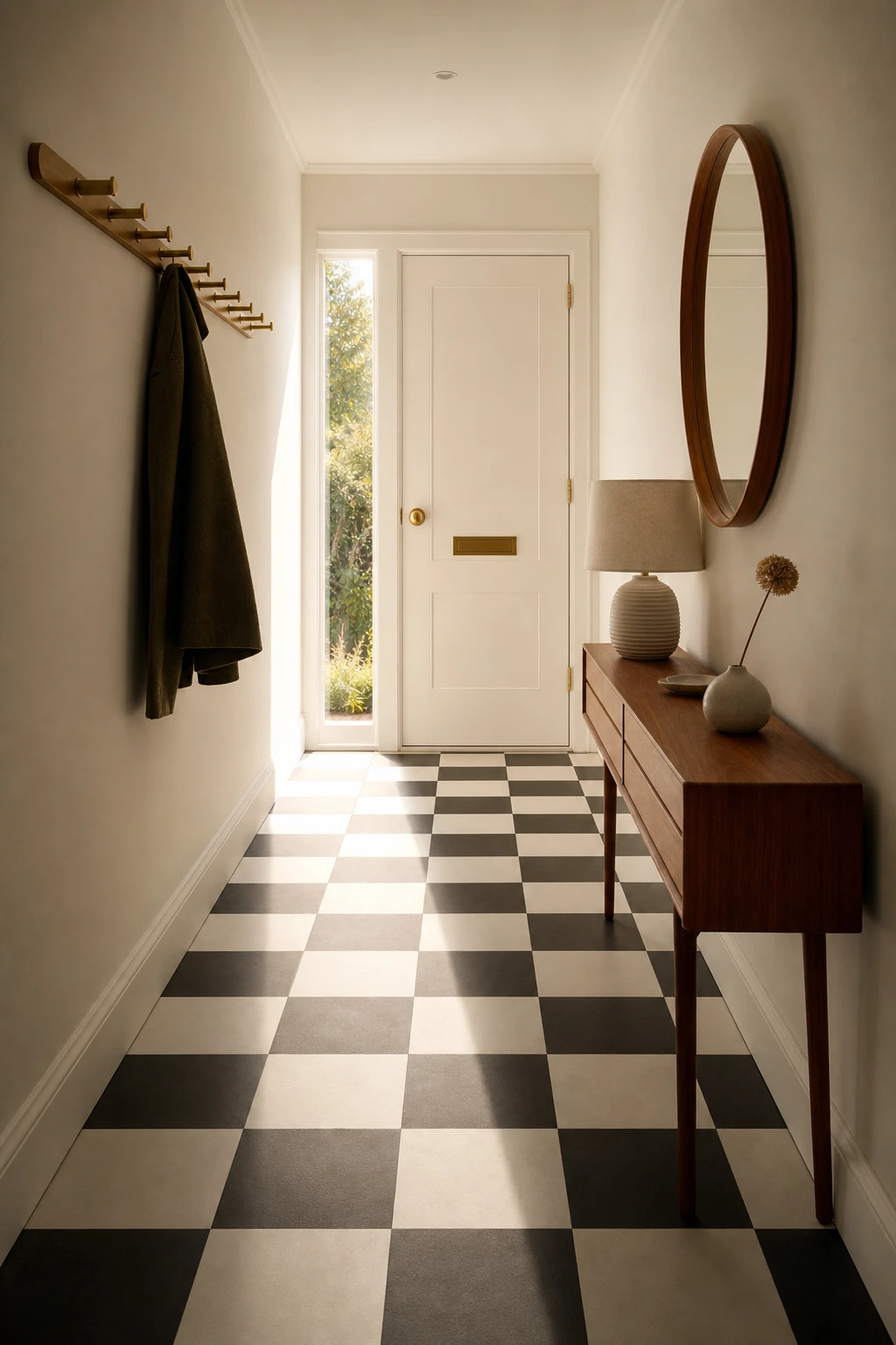
A checker floor is one of my favourite moves in a small hallway because it gives the eye something to land on the moment the door opens. You get instant character before a single piece of furniture earns its keep. What I love is how the grid pulls the space together, so even a narrow entry reads as considered and complete rather than just a corridor you rush through.
The Key Details
Black and white checker ceramic floor tiles
Low walnut console table
Round teak framed mirror
Brushed brass coat hook rail
Ceramic table lamp with dried stem
Pro TipIn a hallway under a metre wide, keep the check to a 15 to 20 cm tile so the pattern repeats enough times across the floor to read as a proper grid rather than a couple of lonely squares.
AvoidFitting an oversized check in a short hall means the pattern never completes a full repeat, and the floor ends up looking cropped and unfinished rather than bold.
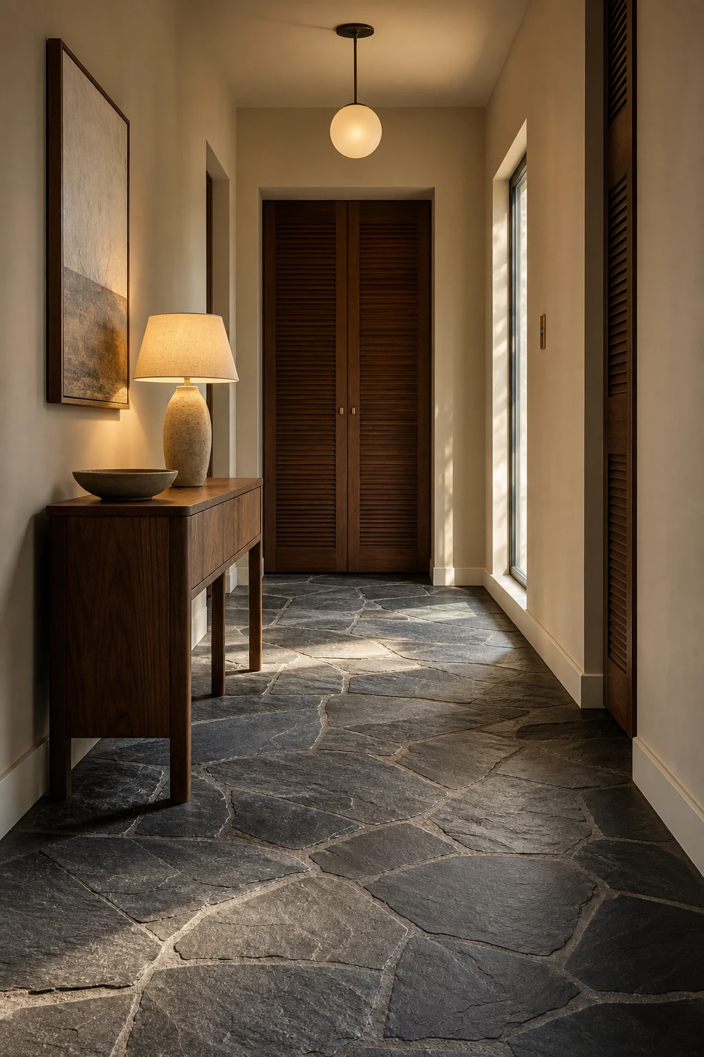
Slate on the Floor Brings That Raw Earthy Feel Every MCM Hall Needs
That riven slate surface is what pulls every warm tone in the space down to the ground, and it is the first thing I reach for when a hallway is too narrow for a rug. You get a beautiful anchoring effect where the floor feels heavy and rooted in the best possible way, and the walnut and brass above it suddenly look richer for it. The natural variation in the stone does all the work, giving texture without pattern, which keeps things calm rather than busy.
The Key Details
Riven slate floor tiles
Walnut veneer console table
Globe pendant light
Louvred timber door panels
Sculptural ceramic bowl
Pro TipSeal your slate with a colour enhancing impregnator rather than a surface sealer, so the stone holds that deep charcoal tone instead of drying to a dull flat grey.
AvoidRelying on cool white overhead light above slate tiles drains all the warmth from the stone and leaves the whole hallway feeling like a car park.
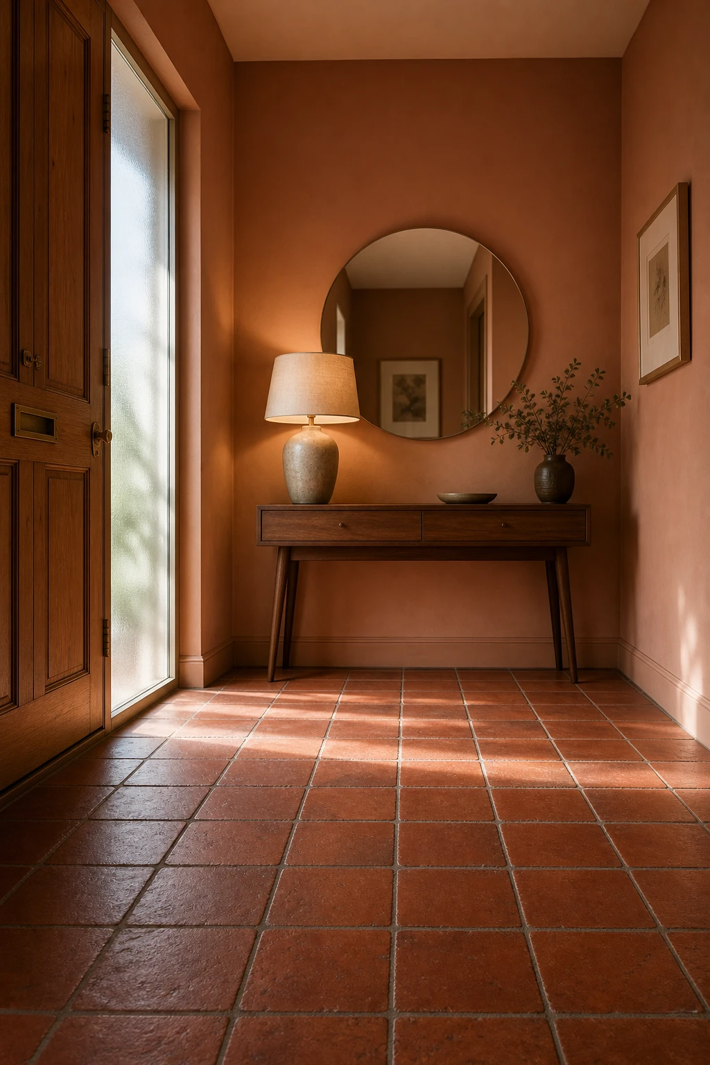
Red Quarry Tiles Are the Retro Floor Detail That Never Gets Old
Red quarry tiles bring a clay warmth to a hallway that no painted floor or vinyl can quite match, and that depth is what I reach for when a small entrance feels cold and flat. You get a colour that sits somewhere between rust and amber, so the whole floor glows rather than just sits there. What wins me over every time is how that terracotta tone pulls the walnut furniture and ceramic lamp into one warm family, making the space feel considered from the ground up.
The Key Details
Hand pressed red quarry tile floor
Walnut console table with tapered legs
Ceramic table lamp with linen shade
Round frameless wall mirror
Frosted glass sidelight panel
Pro TipRun a single row of plain cream tiles as a border around the edge of the quarry field to give the floor a clean frame and stop the rich red from feeling too heavy.
AvoidPairing warm quarry tiles with a stark cool white on the walls drains the life from both surfaces and leaves the hallway looking unfinished rather than fresh.
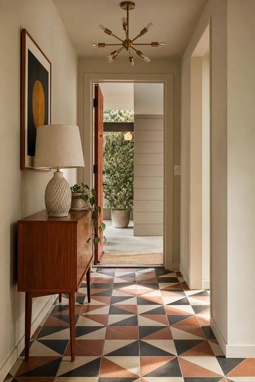
The Eichler Floor Look and Why It Feels So Perfectly at Home in a Small Hall
Eichler floors win me over every time because the geometry does the heavy lifting without needing a single extra accessory. That pinwheel ceramic layout pulls the eye across the floor and makes a narrow hall feel wider than it actually is. What I love most is how directly it references a real moment in design history, so the whole space earns its midcentury credentials from the ground up.
The Key Details
Pinwheel geometric ceramic floor tiles
Sputnik brass pendant light
Tapered leg teak console table
Ceramic table lamp
Sisal entry threshold mat
Pro TipWhere concrete tile meets a doorway, fit a slim teak or oak threshold strip to ground the transition and tie the floor back to any warm wood tones elsewhere in the hall.
AvoidLaying a geometric floor under a busy, pattern heavy wall treatment pulls the room in two directions at once and leaves the eye with nowhere to rest.
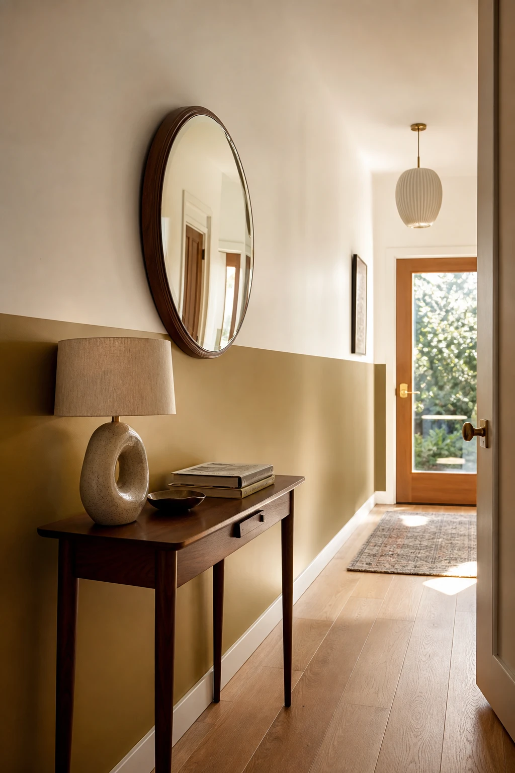
A Half Painted Wall With Trim Is the Easiest Trick for Instant MCM Style
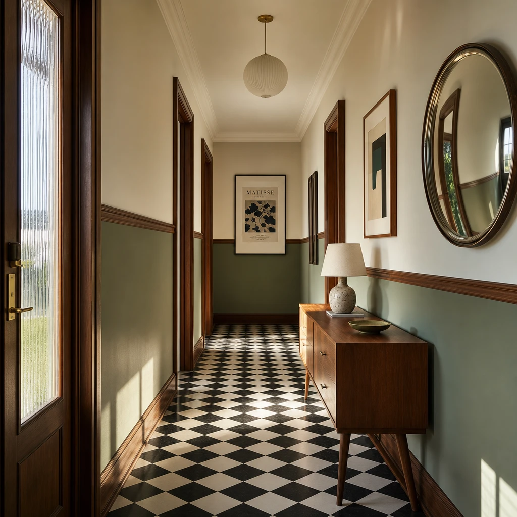
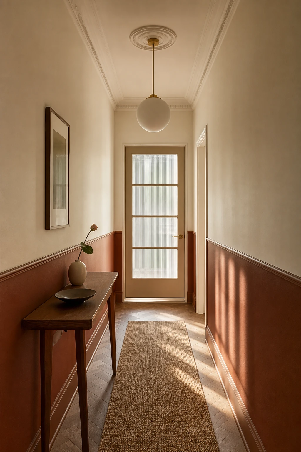
A half painted wall is one of my favourite moves in a narrow hall because the colour split does what no single shade can: it pulls the eye along rather than letting it sit on a flat surface. Paint the lower third in a warm earthy tone and watch how the room suddenly feels grounded and deliberate. You get the contrast, the trim line gives a clean horizontal to anchor it all, and the whole thing reads as properly designed without a single piece of furniture doing the work.
The Key Details
Slim walnut console table
Round convex mirror
Sculptural ceramic table lamp
Oak strip flooring
Glazed end door
Pro TipIn a hall under two metres wide, set your dividing line at roughly 90 to 95 centimetres, which is just below dado height, so the darker tone stays below eye level and the wall above stays open and airy.
AvoidChoosing two tones that are only a shade apart turns the whole effect into a mistake that just looks like an unfinished paint job rather than a considered design decision.
Two Tone Walls and Molding Make Even the Simplest Hall Feel Well Designed
Split the wall at dado height and something almost architectural happens: the lower half grounds the space and the upper half lifts it, so you get a corridor that feels both cosy and open at once. The deeper lower tone does quiet practical work too, hiding the scuffs and knocks a busy hallway collects, which I always think is just good sense. What wins me over is how the architecture carries the design on its own, turning a plain corridor into something that looks considered and complete without a single extra piece of furniture.
The Key Details
Horizontal dado rail molding
Slender walnut console table
Sculptural globe pendant light
Coved ceiling molding
Parquet timber floor
Pro TipPaint the dado and below one full shade darker than the upper wall so the two zones read as a deliberate choice rather than an accidental colour clash.
AvoidChoosing ornate Victorian style molding pulls the whole scheme away from the clean MCM lines and leaves the hall looking like it cannot decide what it wants to be.
Walnut Trim Is the One Detail That Ties Every MCM Hallway Together
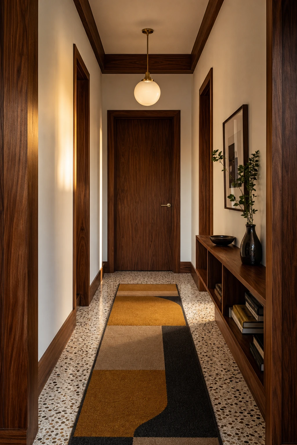
Running walnut trim continuously through a hallway is the move I keep coming back to in any MCM scheme. You get an unbroken warm thread connecting every door frame, skirting and reveal, so the eye travels the whole length without snagging. That consistent chocolate tone is what pulls the terrazzo floor, the ochre runner and the brass pendant into one coherent story rather than a collection of nice things that happen to share a corridor.
The Key Details
Continuous walnut baseboard and door casing trim
Geometric ochre and charcoal wool runner
Globe brass pendant light
Flat slab walnut door with lever handle
Terrazzo floor
Pro TipRun the same walnut profile across every door casing and baseboard in one continuous pass, even around corners, so the trim reads as a single piece of furniture rather than separate elements.
AvoidMixing walnut with a lighter wood, even a warm ash or oak, in the same eyeline creates a contrast that reads as a mismatch rather than intention, and it quietly unravels the unity you worked so hard to build.
Going Colourful in a Small MCM Hall and Getting It Right Every Time
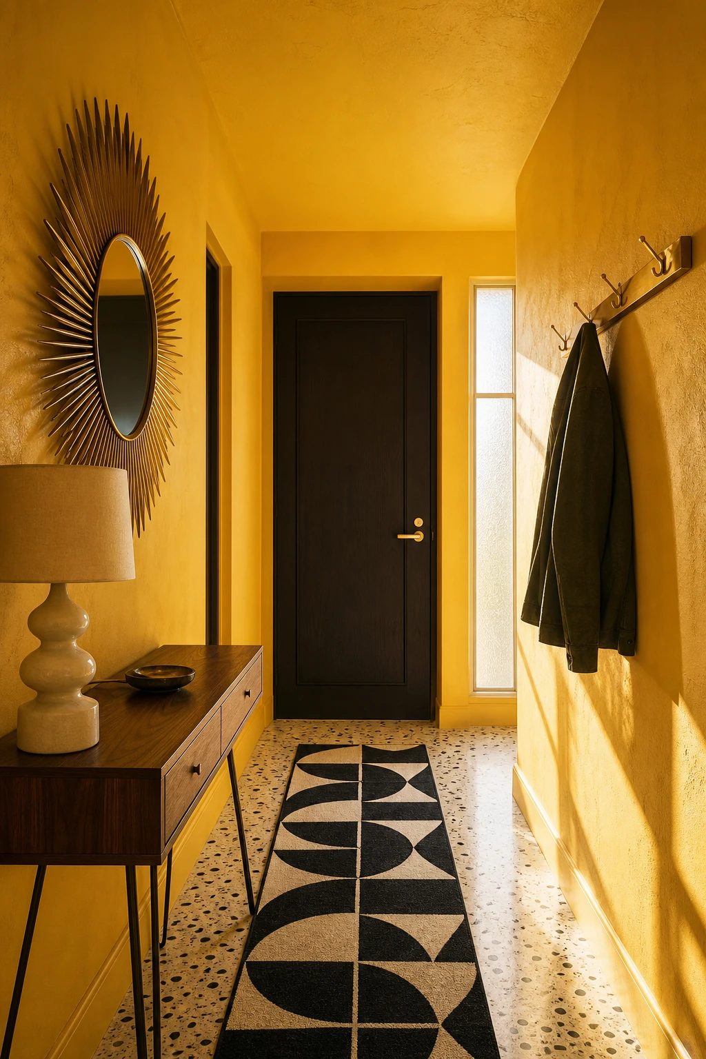
Committing to one brave colour and letting everything else breathe around it is the move I reach for in small MCM halls. You get that punchy, confident energy midcentury style promises without the walls closing in. Watch how a single saturated hue on one wall pulls the eye straight through the space, making it feel longer rather than boxier. The neutral field does the quiet work so the colour gets all the glory.
The Key Details
Sunburst Mirror
Walnut Console Table with Tapered Hairpin Legs
Graphic Geometric Runner
Matte Brass Coat Hook Rail
Terrazzo Floor Tiles
Pro TipPaint only the end wall in your bold hue and keep the two side walls in a warm off white, so the colour reads as a deliberate focal point rather than a gamble.
AvoidIntroducing a third colour through accessories before the first two are fully settled almost always tips a small hall into chaos, muddying the confident statement you were going for.
The Warmest Small MCM Hallways Share One Thing You Can Easily Copy
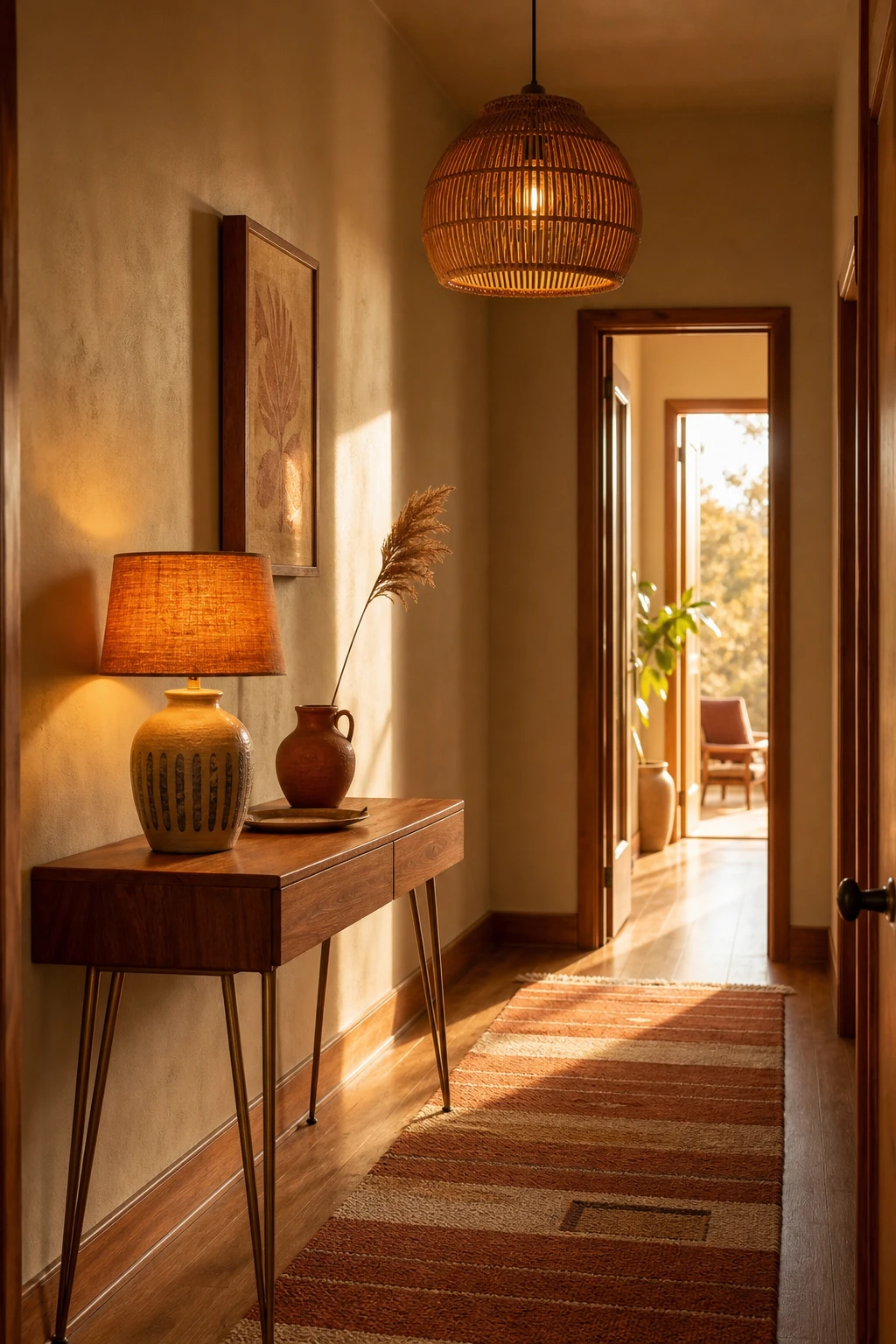
Teak wood, glazed ceramic, woven rattan: when those materials all pull from the same amber and ochre family, warmth bounces between every surface instead of landing in one spot. That layering is the move I reach for when a small entrance feels cold and flat. You get a corridor that feels genuinely cosy from the moment the front door opens, and the depth builds so quietly that nobody can quite point to what is doing the work.
The Key Details
Teak console table with tapered hairpin legs
Circular rattan pendant light
Amber glazed ceramic table lamp
Burnt sienna and sand geometric runner rug
Dried wheat grass stem in terracotta vessel
Pro TipBring your warm neutral onto the ceiling as well as the walls and you will notice the whole space feels taller and more enveloping rather than just painted.
AvoidStacking too many similar mid tones without a single pale or dark anchor makes the whole palette read as flat and tired rather than rich.
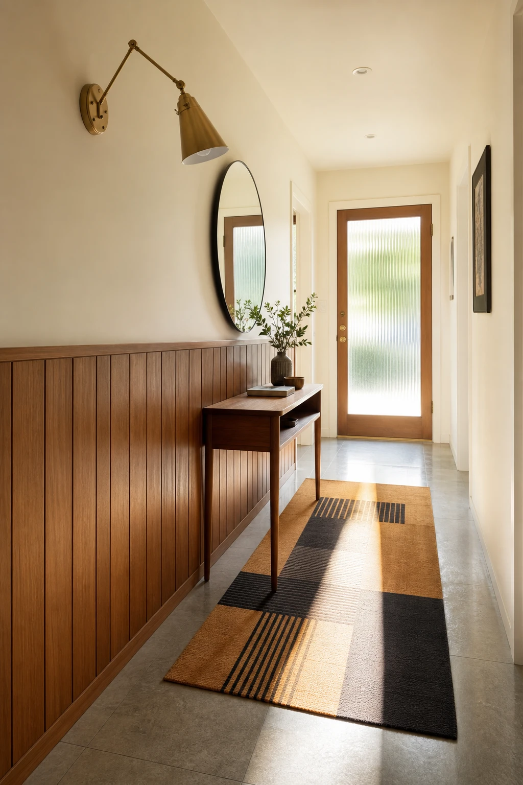
White Walls and Wood Accents Are the Classic MCM Combo for a Reason
White walls and warm wood is the pairing I return to again and again in small hallways, because it does something no other combination quite manages: the white opens the space up and the wood stops it feeling cold or clinical. You get brightness without that slightly hollow, unloved feeling plain white can carry on its own. What wins me over every time is how the teak does all the heavy lifting, so the eye travels across grain and warmth rather than bare wall.
The Key Details
Teak waist height wall panelling
Slender teak console table
Round frameless wall mirror
Geometric ochre and charcoal wool runner
Articulated brass wall sconce
Pro TipKeep your wood tones in the same family across panelling, console and shelves so the eye reads them as one considered layer rather than a jumble of separate pieces.
AvoidPiling too many small objects onto white walls fragments the calm you worked hard to build, and the airy quality that makes the whole scheme sing simply disappears.
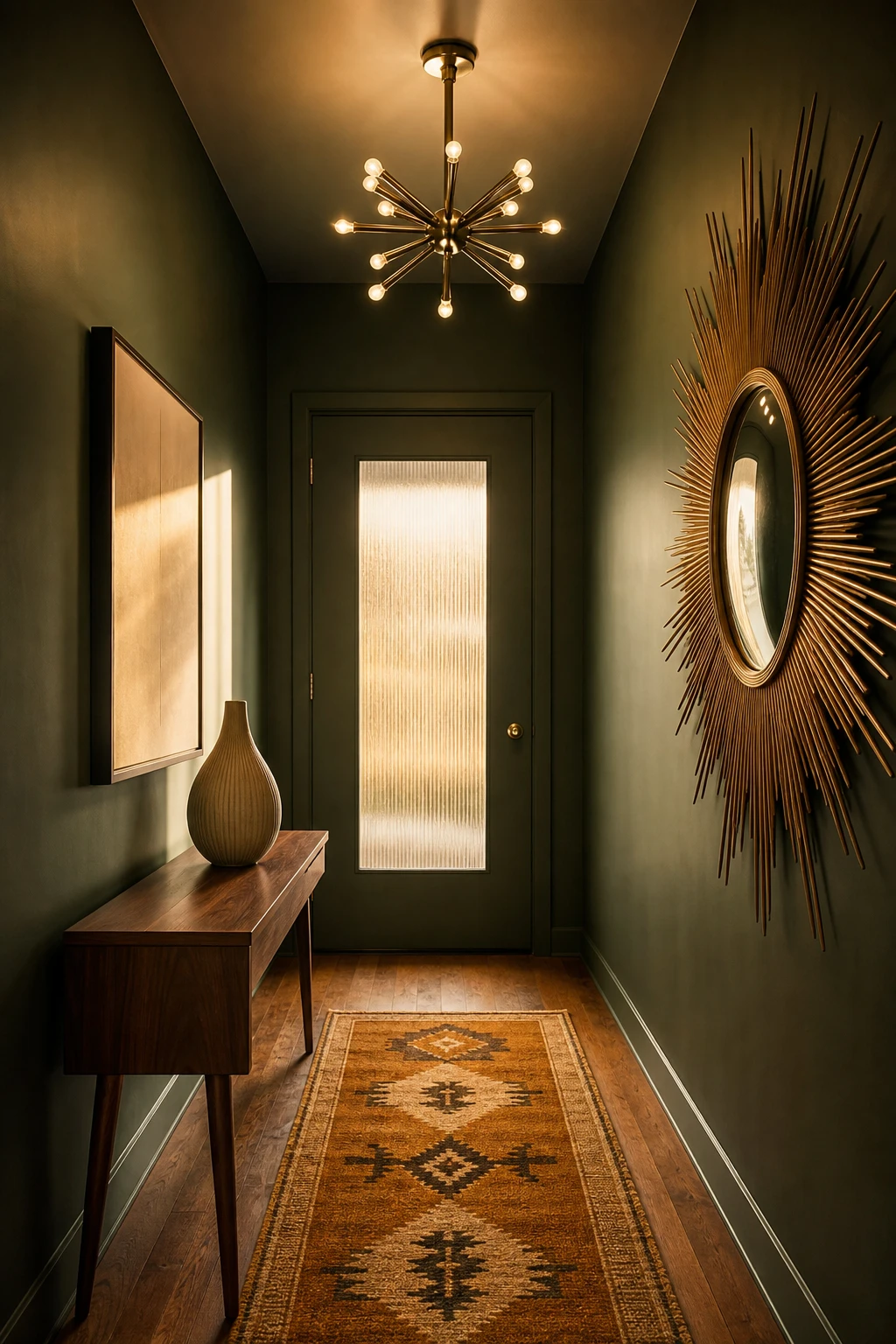
Green Walls Give Your Small MCM Hall a Lush Hotel Feeling at Home
One rich green wrapped around a narrow hall earns its keep fast. The colour does all the heavy lifting and everything else just clicks into place around it, which is the kind of effortless result I am always chasing. A deep, saturated green reads as intentional rather than brave, so even a plain white ceiling and bare floor feel considered against it. That is the hotel corridor quality you get at home, and it costs nothing more than a tin of paint.
The Key Details
Walnut console table
Sputnik pendant light
Sunburst vintage mirror
Geometric flatweave runner rug
Hardwood plank flooring
Pro TipPair your green with unlacquered brass hardware on the door and light fittings, because that warm golden tone pulls out the yellow in the green and keeps the whole scheme firmly in the midcentury era.
AvoidPicking a green that sits too close to teal will shift under warm bulbs and read as a murky blue grey by evening, which loses the lush, confident feeling you are after.
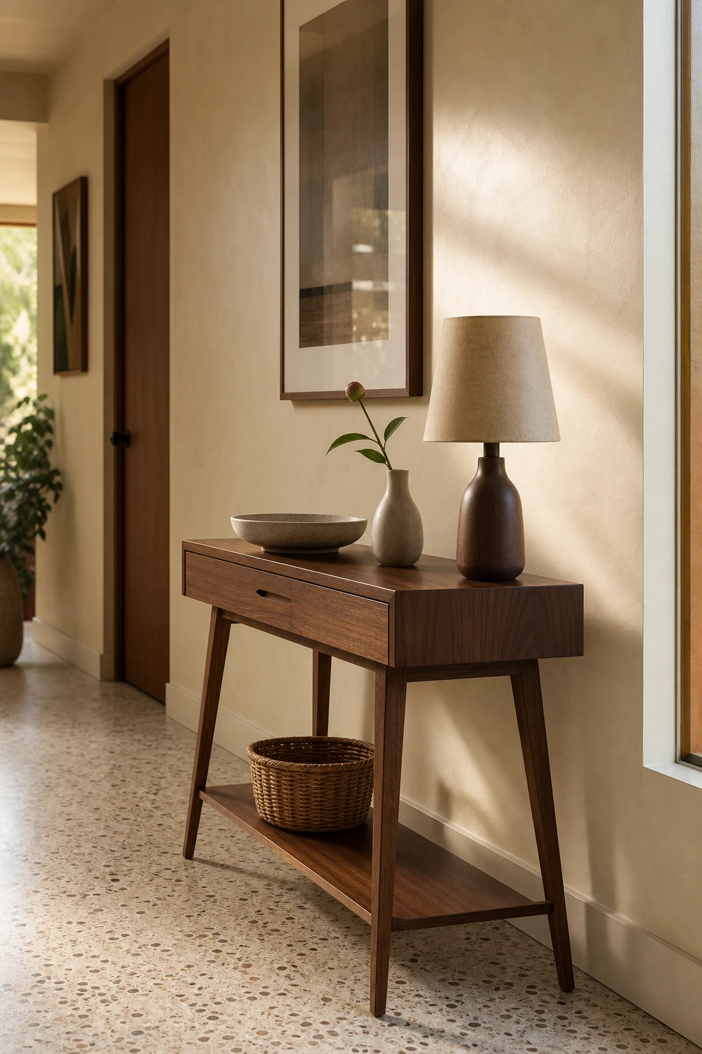
The Right Entry Table Does So Much More Than Hold Your Keys
A walnut console with splayed tapered legs earns its place in a narrow hall because it does two jobs without looking like it is trying. What I love about this pairing of a slim drawer above and an open lower shelf is that you get hidden storage for the everyday clutter and a visible spot for a basket or a bag, so the hall reads as organised rather than sparse. The proportions stay light, the legs lift the eye, and a small lamp on top gives the whole entry a warmth that makes coming home feel like something.
The Key Details
Walnut console with splayed tapered legs
Slim drawer console with open lower shelf
Compact linen shade table lamp
Woven rattan storage basket
Honed terrazzo floor in warm ivory
Pro TipMeasure so the table leaves at least 60 cm of clear walking space on each side, and if the hall is very narrow, lean toward a depth of 25 cm or less to keep the passage feeling open.
AvoidA table that sits too low for the space loses all visual presence in a narrow hall and reads as an obstacle rather than a feature.
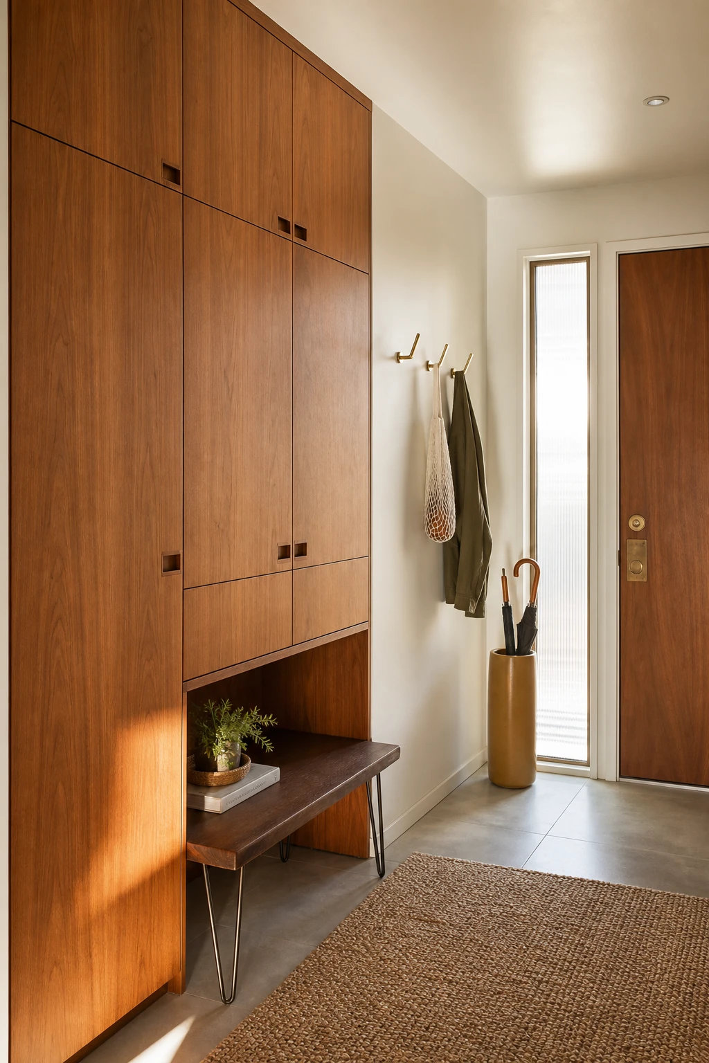
Smart Storage in a Small MCM Hall So Nothing Ever Looks Cluttered
A floor to ceiling teak cabinet with flat slab doors is the quiet hero of a small MCM hall. Everything daily life throws at the front door, bags, shoes, post, disappears behind one clean face, and what you see instead is the grain of the wood and nothing else. That is the lesson I keep coming back to: hiding mess is not about sacrifice, it is about choosing the right container. Pair it with a floating walnut bench on hairpin legs and cast brass hooks, and the hall still reads as dressed, never stripped back.
The Key Details
Floor to ceiling teak built in cabinet with flat slab doors
Floating walnut bench with tapered hairpin legs
Cast brass wall hooks
Poured concrete floor tiles
Matte ochre ceramic umbrella stand
Pro TipRun one tall closed cabinet the full height of the wall so you gain maximum storage without eating into floor space.
AvoidOpen shelving at eye level in a narrow hall turns every dropped key and piled letter into the focal point the moment anyone walks in.
A Walnut Wardrobe in the Hall Is a Bolder Move Than You Think
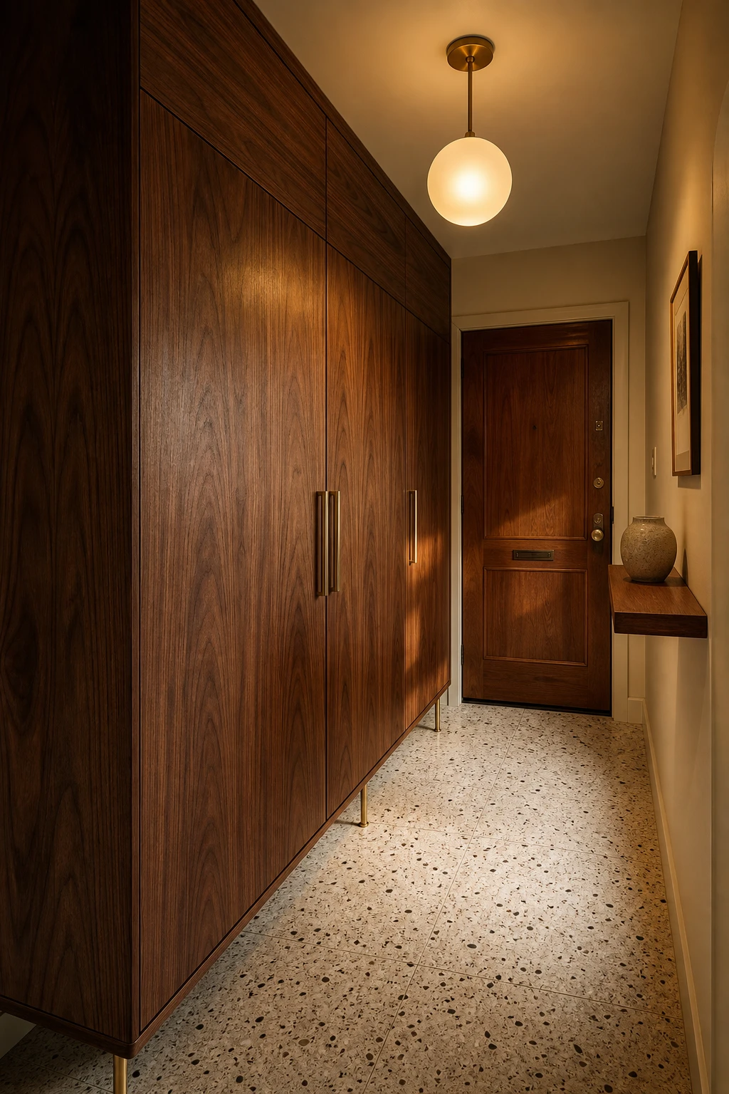
Putting a full height wardrobe in a small hallway sounds counterintuitive, and that is exactly what I love about it. A tall walnut piece draws the eye upward, which makes the ceiling feel higher and the entry feel more considered rather than cramped. Taper those brass legs and you get breathing room at floor level, so the wardrobe floats rather than sits heavily. The warm timber grain does the same job as panelling, giving the hall a finished, purposeful feel the moment you walk in.
The Key Details
Tall walnut wardrobe with tapered brass legs
Brushed brass globe pendant light
Terrazzo tiled floor
Narrow floating timber shelf
Solid timber front door
Pro TipPush the wardrobe tight against the wall with zero gap at the sides and it reads as a bespoke fitted piece, not a freestanding afterthought.
AvoidA wardrobe placed opposite the only window will block the light that makes a small hall feel liveable, leaving you with a tunnel that feels darker every time you open the front door.
A Bench and a Mirror Together Are the Pairing Every Good Hallway Needs
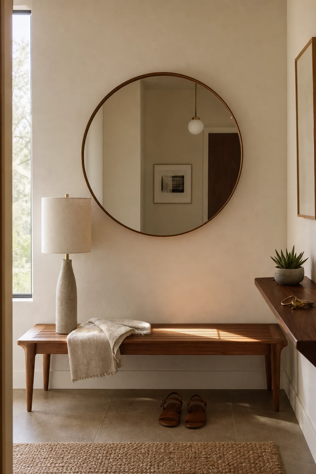
A bench and mirror together do something no single piece can manage alone: they give the hallway a job and a personality at the same time. What I love about this pairing is the way the mirror draws the eye up while the bench grounds everything below it, so you get a composed moment rather than two random objects sharing a wall. You will notice the space feels more welcoming the second you walk in, because the combination signals that someone actually thought about arriving.
The Key Details
Teak slatted bench
Round wall mirror
Slim ceramic table lamp
Brushed brass hardware
Honed plaster wall finish
Pro TipCentre the mirror directly above the bench so the bottom edge sits roughly 15 to 20 cm above the seat, which ties them together as one unit rather than two separate afterthoughts.
AvoidMounting the mirror too high means it reflects only ceiling, which wastes the visual trick entirely and leaves the bench looking abandoned rather than anchored.
A Good Coat Rack Can Actually Make Your Hallway Look Better Not Worse
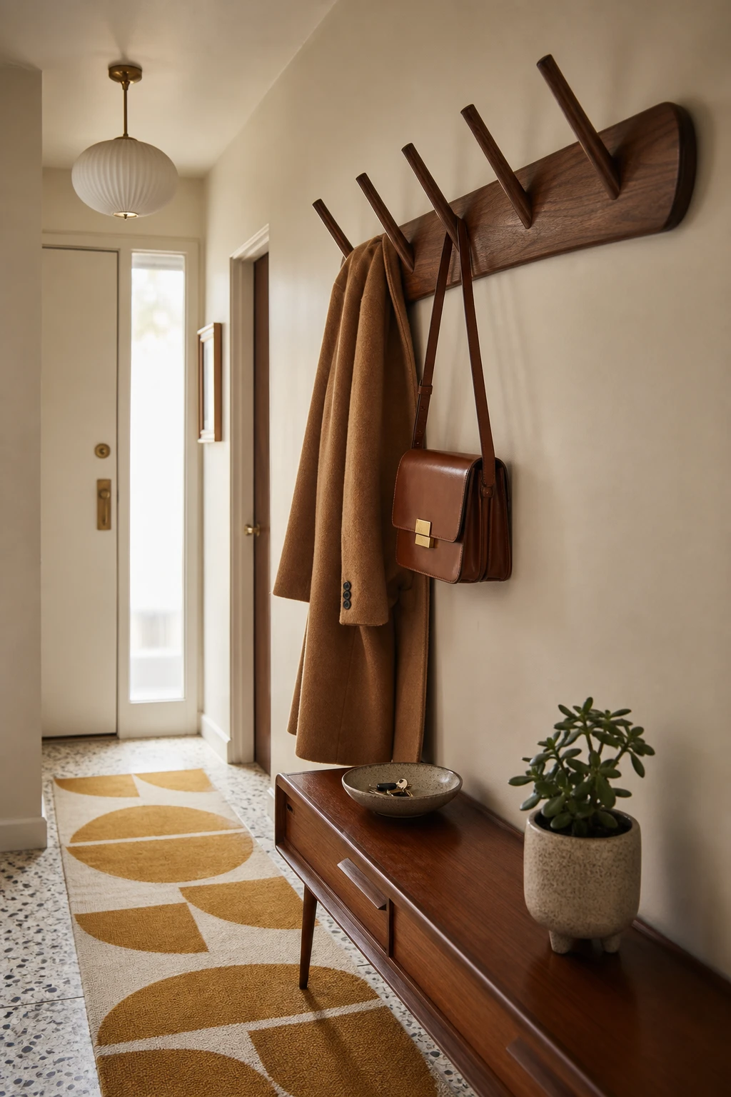
A coat rack with splayed walnut dowel pegs is one of those pieces that earns its place the moment you put it up. What I love is how the angled pegs read as sculpture when the hooks are bare, so the wall stays interesting even on a good day when everyone actually hung their coat up. You get a warm wood tone that ties straight back to the teak console below, and the whole entry starts to feel considered rather than cobbled together.
The Key Details
Wall mounted walnut coat rack with splayed dowel pegs
Low tapered leg teak console table
Geometric ochre and cream wool runner
Glazed ceramic catchall bowl
Slender sidelight window
Pro TipChoose a wall mounted rack rather than a freestanding one so the floor stays completely clear and the hallway reads as bigger than it is.
AvoidLoading every peg with two or three coats hides the walnut rail and the wall behind it, turning a design feature into a pile of fabric.
Floating Shelves in an MCM Hall Give You Display Space Without the Bulk
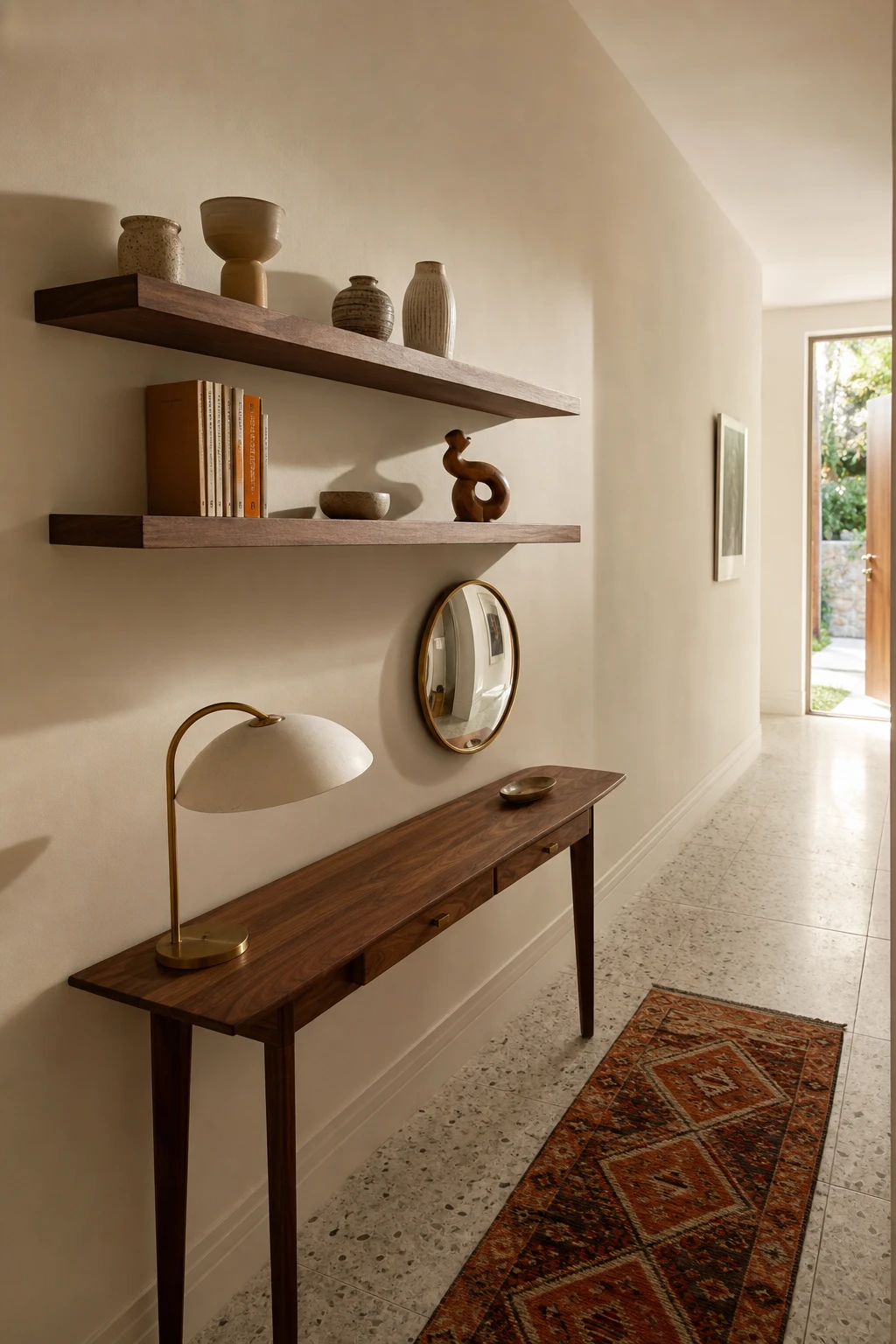
Staggered walnut shelves pinned to the wall at different heights draw the eye up and give a narrow hall a sense of rhythm without eating into floor space. What I love here is the breathing room between objects: one ceramic vessel, a small plant, maybe a single book spine, and you get a display that feels curated rather than crammed. You will notice how the warm wood grain carries the midcentury palette the moment you walk in.
The Key Details
Staggered floating walnut shelves
Ceramic vessel grouping
Slim console table with arched table lamp
Rust and ochre geometric runner rug
Round convex mirror
Pro TipPlace your tallest plant on the lowest shelf so the greenery rises naturally and leaves the upper shelves free for smaller ceramic pieces.
AvoidLoading every shelf level with objects flattens the whole arrangement into visual noise, and nothing catches the eye the way a well placed single piece would.
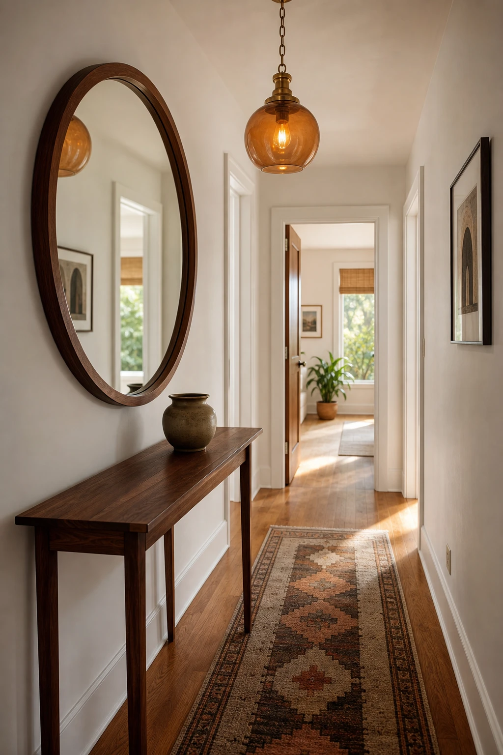
The Entry Mirror That Opens Up a Small Hall More Than You Expect
A large entry mirror is one of those moves that earns its keep immediately: you hang it and the hall just breathes. What I love is how it borrows the light already in the space and throws it back, so you get the feeling of a second room opening up behind you. The teak frame keeps it grounded in the midcentury palette, so it never reads as a trick, just a natural part of the scheme.
The Key Details
Round teak framed wall mirror
Slim walnut console table
Amber glass globe pendant light
Geometric wool runner rug
Hardwood plank flooring
Pro TipPosition the mirror so it faces directly toward your nearest window or light source, and you will notice the hall brighten without a single extra bulb.
AvoidChoosing a round mirror under 60 cm wide leaves it looking like a decorative afterthought, too small to shift the sense of space at all.
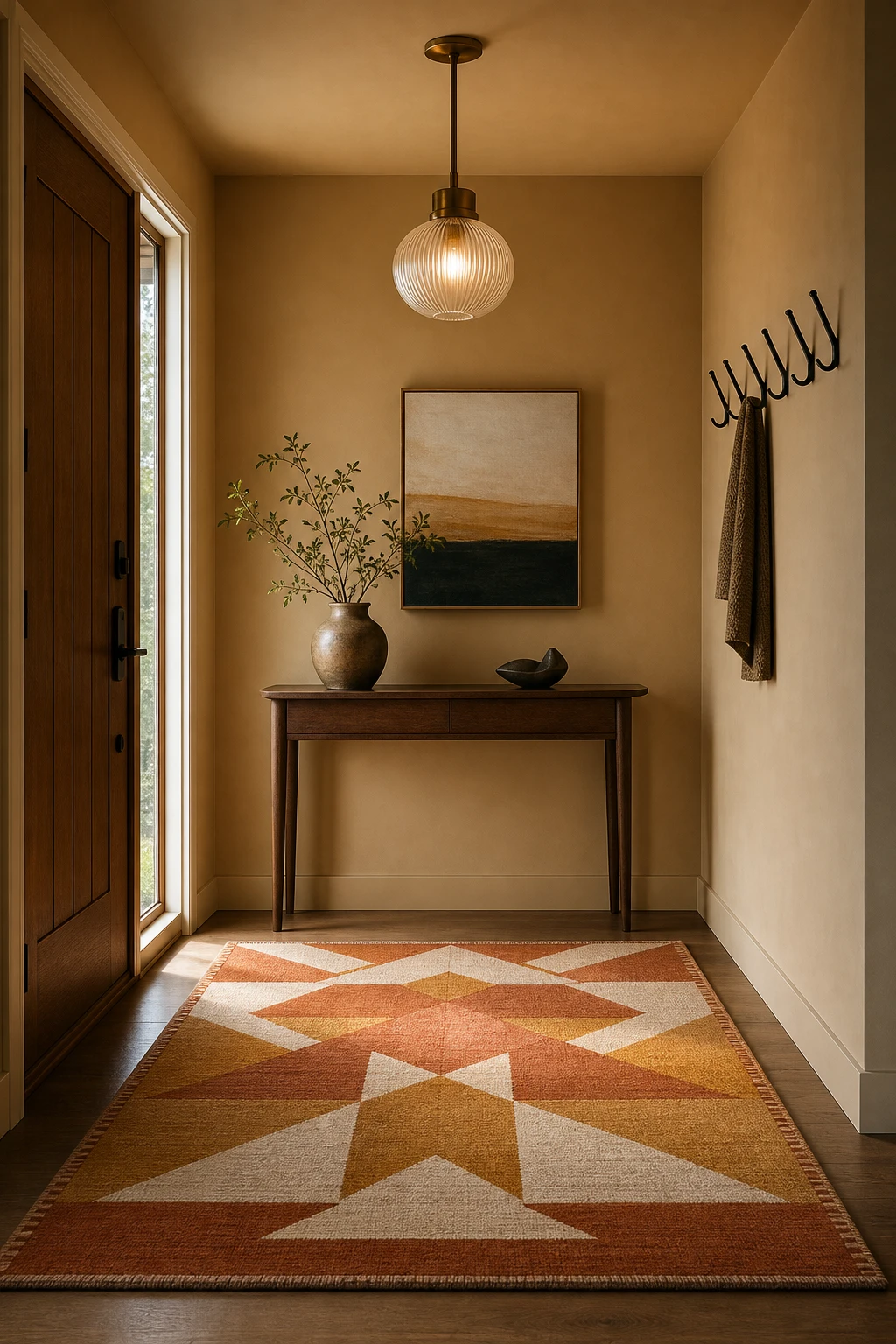
How the Right Rug Sets the Whole Mood Before You Even Turn on a Light
A rug does something paint and furniture cannot: it tells you exactly where the entry begins and ends, so the whole space feels considered the moment you step inside. What I love about this in a mid century hallway is how a bold geometric pulls the eye straight down the corridor before you have even reached for the light switch. You get that satisfying sense of arrival, a zone rather than just a gap between the door and the rest of the house.
The Key Details
Bold geometric wool rug
Slender walnut console table
Ribbed glass globe pendant
Blackened steel coat hooks
Narrow sidelight entry window
Pro TipLay the runner lengthways along the full run of the hall and your floor will read longer and narrower in the best possible way.
AvoidA rug pattern that competes directly with a patterned floor tile creates visual noise that makes even a tidy hall feel chaotic and cramped.
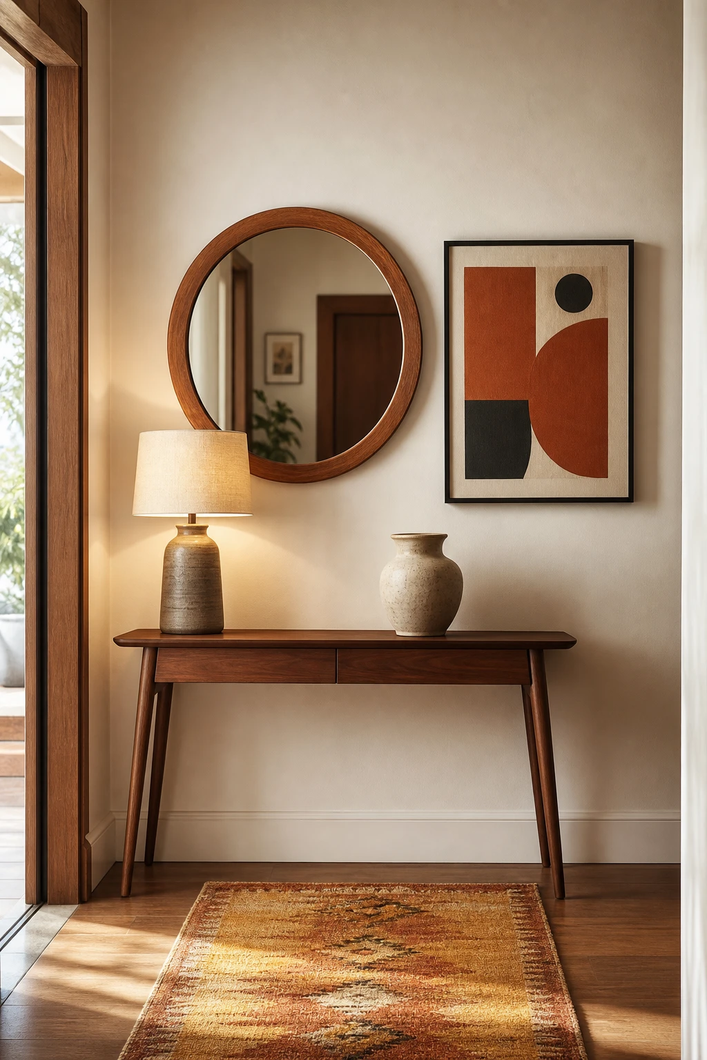
Pairing a Mirror With Art on the Same Wall Is Simpler Than It Looks
Pairing a mirror with art on the same wall is one of my favourite moves in a small entry because you get two very different things happening at once: the mirror opens the space and the art gives it character. What I love is how a bold graphic canvas anchors the grouping while the round teak frame softens it, so neither piece fights for attention. You will notice the whole wall suddenly feels considered rather than accidental.
The Key Details
Round teak framed mirror
Bold graphic canvas artwork
Walnut tapered leg console table
Ochre and rust woven runner
Sculptural ceramic vessel
Pro TipKeep every frame in the same metal finish, whether brushed brass or matte black, so the eye reads the grouping as one composed moment rather than a collection of separate decisions.
AvoidHanging pieces at random heights pulls the eye in too many directions and the wall ends up looking like an afterthought rather than a deliberate gallery moment.
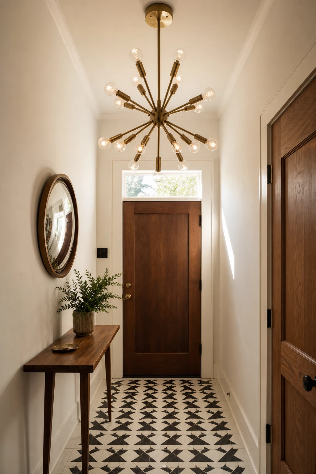
A Statement Chandelier in a Small Hallway Is the Move Nobody Expects
A sputnik chandelier in a narrow hallway is one of my favourite surprises to give a small space. The starburst arms read as sculpture first and light second, so your eye travels up and the ceiling feels further away than it actually is. What I love most is that it flips the usual rule: instead of hiding the ceiling, you celebrate it, and suddenly the whole entry feels considered rather than cramped.
The Key Details
Sculptural brass sputnik chandelier
Slender walnut console with tapered legs
Geometric black and white ceramic tile runner
Convex round wall mirror
Transom window above solid wood front door
Pro TipChoose a sputnik or globe chandelier no wider than half the hallway’s shortest wall so the arms never crowd the passage.
AvoidHanging the fixture too low closes off the sightline the moment you open the door, making the hall feel like a tunnel rather than a welcome.
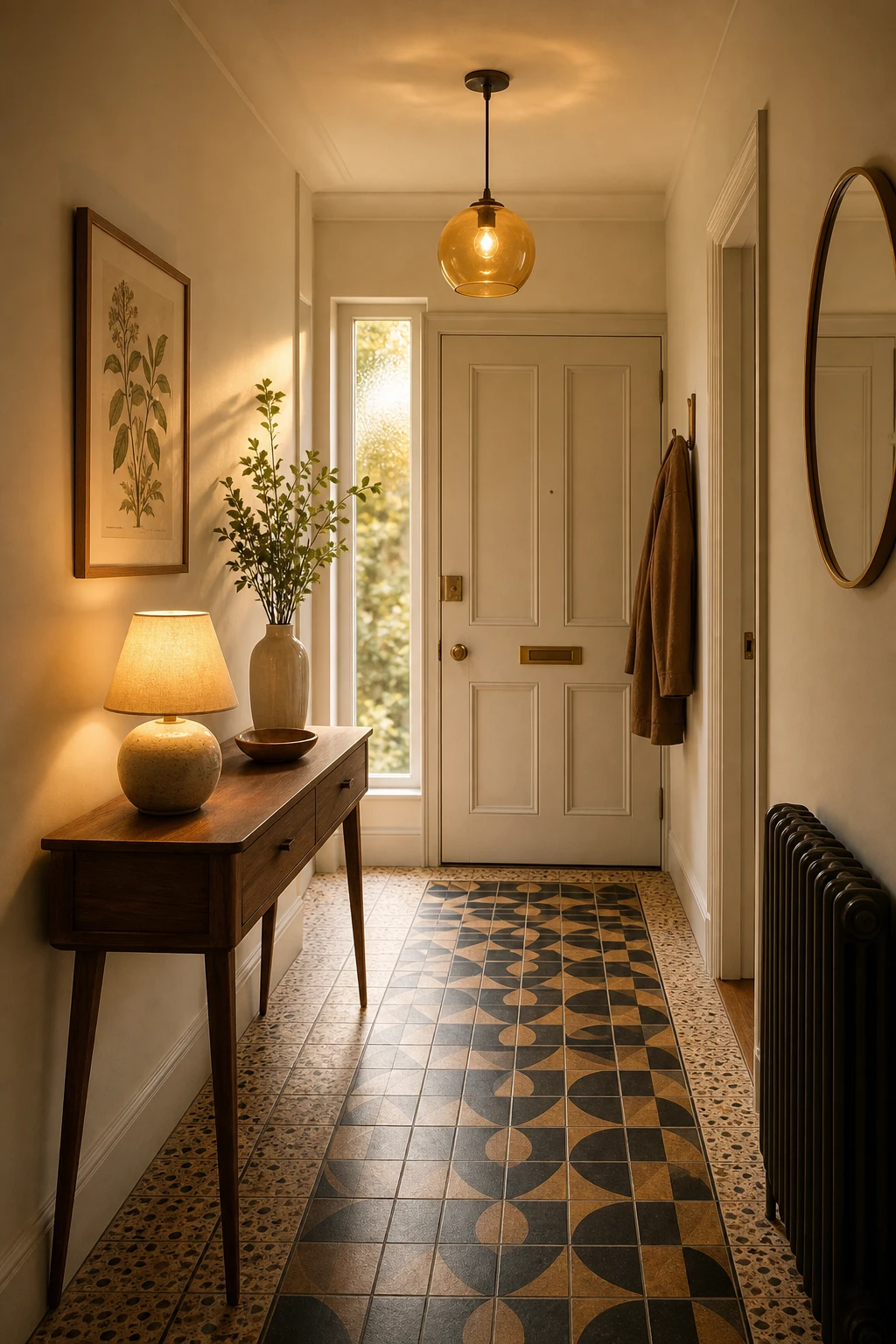
Warm Lighting Alone Can Turn a Plain Hallway Into Something You Love Coming Home To
Warm ambient lighting is the quiet trick that makes a hallway feel like a welcome rather than a corridor. What I love about pairing a low table lamp on the console with a softer overhead source is that you get two pools of light at different heights, and that layering reads as warmth before you have even registered why. The glow from an amber glass pendant pulls the eye up while the lamp anchors the scene at chest height, so the whole space feels considered and calm the moment you step inside.
The Key Details
Amber glass globe pendant
Slender tapered leg walnut console table
Black and ochre geometric floor runner tiles
Ceramic table lamp with warm bulb
Framed botanical wall print
Pro TipChoose a bulb rated 2200K to 2700K for your table lamp so the light reads genuinely golden rather than the flat cool white that strips midcentury rooms of all their character.
AvoidRelying on a single overhead bulb leaves the walls and corners in harsh shadow, which flattens the space and makes even a well styled console look like an afterthought.
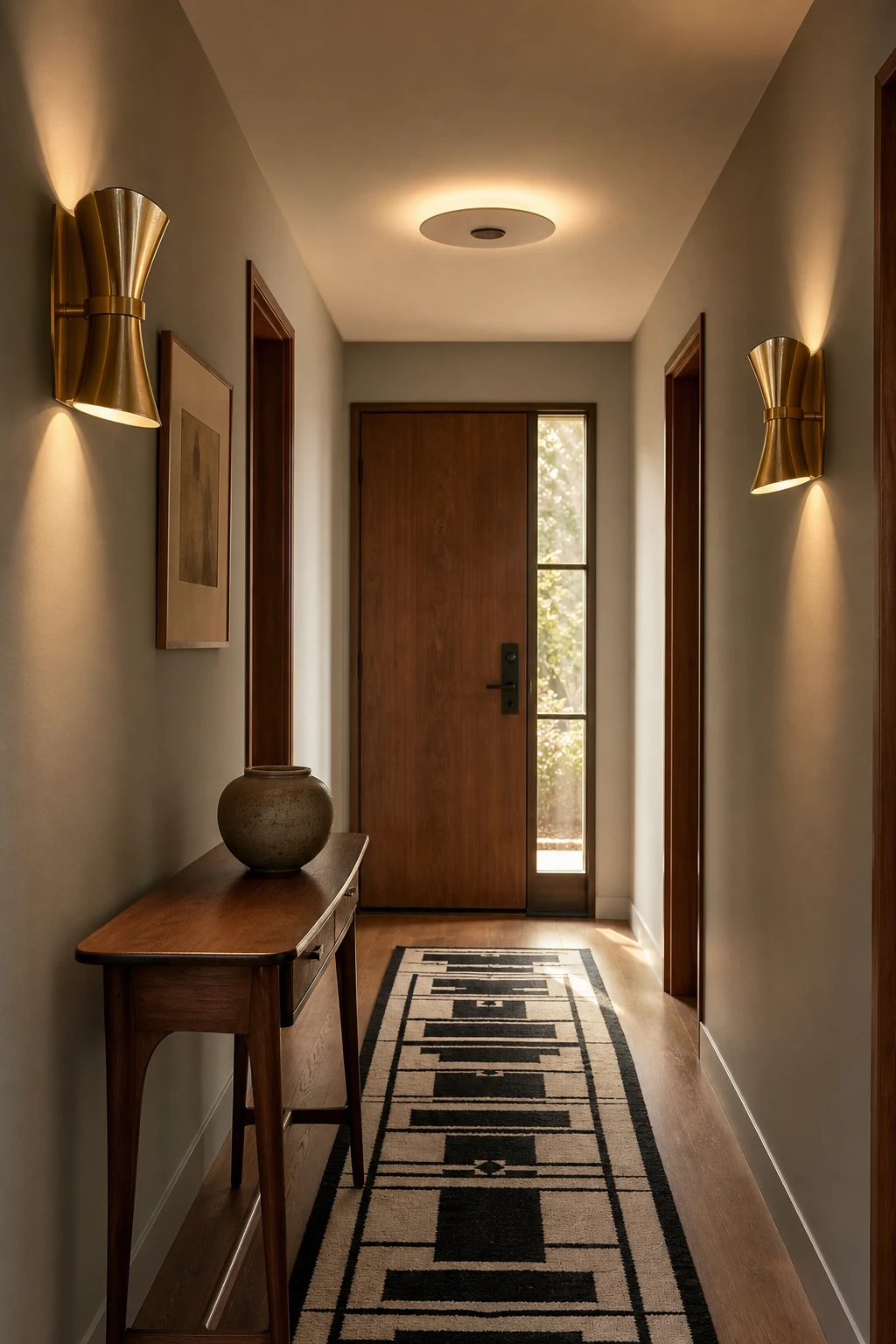
Getting Ambient Lighting Right in a Small MCM Hall Takes One Good Decision
Spreading light along the full length of the hall is the single move that stops a narrow space feeling like a tunnel, and shoulder height sconces are my preferred way to do it. They wash both walls evenly, so you get depth and warmth rather than one bright patch and a dim tail at the far end. The brass finish ties the fixtures back to the walnut console and keeps everything reading as one considered moment rather than a lighting decision made in isolation.
The Key Details
Sculptural brass wall sconces
Recessed ceiling fixture
Walnut console table
Graphic black and white wool runner
Narrow sidelight panel at entry door
Pro TipMount your sconces at around 150 to 160 centimetres from the floor so the light hits the wall at the widest spread and draws the eye down the full length of the hall.
AvoidFitting a single ceiling fixture at the entry end leaves the far wall in shadow, which makes even a short hall feel unfinished and cramped.
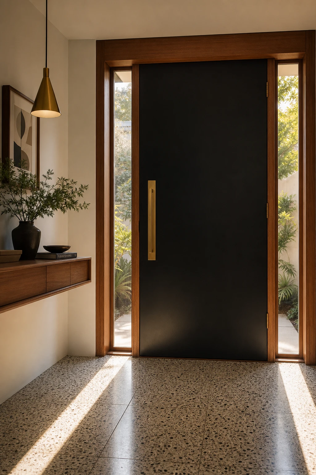
The Front Door Is the First Impression and the MCM Version Gets It So Right
A flat panel door with no mouldings, no fuss, just clean geometry, is one of my favourite ways to stamp an era on a home before anyone steps inside. What I love is how the solid brass pull does the heavy lifting, giving you that warm metallic note that reads as both rich and restrained. You get instant period credibility without a single decorative flourish, and the teak surround ties the whole frame to the timber tones waiting inside.
The Key Details
Flat panel MCM front door
Elongated solid brass door pull
Teak timber door surround
Narrow vertical sidelights
Terrazzo tile entry floor
Pro TipPair a flush panel door with elongated lever handles in brushed brass rather than round knobs, as the vertical line of the lever reinforces the tall, slim proportions MCM hallways rely on.
AvoidSwapping in decorative or leaded glass panels breaks the flat silhouette the whole look depends on, and the moment that clean line is interrupted the era reads as confused rather than considered.
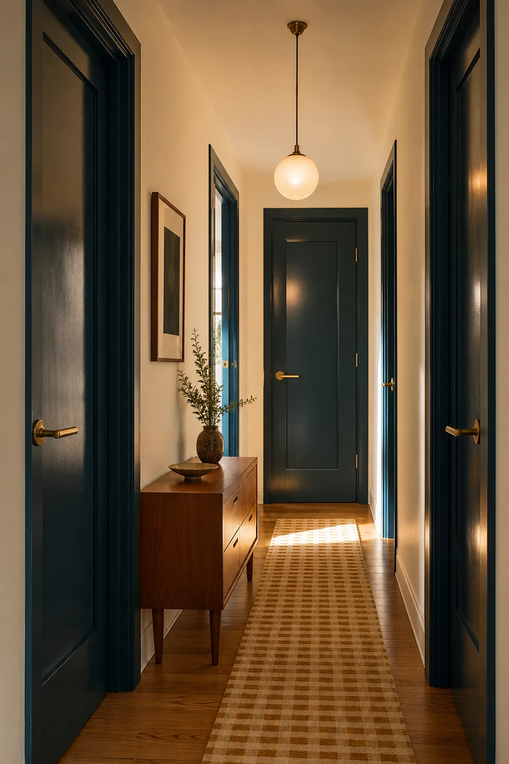
Painting Your Interior Doors a Different Colour Changes Everything About a Hall
Coloured interior doors are one of my favourite moves in a narrow hall because they give your eye something to travel toward, and that forward pull makes the space feel longer rather than cramped. What I love is how repeating the same hue on every door creates a quiet rhythm, almost like a drumbeat running the length of the corridor. You get structure without adding a single piece of furniture.
The Key Details
Solid brass lever door handles
Low slung teak console table
Ochre and ivory woven wool runner
Oak strip flooring
Globe pendant light
Pro TipPaint every door in the hall the same colour so the repetition reads as a deliberate design choice rather than a happy accident.
AvoidReaching for a very dark door colour in a hall with little natural light will pull the walls inward and make the whole space feel like a tunnel.
Mixing Bohemian Layers Into an MCM Hall Without Losing the Clean Lines
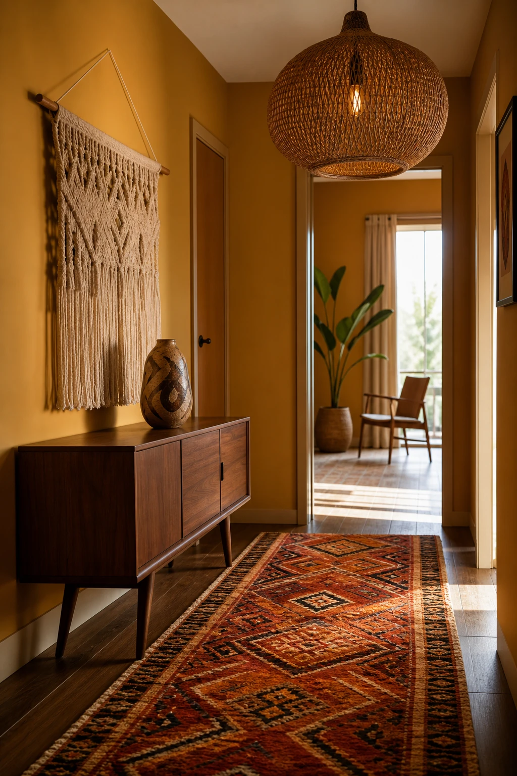
Bringing a bohemian layer into an MCM hall sounds risky, but the kilim runner and macrame hanging actually sharpen the walnut console rather than soften it. What I love is the contrast: the furniture holds its clean geometry while the textiles add warmth and something handmade that you can feel from across the room. One woven piece earns its place; five would bury the bones.
The Key Details
Tapered leg walnut console
Kilim geometric runner
Oversized rattan pendant light
Woven macrame wall hanging
Abstract ceramic vessel
Pro TipChoose one patterned textile as your hero, either the runner or the wall hanging, and keep every other surface plain so the MCM structure stays readable.
AvoidLayering a kilim, a throw, a macrame piece and a woven basket all at once pushes the hall into pure boho and the tapered legs and clean lines you paid for simply disappear.
A Bauhaus Inspired Entry Brings That Spare Graphic Quality to the MCM Hall
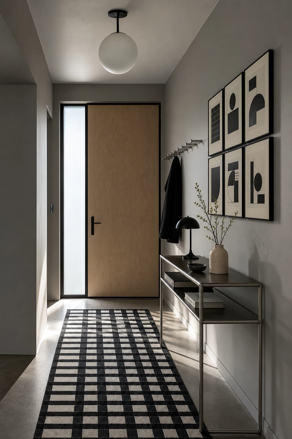
Bauhaus design wins me over every time because it trusts the bones of a space to do the heavy lifting. Strip a small hallway back to pure form and you get something that feels both sharp and calm, nothing competing, nothing wasted. What I love here is the graphic contrast of black against natural materials: the eye reads the composition instantly and moves through it cleanly. You will notice that less genuinely does more.
The Key Details
Tubular steel console table
Geometric black line art grid
Globe pendant light
Black and white geometric runner rug
Cylindrical steel coat hook rail
Pro TipLimit yourself to black metal and raw wood or rattan as your only two accent materials and every piece will look like it was always meant to be there.
AvoidAdding one too many decorative objects buries the geometric simplicity that gives a Bauhaus hallway its whole point, and the look collapses into ordinary clutter.
Alan launched Edward George London in 2017. Since completing his masters in Town & Regional Planning (MPlan) he has combined the skills he learned at the University of Sheffield with his passion for design, to help create a foundation for those looking to create a beautiful home.