Newsletter Subscribe
Enter your email address below and subscribe to our newsletter

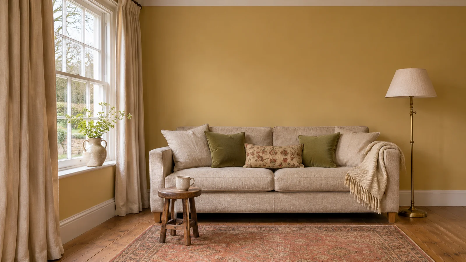
Ochre paint colors can bring warmth to the north facing living room you inherited, but the sample has to work with your sofa, floor and lamps. I would compare three real paints in two places before ordering a full tin. The aim is to find an ochre you still like in the corner where you actually sit.
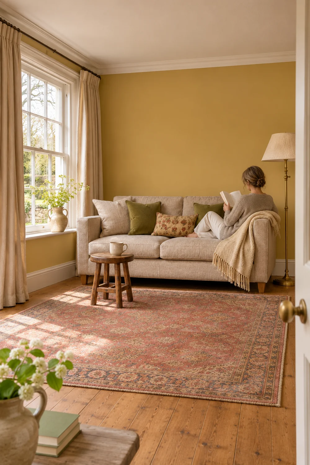
Start with the things you will still see once the room is painted. Put a cushion from the sofa near the skirting, look at the floor where the rug ends and take a good look at the fireplace surround. In a first home, these can be more useful starting points than the previous owner’s paint. They are the colours the new wall has to sit beside.
I would look at three different depths of warmth. If the examples below are unavailable where you live, ask a local paint shop to show you a soft golden yellow, a deeper mustard and a warm neutral with a quieter yellow or brown undertone. Buy the smallest samples available. The point of including a control is to find out how much yellow you want once the light in this room is part of the decision.
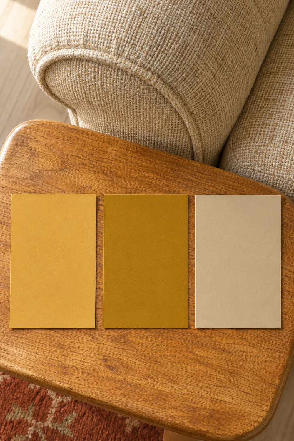
Give each shade a likely job. A gold you enjoy in one recess may feel too present across four walls. A quiet option that seems plain on the card may be the one that lets you keep a patterned rug you love. If you are still deciding where the colour should go, sketch the proportions of an earthy color palette before ordering samples. Mark the sofa, floor, trim and any adjoining wall you can see from the doorway.
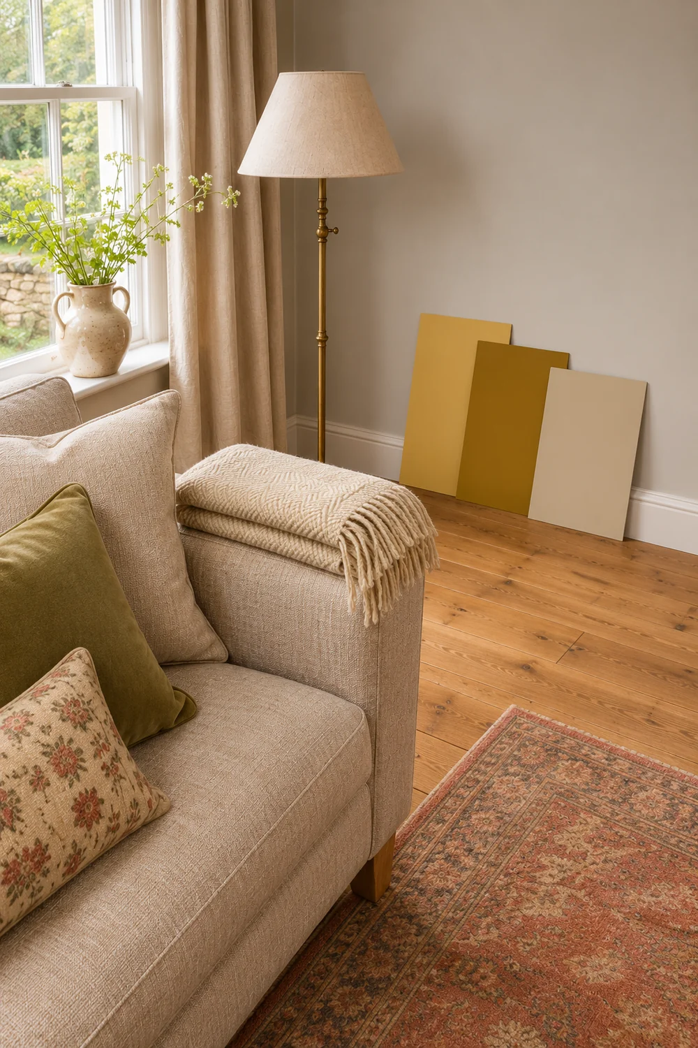
In a room with cool indirect daylight, I would resist buying three close versions of the same yellow. You will learn more from a clear difference in depth. Little Greene’s guidance for rooms with northern exposure includes both gentler yellows and richer shades. That range is useful because your first test is about finding your tolerance for colour across a particular area of wall.
Use three pieces of the same stiff card or suitable sample board. A3 is a useful starting size if you can carry it around easily. Give each sample the same painted area and prepare each board the same way, following the paint maker’s directions for the backing, coats and drying. Keep the label on the back so that a name does not steer the way you read the colour.
I would stir each sample, apply an even coat and follow the product instructions for any further coats. Let all three boards dry fully before comparing them. If the backing still shows through one paint, that board needs another look when you have applied the manufacturer’s recommended system. A thinner patch can make it appear lighter, particularly at the edges.
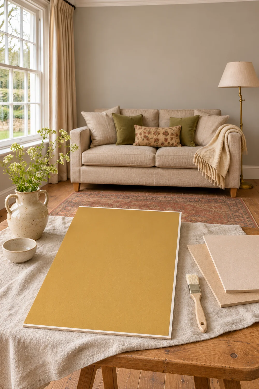
Hold the board flat and upright. A sample resting on the floor catches a different light from a wall. Cover a strong patch of inherited colour immediately behind it with the same plain backing for each comparison, especially if the old wall is a saturated blue or green. Then place the board beside the trim that will actually remain. The first view helps you see the shade clearly. The second tells you whether the room’s finishes still belong together.
Begin by putting the three boards near one another for a quick comparison. Then view them one at a time in the same spot. The deepest board can make the softer candidate look much paler by comparison. Swap their positions, step back to the doorway and then walk over to the sofa. I would keep all three at roughly the same height for that first pass.
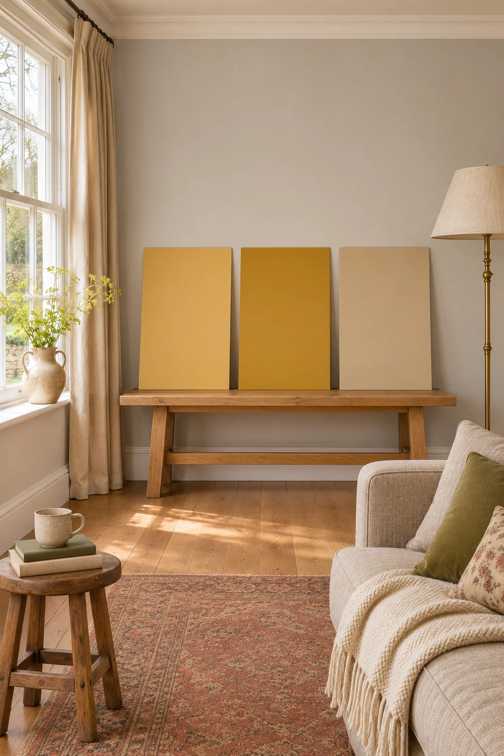
Use paint cards and photographs to help recall what you saw. Make the decision in the room. If the sample pot uses a different sheen from the finish you intend to order, check that finish before committing to the whole room. A shiny surface can pick up a bright window reflection, and the mark a lamp leaves on a wall can matter as much as the difference between neighbouring shades.
Choose the wall that receives the most useful daylight and the wall you look at most often from your seat. They may be on different sides of the room. A window wall can be shaded around the reveal, while the opposite wall catches light across a broad surface. Let the actual room tell you which two locations make the clearest comparison.
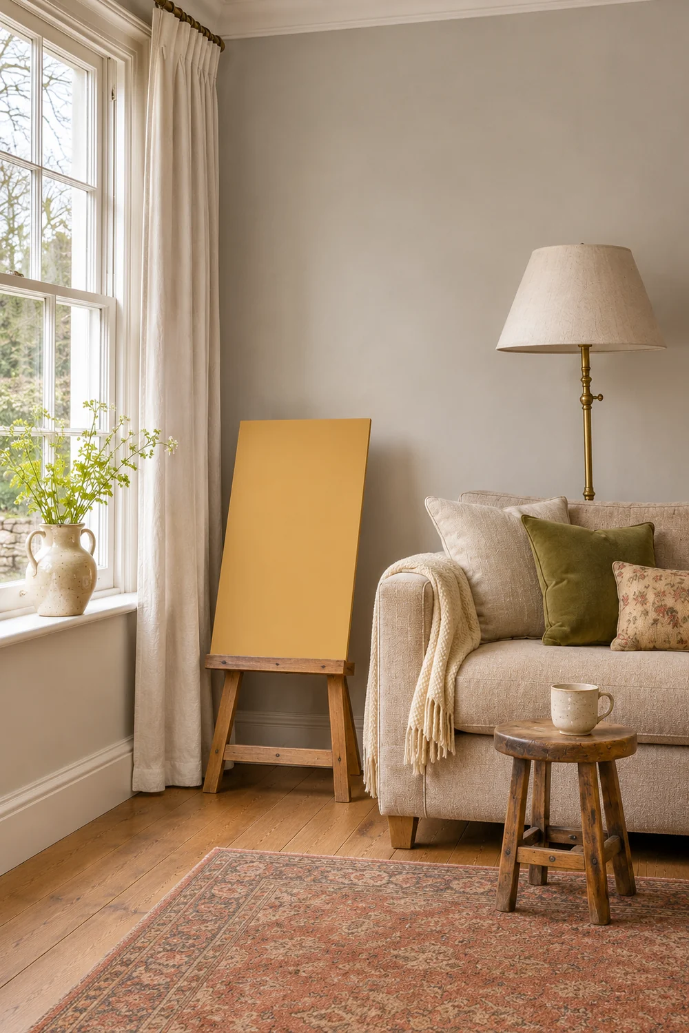
For the first reading, look in daylight with the lamps off. Put each board at the same height and record what happens beside the sofa and beside the floor. Use plain descriptions you can remember. One board might look like soft gold beside the seat and stronger mustard beside the timber. Another might blend too readily into the upholstery. Write the place and time next to the observation.
Make a second reading in the afternoon and a third when you would normally sit with the lamps on. Try to include a dull day if that is when the room bothers you most. I would leave the lamp positions and bulbs as they are during the comparison. If you plan to replace a shade or bulb anyway, do a separate trial with the change so you know what caused the difference. The lighting section of this English countryside color palette gives useful ways to distinguish a soft pool of light from a spotlight on an accent.
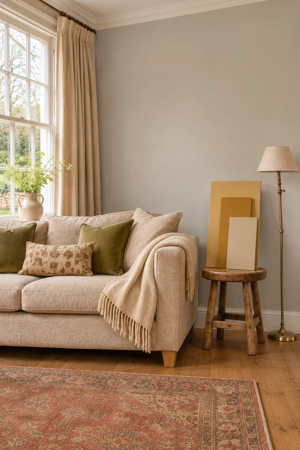
Use a separate line in your notes for each wall. For example, suppose Light Gold looks gentle by the window and more yellow beside your reading lamp, while India Yellow looks rich in daylight and very deep across the alcove after dinner. That would give me a reason to try the lighter option across a larger surface and keep the deeper one as a candidate for the alcove. Your own boards may give you the opposite answer.
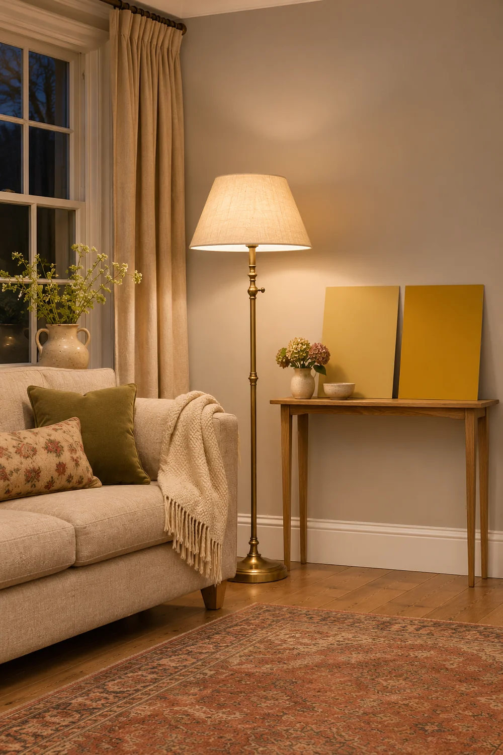
Rank the views according to how you use the room. A space you occupy mostly after work deserves particular attention under its evening lights. If the living room is also where you sit with coffee on a grey morning, make that a second condition the colour has to pass. If the paint should work on both walls, a sample that only succeeds in one favoured spot stays a candidate for a smaller area.
Bring the two best boards down to the part of the room where the floor and sofa are closest. Put the existing cushion next to each one and look at the sofa as a whole. I would also pull back a corner of the rug if it hides most of the floor. The painted wall, the visible strip of timber or carpet and the upholstery will often be in the same view.
Check what the paint does to each surface. Against cool grey wool, an earthy yellow may give the sofa enough warmth to stay. Against cream upholstery, the same paint can make the sofa look much yellower than you expected. Pick the sample that lets you recognise the finishes you liked in the first place. If a single cushion causes the clash, swap it temporarily for a plain one and see whether the problem disappears.
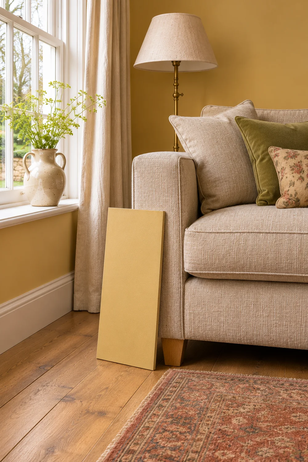
When the floor already has an orange tone, try the deeper yellow against a darker part and a lighter part of the timber. Oak boards can vary across one room. If the richer shade makes the strongest board feel too orange, the warm neutral might make more sense for the wall, with ochre in a cushion or lamp shade. The brown and orange living room examples show how rust, tan leather and timber can provide the warmth that another yellow surface would otherwise have to carry.
I would give the winning paint three tests. It must read as a warmth you enjoy at your usual seat. It must work with the floor and furniture that are staying. And it must still look intentional where it meets the trim or the colour in the hall. If two shades pass, compare how each would feel over the whole area. I would use the quieter shade if the room is already visually busy and save the deeper colour for one clearly bounded surface.
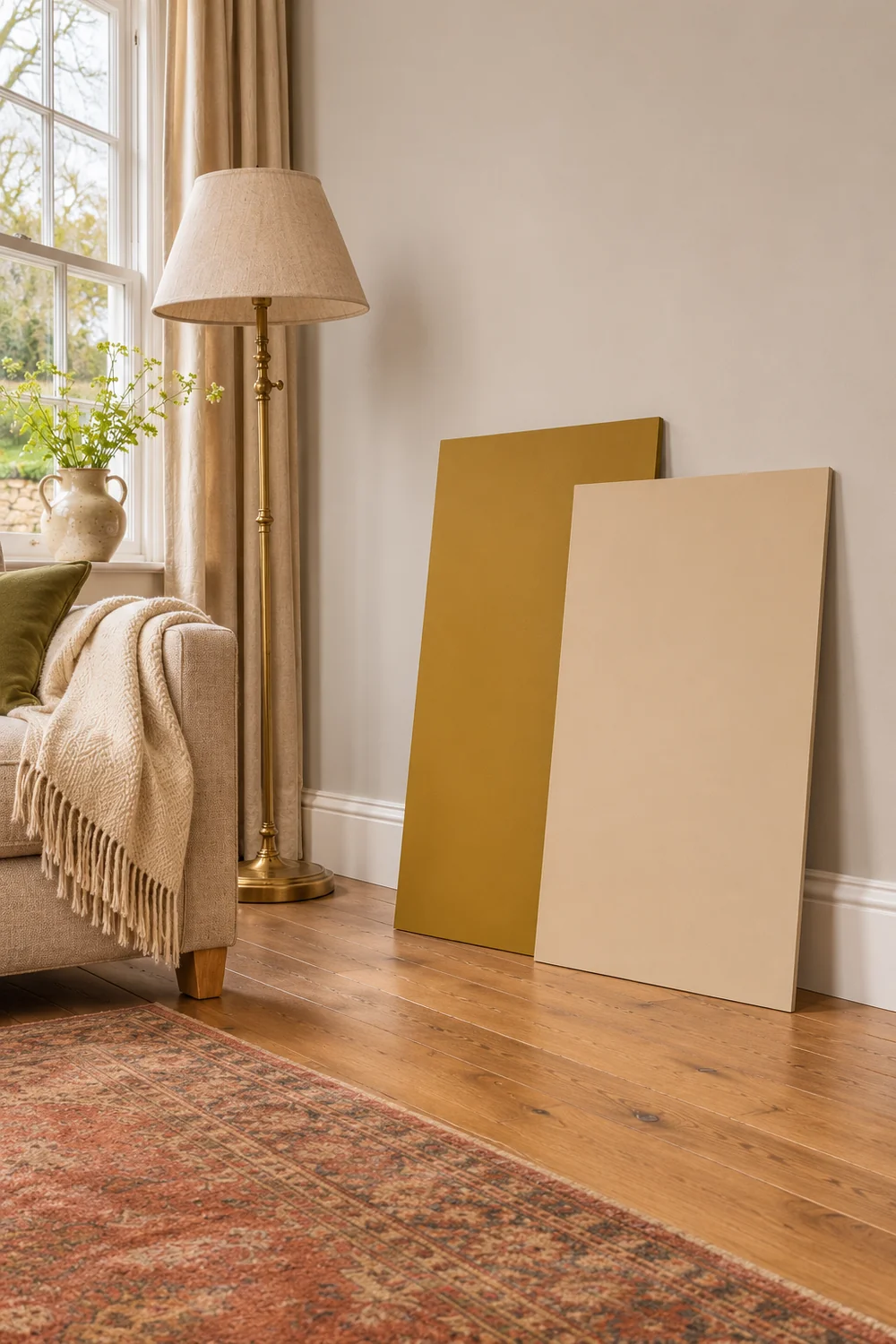
If none of the boards passes, write down the reason before buying another sample. That gives you a useful instruction at the paint shop. You may want less yellow, less depth, or a version that sits more comfortably against the sofa. Keep the most useful control board and change one quality at a time on the next round.
Before placing an order, write down the shade name and number, the exact finish and where you intend to use it. Specify the wall, alcove or whole room and list the surfaces that will take a different finish. If you are keeping the skirting or repainting the fireplace surround, put those on their own lines. Matching colour names can appear across more than one brand, so keep the maker’s name beside the shade.
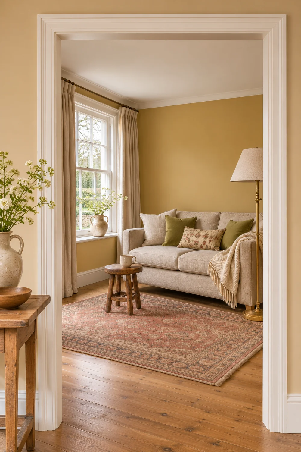
For the walls, I would check the manufacturer’s information on finish, cleaning and surface preparation. A flat effect can be appealing opposite a window, while a frequently brushed wall beside the door may make cleanability a higher priority. If your shortlist finish differs from the tester, ask whether you can see a sample of the actual finish. Compare it on a prepared patch or sample panel appropriate to that product.
Put the winning board next to the paint you will keep on the ceiling, skirting and door frame. Then stand in the hall with the door open. If you see several rooms together, a warm chalk tone can give them something in common while leaving each room its own colour. The Old English color palette has examples of adjoining rooms connected by a quiet neutral, which you can use to decide whether the trim needs to change with the wall.
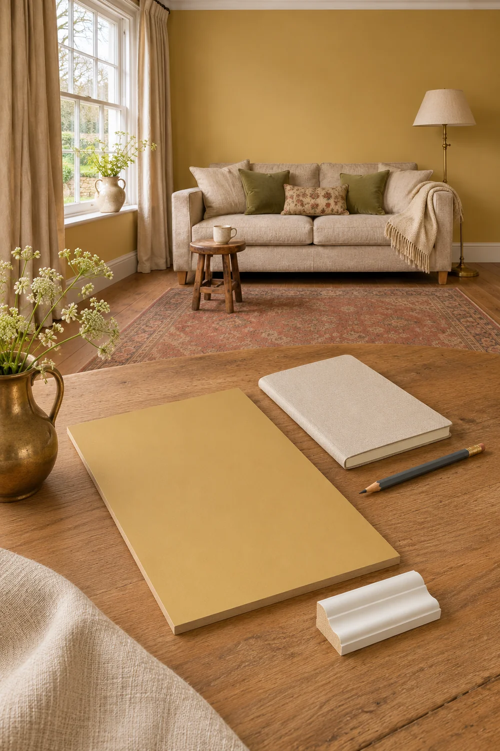
Measure the area you are painting and check the product’s coverage, required preparation and number of coats. Calculate the total area as directed by the maker and allow for the surface you actually have. Uneven repairs and porous surfaces deserve a separate check. I would keep the final decision on a card you can take to the shop or send to the decorator, with these details together.
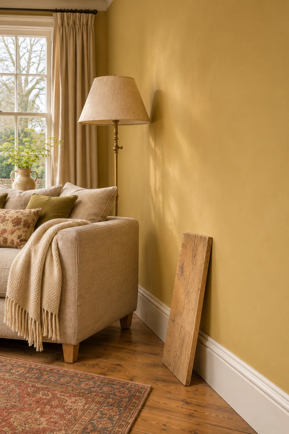
If you can only settle one part this weekend, start with a surface that has a clear edge and passed the test. That gives you a useful first decision while keeping the rest of the room available for a separate check.
Keep a clean, dry board with the leftover paint. On the back, write down the maker, shade, finish, wall and date. Keep the tin label or order confirmation with the board, including any batch information you can find. Follow the maker’s storage guidance for leftover paint so you can judge whether it is suitable to use when you need it.
If a mark later needs a touch up, clean the area according to the finish guidance and try the smallest sensible patch first. Let it dry before you decide how much more to do. A small repair may be visible because the existing wall has aged, the surface texture differs or the lamp catches the patch. If a local repair keeps showing, I would consider repainting the surface to its natural edge, such as an inside corner, once you know the colour still suits the room.
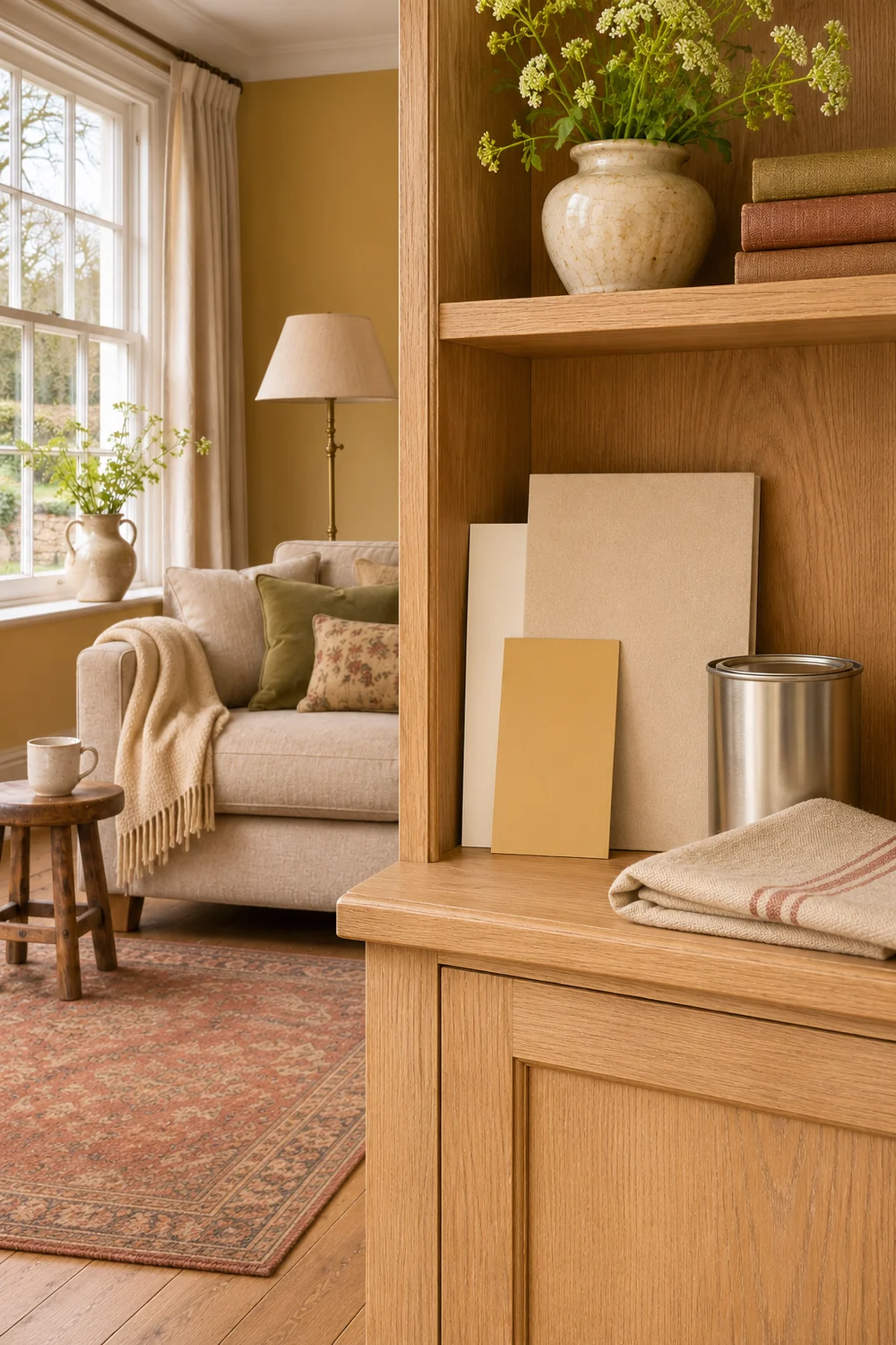
Recheck the board if a new rug, window treatment or set of bulbs makes the room feel different months later. I would stand in the same spot and compare the wall with an original note about its daylight or evening appearance. A living room used mostly after dark in winter can present a quite different decision from one you first decorated in spring. Change one thing for the comparison, such as the bulb, and see what you learn before thinking about another repaint.
When the room’s fixed pieces have changed, bring the old board back alongside them. If it still works near the sofa and floor, you have a useful colour reference even as textiles change. If the balance has moved, revisit your earthy color palette and decide which surface should carry warmth now.
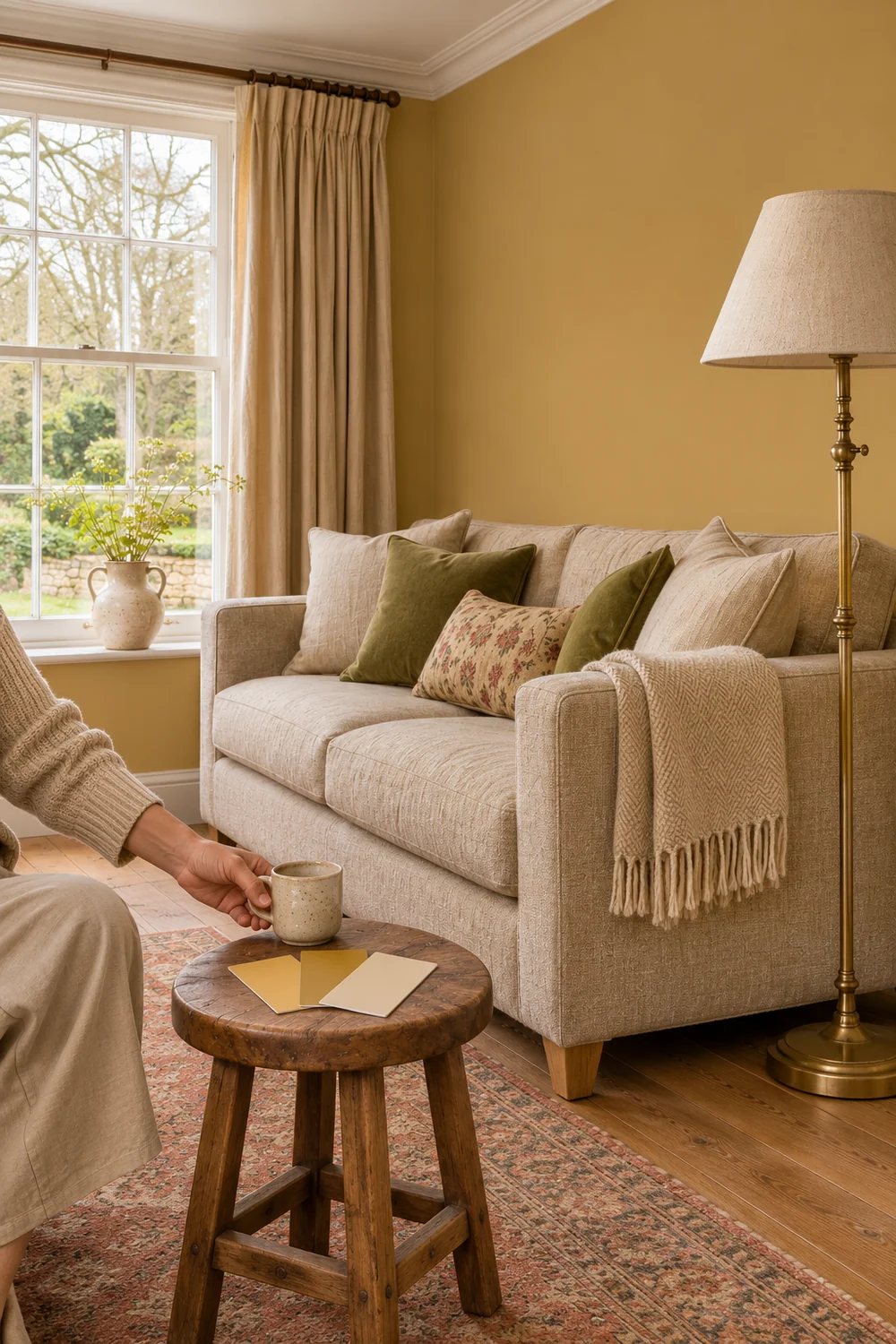
The record I would keep is simple enough to use again. It identifies the paint, the surface and the light in which you liked it. Keep it with the room instead of relying on a picture from the day you moved in. You can then test the next change against the colour you actually chose.