Newsletter Subscribe
Enter your email address below and subscribe to our newsletter

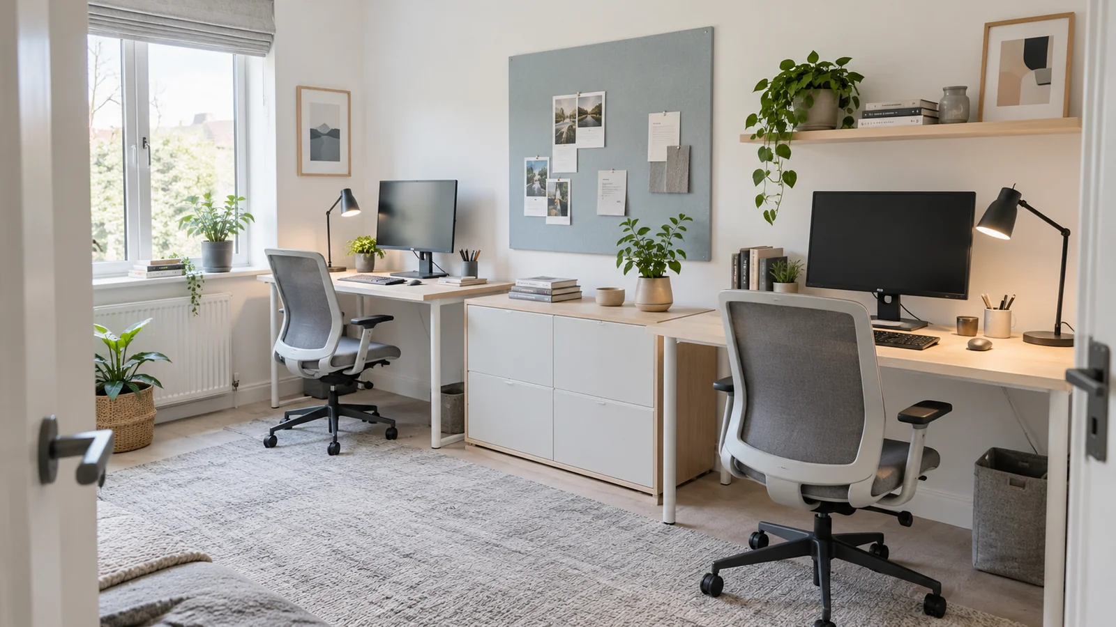
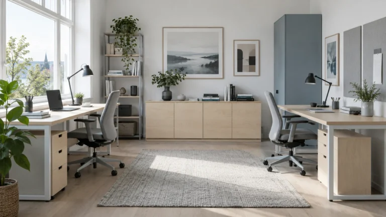
A room that looks calm with one desk can feel crowded when a second person begins working there every day. Two chairs need room to move, two screens need useful light, and a call for one partner can interrupt the other's focus. If you share a small home office for two, I would begin with what each of you actually does rather than trying to make a matching pair of desks fit an attractive photograph. Scandinavian design offers a helpful starting point: a clear floor, useful natural materials and furniture that earns its space. This plan will help you compare arrangements, agree on shared and personal zones, and leave with a measured layout to test before you buy anything. The same room can feel composed and still work for two distinct routines.
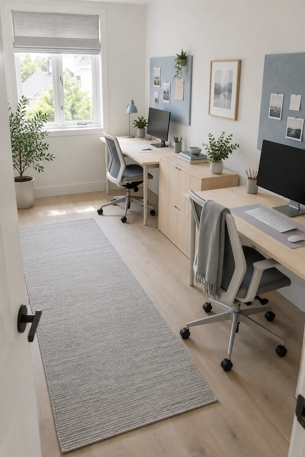
Before drawing furniture, I would ask each partner to describe a normal working day in this room. Note when both are present, how often either person speaks on calls, whether one uses paper beside a screen, and which equipment stays on the desk. Avoid broad labels such as creative and practical. A person who spends two hours on video calls needs a different screen background and lighting position from someone who mostly reads or draws. Put those activities on one sheet so the room plan responds to use rather than assumptions about whose work matters more.
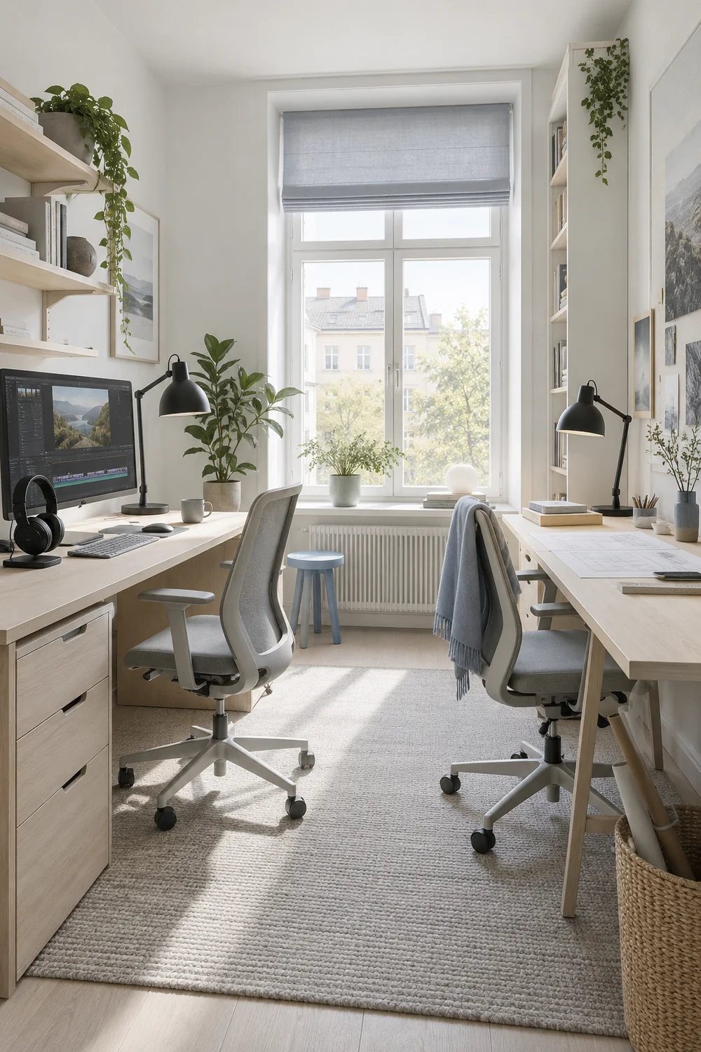
Mark the times when needs conflict. If one person takes a call while the other concentrates, changing the colour scheme will not solve the interruption. You may be able to put the speaking station farther from the door and angle the other screen away from it. You may also need a separate place elsewhere in the home for occasional calls. I would record that honestly in the brief. An attractive shared office cannot guarantee acoustic privacy, particularly in one compact room, and a layout should not promise it.
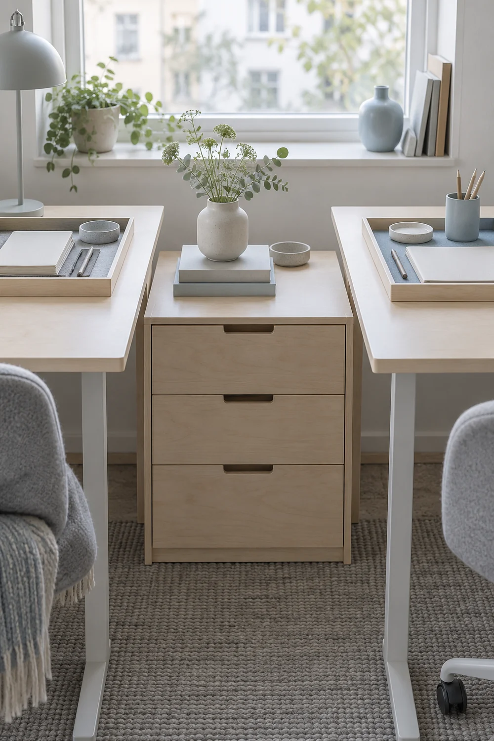
Next, give each partner three essentials and three preferences. Essentials might include a clear video background, space for a drawing tablet, or a chair that can move back without meeting a cupboard. Preferences might include matching desks or a view of the window. I would resolve the essentials first and then look for a Scandinavian arrangement that makes the two stations feel like one room. The published scandinavian home office examples help you choose the room's quiet lines and materials. They are the style reference; this plan deals with the additional demands of two people working together.
Decide what can be shared. A printer, reference shelf or charging place may need one accessible location. Headphones, daily papers and personal equipment usually work better with clear ownership. If one partner is left with the only drawer and the other uses the floor, a visually balanced pair of desks will not feel balanced in use. Write the allocations into the brief now. This prevents storage from becoming the leftover decision after the desks occupy every wall.
I would draw the room as it is, including the door arc, window opening, radiators, sockets, fixed furniture and any sloping ceiling. Then I would draw the full footprint of the desks under consideration, not just a photograph of their tops. The chair behind each desk needs its own working and getting up space. Put two existing chairs in the proposed positions or mark their outlines with paper, then have both partners sit and stand at the same time. An empty room measurement cannot tell you whether one chair traps the other.
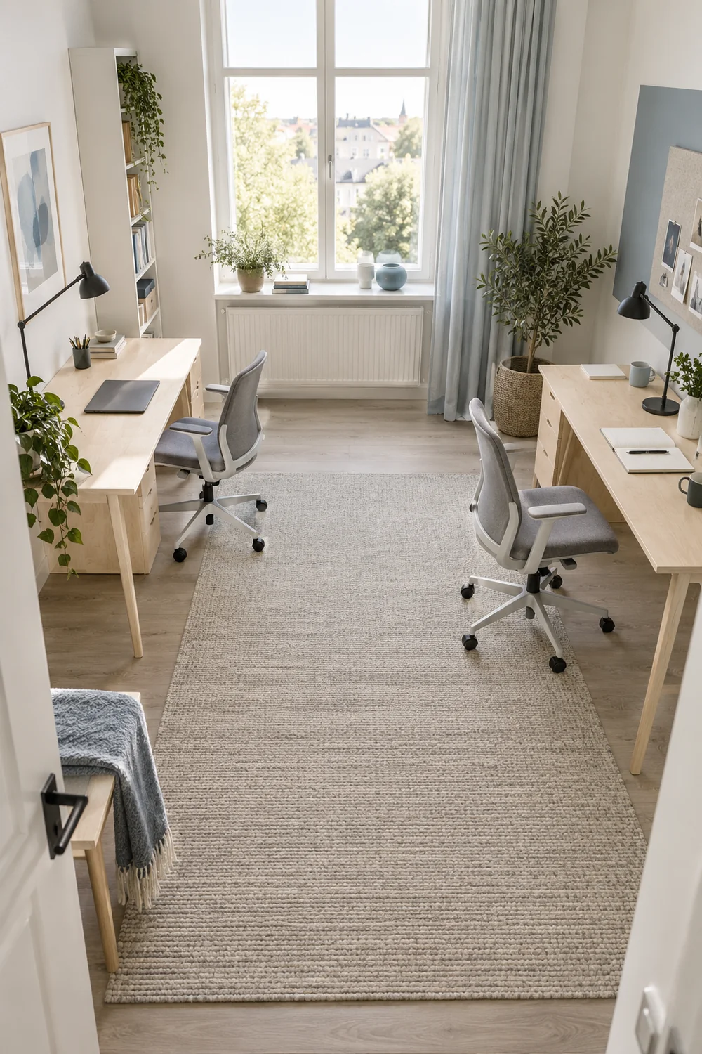
Trace the route from the door to each station and to the window. Open every cupboard or drawer you expect to keep. If a chair must be pushed under a desk each time the other person enters, the arrangement has a hidden cost. I would test the room with a bag, a waste basket and the actual computer equipment as well. Small objects can occupy the strip of floor that the drawing treated as spare. When the route fails, shorten a desk or change its orientation before shrinking the passage in the hope that it will feel acceptable later.
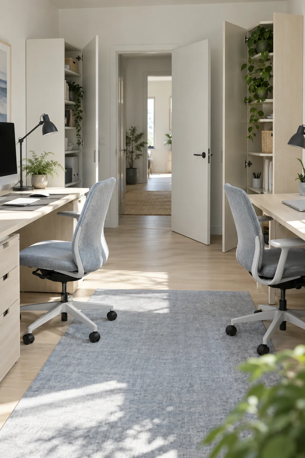
Measure vertical space as carefully as floor space. A low window sill may allow a desk below it but put a screen against bright glass. A shelf above a monitor may look efficient yet prevent the screen from being raised to a comfortable position. Where a socket is on the far wall, consider a safe cable route before fixing the desks in place. I would mark these conditions on the same sketch so the furniture and electrical decisions remain connected. Any new socket or fixed wiring needs an appropriate professional assessment.
The outcome of this section is a usable room envelope for two people: where chairs move, where a door opens and where screens can sit. It is not a purchase list. Once you know those bounds, the double desk home office specification gives you a way to check the actual desk, chair and light choices against this plan. The measured arrangement comes first, so a beautiful paired workstation never dictates a room that cannot accommodate it.
Two desks along one wall can give a small room a clear centre and a simple visual rhythm. I would test this first when the wall is long enough for two proper work surfaces and both chairs can pull out independently. The risk is that one partner is pressed against a corner or that the two people share a single source of glare. Put screens and chairs at their real widths in the sketch, then sit at both positions. If either user must twist toward the monitor or ask the other to move before standing, the long wall is not a good answer even if the desk tops fit.
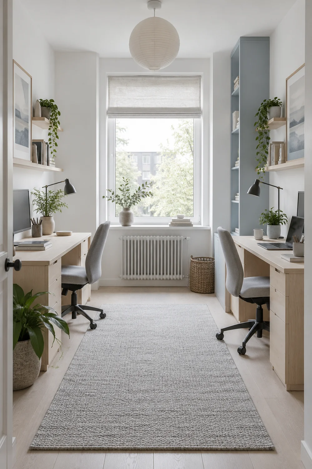
Facing desks can create two personal zones and may let each person own a side of the room. I would try this when depth allows both chairs to move without collision and when the two screens can be angled to avoid reflections. Face to face can also expose more equipment at once, making a compact room feel busy. A low shared storage element may give the arrangement order, but it should not interrupt sightlines or access. Test whether normal conversation and calls are comfortable; do not assume that facing away from each other makes speech private.
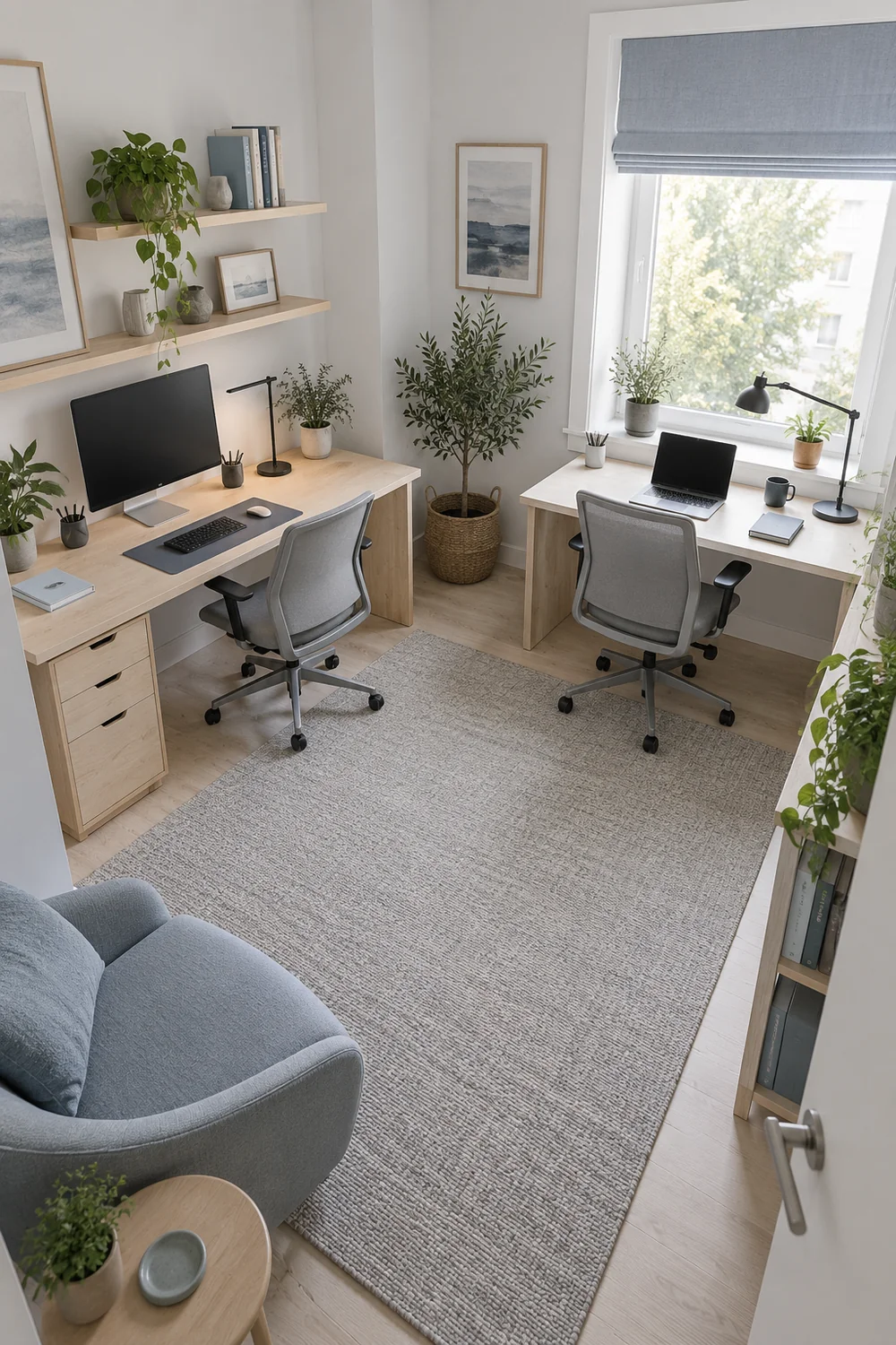
An L shaped arrangement can use two connected walls when one long wall is unavailable. It often helps separate tasks and camera backgrounds, but the inside corner can become wasted or contested. I would assign the corner deliberately: perhaps it belongs to a shared printer or a shallow reference surface rather than either person's knees. The two desk ends must still allow each partner to leave the chair. An L shape is not automatically the space saving choice if one leg blocks a cupboard or the door.
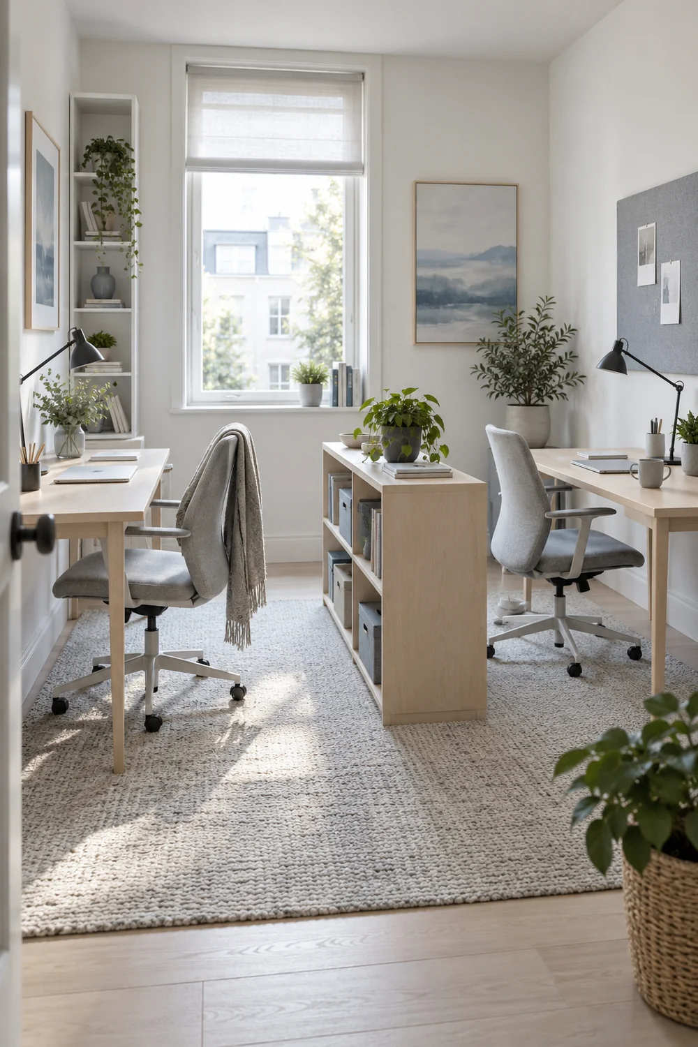
The broader minimalist home office guide discusses open and private office space. Its question is useful here, but I would answer it for two actual routines: do you need visual contact, or does one partner need the other workstation outside the camera view? Give each arrangement a simple score for chair movement, screen comfort, calls, storage access and visual calm. Reject any arrangement that fails an essential. A layout that wins only on symmetry does not win the room.
I would photograph the three rough arrangements from the doorway, both seats and the window before deciding. Tape, borrowed tables or cardboard outlines can reveal a blocked route without committing to furniture. Let each partner use the preferred setup for a short work period if possible. What feels generous in a sketch may change once two people reach for their equipment at the same time.
Daylight is one of the pleasures of a Scandinavian room, but two screens make its direction a practical choice. I would note where the sun and reflections fall during the hours both people work, then orient the screens so neither partner is forced to face a bright window or sit with strong light directly behind the display. Adjustable window covering can soften the difference between a sunny and an overcast day. It should be reachable without walking through the other person's working zone. The Health and Safety Executive advises checking screen reflections and adjusting the room or window covering where glare appears.
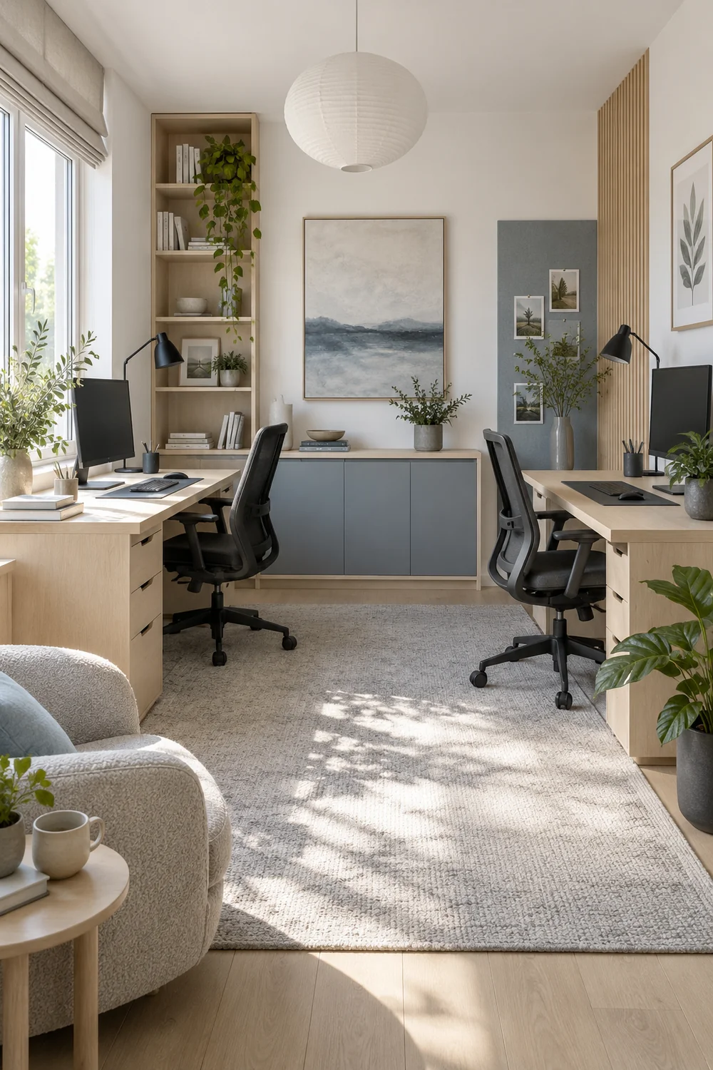
Place each screen and keyboard for the person who uses it. The Health and Safety Executive's display screen guidance favours a screen directly in front, about an arm's length away, with the top near eye level, and a keyboard positioned to keep shoulders relaxed. I would use those as checks for each partner, not assume identical desk heights or chairs will suit both. If one uses a laptop for long sessions, plan space for a separate keyboard and a raised screen or external display. This is why the chosen arrangement must be tested with the actual equipment.
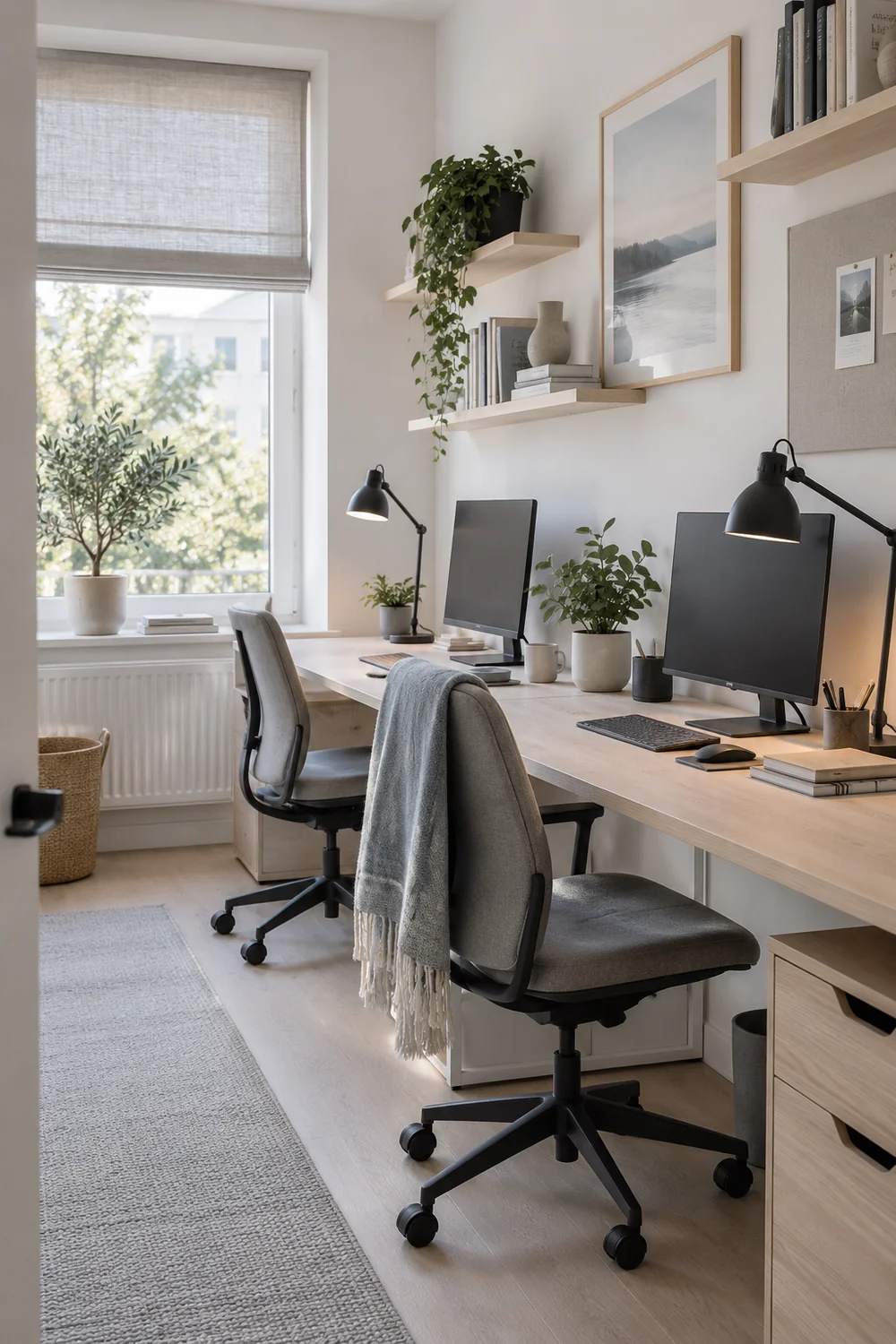
For calls, I would look at what appears behind each seat and what happens when the other person crosses the room. A simple wall, a restrained shelf or pale birch cabinet can make a camera background without adding visual clutter. If a meeting requires confidentiality, agree where that call will happen before promising the room can support it. Soft textiles can moderate the hard feel of a bare room, but I would not describe a rug or curtain as soundproofing. The practical decision is whether the schedule needs another room at certain times.
Once you have placed the stations, the separate home office lighting and desk checks belong in the specification article. Here, mark which side receives useful daylight, where a task light can stand without shining into the other person's screen, and where a cable can reach power safely. The result should be a lighting brief, not an impulse purchase of two identical lamps.
In a shared room, storage works when its ownership is obvious. I would create a personal landing place for each partner's daily items and one shared home for supplies that either uses. Two small drawers may serve better than one large cabinet if both people need quick access during calls. Conversely, separate shelves for a single printer and paper supply can waste a scarce wall. List what must stay within seated reach, what can live behind a door, and what does not belong in the office at all.
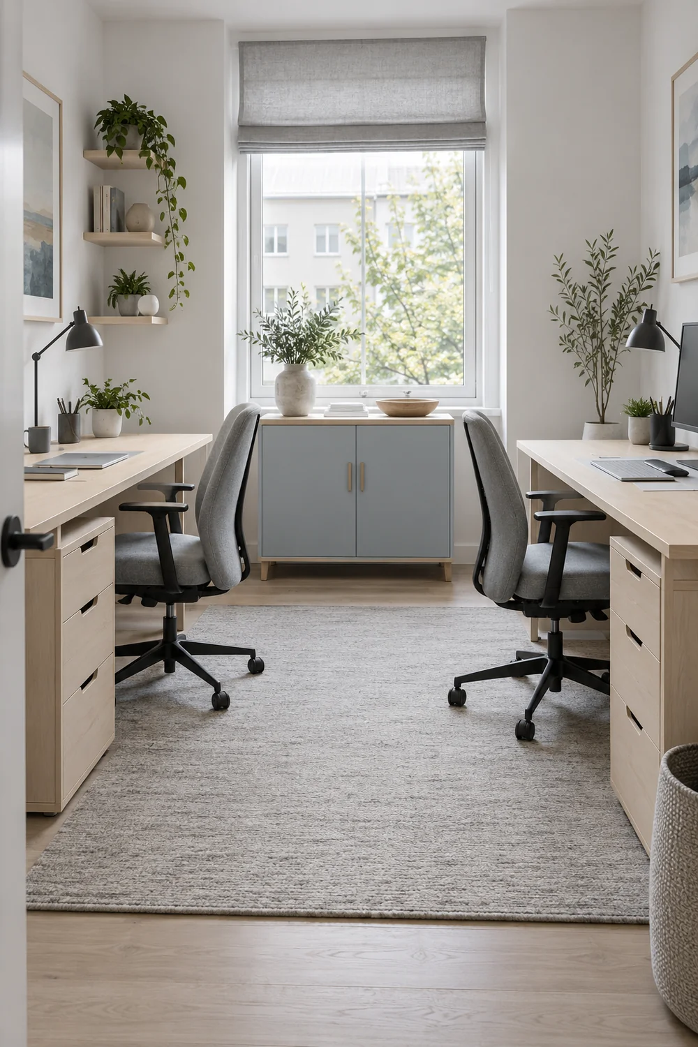
Keep the most frequently used pieces close to the person who needs them. A pen cup or notebook can be visible if it is genuinely used, but piles of spare cables and old files deserve a labelled place away from the work surface. I would ask each partner to clear their own station at the end of the day, while a shared shelf has a single agreed reset rule. That is a household decision, not a decorative trick. It helps the room return to the calm that made Scandinavian style appealing in the first place.
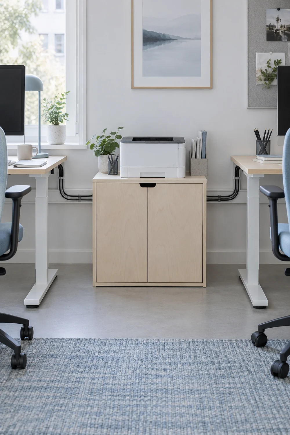
The minimalist home office guide is a useful background for reducing visible clutter and handling cables. In this room I would be stricter about access: a shared cabinet cannot sit behind one chair if the other partner needs it during work. Draw the cabinet doors open on the room plan and test them with both chairs occupied. If a storage piece steals the only clear route, reduce what the office holds before adding a slimmer version of the same problem.
Give charging equipment and cables one planned route rather than trailing them between desks. I would keep cords away from chair movement and check that a power solution suits the equipment and the home. A fixed change belongs with a qualified installer. The visual benefit is a quieter room, but the practical benefit is that either person can stand, adjust a chair and use shared storage without working around a tangle.
I would finish with one page showing the chosen desk arrangement, both chair movement zones, screen directions, door route, window treatment, power points and personal and shared storage. Add the three strongest reasons the arrangement won. If a partner's needs change later, that note will tell you which tradeoff to revisit. A plan is more useful than a mood board at this stage because it names what the room must do for both people.
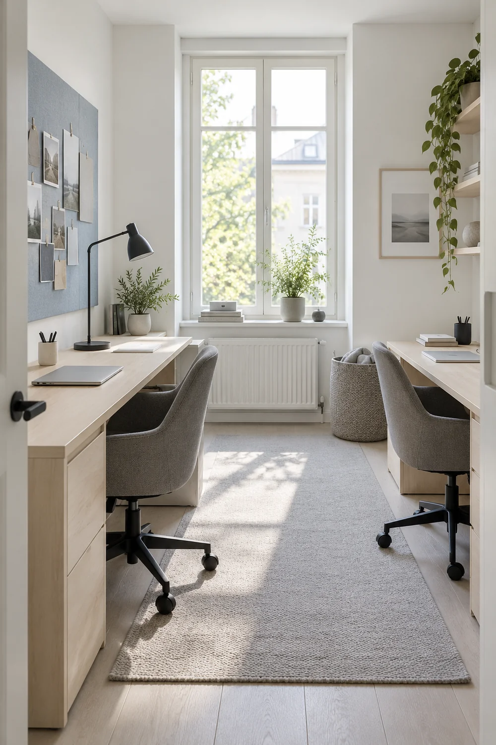
Give the plan a restrained material family. Chalk white walls can keep the small room light, pale birch can make the work surfaces feel related, and light wool grey can soften the harder equipment. Pale mist blue can be limited to a pinboard or one painted surface, with matte charcoal reserved for lamp arms and other task details. I would sample those colours in the actual room before treating them as fixed. The broader scandinavian color palette guide is helpful if your existing floor or light calls for a different balance. The project does not need two competing schemes simply because two people use it.
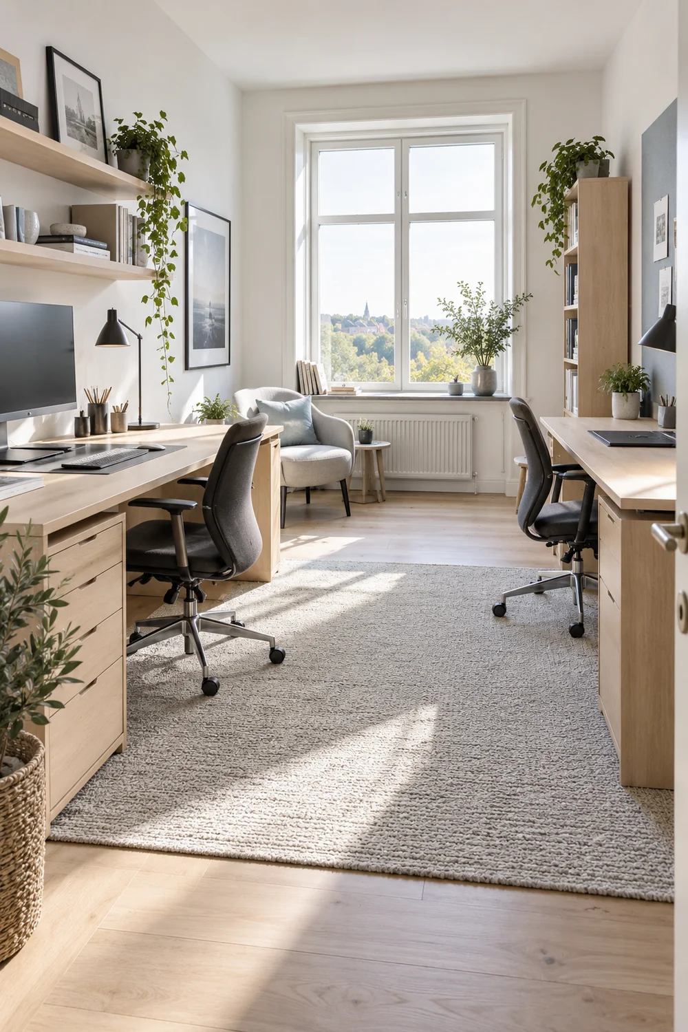
Now list the items that must be specified against your measurements: desk widths and depths, chairs, task lights, window covering, storage and a safe cable path. Hold off on anything that looks convincing only in the empty room. The companion specification takes this selected arrangement into a concrete fit and use check; it should confirm the plan, not quietly replace it with a more photogenic desk. If the plan fails when both chairs and screens are present, come back to the layout comparison before spending on finishes.
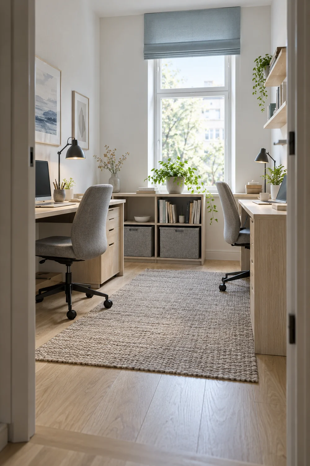
The plan I would keep beside the room
The best small shared office is not perfectly identical on both sides. I would want both partners to have a station that supports their actual work, a clear way in and out, and a room that still feels calm when the computers are on. Use the measured sketch as the test for every next choice. If each person can sit, focus, take the calls the room can reasonably accommodate and put work away without borrowing the other's space, the Scandinavian look has become a working plan rather than a photograph.