Newsletter Subscribe
Enter your email address below and subscribe to our newsletter

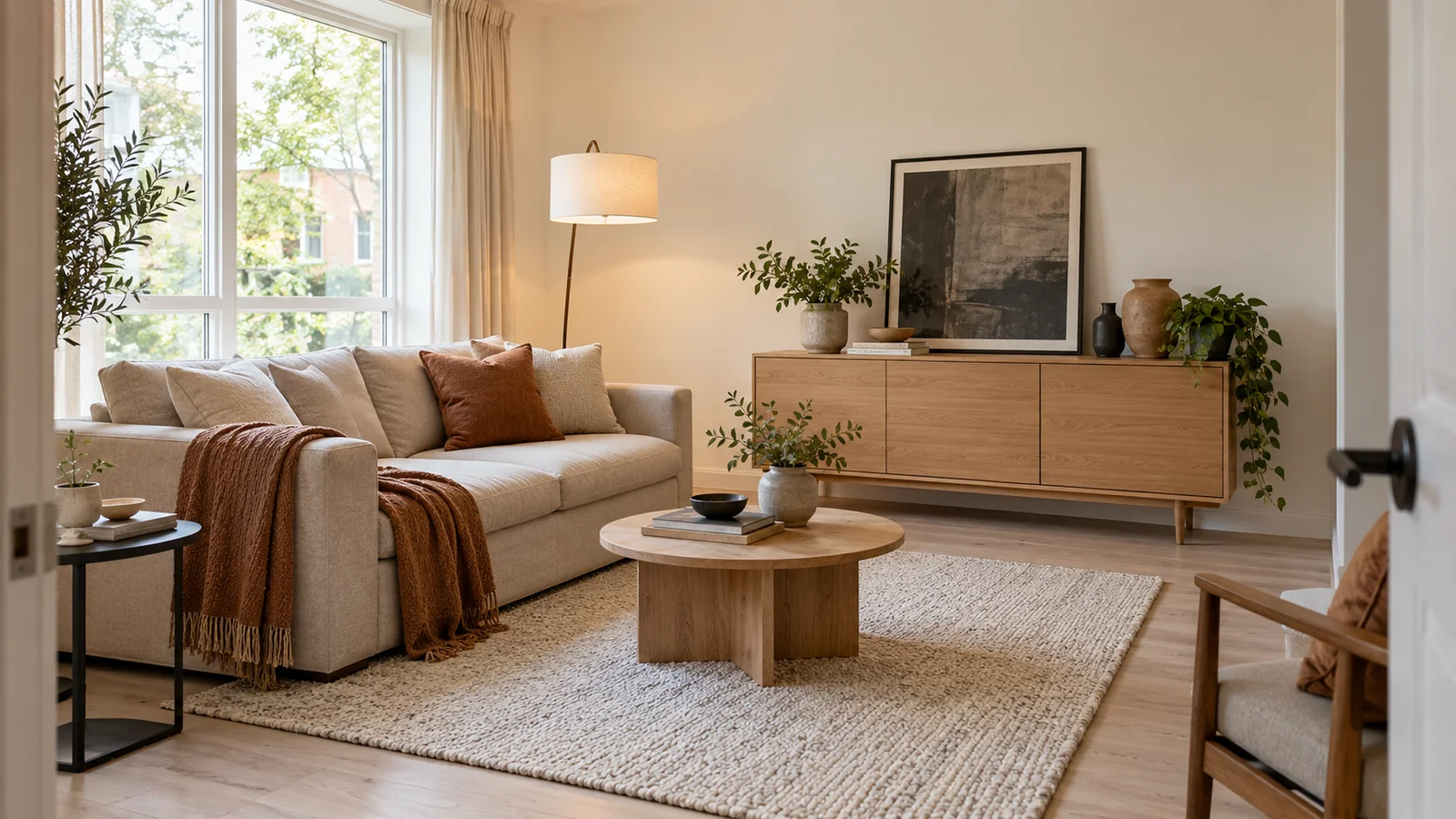
When a rental living room has walls and floors you cannot change, decorating can feel like a choice between accepting the room as it is and buying a collection of things you may not want later. I would begin with the parts that already belong to the room, then use furniture, fabric and light to make those fixed surfaces look intentional. You do not need to pretend a cream wall is a statement wall or cover every inch of it. The aim is a warm modern room that feels comfortable now and can travel with you. I will show you three visual directions, what each needs from the existing space and where I would spend attention before money. By the end you should be able to choose a look for your own living room, even if the sofa, curtains or ceiling light are not what you would have chosen.
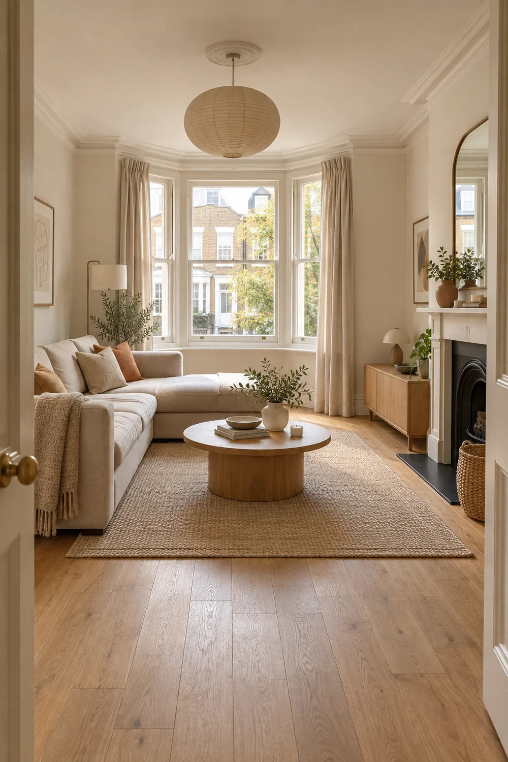
I would take ten minutes to stand in the doorway and name what the room already gives you. Are the walls warm or cool? Does the floor reflect daylight, or absorb it? Is the window the main feature, or is it a quiet opening in an otherwise plain wall? Photograph the room in daylight and again with its ordinary evening lighting. The photographs will show whether the fixed shell feels flat, cold, busy or simply unfinished. Those are different problems, and each asks for a different portable answer.
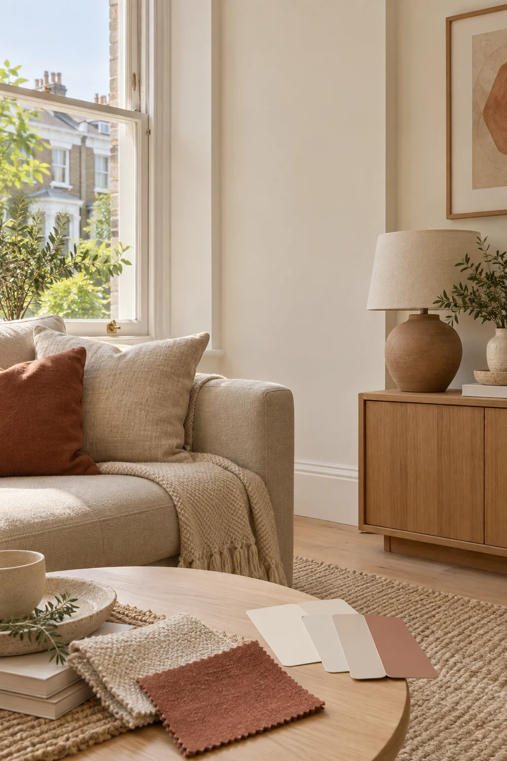
A cream wall and a pale floor can become a calm background for tactile furniture. A darker carpet may need brighter textiles and a lamp close to the sofa. A large window may already supply the drama, so the room only needs a rug and a few strong silhouettes. I would not order art before understanding what the window, door and existing furniture do in the composition. The room should lead the idea, rather than a saved image of someone else's home.
If the whole apartment has the same fixed finishes, the dark cottagecore apartment shows one very different way to use portable layers against them. It is useful as a comparison, even if you prefer the lighter warm modern direction here. Notice that the movable items carry the colour while the shell stays quiet. That principle transfers without copying its moody palette.
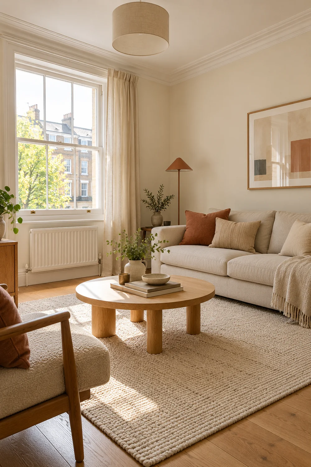
Check the details your eye normally skips: where sockets are, whether the window has a track or rod already installed, how the door opens and which furniture is supplied with the property. Your tenancy terms determine what you can alter. I would build the first idea around pieces you can place and remove without an assumption about permission.
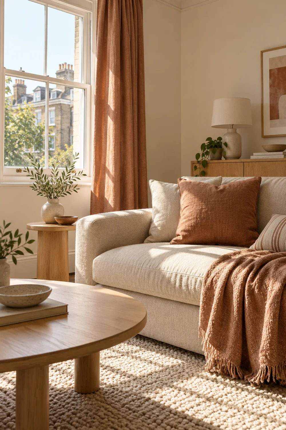
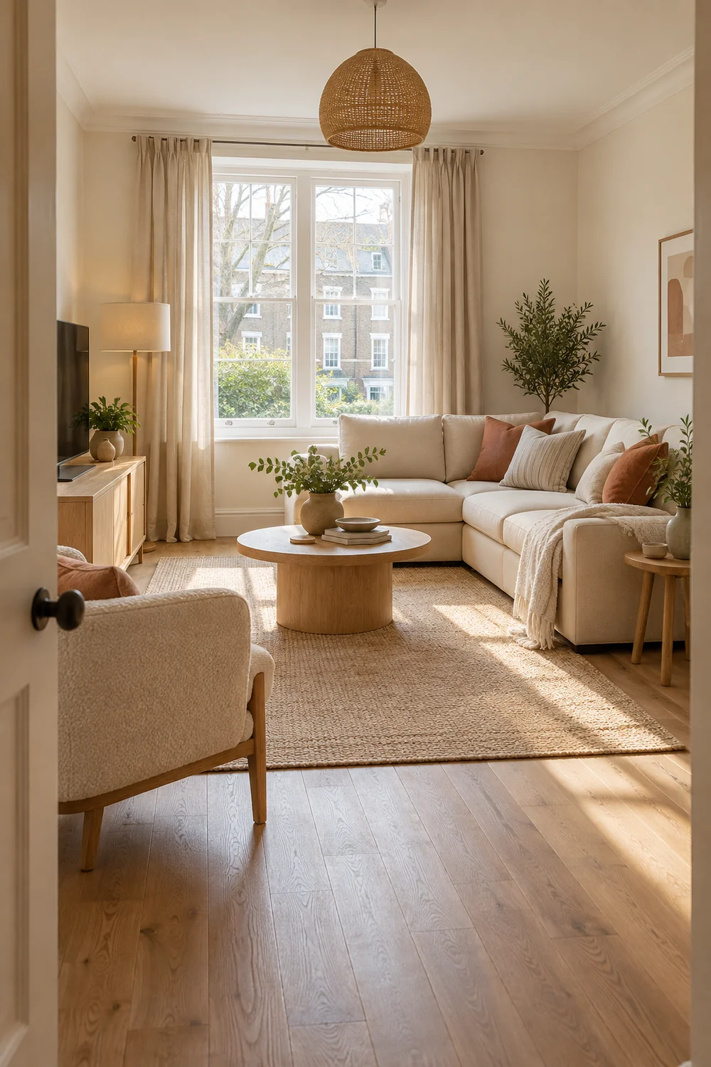
My first visual direction would be a soft seating room. Keep the existing wall as a pale background, then group the sofa, one chair and a generous rug so they feel like a place to sit together. Use an oat or ivory cover if the sofa colour fights the room, and repeat that soft tone in a cushion or curtain fabric. A low oak table and one clay coloured textile add warmth without turning every object into an accent. The feeling comes from the relationship between a few useful pieces, not from filling all the walls.
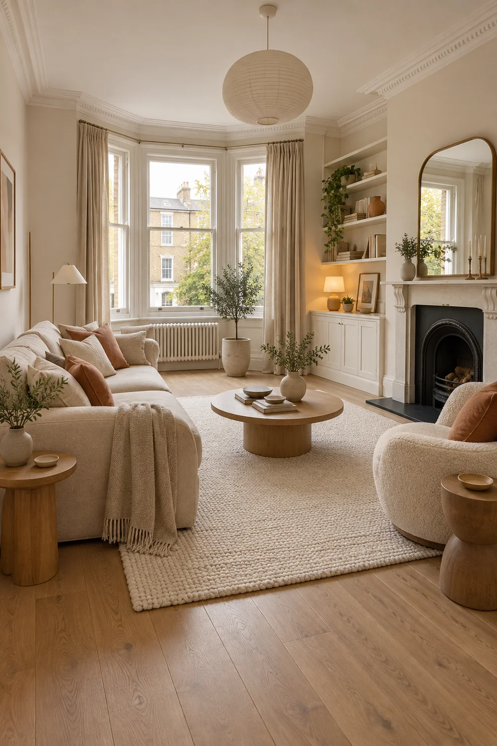
I would choose this direction when the room already has reasonable daylight and a sofa that can stay. It can make plain walls feel deliberate because the composition happens at sitting height. The tradeoff is that too many pale pieces can blur together. Give the eye one darker edge, perhaps a charcoal frame or a lamp base, and keep the rug's texture distinct from the sofa fabric. You can use the modern living room design page to compare general seating proportion and negative space, then apply those ideas to the furniture you actually have permission to move.
If the room is narrow, I would test the rug and chair positions with paper or tape before buying. This article is about the look, but a beautiful composition that blocks the door is not a useful look. Leave a visible path into the room and resist the urge to push everything tight to the perimeter. Sometimes one chair angled towards the sofa makes the seating feel more settled than another large storage unit along the wall.
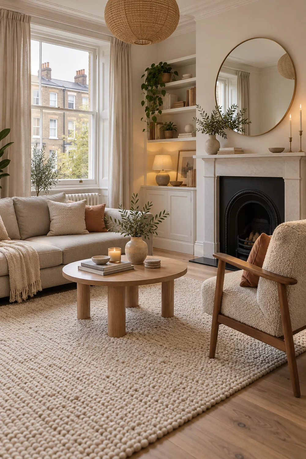
The soft seating direction is strongest when the renter wants a calm place to talk, read and recover from the day. It is less suitable if most of the room must also hold dining, work or large collections. In that case I would choose a clearer set of zones before adding layers.
My second direction would use the same warm modern shapes but let colour do more work. The fixed walls remain the light base. I would bring in one muted clay or rust note through cushions, a throw and one piece of art, then repeat it once across the room. The repeated colour connects the sofa to the opposite side without painting anything. Pale oak and cream keep the scheme open, while a small charcoal detail gives it enough definition.
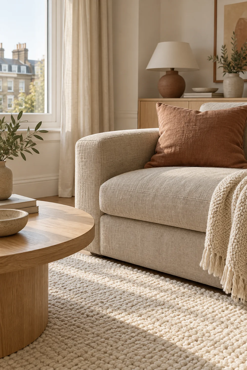
This works best when the wall colour is warm enough to sit beside clay. If the walls read cool grey, I would test a fabric sample against them in daylight before committing. A muted olive or tobacco tone might bridge the difference more naturally. The point is not to collect three trend colours. It is to choose one portable accent that makes the fixed shell look like part of a decision. Put the sample beside the wall and the sofa, then view it from the doorway as well as close up.
Use curtains only if the existing window arrangement allows them. If it does, the living room curtains show how texture, sheer fabric and colour alter a room's light. I would treat the article as fabric inspiration, then measure your own track or rod and check the tenancy terms before making a choice. A long curtain that is beautiful in a photograph but catches on a radiator or furniture will not help this room.
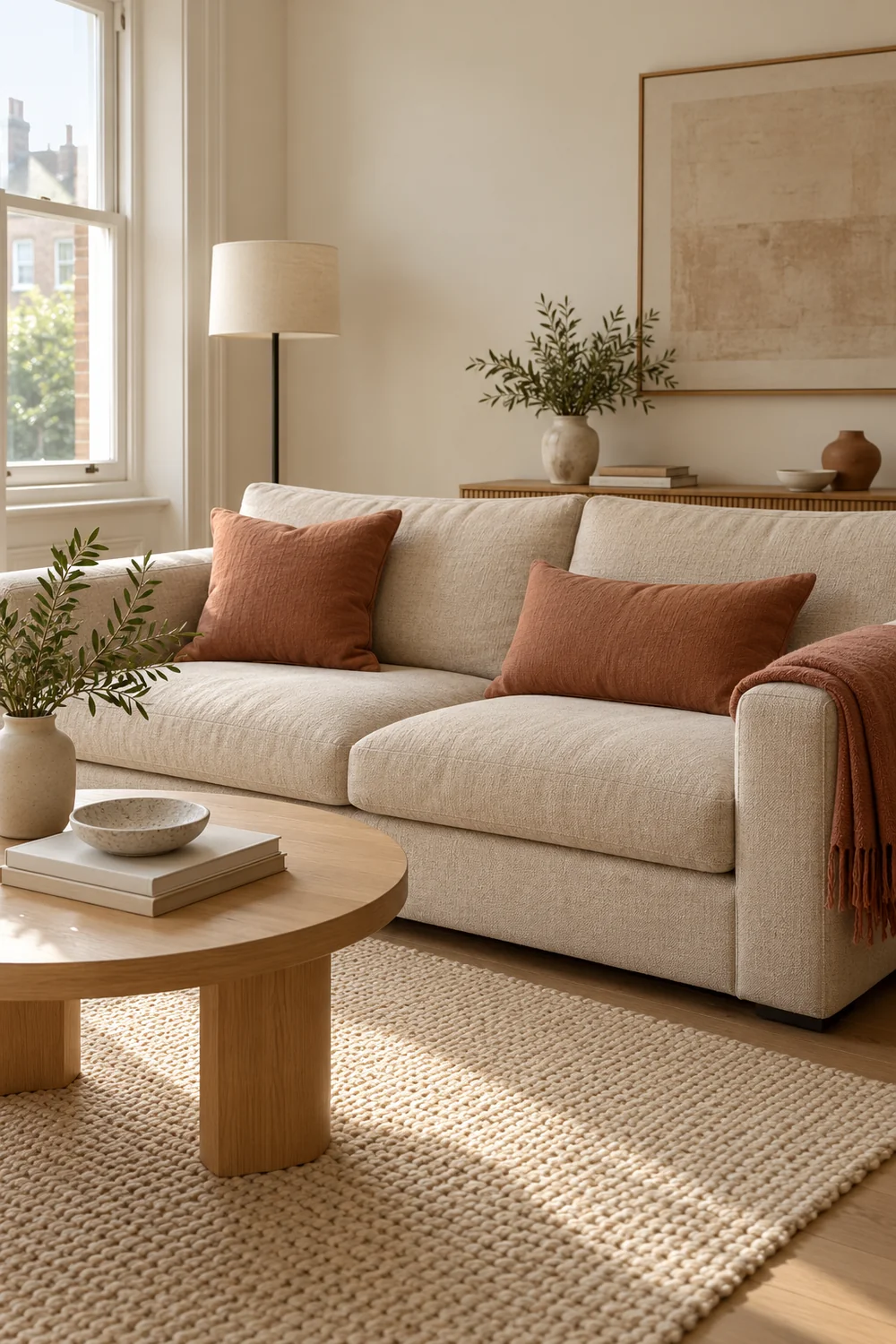
I would choose the colour direction when the room already has a workable layout but still feels anonymous. Its weakness is that small accents can look scattered. Place most of the colour in one area, then repeat a little of it once, rather than buying a matching item for every surface.
My third direction would begin with light. A plain rental ceiling fixture can make the whole room seem temporary, especially after sunset. I would leave it alone and build a second layer with a floor lamp by the main seat and a table lamp near the other activity. The shades matter as much as the bases. A pale shade can spread light gently across the sofa; a directed lamp can make a reading place useful without brightening the entire room.
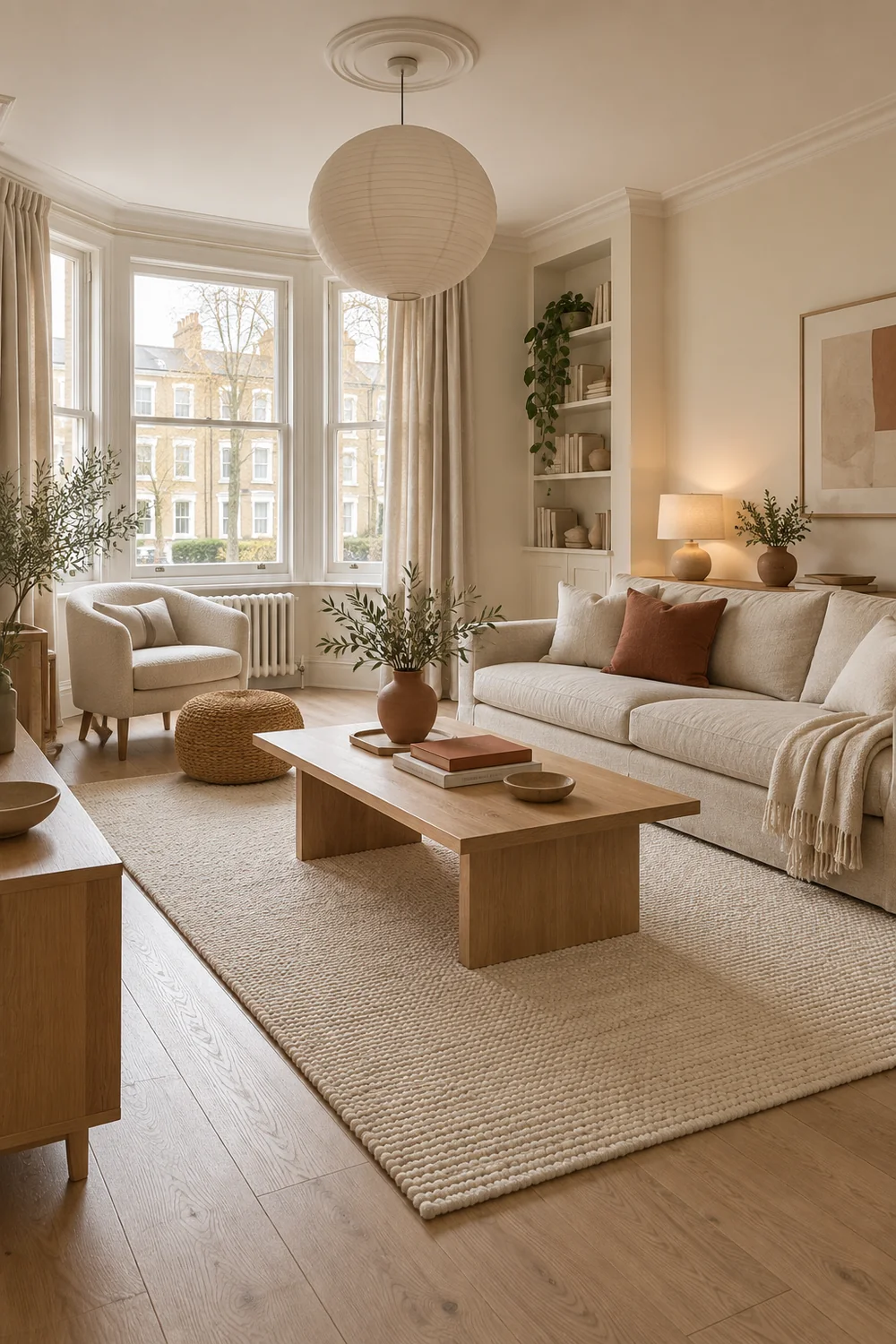
This direction is useful when the walls and furniture are acceptable but the room loses its character at night. In daylight, the lamps still serve as sculptural pieces. I would keep their forms simple and warm: a dark slim floor lamp, a small ceramic table lamp, perhaps a portable accent light on a sideboard. The art and textiles can be restrained because the lighting gives the room its rhythm. A few contrasting heights help the eye move from the low seating to the window and across to the sideboard.
The tradeoff is practical. Lamps need sockets, stable places to stand and cable routes that do not cross the path you use. I would sketch the positions before choosing a shape, then check the size of each lamp in the real corner. The later renter friendly wall decor article will compare the actual lamp and art choices once your room plan is settled. At this stage, choose the effect you want and the places where light must work.
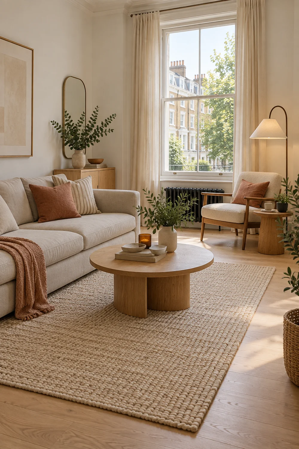
I would avoid making the room dim merely to feel cosy. Good lighting lets you see the textile texture, the floor and the route through the room. It should make daily activities easier, not hide an awkward arrangement.
An empty wall does not always need art. In a rental, I would first ask whether it gives the sofa and window enough breathing room. If the room has one large window, make that the focal point with a clear view and a fabric treatment that works with the existing fittings. If the window is modest, a low cabinet with art set safely on top can give the opposite wall a visual centre without relying on a new fixing. Check the size and stability of any object before placing it where it might fall.
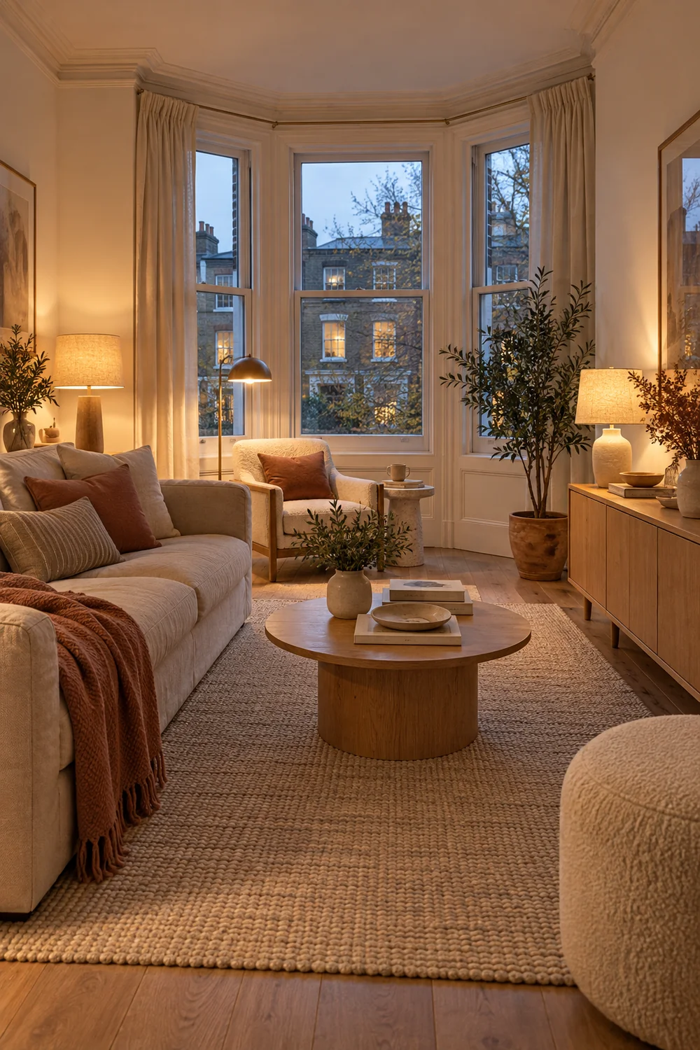
I would also consider what the wall looks like from the main seat. A single generous piece of art can carry more presence than many small frames, but the way it is displayed must fit your own agreement and the product's instructions. Do not assume an adhesive is safe for the surface or allowed by the tenancy. If a wall treatment is uncertain, use a sideboard, a textile, a floor lamp or a freestanding screen as the decorative surface instead.
The living room furniture guide is useful when you are deciding whether a low cabinet, open shelf or side table is doing a real job. For this room, I would prefer a piece that gives you storage and a surface for display, then make sure it fits the route and can move to another home. A display choice should not create a second furniture problem.
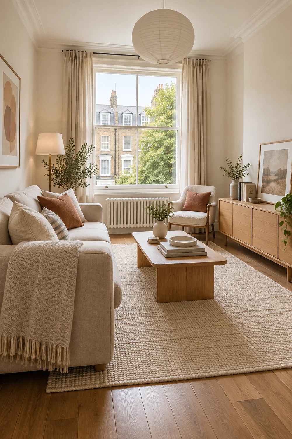
This direction works especially well when the walls are plain and the room has a clear seating area. It becomes less useful when every surface is already busy. Edit the belongings first, then decide whether the wall needs anything.
The best rental room is not one that hides every trace of a renter. I would choose a few things that have a reason to stay visible: books you use, a photograph you love, a vessel that holds something real, or a textile with a strong memory. They can sit within the warm modern scheme without matching it perfectly. In fact, one older piece can make the room feel less like a furniture catalogue.
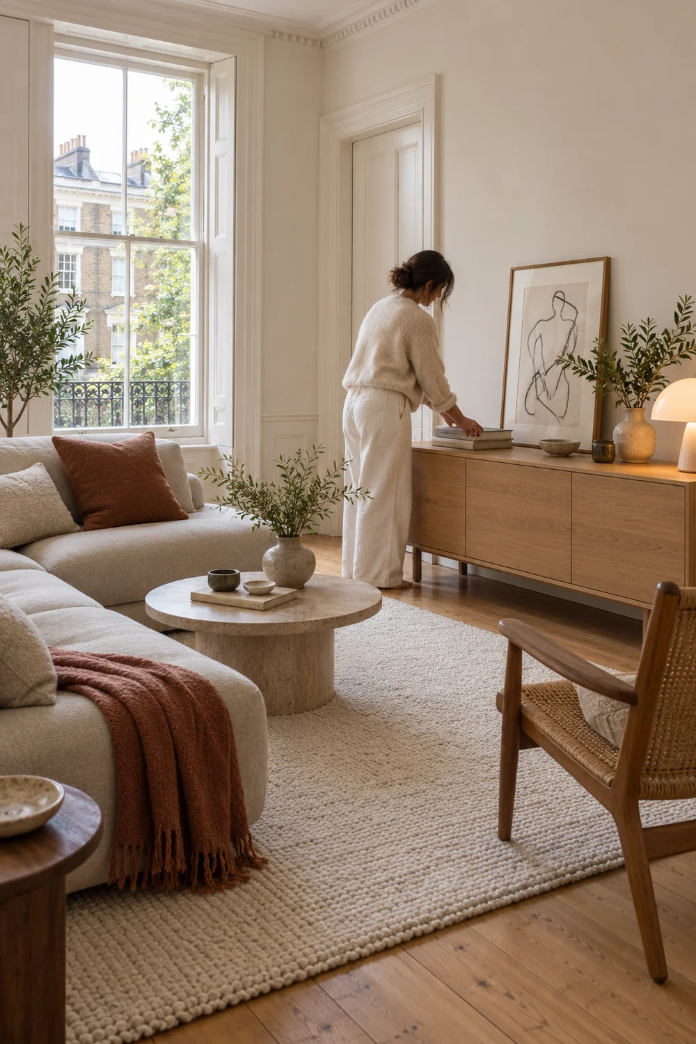
Give each possession a place in the composition. A stack of books can hold a low tray on the sideboard; it does not need an entire new shelving system. A favourite chair may set the colour direction for the cushions. A plant can soften the corner where the window meets a blank wall, provided the light and care suit it. I would leave some clear floor near the door and around the seating so the room still feels easy to enter and use.
If you already own most of the furniture, the fall apartment decor article offers a useful reminder that rearranging and restyling can change the feel of a room before a purchase. The seasonal examples are optional; the broader lesson is to test what you have. Move the chair, clear a surface and try one fabric before deciding the room requires a new sofa.
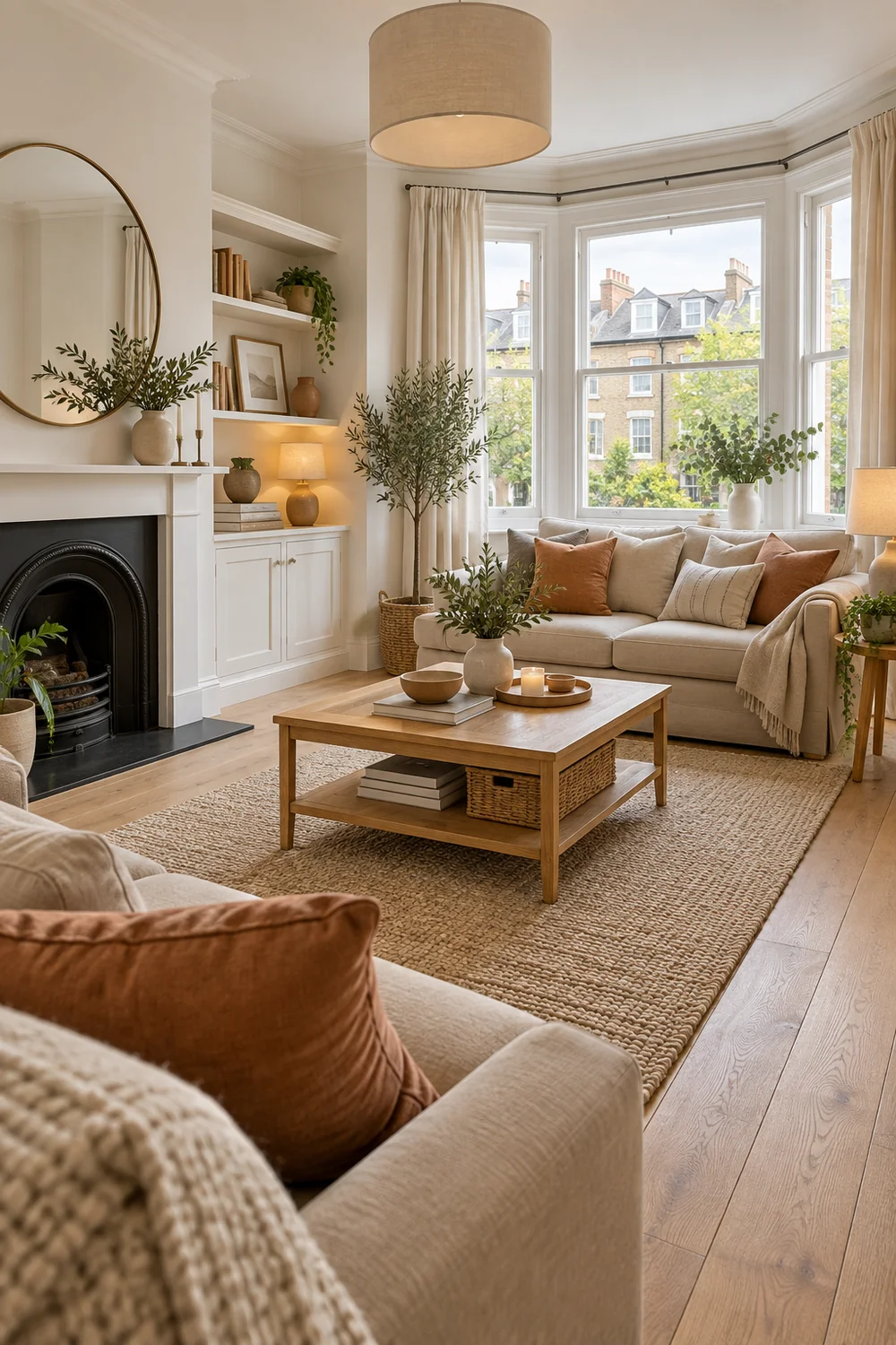
I would watch for the point where decorating begins to obstruct living. A collection on every surface leaves nowhere to put a cup. A larger rug is helpful only if it lies where people actually walk and sit. A leaning object can be hazardous if it is unstable. The room should feel more like yours because it works with your routines, not because it contains more things.
Stand in the doorway again and compare the three directions against your actual constraints. The soft seating room asks for a rug and a stronger grouping of furniture. The portable colour room asks for one accent that suits the existing walls. The lighting led room asks for useful lamp positions and simple forms. You can borrow from more than one, but choose a primary answer so purchases do not pull the room in competing directions.
I would write one sentence about the result you want, such as “a warm place to read and talk” or “a calm room that can also host friends.” Then name the largest obstacle you can see: poor light, scattered furniture, cold finishes or a blocked route. Choose the direction that deals with that obstacle first. Add only the pieces you can explain in that sentence. If an item is attractive but does not help the room's main job, let it wait.
The next decision is placement. The renter friendly living room plan shows how I would measure the fixed shell, test the seating and light positions, and turn this chosen look into a layout before buying. Your direction should survive that test. If it does not, adjust the idea rather than force the room to imitate the photograph.
I would finish this stage with a small visual brief: one chosen direction, the existing pieces to keep, the two colours or materials to repeat, and the feature the room already has. That is enough to move from inspiration to a practical plan. The fixed shell remains part of the picture, but it no longer has to decide how personal the room feels.