Newsletter Subscribe
Enter your email address below and subscribe to our newsletter

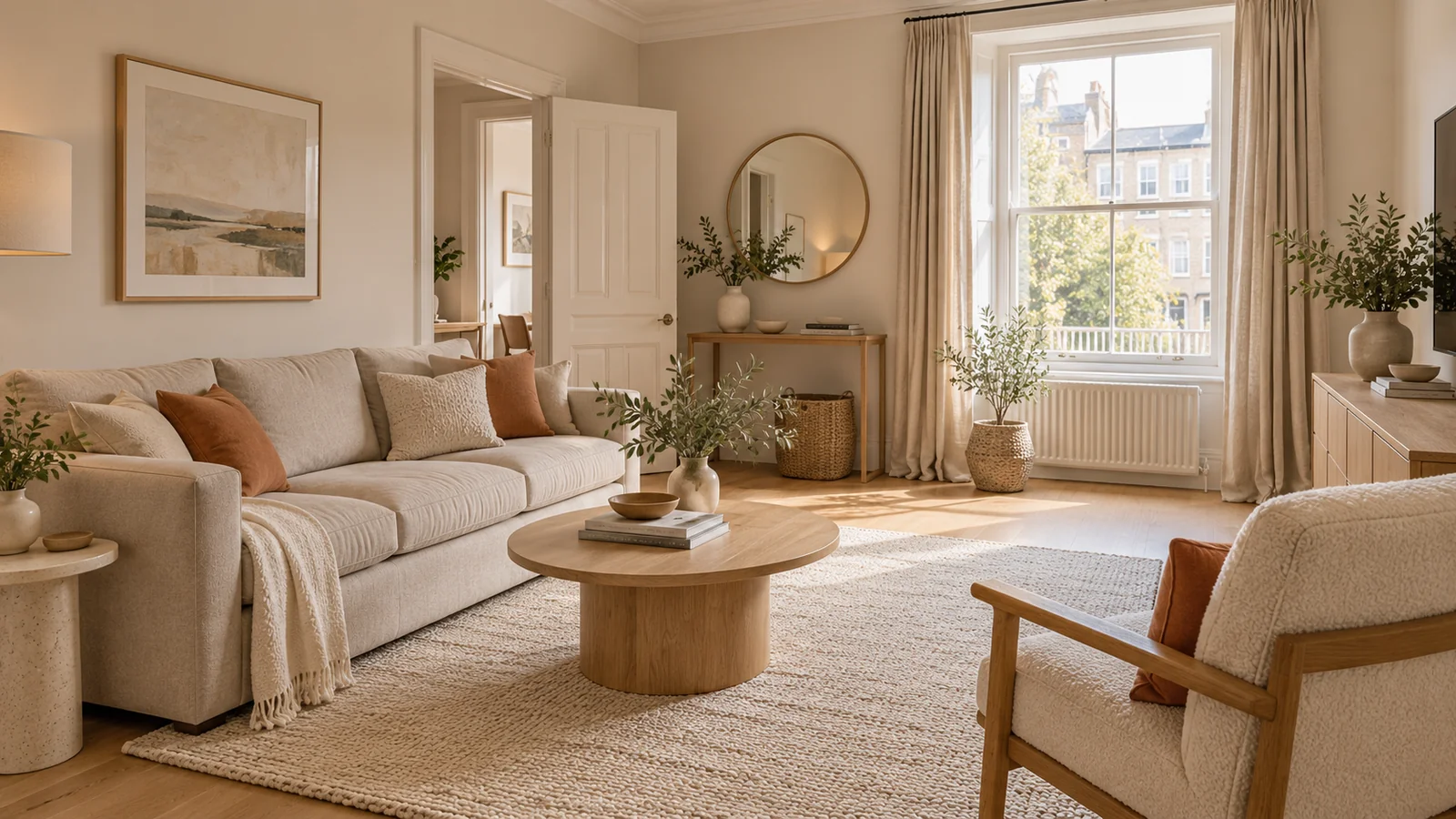
I would not start a renter friendly living room plan with a shopping list. I would start with the walls, floor, window, sockets, doors and furniture that are already there, because those are the conditions the room must answer. Once you know what cannot change, you can test a layout that makes ordinary life easier and lets portable pieces add warmth. This is the stage after choosing the look you want and before choosing the exact lamp, curtain or art. I will take you through a simple room inventory, the route people use, the seating and storage jobs, and two layout tests you can do with what you own. You will end with a plan and a short purchase brief. That way the room can feel considered now without depending on paint, holes in the wall or a collection of things that only fit this one address.
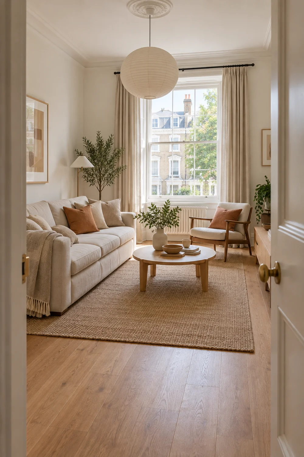
Draw a rough rectangle for the room and mark every fixed interruption. Include the door swing, windows, radiator, sockets, built in storage, awkward corners and any furniture supplied with the home. Measure the clear wall between those features as well as the room's overall length and width. A sofa might fit the total width but still block a door, radiator or socket. Write those measurements on the plan while you are in the room, rather than trusting a photograph.
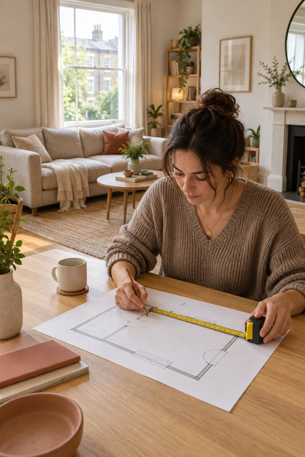
Make three lists beside the drawing. The first is fixed: surfaces and fixtures you cannot alter. The second is yours: furniture, lights, rugs and textiles you can move. The third is uncertain: things that may require permission or special fixing. Put wall mounted shelves, curtain changes and adhesive products in the uncertain list until you have checked your own agreement, the surface and the product instructions. A rental does not give everyone the same rules, and a reversible claim on a package is not proof that a particular wall will remain undamaged.
The rental living room ideas article helps you choose the visual direction. Bring one chosen direction into this room inventory. If you liked the soft seating approach, mark the rug and conversation area. If you preferred portable colour, mark where the coloured textile will be seen. If light was the priority, mark the seats and surfaces that need a lamp. The style is a decision to test, not a separate layer that ignores the plan.
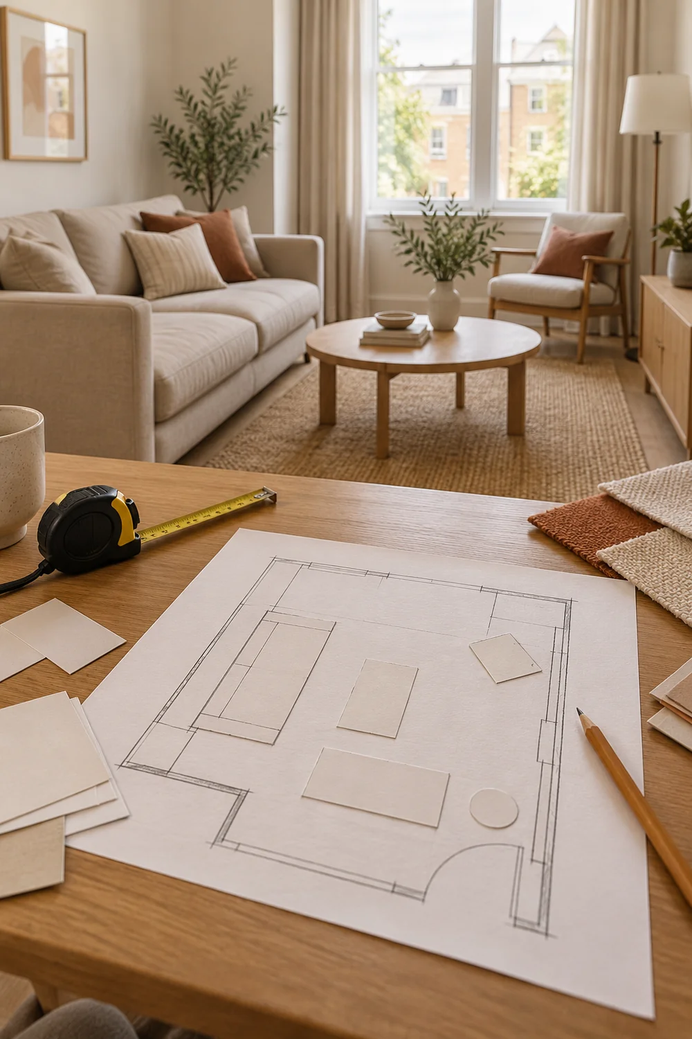
I would also photograph the room with the furniture removed from one corner at a time if moving it is practical. The empty view shows the shell clearly. Keep your first plan simple enough that you can explain what each major piece does. That makes later compromises much easier.
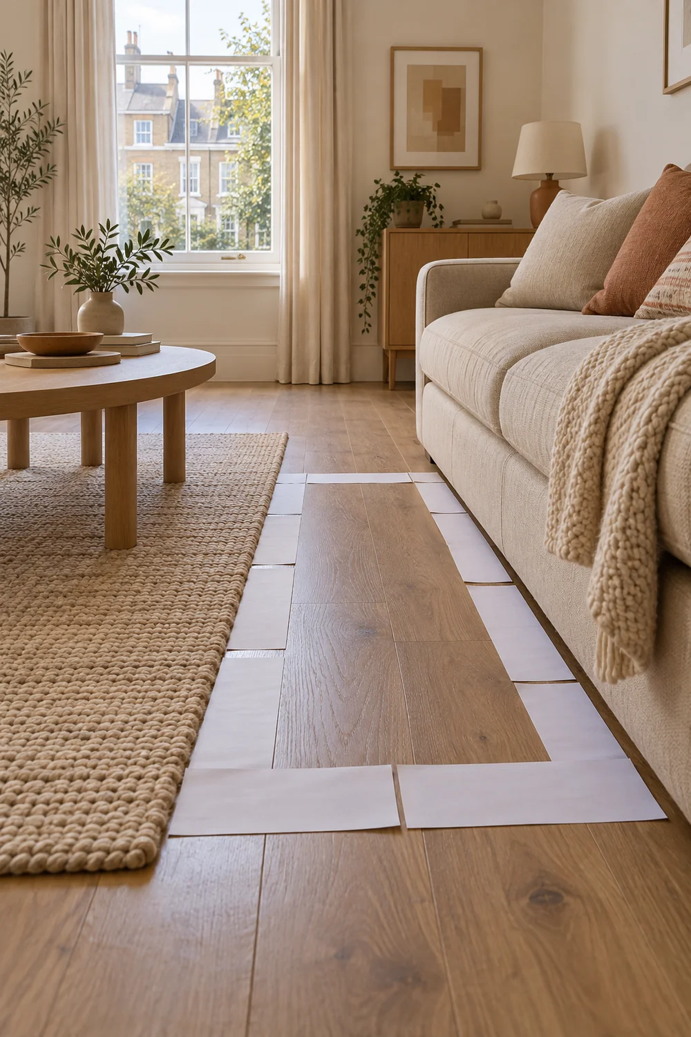
Draw the path you take from the door to the window, the other room or the main seat. Then walk it while carrying something ordinary, such as a laundry basket or two cups. Notice where your shoulder turns, where a chair catches the path and where an open drawer creates a pinch point. I would mark the useful route on the floor with low tack tape that is suitable for your floor finish, or with paper markers. The route is a real piece of the room even though it contains no furniture.
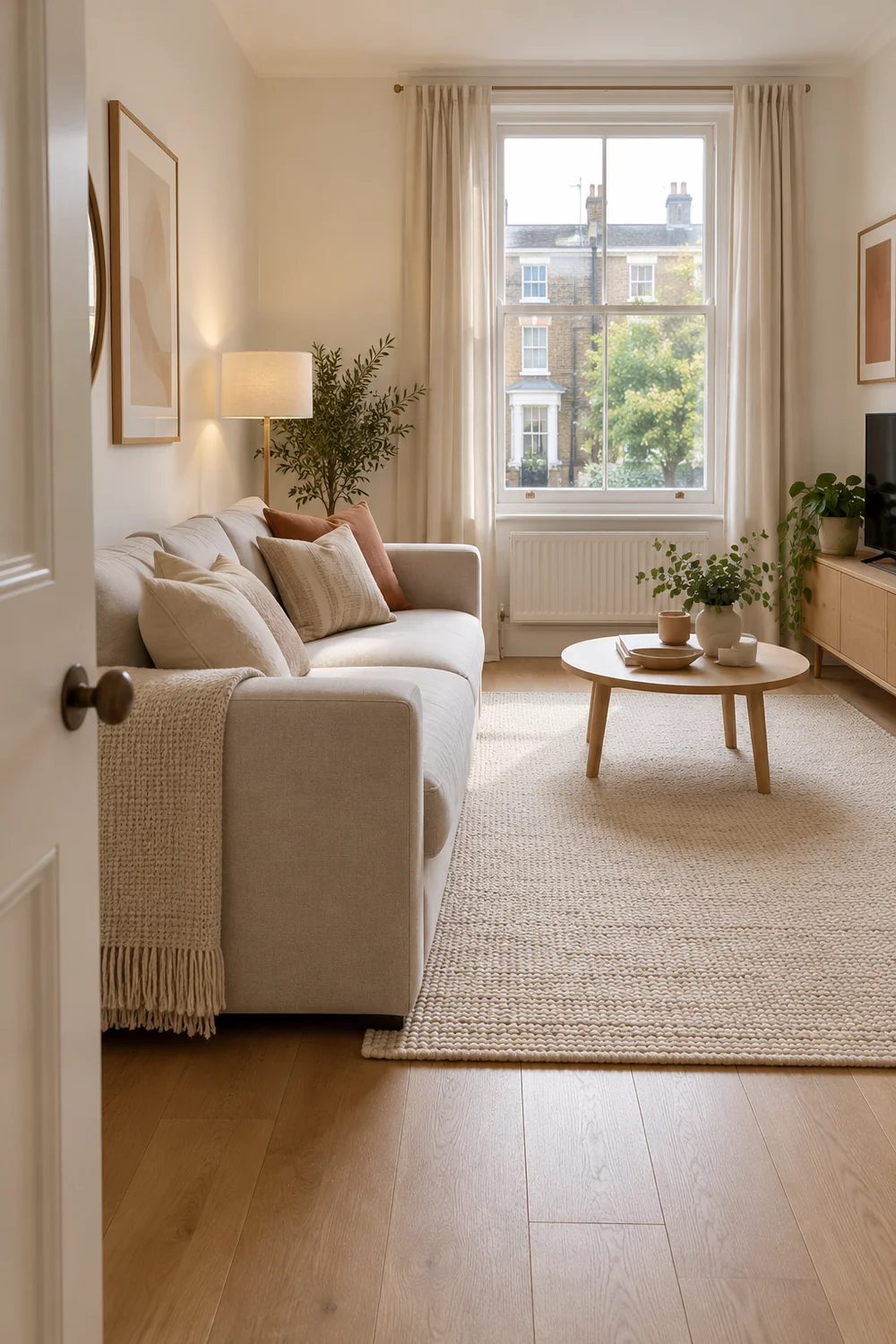
If you have a second doorway, decide whether it needs a direct crossing or whether people can move around the seating group. A coffee table that looks well placed from above can force an awkward bend every time someone walks through. The modern living room design article discusses general conversation and circulation proportions. Use it as a reference, but trust a full size test in your own room over any universal number. Doors, bodies, mobility needs and furniture depths differ.
Place the sofa only after the route is visible. I would try its current position first, then one plausible alternative. You do not have to float it in the middle just because an editorial photograph does. If a little space behind it improves the room without taking the path, test that. If the room is narrow, the better answer may be to keep the sofa near a wall and give the other side a smaller chair or stool. The goal is not to obey a styling rule. It is to make entering, sitting and getting up feel natural.
Mark the place where someone puts a drink and where the remote, book or charger lives. If every daily object has to cross the room, the seating plan is incomplete. I would rather use one practical side table in the right place than add a pair of matching tables that crowd the route.
Write down what you actually do in this room on an ordinary weekday and on a typical weekend. Conversation, television, reading, work and meals ask for different seating relationships. Rank the top two jobs. A room that must do all five does not need five zones; it needs a flexible central arrangement and a few pieces that can take more than one role. If a supplied sofa must stay, treat it as a fixed item for planning even though it is technically movable.
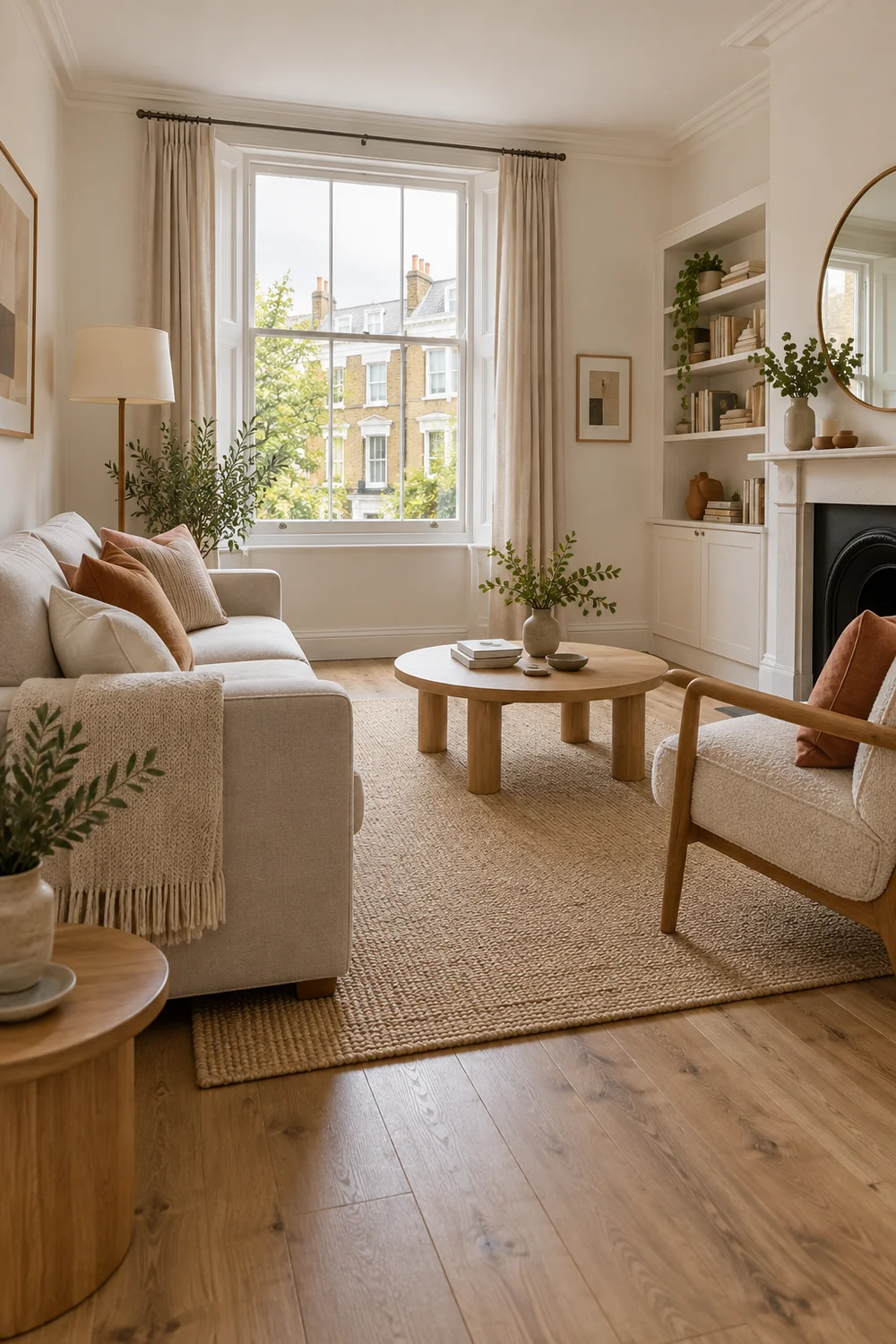
I would start with the primary seat and its view. Can you see the person across from you comfortably? Can you read in daylight without a screen glare? Is the television at a usable angle without becoming the only focal point? Then add the second seat only if it supports a real use. A light chair can be pulled into the group for guests and moved back when the floor needs to open. An ottoman may serve as a footrest and spare seat, but only if there is room to move it when someone needs the route.
The living room furniture guide is useful for comparing the roles of sofas, chairs, tables and storage. In this renter plan, I would ask an extra question about each piece: will it work in another room or home if the layout changes? A modular table or compact chair may be more useful than a piece made for one odd recess. That does not mean buying the smallest furniture. A sofa should still support the people who use it daily.
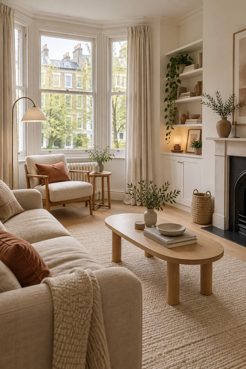
Sketch where the conversation group begins and ends. Keep the rug under the useful seating relationship rather than placing it as an island in the middle. If the room also has dining or work, draw those occupied positions with chairs pulled out, not just the empty furniture outlines. The plan needs to work when someone is actually using it.
Take each current item and mark it keep, move, store or pass on. I would keep a piece if it supports the chosen activity and fits the route, even if its finish is not perfect. A chair can be reupholstered later, or balanced by a textile now. I would move an item if it has a real use but is sitting in the wrong zone. I would store a piece only if there is a realistic place for it. Otherwise storing becomes another problem the room has to solve.
If the room includes a dining table beside the sofa, the living room dining table plan shows why the occupied chair and main route need testing together. That page owns the specific dining table decision. Here, I would use its approach only if your rental living room also combines those jobs. Do not add a dining area to this plan because another apartment has one.
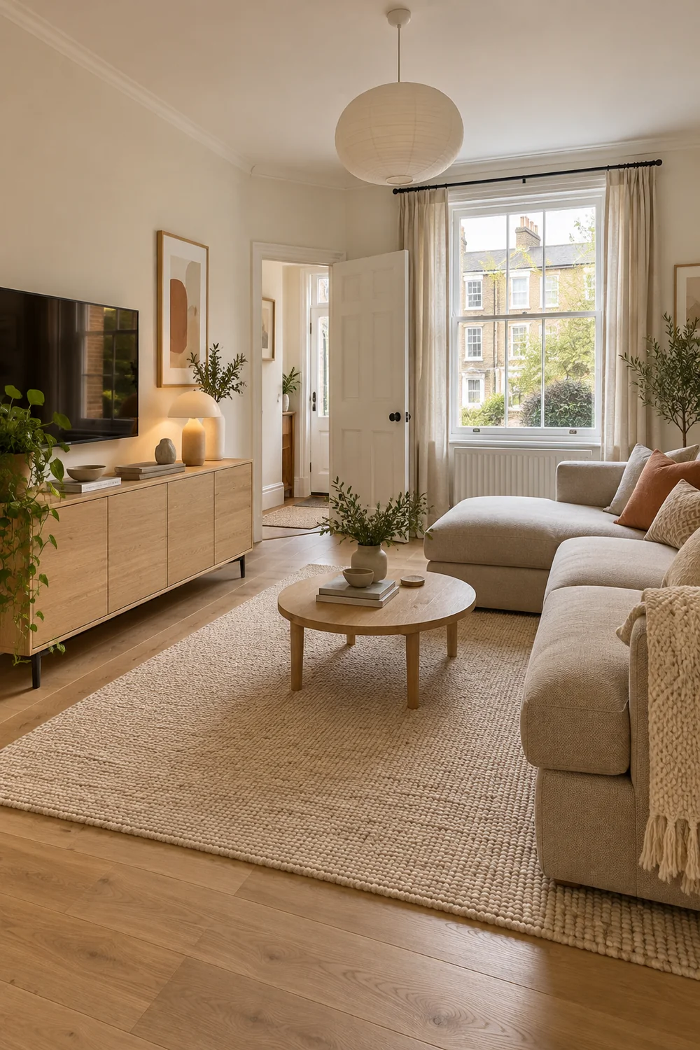
Ask whether a furniture problem is really a storage problem. If the sofa looks too large because baskets, books and cables surround it, clear the floor and retest before replacing the sofa. If the opposite wall looks empty, consider whether it needs a useful cabinet rather than decorative objects. A low movable sideboard can hold equipment and display art, but measure the door clearance, access to sockets and the wall length. A tall unit must be appropriate for the room and installed according to its safety instructions; do not assume a renter can leave it unsecured because fixing permission is difficult.
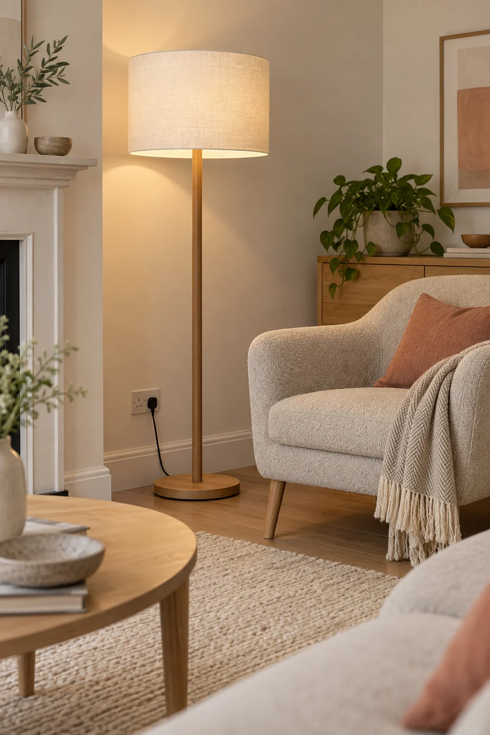
I would let the existing pieces prove what is missing. Often the first purchase is not a sofa or a statement chair. It is a lamp beside the seat, a rug that gathers the group, or storage that removes the daily clutter from the floor.
Draw a circle around every activity that needs light: reading, watching, working and crossing the room after dark. Then mark the sockets and the surfaces where a lamp can stand safely. This tells you whether a floor lamp, table lamp or portable task light is appropriate before you look at finishes. The ceiling light may remain in use, but it does not have to carry every job. I would plan a useful light near the main seat and a softer one elsewhere, with cords kept away from the clear route.
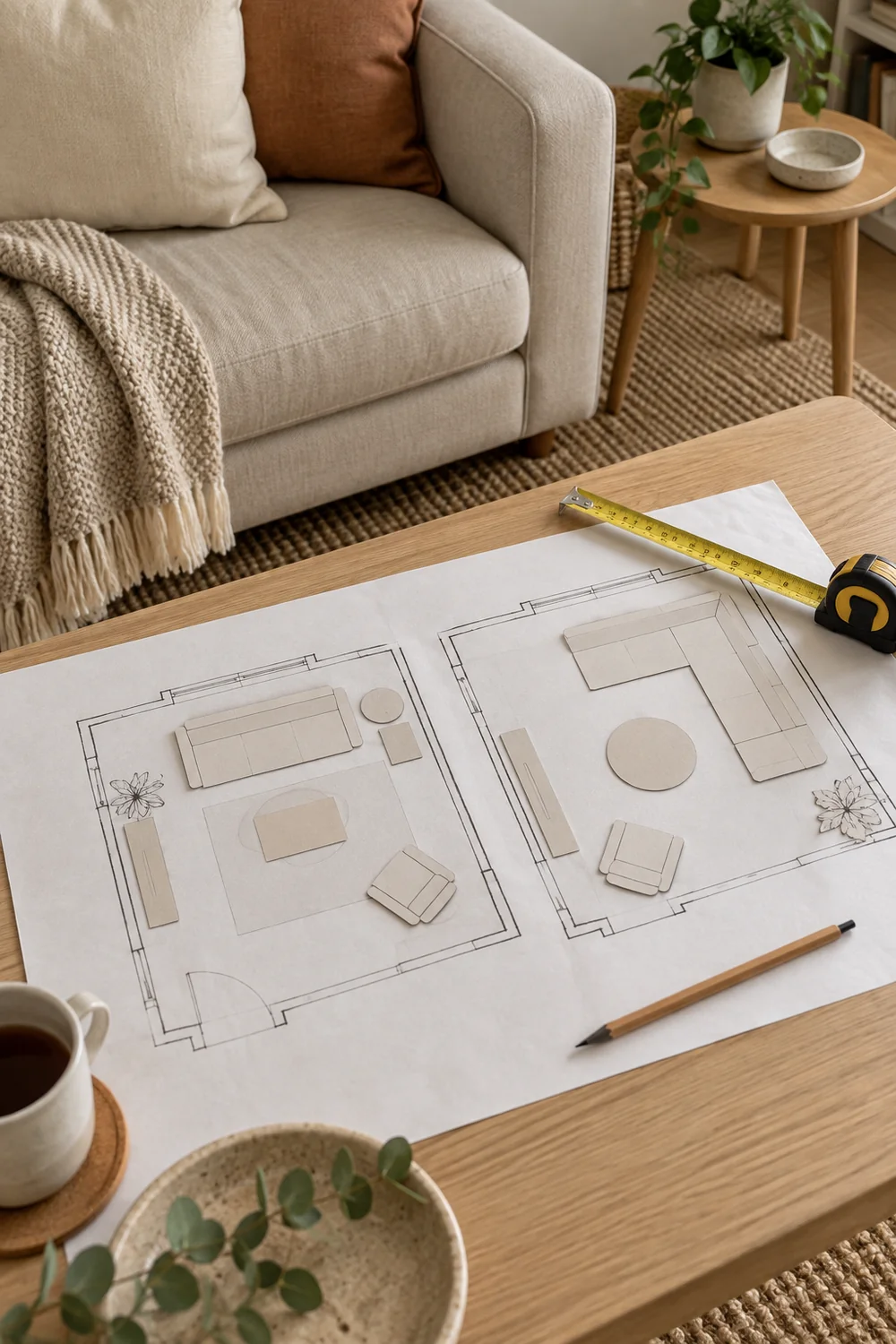
Storage should sit near the action it supports. Put books near reading, blankets near the sofa and small electronics where you can reach them without leaving cables across the floor. The dark cottagecore apartment article shows how a renter can use portable storage and plug in light throughout a home. The aesthetic is different here, but its movable approach is a useful alternative to assuming you need built in shelves or altered wiring.
I would draw the actual depth of a bookcase, cabinet or lamp base. Slim objects in product photographs can occupy more floor than you expect once a door or drawer opens. Look at how the piece will be used, not only how it will photograph. If you want art on a wall, mark the desired visual position, then leave the fixing method unresolved until you know what is permitted and appropriate. A plan can include a question rather than a risky assumption.
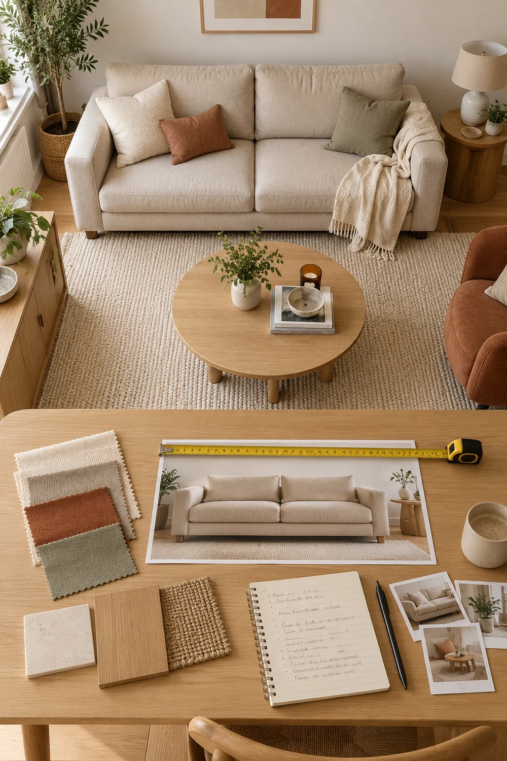
The final renter friendly wall decor selection article will compare safe and suitable ways to create that visual position. For now, your output is a map of where light, storage and character must work.
Choose two plausible arrangements, not a dozen. Layout one can preserve the sofa and move only the smaller pieces. Layout two can change the sofa position if it is possible. Mark both on paper, then try them in the room. If moving large furniture is not practical, use paper rectangles at full footprint for the pieces you might add. Leave space for a person to use each piece and open every relevant door or drawer.
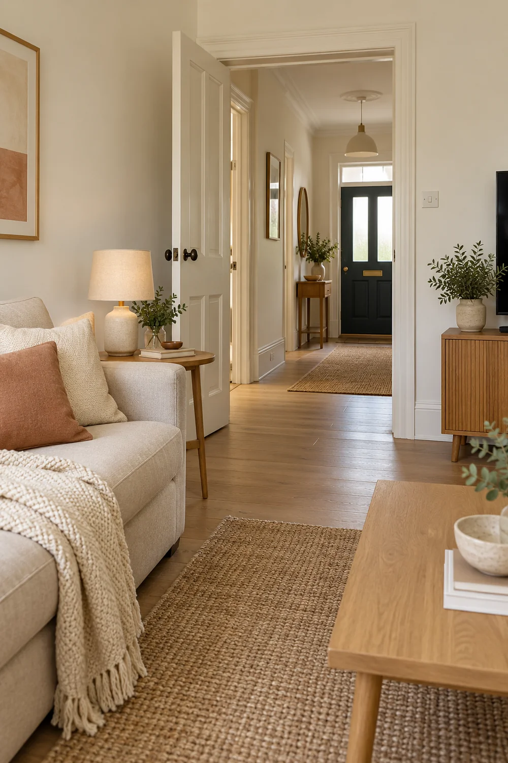
Live with the more promising arrangement for at least one ordinary day if you can. Notice whether the route works when you come in with bags, whether the reading lamp reaches the page and whether the rug stays under the furniture that uses it. Ask anyone else who uses the room where they naturally sit and walk. The test should reveal daily friction, not only whether the room looks balanced from the doorway.
I would keep a short log: what improved, what still feels wrong and what you are tempted to buy. If the temptation has no clear job, wait. The fall apartment decor article offers examples of changing a room through arrangement and portable layers. Its seasonal details need not come into this warm modern room; its useful lesson is to test what you own first.
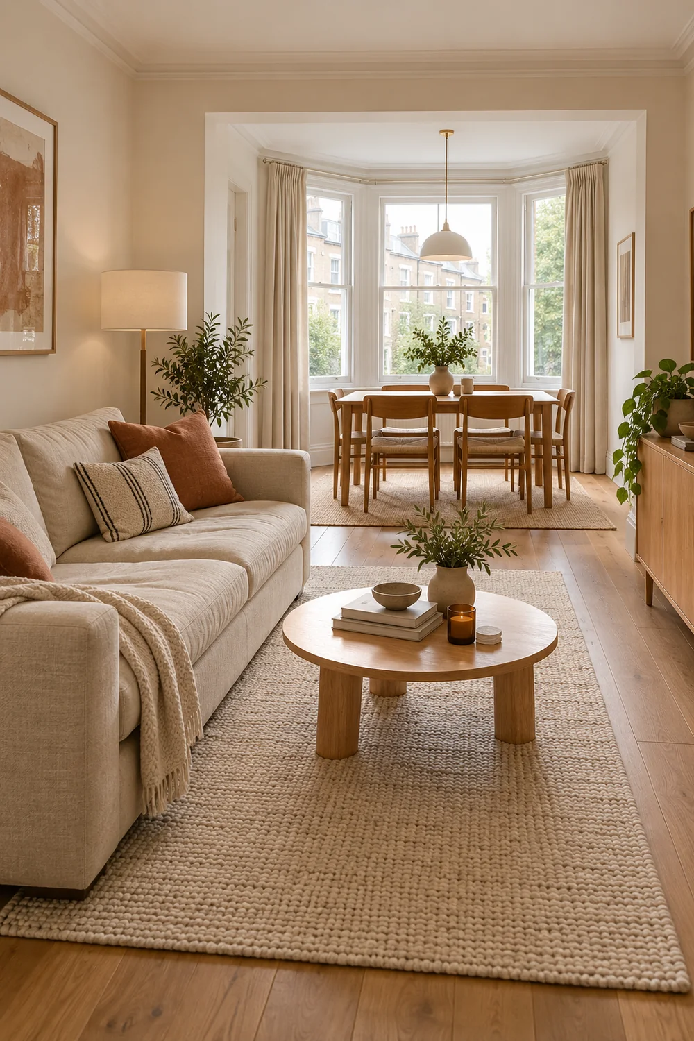
Choose the layout that makes the ordinary route and top two activities easier. If both work, prefer the one that needs fewer new pieces and can be reset when you move. This is where a renter plan becomes more than a list of pretty temporary products.
Once the test survives everyday use, write the measurements and jobs for the pieces you still need. For a rug, record the seating footprint it must gather and the clear door area it must avoid. For a lamp, record the exact surface or floor corner, the socket location and the activity it lights. For art or a cabinet, record the width, height and what it must conceal or display. Note what you can move to the next home and what depends on the current agreement.
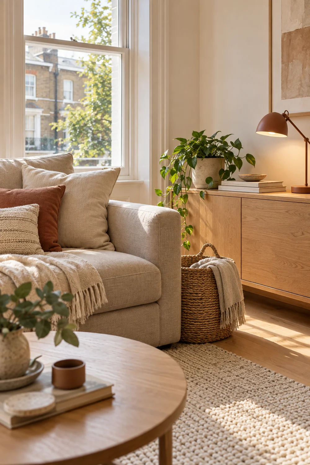
I would give each purchase a priority: necessary for the room to function, helpful for comfort, or purely decorative. Buy in that order. A useful floor lamp may change the room more than a stack of cushions. A proper side table may make the seating feel finished because daily objects finally have a home. When a product is large, compare its dimensions with the paper footprint again before ordering. The plan is only useful if it changes the purchase decision.
The next question is which exact pieces satisfy those measurements and restrictions. The renter friendly wall decor specification compares art, lamps, textiles and finishing furniture against a real plan, including how they will stand, connect, be cared for and leave the room. If one choice cannot pass those checks, return to this layout and decide whether the job can be done another way.
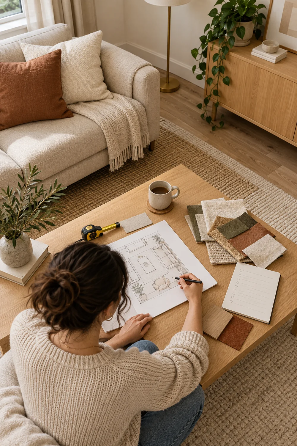
Your final plan should fit on one sheet: the room outline, the main route, the furniture you are keeping, the two activity zones, the required light and storage positions, and the measured purchase brief. I would keep that sheet when shopping. It lets you recognise an item that belongs in the room and leave an attractive item that does not. The fixed walls are still there, but now they are the boundaries of a workable design rather than the reason to give up on one.